7 Controversial Myths About Design Systems
关于设计系统的 7 个有争议的神话
In the world of design systems, many dogmas have become best practices. For inexperienced teams, it is often helpful to rely on established rules when creating their very first Design System. However, some architectural and conceptual dogmas are outdated but still prevalent in the market. This article aims to address the 7 most common misconceptions about DS in the ECEMEA markets.
在设计系统的世界里,许多教条已经成为最佳实践。对于没有经验的团队来说,在创建他们的第一个设计系统时依赖已建立的规则往往是有帮助的。然而,一些架构和概念上的教条已经过时,但在市场上仍然普遍存在。本文旨在解决 ECEMEA 市场上关于 DS 最常见的 7 个误解。
This article summarizes the 7 most common misconceptions about DS that I have encountered in the ECEMEA markets.
本文总结了我在 ECEMEA 市场上遇到的关于 DS 最常见的 7 个误解。
Myth 1: A Design System is supposed to be a battleground to fight over
谣言 1:设计系统应该成为争论的战场
Many roles in today’s product design market try to pull the decision-making rug out from under you. In large companies, UX copywriters suggest completely redesigning an approved design to change a few lines of text. Researchers refuse to democratize processes and want to create wireframes themselves and hand them off to designers for coloring. Similarly, design systems teams hide behind the word “consistency” to tie the hands of designers when it comes to product design.
在当今的产品设计市场中,许多角色试图从你手中夺走决策权。在大公司中,UX 文案编写者建议彻底重新设计一个已批准的设计,仅仅为了改变几行文本。研究人员拒绝民主化流程,并希望自己创建线框图,然后交给设计师进行着色。同样,设计系统团队在“一致性”这个词后面藏身,当涉及到产品设计时束缚设计师的手脚。
During my consultancy role with several large design teams in the Middle East, it became clear that their design systems were causing designers to become stagnant and essentially become mere operators of Figma. Design systems were strictly enforced, leaving little room for deviation from approved practices. In addition, as product decisions were made solely by the PM, designers did nothing more than place components from the design system on the layout. Therefore, the argument that strict DS frees up designers’ time for product decisions is invalid. Designers have simply become lazy and UX is limited by the inflexibility of DS. This is due to the lack of a mature product culture in general. For example, a table component in DS does not sort by column, forcing the designer to add a sort dropdown somewhere on the side of the table.
在我与中东几个大型设计团队合作的顾问角色中,显而易见的是,他们的设计系统导致设计师变得停滞不前,基本上只是成为Figma的操作员。设计系统被严格执行,几乎没有留下偏离批准实践的空间。此外,由于产品决策完全由产品经理做出,设计师所做的无非是在布局上放置设计系统中的组件。因此,严格的设计系统能够为设计师节省时间用于产品决策的论点是无效的。设计师简单地变得懒惰,用户体验受到设计系统不灵活性的限制。这是由于总体上缺乏成熟的产品文化。例如,设计系统中的表格组件不按列排序,迫使设计师不得不在表格的一侧添加一个排序下拉菜单。
Complicating the problem is the international market. For example, users from LatAm don’t understand a flow of ECEMEA users. But the design system is the same for the whole company and is done by the ECEMEA team. Designers in the LatAm market have to bend somewhere and somewhere spend weeks negotiating with the DS team to add components to the DS or create their own DS, quietly. And for some reason everyone thinks that it is normal for a designer to spend time on fighting. It shouldn’t be.
问题的复杂之处在于国际市场。例如,拉美的用户不理解 ECEMEA 用户的流程。但是,整个公司的设计系统是相同的,由 ECEMEA 团队完成。拉美市场的设计师不得不在某些地方妥协,而在其他地方则需要与 DS 团队进行数周的谈判,以便在 DS 中添加组件或悄悄创建自己的 DS。出于某种原因,每个人都认为设计师花时间去争取是正常的。但事实并非如此。
Unfortunately, this problem existed long before the age of digital design. I see the same thing in developing countries, where the thoughtless use of “Design systems” can be seen in the construction and design of roads. Often they just blindly copy the “experience of developed countries” without correcting it for their unique conditions. We see it in the floor-to-ceiling windows and the huge electricity bills for heating in cold countries. Or in the constant traffic jams that millions of people have to pass through when the road layout is copied from Stockholm.
不幸的是,这个问题在数字设计时代之前就已经存在了。我在发展中国家看到了同样的情况,那里“设计系统”的盲目使用可以在道路的建设和设计中看到。他们经常只是盲目地复制“发达国家的经验”,而不是针对他们独特的条件进行调整。我们在寒冷国家的落地窗和巨额取暖电费中看到了这一点。或者在从斯德哥尔摩复制的道路布局导致的持续交通堵塞中,数百万人不得不通过。
Solution: Give designers freedom. Constraints should be at the level of topology, hierarchy, naming, pixel perfection. Product consistency should be achieved through processes, not systems.
解决方案:给设计师自由。约束应该在拓扑、层级、命名、像素完美的层面上。产品一致性应该通过流程来实现,而不是系统。
Myth 2: Decimal values are not allowed
神话 2:不允许使用小数值
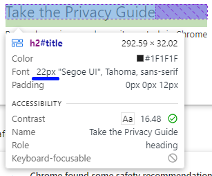
Almost every one of us, designers, thinks that decimal values are something unacceptable. Many mentors and A.I. say that if your Figma/Sketch/Pixso/PenPot source has decimal values, you are a bad specialist and you only came to the digital world from the print world yesterday. Let’s start thinking instead of listening to others. In the browser, the font size is relative. Let’s open any page, for example Chrome settings (Google engineers can’t be wrong, can they?): chrome://settings/. And let’s launch the Web Inspector. We see 24px (1.6em) and a div height of 32.02px. Segoe UI font.
我们几乎每个设计师都认为小数值是不可接受的。许多导师和人工智能表示,如果你的 Figma/Sketch/Pixso/PenPot 源文件中有小数值,你就是一个糟糕的专家,而且你昨天才从印刷世界来到数字世界。让我们开始思考,而不是听别人说。在浏览器中,字体大小是相对的。让我们打开任何一个页面,例如 Chrome 设置(Google 工程师不可能错,对吧?):chrome://settings/。然后启动 Web 检查器。我们看到 24px(1.6em)和一个 div 高度为 32.02px。Segoe UI 字体。
We conclude that the sizes associated with the font are abstract. The default sizes of 16px and 32px only guarantee that the former will be twice as small as the latter. And then there may be nuances with the baseline. We can also see that in the browser there are already decimals, percentages, in the rendered page. Yes, there are no decimal pixels on a physical monitor, but the horse resolutions of modern screens allow more flexibility to play with values + rem and em (not pixels) can generate decimals values. If you have a good design reason for using decimals — well, not advocating, but go for it.
我们得出结论,与字体相关联的大小是抽象的。默认大小 16px 和 32px 只保证前者是后者的两倍小。然后可能在基线上有些细微差别。我们还可以看到,在浏览器中,渲染页面已经有了小数点、百分比。是的,物理监视器上没有小数点像素,但现代屏幕的高分辨率允许更灵活地使用值+rem 和 em(不是像素)可以生成小数值。如果你有使用小数的好设计理由——好吧,不是在提倡,但可以尝试。
For example, there are fonts that render nicely in decimal sizes, such as Martian Mono. It renders perfectly every 2.5. It’s specifically designed for writing code. Your clients write code? So decimal sizes can provide flexibility. In modern digital, there are cases of decimal values, so feel free to experiment with them. Pay attention to the font hinting. And many browsers round decimals, but we do not just make products for browsers.
例如,有些字体在小数大小时渲染得很好,比如 Martian Mono。它每 2.5 完美渲染。它专为编写代码而设计。你的客户编写代码?因此小数大小可以提供灵活性。在现代数字设备中,有小数值的情况,所以请随意尝试它们。注意字体微调。许多浏览器会四舍五入小数,但我们不仅仅是为浏览器制作产品。

If decimal values are used, it is important to communicate this clearly to developers. The use of a decimal font size may be misinterpreted by the developer, who may assume that the designer is being reckless and round up the values in the code. And to an even number, of course.
如果使用了小数值,重要的是要清楚地与开发者沟通。使用小数的字体大小可能会被开发者误解,他们可能会认为设计师是在冒险,并在代码中将值四舍五入至整数值。当然,这是指四舍五入到偶数。
Myth 3: You can’t use transparent colors.
谣言 3:你不能使用透明颜色。
Transparency can be unpredictable in the wrong hands. If you layer translucent red on top of black, you’ll get a dirty, unsaturated color. That’s a fact.
在错误的手中,透明度可能是不可预测的。如果你在黑色上层叠半透明的红色,你会得到一个肮脏、不饱和的颜色。这是事实。

That’s why many design systems’ teams prohibit colors with transparency altogether to avoid potential problems. Yes, problems are possible. But there is a smarter approach — learning to work with transparent colors will significantly reduce your color palette. A sprawling palette leads to many more problems, including inconsistency and performance. Which is far worse than dirty colors.
这就是为什么许多设计系统的团队完全禁止使用带透明度的颜色,以避免潜在的问题。是的,问题是可能的。但有一种更聪明的方法 —— 学会使用透明颜色将显著减少你的颜色调色板。庞大的调色板会导致更多的问题,包括不一致性和性能问题。这比肮脏的颜色要糟糕得多。
Simple example: If you use the base colors #000, #FFF — and add opacity tokens 20/40/60/80% to them, then DS will have 6 values instead of 10. But such a token can be added to any color in DS. If there are 20 colors in DS, there are 24 variables instead of 100.
简单例子:如果你使用基础颜色#000、#FFF —— 并且给它们添加 20/40/60/80%的不透明度标记,那么 DS 将有 6 个值而不是 10 个。但这样的标记可以添加到 DS 中的任何颜色上。如果 DS 中有 20 种颜色,那么就有 24 个变量而不是 100 个。

CSS offers several properties for implementing color overlays, including linear-gradient and background-image and many more. These properties enable the creation of a wide range of shades using a limited number of colors and opacities.
CSS 提供了几种实现颜色叠加的属性,包括 linear-gradient 和 background-image 等等。这些属性使得使用有限数量的颜色和不透明度创建广泛的色调成为可能。
And muddy colors are the responsibility of the designer. If the designer chooses an inappropriate icon, it’s just a mistake. So it is with colors as well. If the designer has untied hands, decent expertise, and no need to fight with the design system team, the problem of muddy colors will not exist.
混浊的颜色是设计师的责任。如果设计师选择了不合适的图标,那就是一个错误。颜色也是如此。如果设计师有自由的手,足够的专业知识,而且不需要与设计系统团队斗争,那么混浊颜色的问题就不会存在。
Myth 4: Outline icons are easier to work with
神话 4:轮廓图标更容易使用
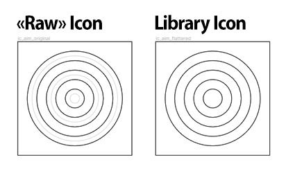
Straight to the solution. To save time, it’s usually better to keep icons fully fill when exporting to SVG. Especially if the same icon will have multiple sizes. But if you decide to go with outline icons, let me tell you what you’ll have to go through.
直接解决问题。为了节省时间,通常最好在导出到 SVG 时保持图标完全填充。特别是如果同一个图标将有多个大小。但如果你决定使用轮廓图标,让我告诉你你将要经历什么。
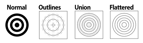
Many products use outline icons by default, often with different line thicknesses for different sizes. This creates difficulties for designers when drawing new icons, and there are endless negotiations about the thickness of the stroke. The main argument for outline icons is that the stroke can be adjusted, so it’s flexible. But it is necessary to give away SVG to developers with icons without strokes, just a shape. One way to keep the source code editable and get a fill outline foe developers is to apply “union”, and sometimes spend time to deal with a mess of artifacts and weekly remind everyone about even-odd. It’s also important to control where your designers get their icons from. Mixing drawn icons in figma with ready-made icons from the web imported in SVG format is a big source of bugs. Most shapes imported into figma from SVG or other vector editors often have problems with Boolean operations.
许多产品默认使用轮廓图标,通常不同大小的图标会有不同的线条粗细。这给设计师绘制新图标时带来了困难,关于笔触厚度的讨论也没完没了。轮廓图标的主要论点是笔触可以调整,因此它很灵活。但是有必要给开发者提供没有笔触、只有形状的 SVG 图标。保持源代码可编辑并为开发者获取填充轮廓的一种方法是应用“联合”,有时还需要花时间处理一堆杂乱的残留物,并每周提醒大家关于奇偶的问题。控制设计师从哪里获取他们的图标也很重要。在 figma 中混合绘制的图标与从网上导入的 SVG 格式的现成图标,是导致错误的一个重要来源。大多数从 SVG 或其他矢量编辑器导入到 figma 的形状,经常会有布尔操作的问题。
This is all the extra work that I want to avoid.
这就是我想要避免的所有额外工作。
Another option is to convert the stroke into a filled shape before pushing it to the library. And the sources are saved separately. This is a way, yes.
另一个选择是在将笔触推送到库之前,将其转换为填充形状。而源文件则另外保存。这是一种方法,没错。
Suppose you have three different sizes of icons. Usually variants are used for different versions of icons: thin, bold, filled, duotone. And it is better to keep icons of the same style as three separate sets and connect them via preferred values. This way you avoid size inconsistencies.
假设你有三种不同大小的图标。通常,变体用于图标的不同版本:细体、粗体、填充、双色调。最好将同一风格的图标作为三套独立的集合保留,并通过首选值连接它们。这样你可以避免大小不一致。
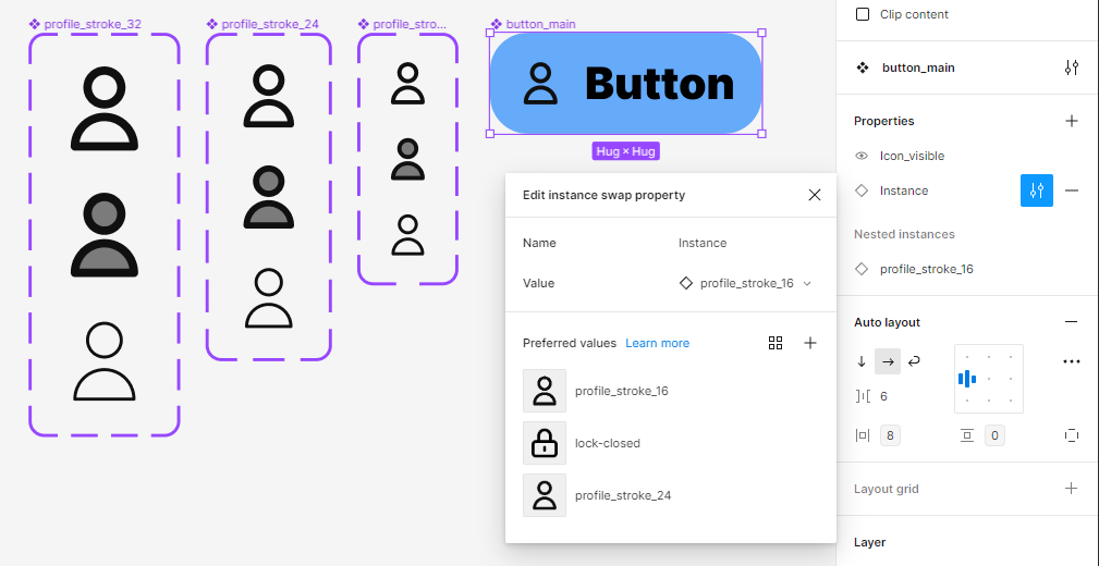
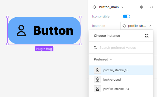
Many small icon sizes are often not included in the preferred values (20x20 or 16x16), making it quicker to find the right icons.
许多小图标尺寸经常不包括在首选值中(20x20 或 16x16),这使得找到正确的图标更快。
And in general, it is always better to break components into sub-components and “pull” them into the parent via nested properties. This way you can reduce the number of variants in the main component, from 2000+ to 48 in my case.
一般来说,将组件拆分为子组件并通过嵌套属性“拉”到父组件中总是更好的。这样,你可以将主组件中的变体数量从 2000+减少到 48。
But! As soon as you do all of the above, and you will sooner or later on a big DS with about 20–30 products, Figma will start sending you “out of memory” banners. Isn’t it easier to use filled icons and not create complex structures?
但是!一旦你做了上述所有事情,在一个拥有大约 20-30 个产品的大型 DS 上,你迟早会收到 Figma 发来的“内存溢出”警告。使用填充图标而不是创建复杂结构难道不更简单吗?
Myth 5: The bottom sheet is simple
神话 5:底部表单很简单
An ordinary bottom sheet that slides up from the bottom of a mobile screen. Many people think it is a very simple component with a fixed height.
一个普通的底部表单从移动屏幕的底部滑出。很多人认为这是一个非常简单的组件,具有固定的高度。
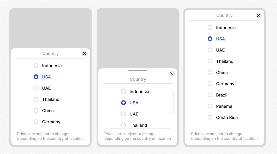
Let’s talk about height and different localizations. In different localizations, the height of the bottom sheet depends on the text and the local requirements of the regulators (what information should be displayed).
让我们谈谈高度和不同的本地化。在不同的本地化中,底部表单的高度取决于文本和监管机构的本地要求(应显示哪些信息)。
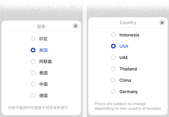
The height of the bottom sheet should adjust to the content, or be fixed at half screen height (50%) with a scroll if there is a lot of content. Or it should expand to full screen at once. All these should be props of a component with adaptation to the content, i.e. if the bottom sheet still overflows with content, it switches to the full screen version + add a scroll.
底部表单的高度应该根据内容调整,或者在内容较多时固定为半屏幕高度(50%)并带有滚动条。或者它应该一次性展开到全屏。所有这些都应该是组件的属性,并且能够适应内容,即如果底部表单的内容仍然溢出,它会切换到全屏版本+添加滚动条。
Another important question about Bottom Sheets is whether they should be modal, i.e. the interface is behind the Bottom Sheet and not available for the user to interact with. By default, bottom sheets are almost always modal, blocking the interface. However, if Bottom Sheets take up less than 50% of the screen height, it is probably not necessary to block them. For example, this is a typical scenario on a map, where the user has tapped a pin and some information has opened, and because it is non-modal, it is possible to click other pins. There may be a lot of information, but for initial familiarization, the top of the Bottom Sheet is sufficient. This is a typical scenario of the fixed height with unfolding (dragging) to full screen.
关于底部表单的另一个重要问题是它们是否应该是模态的,即界面位于底部表单之后,用户无法与之交互。默认情况下,底部表单几乎总是模态的,会阻塞界面。然而,如果底部表单占用的屏幕高度不到 50%,那么可能没有必要阻止它们。例如,在地图上就是一个典型的场景,用户点击了一个图钉,打开了一些信息,因为它是非模态的,所以可以点击其他图钉。信息可能很多,但对于初步熟悉来说,底部表单的顶部就足够了。这是一个典型的固定高度场景,通过拖动可以展开到全屏。
It’s a good idea to hide the bottom sheet not only by swiping or tapping the outer space, but also by tapping the close icon. People can tap the icon with their forehead or nose, not just their fingers. I’ve seen and done it myself. If you live in a cold country, your nose is the best way to press the button in temperatures below -30°, but it’s not that comfortable to swipe with it.
通过滑动或点击外部空间来隐藏底部表单是一个好主意,但同时通过点击关闭图标也是一个好方法。人们不仅可以用手指,还可以用前额或鼻子点击图标。我见过也做过这样的事。如果你生活在一个寒冷的国家,当温度低于-30°时,用鼻子按按钮是最好的方式,但用它来滑动就不那么舒服了。
If you propose an explained behavior for a button sheet component, a default Art Director may disagree and refer to MD2 and MD3 guidelines. Sometimes their opinion is relevant, sometimes not. But what is certain is that Art Directors are often accustomed to small screens and possess long fingers, it’s not always reasonable to blindly rely on their opinions. You might also encounter the opinion that if we require a button sheet component with the mentioned props, we will call the entire design department to converse and determine as a team. It is not a nice process to do things. Because designers should not spend a lot of time searching for information and negotiating, they should work quickly and predictably. We have to design navigation components correctly right away, that’s how planning works in good teams.
如果你为按钮表组件提出一个解释行为,一个默认的艺术总监可能会不同意,并参考 MD2 和 MD3 指南。有时他们的意见是相关的,有时则不然。但可以肯定的是,艺术总监们通常习惯于小屏幕并且拥有长手指,盲目依赖他们的意见并不总是合理的。你可能还会遇到这样的观点:如果我们需要一个带有所提及属性的按钮表组件,我们将召集整个设计部门进行交流并作为一个团队来决定。这不是一个做事情的好过程。因为设计师不应该花费大量时间搜索信息和协商,他们应该快速且可预测地工作。我们必须立即正确设计导航组件,这就是优秀团队中规划的工作方式。
Myth 6: Screen flow scheme for presentations
神话 6:演示文稿的屏幕流程图
A lot of designers looked at the portfolios of big design studios and found a screen flow with arrows between mobile screens. And suddenly they started drawing similar screen flows and showing them to clients during presentations. Well, friends, arrows between screens are not for the primary presentation. Arrows help show the tree view and imply a non-linear narrative. That goes completely against the idea of a presentation as such, a presentation is always linear. Your client thinks linearly, their life flows linearly, and screen flow goes against that way of thinking. Screen flow is part of the technical work, like defining requirements for the development team, it’s not part of the investor presentation.
许多设计师查看了大型设计工作室的作品集,并发现了带箭头的移动屏幕之间的屏幕流程。突然间,他们开始绘制类似的屏幕流程,并在演示中向客户展示。好吧,朋友们,屏幕之间的箭头并不是用于主要演示的。箭头有助于显示树视图,并暗示非线性叙述。这完全违背了演示的概念,演示总是线性的。你的客户线性地思考,他们的生活线性地流动,而屏幕流程与这种思维方式相悖。屏幕流程是技术工作的一部分,比如为开发团队定义要求,它不是投资者演示的一部分。
Myth 7: Designers define CSS naming conventions
神话 7:设计师定义 CSS 命名约定
CSS is seen as a simple description of properties. This carelessness leads to inconsistencies in class naming. As a result, the same styles for elements can be named differently. A familiar situation: the color #FF0000 is called warning, red, secondary, and text_error.
CSS 被视为属性的简单描述。这种粗心大意导致了类命名的不一致。结果,相同样式的元素可以被不同地命名。一个熟悉的情况:颜色#FF0000 被称为 warning、red、secondary 和 text_error。
This is a consequence of not understanding the process of creating a new component within an existing architecture. And there is a solution, it is called methodology. There are two key ones: Write Everything Twice (WET) — semantic ideology, or Don’t Repeat Yourself (DRY) — functional. Both principles are not ideal: the first pollutes CSS by duplicating the same properties in different classes. The second pollutes HTML by repeating classes in tags of identical elements. The flaws in both cases are often fixed by preprocessors like SASS. Now, details:
这是由于不了解在现有架构中创建新组件的过程所导致的后果。而且有解决方案,它被称为方法论。有两个关键的:Write Everything Twice (WET) — 语义意识形态,或者 Don’t Repeat Yourself (DRY) — 功能性。这两个原则都不是理想的:第一个通过在不同的类中复制相同的属性污染了 CSS。第二个通过在相同元素的标签中重复类来污染 HTML。在这两种情况下,缺陷通常由预处理器,如 SASS,来修复。现在,细节:
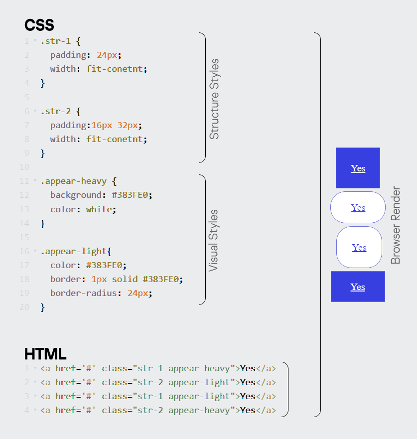
First, we will look at the functional (DRY), and its very popular methodology for organizing CSS — OOCSS. It is based on the division of element styles into structure and design.
首先,我们将看看功能性的 (DRY),及其非常流行的用于组织 CSS 的方法论 — OOCSS。它基于将元素样式分为结构和设计。
Structure styles can include height, width, padding, margins, and anything else that affects the positioning of the element on the page and the content within it.
结构样式可以包括高度、宽度、填充、边距以及任何其他影响元素在页面上的定位和其中内容的东西。
Design styles — colors, border radius, shadows, and other decorative features.
设计风格 — 颜色、边框圆角、阴影以及其他装饰特性。
Let’s contrast something from the world of WET with DRY. This is the once popular semantic BEM. BEM stands for Block, Element, Modifier.
让我们对比一下 WET 世界和 DRY 中的某些东西。这就是曾经流行的语义 BEM。BEM 代表块、元素、修饰符。
- Blocks are components that can be reused many times within a project.
块是可以在项目中多次重用的组件。 - Elements are components of a given block.
元素是给定块的组成部分。 - Modifiers are responsible for properties of a block or element that change its appearance or behavior.
修饰符负责改变块或元素外观或行为的属性。
Each is a class with its own purpose. BEM-written names are easy for developers to read. BEM has its own rules for writing classes:
每个都是具有自己目的的类。BEM 编写的名称对开发者来说易于阅读。BEM 有自己的类编写规则:
.block-name__element-name_modifier-name
In practice, it is better to abandon the documentation in favor of an unofficial but readable version:
在实践中,最好放弃官方文档,转而使用非官方但可读性更强的版本:
.block-name__element-name — modifier-name
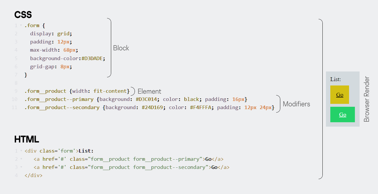
In this case I made a div with 2 buttons. If I want to reuse the `.form__product` element styles and its modifiers `.form__product — primary` and `form__product — secondary` outside of the List block, I will have to create a new block with the same styles, but with a different naming from the block name. So I won’t be able to reuse element classes outside the blocks, I will have to create a component from scratch and duplicate the same properties from class to class. This is the main problem with this and any other semantic approach. At one time BEM solved the cascading and specificity problem by not using selectors other than classes, but this can now be solved with CSS Layers.
在这种情况下,我创建了一个包含 2 个按钮的 div。如果我想在 List 块之外重用`.form__product`元素样式及其修饰符`.form__product — primary`和`form__product — secondary`,我将不得不创建一个具有相同样式但命名与块名称不同的新块。所以我无法在块外重用元素类,我将不得不从头开始创建一个组件,并从类到类复制相同的属性。这是这种和其他任何语义方法的主要问题。BEM 在一段时间内通过不使用除类之外的选择器解决了层叠和特异性问题,但现在这可以通过 CSS 层来解决。
Let’s get back to DRY, namely the Atomic Methodology. The essence of this method is to split styles into classes with a property and a value for the property, and then build HTML elements from them as a constructor. In essence, it is analogous to inline classes. The method is similar to OOCSS, but in OOCSS these “parts” of styles can be more complex and contain many properties. Examples:
让我们回到 DRY,即原子方法论。这种方法的本质是将样式分解为具有属性和该属性值的类,然后像构造器一样从它们构建 HTML 元素。本质上,它类似于内联类。这种方法与 OOCSS 相似,但在 OOCSS 中这些“部分”样式可以更复杂并包含许多属性。例如:
.lh–16— line-height: 16px;
.lh–16— 行高:16px;
.fwbold— font-weight: bold;
.fwbold— 字体加粗;
.mb-8 — margin-bottom: 8px;
.mb-8 — 下边距为 8 像素;
The peculiarity is that they can be written directly in HTML by linking a pre-created atomic library. Classes are widely reused in completely different elements throughout the project, this is their difference from BEM elements and modifiers, which are bound to a specific block. The advantage of atoms is instant customization of a particular element.
它们的特点是可以通过链接预创建的原子库直接在 HTML 中编写。在整个项目中,这些类在完全不同的元素中被广泛复用,这是它们与绑定到特定块的 BEM 元素和修饰符的不同之处。原子的优势在于可以即时自定义特定元素。
However, there is a drawback: the duplication of classes in similar HTML elements makes it challenging to edit them simultaneously, which lacks a component approach.
然而,存在一个缺点:在相似的 HTML 元素中类的重复使得同时编辑它们变得具有挑战性,这缺乏一个组件化的方法。
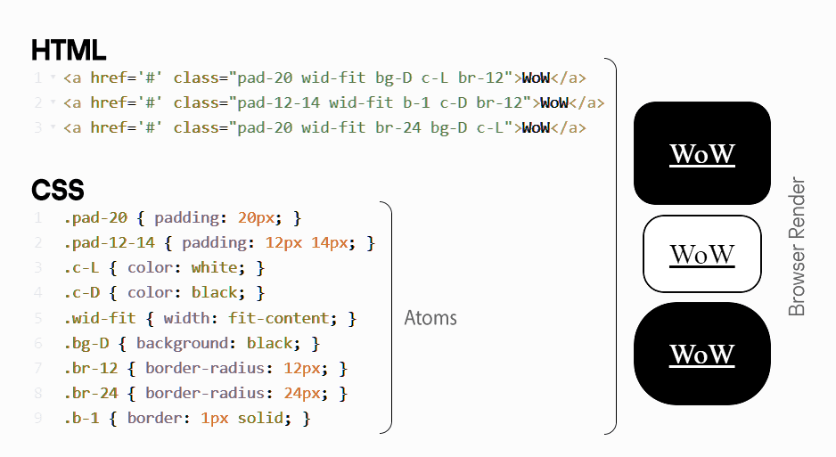
The buttons in this example follow the same pattern as in OOCSS, where each button is made up of multiple classes, with each class responsible for one property.
这个例子中的按钮遵循 OOCSS 中的相同模式,每个按钮由多个类组成,每个类负责一个属性。
There are many different methodologies, OOCSS, ACSS and SMACSS. And that’s not to mention new ones like Cube. bem, &&&css is generally the way to solve css problems. But if everything is so nice, why did I put it here as a myth?
有许多不同的方法论,OOCSS、ACSS 和 SMACSS。更不用说像 Cube 这样的新方法。bem,&&&css 通常是解决 css 问题的方法。但如果一切都这么好,为什么我还要把它列为一个神话呢?
You could be inspired and run off to prove to the team that we will reuse everything and that there will be structured, beautiful names for all the components. The reality is far from this. Many developers will tell you that atomic classes make the code very dirty, and they find it hard to read such code. It is believed that the developer experience on a large project is better when individual components are written, each component has its own class, its own modifications. I usually use GitHub as an example, which uses atomic classes. But again, it turns into a battleground where you are not right…. designer.
你可能会受到启发,跑去向团队证明我们将重用一切,并且所有组件都会有结构化、美观的名称。但现实远非如此。许多开发者会告诉你,原子类使代码变得非常脏乱,他们发现阅读这样的代码很困难。人们认为,在大型项目上,开发者体验更好,当编写单独的组件时,每个组件都有自己的类,自己的修改。我通常用 GitHub 作为例子,它使用原子类。但同样,它变成了一个战场,你不对……设计师。
A really complex and well-structured project use compound components, eslint-plugin-boundaries, style dictionary. And Tailwind for atomicity, ideally along with some sort of MUI. All of this imposes certain technical constraints on naming and structure that designers need to understand and take into account in their source code.
一个真正复杂且结构良好的项目使用复合组件、eslint-plugin-boundaries、样式字典。以及 Tailwind 用于原子性,理想情况下还有某种 MUI。所有这些都对命名和结构施加了一定的技术限制,设计师需要理解并考虑到他们的源代码中。
I hope this article has broadened your horizons regarding the flexibility of mature and modern Design Systems. Remember that every decision for your product should be based on real team/user needs rather than internet articles, including this one.
我希望这篇文章能够拓宽你对成熟和现代设计系统灵活性的视野。记住,你的产品的每一个决策都应该基于真实的团队/用户需求,而不是互联网文章,包括这篇文章。