This article summarises all my knowledge and experience, and it took me 6 months to get together. I believe, anyone, newbie or pro, could find some new useful info inside of it. There are already hundreds of articles, dozens of guides. And some of them are really good. However, there was still a need for the comprehensive photography composition guide nicely presented and easy to follow. I did my best to keep it simple, concise and easy to understand with lots of goodies to download for future reference. Also, I keep it as short as possible with zero fluff for such a massive amount of material. Less talk, more practical info with examples, charts and graphs.
这篇文章总结了我所有的知识和经验,花了我6个月的时间才凑齐。我相信,任何人,无论是新手还是专业人士,都可以在其中找到一些新的有用信息。已经有数百篇文章,数十本指南。其中一些确实很好。然而,仍然需要一份精美且易于理解的综合摄影构图指南。我尽力使其简单、简洁、易于理解,并提供了许多好东西可供下载以供将来参考。此外,对于如此大量的材料,我将其保持尽可能短,零绒毛。少说话,更多实用信息,包括示例、图表和图表。
Side note: Most of the time I shoot landscapes and, therefore, most of my examples are some nature scenes. While street photography or portrait photography have their own specifics, they still follow the same composition principles. I believe this guide can be easily extrapolated for whatever other genres you shoot.
旁注:大多数时候我拍摄风景,因此,我的大部分例子都是一些自然场景。虽然街头摄影或人像摄影有自己的特点,但它们仍然遵循相同的构图原则。我相信本指南可以很容易地推断出您拍摄的任何其他类型。
Table of Contents 目录
- Why Composition Is Important
为什么构图很重要 - Painting vs Photography Composition
绘画与摄影构图 - Composition Concept and Principles
组成概念和原则 - Composition Techniques 构图技巧
- Composition Building Blocks
组合构建块 - How To Control and Affect Composition
如何控制和影响构图 - How To Improve Composition in Editing
如何改进剪辑中的构图 - Bonus #1: Dynamic Symmetry – Myth or Reality
福利#1:动态对称——神话还是现实 - Bonus #2: Composition Decision-Making Flowchart
福利#2:构图决策流程图 - Bonus #3: Simplified Composition Decision-Making Flowchart
好处#3:简化的组合决策流程图 - Final Word 最后一句话
Why Composition Is Important
为什么构图很重要
Let me ask you a question. Have you ever had a chance to tap on the piano or play the guitar? What happens when you randomly hit the keys or strings? I bet it produces something you can’t call music and it hurts your ears. Meanwhile, a set of same chords properly aligned creates something beautiful and meaningful. Another example is a total mess in the room. It’s hard to find anything; it’s hard to walk through. While the clean room with adequately arranged items brings a sense of harmony and it’s easy to navigate. The final example is a human body. Its composition ensures functional abilities and beauty.
让我问你一个问题。您有机会弹钢琴或弹吉他吗?当你随机敲击琴键或琴弦时会发生什么?我敢打赌它会产生一些你不能称之为音乐的东西,而且它会伤害你的耳朵。同时,一组正确对齐的相同和弦会创造出美丽而有意义的东西。另一个例子是房间里一片混乱。很难找到任何东西;很难走过去。干净的房间里物品摆放整齐,给人一种和谐的感觉,而且很容易导航。最后一个例子是人体。它的成分确保了功能性和美观性。
The same principle is for all visual arts including photography. Proper layout of elements creates a sense of harmony, movement, tension – whatever you want. Composition speaks a thousand words, tells a story, encourages the viewer to scan your photo, to stay in it. To break the rules, you must first know the rules. I would rather call them “recommendations” or something similar rather than the rules but it would sound silly and cause confusion. I know, some people, especially creative, hate all “rules”. There are no rules as such, there are things, which look better due to some psychological reasons. Make it help you do the right shot.
同样的原则适用于包括摄影在内的所有视觉艺术。元素的正确布局可以营造出和谐感、动感感、张力感——无论你想要什么。构图讲一千个字,讲述一个故事,鼓励观众浏览你的照片,留在其中。 想要打破规则,首先要了解规则。我宁愿称它们为“建议”或类似的东西,而不是规则,但这听起来很愚蠢并且会引起混乱。我知道,有些人,尤其是有创造力的人,讨厌所有“规则”。没有这样的规则,有些东西由于某些心理原因看起来更好。让它帮助您做出正确的拍摄。
Painting vs. Photography Composition
绘画与绘画摄影构图
Both painting and photography are visual arts. They are similar in many ways, but there’s one huge difference. For the painting, an artist can have weeks and months for sketching out a future masterpiece, can build a perfect complex composition verifying and calibrating each step, each tree, each wave position. We do not have these vast opportunities to make everything perfect. For some photography genres, like portrait, macro, still nature we can take our time to build compositions, while for the landscape photography we take whatever Mother Nature gives us, and we need to decide fast while the light lasts. And it’s even worse for street and sports photography; sometimes a photographer has a split second to decide.
绘画和摄影都是视觉艺术。它们在很多方面都很相似,但有一个巨大的区别。对于这幅画,艺术家可以有数周甚至数月的时间来勾勒出未来的杰作,可以构建完美的复杂构图,验证和校准每一步、每棵树、每个波浪位置。我们没有如此巨大的机会让一切变得完美。对于某些摄影类型,例如肖像、微距、静物自然,我们可以花时间构建构图,而对于风景摄影,我们会采取大自然赋予我们的一切,并且我们需要在光线充足的情况下快速做出决定。对于街头和体育摄影来说情况更糟;有时摄影师有一瞬间做出决定。
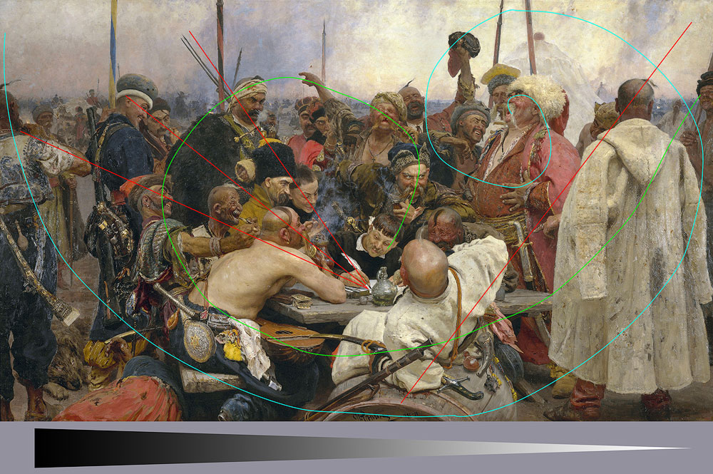
我只指出了一些构图元素:几条通向羽毛的对角线、两条螺旋线以及从黑色到白色的一般对角线过渡。当然,这幅画还有更多内容。出处:作者:Ilya Repin – The Yorck Project (2002) 10.000 Meisterwerke der Malerei (DVD-ROM),由 DIRECTMEDIA Publishing GmbH 发行。 ISBN:3936122202。,公共领域,链接
As you can see, as a general rule, a photographer has much less time than an artist to decide on the final look of the photograph. That is the reason to take an extra shot or two just in case you missed some aspect with the first one.
正如您所看到的,一般来说,摄影师决定照片最终外观的时间比艺术家少得多。这就是为什么要多拍一两次,以防万一你错过了第一张照片的某些方面。
Composition Concept and Principles
组成概念和原则
Before going deep into the techniques, we need to understand what the photography composition actually is, how it is created, what key points it has, how it affects our perception and what its capable of.
在深入探讨技术之前,我们需要了解摄影构图到底是什么,它是如何创作的,它有哪些要点,它如何影响我们的感知以及它的能力是什么。
Frame Shape 镜框形状
Obviously, we need to start with the frame shape as it is the first thing affecting the photo and the general perception. Historically, frame shape is rectangular, and I want to speak more about the aspect ratio. The most common aspect ratio is 3:2 and it comes from the sensor size (and previously film slide size) 36 x 24mm. The reason for the frame to be horizontal is obvious – that’s how we see things due to the eyes position. I’m not aware of any good reason for the exact 3:2 measures and 4:3 (shorter) seems to be more natural. I believe, 2:3 could be a better ratio for the portraits due to the elongated body shape, and that’s the only valid reason for that.
显然,我们需要从镜框形状开始,因为它是影响照片和总体感知的第一件事。从历史上看,框架形状是矩形的,我想更多地谈谈长宽比。最常见的宽高比是 3:2,它来自传感器尺寸(以及之前的胶片幻灯片尺寸)36 x 24mm。框架是水平的原因很明显——这就是我们根据眼睛位置看事物的方式。我不知道确切的 3:2 措施有什么充分的理由,而 4:3(更短)似乎更自然。我相信,由于身体形状拉长,2:3 可能是肖像画的更好比例,这是唯一合理的理由。
The most challenging frame to shoot is square. By its nature, it is very stable and has zero dynamics. So, you should have a perfect reason to select a square format for your shot. The subject should be very stable by itself of lack any dynamics. The good example would be some patterns or something symmetrical.
拍摄最具挑战性的框架是正方形。就其本质而言,它非常稳定并且动态为零。因此,您应该有充分的理由为您的镜头选择方形格式。主体本身应该非常稳定,没有任何动态。很好的例子是一些图案或对称的东西。
Vertical And Horizontal Alignment
垂直和水平对齐
The rule of thumb is to choose a horizontal frame when the majority of the compositional lines are horizontal and vice versa. Sometimes you could do the opposite to increase tension, i.e., include a vertical subject, In this case, make sure to leave a lot of breathing space around it.
经验法则是,当大多数构图线是水平的时,选择水平框架,反之亦然。有时你可以采取相反的做法来增加张力,即包含一个垂直的主题,在这种情况下,请确保在其周围留出大量的呼吸空间。
Fill The Frame 填充框架
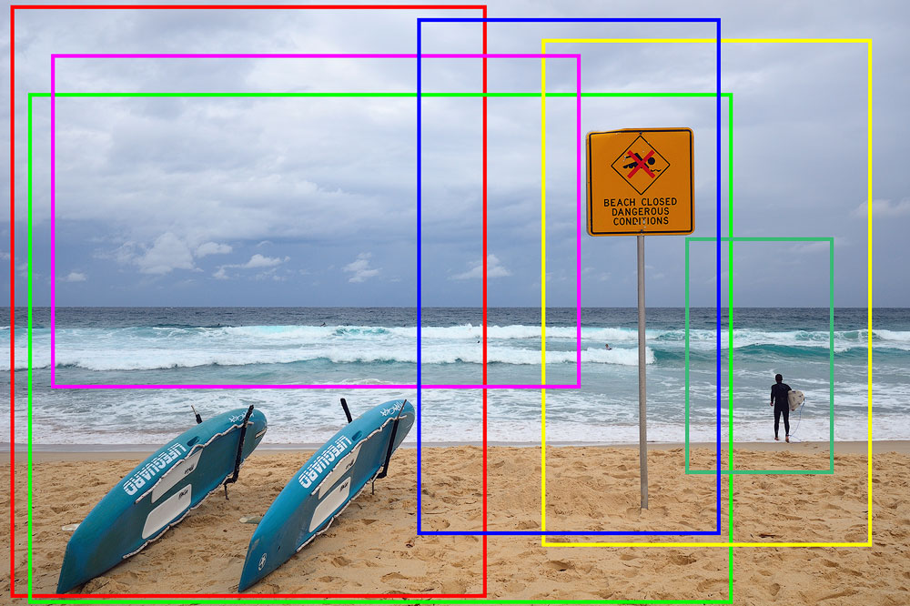
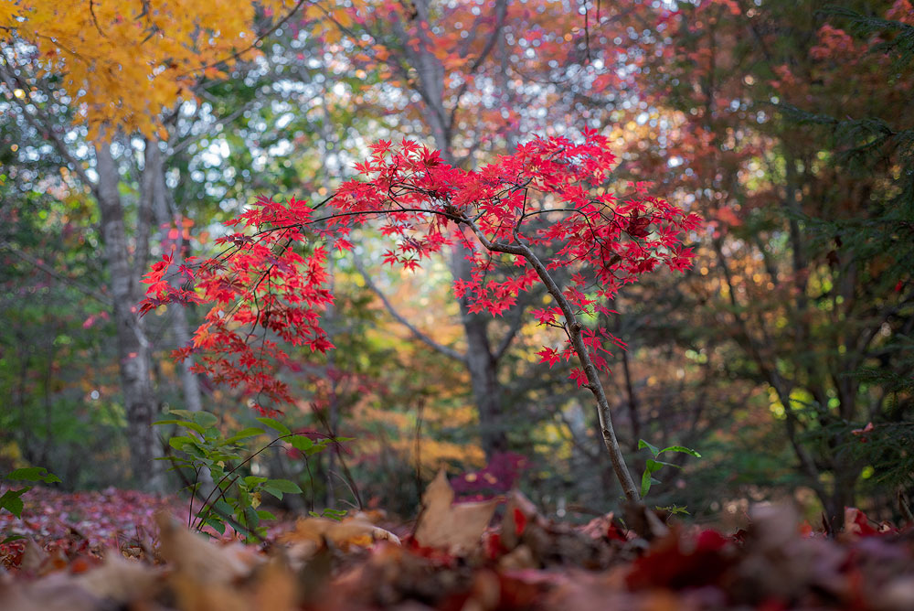
This filling principle is easy to understand and implement. You have a frame, and all of it should work for your story, for your image. Try to arrange elements in a way that doesn’t make part of the photo crowded and another part empty. This concept also applies to the size of the items. Try to use the whole area you have at disposal, not just a fraction of it. Take it this way – if you cut any part of the photo and it looks better and more harmonious, then you haven’t filled the frame.
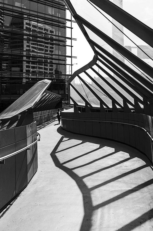
这种填充原理很容易理解和实现。你有一个框架,所有的一切都应该适合你的故事、你的形象。尝试以一种不会使照片的一部分拥挤而另一部分空旷的方式排列元素。这个概念也适用于物品的尺寸。尝试使用您可以使用的整个区域,而不仅仅是其中的一小部分。这么说吧——如果你剪掉了照片的任何部分,它看起来更好、更和谐,那么你就没有填满画面。
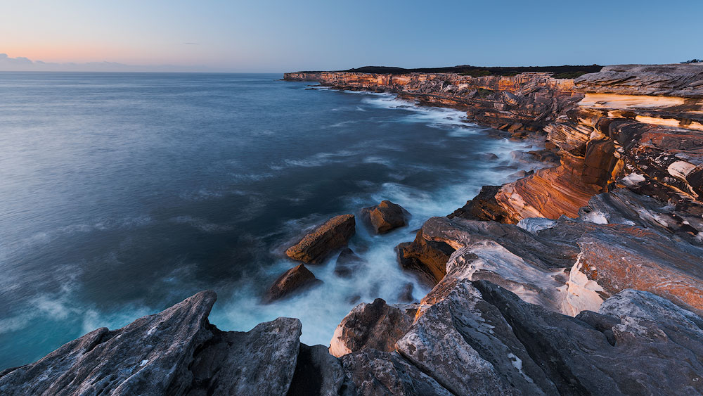
悬崖填充了画面的左下部分,云填充了对面
The critical notice here – don’t put anything bright or dark or contrasty very close to the edge as the visual weight increases towards the edges. It applies to any distracting shapes. The closer to the side the more attention it’s going to get due to the way our eyes scan the image.
这里的关键注意事项是——不要将任何明亮、黑暗或对比度的东西放在非常靠近边缘的地方,因为视觉权重向边缘增加。它适用于任何分散注意力的形状。由于我们的眼睛扫描图像的方式,离侧面越近,它就越容易受到关注。
Another bad idea is to position vertical lines near the vertical edges or horizontal lines near the horizontal sides. Their visual weight increases as well as distracting from the main subject.
另一个坏主意是将垂直线放置在垂直边缘附近或将水平线放置在水平边附近。他们的视觉重量增加并分散了对主要主题的注意力。
Visual Storytelling 视觉讲故事
Storytelling is the whole point of any photograph. We saw something, and we want to tell about the subject or the story it conveys to the viewer. If it has nothing to say or communicate, it’s a snap, not a photograph. This whole guide is about different means of visual storytelling. Like, you start to read a book from the beginning to have a clue what’s going on. There are specific writing rules or structures, like linear narrative, nonlinear narrative, it should have a plot, etc. Same thing in visual arts and photography in particular. You need to have a subject, a context and a layout. All these things plus many more form your visual narrative. So, treat photography composition as a storytelling tool.
讲故事是任何照片的重点。我们看到了一些东西,我们想向观众讲述这个主题或它传达的故事。如果它没有什么可说或传达的,那么它就是一张快照,而不是一张照片。整个指南是关于视觉讲故事的不同方式。就像,你从头开始读一本书,以了解发生了什么。有特定的写作规则或结构,比如线性叙事、非线性叙事、应该有情节等等。在视觉艺术和摄影中尤其如此。你需要有一个主题、背景和布局。所有这些加上更多的东西构成了你的视觉叙事。所以,把摄影构图当作一种讲故事的工具。
Please examine an example below and note how the crop affects the story it tells. Try to figure out what’s the plot in every final picture.
请检查下面的示例,并注意作物如何影响它所讲述的故事。尝试弄清楚每张最终图片的情节是什么。
What’s the catch here? The thing that changes is the context. The context gives us a story to tell.
这里有什么问题?改变的是上下文。上下文为我们提供了一个故事。
I’ll throw in a few examples along the way too.
我也会在此过程中举几个例子。
Follow me on Instagram
在 Instagram 上关注我
Point of Interest 兴趣点
First and foremost, identify what your photo is about, who’s the hero, the main subject. It can be some object, like a tree, it can also be a mood or a feeling. There was something that triggered you, forced to take out the camera and peer into infinity visualising a future shot. You are building a whole story around this subject. The point of interest can really be anything, a human, an animal, a feeling, a mood, a relation between some secondary objects, a colour, a pattern, a rhythm, etc. Don’t limit yourself to something solid.
首先也是最重要的,确定你的照片是关于什么的,谁是英雄,谁是主要拍摄对象。它可以是某个物体,比如一棵树,也可以是一种心情或一种感觉。有一些东西触发了你,迫使你拿出相机,凝视无限远,想象未来的镜头。你正在围绕这个主题构建一个完整的故事。兴趣点实际上可以是任何东西,一个人,一个动物,一种感觉,一种心情,一些次要物体之间的关系,一种颜色,一种图案,一种节奏等等。不要把自己限制在一些固定的东西上。
这里的重点是比较,死植被和活植被之间的关系
Breathing Space 喘息空间
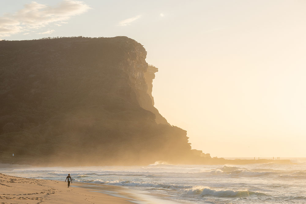
The first thing you are going to wonder is where to put the main subject. Let’s start with a simple scenario of something solid. Before we jump into the multitude of composition rules and techniques, we need to talk about the general positioning within a frame. One of the most fundamental rules is to give your subject a so-called breathing space. Except on some rare occasions, it has to have some area around it not blocked by other objects or, more importantly, frame edges. An object starts to visually suffocate if it (or any part of it) is too close to the side. The scanning eye trips over such positioning, and smooth experience is broken. You can manipulate the amount of breathing space for specific effects, but we’ll discuss it later.
您首先要考虑的是将主要主题放在哪里。让我们从一个简单的、可靠的场景开始。在我们深入讨论众多的构图规则和技巧之前,我们需要先讨论一下框架内的一般定位。最基本的规则之一是给你的主题一个所谓的呼吸空间。除了极少数情况外,它周围必须有一些区域不被其他物体阻挡,或者更重要的是,框架边缘不被阻挡。如果一个物体(或其任何部分)距离侧面太近,就会在视觉上令人窒息。这样的定位会让扫描眼睛绊倒,流畅的体验被打破。您可以操纵呼吸空间的大小以获得特定效果,但我们稍后会讨论它。
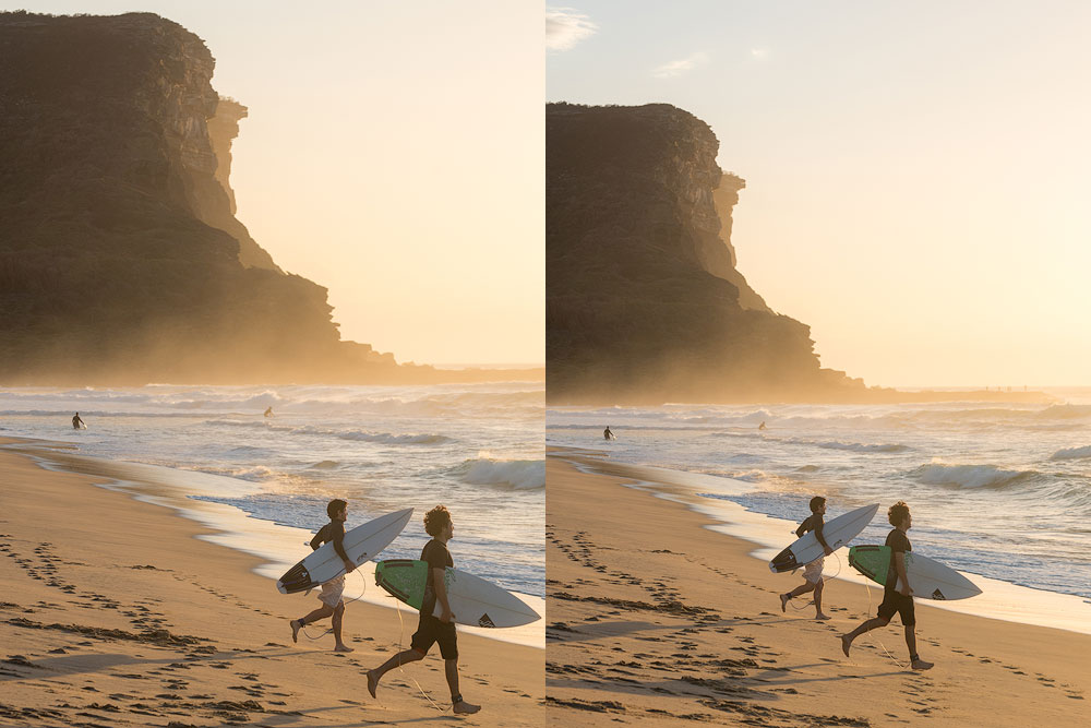
第一个很好地填充了框架,并具有很大的对角线,但框架阻碍了运动,并且悬崖变得太大且占主导地位,因为它几乎到达边缘。第二个镜头看起来更轻盈,暗示了运动
Check The Corners 检查角落
Just like with positioning high contrast objects near the frame edges, the corners are even more critical. Always check the corners before pressing a button and avoid anything distracting. Any object near the corner immediately drags an enormous amount of attention, and the eye keeps jumping back to it. The key to the composition is simplicity and clarity.
就像将高对比度对象放置在框架边缘附近一样,角落更加关键。在按下按钮之前务必检查角落并避免任何分散注意力的东西。任何靠近角落的物体都会立即吸引大量的注意力,并且人们的视线会不断地跳回到它身上。构图的关键是简单和清晰。
右边的图像更清晰
Check The Background 检查背景
It’s not the police background check, but it’s also essential. I know, this sounds obvious and most likely you know this info already. But looking at the photos posted by amateurs, I must repeat it. Check the background. Make sure your main subject is separate from any background, make sure it stands out and is clearly visible. Make sure there is no branch sticking out of the head, make sure no items are interacting or blending with the main point of interest.
这不是警察背景调查,但也是必不可少的。我知道,这听起来很明显,而且您很可能已经知道此信息。但看着素人发的照片,我必须重复一遍。检查背景。确保您的主要拍摄对象与任何背景分开,确保其突出且清晰可见。确保没有树枝从头部伸出,确保没有物品与主要兴趣点相互作用或混合。
Simplify 简化
Take it this way – if it doesn’t add to the story, exclude it. You got it right – include as little as possible.
就这样吧——如果它不能增加故事的内容,那就排除它。 你说得对——尽可能少地包含。
In fact, to build great compositions, you must learn to exclude with no remorse or regrets. If something is distracting, competing, overly bright, etc., remove it. Go for clarity. There are certain things you’ll be able to remove later in Photoshop, but sometimes it’s easier to exclude it in the first place during shooting. This process of eliminating things is known as Subtraction, when you subtract everything unimportant or distracting or competing with the main subject. Always aim to include as little as possible.
事实上,要创作出伟大的作品,你必须学会毫无悔意或遗憾地排除。如果某些东西会分散注意力、竞争性、过于明亮等,请将其删除。追求清晰。有些东西您稍后可以在 Photoshop 中删除,但有时在拍摄过程中首先将其排除会更容易。这种消除事物的过程称为减法,即减去所有不重要或分散注意力或与主要主题竞争的事物。始终致力于包含尽可能少的内容。
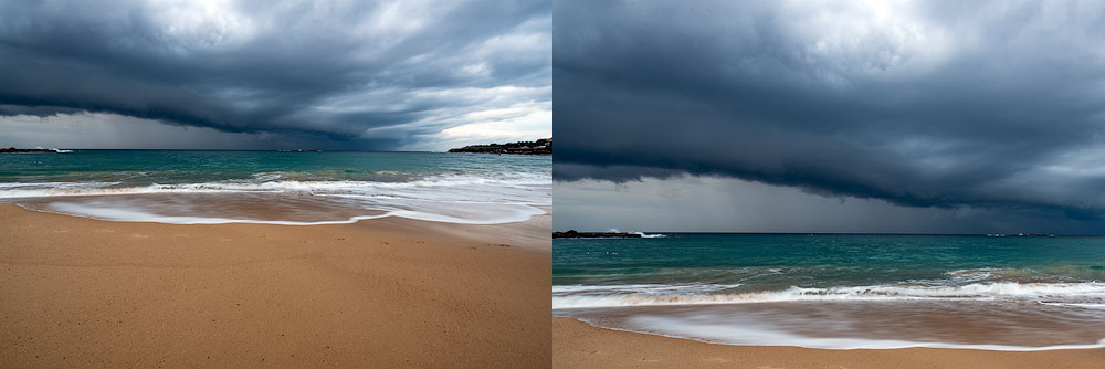
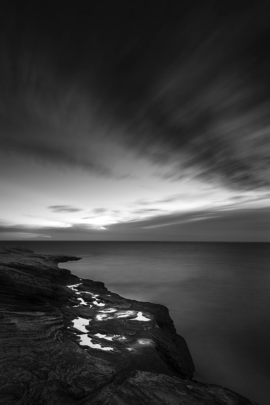
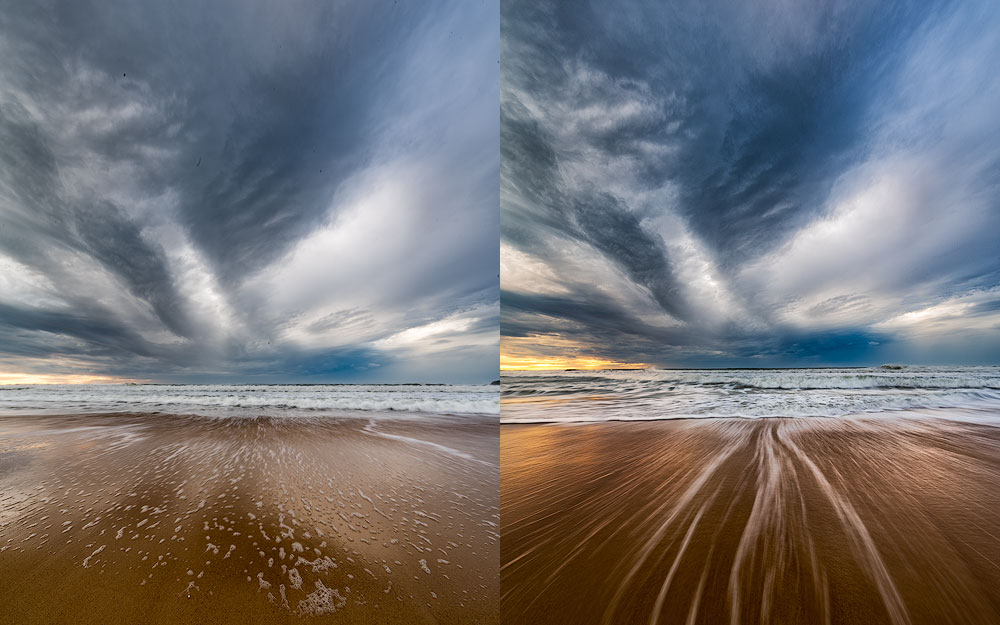
第一个镜头有很多沙子,右侧有黑暗的悬崖——所有这些都分散了人们对风暴这一主要思想的注意力
It goes down to a convenient property of our eyes to filter out a lot of things. We somehow learned over the years to focus our sight instantly on something exciting and ignore the rest. This ability doesn’t apply to the visual arts. Therefore we must remove everything that our eyes would filter out automatically and help the viewer to grasp the concept of your photo in the first couple of seconds.
这取决于我们眼睛的便利特性,可以过滤掉很多东西。多年来,我们不知何故学会了将注意力立即集中在令人兴奋的事情上,而忽略其余的事情。这种能力不适用于视觉艺术。因此,我们必须去除我们的眼睛会自动过滤掉的所有内容,并帮助观看者在前几秒钟内掌握照片的概念。
Balance 平衡
Composition balance is a tricky concept. More often than not, you’ll want a balanced shot. Sometimes, however, out of balance composition can deliberately increase the tension, the expressiveness and convey some idea in a better way. Usually, it’s easy to measure the balance just by looking at the photo.
构图平衡是一个棘手的概念。通常,您会想要一个平衡的镜头。然而,有时,不平衡的构图可以故意增加张力和表现力,并以更好的方式传达一些想法。通常,只需查看照片即可轻松测量平衡。
你知道哪里是训练作文最好的地方吗?这是沙漠!查看我的沙漠摄影快速指南
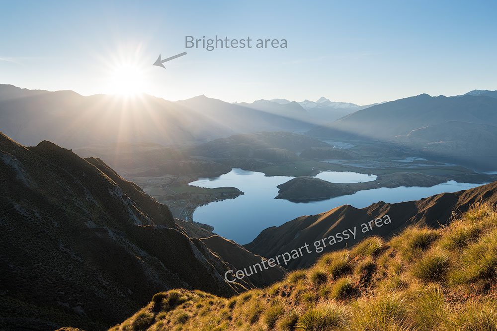
这里的太阳是最亮、要求最高的区域,我们需要用更大的明亮区域来平衡它(它必须更大,因为它不太亮)
Join me for one of the private photography workshops in Gold Coast. Workshops
和我一起参加黄金海岸的私人摄影工作室之一。工作坊
Ask yourself a question – is it balanced or does it fall to the side? The “heavy” elements are dark, bright, high contrast areas, saturated zones. You can easily balance a dark mountain peak with a bright coloured cloud, for instance. The actual weight of the element isn’t relevant in this case; we care about its significance in the shot and the proximity to the centre. The visual weight increases as the element travel further from the centre, hence the rule I mentioned before, where you don’t want to put any “heavy” objects near the frame edges or corners unless you are trying to balance something far bigger.
问自己一个问题——它是平衡的还是偏向一边的? “重”元素是黑暗、明亮、高对比度区域、饱和区域。例如,您可以轻松地平衡黑暗的山峰和明亮的彩色云彩。在这种情况下,元件的实际重量并不相关;我们关心它在镜头中的重要性以及与中心的距离。随着元素远离中心,视觉重量会增加,因此我之前提到过,你不想在框架边缘或角落附近放置任何“重”物体,除非你试图平衡更大的东西。
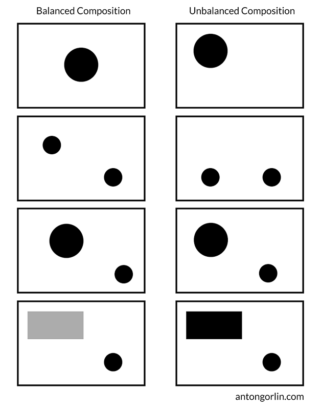
平衡或不平衡构图的一些例子。
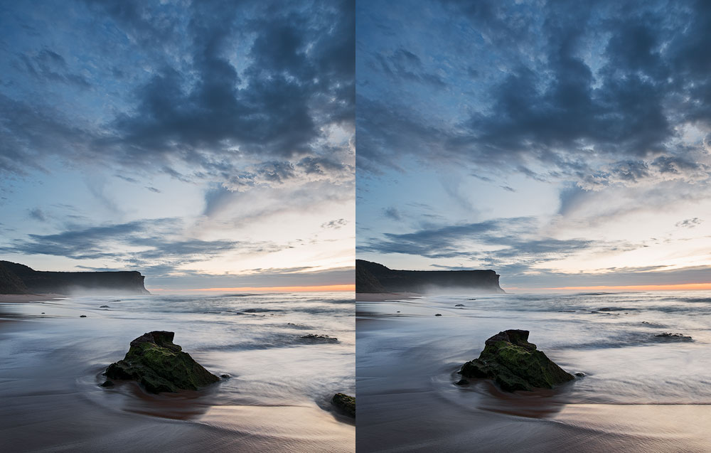
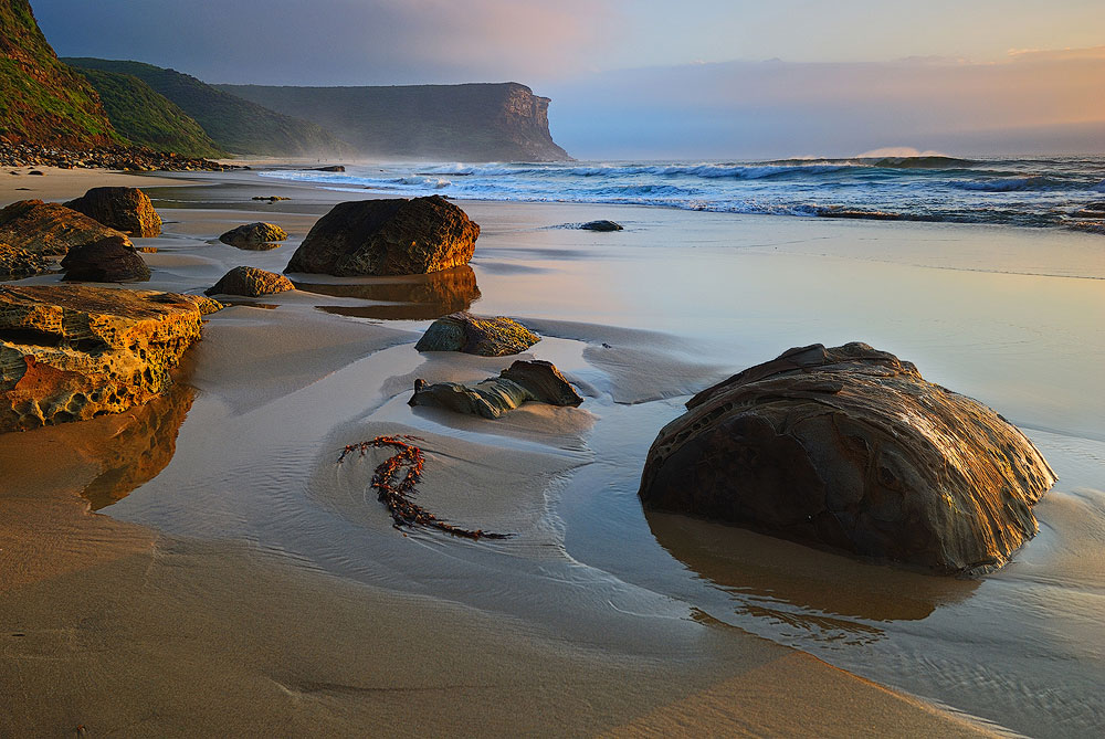
The bigger the object you include in the scene, the harder it is to balance it with something. Sometimes a massive rock on the foreground chokes the whole photo. So, the balance also applies to the object-to-scene relation.
场景中包含的对象越大,就越难用其他东西来平衡它。有时,前景中的一块巨大岩石会遮住整张照片。因此,平衡也适用于物体与场景的关系。
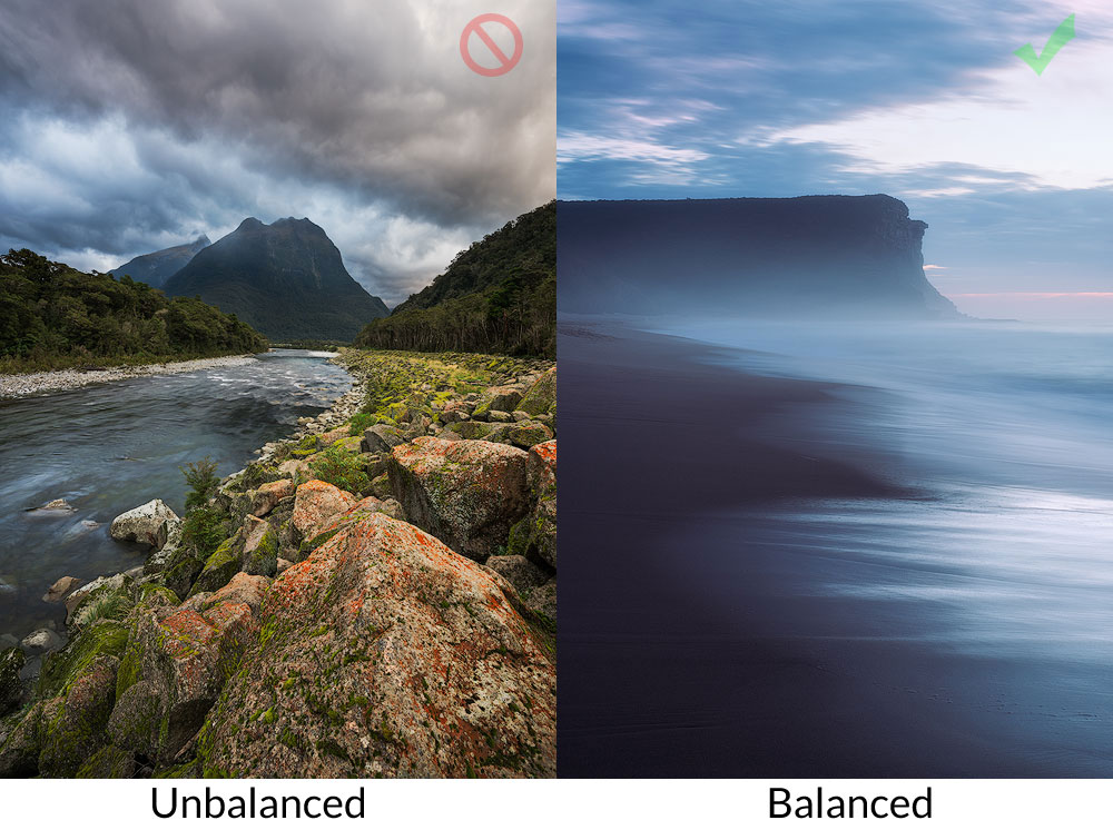
左图是不平衡的,因为底部的岩石太大,没有足够坚固的东西来平衡它。右侧的镜头非常平衡——与黑暗悬崖相对应的是明亮的反射。
Please note, this is important for understanding, balance is not opposite to dynamism. Balance is contrary to off-balance. The decision to make a balanced or unbalanced shot is entirely up to the creator as they have a different influence on the viewer.
请注意,这对于理解很重要,平衡并不与活力相反。平衡与失衡相反。进行平衡或不平衡镜头的决定完全取决于创作者,因为他们对观看者有不同的影响。

故意不平衡的照片增加危险感和规模
Static Balance 静态平衡
Static balance is created by the same or similar objects located at the same distance from the visual gravity centre of the frame. You can have a red cloud on one side and a robust dark tree on the other side, and they’ll balance each other.
静态平衡是由距画面视觉重心相同距离的相同或相似物体创建的。你可以在一侧有一朵红色的云,另一侧有一棵健壮的深色树,它们会相互平衡。
由云和对应漩涡形成的静态平衡
Dynamic Balance 动态平衡
Dynamic balance is created by two completely different in size objects positioned at different distances from the centre. Such difference establishes a balance.
动态平衡是由距离中心不同距离的两个大小完全不同的物体产生的。这种差异建立了一种平衡。
这个就比较难理解了。我们有黑暗的波浪和饱和的水。它们被饱和的天空所平衡。天空的色调较柔和,但由于更靠近边缘,因此起到了平衡作用。
你喜欢这些海景吗?查看海景摄影指南。
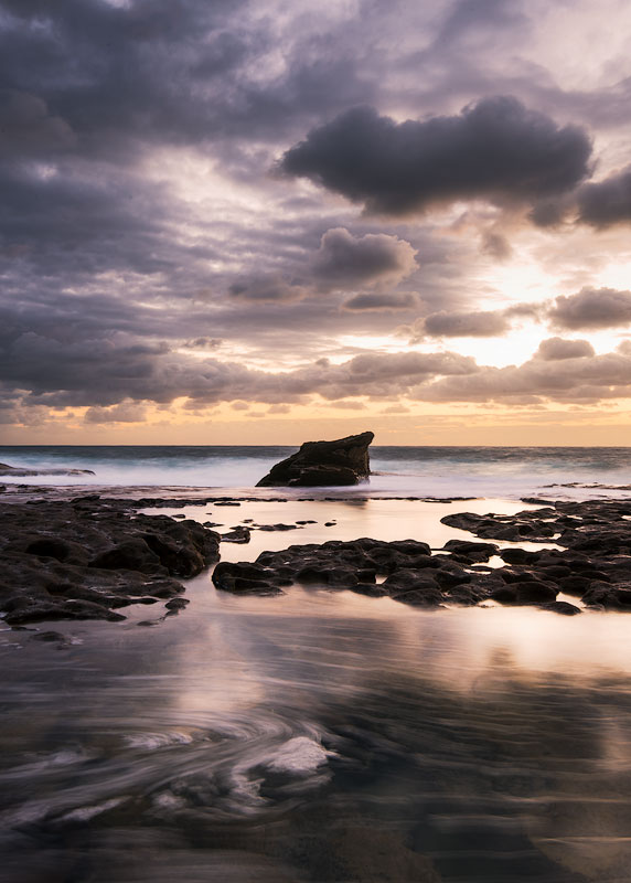
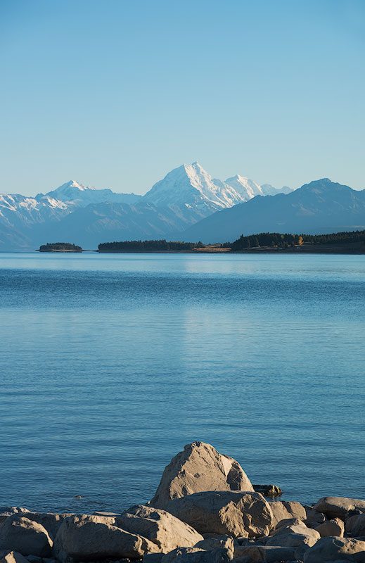
Foreground, Middle-ground and Background
前景、中景和背景
These “grounds” are a basic way to subdivide the photograph. This segregation is essential and must make its way into your subconscious. The photo is a transformation of the 3-d world into the 2-d image. As we project 3-d objects onto a level surface, they lose a whole dimension, and that’s why it is essential to use every single way to add volume and three-dimensionality back to it. The first thing is to have three layers of your photo – foreground (everything close to the photographer), background (the most distant objects, i.e. distant mountains and the sky) and middle ground (everything in between).
这些“背景”是细分照片的基本方式。这种隔离是必要的,并且必须进入你的潜意识。照片是 3D 世界到 2D 图像的转换。当我们将 3D 对象投影到水平表面上时,它们会失去整个维度,这就是为什么必须使用每种方法来为其添加体积和三维度。首先,你的照片要有三层——前景(靠近摄影师的一切)、背景(最远的物体,即遥远的山脉和天空)和中景(介于两者之间的一切)。
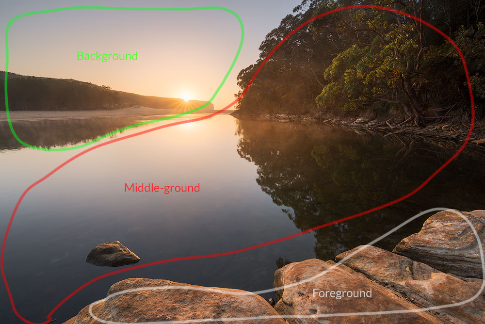
Why three layers? 为什么是三层?
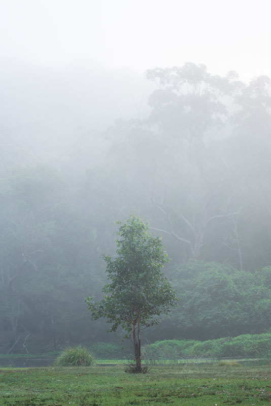
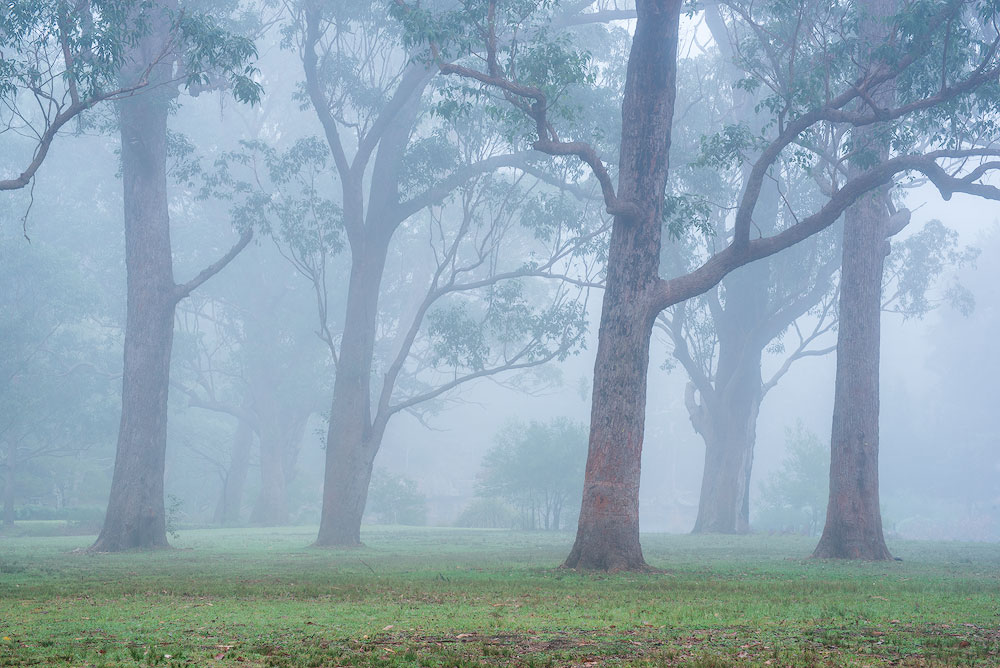
If we have just one layer, it may look flat and dull. If we have two, they could compete with each other. Three will allow the viewer to look smoothly deeper and deeper into the shot. However, take a telephoto lens and zoom heavily in the green hills with some trees and make a shot. There is just one distant plane with everything in it. This one is a special case, where it works. Another excellent example of the reduced number of layers is when the landscape is very graphical, like the foggy morning. In the photo where competition is part of the story, feel free to include two layers to emphasise it.
如果我们只有一层,它可能看起来又平又暗。如果我们有两个,他们就可以互相竞争。三将让观众能够顺利地越来越深入地观察镜头。但是,请使用长焦镜头,对有树木的绿色山丘进行大幅变焦并进行拍摄。遥远的地方只有一架飞机,里面装满了一切。这是一种特殊情况,但它确实有效。减少层数的另一个很好的例子是当风景非常生动时,比如有雾的早晨。在照片中,竞争是故事的一部分,请随意添加两层来强调它。
See more on Instagram
在 Instagram 上查看更多内容
具有两个级别的图形景观
Photo Layout Examples 照片布局示例
For instance, for a seascape, in a classical approach, you’ll include some distant cliffs and a sky as a background, the sea as a middle ground and the rocks or the beach as a foreground. Another way to approach it is to zoom in and have a wave as a foreground object with little to no middle ground. You could also go into the water and capture some water motion as a foreground.
例如,对于海景,在经典方法中,您将包括一些遥远的悬崖和天空作为背景,大海作为中景,岩石或海滩作为前景。处理它的另一种方法是放大并将波浪作为前景对象,几乎没有中间区域。您还可以进入水中并捕捉一些水的运动作为前景。
Composition Techniques 构图技巧
We made it through the composition concept and general implementation principles. Looks like, it’s time to go deeper and get to know the actual rules and techniques that you can implement for instant results. Some of the methods could seem to contradict each other but that only means you can’t use them both at the same time. I’ll tell you more; you don’t have to use anything out of these if your sense of harmony whispers against it. Listen to your heart and to the Harmony inside of you to produce the best images.
我们通过组合概念和一般实现原则来实现它。看起来,是时候更深入地了解可以实现立竿见影的实际规则和技术了。有些方法可能看起来相互矛盾,但这仅意味着您不能同时使用它们。我会告诉你更多;如果你的和谐感不利于你,你不必使用其中的任何东西。倾听你的内心和你内心的和谐,以产生最好的图像。
I have to warn you – none of these techniques will make you a great artist. Practice and study will. How many years do musicians study? How many out of them become composers? Not to mention being a great composer. That’s the whole point, in the current era of digital cameras and Photoshop, one can learn to produce good pics in less than a year. But it doesn’t mean those pics have a right and meaningful layout. 99% of photographers stop at the Rule of Thirds and Diagonals. Those two are enough to do OK shots and focus on editing, but there’s a whole science to master all of them.
我必须警告你——这些技术都不会让你成为一名伟大的艺术家。实践和学习意志。音乐家学习几年?他们中有多少人成为作曲家?更不用说成为一名伟大的作曲家了。这就是重点,在当今数码相机和 Photoshop 的时代,人们可以在不到一年的时间内学会制作好照片。但这并不意味着这些照片有正确且有意义的布局。 99% 的摄影师停留在三分法和对角线法则上。这两个足以完成不错的拍摄并专注于编辑,但掌握所有这些都需要一整套科学。
In this chapter, you will see a lot of layouts, grids and techniques. At the basic level, you’ll need to structure your photo in such a way that important lines are near the grid lines and the main subjects are somewhere near the intersection of the grid lines.
在本章中,您将看到很多布局、网格和技术。在基本层面上,您需要以这样的方式构建照片,即重要的线条位于网格线附近,而主要拍摄对象位于网格线交叉点附近的某个位置。
Important note: in landscapes, more often than not, the horizon is one of the significant lines that you should put somewhere near the grid line. But that isn’t always true, and the horizon can sometimes play a less critical role in the overall layout.
重要提示:在风景中,地平线通常是您应该放置在网格线附近的重要线之一。但情况并非总是如此,地平线有时在整体布局中发挥的作用不太重要。
Leading Lines 引导线
A leading line is a line that makes the viewer’s eyes follow it. It tells us a story, leads our eyes across the image and helps us to understand it. Essentially, every single line covered in this chapter is a leading line, it’s a basic concept of any composition. There are numerous ways to form a leading line. The most basic one is just some solid line, like a fence or a cliff face. The more advanced one is a broken line made of separate objects, which suggest a line between them. It’s better to have at least three objects for a more prominent repetition. We’ll cover the other advanced ways to form the leading lines later in this guide.
引导线是使观看者的眼睛跟随它的线。它告诉我们一个故事,引导我们的眼睛浏览图像并帮助我们理解它。本质上,本章涵盖的每一行都是一条引导线,它是任何作文的基本概念。形成引导线的方法有很多种。最基本的只是一些实线,例如栅栏或悬崖面。更高级的是由单独的对象组成的折线,这表明它们之间有一条线。最好至少有三个物体,以便更突出的重复。我们将在本指南后面介绍形成引导线的其他高级方法。
A critical note here: do not split the frame with a line in two. Most of all it applies to a vertical line in the middle of the shot. The lines should “stay” within the photo and shouldn’t lead the viewer’s eye out of the frame.
这里需要注意的是:不要用一条线将框架分成两部分。最重要的是,它适用于镜头中间的垂直线。这些线条应该“留在”照片内,并且不应该将观看者的眼睛引出画面。
Tension and Stability 紧张与稳定
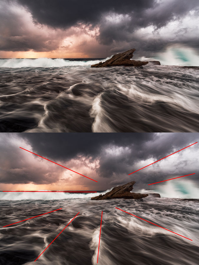
Lines, parallel to the edges (vertical and horizontal) add a sense of stability to the scene. Diagonals and triangles add dynamism and tension. Our eyes have a habit of seeing everything in horizontals and vertices. The land is horizontal, and the walls are vertical, that’s what we see all the time. The rectangle is the most used shape in the world. That’s why when we see a diagonal, we feel some tension as if we wanted to stabilise it, to prevent it from falling. Simultaneously, it adds volume to the picture. Triangle is a geometric shape that has multiple diagonals and a feeling of perspective hence adding even more dynamism. It is possible to build the entire picture made of triangles, and such an image will look dynamic and lively. In general, it’s a good idea to use geometric shapes in photography and triangle is the most dynamic of them.
与边缘(垂直和水平)平行的线条为场景增添了稳定感。对角线和三角形增添了活力和张力。我们的眼睛习惯于以水平和顶点的方式看待一切。土地是水平的,墙壁是垂直的,这就是我们一直看到的。矩形是世界上最常用的形状。这就是为什么当我们看到对角线时,我们会感到一些紧张,好像我们想稳定它,防止它掉落。同时,它增加了图片的体积。三角形是一种几何形状,具有多条对角线和透视感,因此增添了更多活力。可以用三角形来构建整个画面,这样的图像会显得动感活泼。一般来说,在摄影中使用几何形状是个好主意,而三角形是其中最具活力的。
由多个三角形组成的组合
Take this: vertical and horizontal lines add stability, diagonal lines add dynamism. The best part of it is that you can have any number of lines in your shot as long as they all play together. If you want a serene, calm, soothing photo, don’t add a lot of dynamics to it. If you want a lot of action and energy, add diagonals and triangles.
就拿这个来说:垂直和水平线增加稳定性,对角线增加活力。最好的部分是,你的镜头中可以有任意数量的台词,只要它们一起发挥作用即可。如果你想要一张宁静、平静、舒缓的照片,就不要添加太多的动态。如果您想要大量的动作和能量,请添加对角线和三角形。
主要线条都是垂直的,因此照片更加稳定
Diagonals 对角线
Creating diagonals is easy and straightforward. Diagonals are everywhere, always look to include some in your shot. A slight change of angle transforms a horizontal line into a diagonal, and the viewer will eagerly follow it with their eyes. Be careful, don’t let it lead the viewer out of the shot, make them wander within. The most obvious usage is to have some significant subject somewhere in depth of the shot and have a few diagonals leading right to it. The diagonals work best when they start from the corners.
创建对角线既简单又简单。对角线无处不在,总是要在你的镜头中加入一些对角线。轻微的角度变化就会将水平线变成对角线,观看者的眼睛会急切地追随它。 小心,不要让它把观众带出镜头,让他们在镜头内徘徊。最明显的用法是在镜头深度的某个地方放置一些重要的主题,并有几条对角线直接指向它。当对角线从角落开始时效果最好。
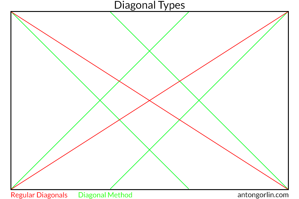
There are two ways to place diagonals in the image:
在图像中放置对角线有两种方法:
- The most obvious way is from one corner to another. This way we have only two lines in the end.
最明显的方法是从一个角落到另一个角落。这样我们最后就只有两行了。 - The so-called Diagonal Method suggests diagonal lines from each corner coming out at 45 degrees. This way we have four separate lines forming a rhombus in the centre. The critical fact here is that Diagonal Method does not give any additional value to the intersections and objects can be placed anywhere on four bisections. However, unlike other rules, this one is strict about putting elements precisely on the lines with next to none deviation.
所谓的对角线法建议从每个角以 45 度角画出对角线。这样我们就有了四条独立的线,在中心形成一个菱形。这里的关键事实是,对角线方法不会为交集提供任何附加值,并且对象可以放置在四个二等分上的任何位置。然而,与其他规则不同的是,这一规则严格要求将元素精确地放在线上,几乎没有偏差。
Ascending/Descending Diagonal
升序/降序对角线
The way the elements are organised within a shot affects how we perceive it. For the majority of people in the world, the eyes scan the picture left to right. That’s how we read and write and that’s how we look at things. Even if something drags our attention in the middle of the shot, we still go back and scan it left to right afterwards. In fact, I’ve heard some photographers dispute this concept, but I found it to be right at least for me. And that should be enough to mean it is right for some people.
镜头中元素的组织方式会影响我们对它的感知。对于世界上大多数人来说,眼睛从左到右扫描图片。这就是我们阅读和写作的方式,也是我们看待事物的方式。即使在拍摄过程中有什么东西吸引了我们的注意力,我们仍然会在拍摄结束后返回并从左到右扫描它。事实上,我听到一些摄影师对这个概念提出异议,但我发现它至少对我来说是正确的。这应该足以表明它适合某些人。
Ok, so what does it mean for the composition? Let’s assume we have a slope. We can show it in two ways – as a challenge, as a tough hill, someone should conquer, or as a smooth descent. Our body will react accordingly because we know both feelings – when we climb a tough hill or when we cycle down the road. Let’s take that slope and show both directions without any action on it.
好的,那么这对于构图意味着什么?假设我们有一个斜率。我们可以用两种方式来展示它——作为一个挑战,作为一个艰难的山峰,有人应该征服,或者作为一个平稳的下降。我们的身体会做出相应的反应,因为我们知道这两种感觉——当我们爬上一座艰难的山坡时,或者当我们骑自行车沿着路走时。让我们采用该斜率并显示两个方向,而不对其进行任何操作。
For me, the first one means a challenge, and the second one expects an easy walk. What about you? Another way to read this is to treat descending diagonal as “negative” and ascending as “positive”. Any diagonal is both ascending and descending depending on where the viewer start to “read” it.
对我来说,第一个意味着挑战,第二个则意味着轻松的步行。你呢?另一种解读方式是将下降对角线视为“负”,将上升对角线视为“正”。任何对角线都会上升和下降,具体取决于观看者开始“阅读”它的位置。
Storytelling Example 讲故事的例子
Getting back to the Storytelling for a bit as such a slope gives us an excellent example to fantasise. Let’s put a standing person somewhere within a picture. And let’s not add a moving person because his posture makes the direction of movement obvious.
回到讲故事的话题,这样的斜坡给了我们一个很好的幻想例子。让我们将一个站立的人放在图片中的某个位置。我们不要添加一个移动的人,因为他的姿势使移动的方向很明显。
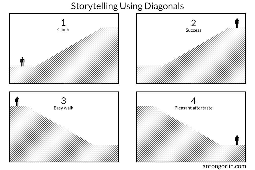
- The person is about to start a climb. A long way ahead.
这个人正要开始攀登。前面还有很长的路要走。 - The person has made it! He’s at the top!
这个人已经做到了!他在最顶端! - He is about to go down, an easy walk ahead.
他正要下去,前面很容易走。 - He’s at the bottom, and it was a pleasant stroll.
他在底部,这是一次愉快的漫步。
Now you see that an incline and the direction gives us a context and we can produce the story immediately.
现在您看到了倾斜度和方向为我们提供了背景,我们可以立即制作故事。
通过阅读我对人类感知格式塔感知的解释,了解更多心理学知识
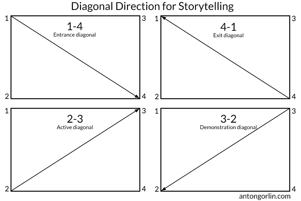
Diagonal Types 对角线类型
Here’s another take on the diagonal directions and their psychological meaning.
这是对角线方向及其心理意义的另一种看法。
讲故事的对角线方向
1-4 – Entrance diagonal. Good for the main hero to enter the frame.
1-4 – 入口对角线。有利于主要英雄进入画面。
4-1 – Exit diagonal. Likewise, showing a train going into the distance.
4-1 – 退出对角线。同样,显示一列火车驶向远方。
2-3 – Active diagonal. A good layout for the struggle to overcome like an uphill battle or a mountain climb.
2-3 – 活动对角线。对于像艰苦的战斗或爬山这样的斗争来说,这是一个很好的布局。
3-2 – Demonstration diagonal. Something is showing off, like a protest or a march.
3-2 – 演示对角线。有些事情正在炫耀,比如抗议或游行。
Take these into account when putting together your composition.
在组合你的作品时要考虑到这些。
Rule Of Thirds 三分法则
Let’s start with this one to clear it out of the way. Rule of Thirds is typically the first rule newbies get to know about the composition. It is a straightforward and natural way to subdivide the frame. We split the photo as the name states into thirds producing a simple grid. The rule says to put the main subject into one of the intersections. If you have several points of interest, put them into different intersections. Luckily, you have four of them. Such positioning allows for the smoother eye scanning. Also, don’t forget to put important lines onto the grid lines. In fact, this grid shows us where to put the elements so that they have some visual relation, but doesn’t tell us how to add dynamism, how to connect the planes, etc. It’s a simple two-dimensional layout.
让我们从这个开始,以清除它。三分法通常是新手了解构图的第一个规则。这是一种简单而自然的细分框架的方式。我们按照名称将照片分成三份,生成一个简单的网格。该规则要求将主要拍摄对象放在其中一个交叉点上。如果您有多个兴趣点,请将它们放在不同的交叉点上。幸运的是,你有四个。这样的定位可以使眼睛扫描更顺畅。另外,不要忘记将重要的线放在网格线上。事实上,这个网格告诉我们把元素放在哪里,让它们有一定的视觉关系,但没有告诉我们如何增加活力,如何连接平面等。这是一个简单的二维布局。
For the curious: Rule of Thirds originates from the Rabatment of Rectangle. This technique builds two squares for any aspect ratio rectangle. Believe it or not, for the regular 3:2 aspect ratio, this rabatment is precisely on the thirds.
好奇的是:三分法起源于矩形的拉巴特。该技术为任何长宽比矩形构建两个正方形。不管你相信与否,对于常规的 3:2 纵横比,这种旋转正好是三分之一。
Golden Rectangle 黄金矩形
Golden Ratio has a long history. I don’t want to go into the calculations because it has been calculated thousands of times by artists and scientists in the past. If you really want to, you can read more about it in Wikipedia. The application that we can use is similar to the Rule of Thirds. The grid lines do not split the frame into equal parts because they are closer to the centre. The rule originates from natural proportions, a lot of things are built around the golden ratio, including humans, to some extent.
黄金比例有着悠久的历史。我不想进行计算,因为过去艺术家和科学家已经计算了数千次。如果您确实愿意,可以在维基百科中阅读更多相关信息。我们可以使用的应用程序类似于三分法。网格线不会将框架分成相等的部分,因为它们更靠近中心。这个规则源于自然比例,很多东西都是围绕黄金比例建立的,某种程度上包括人类。
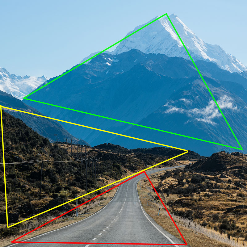
Golden Triangle 金三角
I’m not sure why this rule is called “Golden” as it has nothing to do with the Golden Ratio. Anyway, it’s easy to form the guidelines for it. Draw one diagonal from corner to corner and then draw two lines from the remaining corners so that they make 90 degrees angle with the main diagonal forming four triangles as a result. Like many others, this rule isn’t rigorous, and the objects you create should have a crude resemblance with the lines. Also, these triangles are not symmetrical, and you can flip it if you need to.
我不知道为什么这条规则被称为“黄金”,因为它与黄金比例无关。 不管怎样,制定指导方针很容易。从一个角到另一个角画一条对角线,然后从其余角画两条线,使它们与主对角线形成 90 度角,从而形成四个三角形。与许多其他规则一样,这条规则并不严格,您创建的对象应该与线条有粗略的相似之处。另外,这些三角形并不对称,如果需要,您可以翻转它。
Golden Spiral 黄金螺旋
Maths is amazing. When we look around, it may seem the world is chaotic and unorganised. But then we find yellow chamomile clearly showing spirals arranged with Fibonacci numbers. Or the human X chromosome inheritance tree also shows these numbers. Some galaxies are spiral, fetuses resemble it too. It’s fascinating to see a rule, which describes the way the world is organised.
数学真是太神奇了。当我们环顾四周时,世界似乎是混乱无序的。但随后我们发现黄色洋甘菊清晰地显示出按斐波那契数列排列的螺旋。或者人类X染色体遗传树也显示了这些数字。 有些星系是螺旋状的,胎儿也类似。看到一条规则是很有趣的,它描述了世界的组织方式。
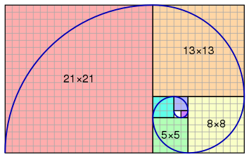
Golden Spiral is a self-repeating spiral shape with a constant growth ratio. Surely, no one will calculate these values precisely, especially when the sunset light is quickly fading. Luckily, this rule is not strict either, and the objects should roughly follow the spiral. Fibonacci numbers are one way to approximate the golden spiral. Lucas numbers are another. It doesn’t mean a lot to us, because the spirals look the same for the naked eye. Just follow the general principle.
黄金螺旋是一种具有恒定增长率的自我重复的螺旋形状。当然,没有人会精确计算这些值,尤其是在日落光线快速消退的情况下。幸运的是,这个规则也不严格,物体应该大致遵循螺旋线。 斐波那契数是近似黄金螺旋的一种方法。卢卡斯数是另一个。这对我们来说意义不大,因为肉眼看起来螺旋线是一样的。只要遵循一般原则即可。
The objects should form something resembling a spiral with a primary subject close to the small twisting point.
这些物体应该形成类似螺旋的形状,其主要主体靠近小扭曲点。
Golden Ratio – Myth Or Reality
黄金比例——神话还是现实
Every time I post anywhere about this ratio, I hear someone disagreeing. There is a lot of dispute about this topic. First of all, the golden ratio is believed to be at least 2400 years old. It is found in a lot of statues and even Pyramid of Giza. Of course, that doesn’t prove anything.
每次我在任何地方发布关于这个比例的文章时,我都会听到有人不同意。关于这个话题有很多争议。首先,黄金比例被认为至少有2400年的历史。它存在于许多雕像甚至吉萨金字塔中。当然,这并不能证明什么。
The main argument against it is saying that all humans are different, how can there be any constant harmony? That’s true, all human beings are different. But somehow we have that internal feeling – that guy has short fingers, the other one – long arms. What are we comparing to? We have that inner sense of harmony. And this ratio speaks Harmony. I believe there are some universal Harmony Rules and we have a candidate to describe this rule right here before us. No one is perfect, while the Golden Ratio describes perfect proportions.
反对的主要论点是,每个人都是不同的,怎么可能有持久的和谐呢?确实如此,所有人都是不同的。但不知何故,我们有一种内在的感觉——那个人的手指很短,另一个人的手臂很长。我们在比较什么?我们有那种内在的和谐感。这个比例讲的是和谐。 我相信存在一些普遍的和谐规则,并且我们有一个候选人来描述这个规则就在我们面前。没有人是完美的,而黄金比例描述了完美的比例。
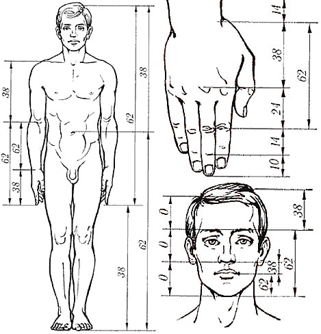
I feel that these ratios and rules correlate with a sense of Harmony I have built-in. And I have Leonardo da Vinci, Michelangelo, Raphael, Rembrandt, Salvador Dali, and others by my side and that’s quite a company.
我觉得这些比例和规则与我内在的和谐感相关。我身边有达芬奇、米开朗基罗、拉斐尔、伦勃朗、萨尔瓦多·达利和其他人,这是一个相当大的公司。
Side note – the absence of harmony can also be pleasing for the viewer. The conflict and dynamism attract attention.
旁注——缺乏和谐也能让观众感到愉悦。冲突和活力引起了人们的关注。
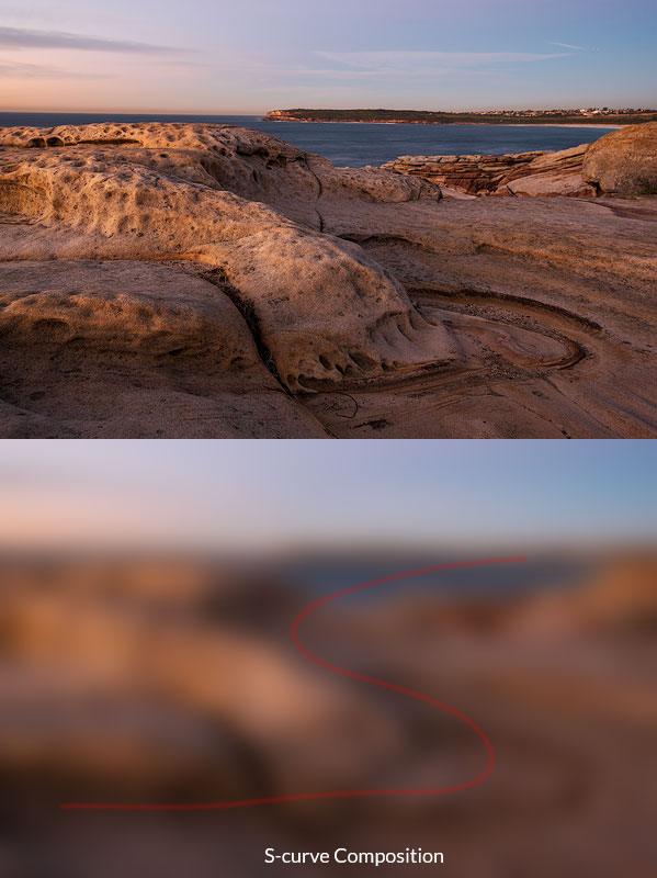
S-shaped Curve S形曲线
This shape is very dynamic and pleasing. It curves through the shot giving the ability to browse all parts and leading to the main subject. Unlike a diagonal, which is very direct and straightforward, the curve is more gentle and catchy. Such compositions look most natural, and the viewer has zero chance to escape the flow.
这个造型非常有动感,赏心悦目。它在镜头中呈曲线状,可以浏览所有部分并引导至主要拍摄对象。与非常直接和直接的对角线不同,曲线更加柔和和引人注目。这样的构图看起来最自然,观看者逃离流动的机会为零。
Continuous Curved Lines 连续的曲线
Such lines work particularly well for the S-shaped curve as well as any other rule. The general idea here is to keep the whole line within frame if possible. If the line goes beyond the frame edge, it stops being a good curve. You may think it’s still curved but that’s only your imagination and memory, it is unlikely the new viewer will recognise the original shape.
此类线条特别适用于 S 形曲线以及任何其他规则。这里的总体想法是如果可能的话将整条线保持在框架内。如果线条超出了框架边缘,它就不再是一条好的曲线。你可能认为它仍然是弯曲的,但这只是你的想象和记忆,新的观看者不太可能认出原来的形状。
Central Composition 中心构图
Every single guide to composition suggests for the reader to avoid central composition at all cost and put your subject into the grid intersections (using the Rule of Thirds, of course). But is it right? Absolutely not! You can safely put an object into the centre if the photo is about this subject solely and everything else is complimentary. As opposed to other rules, where we try to blend it into the scenery. Take this as a more centrist, egoistic approach. This composition, however, needs some strong composition lines pointing at your subject. It’s imperative to have just one subject (dark or having high contrast or saturation) for this type of shot so that it does not have to build relations with other objects. It must be the centre of gravity. Also, it’s nice to have some prominent symmetry around the subject.
每一篇构图指南都建议读者不惜一切代价避免中心构图,并将主题放入网格交叉点(当然使用三分法)。但这是对的吗?绝对不!如果照片仅与该主题有关并且其他一切都是免费的,那么您可以安全地将某个物体放在中心。与其他规则相反,我们试图将其融入到风景中。将此视为一种更中间派、更利己主义的方法。然而,这种构图需要一些强有力的构图线条来指向你的主题。对于这种类型的拍摄,必须只有一个主题(黑暗或具有高对比度或饱和度),这样就不必与其他对象建立关系。一定是重心。另外,围绕主题有一些突出的对称性也很好。
Another myth is that you shouldn’t put the horizon into the middle. This is true when foreground and background compete and are of equal weight. You can put it in the middle in the following cases:
另一个误区是你不应该把地平线放在中间。当前景和背景竞争且权重相等时,情况就是如此。在以下情况下可以将其放在中间:
-
- When one of the parts is significantly stronger than the other part. In this case, the visual centre will still be in a more massive part.
当其中一个部分明显强于另一部分时。在这种情况下,视觉中心仍将处于较大的部分。 - When the horizon is not one of your signature lines.
当地平线不是你的标志性线条之一时。
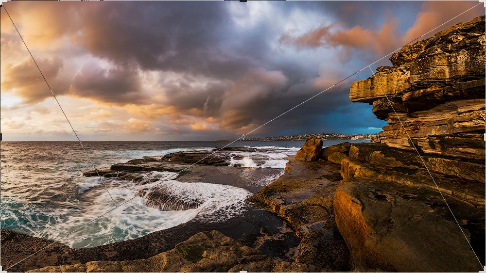
Horizon plays a secondary role here. The main leading line goes from the bottom right corner along the cliff edge and then continues into the clouds
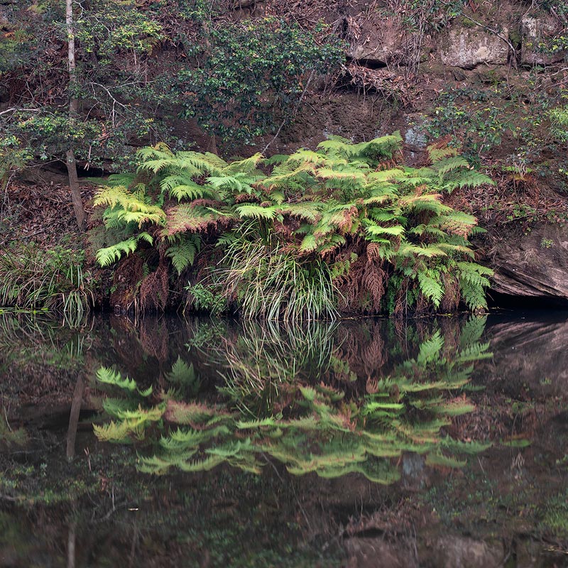
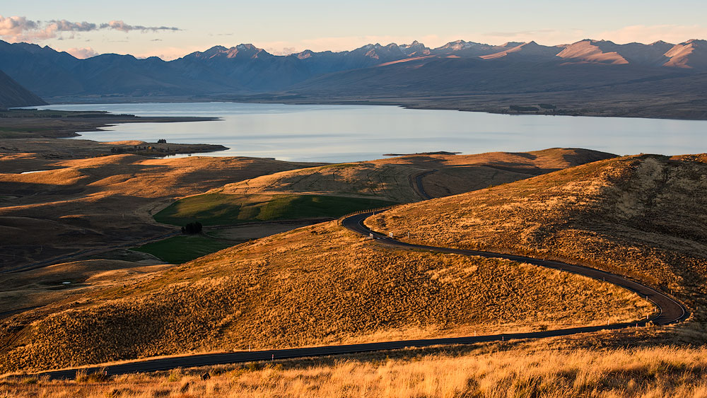
地平线在这里扮演次要角色。主要引导线从右下角沿着悬崖边缘继续延伸到云端 - Again, when you have symmetry. A good example would be a landscape with reflections.
再说一次,当你有对称性时。一个很好的例子是带有反射的风景。 - Panoramic shots. The prolonged shape of the pano adds weight to the bigger side. So, if you feel fine putting a horizon onto the top third for the regular 3 x 2 shot, the same approach for the pano makes the foreground overly heavy and chokes the whole photo. Put the horizon much closed to the centre.
全景拍摄。全景镜头的延长形状增加了较大一侧的重量。因此,如果您觉得在常规 3 x 2 镜头中将地平线放在顶部三分之一处没问题,那么同样的全景拍摄方法会使前景过于沉重并堵塞整张照片。将地平线置于离中心更近的位置。
- When one of the parts is significantly stronger than the other part. In this case, the visual centre will still be in a more massive part.
顺便说一句,这是关于日出摄影的全面快速指南
Symmetry 对称
Everyone knows what symmetry is. Look for it anywhere – architecture, reflections. Symmetry is closely related to the balance and to the way humans are made. Humans are symmetrical, and we have binocular vision, we have two parts of the brain, etc. Symmetry is everywhere. That’s why we tend to like it and to look for it. Symmetry is good for the central composition when the image is symmetrical relating to either vertical or horizontal line going through the image.
大家都知道什么是对称。在任何地方寻找它——建筑、倒影。对称性与平衡以及人类的构造方式密切相关。人类是对称的,我们有双眼视觉,我们有大脑的两个部分等等。对称无处不在。这就是为什么我们倾向于喜欢它并寻找它。当图像相对于穿过图像的垂直线或水平线对称时,对称性有利于中心构图。
Follow me on Instagram
在 Instagram 上关注我
Resemblance 相似
A very cool technique is to find a resemblance between entirely different objects. The key is to see similar shapes and accentuate them with the composition. Once you have noticed similarities, use other composition rules to build the photo. The more significant the difference between the objects the better is the visual effect. The resemblance could be straight or mirror; it can be of a different size but with the same shape. It’s fun to spot and a pure pleasure to photograph. The resemblance is somewhat similar to the Repetition (covered later in this article) but typically requires a more complex shape that is easy to distinguish between other forms.
一个非常酷的技术是找到完全不同的物体之间的相似之处。关键是看到相似的形状并通过构图突出它们。一旦您注意到相似之处,请使用其他构图规则来构建照片。物体之间的差异越显着,视觉效果越好。这种相似可以是直接的,也可以是镜像的;它可以具有不同的尺寸但具有相同的形状。发现很有趣,拍摄也很有趣。这种相似性与重复(本文稍后介绍)有些相似,但通常需要更复杂的形状,以便于区分其他形式。
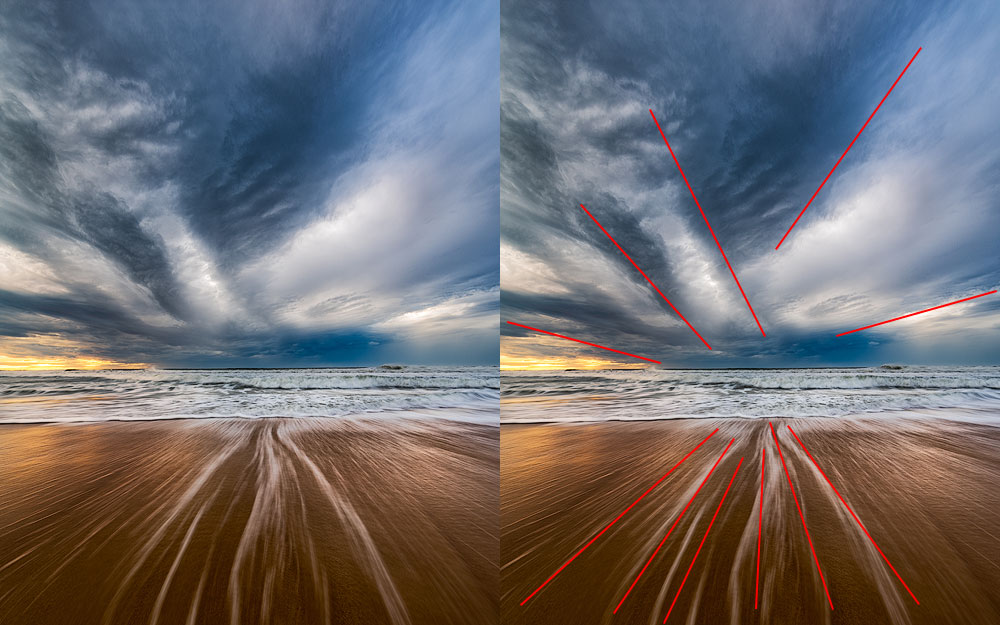
Radial Photography Composition
径向摄影构图
The radial composition is easy. In fact, it’s a sub-type of a diagonal composition with lots of lines and triangles. This particular shape has one main subject and a lot of lines pointing towards it. It is essential not to have any other centre of gravity or significant lines to make the effect even stronger. The whole layout resembles the Sun and the sun rays.
放射状构图很容易。事实上,它是具有大量直线和三角形的对角线构图的子类型。这种特殊的形状有一个主要主题和许多指向它的线条。重要的是不要有任何其他重心或重要的线条,以使效果更加强烈。整个布局类似于太阳和太阳光线。
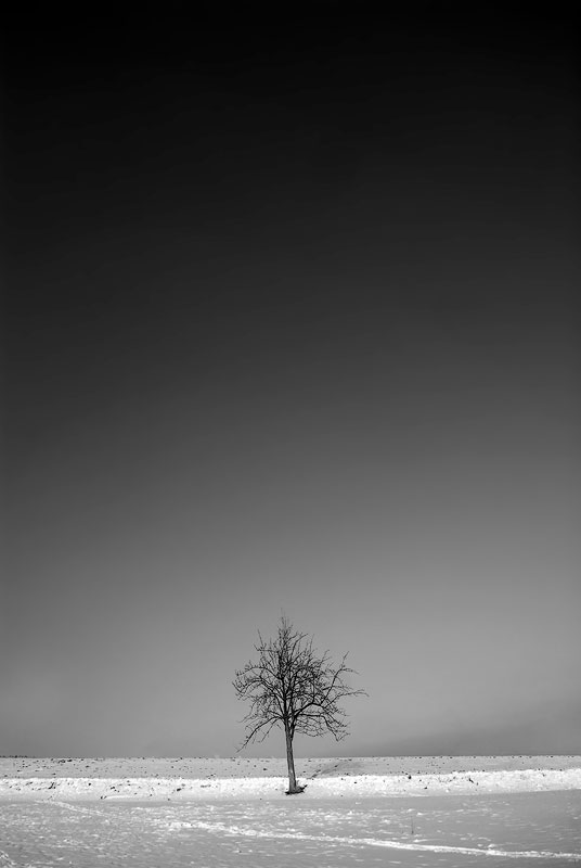
Negative Space 负空间
Remember how we discussed “Fill the frame” principle? This rule shatters the filling concept into pieces. We deliberately leave a lot of empty space around our hero to emphasise the feeling of the loneliness or emptiness or The Big Unknown or something similar. Sometimes, such a photograph can also convey a sense of the smallness of human. Negative space is the perfect example of breaking the rules tastefully.
还记得我们如何讨论“填充框架”原则吗?这条规则将填充概念打碎了。我们故意在英雄周围留下很多空白,以强调孤独或空虚或大未知或类似的感觉。有时,这样的照片也能传达出人的渺小感。负空间是优雅地打破规则的完美例子。
Rule Of Odds 赔率规则
The rule of odds suggests that we find an uneven number of objects in the photo more appealing than an even number. The reason for that is again stability vs dynamism. The even number of objects suggests balance and lack of movement and of course, the bigger the number, the harder to spread attention between all subjects. Also, two elements imply competition, opposition, and tension, or just a dialogue. Three elements convey a story and produce a dynamic balance. There is always something in the middle surrounded by other items thus giving a visual anchor.
赔率法则表明,我们发现照片中奇数数量的物体比偶数数量更有吸引力。其原因又是稳定性与活力。偶数数量的物体表明平衡和缺乏运动,当然,数量越多,就越难在所有主体之间分散注意力。而且,两个元素意味着竞争、对立和紧张,或者只是对话。三个元素传达一个故事并产生动态平衡。中间总是有一些东西被其他物品包围,从而提供视觉锚点。
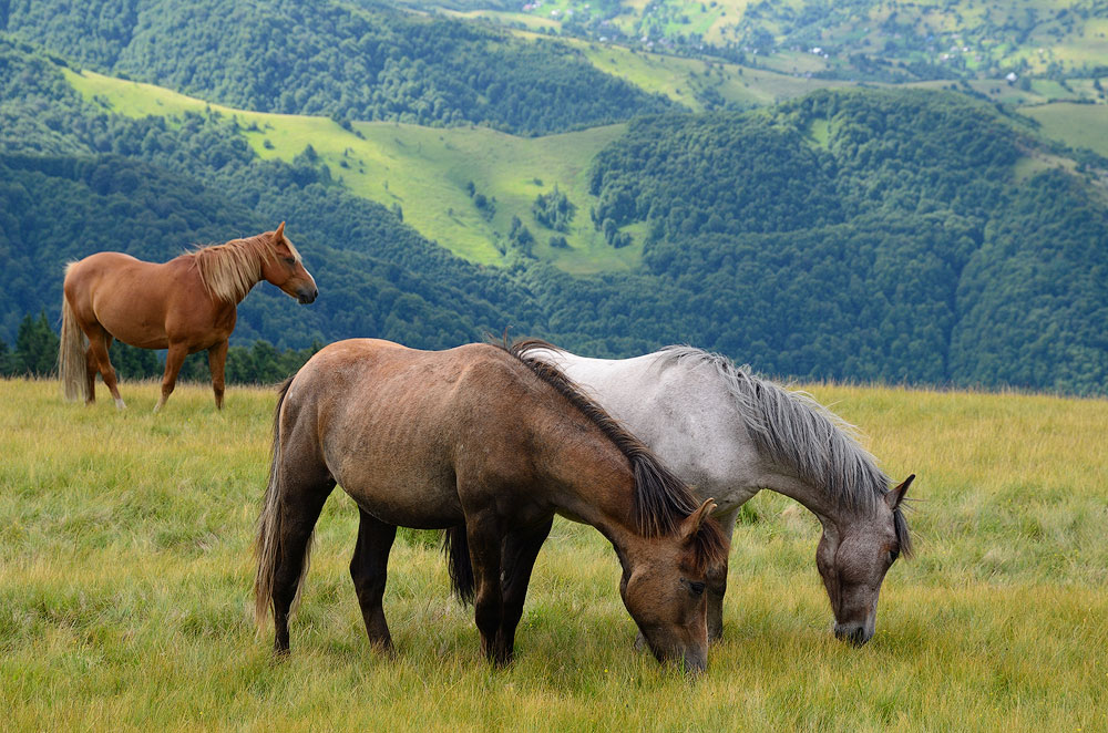
看着这张照片,我不断地思考马之间的关系,为什么其中一匹是分开的等等。这样的布局鼓励了一个故事。
The rule seems pretty simple but is it the case? Can I include five elements? Should I add 27 people in the crowd? It doesn’t make any sense, who will be counting? What if you have a wife and three kids making it four people in total? The answer is to arrange groups of elements. A group of items can create a single complex component of the composition. This way you can always end up with three objects in the photo.
规则看起来很简单,但事实果真如此吗?我可以包含五个元素吗?我应该在人群中添加 27 个人吗?没有任何意义,谁来数数?如果你有一个妻子和三个孩子,总共有四个人怎么办?答案是排列元素组。一组项目可以创建一个复杂的组合组件。这样,您始终可以在照片中看到三个对象。
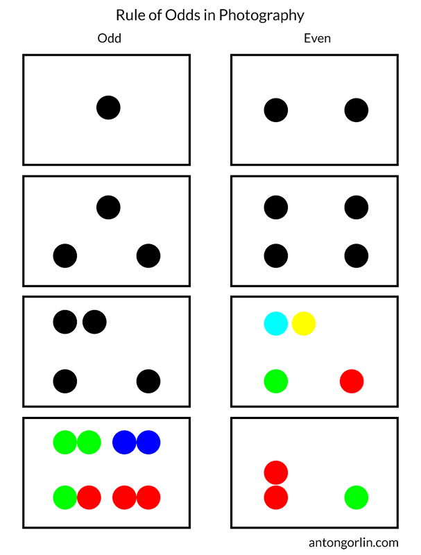
该图表只是为了让您大致了解其工作原理,并没有给出在每种情况下工作的详尽图片
I know, this last image will raise a lot of questions. The main idea here is that if you can visually group elements, they become a single element. It depends on the actual picture and visual weight of the items in it.
我知道,最后一张图片会引起很多问题。这里的主要思想是,如果您可以直观地对元素进行分组,它们就会成为单个元素。这取决于实际图片和里面物品的视觉重量。
Block/Unblock Area 封锁/解除封锁区域
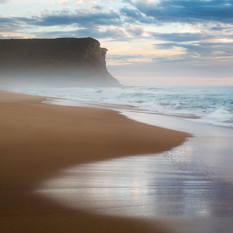
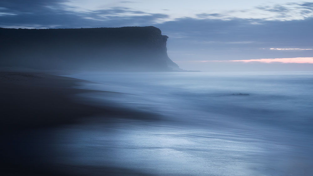
This rule is a bit related to the breathing space. Remember, it’s when you should leave an open space around the object without stuffing it near the edges. This rule is about creating closed (blocked) or open (unblocked) areas in the image. The two examples below show both. Open space allows the flow into infinity; the closed area keeps us inside of the area. The desired effect you want to achieve dictates how you need to compose a shot. Open space is optimistic and encourages us to get out of the current state, to move towards the future. The closed area is stable and dependable, and it prompts to stay and think, to recap.
这个规则和呼吸空间有点关系。请记住,此时您应该在物体周围留出一个开放空间,而不是将其塞在边缘附近。该规则是关于在图像中创建封闭(阻挡)或开放(未阻挡)区域。下面的两个例子展示了两者。开放的空间让流动进入无限;封闭区域使我们处于该区域内。您想要达到的预期效果决定了您需要如何构图。开放空间是乐观的,鼓励我们摆脱现状,走向未来。封闭的区域是稳定可靠的,它促使人们留下来思考、回顾。
由于悬崖之间有间隙,该区域是开放的或畅通的
The wrong area type can ruin the shot. For instance, you have a dynamic and lively seascape with a rushing wave. The closed area in this case could choke it, stop and cut the action. Sometimes, this effect is not strong enough to actually ruin anything but it affects the mood, and you should consider it.
错误的区域类型可能会毁掉镜头。例如,您有一个充满活力和活力的海景,波涛汹涌。在这种情况下,封闭区域可能会使其窒息、停止并切断其动作。有时,这种效果并没有强大到足以真正破坏任何东西,但它会影响情绪,你应该考虑它。
The ways to create a “closed” shot:
创建“封闭”镜头的方法:
- The main lines end inside of the picture.
主线在画面内部结束。 - The main lines enclose the area of the frame. It could be an arch or some other sort of enclosing.
主线包围了框架的区域。它可能是一个拱门或某种其他类型的封闭物。 - When the area is closed to start with, for instance, an interior.
例如,当该区域从室内开始关闭时。
An open area encourages the viewer to travel beyond the edge, to elongate the image and to ponder about the unknown.
开放的区域鼓励观看者超越边缘,拉长图像并思考未知。
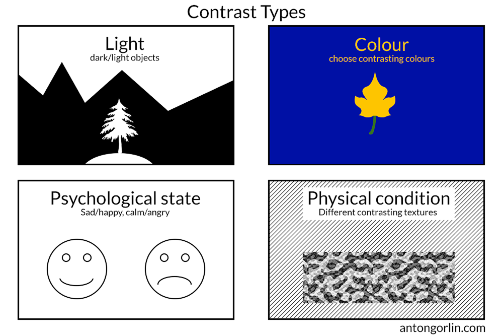
Contrast 对比
One of the fundamental and most important techniques is to implement a contrast. It’s a very expressive method to have some conflict, some contrast between the objects within a frame. Some contrast examples would be:
基本且最重要的技术之一是实现对比。在框架内的对象之间产生一些冲突和对比是一种非常富有表现力的方法。一些对比示例是:
- Light (dark/light objects)
光(暗/亮物体) - Colour (cold/warm or any opposing pair)
颜色(冷色/暖色或任何相反的颜色) - Psychological condition (happy/sad)
心理状况(快乐/悲伤) - Physical condition (relaxed/tense, smooth/rugged)
身体状况(放松/紧张,平稳/崎岖) - Part-to-whole relation. 部分与整体的关系。
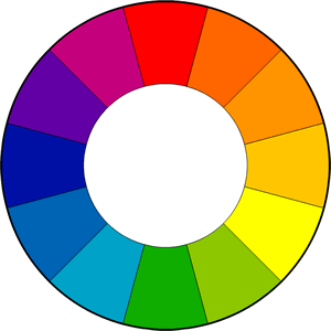
Regarding the colour contrast and colour theory in general – I’ve made a hard decision to leave it all out of this guide as it would add another couple of thousands of words to this guide having a quite distant relation to the composition. Colour theory may make another guide one day if the need arises. I’ll just mention one thing – the colour wheel so that you know which colours are making a contrast (they are opposite to each other on the wheel):
关于一般的色彩对比度和色彩理论——我做出了一个艰难的决定,将其全部排除在本指南之外,因为它会在本指南中添加另外几千个单词,与构图有相当远的关系。如果需要的话,有一天颜色理论可能会成为另一种指南。我只想提一件事——色轮,这样你就知道哪些颜色形成对比(它们在色轮上彼此相反):
Subject Isolation 主体隔离
The traditional perspective for the isolation is the shallow depth of field. This way the subject is separated from the rest of the objects around it. It’s widely used in the portrait, wildlife, and macro photography. You need to have the main hero in focus with everything else out of focus. The best way to achieve this is either open aperture on your lens or longer focal length or both.
隔离的传统观点是浅景深。这样,主体就与其周围的其他物体分开了。它广泛用于肖像、野生动物和微距摄影。你需要让主要英雄处于焦点,而其他一切都处于焦点之外。实现这一目标的最佳方法是在镜头上打开光圈或更长的焦距或两者兼而有之。
This approach hardly can be applied to the landscape photographer. However, there is another implementation that we can use. The other ways to isolate an object are:
这种方法很难适用于风景摄影师。但是,我们可以使用另一种实现。隔离对象的其他方法是:
- Framing. Use some frame to separate an object from the rest of the world.
框架。使用一些框架将物体与世界的其他部分分开。 - Figure-To-Ground Relation. Use some sort of colour contrast on the background for the perfect isolation.
图形与地面的关系。在背景上使用某种颜色对比以获得完美的隔离。
Framing 框架
You need to find something that could form a frame around your main subject. You can use cliffs, tree branches, keyhole, broken fence, anything. It adds another dimension to the photo and adds context. Frame within frame gives an extreme accent to the centre. Also, more often than not, this type of composition works excellent with symmetrical shapes and central composition.
你需要找到一些可以围绕你的主要主题形成框架的东西。你可以使用悬崖、树枝、钥匙孔、破损的栅栏,任何东西。它为照片添加了另一个维度并添加了背景。框架内的框架给中心带来了极端的强调。而且,这种类型的构图通常非常适合对称形状和中心构图。
Figure-To-Ground Relation
图形与地面的关系
I could explain the whole concept with just a single image:
我可以用一张图片来解释整个概念:
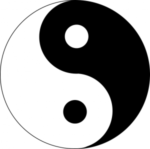
Just how easy is it to see the white on black and the black on white? That’s all about the figure/ground relation. To make the main subject stand out, we need to separate it from the background.
看到黑底白字和白底黑字有多容易?这就是图形/背景关系的全部内容。为了突出主体,我们需要将其与背景分开。
You can use either of the methods from the Contrast chapter plus a new one: Sharp/blurred condition. The most commonly used way is to blur the background. However, I’ve seen good examples with the blurred foreground. Especially, in reporting. With this type of separation, you may still need one of the other types to have the best result.
您可以使用“对比度”一章中的任一方法以及一个新方法:锐利/模糊条件。最常用的方法是模糊背景。然而,我见过一些前景模糊的好例子。尤其是在报道方面。对于这种类型的分离,您可能仍然需要其他类型之一才能获得最佳结果。
我打赌你立刻就注意到了那个人。想象他在黑暗的背景下。
Repetition 重复
The repetition is obvious. Something is being repeated over and over again, like a row of marching soldiers. The repetition typically consists of the same elements. Our eyes tend to follow the lines and rest while browsing such photos. However, simple repetition is relatively dull. It may work well for some interior picture, which serves to create atmosphere and shouldn’t take a lot of time to contemplate. It also works well as a subsidiary technique complementing the other elements in the picture.
重复是显而易见的。有些东西一遍又一遍地重复着,就像一排行进的士兵。重复通常由相同的元素组成。在浏览此类照片时,我们的眼睛倾向于跟随线条并休息。然而,简单的重复是比较枯燥的。它可能适用于一些室内图片,它可以用来营造气氛,并且不应该花费很多时间来思考。它也可以作为补充图片中其他元素的辅助技术。
Rhythm 韵律
I must admit, I stumbled upon this topic and was stuck for over a week. I’ve browsed numerous articles and books to no avail. The vast majority of material passing a repetition off as a rhythm. Of course, that is true but at an elementary level. It’s so much more than this!
我必须承认,我偶然发现了这个话题,并被困了一个多星期。我浏览了很多文章和书籍,但无济于事。绝大多数材料都将重复当作节奏。当然,这是事实,但只是初级水平。远不止这些!
Acoustic Rhythm 原声节奏
We are not used to seeing and understanding visual rhythms beyond apparent repetitions. Therefore it’s easier to explain in other terms. Imagine a piece of music made up of a single beat repeated over time, same beat, same silences in between. Does it sound like music? Does it sound any interesting at all? It’s boring.
我们不习惯看到和理解超越明显重复的视觉节奏。因此,用其他术语来解释会更容易。想象一首音乐,由随时间重复的单一节拍、相同的节拍、中间相同的沉默组成。听起来像音乐吗?听起来很有趣吗?这很无聊。
Let’s make it a little more interesting. Make every third silence twice bigger. It becomes rhythmic instantly! Now modify one of the beats to be different, we now have two rhythms at the same time. It’s easier to understand than to explain.
让我们让它更有趣一点。让每三次沉默变得两倍。瞬间就有节奏了!现在将其中一个节拍修改为不同的,我们现在同时有两种节奏。理解比解释更容易。
Rhythm Definition 节奏定义
Simply saying, the rhythm is a recurring pattern of elements differentiating by strong or weak elements or varying conditions. This definition means, to form a rhythm, you need something repeating over time, and the repetition itself should create a pattern. You can build multiple rhythms in a single shot, and that makes a photo even more interesting.
简单地说,节奏是元素的重复出现模式,根据强弱元素或不同的条件进行区分。这个定义意味着,为了形成节奏,你需要随着时间的推移重复一些东西,而重复本身应该创造一种模式。您可以在一次拍摄中构建多种节奏,这使照片变得更加有趣。
Rhythm In Photography 摄影中的节奏
For example, a simple repetition of lines is a very sketchy rhythm. A repetition with decreasing length is already more appealing than a bunch of similar objects. Another modification to the initial example of repeating lines is to add a few longer gaps (also repeated over some intervals). Think of it as music. Would your pattern form a nice sounding beat?
例如,简单的线条重复就是一种非常粗略的节奏。长度逐渐减少的重复已经比一堆相似的物体更有吸引力。对重复行的初始示例的另一个修改是添加一些较长的间隙(也在某些间隔内重复)。把它想象成音乐。你的模式会形成听起来不错的节拍吗?
The rhythm shouldn’t be overly graphical and have exact shapes and sizes. The objects could have same direction (trees) or colours (berries in the field) or shapes(shadows). The eye should be able to perceive the resemblance and easily extend a visual pattern beyond the photo frame.
节奏不应该过于图形化,并且具有精确的形状和大小。这些对象可以具有相同的方向(树木)或颜色(田野中的浆果)或形状(阴影)。眼睛应该能够察觉到相似之处,并轻松地将视觉图案延伸到相框之外。
你在这里看到多少种节奏?
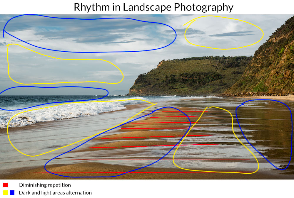
You can build a rhythm around the lines, objects, groups of objects, colours, tones, flares, light and dark areas, etc. Anything goes. Rhythm is a repetition that encourages the eye to move in a particular direction.
您可以围绕线条、物体、物体组、颜色、色调、耀斑、明暗区域等建立节奏。一切都可以。节奏是一种重复,鼓励眼睛朝特定方向移动。
Breaking the Rhythm 打破节奏
Sometimes we can incorporate our main subject into the rhythm, or it can itself be the rhythm. In other cases, we have some other type of subject, which is not strong enough to stand out. In this case, we need to break the rhythm to accentuate the subject. The other reason to break it is to draw attention to the imperfection or to make the viewer stumble and take a closer look at the picture.
有时我们可以将我们的主题融入到节奏中,或者它本身就是节奏。在其他情况下,我们有一些其他类型的主题,但其强度不够突出。在这种情况下,我们需要打破节奏来突出主题。打破它的另一个原因是为了引起人们对缺陷的注意,或者让观看者绊倒并仔细观察图片。
Depth Of Field 景深
The depth of field is a physical parameter of the photography process, and it dramatically affects your final shot. The general rule says that whatever you have in focus is the most important part of the photo, the blurred part makes a context or adds a nuance.
景深是摄影过程的一个物理参数,它极大地影响您的最终拍摄。一般规则是,无论焦点是什么,都是照片中最重要的部分,模糊的部分会产生背景或增加细微差别。
The usual approach for the landscape is to have everything in focus. For the portrait, macro, etc – the have a background blurred. For the landscape, however, sometimes it makes sense to have the foreground blurred to increase the sense of volume. This little trick is often used in cinema, for example.
景观的通常方法是让一切都聚焦。对于肖像、微距等,背景会变得模糊。 然而,对于风景来说,有时模糊前景以增加体积感是有意义的。例如,这个小技巧经常在电影中使用。
Linear Perspective 线性透视
The converging lines create Linear perspective. Our brain knows that they are parallel in reality, but they seem to point to a single vanishing point in the distance. In landscape, it’s the horizon. And such effect forces us to perceive the picture as three-dimensional. This type of perspective is the most natural and prominent and easy to create. The further the starting points in the picture are, the better effect it produces. I.e., two lines starting at the bottom edges are stronger than those beginning near the middle of the bottom edge.
汇聚的线条创造出线性透视。我们的大脑知道它们实际上是平行的,但它们似乎指向远处的一个消失点。在风景中,它是地平线。这种效果迫使我们将图片视为三维的。这种透视法是最自然、最突出、最容易创造的。图片中的起点越远,产生的效果就越好。即,从底部边缘开始的两条线比从底部边缘中间附近开始的两条线更强。
Another trick to enhance linear perspective is to include similar subjects which go into the distance. Their size decreases, and we perceive it as depth.
增强线性透视的另一个技巧是包含远处的相似主题。它们的尺寸减小,我们将其视为深度。
Tonal and Aerial Perspective
色调和空中视角
The way we perceive the reality is inevitably connected with masses of air between our eyes and different objects. The atmosphere is never wholly transparent hence it affects distant objects more than those closer to us. Often, people tend to mix up things and make tonal and aerial perspective synonyms, which is incorrect.
我们感知现实的方式不可避免地与我们的眼睛和不同物体之间的空气质量有关。大气从来都不是完全透明的,因此它对远处物体的影响比对近处物体的影响更大。通常,人们倾向于混淆事物,并将色调和空气透视视为同义词,这是不正确的。
The perspective has following properties:
透视图具有以下属性:
- The clarity and sharpness gradually decrease with depth.
清晰度和清晰度随着深度的增加而逐渐降低。 - The saturation also decreases and the colours whiten with distance.
随着距离的增加,饱和度也会降低,颜色也会变白。 - The contrast fades and softens.
对比度逐渐减弱并变得柔和。 - The objects in the distance seem to be lighter than those on the foreground.
远处的物体似乎比前景的物体更轻。
So, the less saturation and clarity the objects, the further away it seems to be. The perspective instantly adds volume to the photograph making it 3-d.
因此,物体的饱和度和清晰度越低,看起来距离就越远。透视立即增加了照片的体积,使其成为 3D 效果。
The pictures, where distant objects have the same clarity and saturation as the closer ones, could look flat and those objects would look closer than they are.
这些图片中,远处的物体与近处的物体具有相同的清晰度和饱和度,这些图片可能看起来很平坦,而这些物体看起来会比实际情况更近。
Aerial Perspective 空中视角
The worst light for revealing aerial perspective is the front light when the Sun is directly behind the photographer. The Sun brightens every object, and because solid objects have significant weight, they become much brighter than the possible haze out there, making it nearly invisible.
当太阳直接位于摄影师后面时,显示空中透视效果最差的光线是前光。太阳照亮了每一个物体,并且由于固体物体具有很大的重量,它们变得比那里可能存在的雾霾亮得多,使其几乎看不见。
The best light is backlight for it brightens the little particles flying in the air while most objects have their dark side pointed towards the camera. This contrast increases and the haze becomes more prominent.
最好的光线是背光,因为它照亮了空气中飞行的小颗粒,而大多数物体的黑暗面都指向相机。这种对比度增加,雾霾变得更加突出。
Tonal Perspective 色调视角
Let’s assume we shoot inside of the building or in a place with the limited depth of field. There is not enough air to produce any sort of haze. Or it can be a perfectly crisp and transparent autumn day. There is no way to have an aerial perspective. However, we can achieve the same result by using tones or colours. Put darker objects on the foreground and brighter objects in the background, and you immediately have a perspective. This is a tonal perspective, and also this leads us to the conclusion that aerial perspective is a sub-type of the tonal perspective.
假设我们在建筑物内部或景深有限的地方拍摄。没有足够的空气来产生任何形式的雾霾。或者它也可以是一个完全清爽透明的秋日。没有办法获得空中视角。然而,我们可以通过使用色调或颜色来达到相同的结果。将较暗的物体放在前景中,将较亮的物体放在背景中,您会立即获得透视效果。这是一种色调透视,这也让我们得出这样的结论:空中透视是色调透视的一个子类型。
How To Manipulate Perspective
如何操纵视角
| How To Strengthen Perspective 如何加强视角 |
How To Weaken Perspective 如何削弱视角 |
|---|---|
| Choose a point of view with distance visible 选择距离可见的视点 |
Choose a low viewpoint so that there is no middle-ground and the planes are disconnected 选择较低的视点,这样就没有中间地带并且平面被断开 |
| Use a wide-angle lens with a prominent foreground object 使用广角镜头拍摄突出的前景物体 |
Use a telephoto lens from the distance 从远处使用长焦镜头 |
| Use side light 使用侧光 | Use front light 使用前灯 |
| Include haze or fog in the distance, decrease saturation with depth 包括远处的薄雾或雾,随着深度的增加饱和度降低 |
Equalise tones across the image, use UV filter to get rid of haze. Overdo Clarity slider. 均衡图像的色调,使用紫外线滤镜消除雾霾。过度清晰度滑块。 |
| Brighten image with depth, i.e., make the foreground dark, middle-ground brighter, the background even brighter 对图像进行深度提亮,即前景变暗,中景变亮,背景更亮 |
Equalise brightness across the image. 均衡整个图像的亮度。 |
Patterns 图案
Just like the Rhythm, the pattern is based on repetition. The difference is that it does not encourage eye movement in any particular direction. It’s more related to the area it covers. The strong sides of the pattern are its geometry and continuation. If we cannot see the border of the pattern, then we assume it stretches on and on beyond the frame. The further away we move from the pattern element, the more they visually blend up until that moment when we can no longer distinguish each element. At this time they become a texture. So, for the pattern, we must be able to separate a single item from all others, and there should be some repetition. Typically, the objects should be grouped close to each other to form a pattern.
就像节奏一样,该模式基于重复。不同之处在于它不鼓励眼球向任何特定方向移动。和它所覆盖的区域关系更大。该模式的优势在于其几何形状和延续性。如果我们看不到图案的边界,那么我们就假设它一直延伸到框架之外。我们距离图案元素越远,它们在视觉上就越混合,直到我们无法再区分每个元素的那一刻。这时它们就变成了纹理。因此,对于模式,我们必须能够将单个项目与所有其他项目分开,并且应该有一些重复。通常,对象应彼此靠近分组以形成图案。
Break The Pattern 打破模式
There is a way to accentuate one particular object among all others. For this, we should break the pattern. You can do it in many ways. Use a different colour, size, alignment, anything that goes out of order with the rest of the elements in the pattern. And such imperfection immediately drags attention to the rebel.
有一种方法可以在所有其他对象中突出一个特定对象。为此,我们应该打破这个模式。您可以通过多种方式做到这一点。使用不同的颜色、大小、对齐方式以及任何与图案中其他元素不相符的内容。这种不完美立即引起了人们对叛逆者的关注。
Photography Composition Building Blocks
摄影构图构建块
Ok, now it’s all clear what’s the final shape and composition to pursue. But how to build it? What are the building blocks? In this chapter, I will outline the building blocks of the grey give some examples and hopefully give you some new ideas and gotchas.
好吧,现在我们已经清楚要追求的最终形状和构图是什么了。但如何构建它呢?构建模块是什么?在本章中,我将概述灰色的构建块,并给出一些示例,希望能给您一些新的想法和陷阱。
Important: you can easily combine elements and use various building blocks within a single composition.
重要提示:您可以轻松组合元素并在单个组合中使用各种构建块。
Solid Lines 实线
The most obvious composition element is a solid line. It can be anything – a wall, a rock, a crack, a tree. Anything solid and continuous. Due to the perspective, parallel lines converge at infinity, so, any parallel lines form diagonals in the photo.
最明显的构图元素是实线。它可以是任何东西——一堵墙、一块岩石、一条裂缝、一棵树。任何坚固且连续的东西。由于透视的原因,平行线会在无穷远处汇聚,因此任何平行线都会在照片中形成对角线。
Suggested And Broken Lines
建议和虚线
Unless you have an OCD for perfection, you can efficiently use suggested or broken lines. As we know from the elementary maths, there is only one possible line between two points in space. I know this, you know this, our eyes know this. We tend to find patterns and regularities and imagine them where we can’t find any. When we see two objects, we draw an imaginary line between them. Where there are three objects, there is a curve or a triangle.
除非你有完美的强迫症,否则你可以有效地使用建议线或折线。正如我们从初等数学中知道的那样,空间中两点之间只有一条可能的直线。我知道这一点,你知道这一点,我们的眼睛知道这一点。我们倾向于寻找模式和规律,并在找不到的地方想象它们。当我们看到两个物体时,我们会在它们之间画一条假想的线。当有三个物体时,就会有一条曲线或一个三角形。
Direction Using Sight/Movement
使用视线/移动来确定方向
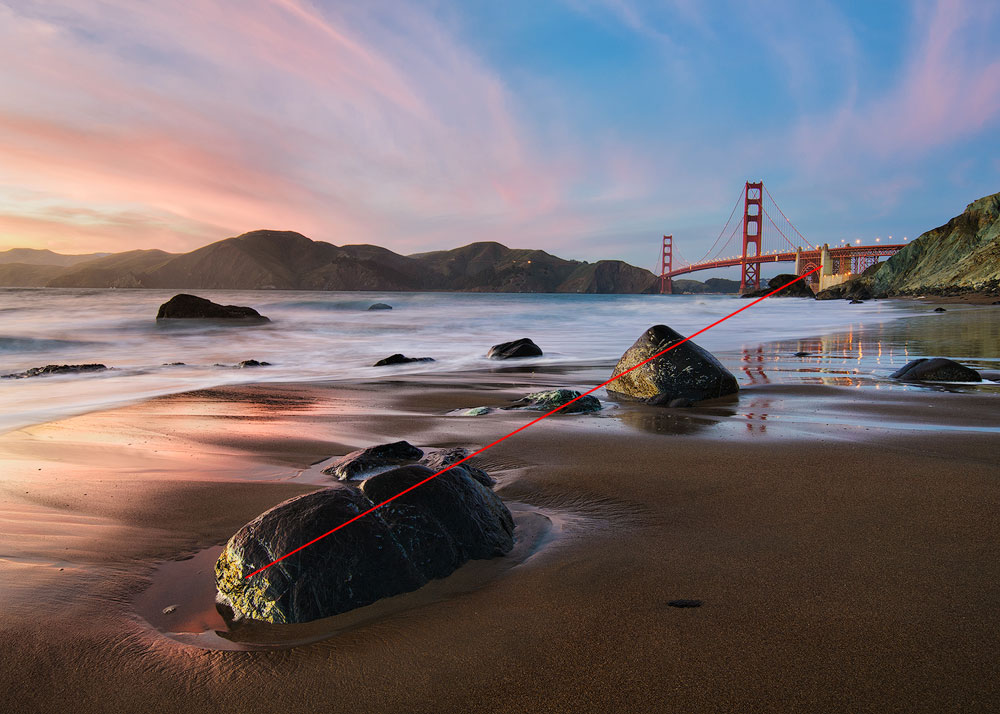
There is a convenient trick, which is somewhat related to the suggested lines. If there is eyesight or a prominent movement, our brain tends to prolong and extend it. So, eyesight or a movement form very strong composition lines. It’s even strong enough to connect planes or form a diagonal. One important note here is to give enough breathing space for the direction of the eyesight.
有一个方便的技巧,它与建议的线路有些相关。如果有视力或显着的运动,我们的大脑往往会延长它的时间。因此,视线或动作形成非常强烈的构图线。它的强度甚至足以连接平面或形成对角线。这里的一个重要注意事项是为视线方向提供足够的呼吸空间。

他们没有向黄貂鱼发射激光,我将视线显示为构图对角线
If, for instance, a person moves or looks towards the edge of the frame, it causes depressing feeling, sadness, hopelessness. Feels like a dead end, end of story.
例如,如果一个人向画面边缘移动或看向画面边缘,就会导致压抑、悲伤、绝望的感觉。感觉就像是一个死胡同,故事的结局。
Visual Masses 视觉质量
As I have already said in the Balance section of the article, the fundamental balance elements are visual masses. In fact, anything on the photo resembles some visual mass. Unlike regular mass, it’s much less related to the weight. It’s more about the prominence and visual strength.
正如我在文章的平衡部分已经说过的,基本的平衡元素是视觉质量。事实上,照片上的任何东西都类似于某种视觉质量。与常规质量不同,它与重量的关系要小得多。更多的是关于突出度和视觉强度。
- Colour saturation. The saturated area carries more weight than a pale one.
色彩饱和度。饱和区域比苍白区域承载更多重量。 - Contrast. Black on white and white on black is an area of importance and stands out. Anything goes, any bright or dark areas. The further off middle grey, the more weight it carries.
对比。白底黑字和黑底白字是一个重要且引人注目的领域。任何事情都可以,任何明亮或黑暗的区域。离中灰色越远,它的重量就越大。 - Solid objects. Any arrangement of points carries weight. The bigger the object, the more significance it has.
固体物体。任何点的排列都有分量。物体越大,它的意义就越大。
这张照片完美平衡。明亮的水视觉质量(更大)平衡了近乎黑暗的悬崖和海滩
Feel free to use any combination of these elements to create a balanced or an unbalanced shot.
您可以随意使用这些元素的任意组合来创建平衡或不平衡的镜头。
Shadows 阴影
Another prominent feature, which can build the whole photograph or create some strong lines is a shadow. It particularly relates to the long shadows. Those you can see in the morning or evening. Shadows are intriguing by themselves and being dark they make a decent visual weight.
另一个突出的特征是阴影,它可以构建整个照片或创建一些强烈的线条。它尤其与长阴影有关。那些你可以在早上或晚上看到的。阴影本身就很有趣,而且黑暗的阴影会产生不错的视觉重量。
Сolors 颜色
Colours or I’d rather say coloured areas make one of the fundamental building blocks of modern photography. A saturated area is stronger than a less saturated one. Halftones connect various regions and create a smooth transition between them. However, saturation is the easiest thing to overdo and ruin your shot. I prefer to de-saturate all colours except the main one (or two if there is a contrast in place). Such area makes a logical and natural accent for the whole frame.
颜色,或者我更愿意说彩色区域是现代摄影的基本组成部分之一。饱和区域比饱和程度较低的区域更强。半色调连接各个区域并在它们之间创建平滑过渡。然而,饱和度是最容易过度和毁掉你的镜头的。我更喜欢对除主要颜色之外的所有颜色进行去饱和度处理(如果有对比,则对两种颜色进行去饱和度处理)。这样的区域为整个框架带来了逻辑和自然的强调。
Colour is also one way to break the pattern or the rhythm or to bring in a new mood.
颜色也是打破模式或节奏或带来新情绪的一种方式。
Brightness and Contrast 亮度和对比度
Not every photo is coloured. Many images are black and white, and some are just muted. So you can’t always use colours to build your composition. This issue is easy to fix as the coloured areas are only a subset of the other type – high contrast areas. Any high contrast area drags attention. It works both for bright and dark tones as well as area edges.
并非每张照片都是彩色的。许多图像都是黑白的,有些只是静音。所以你不能总是使用颜色来构建你的构图。这个问题很容易解决,因为彩色区域只是其他类型(高对比度区域)的子集。任何高对比度区域都会吸引注意力。它适用于亮色调和暗色调以及区域边缘。
Faces and Figures 面孔和人物
A really small chapter here. Any face even being small, carries a psychological weight for us, the humans. We can easily extend this concept to the whole figure, and it works equally suitable for both human and non-human characters. Take this – any living shape brings more visual weight and meaning that equal non-living one.
这里只有一小章。任何一张脸,即使很小,对我们人类来说也具有心理重量。我们可以轻松地将这个概念扩展到整个人物,并且它同样适用于人类和非人类角色。以此为例——任何有生命的形状都会比无生命的形状带来更多的视觉重量和意义。
Textures and Patterns 纹理和图案
Last but not least textures and patterns can also serve as building blocks for the composition. Typically, they do not have any direction. Therefore they are great for the foreground. They create fantastic pleasing for the eye areas and can keep the viewer busy for some time. The pattern works equally well for other parts of the photo, for instance, for the sky.
最后但并非最不重要的一点是,纹理和图案也可以作为构图的构建块。通常,他们没有任何方向。因此它们非常适合前景。它们为眼睛区域带来美妙的愉悦感,并且可以让观看者忙碌一段时间。该图案同样适用于照片的其他部分,例如天空。
In short, a pattern is appealing for the eyes and keeps the viewer’s attention longer than any other type of the elements. Typically, the pattern or the texture lacks dynamism and movement, so it should be used in conjunction with other composition building blocks.
简而言之,图案比任何其他类型的元素更吸引眼球,并能更长时间地吸引观看者的注意力。通常,图案或纹理缺乏活力和运动,因此应与其他构图构建块结合使用。
How to Control and Affect Composition
如何控制和影响构图
There are specific parameters, which significantly affect the composition. I believe I have already mentioned all of them in the article, but this is important enough to write a summary for better understanding.
有一些特定的参数会显着影响成分。我相信我已经在文章中提到了所有这些内容,但这足够重要,需要写一个摘要以便更好地理解。
Focal Length 焦距
Focal length is the first and prime thing to decide before even taking your camera out. Different focal lengths have a different visual effect.
在拿出相机之前,焦距是首先要决定的事情。不同的焦距有不同的视觉效果。
| Ultra-wide | 0-24 mm 0-24毫米 |
| Wide | 24-35 mm 24-35毫米 |
| Normal | 40-58 mm 40-58毫米 |
| Telephoto | 60 mm + 60毫米+ |
Wide-Angle Lens 广角镜头
The wide-angle stretches it and exaggerates the foreground. It is a commonly used general approach to have such lens for the landscape photography. If your photo is about the vastness, about the relation of the foreground to the background, about the scale, then you could use a wide-angle lens and produce photos with a “wow factor” and a sense of scale. This type of glass is less frequently used for other genres of photography.
广角镜头拉伸了画面并夸大了前景。拥有这样的镜头是风光摄影中常用的一般做法。 如果您的照片是关于广阔、关于前景与背景的关系、关于比例,那么您可以使用广角镜头并制作具有“哇因素”和比例感的照片。这种类型的玻璃很少用于其他类型的摄影。
Telephoto Lens 长焦镜头
It’s very limiting for a photographer to own just a wide-angle lens even for the landscape/travel photographer, and I urge you to have some longer lenses too. The telephoto lens squeezes the perspective and distance, making it less stretched, forming a tighter image where all objects seem closer to each other.
即使对于风景/旅行摄影师来说,仅拥有广角镜头对于摄影师来说也是非常有限的,我建议您也拥有一些更长的镜头。 长焦镜头会压缩视角和距离,使其不那么拉伸,形成更紧密的图像,所有物体看起来都彼此更近。
If your subject is distant or the tonal perspective only appears in distant objects, then it’s a good idea to use a longer lens.
如果您的拍摄对象较远或色调透视仅出现在远处的物体中,那么最好使用较长的镜头。
Normal Lens 普通镜片
Standard glass is anywhere in between and offers the most versatile range of possible compositions.
标准玻璃介于两者之间,并提供最通用的可能成分。
There is no right or wrong choice here as everyone would have a different vision and approach to the photography. If you are just starting out, get an all-in-one lens and give it a go for half a year. Then look through your photos and take notes of the focal range used.
这里没有正确或错误的选择,因为每个人对摄影都有不同的视野和方法。如果您刚刚开始使用,请购买一款一体式镜头并试用半年。然后浏览您的照片并记下所使用的焦距范围。
Add a Hero 添加英雄
Adding a story hero help a lot. It immediately starts to convey a story, to bring a sense of scale, to emphasise figure-to-ground relation. It’s doing a lot of things and improves the overall look and feel. This approach applies to the landscape (add a human or an animal), to nature (add a single fallen leaf), to the still nature, to the macro, to anything. A little nuance changes a lot.
添加故事英雄有很大帮助。它立即开始传达一个故事,带来规模感,强调图形与地面的关系。它做了很多事情并改善了整体外观和感觉。这种方法适用于风景(添加一个人或动物)、自然(添加一片落叶)、静止的自然、宏观以及任何事物。一点点的细微差别就会带来很大的变化。
想象一下没有冲浪者的这张照片
Long Exposure 长期接触
Long exposure surely affects a photography composition. It’s able to smooth out the clouds turning them into the lines, to flat out unrest seas turning them into the fog, blur the mob turning them into the impressionist conglomeration of the shadows, create the star trails, etc. There are numerous ways to implement and change the overall structure of the shot. Keep it in mind next time you are out there in the wild.
长时间曝光肯定会影响摄影构图。它能够抚平云朵,将它们变成线条,抚平动荡的海洋,将它们变成雾,模糊暴民,将它们变成印象派的阴影聚集体,创建星轨等等。有多种方法可以实现并改变镜头的整体结构。下次您在野外时请记住这一点。
Point Of View Height
视点高度
Consider also the point of view, i.e. the height of your camera during the shoot. It may affect the composition and change the shapes of the objects. Also, it changes the look and feel of the photo.
还要考虑视角,即拍摄期间相机的高度。它可能会影响构图并改变物体的形状。此外,它还改变了照片的外观和感觉。
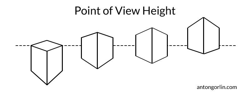
视点高度如何影响你的构图
Psychologically, the towering object seems larger and more prominent. However, the lower position hides the middle-ground thus decreasing the prolongation effect going from the foreground into the background. The very low position will detach layers of the photo from each other. So, use the lower position wisely – it has an excellent expressiveness potential. It’s widely used in sport and landscape photography.
从心理上来说,高耸的物体看起来更大、更突出。然而,较低的位置隐藏了中景,从而减少了从前景到背景的延长效果。非常低的位置会使照片的各层相互分离。因此,请明智地使用较低的位置 - 它具有出色的表现力潜力。它广泛应用于体育和风景摄影。
专业提示:广角镜头的焦距要低一些。它使任何土地特征都变得巨大而突出。
The higher point of view stretches everything between foreground and background, shows all objects on the level surface and makes a harmonious picture. However, it lacks a bigger punch of the lower point of view.
较高的视角拉伸前景和背景之间的一切,显示水平表面上的所有物体,形成和谐的画面。然而,它缺乏较低视角的更大冲击力。
Light Direction and Quality
光线方向和质量
It isn’t obvious for the newbie, but the light itself is the crucial factor in your composition. And especially it’s direction.
对于新手来说这并不明显,但光线本身是构图的关键因素。尤其是它的方向。
The side light is the best – lighting the objects on the angle, it reveals all structure and texture, produces light and shadow and adds a lot of volume. The morning and evening light casts long shadows, which are great for the composition too.
侧光是最好的——从角度照亮物体,它揭示了所有的结构和纹理,产生光影并增加了很多体积。早晨和傍晚的光线投射出长长的阴影,这对于构图也很有帮助。
The backlight has different properties. It’s harder to photograph than other types of light but it’s so rewarding. It lightens up haze and dust particles in the air producing the glowing filling effect. Such photos have the most magical look. Also, the objects show their dark side to the viewer adding to the overall tonal contrast. And lastly, all these objects could have a brightly lit edge.
背光源具有不同的特性。与其他类型的光线相比,它的拍摄难度更大,但也很有价值。它减轻了空气中的雾霾和灰尘颗粒,产生发光的填充效果。这样的照片看起来最神奇。此外,这些物体向观看者展示了它们的阴暗面,增加了整体色调对比。最后,所有这些物体都可以有一个明亮的边缘。
The front light is the worst. First of all, it renders any haze much weaker, often making it disappear altogether hurting the perspective. Second, it fills all the shadows making the shot look flat like a kid’s drawing.
前灯是最差的。首先,它使雾气变得更弱,常常使其完全消失,从而损害了视角。其次,它填充了所有的阴影,使镜头看起来像儿童画一样平坦。
Another kind of light is the daylight when the Sun is up above. Typically, the photographers try to avoid it, but we could also make some use of it. Shoot the water without any solid objects (rocks, etc.) close to the camera. Include just the water and the sand and maybe something in the distance. It makes all those paradise shots.
另一种光是太阳在上方时的日光。通常,摄影师会尽量避免它,但我们也可以利用它。拍摄水面时不要让任何固体物体(岩石等)靠近相机。只包括水和沙子,也许还有远处的东西。它拍出了所有那些天堂般的照片。

How To Improve Composition In Editing
如何提高剪辑中的构图
How To Check Composition
如何检查成分
There can be cases when you are not sure if your composition is prominent enough if it’s speaking to the viewer. There is a simple trick to check if it’s real or exists just in your head. Blur your photo heavily in your editing program. The significant lines, areas, shapes and colours should still be visible. All you composition blocks should stay and form the skeleton of your composition.
在某些情况下,您可能不确定您的构图在与观众对话时是否足够突出。有一个简单的技巧可以检查它是否真实或仅存在于您的脑海中。在编辑程序中严重模糊你的照片。重要的线条、区域、形状和颜色应该仍然可见。所有的构图块都应该保留并形成构图的骨架。
在模糊的镜头上,S 形曲线仍然清晰可见
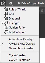
Photoshop Crop Tool Photoshop 裁剪工具
You probably know about the crop tool in Lightroom and Photoshop. But not many are aware of the hidden composition assistant grids it contains. Once you select a crop tool, there is another button on the tool strip at the top. It includes a range of grids for your composition. Select a different grid from the drop-down menu or by pressing O on the keyboard. Some overlays are not symmetrical and to change their orientation, please press Shift+O.
您可能了解 Lightroom 和 Photoshop 中的裁剪工具。但没有多少人知道它包含的隐藏构图辅助网格。选择裁剪工具后,顶部工具条上会有另一个按钮。它包括一系列适合您的构图的网格。从下拉菜单中或按键盘上的 O 选择不同的网格。某些叠加层不对称,要更改其方向,请按 Shift+O。
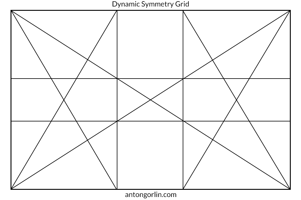
Bonus #1: Dynamic Symmetry – Myth or Reality
福利#1:动态对称——神话还是现实
I’ve seen a large number of articles and books about the dynamic symmetry. There are even sites dedicated to this topic in full. All these materials claim that most of the known composition rules are either nonsense or simply inherit the dynamic symmetry principles. In short, this composition is based upon a large number of major and minor diagonals forming various grids and pretty patterns. Also, some of the articles claim that the classic painters like Leonardo da Vinci used these laws in their works. After some research, I must say that’s total nonsense. Leonardo lived more than 500 years ago, and Dynamic Symmetry principles were formed by Jay Hambidge (1867-1924). Surely, Leonardo and others used diagonals and gestalt principles, but it has nothing to do with those nice grids and modern theories. With all that said, I’m not implying the theory is wrong. It could be right as an arranging principle as it uses lots of diagonals and is based upon the same principles.
我看过大量关于动态对称性的文章和书籍。甚至还有专门讨论该主题的网站。所有这些材料都声称大多数已知的组合规则要么是无稽之谈,要么只是继承了动态对称原理。简而言之,这种构图基于大量的主对角线和次对角线,形成各种网格和漂亮的图案。此外,一些文章声称像达芬奇这样的经典画家在他们的作品中使用了这些法则。经过一番研究,我必须说这完全是无稽之谈。列奥纳多生活在 500 多年前,动态对称原理是由 Jay Hambidge(1867-1924)提出的。当然,列奥纳多和其他人使用了对角线和格式塔原理,但这与那些漂亮的网格和现代理论无关。话虽如此,我并不是说这个理论是错误的。作为一种排列原则,它可能是正确的,因为它使用大量对角线并且基于相同的原则。
Bonus #2: Composition Decision-Making Flowchart
福利 #2:组合决策流程图
Disclaimer: this flowchart shows how my brain works (more or less). I’m not saying it’s perfect or even correct. But I thought it could be interesting and helpful to my readers.
免责声明:这个流程图显示了我的大脑是如何工作的(或多或少)。我并不是说它是完美的,甚至是正确的。但我认为这对我的读者来说可能很有趣并且有帮助。
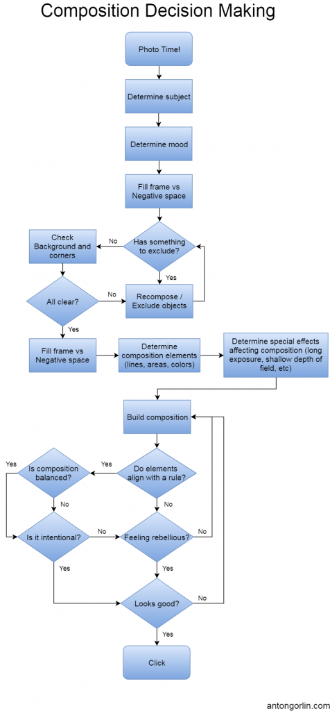
点击查看大图,别忘了分享!
Bonus #3: Simplified Composition Decision-Making Flowchart
好处#3:简化的组合决策流程图
I know many photographers who use another workflow. It works just as good sometimes, especially when you have a good eye for the composition!
我认识许多使用其他工作流程的摄影师。有时它也同样有效,尤其是当您对构图有很好的洞察力时!
[sociallocker]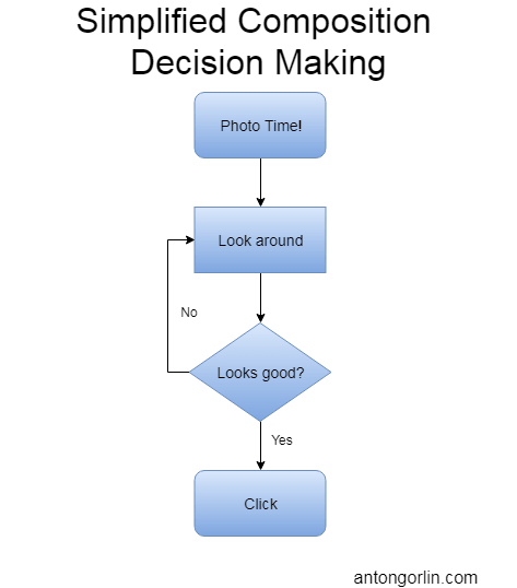 [/sociallocker]
[社交锁][/社交锁]
Final Word 最后的话
I hope this article sheds some light and helps you to build the compositions better and faster and analyse other photographer’s works. The composition is not something you learn in the form of an insight or the “gotcha” moment. It needs practice and careful thinking and analysis. My best advice here is to take some rule and create a few dozens of photos with it. Repeat until you feel you’ve got that intuitive understanding of how it works. Then proceed to the next one. Level two is to combine some rules, etc.
我希望这篇文章能给您带来一些启发,帮助您更好更快地构建构图并分析其他摄影师的作品。作文不是你以洞察力或“陷阱”时刻的形式学到的东西。它需要实践和仔细的思考和分析。我最好的建议是遵循一些规则并用它创建几十张照片。重复直到您感觉自己已经直观地了解了它的工作原理。然后继续进行下一项。第二级是结合一些规则等。
If you enjoyed reading this article, I bet you’d enjoy reading an editing handbook I have created for avoiding the nastiest editing mistakes.
如果您喜欢阅读这篇文章,我打赌您也会喜欢阅读我为避免最严重的编辑错误而创建的编辑手册。
 DOWNLOAD FREE E-BOOK 下载免费电子书
“10 Post Processing Landscape Photography Tips”
“风景摄影的 10 个后期处理技巧”

Marat Stepanoff says 马拉特·斯捷潘诺夫 说
Good work! This is very useful content for a beginner landscape photographer.
干得好!对于风景摄影师初学者来说,这是非常有用的内容。
george petrovsky says 乔治·彼得罗夫斯基 说
Privet, Anton! Very well done! A very comprehensive guide with excellent illustrations as examples. Now… to store it all in the old memory banks… then be able to retrieve it when needed!
女贞,安东!做得太好了!非常全面的指南,并配有精美的插图作为示例。现在...将其全部存储在旧的存储库中...然后能够在需要时检索它!
Interesting – your first picture of Repin’s “Reply of the Zaporozhian Cossacks to the Sultan” is virtually a 16:9 ‘panoramic’ ratio. (Art print available is 50″ x 29″). This is a ratio I find conducive to landscapes of many different types, followed by the ‘classic’ 3:2 ratio. My 23″ PC screen is 16:9, which I find more comfortable to the eye than my previous 17″ 4:3 screen.
有趣的是——你的第一张列宾的《扎波罗热哥萨克给苏丹的回信》实际上是 16:9 的“全景”比例。 (可用的艺术印刷品尺寸为 50 英寸 x 29 英寸)。我发现这个比例有利于许多不同类型的景观,其次是“经典”3:2 比例。我的 23 英寸 PC 屏幕是 16:9,我发现它比我以前的 17 英寸 4:3 屏幕更舒服。
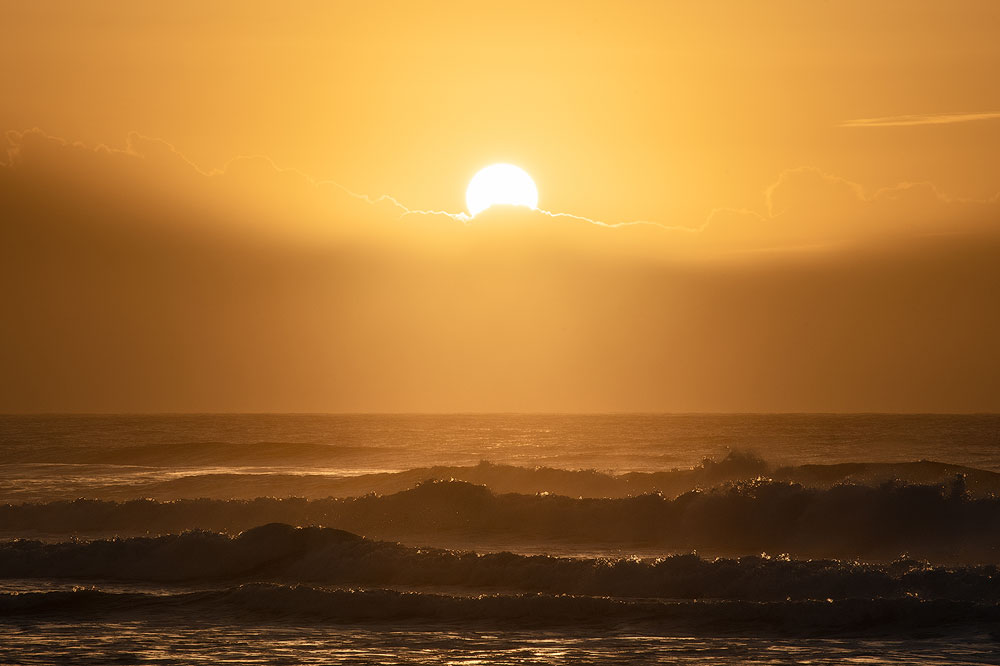
As always, with landscapes, the art lies in being able to capture the essence of it. You stand on a mountain top or on a beach, looking at a magnificent once in a lifetime sunset or sunrise. Overwhelmed by the beauty of it as it surrounds you.
一如既往,风景画的艺术在于能够捕捉它的本质。您站在山顶或海滩上,欣赏一生一次的壮丽日落或日出。当它围绕着你时,你会被它的美丽所震撼。
Standing there with a camera, you wonder how you can adequately capture the moment. Forget all that – just get the settings right on the camera, then think of how to get the best composition. One picture can’t possibly tell the whole story, but you try.
拿着相机站在那里,你想知道如何才能充分捕捉到这一时刻。忘记这一切——只需在相机上进行正确的设置,然后考虑如何获得最佳构图。一张图片不可能讲述整个故事,但你可以尝试。
Despite that frustration, the picture you ultimately decide on creating, keeping all the factors you mention in mind, will tell you the story. It will have the ability to replay the whole journey, the final location and bring back the memory of being there and seeing everything outside the boundaries a frame imposes. If a picture I take can do that, then I am well pleased with it. Always, it become a very personal, emotive and subjective matter. When such a picture I take can make someone else say: “I want to be there!”, when it can transport their imagination to that magic place and immerse them in the atmosphere you have created, then I have achieved a personal success.
尽管有这样的挫败感,但你最终决定创作的图片,记住你提到的所有因素,将会告诉你这个故事。它将能够重播整个旅程、最终地点,并带回在那里的记忆并看到框架强加的边界之外的一切。如果我拍的照片能做到这一点,那么我就很高兴了。它总是成为一个非常个人的、情感化的和主观的问题。当我拍的这样一张照片能让别人说:“我想去那里!”,当它能把他们的想象力带到那个神奇的地方,让他们沉浸在你创造的氛围中,那么我就取得了个人的成功。
Striving for ‘technical perfection’ within known guidelines is always a challenge. Some aims can be achieved in situe, in camera, with a bit of careful thought and pre-planning, the rest can be done – once again with thought and planning, during post editing. Most of my pictures probably fail the compositional perfection test (if there be such a beast). They could always be better… but each sunrise or sunset is unique and fleeting – you can’t go back an re-shoot it!
在已知的指导方针内力争“技术完美”始终是一个挑战。有些目标可以在现场、在镜头前通过一些仔细的思考和预先计划来实现,其余的可以在后期编辑过程中通过思考和计划来完成。我的大部分照片可能都未能通过构图完美测试(如果有这样的野兽的话)。它们总是可以更好……但每个日出或日落都是独特且转瞬即逝的——你无法回去重新拍摄!
Articles such as you have presented will give me a nudge in the right direction.
像你这样的文章将给我一个正确的方向推动。
🙂 george 🙂 乔治
Anton Gorlin says 安东·戈尔林 说
Privet! Thanks a lot for your thoughtful comment. There is no such thing as perfection, there is only a way towards it. I’m really happy my article is here to help you. It means it wasn’t a waste of time and that makes me happy 🙂
女贞!非常感谢您的深思熟虑的评论。没有所谓的完美,只有一条通往完美的路。我真的很高兴我的文章可以为您提供帮助。这意味着这不是浪费时间,这让我很高兴
To subscribe back, just navigate to Fine Art –> Wallpapers and download one of them filling in your email.
要重新订阅,只需导航至美术 –> 壁纸并下载其中一张并填写到您的电子邮件中。
george petrovsky says 乔治·彼得罗夫斯基 说
Aaaargh! Somehow, I think I’ve unsubscribed by ticking a box I shouldn’t have! That was never my intention! 🙁 Sorry!
啊啊!不知何故,我认为我通过勾选了一个不应该勾选的框来取消订阅!那从来都不是我的本意! 🙁 对不起!
David says 大卫说
I’d love to finish reading this but just can’t. The social icons you have repeatably appear and disappear in your photos is just driving me mad.
我很想读完这篇文章,但就是做不到。你的照片中反复出现和消失的社交图标简直让我抓狂。
And don’t get me started on the social bar on the bottom of the screen!
不要让我从屏幕底部的社交栏开始!
Anton Gorlin says 安东·戈尔林 说
hi David, thanks for heads up. I assume you are using a mobile phone? Otherwise, the icons appear on the side, not at the bottom. I just had to disable this plugin altogether because it froze. Hopefully, you can now finish an article.
嗨大卫,谢谢您的提醒。我猜你用的是手机吧?否则,图标会出现在侧面,而不是底部。我不得不完全禁用这个插件,因为它冻结了。希望您现在可以完成一篇文章。
Kevin Gallagher says 凯文·加拉格尔 说
Hi Anton, very well written and illustrated. I came here from a link from The Luminous Landscape website, I expect you will get many more visits. Again, well done sir!!
你好,安东,写得很好,插图也很好。我是通过发光景观网站的链接来到这里的,我希望您会得到更多的访问。再说一遍,干得好,先生!!
Anton Gorlin says 安东·戈尔林 说
hi Kevin, I haven’t posted to Luminous Landscapes, so I guess someone liked the article and shared. This is great to know! Thanks a lot.
嗨,凯文,我还没有发布到夜光景观,所以我猜有人喜欢这篇文章并分享。很高兴知道这一点!多谢。
Celebes says 西里伯斯 说
Very interesting tips and very nice pics!!!
非常有趣的提示和非常漂亮的照片!
Jim says 吉姆说
What a great tutorial. Your visual examples really drive home your points.
多么棒的教程啊。你的视觉例子确实让你明白了你的观点。
Anton Gorlin says 安东·戈尔林 说
thanks a lot, Jim! In fact, getting finding images alone took over a month. Really happy it worked out.
非常感谢,吉姆!事实上,光是寻找图像就花了一个多月的时间。真的很高兴它成功了。
Steve Walker says 史蒂夫·沃克 说
Holly cow, I kept trying to get to the bottom to leave a comment, but the content kept going. Your layout and examples provide a lot of thoughts – the process flow is a great idea.
冬青牛,我一直试图追根究底发表评论,但内容一直在继续。您的布局和示例提供了很多想法 - 流程是一个好主意。
Anton Gorlin says 安东·戈尔林 说
lol thanks, Steve. Now you see why it took me so long to finish!
哈哈,谢谢,史蒂夫。现在你明白为什么我花了这么长时间才完成吧!
Ingrid says 英格丽德 说
Anton, 安东,
thanks for this tutorial – you do give me a lot of inspiration, and I am still glad after so many months that I met you that one early morning on the Maroubra Beach Seascape Tour! Keep going!! Greetings from Germany,
感谢这个教程——你确实给了我很多灵感,几个月后我仍然很高兴在马鲁巴海滩海景之旅的某个清晨遇见了你!继续前进!!来自德国的问候,
Ingrid 英格丽德
Anton Gorlin says 安东·戈尔林 说
oh, what a great comment to receive, Ingrid! Thanks a lot. I also remember that sunrise workshop we did and I’m happy you enjoyed it!
哦,收到的评论真是太好了,英格丽德!多谢。我还记得我们举办的日出研讨会,我很高兴你喜欢它!
Jere says 杰雷 说
en español? 西班牙语?
Marcos says 马科斯 说
Muy buen trabajo! Muy buen trabajo!
Maureen Gilbert says 莫琳·吉尔伯特 说
A very interesting and informative read Anton. I love your photos and wish I was in Sydney to be able to participate in some of your workshops. Thanks
安东的读物非常有趣且内容丰富。我喜欢你的照片,希望我在悉尼能够参加你的一些研讨会。谢谢
Anton Gorlin says 安东·戈尔林 说
thanks Maureen! Appreciate your comment.
谢谢莫琳!感谢您的评论。
LightStalking says 光跟踪 说
Staggeringly detailed and useful post, Anton. Well done. I will share it on our social accounts for Light Stalking.
安东,这篇文章非常详细且有用。做得好。我将在我们的 Light Stalking 社交帐户上分享它。
Anton Gorlin says 安东·戈尔林 说
wow, that’s a great comment to receive. Thanks a lot!
哇,这是一个很好的评论。多谢!
Sharna Kennedy says 莎娜·肯尼迪 说
Great article, I’m going to enjoy trying to apply it to my genre of photography. It’s like a great big kick start. Thank you. 2 thumbs up
很棒的文章,我很乐意尝试将其应用到我的摄影类型中。这就像一个伟大的开始。谢谢。 2 竖起大拇指
Anton Gorlin says 安东·戈尔林 说
thank you, Sharna. I’m sure you’ll succeed in applying it 🙂
谢谢你,莎娜。我相信你会成功应用它 🙂
LightStalking says 光跟踪 说
Not sure if you’re aware Anton, but your website is the third most mentioned photography site in the world over the last few days as a result of this post. detailed.com/photography-blogs/
不确定您是否认识安东,但由于这篇文章,您的网站在过去几天中成为世界上第三大被提及最多的摄影网站。 Detailed.com/photography-blogs/
Well done. 做得好。
Good to see a fellow Sydney sider killing it. 😉
很高兴看到悉尼同胞杀死它。 😉
Anton Gorlin says 安东·戈尔林 说
oh wow!!! No, I wasn’t aware of it. Thanks for pointing it out. Feels so good people enjoy reading it!
哦哇!!!不,我不知道。感谢您指出。感觉真好,人们喜欢阅读它!
Heidi says 海蒂 说
Anton, 安东,
That is a great work, I have saved to my file, so I can keep coming back to read it. How do we pay you back, for such great knowledge, not just well written, easy understanding with your sample pictures, demonstratin Thank you very much
这是一部伟大的作品,我已保存到我的文件中,这样我就可以继续回来阅读它。我们如何回报您如此丰富的知识,不仅仅是写得好,您的示例图片易于理解,演示非常感谢您
Anton Gorlin says 安东·戈尔林 说
thanks, Heidi, I feel happy receiving a comment as this one. You can pay back by sharing this article, subscribing and coming back to visit again 🙂
谢谢,海蒂,我很高兴收到这样的评论。您可以通过分享这篇文章、订阅并再次回来访问来回报 🙂
mariadelpilardiezcalderon says
It is a master lesson.
Cineman says
Interesting that you refer to “backlight” as light from behind the photographer, rather than the subject, and vise versa with frontlight. In my world (motion picture, and Canada) it is the opposite: backlight is from behind the subject relative to the photographer. I can’t help but wonder if the terms are used differently around the world, or if you accidentally got it backwards?
I would argue that with light sources other than the sun, the distinction becomes important. If a person is lit at night from a shop window, but walks a few steps forward, they would go from being frontlit to backlit (in my terminology) in a few steps. Your terminology would describe the person silhouetted in foreground as frontlit. It would also be confusing to communicate to a lighting team: “frontlight that person by putting the light behind them”.
For landscape photography, where the sun is your only light source most of the time, your way of saying it makes some sense. You can’t quickly move your light source, or which direction your subject is facing, so the lighting just is what it is unless you come back another time. So, sure, describe it from the photographer’s perspective.
But wouldn’t it make more sense to always describe lighting relative to the subject, no matter the source or situation?
Anton Gorlin says
that’s great to receive this comment. I wasn’t actually sure how to phrase it correctly and therefore made it clear what I actually meant by saying where the light source is. I’ll have to double check again what’s the general naming in the photography industry as I’ve met both ways of describing it. Thanks for bringing it all up!
george petrovsky says
Anton and Cineman: On the subject of lighting: My understanding of back lighting has been where the light source is at the back of the subject and any shadows are coming towards you, or even creating a silhouette.
Where the light source is behind the photographer, my thinking is it would fall on and *highlight* the subject.
Not being able to attach any examples of my own, I’ll use your pictures as an example.
Your trees with the sun rays streaming in behind them would be what I consider “backlit”, but in the very first picture of the Cossacks, the “photographer” (painter/artist/Repin) would have had the light at his back, thus highlighting the subject.
We may be splitting hairs here with semantics, but I lean towards the light source being behind the subject as “back lighting.”
🙂 george