Designing a layout structure for SaaS products (best practices)
设计SaaS产品的布局结构(最佳实践)
During the past decade, I have been involved in designing many SaaS products like CRM, ERP and admin control panels. Each. time, before designing a product, I analyze best template structures from top companies. Here is what I learned…
在过去的十年中,我参与了许多 SaaS 产品的设计,如 CRM、ERP 和管理控制面板。每个。有时,在设计产品之前,我会分析顶级公司的最佳模板结构。这是我学到的……
In this article, I will write about the designing an Application shell or Layout structure for desktop apps or SaaS products. This is all about desktop view. I will write a separate article for mobile apps later.
在本文中,我将介绍为桌面应用程序或 SaaS 产品设计应用程序 shell 或布局结构。这都是关于桌面视图的。稍后我会单独写一篇关于移动应用的文章。
The main structure of any application is considered its skeleton. The skeleton layout of any app remains the same for all pages. For example, in Figma, layers section are on the left, But in Photoshop they are located on the right side. When you have used Shopify’s Admin panel, its main menu located on the left, Search bar at the top, Profile menu at the top right of the screen. But, if you’ve noticed, on ChatGPT things are different - the profile menu is located at the bottom right corner of the screen.
任何应用程序的主要结构都被视为其骨架。任何应用程序的骨架布局对于所有页面都保持相同。例如,在 Figma 中,图层部分位于左侧,但在 Photoshop 中它们位于右侧。当您使用 Shopify 的管理面板时,其主菜单位于左侧,搜索栏位于顶部,个人资料菜单位于屏幕右上角。但是,如果您注意到的话,在 ChatGPT 上情况有所不同 - 个人资料菜单位于屏幕的右下角。
Therefore, the layout structure of an app depends on its purpose. There are few well tested UI patterns used by many companies. Let’s talks about it
因此,应用程序的布局结构取决于其用途。许多公司使用的经过良好测试的 UI 模式很少。我们来谈谈它
Questions that are always asked...
总是被问到的问题...
It's crucial to find a good solution when designing the main structure of any SaaS or Admin panel. As a UX/UI designer, you may wonder whether the main menu should be on the left side or at the top, or if the search bar should be in the header section or above the table list. You might also consider where to place the avatar icon that triggers a dropdown menu, whether the main sidebar should be collapsible to minimize or hide, how users should access the main settings page, where to put the light/dark mode switcher, and many other questions that arise when starting a new product. If so, you’re in the right article; continue reading carefully.
在设计任何 SaaS 或管理面板的主要结构时,找到一个好的解决方案至关重要。作为一名 UX/UI 设计师,您可能想知道主菜单应该位于左侧还是顶部,或者搜索栏是否应该位于标题部分或表格列表上方。您还可能会考虑在哪里放置触发下拉菜单的头像图标,主侧边栏是否应该可折叠以最小化或隐藏,用户应如何访问主设置页面,在哪里放置明/暗模式切换器,以及许多其他开始新产品时出现的问题。如果是这样,那么您就读对了文章;继续仔细阅读。
Before designing a basic skeletal structure, several questions must be answered.
在设计基本骨架结构之前,必须回答几个问题。
- What is the primary action within the app?
应用程序内的主要操作是什么? - Does the user need more vertical or horizontal space for content.
用户是否需要更多的垂直或水平空间来容纳内容。 - How frequently does the user switch between different pages
用户在不同页面之间切换的频率
(is the main menu more important)?
(主菜单更重要吗)? - What are the daily tasks for users?
用户的日常任务是什么? - Is the app used by multiple users at the same time? Do these users have different roles within the app?
该应用程序是否有多个用户同时使用?这些用户在应用程序中是否具有不同的角色? - Can users have multiple accounts and switch between them seamlessly (often referred to as “workspaces” in many apps)?
用户是否可以拥有多个帐户并在它们之间无缝切换(在许多应用程序中通常称为“工作区”)? - Is it necessary to consider a Multi-Organization feature where users can switch between organizations without creating multiple accounts (similar to workspaces but with the ability to gather analytical reports from all organizations)?
是否有必要考虑多组织功能,用户可以在组织之间切换而无需创建多个帐户(类似于工作区,但能够从所有组织收集分析报告)?
Answering these and many more questions is essential before beginning any design process. That’s why you should start with design thinking or brainstorming sessions to identify the appropriate layout structure.
在开始任何设计过程之前,回答这些以及更多问题至关重要。这就是为什么您应该从设计思维或头脑风暴会议开始,以确定适当的布局结构。
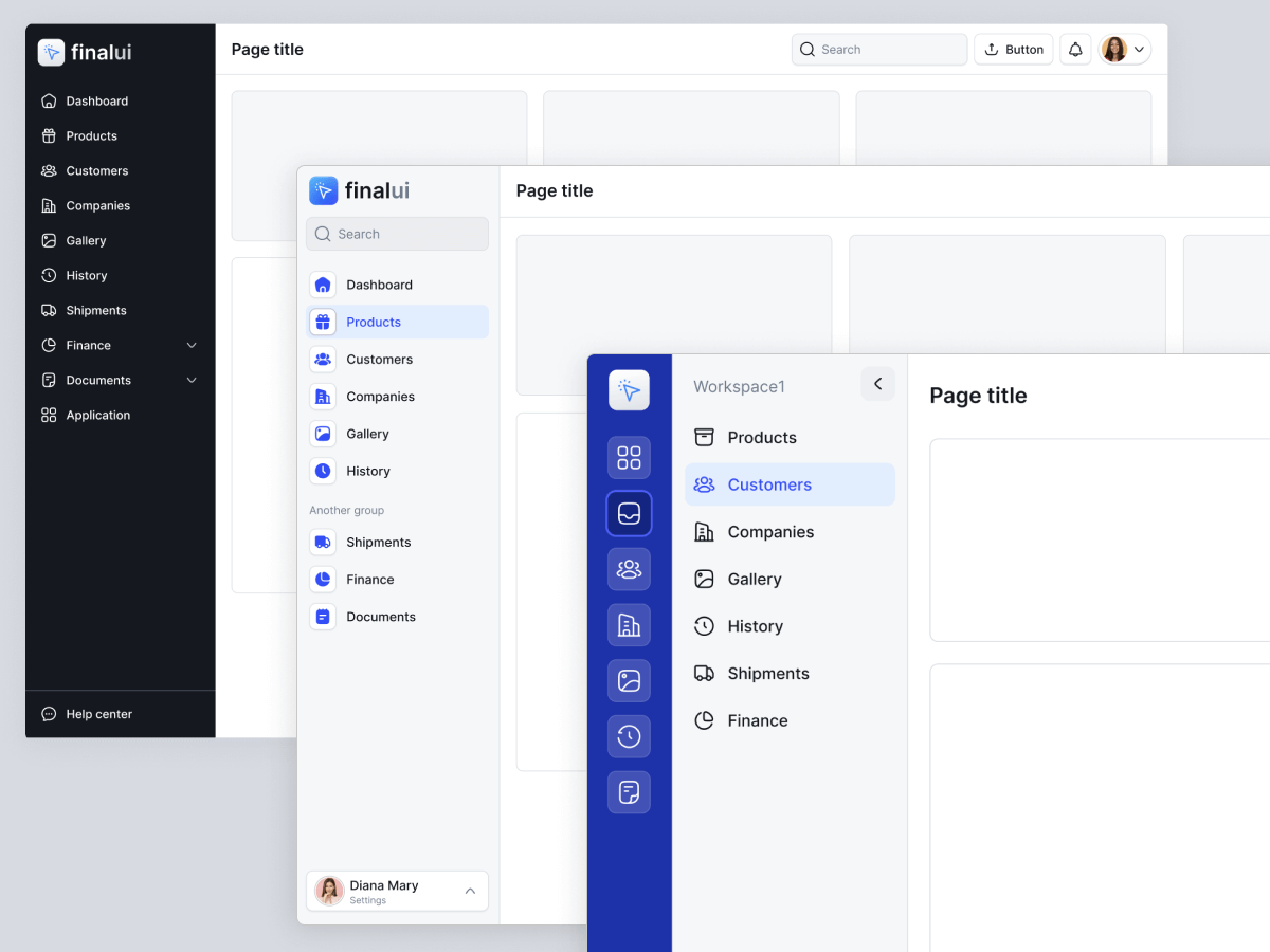
Final UI 的布局模板 (www.finalui.com)
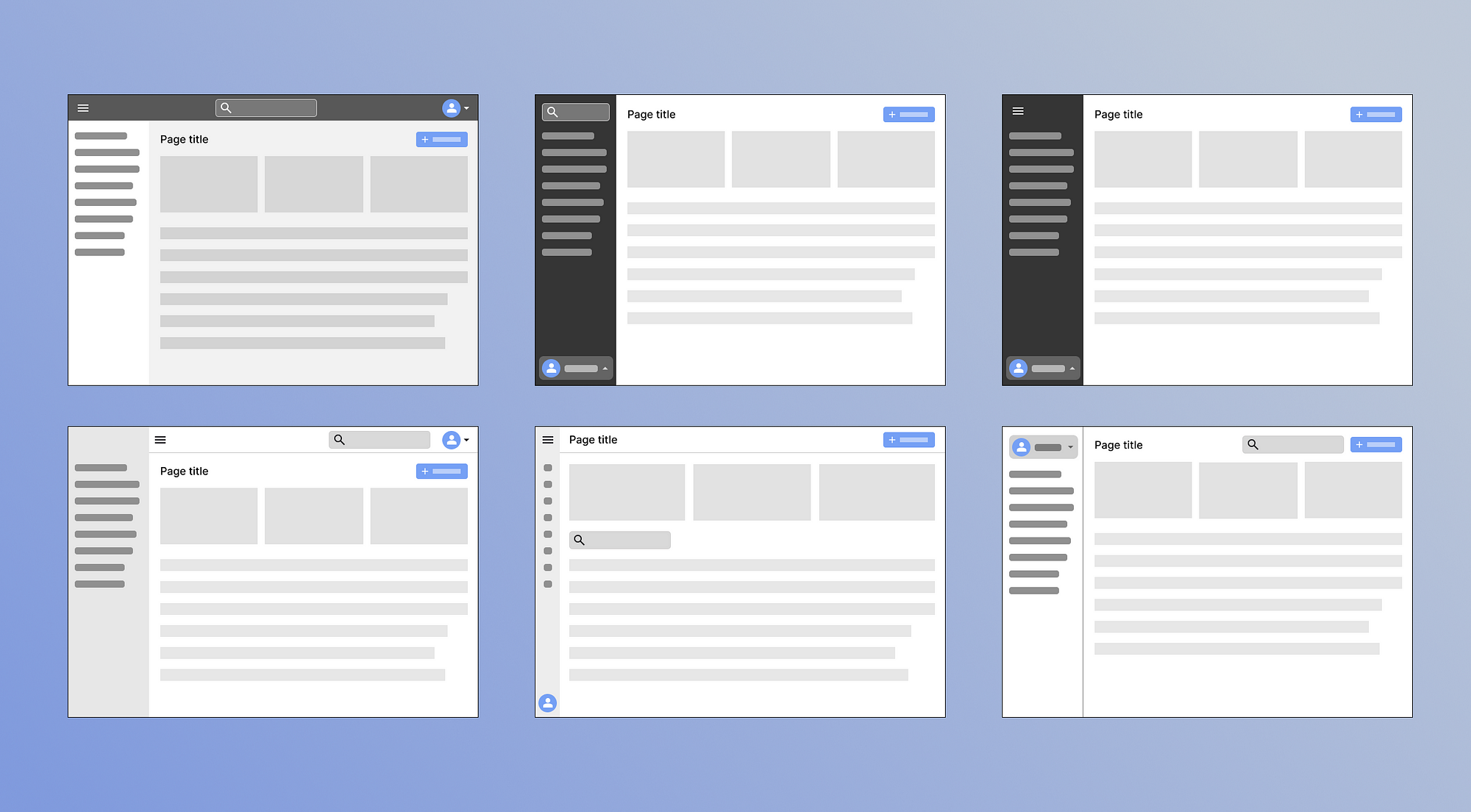
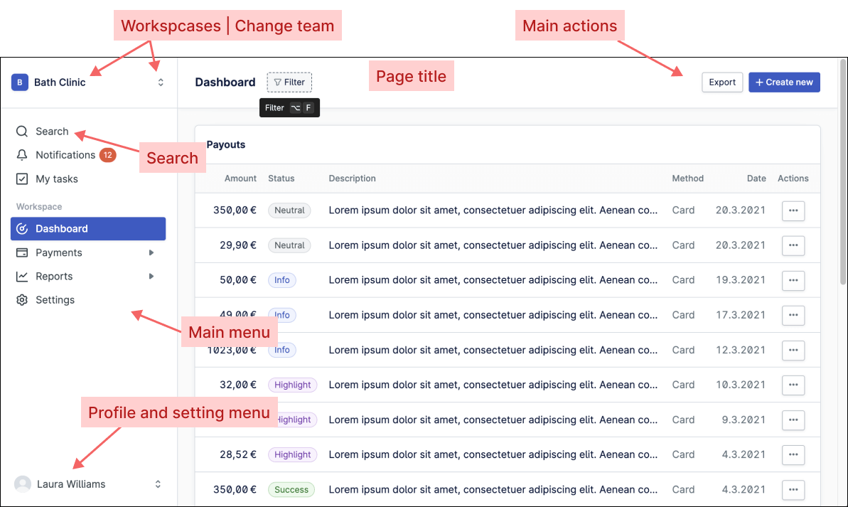
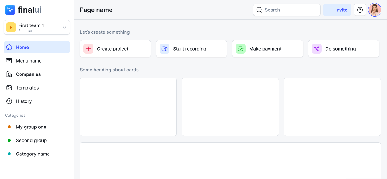
Essential layout elements for an Admin panel include:
管理面板的基本布局元素包括:
- Main menu (located on the sidebar or header bar)
主菜单(位于侧边栏或标题栏上) - Search bar 搜索栏
- Page title and breadcrumb navigation
页面标题和面包屑导航 - Content view selection options (such as list, grid, and sorting)
内容视图选择选项(例如列表、网格和排序) - Notification icon to alert users of new activity
通知图标提醒用户有新活动 - Primary actions like adding new task, or creating a new document
主要操作,例如添加新任务或创建新文档 - Profile icon with a dropdown menu containing settings, profile options, and logout functionality
带有下拉菜单的配置文件图标,其中包含设置、配置文件选项和注销功能 - Help or support button for quick access to assistance
用于快速获取帮助的帮助或支持按钮 - Button for easy access to frequently used settings (such as toggling dark mode or language selection)
用于轻松访问常用设置的按钮(例如切换深色模式或语言选择) - Logo or brand identity symbol (optional but recommended)
徽标或品牌标识符号(可选但推荐) - Workspace feature (in some cases) for managing different organizations or teams within the app, akin to different stores in e-commerce scenarios.
工作区功能(在某些情况下)用于管理应用程序内的不同组织或团队,类似于电子商务场景中的不同商店。
SaaS layout examples from popular apps
流行应用程序中的 SaaS 布局示例
Here is a layout from a popular SaaS product called Asana CRM.
这是一个名为 Asana CRM 的流行 SaaS 产品的布局。
The next screen shows that Profile avatar located at the top right, while the main menu is on the left and it is collapsible which user can hide to focus on main content. Both the Header and Sidebar are dark to clearly differentiate them from the main content. Additionally, there is a “Create” button on the header for quick access to create any document or task.
下一个屏幕显示个人资料头像位于右上角,而主菜单位于左侧,并且可折叠,用户可以隐藏以专注于主要内容。标题和侧边栏都是黑色的,以清楚地将它们与主要内容区分开来。此外,标题上有一个“创建”按钮,可以快速访问以创建任何文档或任务。
Here is another layout from Clickup CRM. It is also similar to the previous one, but the only difference is that it doesn’t allow hiding/showing of the sidebar menu. It offers a multi-workspace functionality, meaning the entire app can be used for different teams and separate purposes.
这是 Clickup CRM 的另一个布局。它也与前一个类似,但唯一的区别是它不允许隐藏/显示侧边栏菜单。它提供了多工作空间功能,这意味着整个应用程序可以用于不同的团队和不同的目的。
Clickup CRM 的布局示例
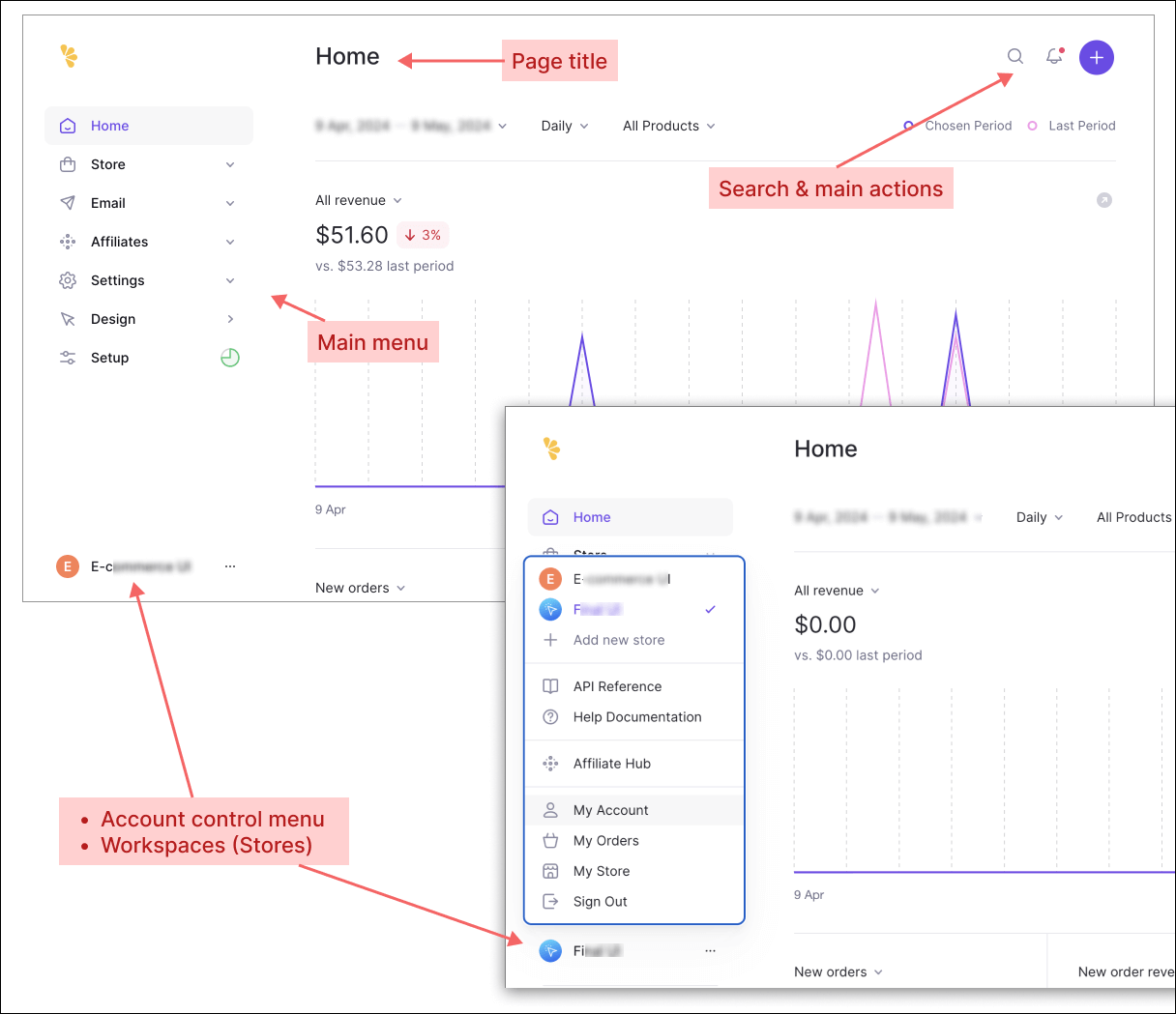
Here’s another example (next screenshot) from the Nord Design System. The layout structure is quite different. The title of each page is located at the top bar, providing more vertical space for the main content. Account-related menus (settings and profile configurations) are positioned at the bottom right. This structure is becoming popular because it frees up vertical space. This layout has Workspace functionality. Users can switch between or add workspaces (teams) from the top right corner.
这是 Nord Design System 的另一个示例(下一个屏幕截图)。布局结构有很大不同。每个页面的标题位于顶部栏,为主要内容提供更多的垂直空间。与帐户相关的菜单(设置和配置文件配置)位于右下角。这种结构越来越受欢迎,因为它释放了垂直空间。此布局具有工作区功能。用户可以从右上角切换或添加工作区(团队)。
Here’s another example from the LemonSqueezy platform, similar to above screenshot. LemonSqueezy is an all-in-one platform for selling digital products, subscriptions, software licenses, and courses. This layout also features an Account-related menu at the bottom right corner. It includes a workspace functionality called “Stores,” which divides entire app for multiple purposes under the same account.
这是来自 LemonSqueezy 平台的另一个示例,类似于上面的屏幕截图。 LemonSqueezy 是一个用于销售数字产品、订阅、软件许可证和课程的一体化平台。此布局还在右下角设有与帐户相关的菜单。它包括一个名为“商店”的工作区功能,该功能将整个应用程序划分为同一帐户下的多个用途。
LemonSqueezy 仪表板的布局示例
There are many other examples as well. There are no right or wrong options; it all depends on your specific requirements. I’d recommend to follow popular patterns because, as Jacobs’s law says:
还有很多其他的例子。没有正确或错误的选择;这完全取决于您的具体要求。我建议遵循流行的模式,因为正如雅各布斯定律所说:
Jakob’s Law of User Experience (UX) states that users spend most of their time on other apps and prefer sites to work in the same way as others they already know. This means that users will transfer expectations they have built around one familiar product to another that appears similar.
雅各布用户体验 (UX) 定律指出,用户将大部分时间花在其他应用程序上,并且更喜欢网站以与他们已知的其他应用程序相同的方式运行。这意味着用户会将他们围绕一种熟悉的产品建立的期望转移到另一种看起来相似的产品上。
There are also some fundamental rules that many designers overlook.
还有一些许多设计师忽视的基本规则。
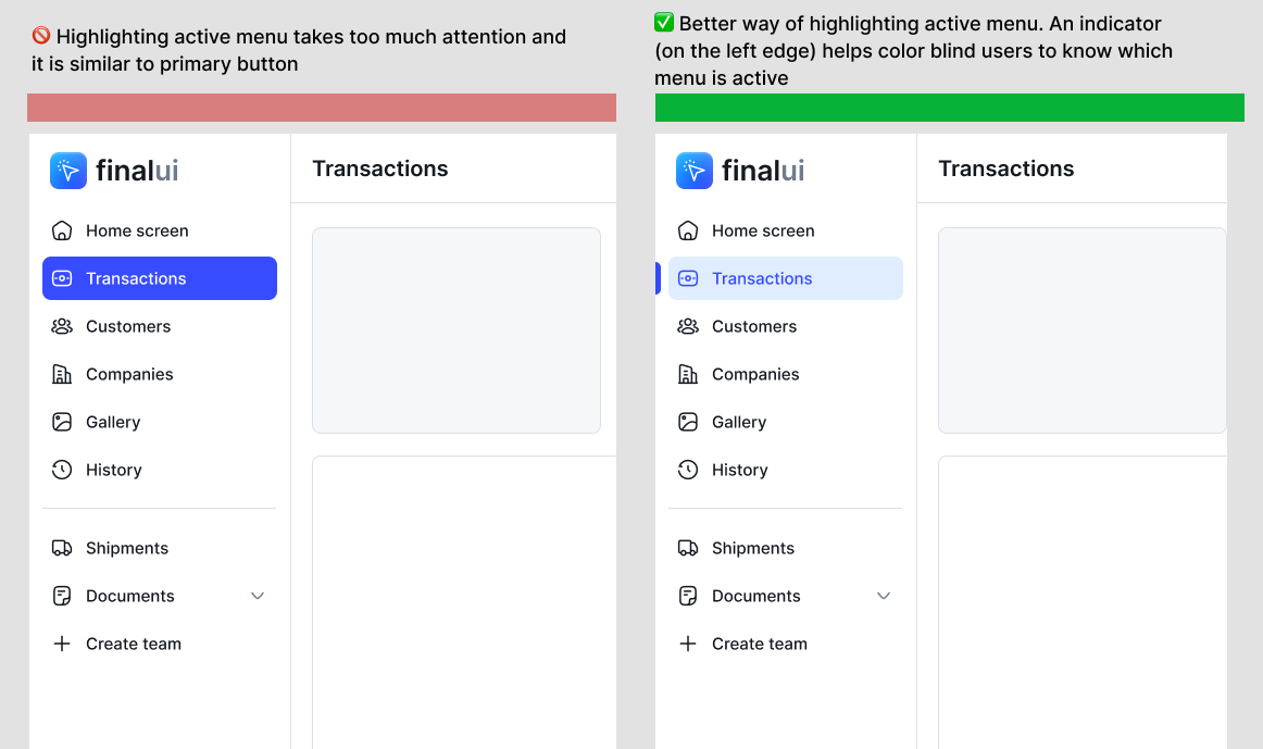
For instance, avoid distracting the user’s attention by highlighting unnecessary elements. Don’t highlight active menu with accent color. Because, content itself already contains a title.
例如,避免突出显示不必要的元素来分散用户的注意力。不要用强调色突出显示活动菜单。因为,内容本身已经包含了标题。
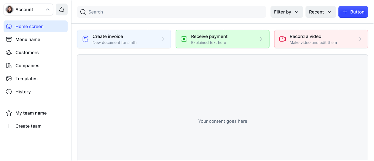
Place quick actions on the main page.
将快速操作放在主页上。
Also, consider adding special buttons for most used actions, let’s say user’s task is to send message or send invoice every day. For those cases, there should be dedicated buttons for these main actions directly on the main page (such as Create Invoice, Send Payment, Create Shipment, etc.).
另外,考虑为最常用的操作添加特殊按钮,假设用户的任务是每天发送消息或发送发票。对于这些情况,主页上应该直接有用于这些主要操作的专用按钮(例如创建发票、发送付款、创建货件等)。
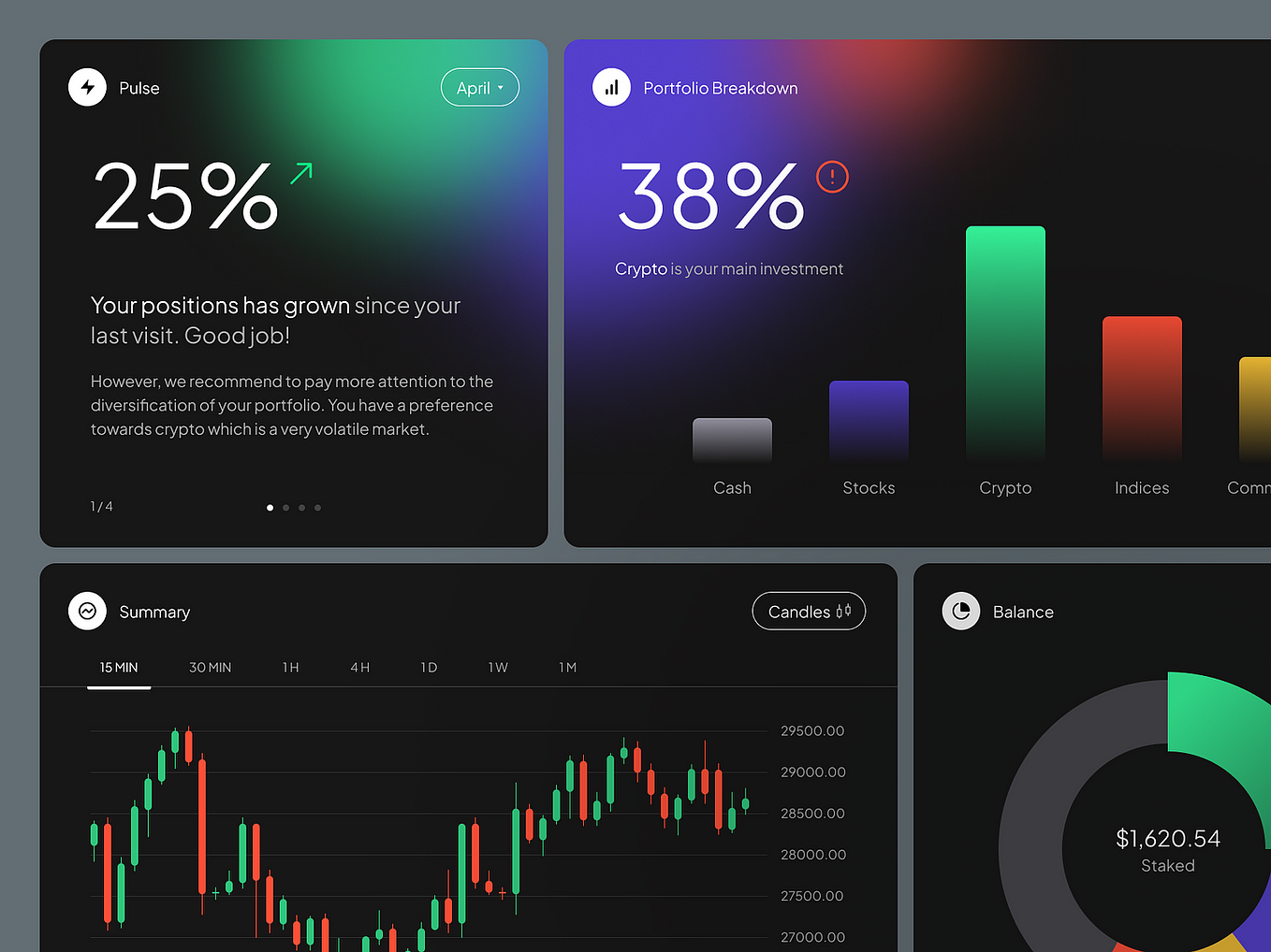
Here are some examples from Final UI Design System (finalui.com)
以下是来自 Final UI 设计系统 (finalui.com) 的一些示例
最终 UI 的 SaaS 布局示例 — 设计系统
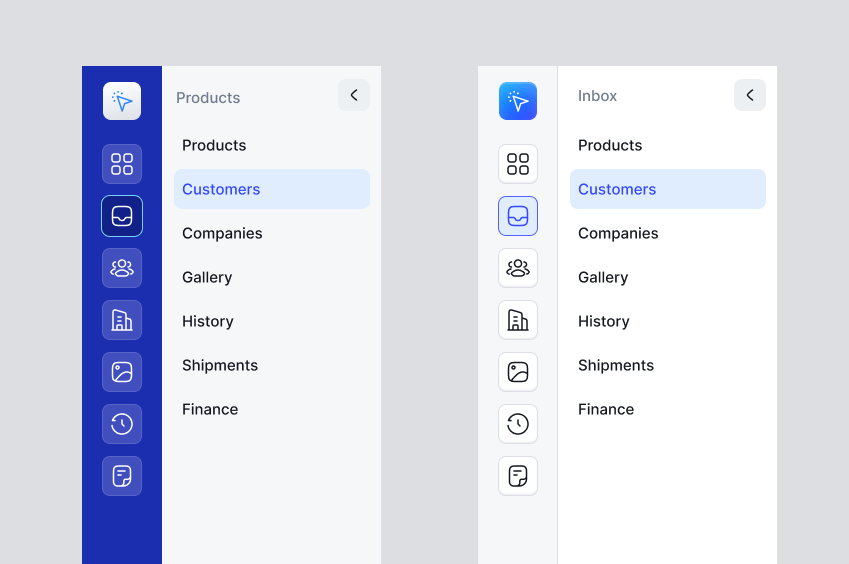
Simplify navigation menu 简化导航菜单
The first impression is the last impression, so your sidebar menu icon and text should be modern and simple. All menus should have at least a 40px height and not be cluttered. Meaningful icons help users quickly understand their purpose. Don’t make menus colorful or gray.
第一印象就是最后印象,因此您的侧边栏菜单图标和文本应该现代而简单。所有菜单的高度至少应为 40 像素,并且不得混乱。有意义的图标可以帮助用户快速了解其目的。不要将菜单设为彩色或灰色。
Consider applying the Pareto Principle, commonly known as the 80/20 rule, in any web apps; users typically use about 20% of the functionality for 80% of the time. This principle is crucial in designing a user-friendly and efficient interface.
考虑在任何 Web 应用程序中应用帕累托原则(通常称为 80/20 规则);用户通常在 80% 的时间里使用大约 20% 的功能。这一原则对于设计用户友好且高效的界面至关重要。
That’s why you shouldn’t use many submenu dropdowns or flyout menus. I suggest not using submenus at all. Allow the user to access content with a single click rather than navigating deep into submenus.
这就是为什么您不应该使用许多子菜单下拉菜单或弹出菜单。我建议根本不要使用子菜单。允许用户通过单击来访问内容,而不是深入导航到子菜单。
Different styles of sidebar menu for SaaS products
SaaS产品不同风格的侧边栏菜单
There are many styles used by various SaaS apps, here are a few examples:
各种 SaaS 应用程序使用的样式有很多种,以下是一些示例:
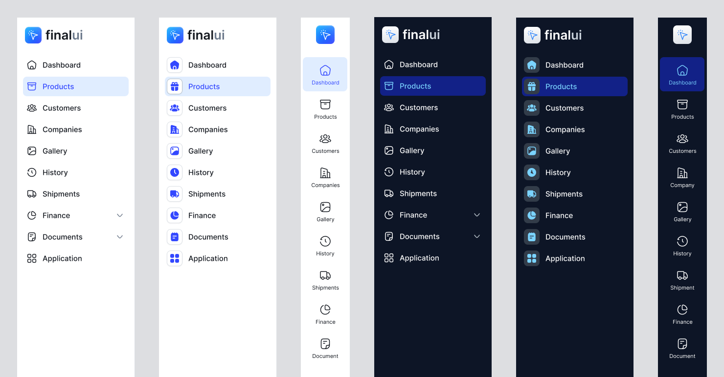
Final UI 的管理面板侧边栏样式
We have created a Design System that includes all variants of layout structures for SaaS systems and Admin control panels.
我们创建了一个设计系统,其中包括 SaaS 系统和管理控制面板的布局结构的所有变体。
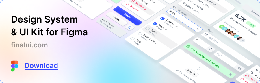
Download here: finalui.com
在这里下载:finalui.com
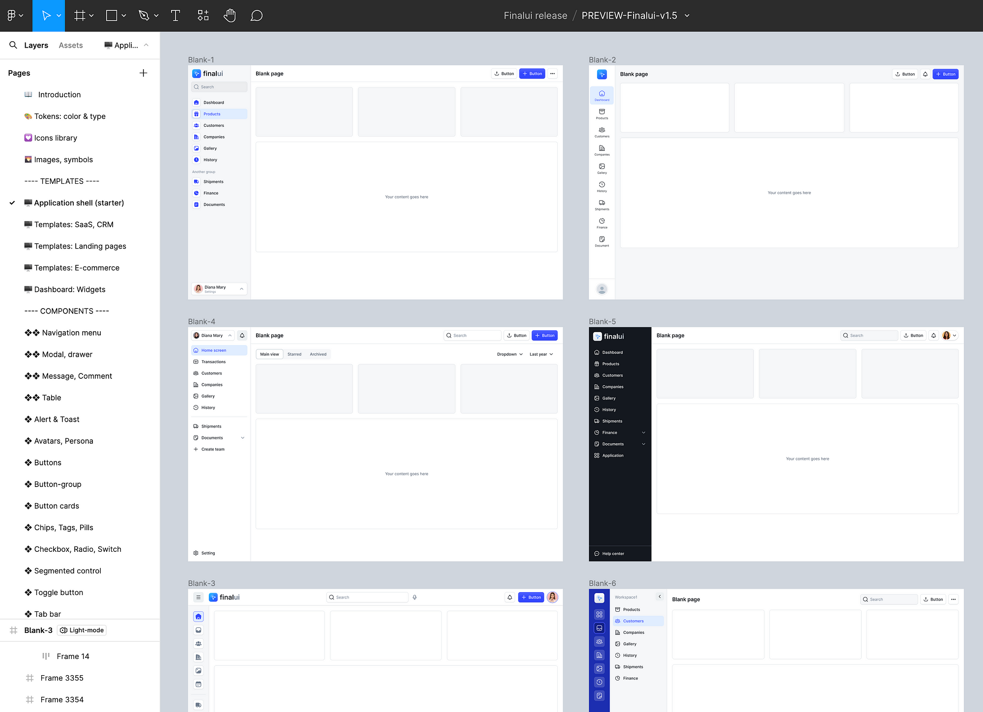
Explore a new design system & UI kit that empowers you to create better UI designs for your next startup project or client project. Design like a Pro!
探索新的设计系统和 UI 套件,使您能够为下一个启动项目或客户项目创建更好的 UI 设计。像专业人士一样设计!
Check it out here: 👉 finalui.com
在这里查看:👉 Finalui.com
下载最终 UI 设计库
Follow me and press “clap” icon to read my next articles…
关注我并按“拍手”图标阅读我的下一篇文章......

