We live in an age of Big: Big Computers, Big Data, and Big Lies.
Faced with an unprecedented torrent of information, data scientists have turned to the visual arts to make sense of big data. The result of this unlikely marriage–often called “data visualizations” or “infographics”–has repeatedly provided us with new and insightful perspectives on the world around us.
However, time and time again we have seen that data visualizations can easily be manipulated to lie. By misrepresenting, altering, or faking the data they visualize, data scientists can twist public opinion to their benefit and even profit at our expense.
We have a natural tendency to trust images more than text. As a result, we’re easily fooled by data visualizations. But fortunately, there are three easy steps we can follow to save ourselves from getting duped in the data deluge.
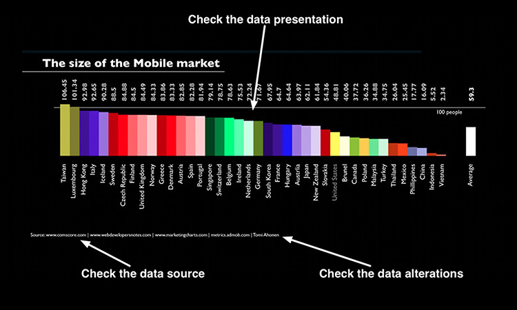
1. Check the data presentation
The subtlest way a data visualization can fool you is by using visual cues to make data stand out that normally wouldn’t. Be on the lookout for these visual tricks.
Color cues
Color is one popular tool for making certain data stand out above the rest. When considering the map below, Kentucky and Utah (the darkest and the lightest) will most likely stand out to us first.

Presented by Mastercard Davos
The company’s novel approach to social and cultural initiatives is forging meaningful connections with consumers The company’s novel approach to social and cultural initiatives is forging meaningful connections with consumers
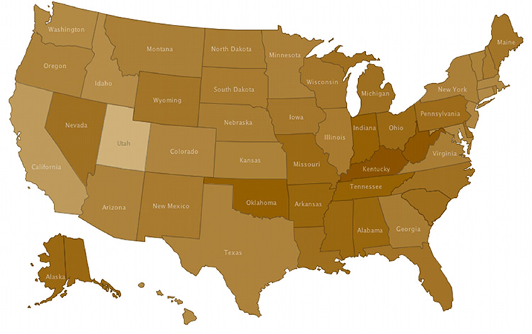
If this map were showing percentage of the population that smokes (dark = more, light = fewer), we may quickly conclude that Kentucky has a serious smoking problem. But what if we looked at the raw numbers and saw that 27% of Kentuckians and 23% of Utahans smoke? Not so big of a difference after all.
Make sure to look at what the colors actually represent before drawing a conclusion from the visualization.
Structural cues
Structure is another popular tool for making data immediately stand out. In the bar charts below, we’re looking at the same data but with different y-axis ranges. Notice how such a simple structural change can make data look much more significant.
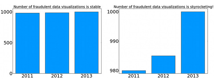
Is an increase of 15 fraudulent visualizations from last year really “skyrocketing”? Don’t let the structure of the visualization decide that for you. Always check the numbers that the visualization is representing.
2. Check the data source
Not all data are created equal. Here’s how to sort out the good data from the bad.
Make sure the data source is reliable
Data collected by an amateur is more error-prone than data collected by a professional scientist. Do a quick web search to see if the people who collected and organized the data have a good track record of collecting and distributing data.
Make sure the data source isn’t biased
A drug company may be inclined to present fake data showing that their latest drug is more effective than it really is, or a political organization may manipulate data to discredit their political opponents. Think twice when considering data provided by biased groups.
Generally, we can trust data provided by:
•Government organizations
•University research laboratories
•Nonpartisan organizations
And we should look more closely at data provided by:
•For-profit companies
•Partisan organizations
•Advocacy groups
If the data source isn’t listed, take the data visualization with many grains of salt.
3. Check the data alterations
Many data sets require a little bit of house cleaning before they can be visualized, but excessive curation can be a sign of misrepresented data. Every good data visualization will come with the blueprints describing how the data was manipulated from its raw form into the visualization you see. Give the blueprints a quick read and watch out for the following data alterations.
Excluded data
Ensure that the explanations for excluding that data are reasonable. Sometimes the “explanation” may be that the data inconveniently contrasted with the story the author wanted to tell.
Transformed data
Data transformation, the process of converting data from one format to another format, can complicate the relationships between data. It’s difficult to interpret a finding such as, “The log transform of a city’s productivity is related to the log transform of the city’s population.” See how that doesn’t make any sense to us in practical terms? That’s why transforming data can potentially be misleading. Be wary if several transformations have been applied to the data.
Statistics
Statistics are an often-abused tool in data science. “Fatal shark attacks have risen 100% this year” sounds like an alarming statistic until you realize that only one person was fatally attacked by a shark last year. Check the raw numbers when data visualizations present only the statistics.
Comparing statistics is even trickier. If a survey shows that 50% of Latinos and only 30% of Caucasians enjoy watching baseball, those results could easily have been purely due to chance because the survey only interviewed 20 people of each ethnicity. If the visualization doesn’t indicate their confidence in the comparison (called statistical significance), then we shouldn’t be confident in their comparison.
If the details on the data alterations aren’t provided with the visualization, always keep in mind how easy it is to make data lie when it’s visualized.
Remember: To save yourself from getting tricked by deceitful data, check the presentation, data source, and alterations.
Apply to the Most Innovative Companies Awards and be recognized as an organization driving the world forward through innovation. Final deadline: Friday, October 4.
