Not all presentations need visuals to shine. What are the design basics when picking images or videos for your slides?
并非所有演示都需要视觉效果来发挥作用。为幻灯片选择图像或视频时的设计基础是什么?
We all know that humans can process images way faster than text. It’s a big deal in advertising and media, so it would be silly not to use it in our presentations too. However, just as you carefully select your words for your speech, you have to be picky about your pictures. Bad images tell lame stories. A good image tells a good story.
我们都知道人类处理图像的速度比处理文本的速度快得多。这对于广告和媒体来说是一件大事,所以不在我们的演示中使用它是愚蠢的。然而,就像你仔细选择演讲的措辞一样,你也必须对你的图片很挑剔。糟糕的图像讲述蹩脚的故事。一个好的形象讲述一个好的故事。
Why a Visual? 为什么是视觉?
Images and words are different languages. Each can express things the other can’t. The trick to a killer presentation is using them both together, playing to their strengths. Don’t just slap visuals (images, videos) in as fillers—they should add real value.
图像和文字是不同的语言。每个人都能表达对方无法表达的东西。杀手级演示的诀窍是将它们结合使用,发挥它们的优势。不要只是将视觉效果(图像、视频)作为填充物——它们应该增加真正的价值。
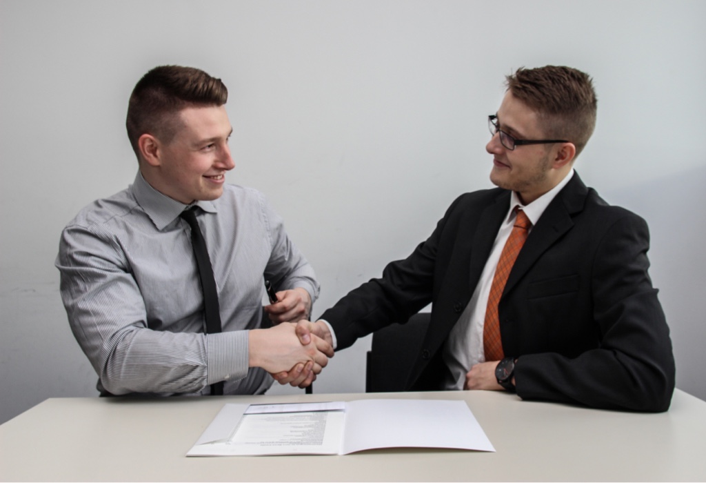
干得好,伙计们!除了作为不应使用哪些图像的示例之外,很难想象如何使用此类图像。两个友好的年轻人在一堵灰色的墙前祝贺自己……祝贺什么?在簿记入门考试中成功作弊?图片:Sebastian Herrmann,Unsplash
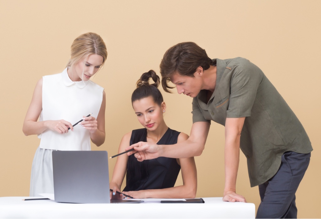
所以20年前每个人都是模特?在黄色工作室背景前非常有吸引力的人。男模特正在解释什么,两个有点老派的女模特正在听。每个人都拿着同一支未使用过的黑色铅笔。除非你经营一家复古模特经纪公司,否则很难想象这种做法有意义的用例。图片:Icons8Team、Unsplash
Visuals can stir up feelings or paint a scene in an instant. However, they may not always nail down the details or explain things as clearly as words can.
视觉可以激发感情或瞬间描绘出一个场景。然而,他们可能并不总是像语言那样明确细节或解释清楚事情。
Words can be very precise and give you all the information you need. Yet, sometimes they miss that instant impact or emotional punch.
言语可以非常精确,并为您提供所需的所有信息。然而,有时他们会错过那种即时的影响或情感上的冲击。
For each visual you add to your presentation, you should ask yourself:
对于添加到演示文稿中的每个视觉效果,您应该问自己:
- Does it enhance the meaning of my message, or is it purely decorative?
它是否增强了我的信息的含义,或者纯粹是装饰性的? - Does it belong at this point in my presentation? Would it be better for another slide?
它现在属于我的演示吗?再放一张幻灯片会不会更好? - Is there a better image that says what I want to say?
有没有更好的图片表达我想说的话?
Additionally, when deciding whether to include an image or video, remember to consider the impression you want to leave on your audience.
此外,在决定是否包含图像或视频时,请记住考虑您想给观众留下的印象。
“Ask yourself, ‘If I had only sixty seconds on the stage, what would I absolutely have to say to get my message across?” ―Jeff Dewar
“问问自己,‘如果我在舞台上只有六十秒,我必须说什么才能传达我的信息?’” ——杰夫·杜瓦
If your audience were to remember just one thing from your presentation, what would it be? And which form of communication—visual or verbal—is more effective to convey this message?
如果你的听众只记得你演讲中的一件事,那会是什么?哪种形式的交流(视觉交流还是口头交流)更能有效地传达这一信息?
What Does it Communicate?
它传达什么信息?
You’ve chosen a few visuals for your presentation, hopefully not too many. As often in design, less is more. Now, it’s time to assess their quality and the impact they’ll have. Always think of your audience when selecting a visual:
您为演示文稿选择了一些视觉效果,希望不要太多。正如设计中经常出现的那样,少即是多。现在,是时候评估它们的质量和它们将产生的影响了。选择视觉效果时始终考虑您的观众:
- Will they understand it?
他们会理解吗? - Will it resonate with them?
会引起他们的共鸣吗? - Does it convey the same emotion that both they and I share?
它是否传达了他们和我所共有的相同情感?
Take into account any significant age gap (common knowledge for teachers, less so for other presenters), cultural differences, and gender considerations. You don’t want to make anyone feel uncomfortable or confused about what’s happening.
考虑到任何显着的年龄差距(教师的常识,其他演讲者的常识)、文化差异和性别因素。您不想让任何人对正在发生的事情感到不舒服或困惑。
“Designing a presentation without an audience in mind is like writing a love letter and addressing it ‘to whom it may concern.” ―Ken Haemer
“在没有考虑到观众的情况下设计演示文稿就像写一封情书并写给“可能涉及的人”。 ——肯·哈默
To determine if you’ve made the right choice with your visuals, take a moment to step back and verbalize each one. For each of them, ask yourself:
要确定您的视觉效果是否做出了正确的选择,请花点时间退后一步,用语言描述每一个选项。对于每个问题,问问自己:
- What is its intended message
它的意图是什么 - What does it actually convey
它实际上传达了什么
You should also find out if you’re biased in your evaluation. We often overestimate the significance and impact of the images we’ve selected. The best is to practice presenting in front of others: observe their reactions, their level of engagement, and ask for their honest feedback on both your words and visuals.
您还应该弄清楚您的评估是否存在偏见。我们经常高估我们所选择的图像的重要性和影响力。最好的方法是练习在他人面前进行演示:观察他们的反应、他们的参与程度,并询问他们对你的文字和视觉效果的诚实反馈。
Traps To Avoid 要避免的陷阱
1. The Wrong Emotion
1. 错误的情绪
The primary purpose of visuals is to evoke emotions in your audience. In this aspect, you will encounter two false friends: Stock Images and AI-generated content.
视觉效果的主要目的是唤起观众的情感。在这方面,你会遇到两个假朋友:图片和人工智能生成的内容。
Most stock images are either unrealistic or superficial. Clichéd images fail to evoke any emotion and thus become mere fillers. A few carefully chosen words can say what 1,000 stock images cannot.
大多数库存图像要么不切实际,要么肤浅。陈词滥调的图像无法唤起任何情感,因此只能成为填充物。几个精心挑选的词语可以表达 1,000 张库存图片所无法表达的内容。

是真实的。这永远不会发生。人们在电脑上咬蜡笔没有创造力。我们已经习惯了用这种图像来传达乐趣,但这是陈词滥调,对你的信息没有任何帮助。相反:它传达出你很肤浅并且看不起你的听众,认为他们不会注意到。图片:Jeshoots,Unsplash

它说什么?在添加图片来添加颜色之前,问问自己:我在这里真正看到了什么?在这个例子中,一群戴着棒球帽的年轻人在学校图书馆指着屏幕大笑。光线在他们的背后,所以他们的脸显得有些阴暗,看起来不是什么好笑而是有些邪恶的笑声。他们在观看有趣的 YouTube 短片吗?他们欺负某人吗?图片:Priscilla du Preez,Unsplash
Computer-generated visuals lack depth and emotion. Quality AI content requires human intervention to infuse it with meaning and authenticity. But the majority of AI content is used as it is, a rough draft. Realizing that something is AI-produced (and we are all capable of that, now) is like discovering that we’re playing chess against a computer: it leaves us with a sense of being deceived.
计算机生成的视觉效果缺乏深度和情感。高质量的人工智能内容需要人工干预,以赋予其意义和真实性。但大部分人工智能内容都是按原样使用的,是一个草稿。意识到某些东西是人工智能产生的(现在我们都有能力做到这一点)就像发现我们正在与计算机下棋一样:它让我们有一种被欺骗的感觉。

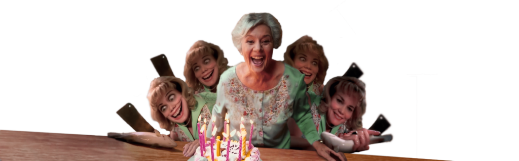
致癌性:计算机没有感觉,这意味着:它们不明白自己在做什么,它们像癌细胞生长细胞一样生长图像:它们只是将某些东西复制到蓝色中。这在人工智能图像通常令人毛骨悚然的情况下变得很明显。很多人工智能图像我们根本想不到——除非我们想吓唬别人。

随机恐怖:人工智能非常擅长制作恐怖图像。即使提示没有任何恐怖媚俗的暗示,当你查看人工智能图像时,你也需要准备好看到或感受到一些令人不安的东西。这就像一个咒语。部分恐惧来自于癌症般的图案,它复制了相同的装饰物,而不考虑其意义和后果。
AI art is cheap and requires minimal time and effort. When your audience encounter AI-generated images or videos, they may question the integrity of your content thinking “If they’re resorting to using cheap AI for images, they might be doing the same for everything else.”
人工智能艺术成本低廉,并且需要最少的时间和精力。当您的受众遇到人工智能生成的图像或视频时,他们可能会质疑您内容的完整性,认为“如果他们诉诸于使用廉价的人工智能来处理图像,那么他们可能会对其他所有事情做同样的事情。”
2. Layout Influence 2、布局影响
Placing pictures next to each other will inevitably invite comparisons. If comparing them wasn’t your intention, you are misguiding your audience.
将图片放在一起将不可避免地引起比较。如果比较它们不是你的本意,那么你就是在误导你的观众。
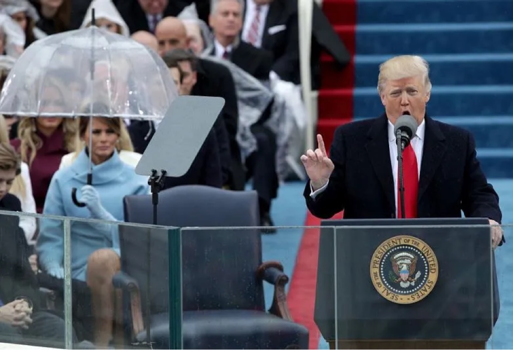
细节很重要。图片中的一切都很重要。通常是一个细节成就了故事。在这张照片中,您需要将焦点从前景转移到背景。注意到什么了吗?比较…
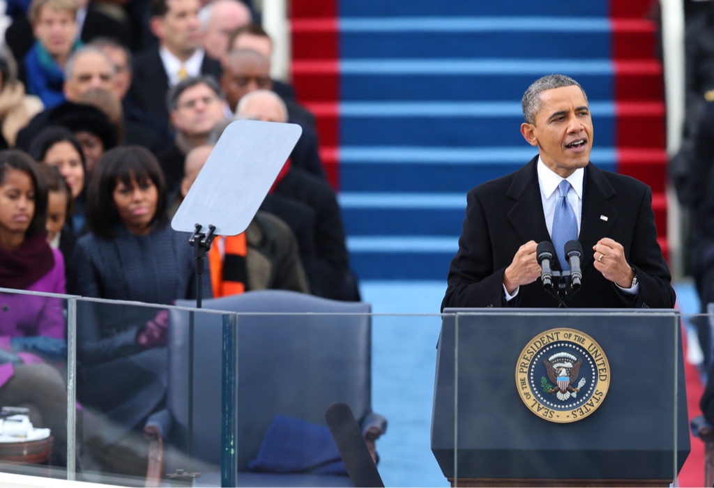
比较的力量 我们很少找到如此相似但又如此不同的图片。虽然梅拉尼娅的利己主义保护伞本身可能不会被注意到,但相比之下,梅拉尼娅第一的信息传达得相当清楚。
If you want to avoid a comparaison, the best trick is to insert a text slide between your pictures. This way, your audience won’t be distracted by playing a spot-the-difference game.
如果您想避免比较,最好的技巧是在图片之间插入文本幻灯片。这样,您的观众就不会因为玩找茬游戏而分心。
When placing multiple images in a grid or on one slide after the other, ensure they don’t clash in terms of colors, style, or resolution. Otherwise, people will focus more on the contrast between the images rather than their content.
将多个图像放置在网格中或一张又一张幻灯片上时,请确保它们在颜色、样式或分辨率方面不会发生冲突。否则,人们会更多地关注图像之间的对比而不是图像的内容。
Design Tips 设计技巧
1. Human Preferences 1. 人类偏好
It’s useful to know what captures an audience’s attention so you can choose your visual accordingly. Generally, people prefer observing faces over silhouettes and viewing people rather than plants. The typical preference order for looking at visuals is as follows:
了解什么能吸引观众的注意力非常有用,这样您就可以相应地选择视觉效果。一般来说,人们更喜欢观察面孔而不是轮廓,更喜欢观察人而不是植物。查看视觉效果的典型偏好顺序如下:
- A face 一张脸
- A whole person 整个人
- Animals 动物
- Things 事物
- Places 地点
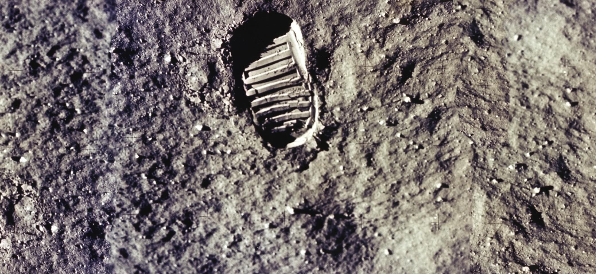
There are exceptions to every rule. The NASA’s moon landing photos might captivate more individuals than your wedding pictures. But know that displaying just a hand might be less interesting than showing nothing at all.
每条规则都有例外。美国宇航局的登月照片可能比你的婚礼照片更吸引人。但要知道,只展示一只手可能不如什么都不展示那么有趣。
2. Meaningful Captions 2. 有意义的字幕
Your audience is made of smart individuals. Don’t write next to the image what people already see. A caption is not an ALT text.
您的观众都是由聪明人组成的。不要在图像旁边写下人们已经看到的内容。标题不是 ALT 文本。
Similarly, don’t repeat in spoken words what your image shows. Visuals should complement, not repeat or overshadow, the text.
同样,不要用口头语言重复你的图像所显示的内容。视觉效果应该补充文本,而不是重复或掩盖文本。
We will use this famous picture of Martin Luther King delivering his speech “I Have a Dream” to showcase how to use images and text together.
我们将用这张马丁·路德·金演讲《我有一个梦想》的著名照片来展示如何结合使用图像和文字。

讲述故事的图像:在巴士座位按种族划分的种族隔离中,一名黑人以新当选总统的典型姿势讲述了一个引人入胜的故事。

单调:重复每个人都可以看到的内容是不好的做法。为了使图片和文字发挥作用,它们需要彼此有话可说。
Consider Apple’s “Think Different” campaign, one of the most iconic marketing campaigns in history. The simple visuals made the slogan even more memorable and gave them staying power.
以苹果公司的“Think Different”活动为例,这是历史上最具标志性的营销活动之一。简单的视觉效果使口号更加令人难忘,并赋予其持久力。

说明:文字描述了图像。比重复显而易见的事情要好,但仍然不是很有趣。

协同作用:图像和文本相互对话。当文本讲述图像中你第一眼看不到的东西,以及当图像呈现出难以想象的内容时,文本和图像最强大的组合就会发生。
Do not be boring or overly explanatory. The visual should attract their attention to your words and vice-versa.
不要无聊或过度解释。视觉效果应该吸引他们对你的文字的注意,反之亦然。
Delve Deeper 深入探究
Select your visuals for your presentation with the same care as you choose your words. If a visual lacks meaning, it is just a decorative placeholder. It will dilute your message, distract from what you want to say, and shows disrespect to your audience. Be extra careful with stock images and AI-generated visuals: they are counterproductive if you lack proficiency in design to control them. Opt for fewer, higher-quality visuals. Don’t let bad imagery choices make you look unprofessional.
像选择文字一样谨慎地选择演示文稿的视觉效果。如果视觉效果缺乏意义,它只是一个装饰性占位符。它会淡化你的信息,分散你想说的内容,并且表现出对你的听众的不尊重。对库存图像和人工智能生成的视觉效果要格外小心:如果您缺乏控制它们的设计能力,它们会适得其反。选择更少、更高质量的视觉效果。不要让糟糕的图像选择让您看起来不专业。
In this article, we’ve distilled information from various design blog posts to provide you with handy tips for your next presentation. If you’re interested in exploring further on those topics, check our in-depth resources below:
在本文中,我们从各种设计博客文章中提取了信息,为您的下一次演示提供方便的提示。如果您有兴趣进一步探索这些主题,请查看以下我们的深入资源:
- A full perspective on Stock Images: Is Every Picture Worth 1,000 Words?
Stock Images 的完整视角:每张图片都值 1,000 个字吗? - Reflections on the widespread use of “AI-Art” for images and videos
对图像和视频广泛使用“AI艺术”的思考
We love to see what you do with iA Presenter and the tips we give you to make better presentation. If you are proud of your work, share it with our team at presenter@ia.net.
我们很高兴看到您使用 iA Presenter 进行的操作以及我们为您提供的如何做出更好演示的提示。如果您对自己的工作感到自豪,请通过 Presenter@ia.net 与我们的团队分享。