
Perhaps you’ve noticed over the past decade how that “once in a century” forest fire or hurricane seems to be appearing in the news more often than its name would imply. With temperatures increasing due to climate change, natural disasters are increasing in both frequency and intensity across the world. In these situations, it’s of the utmost importance that first responders can get on the scene to mitigate damage and aid people as efficiently as possible. CrisisReady and DirectRelief aim to do just that by advancing data-driven decision-making in various types of emergencies worldwide, from forest fires in California to the war in Ukraine.
也许您在过去十年中已经注意到,“百年一遇”的森林火灾或飓风似乎比其名称所暗示的更频繁地出现在新闻中。随着气候变化导致气温升高,世界各地自然灾害的频率和强度都在增加。在这些情况下,最重要的是急救人员能够到达现场以减轻损失并尽可能有效地帮助人们。 CrisisReady 和 DirectRelief 旨在通过在全球各种类型的紧急情况(从加利福尼亚的森林火灾到乌克兰的战争)中推进数据驱动的决策来实现这一目标。
Creating ReadyMapper to map natural disasters
创建 ReadyMapper 来绘制自然灾害地图
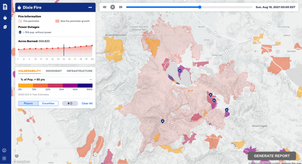
Stamen 构建的交互式仪表板 ReadyMapper,可供 CrisisReady 在森林火灾等紧急情况下用于决策
CrisisReady came to Stamen expressing frustration at the multiple platforms required to gather information and make decisions, especially given their need to perform analysis across multiple datasets. We built a tool called ReadyMapper to solve these problems. Initially, it was designed around forest fires so users could answer these questions quickly:
CrisisReady 向 Stamen 表达了对收集信息和做出决策所需的多个平台的失望,特别是考虑到他们需要跨多个数据集进行分析。我们构建了一个名为 ReadyMapper 的工具来解决这些问题。最初,它是围绕森林火灾设计的,因此用户可以快速回答以下问题:
- Where is the fire perimeter?
火灾范围在哪里? - How is it changing?
变化如何? - Where are the vulnerable people?
弱势群体在哪里? - Where are they going?
他们要去哪? - What does the healthcare infrastructure look like?
医疗保健基础设施是什么样的?
The dashboard features the ability to upload data for natural disasters happening in realtime that can then be visualized alongside demographic data. Users can visualize this information on a map and in secondary visualizations, as well as make selections to hone in on areas of interest. Once they are satisfied with their selections, they can generate a report to summarize their findings for themselves and anyone else in the incident command chain that needs the synthesized results. Users can also upload and/or preserve past fire datasets to study and observe trends for academic purposes and internal training. Learn more about how this dashboard was originally built for forest fires in one of our blog posts from 2023.
该仪表板能够上传实时发生的自然灾害数据,然后可以与人口统计数据一起可视化。用户可以在地图和二次可视化中可视化这些信息,并做出选择以磨练感兴趣的区域。一旦他们对自己的选择感到满意,他们就可以生成一份报告,为自己以及事件指挥链中需要综合结果的任何其他人总结他们的发现。用户还可以上传和/或保存过去的火灾数据集,以研究和观察趋势以用于学术目的和内部培训。请参阅我们 2023 年的一篇博客文章,详细了解此仪表板最初是如何为森林火灾而构建的。
How are hurricanes typically visualized?
飓风通常是如何形象化的?
Once we were satisfied with the design for forest fires, it was time to expand the interface to accommodate hurricane disaster relief. When we were mapping forest fires, we were just showing the fire perimeter along with calling out any new fire growth, meaning there were not many variables to show. Hurricane modeling and predicting is far more robust, however, meaning we had at least 10-20 datasets we could show on a map. Our first instinct was to consult what people were already used to seeing when it came to hurricane visualizations.
一旦我们对森林火灾的设计感到满意,就可以扩展界面以适应飓风救灾。当我们绘制森林火灾地图时,我们只是显示火灾范围并指出任何新的火灾增长,这意味着没有太多变量可以显示。然而,飓风建模和预测要强大得多,这意味着我们至少有 10-20 个数据集可以在地图上显示。我们的第一直觉是参考人们在飓风可视化方面已经习惯看到的内容。
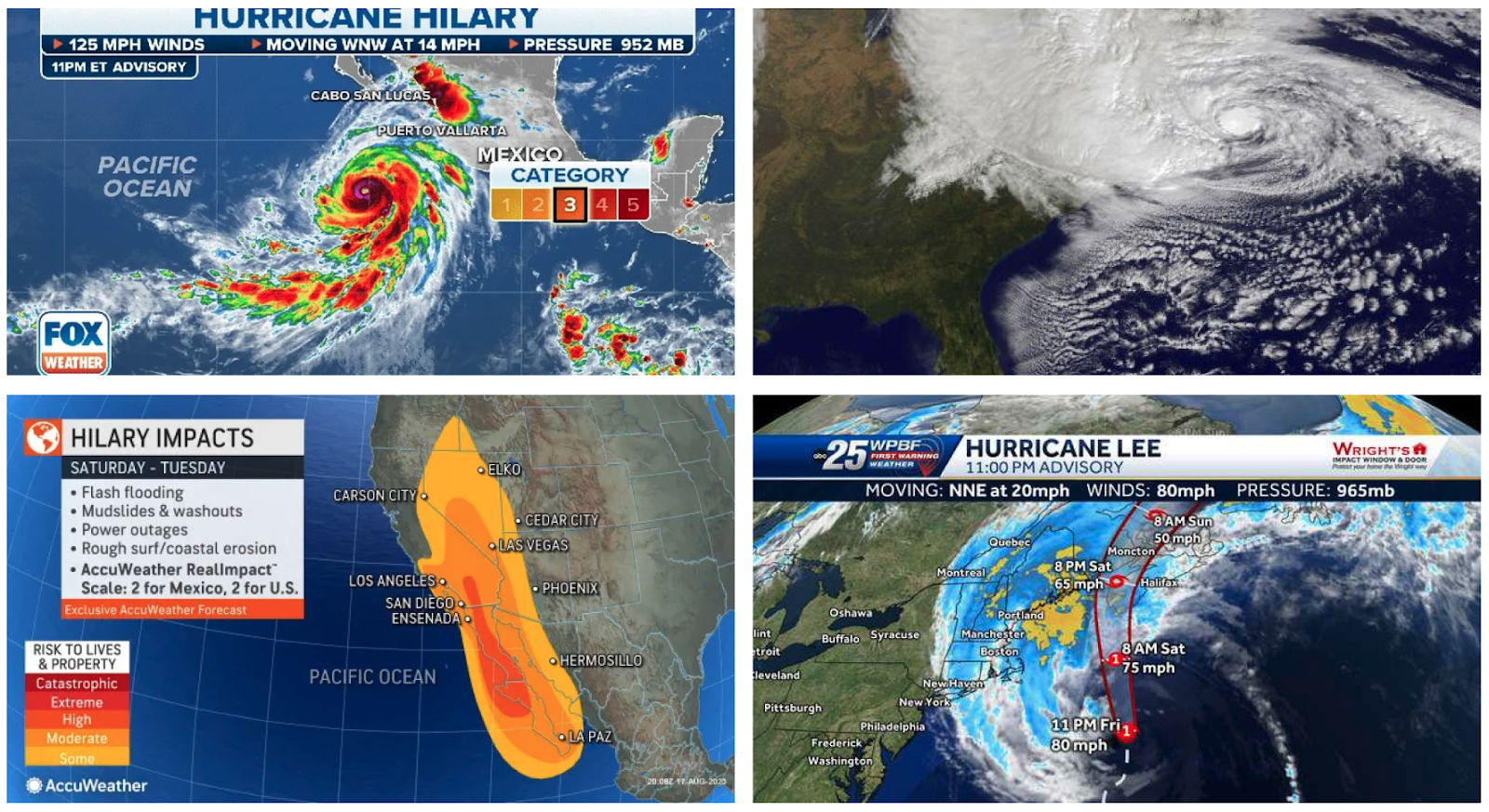
在新闻频道上可视化飓风的常见方法
Initially, we were struck by some observations:
最初,我们对一些观察结果感到震惊:
- Hurricane visualizations are often at a multi-state (sometimes even country) scale
飓风可视化通常是多州(有时甚至是国家)规模的 - The eye of the hurricane and impacted areas are the focal point
飓风眼和受影响地区是焦点 - Satellite data is often the canvas for mapping hurricanes
卫星数据通常是绘制飓风图的画布
While it might seem lazy at first, sticking to what people are familiar with is often one of the best design strategies one can employ. As Dieter Rams, who founded the Ten Principles of Good Design, puts it, good design “makes a product useful and understandable, is innovative, aesthetic, unobtrusive, honest, long-lasting, thorough to the last detail, environmentally friendly, and involves as little design as possible.” Forcing a user to relearn a system that may not be broken is poor design, so we wanted to maintain as much of these design characteristics as possible.
虽然一开始可能看起来很懒,但坚持人们熟悉的东西通常是人们可以采用的最佳设计策略之一。正如《优秀设计十项原则》的创始人迪特·拉姆斯所说,优秀的设计“使产品有用且易于理解、创新、美观、低调、诚实、持久、彻底到最后一个细节、环保,并涉及尽可能少的设计。”强迫用户重新学习一个可能不会被破坏的系统是糟糕的设计,因此我们希望尽可能多地保留这些设计特征。
用于预测和数据分析目的的飓风可视化的常见方法
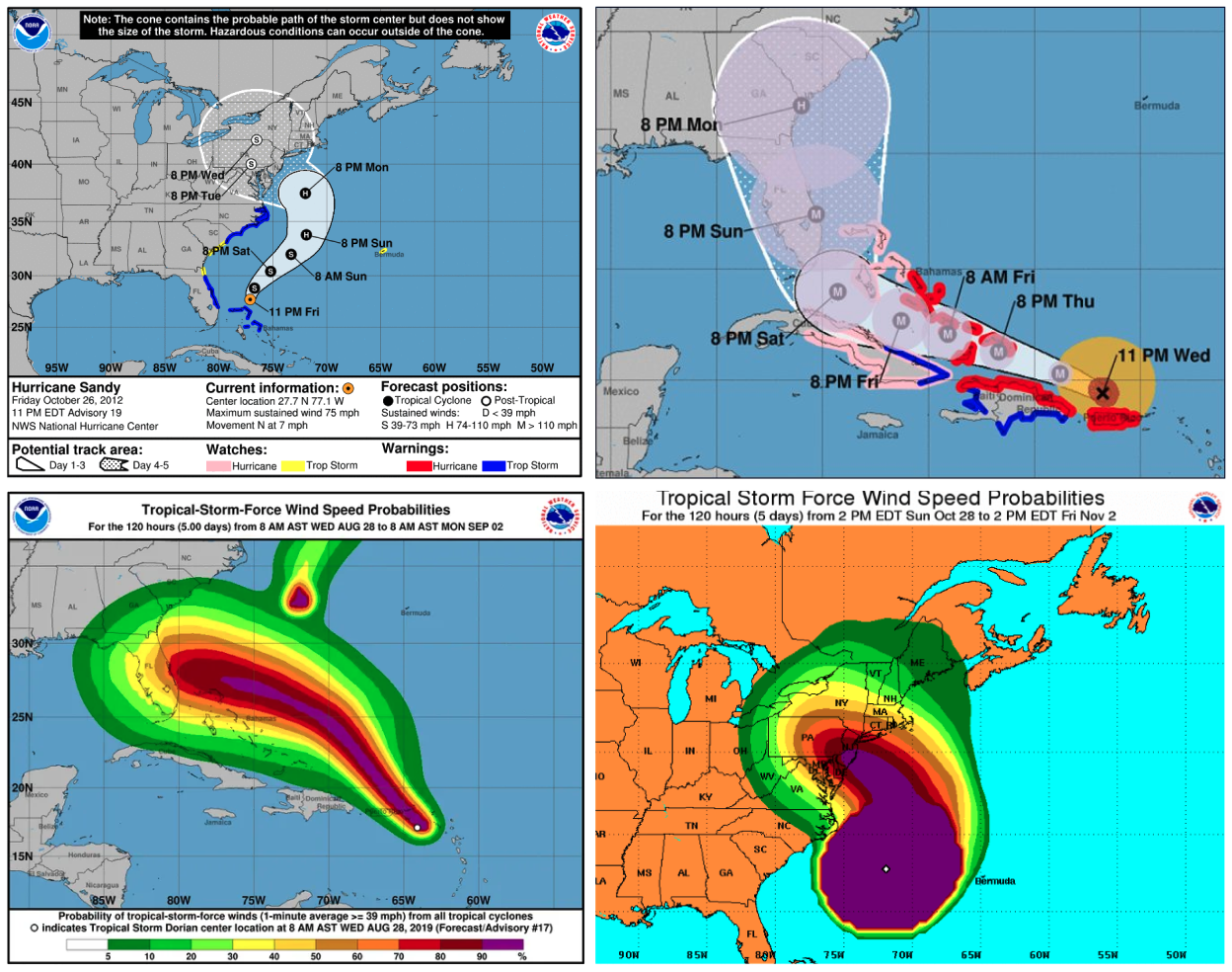
While we appreciated the satellite map as a familiar canvas for people to understand and relate to, we knew it was too noisy to use as our default basemap. Given we needed to also show the other demographic data in tandem with our hurricane information, we needed a much simpler basemap. We did a bit more research on how hurricanes are visualized on monochromatic maps and found that people were often packing in more predictive data. It seemed that the two most common ways of showing forecasting data were through the cone of uncertainty and wind speed probabilities.
虽然我们赞赏卫星地图作为人们熟悉的画布,便于人们理解和联系,但我们知道它的噪音太大,无法用作我们的默认底图。鉴于我们还需要与飓风信息一起显示其他人口统计数据,我们需要一个更简单的底图。我们对如何在单色地图上可视化飓风进行了更多研究,发现人们通常会收集更多预测数据。似乎显示预测数据的两种最常见的方式是通过不确定性锥体和风速概率。
Emphasizing wind speed probability data
强调风速概率数据
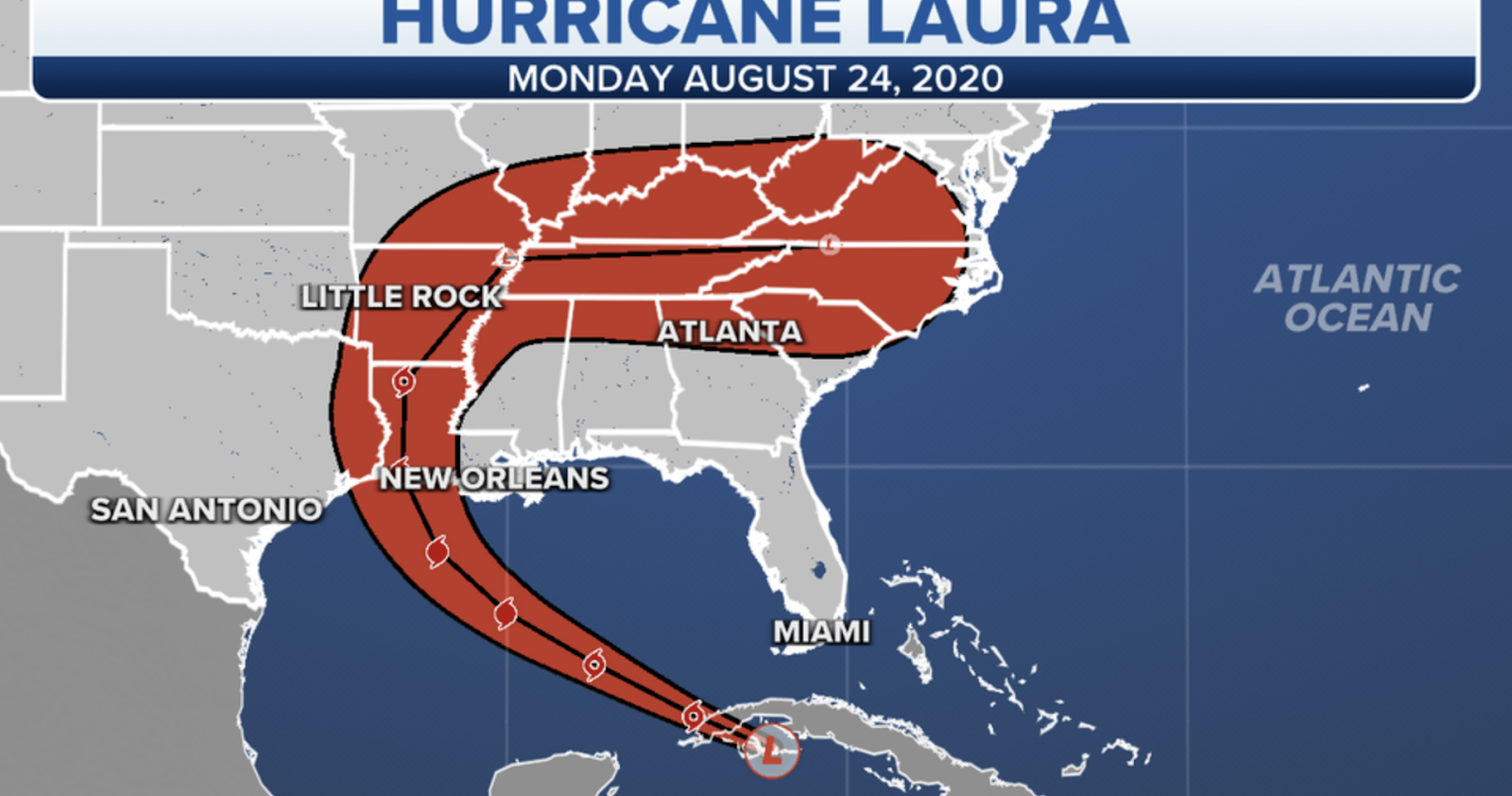
指示飓风劳拉可能路径的不确定锥示例
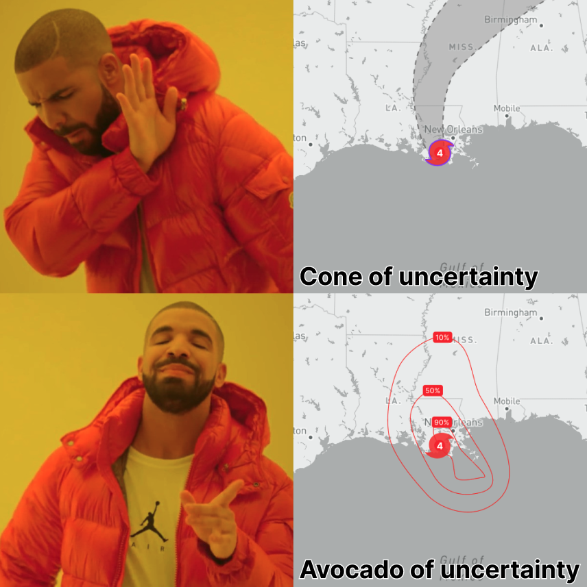
Knowing where the hurricane is likely to go and when allows decision-makers to make preemptive calls to keep people safe, such as determining who to evacuate. The most common way this is done is through the “cone of uncertainty,” which provides a range of where the hurricane could travel. The cone of uncertainty, while commonplace, lacks granular data that is useful for people calling the shots during emergency situations. Through discussing with our stakeholders and future users, we determined that the more precise predictive data would be to show wind speed probabilities.
了解飓风可能去往何处以及何时,决策者可以先发制人,以确保人们的安全,例如确定疏散人员。最常见的方法是通过“不确定锥”,它提供了飓风可能行进的范围。不确定性锥虽然很常见,但缺乏对紧急情况下发号施令的人有用的详细数据。通过与我们的利益相关者和未来用户的讨论,我们确定更精确的预测数据将显示风速概率。
飓风艾达登陆时风速概率数据的预设视图
Wind speed probability data shows you the likelihood of sustained wind speeds that denote a category 1 hurricane (74+ mph). The way the data appears on a map is through concentric polygons that denote progressively less likely areas to experience a category 1 hurricane. We had bands showing the breakdown by 10%, but felt that given how much other data we needed to show, paring back the number of circles would be best. We ultimately decided on showing 90%, 50%, and 10% chance areas of category 1 hurricane. The team, and our stakeholders, agreed that this way of showing hurricane forecasting was far more precise than the cone of uncertainty. Wind speed probability data shows specific degrees of hurricane likelihood compared to only emphasizing one area like with the cone. Put simply, the cone of uncertainty tries to do too much at the cost of specificity. When we loaded the data onto our prototype we realized it looked like an avocado; the avocado of uncertainty! Better yet, we realized later that we weren’t the first ones to make this observation.
风速概率数据向您显示表示 1 类飓风(74+ 英里/小时)的持续风速的可能性。数据在地图上显示的方式是通过同心多边形,这些多边形表示逐渐不太可能经历 1 类飓风的区域。我们的条带显示了 10% 的细分,但我们认为考虑到我们需要显示多少其他数据,减少圆圈的数量将是最好的。我们最终决定显示 1 级飓风发生概率为 90%、50% 和 10% 的区域。该团队和我们的利益相关者一致认为,这种显示飓风预报的方式比不确定锥体要精确得多。与仅强调一个区域(如锥体)相比,风速概率数据显示了特定程度的飓风可能性。简而言之,不确定性锥试图以牺牲特异性为代价做太多事情。当我们将数据加载到原型上时,我们意识到它看起来像一个鳄梨;不确定性的鳄梨!更好的是,我们后来意识到我们并不是第一个做出这一观察的人。
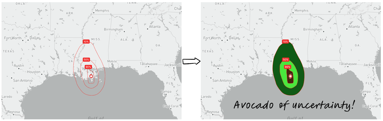
考虑到与臭名昭著的“不确定性锥体”的比较,我们将风速概率数据称为“不确定性鳄梨”
Choosing the right data for our users
为我们的用户选择正确的数据
All our forest fire visualizations were done at a large scale that allowed users to view demographic data in tandem with the fire data. Given the speed and severity of hurricanes, we were going to need to design for the big picture at a much smaller scale. This scale is ideal for understanding what the hurricane is doing and determining the larger areas of interest before zooming into the data and showing more granular demographic data. This led us to de-emphasize the demographic data at more zoomed out levels, which meant we could add more hurricane information.
我们所有的森林火灾可视化都是大规模完成的,允许用户查看人口统计数据和火灾数据。考虑到飓风的速度和严重程度,我们需要在更小的规模上进行整体设计。此比例非常适合了解飓风正在做什么,并在放大数据并显示更精细的人口统计数据之前确定更大的关注区域。这导致我们不再强调更缩小级别的人口数据,这意味着我们可以添加更多飓风信息。
飓风可视化的缩小视图,强调大局
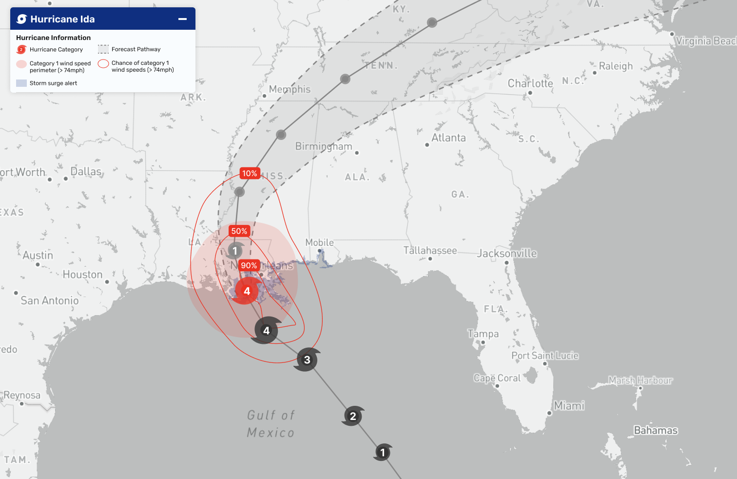
Upon interviewing our users as well as looking at data reliability and accuracy, we decided to add in storm surge data. This would be helpful for users to understand areas that are at risk of flood. We also added in the range of current category 1 hurricane speeds to show the extent of the hurricane impact at that moment in time. We included the historical path as well as the predictive path of the hurricane. For good measure, we added in the cone of uncertainty given how commonplace it is for visualizing hurricanes, though we made sure to de-emphasize that data compared to the rest of our information. As CrisisReady explained to us, people expect to see the cone of uncertainty in hurricane visualizations, though the avocado of uncertainty should remain the focus.
在采访了我们的用户并查看了数据的可靠性和准确性后,我们决定添加风暴潮数据。这将有助于用户了解面临洪水风险的区域。我们还添加了当前 1 类飓风速度的范围,以显示当时飓风影响的程度。我们包括了飓风的历史路径和预测路径。为了更好地衡量,考虑到飓风可视化的普遍性,我们添加了不确定性锥体,尽管与我们的其他信息相比,我们确保不强调这些数据。正如 CrisisReady 向我们解释的那样,人们期望在飓风可视化中看到不确定性的锥体,尽管不确定性的牛油果应该仍然是焦点。
We knew we wanted our focal point to be the current hurricane location and avocado of uncertainty, but we needed to use careful styling that would adjust depending on the zoom emphasis. Unlike most other hurricane maps, our users were going to need to see more of the basemap under the eye of the hurricane. We decided on red to showcase the most important information about the hurricane at that moment in time. We used black to show the historical path and gray to indicate the forecasted path. It felt natural to use blue for storm surge data. With a light pattern, it also could stand out behind the red data overlay that would often appear on top of it.
我们知道我们希望我们的焦点是当前的飓风位置和不确定性,但我们需要使用仔细的样式,该样式会根据缩放重点进行调整。与大多数其他飓风地图不同,我们的用户需要查看飓风眼下的更多底图。我们决定使用红色来展示当时有关飓风的最重要信息。我们用黑色表示历史路径,用灰色表示预测路径。使用蓝色来表示风暴潮数据感觉很自然。通过灯光图案,它还可以在经常出现在其顶部的红色数据覆盖层后面脱颖而出。
Designing for decision-making
为决策而设计
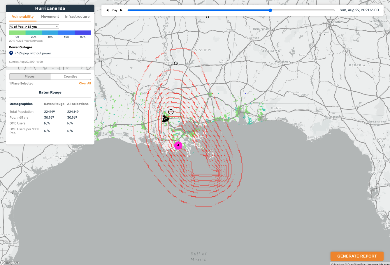
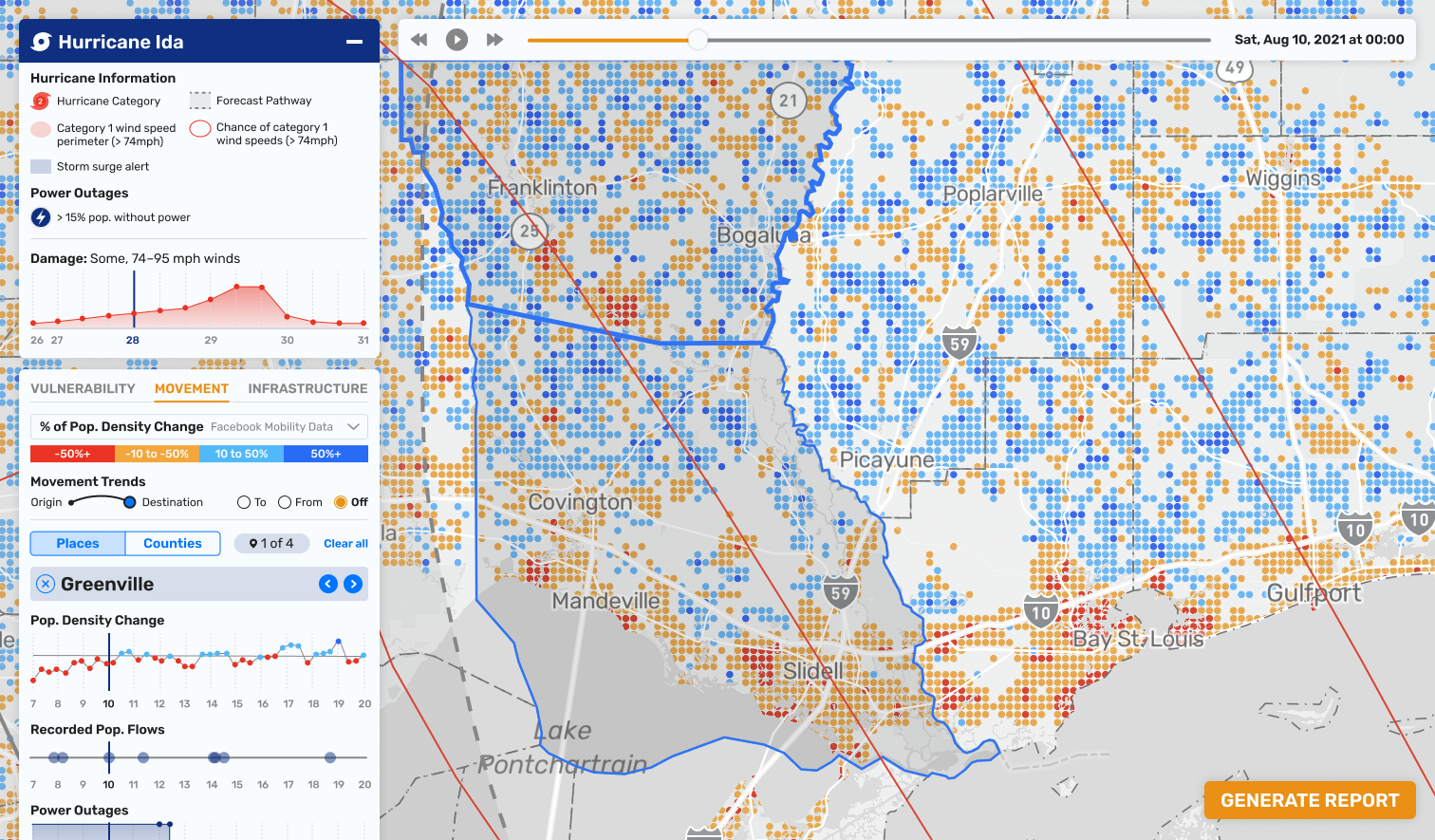
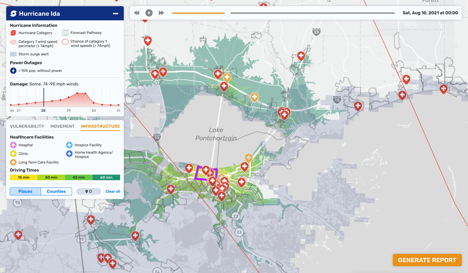
When a user gets a closer look at their areas of interest, we switch the emphasis to the demographic data by de-saturating the hurricane layers. Users can zoom in and out as well as make selections to see more secondary visualizations relating to vulnerability, movement, healthcare infrastructure, and drive times. We’ve also added an area chart to track a hurricane’s growth by wind over time. Users can move back and forward in time depending on data availability to see change over time.
当用户仔细观察他们感兴趣的领域时,我们通过降低飓风层的饱和度将重点转向人口统计数据。用户可以放大和缩小以及进行选择,以查看与漏洞、移动、医疗基础设施和驾驶时间相关的更多辅助可视化。我们还添加了面积图来跟踪飓风随着时间的推移随风的增长。用户可以根据数据可用性及时前后移动,以查看随时间的变化。
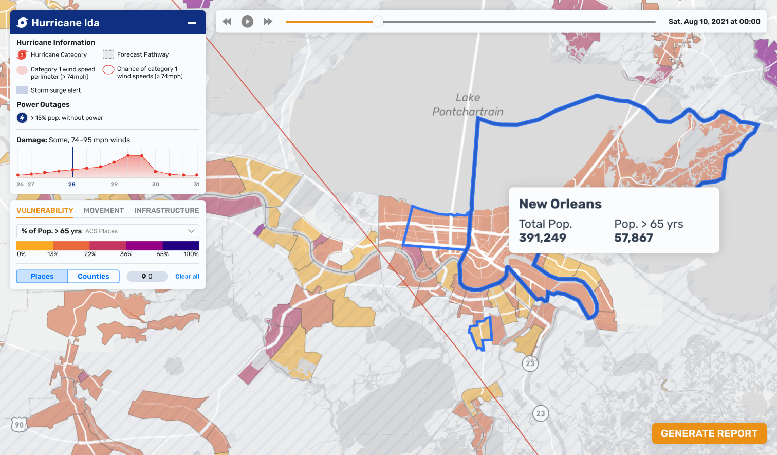
用户使用 ReadyMapper 检查与飓风艾达相关的人口统计数据
Time is of the essence for responders in a hurricane scenario. We built a report-generation feature that synthesizes an analyst’s findings for decision-makers to quickly understand the areas of interest in reference to the hurricane. The structure matches the outline we built for forest fires to ensure consistency for those potentially looking at both fire and hurricane disasters in one day. The first section briefs the reader on the hurricane path, wind speeds, storm surge etc. Then, there are sections on vulnerability, movement, and infrastructure relating to any of the places that were selected when the report was made. Any of the generated maps, figures, and tables can be removed and there are sections for the report-maker to add their own notes in order to ensure that the reader can understand the situation as quickly as possible.
对于飓风场景中的响应者来说,时间至关重要。我们构建了一个报告生成功能,可以综合分析师的调查结果,以便决策者快速了解与飓风有关的感兴趣领域。该结构与我们为森林火灾构建的轮廓相匹配,以确保那些可能在一天内查看火灾和飓风灾难的人的一致性。第一部分向读者简要介绍了飓风路径、风速、风暴潮等。然后,有一些部分介绍了与报告撰写时选择的任何地点相关的脆弱性、移动和基础设施。任何生成的地图、图形和表格都可以删除,并且报告制作者可以在其中添加自己的注释,以确保读者能够尽快了解情况。
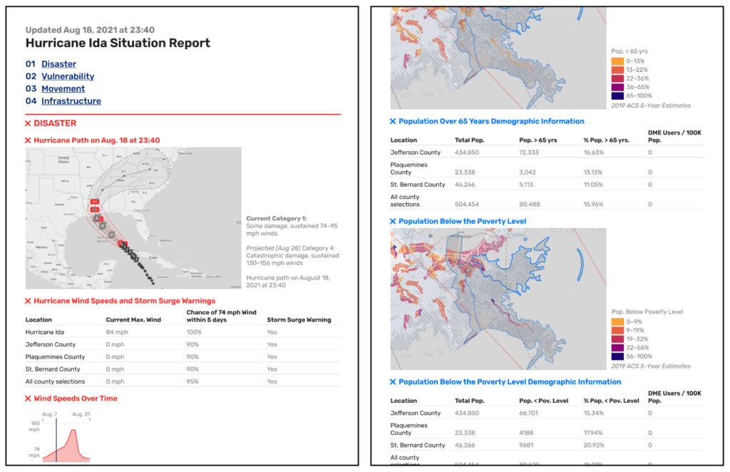
使用 ReadyMapper 生成的飓风自然灾害的可编辑报告
It was a pleasure working with CrisisReady to create more efficient internal systems for responding to public health emergencies (that also double as an archive for teaching). It was especially rewarding for us to be able to work alongside these decision-makers and analysts to determine the right data hierarchy, which in turn surfaced our design decision to place emphasis on the “avocado of uncertainty” over the “cone of uncertainty.” Check out more of our work at our website, and if you’ve got data you need visualizing, let’s be in touch!
很高兴与 CrisisReady 合作创建更有效的内部系统来应对公共卫生紧急情况(也可作为教学档案)。能够与这些决策者和分析师一起确定正确的数据层次结构,这对我们来说是特别有益的,这反过来又使我们的设计决策更加强调“不确定性的牛油果”而不是“不确定性的锥体”。在我们的网站上查看我们的更多工作,如果您有需要可视化的数据,请与我们联系!