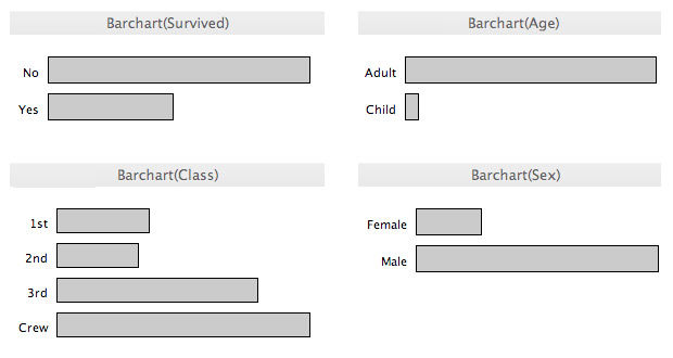
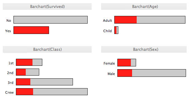
Data visualization is the graphical display of abstract information for two purposes: sense-making (also called data analysis) and communication. Important stories live in our data and data visualization is a powerful means to discover and understand these stories, and then to present them to others. The information is abstract in that it describes things that are not physical. Statistical information is abstract. Whether it concerns sales, incidences of disease, athletic performance, or anything else, even though it doesn't pertain to the physical world, we can still display it visually, but to do this we must find a way to give form to that which has none. This translation of the abstract into physical attributes of vision (length, position, size, shape, and color, to name a few) can only succeed if we understand a bit about visual perception and cognition. In other words, to visualize data effectively, we must follow design principles that are derived from an understanding of human perception.
As the saying goes, "a picture is worth a thousand words" - often more - but only when the story is best told graphically rather than verbally and the picture is well designed. You could stare at a table of numbers all day and never see what would be immediately obvious when looking at a good picture of those same numbers. Allow me to illustrate. Here's a simple table of sales data - a year's worth - divided into two regions:

Author/Copyright holder: Unknown (pending investigation). Copyright terms and licence: Unknown (pending investigation). See section "Exceptions" in the copyright terms below.
Figure 35.1
This table does two things extremely well: it expresses these sales values precisely and it provides an efficient means to look up values for a particular region and month. But if we're looking for patterns, trends, or exceptions among these values, if we want a quick sense of the story contained in these numbers, or we need to compare whole sets of numbers rather than just two at a time, this table fails.
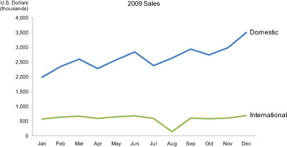
Now look at the following picture of the same information in the form of a line graph:
Author/Copyright holder: Unknown (pending investigation). Copyright terms and licence: Unknown (pending investigation). See section "Exceptions" in the copyright terms below.
Figure 35.2
Several facts now leap into view:
Domestic sales were considerably and consistently higher than international.
Domestic sales trended upward over the year as a whole.
International sales, in contrast, remained relatively flat, with one glaring exception: they decreased sharply in August.
Domestic sales exhibited a cyclical pattern - up, up, down - that repeated itself on a quarterly basis, always reaching the peak in the last month of the quarter and then declining dramatically in the first month of the next.
What these numbers could not communicate when presented as text in a table, which our brains interpret through the use of verbal processing, becomes visible and understandable when communicated visually. This is the power of "data visualization."
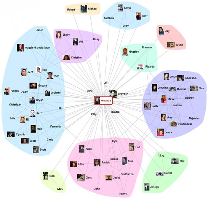
Although data visualization usually features relationships between quantitative values, it can also display relationships that are not quantitative in nature. For instance, the connections between people on a social networking site such as Facebook or between suspected terrorists can be displayed using a node and link visualization. In the following example, people are the nodes, represented as circles, and their relationships are the links, represented as lines that connect them.
Author/Copyright holder: Courtesy of Jeffrey Heer and Danah Boyd using Vizster. Copyright terms and licence: CC-Att-ND (Creative Commons Attribution-NoDerivs 3.0 Unported).
Figure 35.3
Visualizations that feature relationships between entities, such as the people in the example above, can be enriched with the addition of quantitative information as well. For example, the number of times that any two people have interacted could be represented by the thickness of the line that connects them.
35.1 Data Visualization in Historical Context
People have been arranging data into tables (columns and rows) at least since the 2nd century C.E., but the idea of representing quantitative information graphically didn't arise until the 17th century. For this innovation we have the French philosopher and mathematician Rene Descartes to thank. He developed a two-dimensional coordinate system for displaying values, consisting of a horizontal axis for one variable and a vertical axis for another, primarily as a graphical means of performing mathematical operations. It wasn't until the late 18th century that we began to exploit the potential of graphics for the communication of quantitative data, for which we have the Scotsman William Playfair to thank. Playfair pioneered many of the graphs that are commonly used today. He was the first person to use a line moving up and down as it progressed from left to right to show how values changed through time, as in the example below. He also invented the bar graph, and on one of his off days he invented the pie chart, which we have since found relatively ineffective, because it encodes values as visual attributes (primarily the area of each slice as well as the angle that it forms in the center of the pie) that we cannot easily perceive and compare.
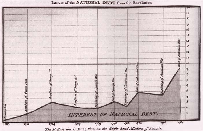
Author/Copyright holder: Courtesy of William Playfair (1759-1823). Copyright terms and licence: pd (Public Domain (information that is common property and contains no original authorship)).
Figure 35.4: Playfair included this graph in his The Commercial and Political Atlas (1786) to argue against England's policy of financing colonial wars through national debt.
The use of quantitative graphs gradually increased over the years, but their methods and effectiveness evolved little until the second half of the 20th century. Jacques Bertin laid the foundation for much of the progress that's been made during the last half a century with the publication in 1967 of the book Semiologie graphique (The Semiology of Graphics, Bertin 1967). His work was pivotal because he discovered that visual perception operated according to rules that could be followed to express information visually in ways that represented it intuitively, clearly, accurately, and efficiently.
The person who really introduced us to the power of data visualization as a means for exploring and making sense of quantitative data was the Princeton statistics professor John Tukey, who in 1977 gave form to a whole new statistical approach called exploratory data analysis.
In 1983, the person working in the field today whose name is recognized above all others, Edward Tufte, published his groundbreaking book The Visual Display of Quantitative Information. In it he pointed out that there were effective ways of displaying data visually and then there were the ways that most people were doing it, which didn't work very well. Also working to improve data visualization practices around this time was William Cleveland, who extended and refined data visualization techniques for statisticians.
Soon thereafter, a new research specialty emerged in the academic world, which was coined "information visualization." In their 1999 book Readings in Information Visualization: Using Vision to Think, Stuart Card, Jock Mackinlay, and Ben Shneiderman collected the best academic work that had been done by that time into a single volume and made its discoveries accessible beyond the walls of academia (Card et al 1999).
Since the turn of the 21st century, data visualization has been popularized, too often in tragically ineffective ways as it has reached the masses through commercial software products. Gratefully, amongst the bevy of products that promote data visualization in ways that feature superficially appealing aesthetics above useful and effective data exploration, sense-making, and communication, there are a few serious contenders for our attention who are helping us fulfill its potential in practical and powerful ways.
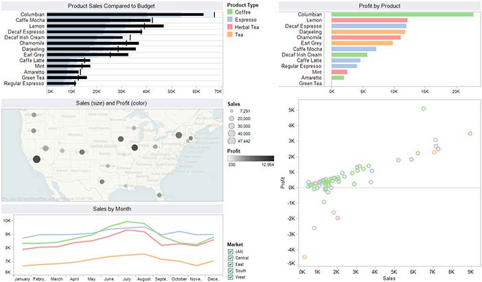
Author/Copyright holder: Unknown (pending investigation). Copyright terms and licence: Unknown (pending investigation). See section "Exceptions" in the copyright terms below.
Figure 35.5: This display, consisting of multiple views of the same data set, was created using Tableau Software, one of the few software vendors that currently understand data visualization.
Among those who have contributed to our understanding of data visualization, Colin Ware has done the most to base its practice on an understanding of human perception. Ware's two excellent books - Information Visualization: Perception for Design (Ware, 2004) and Visual Thinking for Design (Ware 2008) - compile, organize, and explain what we have learned from several scientific disciplines about visual thinking and cognition and apply that knowledge to data visualization.
35.2 Pictures for the Eyes and Mind
Data visualization is only successful to the degree that it encodes information in a manner that our eyes can discern and our brains can understand. Getting this right is much more a science than an art, which we can only achieve by studying human perception. The goal is to translate abstract information into visual representations that can be easily, efficiently, accurately, and meaningfully decoded. Consider a case when you need to help people understand the primary causes of death in America contained in the following table:
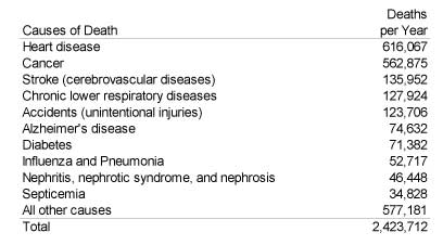
Author/Copyright holder: Unknown (pending investigation). Copyright terms and licence: Unknown (pending investigation). See section "Exceptions" in the copyright terms below.
Figure 35.6
To achieve this goal, the display should achieve the following:
Clearly indicates how the values relate to one another, which in this case is a part-to-whole relationship - the number of deaths per cause, when summed, equal all deaths during the year.
Represents the quantities accurately.
Makes it easy to compare the quantities.
Makes it easy to see the ranked order of values, such as from the leading cause of death to the least.
Makes obvious how people should use the information - what they should use it to accomplish - and encourages them to do this.
The traditional way to display this information graphically involves a pie chart, illustrated below.
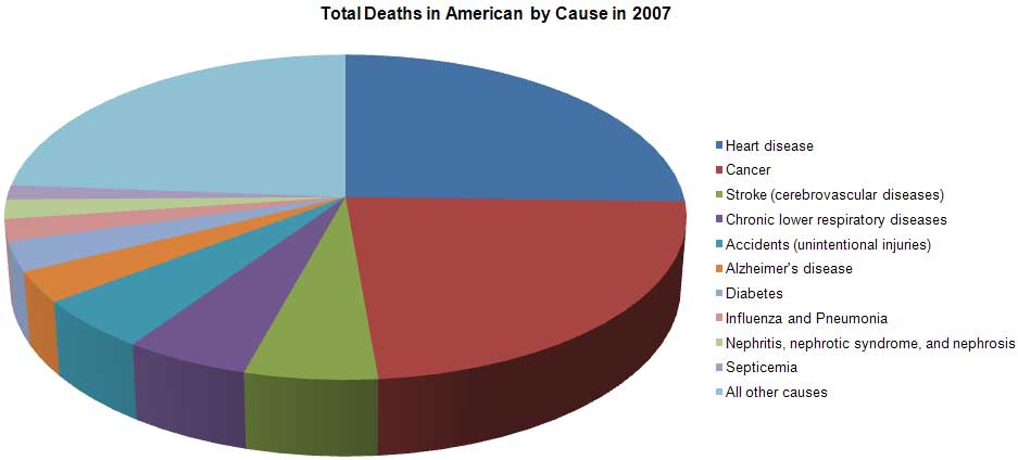
Author/Copyright holder: Unknown (pending investigation). Copyright terms and licence: Unknown (pending investigation). See section "Exceptions" in the copyright terms below.
Figure 35.7
How well does this pie chart satisfy our criteria for effectiveness? Let's consider each of the requirements.
Clearly indicates the nature of the relationship? Yes. The primary strength of a pie chart is the fact that it clearly indicates a part-to-whole relationship between the values.
Represents the quantities accurately? No. Pie charts encode values redundantly through the use of three visual attributes: the area of each slice, the angle formed by each slice at the center of the pie, and the length of the each slice along the pie's perimeter. Even when the area, angle, and perimeter of each slice is calculated properly, it fails in that we cannot perceive any one of these attributes accurately. Visual perception in humans has not evolved to support accurate decoding of areas, angles, or distance along a curve.
Makes it easy to compare the quantities? No. Because we cannot perceive the values accurately, we also cannot compare them easily or accurately. Furthermore, in this particular pie chart, because a legend has been used to label the slices, we are forced over and over to look up the meaning of the slices we wish to compare by finding the right color, which is often difficult to discriminate. The fact that this pie chart has been rendered in 3-D also complicates the simple act of comparison because the perspective skews the relative size and shape of the slices, making slices on the bottom appear larger and more salient than similarly sized slices on the top.
Makes it easy to see the ranked order of values? No. Even though the slices are displayed in ranked order from the highest value (heart disease) at the top and continuing clockwise to the smallest, excluding the final "All other causes" slice, this ranking isn't obvious, because it's difficult to compare the slices. For example, the red cancer slice appears to be larger than the blue heart disease slice due to the 3-D effect, which has given it more visual weight. Effects such as the 3-D rendering of this pie chart are sometimes used to intentionally mislead.
Makes obvious how people should use the information? Partially. Although the pie chart succeeds in encouraging people to compare the slices to understand the relative contributions of each part to the whole, it fails to support this operation effectively.
Given the ways in which this pie chart has failed to match human perception, let's consider an alternative form of display. The following bar graph displays the same set of values, but in a way that can be more readily perceived.
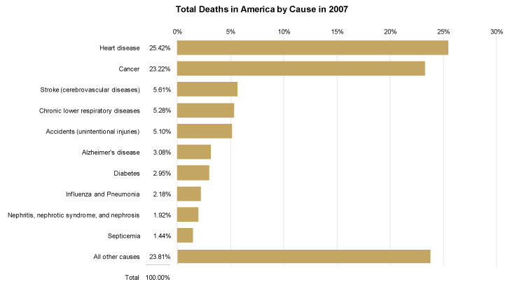
Author/Copyright holder: Unknown (pending investigation). Copyright terms and licence: Unknown (pending investigation). See section "Exceptions" in the copyright terms below.
Figure 35.8
Let's review the effectiveness of this bar graph using the same criteria as before.
Clearly indicates the nature of the relationship? Yes. In and of itself, a bar graph does not declare the part-to-whole nature of the relationship between these values, because, unlike pie charts, bar graphs can be used to display other relationships as well. This particular bar graph, however, includes components that make the nature of the relationship clear, including the title ("Total Deaths...") and especially the column of values that add up to 100%.
Represents the quantities accurately? Yes. The horizontal position at which each bar ends and the length in relation to the quantitative scale along the x-axis both encode these values in a way that can be accurately perceived. Unlike areas, angles, and the lengths of curved lines that don't share a common baseline, 2-D position and the length of straight linear objects such as these bars, which share a common baseline and run parallel to one another are visual attributes that we can perceive with a high degree of accuracy.
Makes it easy to compare the quantities? Yes. Because we can perceive these values accurately when encoded as bars, it is also quite easy to compare them. Notice how easy it is to see differences in the lengths of these bars that could not be easily seen when comparing the slices of the pie. Also notice that when each bar shares the same color, unlike the pie's slices, which varied in color, our eyes are encouraged to compare the bars because of that likeness. And because the bars are labeled directly with the names of the causes of death, we must no longer do the work that a legend requires when comparing the values.
Makes it easy to see the ranked order of values? Yes. Because differences in the bar's lengths are easy to perceive, the fact that they are ranked from highest to lowest, except for the final "All other causes" bar, is obvious. By arranging the bars in ranked order, we've also made comparisons much easier by placing those causes of death that are closest in value near one another in the graph.
Makes obvious how people should use the information? Yes. The fact that these bars should be compared to understand the varying degree to which these causes of death contribute to total deaths is intuitively obvious.
The point of comparing the perceptual effectiveness of the pie chart and bar graph has not been to make a case against pie charts (although this case deserves to be made), but to illustrate how we should always judge a visualization's merits by the degree to which we can easily, efficiently, accurately, and meaningfully perceive the story that the information has to tell. To do this, we must understand the perceptual strengths and weakness of various graphical means for displaying particular stories. To do this, we must understand perception.
35.3 Data Visualization and Human Perception
Data visualization is effective because it shifts the balance between perception and cognition to take fuller advantage of the brain's abilities. Seeing (i.e visual perception) which is handled by the visual cortex located in the rear of the brain, is extremely fast and efficient. We see immediately, with little effort. Thinking (i.e. cognition), which is handled primarily by the cerebral cortex in the front of the brain, is much slower and less efficient. Traditional data sensemaking and presentation methods require conscious thinking for almost all of the work. Data visualization shifts the balance toward greater use of visual perception, taking advantage of our powerful eyes whenever possible.

Author/Copyright holder: Unknown (pending investigation). Copyright terms and licence: Unknown (pending investigation). See section "Exceptions" in the copyright terms below.
Figure 35.9
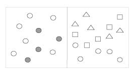
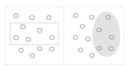
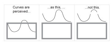
One of the earliest contributions to the science of perception was made by the Gestalt School of Psychology. The original intent of this effort when it began in 1912 was to uncover how we perceive pattern, form, and organization in what we see. The founders observed that we organize what we see in particular ways in an effort to make sense of it. The result of the effort was a series of Gestalt principles of perception, which are still respected today as accurate descriptions of visual behavior. Here are a few of the principles that can inform our data visualization efforts:
Proximity | Objects that are close together are perceived as a group. |
|
Similarity | Objects that share similar attributes (e.g., color or shape) are perceived as a group. |
|
Enclosure | Objects that appear to have a boundary around them (e.g., formed by a line or area of common color) are perceived as a group. |
|
Closure | Open structures are perceived as closed, complete, and regular whenever there is a way that they can be reasonably interpreted as such. |
|
Continuity | Objects that are aligned together or appear to be a continuation of one another are perceived as a group. |
|
Connection | Objects that are connected (e.g., by a line) are perceived as a group. |
|
New insights into visual perception and cognition are arising from work in various disciplines besides information visualization, such as human factors and human-computer interaction, but none are more ground-breaking than those arising from the cognitive sciences, especially cognitive psychology. Today, with new and improved technologies and methodologies for brain exploration, opportunities to improve the perceptual effectiveness of data visualization abound. Two areas of study in particular are especially useful:
preattentive visual processing
mechanisms and limitations of attention and memory
One of the great strengths of data visualization is our ability to process visual information much more rapidly than verbal information. Preattentive visual processing is that part that automatically occurs in the brain prior to conscious awareness. It consists of several stages, each handled by specialized neurons that are tuned to detect particular attributes of the visual information contained in light that reflects off the surfaces of objects in the world, which is then stitched together into a picture in our mind's eye of that object. We can use these basic attributes, such as differences in length, size, hue, color intensity, angle, texture, shape, and so on, as the building blocks of data visualization. When we do so in an informed manner, we have the ability to transfer much of the work that is needed to decode the contents of a visual display, such as a graph, from the slower conscious, energy intensive parts of the brain to the faster parts of the brain that require less energy, which results in more efficient cognition.
Studies in attention and memory are revealing our surprisingly limited ability to hold multiple items simultaneously in awareness. This recognition leads us to augment attention and memory by relying on external forms of information storage. One of the most powerful ways to do this is to encode information visually, which allows more information to be chunked together into the limited slots available in working memory. Another method is to place several views of information in front of our eyes at one time, thus extending our ability to explore data multidimensional and from multiple perspectives to make comparisons and see connections to a degree that would be impossible if we had to consume these views one at a time, due to the limits of working memory. Good data visualization techniques and technologies, properly used, can extend our thinking into new realms of analytical sensemaking, and we are still only beginning to tap into this potential.
35.4 Future Directions
What's most needed in the field of data visualization, as in other fields, is not always what's most exciting or not even what's particularly innovative. Sometimes we simply need to make it easier to do those things that work. One example of this is the effort of a few software vendors to build data visualization best practices right into the tools, such as in the form of defaults, thereby making it easier and less time-consuming to do what works and harder and more costly to do what doesn't. Besides these simple, straightforward but often overlooked improvements, a few other areas offer the potential for enrichment, such as the following:
The integration of geo-spatial and network displays (such as node and link diagrams) with other forms of display for seamless interaction and simultaneous use.
Technological support for collaborative data sensemaking to bring the complementary advantage of multiple brains together.
The application of data visualization beyond descriptive statistics to the realm of predictive analytics, such as through the use of interactive predictive visual models,
Tighter integration of data mining algorithms to find meaningful patterns with data visualization to provide a better way to review and explore those patterns.
Improved human-computer interface devices for interacting with data visualization in a more rapid and seamless manner.
All of these are being pursued to some degree, but could be exploited more quickly if more researchers focused on solving real problems that we face in the world today.
35.5 Where to Learn More
Several universities have developed graduate programs that are dedicated to the study and advancement of data visualization. The University of Maryland, Stanford, the University of North Carolina, the University of California, Berkeley, and Georgia Tech are a few of the finest. Although several periodicals in the broader fields of computer graphics and human-computer interaction include articles about data visualization, only one academic journal features the field exclusively: Information Visualization Journal, published quarterly by Palgrave Macmillan. A few smaller publications focus on making data visualization practical and accessible to a broader audience, such as the Visual Business Intelligence Newsletter. Conferences dedicated to the field are also few. The oldest, IEEE's VisWeek, which includes the InfoVis and VAST (Visual Analytics Science and Technology) sub-conferences that are dedicated entirely to data visualization, remains the largest and perhaps best of the conferences, but significant work in the field also appears in other conferences of broader perspective, such as CHI (Computer-Human Interaction) and SIGGRAPH.
35.5.0.1 CHI - Human Factors in Computing Systems
2011201020092008200720062005200420032002200120001999199819971996199519941993199219911990198919881987198619851983198
35.5.0.2 SIGGRAPH - International Conference on Computer Graphics and Interactive Techniques
20022001200019991998199719961995199419931992199119901989198819871986198519841983198219811980197919781977197619751974
35.5.0.3 InfoVis - IEEE Symposium on Information Visualization
2005200420032002200120001999199819971995
Refreshing exceptions, including Tableau Software and TIBCO Spotfire, both spin-offs of academic work, SAS JMP, which arose from a deep understanding of statistics, and a few other relatively small vendors, are gradually stealing the attention they deserve from the big software companies - especially business intelligence vendors - that dominate the market. Apart from product vendors, a few research laboratories and consultancies are also contributing to the development and application of the field, including Microsoft Research, Pacific Northwest National Laboratory, Flowing Media, Oculus Info, and Perceptual Edge.
Several good books have been written about data visualization. The following, in chronological order, are especially useful for surveying the field and as a source of basic instruction:
Tufte, Edward R. (1983): The Visual Display of Quantitative Information. Cheshire, CT, Graphics Press | All four of Tufte's books are exceptional, but his first is the best. It makes an inspiring case for graphical excellence. |
Cleveland, William S. (1994): The Elements of Graphing Data. Hobart Press | Data visualization practices focused on the needs of statisticians. |
Harris, Robert L. (2000): Information Graphics: A Comprehensive Illustrated Reference. Oxford University Press, USA | An encyclopedic reference for information graphics. |
Card, Stuart K., Mackinlay, Jock D. and Shneiderman, Ben (eds.) (1999): Readings in Information Visualization: Using Vision to Think. Academic Press | An overview of the best academic research in the field as of the publication date. |
Few, Stephen (2004): Show Me the Numbers: Designing Tables and Graphs to Enlighten. Analytics Press | An accessible, practical, and comprehensive guide to the design of tables and graphs for communication. |
Ware, Colin (2008): Visual Thinking: for Design. Morgan Kaufmann | An eloquent introduction to visual perception and cognition as it relates to data visualization. |
Few, Stephen (2009): Now You See It: Simple Visualization Techniques for Quantitative Analysis. Analytics Press | An accessible and practical guide to data visualization for analysis. |
Many blogs and online discussion forums feature data visualization - some thoughtfully, based on expertise, and some with the shallowness that is often found on the Web. Here are a few of the best:
Tufte.com (Edward Tufte)
Perceptual Edge (Stephen Few)
Eager Eyes (Robert Kosara)
Visual Complexity (Manuel Lima)
Flowing Data (Nathan Yau)
Pictures of Numbers (Mike Dickison)
Instant Cognition (Clint Ivy)
35.6 References
Card, Stuart K., Mackinlay, Jock D. and Shneiderman, Ben (eds.) (1999): Readings in Information Visualization: Using Vision to Think. Academic Press
Cleveland, William S. (1994): The Elements of Graphing Data. Hobart Press
Few, Stephen (2009): Now You See It: Simple Visualization Techniques for Quantitative Analysis. Analytics Press
Few, Stephen (2004): Show Me the Numbers: Designing Tables and Graphs to Enlighten. Analytics Press
Harris, Robert L. (2000): Information Graphics: A Comprehensive Illustrated Reference. Oxford University Press, USA
Tufte, Edward R. (1983): The Visual Display of Quantitative Information. Cheshire, CT, Graphics Press
Ware, Colin (2008): Visual Thinking: for Design. Morgan Kaufmann




![An example of a micromap design from Carr and Pickle [1]](https://public-media.interaction-design.org/images/encyclopedia/data_visualization_for_human_perception/geo-spatial_displays_statistical_computing.jpg)
