COVER 封面面
PREFACE 前言言
THE MOVE TOWARD MORE ALGORITHMIC APPROACH 向更加算法化的方法迈进进
COMPETITION 竞争竞争
ACCEPTING RISK 接受风险风险
THE LONG BULL MARKET 长牛市市
WHAT'S NEW IN THE SIXTH EDITION 第六版中的新内容内容
COMPANION WEBSITE 伴随网站网站
WITH APPRECIATION 感恩恩
CHAPTER 1: Introduction 第一章:引言言
THE EXPANDING ROLE OF TECHNICAL ANALYSIS 技术分析日益重要的作用作用
CONVERGENCE OF TRADING STYLES IN STOCKS AND FUTURES 股票和期货交易风格的趋同同
PROFESSIONAL AND AMATEUR 专业和业余余
RANDOM WALK 随机漫步步
DECIDING ON A TRADING STYLE 决定交易风格格
MEASURING NOISE 测量噪声声
MATURING MARKETS AND 成熟市场与与
GLOBALIZATION 全球化化
BACKGROUND MATERIAL 背景材料材料
SYSTEM DEVELOPMENT GUIDELINES``` 系统开发指南指南
OBJECTIVES OF THIS BOOK 本书目标目标
PROFILE OF A TRADING SYSTEM 交易系统概要概要
A WORD ABOUT THE NOTATION USED IN 关于所使用的符号的说明说明
THIS BOOK 这本书书
A FINAL COMMENT 最后的评论评论
CHAPTER 2: Basic Concepts and Calculations 第 2 章:基本概念和计算计算
A BRIEF WORD ABOUT DATA 关于数据的简短说明说明
SIMPLE MEASURES OF ERROR 简单误差测量法法
ON AVERAGE 平均来说来说
PRICE DISTRIBUTION 价格分布布
MOMENTS OF THE DISTRIBUTION: MEAN, 分布的矩:均值,,
VARIANCE, SKEWNESS, AND KURTOSIS 方差、偏斜度和峰度度
CHOOSING BETWEEN FREQUENCY 选择频率之间之间
DISTRIBUTION AND STANDARD 分配与标准标准
DEVIATION 偏差差
MEASURING SIMILARITY 测量相似性性
STANDARDIZING RISK AND RETURN 标准化风险和回报报
THE INDEX 索引引
AN OVERVIEW OF PROBABILITY 概率概述述
SUPPLY AND DEMAND 供求求
NOTES 笔记记
CHAPTER 3: Charting 第 3 章:制图图
FINDING CONSISTENT PATTERNS 寻找一致的模式模式
WHAT CAUSES THE MAJOR PRICE MOVES 是什么导致了主要价格波动动
AND TRENDS? 和趋势??
THE BAR CHART AND ITS 柱状图及其其
INTERPRETATION BY CHARLES DOW
CHART FORMATIONS
TRENDLINES
ONE-DAY PATTERNS
CONTINUATION PATTERNS
BASIC CONCEPTS IN CHART TRADING
ACCUMULATION AND DISTRIBUTION:
BOTTOMS AND TOPS
EPISODIC PATTERNS
PRICE OBJECTIVES FOR BAR CHARTING
IMPLIED STRATEGIES IN CANDLESTICK
CHARTS
PRACTICAL USE OF THE BAR CHART
EVOLUTION IN PRICE PATTERNS
NOTES
CHAPTER 4: Charting Systems
DUNNIGAN AND THE THRUST METHOD
NOFRI'S CONGESTION-PHASE SYSTEM
OUTSIDE DAYS AND INSIDE DAYS
PIVOT POINTS
ACTION AND REACTION
PROGRAMMING THE CHANNEL BREAKOUT
MOVING CHANNELS
COMMODITY CHANNEL INDEX
WYCKOFF'S COMBINED TECHNIQUES
COMPLEX PATTERNS
COMPUTER RECOGNITION OF CHART
PATTERNS
NOTES
CHAPTER 5: Event-Driven Trends
SWING TRADING
POINT-AND-FIGURE CHARTING
THE \(N\)-DAY BREAKOUT
NOTES
CHAPTER 6: Regression Analysis
COMPONENTS OF A TIME SERIES
CHARACTERISTICS OF THE PRICE DATA
LINEAR REGRESSION
LINEAR CORRELATION
NONLINEAR APPROXIMATIONS FOR TWO
VARIABLES
TRANSFORMING NONLINEAR TO LINEAR
MULTIVARIATE APPROXIMATIONS
ARIMA
BASIC TRADING SIGNALS USING A LINEAR
REGRESSION MODEL
MEASURING MARKET STRENGTH
NOTES
CHAPTER 7: Time-Based Trend Calculations
FORECASTING AND FOLLOWING
PRICE CHANGE OVER TIME```
    THE MOVING AVERAGE
    THE MOVING MEDIAN
    GEOMETRIC MOVING AVERAGE
    ACCUMULATIVE AVERAGE
    DROP-OFF EFFECT
    EXPONENTIAL SMOOTHING
    PLOTTING LAGS AND LEADS
    NOTES
    CHAPTER 8: Trend Systems
    WHY TREND SYSTEMS WORK
    BASIC BUY AND SELL SIGNALS
    BANDS AND CHANNELS
    CHOOSING THE CALCULATION PERIOD
    FOR THE TREND
    A FEW CLASSIC SINGLE-TREND SYSTEMS
    COMPARISON OF SINGLE-TREND SYSTEMS
    TECHNIQUES USING TWO TRENDLINES
    THREE TRENDS
    COMPREHENSIVE STUDIES
    SELECTING THE TREND SPEED TO FIT THE
    PROBLEM
    MOVING AVERAGE SEQUENCES: SIGNAL
    PROGRESSION
    EARLY EXITS FROM A TREND
    PROJECTING MOVING AVERAGE
    CROSSOVERS
EARLY IDENTIFICATION OF A TREND 趋势的早期识别别
CHANGE 改变改变
NOTES 笔记记
CHAPTER 9: Momentum and Oscillators 第九章:动量与振荡器器
MOMENTUM 动量量
ADDING VOLUME TO MOMENTUM 添加动量到势头头
DIVERGENCE INDEX 发散指数指数
VISUALIZING MOMENTUM 可视化动量量
OSCILLATORS 振荡器器
DOUBLE-SMOOTHED MOMENTUM 双重平滑动量量
VELOCITY AND ACCELERATION 速度和加速度速度
HYBRID MOMENTUM TECHNIQUES 混合动量技术技术
MOMENTUM DIVERGENCE 动量背离离
SOME FINAL COMMENTS ON MOMENTUM 关于动量的一些最后评论评论
NOTES 笔记记
CHAPTER 10: Seasonality and Calendar Patterns 第 10 章:季节性和日历模式模式
SEASONALITY NEVER DISAPPEARS 季节性从未消失失
THE SEASONAL PATTERN 季节模式模式
POPULAR METHODS FOR CALCULATING 计算的流行方法方法
SEASONALITY 季节性性
CLASSIC METHODS FOR FINDING 经典查找方法方法
SEASONALITY 季节性性
WEATHER SENSITIVITY 天气敏感性性
IDENTIFYING SEASONAL TRADES 识别季节性交易交易
SEASONALITY AND THE STOCK MARKET 季节性与股市市
COMMON SENSE AND SEASONALITY 常识与季节性性
NOTES 笔记记
CHAPTER 11: Cycle Analysis 第 11 章:循环分析分析
CYCLE BASICS 循环基础知识知识
UNCOVERING THE CYCLE 揭开循环循环
MAXIMUM ENTROPY 最大熵熵
SHORT CYCLE INDICATOR 短周期指示器器
PHASING 相位调整调整
NOTES 笔记记
CHAPTER 12: Volume, Open Interest, and Breadth 第十二章:成交量、未平仓合约和市场广度度
FUTURES VOLUME AND OPEN INTEREST 期货交易量和未平仓合约数数
EXTENDED HOURS AND 24-HOUR 延长营业时间和 24 小时小时
TRADING 交易交易
VARIATIONS FROM THE NORMAL 偏离正常值值
PATTERNS 图案案
STANDARD INTERPRETATION 标准解释解释
VOLUME INDICATORS 音量指示器器
BREADTH INDICATORS 广度指标指标
IS ONE VOLUME OR BREADTH INDICATOR BETTER THAN ANOTHER? 是否有一种交易量或广度指标优于其他指标??
MORE TRADING METHODS USING 更多交易方法方法
VOLUME AND BREADTH 成交量和广度度
AN INTEGRATED PROBABILITY MODEL 集成概率模型模型
INTRADAY VOLUME PATTERNS 当日成交量模式模式
FILTERING LOW VOLUME 过滤低音量量
MARKET FACILITATION INDEX 市场促进指数指数
NOTES 笔记记
CHAPTER 13: Spreads and Arbitrage 第十三章:价差与套利套利
DYNAMICS OF FUTURES INTRAMARKET SPREADS 期货市场内部价差动态动态
CARRYING CHARGES SPREADS IN STOCKS 股票持有成本价差差
SPREAD AND ARBITRAGE RELATIONSHIPS RISK REDUCTION IN SPREADS ARBITRAGE 价差和套利关系在价差套利中的风险降低降低
THE CARRY TRADE 套息交易交易
IMPLIED VERSUS HISTORIC VOLATILITY 隐含波动率与历史波动率率
CHANGING SPREAD RELATIONSHIPS 变动的点差关系关系
INTERMARKET SPREADS 跨市场价差差
NOTES 笔记记
CHAPTER 14: Behavioral Techniques 第 14 章:行为技术技术
MEASURING THE NEWS 衡量新闻新闻
EVENT TRADING 事件交易交易
COMMITMENT OF TRADERS REPORT 交易者承诺报告报告
OPINION AND CONTRARY OPINION 意见与反对意见意见
FIBONACCI AND HUMAN BEHAVIOR 斐波那契与人类行为行为
ELLIOTT'S WAVE PRINCIPLE 艾略特波浪理论理论
PRICE TARGET CONSTRUCTIONS USING 价格目标构造使用使用
THE FIBONACCI RATIO 斐波那契比率率
FISCHER'S GOLDEN SECTION COMPASS 费希尔的黄金分割比例圆规规
SYSTEM 系统系统
W. D. GANN: TIME AND SPACE W.D.甘恩:时间与空间空间
FINANCIAL ASTROLOGY 金融占星术术
NOTES 笔记记
CHAPTER 15: Short-Term Patterns 第 15 章:短期模式模式
PROJECTING DAILY HIGHS AND LOWS 预测每日高低温温
TIME OF DAY 一天中的时间时间
OPENING GAPS 打开间隙隙
WEEKDAY, WEEKEND, AND REVERSAL PATTERNS 工作日、周末和反转模式模式
COMPUTER-BASED PATTERN RECOGNITION 基于计算机的模式识别别
ARTIFICIAL INTELLIGENCE METHODS 人工智能方法方法
NOTES 笔记记
CHAPTER 16: Day Trading 第十六章:日间交易交易
IMPACT OF TRANSACTION COSTS 交易成本的影响影响
SLIPPAGE AND LIQUIDITY 滑点与流动性性
KEY ELEMENTS OF DAY TRADING 日内交易的关键要素素
TRADING USING PRICE PATTERNS 使用价格模式进行交易交易
INTRADAY BREAKOUT SYSTEMS 日内突破系统系统
HIGH-FREQUENCY TRADING 高频交易交易
INTRADAY VOLUME PATTERNS 当日成交量模式模式
INTRADAY PRICE SHOCKS 盘中价格冲击击
NOTES 笔记记
CHAPTER 17: Adaptive Techniques 第十七章: 自适应技术技术
ADAPTIVE TREND CALCULATIONS 自适应趋势计算计算
ADAPTIVE VARIATIONS 适应性变化变化
OTHER ADAPTIVE MOMENTUM 其它自适应动量量
CALCULATIONS 计算计算
ADAPTIVE INTRADAY BREAKOUT SYSTEM 自适应日内突破系统系统
AN ADAPTIVE PROCESS 适应性过程过程
NOTES 笔记记
CHAPTER 18: Price Distribution Systems 第 18 章:价格分配系统系统
ACCURACY IS IN THE DATA 准确性就在数据中中
USE OF PRICE DISTRIBUTIONS AND 价格分布的使用和和
PATTERNS TO ANTICIPATE MOVES 预判动作的模式模式
THE IMPORTANCE OF THE SHAPE OF THE 形状的重要性性
DISTRIBUTION 分配配
A PURCHASER'S INVENTORY MODEL 一个购买者的库存模型模型
A PRODUCER'S SELLING MODEL 生产者的销售模式模式
STEIDLMAYER'S MARKET PROFILE 斯泰德迈尔的市场轮廓廓
A FAST VERSION OF MARKET PROFILE 市场剖析的快速版本版本
NOTES 笔记记
CHAPTER 19: Multiple Time Frames 第 19 章:多重时间框架架
TUNING TWO TIME FRAMES TO WORK 调节两个时间框架以工作工作
TOGETHER 在一起一起
DISPLAYING TWO OR THREE TIME FRAMES 显示两个或三个时间框架架
ELDER'S TRIPLE SCREEN TRADING 老人的三重屏幕交易交易
SYSTEM 系统系统
ROBERT KRAUSZ'S MULTIPLE TIME 罗伯特·克劳斯的多重时间时间
FRAMES 帧帧
MARTIN PRING'S KST SYSTEM 马丁·普林格的 KST 系统系统
NOTES 笔记记
CHAPTER 20: Advanced Techniques 第 20 章:高级技术技术
MEASURING VOLATILITY 测量波动率率
THE PRICE-VOLATILITY RELATIONSHIP 价格与波动性之间的关系关系
USING VOLATILITY FOR TRADING 利用波动性进行交易交易
LIQUIDITY 流动性性
TRENDS AND PRICE NOISE 趋势和价格噪音音
TRENDS AND INTEREST RATE CARRY 趋势和利率差额额
FUZZY LOGIC 模糊逻辑辑
EXPERT SYSTEMS 专家系统系统
GAME THEORY 博弈论论
FRACTALS, CHAOS, AND ENTROPY 分形、混沌和熵熵
GENETIC ALGORITHMS 遗传算法算法
NEURAL NETWORKS 神经网络网络
MACHINE LEARNING AND ARTIFICIAL 机器学习与人工智能智能
INTELLIGENCE 智力力
REPLICATION OF HEDGE FUNDS 对冲基金的复制复制
NOTES 笔记记
CHAPTER 21: System Testing 第 21 章:系统测试测试
EXPECTATIONS 期望望
SELECTING THE TEST DATA 选择测试数据数据
TESTING INTEGRITY 测试完整性性
IDENTIFYING THE PARAMETERS 识别参数参数
SEARCHING FOR THE BEST RESULT 寻找最佳结果结果
TOO LARGE TO TEST EVERYTHING 太大而无法测试所有内容内容
VISUALIZING AND INTERPRETING TEST 可视化与解释测试测试
RESULTS 结果结果
THE IMPACT OF COSTS``` 成本的影响影响
REFINING THE STRATEGY RULES 精炼战略规则规则
ARRIVING AT VALID TEST RESULTS 得出有效的测试结果结果
COMPARING THE RESULTS OF TWO TREND 比较两种趋势的结果结果
SYSTEMS 系统系统
RETESTING TO STAY CURRENT 重新测试以保持最新最新
PROFITING FROM THE WORST RESULTS 从最差的结果中获利利
TESTING ACROSS A WIDE RANGE OF 对广泛范围的测试测试
MARKETS 市场市场
PRICE SHOCKS 价格冲击击
ANATOMY OF AN OPTIMIZATION 优化的解剖图图
SUMMARIZING ROBUSTNESS 总结稳健性性
NOTES 笔记记
CHAPTER 22: Adding Reality 第 22 章:加入现实现实
SOME COMPUTER BASICS 一些计算机基础知识知识
THE ABUSE OF POWER 权力滥用用
FINAL STEPS BEFORE LAUNCH 最后的发射前步骤步骤
EXTREME EVENTS 极端事件事件
GAMBLING TECHNIQUES: THE THEORY OF 赌博技巧:理论理论
RUNS 运行运行
SELECTIVE TRADING 选择性交易交易
SYSTEM TRADE-OFFS 系统权衡衡
SILVER AND AMAZON: TOO GOOD TO BE 银和亚马逊:好得令人难以置信置信
TRUE 真真
SIMILARITY OF SYSTEMATIC TRADING 系统交易的相似性性
SIGNALS 信号号
NOTES 笔记记
CHAPTER 23: Risk Control
MISTAKING LUCK FOR SKILL
RISK AVERSION
LIQUIDITY
MEASURING RETURN AND RISK
POSITION SIZING
INDIVIDUAL TRADE RISK
KAUFMAN ON STOPS AND PROFIT-TAKING
ENTERING A POSITION
LEVERAGE
COMPOUNDING A POSITION
SELECTING THE BEST MARKETS
PROBABILITY OF SUCCESS AND RUIN
MANAGING EQUITY RISK
IDEAL LEVERAGE USING OPTIMAL f
COMPARING EXPECTED AND ACTUAL
RESULTS
```
NOTES
CHAPTER 24: Diversification and Portfolio Allocation
DIVERSIFICATION
TYPES OF PORTFOLIO MODELS
CLASSIC PORTFOLIO ALLOCATION
CALCULATIONS
FINDING OPTIMAL PORTFOLIO
ALLOCATION USING EXCEL'S SOLVER
\section*{KAUFMAN'S GENETIC ALGORITHM SOLUTION TO PORTFOLIO ALLOCATION (GASP) \\ VOLATILITY STABILIZATION \\ NOTES \\ ABOUT THE COMPANION WEBSITE \\ INDEX \\ END USER LICENSE AGREEMENT}
\section*{List of Tables}
Chapter 1
TABLE 1.1 These price changes, reflecting the patterns in Figure 1.4, S...
Chapter 2
TABLE 2.1 Weighting an average.
TABLE 2.2 Values of \(t\) corresponding to the upper tail probabilit.
TABLE 2.3 Calculation of returns and NAVs
from daily profits and losses.
TABLE 2.4 Marginal probability.
TABLE 2.5 Transition Matrix
TABLE 2.6a Counting the occurrences of up and down days.
TABLE 2.6b Starting transition matrix.
Chapter 3
TABLE 3.1 Percentage of time gaps are closed within 1 week, based on a...
TABLE 3.2 Average upward gaps, pullbacks, and close for 275 active stocks.
TABLE 3.3 Average downward gaps, pullbacks, and close for 275 active stocks.
\section*{Chapter 5}
TABLE 5.1 Point-and-figure box sizes.
TABLE 5.2 The box size with the best
performance of the point-and-figur...
TABLE 5.3 Breakout test results using data from 2000 through November 2017.
\section*{Chapter 6}
TABLE 6.1 Calculations for the Walmart best fit.
TABLE 6.2 Output from Excel's regression function.
TABLE 6.3 Calculations for the corn-soybean regression.
TABLE 6.4 Excel solution for the corn-soybean regression.
TABLE 6.5 Spreadsheet for ABX-gold regression.
TABLE 6.6 ABX \(=f\) (gold) solution for 1st-, 2nd, and 3rd-order polynomials.
TABLE 6.7 Spreadsheet setup for linear,
logarithmic, and exponential regre.
TABLE 6.8 Spreadsheet for the curvilinear (2nd-order) solution.
TABLE 6.9 Wheat prices and set-up for Solver solution.
TABLE 6.10 Ranking of pharmaceutical companies.
Chapter 7
TABLE 7.1 General Electric analysis of
regression error based on a 20-day...
TABLE 7.2 The standard deviation of errors for different "days ahead" forecasts....
TABLE 7.3 Comparison of exponential smoothing values.
TABLE 7.4 Comparison of exponential smoothing residual impact.
TABLE 7.5 Equating standard moving averages to exponential smoothing.
TABLE 7.6 Equating exponential smoothing to standard moving averages.
TABLE 7.7 Comparison of exponential
smoothing techniques applied to Microsoft.
Chapter 8
TABLE 8.1 Frequency distribution for a sample of five diverse markets, sho...
TABLE 8.2 Comparison of entry methods for 10
years of Amazon (AMZN). Signa...
TABLE 8.3 Comparison of entries on the close, next open, and next close. ...
TABLE 8.4 Performance statistics for NASDAQ futures, 1998-June 2018.
TABLE 8.5 Results of using a moving average of the highs and lows, compa..
TABLE 8.6 MPTDI Variables for gold.
TABLE 8.7 Summary of futures market results.
TABLE 8.8 Summary of stock market results.
TABLE 8.9 Summary of system net profits for stocks.
TABLE 8.10 Average results of the three trend strategies for four sample...
TABLE 8.11 Comparison of a 120-day single moving average with a 100- and...
TABLE 8.12 Results of a 2-trend system using futures, 1991-2017.
TABLE 8.13 Adding a short-term trend to the 2trend crossover system.
Chapter 9
TABLE 9.1 Excel example of 10-day stochastic for Hewlett-Packard (HPQ).
TABLE 9.2 A/D Oscillator and trading signals, soybeans, January 25,...
TABLE 9.3 TSI calculations using two 20-day smoothing periods.
TABLE 9.4 Equations for velocity and acceleration.
Chapter 10
TABLE 10.1 Average monthly cash wheat prices.
TABLE 10.2 Monthly returns based on wheat cash prices. Average and m...
TABLE 10.3 (Top) Back-adjusted wheat futures prices, 1978-1985....
TABLE 10.4 Original cash wheat prices (top) and returns adjusted by...
TABLE 10.5 Wheat prices expressed as link relatives.
TABLE 10.6 Calculations for the moving average method.
TABLE 10.7 Weather-related events in the southern and northern hemispheres.
TABLE 10.8 Corn cash prices with seasonal buy and sell signals.
TABLE 10.9 Results of Bernstein's study, ending 1985.
TABLE 10.10 Seasonal calendar.
TABLE 10.11 Merrill's holiday results.
TABLE 10.12 The January barometer patterns, \(1938-1989\).
\section*{Chapter 11}
TABLE 11.1 Dates of the peaks and valleys in Figure 11.2.
TABLE 11.2 Dates of the combined observed and estimated peaks and valleys.
TABLE 11.3 Election year analysis for years in which the stock market...
TABLE 11.4 Corn setup for Solver solution.
Chapter 12
\section*{TABLE 12.1 Calculating On-Balance Volume. \\ TABLE 12.2 Interpreting On-Balance Volume.}
Chapter 13
TABLE 13.1 Major crossrates as of March 14,
2018.
TABLE 13.2 Gold prices and delivery months, implied yield, and total days.
TABLE 13.3 Key values of crossrates and yields, March 31, 2009.
Chapter 14
TABLE 14.1 Results of upward breakout of U.S. bonds futures (left) and...
TABLE 14.2 Results of downward breakout of U.S. bonds (left) and S\&P...
TABLE 14.3 Size and position of the planets and Earth's moon.
TABLE 14.4 Solar eclipses, 2010-2020.
TABLE 14.5 Lunar eclipses, 2011-2020.
TABLE 14.6 Dates on which Jupiter and Saturn go retrograde \((\underline{R})\) and direct \((\underline{D}) \ldots\).
TABLE 14.7 New moon and full moon
occurrences, 2018-2021.
\section*{Chapter 15}
TABLE 15.1 Merrill's hourly stock market patterns.
TABLE 15.2 Time pattern for 30-year bond futures, \(1998-2017\).
TABLE 15.3 S\&P time intervals for the three periods shown in Figure 15.4.
TABLE 15.4 Detail for crude oil time patterns.
TABLE 15.5 Results of the gap test using emini S\&P prices from 8:30...
TABLE 15.6 Summary of S\&P gap test results.
TABLE 15.7 U.S. 30-year bond futures, 19992017.
TABLE 15.8 Crude oil futures, September 2014-April 2017.
TABLE 15.9 Euro currency futures, April 2001April 2017.
```
TABLE 15.10 Amazon (AMZN) gap analysis,
2000-April 2018.
```
TABLE 15.11 General Electric (GE) gap analysis, 2000-April 2018.
TABLE 15.12 Micron (MU) gap analysis, 2000April 2018.
TABLE 15.13 Boeing (BA) gap analysis, 2000April 2018.
TABLE 15.14 Tesla (TSLA) gap analysis, 2000April 2018.
TABLE 15.15 Average upward gaps, pullbacks, and close for 275 liquid stocks.
TABLE 15.16 Average downward gaps, pullbacks, and close for 275 liquid stocks.
TABLE 15.17 Selected stocks, data from 20122017.
TABLE 15.18 Weekend results conditioned on the previous week's patterns.
TABLE 15.19 Reversal patterns showing the results of 2000-2011 on...
TABLE 15.20 Taylor's book, November 1975 Soybeans
Chapter 16
\section*{TABLE 16.1 Price ranges for S\&P futures.}
TABLE 16.2 Average high-low range of selected stocks, by year.
TABLE 16.3 Average dollar range of selected futures markets, by year.
\section*{TABLE 16.4 Opening range breakout, \% profitable trades.}
Chapter 17
\section*{TABLE 17.1 Comparative returns of four adaptive systems applied to f...}
Chapter 18
TABLE 18.1 Volatility distribution for SPY.
TABLE 18.2 Probability of annualized volatility using a frequency distribution.
Chapter 20
\section*{TABLE 20.1 VIX ETFs and ETNs, daily volume greater than 5,000, as of May 2018.}
\section*{TABLE 20.2 Predicting the trading range of the S\&P 500.}
TABLE 20.3 Frequency of price moves following a known pattern, including...
TABLE 20.4 Frequency of price moves following the completeness of the ch...
TABLE 20.5 Conditional probabilities of a price change given the complet...
TABLE 20.6 Functional description of the genes in chromosomes 1 and 2.
TABLE 20.7 Two training cases (initial state). TABLE 20.8 Two training cases (after mutated weighting factors).
Chapter 21
TABLE 21.1 Optimization report for a simple moving average test of QQQ....
TABLE 21.2 Statistics for the moving average and linear regression strategies.
TABLE 21.3 Reversing a losing strategy.
TABLE 21.4 Results of moving average
optimizations on futures, 1990-2017.
TABLE 21.5 Crossover tests, nearest futures,
1990-2017.
TABLE 21.6 Testing on 2007-2011 and projecting on 2012-2017.
TABLE 21.7 Test 1: Optimizing crude oil,
January 2, 1990-August 3, 1990.*
TABLE 21.8 Test 2: Optimizing crude oil,
January 2, 1990-January 16, 1991.*
TABLE 21.9 Test 3: Optimizing crude oil,
January 2, 1990-March 28, 1991.
\section*{Chapter 22}
TABLE 22.1 Summary of price shocks.
TABLE 22.2 Simulated runs.
TABLE 22.3 Frequency of up and down runs for selected markets, \(3 / 17 / 1998 \ldots\)
TABLE 22.4 Percent of trading days systems holding the same positions.
TABLE 22.5 SPY Moving average correlations, 1998-June 2018.
TABLE 22.6 SPY Similarity of positions using different moving average c...
TABLE 22.7 Correlations for four trend methods using a 20-day calculati...
TABLE 22.8 Correlations for four trend methods using an 80-day calculat...
Chapter 23
\section*{TABLE 23.1 A spreadsheet to calculate the Sharpe ratio.}
TABLE 23.2 VaR calculations on a spreadsheet. TABLE 23.3 Position sizing in futures.
TABLE 23.4 Position sizing for stocks using ATR.
TABLE 23.5 Stock allocation using annualized volatility.
TABLE 23.6 Position sizing using price.
TABLE 23.7 Stop-loss test of 30-year bonds, 2000-2011, applied to a movi...
TABLE 23.8 Results of averaging into a new position based on an 80-day m...
TABLE 23.9 Size of pullback and best delay for each market when waiting ...
TABLE 23.10 Results of timing the entry using an 8-day RSI, an 80-day mo...
\section*{TABLE 23.11 Building a position on new high profits.}
TABLE 23.12 Adding on new highs, long-only.
TABLE 23.13 Averaging down, 1998-2008.
TABLE 23.14 Averaging down, 2009-2018.
TABLE 23.15 Examples of risk of ruin with
unequal wins and losses.
TABLE 23.16 Probability of a loss after N trades, relative to a system ...
TABLE 23.17 The probability of a specific number of losses.
TABLE 23.18 Distribution of \(\chi^{\underline{2}}\).
TABLE 23.19 Results from Analysis of Runs
Chapter 24
TABLE 24.1 Portfolio evaluation of stocks and bonds using a spreadsheet.
\section*{TABLE 24.2 Solver Setup.}
TABLE 24.3 Returns expressed as NAVs.
TABLE 24.4 Generating random numbers to create weighting factors.
TABLE 24.5 Normalized weighting factors for each portfolio in the pool.
TABLE 24.6 Evaluating portfolio return and
\(\underline{\text { risk. }}\)
\section*{TABLE 24.7 Example of volatility stabilization.}
\section*{List of I|lustrations}
Chapter 1
FIGURE 1.1 Crude oil prices weekly chart with July 2008 in the center (top); \(\ldots\)
FIGURE 1.2 Basic measurement of noise using the efficiency ratio (also calle...
FIGURE 1.3 Three different price patterns all begin and end at the same poin...
FIGURE 1.4 By changing the net price move we can distinguish between noise a...
FIGURE 1.5 Relative change in maturity of world markets by region
FIGURE 1.6 Ranking of Asian Equity Index Markets, 2005-2010.
Chapter 2
FIGURE 2.1 The Law of Averages. The normal cases overwhelm the unusual ones....
FIGURE 2.2 Wheat prices, 1978-2017.
FIGURE 2.3 Wheat frequency distribution showing a tail to the right.
FIGURE 2.4 Normal distribution showing the percentage area included within o...
FIGURE 2.5 Gold cash prices.
FIGURE 2.6 Gold cash frequency distribution.
FIGURE 2.7 Skewness. Nearly all price
distributions are positively skewed, \(\mathrm{s} \ldots\)
FIGURE 2.8 Changing distribution at different price levels. A, B, and C are ...
FIGURE 2.9 Kurtosis. A positive kurtosis is when the peak of the distributio...
FIGURE 2.10 Measuring 10\% from each end of the frequency distribution. The d...
FIGURE 2.11 Probability network.
FIGURE 2.12a Shift in demand.
FIGURE 2.12b Demand curve, including extremes.
FIGURE 2.13 Demand elasticity. (a) Relatively elastic. (b) Relatively inelas...
FIGURE 2.14 Supply-price relationship. (a) Shift in supply. (b) Supply curve...
FIGURE 2.15 The three cases of elasticity of supply.
FIGURE 2.16 Equilibrium with shifting supply.
FIGURE 2.17 Cash wheat with the PPI and dollar index (DX), from 1978 through...
FIGURE 2.18 Wheat prices adjusted for PPI and Dollar Index (DX).
Chapter 3
FIGURE 3.1 Dow Theory has been adapted to use the current versions of the ma...
FIGURE 3.2 Bull and bear market signals are traditional breakout signals, bu...
FIGURE 3.3 NASDAQ from April 1998 through June 2002. A clear example of a bu...
FIGURE 3.4 Secondary trends and reactions. A reaction is a smaller swing in ...
FIGURE 3.5 Dow Theory applied to the S\&P. Most of Dow's principles apply to ...
FIGURE 3.6 The trend is easier to see after it has occurred. While the upwar...
FIGURE 3.7 Upward and downward trendlines applied to Intel, November 2002 th...
FIGURE 3.8 Horizontal support and resistance lines shown on bond futures pri...
FIGURE 3.9 Basic sell and buy signals using trendlines.
FIGURE 3.10 Trading rules for horizontal support and resistance lines.
FIGURE 3.11 Trading a price channel. Once the channel has been drawn, buying...
FIGURE 3.12 Turning from an upward to a downward channel. Trades are always ...
FIGURE 3.13 Price gaps shown on a chart of
Amazon.com.
FIGURE 3.14 A series of spikes in bonds. From June through October 2002, U.S...
FIGURE 3.15 AMR in early 2003, showing a classic island reversal with exampl...
FIGURE 3.16 Russell 2000 during the last half of 2002 showing reversal days,...
FIGURE 3.17 Wide-ranging days, outside days, and inside days for Tyco.
FIGURE 3.18 Symmetric and descending triangles and a developing bear market ...
FIGURE 3.19 An assortment of continuation patterns. These patterns are all r...
FIGURE 3.20 Wedge. A weaker wedge formation is followed by a strong rising w...
FIGURE \(3.21 \mathrm{~A} V\)-top in the NASDAQ index, March 2000.
FIGURE 3.22 Cotton has frequent \(V\)-tops but nothing as extreme as in 2011.
FIGURE 3.23 Two \(V\)-bottoms in crude oil, back-adjusted futures.
FIGURE 3.24 A double top in crude oil. FIGURE 3.25 Triple bottom in Bank of America (BAC).
FIGURE 3.26 A triple bottom and two double bottoms in Goldman-Sachs (GS).
FIGURE 3.27 Natural gas shows a classic triple
top.
FIGURE 3.28 Two cases of a breakout of an extended bottom in Yahoo (AABA).
FIGURE 3.29 Two rounded tops in the German DAX stock index.
FIGURE 3.30 A classic rounded bottom in the Japanese yen.
FIGURE 3.31 A large declining wedge followed by a upside breakout in the Jap...
FIGURE 3.32 Head-and-shoulders top pattern in the Japanese Nikkei index.
FIGURE 3.33 On the left, an episodic pattern shown in an upward price shock ...
FIGURE 3.34 Price objectives for consolidation patterns and channels. (a) Tw...
\section*{FIGURE 3.35 Forming new channels to determine objectives.}
FIGURE 3.36 Two profit targets following a top formation in back-adjusted cr...
FIGURE 3.37 Head-and-shoulders top price objective.
FIGURE 3.38 Triangle and flag objectives. (a) Triangle objective is based on...
FIGURE \(3.39(a-j)\) Popular candle formations.
FIGURE 3.40 Similar patterns in the S\&P, GE, and Exxon.
FIGURE 3.41 Asian equity index markets adjusted to the same volatility level...
Chapter 4
FIGURE 4.1 Nofri's Congestion-Phase System applied to wheat, as programmed o...
FIGURE 4.2 Four daily patterns.
FIGURE 4.3 U.S. 30-year T-bond prices showing pivot points above and below \(t\)... FIGURE 4.4 Tubbs' Law of Proportion. FIGURE 4.5 Trident entry-exit.
FIGURE 4.6 Soybean retracements in the late 1970 s.
FIGURE 4.7 S\&P retracement levels.
FIGURE 4.8 Trading a declining channel.
FIGURE 4.9 Channel calculation.
FIGURE 4.10 A sequential buy signal in the Deutsche mark.
Figure 4.11a Above the stomach.
Figure 4.11b Bullish belt hold.
Figure 4.11c Deliberation.
Figure 4.11d Morning doji star and evening doji star.
Figure 4.11e Bearish engulfing.
Figure 4.11f Last engulfing top.
Figure 4.11g Three outside up.
Figure 4.11h Two black gapping.
Figure 4.11i Rising window.
\section*{Chapter 5}
FIGURE 5.1 Gold futures with \(2.5 \%\) swing points marked.
FIGURE 5.2 Corresponding swing chart of gold using a \(2.5 \%\) swing filter.
FIGURE 5.3 Recording swings by putting the dates in the first box penetrated...
FIGURE 5.4 Livermore's trend change rules.
FIGURE 5.5 Failed reversal in the Livermore method.
FIGURE 5.6 Wilder's Swing Index applied to Eurobund back-adjusted futures, u...
FIGURE 5.7 Point-and-figure chart.
FIGURE 5.8 Best formations from Davis's study.
FIGURE 5.9 (a) Compound point-and-figure buy signals. (b) Compound point-and...
FIGURE 5.10 Point-and-figure trendlines.
FIGURE 5.11 Tests of box size for Apple shows smaller is better.
FIGURE 5.12 Tests of the S\&P futures shows results similar to moving average...
FIGURE 5.13 Entering IBM on a pullback with limited risk.
FIGURE 5.14 Entering on a confirmation of a new trend after a pullback.
FIGURE 5.15 Three ways to compound positions.
FIGURE 5.16 Placement of point-and-figure stops.
FIGURE 5.17 Cashing in on profits.
FIGURE 5.18 Alternative methods of plotting
point-and-figure reversals. (a) ...
FIGURE 5.19 Horizontal count price objectives.
FIGURE 5.20 Point-and-figure vertical count for QQQ. The major low in Octobe...
FIGURE 5.21 Renko Bricks pattern.
FIGURE 5.22 N -Day breakout applied to
Merck, using a breakout period of 5 da...
FIGURE 5.23 Apple breakout tests.
FIGURE 5.24 emini S\&P breakout tests.
FIGURE 5.25 Copper profits for the slower and faster trends in our version o...
FIGURE 5.26 Relative performance of N -day
breakout, copper futures, 1980-201...
Chapter 6
FIGURE 6.1 A basic regression analysis results
in a straight line through th...
\section*{FIGURE 6.2 Error deviation for method of least} squares.
FIGURE 6.3 Scatter diagram of corn, soybean pairs with linear regression sol...
FIGURE 6.4 Prices of ABX and gold show that gold remained high while ABX dec...
FIGURE 6.5 The best fit for ABX tracks the upward and downward move, but is ...
FIGURE 6.6 ABX-Gold regression using only the last 20-days of prices.
FIGURE 6.7 Degrees of correlation. (a) Perfect positive linear correlation (
FIGURE 6.8 Confidence bands. (a) A 95\% confidence band. (b) Out-of-sample fo...
FIGURE 6.9 Curvilinear (parabolas).
FIGURE 6.10 Comparison of ABS-Gold linear, 2nd-, and 3rd-order regressions....
FIGURE 6.11 Logarithmic and exponential curves.
FIGURE 6.12 Comparison of four regression methods on weekly corn data.
FIGURE 6.13 Solver set-up page.
FIGURE 6.14 Wheat cash prices and Solver solution.
FIGURE 6.15 Correlogram of monthly corn
prices, \(1978-2017\), for 24 lags.
FIGURE 6.16 Correlogram of weekly returns of corn, wheat, and gold, 1978-201...
FIGURE 6.17 ARIMA forecast becomes less accurate as it is used farther ahead...
FIGURE 6.18 Linear regression model. Penetration of the confidence band turn...
FIGURE 6.19 IBM trend using the slope and \(r\). (Top) IBM prices with 80-day mo...
FIGURE 6.20 AMGN shows a declining slope even though the price is higher.
Chapter 7
FIGURE 7.1 General Electric price from December 31, 2010, through February 1...
FIGURE 7.2 A comparison of moving averages.
The simple moving average, linea...
FIGURE 7.3 SP continuous futures, April through December 2010, with examples...
FIGURE 7.4 Exponential smoothing. The new exponential trendline value, \(E_{t}\), is...
FIGURE 7.5 Graphic evaluation of exponential smoothing and moving average eq...
FIGURE 7.6 Comparison of exponential smoothing techniques applied to Microso...
FIGURE 7.7 Double-smoothing applied to Microsoft, June 2010 through February...
FIGURE 7.8 Comparison of a 9 -day exponential smoothing with a 9 -day exponent...
FIGURE 7.9 The Hull Moving Average (slower trend in the top panel), compared...
FIGURE 7.10 Plotting a moving average lag and lead for a short period of Mic...
\section*{Chapter 8}
FIGURE 8.1 Distribution of runs. The shaded area shows the normal distributi...
FIGURE 8.2 Frequency distribution of returns for SP futures using a 40-day s...
FIGURE 8.3 Amazon (AMZN) with a 40-day moving average.
FIGURE 8.4 A trend system for NASDAQ 100 futures, using an 80 -day moving ave...
FIGURE 8.5 Four volatility bands around a 20day moving average, based on (a...
FIGURE 8.6 Adaptive bands constructed using double exponential smoothing sho...
FIGURE 8.7 Bollinger bands applied to Ford.
FIGURE 8.8 Combining daily and weekly Bollinger bands.
FIGURE 8.9 Modified Bollinger bands shown with original bands (lighter lines...
FIGURE 8.10 Simple reversal rules for using bands.
FIGURE 8.11 Basic rules for using bands.
FIGURE 8.12 A g-day TRIX based on euro futures shows that a triple smoothing...
FIGURE 8.13 Cumulative profits of S\&P futures for four strategies.
FIGURE 8.14 Results of trend strategies for Boeing (BA) from 1998 through Ju...
FIGURE 8.15 Moving average net profits from futures, 1998-2018.
FIGURE 8.16 Moving average net profits for selected stocks, 20 years ending ...
FIGURE 8.17 Amazon (AMZN) net profits from three systems.
FIGURE 8.18 Boeing (BA) net profits from three systems.
FIGURE 8.19 Ford (F) net profits from three systems.
FIGURE 8.20 Eurodollar futures have a strong trend and benefit from any tren...
FIGURE 8.21 The euro currency (CU) has a strong trend but performs about the...
FIGURE 8.22 emini S\&P futures show a weak long-term trend and excessive nois...
FIGURE 8.23 Crude oil futures (CL) has had wide-ranging, volatile price move...
FIGURE 8.24 Three ways to trade using two
moving averages. (a) Enter and exi...
FIGURE 8.25 Moving average crossover for euro futures using 100-day and 30-d...
FIGURE 8.26 Donchian's 5- and 20-Day Moving Average System (somewhat moderni...
FIGURE 8.27 The Golden Cross applied to SPY showing both long-short and long...
FIGURE 8.28 The ROC Method applied to S\&P futures, 1998-2017.
FIGURE 8.29 The Ichimoku Cloud shown on the Dow Industrials.
FIGURE 8.30 Sequences of moving averages.
Left is the original sequence. On ...
FIGURE 8.31 Ehlers' Early Onset Trend indicator for SPY during 2018.
\section*{Chapter 9}
FIGURE 9.1 Geometric representation of momentum.
FIGURE 9.2 Price (top) and corresponding momentum (bottom).
FIGURE 9.3 20- and 40-day momentum
compared to a 20- and 40-day moving avera...
FIGURE 9.4 Momentum is also called relative strength, the difference between...
FIGURE 9.5 Trend signals using momentum.
FIGURE 9.6 Relationship of momentum to
prices. (a) Tops and bottoms determin...
FIGURE 9.7 20-Day momentum (center panel) and 3 -day momentum (bottom panel) ...
FIGURE 9.8 A longer view of the 20- and 3-day momentum applied to the S\&P. T...
FIGURE 9.9 MACD for AOL. The MACD line is the faster of the two trendlines i...
FIGURE 9.10 The Herrick Payoff Index applied to the DAX, 2000 through Februa...
FIGURE 9.11 Divergence Index applied to S\&P futures.
FIGURE 9.12 John Ehlers' SwamiChart showing S\&P price using 15 -minute bars a...
FIGURE 9.13 RSI bottom and top formations using a 20-day RSI applied to SPY....
FIGURE 9.14 Performance of the 2-day RSI, MarketSci blog's favorite oscillat...
FIGURE 9.15 2-Period RSI (center panel) compared with the traditional 14-day...
FIGURE 9.16 RSI applied to the spread between a 10 -week and 40 -week moving a...
FIGURE 9.17 Comparison of simple
momentum, RSI, and stochastic, all for 14-d...
FIGURE 9.18 20-Day stochastic (bottom) and a 6o-day moving average for the S...
FIGURE 9.19 Lane's patterns. (a) Left and right
crossings. (b) Hinge. (c) Be...
\section*{FIGURE 9.20 Williams' A/D Oscillator.}
FIGURE 9.21 Williams' Ultimate Oscillator.
FIGURE 9.22 Ehlers' Relative Vigor Index for QQQ.
FIGURE 9.23 Comparing the TSI with 10-2020 smoothing (bottom) to a standard...
FIGURE 9.24 Comparison of TRIX (center panel) and TSI (lower panel) using tw...
FIGURE 9.25 (a) Average velocity. (b)
Instantaneous velocity.
FIGURE 9.26 SPY prices (top) with first differences (center) and second diff...
FIGURE 9.27 The Parabolic Stop-and-Reverse, similar to the Direction Parabol...
FIGURE 9.28 Momentum divergence.
FIGURE 9.29 An example of divergence in Amazon.com.
FIGURE 9.30 Slope divergence of NASDAQ 100 using double smoothing.
Chapter 10
FIGURE 10.1 A classic chart of wheat seasonality using cash prices, 1978-201...
FIGURE 10.2 Wheat seasonality from backadjusted futures, using differences....
FIGURE 10.3 Percentage of profitable years for cash wheat.
FIGURE 10.4 (a) Cash corn average monthly returns, 1978-2017. (b) Percentage...
FIGURE 10.5 (a) Cash cotton average monthly returns, 1978-2017. (b) Percenta...
FIGURE 10.6 (a) Unleaded gasoline, average yearly percentage change, 1985-20...
FIGURE 10.7 Comparison of heating oil monthly returns, with and without, 200...
FIGURE 10.8 (a) Cotton average monthly returns. (b) High-low price range, in...
FIGURE 10.9 Cotton percentage monthly changes, sorted highest to lowest.
FIGURE 10.10 (a) Average returns by month for Southwest Airlines (LUV). (b) ...
FIGURE 10.11 (a) Amazon average returns by month. (b) eBay average returns b...
FIGURE 10.12 Comparing the change in percentage of positive years for Amazon... FIGURE 10.13 Platinum average returns by month shows much greater demand in ...
FIGURE 10.14 Ford returns, during the past ten years, spike in the spring an...
FIGURE 10.15 (a) Cash wheat volatility as a percentage of price. (b) Wheat v...
FIGURE 10.16 Southwest Airlines (LUV) (a) average monthly returns, and (b) a...
FIGURE 10.17 Heating oil volatility (a) in cents/barrel, and (b) as a percen...
FIGURE 10.18 (a) Amazon price minus a 12month moving average lagged 6 month...
FIGURE 10.19 (a) Amazon detrended prices using a 12-month MA lagged 6 months...
FIGURE 10.20 Amazon price detrended for the period 2009-2017. Vertical lines...
FIGURE 10.21 Seasonal pattern of wheat using the method of yearly averages....
FIGURE 10.22 The four steps in creating link relatives.
FIGURE 10.23 Moving average method for wheat. (a) Moving average through mid...
FIGURE 10.24 Weather sensitivity for soybeans and corn.
FIGURE 10.25 Heating oil cash and futures average monthly returns, 2009-2017...
FIGURE 10.26 Cash and futures corn monthly returns, 2008-2017.
FIGURE 10.27 Coffee cash and futures monthly returns, 2008-2017.
FIGURE 10.28 (a) Corn seasonality for different years. (b) Comparison of cor...
FIGURE 10.29 Comparison of wheat average monthly returns for cash, futures, ...
FIGURE 10.30 Comparison of sugar seasonality, 2008-2015 for cash, futures, a... FIGURE 10.31 Comparison of coffee seasonality using cash, futures, and the E...
FIGURE 10.32 Corn net returns for the calendar years.
FIGURE 10.33 Entering a mean-reversion trade at the end of January in corn....
FIGURE 10.34 Pattern of bullish and bearish years by month.
FIGURE 10.35 Results of seasonal and nonseasonal trades using cash corn.
FIGURE 10.36 Applying the cash corn strategies to corn futures.
FIGURE 10.37 Results of modified seasonal strategy using corn futures.
FIGURE 10.38 Canadian dollars per U.S. dollar.
FIGURE 10.39 Seasonality in the U.S. stock market. (a) Average monthly retur...
FIGURE 10.40 Returns in December, 1998 2016 and 2011-2016, show similar patt... FIGURE 10.41 Daily returns of TNX and TN (futures).
FIGURE 10.42 Returns of bonds are declining.
FIGURE 10.43 Best returns of SPY and SP cluster at the beginning of the mont...
FIGURE 10.44 Returns of the equity index are increasing.
FIGURE 10.45 Results of January patterns.
FIGURE 10.46 Average returns for the year, excluding January.
FIGURE 10.47 SPY monthly volatility and returns, 1994-2017.
Chapter 11
FIGURE 11.1 Cattle cash prices, 1978-2017.
FIGURE 11.2 Peaks and valleys of cattle prices, marked visually.
FIGURE 11.3 Cattle prices for 2012-2017, with circles marking the observed p...
FIGURE 11.4 Searching for the Swiss franc/U.S. dollar cycle.
FIGURE 11.5 The 8.6-year business cycle.
FIGURE 11.6 The Wheeler Index of War.
FIGURE 11.7 The Kondratieff Wave (along the
bottom), as of 2000.
FIGURE 11.8 Another representation of the
Kondratieff Wave.
FIGURE 11.9 Returns of the Dow Jones
Industrials in the presidential cycle....
FIGURE 11.10 Volatility range, separated by presidential cycle, from 1948 to...
FIGURE 11.11 Detail of the election-year cycle. Each chart shows the history...
FIGURE 11.12 Cumulative returns trading each cycle year.
FIGURE 11.13 A 20-10 triangular MACD applied to IBM.
FIGURE 11.14 A 252-126 triangular MACD applied to back-adjusted corn futures...
FIGURE 11.15 Sinusoidal (sine) wave.
FIGURE 11.16 Compound sine wave.
FIGURE 11.17 Solver screen for corn solution.
FIGURE 11.18 Corn with trigonometric fit using Solver.
FIGURE 11.19 Spectral density. (a) A compound wave \(D\), formed from three prim...
FIGURE 11.20 10-, 20-, and 40-day cycles, within a 250 -day seasonal.
FIGURE 11.21 Output of spectral analysis program.
FIGURE 11.22 Excel spreadsheet showing input prices and output from Fourier ...
FIGURE 11.23 Results of Excel's Fourier Analysis for Southwest Airlines (LUV...
FIGURE 11.24 Cash corn cycles using Excel's
Fourier Analysis based on return...
FIGURE 11.25 The phase angle forms a sawtooth pattern.
FIGURE 11.26 A cycle with the phasor and phase angle.
FIGURE 11.27 Back-adjusted soybean futures, 1982-2018, with the Hilbert Tran...
FIGURE 11.28 Probability Density Function (PDF) of a sine wave.
FIGURE 11.29 Monthly AMR (top) prices from 1982 with the Fisher Transform (2...
FIGURE 11.30 Ehlers' Universal Oscillator shown along the bottom of a heatin...
FIGURE 11.31 The Short Cycle Indicator applied to the emini S\&P 30- (top pan...
FIGURE 11.32 Hurst's phasing and target price projection.
Chapter 12
FIGURE 12.1a Average annual volume of Amazon with 1 standard deviation line....
FIGURE 12.1b Amazon average daily volume from January 29 through February 16...
FIGURE 12.2 Tesla price and volume showing numerous spikes on price drops.
FIGURE 12.3 Gold futures with multiple volume spikes, not as extreme or as w...
FIGURE 12.4 Caterpillar (CAT) chart plotting as Equivolume.
FIGURE 12.5 Microsoft prices (top), volume (second panel), normalized 50-day...
FIGURE 12.6 On-Balance Volume applied to GE from December 2010 through April...
FIGURE 12.7 S\&P prices are shown with the volume, OBV, and a 40 -day trend of...
FIGURE 12.8 Blau's Tick Volume Indicator.
FIGURE 12.9 Volume-weighted MACD applied to euro currency futures.
FIGURE 12.10 Elastic Volume-Weighted Moving Average (tracking closer to pric...
FIGURE 12.11 Gold futures with open interest (center) and volume (bottom), e...
FIGURE 12.12 SPY prices ending in February 2018 with the McClellan Oscillato...
FIGURE 12.13 SPY prices with BoltonTremblay Index (center) and Thrust Oscil... FIGURE 12.14 The Arms Index (TRIN) shown with SPY during 2017.
FIGURE 12.15 High-Low Ratio (bottom) shown with SPY (top).
FIGURE 12.16 Total PL using the AD ratio as a countertrend signal applied to...
FIGURE 12.17 QQQ prices (top) with volume
(bottom), along with the lagged av...
FIGURE 12.18 Average return per day for 275 stocks using the volume spike ru...
FIGURE 12.19 Total returns of all trades taken using the volume spike rules....
FIGURE 12.20 Result of trades chosen randomly using the volume spike rules....
FIGURE 12.21 Trading volatility spikes in SPY that come at the same time as ...
FIGURE 12.22 Results of the Pseudo-Volume Strategy for SPY, IWM, and XLE.
FIGURE 12.23 Intraday, 15-minute tick volume patterns, 1995-2005. (a) Crude ...
Chapter 13
FIGURE 13.1 Interdelivery price relationship and terminology. (a) Precious m...
FIGURE 13.2 Major Index futures markets. From top to bottom: Dow Industrials...
FIGURE 13.3 (a) Ratio of S\&P 500 to Dow Industrial. (b) Ratio of S...
FIGURE 13.4 Lennar (LEN) and KB Home (KBH) prices.
FIGURE 13.5 Rolling correlations of Lennar and \(K B\) Home returns.
FIGURE 13.6 Price histories of ICBC and BOC from 2007, traded in Shanghai.
FIGURE 13.7 Example of standard deviation bands around the price difference ...
FIGURE 13.8 Total profits using the standard deviation of price difference \(f\)...
FIGURE 13.9 The 6-day raw stochastic of INTC, MU, and TXN prices.
FIGURE 13.10 Total profit from the pair LENKBH using the momentum differenc...
FIGURE 13.11 Stress indicator for LEN-KBH using momentum differences as inpu...
FIGURE 13.12 Gold futures (top) and Barrick Gold (ABX) from October 2016 thr...
FIGURE 13.13 Trading signals for the bondutilities arbitrage strategy, May ...
FIGURE 13.14 Intercrop spreads. (a) Normal carrying charge relationship. (b)...
FIGURE 13.15 Delivery month distortions in the old crop, making a butterfly...
\section*{FIGURE 13.16 Corrections to interdelivery} patterns.
\section*{FIGURE 13.17 Eurodollar term structure of futures prices.}
FIGURE 13.18 Implied yield from gold futures, April 5, 2011.
FIGURE 13.19 Interest rate differential versus change in futures prices duri...
FIGURE 13.20 (a) Historic volatility and implied volatility, 1998-February 2...
FIGURE 13.21 The VIX index (not tradeable) and UVXY (tradeable, leveraged)....
FIGURE 13.22 Implied vol (VIX index) and historic vol (calculated).
FIGURE 13.23 UVXY stochastic minus the HV stochastic.
FIGURE 13.24 Net asset values of long trades, short trades, and combined lon...
FIGURE 13.25 The weekly gold/silver ratio, from 2014 through 2017 based on n...
FIGURE 13.26 The platinum-gold ratio, shown here from 2014 through mid-2018 ...
FIGURE 13.27 The decline in S\&P futures (top panel) is met by higher 10-year...
FIGURE 13.28 Rolling 20-day correlations. FIGURE 13.29 Returns based on timing SPY with HYG and JNK.
FIGURE 13.30 Crude oil (top) denominated in gold (center, daily futures) giv...
FIGURE 13.31 Total profits using a 20-day trend of the crude/gold ratio.
FIGURE 13.32 Interdelivery spread volatility. (a) Actual prices. (b) Relatio...
FIGURE 13.33 Annualized volatility of
\section*{SP/NASDAQ price ratio, using futures, ...}
FIGURE 13.34 The platinum-gold ratio for 1 year beginning March 2010, using ...
FIGURE 13.35 (a) Results of buying the 10 Dow stocks with the worst returns, ...
FIGURE 13.36 Results of Dow hedge strategy.
FIGURE 13.37 Poor spread selection. (a) Spread price. (b) Spread components....
\section*{Chapter 14}
FIGURE 14.1 Price reaction to unexpected news, including delayed response. T...
FIGURE 14.2 Price shocks in U.S. bond futures (top) and the corresponding mo...
FIGURE 14.3(a) Bond futures returns from upward price shock using 2...
FIGURE 14.3(b) Figure Bond returns using a \(3 \times\) ATR threshold.
FIGURE 14.4 U.S. bond futures, returns from long positions following upward ...
FIGURE 14.5 Returns from crude oil price shocks using the threshold 2...
FIGURE 14.6 Returns from crude oil price shocks using the larger 3...
FIGURE 14.7 S\&P futures price shocks \(>2\) ATRs. (a) Upside shocks. (a) Downsi...
FIGURE 14.8 S\&P futures price shocks using 3
ATRs, 1991-2017. (a) Upward sho...
FIGURE 14.9 Commitment of Traders Report (short form) from the CFTC.gov webs...
FIGURE 14.10 Commitment of Traders Report (long form), May 10, 2011.
FIGURE 14.11 Jiler's normal trader positions.
FIGURE 14.12 (a) Soybeans nearest futures, July 2017-April 2018. (b) The Bri...
\section*{FIGURE 14.13 (a) S\&P continuous futures and}
(b) the Briese COT Index for eac...
FIGURE 14.14 Interpretation of the Bullish Consensus.
FIGURE 14.15 Typical contrarian situation: wheat, 1978.
FIGURE 14.16 The put/call ratio (\$CPCE),
October 2017-mid-April 2018.
FIGURE 14.17 The golden spiral, also the logarithmic spiral, is a perfect re...
FIGURE 14.18 Basic Elliott wave.
FIGURE 14.19 Triangles and ABCs.
FIGURE 14.20 Compound correction waves.
FIGURE 14.21 Elliott's threes.
FIGURE 14.22 Price relationships in Supercycle (V).
FIGURE 14.23 The Supercycle as of 2019.
FIGURE 14.24 MTpredictor of Elliott Wave applied to yen futures.
FIGURE 14.25 Trading signals for the Elliott Wave strategy, and the Elliott ...
FIGURE 14.26 (a) Pentagon constructed from one diagonal. (b) Pentagon constr...
FIGURE 14.27 Using circles to find support and resistance.
FIGURE 14.28 Elliott's complete wave cycle.
FIGURE 14.29 Calculation of time-goal days.
FIGURE 14.30 Price goals for standard 5 -wave moves.
FIGURE 14.31 Gann's soybean worksheet.
FIGURE 14.32 May soybean square.
FIGURE 14.33 An example of Gann angles from ganntrader.com.
FIGURE 14.34 The Hexagon Chart.
FIGURE 14.35 Saturn lines drawn on the Dow
Industrial Average.
FIGURE 14.36 The DJIA Clock.
FIGURE 14.37 Geometry of a solar eclipse.
FIGURE 14.38 Geometry of a lunar eclipse.
\section*{Chapter 15}
FIGURE 15.1 Graph of the New York Stock Market.
FIGURE 15.2 30-year bond futures percentage moves for bars in the same direc...
FIGURE 15.3 U.S. bond futures, average net point change by bar.
FIGURE 15.4 S\&P back-adjusted futures with intervals of study marked.
FIGURE 15.5 S\&P time patterns showing three different market periods corresp...
FIGURE 15.6 Back-adjusted futures for crude oil showing four intervals with ...
FIGURE 15.7 Crude oil time pattern for the sharp price decline from the high...
FIGURE 15.8 Crude oil time patterns for three cases of bull market, sideways...
FIGURE 15.9 U.S. 30-year bond futures, highs and lows by time.
FIGURE 15.10 Distribution of highs and lows for \(S \& P\) futures, during the bull...
FIGURE 15.11 S\&P futures, cumulative
percentage of highs and lows, 2009-2017...
FIGURE 15.12 S\&P futures, frequency of highs and lows during the financial c...
FIGURE 15.13 EURUSD futures from 2001 show wide price swings.
FIGURE 15.14 EURUSD high-lows marked with the times when the U.S. and Europe...
FIGURE 15.15 U.S. 30 -year bond weekday patterns, 2000-April 2018.
FIGURE 15.16 Weekday patterns for heating oil futures, 2000-April 2018.
FIGURE 15.17 Heating oil weekday patterns, April 2017-April 2018.
FIGURE 15.18 Weekday patterns for S\&P futures, 2000-April 2018.
FIGURE 15.19 S\&P futures weekday patterns, 2009-2017.
FIGURE 15.20 Amazon (AMZN) weekday patterns during the bull market, 2009-Apr...
FIGURE 15.21 U.S. bonds weekday patterns filtered with a 120-day moving aver...
FIGURE 15.22 S\&P futures weekday patterns filtered by three trends, \(30,60, \ldots\)
FIGURE 15.23 U.S. 30 -year bond futures, 2010-April 2018, average price chang...
FIGURE 15.24 U.S.30-year bond futures, volume ratio.
FIGURE 15.25 Euro futures price differences by day of month, 2010-2017.
FIGURE 15.26 Euro futures volume ratio by day of month, 2010-2017.
FIGURE 15.27 S\&P futures price differences,
2010-2017.
FIGURE 15.28 S\&P futures volume ratio, 20102017.
FIGURE 15.29 Amazon returns by day, 20102017.
FIGURE 15.30 Amazon volume ratio by day, 2010-2017.
FIGURE 15.31 The 3-day trade system applied to SPY, showing net P/L with and...
FIGURE 15.32 Specific buying and selling days. Chapter 16
FIGURE 16.1 Moving averages applied to a 20minute bar crude oil business da...
FIGURE 16.2 USDGBP 5-min, 24-hr data with a 20-bar moving average.
FIGURE 16.3 USDGBP 5-min data grouped by 100-tick bars, with a 20-bar moving...
FIGURE 16.4 Intraday volatility pattern for 20min crude oil, showing a jump...
FIGURE 16.5 Intraday volatility indicator using past 5 days applied to 20-mi...
FIGURE 16.6 Intraday timing of market
\(\underline{\text { movement. }}\)
FIGURE 16.7 Midday support and resistance breakout applied to 30 -min S\&P fut...
FIGURE 16.8 S\&P 30-min bars with a 2-bar breakout.
FIGURE 16.9 Using the LBR/RSI \({ }^{\mathrm{TM}}\) indicator to trade a 1st-hour breakout.
FIGURE 16.10 Example of using \(0.5 \times\) ATR thresholds from the open.
FIGURE 16.11 Example of using \(0.5 \times\) ATR thresholds from the previous close.
FIGURE 16.12 Optimization of \(30-\mathrm{min}\) S\&P breakout using an ATR factor measure...
FIGURE 16.13 Optimization of \(30-\mathrm{min}\) S\&P breakout using an ATR factor measure...
FIGURE 16.14 S\&P trend filter optimization based on breakout from the open....
FIGURE 16.15 S\&P trend filter optimization based on a factor of the ATR meas...
FIGURE 16.16 Net profits from S\&P breakout using the open and a trend filter...
FIGURE 16.17 Net profits from S\&P breakout using the previous close and a tr...
FIGURE 16.18 Mean reversion optimization based on the open using only the cu...
FIGURE 16.19 Net profits from the S\&P mean reversion strategy based on exten...
FIGURE 16.20 Fisher's buy-and-reverse scenario.
FIGURE 16.21 HFT market-maker sequence.
FIGURE 16.22 HFT with two similar markets,
\section*{trading the one that lags.}
FIGURE 16.23 Intraday volume patterns for crude oil, December 2004. The bott...
FIGURE 16.24 20-minute gold bars with today's bar volatility, the average ba...
Chapter 17
FIGURE 17.1 Similar price moves with low and high noise.
FIGURE 17.2 20-minute gold futures with an 8period Kaufman's Adaptive Movin...
FIGURE 17.3 S\&P futures with a 60-day KAMA (the darker line) and MA in the t...
FIGURE 17.4 Total profits using an 8-period KAMA with a fixed filter applied...
FIGURE 17.5 The adaptive indicators KAMA, VIDYA, Adaptive R2, MAMA, FAMA, an...
FIGURE 17.6 Comparison of the adaptive RSI,
KAMA, and a 10 -day moving averag...
FIGURE 17.7 Parabolic Time/Price System
applied to emini S\&P futures, Februa...
FIGURE 17.8 The Trend-Adjusted Oscillator applied to \(\mathrm{S} \& \mathrm{P}\) futures, September ...
FIGURE 17.9 Ehlers' Instantaneous Trend
applied to euro futures. The thicker...
Chapter 18
FIGURE 18.1 SPY prices and annualized
volatility from 1998 through April 201...
FIGURE 18.2 Daily values of 20-day annualized volatility of SPY sorted highe...
FIGURE 18.3 Comparison of 21-period and 65period Bollinger bands, applied t...
FIGURE 18.4 Kase's 3 DevStops with a "warning" line closer to the prices. Th...
FIGURE 18.5 Forecasted trading zones using the Chande and Kroll method appli...
FIGURE 18.6 Wheat cash prices, and wheat adjusted for inflation and currency...
FIGURE 18.7 Distribution of wheat cash prices compared to the wheat price de...
FIGURE 18.8 Price distribution of indexed cash
euro, 1999-2017.
FIGURE 18.9 Low volume (center panel) and low volatility (bottom panel), the...
FIGURE 18.10 Euro futures show that volume and volatility fall to their lowe...
FIGURE 18.11 Three short-term distribution patterns. (a) A normal, long-term...
FIGURE 18.12 Moving skewness, emini S\&P futures, June 2009-June 2010.
FIGURE 18.13 Excess kurtosis (center panel)
and skew (bottom panel), applied...
FIGURE 18.14 The Kurtosis-Skew strategy
applied to emini S\&P, 30-min data (t... FIGURE 18.15 Forecast of highest and lowest corn prices expected.
FIGURE 18.16 Stochastic indicator with and without Ehlers' roofing filter.
FIGURE 18.17 Cash and futures corn prices show futures in a long-term downtr...
FIGURE 18.18 Annualized volatility of cash corn prices.
FIGURE 18.19 Original Market Profile for 30year Treasury bonds.
\section*{FIGURE 18.20 Daily Market Profile.}
FIGURE 18.21 Buyer's and seller's curves for a sequence of days.
FIGURE 18.22 Market Profile for a trending market.
FIGURE 18.23 Monkey bars shown on the
Thinkorswim trading platform on the to...
FIGURE 18.24 SPY prices, January 1-April 22, 2018.
FIGURE 18.25 Histogram of SPY prices,
\(1 / 1 / 2018-5 / 20 / 2018\)
Chapter 19
FIGURE 19.1 Euro futures 60-min data on top with 40-day trend; daily bars in...
FIGURE 19.2 Daily and weekly data and trends
for euro futures are displayed ...
FIGURE 19.3 The Triple Screen for gold futures, March and April 2011. From t...
FIGURE 19.4 Krausz's Multiple Time Frames, June 1998, U.S. Bonds. (a) Daily ...
FIGURE 19.5 S\&P continuous futures with a 6-, 12 -, and 24 -week ROC (top to b...
FIGURE 19.6 KST combined with an 18-period ROC and a 12-period trendline can...
Chapter 20
FIGURE 20.1 Four volatility measures.
FIGURE 20.2 Apple (AAPL) with a 20-day average true range (center panel) and...
FIGURE 20.3 S\&P futures, June 2016-May 2017 (top), implied volatility (VIX) ...
FIGURE 20.4 Bank of America with average true range (center) and annualized ...
FIGURE 20.5 Bank of America price versus daily returns, 1998-May 2018.
FIGURE 20.6 BAC price versus daily price differences, 1998-May 2018.
FIGURE 20.7 Cash corn prices, 1978-May 2018.
FIGURE 20.8 Annualized volatility of cash corn.
FIGURE 20.9 A scatter diagram of corn
volatility versus price, with a log cu...
FIGURE 20.10 VIX mean-reverting strategy from MarketSci Blog, triggered by t...
FIGURE 20.11 Profits from VIX Mean-
Reverting Strategy, 1998-2011.
FIGURE 20.12 QQQ prices and annualized volatility, 1999-May 2018.
FIGURE 20.13 Profits from trading QQQ with a 6o-day moving average and a vol...
FIGURE 20.14 Daily price/volume distribution shows liquidity.
FIGURE 20.15a A low noise market allows sooner entries and exits resulting i...
FIGURE 20.15b Increased noise causes entries and exits to be delayed, result...
FIGURE 20.15c High-noise markets, typical of an equity index in a major indu...
FIGURE 20.16 How the trend calculation period (the curved line) relates to m...
FIGURE 20.17 Expectations of a price move using two time periods.
FIGURE 20.18 Three matrices associated with trading signals for three differ...
FIGURE 20.19 Payout matrix for customer and refiner. Refiner chooses the row...
FIGURE 20.20 (a) Equal attractors cause a
symmetric pattern, often a figure ...
FIGURE 20.21 Points indicating fractal patterns as well as trading signals a...
FIGURE 20.22 D'Errico and Trombetta's genetic algorithm solution applied to ...
FIGURE 20.23 A biological neural network. Information is received through de...
FIGURE 20.24 A 3-layer artificial neural network to determine the direction ...
FIGURE 20.25 Learning by feedback.
\section*{Chapter 21}
FIGURE 21.1 Comparing heating oil backadjusted data with the nearest contra...
FIGURE 21.2 Visualizing the results of a 2dimensional optimization.
FIGURE 21.3 Walk-forward test results for SPY,
October 1998-December 2018.
FIGURE 21.4 Net profits from longs, shorts, and combined displayed as a bar ...
FIGURE 21.5 Optimization of QQQ shown as a line chart.
FIGURE 21.6a Euro futures optimization of a moving average system shown for ...
FIGURE 21.6b Results of euro currency futures optimization showing performan...
FIGURE 21.7a Eurodollar futures moving
average optimization results through ...
FIGURE 21.7b Results of an emini S\&P optimization.
FIGURE 21.7c Wheat futures optimization shows erratic gains in the longer ca...
FIGURE 21.7d Hog futures optimization shows gains in the short-term.
FIGURE 21.7e Cotton shows a performance spike using an 80 -day moving average...
FIGURE 21.8 Heat map of the 2 moving average crossover system.
FIGURE 21.9 A 3-dimensional bar chart of QQQ returns using a moving average ...
FIGURE 21.10 QQQ optimization results shown as a surface chart. The best res...
FIGURE 21.11a A scatter diagram of all test profits given the trend calculat...
FIGURE 21.11b All net profits given the profit factor along the bottom.
FIGURE 21.11 c All net profits given the stoploss percentage along the botto...
FIGURE 21.12 VIX mean-reversion strategy using optimal parameters.
FIGURE 21.13 Moving average optimization of copper futures, 2007-2017, showi...
FIGURE 21.14 5-Bar averages of profits and
maximum drawdowns for a copper op...
FIGURE 21.15 Averaging of map output results. (a) Center average (9 box). (b...
FIGURE 21.16 Impact of costs on the moving average system.
FIGURE 21.17 Patterns resulting from changing rules. (a) A rule change that ...
FIGURE 21.18 Net profits from a 110-period moving average and a 140-period l...
FIGURE 21.19 Net profits from the two strategies, taking only long positions...
FIGURE 21.20 Consecutive tests.
FIGURE 21.21 Heat map of ES optimization of the standard crossover system.
FIGURE 21.22 Heat map of ES optimization, "fading" the short-term trend in t...
FIGURE 21.23 Best calculation period, sorted smallest to largest.
FIGURE 21.24a Total profits from long and short positions using a 100-day mo...
FIGURE 21.24b Net gain and loss from price shocks for the QQQ trend system....
Chapter 22
FIGURE 22.1 The Gorbachev abduction caused a double price shock, with most im...
FIGURE 22.2 Labour's victory in the British
election of 1992 represents a mor...
FIGURE 22.3 Crude oil prices from Iraq's invasion of Kuwait through the begin...
FIGURE 22.4 The price shock of 9/11/2001.
FIGURE 22.5 The surprising results of the
British vote on staying in the Euro...
FIGURE 22.6 The U.S. election of 2016 was a surprise to both the stock market...
FIGURE 22.7 S\&P 500 futures. Moving average trendlines become out of phase a...
FIGURE 22.8 The S\&P decline due to the subprime crisis generated large profi...
FIGURE 22.9 Sequence of random numbers
representing occurrences of red and b...
FIGURE 22.10 Betting pattern.
FIGURE 22.11 Runs of SPY compared to
random runs.
FIGURE 22.12 Comparison of total profits for SPY and QQQ using a 120-day mov...
FIGURE 22.13 Anti-Martingales applied to
QQQ, doubling the position when the...
FIGURE 22.14 Relative risk of a moving average system.
FIGURE 22.15 Entry point alternatives for a mean-reverting strategy.
FIGURE 22.16 Relationship of profits to risk
per trade based on opportunitie...
\section*{FIGURE 22.17 Combining trends and trading} ranges.
FIGURE 22.18 Cash silver prices, 1978-June 2018.
FIGURE 22.19 Moving average results for SPY using different calculation peri...
Chapter 23
FIGURE 23.1 Changes in utility versus changes in wealth.
\section*{FIGURE 23.2 Investor utility curves.}
FIGURE 23.3 The efficient frontier. The line drawn from \(\underline{R}\), the risk-free ret...
FIGURE 23.4 Two cases in which the Sharpe ratio falls short. (a) The order i...
FIGURE 23.5 The Hindenburg Omen shown as vertical bars on a chart of SPY pri...
FIGURE 23.6 Bank of America prices with position sizes based on a \(\$ 10,000\) in...
\section*{FIGURE 23.7 VIX and annualized volatility of SPY.}
FIGURE 23.8 A closer look at VIX and SPY annualized volatility during the fi...
FIGURE 23.9 Trailing stop based on volatility, applied to Hang Seng futures....
FIGURE 23.10 30-Year bonds with an 80-day
moving average (the smooth line) a...
FIGURE 23.11 Three profit targets based on volatility and measured from the ...
FIGURE 23.12 Wait for a pullback. Most markets show that waiting can improve...
FIGURE 23.13 Compounding structures. (a) Scaled-down size (upright pyramid) ...
FIGURE 23.14 Defining the DM.
FIGURE 23.15 The 14-day ADX, PDM, and MDM, applied to NASDAQ 100 continuous ...
FIGURE 23.16 The ADX and ADXR.
FIGURE 23.17 Scatter diagram of the profit factor versus the efficiency rati...
FIGURE 23.18 Risk of ruin based on invested capital.
FIGURE 23.19 Original NAVs and filtered NAVs for a macrotrend system using s...
FIGURE 23.20 Pascal's triangle.
Chapter 24
FIGURE 24.1 Effect of diversification on risk.
FIGURE 24.2 Improving the return ratio using negatively correlated systems....
FIGURE 24.3 Rolling correlation of S\&P futures against 30-year bonds, the eu...
FIGURE 24.4 Returns of cap-weighted and
\section*{equally weighted sector ETFs.}
FIGURE 24.5 Weights of XLV components. FIGURE 24.6 Returns of XLV, capitalizationweighted 9 stocks, and equally-we...
FIGURE 24.7 SPY and BND NAVs compared to a portfolio of \(60 \%\) SPY + 40\% BND.
FIGURE 24.8 Prices of the 4 assets used in the Solver solution, converted to...
FIGURE 24.9 Solver results.
FIGURE 24.10 GASP solution for 16 NASDAQ 100 futures strategies.
FIGURE 24.11 NAV of macrotrend system with no volatility stabilization.
FIGURE 24.12 NAV of the same macrotrend system with volatility stabilization...
\title{
TRADING SYSTEMS AND METHODS
}
Sixth Edition
\author{
Perry J. Kaufman
}
WILEY
Copyright (C) 2013, 2020 by Perry J. Kaufman. All rights reserved.
Published by John Wiley \& Sons, Inc., Hoboken, New Jersey.
Published simultaneously in Canada.
No part of this publication may be reproduced, stored in a retrieval system, or transmitted in any form or by any means, electronic, mechanical, photocopying, recording, scanning, or otherwise, except as permitted under Section 107 or 108 of the 1976 United States Copyright Act, without either the prior written permission of the Publisher, or authorization through payment of the appropriate per-copy fee to the Copyright Clearance Center, Inc., 222 Rosewood Drive, Danvers, MA 01923, (978) 750-8400, fax (978) 646-8600, or on the Web at www.copyright.com. Requests to the Publisher for permission should be addressed to the Permissions Department, John Wiley \& Sons, Inc., 111 River Street, Hoboken, NJ 07030, (201) \(748-6011\), fax (201) \(748-6008\), or online at www.wiley.com/go/permissions.
Limit of Liability/Disclaimer of Warranty: While the publisher and author have used their best efforts in preparing this book, they make no representations or warranties with respect to the accuracy or completeness of the contents of this book and specifically disclaim any implied warranties of merchantability or fitness for a particular purpose. No warranty may be created or extended by sales representatives or written sales materials. The advice and strategies contained herein may not be suitable for your situation. You should consult with a professional where appropriate. Neither the publisher nor author shall be liable for any loss of profit or any other commercial damages, including but not limited to special, incidental, consequential, or other damages.
For general information on our other products and services or for technical support, please contact our Customer Care Department within the United States at (800) 762-2974,
outside the United States at (317) 572-3993, or fax (317) 5724002.
Wiley publishes in a variety of print and electronic formats and by print-on-demand. Some material included with standard print versions of this book may not be included in e-books or in print-on-demand. If this book refers to media such as a CD or DVD that is not included in the version you purchased, you may download this material at http://booksupport.wiley.com. For more information about Wiley products, visit www.wiley.com.
\section*{Library of Congress Cataloging-in-Publication Data is Available:}
ISBN 9781119605355 (Hardcover)
ISBN 9781119605386 (ePDF)
ISBN 9781119605393 (ePub)
Cover Design: Wiley
Cover Images: (C) Nikada/Getty Images,
(C) KTSDESIGN/SCIENCE PHOTO LIBRARY/Getty Images
Author Photo Credit: AlexZ Photography
To my mother, in her \(100^{\text {th }}\) year
\section*{PREFACE}
What I've learned by trading and studying the markets for many years is that markets do not repeat themselves. Yes, there are similar moves for different reasons, and seemingly the same reasons cause different moves. Where is the common ground? I believe it is in turning specific patterns into generalized ones. For example, is a weekly pattern where there are four days up and one day down on Tuesday different from four days up and a down day on Friday? It's not different if you see it only as four days up and one day down. Successful strategies move from the specific to the general.
Success in trading is in the ability to see the bigger picture, the shape of the price moves rather than the highly specific pattern. That's why long-term moving averages work. You can mix the prices around and still get the same average. Fine tuning was never a good solution. We always return to the idea "loose pants fit everyone." Because we don't know exactly how a price move will develop, we need to build in the flexibility to stay with your strategy through as many challanging scenarios as possible.
\section*{THE MOVE TOWARD MORE ALGORITHMIC APPROACH}
The algorithmic trader, myself included, is more comfortable having an idea of the risk and reward of a
system, knowing full well that future losses can be greater, but so can future profits. What makes traders nervous is the unknown and unexpected risk. Having any type of loss-limiting method, whether a stop loss or just the change in trend direction, means you have some control over risk. It may not be perfect, but it's much better than watching your equity disappear and having to make a decision under stress. "Better to be out and wish you were in, than in and wish you were out."
Institutions such as Blackrock see algorithmic solutions in a different light. It is said that a year ago they eliminated portfolio stock selection by managers in favor of computerized selection. There are methods, discussed in Chapter 24, that have proved highly successful, and don't require more than a few seconds of compute time (although a substantial database is needed). A computer may not be better than the best trader, but it can compete at a high level.
I know a trading company that is gearing up to provide artificial intelligence support for clients, including portfolio selection and individual trade
recommendations. Their approach also includes training for beginning and intermediate traders. Is this the way knowledge is going to be disseminated in the future? It may be clearer to get an answer from a computer than to ask an "expert." And, if you don't yet understand, you can keep asking and the computer won't become impatient.
\section*{COMPETITION}
Trading has become more competitive. High-frequency trading surged 10 years ago as technology made access faster and easier. Just like program trading, institutions jumped into the space, quickly reducing the chances for making big returns. Many players dropped out, not willing to allocate capital to small returns. The market seems to sort all of it out on its own.
It is the same with the deluge of ETFs. There are multiple ETFs for nearly every aspect of the markets, the S\&P 500, S\&P high dividend stocks, growth stocks, leveraged, and every sector in the S\&P, with inverse ETFs for each one, midcaps, small caps, no caps. Again, the market sorts them out. Simply look at the volume to know which will survive.
What about the trend follower? Can he or she survive? Because major trends are based on fundamentals, usually interest rate policy, growth, or trade, they continue to drive prices with persistence, sometimes lasting for six months, sometimes for six years, and in the case of U.S. interest rates, for most of 35 years. We can't capture all of that move, and there are some volatile periods along the way, but a macrotrend trader will capture enough to be rewarded.
\section*{ACCEPTING RISK}
One of the most important lessons that I've learned is to accept risk. No matter how we engineer a trading system, adding stops and profit-taking, leveraging up and down, and hedging when necessary, it's not possible to remove the risk. If you think you've eliminated it in one place, it
will pop up somewhere else. If you limit each trade to only a small loss, a series of losses will still add to a large loss.
The way to survive is first to understand the risk profile of your method. Then capitalize it so that you won't panic and do something irrational, such as sell out at the lows. As you accumulate profits, you can increase your investment without risking your initial capital. Think of it as a long-term partnership with the market.
\section*{THE LONG BULL MARKET}
Following the 2008 financial crisis, the U.S. experienced one of the longest bull markets in its history. During these unusual periods, traders try to adjust to low volatility and small drawdowns. Buying any pullback is profitable. But all bull markets end, just as the Internet bubble ended in 2000. They don't all "burst," but they become far more volatile as they revert to their longterm pattern.
Taking advantage of an unusual pattern can be profitable but should only be done with a small part of your investment. The next pattern is not likely to last as long as the 8 -year bull market. Watching the way prices move can lead to changes in the way you enter orders. For example, during past few years, stocks that gap much higher on earnings reports tend to close even higher. Stocks that gap much lower tend to close near or above their open. Observations can be turned into profits. There is no substitute for watching price movement.
\section*{WHAT'S NEW IN THE SIXTH EDITION}

Besides updating many of the charts and examples, some of the chapters have been largely rewritten to make them clearer and better organized. Unnecessary detail has been removed to make room for more new material, such as artificial intelligence and game theory. More professional techniques have been added, including volatility stabilization and risk management. There are new systems and techniques, most of which have been programmed and can be found on the Companion Website. Large tables have been removed in favor of putting them online. Many of the tables now appear in Excel format, which I find easier to read. Some of the math has been removed and replaced by Excel functions and other software apps.
I recognize that a large part of the readership in now outside the United States. Some of the new examples use Asian markets. Many of the more technical words familiar to U.S. readers have been replaced by more general explanations. I'm sure that readers in all countries will find this an improvement.
\section*{COMPANION WEBSITE}

The Companion Website is an important part of this book. You will find hundreds of TradeStation programs and Excel spreadsheets, and some MetaStock programs, that allow you to test many of the strategies
with your own parameters. Look for the "e" in the margin to indicate a Website program. There is no substitute for trying it yourself, then modifying the code to reflect your own ideas.

In addition, the Appendices in the previous edition, and the Bibliography, have been moved to the Companion Website to make room for new material.
\section*{WITH APPRECIATION}
This book draws on the hard work and creativity of hundreds of traders, financial specialists, engineers, and many others who are passionate about the markets. They continue to redefine the state of the art and provide all of us with profitable techniques and valuable tools.
The team at John Wiley have provided a high professional level of support for my work over the past 40 years. It is not possible to name all of those who have helped, from Stephen Kippur to Pamela van Giessen, and now Bill Falloon and Michael Henton. I truly appreciate their efforts.
As a final note, I would like to thank all the previous readers who have asked questions that have led to clearer explanations. They are the ones who find typographical errors and omissions. They have all been corrected, making this edition that much better.
Wishing you success,
Freeport, Grand Bahama
December 2019
\section*{CHAPTER 1}
\section*{Introduction}
It is not the strongest of the species that survive, nor the most intelligent, but the ones most responsive to change.
-Charles Darwin
Let's start by defining the term technical analysis. Technical analysis is the systematic evaluation of price, volume, breadth, and open interest, for the purpose of price forecasting. A systematic approach may simply use a bar chart and a ruler, or it may use all the computing power available. Technical analysis may include any quantitative method as well as all forms of pattern recognition. Its objective is to decide, in advance, based on a set of clear and complete rules, where prices will go over some future period, whether 1 hour, 1 day, or 5 years.
Technical analysis is not just the study of chart patterns or the identification of trends. It includes intermarket analysis, complex indicators, and mean reversion, as well as the testing process and the evaluation of test results. It can use a simple moving average or a neural network to forecast price moves. This book serves as a reference guide for all of these techniques, puts them in some order, and explains the functional similarities and differences for the purpose of trading. It includes portfolio construction and multilevel risk control, which
are integral parts of successful trading.
\section*{THE EXPANDING ROLE OF TECHNICAL}
\section*{ANALYSIS}
Quantitative methods for evaluating price movement and making trading decisions have become a dominant part of market analysis. Those who do not actively trade with methods such as overbought and oversold indicators are most likely to watch them along the bottom of their screen. The major financial networks are always pointing out price trends and support and resistance levels. They are quick to say that a price that moves up or down was done on low volume, implying that it might be unreliable. The 200-day moving average seems to be the benchmark for long-term direction, and the 50-day for short-term.
In 2002 the U.S. government questioned the integrity of the research produced by major financial houses that have a conflict between financing/underwriting and advising retail brokerage. The collapse of Enron caused us to question the earnings, debt, quality of business, and other company data released to the public by large and small firms. When trading equities in other countries, it is never clear that the financial data is either correct or timely. But price and volume are always accurate. It is not surprising that more quantitative trading methods have been adopted by research firms. In March 2017, Blackrock announced that it would eliminate 40 portfolio managers in favor of algorithmic stock selection. When decisions are made with clear
rules and calculations that can be audited, those analysts recommending buys and sells are safe from scrutiny.
Extensive quantitative trading exists around the world. Interest rate arbitrage is a major source of revenue for banks. Location arbitrage is the process that keeps the price of gold and other precious metals the same all over the globe. Program trading keeps the collective price of stocks in line with S\&P futures and SPY (the SPDR ETF) prices. These fully automated systems are now called algorithmic trading.
If you don't think of arbitrage as technical trading, then consider market neutral strategies, where long and short positions are taken in related markets (pairs trading) in order to profit from one stock rising or falling faster than the other. If you change your time horizon from hours and days to milliseconds, you have high-frequency trading. You might prefer to take advantage of the seasonality in the airline industry or try your hand trading soybeans. Both have clear seasonal patterns as well as years when other factors (such as a disruption in energy supply) overwhelm the seasonal factors. Trading seasonal patterns falls under technical analysis.
Technology that allows you to scan and sort thousands of stocks, looking for key attributes - such as high momentum, a recent breakout, or other indicator values - is technical analysis on a broad scale. High-frequency trading has become a profit center for large financial institutions, but involves placing computer equipment as close to the source of the exchange price transmission as possible - a contentious issue. High-frequency trading is
credited for adding liquidity by increasing volume in equities, but has also been blamed for spectacular, highly volatile price moves.
Most impressive is the increase in managed funds that use technical and quantitative analysis. Many billions of investment dollars are traded using trend-following, timing techniques, mean reversion, and countless other systematic methods. It is thought that well over half of all managed money uses algorithmic trading. The use of technical analysis has infiltrated even the most guarded fundamental fortresses.
\section*{CONVERGENCE OF TRADING STYLES IN STOCKS AND FUTURES}
The development of technical analysis has taken a different path for stocks and futures. This seems natural because the two markets cater to investors with different time frames and different commercial interests. At the same time, those markets place very different financial demands on the investor.
The original users of the futures markets were grain elevators and grain processors, representing the supply side and the demand side. The elevators are the grain wholesalers who bought from the farmers and sold to the processors. The futures markets represented the fair price and grain elevators sold their inventory on the Chicago Board of Trade to lock in a price (hopefully a profit). The processor, typically a bread manufacturer or meat packer, used the futures markets to fix a low price
for their material cost and as a substitute for holding inventory. Both producer (the sell side) and processor (the buy side) only planned to hold the position for a few weeks or a few months, until they either delivered their product to market or purchased physical inventory for production. There was no long-term investment, simply a hedge against risk. Futures contracts, similar to stock options, expire every two or three months and can be held for about one year; therefore, it is nearly impossible to "invest" in futures.
One other critical difference between futures and stocks is the leverage available in futures. When a processor buys one contract of wheat, that processor puts up a good faith deposit of about \(5 \%\) of the value of the contract. If wheat is selling for \(\$ 10\) a bushel and a standard contract is for 5,000 bushels, the contract value is \(\$ 50,000\). The processor need only deposit \(\$ 2,500\) with the broker. The processor is essentially buying with leverage of 20:1.
In the 1970s, the futures trader paid a round-turn commission of \(\$ 50\) per contract. This is about 0.3 of one percent, less than the stock market cost of \(1 \%\) per trade at the time. Now, years after negotiated commissions have become part of the system, the fee is no more than \(\$ 8\), or 0.05 of one percent for either stocks or futures, often less. Commission costs are so low that they are not a consideration when trading futures. The same low costs are also available to equity traders. Low costs allow fast trading, even day trading. It has changed the way we approach the markets.
\section*{A Line in the Sand between Fundamental and Technical Analysis}
The market is driven by fundamentals. These are often employment, GDP, inflation, consumer confidence, supply and demand, and geopolitical factors, all of which create expectations of price movement. But it is too difficult to trade using those facts, and economists have never been very accurate. Economic reports are not usually timely, and individual companies are not forthcoming about problems. We have had too many cases where the data we use to make fundamental decisions about individual companies have been unreliable, or a major computer breach isn't reported for months. We can add that to the conflict of interest inherent in the government's calculation of the Consumer Price Index, because an increase in the CPI requires that all those receiving Social Security checks get a cost-of-living increase.
Technical analysis, when used to determine the longterm direction of prices, attempts to objectively evaluate these complex fundamentals. It is no different from the economists who use regression, seasonality, and cyclic analysis to forecast the economy. The technical trader can use those tools as well as chart trendlines, recognize patterns, and calculate probability distributions. Perhaps the economists are doing the same thing.
It is well known that the Federal Reserve monitors trading and prices to decide how to time their interest rate changes and, when necessary, their currency intervention. All monetary authorities know that, when
their currency is rising too fast, you don't try to stop it. If the public wants to buy the Japanese yen, the Central Bank doesn't have enough clout to halt it unless it first waits for the move to be exhausted. It must use its resources carefully, and it uses market know-how and price analysis to time its actions.
The primary advantages of a technical approach are that it is objective and completely well-defined. The accuracy of the data is certain. One of the first great advocates of price analysis, Charles Dow, said:
The market reflects all the jobber knows about the condition of the textile trade; all the banker knows about the money market; all that the best-informed president knows of his own business, together with his knowledge of all other businesses; it sees the general condition of transportation in a way that the president of no single railroad can ever see; it is better informed on crops than the farmer or even the Department of Agriculture. In fact, the market reduces to a bloodless verdict all knowledge bearing on finance, both domestic and foreign.
Much of the price movement reflected in any market is anticipatory; it results from the expectations of the effects of macroeconomic developments or the outcome of good corporate management and new products. Markets, however, are subject to change without notice. For example, the government may block the merger of two companies, or approve or reject a new drug. A hurricane bound for the Philippines will send sugar prices higher, but if the storm turns off course, prices
reverse. Anticipation of employment reports, housing starts, or corn production reports causes highly publicized expert estimates, which may correctly or incorrectly move prices before the actual report is released. Markets then react to the accuracy of the estimates rather than to the economic data itself. By the time the public is ready to act, the news is already reflected in the price.
\section*{PROFESSIONAL AND AMATEUR}
Beginning technical traders may find a system or technique that seems extremely simple and convenient to follow, one that appears to have been overlooked by the professionals. Most often there is a simple reason why that method is not used. As you learn more about trading, you find that execution is difficult, or the risk is much higher than originally expected, or that the system has too many losses in a row. Trading is a business, not one to be taken casually. As Richard Wyckoff said, "Most men make money in their own business and lose it in some other fellow's." Plan to invest your time before your money, so that when you begin trading, you have more realistic expectations.
That does not mean that simple systems don't work, but that each has a return and risk profile that is typical of that style and difficult to change. One purpose of this book is to present many different trading methods, each with its own risk and reward profile, so that each trader understands the true cost of trading.
To compete with a professional speculator, you must be
accurate in anticipating the next move. This can be done by
Recognizing recurring patterns in price movement and determining the most likely results of such patterns.
Identifying the "trend" of the market by isolating the underlying direction of prices over a selected time interval.
Exploiting an unusual divergence in price between two related companies or commodities, called arbitrage.
\section*{The Tools}
The bar chart, discussed in Chapter 3, is the simplest representation of the market. These patterns are the same as those recognized by Jesse Livermore, in the early 1900s, on the tickertape. Because they are interpretive, more precise methods such as point-andfigure charting came into being, which add a level of exactness to charting.
Mathematical modeling, using traditional regression or statistical analysis, remains a popular technique for anticipating price direction. Most modeling methods are variations on econometrics, basic probability, and statistical theory. They are precise because they are based entirely on numerical data; however, they need trading rules to make them operational.
The proper assessment of the price trend is critical to most trading systems. Countertrend trading, which takes
a position opposite to the trend direction, is just as dependent on knowing the trend. Large sections of this book are devoted to the various ways to identify the trend, although it would be an injustice to leave the reader with the idea that a "price trend" is a universally accepted concept. There have been many studies claiming that price trends do not exist. The most authoritative papers on this topic are collected in Cootner, The Random Character of Stock Market Prices (MIT Press, 1964); very readable discussions can be found in the Financial Analysts Journal, an excellent resource.
Personal money management has an enormous number of tools, many of which can be found in Excel and other spreadsheet software. These include linear regression and correlation analysis. An Excel add-in, Solver, can easily be adapted to portfolio allocation. There is also inexpensive software to perform spectral analysis and apply advanced statistical techniques. Trading systems development platforms such as TradeStation and MetaStock provide programming languages and data management that greatly reduce the effort needed to implement your ideas. Professionals maintain the advantage of having all of their time to concentrate on the investment problems; however, nonprofessionals are no longer at a disadvantage.
\section*{RANDOM WALK}
It has been the position of many advocates of fundamental and economic analysis that there is no
relationship between price movements from one day to the next. That is, prices have no memory of what came before - this has been named the random walk theory. Prices will seek a level that will balance the supplydemand factors, but that level will be reached either instantaneously, or in an unpredictable manner as prices move in response to the latest available information or news release.
If the random walk theory is correct, the many welldefined trading methods based on mathematics and pattern recognition will fail. There are two arguments against random price movement.
The first argument is simply the success of many algorithmic trading strategies. There is definitive documentation of performance for systematized arbitrage programs, hedge funds, and derivatives funds, showing success for upward of 40 years. This is not to say that all technical programs are successful - far from it. But neither are fundamental methods. You still need a sound strategy, whether discretionary or systematic, in order to be profitable. Not everyone can create and implement such a strategy.
The second argument against the random walk is that prices move on anticipation. One can argue academically that all participants (the "market") know exactly where prices should move following the release of news.
However practical or unlikely this is, it is not as important as market movement based on anticipation of further news. For example, if the Fed lowered rates twice this year and the economy has not yet responded, would
you expect it to lower rates again? Of course you would. Therefore, as soon as the Fed announces a rate cut you would speculate on the next rate cut. When most traders hold the same expectations, prices move quickly to that level. Prices then react to further news relative to expectations, but only to the degree that investors have confidence in their future forecast. Is this price movement that conforms to the random walk theory? No. But the actual pattern of price movement can appear similar to random movement.
Excluding anticipation, the apparent random movement of prices is dependent on both the time interval and the frequency of data observed. Over a longer time span, using lower frequency data (for example, weekly), the trending characteristics become more obvious, along with seasonal and cyclic variations. In general, the use of daily data shows more noise (random movement) than weekly or monthly data.
In the long run, prices seek a level of equilibrium. Investors will switch from stocks to bonds to futures if one offers better return for the same risk. Investors are, in essence, arbitraging the investment vehicles. To attract money, an investment must offer more.
Prices do not have a normal distribution, another fact that argues against random walk. The asymmetry of the index markets, in particular those built on traditional stocks, is easy to understand because the public consists overwhelmingly of buyers. When looking at price movement in terms of "runs" - hours or days when prices continue in the same direction for an unusually
long sequence - we find that price data, and the profits that result from trending systems, have a fat tail, representing much longer runs than can be explained by a normal distribution. The existence of a fat tail also means that some other part of the distribution must differ from the norm because the extra data in the tail must come from somewhere else. When we discuss trending systems, the fat tail plays a critical role in profitability.
Price movement is driven by people, and people can buy and sell for nonrandom reasons, even when viewed in large numbers. People move prices and create opportunities that allow traders to profit. The long-term trends that reflect economic policy, normally identified by quarterly data, can be of great interest to longer-term position traders. It is the shorter-term price moves caused by anticipation (rather than actual events), frequent news releases, unexpected volatility, prices that are far from value, countertrend systems looking for price reversals, and shifts in supply and demand that are the primary focus of this book.
\section*{DECIDING ON A TRADING STYLE}
It may seem backward to talk about a trading style in advance of reading all the material, but many traders have already decided that they want to day trade or hold long-term positions because it suits their disposition, their belief of what moves prices, or their time schedule. That's important because you must be comfortable with the way you trade. With that in mind, short-term and
long-term traders will focus on different strategies and markets while portfolio structure and risk control will be much the same for either approach.
To understand how markets and different trading styles work together, consider a daily chart of any market, an individual stock, a short-term interest rate futures contract, or the sector SPDR SPY. There are periods of trending and sideways patterns. However, if you change that chart from intraday to daily, and from daily to weekly, the longer-term trend emerges. Lower frequency data makes the trend clearer. Figure 1.1 shows crude oil weekly, daily, and 20-minute charts, centered around July 2008. The weekly chart shows the smoothest pattern, the daily adds a few extra reversals, and the 20minute chart has some abrupt changes on the open of the day.
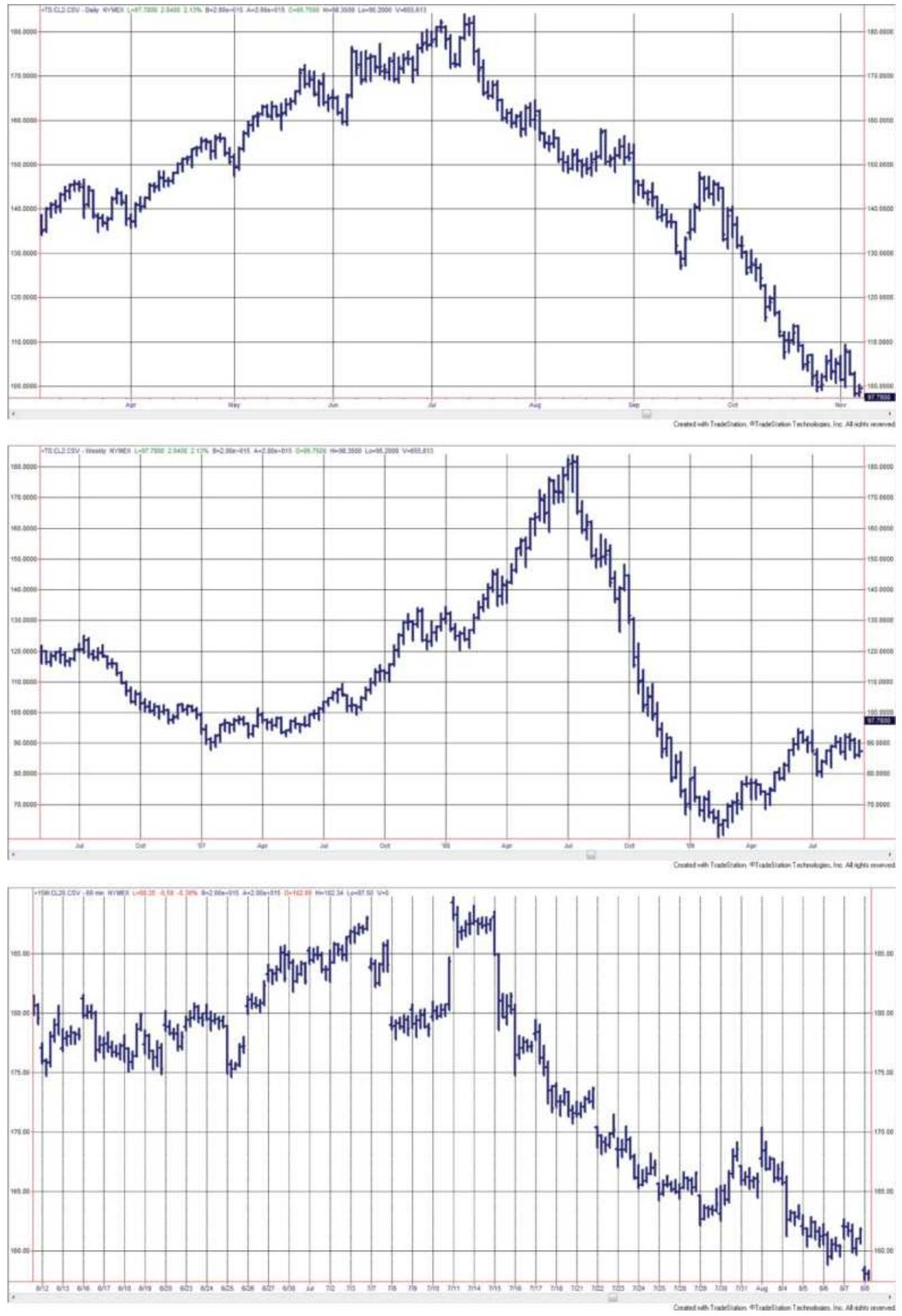
FIGURE 1.1 Crude oil prices weekly chart with July 2008 in the center (top); daily chart with July 2008 in the center (center); 20-min chart with July 2008 in the center (bottom).
Selecting a price frequency that complements your trading strategy is important. If you are a long-term, macrotrend follower, then you want the price series that shows more trends, which is improved by weekly or daily charts. Short-term traders focus on mean reversion or fast directional price moves, and those strategies are enhanced using higher-frequency data, such as hourly or 15 -minute bars.
\section*{MEASURING NOISE}
Noise is the erratic movement that makes up the pattern of any price series. High noise can be compared to a drunken sailor's walk while low noise is a straight line from the starting to the ending point. Understanding the effects of noise can give you a trading edge. A market that has high noise is good for mean-reverting and arbitrage strategies. One with low noise favors trendfollowing. By selecting markets correctly, you increase your chances of success.
Noise can be measured as price density, efficiency ratio (also called fractal efficiency), and fractal dimension. It is important that these measurements do not reflect volatility because noise should not be confused with volatility. In Figure 1.2 a short, hypothetical period of price movement gives an example of noise measured by
the efficiency ratio (ER). ER is calculated by dividing the net move (the change from point A to point B) by the sum of the individual moves during that period, each taken as positive numbers.
\section*{Absolute Value (Net change in price)}
Efficiency ratio \(=\) Sum of individual price changes (as positive numbers)
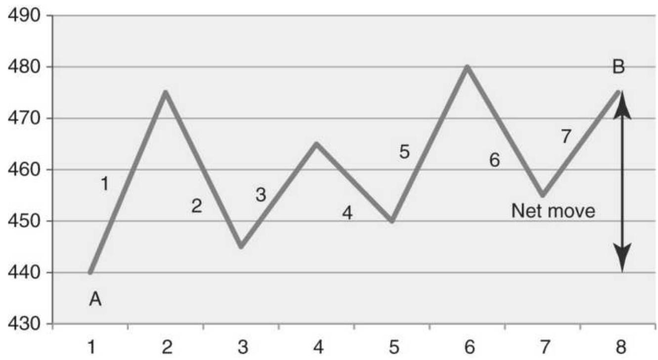
FIGURE 1.2 Basic measurement of noise using the efficiency ratio (also called fractal efficiency).
\section*{Levels of noise}
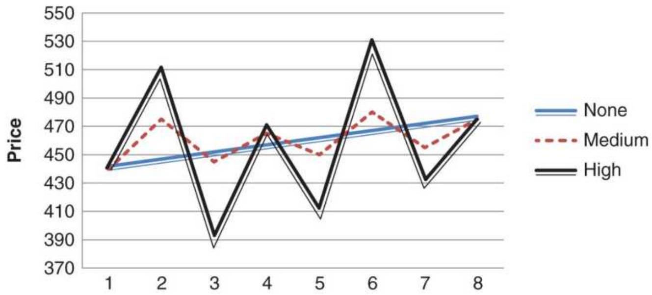
FIGURE 1.3 Three different price patterns all begin and end at the same point. The straight line shows no noise, the smaller variations are medium noise, and the larger swings are high noise.
or
\[
E R_{t}=\frac{\left|P_{t}-P_{t-n}\right|}{\sum_{i=t-n}^{i=t}\left|P_{i}-P_{i-1}\right|}
\]
where \(n\) is the calculation period.
Figure 1.3 illustrates the relative level of noise that might occur with a price move of the same net change. The straight line indicates no noise, the smaller changes that move above and below the straight line would be medium noise, and the large swings are high noise.
However, in this example it is not possible to distinguish the level of noise from volatility, yet they are not the same. In Figure 1.4, the net change in price is from 440
to 475 in one case and from 440 to 750 in the other, yet the sum of the individual component changes is similar, 595 and 554. The efficiency ratio is 0.06 for the first and 0.56 for the second, showing that the first is very noisy while the second has relatively low noise (see Table 1.1). Noise is always relative to the net price change. If prices are moving up quickly, then even large swings may not be considered "noisy."
\section*{Same volatilty, more gain = less noise}
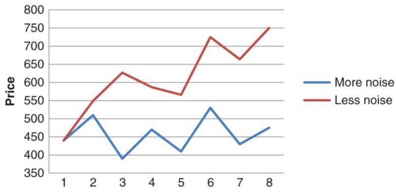
FIGURE 1.4 By changing the net price move we can distinguish between noise and volatility. If the sum of the individual price changes are the same, but the net move is larger, then the noise is less.
TABLE 1.1 These price changes, reflecting the patterns in Figure 1.4, show that larger individual price changes do not correspond to higher noise if the net change over the entire period is much larger.
\begin{tabular}{|l|c|c|c|c|}
\hline Day & \begin{tabular}{c}
High \\
noise
\end{tabular} & \begin{tabular}{c}
Low \\
noise
\end{tabular} & \begin{tabular}{c}
Diff \\
high
\end{tabular} & \begin{tabular}{c}
Diff \\
low
\end{tabular} \\
\hline \(\mathbf{1}\) & 440 & 440 & & \\
\hline 2 & 510 & 549 & .70 & 109 \\
\hline 3 & 390 & 627 & 120 & .78 \\
\hline 4 & 470 & 587 & .80 & .40 \\
\hline 5 & 410 & 566 & .60 & .21 \\
\hline 6 & 530 & 725 & 120 & 159 \\
\hline 7 & 430 & 664 & 100 & .61 \\
\hline 8 & 475 & 750 & .45 & .86 \\
\hline \begin{tabular}{l}
Net \\
change
\end{tabular} & 35 & 310 & 595 & 554 \\
\hline Noise & & & 0.06 & 0.56 \\
\hline
\end{tabular}
\section*{Other Measurements of Noise}
The previous example of noise used the efficiency ratio; however, price density and fractal dimension may also be used. Intuitively, price density can be seen as the extent to which prices fill a box. If we take a 10-day period of price movement charted with highs and lows, and draw a box touching the highest high and lowest low, then the density is how much of that box is filled. It is measured as:

Fractal dimension cannot be measured exactly but can be estimated over \(n\) days using the following steps:
1. Max \(=\) highest high over \(n\) days
2. Min = lowest low over \(n\) days
3. Range \(=\max -\min\)
4. \(d x^{2}=\left(\frac{1}{n}\right)^{2}\)
5. \(L=\sum_{i-t-n+1}^{i=t} \sqrt{d x^{2}+\frac{p_{i}-p_{i-1}}{\text { Range }}}\)
6. \(F D=1+\frac{\ln (L)+\ln (2)}{\ln (2 \times n)}\)
There is a strong relationship between fractal dimension and the efficiency ratio (fractal efficiency), and there is a similarity in the construction of price density and fractal dimension. Of the three methods of measuring noise, the efficiency ratio seems to be the clearest and that will be used in the following analyses.
\section*{Impact on Trading}
Without preempting the discussion in Chapter 20 ("Trends and Price Noise"), a trend system will be more profitable when the price series has less noise, and a mean reversion strategy will be better when there is more noise. That is not to say the noise is the only factor that determines the outcome; however, selecting the best markets to trade gives you a better chance of success.
Noise applies equally to all time frames because it measures erratic price movement. In that regard, it satisfies the concept of fractals, which are repeated in the same way at all levels of detail.
On a macro level, noise can help choose which markets to trade. On a micro level, it can tell you whether to enter a market quickly or wait for a better price.
\section*{MATURING MARKETS AND GLOBALIZATION}
The level of noise in each market can tell us about the maturity of that market and the nature of traders actively using it. The U.S. equity markets are where companies go to finance their business. Typical U.S. workers participate in the equity markets indirectly through their retirement program, and many are actively involved in making the decisions where to allocate those funds. The most conservative choose government debt obligations, such as 5-year Treasury notes or municipal bonds; more aggressive investors may allocate a portion to professionally managed funds. Some may actively trade their investment using ETFs, individual stocks, or futures.
Workers in other countries are not as involved in their equity markets, even though movement of the equity index in these countries reflects the health of their economy. With less involvement, there is less liquidity and with that, less price noise. However, most world markets are becoming more active, even if that liquidity
comes from globalization, where traders from one country buy and sell shares in another country.
We can look at the way price noise has changed over the 20 years from 1990 to 2010 to see the maturity of the world markets, shown in Figure 1.5. As a benchmark, North America shows noise increasing each of the five years, and the highest noise of all regions. Europe and Australia follow close behind. Eastern Europe shows a rapid change from low to high noise, indicating a surge in trading activity. Latin America has the lowest level of noise (the highest value) but is represented only by Mexico. In general, the level of noise has increased as globalization has increased.
For traders, emerging markets have lower liquidity and less noise. Trend systems work well until noise increases. It is only the lack of liquidity, and often difficulty in accessing these markets, that prevent traders from capturing large profits.
Asia continues to be the most important area of world development. China, which holds most of the U.S. debt, has given a great deal of economic freedom to its people, but limited access to the equity markets for outside investors. Figure 1.6, which is ranked from higher to lower noise values (less maturity to more maturity) from left to right shows the relative development of the Asian equity markets. It is not surprising that Japan is the most developed, followed by Hong Kong, Singapore, South Korea, and Taiwan. These represent the most open economies in Asia. At the other end are Sri Lanka, Vietnam, Pakistan, and Malaysia, countries without
access to global investors. India's Sensex shows greater participation than the China Shanghai Composite, but both are toward the center of the ranking. As more traders have access to these markets, as they should in the future, they will move toward the right in the ranking.
\section*{Market Usage by Region}
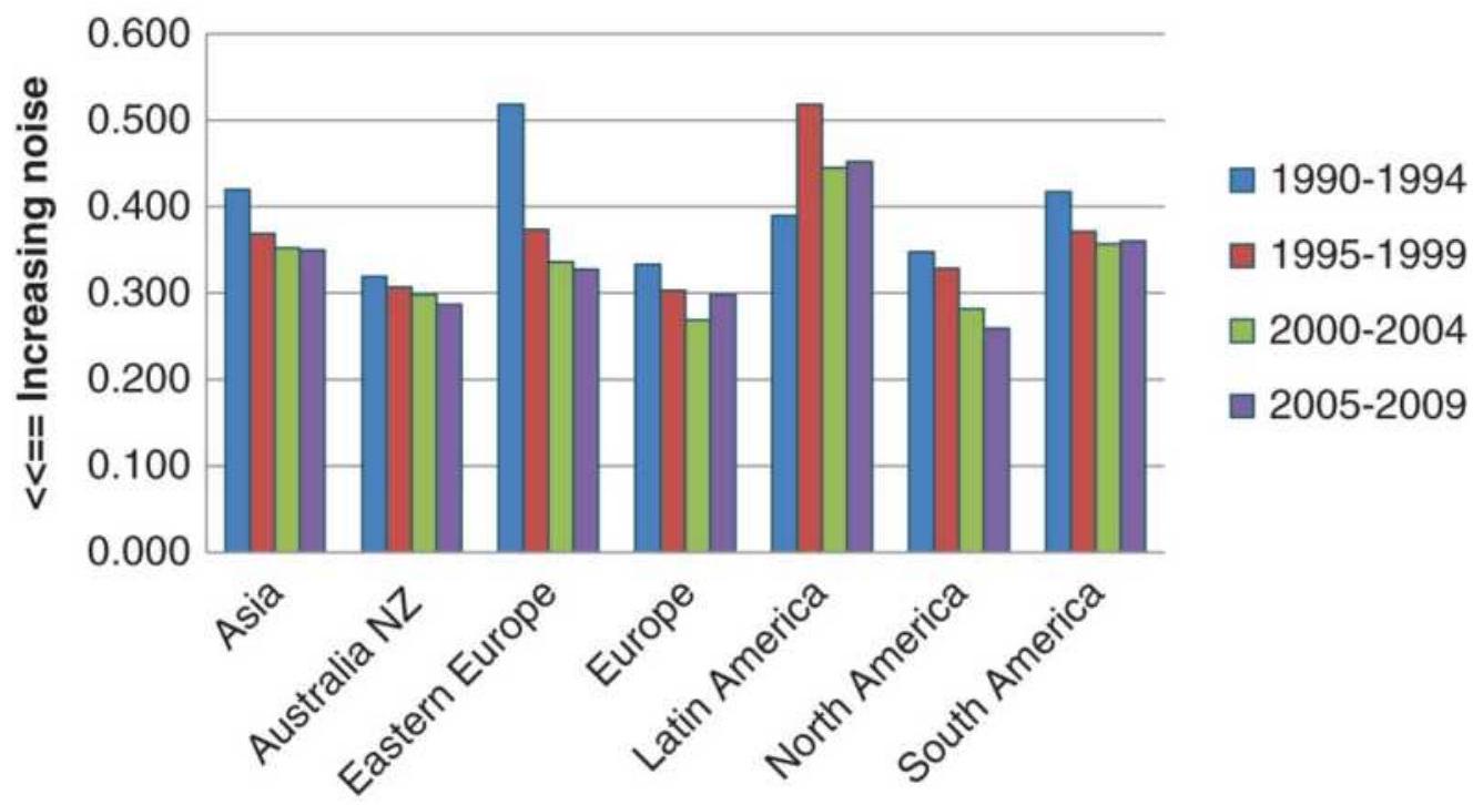
FIGURE 1.5 Relative change in maturity of world markets by region
Ranking of Asian Markets 2005-2010
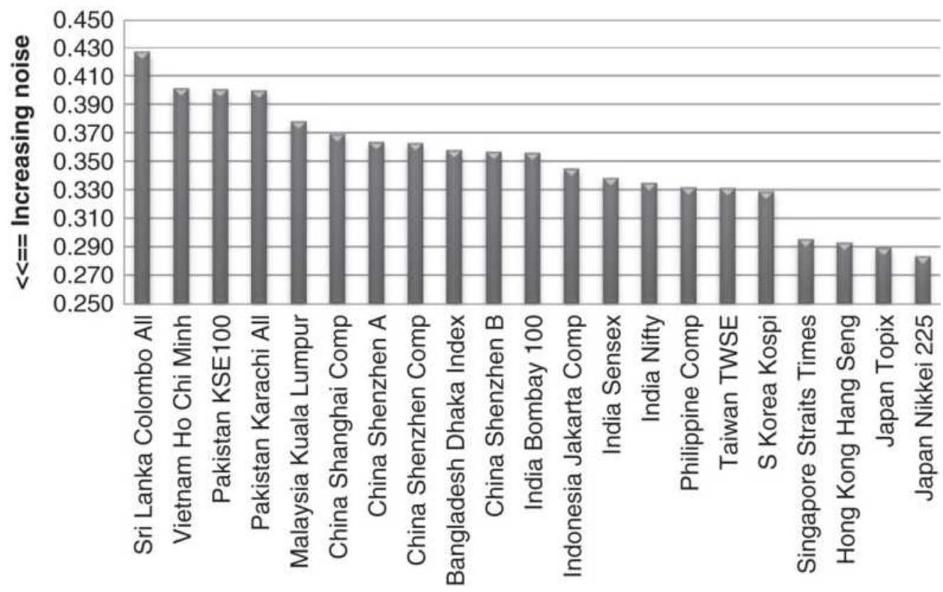
FIGURE 1.6 Ranking of Asian Equity Index Markets, 2005-2010.
\section*{BACKGROUND MATERIAL}
The contents of this book assume an understanding of the stock market and futures markets, such as the S\&P 500 and Treasury notes. Futures markets have a great impact on stock patterns and trade 24 hours a day. The rules and mechanics of those markets are not explained here unless they directly relate to a trading strategy. Ideally the reader should have read one or more of the available trading guides and should understand the workings of a buy or sell order and the contract specifications of futures. Experience in actual trading would be helpful. It's an advantage if you enjoy playing
competitive games and that you like to win.
There are excellent books available to both the beginning and advanced trader. Jack Schwager's Complete Guide to Futures Markets (2017) is a new edition of a classic, as well as the popular Market Wizards (updated 2012). For equities, the newest version of Edwards, Magee, and Bassetti, Technical Analysis of Stock Trends, remains a favorite. There are too many to name them all, so I'll tell you the technical books that are in easy reach of my desk, in alphabetic order by author's last name (details can be found in the Bibliography): Carol Alexander, Market Models; Peter Bernstein, The Portable MBA; Thomas Bulkowski, Encyclopedia of Chart Patterns and The Encyclopedia of Candlestick Patterns; John Ehlers, Cycle Analytics for Traders; Mark Fisher, The Logical Trader; John Hull, Fundamentals of Futures and Options; Andrew Lo, Adaptive Markets; Edgar Peters, Chaos and Order in the Capital Markets; and Cliff Ragsdale, Statistical Modeling. Of course, there are my own books, which I refer to often (see Bibliography).
Your list of worthwhile books should also include John Bollinger, Bollinger on Bollinger Bands, and Martin Pring, Technical Analysis Explained, as well as Robert Colby, The Encyclopedia of Technical Market Indicators (Dow Jones Irwin, 2002), Alex Elder, The New Trading for a Living (Wiley, 2014), and Nassim Taleb, Fooled by Randomness.
For a constant flow of both classic and new techniques, the magazines Technical Analysis of Stocks \&
Commodities and Modern Trader have numerous
articles on trading systems and methods. A basic understanding of market phenomena and relationships, often requiring some math skill, can be found in the Financial Analysts Journal (CFA Institute).
Books that should be read by every trader, and are also next to my desk, are Edwin Lefevre, Reminiscences of a Stock; Sun Tzu, The Art of War; Charles MacKay, Extraordinary Popular Delusions and the Madness of Crowds; and my favorite, The Logic of Failure by Dietrich Dörner. There are also books by Neil deGrasse Tyson because my interest in the universe goes back to my original career path.
\section*{Blogs, User Groups, and Associations}
Times have changed, and the Internet contains a great deal of material on trading systems not published elsewhere. It requires some sifting to locate information that you find relevant, but there are useful ideas out there. Just don't expect to find the golden chalice. You'll need to take the ideas, develop them, and test them yourself. Not all will be as good as they first appear. But ideas are valuable. Scan for "Trading Systems blogs."
There are a number of associations and user groups that can be very helpful to traders at all levels. The CMT Association (renamed from the Market Technician's Association) offers a Certified Market Technician credential, and the CFA Institute (previously the Association for Investment Management Research, AIMR) offers the Charter Financial Analyst credential. For those with higher math skills, the International
Association of Financial Engineers (IAFE) offers excellent resources. There are also user groups, sometimes called forums, for all of the popular development platforms, such as TradeStation, MetaStock, and Ninja Trader. These groups usually meet in larger cities, but can be reached on social media and are a valuable resource for solving a difficult problem.
As for this book, a reader with a good background in high school mathematics can follow everything but the more complex parts. A basic course in statistics is ideal, but knowledge of the type of probability found in Edward Thorp's Beat the Dealer (Vintage, 1966) is adequate. Fortunately, computer spreadsheet programs, such as Excel, allow anyone to use statistical techniques immediately, and most of the formulas in this book are presented in such a way that they can easily be adapted to spreadsheets, if they are not already presented that way. Even better, if you have a computer with trading software, you are well equipped to continue. If you have a live data feed, such as Bloomberg, Reuters, or Thinkorswim, you will also have access to technical studies that you will find very helpful. Bloomberg and Reuter's are also excellent sources of global data.
\section*{SYSTEM DEVELOPMENT GUIDELINES}
Before starting, there are a few guidelines that can help make the task of developing a trading system easier.
1. Know what you want to do before you start. Base your trading on a sound premise. It could be an observation of how prices move in response to
government policy, a theory about how prices react to economic reports, or simply a pattern that shows up at the same time each day or each month. This is the underlying premise of your method. It cannot be discovered by computer testing. It comes from the experience of observing price movement, reminiscent of Jesse Livermore, and understanding the factors that drive prices. If that's not possible, then select ideas from credible books or articles.
2. State your idea or premise in its simplest form. The more complex, the more difficult it will be to evaluate the answer and to understand the interaction of the parts. Simple methods tend to have more longevity. Remember Occam's razor.
3. Do not assume anything. Many projects fail on basic assumptions that were incorrect. It takes practice to avoid making assumptions and to be critical of certain elements that you believe to be true. Verify everything.
4. Try the simplest and most important parts
first. Some of the rules in your trading program will be more important than others. Try those first. It's best to understand how each rule or technique contributes to the final system. Then build slowly and carefully to prove the value of each element of the system. The ability to readily understand the operation of each part of your system is called a transparent solution, rather than a fully integrated or complex one. Transparent solutions are very desirable.
5. Watch for errors of omission. It may seem odd to look for items that are not there, but you must continually review your work, asking yourself if you have included all the necessary costs and accounted for all the risk. Simply because all the questions were answered correctly does not mean that all the right questions were asked.
6. Question the good results. There is a tendency to look for errors when results are bad, but to accept the results that are good. Exceptionally good results are just as likely to be caused by errors in rules, formulas, or data. They need to be checked as carefully as bad results. "Surprisingly good" results are often wrong.
7. Do not take shortcuts. It is sometimes convenient to use the work of others to speed up the research. Check their work carefully; do not use it if it cannot be verified. Check your spreadsheet formulas manually. One error can ruin all your hard work.
8. Start at the end. Define your goal and work backward to find only the necessary input. In this way, you only work with information relevant to the results; otherwise, you may expend a lot of unnecessary effort.
9. Be tenacious. Not all ideas work the first time, or the second. If you believe that your idea is good, keep working at it. There might be a "bug" in your code, or you might have omitted a rule that will make it successful.
\section*{OBJECTIVES OF THIS BOOK}
This book is intended to give you a complete understanding of the tools and techniques needed to develop or choose a trading program that has a good chance of being successful. Execution skill and market psychology are not considered - only the strategies, the methods for testing those strategies, and the means for controlling the risk. This is a goal of significant magnitude.
Not everything can be covered in a single book; therefore, some guidelines were needed to control the material included here. Every technique in this book qualifies as systematic; that is, each has clear rules. Most of them can be automated. We begin with basic concepts, including definitions, how much data to use, how to create an index, some statistics and probability, and other tools that are used throughout the book. The next several chapters cover the techniques that are most important to trading, such as the trend and momentum. All chapters are organized by common grouping so that you can compare variations of the same basic method. Although charting is an extremely popular technique, it is included only to the degree that it can be compared with other systematic methods, or when various patterns can be used in a computerized program (such as identifying a key reversal day). There has been no attempt to provide a comprehensive text on charting; however, various formations may offer very realistic profit objectives or provide reliable entry filters.
Neither stock options nor options on futures are
included in this book. The subject is too large and too specialized. There are already many good books on options strategies. The exception is that there are strategies using VIX, and comparisons of implied volatility versus historic volatility.
This book does not attempt to prove that one system is better than another, because it is not possible to know what will happen in the future or how each reader will cleverly apply these techniques. Instead the book evaluates the conditions under which certain methods are likely to do better and situations that will be harmful to specific approaches. By grouping similar systems and techniques together, and by presenting many of the results in a uniform way, you should be able to compare the differences and draw your own conclusions. Seeing how analysts have modified existing ideas can help you decide how to personalize a strategy and give you an understanding of why you might choose one path over another. With a more complete picture, common sense should prevail over computing power.
\section*{PROFILE OF A TRADING SYSTEM}
There are quite a few steps to be considered when developing a trading program. Some of these are simply choices in style while others are essential to the success of the results. They have been listed here and are discussed briefly as items to bear in mind as you continue the process of creating or choosing a trading system.
\section*{Changing Markets and System Longevity}
Markets are not static. They evolve as does everything else. The biggest changes continue to be in technology, participation, globalization, new markets, and the cost of doing business.
Technology includes communications, trading equipment (primarily computers and handheld devices), electronic exchanges, data access, and order entry. These innovations have accelerated the trading process.
Electronic markets have changed the nature of the order flow and made information about buyers and sellers more accessible. They have changed the speed at which prices react to news, and they have facilitated highfrequency trading and smart executions.
Globalization is mostly the result of the advances in communications. Not only can we see the same news at the same time everywhere in the world, but we can pass on information just as quickly. Equally important, we do not think about the reliability of our equipment. We expect our computers, telephones, and Internet connections to work without question. When we trade, we are willing to bet on it.
The dramatic reduction in commission cost has been a major influence on trading, opening opportunities for the fast trader. For institutions, stock transactions can be done at a fraction of a cent per share, and the individual investor will pay no more than \(\$ 8\) per order and as little as \(\$ 1\). This not only facilitates fast trading but encourages greater participation. Everyone wins.
The challenge for the trader is to find a system that will adapt to as-yet-unknown changes in the future. Most changes are not sudden, but are gradually reflected in price patterns (alternating with an occasional price shock). Biogenetic research has increased crop production while global warming may do the opposite. The rising middle class in China and India will change the demand for energy and retail goods. The increase in trading choices - ETFs, mutual funds, stocks, futures, options - causes a complex interdependence of markets. Index arbitrage and the trading of sector ETFs force the component stocks to move in the same direction regardless of their individual fundamentals. It is both challenging and rewarding to create a program with longevity.
\section*{The Choice of Data}
System decisions are limited by the data used in the analysis. Although price and volume for the specific stock or futures market may be the definitive criteria, there is a multitude of other valid statistical information that might also be used. Some of this data is easily included, such as price data from companies in the same sector or industrial group, or the current yield curve relationship. Other statistical data, including the wide range of U.S. economic data and weekly energy inventories, may add a level of robustness to the results but are less convenient to obtain and less timely.
\section*{Diversification}
Not all traders are interested in diversification, which
tends to reduce returns at the same time that it limits risk. Concentrating all your resources on a single market that you understand may produce a specialized approach and much better results than using a more generalized technique over more markets. Diversification may be gained by trading two or more unique strategies applied to the same market, instead of one strategy used on a broad set of markets. On the other hand, overdiversification can introduce marginal returns with greater risk. It will be important to find the right balance.
\section*{Trade Selection}
Although a trading system produces signals regularly, it is not necessary to enter all of them. Selecting one over another can be done by a method of filtering. This can be a confirmation of another technique or system, a limitation on the amount of risk that can be accepted on any one trade, the use of outside information, or the current volume. Many of these additional rules add a touch of reality to an automated process. You may find, however, that too many filters result in overfitting or no trading.
\section*{Testing}
A mistake in testing may cause you to trade a losing strategy or discard a profitable one. Back-testing is the only option available to confirm or validate your ideas. Testing is misguided when it is used to "discover" a trading method by massive scanning of techniques. A robust solution, one that works on many stocks or across
similar markets, will never appear as good as an optimized result of a single stock. But using the same system for all stocks in the same sector exposes it to more patterns and will give you a more realistic assessment of expectations, both risk and reward, and a much better chance of success.
\section*{Risk Control}
Trading survival requires risk control. Risk must be addressed at all levels. It begins with the individual trade, but must also balance the risks of all markets in a common sector, the risk of those sectors in a portfolio, and finally the risk of multiple systems traded together. Trade risk can be controlled using a stop-loss but can effectively be managed by volatility. Futures traders must also pay attention to leverage. Risk management does not need to be complex, but it cannot be overlooked.
\section*{Transaction Costs}
A system that performs well on paper may be dismal when actually traded. Part of a trading program is knowing how to enter and exit the market, as well as having realistic expectations about the transaction costs, both commissions and slippage. Short-term, fast trading systems are most sensitive to transaction costs because the expected profit on each trade is small. Directional trading strategies, those that buy as prices are rising and sell when they are falling, have larger slippage than mean reversion techniques.
There is equal damage in overstating costs as there is in underestimating them. By burdening a system with unrealistic fees, tests may show a loss instead of a profit, causing you to reject a successful trading method.
\section*{Performance Monitoring and Feedback}
A system is not done when you begin trading; it is only entering a new phase. Trading results must be carefully monitored and compared with expectations to know if the system is performing properly. It is very likely that knowing the true execution slippage will cause you to make some changes to the system rules or to the size of the positions. Performance monitoring provides the essential feedback needed to be successful. It can be an early warning that tells you something is wrong, or it can give you added confidence that everything is going well.
\section*{A WORD ABOUT THE NOTATION USED IN THIS BOOK}

To make the contents of this book more useful for trading, some of the traditional mathematical formulas are also shown as Microsoft's Excel notation, as well as TradeStation's EasyLanguage. EasyLanguage can be understood by anyone who has experience with a programming language, and is easily converted to other development platform code. You will find hundreds of examples on the Companion Website, with references to them noted in the margins throughout the book.
Some of the examples are more complex systems and indicators, written in either, or both, Excel and EasyLanguage. Although these programs have been carefully tested, there may have been occasional errors introduced during final editing. Recent market activity may also produce combinations of price movements that did not occur during the test period. Readers are advised to check over the code and test it thoroughly before using it.
Be aware that the statistical functions may have slightly different names in different platforms. For the standard deviation, Excel uses stdev while EasyLanguage uses stddev. One program expects the mean to be avg while another requires average. Excel uses log when it's really \(\ln\) (natural log). Please check the notation in each formula and solution so that it reflects your needs.
\section*{A FINAL COMMENT}
Throughout this book the principle of unnecessary plurality, better known as Occam's razor, will be stressed. The principle states that, given more than one explanation or solution, the simplest one is the preferred. (Smart people have been around for a long time.) When developing or choosing a trading strategy, it is normally the case that adding complexity for the sake of a few extra basis points increases the potential problems and risk more than it increases returns.
Pluralitas non est ponenda sine necessitate.
William of Ockham (c. 1285-1349)
The goal here is to provide the tools and the understanding to help both aspiring and experienced traders develop systematic ways to trade that satisfy their inherent risk preference and their investment objectives. It is unlikely that any two traders will develop the same system, but the greater their knowledge, the more likely it will be profitable.
\section*{CHAPTER 2}
\section*{Basic Concepts and Calculations}
Economics is not an exact science: it consists merely of Laws of Probability. The most prudent investor, therefore, is one who pursues only a general course of action which is "normally" right and who avoids acts and policies which are "normally"wrong.
—LLB Angas
Technology puts data from everywhere in the world at our fingertips, programs that perform sophisticated calculations instantly, and access to anyone at any time.
As Isaac Asimov foretold, there will come a time when we will no longer know how to do the calculation for long division because miniature, voice-activated computers will be everywhere. We might not even need to be able to add; it will all be done for us. We will just assume that the answer is correct, because computers don't make mistakes.
In a way this is happening now. Not everyone checks their spreadsheet calculations by hand to be certain they are correct before going further. Nor does everyone print the intermediate results of computer calculations to verify their accuracy. Computers don't make mistakes, but people do.
With computer software and trading platforms making
price analysis easier and more sophisticated, we no longer think of the steps involved in a moving average or linear regression. A few years ago, we looked at the correlation between investments only when absolutely necessary because they were too complicated and timeconsuming to calculate. Now we face a different problem. If the computer does it all, we lose our understanding of why a moving average trendline differs from a linear regression. Without looking at the data, we don't see an erroneous outlier, a stock that wasn't adjusted for splits, or that the early price of Apple (AAPL) went negative due to the way splits were applied. By not reviewing each hypothetical trade, we miss seeing that the slippage can turn a profit into a loss.
To avoid losing the edge needed to create a profitable trading strategy, the basic tools of the trade are explained in this chapter. Those of you already familiar with these methods may skip over it; others need to be confident that they can perform these calculations manually even while they use a spreadsheet.
\section*{Helpful Software}
In Excel, many of the functions, such as the standard deviation, are readily accessible. The more advanced statistical functions require that you install the add-ins, which also come free with Excel. These include histograms, regression analysis, \(F\)-test, \(t\)-test, \(z\)-test, Fourier analysis, and various smoothing techniques. To install these add-ins in most versions of Excel, go to file/options/add-ins and select all of the add-ins. Be sure you get Solver. Once installed, which takes only a few
seconds, these functions can be accessed in the Data menu at the top of the screen.
There are other very useful and user-friendly statistical programs, available at a wide range of sophistication and price. One of the best values is Pro-Stat by Poly Software (polysoftware.com). At the high end will be SAS, SPSS, and Statistica. The examples in this chapter will use both Excel and Pro-Stat.
\section*{A BRIEF WORD ABOUT DATA}
Selection and use of data will be discussed in Chapter 21, System Testing; however, there are a few important points to remember as you progress through this book.
More is better. Your system will be more robust if it works on more data. That data needs to include bull and bear markets, and the occasional large price shock.
No data is too old to use. Your rules must adapt to changing times. The data 20 years ago may seem irrelevant now, and today's data will also seem irrelevant in 20 years, but it is not.
Economic data is not timely. Traders react to economic data releases even though some of them reflect averages of the past month and corrections to previous releases. Data from other countries other than the United States and Europe are often very late and not always accurate. Be careful about putting too much dependence on economic data.
In-sample and out-of-sample data. Proper testing involves saving some data to verify your work after you have completed your development. It is the first time you will get a chance to test your idea on unseen data.
\section*{SIMPLE MEASURES OF ERROR}
When you use a small amount of data, the results are not reliable. Financial news is filled with polls that show accuracy of \(\pm 5 \%\). We would like more accuracy. The two basic measures of error are sample error and standard error.
\section*{Sample Error}
With any calculation, it is necessary to have enough data to make the result accurate. The process for verifying if there is adequate data is called the testing of significance. Accuracy increases as the number of items becomes larger, and the sample error becomes proportionately smaller:

Using only one item has a sample error of \(100 \%\); with four items, the error is \(50 \%\). The size of the error is important to the reliability of any trading system. If a system has had only 4 trades, whether profits or losses, it is very difficult to draw any reliable conclusions about
future performance. There must be sufficient trades to assure a comfortably small error factor. To reduce the error to \(5 \%\), there must be 400 trades. This presents a dilemma for a very slow trend-following method that may only generate 2 or 3 trades each year. To compensate for this, the identical method can be applied across many markets and the number of trades used collectively.
\section*{Standard Error}
The standard error(SE) uses the variance, which gives the estimation of error based on the distribution of the data using multiple data samples. It is a test that determines how the sample means differ from the actual mean of all the data. It addresses the uniformity of the data.
\[
S E=\sqrt{\frac{V a r}{n}}
\]
where
Var \(=\) the variance of the sample means
\(n=\) the number of data points in the sample means
Sample means refers to a large amount of data being sampled a number of times, each with \(n\) data points, and the means of these samples are used to find the variance. Most of us will use the mean of all the data rather than multiple samples. Any measure of confidence is better than none.
\section*{ON AVERAGE}
\section*{The Law of Averages}
We begin at the beginning, with the law of averages, a greatly misunderstood principle. In trading, the law of averages is most often quoted incorrectly when an abnormally long series of losses is expected to be offset by an equal and opposite run of profits. It is equally wrong to expect a market that is currently overvalued or overbought to next become undervalued or oversold. That is not what is meant by the law of averages. Over a large sample, the bulk of events will be scattered close to the average in such a way that the typical values overwhelm the abnormal events and cause them to be insignificant.
This principle is illustrated in Figure 2.1, where the number of average items is extremely large, and the addition of a small abnormal grouping to one side does not affect the balance. It is the same as being the only passenger on a jumbo jet. Your weight is insignificant to the operation of the airplane and is not noticed when you move about the cabin. A long run of profits, losses, or an unusually sustained price movement is simply a rare, abnormal event that will be offset over time by the overwhelmingly large number of normal events. Further discussion of this and how it affects trading can be found in "Gambling Technique: The Theory of Runs," in
Chapter 22.
\section*{How We Use Averages}
In working with numbers, it is often necessary to use representative values. The average of a range of values may be substituted to change individual prices into a general characteristic in order to solve a problem. For example, the average retail price of one pound of coffee in the Northeast is more meaningful to a cost-of-living calculation than the price at any one store. However, not all data can be combined or averaged and still have meaning. The average of all prices taken on the same day would not say anything about an individual market that was part of the average. Averaging the prices of unrelated items, such as a box of breakfast cereal, the hourly cost of automobile repair, and the price of the German DAX index would produce a number of questionable value. The average of a group of numbers must have some useful meaning.
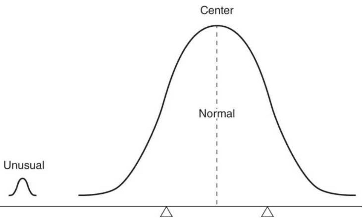
FIGURE 2.1 The Law of Averages. The normal cases overwhelm the unusual ones. It is not necessary for the
extreme cases to alternate - one higher, the next lower to create a balance.
The average can be misleading in other ways. Consider coffee, which rose from \(\$ 0.40\) to \(\$ 2.00\) per pound in 1 year. The average price of these two values is \(\$ 1.20\); however, this would not account for the time that coffee was sold at various price levels. Table 2.1 divides the coffee price into 4 equal intervals, then shows that the time spent at these levels was inversely proportional to the price rise. That is, prices remained at lower levels longer and at higher levels for shorter time periods, which is very normal price behavior.
When the time spent at each price level is included, it can be seen that the average price should be lower than \(\$ 1.20\). One way to calculate this, knowing the specific number of days in each interval, is by using a weighted average of the price:
\[
W=\frac{a_{1} d_{1}+a_{2} d_{2}+a_{3} d_{3}+a_{4} d_{4}}{d_{1}+d_{2}+d_{3}+d_{4}}
\]
and its corresponding intervals:
\[
\begin{aligned}
& W=\frac{6000+8000+8400+7200}{280} \\
& W=105.71
\end{aligned}
\]
This result can vary based on the number of time intervals used; however, it gives a better idea of the correct average price. There are two other averages for
which time is an important element - the geometric mean and the harmonic mean.
\section*{Geometric Mean}
The geometric mean is a growth function in which a price change from 50 to 100 is as important as a change from 100 to 200 . It should be used when working with percentages rather than raw prices. If there are \(n\) prices, a1, a2, a3, ..., an, then the geometric mean is the \(n\)th root of the product of \(n\) prices:
\section*{TABLE 2.1 Weighting an average.}
\begin{tabular}{|l|l|c|c|c|c|}
\hline Prices Go & \multicolumn{5}{|c|}{} \\
\hline From To & \begin{tabular}{c}
Average \\
During \\
Interval
\end{tabular} & \begin{tabular}{c}
Total \\
Days for \\
Interval
\end{tabular} & Weighted & 1/a \\
\hline 40 & 80 & \(\mathrm{a} 1=60\) & \(\mathrm{~d} 1=100\) & 6000 & 0.01666 \\
\hline 80 & 120 & \(\mathrm{a} 2=100\) & \(\mathrm{~d} 2=80\) & 8000 & 0.01000 \\
\hline 120 & 160 & \(\mathrm{a} 3=140\) & \(\mathrm{~d} 3=60\) & 8400 & 0.00714 \\
\hline 160 & 200 & \(\mathrm{a} 4=180\) & \(\mathrm{~d} 4=40\) & 7200 & 0.00555 \\
\hline
\end{tabular}
\[
G=\left(a_{1} \times a_{2} \times a_{3} \times \cdots \times a_{n}\right)^{1 / n}
\]
or in Excel:
\[
\operatorname{product}\left(a_{1}, a_{2}, a_{3}, \ldots, a_{n}\right)^{\wedge}(1 / n)
\]
To solve this without using the product function, the equation above can be changed to either of two forms:
\section*{\(\ln (G)=\underline{\ln \left(a_{1}\right)+\ln \left(a_{2}\right)+\cdots+\ln \left(a_{n}\right)}\) \\ \(n\)}
or
\[
\ln (G)=\frac{\ln \left(a_{1} \times a_{2} \times a_{3} \times \cdots \times a_{n}\right)}{}
\]
\(n\)
The two solutions are equivalent. The term \(\ln\) is the natural log, or log base \(e\). (Note that in Excel, the function \(\log\) actually is \(\ln\).) Using the price levels in Table 2.1,
\[
\ln (G)=\frac{\ln (40)+\ln (80)+\ln (120)+\ln (160)+\ln (200)}{5}
\]
Disregarding the time intervals, and substituting into the first equation:
\(\ln (G)=\frac{3.689+4.382+4.787+5.075+5.298}{5}\)
Then:
\[
\begin{aligned}
\ln (G) & =4.6462 \\
G & =104.19
\end{aligned}
\]
While the arithmetic mean, which is equal-weighted, gave the value of 105.71 , the geometric mean shows the average as 104.19.
The geometric mean has advantages in applications to economics and indices. A classic example compares a tenfold rise in price from 100 to 1000 to a fall to one tenth from 100 to 10 . An arithmetic mean of the two values 10 and 1000 is 505 , while the geometric mean gives:
\[
G=(10 \times 1000)^{1 / 2}=100
\]
and shows the relative distribution of prices as a function of comparable growth. Due to this property, the geometric mean is the best choice when averaging ratios that can be either fractions or percentages.
\section*{Quadratic Mean}
The quadratic mean is most often used for estimation of error. It is calculated as:
\[
Q=\sqrt{\frac{\sum a^{2}}{N}}
\]
The quadratic mean is the square root of the mean of the square of the items (root-mean-square). It is most well known as the basis for the standard deviation. This will be discussed later in this chapter in the section "Moments of the Distribution."
\section*{Harmonic Mean}
The harmonic mean is another time-weighted average, but not biased toward higher or lower values as in the
geometric mean. A simple example is to consider the average speed of a car that travels 4 miles at 20 mph , then 4 miles at 30 mph . An arithmetic mean would give 25 mph , without considering that 12 minutes were spent at 20 mph and 8 minutes at 30 mph . The weighted average would give:
\[
W=\frac{(12 \times 20)+(8 \times 30)}{12+8}=24
\]
The harmonic mean is:
\[
\frac{1}{H}=\frac{\frac{1}{a_{1}}+\frac{1}{a_{2}}+\cdots+\frac{1}{a_{n}}}{n}
\]
which can also be expressed as:
\[
H=n / \sum_{i=1}^{n}\left(\frac{1}{a_{i}}\right)
\]
For two or three values, the simpler form can be used:
\[
H_{2}=\frac{2 a b}{a+b}
\]
\[
H_{3}=\frac{3 a b c}{a b+a c+b c}
\]
This allows the solution pattern to be seen. For the 20 and 30 mph rates of speed, the solution is:
\[
H_{2}=\frac{2 \times 20 \times 30}{20+30}=24
\]
which is the same answer as the weighted average. Considering the original set of numbers again, the harmonic mean would be:
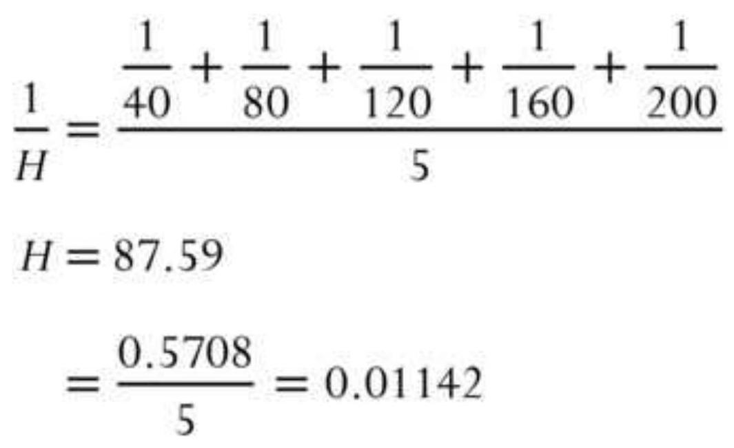
We might apply the harmonic mean to price swings, where the first swing moved 20 points over 12 days and the second swing moved 30 points over 8 days.
\section*{The Relationship Between the Means}
The measures of central tendency discussed in the previous section are used to describe the shape and extremes of price movement that will also be seen in the frequency distribution described in the next section. The general relationship between the three principal means when the distribution is not perfectly symmetric is:
\section*{Arithmetic mean \(>\) Geometric mean \(>\) Harmonic mean}
\section*{PRICE DISTRIBUTION}
The measurement of distribution tells you, in general terms, what to expect. We cannot know what S\&P price will be in one year, but if the current price is 2400 , then we have a high level of confidence that it will fall between 2100 and 2700, less confidence that it will fall between 2300 and 2500, and we have virtually no chance of picking the exact value. The following measurements of distribution allow you to put a probability, or confidence level, on the chance of an event occurring.
In the statistics that follow, we will use a limited number of prices and - in some cases - individual trading profits and losses as the sample data. We want to measure the characteristics of our sample, find the shape of the distribution, decide how results of a smaller sample compare to a larger one, and see if the two samples are similar to each other. All of these measures will show that the smaller samples are less reliable, yet they can still be used if you understand the size of the error or the difference in the shape of the distribution compared to the expected distribution of a larger sample.
\section*{Frequency Distributions}
The frequency distribution (also called a histogram) can give a good picture of the characteristics of the data. Theoretically, we expect commodity prices to spend more time at low price levels and only brief periods at high prices. That pattern is shown in Figure 2.2 for wheat from 1978 to 2017. The most frequent occurrences are at the price where the supply and demand are
balanced, called equilibrium. When there is a shortage of supply, or an unexpected demand, prices rise for a short time until either the demand is satisfied or supply increases to meet demand. Although brief, the rising prices can be extreme and can be seen as the "fat tail" of the distribution stretching to the right in Figure 2.3. There is usually a small tail to the left where prices occasionally trade for less than the cost of production, or at a discounted rate during periods of high supply.
To calculate a frequency distribution, we divide the price range into 20 bins.
- Take the highest high to the lowest low over the data period and divide by 19 to get the size of one bin.
\section*{Wheat cash prices (cents/bushel)}
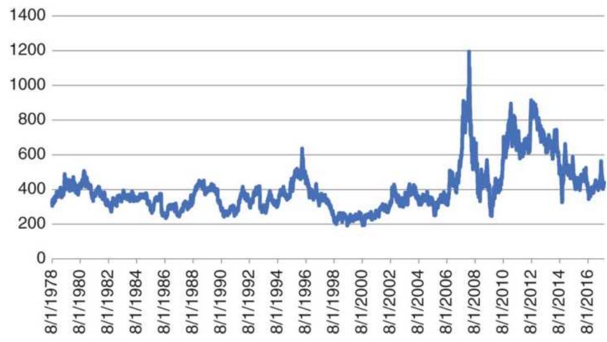
FIGURE 2.2 Wheat prices, 1978-2017.
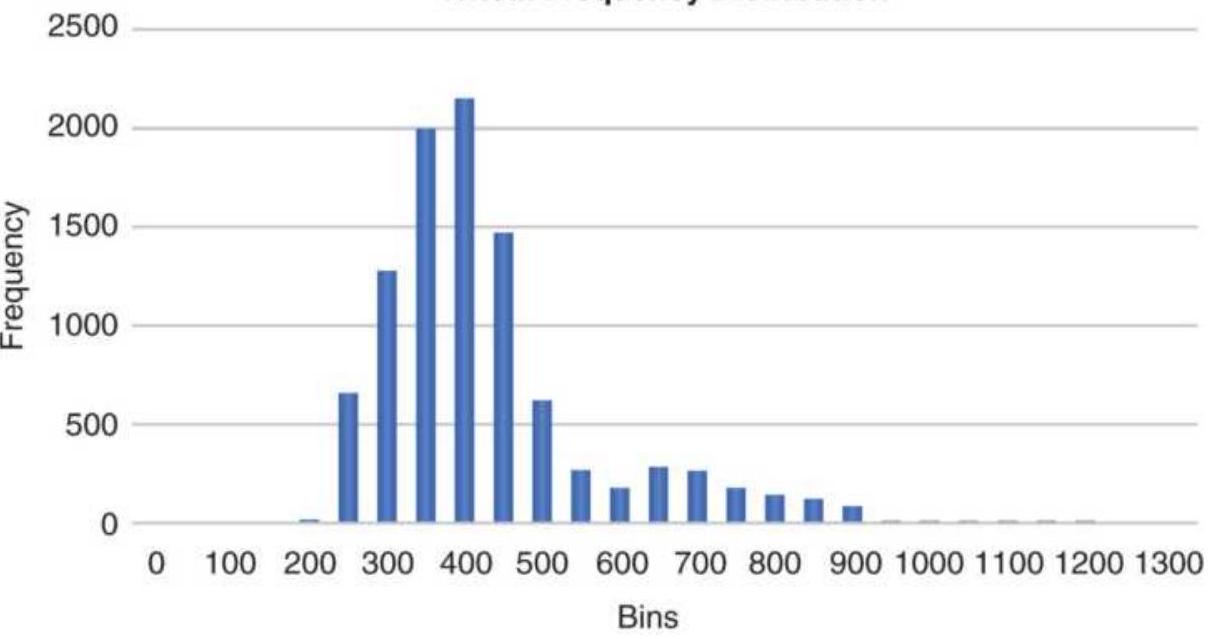
FIGURE 2.3 Wheat frequency distribution showing a tail to the right.
- Beginning with the lowest price, add the bin size to get the second value, add the bin size to the second value to get the third value, and so on.
When completed, you will have 20 bins that begin at the lowest price and end at the highest price.
Instead, we'll use Excel. Once you have installed the addins, go to Data/Data Analysis. Be sure you have Histogram. To set up the analysis:
1. Import the closing prices of your market.
2. Create a set of bins, based on the range of data. In our case, wheat prices ranged from about 200 to about 1300 (expressed in cents). We set up a column starting at zero and incremented by 50 up to 1300.
3. Now go to Data Analysis and choose Histogram.
4. The input range will be the closing prices.
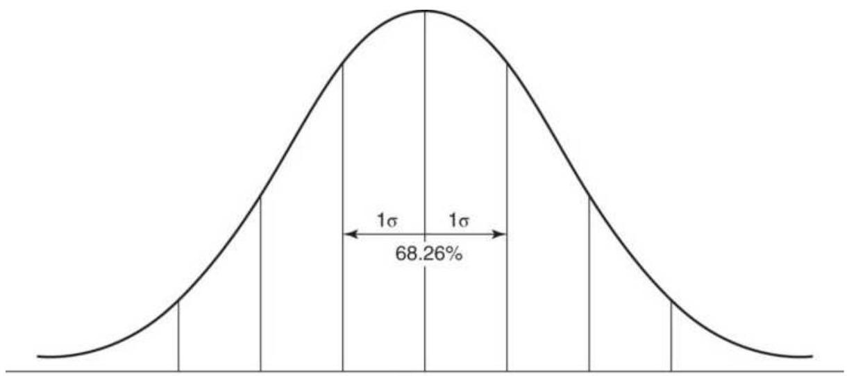
Mean
FIGURE 2.4 Normal distribution showing the percentage area included within one standard deviation about the arithmetic mean.
5. Thebin range is the short column of values we created from o to 1300 .
6. Allow the output to be a New Worksheet.
7. Click on \(O K\).
The program will fill the bins and allow you to plot the results shown in Figure 2.3.
The frequency distribution shows that the most common price fell between \(\$ 4.00\) and \(\$ 4.50\) per bushel. The tail to the right extends to \(\$ 12 /\) bushel and illustrates the fat tail. If this was a normal distribution there would be no entries to the right of \(\$ 6\). The absence of price data below \(\$ 2.00\) is due to farmers refusing to sell at a loss. Wheat prices can also be viewed net of inflation or changes in the U.S. dollar. This will be seen at the end of this chapter.
You should expect that the distribution of prices for
other physical commodities, such as agricultural products, metals, and energy, would look similar to the wheat chart. They will be skewed toward the left (more occurrences at lower prices) and have a long tail at higher prices toward the right. Many commodities are seasonal, which allows them to "restart" each year. The financial markets are quite different because, over time, many of them keep going higher. Currencies prices may fluctuate by \(25 \%\) or more but could go anywhere if the United States or another economy has a structural change.
When observing shorter price periods, patterns that are elongated may be considered in transition, or trending. For more, see Chapter 18 , especially the sections "The Importance of the Shape of the Distribution" and "Steidlmayer's Market Profile."
\section*{Median and Mode}
The median and the mode are also used to describe the distribution. The median, or "middle item," is helpful for establishing the "center" of the data; when the data is sorted, it is the value in the middle. The median is often a better choice than the average because it discounts extreme values, which might distort the arithmetic mean. Its disadvantage is that you must sort all of the data in order to locate the middle point, and it should not be used for a small number of items.
The mode is the most commonly occurring value. In Figure 2.3, the mode is the highest bar in the frequency distribution, at bin 400 .
In a normally distributed price series, the mode, mean, and median all occur at the same value; however, as the data become skewed, these values will move farther apart. The general relationship is:
\section*{Mean \(>\) Median \(>\) Mode}
A normal distribution is commonly called a bell curve, and values fall equally on both sides of the mean. For much of the work done with price and performance data, the distributions tend to be skewed to the right
(positively skewed with the tail to the right), and appear to flatten or cut off on the left (lower prices or trading losses), as we saw in Figure 2.3. If you were to chart a distribution of trading profits and losses based on a trend system with a fixed stop-loss, you would get profits that could range from zero to very large values while the losses would be theoretically limited to the size of the stop-loss. In fact, it would look a lot like the wheat distribution. Skewed distributions will be important when we measure probabilities later in this chapter. There are no "normal" distributions in a trading environment. You may hear statisticians refer to normal distributions as Gaussian.
\section*{Summary of the Principal Averages}
Each averaging method has its unique meaning and usefulness. The following are their principal characteristics:
The arithmetic mean is affected by each data element equally, but it has a tendency to emphasize
extreme values more than other methods.
The geometric mean is most important when using data representing percentages, ratios, or rates of change. It cannot be used for negative numbers.
The harmonic mean is most applicable to time changes and, along with the geometric mean, has been used in economics for price analysis. It is more difficult to calculate; therefore, it is less popular than either of the other averages.
The mode is the most common value and is only determined by the frequency distribution. It is the location of greatest concentration and indicates a typical value for a reasonably large sample.
The median is the middle value and is most useful when the center of an incomplete set is needed. It is not affected by extreme variations and is simple to find; however, it requires sorting the data, which can cause the calculation to be slow.
\section*{MOMENTS OF THE DISTRIBUTION: MEAN, VARIANCE, SKEWNESS, AND KURTOSIS}
To be uncertain is to be uncomfortable, but to be certain is to be ridiculous.
-Chinese proverb
The moments of the distribution describe the shape of the data points, the way they cluster around the mean.
There are four moments: mean, variance, skewness, and kurtosis.
1. The mean is the center or average value, around which other points cluster.
2. Variance is the distance of the individual points from the mean.
3. Skewness is the way the distribution leans to the left or right relative to the mean.
4. Kurtosis is the peakedness of the clustering.
We have already discussed the mean, so we will start with the 2 nd moment. In the following calculations, we will use the bar notation, \(\bar{P}\), to indicate the average of a list of \(n\) prices. The capital \(P\) refers to all prices and the small \(p\) to individual prices. We'll use the following form so that the similarity between moments can be easily seen. The mean is calculated as:
\[
\bar{P}=\underline{\sum_{i=1}^{n} p_{i}}
\]
\(n\)
\section*{Variance (2nd Moment) and Standard Deviation}
Variance (Var) is very similar to mean deviation (MD), which does not square the differences, and is the best estimation of dispersion.
\[
\operatorname{Var}=\frac{\sum_{i=1}^{n}\left(p_{1}-\bar{p}\right)^{2}}{n-1}
\]
Notice that the variance is the square of the standard deviation, var \(=s^{2}=\sigma^{2}\), one of the most commonly used statistics. In Excel, the variance is the function var and in TradeStation it is variance(series, \(n\) ).
The standard deviation, most often shown as \(\sigma\) (sigma), is a special form of measuring average deviation from the mean, which uses the root-mean-square:
\[
\sigma=\sqrt{\frac{\sum_{i-1}^{n}\left(p_{i}-\bar{p}\right)^{2}}{n}}
\]
where the differences between the individual prices and the mean are squared to emphasize the significance of extreme values, and then the total value is reduced using the square root function. This popular measure, also used throughout this book, is the Excel function Stdevp and the TradeStation function, StdDev(price, \(n\) ), for \(n\) prices.
\section*{Gold cash prices}
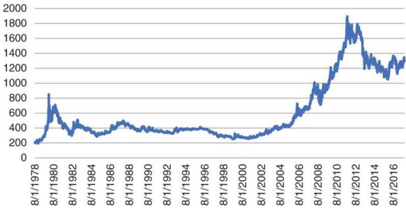
\section*{FIGURE 2.5 Gold cash prices.}
The standard deviation is the most popular way of measuring the dispersion of data as well as volatility, or risk. In a perfectly normal set of data, the value of 1 standard deviation about the mean represents a clustering of approximately \(68 \%\) of the data, 2 standard deviations from the mean include \(95.5 \%\) of all data, and 3 standard deviations encompass \(99.7 \%\), nearly all the data. While it is not possible to guarantee that all data will be included, we use 3.5 standard deviations to represent \(100 \%\) of the data. Figure 2.6 illustrates the standard deviation groupings.
The \(z\)-score, a term used later in this book, is the number of standard deviations from the mean for a specific data point, also called the standard score. If a data point has a \(z\)-score of 2.0, it is 2 standard deviations from the mean.
\section*{Skewness (3rd Moment)}
Most price data, however, are not normally distributed. For physical commodities, such as gold, grains, energy, and even interest rates (expressed at yields), prices tend to spend more time at low levels and much less time at extreme highs. In another example, gold peaked at \(\$ 800\) per ounce in January 1980, then at \$1,895 in September 2011 (see Figure 2.5). After the peak in 1980, prices fell back to between \(\$ 250\) and \(\$ 400\) for most of the next twenty years. That period averaged \(\$ 325\) with a standard deviation of \(\$ 140\). A normal distribution of 2 standard deviations would put \(95 \%\) of the data between \(\$ 45\) and \(\$ 605\), which is not realistic. Using all the data, we get an average of \(\$ 607\) and a standard deviation of \(\$ 408\). Then 2 standard deviation puts the range at \(-\$ 391\) to \(\$ 1,423\), again an unlikely scenario.
The frequency distribution (Figure 2.6) shows two nodes, one where prices remained near \(\$ 400\), and then a newer area where prices are settling at \(\$ 1,300\). In both cases there is a long tail to the right, making it necessary to consider the skew (Figure 2.7). Skew measures the amount of distortion from a symmetric distribution, making the curve appear to be short on the left (lower prices) and extended to the right (higher prices). The extended side, either left or right, is called the tail, and a longer tail to the right is called positive skewness. Negative skewness has the tail extending toward the left.
Gold cash prices 1978-2017
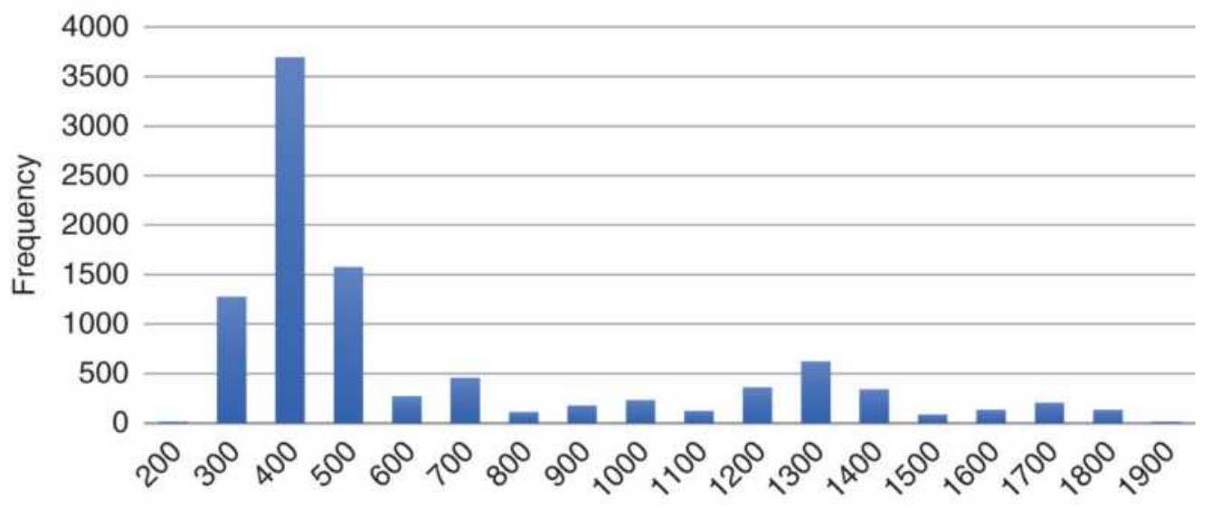
Bins
FIGURE 2.6 Gold cash frequency distribution.
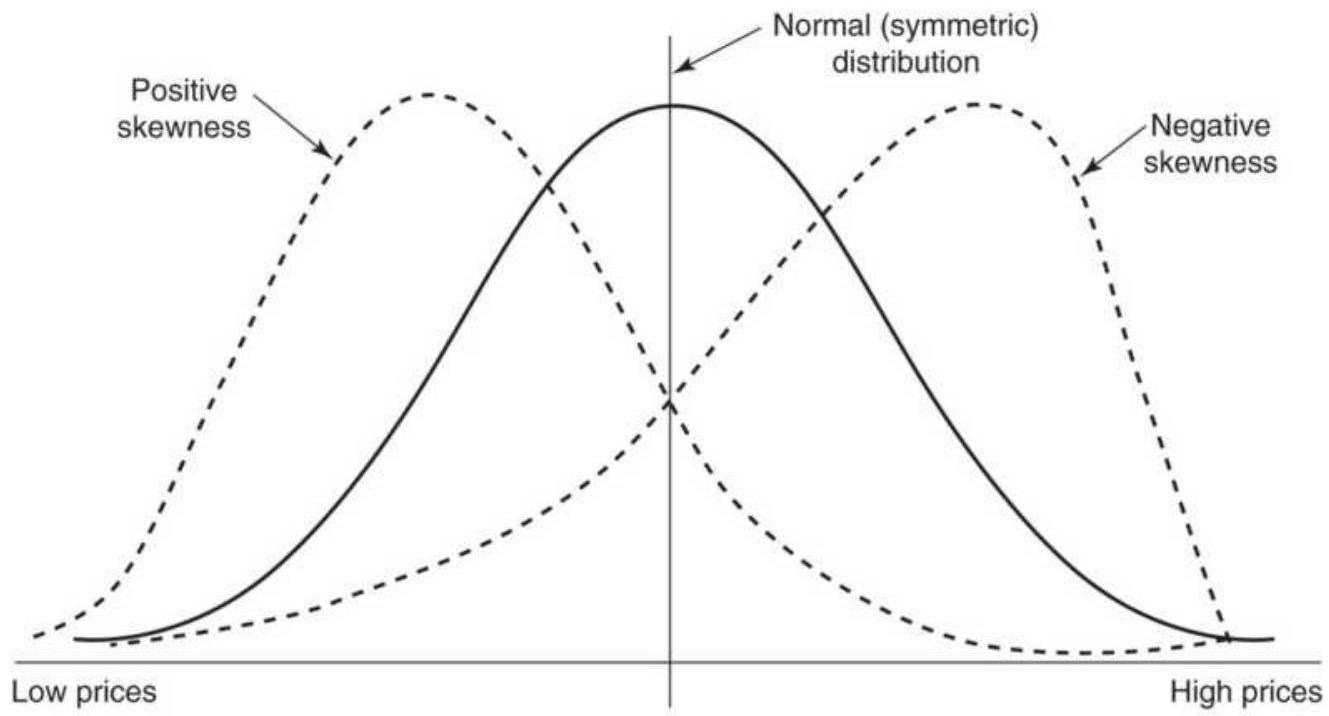
Arithmetic mean average
FIGURE 2.7 Skewness. Nearly all price distributions are positively skewed, showing a longer tail to the right, at higher prices.
The formula for skew is:
\[
s_{K}=\frac{\sum_{=1}^{n}\left(p_{p}-\bar{p}\right)^{3}}{(n-1) \sigma^{3}}
\]
\section*{Skew in Terms of the Mean, Median, and Mode}
In a perfectly normal distribution, the mean, median, and mode all coincide. As prices become positively skewed, typical of a period of higher prices, the mean will move the farthest to the right, the mode will move the least, and the median will fall in between. The difference between the mean and the mode, adjusted for dispersion using the standard deviation of the distribution, gives a good measure of skewness:
\[
(\text { Skewness }) S_{K}=\frac{\text { Mean }- \text { Mode }}{\text { Standard deviation }}
\]
The distance between the mean and the mode, in a moderately skewed distribution, turns out to be three times the difference between the mean and the median; the relationship can also be written as:
\section*{(Skewness) \(S_{K}=\frac{3 \times(\text { Mean }- \text { Mode })}{\text { Standard deviation }}\)}
Skewness in Distributions at Different Relative Price Levels
Because the lower price levels of most commodities are determined by production costs, price distributions show a clear tendency to resist moving below these thresholds.
This contributes to the positive skewness in those markets. Considering only the short term, if prices are at unusually high levels due to a supply and demand imbalance and not a structural change, they can be volatile and unstable, causing a negative skewness that will seem top heavy, the area where prices cannot be pushed any higher. Somewhere between the very high and very low price levels, we may find a frequency distribution that looks normal. Figure 2.8 shows the change in the distribution of prices over, for example, 20 days, as prices move sharply higher. The mean shows the center of the distributions as they change from positive to negative skewness. This pattern indicates that a normal distribution is not appropriate for all price analysis, and that a log, exponential, or power distribution would only apply best to long-term analysis.
\section*{Kurtosis (4th Moment)}
The 4th moment, kurtosis, describes the peakedness or flatness of a distribution as shown in Figure 2.9. This can be used as an unbiased assessment of whether prices are trending or moving sideways. If you see prices moving steadily higher, then the distribution will be flatter and cover a wider range. This is call negative kurtosis. If prices are rangebound, then there will be a clustering around the mean and we have positive kurtosis. Steidlmayer's Market Profile, discussed in Chapter 18 , uses the concept of kurtosis, with the frequency distribution accumulated dynamically using real-time price changes.
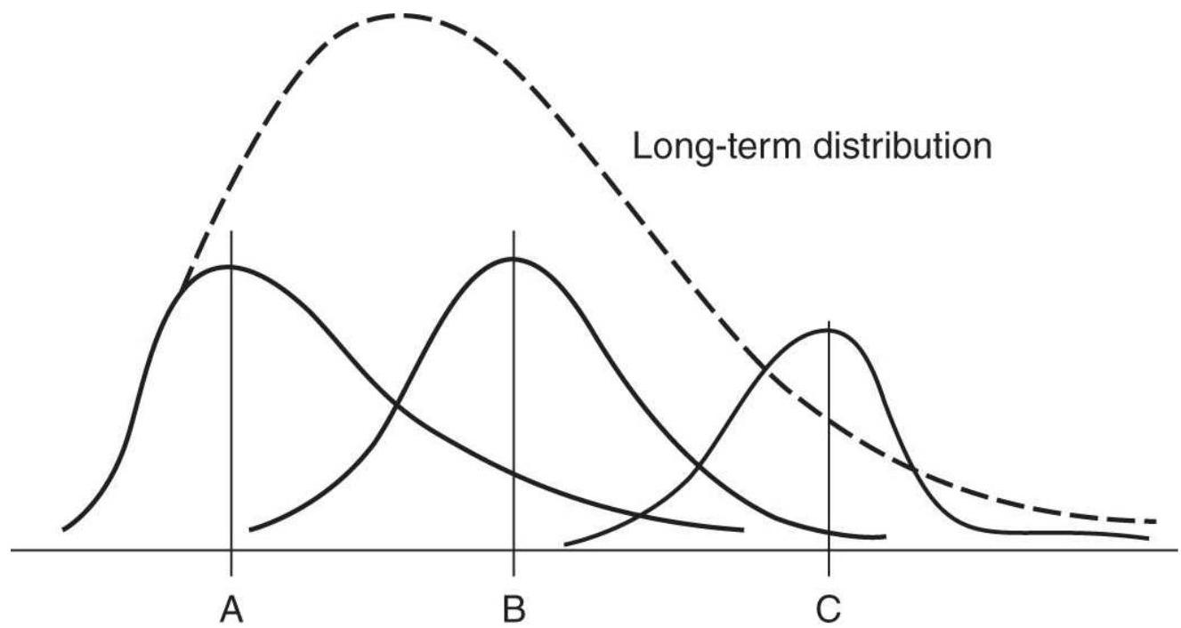
FIGURE 2.8 Changing distribution at different price levels. A, B, and C are increasing mean values of three shorter-term distributions and show the distribution changing from positive to negative skewness.
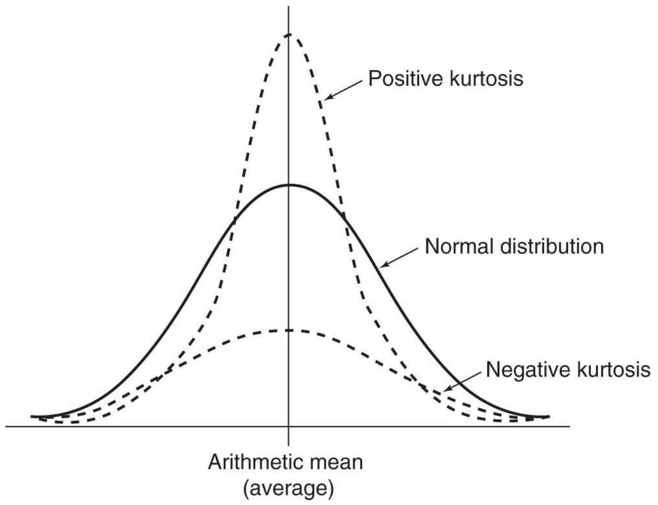
FIGURE 2.9 Kurtosis. A positive kurtosis is when the peak of the distribution is greater than normal, typical of a sideways, or range-bound, market. A negative kurtosis, shown as a flatter distribution, occurs when the market is trending.
Using the same form as the 3rd moment, skewness, kurtosis can be calculated as
\[
K=\frac{\sum_{i=1}^{n}\left(p_{i}-\bar{P}\right)^{4}}{(n-1) \sigma^{4}}
\]
Most often the excess kurtosis is used, \(K E=K-3\), which makes it easier to see abnormal distributions. The
normal value of the kurtosis is 3 .
Kurtosis is also useful when reviewing system tests. The kurtosis of the daily returns will be better than 3 if the system is profitable; however, a kurtosis of a system test that is above 7 or 8 indicates that the trading method is probably overfitted. A high kurtosis means that there are an overwhelming number of profitable trades of similar size, which is not likely to happen in real trading. Any high value of kurtosis should make you immediately suspicious.
\section*{Moments and Other Statistics Using Excel}
Life is easier with spreadsheets. It is no longer necessary to look up tables for to find the location in a probability distribution or enter a complex formula. In Excel:
Variance(list) or VAR.S is the variance of a list of values with the denominator \(n\). The population variance(list) or VAR.P is the same calculation with the denominator \(n-1\).
Stdev(list) or Stdev.S is the standard deviation and Stdev.p(list) is the population standard deviation. The difference is that the denominator of Stdev is
\(n-1\) while the denominator of Stdevp is \(n\).
Skew(list) and Skew.p(list) are the skew with \(n\) as the denominator or \(n-1\) as the denominator.
Kurt(list) is the kurtosis.
Normdist ( \(x\),mean,sd,TRUE) gives you the probability associated with a standard deviation
value in the distribution. \(X\) is the value (e.g., 1.5), mean is the average of the list values, \(s d\) is the standard deviation of the list values, and TRUE indicates that you want the cumulative distribution. An answer of 0.933 means your value is at the \(93.3 \%\) level (far right) of the distribution.
Rand and Randbetween ( \(a, b\) ) returns uniform (evenly distributed) random numbers. Rand returns values between 0 and 1 , and randbetween returns evenly distributed values between the two input numbers \(a\) and \(b\).
To find other statistical functions in Excel, go to the Formulas drop-down tab and click on \(f x\) (insert function) for a list of functions and descriptions. All of the basic functions are also part of any development platform but may have different names.
\section*{Stock Market Returns}
If we assume a normal distribution (shown in Figure 2.4) of the annual returns for the stock market over the past 50 years, it has a mean of about \(8 \%\) and one standard deviation of \(16 \%\). In any one year, we can expect the returns to be \(8 \%\); however, there is a \(32 \%\) chance that it will be either greater than \(24 \%\) ( \(16 \%\) for the right tail determined by the mean plus one standard deviation) or less than \(-8 \%(16 \%\) for the left tail determined by the mean minus one standard deviation). If you would like to know the probability of a return of \(20 \%\) or greater, you must first rescale the values:
Objective - Mean
Probability of reaching objective \(=\)
Standard deviation
If your objective is 20\%, we calculate:
\[
\text { Probability }=\frac{20 \%-8 \%}{16 \%}=0.75
\]
The time period over which you would achieve your goal is the same as the data period used to calculate the standard deviation, 50 years.
\section*{CHOOSING BETWEEN FREQUENCY DISTRIBUTION AND STANDARD DEVIATION}
Frequency distributions are important because the standard deviation doesn't work for skewed distributions, which is common for most price data over long time periods. We have shown examples of both wheat and gold where the average less 2 standard deviations was far lower than what we would consider realistic.
\section*{Wheat Frequency Distribution}
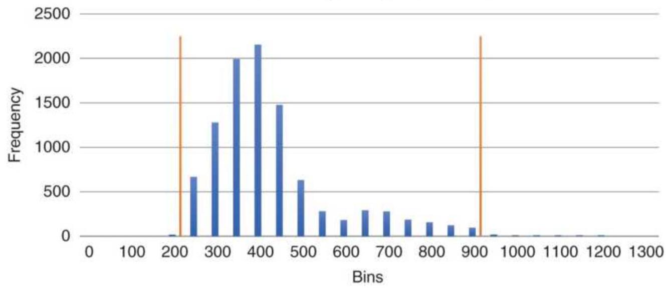
FIGURE 2.10 Measuring 10\% from each end of the frequency distribution. The dense clustering at low prices will make the lower zone look narrow while high prices with less frequent data will appear to have a wide zone.
The frequency distribution gives a more useful picture. If we wanted to know the price at the \(10 \%\) and \(90 \%\) probability levels based on the frequency distribution, we would sort all the data from low to high. If there were 300 data points, then the \(10 \%\) level would be in position 30 and the \(90 \%\) level in position 271 . The median price would be at position 151. This is shown in Figure 2.10 for wheat.
\section*{MEASURING SIMILARITY}
Many readers will be familiar with the concept of correlation, which is a basic measure of similarity.
Correlation is derived from a linear regression and is discussed in Chapter 6 under "Linear Correlation."
\section*{t-Statistic and Degrees of Freedom}
When fewer prices or trades are used in a distribution, we can expect the shape of the curve to be more erratic. For example, it may be spread out so that the peak of the distribution will be only slightly higher than either end. A way of measuring how close the sample distribution of a smaller set is to the normal distribution is to use the \(t\) statistic (also called the student's \(t\)-test). The \(t\)-test is calculated according to its degrees of freedom ( \(d f\) ), which is \(n-1\), where \(n\) is the sample size, the number of prices used in the distribution.
\section*{Average of price changes}
\section*{Standard deviation of price changes}
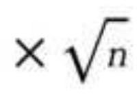
The more data in the sample, the more reliable the results. We can get a broad view of the shape of the distribution by looking at Table 2.2, which gives the values oft corresponding to the upper tail areas of 0.10 , \(0.05,0.025,0.01\), and 0.005 . The table shows that as the sample size \(n\) increases, the values of \(t\) approach those of the standard normal values of the tail areas.
TABLE 2.2 Values of \(t\) corresponding to the upper tail probability of 0.025 .
\begin{tabular}{|l|l|}
\hline Degrees of Freedom ( \(\boldsymbol{d} \boldsymbol{f})\) & Value of \(\boldsymbol{t}\) \\
\hline .1 & 12.706 \\
\hline .10 & .2 .228 \\
\hline .20 & .2 .086 \\
\hline
\end{tabular}
\begin{tabular}{|l|l|}
\hline .30 & .2 .042 \\
\hline 120 & .1 .980 \\
\hline Normal & .1 .960 \\
\hline
\end{tabular}
The values of \(t\) needed to be significant can be found using Excel. The function T.TEST returns the probability associated with the test, T.DIST returns the left tail distribution. Other functions associated with the tdistribution can be found by searching Excel for "T Distribution." The significant levels are the same as other tests where \(5 \%\) is usually considered significant and \(1 \%\) (0.01) highly significant.
Degrees of freedom applies to the rules and variables in your strategy. When testing a trading system, the greater the degrees of freedom, the more data you need to validate the strategy, whether price data or the number of trades. The \(t\)-test is the most common way of measuring whether you have done enough.
\section*{2-Sample t-Test}
You may want to compare two periods of data to decide whether the price patterns have changed significantly. Some analysts use the 2-sample \(t\)-test to eliminate inconsistent data, but characteristics of price and economic data change as part of the evolving process, and trading systems should be able to adapt to these changes. This test is best applied to trading results in order to decide if a strategy is performing consistently.
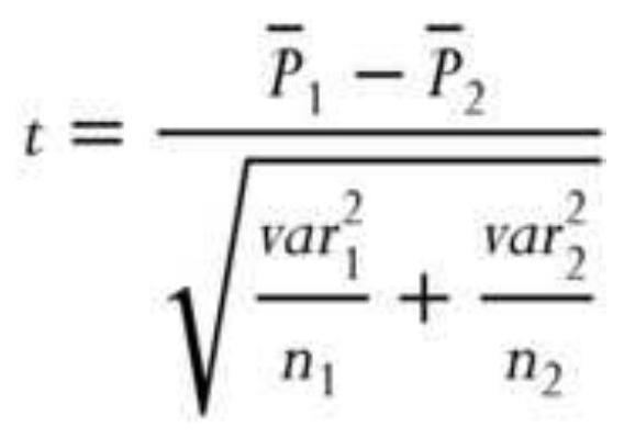
where
\(\bar{P}_{1}\) and \(\bar{P}_{2}=\) the averages of the prices for periods 1
var \(_{1}\) and \(=\) the variances of the prices for periods 1 var \(_{2}\) and 2
\(n_{1}\) and \(n_{2}=\) the number of prices in periods 1 and 2 and the two periods being compared are mutually exclusive.
The degrees of freedom, \(d f\), needed to find the confidence levels can be calculated using Satterthwaite's approximation, where \(s\) is the standard deviation of the data values:
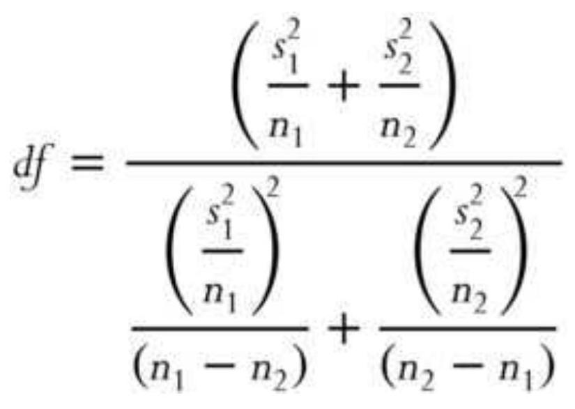
When using the \(t\)-test to find the consistency of profits and losses generated by a trading system, replace the data items by the net returns of each trade, the number of data items by the number of trades, and calculate all other values using trading returns rather than prices.
\section*{Autocorrelation}
Serial correlation or autocorrelation looks for persistence in the data - that is, being able to predict future data from past data. That could indicate the existence of trends. A simple way of finding autocorrelation is the put the data into column A of a spreadsheet, then copy it to column B while shifting the data down by 1 row. Then find the correlation of column A and column B. Additional correlations can be calculated shifting column B down 2,3 , or 4 rows, which might show the existence of a cycle. A formal way of finding autocorrelation is by using the Durbin-Watson test, which gives the \(d\)-statistic. This approach measures the change in the errors ( \(e\) ), the difference between \(N\) data points and their average value.
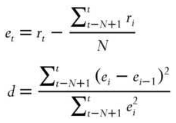
The value of \(d\) always falls between 0 and 4 . There is no
autocorrelation if \(d=2\). If \(d\) is substantially less than 2, there is positive autocorrelation; however, if it is below 1 , then there is more similarity in the errors than is reasonable. The farther \(d\) is above 2 , the more negative autocorrelation appears in the error terms.
A positive autocorrelation, or serial correlation, means that a positive error factor has a good chance of following another positive error factor.
\section*{STANDARDIZING RISK AND RETURN}
To compare one trading method with another, it is necessary to standardize both the tests and the measurements used for evaluation. If one system has total returns of \(50 \%\) and the other \(250 \%\), we cannot decide which is best unless we know the duration of the test and the volatility of the returns, or risk. If the \(50 \%\) return was over 1 year and the \(250 \%\) return over 10 years, then the first one is best. Similarly, if the first return had an annualized risk of \(10 \%\) and the second a risk of \(50 \%\), then both would be equivalent. The return relative to the risk is crucial to performance as will be discussed in Chapter 21, "System Testing." For now it is only important that returns and risk be annualized or standardized to make comparisons valid.
\section*{Calculating Returns}
In its simplest form, the 1-period rate of return, \(r\), or the holding period rate of return, is:
\section*{Ending value - Starting value - Ending value \\ Starting value \\ Starting value}
This is often used to find the return for the current year. For the stock market, which has continuous prices, this can be written:
\[
r_{1}=\frac{p_{1}-p_{0}}{p_{0}}=\frac{p_{1}}{p_{0}}-1
\]
where \(P_{0}\) is the initial price and \(P_{1}\) is the price after one period has elapsed. This cannot be done for futures, which has back-adjusted data that can go negative. Instead, the return would be:
\[
\left(\text { futures } r_{t}=\frac{\text { Equity }_{t}-\text { Equity }_{t-1}}{\text { Equity }_{t-1}}\right.
\]
The securities industry often prefers a different calculation, using the natural log function:
\[
r_{t}=\ln \left(\frac{P_{t}}{P_{t-1}}\right)=\log _{c}\left(\frac{P_{t}}{P_{t-1}}\right)
\]
Both methods have advantages and disadvantages. To distinguish the two calculations, the first method will be called the standard method and the second the ln method. We will use the first method unless indicated.
In the following spreadsheet example, shown in Table 2. 3 over 22 days, the standard returns are in column D and the \(\ln\) returns in column E. The differences seem small, but the averages are 0.00350 and 0.00339 . The standard returns are better by \(3.3 \%\) over this one month, but could reverse the next month. The net asset values (NAVs), used extensively throughout this book, are the compound periodic returns, and most often have a starting value, \(N A V_{0}=100\).
\[
N A V_{t}=N A V_{t-1} \times\left(1+r_{t}\right)
\]
\section*{Annualizing Returns}
The most powerful force in the Universe is compound interest.
-Albert Einstein
\section*{TABLE 2.3 Calculation of returns and NAVs from daily profits and losses.}
\begin{tabular}{|l|r|r|r|r|r|}
\hline Date & PL & \begin{tabular}{l}
Cum \\
PL
\end{tabular} & \begin{tabular}{c}
Standard \\
Return
\end{tabular} & \begin{tabular}{c}
Return \\
Using \\
LN
\end{tabular} & NAV \\
\hline \(9 / 10 / 2010\) & & 100000 & & & 100. \\
\hline \(9 / 13 / 2010\) & 1154 & 101154 & 0.01154 & 0.01147 & 101 \\
\hline \(9 / 14 / 2010\) & 1795 & 102949 & 0.01774 & 0.01759 & 102 \\
\hline \(9 / 15 / 2010\) & -1859 & 101090 & -0.01806 & -0.01822 & 101. \\
\hline \(9 / 16 / 2010\) & -1603 & 99487 & -0.01585 & -0.01598 & .99 \\
\hline \(9 / 17 / 2010\) & 449 & 99936 & 0.00451 & 0.00450 & .99 \\
\hline
\end{tabular}
\begin{tabular}{|l|r|r|r|r|r|}
\hline \(9 / 20 / 2010\) & 1090 & 101026 & 0.01090 & 0.01084 & 101. \\
\hline \(9 / 21 / 2010\) & 2949 & 103974 & 0.02919 & 0.02877 & 103 \\
\hline \(9 / 22 / 2010\) & 1346 & 105320 & 0.01295 & 0.01286 & 105 \\
\hline \(9 / 23 / 2010\) & 64 & 105384 & 0.00061 & 0.00061 & 105 \\
\hline \(9 / 24 / 2010\) & -2051 & 103333 & -0.01946 & -0.01966 & 103 \\
\hline \(9 / 27 / 2010\) & 3269 & 106602 & 0.03164 & 0.03115 & 106. \\
\hline \(9 / 28 / 2010\) & 1795 & 108397 & 0.01684 & 0.01670 & 108. \\
\hline \(9 / 29 / 2010\) & -1154 & 107243 & -0.01064 & -0.01070 & 107 \\
\hline \(9 / 30 / 2010\) & 128 & 107372 & 0.00120 & 0.00119 & 107 \\
\hline \(10 / 1 / 2010\) & -705 & 106666 & -0.00657 & -0.00659 & 106 \\
\hline \(10 / 4 / 2010\) & 1090 & 107756 & 0.01022 & 0.01016 & 107 \\
\hline \(10 / 5 / 2010\) & -449 & 107307 & -0.00416 & -0.00417 & 107 \\
\hline \(10 / 6 / 2010\) & 2308 & 109615 & 0.02150 & 0.02128 & 109 \\
\hline \(10 / 7 / 2010\) & -769 & 108846 & -0.00702 & -0.00704 & 108 \\
\hline \(10 / 8 / 2010\) & -256 & 108589 & -0.00236 & -0.00236 & 108 \\
\hline \(10 / 12 / 2010\) & -1218 & 107372 & -0.01122 & -0.01128 & 107 \\
\hline Average & & & 0.00350 & 0.00339 & \\
\hline Std Dev & & & 0.01502 & 0.01495 & \\
\hline Ann & & & 0.23846 & 0.23730 & \\
\hline StdDev & & & & & \\
\hline AROR & & & & & 125.8 \\
\hline
\end{tabular}
In most cases, it is best to standardize the returns by annualizing. This is particularly helpful when comparing two sets of test results, where each covers a different time period. When annualizing, it is important to know
that:
■ Government instruments use a 360-day rate (based on 90-day quarters).
- A 365-day rate is common for most other data that can change daily, including weekends.
- Trading returns are best with 252 days, which is the typical number of days in a trading year for the United States, slightly less in Europe. For comparisons, 252 will be used everywhere in this book.
The annualized rate of return (AROR) on a simpleinterest basis for an investment over \(n\) days is:
\[
A R O R_{\text {simple }}=\frac{E_{n}}{E_{0}} \times \frac{252}{n}
\]
where \(E_{0}\) is the starting equity or account balance, \(E_{n}\) is the equity at the end of the \(n\)th period, and \(252 / n\) are the years expressed as a decimal. The annualized compounded rate of return is:

Note that \(A R O R\) or \(R\) (capital) refers to the annualized rate of return while \(r\) is the daily or 1-period return. Also, the form of the results is different for the two calculations. An increase of \(25 \%\) for the simple return
will show as 0.25 while the same increase using the compounded returns will be 1.25 .
When the 1-period returns use the ln method, then the annualized rate of return is the sum of the returns divided by the number of years, \(n\) :
\section*{\(A R O R_{\text {ln method }}=\underline{\sum_{i=1}^{n} r_{i}}\)}
\(n\)
An example of this can be found in column F , the row labeled AROR, in the previous spreadsheet. Note that the annualized returns using the ln method are much lower than those using division and compounding. The compounded method will be used throughout this book and is required for U.S. regulatory disclosure.
\section*{Probability of Returns Using the Compound Rate of Return}
The probability of achieving a return can be estimated using the standard deviation and compounded rate of return. In the following calculation, \(\frac{1}{-1}\) the arithmetic mean of continuous returns is \(\ln \left(1+R_{g}\right)\), and it is assumed that the returns are normally distributed.
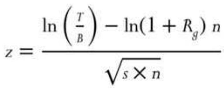
where
\(z=\) standardized variable (the probability)
\(T=\) target value or rate-of-return objective
\(B=\) beginning investment value
\(R_{g}=\) geometric average of periodic returns
\(n=\) number of periods
\(s=\) standard deviation of the logarithms of the quantities 1 plus the periodic returns
\section*{Risk and Volatility}
While we would always like to think about returns, it is even more important to be able to assess risk. With that in mind, there are two extreme risks. The first is event risk, which may take the form of an unpredictable price shock. The worst of these is catastrophic risk, which will cause fatal losses or ruin. The second is risk that is selfinduced by overleverage, or gearing up your portfolio, until a sequence of bad trades causes ruin. The risk of price shocks and leverage will both be discussed in detail in other chapters.
The standard risk measurement is essential for comparing the performance of two systems. It can be applied to any series of returns, including portfolio performance, then compared to a benchmark, such as the returns of the S\&P 500 or a bond fund. The most common estimate of risk is the standard deviation, \(\sigma\), of returns, \(r\), shown earlier in this chapter. Annualizing the risk allows you to use it with the annualized return:
\section*{Annualized risk \((\) daily \()=\) standard deviation (daily returns) \(\times \sqrt{252}\)}
\section*{Annualized risk \((\) monthly \()=\) standard deviation \((\) monthly returns \() \times \sqrt{12}\)}
Risk is also called volatility. When we refer to the target volatility of a portfolio, we mean the percentage of risk represented by 1 standard deviation of the annualized returns. For example, in the previous spreadsheet, column D shows the daily returns. The standard deviation of those returns is shown in the row "Std Dev" as o.01502. Looking only at column D, there is a \(68 \%\) chance of a daily profit or loss less than \(1.862 \%\) and greater than \(-1.162 \%\) (the mean \(\pm 1\) stddev). However, target volatility always refers to annualized risk, and to change a daily return to an annualized one we multiply by \(\sqrt{252}\). Then the standard deviation of daily returns of \(1.502 \%\) becomes an annualized volatility of \(23.8 \%\), also shown at the bottom of the spreadsheet example. Because we only care about the downside risk, there is a \(16 \%\) chance that we could lose \(23.8 \%\) in one year. The greater the standard deviation of returns, the greater the risk.
\section*{Beta}
Beta ( \(\beta\) ) is commonly used in the securities industry to express the relationship of a single market risk to an index or portfolio. If beta is zero, then there is no relationship; if it is positive, it represents the relative volatility of the stock compared to the index. Specifically:
\(0<\beta<1\), the volatility of the single market is less than the index
\(\beta=1\), the volatility of the single market is the same as the index
\(\beta>1\), the volatility of the single market is greater than the index
\(\beta<0\), the market and the index are going in opposite directions
A beta of 1.25 means the stock has \(25 \%\) more volatility than the index, but it also means that, if the index rises by \(4 \%\), the stock should rise by \(5 \%\).
Beta is found by calculating the linear regression of the single market with respect to the index. It is the slope of the single market divided by the slope of the index. Alpha, the added value, is the \(y\)-intercept of the solution. The values can be found using Excel, and are discussed in detail in Chapter 6. A general formula for beta is:
\section*{\(\operatorname{Beta}(\mathrm{A})=\operatorname{COV}(\) returns A , returns B\() / \operatorname{VAR}(\) returns B\()\),} where A is the single market and B is a portfolio or index. The reliability of beta is best when the correlation of the returns of \(A\) and \(B\) is high.
\section*{Downside Risk}
Because the standard deviation is symmetric, a series of jumps in profits will be interpreted as larger risk. Some analysts believe that it is more accurate to measure the
risk using only the drawdowns. The use of only losses is called lower partial moments, where lower refers to the downside risk and partial means that only one side of the return distribution is used. Semivariance measures the dispersion that falls below the average return, \(\bar{R}\), or some target value:
\section*{Semivariance \(=\underline{\sum_{i=1}^{n}\left(\bar{R}-r_{i}\right)^{2}}\), where each \(r_{i}<\bar{R}\) \\ \(n\)}
However, the most common calculation for downside risk is to take the daily drawdowns - that is, the difference between the peak equity and the current equity when it is below the peak equity. For example, if the system returns had produced an equity of \(\$ 25,000\) on day \(t\), followed by a daily loss of \(\$ 500\), and another loss of \(\$ 250\), then we would have two values as input \(500 / 25000\) and \(750 / 25000\), or 0.02 and 0.03 . Only those returns below the previous peaks are used in the calculation, and the result is the average net drawdown. A better alternative is to take the standard deviation of these daily drawdowns, which then gives you the probability of a drawdown.
One concern about using only the drawdowns to predict other drawdowns is that it limits the number of cases and discards the likelihood that higher-than-normal profits can be related to higher overall risk. In situations where there are limited amounts of test data, using both the gains and losses will give more robust results.
A full discussion of performance measurements can be
found in Chapter 21, "System Testing," and in Chapter 23 under the heading "Measuring Return and Risk" and the subheading "Ulcer Index."
\section*{THE INDEX}
The purpose of an average is to transform individuality into classification. In doing that the data is often smoothed to gain useful information. Indices have attracted enormous popularity in recent years. Where there was only the Value Line and S\&P 500 trading as futures markets in the early 1980s, now there are equity index futures contracts representing the markets of every industrialized country. The creation of trusts, such as SPDRs (called "Spyders," the S\&P 500 ETF SPY), "Diamonds" (DIA, the Dow Jones Industrials), and the "Qs" (QQQ, the NASDAQ 100), have given stock traders an efficient vehicle to invest in the broad market rather than pick individual shares. Industrial sectors, such as pharmaceuticals, health care, and technology, first appeared as mutual funds, then as ETFs. These index markets all have the additional advantage of not being constrained by having to borrow shares in order to sell short, or by the uptick rule (if it is reinstated) requiring all short sales to be initiated on an uptick in price.
Index markets allow both individual and institutional participants a number of specialized investment strategies. They can buy or sell the broad market, they can switch from one sector to another (sector rotation), or they can sell an overpriced sector while buying the broad market index (statistical arbitrage). Institutions
find it very desirable, from the view of both costs and taxes, to temporarily hedge their cash equities portfolio by selling S\&P 500 futures rather than liquidating stock positions. They may also hedge using options on S\&P futures or SPY. An index simplifies the decision-making process for trading.
The index also holds an important role as a benchmark for performance. Most investors believe that a trading program is only attractive if it has a better return-to-risk ratio than a portfolio of \(60 \%\) stocks (as represented by the S\&P 500 index) and \(40 \%\) bonds (the Lehman Brothers Treasury Index). Beating the index is called creating alpha, proving that you're smarter than the market. The term crisis alpha refers to those years when futures markets return large gains to offset equally large losses in the stock market, as happened in 2008.
\section*{Constructing an Index}
An index is a standardized way of expressing price movement, as an accumulation of percentage changes. This effectively compounds the returns. Most indices have a starting value of 100 . The selection of the starting year is often "convenient" but can be any year. The base year for U.S. productivity and for unemployment is 1982; for consumer confidence, 1985; and for the composite of leading indicators, 1987. The CRB Yearbook shows the Producer Price Index (PPI) from as far back as 1913. For example, the PPI, which is released monthly, had a value of 186.8 in October 2010 and 185.1 in September 2010, a \(0.9184 \%\) increase in one month. An index value less than 100 means that the index has less value that when it
started.
Each index value is calculated from the previous value as:
Current index value \(=\) Previous index value \(\times\)
\[
\left(\frac{\text { Current price }}{\text { Previous price }}\right)
\]
\section*{Calculating the Net Asset Value: Indexing Returns}
The last calculations shown in the spreadsheet, Table 2.3, are the net asset value (NAV), calculated two ways. This is essentially the returns converted to an index, showing the compounded rate of return based on daily profit and losses relative to a starting investment. In the spreadsheet, the NAVs are shown in column F using standard returns and G using ln returns.
The process of calculating NAVs can be done with the following steps:
1. Establish the initial investment, in this case \(\$ 100,000\), shown at the top of column C. This can be adjusted later based on the target volatility.
2. Calculate the cumulative account value by adding the daily profits or losses (column B) to the previous account value (column C).
3. Calculate the daily returns by either (a) dividing today's profit or loss by yesterday's account value to get \(r\), or (b) taking the natural log of \(1+r\).
4. If using method (a), then each subsequent
\(N A V_{t}=N A V_{t-1} \times(1+r)\), and if using method
(b), then each \(N A V_{t}=N A V_{t-1}+\ln (1+r)\).
The final values of the NAV are in the last dated rows. The U.S. government requires that NAVs be calculated this way, although it doesn't specify whether returns should be based on the natural log. This process is also identical to indexing, which turns any price series into one that reflects percentage returns.
Compounding returns implies that all the investment is used all of the time. Test results are always compounded returns. When you trade, you will need to be sure that you are fully invested; otherwise, you will underperform the compounded return.
\section*{Leveraged Long or Short Index Funds}
As index markets have become more popular, financial engineering has created a wide range of innovative trading vehicles. Mutual funds, such as Rydex and ProFunds, cater to market timers, a group of money managers who may trade in and out of the funds every few days. These funds track the major index markets closely, but offer unique variations. There are both long and short funds, and each may be leveraged. When you buy a long fund that tracks the S\&P 500 (called Nova by Rydex), you are simply long the equivalent of the S\&P 500 . However, when you buy a short S\&P fund, called Ursa, you profit when the S\&P index price drops. In addition, both Rydex and ProFunds offer leverage of 1.5 or 2.0 on these funds, so that a gain of \(1.0 \%\) in the S\&P
500 translates into a gain of 2.0\% in ProFunds' UltraBull \(S \& P\) fund; a drop of \(1.0 \%\) in the S\&P would generate a profit of \(2.0 \%\) in ProFunds' UltraBear fund. The motivation behind the short funds, or inverse funds, is to circumvent the U.S. government rule that does not permit short sales in retirement accounts.
The calculation for leveraged long funds is very similar to a simple index; however, a short fund (where you profit from a decline in prices) is compounded to the upside, in the same way as a long fund. The following calculation will create a long and short index that closely approximates those used by Rydex and ProFunds. In addition, it includes the calculation of the daily high and low index values. If you intend to create a leveraged S\&P index, start with the cash S\&P price. Use the cash index equivalent for each of the mutual fund indices that you plan to duplicate.
In the following calculations, leverage is the leverage factor of the fund, for example, 1.5. Initial index values for both long and short funds are:
\section*{\(X C_{1}=100\)}
\[
\begin{aligned}
X H_{1} & =X C_{1}+100 \times\left(\frac{H_{1}}{C_{1}}-1.0\right) \times \text { Leverage } \\
X L_{1} & =X C_{1}+100 \times\left(\frac{L_{1}}{C_{1}}-1.0\right) \times \text { Leverage }
\end{aligned}
\]
Each subsequent index value for long funds is:
\[
\begin{aligned}
& X C_{i}=X C_{i-1} \times\left(\left(\frac{C_{i}}{C_{i-1}}-1.0\right) \times \text { Leverage }+1.0\right) \\
& X H_{i}=X C_{i-1} \times\left(\left(\frac{H_{i}}{C_{i-1}}-1.0\right) \times \text { Leverage }+1.0\right) \\
& X L_{i}=X C_{i-1} \times\left(\left(\frac{L_{i}}{C_{i-1}}-1.0\right) \times \text { Leverage }+1.0\right)
\end{aligned}
\]
For each subsequent value for the short funds, invert the middle term:
\[
\begin{aligned}
& X C_{i}=X C_{i-1} \times\left(\left(\frac{C_{i-1}}{C_{i}}-1.0\right) \times \text { Leverage }+1.0\right) \\
& X H_{i}=X C_{i-1} \times\left(\left(\frac{H_{i-1}}{C_{i}}-1.0\right) \times \text { Leverage }+1.0\right) \\
& X L_{i}=X C_{i-1} \times\left(\left(\frac{L_{i-1}}{C_{i}}-1.0\right) \times \text { Leverage }+1.0\right)
\end{aligned}
\]
where
\(X C, X H,=\) the leveraged index closing, high, and low and \(X L \quad\) prices
\(C, H\), and \(L=\) the underlying close, high, and low prices or index values
If there is no leverage, then substitute the value 1 for
leverage in the equations. Note that there are no costs included in this calculation, but the final short fund values should be net of the short-term borrowing costs.
\section*{Cross-Market and Weighted Index}
It is very convenient to use an index when two markets cannot normally be compared because they trade in different units. For example, if you wanted to show the spread between gold and IBM, you could index each of them beginning at the same date. The new indices would then be in the same units (percent) and would be easy to compare.
Most often, an index combines a number of related markets into a single number. A simple aggregate index is the ratio of unweighted sums of market prices in a specific year to the same markets in the base year. Most of the popular indices, such as the New York Stock Exchange Composite Index, fall into this class. A weighted aggregate index biases certain markets by weighting them to increase or decrease their effect on the composite value. The index is then calculated as in the simple aggregate index. When combining markets into a single index value, the total of all the weights will equal 1 and all weights are expressed as a percentage.
\section*{The Construction of the Major Index Markets}
Not all the index markets are calculated the same way, even in the United States. The following is a brief list of how the most popular index markets are calculated.
\section*{- Capitalization Weighted}
The outstanding shares \(\times\) price, also called a market-value-weighted index. They include the S\&P 500, NASDAQ 100, the Hang Seng, the MSCI EAFE Index, the German DAX, and the Japanese TOPIX.
\section*{Price Weighted}
Average of the price of all components. Includes the Dow Jones Industrials, the Nikkei 225.
\section*{World Production Index}
The Goldman Sachs Commodity Index (GSCI) is weighted by the production of the component commodities over the past five years, implying that more production is more important to the index.
\section*{- Trade Weighted Index}
The U.S. Dollar Index (DX on the New York Board of Trade and USDX on the Intercontinental Exchange - ICE) is a trade-weighted, geometric average of six currencies: the euro, \(57.6 \%\); the Japanese yen, \(13.6 \%\); the UK pound, \(11.9 \%\); the Canadian dollar, 9.1\%; the Swedish krona, 4.2\%; and the Swiss franc, \(3.6 \%\).
The Dollar Index rises when the U.S. dollar increases in value relative to the other currencies. In the daily calculation of the Dollar Index, each price change is represented as a percent. If, for example, the euro rises 50 points from 1.2500 to 1.2550 , the change is \(1.2550 / 1.2500=.004\); this is multiplied by its weighting factor 0.576 and
contributes -0.002304 to the index (a rising euro is a falling dollar).
\section*{Commodity Index Markets}
Besides the GSCI, other commodity indices have very specific weightings. As of 2018 they were:
Bloomberg Commodity Index(BCI) has energy \(30.57 \%\), grains \(23.46 \%\), industrial metals \(17.39 \%\), precious metals \(15.29 \%\), softs \(7.22 \%\), and livestock \(6.07 \%\)
Bloomberg (DJ-UBS) Commodity Index, energy \(36.69 \%\), agriculture \(28.21 \%\), industrial metals \(16.74 \%\), precious metals \(12.62 \%\), livestock \(5.74 \%\).
Commodity Research Bureau Index (CRB), energy \(39 \%\), agriculture \(41 \%\), precious metals \(7 \%\), industrial metals \(13 \%\).
Thomson Reuters Equal Weight Continuous Commodity Index, energy 18\%, agriculture 47\%, livestock \(12 \%\), metals \(23 \%\). A simple average of the daily prices of the 17 components.
\section*{Price-Volume Index}
Price \(\times\) volume would show the impact of a stock and create an index that reflects the strength of the move rather than the potential shown by a capitalization-weighted index. Although suggested by Paul Dysart in the 1930s, there are no popular index markets calculated this way.
Calculation must measure the incalculable.
-Dixon G. Watts
It's not possible to know tomorrow's price, or the effect of the next economic report. We can only estimate, not predict, its impact from price history. The area of study that deals with uncertainty is probability. Everyone uses probability in daily thinking and actions. When you tell someone that you will "be there in 30 minutes," you are assuming:
- Your car will start.
- You will not have a breakdown.
- You will have no unnecessary delays.
- You will drive at a predictable speed.
- You will have the normal number of green lights.
All these circumstances are extremely probabilistic, and yet everyone makes the same assumptions. Actually, the 30-minute arrival is intended only as an estimate of the average time it should take for the trip. If the arrival time were critical, you would extend your estimate to 40 or 45 minutes to account for unexpected events. In statistics, this is called increasing the confidence interval. You would not raise the time to two hours because the likelihood of such a delay would be too remote. Estimates imply an allowable variation, all of which is considered normal.
Probability is the measurement of the uncertainty surrounding an average value. Probabilities are measured in percent of likelihood. For example, if \(M\)
numbers from a total of \(N\) are expected to fall within a specific range, the probability \(P\) of any one number satisfying the criteria is:
\[
P=\frac{M}{N}, \quad 0<P<1
\]
When making a trade, or forecasting prices, we can only talk in terms of probabilities or ranges. We expect prices to rise 30 to 40 points, or we have a \(65 \%\) chance of a \(\$ 400\) profit from a trade. Nothing is certain, but a high probability of success is very attractive.
\section*{Laws of Probability}
Two basic principles of probability are easily explained by using examples with playing cards. In a deck of 52 cards, there are 4 suits of 13 cards each. The probability of drawing a specific card on any one turn is \(1 / 52\). Similarly, the chances of drawing a particular suit or card number are \(1 / 4\) and \(1 / 13\), respectively. The probability of any one of these three possibilities occurring is the sum of their individual probabilities. This is known as the law of addition. The probability of success in choosing a numbered card, suit, or specific card (that is, either a 10, or a spade, or the queen of hearts) is:
\[
P=\frac{1}{13}+\frac{1}{4}+\frac{1}{52}=\frac{18}{52}=35 \%
\]
The other basic principle, the law of multiplication, states that the probability of two occurrences happening simultaneously or in succession is equal to the product of their separate probabilities. The likelihood of drawing a 3 and a club from the same deck in two consecutive turns (replacing the card after each draw) or of drawing the same cards from two decks simultaneously is:
\[
P=\frac{1}{13} \times \frac{1}{4}=\frac{1}{52}=2 \%
\]
\section*{Joint and Marginal Probability}
Price movement is not as clearly defined as a deck of cards. There is often a relationship between successive events. For example, over two consecutive days, prices must have one of the following sequences or joint events: (up, up), (down, down), (up, down), (down, up), with the joint probabilities of \(0.40,0.10,0.35\), and 0.15 , respectively. In this example, there is the greatest expectation that prices will rise. The marginal probability of a price rise on the first day is shown in Table 2.4, which concludes that there is a \(75 \%\) chance of higher prices on the first day and a \(55 \%\) chance of higher prices on the second day.
\section*{Contingent Probability}
What is the probability of an outcome "conditioned" on the result of a prior event? In the example of joint probability, this might be the chance of a price increase on the second day when prices declined on the first day.
The notation for this situation (the probability of \(A\) conditioned on \(B\) ) is:
\section*{\(P(A \mid B)=\frac{P(A \text { and } B)}{P(B)}=\frac{\text { Joint probability of } A \text { and } B}{\text { Marginal probability of } B}\)}
\section*{TABLE 2.4 Marginal probability.}
\begin{tabular}{|c|c|c|c|c|c|c|}
\hline \multirow{7}{*}{ Day 1} & & \multicolumn{3}{|c|}{ Day 2} & \multirow[b]{3}{*}{ Up } & \multirow{4}{*}{\begin{tabular}{l}
Marginal \\
probability \\
on Day 1
\end{tabular}} \\
\hline & \multirow[b]{2}{*}{ Up } & \multirow{2}{*}{\(\frac{\text { Up }}{.40}\)} & \multicolumn{2}{|c|}{ Down } & & \\
\hline & & & .35 & .75 & & \\
\hline & Down & . 15 & .10 & . 25 & Down & \\
\hline & & . 55 & .45 & & & \\
\hline & & Up & Down & & & \\
\hline & & rgin & y 2 & & & \\
\hline
\end{tabular}
then
\(P(\) up Day \(2 \mid\) down Day 1 \()=\frac{\text { Jointprobability of }(\text { down, up })}{\text { Marrginal probability of }(\text { down Day } 1)}\)
\[
=\frac{0.15}{0.25}=0.60
\]
The probability of either a price increase on Day 1 or a price increase on Day 2 is:
\section*{\(P(\) either \()=P(\) up Day 1) \(+P(\) up Day 2) \(-P(\) up Day 1 and up Day 2) \\ \(=0.75+0.55-0.40\) \\ \(=0.90\)}
\section*{Markov Chains}
If we believe that today's price movement is based in some part on what happened yesterday, we have a situation called conditional probability. This can be expressed as a Markov process, or Markov chain. The results, or outcomes, of a Markov chain express the probability of a state or condition occurring. For example, the possibility of a clear, cloudy, or rainy day tomorrow can be related to today's weather.
The different combinations of dependent possibilities are given by a transition matrix. In our weather prediction example, a clear day has a \(70 \%\) chance of being followed by another clear day, a \(25 \%\) chance of a cloudy day, and only a \(5 \%\) chance of rain. In Table 2.5, each possibility today is shown on the left, and its probability of changing tomorrow is indicated across the top. Each row totals \(100 \%\) and accounts for all weather combinations. The relationship between these events can be shown as a continuous network (see Figure 2.11).
The Markov process can reduce intricate relationships to a simpler form. First, consider a 2 -state process. Using the markets as an example, what is the probability of an up or down day following an up day, or following a down day? If there is a \(70 \%\) chance of a higher day following a
higher day and a \(55 \%\) chance of a higher day following a lower day, what is the probability of any day being an up day?
Start with either an up or down day, and then calculate the probability of the next day being up or down. This is done by simply counting the number of cases, given in Table 2.6a, then dividing to get the percentages, as shown in Table 2.6b.
Because the first day may be designated as up or down, it is an exception to the general rule and therefore is given the weight of \(50 \%\). The probability of the second day being up or down is the sum of the joint probabilities:
\[
\begin{aligned}
P(\text { up })_{2} & =(0.50 \times 0.70)+(0.50 \times 0.55) \\
& =0.625
\end{aligned}
\]
The probability of the second day being up is \(62.5 \%\). Continuing in the same manner, use the probability of an up day as 0.625 , the down as 0.375 , and calculate the third day:
\[
\begin{aligned}
P(\text { up })_{3} & =(0.626 \times 0.70)+(0.375 \times 0.55) \\
& =0.64375
\end{aligned}
\]
\section*{TABLE 2.5 Transition Matrix}
\begin{tabular}{|c|c|c|c|c|}
\hline & & \multicolumn{3}{|c|}{ Tomorrow } \\
\hline & & Clear & Cloudy & Rainy \\
\hline & Clear & 0.70 & 0.25 & 0.05 \\
\hline & & & & \\
\hline
\end{tabular}
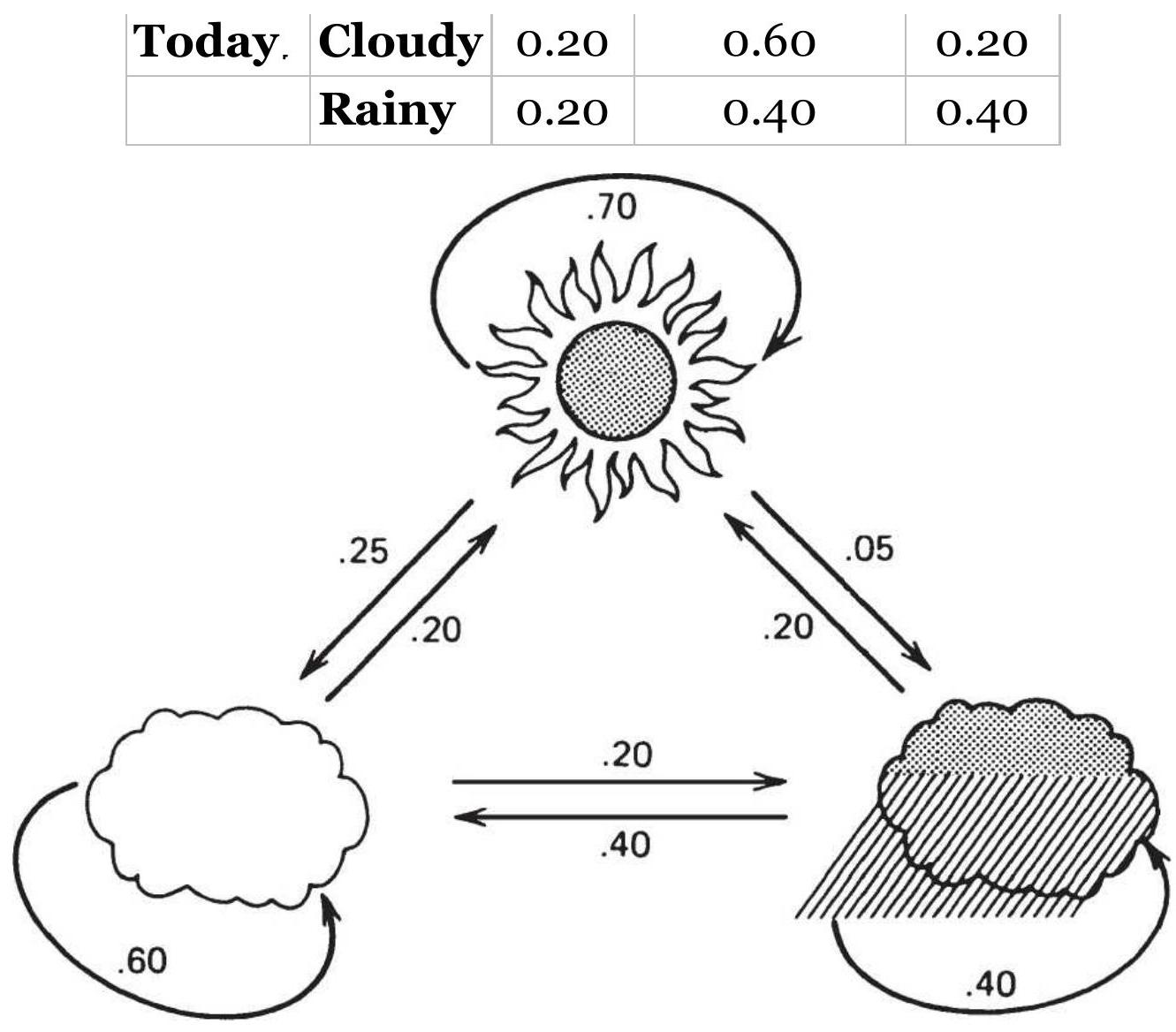
FIGURE 2.11 Probability network.
TABLE 2.6a Counting the occurrences of up and down days.
\begin{tabular}{|c|c|c|c|c|}
\hline & & \multicolumn{3}{|r|}{ Today } \\
\hline & & Up & Down & Total \\
\hline & Up & 75 & 60 & 135 \\
\hline Previous day & & & & \\
\hline & Down & 60 & 65 & 125 \\
\hline
\end{tabular}
TABLE 2.6b Starting transition matrix.
\begin{tabular}{|c|c|c|c|c|}
\hline & & & Today & \\
\hline & & Up & Down & Total \\
\hline & Up & 0.555 & 0.444 & 1.00 \\
\hline Previous day & & & & \\
\hline & Down & 0.480 & 0.520 & 1.00 \\
\hline
\end{tabular}
and the fourth day:
\[
\begin{aligned}
P(\text { up })_{4} & =(0.64375 \times 0.70)+(0.35625 \times 0.55) \\
& =0.64656
\end{aligned}
\]
which can now be seen to be converging. To generalize the probability of an up day, look at what happens on the ith day:
\(P(\text { up })_{i}=\left[\left(P(\text { up })_{i-1} \times 0.70\right]+\left[\left(1-P(\text { up })_{i-1} \times 0.55\right)\right]\right.\)
Because the probability is converging, the relationship
\[
P(\operatorname{up})_{i+1}=P(\operatorname{up})_{i}
\]
can be substituted and used to solve the equation
\[
P(u p)_{i}=\left[P(u p)_{i} \times 0.70\right]+\left[0.55-P(u p)_{i} \times 0.55\right]
\]
giving the probability of any day being up within an uptrend as:
\[
P(u p)_{i}=0.64705
\]
We can find the chance of an up or down day if the 5 -day trend is up simply by substituting the direction of the \(5^{-}\) day trend (or \(n\)-day trend) for the previous day's direction in the example just given.
Predicting the weather is a more involved case of multiple situations converging and may be very representative of the way prices react to past prices. By approaching the problem in the same manner as the two-state process, a \(1 / 3\) probability is assigned to each situation for the first day; the second day's probability is:
\[
\begin{aligned}
P(\text { clear })_{2} & =(0.333 \times 0.70)+(0.333 \times 0.20)+(0.333 \times 0.20) \\
& =0.3663
\end{aligned}
\]
\(P(\text { cloudy })_{2}=(0.333 \times 0.25)+(0.333 \times 0.60)+(0.333 \times 0.40)\)
\[
=0.41625
\]
\[
P(\text { rainy })_{2}=(0.333 \times 0.05)+(0.333 \times 0.20)+(0.333 \times 0.40)
\]
\[
=0.21645
\]
Then, using the second day results, the third day is:
\(P(\text { clear })_{3}=(0.3663 \times 0.70)+(0.41625 \times 0.20)+(0.21645 \times 0.20)\)
\[
=0.38295
\]
\(P(\text { cloudy })_{3}=(0.3663 \times 0.25)+(0.41625 \times 0.60)+(0.21645 \times 0.40)\)
\[
=0.42791
\]
\[
\begin{aligned}
P(\text { rainy })_{3} & =(0.3663 \times 0.05)+(0.41625 \times 0.20)+(0.21645 \times 0.40) \\
& =0.18815
\end{aligned}
\]
The general form for solving these three equations is:
\[
P(\text { clear })_{i+1}=\left[P(\text { clear })_{i} \times 0.70\right]+\left[P(\text { cloudy })_{i} \times 0.20\right]+\left[P(\text { rainy })_{i} \times 0.20\right]
\]
\[
P(\text { cloudy })_{i+1}=\left[P(\text { clear })_{i} \times 0.25\right]+\left[P(\text { cloudy })_{i} \times 0.60\right]+\left[P(\text { rainy })_{i} \times 0.40\right]
\]
\(P(\text { rainy })_{i+1}=\left[P(\text { clear })_{i} \times 0.05\right]+\left[P(\text { cloudy })_{i} \times 0.20\right]+\left[P(\text { rainy })_{i} \times 0.40\right]\)

where each \(i+1\) element can be set equal to the corresponding \(i\) th value. There are then three equations in three unknowns, which can be solved directly or by matrix multiplication, as shown in Appendix 2 on the

use the additional relationship
\section*{\(P(\text { clear })_{i}+P(\text { cloudy })_{i}+P(\text { rainy })_{i}=1.00\)}
The results are:
\section*{\(P(\) clear \()=0.400\) \\ \(P(\) cloudy \()=0.425\) \\ \(P(\) rainy \()=0.175\)}
\section*{Bayes' Theorem}
Although historic generalization exists concerning the outcome of an event, a specific current market situation may alter the probabilities. Bayes' theorem combines the original probability estimates with the added-event probability (the reliability of the new information) to get a posterior or revised probability:
\section*{\(P(\) Original and added-event \()\)}
\section*{\(P(\) Added-event \()\)}
Assume that the price changes \(P(\) up \()\) and \(P(\) down \()\) are both original probabilities, and an added-event probability, such as an unemployment report, trade balance, crop report, inventory stocks, or Federal Reserve interest rate announcement is expected to have an overriding effect on tomorrow's movement. Then the new probability \(P(\mathrm{Up} \mid\) added-event \()\) is:
\section*{\(P(U p\) and added-event \()\)}
\(P\left(U_{P}\right.\) and added-event \()+P(\) Down and added-event \()\) where \(u p\) and down refer to the original historic probabilities.
Bayes' theorem finds the conditional probability even if the joint and marginal probabilities are not known. The new probability \(P\) (up | added-event) is:
\section*{\(P(U p) \times P(\) Added-event \(\mid\) up \()\)}
\(\overline{P\left(U_{p}\right) \times P(\text { Added-event } \mid \text { up })+P(\text { Down }) \times P(\text { Added-event } \mid \text { down })}\) where
\(P(\) Added-event \(\mid\) up \()=\) the probability of the new event being a correct predictor of an upwards move
\(P(\) Added-event \(\mid\) down \()=\) the probability of prices going down when the added news indicates up
For example, if a quarter percent decline in interest rates has an \(80 \%\) chance of causing stock prices to move higher, then:
\[
P(\text { Added-event } \mid \text { up })=0.80
\]
and
\section*{\(P(\) Added-event \(\mid\) down \()=0.20\)}
\section*{SUPPLY AND DEMAND}
Trading system are not always constructed from moving averages and momentum indicators. Arbitrage is a large profit center in financial institutions and, while most arbitrage looks for price differences in similar stocks or
futures markets, there are analysts who would like to know the "fair value" of a commodity. This allows them to buy when the current price is below the fair value and sell when it is higher. To understand and construct a technical or econometric model that estimates fair value requires a knowledge of the fundaments of supply and demand. This section is an overview of those factors.
Price is the balancing point of supply and demand. In order to estimate the future price of any product or explain its historic patterns, it will be necessary to relate the factors of supply and demand and then adjust for inflation, technological improvement, and other indicators common to econometric analysis. The following sections briefly describe these factors.
\section*{Demand}
The demand for a product declines as price increases. The rate of decline is always dependent on the need for the product and its available substitutes at different price levels. In Figure 2.12a, \(D\) represents normal demand for a product over some fixed period. As prices rise, demand declines. \(D^{\prime}\) represents increased demand, resulting in higher prices at all levels.
In most cases the demand relationship is not a straight line. Production costs and minimum demand prevent the curve from going to zero; instead, it approaches a minimum price level. This can be seen previously in the frequency distribution for wheat, Figure 2.3, where the left side of the distribution (lower price) falls off sharply. It is also shown in Figure 2.12b, where 100 represents
the cost of production for a producer. The demand curve, therefore, shows the rate at which a change in quantity demanded brings about a change in price. Note that, although a producer may lose money below 100, lack of demand and the need for income can force sales at a loss. As a trader, don't assume that prices will stop going lower at the point where a producer loses money.
On the higher end of the scale, there is a lag in the response to increased prices and a consumer reluctance to reduce purchasing even at higher prices (called "inelastic demand"). Coffee is well known for having inelastic demand - most coffee drinkers will pay the market price rather than go without.
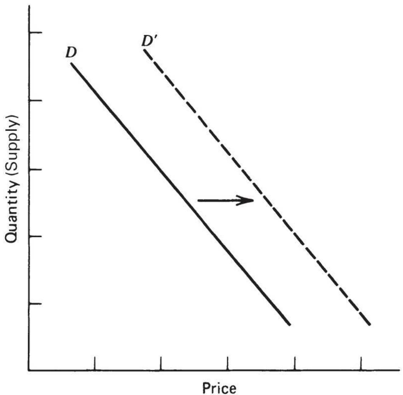
FIGURE 2.12a Shift in demand.
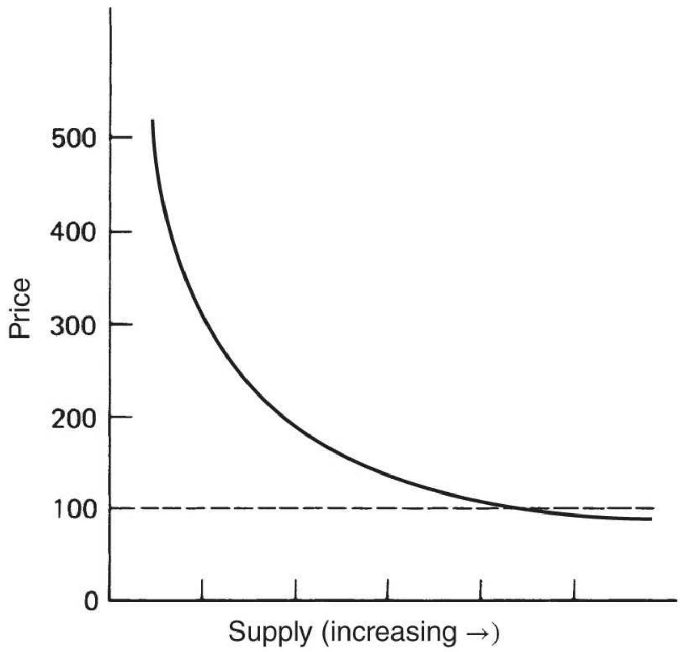
FIGURE 2.12b Demand curve, including extremes.
Source: Geoffrey S. Shepherd and G. A. Futrell.
Agricultural Price Analysis (Ames: Iowa State University, 1969), 53.
\section*{Elasticity of Demand}
Elasticity is the key factor in expressing the relationship between price and demand; it defines the shape of the curve. It is the relative change in demand as price increases:
\section*{Relative change (\%) in demand

The formula for the elasticity of demand uses the Greek letter nu ( \(\eta\) ):
\[
\eta=\frac{\left(Q_{1}-Q_{0}\right) /\left(Q_{1}+Q_{0}\right)}{\left(P_{1}-P_{0}\right) /\left(P_{1}+P_{0}\right)}
\]
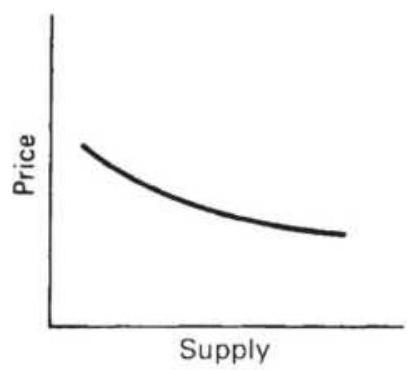
(a)
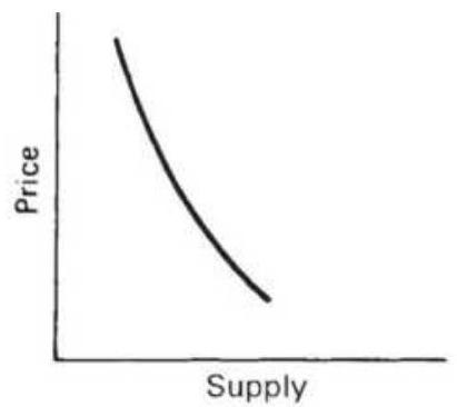
(b)
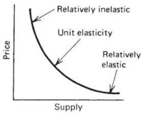
(c)
FIGURE 2.13 Demand elasticity. (a) Relatively elastic. (b) Relatively inelastic. (c) Normal market.
where \(Q_{0}\) is the starting quantity and \(P_{0}\) is the starting price. We will take another look at this formula in
Chapter 12 , where we replace quantity with trading volume.
A market that always consumes the same amount of a product, regardless of price, is called inelastic; as price rises, the demand remains the same and \(E_{D}\) is
negatively very small. An elastic market is just the opposite. As demand increases, price remains the same and \(E_{D}\) is negatively very large. Figure 2.13 shows the
demand curve for various levels of demand elasticity.
If supply increases for a product that has been in short supply for many years, consumer purchasing habits will require time to adjust. The demand elasticity will gradually shift from relatively inelastic (Figure 2.13b) to relatively elastic (Figure 2.13a).
\section*{Supply}
Figure 2.14a shows that, as price increases, the supplier will respond by offering greater amounts of the product. Figure 2.14b shows the full range of the supply curve. At low levels, below production costs, there is a nominal supply by those producers who must maintain operations due to high fixed costs and difficulty restarting after a shutdown (as in mining). At high price levels, supply is erratic. There may be insufficient supply in the short term, followed by the appearance of new supplies or substitutes, as in the case of a location shortage. When there is a shortage of orange juice, South American countries are happy to fill the demand; when there is an oil disruption, other OPEC nations will increase production. In most cases, however, it is reduced demand that brings price down.
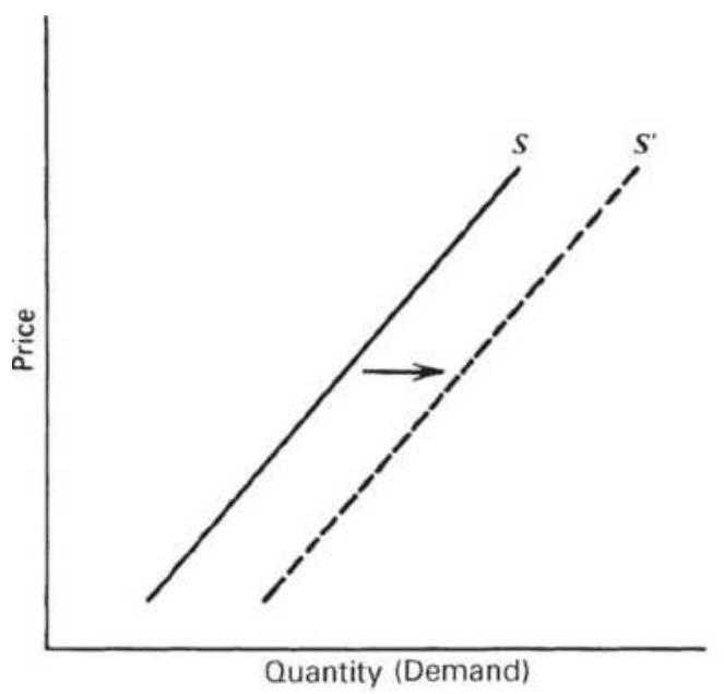
(a)
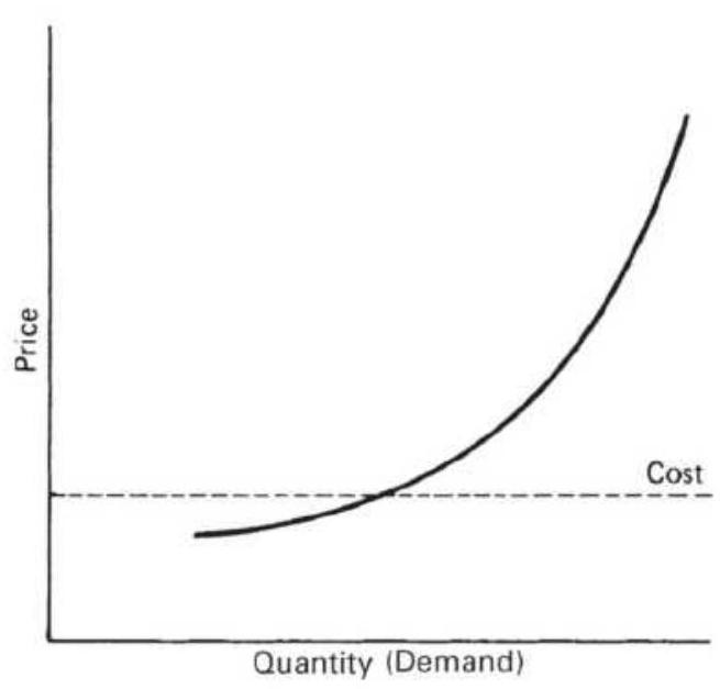
(b)
FIGURE 2.14 Supply-price relationship. (a) Shift in supply. (b) Supply curve, including extremes.
\section*{Elasticity of Supply}
The elasticity of supply \(E_{S}\) is the relationship between the change in supply and the change in price:
\[
E_{S}=\frac{\text { Relative change }(\%) \text { in supply }}{\text { Relative change }(\%) \text { in price }}
\]
The elasticity of supply, the counterpart of demand elasticity, is a positive number because price and quantity move in the same direction at the same time. There are three extreme cases of elasticity of supply, shown in Figure 2.15.3
1. Perfectly elastic, where supply is infinite at any one price
2. Perfectly inelastic, where only one quantity can be supplied
3. Unit elasticity, which graphically is shown as a linear supply curve coming from the origin
Price
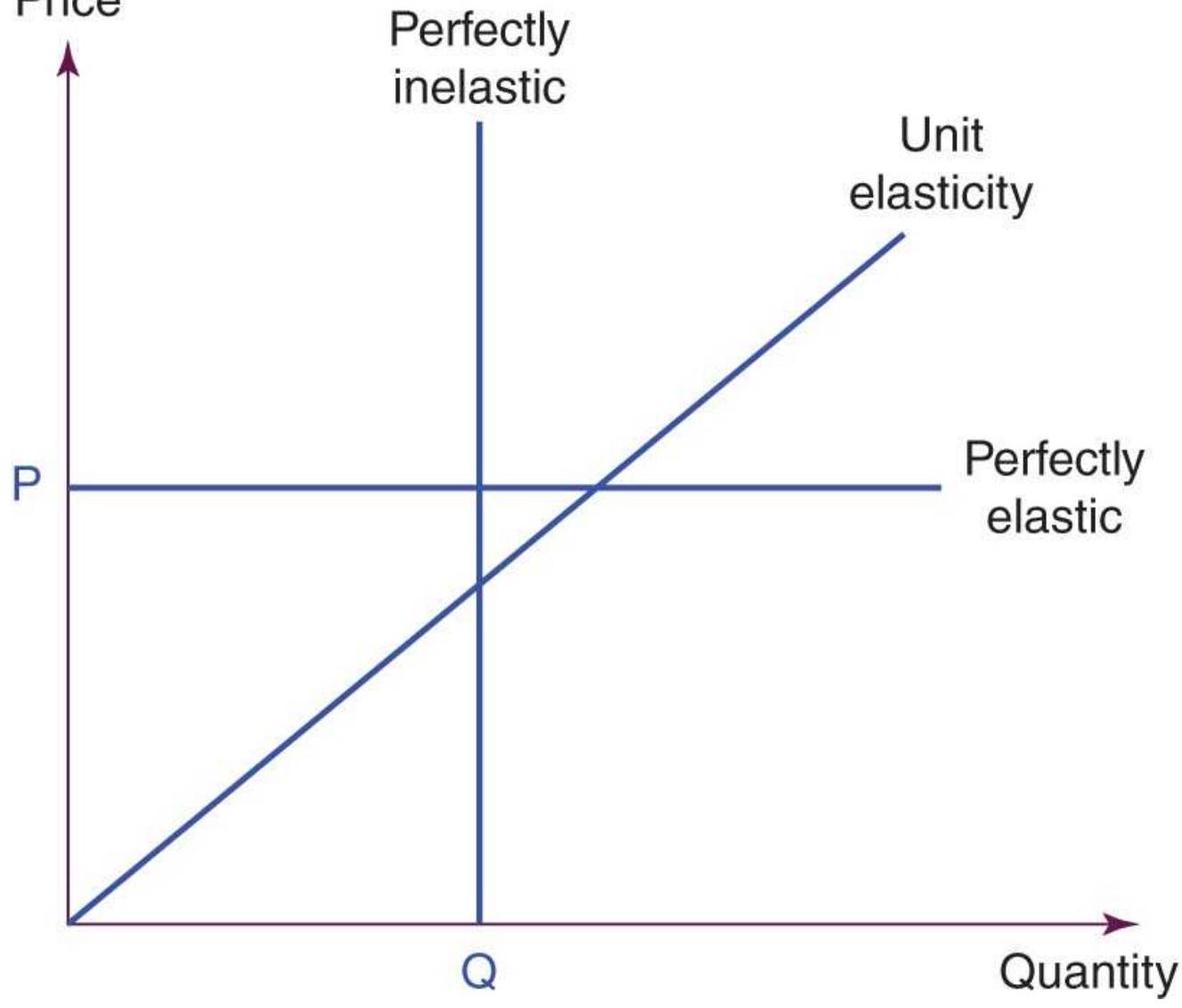
FIGURE 2.15 The three cases of elasticity of supply.
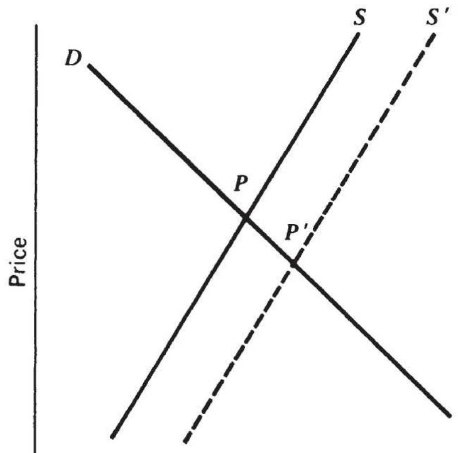
\section*{Quantity (Demand)}
FIGURE 2.16 Equilibrium with shifting supply.
\section*{Equilibrium}
The demand for a product and the supply of that product cross at a point of equilibrium. The current price of any product, or any security, represents the point of equilibrium for that product at that moment in time, essentially the netting of all information. Figure 2.16 shows a constant demand line \(D\) and a shifting supply, increasing to the right from \(S\) to \(S^{\prime}\).
The demand line \(D\) and the original supply line \(S\) meet at the equilibrium price \(P\); after the increase in supply, the
supply line shifts to \(S^{\prime}\). The point of equilibrium \(P^{\prime}\) represents a lower price, the consequence of larger supply with unchanged demand. Because supply and demand each have varying elasticities and are best represented by curves, the point of equilibrium can shift in any direction in a market with changing factors.
Equilibrium will be an important concept in developing trading strategies. Although the supply-and-demand balance may not be calculated, in practical terms equilibrium is a balance between buyers and sellers, a price level at which everyone is willing to trade, although not always happy to do so at that price. Equilibrium is associated with lower volatility and often lower volume because the urgency to buy or sell has been removed. Imbalance in the supply-demand-price relationship causes increased volatility. Readers interested in a practical representation of equilibrium, or price-value relationships, should study "Price Distribution Systems" in "Steidlmayer's Market Profile," Chapter 18.
\section*{Building a Econometric Model}
An econometric model can be created to explain or forecast price changes. Most models explain rather than forecast. Explanatory models analyze sets of data at concurrent times; that is, they look for relationships between multiple factors and their effect on price at the same moment in time. They can also look for causal, or lagged relationships, where prices respond to other factors after one or more days. It is possible to use the explanatory model to determine the normal price at a particular moment. Although not considered forecasting,
any variation in the actual market price from the normal or expected price could present a trading opportunity. This is similar to the concept of buying an undervalued stock.
There is a lot of similarity between the methods of creating a fundamental model and an algorithmic one. An analytic approach selects the factors and specifies the relationships in advance. Tests are then performed on the data to verify the premise. Alternatively, models are refined by fitting the data, using regression analysis or some mass testing process, which applies a broad selection of variables and weighting factors to find the best fit. These models, created with perfect hindsight, are less likely to be successful at forecasting future price levels. Even an analytic approach that is subsequently fine-tuned could be in danger of losing its forecasting ability. Construction of econometric models can suffer the same problems as optimization discussed in Chapter 21. As we will see throughout this book, simpler is often better.
The factors that comprise a model can be both numerous and difficult to obtain. It will be easier to find intramarket relationships, where the data is both available and timely, but global factors have become a major part of price movement since the mid-1970s and will be more difficult to incorporate. In addition, the change in value of the U.S. dollar and the volatility of interest rates have had far greater influence on price than some of the "normal" fundamental factors for many commodities. Companies with high debt may find the price fluctuations in their stock are larger due to interest
rate changes than increases or decreases in revenues. Be aware that factors change over time.
\section*{A Fundamental Model}
Models that explain price movements must be constructed from the primary factors of supply and demand. A simple example for estimating the price of fall potatoes \({ }^{4}\) is:
\[
P / P P I=a+b S+c D
\]
where
\(P=\) the average price of fall potatoes received by farmers
\(P P I=\) the Producer Price Index
\(S=\) the apparent domestic free supply (production less exports and diversions)
\(D=\) the estimated deliverable supply
\(a, b,=\) constants determined by regression analysis and \(c\)
This model implies that consumption must be constant (i.e., inelastic demand); demand factors are only implicitly included in the estimated deliverable supply. Exports and diversion represent a small part of the total production. The use of the PPI gives the results in relative terms based on whether the index was used as an inflator or deflator of price.
A general model, presented by Weymar, 5 may be written
as three behavior-based equations and one identity:
Consumption
\[
C_{t}=f_{C}\left(P_{t}, P_{t}^{t}\right)+e_{C_{t}}
\]
Production
\[
H_{t}=f_{H}\left(P_{t}, P_{t}^{L}\right)+e_{H_{t}}
\]
Inventory
\[
I_{t}=I_{t-1}+H_{t}-C_{t}
\]
Supply of storage
\[
P_{t}^{\prime}-P_{t}=f_{p}\left(I_{t}\right)+e_{p}
\]
where
\(C=\) the consumption
\(P=\) the price
\(P^{\mathrm{L}}=\) the lagged price
\(H=\) the production (harvest)
\(I=\) the inventory
\(P^{\prime}=\) the expected price at some point in the future \(e=\) the corresponding error factor
The first two equations show that both demand and supply depend on current and/or lagged prices, the traditional macroeconomic theory; production and
consumption are therefore dependent on past prices. The third equation, inventory level, is simply the total of previous inventories, plus new production, less current consumption. The last equation, supply of storage, demonstrates that people are willing to carry larger inventories if they expect prices to increase substantially. The inventory function itself, the third equation, is composed of two separate relationships: manufacturers' inventories and speculators' inventories. Each reacts differently to expected price change.
\section*{Changing Factors}
Although the PPI was always used as the component of inflation in forecasting prices, the value of the U.S. dollar was not always considered. Currency values have taken on more significance after mid-1970s when many countries began dropping their gold standard. The value of a currency is now based on the health of the economy as measured by production output and inflation, among other factors.
Wheat is a good example for showing the impact of these changes. Even though United States wheat is quoted in dollars, the price of wheat reflects the world value - that is, what other countries are willing to pay. Wheat is fungible; in other words, a country in need will buy from any source with the lowest price, after converting the seller's currency to the buyer's currency, and that keeps prices competitive.
We will limit our analysis to the impact of inflation and currency changes on the price of wheat. Figure 2.17
shows the monthly price of cash wheat, along with the PPI and the U.S. dollar index (DX). The dollar index shows the relative value of the U.S. dollar; therefore, a decline in DX indicates a weaker U.S. dollar. Both the PPI and DX have been indexed to begin in 1978 with the value of 100 .
In Figure 2.17 the PPI triples from 1.0 to 3.0 while the U.S. dollar drops by about \(60 \%\). At the same time wheat prices rise \(50 \%\) from 100 to about 150 (the cash price from \(\$ 3.35\) to \(\$ 5.39\) ). If we are only concerned with the big picture, the macro factors rather than the seasonality of price, then the rise in wheat prices over this 40 -year interval can be explained by either the PPI or the DX. Inflation, represented by the PPI, would cause wheat prices to rise, and the lower value of the dollar would also cause a rise so that wheat would seek the international value.
If we divide the price of wheat by the PPI, we get the net buying power of the farmer, which has now dropped by 50\% since 1978. This can be seen in Figure 2.18. Because farmers have steadily improved their yields, inflation and a weaker dollar are the only reasons why prices are not \(50 \%\) lower.
Wheat prices with inflation components
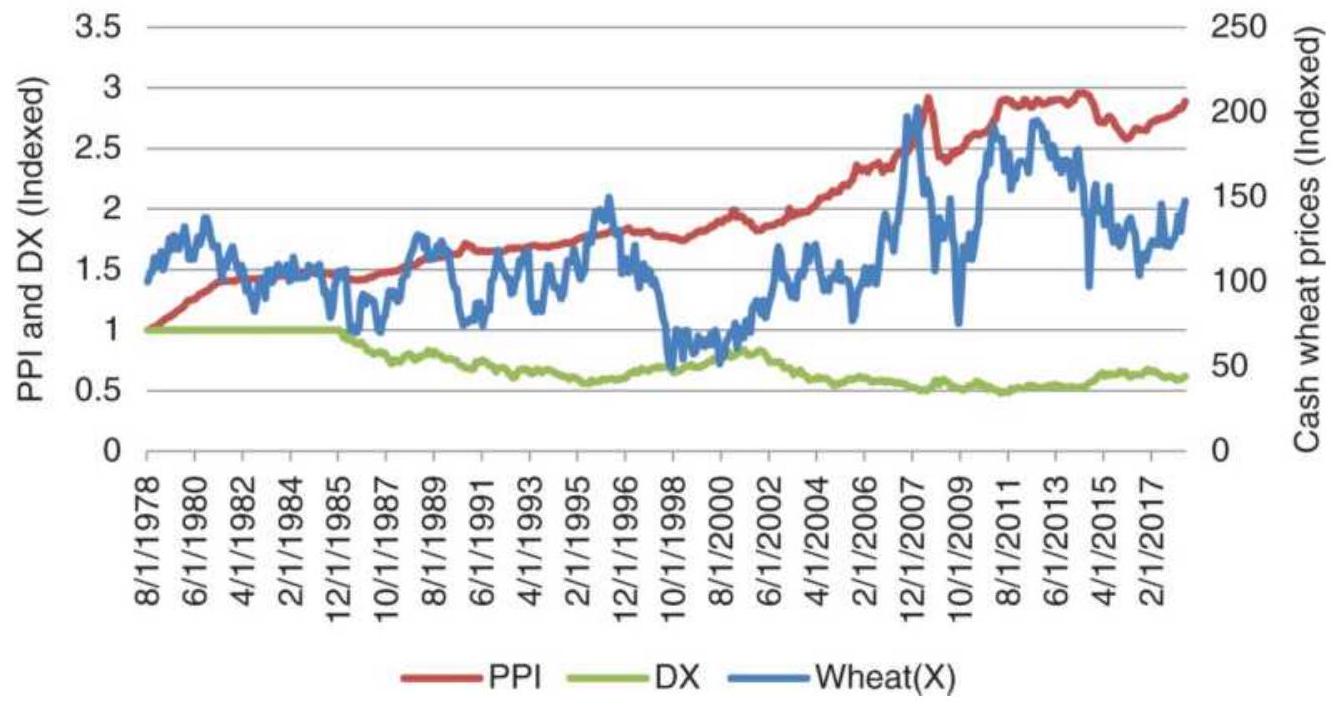
FIGURE 2.17 Cash wheat with the PPI and dollar index (DX), from 1978 through July 2018.
\section*{Effect of inflation on wheat prices}
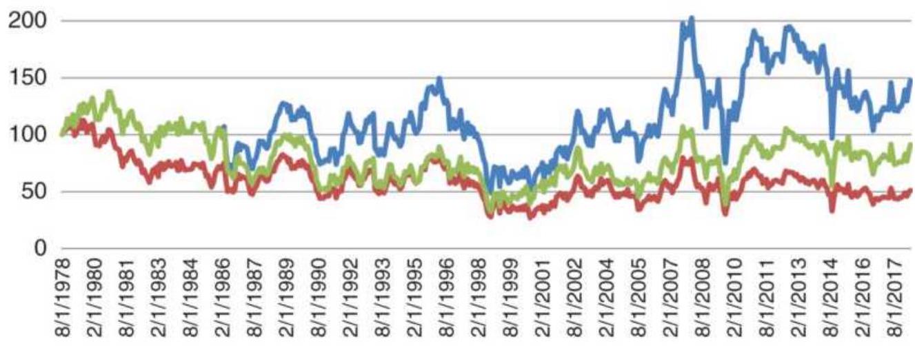
—Wheat \((\mathrm{X})\) —W/PPI \(\quad \mathrm{WxDX}\)
FIGURE 2.18 Wheat prices adjusted for PPI and Dollar Index (DX).
If we want to see the effect of seasonality, or supply and
demand, those factors that cause wheat prices to lose \(75 \%\) of its value or gain \(100 \%\), we need to remove the effects of inflation and the changing dollar first, so that they do not distort the results. This will be discussed with examples in Chapter 10, "Seasonality and Calendar Patterns."
\section*{Economic Reports}
Economic reports are released nearly every day. Based on the health of the nation, investors' focus can shift from one report to another. Since 2008 the focus has been on the employment data, the ultimate solution to recovery, and then Federal Reserve policy regarding raising interest rates. Other relevant data are the GDP, a measure of that recovery, and of less importance, housing, consumer confidence, and various manufacturing data. The Leading Economic Index (LEI), released by the Conference Board each month, tries to anticipate the direction of the economy about six months ahead based on:
- Average weekly hours, manufacturing
- Average weekly initial claims for unemployment insurance
Manufacturers' new orders, consumer goods and materials
- Index of supplier deliveries - vendor performance Manufacturers' new orders, nondefense capital goods
- Building permits, new private housing units
- Stock prices, 500 common stocks
Money supply, M2
Interest rate spread, 10-year Treasury bonds less Federal Funds
Index of consumer expectations
Most of these seem reasonable, but the weighting of them is not clear. It has been said that the direction of the stock market plays a relatively large part in the index.
Can these and other indicators be used for trading? Are they timely or are the expectations of their impact already in the market even before the reports are released? With many reports, the market anticipates the numbers. If unemployment was expected to increase, then the stock market tends to sell off ahead of the report, or if economists anticipate the Fed lowering rates, then the yield curve will adjust to that expectation ahead of the announcement. Therefore, it is the difference between the expectation and the actual report that moves the market, and only secondarily is it the actual numbers released. For example, if the GDP was expected to rise from \(3.5 \%\) to \(4.0 \%\) and the actual number came in at \(3.6 \%\), the market would sell off. But then it would rally again because \(3.6 \%\) is still a good number indicating growth. While large, unexpected changes move the market, the cumulative effect of small changes could also be significant.
Ruggiero has quantified the significance of some of these indicators, concentrating on predicting the direction of yields, which is key to much of the financial market price
moves: \(\underline{6}\)
\section*{Interest rates:}
\section*{Rate of Inflation \\ Yield}
\section*{Inflation Yield Oscillator \((I Y O)=R-\bar{R}\)}
where Yield is the 3 -month Treasury bill and \(\bar{R}\) is the 20-day average of the ratio, \(R\).
- If \((R<0.2\) or \(I Y O<0)\) and Yield \(_{t}>\) Yield \(_{t-3 \mathrm{mo}}\), then rates will rise.
- If \((R>0.3\) or \(I Y O>0.5)\) and Yield \(_{t}<\) Yield \(_{t-3 \mathrm{mo}}\), then rates will fall.
\section*{Money Supply:}
Using monthly data for \(M 2\) and the 3 -month Treasury bill yields, where \(m\) is the current month:
If \(\left(M 2_{m}-M 2_{m-1}\right)>\left(M 2_{m}-M 2_{m-6}\right)\) and Yield \(_{t}>\) Yield \(_{t-11 \mathrm{mo}}\), then rates will rise.
If \(\left(M 2_{m}-M 2_{m-1}\right)<\left(M 2_{m}-M 2_{m-6}\right)\) and Yield \(_{t}<\) Yield \(_{t-11 \mathrm{mo}}\), then rates will fall.
\section*{Consumer Sentiment:}
Using the University of Michigan's Consumer Sentiment Survey (CS), and where \(m\) is the month it is released:
If \(C S_{m}>C S_{m-12}\) and \(C S_{m}>C S_{m-11}\) and Yield \(_{t}>\) Yield \(_{t-4 \mathrm{mo}}\), then rates will rise.
If \(C S_{m}<C S_{m-12}\) and \(C S_{m}<C S_{m-11}\) and Yield \(_{t}<\) Yield \(_{t-4 \mathrm{mo}}\), then rates will fall.
\section*{Unemployment Claims:}
Using monthly unemployment claims (UC) released on the first Friday of each month:
If \(U C_{m}<U C_{m-11}\) and \(U C_{m}>U C_{m-14}\), then rates will rise.
If \(U C_{m}>U C_{m-11}\) and \(U C_{m}<U C_{m-14}\), then rates will fall.
The big picture of price direction is very important, and an accurate forecast can greatly improve results. Using fundamental data in a systematic way is perfectly consistent with other algorithmic approaches.
\section*{NOTES}
1 This and other very clear explanations of returns can be found in Peter L. Bernstein, The Portable MBA in Investment (New York: John Wiley \& Sons, 1995).
2 Further explanations and applications of Markov chains can be found on the Internet by searching for "Markov chains in finance."
3 See
http://www.economicsonline.co.uk/Competitive mar
January 20, 2018
4 J. D. Schwager, "A Trader's Guide to Analyzing the Potato Futures Market," 1981 Commodity Yearbook (New York: Commodity Research Bureau).
5 F. H. Weymar, The Dynamics of the World Cocoa Market (Cambridge, MA: MIT Press, 1968).
6 Murray A. Ruggiero, Jr., "Fundamentals Pave Way to Predicting Interest Rates," Futures (September 1996).
\section*{CHAPTER 3}
\section*{Charting}
It is very likely that all trading systems began with a price chart, and we come back to a chart whenever we want a clear view of where the market is going. Nowhere can a picture be more valuable than in price forecasting. Elaborate theories and complex formulas may ultimately be successful, but the loss of perspective is easily corrected with a simple chart. We should remember the investor who, anxious after a long technical presentation by a research analyst, could only blurt out, "But is it going up or down?" Even with the most sophisticated market strategies, the past buy and sell signals should be seen on a chart. The appearance of an odd trade can save you a lot of aggravation and money.
Through the mid-1980s technical analysis was considered only as chart interpretation. In the equities industry that perception is still strong. Most traders begin as chartists, and many return to it or use it even while using other methods. William L. Jiler, a great trader and founder of Commodity Research Bureau, wrote:
One of the most significant and intriguing concepts derived from intensive chart studies by this writer is that of characterization, or habit. Generally speaking, charts of the same commodity tend to have similar pattern sequences which may be
different from those of another commodity. In other words, charts of one particular commodity may appear to have an identity or a character peculiar to that commodity. For example, cotton charts display many round tops and bottoms, and even a series of these constructions, which are seldom observed in soybeans and wheat. The examination of soybean charts over the years reveals that triangles are especially favored. Head and shoulders formations abound throughout the wheat charts. All commodities seem to favor certain behavior patterns. 1
The financial markets have equally unique personalities. The S\&P traditionally makes new highs, then immediately falls back; it has fast, short-lived drops and slower, steadier gains. Currencies show intermediate trends bounded by noticeable support and resistance levels, the result of threats of Central Bank intervention, while interest rates have long-term trends.
Charting remains the most popular and practical form for evaluating price movement, and numerous works have been written on methods of interpretation. This chapter will summarize some of the traditional approaches to charting and the trading rules normally associated with these patterns. Some conclusions are drawn as to what is most likely to work and why. The next chapter covers systems that are derived from these patterns and are designed to take advantage of behavioral patterns found in charts.
\section*{FINDING CONSISTENT PATTERNS}
A price chart is often considered a representation of human behavior. The goal of any chart analyst is to find consistent, reliable, and logical patterns that can be used to predict price movement. In the classic approaches to charting, there are consolidations, trend channels, topand-bottom formations, and a multitude of other
patterns that are created by the repeated action of large groups of people. The most important of all the chart patterns is the trendline.
Computer programs can now identify chart patterns; but only Bulkowski's Encyclopedia of Chart Patterns² shows a comprehensive analysis of chart formations. In all fairness, there can be numerous valid interpretations of the same chart. In order to identify a chart formation, it is first necessary to select the data frequency (for example, daily or weekly), then the starting date and a time horizon (long-term or short-term). Given the wide range of choices, it should be surprising that any two analysts see the same patterns at the same time.
Chart analysis can be self-fulfilling. Novice speculators approach the problem with great enthusiasm and often some rigidity in an effort to follow the rules. They will sell double and triple tops, buy breakouts, and generally do everything to propagate the survival of standard chart formations. Because of its following, it is wise to know the most popular techniques, if only as a defensive measure. Chapter 4 will review some of the attempts to turn these patterns into trading systems.
\section*{What Causes Chart Patterns?}
Speculators have habits that, taken in large numbers, cause recognizable chart patterns. The typical screen trader, or an investor placing her own orders, will usually choose an even number - for example, buy Microsoft at \(\$ 74.00\), rather than at \(\$ 74.15\). If even-dollar values are not used, then \(50 \$\) and \(25 \$\) are the next most likely increments, in that order. And, as the share prices get higher, the increments get farther apart. When Berkshire Hathaway (BRK-A) was trading at \$278,000 per share, placing an order at a \(\$ 100\) increment would seem very precise. In futures trading the same is true. There are far more orders placed in the S\&P Index at 2530.00 than at 2529.80 , or 10-year Treasury notes at \(155^{16} / 32\) instead of \(12519 / 32\).
It is said that the public always enters into the bull markets at the wrong time. When the news carries stories of dangerously low oil supplies, a new cancer treatment drug, or a drought in the corn belt, the infrequent speculator enters too late in what W. D. Gann calls the grand rush, causing the final runaway move before the collapse or sell-off; this behavior is easily seen on a chart. Gann also talks of lost motion, the effect of momentum that carries prices slightly past its goal. Professional traders recognize that a fast, volatile price may move as much as \(10 \%\) farther than its objective. A downward swing in the euro/dollar from 1.3000 to a support level of 1.1000 could overshoot the bottom by 0.0100 without being considered significant.
The behavioral aspects of prices appear rational. In the
great bull markets, the repeated price patterns that defy random movement are indications of the effects of mass psychology. The classic source of information on this topic is Mackay's Extraordinary Popular Delusions and the Madness of Crowds, originally published in \(1841 .{ }^{3}\) In the preface to the 1852 edition the author says:
We find that whole communities suddenly fix their minds on one object, and go mad in its pursuit; that millions of people become simultaneously impressed with one delusion....
In 1975, sugar was being rationed in supermarkets at the highest price ever known, 50\$ per pound. The public was so concerned that there would not be enough at any price that they bought and hoarded as much as possible. This extreme case of public demand coincided with the price peak, and shortly afterward the public found itself with an abundant supply of high-priced sugar.
The world stock markets often show acts of mass psychology. While U.S. traders watched at a distance the collapse of the Japanese stock market from its heights of 38,957 at the end of December 1989 to its lows of 7,750 in 2003, a drop of \(80 \%\), they were able to experience their own South Sea Bubble when the NASDAQ 100 fell \(83.5 \%\) from its highs of 4,816 in March 2000 to 795 in October 2002. And, while the subprime crisis has taken years to play out, the unparalleled drop in value of nearly all investments at the same time, September 2008, was clearly an act of investor panic.
Charting is a broad topic. A standard bar chart (or line chart) representing highs and lows can be plotted for
daily, weekly, or monthly intervals in order to smooth out the price movement. Bar charts have been drawn on semilog and exponential scales, 4 where the significance of greater volatility at higher price levels is put into proportion with the quieter movement in the low ranges by using percentage changes. Each variation gives the chartist a different representation of price action. The shape of the chart box and its ratio of height/width will alter interpretations that use angles. Standard charting techniques may draw trendlines at \(45^{\circ}\) or \(30^{\circ}\) angles across the chart; therefore, expanding or compressing a chart on a screen will change the angles. You may be concerned that the principles and rules that govern chart interpretation were based on the early stock market, using averages instead of individual stocks or futures contracts. Edwards and Magee \({ }^{5}\) concluded that "anything whose market value is determined solely by the free interplay of supply and demand" will form the same graphic representation. They say that the aims and psychology of speculators in either a stock or commodity environment would be essentially the same, and that the effects of postwar government regulations have caused a "more orderly" market in which these same charting techniques can be used.
\section*{WHAT CAUSES THE MAJOR PRICE MOVES AND TRENDS?}
Prices can move higher for many months or even years, creating a bull market. They can also move down, creating a bear market. Although price moves can be as
short as a few minutes or as long as decades (as happened with interest rates and gold), it is how each chartist defines a "trend" that is most important. Once recognized, the price trend forms a bias for trading decisions that can make the difference between success and failure. The long-term direction of prices is driven by four primary factors:
1. Government policy. When economic policy targets a growth rate of \(4 \%\), and the current growth rate is \(1 \%\), the Federal Reserve (the "Fed" or any central bank) lowers interest rates to encourage growth. Lowering rates stimulates business activity. The Fed raises interest rates and dampens economic activity to control inflation. Changing interest rates has a profound impact on the flow of investment money between countries, on international trade, on the value of currencies, and on business activity.
2. International trade. When the United States imports goods, it pays for it in dollars. That is the same as selling the dollar. It weakens the currency. A country that continually imports more than it exports increases its trade deficit and weakens its currency. A country that increases its exports strengthens its currency and its economy.
3. Supply and demand. A shortage, or anticipated shortage, of any product causes its price to rise. An oversupply of a product results in declining prices. These trends develop as news makes the public aware of the situation. A shortage of a product that cannot be replaced causes a prolonged effect on its
price, although the jump to a higher price may happen quickly.
4. Expectations. If investors think that stock prices will rise, they buy in anticipation. Expectations can lead an economic recovery, although there is no statistical data to support a recovery. Consumer confidence is a good measure of how the public feels about spending. The economy is active when consumer confidence is high. A lack of public confidence following the subprime collapse in 2008 dampened all economic activity and delayed the recovery for years.
\section*{THE BAR CHART AND ITS INTERPRETATION BY CHARLES DOW}
The bar chart, also called the line chart, became known through the theories of Charles H. Dow, who expressed them in the editorials of the Wall Street Journal. Dow first formulated his ideas in 1897 when he created the stock averages in order to have a more consistent measure of price movement for stock groups. After Dow's death in 1902, William P. Hamilton succeeded him and continued the development of his work into the theory that is known today. Today's investors might be interested in just how far our acceptance of charting has come. In the 1920s, a New York newspaper was reported to have written:
One leading banker deplores the growing use of charts by professional stock traders and customers'
men, who, he says, are causing unwarranted market declines by purely mechanical interpretation of a meaningless set of lines. It is impossible, he contends, to figure values by plotting prices actually based on supply and demand; but, he adds, if too many persons play with the same set of charts, they tend to create the very unbalanced supply and demand which upsets market trends. In his opinion, all charts should be confiscated, piled at the intersection of Broad and Wall and burned with much shouting and rejoicing. \(\underline{6}\)
This is remarkably similar to the comments about program trading that followed the stock market plunge in October 1987, where it was condemned as the cause of the crash. In 2011 we again have comments about highfrequency trading "manipulating" the markets, and in Europe they temporarily banned short sales to stem volatility in the equity index markets. Of course, volatility continued to be high, but liquidity dropped. It's politics, not logic.
Charting has become an integral part of trading. The earliest authoritative works on chart analysis are long out of print but the essential material has been recounted in newer publications. If, however, a copy should cross your path, read the original Dow Theory by Robert Rhea; \({ }^{7}\) most of all, read Richard W. Schabacker's outstanding work Stock Market Theory and Practice, which is probably the basis for most subsequent texts on the use of the stock market for investment or speculation. Other publications were listed in Chapter 1
under "Background Material."
Automation has also come to charting, including the Dow Theory. Because these programs are constantly getting better, anyone interested should search the Internet for "Dow Theory Software."
\section*{The Dow Theory}
The Dow Theory \({ }^{8}\) is still the foundation of chart interpretation and applies to a wide variety of investment vehicles. It is part investor psychology supported by chart analysis. When you hear "the market has entered bear territory," they refer to Dow's decline of \(20 \%\) from the highs. It is impressive that it has withstood the tests of more than 100 years. Charles Dow was the first to create an index of similar stocks - the Industrials and the Railroads, although today's components are very different from those in 1897. The purpose of the index was to smooth out erratic price movement caused by less active stocks. In turn, it made price patterns more reliable.
Dow's work can be viewed in two parts: his theory of price movement, and his method of implementation.
Both are inseparable to its success. Dow determined that the stock market moved as the ocean, in three waves, called primary, secondary, and daily fluctuations. The major advances and declines, lasting for extended periods, were compared to the tides. These tides were subject to secondary reactions called waves, and the waves were composed of ripples. Readers familiar with other charting methods will recognize these patterns as
the foundation of Elliott Wave analysis. In 1897 Dow published two sets of averages in the Wall Street Journal, the Industrials and the Railroads, in order to advance his ideas. These are now the Dow Jones Industrial Average and the Transportation Index. Figure 3.1 shows more than 40 years of history for the three most important averages: the Industrials, the Transportation, and the Utilities.
\section*{The Basic Tenets of the Dow Theory}
There are six fundamental principles of the Dow Theory that fully explain its operation.
\section*{1. The Averages Discount Everything (Except "Acts of God')}
At the turn of the twentieth century there was considerably less liquidity and regulation in the market; therefore, manipulation was common. By creating averages, Dow could reduce the impact of "unusual" moves in a single stock - that is, those moves that seemed unreasonably large or out of character with the rest of the market. Dow's Industrials is the average share value of 30 companies (adjusted for splits); therefore, an odd move in one of those prices would only be \(1 / 30\) of the total. The average also represented far greater combined liquidity than a single stock. The only large moves that would appear on a chart of the average price were price shocks to the entire system or "acts of God."
\section*{2. Classifications of Trends}
There are three classifications of trends: primary trends, secondary swings, and minor day-to-day fluctuations. The primary trend, also called the wave, is the trend on a grand scale. When there is a wave of rising prices we have a bull market; when prices are declining there is a bear market. A wave is a major move over an extended period of time, generally measured in years. A clear bull market can be seen in the previous Dow charts (Figure 3.1) throughout all of the 1990s ending at the beginning of 2000 , and from late 2008 to 2018.
\section*{Bull and Bear Market Formation (for Monthly or Weekly Prices)}
The beginning of a bull or bear market is determined using a breakout signal, shown in Figure 3.2, based on large swings in the index value (more about breakout signals can be found in Chapter 5). The bull market signal occurs at the point where prices confirm the uptrend by moving above the high of the previous rally. The bear market signal occurs on a break below the low of the previous decline.
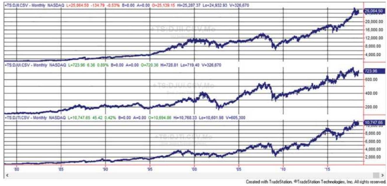
FIGURE 3.1 Dow Theory has been adapted to use the current versions of the major indices: the Industrials (top panel), the Utilities (center panel), and the Transportation Index (bottom panel). Although these indices represent different aspects of the economy, they have become highly correlated. Data from 1978-July 2018.
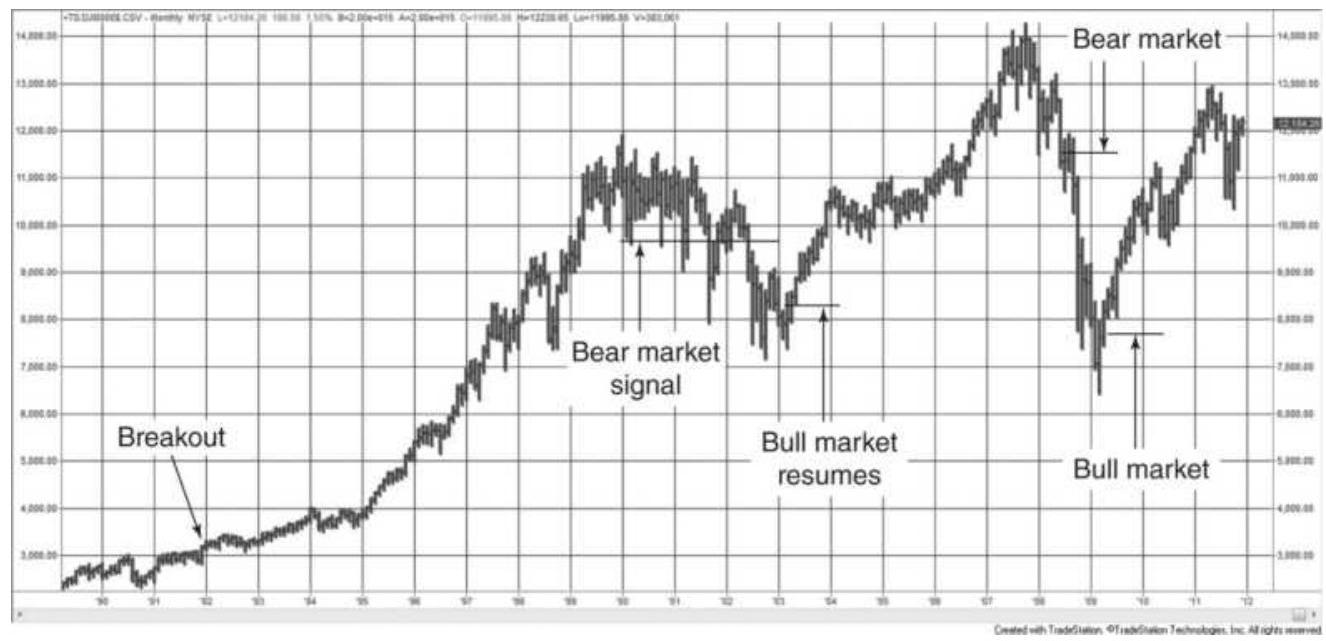
FIGURE 3.2 Bull and bear market signals are traditional breakout signals, but on a larger scale.
Because a breakout can occur at many levels, it is commonly accepted that a bull or bear market begins when prices reverse \(20 \%\) from their lows or highs. In order to get an upward breakout signal needed for a new bull market, we want to look at support and resistance levels (the previous intermediate high and low prices) separated by approximately a \(10 \%\) price move based on the index value. This type of signal is called swing trading. At the top of Figure 3.4, the horizontal broken line should occur at about \(20 \%\) below the absolute price highs, and the second peak should be approximately \(10 \%\) higher than the previous swing low.
While both bull and bear markets start with a price reversal of \(20 \%, 20 \%\) from the highs can be much greater than \(20 \%\) from the lows. For example, in the selloff in September 2008, the S\&P was measured from its high of about 14,000 in late 2007. A decline to 11,200, or 2,80o points, triggered the bear market. In the first quarter of 2009 the S\&P reached its lows of about 6,500. A new bull market began at 7,800, a rally of only 1,300 points. Then the points needed to start a bull market was only \(46 \%\) of the bear market trigger, showing a significant bias toward bull markets.
\section*{Bull and Bear Market Phases}
In Dow Theory the primary trends develop in three distinct phases, each characterized by investor action. These phases can be seen in the NASDAQ bull market of the late 1990s and the subsequent bear market (Figure \(3.3)\).
\section*{The Bull Market}
- Phase 1: Accumulation. Cautious investors select only the safest and best-valued stocks to buy. They limit purchases to deeply discounted stocks at depressed price levels and consider only primary services and industries, most often buying utilities and high yielding stocks.
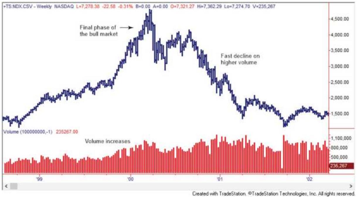
FIGURE 3.3 NASDAQ from April 1998 through June 2002. A clear example of a bull and bear market with a classic pattern of volume.
- Phase 2: Increasing volume. Greater investor participation causes increasing volume, rising prices, and an improving economic picture. A broader range of investors enter the market convinced that the market has seen its lows. Secondary stocks become popular.
- Phase 3: Final explosive move. Excessive speculation and an elated general population result
in a final explosive move. Everyone is talking about the stock market; people who have never considered investing now enter the market. The public is convinced that profits will continue and buying becomes indiscriminate. Investors borrow to buy stocks. Value is unimportant because prices keep rising. Earnings and dividends are ignored.
\section*{The Bear Market}
Phase 1: Distribution. Professionals begin selling while the public is in the final stages of buying. Stocks are distributed from stronger to weaker hands. The change of ownership is facilitated by less experienced investors who enter the bull market too late and pay what turns out to be unreasonably high prices.
Phase 2: Panic. Prices decline faster than at any time during the bull market and fail to rally. The news media constantly talk about the end of the bull market. The public sees an urgency to liquidate. Investors who borrowed money to invest late in the bull market, trading on margin or leverage, now speed up the decline. Some are forced to liquidate because their portfolio value has dropped below the critical point. The divesting of stocks takes on a sense of panic.
Phase 3: Lack of buying interest. The final phase in the sustained erosion of prices results from the lack of buying by the public. After taking losses, investors are not interested in buying even the strongest
companies at extremely undervalued prices. All news is viewed as negative. Pessimism prevails. It is the summers of 2002 and 2009.
\section*{Schabacker's Rules}
Schabacker also had a simple guideline to identify the end of both a bull and a bear market. \({ }^{9}\)
End of a bull market
1. Trading volume increases sharply.
2. Popular stocks advance significantly while some other companies collapse.
3. Interest rates are high.
4. Stocks become a popular topic of conversation.
5. Warnings about an overheated stock market appear on the news.
End of a bear market
1. Trading volume is low.
2. Commodity prices have declined.
3. Interest rates have declined.
4. Corporate earnings are low.
5. Stock prices have been steadily declining and bad news is everywhere.
Secondary Trends (Secondary Reactions Using Weekly or Daily Prices)
Secondary reactions are also called corrections or
recoveries and can be identified using smaller swing values. Corrections in bull markets are attributed to the prudent investor taking profits (a positive spin). This profit phase can have an erratic start but is considered complete when prices rise above the previous secondary rally. The bull market is back in force when a new high occurs (see Figure 3.4), the point where a swing trader will enter a new long position. Lines may be substituted for secondary movements. In Dow Theory, a line is a sideways movement lasting from two to three weeks to months, trading in about a \(5 \%\) range.
\section*{Characteristics of a Secondary Reaction}
- There are a number of clear downswings.
- The movement is more rapid in the reversal (downward during a bull market) than in the primary move.
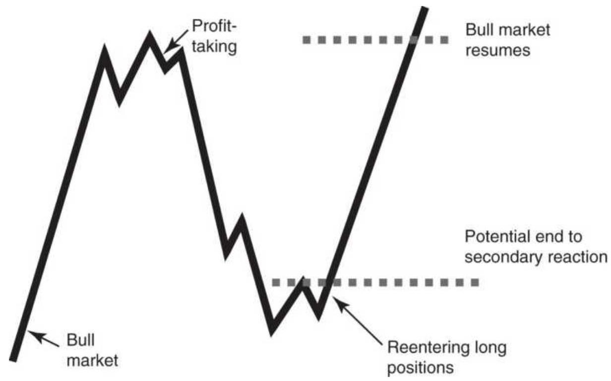
FIGURE 3.4 Secondary trends and reactions. A reaction is a smaller swing in prices that ends when a new high reinstates the bull market.
They last from three weeks to three months.
If the volume during the price drop is equal to or greater than the volume just prior to the decline, then a bear market is likely. If volume declines during the drop, then a rally is expected.
\section*{Minor Trends (Using Daily Prices)}
In Dow Theory, minor trends are the only trends that can be manipulated. They are usually under six days in duration. Because they are considered market noise, not affecting the major price direction, they are seen as less important moves.
\section*{3. The Principle of Confirmation}
For a bull or bear market to exist, two of the three major averages (the Industrials, the Transportation, and the Utilities) must confirm the direction. When first created, the Dow Theory required the confirmation of only the Utilities and the Railroads. Although much has changed since Dow devised this rule, the purpose is to assure that the bull or bear market is a widespread economic phenomenon and not a narrower industry-related event.
\section*{4. Volume Goes with the Trend}
Volume confirms the price move. Volume must increase as the trend develops, whether it is a bull or bear market.
It is greatest at the peak of a bull market or during the panic phase of a bear market.
\section*{5. Only Closing Prices Are Used}
Dow had a strong belief that the closing price each day was the most important price. It was the point of evening-up. Not only do day traders liquidate all of their positions before the close of trading, reversing their earlier impact, but many investors and hedge funds execute at the close. Although liquidity was a problem during Dow's time, even now, a large order placed at a quiet time will move prices. There is always high volume at the close of trading, when investors with different objectives come together to decide the fair price.
Some traders believe that there is no closing price anymore, given the access to 24-hour trading; however, that is not yet true. Every market has a settlement price. This is usually at the end of the primary trading session (previously the pit or open outcry session). The settlement price is necessary to reconcile all accounts, post profits and losses, and trigger needed margin calls. Banks could not operate without an official closing time and settlement price.
\section*{6. The Trend Persists}
A trend should be assumed to continue in effect until its reversal has been signaled. This rule forms the basis of all trend-following. It considers the trend as a long-term price move, and positions are entered only in the trend direction. The Dow Theory does not express expectations
of how long a trend will continue. It simply follows the trend until a signal occurs that indicates a change of direction.
\section*{Interpreting Today's S\&P Using Dow Theory}
After 120 years, can the Dow Theory correctly interpret the major market index? Figure 3.5 shows the S\&P 500, using continuous, back-adjusted futures prices, from 1994 through the middle of 2003. The sustained bull market that began after 1987, peaks at the beginning of 2000. Volume had been higher during the bull market, as Dow had foreseen, although volume does not peak at the top of the market; it starts to decline noticeably about three months before the top. We will see in the study of volume that volume spikes occur at extremes, but a longer-term volume confirmation is very important. Declining volume at the beginning of 2000 signals a divergence in sentiment that foretells the end of the bull market. Volatility increases toward the end of the uptrend, another predictable pattern. The price move from 1994 through the peak in 2000 shows both Phase 2 and Phase 3 of the bull market.
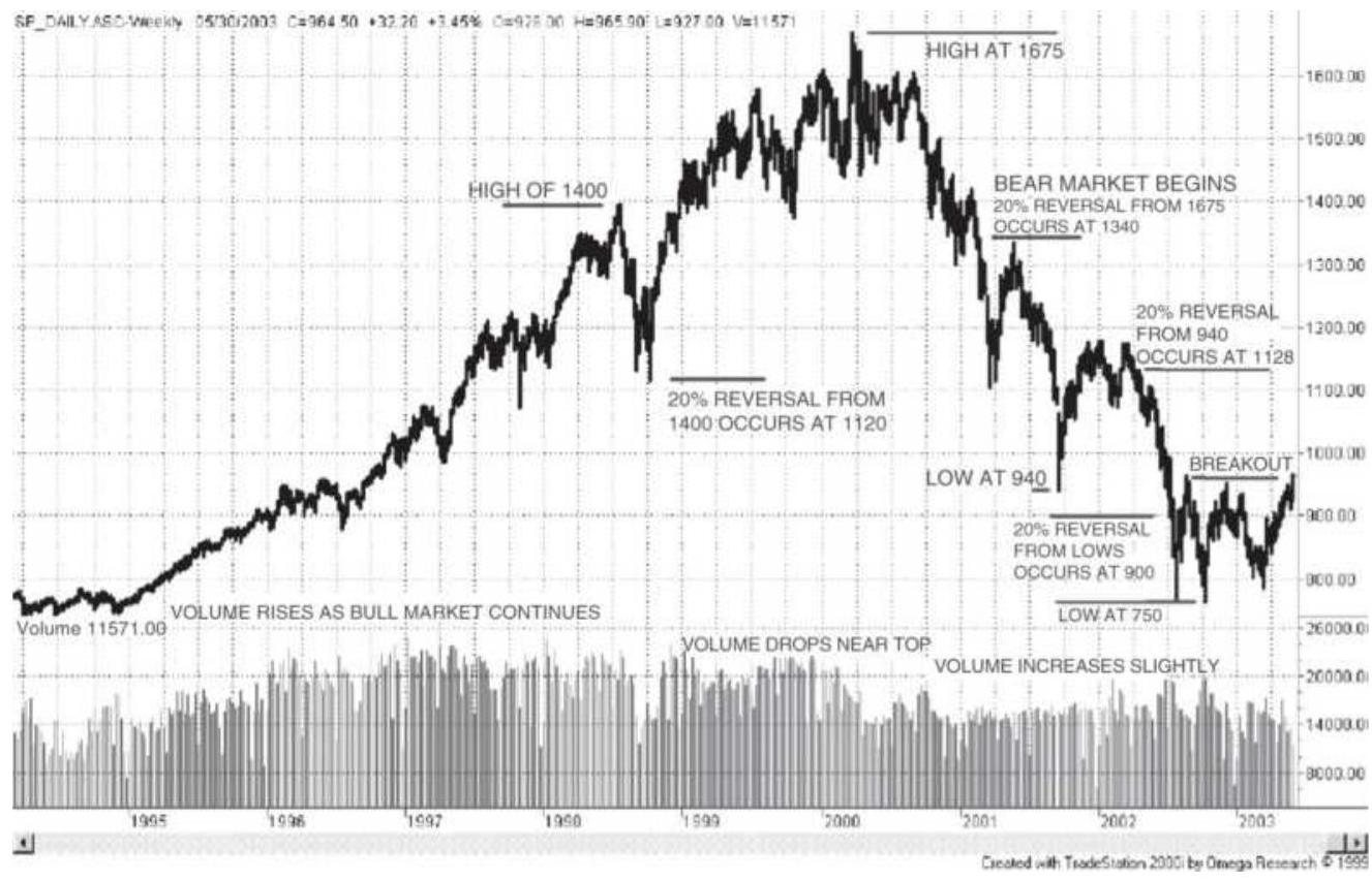
FIGURE 3.5 Dow Theory applied to the S\&P. Most of Dow's principles apply to the current marketplace, but some experience and interpretation is necessary.
The price decline in the third quarter of 1998 addresses the issue: Are there exceptions to the 20\% rule that changes a bull market to a bear market? A 20\% drop from a high of 1400 is 1120 , very close to the point where prices stopped their decline and reversed. Dow never used the number \(20 \%\), and analysts would claim that, because of the speed of the decline and the quick recovery, this was not a bear market signal. Some of these decisions require judgment, some experience, and just a little bit of hindsight. Realistically, we cannot expect every Dow signal to be correct, just as we cannot expect to be profitable on every trade. Long-term success is the real goal.
\section*{Transition from bull to bear in the S\&P. Looking} again for a \(20 \%\) reversal from the S\&P highs of 1675, we target the price of 1340 . This time, volume has declined from its highs and continues to decline quickly. From the second quarter of 2000 through the first quarter of 2001 prices fall sharply, giving back the gains from mid-1997, nearly 3 years. When prices break below 1300 they confirm the previous low at the end of 2000, making it clear that a bear market is underway.
During the subsequent decline, prices attempted to rally. There are four cases of a sharp "V" bottom followed by a significant move higher. After the low at 940 at the end of September 2001, prices move to about 1180, above the \(20 \%\) reversal of 1128 . However, after the first reversal to 1075 prices fail to move back above the highs, finally breaking below 1180 and continuing on to make new lows. Although the recovery exceeded 20\%, the lack of a confirming breakout can be interpreted as a bull market failure. Not every pattern falls neatly into a rule.
We come to the last year of the S\&P chart, where prices have resisted going below 850, and now appear to be moving above the level of 970 and about to confirm a bullish breakout. Is it the end of the bear market? Volume was the highest at the two lowest price spikes, and then declined. Many stocks are undervalued, according to experts, yet those same experts see no reason for the market to rally further because the recent rise has already reflected reasonable expectations for profits and growth in the next year. Who would be correct, Charles Dow or the "talking heads" of the financial news networks? It was Dow.
\section*{Dow Theory and Futures Markets}
The principles of the Dow Theory are simple to understand. Major price moves are most important when they are confirmed by volume. They follow a pattern created by investor action that seems to be universal when seen from a distance.
The primary features of the Dow Theory should hold for any highly liquid, actively traded market. This applies to index futures and most financial futures markets, as well as foreign exchange, which have enormous volume and reflect major economic trends. Because of the variety of products traded as futures and ETFs, an investor may be able to apply Dow's principle of confirmation using any two related financial markets, such as the S\&P Index, 10year Treasury notes, or the U.S. dollar index, in the same way that the Industrials, Utilities, and Transportation indices were used for stocks. A strong economic trend often begins with interest rate policy, which affects the value of the currency, and is intended to stimulate the stock market (lowering rates) or dampen excess investment (raising rates); therefore, confirmation from these three sectors is reasonable. When trading in futures, the nearby contract (the one closest to delivery) is most often used; however, the total volume of all futures contracts traded for each market must be used rather than volume for a single contract.
\section*{CHART FORMATIONS}
While Dow Theory is a macro view of price movement, more often chart analysis deals with much shorter time
periods. Most traders hold positions from a few days to a few weeks; however, they apply the same patterns to both shorter or longer intervals.
Chart analysis uses straight lines and geometric formations. It analyzes volume only in the most general terms of advancing and declining phases. Chart patterns can be classified into the broad groups of:
- Trendlines and channels
- One-day patterns
- Continuation patterns
- Accumulation and distribution (tops and bottoms)
■ Retracements
\(■\) Other patterns
Of these, the most important is the trendline.
\section*{The Trend in Retrospect}
It is easier to see the trend on a chart after it has occurred. Trying to identify the trend as it is developing is much more difficult. The monthly chart in Figure 3.6 shows a sustained upward trend, but there is a slowing of that trend toward the end. Will the upward trend continue? Will prices begin a downward trend? Will they move sideways? The purpose of charting is to apply tools that provide the best chance of identifying the future direction of prices. If wrong, these tools also control the size of the loss.
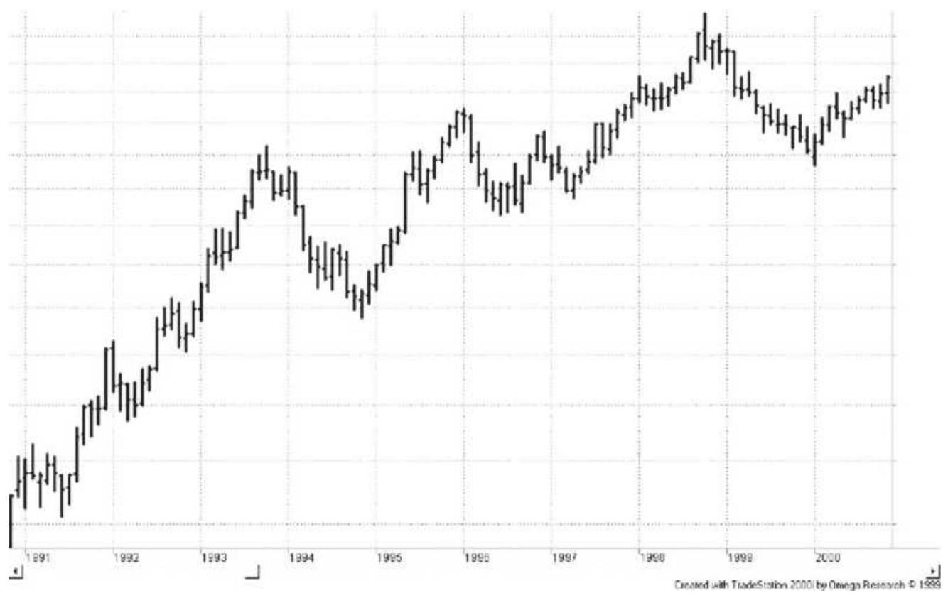
FIGURE 3.6 The trend is easier to see after it has occurred. While the upward trend is clear, are prices going to continue higher, or is this the end of the trend?
The time interval is a key element when identifying a trend. Weekly and monthly charts show the major trends more clearly than daily charts. Longer-term charts remove much of the noise that interferes with seeing the bigger picture. Many chartists start by evaluating a weekly or monthly chart, then apply the lines and values developed on those charts to a daily chart. The weekly chart provides the direction of trades while the daily chart, or even a 15-minute chart, is used for timing entries and exits. Further discussion of this can be found in Chapter 19.
\section*{TRENDLINES}
The trendline determines the current direction of price movement, and often identifies at what specific point that direction will change. The trendline is the most popular and recognized tool of chart analysis. Most analysts will agree that the trend is your friend, that is, it is always safer to take a position in the direction of the trend.
- An upward trendline is drawn across the lowest prices in a rising market.
- A downward trendline is drawn across the highest prices in a declining market.
Figure 3.7 shows a classic downward trendline, \(A\), drawn on a chart of Intel. It connects the highest price of \(\$ 22\) with price peaks at \(18.00,16.75\), and 16.15 before ending at 15.50 . When prices move through the trendline heading higher, the downtrend has been penetrated. This may end the downtrend or cause a new downtrend line to be drawn. In this case it was the end of the downtrend, easily seen afterward.
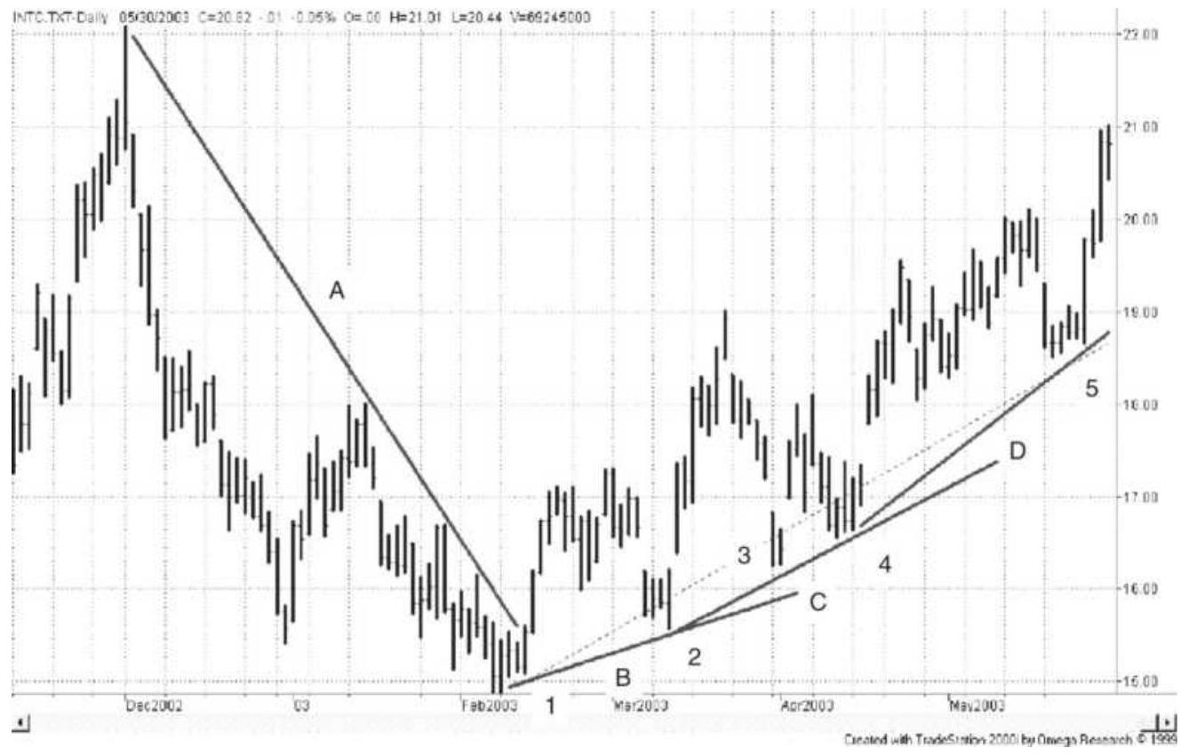
FIGURE 3.7 Upward and downward trendlines applied to Intel, November 2002 through May 2003.
\section*{Redrawing Trendlines}
Most trendlines are not as long-lived or clear as the downtrend in Intel, which was drawn after the fact. Instead, we will chart the uptrend that follows as it develops. The first uptrend line, \(B\), is drawn when the first reversal shows a second low point. The upward trendline \(B\) is drawn across the lows of points 1 and 2. Although prices do not decline through trendline \(B\), rising prices pull back to points 3 and 4 , well above the trendline. At that point we choose to redraw the upward trendline connecting point 2 with 3 and 4 , forming what appears to be a stronger trendline. Trendlines are considered more important when they touch more points. However, prices move up quickly and we decide
to redraw the trendline connecting points 4 and 5 . It is very common to redraw trendlines as price patterns develop. Care must be taken to draw the lines in a way that touches the most points, although some chart analysts would draw a line that connects points 1 and 5 , crossing through points 2,3 , and 4 , because the final picture seems to represent the dominant upward price pattern. This can be seen as the broken line in Figure 3.7.
One way to automate the upward trendline is to calculate a regression line through prices beginning on the day of the lowest price and ending at the most recent day. Then find the lowest prices away from that regression line and draw another straight line, parallel to the regression line, through that point. A downward breakout of the lower line would be a trend reversal. The opposite would be done for a downtrend.
\section*{Support and Resistance Lines}
When investors agree that the economy is doing well, we get an uptrend. Periods of uncertainty form a sideways price pattern. The top of this pattern is called the
resistance level and the bottom is the support level. Once established, the support and resistance levels become key to identifying whether a trend is still in force. Many traders consider this as important as a break in the trendline.
A horizontal support line is drawn horizontally to the right of the lowest price in a sideways pattern. It is best when drawn through two or more points and may cross above the lowest price if it makes the pattern clear. It
represents a firm price level that has withheld market penetration (or allowed minor penetration). It may be the most significant of all chart lines.
A horizontal resistance line serves the same purpose as the support line and is drawn across the highest highs of the sideways interval. It represents the price that has resisted upward movement. Resistance lines are not normally as clear as support lines because they are associated with higher volatility and erratic price movement. \(\underline{10}\)
In the chart of bond futures prices (Figure 3.8), support line \#1 is drawn across two lows of a sideways period. Resistance \#1 is across four highs just above it. At the beginning of June, prices move through resistance. They then retrace back to the resistance line before moving higher. After the peak support line \#2 is formed. When broken, prices drop to the old resistance line \#1 before rallying and penetrating support \#2 before failing. The big break comes when prices fall through the old support \#1. At the far right, a new resistance \#2 has been formed.
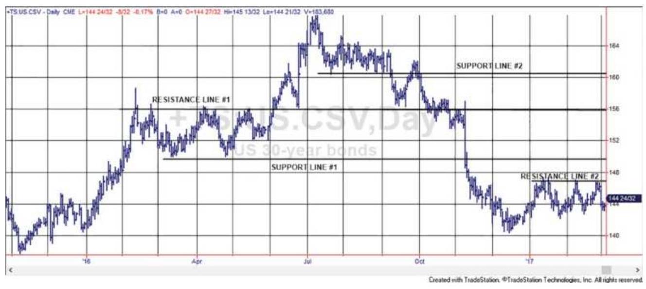
FIGURE 3.8 Horizontal support and resistance lines shown on bond futures prices.
\section*{Failed Breakouts}
A price bar that has the high price penetrating upward through resistance but closes lower is considered a failed breakout and confirms the downward move. This can be seen in Figure 3.8, where support \#2 (now acting as a resistance line) is penetrated by the rally in September before moving lower. Failed breakouts can occur at either support or resistance levels. You may choose to raise the resistance line to the high of that failed bar, but most chartists ignore it, keeping the resistance line at its original position.
\section*{Resistance Becomes Support and Support Becomes Resistance}
Horizontal support and resistance lines are strong indicators of change. If prices are moving sideways because investors are unsure of direction, then a move through either support or resistance is usually associated with new information that causes investors to act. Whatever the cause, the market interprets this as a new event. Having moved out of the sideways pattern, prices have a tendency to remain outside that range. If prices have moved higher, then the resistance line becomes a support line. If prices fall below the resistance line, the price move is considered a failed breakout. In Figure 3.8, resistance \(\# 1\) becomes support after the break of support \#2. Traders are looking for a logical place for price to pause and regroup.
\section*{A Trendline Is Also a Support or Resistance Line}
The angled trendlines in Figure 3.7 are also called support and resistance lines. An upward trendline, drawn across the lows, is a bullish support line because it defines the lowest price allowed in order to maintain the upward trend. The downward trendline, drawn across the highs, is a bearish resistance line. Both trendlines and horizontal lines are most important for traders.
\section*{Back-Adjusted Data}
All traders use online services to display charts. They can draw support and resistance lines using various tools supplied by the service and can convert daily data to weekly or monthly with a single click. When looking at prices that go back many years, the analyst must be sure that the older data is not back-adjusted. For example, futures trade in contracts of limited maturity, and are most liquid during the last few months before expiration. Long-term charts put contracts together by backadjusting the prices, so that the older data does not give the actual price at that time, but is altered by accumulated roll difference. Long-term horizontal support and resistance lines will be wrong.
This same problem exists for stocks that have split. The old price that you see on the chart may not be the actual price traded at that time. In the case of Apple, you'll find that the oldest prices are negative. Using those older prices as a guide for support or resistance doesn't make any sense.
\section*{Trading Rules for Trendlines}
Many of the trading rules that follow have been automated and are discussed in the next chapter. They include channel breakouts, buying on pullbacks, and trading in sideways markets. The methods that follow have well-defined rules and often are the basis for the systems in the next chapter. It is easier to understand the systems if you know the reasoning behind them.
The simplest formations to recognize are the most commonly used and the most important: horizontal support and resistance lines, bullish and bearish trendlines, and channels created using those lines. Systematic traders will generate their buy and sell orders directly from their chart analysis. These major chart patterns create the underlying profitability of chart trading; the more complex formations, as we will discuss further, may enhance good performance but cannot compensate for losses resulting from being on the wrong side of the trend. Typical trading rules for trendlines are shown in Figure 3.9.
\section*{Confirming the New Trend Direction}
In actual trading, the price crossing the trendline is not as clear as in Figure 3.9. Most often prices that have been moving higher will cross through the trendline a number of times. The trendline is an important turning point and there may be indecision that is reflected in a sideways price movement before prices reestablish a trend. To deal with this situation, traders may:
Wait one or two days to confirm that prices remain
on the new side of the trendline.
Wait for a reversal after the penetration, then enter a trade in the new trend direction even if the reversal crosses the trendline again.
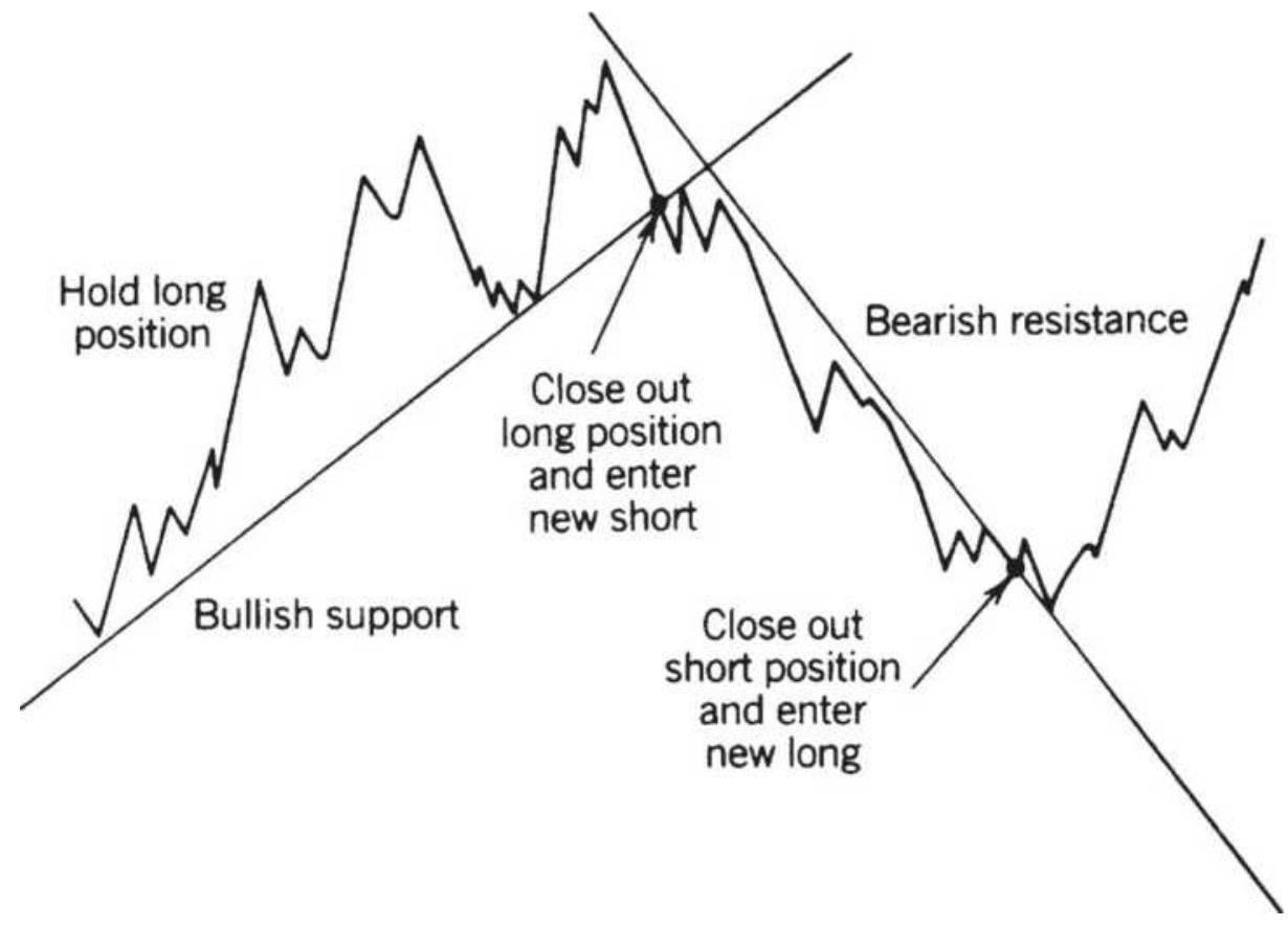
FIGURE 3.9 Basic sell and buy signals using trendlines.
- Create a small safety zone (a band or channel) around the trendline and enter the new trade if prices move through the trendline and through the safety zone.
Each of these techniques requires a delay before entering. A delay normally benefits the trader by giving a better entry price; however, if prices move quickly through an upward trendline and do not reverse or slow down, then any delay will result in a worse entry price.
Unfortunately, most of the biggest profits result from breakouts that never pull back. Catching only one of these breakouts can compensate for all the small losses due to false signals. Many professional traders wait for a better entry price but some miss the biggest moves.
\section*{Trading Rules for Horizontal Support and Resistance Levels}
As with angled trendlines, horizontal support and resistance lines show clear points for buying and selling. Also similar to angled trendlines, the horizontal lines become increasingly important when longer time intervals and more points are used to form the lines. The technique for entering trades using horizontal lines is similar to that using trendlines; however, the maximum risk of the trade is clearly defined.
- Buy when prices cross above the horizontal resistance line.
- Sell when prices cross below the horizontal support line.
Once a long position has been entered, it is not closed out until prices cross below the support line. The maximum risk of the trade is the difference between the support and resistance lines. As prices move higher, each swing reversal forms a low from which a new horizontal support line is drawn. After the initial entry, a single low point is most often used to create the horizontal support and raise the level at which the trade will be closed out. Figure 3.10 shows the pattern of horizontal support and resistance lines as the trade develops. For a swing low to
form, prices must reverse upward by more than some threshold number of points or percentage. Not every small reversal qualifies as a swing low.
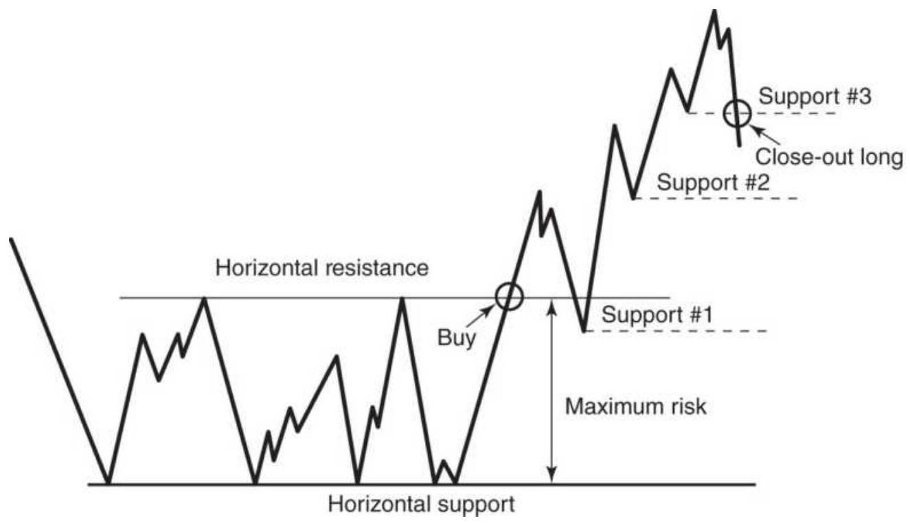
FIGURE 3.10 Trading rules for horizontal support and resistance lines.
Note that the first pullback in Figure 3.10 shows prices crossing below the original resistance line. This is a common occurrence, but the original line no longer holds the importance it had before it was broken. While it should provide support for the pullback (a resistance, once broken, becomes a support), it is more important to record the bottom of the new pullback as the support level. After the third support level is drawn, prices rally but then fall back through the third level, at which point the long position is closed out. A short position, if any, is not entered until a new sideways price pattern is established and horizontal support and resistance lines can be drawn across more than one point.
\section*{Separating Directional from Consolidation Patterns}
It is said that markets move sideways about \(80 \%\) of the time, which means that sustained directional breakouts do not occur often, or that most breakouts are false. Classic accumulation and distribution formations, which occur at long-term lows and highs, attempt to recognize evolving changes in market sentiment. Because these formations occur only at extremes, and may extend for a long time, they represent the most obvious consolidation of price movement. Sometimes they take the shape of a rounded bottom or top. This can make it difficult to decide exactly when a breakout will occur. For an investor, the solution is to average in, where smaller positions are entered at fixed intervals as long as the developing formation remains intact.
Most other consolidation formations are best seen in the same way as a simple horizontal sideways pattern, bounded above by a resistance line and below by a support line. If this pattern occurs at low prices, we can expect a breakout upward when the fundamentals change. Prices seem to become less volatile within an extended sideways pattern, especially at low prices, and chartists take this opportunity to redefine the support and resistance levels so that they are narrower.
Breakouts based on these more sensitive lines tend to be less reliable because they may represent a temporary quiet period inside the larger, normal level of market noise; however, there are two distinct camps, one that believes that breakouts are more reliable after a period of low volatility and the other that prefers breakouts associated with high volatility. Some of these situations
are discussed later under volatility breakout systems.
\section*{Creating a Channel with Trendlines}
A channel is formed by a trendline and another line drawn parallel to the trendline enclosing a sustained price move. The width of the channel defines the volatility of the price move and establishes reasonable entry and exit points. Up to now, the trendline has only been used to identify the price direction. A long position is entered when the price crosses a downward trendline moving higher. The trade is held until the price moves below an upward trendline. However, it is more common to have a series of shorter trades based on shorter trendlines. While the biggest profits come from holding one position throughout a sustained trend, a series of shorter trades each has far less risk and is preferred by the active trader. Be aware that trendlines using very little data are essentially analyzing noise and have limited value.
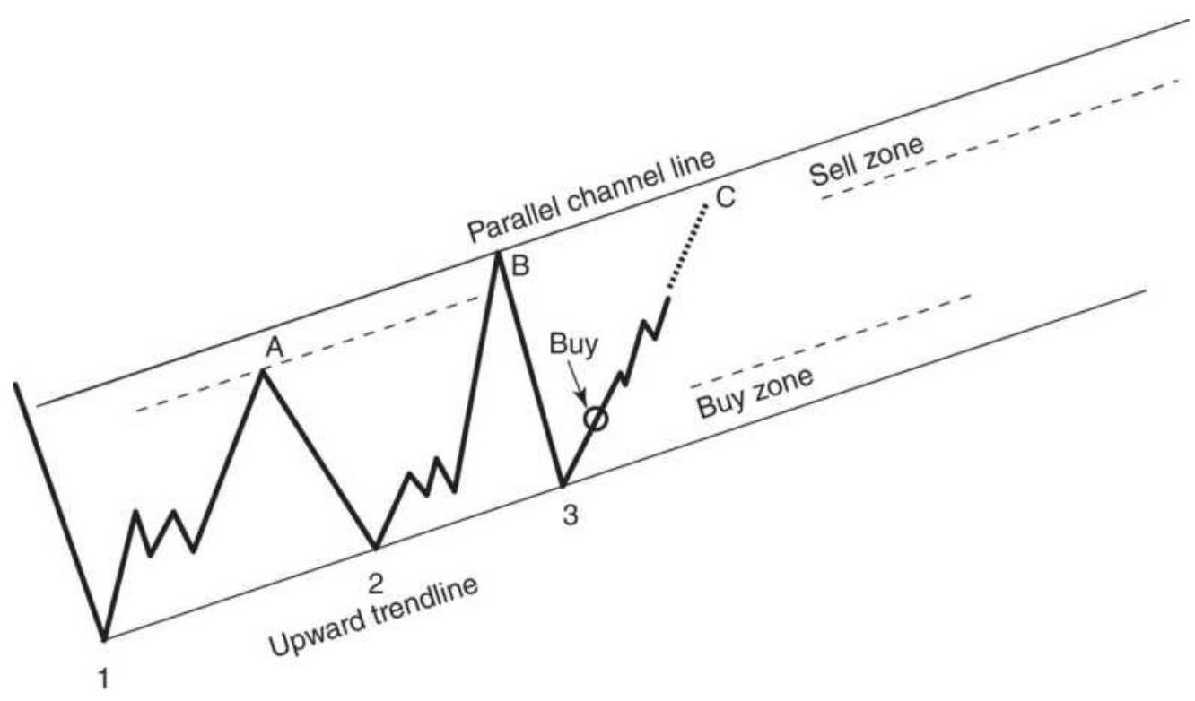
FIGURE 3.11 Trading a price channel. Once the channel has been drawn, buying is done near the support line and selling near the resistance line.
Before a channel can be formed, the bullish or bearish trendline must be drawn. A clear uptrend line requires at least two, and preferably three or more, major low points on the chart, as shown in Figure 3.11, where points 1, 2, and 3 are used. These points do not have to fall exactly on the line. Once the trendline is drawn, the highest high, point \(B\), can be used to draw another line parallel to the upward trendline. The area in between the two parallel lines is the channel. In an earlier section, "Redrawing Trendlines," a regression line was used as a way of finding the trend and drawing a channel.
In theory, trading a channel is a simple process. We buy as prices approach the support line (in this case the upward trendline), and we sell as prices near the
resistance line. These buy and sell zones should be approximately the bottom and top \(20 \%\) of the channel. Some traders might use point A to define the top of the channel, giving it a better chance of being reached and allowing you to take profits sooner.
If prices continue through the lower trendline after a long position has been set, the trade is exited. The trend direction has changed and a new bearish resistance line, the downward trendline, needs to be drawn using points \(B\) and \(C\), shown in Figure 3.12. Once the first pull-back occurs, leaving a low at point 4 , a parallel line is drawn crossing point 4 , forming the downward channel. In a downward-trending channel, it is best to sell short in the upper zone and cover the short in the lower zone. Buying in the lower zone is not recommended; trades are safest when they are entered in the direction of the trend.
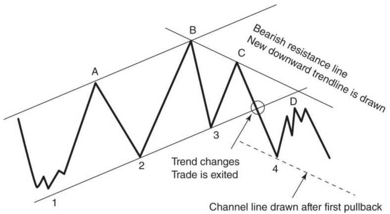
FIGURE 3.12 Turning from an upward to a downward channel. Trades are always entered in the direction of
When the support and resistance lines are relatively horizontal, or sideways, the channel is called a trading range. There is no directional bias in a trading range; therefore, you can enter new long positions in the support zone and enter new shorts in the sell zone. In both cases, penetration of either the support or resistance lines forces liquidation of the trade and establishes a new trend direction.
\section*{ONE-DAY PATTERNS}
The easiest of all chart patterns to recognize occur in one day. They include gaps, spikes, island reversals, reversal days, inside days, outside days, wide-ranging days, and, to a lesser extent, thrust days. Some of these patterns are important at the moment they occur and others must be confirmed by other factors.
\section*{Gaps}
Opening gaps occur when important news influences the market at a time when the exchange is closed. Futures trade 24 hours, so opening gaps only occur on Sunday when the markets reopen while the equities markets trade from 9:30 a.m. to 4:00 p.m., New York time, and are still likely to have opening gaps. Many listed companies release quarterly earnings reports before or after the normal trading sessions. While some stocks have extended hours, the official posting of prices only uses the primary trading session.
European markets have followed the lead of the United States in extending hours but are not yet trading the full day. The German DAX, trading on Eurex, has a "day session" from 9:00 a.m. (local time) to 5:45 p.m., and an extended session from 5:45 p.m. to 8:00 p.m. (closing at the same time as the \(\mathrm{S} \& \mathrm{P}\) in Chicago), then opening for an early session from 8:00 a.m. to 9:00 a.m. Other Eurex markets have similar hours.
There are some national holidays where the exchange is officially closed, but electronic trading on Globex is available. Prices that occur on the holiday are combined with trading on the next day and posted as a single day.
An upward gap exists when the low of the current day is higher than the high of the previous day. Then the S\&P futures will not have gaps, except on Sunday evening when Globex reopens, but the SPY ETF and U.S. stocks could have a gap each morning, as could many non-U.S. markets. It is best to refer to the exchange website to get the latest session times.
\section*{Gaps During the Trading Session}
Major economic reports are released by the U.S. government at 7:30 a.m. (Central time); therefore, they occur before the SPY begins trading, but during the electronic S\&P E-mini session. If the news is a surprise, S\&P futures will move sharply and the SPY will gap open an hour later to adjust to the futures price. Other reports on housing and manufacturing production occur in the morning after the markets open. They can cause liquidity pockets where there are only buyers and no sellers or
sellers and no buyers, at least for a short time. They appear to be gaps on an intraday chart.
Gaps can also occur because of a large cluster of orders placed at the point where the stock or futures market penetrates support or resistance. There is also the rarer case of an event shock such as September 11, 2001.
In charting, gaps are interpreted differently based on where they occur in the current price pattern. In some cases, a gap signals a continued move, and in other situations it is expected to be the end of a price move. The four primary gap formations are shown on a chart of Amazon.com in Figure 3.13. They are:
1. The common gap, which appears as a space on a chart and has no particular attributes - that is, it does not occur at a point associated with any particular significance. A common gap appears in May 1999 during a downward move.
2. A breakaway gap occurs at a point of clear resistance or support. It occurs when there are a large number of buy orders just above a major resistance line, or sell orders below a support line. These support and resistance lines are drawn after a prolonged period of sideways price movement when most chartists see the same pattern. The clearer the formation, and the longer the sideways period, the more likely there will be a large breakaway gap. The term "breakaway" requires some hindsight because it is applied only when the gap is followed by a sustained price move.
There are two breakaway gaps in Figure 3.13, the first in December 1998 shortly after prices make a new high, the second near the right of the chart when prices gap through a short upward trendline while still in a major downtrend following the peak in May 1999. In order to trade a gap, your order must be entered in advance of the gap, as prices approach the support or resistance level. Once you are in a long position and prices "gap up" you gain free exposure, which is the profit caused by the gap or by a fast market moving in your favor. If prices do not gap up, they most often drift lower. The position can be exited with a small loss and reentered later.
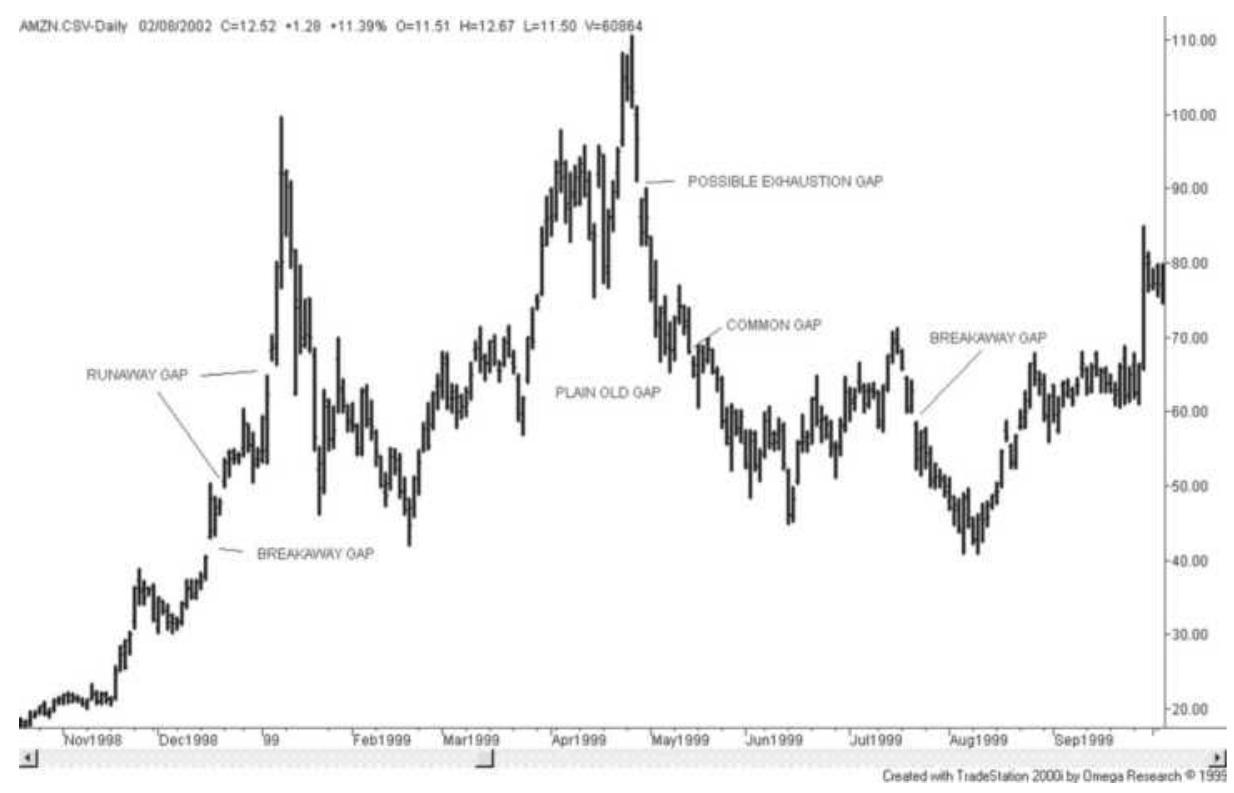
FIGURE 3.13 Price gaps shown on a chart of Amazon.com.
3. An exhaustion gap occurs at the end of a sustained
and volatile price move. It confirms the reversal. Exhaustion gaps usually occur on the day after the highest price of the upward move; however, in the Amazon chart it is one day later when more traders had time to recognize that Amazon prices had topped.
4. A runaway gap occurs at different points during a clear trend and confirms the trend. It does not appear to have any practical use because the trend can stop and reverse just after a runaway gap and it would be renamed an island top. When holding a long position, an upward runaway gap quickly adds profits, but also signifies extreme risk.
Gaps can also be a hindrance to trading. Holding a long position when a downward breakaway gap occurs guarantees that any stop-loss order is executed far away from the order price. If the upward breakaway gap occurs on light volume, it may be a false breakout. If you are holding a short when an upward gap occurs, and if you are lucky, prices will fall back to the breakout level and let you exit gracefully. If unlucky, you will be executed at the high of the move. In the final analysis, if the gap breakout represents a major change, your order should be entered immediately at the market. A series of poor fills will be offset by the one time when prices move quickly in your favor and no pullback occurs. A breakaway gap on high volume is usually indicative of a strong move and a sustained change. We will also see that a volume spike means the opposite. Interpreting a chart becomes an art.
\section*{Filling the Gap}
Tradition states that prices will retrace to fill the gap. Naturally, given enough time, prices will return to most levels; therefore, nearly all gaps will eventually be filled. The most important gaps are not filled for some time.
The gap represents an important point at which prices move out of their previous pattern and begin a new phase. The breakaway gap will often occur just above the previously established price level. With commodities, once the short-term demand imbalance has passed, prices should return to near-normal (perhaps slightly above the old prices given inflation), but also slightly below the gap. When a stock price gaps higher based on earnings, a new product announcement, or a rumor of an acquisition, the price may not return to the previous level.
A computer study of opening gaps, and a program that performs the study, can be found in Chapter 15. It shows the probabilities of subsequent price moves following gaps, based on different-sized gaps, in a wide selection of markets. Bulkowski has a large section devoted to gaps, briefly covered below, and more in Chapter 4.
\section*{Trading Rules for Gaps}
- A common gap is small and occurs with low volume and for no specific reason; that is, it is not the result of an obvious, surprising news release. Active traders will take a position counter to the direction of the gap, expecting the move to reverse and fill the gap, at which point they will take profits. If the gap
is not filled within a few days, the trade is liquidated.
A breakaway gap is the result of bunched orders at an obvious support or resistance area. When a clear sideways pattern has developed, place a buy order just under the resistance level in order to benefit from the jump in prices (free exposure) when the breakout occurs. If a gap occurs on the breakout, then prices should continue higher.
- A runaway gap is often found in the middle of a significant move. It is considered a good point to add to your position because the runaway gap confirms the move and implies additional profits.
An exhaustion gap is best traded as it occurs and, even at that stage, it is highly risky. Sell during the move upward, placing a stop above the previous high of the move. If this pattern fails, prices could move higher in an explosive pattern. If you are successful, profits could be large.
\section*{Bulkowski on Gaps}
Bulkowski includes an extensive study of breakaway, continuation, and exhaustion gaps. The statistics developed for these three cases are shown in Table 3.1. We expect a breakaway gap, one that occurs when prices move out of a sideways range, to mark the beginning of a new trend, and the exhaustion gap (which actually can't be seen until it reverses) to be the end of a trend. The continuation gap is somewhere in between and is only defined within the context of an existing trend.
\section*{TABLE 3.1 Percentage of time gaps are closed within 1 week, based on a sample of 100 stocks.}
\begin{tabular}{|l|l|l|}
\hline Gap Type & Uptrends (\%) & Downtrends (\%) \\
\hline Breakaway & \(\mathbf{1}\) & 6 \\
\hline Continuation & \(\mathbf{1 1}\) & \(\mathbf{1 0}\) \\
\hline Exhaustion & 58 & 72 \\
\hline
\end{tabular}
The results show that the breakaway gap often continues in the trend direction because prices rarely fill the gap.
Strategies that take advantage of this are the \(N\)-day breakout, swing trading, and pivot point breakouts, providing the observation period is greater than 40 days, the minimum considered to be a macrotrend.
\section*{Kaufman on Gaps}
In a study of 275 stocks, from 2012 through 2017, the upward gaps, greater than \(1 \%\), consistently pulled back during the trading day, about 40\% from the highs. In addition, stocks that gapped up tended to finish the day near the high. In Table 3.2 the size of the gap opening is along the top, the percentage of occurrences on the first row, the downward reversal from the gap open is in the second row, and the close compared to the previous day, in the last row.
Downward gaps were different and reflect the upward bias of stocks. The pullbacks from the low were larger and the close was consistently higher than the opening gap, shown in the last row of Table 3.3.
Note that most of the trading opportunities occur in the
first part of the day, when traders and investors are active, reacting to overnight news and economic reports.
\section*{TABLE 3.2 Average upward gaps, pullbacks, and close for 275 active stocks.}
\begin{tabular}{|l|c|c|c|c|c|}
\hline \begin{tabular}{l}
Higher \\
Open
\end{tabular} & \(\mathbf{1 - 3 \%}\) & \(\mathbf{3 - 5 \%}\) & \(\mathbf{5 - 7 \%}\) & \(\mathbf{7 - 9 \% \%}\) & \(\mathbf{9 - 1 1 \%}\) \\
\hline \%Events & \(31.26 \%\), & \(.3 .06 \%\), & \(0.99 \%\), & \(.0 .63 \%\), & \(.0 .59 \%\), \\
\hline \%Pullback & \(-1.45 \%\). & \(-2.50 \%\). & \(-2.73 \%\), & \(-2.99 \%\), & \(-3.51 \%\), \\
\hline \%Close & \(.0 .01 \%\). & \(-0.50 \%\). & \(-0.24 \%\). & \(-0.14 \%\). & \(-0.08 \%\). \\
\hline
\end{tabular}
TABLE 3.3 Average downward gaps, pullbacks, and close for 275 active stocks.
\begin{tabular}{|c|c|c|c|c|c|c|}
\hline ( & 3\% & 3-5\% & 5-7\% & \begin{tabular}{c}
7\%\%
\end{tabular} & 9- & \(>1\) \\
\hline & & & & 0.59\%. & 47\% & \\
\hline & & & & \%. & & 90 \\
\hline & & & & \% & & \\
\hline
\end{tabular}
\section*{Spikes}
Aspike is a single, highly volatile day where the price moves much higher or lower than it has in the recent past. An upward spike can only be recognized one day later because trading range of the following day must be much lower. The opposite is true for downward spikes. It is easiest to show spikes in markets, such as U.S. 30-year Treasury bonds, that react to frequent economic reports. In Figure 3.14 there is a series of three spikes about four weeks apart.
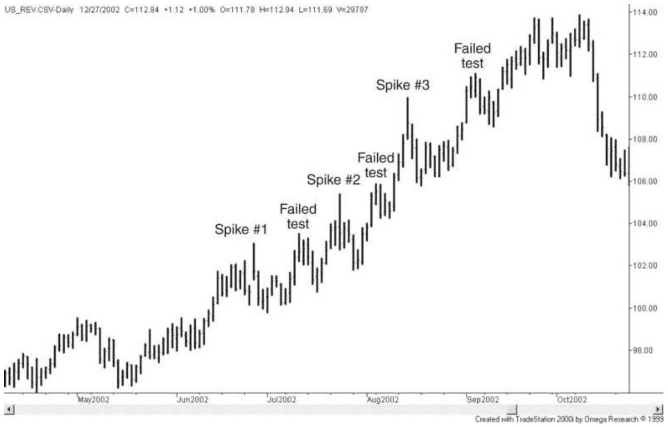
FIGURE 3.14 A series of spikes in bonds. From June through October 2002, U.S. bonds show three spikes that represent local tops. The spikes represent clear resistance levels that cause a unique pattern in the upward move.
An upward spike, as shown in Figure 3.14, is always a local top because a spike is a day with above-average volatility and must be bracketed by two lower days. This can also be called a pivot point. In all three cases shown, the spike represented the high price for at least one week. Because the spike is a clear top, when prices begin to rise again they usually meet resistance at the top of the spike. Chartists draw a horizontal resistance line using the high price of the spike, which encourages selling at that level. After each spike the chart is marked with "failed test," showing the price level where resistance, based on the previous spike, slowed the
advance.
\section*{Quantifying Spikes}
A spike has only one dominant feature: a high or low much higher or lower than recent prices. It must therefore also have high volatility. The easiest way to identify an upside spike is to compare the trading range on the day of the spike to previous ranges and to the subsequent day. This can be programmed in
TradeStation by using the true range function and satisfying the conditions that the high on the day of the spike, high[1], is greater than the previous and subsequent highs by the amount of \(k \times\) average true range over \(n\) days.
\[
\begin{aligned}
& \text { Spike = high[1]-highest(high, } n \text { ) } \\
& \left.[2]>k^{*} \text { average(truerange, } n\right)[2] \text { and } \\
& \quad \text { high[1]-high>k*average(truerange, } n)[2]
\end{aligned}
\]
In this code, spike is a logical variable (true-false), and we are testing if the spike occurred yesterday. The notation [1] indicates yesterday and [2] two days ago. We test to see that the high of yesterday is greater than the high of the previous \(n\) days, greater than the average true range of the same \(n\) days by a factor of \(k\), and also greater than the high of today by the same factor \(k\). Note that the use of [2] ends the true range calculation on the day before the spike. The value of \(k\) should be greater than 0.75. Spikes satisfying \(k>1\) are more desirable but less frequent.
In Excel, the true range is:
\[
\mathrm{TR}_{n}=\operatorname{Max}\left(\mathrm{H}_{n}-\mathrm{L}_{n}, \mathrm{H}_{n}-\mathrm{C}_{n-1}, \mathrm{C}_{n-1}-\mathrm{L}_{n}\right)
\]
where \(n\) is the current row, \(n-1\) is the previous row, and the high, low, and close ( \(H, L\), can \(C\) ) are in columns B, C , and D .
\section*{Island Reversals}
An island reversal or an island top is a single price bar, or group of bars, sitting at the top of a price move and isolated by a gap before and after the island formation. Combined with high volatility, this formation has the reputation of being a major turning point. The gap on the right side of the island top is an exhaustion gap. In Figure 3.15, showing AMR during the first part of 2003, there is one island reversal in mid-April. This single, volatile day has a low that is higher than both the previous day and the following day. It remains the high for the next week but eventually gives way to another volatile price rise. Island bottoms also occur, but are less frequent.
\section*{Pivot Point Reversals and Swings}
A pivot point is a trading day, or price bar, that is higher or lower than the bars that come before and after. If the entire bar is above the previous day and the following day, the pivot point reversal is the same as the island reversal. If it is a very volatile upward day but the low price is not above the high of the surrounding bars, then it is a spike. If you were plotting swing highs and lows, the high of an upward pivot point reversal day would become the swing high. It is common to locate a swing high by comparing the high of any day with two or more
days before and after. The patterns of the days on either side of the high bar are not important as long as the middle bar has the highest high. When more days are used to identify pivot points, these reversals become more significant; however, they take longer to identify.
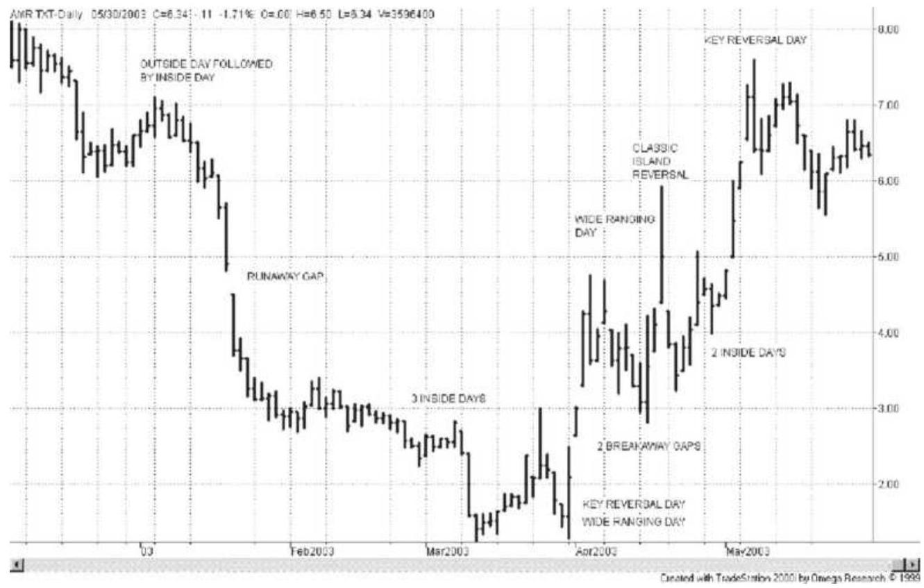
FIGURE 3.15 AMR in early 2003, showing a classic island reversal with examples of other 1-day patterns.
Colby \({ }^{11}\) tested a Pivot Point Reverse Trading System, using the following rules:
- Buy (and close out short positions) when a pivot point bottom occurs and the close is higher than the previous close.
- Sell (and close out long positions) when a pivot point top occurs and the close is lower than the previous close.
Applying these reversal rules to the Dow Jones Industrials (DJIA) for 101 years ending December 2000 showed nearly 7,000 trades ( 70 per year) with significant profits. Other tests of pivot points can be found in Chapter 4.
\section*{Cups and Caps}
Another name given to the pivot point reversals are cups and caps, each determined by only three price bars, although another formation with the same name, cup with handle, is similar to a longer-term rounded bottom followed by a sideways or slight downward trend and a breakout to the upside. These two short-term formations are associated with trading rules that are identical to pivot point channels applied to the shortest time frame. Although some literature uses these formations backward, a cap formation identifies a sell signal when the trend is up, while a cup is a setup for a buy signal in a downtrend.
Once an uptrend is clear, a cap formation is found using either the daily closes or daily lows. For any three consecutive days, the middle day must have the highest close or the highest low. In a cup pattern, the middle day must have the lowest low or the lowest close of the 3-day cluster. In both cases, the positioning of the highs and lows of the other two days are not important as long as the middle day is lower for the cup and higher for the cap.
The cup will generate a buy signal if:
- The cup formation is the lowest point of the
\section*{downtrend;}
■ The buy signal (an upward breakout) occurs within three days of the cup formation; and
The current price closes above the highest high (middle bar) of the cup formation.
The buy signal is false if prices reverse and close below the low of the cup formation, resuming the previous downtrend. This pattern is only expected to forecast an upward price move of two days; however, every change of direction must start somewhere and this formation could offer an edge. A cap formation is traded with the opposite rules.
\section*{Reversal Days and Key Reversal Days}
A day in which there is a new high followed by a lower close is a downward reversal day. An upward reversal day is a new low followed by a higher close. A reversal day is a common formation, as seen in Figure 3.16, the Russell 2000 futures. Some of these days are identified; however, you can find other examples in Figures 3.13 through 3.16 . There have been many studies to determine the importance of reversal days for trading, but these are inconclusive. In Chapter 15 there is a detailed study of reversal days, indicating the likelihood of a subsequent price move based on this reversal pattern and other combinations. A reversal day by itself is not significant unless it can be put into context with a larger price pattern, such as a clear trend with sharply increasing volatility, or a reversal that occurs at the highest or lowest price of the past few weeks.
\section*{Key Reversals}
A key reversal day is a more selective pattern and has been endowed with great forecasting power. It is also called an outside reversal day and is a weaker form of an island reversal. A bearish key reversal is formed in one day by first making a new high in an upward trend, reversing to make a low that is lower than the previous low, and then closing below the previous close. It should be associated with higher volatility. Examples of key reversal days can be seen in Figures 3.14 and 3.15. It is considered more reliable when the trend is wellestablished.
As with reversal days, studies have shown mixed results using the key reversal as a sole trading indicator. The

that the performance was "strikingly unimpressive." Even though tests have not proved its importance, traders still pay close attention to key reversals, and consider them important. The job of a system developer is to find the environment in which this pattern becomes reliable. A comprehensive study of reversal days and other patterns can be found in Chapter 15.
Figure 3.16 shows a number of reversal days during the rapid drop of the Russell in January 2002. Three patterns of particular interest are the reversal days at the two extreme lows in July and October 2002, and the high in between, during August. Although there are many other reversal days embedded within other parts of the price move, the reversals off the lows are clearly at higher volatility than most other days, and follow very
sharp, accelerating price drops. The reversal day that ends the intermediate high during August does not share these attributes; however, it tops a pattern that is not the dominant trend, but an upward reaction within a previous sustained downtrend. If we focus on the characteristics of those reversal days that mark price extremes, rather than all reversal days, we should expect successful results.
\section*{Programming Key Reversal Days}
A key reversal day can be easily tested. In TradeStation's EasyLanguage the instructions for downward key reversal are:
KeyReversalDown = close[1] > average(close[2],n) and high >= highest(high[1],n) and low < low[1] and close < close[1];
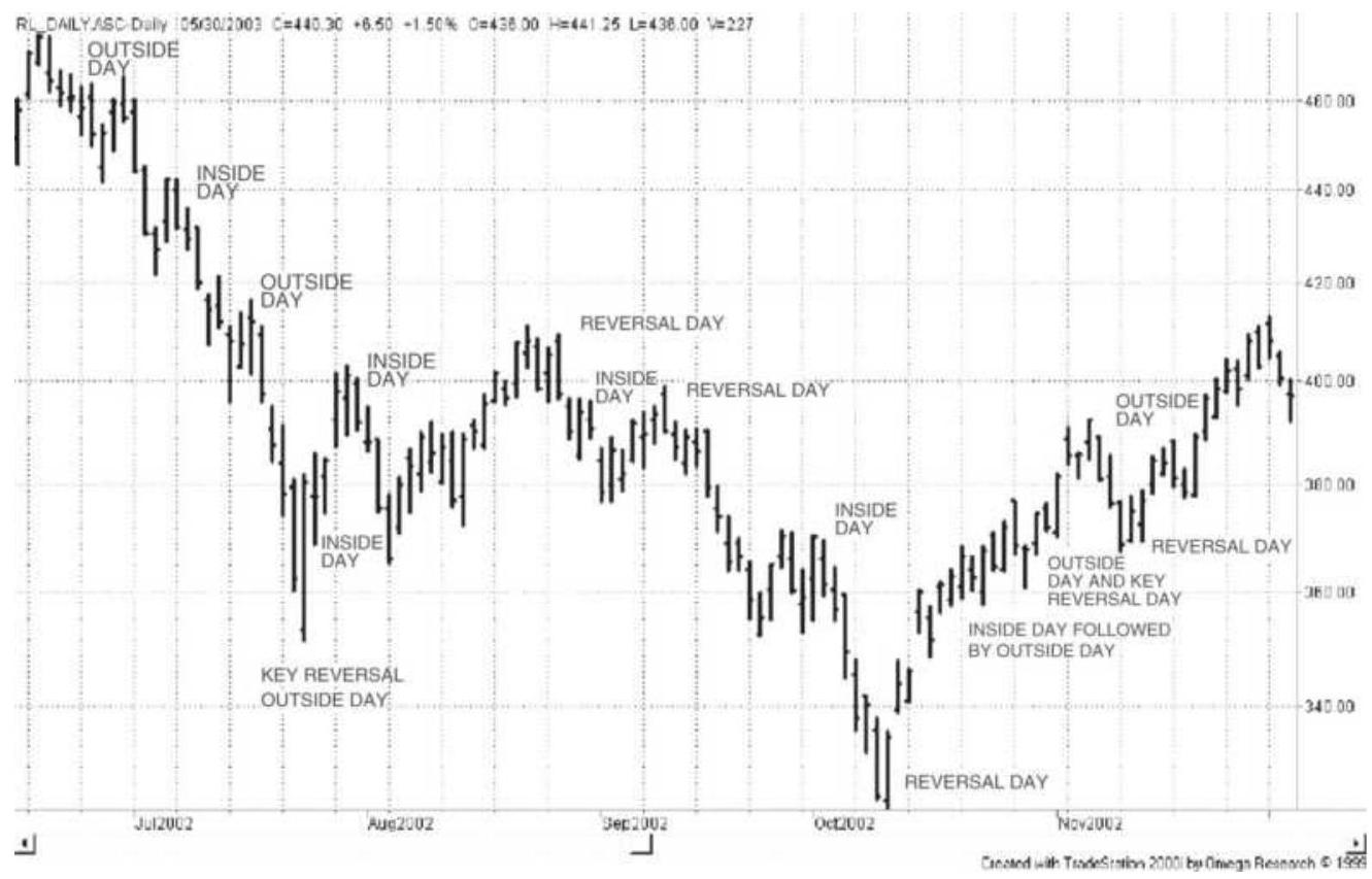
FIGURE 3.16 Russell 2000 during the last half of 2002 showing reversal days, key reversal days, inside days, and outside day.

where KeyReversalDown is true or false and the first term tests for an uptrend over \(n\)-days prior to the reversal day, the second term tests that the current day is the highest price of the same \(n\)-days, the third term verifies that a lower low has occurred, and the last term tests for a lower close. This can be done in Excel by using the max and min functions instead of highest and lowest. A TradeStation function to identify key reversals is TSM Key Reversals and can be found on the
Companion Website along with an Excel spreadsheet of the same name.
Adding a volatility factor so that the key reversal day has noticeably higher volatility than the previous days seems to select more significant patterns. In the spreadsheet, which uses heating oil from 2005 through 2011, the basic rules gave marginal gains, but a filter that took only trades where today's true range was greater than \(1.5 \times\) average2o-day true range was much better.
\section*{2-Bar Reversal Patterns}
Martin Pring \({ }^{13}\) has called attention to a special 2-bar reversal pattern that frequently precedes a strong directional change. This pattern consists of two days that are essentially the mirror image of one another. Consider a market in which prices have been moving steadily higher. The first day of the pattern shows a volatile
upward move, with prices opening near the lows and closing near the highs. On the following day, prices open where they had closed, trade slightly higher (nearly matching the previous day's highs), then fall sharply to close near the lows, giving back all of the previous day's move.
Following the 2-bar reversal to the downside, the next few days should not trade above the midpoint of the 2bar reversal pattern. The smaller the retracement, the more likely there will be a good sell-off.
It is easy to explain the psychology of this pattern. The first bar represents the strong bullish feeling of the buyers while the second bar is seen as complete discouragement at the inability to follow through to make new highs. It will take some days before traders are willing to test the highs again. More traders may view this as a potential reversal. High volume can confirm the reversal. The nature of the move to follow depends on the extent of the previous trend and the volatility. Four key factors in predicting a strong reversal are:
1. Stronger preceding trend
2. Wider, more volatile 2-bar pattern
3. Greater volume than in previous days
4. Smaller retracements following the 2-bar pattern
\section*{Wide-Ranging Days, Inside Days, and Outside Days}
A wide-ranging day is a day of much higher volatility
than recent days, but no requirement that it is higher or lower than other days. An outside day must have both a higher high and lower low than the previous day. Inside days having lower highs and higher lows than the previous day are an example of volatility compression. All three patterns are very common but indicate that something special has happened. Examples of these patterns are shown in Figure 3.17, a 1-year, active trading period for Tyco ending in July 2000, before any accounting scandal surfaced.
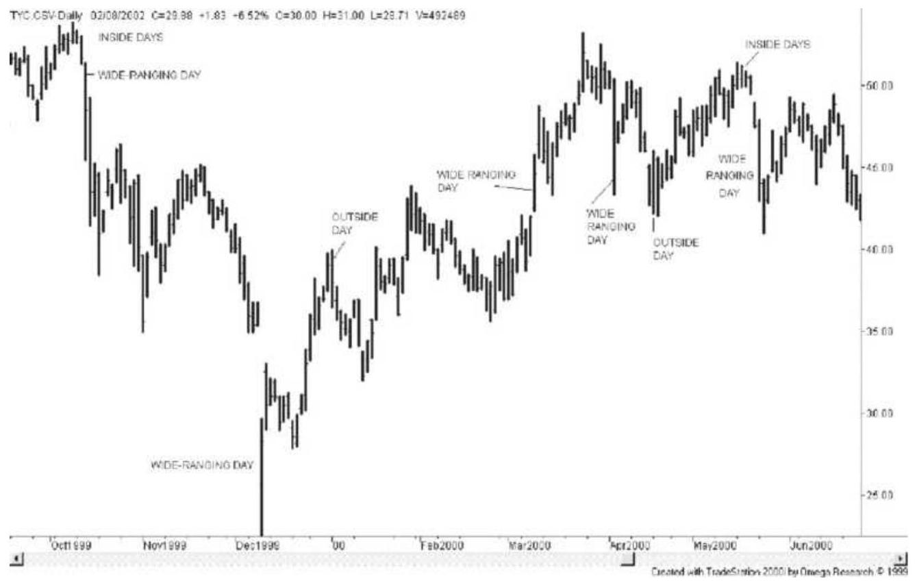
FIGURE 3.17 Wide-ranging days, outside days, and inside days for Tyco.
\section*{Wide-Ranging Days}
A wide-ranging day is likely to be the result of a price shock, unexpected news, or a breakout in which many
orders trigger one another, causing a large increase in volatility. A wide-ranging day could turn out to be a spike or an island reversal. Because very high volatility cannot be sustained, we can expect that a wide-ranging day will be followed by a reversal, or at least a pause. When a wide-ranging day occurs, the direction of the close (if the close is near the high or low) is a strong indication of the continued direction.
A wide-ranging day is easily seen on a chart because it has at least twice or three times the volatility of the previous trading days. There is no requirement that it makes a new high or low relative to a recent move, or that it closes higher or lower. It is simply a very volatile day.
\section*{Outside Days}
An outside day often precedes a reversal. An outside day can also be a wide-ranging day if the volatility is high, but when volatility is low and the size of the bar is slightly longer than the previous bar, it is a weak signal. As with so many other chart patterns, if one day has an unusually small trading range, followed by an outside day of normal volatility, there is very little information in the pattern. Selection is important.
\section*{Inside Days}
An inside day is one where the high is lower than the previous high and the low is higher than the previous low. An inside day represents consolidation and lower volatility. In turn, lower volatility is most often associated with the end of a price move. After a burst of
activity and a surge of upward direction, prices have reached a point where the buyers are already in and the price has moved too far to attract more buyers. Volume drops, volatility drops, and we get an inside day. An inside day is often followed by a change of direction, but we really only know that the event that drove prices up is now over. If more news surfaces to ignite prices, the next move could just as easily be up as down.
In Figure 3.17 there are two inside days at the price peak on the top left of the Tyco chart. The first inside day is followed by a small move lower, then a small move higher, followed by another inside day. This last inside day precedes a major sell-off. On the right top of the chart there are two inside days immediately before another sharp drop.
Some analysts believe that a breakout from low volatility is more reliable than one following high volatility. For those readers interested in these patterns, a quantitative study of wide-ranging, inside days, and outside days can be found in Chapter 4.
\section*{CONTINUATION PATTERNS}
Continuation patterns occur during a trend and help to explain the stage of development of that trend. \(A\) continuation pattern that occurs within a long-term trend is expected to be resolved by continuing in the direction of the trend. If prices fail to move in the direction of the trend following a major continuation pattern, then the trend is considered over. The primary continuation patterns are triangles, flags, pennants, and
wedges. The larger formations of these patterns are more important than the smaller ones.
\section*{Symmetric, Descending, and Ascending Triangles}
Triangles tend to be larger formations that occur throughout a trend. A symmetric triangle is most likely to occur at the beginning of a trend when there is greater uncertainty about direction. A symmetric triangle is formed by a price consolidation, where uncertainty of buyers and sellers results in decreasing volatility in such a way that prices narrow to the center of the previous trading range. In Figure 3.18 the symmetric triangle is formed at about the level of the previous support. The breakout from a symmetric triangle often marks the beginning of a longer-term trend.
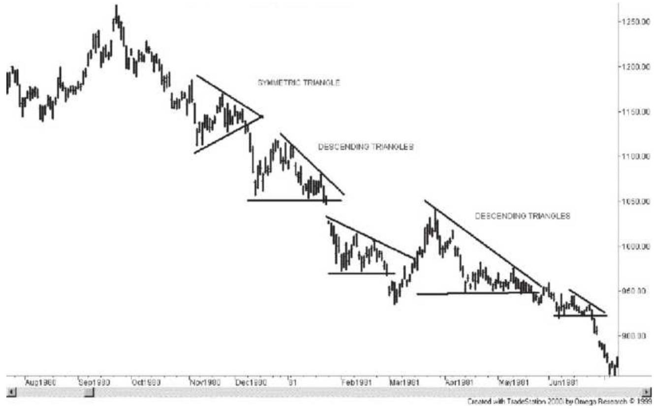
FIGURE 3.18 Symmetric and descending triangles and a developing bear market in gold futures.
\section*{Formation of a Descending Triangle}
Even during a clear downward trend, prices will rally. Because the trend is clear, sellers are anxious to step in and sell these upward moves, looking for the trend to continue. The top of this mid-trend rally is likely to be the last support point where prices broke out of a previous pattern. In Figure 3.18 the top of the first descending triangle comes very close to the breakout level of the symmetric triangle, and the larger descending triangle toward the lower right of the chart has its high point at the breakout of another descending triangle.
The recent lows of the new trend form a temporary support level and prices may bounce off that level while short-term traders play for small profits. This action forms a descending triangle. As more traders are convinced that prices are still heading lower, rallies off the support level are sold sooner, causing a narrowing pattern, until prices finally break below support. The descending triangle is complete. In an upward trend an ascending triangle would be formed.
\section*{Size of the Triangles}
A triangle should take no less than two weeks to form; however, they can span a much longer period, occasionally up to three months. Larger formations represent periods of greater uncertainty. They may be
followed by another symmetric triangle, again indicating that traders are undecided about direction. If the symmetric triangle is resolved in the current trend direction, the trend is in full force, and a large price move is expected.
Triangles can be consistent indicators of investor confidence. Because they reflect human behavior, they are not always perfect in appearance and not always consistent in pattern. Experience will help identify the formation in a timely manner.
\section*{Flags}
A flag is a smaller pattern than a triangle, generally less than two weeks, and is formed by a correction in a bull market or a rally in a bear market. A flag is a congestion area that leans away from the direction of the trend and typically can be isolated by drawing parallel lines across the top and bottom of the formation. At the beginning of a trend the flags may not lean away from the direction of the new trend as clearly as during a well-established trend. If the first flag after an upward breakout leans down, it confirms the new upward trend.
Figure 3.19 shows an assortment of triangles, flags, and pennants. There are two small flags, one in the middle of the chart and one in the lower right, each leaning upward as expected in a downtrend. A larger flag slightly below center lasting nearly two months could also have been a symmetric triangle. Both patterns are resolved by a continuation of the trend.
\section*{Pennants}
Pennants are irregular triangles normally leaning toward the trend, similar to a descending triangle in a downtrend but without a horizontal support line. A typical pennant can be seen in the middle of Figure 3.19. During a sustained trend, triangles are large, clear formations with horizontal support or resistance lines while pennants are consolidation formations requiring only that the lines converge. A larger pennant should lean in the direction of the trend in a manner similar to a descending triangle; however, a small pennant may serve the same purpose as a flag and lean away from the trend.
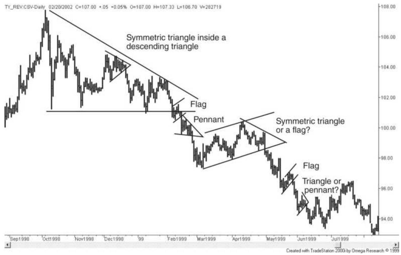
FIGURE 3.19 An assortment of continuation patterns. These patterns are all resolved by prices moving lower. A downward pennant can be found in the middle of the chart.
\section*{Wedges}
A pattern that looks as if it is a large pennant, with both sides angling in the same direction but not coming to a point, is a wedge. In an upward-trending market the wedge should be rising as shown on the right side of the General Electric chart, Figure 3.20, near the end of 1999. The earlier wedge has nearly a horizontal upper line, bridging the pattern between a wedge and a rising triangle. A rising wedge is formed in the same way as an ascending triangle. Investors, convinced that the share price will rise, will buy smaller and smaller reversals even as prices make new highs. In the end, prices continue in the direction of the trend. In a typical rising wedge, the lower line has a steeper angle than the upper line.
The angle of the wedge should be steeper as the trend becomes clear. The earlier wedge formation shown in Figure 3.20 is nearly symmetric. If we study the bigger picture, we can see that the uncertainty at the beginning of the trend is reflected in the symmetric formation while the rising wedge occurs after the trend is well established and investors anticipate a continuation.
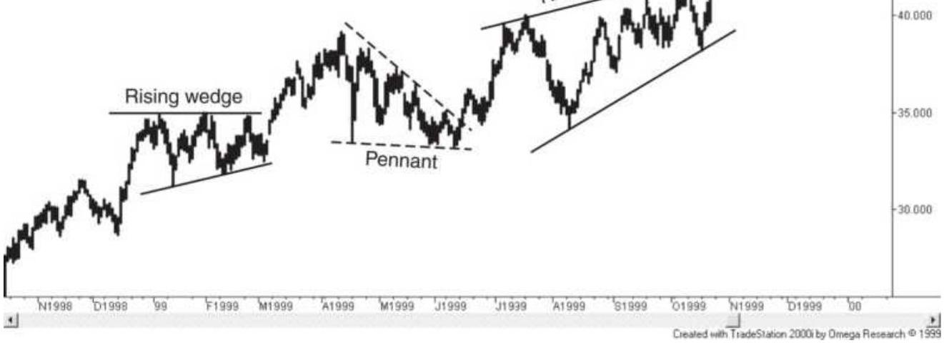
FIGURE 3.20 Wedge. A weaker wedge formation is followed by a strong rising wedge near the end of 1999 in this chart of General Electric.
\section*{Run Days}
Triangles, flags, pennants, and wedges represent the best of the continuation patterns. They can be identified clearly while they are still being formed and the direction of the breakout can be anticipated and traded. Other formations, such as run days, are not as timely. A run day occurs when the low of that day is higher than the previous \(n\) days, and the high of the day is lower than the subsequent \(n\) highs. When it occurs, this pattern confirms that a trend is in effect. The more days used to define the run day, the stronger the pattern. Therefore, a 5 -day run day requires 11 days to identify, 5 before the run day and 5 after. Unlike the other continuation
patterns, which have a breakout level that can be used as a trading signal, entering a long position after 11 days of a strong upward move is not likely to be a good entry point. There are no trading rules or trading action associated with run days. They simply confirm what you have already seen on charts - that prices have been trending.
\section*{BASIC CONCEPTS IN CHART TRADING}
Having covered the fundamental chart patterns, there are some additional concepts that should be discussed in order to keep the proper perspective. Charting involves a great deal of subjective pattern identification; therefore, there may be a choice of patterns within the same time interval. There are also many cases where prices nearly form a pattern, but the shape does not fit perfectly into the classic definition.
\section*{Major and Minor Formations}
In the study of charting, the same patterns will appear in short- as well as long-term charts. An upward trendline can be drawn across the bottom of a price move that only began last week, or it can identify a sustained 3-year trend in the financial markets, or a 6-month move in Amazon. In general, formations that occur over longer time intervals are more significant. All-time highs and lows, well-defined trading ranges, trendlines based on weekly charts, and head-and-shoulder formations are carefully watched by traders. Obscure patterns and new formations are not of interest to most chartists, and
cannot be resolved consistently. Charting is most successful when formations are easy to see; therefore, the most obvious buy and sell points are likely to attract a large number of orders.
\section*{Market Noise}
All markets have a normal level of price noise. The stock index markets have the greatest amount of irregular movement due their extensive participation, the high level of anticipation built into the prices, the uncertain way in which economic reports and news will impact prices, and because it is an index. This is contrasted to short-term interest rates, such as Eurodollars, which have large participation but little anticipation because it has strong ties to the underlying cash market, governed by the central bank. The normal level of noise can be seen in the consistency of the daily or weekly trading range on a chart of the Dow or S\&P. When volatility declines below the normal level of noise, the market is experiencing short-term inactivity. An increase in volatility back to normal levels of noise should not be confused with a breakout.
This same situation can be applied to a triangular formation, which has traditionally been interpreted as a consolidation, or a pause, within a trend. This pattern often follows a fast price change and represents a short period of declining volatility. If volatility declines in a consistent fashion, it appears as a triangle; however, if the point of the triangle is smaller than the normal level of market noise, then a breakout from this point is likely to restore price movement to a range typical of noise,
resulting in a flag or pennant formation. Both of these latter patterns have uniform height that can include a normal level of noise, but they would not be reliable buy or sell signals.
\section*{ACCUMULATION AND DISTRIBUTION: BOTTOMS AND TOPS}
Most of the effort in charting, and the largest payout in trading, goes into the identification of tops and bottoms. For long-term traders, those trying to take advantage of major bull and bear markets, these formations can unfold over fairly long periods. These prolonged phases, which represent the cyclic movement in the economy, are called accumulation when prices are low and investors slowly buy into their position, and distribution at the top, where the invested positions are sold off.
The same formations can occur over shorter periods and are very popular among all traders; however, they are not as reliable. There are many top and bottom formations that are easily recognized. In order of increasing complexity, they are the \(V\)-top or \(V\)-bottom, the double or triple top or bottom, the common rounded top or bottom, the broadening top or bottom, the headand-shoulders formation, and the complex top or bottom.
\section*{\(\boldsymbol{V}\)-Tops and \(\boldsymbol{V}\)-Bottoms}
The \(V\)-top (actually an inverted "V"), which may also have a spike on the final day, is the easiest pattern to see
afterward, but a difficult top formation to anticipate and trade. There have been times, such as in 1974, 1980, and 2000, when the frequency of \(V\)-tops was deceiving. \(V\) tops are often preceded by critical shortage or extreme demand and magnified by constant news coverage. In 1974, it was a combination of domestic crop failure, severe pressure on the U.S. dollar abroad, and foreign purchases of U.S. grain that combined to draw public attention to a potential shortage in wheat. The news was so well publicized that novice commodity traders withdrew their funds from their declining stock portfolios and bought any commodity available as a hedge against inflation.
It could not continue for long. When the top came in soybeans, silver, and most other commodities, there was no trading for days in locked-limit markets; paper profits dwindled faster than they were made, and the latecomers found their investments unrecoverable. The news is not a good source for timing your trade. The most dramatic of all price moves was the technology bubble of the 1990s, ending with a peak in the NASDAQ index during March 2000. As you can see in Figure 3.21, prices accelerated near the end of the bull market, then collapsed just as quickly.
Since then, there have been runs in many commodities. The seasonal nature of cotton has shown price spikes every few years, but nothing as extreme as the \(V\)-top in 2011 (see Figure 3.22). Flooding in both Pakistan and Egypt greatly reduced the cotton supply in 2011, causing prices to soar, then decline just as fast. Shortages in agricultural products are usually resolved by the
following year if the new crop looks good, or by substitution. Consumers can switch from cotton to synthetics.
Cotton also shows a consistent resistance level at about \(\$ 0.80\) per pound. It can be seen in the 12 years prior to the 2011 spike, with prices reverting to the same pattern afterward.
In some way, every \(V\)-top shares a similarity with the examples in Mackay's Extraordinary Popular Delusions and the Madness of Crowds. It is where a large number of people chase a smaller supply. However, when prices get high enough, four phenomena occur:
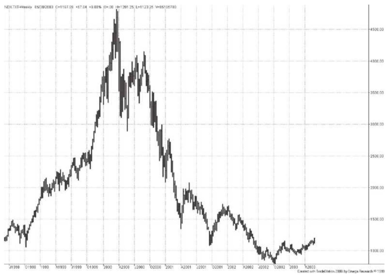
FIGURE 3.21 A \(V\)-top in the NASDAQ index, March 2000.
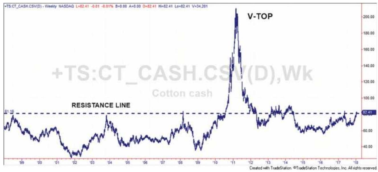
FIGURE 3.22 Cotton has frequent \(V\)-tops but nothing as extreme as in 2011.
1. Previously higher-priced substitutes become practical (synthetics for cotton, reclaimed silver, solar power).
2. Competition becomes more feasible (corn sweetener as a sugar substitute, wind generation and solar energy, biofuel and electric cars).
3. Inactive operations start up (Southwest goldmines, marginal production of oil and shale).
4. Consumers avoid the products (beef, bacon, silver, cotton) and drive less.
Consequently, the demand suddenly disappears. Announcements of additional production, more acreage, new products, boycotts, and a cancellation of orders all coming at once cause highly inflated prices to reverse sharply. These factors form a \(V\)-top that can't be anticipated with any accuracy. There is a natural reluctance to cash in on profits from long positions while
they are increasing every day. The situation becomes even more perilous at the end of the move when more investors join the party. These latecomers, who entered their most recent positions near the top, will show a loss immediately and will need to get out of the trade first; they cannot afford a continued drawdown.
Once a reversal day is recognized, there is a mad rush to liquidate. The large number of investors and speculators trying to exit at the same time causes the sharpness in the \(V\)-top and extends the drop in prices. There is a liquidity void at many points during the decline where there are no buyers and a long line of sellers. A \(V\)-top or \(V\)-bottom is always accompanied by high volatility and usually high volume. When the \(V\)-top is particularly extreme it is commonly called a blow-off. A true \(V\)-top or \(V\)-bottom will become an important medium- or longterm high or low for that market.
\section*{\(V\)-Bottoms}
\(V\)-bottoms are much less common than their upside counterparts. They occur more often in commodity markets where supply and demand can change dramatically and leverage causes surges of buying and selling. Both \(V\)-tops and \(V\)-bottoms should be read as a sign that prices have gone too far, too fast. Both buyers and sellers need time to reevaluate the fundamentals to decide where prices should be. \(V\)-bottoms are usually followed by a rebound and then a period of sideways movement. Two good examples can be found in the crude oil chart, Figure 3.23, and in the stock market crash of October 1987
\section*{Double and Triple Tops and Bottoms}
The experienced trader is most successful when prices are testing a major support or resistance level, especially an all-time high in a stock, or a seasonal high or low in an agricultural market. The more often those levels are tested, the clearer they become and the less likely prices will break through to a new level without additional fuel. This fuel comes in the form of higher earnings or a change in the fundamental supply-and-demand factors.
A double top is a price peak followed, a few days or weeks later, by another peak, and stopping very close to the same level. A double bottom, more common than a double top, occurs when two price valleys show lows at nearly the same level. Because prices are more likely to settle for a while at a lower price than a high one, prices often test a previous support level, causing a double bottom.
Tops and bottoms occur at the same level because traders will bet that the same reason that caused prices to fail to go higher the first time will be the reason they fail the second time. The exceptionally high or low prices are the result of extreme speculation rather than fundamentals. In the same way that some stocks will trade at price/earnings ratios far above any rational assessment of business prospects in the near future, commodity prices can be pushed to extremes by crowd psychology without regard to value. Traders, looking for a place to sell an unreasonably high price, target the previous point where prices failed. Although a classic double top is thought to peak at exactly the same price,
selling in anticipation of the test of the top may cause the second peak to be lower than the first. Figure 3.24 shows one type of double top in crude oil. While some double tops are two sharp peaks, this one looks as though it was gathering strength. It penetrated slightly above the previous high, but could not sustain higher prices.
Double tops are rarely perfect.
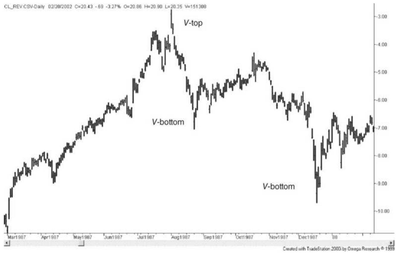
FIGURE 3.23 Two \(V\)-bottoms in crude oil, backadjusted futures.
\section*{Double and Triple Bottoms}
Bottoms are more orderly than tops, but can still be irregular. They should be quiet rather than volatile. They are caused by prices reaching a level that is low enough for the normal investor to recognize that there is little additional downside potential. Economists might call
this the point of equilibrium. Neither buyers nor sellers are convinced that prices will continue to move lower. They wait for further news.
Double bottoms in commodities will often test the same price level because large position traders and commercial users accumulate more physical inventory, or increase their futures position, each time the price falls to their target level. Once prices are low there is less chance of absolute loss. Selling a double top can be very risky. The greatest risk when buying a double bottom is that your timing is wrong. If prices do not rally soon, you have used your capital poorly.
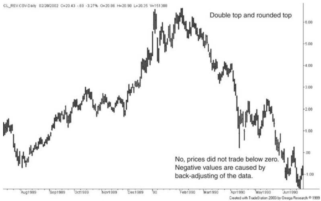
FIGURE 3.24 A double top in crude oil.
Bank of America (BAC) shows a classic triple bottom (Figure 3.25), with the third test slightly higher than the previous two, a situation that happens when traders
expect the bottom to hold and start buying in advance. The same chart has a test of the top and a breakout of an extended bottom formation.
Goldman Sachs (GS) shows a less regular triple bottom at the lowest prices (Figure 3.26), and two double bottoms at higher levels. On the second test of the lows in 2003, volatility declines. The third test is a spike down. The chart also shows a volatile double top in 2007 just ahead of the financial crisis.
Traders will start to buy a double bottom when prices slow near previous low levels, as happened in 2003. They will also look for declining volume or confirmation in the stock price of another related company or a related sector ETF. Traders chose the small double top at the end of 2002 to signal a breakout.
\section*{Bank of America (BAC)}
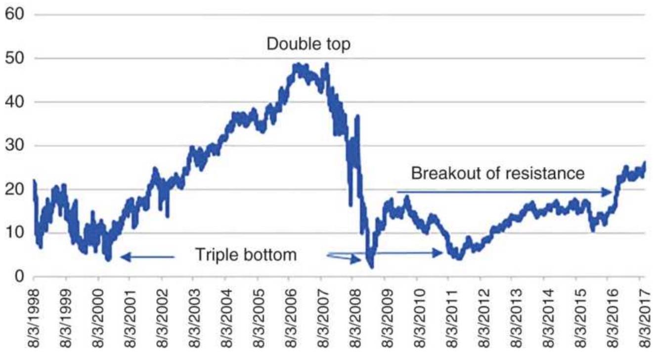
FIGURE 3.25 Triple bottom in Bank of America (BAC).
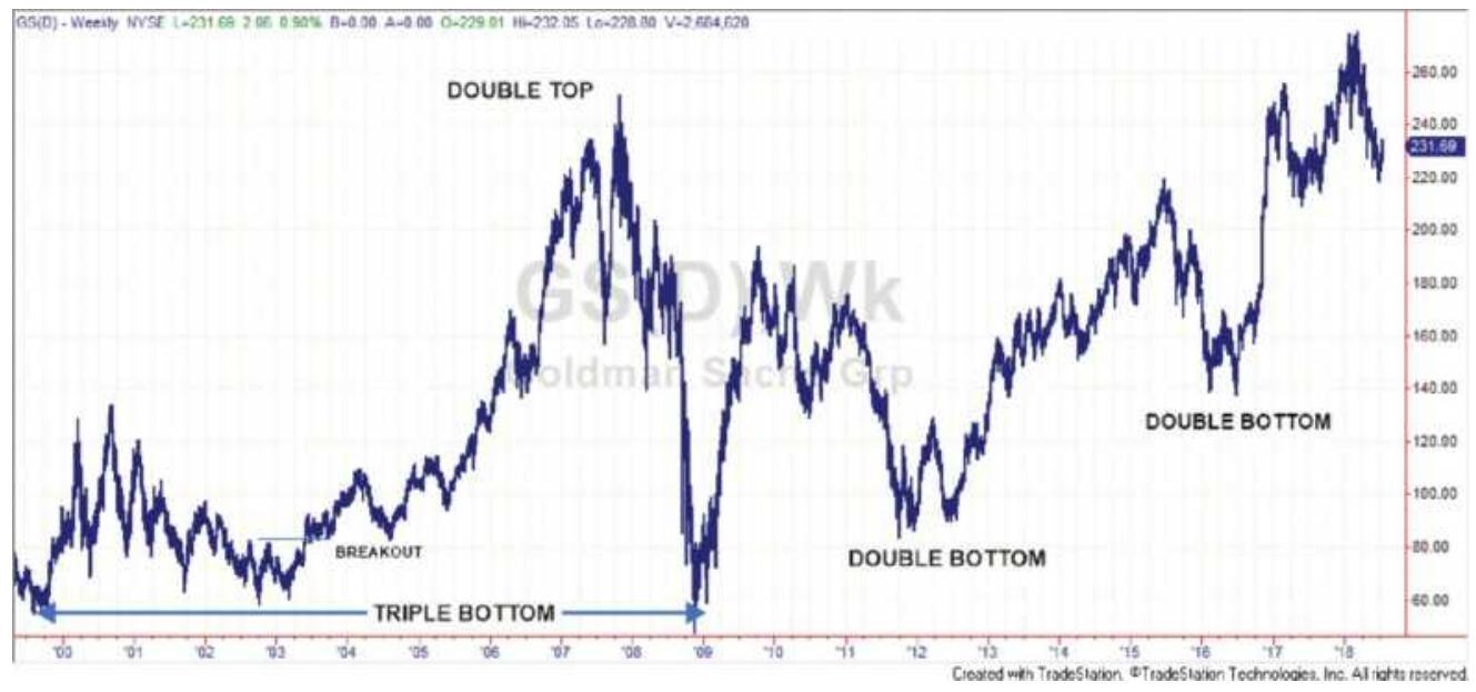
FIGURE 3.26 A triple bottom and two double bottoms in Goldman-Sachs (GS).
\section*{Triple Tops and Bottoms}
Triple tops are considerably less common than double tops; however multiple bottoms can be found more readily, as in Figure 3.26. Figure 3.27 shows a classic triple top in natural gas. A triple top can be formed from a \(V\)-top, but in this case, the first peak is an island reversal, the second is a spike, and the third an extended top that ends the move.
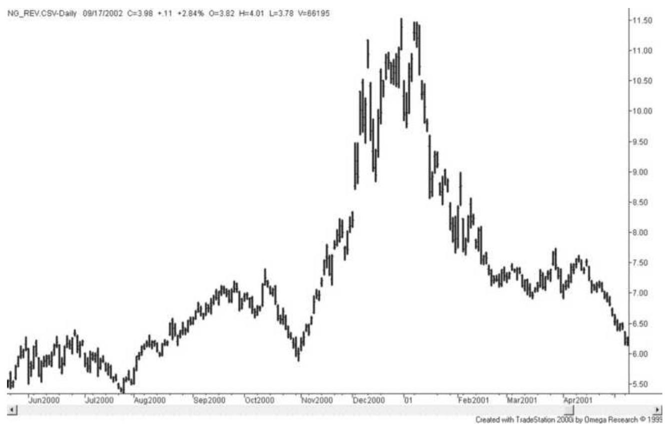
FIGURE 3.27 Natural gas shows a classic triple top.
If we did not have the advantage of seeing the triple top afterward, each of the individual tops would look as if it were the end of the move. After the first island reversal prices dropped \(\$ 2\), nearly \(20 \%\); after the second peak there was another large gap down and a 1-day loss of more than \(\$ 1\). High volatility is normally associated with an extreme top. By waiting for a confirmation of a decline after the single or double top, the trade would have been entered \(\$ 1.50\) to \(\$ 2.50\) below the top, and that position would be held while prices reversed to test the highs. Selling tops is risky business. In this case, persistence payed off.
A triple bottom that offers a trading opportunity is most likely to occur at low prices and low volatility, much the same as a double bottom. It shows an inability to go
lower because investors are willing to build a position at a good value. For commodities it is a good place for a processor to accumulate inventory.
\section*{The Danger of Trading Double and Triple Tops}
There are many examples of double tops and a smaller number of triple tops. Ideally, there is a lot of money to be made by selling tops at the right place. However, the likelihood of this good fortune happening is less than it appears. Consider why a triple top is so rare. It is
because prices continue higher and the potential triple top disappears into a strong bull market pattern.
This happens even more often with double tops. Every time a price pulls back from new highs, then starts moving up again, there is a potential double top. In a prolonged bull market, most double tops disappear in the move higher. To improve your chance of success, traders add declining volume or volatility, support and resistance, and often a confirmation of a price reversal. It is better to capture less of the move and have a greater chance of success. These confirming indicators are discussed throughout this book. Until then, it is important to recognize the difficulty of deciding whether the current pattern will be a single, double, or triple top, or simply a pause in a bull market.
\section*{Extended Rectangle Bottom}
The extended rectangular bottom presents one of the best opportunities for large profits. In his book The Professional Commodity Trader, Stanley Kroll discussed
"The Copper Caper: How We're Going to Make a Million." He identified an extended rectangular at low prices with low volatility, accumulated a position whenever prices tested the low of the range, then captured huge profits when prices finally broke out to the upside.
However, success involves a great deal of luck. The problems not stated are:
1. How many times do you buy at the lows if you don't know how long it will be before a breakout? How do you allocate your capital?
2. While you may not lose much by buying lows, you can be wasting capital if nothing happens, or miss a better opportunity in another market.
Instead of accumulating a position on lows, the safer choice is to buy the breakout. Typically, a good trade will be confirmed by increased volume on the breakout. Figure 3.28 shows Yahoo (AABA) forming a \(11 / 2\) year bottom in 2001 and 2002 after the dramatic decline in tech stocks. A breakout at about \(\$ 11\) took prices to \(\$ 40\). A longer extended bottom from 2009 through 2012 was also followed by a rally to \(\$ 40\) and eventually higher. Again, buying the breakout would have been a better use of capital.
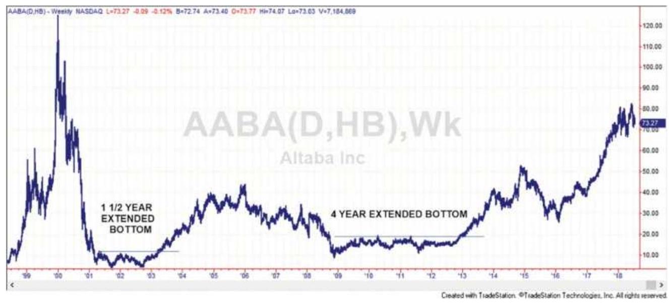
FIGURE 3.28 Two cases of a breakout of an extended bottom in Yahoo (AABA).
The only pattern that allows for the accumulation of a large short position is the rounded top, discussed in the next section. Consolidation areas for commodities at low levels have a number of factors working in your favor that do not exist for equities: the underlying demand for a product, the cost of production, government price support (for agricultural products), and low volatility itself. Opportunities are always there.
\section*{Rounded Tops and Bottoms}
When prices change direction over a longer time period, they can create a rounded top or bottom pattern. A rounded top reflects a gradual change in market forces from buyers to sellers. In the stock market it is also called distribution. It is a sign that any attempt to move prices higher has been abandoned. Rounded tops often lead to faster and faster price drops as more investors liquidate their long positions or initiate shorts.
In Figure 3.29 we see two classic rounded tops in the German DAX futures. The first is an example of gathering downside momentum as more investors become aware of the decline. Prices drop faster after a break of the double bottom. The rounded top offers an opportunity to accumulate a short position with relatively low volatility.
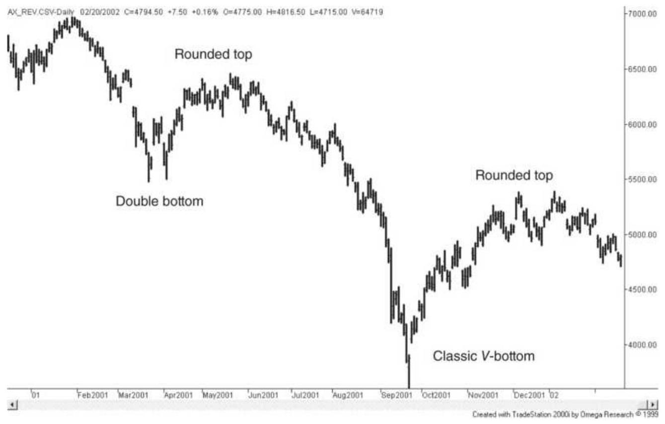
FIGURE 3.29 Two rounded tops in the German DAX stock index.
\section*{Rounded Bottom}
A rounded bottom, similar to a rounded top, is an extended formation where prices gradually turn from down to up. In Figure 3.30 we see a rounded bottom in the Japanese yen followed by a breakaway gap. The rounded bottom offers traders an opportunity to
accumulate a long position without much risk. In this case, the sharp rally as prices move through the high of the rounded bottom, followed by a runaway gap, clearly marks the end of the rounded bottom. A breakout, whether in stocks or futures, indicates that something new has entered the picture.
\section*{Wedge Top and Bottom Patterns}
We have seen a wedge formation as a continuation pattern in Figure 3.20, but a large ascending wedge can mark the top of a move and a large descending wedge the bottom. The dominant characteristic of the wedge is that volatility is declining toward the end, especially in a descending pattern. In Figure 3.31 there is a declining wedge in the Japanese yen. Volatility compresses until a breakout is inevitable. If the breakout had been to the downside, this wedge would have been interpreted as a continuation pattern. In this example, a breakout in the opposite direction is a strong indicator of a major reversal.
\section*{Head-and-Shoulders Formation}
A classic top and bottom formation is the head and shoulders, accepted as a major reversal indicator. This pattern, well known to chartists, appears as a left shoulder, a head, and a right shoulder, as seen in Figure 3.32. The head-and-shoulders top is developed with the following five characteristics:
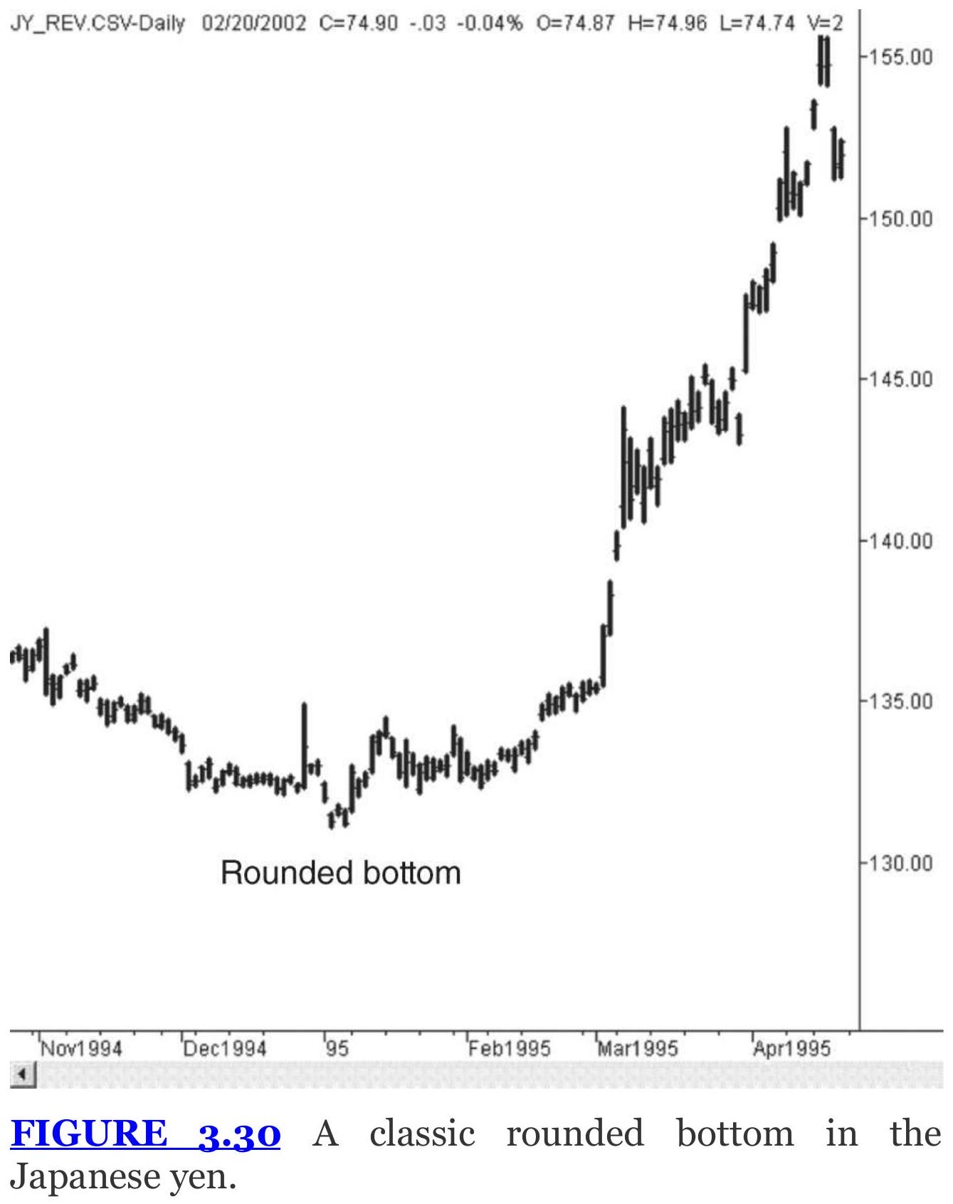
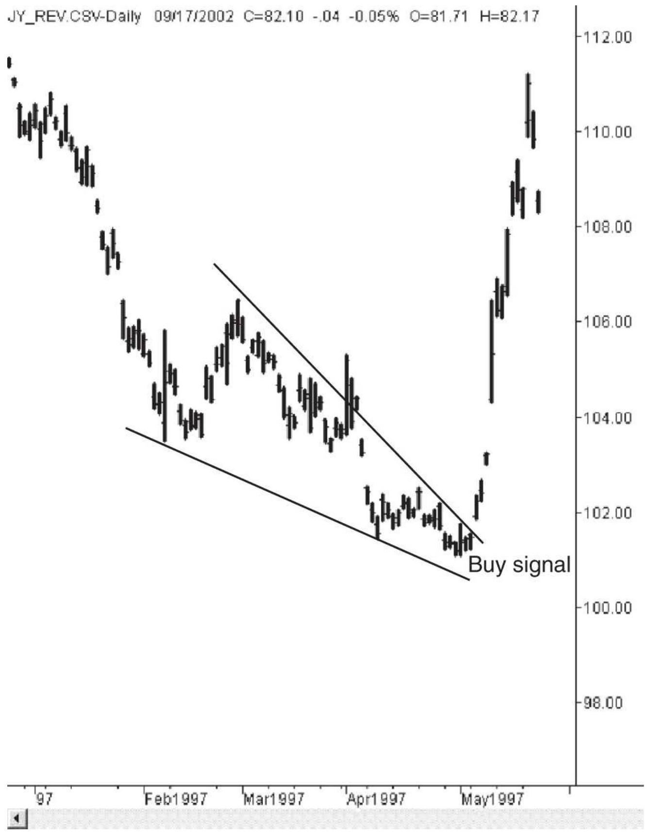
FIGURE 3.31 A large declining wedge followed by a upside breakout in the Japanese yen.
1. A strong upward breakout reaching new highs on increasing volume. The pattern appears to be the continuation of a long-term bull move.
2. A consolidation area formed with declining volume. This can look much like a descending flag predicting an upward breakout, or a descending triangle indicating a downward breakout.
3. Another upward breakout on continued reduced volume forms the head. This is the key point of the formation. The new high is not confirmed by increased volume, and prices drop quickly.
4. Another descending flag or triangle is formed on further reduced volume, followed by a minor breakout without increased volume. This last move forms the right shoulder and is the third attempt at new highs for the move. The right shoulder is often lower than the left shoulder.
5. The lowest points of the two flags, pennants, or triangles become the neckline of the formation. A short sale is indicated when this neckline is broken.
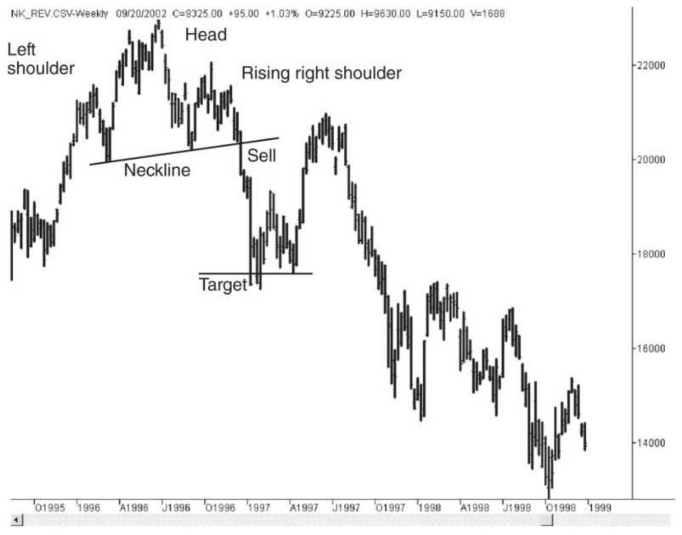
FIGURE 3.32 Head-and-shoulders top pattern in the Japanese Nikkei index.
\section*{Trading Rules for Head and Shoulders}
There are three approaches to trading a head-andshoulders top formation involving increasing degrees of anticipation and risk:
1. Wait for a confirmation.
a. Sell when the final dip of the right shoulder penetrates the neckline. This represents the completion of the head-and-shoulders
formation. Place a stop-loss just above the entry
if the trade is to be held only for a fast profit, or
place the stop-loss above the right shoulder or above the head in order to liquidate on new strength, allowing a longer holding period.
b. Sell on the first rally after the neckline is
broken. This approach can give a better price or completely miss the trade if there is no rally. Use the same stops as in step la.
2. Anticipation of the final shoulder.
a. Sell when the right shoulder is being formed. A likely place would be when prices have retraced their way half the distance to the head. A stoploss can be placed above the top of the head.
b. Wait until the top of the right shoulder is formed and prices appear to be declining. Sell and place a stop either above the high of the right shoulder or above the high of the head. Both steps 2 a and 2 b allow positions to be taken well in advance of the neckline penetration with logical stop-loss points. Using the high of the head for the stop allows the integrity of the pattern to be tested before the position is exited.
3. Early anticipation of the head.
Sell when the right part of the head is forming, on the downward price move, with a stop-loss at about the high of the move. Although this represents a small risk, it has less chance of success and much larger potential profits. This approach is for traders who prefer to anticipate
tops and are willing to suffer frequent small losses to do it. A confirmation of lower volume or price compression would help select better opportunities.
Volume was part of the classic definition of the headand-shoulders formation that appeared in Edwards and Magee's Technical Analysis of Stock Trends, published in 1948. This is no longer considered as important. There are many examples of successful head-and-shoulders formations that do not satisfy the volume criteria. Nevertheless, declining volume on the head or the right shoulder of a top formation must be seen as a strong confirmation of a failing upward move, and is consistent with the normal interpretation of volume.
\section*{EPISODIC PATTERNS}
There is little argument that all prices change quickly in response to unexpected news. The transition from one major level to another is termed an episodic pattern; when these transitions are violent, they are called price shocks. Until the late 1990 os there were very few price shocks in the stock market; the greatest one is terrorist attacks of September 11, 2001. Otherwise, price shocks can be caused by a surprising election result, the unexpected action by the Federal Reserve, the devaluation of a currency (e.g., Switzerland), a natural disaster, or an assassination (or what we now call a geopolitical event). While price shocks are most common in futures markets, all markets are continually adjusting to new price levels and all experience
occasional surprises. Each news article, government economic release, or earnings report can be considered a mini-shock. A common price shock occurs when a pharmaceutical company's application for a new drug is unexpectedly rejected by the USDA.
The pattern that results from episodic movement is exactly what one might expect. Following the sharp price move, volatility declines from its highs, narrowing until a normal volatility level is found, then remaining at that level. In the Raytheon reaction to \(9 / 11\), the upward price shock, shown in Figure 3.33, is followed by a volatile, unstable few days and then a steady decline in volatility as some level of equilibrium is found. The Raytheon price reacted opposite to most other stocks because it is a defense contractor, and a terrorist attack implies an increased amount of business from the government.
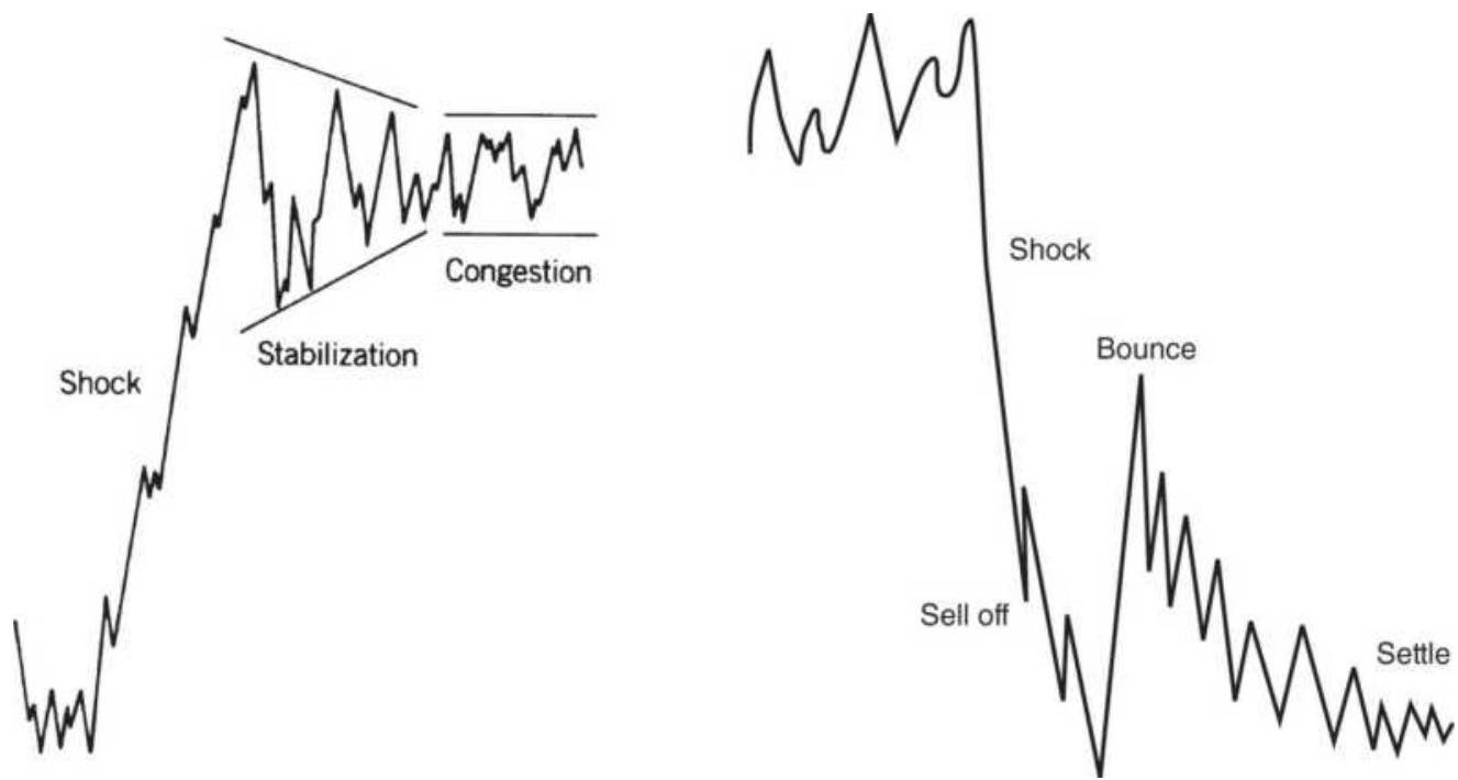
FIGURE 3.33 On the left, an episodic pattern shown in an upward price shock In Raytheon following 9/11/2001.
On the right, a typical downward price shock.
Unless the news that caused the price shock was an error, in which case prices immediately move back to levels prior to the news, prices will settle in a new trading range near the extreme highs or lows. It will take time for the market to absorb the consequences of the news, and many traders will find the risk too high to participate.
Price shocks have become the focus of much analytic work. Because a price shock is an unpredictable event, it cannot be forecast. This has a critical effect on the way in which systems are developed, especially with regard to the testing procedures. We understand at the time of the price shock that the event was entirely unexpected. However, years later, when the same prices are analyzed using a computer program, you might find that a trend or charting pattern benefited from this move. The analysis records the profits as though they were predictable and you are now basing your conclusions on the false premise that you can profit from price shocks. These important issues are covered in other parts of this book under the topics "Price Shocks," "Robustness," and "Optimization," found in Chapters 21 and 22.
\section*{PRICE OBJECTIVES FOR BAR}
\section*{CHARTING}
Most traders set price objectives and stops and use them to assess the risk and reward of a potential trade.
Objectives are most reasonable for short-term trading
and successful objectives are based on straightforward concepts and not complex calculations. There is a noticeable similarity between the price objectives for different chart patterns. Many of these can be easily calculated in a spreadsheet.
For a chartist, the most common price objective is a major support or resistance level. When entering a long position, look at the most well-defined resistance levels above the entry point. These have been discussed in previous sections of this chapter. When those prior levels are tested, there is generally a pause or a reversal. The more well-established the support or resistance level, the more likely prices will stop. In the case of a strong upward move, volatility often causes a small penetration before the setback occurs. A penetration of support or resistance, followed by a return to the previous trading range, is considered a confirmation of the old range and a false breakout. Placing the price objective for a long position below the nearest major resistance level will always be safe. The downside objective can be identified in a similar manner: Find the major support level and exit just above it.
When trading with chart patterns it pays to be flexible. Regardless of which method you use to identify a profit target, be prepared to take profits sooner if the market changes. For example, you have entered a long in IBM at \(\$ 160\) and set your profit objective at \(\$ 180\). Prices move as predicted and reach \(\$ 175\) when volume starts to drop and the price pattern seems to move sideways. An experienced trader will say "close enough" and take the profit. Profit objectives are not perfect, only good
guidelines. If you have set a single price target for a long position, and it falls slightly above a resistance level, then the lower resistance level should be used as the price objective.
One practical solution that will be discussed in Chapter 22 is using multiple profit-targets. Rather than rely on a single point, traders will fan out their target points around the most likely objective, dividing their goal into three or five levels. As each profit-target is reached the risk of the current trade is reduced as is the likelihood of turning a profit into a loss.
While waiting for prices to reach the upside objective, remember to watch for a violation of the current trend; trend changes take priority over profit objectives. After you have successfully taken profits, watch for a new pattern. If prices decline, then reverse upward again, and break through the new high, the position can be reentered on the breakout and a new price objective calculated.
\section*{Common Elements of Profit Objectives}
Most chart formations have a price objective associated with them. The common element in all of them is volatility. Each chart pattern is larger or smaller because of the current price volatility; therefore, the price targets derived from these formations are also based on volatility. In general, the price objective reflects the same volatility as the chart formation and is measured from the point where prices break out of the pattern.
Calculations for volatility objectives can be found in the
sections "Using Volatility for Profit Targets and StopLoss Orders" in Chapter 20 and "Taking Profits" in Chapter 23.
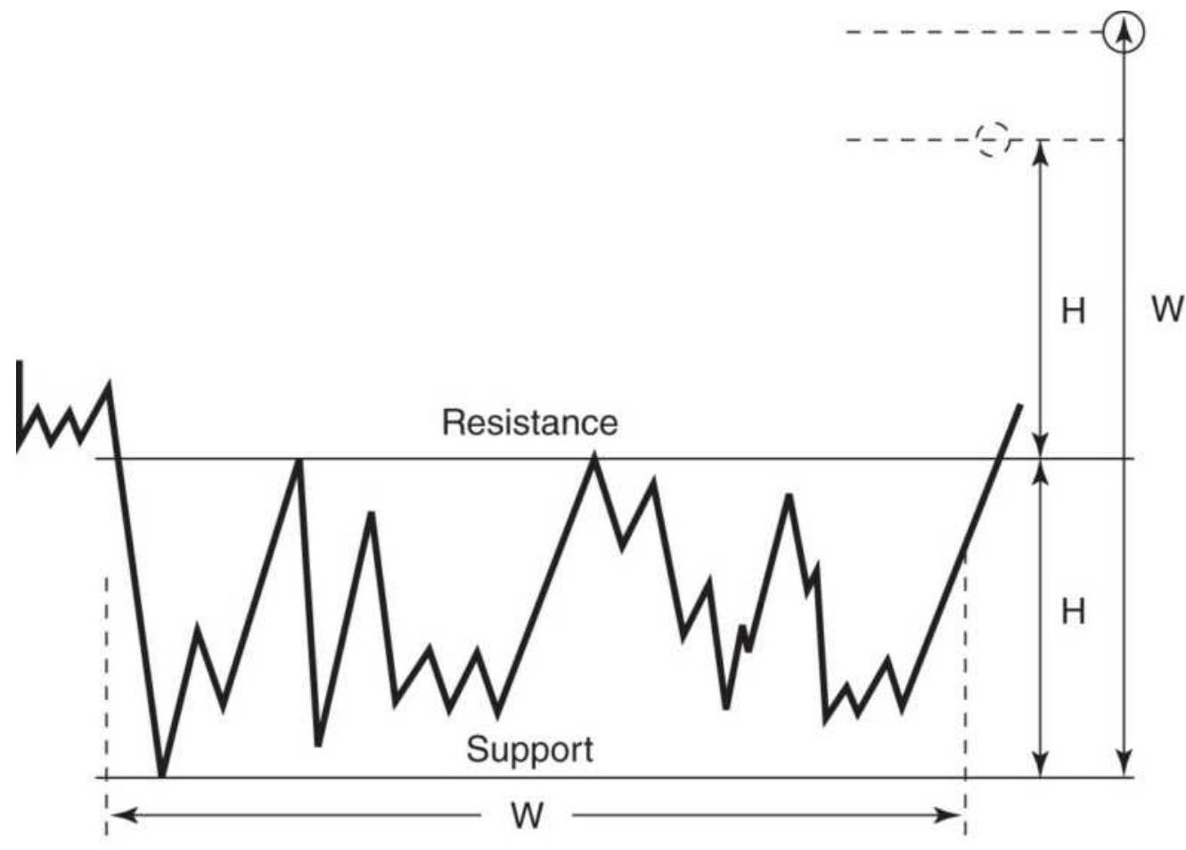
(a)
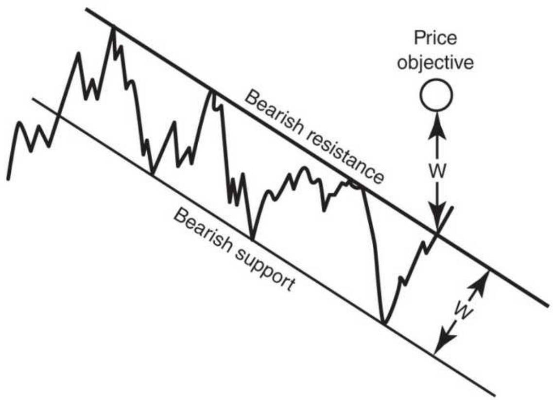
(b)
FIGURE 3.34 Price objectives for consolidation patterns and channels. (a) Two objectives for consolidation patterns. (b) Price objective for a channel.
\section*{Profit Targets for Consolidation Areas and Channels}
The most basic of all formations is the horizontal consolidation area, bounded on the top and bottom by a horizontal resistance and support lines. There are two possible profit targets, shown in Figure 3.34.
1. For any horizontal consolidation pattern, the target is above the breakout of the resistance line at a point equal to the height of the consolidation area (the resistance level minus the support level added to the resistance level). That makes the expected move equal to the extreme volatility of the consolidation area (see Figure 3.34a).
2. With extended rectangular formations, the upward profit target is calculated as the width of the entire consolidation pattern added to the support level. This implies that the longer the consolidation period, the larger the breakout. After some time, this becomes unrealistic, and your first objective should be the height of the consolidation area added to the resistance level.
A third objective is more conservative but even more practical:
3. Use the average volatility of the consolidation formation added to the resistance level, or reduce
the target in (1) above by \(20 \%\) to remove the extremes from influencing the objectives. A closer price target will be reached more often.
The price objective for a channel is the same as the traditional objective for a horizontal consolidation pattern (Figure 3.3b). Because the channel is at an angle, it is necessary to measure the width of the channel as perpendicular to the support and resistance channel lines, then project that width upward from the point of breakout. The length of the channel does not change the profit target. Again, you may want to make the target slightly smaller than the original channel.
\section*{Changing Price Objectives Using Channels}
Price objectives must be recalculated as trends change and new channels are formed. Figure 3.35 shows the change from an upward to a downward trend. Once a breakout of an upward channel has occurred (marked "First point of reversal"), we wait until the low is reached at \(a\), followed by the reaction back up to \(b\). A resistance line, \(1 R\), can then be drawn from the prior high \(h\) to the top of the latest move \(b\). A line, \(1 S\), can be constructed parallel to \(1 R\) passing through point \(a\), forming the initial downward channel. Price objective 1 is on line \(1 S\) of the new channel and is used once the top at point \(b\) is determined. Price objective 1 cannot be expected to be too precise due to the early development of the channel. If prices continue down to point \(c\) and then rally to \(d\), a more reasonable channel can now be defined using trendlines \(2 R\) and \(2 S\). The support line will again become the point where the new price objective is placed. The
upper and lower trendlines can be further refined as new high and low reactions occur. The primary trendline is always drawn first, then the new price objective becomes a point on the parallel trendline.
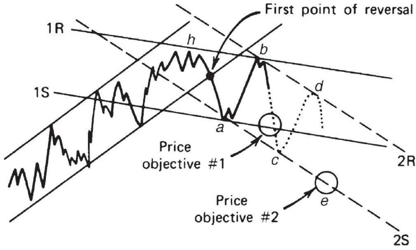
FIGURE 3.35 Forming new channels to determine objectives.
\section*{Targeting Profits after Tops and Bottoms}
Because profit targets are based on the volatility of the underlying pattern, the profit targets for all top formations will be farther away than those for bottom formations. Looking back at Figure 3.27, natural gas, there is a triple top formation. Between each top is a reversal marking a short-term support level. The first pullback after the island reversal brought prices to 8.20, followed by a test of the top that formed the second peak. The second retracement stopped at 9.00 and was
followed by the third peak. When prices finally drop through the highest support level at 9.00 we can treat it as a breakout and sell short.
Breaking this support level at 9.00 indicates that the topping formation is complete. For this triple top, we can use the distance between the high of 11.50 and the low of 9.00 as the size of the profit target, measured from the breakout. That gives 6.50 as the target, an ambitious number. Had we been trading it, when prices went sideways between 7.00 and 7.50 , we would have been looking to exit.
\section*{Calculating the Profit Target for a Top Formation}
The profit target is found by measuring the height of the top formation and projecting it downward from the point where the top is confirmed, that is, the break of the support level. If we look at crude oil futures, Figure 3.36, a major top was formed from July 2011 to July 2014. During this interval there were three attempts to break the high of 112.47. After the first top, prices dropped to 77.09, rallied to 106.77, then dropped to 79.11. We'll only calculate the profit targets for these two.
1. For the first profit target, subtract the low of 77.09 from the high of 112.47 , a difference of 35.38 . Subtract that from the low of 77.09 to get the major target of 41.71. The low was at 26.42 .
\section*{Crude oil triple top}
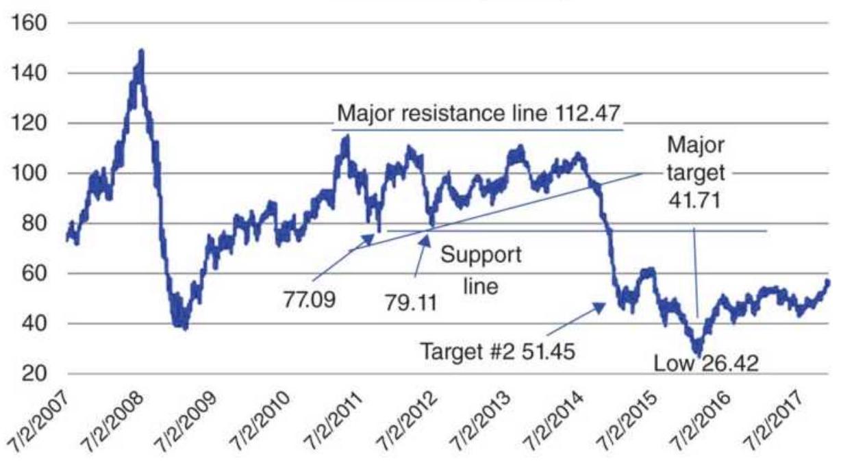
FIGURE 3.36 Two profit targets following a top formation in back-adjusted crude oil futures.
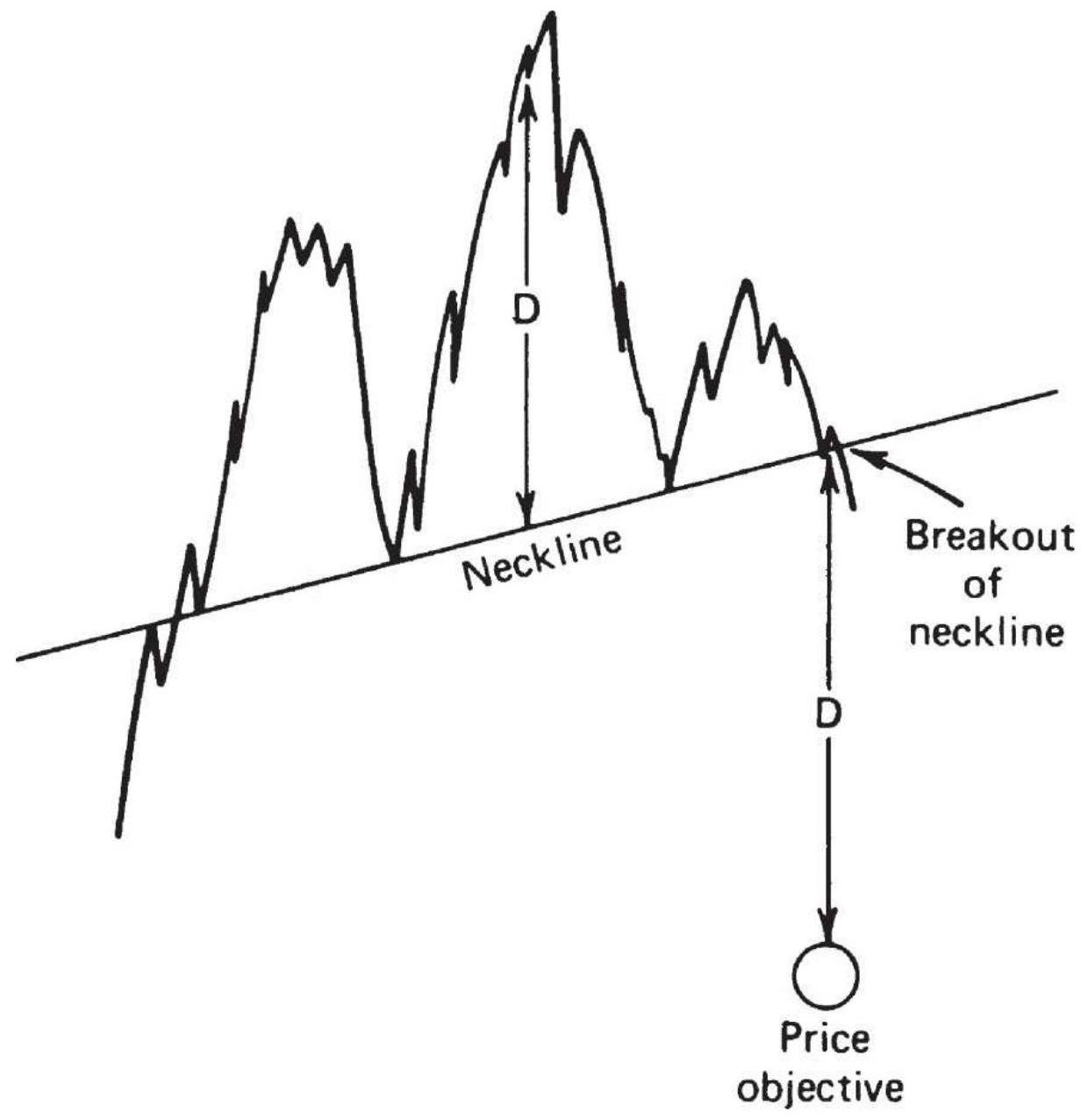
FIGURE 3.37 Head-and-shoulders top price objective.
2. Based on the second peak at 106.77 and the drop to 79.11, we subtract that difference and subtract it from 79.11 to get another profit target at 51.45 . That turns out to be the first significant support level after the breakout.
Some chartists would prefer to measure the profit target from the breakout of the upward slanting support line,
but horizontal support lines tend to be stronger because they can often be associated with structural shifts in price.
\section*{Profit Targets after a Bottom Formation}
The same principle can be applied to calculate the profit target for bottom formations. The profit target for a consolidation area was discussed in a previous section, but shorter, more volatile patterns forming bottoms are calculated in the same way as with tops. The distance from the lowest price of the bottom to the resistance level is projected upward from the breakout. This method can be applied to any type of bottom formation. In Figure 3.26, the double bottom in Cisco spanned the price range from about 5.00 to 6.25 . The volatility of the bottom pattern, 1.25 , is projected upward from the breakout at 6.25 to get the target of 7.50 . Because volatility should increase as prices rise, this volatility calculation should be conservative.
\section*{The Head-and-Shoulders Price Objective}
In keeping with other price targets, the head-andshoulders top has a downside objective that is also based on its volatility. This objective is equal to the distance from the top of the head to the neckline and measured downward from the point where the right shoulder penetrates the neckline (Figure 3.37).
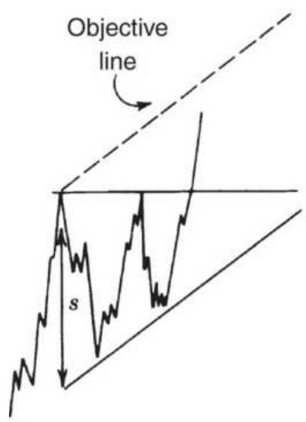
(a)
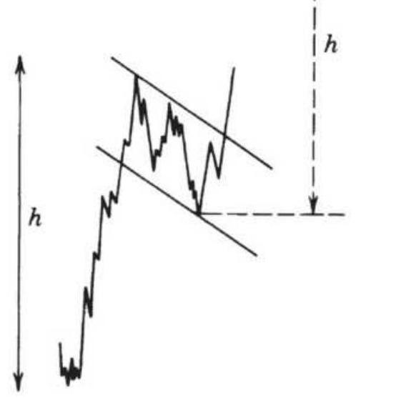
(b)
FIGURE 3.38 Triangle and flag objectives. (a) Triangle objective is based on the width of the initial side, \(s\). (b) Flag objective is equal to the move prior to the flag formation.
\section*{Triangles and Flags}
Triangles and flags also have objectives based on volatility. The triangle objective is equal in size to the initial reaction that formed the largest end of the triangle (Figure 3.38a), measured from the support line. It may also be viewed as a developing channel rather than a triangle, with the ascending leg of the triangle forming the primary bullish trendline. The price objective then becomes the same as those used for channels.
The flag is assumed to occur at some point during a price move; therefore, the objective of a new breakout must be
equal to the size of the move preceding the flag (Figure 3.38b). This avoids problems associated with the decreasing volatility of the triangular formation.
Subsequent profit targets for flags are measured starting from the breakout of the previous formation.
Note that an alternative profit target for a triangle could be measured in the same way, based on the move from a prior breakout to the high of the first peak in the triangle.
\section*{The Rule of Seven}
Another measurement of price objectives, the Rule of Seven, is credited to Arthur Sklarew. \({ }^{14}\) It is based on the volatility of the prior consolidation formation and computes three successive price objectives in proportion to one another. The Rule of Seven is not symmetric for both uptrends and downtrends. Sklarew believes that, after the initial leg of a move, the downtrend reactions are closer together than the reactions in a rising market. Because the downside of a major bear market is limited, it is usually characterized by consolidation. Major bull markets tend to expand as they develop.
To calculate the objectives using the Rule of Seven, first measure the length \(L\) of the initial leg of a price move (from the previous high or low, the most extreme point before the first pullback). The objectives are:
1. In an uptrend:
\section*{Upwards objective \(1=\) prior low \(+(L \times 7 / 4)\)}
Upwards objective \(2=\) prior low \(+(L \times 7 / 3)\)
Upwards objective \(3=\) prior low \(+(L \times 7 / 2)\)
2. In a downtrend:
\[
\begin{aligned}
& \text { Downwards objective } 1=\text { prior high }-(L \times 7 / 5) \\
& \text { Downwards objective } 2=\text { prior high }-(L \times 7 / 4) \\
& \text { Downwards objective } 3=\text { prior high }-(L \times 7 / 3)
\end{aligned}
\]
The three objectives apply most clearly to major moves. During minor price swings it is likely that the first two objectives will be bypassed. In Sklarew's experience, regardless of whether any one objective is missed, the others still remain valid.
\section*{IMPLIED STRATEGIES IN CANDLESTICK CHARTS}
For a technique that has been used as early as the mid160os, Japanese candle charts were slow to find their way into the Western method of analysis. Candle charts are similar to bar charts but offer additional visual interpretation. The candles are created simply by shading the piece of the bar between the opening and closing prices: white if the close is higher than the open and black if the close is lower than the open. The shaded area is called the body and the extended lines above and
below the body are the shadows. With this simple change, we get an entirely new way of looking at and interpreting charts. The patterns become much clearer than the Western style of line chart.
Although many candlestick patterns have equivalent bar chart formations, there is an implied strategy in many of them. The following summary uses the traditional candlestick names representing the significance of the formation (see Figure 3.39):
Doji, in which the opening and closing prices are the same. This represents indecision, a temporary balancing point. It is neither bullish nor bearish. A double doji, where two dojis occur successively, implies that a significant breakout will follow.
DOJI
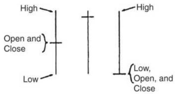
(a)
HANGING MAN
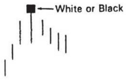
(c)
BULLISH ENGULFING PATTERN

(e)
BULLISH MORNING STAR

\(\square\)
(g)
BULLISH PIERCING LINE

(i)
HAMMER
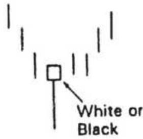
(b)
SHOOTING STAR
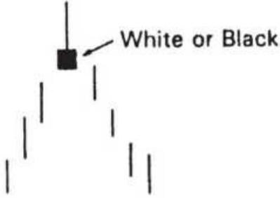
(d)
\section*{BEARISH ENGULFING} PATTERN

(f)
BEARISH EVENING STAR
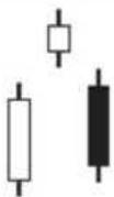
(h)
BEARISH DARK CLOUD COVER

(j)
\section*{FIGURE \(3.39(\mathrm{a}-\mathrm{j})\) Popular candle formations.}
Engulfing patterns seem at first to be the same as outside days in bar charting, but the pattern only refers to the part of the bar between the opening and closing prices. Engulfing patterns are considered exceptionally strong signals of price change. A bullish engulfing pattern has a black candle followed by a white, indicating a wide range with a higher close. The bearish engulfing pattern is white followed by black, showing a lower close on the engulfing day.
Morning star and evening star are 3-day patterns that are more specific than an island reversal. In the morning star, a bullish reversal pattern, the first day has a lower close than the open, the second day (called the star, similar to the island bottom) has a higher close, and the final reversal day has an even higher close. The bearish reversal is just the opposite, with two higher closes followed by a reversal day with a lower close. If the star is also a doji, then the pattern has more significance.
Piercing line and dark cloud cover are bullish and bearish reversals. The piercing line, a bullish reversal, begins with a black candle (a lower close) and is followed by a white candle in which the open is below the previous day's low and the close is above the midpoint of the previous day's body (the open-close range). The dark cloud cover is a bearish formation, the opposite of the piercing line.
- Hammer, a bullish reversal signal, showing the bottom of a swing, where the body is at the top of the candle, indicating an upward change of direction, and the shadow is below the body. The body may be black or white.
- Hanging man, a bearish reversal pattern where the body of the candle represents the high of a swing, and the shadow lies below in the direction of the reversal. The body may be black or white.
Shooting star, a bearish signal, occurs at the top of a swing and has its body at the bottom of the candle with the shadow above. The body may be black or white.
Although these patterns are similar to Western bar chart formations, none of them are exactly the same. The hammer, hanging man, and shooting star are reversal patterns but can only be compared to the simple pivot point where the middle day is higher or lower than the bars on either side. None of the candle formations is exactly the same as a key reversal day or island reversal. The engulfing pattern is stronger than the typical outside day because the spanning of the prior day's range must be done only by the current day's open-close range.
The analysis of candle charts is a skill involving the understanding of many complex and interrelated patterns. For full coverage, Thomas Bulkowski's, Encyclopedia of Candlestick Charts is recommended, because it includes an extensive analysis of these patterns. Some of his conclusions are given in a following section, "The Best of Candles."
\section*{Quantifying Candle Formations}
The preciseness of the candle formations allows some patterns to be tested. The popular engulfing patterns can be defined exactly for a computer program as:
Bullish engulfing pattern \(=O_{t-1}>C_{t-1}\) and \(O_{t}<C_{t-1}\) and \(C_{t}>O_{t-1}\) Bearish engulfing patter \(=C_{t-1}>O_{t-1}\) and \(O_{t}>C_{t-1}\) and \(C_{t}<O_{t-1}\)
Another technique uses the shadows as confirmation of direction. We can interpret an increase in the size of the upper shadows as strengthening resistance (prices are closing lower each day); an increase in the size of the lower shadows represents more support. One way to look at this is by defining:
Upper shadow \((\) white \()=H_{t}-C_{t}\) Lower shadow \((\) white \()=O_{t}-L_{t}\)
Upper shadow \((\) black \()=H_{t}-O_{t}\) Lower shadow \((\) black \()=C_{t}-L_{t}\)
The sequences of upper and lower shadows can be smoothed separately using a moving average to find out whether they are rising or falling. \({ }^{15}\)
A method for determining whether black or white candles dominate recent price movement is to use only the body of the candle, \(B=C_{t}-O_{t}\), and apply a momentum calculation:
\section*{Body momentum \\ up \\ \(B_{\text {up }}+B_{\text {down }}\)}
where
\(B_{u p} \quad=\) the sum of the days where \(B>0\) (body is white)
\(B \quad=\) the sum of the days where \(B<0\) (body is
down black)
14 = the recommended number of days
When the body momentum is greater than 70 the whites dominate; when the value is below 20 the blacks dominate. These thresholds indicate an upward bias.
\section*{Morning Star and Evening Star}
Two formations that are easily programmed are the morning star (a bullish signal) and evening star (a bearish signal). Using the morning star as an example, the rules call for a long downward (black) candle followed by a lower, less volatile white candle (the open of the next bar less than the close of the previous long bar), and finally an upward thrust shown as a gap up body with the close higher than the open (another white candle).

When programmed (see TSM Morning Star and TSM Evening Star in the Companion Website), there were very few signals if we put minimum size restrictions on the bodies of the three candles. Instead, we only
required that the body of the first day is greater than the 20-day average body, the second day less, and the third day greater. While there are still only a modest number of trades, the S\&P performs well on the day following both patterns.
\section*{Qstick}
As a way of quantifying the Candle formations, Tuschar Chande \({ }^{16}\) created Qstick, a moving average of the body of the candle. While it is intended to be an aid to interpreting the charts, it also has simple trading rules.
If Body \(y_{t}=C_{t}-O_{t}\)
\(Q_{1}=\operatorname{average}(\) periodl, body), where periodl is suggested as 8 days
\(\operatorname{Avg} Q_{t}=\operatorname{average}(\operatorname{period} 2, Q)\), where period 2 is also 8 days then the trading rules are:
\section*{Buy when \(Q_{t}\) crosses above \(\operatorname{Avg} Q_{t}\)}
\section*{Sell when \(Q_{t}\) crosses below \(\operatorname{Avg} Q_{t}\)}
\section*{Pivot Points and Candle Charts}
John Person suggests that the strategies inherent in candle formations can be combined with support and resistance levels derived from pivot points. \({ }^{17} \mathrm{He}\) uses the following calculations:
1. Pivot point, \(P_{t}=\left(H_{t}+L_{t}+C_{t}\right) / 3\)
2. First resistance level, \(R 1=\left(P_{t} \times 2\right)-L_{t}\)
3. Second resistance level, \(R 2=P_{t}+H_{t}-L_{t}\)
4. First support level, \(S 1=\left(P_{t}+2\right)-H_{t}\)
5. Second support level, \(S 2=P_{t}-H_{t}+L_{t}\)
Once a key formation for a top or bottom is recognized using candle charts, support and resistance levels calculated based on pivot points can be a strong indication of the extent of the following price move. Person used Dow futures to support his study.
\section*{The Best of the Candles}
Bulkowski has summarized his own research on the success of various candles \({ }^{18}\) as:
- The best-performing candles had closing prices within \(1 / 3\) of the bar low, followed by the middle and high, respectively.
- Candle patterns in a bear market outperform other markets, regardless of the breakout direction.
Most candles perform best on days with higher volume.
- Candles with unusually long wicks outperform.
- Unusually tall candles outperform.
\section*{Trends Are Easier to See in Retrospect}
As important as it is to identify the direction of price movement, it is much easier to see the trend afterward than at the moment it is needed. There is no doubt that all stocks and futures markets have short-term swings and longer-term bull and bear markets. Unfortunately, at the time you are ready to trade, it is not going to be clear whether the current price trend is a short-term pattern that is about to change, or a long-term persistent trend experiencing a temporary reversal.
The ease of seeing charts on a screen has made the past patterns clear. It seems natural to expect prices to trend in the future as clearly as they appear on a chart; however, it is not easy to recognize the best trend in a timely fashion. The eye has a remarkable way of simplifying the chart patterns. The purpose of drawing a trendline is to add objectivity to your analysis, even when prices are volatile. A new trend signal to buy or sell always occurs as the trend is changing; therefore, it is at the point of greatest uncertainty.
Success in systematic trading, whether using charts or mathematics, relies on consistency. In the long run it comes down to probabilities. In a typical trend-following system, because individual profits are much larger than losses, it is only necessary to be correct \(30 \%\) of the time. Accepting losing trades 70\% of the time can be a challenging psychological hurdle.
\section*{Long-Term Trends Are More Reliable Than Short-Term Trends}
Charting is not precise and the construction of the trendlines, other geometric formations, and their interpretation can be performed with some liberties. When using the simplest trendline analysis, it often happens that there is a small penetration of the channel or trendline followed by a movement back into the channel. Some think that this inaccuracy with respect to the rules makes charting useless; however, many experienced analysts interpret this action as confirmation of the trend. The trendline is not redrawn so that the penetration becomes the new high or low of the trend; it is left in its original position.
We must always step back and look for the underlying purpose in each method of analysis, whether interpretive or fully systematic. The trendline is an attempt to identify the direction of prices over some time period. Chartists can use a simple straight line to visualize the direction; they draw the uptrend by connecting the lowest prices in a rising market even though each point used may represent varying levels of volatility and unique conditions. The chance of these points aligning perfectly, or forecasting the exact support level, is small. A trendline is simply a guide; it may be too conservative at one time and too aggressive at another; and you won't know until after the trade is completed. Applied rigorously, charting rules should produce many incorrect signals but be profitable in the most important cases. The challenge for the chartist is to interpret the pattern of prices in context with the bigger picture.
Many price moves are called trends, but the most important and sustained trends are those resulting from
government policy, in particular those that affect interest rates. Therefore, the most reliable trends are long-term phenomena because government policy develops slowly and often over years. During a period of recession, as we saw in 2001 and 2002, the Federal Reserve continued to lower interest rates incrementally, causing a major bull market in all fixed-income maturities. It is easiest to see this trend by looking at a weekly chart of the 10-year Treasury note, rather than a daily chart. The more detail there is, the more difficult it is to see the long-term trend. Following the financial crisis of 2008 the Fed and other central banks decided to lower rates to the absolute minimum and keep them there as long as necessary to stimulate the economy. This resulted in a protracted bull market in both interest rates and equities.
\section*{Confirming Signals}
Some of the impreciseness of charting can be offset with confirming signals. A simultaneous breakout of a shortterm trendline and a long-term trendline is a much stronger signal than either one occurring at different times. The break of a head-and-shoulders neckline that corresponds to a previous channel support line is likely to receive much attention. Whenever there are multiple signals converging at, or near, a single price, whether based on moving averages, Gann lines, cycles, or phases of the moon, that point gains significance. You should also watch when a single stock meets support or resistance at the same place as the S\&P. In chart analysis, the occurrence of multiple signals at one point can compensate for the quality of the interpretation.
\section*{Pattern Failures}
The failure to adhere to a pattern is equally as important as conforming to that pattern. Although a trader might anticipate a reversal as prices near a major support line, a break of that line is significant in continuing the downward move. A failure to stop at the support line should result in setting short positions and abandoning plans for higher prices.
A head-and-shoulders formation that breaks the neckline, declines for a day or two, then reverses and moves above the neckline is another pattern failure. Postpattern activity must confirm the pattern. Failure to do so means that the market refused to follow through; therefore, it should be traded in the opposite direction. This is not a case of identifying the wrong pattern; instead, price action actively opposed the completion of the pattern. Wyckoff calls this "effort and results," referring to the effort expended by the market to produce a pattern that explains the price direction. If this pattern is not followed by results that confirm the effort, the opposite position is the best option.
\section*{Change of Character}
Thompson \({ }^{19}\) discusses the completion of a pattern or price trend by identifying a change of character in the movement. As a trend develops, the reactions, or pullbacks, tend to become smaller. Traders looking to enter the trend wait for reactions to place their orders; as the move becomes more obvious, these reactions get smaller and the increments of trend movement become
larger. When the reaction suddenly is larger, the move is ending; the change in the character of the move signals a prudent exit, regardless of how prices move afterward.
A similar example occurs in the way prices react to economic reports or government action. The first time the Federal Reserve acts to raise rates after a prolonged decline, the market is not prepared and interest rate prices react sharply lower. Before the next meeting of the Fed the market may be more apprehensive, but is likely to be neutral with regard to expectation of policy. However, once there is a pattern of increasing rates following signs of inflation, the market begins to anticipate the action of the Fed. A sharp move in the opposite direction occurs when the government fails to take the expected action.
\section*{Bull and Bear Traps}
While it is not much of a consolation to those who have gotten caught, a failed downside breakout is called a bear trap, and a failed upward breakout is a bull trap. For example, a bear trap occurs when prices fall below a clear support line, generating sell signals. After a few days, prices move back above the support line, often accelerating upward. In both cases, prices appear to be continuing in the trend direction, but the final picture is a reversal. Although there is no advice on how to avoid bull and bear traps, the failed reversal should be recognized as soon as possible and the position should be reversed. Bull and bear traps often precede significant price reversals.
As with other top and bottom patterns, a confirmation of the bear trap is complete when prices move above the next higher resistance level. In the case of a failed flag formation in a downward trend, prices break lower as expected, then reverse. The confirmation occurs when prices move above the top of the failed flag pattern. The same principle would be true of other failed chart formations; the failure is confirmed when prices retrace the entire pattern. 20
\section*{Testing Your Skill}
Recognizing a pattern is both an art and a discipline. Not everyone has an eye for patterns; others see formations where no one else does. The first decision may be the most important: How much of the chart do you use? It is perfectly normal for different time intervals to show different pictures. In some cases, arbitrarily cutting the chart at some previous date might cause an important trend to disappear.
The timeliness of the pattern identification is the most serious problem. Can the formation be interpreted in time to act on a breakout, or is the pattern only seen afterward? At different stages of development, the lines may appear to form different patterns. Before using your charting skills to trade, practice simulating the day-today development of prices using the following steps:
1. Have someone give you a chart ending at least a year earlier.
2. Analyze the formations.
3. Determine what trades you will make based on your interpretation. Be specific. You will need to hold these trades for a week.
4. Get the next week of prices.
5. Record any orders that would have been filled based on the prior analysis. Don't cheat.
6. Determine whether the new week's prices would have altered your interpretation. Record your new trades.
7. Return to step 4 until finished.
This simple exercise might save a lot of money. At first, results may be bad, but with practice you will become better at finding and using formations. Weekly data is better than daily because it forces you to have a wider view of the market. Keep it simple at first, using only trendlines, then graduate to more complex formations. Every trader should have practiced forecasting from charts. They are also the basis of many good systematic programs.
\section*{EVOLUTION IN PRICE PATTERNS}
A change has occurred in the stock market because of the S\&P 500 index, SPDRs, and other index markets. If you think that stock prices are about to fall because of a pending interest rate hike by the Fed, you can protect your portfolio by selling an equivalent amount of S\&P futures. Afterward, when you have decided that prices have stabilized, you can lift your hedge and profit from
rising prices. It is an easy and inexpensive way to get portfolio insurance and, at the same time, keep any capital gains in your stock positions. When institutions and traders buy or sell large quantities of S\&P futures, the futures price will drift away from the S\&P cash index. Program trading is the process that keeps the price of futures and ETFs aligned with the cash index. But buying or selling all the stocks in the S\&P at the same time has changed the patterns of individual stocks that are part of the S\&P index. Under massive buying, an individual stock may reverse a downtrend and form a support level that has nothing to do with its own fundamentals. It may not matter that IBM is fundamentally stronger than GE, or that Micron is at a resistance level and Ford is at support, or even if a company is under investigation. When program traders buy S\&P stocks, they buy all of the stocks at the same time. Today's technical trader must keep one eye on the individual stock and the other eye on the index.
Figure 3.40 shows the S\&P 500 index, GE, and Exxon over the same period from October 1999 through December 2000. Fundamentally, these three markets have little in common; however, the overall pattern of the three markets is remarkably similar, with most tops and bottoms occurring at nearly the same time. Because it is unlikely that the fundamentals of each company would result in such a similar price pattern, we can conclude that the S\&P futures, combined with program trading, forces the patterns to be materially the same. This change in the way stocks are traded reduces the ability to get diversification by trading across sectors. At
the same time, it increases risk.
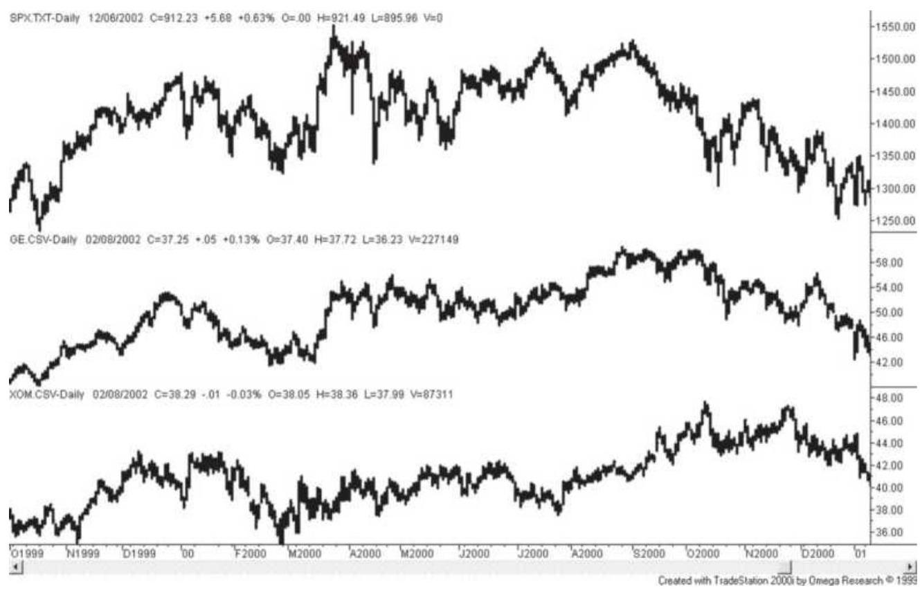
FIGURE 3.40 Similar patterns in the S\&P, GE, and Exxon.
\section*{Globalization: The Similarity of Asian Markets}
There has been a noticeable shift in Asian markets price patterns as well. Their largest economies, China and India, have been creating a consumer middle-class. Although not all of the Asian stock markets are open to foreign investors, globalization has not passed them by. Figure 3.41 shows the equity index markets for Hong Kong (HSI), Singapore (SSG), Taiwan (STW), the Philippines (PHI), and Malaysia (KLI) adjusted to 100 on January 28, 2005.
The five series look remarkably the same. It is understandable that, as trading partners, these countries
are dependent upon one another, yet the similarity is surprisingly strong. One explanation would be that, if traders believe that a poor economic signal in one country means that others will also share in bad times, then they sell the equity index markets, or individual stocks, in each country. That would be similar to Hewlett-Packard announcing worse than expected earnings and having traders sell ACER and microchip companies, expecting the same downturn. In volatile markets, the movement of money can be more important than the fundamentals. This was clearly the case for the financial crisis in September 2008, when all markets moved the same way as investors withdrew their funds as quickly as possible.
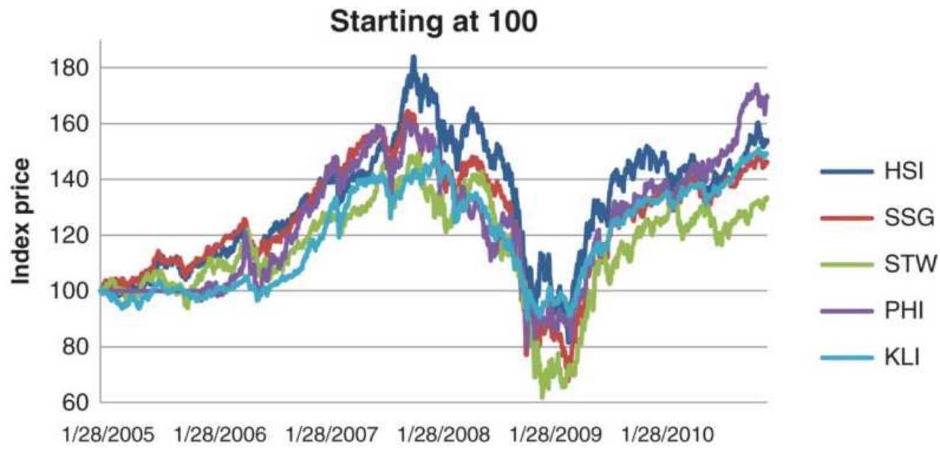
FIGURE 3.41 Asian equity index markets adjusted to the same volatility level and started at the value 100.
\section*{NOTES}
1 William L. Jiler, "How Charts Are Used in Commodity
Price Forecasting," Commodity Research Publications (New York, 1977).
\(\underline{2}\) Thomas N. Bulkowski, Encyclopedia of Chart Pattern, 2nd ed. (Hoboken, NJ: John Wiley \& Sons, 2005). Results of Bulkowski's studies are included in Chapter 4, the section "A Study of Charting Patterns." A similar approach can be found in Bulkowski's Encyclopedia of Candlestick Charts (Hoboken, NJ: John Wiley \& Sons, 2008).
3 Reprinted in 1995 by John Wiley \& Sons, Inc.
4 R.W. Schabacker, "Stock Market Theory and Practice," Forbes (New York, 1930, pp. 595-600).
5 Robert D. Edwards and John Magee, Technical Analysis of Stock Trends (Springfield, MA: Stock Trend Service, 1948, Chapter 16).
6 Richard D. Wyckoff, Stock Market Technique, Number One (New York, 1933), p. 105.
\({ }^{7}\) Robert Rhea, Dow Theory (Binghamton, NY: VailBallou, 1932).
\(\underline{8}\) The rules of the Dow Theory in this section are based on a fine article by Ralph Acampora and Rosemarie Pavlick, "A Dow Theory Update," originally published in the MTA Journal (January 1978, reprinted in the MTA Journal, Fall-Winter 2001). Other parts of this section are drawn from Kaufman, \(A\) Short Course in Technical Trading (Hoboken, NJ: John Wiley\& Sons, 2003).
9 Adapted from James Maccaro, "The Early Chartists: Schabacker, Edwards, Magee," Technical Analysis of Stocks \& Commodities (November 2002).
10 In Carol Oster, "Support for Resistance: Technical Analysis and Intraday Exchange Rates," FRBNY Economic Policy Review, July 2000, the author shows that support and resistance levels specified by six trading firms over 3 years were successful in predicting intraday price interruptions. In addition, these levels were valid for about 5 days after they were noted.
11 Robert W. Colby, The Encyclopedia of Technical Market Indicators (McGraw-Hill, 2003), pp. 510514 .
12 Eric Evans, "Why You Can't Rely on ‘Key Reversal Days," Futures (March 1985).
13 Martin Pring, "Twice as Nice: The Two-Bar Reversal Pattern," Active Trader (March 2003).
14 Arthur Sklarew, Techniques of a Professional Commodity Chart Analyst (Commodity Research Bureau, 1980).
15 Both "shadow trends" and "body momentum" are adapted from Tushar Chande and Stanley Kroll, The New Technical Trader (John Wiley \& Sons, 1994).
16 Tushar Chande and Stanley Kroll, The New Technical Trader (Hoboken, NJ: John Wiley \& Sons, 1994).
17 John L. Person, "Pivot Points and Candles," Futures (February 2003).
18 Thomas Bulkowski, "What You Don't Know About Candlesticks," Technical Analysis of Stocks \& Commodities (March 2011).
19 Jesse H. Thompson, "What Textbooks Never Tell You," Technical Analysis of Stocks \& Commodities (November-December 1983).
20 See Christopher Narcouzi, "Winning with Failures," Technical Analysis of Stocks \& Commodities (November 2001).
\section*{CHAPTER 4}
\section*{Charting Systems}
The automation of charting techniques can be seen on most quote equipment. With a single click, you can change a line chart into a candlestick or a point-andfigure chart. More sophisticated programs can identify Elliott Waves and Gann angles and projections. Granted, there will always be analysts who disagree with the positioning of these points and lines, but they make charting simpler and bring standardization to what was considered a combination of art and skill.
The systems and techniques included in this chapter are those that might be used by traditional chartists. Many of them are classic methods by famous analysts. In some of these charting systems, the time that it takes for a price to move from one level to the next is not important; it is only the extent of the move that is used. The common ground in this chapter is that the methods can be automated. At the end of the chapter is a summary of Bulkowski's work, a study and ranking of most popular chart patterns.
We begin with a review of a few of the earliest attempts at systematic trading. Of course, we have come much further in the 70 years since Dunnigan, and markets have expanded and changed. Yet they are still driven by investors with the same objectives. Given our wide range of techniques, tools, and technology, deciding on the
most profitable path may be difficult. These first developers struggled with basic concepts and, in many ways, they are the same concepts that we try to resolve now. What appears to be a less sophisticated solution may actually be the key to the best solution. Lest we forget Occam's razor,
One should not increase, beyond what is necessary, the number of entities required to explain anything.
\section*{DUNNIGAN AND THE THRUST METHOD}
William Dunnigan's work in the early 1950s is based on chart formations and is purely technical. Although an admirer of others' ability to perform fundamental analysis, his practical approach is contained in this statement:
"If the economists are interested in the price of beans, they should, first of all, learn all they can about the price of beans." Then, by supporting their observations with the fundamental elements of supply and demand they will be "certain that the bean prices will reflect these things." \({ }^{\prime 1}\)
Dunnigan did extensive research before his major publications in 1954. A follower of the Dow Theory, he originally created a breakaway system of trading stocks and commodities but was forced to drop this approach because of long strings of losses. The net results of his system, however, were profitable. He was also disappointed when his " \(23 / 8\) Swing Method" failed after its publication in A Study in Wheat Trading. But good
often comes from failure and Dunnigan had realized that different measurements should be applied to each market at different price levels. His next system, the Percentage Wheat Method, combined a \(2^{1 / 2} \%\) penetration and a 3 -day swing, introducing the time element into his work and perhaps the first notion of thrust, a substantial move within a predefined time interval. With the \(2^{1 / 2} \%, 3\)-day swing, a buy signal was generated if the price of wheat came within \(2 \%\) of the lows, then reversed and moved up at least an additional \(2^{1 / 2} \%\) over a period of no less than three days.
For Dunnigan, the swing method of charting \({ }^{2}\) represented a breakthrough; it allowed each market to develop its natural pattern of moves, and its own volatility. He had a difficult time trying to find one criterion for his charts that satisfied all markets, or even all grains, but established a \(\$ 2\) swing for stocks where Rhea's Dow Theory used only \(\$ 1\) moves. It could be that higher prices since Rhea's work justified larger swings. His studies of percentage swings were of no help even though we now find a percentage swing is a better solution.
\section*{The Thrust Method}
Dunnigan's final Thrust Method combined percentage measurements with the interpretation of chart patterns, later modified with some mathematical price objectives. He defines a downswing as a decline in which the current day's high and low are both lower than the corresponding high and low of the highest day of the prior upswing. If currently in an upswing, a higher high
or higher low will continue that move. The reverse effect of having both a higher high and higher low would result in a change from a downswing to an upswing. The top and bottom of a swing are the highest high of an upswing and the lowest low of a downswing, respectively. An outside or inside day, in which the highs and lows are both greater or both contained within any previous day of the same swing, has no effect on the direction.
In addition to the swings, Dunnigan defines the five key buy patterns:
1. Test of the bottom, where prices come within a predetermined percentage of a prior low
2. Closing-price reversal, a new low for the swing followed by a higher close than the prior day
3. Narrow range, where the current day's range is less than half of the largest range for the swing
4. Inside range, where both the high and low fall within the prior range, now called an inside day
5. Penetration of the top by any amount, what we now call a breakout
These conditions are reversed for sell patterns. A new buy signal was generated by combining the patterns indicating a preliminary buy, with a thrust the next day confirming the move. The thrust was defined as a price gain that varied with the price level of the market (for 1954 wheat, this was from \(1 / 2\) to \(1^{1 / 2}(\) ). Dunnigan's system attempted to enter a long position near a bottom and short near a top, an improvement on the Dow Theory. Because of the risks, the market was asked to
give evidence of a change of direction by satisfying two of the first four patterns followed by a thrust on the next day; otherwise, no trade was entered.
The same buy and sell signals apply to changes in direction that did not occur at prior tops and bottoms but somewhere within the previous trading range. If all the conditions were not satisfied and prices penetrated either the top or bottom, the fifth pattern satisfied the preliminary signal and a thrust could occur on any day. This was not restricted to the day following the penetration. If nothing else happened, Dunnigan followed the rules of the Dow Theory to ensure that a major move would not be missed.
\section*{Repeat Signals and Double Thrusts}
Followers of Dunnigan's method say that his repeat signals are the strongest part of his system; even Dunnigan states that they are more reliable, although they limit the size of the profit by not taking full advantage of the trend from its start. Repeat signals use relaxed rules not requiring a new thrust because the trend has already been identified. Two key conditions for repeat buy signals are:
1. A test of the bottom followed by an inside day (interpreted as market indecision)
2. A closing price reversal followed by an inside day
Adouble thrust occurs when the first thrust is followed immediately by a second thrust; or, after the first thrust, a congestion area develops, followed by a second thrust in the same direction as the first. Although Dunnigan
used a fixed number of points to define his "thrust," today's traders may find that comparing today's price move to the average true range would be a more flexible rule based on volatility, and more practical for identifying thrusts.
\section*{One-Way Formula}
Dunnigan worked on what he hoped would be a generalized version of his successful Thrust Method and called it the One-Way Formula. Based on his conclusions that the Thrust Method was too sensitive, causing more false signals than he was prepared to accept, he modified the confirmation aspect of the signal and made the thrust into the preliminary signal. He also emphasized longer price trends that smooth performance and reduce trading signals.
With the upswing and downswing rules remaining the same, Dunnigan modified the thrust, requiring its entire range to be outside the range of the prior day, what we call and outside day. This is a much stronger condition than his original thrust, yet only constitutes a
preliminary buy. (It is likely that lower liquidity during the 1950 allowed for more gaps than we have now.) The confirmation requires an additional upthrust after the formation of, or test of, a previous bottom. There must be a double bottom or ascending bottom followed by a thrust to get a buy signal near the lows. If the confirmation does not occur after the first bottom of an adjustment, it may still be valid on subsequent tests of the bottom.
For the One-Way Formula, repeat signals are identical to original signals. Each one occurs on a pullback and test of a previous bottom, or ascending bottom, followed by an upthrust. Both the initial and repeat signals allow the trader to enter after a reaction to the main trend. The Dow approach to penetration is still allowed in the event that all else fails. The refinement of the original Thrust Method satisfied Dunnigan's problem of getting in too soon.
\section*{Updated Trend and One-Way Formula}

Ruggiero has interpreted Dunnigan's trend and updated the One-Way Formula \({ }^{3}\) so that it can be programmed. An uptrend requires two consecutive days where the highs and lows are both higher, confirmed by prices moving above the high of the current downtrend. Results are good and similar to more complex methods. A program to test this method is TSM Dunnigan Trend, available on the Companion Website.

The One-Way Formula is considerably more involved and requires identifying a double bottom, then takes advantage of a short-term uptrend or bounce that follows. A program to test this is TSM Dunnigan OneWay Formula, available on the Companion Website.
\section*{The Square Root Theory}
The two previous methods show a concentration of entry techniques and an absence of exit rules. Although
positions are reversed when an opposite entry condition appears, Dunnigan spends great effort in portfolio management \({ }^{4}\) and risk-reward conditions that were linked to exits. By his own definition, his technique would be considered "trap forecasting," taking a quick or calculated profit rather than letting the trend run its course (the latter was called continuous forecasting).
Dunnigan measured risk and set profit objectives using the Square Root Theory. He strongly supported this method, thinking of it as the "golden" 5 key and claiming support of numerous sources, such as the Journal of the American Statistical Association, the Analyst's Journal, and Econometrica. The theory claims that prices move in a square root relationship. For example, a market trading at 81 ( or \(9^{2}\) ) would move to \(64\left(8^{2}\right)\) or \(100\left(10^{2}\right)\); either would be one unit up or down based on the square root. The rule also states that a price may move to a level that is a multiple of its square root. A similar concept can be found greatly expanded in the works of Gann (Chapter 14). Both are methods that take advantage of increasing volatility as prices increase.
\section*{NOFRI'S CONGESTION-PHASE SYSTEM}
Markets spend the greater part of their time in nontrending motion, moving up and down within a range determined by near-stable equilibrium of supply and demand. Most trend followers complain about the poor performance during these sideways periods. Eugene Nofri's system, presented by Jeanette Nofri
Steinberg,, 6 is used during the long periods of congestion, returning steady but small profits. The user of the Congestion-Phase System should wait for a well-defined congestion area before beginning a trading sequence.
The basis of the system is a 3 -day reversal. If prices are within a congestion range and have closed in the same direction for two consecutive days, take the opposite position on the close of day two, anticipating a reversal. If this is correct, take the profits on the close of trading the next (third) day. The concept is that, during a sideways period, sustained runs, either up or down, are unlikely. The Congestion-Phase System is only applied to markets within a trading range specifically defined by Nofri. Users are cautioned not to be too anxious to trade in a newly formed range until enough time has elapsed or a test of the support and resistance has failed. Readers will find that these rules are part of the Taylor Trading Technique, published much earlier, and discussed in Chapter 15, but without defining a congestion area.
Thetop of the congestion area is defined as a high, which is immediately followed by two consecutive days of lower closing prices; the bottom of the congestion area is a low price followed by two higher days. A new high or low price cancels the congestion area. Any two consecutive days with prices closing almost unchanged are considered as one day for the purposes of the system. In cases where the top or bottom has been formed following a major breakout or price run, a waiting period of 10 additional days is needed to ensure the integrity of the congestion area and limit the risk during more volatile periods. A congestion area is not formed until both a top
and bottom can be identified. Penetration of a previous top and formation of a new top redefine the range without altering the bottom point; the opposite case can occur for new bottoms. If a false breakout occurs lasting two or three days, safety suggests a waiting period of seven days. Logical stops can be placed at the top and bottom of the current congestion area, but closer stops could be formulated based on price volatility.
\section*{Implementing the Congestion-Phase System}
When programming the Congestion-Phase System, and many older strategies, you often find that the rules are not clearly defined. Some innovations and decisions need to be made. For this method, the greatest uncertainty was defining a "large move," after which we would wait 10 days before looking for a new signal. We defined the "large move" as any net price change over a 10-day interval that was at least two times larger than the average net change over 10 days for all past data. Our definition of a "false breakout" is any move above or below the congestion levels that reverted back into the congestion zone within two days.

For simplicity, no stop losses were used because trades are held for only one day. However, if we enter a new long position after two days down and the next day is also lower, then we close out the current trade with a loss but simultaneously reenter a new long at the same time because the " 2 - day down" rule continues to apply. Once you enter a long (or short), you continue to hold it until you have a 1-day profit or the price moves out of the
congestion zone. Because this strategy is applied only to sideways markets, there should not be too many "piggybacked" signals before an exit. The TradeStation program, TSM Nofri Congestion Phase, can be found on the Companion Website.
Figure 4.1 shows the signals from the program applied to wheat, which was chosen because it would have been a popular market when the strategy was first developed. Note that there were no signals during the rally in late September 2006 due to the "large move" rule. Performance was good for a surprisingly long period, although some markets showed large losses during the 2008 financial crisis. It may be necessary to add a highvolatility filter to avoid extremes in recent years.
The advantages of the Congestion-Phase System, even after more than fifty years, is the unique way it defines a sideways range, and that it is not based on trend following; therefore, it may complement other systems in a portfolio.
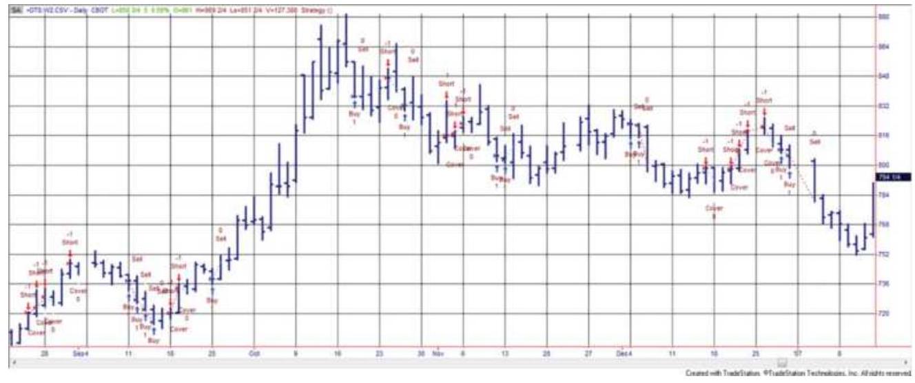
FIGURE 4.1 Nofri's Congestion-Phase System applied to wheat, as programmed on TradeStation.
\section*{OUTSIDE DAYS AND INSIDE DAYS}
There are numerous chart patterns that can be profitable if they are properly identified and traded consistently. Unfortunately, any one pattern may not appear very often and traders may become impatient waiting for the opportunities. For others who feel that overall trading success is a combination of small victories, the outside day with an outside close (Figure 4.2c) is a good place to start.
\section*{Outside Days}
An outside day (Figure 4.2b) has the high and low outside the range of the previous day; that is, the high is higher and the low is lower. An outside close is an outside day with the closing price higher or lower than the prior day's high or low, respectively. This pattern represents a volatile day, often triggered by news, and is clearly resolved in one direction. If the close was in the direction opposite to a recent price move, it is also a key reversal day; \({ }^{:}\)however, this method does not attempt to find the current trend. A brief study by Arnold \({ }^{8}\) in 1984 showed that this pattern proved profitable for a small sample of currencies, metals, and financials using the following rules:
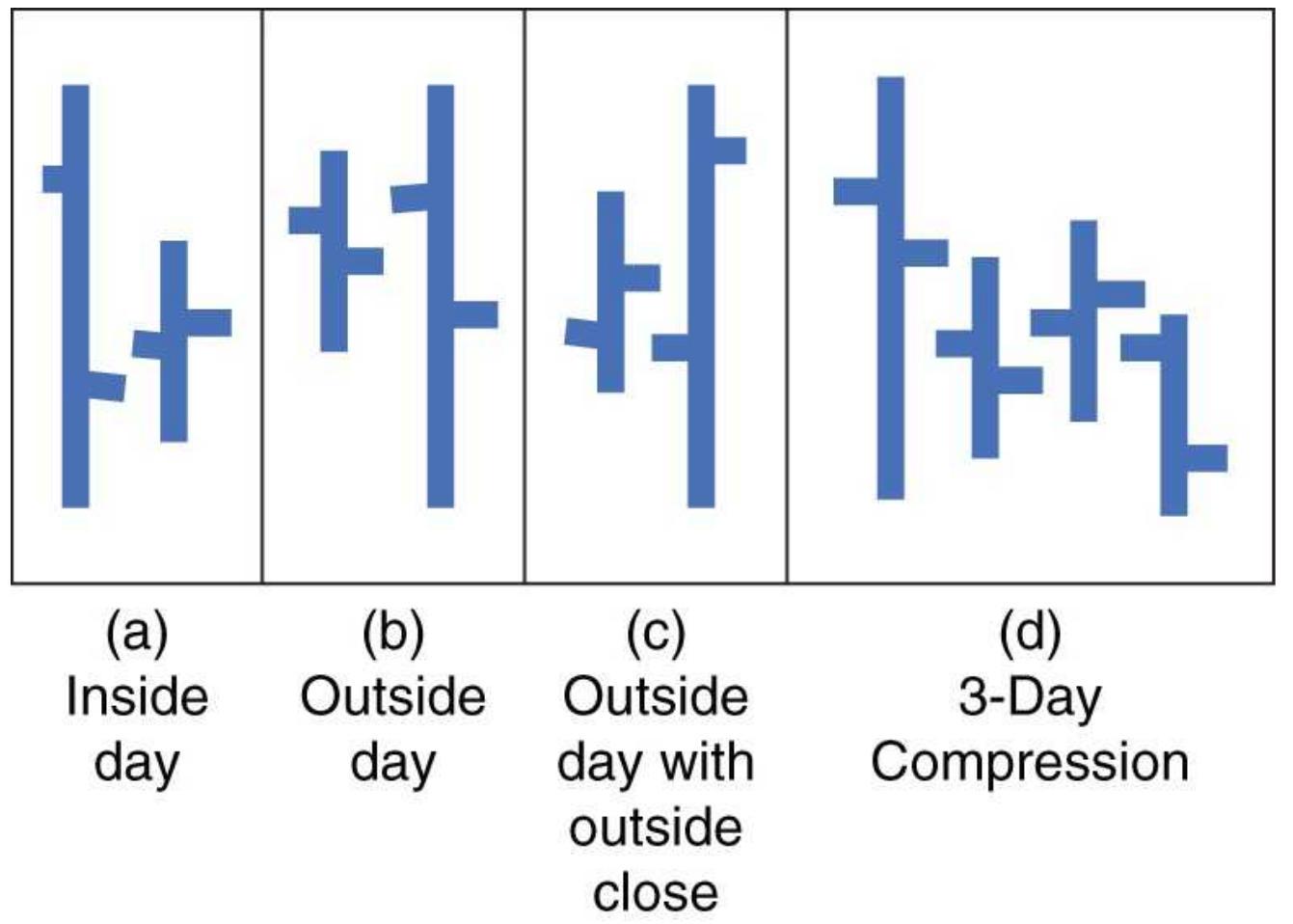
FIGURE 4.2 Four daily patterns.
1. Buy on the close of an outside day if the close is above the prior high; sell if the close is below the prior low.
2. If buying, place a stop-loss just below the low of the outside day; if selling, place the stop just above the high.
3. Close out the position on the close three days after entry (the result of testing from one to five days).

Times have changed and markets are generally noisier and often more volatile. In the 1970s and perhaps into the early 1980 os, this pattern was likely to work, but
not since the mid-198os. However, if you reverse the rules and sell when today's price closes above the previous high on a volatile day, your results are much better. A conditional exit, which includes profit-taking, is likely to improve results. The program TSM Outside Day with an Outside Close is available on the Companion Website. It allows you to test the number of days that the trade is held plus profit-taking based on the average true range. Results might be improved by removing trades during periods of low volatility because a wide-ranging day that follows a very narrow range may prove to have no forecasting value.
\section*{Inside Days}
Inside days (Figure 4.2a) can also be a predictor of direction. Prathap \({ }^{9}\) has identified the setup pattern
1. An upward day, \(C_{t-2}>C_{t-3}\)
2. Followed by an inside day, \(H_{t-1}<H_{t-2}\) and \(L_{t-1}>L_{t-2}\)
3. Followed by another upward day, \(C_{t}>C_{t-1}\)

as a short-term indicator of a continued upward move, especially for gold, silver, and crude oil. The reverse is true for downward moves. A program to test this is TSM 3-Bar Inside Day, available on the Companion Website.
\section*{Compression}
An extension of the inside day is compression, multiple days when the daily range is less than the range three or four days before. Figure 4.2d shows a 3 -day compression. Note that the compression days do not need to be inside the larger range day, only that the high-low ranges are smaller. Studies show that breakout signals following a few days of compression are more reliable.
Compression days are used as a filter for signals and do not constitute a system of its own. We will look at how compression performs later in this book, including Chapter 16, "Day Trading."
There is always the risk that a short period of compression is just an anomaly. When the price range expands, it may just be returning to normal volatility and not starting a new move. However, tests show that compression is a valuable pattern used in combination with short-term breakouts.
\section*{PIVOT POINTS}
A pivot point was defined in the previous chapter as the highest high price or a lowest low in the center of a number of days. Most often there are one to three days on either side of the pivot day. A pivot point can be used in the same way as a swing high or low, except that there is no minimum retracement needed, which adds a greater degree of flexibility to the patterns. It is also more restrictive than the swing high; therefore, the pivot point that requires more than three total days introduces a lag as a trade-off for confirmation.
1 The best application for pivot points is trend following, buying on an upward move through the previous pivot high and selling on a break through the previous pivot low. Although most uses of pivots points will focus on one to three days on each side of the pivot point, using longer periods, for example, 10 or 20 days, will give the performance the same appearance as a macrotrend program. A TradeStation program that generates trend signals, TSM Pivot Point Breakout, is available on the Companion Website along with an indicator, TSM Pivot Point, that plots the pivot points on a price chart, as seen in Figure 4.3.
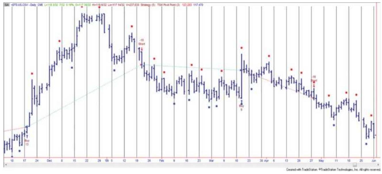
FIGURE 4.3 U.S. 30-year T-bond prices showing pivot points above and below the price and buy and sell signals when there is a penetration of the previous pivot points, based on 5 days on either side of the pivot point.
\section*{ACTION AND REACTION}
Fundamentals may be the reason for the ultimate rise
and fall of prices, but human behavior creates the patterns that occur as prices find their level of equilibrium. Each move is a series of overreactions and adjustments. Elliott's Wave Principle is the clearest and most well-known of the theories founded entirely on this notion. Frank Tubbs. Stock Market Correspondence Course (written in the 1930s) is the first to define the magnitude of these reactions in his Law of Proportion; and, in 1975, the Trident System was based on both the patterns and the size of the action and reaction.
Retracement of a major bull move is the most familiar of the market reactions and the one to which almost every theory applies. Most analysts agree that a 100\% retracement, where prices return to the beginning of the move, is the most important support level. The \(100 \%\) figure itself is called unity, referring to its behavioral significance. The next most accepted retracement level is \(50 \%\), strongly supported by Gann. The other significant levels vary according to different theories:
Schabacker recognized an adjustment of \(1 / 3\) or \(1 / 2\), considering anything larger to be a trend reversal.
Angas anticipated 25\% reactions for intermediate trends.
Dunnigan and Tubbs looked at the larger \(1 / 2,2 / 3\), or \(3 / 4\) adjustments.
Gann took inverse powers of 2 as behaviorally significant: \(1 / 2,1 / 4,1 / 8, \ldots\)
Elliott based his projections on the Fibonacci ratio and its complement ( 0.618 and 0.382 ).
Predicting advances to higher or lower prices is based on the size of prior moves. Gann believed in multiples of the lowest historic price as well as even numbers; prices would find natural resistance at \(\$ 2, \$ 3, \ldots\), at intermediate levels of \(\$ 2.50, \$ 3.50, \ldots\), or at two to three times the base price level. Elliott looked at moves of \(1.618 \%\) based on a Fibonacci ratio, and a function of the previous price move.
\section*{Fibonacci Ratios}
Along with the most common \(1,1 / 2,1 / 3\), and \(1 / 4\) retracement values, Fibonacci ratios have the greatest following. Fibonacci ratios are found by dividing one number in the Fibonacci summation series:
\[
1,1,2,3,5,8,13,34,55,89,144,233
\]
by the preceding or following value. The series is formed beginning with the values 1,1 and adding the last two numbers in the series together to get the next value. The numbers in the series, especially those up to the value 21, are often found in nature's symmetry; however, the most important aspect of the Fibonacci sequence is the ratio of one value to the next. Called the golden ratio, this value \(F_{n} / F_{n+1}\) approaches 1.618 as \(n\) gets large. An unusual quality is that the inverse \(F_{n+1} / F_{n}=0.618\).
The golden ratio has a long history. The great pyramid of Giza, the Mexican pyramids, many Greek structures, and works of art have been constructed in the proportions of the golden ratio. These and other examples are given in
Chapter 14, where they are also shown in context with trading systems. In this section we recognize that many analysts who consider human behavior as the primary reason for the size of a price move and their retracements use the Fibonacci ratio 0.618 (also 1.618) or, less often, its reciprocal \(1-0.618=0.382\), as very likely targets.
Elliott is the most well-known advocate, and applications of his Wave Theory are filled with these ratios.
Retracement rules have not been proved scientifically but they are accepted by most traders. In general terms, the retracement theories, or revelation methods, can be categorized as either proportional retracements or time-distance goals. Proportional retracement states that prices will return to a level that is clearly related, by proportion or ratio, to the length of the prior price move. The larger the move, the clearer the retracement. The percentages and ratios expected to be successful are those that are most obvious: \(100 \%, 50 \%, 33 \%\), and so on, in addition to the Fibonacci ratio 1.618 and its inverse
0.618 . The time-distance rule is popularized in the works of Gann (also found in Chapter 14). Gann's retracement objectives can best be thought of as forming an arc of a circle, with the center at the recent price peak. The goal is satisfied when prices that follow touch any point on the circle.
Practically speaking, it is unrealistic to expect retracement levels to be reached exactly; therefore, when making this fully systematic it is better to allow for the targets to be slightly closer or use multiple targets to avoid depending on a single number.
\section*{Tubbs' Law of Proportion}
The technical part of Frank Tubbs' course in stock market trading is intense chart interpretation. The Law of Proportion presented in Lesson 9 is a well-defined action-and-reaction law. In cases where the nearby highs or lows of a swing were not broken, Tubbs claims four out of five successful predictions with his principle. The law states:
Aggregates and individual stocks tend to run on half, two-thirds, three-fourths of previous moves. First in relation to the next preceding move which was made. Then in relation to the move preceding that.
Applied to a stock trading at \(\$ 20\), an initial move from \(\$ 20\) to \(\$ 26\) would react \(1 / 2\) to \(\$ 23,2 / 3\) to \(\$ 22\), or \(3 / 4\) to \(\$ 21.50\). Tubbs does allow for traditional price support as a major obstacle to the proportional price retracement, and so unity (a \(100 \%\) retracement) may be added to the three targets. Figure 4.4 shows subsequent reactions to the stock move just described; the second reversal could be any of three values (or back to major support at \(\$ 20.00\) ), ending at \(\$ 21.50\), a \(3 / 4\) reversal. Reversals 3,4 , and 5 are shown with their possible objectives. The last reversal, 5 , becomes so small that the major support levels (horizontal broken lines) are considered as having primary significance, along with proportions of moves 1 and 2. Major support at \(\$ 20.00\) coincides with \(1 / 2\) of move 1 and \(2 / 3\) of move 2 . This would normally be sufficient to nominate that point as the most likely to succeed. Tubbs indicates that these points rarely occur
with exactness, but proportions serve as a valuable guideline. The principle is one of reaction in relationship to an obvious preceding action.

FIGURE 4.4 Tubbs' Law of Proportion.
\section*{Trident}
The Trident Commodity Trading System received its fair share of publicity when it was introduced at the beginning of 1975. 10 The object of the system is to trade in the direction of the main trend but take advantage of the reactions (or waves) to get favorable entry and exit points. These same entry concepts were discussed as early as 1942 by W. D. Gann and in the preceding section by Tubbs. As with Gann, the goal is to predict where the
reactions will occur and what profit objective to set for each trade.
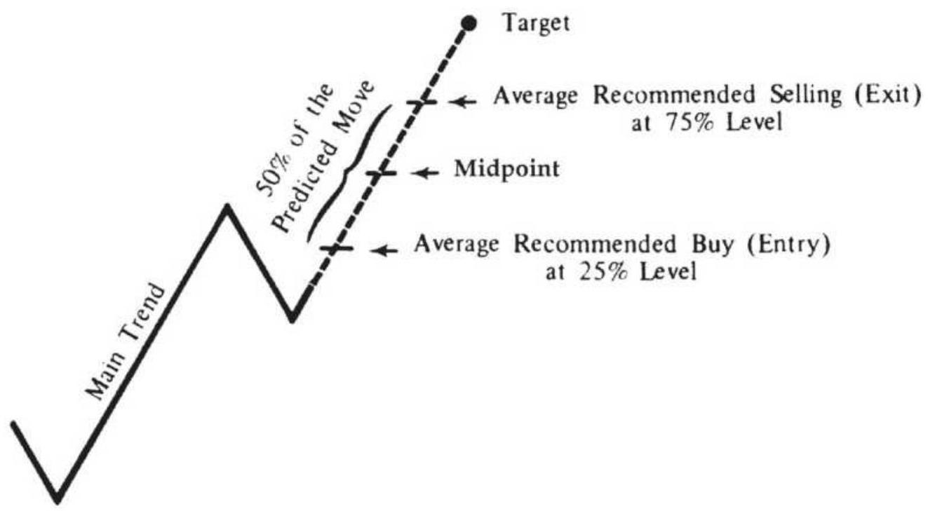
\section*{FIGURE 4.5 Trident entry-exit.}
Trident's approach is easy to understand: Each wave in the direction of the main trend will be equal in length to the previous wave in the same direction. The target is calculated by adding this distance to the highest or lowest point of the completed reaction. Forecasting the tops and bottoms of the waves is dependent on the time period used; the complex form of primary and intermediate waves, as in Elliott's principle, would hold true with Trident (see Figure 4.5).
Because there are inaccuracies in the measurement of behavioral phenomena, Trident emphasizes the practical side of its theory by offering flexibility in its choice of entry and exit points. By entering after \(25 \%\) of the anticipated move has occurred and exiting \(25 \%\) before the target, there is ample time to determine that the
downward reaction has ended before your long position is entered, and enough leeway to exit well before the next reaction. A critical point in each main trend is midway between the start of the move and the target. If the midpoint is not reached, main trend and the reactions are reevaluated. A change in the direction of the trend is finalized if a reversal equal in size to \(25 \%\) of the last reaction occurs during what was expected to be an extension of the main trend. That \(25 \%\) value becomes the trailing stop-loss on any trade in the event the objective is not reached.
This discussion is only intended to be a brief description of Trident's essential ideas. The actual system has other rules for target selection, major and minor trends, and corrective moves, and includes points to reverse positions based on the trailing stop. However, the main premise must hold up if the strategy is to be successful.
A later bulletin to Trident users suggested changes to their money management approach. Using a technique similar to Martingale, each loss is followed by an increase in the size of the next position. The trader only has to continue to increase his positions and stay with the system until he wins. A comprehensive version of this classic gambling approach can be found in the sections "Martingales and Anti-Martingales" and "Theory of Runs," both in Chapter 22. The unique concept for Trident is capturing the middle \(50 \%\) of the trend. The idea of increasing your position size following each loss will eventually result in ruin.
\section*{An Overview of Percentage Retracements}
The last few sections have discussed specific retracement levels advocated by past market analysts. This section takes a more general approach to percentage retracements, applying these levels to soybeans and the \(\mathrm{S} \& \mathrm{P} 500\).
\section*{Retracements Less than 100\%}
There is a significant difference between a full retracement (100\%) and a partial retracement. A full retracement negates the underlying reason for the previous move. But what is the significance of a \(50 \%\) retracement? Retracements are a common occurrence. They have been compared to the ebb and flow of the tides. Investors buy until they have bought too much, then the sellers come in to correct the overbought situation until the price is back to a level that attracts more buying.
The previous sections have discussed retracements of \(50 \%, 33 \%, 25 \%\), and \(12.5 \%\), as well as \(61.8 \%\) and \(38.2 \%\). The obvious problem is that, if there are so many possible retracement levels, then the price is likely to stop at one of them, even if by chance. Without other information, the most successful retracements are most likely to be the larger ones. Then \(100 \%\) is the most important and \(50 \%\) is the next most likely. After that there is \(33 \%\) and \(25 \%\), each of less importance, with \(12.5 \%\) too small to consider seriously. Fibonacci ratios are an exception; there seems to be evidence for expecting mass behavior to be reflected in these ratios.
Including Fibonacci, the most important retracements
are \(100 \%, 50 \%\), and \(61.8 \%\). Figure 4.6 shows one of each primary retracement on a weekly soybean chart during a 4-year period from 1976 to 1980. Markets that have high volume are most likely to conform to standard retracements. This means that index markets, such as the S\&P 500, would also show 50\% and 61.8\% pullbacks, but individual stocks may not. Broad participation is a requirement.
\section*{S\&P Retracement Levels}
S\&P futures, and now the sector SPDR SPY, have excellent liquidity; therefore, we would expect retracement levels to conform to the rule of large numbers. Unlike an agricultural product, or a stock with a strong seasonality, the \(S \& P\) is not likely to retrace \(100 \%\) of a longer-term move. We expect that the core inflation rate, added to the investment bias that exists in the United States, will cause a steady rise in the overall price of stocks. Figure 4.7 shows the first part of the bear market that began in 2000. The swing highs and lows are marked with letters beginning with \(A\) and \(C\) at the top, with \(B\) the low between them. The breakdown of the support line drawn horizontally from \(B\) results in prices reaching \(D\), a decline of \(100 \%\) of the range from \(A\) to \(B\), followed by a retracement of \(50 \%\) back to \(E\) (support becomes resistance). Throughout the decline we can find numerous examples of retracement that conform to the expectations of \(100 \%, 50 \%\), and less important, \(62 \%\).
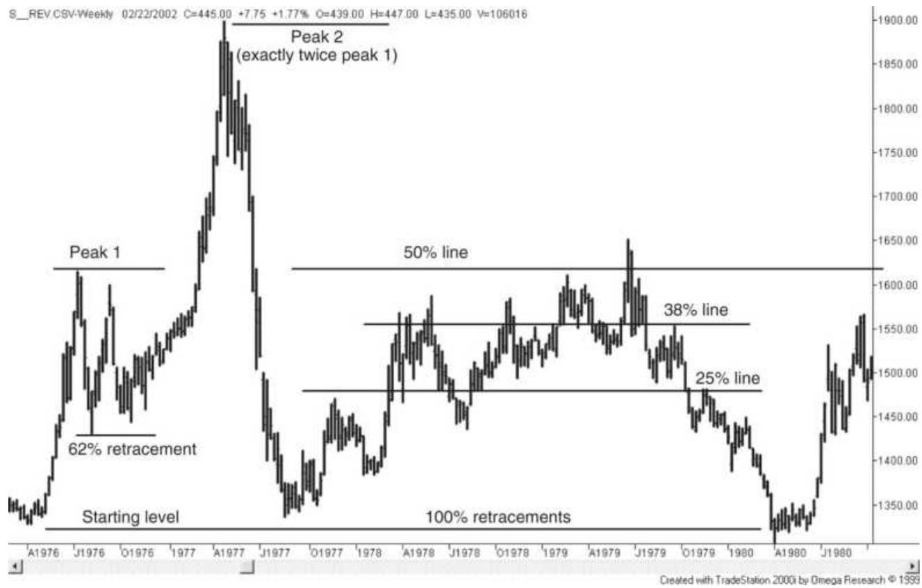
FIGURE 4.6 Soybean retracements in the late 1970s.
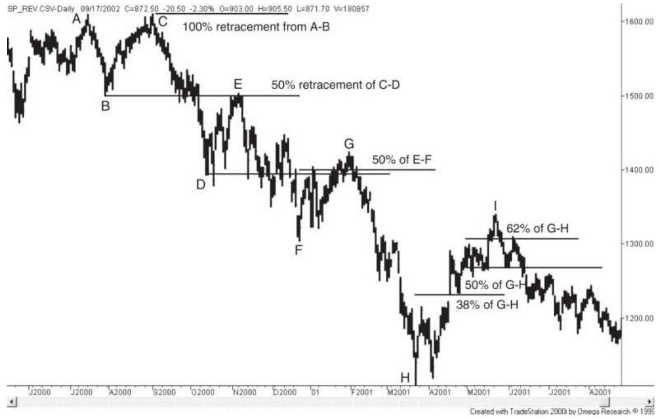
FIGURE 4.7 S\&P retracement levels.
Each retracement level is a trading opportunity. If a rally is expected to stop at a \(50 \%\) retracement, a short sale could be entered at that price. But anticipating a top and selling into a rising market has a high degree of risk. Price movement is not so precise that you can anticipate a target with a great degree of confidence. Targeting a profit level and exiting a trade is considered safe and sensible, because you are removing risk, but buying into a new position when prices are falling quickly is comparable to stepping in front of a moving train. Entering a new trade on a retracement is considered best when there is a confirmation that prices have stopped at that retracement level. This may manifest itself as slowing price movement, declining volatility, or declining volume occurring at a point very close to your expected retracement level. If prices don't stop, but continue with increasing volume, then you quickly close out the trade and try again later. Common sense is needed in addition to a retracement target.
Interesting observations were made by Tom DeMark \({ }^{11}\) about identifying the price move that serves as the basis for measuring retracements. If the market is currently at a low, rather than judging the distance of this drop from the most recent swing high, he chooses to look for the highest point that has occurred since the last time the market traded at this low level, thereby eliminating obsolete data. He then finds the most likely retracement points using the Fibonacci ratios o.618 and 1.618, plus Fibonacci "alternative" ratios \(0.382,0.50,1.382,2.236\), and 2.618 applied to the difference between the high and low, added to the current low price.
\section*{Trading at Even Numbers}
It is said that prices advance and decline to even numbers. A stock is more likely to stall at \(\$ 10\) than at \(\$ 9.25\); the price of gold resisted moving below \(\$ 1,000\), but once it had traded lower, it struggled to go back above \(\$ 1,000\). A study by the New York Federal Reserve confirms the increase in trader activity around even numbers.
It makes sense that investors are more likely to place orders at even numbers. Active traders and longer-term investors do not usually tell a broker to buy IBM at \(\$ 153.20\) but would more likely buy at \(\$ 152\) or \(\$ 153\). Even more investors would choose \(\$ 150\) or \(\$ 155\). When Martha Stewart placed her now well-known order to sell ImClone stock, it was at \$60, not at an odd value.
A trader can take advantage of this obvious bias for placing orders by avoiding even numbers and looking for free exposure when prices move through those levels. Moves through even numbers can be thought of as minor breakouts. If you want to sell short ImClone on a break below \(\$ 60\), place your sell order at \(\$ 60.25\) to be ahead of the crowd and take advantage of a fast drop caused by the bunching of orders at even numbers.
\section*{PROGRAMMING THE CHANNEL BREAKOUT}
The classic upward channel is formed by drawing a straight line along the bottom points of an upward trend, then constructing a parallel line that touches the extreme
high price of that same time interval, forming an envelope, or channel, around a price move. This construction was shown in Chapter 3 (see Figure 3.11). For a downward channel the trendline is first drawn through the high points of the declining price pattern, then a parallel line is drawn across the lowest low price of that interval. It is easy to do this with a chart and a ruler, and easy with drawing tools on a screen, but not as simple to transfer this concept to a computer program. Because a channel breakout is a basic trading strategy, an automated version may prove useful for identifying key market turning points.
1. Put the date in column A , a sequential number 1,2, \(3, \ldots\) in column B (call that value \(X\) ), and the closing price in column C.
2. Select a starting date on which you think prices are beginning a new direction, or a date that indicates the start of an existing trend. A new swing high above the previous swing high or swing low below the previous swing low might indicate that direction. A more general approach would be to use a rolling \(n\)-day period and test that the slope of the regression is angled enough to indicate a trend or that the "goodness of fit" is satisfied.
3. Using the regression tool in Excel, located in the Data menu, assign the closing prices (column C) to \(Y\) (the dependent variable), and the sequential numbers in column B to \(X\) (the independent variable) ending at the most recent data and starting at your selected date or \(n\) days ago. We can't use the
date for X because it has gaps due to weekends, which would cause an incorrect answer. Solve for \(a\) and \(b\), the slope and \(y\)-intercept. Once you have the \(a\) and \(b\) values, any point \(y\) on the regression line can be found using:
Straight line values, \(y=a \times X+b\), where \(X\) is the sequential number
4. Find the maximum and minimum residuals. For each closing price, subtract the corresponding value of \(y\). Save the maximum and minimum values as Rmax and Rmin.
5. Calculate the most recent value of the upper and lower bands, \(U=y(n)+\mathrm{Rmax}\) and \(L=y(n)-\mathrm{Rmin}\)
6. Project the bands one period ahead. In order to know whether tomorrow's price has broken through the channel, indicating a change of trend, we project the channel one period ahead using the slope value, \(a\),
\section*{Projected upper channel band at \(n+1=U+a\) Projected lower channel band at \(n+1=L-a\)}
Figure 4.8 shows a clear downward channel with the regression line through the center, the resistance line parallel to the regression line touching the highest residual, and the support line also parallel, touching the lowest residual.
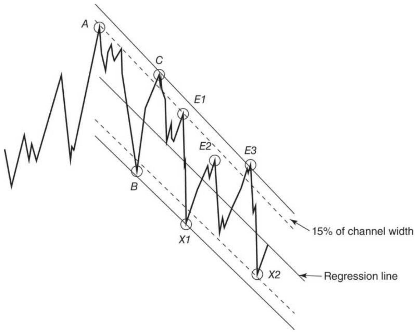
FIGURE 4.8 Trading a declining channel.
Decide if you are using the low or the close to signal a downward break of an upward trendline (slope \(a>0\) ). The close is more conservative, but the low will give a signal sooner. If the trend is up and the next close is below the projected lower band, then the trend has turned down. If the trend is down \((a<0)\) and the next close (or high) is greater than the projected upper band, then the trend has turned up. When the slope, \(a\), is very near zero, we have a sideways channel, but the same rules still apply.
\section*{Trading the Channel}
Because a major channel is considered a strong chart formation, prices that approach the channel, but have not penetrated the band, would be candidates for a countertrend entry. For example, if the trend is down and prices come within \(15 \%\) of the upper band (based on the channel width), we would enter a new short position (see Figure 4.8) or add to existing short sales. We do not necessarily want to cover those existing shorts at the bottom of the channel, especially if the downtrend is severe, because prices may continue lower; however, this technique offers a clear and safe way to scale into a trade with more than one entry point. The trade is closed out if the price breaks above the upper channel line in a downtrend or the lower channel line in an uptrend. If the trend is sideways (the slope is near zero), then exiting shorts and reversing to a long position is the preferred strategy. One note of caution: All trends turn sideways as they reverse direction. For a sideways market, the rate of change of the price should also be small.
\section*{MOVING CHANNELS}
Channels are frequently constructed as moving bands around prices. Some of these, such as those using a standard deviation, can claim statistical significance (see "Bollinger Bands" in Chapter 8). A simple mathematical way of representing a moving channel \((M)\) uses the average of the high, low, and close to designate the center of daily prices; the upper and lower bands are constructed using the average daily range (or true range), \(R\). The moving midpoint \(M\) and range \(R\) can be calculated for each day \(i\) over the past \(n\) days as:
\[
\begin{aligned}
& M_{t}=\frac{1}{3 n} \sum_{i=t-n+1}^{t}\left(H_{i}+L_{i}+C_{i}\right) \\
& R_{t}=\frac{1}{n} \times \sum_{i=t-n+1}^{t}\left(H_{i}-L_{i}\right)
\end{aligned}
\]
Then the upper and lower channel bands are formed by adding and subtracting \(1 / 2 R\) to the midpoint \(M\), and the forecast for the next day will project the path of the midpoint and apply a multiple of the range ( \(f\) ) for scaling:
\[
\begin{aligned}
U_{t+1} & =M_{t}+\left(M_{t}-M_{t-1}\right)+f \times \frac{R_{t}}{2} \\
L_{t+1} & =M_{t}+\left(M_{t}-M_{t-1}\right)-f \times \frac{R_{t}}{2}
\end{aligned}
\]
A long position is entered when the new price \(p_{t+1}>U_{t+1}\); a short is entered when \(p_{t+1}<L_{t+1}\). If a profit objective is needed, it can be calculated at a point equal in distance to the channel width from the channel breakout as follows:
Long objective (upper band), \(U O_{t+1}=U_{t+1}+f \times \frac{R_{t}}{2}\)
\[
\text { Short objective (lower band), } L O_{t+1}=L_{t+1}-f \times \frac{R_{t}}{2}
\]
The objective should remain fixed at the price level determined on the day of the breakout, or preferably, the point of breakout remains fixed but the distance to the profit target will change based on the current average true range (Figure 4.9). In that way, it would adjust to changing price volatility. More examples can be found in Chapter 20.
An alternative way of defining a channel would be to forecast one day ahead using the slope of a regression analysis and use the standard deviation of the price changes times a factor, to define the band. The other rules would remain the same. \({ }^{12}\)
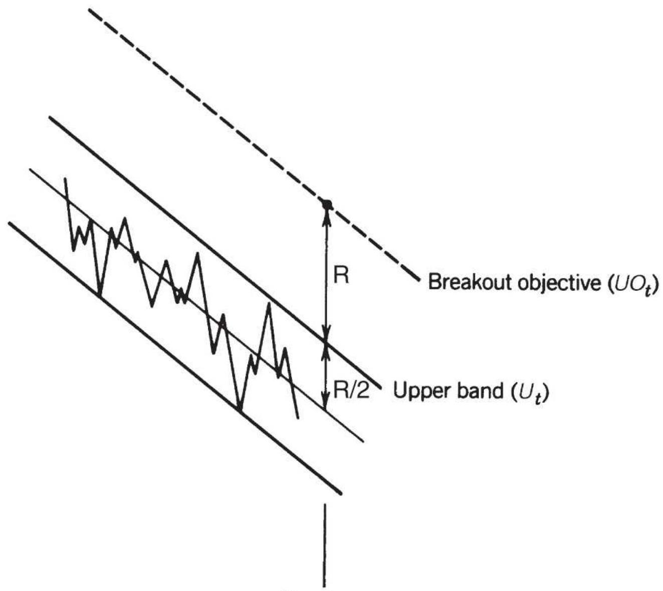
Day \(t\)
FIGURE 4.9 Channel calculation.
\section*{COMMODITY CHANNEL INDEX}
TheCommodity Channel Index (CCI) isn't necessarily for commodities and uses a channel only in the broadest sense. Instead, it is a measure of the deviation of the current price from the average of the previous \(n\) days. It is considered best for mean reversion trading. First, find the average of the daily high, low, and close, \(M\). Find the average of \(M\) over the past \(n\) days (call it \(A D P\) ):
\[
\begin{aligned}
M_{t} & =\frac{H_{t}+L_{t}+C_{t}}{3} \\
A D P_{t} & =\frac{\sum_{t=-n+1}^{t} M_{t}}{n}
\end{aligned}
\]

Then calculate the average deviation ( \(A v g D e v)\) over the same \(n\)-day interval:
\[
A v g D e v_{t}=\frac{\sum_{i=t-n+1}^{t}\left|M_{i}-A D P_{i}\right|}{n}
\]
Then \(C C I_{t}\) is the ratio of today's deviation divided by a fraction of the average deviation:
\[
C C I_{t}=\frac{\left(M_{t}-A D P_{t}\right)}{0.015 \times A v g D e v_{t}}
\]

This can be easily done in a spreadsheet and plotted with the underlying price. The full spreadsheet, TSM Commodity Channel Index HPQ, can be found on the Companion Website.
The CCI is essentially a variation on a standard deviation channel. When price becomes overbought during a strong upward move (price above the channel), it can stay that way for weeks at a time. Simple rules for buying and selling oversold and overbought prices will give
frequent small profits and an occasional very large loss.
\section*{WYCKOFF'S COMBINED TECHNIQUES}
Richard D. Wyckoff, popular in the early 1930s and still discussed today, relied solely on charts to determine the motives behind price behavior. He combined the three most popular methods - bar charting, point charts (the predecessor of point-and-figure charts), and waves - to identify the direction, the extent, and the timing of price behavior, respectively. 13
To Wyckoff, the bar chart combined price and volume to show the direction of the price movement. In general terms, it shows the trading ranges in which supply and demand are balanced. The volume complemented this by giving the intensity of trading, which relates to the quality of the long or short position. Wyckoff used group charts, or indices, in the manner of Charles Dow, to select sets of stocks with the most potential, rather than looking only at individual stock price movement. This assures that the move is based on the broader nature of business health, rather than on individual company dynamics. In today's market we can use the S\&P 500 or sector ETFs to accomplish the same objective.
Point-and-figure charts are used to condense price action. If prices move from lower to higher levels due to events, the time it takes to reach the new level is unimportant. Point-and-figure charts record events, not time. As long as prices rise without a significant reversal, the chart uses only one column; when prices change direction, a new column is started (see the point-and-
figure and the swing trading sections in Chapter 5). Price objectives can be determined from formations in a pointand-figure chart and are usually related to the length of the sideways periods, or horizontal formations. Wyckoff preferred these objectives to the comparable bar chart formations.
The wave chart, similar to Elliott's theories (discussed in Chapter 14), represents the behavior of investors and the natural rhythm of the market. Wyckoff uses these waves to determine the points of buying and selling within the limitations defined by both the bar chart and point-andfigure charts. He considered it essential to use the wave charts as a leading indicator of price movement.
Wyckoff used many technical tools but none rigidly. He did not believe in unconfirmed fundamentals but insisted that the market action was all you needed - the market's primary forces of supply and demand could be found in charts. He did not use triangles, flags, and other formations, which he considered to be a type of Rorschach test, but limited his analysis to the most basic patterns, favoring horizontal formations or congestion areas. He used time-based and event-based charts to find the direction and forecast price movement, then relied on human behavior (in the form of waves) for timing. His trading was successful, and his principles have survived.
\section*{COMPLEX PATTERNS}
Most charting systems involve a few simple rules, trying to model a price pattern that seems to have repeatedly
resulted in a profitable move. The most popular systems are trend breakouts, either a horizontal pattern or a trend channel. Over the years these approaches have proved to be steady performers. Another group of traders might argue that is it better to be more selective about each trade and increase the expectation of a larger profit than it is to trade frequently in order to win "in the long term" - that is, playing a statistical numbers game.
\section*{DeMark's Sequential \({ }^{\text {TM }}\)}
Tom DeMark created a strategy, called a sequential, that finds a very overextended price move, one that is likely to change direction, and takes a countertrend position. \({ }^{14}\) His selling objective is to identify the place where the last buyer has bought. His rules use counting and retracements rather than mathematical formulas and trendlines. To get a buy signal, the following three steps are applied to daily data:
1. Setup. To begin, there must be a decline of at least nine or more consecutive closes that are strictly lower than the corresponding closes four days earlier \(\left(\right.\) close \(_{t}<\) close \(_{t-4}\) ). If any day fails, the setup must begin again.
2. Intersection. To assure that prices are declining in an orderly fashion, rather than plunging, the high of any day on or after the eighth day of the setup must be greater than the low of any day three or more days earlier. Note that there can be a delay before the intersection occurs provided that the pattern is not negated by the rules in step 3 .
3. Countdown. Once the setup and intersection have been satisfied, count the number of days in which the close was lower than the close two days ago \(\left(\right.\) close \(_{t}<\) close \(\left._{t-2}\right)\). The days that satisfy this countdown requirement do not need to be continuous. When the countdown reaches 13 , we get a buy signal unless one of the following conditions occurs:
a. There is a close that exceeds the highest intraday high that occurred during the setup stage.
b. A sell setup occurs (nine consecutive closes above the corresponding closes four days earlier).
c. Another buy setup occurs before the buy countdown is complete. In this case the rules begin again at step 2. This condition is called recycling.
A sequential buy signal is shown in Figure 4.10 for the Deutsche mark (now the euro). The sell signal is the reverse of the buy. Traders should expect that the development of the entire formation will take no less than 21 days, but typically 24 to 39 days.
Deutsche Mark
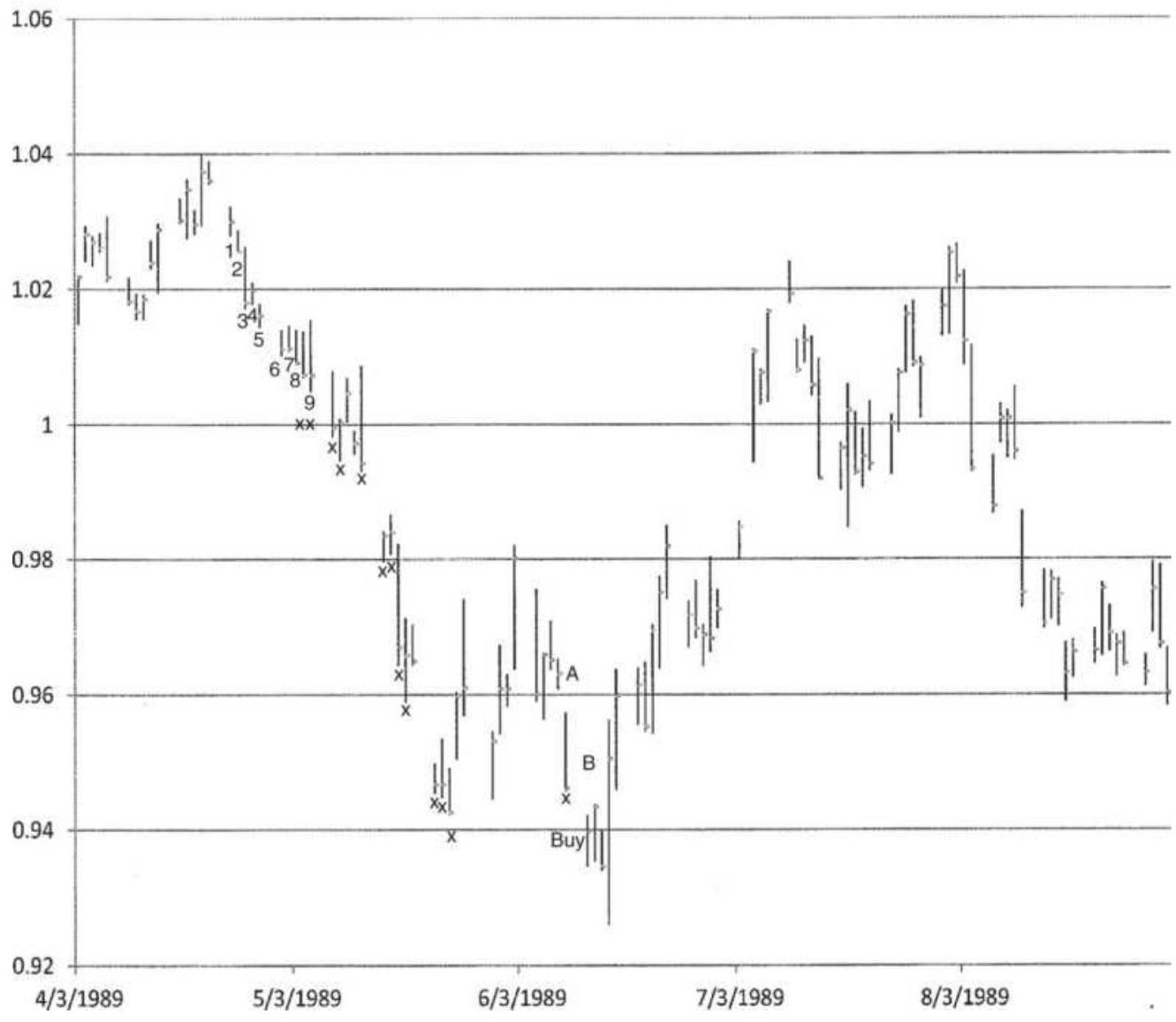
FIGURE 4.10 A sequential buy signal in the Deutsche mark.
Source: Data from Logical Information Machines, Inc. (LIM), Chicago, IL.
\section*{Entering the Sequential}
Once the buy signal occurs there are three choices for entering the market. The first is to enter on the close of the day on which the countdown is completed; however, this risks a new setup situation which will extend the conditions for an entry. The second requires a
confirmation of price direction, the close greater than the close four days ago, but it avoids the possibility of recycling. The third is to enter a long when the close is greater than the high two days earlier, a compromise between the first two techniques.
\section*{Exiting the Sequential}
A number of exit conditions provide the trader with clear rules to liquidate the current trade. First, the current buy setup is complete and the lowest price recorded does not exceed the furthest price recorded by the recent inactive setup (normally the previous sell setup). If, however, any price recorded in the current buy setup exceeds the furthest price of the previous sell setup, then the position is held until a reverse signal occurs.
Two stop-losses are recommended. For a buy signal, the true range of the lowest range day of the combined setup and countdown period is subtracted from the low of that lowest day to create a stop-loss. Alternatively, the difference between the close and the low of the lowest day is subtracted from the low of the lowest day for a closer stop-loss.
\section*{Thinking about Complex Patterns}
There is an extreme contrast between the simplicity of a horizontal breakout and the very complex set of rules that produce a signal for DeMark's sequential. The basic breakout system can be tested for robustness by comparing the performance of slightly longer and shorter calculation periods. As the calculation period
becomes larger, there are fewer trades, the profits per trade become larger, and the overall performance profile improves. In the case of DeMark's sequential, there is no way to measure robustness in the same terms. For the sequential, there is only one count of 13 days and 1 pattern. Only time will decide whether this pattern, or any other complex set of rules, produces a better set of trades.
\section*{COMPUTER RECOGNITION OF CHART PATTERNS}
A credible attempt to quantify charting patterns and assess their value was published by Lo, Mamaysky, and Wang. \({ }^{15}\) The authors applied kernel regression as a smoothing technique, then defined 10 charting formations in the context of the smoothed price series. For example, a head-and-shoulders top formation is defined in terms of the most recent five local maxima and minima in the smoothed series, \(E_{1}, E_{2}, E_{3}, E_{4}\), and \(E_{5}\). In the definitions of the tops, which follow, \(E_{1}\), \(E_{3}\), and \(E_{5}\) are maxima and \(E_{2}\) and \(E_{3}\) are minima; for the bottom formations, which are not shown, \(E_{1}, E_{3}\), and \(E_{5}\) would be minima and \(E_{2}\) and \(E_{3}\) the maxima.
\section*{Head-and-Shoulders Top:}
\(E_{3}>E_{1}, E_{3}>E_{5}\) (the middle maxima is greater than the left and right)
\(E_{1}\) and \(E_{5}\) are within \(1.5 \%\) of their average (the highs are not more than \(3 \%\) apart)
\(E_{2}\) and \(E_{4}\) are within \(1.5 \%\) of their average (the lows are within \(3 \%\) )
\section*{Broadening Top:}
\[
\begin{gathered}
E_{1}<E_{3}<E_{5} \\
E_{2}>E_{4}
\end{gathered}
\]
\section*{Triangular Top:}
\[
E_{1}>E_{3}>E_{5}
\]
\[
E_{2}<E_{4}
\]
\section*{Rectangular Top:}
1. Tops are within \(0.75 \%\) of their average
2. Bottoms are within \(0.75 \%\) of their average
3. Lowest top > highest bottom
\section*{Double Top:}
\(E_{1}\) and \(E_{b}\) are within \(1.5 \%\) of their average, where \(E_{1}\) is a maxima
\section*{\(t_{a}^{*}-t_{1}^{*}>22\)}
The identification of formations used a rolling window of 38 trading days; the notation \(t_{1}\) represents the first day of the current window, 37 days back. We interpret the notation \(t_{a}^{*}-t_{1}^{*}>22\) to mean that the two extrema \(E_{1}\) and \(E_{b}\) must be separated by more than 22 days. In the triangular formations, the key points used to identify the pattern did not align to form classic straight-line sides; however, the consolidating formation that was recognized is itself a good candidate for analysis.
Although the definitions are logical, the authors accept the differences between a mathematical definition of a charting formation and the visual, cognitive approach taken by a technical analyst. The human brain can assimilate and recognize more complex and subtle formations than the simple definitions presented in the paper. Then, on the one hand we have a somewhat limiting definition of chart patterns, and on the other we have the way in which humans select which patterns they choose to trade. It is far from certain which approach will yield the best returns.
The success of the formation was measured by the returns over the three days immediately following identification. In addition, the formations were conditioned on the trend of volume; that is, returns were separated into formations that develop with increasing or decreasing volume.
\section*{Results of the Study}
Tests were performed on several hundred U.S. stocks traded on both the NYSE and NASDAQ, from 1962 through 1996. The most common formations, the double top and double bottom, showed more than 2,000 occurrences of each. The next most frequent were the head-and-shoulders top and bottom, with over 1,600 appearances each. As a control, a random, synthetically created price series was also tested and showed only \(1 / 3\) the number of head-and-shoulders formations. It argues that charting patterns are formed by the actions of the participants rather than by random events. Based on the number of stocks tested, the head-and-shoulders formation appeared about once each year for each stock.
All but one of the chart formations (the triangular top) showed positive returns for the three days following the identification of the formation. Of these, five were rated as statistically significant: the head-and-shoulders top, the broadening bottom, the rectangular top, the rectangular bottom, and the double top.
When formations were conditioned on rising or declining volume, the results changed for some of the patterns. In general, rising volume improved results. Falling volume was better for the head-and-shoulders top, and the rectangular top and bottom. Most analysts would expect rising volume to favor a breakout of bottom formations and declining volume to improve most top formations.
On the whole, technical analysts would not be disappointed with the conclusions of this study. Although the chart patterns may not meet the strict
definition set by an experienced technician, they did capture the spirit of the formation and showed that positive returns followed. Confirmation is gratifying; any other conclusion would have been ignored.
For those not as mathematically gifted, but adept at computer programming, many of these formations can be created using the highs and lows generated from a swing chart, which is easily automated (a program is provided in Chapter 2). A trendline can be found using a least-squares regression through a series of swing highs or lows, qualified by a minimum variance. A triangle would be alternating swing highs and lows that get closer together. It is all within our reach and new programs continue to improve.
\section*{Bulkowski's Chart Pattern Rankings}
A particularly helpful section in Bulkowski's Encyclopedia of Chart Patterns is the summary at the end, where he ranks all the chart patterns by their success in forecasting price moves. The best five bullish formations are:
1. Upward breakout of a rectangular top
2. Upward breakout from a falling wedge
3. Upward breakout from an ascending triangle
4. Upward breakout from a double bottom
5. Upward breakout of a symmetric triangle after a downward move
For clarity, a rectangular top has multiple tests of a
resistance level before the breakout, and a double bottom breaks out when the price goes above the highest price that occurred between the two lows making up the double bottom. The breakout of a symmetric triangle formed during a downtrend is typically down and is said to confirm the existing trend. Bulkowski's study shows that it performs the opposite way, and with high reliability.
The best five bearish patterns are:
1. Descending scallops
2. Downward breakout of a symmetric triangle in a downtrend
3. Downward breakout of a broadening top
4. Downward breakout of a right-angled, descending, broadening formation
5. Downward breakout of a broadening bottom
Unlike the bullish formation, these seem dominated by broadening formations. For those unfamiliar with the descending scallop, an obscure formation, the scallop looks like a fishhook with the long stem to the left and the hook to the right. Attached to the end of the hook is another hook, also facing to the right, so that there is a series of longer declines and a shorter rounded recovery before another longer decline and rounded recovery.
A broadening top shows alternating swings getting larger, and is interpreted as a sideways pause during an uptrend. With a right-angled, descending, broadening formation there is a somewhat horizontal top (the right-
angle) to the swing highs and a broadening bottom before the downward break. A broadening bottom is similar to a broadening top but occurs during a downward price trend.
It is interesting that the broadening formations are more reliable when they break out to the downside. On the other hand, the symmetric triangle is the most dependable chart pattern because it forecasts a reliable price move whether it breaks to the upside or downside.
\section*{Testing the Candlestick Patterns}
Bulkowski followed his standard chart analysis with tests of candlestick patterns. \(\frac{16}{}\) He evaluated 412 combinations of 101 candle patterns, of which 100 , or \(24 \%\), qualified as being successful at least \(60 \%\) of the time. When those patterns were filtered for at least 51 occurrences, the number of successful patterns dropped to 10\%. Our normal reaction is that the successful patterns should also be simple. They are shown in Figure 4.11.
1. Above the stomach. A reversal pattern following at least two black candles, where the white candle opens within the previous black candle and closes above the high of the previous black candle.
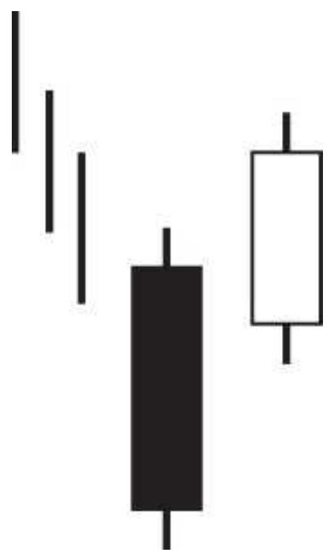
Figure 4.11a Above the stomach.
2. Belt hold, bearish and bullish. A reversal pattern. In the bullish formation the last black candle is followed by a tall white candle, with the high of the candle below the low of the previous low candle. Similar to a key reversal day. It performed well as a reversal.
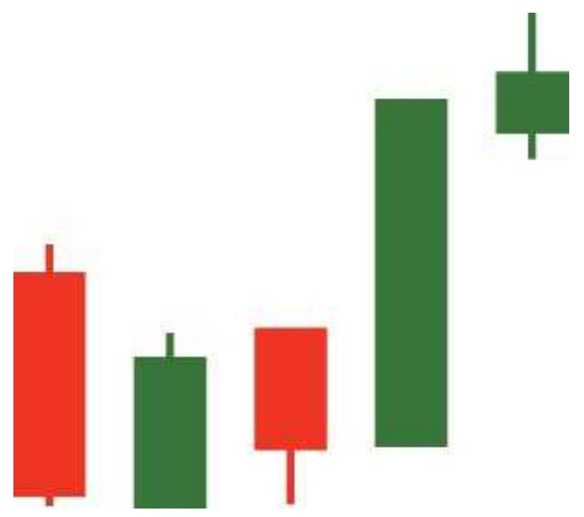
Figure 4.11b Bullish belt hold.
3. Deliberation. After an upward move, two white candles followed by a smaller white candle in which the body is fully above the body of the previous white candle. It is intended to be a reversal pattern but instead, it forecasted a continuous upward move \(75 \%\) of the time.
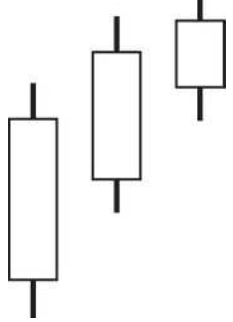
Figure 4.11c Deliberation.
4. Doji star, bearish. An intended reversal pattern following a series of white candles, the low of the bar is above the last candle and the open and close are at the same price, showing a horizontal bar for the body. While it appears that the move has faltered, tests showed that prices continued higher \(69 \%\) of the time. The trend wins.
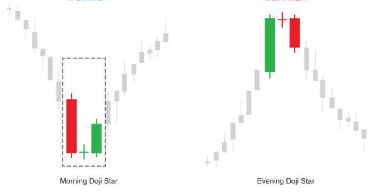
Figure 4.11d Morning doji star and evening doji star.
5. Engulfing, bearish. A common reversal pattern where a black candle is an outside day following a white candle and a series of higher candles. While reliable, the reversal is often small.
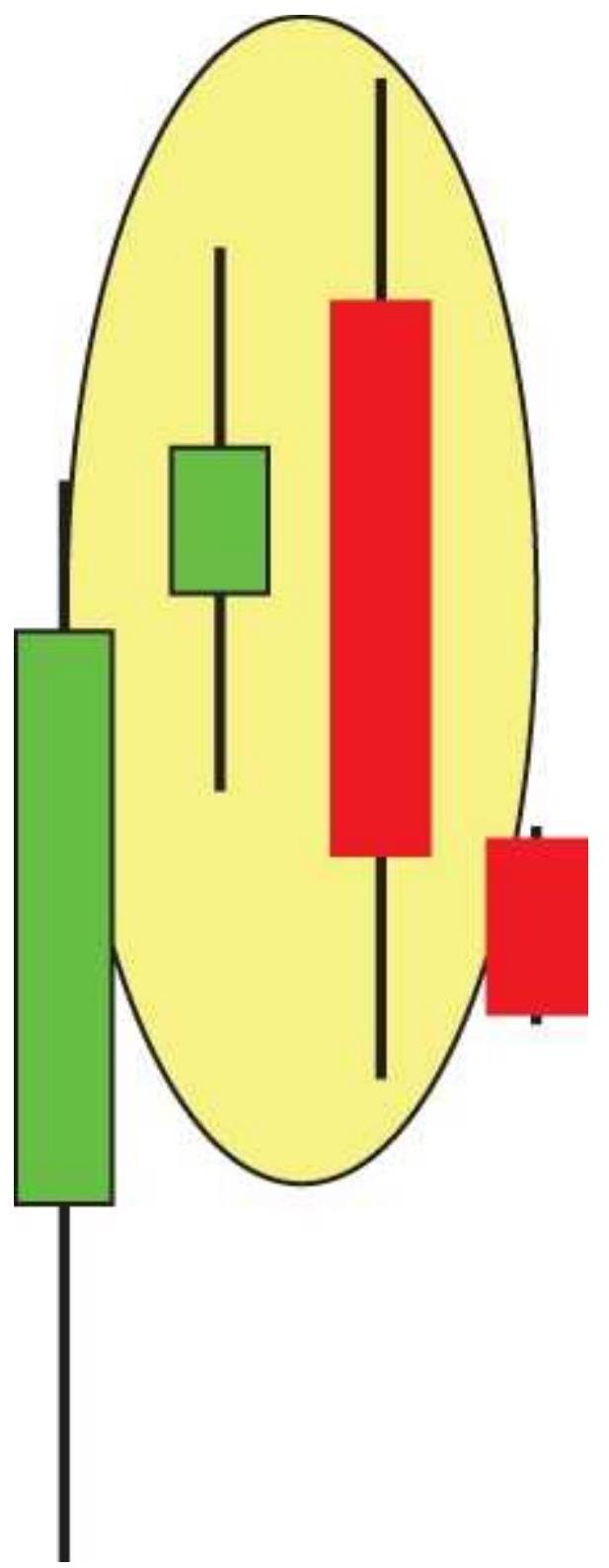
Figure 4.11e Bearish engulfing.
6. Last engulfing bottom and top. Both of these formations are intended to be a reversal pattern. For the bottom, where a black candle engulfs a previous
white candle (an outside day), tests show that it is a reliable indicator of a continued downtrend. The top formation strongly favored a continuation higher.
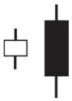
Figure 4.11f Last engulfing top.
7. Three outside up and down. The up formation is a gap down after a price decline, forming a black candle fully below the previous candle. This is followed by an engulfing white candle, then another white candle. Both patterns performed well as reversals, but downward breakouts were best.
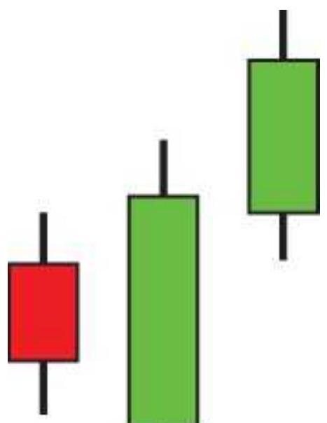
Figure 4.11g Three outside up.
8. Two black gapping candles. A downward move followed by a gap, then two black candles. This pattern performed well as a bullish reversal.

Figure 4.11h Two black gapping.
9. Rising and falling windows. Similar to a running gap, where the rising window has a black candle following a rising pattern, and the body is fully above the previous candle high, then followed by a gapping black candle. Both rising and falling windows performed well as continuation patterns.
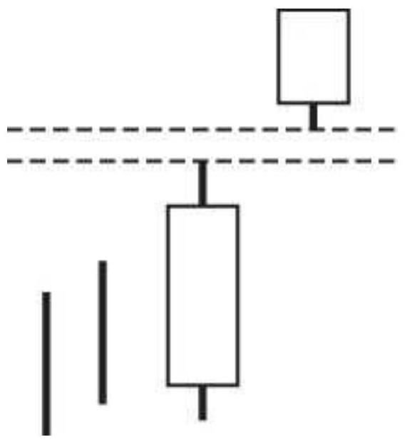
Figure 4.11i Rising window.
While these patterns were ranked as frequently successful, they give no indication of the length or success of the price move that followed.
\section*{NOTES}
1 William Dunnigan, Selected Studies in Speculation (San Francisco: Dunnigan, 1954), p. 7.
2 W. D. Gann, How to Make Profits in Commodities (Pomeroy, WA: Lambert-Gann, 1976). This book devotes a large section to swing charts and includes many examples of markets prior to Dunnigan's work.
3 Murray Ruggiero, "Dunnigan's Way," Futures, November 1998.
4 Each of his writings on systems contained examples of multiple-fund management of varied risk.
5 Refers to the Greek description of Fibonacci ratios.
6 A republication of Nofri's method (2010) is available on www.successincommodities.com.
\({ }_{7}\) See the discussion of key reversals in Chapter 3.
\(\underline{8}\) Curtis Arnold, "Your Computer Can Take You Beyond Charting," Futures (May 1984).
9 Johnan Prathap, "Three-Bar Inside Bar Pattern," Technical Analysis of Stocks \& Commodities (March 2011).
10 Charles L. Lindsay, Trident: A Trading Strategy (Windsor Books, 1976; Trident Systems Publications, 1991).
11 Thomas R. DeMark, "Retracing Your Steps," Futures (November 1995). Also see Chapter 2 of DeMark, The New Science of Technical Analysis (New York: John Wiley \& Sons, 1994).
12 For a further discussion of channels, see Donald Lambert, "Commodity Channel Index," Technical Analysis of Stocks \& Commodities (October 1980), and John F. Ehlers, "Trading Channels," Technical Analysis of Stocks \& Commodities (April 1986).
13 Jack K. Hutson, "Elements of Charting," Technical Analysis of Stocks \& Commodities (March 1986).
14 Thomas R. DeMark, The New Science of Technical Analysis (New York: John Wiley \& Sons, 1994).
15 Andrew W. Lo, Harry Mamaysky, and Jiang Wang, "Foundations of Technical Analysis: Computational Algorithms, Statistical Inference, and Empirical Implementation," Journal of Finance (August 2000).
16 Thomas Bulkowski, The Encyclopedia of Candlestick Charts (Hoboken: John Wiley \& Sons, 2008), Chapter 1.
\section*{CHAPTER 5}
\section*{Event-Driven Trends}
Trends are sustained moves in one direction. In the previous chapters, an upward trend was identified by drawing an upward angling line under the lows of a rising price formation. Time is an important factor. The price for each week, each day, or each bar is plotted to the right of the last price. Like the ticking of a clock, prices must continue to move. If they stop, the trend is over. But there are methods of recognizing the trend that ignore time. This chapter will look at those methods.
A price trend can be thought of as an accumulation of reactions to news and economic reports - that is, a series of large and small jumps in price. In between, traders anticipate that the trend direction will continue. For some systems, it is only when the accumulation of positive or negative news drives prices to new highs or lows that is important. Anything in between is ignored. These methods include the breakout, point-and-future, and swing trading. The shorter the period of observation, the more sensitive the system and the more frequent the trades.
There is no math required, simply the idea that, if prices moved to a new high or new low, then something important has happened. This approach appeals to our common sense and has proved to be a successful strategy. As you progress through this book and become
familiar with more complex and mathematically intricate techniques, continually ask yourself to what degree the newer methods have improved on the older, simpler ways of recognizing a trend.
\section*{SWING TRADING}
A price swing is a price movement up or down by a preset minimum size (the swing filter). A new upward swing starts when prices reverse from the lows by the filter size. New highs are recorded until prices turn down from the swing high by the swing filter amount. Once the direction is down, new lows are recorded until the price turns up from the swing low by the swing filter amount. The distance from any swing high to the next swing low is no smaller than the swing filter. With a large filter, you can choose to plot only the major price moves, or, using a small filter you can fill the chart with frequent price reversals. The swing filter can be expressed in cents, dollars, or as a percentage of the current stock or commodity price.
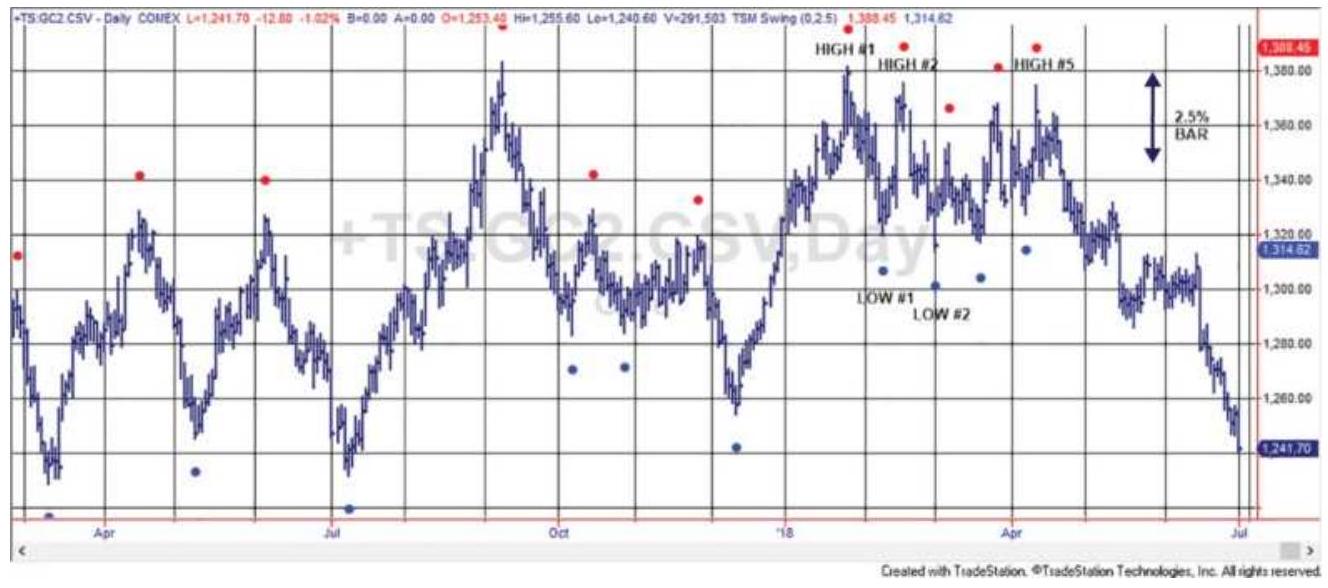
FIGURE 5.1 Gold futures with \(2.5 \%\) swing points marked.
Figure 5.1 shows a bar chart of gold futures with points above and below the bars representing the swing highs and lows based on a \(2.5 \%\) swing filter. At the high of \(\$ 1,380,2.5 \%\) is a minimum swing of \(\$ 34\). A percentage swing filter is determined at the point of the last swing high or swing low, so it will vary slightly from swing to swing. A bar at the top right of the figure shows the filter equal to a \(\$ 34\) move.
\section*{Constructing a Classic Swing Chart}
You may plot the swing high and low points on a bar chart, or create a classic swing chart that looks like Figure 5.2, the result of using the gold swings in Figure 5.1. You can change the frequency of the data and size of the swing to satisfy your personal trading preference. If you don't want to do this manually, the indicator TSM Swing plots the points on a chart for you. It can be programmed to print each swing high and low to a file.
1. For convenience, assume we start on the gold chart at HIGH\#1. We can actually start at any point, but the first swing may not be accurate. Record the high of the bar as the last swing high, SH. Following this swing high, we are in a downswing. Record the low of the day as the low of the current swing, CL.
2. On the next day, first test if the downswing continues. If the Low \(<\mathrm{CL}\), then \(\mathrm{CL}=\) Low.
3. Now test if the downswing reverses. If the High - CL
> swing filter, then we have a new upswing. Let the new swing low \(\mathrm{SL}=\mathrm{CL}\) and set \(\mathrm{CH}=\) High.
\section*{2.5\% Gold swings}
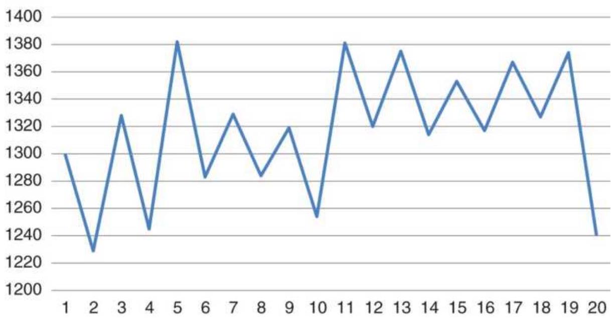
FIGURE 5.2 Corresponding swing chart of gold using a \(2.5 \%\) swing filter.
4. On the next day, test if the upswing continues. If the High \(>\mathrm{CH}\), then \(\mathrm{CH}=\) High.
5. Now test if the upswing reverses. If the CH - Low \(>\) swing filter, then we have a new downswing.
6. Go to step 2.
Traders will find that these rules are very similar to the point-and-figure rules later in this chapter. The swing chart that is created from the rules has only the swing high and swing low points in alternating columns. It simplifies the picture by skipping all the intermediate moves, as shown in Figure 5.2. It has removed time from the picture.
A different view of a swing chart construction is given in
Figure 5.3. In this chart the boxes are filled with the date on which the price moved into that box, adding a little more information. Using this form of recording swing makes it possible to see the origins of point-and-figure charting, which will be explained in the next section.
\section*{Percentage Swings}
The swing filter, which determines the minimum swing size, can be most robust if it is expressed as a percentage of price rather than as a fixed dollar per share or point value. Many markets have doubled in value - or halved or both - over the past ten years. Using a fixed value for finding the swing highs and lows will cause the swing chart to be insensitive to price movement at low prices and show frequent changes in swings at higher prices. The swing filter, expressed as a percentage \(p\), avoids this problem.
\[
\% \text { Swing filter }_{t}=p \times \text { Price }_{t}
\]
This variable swing filter helps to keep the sensitivity of the swings the same over a long period, which is very helpful for back-testing of results and for more consistent trading signals. The only complication is that the minimum swing value may change daily. To avoid that, recalculate the swing filter only when a new swing high or swing low is formed.
\begin{tabular}{|l|rrrrr|}
\cline { 2 - 6 } \multicolumn{1}{c|}{} & \multicolumn{4}{c|}{ Price swings } \\
\hline Price & Up & Down & Up & Down & Up \\
\hline 1220 & & & & & 25 \\
1215 & & & & & 25 \\
1210 & & & & & 25 \\
1205 & & & & & 25 \\
1200 & & & & & 25 \\
1195 & & & 17 & 19 & 22 \\
1190 & & & 17 & 19 & 22 \\
1185 & 12 & 13 & 15 & 19 & 22 \\
1180 & 8 & 13 & 14 & 19 & 22 \\
1175 & 8 & 13 & 14 & 19 & 22 \\
1170 & 8 & 13 & 14 & & \\
1165 & 6 & 13 & 14 & & \\
1160 & 3 & 13 & 14 & & \\
1155 & 3 & & & & \\
1150 & 1 & & & & \\
1145 & 1 & & & & \\
1140 & 1 & & & & \\
1135 & 1 & & & & \\
1130 & & & & & \\
\hline
\end{tabular}
FIGURE 5.3 Recording swings by putting the dates in the first box penetrated by the price.
\section*{Rules for Swing Trading}
Each swing represents a price trend. There are two sets of rules commonly used to enter positions in the trend direction:
1. (Conservative) Buy when the high of the current upswing exceeds the high of the previous upswing (two columns back). Sell when the low of the current downswing falls below the low of the previous downswing.
2. (Aggressive) Buy as soon as a new upswing is recognized. Sell when a new downswing is recognized. Both of these occur the first time there is a reversal greater than the swing filter.
The sideways market in gold (Figure 5.2) is not a good example for trends, but the last leg down, on the far right of the chart, would generate a sell signal on a break of the previous swing low, at about 1325. In that market, the aggressive approach would have been better.
\section*{The Swing Philosophy}
The primary advantage of a swing method, and most event-driven trend systems, is that no action occurs if prices move sideways. We will see in the next two chapters that a trend recalculated on each bar, such as a moving average, has an agenda. That is, prices must continue to advance if the trend is to remain intact. In a
swing philosophy, prices can move sideways or stand still within a trend. Prices can move up and down in any pattern as long as they do not violate the previous swing highs (if in a downtrend) or swing lows (if in an uptrend). This characteristic of event-driven systems makes them very robust at a cost of higher risk. Risk is measured as the difference between the entry point of a trade (the price at which the old swing high or low was penetrated) and the price at which an exit or reverse trade would be signaled. This risk can be as small as the swing filter or much larger if there was a sustained price move.
Another benefit of the swing method is that it can signal a new trade at the moment of a significant event - that is, without a lag. If the news is a surprise to the market and prices move out of their current trading levels to new highs or new lows, the swing method will signal a new trade. This immediate response is a very positive feature for most traders, who want to act in a timely manner. It is very different from trend systems that use moving average or other time series calculations, which have lags.
\section*{The Livermore System}
Known as the greatest trader on Wall Street, Jesse Livermore was associated with every major move in both stocks and commodities during the 30-year period from 1910 to 1940. Livermore began his career as a board boy, marking prices on the high slate boards that surrounded the New York Stock Exchange floor. During this time, he began to notice the distinct patterns in the price
movement that appeared in the columns of numbers. \({ }^{1}\) As Livermore developed his trading skills, he continued the habit of writing prices in columns headed Secondary Rally, Natural Rally, Up Trend, Down Trend, Natural Reaction, and Secondary Reaction. This may be the basis for a number of systematic charting methods.
Livermore's approach to swing trading required two filters, a larger swing filter and a penetration filter, believed to be one-half the size of the swing filter. Penetrations were significant at price levels he called pivot points. A pivot point is defined in retrospect as the top and bottom of each new swing and are marked with letters in Figure 5.4.․․ Pivot points remain a popular way of identifying relative highs and lows.
Livermore took positions only in the direction of the major trend. A major uptrend is defined by confirming higher highs and higher lows, and a major downtrend by lower lows and lower highs, and where the penetration filter is not broken in the reverse direction. That is, an uptrend is still intact as long as prices do not decline below the previous pivot point by as much as the amount of the penetration filter (seen in Figure 5.4). Once the trend is identified, positions are added each time a new penetration occurs, confirming the trend direction. A stop-loss is placed at the point of penetration beyond the prior pivot point. Livermore's rules are not clear about the penetration filter being one-half the swing filter; it may have been as small as \(20 \%\) of the current swing size.
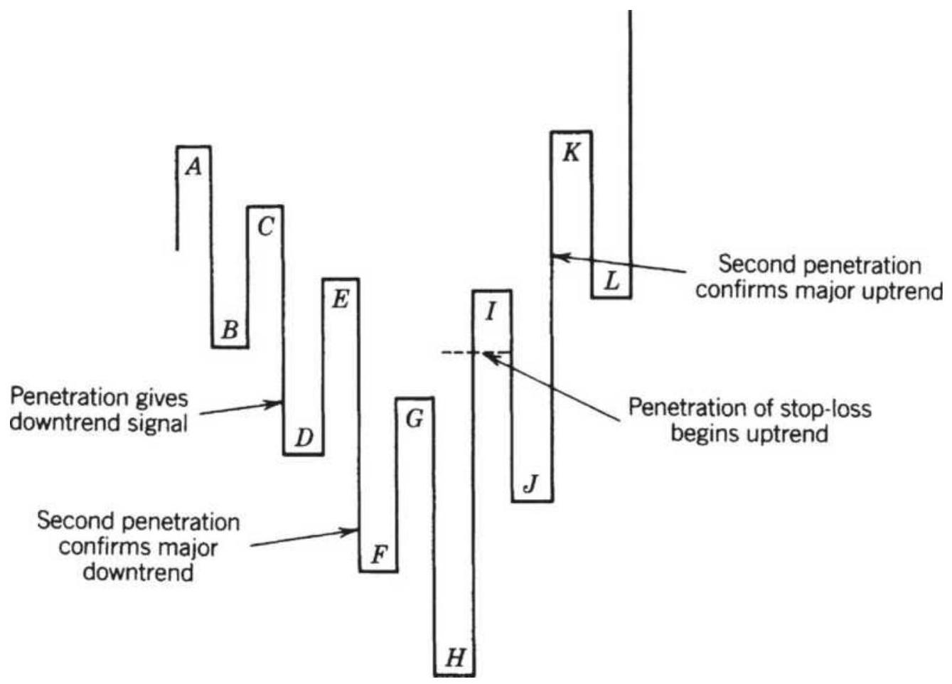
FIGURE 5.4 Livermore's trend change rules.
\section*{Failed Reversal}
In the Livermore system, the first penetration of the stop-loss (a new swing high for a short or swing low for a long position) calls for liquidation of the current position. A second penetration is necessary to confirm the new trend. If the second penetration fails (at point \(K\) in Figure 5.5), it is considered a secondary reaction within the old trend. The downtrend may be reentered at a distance of the swing filter below \(K\), guaranteeing that point \(K\) is defined, and again on the next swing, following pivot point \(M\), when prices reach the penetration level below pivot point \(L\). It is easier to reenter an old trend than to establish a position in a new
one.
\section*{Programming the Swing High and Low Points}

The swing method can be programmed in strategy development software or Excel. The good part about specialized software is that the points can be shown on a price chart to give visual confirmation, as seen in Figure 5.1. The indicator TSM Swing can be found on the Companion Website along with the Excel spreadsheet that does the same calculations. Note that the spreadsheet tests for a reversal first before it tests for a continuation of the trend.
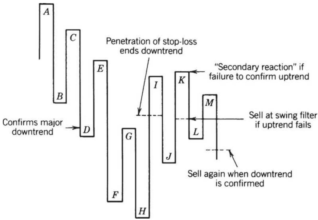
FIGURE 5.5 Failed reversal in the Livermore method.
\section*{Keltner's Minor Trend Rule}
TheMinor Trend Rule was published by Keltner in his book, How to Make Money in Commodities. For many years it was followed closely by a large part of the agricultural community and is relevant for its simplicity and potential impact on markets. In today's high-tech environment, it is important to remember that many trading decisions are still made using simple tools.
Keltner defines an upward trend by the failure to make new lows (comparing today's low with the prior day) and a downtrend by the absence of new highs. This notion is consistent with chart interpretation of trendlines by measuring upward moves along the bottom and downward moves along the tops. The rule states that the minor trend turns up when the daily trend (which we interpret as price) trades above its most recent high; the minor trend stays up until the daily trend trades below its most recent low, when it is considered to have turned down. In order to trade using the Minor Trend Rule, buy when the minor trend turns up and sell when the minor trend turns down; always reverse the position.
The Minor Trend Rule is a simple short-term trading tool, buying on new highs and selling on new lows with risk varying according to volatility. It differs from the filtered swing method because there is no minimum requirement for a reversal. It will also produce many more swings.
\section*{Pivot Points}
A pivot point, discussed in Chapter 3 and later in
Chapter 7, is the high or low point of a reversal, but a much weaker condition than a swing high or low. It could be the center point of three trading days, five days, or more. A 5-day pivot point means that there are two days on each side of the local high or low price. For example, a 5-day pivot point has a 2-day lag because you cannot identify it until the close of the second day following the high or low point. Unlike a swing filter, a pivot point does not have a minimum size.
\section*{Wilder's Swing Index}
Although Wilder called this the Swing Index, it is a combination of daily range measurements with trading signals generated using pivot points. However, it is clearly an event-driven method. It was presented with trading rules in Wilder's Swing Index System. \({ }^{3}\) Wilder believed that the five most important positive patterns in an uptrend are:
1. Today's close is higher than the prior close.
2. Today's close is higher than today's open.
3. Today's high is greater than the prior close.
4. Today's low is greater than the prior close.
5. The prior close was above the prior open.
In a downtrend, these patterns are reversed.
The Swing Index, SI, combines these five factors, then scales the resulting value to fall between +1 and -1 .

where
\(\mathrm{K}=\) the largest of \(\left|H_{t}-C_{t-1}\right|\) and \(\left|L_{t}-C_{t-1}\right|\)
\(M=\) the value of a limit move (more about this below)
\(T R=\) the weighted true range
True range is calculated from the following two steps (note that this is the same true range as commonly used; however, step 2 requires that you know which of the three combinations was largest):
1. First, determine which is the largest of:
\[
\begin{aligned}
& \text { a. }\left|H_{t}-C_{t-1}\right| \\
& \text { b. }\left|L_{t}-C_{t-1}\right| \\
& \text { c. }\left|H_{t}-L_{t}\right|
\end{aligned}
\]
2. Calculate \(T R\) according to the corresponding formula, using (a) if the largest in step 1 was (a), use (b) or (c) if one of those was the largest in step 1.
a. \(T R=\left|H_{t}-C_{t-1}\right|-0.50 \times\left|L_{t}-C_{t-1}\right|+0.25 \times\left|C_{t-1}-O_{t-1}\right|\)
b. \(T R=\left|L_{t}-C_{t-1}\right|-0.50 \times\left|H_{t}-C_{t-1}\right|+0.25 \times\left|C_{t-1}-O_{t-1}\right|\)
c. \(T R=\left|H_{t}-L_{t}\right|+0.25 \times\left|C_{t-1}-O_{t-1}\right|\)
The SI calculation uses three price relationships: the net price direction (close-to-close), the strength of today's
trading (open-to-close), and the memory of yesterday's strength (prior open-to-prior close). It then uses the additional factor of volatility as a percentage of the maximum possible move \((K / M)\). The rest of the formula simply scales the results to within the range of +1 to -1 .
\section*{Updating the Swing Index}
In today's market, \(M\), the limit move, doesn't exist. When Wilder developed this method, all markets had limit moves; that is, trading halted when prices moved to a maximum daily price change as determined by the exchange. That is no longer the case. With some markets, trading is temporarily halted when prices move to a preset limit, but after a few minutes trading begins again. For those markets, there is no clear value for \(M\); however, that is easily resolved. \(M\) is used only to scale the index into the range +1 to -1 . If we choose an
arbitrary value, larger than the normal daily move, the results will be fine. Because the trading rules use only the relative highs and lows of the index, rather than thresholds such as 0.90, the results will be the same regardless of the choice of \(M\). In these examples,
Figure 5.6 shows the daily prices for Eurobund futures along with the values of the Swing Index for the last few months of 2010 and the beginning of 2011. SI switches from a positive bias at the beginning of the chart to a negative one as prices turn from bullish to bearish. These calculations are given in the spreadsheet, TSM Wilder Swing Index, found on the
Companion Website. The Swing Index is in the TradeStation library of indicators and functions; however, those programs require that the limit move be preset with each market. Instead, TSM Wilder Swing Index is provided on the Companion Website that allows you to input that value as, for example, 100.
\section*{Trading Rules}
The daily \(S I_{t}\) values are added together to form an Accumulated Swing Index (ASI),
\[
A S I_{t}=A S I_{t-1}+S I_{t}
\]
which is substituted for the price and used to generate trading signals, allowing the identification of the significant highs and lows as well as clear application of Wilder's trading rules. The terms used in the trading rules are:
HSP, High swing point: Any day on which the ASI is higher than both the previous and the following day.
\(L S P\), Low swing point: Any day on which the \(A S I\) is lower than both the previous and the following day.
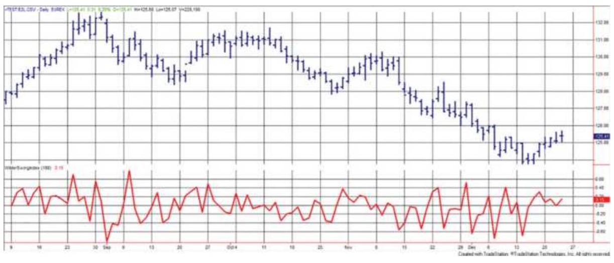
FIGURE 5.6 Wilder's Swing Index applied to Eurobund back-adjusted futures, using TradeStation modified code.
SAR, Stop and reverse points (three types) - Index SAR points generated by the \(A S I\) calculation, SAR points applied to a specific price, and Trailing Index \(S A R\), which lags 60 ASI points behind the best \(A S I\) value during a trade.
\section*{The Swing Index System rules are:}
1. Initial entry:
a. Enter a new long position when \(A S I_{t}\) crosses above \(H S P_{t-2}\).
b. Enter a new short position when \(A S I_{t}\) crosses below \(L S P_{t-2}\). Note that HSP and LSP cannot be identified until two days after they occur.
2. Setting the \(S A R\) point:
a. On entering a new long trade, the \(S A R\) is the most recent \(L S P\); the \(S A R\) is reset to the first
\(L S P\) following each new HSP. A trailing \(S A R\) is the lowest daily low occurring between the highest \(H S P\) and the close of the day on which the \(A S I\) dropped 60 points or more.
b. On entering a new short trade, the \(S A R\) is the most recent \(H S P\); the \(S A R\) is reset to the first \(H S P\) following each new \(L S P\). The trailing \(S A R\) is the highest daily high occurring between the lowest \(L S P\) and the close of the day on which the \(A S I\) rose by 60 points or more.

The program TSM Accumulated Swing Index can be found on the Companion Website.
\section*{POINT-AND-FIGURE CHARTING}
There does not appear to be any record of which came first, swing charting or point-and-figure charting. Both methods are very similar; however, point-and-figure has developed a greater following. Point-and-figure charting is credited to Charles Dow, who is said to have used it just prior to the turn of the twentieth century. It has three important characteristics:
1. It has simple, well-defined trading rules.
2. It ignores price reversals that are below a minimum price move as determined by the box size.
3. It has no time factor (it is event-driven). As long as prices fail to change direction by the reversal value, the trend is intact.
When point-and-figure charting first appeared, it did not contain the familiar boxes of \(X \mathrm{~s}\) and \(O \mathrm{~s}\). The earliest book containing the subject is reported to be The Game in Wall Street and How to Play It Successfully, written by "Hoyle" (not Edmond Hoyle, the English writer) in 1898. The first definitive work on the subject was by Victor De Villiers, who published The Point and Figure Method of Anticipating Stock Price Movement in 1933. De Villiers worked with Owen Taylor to publish and promote a weekly point-and-figure service, maintaining their own charts; he was impressed by the simple, scientific methodology. As with many of the original technical systems, the application was intended for the stock market, and the rules required the use of every price change appearing on the ticker. It has also been highly popular among futures traders in (what were) the grain and livestock pits of Chicago. The rationale for a purely technical system has been told many times, but an original source is often refreshing. De Villiers said: 4
\section*{The Method takes for granted:}
1. That the price of a stock at any given time is its correct valuation up to the instant of purchase and sales (a) by the consensus of opinion of all buyers and sellers in the world and (b) by the verdict of all the forces governing the laws of supply and demand.
2. That the last price of a stock reflects or crystalizes everything known about or bearing on it from its first sale on the Exchange (or prior), up to that time.
3. That those who know more about it than the observer cannot conceal their future intentions regarding it. Their plans will be revealed in time by the stock's subsequent action.
Who can argue with that? The point-and-figure chart differs from the swing chart in that each column representing an upswing is a series of boxes containing \(X\) s and each downswing is shown as a string of \(O\) s (Figure 5.7), and a new mark is not entered unless a minimum price change (the box size) occurs.
The original figure charts were plotted on graph paper with square boxes, and only dots, or the exact price, were written in each box. The chart evolved to have prices written on the left scale of the paper, where each box represented a minimum price move. Some point-andfigure chartists then used a combination of \(X \mathrm{~s}\) and occasional digits (usually os and 5 s every five boxes) to help keep track of the length of a move. In some cases, the top of an upswing column was connected to the start of a downswing in the next column with a crossbar, and the bottom of a downswing column was connected to the beginning of the next upswing column. This gave the point-and-figure chart an appearance similar to the swing chart. Charts using 1, 3, and 5 points per box were popular. In the 5 -point method, no entry was recorded unless the price change spanned 5 points. It is most likely that a "point" is a minimum move. Floor traders used the charts to show only the short-term price moves and left a lot to the interpretation of patterns.
\section*{Silver}
\begin{tabular}{|l|l|l|l|l|l|l|l|l|l|l|}
854.0 & X & & & & & & & & & \\
\hline 853.0 & X & O & X & & & & & & & \\
\hline 852.0 & X & O & X & O & & & & & & \\
\hline 851.0 & & O & X & O & X & & & & & \\
\hline 850.0 & & O & & O & X & O & & & & \\
\hline 849.0 & & & & O & X & O & & & & \\
\hline 848.0 & & & & O & X & O & & & & \\
\hline 847.0 & & & & O & & & & & & \\
\hline 846.0 & & & & & & & & & & \\
\hline
\end{tabular}
FIGURE 5.7 Point-and-figure chart.
\section*{Plotting Prices Using the Point-and-Figure Method}
To plot prices on a point-and-figure chart, start with a piece of square-box graph paper and mark the left scale with price increments equal to one box. How much is that? In the current market, you should start with a box equal to the 20-day average true range of the market. In late 2017, the box size would have been 15 points for the S\&P, \(\$ 4\) for gold, \(\$ 1.10\) for crude oil, \(\$ 2.75\) for Apple, and \(\$ 1.50\) for Walmart. Increasing or decreasing the box size
will make the chart less or more sensitive to changes in direction, as will be seen in later examples. Therefore, a point-and-figure chartist looking for a long-term price movement will use a larger box size.
Once the graph paper has been scaled and the prices entered along the left side, the chartist can begin. The first box is entered with the current closing price of the market. If the price of soybeans is 852.50 and a
\(1 \phi(1 \phi=1.00)\) box is being used, a mark is placed in the box beside the value 852. An \(X\) or an \(O\) is used to indicate that the current price trend is up or down, respectively. Either an \(X\) or \(O\) may be used to begin after that, it will be determined by the method.
The rules for plotting point-and-figure charts are similar to a swing chart. Preference is given to price movements that continue in the direction of the current trend. Therefore, if the trend is up (represented by a column of \(X s\) ), the new high price is tested first; if the trend is down, the low price is tested first. A reversal is checked only if the new price fails to increase the length of the column in the direction of the current trend. No box is filled unless the price reaches the value associated with that box.
\section*{Starting a New Column}
The traditional point-and-figure method calls for the use of a 3-box reversal, that is, the price must reverse direction by an amount that fills 3 boxes from the most extreme box of the last column before a new column can begin (it actually must fill the fourth box because the
extreme box is left blank). The importance of keeping the 3 -box reversal has long been questioned by traders. It should be noted that the net reversal amount (the box size times the number of boxes in the reversal) is the critical value, and is similar to the swing filter.
For example, a 25-point box for the NASDAQ 100 futures (NQ) with a 3-box reversal means that NQ prices must reverse from the lows of the current downtrend by 75 points to indicate that an uptrend has started. The opposite combination, a 3 -point box and a 25 -box reversal, would signal a new trend after the same 75point reversal. The difference between the two choices is that the smaller box size would recognize a smaller continuation of a price move by filling more boxes. Ultimately the smaller box size will capture more of the price move. The choice of box size and reversal boxes will be considered later in more detail.
\section*{Painless Point-and-Figure Charts}
There are a number of graphic charting and quote systems that allow a simple bar chart to be converted to point-and-figure automatically, just as it can convert to candlesticks. It is still necessary to specify the box and reversal sizes. The reason for showing the construction in detail is that none of these services provide trading signals or performance results based on point-and-figure charting. For that it will be necessary to code the instructions into a spreadsheet or a strategy development platform.
\section*{Point-and-Figure Chart Formations}
It would be impractical for the average speculator to follow the original method of recording every change in price. When applied to stocks, these charts became so lengthy and covered so much paper that they were unwieldy and made interpretation difficult. In 1965, Robert E. Davis published Profit and Profitability, a point-and-figure study that detailed eight unique buy and sell signals. The study covered two stocks for the years 1914-1964, and 1,100 stocks for 1954-1964. The intention was to find specific bull and bear formations that were more reliable than others. The study concluded that the best buy signal was an ascending triple top and the best sell signal was the breakout of a triple bottom, both shown in Figure 5.8 and with the other patterns studied in Figure 5.9.
Futures do not offer the variety of formations available in the stock market. The small number of markets and the high correlation of movement between many of the index and interest rate markets limit the number of unique patterns. Instead, the most basic approach is used, where a buy signal occurs when an \(X\) in the current column is one box above the highest \(X\) in the last column of \(X \mathrm{~s}\), and the simple sell signal is an \(O\) plotted below the lowest \(O\) of the last descending column. The flexibility of the system lies in the size of the box; the smaller the size, the more sensitive the chart will be to price moves.
Ascending Triple Top
Breakout of a Triple Bottom
X X
X \(\leftarrow\) BUY
XOX
XOXOX
XOXO
O
\(\begin{array}{lll}x & x \\ o x & X X O \\ O X O X & 0 \\ 0 & 0 & 0\end{array}\)
\(\mathrm{O} \leftarrow \mathrm{SELL}\)
FIGURE 5.8 Best formations from Davis's study.
(a)
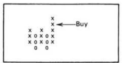
Breakout of a triple top
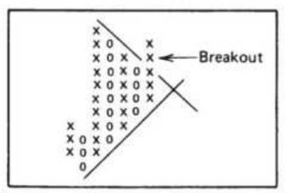
Upside breakout of a symmetric triangle
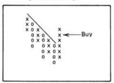
Upside breakout of a bearish resistance line
(b)
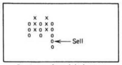
Breakout of a triple bottom
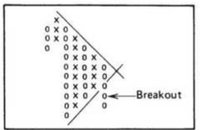
Downside breakout of a symmetric triangle
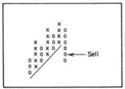
Downside breakout of a bullish support line
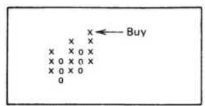
Ascending triple top
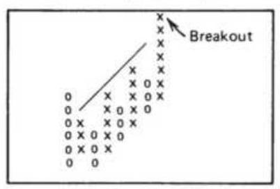
Upside breakout of a bullish resistance line
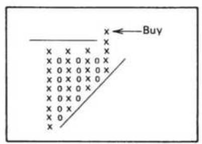
Upside breakout of an ascending triangle
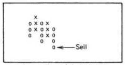
Descending triple bottom
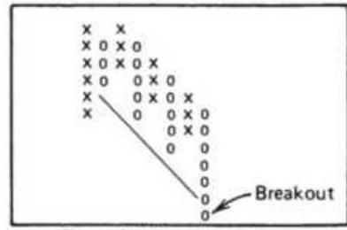
Downside breakout of a bearish support line
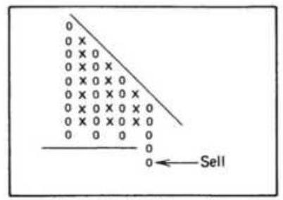
Downside breakout of a
Bearish catapult
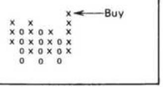
Spread triple top
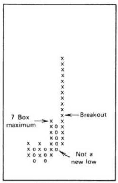
Bullish catapult
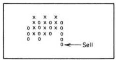
Spread triple bottom
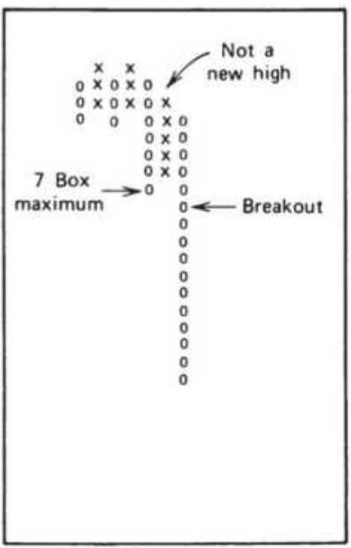
descending triangle
\section*{FIGURE 5.9 (a) Compound point-and-figure buy signals. (b) Compound point-and- figure sell signals.}
\section*{Point-and-Figure Trendlines}
Bullish and bearish trendlines are commonly used with point-and-figure charts. The top or bottom box that remains blank when a reversal occurs can form the beginning of a descending or ascending pattern at a \(45^{\circ}\) angle (diagonally through the corners of the boxes, providing the graph paper has square boxes). These \(45^{\circ}\) lines represent the trends of the market. Once a top or bottom has been identified, a \(45^{\circ}\) line can be drawn down and to the right from the upper corner of the top boxes of \(X \mathrm{~s}\), or up and toward the right from the bottom of the lowest box of Os (Figure 5.10). These trendlines are used to confirm the direction of price movement and are often used to filter the basic point-and-figure trading signals so that only long positions are taken when the \(45^{\circ}\) trendline is up and only shorts sales are entered when the trendline is down.
\section*{Finding the Point-and-Figure Box Size}
Just as with the calculation period for a moving average, the box size, given a 3-box reversal, is the key variable to point-and-figure success. There have been many studies that show the best choice, the earliest being Charles C . Thiel, Jr., and Robert E. Davis in 1970. Because of the stronger trends during those years, \(53 \%\) of the trades in their tests were profitable. A few years later, Zieg and Kaufman \({ }^{5}\) performed a computerized study using the same rules but limiting the test period to six months
ending May 1974, an extremely active market period. For the 22 commodities tested, 375 signals showed \(40 \%\) of the trades were profitable; the net profit over all the trades was \(\$ 306\) and the average duration was 12.4 days compared to 50 days in the Davis and Theil tests. Price moves were getting faster.
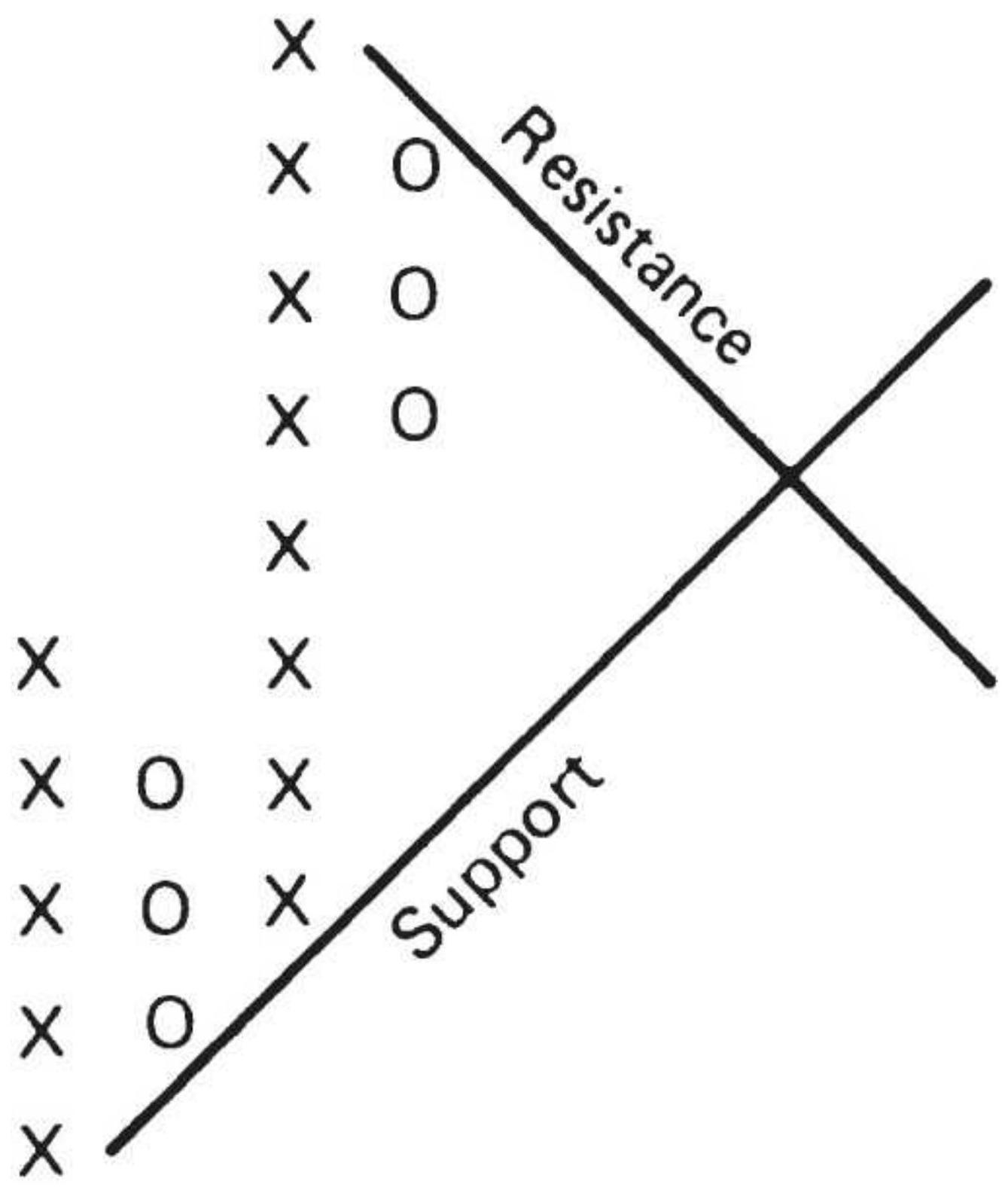
FIGURE 5.10 Point-and-figure trendlines.
History of the Point-and-Figure Box Size
For many years Chartcraft (Investors Intelligence) was the only major service that produced a full set of point-
and-figure charts for the futures markets. A history of their box sizes is shown in Table 5.1.
\section*{TABLE 5.1 Point-and-figure box sizes. \(\underset{\sim}{*}\)}
\begin{tabular}{|c|c|c|c|c|c|c|c|}
\hline \multirow[b]{2}{*}{\begin{tabular}{l}
Futures \\
Market
\end{tabular}} & \multirow[b]{2}{*}{ Units } & \multicolumn{2}{|c|}{\begin{tabular}{c}
Prior to \\
1975 \(\ddagger\)
\end{tabular}} & \multirow{2}{*}{\begin{tabular}{|c|}
1975 \\
\hline Box \\
Bize \\
Size
\end{tabular}} & & & \multirow{2}{*}{\begin{tabular}{c}
1986 \\
\(\ddagger\) \\
Box \\
Size
\end{tabular}} \\
\hline & & Year & \begin{tabular}{l}
Box \\
Size
\end{tabular} & & \begin{tabular}{l}
Box \\
Size
\end{tabular} & \begin{tabular}{l}
Box \\
Size
\end{tabular} & \\
\hline \multicolumn{8}{|c|}{ Grains } \\
\hline Corn & cents & 1971 & \(1 / 2\) & 2 & 2 & 2 & 1 \\
\hline Oats & cents & 1965 & \(1 / 2\) & 1 & 1 & & 1 \\
\hline Soybeans & cents & 1971 & 1 & 10 & 10 & 5 & 5 \\
\hline \begin{tabular}{l}
Soybean \\
meal
\end{tabular} & pts & 1964 & 50 & 500 & 500 & & 100 \\
\hline \begin{tabular}{l}
Soybean \\
oil
\end{tabular} & pts & 1965 & 10 & 20 & 20 & & 10 \\
\hline Wheat & cents & 1964 & 1 & 2 & 2 & 2 & 1 \\
\hline
\end{tabular}
\section*{Livestock and Meats}
\begin{tabular}{|l|c|c|c|c|c|c|c|}
\hline \begin{tabular}{l}
Live \\
cattle
\end{tabular} & pts & 1967 & 20 & 20 & 20 & & 20 \\
\hline Live hogs & pts & 1968 & 20 & 20 & 20 & & 20 \\
\hline \begin{tabular}{l}
Pork \\
bellies
\end{tabular} & pts & 1965 & 20 & 20 & 20 & & 20 \\
\hline
\end{tabular}
\begin{tabular}{|l|c|c|c|c|c|c|r|}
\hline \multicolumn{8}{|c|}{ Other Agricultural Products } \\
\hline CocoaI & pts & 1964 & 20 & 100 & 100 & 50 & 10 \\
\hline Coffee & pts & & \begin{tabular}{c}
\((20)\) \\
\(\pm\)
\end{tabular} & 100 & 100 & 50 & 100 \\
\hline
\end{tabular}
\begin{tabular}{|l|c|c|c|c|c|c|c|}
\hline Cotton & pts & & \begin{tabular}{c}
\((20)\) \\
\(\pm\)
\end{tabular} & 100 & 100 & & 50 \\
\hline Lumber & pts & & \begin{tabular}{c}
\((100)\) \\
\(\pm\)
\end{tabular} & 100 & 100 & & 100 \\
\hline \begin{tabular}{l}
Orange \\
juice
\end{tabular} & pts & 1968 & 20 & 20 & 100 & 20 & 100 \\
\hline Sugar & pts & 1965 & 5 & 20 & 20 & & 10 \\
\hline
\end{tabular}
\section*{Metals}
\begin{tabular}{|l|c|c|c|c|c|c|c|}
\hline Copper & pts & 1964 & .20 & 100 & 100 & 50 & 50 \\
\hline Gold & pts & & & 50 & 100 & & 400 \\
\hline Platinum & pts & 1968 & 200 & 100 & 200 & 200 & 400 \\
\hline Silver & pts & 1971 & 100 & 200 & 200 & 400 & 1000 \\
\hline
\end{tabular}
\({ }^{*}\) All box sizes use a 3 -box reversal and are in points (decimal fractions treated as whole numbers) unless otherwise indicated.
\({ }^{\dagger}\) Cohen (1972); parentheses indicate approximate values.
\({ }^{\ddagger}\) Courtesy of Chartcraft Commodity Service, Chartcraft, Inc., Larchmont, NY.
\({ }^{\S}\) Chart Analysis Limited, Bishopgate, London. Values are for long-term continuation charts.
\({ }^{\text {I }}\) Cocoa contract changed from cents/pound to dollars/ton.
There is a lesson in the way Chartcraft changed its box sizes. First, picture that they always showed the same number of charts per page, say that was 12 , three across and four down. Each chart was a grid of \(20 \times 20\), allowing 20 swings and 20 price boxes. If the S\&P were to have moved 100 points over the 20 swings on the
chart, each box would be assigned 5 points. If soybeans moved \(\$ 2\) over the 20 swings, then each box would be 10 cents. In order to fit the entire price move into the box, the chart automatically adjusted for volatility.

Since the 1970s, every traded commodity has had a major price swing, and the price levels have changed substantially, most often upward. If we perform a test to find the best box size, given a 3 -box reversal, we find that results are inconsistent. Table 5.2 used futures and stock data from 2000 through November 2017 and the program TSM Point \& Figure, available on the Companion Website.
TABLE 5.2 The box size with the best performance of the point-and-figure method, 2000-2017, for a selection of futures markets and stocks.
From January 2000 through November 2017
\begin{tabular}{|l|l|l|l|l|l|l}
\hline & & \begin{tabular}{c}
Best \\
Box
\end{tabular} & \multicolumn{2}{|c|}{\begin{tabular}{c}
Tested \\
Range
\end{tabular}} & \begin{tabular}{c}
No. \\
of
\end{tabular} & Tot \\
\hline Symbol Name & \begin{tabular}{l}
size
\end{tabular} & \multicolumn{2}{|c|}{ From } & To & Tests & Long \\
\hline \multicolumn{3}{|l|}{ Interest rate futures } \\
\hline TU & \begin{tabular}{l}
2-Year \\
Notes
\end{tabular} & 0.24 & 0.005 & 0.325 & 66 & 27406 \\
\hline FV & \begin{tabular}{l}
5-Year \\
Notes
\end{tabular} & 0.955 & 0.005 & 1 & 200 & 60664 \\
\hline US & \begin{tabular}{l}
30-Year \\
Bonds
\end{tabular} & 0.475 & 0.005 & 0.5 & 100 & 92593 \\
\hline
\end{tabular}
\begin{tabular}{|c|c|c|c|c|c|c|}
\hline EBL & \begin{tabular}{l}
Eurobund \\
(10 Year)
\end{tabular} & 0.75 & 0.05 & 1.85 & 31 & 8506c \\
\hline \multicolumn{7}{|c|}{ Index } \\
\hline ES & \begin{tabular}{l}
\(e\) mini \\
S\&P
\end{tabular} & 25.5 & 0.05 & 30 & 60 & 52075 \\
\hline NQ & \begin{tabular}{l}
Nasdaq \\
100
\end{tabular} & 51 & 1 & 100 & 100 & 68545 \\
\hline DAX & DAX & 69 & 1 & 100 & 100 & 19918; \\
\hline \multicolumn{7}{|c|}{ Energy } \\
\hline CL & Crude oil & 2.5 & 0.25 & 4.75 & 20 & 10527 \\
\hline HO & \begin{tabular}{l}
Heating \\
oil
\end{tabular} & 0.1 & 0.005 & 2 & 40 & 10262: \\
\hline \multicolumn{7}{|c|}{ Metals } \\
\hline GC & Gold & 1.5 & 0.5 & 20 & 40 & 11007 \\
\hline HG & Copper & 8 & 0.5 & 20 & 40 & 10098 \\
\hline PA & Palladium & 23 & 1 & 50 & 50 & 57430 \\
\hline \multicolumn{7}{|c|}{ Currency } \\
\hline CU & Euro & 0.0075 & 0.0025 & 0.05 & 20 & 68487 \\
\hline \multicolumn{7}{|c|}{ Stocks } \\
\hline AAPL & Apple & 1.25 & 0.25 & 5 & 20 & 157.9 \\
\hline AMZN & Amazon & 15 & 1 & 20 & 20 & \(916.2 C\) \\
\hline BAC & \begin{tabular}{l}
Bank of \\
America
\end{tabular} & 3 & 0.1 & 3 & 30 & 5.65 \\
\hline WMT & Walmart & 2 & 0.1 & 3 & 30 & 4.42 \\
\hline
\end{tabular}
The results show that, with few exceptions, the best box
size favored large reversals, resulting in long trends and few trades. In all cases we see that the long positions were profitable, particularly obvious for interest rate futures, where the price has been in an uptrend for the better part of 35 years. The far-right column shows the percentage of tests that were profitable, a good indication of robustness. Most markets showed good results, with Bank of America (BAC) and Walmart (WMT) failing that test, BAC because of the 2008 financial crisis and WMT because it has traded in a narrow range for years.
The specific test results of two of the more popular markets, Apple and the emini S\&P, are shown in Figures 5.11 and 5.12 , with the box size along the bottom. AAPL shows good results except at the short and long ends, but the pattern in the center is not as smooth as we would prefer. The S\&P, however, shows the typical improvement from small to large reversals, very similar to the results we see when testing moving average calculation periods.
When testing, the first problem we find is that each market needs its unique box size. For example, bond futures were tested for box sizes from 0.005 to 0.500 in increments of 0.005 while Amazon was tested from 1 cent to 20 cents in steps of 1 cent. There may be a way to specify the range and steps automatically, but we haven't figure that out yet. Percentages don't work for backadjusted futures because old prices can be negative, and volatility can be greater at lower prices. It can be corrected by knowing the full range of price movement over the test period, but that would be cheating.
\section*{The Box Size Dilemma}
The problem with the point-and-figure box size is that a small reversal (box size times the number of boxes for a reversal) is good for low prices and consistent trends while a large reversal is only good for high priced, volatile moves. Using the same reversal criterion, a market that has spanned both low and high price levels is likely to be profitable at one but not both.
\section*{Apple (AAPL) P\&F Tests}
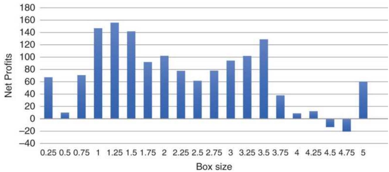
FIGURE 5.11 Tests of box size for Apple shows smaller is better.
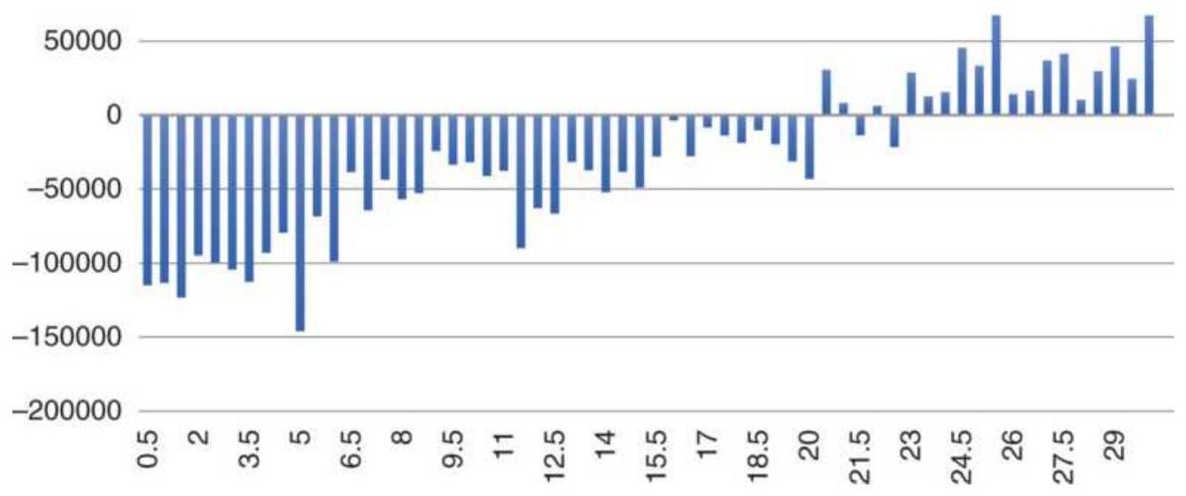
FIGURE 5.12 Tests of the S\&P futures shows results similar to moving averages, with profits clustered at the larger box sizes, favoring slower trading.
What are the solutions? There are different ways that analysts have tried to solve this over the years.
- Chartcraft kept the number of vertical boxes constant and adjusted the box size to make the total price range fit in that scale. But then the box size and the trading signals might change each week.
Zieg and Kaufman created a variable size box, getting larger at higher prices and smaller at lower prices in order to maintain the same sensitivity. But larger boxes mean fewer trades, and smaller means more trades, which does not necessarily address the profitability, but guarantees greater risk at higher prices.
Using the average true range, a measure of volatility, to adjust the box size is similar to Chartcraft's
method. Box sizes would change as volatility changed, and a long position one day entered on high volatility may turn out to be a short sale if volatility dropped.
Consider this a problem yet to be solved. It could be that increasing box size as a percentage proportional to the price increase will give a result that shows consistency in the length of the trade. Maybe we're creating a problem that doesn't exist. There are many followers of pointand-figure that are satisfied with the way it works.
\section*{Point-and-Figure Trading Techniques}
The basic point-and-figure trading signals are triggered on new highs and new lows:
- Buy when the column of \(X \mathrm{~s}\), the current upswing, rises above the previous column of \(X\) s by one box.
- Sell when the column of \(O\) s, the current downswing, falls below the low of the previous column of \(O\) s by one box.
A point-and-figure signal differs from the swing method because a new high occurs only when a box is filled, while any move above a previous high will trigger a signal on a swing chart. Using these basic rules, you are always in the market, reversing from long to short and from short to long, unless you trade stocks only from the long side.
There are alternative methods for selecting point-andfigure entry and exit points that have become popular. Buying or selling on a pullback after an initial point-and-
figure signal is one of the more common system entries because it can limit risk and still use the reversal signal as a stop-loss. Of course, there are fewer opportunities to trade when only small risk is allowed, and there is a proportionately greater chance that the trade will be stopped out because the entry and exit points are closer together. Three approaches for entering on limited risk are:
1. Wait for a reversal back to within an acceptable risk, then buy or sell immediately with the normal point-and-figure stop. Figure 5.13 shows various levels of risk in IBM with \(\$ 2.00\) boxes. The initial buy signal is at \(\$ 150\), with the simple sell signal for liquidation at \(\$ 134\), giving a risk of \(\$ 16\) per share. Instead of buying as prices reach new highs, wait for a reversal after the buy signal, then buy when the low for the day penetrates the box corresponding to your acceptable level of risk. Three possibilities are shown in Figure 5.13. Buying into a declining market assumes that the support level (at \$134 in this example) will hold, avoiding the next short signal. To increase confidence, the base of the formation should be as broad as possible. The test of a triple bottom or a spread triple bottom after a buy signal is a good place to go long.
It is not advisable to reduce risk by entering on the original buy signal and placing a stop-loss at the point of the first reversal ( 3 boxes below the highs). The advantage of waiting for the pullback is that it uses a logical support level as a stop. A stop-loss placed arbitrarily 3 boxes lower has no logical basis
and can quickly result in a losing trade.
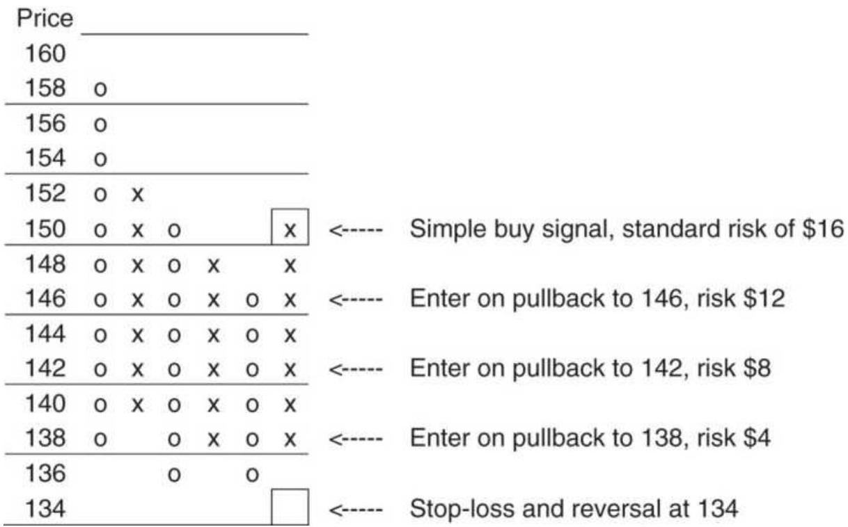
FIGURE 5.13 Entering IBM on a pullback with limited risk.
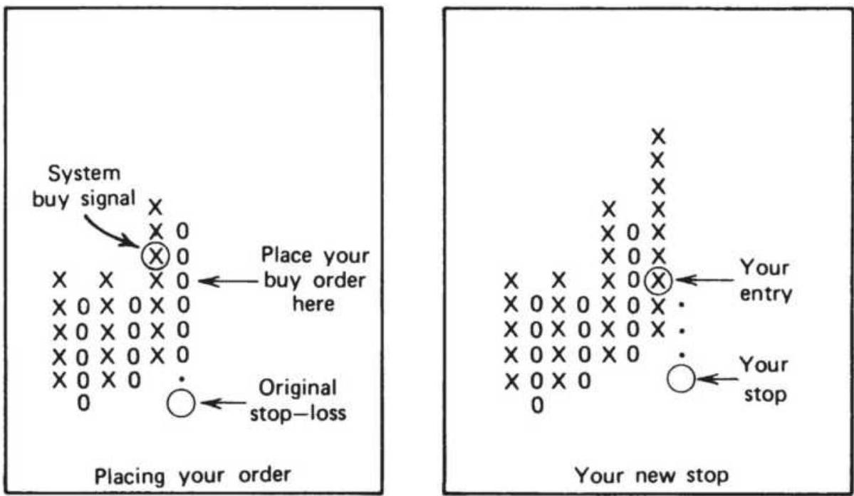
FIGURE 5.14 Entering on a confirmation of a new trend after a pullback.
2. Enter the market on the second reversal back in the direction of the original signal. As shown in Figure 5.14, the first reversal following a signal may not reach the target risk level. Price movement does not often accommodate our expectations. Instead, you can enter a long position on the second upswing. That is, do not enter a long position on the initial buy signal but wait until a 3-box reversal has caused a downswing. As the downswing continues, place a trailing buy order at the point where the next upswing would begin, at the fourth box above the lowest box of \(O\) s. If the order is executed, then the new position is in the direction of the trend; however, the risk has been limited to the value of four boxes, which is the new trend reversal point.
This technique can reduce risk and avoid false signals. If the pullback that follows the breakout continues in an adverse direction, penetrates the other support or resistance level, and triggers the original system stop-loss, then no entry occurs, saving a substantial whipsaw loss. This method is essentially looking for a confirmation of direction. However, if prices continue upward, without a pullback, the trade may be missed entirely. You can read more on this topic in the section "Individual Trade Risk" in Chapter 23.
Entering on a secondary upswing can also be effective for building positions. It is similar to bar charting, where you wait for a pullback to a bullish support line or a bearish resistance line to add a position with a risk limited. With point-and-figure,
we add on each reversal back in the direction of the trend using the newly formed stop-loss point to exit the entire position (as shown in Figure 5.15).
3. Allowing for irregular patterns. Price patterns are not always orderly, and the price activity at the time of a trend change can be very indecisive. One basic trading principle is to require a confirming new high before buying; the first new high might simply occur during an erratic sideways pattern, or an expanding formation after a period of low volatility. We are demanding that the momentum, or speed of price movement, increase before a position is set. \(\frac{6}{}\) The pattern of higher highs and higher lows is similar to upward acceleration.
This technique, which tends to minimize false breakouts, may be modified to increase the confirmation threshold from two to three or four boxes as market volatility increases.
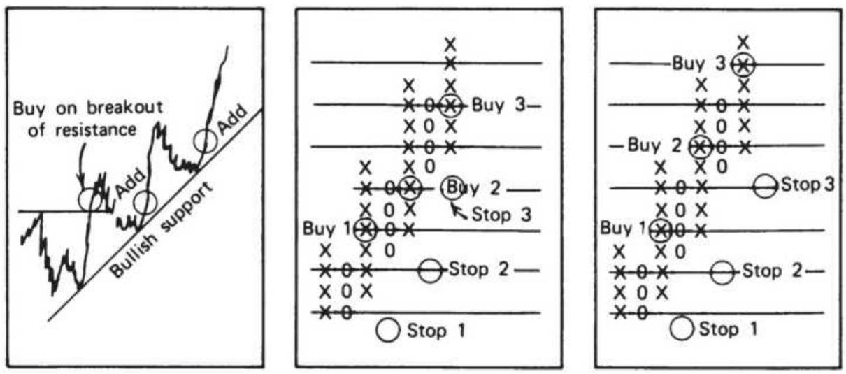
FIGURE 5.15 Three ways to compound positions.
\section*{Point-and-Figure Trading Risk}
I go long or short as close as I can to the danger point, and if the danger becomes real I close out and take a small loss.
-Jesse Livermore to Richard Wyckoff¹
If we look at both a bar chart and a corresponding pointand-figure chart for the same period (Figure 5.16), we see similar horizontal support and resistance lines that define a trading range. In both cases, when the resistance line is penetrated, a long position is entered. This is the same concept used in the swing method. A stop-loss is placed below the resistance line in order to close out the trade in the event of a false breakout. The placement of the stop-loss could have been below the support line, allowing the new upward trend the most latitude to develop.
\section*{A Windfall Profit}
From time to time you find yourself the beneficiary of a substantial price move, a price shock, where there is an uncomfortably large, unrealized profit. It is normal to consider how much of that profit will be lost before the system finally generates an exit signal. At these times, some traders prefer to take the profits. These are decisions that go beyond the area of technical analysis, although they could be rigorously tested.
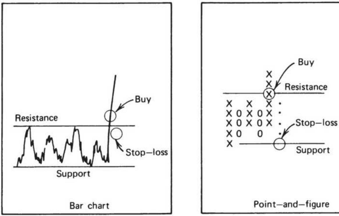
Point-and-figure
FIGURE 5.16 Placement of point-and-figure stops.
A trading system should not depend on a single, very large profit to prove its success. It should have profits and losses that vary in size, but nothing exceptional. Occasionally, a price shock gives you a windfall profit that has nothing to do with a well-designed system or astute trading. It is an opportunity to take profits. If you are correct, prices will reverse after you have gotten out, and there will be an opportunity to reenter the trade at a much better level.
You can always justify reducing your position size when volatility is extreme, in order to bring risk under control. To make the process more systematic, wait until prices reverse by the 3-box criteria before exiting all or part of the trade (Figure 5.17a). That gives you a chance to reenter if prices again start up and make a new high (Figure 5.17b). Sometimes you need to reduce the market exposure, whether the current position is a profit or a
loss. A systematic way to maintain a constant level of risk, called volatility stabilization, is discussed in Chapter 23.
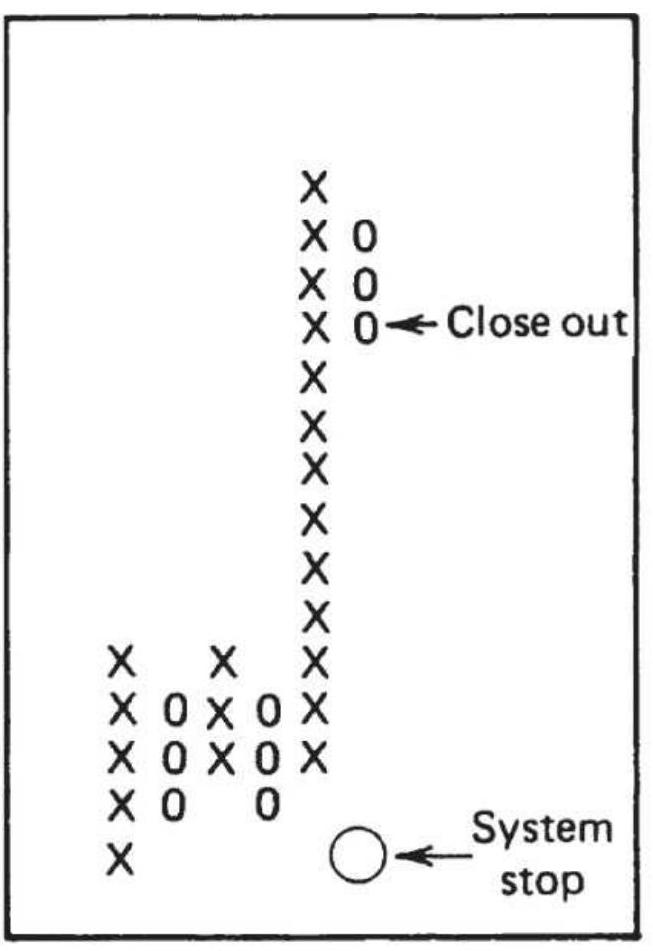
(a)
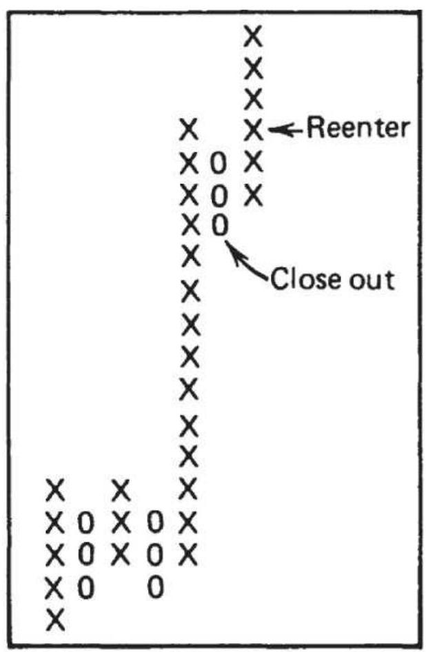
(b)
FIGURE 5.17 Cashing in on profits.
In general, taking small profits does not improve overall profitability because it most often misses the biggest moves. But taking profits on extreme moves is different. Chapter 15 has a number of studies focused on price reversals that might help clarify the choices.
\section*{Alternative Treatment of Reversals}
Traditional point-and-figure charting favors the continuing trend. On highly volatile outside days, it is
possible for both a trend continuation and a 3 -box reversal to occur. Point-and-figure rules require that the trend continuation be recorded and the reversal ignored. Figure 5.18 shows a comparison of the two choices. In the example, prices are in an uptrend when a new 1-box high and a 3 -box reversal both occur on Day 6 , as seen in Figure 5.18a. In part b, the traditional approach is taken, resulting in a continuous upward trend with a stop-loss at 7.90. Taking the reversal first as an alternative rule, part c shows the same trend with a stop-loss now at 8.05, 15 points closer.
Plotting the reversal first usually works to the benefit of the trader; both the stop-loss and change of trend will occur sooner. Subsequent computer testing proved this to be true. This alternative does not work when the reversal value is small and there are many occurrences of the optional reversal.
\section*{Selecting Trades}
Not all trades are profitable in any trading system. Some analysts prefer point-and-figure charts because both the profit objective and the risk can be identified at the time of entry. The profit objective can be calculated using the vertical or horizontal count, and the risk is the size of the price reversal needed to cause the opposite signal. Some traders prefer those trades that have a return to risk ratio greater than 2.0.
As with other trending systems, trendlines can be drawn to identify the current dominant trend. For point-andfigure, the upward trendline starts at the lowest box and
goes up and to the right at a \(45^{\circ}\) angle. Trades may be taken only in the direction of that trend. In a bull market, new short signals are ignored until the box is filled that penetrates the upward bullish trendline. Then the bias switches to the short side.
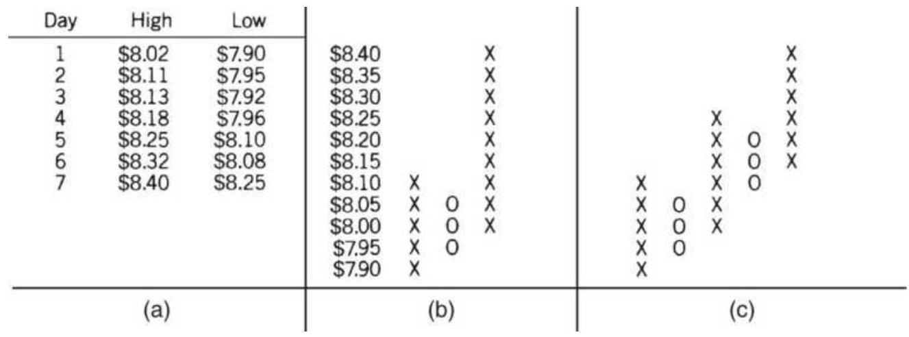
FIGURE 5.18 Alternative methods of plotting pointand-figure reversals. (a) Sample prices for plotting. Traditional method. (c) Alternative rule taken on day 6.
\section*{Price Objectives}
Point-and-figure charting has two unique methods for calculating price objectives: horizontal counts and vertical counts. These techniques do not eliminate the use of the standard bar charting objectives, such as support and resistance levels, which apply here as well.
\section*{The Horizontal Count}
The time that prices spend in a consolidation area is considered directly related to the size of the subsequent price move. One technique for calculating price objectives is to measure the width of the consolidation (the number of columns on a bar chart) and project the
same measurement up or down as the target of the move. The point-and-figure horizontal count method is a more exact approach to the same idea.
The upside price objective is calculated as:
\[
H_{U}=P_{L}+(W \times R)
\]
where:
\(H=\) the upside horizontal count price objective \(U\)
\(P=\) the price of the lowest box of the base formation \(L\)
\(W=\) the width of the bottom formation (number of columns)
\(R=\) the reversal value (number of boxes times the value of one box)
To use this formula, the base (width of the bottom or top formation) needs to be identified. Count the number of columns, \(W\), not including the breakout column and multiply \(W\) by the value of a minimum reversal, \(R\); then add that result to the bottom point of the base to get the upper price objective. The base can always be identified after the breakout has occurred. For example, Figure 5.19 shows the March 74 contract of London Cocoa ( \(£ 4\) box) forming a very long but clear base. The reversal value is \(£ 12\) and the width of the base is 19 columns (not counting the last column, which included the breakout). Added to the lowest point of the base ( \(£ 570\) ) this gives an objective of \(£ 798\), reached on the left shoulder of the topping formation. Another alternative is the wider base,
marked as \(W_{2}=25\). Using this selection results in a price objective of \(£ 870\), by adding \(25 \times £ 12=£ 300\) to \(£ 570\), the lowest point of the base.
The downside objective is calculated in the same manner as the upside objective:
\[
H_{D}=P_{H}-(W \times R)
\]
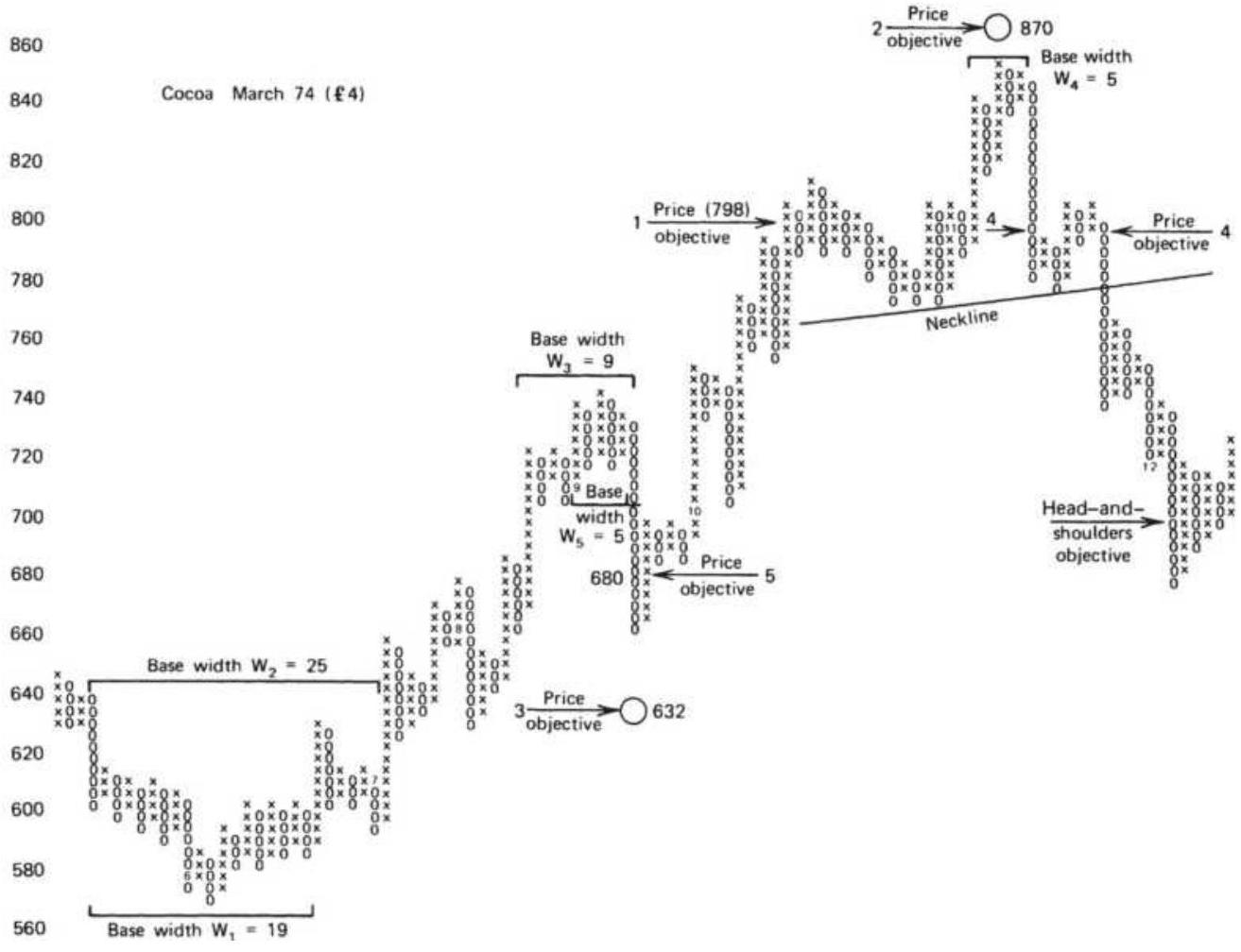
FIGURE 5.19 Horizontal count price objectives.
where:
\(H=\) the downside horizontal count price objective
\(D\)
\(P_{H}=\) the price of the highest box of the top formation
\(W=\) the width of the top formation (number of columns)
\(R=\) the reversal value
Some examples are given for downside objectives in the same cocoa diagram (Figure 5.19). A small correction top could be isolated at the \(£ 720\) level and two possible top widths, \(W_{3}\) and \(W_{5}\), could be chosen. The broader top,
\(W_{3}\), has a width of 9 and a downside objective of \(£ 632\). The shorter top, \(W_{5}\), has a width of 5 and a downside objective of \(£ 680\). Although the closer objective, calculated from \(W_{5}\), is easy to reach, the farther one is reasonable because it coincides with a strong intermediate support level at about \(£ 640\).
The very top formation, \(W_{4}\), was small and only produced a nearby price objective similar to the first downside example; there would be no indication that prices were ready for a major reversal. The top also forms a clear head-and-shoulders pattern, which could be used in the same manner as in bar charting to find an objective. Using that technique, the distance from the top of the head to the point on the neckline directly below is 20 boxes; then the downside price objective is 20 boxes below the point where the neckline was penetrated by the breakout of the right shoulder, at \(£ 776\), giving \(£ 696\) as the objective.
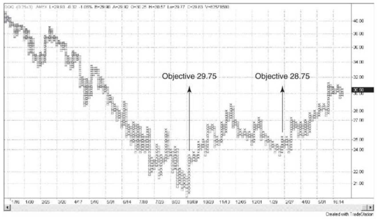
FIGURE 5.20 Point-and-figure vertical count for QQQ. The major low in October 2002 had a reversal of 13 boxes, each with a value of 0.25 , for a total of 3.25 . Multiplying by 3 and adding the result, 9.75 , to the lowest value \(\$ 20.00\), gives the price objective of 29.75 . The second bottom in February 2003 shows a reversal of 7 boxes and gives a target of 28.75 .
The horizontal count can also be applied to a breakout from a triangular formation, similar to the one on the very far right in Figure 5.19 (marked "Head-andshoulders objective"). The width of the formation is the widest point in the center of the triangle, and the upward objective is also measured from the center, rather than from the bottom of the triangle.
\section*{The Vertical Count}
The vertical count is a simpler calculation than the
horizontal count. As with the horizontal count, there is adequate time to identify the formations and establish a price objective before it is reached. The vertical count is a measure of volatility (the amount of rebound from a top or bottom) and can be used to determine the size of a retracement after a major price move. To calculate the upside vertical count price objective, locate the first reversal column after a bottom formation. To do this, a bottom must be established with one or more tests, or a major resistance line must be broken to indicate that a bottom is in place. The vertical count price objective is then calculated:
\section*{\(V_{u p}=\) Lowest box \(+(\) First revesal boxes \(\times\) Minimum reversal boxes \()\)}
The downside vertical count price objective is just the opposite:
\section*{\(V_{\text {doun }}=\) Highest box \(-(\) First reversal boxes \(\times\) Minimum reversal boxes \()\)} where:
first reversal \(=\) the number of boxes in the first boxes reversal
minimum \(=\) the number of boxes needed for a reversal boxes chart reversal
Examples illustrating the vertical count are easy to find. In the QQQ chart (Figure 5.20), the NASDAQ low occurs in early October 2002, followed by an upward reversal of 13 boxes. Each box is \(\$ 0.25\), giving a total reversal of \(\$ 3.25\). Multiply the reversal amount by 3 , the number of
boxes in a reversal, and add that value, 9.75, to the low of \(\$ 20.00\) to get the target of \(\$ 29.75\). That value was reached during May 2003.
A secondary low in QQQ occurs in February 2003 at \(\$ 23.50\). The first reversal that follows is 7 boxes, or \(\$ 1.75\). Multiply 1.75 by 3 and add the result to the low to get the target of \(\$ 28.75\). The two objectives confirm each other. As a simple measurement tool based on recognizing key highs or lows, the vertical count relies on volatility to determine the extent of the move that follows. It can be quite accurate at times; otherwise it is likely to understate the expected price move.
\section*{Recent Applications of Point-and-Figure}
Not much new has happened to point-and-figure during the past 100 years; however, there has been renewed interest in using it. Two books, Power Investing with Sector Funds (St. Lucie Press / American Management Association, 1999) by Peter Madlem, and Point \& Figure Charting, Second Edition (John Wiley \& Sons, 2001) by Thomas Dorsey, show more recent examples of how this technique applies to stocks and sector indices. There are also a number of websites with instructions and examples, most combined with advertising.
\section*{Renko Bricks}
In a manner similar to point-and-figure, Renko Bricks 8 (from the Japanese word renga, for brick) assign a price range to each brick and record one box up and one to the right for each completion of a higher brick. Lower bricks
are one box down and one to the right, as shown in Figure 5.21. Each progression up and down is always at a \(45^{\circ}\) angle. By setting the size of the brick larger, you can smooth the price movement.
Renko Bricks suffer from the same problem as pointand-figure, or any strategy that uses a fixed size increment. When prices go higher, it becomes more sensitive, and when they go lower it becomes less sensitive to price moves. A percentage increment may solve the problem. A system that maintains a constant sensitivity is usually a better option.
\begin{tabular}{|c|c|c|c|c|c|c|c|c|c|}
\hline & & & X & & & & & & \\
\hline & & X & & X & & & & & \\
\hline & X & & & & X & & & & \\
\hline X & & & & & & X & & & \\
\hline & & & & & & & X & & \\
\hline & & & & & & & & X & \\
\hline & & & & & & & & & X \\
\hline & & & & & & & & & \\
\hline
\end{tabular}
FIGURE 5.21 Renko Bricks pattern.
\section*{THE N-DAY BREAKOUT}
Close on the heels of the swing and point-and-figure methods is the rolling breakout, or N -day breakout. In the theoretical sense, it is not entirely an event-driven method because it is affected by time, but its best feature is that it buys on new highs and sells on new lows, very much the same as event-driven techniques. The \(N\)-day breakout has become one of the most popular trendfollowing techniques. Its rules are simply:
Buy when today's high crosses above the high of the past \(N\) days.
- Sell when today's low crosses below the low of the past \(N\) days.
Using these basic rules, you would always be holding a long or short position, reversing direction whenever there is a new signal. A slightly more conservative set of rules is:
- Buy when today's close is above the high of the past \(N\) days.
- Sell when today's close is below the low of the past \(N\) days.
Using the close offers a confirmation of the new direction at the cost of setting the new position later in the day than the first set of rules. The intention of the \(N\)-day breakout is to react immediately to an event that drives prices higher than they have been recently. Figure 5.22 shows a buy and sell breakout in Merck based on a 5 -day calculation period. The buy signal occurs in early
January 2002 when prices turn up after a decline under \(\$ 54\). The third day up after the double bottom makes a new high above the previous 5 days. Although there is a wide-ranging day four days later, it fails to make a 5 -day low and the buy signal remains in effect until after prices peak on January 20. Four days later a new low generates a sell signal that is held for the rest of the chart. Two attempts to rally only succeed in making highs above the prior three days, leaving the short sale in place.
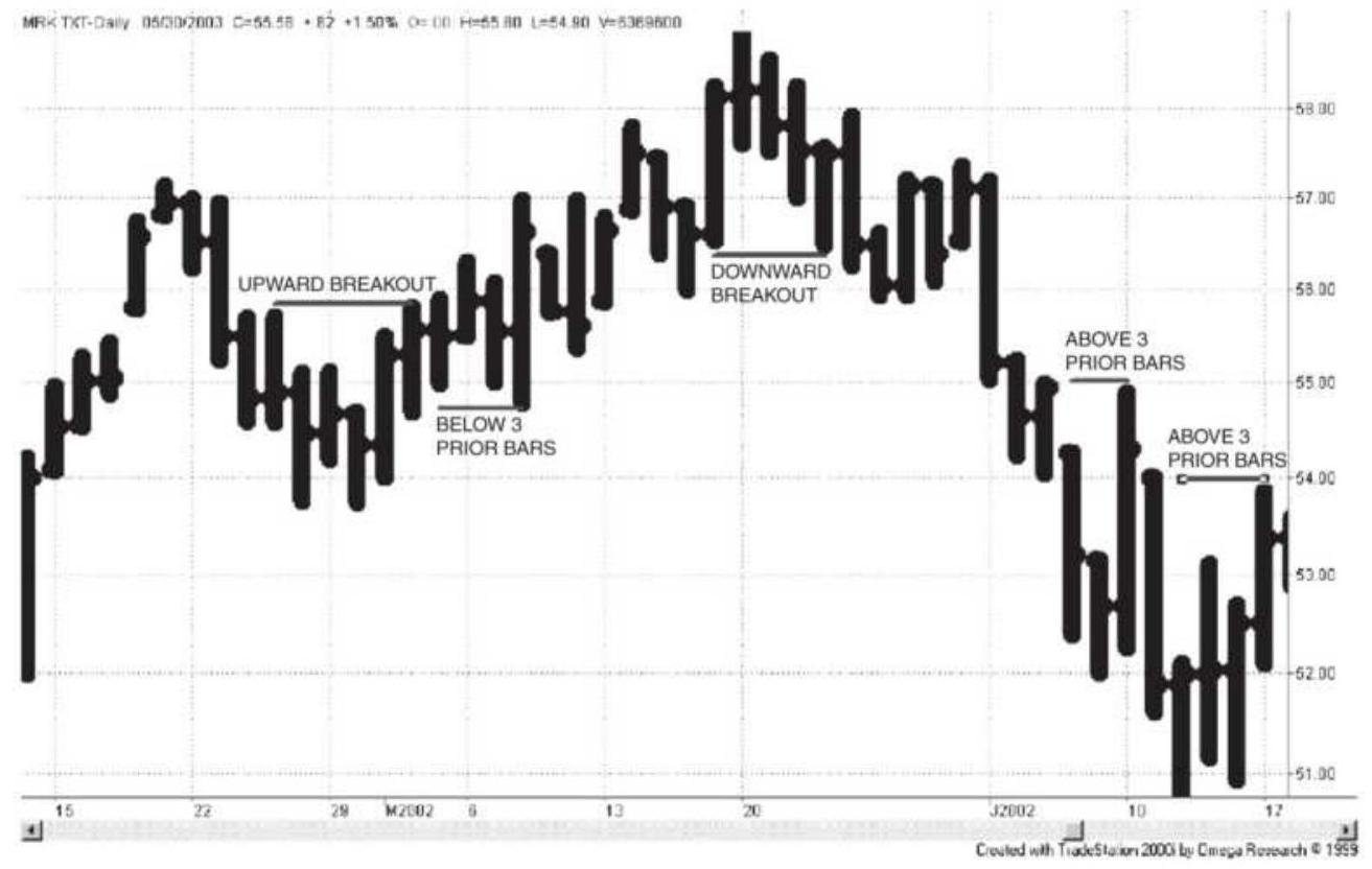
FIGURE 5.22 \(N\)-Day breakout applied to Merck, using a breakout period of 5 days.
The risk characteristic of the breakout system is similar to that of both the swing method and point-and-figure. Risk is the difference between the entry price and the point at which an N -day high or low would reverse the signal. The larger the calculation period, the larger the
risk. This is the primary feature that distinguishes eventdriven techniques from time-driven methods, such as a moving average.
A "Comparison of Major Trend Systems," including the \(N\)-day breakout, can be found in Chapter 8 after a discussion of time-based trends. These entry and risk characteristics are important when you select a trending system, and they vary considerably between event-driven and time-based methods.
\section*{Donchian's 4-Week Rule}
Breakout strategies have a long, successful history. In the mid-1970s, Playboy's Investment Guide reviewed Donchian's 4-Week Rule as "childishly simple . . . was recently discovered to rank premiere among a dozen widely followed mechanical techniques." Even now, simple trend-following systems continue to have success. Donchian's method used the following rules:
1. Go long (and cover shorts) when the current price exceeds the highs of the previous four calendar weeks.
2. Sell short (and liquidate longs) when the current price falls below the lows of the previous four calendar weeks.
3. When trading futures, roll forward if necessary into the next contract on the last day of the month preceding expiration.
In 1970, The Traders Note Book (Dunn and Hargitt Financial Services) rated the 4-Week Rule as the best of
the popular systems of the day, based on 16 years of history. The system satisfies the basic concepts of trading with the trend, limiting losses and following well-defined rules. It bears a great resemblance to the principle of Keltner's Minor-Trend Rule, modified to avoid trading too often.
\section*{Modifying the \(N\)-Day Rule}
Strategy development platforms as well as spreadsheets allow us to take many simple ideas and examine them in great detail, sometimes to excess. We can test the \(N\)-day breakout, the \(N\)-week breakout, and even the \(N\)-minute breakout. Using short time intervals and adding volatility, we get the volatility breakout strategy, popular in the 1990s, and discussed when we look at intraday trading.
In the \(N\)-day breakout, the determination of \(N\) is critical to the success of this system. While the most obvious approach to finding \(N\) is by back-testing a broad range of calculation periods, it has also been suggested that \(N\) could be based on the relationship of normal volatility to current volatility: 9
\[
N_{t}=N_{l} \times \frac{V_{n}}{V_{c}}
\]
where:
\(=\) the number of days used for today's calculation
= the initial number of days used for "normal" markets
\(\eta_{1}=\) the normal volatility measured over historical data \(=\) the current volatility measured over a fixed period shorter than the period used to define normal volatility, \(V_{n}\). Typically, this is less than \(1 / 4\) of the longer period.
As the current volatility increases, the number of days used in today's calculation decreases. This is also an adaptive technique. More can be found in Chapter 17.
When trading stocks, traders may prefer to define \(N\) as a multiple or fraction of the calendar quarter. That would relate the length of the trend to earnings announcements. A multiple of three months would smooth out those price reactions while a shorter period would try to capture the trend leading up to the announcements.
\section*{Testing the \(N\)-Day Rule}
Using a development platform, it is a simple matter to test the \(N\)-day breakout on any stock or futures market. In the following example, the same markets and the same data interval were used as previously used in the point-and-figure tests, Table 5.2 . Although testing methods will be discussed in Chapter 21, this process is needed to understand the N -day breakout and to introduce concepts that will be used throughout this book.
\section*{Apple (AAPL) Breakout Tests}
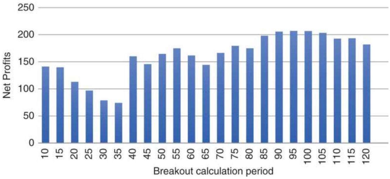
FIGURE 5.23 Apple breakout tests.
The \(N\)-day breakout results, in Table 5.3, are remarkable consistent. All markets were tested from January 2000 to November 2017 using calculation periods from 10 to 120 days, in increments of 10 days. The purpose was to get a broad view of performance. The average "best" calculation period was 93 days, typical of a macrotrend approach. Of the 23 tests performed on each market, seven of the markets had tests that were all profitable (see the last column in the table), and the average percentage of profitable tests was \(79 \%\). For point-andfigure, the average tests with positive returns was \(63 \%\).
Most important to traders, the net profits for the breakout system was more than 15 times greater than point-and-figure. In addition, it wasn't necessary to find the different ranges to test for each market and most of the selections had a similar number of trades. The consistency of the results adds confidence to the robustness of the method.
A closer look at the pattern of test results for Apple and the emini S\&P, Figures 5.21 and 5.22 , also shows consistency greater than that of the point-and-figure tests, Figures 5.23 and 5.24. For both Apple and the S\&P, the shorter calculation periods are less predictable. These patterns will compare closely with moving average tests rather than point-and-figure, where both use a rolling calculation.
\section*{Weekly Breakouts}
Weekly breakouts were introduced with Donchian's 4Week Rule. The original purpose for the Weekly Rule was to look at prices only on Friday. The close on Friday is considered important because it is the evening up at the end of the week, in the same sense as the daily close is considered the most important price of the day because all accounts are settled at that price. Many traders have the opinion that holding a position over a weekend is the only thing worse than holding it overnight. This evening-up process is expected to prevent false signals that may occur midday or midweek during periods of low liquidity. Weekly data are also smoother than daily data, and often show a clearer trend.
\section*{TABLE 5.3 Breakout test results using data from 2000 through November 2017.}
\section*{From January 2000 through November 2017}
\begin{tabular}{|l|c|c|c|c}
\hline Symbol Name & \begin{tabular}{c}
Best \\
Period
\end{tabular} & \begin{tabular}{c}
Tested \\
Range
\end{tabular} & \begin{tabular}{c}
No. \\
of
\end{tabular} & Tot: \\
\hline From To & Tests & Long \\
\hline
\end{tabular}
\section*{Interest rate futures}
\begin{tabular}{|c|c|c|c|c|c|c|}
\hline TU & \begin{tabular}{|l|}
2-Year \\
Notes
\end{tabular} & 80 & 10 & 120 & 23 & 403896 \\
\hline FV & \begin{tabular}{l}
5-Year \\
Notes
\end{tabular} & 100 & 10 & 120 & 23 & 292547と \\
\hline US & \begin{tabular}{l}
30-Year \\
Bonds
\end{tabular} & 40 & 10 & 120 & 23 & 183893^ \\
\hline EBL & \begin{tabular}{l}
Eurobund \\
(10 Year)
\end{tabular} & 70 & 10 & 120 & 23 & 399090C \\
\hline
\end{tabular}
\begin{tabular}{|c|c|c|c|c|c|c|}
\hline \multicolumn{7}{|c|}{ Index } \\
\hline ES & \begin{tabular}{l}
emini \\
S\&P
\end{tabular} & 115 & 10 & 120 & 23 & 191808\& \\
\hline NQ & \begin{tabular}{l}
Nasdaq \\
100
\end{tabular} & 115 & 10 & 120 & 23 & 1934285 \\
\hline DAX & DAX & 69 & 10 & 120 & 23 & 19918; \\
\hline \multicolumn{7}{|c|}{ Energy } \\
\hline CL & Crude oil & 115 & 10 & 120 & 23 & 153521 C \\
\hline HO & \begin{tabular}{l}
Heating \\
oil
\end{tabular} & 110 & 10 & 120 & 23 & 97719: \\
\hline \multicolumn{7}{|c|}{ Metals } \\
\hline GC & Gold & 90 & 10 & 120 & 23 & 195701C \\
\hline HG & Copper & 120 & 10 & 120 & 23 & 540575C \\
\hline PA & Palladium & 80 & 10 & 120 & 23 & 202148c \\
\hline \multicolumn{7}{|c|}{ Currency } \\
\hline CU & Euro & 105 & 10 & 120 & 23 & 199431: \\
\hline
\end{tabular}
\begin{tabular}{|l|l|l|c|c|c|r|}
\hline AAPL & Apple & 120 & 10 & 120 & 23 & \(17 \%\) \\
\hline AMZN & Amazon & 115 & 10 & 120 & 23 & 103 \\
\hline BAC & \begin{tabular}{l}
Bank of \\
America
\end{tabular} & 115 & 10 & 120 & 23 & 19.15 \\
\hline WMT & Walmart & 30 & 10 & 120 & 23 & 17.9 \\
\hline
\end{tabular}
Typical trading rules for a weekly breakout system most often use the closing prices:
■ Buy (and close out shorts) if the closing price on Friday exceeds the highest closing price of the past \(N\) weeks.
Sell short (and close out longs) if the close on Friday is below the lowest closing price of the past \(N\) weeks.
\section*{emini SP futures}
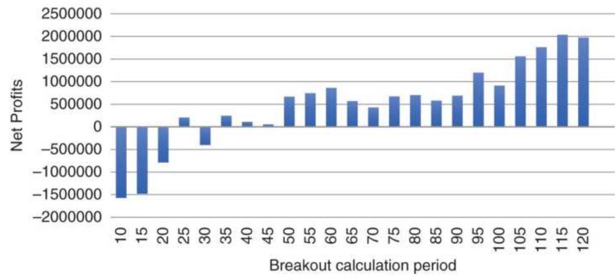
FIGURE 5.24 emini S\&P breakout tests.
The main drawback of this model is that the risk can be very high. The initial risk of a new long position is the difference between the highest and lowest closing prices of the past \(N\) weeks. In addition, even if penetrated, the
position is not liquidated until the close of Friday, or even the open on Monday if the calculations are made after the Friday close. This could be very risky; however, that risk is offset by the smoothing effect of weekly data. It may be that accepting higher risk is better than being subjected to more frequent false signals. When a series of individual trade losses is viewed as a single, larger loss, the risk of weekly positions may not seem quite so large.

Traders will find that the basic breakout method is one of the important trending techniques, and it is used throughout this book as a benchmark study. In Chapter 8 it is included in "Comparison of Major Trend Systems." A spreadsheet is also available on the Companion Website, TSM N-Day breakout example using BA (Boeing Aircraft), that allows testing of this method.
\section*{Avoiding Problems Programming the Weekly Breakout}
The Weekly Rule is often thought of as having signals only on Friday; however, it can be the last close of the week when there is a holiday on Friday. When trading, you will know which days are holidays, but when programming and testing a weekly system it will be necessary to look ahead to see when the week has ended.
To avoid this problem, many charting systems provide weekly data on request, converting from daily. The close of the week will be correct, regardless of holidays. It is
best not to try to use daily data to test a weekly strategy.
\section*{Dynamic Breakout System}

While the \(N\)-day breakout adapts to price moves and volatility, placing orders for entry and exit one day ahead may improve timing. In his Dynamic Breakout System (DBS), \({ }^{10}\) Stridsman anticipates the entry and exit points based on a factor of the standard deviation of recent prices, then places stop orders for the next trading day. He also concludes from his study that the pattern of when an exit stop is hit falls into two groups, those that get stopped out very quickly and the others that hold the trade for a much longer time. From this information, he expects traders to position their stops better. A program that generates this information, TSM Dynamic Breakout System, is available on the Companion Website.
\section*{The N-Day Breakout Applied to Stocks}
Most literature on breakout systems applies this technique to futures markets. The primary differences between futures and stocks are that futures markets are generally less correlated and have higher leverage. Leverage in futures trading will cause a small percentage move to yield a relatively high return. In addition, the cost of trading futures is almost negligible compared to the face value of the contract. For example, one S\&P emini contract costs less than \(\$ 5\) per trade. At an S\&P price of 2500 and a value of \(\$ 50\) per big point, one contract has a value of \(\$ 125,000\), making the commission cost about \(0.4 / 100\) ths of a basis point
(0.00004). While you can trade up to 500 shares of a stock for a flat fee of \(\$ 8\) or less, most stocks average less than \(\$ 30\) per share, about 2.6 basis points. To decide the success of trading either futures or stocks, it is necessary to show the returns in terms of dollars per contract or cents per share. Only then can you decide if commissions and slippage can be covered comfortably and still net a profit.
\section*{Donchian's 40/20 Channel Breakout}
Before we applaud newer developers for innovation, we must give the originators credit. Richard Donchian created what now seem to be very simple trading methods, but in the 1960s while working at Hayden Stone, he implemented a number of technical systems that were groundbreaking. They included moving average and breakout systems. At the time, any
systematic trend-following method was state-of-the-art and profitable.
The 40/20 channel breakout, also called Donchian Channels, was the earliest \(N\)-day breakout that is recorded. The longer period was used for entries and the shorter for exits, very much like the Turtles method that follows.
\section*{The Turtles}
During the mid-1980s the group known as the Turtles, founded by Richard Dennis and Bill Eckhardt, was the biggest trading sensation, much like Monroe Trout in the later 1980s and "Jim" Simons' Renaissance Asset
Management in the 1990s. They all maintained a high degree of secrecy with regard to their trading methods. Years after the group disbanded, the rules and operations of the Turtles became public through publications of Michael Covel and Curtis Faith, 11 among others.
The method is based on an \(N\)-day breakout, with a number of add-on rules that seem to be rooted in trader experience. The following summary should be sufficient to test the concepts, although it is not clear how much discretion was allowed in following the signals. There are a number of subtle rules and variations presented in the original material that are not included here. Underlying the process was the imperative that you can't miss the trade.
During the early 198 os the futures markets were not as diverse as now, and commodities made up a larger part of the portfolio. Only markets that traded on U.S. exchanges were included.
\section*{The Turtle Rules}
There are two systems, \(S 1\) and \(S 2\); however, there is no indication of what proportion of assets are allocated to each. We will assume that the capital is apportioned equally. The two versions have differences in both the positioning of stop-losses and the method of compounding, and those rules are combined here. Both are explained.
\section*{System 1 (S1)}
1. Enter a long position when the intraday high exceeds the highest high of the previous 20 days. Exit the long position when the intraday low falls below the lowest low of the previous 10 days.
2. Enter a short position when the intraday low falls below the lowest low of the previous 20 days. Exit the short position when the intraday high exceeds the highest high of the previous 10 days.
3. Filter Rule. Ignore the \(S 1\) entry if the previous \(S 1\) entry was profitable (whether or not it was taken). However, if the prior \(S 1\) trade was a loss of at least \(2 \times L\), then the trade could be taken. \(L\) is a 20-day average-off true range volatility measure,
\[
\frac{\left(19 \times L_{t-1}+T R_{t}\right)}{20}
\]
where \(T R\) is the daily true range, \(t\) is today, and the conversion factor is the amount that transforms the point value of a market into its dollar value. We will call this the big point value (BPV).
\section*{System 2 (S2)}
1. Enter a long position when the intraday high exceeds the highest high of the previous 55 days. Exit the long position when the intraday low falls below the lowest low of the previous 20 days. Traders were allowed discretion in selecting a period slightly shorter than 55 days.
2. Enter a short position when the intraday low falls
below the lowest low of the previous 55 days. Exit the short position when the intraday high exceeds the highest high of the previous 20 days.
3. There was no filter for method \(S 2\).
\section*{Risk Control}
1. A stop-loss is placed a distance of \(2 L\) from the initial entry.
2. Trades are exited on the first occurrence of:
a. The stop-loss
b. An \(S 1\) or \(S 2\) reversal
c. A loss of \(2 \%\) relative to the portfolio (where \(2 L\) is equal to \(2 \%\) of the portfolio)
3. The position size is determined by equalizing \(L \times B P V\) across all markets; then 1 unit size \(=(1 \%\) of the investment \() /(L \times B P V)\)
4. Position limits restrict the maximum unit size that could be traded in correlated markets:
a. Single market, \(4 \times\) unit size
b. Closely correlated markets (e.g., energy complex, precious metals, currencies, shortterm rates), \(6 \times\) unit size
c. Less correlated markets (related by inflation or other factors), \(10 \times\) unit size
d. Any net position, long or short, \(12 \times\) unit size
5. Compounding positions.
a. Add another unit (or \(1 / 2\) unit) for every profitable price move equal to \(L\), measured from the actual entry price.
b. A maximum of 5 units are allowed (this is different from 4a).
c. A stop-loss is set at \(1 / 2 L\) on day 1 and \(2 L\) afterward (see alternate stops below). Once a second unit is bought, all stops are increased to \(2 L\). For each subsequent unit, stops were brought to \(2 L\) measured from the most recent entry, so the total trade risk was
\(2 L \times\) total contracts at all times during the trade.
d. Alternate stops. Stops could be placed at \(1 / 2 L\) instead of \(2 L\). If stopped out, that position could be reentered at the original entry price.
6. Portfolio risk management. For every \(10 \%\) drawdown in the portfolio, measured from the peak equity, the position size was cut by \(20 \%\). (At the time, most futures managers considered \(50 \%\) the maximum loss allowed.) For every \(6^{2} / 3 \%\) recovery, \(10 \%\) was added back. Costs were included when calculating these values.
\section*{Comment}
Richard Dennis was reported to have been one of the most successful floor traders during the late 1970s and early 1980 os. The industry was surprised when he formed
the Turtles but expected great success. It is not known if his previous success was based on using this method or one similar to it. Floor traders usually profit from the bid-asked spread during active trading periods, although Dennis was also said to hold large positions overnight.
It often happens that a good period in the market will encourage you to expand your operation. As Fate would have it, that good period is often followed by a bad one. As Will Rogers said, "Good judgment comes from experience, and a lot of that comes from bad judgment."

The basic breakout concept with the initial position size and stop-loss is programmed as TSM Turtle, available on the Companion Website. While it does not attempt to duplicate all the rules, it is good to see the underlying method returns profits, and subtle additions may add to those returns. The period prior to 1984 should be of interest because it was this period in which Dennis made the decision to form the Turtles.
Figures 5.25 shows the cumulative profits (closed out trades only) for copper beginning in 1980. The slower system \(S 2(55 \times 20)\) shows steady profits for the entire 38 years, which is typical of a long-term trend following method. The faster system S1 \((20 \times 10)\) shows profits only for the first part of the 1980s, the period in which Dennis would have decided to form the Turtles. Remembering that this is only one market and many of the rules are not implemented, the reader would need to look further to decide if this is the general pattern or simply a poor example.
By way of comparison, the same 38 -year period was tested using the \(N\)-Day Breakout and the results of the optimization are shown in Figure 5.26. Copper was a very trending market, and all but the shortest two calculation periods returned a net profit. In retrospect, the returns of the slower \(55 \times 20\) Turtles strategy are shown as the horizontal line. Given that markets had more trend when Dennis started his program, he must be credited for having the foresight to use breakout systems ahead of the crowd.
Copper total profits
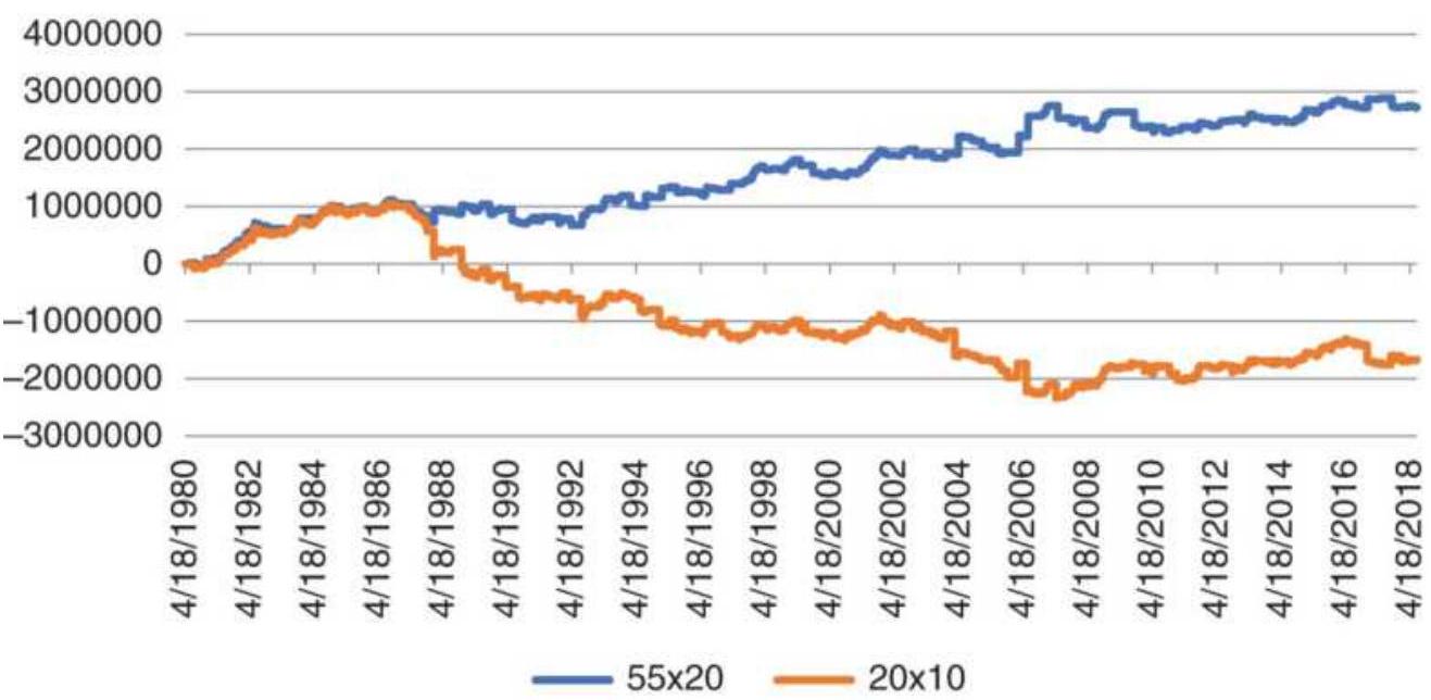
FIGURE 5.25 Copper profits for the slower and faster trends in our version of the Turtle system.
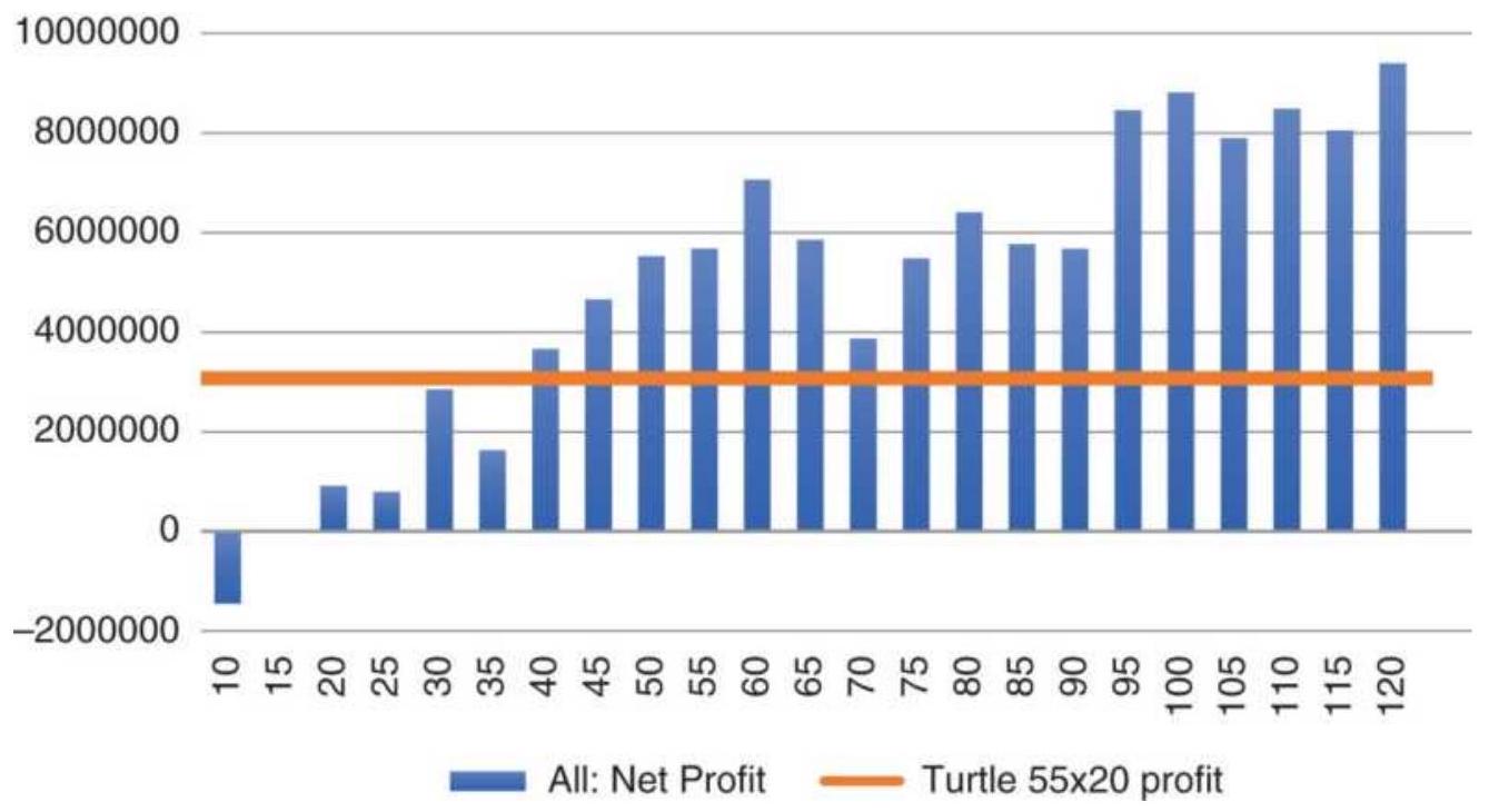
FIGURE 5.26 Relative performance of \(N\)-day breakout, copper futures, 1980-2017, with calculation periods from 10 to 120 days.
\section*{NOTES}
1 Edwin Lefèvre, Reminiscences of a Stock Operator (Burlington, VT: Books of Wall Street, 1980). First published by George H. Doran, 1923.
\(\underline{2}\) Jesse Thompson, "The Livermore System," Technical Analysis of Stocks \& Commodities (May 1983).
3 J. Welles Wilder, Jr., New Concepts in Technical Trading Systems (Greensboro, NC: Trend Research, 1978).
4 Victor De Villiers, The Point and Figure Method of Anticipating Stock Price Movements (New York: Trader Press, 1966; reprint of 1933 edition), p. 8.
5 Kermit C. Zieg, Jr., and Perry J. Kaufman, Point and Figure Commodity Trading Techniques (Larchmont, NY: Investors Intelligence, 1975). This book contains complete tabularized results of both point-and-figure tests.
6 Adam Hewison, "The Will Rogers Theory of Point \& Figure Trading," Technical Analysis of Stocks \& Commodities (August 1991).
7 Wyckoff (Market Techniques, 1933), p. 2.
\(\underline{8}\) Bramesh Bhandari, "Building Profits with Renko Bricks," Modern Trader (September 2017).
9 Andrew D. Seidel and Philip M. Ginsberg, Commodities Trading (Englewood Cliffs, NJ: Prentice-Hall, 1983).
10 Thomas Stridsman, "Revelation Trading," Futures (February 1998).
11 Michael W. Covel, The Complete TurtleTrader (Collins, 2007), and Curtis Faith, The Original Turtle Trading Rules (2003), originalturtles.org.
\section*{CHAPTER 6}
\section*{Regression Analysis}
Regression analysis is a way of measuring the relationship between two or more sets of data, or just price and time. A stock analyst might want to know how the price of Barrick Gold Corporation (ABX) changes with the price of physical gold. An economist might want to know how the value of the U.S. dollar is dependent on interest rates, inflation, and the trade balance. A hedger or arbitrageur could use the results to establish the relative fair value of two related products, such as palm oil and soybean oil, in order to select the cheaper product or to profit from price distortions; or, as an investor you might simply want to find the strongest stock in the banking sector. A straight line fit through a series of prices is also a way of drawing a trendline. Regression analysis is a valuable tool for traders.
\section*{COMPONENTS OF A TIME SERIES}
Regression analysis is often used to identify the main component of a time series, the trend. With some variation, it can also be used to isolate the seasonal (or secular trend) and cyclic components. These three factors are present in all commodity price data as well as many stocks. The part of the data that cannot be explained by these three elements is considered random, or unaccountable price movement.
Trends are the basis of many trading systems. Longterm trends can be related to economic factors, such as changing interest rates, inflation, shifts in the value of the U.S. dollar due to the balance of trade, and even consumer confidence. Economists use weekly and monthly economic data to forecast future prices, gross domestic product (GDP), and crop production, among many others. Because of the infrequent data, these forecasts are necessarily long-term, called macrotrends, and can have significant uncertainty, which can also be measured.
The reasons for the existence of short-term trends are not always as clear. Expectations of a merger or government approval of a new drug, a temporary disruption in oil supply, or a dockworkers slowdown could all be catalysts for higher prices. However, trends that survive for only a few days or weeks cannot be explained by macroeconomic factors but are usually the result of investor behavior - reaction to the constant flow of news and market reports. Traders will often use the longer trends, based on fundamentals, to bias trading in that direction.
Large sustained fluctuations above and below the longterm trend are attributed to cycles. Both business and industrial cycles respond slowly to changes in supply, demand, and technology. The decision to close a factory or build more container ships or office buildings is not made quickly, nor can the decision be easily changed once it has been made. Stimulating economic growth by lowering interest rates is not a cure that works overnight. Opening a new mine, finding new crude oil deposits, or
building an automobile assembly plant in another country makes the response to increased demand slower than the act of cutting back on production. Moreover, once the investment has been made, business is not inclined to stop production due to marginal returns or even small losses.
Seasonality, the third component of price movement, is a cycle that depends on the calendar year. The most obviously affected are crops, which have planting and harvesting cycles attributed directly to weather. The travel industry is much more active in the summer than winter, and there is a higher demand for electricity in the summer. The oil industry shifts their refining from heating oil to gasoline in February and March as winter demand comes to an end, then changes back again in the late summer. The fashion industry anticipates the changing seasons in order to introduce their new lines of clothing.
The random element of price movement is a composite of everything unexplained. In later sections an
Autoregressive Integrated Moving Average (ARIMA) will be used to find trends and cycles that may exist in the leftover data. This chapter concentrates on trend identification, using regression analysis. Seasonality and cycles are discussed in Chapters 8 and 9. Because the basis of a strong trading strategy is its foundation in real phenomena, serious students of price movement and traders should understand the tools of regression analysis to avoid incorporating erroneous relationships into their strategies. A sound premise is the basis for success.
\section*{CHARACTERISTICS OF THE PRICE} DATA
A time series is not just a series of numbers but ordered pairs of price and time. There is a special pattern in the way price reacts to periodic reports, and the way prices fluctuate due to the time of year. Most trading strategies use one price per day, usually the closing price, while economic analysis operates on weekly or monthly average data, but might use a single price (e.g., "week on Friday") for convenience. The infrequent data (also called low-frequency data), due to the reporting of most major statistics, forces a long-term perspective to the analysis.
The use of less frequent data also causes a smoothing effect. The highest and lowest prices rarely appear on the last day of a month and do not show up in average monthly data, causing the data to seem less volatile. Even when using daily closing price data, the intraday highs and lows have been eliminated, and the closing prices show less volatility.
\section*{Selection of the Calculation Period}
A regression analysis, which can identify price direction over a specific time period, will not be influenced by cyclic patterns or short-term trends that are the same length as the time interval used in the analysis. For example, if we use 12 months of data, then the average of those 12 months includes an entire season of price changes. If the seasonal pattern was a perfect cycle, increasing by \(15 \%\) during high-demand and dropping by
\(15 \%\) during harvest or high-supply, then the 12-month average would neutralize both up and down swings. Therefore, calculation periods equal to multiples of a calendar year are used for deseasonalizing the data.
In Figure 6.1, a regression line is calculated using the cash corn prices for 30 years ending in 2010, along with a 1-year (12-month) moving average. Although the regression is influenced by the exceptional rally in 2008, the upward-slanting center line increased from \(\$ 2.36 /\) bushel to \(\$ 2.88\) over the thirty years, or \(0.73 \%\) per year. We can think of that as the inflation rate for corn, based on the combination of real inflation, the changing value of the U.S. dollar, improvements in technology that increase the crop size, higher consumption, and other factors. A line parallel to the regression line was drawn across the lows of the price history to show the uniform increase over time.
The 12-month moving average plotted in Figure 6.1 does not appear to reflect seasonal price changes, but the difference between the monthly price and the corresponding moving average value would clearly show seasonal changes, as we will see in Chapter 10 . If you do not want to remove the effects of seasonality, the time interval of the regression analysis or moving average should be 3 months or less. By using a shorter calculation period, a regression analysis, or any trend technique, may be used to identify any sustained price move.
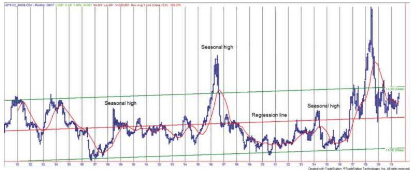
FIGURE 6.1 A basic regression analysis results in a straight line through the center of prices.
In classic time-series decomposition, the trend is removed first by subtracting the value of the regression line from the corresponding price. The detrended series is then used to find the cyclic and seasonal components. Detrending can also be done by taking the first differences of daily closing prices, \(P_{t}-P_{t-1}\), for the entire data series.
\section*{LINEAR REGRESSION}
When most people talk about regression, they normally think about drawing a straight line through the center of some period of price movement, such as the middle line in Figure 6.1. But regression is a simple and powerful tool for explaining the relationship between two price series. In econometrics, analysts will use multiple regression to find the relationship between various factors, such as supply, demand, inflation, and price.
In this chapter we look at how regression can be used:
- As a trading tool for a single market
- To find the relationships between two markets or two data series
■ To rank markets
The inputs to a regression analysis must be two time series of the same frequency (i.e., daily, monthly) and the same number of data points. For trading we will use daily data but economic relationships will depend on the availability of the data. We start with the linear relationship between two price series, \(X\) and \(Y\). A linear relationship will try to find the value of \(Y\) (the dependent variable) for each value of \(X\) (the independent variable) using the formula for a straight line, \(Y=a+b X\), where \(b\) is the slope of the line, and \(a\) is the \(Y\)-intercept, the point where the line crosses the \(Y\) axis when the value of \(X\) is zero.
The linear regression is also called a straight-line fit, or simply the best fit. It selects the straight line that comes closest to all of the data points. The result tells you that, for example, for every move of \(\$ 1\) in corn (series \(X\) ), we can expect a move of \(\$ 2.50\) in soybeans (series \(Y\) ). We can also expect inflation, or combined economic factors, to increase the price of corn by \(0.000029 \%\) per day, as shown in Figure 6.1. We will apply a linear regression in two examples, first to explain the price movement of corn based on the price of soybeans, then to explain the price of Barrick Gold Corporation (ABX) based on the price of physical gold.
\section*{Explaining, Not Predicting}
You may have noticed that we refer to explaining the Barrick Gold stock price in terms of the price of gold bullion. We do not say that we can predict the price. We are finding the past relationship between two price series. You may decide that this relationship can be used to trade those two markets whenever prices move too far from one another. The regression analysis may establish what you see as a fair value for one market based on the price of the other. In order to forecast a price, you will need to establish that conditions at the date of your forecast are likely to be the same as the period over which the regression was calculated. You must also account for the loss of accuracy, or confidence, as you forecast further into the future.
\section*{Calculating the Best Straight-Line Fit}
The method of least squares is the process for finding the regression line, and the one seen in Figure 6.1. It calculates the best straight-line fit through a selected period of price movement. This is done in the same way as finding the relationship between two price series, except that we will substitute the simple sequence \(1,2,3\), \(4, \ldots\) for the second series to represent time. We do not use the date as the dependent variable because weekends and holidays break the continuity of the series.
Our example uses ten days of price movement in Walmart during March 2002. To find the best straightline fit, we begin with the equation for a straight line:
\[
Y=a+b X
\]
In this equation, \(Y\) is the dependent variable because it is a function of the value of \(X\), the independent variable. The slope, \(b\), is the relative change in \(Y\) for every unit change in \(X\). Therefore, if \(b=0.20\) and \(X\) are sequential days, then for every day, the price \((Y)\) gains \(\$ 0.20\). The \(Y\)-intercept, \(a\), is an adjustment in the price level to bring \(X\) and \(Y\) into alignment. It is also the point at which the straight line crosses the \(Y\)-axis when
\(X=0\)
\section*{Method of Least Squares}
The method of least squares calculates the sum of the squares of all the differences between the price and the corresponding value of a straight line and chooses the line that has the smallest total deviation. The mathematical expression for this is:
\[
S=\sum_{i=t-n+1}^{t}\left(y_{i}-\hat{y}_{i}\right)^{2}
\]
where
\(S=\) the sum of the squares of the error at each of the 10 Walmart points on the straight line (one point for each price, designated by \(i=1,2,3, \ldots\) )
\(y_{i}=\) the price of Walmart on day \(i\)
\(\begin{aligned} \hat{y}_{i}= & \text { the estimated value of this price on the straight } \\ & \text { line }\end{aligned}\)
\(y=\) the difference between the actual price \(y_{i}\) at \(i\) and
the predicted price \(\hat{y}_{i}\)
\section*{Walmart Regression and Error Deviation}
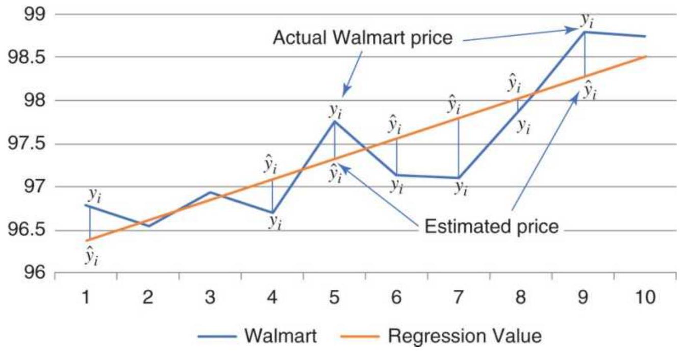
FIGURE 6.2 Error deviation for method of least squares.
Graphically, the individual deviations, or errors, for the best fit may look like those in Figure 6.2. Each actual data point is \(\left(1, y_{1}\right),\left(2, y_{2}\right),\left(3, y_{3}\right), \ldots\) and the corresponding position on the regression line is \(\left(1, \hat{y}_{1}\right),\left(1, \hat{y}_{2}\right),\left(1, \hat{y}_{3}\right), \ldots\) The sum of the squares of the errors is:
\[
S=\sum_{i=t-n+1}^{t}\left(y_{i}-\hat{y}_{i}\right)^{2}
\]
\(S=\left(y_{1}-\hat{y}_{1}\right)^{2}+\left(y_{2}-\hat{y}_{2}\right)^{2}+\cdots+\left(y_{10}-\hat{y}_{10}\right)^{2}\)
The straight line that causes \(S\) to be the smallest possible value will be the best choice for the 10 Walmart data points. The square of \(y,-\frac{1}{y}\) is always positive; therefore, prices above and below the regression line are treated equally. The least-squares method for solving the Walmart time-price relationship can be found directly by solving the equations
\[
\begin{aligned}
& b=\frac{N \sum x y-\sum x \sum y}{N \sum x^{2}-\left(\sum x\right)^{2}} \\
& a=\frac{1}{N}\left(\sum y-b \sum x\right)
\end{aligned}
\]
where
\(N=\) the number of data points (10 in the example)
\(\Sigma=\) the sum over \(N\) points
This is easily done in a spreadsheet by entering Walmart prices in column B (see Table 6.1) and calculating the individual expressions needed for the two formulas in the next columns We can now substitute the values on the Sum line into the two equations:
\section*{TABLE 6.1 Calculations for the Walmart best fit.}
\begin{tabular}{|c|c|c|c|c|c|c|c|c|c|}
\hline 4. & A & \(B\) & C & D & E & F & G & H & 1 \\
\hline 1 & Date & Wal-Mart & x & \(X^{\wedge} 2\) & XY & \(y^{4} 2\) & \begin{tabular}{c}
Regression \\
Value
\end{tabular} & & Solution \\
\hline 2 & 12/7/2017 & 96.78 & 1 & 1 & 96.78 & 9366.37 & 96.379 & A \(=\) intercept & 96.143 \\
\hline 3 & 12/8/2017 & 96.55 & 2 & 4 & 193.10 & 9321.90 & 96.615 & X \(=\) Slope & 0.236 \\
\hline 4 & 12/11/2017 & 96.93 & 3 & 9 & 290.79 & 9395.42 & 96.851 & & \\
\hline 5 & 12/12/2017 & 96.7 & 4 & 16 & 386.80 & 9350.89 & 97.087 & & \\
\hline 6 & 12/13/2017 & 97.76 & 5 & 25 & 488.80 & 9557.02 & 97.323 & & \\
\hline 7 & 12/14/2017 & 97.13 & 6 & 36 & 582.78 & 9434.24 & 97.559 & & \\
\hline 8 & 12/15/2017 & 97.11 & 7 & 49 & 679.77 & 9430.35 & 97.795 & & \\
\hline 9 & 12/18/2017 & 97.9 & 8 & 64 & 783.20 & 9584.41 & 98.031 & & \\
\hline 10 & 12/19/2017 & 98.8 & 9 & 81 & 889.20 & 9761.44 & 98.267 & & \\
\hline 11 & 12/20/2017 & 98.75 & 10 & 100 & 987.50 & 9751.56 & 98.503 & & \\
\hline 12 & Sum & 974.41 & 55 & 385 & 5378.72 & 94953.6 & & & \\
\hline
\end{tabular}
\[
\begin{aligned}
b & =\frac{10 \times 5378.72-55 \times 974.41}{10 \times 385-55 \times 55} \\
& =\frac{53789.2-53592.6}{3850-3025} \\
& =0.23593 \\
a & =\frac{1}{10} \times(974.41-0.23594 \times 55) \\
a & =96.143
\end{aligned}
\]
The equation for the least-squares approximation is:
\[
Y=96.143+0.236 X
\]

Selecting values for \(X\) and solving for \(Y\) gives the results shown in the right column of Table 6.1, "Regression Value," representing the straight line fit.
This is shown along with the original prices for Walmart in Figure 6.2. The straight-line increases by
approximation \(23.6 \$\) per day and the approximation line starts at 96.143, where \(X=0\). The spreadsheet used for this can be found on the Companion Website as TSM Walmart Regression Analysis.
\section*{Excel Regression}
If you would rather not enter the formulas yourself, Excel's regression function can be found in the dropdown menu Data/Data Analysis (this is available as an "add-in" if not already loaded), then select "Regression." Assign the sequential values \((1,2,3, \ldots)\) as \(X\), the prices as \(Y\), and the output will be in a new worksheet. Excel will produce the analysis shown in Table 6.2. The \(Y\) intercept and slope can be found in the bottom left of the lower table. Also of interest is the correlation,
\(R\) Square \(=0.7504\), at the top, which shows the quality of the fit (reasonably good).
TABLE 6.2 Output from Excel's regression function.
\section*{SUMMARY OUTPUT}
Regression Statistics
Multiple R 0.8663
R Square
0.7504
Adjusted R
0.7192
Square
Standard
0.4370
\section*{Error}
Observations 10
\section*{ANOVA}
\begin{tabular}{|l|c|c|c|}
\hline & df & SS & \(\boldsymbol{M S}\) \\
\hline Regression & 1 & 4.5926 & .4 .5926 \\
\hline Residual & 8 & 1.5275 & .0 .1909 \\
\hline Total & 9 & 6.1201 & \\
\hline
\end{tabular}
\begin{tabular}{|l|l|c|l|}
\hline & Coefficients & StandardError & t Stat \\
\hline Intercept & 96.143. & 0.299 & 322.082 \\
\hline X Variable 1 & .0 .236. & 0.048 & .4 .904. \\
\hline
\end{tabular}
\section*{Corn Explained by Soybeans}
Finding the relationship between corn and soybean prices will tell the farmer whether planting one or the other is a better business decision. We use the same technique, but this time we use the corn and soybean price series instead of letting one be the simple integer sequence. Table 6.3 gives the cash prices and the intermediate calculations. These result in the slope \(=0.282\) and the \(y\)-intercept \(=0.336\), giving the equation for the regression as \(y=0.282+0.336 X\).
The Excel solution is shown in Table 6.4 with the
correlation, \(R=0.91\). Looking at the scatter diagram of the corn-soybean relationship, Figure 6.3, we see that if corn is selling at \(\$ 2.00 /\) bu we can expect soybeans to sell at \(\$ 5.00 /\) bu.
This is close to what would be expected for farm income. Corn yield is generally thought to be 2.5 times greater per acre than the soybean yield in most parts of the United States; then the ratio 1:2.5 will yield \(\$ 5\) for soybeans when corn is \(\$ 2\). The slope of the regression is 0.3358 , showing that our ratio was \(1: 2.98\). Notice that, at higher prices (right and up), points are scattered further from the line, indicating greater variation due to volatility.
\section*{TABLE 6.3 Calculations for the corn-soybean regression.}
Source: Illinois Statistical Service, Commodity Research Bureau, Commodity Yearbook, 1966-1982.
\begin{tabular}{|l|c|l|l|l|l|c|}
\hline Year & Seq & Corn \(\mathbf{y}_{\mathbf{i}}\) & Soy \(_{\mathbf{i}}\) & \(\mathbf{x}_{\mathbf{i}}{ }^{\mathbf{2}}\) & \(\mathbf{x}_{\mathbf{i}} \mathbf{y}_{\mathbf{i}}\) & \(\mathbf{y}_{\mathbf{i}}^{\mathbf{2}}\) \\
\hline 1956 & 1 & .1 .27 & .2 .43 & .5 .90 & .3 .09 & .1 .61 \\
\hline 1957 & 2 & .1 .19 & .2 .26 & .5 .11 & .2 .69 & .1 .42 \\
\hline 1958 & 3 & .1 .10 & .2 .15 & .4 .62 & .2 .36 & .1 .21 \\
\hline 1959 & 4 & .1 .10 & .2 .07 & .4 .28 & .2 .28 & .1 .21 \\
\hline 1960 & 5 & .1 .05 & .2 .03 & .4 .12 & .2 .13 & .1 .10 \\
\hline\(\vdots\) & \(\vdots\) & \(\vdots\) & \(\vdots\) & \(\vdots\) & \(\vdots\) & \(\vdots\) \\
\hline 1979 & 24 & .2 .25 & .6 .61 & .43 .69 & .14 .87 & .5 .06 \\
\hline 1980 & 25 & .2 .52 & .6 .28 & 39.44 & .15 .83 & .6 .35 \\
\hline 1981 & 26 & .3 .11 & .7 .61 & .57 .91 & .23 .67 & .9 .67 \\
\hline
\end{tabular}
\begin{tabular}{|l|l|l|l|l|l|l|}
\hline 1982 & 27 & .2 .50 & .6 .05 & 36.60 & .15 .13 & 6.25 \\
\hline Sums & & \(43 \cdot 38\) & 106.46 & 512.95 & 202.35 & 82.27 \\
\hline
\end{tabular}
TABLE 6.4 Excel solution for the corn-soybean regression.
\section*{SUMMARY OUTPUT}
\section*{Regression Statistics}
Multiple R 0.9135
R Square \(\quad 0.8345\)
Adjusted R
0.8279
Square
Standard
0.2888
Error
Observations 27
ANOVA
\begin{tabular}{l|c|c|c|c}
\hline & df & SS & \(\boldsymbol{M S}\) & \(\boldsymbol{F}\) \\
\hline Regression & 1 & 10.5106 & 10.5106 & 126.04 ؛ \\
\hline Residual & 25 & 2.0846 &. & \\
\hline Total & 26 & 12.5952 & & \\
\hline
\end{tabular}
\begin{tabular}{|l|l|l|l|l|}
\hline & Coefficients & \begin{tabular}{c}
Standard \\
Error
\end{tabular} & t Stat & P-vala \\
\hline Intercept & .0 .2825 & 0.1304 & .2 .1665 & .0 .040 \\
\hline
\end{tabular}
\begin{tabular}{|l|l|l|l|l|}
X Variable 1 & .0 .3358 & 0.0299 & 11.2271 & .0 .000
\end{tabular}
\section*{Gold Bullion and Barrick Gold Corporation}
A question often asked is, "If gold goes up by \(\$ 1\), how much will a gold mining share go up?" For this to make sense, the mining company should not be diversified but concentrated on gold production. To find how the stock price of Barrick Gold Corporation can be explained by the price of physical gold, we will first take a long view, from 1998 through 2017. It will be necessary to align the daily data because stocks do not always trade on the same days as futures, and we'll use gold futures to be practical. When there is a missing date, use the price from the previous day. In Table 6.5, we indexed the price data (columns \(D\) and \(E\) ) to see if that made a difference in the regression results - it did not.
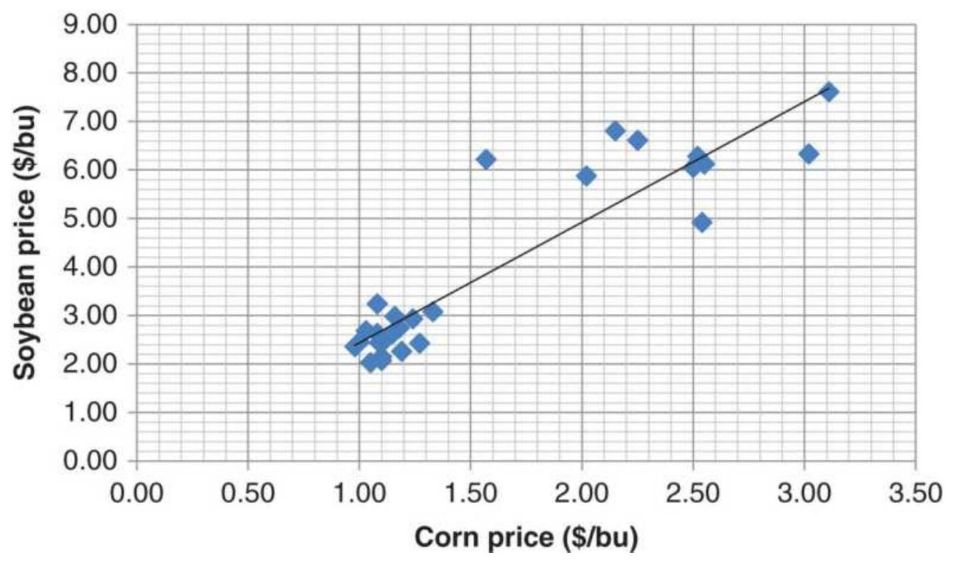
FIGURE 6.3 Scatter diagram of corn, soybean pairs
with linear regression solution.
\section*{TABLE 6.5 Spreadsheet for ABX-gold regression.}
\begin{tabular}{|c|c|c|c|c|c|c|c|}
\hline 4 & A & B & C & D & E & F & G \\
\hline 1 & Date & ABX & Gold Cash & \(\mathrm{Y}=\mathrm{ABX}\) & X \(=\) Gold & Index Reg & Price Reg \\
\hline 2 & 8/3/1998 & 12.93 & 286.1 & 100.00 & 100.00 & 125.20 & 16.19 \\
\hline 3 & 8/4/1998 & 12.98 & 286.1 & 100.39 & 100.00 & 125.20 & 16.19 \\
\hline 4 & 8/5/1998 & 13.27 & 287.9 & 102.63 & 100.63 & 125.36 & 16.21 \\
\hline 5 & 8/6/1998 & 13.22 & 287.8 & 102.24 & 100.59 & 125.35 & 16.21 \\
\hline 6 & 8/7/1998 & 13.18 & 285.7 & 101.93 & 99.86 & 125.16 & 16.18 \\
\hline 7 & 8/10/1998 & 13.22 & 285.6 & 102.24 & 99.83 & 125.15 & 16.18 \\
\hline 8 & 8/11/1998 & 12.68 & 284.8 & 98.07 & 99.55 & 125.08 & 16.17 \\
\hline 9 & 8/12/1998 & 12.68 & 285 & 98.07 & 99.62 & 125.10 & 16.18 \\
\hline
\end{tabular}
Using the Excel regression function applied to the prices (columns B and C), where \(Y=\mathrm{ABX}\) and \(X=\) gold, gave an intercept \(a=12.8841\) and a slope \(b=0.0115\). We interpret that as an increase of 1.15 in ABX for every \(\$ 1\) move in gold. However, Figure 6.4 shows that the price of gold has stayed high while ABX has dropped. The long-term best fit dampens both the upward and downward moves in order to find the center (Figure 6.5).
Most analysts and traders will consider it more relevant to use a small amount of data and recalculate each day. If we use a rolling 20-day regression, Figure 6.6 shows the results of the most recent 20 days, mid-December 2017. The intercept \(\mathrm{a}=7.8715\), and the slope \(b=0.004839\), a change of \(48 \$\) in ABX for every \(\$ 1\) change in gold. The direction of the linear regression
values tracks the trend of ABX nicely, and runs through the center of the price movement.
\section*{\(A B X\) and cash gold prices}
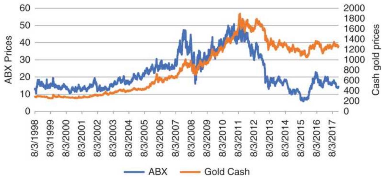
FIGURE 6.4 Prices of ABX and gold show that gold remained high while ABX declined from 2011.
\(A B X\) and regression values
60
50
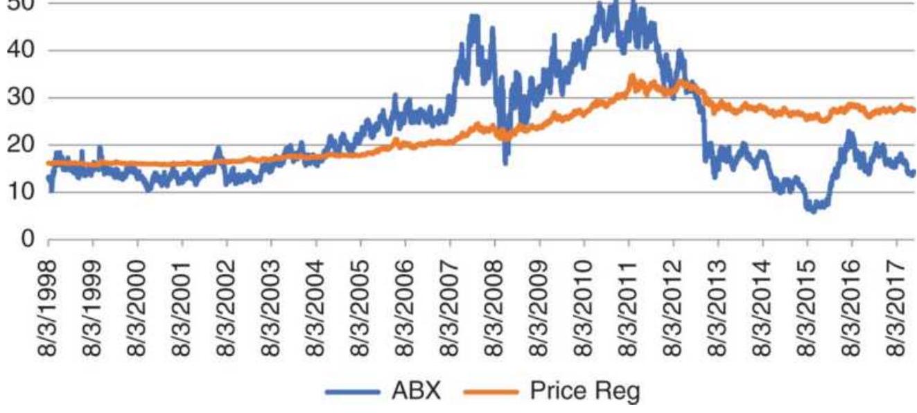
FIGURE 6.5 The best fit for ABX tracks the upward and downward move, but is greatly dampened due to trying
to fit a large amount of data.
ABX-Gold 20-Day Regression

13.4
— ABX — Regression estimate
FIGURE 6.6 ABX-Gold regression using only the last 20-days of prices.
\section*{Programming and Spreadsheet Tools}
In addition to the regression function in Excel Data Analysis, there are simple functions that can produce the same results. \(\operatorname{Slope}(y, x)\) returns the slope value, \(b\), when you enter the column lists for \(Y\) and \(X\). Intercept \((y, x)\) returns the \(y\)-intercept, \(a\), when you enter the same values for \(Y\) and \(X\). Once you know what to look for, it becomes easy.
In strategy development software, such as TradeStation, the functions that calculate linear regression are nearly the same. LinearRegSlope LinearRegValue, LinRegIntercept all produce the same results as Excel. Most often, traders are only interested in the slope as a way to identify the direction of prices. Using daily data,
they can add the slope value to the most recent price to project tomorrow's price:
\section*{Projected price \((1\)-day ahead \()=\) Today's price + Slope}
If they want to project \(n\) days ahead, they multiply the slope by \(n\) and add that value to today's price,
Projected price \((n\)-days ahead \()=\) Today's price \(+n \times\) Slope
As prices are projected further ahead, there is a much greater chance of error. This is discussed in a later section, "Confidence Bands." Note that when economist project they use the last value on the regression line, not the last price.
\section*{LINEAR CORRELATION}
Solving the least-squares equation for the best fit does not mean that the answer is useful. In the previous sections we used two price series that had a clear relationship; therefore, the results appeared reasonable. The least-squares method will always give an answer, even when there is nothing that makes one prices series dependent upon the other. You may think that two data items affect one another, such as the amount of disposable income and the purchase of television sets, but that might not be the case. Instead, the purchase of television sets may peak just before the Superbowl.
The linear correlation, which produces a value called the coefficient of determination \({ }_{r}^{2}\), or the correlation
coefficient, expresses the strength of the relationship between the data on a scale from +1 (perfect correlation) to o (no relationship). It may be even better to look at \(r\), which varies from +1 to -1 , rather than \(r^{2}\), because you then know whether the correlation is positive or negative. A negative correlation between two prices series means that when one goes up, the other goes down. When \(r=+1\) there is a perfect positive correlation, when \(r=0\) there is no correlation, and when \(r=-1\) there is a perfect negative correlation, as shown in Figure 6.7. This is the most practical way to find out whether two price series are moving in a similar manner. If \(r^{2}\) is less than about 0.20 , then the linear regression has no practical value. In the examples that looked at the corn-soybean relationship, the Excel results showed an \(\mathrm{r}^{2}=0.83\), very high, while the long-term ABX-gold correlation was only 0.26. For arbitrage purposes, however, high correlations mean little opportunity while moderately positive correlations are good. Another measurement, cointegration, will be helpful in qualifying arbitrage pairs, and is discussed in Chapter 13.
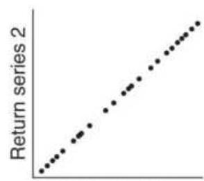
Return series 1
(a)
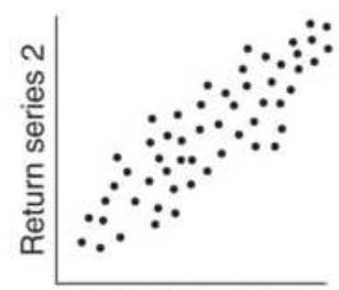
Return series 1
(b)
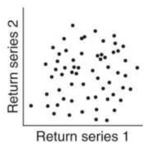
(c)
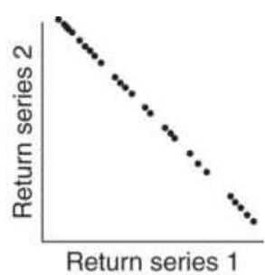
(d)
FIGURE 6.7 Degrees of correlation. (a) Perfect positive linear correlation ( \(r=1\) ). (b) Somewhat positive linear
correlation ( \(r=0.5\) ). (c) No correlation ( \(r=0\) ). (d) Perfect negative linear correlation \((r=1)\).
To calculate the correlation coefficient, \(r\), for the most recent \(n\) days, where \(t\) is today, we use Pearson's Product-Momentum Correlation:
\[
r=\frac{1}{N} \sum_{i=t-n+1}^{t}\left[\left(\frac{x_{i}-\bar{x}}{s_{x}}\right)\left(\frac{y_{i}-\bar{y}}{s_{y}}\right)\right]
\]
In the calculation above, \(s_{x}\) and \(s_{y}\) are the standard deviations of \(x\) and \(y\), and \(\bar{x}\) and \(\bar{y}\) are the averages. The result \(r\) is interpreted as follows:
\(|\equiv+|\) A perfect positive linear correlation. The data points are along a straight line going upward to the right (Figure 6.7a). For every upward move in \(x\) there is a corresponding upward move in \(y\).
* 1 ) The scattered points become more uniformly distributed about a positive approximation line as the value of \(r\) becomes closer to +1 (Figure 6.7b).
\(r=0\) No linear correlation exists (Figures 6.7c, 6.7d).
*|,|(|) The scattered points become more uniformly distributed about a negative approximation line as the value of \(r\) becomes closer to -1 .
\(t=-\mid\) A perfect negative linear correlation, the line going downward to the right. For every upward move in \(x\) there is a corresponding downward move in \(y\).

In Excel, the correlation function \(\operatorname{correl}(x, y)\) returns \(r^{2}\). The formula appears to be different, but it is only a regrouping of the factors. If you need to know whether the correlation is positive or negative, it will be necessary to do the calculation yourself. On the Companion Website, the spreadsheet, TSM ABX-Gold regression comparison of power fits, compares the formula given above with the Excel method.
\section*{Use of Returns or Price Differences for Correlations}
Because most price analyses involve the use of two time series, a strong trend can exaggerate the correlations by overshadowing the smaller movements. Inputs to correlations should be returns or price changes, not the actual prices. It is best if these changes are in percent, but for back-adjusted futures data, the price differences should be used. Most software, such as Excel, will calculate the correlation on whatever series you input, so it is your responsibility to give it the correct data.
\section*{Confidence Bands}
Regression analysis includes its own measure of accuracy called the confidence level. It is based on the size of the errors, the distance of the actual data from the regression line, and the number of data points. Looking back at Figure 6.3, the straight line cannot touch all the points, but its "goodness of fit" is best when the errors, \(e_{t}\) , are small. If the actual data points are \(y_{i}\) and their
corresponding value on the fitted line \(\hat{y}_{i}\), then \(s\) is the standard deviation of the errors,
\[
s=\sqrt{\frac{\sum\left(y_{i}-\hat{y}_{i}\right)^{2}}{N}}
\]
where \(i=1, N\), the number of data points.
Using the Excel function NORMDIST, we can find that the \(95 \%\) level is equivalent to 1.96 standard deviations. Then, a confidence band of \(95 \%\), placed around the forecast line, is written:
\[
\begin{aligned}
& 95 \% \text { upper band }=y_{i}+1.96 \sigma \\
& 95 \% \text { lower band }=y_{i}-1.96 \sigma
\end{aligned}
\]
Figure 6.8 a is an example of a forecast with a \(95 \%\) confidence band. The points that are outside the band are of particular interest and can be interpreted in one of two ways.
1. They are normal outliers, and prices are expected to correct the levels within the bands.
2. The model was not performed on representative or adequate data and should be reestimated with more data.
Figure 6.8b also shows that the forecast loses accuracy as it is further projected; the forecast is based on the size of the sample used to find the regression coefficients. The
more data included in the original solution, the longer the forecast will maintain its accuracy.
(a)

(b)
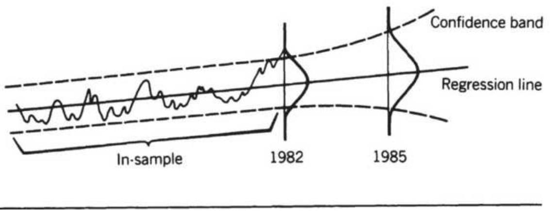
FIGURE 6.8 Confidence bands. (a) A 95\% confidence band. (b) Out-of-sample forecasts lose confidence.
In the previous example of the corn-soybean relationship, the Excel analysis output (Table 6.4) showed the values corresponding to the \(95 \%\) confidence level for both the slope and \(Y\)-intercept. Generally, the
slope is the more interesting value. The solution for the slope was 0.3358 , with the upper \(95 \%\) at 0.3974 and the lower \(95 \%\) at \(0.2742,18 \%\) higher and \(22 \%\) lower respectively. These values are large because only a few data points were used.
\section*{Spearman's Correlation}
Most analysts will find Pearson's correlation works well for their applications, but some may want to look at an alternative, Spearman's correlation. The difference is that Spearman's correlation will give less weight to outliers and focus on the main pattern, similar to Figure 6.8b. Given a few outliers, it would still return a high correlation.
The technique used by Spearman is to rank the values of the two series, \(x\) and \(y\), then apply the formula to the ranking pairs. The process is more complicated than Pearson's correlation but the results may be more useful. The process can be found online by searching for "Spearman's correlation."
\section*{Autocorrelation}
Serial correlation or autocorrelation is a way of identifying if there is persistence in the data - that is, future data can be predicted (to some degree) from past data. That could indicate the existence of trends. A simple way of finding autocorrelation is the put the data into column A of a spreadsheet, then copy it to column B while shifting the data down by 1 row. Then find the correlation of column A and column B, ignoring the first
and last rows. Additional correlations can be calculated shifting column B down 2,3 , or 4 rows, which would show the existence of a lagged relationship, or a cycle.
A formal way of finding autocorrelation is by using the Durbin-Watson test, which gives the \(d\)-statistic. This approach measures the change in the errors ( \(e\) ), the difference between \(N\) data points and their average value:
\[
\begin{aligned}
e_{t} & =r_{t}-\frac{\sum_{t-N+1}^{t} r_{i}}{N} \\
d & =\frac{\sum_{t-N+1}^{t}\left(e_{i}-e_{i-1}\right)^{2}}{\sum_{t-N+1}^{t} e_{i}^{2}}
\end{aligned}
\]
A positive autocorrelation, or serial correlation, means that a positive error factor has a good chance of following another positive error factor. The value of \(d\) always falls between o and 4. There is no autocorrelation if \(d=2\). If \(2>d>1\), there is positive autocorrelation; however, if \(\mathrm{d}<1\) then, there is more similarity in the errors than is reasonable. The further \(d\) is above 2 , the more negative autocorrelation appears in the error terms.
\section*{NONLINEAR APPROXIMATIONS FOR TWO VARIABLES}
The linear regression, \(a+b x\), also called a 1st-order
polynomial equation, is the simplest way of finding the relationship between two price series. It uses one multiplier ( \(b\), the slope) of power 1 (hence first order) and one constant, \(a\) (the \(Y\)-intercept), to shift the starting point. By adding a third term, \(c x^{2}\), the approximation can be made much more accurate when a factor such as the decline in the supply of gold causes the stock price to rise at a faster rate. The term, \(x^{2}\), introduces a parabolic curve - a single, smooth change of direction. A fourth term, \(d x^{3}\), would add inflection, the ability for the curve to turn up and down at different points. Each time we add one more term, the ability to fit one price series based on another becomes better. Because we will want to create a polynomial with more than two or three terms, it is more convenient to change the general notation to:
\[
y=a_{0}+a_{1} x+a_{2} x^{2}+\cdots+a_{n} x^{n}
\]
The first two terms on the right side of the equal sign form the equation for a straight line (where \(a_{0}\) was called \(a\) and \(a_{1}\) was called \(b\) ). For most price forecasting, the second-order equation, also called curvilinear, which uses three terms, is sufficient. Figure 6.9 shows the general form of a second-order equation, curving up and to the right at an increasing rate.
Curvilinear (Second Order)
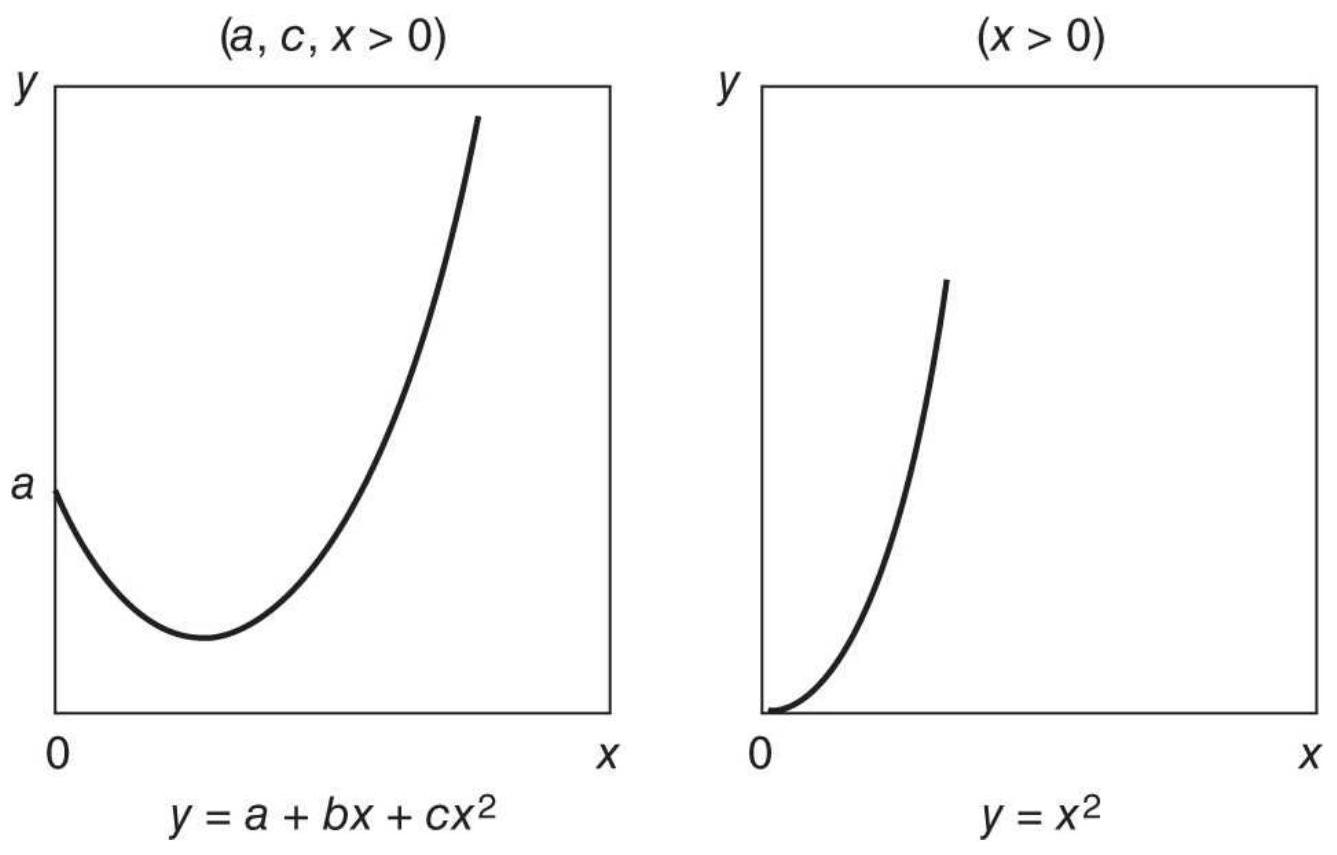
FIGURE 6.9 Curvilinear (parabolas).
\section*{ABX-Gold Results}

If we want to know if the price of ABX will go up faster than the linear approximation when gold prices move much higher, then we will want to try a 2nd- and 3 rd-order approximation. Instead of a period of only a few days, this solution will use 8 years from 2011 through mid-2018. A spreadsheet with this data and the results of the approximations, TSM ABX-Gold Regression, is available on the Companion Website.
The second-order (curvilinear) form:
\[
y=a_{0}+a_{1} x+a_{2} x^{2}
\]
must be solved for the coefficients \(a_{0}, a_{1}\), and \(a_{2}\) using the simultaneous equations:
\[
\begin{aligned}
N a_{0}+a_{1} \sum x+a_{2} \sum x^{2} & =\sum y \\
a_{0} \sum x+a_{1} \sum x^{2}+a_{2} \sum x^{3} & =\sum x y \\
a_{0} \sum x^{2}+a_{1} \sum x^{3}+a_{2} \sum x^{4} & =\sum x^{2} y
\end{aligned}
\]
\section*{Second-Order Least Squares Solution}
The least squares solution can be extended to the curvilinear (second-order) equation by minimizing the sum of the errors: 1
\[
S=\sum_{i=1}^{N}\left(y_{i}-a_{0}-a_{1} x_{i}-a_{2} x_{i}^{2}\right)^{2}
\]
We'll skip the way we get to the solution because that can be found in a statistics book. The procedure is identical to the linear least squares solution. The constant values can then be found by using a spreadsheet and substituting the following terms into the equations:
\[
\begin{aligned}
& a_{1}=\frac{S_{x y} S_{x^{2} x^{2}}-S_{y x^{2}} S_{x x^{2}}}{S_{x x} S_{x^{2} x^{2}}-\left(S_{x x^{2}}\right)^{2}} \\
& a_{2}=\frac{S_{x x} S_{y x^{2}}-S_{x x^{2}} S_{x y}}{S_{x x} S_{x^{2} x^{2}}-\left(S_{x x^{2}}\right)^{2}} \\
& a_{0}=\bar{y}-a_{1} \bar{x}-a_{2} \bar{x}^{2}
\end{aligned}
\]
Fortunately, there are simple computer programs that have already been written to solve these problems, such as Polysoftware's Pro-Stat or Matlab.
\section*{ABX-Gold 2nd- and 3rd-Order Results}
Using Excel for the linear (1st order) regression solution, and Pro-Stat for the 2 nd-order and 3 rd-order solutions, we get the values for the constants \(a_{0}, a_{1}, a_{2}\), and \(a_{3}\) shown in Table 6.6.
Seeing a plot of the three solutions, Figure 6.10, shows that even with different values for the constants, the solutions are very similar. The most likely scenario is that \(a_{2}\) and \(a_{3}\), the constants used in the 2nd- and 3 rdorder solutions, are very small because they could not improve over the linear solution. In this case, simple was better. We can also see that the correlations improved only slightly, indicating only a marginal improvement.
\footnotetext{
TABLE 6.6 ABX = f(gold) solution for 1st-, 2nd-, and 3rd-order polynomials.
}
\begin{tabular}{|l|l|l|l|l|l|}
\hline Linear & -53.2977. &. & & & \(0.86 \%\) \\
\hline \begin{tabular}{l}
2nd \\
Order
\end{tabular} & -96.026. & .0 .115858 & \(-2.1 \mathrm{E}-05\) & & 0.869 \\
\hline \begin{tabular}{l}
3rd \\
Order
\end{tabular} & 232.294. & -0.59271. & 0.0004828 & \begin{tabular}{c}
\(-1.2 \mathrm{E}-\) \\
07
\end{tabular} & 0.872 \\
\hline
\end{tabular}
60
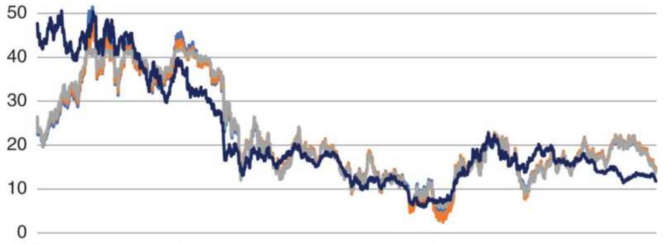
\(\begin{array}{llllllll}1 / 3 / 2011 & 1 / 3 / 2012 & 1 / 3 / 2013 & 1 / 3 / 2014 & 1 / 3 / 2015 & 1 / 3 / 2016 & 1 / 3 / 2017 & 1 / 3 / 2018\end{array}\)
—_1st Order —_2nd Order —_3rd Order _ ABX
FIGURE 6.10 Comparison of ABS-Gold linear, 2nd-, and 3rd-order regressions.
\section*{TRANSFORMING NONLINEAR TO LINEAR}
Returning to the simpler solutions, two curves that can also be used to forecast prices are logarithmic (power) and exponential (see Figure 6.11). The exponential, curving up when \(b>0\), is used to scale price data that become more volatile at higher levels. It is equivalent to
converting a stock price to a percentage. The logarithmic curve that bends down ( \(0<b<1\) in Figure 6.11a) is typical of volatility measured over increasing time intervals. Each of these formulas can be easily transformed into linear relationships and solved using the method of least squares. This will allow you to fool the computer into solving a nonlinear problem using a linear regression tool.
Logarithmic (Power)
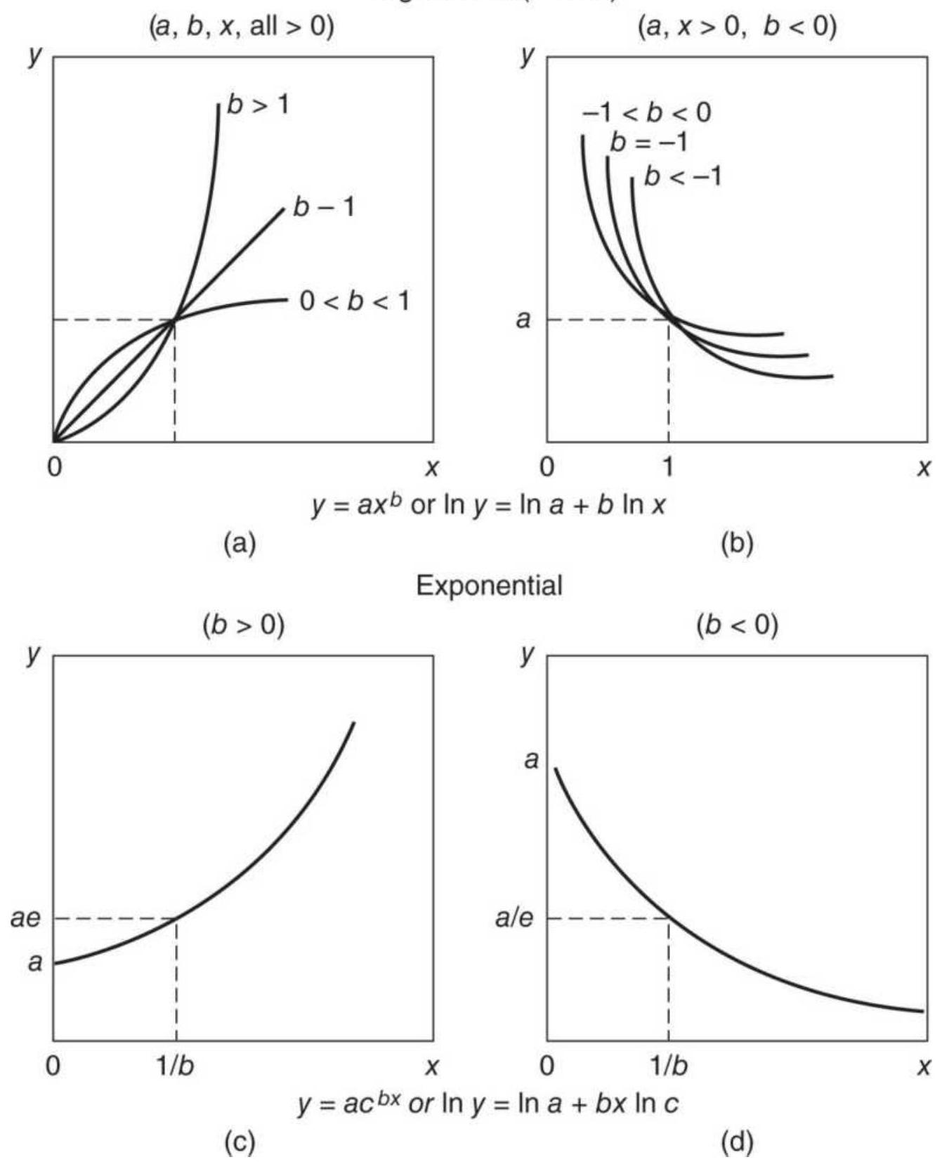
FIGURE 6.11 Logarithmic and exponential curves.
Source: Cuthbert Daniel and Fred S. Wood, Fitting Equations to Data: Computer Analysis of Multifactor
Data, 2nd ed. (New York: John Wiley \& Sons, 1980), pp. 20, 21. Reprinted with permission.
\section*{Logarithmic Solution}
Using monthly cash corn data, we solve the logarithmic relationship by starting with \(y=a+b x\), then substituting \(\ln x\) for \(x\), and \(\ln y\) for \(y\). In Table 6.7, monthly data for corn \((Y)\) is shown in column \(B\), a sequential number \((X)\) in \(C\), the natural \(\log (\ln )\) of corn in D , and \(\ln X\) in E. Now solve the regression using \(\ln x\) and \(\ln y\) instead of \(x\) and \(y\). The solutions are shown at the right. To create the values for the linear regression line, cell F2 \(=\mathrm{K} \$ 2+\mathrm{K} \$ 3 * \mathrm{C} 2\). Copy down to get all the values.
For the \(\log\) solution, cell
\(\mathrm{G} 2=\mathrm{EXP}(\mathrm{L} \$ 2+\mathrm{L} \$ 3 * \mathrm{LN}(\mathrm{C} 2)\), and for the exponential regression,
\(\mathrm{H} 2=\operatorname{EXP}(\mathrm{M} \$ 2+\mathrm{M} \$ 3 * \mathrm{C} 2)\). The curvilinear solution does not require any transformation, just an extension of the calculations shown earlier in Table 6.3. Use the sums and averages at the bottom of the spreadsheet shown in Table 6.8. The column heading shows the calculations. The value for the curvilinear fit for cell
\(\mathrm{L} 2=\mathrm{K} \$ 8+\mathrm{K} \$ 6 * \mathrm{C} 463+\mathrm{K} \$ 7 * \mathrm{C} 463 * \mathrm{C} 463\) , where \(\mathrm{K} \$ 6=b, \mathrm{~K} \$ 7=c\), and \(\mathrm{K} \$ 8=a\).
When comparing the regression results, we again find that none of them are perfect. In Figure 6.12 the log approximation, curving slightly down, seems to have
favored the earlier data from 1978 to 2006. The other three approximations are close together from 1995 through 2017. The linear solution is good, but then it will continue higher at the same rate until it becomes unrealistic. The exponential starts lower but also curves upward. Only the curvilinear solution seems to be bending down, not expecting higher prices.
\section*{TABLE 6.7 Spreadsheet setup for linear, logarithmic, and exponential regressions.}
\begin{tabular}{|c|c|c|c|c|c|c|c|c|c|c|c|c|c|}
\hline 4 & A & B & C & D & E & F & G & H & 1 & J & K & L & M \\
\hline 1 & Date & \(\mathrm{Y}=\) Corn & \(\times\) & \(\ln Y\) & \(\ln X\) & Linear & Log & Exp & Curvilinear & & Linear & Log & Exp \\
\hline 2 & 8/31/1978 & 215.25 & 1 & 5.372 & 0.000 & 193.235 & 209.181 & 209.444 & 3.739 & A \(=\) intercept & 192.7715 & 5.3432 & 5.343211 \\
\hline 3 & 9/29/1978 & 221.25 & 2 & 5.399 & 0.693 & 193.699 & 209.362 & 209.705 & 5.393 & X = Slope & 0.463534 & 0.001246 & 0.001246 \\
\hline 4 & 10/31/1978 & 231.25 & 3 & 5.443 & 1.099 & 194.162 & 209.468 & 209.966 & 7.045 & & & 209.181 & \\
\hline 5 & 11/30/1978 & 233.25 & 4 & 5.452 & 1.386 & 194.626 & 209.543 & 210.228 & 8.693 & Curvilinear & & & \\
\hline 6 & 12/29/1978 & 228.75 & 5 & 5.433 & 1.609 & 195.089 & 209.601 & 210.490 & 10.338 & \(B=\) & 1.659739 & & \\
\hline 7 & \(1 / 31 / 1979\) & 234.5 & 6 & 5.457 & 1.792 & 195.553 & 209.649 & 210.753 & 11.980 & \(C=\) & -0.00165 & & \\
\hline 8 & 2/28/1979 & 238.75 & 7 & 5.475 & 1.946 & 196.016 & 209.689 & 211.015 & 13.618 & \(A=\) & 2.080506 & & \\
\hline 9 & \(3 / 30 / 1979\) & 253.5 & 8 & 5.535 & 2.079 & 196.480 & 209.724 & 211.278 & 15.253 & & & & \\
\hline 10 & 4/30/1979 & 261.5 & 9 & 5.566 & 2.197 & 196.943 & 209.754 & 211.542 & 16.885 & & & & \\
\hline
\end{tabular}
\section*{TABLE 6.8 Spreadsheet for the curvilinear (2ndorder) solution.}
\begin{tabular}{|c|c|c|c|c|c|c|c|c|c|c|c|c|}
\hline 4. & A & \(B\) & C & D & E & F & G & H & 1 & J & K & 1 \\
\hline 1 & Date & \(\mathrm{Y}=\) Corn & X & X-Avg & Y-Avg & \(\mathrm{X}^{*} \mathrm{X}\) & \(X^{*}{ }^{*}\) & \(Y^{*} Y\) & \(\mathrm{X}^{*} \mathrm{x}^{\wedge} 2\) & \(x^{\wedge} 2^{*} x^{\wedge 2}\) & \(y^{*} X^{\wedge} 2\) & Curvilinear \\
\hline 463 & \(1 / 31 / 2017\) & 343 & 462 & 225.5 & 40.603 & 213444 & 158466 & 117649 & 98611128 & \(4.56 \mathrm{E}+10\) & 73211292 & 416.99003 \\
\hline 464 & 2/28/2017 & 350 & 463 & 226.5 & 47.603 & 214369 & 162050 & 122500 & 99252847 & \(4.6 \mathrm{E}+10\) & 75029150 & 417.12479 \\
\hline 465 & \(3 / 31 / 2017\) & 339 & 464 & 227.5 & 36.603 & 215296 & 157296 & 114921 & 99897344 & \(4.64 E+10\) & 72985344 & 417.25625 \\
\hline 466 & 4/28/2017 & 338 & 465 & 228.5 & 35.603 & 216225 & 157170 & 114244 & \(1.01 E+08\) & \(4.68 \mathrm{E}+10\) & 73084050 & 417.38441 \\
\hline 467 & \(5 / 31 / 2017\) & 349 & 466 & 229.5 & 46.603 & 217156 & 162634 & 121801 & \(1.01 \mathrm{E}+08\) & \(4.72 E+10\) & 75787444 & 417.50928 \\
\hline 468 & 6/30/2017 & 351.5 & 467 & 230.5 & 49.103 & 218089 & 164150.5 & 123552.3 & \(1.02 E+08\) & \(4.76 \mathrm{E}+10\) & 76658284 & 417.63085 \\
\hline 469 & 7/31/2017 & 340.5 & 468 & 231.5 & 38.103 & 219024 & 159354 & 115940.3 & \(1.03 E+08\) & \(4.8 \mathrm{E}+10\) & 74577672 & 417.74912 \\
\hline 470 & 8/31/2017 & 320 & 469 & 232.5 & 17.603 & 219961 & 150080 & 102400 & \(1.03 E+08\) & \(4.84 \mathrm{E}+10\) & 70387520 & 417.86409 \\
\hline 471 & 9/29/2017 & 319 & 470 & 233.5 & 16.603 & 220900 & 149930 & 101761 & \(1.04 E+08\) & \(4.88 \mathrm{E}+10\) & 70467100 & 417.97577 \\
\hline 472 & 10/31/2017 & 313 & 471 & 234.5 & 10.603 & 221841 & 147423 & 97969 & \(1.04 E+08\) & \(4.92 E+10\) & 69436233 & 418.08415 \\
\hline 473 & 11/30/2017 & 314 & 472 & 235.5 & 11.603 & 222784 & 148208 & 98596 & \(1.05 E+08\) & \(4.96 E+10\) & 69954176 & 418.18923 \\
\hline \multicolumn{13}{|l|}{474} \\
\hline 475 & Mean & 302.3972 & 236.5 & Sum \(\Rightarrow\) & \(-4.394 E-11\) & 35162820 & 37817853 & 51375445 & \(1.25 E+10\) & \(4.71 E+12\) & 1.29E+10 & \\
\hline
\end{tabular}
Regression comparison
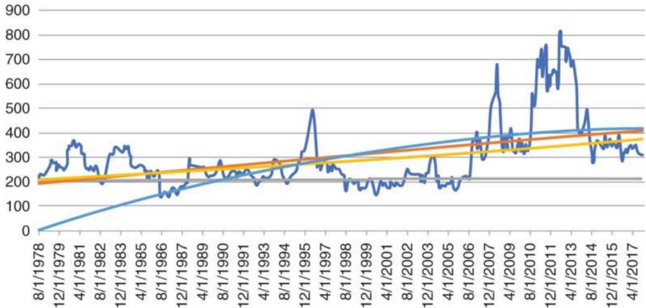
\(-\mathrm{Y}=\) Corn - Linear-Log-Exp-Curvilinear
FIGURE 6.12 Comparison of four regression methods on weekly corn data.
These solutions show that a long-term fit of the data will look good at some intervals and poor at others. Then the calculation period will be the critical parameter, and shorter or well-selected intervals allow for better results, as we saw in Figure 6.10, the ABX-gold fit. Traders can use a rolling calculation period over a shorter interval to stay relevant. Economists will use a multivariate solution, discussed in the next section, if prices are a complex combination of factors.
\section*{Interrelationships}
The price at which a commodity or stock trades is often dependent upon the prices of other competitive or substitute products. This can be seen for stocks where two pharmaceutical companies provide the same product
(such as the cholesterol drugs Lipitor and Zocor), and for airlines vying for passengers on the same route.
The ability to substitute one product for another creates an opportunity for arbitrage. In general, if two physical products provide the same function, they should sell at the same price, net of transaction costs, which can include carrying charges, shipping, inspection, and commissions. These products and stocks are watched carefully when they move apart; traders step in quickly to buy the cheaper one and sell short the more expensive one, causing prices to come back into alignment. In the equities markets this is the basis for pairs trading. In commodities, arbitrageurs keep the futures and cash prices together; they continually prevent the price of gold in New York, London, and Hong Kong from drifting apart. For interest rate markets, "strips" serve the purpose of preventing the large pool of 3 -month rates, 5 and 10-year notes, and 30 -year bonds from offering widely different returns when they revert to the same maturity. The Interbank market provides the same stability for foreign exchange markets, and the soybean crush, energy crack, and other processing margins do not stay out of line for long. The following markets have close relationships that can be found using regression analysis.
\footnotetext{
Commodity
Reason
Product
Relationships
All crops
Farmers choose which crops to plant based on income and yield
}
Feedlots choose the cheapest feedgrain that offers the same protein value
Livestock and feedgrains
All livestock
Sugar and corn
Hogs and pork bellies
Silver, gold, and platinum
\section*{Nonferrous}
metals
Interest rates
and stock
markets
Interest rates and foreign exchange
Cost of feed affects the cost of livestock
Consumer purchases decline as prices rise
Commercial sweetener substitution
Product dependency: bacon prices depend on hog prices
Investor's inflation hedge
Driven primarily by the housing market
Investors continually choose between stocks and interest rates
Investors worldwide move money to seek the best returns and protect against inflation
\section*{MULTIVARIATE APPROXIMATIONS}
Regression analysis is most often used in complex economic models to find the combination of two or more independent variables that best explain or forecast prices. A simple application of the annual production and usage of wheat will tell us whether these factors are significant in determining the price of wheat. Because
both the supply and demand for wheat is global, we should not expect a very accurate model using only two inputs. However, the method of solution is the same when you add other factors.
Applying the method similar to least squares, the equation for two independent variables is:
\[
y=a_{0}+a_{1} x_{1}+a_{2} x_{2}
\]
where
\[
\begin{aligned}
y & =\text { the resulting price, in this case cash wheat } \\
x_{1} & =\text { the total production (supply) } \\
x_{2} & =\text { the total distribution (usage) } \\
a_{0}, a_{1}, & =\text { constants, or weighting factors, to be } \\
a_{2} & \text { calculated }
\end{aligned}
\]
As in the linear approximation, the solution to this problem will be found by minimizing the sum of the squares of the errors at each point, where \(\hat{y}_{i}\) is the approximation for the \(i\) th data item, and \(y_{i}\) is the actual price.
\[
S=\sum_{i=1}^{N}\left(y_{i}-\hat{y}_{i}\right)^{2}
\]
However, this solution will use Excel's Solver. Table 6.9 shows the first few rows of the set-up needed. Column B has the world production, C has the consumption or
usage, and D has the wheat cash price. The cells H2, I2, and J2 are the constants needed for the solution. Column E gives the formula, using those constants for each of the values of production and usage, minus the cash price. By subtracting the cash price, we are creating the forecast errors and we are able to tell Solver to minimize the standard deviation of column E. The cell G2 = STDEV(E2:E32), spans the full set of data:
\section*{\(\mathrm{E} 2=\$ \mathrm{H} \$ 2+\$ \mathrm{I} \$ 2 * \mathrm{~B} 2+\$ \mathrm{~J} \$ 2 * \mathrm{C} 2-\mathrm{D} 2\)}
On the Solver page, we indicate that the solution is found in cell \(\$ \mathrm{G} \$ 2\) and that we want to minimize that value (Figure 6.13) by changing cells \(\$ \mathrm{H} \$ 2\) :\$J \(\$ 2\). Constraints are added to say that the three cells must have values between \(\pm 10\). When we click on "Solve" at the bottom, the cells in Table 6.9 show the answer.
The last step is the show the solution in column F, using the original formula,
Cash price \(=a_{0}+a_{1} \times\) production \(+a_{2} \times\) usage. Figure 6.14 shows the original wheat prices and the Solver solution.

As with the least-squares and polynomial solutions, user-friendly software is available. The data for this solution was available from the Commodity Research Bureau Yearbook (published annually by John Wiley \& Sons). The full spreadsheet and the forecasted results are available on the Companion Website as Wheat supply and demand. For only two inputs, the result looks good.
Neural networks and genetic algorithms have been used for complex problems of supply and demand. Both have the advantage of providing a nonlinear solution. Both genetic algorithms and neural nets are discussed in Chapter 20.
\section*{TABLE 6.9 Wheat prices and set-up for Solver solution.}
\begin{tabular}{|c|c|c|c|c|c|c|c|c|c|c|}
\hline 4 & A & B & C & D & E & F & G & H & 1 & J \\
\hline 1 & Crop year & \begin{tabular}{l}
World \\
Prod- \\
uction
\end{tabular} & Usage & \begin{tabular}{c}
Chicago \\
Cash
\end{tabular} & Minimize & \begin{tabular}{l}
Solver \\
Solution
\end{tabular} & \begin{tabular}{c}
Standard \\
Deviation
\end{tabular} & a0 & a1 & a2 \\
\hline 2 & 1970-1 & 306.5 & 226 & 1.33 & 1.79 & 3.12 & 0.65 & 0.997627 & -0.01399 & 0.028385 \\
\hline 3 & 1971-2 & 344.1 & 254.9 & 1.34 & 2.08 & 3.42 & & & & \\
\hline 4 & 1972-3 & 337.5 & 262.6 & 1.73 & 2.00 & 3.73 & & & & \\
\hline 5 & 1973-4 & 361.3 & 278.9 & 3.95 & -0.09 & 3.86 & & & & \\
\hline 6 & 1974-5 & 355.2 & 273.8 & 4.09 & -0.29 & 3.80 & & & & \\
\hline 7 & 1975-6 & 352.6 & 265.9 & 3.55 & 0.06 & 3.61 & & & & \\
\hline 8 & 1976-7 & 414.3 & 286.9 & 2.73 & 0.61 & 3.34 & & & & \\
\hline 9 & 1977-8 & 377.8 & 268.6 & 2.33 & 1.01 & 3.34 & & & & \\
\hline 10 & 1978-9 & 438.9 & 304.1 & 2.97 & 0.52 & 3.49 & & & & \\
\hline
\end{tabular}
Set Objective:
To:
Max
Min
Value of:
0
By Changing Variable Cells:
SH\$2:SJ\$2
Subject to the Constraints:
SHS2 \(<=10\)
SHS2 \(>=-10\)
SIS2 \(<=10\)
SIS2 \(>=-10\)
SIS2 \(<=10\)
SIS2 \(>=-10\)
Add
Add
\(\square\) Change
\(\square\) Delete
Reset All

Make Unconstrained Variables Non-Negative
Select a Solving GRG Nonlinear Options Method:
\section*{FIGURE 6.13 Solver set-up page.}
6

0

Chicago Cash
FIGURE 6.14 Wheat cash prices and Solver solution.
\section*{Generalized Multivariate Solution}
In general, the relationship between \(n\) independent variables is expressed as:
\[
y=a_{0}+a_{1} x_{1}+a_{2} x_{2}+\cdots+a_{n} x_{n}
\]
The solution to this equation is the natural extension of the problem in two and three variables. The classic solution creates \(n+1\) equations in \(n+1\) variables and requires specialized software - that is, unless you use Solver. This problem is set up and solved in exactly the same way as the wheat solution, only with more data. To get a fast solution, it is best to have an idea about the range of values that each constant (a) can take on. The wider the range, the slower the solution.
Many independent variables \(\left(x_{i}\right)\) may be used to increase the possibility of finding a good fit. The predictive quality of this solution will depend on the relevance of the independent variables. It is best to start with the obvious components of a time series, such as inflation, then add standard economic statistics, including the Consumer Price Index and supply-anddemand information specific to the market being evaluated. For both grain and energy markets, the accumulation of inventory, or stocks, is a strong influence on price; these factors also have an expected seasonal variation, which is represented in terms of an index of adjustment. Using monthly data means that you must have a strong tolerance for risk because even the
best models do not account for the price fluctuations during the month. Measuring the error of the estimates will help determine whether additional factors are necessary. When done, look at the coefficients, \(a\). Those that are very small should be discarded. The fewer inputs, the better.
\section*{Selecting Data for an S\&P Model}
A rising stock market is driven by a healthy economy and lower interest rates. A good economy means that there is high employment and consumers are actively buying homes, durable goods, services, and frivolous items with their disposable income. Low interest rates increase corporate profitability by reducing the cost of borrowing and providing lower mortgages for homeowners.
Economic growth and controlled inflation are delicately orchestrated by the central bank of each country; in the United States, it is the Federal Reserve.
To create a robust S\&P economic model, it is necessary to select the most meaningful data. The following was suggested by Lincoln \(\underline{2}\) to be used for a 6-month-ahead S\&P forecast: \({ }^{3}\)
- S\&P prices, the closing prices of the Standard \& Poor's 500 cash index
- Corporate bonds/Treasury bonds, the BAA corporate bond yield divided by the 30 -year Treasury bond yield, normalized by subtracting the historical mean
■ Annual change in the U.S. dollar, the 12-month
change in the dollar, minus 1 , which might be based on the Dollar Index traded on the New York Futures Exchange (discussed in Chapter 2), or a weighting of major currencies
Annual change in federal funds rate, the 12-month change in the Fed funds rate, minus 1
- Federal funds rate/Discount rate, the Fed funds rate divided by the discount rate, normalized by subtracting the historical mean
Money supply, M1 money supply, not seasonally adjusted
Annual Consumer Price Index, the 12-month change in the CPI, minus 1
- Inflation/Disinflation index, the annualized 1month change in the CPI divided by the 12-month change in the CPI, minus 1
- Leading economic indicators, the 12-month change in the leading economic indicators, minus 1
- One-month versus 10-month oscillator for the \(S \& P\) cash index, the difference between the monthly average and the past 10 months, approximately 200 days
Inflation-adjusted commercial loans, the inflationadjusted 12-month growth in commercial loans
Lincoln used 20 years of monthly values to forecast the S\&P price six months ahead. Some of these data are available on a weekly basis and might be adapted to a shorter time frame, one that is still consistent with the
frequency of the data. Also, remember that yields must always be used for interest rates, not prices.
\section*{Least-Squares Sinusoidal}
When you know that there is a seasonal or cyclic pattern to price movement, you can use the trigonometric functions, sine and cosine, as a special case of multiple linear equations. Observing periodic peaks and valleys in a price series suggests that a cyclic pattern may be present. One of the more well-known uses of cyclic analysis was performed by Hurst in The Profit Magic of Stock Transaction Timing (Prentice-Hall), in which there is an interesting example of Fourier analysis applied to the Dow Jones Industrial Averages. A full discussion of cyclic analysis and trigonometric estimations can be found in Chapter 11.
The equation for the approximation of a periodic movement is:
\(y_{t}=a_{0}+a_{1} t+a_{2} \cos \frac{2 \pi t}{P}+a_{3} \sin \frac{2 \pi t}{P}+a_{4} \cos \frac{2 \pi t}{P}+a_{5} \sin \frac{2 \pi t}{P}\)
which is a special case of the generalized multivariate approximation:
\[
y=a_{0}+a_{1} x_{1}+a_{2} x_{2}+a_{3} x_{3}+a_{4} x_{4}+a_{5} x_{5}
\]
where
\[
\begin{aligned}
& P=\text { the number of data points in each cycle (the } \\
& \text { period) }
\end{aligned}
\]
\(x_{1}=t\), the incremental time element
\(x_{2}=\cos .(2 \pi t / P)\), a cyclic element
\(x_{3}=\sin .(2 \pi t / P)\), a cyclic element
\(x_{4}=t \times \cos (2 \pi t / P)\), an amplitude-variation element
\(x_{5}=t \times \sin (2 \pi t / P)\), an amplitude-variation element
The number of data points, \(P\), in each cycle would be 12 if you were calculating seasonality using monthly data. If you believe that there is a cycle, then you can find the average number of data points between major price peaks. The term \(a_{1} t\) will allow for the linear tendencies of the sequence. The term \(2 \pi\) refers to an entire cycle and \(2 \pi t / P\) is a section \((1 / P)\) of a specific cycle \(t\); this in turn adds weight to either the sine or cosine functions at different points within a cycle.
The solution is found using Solver in exactly the same way as multiple regression. Using Excel, it is just as easy to calculate \(\cos (2 \pi t / P)\) for \(x_{2}\). You need to decide the period, \(P\), but start with the number of data points in 1 year. If the data are annual, then \(P=1\), if quarterly, then \(P=4\). Given the speed of Solver, you should find the best solution within a few tries.
\section*{ARIMA}
An Autoregressive Integrated Moving Average (ARIMA) model is created by a process of regression analysis over a moving time window, comparing today's prices with past prices (the autoregressive part) each
time there is a new piece of data, until it finds the best fit. Moving average refers to the normal concept of smoothing price fluctuations, using a rolling average of the past \(n\) days.
ARIMA is based on finding a repeated pattern in the data. It makes the assumptions that forecast errors are white noise, relative volatility is constant, and absolute changes get larger as prices increase. 4 It is essentially a parameter optimization and an adaptive process in one. G.E.P. Box and G.M. Jenkins refined ARIMA at the University of Wisconsin \({ }^{5}\) and their procedures for solution have become the industry standard. This technique is often referred to as the Box-Jenkins forecast. In the ARIMA process, the autocorrelation is used to determine to what extent past prices will forecast future prices. In a first-order autocorrelation, only the prices on the previous day are used to determine the forecast. This would be expressed as:
\[
p_{t}=a \times p_{t-1}+e
\]
where
\(p_{t}=\) the price being forecast (dependent variable)
\(p_{t}=\) the price being used to forecast (independent
\(-1 \quad\) variable)
\(a=\) the coefficient (constant factor)
\(e=\) the forecast error
In a second-order autoregression:
\[
P_{t}=a_{1} \times P_{t-1}+a_{2} \times P_{t-2}+e
\]
The current forecast \(P_{t}\) is based on the two previous prices \(P_{t-1}\) and \(P_{t-2}\) using two unique coefficients and a forecast error. A moving average is used to correct for the forecast error, \(e\). There is also the choice of a 1st- or 2nd-order moving average process:
\[
\begin{array}{ll}
1 \text { st-order: } & E_{t}=e_{t}-b e_{t-1} \\
2 n d \text {-order: } & E_{t}=e_{t}-b_{1} e_{t-1}-b_{2} e_{t-2}
\end{array}
\]
where
\[
\begin{aligned}
E_{t} & =\text { the approximated error term } \\
e_{t} & =\text { today's forecast error }
\end{aligned}
\]
\(e_{t-1}\) and \(e_{t-2}=\) the two previous forecast errors
\(b_{1}\) and \(b_{2}=\) the two regression coefficients
Because the two constant coefficients, \(b_{1}\) and \(b_{2}\), can be considered percentages, the moving average process is similar to exponential smoothing.
The success of the ARIMA model is determined by two factors: high correlation in the autoregression and low variance in the final forecast errors. The determination of whether to use a 1st- or 2nd-order autoregression is based on a comparison of the correlation coefficients of the two regressions. If there is little improvement using the 2 nd-order process, it is not used. The final forecast is constructed by adding the moving average term, which approximates the errors, back into the autoregressive
\section*{process:}
\[
p_{t}^{\prime}=p_{t}+E_{t}+e^{\prime}
\]
where
\[
\begin{aligned}
p_{t}^{\prime} & =\text { the new forecast } \\
e^{\prime} & =\text { the new forecast error }
\end{aligned}
\]
The moving average process is again repeated for the new errors \(e^{\prime}\), added back into the forecast to get a new value \(p^{\prime \prime}\) and another error \(e^{\prime \prime}\). When the variance of the errors becomes sufficiently small, the ARIMA process is complete.
\section*{Creating a Stationary Price Series}
The contribution of Box and Jenkins was to stress the simplicity of the solution. They determined that the autoregression and moving average steps could be limited to 1st- or 2nd-order processes. To do this, it was first necessary to detrend the data, thereby making them stationary. Detrending can be accomplished most easily by differencing the data, creating a new series by subtracting each previous term \(P_{t-1}\) from the next \(P_{t}\). Of course, the ARIMA program must remember all of these changes, or transformations, in order to restore the final forecast to the proper price notation by applying these operations in reverse. If a satisfactory solution is not found in the Box-Jenkins process, it is usually because the data are still not stationary and further differencing is necessary.
With the three features just discussed, the Box-Jenkins forecast is usually shown as \(\operatorname{ARIMA}(p, d, q\) ), where \(p\) is the number of autoregressive terms, \(d\) is the number of differences, and \(q\) is the number of moving average terms. The expression ARIMA ( \(0,1,1\) ) is equivalent to simple exponential smoothing, a common technique discussed in the next chapter. In its normal form, the Box-Jenkins ARIMA process performs the following steps:
Specification. Preliminary steps for determining the order of the autoregression and moving average to be used:
- The variance must be stabilized. Volatility can vary directly or inversely with price changes. A simple test for variance stability, using the log function, is checked before more complex transformations are used.
Prices are detrended. This step takes the first differences; however, a second difference (or more) will be performed if it helps to remove further trending properties in the series (this is determined by later steps).
- Specify the order of the autoregressive and moving average components. This determines the number of prior terms to be used in these approximations (not necessarily the same number). In the Box-Jenkins approach, these numbers should be as small as possible; often one value is used for both. Large numbers require a rapidly expanding amount of
calculation, even for a computer. All ARIMA programs will print a correlogram, a display of the autocorrelation coefficients. The correlogram is used to find whether all the trends and welldefined periodic movements have been removed from the series by differencing. Figure 6.15 shows a monthly correlogram of corn returns from 1978 to 2017 before any data manipulation. It shows that there is a tendency for persistence in the nearest two months and seasonality clustered around the 11th lag (the 12-month cycle), but none of them meet the threshold of 0.40 , which would require another round of differencing.
We can compare the weekly correlograms of corn, wheat, and gold and Figure 6.16. Weekly data will be less correlated because it is less likely that the same pattern will appear in the smaller weekly window. Then, seeing a cluster of more correlated weeks could be interpreted as indicative of a cycle. Although wheat does not have the same seasonality as corn, it would still have a 12 -month cycle.
\section*{Corn monthly correlogram from 1978}
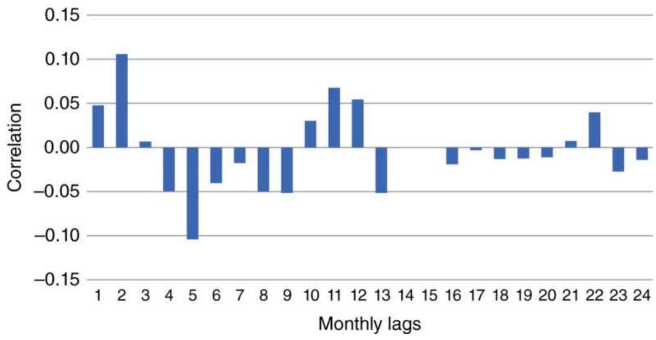
FIGURE 6.15 Correlogram of monthly corn prices, 1978-2017, for 24 lags.
\section*{Weekly correlogram}
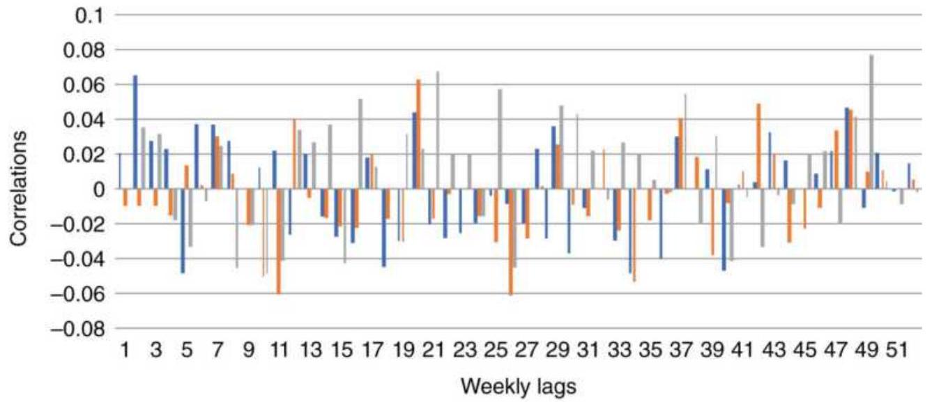
■ Corn Wheat ! Gold
FIGURE 6.16 Correlogram of weekly returns of corn, wheat, and gold, 1978-2017.
Estimation: determining the coefficients.
Having minimized the number of autoregressive and moving average terms, the ARIMA method then attempts to minimize the errors in the forecast. It will perform a linear or nonlinear regression on price (depending on the number of coefficients selected), determine the errors in the estimation, approximate those errors using a moving average, and add the smoothed error series to the regression values to get the forecast. It will look at the resulting error of the new estimation and repeat the process until the completion criteria are satisfied.
Testing for completion. To determine when an ARIMA process is completed, three tests are performed at the end of each estimation pass:
Compare the change in the coefficient value. If the last estimation has caused little or no change in the value of the coefficient(s), the model has successfully converged to a solution.
- Compare the sum of the squares of the error. If the error value is small or if it stays relatively unchanged, the process is completed.
- Perform a set number of estimations. Unless a maximum number of estimations is set, an ARIMA process might continue indefinitely. This safety check is necessary in the event the model is not converging to a solution.
Once completed, the errors can be examined using an \(O\) statistic to check for any trend. If one exists, an additional moving average term may be used to
eliminate it.
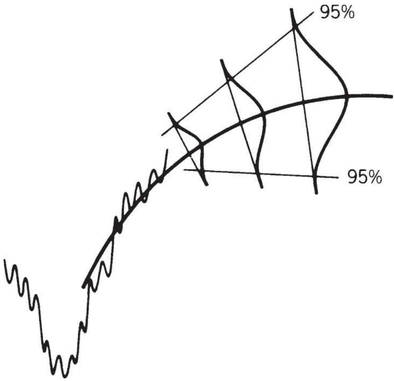
FIGURE 6.17 ARIMA forecast becomes less accurate as it is used farther ahead.
\section*{Forecast Results}
The final ARIMA coefficients are used to calculate the forecast value. These forecasts are most accurate for the next day and are less accurate for subsequent days (see Figure 6.17).
What if the forecast does not work? If you've checked all your work, the most likely problem is instability in the data - that is, large price changes or erratic volatility that prevents recent data from being similar to past data. Select either a shorter or longer period that contains more homogeneous data.
\section*{ARIMA Trading Strategies}
In the article that originally piqued the interest of traders, \({ }^{6}\) Anon uses a 5 -day-ahead forecast. If the ARIMA process forecasts an uptrend and prices fall below the forecast value, the market can be bought with added confidence (expecting lower risk and more profit by buying at a price that is below estimated value). This technique of selecting better entry points may compensate for some of the inaccuracies latent in any forecasting method. The danger of this approach is that prices may continue to move counter to the forecast, and not give you an opportunity to enter.
\section*{Follow the Trend}
Use the 1-day-ahead forecast to determine the trend direction. Hold a long position if the forecast is for higher prices and a short position if lower prices are forecast.
\section*{Mean-Reverting Indicator}
Use the ARIMA confidence bands to determine overbought/oversold levels. Not only can a long position be entered when prices penetrate the lowest \(95 \%\)
confidence band, but they can be closed out when they return to the mean. Although mean reversion trades are tempting, they always carry more risk than trend trading. A conservative trader will enter the market only in the direction of the ARIMA trend forecast. If the trend is up, only the penetrations of a lower confidence band will be used to enter new long positions.
\section*{Kalman Filters}
Kalman offers an alternative approach to ARIMA, allowing an underlying forecasting model (message model) to be combined with other timely information (observation model). The message model may be any trading strategy, moving average, or regression approach. The observation model may be the specialist's or floor broker's opening calls, market liquidity, or earlier trading activity in the same stock, index market, or on a foreign exchange - all of which have been determined to be good candidates for forecasting.
Assume that the original forecast (message) model can be described as:
\[
M\left(p_{t}\right)=c_{f} p_{t-1}+m e_{t}
\]
where \(c_{f}\) is the forecast factor and \(m e\) is the message error. The observation model is:
\[
O\left(p_{t}\right)=c_{o} p_{t}+o e_{t}
\]
where \(o e\) is the observation model error. The combined
forecast would then use the observation model error to modify the result:
\[
p_{t+1}^{\prime}=c_{f} p_{t}^{\prime}+K_{t+1} o e_{t}
\]
where \(K=\) the Kalman gain coefficient, \({ }^{7}\) a factor that adjusts the error term.
\section*{BASIC TRADING SIGNALS USING A LINEAR REGRESSION MODEL}
A linear regression, or straight-line fit, could be the basis for a simple trading strategy similar to a moving average. For example, an \(n\)-day linear regression, applied to the closing prices, can produce a 1-day-ahead forecast price, \(F_{t+1}=F_{t}+b\), a projection of the slope \(b=F_{t}-F_{t-1}\). If the current regression value is \(R V_{t}\), we can have the following rules for trading:
- Buy when tomorrow's closing price \(\left(C_{t+1}\right)\) moves above the forecasted value \(F_{t+1}\) or the current forecast \(F_{t}\).
- Sell short when tomorrow's closing price \(\left(C_{t+1}\right)\) moves below the forecasted value \(F_{t+1}\) or the current forecast \(F_{t}\).
\section*{Adding Confidence Bands}
Because the linear regression line passes through the
center of price movement during a period of steadily rising or falling prices, these rules would produce a lot of buy and sell signals. To reduce the frequency of signals and avoid changes of direction due to market noise, confidence bands are drawn on either side of the regression line. A \(90 \%\) confidence band is simply 1.65 times the standard deviation of the residuals ( \(R_{t}\), the difference between the actual prices and the corresponding value on the regression line as of time \(t\), the most recent price). A \(95 \%\) confidence band uses a multiplier of 1.96; however, most people use 2.0 simply for convenience. The new trading rules using a \(95 \%\) confidence band would then become:
- Buy when tomorrow's closing price \(\left(C_{t+1}\right)\) moves above tomorrow's forecasted value
\[
\left(F_{t+1}+2.0 \times R_{t}\right)
\]
- Sell short when tomorrow's closing price \(\left(C_{t+1}\right)\) moves below the forecasted value
\[
\left(F_{t+1}-2.0 \times R_{t}\right)
\]
An important difference between a model based on linear regression and one founded on a moving average is the lag. Both methods assume that prices will continue to move in the same direction as the last moving average point or the last regression slope value. If prices continue higher at the same rate, a moving average will initially lag behind, then increase at the same rate. The lag creates a safety zone to absorb some minor changes in prices without a change in the direction of the trend.
(See Chapter 7 for a complete discussion of moving averages, and Chapter 8 for a comparison of a linear regression slope trading system with five other popular trending methods.)

A regression model, however, identifies a change of direction by measuring tomorrow's actual price against the projected future price (a straight-line projection for a linear regression). Confidence bands around the straight-line projection will decide if the new price triggered a change of direction. Figure 6.18 shows the changing direction of a rolling linear regression at three points in time compared to a moving average. At the most recent period on the chart the reversal point for the trend direction is much closer using the confidence bands of the regression than the lagged moving average. While this is generally true, much depends on how the trend develops. As with most trending systems, performance tends to improve as the calculation period increases, capturing the largest economic trends. The Companion Website has a spreadsheet, Bund regression with bands, that produces trading signals and performance using regression bands. It also compares the results with the slope method described in the next section.
\section*{Using the Linear Regression Slope and Correlations}
The slope of the linear regression line, the angle at which it is rising or falling, is all that is needed for a simple trend trading system. The slope shows how quickly
prices are expected to change over a unit of time. The unit of time is the same as the data period used to find the regression values, usually days or weeks. As with other trend systems, the longer the calculation period, the slower the trend will react to price changes. Using only the slope, you can trade with the following rules:
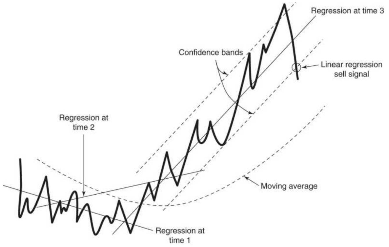
FIGURE 6.18 Linear regression model. Penetration of the confidence band turns the trend from up to down. When prices move steadily up, the regression model will signal a change of direction faster than a moving average.
- Buy when the slope \(>0\).
- Sell when the slope \(<0\).
If \(b\) is the slope, a faster version of this is:
- Buy when the change in the value of the slope is
positive, \(b_{t}>b_{t-1}\).
- Sell when the change in the value of the slope is negative, \(b_{t}<b_{t-1}\).
Both trading methods can be seen in Figure 6.19. The scale of the slope is different from the prices; therefore, it is shown in the middle panel in Figure 6.19. Both the moving average line in the top panel and the slope use a 60 -day period. The slope crosses the zero line at about the same time the moving average turns from up to down and down to up. If we look at the changes in direction of the slope, there are many more trading signals. We will compare the performance of these variations in Chapter 8.
The bottom panel of Figure 6.19 shows the correlation, \(r\), of the regression. The 30-day moving average of the correlation is actually smoother than the slope in the middle panel and could be used to generate trading signals. Note that the correlation is lower when prices are father from the moving average in the top panel.
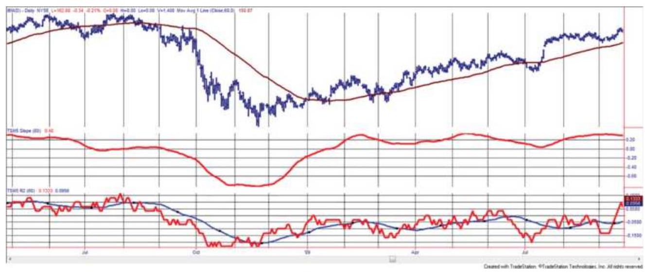
FIGURE 6.19 IBM trend using the slope and \(r\). (Top)
IBM prices with 80-day moving average. (Center) 80day regression slope. (Bottom) Correlation \(r\).
\section*{Forecast Oscillator}
Tuschar Chande used the regression forecast and its residuals to create the Forecast Oscillator. 8 Using a 5day regression, find the residuals as a percentage variation from the regression line. A buy signal occurs when the 3-day average of the residuals crosses above the regression line; a short sale is when the 3 -day average of the residuals crosses below the regression line. If:
\[
\% F_{t}=100 \times \frac{y_{t}-\hat{y}_{t}}{y_{t}}
\]
and \(\% F_{t}(3)\) is the 3 -day moving average of \(\% F\), then:
- Buy when \(\% F_{t}(3)\) crosses above \(\hat{y}_{t}\).
■ Sell short when \(\% F_{t}(3)\) crosses below \(\hat{y}_{t}\).
This makes the assumption that the residuals trend.
\section*{MEASURING MARKET STRENGTH}
One of the natural applications of the linear regression is to measure and compare the strength of one market against another. For example, we might want to ask, "Which pharmaceutical company is leading the others, Amgen (AMGN), Johnson \& Johnson (JNJ), Merck
(MRK), or Pfizer (PFE)?" Table 6.10 shows the prices on \(1 / 1 / 2018\) and \(6 / 29 / 2018\). It would be easiest to say that the simple return for the 6 months tells the story, in which case the stocks would be MRK, AMGN, PFE, and JNJ.
\section*{TABLE 6.10 Ranking of pharmaceutical companies.}
\begin{tabular}{|l|l|l|l|l|}
\hline & 1/1/2018 & 6/29/2018 & Return & Slope \\
\hline AMGN & 174.36. & 184.59 & \(.5 .9 \%\). & -0.0262. \\
\hline JNJ & 137.49 & 121.34 & \(-11.7 \%\), & -0.0449. \\
\hline MRK & .55 .26 & .60 .70 & \(.9 .8 \%\). & 0.0619. \\
\hline PFE & .35 .76 & .36 .28 & \(.1 .5 \%\). & 0.0379. \\
\hline
\end{tabular}
200
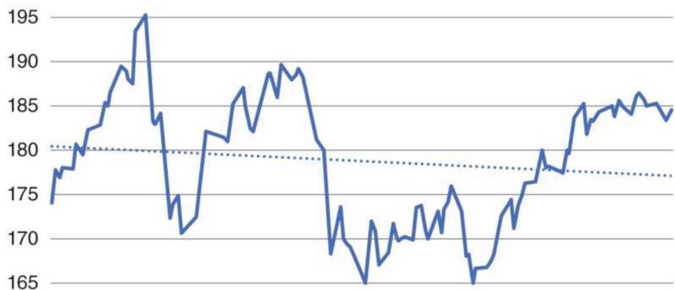
160
\(\begin{array}{llllll}1 / 2 / 2018 & 2 / 2 / 2018 & 3 / 2 / 2018 & 4 / 2 / 2018 & 5 / 2 / 2018 & 6 / 2 / 2018\end{array}\)
FIGURE 6.20 AMGN shows a declining slope even though the price is higher.
When we calculate the regression slope, we see a slightly different picture. Merck is still the strongest, but the rankings are MRK, PFE, AMGN, and JNJ. The two in the middle have switched. Figure 6.20 shows why. Even though AMGN is higher on \(6 / 29 / 2018\) than on \(1 / 1 / 2018\), it shows a declining pattern. Regression would be the preferable way to rank both prices and performance.
\section*{NOTES}
1 F.R. Ruckdeschel, BASIC Scientific Subroutines, Vol. 1 (Peterborough, NH: Byte/McGraw-Hill, 1981).
\(\underline{2}\) Thomas H. Lincoln, "Time Series Forecasting: ARMAX," Technical Analysis of Stocks \&
Commodities (September 1991).
3 Note that the "minus 1 " in the data list refers to the calculation of returns, final value divided by starting value, minus 1.
4 Murray A. Ruggiero, Jr., "Predictive Market Modeling in R Language," Modern Trader (July 2017).
5 G.E.P. Box and G.M. Jenkins, Time Series Analysis: Forecasting and Control, 2nd ed. (San Francisco: Holden-Day, 1976).
6 Louis J. Anon, "Catch Short-Term Profits with ARIMA," Commodities Magazine (December 1981).
\({ }^{7}\) For a more complete discussion, see Andrew D. Seidel and Philip D. Ginsberg, Commodities Trading
(Englewood Cliffs, NJ: Prentice-Hall, 1983), or R. E.
Kalman, "A New Approach to Linear Filtering and Prediction Problems," Journal of Basic Engineering (March 1960).
8 Tushar S. Chande and Stanley Kroll, The New Technical Trader; also in Technical Analysis of Stocks \& Commodities 10:5.
\section*{CHAPTER 7 \\ Time-Based Trend Calculations}
The purpose of all trend methods is to ignore the underlying noise in the market, those erratic moves that seem to be meaningless, and find the current direction of prices. But trends are dependent upon your time horizon. In addition, there may be more than one trend at any one time, caused by short-term events and longterm policy, and it is likely that one trader will search for the strongest, or most dominant trend while another will seek a series of shorter-term moves. There is no "right" or "wrong" trend.
The technique that is used to uncover the particular trend can depend upon whether any of the underlying trend characteristics are known. Does the stock or futures market have a clear seasonal or cyclic component, such as the travel industry or coffee prices; or, does it respond to long-term monetary policy because it has a high cost of servicing debt? If you know more about the reasons why prices trend, you will be able to choose the best method of finding the trend and the calculation period.
Chapter 6 used regression to find the direction of a single series (based on price and time), the relationship between two markets, and the ranking of both similar and diverse markets. The regression slope was used to forecast the trend and bands around the regression line
allowed us to decide if the trend had changed or if there was an opportunity for buying and selling inside the band. Chapter 5 looked at price direction based on events. Time was ignored. As long as the price did not move above a resistance level or below a support level, the direction was still intact.
But time is a factor in trading. Prices can move faster or slower over the same time period. A moving average and variations of averages try to hold onto profits as they develop instead of waiting for an event to trigger a change of direction. This chapter will show how these averages are calculated and how one differs from another. Chapter 8 will give examples of the trading systems that use them.
\section*{FORECASTING AND FOLLOWING}
There is a clear distinction between forecasting the trend and recognizing the current trend. Forecasting is predicting the future price, a very desirable but more complex achievement. As shown in the previous chapter, it involves combining those data that are most important to price change and assigning a value to each one. The results are always expressed with a confidence level, the level of uncertainty in the forecast. There is always lower confidence as you try to forecast further into the future.
The techniques most commonly used for finding the current direction of prices are called autoregressive functions. They determine the trend direction based only on past prices. Most analysis limits its goals to simply stating that prices are moving in an upward, downward,
or sideways direction, with no indication of confidence and no indicator of how long the direction will persist. Nevertheless, an entire industry has formed, trading rules developed, and complex strategies have evolved. The key to their success is that these techniques assume persistence, that the direction of prices today is most likely to be the same as the direction of prices tomorrow. For the most part, this assumption has proved to be true and, from a practical viewpoint, these methods are more flexible than the traditional regression models. But to achieve success they introduce a lag. A lag is a delay in the identification of the trend. Great effort has been spent trying to reduce this lag in an attempt to identify the trend sooner; however, the lag is the zone of uncertainty that allows the technique to ignore most of the market noise. The lag is the best and worst part of moving average methods.
In an autoregressive model, one or more previous prices determine the next sequential price. If \(p_{t}\) represents today's price, \(P_{t-1}\) yesterday's price, and so on, then tomorrow's expected price will be:
\[
p_{t+1}=a_{0}+a_{1} p_{t}+a_{2} p_{t-1}+\cdots+a_{t} p_{1}+e
\]
where each price is given a corresponding weight \(a_{i}\) and then combined to give the resultant price for tomorrow \(p_{t+1}+e\) (where \(e\) represents an error factor, usually ignored). The simplest example is the use of yesterday's price alone to generate tomorrow's price:
\[
p_{t+1}=a_{0}+a_{1} p_{t}+e
\]
which you may also recognize as the formula for a straight line, \(y=a+b x\), plus an error factor. The general form, using \(n\) past prices, is the same as the multivariate solution in Chapter 6, but using only prices instead of fundamental factors.
The autoregressive model does not have to be linear; each prior day can have a nonlinear predictive quality. Then each expected price \(P_{t+1}\) could be represented by a curvilinear expression,
\[
p_{t+1}=a_{0}+a_{1} p_{t}+a_{1} p_{t-1}^{2}+e, \text { or by an }
\]
exponential or logarithmic formula,
\(\ln p_{t+1}=a_{0}+a_{1} \ln p_{t}+a_{2} \ln p_{t-1}+e\), which is
commonly used in equity analysis. Any of these expressions could then be combined to form an autoregressive forecasting model for \(P_{t+1}\).
In going from the simple to the complex, it is natural to want to know which of these choices will perform best. Theoretically, the best method will be the one that, when used in a strategy, yields the highest return for the lowest risk; however, every investor has a personal risk preference. The answer can only be found by applying and comparing different methods and experiencing how they perform when actually traded. It turns out that the best historic results often come from overfitting the data, and is a poor choice for trading. At the end of Chapter 8 there is a comparison of popular trending systems, and Chapter 21 will show testing methods that are most likely to lead to robust results. Throughout the book there will be comparisons of systems and methods
that are similar.
\section*{Least-Squares Model}
The least-squares regression model is the same technique that was used in the previous chapters to find the relationship between two markets - Barrick Gold and cash gold, corn and soybeans - or to find how price movement could be explained by the main factors influencing them, supply and demand. Most trading systems depend only on price; therefore, we will look again using the least-squares model with time as the independent variable and price as the dependent variable. The regression results will be used in an autoregressive way to forecast the price \(n\)-days ahead, and we will look at the accuracy of those predictions. The slope of the resulting straight line will determine the direction of the trend.
\section*{Error Analysis}
A simple error analysis can be used to show how time works against the predictive qualities of regression, or any forecasting method. Using General Electric (GE) prices, ending February 15, 2010, the slope and \(y\) intercept are calculated for a rolling 20-day window. The \(1^{-}, 5^{-}\), and 10-day-ahead forecast is found by projecting the slope by that number of days. The forecast error is the difference between the projected price and the actual price. Figure 7.1 shows the price for GE from December 31, 2010, through February 15, 2011, along with the error for three forecast intervals. The forecast error gets larger as we try to forecast further ahead. This result is typical
of forecasting error, regardless of the method, and argues that the smallest forecast interval is the best.

The method of finding the forecast error is shown in Table 7.1 (the full spreadsheet can be found on the Companion Website as TSM General Electric regression error forecast). Only the closing prices are needed, and they appear in column 3. The slope and intercept use the sequential numbers in column 1 for \(X\), and the GE prices for \(Y\). The \(n\)-day ahead forecast is:
\(y_{t+n}=\) intercept \(_{t}+\) slope \(_{t} \times\) price \(_{t}+n \times\) slope \(_{t}\)
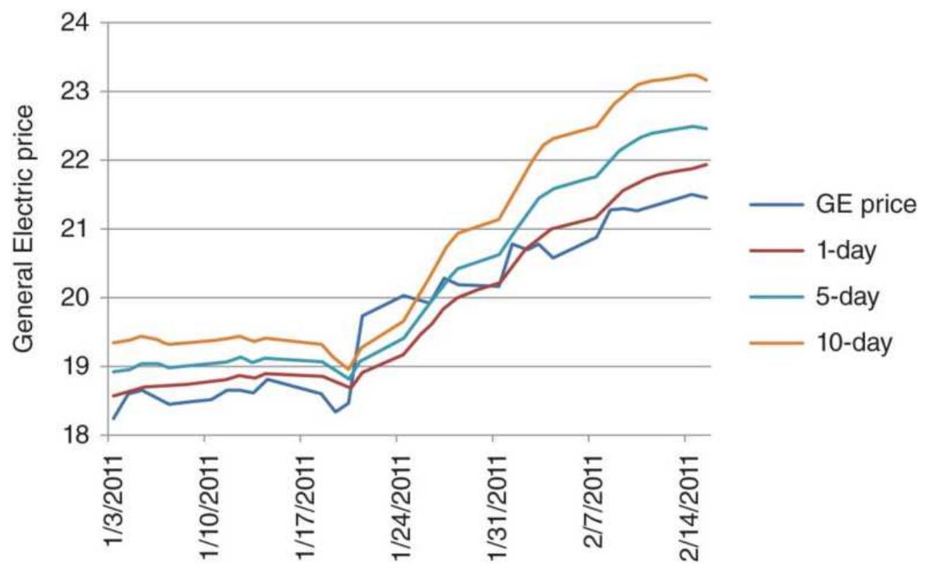
FIGURE 7.1 General Electric price from December 31, 2010, through February 15, 2011. Forecast accuracy decreases as the forecast period increases.
regression error based on a 2o-day rolling calculation period.
\section*{Regression}
Forec:
\begin{tabular}{|l|l|l|l|l|l|l}
\hline Seq & Date & GE & Slope & Intercept & 1-day & 5-da.
\end{tabular}
\begin{tabular}{|l|l|l|l|l|l|l}
\hline\(n\) & \(2 / 1 / 2011\) & 20.80 & 0.118 & -351.689 & 20.438 & 20.91 \\
\hline \begin{tabular}{l}
\(n+\). \\
1
\end{tabular} & \(2 / 2 / 2011\) & 20.71 & 0.131 & -390.484 & 20.673 & 21.19 \\
\hline \begin{tabular}{l}
\(n+\). \\
2
\end{tabular} & \(2 / 3 / 2011\) & 20.75 & 0.141 & -422.673 & 20.886 & 21.44 \\
\hline \begin{tabular}{l}
\(n+\). \\
3
\end{tabular} & \(2 / 4 / 2011\) & 20.56 & 0.144 & -432.439 & 21.019 & 21.59 \\
\hline \begin{tabular}{l}
\(n++\). \\
4
\end{tabular} & \(2 / 7 / 2011\) & 20.87 & 0.146 & -440.206 & 21.166 & 21.75 \\
\hline \begin{tabular}{l}
\(n+\). \\
5
\end{tabular} & \(2 / 8 / 2011\) & 21.28 & 0.152 & -458.803 & 21.367 & 21.97 \\
\hline \begin{tabular}{l}
\(n+\). \\
6
\end{tabular} & \(2 / 9 / 2011\) & 21.31 & 0.156 & -471.628 & 21.544 & 22.16 \\
\hline \begin{tabular}{l}
\(n+\). \\
7
\end{tabular} & \(2 / 10 / 2011\) & 21.27 & 0.157 & -471.985 & 21.675 & 22.30 \\
\hline \begin{tabular}{l}
\(n++\). \\
8
\end{tabular} & \(2 / 11 / 2011\) & 21.33 & 0.152 & -459.262 & 21.769 & 22.37 \\
\hline \begin{tabular}{l}
\(n+\). \\
9
\end{tabular} & \(2 / 14 / 2011\) & 21.50 & 0.150 & -452.185 & 21.879 & 22.48 \\
\hline \begin{tabular}{l}
\(n++\). \\
10
\end{tabular} & \(2 / 15 / 2011\) & 21.46 & 0.140 & -419.686 & 21.914 & 22.47 \\
\hline
\end{tabular}
\footnotetext{
TABLE 7.2 The standard deviation of errors for
different "days ahead" forecasts.
\begin{tabular}{|l|c|c|c|c|c|}
\hline Days ahead & 1 & 2 & 3 & 5 & 10 \\
\hline Stdev of errors & 1.137 & 1.336 & 1.519 & 1.860 & 2.672 \\
\hline
\end{tabular}
The standard deviation for five forecasts (Table 7.2), taken over the entire 10 years, shows the error increasing as the days-ahead increase. This confirms the expectation that forecasting accuracy decreases with time and that confidence bands will get wider with time. For this reason, any forecasts used in our strategies will be 1-day ahead.
\section*{Defining Our Expectations}
To be profitable trading a trending system it is only necessary to be correct in one of the following two cases:
1. In more than \(50 \%\) of the days you are correct in predicting whether prices will go up or down and the average up move is equal to the average down move.
2. Your forecast accuracy is less than \(50 \%\) but the size of the profitable moves is greater than the size of the losing moves.
Unfortunately, there is no way to prove that a particular method of forecasting, moving average, regression, or other techniques, will be accurate in the future over all calculation periods. The fact is that some calculation periods will be profitable and others will not. Those that are profitable must satisfy one of the two conditions stated above.
Experience shows that the most robust trending method is the one that has been profitable over most markets and most calculation periods. The shorter calculation periods have been excluded because they have no reliable trend (this was discussed in Chapter 1), so we need to restrict our statement to longer periods.
The methods discussed in the remainder of this chapter are all intended to identify the direction of prices based only on past price data. The trading systems that use these trends assume persistence, that there is a better chance of prices continuing in the same direction. If the systems are profitable, then the assumption was correct. There is sufficient performance history for macrotrend funds that justify this conclusion. These systems will be discussed in the next chapter.
\section*{PRICE CHANGE OVER TIME}
The most basic of all trend indicators is momentum ( \(M\) ), the change of price over some period of time. Unless indicated, the time period will be in days, but it could be intraday bars or weeks. Momentum is written as:
\[
M_{t}=p_{t}-p_{t-n}
\]
where \(t\) is today, and \(n\) is the number of days back. Sometimes this is called rate of change (ROC), but true rate of change refers to change over a unit of time. Then:
\[
R O C_{t}=\underline{p_{t}-p_{t-n}}
\]
If the momentum is positive, we can say that the trend is up, and if negative, the trend is down. Of course, this decision is based only on two data points, but if those points are far enough away from each other, that is, if \(n\) is large, then the trend as determined by this method will be very similar to a simple moving average, discussed in the next section. The simplest method can often be the most robust; therefore, as you read about other approaches to analyzing price, keep asking, "Is it better than momentum?"
\section*{THE MOVING AVERAGE}
The most well-known of all smoothing techniques, used to remove market noise and find the direction of prices, is the moving average (MA). Using this method, the number of elements to be averaged remains the same, but the time interval advances. This is also referred to as a rolling calculation period. Using a series of prices,
\(p_{0}, p_{1}, p_{2}, \ldots, p_{t}\), a moving average measured over the most recent \(n\) of these prices, or data points, at time \(t\) would be:
\[
M A_{t}=\frac{p_{t-n+1}+p_{t-n+2}+\cdots+p_{t}}{n}=\frac{1}{n} \sum_{i=t-n+1}^{t} p_{i}, n \leq t
\]
Then today's moving average value is the average (arithmetic mean) of the most recent \(n\) data points. For example, using three points \((n=3)\) to generate a \(3^{-}\) day moving average starting at the beginning of the data:
\[
\begin{aligned}
M A_{3}= & \left(p_{1}+p_{2}+p_{3}\right) / 3 \\
M A_{4}= & \left(p_{2}+p_{3}+p_{4}\right) / 3 \\
& \vdots \\
M A_{t}= & \left(p_{t-2}+p_{t-1}+p_{t}\right) / 3
\end{aligned}
\]
You may quickly realize that today's new moving average value is only dependent on how the new data point compares to the old one that is being dropped off. All the other data points remain unchanged. If the new price is higher than the oldest price, then the moving average will increase; if lower, the new average value will decrease. That makes it not exactly the same as momentum, but very similar.
\section*{The Calculation Period}
The selection of the number of data points, called the calculation period, is based on the predictive quality of the choice (measured by the error but more often by the profitability) or the need to determine price trends over specific time periods, such as a season. For outright trading, the calculation period is chosen for its accuracy in identifying the trend and the risk tolerance of the trader to price swings. Slower trends, using longer calculation periods, are usually better indicators of price direction, but involve larger risk. The stock market has adopted the 200-day moving average as its benchmark for direction; however, traders find this much too slow for timing buy and sell signals.
The length of a moving average can be tailored to specific
needs. A 63-day moving average, \(1 / 4\) of 252 business days in the year, would reflect quarterly changes in stock price, minimizing the significance of price fluctuations within a calendar quarter. A simple yearly calculation period, 252 days, would ignore all seasonality and emphasize the annual growth of the stock, or show inflation in commodities. Any periodic cycle that is the same length as the moving average length is lost; therefore, if a monthly cycle has been identified, then a moving average of less than 10 days (half the cycle length) would be best for letting the moving average show that cycle. Using a moving average to find seasonal and cyclic patterns is covered in Chapters 10 and 11, and was discussed in Chapter 6, "Regression Analysis." At this point it is sufficient to remember that if there is a possibility of a cyclic or seasonal pattern within the data, care should be taken to select a moving average that is out of phase with that pattern (that is, not equal to the cycle period).
The length of the moving average may also relate to its commercial use. A jeweler may purchase silver each week to produce bracelets. Frequent purchases of small amounts keep the company's cash outlay small. The purchaser can wait a few extra days during a week while prices continue to trend downward but will buy immediately when prices turn up. A 6-month trend cannot help him because it gives a long-term answer to a short-term problem; however, a 5 -day moving average may give the trend direction within the jeweler's time frame.
\section*{User-Friendly Software}
Fortunately, we have reached a time when it is not necessary to perform these calculations the long way. Spreadsheet programs and specialized testing software provide simple tools for performing trend calculations as well as many other more complex functions discussed in this book. The notation for many of the different spreadsheets and software is very similar and selfexplanatory:
\begin{tabular}{|l|l|l|l|}
\hline Function & Excel & TradeStation & MatLab \\
\hline Summation & =sum & summation & Sum \\
\hline Moving average & \(=\) average & average & Mean \\
\hline Standard deviation & \(=\) stdev & stddev & Std \\
\hline Maximum value & \(=\) max & highest & Max \\
\hline Minimum value & \(=\) min & lowest & Min \\
\hline
\end{tabular}
In the spreadsheet notation, the function is followed by the list of rows. For example, (D11:D30) would be 20 rows in column D, and in TradeStation notation average(close,period) is followed by the data and the calculation period. For MatLab the parameter is a vector or an array.
\section*{What Can You Average?}
The closing or daily settlement is the most common price applied to a moving average. It is generally accepted as the "true" price of the day and is used by many analysts for the calculation of trends. It is the price used to reconcile brokerage accounts at the end of the day, create
the Net Asset Value (NAV) for funds, and for futures trading it is called marked-to-market accounting. A popular alternative is to use the average of the high, low, and closing prices, representing some sort of center of gravity. You may also try the average of the high and low prices, ignoring the closing price entirely.
Another valid component of a moving average can be other averages. For example, if \(p_{1}\) through \(p_{t}\) are prices, and \(M A_{t}\) is a 3-day moving average on day \(t\), then:
\[
\begin{aligned}
& M A_{3}=\left(p_{1}+p_{2}+p_{3}\right) / 3 \\
& M A_{4}=\left(p_{2}+p_{3}+p_{4}\right) / 3 \\
& M A_{5}=\left(p_{3}+p_{4}+p_{5}\right) / 3
\end{aligned}
\]
and:
\[
D M A_{5}=\left(M A_{3}+M A_{4}+M A_{5}\right) / 3
\]
where \(D M A_{5}\) is a double-smoothed moving average, which gives added weight to the center points. Double smoothing can be very effective and is discussed later in this chapter. Smoothing the highs and lows independently is another technique that creates a daily trading range, or a band that reflects volatility. This can be used to identify normal and extreme moves, and is also discussed in Chapter 8.
\section*{Types of Moving Averages}
Besides varying the length of the moving average and the elements that are to be averaged, there are a great number of variations on the simple moving average. In the methods that follow the notation assumes that the most recent day is \(t\) and the average is found over the past \(n\) days.
\section*{The Simple Moving Average}
The simple moving average is the average (mean) of the most recent \(n\) days. It has also been called a truncated moving average and it is the most well-known and commonly used of all the methods. Repeating the formula from earlier in this chapter,
\[
M A_{t}=\frac{p_{t-n+1}+p_{t-n+2}+\cdots+p_{t}}{n}=\frac{1}{n} \sum_{i=t-n+1}^{t} p_{i}, \quad n \leq t
\]
The main objection to the simple moving average is its abrupt change in value when an important old piece of data is dropped off, especially if only a few days are used in the calculation. We also know that, if the new data, \(p_{t}\) , is greater than the oldest data item that will be dropped off, \(P_{t-n}\), then the new average, \(M A_{t}\) will be greater than the previous average, \(M A_{t-1}\).
\section*{Average-Modified or Average-Off Method}
To avoid the end-off problem of the simple moving average, each time a new piece of data is added the previous average can be dropped off. This is called an
average-modified or average-off method. It is computationally convenient because you only need to keep the old average value rather than all the data that was used to find the average.
\[
A v g O f_{t}=\frac{(n-1) \times \operatorname{AvgOff}_{t-1}+p_{t}}{n}
\]
\(n\)
The substitution of the moving average value for the oldest data item tends to smooth the results even more than a simple moving average and dampens the end-off impact.
\section*{Weighted Moving Average}
The weighted moving average (WMA) opens many possibilities. It allows the significance of individual or groups of data to be changed. It may restore perceived value to parts of a data sample, or it may incorrectly bias the data. A weighted moving average is expressed in its general form as:

The weighted moving average at time \(t\) is the average of the previous \(n\) prices, each price having its own weighting factor \(w_{i}\). There is no restriction on the values
used as weighting factors, that is, they do not have to be percentages that all total to 1 . The most popular form of this technique is called front-loaded because it gives more weight to the most recent data \((t=n)\) and reduces the significance of the older elements. For the front-loaded weighted moving average (seen in Figure 7.2):
\[
w_{1} \leq w_{2} \leq \cdots \leq w_{n-1} \leq w_{n}
\]
The weighting factors \(w_{i}\) may also be determined by regression analysis, but then they may not necessarily be front-loaded. A common modification to front-loading is called step-weighting in which each successive \(W_{i}\) differs from the previous weighting factor \(w_{i-1}\) by a fixed increment. The most common 5-day front-loaded, stepweighted average would have weighting factors increasing by 1 each day, \(w_{1}=1, w_{2}=2, w_{3}=3\), \(w_{4}=4\), and \(w_{5}=5\). In general, for an \(n\)-day frontloaded step-weighted moving average:
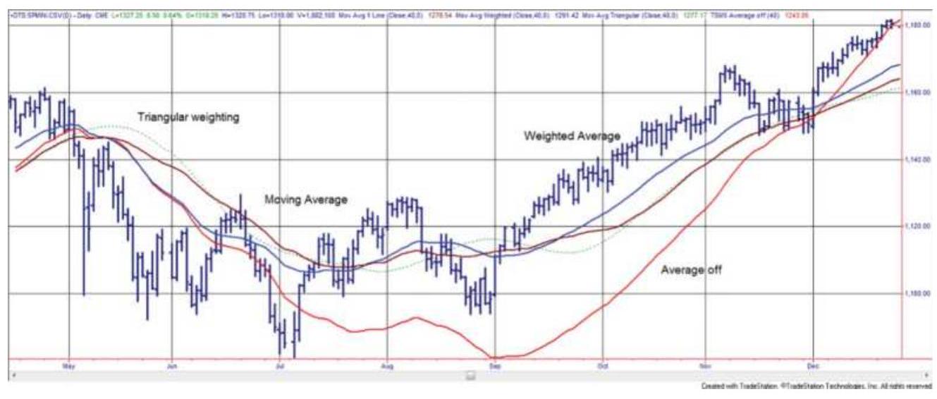
FIGURE 7.2 A comparison of moving averages. The
simple moving average, linearly weighted average, triangular weighted, and average-off methods are applied to the S\&P, April through December 2010.
\[
\begin{aligned}
w_{t-n+1} & =1 \\
& \vdots \\
w_{t-1} & =n-1 \\
w_{t} & =n
\end{aligned}
\]
A TradeStation program for calculating an \(n\)-day, frontloaded, linearly weighted moving average is called waverage.
If simple linear step-weighting is not what you want, then a percentage relationship \(a\) between \(w_{i}\) elements can be used:
\[
w_{i-1}=a \times w_{i}
\]
If \(a=0.90\) and \(w_{5}=5\), then \(w_{4}=4.5, w_{3}=4.05\) ,\(w_{2}=3.645\), and \(w_{1}=3.2805\). Each older data item is given a weight of 0.90 of the more recent value. This is similar to exponential smoothing, which will be discussed later in this chapter.
\section*{Weighting by Group}
Prices may also be weighted in groups. If every two consecutive data elements have the same weighting factor, and \(P_{t}\) is the most recent price, \(n\) is the
calculation period (preferably an even number), and there are \(n / 2\) number of weights, then:
\[
W M A_{t}=\frac{w_{1} p_{t-n+1}+w_{1} p_{t-n+2}+w_{2} p_{1-n+3}+w_{2} p_{t-n+4}+\cdots+w_{n / 2} p_{t-1}+w_{n} / 2 p_{t}}{2 \times\left(w_{1}+w_{2}+\cdots+w_{n / 2}\right)}
\]
For two or more data points using the same weighting, this formula can be regrouped as:

\[
\begin{aligned}
& 2 \times\left(w_{1}+w_{2}+\cdots+w_{n / 2}\right)
\end{aligned}
\]
Any number of consecutive data elements can be grouped for a step-weighted moving average.
If the purpose of weighting is to reproduce a pattern that is intrinsic to price movement, then either the geometric average, \(G=\left(p_{1} \times p_{2} \times p_{3} \times \ldots \times p_{p_{n}}\right)^{1 / n}\), discussed in Chapter 2, or exponential smoothing, explained later in this chapter, may be a better tool.
\section*{Triangular Weighting}
While the simple moving average or linear regression treats each price equally, exponential smoothing and linear step-weighting put greater emphasis on the most recent data. There is an entire area of study in which the period of the dominant cycle is the basis for determining the best trend period. Triangular weighting or triangular filtering \({ }^{1}\) attempts to uncover the trend by
reducing the noise in both the front and back of the calculation window, where it is expected to have the greatest interference. Therefore, if a 21-day triangular weighting is used, the 11th day will have the greatest weight while days 1 and 21 will have the smallest. It is best to have an odd number of days.
To implement triangular weighting with integer weights, begin with the standard formula for a weighted average, calculated for \(n\) days as of the current day \(t\) :
\[
W M A_{t}=\frac{\sum_{i=1}^{n} w_{i} P_{t-n+i}}{\sum_{i=1}^{n} w_{i}}\left\{\begin{array}{l}
w_{i}=i, \quad \text { for } i=1, \frac{n}{2} \\
w_{i}=n-\frac{n}{2}+i-1, \quad \text { for } i>n / 2
\end{array}\right.
\]
where \(n\) is also called the size, or width, of the window. These weighting factors \(w_{i}\) will increase linearly from 1 to the middle of the window, at \(n / 2\), then decrease until \(n\).
Instead of a triangular filter, which climbs in equal steps to a peak at the middle value, a Guassian filter can be used, which weights the data in a form similar to a bell curve. Here, the weighting factors are more complex, but the shape of the curve may be more appealing:
\[
w_{i}=10^{x} \text { and } x=\frac{3}{2} \times\left(1-\frac{2 i}{n}\right)^{2}
\]
Triangular weighting is often used for cycle analysis. Two techniques that use this method successfully, Hilbert and Fischer transforms, can be found in Chapter 11.
\section*{Pivot-Point Weighting}
Too often we limit ourselves by our perception of the past. When a weighted moving average is used, it is normal to assume that all the weighting factors should be positive; however, that is not a requirement. The pivot-point moving average uses reverse linear weights (e.g., \(5,4,3, \ldots\) ) that begin with a positive value and continue to decline even when they become negative. \(\underline{2}\) In the following formula, the pivot point, where the weight is zero, is reached about \(2 / 3\) through the data interval. For a pivot-point moving average of 11 values, the eighth data point is given the weight of \(o\) :
\(P P M A_{t}(11)=\left(-3 p_{t-10}-2 p_{t-9}-1 p_{t-8}+0 p_{t-7}+1 p_{t-6}+2 p_{t-5}\right.\)
\[
\left.+3 p_{t-4}+4 p_{t-3}+5 p_{t-2}+6 p_{t-1}+7 p_{t}\right) / 22
\]
The intent of this pattern is to reduce the lag by frontloading the prices. The divisor is smaller than the usual linear weighted average (where the sum of 1 through 11 is 66) because it includes negative values. The general formula for an \(n\)-day pivot-point moving average is: \({ }^{3}\)
\[
\operatorname{PPMA}_{t}(n)=\frac{2}{n(n+1)} \sum_{i=1}^{n}(3 i-n-1) p_{i}
\]
1 A computer program and indicator that calculates and displays the pivot-point moving average, both called TSM Pivot Point Average, are available on the Companion Website. The negative weighting factors actually reverse the impact of the price move for the oldest data points rather than just give them less importance. For a short interval this can cause the trendline to be out of phase with prices. This method seems best when used for longer-term cyclic markets, where the inflection point, at which the weighting factor becomes zero, is aligned with the cyclic turn or can be fixed at the point of the last trend change.
\section*{Standard Deviation Moving Average}

This method creates a comparatively smooth trendline, StdAvg, by modifying the moving average value with a percentage of the standard deviation of prices. \({ }^{4}\) This also implies some amount of volatility. The following instructions are from the program TSM Stdev \(M v g A v g\), available on the Companion Website. It uses \(5 \%\) of a 30 -period standard deviation, and a 15 -period moving average; however, each of these values can be changed. The result is shown for S\&P futures in Figure 7.3.
SD = StdDev(close,30);
SDV = (SD - SD[1]) / SD;
StdAvg = Average(close,15) + 0.05*SDV;
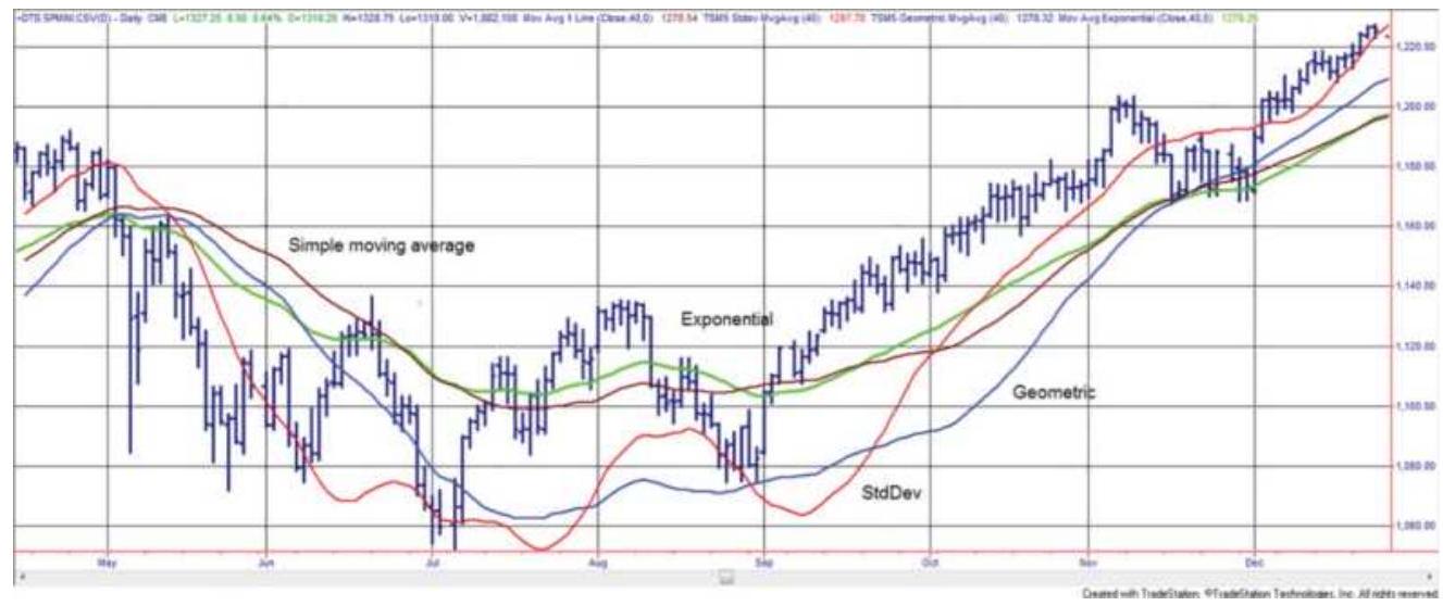
FIGURE 7.3 SP continuous futures, April through December 2010, with examples of the simple moving average, standard deviation average, geometric average, and exponential smoothing, all with calculation periods of 40 days.
\section*{THE MOVING MEDIAN}
The median is the middle value when all items are sorted. It is useful for ignoring the extremes and showing a "typical" value. It's a slower calculation than any of the other averages because each day the past \(N\) prices must be sorted.

One problem using the moving median instead of a moving average is that the median value will remain the same if prices have been in a sideways range before they take a sharp turn up or down. The new prices will not affect the median value until nearly half the data are replaced. That makes the median appear to go sideways while prices are moving quickly. You can plot the moving
median using the indicator TSM Median available on the Companion Website.
\section*{GEOMETRIC MOVING AVERAGE}
The geometric mean is a growth function that is applicable to long-term price movement. It was introduced in Chapter 2. It is especially useful for calculating the components of an index. The geometric mean can also be applied to the most recent \(n\) points at time \(t\) to get a geometric average (GA) similar in function to a moving average:
\[
G A_{t}=\left(p_{t-n+1} \times p_{t-n+2} \times \cdots \times p_{t-1} \times p_{t}\right)^{(1 / n)}=\left(\prod_{i=1}^{n} p_{t-i+1}\right)^{\prime}
\]
The daily calculation, as shown in Chapter 2, could be rewritten as:
\[
\ln G A_{t}=\frac{\ln p_{t-n+1}+\ln p_{t-n+2}+\cdots+\ln p_{t-1}+\ln p_{t}}{n}=\frac{1}{n}\left(\sum_{i=1}^{n} \ln p_{t-i+1}\right)
\]
This is similar in form to the standard moving average based on the arithmetic mean and can be written in either spreadsheet or program code using the natural \(\log , \ln\), as:
GA = average(ln(price), n)
A weighted geometric moving average ( \(W G A\) ), for \(n\) days ending at the current day \(t\), would have the form:
\[
\begin{aligned}
\ln W G A_{t}= & \frac{w_{1} \ln p_{t-n+1}+w_{2} \ln p_{t-n+2}+\cdots+w_{n-1} \ln p_{t-1}+w_{n} \ln p_{t}}{w_{1}+w_{2}+\cdots+w_{n}} \\
= & \frac{\sum_{i=1}^{n} w_{i} \ln p_{t-i+1}}{\sum_{i=1}^{n} w_{i}}
\end{aligned}
\]
The geometric moving average gives greater weight to lower values without the need for a discrete weighting function. This is most applicable to long data intervals where prices had a wide range of values. In applying the technique to recent index or stock prices, this distinction is not as clear. For example, if the historical index values vary from 10 to 1000 , the simple average of those two values is 505 and the geometric average is 100 , but for the three sequential prices of \(56.20,58.30\), and 57.15 , the arithmetic mean is 57.2166 and the geometric is 57.1871 . The \(5^{-}, 10\)-, or 20 -day moving averages of stock prices, compared to geometric averages of the same intervals, show negligible differences. The geometric moving average is best applied to long-term historic data with wide variance, using yearly or quarterly average prices.
\section*{ACCUMULATIVE AVERAGE}
An accumulative average is simply the long-term average of all data and is not practical for trend following. One drawback is that the final value is dependent upon the start date. If the data have varied around the same price for the entire data series, then the result would be good. It would also be useful if you are looking for the average of a ratio over a long period. Experience shows that price levels have changed because of inflation or a structural shift in supply and/or demand, and that a rolling window is a better approach.
\section*{Reset Accumulative Average}
A reset accumulative average is a modification of the accumulative average and attempts to correct for the loss of sensitivity as the number of trading days becomes large. This alternative allows you to reset or restart the average whenever a new trend begins, a significant event occurs, or at some specified time interval, for example, at the time of quarterly earnings reports or at the end of the current crop year.
\section*{DROP-OFF EFFECT}
Many rolling trend calculations are distinguished by the drop-off effect, a common way of expressing the abrupt change in the current value when a significant older value is dropped from the calculation. Simple moving averages, linear regressions, or any average that weights the data equally, or gives more weight to the older data, are subject to this effect. For an \(n\)-period moving average, the importance of the oldest value being
dropped off, \(P_{t-n}\), is measured by the difference between the new price being added, \(P_{t}\), and the one being removed, \(P_{t-n}\), divided by the number of periods:
\[
\text { Drop-off effect }=\operatorname{ABS}\left(P_{t}-P_{t-n}\right) / n
\]
A front-weighted average, in which the oldest values have less importance, reduces this effect because older data slowly become a smaller part of the result before being dropped off. Exponential smoothing, discussed next, is by nature a front-loaded trend that minimizes the drop-off effect as does the average-off method.
\section*{EXPONENTIAL SMOOTHING}
Exponential smoothing may appear to be more complex than other techniques, but it is only another form of a weighted average. It can also be more accurately called percentage smoothing and has the added advantage of only needing the current price, \(P_{t}\), the last exponentially smoothed value \(E_{t-1}\), and the smoothing constant \(a\) (a percentage), to compute the new value. The technique of exponential smoothing was developed during World War II for tracking aircraft and missiles and projecting their positions: The immediate past is used to predict the immediate future.
Exponential smoothing is similar to a weighted moving average, but the weights have a specific form; they get smaller by the same percentage for each previous day. Think of this in terms of a company with 1,000 shares of
stock outstanding. A new investor is given \(5 \%\), or 50 shares, leaving the original shareholders to divide 950 shares. A second investor buys \(5 \%\), so the previous investor now has 47.5 shares and the remaining have 902.5. For the next investor buying \(5 \%\) we get \(50,47.5\), 45.125 , and the balance is 857.375 . The original shareholders will always have some diminishing shares and the new shareholder will always have \(5 \%\). Because all past data will have some weight, exponential smoothing will be slower than the comparable moving average.
\section*{The Common Form of Exponential Smoothing}
The common use of exponential smoothing is written as:
\[
E_{t}=E_{t-1}+s c \times\left(p_{t}-E_{t-1}\right)
\]
where
\[
\begin{aligned}
E_{t} \text { and } & =\text { today's and yesterday's exponential } \\
E_{t-1} & \text { smoothing values } \\
p_{t} & =\text { today's price } \\
s c & =\text { the smoothing constant, } \mathrm{o} \leq s c \leq 1
\end{aligned}
\]
Another way of visualizing the effect of the smoothing process with \(a=0.10\) is by thinking of it as moving the exponential trendline closer to the current price by \(10 \%\) of the distance between the price and the previous trendline value. In Figure 7.4, using a smoothing constant of o.10, the distance from the new price \(P_{t}\) and
the previous trendline value \(E_{t-1}\) is \(p_{t}-E_{t-1}\). The new trendline value is \(10 \%\) closer to the price because the distance between \(p_{t}\) and \(E_{t-1}\) is reduced by
\(0.10 \times\left(p_{t}-E_{t-1}\right)\). Therefore:
New exponential value \(=\) Previous exponential value
t a percentage of (Today's price - Previous exponential value)
The smoothing process is started by letting \(E_{1}=p_{1}\) and calculating the next value:
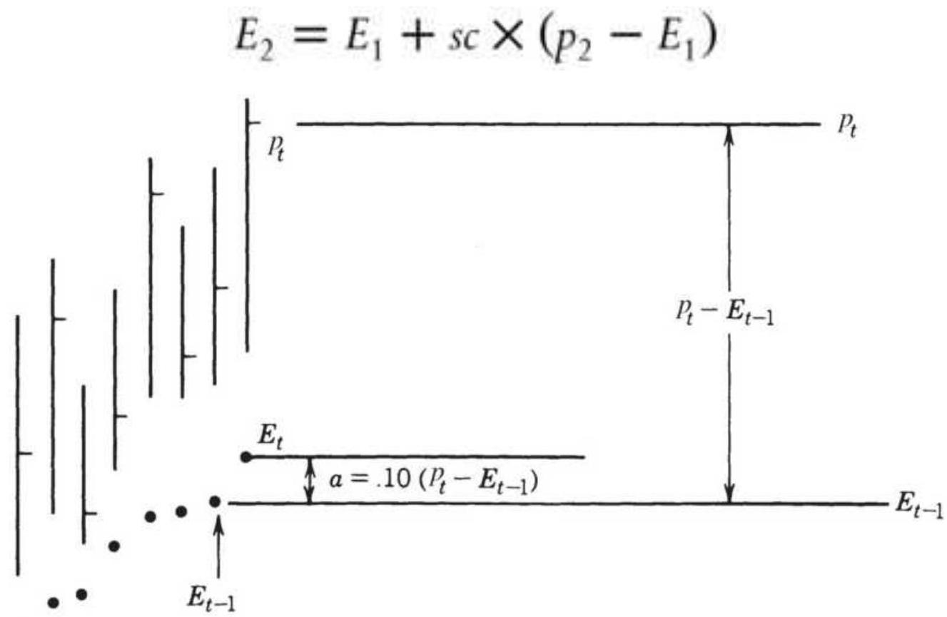
FIGURE 7.4 Exponential smoothing. The new exponential trendline value, \(E_{t}\), is moved closer to the
new price, \(P_{t}\), by \(10 \%\) of the distance between the new price and the previous exponential trendline value, \(E_{t-1}\).
Even though the calculations are initialized with the closing price, a longer-term smoothing, where the smoothing constant is small, will take more data for the smoothed line, \(E_{t}\), to reach a stable value.
\section*{The Smoothing Constant Expressed in Days}
The standard conversion from the number of days to a smoothing constant sc was given by Hutson \({ }^{5}\) as:
\[
s c=\frac{2}{n+1}
\]
where \(n\) is the equivalent number of days in the standard moving average. While this is the way most development platforms express the calculation period for exponential smoothing, it greatly limits the smoothing ability. In this formula, when \(n\) goes from 1 to 5 , we get smoothing constants of \(1.0,0.667,0.50,0.40\), and 0.333 . That leaves large gaps in the test possibilities. The function TSM_Exponential_Smoothing allows you to input a fractional smoothing constant.
Using the Hutson conversion does not give you the real exponential smoothing equivalent of the moving average because it ignores the lag, which can be substantial. This can be seen in Tables 7.3 and 7.4 .
A 2nd- or 3rd-order exponential smoothing, based on the weighting of the past 2 or 3 days' prices, is the
exponential equivalent of step-weighting. Its general form is:
\[
s c_{p}=1-\left(1-\frac{2}{n+1}\right)^{\frac{1}{p}}
\]
A comparison of the standard moving average days with 1st-, 2nd-, and 3rd-order exponential smoothing is shown in Table 7.3.
TABLE 7.3 Comparison of exponential smoothing values.
\begin{tabular}{|l|c|c|c|}
\hline \begin{tabular}{l}
Moving \\
Average Days \\
( \(\boldsymbol{n}\) )
\end{tabular} & \begin{tabular}{c}
1st-Order \\
\(\boldsymbol{P}=1\)
\end{tabular} & \begin{tabular}{c}
2nd-Order \\
\(\boldsymbol{P}=2\)
\end{tabular} & \begin{tabular}{c}
3rd-Order \\
\(P=3\)
\end{tabular} \\
\hline 3 & 0.500 & 0.293 & 0.206 \\
\hline 5 & 0.333 & 0.184 & 0.126 \\
\hline 7 & 0.250 & 0.134 & 0.091 \\
\hline 9 & 0.200 & 0.106 & 0.072 \\
\hline 11 & 0.167 & 0.087 & 0.059 \\
\hline 13 & 0.143 & 0.074 & 0.050 \\
\hline 15 & 0.125 & 0.065 & 0.044 \\
\hline 17 & 0.111 & 0.057 & 0.039 \\
\hline 19 & 0.100 & 0.051 & 0.035 \\
\hline 21 & 0.091 & 0.047 & 0.031 \\
\hline
\end{tabular}
TABLE 7.4 Comparison of exponential smoothing residual impact.
\begin{tabular}{|c|c|c|c|c|}
\hline \(\mathbf{N}\) & 2/(n + 1) & RI (\%) & \(\mathbf{1 0 \%}\) RI & \(\mathbf{5 \% ~ R I}\) \\
\hline .5 & 0.333 & 13.17 & 0.369 & 0.451 \\
\hline 10 & 0.182 & 13.44 & 0.206 & 0.259 \\
\hline 15 & 0.125 & 13.49 & 0.142 & 0.181 \\
\hline 20 & 0.095 & 13.51 & 0.109 & 0.139 \\
\hline
\end{tabular}
\section*{Estimating Residual Impact}
The primary difference between the standard moving average and exponential smoothing is that all prices remain as part of the exponentially smoothed value indefinitely. For practical purposes, the effect of the oldest data may be very small. A general method of approximating the smoothing constant for a given level of residual impact is given by:
\[
s c=1-R I^{1 / n}
\]
where
\(n=\) the number of moving average days that is equivalent to the smoothing constant
\(R I=\) the level of residual impact expressed as a percentage (e.g., 0.05, 0.10, 0.20)
A smaller percent implies more residual impact. 6 The approximation for the smoothing constant, given in the previous section as \(2 /(n+1)\), can be shown to have a consistent residual impact of between 13 and \(14 \%\). The use of the preceding formula, as shown in Table 7.4, would allow the specific adjustment of residual impact;
however, eliminating all residual impact would transform exponential smoothing to a weighted average.
\section*{Relating Exponential and Standard Averages}
It is much easier to visualize the amount of smoothing in a 10-day moving average than with a "10\%" exponential smoothing, where \(a=0.10\). Although we try to relate the speed of both techniques, the simple moving average is equally weighted and the exponential is front weighted; therefore, they produce very different results. Because the exponential smoothing never completely discards the old data, a \(10 \%\) smoothing is slower than a 10-day moving average, and a \(5 \%\) smoothing is slower than a 20-day moving average.
Table 7.5 relates the fully calculated exponential smoothing (within 1\%) to the standard moving average. Find the smoothing constant on the top line, and the equivalent number of days in a standard moving average will be below it. Observe in the following summary that, if you perform an optimization with equally spaced exponential smoothing constants, there is more sensitivity at the low end and little at the high end.
If equally distributed smoothing constants are used for testing, half of the tests will analyze moving averages of three days or less. If the process is reversed, and equally spaced days are used, then the smoothing constants are very different, shown in the next summary, Table 7.6. The distribution of calculation periods used for testing will be important when finding robust system parameters and is discussed in Chapter 21.
The distribution of smoothing constants is very close to logarithmic and is plotted on a log scale in Figure 7.5. This can be seen because the line representing the relationship between the smoothing constant and the moving average days is nearly straight.
\section*{TABLE 7.5 Equating standard moving averages} to exponential smoothing.
\begin{tabular}{|l|c|c|c|c|c|c|c|c|c|}
\hline \begin{tabular}{l}
Smoothing \\
constant
\end{tabular} & 0.10 & 0.20 & 0.30 & 0.40 & 0.50 & 0.60 & 0.70 & 0.80 & 0 \\
\hline \begin{tabular}{l}
Standard \\
(n-day \\
average)
\end{tabular} & 20 & 10 & 6 & 4 & 3 & 2.25 & 1.75 & 1.40 & 1. \\
\hline
\end{tabular}
\section*{TABLE 7.6 Equating exponential smoothing to} standard moving averages.
\begin{tabular}{|l|c|c|c|c|c|c|c|c|}
\hline \begin{tabular}{l}
Standard \\
( \(n\)-day \\
average \()\)
\end{tabular} & 2 & 4 & 6 & 8 & 10 & 12 & 14 & 16 \\
\hline \begin{tabular}{l}
Smoothing \\
constant
\end{tabular} & 0.65 & 0.40 & 0.30 & 0.235 & 0.20 & 0.165 & 0.14 & 0.125 \\
\hline
\end{tabular}
A
Number of Days Used in Calculating
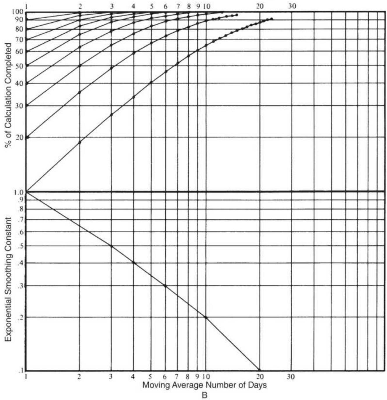
FIGURE 7.5 Graphic evaluation of exponential smoothing and moving average equivalents.
\section*{Double Smoothing}
In order to make a trendline smoother, the period of a moving average may be increased or the exponential
smoothing constant decreased. This succeeds in reducing the short-term market noise at the cost of increasing the lag. An alternative to increasing the calculation period is double smoothing, that is, the trend values can themselves be smoothed. This will slow down the trendline but gives weight to the previous values in a way that may be unexpected.
A double-smoothed 3-day moving average, \(M A\), would take the most recent 3 moving average values, calculated from prices, and use them in another 3-period average to get a double-smoothed moving average, \(D M A\) :
\[
\begin{aligned}
& M A_{3}=\left(p_{1}+p_{2}+p_{3}\right) / 3 \\
& M A_{4}=\left(p_{2}+p_{3}+p_{4}\right) / 3 \\
& M A_{5}=\left(p_{3}+p_{4}+p_{5}\right) / 3
\end{aligned}
\]
then
\[
D M A_{5}=\left(M A_{3}+M A_{4}+M A_{5}\right) / 3
\]
By substituting the original prices, \(P_{1}, \ldots, p_{5}\), into the equation for \(D M A_{5}\) we find out that:
\[
D M A_{5}=\left(p_{1}+2 p_{2}+3 p_{3}+2 p_{4}+p_{5}\right) / 9
\]
This shows that double smoothing puts weight on the center values, and for a 3-day average the results look the same as triangular weighting. For longer calculation periods the end values have decreasing weight, but all
other values have the same weight. For a 5 -day doublesmoothed average the three end values would have declining weights. For exponential smoothing the result is also different. Because the most recent value in exponential smoothing receives the full weight of the smoothing constant, \(s c\), the double smoothing:
\[
D E_{t}=D E_{t-1}+s c \times\left(E_{t}-D E_{t-1}\right)
\]
causes the nearby value \(t\) to be smoothed twice by \(s c\), or \(s c \times s c\), and older values as well. Therefore, the net effect of using a constant of \(s c=0.10\) for exponential double smoothing will result in a weighting that is much closer to using the square of \(s c\), approximately 0.031 .
Figure 7.6 and Table 7.7 give an example of this method using the standard conversion of a smoothing constant from the number of days. Prices for Microsoft are shown, along with a single 0.20 smoothing, a double smoothing, and a single error correction. The error correction positions the trendline in the middle of the price move and may be a good candidate for mean reversion trading.
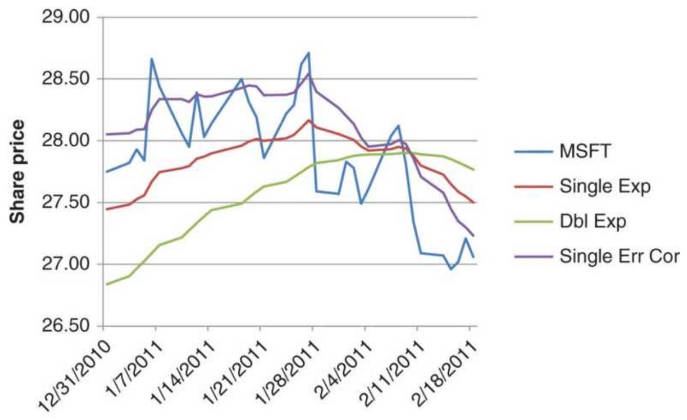
FIGURE 7.6 Comparison of exponential smoothing techniques applied to Microsoft shows a single 0.20 smoothing (Exp), a double-smoothed series (Dbl Exp), and a single smoothed series with the forecast error corrected (Single Err Cor).
\section*{TABLE 7.7 Comparison of exponential} smoothing techniques applied to Microsoft.
\begin{tabular}{|l|l|l|c|l|l|l}
\hline & & Exp & \begin{tabular}{c}
Dbl \\
Exp
\end{tabular} & & \begin{tabular}{l}
Sm \\
Err
\end{tabular} & \\
\hline Date & MSFT & 0.10 & o.10 & \begin{tabular}{c}
Exp \\
Err
\end{tabular} & .o.10. & \begin{tabular}{c}
Cor \\
ExI
\end{tabular} \\
\hline \(1 / 19 / 2011\) & 28.31 & 27.994 & 27.540 & .0 .316 & .0 .453 & 28.4 \\
\hline \(1 / 20 / 2011\) & 28.19 & 28.013 & 27.588 & .0 .177 & .0 .426 & 28.4 \\
\hline \(1 / 21 / 2011\) & 27.86 & 27.998 & 27.629 & -0.138 & .0 .369 & \(28.3^{4}\) \\
\hline \(1 / 24 / 2011\) & 28.22 & 28.020 & 27.668 & .0 .200 & .0 .352 & 28.3 \\
\hline
\end{tabular}
\begin{tabular}{|l|l|l|l|l|l|l|}
\hline \(1 / 25 / 2011\) & 28.29 & 28.047 & 27.706 & .0 .243 & .0 .341 & \(28.3^{4}\) \\
\hline \(1 / 26 / 2011\) & 28.62 & 28.105 & 27.746 & .0 .515 & .0 .359 & 28.4 \\
\hline \(1 / 27 / 2011\) & 28.71 & 28.165 & 27.788 & .0 .545 & .0 .377 & \(28.5^{\prime}\) \\
\hline \(1 / 28 / 2011\) & 27.59 & 28.108 & 27.820 & -0.518 & .0 .288 & 28.3 \\
\hline \(1 / 31 / 2011\) & 27.57 & 28.054 & 27.843 & -0.484 & .0 .211 & 28.2 \\
\hline \(2 / 1 / 2011\) & 27.83 & 28.031 & 27.862 & -0.201 & .0 .170 & 28.21 \\
\hline \(2 / 2 / 2011\) & 27.78 & 28.006 & 27.876 & -0.226 & .0 .130 & 28.1 \{ \\
\hline \(2 / 3 / 2011\) & 27.49 & 27.955 & 27.884 & -0.465 & .0 .070 & 28.0 ؛ \\
\hline \(2 / 4 / 2011\) & 27.61 & 27.920 & 27.888 & -0.310 & .0 .032 & \(27.9!\) \\
\hline \(2 / 7 / 2011\) & 28.04 & 27.932 & 27.892 & .0 .108 & .0 .040 & 27.97 \\
\hline \(2 / 8 / 2011\) & 28.12 & 27.951 & 27.898 & .0 .169 & .0 .053 & 28.0 ! \\
\hline \(2 / 9 / 2011\) & 27.81 & 27.937 & 27.902 & -0.127 & .0 .035 & 27.9 ! \\
\hline \(2 / 10 / 2011\) & 27.34 & 27.877 & 27.899 & -0.537 & -0.022 & \(27.8!\) \\
\hline
\end{tabular}
\section*{Double Smoothing of Price Changes}
To reduce the compounded lag produced by double smoothing yet take advantage of the smoother trendline, William Blau has substituted the price changes,
\(p_{t}-p_{t-n}\), for the price itself, 7 a process that makes the data more sensitive to change. The first smoothing is then performed on this accelerated price series and acts to restore the speed of the series back to normal. When
\(n=1\), the price changes are called the first differences. In effect, the first smoothed series does not have a lag so that the second smoothing results in one lag, the same as a normal moving average. Blau found this to be a successful proxy for long-term trends, where the first
smoothing may be as long as 250 days, and the second, a much shorter 5 days. The only disadvantage of this is that the scale is no longer the same as the price so that it cannot be plotted in the same window as prices.
To calculate the double smoothing of price change (in the following chapters the price change is also called momentum), follow the same method as exponential smoothing. First calculate the smoothed momentum, \(S M_{t}\), substituting the price change, \(P_{t}-P_{t-n}\), for the price, \(P_{t}\), normally used. Next, perform another exponential smoothing using the smoothed momentum instead of price. The result is the double-smoothed momentum, \(D S M_{t}\).
\[
\begin{aligned}
S M_{t} & =S M_{t-1}+s c \times\left(\left(p_{t}-p_{t-n}\right)-S M_{t-1}\right) \\
D S M_{t} & =D S M_{t-1}+s c \times\left(S M_{t}-D S M_{t-1}\right)
\end{aligned}
\]
As an example of this approach, start with the 5 -day momentum, \(M(5)_{t}=p_{t}-p_{t-5}\), and smooth the momentum values using the 5 -day period equivalent, \(s c=0.166\). Smooth the resulting values again using the 20-day smoothing constant equivalent, o.0555. The result is shown in the bottom panel of Figure 7.7 applied to Microsoft. The double-smoothed trendline is very smooth and the points at which the trends turn show less lag than any of the other methods. Trading signals should be generated from the trendline only - that is, buying when the trendline turns up and selling when it turns down. These methods are discussed in detail in
Chapter 8 under "TRIX" and in Chapter 9 under "Double Smoothing."
\section*{Adding Back the Smoothing Error}

The single and double exponential smoothing methods, including error corrections, can be compared in a spreadsheet. A piece of that spreadsheet is shown in Table 7.7 and the entire spreadsheet is available on the Companion Website as TSM Comparison of exponentials MSFT. The methods are applied to Microsoft from August 1998 through February 2011. The smoothing constants, all 0.10, are shown in row 2. The first calculation in column C is the single exponential smoothing (Exp), followed by the double smoothing in column D (DblExp). The error for the single smoothing, the current price minus the corresponding exponential value, is in column E (Exp Err), followed by an exponential smoothing of those error values (Sm Err) in F. Column G shows the single exponential with the smoothed errors added back (Corr Exp). To see the difference in the single smoothing and the errorcorrected method, the last two columns indicate when the trends turn up or down based on the trendline changing direction. The error-corrected method (column \(\mathrm{G})\) is more sensitive to changing prices.
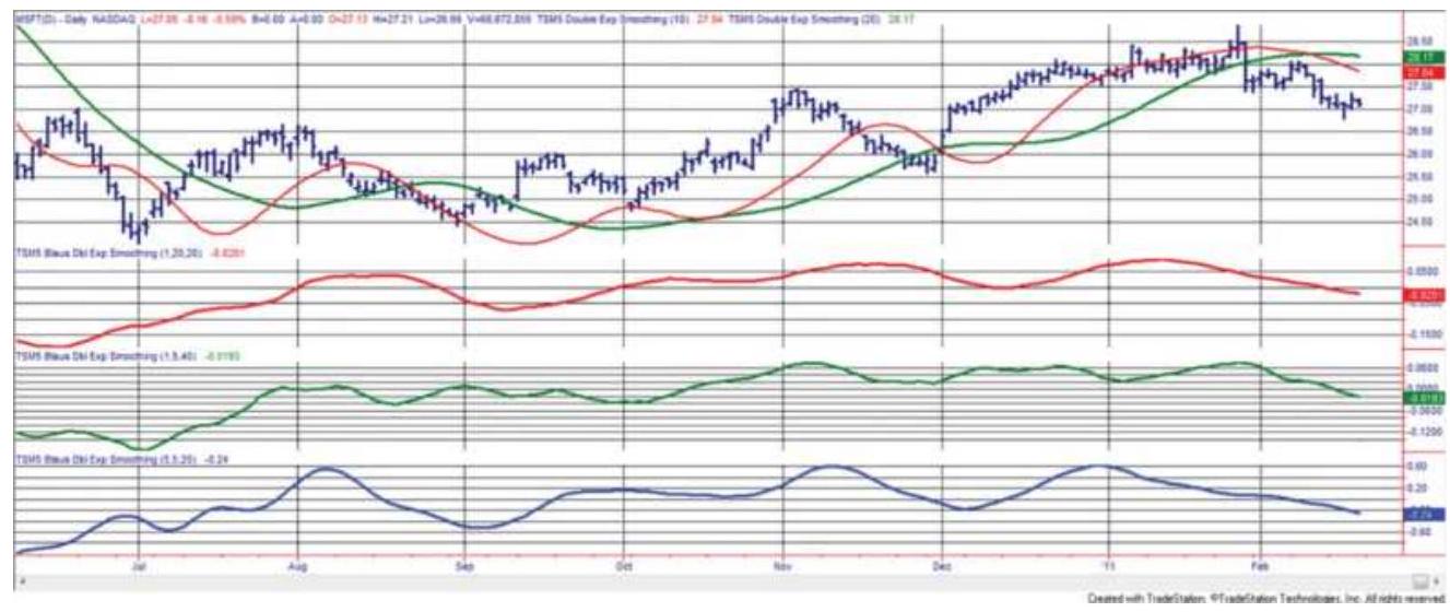
FIGURE 7.7 Double-smoothing applied to Microsoft, June 2010 through February 2011. (Top panel) The price of Microsoft along with an exponential double smoothing of 10 and 20 days. (Second panel) Blau's double smoothing of 20/20 days. (Third panel) Blau's smoothing of \(5 / 40\) days. (Bottom panel) The 5 -day difference before applying Blau's double smoothing of \(5 / 20\) days.
\section*{Regularization}
An interesting form of double smoothing is given by Mills and called exponential regularization. \(\underline{8}\)
\[
R E M A_{t}=\frac{R E M A_{t-1} \times(1+2 \times w)+\alpha \times\left(p_{t}-R E M A_{t-1}\right)-w \times R E M A_{t-2}}{1+w}
\]
where
\[
\begin{aligned}
p & =\text { price } \\
a & =\text { smoothing constant } \\
w & =\text { weighting factor }
\end{aligned}
\]
보Nominally, both \(\alpha\) and \(w\) are set to 9. A comparison of a 9-day standard exponential and the 9day exponential regularization is shown in Figure 7.8, applied to weekly S\&P data, 2007 through 2010. The regularized trendline is much smoother but also shows more lag. The program TSM Exponential Regularization can be found on the Companion Website.
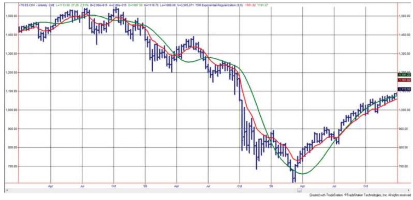
FIGURE 7.8 Comparison of a 9-day exponential smoothing with a 9-day exponential regularization (the smoother line), applied to the weekly S\&P, 2007-2010.
\section*{Hull Moving Average}
A double-smoothed method that uses linearly weighted averages and modified calculation periods, all applied to weekly data, is the Hull Moving Average. 9 Beginning with the suggested period, \(p=16\) weeks, three weighted averages use the original period, the square root of the period, and half the period, with the goal of shortening
the net period and reducing the lag. The calculation can be written as:
\section*{WAVG1 \(=\) WAVG \((\) close,\(p)\)}
WAVG2 \(=\) WAVG \((\) close, \(\operatorname{INT}(p / 2))\)
\section*{HMA \(=\) WAVG \((2 *\) WAVG2 - WAVG1, INT(SQRT(p) \())\)}
where
close \(=\) weekly closing prices
\[
p=\text { calculation period }
\]
WAVG = linearly weighted average function (data series, period)
INT = integer portion function
SQRT = square root function

The 16-week HMA can be compared with a traditional double smoothing which uses a 20-week exponential smoothing followed by a 5 -week smoothing, as shown in Figure 7.9. Applied to the emini S\&P from December 2007 through July 2011, both of these are very similar (the HMA is the slower trend in the top panel and the double smoothed average is at the bottom). A double-smoothed 16 -week simple moving average is much more sensitive to price changes, as seen in the top panel. A program, TSM Hull Moving Average, can be found on the Companion Website.
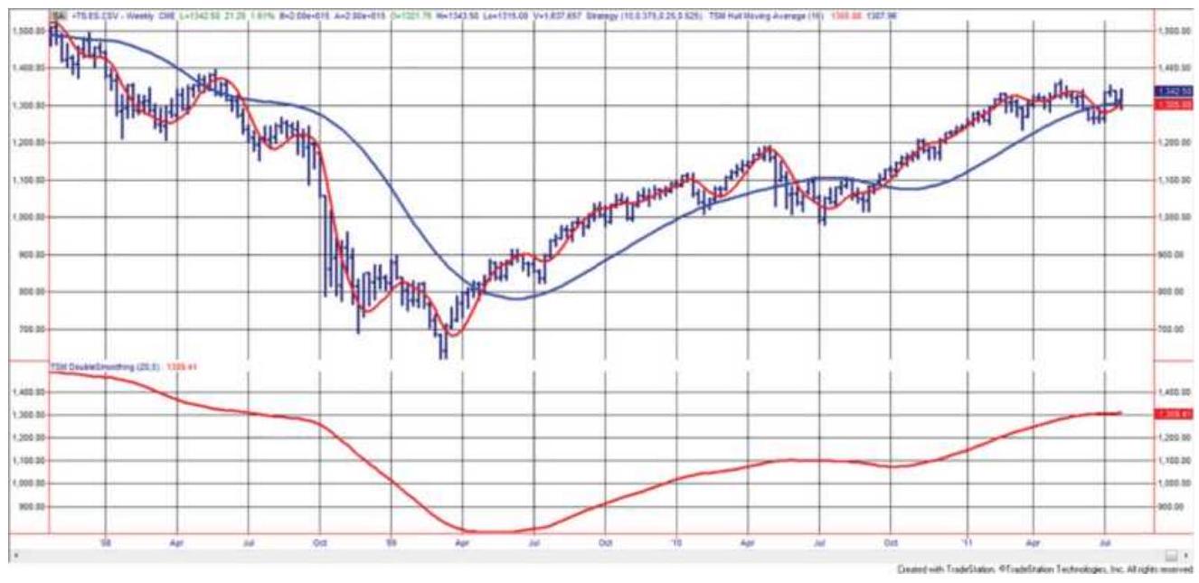
FIGURE 7.9 The Hull Moving Average (slower trend in the top panel), compared with a double-smoothed 16week simple moving average (top panel) and a double smoothed exponential (20 and 5-week) at the bottom.
\section*{PLOTTING LAGS AND LEADS}
Moving averages, as well as any trend calculation, can be plotted with leads and lags, that is, forward or backward on a chart, each having a major impact on the interpretation. The conventional plot places the moving average value \(M A_{t}\) directly above or below the last price \(P_{t}\) used in the calculation. Any averaging or smoothing technique is said to be lagging actual price movement. When prices have been trending higher over the calculation period, the value \(M A_{t}\) will be lower than the most recent price \(P_{t}\); therefore, it will be plotted below the actual prices. When prices are declining, the trendline will be plotted above the prices.
Using a simple moving average as an example, the trend values can be plotted so they lead or lag the most recent price used in the calculation. If it is to lead by 4 days, the value \(M A_{t}\) is plotted four periods ahead on the chart, on day \(t+4\); if it is to lag by 2 days, it is plotted at \(t-2\). In the case of leading moving averages, the analysis attempts to compensate for the time delay by treating the average as an \(n\)-day-ahead forecast rather than a concurrent statement of direction. A penetration of the forecasted line by the price is used to signal a change of direction. The lag technique may serve the purpose of phasing the moving average, putting it in tune with a specific cycle. A 10-day moving average, when lagged by 5 days, will be plotted in the middle of the actual price data. This technique is used when finding the seasonal patterns of commodities. Figure 7.10 shows Microsoft with a simple 20-day moving average plotted 4 days ahead as well as 4 days lagged. The charting technique, Ichimoku Clouds, uses multiple lead plots.
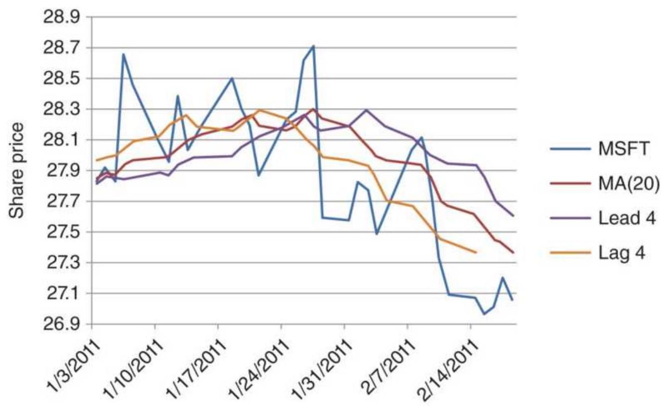
FIGURE 7.10 Plotting a moving average lag and lead for a short period of Microsoft. The leading trendline is at the top, the lagging one at the bottom.
\section*{NOTES}
1 J.J. Payne, "A Better Way to Smooth Data," Technical Analysis of Stocks \& Commodities (October 1989).
\(\underline{2}\) Patrick E. Lafferty, "End-Point Moving Average," Technical Analysis of Stocks \& Commodities (October 1995).
3 Don Kraska, "Letters to S\&C," Technical Analysis of Stocks \& Commodities (February 1996), p. 12.
4 Robert T.H. Lee, Power Tools for Traders (Hong Kong: MegaCapital Limited, 1997).
5 Jack K. Hutson, "Filter Price Data: Moving Averages vs. Exponential Moving Averages," Technical Analysis of Stocks \& Commodities (May-June 1984).
6 Donald R. Lambert, "Exponentially Smoothed Moving Averages," Technical Analysis of Stocks \& Commodities (September-October 1984).
7 William Blau, Momentum, Direction, and Divergence (New York: John Wiley \& Sons, 1995).
\(\underline{8}\) Mark Mills, "Regularization," in "Traders' Tips," Technical Analysis of Stocks \& Commodities (July 2003).
9 "The Hull Moving Average," Technical Analyst (JulySeptember 2010).
\section*{CHAPTER 8 Trend Systems}
The previous chapters developed the tools for calculating trends - a traditional moving average, various weighted averages, exponential smoothing, and regression. To profit from identifying the trend requires trading rules and specific parameters that define the trend speed and an acceptable level of risk, among other factors. This chapter first discusses the rules that are necessary for all trading strategies and gives examples of actual systems. The selection of trend speed is handled only briefly here but is continued with a detailed analysis of these and other systems throughout the book, and especially in Chapter 21. It is most important to find trends that are robust - that is, ones that work across many markets and under varied economic conditions. At the same time, they must satisfy an investor's risk tolerance. It is a difficult balance.
Trend systems are the preferred choice of Commodity Trading Advisors (CTAs) and many hedge funds. Some advisors are reported to be using the same trend systems devised in 1980. CTA total assets under management reached a record \(\$ 343\) billion in 2017 , but a small part of the \(\$ 3.37\) trillion managed by all hedge funds. It attests to the long-term success of trend following.
\section*{WHY TREND SYSTEMS WORK}
Trend analysis is the basis for many successful trading programs, some with audited performance spanning nearly 40 years. Being able to identify the trend is also important if you are a discretionary trader looking to increase your chances for success by trading on "the right side of the market." Trend systems work because:
Long-term trends capture large price moves caused by fundamental factors. Economic trends are most often based on government interest rate policy, which is both slow to develop and incremental. In turn, interest rates directly affect foreign exchange, the trade balance, mortgage rates, carrying charges, and the stock market.
Persistence. Some stock price moves defy analysis. They continue to rise beyond any normal assessment of value. Only by staying with the trend could you capture the gains of Apple, Amazon, Tesla, and even Bitcoin. In the case of Bitcoin, extreme trends have been both up and down.
Prices are not normally distributed but have a fat tail. The fat tail refers to the unusually large number of directional price moves in many stocks and futures markets that are far longer than would be expected if prices were randomly distributed. Profits generated by the fat tail are essential to the longterm success of trend following.
Money moves the markets. Most trends are supported by the flow of investor funds. While this causes short-term noise, it also delivers the longterm trends. As trends become clearer, additional
money flows in to continue the trend.
Trend trading works when the market is trending. It doesn't work in markets that are not trending. There is no magic solution that will generate profits for trending strategies when prices are moving sideways, and there is no one trending technique that is always best. You'll find that most trending methods have about the same returns over time but with different risk profiles and different trading frequency.
\section*{How Often Do Markets Trend?}
Is there a way to measure how often markets trend? One analyst defines a trend as 10 consecutive closes in the same direction, but that seems arbitrary and a small window. What if there were 9 days up and one small down day?
A trend is a relative concept. It depends on the trader's time horizon and it is relative to the frequency and size of price swings that are acceptable to the trader.
Ultimately, a trend exists if you can profit from the price moves using a trending strategy.
\section*{The Fat Tail}
The fat tail is a statistical phenomenon caused by a combination of market fundamentals and supported by human behavior. The net effect is that prices move in one direction much longer than can be explained by a random distribution. As a simple example, consider coin flipping as a classic way to produce a random distribution. In 100-coin tosses:
50 will be a head or a tail followed by the opposite head or tail.
25 will be two heads or two tails in a row. \(12^{1 / 2}\) (if we could have halves tosses) will be 3 heads or 3 tails in a row.
About 6 will be 4 heads or 4 tails in a row.
About 3 will be 5 in a row.
1 or 2 will be 6 in a row of either heads or tails.
If price moves are substituted for coin flips, then heads would be a move up and tails a move down. If the pattern of up and down price moves follows a random distribution (and the up and down moves were of the same size), then it would not be possible to profit from a trend system. But prices are not normally distributed. Instead of one run of 6 out of 100 days of trading, we may see a run of 12 , or 3 runs of 6 .
These long runs can translate into very large trading profits. It is not necessary to have every day go in the same direction in order to profit, only that the downward reversals during an uptrend not be large enough to change the direction of the trend and end the trade. The more tolerance for the size of the interim reversals, that is, the more risk you are willing to take, the more likely the fat tail can be captured.
If there are more runs of longer duration for every 100 daily price moves, what is the shape of the rest of the distribution? Figure 8.1 gives a theoretical representation of an actual price distribution compared
to a random distribution. The extra movement that goes into creating the fat tail comes from the frequency of short runs. There are fewer runs of 1 and 2 and more runs greater than 6 . The total remains the same. Readers interested in this subject should read the section "Gambling Techniques: The Theory of Runs" in Chapter 22 .
\section*{Distribution of Profits and Losses}
As a trader, you would want to know, "How often is there a profit from a fat tail? To find the answer, we'll apply the most basic trending system, a simple moving average that buys when the trendline turns up and sells short when it turns down. This will be discussed in more detail in the next sections. For now, we need to know that results depend on both the market and the calculation period. Applying a simple 40 -day moving average strategy to five diverse futures markets, 30 -year bonds, the S\&P, the euro currency, crude oil, and gold, the results of individual trades can be collected and displayed as a histogram (frequency distribution). The results of the S\&P are shown in Figure 8.2.
\section*{Random versus Actual Price Distribution}
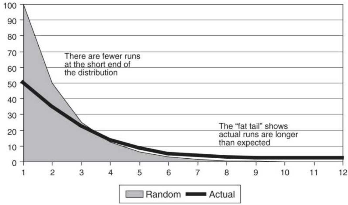
FIGURE 8.1 Distribution of runs. The shaded area shows the normal distribution of random runs. The solid dark line represents the distribution when there is a fat tail. In the fat tail distribution, there are fewer short runs and an unusually large number of longer runs or a single exceptionally long run.
In the frequency distribution, the bottom axis shows the starting value of the bins that hold the size of the profitable or losing trades, and the left scale shows the number of trades that fall into that bin. If the distribution was normal, then the shape would be a bell curve. This distribution is clearly extended far to the right, with one very large profit showing in the \(\$ 18,750\) bin . That one profit offsets 15 losses in the bar with the highest frequency, \(-\$ 1,250\). But the S\&P is not the only market with this distribution. Table 8.1 shows the
distribution sample, where bin \(1=-\$ 5,000\) and \(\operatorname{bin} 20=+\$ 18,750\). The tails to the right are very long and those to the left very short. It is important to remember that a pure trend strategy needs this distribution to be profitable.
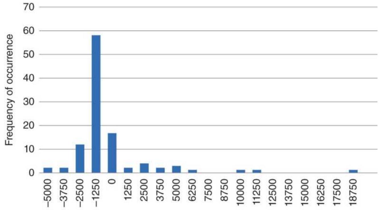
Starting value of bin
FIGURE 8.2 Frequency distribution of returns for SP futures using a 40-day simple moving average strategy. Results show a fat tail to the right.
TABLE 8.1 Frequency distribution for a sample of five diverse markets, showing the fat tail to the right and a short tail to the left.
\begin{tabular}{|l|l|l|l|l|l|l|l|l|l|l|l|l|l|l|l|l|}
\hline Bin & \(\mathbf{1}\) & \(\mathbf{2}\) & \(\mathbf{3}\) & \(\mathbf{4}\) & \(\mathbf{5}\) & \(\mathbf{6}\) & \(\mathbf{7}\) & \(\mathbf{8}\) & \(\mathbf{9}\) & \(\mathbf{1 0}\) & \(\mathbf{1 1}\) & \(\mathbf{1 2}\) & \(\mathbf{1 3}\) & \(\mathbf{1 4}\) & \(\mathbf{1 5}\) & \(\mathbf{1 6}\) \\
\hline Bonds & \(\mathbf{0}\) & 2 & 8 & 17 & 53 & 27 & 6 & 3 & 2 & 3 & \(\mathbf{1}\) & \(\mathbf{0}\) & \(\mathbf{0}\) & \(\mathbf{1}\) & \(\mathbf{1}\) & o \\
\hline S\&P & \(\mathbf{2}\) & \(\mathbf{2}\) & 12 & 5 & 17 & 2 & 4 & 2 & 3 & 1 & 0 & 0 & \(\mathbf{1}\) & \(\mathbf{1}\) & 0 & 0 \\
\hline Euro & \(\mathbf{1}\) & \(\mathbf{0}\) & 4 & 7 & 26 & 75 & 20 & 2 & \(\mathbf{2}\) & 3 & \(\mathbf{1}\) & \(\mathbf{0}\) & \(\mathbf{2}\) & \(\mathbf{1}\) & \(\mathbf{1}\) & o \\
\hline
\end{tabular}
\begin{tabular}{|l|l|l|l|l|l|l|l|l|l|l|l|l|l|l|l|l|}
\hline Crude & O & 3 & 22 & 92 & 2 & 0 & 4 & o & 1 & 0 & 0 & 0 & 0 & 0 & 0 & 0 \\
\hline Gold & 0 & 1 & 4 & 8 & 20 & 70 & 16 & 4 & 0 & 2 & 0 & 3 & 0 & 0 & 0 & 0 \\
\hline
\end{tabular}
\section*{Time Intervals, Market Characteristics, and}
\section*{Trends}
Trends are most easily seen using long-term charts, weekly rather than daily data, or daily rather than hourly data. The farther you step back from a chart, the clearer the trend. If you display a daily chart, there will be some obvious trending periods and some equally clear sideways moves. Change that to a weekly chart and the trends will seem much clearer. Change that to an hourly chart and you'll see mostly noise. Lower frequency data translates into better performance when using longerterm trends. While there are always fast trends that show profits in back-testing, they tend to be less stable and inconsistent in their returns. Trends using longer calculation periods are more likely to track economic policy, such as the progressive lowering of interest rates by the central bank or a plan to allow the currency to weaken, which stimulates exports and reduces debt.
Market sectors differ in their trending qualities. Interest rate futures, money markets, and utility stocks are among the many investment vehicles closely tied to government rate policy and reflect the same long-term trend; this trend can persist for years. Foreign exchange is more complex and may be manipulated by monetary policy. Governments are more accepting of changes in the exchange rates if they occur slowly, but they will work hard to keep them within a target range. The Bank
of Japan has been known to intervene often, while the Swiss National Bank had only one spectacular intervention in January 2015, an attempt to stabilize the franc in front of a possible Greek financial crisis. Most foreign exchange markets show clear but shorter trends compared to interest rates.
\section*{Equities}
The stock market presents another level of difficulty. Individual stocks are driven by many factors, including earnings, competition, government regulation, management competence, and consumer confidence. Because the volume of trading in individual shares may vary considerably from day to day, these factors do not often net out as a clear trend. Stock prices may run up sharply on anticipation of better earnings or approval of a new drug and reverse just as quickly within a few days. Liquidity, or volume, is an important element in the existence of a steady trend.
Individual stocks are also affected by concurrent trading in the index markets. When the S\&P futures or the ETF SPY are bought and sold, all stocks within that index are bought and sold. If one company in the S\&P 500 has just announced the loss of a major contract, but the overall market is strong, the share price of the suffering company may be dragged higher by arbitrage due to massive buying of the S\&P index. This behavior makes for erratic price patterns in individual stocks. This individuality allows us to understand why Charles Dow created his indices, trying to bring order to chaos.
Emerging markets are the exception. The introduction of a new market, such as the fictitious East European Stock Index, would be lightly traded but may be very trending. Initial activity would be dominated by commercials, such as banks, all of which would have a similar opinion on the economy of Eastern Europe. As the general public starts to participate it adds liquidity while it also introduces noise, which in turn makes the trends less clear. Finding the trend then requires a longer time interval. Readers interested in this process should review the discussion of noise in Chapter 1.
When using a trending strategy, select both the markets and the time frame that work with you. Longer calculation periods, lower frequency data, and markets that are more closely linked to their underlying fundamentals will all perform better.
\section*{BASIC BUY AND SELL SIGNALS}
All trends lag the price movement. It is both the advantage and the disadvantage of the method. As the calculation period gets larger, the trend lags further. Figure 8.3 shows Amazon prices from April 2010 through February 2011 with a 40-day moving average. Clearly, the moving average is smoother than the prices because, on any day, only two of the values change. The lag exists because the value of the average is closest to the price 20 days ago, or half the length of the calculation period. But that value is plotted under today's price. When prices are going steadily up or down, the lag will be largest, as we see on the right side of Figure 8.3. It
is the lag that allows us to stay in a trade.
The most common way to trade a moving average is to be long when prices are above the average and short when below. The rules are:
- Buy when prices cross above the trendline.
- Sell short when prices cross below the trendline.
Even with these simple rules, there are important choices to be made. Do you buy at the moment rising prices cross the trendline during the trading session, or do you wait for the price to close above the trendline? As seen in Figure 8.3, prices may cross back and forth through the trendline before settling on a final direction. If you subscribe to the belief that the closing price of the day is the most reliable price, then the number of trading signals can be reduced by using the rules:
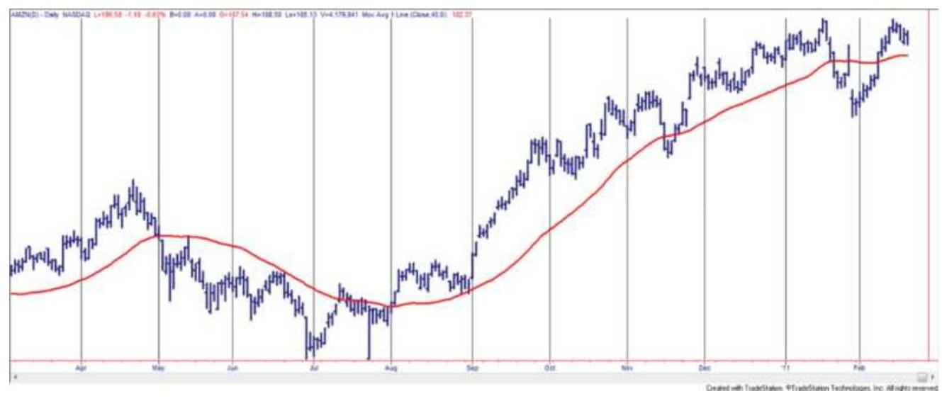
FIGURE 8.3 Amazon (AMZN) with a 40-day moving average.
- Buy when prices close above the trendline.
- Sell short when prices close below the trend line.
Another school of thought prefers the average of high and low prices, or the average of the high, low, and closing prices. A buy or short sale signal occurs when the \((\) high + low \() / 2\) or \((\) hight + low + close \() / 3\) crosses above or below the current trendline value. In both of these cases, the averages could not be calculated until the end of the trading session because none of the three component values would be known until then.
\section*{Using the Trendline for Signals}
The purpose of the trendline is to smooth erratic price moves and uncover the underlying direction of prices. Then it seems more reasonable to use the trendline to generate the trading signal.
- Buy when the change in the trendline is up.
Sell short when the change in the trendline is down. The penalty for using the trendline as a trading signal is its lag. Figure 8.3 shows that, using a 40 -day moving average, prices cross above the trendline during July a few days ahead of the point where the trendline turns up. The benefit using the trendline as the signal is that there are far fewer false signals (as in July and November); therefore, it has a higher percentage of profitable trades and lower cost. As we will see later, using the price cross will be best for short-term trading and the trend direction for longer-term trading.
As an example, Table 8.2 shows five calculation periods for Amazon beginning with 5 days and doubling the period for each test. This maintains the percentage
change in the calculation period and gives a better distribution sample (this is discussed further in Chapter 21). The two columns headed Number of Trades shows that the trendline method has from \(26 \%\) to \(37 \%\) fewer trades and, for the most part, better performance. The Profit Factor is a performance ratio equal to the gross profits divided by the gross losses.
\section*{TABLE 8.2 Comparison of entry methods for 10} years of Amazon (AMZN). Signals using the trendline direction are shown on the left, and price penetration on the right.
\begin{tabular}{|l|l|l|l|l}
\hline & \multicolumn{2}{|c|}{ Signal Using Trendline } & \multicolumn{1}{c}{ Signal } \\
\begin{tabular}{l}
Trend \\
Calculation \\
Period
\end{tabular} & \begin{tabular}{l}
Total \\
Profit/Loss
\end{tabular} & \begin{tabular}{c}
Profit \\
Factor
\end{tabular} & \begin{tabular}{l}
Number \\
of \\
Trades
\end{tabular} & \begin{tabular}{l}
Total \\
Profit/L
\end{tabular} \\
\hline 80 & 48.24. & 1.34 & 84 & 57.16. \\
\hline 40 & .94 .42. & 1.46 & 120 & .32 .21. \\
\hline 20 & 111.97 & 1.45 & 196 & \((7.31)\) \\
\hline 10 & \((87.67)\) & 0.81 & 292 & \((90.82)\) \\
\hline 5 & \((90.31)\) & 0.84 & 439 & \((49.15)\) \\
\hline
\end{tabular}
Using the trendline for signals is better in all but the fastest trend. But the fast trends are not the best choice for tracking fundamental price moves. It is very possible that, for faster trading, the lag in the trendline is too much of a burden to overcome and the price penetration is better. This will be discussed further in Chapter 16, "Day Trading." It is always necessary to confirm the results by testing other markets.
\section*{Anticipating the Trend Signal}
Consistency is important. The system that is tested and the one that is traded should be the same. In this book the closing price is used for most of the calculations; however, any combination of open, high, low, and close could be substituted. The normal process for generating a trading signal is to wait until prices close, then calculate the new moving average or trendline value, then see whether a crossing occurred or the direction of the trendline changed according to the basic buy and sell rules. But using the closing price for the calculation of the entry signal means that you could not enter a new trade on the close, unless you can anticipate the signal; otherwise, you must execute the trade in the after-hours market or on the next open. That means your trading performance is not going to match the way you tested.
One solution to this dilemma is to capture the prices shortly before the close, generate the trading signals, then enter the buy and sell orders for execution on the close. Occasionally the order will be wrong because prices changed direction in the last few minutes of trading, but the cost of exiting the trade will usually be small compared to the improvement in overall execution. As a general rule, entering sooner is better.
The other alternative is to calculate, in advance, the closing price that will generate a signal using either the trendline method or the price crossing method. For an \(n\) day moving average the calculation is simple - the new moving average value will be greater than the previous value if today's price is greater than the price dropped off
\(n\)-days ago. Because all the other values in the average remain the same except for the first and last, the answer only needs those two values. If a 40-day average is used and the oldest price \(P_{t-40}\) was 30.25 , then any price greater than 30.25 today would cause the trendline to move up. Then an order can be placed shortly before the close to buy at 30.26 stop. There is more on projecting prices at the end of this chapter.
\section*{Not All Entries Should Be Anticipated}
How important is this? A lot depends on the trending nature of the market. In Chapter 1 the discussion of market noise showed that the short-term interest rates had the lowest amount of noise and the equity index markets had the most noise. Using the Eurodollar interest rates and S\&P 500 futures as extreme examples, the method that used the trendline signal was compared when entries were taken on the current close, the next open, and the next close to assess the sensitivity of the total profits to entry delays. Table 8.3 shows the results.
All but one of the Eurodollar results were more profitable entering sooner. Longer trend periods were generally more profitable, reflecting the fundamentals of government policy. This is also seen in the profit factors, which measure reward to risk rather than only total profits.
The S\&P favors waiting until the next close. In addition, short-term trends are not profitable. Both of these can be attributed to higher noise. Even after the sustained bull market that began after 2008, S\&P daily prices will
rarely move in the same direction three days in a row.
To help find which markets are best entering quickly and which should be delayed, review the section "Measuring Noise" in Chapter 1. It is a concept that has been applied to smart execution.
\section*{Profile of a Simple Moving Average System}
Using the moving average trendline as the basis for system signals, we chose an 8o-day calculation period because it represents a typical macrotrend system. The profile of results is typical of any moving average system. Figure 8.4 shows the NASDAQ 100 futures from March through June 2018. Buy and sell signals are generated from the direction of the trendline; there were no transaction fees.
TABLE 8.3 Comparison of entries on the close, next open, and next close. Based on 10 years of S\&P and Eurodollar interest rate futures, backadjusted, ending in February 2011.
Eurodollar Interest Rates
\begin{tabular}{l|l|l|l}
\hline Today's Close & Next Open & Next \\
\hline
\end{tabular}
\begin{tabular}{|c|c|c|c|c|c|}
\hline \begin{tabular}{|l|}
\hline Calculation \\
Period
\end{tabular} & \begin{tabular}{|c|}
\hline Total \\
Profit \\
or \\
Loss
\end{tabular} & Profit & \begin{tabular}{c}
Total \\
Profit \\
or \\
Loss
\end{tabular} & Profit & \begin{tabular}{|c|c|c|c|}
Total \\
Profit \\
or Loss
\end{tabular} \\
\hline 80 & 16150 & 2.87 & 16325 & 2.89 & 15630 \\
\hline 40 & 9603 & 1.61 & 9050 & 1.55 & 9383 \\
\hline 20 & 7745 & 1.37 & 6258 & 1.29 & 3850 \\
\hline
\end{tabular}
\begin{tabular}{|c|c|c|c|c|r|}
\hline 10 & 10773 & 1.40 & 8765 & 1.31 & 1165 \\
\hline .5 & 3368 & 1.09 & -1715 & 0.96 & -870 \\
\hline
\end{tabular}
\section*{S\&P 500}
\section*{Today's Close Next Open Next}
\begin{tabular}{|c|c|c|c|c|c|}
\hline \begin{tabular}{l}
Calculation \\
Period
\end{tabular} & \begin{tabular}{c}
Total \\
Profit \\
or \\
Loss \\
\hline
\end{tabular} & \begin{tabular}{l}
Profit \\
Factor
\end{tabular} & \begin{tabular}{c}
Total \\
Profit \\
or \\
Loss
\end{tabular} & \begin{tabular}{l}
Profit \\
Factor
\end{tabular} & \begin{tabular}{c}
Total \\
Profit \\
or Loss
\end{tabular} \\
\hline 80 & -12325 & 0.87 & -10463 & 0.89 & 16363 \\
\hline 40 & -29138 & 0.75 & -26013 & 0.78 & 5013 \\
\hline 20 & 13088 & 1.12 & 13900 & 1.13 & 22738 \\
\hline 10 & -27925 & 0.83 & -22738 & 0.86 & -12550 \\
\hline .5 & -21725 & 0.90 & -19588 & 0.91 & -56350 \\
\hline
\end{tabular}
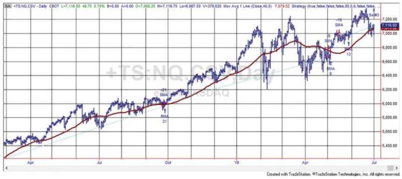
FIGURE 8.4 A trend system for NASDAQ 100 futures, using an 80-day moving average and taking the trading signals from the direction of trendline results.
The trading signals in Figure 8.4 show that a strong uptrend was captured with only a minor loss exiting and reentering in September. After a strong January 2018, prices increase in volatility and begin a sideways pattern. The trend system holds its long position until the beginning of May, when it gets a series of losing trades searching for a new trend.
The profile of this NASDAQ example, using data from 1998 through June 2018, is shown in Table 8.4. It is typical of longer-term trend-following systems and also shows the bullish bias of the U.S. equities market. Of the 210 trades over 20 years, only \(36 \%\) were profitable. Those profits and the profitable trades greatly favored the long positions.
\section*{TABLE 8.4 Performance statistics for NASDAQ futures, 1998 -June 2018.}
\begin{tabular}{|l|c|c|c|}
\hline & \begin{tabular}{c}
All \\
Trades
\end{tabular} & \begin{tabular}{c}
Long \\
Trades
\end{tabular} & \begin{tabular}{c}
Short \\
Trades
\end{tabular} \\
\hline Total Net Profit & \(\$ 1,584,665\) & \(\$ 1,868,520\) & \((\$ 283,855)\) \\
\hline Profit Factor & 1.47 & 2.22 & 0.85 \\
\hline Roll Over Credit & \(\$ 0.00\) & \(\$ 0.00\) & \(\$ 0.00\) \\
\hline Open Position P/L & \(\$ 0.00\) & \(\$ 0.00\) & \(\$ 0.00\) \\
\hline \begin{tabular}{l}
Total Number of \\
Trades
\end{tabular} & 201 & 101 & 100 \\
\hline Percent Profitable & \(36.32 \%\) & \(46.53 \%\) & \(26.00 \%\) \\
\hline \begin{tabular}{l}
Avg. Trade Net \\
Profit
\end{tabular} & \(\$ 7,884\) & \(\$ 18,500\) & \((\$ 2,839)\) \\
\hline Avg. Winning & \(\$ 67,844\) & \(\$ 72,226\) & \(\$ 59,921\) \\
\hline
\end{tabular}
\begin{tabular}{|l|c|c|c|}
\hline Trade & & & \\
\hline Avg. Losing Trade & \((\$ 26,312)\) & \((\$ 28,261)\) & \((\$ 24,889)\) \\
\hline \begin{tabular}{l}
Ratio Avg. \\
Win:Avg. Loss
\end{tabular} & 2.58 & 2.56 & 2.41 \\
\hline \begin{tabular}{l}
Consecutive \\
Winning Trades
\end{tabular} & 5 & 5 & 3 \\
\hline \begin{tabular}{l}
Consecutive Losing \\
Trades
\end{tabular} & 11 & 5 & 12 \\
\hline \begin{tabular}{l}
Avg. Bars in \\
Winning Trades
\end{tabular} & 47.3 & 54.11 & 35 \\
\hline \begin{tabular}{l}
Avg. Bars in Losing \\
Trades
\end{tabular} & 10.09 & 11.06 & 9.38 \\
\hline
\end{tabular}
Of added interest are the number of bars in the winning and losing trades. Again, this shows a strong upward bias in prices, even though the 20 years included the disastrous NASDAQ "dot.com" sell-off in 2000 and the financial crisis in 2008. The average winning trade was held 47 days and the losing trades held 10 days. This supports the trend-following adage "cut your losses and let your profits run." The performance picture is that trend following gets in and out quickly when it has a loss but holds the trades whenever trends and profits develop. This category of strategy is called conservation of capital.
We can generalize the moving average trend-following profile as:
- The percentage of profitable trades is low - about \(35 \%\).
- The average winning trade must be significantly larger than the average losing trade; given only \(35 \%\) profitable trades, the ratio must be greater than 10:3.5 to be profitable.
The average winning trades are held much longer than losses.
Because there is a high frequency of losing trades, there are also long sequences of losing trades.

There are many analysts trying to improve these statistics; that is, capturing the long-term trend by trading pieces of it. But doing that will change the risk characteristics of trend-following systems. For example, if you add profit-taking or stop-losses (Chapter 23), then you reduce or eliminate the chance of capturing the fat tail, which will be necessary for a long-term profit. Still, many traders do not like the idea of holding the trades for such a long time and giving back so much of the unrealized profits when the major trend changes direction. Different traders make different choices.
Other trending methods, such as a breakout, will have different profit and risk profiles. It is always best to know the alternatives first. A program to test the trend method, entry rules, and execution options, including long-only, is TSM Trends, available on the Companion Website.
\section*{Timing the Order}
The timing of execution orders when following a system
will affect its results over the long term. The use of a simple trend system or one with a band (discussed in the next section) will identify a change of trend, but it is also a point of uncertainty. Buying or selling at the exact time of the new trading signal often places the trader in a new trend at a loss, especially if the market is noisy. In an attempt to overcome these problems, a number of rules can be used:
- If the trade is triggered by an intraday signal, wait until the close to execute the order.
- Buy (or sell) on the next day's open following a signal on the close.
Buy (or sell) with a delay of 1,2 , or 3 days after the signal.
Buy (or sell) after a price retracement of \(50 \%\) of the daily range (or some other value) following a signal.
Buy (or sell) when prices move to within a specified risk level relative to a reversal or exit point.
The object is to enter a new position and see an immediate profit, or reduced risk. Some of these rules can be categorized as timing and others as risk management. If intraday prices are used to signal new entries and exits, a rule may be added that states:
Only one order can be executed in one day: either the liquidation of a current position or an entry into a new position.
While better entry points will improve overall performance, an entry rule that is contingent on price
action, such as a pullback, risks the possibility of not entering at all. A contingent order that is missed is guaranteed to be a profitable trade. It might be better to combine the entry order, for example:
\section*{Buy (or sell) after prices reverse by \(0.50 \times\) ATR or enter on the next close.}
Once you have decided on a timing rule, you must test it carefully. The perception of improvement does not always live up to expectations. In tests of trend-following systems conducted over many years, positions calculated on the close but delayed until the next open improved execution prices about \(75 \%\) of the time but resulted in smaller overall total profits. Why? Fast breakouts that never retrace result in missed trades. Therefore, while three out of four executions returned a better price by a small amount, those improvements were often offset by the profitable breakouts that were never entered.
\section*{BANDS AND CHANNELS}
A good way to improve the reliability of signals without altering the overall trend profile is by constructing a band, or channel, around the trendline. It can be used to effectively slow down trading without sacrificing the biggest profits and gives the trend time to develop. The time of trend change is also the time of greatest indecision.
\section*{Bands Formed by Highs and Lows}
The most natural band is one formed from the daily high
and low prices. Instead of applying the \(n\)-day moving average to the closing prices, it is applied separately to the highs and lows. Long positions are entered when today's high crosses the average of the highs and short sales when today's lows cross the average of the lows. To get a broad view of whether this is an improvement to entry points, the two most extreme markets (the Eurodollar considered the trendiest and the S\&P the noisiest) are tested for the volatile 10 years from 2001 through 2011 with the five calculation periods used in an earlier example. Results are shown in Table 8.5.
TABLE 8.5 Results of using a moving average of the highs and lows, compared to the closes.
\section*{Eurodollar Interest Rates}
Close
High-Low
Close Cri
\begin{tabular}{|c|c|c|c|c|c|}
\hline \begin{tabular}{|l|}
\hline Calculation \\
Period
\end{tabular} & \begin{tabular}{|c|}
\hline Total \\
Profit \\
or \\
Loss \\
\hline
\end{tabular} & Profit & \begin{tabular}{|c|}
\hline Total \\
Profit \\
or \\
Loss
\end{tabular} & Profit & \begin{tabular}{c}
Total \\
Profit \\
or Loss
\end{tabular} \\
\hline 80 & 16320 & 2.94 & 13842 & 2.18 & 30027 \\
\hline 40 & 16035 & 2.18 & 15000 & 2.02 & (10337) \\
\hline 20 & 10172 & 1.44 & 5167 & 1.20 & 5987 \\
\hline 10 & 2727 & 1.08 & 3667 & 1.11 & (49000) \\
\hline 5 & 7812 & 1.20 & (337) & 0.99 & (106950) \\
\hline
\end{tabular}
For a highly trending market, such as the Eurodollar interest rates, entering later on a penetration of either the highs or lows is not as good as entering on a price
penetration of the close. Just the opposite is seen in the S\&P results. Waiting longer to enter improves results noticeably and, in the case of the 40-day trend, it turns a loss into a profit.
We can conclude that a band can be a profitable variation to a simple trend system, but not for all markets. The next question is, "Are there other bands that work better?"
\section*{Keltner Channels}
One of the original band calculations was by Keltner, \({ }^{1}\) which goes as follows:
\[
\begin{array}{ll}
\text { (Average daily price) } & A P_{t}=\left(H_{t}+L_{t}+C_{t}\right) / 3 \\
\text { (10-Day moving average) } & M A_{t}=\operatorname{average}\left(C_{t}, 10\right) \\
\text { (Upper band) } & U B_{t}=M A_{t}+A P_{t} \\
\text { (Lower band) } & L B_{t}=M A_{t}+A P_{t}
\end{array}
\]
It would be best to substitute the true range, rather than the high-low range, as a better measure of volatility.
\section*{Percentage Bands}
Another simple construction is a percentage band, formed by adding and subtracting the same percentage of price from a trendline based on the closing prices. If \(c\) is the percentage to be used (where \(c=0.03\) means \(3 \%)\), then:
\section*{(upper band) \(B_{U}=(1+c) \times M A_{t}\) \\ (lower band) \(\quad B_{L}=(1-c) \times M A_{t}\)}
where
\section*{\(M A_{t}=\) today's moving average value.}
Therefore, if the moving average value for Merck (MRK) is \(\$ 33\), and the band is \(3 \%\), then the upper band is 33.99 and the lower band is 32.01 . Because the moving average is much smoother than the price series, the band will be uniform around the moving average, narrowing and widening slightly as prices decline and rise.
The band can be more sensitive to change if the current price \(P_{t}\) is used to calculate the band instead of the moving average trendline. The bands are then:
\[
\begin{array}{ll}
(\text { upper band }) & B_{U}=(1+c) \times p_{t-1}+M A_{t} \\
(\text { lower band }) & B_{L}=(1-c) \times p_{t-1}+M A_{t}
\end{array}
\]
The band is still centered around the moving average trendline to give it stability. In both cases above we used the current moving average value and price, which will be applied to the next day's price. Remember that percentages can't be used for back-adjusted futures.
Avoid using a fixed value, such as a \(\$ 1\) band. That would make it very sensitive at higher prices and less sensitive at lower prices.
\section*{Volatility Bands}
Trying to put rules to volatility can be difficult. In general, stock prices are more volatile when they are low while commodity price volatility remains about the same. Yet both markets can be quiet or volatile for weeks at a time. By constructing a band that changes with volatility, we attempt to keep the sensitivity of the trend signals the same.
Most bands need to be scaled. Scaling is accomplished by using a constant value or scaling factor as a multiplier to increase or reduce the sensitivity of the band. If \(s\) is a scaling factor and \(c\) is a fixed percentage, then the following bands can be constructed:
\[
\begin{array}{ll}
B_{t}=M A_{t} \pm c \times M A_{t} & \text { (percentage of trendline) } \\
B_{t}=M A_{t} \pm c \times P_{t} & \text { (percentage of price) } \\
B_{t}=M A_{t} \pm s \times A T R_{t} & \text { (average true range) } \\
B_{t}=M A_{t} \pm s \times s t d e r_{t} & \text { (standard deviation of ret }
\end{array}
\]
(standard deviation of returns or differences)
When \(s=1\), the full band is equal to \(2 \times\) ATR or \(2 \times\) stdev \(\cdot M A\) was used to indicate a moving average, but any method of calculating the trend can be substituted, such as an exponential smoothing or a regression. Figure 8.5 shows the four types of bands applied to the S\&P futures. All use a scaling factor of 2, which may be too close for some methods and too far for others. The ATR and stdev are based on 20 days. When using futures, the standard deviation uses price
differences instead of returns. The purpose of the chart is to show the relative shape of the bands and distance from the prices.
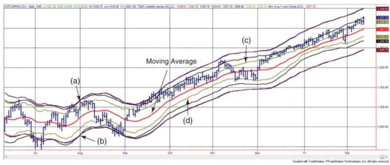
FIGURE 8.5 Four volatility bands around a 20-day moving average, based on (a) \(2 \%\) of the trendline, (b) \(2 \%\) of the price, (c) 2 x average true range, and (d) annualized 20 -day volatility.
In Figure 8.5 the center line is a 20-day moving average. The first two methods of calculating bands, the percentage of trendline and percentage of price, are almost identical, very smooth, and are the farthest from the center. The next band closer to the moving average is the average true range. It moves slightly farther apart when prices are more volatile. The band closest to the trendline is the standard deviation, which is more sensitive to price volatility. Because the same scaling factor produces bands that are different for each method, their benefits are difficult to compare. By changing the scaling factors, we might make them all look alike.
It may be convenient to have separate exit and entry
bands, the entries less sensitive than the exits so that the strategy exits quickly but enters slowly. Or, if the entry occurs on a penetration of the band, but the exit is based on the trendline, then trades are not reversed from long to short. That improves slippage because only half the number of shares or contracts are traded on each order and some false signals may be avoided. When trading, be sure to use yesterday's trend calculations with today's prices to get a signal.
\section*{An Adaptive Band for Mean Reversion}
Developed by Lee Leibfarth in 2006, this method creates a band using a double-smoothed exponential that works well for identifying mean-reversion trades. \(\underline{\underline{2}}\) Volatility is measured using an adaptive range, the 5-day EMA of the 5-day EMA of the daily high minus the daily low. Figure 8.6 shows that the bands, called the Adaptive Price Zone (APZ), touch the highs and lows when volatility increases, providing an opportunity for a mean-reversion trade.
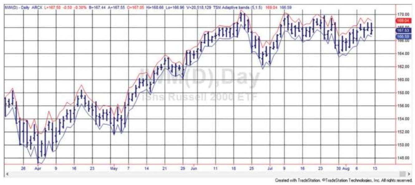
FIGURE 8.6 Adaptive bands constructed using double exponential smoothing shows points where a meanreversion trade can be entered.
\section*{Bollinger Bands}
Both the ATR and the standard deviation of returns or price differences provide the best measures of volatility. The most common calculation period is 20 days. John Bollinger has popularized the combination of a 20-day moving average with bands formed using 2 standard deviations of the price changes over the same 20-day period. They are frequently called Bollinger bands. \({ }^{3}\) Because the standard deviation represents a confidence level, and prices are not normally distributed, the choice of two standard deviations equates to an \(87 \%\) confidence band (if prices were normally distributed, two standard deviations would contain \(95.4 \%\) of the data). Bollinger bands are combined with other techniques to identify extreme price levels. These are discussed later in this section.
Figure 8.7 shows Ford (F) plotted with a traditional Bollinger band. One of the characteristics of this band is that, once the price moves outside either the upper or lower band, it remains outside for a number of days in a row. This type of pattern was typical of what used to be called high momentum. Note that the width of the band varies considerably with the volatility of prices and that a period of high volatility causes a "bubble," which extends past the period where volatility declines. These features and more about volatility will be discussed in Chapter 20.
Figure 8.7 was created using the TradeStation indicator Bollinger Bands, which lets you vary both the calculation period for the trend and the number of standard deviations. But then, if it's not a 20-day average and 2 standard deviations, it's not a Bollinger band.
Bollinger bands can also be applied effectively to multiple time frames. An excellent example that uses a combination of weekly and daily data applied to the S\&P 500 is seen in Figure 8.8. The price pattern follows the weekly Bollinger band higher, where the daily and weekly prices come together during the week of July 14.
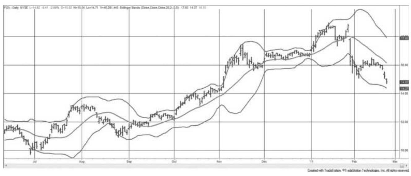
FIGURE 8.7 Bollinger bands applied to Ford.
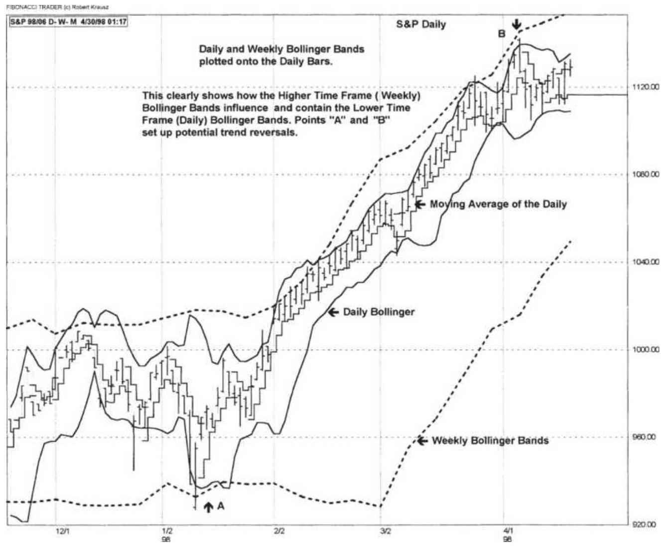
FIGURE 8.8 Combining daily and weekly Bollinger bands.
Source: Chart created using The Fibonacci Trader, by Robert Krausz. Used with permission from Fibonacci Trader Corporation, St. Augustine, FL, www.fibonaccitrader.com.
\section*{Modified Bollinger Bands}
One of the significant problems with Bollinger bands, as well as any volatility measure based on historic data, is that the bands will expand after increasing volatility but are slow to narrow as volatility declines. An excellent correction \({ }^{4}\) for this requires the following calculations
for the center line, \(D\) :
\[
\begin{aligned}
M_{t} & =\alpha \times C_{t}+(1-\alpha) \times M_{t-1} \\
U_{t} & =\alpha \times M_{t}+(1-\alpha) \times U_{t-1} \\
D_{t} & =\frac{(2-\alpha) \times M_{t}-U_{t}}{1-\alpha}
\end{aligned}
\]
where \(C\) is the closing price and \(\alpha\) is the smoothing constant, set to 0.15 to approximate a 20 -day moving average. To correct the bulge in the bands following a volatile period, the upper and lower bands ( \(B U\) and \(B L\) ) are calculated as:
\[
\begin{aligned}
m_{t} & =\alpha \times\left|C_{t}-D_{t}\right|+(1-\alpha) \times m_{t-1} \\
u_{t} & =\alpha \times m_{t}+(1-\alpha) \times u_{t-1} \\
d_{t} & =\frac{(2-\alpha) \times m_{t}-u_{t}}{1-\alpha} \\
B U_{t} & =D_{t}+f \times d_{t} \\
B L_{t} & =D_{t}-f \times d_{t}
\end{aligned}
\]

where \(f\) is the multiplier for the width of the band, suggested at 2.5 compared to Bollinger's 2.0. Figure 8.9 shows the modified Bollinger bands along with the
original (lighter lines) for gold futures during the first part of 2009. While the new bands do not remove the bulge, they are faster to correct and more uniform in the way they envelop prices. Programs to calculate and display the original and modified bands are TSM
Bollinger bands and TSM Bollinger Modified, available on the Companion Website.
\section*{Rules for Using Bands}
Regardless of the type of band that is constructed, rules for using bands to generate trading signals are similar. The first decision to be made is whether trading strategy is a reversal strategy, changing from long to short and back again as the bands are penetrated. If so, the following rules apply:
- Buy (close out shorts and go long) when the prices close above the upper band.
- Sell short (close out longs and go short) when the prices close below the lower band.
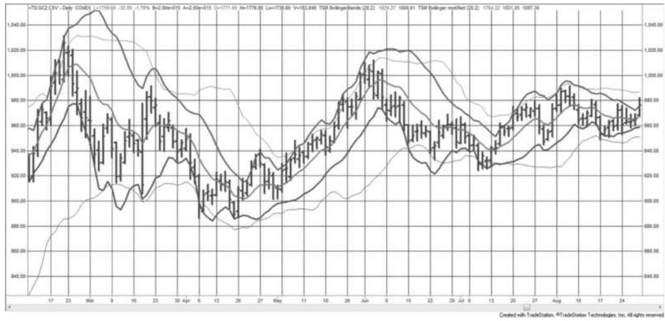
FIGURE 8.9 Modified Bollinger bands shown with original bands (lighter lines), applied to gold futures, February-August 2009.
Buy when prices move up through band
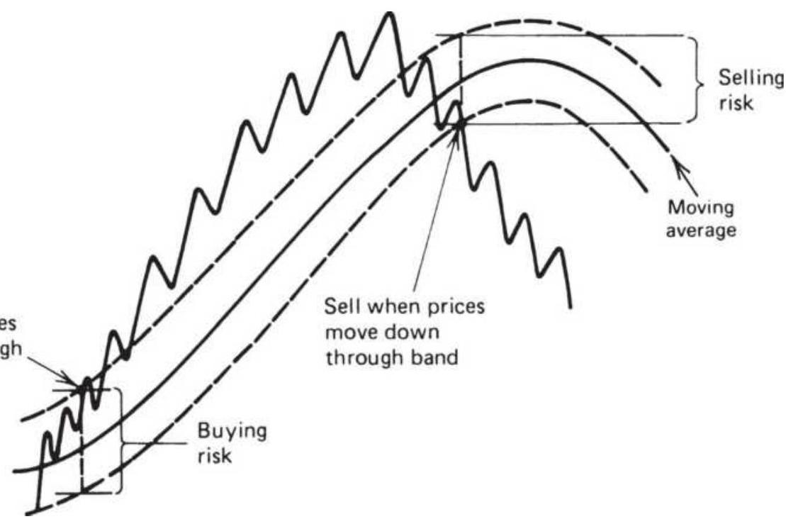
FIGURE 8.10 Simple reversal rules for using bands.
This technique is always in the market with a maximum risk equal to the width of the band, which changes each day (see Figure 8.10). Alternatively, you may prefer to exit from each trade when prices cross the trendline midway between the bands.
- Buy (go long) when prices close above the upper band. Close out longs when prices reverse and close below the moving average trendline (the center of the band).
- Sell short when prices close below the lower band. Cover your shorts when prices close above the moving average trendline.
The band is then used to enter into new long or short
trades, and the trendline at the center of the band is used for liquidation. If prices are not strong enough to penetrate the opposite band on the close of the same day, the trade is closed out but not reversed. The next day, penetration of either the upper or lower band will signal a new long or short trade, respectively. If you are trading a trending market, then using the high of the day for the longs and the lows for the shorts should produce some extra profits.
This technique allows a trade to be reentered in the same direction in the event of a false trend change. If a pullback occurs after a close-out while no position is being held (as shown in Figure 8.11), an entry at a later date might be at a better price. It also reduces the order size by \(50 \%\), which is likely to improve the execution price and add liquidity for large traders.
Using the trendline as an exit, risk is limited to half of the full band width. If the bands are narrow, there is a greater chance that an entry on an intraday high might also see an exit below the trendline on the close of the same day.
\section*{The "Squeeze"}
Bollinger band squeeze is a variation on compression but measures the narrowing of the Bollinger bands. Wait until the Bollinger band compresses to some percentage of the average, for example, \(50 \%\), then buy or sell a new breakout through the bands. Compression has a history of success as a filter and trading on the same side as the trend often shows an improvement in performance. 5
\section*{Bollinger on Bollinger Bands}
While most trading strategies buy when there is an upward penetration of the top band and sell when prices move below the lower band, the use of Bollinger bands is usually mean-reverting, or counter to the price direction. This can be risky, especially when prices are volatile. To reduce this risk, Bollinger recommends confirming a downside penetration using other indicators, primarily those based on volume and market breadth. If prices are moving lower but volume is not increasing, and negative breadth is not confirming the downward move, then a buy signal is realistic. 6
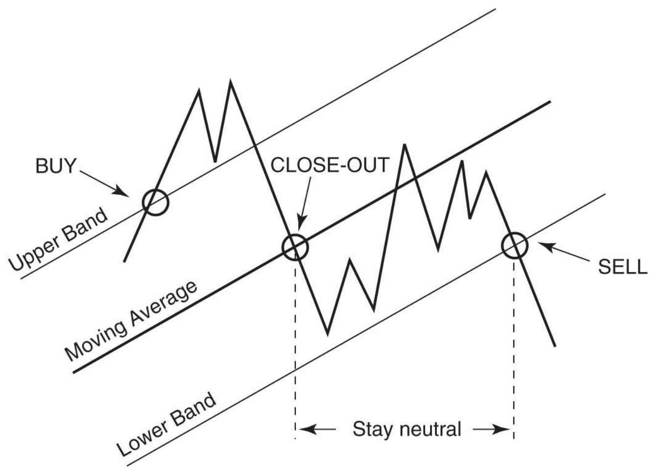
FIGURE 8.11 Basic rules for using bands.
Bollinger uses the concept that volatility is cyclic, but
without a regular period. He sees very low volatility as a forecast for high volatility and very high volatility forecasting low volatility, similar to the way traders use VIX, the CME Volatility Index. He calls this "extreme seeking." Based on this, a major price rally with dramatically higher volatility, which expands the bandwidth to extremes, should be sold when the bandwidth begins to narrow. This only applies to upward price moves.
\section*{Combining Bollinger with Other Indicators}
Williams \({ }^{7}\) suggests that other indicators can be combined to capture volatile moves after a price contraction:
1. A standard 20-day, 2 standard deviation Bollinger band
2. A 20-day Keltner Channel
3. A 21-day Chaikin Oscillator to monitor the flow of funds
To enter a long position, the following conditions must be satisfied:
- The Bollinger bands narrow so they are fully inside the Keltner Channel while the Chaikin oscillator is below zero.
■ The Chaikin Oscillator crosses above the zero line. For short sales:
- The Bollinger bands narrow so they are fully inside the Keltner Channel while the Chaikin oscillator is
above zero.
- The Chaikin Oscillator crosses below the zero line.
\section*{The Compromise between Reliability and Smaller Profits}
As with most trading techniques, the benefits of one approach can also have negative factors. The use of a band around a trendline improves the reliability of the trading signal and reduces the total number of signals. The wider the band, the fewer signals. Both of these characteristics are significant benefits. But wider bands mean delayed entries; therefore, you cannot capture as much of the trend and the average profits will be smaller. If the bands are too wide, then profits can disappear. The use of wider bands also means greater risk on each trade. It will be necessary to trade smaller positions or capitalize the account with a larger investment.
These are serious choices that must be made with every trading program. Although there are classic solutions to this problem discussed in Chapters 23 and 24, traders must choose the methods that complement their risk preference.
\section*{CHOOSING THE CALCULATION PERIOD FOR THE TREND}
For any trend technique, the selection of the calculation period - the interval over which you will define the trend - is the most important decision in the ultimate success of the trading system. Entry rules, profit-taking, and
volatility filters are improvements, but will rarely change a losing trend into a profitable one. Deciding the calculation period is more important than the method of identifying the trend. You can be profitable using a simple moving average, regression, breakout, or any other technique - if you can settle on the right calculation period.
The previous sections have used examples of calculation periods without any claim that one interval was better than another. We have discussed that the long-term trend tracks government interest rate policy or economic growth; therefore, there is good reason to choose a longer calculation period. We also saw that the trends were clearer when looking at a weekly chart rather than daily, and it was not clear that an intraday chart had any persistent trends. But for most traders, the risks associated with using a longer time frame are unacceptable; they prefer smaller profits and smaller losses associated with faster trading. Most strategy development software makes it easy to test a range of calculation periods to find the one that performed best in the past. This technique is called optimization and is discussed in Chapter 21. But the power of the computer is not always as good as human reasoning and common sense. The computer is best for validating an idea, not for discovering one.
Before the computer, analysts struggled with the same problem of finding the best calculation period. At first the trend period was based on multiples of calendar periods, such as a week or a month, expressed as trading days. Before 1980, these approaches were very
successful. Many traders still subscribe to the idea that certain time intervals have intrinsic value. The most popular calculation periods have been: 3 days, the expected duration of a short price move; 5 days, a trading week; 20 to 23 days, a trading month; 63 days, a calendar quarter; and of course, 252 days, a calendar year. Implied volatility calculations traditionally use 20 days. It is not clear where the 200-day moving average, used for stocks, came from, but even numbers have always been popular.
More recently, a class of adaptive trends has appeared. These attempt to change the speed of the trend based on a characteristic of price movement, such as volatility or noise. These techniques are another alternative to optimization and are discussed in Chapter 17.
\section*{A FEW CLASSIC SINGLE-TREND SYSTEMS}
The following section includes classic examples of wellknown systems that use a single trend.
\section*{A Simple Momentum System}
In Chapter 7 the \(n\)-day momentum was defined as the change in price over \(n\) days. The simplest trend system is the one that buys when the \(n\)-day change is positive and sells when the \(n\)-day change is negative. For large values of \(n\), the results will be surprisingly similar to a simple moving average system using the same entry and exit rules; therefore, we will not give examples here. Keep in
mind that momentum can be effective even as it is very simple.
\section*{A Step-Weighted Moving Average}
In 1972, Robert Joel Taylor published the "Major Price Trend Directional Indicator" (MPTDI), which was reprinted in summary form in the September 1973 Commodities Magazine (now Modern Trader). The system was tested in 1972 on historical data provided by Dunn and Hargitt Financial Services in West Lafayette, Indiana. It was one of the few well-defined published systems and served as the basis for much experimentation.
MPTDI is a moving average with a band. Its unique feature is that the calculation period and band width changed based on price volatility, defined as the current trading range. Because the method has distinct trading range thresholds (called steps), the method is called a step-weighted moving average. It is unique in its complete dependence on incremental values for all aspects of the system: the moving average, entry, and stop-loss points. For example, Table 8.6 shows what conditions might be assigned to gold.
\section*{TABLE 8.6 MPTDI Variables for gold.*}
\begin{tabular}{|l|c|c|c|c|}
\hline \begin{tabular}{l}
Average \\
Trading \\
Range
\end{tabular} & \begin{tabular}{c}
Number of \\
Days in \\
Calculation
\end{tabular} & \begin{tabular}{c}
Weighting- \\
Frogrestors
\end{tabular} & \begin{tabular}{c}
Entry \\
Signal
\end{tabular} & AI \\
\hline \(50-150\) & \(2-5\) days & TYPE A & 100 pts & \\
\hline \(150-250\) & 20 days & TYPE B & 200 pts & \\
\hline
\end{tabular}
\begin{tabular}{|l|c|c|c|c}
\hline \(250-350\) & 15 days & TYPE C & 250 pts & \\
\hline \(350-450\) & 10 days & TYPE D & 350 pts & \\
\hline \(450+\) & .5 days & TYPE E & 450 pts & \\
\hline
\end{tabular}
\({ }_{-}^{*} 100\) points \(=\$ 1\) per ounce.
If gold were trading in an average range of 250 to 350 points each day ( \(\$ 2.50\) to \(\$ 3.50\) per ounce, but remember this was 1972), the weighting factor for the moving average would be TYPE C, indicating medium volatility (TYPE A is lowest). Using TYPE C with a 15 -day moving average, the most recent 5 days are given the weight 3 , the next 5 days 2 , and the last 5 days are weighted by 1 . The entry signals use the corresponding penetration of 250 points above the moving average for a buy and 250 below for a sell. The intraday highs or lows are used to trigger the entry based on values calculated after the close of trading on the prior day. A stop-loss is fixed at the time of entry equal to the value on the same line as the selected volatility. The penetration of the stop-loss will cause the liquidation of the current trade. A new signal in the reverse direction will serve as both the exit for the current trade and the entry for a new trade.
There is a lot to say in favor of the principles of MPTDI. It is individualized with respect to markets and selfadjusting to changing volatility. Prices are step-weighted, given more importance to more recent data. The stoploss limits the risk of the trade. The fixed risk differs from moving averages using bands based on volatility because they back away as volatility increases. But there
are some rough edges to the system. The incremental ranges for volatility, entry points, and stops seem to be a crude measure. Even if they are accurate in the center of the range, they must get less accurate at the extremes where volatility causes an abrupt change in parameter values when it moves from one range to another.
MPTDI sets the groundwork for a smoother, more adaptive process. Before such a process can be developed, however, it is necessary to study price movement at discrete levels, such as those shown in MPTDI. From discrete relationships it is possible to generalize a continuous relationship. These adaptive methods are covered in Chapter 17.
\section*{The Volatility System}
Another method that includes volatility and is
computationally simple is the Volatility System. \({ }^{8}\) It is an early use of the average true range (ATR). Signals are generated when a price change is an unusually large move relative to the ATR, calculated over \(n\) days as:
\[
A T R_{t}=\frac{1}{n} \sum_{\mid=1=n+1} T R_{l}
\]
where \(T R_{i}\) is the true range on day \(i\). The average true range was defined in Chapter 5. For a calculation period of \(n\) days, the trading rules are given as:
Sell if the close drops by more than \(k \times \mathrm{ATR}_{t-1}\) from the previous close.
Buy if the close rises by more than \(k \times \mathrm{ATR}_{t-1}\) from the previous close.

The value of \(k\) is generally about 2.0 . There are few trades but high reliability. What is particularly interesting about the volatility system is that the trend is defined only by a large move. When there is a price shock, the following movement is in the direction of the shock. You can test this using TSM Volatility System on the Companion Website.
\section*{The 10-Day Moving Average Rule}
The most basic application of a moving average system was proposed by Keltner in his 1960 publication, How to Make Money in Commodities. His choice of a moving average calculation period was based solely on experience. The system itself is simple, a 10-day moving average applied to the average of the daily high, low, and closing prices, with a band on each side formed from the 10-day moving average of the high-low range (similar to a 10-day average true range). A buy signal occurs when the price crosses above the upper band and a sell signal when the price crosses below the lower band; positions are always reversed.
The 10-Day Moving Average Rule is an early example of a volatility band. Keltner preferred this particular technique because it identifies minor rather than medium- or long-term trends, and there are some performance figures that substantiate his conclusion. A side benefit to the selection is that the usual division
required by a moving average calculation can be substituted by a simple shift of the decimal place; in an era before the pocket calculator, who knows how much impact that convenience had on Keltner's choice?
The price history now shows us that price movement was much smoother up to the end of the 1970s and has been getting noisier ever since. A 10-day moving average, supplemented by a volatility band, was truly the state-ofthe-art technology. While the shorter calculation periods are not generally successful for current price moves, the use of volatility to create bands has held up well over time.
\section*{TRIX , Triple Exponential Smoothing}
A triple exponential smoothing technique that was first described by Hutson \({ }^{9}\) has gained popularity over the years. Called TRIX, it first takes the natural log of the price to account for growth and then applies an exponential smoothing three times using the same smoothing constant. A buy signal is generated when the triple-smoothed trendline rises for two consecutive days; a sell signal occurs when the trendline falls for two days in a row. The exponential smoothing process usually starts by setting the initial trend value to the current price, \(E 1_{0}=P_{0}\), but in this case \(E 1_{0}=\ln p_{0}\). The rest of the process is:
\[
\begin{aligned}
E 1_{t} & =E 1_{t-1}+s \times\left(\ln p_{t}-E 1_{t-1}\right) \\
E 2_{t} & =E 2_{t-1}+s \times\left(E 1_{t}-E 2_{t-1}\right) \\
E 3_{t} & =E 3_{t-1}+s \times\left(E 2_{t}-E 1_{t-1}\right) \\
T R I X & =\left(E 3_{t}-E 3_{t-1}\right) \times 10000
\end{aligned}
\]
This original approach has seen some variations over the years. The most significant is not using the natural log of prices but changing the final step to a percentage change. The percentage change at the end speeds up the process. The smoothing constant should represent a short time period, between 3 and 20 days but recommended as 6 days. The number of days is converted to a smoothing constant using \(s=2 /(n+1)\). The alternative calculation is:
\[
\begin{aligned}
E 1_{t} & =E 1_{t-1}+s \times\left(p_{t}-E 1_{t-1}\right) \\
E 2_{t} & =E 2_{t-1}+s \times\left(E 1_{t}-E 2_{t-1}\right) \\
E 3_{t} & =E 3_{t-1}+s \times\left(E 2_{t}-E 1_{t-1}\right) \\
T R I X_{t} & =\left(E 3_{t}-E 3_{t-1}\right) / E_{t-1}
\end{aligned}
\]
A signal line is created by taking the 3 -day moving average of the TRIX values. A buy occurs when TRIX crosses above the signal line and a sell when it crosses below the signal line. Using a signal line is a technique
that will be seen with other momentum indicators, such as the MACD.
A 9-day TRIX is shown in the lower part of Figure 8.12 corresponding to the price of euro currency futures in 2013. The final step that takes the difference between the current and previous TRIX value removes the lag that would be expected, yet it is still reasonably smooth. Price peaks and TRIX peaks are nearly at the same place. The effect of the weighting on price data caused by double and triple smoothing was discussed in Chapter 7.
Readers who are interested in similar methods should refer to Blau's True Strength Index and True Directional Movement.
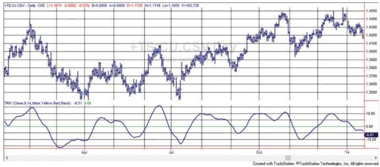
FIGURE 8.12 A 9-day TRIX based on euro futures shows that a triple smoothing does not create the lag that would be expected.
\section*{COMPARISON OF SINGLE-TREND SYSTEMS}
Trend strategies dominate the world of algorithmic trading and managed futures in particular. But which method is the best? There are many rules that can be added to a basic trend strategy, including stop-losses, profit-taking, and entry timing, that change both the return and the risk profile. There are cases where an underlying losing strategy can be turned profitable by risk management or clever timing rules; however, it is always best to start with a sound trend-following method that is profitable without add-ons and has the risk characteristics most acceptable to you.
This chapter will not draw conclusions about which trending method is best. It may be that there is no best strategy, only trade-offs between risk and reward, fast or slow. By testing a small sample of markets for the same data interval and of the same calculation period, we can understand how the major trending methods differ, especially in their risk profiles. The most popular approaches, two event-driven trends (discussed in Chapter 5) and four time-driven trends, are:
1. \(M\), an \(N\)-day momentum
2. \(M A\), a simple moving average
3. EXP, exponential smoothing
4. \(B O, N\)-day breakout
5. \(S W G\), swing breakout
6. LRS, linear regression slope
The markets used will be IBM, Ford, and Bank of America representing the equities, and Eurodollar
interest rates, the emini S\&P, the euro currency, and crude oil futures markets. The data for equities has been adjusted for splits and the futures are continuous, backadjusted contracts. Neither of these data adjustments affects the trend calculations or trading signals. The time period will be 1991 to 2018 for futures and 2000 to 2018 for stocks. Position sizes will be variable based on an investment of \(\$ 25,000\) for futures and \(\$ 10,000\) for stocks. A cost of \(\$ 8\) per trade for stocks and \(\$ 8\) per side per contract for futures will reduce the returns.
In Chapter 21 we will explore testing in depth, looking at the pattern of returns for different stocks and futures,
and selecting the best parameters. Here, we are interested in the risk-and-reward profiles of these methods. It is one way a trader can decide if she can feel comfortable trading that system. A different calculation period will be used for some of the markets because some trend better than others.
\section*{Trading Rules}
To see the characteristics of each system, the trading rules will be as simple as possible. Only the basic buy and sell signals will be used (where sell is both exiting longs and selling short). All six systems are always in the market. There are no stop-losses or other risk controls; therefore, each system will show its own, natural risk profile. All entries and exits are done at the current closing price. While it is more realistic to trade stocks on the next open, futures trade nearly 24 hours each day and you cannot run your system, produce trading signals, and execute orders before the next open, which
is 30 minutes after the close. Understanding that, an execution on the current close will be the fairest way to compare systems across markets.
The following is a brief description of the type of system, calculation method, and trading rules. Note that, for MA, EXP, and LRS, the trading signal is based on the direction of the trendline.
1. \(M, N\)-day momentum
a. Buy when close \(_{t}>\) close \(_{t-n}\)
b. Sell when close \(_{t}<\) close \(_{t-n}\)
2. MA, Simple moving average
a. Buy when \(M A_{t}>M A_{t-1}\)
b. Sell when \(M A_{t}<M A_{t-1}\)
3. EXP, Exponential smoothing
a. Buy when \(\operatorname{Exp}_{t}>\operatorname{Exp}_{t-1}\)
b. Sell when \(\operatorname{Exp}_{t}<\operatorname{Exp}_{t-1}\)
4. \(B O, N\)-day breakout
a. Buy when

close \(_{t}>\) close \(_{t-1}\)
b. Sell when low \(<\) lowest(low, \(t-1\), and close \(_{t}<\) close \(_{t-1}\)
5. SWG, Swing breakout
a. Buy when the current swing high \(>\) previous swing high
b. Sell when the current swing low < previous swing low
6. \(L R S\), Linear regression slope
a. Buy when Slope(close,t,n) > 0
b. Sell when Slope(close,t,n) < 0
In the rules described above, the functions highest, lowest, and slope use the parameters (price, current day, calculation period), then highest(high, t.-.1, n) will return the highest high for the \(n\) days ending on the previous day, t.-.1.
\section*{Spreadsheet Calculations}
A spreadsheet is an easy way to see the returns of all but the swing method. The function OFFSET allows the calculation period (located in F3) to be changed, resulting in all calculations and returns changing. It is a simple way of allowing different calculation periods to be tested. The calculations for the other five systems can be done in a single column, using the following setup and instructions:
1. Column A is the date.
2. Columns B, C, D, and E are the open, high, low, and closing prices.
3. F3 has the calculation period that will be used for all
five strategies.
4. Column F calculates the momentum as \(=\mathrm{E} 163\) OFFSET(E163,-\$F\$3+1,o). Calculations begin in row 163 because there will be a maximum of 160 days allowed.
5. Column G is the moving average =AVERAGE(E163:OFFSET(E163,-\$F\$3+1,o)).
6. Column H is the exponential smoothing, \(=\mathrm{H} 162+\$ \mathrm{H} \$ 3 *\) (E163-H162). Cell \$H\$3 = 2/(F2 + 1), the standard conversion from days to smoothing constant.
7. Column I is the regression slope =SLOPE(E163:OFFSET(E163,\$F\$3+1,o),A163:OFFSET(A163,-\$F\$3+1,o)).
8. Column \(J\) records if the most recent breakout is up \((+1)\) or down \((-1)\)
\(=\) IF(E163 \(>\) MAX(E162:OFFSET(E162,\$F\$3+1,o)),1,IF(E163<MIN(E162:OFFSET(E162,\$F\$3-1,o)),-1," ")).
The next five columns, \(\mathrm{K}-\mathrm{O}\), show the continuous trend direction ( +1 or -1 ) based on the calculations in \(\mathrm{F}-\mathrm{J}\). Then cell K164 (momentum) \(=\operatorname{IF}(\mathrm{F} 164>\mathrm{F} 163,1,-1)\). Once there is an initial direction, the cells are either +1 or -1 . The breakout strategy, column J, takes 77 days before the first trend can be identified.

The last five columns give the cumulative profit or loss in points; that is, there is no conversion to dollars. Cell P165=K164*(\$E165-\$E164)+P164. For the
Eurodollar interest rates, the futures market conversion is \(\$ 2,500\) per big point. Then a move from 97.00 to 98.00 is worth \(\$ 2,500\). Results for one futures market and one stock, the S\&P and AAPL, can be found in three spreadsheets, TSM Trend Systems Comparisons SP and TSM Trend Systems Comparisons AAPL, available on the Companion Website. The programs TSM Trends, TSM Swing, and TSM Momentum were used to produce the results that follow.
\section*{Results for Futures}
Table 8.7 is a summary of the futures market results. The calculation periods, shown with the system name in column B, are different for most of the markets. Those with stronger trends have longer periods, although all are quite long. The swing filter varies the most and is larger when a market has more noise and smaller when it has more trend. In column K, the ratio is the Total PL ( Col C) divided by the Max Drawdown ( col J ). It is a good measure of success.
\section*{TABLE 8.7 Summary of futures market results.}
\begin{tabular}{|c|c|c|c|c|c|c|c|c|c|c|}
\hline A & B & C & D & E & F & G & H & 1 & J & K \\
\hline & System & Total PL & Long PL & Short PL & Profit & Trades & \begin{tabular}{|l|}
\%Prof \\
Trades
\end{tabular} & \begin{tabular}{l}
Days \\
Held
\end{tabular} & Max Draw & Ratio \\
\hline \multirow[t]{6}{*}{ Eurodollars } & MA 160 & \$7,982,720 & \$6,779,769 & \$1,202,951 & 4.61 & 102 & 34.3 & 69.4 & \((\$ 670,906)\) & 11.90 \\
\hline & BO 160 & \$7,526,277 & \$6,972,466 & \$553,811 & 7.33 & 20 & 65.0 & 349.3 & \((\$ 700,168)\) & 10.75 \\
\hline & LRS 160 & \$6,806,003 & \$6,368,009 & \$437,994 & 4.53 & 26 & 50.0 & 269.3 & \((\$ 1,030,097)\) & 6.61 \\
\hline & EXP 160 & \$6,797,150 & \$6,002,226 & \$794,924 & 3.68 & 140 & 22.1 & 50.8 & \((\$ 808,109)\) & 8.41 \\
\hline & Swing 2\% & \$3,905,013 & \(\$ 4,231,857\) & \((\$ 326,844)\) & 1.64 & 282 & 37.2 & 25.7 & (\$732,784) & 5.33 \\
\hline & MOM 160 & \$7,629,409 & \$6,943,497 & \$685,913 & 4.79 & 101 & 34.6 & 68.4 & (\$641,178) & 11.90 \\
\hline \multirow[t]{6}{*}{ emini S\&P } & MA 160 & \$2,332,118 & \$3,321,853 & \((\$ 989,735)\) & 1.62 & 181 & 28.7 & 39.6 & (\$1,352,180) & 1.72 \\
\hline & BO 160 & \(\$ 2,888,153\) & \$3,645,825 & (\$757,672) & 2.37 & 27 & 44.4 & 256.0 & \((\$ 1,240,622)\) & 2.33 \\
\hline & LRS 160 & \(\$ 5,182,348\) & \$5,359,980 & \((\$ 177,632)\) & 4.28 & 30 & 43.3 & 233.8 & \((\$ 1,664,422)\) & 3.11 \\
\hline & EXP 160 & \$1,832,050 & \$3,061,964 & \((\$ 1,229,914)\) & 1.38 & 287 & 15.0 & 25.3 & ( \(\$ 990,873\) ) & 1.85 \\
\hline & Swing 9\% & \$3,399,836 & \$3,093,387 & \$306,449 & 5.55 & 22 & 45.4 & 293.3 & \((\$ 896,000)\) & 3.79 \\
\hline & MOM 160 & \$1,878,236 & \(\$ 2,813,001\) & (\$934,765) & 1.51 & 179 & 29.0 & 37.2 & \((\$ 1,338,172)\) & 1.40 \\
\hline \multirow[t]{6}{*}{ Euro } & MA 120 & \$2,658,518 & \$1,116,006 & \$1,542,512 & 1.62 & 210 & 33.8 & 34.2 & (\$1,039,919) & 2.56 \\
\hline & BO 120 & \$2,927,716 & \$1,629,240 & \$1,298,477 & 2.16 & 34 & 47.1 & 206.1 & \((\$ 1,219,941)\) & 2.40 \\
\hline & LRS 120 & \$3,462,645 & \$1,593,347 & \$1,869,299 & 2.33 & 52 & 48.1 & 135.1 & \((\$ 1,080,985)\) & 3.20 \\
\hline & EXP 120 & \(\$ 3,075,915\) & \$1,635,219 & \$1,440,696 & 1.58 & 362 & 17.4 & 20.3 & \((\$ 1,195,265)\) & 2.57 \\
\hline & Swing 2\% & \$4,852,806 & \(\$ 2,608,670\) & \(\$ 2,244,136\) & 2.18 & 159 & 47.2 & 44.3 & (\$699,124.50) & 6.94 \\
\hline & MOM 120 & \$2,609,894 & \$1,148,758 & \$ \(\$ 1,461,136\) & 1.61 & 209 & 33.4 & 34.2 & \((\$ 1,032,175)\) & 2.53 \\
\hline \multirow[t]{6}{*}{ Crude } & MA 100 & \$4,871,166 & \$3,439,154 & \$1,432,012 & 2.01 & 259 & 35.1 & 27.8 & (\$1,342,802) & 3.63 \\
\hline & BO 100 & \$5,258,306 & \$4,064,040 & \$1,194,266 & 3.11 & 36 & 33.3 & 192.6 & \((5976,864)\) & 5.38 \\
\hline & LRS 100 & \$4,137,986 & \$3,003,342 & \$ \(1,134,644\) & 2.30 & 63 & 36.5 & 111.3 & \((\$ 1,252,882)\) & 3.30 \\
\hline & EXP 100 & \$3,563,194 & \$2,592,276 & \(\$ 970,918\) & 1.68 & 349 & 20.0 & 20.9 & \((\$ 940,706)\) & 3.79 \\
\hline & Swing 4.5\% & \$4,553,426 & \$3,486,558 & \$1,066,868 & 2.32 & 114 & 38.6 & 61.9 & ( \(\$ 840,402)\) & 5.42 \\
\hline & MOM 100 & \$4,861,582 & \$3,375,746 & \$1,485,836 & 2.02 & 258 & 34.9 & 27.9 & \((\$ 1,329,866)\) & 3.66 \\
\hline
\end{tabular}
\section*{The profits and ratios for Eurodollars are far higher than} other markets because it has the strongest trend. On the other end of the spectrum is the \(S \& P\), which has the lowest ratio. The euro currency is fairly trending and shows balanced gains on both long and short positions, while the S\&P strongly favors long positions and crude oil does better long but is also profitable on short sales.
\section*{Looking at the individual systems, exponential} smoothing is consistently a poor choice over the standard moving average, and momentum results are almost identical to the moving average, which was explained when we looked at the calculations in Chapter 7. The swing system has varying results based on the
swing filter - very good for crude oil and the euro, not as good for the Eurodollars and S\&P.
It comes down to the three systems at the top of each group: the moving average, the breakout, and the linear regression slope. Of those, the moving average has far more trades and a much lower percentage of profitable trades, yet for Eurodollars it has the highest ratio.
Otherwise, the linear regression slope has the best overall profile and is generally good for all markets.
You can't really go wrong, whichever method you choose. There is great similarity in the results. Taking only the emini S\&P for the moving average, breakout, regression, and swing methods, Figure 8.13 shows that the returns of all four systems tracked closely until 2000, when the downturn due to the Internet bubble resulted in different patterns. Afterward they continued to track closely. In this case, the linear regression outperformed, but the swing method had the smoothest returns. If you study the other markets, you will find that the best system will vary but most perform similarly. It is more important to select markets that trend than it is picking the "best" system.
FIGURE 8.13 Cumulative profits of S\&P futures for four strategies.
\section*{Results for Stocks}
Based on a \$10,000 investment and data from 1998 through July 2018, the results of the six trend strategies are summarized in Table 8.8. The first observation is that short sales are not profitable, with the exception of General Electric, which has been in a steady decline for years.
Overall, the exponential smoothing does poorly, except for AAPL, and the swing method is erratic. The moving average, breakout, and linear regression all perform well, even though the best performer varies from stock to stock. Figure 8.14 shows the comparative performance, including both long and short positions, of four systems applied to Boeing (BA). While the patterns are very
similar, this time the moving average had the best returns.
\section*{Observations}
By observing the performance pattern of the six systems, we can draw some interesting and valuable conclusions:
- Long-term trend following can be profitable.
- All basic trending strategies are profitable if the market trends.
\section*{TABLE 8.8 Summary of stock market results.}
\begin{tabular}{|c|c|c|c|c|c|c|c|c|c|c|}
\hline A & B & C & D & E & F & G & H & 1 & J & K \\
\hline & System & Total PL & Long PL & Short PL & Profit & Trades & \%Prof & \begin{tabular}{l}
Days \\
Held
\end{tabular} & Max Draw & Ratio \\
\hline \multirow[t]{6}{*}{ AAPL } & MA 120 & \$76,619 & \$84,754 & \((58,136)\) & 2.98 & 119 & 31.9 & 42.9 & \((\$ 22,964)\) & 3.34 \\
\hline & BO 120 & \$124,998 & \$124,582 & \$416 & 11.49 & 17 & 70.6 & 290.9 & \((\$ 40,584)\) & 3.08 \\
\hline & LRS 120 & \(\$ 52,423\) & \$70,524 & \((\$ 18,101)\) & 2.3 & 35 & 45.7 & 143.3 & \((\$ 26,808)\) & 1.96 \\
\hline & EXP 160 & \$84,684 & \$89,447 & \((54,763)\) & 3.07 & 151 & 19.2 & 34.0 & \((\$ 20,489)\) & 4.13 \\
\hline & Swing 6\% & \$49,980 & \$ \(\$ 3,113\) & \((\$ 13,132)\) & 1.63 & 202 & 42.1 & 25.3 & \((\$ 9,491)\) & 5.27 \\
\hline & MOM 120 & \$74,833 & \$82,968 & \((58,136)\) & 2.93 & 118 & 31.4 & 42.6 & \((\$ 22,964)\) & 3.26 \\
\hline \multirow[t]{6}{*}{ BA } & MA 160 & \$54,508 & \$49,696 & \$4,812.33 & 4.58 & 91 & 42.8 & 55.7 & \((\$ 6,667)\) & 8.18 \\
\hline & BO 160 & \$36,122 & \(\$ 36,673\) & (\$550.75) & 4.87 & 13 & 53.8 & 373.8 & \((58,087)\) & 4.47 \\
\hline & LRS 160 & \$36,018 & \(\$ 38,069\) & \((\$ 2,051)\) & 3.69 & 24 & 45.8 & 208.6 & \((56,191)\) & 5.82 \\
\hline & EXP 160 & \$3,897 & \$20,593 & \((\$ 16,696)\) & 1.07 & 273 & 10.2 & 19.2 & \((519,398)\) & 0.20 \\
\hline & Swing 6\% & \$29,205 & \$33,326 & \((\$ 4,120)\) & 1.73 & 104 & 40.4 & 48.2 & ( \(\$ 7,616.8\) ) & 3.83 \\
\hline & MOM 160 & \(\$ 36,750\) & \(\$ 32,443\) & \$4,306 & 3.34 & 89 & 41.6 & 51.5 & \((56,667)\) & 5.51 \\
\hline \multirow[t]{6}{*}{ GE } & MA 160 & \$13,760 & \$8,161 & \$5,599 & 1.57 & 128 & 32.8 & 39.9 & (\$13,793) & 1.00 \\
\hline & BO 160 & \$14,052 & \$6,897 & \$7,155 & 2.36 & 16 & 43.7 & 309.7 & (\$11,751) & 1.20 \\
\hline & LRS 160 & \$18,286 & \$9,878 & \(\$ 8,408\) & 2.84 & 29 & 44.8 & 172.8 & \((56,239)\) & 2.93 \\
\hline & EXP 160 & \(\$ 970\) & \(\$ 885\) & \(\$ 85\) & 1.03 & 224 & 18.7 & 23.2 & \((\$ 10,766)\) & 0.09 \\
\hline & Swing 6\% & \$1,516 & \$698 & \$818 & 1.03 & 107 & 37.4 & 47.1 & (\$14,052) & 0.11 \\
\hline & MOM 160 & \$8,582 & \$8,161 & \(\$ 421\) & 1.36 & 127 & 32.3 & 38.0 & \((\$ 13,793)\) & 0.62 \\
\hline \multirow[t]{6}{*}{ v } & MA 120 & \$23,532 & \$28,345 & \((54,813)\) & 3.03 & 75 & 32.0 & 33.2 & \((59,199)\) & 2.56 \\
\hline & BO 120 & \$21,827 & \(\$ 28,598\) & \((\$ 6,770)\) & 4.12 & 8 & 62.5 & 301.5 & \((57,190)\) & 3.04 \\
\hline & LRS 120 & \$24,330 & \(\$ 28,745\) & \((\$ 4,415)\) & 5.79 & 14 & 35.7 & 173.5 & \((56,831)\) & 3.56 \\
\hline & EXP 160 & \(\$ 5,256\) & \$17,842 & \((512,586)\) & 1.21 & 97 & 11.3 & 25.9 & (\$12,664) & 0.41 \\
\hline & Swing 6\% & \$9,380 & \$17,505 & \((58,126)\) & 1.62 & 42 & 40.5 & 55.7 & \((\$ 6,486)\) & 1.45 \\
\hline & MOM 120 & \$15,479 & \$20,375 & \((54,896)\) & 2.33 & 73 & 30.1 & 28.4 & \((\$ 9,199)\) & 1.68 \\
\hline
\end{tabular}
- Exponential smoothing has the poorest performance.
Momentum is very similar to a moving average, but the moving average is the better choice.
Any one of the four systems shown in Figures 8.13 and 8.14 could be the best performer for a selected futures market or stock.
A larger percentage of profitable trades is associated with fewer trades and higher risk.
Short sales in equities are not generally profitable.
When adding other features to a system, it needs to be proved that those features improve the results, because the simple approach seems to be very good.
\section*{Looking for Patterns}
In order to explain why long calculation periods were used for the tests shown in the previous examples, it is necessary to preview the explanations that will be found in Chapter 21, "System Testing." Looking first at futures (Figure 8.15), all four markets tend to improve as the moving average calculation periods increase. This is especially clear for the Eurodollars (ED) and the S\&P. We expect that many commodities will have shorter trends than interest rates and FX markets because they are seasonal. The S \& P is the only market posting significant losses using shorter calculation periods, the result of more price noise.
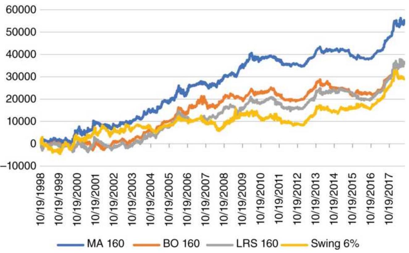
FIGURE 8.14 Results of trend strategies for Boeing (BA) from 1998 through July 2018.
\section*{Net profits long-short}
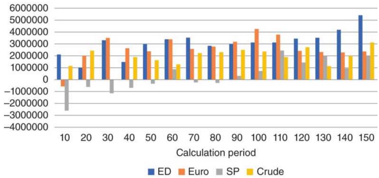
FIGURE 8.15 Moving average net profits from futures, 1998-2018.
Using Amazon (AMZN), Boeing (BA), and Ford (F) for
the moving average tests, we see a more erratic pattern in Figure 8.16, but there is still a tendency for improved returns with longer calculation periods. By using the period from 1998 through 2018, two major bear markets and some recently volatile price moves are included. Amazon has been in a long and sometimes volatile uptrend in its quest to take over the world, and a longer trend period allows us to hold the position through temporary drawdowns. Boeing has shown good trends and is benefiting from increased geopolitical tension, including the United States and North Korea, Iran, and possibly Russia. Ford has also been doing well since the 2008 financial crisis but favors a mid-range trend. Most stocks favor the long-term trends, although the overall picture is not as uniform as the sample of futures markets because individual stocks have unique personalities.
\section*{Net profits long only}
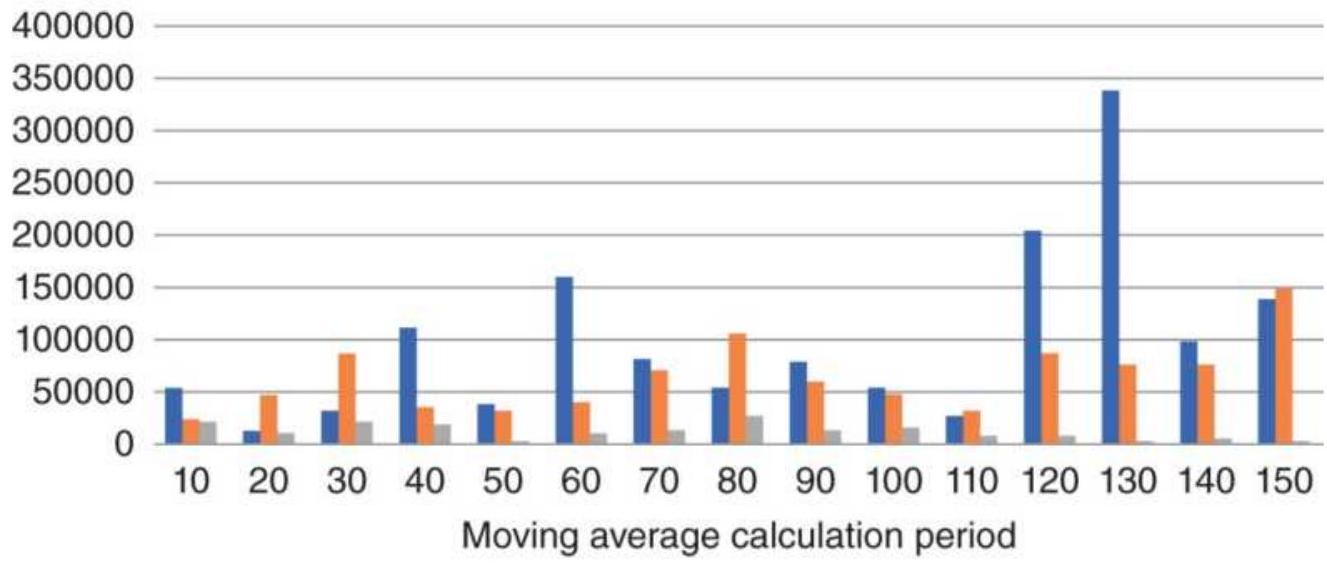
■ AMZN ■BA ■F
FIGURE 8.16 Moving average net profits for selected stocks, 20 years ending December 2018.
\section*{Strategy Comparisons: Stocks}
Can we expect the same results from other trend systems? We already know that when prices trend, we should expect profits from any trending system, but verifying that premise is important.
Starting with stocks, Figures 8.17, \(\underline{8.18}\), and 8.19 show the net profits from testing the moving average, breakout, and linear regression slope for Amazon (AMZN), Boeing (BA), and Ford (F), from 1998 through 2018, with calculation periods from 10 to 150 days, in steps of 10 days. Only long positions were taken due to the upward bias of equities, and the difficulties in capturing short sale profits. The first thing you should see is the overall profitability of all three stocks over all calculation periods for the different trending methods. This fits with the idea that a macrotrend strategy should start at a 40- or 60-day period and go up and that, at any one time, any trending method could be the best.
\section*{AMZN Net profits}
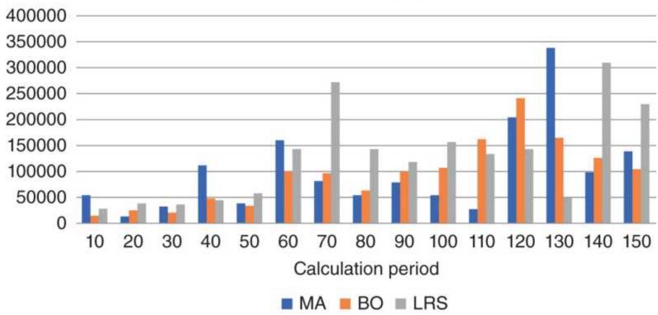
FIGURE 8.17 Amazon (AMZN) net profits from three systems.
\section*{BA Net profits}
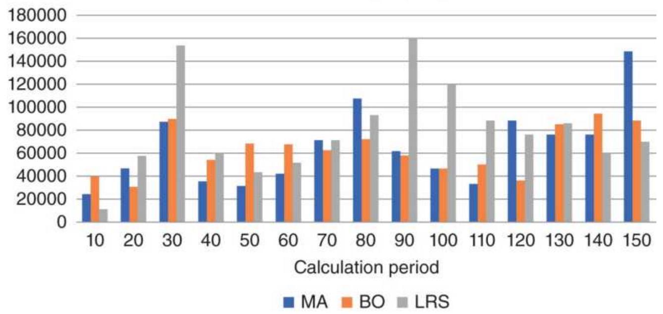
FIGURE 8.18 Boeing (BA) net profits from three systems.
Ford Net profits long only
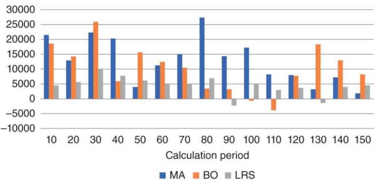
FIGURE 8.19 Ford (F) net profits from three systems.
Next, we look at the way profits distribute. AMZN and
BA favor the longer trends, but F is the opposite, with all techniques favoring much shorter trends. As a trend follower looking for robustness, Ford presents a problem because there is a lack of a long-term trend. If we look at all three tests, each of the systems had periods where they were better than the others. Then, which of the three systems is best?
If we average the results of each system for all markets over all calculation periods, we can get a better idea of overall success. Table 8.9 shows that the regression was generally better but lower for Ford. There will always be exceptions, but all trending systems work in a similar way.
\section*{Strategy Comparisons: Futures}
Futures offer a different type of diversification than stocks. Individual stocks can have very different dynamics and different earnings, but there is an overall similarity in the movement of a large percentage of stocks in the S\&P. When the economy is doing well, there is greater disposable income and more purchasing. When interest rates are lowered, companies pay less to service their debt and consumers pay less to take on more debt.
TABLE 8.9 Summary of system net profits for stocks.
\begin{tabular}{|l|c|c|c|}
\hline & MA & BO & LRS \\
\hline AMZN & 99,794 & 93,841 & 126,489 \\
\hline BA & 65,478 & 63,333 & 80,244 \\
\hline
\end{tabular}
\begin{tabular}{|l|r|r|r|}
\hline F & 13,029 & 10,172 & 4,456 \\
\hline Average & 59,434 & 55,782 & 70,396 \\
\hline
\end{tabular}
Interest rate futures have even more in common, that is, they are more highly correlated. The U.S. 5-year Treasury note will move much the same as the 10-year note. Even European interest rates will move with U.S. rates when there is action by the Fed. We also know that currencies are sensitive to interest rates because money seeks the highest rates, net of inflation. The stock market will also rally on lower rates given good news about the economy. But these futures sectors offer a considerable amount of diversification and have fundamentals that may cause them to make sustained moves not tied to interest rates. Energy and agricultural products have only a distant relationship.
The test results are shown in Figures 8.20 through 8.23 , each the same 20 years of data in which markets saw bull and bear periods, as well as low and high volatility. We should expect patterns to be different for each market.
Starting with Eurodollar futures, which has a very strong trend, we see that longer calculation periods are better for all systems, and there are no periods that generated losses, even net of costs. The breakout system is best for longer term trends, but worse for short periods.
\section*{ED Net profits}
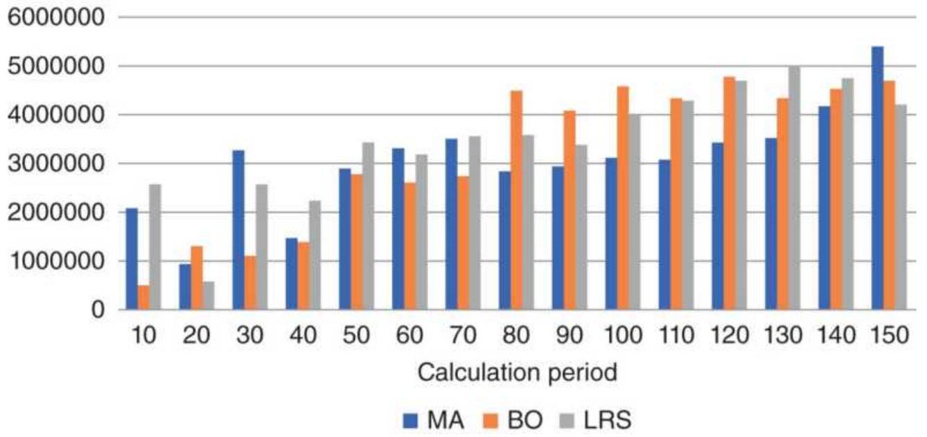
FIGURE 8.20 Eurodollar futures have a strong trend and benefit from any trend method.
\section*{Euro Net profits}
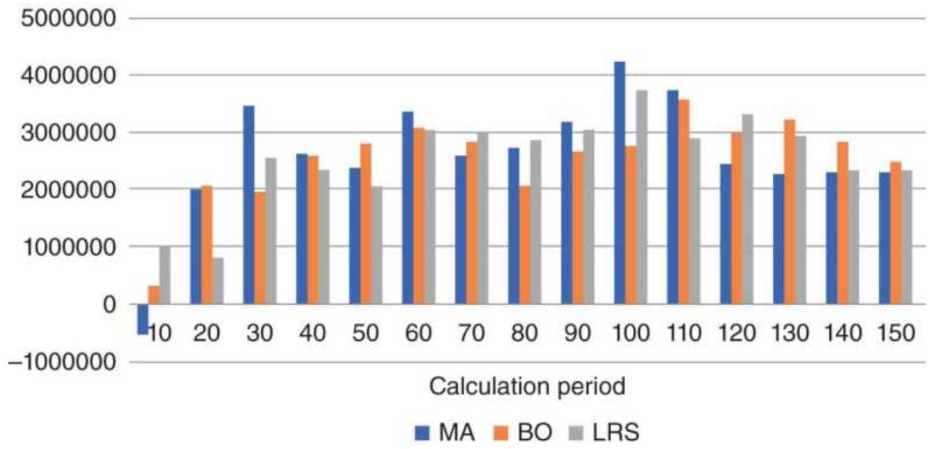
FIGURE 8.21 The euro currency (CU) has a strong trend but performs about the same for most of the calculation periods.
\section*{SP Net profits}
4000000
3000000 2000000 1000000
FIGURE 8.22 emini S\&P futures show a weak longterm trend and excessive noise in the short term.
Euro futures react to interest rates but are also affected by trade policy and geopolitical events. Money will flow into the U.S. when investors think that the stock market will rise or that interest rates are favorable. Nearly all calculation periods were profitable to much the same degree in all systems. It is clear that the euro is a trending market.
The emini S\&P futures - the most active of all markets shows that it has a long-term trend but extreme noise in the short-term; that is, prices rarely move in one direction for more than a few days before a reversal (Figure 8.22). Still, there is an upward bias in the stock market due to broad participation by investors through their retirement accounts. That shows as a long-term trend, but not one that produces large profits. All three trend systems seem to perform about the same.
Crude oil is driven by geopolitical events, OPEC policy, and short-term supply and demand. For years the price sat at \(\$ 20 / \mathrm{bbl}\), ran up to \(\$ 145 / \mathrm{bbl}\) in July 2008, and back to \(\$ 30\). While there is a long-term rise in prices, the volatility of the price swings is best captured with the mid-range calculation periods, shown in Figure 8.23. There is no telling which of the three trends will be best at any one time.
\section*{Crude Net profits}
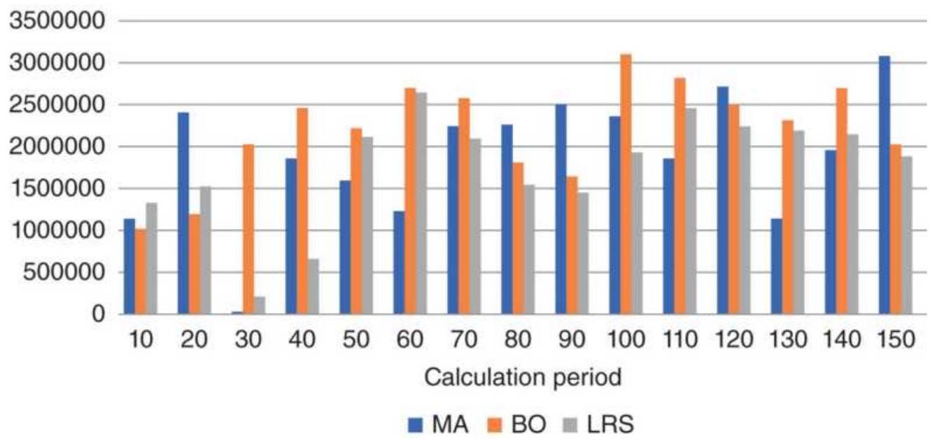
FIGURE 8.23 Crude oil futures (CL) has had wideranging, volatile price moves over the 20-year test period.
Can you tell from looking at the four futures markets, which system is best overall? Table 8.10 shows that the results are very close. The moving average is only best for the euro while the linear regression is best for three markets.
\section*{Making a Decision}
Given these test results, which of these trend methods would you choose? These tests represent only a small sample of markets. It may be that they favored the regression by chance. Perhaps that test period wasn't a good choice. Do you care which system worked best over 20 years, or should you only consider the last five or 10 years?
There is also the risk profile and the percentage of profitable trades. The moving average has many small losses and fewer larger profits. It typically has less than \(35 \%\) profitable trades. At the other extreme, the breakout system has high risk, the difference between the highest high and lowest low over the calculation period, but it may have \(50 \%\) to \(70 \%\) good trades because it allows prices to flop around without reversing the trade. The regression system falls somewhere in between in both risk and percentage of profitable trades.
TABLE 8.10 Average results of the three trend strategies for four sample futures markets.
\begin{tabular}{|l|r|r|r|}
\hline & \multicolumn{1}{|c|}{ MA } & \multicolumn{1}{c|}{ BO } & \multicolumn{1}{c|}{ LRS } \\
\hline ED & \(3,076,472\) & \(3,230,321\) & \(3,478,999\) \\
\hline Euro & \(2,604,648\) & \(2,553,821\) & \(2,555,869\) \\
\hline SP & 308,406 & 545,553 & 647,580 \\
\hline Crude & \(1,896,764\) & \(2,210,268\) & \(1,767,644\) \\
\hline Average & \(1,971,573\) & \(2,134,991\) & \(2,112,523\) \\
\hline
\end{tabular}
There is not going to be one "right" system. Breakouts may be better for intraday trading and moving averages for long-term trends. Regression will be better for
arbitrage and ranking. Each system has a preferred application.
In Chapter 21 we will take a closer look at testing, including parameters other than trend speed. With more information, it will be easier to make a decision.
\section*{Programs for Six Systems}

In addition to a spreadsheet that gives comparative performance for the six systems, there are individual programs on the Companion Website that will provide much more detail: TSM Momentum, TSM Moving Average, TSM Exponential, TSM N-Day Breakout, TSM LinReg Slope, and TSM Swing. There is also one program, TSM Trend, that allows you to choose one or more of the four main systems. In the programs, the momentum, moving average, and exponential get signals from the trendline rather than a price penetration. Each program has useful options.
\section*{TECHNIQUES USING TWO TRENDLINES}
There are situations where two trends of different calculation periods can be an improvement over one trend. It is often the case that there is a dominant, longterm trend driven by government interest rate policy. Trends based on fiscal policy can last for years and can be very persistent. Most traders, however, are not likely to hold a single long-term trade for the full period of its move. Even if convinced of the ultimate outcome of the trade, there can be very large price swings along the way.
These traders would rather enter and exit the market many times, in the direction of the longer-term trend, each time taking a small profit but with much smaller risk. The net result may be lower total profits, but a much more comfortable risk level for each trade.
This problem can be solved with two simple moving averages or a combination of any two trendlines of different speeds. The slower trendline, using a longer calculation period, identifies the primary trend. The faster trendline is used for timing. The faster signal does not have to be a trend at all; it can be pattern recognition or any timing indicator, such as an RSI. In this section, we will use the same trending techniques previously discussed to create a 2 -trend system. To implement this plan apply one of the following sets of rules (also shown in Figure 8.24).
1. Buy when the faster moving average crosses above the slower moving average. Sell short when the faster moving average crosses below the slower moving average.
2. Buy when the current price crosses above both moving averages and close out long positions when prices cross below either moving average. Sell short when the current price crosses below both moving averages and close out short positions when prices cross above either moving average.
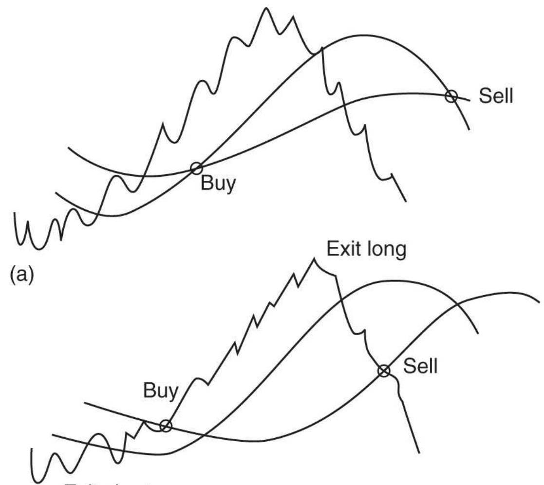
\section*{Exit short}
(b)
(c)
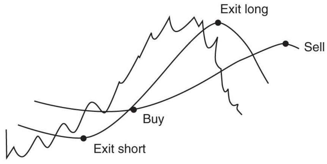
FIGURE 8.24 Three ways to trade using two moving averages. (a) Enter and exit when the trendlines cross. (b) Buy and sell when the price crosses the trendlines, staying out of the market
when prices are between the trendlines. (c) Enter when both trendlines are moving in the same direction; exit when they conflict.
3. Buy when the faster trendline turns up and the slower trendline is up. Sell short when the faster trendline turns down and the slower trendline is down. Exit the trade when the two trendlines are moving in opposite directions.
The first set of rules always has a position in the market, going from long to short and back again as the faster trend crosses the long-term trend. The second and third sets of rules create a neutral zone, where no position is held. Rule 2 attempts to extract the stronger part of the move using price as a trigger while Rule 3 looks for both trendlines to provide confirmation. Exiting a trade, rather than reversing, adds liquidity by reducing the order size and allows you to enter the next trade in the same direction as the previous one, instead of always reversing.
Table 8.11 compares the euro futures using the 120-day moving average shown in Table 8.7 and a 100-day and 30-day crossover using Rule 1 above. The two trend periods for the euro were selected from Figure 8.17b, which has the advantage of hindsight. Still, returns were higher, the ratio was higher, and the number of trades lower, altogether a better profile. It simply means that a trend crossover system is a viable choice.
\footnotetext{
TABLE 8.11 Comparison of a 120-day single moving average with a 100- and 30-day moving average crossover (Rule 1) for the euro futures,
}
1990 -2018.
\begin{tabular}{|c|c|c|c|c|c|}
\hline & System & Total PL & Long PL & Short PL & \begin{tabular}{|c|}
\hline Pro \\
Fact
\end{tabular} \\
\hline ro & MA 120 & \$2,658,518 & \$1,116,006 & \$1,542,512 & 1.6: \\
\hline & \begin{tabular}{l}
MA \\
\(100 \times 30\)
\end{tabular} & \$3,441,223 & \$1,656,150 & \$1,785,073 & 2.0 \\
\hline & & & & & \\
\hline & & & & & \\
\hline & & \ & & u & * \\
\hline & & & & & \\
\hline & & & & & \\
\hline
\end{tabular}
FIGURE 8.25 Moving average crossover for euro futures using 100-day and 30-day periods.
To visualize the way the system works, Figure 8.25 shows both trends with euro prices spanning mid-2010 to mid-2012. The buy and sell signals appear whenever the two trendlines cross.
If the strategy produces too many losses because of trades held only a few days, a small band can be placed around each of the trendlines. Prices must move higher through the upper band before a buy signal occurs and then back through the lower band before that signal is reversed. It is a small safety zone that can eliminate the
frequency of bad trades even when the band is small.
\section*{Donchian's 5- and 20-Day Moving Average System}
The method claiming one of the longest recorded trading histories, beginning January 1, 1961, is Donchian's 5and 20-Day Moving Average. 10 In 1961, when moving averages were considered state-of-the-art, there was less noise, and agricultural markets were the most liquid, this system, the equivalent of a 1 - and 4 -week moving average, would have worked well. Even now, the use of calendar periods - such as 21 and 63 days for a month and a quarter, respectively - may pick up trends driven by the action of major fund managers as they rebalance their portfolio each month while also responding to price direction resulting from quarterly earnings reports.
Donchian's idea was to use a volatility-penetration criterion relative to the 20 -day moving average. The current price penetration must not only cross the 20-day moving average but also exceed any previous 1-day penetration of a closing price by at least one volatility measure. In this way Donchian places a flexible band around the 20 -day trendline. One volatility measure can now be calculated as the average true range over one or more days.
The 5 -day moving average is used for exits (along with others) and is also modified by prior penetration and volatility. These features tend to make Donchian's approach an early rendition of self-adjusting rules. To maintain a human element, Donchian requires execution
of certain orders to be delayed a day if the signals occurred on specific weekdays or before a holiday. These refinements were based on years of actual operation.

Rather than try to implement Donchian's idea exactly, the program TSM Donchian Moving Average System, available on the Companion Website, uses the calculations:
1. A 5 -day moving average
2. A 20-day moving average
3. The average true range based on the longer moving average period
These three calculations are then used with these rules:
- If position is not long and
Close \(_{t}>M A 5_{t-1}+1 \times A T R_{t-1}\) and close \(_{t}>\) MA2O \(_{t-1}+1 \times\) ATR \(_{t-1}\), then buy.
- If position is not short and
Close \(_{t}<M A 5_{t-1}-1 \times A T R_{t-1}\) and close \(_{t}<\) MA2O \(_{t-1}-1 \times A T R_{t-1}\), then sell short.
- If position is long and
\(\left(\right.\) Close \(_{t}<\) MA5 \(_{t-1}-1 \times\) ATR \(_{t-1}\) close \(_{t}<M A 20_{t-1}-1 \times\) ATR \(\left._{t-1}\right)\) , then exit long position.
- If position is short and
\(\left(\right.\) Close \(_{t}>\) MA5 \(_{t-1}+1 \times\) ATR \(_{t-1}\) or close \(e_{t}>\) MA2O \(_{t-1}+1 \times\) ATR \(\left._{t-1}\right)\) , then cover short position.
Because the price level and volatility of the markets have changed dramatically since 1960, new positions should be sized according their volatility:
\section*{Position size \(=\) investment \(/(\) ATR \(\times\) Big Point Value \()\)}
where ATR is calculated over the longer moving average period and the Big Point Value is the conversion factor for a futures contract - for example, \(\$ 50\) for corn and \(\$ 1,000\) for U.S. bonds.

How did this strategy perform? Applying these rules to corn, which would have been the primary market during the 196os, and with \(\$ 8\) per contract per side costs (which were much higher until the mid-1990s), the cumulative profits are shown in Figure 8.26. Although the rate of return has slowed, it seems remarkable that a simple method could have been consistently profitable for 60 years. For those analysts who are interested, the program on the Companion Website allows the calculation periods to change as well as the penetration factor. Only corn was run for this example and no parameters were tested or changed.
FIGURE 8.26 Donchian's \(5^{-}\)and 20-Day Moving Average System (somewhat modernized) applied to corn futures, \(1960-2018\).
\section*{Donchian's 20- and 40-Day Breakout}
One level slower than the \(5^{-}\)and 20-day average is Donchian's 20- and 40-Day Breakout. Instead of 1 week and 1 month, this looks at 1 month and 2 months. The method is far less complicated and only considers simple breakouts and not volatility bands. The rules are:
Buy when today's high > high of the past 40 days Sell short when today's low < low of the past 40 days
Exit longs when today's low < low of the past 20 days
Exit shorts when today's high > high of the past 20
Readers will recognize that this is the basis for the Turtles' trading method.
\section*{The Golden Cross and the Death Cross}
The most popular stock market trending methods are the simplest, which does not mean they don't work. Of course, the 200-day moving average is shown as the key technical indicator on most financial networks, but 50 and 100 days are equally popular. It is not clear how these began, but doubling the period is a simple way of keeping percentage changes the same and getting a good distribution of results over time.
The Golden Cross is the point at which the 50-day average crosses above the 200-day average, indicating the beginning of a bullish move in the market. It has yielded very good results for the past 60 years and avoided the damaging declines of 2008 . When the \(50-\) day average crosses below the 200-day, it is ominously called the Death Cross.

In Figure 8.27, the results of Golden Cross are shown with the Golden Cross plus the Death Cross. The combination is the better result but most of that was earned during the NASDAQ collapse of 2000 and the following bear market. Note that the bigger drawdown was in 2014 rather than during the financial crisis of 2008. There would also be additional interest income during periods when the long-only version was out of the market. A spreadsheet and program named TSM Golden
Cross can be found on the Companion Website.
\section*{ROC Method}
Another classic method for trading the major index is Woodshedder's long-term indicator. \({ }^{11}\) It uses the rateof-change (ROC), which is defined as the same as momentum.
- Buy when the 5 -day ROC is below the 252 -day ROC for two consecutive days.
- Exit the long when the 5-day ROC is above the 252day ROC for two consecutive days.
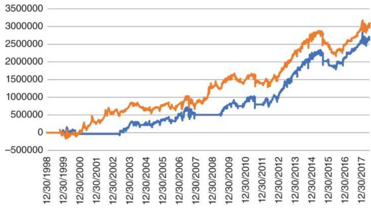
_G Golden Cross Golden + Death Cross
FIGURE 8.27 The Golden Cross applied to SPY showing both long-short and long-only returns compared to SPY.
FIGURE 8.28 The ROC Method applied to S\&P futures, 1998-2017.
When there is no position, the system earns one-half of the cash 3-month T-bill rate.

Results are very good, posting profits for both long and short positions in S\&P futures, with a total of 52 trades, \(53 \%\) of them profitable for 20 years from 1998. The total profits are shown in Figure 8.28. The program, TSM ROC, can be found on the Companion Website.
\section*{Staying Ahead of the Crowd}
There is always an attempt to find out where others are placing their orders and get ahead of them. For example, if you know that most trend-followers are using a 30-day calculation period, then using a 28 -day average might edge them out. During the 1980s and 1990s there was a
trend system that used 8 and 18 days to beat the 10 and 20 days that was most popular. The following calculations would use fastperiod \(=8\) and slowperiod \(=18\). The differenceperiod \(=9\).
FasterAverage \(=\) Average \((\) close, fastperiod \()\)
SlowAverage \(=\) Average \((\) close , slowperiod \()\)
TrendDifference \(=\) FasterAverage - SlowAverage
DifferenceAverage \(=\) Average \((\) TrendDifference, differenceperiod \()\)
The trading rules were:
Buy when today's TrendDifference > yesterday's DifferenceAverage
Sell short when today's TrendDifference < yesterday's DifferenceAverage
Although these calculation periods may not be profitable in today's markets, the idea of being slightly ahead of the crowd gives you free exposure, a small jump in profits caused by many orders following yours. If you can figure out where the crowd is buying and selling, then this concept will give you an edge.
\section*{Replication}
Rather than trying to enter slightly ahead of the crowd, a technique called replication tries to copy a successful trading system without knowing the rules. An analyst tracks the performance of a portfolio of stocks or futures.
If we know the markets that can be in the portfolio, it picks from a similar set of markets in such a way that it yields the same daily return. Each day the positions are adjusted to come as close to the returns of the target portfolio. Of course, the replicated portfolio lags one day behind.
This approach was developed by IBM to be used by the insurance industry as a way to speed up complex risk models. It was intended to be used with financial markets and cash flows but has also been adopted by fund managers as a new product. Further comment on this method can be found in Chapter 20.
\section*{THREE TRENDS}
If two trends can improve trading, it should follow that three or more are even better. First, consider two trends. Compared to a single trend, there are a much larger number of combinations. Rather than optimize the calculation periods, can we find a logical relationship between the slower and faster trends? For example, should the faster trend period be \(1 / 4\) of the slower? For equities, should we use trends that align with quarterly and annual earnings? In commodities, should the combination of trends try to profit from seasonality?
We are smart enough to know that two trends that have nearly the same calculation periods will not be useful, but can a 10-day and 40-day trend, working together, generate profits? Consider this: If the 10-day trend is not profitable, and the 40-day trend is not profitable, each taken on their own, but the combination is profitable,
would you trade it? These questions will be addressed in Chapter 21, but some of the concepts should be clear now. If, by computer testing, we were to "discover" that a combination of 2 or 3 trends was profitable, would you be convinced to trade it? "That depends." If a very large percentage of the combinations were profitable, it would be more tempting than if only 5 of 100 combinations were profitable.
\section*{Each Trend Must Have a Purpose}
If longer-term trends are intended to track macro fundamental policy and were generally profitable, then that longer-term period would be a good candidate for one of the two or three trends. The shorter trend calculation period is not as clear, but using 1 week ( 5 days), 1 month (20 days), or 1 quarter ( 64 days) has some sense of logic, rather than optimizing.
Using the same rules as the Golden Cross, going long when the fast trend crosses above the slow trend, and going short when the fast trend crosses below the slow trend, we compare both Eurodollar and emini S\&P futures, net of \(\$ 8\) per trade costs. Positions are sized for equal risk. For Eurodollars we use an 8o-day moving average because that market is highly trending, and 80 days represent a typical macrotrend period. For the S\&P we use a longer 120-day because we know that only a much longer trend works due to its high level of noise. Table 8.12 shows the results.
\footnotetext{
TABLE 8.12 Results of a 2 -trend system using futures, \(1991-2017\)
}
\begin{tabular}{|l|c|c|c|c|c|}
\hline & Trend & \begin{tabular}{c}
Number \\
of \\
Trades
\end{tabular} & \begin{tabular}{l}
Days \\
Held
\end{tabular} & \begin{tabular}{c}
Total \\
Long \\
Profit
\end{tabular} & \begin{tabular}{c}
To \\
Sh \\
Prc
\end{tabular} \\
\hline Eurodollars & 80 & 236 & 29 & \(5,533,595\) & \((1,01 c\) \\
\hline & 20 & 532 & 13 & \(4,335,186\) & \((1,83\) \\
\hline & Both & 88 & 78 & \(5,100,400\) & \((6 \varepsilon\) \\
\hline emini SP & 120 & 243 & 28 & \(3,236,779\) & \((86!\) \\
\hline & 20 & 532 & 13 & \(1,595,730\) & \((2,76\) \\
\hline & Both & 77 & 89 & \(2,526,750\) & \((1,11\) \\
\hline
\end{tabular}
The combined trends have greatly reduced trades. For Eurodollars, which are very trending and have been in a sustained bull market, all profits were in long positions. The 2-trend results had smaller gains on long trades, but much smaller losses on short sales, giving the combined results a high profit factor, showing lower risk.
The emini S\&P did not fare as well. The 20-day trend had substantial losses on short sales, and the faster trading of long positions was not as good as holding the slow trend. The only improvement is in the profit per trade.
From this small sample, we might conclude that a 2trend system improves an already trending market, but not a noisy one.
\section*{Adding a Third Trend}
Is there a rationale for more than two trends? If the longterm trend is for market direction, and the shorter one is to reduce the length of the holding period, then the third
could be used for entry timing. The third trend could be very fast, perhaps 3 days.
Gerald Appel \({ }^{12}\) adds three rate-of-change (ROC) indicators together (in his calculation, ROC is the difference between the price today and the price \(n\) days ago) and applies the composite to the S\&P index (SPX), all expressed in percent. He recommends buying when the composite crosses above \(4 \%\) and exiting when it falls below \(4 \%\). If you consider the upward bias in the S\&P, the \(4 \%\) threshold may not seem arbitrary.
\section*{Modified 3-Crossover Model}
The justification for using three trends is that one or more slower moving averages may result in a buy or sell signal at a time when the prices are actually moving opposite to the position that is about to be entered. This can happen when we use the moving average for the signals rather than when the price crosses the trendline. A third, faster moving average can be used to confirm the direction and avoid entry into a trade that is going the wrong way. This filter can be added to any moving average or multiple moving average system with the following rule:
Do not enter a trade unless the confirming moving average is moving in the same direction as the position you want to enter.

If we add a 3 -day timing trend to the previous Eurodollar 80-20 crossover, we get the results in Table 8.13. In both cases there was a small improvement in the
long profits and a decline in the short profits. The overall returns are slightly better. Then adding a timing trend seems to have positive results, more if you trade from the long side. A program to test any 3 -trend crossover model is TSM Modified 3MA Cross, available on the Companion Website.
\section*{4-9-18 Crossover Model}
During the late 1970s, the 4-9-18 Crossover Model was very popular. It seems likely that the selection of 4,9 , and 18 days was a conscious effort to be slightly ahead of the 5,10 , and 20 days frequently used in moving average systems during that period. Even now, high-frequency traders continue to look for the smallest edge that keeps them ahead of the competition. In addition to the marginally faster calculation periods, each moving average is (nearly) twice the speed of the prior, enhancing their uniqueness for recognizing different trends. Increasing the period in this way keeps a constant percentage difference.
The large amount of price noise makes three fast trends an unlikely combination. Tests on a sample of futures markets showed marginal profits, which is better than losses. None of the results would have convinced you to trade this. But in the days when Donchian was successful with his 10 -day moving average and 5 - and 20 -day crossover, there is no doubt that it would have been profitable.
\section*{TABLE 8.13 Adding a short-term trend to the 2}trend crossover system.
\begin{tabular}{|l|l|c|c|c|c|}
\hline & Trend & \begin{tabular}{c}
Number \\
of \\
Trades
\end{tabular} & \begin{tabular}{c}
Days \\
Held
\end{tabular} & \begin{tabular}{c}
Total \\
Long \\
Profit
\end{tabular} & \begin{tabular}{c}
To \\
Sh \\
Prc
\end{tabular} \\
\hline Eurodollars & \(80-20\) & 88 & 78 & \(5,100,400\) & \((68\) \\
\hline & \(80-20-\) & 87 & 79 & \(5,393,525\) & \((37 \varepsilon\) \\
\hline & 3 & & & & \\
\hline emini S\&P & \(120-20\) & 77 & 89 & \(2,526,750\) & \((11<\) \\
\hline & \(120-\) & 72 & 96 & \(2,657,212\) & \((1,05 \leq\) \\
\hline & \(20-3\) & & & & \\
\hline
\end{tabular}
\section*{Ichimoku Clouds}
This strategy is visually enticing, the result of projecting trends forward and coloring the space between indicators so that they look like clouds. The Ichimoku Cloud \({ }^{13}\) consists of five moving average trends:
T1. Tenkan-sen, (9-day MA of the highs + 9-day MA of the lows)/2, also called the Conversion Line
T2. Kijun-sen, (26-day MA of the highs + 26-day MA of the lows)/2, also called the Base Line
T3. Senkou A, (T1 + T2)/2, plotted 26 periods in the future (leading)
T4. Senkou B, (52-day MA of the highs + 52-day MA of the lows) \(/ 2\), plotted 26 periods in the futures (leading)
T5. Chikou, closing price plotted 26 days in the past (lagging), also called the Lagging Span
Senkou A and Senkou B are both plotted 26 days into the
future and form the outline of one of the two clouds. The area in between is colored green when the cloud is rising and red when it is falling. By projecting the cloud forward, traders can easily see support and resistance areas as prices approach them. Figure 8.29, an example available on StockCharts.com, shows rising and falling clouds for the Dow Industrials.
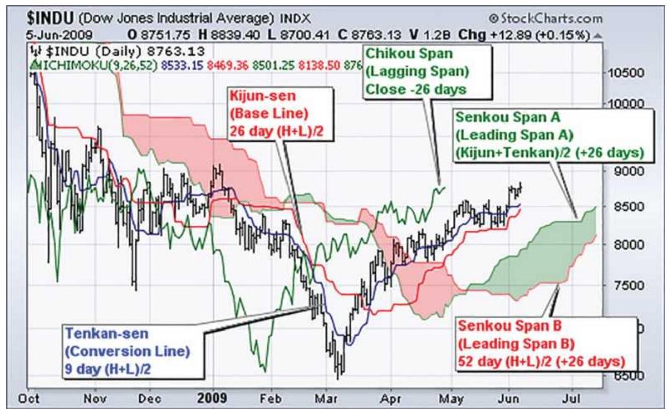
FIGURE 8.29 The Ichimoku Cloud shown on the Dow Industrials.
Chart courtesy of StockCharts.com.
\section*{Trading Rules for the Ichimoku Cloud}
The "cloud" serves the purpose of a long-term trend filter. Positions are recommended only in the direction of the cloud, long when green, short when red.
\section*{Macrotrend signals:}
Buy when the cloud turns from red to green or when the price moves above the cloud when the cloud is green (bullish).
Sell short when the cloud turns from green to red or when the price moves below the cloud when the cloud is red (bearish).
\section*{Shorter-term momentum and reentry signals:}
Trades are taken only in the direction of the cloud.
Buy when the Conversion Line (T1) moves above the Base Line (T2).
Sell short when the Conversion Line (T1) moves below the Base Line (T2).
\section*{COMPREHENSIVE STUDIES}
Because computerized testing platforms have made it easy for anyone to test any number of trends in combination, there have been very few comprehensive studies published since 1990. The exceptions are Colby's The Encyclopedia of Technical Market Indicators and Bulkowski's Encyclopedia of Chart Patterns, 2nd Edition, and The Encyclopedia of Candlestick Charts. All three show results in a standard form that makes it easy to compare the differences between systems. But most traders seeking a strategy will need to test it themselves and add their own special features. Both Colby and Bulkowski will give you a good idea of which methods and patterns to avoid.
There is a great deal to learn from putting the results of
various systems and markets side by side. Earlier in this chapter there is an informative comparison of six major trending systems; in Chapter 21 single-trend strategies are compared for a standard set of 17 futures markets. In addition, a 2-trend crossover strategy was compared to the single-trend methods. The objective of the testing process is to find parameters that succeed over time and across many markets; this discussion is continued in Chapter 21.
\section*{SELECTING THE TREND SPEED TO FIT THE PROBLEM}
Up to now, the selection of the best moving average, the one that will work in the future, has only been discussed in general terms. The success of a single calculation period for a single-trend strategy does not mean that it is the right choice for trading. In fact, the best moving average speed for an institutional or commercial participant may be very different from that of a trader or investor.
For example, a mutual fund receives new investments that must be moved into the market, collectively, once or twice each month. In the same way, a cattle feed lot will choose one time each month to fix the price of new inventory. Each would like a better-than-average price when they buy or sell. They can do that by selecting a trend calculation period that generates one or two signals each month. \({ }^{14}\) It is only important that the entry beat the average price that month. The next month they can start all over again. In the 3-trend crossover, we saw
that the third 3-day trend helped entry timing.
A better price might also be gained using a momentum indicator, which shows when a price is overbought or oversold within some time window, but that will be discussed in the next chapter.
A trader's goal is very different. It is to find the combination of parameters that will produce the best performance profile over an investment horizon. This target profile could be simply maximum profits, or it could be a more complex combination of profits, risk, and time in the market. In Chapter 21, automated testing is used to find the combination of speed, stop-loss, and other rules that best satisfy an objective; a computer, however, is not always the answer.
Dominant seasonal factors are an important influence on the calculation period of the trend. While some stocks, such as travel and leisure, can be highly seasonal, their seasonal price patterns can be overwhelmed in any year by a strong trend in the overall market, as measured by the \(\mathrm{S} P \mathrm{P} 500\). But the seasonal pattern is still there.
If you use a 12-month moving average for a seasonal market, you eliminate the chance of capturing the seasonal move. You end up with the net impact of inflation, or the change in the U.S. dollar. To capture the seasonal move, you will need a trend that is not longer than one calendar quarter, 64 days, perhaps even half that.
\section*{MOVING AVERAGE SEQUENCES:}
\section*{SIGNAL PROGRESSION}
Consider the case where you have selected a 20-day moving average to trade. You enter the day long Biotech and you get a sell signal. However, you are unaware that the 18-day and 21-day moving averages did not get sell signals. This means that the data that was dropped off the calculation 20 days ago caused a slight shift not seen by most of the neighboring trends. This can be an important piece of information when assessing the reliability of the trend signal.
A moving average is simply a consensus of direction. It is an approximation of values intended to steer a trader to the right side of the market at the right time. It is most fallible when prices are changing direction or going sideways. Any information that clears up the problem is valuable. For any trend system, it is helpful to look at steady progression of trend changes from the short term to the long term. This is seen in the following sequence, where \(u\) is an uptrend and \(d\) is a downtrend associated with the calculation period above those letters:
\section*{EXAMPLE E1 Orderly Trend Change}
\begin{tabular}{|l|c|c|c|c|c|c|c|c|c|c|c|c|c|c|c|c|c|c}
\hline \multicolumn{10}{|c|}{ Moving Average Period in } \\
\hline & \(\mathbf{1}\) & \(\mathbf{2}\) & \(\mathbf{3}\) & \(\mathbf{4}\) & \(\mathbf{5}\) & \(\mathbf{6}\) & \(\mathbf{7}\) & \(\mathbf{8}\) & \(\mathbf{9}\) & \(\mathbf{1 0}\) & \(\mathbf{1 1}\) & \(\mathbf{1 2}\) & \(\mathbf{1 3}\) & \(\mathbf{1 4}\) & \(\mathbf{1 5}\) & \(\mathbf{1 6}\) & \(\mathbf{1 7}\) & \(\mathbf{1 8}\) \\
\hline Trend & u & u & u & u & u & u & u & u & u & u & u & u & u & u & u & u & u & u \\
\hline
\end{tabular}
In example E1, prices have turned up in such a way that the trend calculation periods 1 through 19 show uptrends while calculation periods from 20 and higher are still
down. Unfortunately, normal price movement is not often as uniform as this example. The shorter-term trends can be very erratic, and often appear in smaller, alternating groups of up and down trends (see Example E2). This is easily explained because changing one day of data when only two, three, or four days are used in the moving average calculation can quickly change the direction of the trend. As you get to longer intervals, such as 20, 30, and 50 days, this is not the case. Most often, the trend sequence changes in a uniform, progressive manner, yet when it appears erratic, the trend change is not to be trusted.
\section*{EXAMPLE E2 Erratic trend change for the short calculation periods.}
\section*{Moving Average Period in Da}
\begin{tabular}{|l|l|l|l|l|l|l|l|l|l|l|l|l|l|l|l|l|l|l}
\hline & \(\mathbf{1}\) & \(\mathbf{2}\) & \(\mathbf{3}\) & \(\mathbf{4}\) & \(\mathbf{5}\) & \(\mathbf{6}\) & \(\mathbf{7}\) & \(\mathbf{8}\) & \(\mathbf{9}\) & \(\mathbf{1 0}\) & \(\mathbf{1 1}\) & \(\mathbf{1 2}\) & \(\mathbf{1 3}\) & \(\mathbf{1 4}\) & \(\mathbf{1 5}\) & \(\mathbf{1 6}\) & \(\mathbf{1 7}\) & \(\mathbf{1 8}\) \\
\hline Trend u & u & d & d & u & d & u & u & u & u & u & u & u & u & \(\mathbf{u}\) & \(\mathbf{u}\) & u & u & u \\
\hline
\end{tabular}
There are cases where the longer trend begins to reassert itself and the results appear the same as in E1; however, the trend change occurs from the longer-term down (from right to left instead of left to right). The case we must watch for satisfies neither of these, but occurs in an erratic pattern, such as in Example E3. Here we see a dominant long-term uptrend with the very short end turning down. Because of another downturn a few days ago, which then disappeared, this most recent downturn also caused a shadow turn at 19 and 20 days. Is it a leading indicator or a false signal? All indications are
that smooth changes in a trend are more reliable precursors of change.
Another case is given on the bottom line of E3. Here, the smooth trend changes from up to down is occurring from left to right; however, as it gets to 13 days, it also jumps ahead to 19 and 20 days, leaving days 14 through 18 still in an uptrend. For trends in this faster range, it appears best to wait for all fastest trends to change. As the calculation period becomes longer, it is unrealistic to expect all faster trends to be the same; therefore, you will need to settle for an orderly change in a group of trends faster than the target trend period (the one you are actually trading).
\section*{EXAMPLE E3 Progression of trend changes.}
\section*{Moving Average Period in Da}
\begin{tabular}{|l|l|l|l|l|l|l|l|l|l|l|l|l|l|l|l|l|l|l}
\hline & \(\mathbf{1}\) & \(\mathbf{2}\) & \(\mathbf{3}\) & \(\mathbf{4}\) & \(\mathbf{5}\) & \(\mathbf{6}\) & \(\mathbf{7}\) & \(\mathbf{8}\) & \(\mathbf{9}\) & \(\mathbf{1 0}\) & \(\mathbf{1 1}\) & \(\mathbf{1 2}\) & \(\mathbf{1 3}\) & \(\mathbf{1 4}\) & \(\mathbf{1 5}\) & \(\mathbf{1 6}\) & \(\mathbf{1 7}\) & \(\mathbf{1 8}\) \\
\hline Trend d d d d & u & u & u & u & u & u & u & u & u & u & u & u & u & u \\
\hline Trend d d d & d & d & d & d & d & d & d & d & d & d & u & u & u & u & u \\
\hline
\end{tabular}
An example of actual trend sequences is shown in Figure 8.30. Moving average calculation periods of 5 to 50 days appear in increments of five days along the top, and a history of the past 44 days are shown below. Each row shows the trend that we can see at the time; we can also see the rows below. Using the adjacent trends and the trends of the previous day, we can smooth the patterns. On the right, those trends that are boxed can be reversed to create a smoother process.
\begin{tabular}{|c|c|c|c|c|c|c|c|c|c|c|c|c|c|c|c|c|c|c|c|c|c|}
\hline & \multicolumn{10}{|c|}{ Moving Average Period } & & \multicolumn{10}{|c|}{ Moving Average Period } \\
\hline Day & 5 & 10 & 15 & 20 & 25 & 30 & 35 & 40 & 45 & 50 & Day & 5 & 10 & 15 & 20 & 25 & 30 & 35 & 40 & 45 & 50 \\
\hline 1 & U & U & \(u\) & U & \(u\) & U & U & U & \(u\) & U & 1 & U & U & U & U & U & U & U & U & U & U \\
\hline 2 & D & D & u & u & \(u\) & u & u & U & u & u & 2 & D & D & u & u & U & \(u\) & U & u & U & U \\
\hline 3 & D & U & u & U & \(u\) & u & u & u & u & U & 3 & D & U & U & u & U & u & U & U & u & U \\
\hline 4 & U & U & u & u & \(u\) & u & \(u\) & u & u & U & 4 & U & U & u & U & U & U & U & u & U & U \\
\hline 5 & u & U & U & u & U & u & U & u & u & u & 5 & u & u & U & U & U & U & U & U & U & U \\
\hline 6 & U & u & u & \(u\) & u & u & u & u & u & u & 6 & U & U & U & U & U & u & U & u & U & U \\
\hline 7 & U & U & u & u & u & u & u & u & U & u & 7 & U & u & u & u & u & U & u & \(u\) & u & U \\
\hline 8 & D & U & U & u & U & U & u & u & U & u & 8 & D & u & U & U & U & U & u & u & U & U \\
\hline 9 & U & D & D & D & U & u & u & u & u & u & 9 & U & D & D & D & U & u & u & u & u & u \\
\hline 10 & D & D & D & D & D & u & U & U & U & u & 10 & D & D & D & D & D & U & U & U & U & U \\
\hline 11 & D & D & D & D & U & U & U & u & u & u & 11 & D & D & D & D & U & U & U & U & u & U \\
\hline 12 & D & D & D & D & D & D & D & u & u & u & 12 & D & D & D & D & D & D & D & \(u\) & u & U \\
\hline 13 & D & D & D & D & U & U & U & u & U & u & 13 & D & D & D & D & U & U & U & u & u & U \\
\hline 14 & U & D & D & D & D & D & u & U & U & \(u\) & 14 & U & D & D & D & D & D & U & U & U & u \\
\hline 15 & D & D & D & D & D & D & D & D & D & U & 15 & D & D & D & D & D & D & D & D & D & U \\
\hline 16 & D & D & D & D & D & D & D & D & D & D & 16 & D & D & D & ( & D & D & D & D & D & D \\
\hline 17 & D & D & D & D & D & D & D & D & D & D & 17 & D & D & D & D & D & D & D & D & D & D \\
\hline 18 & D & D & D & D & D & D & D & D & D & D & 18 & D & D & D & D & D & D & D & D & D & D \\
\hline 19 & U & D & D & D & D & D & D & D & D & D & 19 & U & D & D & D & D & D & D & D & D & D \\
\hline 20 & U & D & D & D & D & D & D & D & D & D & & u & D & D & D & D & D & D & D & D & D \\
\hline 21 & u & U & u & D & D & D & D & u & U & u & 21 & \(u\) & u & U & D & D & D & D & U & u & U \\
\hline 22 & u & u & u & U & D & U & U & u & U & u & 22 & u & ( & u & U & D & U & U & u & & U \\
\hline 23 & U & U & u & D & D & D & D & U & u & u & 23 & u & u & u & D & D & D & D & u & u & U \\
\hline 24 & u & U & u & u & D & D & D & u & u & u & & u & & U & U & D & D & D & u & U & U \\
\hline 25 & u & U & u & u & D & D & D & u & U & u & & U & u & U & U & D & D & D & U & U & U \\
\hline 26 & D & U & u & D & D & D & D & D & D & U & 2 & D & u & U & D & D & D & D & D & D & U \\
\hline 27 & D & D & D & D & D & D & D & D & D & D & 27 & D & D & D & D & D & D & D & D & D & D \\
\hline 28 & D & D & D & D & D & D & D & D & D & D & 28 & D & D & D & D & D & D & D & D & D & D \\
\hline 29 & D & U & U & & D & D & D & D & D & u & & D & U & U & U & D & D & D & D & D & U \\
\hline 30 & U & U & u & u & U & D & D & D & U & U & & U & u & u & U & u & D & D & D & U & U \\
\hline 31 & U & u & u & u & U & D & D & D & D & u & & u & u & u & U & u & D & D & D & D & U \\
\hline 32 & u & U & u & u & U & u & \(u\) & U & U & u & & u & & U & U & u & U & & U & U & U \\
\hline 33 & u & U & U & \(u\) & U & u & u & u & u & u & 3 & u & u & u & u & U & u & U & \(u\) & u & U \\
\hline 34 & \ & u & u & u & U & u & U & u & u & u & & u & u & u & & u & & \(u\) & \(u\) & u & U \\
\hline 35 & U & u & u & u & U & u & U & u & u & u & & u & u & U & U & U & U & & u & & U \\
\hline 36 & U & U & u & \(u\) & \(u\) & u & u & U & U & u & & u & U & U & & u & u & U & U & U & U \\
\hline 37 & & u & u & u & u & u & U & U & u & u & & U & 0 & u & & u & U & U & \(u\) & & U \\
\hline 38 & D & U & u & u & U & u & u & u & U & u & 3 & D & u & u & u & U & U & u & \(u\) & u & U \\
\hline 39 & D & D & U & u & u & u & U & U & u & u & & D & D & U & U & U & U & U & U & U & U \\
\hline 40 & D & D & U & U & U & U & U & U & U & u & & D & D & U & U & U & U & U & U & U & U \\
\hline 41 & D & u & U & U & U & U & u & U & u & u & 4 & D & U & u & U & U & U & U & U & U & u \\
\hline 42 & U & u & u & U & U & u & u & & u & u & & U & U & u & U & U & U & & \(u\) & U & U \\
\hline 43 & U & U & u & u & u & u & u & U & u & u & 4 & U & u & U & u & U & u & u & u & U & U \\
\hline 44 & U & U & u & U & u & U & u & U & U & u & 44 & U & U & U & u & U & U & U & \(u\) & U & U \\
\hline
\end{tabular}
FIGURE 8.30 Sequences of moving averages. Left is the original sequence. On the right the boxes outlined could be reversed.
Another way of adding consistency is to count the number of up and down trends from the smallest to your target calculation period. Whichever has the largest count is the current trend.
By now we know that capturing the fat tail is necessary for the success of macro trend systems. However, there are always practical exceptions. One of the oldest truths for trend-following is "Take your losses and let your profits run." By imposing profit-taking, or even stoplosses, this can be changed to "Take your profits and let your losses run." There is a need to be very careful when making exceptions. But consider the following situation.
Interest rates declined for most of the 35 years from 1981 through 2015. For many traders, that's more than their entire professional career. To profit from this move, a slow trend system can track the 10-year Treasury note futures contract, a municipal or corporate bond index, or any number of income funds. If a 200-day trend were used, then there would be a lag of 100 days. That is, for a bond fund, the current value of the trendline would reflect the bond prices at the midpoint of the calculation period, 100 days ago. If the yield on interest rates had dropped a total of \(2 \%\) during the past year, then the trendline could be lagging a full \(1 \%\) behind current yields. If the trend changed direction, that can translate into a large loss in unrealized gains.
One advantage of long-term interest rate trends is that they are based on a sustained economic policy. If that policy changes, then the trend is over, even if the trendline has not yet reversed direction. When the Fed starts raising rates, or even hints that it will start raising rates sometime in the future, it has signaled a change in policy. You can reasonably conclude that the basis for the long-term uptrend in prices is over and that the trend in futures prices will turn down. A central bank rarely
raises rates one month and lowers them the next. Because the very slow trend lags far behind the actual market price, it may be three months before the trendline signals a change of position. This will occur after a large part of your profits has been given back. Exiting the trade when the fundamentals change would be a safe way of capturing more profits and reducing market risk.
Caveat emptor. This is only true when a reliable government policy drives prices. Often, these decisions are clear only after the fact. In 2010 it seemed that Fed policy was going to change, yet 2011 posted a strong upward trend in bonds, with yields reaching record lows. Wait for a statement of policy. This trading method has been named techno-fundamental.
\section*{PROJECTING MOVING AVERAGE CROSSOVERS}
Systematic trading is most successful when you can execute an order as soon as possible. Calculating your trading signals after the close of the market, then placing your order for the next open, or worse, the next close, is going to return less than executing on the same close that you just used for your new signals.
With a single \(N\)-day moving average, we know that a close today that is higher than the price \(N\) days back, which is being dropped off, means that the trendline will rise. If today's price is lower than \(N\) days ago, the trend will be down.
To predict where two moving averages will cross is more complicated. If the two calculation periods are \(m\) and \(n\), the price that will cause them to cross ( CP2 ) is: \({ }^{15}\)
\[
C P 2=m \times\left(\frac{\sum \text { most recent } m-1 \text { prices }}{m}-\frac{\sum \text { most recent } n-1 \text { price }}{n}\right)
\]
Calculated each day, the projected crossover will begin to converge as it nears \(C P 2\). The difference between the projected crossover and the current price can also be considered a relative strength indicator. Lambertt6 \({ }^{16}\) used the change in the projected crossover to create a Market Direction Indicator (MDI):
\[
M D I=\frac{100 \times\left(\text { Crossover price }_{\text {previous }}-\text { Crossover price }_{\text {today }}\right)}{\text { Average of past } 2 \text { day's prices }}
\]
The point at which the MDI crosses the zero line moving higher is a buy signal, and the point where it crosses moving lower is a sell signal.
\section*{EARLY IDENTIFICATION OF A TREND CHANGE}
John Ehlers uses a quotient transformation to find an early indication of a trend and estimate its duration. \({ }^{17}\)
\section*{Input \(+K\)


Most oscillators can be used but the output must be rescaled to between -1 and +1 . For example, the RSI ranges between -100 and +100 , so dividing the value by 100 solves the problem. For the stochastic, which ranges between 0 and +1 , subtract 0.50 and multiply by 2 . He then applies his roofing filter to remove the spectral dilation. Those results are not normalized, so he applies an automatic gain control (AGC) to normalize without affecting the pattern. Only Ehlers can do this. TSM Ehlers Early Onset Trend indicator is on the Companion Website. Figure 8.31 shows the results for SPY. The ADX (Chapter 23) is another indicator that tries to recognize when there is a trend.
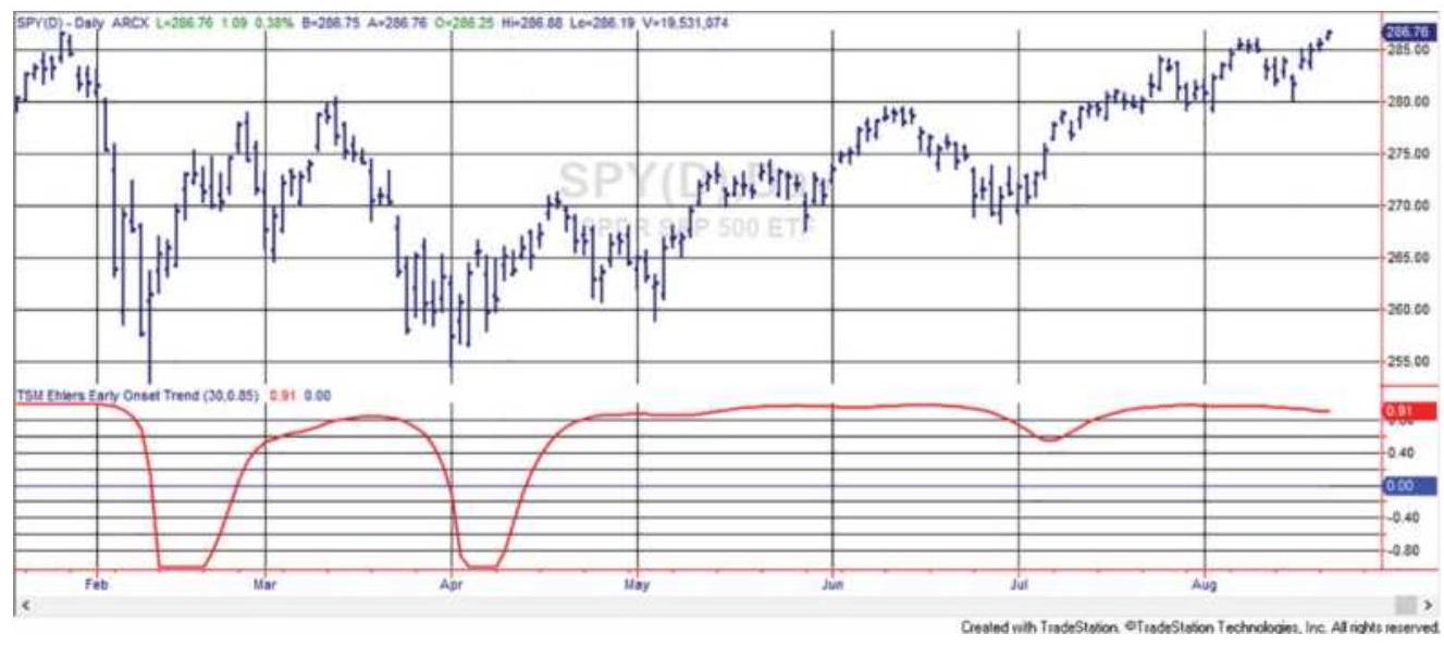
FIGURE 8.31 Ehlers' Early Onset Trend indicator for SPY during 2018.
\section*{NOTES}
1 Chester W. Keltner, How to Make Money in Commodities (Kansas City, MO: Keltner Statistical Service, 1960).
\(\underline{\underline{2}}\) Jean Folger, "The Adaptive Price Zone," Modern Trader (November 2015).
3 John A. Bollinger, Bollinger Capital Management, Inc. P.O. Box 3358, Manhattan Beach, CA 90266, www.bollingerbands.com. Also see Bollinger on Bollinger Bands (New York: McGraw-Hill, 2001).
4 Dennis McNicholl, "Better Bollinger Bands," Futures, October 1998.
5 Kent Calhoun, "Bollinger Band MA Crossover Breakouts," Technical Analysis of Stocks \& Commodities, October 2016.
6 John Bollinger, "John Bollinger of Bollinger Bands Fame," Technical Analysis of Stocks \& Commodities (May 2002).
7 Billy Williams, "Biting off Profits with the Rattlesnake Breakout Method," Futures (October 2010).
\(\underline{8}\) Richard Bookstaber, The Complete Investment Book (Glenview, IL: Scott, Foresman, 1984), p. 231.
9 Jack K. Hutson, "Good TRIX," Technical Analysis of Stocks \& Commodities (July 1983).
10 Richard D. Donchian, "Donchian's 5- and 20-Day
Moving Averages," Commodities Magazine (December 1974).
11 The Woodshedder blog can be found on the Internet and covers many other strategies. This method was reviewed by MarketSci blog on October 4, 2011, but used SPX (the cash index) rather than SPY.
12 Gerald Appel, Technical Analysis: Power Tool for Active Traders (FT Prentice Hall, 2005), p. 59.
13 Developed by Goichi Hosada, published in his book in 1969 but developed in the 1930s. See www.StockCharts.com for more detail.
14 Perry J. Kaufman, "Moving Averages and Trends" in Todd Lofton (Ed.), Trading Tactics: A Livestock Anthology (Chicago: Chicago Mercantile Exchange, 1986).
15 Calculation courtesy of Alexander Solodukhin, Mizuho Alternative Investments, New York.
16 Donald R. Lambert, "The Market Directional Indicator," Technical Analysis of Stocks \& Commodities (November-December 1983).
17 John Ehlers, "The Quotient Transform," Technical Analysis of Stocks \& Commodities (August 2014).
\section*{CHAPTER 9}
\section*{Momentum and Oscillators}
The study of momentum and oscillators is the analysis of price changes rather than price levels. Among technicians, momentum establishes the speed of price movement and the rate of ascent or descent. Analysts use momentum interchangeably with slope, the angle of inclination of price movement usually found with a simple least squares regression (Figure 9.1), a straightline fit through prices. The steeper the slope, the faster prices are rising. When today's momentum value is the same as the previous, prices are advancing or declining at the same rate; therefore, it is also called the rate of

terms of Newton's Law, which can be restated loosely as once started, prices tend to remain in motion at about the same speed and in more-or-less the same direction.
Indicators of change, such as momentum and oscillators, are used as leading indicators of price direction. They can identify when the current trend is no longer maintaining its same level of strength; that is, prices are rising, but at a slower rate. This gives traders an opportunity to begin liquidating their open trend trades before prices reverse direction. As the time period for the momentum calculation shortens, this indicator becomes sensitive to small changes in price. It is often used in a countertrend, or mean reversion strategy to indicate
overbought and oversold conditions. The change in momentum, also called acceleration, is even more sensitive and anticipates change sooner. The first differences (today's price minus yesterday's price) and second differences can be substituted for momentum and acceleration.
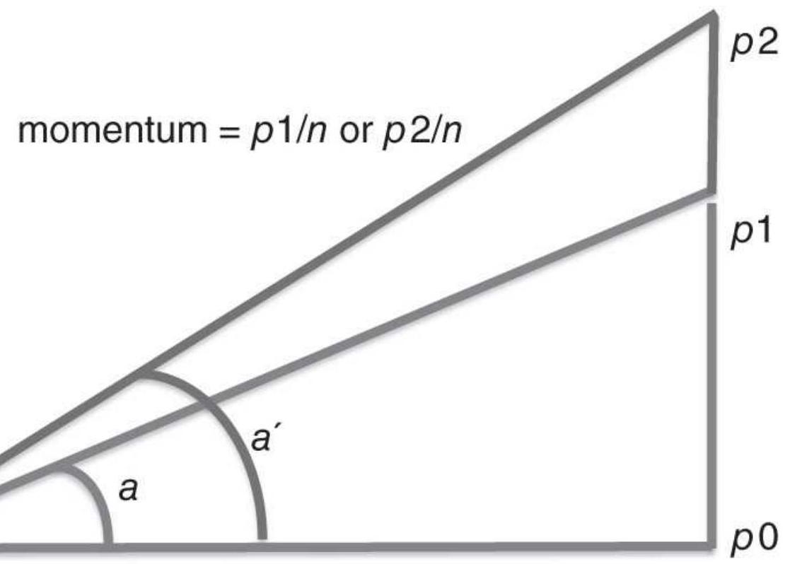
\(n\) Days
FIGURE 9.1 Geometric representation of momentum.
\section*{Price and Price Change}
Before beginning a discussion of various momentum calculations, a brief comment on terminology is necessary to understand how these various techniques are grouped together. The use of a single price, such as Microsoft at \(\$ 85.50\) or gold at \(\$ 1400\), has no direction or movement implied. We are simply relating a price level and not indicating that prices are going up or down.
Next, we describe the speed at which prices are rising or falling. To know the speed, it is not enough to say that the S\&P rose 3 points; you must specify the time interval over which this happened: "The S\&P rose 3 points in 1 hour." When you say that you drove your car at 6o, you really imply that you were going 60 miles per hour, or 60 kilometers per hour. This description of speed, or distance covered over time, is the same information that is given by a single momentum value. Then, if the daily momentum of the NASDAQ 100 is +10 , it is rising at the rate of 10 points per day. A 3 -day momentum is the price change over three days. A momentum of zero means that there has been no change in price.
\section*{MOMENTUM}
Momentum is the difference between two prices taken over a fixed interval. It is another word for speed, the distance covered over time; however, everyone uses it to mean change. For example, today's 5-day momentum value \(M\) would be the difference between today's price \(p_{t}\) and the price five days ago:
\[
\text { 5-day momentum, } M(5)_{t}=p_{t}-p_{t-5}
\]
Using notation familiar to many programmers:
\[
5 \text {-day momentum }=\text { price }- \text { price }[5]
\]
\section*{\(n\)-day momentum \(=\) price - price \([n]\)}
where the notation [n] refers to the price \(n\) days ago, the same as \(P_{t-n}\).
The 5-day momentum value \(M(5)_{\mathrm{t}}\) increases as the change in price increases over the same 5 -day period, shown in Figure 9.1. In general, over \(n\) days, if the price moves from \(p_{\mathrm{O}}\) to \(p_{1}\), it forms angle \(a\), which is the slope, and has a momentum of \(p_{1}-p_{\mathrm{O}}\). If prices had moved to point \(p_{2}\), a larger move, then the momentum would have been greater and the slope, \(a^{\prime}\), would have been steeper.
Today's 5-day momentum, which we will show as \(M(5)_{t}\), can range in value from the maximum upward move to the maximum downward move that the price can make in five days; the momentum is zero if prices are unchanged after five days. For stocks, there is no limit on the maximum price range over any time interval. In cases such as Enron, or even Bitcoin, prices could collapse to zero in short order. From a practical view, most stocks and futures markets have a history of volatility that relates to their price level. The higher the price, the larger the price moves. As the price of gold rose to \(\$ 2,000\) per ounce in September 2011, the 5 -day momentum reached \(\$ 200\) per ounce ( \(\$ 40\) per day). When it was at \(\$ 250\) in August 1996, and investors lost interest, it had a \(\$ 3\) per ounce change over five days.
Momentum is not volatility. Gold can move from \(\$ 1200\) to \(\$ 1250\) in two days then back to \(\$ 1200\) over the next three days and the momentum would be zero but the
volatility would be high. When prices continue in one direction, it will be the same as volatility.
\section*{Pattern of Change}
Figure 9.2 shows a typical pattern of momentum. Smooth prices are used to make the relationship between price change and momentum clear. During the first \(15^{-}\) day cycle prices (the top panel) rise steadily, peaking on day 9 . As prices rise at a slower rate during days 5 through 9, the momentum declines but remains above zero. As long as the 5 -day momentum is greater than zero, prices are rising. The highest momentum value occurs on day 3 , when prices have the largest positive price change.
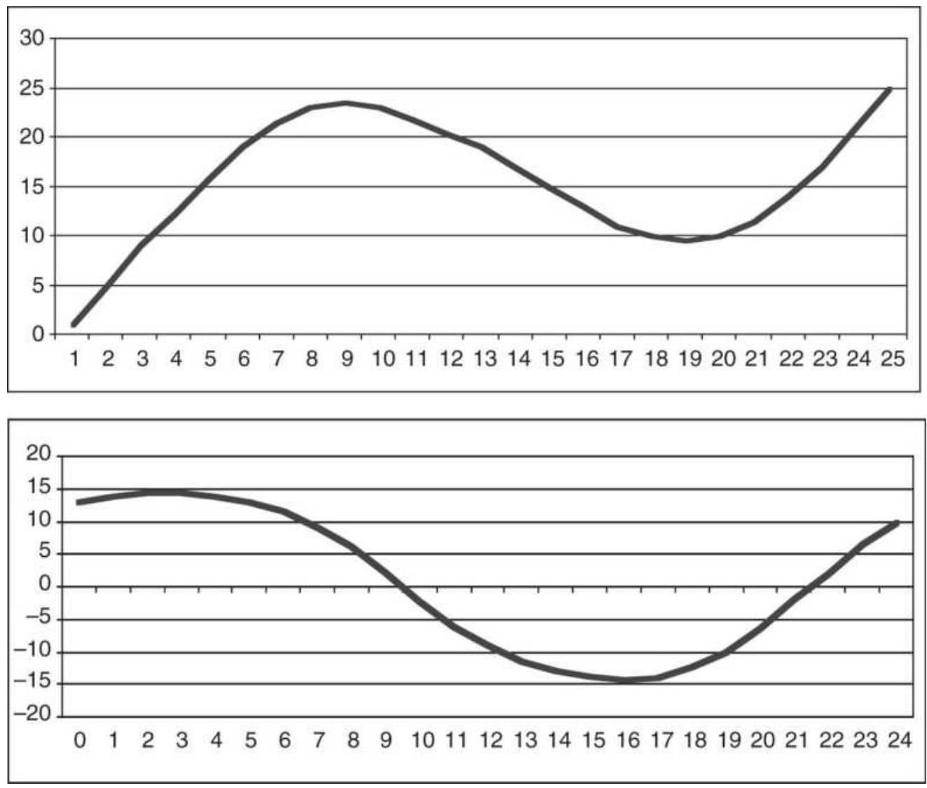
FIGURE 9.2 Price (top) and corresponding momentum (bottom).
On day 10 the momentum value is zero. Looking at the price chart, this occurs when the 5 -day change in price is zero. The lowest momentum value occurs on day 16 , when the prices have declined the most. After prices reach their lowest point and begin up, the momentum is negative but rising.
If prices always moved in the smooth pattern shown in Figure 9.2, momentum would be a perfect leading indicator. You could buy when momentum turned up
and sell when it turned down, which would be ahead of the change in price direction. Unfortunately, price movement is irregular; consequently, momentum values are irregular. Later in this chapter we will use double smoothing, which makes anticipating the change of direction more practical. Most momentum systems focus on values and patterns that occur at extremes, all of which have proved to be valuable additions to trading strategies, from the timing of entries and exits to mean reversion.
\section*{Characteristics of Momentum}
Momentum can be smoothed in much the same way as the trend. One key advantage of momentum is that it does not have the lag that exists in a moving average. The Raytheon chart (Figure 9.3) compares 20- and 40day moving averages at the top with 20 - and 40 -day momentum along the bottom. The 40-day momentum (thinner line) is smoother and peaks at about the same place as the price at the end of February. The faster 20day momentum is not as smooth and peaks at the end of January. You should notice that as prices made higher peaks at the end of February and near the end of April, the momentum did not make new highs. This will be the basis for momentum divergence later in this chapter. Momentum is also declining while the trendline is rising, an indication that the upward price move is slowing. The cost of using this leading indicator is the increased noise seen in the erratic pattern of momentum compared to the smoothness of the trendline.
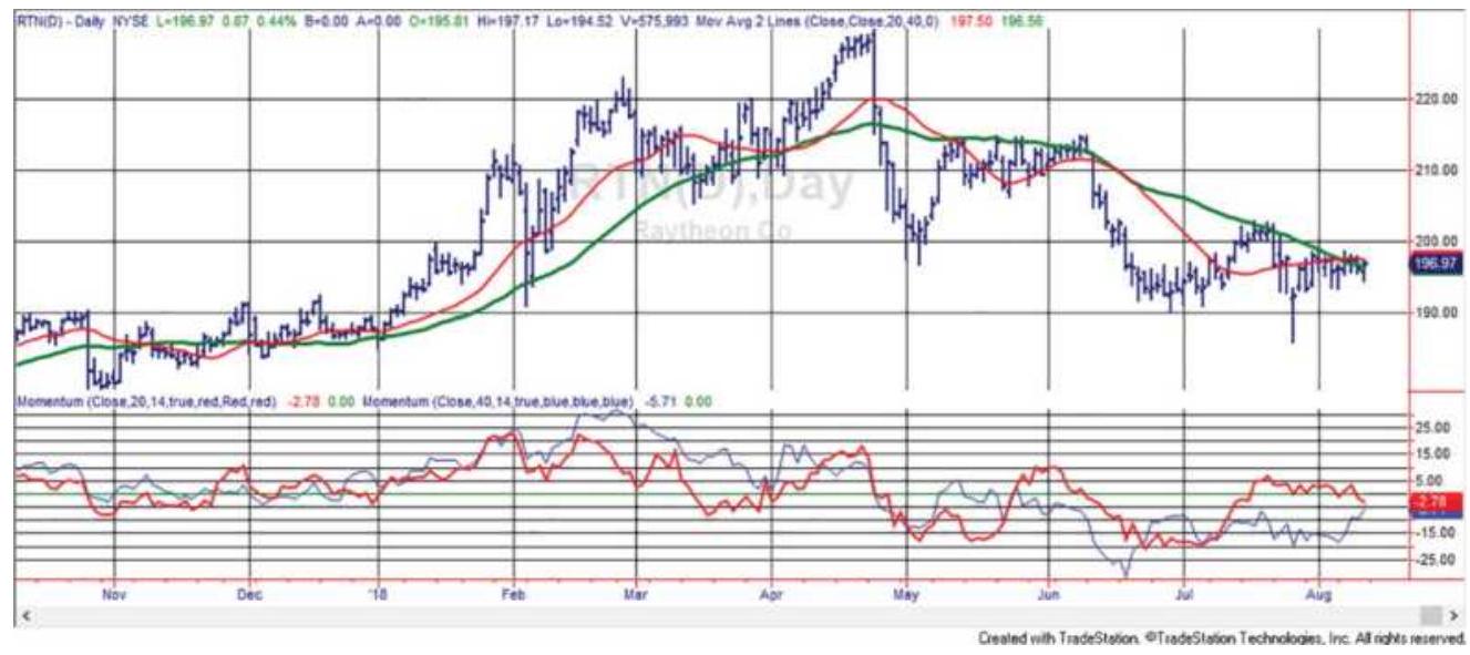
FIGURE 9.3 20- and 40-day momentum compared to a 20- and 40-day moving average, applied to Raytheon (RTN).
Momentum can be used as a trend indicator by selling when the momentum value turns negative and buying when it turns positive. Because there is more noise in momentum than in the equivalent moving average, you would want to draw a small band around the zero line. A sell signal would be given when the momentum falls below the lower band and a buy when it moves upward through the upper band. However, the momentum crossing zero is essentially the same as the moving average of the same calculation period turning up or down. It means that the price today is the same as the price \(n\)-days ago. Chapter 8 showed that the performance of a trend and a momentum system over the same calculation periods was very similar.
\section*{Momentum of Returns}
It is convenient to express all markets in the same
notation. It makes comparisons much easier. For the stock market, momentum can be expressed as daily returns (a percentage change):
1-day momentum in percent, \(M(1) t=\frac{\left(p_{t}-p_{t-1}\right)}{p_{t-1}}=\frac{p_{t-1}}{p_{t}}-1\)
or, because they are returns, the alternative can be used, \(\ln \frac{p_{t-1}}{}\). But momentum is most often calculated over \(P_{t}\)
more than one day; therefore, the \(n\)-day momentum as a percentage is:
\[
M(n)_{t}=\frac{P_{t}}{P_{t-n}}-1
\]
Using percentages does not work for futures markets because most data used for analysis are continuous, back-adjusted prices. Back-adjusting over many years and many contracts will cause the oldest data to be very different from the actual prices that occurred on those dates; therefore, percentages are incorrect. When using momentum with back-adjusted futures prices, it is best to use the price differences. Some stocks that have been adjusted for splits have the same problem.
\section*{Momentum as the Difference between Price and Trend}
The term momentum is very flexible. It is common for it to refer to the difference between today's price and a
corresponding moving average value. The properties of this new value are the same as standard momentum. As the momentum becomes larger, prices are moving away from the moving average. As it moves toward zero, the prices are converging toward the moving average.
The upper panel of Figure 9.4 shows a 20 -period moving average plotted on a daily chart of Intel during the 14 months ending May 2003. The center panel shows the standard 20-period momentum, the difference between prices that are 20 days apart. The bottom panel is the difference between the price and the 20 -day moving average. The range of values for the center panel is approximately +6 to -11 , and the scale on the lower panel is +3 to -7 . Because a trendline lags behind price movement, the difference between the price and trendline is smaller, but appears to have less lag. This momentum calculation has also been called relative strength because it is measured relative to a previous price or relative to a trendline.
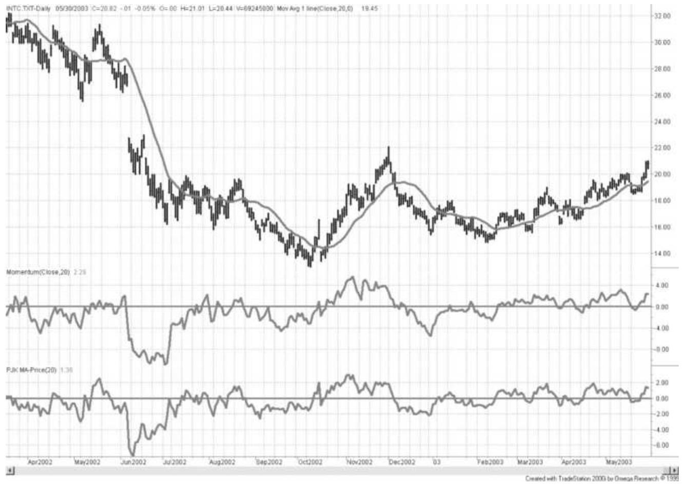
FIGURE 9.4 Momentum is also called relative strength, the difference between two prices or a price and a moving average (lower panel). The traditional momentum calculation is shown in the center panel.
\section*{Momentum as a Trend Indicator}
Chapter 8 showed that a simple momentum system gave similar results as a moving average of the same calculation period. By looking at the net change in price over \(n\) days, intermediate fluctuations are ignored, and the trend can be seen. The longer the calculation period, the smoother the results.
To use momentum as a trend indicator, choose any calculation period, preferably longer. A buy signal occurs whenever the value of the momentum turns from
negative to positive and a sell signal is when the opposite occurs, as shown in Figure 9.5. If a band is used to establish a neutral position or avoid noise, as discussed earlier, it should be drawn around the horizontal line representing the zero momentum value.
To find the best calculation period for momentum, you could test a range of values, or you could examine a chart looking for a natural price cycle. Identify the significant tops and bottoms of any bar chart and average the number of days between these cycles or find the number of days that would closely approximate the occurrences of these peaks and valleys. Then use \(1 / 2\) or \(1 / 4\) of the number of days from peak to peak or valley to valley. These natural cycles will often be the best choice of momentum calculation interval (Figure 9.6). Momentum and oscillators, however, are more often used to identify extreme price movements and for timing of entries and exits in coordination with a longer-term trend.
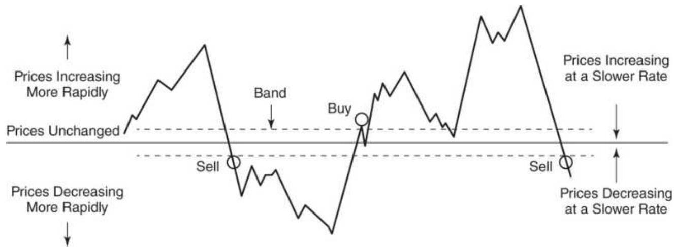
FIGURE 9.5 Trend signals using momentum.
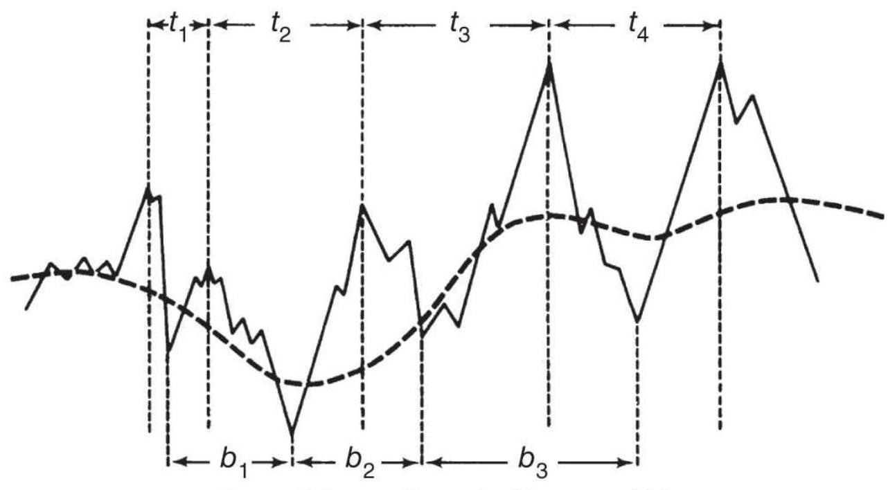
Tops and Bottoms Determine Momentum Value
(a)

Corresponding Momentum
(b)
FIGURE 9.6 Relationship of momentum to prices. (a) Tops and bottoms determine momentum value. Corresponding momentum.
\section*{Timing an Entry}
Momentum is a convenient tool for identifying good entry points based on small price reversals within a trend. By choosing a much shorter time period for the
momentum calculation (for example, 6 days) to work in combination with a longer trend of 30 to 50 days, the momentum indicator will show frequent overbought and oversold levels within the trend. The short time period for the momentum calculation assures you that there will be an entry opportunity within a few days of the trend entry signal; therefore, it becomes a practical timing tool. When a new trend buy signal occurs, wait for momentum to turn negative to enter. The greater the negative momentum, the better the entry point. Waiting for a better price always involves the risk of missing the trade. Examples of using momentum as entry timing can also be found in Chapter 19, and in Linda Raschke's First
Cross system later in this chapter.
\section*{Identifying and Fading Price Extremes}
The most interesting use for momentum focuses on the analysis of relative tops and bottoms. All momentum values have positive and negative peaks limited by the maximum price move possible during the momentum calculation period, \(N\). The conditions at the points of high positive and negative momentum are called overbought and oversold, respectively. These extremes can be very irregular because they represent the maximum price change during the rolling \(N\) days.
A market is overbought when it has sustained an upward trend at a faster rate for most of the \(n\) days in the calculation. We expect that a downward price reaction is imminent or, at the least, a slower rise. An oversold market is the opposite, declining to an extreme and ready for an upward move. Faster momentum
calculations (those using shorter calculation periods) will tend to fluctuate above and below the zero line based on small price changes. Longer calculation periods will take on the characteristics of a trend and stay above or below the zero line for the extent of the trend. In Figure 9.7, using S\&P futures, the 20-day momentum in the center panel stays above zero for most of the period from September 2010 through February 2011. The very fast 3day momentum in the bottom panel consistently penetrates the zero line, although the peaks on the upside are larger than those on the downside.
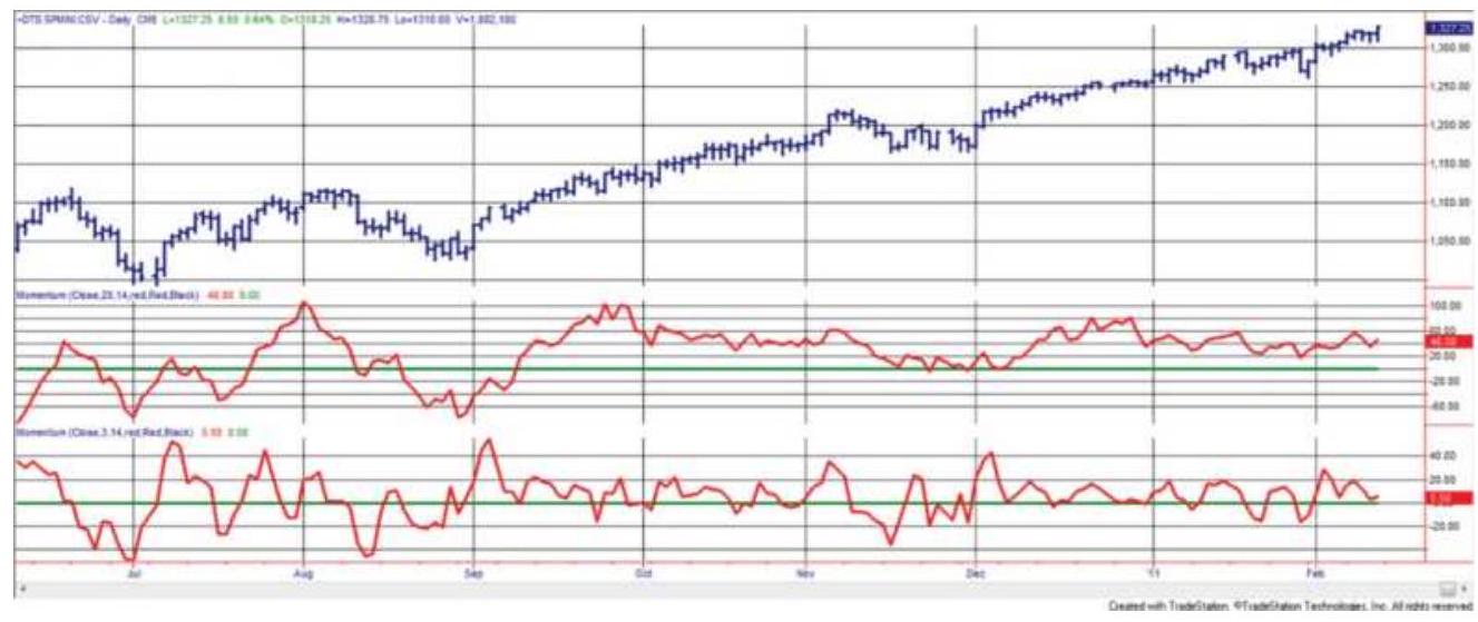
FIGURE 9.7 20-Day momentum (center panel) and 3day momentum (bottom panel) applied to the S\&P, June 2010 through February 2011.
The values on the right scale of the two lower panels in Figure 9.7 show the range of price movement over the 20-day and 3 -day periods. The 20-day range goes from +100 to -60 while the 3 -day span is smaller, about +60 to -40 . The 3 -day momentum is not \(3 / 20\) ths of the \(20-\) day momentum because volatility does not increase linearly over time. That is, volatility can increase quickly
in a few days, but over longer periods it tends to appear slower.
\section*{Fading an Entry or Exiting a Trade}
A system can take advantage of the momentum extremes by fading the price movement (selling rallies and buying declines). This is done by drawing two horizontal lines on the momentum chart (as shown in Figure 9.6b) above and below the zero line in such a way that the tops and bottoms of the major moves are isolated. These lines may be selected:
Visually, based on previous values, so that once the line is penetrated, prices tend to reverse shortly afterward.
- Based on a percentage of the maximum possible momentum value.
A multiple of the standard deviation of momentum values. Using two standard deviations would position the lines so that only \(5 \%\) of all momentum values penetrate above and below the two horizontal lines.
When positioning these bands, there is always a trade-off between finding more trading opportunities and entering the market too soon. This can be a complicated choice and is discussed in "System Trade-Offs" in Chapter 22. Once these lines have been drawn, the basic trading rules will be one of the following:
Aggressive. Enter a new long position when the momentum value crosses the lower bound; enter a
new short position when the value crosses the upper bound.
Minor confirmation. Enter a new short position on the first day the momentum value turns down after crossing the upper bound (the opposite for longs).
Major confirmation. Enter a new short position when the momentum value crosses the upper bound moving lower (the opposite for longs).
Timing. Enter a new short position after the momentum value has remained above the upper bound for \(n\) days (the opposite for longs), or a confirmation has occurred.
To close out a profitable short or long position there are the following alternatives (the rules are symmetrical for longs and shorts):
Most demanding. Close out long positions or cover shorts when the momentum value crosses the opposite threshold used for an entry. If we bought when the momentum was -50 , we would sell when the momentum reached +50 .
Moderately demanding. Cover a short position when the momentum crosses zero, minus one standard deviation (or some other target point partway between the zero line and the lower bound). When calculating the standard deviation, use the changes in momentum, not the momentum values.
Basic exit. Cover a short position when the momentum value crosses zero.
Allowing an extended move. Cover a short position if the momentum crosses zero moving up after penetrating that line moving down. This is
effectively using momentum as a short-term trend.
\section*{Changing Volatility}
The same momentum calculations, viewed over a longer time period, show one of the problems using momentum for timing. Figure 9.8 covers a critical period, from August 2005 through February 2011. Notice that the scale of the momentum values changes dramatically from the beginning to the end of the chart. This is especially important for the 20-day momentum in the middle panel. For all of 2006 volatility was very low. Had we used momentum as an overbought/oversold indicator, the entry bands would have been at about \(\pm 30\). For the 3-day momentum it would have been closer to \(\pm 15\). As we saw before, the faster momentum is more symmetric than the slower one. During 2006 there were more selling than buying opportunities.
Volatility increases in 2007. If buy entries were targeted as momentum values of -30 , then traders would have held a 120-point loss as momentum dropped to -150. A similar pattern was repeated on the upside for sell signals. It would be necessary to increase the width of the buy and sell bands to \(\pm 75\) and still hold larger losses waiting for a price reversal. But then comes 2008 and any countertrend entry, buying as prices fall, would have caused a complete loss of equity. However, let's say that we were able to avoid disaster and the entry-exit bands were at \(\pm 100\) for the 20 -day momentum and \(\pm 50\) for the
3-day. Volatility finally declines and we get only an occasional entry signal. The bands need to be adjusted back down to a smaller range.
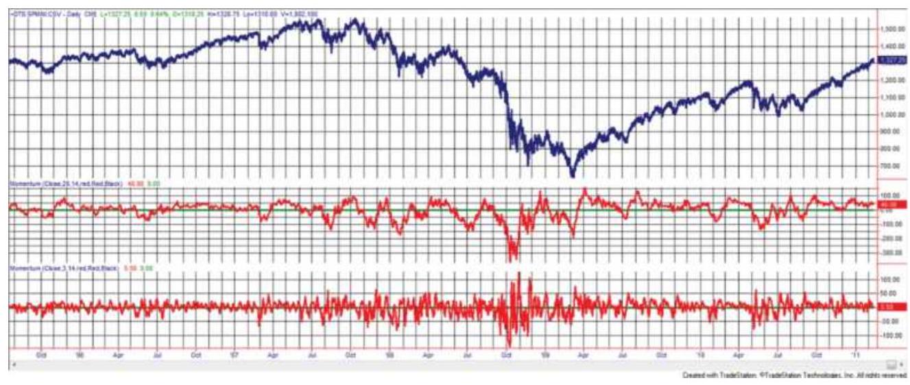
FIGURE 9.8 A longer view of the 20- and 3-day momentum applied to the S\&P. The magnitude of the momentum values change over time.
The problem with using momentum for timing is that the scale is unpredictable. Even if we waited for a reversal after penetrating the band, there is no assurance that prices will not reverse and go to new extremes. Some risk protection is needed, a way of dynamically adjusting the bands (as discussed in Chapter 8), or a different way of measuring momentum.
\section*{Risk Protection}
A protective stop-loss order can be used whenever you trade opposite to the current price momentum. A stoploss is a specific order to exit if the price goes the wrong way. This is most important with the aggressive entry, which advocates selling as the momentum value moves
above the upper threshold line, regardless of how fast prices are rising. While the other entry options allow for a logic positioning of a stop-loss, the aggressive entry does not. You will simply need to decide, based on historic momentum values and volatility, where to limit your risk. With the other entry options, prices are no longer at their extremes, so that stops may be placed using one of the following techniques:
- Place a protective stop above or below the most extreme high or low momentum value.
- Follow a profitable move with a trailing stop based on momentum points or price volatility.
- Establish zones that act as interim profit levels (using horizontal lines of equal spacing) and do not permit reverse penetrations once a new zone is entered.
Risk protection must be flexible in the way it deals with volatility. As prices reach higher levels, increased volatility will cause momentum tops and bottoms to widen; with low volatility, prices may not be active enough to penetrate the upper or lower bounds. This is shown in Figure 9.8. Therefore, both the profit targets and risk of a trade entered at extremes must increase with volatility and higher prices. Stops could be based on a reversal of momentum or a multiple of volatility.
The aggressive entry remains the greatest problem for controlling risk, yet has the greatest profit potential. Entering a short sale when prices are moving higher can result in large open losses. To determine the best stop-
loss amount, a computer test was performed using an immediate entry based on penetration of an extreme boundary and with a stop-loss at the close of the day for risk protection. The first results were thought to have outstanding profits and consistency until it was discovered that the computer had done exactly the opposite of what was intended: It bought when the momentum crossed the upper bound and placed a close stop-loss below the entry. It did prove, for a good sampling of futures markets, thathigh momentum periods continued for enough time to capture small but consistent profits. It also showed that an aggressive entry, anticipating an early reversal, would be a losing strategy. One should never forget that declining momentum, while still above zero, does not mean that prices are falling, only that they are rising at a slower pace.
\section*{The Trend Provides Protection}
In these examples, momentum is not a strategy itself, but a way of entering and exiting a trend trade. When a trend signal first occurs, it is not entered. If the signal was long, then the strategy waits until the 3-day momentum penetrates the lower band. If prices continue lower, the trend will change from up to down and the position will be exited. It should not be necessary to have a stop-loss.
\section*{Exiting Countertrend Trades}
When using momentum as a mean-reversion strategy, the most reasonable exit for a short entered at a momentum high, or a long position entered at a low, is
when the momentum returns to near zero, the midpoint line. Prices do not have an obligation to go from extreme lows to extreme highs and back again; however, any extreme can be expected to return to normal, which is where momentum is zero. Returning to zero does not mean that all trades will be profitable. If you sold momentum and then prices had a strong upward move, prices can be higher when momentum finally returns to zero. The trend is not your friend if it fights with your mean-reversion position.
The number of profitable trades can be increased by targeting a momentum level that is more conservative than zero. That is, if a long was entered at an extreme low, a sell would be placed \(5 \%\) or \(10 \%\) below the zero momentum line, based on the distance between the buying threshold line and zero. Trades that almost return to normal would then be closed out with profits, although the average size of the profit would be smaller. To increase the size of the profits per trade, you would target the opposite side of the zero momentum line. For example, if you held a long position, you would wait until the momentum value was greater than zero by \(5 \%\) or \(10 \%\) of the range. The success of taking profits early or late depends on the amount of noise in the momentum values. In many cases where extreme prices are followed by a sideways pattern, momentum will fluctuate around zero so that there is ample opportunity to exit the trade at a better price. In a trending market, the momentum tends to stay on one side of the zero line; therefore, expecting a penetration can be a long wait.
\section*{High-Momentum Trading}
Some professional traders have made a business of trading in the direction of the price move only when momentum exceeds the high threshold level rather than anticipating a change of direction. There is a small window of opportunity when prices are moving fast. They will usually continue at the same, or greater, momentum for a short time, measured usually in minutes or hours, but occasionally a few days. There are profits to be made quickly, but there is also risk if prices reverse direction sooner than expected.
Price patterns have changed. There are many more day traders. When one stock breaks out above a previous high, everyone sees it as an opportunity for profit. Buy orders start to flow and volume increases. Stocks that are normally ignored can attract large volume when prices make a new high. Traders ride the rising prices for as long as possible, watching to see when volume begins to drop, then they exit. Some may just target a modest profit and get out quickly.
High-momentum trading is a fast game that requires tools that allow you to scan a wide range of stocks. You are looking for one that has made a new high after a long, quiet period. You may also continually sort stocks by the highest momentum values. You need to stay glued to your screen, enter fast and exit fast. It is a full-time commitment.
\section*{Moving Average Convergence/Divergence (MACD)}
Many of the practical problems of fading prices using momentum are solved with the Moving Average
Convergence/Divergence (MACD), \(\stackrel{2}{ }\) developed by Gerald Appel. The MACD uses momentum calculated as the difference between two trends, produced using exponential smoothing. This momentum value is further smoothed to give a signal line. The standard parameters are a 12-day and 26-day exponential smoothing, and a 9day smoothing of the MACD for the signal line. The MACD is constructed as follows:
Step 1: Choose the two calculation periods for the trend - for example, 20 and 40 days. Convert to smoothing constants using \(2 /(n+1)\).
Step 2: Calculate the slow trendline, E40, using the smoothing value 0.0243 .
Step 3: Calculate the fast trendline, E20, using the smoothing value 0.0476 .
Step 4: The MACD line, the slower-responding line in the bottom panel of Figure 9.9, is E2O-E40. When the market is moving up quickly, the fast smoothing will be above the slow and the difference will be positive. This is done so that the MACD line goes up when prices go up.
Step 5: The signal line is the 9-day smoothing (using a constant of o.10) of the MACD line. The signal line is slower than the MACD; therefore, it can be seen in the bottom panel of Figure 9.9 as the lower line when prices are moving higher.
The 20- and 40-day momentum lines, corresponding to the MACD line and the histogram, are shown in the center panel of Figure 9.9. The MACD process in the bottom panel smooths these values significantly; therefore, it makes trading signals easier to see.
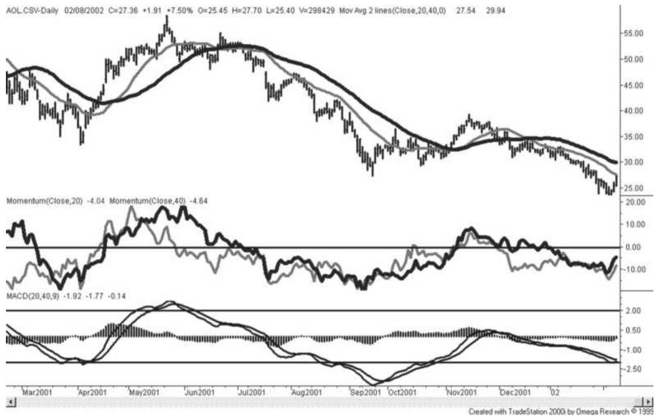
FIGURE 9.9 MACD for AOL. The MACD line is the faster of the two trendlines in the bottom panel; the signal line is the slower. The histogram is created by subtracting the slower signal line from the MACD line.
\section*{Reading the MACD Indicator}
The MACD is normally seen as it appears at the bottom of Figure 9.9. The MACD line is moving higher in an uptrend and lower in a downtrend. The histogram, also seen in the bottom panel of Figure 9.9, is created by subtracting the slower signal line from the MACD line.
When the histogram is above zero, it confirms the uptrend.
The 40/20 MACD line is similar to the 40-day momentum line. We can compare the MACD in the lower panel with the 20- and 40-day momentum in the center panel and see that the peaks and valleys are at about the same place, but the MACD line is much smoother because it is the difference between two trendlines rather than the difference between prices.
You should note the point at which the MACD and signal lines turn down in May 2001, compared to the corresponding moving averages that are shown with prices in the top panel of the chart. The MACD leads the moving averages in showing the downturn and has only slightly more up-and-down variation in its values. The signal line also leads the moving averages in the downturn and is equally smooth.
\section*{Trading the MACD}
The most common use of the MACD is as a trend indicator. For this purpose, only the MACD and signal lines are used in the following way:
Buy when the MACD line (faster) crosses upward through the signal line (slower).
Sell when the MACD line crosses below the signal line.
In the bottom panel of Figure 9.9, the buy signals that occur right after an extreme low in April and October of 2001 generated large gains. Unfortunately, there were
many other crossings that generated losses; therefore, it is necessary to select which trades to enter. To accomplish that, the MACD uses thresholds similar to those shown for momentum, but in the opposite way. The MACD must first penetrate the lower band, then it must signal a new uptrend before a long position can be entered. In this way it removes some of the whipsaws that might occur in a sideways market. Threshold levels were established by observing the historically high and low momentum values, shown as horizontal lines at the +2.00 and -2.00 levels in the bottom panel of Figure 9.9. Sell signals would have been taken only after the MACD value had been above +2.00 and buy signals only when the MACD value had fallen below -2.00. The trading signals that satisfy these conditions are the buy signal in April, a sell in May, and a buy in October. However, fitting the threshold lines makes, them unreliable values for trading. One solution can be found in "An RSI Version of MACD" in the next section.
Appel has written extensively on the MACD and his analysis can be found in his book Technical Analysis. \({ }^{3}\) Many of the examples are interpretive, similar to the way we look at chart patterns. Appel also preferred using trends of 19 and 39 days for the NASDAQ composite. An equally important use of MACD is for divergence signals. Bearish divergence occurs when prices are rising but the MACD values are falling. Because this technique applies to many indicators in addition to the MACD, it is covered in detail in the section "Momentum Divergence" toward the end of this chapter.
\section*{ADDING VOLUME TO MOMENTUM}
A momentum indicator can also incorporate volume by multiplying the price change over \(n\) periods by the total volume over that same period. The use of the cumulative volume over the period, or even better, the average volume, will help to stabilize the volume, which is often erratic from day to day. The average volume will appear to be the same magnitude as the volume and can be plotted along with it on a chart. That gives the momentum-volume indicator ( \(M V\) ), shown mathematically and in programming notation:
\[
\begin{aligned}
& M V_{t}=\left(p_{t}-p_{t-n}\right) \times \frac{\sum_{i=t-n+1}^{t} \text { volume }_{i}}{n} \\
& \text { MV }=(\text { close }- \text { close[n] }) * \text { average }(\text { volume }, \mathrm{n})
\end{aligned}
\]
Alternatively, the price change over \(n\) periods could have been divided by \(n\) to give a per-unit value. The following sections will include those techniques that combine price change and volume or open interest; for methods that use volume but not price, see Chapter 12.
\section*{Scaling by a Percentage or Volatility}
It is always best to convert values to a percent or normalize them using a divisor based on volatility. Because volatility has periods where it increases and decreases, using a longer 20 - to 65 -day calculation period can give more stable results.
Percentage momentum with volume
\%MV = average(volume,n)*(close - close[n])/close[n]
Momentum with volume scaled by true range
TRMV = average(volume, n\()^{*}\)
(close - close[n])/avgtruerange(p)
where avgtruerange is the average of the 1-day true ranges for the past \(p\) days and \(n\) is the calculation period for everything else, and \(p>n\).
\section*{Money Flow}
We can weight each day by its volume to get what is called money flow. 4 A positive or upward day is when the average of today's high, low, and close is greater than the previous average. Each average is then multiplied by the volume, giving the daily money flow, and a ratio of the past 14 days is used to create a money ratio and finally a money flow index.
\[
\begin{aligned}
\text { Money flow }_{t} & =\text { Volume }_{t} \times \frac{\text { High }_{t}+\text { Low }_{t}+\text { Close }_{t}}{3} \\
\text { Money ratio }_{t} & =\frac{\sum_{i=t-13}^{t} \text { Money flow }_{i} \text { if }>0}{\sum_{i=t-13}^{t} \text { Money flow }_{i} \text { if }<0} \\
\text { Money flow index }_{t} & =100-\frac{100}{1+\text { Money ratio }_{t}}
\end{aligned}
\]

\section*{Herrick Payoff Index}
Using the change in the underlying value of the futures contract, rather than only the change in price, the Herrick Payoff Index \({ }^{5}\) (HPI) combines volume and open interest to generate an indicator that is not bounded from 0 to 100 as most oscillator calculations. The daily value is:
\(H P_{t}=c f \times V_{t} \times\left(M_{t}-M_{t-1}\right) \times\left[1+\left(\frac{M_{t}-M_{t-1}}{\left|M_{t}-M_{t-1}\right|}\right)\left(\frac{2 \times\left|0 I_{t}-0 I_{t-1}\right|}{\min \left(0 I_{t}, 0 I_{t-1}\right)}\right)\right]\) where
\[
\begin{aligned}
t & =\text { today } \\
t-1 & =\text { the previous day }
\end{aligned}
\]
\[
\begin{aligned}
c f= & \text { the conversion factor (value of a one big } \\
& \text { point move) } \\
V_{t}= & \text { today's volume }
\end{aligned}
\]


( \(M_{t}-M_{t}=\) the difference in the mean values, \(\mathrm{M}=\) \(\left.{ }_{-1}\right)(\) high + low) \(/ 2\),
\(\mid M_{t}-M_{t}=\) the absolute vale of the difference in the \({ }_{-1} \mid\) mean values
\(\mid O I_{t}-O I_{t}=\) the absolute value of the change in open \({ }_{-1} \mid\) interest
\(\min \left(O I_{t},=\right.\) the smaller of the open interest for today \(\left.O I_{t-1}\right) \quad\) or the previous day
The expression that divides the change in mean prices by the absolute value of the same change is used to create a value of +1 or -1 . The index \(H P_{t}\) is then scaled down to a manageable value and smoothed using a 0.10 smoothing factor, \(s\) (about 19 days). This complex formula for HPI can also be written in programming code as:
\[
\begin{aligned}
& \text { HP = BigPointValue*volume* }((\text { high-low }) / 2-(\text { high[1]- } \\
& \text { low[1])/2)* } \\
& \begin{array}{r}
(1+(((h i g h-l o w) / 2-(\text { high[1]-low[1])/2) } \\
\text { absvalue }((\text { high-low }) / 2-(\text { high[1]- }
\end{array} \\
& \text { low[1])/2))*2* } \\
& \text { (absvalue(opint - } \\
& \text { opint[1])/lowest(opint,2))) } \\
& \text { HPI = smoothedaverage(HP,19) }
\end{aligned}
\]
Most analysts who use the Herrick Payoff Index divide the HPI by 100,000 to scale the value to a more usable level (in the example below it is scaled by \(1,000,000)\). The final series, when seen along with prices, may appear volatile and require interpretation, often using trendlines. This is due to the fluctuations in volume and open interest, which are smoothed over 20 days, rather than a longer period. The Herrick Payoff Index may be helpful, despite its volatility, because it is a combination of factors not included in most other indices. It has larger values, both positive and negative, that appear ahead of price turning points. A spreadsheet, TSM Herrick Payoff Index for DAX, and a program, TSM Herrick Payoff, can be found on the Companion Website.
Figure 9.10 gives an idea of how the HPI reacts to prices, in this case using the German DAX from 2000 through February 2011. It shows higher volatility at the turning points and very low volatility during the upward trends from 2004 to 2006 and again in 2010. It turns out that volume is a good surrogate for volatility and might actually be a good forecaster of volatility. This is discussed in Chapter 12.

FIGURE 9.10 The Herrick Payoff Index applied to the
DAX, 2000 through February 2011. Clusters of larger HPI values precede price turning points.
\section*{Comments on the Use of Volume}
Volume is an important piece of information, but it can be difficult to interpret. It fluctuates in a much larger range than price, and may be 50\% higher or lower from day to day. While it indicates market interest and potential volatility, there are many days for which a high or low volume has no significance.
In general, adding volume to an indicator results in a more volatile, erratic series. Therefore, the first steps in using volume are:
1. Create a long-term, smoothed volume series.
2. Compare the current volume with the smoothed volume to identify important outliers.
3. Low volume should not be determined by a single day, but either by a few unusually low days clustered together or by a decay in the smoothed volume over a modest time period.
Using volume to enhance trend signals as well as identifying important volume patterns are discussed in Chapter 12.
\section*{DIVERGENCE INDEX}

A method similar to MACD but one that uses an interesting combination of generalized techniques is
theDivergence Index, the volatility-adjusted difference between two moving averages, for example, 10 and 40 days.
1. Slow average \(=40\)-day moving average
2. Fast average \(=10\)-day moving average

difference
Then the Divergence index (DI),
\[
D I_{t}=\frac{\text { Fast average }_{t}-\text { Slow average }_{t}}{{\text { StDev }\left(\text { Difference }_{t}, \text { slow period }^{2}\right.}^{2}}
\]
In this case, the slow period is 40 . To avoid too many false signals, a band is placed around the zero trigger level.
\[
\text { Band }_{t}=\operatorname{stdev}\left(D I_{t}, \text { slow period }\right)
\]
UPper band \({ }_{t}=\) factor \(\times\) band \(_{t}\) Lower band \(d_{t}=-\) factor \(\times\) band \(_{t}\)
where factor \(=1.0\). By using the standard deviation of DI, the band adjusts to changes in volatility. In Figure 9.10 the index in the lower panel has peaks followed by periods of low or varying volatility. The standard deviation allows the bands to widen or narrow according to the fluctuations in volatility. This example used the
slow period for the standard deviation; however, the fast period would have caused more rapid changes to the band.
The trading rules are:
Buy when the DI moves below the lower band while the slow average is in an uptrend.
Sell when the DI moves above the upper band while the slow average is in a downtrend.
Exit longs and shorts when the DI crosses zero.
Figure 9.11 shows the DI and the upper and lower bands in the bottom panel. The top panel shows the trading signals for \(e\) mini S\&P futures.
\section*{VISUALIZING MOMENTUM}
John Ehlers and Ric Way have created a new visualization aide for momentum indicators. Called a SwamiChart, \(\underline{6}\) it is similar to a heat map but a dynamic representation of momentum in color. In the center panel of Figure 9.12, red (darker shading) indicates bearish, green (medium shading) bullish, yellow a transition. In the bottom panel blue (darker shading) indicates cold and white is hot, referring to the intensity.
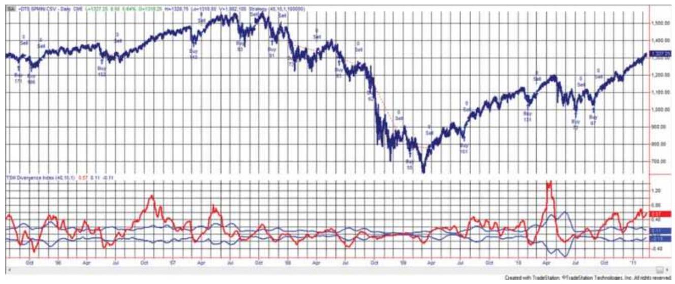
FIGURE 9.11 Divergence Index applied to S\&P futures.
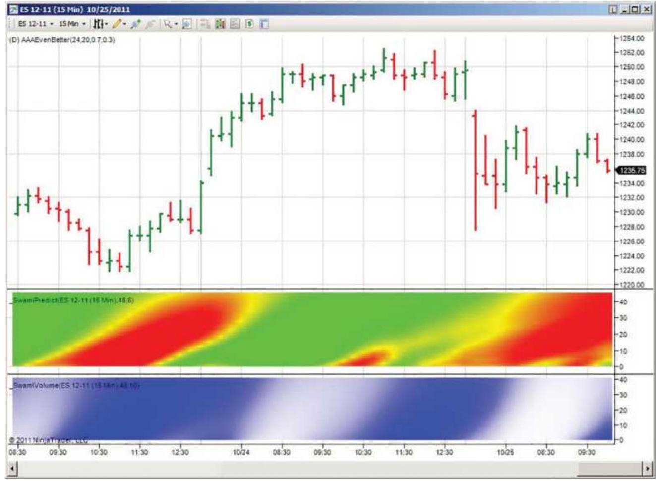
FIGURE 9.12 John Ehlers' SwamiChart showing S\&P price using 15 -minute bars at the top, the indicator in the center panel, and intensity at the bottom.

To create this mosaic, Ehlers uses two indicators, Swami Predict and Swami Volume; however, this method can use the RSI, stochastics, or other indicators. \({ }^{7}\) Ehlers' programming code for this visualization is available on the Companion Website as TSM SwamiCharts.
In the lower panels, the top of the band represents longer calculation periods, that is, less sensitivity, and the bottom shorter, more sensitive reactions. Looking at the middle panel, we see the darkest tone beginning at the bottom left reflecting the short downturn. That turns to a lighter tone along the bottom while the dark tone moves diagonally to the top right. Then the faster calculation periods show an upturn in prices while the slower ones show the lag.
Along the bottom, the dark segment on the left reflects the increasing momentum in the upward move. That turns to white as prices go sideways near the top, but then turns dark again when prices break lower. Although there are no specific trading signals associated with the SwamiChart, the availability of the computer code should give developers enough of a structure to create a strategy.
\section*{OSCILLATORS}
Although momentum indicators may be considered oscillating, we will use the term oscillator to describe a momentum indicator that is normalized and expressed in terms of values that are limited to the ranges between
+1 and -1 (or +100 to -100 ), +1 and o , or +100 and 0 (as in a percent). In other words, bounded.
To transform a standard momentum calculation into the normalized form with a maximum value of +1 and a minimum value of -1 , divide the momentum calculation by its maximum value (either positive or negative, but always used as a positive number) over the same rolling time period. This allows the oscillator to self-adjust to changes in price or volatility. Using Amazon as an example of changing volatility:
During 10 days in February 2011, it had a high of \(\$ 191.40\) and a low of \(\$ 174.77\), a range of \(\$ 16.63\).
During a 10-day period in July 2018, it had a high of \(\$ 1880.05\) and a low of \(\$ 1739.32\), a range of \(\$ 140.73\).
Then a price move of \(\$ 5\) in 2011 would be \(30 \%\) of the trading range. A price move of \(\$ 42.21\) would be needed in 2018 to span \(30 \%\) of that range.
Hence, normalization, which is the basis for most oscillators, can be an excellent way to self-adjust to price changes.
The following sections show how a variety of useful oscillators are calculated. In each case, the purpose is to have the indicator post high values when prices are at a peak and low values when they are in a valley, all relative to recent volatility. Ideally, when we create trading systems, prices should reverse direction soon after the oscillator records values near its extremes.
\section*{Relative Strength Index}

One of the most popular indicators for showing overbought and oversold conditions is the Relative Strength Index (RSI) developed by Welles Wilder. \({ }^{8}\) It is more stable than momentum because it uses all the values in the calculation period, creating a ratio of the total up moves to total down moves, rather than only using the first and last prices. It expresses the relative strength of the current price movement as increasing from o to 100. It is calculated as:
\[
R S I=100-\left(\frac{100}{1+R S}\right)=100 \times\left(\frac{R S}{1+R S}\right)
\]
where
\[
R S=\frac{A U}{A D}
\]
\(A U=\) the total of the upwards price changes during the past 14 days
\(A D=\) the total of the downwards price changes (used as positive numbers) during the past 14 days
Once the first calculation has been made, both the \(A U\) and \(A D\) values can be calculated daily using an averageoff method:
\[
\begin{aligned}
& A U_{t}=A U_{t-1}+\frac{A U_{t-1}}{14}+\max \left(p_{t}-p_{t-1}, 0\right) \\
& A D_{t}=A D_{t-1}+\frac{A D_{t-1}}{14}+\max \left(p_{t-1}-p_{t}, 0\right)
\end{aligned}
\]
This method essentially subtracts an average value and adds the new value (see "Average-Modified or AverageOff Method" in Chapter 7). All price changes are treated as positive numbers. The daily calculation of the RSI becomes a matter of simple arithmetic. Wilder has favored the use of 14-days because it represents one-half of a natural cycle, in this case 1 month. He has set the significant threshold levels for the RSI at 30 and 70. Penetration of the lower level is indicative of an imminent upturn and penetration of the upper level, a pending downturn. A chart of an RSI is shown in Figure 9.13 and will be compared to other indicators in the next sections.
Use of the RSI alone to generate trading signals often requires interpretation similar to standard chart analysis. Lines are drawn across the tops of the RSI values to indicate a downtrend. A head-and-shoulders formation can be used as the primary confirmation of a change in direction. Wilder himself used the RSI top and bottom formations shown in Figure 9.13. On the left is a buy signal, where the second low is higher than the first, then the RSI moves above the peak of the rally between the two lows. In the center is the reverse formation that generates a sell signal when the momentum low is
broken. This formation is also called a failure swing, or divergence (discussed later in this chapter), denoting an unsuccessful test of a recent high or low RSI value.
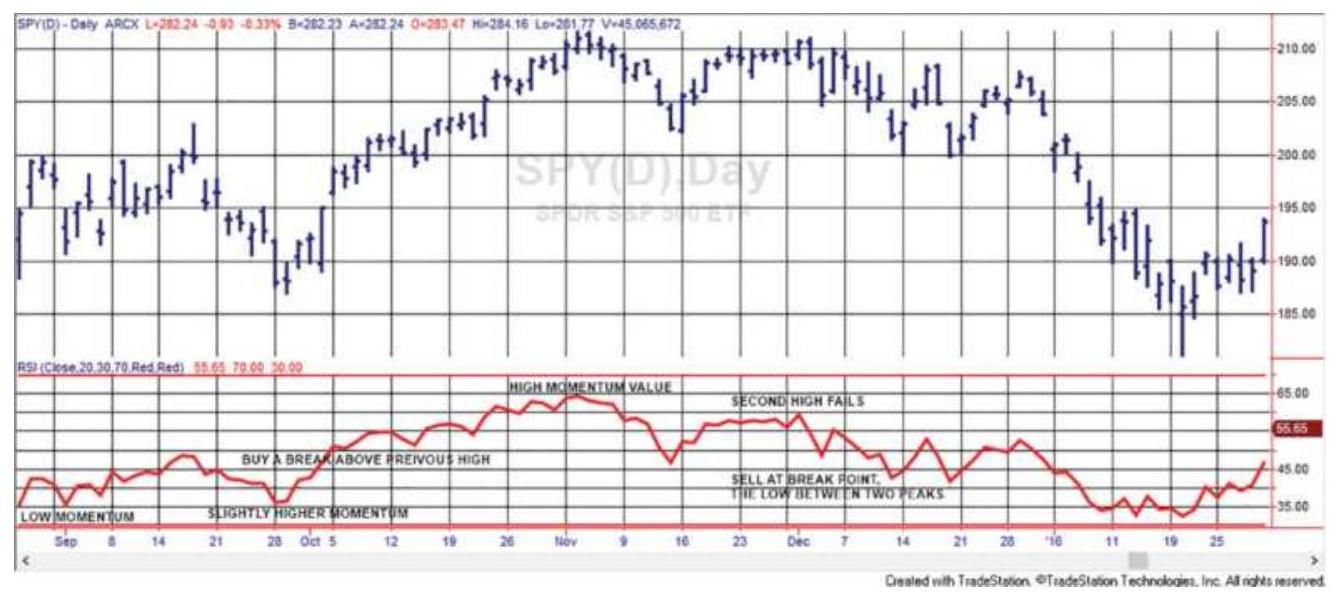
FIGURE 9.13 RSI bottom and top formations using a 20-day RSI applied to SPY.
Wilder created other popular indicators. One of these is a momentum calculation called the Average Directional Movement (ADX). The ADX is a byproduct of the Directional Movement and is discussed in Chapter 23. All of these indicators are actively used by traders.
\section*{Modifying the RSI}
An obvious concern might be the selection of a 14-day half-cycle for the RSI. Maximum divergence occurs using a moving average that is some fraction of the length of the dominant cycle, but 14 days may not be that value. If a 14-day calculation period is too short, then the RSI would remain outside the \(70-30\) zones for longer periods rather than signaling an immediate turn. In practical terms, a 14-day RSI means that a sustained
move in one direction that lasts for more than 14 days will produce the maximum RSI value. If prices continue higher for more than 14 days, then the RSI, as with other oscillators, will go sideways at the maximum value, 100. The idea is to pick the calculation period for which there are very few larger sustained moves, and 14 may be that value. If more frequent overbought and oversold conditions are needed, then the period could be lowered to 10. At the same time the zones could be increased to 80-20. Some combination of calculation period and zone will usually give the frequency of signals that a trader is looking for.
\section*{RSI Countertrend Trading}

Momentum indicators are used for timing and entry, but most often in the countertrend direction. Normally, it is the absolute overbought or oversold level that is the trigger for a trade. However, a big 1-day jump in the RSI could be a criterion for a reversal. When
\(R S I_{t}-R S I_{t-k}>D\) or when \(R S I_{t}-R S I_{t-k}<-D\) , where \(D\) is a threshold difference, we could sell or buy, respectively. The absolute value of the RSI doesn't matter, only the size of the jump. This is somewhat like a gap opening but could occur any time. It increases the number of trades if you use both the standard entry thresholds and the large jump criteria. Exits can be taken when momentum returns to near zero, or after \(n\) days. A program to test this is TSM RSI Countertrend, available on the Companion Website.
\section*{Net Momentum Oscillator}
Another variation on the RSI is the net momentum oscillator. 9 It uses the difference between the sum of the up days and the sum of the down days, rather than a ratio. If you consider the unsmoothed \(\mathrm{RSI}=100 \times\left(S_{u} /\left(S_{u}+S_{d}\right)\right)\), then the net momentum oscillator would be:
\[
\mathrm{CMO}=100 \times\left(S_{u}-S_{d}\right) /\left(S_{u}+S_{d}\right)
\]
This method replaces some of the indicator movement lost to smoothing in the normal RSI and shows more extremes. This may also be accomplished by shortening the number of periods in the RSI calculation.
\section*{Smoothing with the 2-Day RSI}
Among the interesting information published on MarketSci Blog 10 is Michael Stokes's "favorite" indicator, the 2-day RSI, which replaces each 1-day closing price change with a 2-day change; otherwise, the calculations and the number of data points are the same. You can do this for any momentum indicator by creating a new series where \(q_{t}=p_{t}-p_{t-2}\) to get overlapping 2-day data. Then use the \(q\) series instead of the original prices. The effect of using combined 2 days instead of 1 is some smoothing and a general increase in volatility. Stokes uses threshold levels of 10 and 90 for the S\&P and the rules:
Buy on the next close when the 2-day RSI penetrates the threshold 10 moving lower.
Sell short on the next close when the 2-day RSI penetrates the threshold of 90 moving higher.
Exit one day later on the close.
Figures 9.14a and b are from the MarketSci Blog on December 9, 2008. Figure 9.14a shows that the profitability of the RSI reversed in about 1998. From 1970 to 1998 it was a good trend indicator; that is, when the RSI moved above 90 the S\&P continued up. After 1998 it has been a much better mean reverting indicator. Figure 9.12b is the result of applying a method of scaling in to trades according to the following rules:
\begin{tabular}{|l|l|l|l|}
\hline \multicolumn{2}{|c|}{\begin{tabular}{c}
If the RSI < then buy \\
this \%
\end{tabular}} & \multicolumn{2}{c|}{\begin{tabular}{c}
If the RSI \(>\) then sell short \\
this \%
\end{tabular}} \\
\hline\(<5\) & \(100 \%\) & \(>95\) & \(100 \%\) \\
\hline\(<10\) & \(.75 \%\) & \(>90\) & \(.75 \%\) \\
\hline\(<15\) & \(.50 \%\) & \(>85\) & \(.50 \%\) \\
\hline\(<20\) & \(.25 \%\) & \(>80\) & \(.25 \%\) \\
\hline
\end{tabular}
It was not clear if, on day \(t\) the RSI was 14 and we entered \(50 \%\) of our position, but then on day \(t+1\) the RSI dropped to 8 whether we added an extra \(25 \%\), but we assume that is the case. Then the trade is exited if we do not add on the next day. Because the RSI can stay above or below 50 for long periods of time, an exit rule that waits for the RSI to cross 50 is not likely to be successful. Stokes's approach of exiting after one day seems much safer. Figure 9.14 b separates the longs and short sales from 2000 through 2008, showing that both sides performed well, a very desirable outcome. Having
good performance for longs and shorts is not common because many markets have an upward bias (especially the stock market). However, 1-day trades are sensitive to costs. Traders will need to see if the returns per share, or per contract, are sufficient to cover commissions and slippage.
Evolution of RSI(2) Strategy (1970 - 2008)
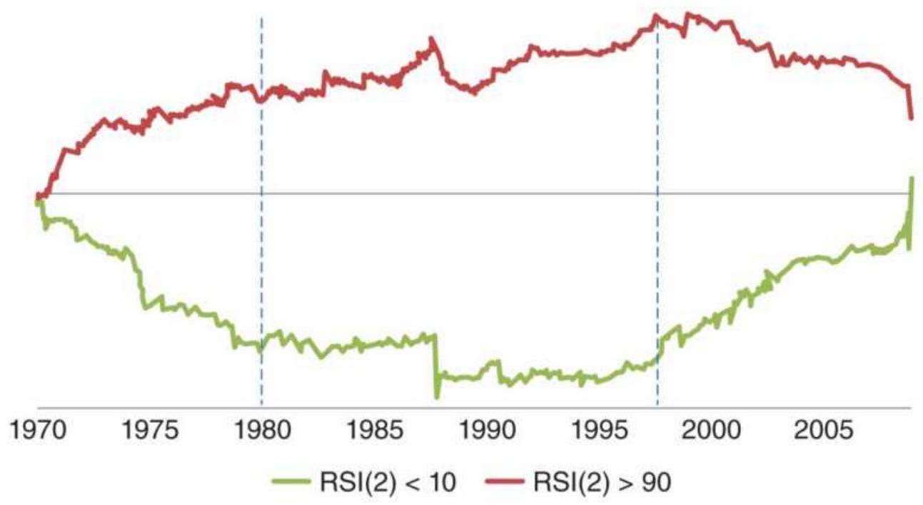
(a)
Trading Strategy: Long vs Short-Only
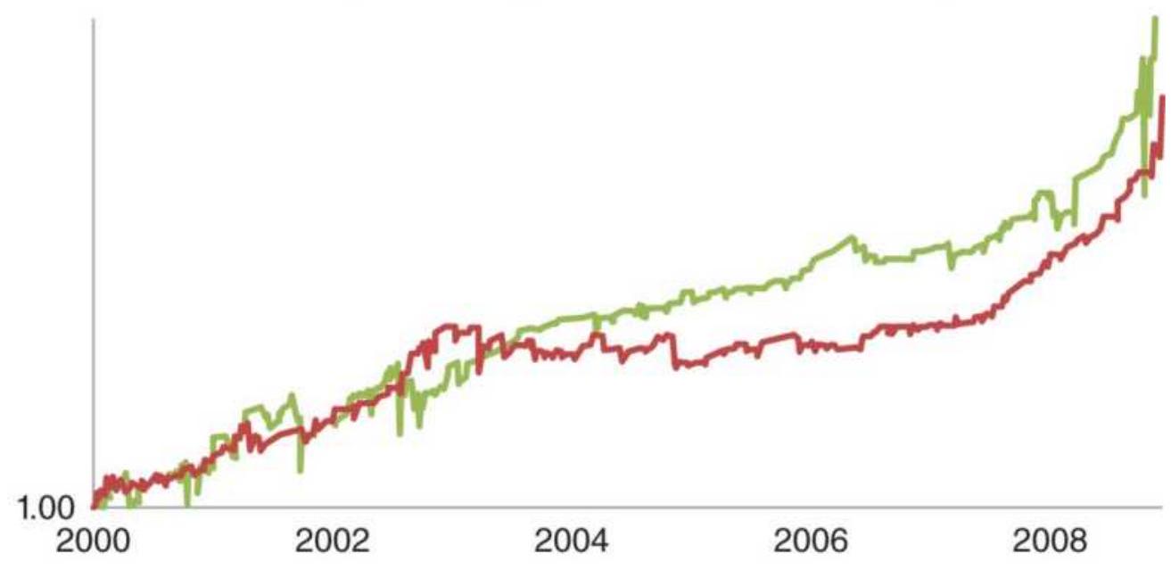
- Trading Strategy: Long Only — Trading Strategy: Short Only
(b)
FIGURE 9.14 Performance of the 2-day RSI, MarketSci blog's favorite oscillator from the December 9, 2008,
posting (a), simple entries \(<10\) and \(>90\) applied to the S\&P, 1970 through 2008; (b) a breakdown of longs and short sales using the scaling-in method, S\&P 2000 through 2008.
\section*{Comparing the 1- and 2-Period RSI}
In Figure 9.15 a standard 2-period, 14-bar RSI is shown in the middle panel and the traditional 1-period, 14-bar RSI in the lower panel. Both are applied to NASDAQ futures from August 2005 through September 2008. The NASDAQ price appears at the top. The classic RSI penetrates the extremes of 30 and 70 but does not reach 20 or 80 while the 2 -period RSI touches near 15 and 85 a number of times. The average 2-period price move will always be greater than the average 1-period move, so the volatility of the RSI will increase.
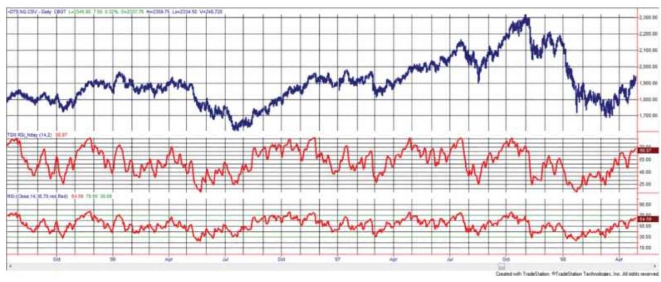
FIGURE 9.15 2-Period RSI (center panel) compared with the traditional 14-day RSI (bottom panel), applied to NASDAQ futures, August 2005 through September 2008.
\section*{An RSI Version of MACD}
While the MACD creates a histogram of the difference between two moving averages, it is not bounded; in other words, it can get as large or small as prices dictate. We can make that pattern easier to use by applying the RSI to the difference in the moving averages, the basic MACD calculation. In Figure 9.16 a 5-day RSI is applied to the difference between the 10- and 40-week moving average for the emini S\&P futures. Using the standard \(30-70\) thresholds, this seems to find credible points where prices are overbought and oversold with little lag.
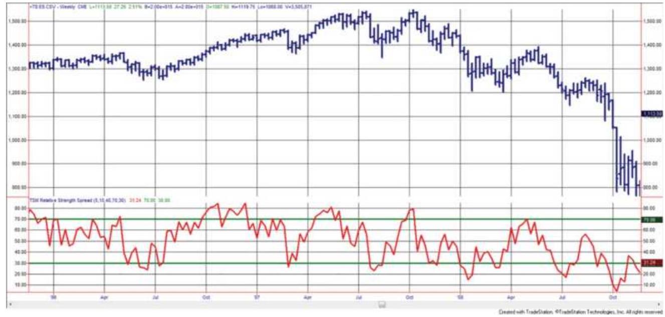
FIGURE 9.16 RSI applied to the spread between a 10week and 40-week moving average of S\&P futures.
\section*{Stochastics}
Thestochastic indicator, created by George Lane, is an oscillator that measures the relative position of the closing price within a past high-low range. It is based on the commonly accepted observation that closing prices
tend to resist penetrating the high and low prices of the past few days, the place where horizontal resistance lines would be drawn on a chart. A breakout of the highs or lows is a predictor of a continued price move in that direction. When the market is about to turn from up to down, for instance, it is often the case that the highs are higher than previous days, but the closing price settles much lower in the range, failing to indicate a continuation of the uptrend. This makes the stochastic oscillator conceptually different from the MACD, which uses the difference between two trends, and the RSI, which uses only the closing prices, and gives weight to the up and down moves. Unlike the other oscillators, there does not need to be any smoothing to introduce a lag; however, some traders prefer a smoother version.
The three indicators that result from the stochastic formula are called \(\% K, \% D\), and \(\% D\)-slow. \(\% K\) is the raw stochastic, without smoothing, \(\% D\) is a 3 -day smoothing of \(\% K\), and \(\% D\)-slow is a 3 -day smoothing of \(\% D\). Each removes more noise from the raw stochastic.
Calculations of these indicators for today's value \(t\) over the past 10 days, are:

\(\operatorname{Max}(\) High, 10) \(-\operatorname{Min}(\) Low, 10)
\(\% D=" \% K\)-slow" \(=\frac{\% K_{t}+\% K_{t-1}+\% K_{t-2}}{3}=\left(\frac{\sum_{i=t-2}^{t} \% K_{i}}{3}\right)\)
\[
\% D_{t} \text {-slow }=\frac{\left(\sum_{i=t-2}^{t} \% D_{i}\right)}{3}
\]
where
\[
\text { Close }_{t}=\text { today's closing price }
\]
\(\operatorname{Min}(\operatorname{Low,10)}=\) the lowest low price of the last 10 days
\(\operatorname{Max}(\) High,10 \()=\) the highest high price of the last 10 days \({ }^{11}\)
Note that \(\% K\)-slow is also called \(\% D\).
\section*{TABLE 9.1 Excel example of 10-day stochastic for Hewlett-Packard (HPQ).}
\begin{tabular}{|c|c|c|c|c|c|c|c|c|c|c|}
\hline 4. & A & B & c & D & E & F & G & H & 1 & J \\
\hline 1 & Date & High & Low & Close & \begin{tabular}{c}
10-Day \\
High
\end{tabular} & \begin{tabular}{c}
10-Day \\
Low
\end{tabular} & \begin{tabular}{l}
10-Day \\
Range
\end{tabular} & \%K & \%K-Slow & \%D-Slow \\
\hline 2 & 1/3/2011 & 43.49 & 42.22 & 42.74 & & & & & & \\
\hline 3 & 1/4/2011 & 43.77 & 43.01 & 43.63 & & & & & & \\
\hline 4 & 1/5/2011 & 44.22 & 43.40 & 44.20 & & & & & & \\
\hline 5 & \(1 / 6 / 2011\) & 44.96 & 44.18 & 44.88 & & & & & & \\
\hline 6 & 1/7/2011 & 45.39 & 44.71 & 45.09 & & & & & & \\
\hline 7 & 1/10/2011 & 45.05 & 44.57 & 44.86 & & & & & & \\
\hline 8 & 1/11/2011 & 46.06 & 45.20 & 45.43 & & & & & & \\
\hline 9 & 1/12/2011 & 45.71 & 45.27 & 45.64 & & & & & & \\
\hline 10 & 1/13/2011 & 45.84 & 45.31 & 45.65 & & & & & & \\
\hline 11 & 1/14/2011 & 46.40 & 45.61 & \(46.25^{\prime \prime}\) & \(46.40^{\prime \prime}\) & 42.22 & 4.18 & 96.41 & & \\
\hline 12 & 1/18/2011 & 46.42 & 46.08 & 46.34 & \(46.42^{\prime 2}\) & 43.01 & 3.41 & 97.65 & & \\
\hline 13 & 1/19/2011 & 46.48 & 46.08 & 46.32 & \(46.48^{\prime 2}\) & 43.40 & 3.08 & 94.81 & 96.29 & \\
\hline 14 & 1/20/2011 & 46.79 & 45.76 & \(46.78^{\prime \prime}\) & \(46.79^{\prime \prime}\) & 44.18 & 2.61 & 99.62 & 97.36 & \\
\hline 15 & 1/21/2011 & 47.64 & 46.83 & \(47.23^{\prime \prime}\) & 47.64 & 44.57 & 3.07 & 86.64 & 93.69 & 95.78 \\
\hline 16 & 1/24/2011 & 47.59 & 46.66 & \(47.55^{\prime \prime}\) & 47.64 & 44.57 & 3.07 & 97.07 & 94.44 & 95.16 \\
\hline 17 & \(1 / 25 / 2011\) & 47.83 & 46.88 & 47.08" & \(47.83^{\prime}\) & 45.20 & 2.63 & 71.48 & 85.07 & 91.07 \\
\hline 18 & \(1 / 26 / 2011\) & 47.28 & 46.57 & \(46.88^{\prime}\) & \(47.83^{\prime}\) & 45.27 & 2.56 & 62.89 & 77.15 & 85.55 \\
\hline 19 & 1/27/2011 & 46.98 & 46.58 & 46.74 & \(47.83^{\prime}\) & 45.31 & 2.52 & 56.75 & 63.71 & 75.31 \\
\hline 20 & 1/28/2011 & 46.69 & 45.36 & 45.51 & \(47.83^{\prime}\) & 45.36 & 2.47 & 6.07 & 41.90 & 60.92 \\
\hline
\end{tabular}
\section*{Calculating the 10-day Stochastic Using Excel}
Using an Excel spreadsheet (Table 9.1), paste the date, high, low, and closing prices in columns \(A-D\). The 10day stochastic calculations, columns \(E-J\), for row 15, are:
1. Column \(E\), the 10 -day high \(=\mathrm{MAX}(\mathrm{B} 6: \mathrm{B} 15)\)
2. Column \(F\), the 10-day low \(=\mathrm{MIN}(\mathrm{C6}: \mathrm{C} 15)\)
3. Column \(G\), the 10 -day range \(=\mathrm{E} 15-\mathrm{F} 15\).
4. Column \(H\), the raw stochastic \(\% K=100^{*}\left(\mathrm{D} 15^{-}\right.\) F15)/G15.
5. Column \(I\), the smoothed stochastic \(\%\) Kslow =AVERAGE(H13:H15)
6. Column \(J\), the double-smoothed stochastic, \(\%\) Dslow=AVERAGE(I13:I15)
\(\perp\) The raw stochastic in column \(H\) of the spreadsheet shows that values start above \(90 \%\) and drop to \(6 \%\) in a few days. This happens when prices close near the highest or lowest prices of the past 10 days. When calculating the stochastic, today's close is always included in the max and min calculations. If today's price is the highest or lowest of the calculation period, then the raw stochastic will have a value of 100 or 0 . The full spreadsheet TSM Stochastic calculation for \(H P Q\), can be found on the Companion Website.
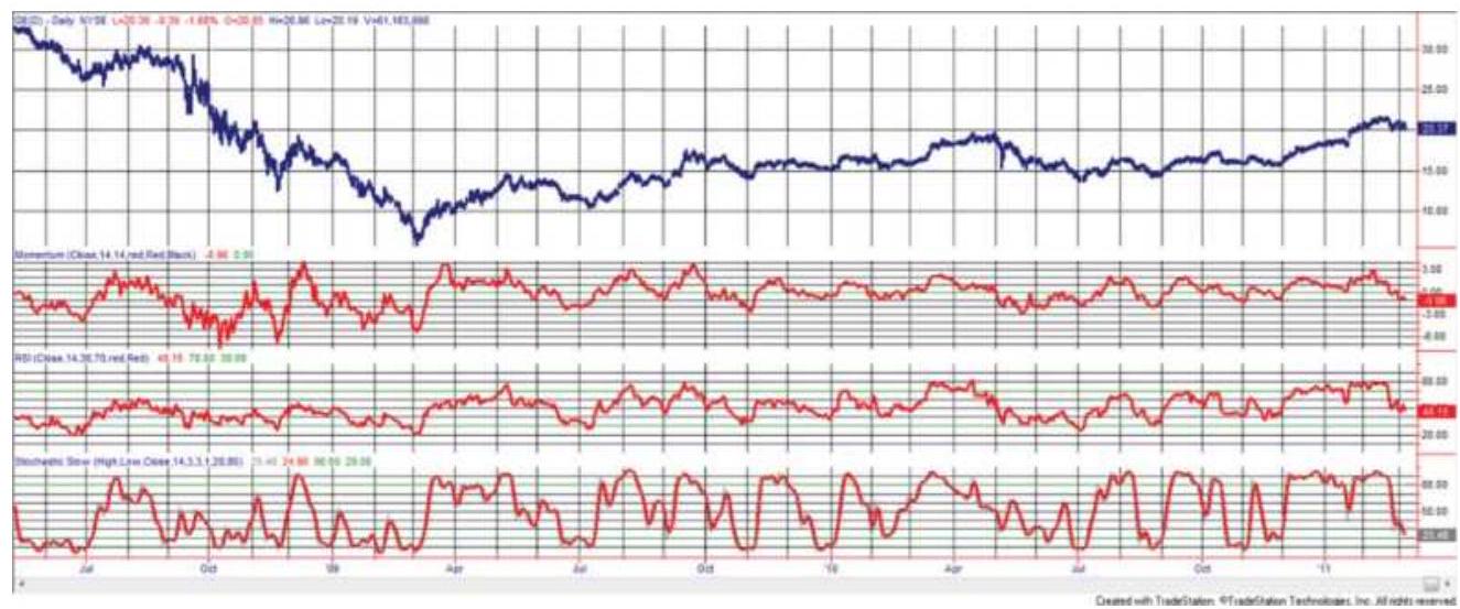
FIGURE 9.17 Comparison of simple momentum, RSI, and stochastic, all for 14-day calculation periods, General Electric, May 2008 through February 2011.
\section*{Comparing the Stochastic to Momentum and the RSI}
The calculations for momentum, RSI, and the stochastic are very different; however, there are surprising similarities among the three when calculated over the same 14-day period, as shown in Figure 9.17. The momentum and RSI (panels 2 and 3) are most similar
except for the period at the far left. Also, the RSI is normalized between 0 and 100.
The stochastic (bottom panel) gives the overall impression that it moves faster and exaggerates the swings. There is no smoothing in the raw stochastic, so it has less lag than the other indicators.
\section*{Trading the Stochastic}
The stochastic is most often used as a countertrend timing signal. Trades may buy when the value goes below 10, or sell above 90, depending on the calculation period. These signals would be filtered with a trend, so a trader would be looking to buy lower in an upward trend.
Using a faster and slower stochastic, \(\% D\) and \(\%\) Dslow, traders will sell after the faster goes above 90, then crosses the slower going down. The slower becomes the signal line that we have seen in the MACD. The fastest calculation, \(\% K\), is not often used due to its volatility. Instead, Figure 9.18 shows \(\% D\) and \(\% D\)-slow, using a 20day calculation period, along the bottom of an S\&P futures continuation chart from December 2001 through September 2002. A 60-day moving average is in the top panel.
The downtrend in the S\&P during 2002 produces two good sell signals using the stochastics. In March and August, \(\% D\) penetrates above the \(80 \%\) threshold and then crosses the signal line, \(\% D\)-slow, moving down. A third peak in May touches near \(70 \%\) and would produce an additional sell signal if the upper threshold were set lower. During a sustained downtrend, it is common for
the indicator values to fall below the lower threshold and remain there for extended periods. Although the rolling calculation is intended to self-adjust to the full 0 to 100 range, a strong trend will prevent that from happening.
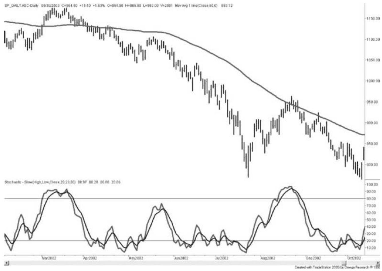
FIGURE 9.18 20-Day stochastic (bottom) and a 60-day moving average for the S\&P futures continuation series.
The 6o-day moving average, shown along with prices in the upper part of Figure 9.17, indicates a downtrend for the entire period of the chart. Using the relatively slow 20-day stochastic, the penetration of the upper \(80 \%\) threshold gives very good timing for short sale entries and avoids the problems of an unfavorable distribution of stochastic values. The 20-day stochastic does not indicate where to exit the downtrend. A faster stochastic
can be used to produce more frequent sell signals that can be applied as follows:
Enter a short sale on the first stochastic sell signal (the stochastic crosses the signal line going down) after the trend has turned down.
Enter a long on the first stochastic buy signal after the trend has turned up.
The problem with all timing rules is that, if the price moves higher and does not retrace, then there will not be a stochastic buy signal, or it will occur well after there are profits in the trade. Many of these lost opportunities, but not all, can be eliminated by using a faster stochastic calculation period. It is particularly dangerous to use a timing rule for exiting a position. Delays in entering are lost opportunities, but delays exiting are real trading losses.
\section*{Left and Right Crossovers}
The faster \(\% K\)-slow will usually change direction sooner than the \(\% D\)-slow, crossing the \(\% D\)-slow line while it is still moving in the prior trend direction. The opposite case, when the \(\% D\)-slow turns first, indicates a slow, stable change of direction and is a more favorable pattern (Figure 9.19a). Patterns formed by a combination of the fast \(\% K\)-Slow and the slower \(\% D\) Slow, using a 10-day calculation period, have been given forecasting attributes by Lane:
Hinge. A reduction in the speed of either the \(\% K\) slow or \(\% D\)-slow lines, shown as a flattening out,
indicates a reversal on the next day (Figure 9.12b).
Warning. An extreme turn in the faster \(\%\) K-slow (from 2 to \(12 \%\) ) indicates at most two days remaining in the old trend.
Extremes. Reaching the extreme \%K-slow values of 0 and 100 requires seven consecutive days of closes at the highs (or lows). The test of these extremes, following a pullback, is an excellent entry point.
Setup. Although the line chart shows higher highs and lows, if the \(\% D\)-slow line has lower lows, a bear market setup has occurred. Look for a selling opportunity on the next rally (Figure 9.19c).
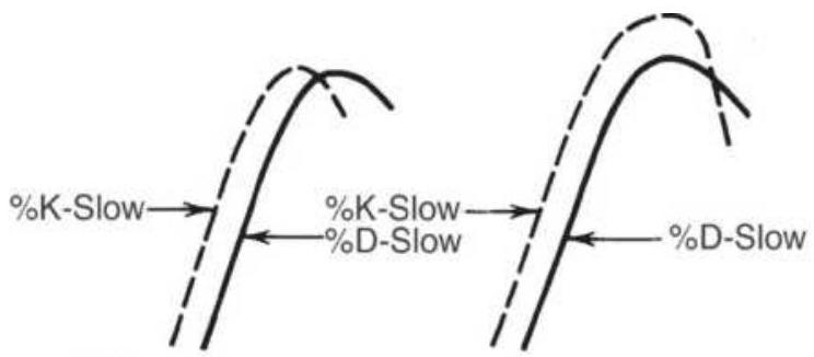
Right crossing
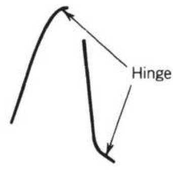
(a)
(b)
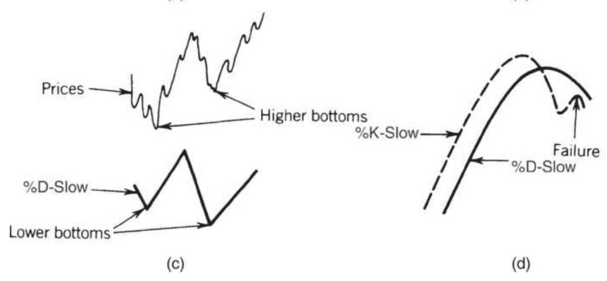
FIGURE 9.19 Lane's patterns. (a) Left and right
crossings. (b) Hinge. (c) Bear market setup. (d) \%Kslow failure.
Failure. An excellent confirmation of a change in direction occurs when \(\% K\)-slow crosses \(\% D\)-slow (after penetrating the extreme level), then pulls back to the \(\% D\)-slow line but fails to cross it again (Figure 9.19d).
\section*{Creating a Stochastic from the RSI}
Any series or indicator value can be converted to a raw stochastic, \(\% K\), without adding lag by replacing the closing price with the indicator value. This creates a measure of where that indicator lies in its high-low range over the calculation period and may simplify the buy and sell signals. It would also normalize an indicator, such as momentum, that doesn't have any limits on high or low values, expressing the results from o to 100. A stochastic created from an RSI would be: \(\underline{12}\)
\[
n \text {-day StochRSI }=\frac{R S I_{\text {today }}-R S I_{\mathrm{n} \text {-day low }}}{R S I_{\mathrm{n} \text {-day high }}-R S I_{\mathrm{n} \text {-day low }}}
\]
\section*{Williams' Oscillators}
Larry Williams has been known for his development of trading methods based on oscillators since his publication of the \(A / D\) Oscillator in 1972.
\section*{A/D Oscillator}
The \(A / D\) Oscillator was the creation of Jim Waters and Larry Williams, where \(A / D\) means
accumulation/distribution. They used a unique form of relative strength, defining buying power (BP) and selling power (SP) as:
\[
\begin{aligned}
& B P_{t}=\text { high }_{t}-\text { open }_{t} \\
& S P_{t}=\text { close }_{t}-\text { low }_{t}
\end{aligned}
\]
\(B P\) and \(S P\) show the buying strength (relative to the open) and selling strength (compared to the close), which will be used to measure the implied direction of the day's prices. This definition of buying and selling power is still used today. The combined measurement, called the Daily Raw Figure (DRF), is calculated as:
\[
D R F_{t}=\frac{B P_{t}+S P_{t}}{2 \times\left(H i g h_{t}-\text { Low }_{t}\right)}
\]
The maximum value of 1 is reached when a market opens trading at the low and then closes at the high:
\(B P_{t}-S P_{t}=\) Hight \(_{t}-\) Low \(_{t}\). When the opposite occurs and the market opens at the high and closes on the lows, the \(D R F=0\). Each price series develops its own patterns, which can be smoothed or traded in the same way as a momentum index. The Waters-Williams A/D Oscillator solves problems of volatility and limit moves in futures markets (although there are very few markets with trading limits any more). \(D R F\) completely
adjusts to higher or lower trading ranges because the divisor itself is a multiple of the day's range. Each day is treated independently; therefore, the cumulative values of the momentum index are not part of the results.
\section*{A/D Oscillator Trading Rules}
Because the DRF has no memory of yesterday, it can be very volatile. The DRF can be smoothed to reduce the number of trades. In the example in Table 9.2, a 0.30 smoothing was used (selected arbitrarily) and the entry bands narrowed from \(80-20\) to \(70-30\) to get more signals from the fewer extreme prices (see Figure 9.20). Using the raw DRF with an 80-20 trigger or the smoothed DRF with 70-30, the trading rules, shown in Table 9.2, are:
Sell when the DRF (or smoothed DRF) penetrates into the overbought zone. Close out all accumulated long positions (if any) and go short on the open of the next trading day.
TABLE 9.2 A/D Oscillator and trading signals, soybeans, January 25, 2011, through March 4, 2011.
\begin{tabular}{|l|l|l|l|l|l|}
\hline & & & & & \\
\hline Date & Open & High & Low & Close & DR \\
\hline \(1 / 25 / 2011\) & 1417.25 & 1421.00 & 1383.25 & 1387.50 & \(0.1 C\) \\
\hline \(1 / 26 / 2011\) & 1388.50 & 1404.00 & 1377.25 & 1398.50 & \(0.6 \varepsilon\) \\
\hline \(1 / 27 / 2011\) & 1402.25 & 1414.00 & 1391.00 & 1412.50 & 0.72 \\
\hline & & & & & \\
\hline
\end{tabular}
\begin{tabular}{l|l|l|l|l|l|l|l|l|}
\(1 / 28 / 2011\) & 1414.50 & 1436.25 & 1405.50 & 1411.00 & \(0.4 \angle\)
\end{tabular} \begin{tabular}{l|l|l|l|l|l|l}
\(1 / 31 / 2011\) & 1408.25 & 1426.50 & 1407.50 & 1426.00 & \(0.9 €\)
\end{tabular} \begin{tabular}{l|l|l|l|l|l|l|l|}
\(2 / 1 / 2011\) & 1426.50 & 1453.50 & 1421.25 & 1451.00 & \(0.8 \varepsilon\) \\
\hline
\end{tabular} \begin{tabular}{l|l|l|l|l|l|l}
\(2 / 2 / 2011\) & 1452.50 & 1465.00 & 1446.50 & 1457.00 & 0.62
\end{tabular} \begin{tabular}{l|l|l|l|l|l|}
\(2 / 3 / 2011\) & 1459.00 & 1465.50 & 1447.00 & 1448.50 & 0.21 \\
\hline
\end{tabular} \begin{tabular}{l|l|l|l|l|l|}
\(2 / 4 / 2011\) & 1451.50 & 1455.75 & 1435.25 & 1446.50 & 0.37 \\
\hline
\end{tabular} \begin{tabular}{l|l|l|l|l|l|}
\(2 / 7 / 2011\) & 1451.00 & 1456.75 & 1434.25 & 1437.50 & 0.2 C \\
\hline
\end{tabular} \begin{tabular}{l|l|l|l|l|l|l|}
\(2 / 8 / 2011\) & 1438.00 & 1450.00 & 1427.00 & 1447.25 & \(0.7 C\)
\end{tabular} \begin{tabular}{l|l|l|l|l|l|l}
\(2 / 9 / 2011\) & 1450.00 & 1468.75 & 1448.00 & 1464.00 & \(0.8:\)
\end{tabular} \begin{tabular}{ll|l|l|l|l|l|l|}
\(2 / 10 / 2011\) & 1464.25 & 1468.00 & 1443.00 & 1446.00 & 0.13 \\
\hline
\end{tabular} \begin{tabular}{l|l|l|l|l|l|l|}
\(2 / 11 / 2011\) & 1444.75 & 1454.50 & 1423.00 & 1429.00 & 0.25 \\
\hline
\end{tabular}


\begin{tabular}{l|l|l|l|l|l|l|}
\(2 / 17 / 2011\) & 1378.50 & 1418.75 & 1378.50 & 1416.50 & 0.97
\end{tabular} \begin{tabular}{l|l|l|l|l|l|l|}
\(2 / 18 / 2011\) & 1417.50 & 1421.25 & 1373.00 & 1381.00 & 0.12 \\
\hline
\end{tabular} \begin{tabular}{ll|l|l|l|l|l|l}
\(2 / 22 / 2011\) & 1391.00 & 1397.50 & 1311.00 & 1311.00 & 0.05 \\
\hline
\end{tabular} \begin{tabular}{ll|l|l|l|l|l|}
\(2 / 23 / 2011\) & 1310.00 & 1335.00 & 1296.25 & 1331.50 & 0.77 \\
\hline
\end{tabular} \begin{tabular}{ll|l|l|l|l|l}
\(2 / 24 / 2011\) & 1332.25 & 1336.75 & 1310.25 & 1329.25 & \(0.4 \angle\) \\
\hline
\end{tabular}

\begin{tabular}{ll|l|l|l|l|l}
\(2 / 28 / 2011\) & 1378.00 & 1380.25 & 1357.75 & 1364.75 & 0.2 C
\end{tabular} \begin{tabular}{l|l|l|l|l|l}
\(3 / 1 / 2011\) & 1368.00 & 1376.50 & 1353.75 & 1375.25 & 0.6 5
\end{tabular} \begin{tabular}{l|l|l|l|l|l|l}
\(3 / 2 / 2011\) & 1374.50 & 1399.00 & 1372.00 & 1394.25 & \(0.8 €\)
\end{tabular} \begin{tabular}{l|l|l|l|l|l|l}
\(3 / 3 / 2011\) & 1390.50 & 1414.50 & 1384.50 & 1412.00 & 0.85
\end{tabular}
\begin{tabular}{|l|l|l|l|l|l|l}
\(3 / 4 / 2011\) & 1410.25 & 1424.50 & 1395.75 & 1414.00 & \(0.5 €\)
\end{tabular}
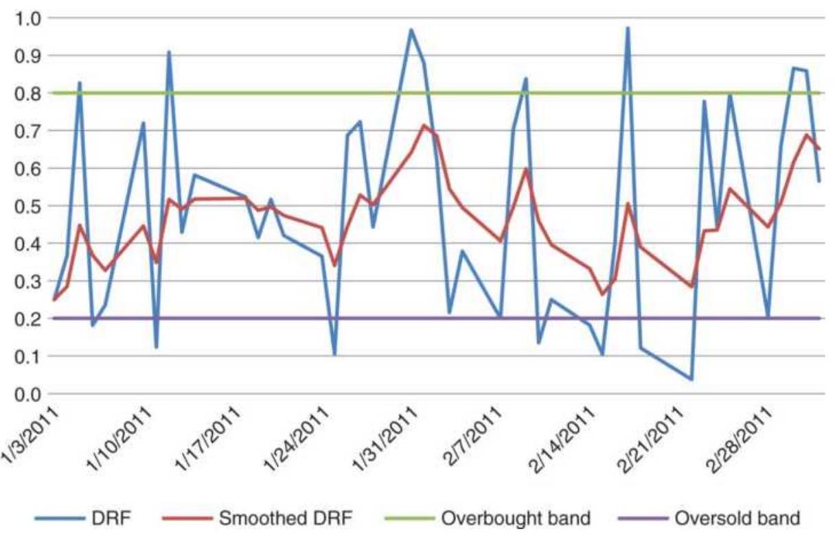
FIGURE 9.20 Williams' A/D Oscillator.
- Buy and exit the short position when the opposite conditions occur.
- All positions are entered on the next open after a signal.
For risk control, positions could be exited if the DRF does not post a lower value (for shorts) within one or two days, and the opposite for longs. In Table 9.2, no stops were used. Long positions were held until a short signal occurred, and shorts until a long was signaled. A more conservative rule would be to exit when the DRF crossed 0.50, the neutral level. In a bull market, holding a short and waiting for the DRF to drop to 0.10 might be a long wait.
1 Following these rules using data from January 1 through March 4, 2011, the A/D Oscillator showed 9 trades, 6 of them profitable. For the smoothed DRF there were only 2 trades, both profitable. The amount of smoothing can easily be changed. For more signals, increase the smoothing constant so that it's greater than o.30. An Excel spreadsheet, and a TradeStation program, both named TSM AD Oscillator, are on the Companion Website.
Although this example was very good, there are potential problems in the A/D Oscillator. One concerns gap openings in stocks. A much higher opening with a stronger close would upset the resulting DRF value. Consider the following example:
\begin{tabular}{|l|l|l|l|l|l|l|l|}
\hline & Open & High & Low & Close & DRF & DDRF & \(\boldsymbol{\Sigma} \angle\) \\
\hline Monday & 43.00 & 44.00 & 40.00 & 41.00 & .25 & & \\
\hline Tuesday & 42.00 & 42.00 & 39.00 & 40.00 & .17 & -.17 &. \\
\hline Wednesday & 38.50 & 38.50 & 38.00 & 38.00 & .00 & +.17 &. \\
\hline Thursday & 42.00 & 42.00 & 39.00 & 40.00 & .17 & -.33 & - \\
\hline Friday & 40.00 & 43.00 & 40.00 & 42.00 & .83 & +.50 &. \\
\hline
\end{tabular}
Note that on Wednesday, the DRF indicates that the momentum has reversed, but in fact the price is falling rapidly and gives no indication of recovering; it may actually be gaining momentum. On Thursday the price soars up and closes in the midrange, but the DRF shows a new downward momentum. The problem happens when the entire trading range was above or below the
previous closing price. To form this link, replace the current high or low with the prior closing price, in the manner of the true range calculation, if that price was outside the current trading range. The following example shows that the results smoothed out and leaves the trend intact.
\begin{tabular}{|l|c|c|c|c|c|c}
\hline & Open & High & Low & Close & DRF & DDRF \\
\hline Monday & 43.00 & 44.00 & 40.00 & 41.00 & .25 & \\
\hline Tuesday & 42.00 & 42.00 & 39.00 & 40.00 & .17 & -.17 \\
\hline Wednesday & 38.50 & \((40.00)\) & 38.00 & 38.00 & .37 & +.04 \\
\hline Thursday & 42.00 & 42.00 & \((38.00)\) & 40.00 & .25 & -.12 \\
\hline Friday & 40.00 & 43.00 & 40.00 & 42.00 & .83 & +.58 \\
\hline
\end{tabular}
\section*{Linking the Current Day with the Prior Day}
Another oscillator, \(O\), can be constructed using the highs and lows relative to the prior close:
\[
O_{t}=\frac{\operatorname{High}_{t}-\text { Close }_{t-1}}{\operatorname{High}_{t}-\text { Low }_{t}}
\]
This links two days together, and the ratio of the high price relative to the prior close is measured against the total range for today. For the normal case,
High \(_{t} \geq\) Close \(_{t-1} \geq\) Low \(_{t}\); but if Close \(_{t-1}\) replaces either \(\mathrm{High}_{t}\) or \(\mathrm{Low}_{t}\) to extend the range, the value of \(O_{t}\) will be either 1 or o for these extreme cases. As with the A/D Oscillator, the values derived from this method
may also be smoothed.
A word of caution: Trading against the trend can be exciting and profitable, but at considerably greater risk than trading in the direction of the trend. The problem with selling an overbought condition is that it is much more difficult to control the losses. A long position may be entered while prices are falling fast, and they may continue to fall at the same speed after you are long. Even a quick exit may result in a substantial loss.
\section*{\%R Method}
After the publication of Williams' How I Made One Million Dollars ... Last Year ... Trading Commodities, the \(\% R\) oscillator became well known. It is a simple way of calculating where today's closing price fits into the recent trading range. Using the last 10 days, define:

Williams' 10-day \(\%\) R is different from a 10-day stochastic, because it measures how strong the market closed today compared to the high of the past 10 days. It is also conceptually upside down, that is, as the close gets stronger the value of \(\% R\) gets smaller. It may be intuitively easier to work with if you use \(1.0-\% R\).
Williams viewed this as a timing device to add positions within a major technical or fundamental trend. This same approach was discussed for the stochastic and is shown in Figure 9.16. Trades were only taken in the
direction of the major trend.
\section*{The Ultimate Oscillator}
In the Ultimate Oscillator, published in 1985, Williams seems to combine his original idea of the A/D Oscillator with a great deal of Wilder's RSI. \({ }^{13} \mathrm{He}\) adds the unique feature of three concurrent time periods in order to offset the negative qualities of the short time period used for the \(\% R\), without slowing the system too much. The Ultimate Oscillator uses the following steps:
1. Calculate today's buying pressure \(B P_{t}\) by subtracting the true low from the closing price, \(B P_{t}=C_{t}-T L_{t}\). The true low \(T L_{t}=\min \left(L_{t}, C_{t-1}\right)\).
2. Calculate today's true range,
\[
T R_{t}=\max \left(H_{t}-L_{t}, H_{t}-C_{t-1}, C_{t-1}-L_{t}\right)
\]
3. Total the buying pressure \(B P_{t}\), calculated separately for the three intervals 7,14 , and 28 days, designated as \(S B_{7}, S B_{14}\), and \(S B_{28}\).
4. Total the true range \(T R_{t}\) over the same three periods, \(S R_{7}, S R_{14}\), and \(S R_{28}\).
5. Divide each sum of the buying pressures by the corresponding true range, that is, \(S B_{7} / S R_{7}\) and scale by multiplying the 7 -day value by 4 and the \(14^{-}\) day value by 2 . All three calculations are now in the same scale.
Notice that the nearest seven values for the buying pressure and the true range are each used seven times; that is, they are multiplied by both the scaling factors of 4 and 2 , then used once more in the 28-day calculation. Williams has created a step-weighted momentum, assigning values of 7,3 , and 1 to the first 7 days, second 7 days, and last 14 days, respectively. The last 14 days account for only \(10 \%\) of the total.
The rules for using this oscillator (Figure 9.21) are:
1. A sell setup occurs when the oscillator moves above the \(50 \%\) line, peaks at a high value, declines and then moves higher. If the oscillator fails to move above the peak on the next rally, a short sale order can be placed when the oscillator fails on the right shoulder. This is a traditional top confirmation signal.
2. Short positions are closed out when a long signal occurs, when the \(30 \%\) level is reached, or if the oscillator rises above \(65 \%\) (the stop-loss point) after being below \(50 \%\).
3. A buy signal is given using the opposite formation as the short signal (rule 1 ).
4. Close out longs when a short signal occurs, when the \(70 \%\) level is reached, or if the oscillator falls below \(30 \%\) (after being above \(50 \%\) ).

\section*{FIGURE 9.21 Williams' Ultimate Oscillator.}
\section*{Relative Vigor Index}
John Ehlers, who has contributed extensively in the mathematical analysis of prices, in particular using cycles, has created the Relative Vigor Index (RVI), a very smooth momentum indicator. \({ }^{14}\) The basic form of RVI is:
\[
\text { RVI }=\left(\text { Close }_{t}-\text { Open }_{t}\right) /\left(\text { Hight }_{t}-\text { Low }_{t}\right)
\]
However, the final RVI uses a 4-day symmetric weighting (similar to a triangular weighting) of numerator and denominator, taken separately.
RVI is conceptually similar to the A/D Oscillator; however, the RVI is smoothed in a special way that targets a particular price cycle and eliminates the 2-bar cycle and its associated unwanted frequencies. While it is preferable that the price series be analyzed for its cycle period, Ehlers suggests using 10 as the nominal value. The RVI is calculated as:
\[
\begin{gathered}
N_{t}=\left[\left(C_{t}-O_{t}\right)+2 \times\left(C_{t-1}-0_{t-1}\right)+2 \times\left(C_{t-2}-0_{t-2}\right)+\left(C_{t-3}-O_{t-3}\right)\right] / 6 \\
D_{t}=\left[\left(H_{t}-L_{t}\right)+2 \times\left(H_{t-1}-L_{t-1}\right)+2 \times\left(H_{t-2}-L_{t-2}\right)+\left(H_{t-3}-L_{t-3}\right)\right] / 6 \\
\text { Numerator } r_{t}=\Sigma N_{i}, \quad i=t-n+1, t \\
\text { Denominator }=\Sigma D_{i}, \quad i-t-n+1, t \\
\text { RVI }=\text { Numerator } r_{t} / \text { Denominator }_{t}, \text { while Denominator } r_{t} \neq 0
\end{gathered}
\]

\(R V I\) signal line \(e_{t}=\left(R V I+2 \times R V I_{t-1}+2 \times R V I_{t-2}+R V I_{t-3}\right) / 6\) where \(O_{t}, H_{t}, L_{t}\), and \(C_{t}\) are today's open, high, low, and closing prices and \(n\) is the calculation period, nominally 10 .

The RVI signal line is used in the same manner as the MACD signal line. After a peak in the RVI value, showing an overbought situation, the sell signal occurs the first time that the RVI crosses the RVI signal line moving lower. Figure 9.22 was created using TSM Ehlers Relative Vigor indicator, on the Companion Website, applied to QQQ from Sep 2017 through July 2018.
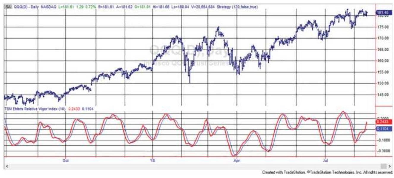
FIGURE 9.22 Ehlers' Relative Vigor Index for QQQ.
\section*{Awesome Oscillator}
Another indicator by Ehlers is the Awesome Oscillator (AO). It is a 34-day moving average using the midpoint of the daily high and low, \((\mathrm{H}+\mathrm{L}) / 2\), as the input data, then subtracted from the 5 -day moving average using the same data.
\section*{\(A O=A v e r a g e(m i d p o i n t, 5)-A v e r a g e(\) midpoint, 34\()\)}
The buy signal for this oscillator is based on a saucer formation. It is formed when prices change from down to up. The oscillator must form a pattern where:
■ The AO value crosses above zero.
- AO then turns down, then turns up again, forming the saucer.
Essentially, this is an initial buy (AO goes above zero), a pullback, then another move up (above zero), confirming
the buy signal.
\section*{Twin Peaks}
An additional buy signal can occur if there is a formation similar to a bullish divergence when the AO is below the zero line.
- The AO forms a low below zero.
- A second low occurs but it is higher than the previous low, but still below zero.
- Buy when the AO crosses the zero line moving higher.
Alternatively, multiple buy signals can occur each time the AO makes a new higher peak after two rising lows, provided there is no lower low to break the pattern.
\section*{Raschke's First Cross}
Although we usually trade a trend from the time the trend turns up or down to the exit when it reverses, Linda Bradford Raschke has taken the approach that a small part of the trend near the beginning can be a very reliable trade. Her First Cross system enters a trend after an initial trend signal based on a momentum indicator.
Momentum used here is the difference between two trends. In the original version of this strategy there are four key elements:
\begin{tabular}{|l|l|}
\hline 1. slowMA & Slow moving average \\
\hline 2. fastMA & Fast moving average \\
\hline & \\
\hline
\end{tabular}
\begin{tabular}{|l|l|}
\hline 3. osc & osc \(=\) fastMA - slowMA \\
\hline 4. trend & Moving average of osc \\
\hline
\end{tabular}
A buy or sell entry signal is a 3 -step process:
B1. osc \(_{t-1}>\) trend \(_{t}\) and \(o s c_{t}<=\) trend \(_{t}\) (osc crosses above the osc trend)
B2. \(l_{t o w_{t}}>\operatorname{low}_{t-1}\) (low of the current bar is rising)
B3. buy
S1. osc \({ }_{t-1}<\) trend \(_{t}\) and osc \(_{t}<=\) trend \(_{t}\) (osc crosses below the osc trend)
S2. high \(_{t}<\) high \(_{t-1}\) (high of the current bar is declining)
S3. sell
There were no exit rules given in the original version, so we will need to exit when the trend of the osc reverses, that is, exit a short when osc moves above the trend of osc and exit a long when the osc moves below the trend of osc.
It is also not clear whether the test of the lows, which confirm the buy signal, must occur at the same time as the trend change or if the buy signal occurs on the first occurrence of a higher low after the momentum trend turns up.
We tested both situations and the simultaneous condition was noticeably better than allowing the entry any time after the trend change. The best parameters for
S\&P futures were fast \(M A=13\), slowMA \(=25\), and osctrend \(=3\); for the ETF SPY, the best were fast \(M A=13\), slow \(M A=35\), and osctrend \(=7 . \mathrm{It}\) is not surprising that there is some difference between futures and equities, given the leverage of futures.
\section*{Modifying the Rules}
Using these fast parameters, we find that there is only one opportunity to enter a trade, but the idea of "first cross" implies that there should be a number of buy and sell opportunities with a trend, and the first one should be the best. In order to make that happen, we can apply a Slow_K stochastic to the osc value. Call it mom. That creates values between o and 100. The rules would be:
The trend is up when fastMA > slowMA; it is down when fastMA < slowMA.
If the trend is up, then buy the first time mom < 10; if the trend is down, then sell short the first time mom \(>90\).
Exit the trend if the trend changes. Exit a long when mom \(>50\); exit a short sale when \(m o m<50\). If a fast momentum is used, the long exit can be \(>90\) and the short exit can be \(<10\).

Results were an improvement over the previous rules using the same parameters for both futures and ETFs, fastMA \(=13\), slowMA \(=25\), \(m o m=3\). Buy and sell thresholds were set at long entry 20, exit 80 , short entry 85 , exit 20. A program and a spreadsheet, both named
TSM Raschke First Cross Modified, are on the Companion Website.
Raschke is a trading star and her idea is an excellent example of selectivity. First, you recognize that the beginning of a trend is a unique event where prices are moving in the direction of the new trend. That is not often the best time to enter. This technique waits for the first move to be exhausted and then enters in anticipation of another surge as the new trend reasserts itself. Once these early moves are over, the underlying trend may not be as easy to work with, and you may find yourself trying to enter as the trend comes to an end.
\section*{An Oscillator to Distinguish Between Trending and Sideways Markets}
Not knowing when a market will trend is the greatest problem for the analyst. The work found under the topics "Selecting the Best Markets" and "Directional Movement" in Chapter 23 discusses that issue. Based on the idea that the trend component is stronger when price is farther from fair value, and the noise (sideways movement) is greater when price is near value, an oscillator can be created to show the strength of the trend component based on this concept:
\[
\text { Strength Oscillator }=\frac{\text { Average }\left(\operatorname{Close}_{t}-\operatorname{Close}_{t-1}, n\right)}{\text { Average }\left(\operatorname{High}_{t}-\operatorname{Low}_{t}, n\right)}
\]

As the trend increases, the average change in
closing prices becomes larger relative to the high-low range for the day. During an unusual period, when the market gaps open, it would be possible for the differences in the closing prices to become larger than the daily range. In a sideways market both the change in the closes and daily range will get smaller, but the net price change over period \(n\) should be close to zero. This oscillator can be smoothed by taking the change in price over two or three days (for example, close \(_{t}-\) close \(_{t-3}\) ), rather the most recent day, as well as taking the highlow range over the same number of days. The indicator and function, TSM Strength Oscillator, can be found on the Companion Website.
\section*{DOUBLE-SMOOTHED MOMENTUM}
Important contributions to the study of momentum have been made by William Blau. \({ }^{15}\) In addition to creating new momentum indicators, he has added substantial value to the old ones. Also refer to his work on double smoothing of momentum in Chapter 7.
\section*{True Strength Index}
Much of Blau's work combines double smoothing of first differences (daily price changes) which has surprisingly little calculation lag given the amount of smoothing. By using the first differences, he has based the calculations on values more sensitive than price, then slowed them down by smoothing. In effect, he speeds up the price movement, then slows it down. The net result is that the final index value has less lag than we would normally
expect, and the index line is much smoother than a standard moving average. Blau refers to this as using momentum as a proxy for price. Blau's most popular indicator is the True Strength Index (TSI):
\section*{\(100 \times\) XAverage \((\) XAverage \((\) close - close \([1], r) s)\)

where
\[
\begin{aligned}
& r= \text { the calculation period of the } \\
& \text { first momentum smoothing } \\
& s= \text { the calculation period of the } \\
& \text { second momentum } \\
& \text { smoothing }
\end{aligned}
\]
close - close \([1]\) = the 1-day momentum
XAverage(close,period \()=\) the TradeStation function for exponential smoothing
\(\begin{aligned} & \text { AbsValue }= \text { the TradeStation function for } \\ & \text { absolute value }\end{aligned}\)

A spreadsheet to calculate the True Strength Index for crude oil is TSM True Strength Index, and a program indicator is TMS True Strength, available on the Companion Website. The spreadsheet code, which is easily entered, is set up as follows:
1. Column \(B\) is the closing prices.
2. Column \(C\) is the 1-day difference in prices.
3. Column \(D\) is the first smoothing, where \(\mathrm{D} 3=\mathrm{C} 3\) and D4 \(=\) D3 \(+\$ \mathrm{H} \$ 2 *(C 3-D 3)\).
4. Column \(E\) is the second smoothing, \(\mathrm{E} 4=\mathrm{D} 4\), and \(\mathrm{E} 5=\mathrm{E} 4+\$ \mathrm{H} \$ 3 *(\mathrm{D} 5-\mathrm{E} 4)\).
The smoothing constants in \(H\) are derived from the calculation periods in \(G\) using \(2 /(n+1)\). A sample of the spreadsheet appears in Table 9.3.
TABLE 9.3 TSI calculations using two 20-day smoothing periods.
\begin{tabular}{|l|c|c|c|c|c}
\hline & \multicolumn{1}{c|}{ A } & \multicolumn{1}{c|}{ B } & \multicolumn{1}{c|}{ C } & \multicolumn{1}{c}{ D } & \multicolumn{1}{c}{ E } \\
\hline Column & \multicolumn{1}{c|}{ Date } & Crude & Diff & Smooth1 & Smooth2 \\
\hline 2 & \(1 / 3 / 2011\) & 96.35 & & & \\
\hline 3 & \(1 / 4 / 2011\) & 94.18 & -2.17 & -2.170 & \\
\hline .4 & \(1 / 5 / 2011\) & 95.10 & .0 .92 & -1.876 & -1.876 \\
\hline .5 & \(1 / 6 / 2011\) & 93.18 & -1.92 & -1.880 & -1.876 \\
\hline .6 & \(1 / 7 / 2011\) & 92.83 & -0.35 & -1.734 & -1.863 \\
\hline .7 & \(1 / 10 / 2011\) & 94.05 & .1 .22 & -1.453 & -1.824 \\
\hline .8 & \(1 / 11 / 2011\) & 95.91 & .1 .86 & -1.137 & -1.758 \\
\hline .9 & \(1 / 12 / 2011\) & 96.42 & .0 .51 & -0.980 & -1.684 \\
\hline 10 & \(1 / 13 / 2011\) & 95.85 & -0.57 & -0.941 & -1.613 \\
\hline
\end{tabular}
The numerator and denominator of the TSI differ only in that the denominator takes the absolute value of the price changes. This guarantees that the denominator will
be at least as large as the numerator. The 1-day differences are first smoothed over the period \(r\), and that result is smoothed over the period \(s\). The relationship between the standard momentum (the difference in prices over \(r\) days) and the TSI can be seen in Figure 9.19 for Intel (INTC). The standard 20-day momentum indicator (2nd panel) has the typical erratic pattern of prices, and a slight lead identifying the peaks. The TSI is much smoother with peaks and valleys lagging prices slightly (3rd panel). If more smoothing is necessary to avoid false signals, a signal line can be created by smoothing the TSI using a 3 -period moving average, then buying when the TSI crosses above the signal line after a low value was reached. The slight lag in the TSI seems a small problem compared to the extreme noise of the momentum calculation.
\section*{Additional Smoothing Without Adding Lag}
In creating the TSI, Blau missed an opportunity to improve the smoothing with only a minor increase in the lag. Instead of taking the 1-day differences, substitute the \(n\)-day differences in the first step. This smooths the trendline even more at the cost of a slight additional lag. Figure 9.23 shows the TSI with a 10-day difference followed by two 20-day exponential smoothings in the bottom panel.
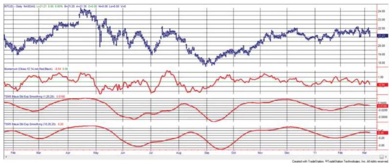
FIGURE 9.23 Comparing the TSI with 10-20-20 smoothing (bottom) to a standard 20-period momentum (center) using INTC from January 2001 through March 2002.
\section*{Anticipating the Turn}
When working with trendlines that are very smooth, such as the 10-20-20 TSI, you can anticipate the change in the trend direction most of the time. Instead of waiting for the smoothed trendline to change from up to down, you can sell when it gets to a "near-zero slope" and is continuing to flatten. This anticipation can greatly reduce the lag and improve performance even at the cost of a few false signals.
\section*{Double-Smoothed Stochastics}
Because of Blau's great interest in double smoothing, he defines the general form of a double-smoothed stochastic as:
\section*{\(100 \times\) XAverage \((\) XAverage \((\) Close \(-\operatorname{Lowest}(\operatorname{Low}, q), r), s)\)}
\(\operatorname{DS}(q, r, s)=\)
XAverage \((\) XAverage \((\) Highest \((\) High, \(q)-\operatorname{Lowest}(\) Low, \(q), r), s)\)
where
Close - = the numerator of Lane's raw
Lowest(Low,q) stochastic, the lowest low over the past \(q\) periods
Highest \((\) High, \(q)=\) the denominator of Lane's
- stochastic, the greatest high-low
Lowest \((L o w, q) \quad\) range over the past \(q\) periods
XAverage( \((.=\) an exponential smoothing of the
.,r),s) numerator, first calculated over \(r\) periods, then over \(s\) periods
\section*{TRIX}
Similar to Blau's double smoothing is TRIX, a triplesmoothed exponential that is most often used as an

using steps similar to Blau except that there are three exponential smoothings and the differencing is done at the end. Typically, the same smoothing constants (calculation periods) are used for each smoothing. This method has been applied to daily, hourly, or even 1minute price data.
1. Calculate the natural \(\log (\ln )\) of the closing prices (daily or intraday bars). This implicitly corrects for price volatility; however, it is commonly omitted from the calculation because back-adjusted data in futures and some split-adjusted data for stocks will
cause errors.
2. Calculate the \(p\)-period exponential smoothing of the closing prices, or the ln of the closing prices, to get trend \#1.
3. Calculate the \(q\)-period exponential smoothing of trend \#1 to get trend \#2.
4. Calculate the \(r\)-period exponential smoothing of trend \#2 to get trend \#3.
5. Get the 1-period differences of trend \#3 by subtracting each value from the previous value. As with the added smoothing of the TSI, the 1-period differences can be replaced with the \(s\)-period differences.
6. Scale the results by multiplying by 10,000 . This is an attempt to get TRIX scaled to a positive integer value for charting. This step may also be omitted.
The resulting TRIX indicator can be an oscillator if the calculation periods are short or a trend indicator if they are large. As a trend indicator, buy when the value of TRIX crosses above zero and sell when it crosses below zero. It can produce buy and sell signals sooner by buying when the TRIX value is rising for two or three consecutive bars, and selling when TRIX is falling for two or three consecutive bars. Because the triple smoothing results in a very smooth TRIX value, trading signals can use the change in TRIX as an advance indicator of trend change.
Figure 9.24 compares TRIX (center panel) with the TSI (lower panel), both based on 1st differences, but using
the smoothing constant of 1 to negate one of the steps. The point is to show that TRIX is smoother because the differences are taken at the end rather than the
beginning. The lag in TRIX is slightly more than the TSI, a natural consequence of getting a smoother curve.
\section*{Changing the Divisor}
All return calculations divide the price change from yesterday to today by the starting value, yesterday's price. There is no rule that says that you cannot divide the change by the current price:
\[
r_{t}=\frac{\text { Close }_{t}-\text { Close }_{t-1}}{\text { Close }_{t}}-1
\]
While this would result in only small changes, the cumulative effect is said to add stability to an indicator that is based on returns.
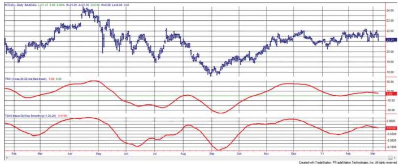
FIGURE 9.24 Comparison of TRIX (center panel) and TSI (lower panel) using two 20-day exponential
smoothings applied to INTC.
\section*{VELOCITY AND ACCELERATION}
In Newton's own words: \(\underline{17}\)
1. "Every object persists in its state of rest or uniform motion in a straight line unless it is compelled to change that state by forces impressed on it."
2. "Force is equal to the change in momentum \((\mathrm{mV})\) per change in time. For a constant mass, force equals mass times acceleration, \(F=m \times a\)."
3. "For every action there is an equal and opposite reaction."
His laws survive unchanged since the year 1686. His first law is also considered the definition of inertia. It implies that, if no net force acts on an object, then it will continue at a constant velocity. If that velocity is zero, it will be at rest.
The second law explains how a body changes when an external force acts on it. That change is equal to the change in momentum per change in time.
The third law states that, if object A exerts a force on object B, then object B exerts an equal and opposite force on object A. Otherwise, every object would be moving around.
This section will deal with how these three laws are used in the analysis of price movement, and techniques that have been developed based on them.
\section*{Slope, Velocity, and Acceleration}
In physics, momentum is called speed or velocity. It is the amount of change measured over a specific period of time. It is also called rate of change and with regression analysis it is slope, discussed in detail in Chapter 6,
\[
\text { Slope }_{t}=\frac{p_{t}-p_{t-n}}{x_{t}-x_{t-n}}
\]
where the numerator is the change in price and the denominator is the change in time, both over the same interval, usually \(n\) days, and normally time is the \(x\)-axis. For example, when traveling in a car, your speed might be 30 miles per hour. When prices are moving higher, they may be averaging a gain of \(\$ 1\) per week. Each net change needs a time reference.
There are two types of velocity: average and instantaneous. The average velocity is calculated as the mean velocity over a fixed distance and for a fixed time interval. In working with stock and futures prices, the time interval used is normally days and the distance is measured in points or dollars; if IBM moved \(\$ 5\) in six days, its average velocity, \(\bar{v}\), is:
\[
\bar{v}=\frac{5}{6}=\$ 0.833 \text { per day }
\]
In general, the average velocity is expressed:
\[
\bar{v}=\frac{D}{T}
\]
where
\(D=\) the total elapsed distance over the time interval \(T\)
Velocity is the same as the simple measurement of momentum. For a geometric interpretation of momentum, the change in price, \(D\), over momentum span, \(T\), is shown in Figure 9.25. The curved line representing price indicates that prices are rising at a slower rate.
The instantaneous velocity, \(v\), which is the velocity calculated at a specific point in time, will be different from the average velocity unless prices are going up or down by the same amount every day. In order to determine the instantaneous velocity, a mathematical technique called differentiation is used. It effectively looks at smaller and smaller time intervals and consequently smaller distances on the price curve until the slope calculation is reduced to a single point. The result of the process of differentiation is called the derivative and is expressed:
(a)
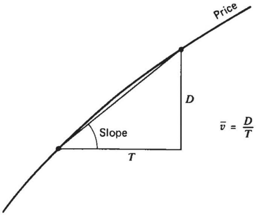
(b)
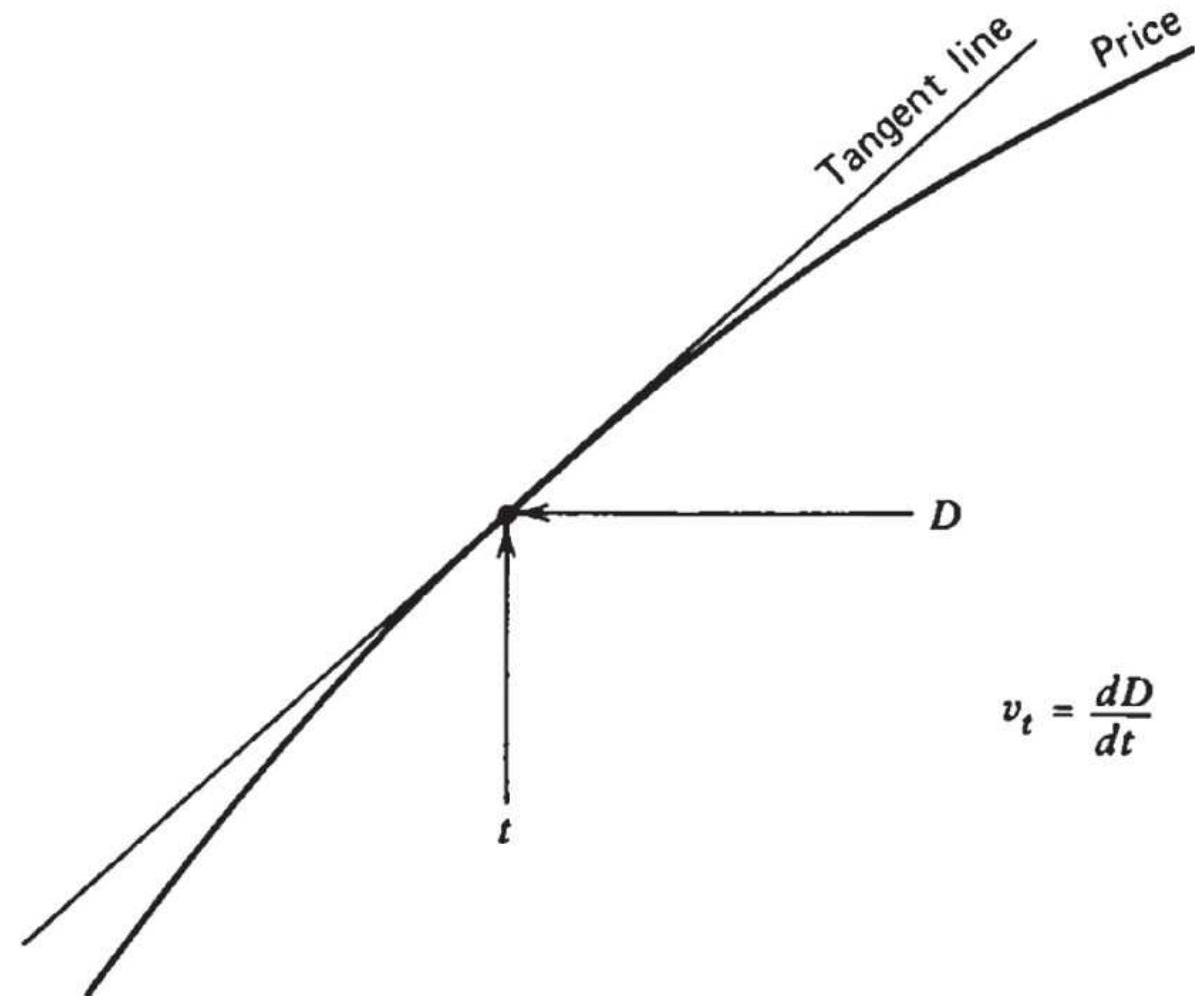
FIGURE 9.25 (a) Average velocity. (b) Instantaneous velocity.
TABLE 9.4 Equations for velocity and acceleration.
\begin{tabular}{|c|c|c|c|}
\hline & \begin{tabular}{|l|}
Basic \\
Equation
\end{tabular} & \begin{tabular}{|l}
Velocity at \\
\(x_{t}^{*}\)
\end{tabular} & \begin{tabular}{|l}
Acceleration \\
at \(x_{t}^{*}\)
\end{tabular} \\
\hline Straight line & \(y_{t}=a+b x_{t}\) & \(v_{t}=b\) & \(a_{t}=0\) \\
\hline Curvilinear & \(y_{t}=a+b x_{t}+c x_{t}^{2}\) & \(v_{t}=b+2 c x_{t}\) & \(a_{t}=2 c\) \\
\hline \begin{tabular}{l}
Logarithmic \\
(base \(a\) )
\end{tabular} & \(y_{t}=\log _{\mathrm{a}} x_{t}\) & & \(a_{t}=-1 /\left(x_{t}^{2} \ln a\right)\) \\
\hline \begin{tabular}{|l|l}
Logarithmic \\
(natural \\
log)
\end{tabular} & \(y_{t}=\ln x_{t}\) & \(v_{t}=1 / x_{t}\) & \(a_{t}=-1 / x_{t}^{2}\) \\
\hline Exponential & \(y_{t}=e^{a x_{t}}\) & \(v_{t}=a e^{a x_{t}}\) & \(a_{t}=a^{2} e^{a x_{t}}\) \\
\hline \begin{tabular}{l}
Moving \\
average
\end{tabular} & \(y_{1}=\frac{1_{1}+t_{121}+\cdots+t_{10+1}}{n}\) & \(v_{t}=1\) & \(a_{t}=0\) \\
\hline \begin{tabular}{l}
Weighted \\
moving \\
average \\
\hline
\end{tabular} & & \(r_{1}=\frac{a_{1}+a_{2}+\cdots+a_{n}}{n}\) & \(a_{t}=0\) \\
\hline \begin{tabular}{l}
Exponential \\
smoothing
\end{tabular} & \(y_{1}=y_{i-1}+c\left(x_{1}-\right.\) & \(v_{t}=c\) & \(a_{t}=0\) \\
\hline
\end{tabular}
* Because velocity and acceleration are time derivatives, all
equations implicitly include the factor \(\frac{d\left(x_{t}\right)}{d_{t}}\) as part of the right member.
\[
v_{t}=\lim _{\Delta_{t \rightarrow 0}}=\frac{\Delta D}{\Delta t}=\frac{d D}{d t}
\]
This shows that the velocity taken at any point is the result of the time interval \((t)\) becoming progressively smaller without actually reaching zero. The symbol delta \((\Delta)\) represents the change in price \((\Delta D)\) and the corresponding change in time \((\Delta t)\). The rules for differentiation can be found in any advanced mathematics book; Table 9.4 also shows the calculations. The velocity \(v_{t}\) represents the speed or momentum of the price at the point in time \(t\). If \(v\) gets larger as time moves forward, \(t_{0}, t_{1}, t_{2}, \ldots\), then the velocity is increasing; if \(v\) gets smaller, the velocity is decreasing. Because the velocity also denotes direction, it can be both positive and negative in value and appears similar to a momentum indicator.
Acceleration is the change in velocity. In the same way that we find the change in price \(D\) over time period \(t\), we can find the change in velocity over time period \(t\). For example, if you are driving at 30 miles per hour when you enter the acceleration ramp of the motorway, and after one minute you are driving 60 miles per hour, you have changed speed, or accelerated, at the rate of 30 miles per hour per minute. Fortunately, we do not need to be concerned about the units of time when we apply
these techniques to prices. The units are always the same, either weeks, days, or bars. When S\&P prices have been moving higher at an average speed of 10 points per week and then begin posting increases of 15 points per week, then 20 points per week, prices are accelerating at the rate of 5 points per week. Mathematically, velocity can be substituted for price in the equation for \(v_{t}\) to get acceleration, \(a_{t}\).
\[
a_{t}=\lim _{\Delta_{t \rightarrow 0}} \frac{\Delta V}{\Delta t}=\frac{d V}{d t}
\]
The short-cut to finding velocity and acceleration is to take the 1st and 2nd differences. The first difference removes the trend, the second removes the speed, leaving the acceleration plus noise.
\section*{Rules for Differentiation}
As with many areas of math, the name sounds harder than the process. For the applications of trading, differentiation is easiest to understand using a few simple examples. A reminder of the rules of algebra comes first. The equation for a polynomial of power 2 is normally written as \(\mathrm{a}+\mathrm{bx}+\mathrm{cx}^{2}\). It will be easier to understand if we rewrite it \(\mathrm{ax}^{0}+\mathrm{bx}{ }^{1}+\mathrm{cx}^{2}\). The rules of algebra say that \(x^{0}=1\) and \(x^{1}\) is the same as \(x\). Remembering that, the following examples should be easier.
1. Find the derivative of curvilinear equation, \(\mathrm{a}+\mathrm{b} x+\) \(c x^{2}\).
This equation produces a curve, and the 1st derivative will give you the slope at any point \(x\) on that curve. The rules for differentiation are:
a. Any constant, a, becomes zero (the term \(a x^{0}=\mathrm{a} \times 1\) is a constant).
b. Any variable with a power of \(1\left({ }_{X}{ }^{1}\right.\) is the same as \(x\) ), becomes 1.
c. For a variable with a power of more than 1 , move the power in front of the variable as a constant and reduce the power by 1 . So
\[
d\left(\mathrm{cx}^{2}\right) / d x=2 \mathrm{c} x
\]
d. Then the first derivative of
\[
\mathrm{a}+\mathrm{bx}+\mathrm{cx}^{2}=\mathrm{b}+2 \mathrm{c} x^{1}
\]
2. Find the derivative of \(2 x^{2}+3 y+4 z^{3}\).
Following the rules above, we get \(4 x+3+12 z^{2}\). Did you get that right? If so, you've just had your first successful lesson in calculus.
\section*{Finding the Velocity and Acceleration of Different Techniques}
Differentiation can be applied to many different formulas that have been discussed previously, including those that represent a straight line, curved lines, and various other trendlines. The result of the first differentiation gives you the formula for velocity, and the second differentiation is the acceleration. Of course,
some of the basic equations, such as a straight line, simple and weighted moving averages, and exponential smoothing all have constant velocities, so those values never change. Only equations with second-order smoothing (having a power of 2 or more, such as curvilinear) will work. Table 9.4 gives basic equations along with their first and second derivatives. You should be able to apply the rules from the previous section to get the same results.
The combination of velocity and acceleration is traditionally interpreted as follows:
\begin{tabular}{|c|c|l|}
\hline Velocity & Acceleration & Price movement \\
\hline+ & + & \begin{tabular}{l}
Price is moving up at an \\
increasing rate.
\end{tabular} \\
\hline+ & 0 & \begin{tabular}{l}
Price is moving up at a \\
constant rate.
\end{tabular} \\
\hline+ & - & \begin{tabular}{l}
Price is moving up at a \\
decreasing rate.
\end{tabular} \\
\hline o & o & Price is static. \\
\hline- & + & \begin{tabular}{l}
Price is moving down at a \\
decreasing rate.
\end{tabular} \\
\hline- & o & \begin{tabular}{l}
Price is moving down at a \\
constant rate.
\end{tabular} \\
\hline- & - & \begin{tabular}{l}
Price is moving down at an \\
increasing rate.
\end{tabular} \\
\hline
\end{tabular}
Using acceleration, a change of velocity (or momentum) can be detected or the strength of a current price move can be confirmed.
\section*{Using Velocity and Acceleration to Identify a Sideways Market}
The combination of velocity and acceleration can give a good indication of whether prices are moving in a directional or sideways pattern. When velocity is near zero, the price movement is near zero, that is,
\(p_{t}-p_{t-n}=0\). It also says that the price is unchanged over the time interval \(n\). We might interpret that, or any small change in price over time \(n\), as meaning prices are going sideways. However, that is not enough.
If the trend is turning from up to down quickly, at some point the slope will be zero even though prices may be collapsing. The acceleration will tell you that prices are dropping at an increasing rate, or that the rate is slowing as prices reach some point of equilibrium. To identify a sideways pattern, both the velocity and acceleration should be small.
\section*{Quick Calculation of Velocity and Acceleration}
A less precise but very convenient way of isolating velocity and acceleration is to calculate the first and second differences. The first difference is most often used to detrend a price series. You are converting the price series into 1-day momentum values. The second difference gives you the 1-day change in momentum, or acceleration. Most traders find this quick calculation satisfactory. The results can be used in exactly the same way as the differentiation results. Consider the following two examples:
1. A price series \(10,20,30,40, \ldots\) is moving higher by a constant value each day. The first differences are \(10,10,10, \ldots\), showing a consistent velocity of 10 . The second differences, formed by subtracting sequential values in the first-difference series, are o, \(o, 0, \ldots\), showing that there is no change in speed; therefore the acceleration is zero.
2. Another price series is shown with its first and second differences as:
\begin{tabular}{|l|c|c|c|c|c|c|c|c|c|c|c|}
\hline Time & \(\mathbf{1}\) & \(\mathbf{2}\) & \(\mathbf{3}\) & \(\mathbf{4}\) & \(\mathbf{5}\) & \(\mathbf{6}\) & \(\mathbf{7}\) & \(\mathbf{8}\) & \(\mathbf{9}\) & \(\mathbf{1 0}\) & \(\mathbf{1}\) \\
\hline Series & 10 & 15 & 20 & 30 & 45 & 50 & 45 & 35 & 25 & 20 & \(:\) \\
\hline Velocity & & +5 & +5 & +10 & +15 & +5 & -5 & -10 & -10 & -5 & - \\
\hline Acceleration & & & 0 & +5 & +5 & -10 & -10 & -5 & 0 & +5 & \(+:\) \\
\hline
\end{tabular}
where velocity values are the first differences, and acceleration the second differences. The original series has two turns in the trend direction clearly shown by the velocity and acceleration as changes in the sign of the numbers. The velocity continues to be positive through the sixth value as the underlying price moves from 10 to 50 . Whenever prices change direction, the velocity changes sign, we could say it is decelerating. The basic upward trend can be considered positive velocity and a downward trend, negative velocity.

The acceleration shows the change in speed. At the sixth item, the acceleration becomes negative, even though the velocity was positive, because prices moved higher at a slower rate. They had been gaining by 5,10 , and 15 points each day, but on day 6 the gain was only 5
points. This reversal in acceleration was a leading indicator of a trend change. A similar situation occurred on day 8 , when the acceleration slowed and reversed on day 10, one day ahead of the actual price reversal. Figure 9.26 shows SPY during the second half of 2017 with the first differences in the second panel and second differences in the bottom panel. This chart used the indicators TSM Velocity and TSM Acceleration with functions of the same name, found on the Companion Website. It is easy to see the increasing sensitivity even in a strong bull market.
Acceleration can be a valuable leading indicator of change, but it is also very sensitive. It can give many false signals. It is best applied to a smooth trend, such as we find in TRIX or Blau's True Strength Index.
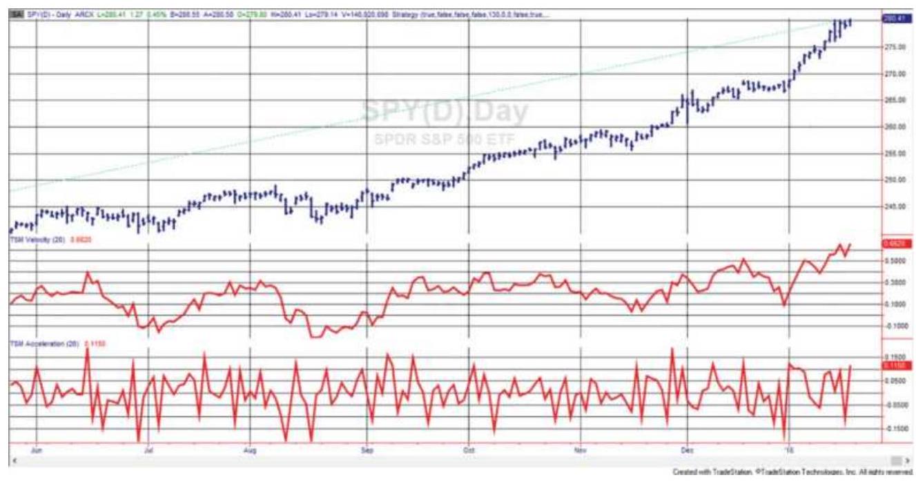
FIGURE 9.26 SPY prices (top) with first differences (center) and second differences (bottom).
\section*{HYBRID MOMENTUM TECHNIQUES}
\section*{Combining a Trend and an Oscillator}
\section*{Directional Parabolic System}


of Wilder's well-known techniques, Directional Movement and the Parabolic Time/Price System. Directional Movement is covered fully in Chapter 23. It gained popularity as a method of selecting the futures markets that were most likely candidates for trendfollowing systems, but here it is used to give trading signals. The Parabolic Time/Price System is covered in Chapter 17. Although a full reading of both techniques is necessary, the essence of the combined systems may be understood with the following definitions:
Using 14 days as the period, \(N\), define:

\[
\begin{aligned}
& \text { Dlow }_{t}=\operatorname{absvalue}\left(\operatorname{Low}_{t}-\operatorname{Low}_{t-1}\right)
\end{aligned}
\]
If Dhigh \(_{t}>\) Dlow \(_{t}\) then
\(\mathrm{PDM}_{\mathrm{t}}=\mathrm{PDM}_{\mathrm{t}}+\) Dhigh \(_{t}\)
If Dhigh \({ }_{t}<\) Dlow \(_{t}\) then \(\mathrm{MDM}_{\mathrm{t}}=\mathrm{MDM}_{\mathrm{t}}+\) Dlow \(_{t}\)
Average the values after adding PDM and MDM for \(N\)
days:
\section*{\(\operatorname{Avg} \mathrm{PDM}_{t}=\mathrm{PDM}_{t} / N\) and \(\operatorname{AvgMDM}=\mathrm{MDM}_{t} / N\)}
Smooth the resulting values using the constant
\(s=2 /(N+1)\). For \(N=14, s=0.1333\).
\(\mathrm{PDMI}_{t}=\mathrm{PDMI}_{t-1}+s \times\left(\mathrm{PDM}_{t}-\operatorname{Avg} \mathrm{PDM}_{t-1}\right)\), written as +DMI
\(\mathrm{MDMI}_{t}=\mathrm{MDMI}_{t-1}+s \times\left(\mathrm{MDMI}_{t}-\operatorname{Avg} \mathrm{MDM}_{t-1}\right)\), written as -DMI
The Average Directional Movement Index, ADX, is a smoothing of only the PDMI, starting with the first value of PDMI. The smoothing constant is normally 25 days, or \(s 2=0.0769\)
\[
\mathrm{ADX}_{t}=\mathrm{ADX}_{t-1}+s 2 \times\left(\mathrm{PDMI}_{t}-\mathrm{ADX}_{t-1}\right)
\]
For the trading system, we define DPS as the Directional Parabolic Stop-Loss. It is the same as the SAR (stop-andreverse) used by Wilder, but in this case there is no reversal, only an exit at the point of the stop-loss.
On the initial long position entry, day \(t\),
\(\mathrm{DPS}=\mathrm{Low}_{\mathrm{t}}-\) ATR \((\) ATRlength \() \times\) ATRfactor, where the ATRlength is normally 3 and the ATR factor is normally 1.5. Whenever high Whigh \(_{t-1}\), the DPS is increased:
\(\mathrm{DPS}_{t}=\mathrm{DPS}_{t-1}+\mathrm{AF} \times\) (highest high of the trade \(\left.-\mathrm{DPS}_{t-1}\right)\)
Therefore, the stop-loss advances as the price moves higher. The acceleration factor, AF, begins at o.02, but cannot exceed o.20.
Directional Movement is combined with the Parabolic Time/Price System according to the following rules:
1. Use the ADX as a directional filter. If the ADX is up, take only long trades; if the ADX is down, take only short trades.
2. When the +DMI crosses above the -DMI and the ADX is up, enter a long. When the +DMI crosses below the -DMI and the ADX is down, enter a short sale.
3. If a position is held, the Directional Parabolic Stop (DPS) is used.
In Figure 9.27, the + DMI and -DMI appear at the bottom, both positive numbers, along with the ADX, the dark line. The dots show the DPS, although this example used the Parabolic Stop and Reverse logic, which is not filtered by the direction of the ADX. These indicators are available on many charting services.
Directional Parabolic Revision. In 1980, the entry rules were revised to the following:
When the ADX is above the + DMI or - DMI and reverses, exit the current position.
If the ADX remains above both the +DMI and -DMI, hold the position due to extreme price strength. Use only the DPS to exit.
New positions must agree with the direction of the
ADX .
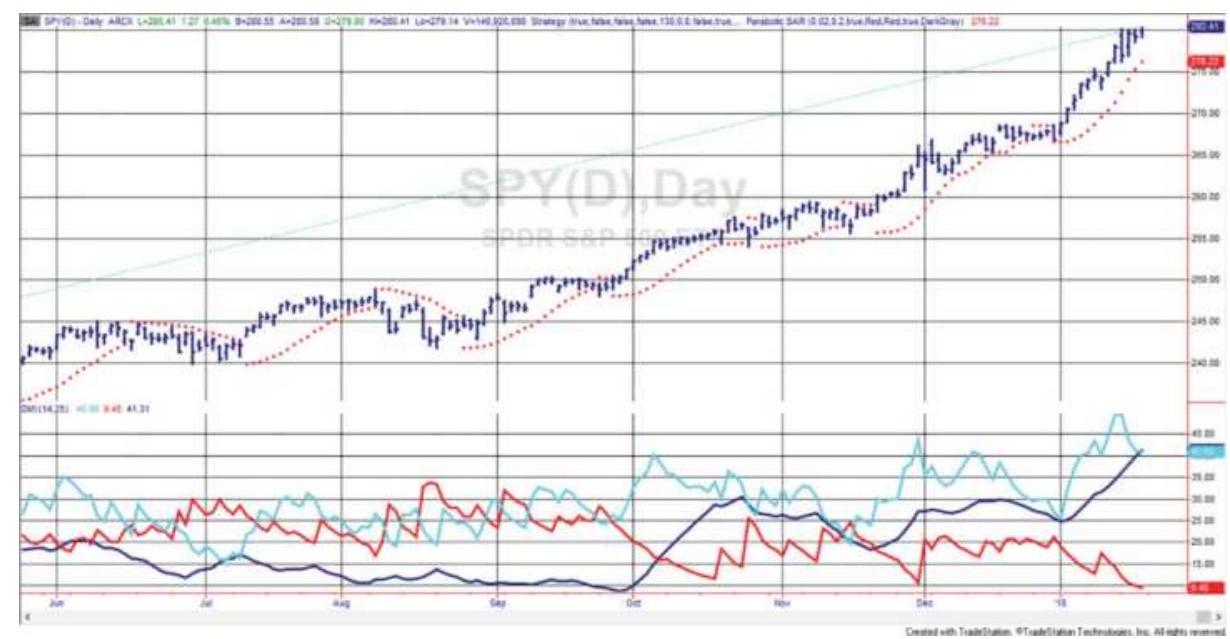
FIGURE 9.27 The Parabolic Stop-and-Reverse, similar to the Direction Parabolic System, but not filtered by the ADX. The \(+\mathrm{DMI},-\mathrm{DMI}\), and ADX are shown in the bottom panel. The stop-loss appears as points in the top panel.
\section*{Oscillator Method with ADX Filter}
A simple variation by Lars Kestner \({ }^{19}\) creates an oscillator from a 10-day and 50-day moving average, then uses the ADX to show a lack of trend. The rules are:
Osc \(=\operatorname{average}(\) close, 10\()-\) average(close, 50)
If osc \(<\operatorname{osc}[1]\) and \(\mathrm{ADX}(14)<30\) then sell next open.
If osc \(>\operatorname{osc}[1]\) and \(\operatorname{ADX}(14)<30\) then buy next open.
If osc \(>\operatorname{osc}[1]\) then buy to cover next open.
If osc \(<\operatorname{osc}[1]\) then sell next open.
\section*{Cambridge Hook}
An indicator that combines Wilder's RSI with other basic indicators is the Cambridge Hook. \(\underline{20}\) It is intended to identify an early reversal of the current trend using three indicators. The following conditions must occur in an existing upward trend:
- An outside reversal day (a higher high followed by a lower close).
Wilder's RSI must exceed 60\% (moderately overbought).
Volume and open interest must be increasing (they might need to be smoothed).

The result is a high likelihood of a downward trend reversal (the opposite applies to upward trend reversals). Protective stops are placed above the high of the hook on the day that signaled a downward reversal. The program function TSM Cambridge Hook, available on the Companion Website, returns a " 1 " when an upward hook occurs and a " -1 " when a downward hook occurs. These events should be filtered with a trend direction.
Note that using the open interest may be a problem. While volume is available throughout the day for most futures and stock markets, open interest is not as easily
available. Because of that, the program TSM Cambridge Hook has the option of not using open interest.
\section*{MOMENTUM DIVERGENCE}
Divergence occurs when two price series move apart. The Dow Jones Industrials and Dow Jones Utilities are diverging if the Industrials are rising while the Utilities are falling. This divergence between these two markets has always been considered a leading indicator of a downturn in the economy. The S\&P 500 is also watched in relationship to the 10-year Treasury note, the benchmark long-term rate. Notes usually counterbalance moves in the stock market. When the S\&P rallies at a fast pace, the price of notes falls to reflect the anticipation of an increase in interest rates needed to dampen growth. When the S\&P and the price of Notes both rise or both fall, something special is happening. When prices diverge with respect to a technical indicator, such as an unsmoothed momentum or the MACD, the direction of prices is expected to follow the direction of momentum. You can visualize the price chart that shows divergence as the rising part of a rounded top. Prices are still going up but at a slower and slower rate.
Momentum divergence is measured by comparing the direction of prices with the direction of a momentum indicator over the same time interval. Most often, this is done by observing the peaks of the price moves with the corresponding peaks of the momentum indicator (and the valleys of both). The values in between are not important. Figure 9.28 shows three examples of a 20-day
momentum divergence for Intel.
A bearish divergence is one that anticipates a downturn in prices. Because momentum is the leading indicator, a bearish divergence occurs when prices are rising and the momentum values are falling. This can be seen in the middle of Figure 9.28 where line 2 (in the top panel) shows sharply rising prices at the same time that line \(B\) (in the bottom panel) shows clearly falling momentum values. Price follows momentum, and a sharp decline lasts for all of December 2002.
A bullish divergence is formed when prices are declining while momentum values are rising. Two examples of a bullish divergence can be seen in Figure 9.28 marked with 1 and 3 on the price chart and \(A\) and \(C\) on the momentum indicator.
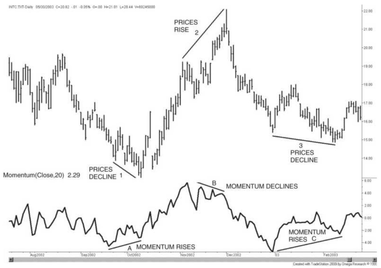
\section*{FIGURE 9.28 Momentum divergence.}
The important points to remember about a divergence are:
Prices and momentum must be moving in opposite directions. It is not a bullish divergence when momentum and price are both moving in the same direction, even when momentum is rising faster than prices. They must be moving in opposite directions.
The greater the divergence, the more likely prices will change direction soon. During a bearish divergence, prices are rising at a slower and slower rate. Each successive peak makes a smaller advance and each successive peak occurs after more time has elapsed. This may appear similar to a rounded top before prices start down.
Divergence that occurs over a longer time period (for example, months) will forecast a larger price reversal than a divergence formed over days.
Divergence is more reliable using daily data than intraday data. With intraday data there is more noise. There is a greater chance that a divergence pattern is a random event.
Divergence is best when the momentum indicator begins at an extreme high or low level, indicating that the price move is overextended. It is particularly good if the divergence signal occurs while momentum is still well above or below the midpoint of the indicator values, either 50 or 0 . That assures us that a price correction can
occur before the indicator returns to neutral.
\section*{An Amazon.com Example Using Momentum Peaks}
In the following Amazon example (Figure 9.28), divergence is identified using MACD momentum peaks plus an additional rule. Use the following steps:
1. Find the swing highs on the chart. This can be done simply by looking at the highest peaks separated by noticeable reversals. In Figure 9.29 there are two significant peaks, one in January 1999 and the other at the end of April 1999. There is a peak slightly earlier in April; however, that is part of the price move that ends with a rally to 110 .
2. Draw a line connecting the January and April peaks.
3. There will be two corresponding peaks in the MACD lines directly below the price chart. Connect the two peaks in the MACD line.
4. The line drawn across the price highs is clearly rising. The line across the MACD peaks is clearly falling; therefore, the pattern indicates a bearish divergence. Prices confirm the divergence by dropping from 110 to 70 in less than two weeks, and then below 50 later in the same move.
There is also an unmarked bullish divergence on the chart. Prices bottom in June and August with clearly rising lows in the MACD occurring at the same time. The August price low marks the bottom of the move and a rally follows.
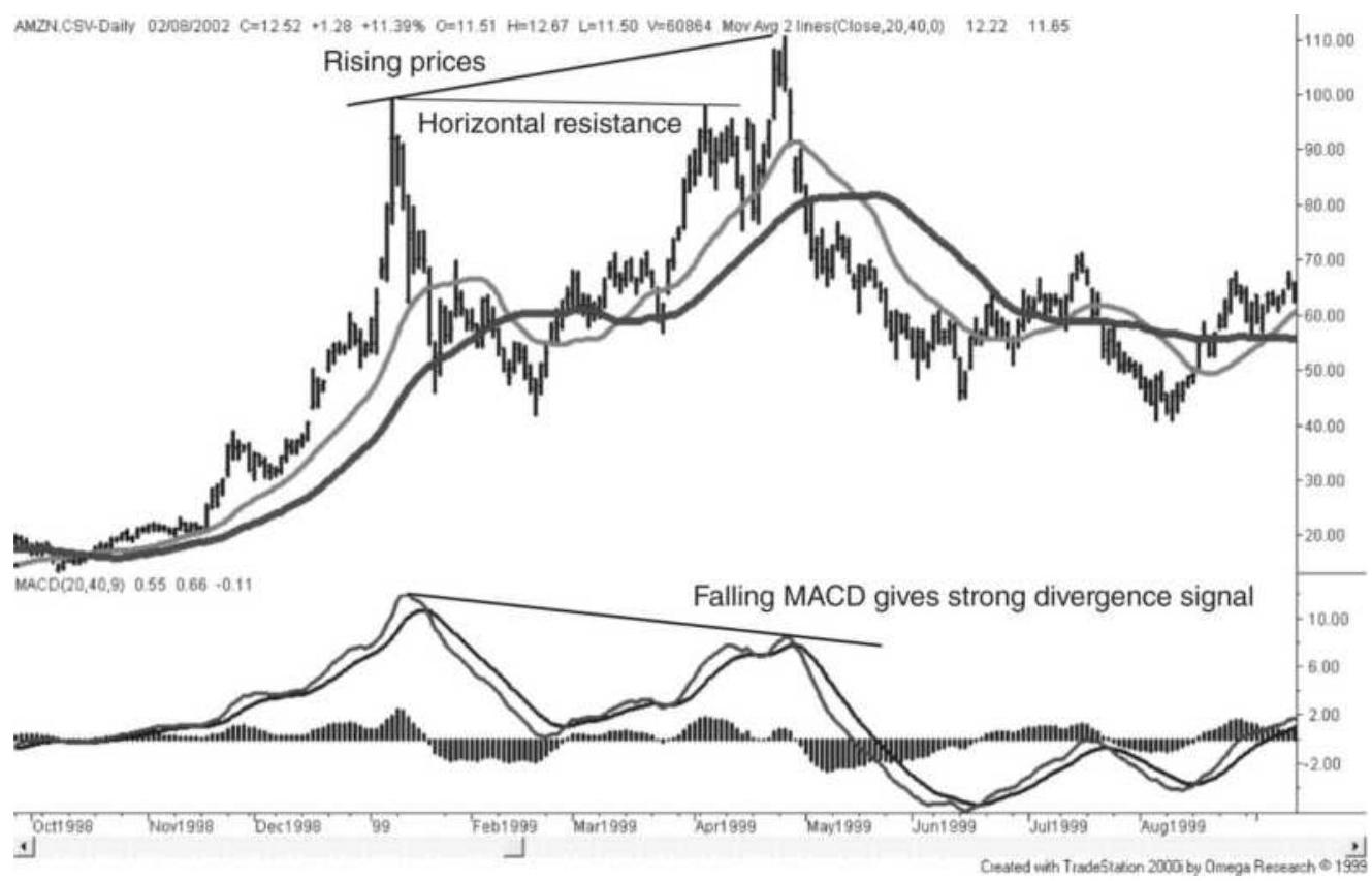
FIGURE 9.29 An example of divergence in Amazon.com.
\section*{Trading Rules for Divergence}
There are a number of alternative rules for trading a momentum divergence, each differing in the amount of anticipation and risk.
The simplest rules use the MACD, the RSI, or a slow stochastic, as the indicator to identify a bearish divergence. This example will use the MACD. Once the second rising price peak is identified, along with the corresponding MACD peak, the divergence sell signal comes when the MACD line crosses the MACD signal line as it moves lower. This is seen in Figure 9.28 at the end of April. The trade is exited when the MACD value goes to zero, or if a price objective is reached, using
either volatility or based on a top formation. It is possible to extend the trade by waiting for the MACD line to cross back over the signal line before exiting. The same rules apply to a bullish divergence.
\section*{General Rules for Trading Momentum Divergence}
1. Enter a short position when the divergence is identified, provided prices have not already reached the correction level or profit target. Bearish divergence occurs after the second momentum peak has formed; therefore, it is possible that the momentum value will have fallen quickly and be near neutral (the midpoint value). This is more likely if the first momentum peak was not an extreme.
The neutral momentum value (either o or 50 depending on the indicator) is the normal profit target because we cannot expect an overbought (high) momentum value to alternate with an oversold (low) value, but we can expect high or low momentum to correct to neutral. Waiting until the divergence is extremely clear is often too late. Momentum will have achieved most of its correction. An alternative is discussed in the following section, "Anticipating the Divergence."
2. Enter a short position when the MACD line crosses the signal line after the divergence formation is recognized. MACD offers a clear signal: the crossing of the faster MACD line with the slower signal line. It is best if the first peak is at an extreme
\section*{momentum value.}
3. Exit the short position when the current momentum moves above the last momentum peak. A new momentum high after a divergence signal indicates that the divergence has disappeared and there is no basis for this trade. The exact price at which this occurs may be calculated one day in advance for most momentum indicators.
4. Exit the short position when the market has corrected or an objective has been reached. Once the momentum has declined to the midpoint level of 50 for the RSI and stochastic, or zero for the MACD or simple momentum, it should be considered neutral and cannot be expected to continue into negative values. Additional price objectives can also be set using volatility or support levels.
5. Exit the MACD short divergence when the MACD crosses the signal line moving higher. MACD provides a signal that may allow the divergence trade to be held longer or exited quickly. In Figure 9.28 the MACD line gives a sell signal at the beginning of May and does not give another buy signal to close out the trade until mid-June. This adds considerable profit to the trade. A signal line can be created using a 3-day smoothing of the RSI or using a combination of smoothed and twicesmoothed stochastics.
6. Allow the short divergence position to convert to a short trend position. Using a separate trend, or one of the two MACD trends, if the divergence position
is in the same direction as the trend at the time of the normal divergence exit, hold the trade and use the trend reversal as an exit.
\section*{Anticipating the Divergence}
Divergence signals are often seen too late. When the second momentum peak is recognized, especially when the bearish divergence is severe, the momentum values may be near their neutral level, 50 or zero. Anticipating the divergence signal can be a more successful approach to trading.
Bearish divergence can be anticipated at the point where prices move above their previous resistance level. This is shown in Figure 9.28 with the line marked horizontal resistance. Once prices move higher there is always a potential divergence. If the current value of momentum is lower than the value of momentum at the previous price peak, an anticipated divergence sell signal exists. The short sale is now entered as prices are rising as long as the current momentum value is below the last peak momentum value. For Amazon.com, that means holding a short position while prices continue higher. The trade is exited if the move in the momentum exceeds the previous momentum peak, in which case there can be no divergence pattern. This method offers the best opportunity for profiting from the entire downward reversal, but at higher risk. A less risky alternative would be to divide trading capital into three parts, then:
1. Sell the first third when prices make a new high while the MACD value is much lower.
2. Sell the second part when the MACD value moves to within \(15 \%-20 \%\) of the previous MACD high.
3. Sell the third part when the MACD value crosses the signal line heading down.
If there is only one choice, it is better to take the second option. If there are two choices, take the first and second. If you only take the third sell signal, when the MACD crossed the signal line, prices will have already dropped significantly, and you will be disappointed with your entry price and the lack of profit opportunity.
\section*{Single, Double, and Triple Divergences}
In fewer cases, double and triple bearish divergences will occur. A double bearish divergence is one in which three momentum peaks are declining with prices rising at each corresponding momentum peak. Most often, the second momentum peak is slightly lower than the first, and the last peak drops off noticeably, indicating that a drop in prices is soon to follow. Multiple divergences are expected to be more reliable than single divergences and represent a prolonged period in which prices are rising at a slower and slower rate, in the manner of a rounded top.
\section*{Alternating Divergence Peaks}
A common bearish pattern is where a lower momentum peak falls between two declining peaks. For example, the first momentum peak is at 90 , the next at 60 and the last at 75 . When studying the price and momentum charts, most analysts will ignore the lower peak in the middle and consider only the \(90-75\) divergence. In the
following section, this combination can be automated by looking at the most recent momentum peak, \(i\), and the previous two momentum peaks, \(i-1\) and \(i-2\), along with their corresponding prices.
\section*{Programming Divergence}

Before explaining the technique used in programming divergence, it is important to understand that there are many choices to be made to recognize a divergence pattern, and it will be difficult to find them all. What we can see on a chart is not always easy to program into a computer. A program, TSM Divergence, is available on the Companion Website that gives the user a number of rules for entries and exits, including multiple divergences. It can also be a template for writing your own program. The program uses a stochastic indicator rather than MACD. The following inputs allow you to see the complications in identifying a divergence:

2. Swing the percentage price swing to identify price extremes (normally \(2 \%\) to \(5 \%\) ).
3 . the minimum percentage decline from the
Strength indicator high that will trigger a signal (normally \(5 \%\) ).
4. the calculation period for the stochastic
Length (normally 5 to 10 days).
5. Type \(0=\) for normal prices,
\(1=\) convert short rates into yields, and \(2=\) approximate the yield of a bond. Note that interest rates are converted from prices to yields for this program to give the correct signals.
6. Exit
the percent added or subtracted from 50 for the momentum exit criterion based on using slow (if exit \(=10\) then exit at 60 ; if exit \(=-10\) then exit at 40 ).
7. FastX exit level for fast stochastic using fastK (normally 20).
The first decision is whether the pattern keys off the momentum peaks or the price peaks. This program uses the price peaks, which are identified using the swing technique explained in Chapter 5, with the minimum swing value given in the parameter swing.
The stochastic is used for the momentum indicator. SlowK is used for entries, and FastK for exits, to avoid any lag. Momentum values are then used corresponding to those price extremes, even if they are not highest or lowest values, which might have been a day or two earlier or later. The momentum value at the second swing high must be less than the one at the first swing high by the amount specified by the strength parameter, typically 5 (for a bearish divergence). There is no test to see if momentum dropped further between the two price peaks. All other momentum values are ignored for the purpose of deciding on the entry signal. If the
momentum peaks are declining and the price peaks are rising, there is a bearish divergence. If momentum peaks are rising and the price peaks are falling, there is a bullish divergence. By not looking for the exact momentum peaks it is possible that some of the patterns may not be timed correctly.
A bearish divergence exits when the smoothed fast stochastic (SlowK or \(\% D\) ) reaches 50. If the input parameter exit is set to +10 or -10 , the trade exits when the momentum reaches 60 or 40 , respectively. Alternatively, if the momentum drops quickly, the parameter FastX will trigger an exit when the raw stochastic, FastK, touches 20.
In addition to the standard single divergence, the program recognizes a double divergence, the combination of three rising price peaks and three declining momentum peaks.
It is easier to find divergence by looking at a chart on a quote screen than to program it into a computer. You will find that this program does not always find the divergence that seems obvious to the eye. A divergence may be missed when there is a steady rise in prices that do not create swing highs, even though there is a corresponding steady decline in momentum. This situation is addressed using slope divergence.
\section*{Slope Divergence}
One of the problems in using peak prices and peak momentum values is that some of the most obvious divergence situations are missed. Prices can move higher
or lower steadily, without large swings, while momentum moves the other way. This will happen during a very orderly rounded top or rounded bottom formation. Without peaks that can be identified using a swing analysis, this pattern is missed.
An alternative technique is to calculate the slope of both the price movement and the momentum indicator over the same time interval. This can be done using a spreadsheet function, slope, or the program function LinearRegSlope, over a specified time interval. Because momentum is a way of detrending the price series, the period used for the calculation should not be too long; otherwise the slope values of the momentum will tend toward zero. If the slope of one is positive and the other is negative, we have a divergence.
An interesting but more complicated method is to record the point of the last momentum peak, \(m\). As we move forward in time to day \(t\), find the slope of the momentum from \(m\) to \(t\) and the corresponding slope in the price over the same period. If the slope of one is negative and the other is positive, then there is a divergence. As the interval \(t\) gets larger, we have more confidence in the divergence. If the slope of the prices on day \(t\) is less than the slope on day \(t-1\), but still positive, we have a sell signal.
Divergence can be any combination of conflicting directions between the slope of price and the slope of momentum, including prices rising faster than momentum, momentum rising faster than prices, and similar patterns when falling. However, classic analysis
limits the combinations to:
Prices rising and momentum falling (a bearish divergence).
Prices falling and momentum rising (a bullish divergence).
The strength of a bearish divergence, which is helpful when selecting which situations are best for trading, can be determined primarily by the momentum slope, but can also be assessed as the net difference between the rising slope of prices and the falling slope of momentum. When comparing the two slopes, care must be taken because the angle of price movement can be far greater than the angle of momentum movement.
\section*{Slope Divergence Using Triple Smoothing}
Triple smoothing of momentum, using TRIX or Blau's TSI, will show a clear, but slower and lagged picture. In Figure 9.30 there is a long upward move in the NASDAQ 100 throughout 1999. The price swings are relatively small and may not be picked up using a swing identifier that worked during prior years. At the same time there is a steady decline in momentum, represented by a smoothing of 20-20-20 (a 20-day momentum, smoothed twice using 20 -day exponentials). Lines are drawn through both prices and momentum to show the slope of the corresponding movement.
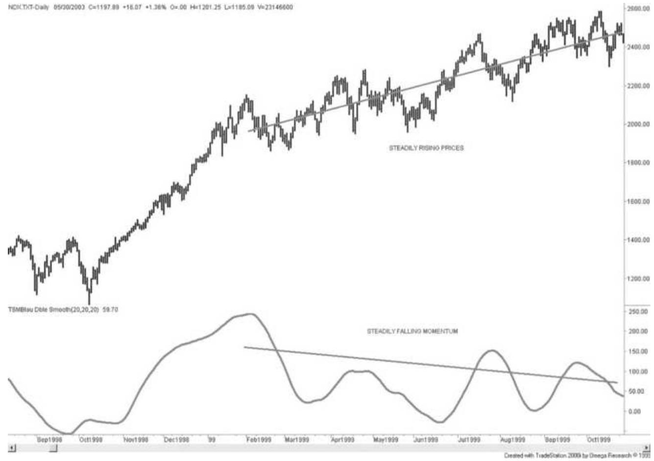
FIGURE 9.30 Slope divergence of NASDAQ 100 using double smoothing.
Because this is a long-term indicator, the entry rules will be different. While the two slopes remain constant or are moving apart, no action is taken. Once the slope values begin to converge beyond a threshold value representing normal variance, a short can be entered. After that, normal price targets apply. If the price slope continues to decline, the trade should be held. If the momentum slope rises above its value at the time of the short sale signal, the trade should be exited, or if the slopes begin to diverge significantly, the trade should also be exited.
\section*{SOME FINAL COMMENTS ON}
\section*{MOMENTUM}
Because momentum and oscillators are very different from either a charting technique or moving averages, they have become important in technical analysis. However, when the time interval for calculation is small, these indicators can be highly unstable, jumping from frequent overbought signals to just as frequent oversold ones. Any strategy that uses a momentum indicator to enter trades contrary to the direction of price movement will exhibit high risk.
A few reminders about oscillators: \(\underline{\underline{ }}\)
If the indicator gets stuck at the top or bottom value, the calculation period is too short.
- If the indicator does not reach the top or bottom value, the calculation period is too long.
A shorter period tends to have a leading effect while a longer period lags the market.
Anticipating the indicator turn is better than waiting for it to turn before acting.
When the market is trending, indicators stay in the top or bottom of the range.
Momentum indicators are most often used as a timing tool within a longer-term strategy, such as a macrotrend. The calculation period is then tuned to allow the momentum values to reach extremes with a frequency likely to give you a better entry point. Consider a trending strategy where each trade is held for an average of 20 days. A fast oscillator can be created to provide
entry timing. If you are willing to wait up to two days to enter a trade after the trend signal has been given, then construct a 10-period oscillator of 1-hour bars, or a 3period oscillator of daily bars. Test the oscillator to see if it generates at least one, but preferably two, oversold signals during each 2-day period. If so, use it to time your entry and you are likely to be buying dips rather than rallies.
\section*{NOTES}
1 Rate of change used by financial analysts is not the same as it is defined in physics. Momentum is called speed in physics, and the rate at which momentum changes is the rate of change. If you accelerate a car from 20 mph to 60 mph in 4 seconds, your rate of change is 10 and your speed is 30 mph after \(1 . \mathrm{second}\), 40 after 2 seconds, and so on.
\(\underline{2}\) From John D. Becker, "Value of Oscillators in Determining Price Action," Futures (May 1994).
3 Gerald Appel, Technical Analysis: Power Tools for Active Investors (Upper Saddle River, NJ: FT Prentice Hall, 2005).
4 Gene Quong and Avrum Soudack, "Volume-Weighted RSI: Money Flow," Technical Analysis of Stocks \& Commodities (March 1989).
5 From the original CompuTrac manual, which became the Dow Jones Telerate division, and finally just Dow Jones.
6 John Ehlers, Cycle Analytics for Traders (Hoboken, NJ: John Wiley \& Sons, 2013), Chapter 16.
\({ }^{7}\) More information about SwamiCharts and Ehlers' indicators can be found at www.SwamiCharts.com.
8 J. Welles Wilder, Jr., New Concepts in Technical Trading Systems (Greensboro, NC: Trend Research, 1978).
9 Tushar S. Chande and Stanley Kroll, The New Technical Trader (New York: John Wiley \& Sons, 1994).
10 Free subscriptions are available at MarketSci Blog email@marketsci.com. The author, Michael Stokes, presents his own ideas and analysis of various systematic approaches.
11 Harry Schirding, "Stochastic Oscillator," Technical Analysis of Stocks \& Commodities (May-June 1984). For a pocket computer version of these calculations, see C. F. Johnson, "Stochastic Oscillator Program for the HP-41C(V)," Technical Analysis of Stocks \& Commodities (September-October 1984).
12 Tushar Chande and Stanley Kroll, The New Technical Trader (New York: John Wiley \& Sons, 1994).
13 Larry Williams, "The Ultimate Oscillator," Technical Analysis of Stocks \& Commodities (August 1985).
14 John F. Ehlers, "Relative Vigor Index," Technical Analysis of Stocks \& Commodities (January 2002).
15 William Blau, Momentum, Direction and Divergence (New York: John Wiley \& Sons, 1995).
16 Referenced in Robert W. Colby, The Encyclopedia of Technical Market Indicators (New York: McGrawHill, 2003) as "Good Trix" by Jack K. Hutson, Technical Analysis of Stocks \& Commodities 1:5.
17 For more detail, see the NASA website, https://www.grc.nasa.gov/www/k12/airplane/newton.html.
18 J. Welles Wilder, Jr., Chart Trading Workshop 1980 (Greensboro, NC: Trend Research, 1980).
19 Lars Kestner, Quantitative Trading Strategies (New York: McGraw-Hill, 2003).
20 Elias Crim, "Are You Watching the 'Right' Signals?'" Futures (June 1985).
21 John Ehlers, "Measuring Market Cycles," Technical Analysis of Stocks \& Commodities (September 2016).
\section*{CHAPTER 10}
\section*{Seasonality and Calendar Patterns}
Chapter 6 introduced prices as a time series and identified its four components as the trend, the seasonal pattern, the cycle, and chance (random) movement; it included various ways of finding the trend using statistical analysis and forecasting techniques. Chapter 7 then showed different ways to calculate trends, and Chapter 8 applied those techniques to trading systems. Of all techniques, the trend is overwhelmingly the most popular foundation for trading systems. In this and the next chapter we turn our attention to two other principal components, the seasonal and cyclic movements.
Seasonality is a cycle that occurs yearly. It is most often associated with the planting and harvesting of crops, which directly affects the feeding and marketing of livestock. Normally, prices are higher when a product is not as readily available, or when there is a greater demand relative to the supply, as often occurs with food or heating oil during the winter months and electricity during midsummer. For grain, cotton, coffee, and other agricultural products, the crop year is dominated by planting, harvest, and weather-related events that occur in between. The most abundant crops have been produced in the northern hemisphere, but many countries in the southern hemisphere have become a significant factor since the early 1980s: Brazilian soybeans, Brazilian and Mexican orange juice, and
Chilean fish production. Then there is Australian and New Zealand beef and lamb, and in Asia, Chinese chickens, and Indian cotton, all resulting in a structural change in seasonal patterns. Globalization has not only affected financial markets, but nearly everything we purchase.
Consumer habits can cause a seasonal pattern in metals and some equity markets as weather does for agricultural products. Passenger airline traffic, along with the travel and hotel industry, is much more active in the summer than in the winter, and profits of those companies that are not diversified reflect that seasonality. Gasoline is in high demand during the summer, when most of the population in the northern hemisphere drives to the beach or takes car holidays. Eastman Kodak once had a seasonal pattern caused by much more active picturetaking during the summer months, which was also reflected in the price of silver, used to make film. Of course, not anymore.
Many commodities are priced in U.S. dollars, such as gold, oil, and even metals trading on the London Metals Exchange (LME), but for other investors, not in the United States, purchasing in their own currency, the fluctuations in foreign exchange rates significantly change the price of the commodity. Looking at it from the view of a U.S. consumer, if the U.S. dollar falls, then American buyers will pay more for imported products. Commodities that have worldwide demand maintain a world price so that everyone essentially pays the same amount, regardless of their currency. When studying seasonality, it is sometimes necessary to separate the
underlying price move of the commodity from the move in its denominated currency.
\section*{SEASONALITY NEVER DISAPPEARS}
Even when the impact of seasonality on agricultural products is not clear from the price patterns, it is still there. Consider the following factors that do not change:
More corn, wheat, and soybeans are sold during harvest than at any other time of year because there is not enough available storage to hold all of the new crop. Rental storage, when available, requires a minimum 3-month charge. Lack of storage and the need for immediate farm income result in greater sales and cause prices to decline.
Because feed grains are harvested only once each year, forward contracts include a storage cost as part of the total carrying charge. Therefore, each forward delivery price should be higher within the same crop year.
Sometimes the price pattern of forward months does not reflect the added costs of carry. Occasionally these markets even invert and the nearest delivery trades at a price higher than the deferred months, a situation familiar in crude oil and copper. The cost of carry, however, still exists in an inverted or backwardation market. Extreme short-term demand pushes the nearest delivery much higher while the events causing price disruption are expected to be temporary. The normal carry is still there; it is just overwhelmed by temporary
demand.
Stock prices can reflect seasonality in the same way as agricultural products. While holiday travel may vary by \(10 \%\) in a given year, there is still a strong seasonal pattern in the travel business. The profitability of a company may decline during a poor travel year, sending share prices lower, yet the seasonality is still there.
It is important to be able to identify seasonal patterns. Seasonal patterns can bias the size of the positions traded throughout the year, they can identify changes in risk, they can affect the direction of prices, and most important they can be exploited for profit. The methods for finding them are simple, and made more so by the use of a spreadsheet program or statistical software. These will be discussed in this chapter along with some practical applications.
\section*{THE SEASONAL PATTERN}
Seasonal patterns are easier to find than the longer-term cycles or economic trends, because they must repeat each calendar year. Although any 12-month period can be used to find the seasonal pattern, academic studies in agriculture usually begin with the new crop year for grains, just following harvest, when prices tend to be lowest. This approach makes the carrying charges, which increase steadily throughout the new crop year, more apparent. For uniformity, the examples in this chapter always begin with a calendar year, which assumes no knowledge of where the season starts, and can be equally applied to stocks. Carrying charges are always reflected
in the market price.
\section*{Agricultural markets. United States agricultural} production is the standard for determining "seasonality," even though a wheat crop is harvested continuously throughout the year in different parts of the world, but mostly in the northern hemisphere. Prices are expected to be lower during the U.S. harvest, and higher in the winter when inventories are reduced and carrying charges accumulate. But there are exceptions. The highest price can occur during the middle of the growing season, if there are concerns about the size of the crop. The influence of world inventories and anticipated harvest from other major producers in South America or Russia will cause a dampening or inflating of prices, but not a change in the seasonal pattern. There is a constant flow of agricultural and industrial products throughout the world. The seller of a product will always choose the highest price as denominated in the local currency, so that a buyer with a weaker currency will appear to pay more than one with a stronger currency. But the seller gets the same price from everyone, net of shipping costs. The fact that any buyer can go to any seller creates a world market price. When a product is mutually interchangeable it is called fungible.
Metals. Industrial commodities have seasonal price variation based on demand. Silver and gold are each equally in demand for jewelry, investment, and electronics; an increasing amount of the supply comes from reclaiming. Almost half of all copper is used in electrical and heat conductivity, with much of it in the form of an alloy with nickel and silver. Its seasonality is
heavily related to the housing industry, where it is required for both electrical and water systems. New sources of ore are introduced infrequently, and the possibility of discovery or expansion rarely affects prices. The primary supply problems in copper are related to labor as well as social and political changes in producing countries. Growth of a middle class in China and India has spurred a demand for copper. It is said that China has warehoused large quantities of copper in anticipation of future needs. This might distort the seasonal patterns, but they will return to normal as seasonal consumption becomes the driver.
Other seasonality. There are many businesses with finished products that have seasonal demand and their publicly traded stock prices will reflect that tendency. Because the shares in a company are far removed from buying and selling the raw materials that they use, changes in the price of raw materials may have a small effect on the bottom line, or the share price. Yet some industries, such as airlines, still show seasonal patterns and the same procedures given here can be used to find them.
\section*{POPULAR METHODS FOR \\ CALCULATING SEASONALITY}
Seasonal patterns are most often calculated using monthly data, although some studies have tried to pinpoint their periodic turns to specific days. As with most other analysis, closer observation and shorter time periods also bring more noise and erratic results. With
that in mind, the seasonal studies in this chapter will use monthly data and keep an eye toward the big picture.
\section*{An Important Note about the Data}
There is an important caveat about the futures prices used in these examples. Most were created using continuous, back-adjusted data. Some examples will reference specific delivery months. A traditional seasonal analysis will use cash prices, rather than a back-adjusted futures series, and cash prices allows the monthly changes to be represented as percentages. But it's futures that are used for trading; therefore, we need to be comfortable that futures and cash prices will show the same patterns. This chapter will include comparisons of seasonal patterns using both cash and futures data.
To create a continuous data series from individual contract delivery months, it is necessary to close the price gap between the old futures contract and the new one on the day of the roll, then adjust all the data backward to reflect the value of that closed gap. The continuous data works well for trend analysis, but the oldest data may be much higher or lower than actual prices at that time due to the aggregate effect of adjusting dozens of gaps. In the case of wheat, the price in 1965 was \(\$ 1.72\) /bushel using cash data but when backadjusted it is \(\$ 12.45\). In other cases, such as interest rates, prices that have been adjusted back 25 years can become negative because the gap is always negative; therefore, older prices are adjusted down. When using continuous futures data, results cannot be expressed as percentage changes. Cash prices for the underlying
futures contracts are available on downloading services, such as Commodity Systems, Inc. (CSI), Boca Raton, Florida, as well as Bloomberg and Reuters.
\section*{Basic Calculations}
\section*{Average Prices}
Finding the seasonal pattern does not need to be complicated. For most analysts it is easiest to begin with a spreadsheet, where the months are recorded in each
column and the rows represent years (see Table 10.1). Put the last price of the month in each cell. Next calculate the monthly returns in the columns to the right of the prices. Put the average and median prices for each month at the bottom, as shown in Table 10.2. The median is preferred over the average because it does not reflect the distortions caused by a few extreme years.
\section*{TABLE 10.1 Average monthly cash wheat prices.}
\begin{tabular}{|c|c|c|c|c|c|c|c|c|c|c|c|c|}
\hline A & 8 & C & D & E & F & G & H & 1 & J & K & L & M \\
\hline Year & Jan & Feb & Mar & Apr & May & Jun & Jul & Aug & Sep & Oct & Nov & Dec \\
\hline 2009 & 453.35 & 442.47 & 447.68 & 444.95 & 507.50 & 504.50 & 414.82 & 330.05 & 267.29 & 306.64 & 366.80 & 381.68 \\
\hline 2010 & 418.21 & 417.74 & 411.87 & 411.10 & 438.25 & 456.73 & 546.52 & 623.64 & 658.29 & 639.10 & 678.52 & 764.44 \\
\hline 2011 & 793.70 & 837.26 & 735.39 & 782.10 & 773.95 & 712.09 & 674.10 & 696.48 & 643.95 & 607.38 & 620.05 & 617.48 \\
\hline 2012 & 645.10 & 664.75 & 667.55 & 653.75 & 650.27 & 662.24 & 845.67 & 853.04 & 860.37 & 840.70 & 851.52 & 804.15 \\
\hline 2013 & 783.00 & 772.16 & 740.50 & 717.91 & 724.68 & 703.40 & 677.55 & 640.00 & 632.95 & 703.18 & 670.45 & 655.19 \\
\hline 2014 & 606.20 & 626.22 & 704.19 & 703.50 & 690.38 & 603.54 & 534.32 & 506.86 & 416.19 & 416.42 & 514.66 & 616.57 \\
\hline 2015 & 547.85 & 523.08 & 508.73 & 501.05 & 490.01 & 513.66 & 511.86 & 448.64 & 427.33 & 443.50 & 440.93 & 421.98 \\
\hline 2016 & 431.71 & 470.43 & 473.77 & 479.07 & 463.26 & 474.40 & 423.10 & 386.83 & 389.08 & 388.76 & 403.43 & 391.75 \\
\hline 2017 & 417.08 & 437.78 & 423.63 & 414.26 & 419.94 & 466.05 & 515.20 & 430.61 & 429.96 & 415.41 & 433.48 & 427.48 \\
\hline
\end{tabular}
TABLE 10.2 Monthly returns based on wheat cash prices. Average and median monthly prices are shown along the bottom.
\begin{tabular}{|c|c|c|c|c|c|c|c|c|c|c|c|c|}
\hline Year & Jan & Feb & Mar & Apr & May & Jun & Jul & Aug & Sep & Oct & Nov & Dec \\
\hline 2009 & 0.1048 & -0.0240 & 0.0118 & -0.0061 & 0.1406 & -0.0059 & -0.1778 & -0.2044 & -0.1902 & 0.1472 & 0.1962 & 0.0406 \\
\hline 2010 & 0.0957 & -0.0011 & -0.0140 & -0.0019 & 0.0661 & 0.0422 & 0.1966 & 0.1411 & 0.0556 & -0.0292 & 0.0617 & 0.1266 \\
\hline 2011 & 0.0383 & 0.0549 & -0.1217 & 0.0635 & -0.0104 & -0.0799 & -0.0534 & 0.0332 & -0.0754 & -0.0568 & 0.0209 & -0.0041 \\
\hline 2012 & 0.0447 & 0.0305 & 0.0042 & -0.0207 & -0.0053 & 0.0184 & 0.2770 & 0.0087 & 0.0086 & -0.0229 & 0.0129 & -0.0556 \\
\hline 2013 & -0.0263 & -0.0138 & -0.0410 & -0.0305 & 0.0094 & -0.0294 & -0.0368 & -0.0554 & -0.0110 & 0.1110 & -0.0465 & -0.0228 \\
\hline 2014 & -0.0748 & 0.0330 & 0.1245 & -0.0010 & -0.0186 & -0.1258 & -0.1147 & -0.0514 & -0.1789 & 0.0006 & 0.2359 & 0.1980 \\
\hline 2015 & -0.1115 & -0.0452 & -0.0274 & -0.0151 & -0.0220 & 0.0483 & -0.0035 & -0.1235 & -0.0475 & 0.0378 & -0.0058 & -0.0430 \\
\hline 2016 & 0.0231 & 0.0897 & 0.0071 & 0.0112 & -0.0330 & 0.0240 & -0.1081 & -0.0857 & 0.0058 & -0.0008 & 0.0377 & -0.0289 \\
\hline 2017 & 0.0646 & 0.0496 & -0.0323 & -0.0221 & 0.0137 & 0.1098 & 0.1055 & -0.1642 & -0.0015 & -0.0338 & 0.0435 & -0.0138 \\
\hline Average & \(0.34 \%\) & \(-0.07 \%\) & \(-0.71 \%\) & \(-0.76 \%\) & \(-2.05 \%\) & \(-1.43 \%\) & \(-0.36 \%\) & \(-1.15 \%\) & \(0.60 \%\) & \(2.56 \%\) & \(4.89 \%\) & \(1.52 \%\) \\
\hline Median & \(0.80 \%\) & \(-0.11 \%\) & \(-0.82 \%\) & \(-0.53 \%\) & \(-0.42 \%\) & \(-1.65 \%\) & \(-0.93 \%\) & \(-0.88 \%\) & \(0.57 \%\) & \(2.14 \%\) & \(3.50 \%\) & \(1.15 \%\) \\
\hline
\end{tabular}
To create a classic chart of wheat seasonality, simple plot the last two lines of Table 10.2 as a line chart using Excel (see Figure 10.1). The low point, in May or June, represents the harvest of winter wheat, and the high point, in November, is the month of greatest demand with the lowest supply and highest carrying charges. It is not necessary to study the fundamentals of planting wheat; the prices tell you everything.
Cash Wheat Seasonality 1978-2017
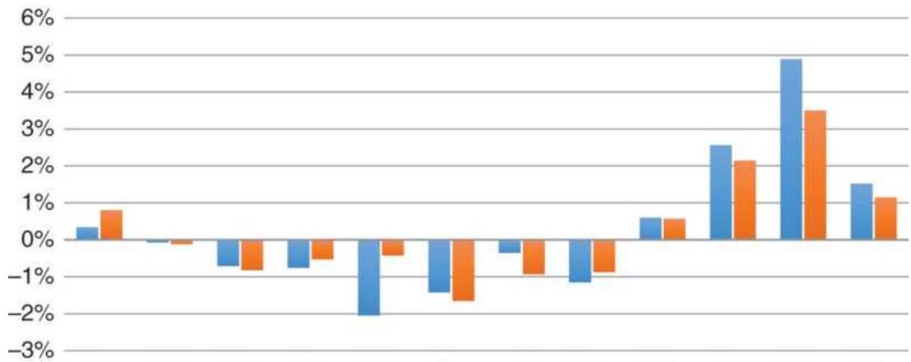
Jan Feb Mar Apr May Jun Jul Aug Sep Oct Nov Dec ■ Average ■ Median
FIGURE 10.1 A classic chart of wheat seasonality using cash prices, 1978 -2017.
If you are only looking for the seasonal pattern, either
the average or median will work. The median, however, is a more conservative and realistic number. In
November it shows a value of \(3.5 \%\), compared to the average of \(6 \%\).

To get the monthly prices, many charting and data services, as well as finance.yahoo.com, will automatically convert to monthly, then download those prices into an Excel spreadsheet. With TradeStation or other development software, you can write a program to print the prices shown on a monthly chart into a flat file. You will find two programs, TSM Seasonal Average and TSM Seasonal Median, on the Companion Website that produced these tables.
Comparing Cash and Futures Seasonal Calculations
We trade futures and not cash, and we should know if the futures prices reflect a different seasonal pattern from cash. When we put futures prices into a table, we immediately find problems. Back-adjusted wheat futures have much higher prices in the late 1970 and 198 os than cash. In Table 10.3, October 1978 shows an average price of 2009.58, which is \(\$ 20.09\), compared to the actual cash price of \(\$ 3.47\). While cash and futures prices converge in December 2017, the January 2012 adjusted futures price is \(\$ 9.80\), compared to the cash price of \(\$ 6.45\). Still a big difference.

Calculating returns on back-adjusted futures that is, the percentage change in price from month to
month - gives us unreasonable numbers. Instead, we will use the difference in the prices from month to month. But those also turn out to misrepresent the seasonal pattern. Figure 10.2 shows the average and median values using monthly differences in the same way that the cash seasonal charts were constructed. The price patterns are distorted due to both the backadjusting and large differences when prices rallied sharply over the years. The full tables for cash and futures wheat data, including returns and differences, are available on the Companion Website as TSM Cash and Futures monthly tables wheat.
\section*{TABLE 10.3 (Top) Back-adjusted wheat futures prices, 1978-1985. (Bottom) Back-adjusted prices, \(2012-2017\)}
\begin{tabular}{|c|c|c|c|c|c|c|c|c|c|c|c|c|}
\hline A & \(B\) & c & D & E & F & G & H & 1 & J & K & L & M \\
\hline Year & Jan & Feb & Mar & Apr & May & Jun & Jul & Aug & Sep & Oct & Nov & Dec \\
\hline 1978 & & & & & & & & & & 2009.58 & 2022.61 & 2015.13 \\
\hline 1979 & 2014.96 & 2029.75 & 2032.32 & 2026.83 & 2056.65 & 2122.02 & 2132.06 & 2118.30 & 2120.40 & 2118.79 & 2103.19 & 2102.15 \\
\hline 1980 & 2097.95 & 2104.25 & 2068.05 & 2035.30 & 2046.41 & 2038.02 & 2062.58 & 2068.11 & 2089.45 & 2114.20 & 2110.83 & 2054.11 \\
\hline 1981 & 2049.75 & 2019.46 & 1978.55 & 1983.00 & 1957.18 & 1933.91 & 1924.16 & 1916.01 & 1912.57 & 1918.99 & 1914.29 & 1867.52 \\
\hline 1982 & 1849.70 & 1827.09 & 1812.16 & 1819.80 & 1797.15 & 1778.61 & 1770.17 & 1762.46 & 1740.92 & 1711.57 & 1732.74 & 1717.02 \\
\hline 1983 & 1716.55 & 1719.93 & 1709.87 & 1719.18 & 1711.20 & 1702.23 & 1701.15 & 1728.47 & 1709.57 & 1687.00 & 1668.50 & 1664.39 \\
\hline 1984 & 1655.58 & 1636.88 & 1659.17 & 1671.76 & 1668.59 & 1669.50 & 1659.57 & 1658.89 & 1651.33 & 1652.65 & 1658.49 & 1646.48 \\
\hline 1985 & 1648.49 & 1651.70 & 1656.86 & 1668.39 & 1652.89 & 1656.70 & 1638.56 & 1615.55 & 1610.44 & 1626.66 & 1650.29 & 1660.98 \\
\hline 2012 & 980.00 & 997.59 & 992.53 & 973.16 & 972.02 & 989.01 & 1182.46 & 1191.73 & 1181.01 & 1160.91 & 1155.91 & 1094.24 \\
\hline 2013 & 1047.01 & 1014.08 & 987.45 & 972.94 & 972.34 & 957.50 & 922.84 & 901.00 & 900.14 & 935.70 & 897.56 & 865.93 \\
\hline 2014 & 811.48 & 833.32 & 913.51 & 916.98 & 912.39 & 819.12 & 765.64 & 769.85 & 710.81 & 719.72 & 750.59 & 817.83 \\
\hline 2015 & 751.34 & 725.16 & 716.67 & 711.61 & 697.21 & 723.56 & 746.24 & 697.94 & 683.64 & 700.74 & 689.09 & 660.22 \\
\hline 2016 & 653.70 & 640.60 & 638.23 & 642.92 & 633.68 & 639.02 & 575.28 & 557.38 & 526.27 & 532.52 & 526.49 & 503.11 \\
\hline 2017 & 520.88 & 534.45 & 515.74 & 499.74 & 496.01 & 514.90 & 557.75 & 474.26 & 464.76 & 453.32 & 441.00 & 423.50 \\
\hline
\end{tabular}
Wheat monthly averages using futures differences

FIGURE 10.2 Wheat seasonality from back-adjusted futures, using differences.
\section*{Trading Futures}
If futures do not reflect the seasonality correctly, how can we trade seasonality using futures? When each new wheat contract starts trading, at least one year out, it attempts to reflect the standard seasonal pattern. That is, when the November delivery begins, it will trade at a higher price than the October delivery (the new crop for corn), reflecting higher carrying costs and lower supply. Futures prices will reflect a conservative view of the normal seasonal pattern when delivery is a year out. Traders will accept what they expect will be the typical season premium or discount until they have more information.
Having said that, when we look only at recent futures data in the nearby futures contracts, we will see that the
seasonal pattern is very similar to the cash pattern. Once we accept that, we can trade futures based on the patterns of the longer cash data.

A seasonal trading system will try to take advantage of the potential volatility and extremes. For example, corn and soybeans are subject to saturated ground delays during the spring planting, drought during the summer growing season, and rain delays during harvest. Yet unknown trade deals with other countries will change the demand for crops, and a swing in the value of the U.S. dollar will make U.S. grain more or less desirable on the international market. There are always uncertainties that create trading opportunities. A TradeStation program, TSM Seasonal Volatility, on the Companion Website, will print a table of monthly volatility in the same format as the tables of average and median monthly prices. Later in this chapter there will be more about volatility and sample strategies that attempt to exploit these uncertainties. Volatile months will be the key to a successful seasonal strategy.
\section*{Wheat percentage of profitable years}
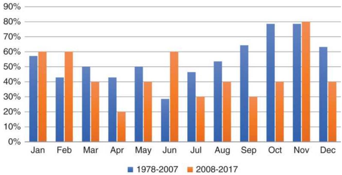
FIGURE 10.3 Percentage of profitable years for cash wheat.
\section*{Percentage of Positive Years}
One way to confirm seasonality, or get additional insight, is simply to find the percentage of profitable years for each calendar month. If we are truly at a seasonal low, then most years will show declining prices during those months. For wheat, Figure 10.3 shows that April has gains only 20\% of the time, and August only 30\%. On the other hand, November, the middle of the winter for wheat, is positive \(80 \%\) of the time. This works equally well for futures prices.
If you combine the highest profits in November with the greatest number of positive years, you get the best seasonal trading opportunity. The reverse is true for April, which shows net losses over the years and only 20\% of the years positive. Selling short ahead of April
would be a seasonal strategy.
Changing Patterns. Figure 10.3 shows two separate periods, 1978-2007 and 2008-2017. The second period has only ten years, compared to thirty years in the first period; therefore, it is not surprising that the shorter period is not as smooth. Accepting that, wheat prices from 1978 to 2007 are what we would expect of a seasonal pattern, but recent years show a drop in August and September. A closer look shows that both 2008 and 2009 had monthly losses exceeding \(20 \%\), the result of the financial crisis. If we can avoid another crisis, the old pattern should return.
\section*{Seasonal Patterns in Selected Futures}
So far, wheat has shown a classic pattern associated with its crop year. We would then expect other crops - corn, soybeans, and cotton - to show similar patterns. Looking at corn first, the largest U.S. crop, there is a clear seasonal pattern shown in Figure 10.4a. Unfortunately, it is the opposite of what the producer would like to see. The main growing season, from May through July, shows negative returns, indicating that prices were falling throughout those months. Of course, those are averages and medians, which would obscure a few years with much higher prices. For example, July and August 2011, 2012, and 2013 saw highs over \(\$ 8 /\) bushel. But improvements in seed corn, fertilizer, and technology has corn at \(\$ 3.20\) /bushel in December 2017, the same price as in August 1980. The seasonality seen in the average prices is reflected in the percentage of profitable years on the right. The comparison of profitable years
(Figure 10.4b) shows that corn seasonality hasn't changed since 1978.
\section*{Cash corn monthly returns}
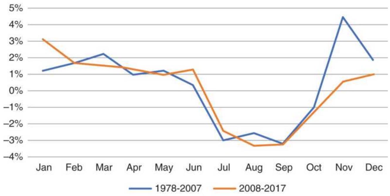
(a)
\section*{Cash corn percent profitable years}
\(90 \%\)
\(80 \%\)
\(70 \%\)
\(60 \%\)
\(50 \%\)
\(40 \%\)
\(30 \%\)
\(20 \%\)
\(10 \%\)
\(0 \%\)
Jan Feb Mar Apr May Jun Jul Aug Sep Oct Nov Dec
- 1978-2007 - 2008-2017
(b)
FIGURE 10.4 (a) Cash corn average monthly returns, 1978-2017. (b) Percentage of profitable years.
\section*{Cotton}
While corn is mostly a domestic market, used for cattle and hog feed, with some strains producing high-fructose corn syrup, cotton is more international. China, India, Pakistan, and Turkey are major producers, all in the northern hemisphere, and nearly every country uses cotton. Cotton is planted in the southern U.S. states in February and has a growing season of 5 to 6 months. Occasional flooding in Pakistan as well as geopolitical and trade disruptions should cause volatility in prices, yet we again see that prices are trading lower during the main growing season (Figure 10.5). The best trading opportunities are going to be in the winter, when supplies are diminished.
\section*{Cash cotton monthly returns, 1978-2017}
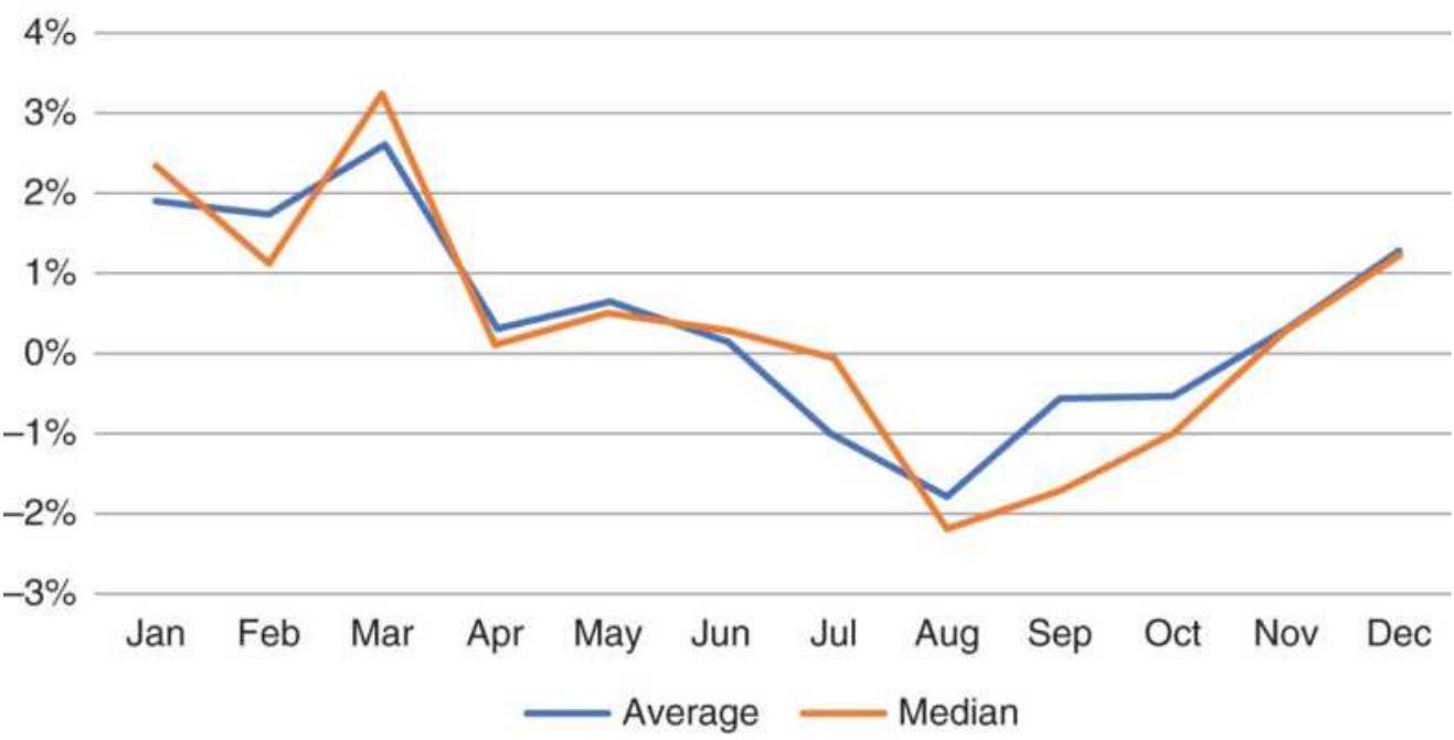
(a)
Cash cotton percent of profitable years
\(90 \%\)
\(80 \%\)
\(70 \%\)
\(60 \%\)
\(50 \%\)
\(40 \%\)
\(30 \%\)
\(20 \%\)
\(10 \%\)
\(0 \%\)
Jan Feb Mar Apr May Jun Jul Aug Sep Oct Nov
- 1978-2007 - 2008-2017
(b)
FIGURE 10.5 (a) Cash cotton average monthly returns, 1978-2017. (b) Percentage of profitable years.
Changing Patterns. Just as with corn, cotton seasonal patterns are much the same now as they have been for
40 years, with fewer profitable years recently, but the same shape as the historic pattern.
\section*{Heating Oil and Gasoline}
The industrial products with the clearest seasonality are heating oil and unleaded gas, both refined from crude oil. While supply has been a problem from time to time, mostly when the United States was importing more than \(10 \%\) of its crude oil, demand now drives prices. Heating oil (essentially the same as diesel fuel) is used in the winter, mostly for home heating, while gasoline is for cars. Both are products of crude oil, but gasoline is the more important. In the seasonal picture seen in Figure 10.6a, gasoline is in demand from March through May, when refiners build inventory for the spring and summer driving season. In the early summer they switch over to heating oil and the demand for gasoline drops from midsummer though February. Heating oil, seen in Figure 10.6b, has highest demand just ahead of winter when refiners build inventory and customers fill their tanks in preparation for colder weather.
Unleaded gasoline, average percentage change by month
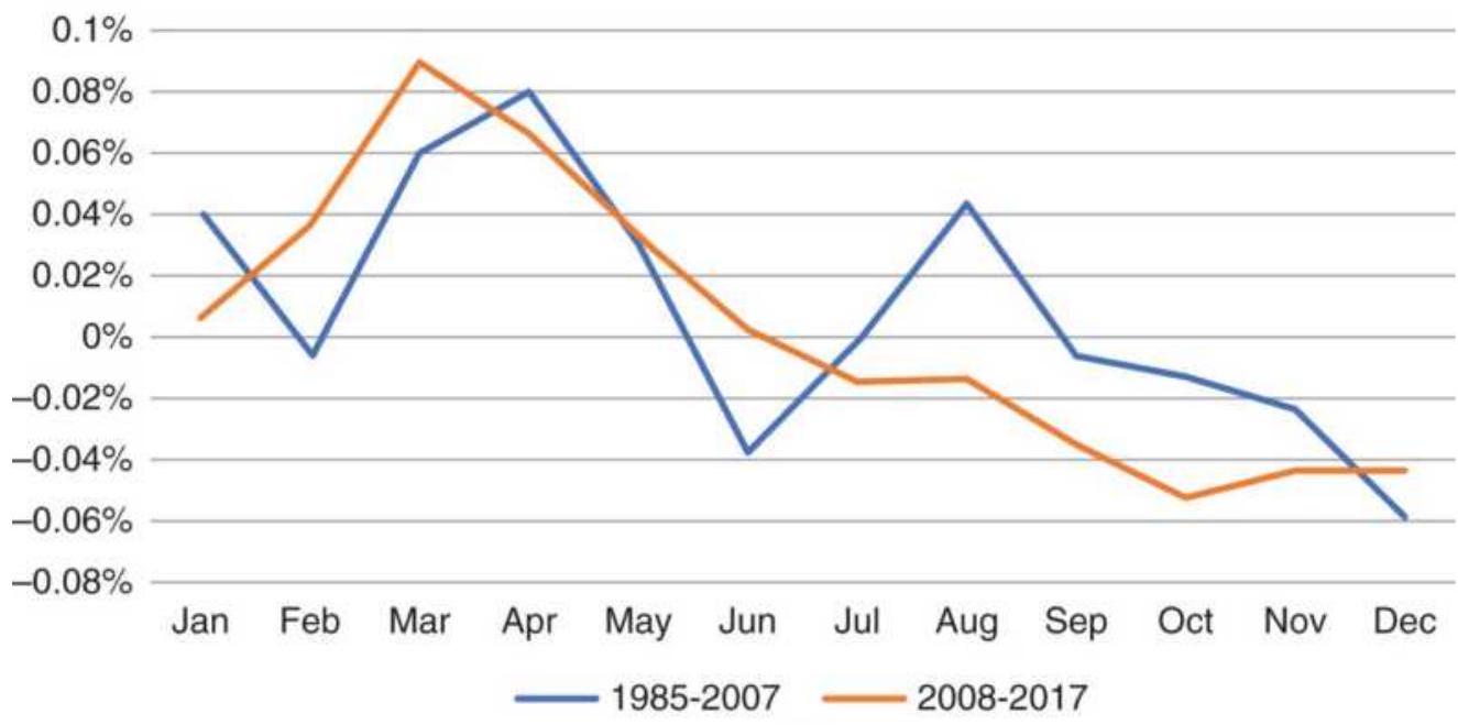
(a)
Cash heating oil, average percentage change by month
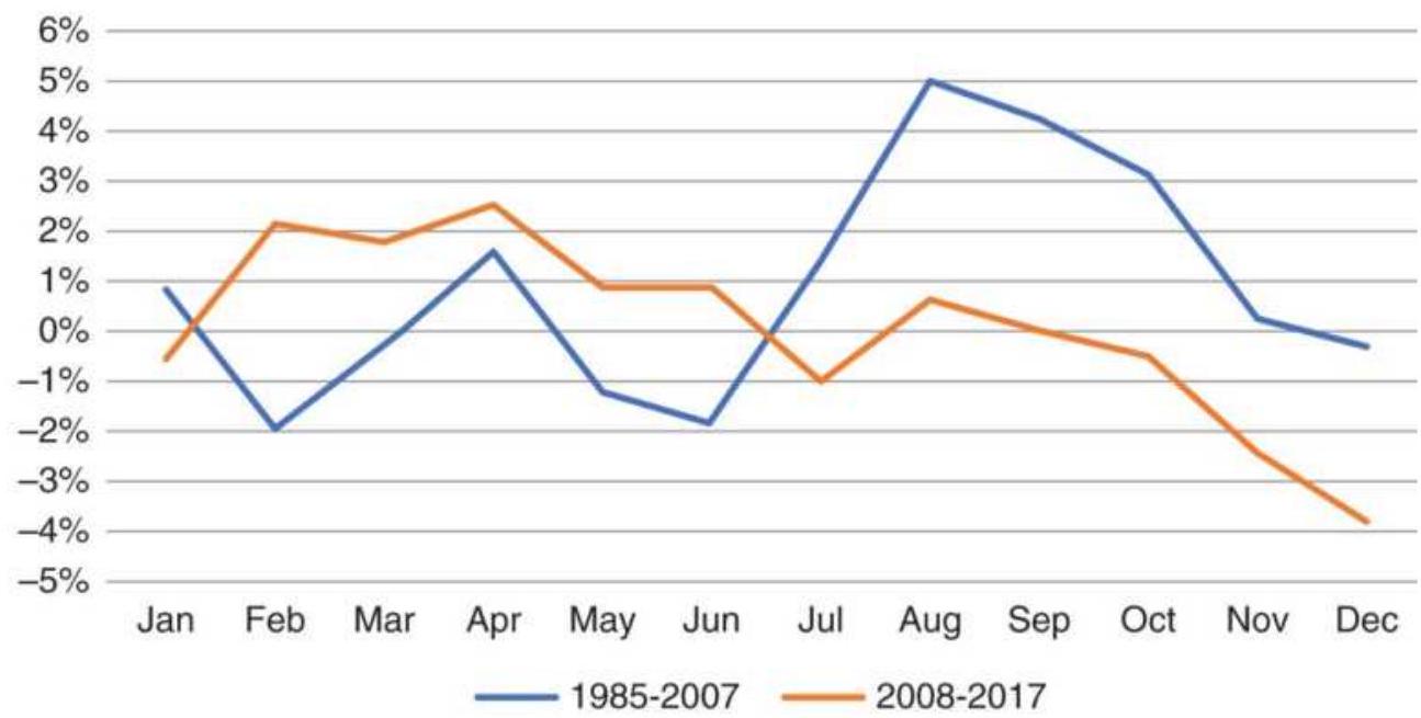
(b)
FIGURE 10.6 (a) Unleaded gasoline, average yearly percentage change, 1985-2017. (b) Heating oil, average yearly percentage change, 1985-2017.
Changing Patterns. Demand for gasoline is sensitive
to price, and during the rally in July 2008 that took prices to \(\$ 150 /\) barrel, demand fell sharply. Prices dropped to under \(\$ 40 /\) barrel in late December. That one move can distort the seasonal averages during the past ten years, 2008-2017.
\section*{Lasting Changes in Seasonal Patterns}
We need to be aware that commodities can change their seasonal patterns from what they were 30 or 40 years ago, perhaps even 20 years ago. The main reasons for the change are the usual culprits, technology and globalization.
Biogenetics have improved crop production substantially, increasing yields and making grain more resistant to both disease and drought. Large yields mean lower prices. We can see in the cash wheat table that the price in 1978 was \(\$ 3.47 /\) bushel, and the price at the end of 2017 was \(\$ 4.27 /\) bushel, an increase of \(\$ 0.80 /\) bushel over 40 years, or \$ \(\$ 0.02\) each year - not nearly enough to offset inflation.
Combined with technology is the increased competition from other countries, most notably Brazil. But all countries improve their production to some degree, just through education if not chemicals. The better their production, the less need for importing and a greater ability to export, all factors that keep prices low.
Storage facilities have also improved. More storage means that not as much grain will be sold at harvest. It can be held over for later in the season and producers can add carrying charges to the price. That should cause
less of a price drop at harvest and less of an increase during the midwinter as supplies diminish.
When studying seasonality, separate older and newer periods and consider changes that would have a permanent effect on both production and demand. Some research may be necessary. For example, platinum was once only used for jewelry, but is now an industrial product used in catalytic converters. Gold is not just for decoration or for hedging currency but used in high-end circuit boards. The secondary market for these metals that is, reclaiming them - is bigger than the flow of new product. These changes will affect seasonality.
\section*{The Impact of a Few Volatile Years}
Some of the patterns that we see as seasonal are created by a few highly volatile years. For grains, the growing season rarely has surprises. Planting occurs within a reasonable time, sometimes delayed by rain or a late frost, and harvest is mostly uneventful, also delayed mostly by rain. But there are a few years when drought reduces yield, or exceptional rain causes farmers to shift from corn to soybeans. This causes wide price swings, mainly higher. The result is a higher average price during those active growing months.
Heating oil had a series of much lower prices following the 2008 financial crisis. From August 2008 through February 2009 monthly returns showed declines varying from \(8 \%\) lower to \(24 \%\) lower. That could change the seasonal pattern. Figure 10.7 shows that, if you remove 2008 and 2009 and compare 2010-2017 to 2008-2017,
the pattern does not change, even though the size of the average losses is much smaller.
When trading seasonality, look for triggers that say this is going to be an unusual or volatile year, because entering a long position ahead of planting and exiting during the peak growing season can be disappointing most years. This is discussed later in this chapter in "Seasonality and the Stock Market."
\section*{Extremes in Cotton}
During 2009 through 2011, cotton suffered severe supply disruptions - flooding in Pakistan, geopolitical events in Egypt, and drought in the United States. The normal seasonal pattern from 1973 through February 2011, shown in Figure 10.8a, is similar to other northern hemisphere summer crops, with seasonal lows at harvest, or anticipation of harvest, July through September.
Heating oil monthly returns
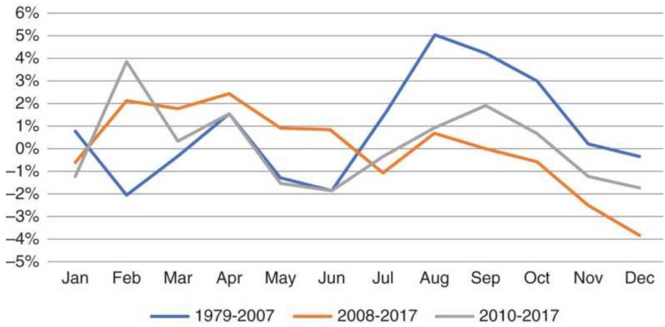
FIGURE 10.7 Comparison of heating oil monthly returns, with and without, 2008-2009.
Cotton monthly returns
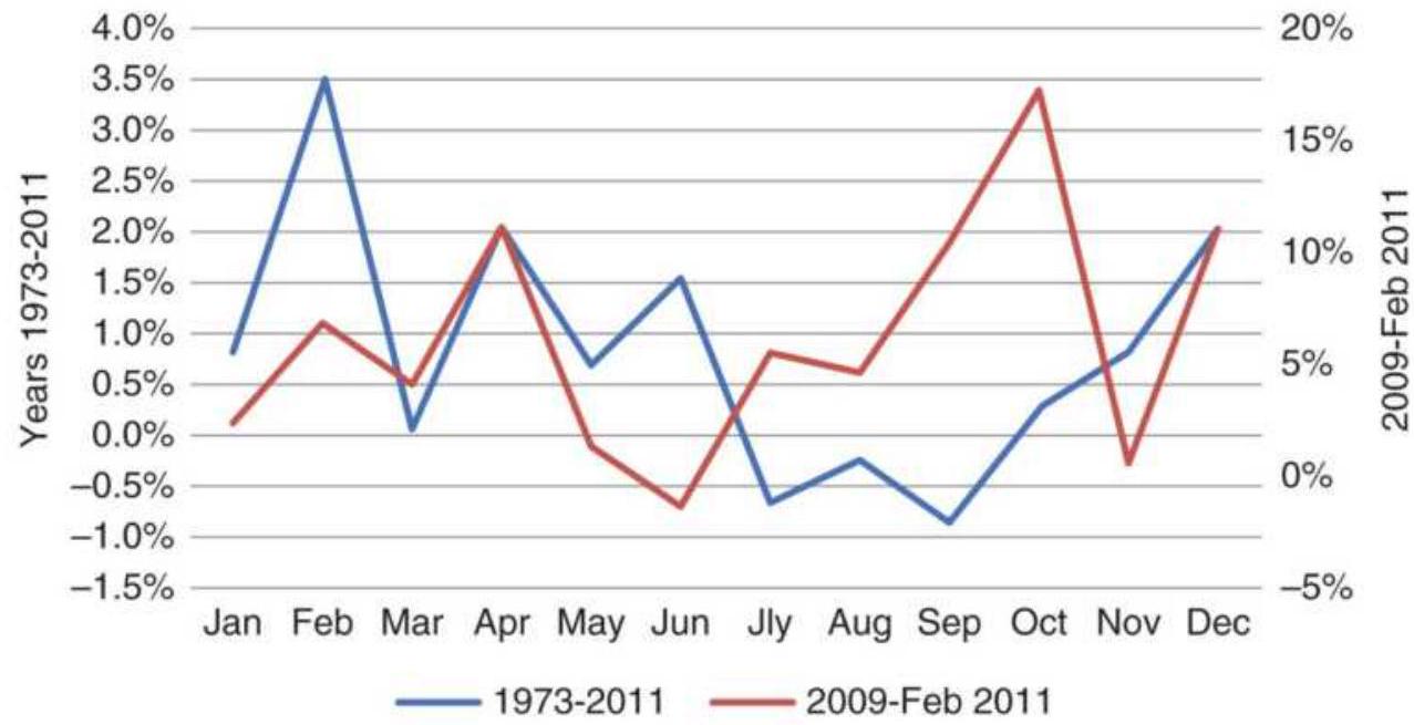
(a)
\section*{Cotton monthly high-low range}
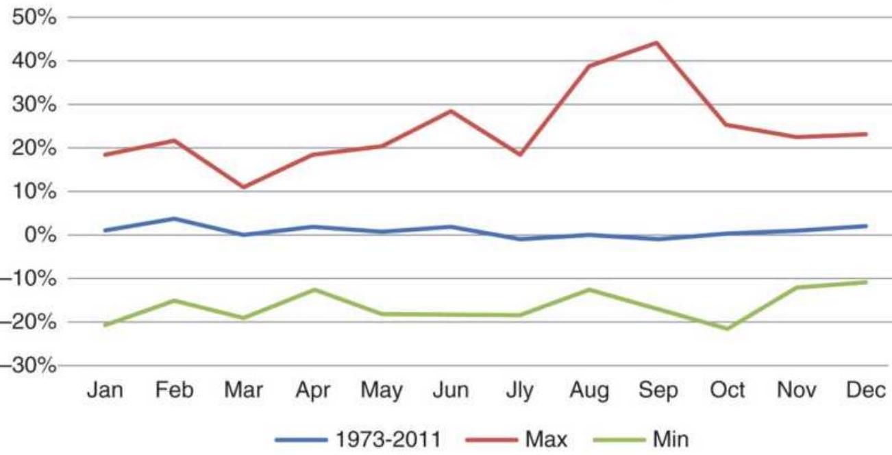
(b)
FIGURE 10.8 (a) Cotton average monthly returns. (b) High-low price range, in percent.
If only the years from January 2009 to February 2011 are averaged, the pattern is very different, with a price jump of \(17 \%\) in October and rising prices during what is normally harvest season. This distortion points out that seasonal patterns are formed over many years, and a few nonseasonal events do not affect the long-term pattern, although they could result in large trading losses for those who do not look at historic volatility. Most of the extremes are in the direction of higher prices.
Another way of seeing extremes is to plot the highest and lowest price changes that occur during any month. Although seasonal lows are in July, August, and September, the maximum monthly move was \(45 \%\) in September, as seen in Figure 10.8b, with the second largest move in August. The largest downside move, about 22\%, was in October. The upward surprises are much larger than the downward ones.

If the monthly percentage changes are each sorted highest to lowest for all years, the extent of the extremes can be seen in Figure 10.9. Although it is difficult to distinguish one month from another, the largest upside move was \(45 \%\) in September, followed by 40\% in August and nearly 30\% in June. On the downside, July, September, and October all compete with each other at about \(-20 \%\). Harvest seems to be the time for the largest moves, regardless of direction.
Complete seasonal tables in prices and percentages are available on the Companion Website as Cotton Extreme Years and Heating Oil Extreme Years.
\section*{Seasonality in Stocks}
An online search will give you the stocks that have had the best returns in November, or May, or any other month. That could be for any number of reasons, seasonality, an earnings surprise, a takeover of another company, a new CEO. To identify seasonality, you must separate one or two exceptional returns from a pattern. We will use Southwest Airlines (LUV) as an example. Although splits can cause problems in older adjusted stock data, that is not a problem with Southwest. We can create a seasonal table in the same way we did for wheat. We expect a seasonal pattern in Southwest, because it seems more likely that more passengers fly during the summer and over holidays.
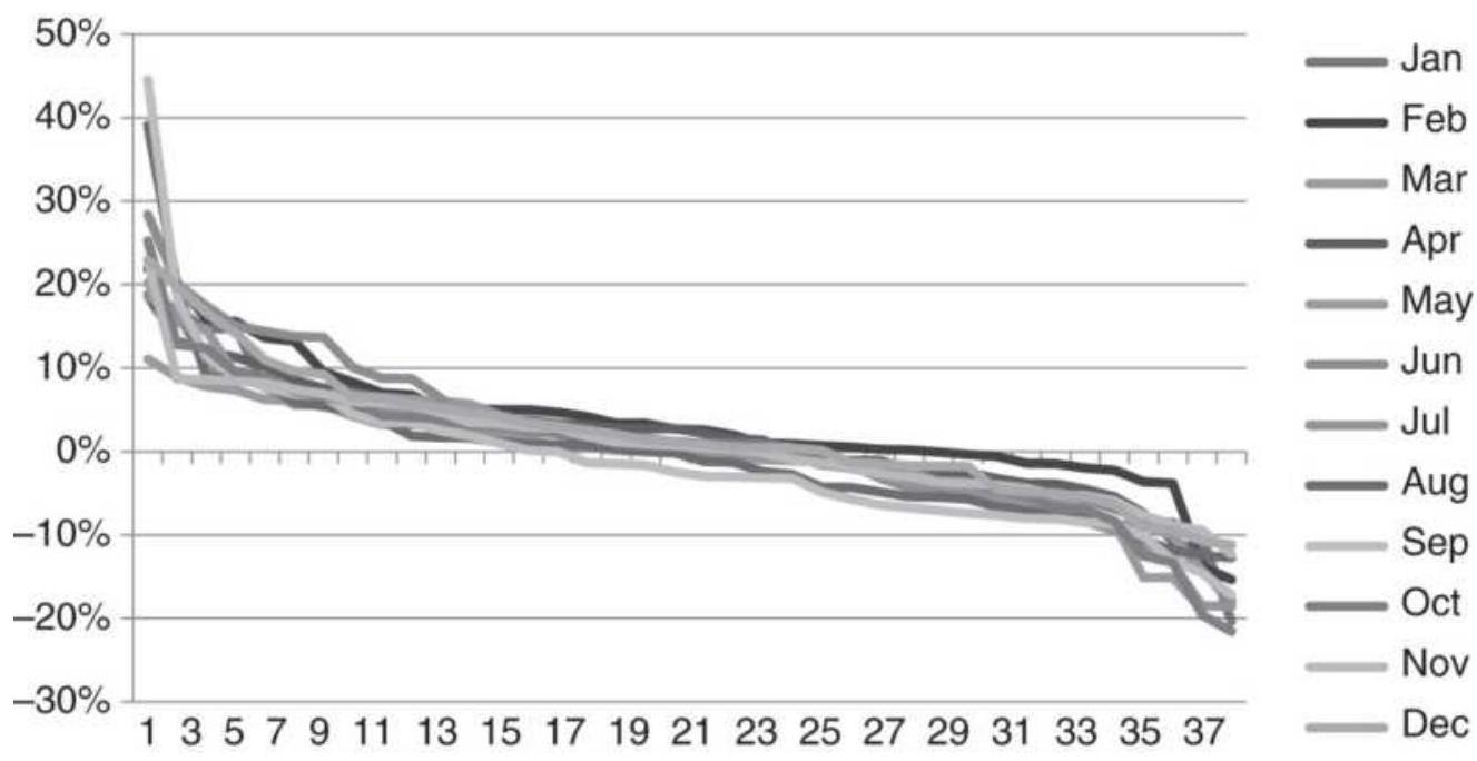
FIGURE 10.9 Cotton percentage monthly changes, sorted highest to lowest.
Although we prefer using the median value, the average is easier for most traders and the patterns are similar,
even though the percentages are different; therefore, we will only use averages in our analysis. Figure 10.10a shows the average monthly returns for two different periods, 1978-2007 and 2008-2017. This allows us to see if there is a seasonal pattern and whether it is changing. It is not a clear picture. During the more recent interval, there are good returns from September through January, and weak returns during May through August. That could be seasonal, but we might confirm that using the percent of positive years (Figure 10.10b).
Southwest Airlines (LUV) average monthly returns
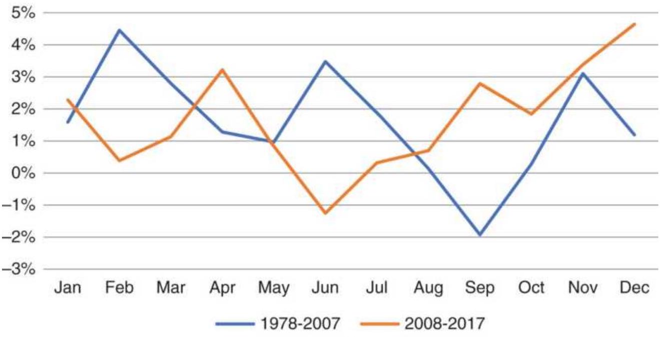
(a)
\section*{LUV Percent of positive years}
\(80 \%\)

\(20 \%\)
Jan Feb Mar Apr May Jun Jul Aug Sep Oct Nov Dec
- 1978-2007 - 2008-2017
(b)
FIGURE 10.10 (a) Average returns by month for Southwest Airlines (LUV). (b) Percent of positive years.
Figure 10.10b shows that 8 of 12 months had positive returns in at least \(60 \%\) of the years 2008-2017. The only
seasonal trait seems to be poor returns during the summer months, June through August. That seems contrary to our expectations of seasonality but may be the result of passengers buying tickets in advance. While it would have been considered unearned income some years ago, and not posted until passengers used their tickets, the current policy of nonrefundable tickets would allow airlines to post that income immediately. Caveat emptor: Anyone can seem smart when they explain something that happened in the past. Even if it sounds reasonable, it might not be true.
\section*{Amazon and eBay}
What about Amazon? We know that they have huge sales in late November, around the U.S. Thanksgiving holiday, and throughout December. Does that result in a clear seasonal pattern? While Amazon has expanded from only books to online sales of everything, it is now branching out into other businesses. We will compare Amazon with eBay, which has remained in the online auction business.
The Amazon monthly returns prior to 2007 can be argued to fit our expectations. In Figure 10.11a,
December is the strongest month while January and February fall after the holidays. Note that the earlier period, 1997-2007, has higher returns because share prices were lower and volatility relatively higher. During the past ten years, Amazon has figured out how to keep business flowing evenly all year. A combination of new business and well-engineered promotions must be the reason.
In contrast, eBay performance is erratic. The earlier period shows profits peaking in December, April, and May. They fall in July, similar to Amazon in earlier years, but do not rebound as quickly as Amazon. During the more recent ten years, the pattern has almost reversed.
If we look for confirmation in the percentage of positive years, shown in Figure 10.12, we see that February has the worst performance; otherwise, Amazon has improved the profitability for all other months, with July and September at \(90 \%\). The monthly averages and percentage of profitable years paints an impressive picture.
\section*{Ford and Platinum}
Earlier, it was mentioned that platinum has changed from a store of value to an industrial commodity, its primary use being catalytic converters in cars. To see if we find a pattern that reflects that change, we can compare the monthly average returns of platinum with those of Ford. Figure 10.13 shows much stronger first quarter returns for platinum during the past 10 years, and much lower returns during the second half of the year. Ford returns, in Figure 10.14, show stronger sales in the spring and a spike in December, both confirming what we would expect of seasonal auto sales. Because platinum needs to be purchased ahead of production, it seems reasonable that January and February are strong for platinum and March, April, and May are strong for car sales. The summer months and early fall are weak for both. This leading relationship of platinum to Ford is similar to refiners buying crude in one month and selling
heating oil or gasoline one to two months later, the delay needed for processing.
Amazon (AMZN) monthly average returns
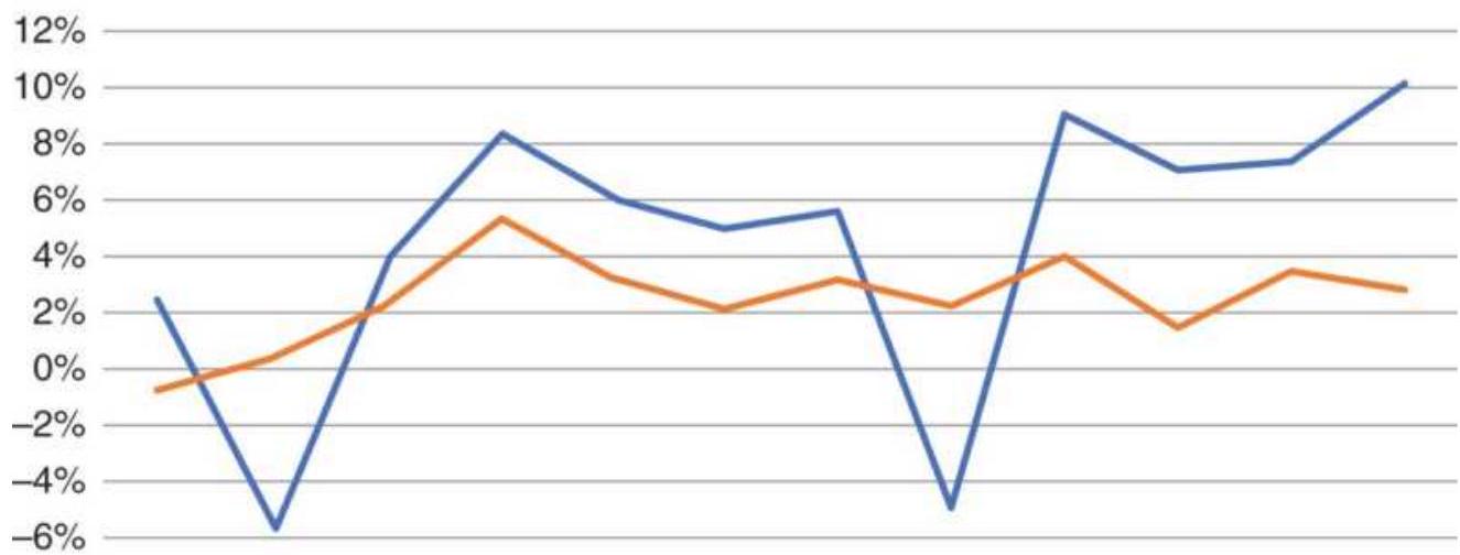
\(-8 \%\)
Jan Feb Mar Apr May Jun Jul Aug Sep Oct Nov Dec
-1997-2007 - 2008-2017
(a)
eBay (EBAY) monthly average returns
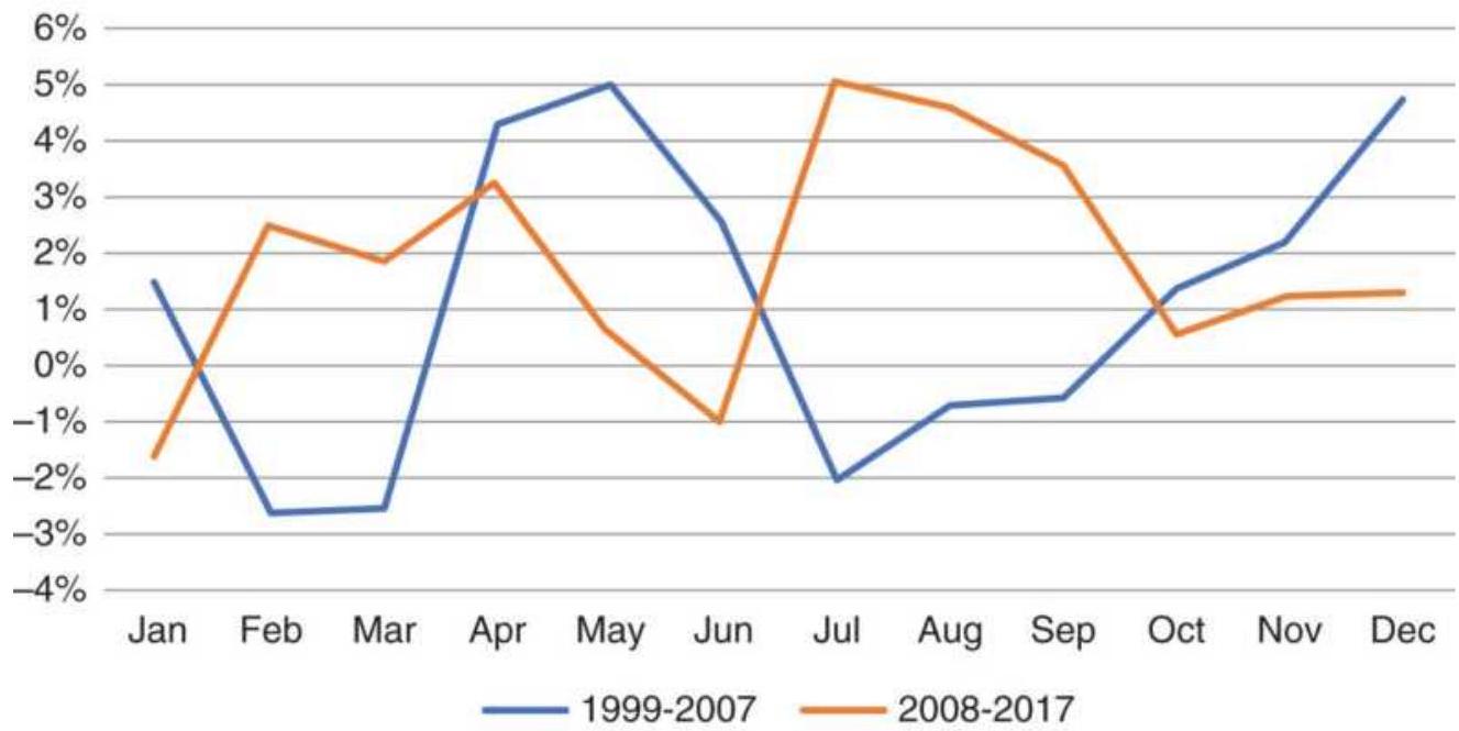
(b)
FIGURE 10.11 (a) Amazon average returns by month. (b) eBay average returns by month.
\section*{Amazon percent profitable years}
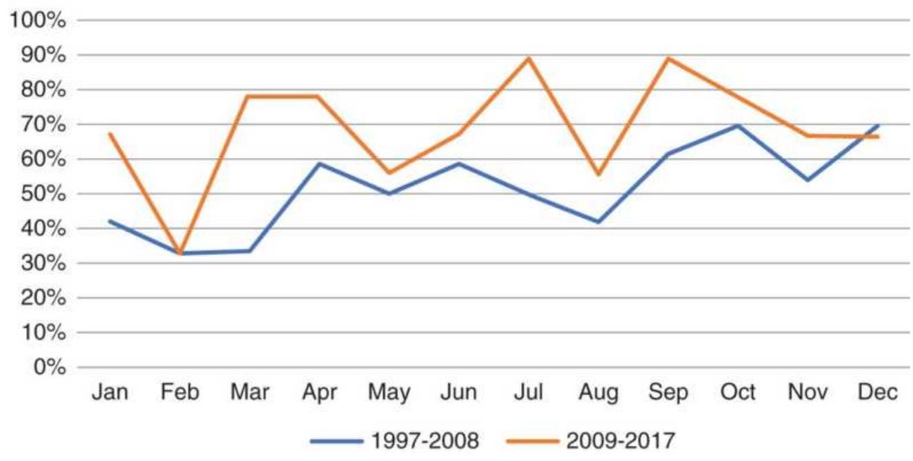
FIGURE 10.12 Comparing the change in percentage of positive years for Amazon.
Platinum cash average returns by month
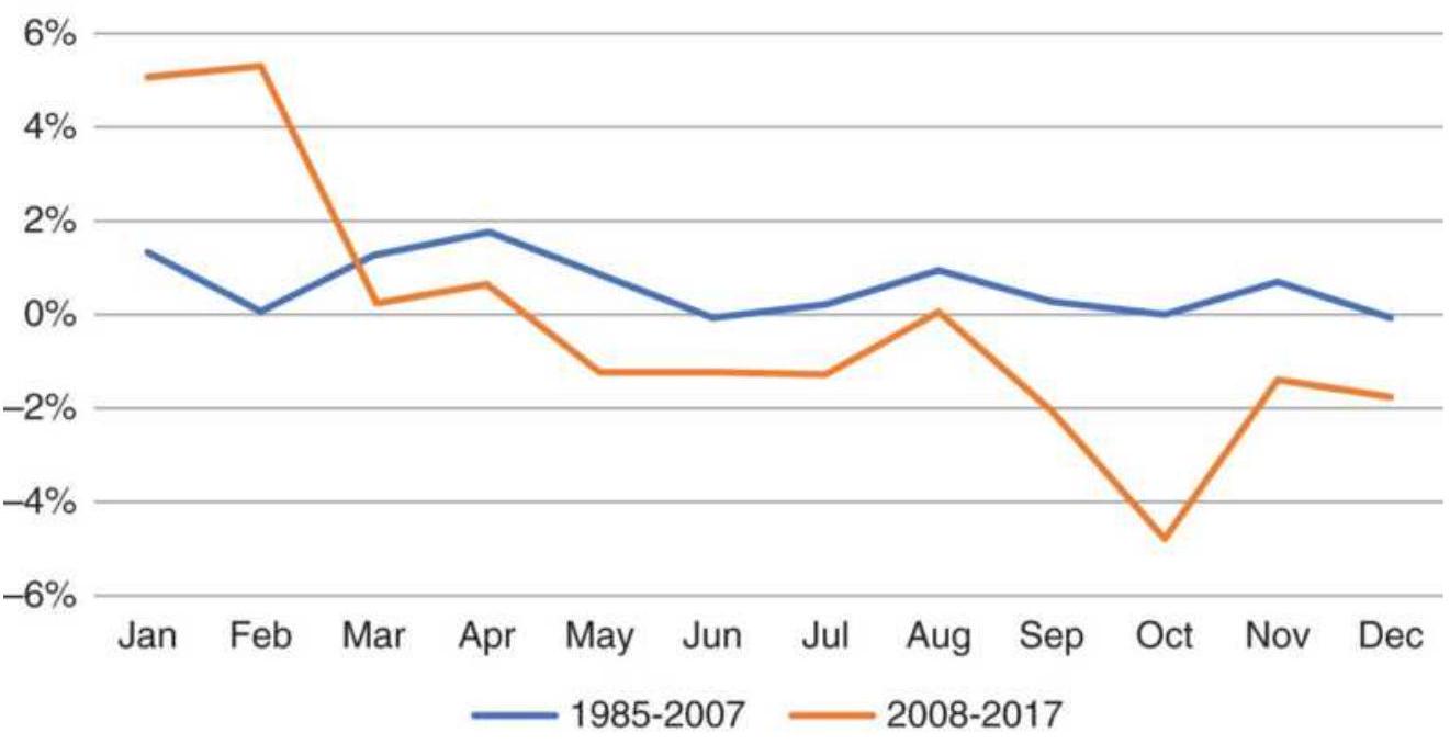
FIGURE 10.13 Platinum average returns by month shows much greater demand in the first quarter and less demand in the second half of the year.
\section*{Ford average returns by month}
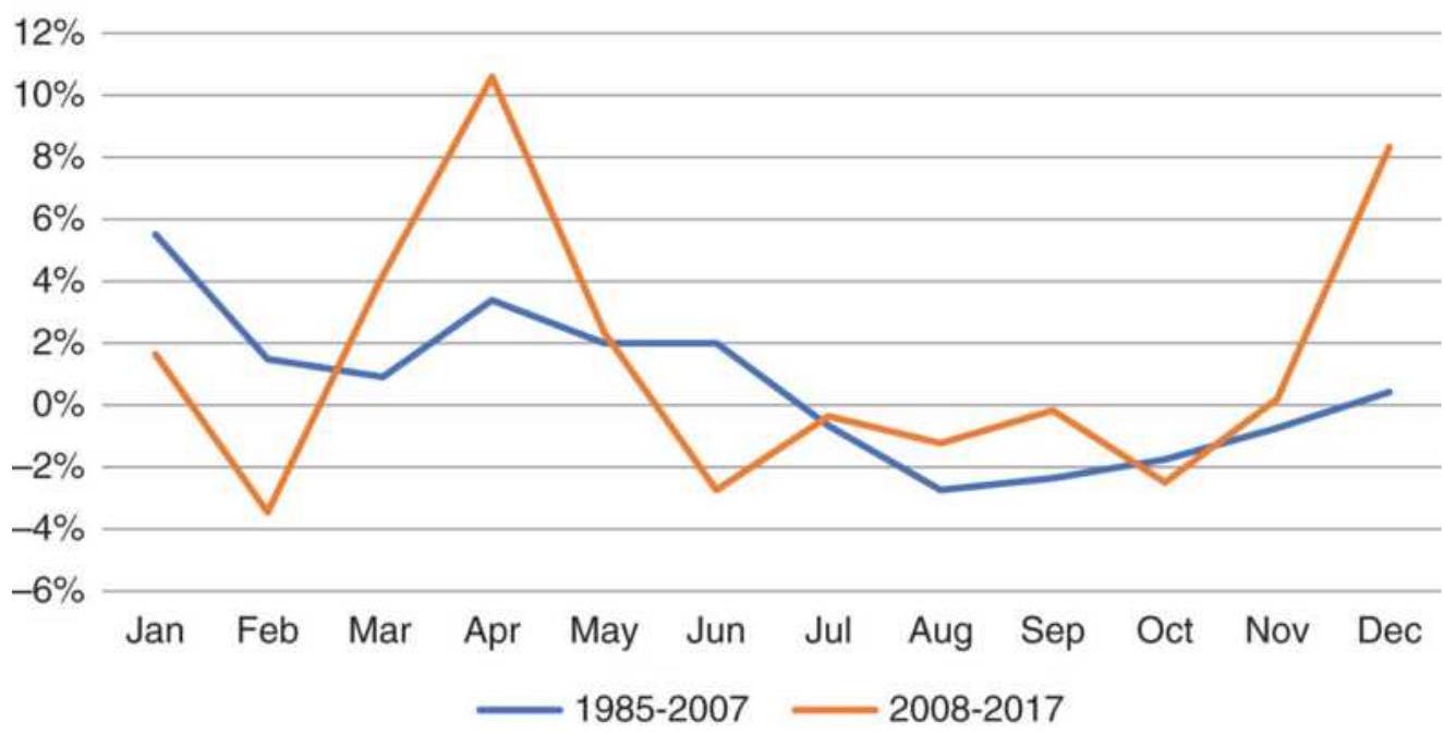
FIGURE 10.14 Ford returns, during the past ten years, spike in the spring and again in December, similar to the earlier period, but more volatile.
\section*{Adding Volatility}
Volatility can also explain seasonality, but more important, it is the key to a seasonal trading strategy. For grains, price is uncertain throughout the growing season, as traders try to assess the size of the crop ahead of the USDA reports. During the nongrowing season, price is determined by changes in demand, primarily exports. Domestic consumption should be reasonably predictable.
Our first seasonal chart, winter wheat (Figure 10.1), showed prices peaking in November, declining through June, then rising. With harvest in May and June, we would have expected uncertainty in the crop size to cause a rally. Any commodity trader knows that the growing
season is filled with uncertainty and rumors, even when the crop ends up having a record harvest.
By calculating the average monthly volatility as the highest minus the lowest daily closing prices (the volatility would be greater if we used the daily highs and lows), we get a picture that comes closer to our expectations. Figure 10.15 a shows volatility increasing sharply in June, the month that the USDA issues their final assessment of the crop size. While more volatile during the past ten years, volatility follows the same pattern as it has had for the past 40 years. A closer look at June volatility (Figure 10.15b) shows the impact of the 2008 financial crisis, continuing into 2009. However, all months were affected similarly during those years. More recently, volatility has settled at about \(20 \%\).
\section*{Cash wheat volatility as a percentage of price}
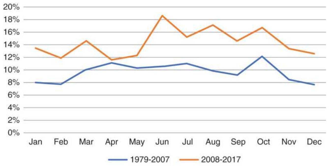
(a)
\section*{Wheat volatlity in June}
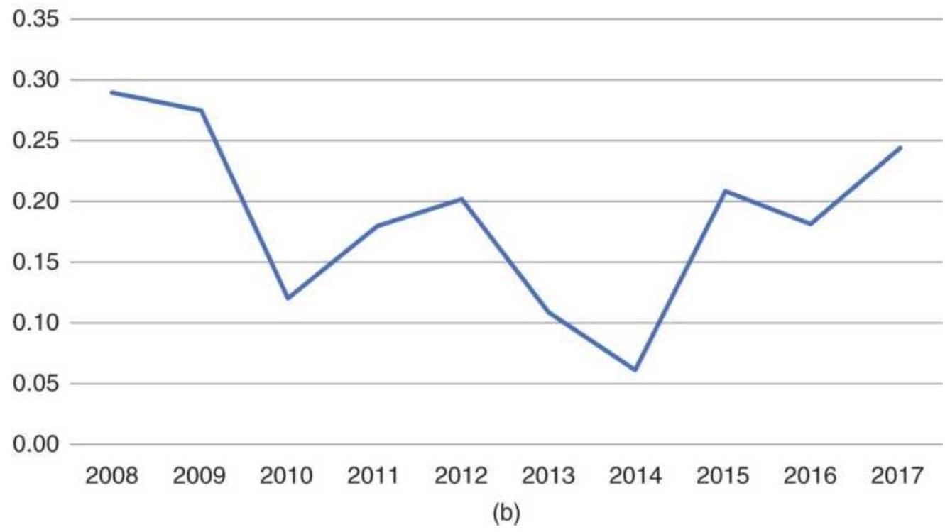
FIGURE 10.15 (a) Cash wheat volatility as a percentage of price. (b) Wheat volatility during June.
Southwest Airlines (LUV) average monthly returns
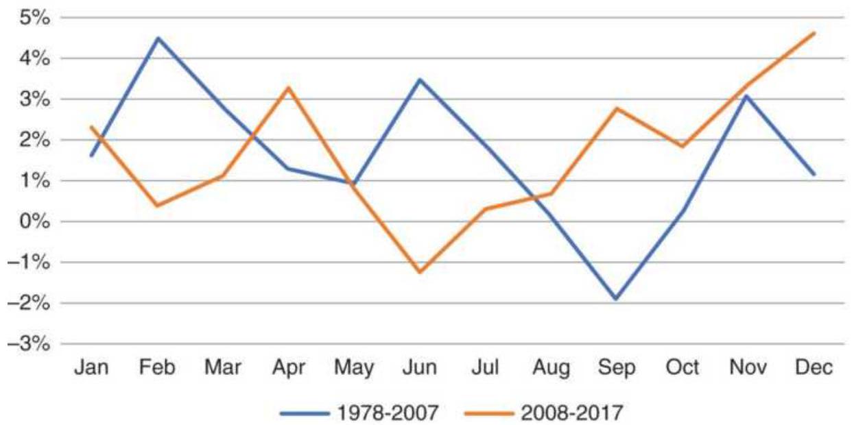
(a)
LUV Volatility
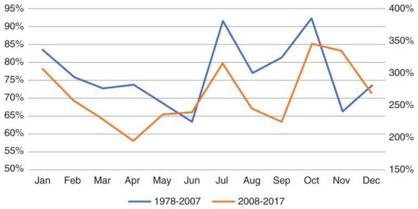
(b)
FIGURE 10.16 Southwest Airlines (LUV) (a) average monthly returns, and (b) average monthly volatility (using closing prices).
By looking at both the volatility and the average monthly prices (Figure 10.1), we see that June has high volatility
but the lowest average price. That can only happen if there were a few volatile years during June. Figure 10.15b shows that 2008 and 2009 posted volatility between \(25 \%\) and \(30 \%\), and 2017 shows volatility of \(25 \%\). There are two additional years with volatility near \(20 \%\). Then half the years show enough volatility for good trading profits.
If we return to Southwest Airlines, Figure 10.16b, the volatility shows that the steady gains from July through December are erratic. September is the most desirable month, with good returns (a) and low volatility (b).
\section*{Heating Oil Volatility}
Heating oil is a good example of seasonality. Figure 10.7 showed prices peaking in September (if we eliminate 2008 and 2009), when many homeowners fix their price for the winter season. Afterward, the average price declines. As we've seen before, the average price can hide a few years of volatility, caused by extreme cold weather. Figure 10.17a shows a peak in volatility during May, expressed as cents/barrel, although the long-term volatility declines in a very seasonal pattern. Figure 10.17b, we see that history showed high volatility increasing in December and peaking in January, even while the past ten years shows volatility averaging about \(15 \%\) across most months. Traders must keep in mind that the demand for heating oil cannot be determined in September, even though demand often peaks as homeowners fill their tanks for the winter. A spike in January is also likely, and an opportunity to capture profits.
Heating oil price volatility, in cents/barrel
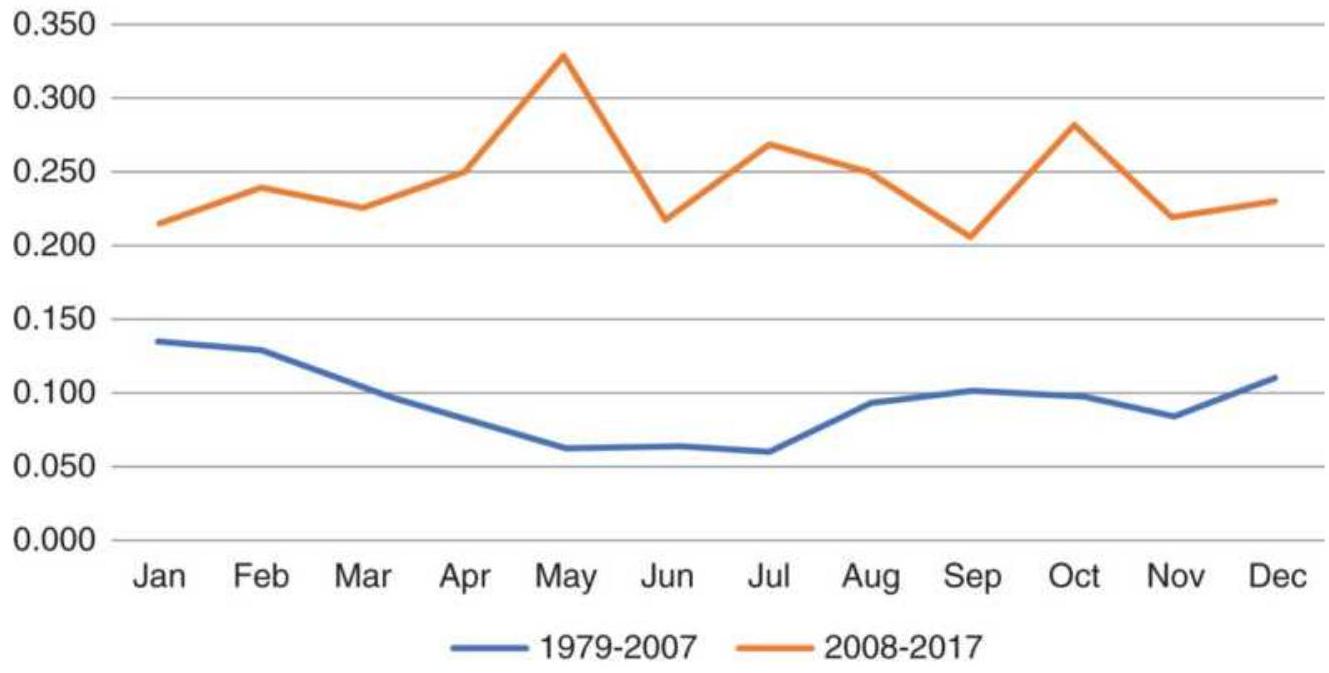
(a)
Heating oil, volatility as a percentage of price
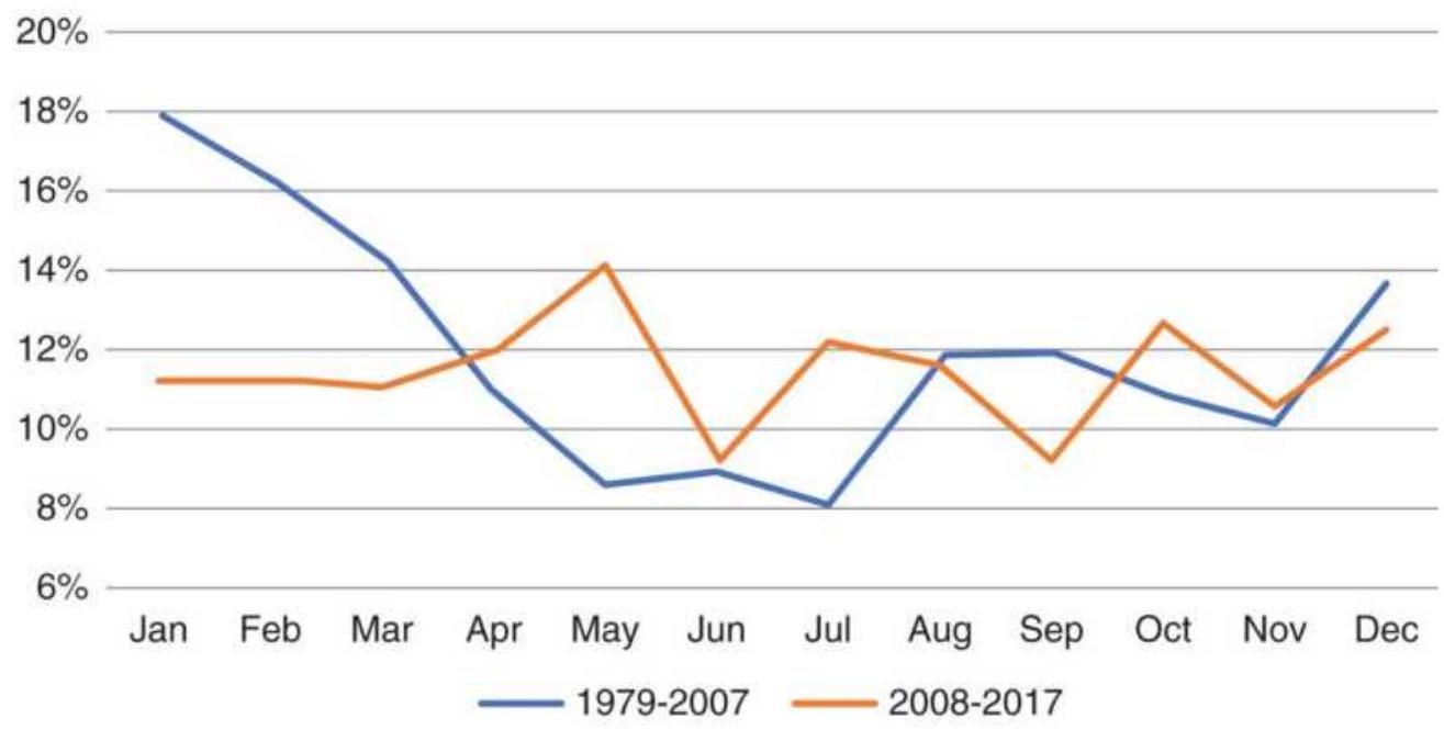
(b)
FIGURE 10.17 Heating oil volatility (a) in cents/barrel, and (b) as a percentage of cash price.
Trend followers with positions in heating oil should monitor the risk of those positions. As prices move
sharply higher in December and January, reducing position size to maintain a consistent level of risk is the conservative approach to risk management. Large accumulated profits can turn into large losses when prices reverse.
\section*{CLASSIC METHODS FOR FINDING SEASONALITY}
\section*{Using Computer Programs to Find Seasonality}
Time series decomposition is a formal process that separates a price series into four categories, the trend, seasonal, cycle, and noise. The noise is anything left over after the other three components are extracted. The methods for doing this can vary from very
understandable to extremely obscure. It is never clear whether there is added value from additional complexity; however, it is always important to understand what others are doing. In our case, the "other" is the government, with many departments forecasting the economy.
The easiest way to decompose a time series is by using software that does it automatically. Three choices for this would be Python, MatLab, and ProStat. Even then, you will need to make decisions about the length of the trend, the season, and some other factors. You can use daily, weekly, or monthly data. Finding the seasonality can be done without specialized software, and understanding the process is important before you can build a trading system that exploits seasonal moves.
There are two basic decomposition models, additive and multiplicative. If today's forecast price is \(E_{t}\), then the components are either added or multiplied to get \(E_{t}\) :
\[
E_{t}=\text { Trend }_{t}+\text { Seasonal }_{t}+\text { Cyclic }_{t}+\text { Noise }_{t}
\]
(Multiplicative) \(\quad E_{t}=\operatorname{Trend}_{t} \times\) Seasonal \(_{t} \times\) Cyclic \(_{t} \times\) Noise \(_{t}\)
An additive model is considered linear and a multiplicative model, nonlinear. In this book we will not reconstruct a forecast price from the components; instead we will use the components separately in unique strategies. Each component is an estimation, and a forecast that combines them can vary considerably from what happens in the future.
In economic terminology, when the seasonal component is removed from the original price series, the resulting series is called seasonally adjusted.
\section*{An Example of Detrending Using Amazon}
There are two basic methods for removing the trend from a time series, taking the first differences and subtracting a lagged moving average or a regression line from the price. Using monthly Amazon prices, we calculate the first differences, which is the same as the returns, \(r_{t}=p_{t} / p_{t-1}-1\). Figure 10.18 shows the results of both. The two methods emphasize volatility differently, the moving average method with more recent data, because prices have been accelerating upward away from the moving average, and the first differences at the
beginning of the data, where returns were high because share prices were low.
Amazon detrended using lagged 12-month MA
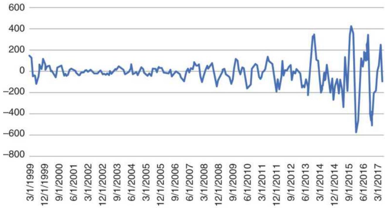
(a)
AMZN Monthly first differences
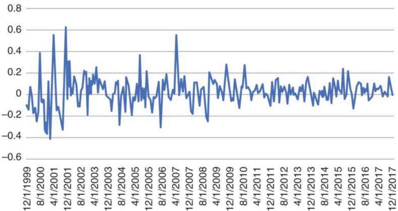
(b)
FIGURE 10.18 (a) Amazon price minus a 12-month moving average lagged 6 months. (b) Amazon first differences.
The moving average method will be the most practical for trading purposes. To calculate this correctly, we center the moving average within its calculation period. Then the 12-month moving average at month \(t\) will be plotted at month \(t-6\). The detrended series will be \(D_{t}=p_{t}-M A_{t-6}\). Some analysts will go further and use triangular weighting for their average, emphasizing the center price. This technique is popular for finding cycles, covered in the next chapter. A regression line is another alternative, where the regression value is subtracted from the price. In that case, use a rolling 12month regression and subtract the center regression value from the current price in the same way the lagged moving average value was used.
\section*{Amazon centered MA}
6000
5500
5000
4500
4000
3500
3000
2500
2000
1500 \(\square\)
s

-Amazon prices
- Lagged moving average
(a)
\section*{Amazon detrended using a 12-month MA lagged by 6 months}

\(-800\)

(b)
FIGURE 10.19 (a) Amazon detrended prices using a 12month MA lagged 6 months. (b) The detrended prices using the lagged MA.
To see this lagged process clearly, Figure 10.19a shows the Amazon prices with the lagged moving average
overlaid and Figure 10.19b the resulting detrended series, but only for a recent 2-year period.
\section*{Another Look at Amazon Seasonality}
Choosing Amazon as an example does not guarantee that it has a seasonal pattern. The strong increase in price over the years could easily overwhelm any seasonality, if there is any. In Figure 10.11, we saw that Amazon seems to have engineered out a large part of the seasonality they had in earlier times. Figure 10.20 shows the detrended Amazon price series with vertical lines at the end of December. These seem to occur at peaks in the series, although there are a few years where the bars correspond to low points.
The chart shows that the end of December is a critical time for Amazon. It may either post excellent or disappointing returns, causing prices to move sharply up or down. The higher prices in the more recent period allow larger differences relative to the moving average. The risks of trading can be reduced by sizing the position based on volatility parity, another subject to be covered later. At this time, smaller positions should be taken as volatility increases.
\section*{Detrended AMZN with markers at Dec 31}
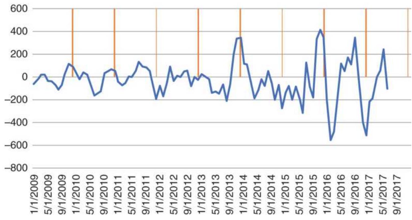
FIGURE 10.20 Amazon price detrended for the period 2009-2017. Vertical lines are at the end of December.
\section*{Method of Yearly Averages}
Although different methods have been used to show the seasonal patterns, all of them have problems when prices have wide price ranges or extreme volatility. Expressing prices as percentages tends to reduce some of the issues, but changes at higher price levels still seem to overwhelm those at lower levels.
An alternative way of calculating returns is to express each year's variation as it relates to the annual average. In order to compare methods, the same wheat data will be used as in Table 10.1. A few years of the cash data and the yearly averages (on the right) are shown in the top part of Table 10.3. The percentage changes for each month are calculated using the average of the same year,
change \(=\) month price/average yearly price -1, then shown in the bottom part of Table 10.4. The same process as before is followed to create the seasonal patterns. Each month is averaged down, then divided by the average of all months. Figure 10.21 shows that the pattern based on yearly averages is more representative of what we would expect in a seasonal wheat chart.
A general formula for the monthly average is: \({ }^{1}\)
\(A P P_{i}=100\left\{\frac{1}{N}\left[12 \sum_{n=1}^{N}\left(P_{i n} / \sum_{j=1}^{12} P_{j n}\right)\right]\right\}, i=1,12\)
\section*{TABLE 10.4 Original cash wheat prices (top) and returns adjusted by yearly averages (bottom).}
\begin{tabular}{|c|c|c|c|c|c|c|c|c|c|c|c|c|c|}
\hline Year & Jan & Feb & Mar & Apr & May & Jun & Jly & Aug & Sep & Oct & Nov & Dec & Average \\
\hline & \multicolumn{13}{|c|}{ Wheat cash prices } \\
\hline 2013 & 783 & 772.16 & 740.5 & 717.91 & 724.68 & 703.40 & 677.55 & 640.00 & 632.95 & 703.18 & 670.45 & 655.19 & 701.7472 \\
\hline 2014 & 606.20 & 626.22 & 704.19 & 703.50 & 690.38 & 603.54 & 534.32 & 506.86 & 416.19 & 416.42 & 514.66 & 616.57 & 578.254 \\
\hline 2015 & 547.85 & 523.08 & 508.73 & 501.05 & 490.01 & 513.66 & 511.86 & 448.64 & 427.33 & 443.50 & 440.93 & 421.98 & 481.5514 \\
\hline 2016 & 431.71 & 470.43 & 473.77 & 479.07 & 463.26 & 474.40 & 423.10 & 386.83 & 389.08 & 388.76 & 403.43 & 391.75 & 431.2992 \\
\hline 2017 & 417.08 & 437.78 & 423.63 & 414.26 & 419.94 & 466.05 & 515.20 & 430.61 & 429.96 & 415.41 & 433.48 & 427.48 & 435.9053 \\
\hline \multicolumn{14}{|c|}{ Monthly averages divided by yearly averages } \\
\hline 2013 & 0.1158 & 0.1003 & 0.0552 & 0.0230 & 0.0327 & 0.0024 & -0.0345 & -0.0880 & -0.0980 & 0.0020 & -0.0446 & -0.0663 & \\
\hline 2014 & 0.0483 & 0.0830 & 0.2178 & 0.2166 & 0.1939 & 0.0437 & -0.0760 & -0.1235 & -0.2803 & -0.2799 & -0.1100 & 0.0663 & \\
\hline 2015 & 0.1377 & 0.0862 & 0.0564 & 0.0405 & 0.0176 & 0.0667 & 0.0629 & -0.0683 & -0.1126 & -0.0790 & -0.0844 & -0.1237 & \\
\hline 2016 & 0.0010 & 0.0907 & 0.0985 & 0.1108 & 0.0741 & 0.0999 & -0.0190 & -0.1031 & -0.0979 & -0.0986 & -0.0646 & -0.0917 & \\
\hline 2017 & -0.0432 & 0.0043 & -0.0282 & -0.0496 & -0.0366 & 0.0691 & 0.1819 & -0.0122 & -0.0136 & -0.0470 & -0.0056 & -0.0193 & \\
\hline Averi & 0.037 & 0.036 & 0.027 & 0.016 & -0.010 & -0.028 & -0.036 & -0.049 & -0.041 & -0.018 & 0.025 & 0.041 & \\
\hline dj) Medi & 0.048 & 0.035 & 0.039 & 0.014 & -0.017 & -0.025 & -0.048 & -0.056 & -0.029 & -0.018 & 0.017 & 0.027 & \\
\hline
\end{tabular}
Wheat using the method of yearly averages
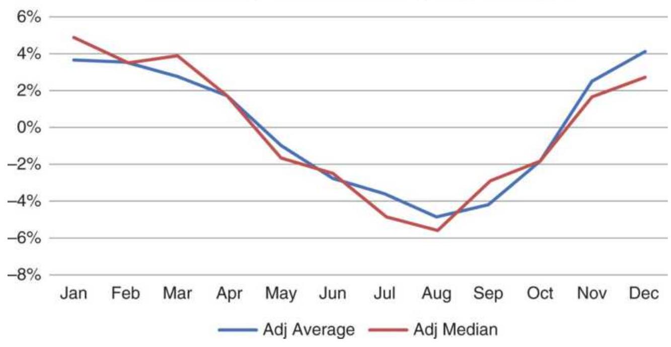
FIGURE 10.21 Seasonal pattern of wheat using the method of yearly averages.
where
\(A P P_{i}=\) the Average Percentage Price in month \(i\)
\(i=\) the calendar month from 1 to 12
\(N=\) the number of years in analysis
\(P_{j n}=\) the average price for month \(j\) of year \(n\)
This formula may be applied to weekly or quarterly average prices by changing the 12 to 52 or 4 , respectively. The use of an annual average price still does not account for a long-term trend in the price of the stock or futures market. If the rate of inflation in the United States is 6\%, there will be a tendency for a commodity price, such as gold, to be \(0.5 \%\) higher each month, resulting in a trend toward higher prices at the end of the year. Longer
trends, such as the steady rise in grain prices from 1972 to 1975 and from 2000 to 2014, alternating with even longer declines, can obscure or even distort the seasonality unless the trend is removed. Seasonality is still a major factor influencing price variation, even when there is a dominant trend.
\section*{The Method of Link Relatives}

Another technique for identifying seasonal price variations and separating them from other price components involves the use of link relatives. Table 10.5 shows only the most recent 5 years associated with the steps used for wheat cash prices, 1966-2017. The average and median values for all 52 years are shown at the bottom. The full spreadsheet, along with all calculations, is available on the Companion Website as TSM Wheat method of yearly averages and link relatives.
The followings steps calculate wheat seasonality using the method of link relatives:
1. Calculate the ratio of the monthly prices to the corresponding yearly average; put them into the table marked Step 1: Link Relatives.
\section*{TABLE 10.5 Wheat prices expressed as link relatives.}
\begin{tabular}{|c|c|c|c|c|c|c|c|c|c|c|c|c|c|c|}
\hline Year & Jan & Feb & Mar & Apr & May & Jun & Jly & Aug & Sep & Oct & Nov & Dec & Average & AROR \\
\hline \multicolumn{15}{|c|}{ Cash wheat prices } \\
\hline 2013 & 783.00 & 772.16 & 740.50 & 717.91 & 724.68 & 703.40 & 677.55 & 640.00 & 632.95 & 703.18 & 670.45 & 655.19 & & \\
\hline 2014 & 606.20 & 626.22 & 704.19 & 703.50 & 690.38 & 603.54 & 534.32 & 506.86 & 416.19 & 416.42 & 514.66 & 616.57 & & \\
\hline 2015 & 547.85 & 523.08 & 508.73 & 501.05 & 490.01 & 513.66 & 511.86 & 448.64 & 427.33 & 443.50 & 440.93 & 421.98 & & \\
\hline 2016 & 431.71 & 470.43 & 473.77 & 479.07 & 463.26 & 474.40 & 423.10 & 386.83 & 389.08 & 388.76 & 403.43 & 391.75 & & \\
\hline 2017 & 417.08 & 437.78 & 423.63 & 414.26 & 419.94 & 466.05 & 515.20 & 430.61 & 429.96 & 415.41 & 433.48 & 427.48 & & \\
\hline \multicolumn{15}{|c|}{ Step 1: Link Relatives } \\
\hline 2013 & 0.974 & 0.986 & 0.959 & 0.969 & 1.009 & 0.971 & 0.963 & 0.945 & 0.989 & 1.111 & 0.953 & 0.977 & 0.984 & \\
\hline 2014 & 0.925 & 1.033 & 1.125 & 0.999 & 0.981 & 0.874 & 0.885 & 0.949 & 0.821 & 1.001 & 1.236 & 1.198 & 1.002 & \\
\hline 2015 & 0.889 & 0.955 & 0.973 & 0.985 & 0.978 & 1.048 & 0.997 & 0.876 & 0.953 & 1.038 & 0.994 & 0.957 & 0.970 & \\
\hline 2016 & 1.023 & 1.090 & 1.007 & 1.011 & 0.967 & 1.024 & 0.892 & 0.914 & 1.006 & 0.999 & 1.038 & 0.971 & 0.995 & \\
\hline 2017 & 1.065 & 1.050 & 0.968 & 0.978 & 1.014 & 1.110 & 1.105 & 0.836 & 0.998 & 0.966 & 1.043 & 0.986 & 1.010 & \\
\hline Link rel & 0.990 & 0.998 & 0.990 & 0.983 & 0.982 & 0.989 & 1.017 & 1.002 & 1.018 & 1.035 & 1.046 & 1.009 & & \\
\hline Median & 0.994 & 0.988 & 0.976 & 0.987 & 0.973 & 0.991 & 1.003 & 1.008 & 1.006 & 1.038 & 1.028 & 1.001 & & \\
\hline \multicolumn{15}{|c|}{ Step 2: Chain Relatives } \\
\hline 2013 & 1 & 0.986 & 0.946 & 0.917 & 0.926 & 0.898 & 0.865 & 0.817 & 0.808 & 0.898 & 0.856 & 0.837 & 0.829 & -0.016 \\
\hline 2014 & 1 & 1.033 & 1.162 & 1.161 & 1.139 & 0.996 & 0.881 & 0.836 & 0.687 & 0.687 & 0.849 & 1.017 & 1.007 & 0.001 \\
\hline 2015 & 1. & 0.955 & 0.929 & 0.915 & 0.894 & 0.938 & 0.934 & 0.819 & 0.780 & 0.810 & 0.805 & 0.770 & 0.763 & -0.022 \\
\hline 2016 & 1 & 1.090 & 1.097 & 1.110 & 1.073 & 1.099 & 0.980 & 0.896 & 0.901 & 0.901 & 0.934 & 0.907 & 0.899 & -0.009 \\
\hline 2017 & 1 & 1.050 & 1.016 & 0.993 & 1.007 & 1.117 & 1.235 & 1.032 & 1.031 & 0.996 & 1.039 & 1.025 & 1.015 & 0.001 \\
\hline Average & 1. & 0.998 & 0.984 & 0.967 & 0.951 & 0.938 & 0.955 & 0.964 & 0.988 & 1.017 & 1.060 & 1.070 & & \\
\hline Chain rel & 1 & 0.998 & 0.984 & 0.967 & 0.951 & 0.938 & 0.955 & 0.964 & 0.988 & 1.017 & 1.060 & 1.070 & 1.060 & \\
\hline Median & 1 & 0.988 & 0.984 & 0.971 & 0.952 & 0.925 & 0.929 & 0.904 & 0.945 & 0.953 & 0.970 & 0.986 & 0.979 & \\
\hline \multicolumn{15}{|c|}{ Step 3: Corrected Chain Relatives } \\
\hline 2013 & 1 & 0.971 & 0.930 & 0.901 & 0.910 & 0.883 & 0.850 & 0.802 & 0.793 & 0.883 & 0.841 & 0.821 & 0.882 & \\
\hline 2014 & 1 & 1.034 & 1.162 & 1.161 & 1.139 & 0.996 & 0.882 & 0.837 & 0.687 & 0.688 & 0.850 & 1.018 & 0.954 & \\
\hline 2015 & 1 & 0.932 & 0.906 & 0.892 & 0.872 & 0.915 & 0.912 & 0.797 & 0.758 & 0.787 & 0.783 & 0.748 & 0.859 & \\
\hline 2016 & 1 & 1.081 & 1.089 & 1.101 & 1.064 & 1.090 & 0.971 & 0.887 & 0.892 & 0.892 & 0.926 & 0.899 & 0.991 & \\
\hline 2017 & 1 & 1.051 & 1.017 & 0.995 & 1.008 & 1.119 & 1.237 & 1.034 & 1.032 & 0.997 & 1.041 & 1.026 & 1.046 & \\
\hline Corr chain rel & 1 & 0.999 & 0.986 & 0.969 & 0.953 & 0.939 & 0.957 & 0.966 & 0.989 & 1.018 & 1.062 & 1.072 & 0.993 & \\
\hline Median & 1 & 0.987 & 0.991 & 0.971 & 0.950 & 0.915 & 0.912 & 0.901 & 0.939 & 0.950 & 0.964 & 0.983 & & \\
\hline \multicolumn{15}{|c|}{ Step 4: Index of seasonal variation } \\
\hline Index & 1.007 & 1.007 & 0.994 & 0.976 & 0.960 & 0.946 & 0.964 & 0.973 & 0.997 & 1.026 & 1.070 & 1.080 & & \\
\hline
\end{tabular}
2. Calculate the average of the monthly ratios for all years. Put that value to the right on the same line as its monthly data in step 1.
3. To see the results of step 1, calculate the average (or median) of the monthly ratios.
4. Step 2 establishes a fixed base in the manner of an index, called chain relatives. Set January values to 1.00 and calculate each monthly chain relative by multiplying its average link relative by the average link relative of the preceding month. In step 2, March 2014, the chain relative is 1.033 (the February 2014 chain relative) \(\times 1.125\) (the March 2014 link relative) \(=1.162\) (the March 2014 chain relative).
5. In step 3, a constant trend throughout the test period can be found by multiplying the February 2014 chain relative (step 2) by the March 2014 link relative (step 1) giving \(1.033 \times 1.125=1.162\). The results are called the adjusted or corrected chain relatives. If prices show no tendency for either upward or downward movement, the result would be 1.00 (the average in the right column); however, long-term inflation should cause an upward bias; therefore, the results are expected to be higher. In this example, the average of 0.993 shows only a small negative bias.
6. In step 4, the adjusted chain relatives are corrected for the negative bias by dividing the corrected chain relatives by their average. The adjustment is small because there has been no strong trend in wheat prices. This gives the final index value.
Figure 10.22 shows the monthly averages during the four steps needed to create the index. The final index is very smooth and has its seasonal lows at harvest, as did the other techniques. A complete study of seasonality using this method can be found in Courtney Smith, Seasonal Charts for Futures Traders (1987).
\section*{Method of link relatives}
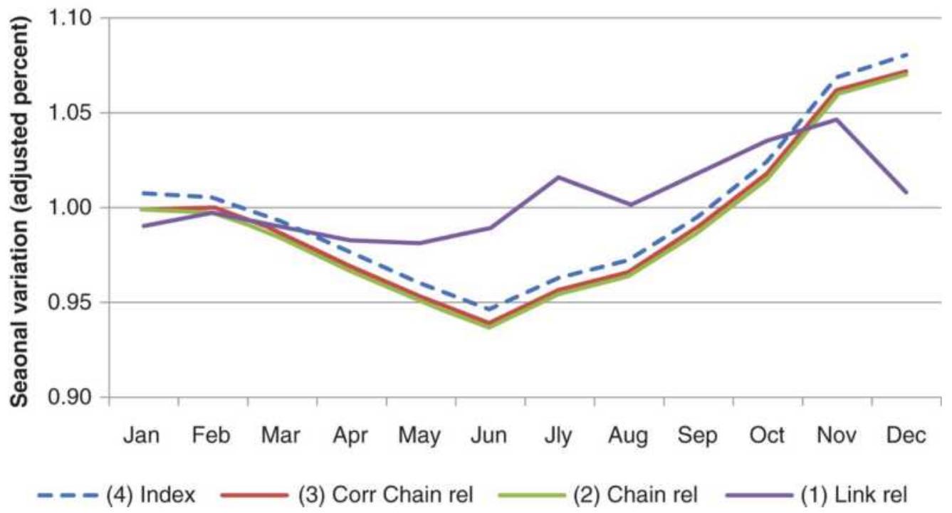
FIGURE 10.22 The four steps in creating link relatives.
\section*{The Moving Average Method}
The moving average is a much simpler yet very good technique for determining seasonal patterns and removing the trend. Using monthly cash wheat prices from 1967 through 2017, calculate as follows:
1. Take the average of each 12 consecutive monthly prices (column B) - for example, rows 611-622.
2. Place the average in column C , aligned with the 6th row from the beginning of the data being averaged, which is the same as lagging the average by 6 months. Then C616 = AVERAGE(B611:B622).
3. Take the average of the current and previous averages because a calendar year has an even number of months; therefore, the midpoint will be
the average of month 6 and month 7 . Then D616 \(=\) AVERAGE(C616:C617).
4. Get the seasonal adjustment factor by subtracting the midpoint value (column D) from the corresponding average price, E616=AVERAGE(B616:B617)-D616.
5. The
seasonal index \(=1+\) seasonal adjustment factor \(/ 100\) , F616 \(=1+\) E \(616 / 100\).
These calculations can be seen in Table 10.6 and the midpoint plotted along with wheat prices from 2010 through 2017 in Figure 10.23a. The midpoint shows the expected wheat price given seasonality, so that the difference between the actual wheat price and the midpoint is the abnormal price movement. The seasonal pattern, shown in Figure 10.23b, is found by averaging the values for each month.
\section*{TABLE 10.6 Calculations for the moving average method.}
\begin{tabular}{|c|c|c|c|c|c|c||}
\hline 4 & A & \multicolumn{1}{c|}{ B } & \begin{tabular}{c}
C
\end{tabular} & \multicolumn{1}{c|}{ D } & \multicolumn{1}{c|}{ E } & F \\
\hline & & \begin{tabular}{c}
12-Month \\
Moving \\
Average, \\
Lag 6
\end{tabular} & \begin{tabular}{c}
Mid- \\
point
\end{tabular} & \begin{tabular}{c}
Sdjustment \\
Factor
\end{tabular} & \begin{tabular}{c}
Seasonal \\
Index
\end{tabular} \\
\hline 1 & Date & Price & Feasonal & \\
\hline 615 & \(6 / 30 / 2017\) & 530.5 & 434.96 & 433.54 & 40.46 & 1.405 \\
\hline 616 & \(7 / 31 / 2017\) & \(477^{2}\) & 436.68 & 435.82 & 67.93 & 1.679 \\
\hline 617 & \(8 / 31 / 2017\) & 414 & 437.70 & 437.19 & 8.31 & 1.083 \\
\hline 618 & \(9 / 29 / 2017\) & 418 & 439.89 & 438.79 & -22.79 & 0.772 \\
\hline 619 & \(10 / 31 / 2017\) & 413 & 441.50 & 440.69 & -25.19 & 0.748 \\
\hline 620 & \(11 / 30 / 2017\) & 430 & 444.93 & 443.21 & -21.71 & 0.783 \\
\hline 621 & \(12 / 29 / 2017\) & 432 & 430.67 & 437.80 & -6.80 & 0.932 \\
\hline
\end{tabular}
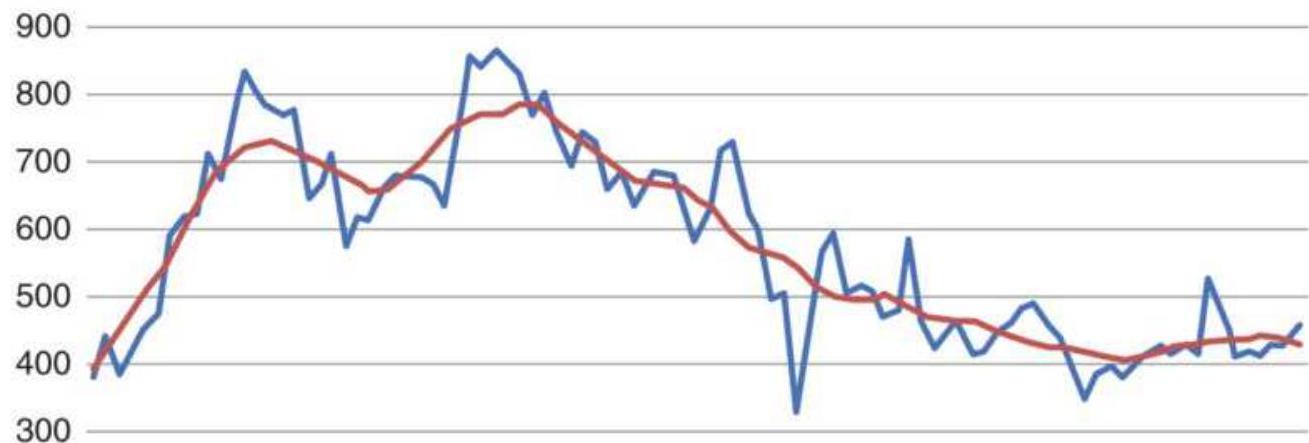
200

——Monthly prices
—— Seasonal midpoint
(a)
Moving average method
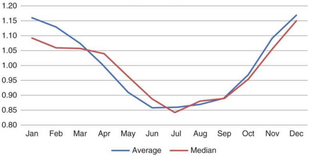
(b)
FIGURE 10.23 Moving average method for wheat. (a) Moving average through midpoints (lag 6). (b) Seasonal pattern.
\section*{X-11 and X-12 ARIMA Methods \({ }^{\mathbf{2}}\)}
The seasonal adjustment method \(X-11\) (Census Method II-X-11) has been most widely used for creating a seasonally adjusted series of such information as car and housing sales, as well as other consumer products. It uses moving averages to detrend the data, and includes both an initial estimation and reestimation. \(X-12^{-}\)
ARIMA \({ }^{3}\) is used to adjust the CPI and includes both X-11 estimations and a regression ARIMA calculation (see Chapter 6) for determining intervention and data extension. Because it is widely used by economists, an outline of the \(\mathrm{X}-11\) process follows. 4
1. Calculate a 12 -month moving average (MA) and then smooth that with a 2 -month moving average (referred to as \(2 \times 12 \mathrm{MA}\) ). Subtract this MA from the original series to get an initial seasonally detrended series in the same manner as the moving average method.
2. Apply a weighted 5 -period MA to each month separately to get an estimate of the seasonal factors.
3. Compute a centered 12-month MA of the seasonal factors (step 2) for the entire series. Fill in the six missing values at either end by repeating the first and last MA values. Adjust the seasonal factors from step 2 by subtracting the centered 12-period MA. The adjusted seasonal factors will total approximately zero over any 12 -month period.
4. Subtract the seasonal factor estimates (step 3) from the seasonally adjusted series (step 1). This is the
irregular component series used for outlier adjustment.
5. Adjust the outliers in step 4 using by the following procedure:
a. Compute a 5-year moving standard deviation \(s\) of the irregular component series (step 4).
b. Assign weights to the series components \(c_{i}\) as follows:
\section*{- o if \(c_{i}>2.5 s\)}
- linearly scaled from o to 1 if
\[
2.5 \mathrm{~s} \geq c_{i} \geq 1.5 \mathrm{~s}
\]
-1 if \(c_{i}<1.5 s\) Use this weighting function to adjust the detrended series in step 1.
6. Apply a weighted 7-period MA to the adjusted series (step 5) to get the preliminary seasonal factor.
7. Repeat step 3 to standardize the seasonal factors.
8. Subtract the series resulting from step 7 from the original series to find the preliminary seasonally adjusted series.
9. To get the trend estimate, apply a 9-, 13-, or \(23^{-}\) period Henderson's weighted moving average \({ }^{5}\) to the preliminary seasonally adjusted series (step 8). Subtract this series from the original data to find a second estimate of the detrended series.
10. Apply a weighted 7-period MA to each month separately to get a second estimate of the seasonal
\section*{component.}
11. Repeat step 3 to standardize the seasonal factors.
12. Subtract the final seasonal factors from the original series to get the final seasonally adjusted series.
\section*{X-12-ARIMA}
The Bureau of Labor Statistics uses intervention analysis in the seasonal adjustment of consumer price indexes to provide more accurate CPI data. This process offsets the effects that extreme price volatility would otherwise have on the estimates of seasonally adjusted data. It states: \(\underline{6}\)
Intervention analysis is the prior adjustment of an index series before the calculation of the seasonal factors. Prior adjustment may be called for if a "ramp" occurs. (A "ramp" occurs where a good or service undergoes a unique, large, and rapid change in price level.) An example would be a large decrease in the price of gasoline due to the breakdown of an oil cartel. Removal of the ramp gives a clearer seasonal pattern and lessens the irregular component.
The BSL statement references a large drop in oil prices; however, it is of greater interest to them to reduce the impact of a large increase. They argue that oil prices are embedded in all other consumer prices; therefore, using them explicitly in an inflation calculation (such as the CPI) would be counting them twice. However, it is in the interest of the U.S. government to show only small increases in the CPI. By law, the government must give
cost-of-living increases to all Social Security beneficiaries based on the annual change in the CPI. A large upward revision would be very costly. Intervention analysis, although automated, provides a way to delay the effects of large shifts in prices, whether an event-driven or a structural change in the seasonality. Because of this inherent conflict of interest, it becomes questionable whether the CPI is a good choice for deflating commodity prices.
In keeping with the ARIMA concept, each year the seasonal adjustment factors are recalculated using the most recent five to eight calendar years. These values are then used for the next year's seasonal adjustment indices and the most recent five years of adjustment factors are published. As part of the process, it states:
Most higher level index series are adjusted by the indirect, or aggregative, method, which is more appropriate for broad categories whose component indexes show strongly different seasonal patterns. Under the aggregative method, direct adjustment is first applied to indexes at lower levels of detail, and thereafter the adjusted detail is aggregated up to yield the higher level seasonally adjusted indexes. If intervention analysis is indicated, it will be used in adjusting selected lower level indexes prior to aggregation. For those series which have not been selected for seasonal adjustment, the original, unadjusted data are used in the aggregation process.
\section*{STL Decomposition}
An alternative to X-12-ARIMA for decomposing a time series is STL, "Seasonal and Trend decomposition using Loess," \({ }^{\prime}\) a nonlinear method. STL has the advantages of handling data of different frequencies, allows the seasonal component to change over time, and allows the user to define the trend calculation period.
\section*{Winter's Method}
Winter's method \(\underline{8}_{\text {is }}\) a self-generating, heuristic approach to finding the seasonal component. It assumes that the only relevant characteristics of price movement are the trend and seasonal components, which are represented by the formula:
\[
X_{t}=\left(a+b_{t}\right) \times S_{t}+e_{t}
\]
where
\[
X_{t}=\text { the estimated value at time } t
\]
\(\left(a+b_{t}\right)=\) a straight line that represents the trend
\(S_{t}=\) the seasonal weighting factor between o and 1
\(e_{t}=\) the error in the estimate at each point
If each season is represented by \(n\) data points, then \(S_{t}\) repeats every \(n\) entries, and:
\section*{\(\sum_{i=1} s_{i}=1\)}
The unique feature of Winter's model is that each new observation is used to correct the previous components \(a, b\), and \(S_{t}\). Without that feature, it would have no applicability to price forecasting of housing starts, employment, or other seasonal data. Starting with two or three years of price data, the yearly (seasonal) price average (for example, a 12-period average for monthly data) can be used to calculate both values \(a\) and \(b\) of the linear trend. Each subsequent year can be used to correct the equation \(a+b_{t}\) using any regression analysis. Winter's method uses a technique similar to exponential smoothing to estimate the next \(a\) and \(b\) components individually. The seasonal adjustment factors are assigned by calculating the average variance from the linear component, expressed as a ratio, at each data point. As more observations are made, each component can be refined, and it will take on the form of the generalized long-term seasonal pattern.
\section*{WEATHER SENSITIVITY}
The effects of changes in weather, especially extremes in weather, are an inseparable part of the agricultural market's seasonal effects. It is the few extreme years that creates the seasonal rally in many commodities. A drought, too much rain, or an early freeze will cause traders to expect the worst, most often causing a rally in
prices. For insurance companies, hurricane season (from July through October) contains the same uncertainty.
Each agricultural product, and those firms impacted by changing agricultural prices, has its own particular sensitivity to weather. \({ }^{9}\) If corn planting is delayed due to rain, some farmers switch from corn to soybeans, which has a shorter growing season. Hot weather during pollination will significantly reduce yields, and a freeze in September can stop the ripening process and damage production for orange juice. Freezes are of greater concern than droughts and affect more products. Patterns of crop sensitivity to weather depend upon their location in the northern or southern hemisphere; however, active trade between world markets shows that crops grown primarily in the northern hemisphere are affected by weather developments in the southern hemisphere. In Table 10.7, major weather events are separated into the southern and northern hemispheres. Figure 10.24 combines the soybean and corn weather sensitivity charts \({ }^{10}\) to show the effects of both southern and northern hemisphere weather.
\section*{Measuring Weather Sensitivity}
While a weather sensitivity chart, such as the one shown in Figure 10.24, may appear to have a strong similarity to a standard seasonal chart, they are actually very different. Weather sensitivity is a measurement of potential price volatility. It could simply be the highest price that the market reached during a period in which the weather event occurred. Those more adept at
statistics would want to record the increase in price relative to the average during those months in which weather was a factor, and then show the price representing the \(95 \%\) confidence level, about two standard deviations.
A thorough approach to measuring weather sensitivity is to record the temperature each day and find out whether it is far above or below the average. Information available from the NOAA (National Oceanic and Atmospheric Administration) will give you both regional weather and measurements of effective heat, in thermals. It is the cumulative effect of heat that is damaging to a crop, rather than a high temperature for one day. In addition, the amount of crop damage is not simply a linear relationship with rising temperatures but is more likely to start slowly and increase quickly once critical levels of cumulative heat are reached. The same is true of a drought. Advancements in hybrid seed production have made corn and other grains drought resistant. They can withstand long periods of dry weather. Many analysts have been unpleasantly surprised by recommending a long position in corn only to find that, even with low levels of rain, the harvest was a record crop.
TABLE 10.7 Weather-related events in the southern and northern hemispheres.
\begin{tabular}{|l|l|l|}
\hline & Southern Hemisphere & \begin{tabular}{l}
Northern \\
Hemisphere
\end{tabular} \\
\hline January & & \begin{tabular}{l}
Orange juice \\
peak for Florida
\end{tabular} \\
\hline
\end{tabular}
\begin{tabular}{|c|c|c|}
\hline & & \begin{tabular}{l}
freeze, heating \\
oil (cold or hot)
\end{tabular} \\
\hline February & \begin{tabular}{l}
Corn pollination in S. \\
Africa and Argentina, \\
soybean pod development
\end{tabular} & \begin{tabular}{l}
Heating oil (cold \\
or hot)
\end{tabular} \\
\hline \multicolumn{3}{|l|}{ March } \\
\hline April & & \begin{tabular}{l}
Corn, cotton \\
planting
\end{tabular} \\
\hline May & & \begin{tabular}{l}
Soybean \\
planting
\end{tabular} \\
\hline June & & \begin{tabular}{l}
Cotton boll \\
development
\end{tabular} \\
\hline July & \begin{tabular}{l}
Coffee freeze Brazil, \\
orange juice freeze Brazil, \\
cocoa pod development in \\
W. Africa, and pod rot in \\
Brazil
\end{tabular} & \begin{tabular}{l}
Sugar: heat in \\
Russia, corn \\
pollination
\end{tabular} \\
\hline August & & \begin{tabular}{l}
Soybean pod \\
development
\end{tabular} \\
\hline September & & \begin{tabular}{l}
Atlantic \\
hurricanes affect \\
sugar, orange \\
juice, heating oil, \\
corn freeze
\end{tabular} \\
\hline October & & \begin{tabular}{l}
Soybean freeze, \\
cotton harvest
\end{tabular} \\
\hline November & Brazil coffee rainy season & \begin{tabular}{l}
Soybean harvest, \\
corn harvest
\end{tabular} \\
\hline
\end{tabular}
\begin{tabular}{|l|l}
December & \begin{tabular}{l}
Heating oil (cold \\
or hot)
\end{tabular} \\
\hline
\end{tabular}
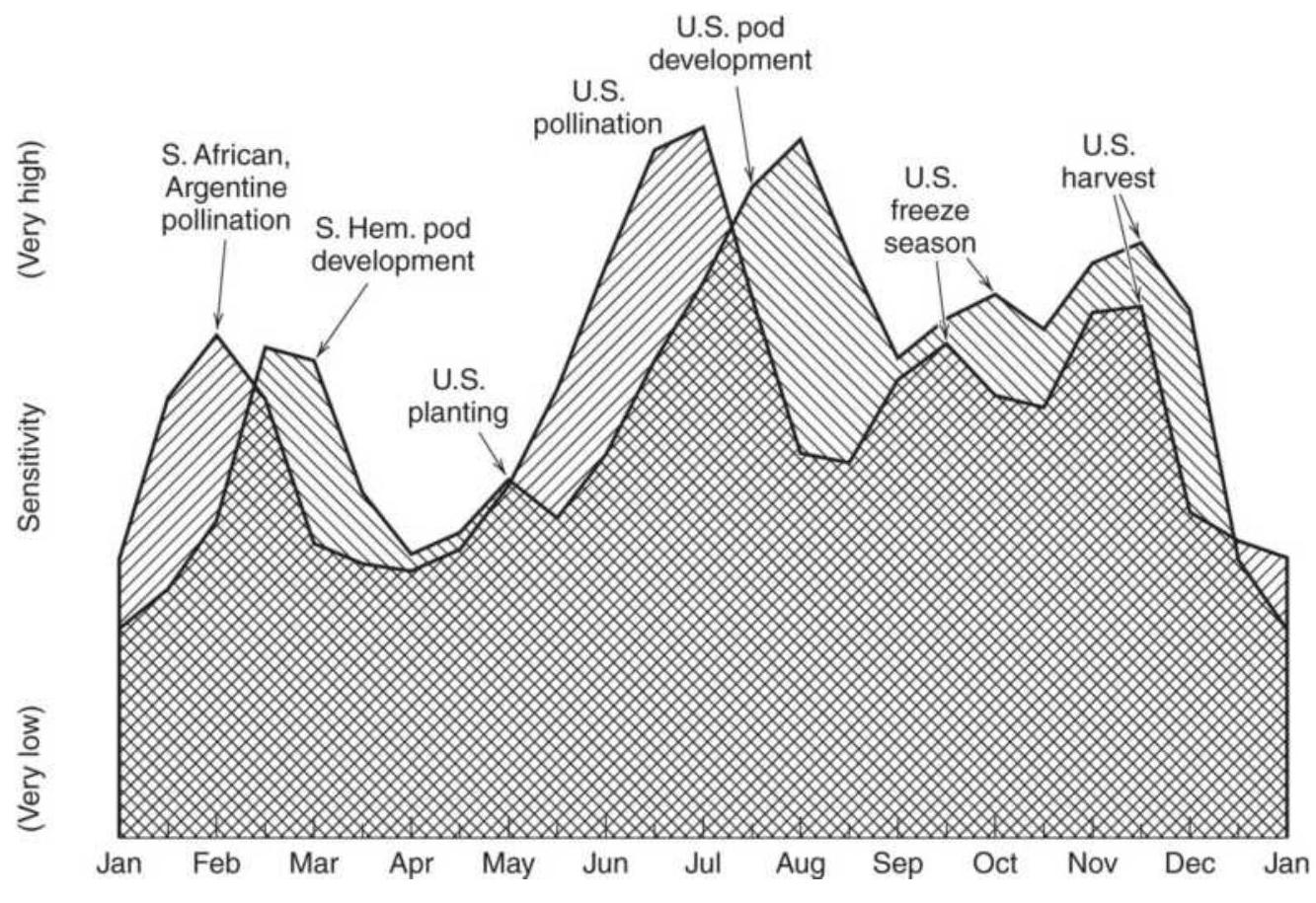
FIGURE 10.24 Weather sensitivity for soybeans and corn.
Source: Smith Barney.
Measuring the variations in temperature and its effect on crop output and price is done using Heating Degree Days (HDD) and Cooling Degree Days (CDD), where
\[
\begin{aligned}
& H D D_{t}=\max \left(0,65^{\circ} \mathrm{F}-\text { Average temperature }\right) \\
& C D D_{t}=\max \left(0, \text { Average temperature }{ }_{t}-65^{\circ} \mathrm{F}\right)
\end{aligned}
\]
The daily values are then accumulated during specific critical months. For example, heating oil would be
December, January, and February, a total of 90 calendar days, where \(t\) is the number of days from December 1 but no greater than 90:
\section*{\(C_{u m} H D D_{t}=\sum_{t=1}^{i} H D D_{t}\)}
The demand for heating oil can be closely estimated by recording the temperature relative to population, so that a widespread hailstorm in August does not have the same impact in Montana as it does in Ohio. This has an immediate effect on futures prices, and a ripple effect on related businesses. During sustained cold periods, increased production of heating oil will mean decreased production of gasoline, driving those prices higher.
The Chicago Mercantile Exchange (CME) has made using heating degree days and cooling degree days easier by initiating two futures contracts, CME Heating Degree Days and CME Cooling Degree Days. The daily temperature is recorded as the average of the maximum and minimum temperatures between midnight and 11:59 p.m. as reported by MDA Information Systems. They include Atlanta, Chicago, Cincinnati, Dallas-Fort Worth, Las Vegas, Minneapolis, New York, and Sacramento.
Each CME Degree Days index is the accumulation of all days in the month, with the daily values the same as the HDD and CDD defined above. In addition, there is a Seasonal Strip Degree Days futures contract, both heating and cooling, which accumulates the next \(n\) months of individual cooling degree day futures.
\section*{IDENTIFYING SEASONAL TRADES}
Seasonal trades identify periods during the year in which a long or short position would be entered based upon a clear seasonal pattern. These periods should be chosen based on detrended data and median values; however, we have seen that most of the methods for finding the seasonal patterns give similar results. One method might show a low in corn in September and another in October, but September and October will be the two lowest months. The seasonality, and risk, can also be confirmed by creating a seasonal volatility chart, which will show the potential for a larger move.
\section*{Qualifying the Market}
Before analyzing a market for seasonal patterns, you must understand whether that market qualifies. Given the power of computers and the convenience of spreadsheets, it is possible to evaluate all stocks and all futures markets looking for patterns. Finding a monthly pattern does not mean that there is seasonality. Years ago, when computing power was just taking hold, there was an academic study showing that, for the past 18 years, whenever there was a good coffee crop in South America, the next year there was a good wheat harvest in Europe. The researcher, seeking to understand more, delved deeper and found that the Gulf Stream, a wellknown flow of warm water, passes by the eastern coast of South America and flows north all the way to Europe. Voilà! Having decided that 18 consecutive years of success was convincing, combined with a fundamental
justification, he bought wheat the next year following a good coffee crop. Of course, that was the first year that the theory failed. It turns out that he had tested
hundreds of combinations of causal effects, a crop in one location followed by a crop in another location, in order to find 18 consecutive profitable years. We understand now that it was an early case of overfitting; however, the lesson to be learned is that there must be a clear fundamental reason to believe that there is a seasonal pattern. The computer is used to validate a belief, not to create one.
\section*{Cattle and Grain}
By way of a valid example, there is an interesting pattern that develops in livestock during a period of high grain prices. Most often, a farmer who also feeds cattle will send them to market early rather than pay the high cost of feed and then face an uncertain profit when the cattle are ready to market. The decision to sell early puts immediate pressure on cattle prices in the short-term but causes higher prices six to nine months out, when there will be a shortage of supply. As grain prices move higher, selling the nearby cattle futures and buying the deferred can be a profitable strategy.
\section*{Industrial Metals}
Although metals are not subject to seasonal supply factors, copper, as well as most of the LME nonferrous metals, should have a significant seasonal demand component. All of them are primarily used in housing for plumbing, sheet metal, or stainless steel. Commodities
have seen periods of unprecedented strength due to fears of inflation as well as demand from the rising middle class in China, and now India. Seasonality is hidden within these prices; however, larger macroeconomic factors can overwhelm them to the point where they are temporarily insignificant. One solution is to detrend the prices or look at the slope of a regression. If it is very strong, then a seasonal trade is not going to work. It is necessary to be realistic about which patterns to use.
The systems and methods that follow are based entirely on seasonal patterns and may be used alone or as a filter for other strategies.
\section*{Heating Oil and Futures Data}
Heating oil is a volatile and seasonal market influenced by geopolitical events. Since the United States has reduced its dependence on foreign oil, it is affected more by supply disruptions, such as the closing of a U.S. refinery, or a hurricane in the Gulf, than it is by OPEC production controls. The sharp declines in 2008 contrary to the normal seasonal move could always be repeated, but it should be a rare event.
Using data from 2009 through 2017, the seasonal patterns of cash and futures are very similar, as seen in Figure 10.25. Earlier in this chapter it was shown that futures data are distorted when looking far back in history; however, using futures for more recent data will not show those problems. For most traders it will be more convenient to use futures.
To take advantage of the seasonally strong months,
trades are entered at the end of the prior month and held to the end of the month that shows strong returns. This means there are three seasonal trades with reasonable returns:
- Buy the last trading day of December; exit the last trading day of April.
- Buy the last trading day of July; exit the last trading day of August.
- Sell short the last trading day of October; exit the last trading day of December.
It is important to note that we are not selling on the last day of February and exiting on the last day of March. The March returns are zero, even though the chart appears to show a decline. Monthly returns are actually falling from a gain of about 2\% for February to 0\% for March. A declining bar means that returns are not as high as the previous month, but they may still be positive.
HO Percentage change, 2009-2017
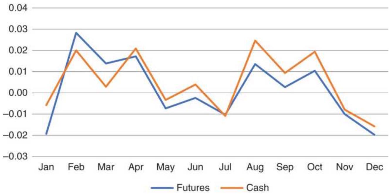
FIGURE 10.25 Heating oil cash and futures average monthly returns, 2009-2017.
\section*{Corn}
While corn may have weather uncertainties, it is a much more predictable market than heating oil. Prices are highest in the winter as the inventory is consumed, and lowest ahead of harvest as processors delay delivery of the old crop when the price of the new crop is lower.
July, August, and September tend to be the bottom of the market, as shown in Figure 10.26. Only 9 of the 30 months included in the 2008-2017 returns showed a profit; however, July 2012 posted a gain of \(30 \%\) in futures, a reminder that weather counts. The bump up in June showed no large gains or losses, just the usual concerns at the beginning of the growing season - too much rain, too little rain, not enough sun, too much heat.
The seasonal chart for corn is very smooth, and suggests the following trades:
Sell on the last day of June; exit the last day of September.
Buy the last day of October; hold through the end of January. Holding until the end of March would generate larger returns, because those months were profitable, but with more risk.
\section*{Coffee}
Coffee is grown in many countries and harvested from
March through September, but the size of the crop is known somewhat earlier. Coffee is also known for its inelastic demand. Coffee drinkers continue to buy regardless of price - at least at Starbucks. There are three main harvests reflected in Figure 10.27 by the drop in price. Some of the countries and their harvest months are:
March for Ecuador, Brazil, Bolivia, and Madagascar, the smallest harvest
- June for Haiti and the Caribbean, a larger harvest
Corn percentage changes, 2008-2017
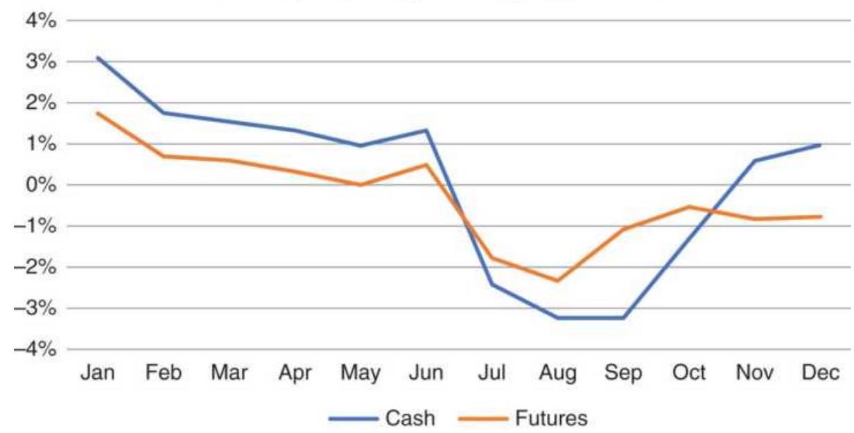
FIGURE 10.26 Cash and futures corn monthly returns, 2008-2017.
Coffee monthly returns, 2008-2017
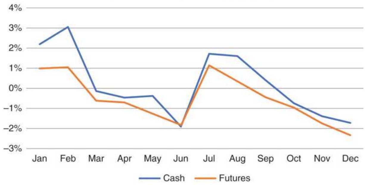
FIGURE 10.27 Coffee cash and futures monthly returns, 2008-2017.
September for Guatemala, Ghana, Kenya, Mexico, and many others, the largest harvest
The market should then see supply increasing starting in March, a larger supply in June, and the final crop in September. Figure 10.27 comes close to showing that. Prices are strongest in January and February, ahead of the first harvest, then strong again in July, between crops.
Seasonal trades are then:
- Buy the last day of December; exit the last day of February, before the first harvest.
- Sell the last day of March; exit the last day of June, capturing the new supply.
- Buy the last day of June; exit the last day of August, ahead of the next harvest.
- Sell the last day of September; exit the last day of December.
\section*{Commodity Seasonality Using ETFs}
Although volume is not very large in commodity ETFs, the major financial institutions make a market for their own programs. They can keep prices in line by arbitraging the futures and ETFs. ETFs are a very convenient trading vehicle because, unlike futures, they don't need to be rolled forward each time a contract expires, and unlike the cash market, they can be traded.
Corn. To be sure that the ETF tracks cash and futures, Figure 10.28a shows the average monthly returns for different periods of corn using cash, and Figure 10.28b is a comparison of cash and futures to the ETF CORN. The ETF comes closer to tracking the cash market, which would allow us to use more historic cash data for testing a trading strategy. Futures are mostly more volatile.
Corn seasonality from cash
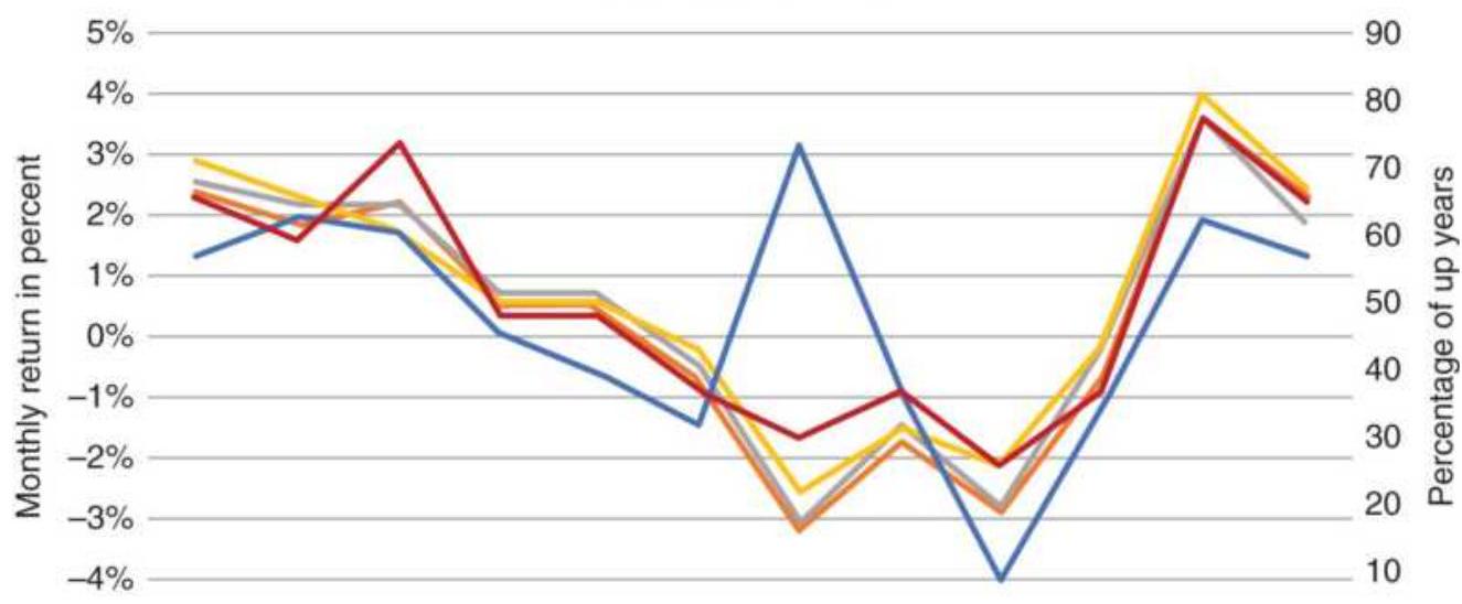
\(-5 \%\) Jan Feb Mar Apr May Jun Jul Aug Sep Oct Nov Dec - Avg 1989 - Avg 1995 - Avg 2000 - Avg 2010 -\% Up (a)
Corn seasonality comparison
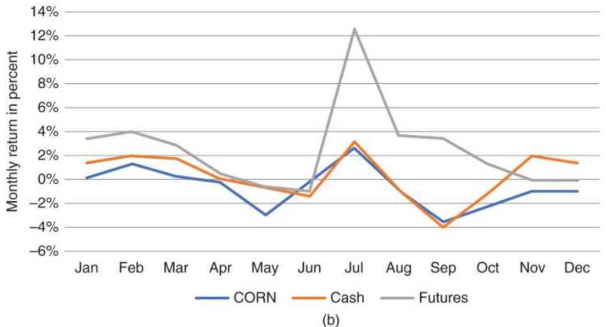
FIGURE 10.28 (a) Corn seasonality for different years. (b) Comparison of corn seasonality using cash, futures, and the ETF CORN.
Wheat. Looking at wheat from 2010 through 2015, we
get a slightly different picture from the long-term view. Figure 10.29 shows the typical decline in wheat from spring into the summer for cash, futures, and the WEAT ETF, but there is a rally in July. That corresponds to the rally in corn and soybeans, rather than anything to do with wheat, which is harvested in June. All three grains are used for feed, and purchases are made based on their protein value. Then all three will move up and down together, but in their own ratio. The cattle have little to say in their choice of feed.
Seasonal comparison of cash, futures, and WEAT ETF
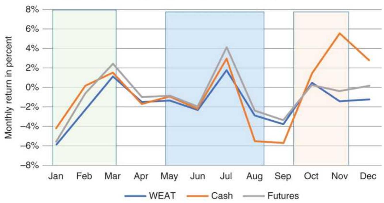
FIGURE 10.29 Comparison of wheat average monthly returns for cash, futures, and WEAT ETF, 2010-2015.
\section*{Sugar seasonality}
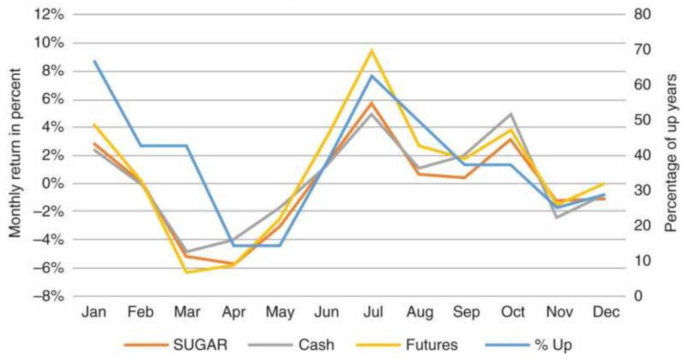
FIGURE 10.30 Comparison of sugar seasonality, 2008-2015 for cash, futures, and the SUGAR ETF.
Sugar. Sugar has a more complex seasonal pattern because half of production is in the southern hemisphere and half in the northern. Figure 10.30 shows two seasonal peaks. The northern season is from April to November with its peak in July; the southern hemisphere is from November to April with its peak in January. Sugar essentially has two seasons and two trading opportunities.
Coffee. Coffee is nearly all grown in the southern hemisphere, with a small amount of U.S. coffee produced in Hawaii. The coffee ETF JO has been traded since mid2008. Again, we can see in Figure 10.31 that the ETF does a good job tracking the cash seasonality. The harvest lows are in June and the new season begins in November.
Coffee seasonality
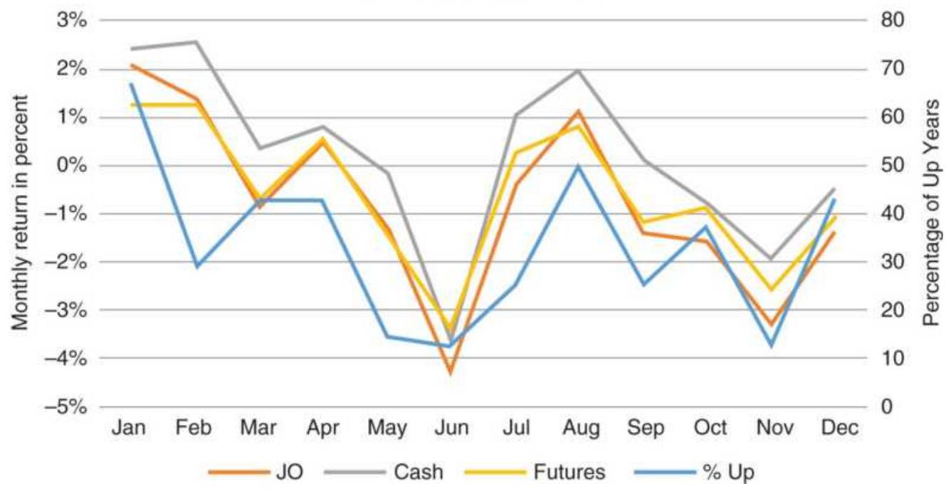
FIGURE 10.31 Comparison of coffee seasonality using cash, futures, and the ETF JO, 2008-2015.
\section*{Bullish and Bearish Years}
Even with a clear seasonal pattern over many years, embedded in those averages are years where prices go up most of the year or down most of the year, contrary to what the seasonality says. Because corn is harvested in September, the month of January should be priced higher to include storage and other carrying charges. Figure 10.32 shows the net change each year in cents. There were 19 years out of 39 in which prices ended lower, just about half.
Is it more profitable to separate bullish and bearish years? A simple way to start is to test if this year's average price in January was higher or lower than the January average of the prior five years. That's the same as the stock market saying, "As goes January, so goes the
year." But we'll do the opposite. The rules for this system would be:
\section*{Corn: Years ending higher and lower}
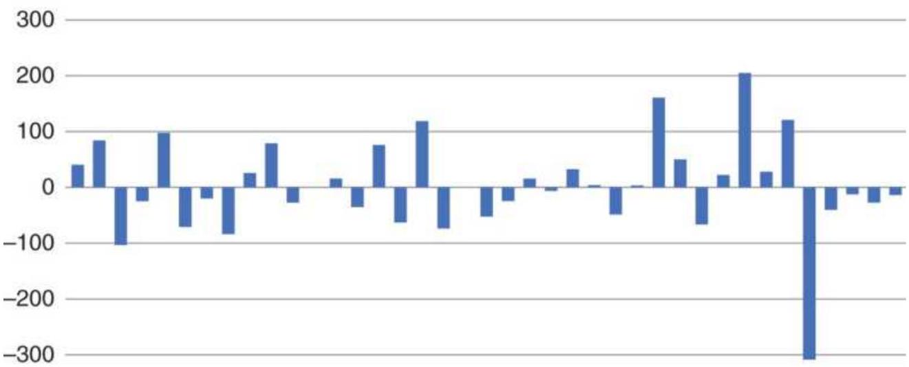
\(-400\)

FIGURE 10.32 Corn net returns for the calendar years.
Buy on the last day of January if the average January price is below the average of the past 5 Januarys. Exit at the end of December.
Sell short on the last of January if the average is above the average of the past 5 Januarys. Exit at the end of December.
The system is using January as a measure of whether prices are coming into the new year higher or lower than usual. We buy or sell as a mean-reversion trade, expecting price to correct to normal. Figure 10.33 shows the result of trades taken from the end of January through the end of the year.
Clearly this is not a sophisticated approach to
seasonality, but it may help show that a simple rule can net a profit. It may be that the January price should be some threshold amount above or below the previous average before a trade is entered. It may be better to base the test on April, when crops are planted. Long positions could be held until winter, when prices are higher, and shorts until harvest, when they are lower. There are many possibilities that can take advantage of the seasonal pattern.
If we look a little deeper, we can see a more promising pattern. Figure 10.34 shows the average price of corn separated into bullish and bearish years. Both have rising prices from January through June, but then the bearish years drop off sharply through the summer and into harvest. The bullish years keep rising slowly. The reason our simple strategy was profitable is that the bearish years started January at higher prices than the bullish years, and we were able to net a profit. From Figure 10.34, we can change the rules so that, if the January price is higher, we wait until the end of June to set our short position.
\section*{Using January to decide direction}
1000 200
\(-200\)

FIGURE 10.33 Entering a mean-reversion trade at the end of January in corn.
Pattern of bullish and bearish years
360
340
320
300
280 \(\square\)
260
240
220
Jan Feb Mar Apr May Jun Jul Aug Sep Oct Nov Dec —_Bullish Bearish
FIGURE 10.34 Pattern of bullish and bearish years by month.
\section*{Seasonal and Nonseasonal Years}
Seasonal and nonseasonal years are not the same as bullish and bearish years. The decision to enter a trade was not based on the seasonal pattern, only on the January price. We could do better.
There are years when agricultural prices follow a normal seasonal pattern and years that are quite different, just as there are bullish and bearish years. If a strategy is to profit from the rally during the growing season or the decline into harvest, then it's important to recognize in what months those are likely to occur. There are many events that would cause nonseasonal patterns, such as an export contract (increase in demand) or a previously bad harvest (decrease in supply), or even a large change in the value of the export currency (in our case, the U.S. dollar). A poor harvest in the previous year will cause the new crop to start trading at a high price in anticipation of continued short supply until the new crop yield can be assessed.
Using corn as an example because it represents the largest and most seasonal of the U.S. crops, we can construct a simple model that anticipates a seasonal or nonseasonal year and profit from those moves. We believe that, in a seasonal year, the price in April will be lower than the price in January, in anticipation of a good planting season and a normal crop yield; otherwise, we'll consider it a nonseasonal year. A seasonal year should then see lower prices in September, the primary month for harvest. In a nonseasonal year, we look for a higher price in July than April, the result of some negative news
during growing season, then look for a profit from prices declining into harvest. The rules would be:
\section*{For a seasonal year}
If the April price is less than the January price, then sell short at the end of April and exit at the end of September.
\section*{TABLE 10.8 Corn cash prices with seasonal buy and sell signals.}
\begin{tabular}{|c|c|c|c|c|c|c|c|c|c|c|c|c|c|c|c|c|c|}
\hline 4 & E & C & D & E & F & 6 & H & 1 & 1 & K & 1 & M & N & 0 & \(p\) & Q & R \\
\hline Year & Jan & Feb & Mar & Apr & May & Jun & Jul & Aug & Sep & Oct & Nov & Dec & an Extrem & oril Extrent & Apr < an is & asonal & nSeasc \\
\hline 1985 & 64.11 & 53.53 & 38.98 & 272.41 & 268.73 & 64.43 & 259.92 & 246.07 & 27.60 & 209.94 & 231.65 & 337.62 & Normal & Normal & NonSeas & 0 & 0 \\
\hline 1986 & 6.65 & 33.28 & 29.05 & 230.64 & 42.86 & 41.10 & 192.59 & 52.31 & 34.52 & 33.00 & 55.63 & 52.00 & Normal & Normal & Seasonal & 112 & 0 \\
\hline 1987 & 3.64 & 7.82 & 6.61 & 55.55 & 4.93 & 4.61 & 59.48 & 5.98 & 51.10 & 53.43 & 3.81 & 3.39 & Low & Low & NonSeas & 0 & 8.382 \\
\hline 1988 & 3.98 & 38.98 & 91.91 & 192.08 & 97.39 & 57.14 & 285.50 & 71.40 & 68.93 & 69.74 & 254.31 & 38.14 & Normal & Low & vonSeas & 0 & 16.571 \\
\hline 1989 & 2.01 & 9.84 & 4.55 & 256.98 & 2.84 & 3.93 & 95 & 0.15 & 9.33 & 3.96 & 9.79 & 9.40 & Normal & Normal & Seasonal & .65 & 0 \\
\hline 1990 & 9.55 & 5.03 & 4.71 & 63.98 & 3.68 & 5.50 & 7.52 & 3.33 & 5.24 & 18.04 & 9.50 & 6.65 & Normal & ormal & onseas & 0 & 287 \\
\hline 1991 & 139 & 6.26 & 4.93 & a. 2 & 3 & 5 & 233.59 & & 5 & 5 & 3 & 3 & I & & & 0 & 0 \\
\hline 1992 & 3.82 & 7.82 & 3.75 & 49.98 & 130 & 0.86 & 枵 & 217.21 & 4.69 & & 18 & 5.33 & Normal & Normal & NonSeas & 0 & 0 \\
\hline 1993 & 6.28 & 5.13 & 5.44 & 222.83 & 19.83 & 2.41 & 25.48 & 25.34 & 1.86 & 02 & 48 & 0.60 & Normal & Normal & vonseas & 0 & 619 \\
\hline 1994 & 5.62 & 2.50 & 5.46 & & & 2 & & & & & 2 & .24 & Normal & Normal & Seasonal & 23 & 0 \\
\hline 1995 & 1.83 & 6.47 & 3.57 & 24.08 & 249.68 & 65.11 & 279.03 & & 32.28 & - & & 5.80 & Normal & Normal & onSeas & 0 & -3.25 \\
\hline 1996 & 52.30 & 370.55 & 391.83 & 446.98 & 456.07 & 473.78 & 469.96 & 447.59 & 338.93 & 281.00 & 263.09 & 261.40 & High & High & NonSeas & 0 & 131.03 \\
\hline
\end{tabular}
\section*{For a nonseasonal year}
If the April price is greater than the January price, and the July price is greater than the April price, sell short at the end of July and exit at the end of September.

Table 10.8 shows a part of the spreadsheet available on the Companion Website, TSM Corn bull and bear years, seasonal patterns. The full spreadsheet includes 1978-2017 prices. Column P indicates whether the current year was seasonal or nonseasonal, and the next two columns show the profits and losses, in cents/bushel, based on the trading rules given above.
The spreadsheet in Table 10.8 contains the following for
1986 (Row 10):
Columns A-M: Corn cash prices
Cell N10 "January Extreme":
\(=\mathrm{IF}(\$ \mathrm{~B} 10>\)
(1+N\$2)*AVERAGE(\$B5:\$B9),"High",IF(\$B10<(1N\$2)*AVERAGE(\$B5:\$B9),"Low","Normal"))
Cell O10 "April Extreme":
\(=\mathrm{IF}(\$ \mathrm{E} 10>\)
(1+O\$2)*AVERAGE(\$E5:\$E9),"High",IF(\$E10<(1O\$2)*AVERAGE(\$E5:\$E9),"Low","Normal"))
Cell P10 "Apr < Jan":
=IF(E10<B10,"Seasonal","NonSeas")
Cell Q10 "Seasonal": =IF(P10="Seasonal",E10J10,J10-E10)
Cell R10 "Nonseasonal":
\(=\mathrm{IF}(\) AND(P10="NonSeas",H10>E10),H10-J10,0)
If we add the seasonal and nonseasonal trades separately, we get the results shown in Figure 10.35. For a simple strategy, the results are good, especially for the nonseasonal trades. The purpose of this was to show that specific months are important for seasonal commodities. A rally during the middle of the growing season, or shortly before, often ends with lower prices. Of the 10 nonseasonal trades, 9 were profitable. Of the 12 seasonal trades, 9 were profitable. Both are good results, and this strategy did not require testing or sophisticated mathematics, just a basic knowledge of the crop year.
\section*{Not Quite So Easy}
There are two problems with this seasonal model. The first is that it uses cash corn prices. While we have shown that the seasonal pattern is very similar to futures, we need to use futures to get a more realistic result. The second problem is the drawdown in the seasonal part of the strategy. Even if we don't expect systems to be perfect, the simple rules may be too simple. The nonseasonal strategy seems to be fine, so we will only look at the seasonal trades.
Corn seasonal and nonseasonal trades
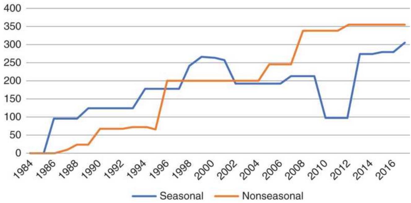
FIGURE 10.35 Results of seasonal and nonseasonal trades using cash corn.
\section*{Cash corn strategy applied to futures}
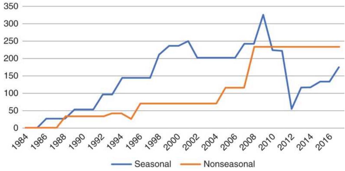
FIGURE 10.36 Applying the cash corn strategies to corn futures.
When we simply replace cash with back-adjusted futures prices we get the results in Figure 10.36. The nonseasonal returns are still good, but the seasonal strategy has a larger drawdown. The strategy will need to be a little more sophisticated by taking advantage of the seasonal patterns.
We know that, during a normal seasonal year, prices will be lowest at harvest. The best opportunities come during years when some weather event occurs during the summer, driving prices up. If we can identify those years, we can sell short during the summer rally and cover at the end of harvest. The modified seasonal rules then become:
To qualify, April < January, to give opportunity for a rally
Modified seasonal strategy for futures
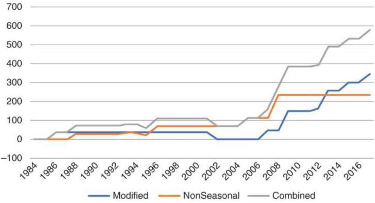
FIGURE 10.37 Results of modified seasonal strategy using corn futures.
If June > April, then sell end of June, exit end of September
Or else if July > June and July > January then sell end of July, exit end of November

There are 8 trades, of which 7 are profitable, and the large loss has disappeared, as shown in Figure 10.37. You will find the full spreadsheet, similar to Table 10.8, on the Companion Website under TSM Corn seasonal and nonseasonal strategy. It has both the cash and futures prices along with the instructions for each trade. Readers will find it valuable to apply the same ideas to soybeans, which have a similar pattern to corn, or to any commodity with a clear seasonal pattern.
\section*{Effects of Currency}
There was a time when the United States was the biggest exporter of grain and world currencies did not fluctuate very much. But then many currencies were backed by gold and not freely traded. Wheat, which is the grain grown nearly everywhere, competes with U.S. exports. While China is the largest producer, followed by India, Russia, and then the United States, the United States is the largest exporter, followed by Canada. In order to understand some of the price fluctuations in wheat and its impact on trading systems, we need to be aware of the changing value of the U.S. dollar. The Canadian dollar serves as a good example.
Figure 10.38 shows that the Canadian dollar has had swings of \(30 \%\) and \(40 \%\) in the past ten years. Some readers will be more familiar seeing the Canadian dollar's value at 0.77 instead of the 1.3 shown on the chart. At 1.3 a person exchanging one U.S. dollar will get \$1.30 Canadian dollars. If both the U.S. and Canada are selling wheat to China, then the country with the stronger currency will need to reduce the price of wheat to match the price in Canadian dollars. Then a strong U.S. dollar causes wheat prices, denominated in U.S. dollars, to go down.
One of the reasons a long-term trend program can make money trading wheat is the variation in the U.S. dollar. To profit from seasonal moves requires a shorter trend period, one that can capture a 1-month price move, but the swings in currency are much slower and often very large. If the price of U.S. wheat remained unchanged for the 10 years shown in the chart, a macrotrend system would (hopefully) capture the smooth swings of the U.S.
dollar. Rather than just the Canadian dollar that affects the price of U.S. wheat, it would be the combined effect of all countries exporting wheat, prorated by their percentage of exports to the total exports. That will be a difficult number to calculate, but using the Dollar Index would be a good alternative. Being aware of the reasons behind the price moves can help you decide what strategy you should use.
\section*{Canadian dollars per USD}
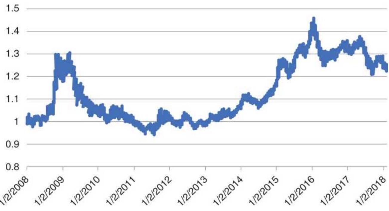
FIGURE 10.38 Canadian dollars per U.S. dollar.
\section*{Seasonal Studies and Key Dates}
A knowledge of history will help all traders be better prepared. It is not enough to profit from a good year; it is more important to act rationally when prices don't go your way. A professional golfer practices for hours hitting out of a sand trap, or off the cart path, or from behind a tree. A trader needs the same versatility when
creating a trading system or managing risk. It can't be done without an understanding of past events.
Most agricultural commodities exhibit traditional, reliable price moves at one or more periods throughout the year. The grains grown in the northern hemisphere have a high likelihood of a rally during the late spring and early summer, when the chance of drought has the greatest effect on yield. When prices show the normal harvest lows, followed by a modest rise and sideways pattern throughout the winter, the potential is good for a rally during the early growing season. When prices begin the new crop year at relatively low levels, the risk of holding a long position is small. Once prices have moved higher, there is good chance that a short sale of corn, soybeans, cotton, or sugar will net a profit within the two months before harvest begins.
Seasonal studies are intended to provide information on when the largest move will occur as well as the lowest prices. Of all the studies, Bernstein (1986) is the most relevant. It can be used to compare historic seasonality in some of the more active commodities and to see if patterns have changed. Because the physical seasons cannot change, any shift in patterns must come from somewhere else, perhaps a change in technology or the ability to store more at harvest, easing the glut of supply. It is still best to be able to identify bullish and bearish years, as well as seasonal and nonseasonal years, as discussed in the previous sections.
A summary of the results is shown in Table 10.9. The top line of each section gives the average return for the
month, and the second line gives the reliability of that return, that is, the percentage of months that prices either rose or fell.
We expect coffee and orange juice markets to show patterns that reflect a rise in price as the possibilities of a winter freeze increase; however, those patterns did not appear. Because we know that the freeze concerns must appear in the prices, we can infer that those years affected are small compared to a normal weather pattern. Being aware of the possibility of a freeze is important for risk control.
\section*{Seasonal Calendar and Historic Data}
Because Bernstein's work covers the cash markets over an extremely long period, it should be considered a reliable source of basic seasonal patterns, other than doing it yourself. If you want to go back further than the data normally available in downloads, the \(C R B\)
Commodity Year Book has a separate CD with valuable monthly historic data, including corresponding inventories so that you can decide if a large or small carryover crop will put pressure on prices or create a season in which traders worry about a small harvest, thereby creating volatility.
Table 10.10 is part of the weekly seasonal calendar that appeared in Seasonal Concepts in Futures Trading. The numbers in the table show those weeks with consistent historic moves. Weeks of \(64 \%\) and higher represent upward moves; weeks of \(36 \%\) and lower are downward trends. This type of calendar can be extremely useful
when combined with some simple trading logic that asks, "Is the market acting in a seasonal manner?" before the position is entered. It should also be noted that patterns in futures markets, whether a single contract or backadjusted data, will be similar, but not the same as the cash market. If you are trading futures, then use futures patterns when possible.
TABLE 10.9 Results of Bernstein's study, ending 1985 .
\begin{tabular}{|c|c|c|c|c|c|c|c|c|c|c|c|c|}
\hline & Jan & Feb & Mar & Apr & May & Jun & Jul & Aug & Sep & Oct & Nov & Dec \\
\hline \multicolumn{13}{|c|}{ Corn } \\
\hline 46 years & -0.6 & 2 & 3 & 2.9 & 2.3 & 3.8 & -15 & -3.2 & -6.7 & -3.7 & 5.4 & 1.5 \\
\hline \% Reliability & 52 & 60 & 80 & 72 & 45 & 59 & 62 & 63 & 82 & 60 & 82 & 70 \\
\hline \multicolumn{13}{|c|}{ Soybeans } \\
\hline 42 years & 3 & 11 & 8 & 8 & 3 & -1 & -5 & -20 & -8 & 10 & 3 & 2 \\
\hline \% Reliability & 62 & 53 & 57 & 51 & 42 & 37 & 64 & 74 & 64 & 76 & 72 & 70 \\
\hline \multicolumn{13}{|c|}{ Cattle } \\
\hline 50 years & 1 & 12 & 13 & 4 & -1 & 7 & 3 & 4 & -9 & -9 & -2 & 2 \\
\hline \% Reliability & 52 & 70 & 59 & 52 & 52 & 59 & 55 & 42 & 60 & 71 & 51 & 62 \\
\hline \multicolumn{13}{|c|}{ Orange Juice } \\
\hline 34 years & 27 & 14 & 4 & -3 & -8 & -1 & 1 & 3 & -2 & -2 & -13 & -4 \\
\hline \% Reliability & 6 ! & 64 & 50 & 58 & 50 & 65 & 66 & 81 & 61 & 40 & 67 & 62 \\
\hline \multicolumn{13}{|c|}{ Coffee } \\
\hline 53 years & 0 & -10 & 2 & -4 & 1 & 4 & 18 & 2 & 19 & -10 & -4 & -2 \\
\hline \% Reliability & 56 & 58 & 43 & 53 & 50 & 48 & 56 & 56 & 51 & 59 & 54 & 49 \\
\hline
\end{tabular}
\section*{TABLE 10.10 Seasonal calendar.}
\begin{tabular}{|l|c|c|c|c|c|c|c}
\hline & \begin{tabular}{c}
Mar \\
Corn
\end{tabular} & \begin{tabular}{c}
May \\
Corn
\end{tabular} & Jul & \begin{tabular}{c}
Sep \\
Corn
\end{tabular} & \begin{tabular}{c}
Dec \\
Corn
\end{tabular} & \begin{tabular}{c}
Mar \\
Corn
\end{tabular} & \begin{tabular}{c}
May \\
Wheat
\end{tabular} \\
\hline 1 Jan & & & & 76 & & & 29 \\
\hline 2 & & & & & & & \\
\hline 3 & 66 & & & & & & \\
\hline 4 & & & & & & & 27 \\
\hline 5 Feb & & & & & & 31 & \\
\hline 6 & & 27 & & & & 64 & \\
\hline
\end{tabular}
\begin{tabular}{|c|c|c|c|c|c|c|c|}
\hline 7 & 35 & & & & & & \\
\hline 8 & 35 & 29 & & & & 22 & 27 \\
\hline 9 Mar & 66 & & & & & & 35 \\
\hline \multicolumn{8}{|l|}{10} \\
\hline 11 & & & & 72 & & 35 & \\
\hline \multicolumn{8}{|l|}{12} \\
\hline 13 Apr & & & 66 & 66 & & & 72 \\
\hline 14 & & 77 & & & & & \\
\hline 15 & & & & & & & 37 \\
\hline 16 & & & & & & & 33 \\
\hline 17 & & & 27 & & & & \\
\hline 18 May & & & & & & & 37 \\
\hline 19 & 35 & & & & & & \\
\hline 20 & 70 & & & & 66 & & \\
\hline 21 & & & & & & 37 & \\
\hline 22 Jun & & & & 37 & & & \\
\hline 23 & 33 & & 33 & 35 & & 76 & \\
\hline 24 & 76 & & & 76 & & 33 & \\
\hline 25 & 33 & & & 27 & 36 & & \\
\hline 26 Jul & 66 & & 70 & 66 & 63 & & \\
\hline 27 & & & 66 & & & & \\
\hline 28 & & 35 & & & & & \\
\hline 29 & 22 & 22 & & & 21 & & \\
\hline 30 & & 27 & & 23 & 36 & & 27 \\
\hline
\end{tabular}
\begin{tabular}{|c|c|c|c|c|c|c|}
\hline 31 Aug & & & & 35 & 33 & \\
\hline \multicolumn{7}{|l|}{32} \\
\hline \multicolumn{7}{|l|}{33} \\
\hline 34 & & & & & & 83 \\
\hline 35 Sep & & & 35 & & & 72 \\
\hline \multicolumn{7}{|l|}{36} \\
\hline 37 & & 31 & & & & \\
\hline 38 & 29 & & & 31 & & \\
\hline \multicolumn{7}{|l|}{39} \\
\hline \multicolumn{7}{|l|}{40 Oct } \\
\hline 41 & & & & & 66 & \\
\hline 42 & & & & 63 & & \\
\hline 43 & & & & & & 27 \\
\hline 44 Nov & & 27 & & 66 & 37 & 33 \\
\hline \multicolumn{7}{|l|}{45} \\
\hline \multicolumn{7}{|l|}{46} \\
\hline 47 & & 64 & & & & \\
\hline 48 Dec & & & & & & 29 \\
\hline 49 & 18 & 35 & & & & \\
\hline \multicolumn{7}{|l|}{50} \\
\hline \multicolumn{7}{|l|}{51} \\
\hline 52 & & & & & & 66 \\
\hline
\end{tabular}
\section*{Books on Seasonal Patterns}
There are a number of books that can be studied to take
advantage of work already available.
Thackray's 2018 Investor's Guide: How to Profit from Seasonal Market Trends, by Brooke Thackray (2018, updated each year)
Seasonal Stock Market Trends: The Definitive Guide to Calendar-Based Stock Market Trading, by Jay Kaeppel (Hoboken, NJ: John Wiley \& Sons, 2009)
The Encyclopedia of Commodity and Financial Spreads, by Steve Moore et al. (2006)
The Almanac Investor: Profit from Market History and Seasonal Trends, by Jeffrey A. Hirsch and J. Taylor Brown (Stock Traders Almanac, 2005)
Ultra-Reliable Seasonal Trading, by John Momsen (Windsor Books, 1999)
Seasonality: Systems, Strategies, and Signals, by Jake Bernstein (New York: John Wiley \& Sons, 1998)
Trading Spreads and Seasonals, by Joe Ross (Ross Trading, 1995)
Seasonal Charts for Futures Traders: A Source Book, by Courtney Smith (New York: John Wiley \& Sons, 1987)
Seasonal Concepts in Futures Trading, by Jacob Bernstein (New York: John Wiley \& Sons, 1986)
Sure Thing Commodity Trading: How Seasonal Factors Influence Commodity Prices, by Larry
Williams (Windsor Books, 1999)
How to Profit from Seasonal Commodity Spreads, by Jake Bernstein (New York: John Wiley \& Sons, 1983)
By entering "seasonality in commodities" into your browser, you get the following websites, among others:
https://commodityseasonality.com (Movement Capital)
- http://www.seasonalcharts.com/index.html (Seasonax)
- https://www.mrci.com/client/spmarket/ (Moore Research Center)
- https://seekingalpha.com/article/4051545commodity-seasonality-brand-new-service (Seeking Alpha)
In addition, many books include sections on seasonality within more general coverage of price patterns and strategies.
\section*{SEASONALITY AND THE STOCK MARKET}
There is seasonality in some stocks, such as airlines, hotels, even Amazon, although business practices may have caused these patterns to shift. Airlines do not refund ticket prices, vacationers book ahead to take advantage of special prices, and online shopping has increased. It will be necessary to compare longer and
shorter periods to find these changes. Some of these were discussed earlier in the section "Seasonality in Stocks."
What about investors and traders? Is there a pattern to when they take positions, and when they stand aside? Many of the large investment firms, such as Fidelity, manage retirement accounts, and those participants invest every month, probably on the same days. They should not affect any seasonality we may see in the markets. Others can create a pattern, such as the holiday effect or the January effect. This section will look at some of the seasonal patterns in the stock market.
\section*{The Major Equity Index Markets}
We will look at three U.S. equity index markets: the S\&P 500 , the NASDAQ 100, and the Dow Industrials. It is convenient and realistic to look at the ETFs for those markets, SPY, QQQ, and DIA, which can be traded. The SPY data starts in 1993, QQQ in June 1999, and DIA in April 1998. By looking at the three indices at the same time, we can find a more robust pattern, if there is any.
\section*{Average monthly returns}
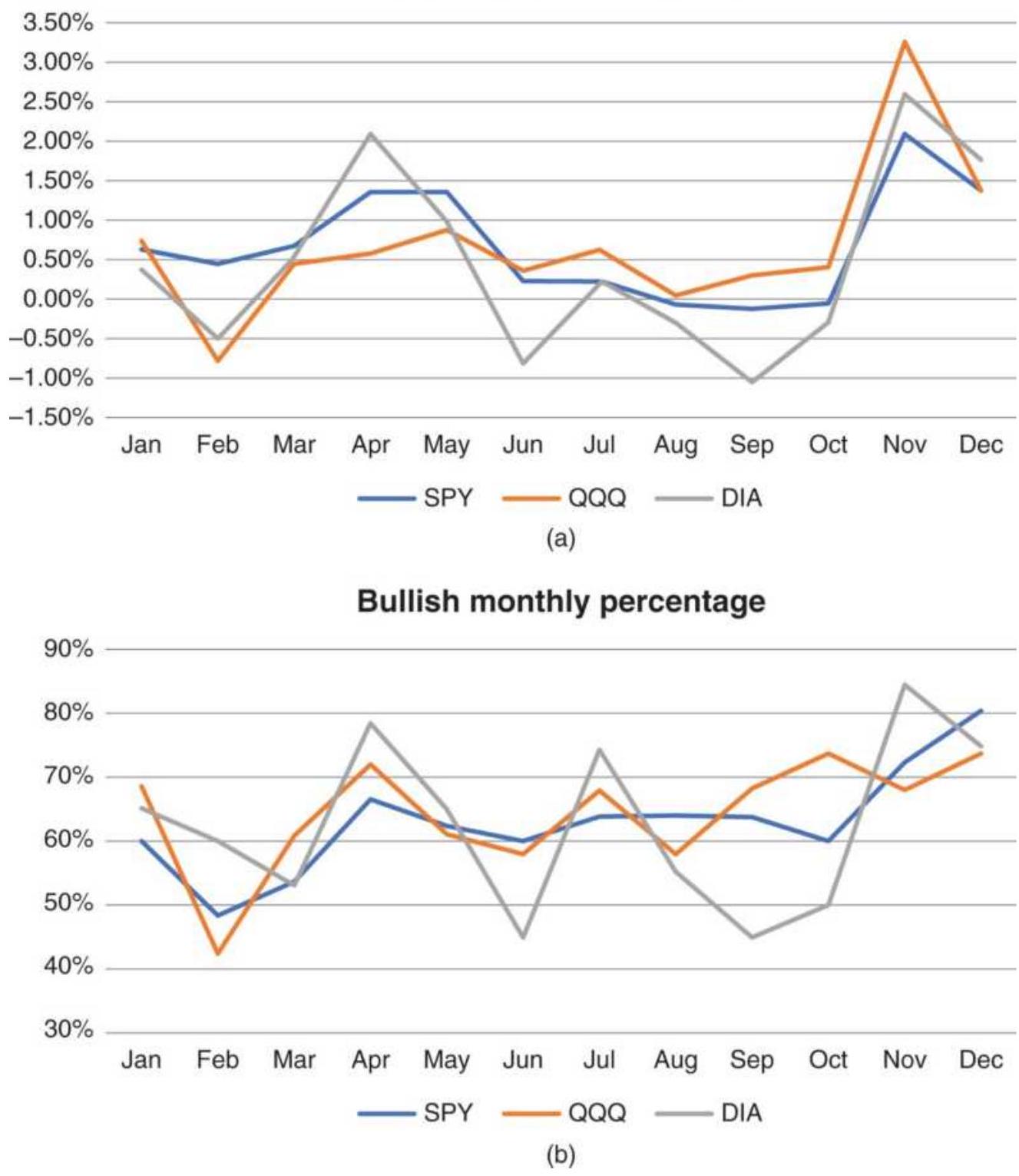
FIGURE 10.39 Seasonality in the U.S. stock market. (a) Average monthly returns. (b) Percentage of profitable years.
It turns out that the pattern in Figure 10.39a shows
smaller returns during the summer and more in the fall, October through December. That corresponds with our observation that investors are less interested in being active in the summer, when they take their vacation, and reset their positions in September. There is a lag after the New Year, and a rally in March, April, and May, peaking in April. Figure 10.39b shows the percentage of profitable years. April and November top the list, corresponding to the months with the best returns. December is also good. It seems that there is seasonality in the stock market, when viewed as a big picture, but the adage "Buy in May and go away" no longer works.
\section*{The Holiday Effect for Stocks}
Arthur Merrill is acknowledged as the pioneer in seasonal timing of stocks, publishing his comprehensive work on this topic in 1966. \({ }^{11}\) In his studies of price movement before and after major holidays, Merrill shows a strong bullish tendency in advance of a holiday with a weak day immediately following. Remembering the bullish bias of the stock market (about \(54 \%\) of all days were higher from 1897 to January 1964), Merrill's results are shown in Table 10.11. For trading, this would indicate the possibility of a sharp trending move prior to or throughout a holiday season. \({ }^{12}\) Kaeppel is more specific, recommending buying on the close of the third day before an exchange holiday and selling on the close two days later (one day before the holiday), \({ }^{13}\) in anticipation of a reversal following the holiday.
In a study similar to Kaeppel, Norman Fosback \({ }^{14}\)
confirmed Merrill's results by studying the returns based on buying two days prior to a major holiday and exiting on the day prior to the holiday. Fosback's strategy yielded returns of \(880 \%\) from 1928 through 1975, and AROR of \(4.87 \%\) for only a few days exposure, with \(70 \%\) of the trades profitable, while holding long positions for the remaining days of the year would have lost \(41 \%\). Therefore, the net gains for the year were all associated with the few days prior to major holidays. According to an updated study by Freeburg, the strategy used by Fosback is still profitable, but not as impressive. Freeburg also showed that the same strategy was profitable for U.S. 30-year Treasury bond futures as well as corporate bonds, but then bond prices had gone up from 1980 through 2016.
\section*{TABLE 10.11 Merrill's holiday results.}
\begin{tabular}{|l|l|l|}
\hline \begin{tabular}{l}
Period \\
Tested
\end{tabular} & \begin{tabular}{l}
Holiday or Holiday \\
Period
\end{tabular} & \begin{tabular}{l}
\% Upward \\
Moves
\end{tabular} \\
\hline \(1897-1964\) & Day prior to all holidays & \(67.9 \%\). \\
\hline \(1897-1964\) & Day after all holidays & 50.8. \\
\hline \(1897-1964\) & \begin{tabular}{l}
Thanksgiving to New \\
Year
\end{tabular} & 74 \\
\hline \(1897-1964\) & July 4th to Labor Day & 69 \\
\hline \(1931-1965\) & Before Christmas & 74 \\
\hline \(1931-1965\) & Before New Year & 75 \\
\hline
\end{tabular}
\section*{SPY Average returns for December}
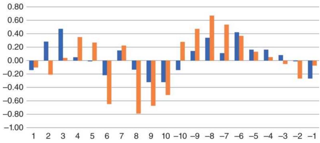
■ From 1998 ■ From 2011
FIGURE 10.40 Returns in December, 1998-2016 and 2011-2016, show similar patterns.
\section*{Christmas Cheer}
Has the Christmas pattern changed since Merrill's study? If we look at the average returns in December by day, we'll see a classic pattern. Figure 10.40 shows the first 10 days of the month and the last 10 days as a way of aligning historic data. Returns are positive at the beginning of the month, perhaps a continuation of the Thanksgiving sales very popular in the United States That is followed by a sag in sales during the second week of December, then a buildup to Christmas Day. Right after that, sales start dropping until returns become negative on the last two days of December.
\section*{The Month-End Effect}
Profits can be made by taking the position opposite to
the crowd. One such strategy takes advantage of monthend liquidation. Some investors close out positions before the end of the month in order to realize profits or losses; this is even more likely to happen at the end of a quarter or the calendar year. Merrill, Fosback, Kaeppel, and Freeburg all confirm that a strategy is successful if it buys on the last day of the month, or the second-to-thelast day, then exits the trade on the fourth trading day of the new month. That takes advantage of large-scale, month-end liquidation, followed by resetting positions. Freeburg confirmed that this strategy works for both the S\&P Index and bonds, although not as profitable as in the recent past. The following is an updated approach. Readers should also see the section on convenience yield in Chapter 13.
\section*{Profiting from Fund Flows}
A likely reason for month-end price distortions are the monthly deposits and additions to funds, managed by companies such as Fidelity and T. Rowe Price, based on automatic retirement account flows. In 2015, the amount of money just from federal and state retirement
programs was estimated at about \(\$ 12\) trillion, with \(\$ 2.7\) trillion allocated to equities, leaving a large amount in bonds and other interest rate vehicles. Not only is that a lot of money, but the monthly flow is enough to move prices.
We know that an IRA manager has an obligation to add deposits or divest in a well-defined process. Every firm will have a strict policy of how and when it is done. All customers need to be treated the same way to avoid any
legal issues. If a firm has an equal, offsetting number of deposits and redemption, they're not going to have to buy or sell anything. They can do an internal switch. But it's not likely that these transactions will balance out each month. Given the enormous number of firms doing the same thing, we should see a noticeable effect on price movement.
\section*{Price Patterns within the Month}
We can uncover this pattern by looking at the returns of the bond market by the day of the month, in a way similar to the December analysis in the previous section. For our purposes we'll ignore specific dates and simply reference the first trading day, the second trading day, and so forth, making it easy to combine and average the results. We can do the same with the end of the month. Working backward, we can align the last trading day of each month, the next to last trading day, the third from last, and so on. If there is a consistent pattern, it should surface.
\section*{Bonds}
First look at the 10-year bond index, TNX, and the U.S. 10 -year Note futures, TN. TNX is expressed as a yield and futures are quoted as a price. When yields drop, TNX declines and TN rises. TNX may not be the specific interest rate used in retirement accounts, but interest rate vehicles are actively arbitraged, so the same patterns should appear in all rates of about the same maturity.
By looking at futures, which are liquid, inexpensive to buy and sell, and good for hedging, we can get a
confirmation of the effect. We see in Figure 10.41 that there is a clustering of positive returns on the far right, the last three days of each month. That can be interpreted as fund managers buying bonds. One manager may not buy on all three days, but collectively a large number of managers would be buying during that interval.
We also see that the gains over those three days have declined significantly during the past 15 years. Figure 10.42 shows the monthly and annualized gains for the three days over the 10-year periods 1990-1999, 20002009, and the five years from 2010 to 2015 . While this strategy would have returned \(7 \%\) per year during the 1990s, it is now down to \(2.7 \%\). That may be the result of others gaming the system, or it may be that there is less buying because investors are not choosing to invest in bonds as interest rates hit at all-time lows.
\section*{The S\&P}
If investments are not going into bonds, then they should be going into the stock market. The decline in bond returns should be offset by an increase in equity index returns. The daily returns in Figure 10.43 confirm that premise, except that the pattern shows that buying occurs in the first three days of the month, rather than the end of the previous month.
TNX (10-year Note index)
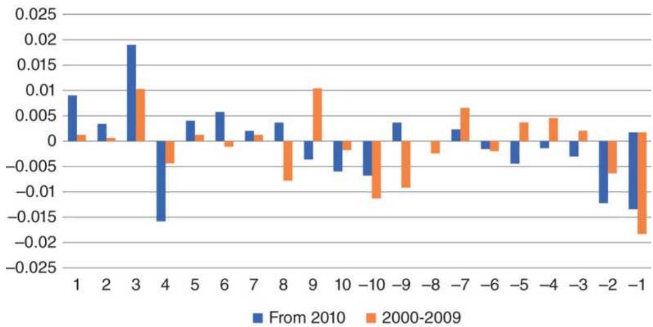
(a)
10-Year Note futures day-of-month patterns
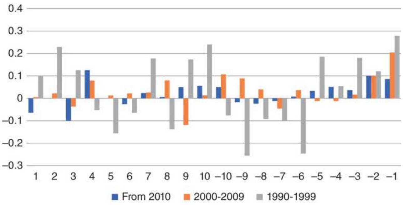
(b)
FIGURE 10.41 Daily returns of TNX and TN (futures).
Note that the last day of the month tends to be a decline, so buying on close of the last day of the month and holding for the first three days of the next month would
give the payout shown in Figure 10.44, an annualize rate of \(5.64 \%\) for futures, and \(5.29 \%\) for SPY.
\section*{Trading Rules}
You can use either futures or ETFs to trade this pattern. With futures there is the advantage of leverage - but also added risk. Remember that these patterns show the average return over many months and that some months are not profitable.
For 10-year rates, buy on the close 4 to 6 trading days before the end of the month. Exit on the close of the last day of the month.
For the S\&P, buy on the close of the last day of the month (hopefully a lower day), and exit the trade on the close of the third trading day of the month.
Returns from bonds
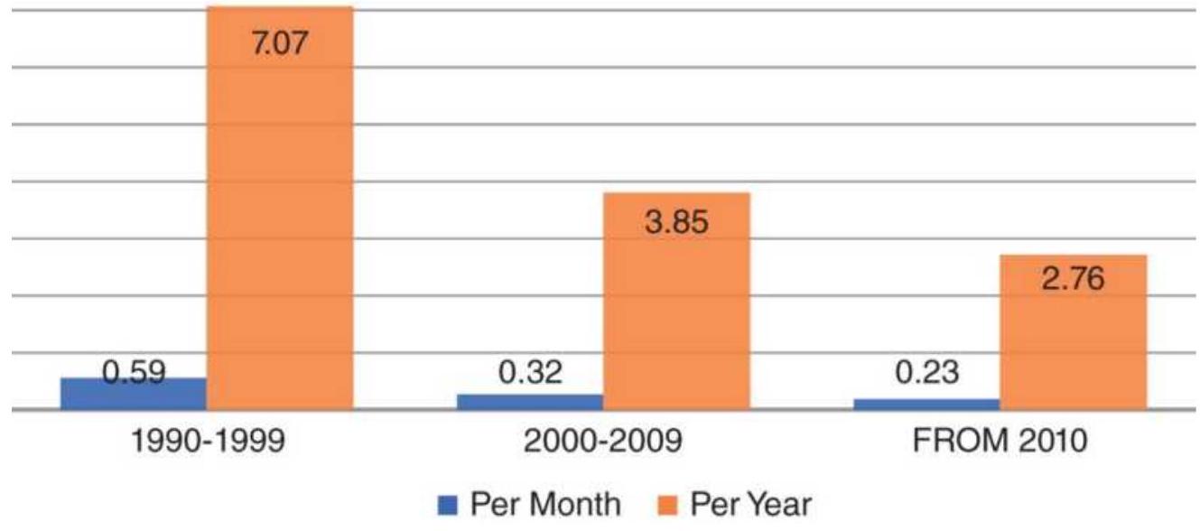
FIGURE 10.42 Returns of bonds are declining.
\section*{SPY day-of-month patterns}
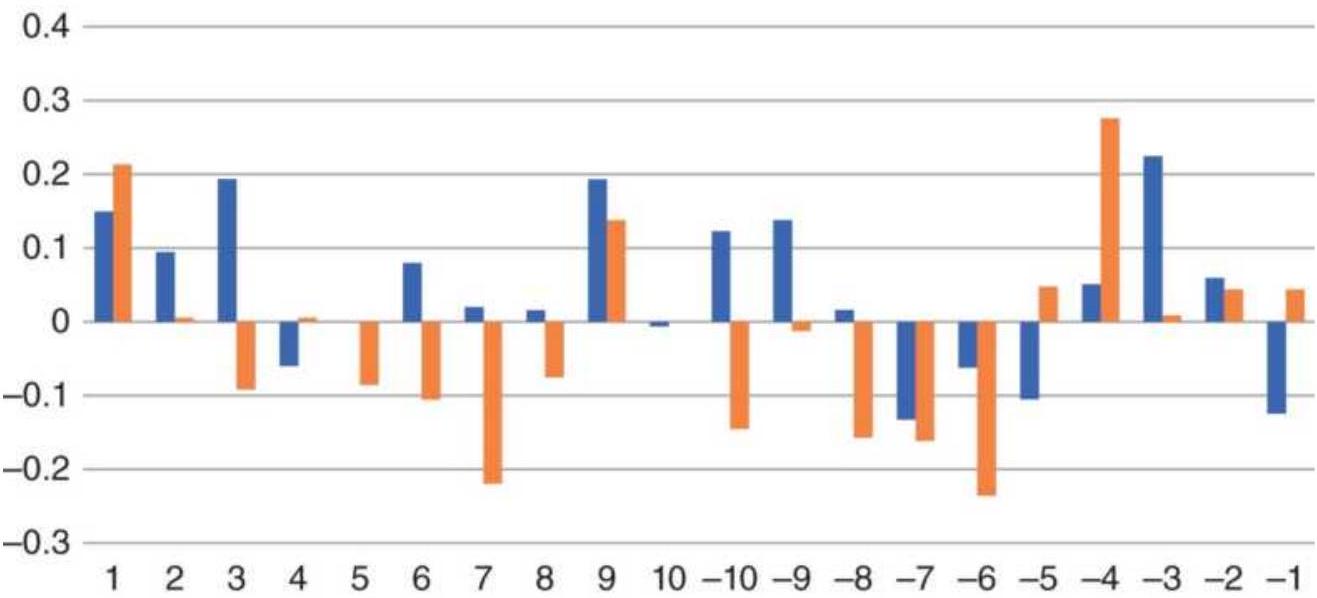
■ From 2010 ■ 2000-2009
(a)
SP Futures day-of-month patterns
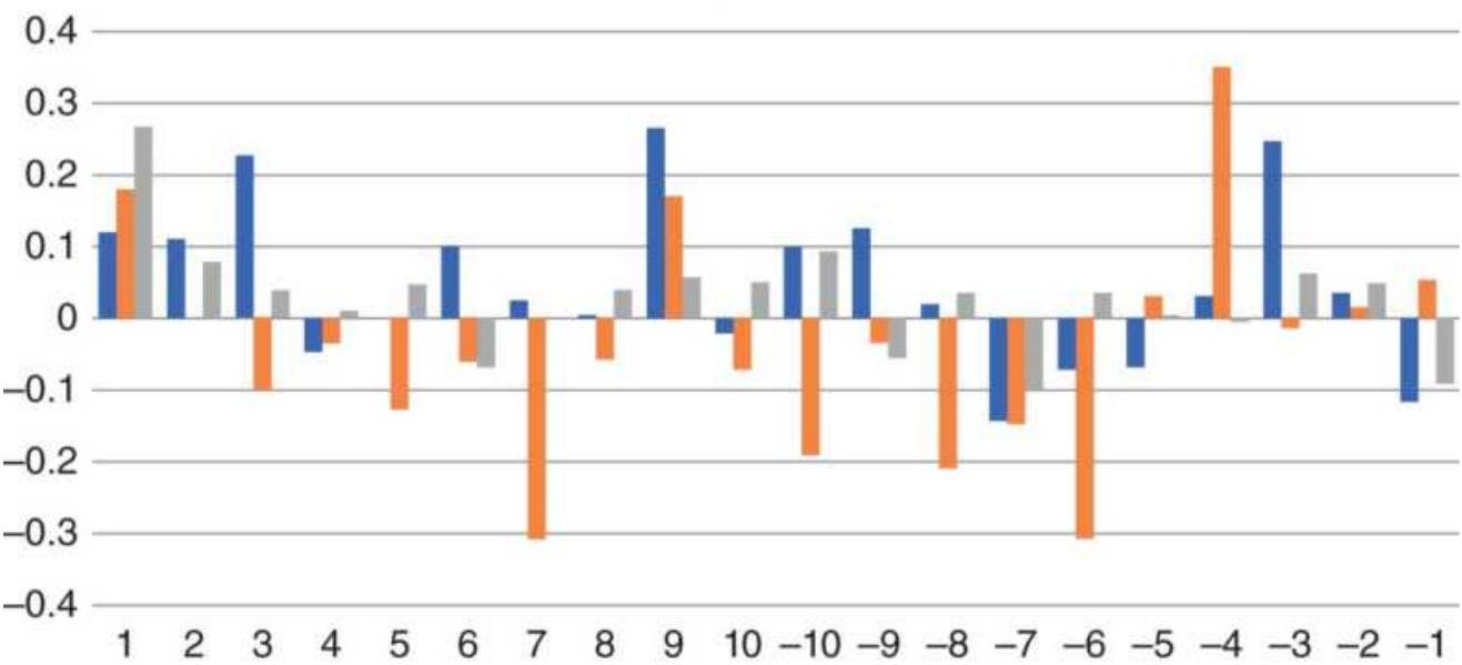
■ From 2010 - 2000-2009 1990-1999
(b)
FIGURE 10.43 Best returns of SPY and SP cluster at the beginning of the month.
\section*{Returns from SP futures}
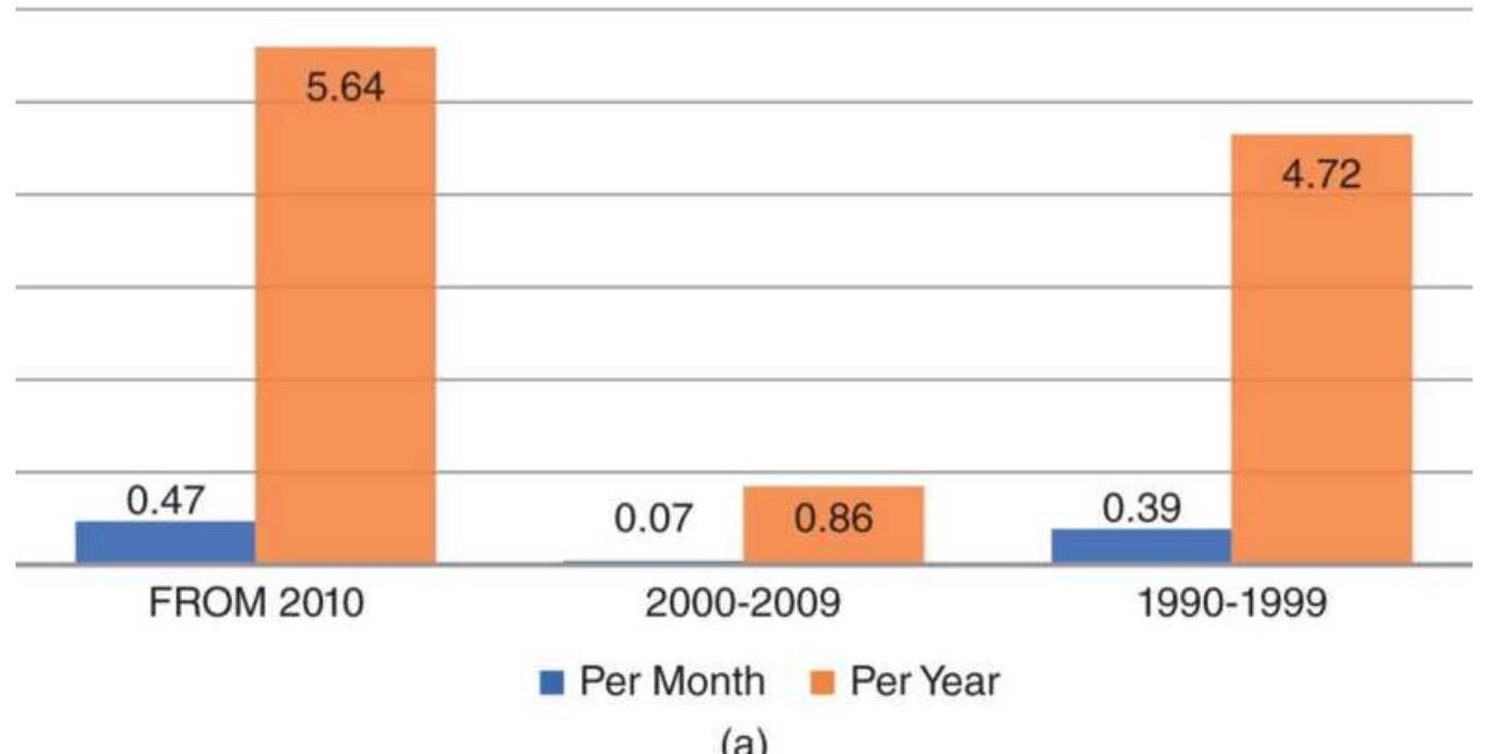
\section*{Returns from SPY}
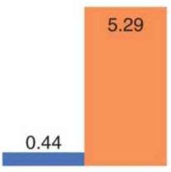
FROM 2010
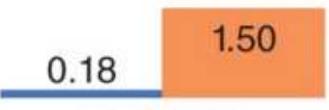
2000-2009
(b)
FIGURE 10.44 Returns of the equity index are increasing.
\section*{The Hirsch Strategy}
Another popular seasonal strategy is from Yale Hirsch. He simply bought on the first day of November and sold on the last day of April, holding the position for six months. \({ }^{15}\) In addition to satisfying capital gains
requirements, it had no position during the period most traders consider the summer doldrums. The Hirsch strategy would have avoided the spectacular October losses as well as those of the disaster of \(9 / 11 / 2001\) but benefited from the subsequent recovery. Hirsch had discovered that virtually all gains in the stock market took place during those six months. Looking back at the SPY returns in Figure 10.39, except for February, those months show profits.
Hirsch's original strategy reinvested dividend income during the six months when you were not in the market. That advantage has diminished, but leveraged investing can replace that loss. Using futures or leveraged ETFs can make up the difference. Of course, some interest income is better than none.
When this strategy was applied to SPY from 1998 through 2017, it had 12 of 19 years profitable, with an annualized return of \(4.37 \%\), not including interest.
\section*{The January Effect}
Is January a leading indicator of stock market movement for the rest of the year? Is there any justification for the rule "As January goes, so goes the market"? To look at this carefully, we will take two different predictors, the first five days of January and the entire month. \({ }^{16}\) Using the Dow Industrials as the stock market indicator, the January pattern was viewed from 1900 to 1989 in two parts, 1900-1937 and 1938-1989. The results are shown in Figure 10.45 for all years, 1900-1989, and Table 10.12 for the 52 years ending in 1989.
Figure 10.45 shows that the early part of the century had no significant pattern. There were nearly the same number of bullish and bearish indications resulting in a larger number of incorrect predictions. The past 52 years are very different, with a much larger number of correct moves. One should note, however, that the ratio of up to down moves is more than 7:1. To offset the market bias, the patterns shown in Table 10.12 can be used. The direction of the first five days, confirmed by a continuation in that pattern for the balance of January, is then followed by the same pattern for the year. In the case where the market changes direction after the first five days and nets a loss for the month, the pattern takes on the new direction for the balance of the year.
\section*{January barometer results}
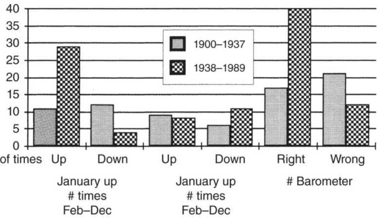
\section*{FIGURE 10.45 Results of January patterns.}
Source: "The January Barometer" by Jay Kaeppel.
Technical Analysis of Stocks \& Commodities, Vol.8, No. 7
(July 1990). (C) 1990 Technical Analysis, Inc. Used with permission.
TABLE 10.12 The January barometer patterns, 1938 -1989.
\begin{tabular}{|c|c|c|c|}
\hline \multirow[b]{2}{*}{ Pattern } & \multicolumn{2}{|c|}{ S\&P 500} & \multirow[b]{2}{*}{\begin{tabular}{l}
Expectations \\
for Feb-Dec
\end{tabular}} \\
\hline & \begin{tabular}{l}
During First \\
5 Days of the \\
Year
\end{tabular} & \begin{tabular}{l}
By the End \\
of January
\end{tabular} & \\
\hline 1 & Declines & \begin{tabular}{l}
Further \\
decline
\end{tabular} & Bearish \\
\hline 2 & Declines & \begin{tabular}{l}
Less decline, \\
but loss for the \\
month
\end{tabular} & Bearish \\
\hline 3 & Declines & \begin{tabular}{l}
Gain for the \\
month
\end{tabular} & Bullish \\
\hline 4 & Advances & Further gains & Bullish \\
\hline 5 & Advances & \begin{tabular}{l}
Less gain, but \\
gain for the \\
month
\end{tabular} & Bullish \\
\hline 6 & Advances & \begin{tabular}{l}
Loss for the \\
month
\end{tabular} & Bearish \\
\hline
\end{tabular}
\section*{The After-January Pattern through 2017}
For the 18 years from 2000 through 2017, 14 were higher at the end of December than at the end of January, or \(77.7 \%\) of the years. During those 18 years, 8 had a higher January close. Of those 8,6 closed the year higher than at the end of January. It would be more accurate to say,
"No matter how January goes, the market goes up."
It turns out that January is unpredictable. If we remove January from the past 19 years, the average returns for the years are shown in Figure 10.46. The financial crisis of 2008, which shows as the largest loss, was the only losing year of the past 15 years. By not including January of 2008 , that loss was about \(30 \%\), not the \(50 \%\) seen by most investors. The results that followed the Internet bubble, the years from 2000 to 2002, taken collectively, were worse. The right investment strategy seems to be to avoid January and accept an average return of \(8.75 \%\) for the remaining 11 months.
You should always be wary of volatility, but history shows that, barring a financial meltdown, the stock market usually produces good returns from February on. Rather than holding the same portfolio for the entire year, you might enter at the end of January, exit at the end of April, reenter at the end of September, and hold until year-end. That way you combine the "after-January effect" with seasonality and get to take a holiday in the summer.
\section*{End of year minus January}
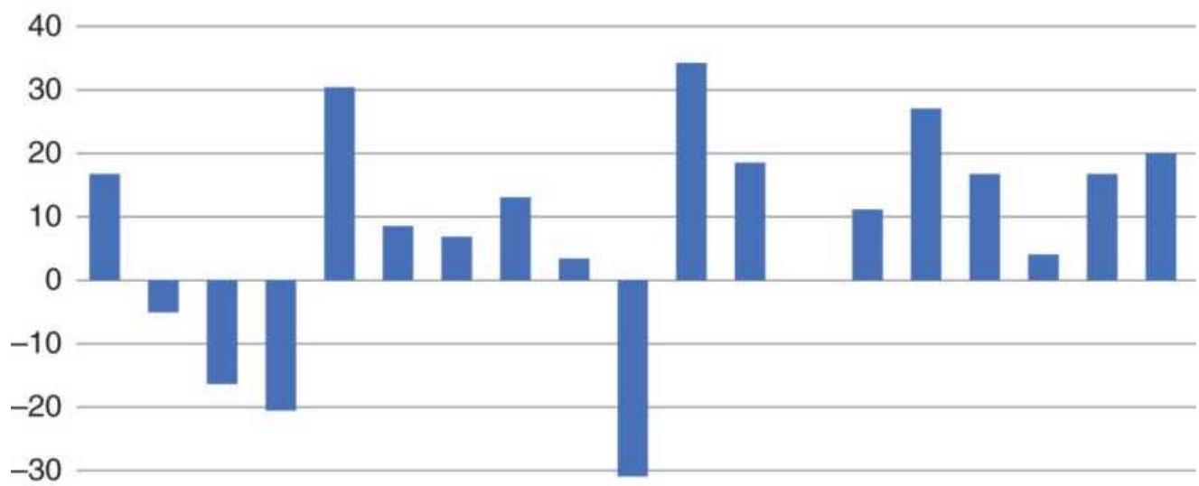
\(-40\)

FIGURE 10.46 Average returns for the year, excluding January.
\section*{The Risk of October}
It is easy to point out the spectacular events during September and October: the tragedy of September 11, 2001; Black Monday on October 28, 1929; and the market crash of October 19, 1987. However, these months have other negative attributes that are not as noticeable. Freeburg has found 17 ricochet rallies in October since 1950. He defines a ricochet rally as a price rise of at least \(5 \%\) within 10 days as measured from the S\&P monthly low. June ran a distant second place with only 10 rallies. Therefore, while October may hold the record for the most volatile price moves and the most risk, it also has great opportunity for timing an entry into a new position.
Figure 10.47 shows the standard deviation of the
monthly volatility of SPY from 1994 through 2017, measured as the high-low range of the closing prices divided by the average monthly price. October stands out as the highest volatility with a slightly negative return. March has a lower volatility but a larger average loss. The months that are most desirable are April, May, and December, which have good returns with reasonable risk, and November, which has better returns with moderate risk.
\section*{COMMON SENSE AND SEASONALITY}
Most comprehensive works on seasonality include agricultural markets, currencies, interest rates, and indices. Very little is available on stocks. Common sense tells us that the major agricultural products follow a clear seasonal pattern based on Nature. This calendar cycle also applies to coffee, cocoa, and oranges, although competition from South America has limited the extreme moves that result from a freeze in Florida's orange groves. But grain seasonality has been slowly changing as other countries continue to improve their production of wheat, China and India become a greater factor in soybeans, and farmers build more on-site storage to avoid seasonal lows and capture the cost of carry. Cattle and hog prices, dependent upon the cost of feed, and still marketed more actively in the fall because of weather, show a strong seasonal trend even though feedlots don't live by the calendar year. Livestock patterns have been changed due to competition from Australia and New Zealand.
\section*{SPY Volatility and return, 1994-2017}
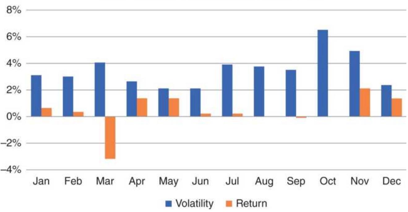
FIGURE 10.47 SPY monthly volatility and returns, 1994-2017.
These agricultural markets are reasonable candidates for seasonal analysis but require care to identify shifting patterns in competition and storage. What about Treasury bonds or the Japanese yen? Should we look for seasonal patterns in the financial markets? We can argue that certain listed companies and even market sectors are highly dependent upon seasonal business. However, can we say that the demand for money is higher in the summer than in the winter? Or that enough tourists convert their currencies to yen when they visit Japan during the summer that they effectively drive the value of the yen consistently higher? Are automobile exports from Japan stronger or weaker during a certain season, so that there is a predictable pattern? These scenarios are highly unlikely, and we have no assurance that cars will be sold off ahead of winter in the way that grain
must be harvested. But consumers have habits, and holiday shopping has created a predictable pattern for some companies. In financial markets most players can choose their time to act; they can hedge their commitments or wait for a better opportunity.
There are some stocks that are clearly seasonal, such as airlines that service nonbusiness customers, resort hotels, cruise lines, perhaps even luggage manufacturers. Holiday goers tend to book in the spring for summer vacations. And it is possible that mortgages spike in the spring and are at lows in the winter, simply because shoppers are not looking for houses when the weather is bad. The study of seasonality should be limited to those markets that depend on weather and seasons, on Mother Nature or consumer behavior, either directly or indirectly. If you find a pattern in a market that cannot be clearly explained by fundamentals, it is best to avoid it.
\section*{Being Too Specific about Targets}
Neither weather nor human behavior are precise, so selecting an optimal day of the year to enter a long position is not likely to work. Small shifts in fundamentals, such as the building of additional storage, allow farmers to change their selling habits slightly. The right day to buy or sell in 1975 is not likely to be the right day this year. Even weekly data may be too specific. Seasonal patterns are best seen using monthly data. The most we might expect is to know that the seasonal high in corn usually occurs in July but sometimes in June or August; the harvest lows are likely in September but
could be in October or November. We must first be aware of the big picture, and then study how the specific pattern develops each year. There are other timing tools, such as overbought and oversold indicators, that can help narrow the moment of opportunity within an expected window of time. If not, averaging into a position is always safe.
\section*{NOTES}
1 David Handmaker, "Low-Frequency Filters for Seasonal Analysis," in Perry J. Kaufman, Handbook of Futures Markets (New York: John Wiley \& Sons, 1984).
2 For another detailed description, see www.otexts.org/fpp/6/4 (On-Line Tests) and in Ladiray and Quenneville (2001). Free software that implements the method is available from the U.S. Census Bureau (https://www.census.gov/), along with various language interfaces.
3 The U.S. government provides details of its methods on the Bureau of Labor Statistics website. Search the Internet for "X-11" or "X-12."
4 A more detailed account of X-11 and Henderson's weighted moving average (step 9) can be found in Bovas Abraham and Johannes Ledolter, Statistical Methods for Forecasting (New York: John Wiley \& Sons, 1983), pp. 178-191. Their book also includes a computer program for "seasonal exponential smoothing."
5 A specialized symmetric assignment of weighting values. A specific example can be found in Bovas Abraham and Johannes Ledolter, Statistical Methods for Forecasting (New York: John Wiley \& Sons, 1983), p. 178.
6 "Estimation of Price Change," Chapter 17, "The Consumer Price Index,"BLS Handbook of Methods Bulletin 2490 (April 1997), p. 192.
7 For more detail, see Rob J Hyndman, Forecasting: Principles and Practice (OTexts, 2013).
8 Winter's method, as well as other advanced models, can be found in Douglas C. Montgomery and Lynwood A. Johnson, Forecasting and Time Series (New York: McGraw-Hill, 1976), and Abraham and Ledolter (1983).
9 Current weather information on crops is available on www.agweb.com. Detailed history of temperature, precipitation, and drought can be found at NOAA, the National Center for Environmental Information, a division of NOAA, the National Oceanic and Atmospheric Administration, specifically www.ncdc.noaa.gov/cdo-web/ ("climate data online").
10 Jon Davis, Weather Sensitivity in the Markets (Smith Barney, October 1994).
11 Arthur A. Merrill, Behavior of Prices on Wall Street (Chappaqua, NY: Analysis Press, 1966). It is currently available from Analysis Press, 3300 Darby Road, \#3325, Haverford, PA 19041.
12 An excellent summary of seasonal studies in the stock market can be found in Nelson F. Freeburg's reports, Formula Research (Formula Research, Inc., 4745 Poplar Ave., Suite 307, Memphis, TN 38117-4408). Material from this section was drawn from volume 6, nos. 10-11, December 2000 and August 2001. Also recommended is Steve Moore, "Playing the Seasonals," Active Trader 1 (no. 8, November 2000).
13 Jay Kaeppel, "The Stock Market, the Calendar, and You," Technical Analysis of Stocks \& Commodities (December 2002).
14 Norman G. Fosback, Stock Market Logic (Dearborn Financial, 1998).
15 Nelson Freeburg, see footnote 12.
16 Jay Kaeppel, "The January Barometer: Myth and Reality," Technical Analysis of Stocks \& Commodities (July 1990).
\section*{CHAPTER 11 \\ Cycle Analysis}
The cycle is another of the basic components of price movement, along with the trend and seasonality, but as a mathematical problem it can be more difficult to evaluate and is often avoided. But there are different types of cycles and many of them are simple to find and can improve trading. For those more ambitious, there is inexpensive software that will help.
Cycles come in many forms - seasonality, production startup and shutdown, inventory, behavioral, astronomical, and the elusive business cycle. Seasonality is a special case of a calendar or annual cycle. Seasonality was covered in the previous chapter and its special features are not considered here. Some cycles are clearly periodic, having regular intervals between peaks and valleys; others are more uniform in their amplitude or height but irregular in period. The most definitive and regular cycle remains the seasonal, which is determined by the unalterable changing of the year.
This chapter will discuss the major commodity and financial cycles that most likely result from business decisions, government programs, and long-term market characteristics and phenomena. Short-term cycles are usually attributed to behavior and will be covered in
Chapter 15, "Short-Term Patterns."
There are a few popular ways to find the cycle, the most common being trigonometric curve fitting and Fourier (spectral) analysis. Both will require a computer and will be explained in the following sections. John Ehlers introduced Maximum Entropy Spectral Analysis (MESA), which finds price cycles based on small amounts of data, at the same time avoiding some of the problems inherent in other methods. Examples of solutions will be included in the explanation of the methods and applications that follows. Computer programs that show the solution to the trigonometric problems can be found on the Companion Website.
Commercial software examples will also be used.
\section*{CYCLE BASICS}
The cycle, along with the trend and seasonality, comprise the three main components of price movement. The fourth is noise, which includes everything not accounted for in the first three. To find any one component we must remove the others. In earlier chapters we found that we can eliminate the trend by taking the first differences of the data- that is, subtracting the previous price from the current price. In the previous chapter on seasonality we used the simple technique of subtracting a centered 1year moving average (a 12-period average applied to monthly data, lagged 6 months) from the original price series to remove the seasonal pattern. Alternatively, statistical software will subtract this month's average price from that of 12 months ago, or today's daily price from that of 252 days ago, in order to detrend the data.
Regardless of the tools, when we remove the trend and seasonal component we are left with the cycle and the unaccountable price movement.
There are many cycles based on the periodic effects in our Universe. After the 1-year orbit of our planet around the Sun, there is the 28-day lunar cycle; converted to business days, this gives the very familiar 20-day reference that remains overwhelmingly popular among all analysts (also corresponding to four weeks). The companies listed on the New York Stock Exchange release earnings every three months, another interval based on our planetary motion. If they post returns monthly, it is a subcycle. Other planetary effects, which should by no means be discarded off-hand, can be found in Chapter 14 under "Financial Astrology." We should not eliminate the possibility that, besides seasonality, planetary motion may account for the effects of mass behavior, and that it may form a consistent cycle with a fixed period. 1
Cycles can be complex and difficult to see because there is often a combination of larger and smaller patterns, and cycles within cycles, all acting at the same time. Nevertheless, they exist. The cycles that appear to be most important are either long-term or the sum of a number of subcycles that come together at peaks or valleys. This gives us a way to identify one point on a cycle; we must remember that, when the individual components are found, there may be a number of smaller patterns that cause this effect. Think about it as harmonics. A smaller cycle is a fraction of the larger
cycle; for example, its cycle length can be \(1 / 2,1 / 3,1 / 4, \ldots\) of
the larger. When two cycles are synchronized, their peaks or valleys occur at the same time. Any price series can be decomposed into individual cycles and represented as the sum of multiple cycles.
\section*{Five Principles}
In 1970, J.M. Hurst described five principles of periodic motion that may help explain the concept. \(=\)
The Summation Principle states that a single large cycle can be composed of many smaller cycles, giving it the appearance of a harmonic- that is, waves within waves.
The Commonality Principle recognizes that there are larger economic and fundamental factors that affect all stocks and commodity sectors in the same way at the same time. These can be economic reports, geopolitical events, or natural disasters.
The Variation Principle recognizes that cycle lengths can vary. They do not make highs and lows at the same time each month or each year.
The Nominality Principle states that there are often shorter, common price cycles, likely caused by earnings reports or other calendar events shared by those markets.
The Proportionality Principle recognizes that the longer the cycle, the larger its magnitude, a concept similar to a longer-term trend having larger retracements.
Each of these components can be isolated using a bandpass filter. You will find more about this later in this
chapter under "Fourier Analysis."
\section*{Observing the Cycle}
Before selecting a market for cycle analysis, it is necessary to observe that a dominant cycle exists; it is also useful to know why it exists in order to avoid uncovering spurious patterns. This is most easily done for markets in which you can clearly identify the fundamental or industrial reasons for cycles. The basis for a cycle could be a pattern of holding inventory, the fixed time needed for breeding and feeding of livestock, seasonality, the time necessary for closing a mining operation and then starting it up again, expansion or contraction of business based on disposable income, the effects of government interest rate policy, or other economic factors.
\section*{The Cattle Cycle}
Using cattle as an example, a long-term chart of cash prices (Figure 11.1) shows very uniform peaks and valleys from 1978 through 2008, but then it seems to disappear in the rally leading up to 2015 . Without using complicated mathematics, we can find the cattle cycle and understand why it can't be seen recently.
\section*{Cash cattle prices}
180
160
140
120
100
80
60
40

FIGURE 11.1 Cattle cash prices, 1978-2017.
By isolating the earlier period, 1978 through 1984, we can mark off the peaks and valleys visually, as seen in Figure 11.2. As we expected, the circles around the extreme prices appear very uniform. If we create a table of dates by putting the cursor on the Excel chart, we get the results in Table 11.1.
In Table 11.1, we find the number of days between peaks by subtracting one date from the following date. Repeat the process for the valleys. Average the days between peaks and days between valleys to get peaks \(=300\) and valleys \(=319\). The average of those values converted to months gives a cattle cycle of 10.2 months.
Looking next at the more recent data, we can circle the peaks and valleys that are obvious and put them in Table 11.2. There are some dates that cannot be filled in because there are no clear peaks or valleys. We can
estimate those dates using the cattle cycle of 10.2 months that we calculated for the earlier data. Figure 11.3 had circles around the data that we observed as peaks and valleys, and squares around the dates that fit our estimated 10 -month cycle. The corresponding dates are shown in Table 11.2. When we average the days between dates, we get about the same cycle as the earlier period.
\section*{Cash cattle prices}
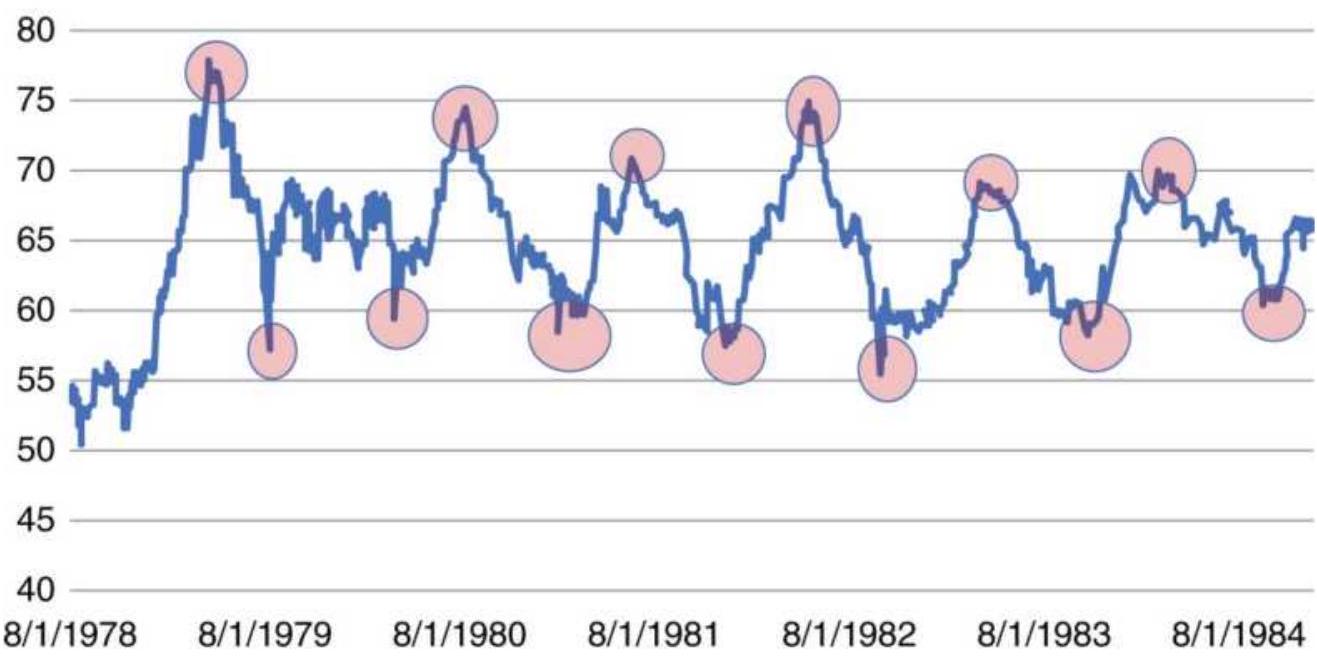
FIGURE 11.2 Peaks and valleys of cattle prices, marked visually.
TABLE 11.1 Dates of the peaks and valleys in Figure 11.2.
\begin{tabular}{|l|l|c|c|}
\hline Peak & Valley & Peak Days Valley Days \\
\hline & \(8 / 14 / 1978\) & & \\
\hline \(4 / 26 / 1979\) & \(8 / 8 / 1979\) & & 359 \\
\hline \(12 / 4 / 1979\) & \(4 / 2 / 1980\) & 222 & 238 \\
\hline \(8 / 12 / 1980\) & \(2 / 4 / 1981\) & 252 & 308 \\
\hline
\end{tabular}
\begin{tabular}{|l|l|l|l|}
\hline \(6 / 29 / 1981\) & \(12 / 14 / 1981\) & 321 & 313 \\
\hline \(6 / 1 / 1982\) & \(10 / 4 / 1982\) & 337 & 294 \\
\hline \(4 / 26 / 1983\) & \(11 / 1 / 1983\) & 329 & 393 \\
\hline \(3 / 27 / 1984\) & \(9 / 27 / 1984\) & 336 & 331 \\
\hline Average & & 300 & 319 \\
\hline Average of peaks and valleys & & 309 \\
\hline \multicolumn{2}{|r|}{ Average months } & & 10.2 \\
\hline
\end{tabular}
\section*{TABLE 11.2 Dates of the combined observed and estimated peaks and valleys.}
\begin{tabular}{|l|l|c|c|}
\hline Peak & Valley & Peak Days & Valley Days \\
\hline \(3 / 6 / 2012\) & \(8 / 1 / 2012\) & & \\
\hline \(1 / 10 / 2013\) & \(7 / 23 / 2013\) & 310 & 356 \\
\hline \(11 / 10 / 2013\) & \(6 / 5 / 2014\) & 304 & 317 \\
\hline \(12 / 1 / 2014\) & \(2 / 5 / 2015\) & 386 & 245 \\
\hline \(5 / 10 / 2015\) & \(10 / 3 / 2015\) & 160 & 240 \\
\hline \(3 / 21 / 2016\) & \(10 / 8 / 2016\) & 316 & 371 \\
\hline \(5 / 8 / 2017\) & \(9 / 7 / 2017\) & 413 & 334 \\
\hline Average & & 315 & 311 \\
\hline
\end{tabular}
\section*{Cattle cash prices}
180
170
160
150
140
130
120
110
100
90
80
\(1 / 3 / 2012\)
\(1 / 3 / 2013\)
\(1 / 3 / 2014 \quad 1 / 3 / 2015\)
\(1 / 3 / 2016\)
\(1 / 3 / 2017\)
\(1 / 3 / 2018\)
FIGURE 11.3 Cattle prices for 2012-2017, with circles marking the observed peaks and valleys, and squares marking the estimated ones.
How does this compare to the fundamentals of feeder and finished cattle? It takes 4 to 6 months to wean a calf, and 6 to 10 months to fatten it for market. If we consider the shortest time period for both, the process is 10 months. However, there is a lot of variability in that time frame. If the cost of feed is too high, then cattle is sold early. A farmer or feedlot never keeps a steer longer than necessary. With some variability, our calculation of 10 months could be correct. At least that's what the numbers show.
\section*{The Swiss Franc Cycle}
Is there a Swiss franc cycle? In the previous edition of this book there was a chart showing a likely Swiss franc cycle, with the months between peaks averaging about 30 months in the late 1970s, then increasing to about 40
months in the years around 2000. The longest period between peaks was 52 months and the shortest was 26 months. There did not appear to be a 26-month cycle. What fundamentals would cause such a cycle?
There are two ways to view a cycle: the length of time between peaks or valleys, and the height or depth of the peak or valley. It is easy to understand the consistency of an agricultural cycle, but a business cycle is more likely to occur at irregular times. They would be recognizable by their clear tops and bottoms.
There doesn't seem to be any fundamental basis for a Swiss franc cycle, unless investors move funds into or out of the franc with some regularity. Investments into the United States buy U.S. dollars. If they are successful, then they will repatriate their profits at some time, which means selling U.S. dollars and buying the Swiss franc. In Figure 11.4 the last four years, 2014-2017, which are circled, have peaks on or about December 31. That would correspond to the theory of repatriating gains because the U.S. equity markets have been profitable during those years. If we continue to associate the end-of-year move in the franc with the net gain for the year in U.S. equities, we may uncover a trading opportunity as well as a valid cycle.
\section*{Basic Cycle Identification}
A simple way to begin the search for major cycles is to look at a long-term chart, displayed as weekly or monthly, rather than daily prices. The dominant halfcycle can be found by locating the obvious price peaks
and valleys, then averaging the distance between them, as we did with the cattle cycle. It is best to have at least eight cycle repetitions before concluding that you have a valid cycle. To be perfectly correct, cycle theory measures the distance between the low points; however, we will find more information using both peaks and valleys.
Swiss franc
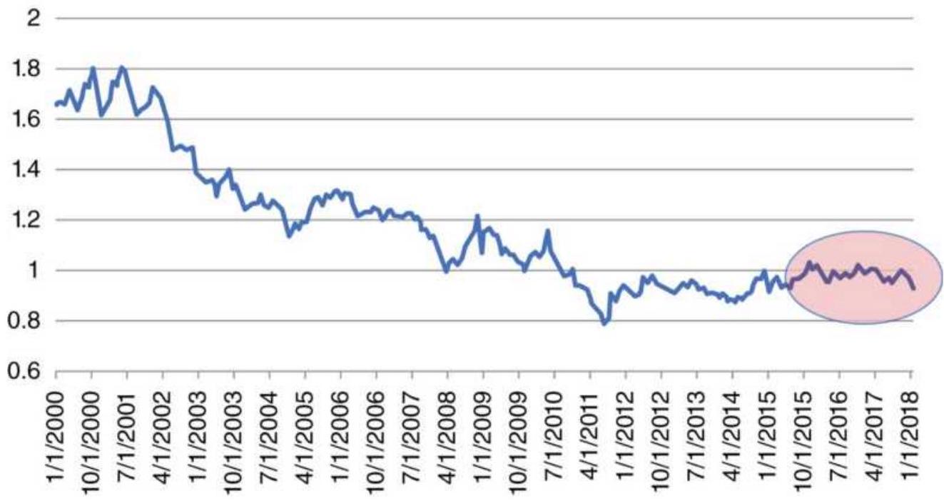
FIGURE 11.4 Searching for the Swiss franc/U.S. dollar cycle.
Cycles can be obscured by other price patterns or market noise, in the same way that seasonals were hidden during periods of strong trends. When cycles are less pronounced, they are more easily overwhelmed. Classic cycle identification requires that the non-cycle factors the trend and seasonal components - be removed first. The resulting data will then be analyzed and the trend and seasonal factors added back once the cycle has been found. To find a subcycle, the primary cycle should be
removed and a second cycle analysis performed on the data. This can be a tedious process. In order to bypass these steps, the methods that follow (trigonometric regression and spectral analysis) can locate the dominant cycle and subcycles at one time using an integrated process.
\section*{The Business Cycle}
The global business cycle, as distinguished from industrial cycles, is the result of macroeconomic events, such as recessions, inflation, and government economic policy. Figure 11.5, a study done by Armstrong Economics and published by the Princeton Research Institute, has calculated this cycle at about 8.6 years, or 4.3 (4 years, 4 months) years from top to bottom in each cycle. Although this chart dates from 1997, it seems remarkably accurate in capturing the tech bubble that ended in 2000, the downturn that followed, ending in 2003, the rally preceding the 2008 financial crisis, and the extreme fall of the market and the recovery afterward. It was printed in the previous edition of this book in 2013, and shows the last cycle bottom in 2011, very nearly true. At the beginning of 2018, it shows a last rally. In February 2018, the market sold off sharply. We are still waiting to see what follows.
\section*{War and Politics}
In the same research report as the business cycle, Armstrong shows the Wheeler Index of War, a 25-year cycle, reproduced in Figure 11.6. It would be too much to present a method to find these cycles, but any reader
who is interested can read an evaluation at http://timeprice-research-astrofin.blogspot.com. In contrast to Wheeler's results they show:
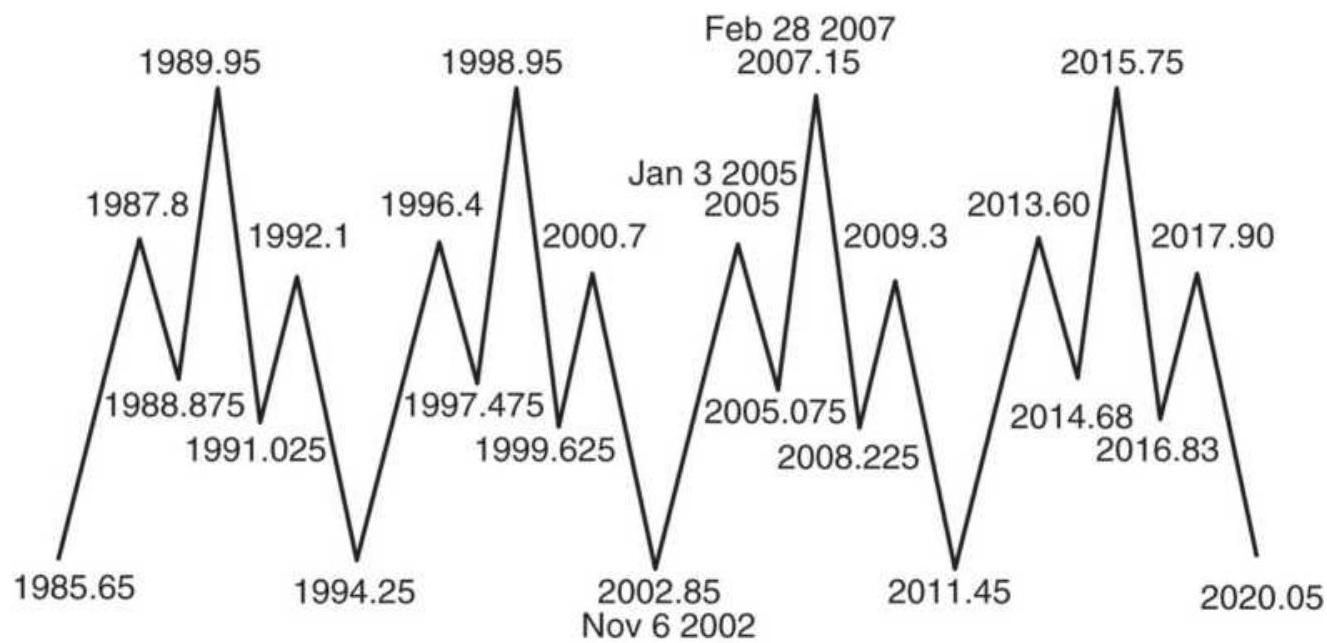
FIGURE 11.5 The 8.6-year business cycle.
Source: Princeton Economic Institute, available on www.financialsense.com.
- A 54-year sociopolitical cycle
- An 18-year war cycle
- 4.5- and 9-year economic subcycles
The economic subcycles are \(1 / 2\) and \(1 / 4\) of the war cycle, and wars always take a toll on the economy, first good, then bad. In Wheeler's chart, the last two valleys were August 1964 and September 1989. That makes the next valley October 2014, followed by the next peak after the beginning of 2026. However, at the time of this writing, we need a better definition of "war." Conflicts in Afghanistan, Syria, and Ukraine do not seem to rise to the occasion. Let's hope that Wheeler and other
researchers are wrong.
\section*{CYCLE OF WAR \& POLITICAL CHANGE (25.049 YEARS)}
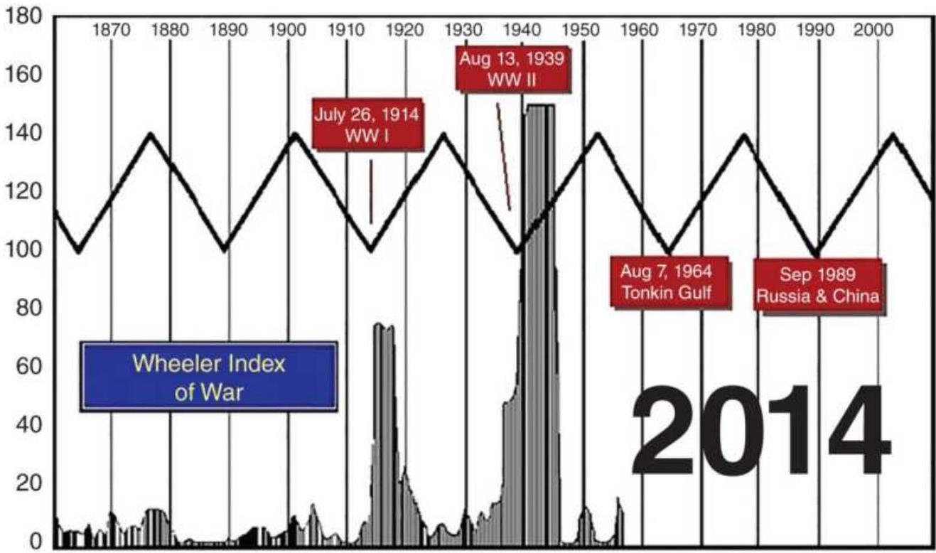
Copyright 1998, 1985, 1979 Princeton Economic Institute
FIGURE 11.6 The Wheeler Index of War.
Source:https://www.armstrongeconomics.com/writings/20 2/cycle-of-war-political-economy/.
\section*{The Kondratieff Wave}
Much of the popularity of cycles is due to the publicity of Nicolai Kondratieff's 54-year cycle, known as the Kwave, or more recently, the long wave. It corresponds to Armstrong's 54-year Sociopolitical Cycle. During its documented span from about 1780 to the present, it appears to be very regular, moving from highs to lows and back again. In Figure 11.7 the Kondratieff wave is seen with the S\&P, the PPI, and other indicators to show
its relationship to economic health. \({ }^{3}\) With only three full cycles completed, it is difficult to tell if the overall trend is moving upward, or whether the entire pattern is just a coincidence.
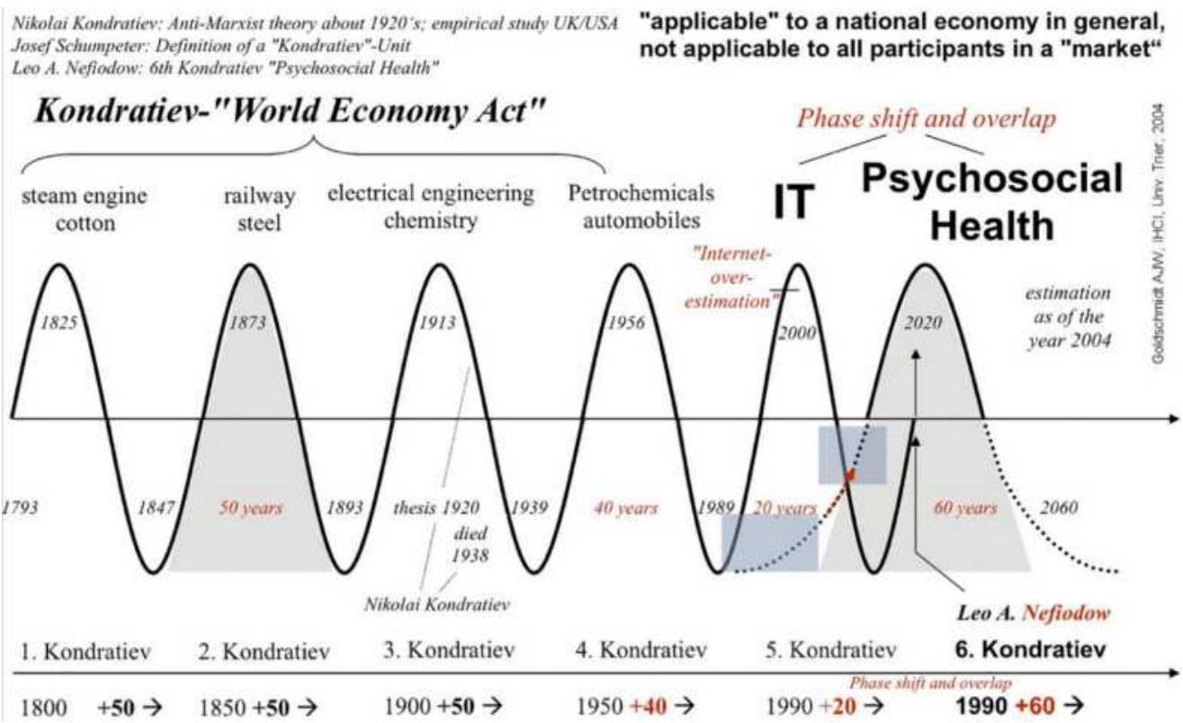
FIGURE 11.7 The Kondratieff Wave (along the bottom), as of 2000 .
Source:www.financialsense.com.
The forecast of the \(K\)-wave, shown in Figure 11.7, corresponds to a sharp decline in wholesale prices due at about the year 1990, the millennium's equivalent to the depression of the 1930s. In fact, the 1990 posted remarkable gains in the stock market, peaking at the beginning of 2000. According to the chart pattern, this peak should be followed by 10 to 20 years of downturn in the economy, in which case we are in the middle, having experienced a major correction in 2008. It should be
noted that the peaks of the four waves are of different duration, 1870 being the shortest and the recent one in 2000 the longest.
An updated version of the Kondratieff Wave, published in the Allianz 2010 report to investors (Figure 11.8), shows the bottom of the cycle just after the 2008 financial crisis, followed by a partial economic recovery. If we continue through 2017, that recovery was substantial. But if the half-cycle is 27 years, it should continue until 2035. We only hope it does.
Although we all accept the existence of an economic cycle, pinpointing the peaks and valleys is impractical. Even if the 54 -year period varied only by \(10 \%\), we could be entering the market five years too soon or too late. Determining long-term cycles for any market has the same problem - the actual price pattern will never correspond exactly to the predicted peaks and valleys. Most investors will opt for shorter time frames. Both short-term and longer cycles will be more useful when combined with other strategies, as we will see throughout this chapter. However, some investors will want to keep this big-picture concept, both the business cycle and the Kondratieff wave, as a general guide to investment timing.
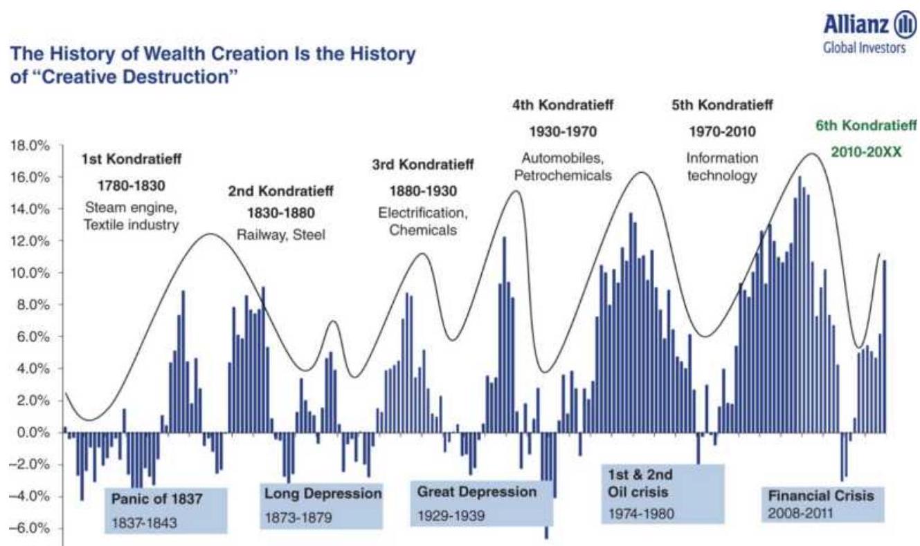

FIGURE 11.8 Another representation of the Kondratieff Wave.
Source: Hans-Jörg Naumer, Allianz GI Global Capital Markets \& Thematic Research; data as of 31.12.2018.
\section*{Presidential Election Cycle}
Of all the events that move the market, the presidential elections have been the most consistent. The patterns stem from the motivation of the incumbent party to provide good economic news to the voters prior to the election year, and as far into the election year as possible. Stock market action during the election year is always more erratic, as parties battle over the value of each other's actions.
History shows that the year preceding the election (year
3 in the president's term), until recently, posted the strongest gains for the market, followed by a reasonably strong election year, as shown in Figure 11.9. Some analysts have been more specific by starting on October 1 of the previous year. The two years after the election show returns below average as the reality of politics reasserts itself and the new administration tries to implement campaign promises that turn out to be unpopular. More recently, it is only in the first year that the president can deliver on campaign promises.
Beginning in the second year, the midterm election of members of Congress becomes more important. A better year follows ahead of the midterm elections, which have become a more important political event than in the past. \({ }^{4}\)
\section*{THE PRESIDENTIAL CYCLE}
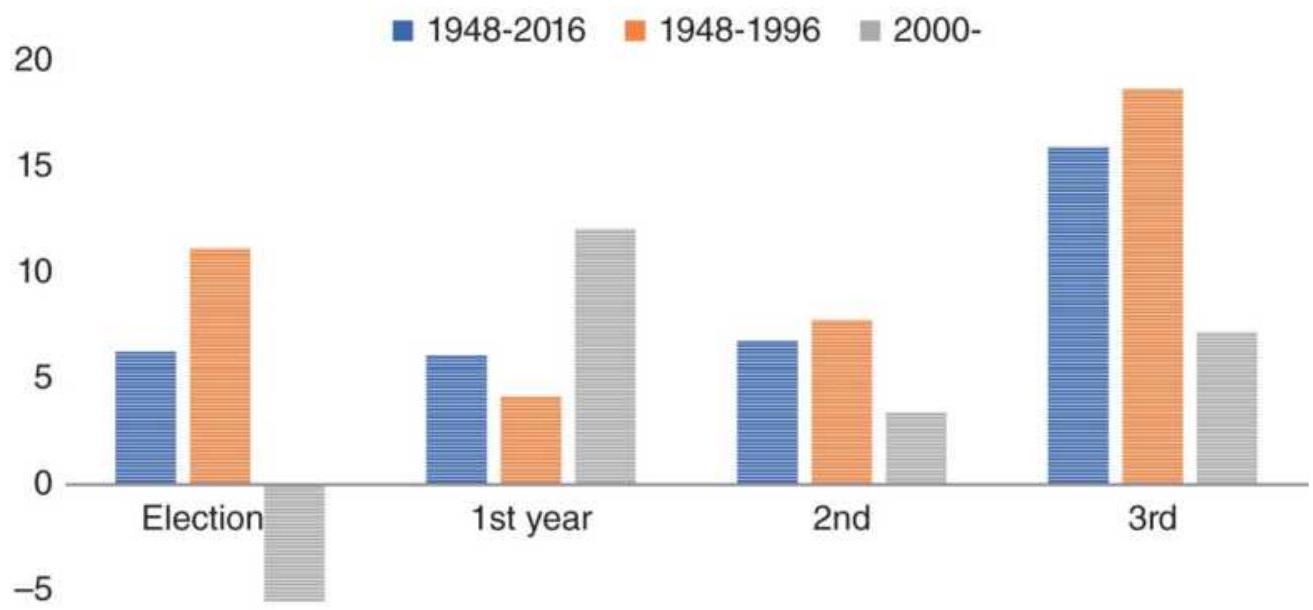
\(-10\)
FIGURE 11.9 Returns of the Dow Jones Industrials in the presidential cycle.
There is an additional 8-year cycle that may be interesting; 5 however, the 8 -year period is important if it represented only those years in which the same president was in office. Actions by a president who cannot be reelected are likely to be different from one who seeks another term; therefore, we should expect a different pattern. This can be made more complicated by studying the patterns preceding and following a change of party, all of which have a basis in the behavior of the political parties and the voters.
More sophisticated computer software, such as that provided by Logical Information Machines, \(\underline{6}\) a Chicago firm, can produce a very interesting, closer view of how voters respond to election politics. Table 11.3 breaks the election year into seven periods between the key events for those years in which the stock market began the election year within \(8 \%\) of its 2-year high price (days refers to business days):
1. The returns of the year preceding the election year
2. The first 10 days of the new year, typically a strong period (days \(\mathrm{O}-10\) )
3. Through the State of the Union address and the primaries (days 10-83)
4. Waiting for the conventions (days \(83-161\) )
5. Pre-election blahs: the actual campaign (days 161195)
6. The election to year-end reaction (days 195-253)
7. Combined periods (2) \(+(4)+(6)\)
TABLE 11.3 Election year analysis for years in which the stock market began the year within \(8 \%\) of the previous 2-year highs.
Source: Data from Michael Carr, Logical Information Machines.
\begin{tabular}{|c|c|c|c|c|}
\hline Year & \begin{tabular}{|c|}
1. \\
Previous \\
Year
\end{tabular} & \begin{tabular}{c|}
First \\
( \\
2. \\
weeks \\
(1- \\
10)
\end{tabular} & \begin{tabular}{|c|}
3. \\
Primaries \\
(10-83)
\end{tabular} & \begin{tabular}{l}
4. Pre- \\
convention \\
\(\left(83^{-161}\right)\)
\end{tabular} \\
\hline 1936 & 41.82 & .2 .76 & .4 .64 & 11.91 \\
\hline 1944 & 19.45 & . 1.63 & -0.84 & .9 .27 \\
\hline 1952 & 16.15 & . 1.60 & -2.82 & . 8.02 \\
\hline 1956 & 27.25 & -1.78 & .5 .42 & .3 .16 \\
\hline 1960 & . 8.48 & -2.49 & -5.75 & . 2.94 \\
\hline 1964 & 18.89 & . 1.79 & .4 .44 & 3.03 \\
\hline 1968 & 20.03 & .0 .26 & -0.10 & . 1.44 \\
\hline 1972 & 10.82 & .1.41 & .3 .39 & .5 .30 \\
\hline 1980 & 12.31 & .2 .26 & -5.42 & 18.57 \\
\hline 1984 & 17.53 & . 1.27 & -5.01 & 4.27 \\
\hline 1992 & 26.30 & . 0.80 & -2.72 & .2 .14 \\
\hline Average & 19.91 & . 0.86 & -0.44 & .6.37 \\
\hline
\end{tabular}
Combining the three periods (2), (4), and (6), which have strong upward biases, gives consistently positive results. Even if the newly elected party fails to deliver on
their campaign promises, traders could have already converted those marketing gimmicks into stock market profits.
\section*{Presidential Cycle Internals}
The final returns of the years, or the averages, do not tell us everything. Volatility within each year of the cycle can make us aware of the uncertainty of the results. We know that each cycle could vary considerably from the average, in particular during the 1987 crash, the 2000 Internet bubble, and the 2008 financial crisis, so the average can hide a lot of volatility. We can see this volatility in Figure 11.10. Although the election year and the two years that follow showed stable average returns (seen in Figure 11.9), the election year had a \(39 \%\) loss in 2010 . Other years have been much more stable, with the third year the most consistent.
We also know that the years after the financial crisis (2008) saw a remarkable bull market; then it should not be surprising that the last two cycles show profits. Figure 11.11 takes a closer look at the yearly returns, showing each cycle from 1948 to 2016. Remembering that there is an upward bias in the stock market, we should expect each year of the 4 -year cycle to be positive, on average. The election year may be distorted by 2008 but seems to be less positive and more sideways during the past four cycles. The first year in office (2017) has been generally good since 1985. The second year, when a new congress is elected, is erratic. Historically, the third year has been the most successful for the market, but the last two cycles, 2008 and 2012, have suffered from a
congressional stalemate. Hopefully, patterns will revert to something closer to normal.
Range of returns, all years
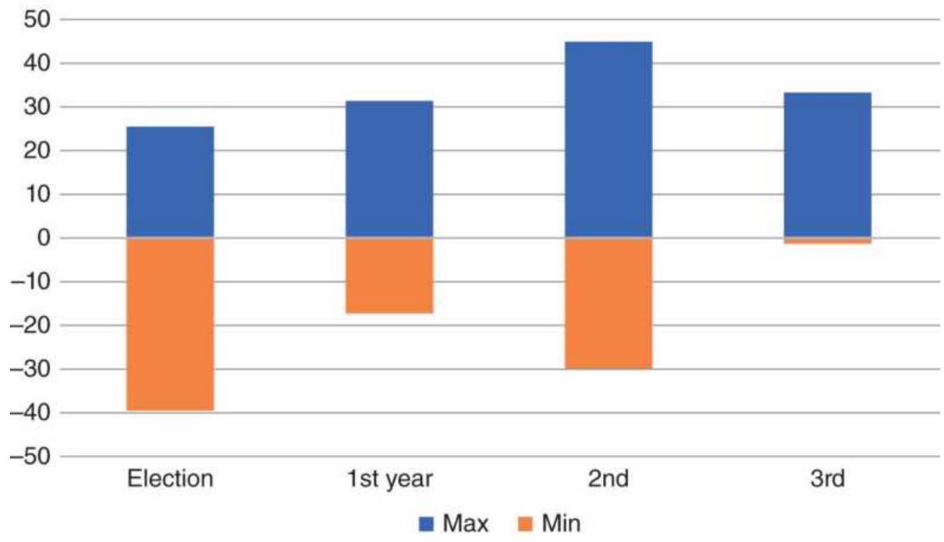
FIGURE 11.10 Volatility range, separated by presidential cycle, from 1948 to 2016. Only the 3rd year of the cycle has low volatility.
\section*{Trading the Cycle}
If we look at the accumulated profits from trading each cycle year (Figure 11.12) there is the overall upward bias, but only the 2016 election year seems to be failing after a long run of success. Have the markets really changed? If we look at the humor of the past 150 years, we might conclude that nothing changes.
"Suppose you were an idiot. And suppose you were a member of Congress. But I repeat myself."
"Politics is the art of looking for trouble, finding it everywhere, diagnosing it incorrectly, and applying the wrong remedies."
- Groucho Marx
And more recently,
"Our intent will not be to create gridlock. Oh, except maybe from time to time."
- Bob Dole
If we look to the past for answers, we should expect the long-term patterns to continue. There will be price shocks from time to time that disrupt the market. The shock in 2008 was larger than usual, but not any worse than 1929 or 1987 . Over time, both positive and negative runs become longer, and at inflated prices, shocks will appear larger. We should not confuse normal variability with structural change. Much like a commodity cycle, which can be temporarily disrupted by bad weather, the last two presidential cycles may be an exception.
Election year
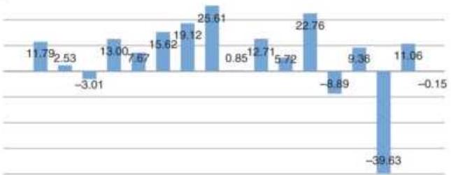
194819521956196019641966197219761980198419881992199620002004200820122016
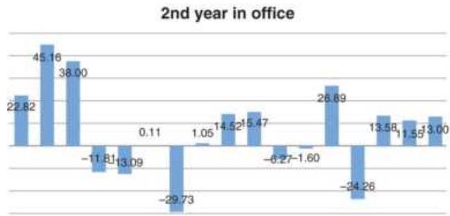
19501954195819621966197019741978196219861990199419982002200620102014 1st year in office
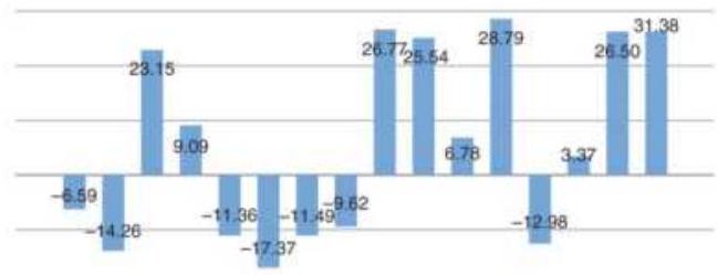
194919531957198119651969197319771981198519891993199720012005200920132017
(a)
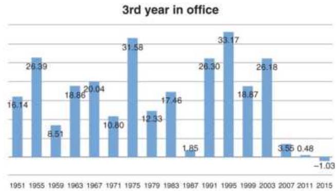
(b)
\section*{FIGURE 11.11 Detail of the election-year cycle. Each chart shows the history of one year in the cycle.}
\section*{Cumulative returns by 4-year cycle}
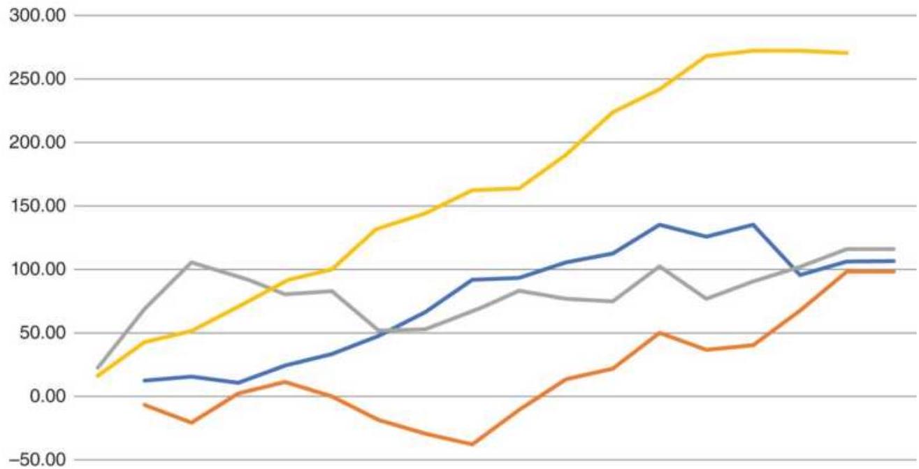
\(-100.00\)
194819521956196019641968197219761980198419881992199620002004200820122016
—_Election—1st year——2nd year Cum 3rd
FIGURE 11.12 Cumulative returns trading each cycle year.
\section*{UNCOVERING THE CYCLE}
Before resorting to the highly mathematical methods for finding cycles, there are some simple approaches that may serve many traders. For example, if you believe that the dominant cycle has a 20-day period, then you simply create a new price series by subtracting the 20-day moving average (lagged 10 days) from the corresponding prices. This removes the trend that may obscure the cycle. This is the same method used for removing seasonality, which subtracted the values of a 1-year trend, lagged 6 months, from the prices. Alternatively,
you can take the 20-day differences \(\left(p_{t}-p_{t-20}\right)\), which effectively removes the 20-day trend, or the first differences, which removes all trends.
Most oscillators, such as a stochastic or RSI, can also serve to identify a price cycle; however, if you want to see the peaks and valleys of a 20-day cycle, you will need to use a calculation period for the oscillators that is no more than 10 days.
\section*{Removing the Trend}
The cycle can be found more easily by removing the price trend. While we traditionally only use one trendline, lag that trend by one-half it's calculation period, and subtract the lagged values from the price, it is also possible to use two trends. \({ }^{7}\) The idea is that a smoother trendline will result in a better detrended series.
First smooth the data using two exponential or simple moving averages, where the longer average is half the period of the dominant cycle (using your best guess), and the shorter one is half the period of the longer one. Then subtract the value of one trendline from the other, in the manner of an MACD indicator. While the article by Johnson calls for using this synthetic series, it would be more consistent with the nature of detrending if that series, lagged by one-half the longer period, was subtracted from the original price series.
Using any double-smoothed trend will be smoother than a single trend. For a trend-following strategy, the lag is usually unacceptable, but for detrending, the double-
smoothed trend is centered (lagged by one-half the period) before subtracted from the price series, so the lag is not important.
\section*{Using Triangular Weighting}
One method for enhancing the cycle is to use triangular weighting instead of equal weighting. The weighting is triangular because the weighting factors are smallest at the ends and largest in the middle, and typically symmetric. If you assume the end values are 1.0, you must first decide the calculation period and the weighting factor for the center price. The calculation period must be an odd number so that there is a center price, or you can give the two center prices the same weight. For example, we can use a period of \(P=9\) and give the center price the weight of 2.0 , then \(\mathrm{w}_{1}=1.0\)
\[
\begin{aligned}
& w_{2}=w_{1}+\left(w_{5}-w_{1}\right) / \operatorname{INT}(P / 2)=1.25 \\
& w_{3}=w_{2}+\left(w_{5}-w_{1}\right) / \operatorname{INT}(P / 2)=1.50 \\
& w_{4}=w_{3}+\left(w_{5}-w_{1}\right) / \operatorname{INT}(P / 2)=1.75 \\
& w_{5}=2.0 \\
& w_{6}=w_{5}-\left(w_{5}-w_{1}\right) / \operatorname{INT}(P / 2)=1.75 \\
& w_{7}=w_{6}-\left(w_{5}-w_{1}\right) / \operatorname{INT}(P / 2)=1.50 \\
& w_{8}=w_{7}-\left(w_{5}-w_{1}\right) / \operatorname{INT}(P / 2)=1.25 \\
& w_{9}=1.0
\end{aligned}
\]
where INT returns the integer value. The triangular average (TMA) is calculated in the same way as a weighted average:
\(T M A_{t}=\left(w_{1} \times p_{t-p+1}+w_{2} \times p_{p_{-p+2}}+\ldots+w_{p_{-1}} \times p_{p_{t}}\right) / \operatorname{SUM}\left(w_{t-p+1}, \ldots, w_{t}\right)\)
Enhancing the cycle requires that you calculate two triangular averages, one of which is half the period of the other, then take the difference of the two. The resulting smooth curve, called a triangular MACD in Figure 11.13, shows the enhanced cyclic pattern of IBM (shown for one year) based on 63 days (about the number of days in a calendar quarter) under the assumption that cycles are likely to be related to periodic earnings releases. Figure 11.14 uses a full year, 252 days as the primary cycle, with back-adjusted corn prices covering more than five years.

While this method creates a smooth representation of cyclic movement, it has the characteristics of a momentum indicator because the peaks and valleys are not evenly spaced and the amplitude of the cycles varies considerably. However, the smoothness of the indicator allows you to anticipate the major changes in the direction of prices, a technique discussed in double-smoothing. The programTSM Triangular MACD is available on the Companion Website.
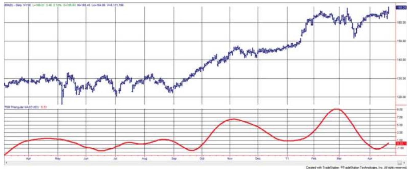
FIGURE 11.13 A 20-10 triangular MACD applied to IBM.
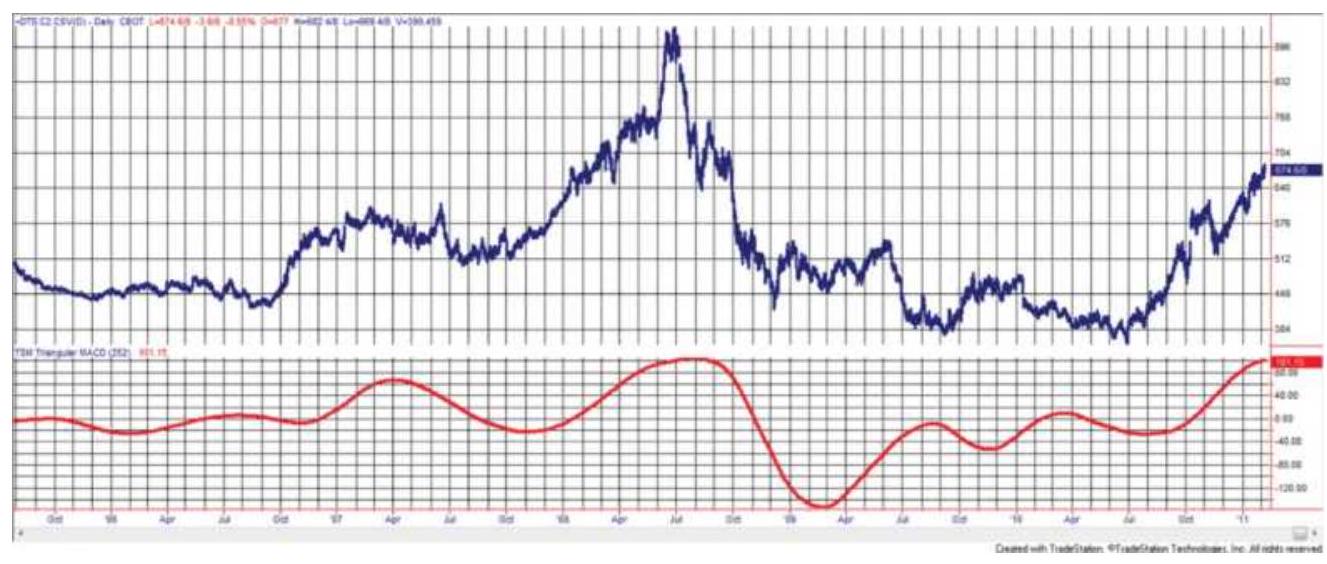
FIGURE 11.14 A 252-126 triangular MACD applied to back-adjusted corn futures.
\section*{Terminology}
Before getting technical about the measurement and calculation of cycles, there are a few terms that describe most of the concepts discussed throughout this chapter. Note that the use of wave and cycle is interchangeable.
Cycle or wave. A recurring process that returns to
its original state.
Amplitude (a). The height of the wave (the y -axis) from its horizontal midpoint.
Period (T). The number of time units necessary to complete one wavelength (cycle).
Frequency \((w)\). The number of wavelengths that repeat every \(360^{\circ}\), calculated as \(\omega=1 / T\).
Phase. A measurement of the starting point or offset of the cycle relative to a benchmark wave.
Phase angle. Locates the position within the cycle measured as the minute hand of a clock moving clockwise, where \(0^{\circ}\) is 3 o'clock.
Left and right translation. The tendency for a cycle peak to fall to the left or right of the center of the cycle, similar to skew.
\section*{Trigonometric Price Analysis}
Although there is statistical software that can find the cycle period with little trouble, some analysts still find it useful to know just how it can be done. Cycles can be found using the trigonometric functions sine and cosine. These functions result in what are called periodic waves because they repeat every \(360^{\circ}\) or \(2 \pi(2 \mathrm{pi}\) ) radians, where \(\pi=3.141592\). Because radians can be converted to degrees using the relationship:
\[
1 \text { degree }=\frac{2 \pi}{360}
\]
all the work that follows will be in degrees.
A simple sine wave fluctuates back and forth from
+1 to \(-1(0,+1,0,-1,0)\) for each cycle (one wavelength) as the degrees increase from \(0^{\circ}\) to \(360^{\circ}\) (see Figure 11.15). To relate the wavelength to a specific distance in boxes (or days, on graph paper), simply divide \(360^{\circ}\) by the number of boxes in a full wavelength, resulting in the box size (in degrees). For example, a 10o-box cycle would give a value of \(3.6^{\circ}\) to each box or day. The wavelength can be changed to something other than \(360^{\circ}\) by using the frequency, \(\omega\), as a multiplier of the angle of the sine wave, \(\varphi\) :
\[
\begin{gathered}
\sin \omega \phi \\
y=a \sin (\omega \phi+b)
\end{gathered}
\]
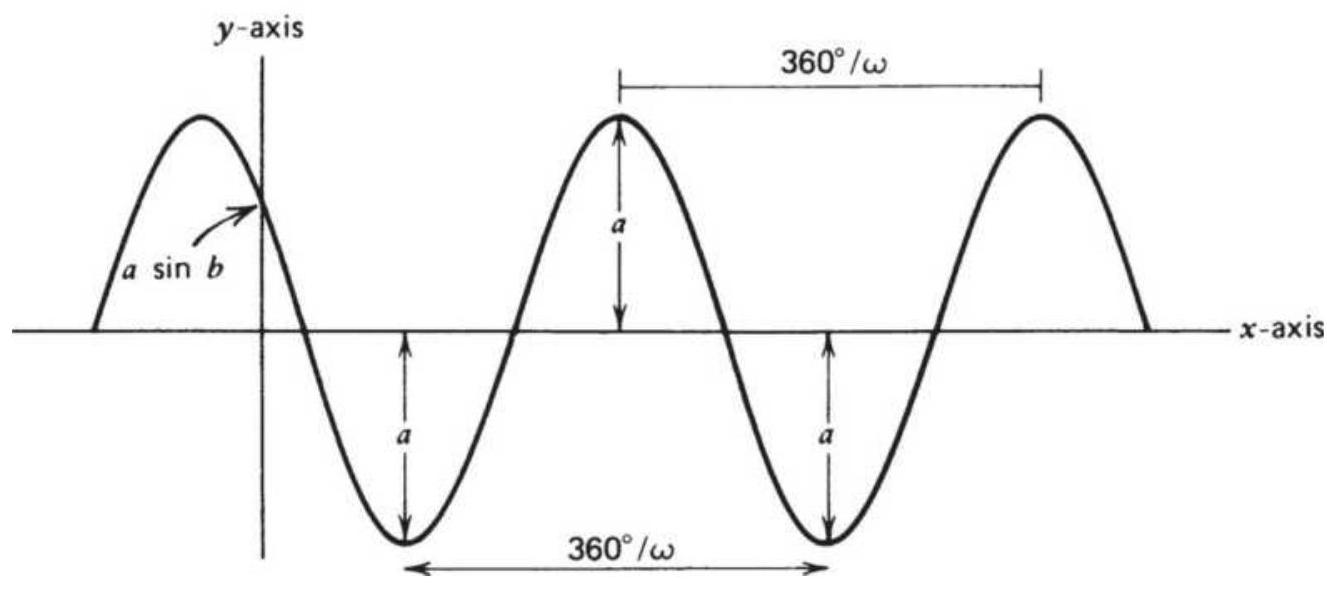
FIGURE 11.15 Sinusoidal (sine) wave.
If \(\omega>1\), the frequency increases and the wavelength shortens to less than \(360^{\circ}\); if \(\omega<1\), the frequency decreases and the wavelength increases. Because \(\omega\) is the
frequency, it gives the number of wavelengths in each \(360^{\circ}\) cycle. To change the phase of the wave (the starting point), the value \(b\) is added to the angle:
\section*{\(\sin (\omega \varphi+b)\)}
If \(b\) is \(180^{\circ}\), the sine wave will start in the second half of the cycle; the phase value \(b\) serves to shift the wave to the left. The amplitude can be changed by multiplying the resulting value by a constant \(a\). Because the sine value ranges from +1 to -1 , the new range will be \(+a\) to \(-a\) (Figure 11.8). This is written \(a \sin (\omega \phi+b)\).
There are few examples of price movement that can be represented by a single wave; therefore, two sine waves (or more) must be added together to form a compound wave:
\[
y=a_{1} \sin \left(\omega_{1} \varphi+b_{1}\right)+a_{2} \sin \left(\omega_{2} \varphi+b_{2}\right)
\]
Each set of characteristic variables, \(a_{1}, \omega_{1}, b_{1}\), and \(a_{2}, \omega_{2}, b_{2}\), can be different, but both waves are measured at the same point \(\varphi\) at the same time. Consider an example that lets the phase constants \(b_{1}\) and \(b_{2}\) be zero. Then:
\[
\begin{aligned}
y_{1} & =3 \sin 4 \varphi \\
y_{2} & =5 \sin 6 \varphi \\
y & =y_{1}+y_{2}
\end{aligned}
\]
Figure 11.16 shows the individual regular waves \(y_{1}\) and \(y_{2}\), and the compound wave \(y\) over the interval \(o^{\circ}\) to \(180^{\circ}\). Note that both \(y_{1}\) and \(y_{2}\) began the normal upward cycle at \(0^{\circ}\); by \(180^{\circ}\), however, they are perfectly out of phase. During the next \(180^{\circ}\), the two waves come back into phase.
When combining periodic waves, it is useful to know the maximum and minimum amplitude of the resulting wave. Because the peaks of the two elementary waves do not necessarily fall at the same point, the maximum amplitude of either wave may not be reached. A mathematical technique called differentiation is used to find the maximum and minimum amplitudes. The first derivative, with respect to angle \(\varphi\), is written \(d y / d \varphi\) or \(y^{\prime}\), where \(y\) is the formula to be differentiated. In the examples below, \(y\) is replaced by the term in the parenthesis on the left. The rules are:
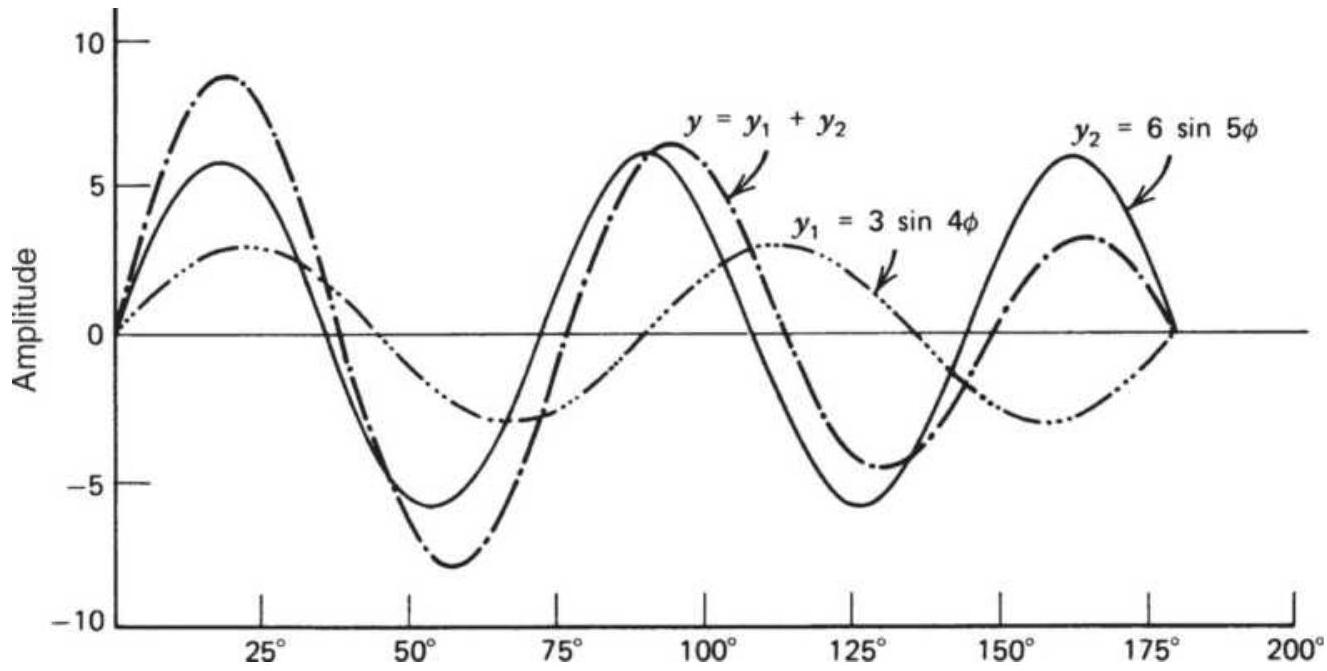
FIGURE 11.16 Compound sine wave.
\(\frac{d}{d \varphi}(\sin \varphi)=\cos \varphi ; \quad \frac{d}{d \varphi}(\cos \varphi)=-\sin \varphi\)
\[
\frac{d}{d \varphi}(\sin \omega \varphi)=\omega \cos \omega \varphi
\]
\[
\frac{d}{d \varphi}(\sin (\omega \varphi+b))=\omega \cos (\omega \varphi+b)
\]
\(\frac{d}{d \varphi}\left(a_{1} \sin \left(\omega_{1} \varphi+b_{1}\right)+a_{2} \sin \left(\omega_{2} \varphi+b_{2}\right)\right)\)
\[
=a_{1} \omega_{1} \cos \left(\omega_{1} \varphi+b_{1}\right)+a_{2} \omega_{2} \cos \left(\omega_{2} \varphi+b_{2}\right)
\]
Applying this method to the previous example:
\[
\begin{gathered}
y=3 \sin 4 \varphi+6 \sin 5 \varphi \\
\frac{d y}{d \varphi}=y^{\prime}=12 \cos 4 \varphi+20 \cos 5 \varphi
\end{gathered}
\]
The points of maximum and/or minimum value occur when \(y^{\prime}=0\). For \(y_{1}^{\prime}=12 \cos 4 \varphi\), the maxima and minima occur when \(4 \varphi=90^{\circ}\) and \(270^{\circ}\)
\(\left(\varphi=22 \frac{1}{2}{ }^{\circ}\right.\) and \(\left.671 / 2^{\circ}\right)\) (Figure 11.16). For \(y_{2}^{\prime}=30 \cos 5 \varphi\), the maximum and minimum values
occur at \(5 \varphi=90^{\circ}\) and \(270^{\circ}\left(\varphi=18^{\circ}\right.\) and \(\left.54^{\circ}\right)\). It must be pointed out that the first derivative identifies the location of the extreme highs and lows, but does not tell which one is the maximum and which is the minimum. The second derivative, \(y^{\prime \prime}\), calculated by taking the derivative of \(y^{\prime}\), is used for this purpose:
\[
\text { If } y^{\prime}(x)=0 \text { and } y^{\prime \prime}(x)>0 \text {, then } \mathrm{y}(\mathrm{x}) \text { is a }
\]
minimum.
\[
\begin{aligned}
& \text { If } y^{\prime}(x)=0 \text { and } y^{\prime \prime}(x)<0 \text {, then } \mathrm{y}(\mathrm{x}) \text { is a } \\
& \text { maximum. }
\end{aligned}
\]

Then, \(y_{1}=221 / 2^{\circ}\) and \(y_{2}=18^{\circ}\) are maxima and \(y_{1}=671 / 2^{\circ}\) and \(y_{2}=54^{\circ}\) are minima.
Anyone interested in pursuing the analysis of extrema will find more complete discussions in a text on calculus.
\section*{A Corn Example}

It is not likely that any trader will want to go through the process of solving the trigonometric regression each day in order to get a forecast price. Anyone wanting to do that will find the Fortran programs, TSM Single Frequency Trigonometric Regression and TSM 2-Frequency Trigonometric Regression, given on the Companion Website. These can be easily adapted to any programming language.
\section*{TABLE 11.4 Corn setup for Solver solution.}
\begin{tabular}{|c|c|c|c|c|c|c|c|c|}
\hline 4 & A & B & C & D & E & F & G & H \\
\hline 1 & Date & Seq & Close & Detrend & Solve & Restore & \multicolumn{2}{|c|}{ Solver values } \\
\hline 14 & 8/31/1979 & 13 & 288.5 & -15.33 & -16.5383 & 271.9617 & \(a=\) & 0.008553 \\
\hline 15 & 9/28/1979 & 14 & 280.75 & -16.12 & -17.4143 & 263.3357 & \(b=\) & -2.23011 \\
\hline 16 & 10/31/1979 & 15 & 249.5 & -3.54 & -4.92209 & 244.5779 & \(\mathrm{w}=\) & 0.047532 \\
\hline 17 & 11/30/1979 & 16 & 270.5 & 1.44 & -0.02286 & 270.4771 & sum \(=\) & 34.70089 \\
\hline 18 & 12/31/1979 & 17 & 271.75 & 5.98 & 4.437372 & 276.1874 & & \\
\hline 19 & 1/31/1980 & 18 & 260.75 & 27.27 & 25.65109 & 286.4011 & & \\
\hline 20 & 2/29/1980 & 19 & 263 & 11.83 & 10.13769 & 273.1377 & & \\
\hline 21 & 3/31/1980 & 20 & 249.25 & 20.02 & 18.26273 & 267.5127 & & \\
\hline 22 & 4/30/1980 & 21 & 260.75 & 11.71 & 9.89173 & 270.6417 & & \\
\hline 23 & 5/30/1980 & 22 & 266.75 & -19.94 & -21.8213 & 244.9287 & & \\
\hline 24 & 6/30/1980 & 23 & 276.75 & 0.46 & -1.47242 & 275.2776 & & \\
\hline 25 & 7/31/1980 & 24 & 327.25 & -0.94 & -2.92684 & 324.3232 & & \\
\hline
\end{tabular}
Instead, we will use Excel's Solver to speed up the process. Using monthly corn prices, which we know has a cycle, we enter monthly data from 1978 through May 2018, shown in Table 11.4. Monthly prices are in column \(A\), a sequential number in \(B\), and the end-of-month prices in C. Column \(D\) is the detrended value, the 12month trend lagged by 6-months. Cell D14 \(=\mathrm{C} 7-\)
\section*{AVERAGE(C2:C14).}
Using the detrended data in column D and D minus the trigonometric equation in column E, Solver can be set as shown in Figure 11.17 to solve the equation \(y=a \cos w t+b \sin w t\)
Cell H14 \(=\) value of \(a\)
Cell H15 = value of \(b\)
Cell H16 = value of \(w\)
Cell H17 = standard deviation of all values in column E Solver changes the values in H14, H15, and H16 in order to minimize the solution in cell H17. Each of the cells H14, H15, and H16 can vary from -100 to +100 . The solution is shown on the spreadsheet as 34.7 in H17.
To:

(c) Min
Value of: 0
By Changing Variable Cells:
Subject to the Constraints:
SHS14 \(<=100\)
SHS14 \(>=-100\)
SHS15 \(<=100\)
SHS15 \(>=-100\)
SHS16 \(<=360\)
\begin{tabular}{c}
\(\square\) Add \\
\(\square\) Change \\
\hline Delete \\
\hline
\end{tabular}
FIGURE 11.17 Solver screen for corn solution.
FIGURE 11.18 Corn with trigonometric fit using Solver.
The next step is to add the solution in column E, based on the detrended data, back to the closing prices in column \(C\) to get the final solution in column F. Figure 11.18 plots the first values of both the monthly corn prices and the trigonometric solution. The solution shows a slightly smoother and less volatile forecast.
\section*{2-Frequency Trigonometric Regression}
The combination of more than one set of sine and cosine waves of varying amplitudes and frequencies creates a better fit than a single-frequency solution. This is analogous to the use of a second-order (curvilinear) solution instead of the first-order linear regression. The equation for the 2 -frequency cycle is:
\[
y_{t}=a_{1} \cos \omega_{1} t+b_{1} \sin \omega_{1} t+a_{2} \cos \omega_{2} t+b_{2} \sin \omega_{2} t
\]

To find the results of this complex wave, apply the same techniques used in the single-frequency approach. The algebra for solving this problem is an expanded form of the previous solution, and the use of a computer is a requirement (available on the Companion Website as "Trigonometric Regression for Finding Cycles").
Rather than using this complex approach, we can again turn to Solver to provide an answer. Add the three new parameters \(\mathrm{H} 17=\mathrm{a} 2, \mathrm{H} 18=\mathrm{b} 2\), and
H19 = w2. Move the solution SUM to cell H20. Then:
\[
E 17=\text { D17 }-(\$ H \$ 14 * \operatorname{COS}(\$ H \$ 16 * \$ B 16)+\$ H \$ 15 * S I N(\$ H \$ 16 * \$ B 16)
\]
\[
+\$ H \$ 17 * \operatorname{COS}(\$ H \$ 19 * \$ B 16)+\$ H \$ 18 * S I N(\$ H \$ 19 * \$ B 16))
\]

1 Add the constraints for H17, H18, and H19 to the Solver criteria and solve. We get an answer very similar to the single frequency solution, no doubt because corn has a clear yearly cycle. The setup can be found on the Companion Website as TSM Corn 2-Frequency Trig Regression Solution. You can replace the corn prices with any monthly price series.
\section*{Fourier Analysis: Complex Trigonometric Regression}
This sophisticated method can be a simple solution to finding cycles if you apply Excel's add-in program or any of a number of statistical software applications that are available at reasonable cost. For those of you not
interested in the math, skip to the section "Using Excel's Fourier Analysis."
Developed by the French mathematician Jean-Baptiste Joseph Fourier, Fourier analysis is a method of complex trigonometric regression that expresses any data series as a series of sine and cosine waves of the same type as discussed in the previous sections.
It should be understood that Fourier analysis, or the more popular and efficient Fast Fourier Transform \((F F T)\), is not reliable unless the data is stationary; therefore, it must be detrended. Agricultural products are most likely to be candidates for this method. Some stocks that are traditionally seasonal or cycle would work unless they had a structural change, such as an
acquisition, that would materially affect its operating cycle. In this section FFT will be applied to corn, to see if the results are similar to the seasonality results from the previous chapter, and to Southwest Airlines, which represents a company dependent on seasonal travel and without diversification. For best results, it may be necessary to remove the rate of inflation or the USD exchange rate from the series to make it more stable.
\section*{Basic Fourier Calculations}
Assuming that there is a cycle and that there are \(N\) data points in each repetition of this cycle, the Fourier method of analysis shows that the \(N\) points lie on the regression curve:
\section*{\(y_{i}=1+\sum_{k=1}^{(N / 2)}\left(u_{k} \cos \frac{2 \pi k i}{(N / 2)}+v_{k} \sin \frac{2 \pi k i}{(N / 2)}\right)\)}
where the regression coefficients \(u_{k}\) and \(v_{k}\) are given by:
\[
\begin{aligned}
u_{k} & =\frac{1}{(N / 2)} \sum_{i=1}^{N} y_{i} \cos \frac{2 \pi k i}{(N / 2)}, k=1,2, \cdots, \frac{N}{2} \\
v_{k} & =\frac{1}{(N / 2)} \sum_{i=1}^{N} y_{i} \sin \frac{2 \pi k i}{(N / 2)}, k=1,2, \cdots, \frac{N}{2} \\
v_{N / 2} & =0
\end{aligned}
\]
It is important to see that the mean of all the points on one cycle is equal to the value 1 . The \(N\) values of \(y_{i}\) will have the property:
\[
\sum_{i=1}^{N} y_{i}=N
\]
Applying the Fourier series to the seasonal component will help clarify this method. Seasonal data form the most obvious cycle. Using average monthly prices, detrend the data to avoid letting the trend overwhelm the cycle, letting \(N=12\). It is also known that seasonally adjusted prices will vary about the mean; hence the
weighting factors will have the same property as the above equation. With this information, the trigonometric curve that approximates the seasonality can be generated and compared with the results of other methods. \(-\frac{8}{8}\)
Excel provides Fourier analysis as an analytic add-in under Tools/Data analysis. Instructions and examples will follow in the section "Using Excel's Fourier Analysis."
\section*{Spectral Analysis}
Derived from the word spectrum, spectral analysis is a statistical procedure that isolates and measures the cycles within a data series. The specific technique used is the Fourier series as previously discussed, although other series can be used.
When studying the cycles that comprise a data series, it is important to refer to their phase with respect to each other. Phase is the relationship of the starting points of different cycles. For example, if one cycle has the same period as another but its peaks and valleys are exactly opposite, it is \(180^{\circ}\) out of phase. If the two cycles are identical in phase, they are coincident. Cycles with the same period may lead or lag the other by being out of phase to various degrees.
A tool used in spectral analysis to visualize the relative significance of a series' cyclic components is the periodogram. Weighting the cyclic components in the periodogram will yield the more popular spectral density diagram, which will be used to illustrate the results of the spectral analysis. Density refers to the frequency of
occurrence. Figures 11.19 a and \(11.19 b\) show the spectral density of a series composed of three simple waves ( \(D\) is the Fourier series made up of waves \(A, B\), and \(C\) ). \({ }^{9}\) The cycle length, shown at the bottom of the spectral density chart, corresponds exactly to the cycle length of the component waves \(A, B\), and \(C\). The spectral density, measured along the left side of Figure 11.19b, varies with the amplitude squared of the cycle and the magnitude of the noise, as well as random price movements, which tend to obscure the cycle. In Figure 11.19b, the result is based on a series composed of only three pure waves. Had there been noise of the same magnitude as the underlying cycle amplitude, those cycles identified by the spectral analysis would have been completely obscured. Readers who have studied ARIMA will recognize the similarity between the spectral density and the correlogram.
As in trigonometric regression analysis, other basic price components can distort the results. A noticeable trend in the data must be removed or it may be interpreted as the dominant cycle. The familiar methods of first differencing or linear regression can be used to accomplish this. The seasonal component is itself a cycle and does not need to be removed from the series.
Because spectral analysis identifies both the seasonal and cyclic component, the success of the results will depend on the strength of these waves compared to the noise that remains. In applying this technique to real data, it would not be surprising to see results similar to Figure 11.20. Three subcycles of length 10, 20, and 40 days are shown as part of a 250-day (seasonal) cycle,
where the days are trading days, not calendar days. Notice that, as the cycle lengthens, the width of the spectral density representation widens. This does not mean that the wider peaks are more important.
(a)
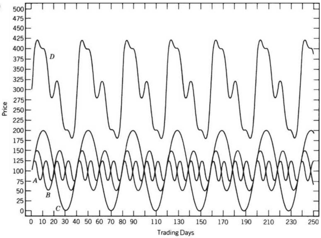
(b)
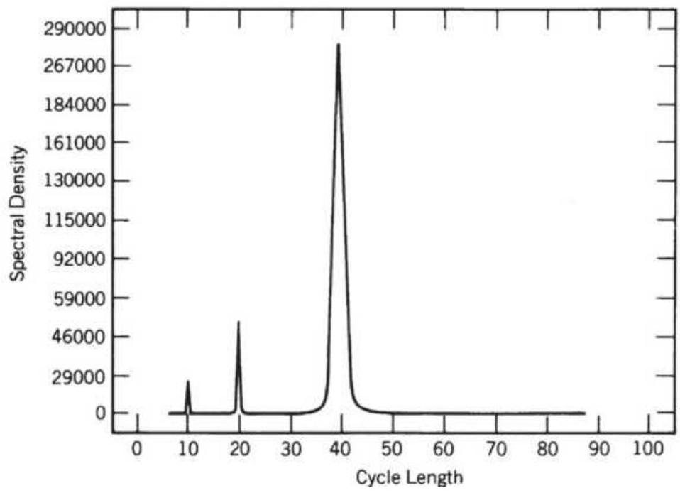
FIGURE 11.19 Spectral density. (a) A compound wave D, formed from three primary waves, A, B, and C. (b) Spectral density of compound wave D.
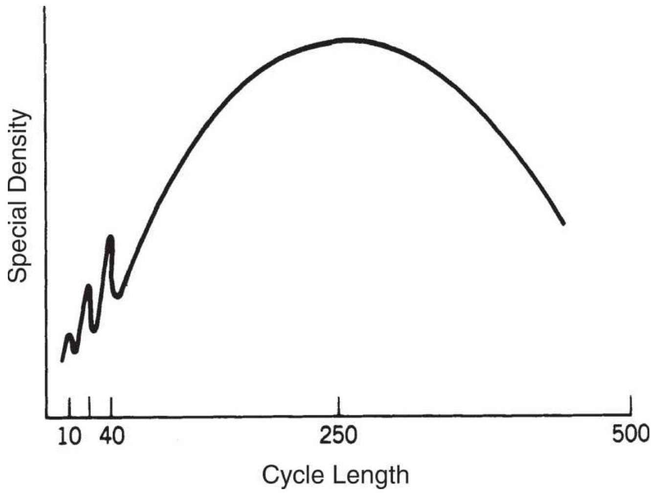
FIGURE 11.20 10-, 20-, and 40-day cycles, within a 250-day seasonal.
Traders will be most interested in those cycles with greater spectral density, corresponding to a larger price move. The minimum amount of data necessary to find these cycles must include at least one full cycle. For example, to see any seasonal pattern, a minimum of 12 months are needed, but much more data, including multiple cycles, are better to find a robust result.
\section*{Weighting Factors}
The most important part of spectral analysis is finding the proper estimators, or weighting factors, for the single-frequency series of cosine waves. The data used
will have the trend and seasonal components removed.
As in the other trigonometric formulas, the basic timeseries notation is used, where \(y_{t}, t=1,2, \ldots, N\) are the data points and \(\widehat{y}_{t}\) will be the resulting estimated points on the spectral analysis. Then:
\[
\widehat{y}_{t}(\omega)=\frac{1}{\pi}\left(c_{0}+2 \sum_{k=1}^{N-1} c_{k} \cos \omega k\right)
\]
where
\[
c_{k}=\sum_{i=1}^{N-k} \frac{\left(y_{t}-\bar{y}\right)\left(y_{t+k}-\bar{y}\right)}{N}
\]
Methods of performing spectral analysis vary due to the choice of weighting functions that compensate for the fact that the accuracy of \(c_{k}\) decreases as \(k\) increases. The two most popular techniques for handling this problem introduce an estimator \(\lambda_{k}\) called a lag window and a truncation point \(M<N\) so that the values of \(c_{k}\) for \(M<k<N\) are no longer used and the values of \(c_{k}\) for \(k<M\) are weighted by \(\lambda_{k}\).
The spectral analysis approximation is then written:
\[
\widehat{y}_{t}(\omega)=\frac{1}{\pi}\left(\lambda_{0} c_{0}+2 \sum_{k=1}^{M} \lambda_{k} c_{k} \cos \omega k\right)
\]
where \(\lambda_{k}\) can be either of the following:
Tukey window
\[
\lambda_{k}=\frac{1}{2}\left(1+\cos \frac{\pi k}{M}\right) k=0,1, \ldots, K
\]
Parzen window
\[
\lambda_{k}= \begin{cases}1-6\left(\frac{k}{M}\right)^{2}+6\left(\frac{k}{M}\right)^{3} & 0 \leq k \leq \frac{M}{2} \\ 2\left(1-\frac{k}{M}\right)^{3} & \frac{M}{2} \leq k \leq M\end{cases}
\]
\section*{Using a Fast Fourier Transform Program}

There are computer programs that apply a Fast Fourier Transform to perform a spectral analysis and create a Fourier power spectrum such as the one in Figure 11.19b. Anthony Warren's approach \({ }^{10}\) can be found on the Companion Website, TSM Fast Fourier Transform, written by John Ehlers in BASIC program code. The program detrends the data and reduces endpoint discontinuity, which can produce large
unwanted cycles. This is accomplished by multiplying the data by a bell-shaped window and extending the endpoints to give a more definitive structure to the detrended data, without affecting the results (as discussed in the previous section).
A second filter is applied using selected moving averages. The moving average will reduce or eliminate the importance of those cycles, which are equal to or shorter than two times the length of the moving average period, letting the more dominant cycles appear. For example, the use of a 10-day moving average will eliminate cycles of length less than 20 days (frequencies greater than 12.5 per year). Figure 11.21 shows the output of the computer program.
Subsequent works by Warren and Hutson \({ }^{11}\) present a computer program to calculate moving average-weighted filters using linear, triangular, and Hanning weights.
\section*{Interpreting the Results of the Fourier Power Spectrum}
Both Figures 11.19b and 11.21 show a power spectrum resulting from a Fourier transform. Figure 11.19b is an ideal representation, where the cycles stand out with no ambiguity; Figure 11.21 is more realistic, showing both the dominant cycles and a certain amount of variance around those values. In the power spectrum, the cycle power shown along the \(y\)-axis is the cycle amplitude squared. In Figure 11.19a cycle \(D\) peaks at a price of about 425, which yields a spectral density, or spectral power, of 180,625 when squared, corresponding roughly
to the 40-day cycle in Figure 11.19b.
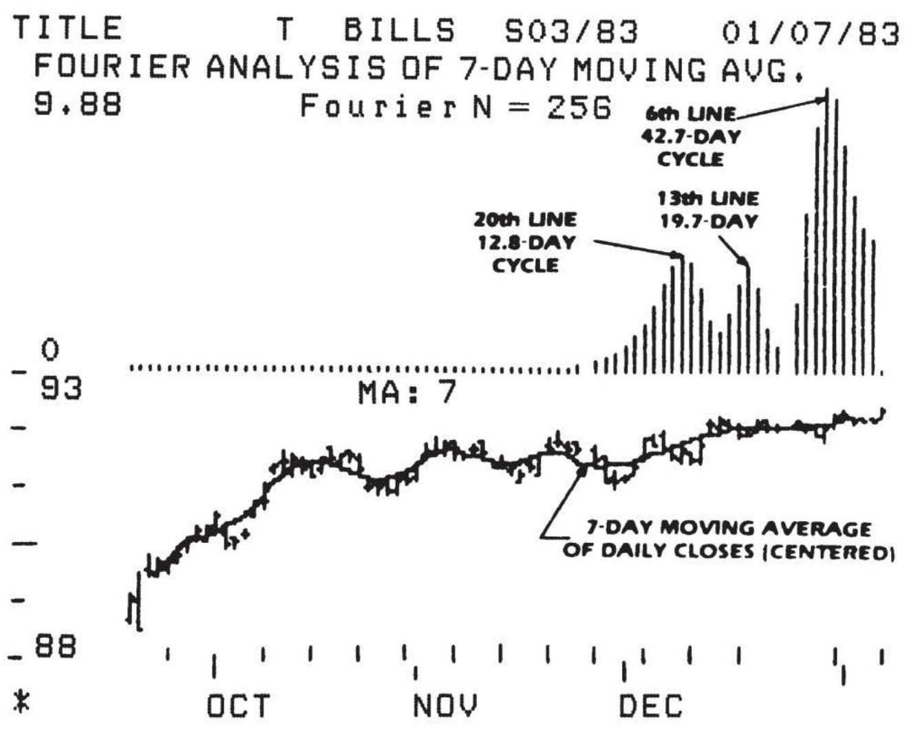
FIGURE 11.21 Output of spectral analysis program.
Source: Jack K. Hutson, "Using Fourier," Technical Analysis of Stocks \& Commodities (January 1983), p. 10.
Using the information from the beginning of this chapter, the frequency is the inverse of the cycle length; therefore, if the cycle length is 40 days, the frequency \(F=360 / 40=9\). The sine wave changes phase at the rate of 9 degrees per day, completing one full cycle every 40 days.
A fast method for observing the results is to use weekly rather than daily data. This will be a close approximation
for low frequency waves but will be less representative for the high frequencies. Averaging the data points can yield results very similar to the daily analysis.
\section*{Using Excel's Fourier Analysis}
The Excel spreadsheet program provides a convenient application of Fourier analysis. It is a data analysis addin that is available for most users but must be chosen by the user. This can be done by going to Tools/Add-Ins and following the instructions for Data Analysis. Once the program has been loaded, it is accessed in the dropdown menu Tools/Data Analysis/Fourier Analysis. The following steps will create the spreadsheet results shown in Figure 11.22. \({ }^{12}\)
\begin{tabular}{|l|r|r|r|l}
\hline Date & Price & Diff & Returns & Fourier Results \\
\hline \(8 / 3 / 1998\) & .9 .46 & 0 & O & 0.5011466458502 \\
\hline \(8 / 31 / 1998\) & .7 .78 & -1.68 & -0.17759 & 0.7048717660794 \\
\hline \(9 / 30 / 1998\) & .8 .84 & 1.06 & 0.136247 & 1.0204291786107 \\
\hline \(10 / 30 / 1998\) & .9 .22 & 0.38 & 0.042986 & 0.1460796143305 \\
\hline \(11 / 30 / 1998\) & .9 .47 & 0.25 & 0.027115 & \begin{tabular}{l}
2.2133471150028 \\
002+0.10491904;
\end{tabular} \\
\hline \(12 / 31 / 1998\) & .9 .91 & 0.44 & 0.046463 & -0.863452208951 \\
\hline \(1 / 29 / 1999\) & 11.77 & 1.86 & 0.187689 & 0.2595915373700 \\
\hline \(2 / 26 / 1999\) & 13.16 & 1.39 & 0.118097 & \begin{tabular}{l}
1.4727426909679 \\
0021
\end{tabular} \\
\hline \(3 / 31 / 1999\) & 13.22 & 0.06 & 0.004559 & \(2.023820655633<\) \\
\hline \(4 / 30 / 1999\) & 14.23 & 1.01 & 0.076399 & -0.65547824846( \\
\hline
\end{tabular}
\section*{002 i}
\begin{tabular}{|r|r|r|r|r|}
\hline \(5 / 28 / 1999\) & 14.01 & -0.22 & -0.01546. & -0.761473092874 \\
\hline \(6 / 30 / 1999\) & 13.6. & -0.41 & -0.02926. & 0.4962386745861 \\
\hline
\end{tabular}
\section*{FIGURE 11.22 Excel spreadsheet showing input prices} and output from Fourier analysis for Southwest Airlines (LUV), August 1998-April 2011.
1. Load your data into a worksheet. Monthly data are best for finding longer-term cycles, ranging from three months to a few years. In Figure 11.22 the input date and price are shown in the first two columns.
2. The Fourier analysis program will only take the amount of data equal to a power of \(2-\) that is, 2,4 , \(8,16, \ldots, 1024,2048,4096\). It will not accept more than 4096 data values. Using monthly data keeps the quantity well within those constraints; however, you may need to use only the most recent 256 or 512 data points.
3. Remove the trend by taking the first differences, or the returns, of the data. The first differences are \(P_{t}-P_{t-1}\), carried down in the column marked "Diff." Differences are good if the data is stationary, but returns are best if prices continue higher; otherwise, more recent data, at higher prices, will overwhelm the results. In the example, both differences and returns are compared.
4. Go to Tools/Data Analysis/Fourier Analysis and enter the data points from the column "Price" as the
input, and the corresponding cells from the first empty column, \(E\). Column \(E\) will become the output, "Fourier Result Using Returns."
5. Note that most of the numbers in column \(E\) are imaginary. The term imaginary is a mathematical term that refers to the result of taking the root of a negative number. To create a usable value, apply the Excel function IMABS to each value in column \(E\) and store it in column \(F\).
Only the first 12 rows of the spreadsheet are shown in Figure 11.22. The sixth column (IMABS) will hold the significant monthly cycles 1 through 12 . The larger numbers indicate a dominance of that monthly cycle. In Figure 11.23 the cycle strength for both the returns and the differences is shown as a bar chart intended to represent the spectral density. The pattern can be interpreted as the seasonality for Southwest Airlines. Both the returns (the bars) and differences (the line) show about the same results, although the magnitude of the values is very different. The chart shows stock prices rising through the summer, and again in November and December. Lows are in January, May, and October.
October may be distorted due to the \(9 / 11\) terrorist attack; otherwise, this may be a reasonable representation, not of when people fly, but of when they buy tickets, or when investors believe that Southwest income will reflect revenues.
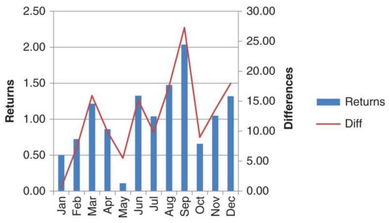
FIGURE 11.23 Results of Excel's Fourier Analysis for Southwest Airlines (LUV), August 1998-April 2011.
Another Fourier analysis was performed on cash corn prices from 1990 through April 2011. Figure 11.24 also shows that both results, using differences and returns, are very similar; however, returns, which are percentages, will adjust to larger price changes in recent years. This chart is closer to what we would have expected in a seasonal pattern, and different from the results of the seasonal study in Chapter 10. They both have the seasonal lows in September, but the previous study showed declines throughout the summer while this shows a likely rally during growing season and a distinctive decline ahead of planting. This difference could be the selection of years, or the Fourier analysis, but confirms our expectation that the growing season breeds uncertainty.
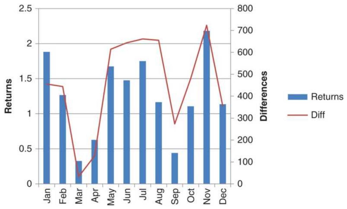
FIGURE 11.24 Cash corn cycles using Excel's Fourier Analysis based on returns and price differences, 1990April 2011.
\section*{MAXIMUM ENTROPY}
In thermodynamics, entropy measures the randomness or disorder of a system. Where particles are free to move, in a gas rather than a solid, entropy is higher. Then entropy can be considered a way of measuring noise. Information entropy has become popular for analyzing text. Shannon entropy is:
\[
H=-\sum_{i} p_{i} \log _{b} p_{i}
\]
where \(p_{i}\) is the probability of a character \(i\) appearing in
the stream of characters in a message. This would be valuable searching for key words online.
Maximum Entropy Spectral Analysis (MESA) is a technique created by John Ehlers \({ }^{13}\) that filters noise (entropy) from a time series and exposes the useful cycles. \({ }^{14}\) It provides a very practical alternative to Fourier analysis and makes it possible to find cycles using a very small amount of data by making the data appear more stationary. The use of Fourier transforms requires at least 256 data points and a minimum of 16 consistent cycles of 16 bars. That would eliminate the possibility of uncovering cycles for the short-term trader.
Ehlers describes the existence of short-term cycles as a natural phenomenon. \({ }^{15}\) It is part of the process that causes rivers to meander back and forth as water seeks to flow in a straight line, or a drunkard who walks through an alley bumping against the walls but moving steadily forward. From these patterns, useful cycles can be found about \(20 \%\) of the time. The presence of a useful cycle, or the lack of one, can be a valuable piece of information for a trader.
\section*{Using the Phase Angle}
In an ideal situation, where the market cycle can be shown as a pure sine wave, the phase angle constantly increases throughout the cycle, beginning at \(0^{\circ}\) and ending at \(360^{\circ}\) (also equal to \(0^{\circ}\) ). The phase angle then drops to zero when the new cycle begins and increases again at a constant rate until it ends at \(360^{\circ}\). This repeated pattern forms a sawtooth chart shown at the
bottom of Figure 11.25 (further description of the phase angle can be found in the next section, "Hilbert
Transform"). Although the cycle goes from peak to value, the phase angle moves constantly in one direction.
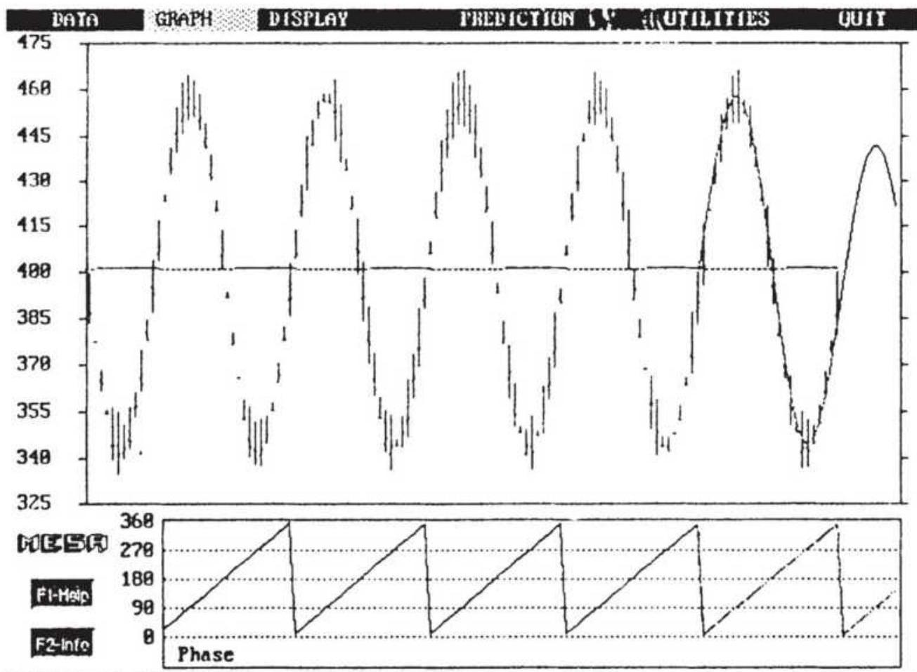
FIGURE 11.25 The phase angle forms a sawtooth pattern.
Source: John Ehlers, "Cycle Analysis and Intraday Trading," Technical Analysis of Stocks \& Commodities 11, no. 4 (February 1993). (C) 1993 Technical Analysis, Inc. Used with permission.
In the practical analysis of short-term cycles, Ehlers compresses tick data into bars of an equal number of ticks and then examines the phase for uniformity. Once
found, the uniform phase, which appears as a sawtooth chart, will become erratic as the short-term cycle begins to break down, marking the end of the current market event. Ehlers creates an instantaneous trendline after removing the dominant cycle, then uses it together with a smoothed price trendline to generate trading signals. A trend exists if the smoothed price line has not crossed the instantaneous trendline within the last halfdominant cycle. The mathematics of MESA is extensive, but Ehlers makes it remarkably clear, along with simple summaries of important points, in the second edition of MESA and Trading Market Cycles and in the newer Cybernetic Analysis of Stocks and Futures.
\section*{Ehlers' Lateral Shift in Thinking}
At first glance the use of only the small amount of data needed by MESA seems to contradict the basic rules of statistics, which says that results should be based on as much data as possible in order to be reliable. But Ehlers, who has been the dominant influence in cycles since 1990, is too knowledgeable to have made such a simple mistake. His book MESA and Trading Market Cycles, which focuses on the use of short-term cycles based on short sample time periods, used this very attribute turned inside out when applied to cycles.
Ehlers' objective is to find very short-term cycles. By definition, these cycles must be the result of human behavior, rather than based on market economics, because fundamentals are not usually relevant over periods of only a few days and are not likely to have a regular pattern when they make a rare appearance. If
very short-term cycles exist, they will not continue for long periods, and you must recognize them quickly if they are to be useful; therefore, short-term cycles are found by analyzing only a small amount of recent data.
Why bother to find a short-term cycle based on a small amount of data, if it is not statistically dependable? In a lateral shift, Ehlers uses the existence of a short-term cycle to tell us that prices are in a sideways pattern. If a short-term cycle exists, then the market cannot be trending. Ehlers has no interest in trading the cycle, which is surprising for a cycle expert, but prefers the dependability of the trend. He has, instead, attempted to solve one of the most difficult problems facing the analyst, trying to distinguish between a trending and sideways market. If a short-term cycle exists, then the market is not trending. Ehlers develops this method throughout his book.
\section*{Finding the Cycle Using the Hilbert Transform}
Ehlers is able to recognize the cyclic component of price movement using very little data as contrasted with the traditional methods. In one technique, using the Hilbert Transform, \({ }^{16}\) only a small part of one cycle is needed to form a picture of the entire process, as little as 4 bars. This allows the cycle to be shown as an indicator with only a modest amount of lag.
The Hilbert Transform is based on the separation of the cycle phase, represented by a phasor, into two components, the Quadrature and InPhase, shown in Figure 11.26. The left circle with a single arrow points to
the current position of the cycle based on the phasor being straight up ( \(270^{\circ}\) ) at the cycle peaks and straight down ( \(90^{\circ}\) ) at the cycle valleys. The cycle begins when the phasor is pointing to the right \(\left(0^{\circ}\right)\). The right circle separates the phasor into its horizontal and vertical components, InPhase and Quadrature, respectively. The phase angle, shown as \(\theta\) (theta), is the arctangent of the ratio of the Quadrature and InPhase components. Ehlers reduces the equations for the Hilbert Transform to:

FIGURE 11.26 A cycle with the phasor and phase angle.
Source: Adapted from John F. Ehlers, Rocket Science for Traders (Hoboken, NJ: John Wiley \& Sons, 2001).
Quadrature
\[
\begin{aligned}
Q= & 0.0962 \times \text { price }_{t}+0.5769 \times \text { price }_{t-2}-0.5769 \times \text { price }_{t-4} \\
& -0.0962 \times \text { price }_{t-6}
\end{aligned}
\]
InPhase
\[
I=\text { price }_{t-3}
\]

These equations make it possible to write simple
program indicators (TSM Hilbert Transformation and TSM Hilbert Transformation V2 on the Companion Website) to plot the results of the Hilbert Transform for any data series. Although there are some penalties for truncating the Hilbert Transform, which is an infinite series, those penalties should not affect the use of this method for trading.
Applying the Hilbert Transform to soybean monthly prices gives the results shown in Figure 11.27. The continuous, back-adjusted series is shown at the top of the chart. Continuous data is preferable in this case to avoid any odd jumps in prices when one contract is rolled to another at expiration.
The bottom panel in Figure 11.27 is the result of first detrending the monthly data (part of the calculation process), then applying the Hilbert Transform with alpha \(=0.07\). The Hilbert Transform creates sharp peaks and valleys at the points where the cycle is expected to be at maximum and minimum value. There is usually one peak and one valley each year, and the minimum level often coincides with late summer or early fall, when the harvest yield is known and there is usually a surplus (or anticipated surplus) of soybeans. Sharp peaks are particularly good for mean reversion trading compared to indicators that reach maximum or minimum values and stay there while prices continue in the same direction. However, as we saw when comparing the results of cash and back-adjusted futures, these extremes will vary due to forward discounting of prices. Peaks tend to be earlier in the year using futures data; nevertheless, futures data are the most practical means
of trading. In addition, geopolitical events occur more often, and these are more likely to affect the high prices than the lows. A more thorough discussion can be found in Chapter 10. The same method can be applied to weekly data. If the obvious major cycle is yearly, then a 52 -period average can be used to detrend weekly data.
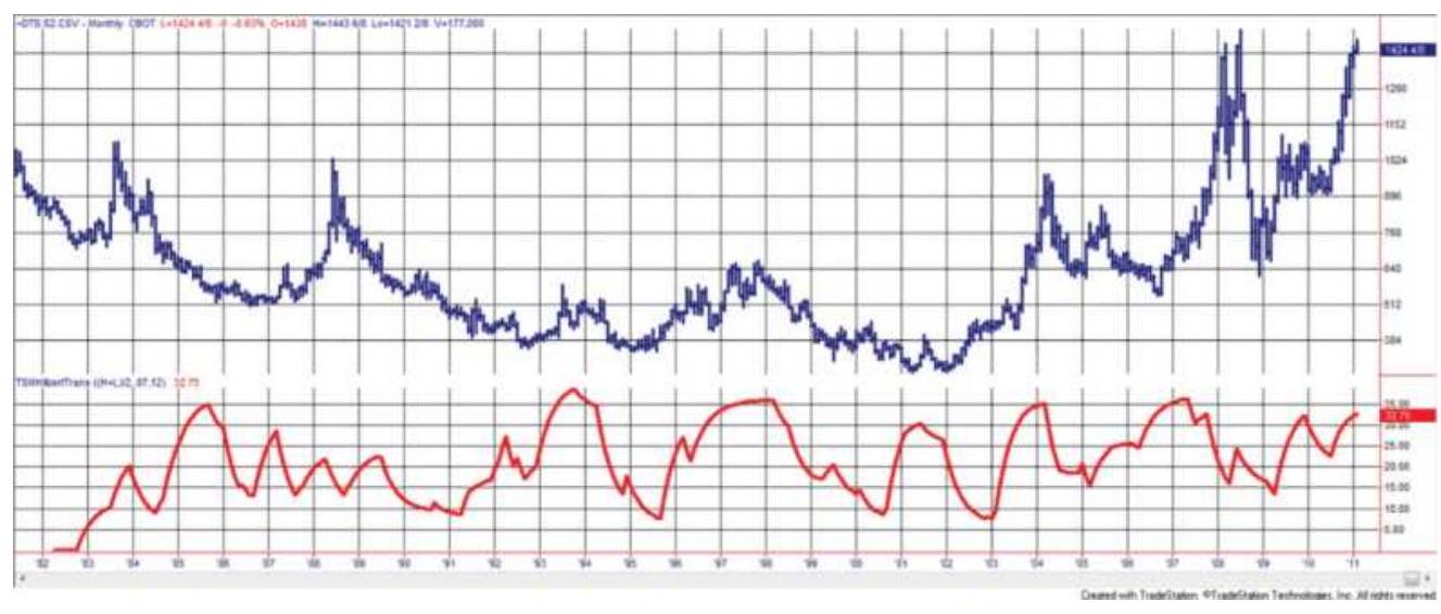
FIGURE 11.27 Back-adjusted soybean futures, 19822018, with the Hilbert Transform in the lower panel.
The Hilbert Transform indicator does a very good job of locating relative peaks and the highest and lowest values of the indicator could be used for sell and buy signals. However, the chart of the indicator does show characteristics similar to momentum indicators - that is, during a period of low volatility, the indicator will show relative highs and lows. To assure that there is enough opportunity for a trading profit will require using a minimum price volatility threshold.
\section*{The Fisher Transform}
Prices are not normally distributed; that is, the
distribution of price changes, or returns, does not appear to be a bell-shaped, symmetric curve. Stock market prices have a longer tail to the right, as do returns from successful trading performance. We have already discussed some of the idiosyncrasies of price movement in earlier chapters, including the fat tail of trendfollowing performance, or the changes in volatility with respect to price. The distribution of prices is called a probability density function (PDF), and the normal, bell-shaped curve is a Gaussian PDF.
The way in which prices move between two bands is very similar to the probability density function of a sine wave, \(\frac{17}{}\) which spends more time in the vicinity of the peaks and valleys (where it changes direction) than in the middle (where it moves the fastest). Figure 11.28a shows two cycles of a sine wave with the PDF to the right (Figure 11.28b). Although the PDF is normally shown with the phasor angle along the bottom, as in Figure 11.28 c , this chart is drawn to represent a typical frequency distribution. The peaks of the sine wave occur when the phasor angle is \(270^{\circ}\) and the lowest points when the angle is \(90^{\circ}\). The frequency of the peaks (the top of the chart) and valleys (the bottom of the chart) is much greater than the frequency of the other angles, especially \(0^{\circ}\) and \(180^{\circ}\).
The same PDF can be seen in price movement if we form a channel around the prices and measure the relative position of prices within that channel. The channel high \((\mathrm{MaxH})\) is simply the maximum price during period \(p\), and the channel low \((\operatorname{MinL})\) is the minimum price during the same period \(p\). The value used in the distribution is
calculated:
\[
X_{t}=0.5 \times 2 \times\left(\left(r_{t}-\operatorname{MinL}\right) /(\operatorname{MaxH}-\operatorname{MinL})-0.5\right)+0.5 \times x_{t-1}
\]
Sine wave

Probability density function
Sine wave PDF
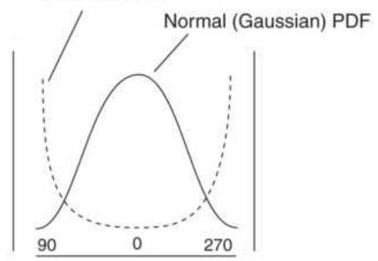
(c)
FIGURE 11.28 Probability Density Function (PDF) of a sine wave.
\section*{The Fisher Transform takes this distribution and} changes it to one that is approximately Gaussian with the following formula:
\[
y=0.5 \times \ln \left(\frac{1+x}{1-x}\right)
\]
\[
\begin{aligned}
x & =\text { the input } \\
y & =\text { the output } \\
\ln & =\text { the natural } \log
\end{aligned}
\]
The result of applying the Fischer Transform to American Airlines (AMR) monthly data can be seen in the second panel of Figure 11.29. For comparison, the Hilbert Transformation is in the third panel. The period for the calculation of the bands was 12 months, in order to allow a better comparison with other methods. An alternate choice would be 3 months to correspond to calendar quarters and earnings reports. Values for the Fisher Transform range from +1.0 to -1.0 . The peaks of the Fisher Transformation are well-aligned with the price peaks and show very little lag compared to the Hilbert Transformation, although they occasionally peak out early and hold that level until prices reverse. The valleys are also good, although there is an occasional lag.

The Fisher Transform produces clearer, sharper turning points than a typical momentum-class indicator. A trigger, typically a 3-day moving average of the indicator, is used to generate a trading signal, in the same ways as the MACD signal line. A sell signal occurs when the Fisher Transform value crosses the trigger moving lower. Experience shows that the best signals are those occurring just after an extreme high or low value and not after a turning point where the value is near zero, similar to MACD rules. Programs for creating the Hilbert, Fisher, and Inverse Fisher transforms are TSM Hilbert Transform, TSM Fisher Transform, and TSM
Fisher Inverse on the Companion Website.
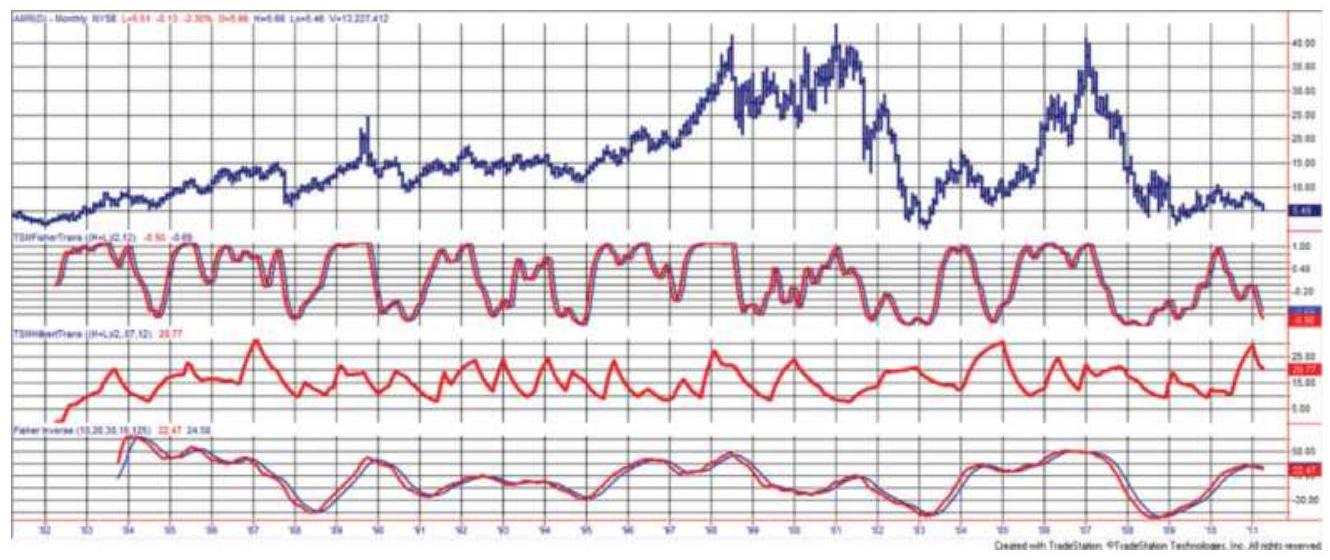
FIGURE 11.29 Monthly AMR (top) prices from 1982 with the Fisher Transform (2nd panel), Hilbert Transform (3rd panel), and Inverse Fisher Transform (lower panel).
\section*{Inverse Fisher Transform}
One more variation that produces a very credible momentum indicator is the Inverse Fisher Transform. 18 While the Fisher Transform uses the price to solve for the distribution, the Inverse Fisher Transform does the opposite:
\[
x=\frac{e^{2 y}-1}{e^{2 y}+1}
\]
However, implementation of this is wrapped around the RSI indicator as follows (shown in TradeStation code):
series = close - close[mom];
x1 = 0.1*(RSI(series,RSIper) - 50);
x2 = WAVERAGE(x1,waper);
invfisher = 100*(EXPVALUE(2*x2) -
1.0)/(EXPVALUE (2*x2) + 1);
using the input values, mom \(=10\), RSIper \(=20\), and waper \(=30\). Note that RSI, WAVERAGE (linearly weighted average), and EXPVALUE are all built-in functions.
This process gives a bipolar distribution, where results are most likely to cluster near the extremes, +1 and -1 . Based on monthly data of AMR, the results of the Inverse Fisher Transform are shown in the bottom panel of Figure 11.29.
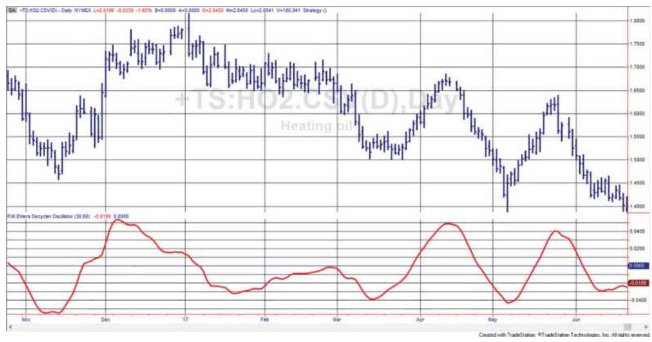
FIGURE 11.30 Ehlers' Universal Oscillator shown along the bottom of a heating oil futures price series, November 2016-June 2017.
\section*{Ehlers' Universal Oscillator}
Ehlers'Universal Oscillator \({ }^{19}\) seems to capture much of Ehlers' goals, an indicator that tracks price movement with little lag. Figure 11.30 shows heating oil futures with the Universal Oscillator along the bottom. As promised, the two peaks in the oscillator on the right are aligned with the price peaks without any apparent lag. On the left, we see a declining formation in the oscillator typical of a momentum indicator when prices stop rising - the momentum indicator adjusts to the new level and moves toward zero, or its neutral value. That seems to be a small price to pay for a smooth indicator with no lag.
The code for this indicator is remarkably short. Written in Trade Station's EasyLanguage, the logic is:
\[
W_{t}=\left(\text { close }_{t}-\text { close }_{t-2}\right) / 2
\]
The super-smoother filter is:
\(\mathrm{a}=\operatorname{EXP}(-1.414 \times 3.14159 /\) BandEdge \()\)
c2 \(=2 \times \mathrm{a} 1 * \operatorname{COS}(1.414 \times 180 /\) BandEdge \()\)
\(\mathrm{c} 3=-\mathrm{a} \times \mathrm{a}\)
\(\mathrm{c} 1=1-\mathrm{c} 2-\mathrm{c} 3\)
\[
F_{t}=\mathrm{c} 1 \times\left(W_{t}+W_{t-1}\right) / 2+\mathrm{c} 2 \times F_{t-1}+\mathrm{c} 3 \times F_{t-2}
\]
Initialization of the filter:
If \(\mathrm{t}=1\), then \(F_{t}=0\)
\(\mathrm{Ift}_{\mathrm{t}}=2\), then
\[
\begin{aligned}
& F_{t}=\mathrm{c} 1 \times 0 \times\left(\text { close }_{t}+\text { close }_{t-1}\right) / 2+\mathrm{c} 2 \times F_{t-1} \\
& \text { If } \mathrm{t}=3, \text { then } \\
& F_{t}=\mathrm{c} 1 \times 0 \times\left(\text { close }_{t}+\text { close }_{t-1}\right) / 2+\mathrm{c} 2 \times F_{t-1}+\mathrm{c} 3 \times F_{t-2}
\end{aligned}
\]
Automatic Gain Control (AGC):
\[
\operatorname{Peak}_{t}=0.991 \times \text { Peak }_{t-1}
\]
If \(t=1\), then \(\operatorname{Peak}_{t}=0.0000001\)
If \(\operatorname{ABS}\left(F_{t}\right)>\operatorname{Peak}_{t}\), then \(\operatorname{Peak}_{t}=\operatorname{ABS}\left(F_{t}\right)\) If \(\operatorname{Peak}_{t} \neq 0\), then \(U_{t}=F_{t} /\) Peak \(_{t}\),

where BandEdge \(=20, F=\) Filter,
\(W=\) white noise, and \(U=\) Universal Oscillator. The function \(\operatorname{EXP}(\mathrm{a})\) is the exponent of \(e^{a}\), available on Excel. In the two statements, \(t=2\) and \(t=3\), the first expressions have been eliminated by the zero multiplier. An indicator for the Universal Oscillator is TSM Ehlers Universal Oscillator on the Companion Website.
\section*{SHORT CYCLE INDICATOR}
In an excellent article, \(\underline{20}\) Francisco Lorca-Susino presents the Short Cycle Indicator ( \(L X\) ). This method is expected to correct some of the difficulties using financial time series, which are said to have a long memory, obscuring some of the patterns. It is applied to
intraday bars and is best interpreted over multiple time frames.
The formula is based on the squared difference of two exponential moving averages, and the relationship of those trendlines with the highest low and lowest high of the slower period, a form of stochastic indicator. The term \((X F-X S) / X F\) addresses the convergence of the two trends. The combination of squaring and the stochastic is intended to smooth while still retaining the most important aspects of sensitivity. The \(S F\) values are for scaling.
\section*{Slow \(=20\)}
Fast \(=8\)
\(X F=\) fast exponential smoothing (Fast)
\(X S=\) slow exponential smoothing (Slow)
\(L H=\) Lowest(High, Slow)
\(H L=\operatorname{Highest}(\) Low, Slow \()\)
\(S F_{1}=1,000,000\)
\(S F_{2}=100\)
\(S F_{3}=1000\)
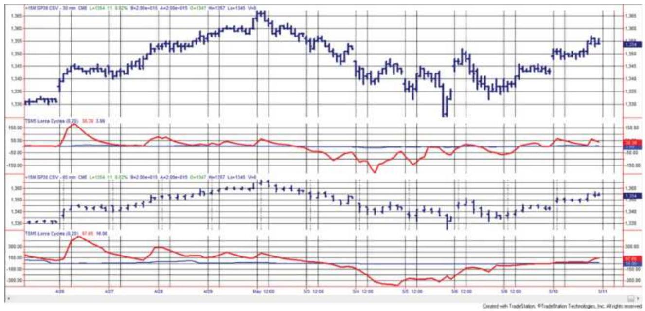
FIGURE 11.31 The Short Cycle Indicator applied to the emini S\&P 30- (top panel) and 60-minute bars (third panel), May 2011. The corresponding short cycle indicators are below the intraday prices (second and fourth panels).
\[
\begin{aligned}
& L X 1=\left(\frac{(X S-L H)^{2}+(X S-H L)^{2}}{X S}\right) \times \frac{X F-X S}{X F} \times S F_{1} \\
& L X 2=\frac{(X S-L H)^{2}+(X S-H L)^{2}}{X S} \times S F_{2} \times \frac{\frac{X F-X S}{X F} \times S F_{3}}{C^{2}} \times S F_{1}
\end{aligned}
\]
As shown in Figure 11.31, the indicator tends to stay above or below the trigger line but reacts to changing volatility, measured as the difference between the trendlines and the price extremes. These usually occur before prices change direction. It is interesting to note the multiple divergence signals that occur as prices rally in the first part of the chart, and that the indicator posts
its lows in advance of the lows on April 5.
To generate a sell signal, Lorca looks for volatility to expand in a particular pattern. One of the three conditions must be satisfied:
\[
\text { 1. } \begin{aligned}
& L X 1_{t}>0 \text { and } L X 1_{t}<L X 1_{t-12} \text { and } \\
& L X 1_{t}<L X 1_{t-14} \text { and } L X 1_{t}<L X 1_{t-16} \text { and } \\
& \\
& H_{t}-L_{t}>H_{t-1}-L_{t-1} \text { and } \\
& H_{t}=\operatorname{Highest}(H, 12)
\end{aligned}
\]
2. \(L X 1_{t}>0\) and \(H_{t}=\operatorname{Highest}(H, 16)\) and \(L X 1_{t}=\operatorname{Lowest}(L X 1,32)_{t-1}\)
3. \(L X 1_{t}>0\) and \(H_{t}=\operatorname{Highest}(H, 16)\) and \(L X 1_{t-2}=\operatorname{Lowest}(L X 1,32)_{t-1}\)
In case 1 , the indicator is rising but it is lower than the interval from 12 to 14 bars ago. In addition, the trading range of the current bar must be greater than the range of the previous bar and confirmed by a new 12-bar high, both measures of expanding volatility.
Cases 2 and 3 are simpler, requiring that the indicator is rising and it is a 16 -bar high. Then a sell signal occurs if either the current indicator value is the lowest of the past 32 bars or the indicator 2 bars ago is the lowest of the past 32 bars.
\section*{PHASING}
One of the most interesting applications of the cyclic
element of a time series is presented by J. M. Hurst in The Profit Magic of Stock Transaction Timing. \({ }^{21} \mathrm{He}\) uses phasing,the synchronization of a moving average by lagging, to represent cycles. This section highlights some of the concepts and presents a simplified example of the method.
Normally, to isolate the cycle from the other elements, the trending and seasonal factors should be subtracted, reducing the resulting series to its cyclic and noise components. In many cases, the seasonal and cyclic components are similar but the trend is unique. Instead, Hurst treats the cyclic component as the dominant component of price movement and uses a moving average to identify the combined trend-cycle.
The system can be visualized as measuring the cyclic oscillation about a straight-line approximation of the trend (a best-fit centered line), producing approximately equal moves above and below. Prices have many longand short-term trends, depending on the interval of analysis. Because this technique was originally applied to stocks, most of the examples used by Hurst are longterm trends expressed in weeks. For futures the same technique could be used with continuous back-adjusted daily or weekly data.
As a simple example of the concept, choose a moving average of medium length for the trend. This full-span moving average period may be selected by averaging the distance between the tops on a price chart (a rough measure of the cycle). The half-span moving average is then equal to half the days used in the full-span average.
For his purpose, Hurst lags each moving average by half its calculation period so that it appears to be in the center of the price moves. He calls this process phasing. Figure 11.32 shows the long-term average as a slightly swinging trend in phase with the large price swings, and the faster average tracking inside the smaller price moves.

FIGURE 11.32 Hurst's phasing and target price projection.
Next, mark the points where the two trends cross, shown as circles in Figure 11.32. Draw a straight line through the circled points. That straight line creates a way to reflect the price swings on the top and bottom. You can use the circle points as input to a regression function, giving you an accurate line through those points. Once the straight line is calculated, it is projected as the center of the next price cycle.
With the trend identified and projected, the next step is to reflect the cycle about the trend. When the phased half-span average turns down at point \(A\) in Figure 11.32, measure the greatest distance \(D\) of the prices above the projected trendline. The system then anticipates that prices will cross the trendline at point \(X\) and decline an
equal distance \(D\) below the projected centered trendline. Once the projected crossing becomes an actual crossing, the distance \(D\) can be measured and the exact price objective specified. The rules for using this technique are:
1. Calculate the full-span moving average for the selected calculation period; lag the plot by half the days. If the full-span moving average uses Ndays, the value of the average is calculated at \(t-N / 2\), where \(t\) is the current day. Call this phased point \(P N_{t}\).
2. The half-span moving average is calculated for \(M\) days and plotted at \(t-M / 2\). Call that point \(P M_{t}\).
3. Record the points where the two phased averages \(P M_{i}\) and \(P N_{i}\) cross and call these points \(X_{n}, X_{n-1}, \ldots\)
4. Find the trend by performing a linear regression on the crossing points \(X_{n}, X_{n-1}, \ldots\). For the straight line, \(Y_{T}=a+b X_{T}\).
5. Record the highest (or lowest) values of the price since the last crossing, \(X_{n}\).
6. Calculate the projection of the half-span by creating a straight line from the highest (or lowest) half-span value since the last crossing \(A\) to the last calculated half-span value. This equation will be
\section*{\(Y_{c}=c+d X_{c}\).}
7. Find the point at which the projected trendline crosses the projected cyclic line by setting the equations equal to one another and solving for \(X\) and \(Y\). At the point of crossing
\[
\left(X_{T}, Y_{T}\right)=\left(X_{c}, Y_{c}\right) \text {, giving two equations in }
\]
two unknowns, which is easily solvable ( \(X\) is time in days; \(Y\) is price).
8. If the half-span is moving down, the maximum price reached since the last crossing is subtracted from the \(Y\) coordinate of the projected crossing to get \(D\). This distance \(D\) is subtracted again from the \(Y\) coordinate to determine the price objective, equidistant below the best-fit line. If the half-span is moving up, the price objective uses the minimum price and reflects the distance above the projected crossing. It should be noted that this calculation of distance is simplified because the trend is established by a straight line; for nonlinear fits, the measurement of \(D\) will be more complicated.
9. Recalculate the moving averages (step 1), the halfspan projection (step 6), the projected crossing (step 7), and price objective (step 8) each day until the actual crossing occurs. At that time \(D\) is fixed.
10. Follow the trading rules:
a. Enter a new long position when the half-span moving average turns up; cover any existing short positions regardless of the price objective. Set the new price objective as in step 8.
b. Enter a new short position when the half-span moving average turns down; close out any long positions. Set the new price objective as in step 8 .
c. Close out any long and short positions if the price objective is reached. An error factor of \(10 \%\) of the height of the full cycle (lowest to highest point) should be allowed. Therefore, the price objective should be closer by \(10 \%\).
Hurst's approach is a good example of a complex problem solved using elementary mathematics. There are many techniques for determining trends, seasonality, and price objectives, but a cyclic approach is rare. Hurst's own explanation is more complete and the interpretation presented in this section should be considered only as a reasonable approximation.
\section*{NOTES}
1 See the section, "The Moon: Buy Full, Sell New," in Chapter 14 .
\(\underline{2}\) John Ehlers, "Fourier Series Model of the Market," Technical Analysis of Stocks \& Commodities (June 2019). Refer to this issue for a computer program that will perform Fourier analysis.
3 Jeff Walker, "What K-wave?" Technical Analysis of Stocks \& Commodities (July 1990).
4 Gerald Appel states. "There is a clear election-year cycle, where the election year is \(+10 \%\), year after
\(+4.5 \%, 2\) years before next \(-1.25 \%\), and the year before +20\%." Technical Analysis: Power Tool for Active Traders (Upper Saddle River, NJ: FT Prentice Hall, 2005), p. 94.
5 Articles by Adam White, "The Eight-Year Presidential Election Pattern," Technical Analysis of Stocks \& Commodities (November 1994); Arthur Merrill, "The Presidential Election Cycle," Technical Analysis of Stocks \& Commodities (March 1992); and Michael J. Carr, "Get out the Vote and into Stocks," Futures (February 1996), all show very similar results for the 4-year election pattern.
6 See http://www.lim.com.
7 In his article, "Finding Cycles in Time Series Data," Technical Analysis of Stocks \& Commodities (August 1990), A. Bruce Johnson credits John Ehlers for his work in the use of two exponential trends. See John Ehlers, "Moving Averages, Part 1" and "Moving Averages, Part 2," Technical Analysis of Stocks \& Commodities (1988).
8 A continuation of this development can be found in Warren Gilchrist, Statistical Forecasting (London: Wiley, 1976), pp. 139-148; a more theoretical approach is to be found in C. Chatfield, The Analysis of a Time Series: Theory and Practice (London: Chapman and Hall,1975), Chapter 7.
9 William T. Taylor, "Fourier Spectral Analysis," Technical Analysis of Stocks \& Commodities (July-
\section*{August 1984).}
10 Anthony Warren, "A Mini Guide to Fourier Spectrum Analysis," Technical Analysis of Stocks \&
Commodities (January 1983). A very useful series of articles on spectral analysis has been published in Technical Analysis beginning in January 1983, authored by both Anthony W. Warren and Jack K. Hutson. Much of the information in this section was drawn from that material.
11 Anthony Warren and Jack K. Hutson, "Finite Impulse Response Filter," Technical Analysis of Stocks \& Commodities (May 1983).
12 The author gratefully acknowledges the help of John Ehlers in the interpretation of Excel's Fourier analysis.
13 John F. Ehlers, MESA and Trading Market Cycles, 2nd ed. (Hoboken, NJ: John Wiley \& Sons, 2001). Also in Cybernetic Analysis for Stocks and Futures (Hoboken, NJ: John Wiley \& Sons, 2004).
14 Anthony Warren, "An Introduction to Maximum Entropy Method (MEM)," Technical Analysis of Stocks \& Commodities (February 1984). See the bibliography for other articles on this topic.
15 John F. Ehlers, "How to Use Maximum Entropy," Technical Analysis of Stocks \& Commodities (November 1987).
16 John F. Ehlers, Rocket Science for Traders (John
Wiley \& Sons, New York, 2001, Chapter 6).
17 This section is adapted from John Ehlers, Cybernetic Analysis for Stocks \& Commodities (Hoboken, NJ: John Wiley \& Sons, 2004), Chapter 1.
18 See http://www.mesasoftware.com/papers/ and follow the link.
19 John Ehlers, "White Is Brighter," Technical Analysis of Stocks \& Commodities (January 2015).
20 Francisco J. Lorca [Susino], "Exploiting Stock Market Cycles," Futures (April 2009). The author appreciates the help of Mr. Lorca-Susino in this section (franlorcasusino@gmail.com).
21 J. M. Hurst, The Profit Magic of Stock Transaction Timing (Upper Saddle River, NJ: Prentice Hall, 1970), reprinted in trade paper by Traders Press, 2000.
\section*{CHAPTER 12 \\ Volume, Open Interest, and Breadth}
Patterns in volume have always been tied closely to chart analysis of both the stock and futures markets. Volume is a valuable piece of information that is not often used, and one of the few items, other than price, that is considered valid data for the technician. Nevertheless, there has been little research published that relates volume to futures markets; its popular use has modeled itself on stock market interpretation.
The stock and futures markets have two other measures of participation that are related. In equities, the large number of shares being traded allow for measurements of breadth. In the same way that the stock index has become a popular measure of overall market trend, the breadth of the market is the total number of stocks that have risen or fallen during a specific period. When you have the ability to view the bigger picture of market movement, breadth seems to be a natural adjunct to the index. In addition, the total of new highs and new lows may add value to a trading decision.
The simple count of new highs and new lows can be viewed as an equal weighting of stocks, and equal weighting is known to show a fair picture of market movement. Individual stock volume often reflects the stocks with the highest capitalization. For example, in
mid-February 2018, the volume (in millions) for a few of the more active stocks was Apple (AAPL) 45, Bank of America (BAC) 80, and General Electric (GE) 75. Yet, Northrop-Grumman (NOC) 1.2, and Tesla (TSLA) 5 may be more important for traders. If so, you don't want a measure of total volume that minimizes NOC and TSLA; instead, breadth should be used. This chapter will look at different ways these statistics can complement trading strategies.
\section*{FUTURES VOLUME AND OPEN INTEREST}
In futures, open interest is the measurement of those participants with outstanding positions; it is the netting out of all open positions (longs and short sales) in any one market or delivery month, and gives an understanding of the depth of participation and anticipated volume. A market that trades only 10,000 contracts per day but has an open interest of 250,000 is telling the trader that there are many participants who will enter the market when the price is right. These are most likely to be commercial traders, using the futures markets for hedging. Unlike the stock market, which can only trade a fixed number of outstanding shares, the futures market can add interest (net contracts) for every new buyer and short seller and reduce the interest in the market when both buyers and sellers liquidate.
When you trade contracts for delivery in specific months, the volume of each contract is available, along with the total volume of all contracts traded for that market.
Spread transactions within that market, for example, buying the March delivery and selling June, are not included in the reported volume, which is different from stocks, which report both sides of a high-frequency trade. Official volume and open interest data are available at the time of the settlement, but real-time estimates for many markets are available on services such as Bloomberg and can also be found on the exchange websites.
Individual contract volume is important to determine which delivery month is most active because that is usually the contract you will trade. Analysts, however, will use total volume for futures. Individual contracts start with low volume, increase when they become the nearby, then decline toward delivery as traders switch to another month. Total volume does not have that problem, so it should be used. The same is true for open interest.
While volume is normally concentrated in the nearby delivery, and is the choice of most traders, short-term interest rates are the exception. Price movement in the nearby Eurodollar contract, as well as the short sterling, is very small and requires large positions to balance the risk in a portfolio. The most popular contract is the third month out; that is, during the month of May, fund managers will trade the December delivery in most 3month interest rate maturities, which will have larger price moves and more volume.
There are specific conventions for rolling different futures markets. For example, interest rates are not
trading during the delivery month because margins increase dramatically. On the other hand, equity index markets and currencies trade in the nearby until about three days before expiration. Energy contracts end in the month before the delivery month. Those interested in futures will need to check the rules for each market. They are available on the exchange website.
For developers using back-adjusted futures, and those who want to trade in the most liquid delivery month, select the option to roll on volume and open interest from the database provider. Contracts will then switch when everyone else has decided to move to the next contract. It is easier and safer than trying to figure out when each markets rolls.
When traders roll from the nearby to the next deferred contract, the open position transactions are usually executed as a spread, and those trades are not included in the volume figures. Because positions are closed out in one contract and opened in another there is no change in the open interest. A spread trade is also less expensive than two individual orders, one to liquidate the old delivery month and the other to enter the new contract.
\section*{Tick Volume}
The popularity of quote machines and fast trading requires a measurement of volume that can be used immediately to make decisions. Because total volume is not always available on a timely basis to day traders, tick volume can be substituted. Tick volume is the number of recorded transactions, regardless of volume or the size of
the price change that occurs during any time interval. Each time a trade is executed, even at the same price, it counts as one tick.
Tick volume relates directly to actual volume because, as the market becomes more active, prices move back and forth from bid to asked more often. If only two trades occur in a 5 -minute period, then the market is not liquid. From an analytic view, tick volume gives a reasonable approximation of true volume and can be used as a substitute. From a practical view, it is the only choice for some markets. Higher than normal tick volume at the beginning of the day implies higher volume throughout the day. Tick volume is available real-time on CQG and MetaTrader 4. Intraday traders will need to ask their own service if actual volume or tick volume is provided. Tick volume patterns are discussed later in this chapter.
\section*{EXTENDED HOURS AND 24-HOUR TRADING}
The New York Stock Exchange officially trades from 9:30 a.m. to 4:00 p.m., Eastern Time. There is also premarket and extended hours trading. The premarket opens at 4:00 a.m. and trades until the regular session opens at 9:30 a.m. Extended hours are from 4:00 p.m. to 8:00 p.m. For those trading in the extended session, trades will be posted the following day and settled against the next close. Not all stocks trade in the extended hours.
Futures are different. The CME Globex platform trades \(23^{1 / 2}\) hours and orders can be entered and executed,
given both a buyer and a seller, at any time. Settlement is the next day. Although the CME will post settlement prices shortly after each market closes, the final numbers for all markets are available at 19:00 Eastern Time. Both stock prices and futures may see adjustments to those prices the next day, particularly the high and low for the day.
\section*{Liquidity}
The volume of equity trading is usually light until about 8:00 a.m. It can be very active after 9:00 a.m., and there can be high volume in any stock that posted earnings ahead of the 9:30 open, or any stock with an interesting story in the news. Many listed companies post quarterly earnings after the market closes, and traders wait for those releases. On those days, volume can be high in the afterhours market.
Futures are most active during the business day. Then U.S. futures will be most liquid from about 9:00 a.m. to 16:00 p.m., and Japanese futures from 18:00 p.m. to 12:00 p.m. Traders trying to execute a Japanese equity index or interest rate futures during U.S. business hours will find it difficult, even though Globex facilitates trading. If no one is awake on the other side of the world, trading is thin. On the other hand, European markets open at about 2:00 a.m. ET and there is at least 3 hours of active trading when both regions are open. For more detail, see "Intraday Volume Patterns" later in this chapter.
\section*{VARIATIONS FROM THE NORMAL PATTERNS}
\section*{The W Intraday Pattern}
One note of warning when using intraday volume or volume indicators to confirm price direction - the patterns in volume have a dominant \(W\) pattern throughout the day. They begin high, drop quickly, increase modestly near midday, fall again, then increase significantly toward the close of trading. To decide that a buy signal is more important near the end of the trading day because volume was rising is not a good indicator; volume is always higher at the beginning and the end of the day. You may conclude, in general, that the beginning and end of the day, or higher-than-average volume produces more reliable trading signals; however, an intraday volume confirmation must be compared against the normal volume for that time of day.
Open interest and market breadth have seasonal patterns. In agricultural markets, farmers hedge in larger numbers during the growing season than in the winter, raising the open interest. In stocks, there is a lot of activity associated with the end-of-year positioning for tax purposes and traditional rallies during holiday seasons. Volume is low during the summer when many investors take their vacation. None of these changes indicate that something special is occurring. These variations are discussed in detail later in this chapter.
\section*{Variance in Volume}
Nearly all volume analysis uses smoothed or averaged data because volume can vary substantially from one day to the next. As an example, Figure 12.1a shows the average annual volume for Amazon (AMZN) from 2013 through 2017, along with the standard deviation of the annual changes. The average was 3.7 million shares per day with a standard deviation of about 430,000 shares. That means \(68 \%\) of the days fell between 4.14 million and 3.28 million shares. Looking at it from the other side, \(32 \%\) of the days were either higher or lower than those volumes. One standard deviation for Amazon annual volume was only \(11 \%\), not remarkably large.
\section*{AMZN Daily volume}
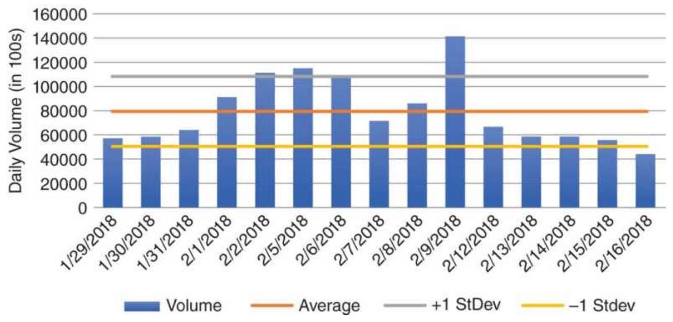
FIGURE 12.1a Average annual volume of Amazon with 1 standard deviation line.
AMZN Annual volume
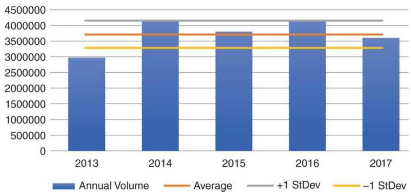
FIGURE 12.1b Amazon average daily volume from January 29 through February 16, 2018.
Yet the average annual numbers can hide the daily variation in volume. Taking the three weeks from January 29 through February 16, 2018, a period when prices dropped dramatically, the average daily volume was 108 million with 1 standard deviation of 5 million, about \(36 \%\), shown in Figure 12.1b. While some of the days advanced and declined in an orderly way, the outlier on February 9 would make any trend of volume erratic.
Variation in volume from under 6 million shares to over 14 million and back to 5 million in a few days is very volatile data and will require special attention to be used effectively. Keep in mind that many of the indicators that use volume will also be erratic. No amount of adding, dividing, and combining can eliminate the volatility. Strategies that can take advantage of these volume extremes can add value to your trading.
\section*{Volume Spikes}
Madness is the exception in individuals but the rule in groups.
- Nietzsche
A volume spike is a single day in which the volume was much higher than the previous day - at least twice as high, perhaps three or four times. The high volume shown in Figure 12.1b on February 9 is not large enough to qualify. A volume spike is a warning that something has happened, most likely the result of a surprising earnings announcement, new economic data, a geopolitical event, or some other company-specific surprise. It could also be the crescendo of a few days of rising volume associated with sharply rising or falling prices.
A volume spike is a clear, positive action by investors. It implies that a very large number of investors, perhaps even the general public, all hold the same opinion on the direction of the market and feel compelled to act on that opinion at the same time. It is the result of mass behavior discussed by Charles Mackay in his famous book, Extraordinary Popular Delusions and the Madness of Crowds. A volume spike means that everyone has jumped into the boat at the same time. Traditional interpretation of a volume spike is that it indicates the end of a price move; that is, the boat sinks.
Tesla (TSLA) is a good example of a market with volume spikes, some big, some moderate, and most produced by earnings and announcements by the company itself.
Most of the spikes shown in Figure 12.2 occur on severe price drops. The average volume during this period is about 5 million shares, including 17 days when volume was about 12 million shares and four days above 15 million. Of the two clear peaks in price, one in June and the other in September, the June volume spikes before the price top and the September volume has little indication of increased volume.
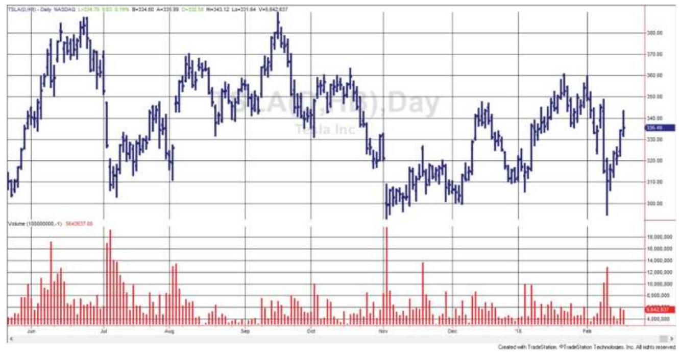
FIGURE 12.2 Tesla price and volume showing numerous spikes on price drops.
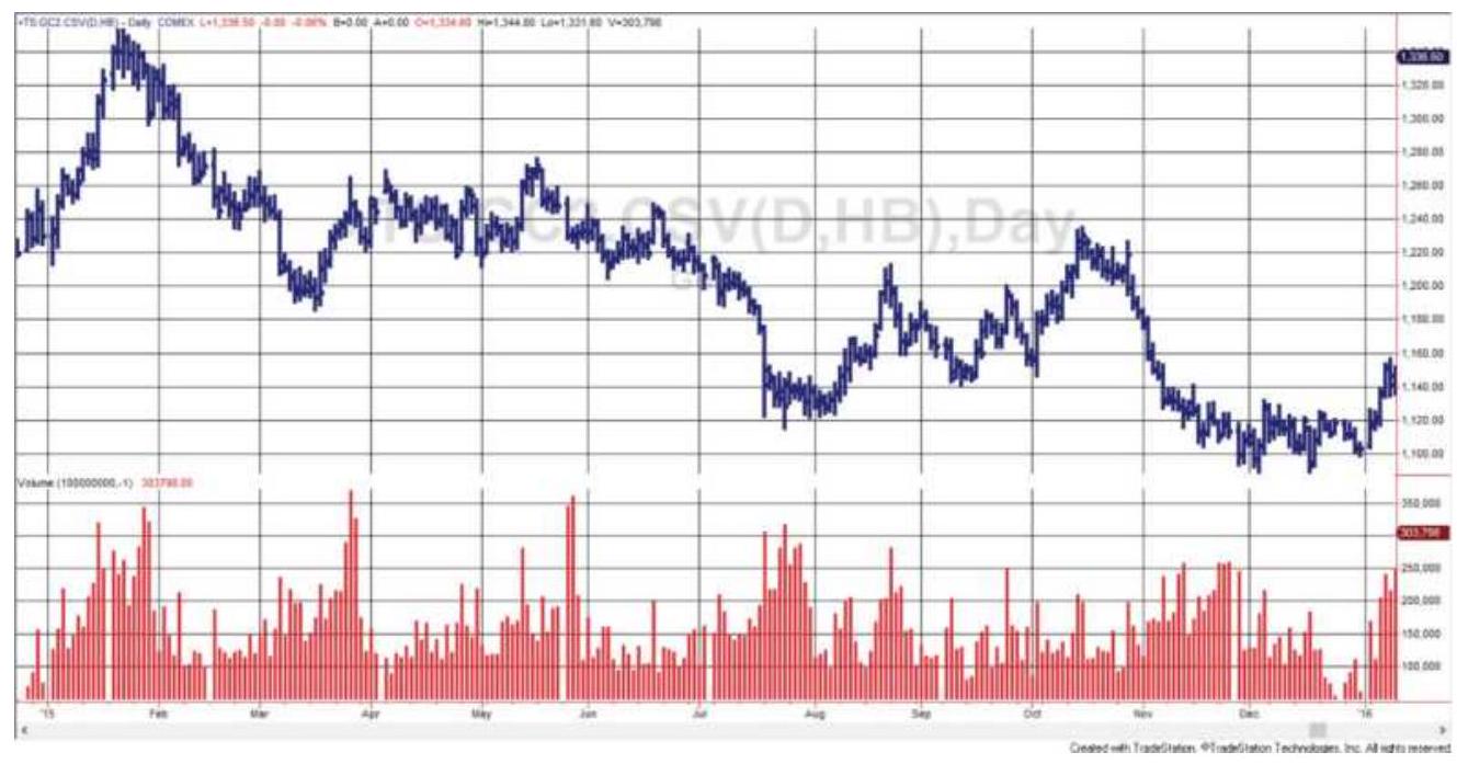
FIGURE 12.3 Gold futures with multiple volume spikes, not as extreme or as well-positioned as Tesla.
Prices reverse direction immediately after the spikes, and usually that reversal is substantial. A volume spike does not indicate the strength of the price reversal; it simply tells you that the current move is exhausted. It may turn out to be a major top or bottom, or simply a local turning point.
Not all volume patterns are as clear. Gold futures, shown in Figure 12.3, have noticeable increases in volume, but at about 2.5 times the average volume, not as spectacular as Tesla. The spikes are not aligned with the peaks and valleys as we would prefer, and at price points that are not as easy to interpret. The low prices in late September-early August are associated with a cluster of higher volume but not a spike. We can recognize that volume is reflecting increased trading interest but finding a clear rule will be difficult.
Volume spikes are a good example of extremes and the clearest cases for trading. The theory of a spike is that, when everyone has entered the market, there is no one left to buy (or sell) and prices must reverse. The crowd is always wrong, or at least their timing is always wrong.
\section*{Drop in Volume}
Although a drop in volume is less impressive than a volume spike, it can be equally important. Volume can decline because there is little interest in a stock or futures market, which often happens when prices are very low. Volume can also drop when a price reaches equilibrium, the price at which buyers and sellers agree is fair value. Volume may also drop on the day before a holiday, or just by chance.
In Figure 12.2, the Tesla volume falls well below average in late September and early October 2017, at the same time prices move sideways. At other times, volume drops after a price peak, and still at other times with no particular pattern. Gold also shows lower volume during declines in price after peaks and during sideways periods. This declining pattern fits the standard interpretation of volume.
\section*{STANDARD INTERPRETATION}
The interpretation of volume has been part of the trading culture from its beginning. Volume is always considered in combination with price movement:
\section*{Volume Price Interpretation}
\begin{tabular}{|l|l|l|}
\hline Rising & Rising Volume confirms price rise (bullish) \\
\hline Rising & Falling Volume confirms price drop (bearish) \\
\hline Falling & Rising Volume indicates weak rally (bearish) \\
\hline Falling & Falling \begin{tabular}{l}
Volume indicates weak pullback \\
(bullish)
\end{tabular} \\
\hline
\end{tabular}
An additional interpretation \(\frac{1}{1}\) is that:
An increase in volume confirms a move out of a congestion area.
When comparing volume on the upside to downside, the greater volume defines the market's bias.
For both the futures and stock market, volume has the same interpretation, volume confirms direction. When volume declines, it indicates that a change of direction should follow because there is no general support for the price move. Therefore, volume normally leads price. It has also been said that 1-week returns accompanied by declining volume tend to reverse the next week. Using weekly data would smooth the volume and may add consistency.
The classic interpretation of volume was published in the monograph by W. L. Jiler, Volume and Open Interest: A Key to Commodity Price Forecasting, a companion piece to his most popular Forecasting Commodity Prices with Vertical Line Charts.
Price changes that occur on very light volume are less dependable for indicating future direction than those changes associated with relatively heavy volume.
Additional uncertainty exists for stocks that are not
actively traded, and for low-priced shares where the total dollar volume can be small. In these cases, it might be best to look at the accumulated volume of similar companies or its sector.
\section*{Volume and Open Interest}
Open interest is a concept unique to futures markets. It helps to explain the depth of the market as well as trader expectations. New interest in a market is the result of new buyers and sellers meeting, which increases the open interest, the net of all outstanding contracts being traded. Unlike the equities market, there is no limit to the number of contracts outstanding. The following table explains the interactions of buyers and sellers that result in changes to the open interest:
\begin{tabular}{|l|l|c|l|}
\hline Buyer & Meets & Seller & Change in Open Interest \\
\hline New & & New & Increase in open interest \\
\hline New & & Old & No change in open interest \\
\hline Old & & New & No change in open interest \\
\hline Old & & Old & Decrease in open interest \\
\hline where & \begin{tabular}{l}
"New" buyer (seller) is a trader with no market \\
position seeking to be long (short).
\end{tabular} \\
\hline & \begin{tabular}{l}
"Old" buyer (seller) is a trader who had \\
previously entered a short (long) position and \\
seeks to exit.
\end{tabular} \\
\hline
\end{tabular}
When the open interest increases while prices rise quickly, it is commonly interpreted as more traders entering long positions. This may seem strange because
for every new buyer of a futures contract there must be a new seller; however, the seller is likely to be someone looking to hold a position for a few hours or days, expecting to profit from the normal ups and downs of price movement. The position trader, who is willing hold a position for a much longer time, is the one who is attributed with the open interest. In reality, no one knows. However, if prices keep rising, the shorts are more likely to be forced out while the longs have staying power.
The traditional interpretation of changes in volume and open interest (for futures markets) can be summarized as:
\begin{tabular}{|l|c|l|}
\hline Volume & \begin{tabular}{c}
Open \\
Interest
\end{tabular} & Interpretation \\
\hline Rising & Rising & Confirmation of trend \\
\hline Rising & Falling & \begin{tabular}{l}
Position liquidation (at \\
extremes)
\end{tabular} \\
\hline Falling & Rising & Slow accumulation \\
\hline Failing & Falling & Congestion phase \\
\hline
\end{tabular}
Three generally accepted notions for the use of volume and open interest are:
1. Open interest increases during a trending period.
2. Volume may decline but open interest builds during an accumulation phase. Volume occasionally spikes.
3. Rising prices and declining volume/open interest indicate a pending change of direction.
There is a traditional interpretation for the combined movement of price direction, volume, and open interest.
\begin{tabular}{|l|l|c|l|}
\hline Prices & Volume & \begin{tabular}{c}
Open \\
Interest
\end{tabular} & Interpretation \\
\hline Rising & Rising & Rising & \begin{tabular}{l}
New buyers are entering \\
the market.
\end{tabular} \\
\hline Falling & Falling & Falling & \begin{tabular}{l}
Longs are being forced out; \\
the downtrend will end \\
when all sellers have \\
liquidated their positions.
\end{tabular} \\
\hline Rising & Falling & Falling & \begin{tabular}{l}
Short sellers are covering \\
their positions, causing a \\
rally. Money is leaving the \\
market.
\end{tabular} \\
\hline Falling & Rising & Rising & \begin{tabular}{l}
New short selling. Bearish \\
money is entering the \\
market.
\end{tabular} \\
\hline
\end{tabular}
In futures, open interest is considered more important than volume.
\section*{Exceptions}
No method is without exceptions, including volume patterns in the stock market. There are days or periods when volume is expected to decline:
On the first day of the week
On the day before a holiday
During the summer
There are also days when we expect volume to rise:
On an earnings announcement
An economic release relating to the company business
Action by the Federal Reserve following their scheduled meetings
Volume is also higher on triple witching day (or quadruple witching day if you include futures on stocks), when S\&P futures, options on futures, and options on the individual stocks all expire at the same time.
In the futures markets, there are similar patterns. Lighter volume exists during holiday periods and summer months, but may be greater on Fridays and Mondays during a trending market or a weather market for agricultural products (uncertainty over rain, drought, or frost over the weekend). Liquidation often occurs before the weekend and positions are reentered on the first day of the next week.
\section*{Richard Arms' Equivolume}
Most of the techniques for using volume discussed in this chapter will multiply or accumulate volume, creating an index that rises faster as volume increases. Equivolume, a charting method introduced by Richard Arms, \(\underline{2}\) takes the unique approach of substituting volume for time along the bottom scale of a chart. When volume increases, the price bar is lengthened to the right; therefore, an upward move on high volume will appear
as a higher box that is also wider, shown in Figure 12.4.
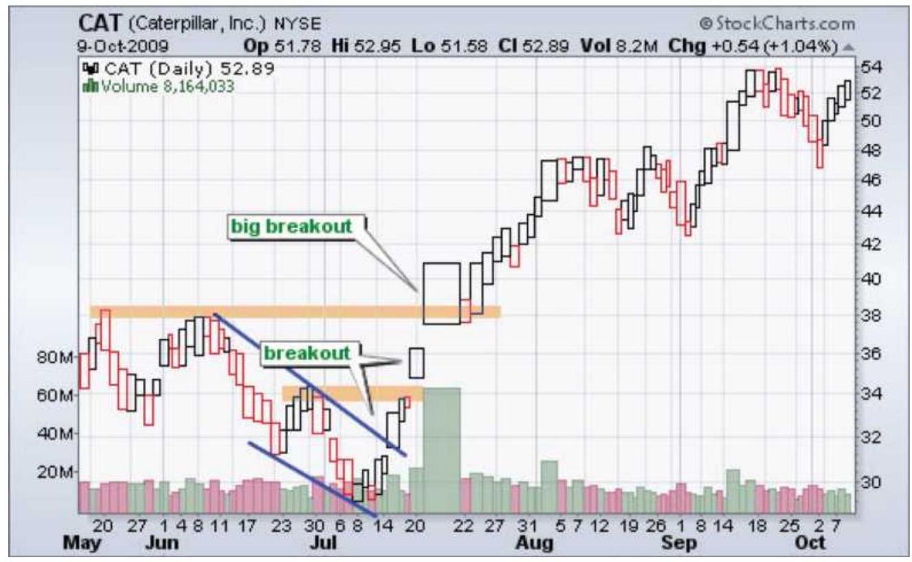
\section*{FIGURE 12.4 Caterpillar (CAT) chart plotting as Equivolume.}
Source: Chart courtesy of StockCharts.com.
By combining volume with price bars, the user gets a better picture of breakouts on high volume and sideways periods on low volume, both seen in Figure 12.4. The trendlines and support and resistance lines used in standard charting are also applied to Equivolume charts.
To implement this in an algorithmic strategy, first find the number of shares representing "normal" volume. Assign that to 10 units of time on the bottom scale. If today's volume is twice normal, assign 20 units of time, repeating the same price for each bar. If volume is half the normal amount, assign 5 units. The result will show as a different slope using a linear regression, and
different trendlines for a moving average and other techniques.
\section*{Herrick Payoff Index}
The Herrick Payoff Index (HPI) is the most popular calculation that combines price, volume, and open interest. It is designed to gauge the strength of the current trend and has been applied primarily to futures prices. Because it adds volume and open interest to a momentum calculation, it can be found in Chapter 9 along with some other indicators that use volume as an added feature.
\section*{Volume Is a Predictor of Volatility}
Most often high volume and high volatility occur at the same time. It is easy to see on a chart that one confirms the other. However, not all days that have high volume also have high volatility. Even on days with high volume, the price can close nearly unchanged from the previous day. We need to look at those days as a sign of potential volatility - a large number of traders all with their own objectives somehow managed to offset each other. The next day, if there is an imbalance in the buyers and sellers, and volume is still high, prices could break out in either direction. Therefore, high volume means high risk, even on those days when the risk does not materialize.
\section*{VOLUME INDICATORS}
Both the equities and futures markets have numerous
indicators that use only volume, and those that add volume, intending to make the calculations more robust. The following section gives the most popular of these indicators, most of which originate in the stock market; many use the number of advancing and declining stocks. Readers should note the way in which the data is used from one technique to another and consider the significance of these changes. They are discussed after the section "Breadth Indicators."
\section*{Average Volume}
The most basic of all volume indicators is the average, and the calculation period most commonly used for the equity markets is 50 days, although it may be reasonable to use the same period as the price average that is being used. Then, if you are tracking the 200-day moving average, a 200-day average of the volume would make sense. Anything less than 50 days is not likely to be smooth.
\section*{Normalizing the Volume}
Many momentum indicators, such as the RSI, are more useful because they move between 0 and 100 or -100 to +100 . Other indicators are not limited by a range but fluctuate around zero, such as rate-of-change. Volume \((V)\) can also be normalized. Letting the calculation period, \(N\), be either 50 or 200 days, we can express the volume as a percent of the average volume.
\section*{NormFol \(_{4}=100\) \\ \[
\overline{\left(\sum_{i=I-N+1}^{t} V_{t}\right) / N}
\]}
The normalized volume lets us say that "today's volume is \(20 \%\) higher than the average volume over the past 200 days." This can be seen in the third panel of Figure 12.5, showing Microsoft prices and volume. We can also change volume to an indicator with a value from 0 to 100 by applying the same calculation as a stochastic:

\section*{Volume Momentum and Percentage Change}
Two other basic volume indicators are the equivalents of momentum and rate of change. These techniques treat volume as they would price. For momentum, this means finding the change in volume over a specific time interval; percentage change measures the size of the volume change relative to the starting value.
Because volume is an erratic number, volume momentum only makes sense using average volume. If \(t\) is today:
Volume momentum \(_{t}=\) Average \(\left(\right.\) Volume \(\left._{t}, N\right)-\) Average \(\left(\right.\) Volume \(\left._{t-n}, N\right)\)
\[
\text { Volume } \%_{t}=\frac{\text { Average }\left(\text { Volume }_{t}, N\right)-\text { Average }\left(\text { Volume }_{t-n}, N\right)}{\text { Average }\left(\text { Volume }_{t-n}, N\right)}
\]
where \(N\) is the period over which the rolling average is taken, and \(n\) is the calculation period for the indicator.
\section*{Force Index}
Devised by Alex Elder, the Force Index is the change in price multiplied by the daily volume, an idea that we'll see repeated in a number of other indicators, including Joseph Granville's On-Balance Volume. Elder, however, includes trading rules.
\section*{Force Index \({ }_{t}=\left(\right.\) Close \(_{t}-\) Close \(\left._{t-1}\right) \times\) Volume \(_{t}\)}
The Force Index will be positive or negative if the price change was higher or lower. It is also not limited to daily charts, but can be applied to weekly or monthly data, as can many of the other methods in this chapter. Once the daily Force Index is calculated, it should be smoothed.

For timing entries and exits, it is suggested that a 2-day exponential smoothing (EMA with a smoothing constant 0.667 ) be used to avoid unnecessary noise in the indicator. For longer-term analysis, a 13-day EMA (smoothing constant o.1428) should be used. Consistent with the idea of noise, the 2-day smoothed Force Index buys when the value is low and sells short when it is
high; however, the 13-day value is treated as a trend, giving a buy signal when it crosses above zero and a sell when it crosses below zero. Signals remain in effect until the smoothed Force Index crosses the zero line in the other direction. The indicator TSM Force Index is on the Companion Website.
\section*{Volume Oscillator}
Visualizing the pattern of volume can be very helpful, and the simplest way to do this is with a volume oscillator, which addresses the issue of erratic data by using two smoothed values. A volume oscillator is a twostep process and may use trends of any calculation period. Here, 14- and 34-day periods are used.
\section*{Method 1}
Calculate the difference between a short-term and longterm average volume. Using 14 and 34 days gives:
\[
V O\left(\text { Diff }_{t}=\frac{\sum_{i=t-14+1}^{t} V_{i}}{14}-\frac{\sum_{i=t-34+1}^{t} V_{i}}{34}\right.
\]
\section*{Method 2}
Calculate the ratio of a short-term and long-term sum of volume. Again, using 14 and 34 days:
\[
V O(\text { Ratio })_{t}=\frac{\sum_{i=t-14+1}^{t} V_{i}}{\sum_{i=t-34+1}^{t} V_{i}}
\]
\(\perp\) Once calculated, the oscillator values can be displayed as a histogram or a line chart. Figure 12.5 shows Microsoft from November 2010 through April 2011 in the top panel, volume in the second panel, the normalized 50-day volume in the third panel, and the volume oscillator using the ratio at the bottom. In this example, the volume oscillator does not confirm the upward or downward trends. Perhaps that is the correct interpretation because these trends were short lived.
Find TSM Volume Oscillator on the Companion Website.
\section*{On-Balance Volume}
Made famous by Joseph Granville, On-Balance Volume \({ }^{3}\) is now a byword in stock analyst circles. On days when prices close higher, it is assumed that all volume represents the buyers; on lower days, the volume is controlled by the sellers. The volume is then added or subtracted from a cumulative value, \(O B V\), to get today's value.
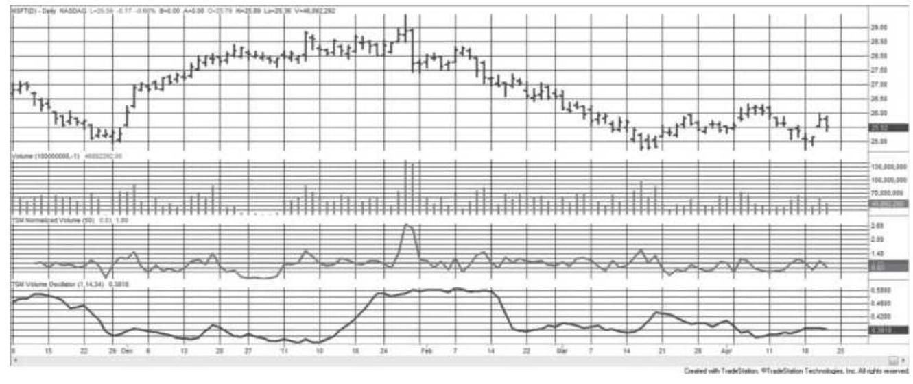
FIGURE 12.5 Microsoft prices (top), volume (second
panel), normalized 50-day volume (third panel), and volume oscillator from ratio (bottom), based on 14- and 34-day periods.
IF Today's price change \(\left(p_{t}>p_{t-1}\right)\), then \(O B V_{t}=O B V_{t-1}+\) Volume \(_{t}\)

The result is a weighted volume-series, which serves to smooth out the erratic nature of the data. The decision to add or subtract the volume can be automated using the following formula. The expression that divides the closing prices produces a value of \(+1,0\), or -1 , which then determines whether today's volume will be added or subtracted from the volume series:
\[
O B V_{t}=O B V_{t-1}+\frac{\text { Close }_{t}-\text { Close }_{t-1}}{\mid \text { Close }_{t}-\text { Close }_{t-1} \mid} \times \text { Volume }_{t}
\]
Determining the OBV manually is a simple accumulation process as shown in Table 12.1. On day 2 prices closed higher; therefore, the volume of 30 (assume thousands) is added to the starting volume of zero. On the next day, the price was again higher, and the volume is added to the total. On day 4 the price drops so that day's volume is subtracted from the total. In this example, volume was higher when price closed up and lower when prices closed down. This is the ideal pattern in a market with a clear uptrend. One advantage of recording the OBV is in observing when the trend of the prices diverges from the
OBV values. The general interpretation of OBV is given in Table 12.2.
\section*{TABLE 12.1 Calculating On-Balance Volume.}
\begin{tabular}{|l|c|c|c|}
\hline Day & \begin{tabular}{c}
Closing \\
Price
\end{tabular} & \begin{tabular}{c}
Daily Volume (in \\
10oos)
\end{tabular} & \begin{tabular}{c}
On-Balance \\
Volume
\end{tabular} \\
\hline 1 & 310 & 25 & .0 \\
\hline 2 & 315 & 30 & 30 \\
\hline 3 & 318 & 27 & 57 \\
\hline 4 & 316 & 15 & 42 \\
\hline 5 & 314 & 12 & 30 \\
\hline 6 & 320 & 28 & 58 \\
\hline
\end{tabular}
\section*{TABLE 12.2 Interpreting On-Balance Volume.}
\begin{tabular}{|l|l|l|}
\hline \begin{tabular}{l}
Price \\
Direction
\end{tabular} & \begin{tabular}{l}
OBV \\
Direction
\end{tabular} & \multicolumn{1}{c|}{ Interpretation } \\
\hline Up & Up & Clear uptrend \\
\hline & Sideways & Moderate uptrend \\
\hline Sideways & Up & \begin{tabular}{l}
Weak uptrend near \\
reversal
\end{tabular} \\
\hline & \begin{tabular}{l}
Accumulation period \\
(bottom)
\end{tabular} \\
\hline & Sideways & No determination \\
\hline Down & Down & \begin{tabular}{l}
Distribution period (top) \\
Up \\
Reak downtrend near
\end{tabular} \\
\hline & Sideways & Moderate downtrend \\
\hline
\end{tabular}
\section*{Down}
\section*{Clear downtrend}
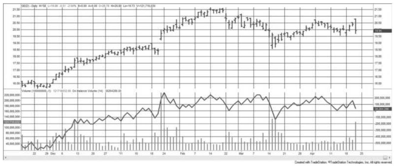
FIGURE 12.6 On-Balance Volume applied to GE from December 2010 through April 2011. Volume is shown on the left lower scale and the OBV on the right lower scale.
Because a volume series has many erratic qualities caused by large variations in volume from day to day, it is most often used with a long-term moving average trend. An upward trend in volume is interpreted as a confirmation of the current price direction while a downturn in volume can be liquidation or uncertainty. Combining the volume trend and price trend is not necessary. The OBV values can be used instead of price for making trading decisions.

In Figure 12.6, the OBV is plotted along with the volume at the bottom of the GE chart, covering from December 2010 through April 2011. The pattern of the OBV is similar to the pattern of prices in the top panel even though it is created from volume. The primary difference between the price chart and the OBV line is
that prices continue to move higher throughout December before peaking while the OBV spikes at the end of November before going sideways. The OBV pattern might actually be declining while prices continue to rise, creating a divergence. The spreadsheet code, \(T S M O B V\), is on the Companion Website.
\section*{Substituting the OBV for Price in a Moving Average}
If the OBV adds value to a standard price series, then we can use the OBV instead of price to find trend signals. In Figure 12.7, the emini SP prices are shown in the top panel with a 40-day moving average, and the volume, OBV, and a 40-day moving average of the OBV are in the bottom panel. The corresponding moving average trendlines are equally smooth, but slightly different on the far right where the price trend rises sooner than the OBV trend.

It is necessary to do a comprehensive test on many markets to find out if the OBV produced better trend results than simply using the price. We already know that the S\&P and stocks in general are not the best choice for trending; therefore, tests of interest rates would be more interesting. Tests of interest rates did show improvements using OBV as a substitute for price. An example of a strategy, TSM OBV Trend, that applies a trend to the OBV is on the Companion Website.
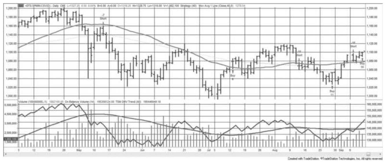
FIGURE 12.7 S\&P prices are shown with the volume, OBV, and a 40-day trend of the OBV in the bottom panel. Trading signals are derived from the OBV trendline. A corresponding 40-day moving average is shown in the top panel.
\section*{Money Flow Index}

A simple variation of On-Balance Volume uses the average of the high, low, and closing prices instead of only the close. It is called the Money Flow Index (MFI) and has been compared to the RSI. It is on the
Companion Website as TSM Money Flow.
\(T P_{t}=\left(H_{t}+L_{t}+C_{t}\right) / 3\)
If \(T P_{t}>T P_{t-1}\) then \(M F P_{t}=M F P_{t-1}+T P_{t} \times V_{t}\)
If \(T P_{t}<T P_{t-1}\) then \(M F N_{t}=M F N_{t-1}+T P_{t} \times V_{t}\)
\(M F I_{t}=100-\frac{100}{\left(\frac{1+M F P_{t}}{M F N_{t}}\right)}\)
\section*{Volume Count Indicator}

An indicator that closely resembles On-Balance Volume is a running total of the days when volume increases minus the days when volume declines. That is, add 1 to the cumulative value on a day when today's volume is greater than the previous day; otherwise, subtract 1. The Volume Count Indicator (VCI) is on the Companion Website. It can be written as:
\[
V C I_{t}=V C I_{t-1}+\frac{V_{t}-V_{t-1}}{\left|V_{t}-V_{t-1}\right|}
\]
\section*{Volume Accumulator}

A variation on Granville's OBV system is Mark Chaiken's Volume Accumulator (VA), available on the Companion Website. Instead of assigning all the volume
to either the buyers or the sellers, the Volume Accumulator uses a proportional amount of volume corresponding to the relationship of the closing price to the intraday mean price. If prices close at the high or low of the day, all volume is given to the buyers or sellers as in the OBV calculation. 4 If the close is at the midrange, no volume is added. This can be accomplished with the following calculation:
\[
V A_{t}=V A_{t-1}+\left(\frac{C_{t}-L_{t}}{H_{t}-L_{t}}-0.50\right) \times 2 \times V_{t}
\]
\section*{Accumulation Distribution}
Similar to the Volume Accumulator, and also developed by Mark Chaiken, the Accumulation Distribution indicator as well as the following two methods use a concept that relates to buying and selling pressure. This compares the strength of the close compared to the open divided by the trading range. It is also called money flow in some references. In the following formula, the previous close can be substituted for the open if the opening price is not available.
\[
A D_{t}=A D_{t-1}+\frac{C_{t}-O_{t}}{H_{t}-L_{t}} \times V_{t}
\]
\section*{Intraday Intensity}
Intraday Intensity uses the distribution of the daily
trading range to create a new indicator. If the intraday low is further from the close than the intraday high, in other words, prices close nearer to the high, then the indicator increases in value.
\[
I_{t}=I_{t-1}+\left(\frac{\left(C_{t}-L_{t}\right)-\left(H_{t}-C_{t}\right)}{H_{t}-L_{t}}\right) \times V_{t}
\]
\section*{Alphier Expectation}
A variation on intraday intensity is the Alphier
Expectation, recognized by John Bollinger. All values are as of day \(t .5\)
\[
A E=\frac{2 \times C-H-L}{(H-L) \times V}
\]
\section*{Price and Volume Trend, the Positive Volume Index, and the Negative Volume Index}

The Price and Volume Trend (PVT) \({ }^{\underline{6}}\) applies volume to the daily percentage price change, which can be positive or negative. Note that this cannot be used for back-adjusted futures prices, only for cash markets, stock prices, and indexes.
\[
V P T_{t}=V P T_{t-1}+\left(\frac{C_{t}}{C_{t-1}}-1\right) \times V_{t}
\]

There are two variations on the PVT, the Positive Volume Index (PVI) and Negative VolumeIndex (NVI). Both take the approach that a single indicator that adds and subtracts volume based on market direction is not as informative as two separate series that can be viewed at the same time. In the first variation, the direction of the closing price determines whether volume is added to the positive or negative index. In the second variation, higher or lower volume, compared to the previous day, is the basis for adding to the positive or negative index.
Variation 1 , use the close as the determining factor:
\[
\begin{aligned}
& \text { If } C_{t}>C_{t-1} \text { then } P V I_{t}=P V I_{t-1}+V_{t} \\
& \text { If } C_{t}<C_{t-1} \text { then } N V I_{t}=N V I_{t-1}+V_{t}
\end{aligned}
\]
Variation 2, use the volume as the determining factor:
\[
\begin{aligned}
& \text { If } V_{t}>V_{t-1} \text { then } P V I_{t}=P V I_{t-1}+\frac{C_{t}}{C_{t-1}} \times V_{t} \\
& \text { If } V_{t}<V_{t-1} \text { then } N V I_{t}=N V I_{t-1}+\frac{C_{t}}{C_{t-1}} \times V_{t}
\end{aligned}
\]
In Norman Fosback's Stock Market Logic, the author studied stock trends from 1941 through 1975 based on variation 1 and concluded that:
- If the PVI trend is \(u p\), there is a \(79 \%\) chance that a
bull market exists.
- If the PVI trend is down, there is a \(67 \%\) chance that a bear market exists.
- If the NVI trend is up, there is a \(96 \%\) chance that a bull market exists.
If the NVI trend is down, there is a \(50 \%\) chance that a bear market exists.
In order to find the trend of either the PVI or NVI, a 6month (127-day) or 1-year (255-day) moving average was applied to the individual index values.
\section*{Aspray's Demand Oscillator}

Using direction to separate volume into two series of Buying Pressure and Selling Pressure, Aspray then nets them into his own Demand Oscillator (DO). \({ }^{7}\) Note that during a rising market the Selling Pressure has been divided by a percentage of the volume, which has been scaled to be greater than 1 . The following calculations show the separate steps needed to create Aspray's DemandOscillator:
For rising prices:
\section*{(Buying Pressure) \(B P_{t}=V_{t}\)}

For declining prices:
\[
\begin{aligned}
B P_{t} & =\frac{V_{t}}{K \times \frac{C_{t}-C_{t-1}}{C_{t-1}}} \\
S P_{t} & =V_{t}
\end{aligned}
\]
and where
\section*{\(3 \times C_{t}\)}
\(K=\frac{3 \times C_{t}}{\left[\sum_{i=t-9}^{t}\left(\max \left(H_{t}, H_{t-1}\right)-\min \left(L_{t}, L_{t-1}\right)\right)\right] / 10}\)
and
\[
D O_{t}=B P_{t}-S P_{t}
\]
\(K\) is a volatility scaling factor which is 3 times the closing price divided by the 10 -day moving average of the maximum 2-day high-low combined range, and has a value likely to be well over 100 . For example, if the S\&P is trading at 2,000 and the average volatility is 30 full points (which is very high for a 10-day average), then \(K=\) \(3 \times 2000 / 30=200\).
\section*{Tick Volume Indicator}
In a manner similar to Wilder's RSI, Blau doublesmoothes the tick volume as a way of confirming price direction. The Tick Volume Indicator, seen in Figure 12.8, is calculated as:
\section*{\(100 \times\) DEMA(upticks, \(r, s)-\) DEMA(downticks, \(r, s)\)}
\(\operatorname{TVI}(r, s)=\)
DEMA(upticks, \(r, s)+\) DEMA(downticks, \(r, s\) )
TVI ranges from -100 to +100 and DEMA (Double Exponential Moving Average) is the double smoothing of the downticks or upticks. The exponential smoothing is first calculated over \(r\) bars, and the result of that smoothing is again smoothed over the past \(s\) bars. More about the double-smoothing technique can be found in Chapter 7. This technique differs from Blau's price smoothing because it takes the price differences first; therefore, the TVI will be lagged slightly less than half the sum of the two calculation periods.
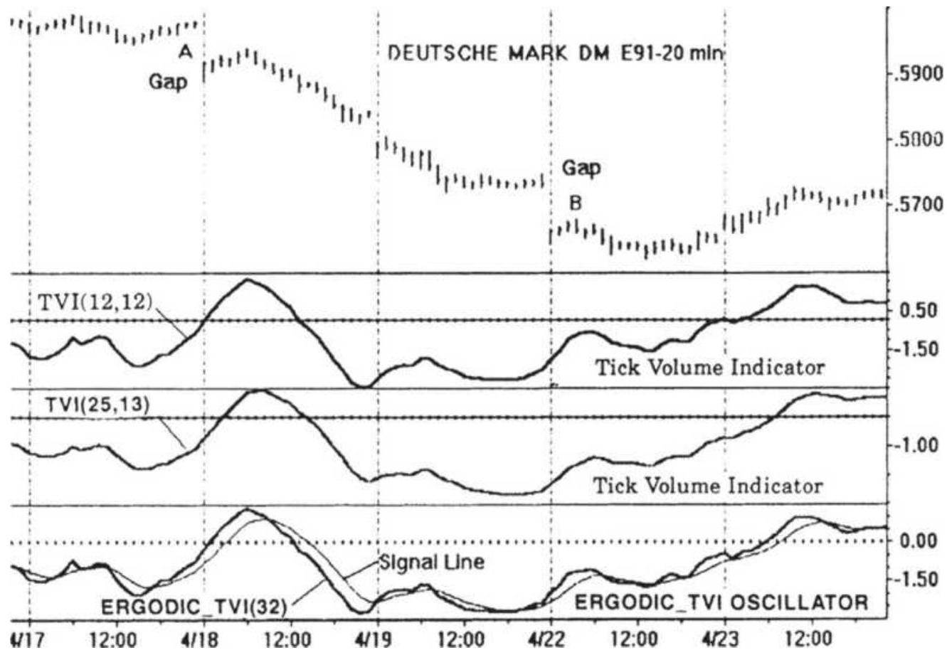
FIGURE 12.8 Blau's Tick Volume Indicator.
Source: William Blau, Momentum, Direction, and
Divergence (New York: John Wiley \& Sons, 1995), p. 45.
\section*{Volume-Weighted MACD}
The MACD is based on the difference between two moving averages (see Chapter 9). To add volume, the closing prices for each day are multiplied by the corresponding volume, and each moving average is normalized by the average volume over the same period. The recommended calculation periods are 12 and 26 days, the standard MACD values. A signal line, also the same as MACD, is the exponentially smoothed VWMACD line using a 0.20 smoothing constant, the equivalent of about 9 days.
VWMACD \(=\left(\frac{\sum_{t=t-12+1}^{t} C_{i} \times V_{i}}{\sum_{i=t-12+1}^{t} V_{i}}\right)-\left(\frac{\sum_{t=t-26+1}^{t} C_{i} \times V_{i}}{\sum_{i=t-26+1}^{t} V_{i}}\right)\)

Figure 12.9 uses TSM Volume Weighted MACD, on the Companion Website, to plot the VWMACD for euro currency futures during 2017. Prices are at the top, volume in the second panel, the MACD in the third panel (using the standard parameters 12-26-9), and the volume-weighted MACD in the bottom panel. For both the MACD and VWMACD, the heavier line is the indicator and the thinner, smoother line is the signal. As with the MACD, the rules are to enter a new long position when the VWMACD crosses above the signal line, and the opposite for shorts. When compared to the
MACD, this variation appears to make the indicator swings more distinct, although a thorough testing would be needed to compare its value in generating signals.
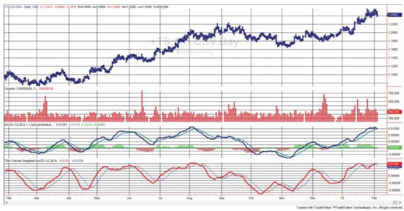
FIGURE 12.9 Volume-weighted MACD applied to euro currency futures.
\section*{Variably Weighted Moving Average Using Volume}

A unique approach taken by Christian Fries \({ }^{8}\) uses the relationship between the number of outstanding shares, the current price, and the volume of the next period or the next trade to create an Elastic VolumeWeighted Moving Average (eVWMA). Using the difference between the number of outstanding shares and the number of shares being traded, he creates a weighting factor. That weighting factor causes the previous trend value to have more importance when fewer shares are traded today and less important when
relatively more shares are traded. The net effect is that the weighted average is more responsive to change when relatively more shares are traded.

where
\(O S=\) the number of outstanding shares.
Using Merck (MRK) as an example, the total outstanding shares was set to 200 million (based on an observed maximum daily volume of approximately 150 million). By keeping the outstanding shares slightly bigger than the maximum volume, the indicator will vary across a wider range and show more of its characteristics. Figure 12.10 compares the eVWMA to a standard exponential smoothing of o.10. The results are very similar although the eVWMA tracks closer to the price in the center of the chart.
\section*{Substituting Open Interest for Volume Using Futures}
Futures volume can create very different results than volume for stocks. The markets themselves, energy, gold, and even interest rates, have had strong secular trends, alternating with periods of sideways price movement. The nature of movement in futures markets, driven greatly by fundamentals and not complicated by company management, earnings, and index arbitrage, is
very different from equities.
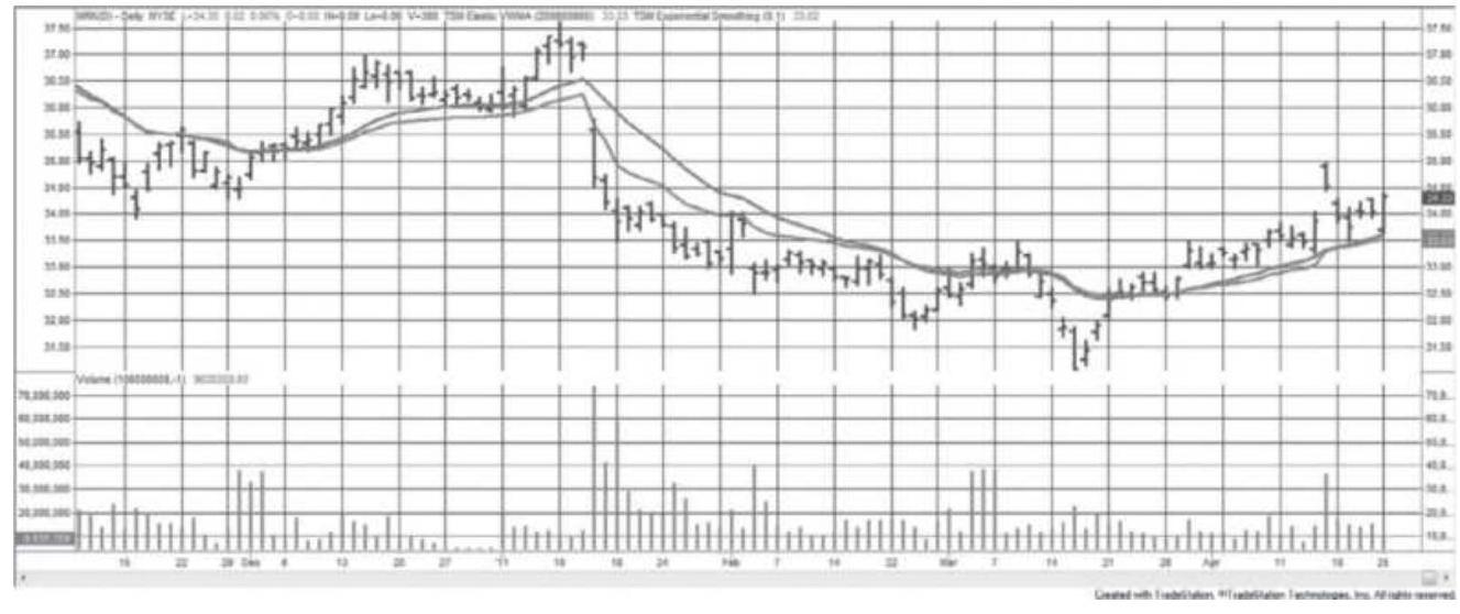
FIGURE 12.10 Elastic Volume-Weighted Moving Average (tracking closer to prices) applied to Merck (MRK) compared with a 0.10 exponential smoothing.
Futures volume comes in two parts, contract volume and total volume. Total volume is the volume of all contracts in that market. Contract volume begins at zero, increases as the contract moves from deferred (many months away from delivery) to the nearby delivery, then back to zero as the contract nears expiration. Open interest follows a similar pattern. To avoid this rising and falling pattern, total volume is used instead of contract volume; however, open interest is much more stable than volume. Similar to volume, open interest increases as market activity increases; therefore, it reflects the same fundamentals.
Total open interest can be a preferable substitute for volume in many of the indicators covered in the previous sections because it is less variable than volume. A clear example is gold futures during 2016, shown in Figure
12.11. Open interest, in the center panel, rises and falls smoothly with prices while volume, in the bottom panel, trends up and down. Both are shown with a 40-day moving average. This does not eliminate using volume to confirm a short-term view of the market, but should point out that both volume and open interest are valuable assets.

Two indicators, TSM Tend of Volume, and TSM Trend of Open Interest, which will create the bottom two panels in Figure 12.11, are on the Companion Website.
\section*{VWAP and TWAP}
As a note, executions can be placed as a \(V W A P\) order, a volume-weighted average price. For larger positions, this would return an average price representing how actively the market traded at different levels throughout the day. It is most convenient for hedge funds that do not want to force prices higher by placing an excessively large buy order at one point during the day, or even on the close. Equally spaced orders, which ignore liquidity, use TWAP, a time-weighted average price.
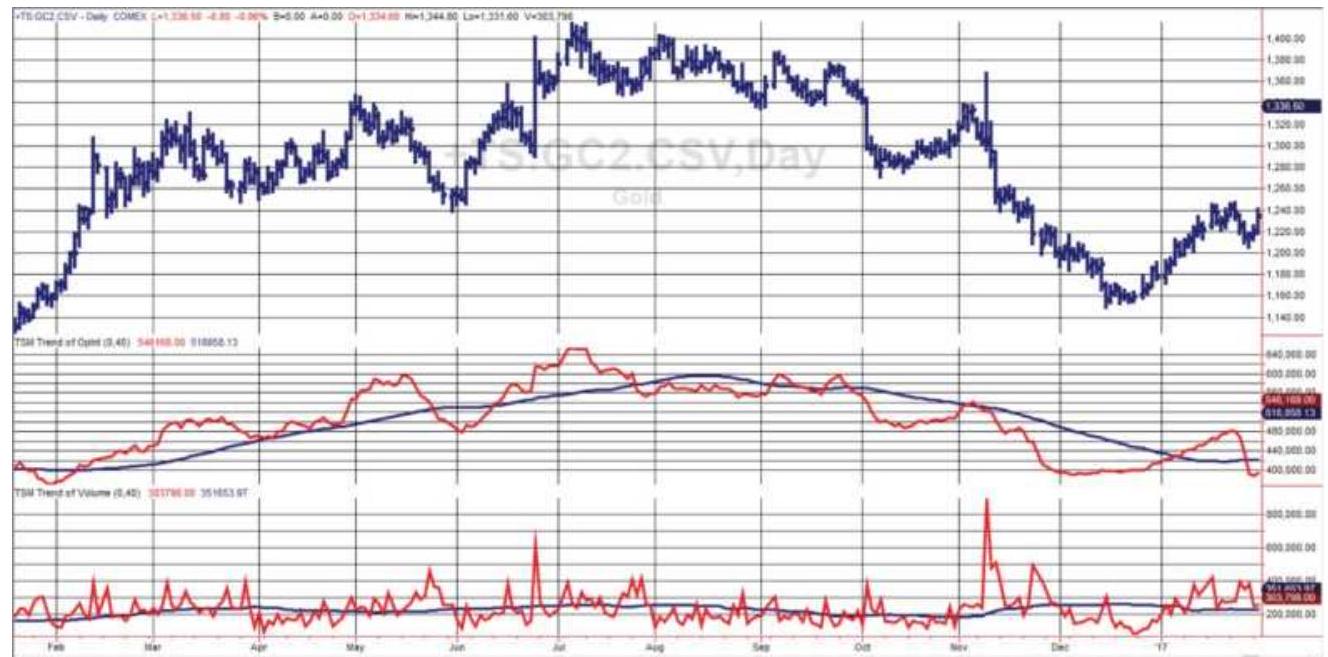
FIGURE 12.11 Gold futures with open interest (center) and volume (bottom), each with a 40-day moving average.
\section*{BREADTH INDICATORS}
Market breadth measures the imbalance between the number of advancing and declining stocks on a given day. It is the percentage of rising stocks to the total number of stocks traded. In general, more advancing issues should add confidence to an upward price move in the same way that volume confirms price. When S\&P prices are rising while more issues are declining, it is interpreted as a weak rally and likely to fail. Breadth indicators equally weight the impact of stock movement; therefore, they offer diversification from the price moves of the S\&P or other indexes, which are capitalization weighted or even price weighted.
The information for advances and declines is published
along with stock prices each day. You may also want the volume of advancing issues and the volume of declining issues. Both of these values can be found in the Wall
Street Journal under "Trading Activity," and on many data services such as Bloomberg. In this section, the CSI data series, UVDV, will be used. In addition, we will look at the new highs and new lows using CSI data MKST, to see if those numbers add value to price analysis.
To interpret the CSI data files, use the following guide. The normal field designation is in the heading and the actual content is below.
\begin{tabular}{|l|l|l|c|c|c|c|}
\hline Series & Date & Open & High & Low & Close & Vc \\
\hline UVDV & Date & \begin{tabular}{l}
Total \\
traded
\end{tabular} & Advanced & Declined & Unchanged & \begin{tabular}{l}
Uf \\
Vc
\end{tabular} \\
\hline MKST & Date & \begin{tabular}{l}
Total \\
traded
\end{tabular} & Advanced & Declined & Unchanged & 52 \\
& & & & & Hi \\
\hline
\end{tabular}
Market breadth indicators are typically used as a confirmation of price direction. The table below shows that the interpretation of market breadth is the same as the relationship between volume and price.
\begin{tabular}{|l|l|l|}
\hline \begin{tabular}{l}
Market \\
Breadth
\end{tabular} & Price & \multicolumn{1}{c|}{ Interpretation } \\
\hline Rising & Rising & Breadth confirms price rise \\
\hline Falling & Falling & \begin{tabular}{l}
Breadth confirms price drop
\end{tabular} \\
\hline Falling & Rising & \begin{tabular}{l}
Breadth does not confirm price \\
rise
\end{tabular} \\
\hline Rising & Falling & Breadth does not confirm price \\
\hline
\end{tabular}
The measurement of breadth must relate to what you are trading. If \(75 \%\) of the stocks in the Dow rise, the S\&P Small Cap Index (IWM) can still be lackluster or declining. Investors shift from small-cap stocks to the S\&P 500 and then to the Dow when they are looking for safety. The breadth of the overall market, or the breadth of large caps, is not enough to confirm an upward trend in the small caps.
\section*{Separating Advancing from Declining Volume}
The most basic of all techniques for determining market breadth is the Advance-Decline Index, which creates a new series by adding the net of the number of advancing and declining stocks each day. Unchanged issues are ignored.
\section*{Advance-Decline Oscillator \(=\) Advances \(_{t}-\) Declines \(_{t}\)}
\[
\text { Advance-Decline Index }=\text { Advance-Decline Index } x_{t-1}+\text { Advances }_{t}-\text { Declines }_{t}
\]
In some of the techniques that follow, only the oscillator, or single-period calculation, may be shown. An index can be created by accumulating these values.
\section*{Sibbett's Demand Index}
One method that smoothes volume by using the sum of the upside and sum of the downside volume is James Sibbett's Demand Index. The technique bears a resemblance to the approach used in Wilder's RSI. It can
be used as an oscillator with individual daily values or accumulated into an index. The daily index (DI) is calculated as the sum of the upside volume divided by the sum of the downside volume. That makes this oscillator neutral at the value of 1.0.
\section*{Demand Index \(_{t}=\frac{\sum_{i=t-n+1}^{t} \text { upside volume }_{i}}{\sum_{i=t-n+1}^{t} \text { downside volume }_{t}}\)}

Sibbett used 10 days for the period, but Arthur Merrill, another well-known stock analyst, has suggested using \(n=5\). The values for upside and downside volume can also be found in the Wall Street Journal under the heading "Trading Activity." Figure 12.12 shows SPY prices (top) with the McClellan Oscillator (described in the next section) in the center, and Sibbett's Demand Oscillator at the bottom. The end of January 2018 started a sudden sell-off of equities, and both oscillators show that they are leading indicators of a price drop. TSM Sibbett Demand Index is on the Companion Website.
\section*{McClellan Oscillator}
The McClellan Oscillator is created by subtracting two smoothed trends of the net advances (NA), using 19 and 39 days, in a manner similar to the MACD. Converting the 19- and 39-day calculation periods to smoothing constants using \(2 /(n+1)\) we (conveniently) get
\section*{\(s_{1}=0.10\) and \(s_{2}=0.05\)}
\[
\begin{aligned}
& N A_{t}=\text { Advances }_{t}-\text { Declines }_{t} \\
& E 1_{t}=E 1_{t-1}+s_{1} \times\left(N A_{t}-E 1_{t-1}\right) \\
& E 2_{t}=E 2_{t-1}+s_{2} \times\left(N A_{t}-E 2_{t-1}\right) \\
& M c \text { Clellan Oscillator }_{t}=E 1_{t}-E 2_{t}
\end{aligned}
\]
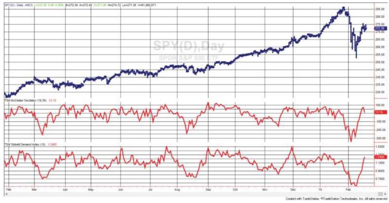
FIGURE 12.12 SPY prices ending in February 2018 with the McClellan Oscillator (center) and Sibbett's Demand Index (bottom).
By using longer calculation periods than the Demand Index, Figure 12.12 shows that the McClellan Oscillator has larger swings, yet highs and lows are very closely positioned in both indicators. When SPY sold off sharply in late January, the McClelland Oscillator crossed the zero line one week earlier, while the Demand Oscillator
crossed its midpoint two days before SPY peaked.

Both indicators stay slightly above neutral during the long upward move, but the most interesting feature would be the extreme highs and lows, which are clearer in the McClellan Oscillator, corresponding nicely to two price lows and one peak. The high point that ended the long upward move shows as divergence in the two indicators, a pattern that is not as easy to identify at the time but can be very useful. TSM McClellan Oscillator is on the Companion Website.
\section*{Bolton-Tremblay}
Using the net advancing stocks, as seen in the McClellan Oscillator, compared to the number of stocks that were unchanged, the Bolton-Tremblay approach also includes a form of geometric weighting of the results. In the following calculation, \(B T\) is the daily Bolton-Tremblay value, and \(B T I\) is the index resulting from accumulating the individual daily values.
\[
\begin{aligned}
& B T_{t}=\frac{\text { Advancing }_{t}-\text { Declining }_{t}}{\text { Unchanged }_{t}} \\
& \text { if } B T_{t}>0 \text { then } B T I_{t}=B T I_{t-1}+\sqrt{B T_{t}} \\
& \text { if } B T_{t}<0 \text { then } B T I_{t}=B T I_{t-1}-\sqrt{\left|B T_{t}\right|}
\end{aligned}
\]
Note that the absolute value of \(B T\) is used to avoid a negative value; otherwise, the square root function will
fail.
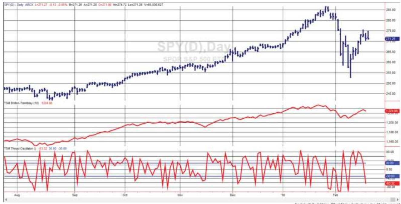
FIGURE 12.13 SPY prices with Bolton-Tremblay Index (center) and Thrust Oscillator (bottom).

Even if it's difficult to see in Figure 12.13, the Bolton-Tremblay calculation will have large spikes on days when the advancing or declining breadth is very strong because the unchanged number of stocks in the denominator is very small. It also seems to lead the decline in SPY in late January. TSM Bolton-Tremblay is on the Companion Website. Figure 12.13 shows both the Bolton-Tremblay Index and the Thrust Oscillator.
\section*{Schultz}
Schultz chose to look at the advancing stocks only as a percentage of the total stocks, which puts the results in the convenient range of o to 100:

\section*{Upside/Downside Ratio}
A simple Upside/Downside Ratio (UDR) is similar to Sibbett's Demand Index but is not smoothed. With this ratio, it is easier to see the asymmetry of the calculation. When the declining volume is very low, for example, only \(20 \%\) of the total volume, the UDR will have a value of 4.0. In contrast, if the advancing volume is low, \(20 \%\) of the declining volume, the ratio is 0.20 . There is no upside limit when stocks are advancing but the downside ratio is limited to the range between 0 and 1 . This is a familiar pattern for advancing and declining prices expressed as a percentage. High values of the UDR are expected to precede a bull market period.
\section*{\(U D R_{t}=\frac{\text { Advancing Volume }_{t}}{\text { Declining Volume }_{t}}\)}
\section*{Arms Index (TRIN)}
Richard Arms explains the relationship between the number of advancing and declining stocks, and the up and down volume, in the Arms Index, more popularly known as TRIN, the Trader's Index. It divides the ratio of the number of advancing and declining stocks by the ratio of the volume of the advancing and declining stocks. \\ Advancing stocks \(s_{t}\) Declining stocks \({ }_{t}\)
\section*{\(\operatorname{TRIN}_{t}=\) \\ Advancing volume \(_{t} /\) Declining volume \(_{t}\)}

In an article by Bhandari, \({ }^{9}\) he states that TRIN is a short-term trading tool, showing whether volume is flowing into advancing or declining stocks. It is also a countertrend indicator. When the index is below 1.0 it is bullish, when above it is bearish. It is neutral at 1.0. TRIN has no upper limit. As a trend indicator, a buy signal occurs when TRIN goes above 2.0, a sell signal when it is below 0.50 . Figure 12.14 shows three buy signals where TRIN moves above 2.0 (the horizontal line in the lower panel). TSM TRIN is on the Companion Website.
\section*{Thrust Oscillator}
Tushar Chande's Thrust Oscillator (TO) uses the same values as TRIN but creates a bullish oscillator by multiplying the number of advancing stocks by the volume of the advancing stocks and subtracting the comparable declining values, then dividing by the sum of the two.
\[
\begin{aligned}
& \text { Adv stocks }_{t} \times \text { Vol of adv stocks }- \text { Decl stocks }_{t} \times \text { Vol of decl stocks } \\
& T 0_{t}=100 X \\
& \text { Adv stocks }_{t} \times \text { Vol of adr stocks }{ }_{t}+\text { Decl stocks }_{t} \times \text { Vol of decl stocks } s_{t}
\end{aligned}
\]
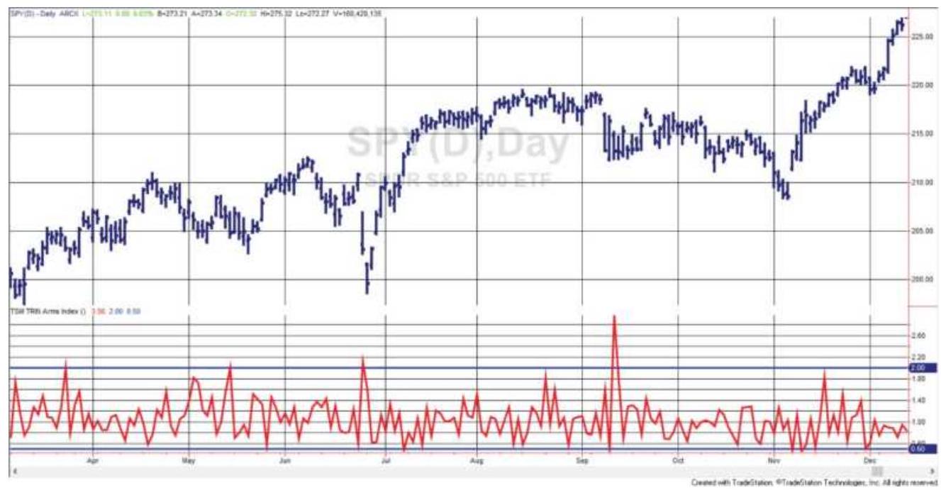
FIGURE 12.14 The Arms Index (TRIN) shown with SPY during 2017 .
The Thrust Oscillator is used as an overbought/oversold indicator to complement another strategy that would decide the major direction of the market. Values of \(\pm 30\) may be used to identify overbought and oversold levels, respectively. Figure 12.13 shows the Thrust Oscillator (bottom panel) along with S\&P futures (top panel). The recommended bands of \(\pm 30\) give short-term indications of overbought and oversold days and occur more frequently during a sideways price move. Using \(\pm 40\) would be more selective in the period shown.

When studying both the Arms Index (TRIN) and the Thrust Oscillator (TO) it would seem sensible to express all the component values as percentages of the whole. That is, the number of advancing and declining stocks should each be divided by the total number of stocks, and the volume of the advancing and declining
stocks should each be divided by the total volume of all shares traded. This would make those days with low relative volume less important. In the current calculations, inactive days might produce highly distorted values. This indicator is on the Companion Website as TSM Thrust Oscillator.
\section*{New Highs and Lows}
There is very little literature on the use of the number of new highs and lows that occur daily, yet the data are available and can be used in ways similar to market breadth. This indicator used the CSI series MKST-I. The most obvious way to use these data is by creating a HighLow Index (HLX):
\[
H L X_{t}=H L X_{t-1}+N H_{t}-N L_{t}
\]
where \(N H\) are new 52 -week highs and \(N L\) are new 52 week lows. Another approach would be a simple ratio of the new highs compared to the combined new highs and lows, over the past \(n\) days:
\[
H L R_{t}=\frac{\sum_{i=t-n+1}^{t} N H_{i}}{\sum_{i=t-n+1}^{t}\left(N H_{i}+N L_{i}\right)}
\]

Gerry Appel \({ }^{10}\) uses this High-Low Ratio, smoothed over 10 days, and generates a buy signal when the ratio crosses above a threshold of, for example, 0.80 or 0.90 , and a sell signal when it crosses back below that
level. In Figure 12.15, the SP futures are shown with the HLR in the lower panel. The top line of the lower panel is 0.90 and might serve as a threshold to extract highmomentum trades during the steady uptrend. It may also be useful to create a fast 3-bar smoothing of the HLR to use as a signal line, in the same manner as MACD, which would avoid the need for a strict threshold entry and exit value. See TSM High-Low Ratio on the Companion Website.
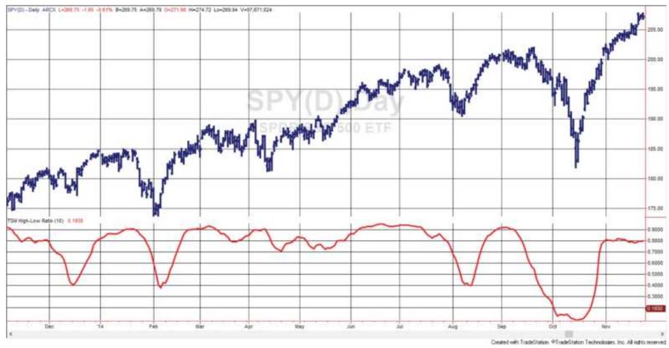
FIGURE 12.15 High-Low Ratio (bottom) shown with SPY (top).
\section*{Baskets of New Highs and Lows}
Another method that will be discussed in more detail in Chapter 13 is buying a basket of stocks that are making new highs and selling a basket of stocks making new lows. Naturally, this assumes that each stock making a new high will sustain that direction because there has
been some fundamental change in its earnings or
structure that the market sees as positive. Similarly, those stocks making new 52 -week lows have negative fundamentals. To avoid unnecessary risk, the long basket and short basket must have the same volatility.
\section*{IS ONE VOLUME OR BREADTH INDICATOR BETTER THAN ANOTHER?}
The final test of a successful indicator is whether it adds value to your trading decisions. This can be determined by programming the indicator into a strategy and testing the rules over a reasonable period of price history. Before doing that, we should decide what an increase or decrease in volume or breadth is telling us, and how we will use that information for trading. Volume and breadth indicators are more difficult than those that use price because the values are more erratic. That makes translating a concept into a profitable strategy also more difficult. There seems no doubt that volume and breadth data have value, and finding how to apply them will improve our trading performance.
Looking at the previous selection of indicators, we see that in Granville's On-Balance Volume and in the Bolton-Tremblay method, a small net change in price can result in all volume being designated to one market direction. Is it reasonable to add all volume to the accumulated index if the S\&P gained only a fraction of one point? On a single day this may seem to be arbitrary, but just as in many basic systems, over a long period of time the net effect of this decision is sound.
The changes made by Mark Chaiken, which take a percentage of volume based on the relative close of prices within the daily range, seem very sensible and avoid the all-or-nothing technique used in On-Balance Volume. Sibbett's Demand Index, by using the sum of 10 days' volume, avoids this problem completely and smoothes the results, a technique often needed when using the highly variable values of volume and breadth.
By seeing these indicators together, they appear to be a collection of minor manipulations of data. Traditional technicians advocate interpretation using trend lines, divergence, or new highs and lows. Those methods alone can be difficult to interpret. Adding volume and breadth makes the process even more intricate. While we don't question that volume and breadth contribute to the understanding of a price move, you must be able to interpret everything profitably. Writing clear rules and testing them may be the only way to find out.
\section*{Breadth as a Countertrend Indicator}
Most literature favors using breadth to confirm direction, but Connors argues the opposite. \({ }^{11}\) He trades the advance/decline \((A D)\) ratio as follows:
Sell the index when \(A D>2.0\)
Buy the index when \(A D<0.50\)
Exit the trade after 5 days unless a reverse signal occurs

Using the series, UVDV-I or MKST-I, defined
earlier in this section, we added the SPX in column 2, then created the advance/decline ratio. The buy and sell rules were applied, but because there were very frequent signals, all trades were held until an opposite signal occurred, rather than for 5 days. The total return (in percent) is shown in Figure 12.16. Complete calculations can be found in the Excel spreadsheet, TSM MKST-I Market Breadth, on the Companion Website.
\section*{MORE TRADING METHODS USING VOLUME AND BREADTH}
Most systematic approaches to volume apply a long-term smoothing method to the data and then identify trend changes to confirm price direction. This can be implemented with any of the accumulation indexes, but not with single-day momentum or oscillator values. For oscillators, most analysts have taken the approach that high volume confirms a new price direction; extreme volume, on the other hand, is more likely to be a reversal signal. If volume and price peaks do not occur at the same time, a volume peak should precede a trend change. A decline in volume has also been used to confirm direction, but it is more likely to indicate that prices have reached equilibrium, and that a further advance or decline requires additional confirmation.
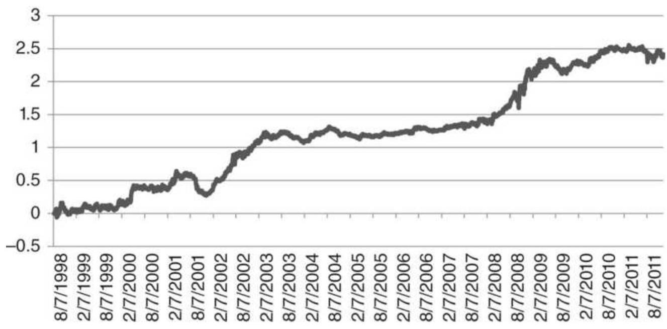
FIGURE 12.16 Total PL using the AD ratio as a countertrend signal applied to SPX.
\section*{Identifying a Volume Spike}
A volume spike is one of the clearest and best examples of useful volume information. Technically, a volume spike is a day when the volume is at least twice that of the average volume over a period generally longer than one month, most likely longer than three months. Volume spikes may come in clusters due to an unstable political or economic situation; however, it is normally associated with the end of a significant price move. Earlier, Figures 12.2 and 12.3 showed spikes in Tesla and gold futures. Individual equities can have large spikes due to the narrower focus on specific news that influences a stock. Index markets will have smaller spikes because they are averages, and spikes must reflect a broader economic event.
\section*{Measuring a Spike}
A simple spike can be measured as exceeding a threshold, \(T\), where \(T\) is a multiple of the average volume, \(A V=\) average (volume, \(n\) ), over the recent \(n\) days. Then a volume spike exists if today's volume is greater than the average volume on the previous day times its multiplier,
Most cases are not as clear as a 1-day spike that appears after days of much lower volume - and is then followed by days of lower volume. More likely, volume has increased over a few days preceding the spike, culminating in a spike that is much higher than the average volume, but may only be \(25 \%\) higher than the previous day. The solution to this is to lag the average volume so that it does not reflect the increasing volume of the recent few days.
We will make the assumption that volume resulting in a spike takes no longer than three days to develop. We can safely say that the average volume, lagged 10 days, should not reflect the recent rise in volume. Then a volume spike would be identified when:
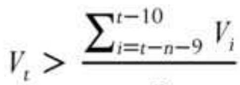
\(n\)
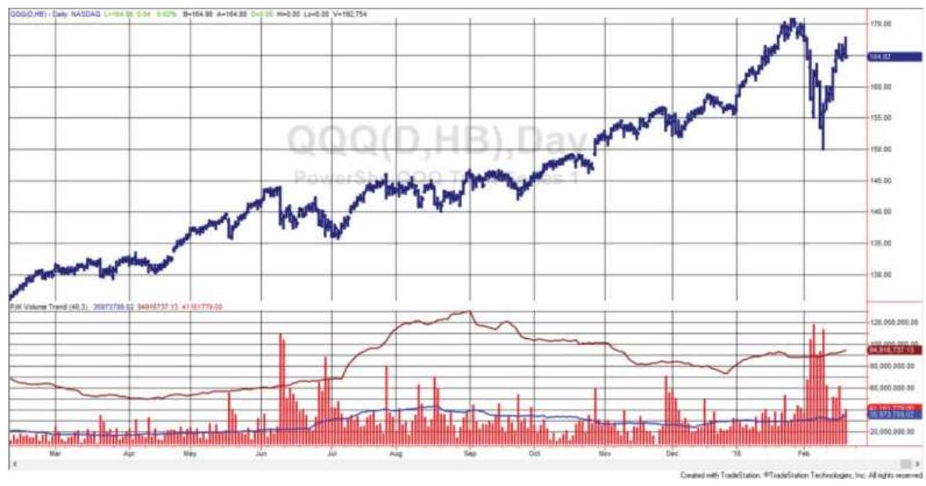
FIGURE 12.17 QQQ prices (top) with volume (bottom), along with the lagged average of volume, and the volume threshold.
This formula is the average volume over \(n\) days beginning \(t-n-9\) days ago and ending \(t-10\) days ago, a total of \(n\) days. If \(t\) is today, then the average volume stops 10 days ago; therefore, it is not influenced by recent volume data.
Volume spikes are not as extreme when dealing with futures markets and indexes. In Figure 12.17 the NASDAQ ETF, QQQ, shows numerous spikes. In the bottom panel, the lower line is a 40 -day moving average of the volume lagged 10 days, and the upper line is the same average multiplied by 2.0 to represent the extreme threshold. The first penetration, in June, occurs on a sudden jump in volume, but the other two clusters of higher volume do not have the strongest day first. All three events occur on price drops. The higher-volume days are on more severe price drops.
\section*{Basic Rules for Trading a Spike}
Without getting complex, trading a volume spike can be profitable with the following rules:
1. Calculate "normal" volume as the 60-day average volume.
2. Find the price direction of the past 5 days. If today's price is greater than the price 5 days ago, then the direction is up.
3. To enter a trade, today's volume must be at least twice the normal volume. The larger the threshold, the smaller the risk but there are fewer trades.
4. Enter on the close of the day showing a volume spike. If the price direction is up, then enter a short sale, and if the price direction is down, then buy.
5. Set a profit target of \(3 \times 20\)-day ATR from the point of entry.
6. Hold the trade for no more than 5 days.
7. If you get another valid signal within the 5 days, reset the count to 1 and continue holding the trade.
8. Do not enter any stock with a share price under \(\$ 10\).
9. Your position size will be your investment divided by the price of the stock. All trades in all stocks must use the same investment allocation in order to keep the risk equal and maximize diversification.
Volume spikes are not frequent, so tracking a large number of stocks will produce more trading signals. Using 275 stocks over 14 years ending 2017 produced an
average return of \(\$ 2,508\) for each stock based on a \(\$ 10,000\) investment. Only long positions were taken. The total return was \(11.5 \%\) per annum.
An interesting outcome is the pattern of profits during the five days of the trade. Figure 12.18 shows that day 2 has the biggest gain, although the average returns are positive each day the trade is open. If we record the total returns of all trades taken over the test period, we get the results in Figure 12.19.
As nice as the results are in Figure 12.19, there may be more than one stock with a volume trade on the same day or on overlapping days. If we only have \(\$ 10,000\) to invest, we need to decide which trading signal to take. Using performance history is not helpful because of the infrequency of trades. Because these trades have 66\% likelihood of being successful, the trade taken was chosen randomly when more than one trade occurred. The resulting NAV is shown in Figure 12.20. It closely parallels the total returns but limits the investment at any one time to \(\$ 10,000\). Some trading systems require unique approaches to implementation.
\section*{Average cumulative profit (long only)}
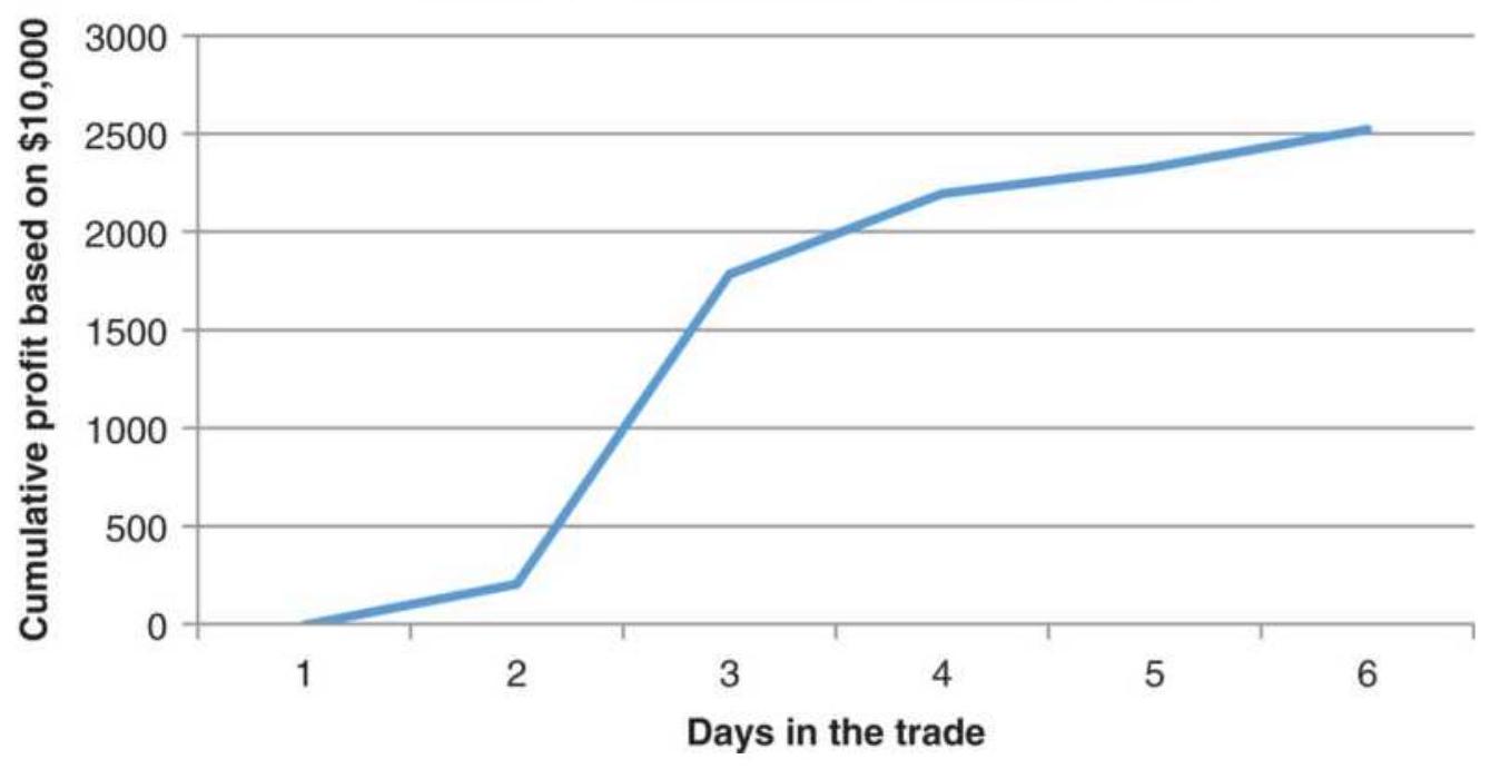
FIGURE 12.18 Average return per day for 275 stocks using the volume spike rules.
\section*{Cumulative PL all trades}
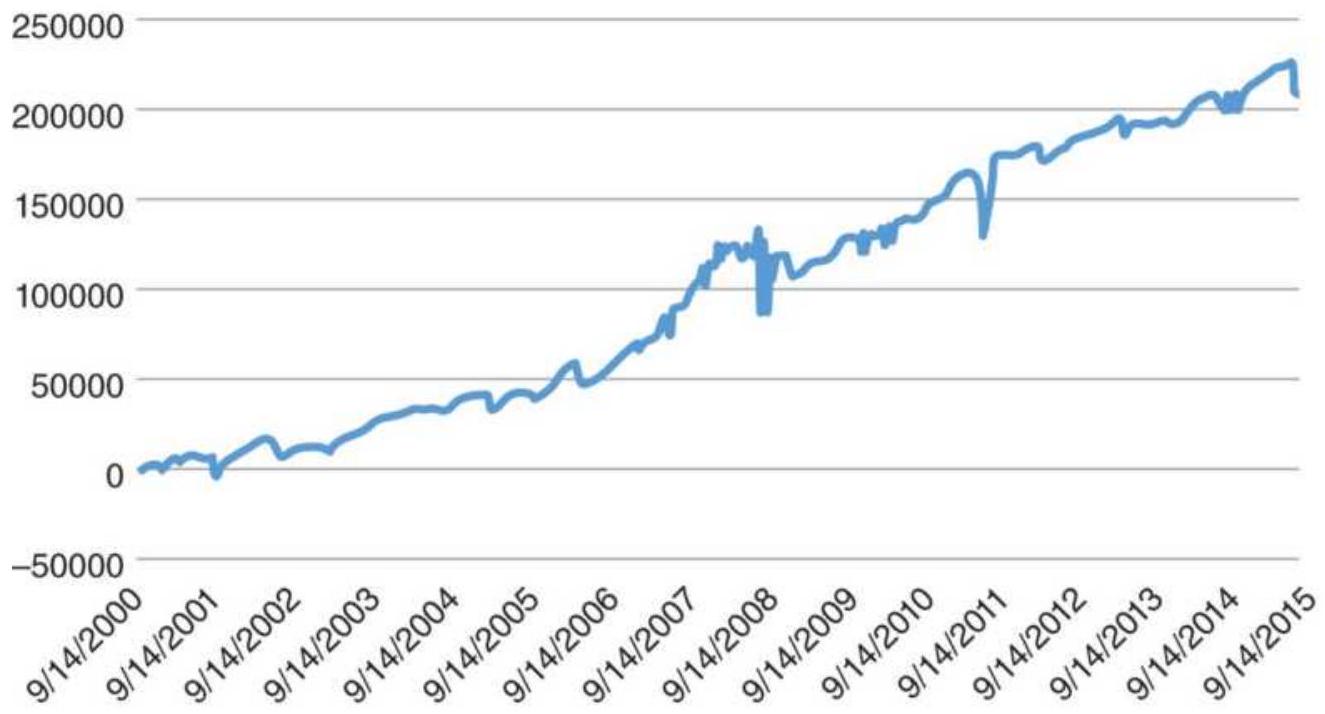
FIGURE 12.19 Total returns of all trades taken using the volume spike rules.
\section*{ETF portfolio chosen randomly}
0

FIGURE 12.20 Result of trades chosen randomly using the volume spike rules.
\section*{A Pseudo-Volume Strategy}
Another way of taking advantage of volume spikes does not use volume at all, but uses the price volatility that occurs at the same time. This strategy needs three conditions to be met for an entry signal. Using SPY, only long positions are taken.
1. The closing price must be below the 100-day moving average to assure a downtrend.
2. The annualized volatility must be greater than a threshold value of \(19 \%\) to indicate high volatility, and volatility must be rising.
3. The 20-day stochastic must be below a threshold value of 15 to be oversold.
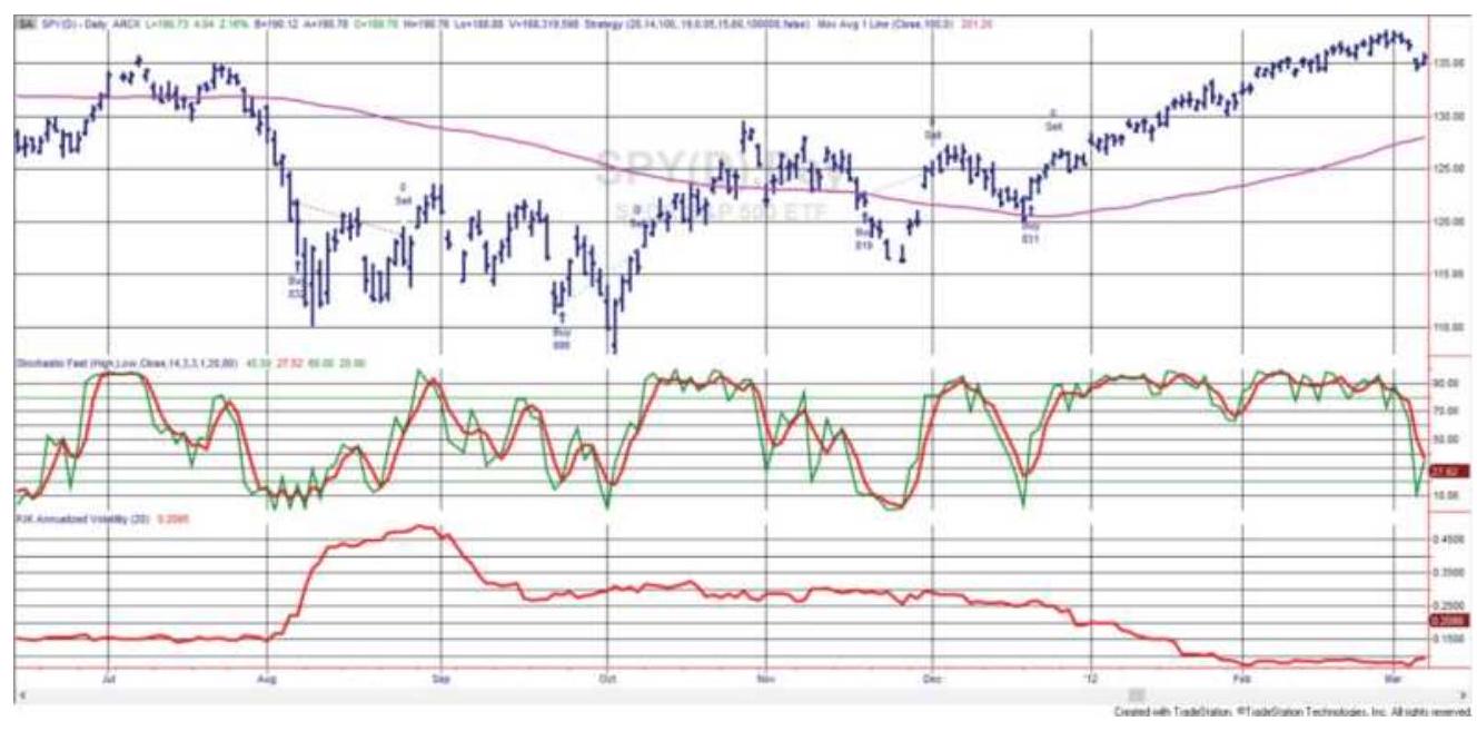
FIGURE 12.21 Trading volatility spikes in SPY that come at the same time as volume spikes.
Exit the trade if either of the following conditions occur:
1. The 20-day annualized volatility falls below a threshold value. Declining volatility often indicates the end of a move.
2. The 20-day stochastic rises above a threshold value, indicating the price is no longer oversold.
Figure 12.21 shows SPY prices at the top, along with the 100-day moving average. The stochastic indicator is in the center, and the annualized volatility at the bottom. Trading signals are shown along with the prices.
When this strategy is applied to three ETFs, SPY, IWM, and XLE (energy), performance of SPY was the least active, and XLE was both active and consistently profitable, as shown in Figure 12.22. Could these results have been better? You could optimize, with specific values for each parameter for each market. The losses in
2002 and 2008 could have been "engineered" out. Doing that would be fine tuning the signals to the past history of those markets, a method that has never turned out to be rewarding. The future does not quite follow the patterns of the past, and no one market contains enough patterns to give us a robust solution. By using one set of parameters that work across all markets, we have essentially used more data to arrive at one solution. The results are not as good as optimizing, but they are more realistic. A more detailed discussion of testing can be found in Chapter 21.
\section*{Confirming the Trend with a Moving Average of Volume}
A straightforward way of using higher volume to confirm a trend is to calculate a 10-day moving average of the volume as a complement to a 20-day trend position. \({ }^{12}\) By simply requiring the current volume to be greater than the average volume over those past 10 days, you introduce the idea of greater participation associated with the new trend. If you use the volume trend as a trading filter, a substantial number of trades can be eliminated. If the net returns are the same, the volumefiltered approach is far better because you are out of the market more, reducing your risk and not reversing your position every time there is a new signal. That improves liquidity.
\section*{Cumulative profits}
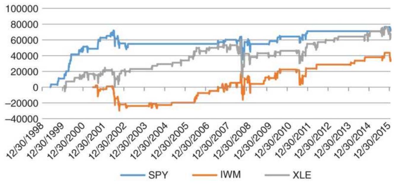
FIGURE 12.22 Results of the Pseudo-Volume Strategy for SPY, IWM, and XLE.
A similar method was proposed by Waxenberg. \({ }^{13}\) A 10day moving average of the volume is considered the normal level, and a change in trend must be confirmed by a 20\% increase in volume above this norm. (The 20\% threshold acts as an additional smoothing filter but may be replaced by a longer trend and smaller threshold.) Extremes in a price move can be found at points that exceed approximately a 40\% volume increase. Applied to the stock market, Waxenberg used the extreme volume to indicate the end of a sell-off. To add more flexibility over longer test periods, and to adapt more quickly to volatility changes, Bollinger bands (based on 2 standard deviations, or \(95 \%\) probability) can be substituted for the fixed percentage thresholds.
Alternatively, using 13 days of volume, subtract the total down volume from the total up volume. A plot of the results will serve as a momentum indicator from which
overbought and oversold levels can be identified. If these values are unstable due to lack of liquidity, they may be smoothed using a short-term moving average.
\section*{Advance-Decline System}
Advance and decline values, as with most volume figures, can be more useful if they are smoothed.
Conners and Hayward use the concept of the AdvanceDecline Oscillator but group the values in a way that smoothes the results. They call it CHADTP \({ }^{14}\) (ConnersHayward Advance-Decline Trading Patterns). This system tries to identify reversal patterns by applying the following steps:
1. Add the past 5 days of advancing issues on the New York Stock Exchange.
2. Add the past 5 days of declining issues on the New York Stock Exchange.
3. Subtract the 5 -day sum of declining issues (step 2) from the advancing issues (step 1).
4. Divide by 5 to get the average daily value.
\[
\text { CHADTP }=(\text { Sum }(\text { AdvancingNYSE, 5 })-\text { Sum }(\text { DecliningNYSE, 5) }) / 5
\]
To trade using this oscillator, Conners and Hayward determined that \(\pm 400\) are the extreme levels where the values have been overbought and oversold. However, that was in 1995. To make this more relevant, use a threshold value, \(T=2\) standard deviations of CHADTP taken over the past 60 days. It will also be necessary to
find the S\&P threshold value, originally set at 10 points when the S\&P was at 460 . At 2800 , that value should be closer to 25 . If the S\&P threshold is TSP, we can apply the following rules to the \(S \& P\) futures:
1. Sell short when CHADTP \(>+T\) and the SP futures trades TSP points below the low of the previous day; buy when CHADTP \(<-T\) and the S\&P futures trades TSP basis points above the high of the previous day.
2. Note that the oscillator does not have to exceed its recent extremes on the day of the buy or sell signal.
3. Timing is best if the signal occurs at the same time as a newspaper commentary indicating "depressed volume," or volume is significantly below the \(3^{-}\) month average, which is seen as an excess of cash waiting to enter the market.
This system targets returns over a 5 - to 7 -day period. A drop in the oscillator, which results in values in the midrange, is an opportunity to exit. A standard price oscillator can be constructed to generate overbought and oversold signals within this time frame. An opposite entry signal would reverse the position.
\section*{Breadth as a Countertrend Indicator}
Equity indexes have a tendency to be mean reverting because they have a large amount of price noise. That seems to hold true for market breadth, which is the sum of a large number of stocks. Larry Conners has shown that more declining stocks is an excellent leading
indicator of a stock market advance. 15
- If declining NYSE stocks are greater than advancing NYSE stocks for at least three days in a row, then the S\&P averaged a gain of \(0.50 \%\) the following week.
If declining NASDAQ stocks are greater than advancing NASDAQ stocks for at least two days in a row, then the NASDAQ 100 index gained an average of \(0.80 \%\) the next week.
- If declining NYSE stocks were at least twice the NYSE advancing stocks, then the S\&P gained an average of \(0.60 \%\) the following week.
In addition, when the opposite occurred, all three situations showed essentially no gain in the respective index during the following week. The observation period was 1996-2003, which contained extreme bull and bear markets.
\section*{AN INTEGRATED PROBABILITY MODEL}
If there is a noticeable relationship between price, volume, and open interest (or market breadth), then a probability model can be constructed to test its importance. \({ }^{16}\) To do this it is necessary to construct a 1day-ahead forecast using a simple linear regression model and then back-test weighting factors for each element. Because of powerful software products, this has become a very manageable process. Using TradeStation's EasyLanguage, each 1-day-ahead forecast is determined
using the previous \(n\) days:
Price forecast:
\[
P_{t+1}=P_{t}+\text { LinearRegSlope }(P, n)
\]
Volume forecast:
Open interest
\[
\begin{aligned}
& V_{t+1}=V_{t}+\text { LinearRegSlope }(V, n) \\
& \left.O_{t+1}=O_{t}+\text { LinearRegSlope } O, n\right)
\end{aligned}
\]
forecast:
On-Balance Volume \(O B V_{t+1}=O B V_{t}+\) LinearRegSlope \((O B V, n)\) forecast:
The function LinearRegSlope returns the 1-period increase or decrease in the input value based on a straight-line fit of the past \(n\) days. That value can be added to the current price, volume, open interest, or OnBalance Volume to get the 1-day-ahead forecast. The calculation period \(n\) can be selected by subtracting the actual next-day value from the forecast and creating an error series that can be measured using a standard deviation. The number of days, \(n\), that generates the smallest standard deviation is the best forecast period. It is possible that the optimal forecast period will differ for each of the four items above, but a robust solution would seem to be the one period that minimized the errors across all the components. These and other testing issues are discussed in Chapter 21.
Having found the four 1-day-ahead forecasts, an index can be created that gives one weight \(w_{1}\) to the price forecast and the remaining weight, \(1-w_{1}\), to a combination of the other three factors. This assumes that price is the most important predictor of price. Then:
Forecast index \(=w_{1} P_{t+1}+\left(1-w_{1}\right) \times\left(w_{2} V_{t+1}+w_{3} 0_{t+1}+w_{4} 0 B V_{t+1}\right)\) This formula can be back-tested for values of \(w\), where \(w_{1}+w_{2}+w_{3}+w_{4}=1\). The final index can be used instead of price for determining the trend. It will still require a moving average, or some smoothed line, to signal new uptrends and downtrends; however, the results, if successful, should be more reliable than using only price.
One advantage of testing the weighting factors is that, if one of the four elements is not helpful in predicting a trend, the weighting factor should be near zero. Another approach, that does not cluster the nonprice data together, would be to treat each item separately in the classic form:
Forecast index \(=w_{1} P_{t+1}+w_{2} V_{t+1}+w_{3} O_{t+1}+w_{4} O B V_{t+1}\)
\section*{INTRADAY VOLUME PATTERNS}
Identifying increases and decreases in volume during the trading day must consider the patterns caused by the flow of orders during the day, and the way traders enter orders. There has been a great improvement in timely reporting of intraday volume for both stocks and futures markets. Services such as Bloomberg have continually updated volume for nearly all markets. Prior to this, only tick volume was the practical alternative. Tick volume represents the number of price changes that occurred during any time interval. It turns out that tick volume is a good substitute for the actual volume traded. If you
purchase intraday data from CQG, it will have tick volume in each price bar. Volume and open interest are also available for daily downloads of data.
\section*{Time Stamps}
One point to note is that some services, including CQG, time stamp each bar at the beginning of the interval. It is because they accumulate the data as it occurs, so that \(5^{-}\) minute bars that are stamped 10:00, 10:05, and 10:10 have the data from 10:00:00 through 10:04:59, 10:05 through 10:09:59, and 10:10:00 through 10:14:59, respectively. For many applications, users will want to shift those times to show the end of the bar rather than the beginning. That way, if you are coordinating the time of the bar with the closing time of the session, those times will match. Otherwise, if the closing time is 4 p.m., or \(16: 00\), the last 5 -minute bar will be stamped 15:55. Also note that because these bars are time stamped at the beginning, the last bar of the day will have only the trading that occurred in the last 1 minute of the session. For example, the U.S. bond chart has the last interval posted at 14:00, the Chicago closing time. All trading starting at 14:00 will be captured, which is only the last minute, yet it shows very high volume. You may want to combine the last bar with the previous bar or be aware that the last bar cannot be traded.
\section*{Intraday Patterns}
Figure 12.23 shows the intraday tick volume patterns for four futures markets, crude oil, the German DAX, NASDAQ, and U.S. 30-year bonds. The charts represent
the average number of price changes in each 15 -minute interval for the years 1995 through 2005, based on the nearest contract to delivery. Each market has a different pattern.
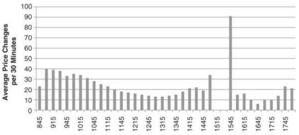
(a) Crude oil
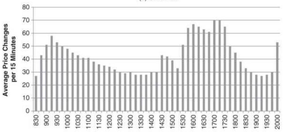
(b) German DAX
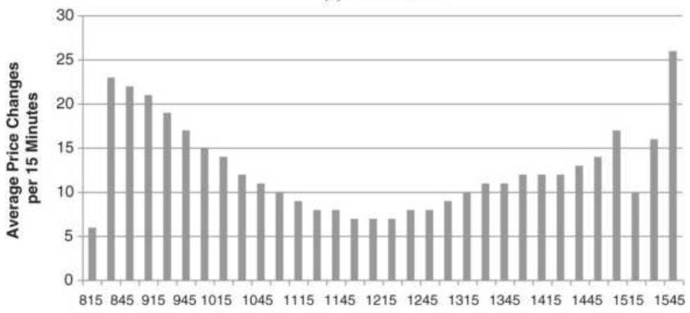
(c) NASDAQ
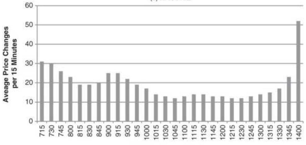
(d) U.S. 30-year bonds
FIGURE 12.23 Intraday, 15-minute tick volume patterns, 1995-2005. (a) Crude oil, (b) German DAX, (c) NASDAQ, and (d) U.S. 30-year bonds.
Before Europe was as actively traded as it is today, intraday volume patterns tended to have a very symmetric \(U\)-shaped pattern, with the highest volume at the open and close. The bottom of the \(U\) always came at midday when traders took their lunch break. This can still be seen in the NASDAQ chart, Figure 12.23c. As European markets increased in volume the patterns changed so that volume was greatest while both the United States and Europe were open, then declined as European traders ended their business day. In Figure 12.23b, the DAX shows a sharp drop from 17:30, then one strong bar on the close at 18:00 ( 6 p.m.). Soon after 2005, the Eurex extended hours to match the U.S. trading sessions, so the DAX now trades until 20:00, the close of the U.S. equity index markets. We should expect the \(U\)-shaped pattern in the late session to be extended to 20:00.
Crude oil shows two \(U\)-shaped patterns, the first for the primary session, originally called the pit session, and the second for the evening session. Now crude trades 24 hours although we should always expect this same volume pattern bounded by normal daily business hours in the country where the product is traded. A chart of the CME Nikkei contract will have very low volume during the entire U.S. trading session because Japanese business sleeps. Any period of higher volume, the result of U.S. economic news, would be the U.S. traders'
interpretation of what they think the Japanese traders will do.
It should not be surprising to see the extreme clustering at both ends of the trading day. Orders enter the market early in reaction to news and events that occurred after the close of the previous day's trading. Algorithmic traders do their calculations after the previous close when data become available, but orders are entered for the next open. The end of day is active due to liquidation of the positions of day traders who do not want overnight risk.
\section*{Relative Changes in Volume}
Whether using actual or tick volume, decisions made using, for example, 15 -minute volume patterns should compare each 15 minutes of the current day with the same 15 minutes of the prior day or with the average of that 15 -minute interval over some range of days. A program to compare volatility by bar can be found in "Recognizing a More Volatile Day" in Chapter 16.
While it may be sensible to use increasing intraday volume as a condition for entering a new trade, if the trade signal is in the second half of the day, then each interval generally increases in volume; therefore, the condition is always true. If the trading signals were in the morning, the condition would always be false.
In order to use intraday volume correctly, consider this approach:
1. The volume of the opening bar must be compared to
the volume of the opening bar on the previous day, or the average volume of that bar over the past \(n\) days.
2. The second bar of the day can then show volume as a percentage of the first bar. By keeping a history of this percentage value, we then will know if today's second bar is relatively stronger or weaker than the average second bar.
3. We can track the relative strength or weakness of every bar compared to the opening bar and compared to the average bar of the same time.
Using this information, it is possible to anticipate a stronger or weaker close for the day. It is also generally true that an open on higher volume will indicate higher volume throughout the day. We could then also expect higher volatility. Days with significantly lower volume would be associated with less volatility and less directional movement.
\section*{FILTERING LOW VOLUME}
Minutes, hours, or even days that have little market activity are likely to be associated with uncertain price direction. If the British pound moves \(\$ 0.50\) in the midafternoon of the U.S. market, we know that volume is normally light because many traders in London and Europe have gone home for the day. The intention of a volume indicator is to identify positive moves in volume that can be used as a confirmation of price direction. Eliminating those days with low volume, or with
marginal price moves, may increase the dependability of the volume indicator.
\section*{Removing Low-Volume Periods}
Most of this chapter has focused on high-volume situations, which tend to be very clear. We need to ask, "Are low-volume days important?" Consider the situation where a number of economic reports are released, each showing a very small improvement. Each value on its own is not noticeably important, but collectively they cause a bias. Some analysts believe that the collective weight creates significance while others favor ignoring values that are so small they are insignificant and perhaps confusing.
You can decide if low-volume days are important by ignoring all trading days where the volume is less than the average minus 2 standard deviations. Then you are removing about \(2.5 \%\) of the data. Any collective change caused by a series of low-volume days will be ignored.
As a test, this type of filter can be applied to On-Balance Volume, which was shown to be better for identifying a trend than actual prices. If we set the volume filter at 2.0, we can create the filter threshold value with the TradeStation code:
Volumethreshold \(=\) average(volume, n) - volumefilter*stddev(volume, \(n\) )
If volume < volumethreshold then VFOBV = VFOBV[1]
else VFOBV = VFOBV +
(close - close[1])/absvalue(close - close[1])) + volume;
We would effectively ignore all days, leaving the OBV unchanged, when the volume was below the threshold.
\section*{Removing Volume Associated with Small Price Moves}
If you agree with the concept of removing days with low volume, then there is the similar case for very small price moves. Indicators such as On-Balance Volume post all volume as either a positive or negative contribution to the index, based on the direction of prices on that day. It is fair to question the validity of posting all volume to the upside when the S\&P 500 closed higher or lower by a minimum move of 25 basis points or the Dow closed up 1 point. It could just as easily have closed down by that amount. In a manner similar to filtering low-volume, periods in which prices moved very little may be eliminated by using a standard deviation of the price changes as a filter. Days that are within \(\pm 0.10\) or \(\pm 0.25\) standard deviations of the average would be ignored. The Price-Filtered On-Balance Volume, PFOBV, would then be found using the code:
\[
\begin{aligned}
& \text { pricethreshold = average(price - price[1], } n)+ \\
& \text { f*stddev(price - price[1],n) } \\
& \text { if absvalue(price - price[1]) < price threshold } \\
& \text { then PFOBV = PFOBV[1] } \\
& \text { else PFOBV = PFOBV[1] + } \\
& \text { ((close - close[1])/(absvalue(close - close[1])) * } \\
& \text { volume }
\end{aligned}
\]
where
\(\mathrm{n}=\) the number of periods in both the average and standard deviation
\title{
\(f=\) the number of standard deviations used to filter minimum volume
}
Note that, in the case of a minimum price threshold, the rules look at price change, which can be positive or negative. For a volume threshold, there is only a onesided test using the value of volume.
\section*{MARKET FACILITATION INDEX}
In weighing the likelihood that prices are indicating a direction, rather than a false start, the tick volume can be compared to the price range for the same period. Called the Market Facilitation Index, 17 it can measure the willingness of the market to move the price. This concept is interesting because it is not clear that high volume results in a large price move, although high volume appears to set up the conditions for high volatility. If the Market Facilitation Index increases, then the market is willing to move the price; therefore, trading that benefits from higher volatility should improve.
Market Facilitation Index \({ }_{t}=\frac{\text { Trading range }_{t}}{\text { Volume }_{t}}=\frac{H_{t}-L_{t}}{V_{t}}\)
The results of combining the change in tick volume and the Market Facilitation Index are interpreted as:
\begin{tabular}{l|}
\hline Tick \\
Volume
\end{tabular}
\author{
Market \\ Facilitation \\ Index
}
\section*{Interpretation}
\begin{tabular}{|l|l|l|}
\hline Up & Up & Confirmation of direction \\
\hline Down & Down & \begin{tabular}{l}
False direction, do not \\
take trade
\end{tabular} \\
\hline Down & Up & \begin{tabular}{l}
Poor entry timing, \\
approach with caution
\end{tabular} \\
\hline Up & Down & \begin{tabular}{l}
Potential new trend, end \\
of old trend
\end{tabular} \\
\hline
\end{tabular}
\section*{NOTES}
1 Bill DeBuse, "What Traders Need to Know About Volume," Modern Trader (December 2017).
\(\underline{2}\) See
www.armsinsider.com/education/armsonthemarket/e for examples. There is also a good description on StockCharts.com.
3 Robert W. Colby and Thomas A. Meyers, The Encyclopedia of Technical Market Indicators (New York: McGraw-Hill, 2003), is a comprehensive study of most market indicators, including On-Balance Volume and some other techniques in this section.
4 Both OBV and the Volume Accumulator are characterized as "momentum" systems. See Chapter 9 for more information on similar techniques.
5 Review of Bollinger on Bollinger, Technical Analysis of Stocks \& Commodities (December 2013), 53.
6 Dennis D. Peterson, "Positive Volume Index,"
Technical Analysis of Stocks \& Commodities (April 2003). Also see Norman G. Fosback, "Stock Market Logic" (Institute for Economic Research, 1985).
\(z\) Thomas Aspray, "Fine-Tuning the Demand Index," Technical Analysis of Stocks \& Commodities (June 1986), and "Demand Oscillator Momentum," Technical Analysis of Stocks \& Commodities (September 1989).
\(\underline{8}\) Christian P. Fries, "Elastic Moving Averages," Technical Analysis of Stocks \& Commodities (June 2001).
9 Bramesh Bhandari, "Trading Using the Arms Index," Modern Trader (December 2017).
10 Gerald Appel, Power Tools for Active Traders (Upper Saddle River, NJ: Financial Times Prentice Hall, 2005), 126.
11 Larry Conners, "Fade the Breadth," Futures (January 2005).
12 Alex Saitta, "A Price and Volume-Based System," Technical Analysis of Stocks \& Commodities (March 1996).
13 Howard K. Waxenberg, "Technical Analysis of Volume," Technical Analysis of Stocks \& Commodities (March 1986).
14 Laurence A. Conners and Blake E. Hayward, Investment Secrets of a Hedge Fund Manager
(Chicago: Probus, 1995).
15 Larry Conner, "Fade the Breadth," Futures (January 2005).
16 Based on CSI Technical Journal (May 1995), Commodity Systems Inc., Boca Raton, Florida.
17 Bill Williams, Trading Chaos (New York: John Wiley \& Sons, 1995).
\section*{CHAPTER 13 Spreads and Arbitrage}
For both spreads and arbitrage, traders seek to take advantage of price differences or divergence. Positions taken in opposing directions in related markets, contracts, options, or shares are generally referred to as a spread or straddle. When a long and short sale are entered simultaneously in two related stocks, such as AMR and UAL, the strategy is called pairs trading. When the dynamics of the spread can be definitively calculated, such as the price of two bonds of the same maturity and the same grade, or the price of gold in two different locations, the transaction can be considered an arbitrage. When academics use the term arbitrage it implies risk-free, although nothing is risk-free. An arbitrage between two similar companies or similar products that diverge, when there is a history of similar price movement, such as two microchip manufactures, or U.S bonds and the Euro-bund, is a relative value arbitrage.
For futures markets, the most common use of the term spread relates to two delivery months of the same market. This can also be called an intramarket spread, an interdelivery spread, or a calendar spread. For example, a trader may take a long position in March Treasury bonds and sell short the June contract (for the same year). The expectation is that prices will rise (yields fall) and that near-term delivery will rise faster than the
deferred, netting a larger profit on the long position and a smaller loss on the short sale.
An intermarket or intercommodity spread can be taken in related futures markets, such as the S\&P 500 and the Russell 2000, gold and silver, crude oil (WTI) and Brent North Sea crude, or the U.S. 10 -Year Note and the Eurobund. Because one product or market is not a substitute for another, these are all relative value spreads.
Globalization has caused many markets to move together, greatly increasing the opportunities for spreads.
Spreads can be simple or complex, but they generally offer the ability to remove directional risk. By being long one market and short another (a short sale in stocks), a strong trend or a market crisis should move both legs of the spread in the same direction. One leg profits, the other loses, and the net is near zero. This is very different from the typical long-only portfolio in equities or commodities and offers diversification for the investors.
\section*{DYNAMICS OF FUTURES INTRAMARKET SPREADS}
A spread is most often a way to reduce both the risk and, consequently, the potential profit that exists in an outright long or short position. However, futures trading benefits from lower margins for spreads, allowing further leveraging and restoring at least part of that reward. That is not usually the case with stocks, where full financing is required for any trade.
An intramarket spread is placed in two delivery months of the same market, a combination of futures and physicals in the same market, or in two options of different strike prices or maturities on the same underlying. The reduction in risk depends on the relationship between successive delivery months, which varies considerably with the market traded. The risks associated with the term structure (the price relationship of successive contracts) can be summarized as follows:
Financial markets nearest to delivery react faster to changing interest rates, economic data, and supplyand-demand disruptions. The deferred contracts will respond slower if the lasting effect on the market is not as clear. There are notable exceptions when changes in interest rate policy target longerterm rates and do not take effect immediately. In the normal course of activity, longer maturities are more volatile.
Precious metals markets, such as gold, platinum, and silver, were once considered pure carry markets. Successive delivery months would always trade at a higher price due to the cost of holding the physical product in inventory. If the price of the metal rises or interest rates rise, the cost of carry increases and the spread between months widens. If metal prices or interest rates decline, the spread narrows. There has been an evolution in the industrial use of precious metals, primarily gold and platinum in electronics, which has increased the consumption and changed the price patterns, but the cost of carry is still there.
Industrial metals, such as copper, will show normal carrying charges under most circumstances but are affected by demand to the extent that prices have been known to invert for significant periods of time. The nonferrous metals, traded on the London Metals Exchange (LME), are all used in housing and vary in price based on the general outlook on the economy.
Foreign exchange rates are dependent on the prevailing economic outlook for the specific country, net of inflation and geopolitical risk, and greatly affected by their balance of trade. A stable economy will show forward rates based on their current Central Bank interest rate. All things being equal, higher interest rates attract investors and
strengthen the currency. A weakening economy will cause the deferred contracts to be discounted. Prices tend to become more volatile as they move away from equilibrium, whether higher or lower.
Countries prefer to see their exchange rates change slowly. A fast rise in value, which adversely affects exports, may be met with central bank intervention, as has often been seen in the Japanese yen. This makes for a bumpy price pattern. Because exchange rates are quoted in terms of other currencies, everything must be viewed as relative to another economy.
Agricultural products (crops) contain a welldefined carrying charge within each crop year, which begins at the end of harvest. Unfortunately, competition from other countries has changed the
supply and prices rarely achieve full carry. Spreads are typically entered in the new and old crop deliveries when there is the greatest price difference. That capitalizes on consumers who will defer delivery of an expensive old crop when a cheap new crop will be available soon.
Livestock markets are products that cannot be stored and redelivered; therefore, the prices for any one contract month are based on anticipated supply and demand at the time of delivery. Feedlots and farmers have been known to deliver early when prices were high or when feed costs were rising; however, this will cause an irreplaceable shortage in the deferred months (Figure 13.1). \({ }^{1}\) Patterns in delivery months are a combination of the number of livestock on feed, expectations of marketing, and the price of grain.
\section*{CARRYING CHARGES}
Carrying charges are an essential part of forward prices. The carrying charge structure (also term structure) of a market determines the underlying differences in the relative price of each contract and the price pattern of the delivery months. For metals and most storable commodities, these charges consist of interest, transportation, storage costs, and insurance. All else being equal, a market with normal carry can be expected to show steadily higher prices for deferred contracts based entirely on the cost of carry. It is important to remember that carrying charges are always
part of the price, even when prices are inverted. The ability to redeliver a commodity keeps carrying charges in line. If a nearby price becomes unusually inexpensive, a trader can take delivery and sell a deferred futures contract at a higher price, capturing the implied carry, ultimately delivering that commodity at expiration.
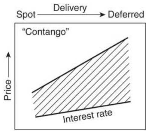
(a) Precious metals
- Carrying charges are directly related to interest rates.
- Higher prices or increasing rates result in larger spreads.
- Lower prices or decreasing rates result in smaller spreads.
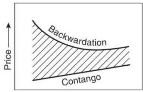
(b) Industrial metals
- Under normal conditions, carrying charges increase in deferred months.
- Extreme short-term demand will cause backwardation.
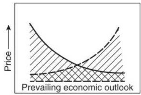
(c) Foreign exchange
- Normal market reflects increasing interest rates in deferred months.
- Changes in the economic outlook are often seen affecting the nearby deliveries, either higher or lower.
- Increases in interest rates will favor the exchange rate, but increases in inflation will weaken rates.
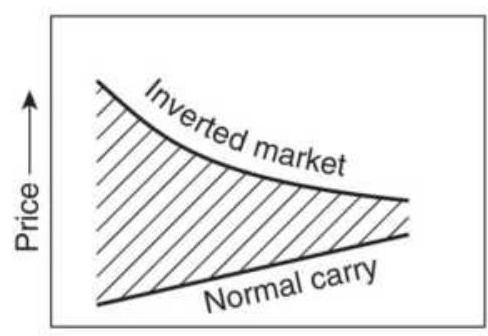
(d) Agricultural products
- Normal carry increases prices in the deferred months within the same crop year.
- Extreme short-term supply shortage or export demand will cause an inversion in the old crop, but deferred contracts will approach lower price of new crop.
- Expectations of a large new crop will invert old crop prices.
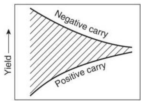
(e) Interest rates
- Rising yield curve exists under normal conditions.
- Inverted yield curve exists during periods of perceived economic instability or central bank action.
FIGURE 13.1 Interdelivery price relationship and terminology. (a) Precious metals. (b) Industrial metals. (c) Foreign exchange. (d) Agricultural products. (e) Interest rates.
\section*{Inverted Term Structure}
It is always possible for changes in supply and demand to alter the relationship of futures contracts so that the carrying charge pattern no longer appears normal. Although this is not likely to occur in the metals, it often happens that an immediate demand for food or energy can cause short-term increases in prices without substantial effect on more deferred months. This situation is called an inverted market, negative carry, or backwardation, even though the carrying charges are implicit in the price regardless of the pattern.
In the financial markets, a similar situation occurs when the demand for money increases dramatically in the short term. If the market expects that the demand will be short-lived, the rates on short-term maturities can rise significantly while the longer-term rates may show only a minor change. This creates a negative yield curve.
In the metals markets, a normal carry market is in contango (a term coined by the London Metals Exchange when referring to copper) and an inverted term structure is backwardation. Changes in supply and demand that lead to backwardation are most likely to occur in the industrial metals where the commodity is consumed at a greater rate.
\section*{Precious Metals}
Gold, silver, and platinum - the precious metals markets- have traditionally had a uniform price relationship in their term structure. Because these metals now have more industrial uses, it is possible that supply and demand may bend the term structure, but that has not yet happened.
Any deferred delivery price can be calculated by adding the current rate of interest (plus storage and insurance) to the value in the cash market. If interest rates rise and the price of gold remains the same, the carrying charges and the spread will increase. If the price of gold rises but interest rates remain constant, the carrying charges and spread will also increase because the increased value of the contract results in higher interest costs. Similarly, lower carrying charges and a narrowing spread will occur if either or both the rate of interest or the price of gold declines. Precious metals are subject to implied interest rate spreads, discussed in the next section.
\section*{Financial Markets}
The terms used in referring to carrying charges in the financial markets are the same as those just mentioned, but the concepts are different. Carry is a term describing the yield-curve relationship. The concept of positive or normal carry is a curve that increases in yield with the time of maturity. The longer an investor is willing to commit money, the greater the yield. Negative carry can also exist for short periods of time. When economic conditions become unstable, the interest on short-term
investments may increase sharply, although longer-term rates will increase only slightly. Investors anticipate a correction in these short-term distortions, and do not often move money committed for longer periods for fear that rates will return to positive carry.
\section*{SPREADS IN STOCKS}
In the stock market, spreads are actively traded in companies with similar business or grouped into baskets of common qualities.
Pairs trading, which is buying one stock and selling short another in the same business, such as Verizon and ATT, two microchip companies, or two grocery chains, will profit from the temporary divergence of one firm over the other, or one reporting earnings before the other, while removing the directional risk of the overall market.
Market neutral trading can be thought of as a basket of stock pairs or a basket of long positions traded against a basket of short sales in the same industrial group or in multiple industrial groups. It may also be a basket of stocks that are ranked as "outperform" against a basket of those expected to "underperform." Generally, the stronger stocks are sold short and the weaker bought; however, the opposite may be done in a trending market.
Dividend stocks versus Treasury yields are an important benchmark for investors, who are always seeking the highest return. Most public utilities are
in direct competition for low-risk investors targeting interest income. When Treasury yields become extremely low, as they have from 2003 through 2016, investors are willing to take greater risk to receive higher returns; they look for stable companies with high-dividend returns. When Treasury yields are very high, they draw investments away from the stock market.
Cross-market spreads will take one position in a stock that is highly dependent upon a physical commodity, such as a precious metals or crude oil, and the other in the futures market for that commodity. Traders can use a gold miners ETF, such as GDX, or spread gold futures against a single company, such as Barrick Gold, when they diverge.
\section*{Globalization}
Globalization has increased the correlation in nearly all world markets, whether equities, financials, or commodities. Countries all compete for investment dollars (or euros, yen, and now the Chinese yuan and Indian rupee). Higher interest rates and a strong economy in the United States would put pressure on Europe to raise its rates or suffer a flow of funds away from the euro into the dollar. A weak U.S. economy has a ripple effect on many of the world economies because the United States is an extremely large importer. In general, money flows to those countries with the highest yield on sovereign debt, net of inflation and political instability. In a crisis, such as the 2008 subprime meltdown, money will flow out of all markets into cash,
causing high correlations in all assets.
Technology facilitates globalization. Information about European, U.S., or Asian economic reports is disseminated instantly. When the U.S. government releases its reports, often at 8:30 a.m. Eastern Time, the world knows those statistics within seconds. It is fair to say that the world reacts at the same time to these reports. Electronic trading, which allows 24-hour access in many markets, provides the means for price discovery and speculation.
Globalization has greatly increased the number of opportunities for spreading. We can expect the European interest rates to fall if the U.S. lowers its rates. We can expect the euro/U.S. dollar (EURUSD, dollars per euro) exchange rate to fall if European economic growth is stronger than U.S. growth, or if the balance of trade between the countries shifts. The meetings of the Group of 7 ("G7"), or G9, or G18, further increases the chance of a unified policy by setting common expectations for interest rates and exchange rates among the largest economies. While there is a clear dependence of one market on the other, the effects are highly variable. Because each country must favor its own economic health, there is always maneuvering to get the upper hand, sometimes causing rapid changes in FX rates.
Some spreads are unique to a specific market situation and cannot be generalized. The trader must first understand the basis of the spread relationship before any strategy can be applied. It is most important to understand the conditions under which a spread, or even
an arbitrage, will fail. This chapter presents many approaches to spreading that are very specific; examples are limited in scope and application.
\section*{SPREAD AND ARBITRAGE RELATIONSHIPS}
The relationship between two markets, or between various deliveries and trading vehicles within the same market, will determine the type of trading strategy that may be applied. The types of spreads and arbitrage situations that are most often watched are:
1. Substitute products, such as wheat and corn or cattle and hogs. Product substitution ranges from those markets that are nearly identical (e.g., \(3^{-}\) month T-bills and 3-month Eurodollars), to cotton and soybeans, which share the same land and growing season.
2. Location spreads, including precious metals priced in New York, Chicago, London, and Singapore; cocoa and sugar in New York and London. The price at one location should never be greater than the cost of moving the product from another location. However, contract specifications may be different.
3. Carrying charge spreads and cash and carry, where one delivery month is out of line with others based on the cost of storing the physical product and redelivering it at a later date.
4. Product relationships, such as crude oil versus heating oil and gasoline, and soybeans versus
soybean meal and oil. Costs for converting the raw material to its component products define relative prices.
5. Usage spreads, including the hog-corn ratio, feeder cattle-corn-fat cattle, cocoa-sugar, broilers-corn, and lumber-plywood. If the cost of corn increases, then the cost of livestock increases. If the market will not absorb the higher-end product cost, as determined by deferred futures prices, then livestock is brought to market early.
6. Pure mispricing in financial markets, such as different exchange rates offered by different banks around the world, and interest rates of the same maturity and the same grade, where there is no actual cost of delivery or carrying charges.
7. Interest rate strips, where pieces of varying interest rate maturities are put end-to-end and must be equivalent to the comparable rate offered on the longer-term maturity.
Strategies using these relationships can be found in a later section, "Product Spreads."
\section*{RISK REDUCTION IN SPREADS}
As long as there is a fundamental relationship between the two markets being spread, \(A\) and \(B\), the resulting spread return stream will be less volatile than the average volatility of the two spread components. In mathematical terms, the variance of the spread is:
\section*{\(S_{t d_{A, B}^{2}}^{2}=\operatorname{Std}_{A}^{2}+\operatorname{Std}_{B}^{2}-2 \times \operatorname{Cov}_{A, B}\)}
where
Std \(=\) the standard deviation
\(\mathrm{Cov}=\) the covariance
When the two components of the spread are more closely related, they vary in the same way at the same time, and the covariance increases. This in turn reduces the variance of the spread. Covariance is calculated by first finding the differences between the corresponding prices and their average values, multiplying them, and finding the average over period \(N\).
\[
\operatorname{Cov}_{1, B}=\frac{1}{N} \sum_{i=1}^{N}\left(A_{i}-\arg _{g_{A}}\right)\left(B_{i}-\arg _{B}\right)
\]
It is easy to compare the risk of the spread with the risk of the individual markets using a spreadsheet. Put the prices of market \(A\) in column \(A\), the prices of market \(B\) in column B, then calculate the daily differences for \(A\) and \(B\) and put them in columns \(C\) and \(D\). Put the spread differences A-B in column E. Calculate the standard deviations for all of the values in each of columns C, D, and E separately and simply compare the result of those columns. The stronger the correlation between A and B (using the returns, not the price), the smaller the standard deviation of E and the lower the risk. Expect the risk of the spread to fall somewhere between the risk of the two legs.
Offsetting the lower risk of the spread is the lower cost of margin usually granted to spread trades. Spread traders expect spread margin to be less than the margin of either of the two legs, and for interest rates, much lower.
Taking advantage of the lowest margin to gain maximum leverage may turn a low-risk spread into a high-risk trade.
\section*{ARBITRAGE}
When the two legs of a spread are highly correlated the trade is an arbitrage. When it can be executed often and corrects within minutes, or even milliseconds, it is also high-frequency trading. More complex arbitrage can take advantage of price differences in related products and last days or weeks; however, risk is proportional to the time in the trade. True arbitrage has, theoretically, no trading risk; however, those opportunities are also associated with small profits and low liquidity. For example, a spatial arbitrageur using the Interbank market might call (or access electronically) one bank in Tokyo and another in Frankfurt to find their rates on the Mexican peso. If they differ, the trader would buy the cheaper peso from one bank and sell the peso at the other provided:
- The price difference was greater than the bid-asked spread, representing the cost of converting the currencies.
- The arbitrageur has proper credit established with both banks.
- The transaction can be performed simultaneously (by telephone). This requires one trader with a telephone in each ear or two traders working side by side.
If banks make a market electronically (which is preferable), then arbitrage of rates between banks can also be done automatically.
Large-scale arbitrage has become the domain of major financial institutions that employ many traders, each provided with high-tech computer displays, sophisticated analytic software, and (at one time) lots of telephones. These traders specialize in specific interestrate markets, foreign exchange, individual stock selection, or less often, precious metals. They constantly scan quotes from across the world to find price differences, then act quickly using cash, forward, futures, and options. They trade large quantities to profit from small variations. For the interest rate markets, there are computer programs that compare the various types of coupons, maturities, and strips in order to identify an opportunity quickly. Such operations have become an integral part of the financial industry; they keep prices in-line around the world and generate steady profits.
Relative value arbitrage is a term given to buying and selling related products based on their history of similar price movement. For example, LME nonferrous metals, such as copper, tin, and zinc, are all used in housing and are sensitive to a country's economic health. If the price of tin lags the rise in zinc prices, a trader will buy tin and sell zinc. For equities, pairs trading, as we will discuss
later, is a classic relative value arbitrage.
\section*{Pricing of Futures Contracts}
The relationship of one futures market delivery month to the spot price of that market is different according to the type of product, the carrying charges, and the seasonality. The mathematics of some of these relationships can become very complex, and the reader is referred to texts that deal specifically with these subjects. \({ }^{\underline{ }}\) The following sections describe the most important features of these relationships.
\section*{Convenience Yield}
Convenience yield is the forward price of a commodity less the cost of storage. It is the benefit of holding the underlying physical product compared to holding a futures, forward, or options contract. For example, the price of December gold futures, \(F\), on June 1 is \(\$ 1400\) and the current spot price, \(S\), is \(\$ 1350\). The borrowing rate, \(r\), is \(5.0 \%\) and there is no cost of storage. \(T-t\) are the number of days to delivery. Then the convenience yield, \(C Y\), is:
\[
F_{t, T}=S_{t}+\left(S_{t} \times r_{T} \times(T-t) / 365+C Y_{t, T}\right)
\]
Rearranging this to solve for the convenience yield:
\[
C Y_{t, T}=F_{t, T}-S_{t}-\left(S_{t} \times r_{T} \times(T-t)\right) / 365
\]
Substituting the values in the example:
\[
C Y_{L, T}=1400-1350-\left(1350 \times 0.05 \times \frac{(182.5-0)}{365}\right)=16.25
\]
Then 16.25/1350 gives a 6-month return (convenience yield) of \(1.20 \%\). Had the interest rate been lower, all of that difference would have gone into the convenience yield.
The convenience yield between any two futures markets can be calculated by replacing the spot price with the nearest futures, the futures price with a more deferred futures price, and \(T-t\) becomes the number of days between the two futures contract deliveries. Geman gives the relationship between the spot and futures price as:
\[
F_{t}^{T}=S_{t} \times e^{(r-C Y)(T-t)}
\]
\section*{Arbitraging the Carry of Storable Commodities}
Storable commodities can be purchased in the cash market, stored, and sold at a later time. Storable commodities range from gold to grain, from crude oil to orange juice. They can be delivered at the maturity of a futures contract, held in storage, and redelivered against another deferred contract. This puts an upper limit on the amount of the carrying charges that can be implied in futures prices. The difference in cost between holding the physical commodity ( \(S\) is the spot price) and buying it on the futures market are:
- The financing cost involved in the purchase of the physical commodity:
\section*{Cost of interest \(=S_{t} \times\left((1+r)^{\frac{T-t}{365}}-1\right)\)}
- The cost of storage, if any.
- A convenience cost for not buying the physical product, and the ability to sell it at any time.
These three costs are added to the spot price to get the fair value of the futures price at the time of delivery. However, this relationship represents the ideal case. If you add more realistic features, such as separate borrowing and lending rates, \(R_{b}\) and \(R_{a}\), where \(R_{b}>R_{a}\), and assume that the short seller cannot recover the saved storage costs, \(k\), and must pay transaction costs, \(c_{s}\), as well, you get a range in which futures prices can fluctuate:
\[
\left(S_{t}-c_{s}\right)\left(1+R_{a}\right)^{Y}<F_{t}<S_{t} \times\left(\left(1+R_{b}\right)^{Y}+k Y\right)
\]
where \(Y\) is the time to delivery of the futures contract or the holding period, in years. The opportunity for arbitrage is when futures prices move outside this range.
\section*{Forward Rates}
Arbitrage is all about knowing the expected forward rate and comparing it to the futures price for the same forward period. The basic formula for calculating a forward rate \(F R\) is:
\[
F R=\frac{(1+s p o t)^{3}}{(1+\text { spot })^{2}}-1
\]
where the exponent in the numerator represents 3 -years forward and the denominator 2 -years forward. If the 3 year rate is now \(10 \%\) and the 2 -year rate is \(8 \%\), then the implied forward rate for that period is:
\[
F R=\frac{(1+0.10)^{3}}{(1+0.08)^{2}}=\frac{1.331}{1.1664}=14.1 \%
\]
\section*{Forward Interest Rate Parity}
One well-known, second-order arbitrage combines foreign exchange forward rates with interest rate parity. Consider a U.S. corporation that would like to invest \$1 million for the next 6 months. The current U.S. T-bill return for the next 6 months is lower than the rate in Europe and the inflation rate is about the same. The corporation is faced with the decision of whether to convert U.S. dollars to euros and invest in European time deposits or accept the lower U.S. rates. The decision is made easier if the corporation purchases goods from Germany, because it must eventually convert U.S. dollars to euros to satisfy payments; the conversion cost will then exist with either choice.
What if the value of the euro loses \(1 \%\) against the U.S. dollar during the 6 -month investment period? A corporation whose deferred payment is stated in euros suffers a \(1 \%\) loss in the total amount received. If the
corporation bought 6-month EUR 100,000 CDs with a return of \(4 \%\), it now repatriates EUR 102,000, or \(\$ 100,980\), a net return of only 98 basis points, or an annualized rate of \(1.96 \%\), less than the currency loss. A U.S. trader buying and selling futures contracts denominated in euros, yen, or reals, needs to account for the changes in the exchange rate of the invested capital.
The interest rate parity theorem will normally explain the differences between the foreign exchange rates and the relative interest rates of countries. It states that the forward rate of a currency is equal to its present value plus the interest earned in that country for the period of the forward rate. \({ }^{3}\) Using the futures or Interbank market for the forward rate ( \(E U R_{1 \text { yr }}\) is 1-year forward) and the spot rate for the current value ( \(E U R_{\text {spot }}\) ), the annual interest rate in the European Community ( \(I_{\mathrm{EC}}\) ) is applied to get the relationship:
\[
E U R_{\mathrm{tyr}}=E U R_{\text {spot }}\left(1+I_{\mathrm{EC}}\right)
\]
The forward value of the U.S. dollar can be expressed similarly as:
\[
U S D_{1 \mathrm{yr}}=U S D_{\text {spot }}\left(1+I_{\mathrm{uS}}\right)
\]
Compute the implied interest-rate/forward-rate parity by dividing the foreign rate ( \(R_{f}\) ) by the domestic rate ( \(R_{d}\) ):
\section*{EURUSD \(_{1 y r}=\) EURUSD \(_{\text {spot }} \times \frac{1+I_{\text {EUR }}}{1+I_{\text {USD }}}\)}
Naming conventions in foreign exchange (FX) interpret EURUSD as the number of U.S. dollars per euro. For example, if the U.S. interest rate is \(4 \%\), the European rate is \(6 \%\), and the current exchange rate \(E U R U S D_{\text {spot }}\) is 1.450 , the 1-year forward rate would be:
\[
\text { EURUSD }_{1, r}=1.450 \times \frac{1.06}{1.04}=1.4779
\]
The forward exchange rate of 1.4779 , higher than the current rate, is entirely based on the rationale that higher yields in the EC will attract more investment and further weaken the U.S. dollar. Any difference between this calculation and the actual forward exchange rate would be based on anticipation of other factors.
Backwardation in exchange rates can be described as downward-biased estimates of future spot prices. If we consider the case of the EURUSD in the previous example, and the forward interest rate of the euro is less than the comparable forward rate in the United States, then the ratio \(\frac{1+I_{E C}}{1+I_{U S}}<1\) and the forward rate of the EURUSD will be lower than the spot rate.

When testing strategies using foreign exchange (crossrates), it is not good to use the spot rate for
calculations and then trade futures. The interest rate parity will cause prices to move systematically either for you or against you, but your results using calculated forward prices will be different from those using futures. A function, TSMIntRateParity, can be found on the Companion Website. Be careful when specifying the spot FX and the order of the interest rates.
\section*{Triangular Arbitrage of Exchange Rates}
Triangular arbitrage uses three currencies and three banks to take advantage of a price differential. Each bank will arrive at its own currency rate based on its own flow and its observation of other bank rates. For example, assume you have 1 million U.S. dollars. Three different banks are simultaneously quoting:
- Bank 1: EURUSD, Euros/USD \(=0.894\)
- Bank 2: EURGBP,
\section*{Euros/British pound \(=1.276\)}
- Bank 3: USDGBP,
\section*{USD/British pound \(=1.432\)}
First, convert the \(\$ 1\) million to euros at the 0.894 rate, giving you \(€ 894,000\). Then convert the \(€ 894,000\) euros to pounds at the 1.276 rate, giving you \(£ 700,627\). Next, you would convert the pounds back to U.S. dollars at the 1.432 rate, giving you \$1,003,297. Your risk-free arbitrage profit would be \(\$ 3,297\), or \(3.3 \%\), all within a few minutes.
\section*{Crossrate Matrix Evaluation}
Crossrates are most often seen published in table format similar to the one from Bloomberg shown in Figure 13.1 On some websites, this table is "live," that is, it is continually updated. While it gives you a current view of major rates, it is not a tool for arbitrage. If we apply a generalized triangular arbitrage, we can see if there are any inconsistencies.
If each row is \(i\) and each column is \(j\), then \(T_{71}\) is the USDAUD (1.2686) and \(T_{24}\) is the GBPEUR (1.1287), then every crossrate in \(T\) is related to every other crossrate according to:
\[
a_{i j} \times a_{j k}=a_{i k}, \text { for all } i, j, k
\]
Each value of \(a\) represents an element in the table, with \(a_{j i}\) representing currency \(i\) in terms of currency \(j\). The top right triangle of the table is exactly the inverse of the lower left part, and can be calculated as:
\[
\mathrm{a}_{\mathrm{ij}}=1 / \mathrm{a}_{\mathrm{ji}}
\]
Any two rates in table \(T\) can be multiplied together to get a third rate:
\[
a_{i j} \times a_{m n}=a_{i n}
\]
As an example, multiply the
\(\operatorname{EURUSD}\left(a_{21}\right) \times \operatorname{USDJPY}\left(a_{13}\right)=\operatorname{EURJPY}\left(a_{23}\right)\) . Then
\section*{\(a_{21}(0.8082) \times a_{23}(0.0094)=a_{23}(0.00759)\),} proving that this set of crossrates in table \(T\) is correct. The difference between the implied interestrate/forward-rate parity and the current forward prices may offer arbitrage opportunities. Using the same crossrates in Table 13.1, we can find the forward rates for June 2011 delivery and the current 3-month LIBOR rate. Using the interest rate parity formulas given in the previous section, we can calculate our own forward price and compare this against the actual futures price. The difference is the opportunity differential.
TABLE 13.1 Major crossrates as of March 14, 2018.
Source: Bloomberg.com.
\begin{tabular}{|c|c|c|c|c|c|c|}
\hline & USD & EUR & JPY & GBP & CHF & C \\
\hline SD & - & 373 & 0094 & 1.3966 & 87 & . 0.7 \\
\hline UR & & & & & & \\
\hline Y & 6.26 & & - & & & ( \\
\hline BP & 716 & & & - & . 0.758 & O \\
\hline \ & 0.944 & 1.1688 & & & - & .0. \\
\hline AD & 1.2947 & & & 1.8082 & 枵 & \\
\hline DD & 1.2686 & & & & . 1.343. & .O. \\
\hline KD & 7.8414 & . 9.7022 & 0.0738 & . 10.9513 & .8 .3013 & .6.0 \\
\hline
\end{tabular}
\section*{Program Trading}
Program trading is an institutional arbitrage requiring a large number of stock positions and high capital requirements. Arbitrage is most often associated with institutional trading. Program trading is the process by which a stock index futures market and the cash index (the weighted average of the actual stock prices) are kept in the proper relationship to one another.
There is nothing secret about program trading. The premise is that cash and futures prices will come together (to within a small price difference) by the time the futures contract expires. If prices converge sooner, the arbitrageur benefits from the same profits in a shorter time. At futures expiration the buyers and sellers must settle in cash at the current market value. If at any time the difference between the cash and futures price exceeds the cost of trading plus a profit, then the two markets can be arbitraged. A profit in the trade, \(P\), is
\[
P=|C-F|-C \times r \times t-E
\]
\section*{where}
\(C=\) the cash price of the stocks (the cash index)
\(F=\) the price of the comparable futures index
\(r=\) the annualized interest rate
\(t=\) the time to maturity in years
\(E=\) the execution cost
For a successful trade, \(P\) must be greater than some value that makes it worth trading. The arbitrageur must also have a fully automated order-entry system so that
orders to buy all of the stocks that comprise the index, and sell the corresponding futures market, can be done instantly.
Note that this arbitrage refers only to buying stocks and selling futures. Opportunities for selling stocks and buying futures may be greater, but the uncertainty of being able to sell short all stocks within a short time window makes it too risky. It is also made more difficult if an uptick rule in being enforced.
Program trading may also be triggered when futures prices differ from fair value by a sufficient amount to be profitable. The fair value is the price at which cash and futures will converge at delivery based on today's values,
\section*{Fair value \((F V)=C \times(1+(r-D) \times t)\)}
where \(D=\) the annualized dividend payment.
In addition to accepting a small differential between cash and futures at the time of delivery, you must be able to estimate the execution costs, including slippage. While many stocks can be sold short without notification, large institutions may keep a passive portfolio of stocks representing a particular index so that they can be sold as part of a program trade.
Program trading can work for any index futures, which includes the 30 Dow Industrials, the S\&P 500, the Russell 2000, and even sectors that have ETFs. Trading the larger index futures, such as the S\&P 500, involves a large cost for setting a position in all of the 500 stocks that comprise the Index. There is also competition from
other institutions. This limits the profit potential of the trade to the smallest acceptable amount over the breakeven level.
Program trading is separated into buying programs and selling programs. In addition to the difficulties already stated, there are distinct borrowing and lending rates, \(r_{b}\) and \(r_{s}\), plus separate execution costs for buying stock \(E_{b}\) and selling short \(E_{s}\). The fair value at delivery can vary within the band:
\[
\left(C-E_{s}\right)\left[1+\left(r_{b}-D\right) \times t\right]<F V<\left(C+E_{b}\right)\left[1+\left(r_{s}-D\right) \times t\right]
\]
Those readers interested in examples can find a program trading calculator on-line. This allows you to enter the cash index value, the buying interest rate and the selling rebate, the dividend return, and the time to maturity. You get the levels at which an arbitrage can be set. Transaction costs are not included.
\section*{Finding a Representative Subset of an Index}
An arbitrage would be much easier and less costly if there were a smaller group of stocks or futures markets that performed the same as the entire index. If the index is weighted by capitalization, volatility, or some other characteristic, then sorting the components of the index in order of largest capitalization or highest volatility would allow you to find a reasonable subset. In the case of capitalization, it is likely that a smaller group of stocks would represent \(90 \%\) of the index value; therefore, that subset would perform in a way very similar to the index.
As of March 2018, the top five stocks in the S\&P 500 represented \(12 \%\) of the total capitalization, and the top ten stocks represented \(20 \%\).
This approach is much easier with sector ETFs. In many cases the ETFs have a few very large companies and many small ones. For example, the healthcare sector (XLV) has 57 components, and the top 9 companies represent \(51 \%\) of the index. In the energy sector (XLE), the top eight companies represent \(60 \%\). It is very likely that these larger companies drive the index price.
Another approach to finding a representative subset is to use regression, inputting all of the markets that compose the index, and taking those with the largest weighting factors. The total of the weighting factors is the same as accounting for the total movement of the index. If 50 stocks have a total weight of 0.90 , then those stocks account for \(90 \%\) of the S\&P price moves. The regression would need to be rerun frequently, and the basket adjusted, to stay aligned with the index. The natural trade-off for using a subset is that there is added risk based on how the subset tracks the full index.
\section*{Fair Value}
If we could know the "correct" price, the fair value, of a stock or futures market, we would automatically know whether to buy or sell. For the S\&P futures, the theoretical fair value can be calculated from the cash index (SPX): 4
Theoretical Futures Fair Value \(=\operatorname{SPX} \times[1+r \times T / 360)-d\)
where
\(r=\) risk-free interest rate
\(d=\) aggregate dividend rate of the stocks in the SPX to the expiration of the futures contract (in S\&P points)
\(T=\) number of days until expiration of the futures contract
Dividends are converted by multiplying the current SPX price by the annual dividend rate. If the S\&P is trading at 2800 and the dividend rate is \(2.1 \%\), then the point value is 58.8 . That is multiplied by \(T / 360\).
A large difference between the calculated fair value and the futures contract price is an opportunity for arbitrage. For smaller investors, substituting the ETF SPY for SPX, and looking at the more deferred futures contracts may offer more opportunities.
\section*{Convertible Arbitrage}
Convertible arbitrage is another institutional technique that takes advantage of mispricing in convertible bonds
or notes. 5 When prices are out-of-line, you buy the company's convertible securities and sell short the common stock when the investor expects that the stock price will rise.
In a typical arbitrage, the investor believes that the convertible bonds are undervalued. He then buys the bonds and sells short the stock. If the stock price declines, the convertible bonds will usually not decline as
much because of the interest income component. If the stock rises, the investor converts the bonds to stock and then sells it at the current price while buying back the short position.
The complication is that this arbitrage involves planning. There is a minimum holding period before the convertible bonds or notes can be traded for stock. A large price move in the stock may also change the relationship and increase competition.
\section*{Merger Arb}
Merger arbitrage, also called risk arbitrage, tries to take advantage of mergers and acquisitions between two public companies. It can be an important part of a financial institution's portfolio. There are two main strategies for merger arb:
1. Find a company that is a candidate for acquisition based on its market share, recent earnings (usually not doing well), ability to provide a missing product line for a major player in the same industry, or a company that poses a threat if it is acquired by a competitor. Buy a call option, or a combination of options that put you net long and wait for an announcement. Close out the positions after the announcement or if the potential for acquisition disappears.
This method depends on the research of the trader or analyst, but it is a common industry practice to speculate on takeovers. If right, you are ahead of everyone else and will be rewarded well.
2. More common is a strategy that waits for the official announcement by the board of directors that they have accepted an offer by another company to be bought at, say a \(30 \%\) premium over the close of trading on the previous day. If the price is \(\$ 30\), then the takeover price is \(\$ 39\). On hearing the announcement, traders will buy the target stock (the one being taken over) at nearly any price under \(\$ 39\), expecting to get \(\$ 39\) when the merger is finalized. Some traders will take an opposite position, a short sale in the acquiring company, as a market neutral position. However, there is nothing to show that shorting the acquiring company reduces the risk of the trade.
On the day of the announcement, based on the confidence that the deal will ultimately close, the price of the stock will move up from \(\$ 30\). If there is great confidence, then the stock may trade as high as \(\$ 38\). If low confidence, it may only go to \(\$ 34\). The high confidence trades are the most reliable. If the deal closes in four months, which is typical, then a \(\$ 1\) profit on a \(\$ 38\) investment is a \(7.89 \%\) annualized return.
The risk in this merger-arb trade is that the deal fails, often based on undisclosed losses or other accounting issues. When announced, the target stock falls back to its original price, and sometimes lower. This can be a large loss, but it should not occur often. Hence, merger arb is considered a short-option strategy - many small profits and a few large losses.
Offsetting the bad events when a deal fails are the cases
where another company offers a higher price, say \(\$ 43\). Now the return becomes \(\$ 5\) on \(\$ 38\), or more than \(39 \%\). In a portfolio of many deals, these upside surprises go a long way toward offsetting the losses from failed deals.
The most difficult part of trading a merger-arb program is the proper use of investment funds. Given a fixed investment to put into merger arb deals, it is important to use all the money. If any of it sits idle, then the return on investment is reduced. The difficulty is that no one knows when the next deal will occur, whether it will be big or small (with regard to liquidity), or how long it will last. The best returns are when there are many deals in the portfolio, so that one failed deal is only a small part of the total. This will be discussed in Chapter 24, "Diversification and Portfolio Allocation."
The solution to this erratic flow of deals is the same as that of a tech company with a service call center. They have a fixed number of service representatives (the investment), calls arrive at unpredictable times (the deals), and take varying amounts of time to resolve (settlement). They want to minimize the hold time of their customers (optimize the use of resources). Readers interested in this solution should refer to call center optimization on the web.
\section*{Single Stock Futures and the Underlying Stock}
Single stock futures allow you to buy or sell a stock for future delivery or cash settlement. The advantages of single stock futures are the lower cost of holding a position and the ability to go short without the
restriction of an uptick rule, which would require that all short sales (new short positions) be initiated on an uptick.
A natural arbitrage exists between single stock futures and the cash price of the stock being traded on the NYSE, NASDAQ, or another exchange. The decision to enter this spread is the same as for program trading. The price discrepancy must be large enough to allow a profitable trade. For example, if the cash price of IBM is \(\$ 120\), interest rates are \(3 \%\), and IBM's dividend yield is \(1 \%\), it would cost the trader \(\$ 120 \times 0.03\), or \(\$ 3.60\) in lost interest to purchase the stock. \(\frac{6}{}\) The trader also expects to receive \(\$ 1.20\) from dividends over the life of the trade ( \(\$ 120 \times 0.01\) ). Ignoring interest on the dividend payment, the price of the futures contract should be:
\section*{Single stock futures price \(=(S-d) \times(1+r)^{T-t}\)} where
\(S=\) current price of the stock
\(r=\) annualized risk-free interest rate
\(T-t=\) number of days to expiration
\(d=\) expected dividends for the period \(T\) - \(t\)
The price of IBM futures should be
\(\$ 120+\$ 3.60-\$ 120=\$ 122.40\); therefore, if the difference between the cash price of IBM and the single stock futures price varies because of strong selling concentrated in the cash market, you can buy the cash and sell futures until the fair value is restored. For
example, if IBM is trading at \(\$ 119\) on the NYSE and the nearest futures is at \(\$ 123\), you can buy 100 shares and sell 1 futures contract (equal to 100 shares). If the markets settle at \(\$ 120\) and \(\$ 122.40\), respectively, you will have a gain of:
\([(\$ 120.00-119.00)+(\$ 123.00-\$ 122.40)] \times 100=(1+0.60) \times 100=\$ 160\) , less commissions.
\section*{More ETF Arbitrage}
Now that we have a broad range of ETFs, there are more arbitrage opportunities.
■ Gold and silver, IAU and SLV, where SLV tends to be more volatile
- WEAT and CORN, both used for feed based on protein ratio
- Livestock, LSTK and COW, similar underlying prices, or a combination of live cattle and lean hogs futures.
- Currencies, such as the Japanese yen (FXY) and futures (JY)
\section*{Intermarket Index Spreads}
The propagation of financial and stock index futures markets, ETFs, sector funds, large- and small-cap funds, Index funds, and many other structured products has been rampant. Every country seems to have introduced its equity index into the marketplace, all with the idea of competing for their share of hedgers and speculators. Combined with the ability to trade electronically from
anywhere, many of these markets move together, offering spread opportunities.
Spreading two stock indexes expresses a particular market opinion. If you consider four popular U.S. indices - the DJIA, S\&P 500, NYSE Index, and the Russell 2000 - we see that each represents a different profile of the business economy. The DJIA, limited to the 30 largest companies, is viewed as being the safe haven of stocks, the "blue chips." When the economy is not robust, investors move to these companies, which traditionally pay competitive dividends. The S\&P 500 is a broader view of high-cap stocks, offering more diversification but still viewed as safe. The NYSE Index is the average of all shares and expresses the broadest view of the economic health. If you believe that the economy is headed for a downturn, but do not want to be net short the entire market, then a spread that is long the Dow and short the NYSE Index would reduce risk and take advantage of what is hoped to be the stronger stocks. The Russell 2000 is a small-cap index, representing the weakest part of the market during a poor economy but often the first to recover as a bear market comes to an end. It is often used as an example of the investors' risk appetite.
Figure 13.2 compares the four index futures from August 2002 through September 2003, the end of the bear market that began in January 2000. It is very difficult to see significant differences in any of the indexes without creating a ratio chart, shown in Figure 13.3.
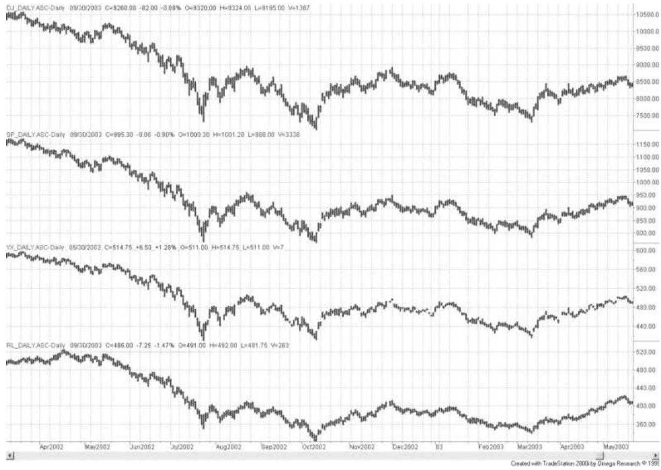
FIGURE 13.2 Major Index futures markets. From top to bottom: Dow Industrials (DJ), S\&P 500 (SP), NYSE Index (YX), and Russell 2000 (RL).
(a)

(b)

FIGURE 13.3 (a) Ratio of S\&P 500 to Dow Industrial.
(b) Ratio of S\&P 500 to Russell 2000.
A ratio chart divides the price of one index by another, giving the percentage change between the two. In Figure 13.3 a the ratio of the S\&P 500 and the DJIA varies from 104 to 110 , with a midpoint of 107 , a range of about \(6 \%\). Considering the very different ways that these index values are calculated, this is a narrow range. Of course, all of the Dow components are also in the \(\mathrm{S} \& \mathrm{P} 500\) and their capitalization accounts for about \(20 \%\) of the S\&P; therefore, there should be a similarity between the two. In the short-term, differences in these index markets are mean reverting; that is, they would be traded by buying the lower ratio and selling the higher, expecting prices to return to the midpoint. However, there can be a longerterm trend to the ratio.
The S\&P 500 and the Russell 2000 represent different ends of the stock market, the high caps and the small caps. In the bottom panel of Figure 13.3 the declining ratio of the S\&P compared to the Russell shows that the Russell has been much stronger since April 2003. It was a sign that investors were comfortable with the market and willing to put their money in stocks that have higher risk. This trend in the ratio would normally be traded by selling the S\&P and buying the Russell at a time when an economic recovery was expected.
\section*{Pairs Trading}
Pairs trading is one of the oldest and most wellestablished equity trading strategies. It also goes by the names statistical arbitrage (stat-arb) and relative value
arbitrage. It takes advantage of price differences between two related stocks or futures markets. In its most advanced form it can be the basis for highfrequency trading, where fully automatic systems enter and exit the markets in microseconds. A great deal of money has been made with this method.
\section*{Qualifying the Candidates}
The first step is to find two candidate markets. Quantitative analysts have a number of different methods they use to identify good pairs. In order of simplicity, the most common are:
1. Correlations between 0.4 and 0.7 . Correlations tell you about the short-term relationship between two series. In this range the two series are often moving in the same direction on the same day, but not always. It is the simplest and most popular way to identify pairs.
2. A high \(z\)-score or \(t\)-test, indicating that the mean and distribution of prices in the two series are similar.
3. Cointegration identifies whether the long-term trend of the two series is the same. If it is, then variations around the trend are trading opportunities.
For the less mathematical, observing a chart of the ratio or difference between two price series may be enough. When finding candidates, we look for a pattern where the relative values cross one another frequently while the long-term trend is the same. Nevertheless, traders have
been successful at pairs trading long before cointegration was known. Using the home builders Lennar (LEN) and KB Home (KBH), Figure 13.4 shows the type of similarities that are looked for.
\section*{Home builders}
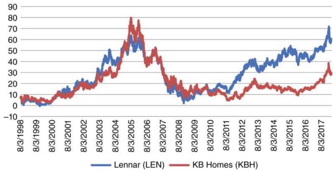
FIGURE 13.4 Lennar (LEN) and KB Home (KBH) prices.
\section*{LEN-KBH Rolling correlations}
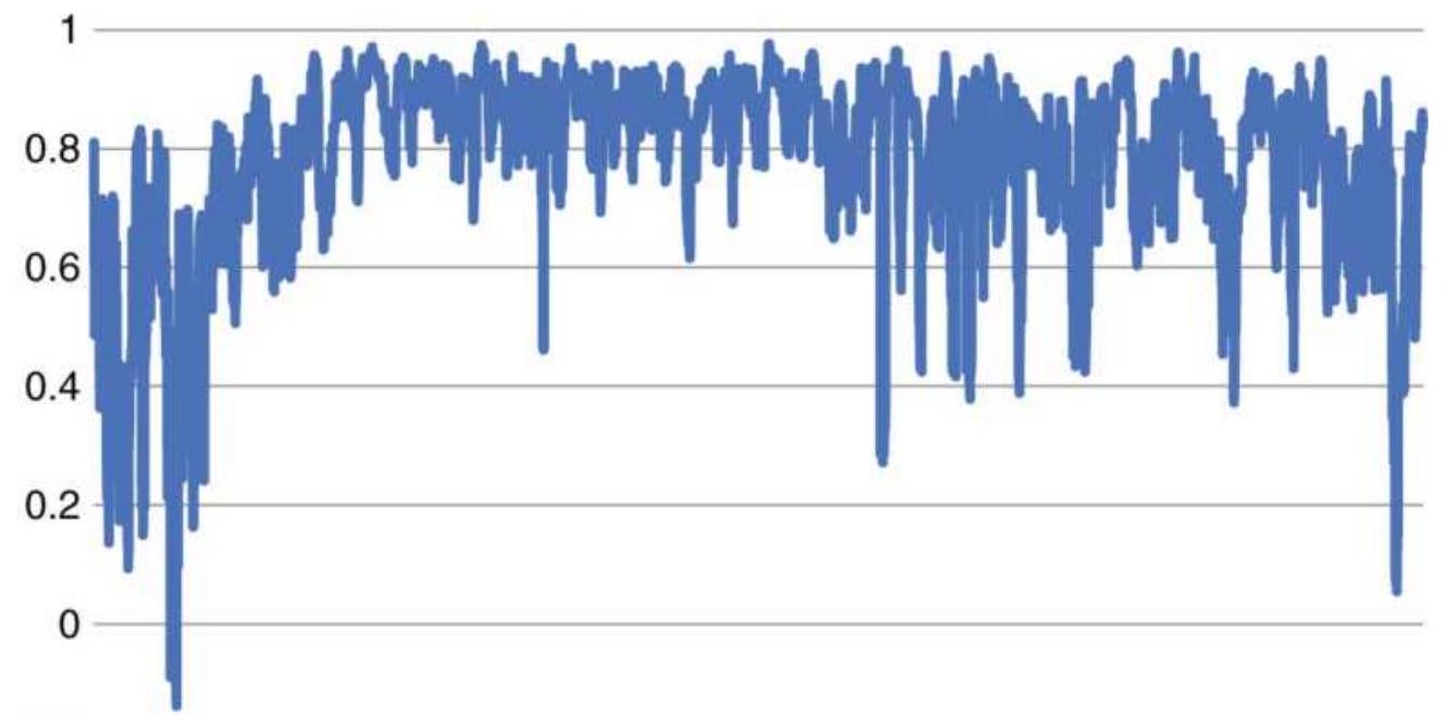

FIGURE 13.5 Rolling correlations of Lennar and KB Home returns.
\section*{Correlations}
Taking it one step farther, we calculate the correlation of returns over the entire test period as well as rolling 20day correlations. The result for LEN and KBH is 0.797 , very high. A picture of the rolling correlations, Figure 13.5, shows extremely high correlations from 2002 through 2008, but a more erratic relationship since then. Looking only at the period from 2012 to March 2018, where the prices diverge, the correlation is still 0.752. By any criterion, these two markets are candidates.
\section*{2-Sample z-Score and 2-Sample t-Test}
Both the \(z\)-score and \(t\)-test measure the similarity in the means and the distributions of two time series. The calculations are very similar and readily done in a spreadsheet.

Using an online 2-sample \(t\)-statistic calculator, \({ }^{7}\) we entered the mean, the standard deviation of prices, and the number of data items (1310) for each of the three pairs. The results matched the \(t\)-score results calculated in Excel, showing a confidence level for each pair of at least \(95 \%\). Note that the standard deviation used the original prices, not the returns. This calculation uses the trends of the two series as part of the solution.
\section*{Cointegration}
Cointegration is the preferred method for institutions. \({ }^{8}\) It finds two series that move in the same direction over the long-term. It is best if they have a high degree of randomness around that direction. The classic example is walking two dogs, each on their own lead. They both go forward, but their movements left and right are unpredictable. While cointegration is explained theoretically in some texts, the exact implementation is closely held. A good mathematical background will be necessary for the more sophisticated solutions.
The essence of the method is as follows:
1. Find two candidate markets, \(A\) and \(B\).
2. Each market must be stationary, that is, it cannot have an underlying trend. To do this we take the 1st differences of each series \(\left(p_{t}-p_{t-1}\right)\) and test if the sum is near zero. More sophisticated analysts will use the Dicky-Fuller (DF) test, which regresses the series against the same series lagged by one day. If the slope of the regression is less than 1 , the series is considered stationary.
Typically, you would want the 1st differences to be stationary. If that fails, you may take the 2nd differences (called order 2) and test for stationarity, but it is best if the 1st differences work.
3. If both series are stationary, solve the regression \(A=X \times B+c\), which can be done using Excel's
Data Analysis tool. If \(X<1\), the relationship satisfies the cointegration conditions.
Even if a series is stationary, it can have different volatility and large price swings. Taking the standard deviation ( \(\times 252\) for daily data) of the 1st differences will give the annualized volatility of the series. The ratio of the volatilities of the two series will give the ratio of the position sizes of the two legs of the trade necessary to make them equal risk. Without that, the profits or losses of one series can overwhelm the other. If the annualized volatility of either series is very high, the series had large price swings and may be best to avoid.
The Johansen Test can also be used to find cointegration between two series. The source code is available online along with an explanation and instructions. \({ }^{9}\) There is also a reference to mean reversion strategies that can be developed from this approach.
To see if you have done this correctly, try testing the ETF SPY and its inverse SDS. The regression of the two should always be stationary ( \(X\) very near zero) although during different periods the price swings could be large. The volatility ratio of SDS to SPY is about 2.5 because SDS is leveraged.
\section*{Mean-Reversion Strategy}
The most obvious strategy for pairs is mean reversion based on the differences or ratios of the two series. In this example, two major Chinese banks are used, the Industrial and Commercial Bank of China (ICBC) and the Bank of China (BOC). The price histories from 2007 through 2017 are shown in Figure 13.6. They appear to be correlated.
Using the price difference, ICBC-BOC, take the rolling 15 -day standard deviation and form a \(\pm 2.0\) standard deviation band around the differences. Figure 13.7 uses 2011, a quiet period, to show the pattern. The trading rules are:
Buy ICBC and Sell BOC when the difference is below the 15 -day average minus 2.0 standard deviations. Exit when the current difference crosses above the average of the 15 -day difference.
Sell ICBC and Buy BOC when the difference is above the average +2.0 standard deviations. Exit when the current difference crosses below the average.
Major China banks
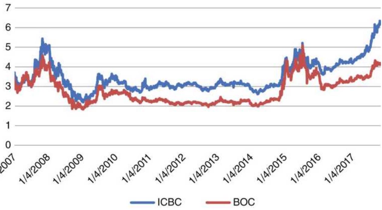
FIGURE 13.6 Price histories of ICBC and BOC from 2007, traded in Shanghai.
ICBC-BOC Standard deviation bands
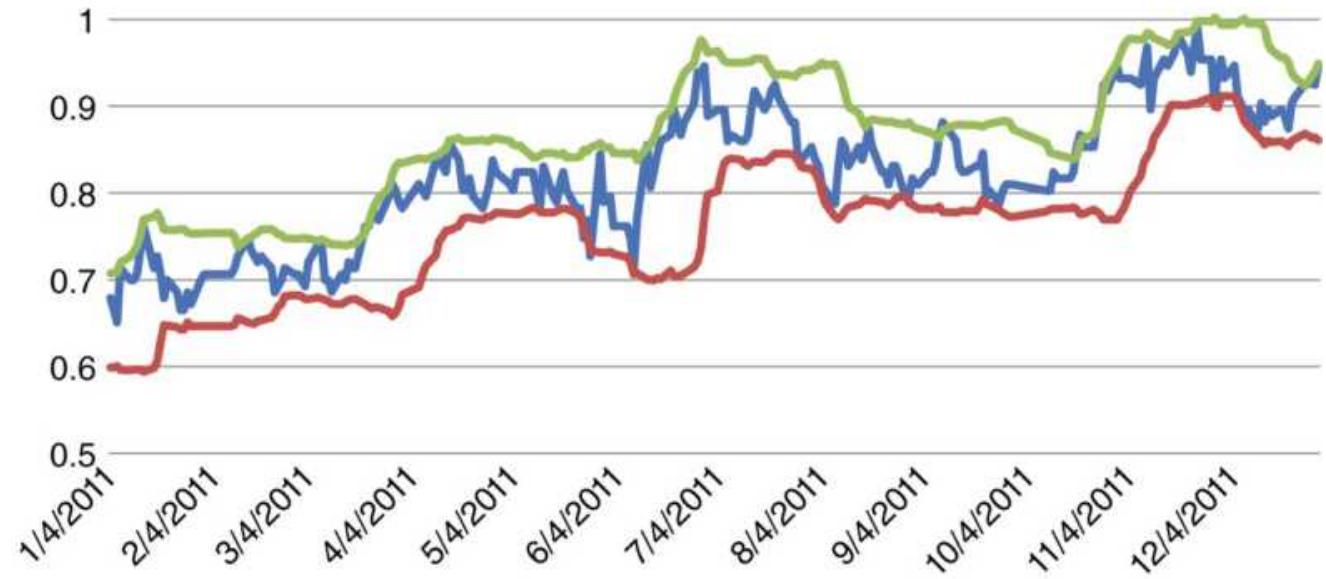
FIGURE 13.7 Example of standard deviation bands around the price difference of ICBM-BOC during 2011.
\section*{ICBC-BOC Total profits using differences}
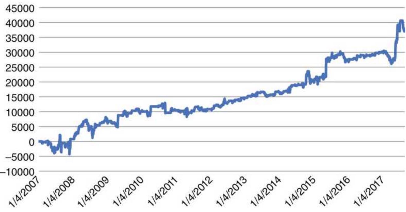
FIGURE 13.8 Total profits using the standard deviation of price difference for ICBC-BOC.

The position size is determined by an equal investment (for example, \(\$ 1,000\) ) divided by the current price of the leg. A smaller standard deviation threshold will generate more trades and higher risk. In this example, the total profits are shown in Figure 13.8. The calculations necessary for this analysis can be found on the Companion Website as Pairs using stdev of difference for ICBC-BOC.
The ability to adjust to volatility is critical to the risk of pairs trading, whether using the standard deviation or momentum. For that reason, the calculation periods used are very short. This also results in trades that are
held for only a few days, which seems to satisfy the nature of pairs trading.
\section*{The Difference between Two Momentum Indicators}
We can treat a pairs trade as a relative-value arbitrage by applying a momentum indicator to the prices, ratios, or differences. Using a 6-day raw stochastic indicator, applied to the home builders Lennar (LEN) and KB Home (KBH), we get the values shown in Figure 13.9 for the period January 1 through March 15, 2018. It also shows the momentum differences. The three boxes highlight the periods where the momentum values diverged, the first one being much larger than the last two. An RSI or MACD would have given similar results.
\section*{Momentum and momentum difference}
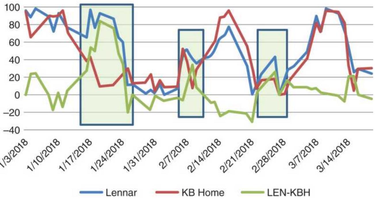
FIGURE 13.9 The 6-day raw stochastic of INTC, MU, and TXN prices.
Based on this approach, there are a number of choices
1. Sell the stronger when one stock is overbought at 90 and the momentum difference is greater than 70 , or some other threshold. That argues the overbought stock will correct but does not say anything about the other leg of the pair. Exit when the overbought stock corrects to neutral or the momentum difference narrows to a neutral level.
2. Buy the weaker when the momentum difference is below -20 and sell when the difference is the opposite. Exit when the difference crosses zero.
Using the second set of rules, which are the easiest to implement, produces the total profits marked as "Mom diff" shown in Figure 13.10.
\section*{Stress Indicator}
The difference between the two momentum indicators can be the input to another stochastic calculation, resulting in a Stress Indicator. The steps are:
\[
C 1_{t}-\min _{i=t-n, t-1}\left(L 1_{i}\right)
\]
\section*{Stochastic \(1_{t}=\)}
\[
\begin{aligned}
& \max _{i=t-n, t-1}\left(H 1_{i}\right)-\min _{i=t-n, t-1}\left(L 1_{i}\right) \\
& C 2_{t}-\min _{i=t-n, t-1}\left(L 2_{i}\right) \\
& \max _{i=t-n, t-1}\left(H 2_{i}\right)-\min _{i=t-n, t-1}\left(L 2_{i}\right)
\end{aligned}
\]

\section*{LEN-KBH Total profits}
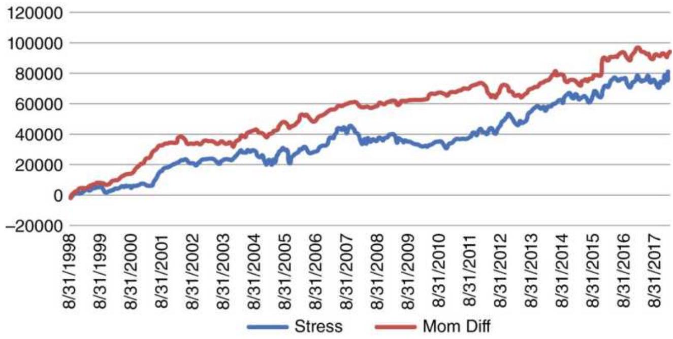
FIGURE 13.10 Total profit from the pair LEN-KBH using the momentum difference and the Stress Indicator.
IfD \(D_{t}\) is the difference between Stochastic1 and
Stochastic2 on day \(t\), then the stress indicator is:
\[
D_{t}-\min _{i=t-n, t-1}\left(D_{i}\right)
\]
Stress \(_{t}=\)
\[
\max _{i=t-n, t-1}\left(D_{i}\right)-\min _{i=t-n, t-1}
\]
Instead of inspecting the standard deviation of the difference to find the current threshold value, the stress indicator normalizes the results so that the rules become simpler. Figure 13.11 shows the stress indicator for the first part of 2018. Because the calculation period is only 10 days, the indicator moves quickly between oversold and overbought values. The rules are:
Buy LEN (leg 1) and sell KBH (leg 2) when
\section*{Stress \(_{t}<5\). Exit when Stress \(_{t}>=50\).}
Sell LEN (leg 1) and buy KBH (leg 2) when
Stress \(_{t}>95\). Exit when Stress \(_{t}<=50\).
Because the short calculation period for the stochastic can cause the momentum to remain at zero or 100 for a number of days, one technique used by traders is to enter on the first day that the momentum reverses from the extreme. The success of this technique depends on how strongly the market trends.
Momentum indicators show price fluctuation over the calculation period, but in a very quiet market, the range of that fluctuation can be too small to trade. This can be fixed by looking at the average true range or the price range from the last momentum high to the last momentum low and using a minimum volatility filter.
The results of using the momentum differences and the stress indicator for the period from 1998 through first quarter of 2018 are shown in Figure 13.11. The momentum differences are slightly better; however, this is just one test. Analysts will need to apply this to their specific markets to make a final decision.
\section*{Stress}
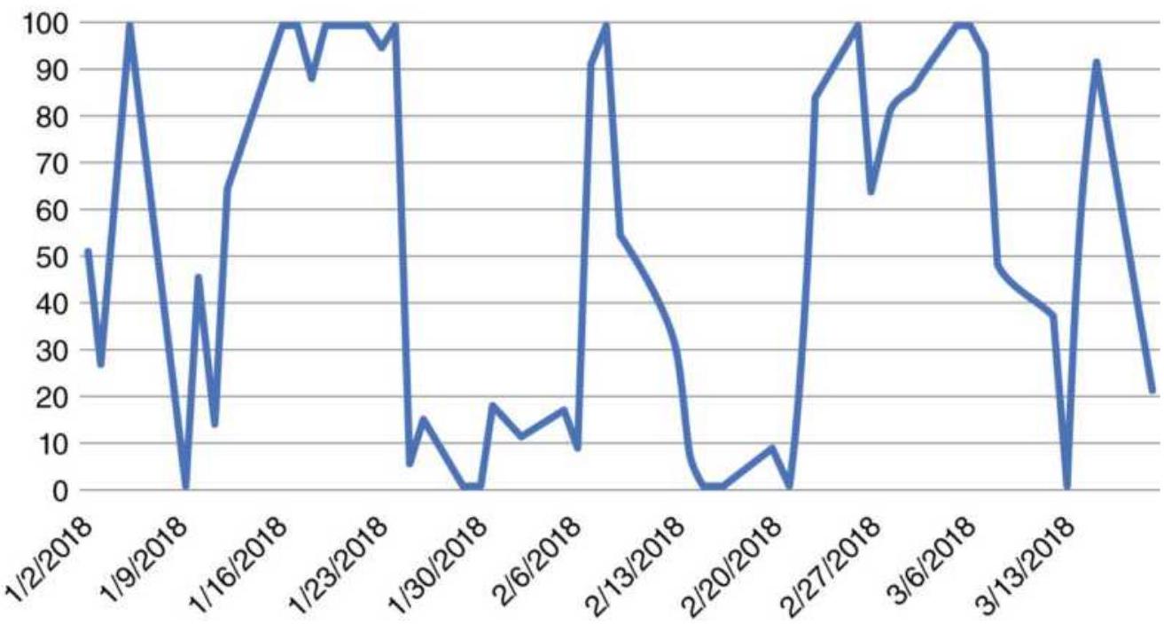
FIGURE 13.11 Stress indicator for LEN-KBH using momentum differences as input.

A spreadsheet containing all of the calculations in the pairs section can be found on the Companion Website, Pairs Calculation for LEN-KBH using Stress.
\section*{Position Sizing}
An important part of success in any arbitrage is making the two legs equal in risk. If you were to trade one leg at an average price of \(\$ 5\) and another at an average of \(\$ 25\), you could expect the \(\$ 25\) leg to be much more volatile. Trading equal shares of each stock or futures market would effectively make your returns entirely dependent on the success of the \(\$ 25\) leg.
The easiest way to equalize the risk is to calculate the position sizes based on the same investment, for
example, \(\$ 1,000\). Divide the \(\$ 1,000\) by the dollar value of the average true range over the past 20 days. Therefore, if a \(\$ 5\) stock had an average range of \$0.25, we would buy or sell short 4,000 shares. If the \(\$ 25\) stock had an average range of \(\$ 1\), we would buy or sell short 1,000 shares. This technique is called volatility parity. Using this process, both legs have an equal chance to contribute to the bottom line. Another method most often used by traders is simply divide the investment of \(\$ 1,00 o\) by the current stock price. While not as accurate, it is a fast solution and works reasonably well, as long as the stock is not trading below \(\$ 10\). When portfolio allocation and risk are discussed in Chapters 23 and 24, it will be difficult to improve on these methods.
\section*{More Statistical Arbitrage}
Both statistical arbitrage and high-frequency trading go beyond the scope of this book. There is a detailed PowerPoint presentation, "Algorithmic and HighFrequency Trading: An Overview," 10 which includes various statistical arbitrage techniques, high-frequency trading, and order execution algorithms. It should be of interest to traders with a strong math background.
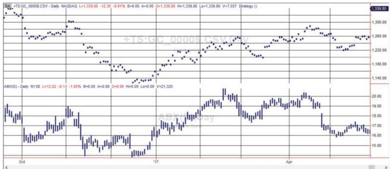
FIGURE 13.12 Gold futures (top) and Barrick Gold (ABX) from October 2016 through May 2017.
\section*{Stock and Futures Relationships}
When a listed company has a highly focused business dependent upon one or more physical commodities, it can be helpful to view both the price of the stock and the price of the commodity at the same time. As an example, Figure 13.12 shows the price of gold futures along with the share price of Barrick Gold (ABX), a mining company.
Although this chart might have been clearer if both gold and the stock price were expressed as percentages, the shapes of the curves are very similar and the correlation for this period is 0.40 , which indicates a positive relationship. Stock prices are affected by management and earnings, so the dependence of the stock on the commodity is not always clear; however, those differences create the opportunities for profit.
Once these prices are converted to stochastics, the buy
and sell signals are performed in exactly the same way as the home builders LEN-KBH with the exception of valuing the volatility. A \(\$ 1\) move in gold futures is worth \(\$ 100\); therefore, we expect to trade only a few futures contracts for a much larger stock position. One advantage of trading gold futures is that you can buy or sell (short) with no restrictions and no added cost. If you choose to take only the signals where you bought Barrick and sold gold, you would not have to deal with short sales in the stock market. Of course, in exchange for convenience you would be giving up opportunity and diversification.
In the world of technical adaptation, it should be noted that pairs trading can be applied to options in a technique called volatility dispersion trading. Rather than taking advantage of differences in price, it looks for relative value differences in implied volatilities between and index and a basket of component stocks, targeting large differences. It more often involves short options positions.
\section*{Bonds and Utilities}
Utilities are an investment that competes with bonds. It should not be surprising that when the two markets diverge, there is an opportunity to trade the correction. Murray Ruggiero shows a program with very good success using 30-year bond futures (US) and the
Philadelphia Utility Index (UTY). \({ }^{11}\) We will substitute the more liquid ETF XLU for utilities. The rules are:
- If US < AVERAGE(US,6) and XLU > AVERAGE
(XLU,20), then buy bonds
If US > AVERAGE (US.6) and XLU < AVERAGE (XLU,20), then sell short bonds

The Companion Website program TSM BondUtility Arb allows you to change the calculation periods, although these parameters show consistent profits in both long and short positions for the past 20 years. Figure 13.13 shows bonds on the top and XLU on the bottom with trading signals marked.
\section*{Product Spreads}
Product spreads take advantage of the relationship between the raw product and the results of processing that product. They are very actively traded. The soybean crush and the energy crack spreads are the most popular among futures traders and commercials and have been used for decades. Product spreads usually involve three markets, which may be of different delivery months, depending on the processing time. The most common product spreads are:
\section*{Raw Product(s)}
Soybeans
Crude oil
Feeder cattle and grain
Feeder pigs and corn
\section*{Resulting Primary \\ Product(s)}
Soybean meal and soybean oil
Gasoline and \#2 heating oil
Fat cattle
Live hogs
Exchanges recognize various spreads, executed in a specific proportion, as commercial application. They often allow reduced margins.
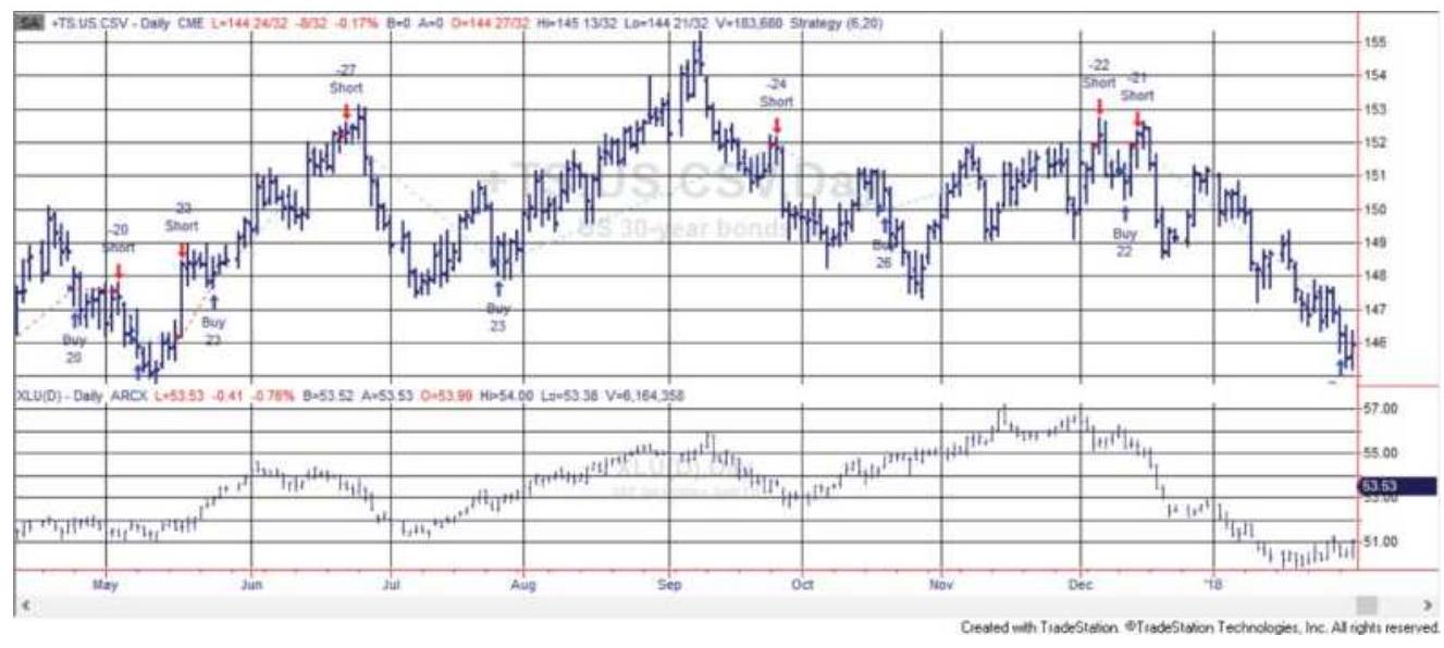
FIGURE 13.13 Trading signals for the bond-utilities arbitrage strategy, May 2017-January 2018.
\section*{The Soybean Crush}
Typically, the product spread is viewed from the perspective of the processor. A. E. Staley or Archer, Daniels, Midland (ADM) will buy soybeans, crush them into meal and oil, and then sell the products. You would expect the combined cost of the final products to be greater than the cost of the soybeans plus a margin of profit (the gross processing margin). Due to processing time, the crush relationship should be reflected in the current soybean price and the deferred product prices. When the gross processing margin is applied to futures prices it is called the Board Crush, after the Chicago Board of Trade.
Processing one bushel of soybeans weighing 60 pounds yields 11 pounds of soybean oil and 44 pounds of \(48 \%\) protein soybean meal, 3 pounds of hulls, and 1 pound of waste. Then:
\section*{GPM \(=0.022 \times\) Soybean meal \(+0.11 \times\) Soybean oil - Soybeans} where meal is expressed in dollars/ton, oil in dollars/pound, and soybeans in dollars/bushel, the same units as the futures contracts. The exact ratio for trading would be 10:11:9 (soybeans:meal:oil); however, most traders use 1:1:1. Applying this to the current prices of November soybeans and December meal and oil on October 22, 2003, the GPM becomes:
\(G P M=0.022 \times 240.30+0.11 \times 26.69-7.625=0.5975\) Therefore, the GPM is nearly \(60 \$\) /bushel.
When the combined return on soybean meal and oil is below the cost of crushing the soybeans, processors may execute a reverse crush spread, in which they sell the soybeans and buy the products. Even though this appears to be a clever way of keeping prices in line, it is not done until the crushing margin is very negative. Processors cannot readily reduce their level of operation and lay off employees; a reverse crush means that they are buying products as well as producing them - a position with significantly increased risk.
\section*{The Crack Spread}
Crude oil is refined primarily into gasoline and heating
oil. The residual is bitumen and is used for binding asphalt. As with the soybean crush, where the processor buys soybeans and produces meal and oil, the refiner expects a profit from the buying crude oil and selling gasoline and heating oil. A speculator can theoretically participate in this process, called the crack spread, by buying crude oil and selling the products in the right proportion and in the correct delivery months. It takes from four to six weeks to refine crude oil into its products; therefore, the prices used in the crack spread should always take the product prices quoted one month after the crude price.
For example, on May 5, 2011, crude oil for June delivery was \(\$ 101.13\) per barrel, heating oil \(\$ 2.9338\) per gallon for July delivery, and gasoline \(\$ 3.0491\) per gallon for July delivery. Based on futures contracts of 1,000 barrels of crude and 42,0oo gallons of heating oil and gasoline, we could calculate each contract value:
\begin{tabular}{|l|l|c|c|}
\hline & Price & Size & Value \\
\hline Gasoline component & \(\$ 3.0491\) & 42,000 & \(\$ 128,062\) \\
\hline Heating oil component & \(\$ 2.9338\) & 42,000 & \(\$ 123,220\) \\
\hline Total products & & & \(\$ 251,282\) \\
\hline Crude oil component & \(\$ 101.1300\) & 1,000 & \(\$ 101,130\) \\
\hline
\end{tabular}
In the example above, June crude was paired with July heating oil and gasoline. Although there are other byproducts of the refining process, the major components of fuel oil and gasoline are produced in a ratio of slightly more than 2 parts gasoline to 1 part fuel oil on average each year. This ratio then accounts for the
3-2-1 crack spread, where 3 contracts of crude oil are bought, and 2 contracts of gasoline and 1 contract of heating oil are sold. The exact historic ratios can be found in the CRB Commodity Yearbook under Fuel Oil and Gas Production and Ratios. In the example above, we can complete the net transaction as follows:
\begin{tabular}{|l|l|l|l|l|l}
\hline & Trade & Price & Size & Value & Cost \\
\hline \begin{tabular}{l}
Gasoline \\
component
\end{tabular} & Sell 2 & \(\$ 3.0491\) & 42,000 & \(\$ 128,062\) & \(\$ 256,1\) \\
\hline \begin{tabular}{l}
Heating oil \\
component
\end{tabular} & Sell 1 & \(\$ 2.9338\) & 42,000 & \(\$ 123,220\) & \(\$ 123,2\) \\
\hline \begin{tabular}{l}
Total \\
products
\end{tabular} & & & & \(\$ 251,282\) & \\
\hline \begin{tabular}{l}
Crude oil \\
component
\end{tabular} & Buy 3 & \(\$ 101.1300\) & 1,000 & \(\$ 101,130\) & \(\$ 303,3\) \\
\hline \begin{tabular}{l}
GPM (Net \\
gain)
\end{tabular} & & & & & \(\$ 75,9\) \\
\hline
\end{tabular}
Transaction costs will include execution slippage, commissions, and the cost of carrying the contracts until delivery (margin deposit and interest).
\section*{Reverse Crack}
Similar to the reverse crush, when the combined delivered price of the products is less than the cost of crude oil, the refiner has no reason to process the crude oil, and can go to the market to buy the products and sell crude. This is called a reverse crack. In reality, processors can perform a reverse crack to some degree, but shutting down operations to accommodate a
temporary market condition is not a good policy. Shutting down and restarting a large refinery involves labor problems and delivery obligations that make matters more complicated. When executing a reverse crack, the same delivery months are used for both crude and products.
\section*{Old Crop-New Crop Spreads}
A special case involving carrying charges is the old cropnew crop spread, also called an intercrop spread. Even though there is an old crop inventory carryover that ties the two seasonal markets together, this spread can be highly volatile. Soybeans, for example, are harvested mainly in September and October. The August delivery is clearly the old crop, and November is the first new crop month; the September contract often reflects the shift from old to new and is avoided by most traders.
Normally, the old crop trades at a premium to the new crop. Carrying charges, accumulating since the previous winter, are part of the August price. Export demand may cause shortages in the old crop, which move prices further above the cost of carry. Figure 13.14a shows the anticipated price pattern resulting from carrying charges during a normal year. There are no carrying charges if the new crop is sold immediately, but there is a minimum storage commitment for the 3 months immediately following harvest, which is shown as a larger increase in prices. After the first three months, normal carry adds a decreasing amount to the price (as the product is sold off) until the following September, where old and new crop mix. Finally, any carryover (old
crop inventory) must assume the price of the new crop, which is in greater supply.
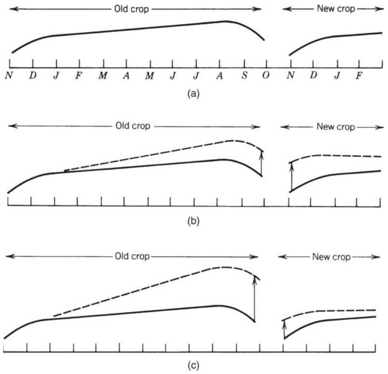
FIGURE 13.14 Intercrop spreads. (a) Normal carrying charge relationship. (b) New crop supply problems result in narrowing spreads. (c) Export affects the old crop more than new, resulting in a widening spread.
The theory behind an intercrop spread is that prices must come together when the old crop merges with the new crop. But can it be a profitable trade? Examine the
two possible events which affect this trade:
1. Problems involving development of the new crop making supply uncertain. This could cause prices in the new crop to rise faster than the old crop (Figure \(13.14 b)\).
2. Export demand in the old crop results in old crop prices rising faster than new crop prices (Figure 13.14 c ).
In Case 1, the spread between crops narrows and can only be traded as a spread that is short the old crop, long the new crop. This spread has limited potential since the November delivery cannot exceed the old crop by more than the normal carrying charge. At that point, processors will buy, store, and redeliver the old crop against the new crop. When prices in the new crop are nearing the old crop value, it makes sense to liquidate or even to reverse the spread. Once reversed, there is little risk that the spread can move adversely. A revised crop estimate that showed better yield than originally expected would cause the new crop to decline sharply and the spread to widen.
In Case 2, export demand in the old crop causes the intercrop spread to widen at first. A spread trader will typically wait until export commitments are fully known, then sell the old crop and buy the new. When old crop prices rise to a large premium over the new crop, many processors will reduce purchasing based on:
- Low or negative profit margins at the current price levels
- Use of reserves or inventory to carry processing through until the lower new crop prices are available
It is remarkable how demand is inversely related to price even when it is considered inelastic. When a delay in purchasing or processing will result in greater profits for the commercial, that delay is somehow achieved.
\section*{Butterfly Spreads}
A butterfly spread, normally referred to as just a butterfly, is a low-risk technique for capturing shortterm price distortions between delivery months in the term structure of a futures market. It is best in highly volatile markets, where the concentration of trading in one or two delivery months causes those contract prices to move away from the normal delivery month relationship. These distortions occur often in the week before the nearby futures contract expires, when large positions holders, such as fund managers, roll from the nearby month to the next delivery. Opportunities most often exist during the trading day; however, setting a butterfly is the same process whether looking at intraday or closing prices.
For example, in April a combination of poor planting, declines in the U.S. dollar, and new export agreements changes the soybean prices as shown in Figure 13.15. Increased demand results in sharply higher July futures prices (the open circle) with a tapering-off of the effect in the more deferred contracts. The normal carrying charge relationship is shown as a straight line in the old crop, beginning again in the new crop. A butterfly entered in
the old crop would mean selling two contracts of July soybeans and buying one contract each of May and August. This is the same as executing two spreads: long May, short July, and short July, long August.
Old crop
Sell 2
0
\(\underset{0}{\text { Buy } 1}\)
Buy 1

FIGURE 13.15 Delivery month distortions in the old crop, making a butterfly spread possible.
Each spread in the butterfly has a good chance of being profitable; the combination of the two is essentially riskfree. The July contract cannot remain out of line with the deliveries on both sides because a trader could take delivery of the May contract and redeliver it in July at a profit exceeding the cost of carry. Under normal circumstances, commercial users of soybeans will defer their purchases to later months, depleting their reserves, to avoid paying a short-term premium and causing July prices to drop.
Another reason for distortions in the term-structure of the delivery months is concentration of orders by large hedge funds, typically macrotrend trading programs. Those funds tend to trade in the most liquid month and
many do not make an effort to spread their orders across other months. Instead, they let the market makers (at one time floor traders) execute their orders by spreading against other delivery months. If a large buy order is placed in the May soybean contract, the broker will sell May and buy July, and if possible also buy March and sell May, creating a March-May-July butterfly. Brokers will rarely hold and outright long or short position. This is similar to convenience yield, discussed earlier.
The butterfly spread guarantees that any adjustment in the three contracts back to a normal relationship will prove profitable. If the prices of both May and August rise to be in-line with July or if May rises to form an inverted relationship, the spread will be profitable (Figure 13.16).
The problem with such an ideal spread is the short window of opportunity and difficulty executing both legs at the right moment. Because profits are nearly riskless, opportunity is small. The beneficiaries of these trades used to be the floor traders who can act quickly. Now, it's the algorithmic traders, constantly scanning markets for discontinuities and acting on them in milliseconds. Once the position is entered, liquidation can be easily accomplished.
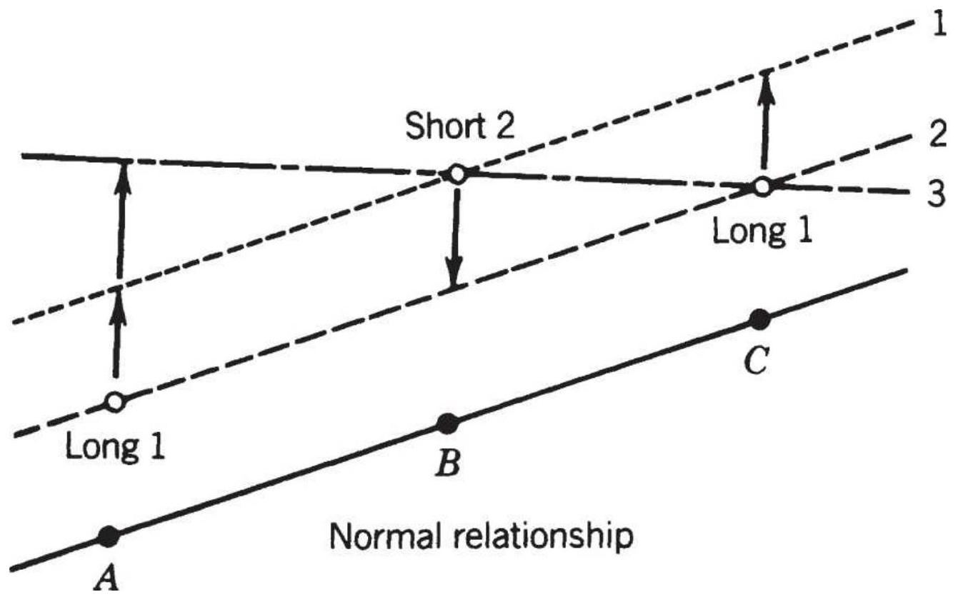
FIGURE 13.16 Corrections to interdelivery patterns.
A common problem for those attempting butterfly spreads from screen prices is that a lack of trading in the deferred months may appear to be a distortion. Prices may be bid or asked at the correct level, but not traded. If the bid-asked prices do not show on your screen, then the last traded price that is out of line may be a false opportunity.
\section*{The Yield Curve}
There are a wide range of strategies involving the yield curve, or term structure of various futures markets. At the most sophisticated level, the large investment houses, hedge funds, and commercials make a business of arbitraging individual Eurodollars futures prices against strips of the same maturity as well as against
comparable bond maturities, normally the \(2^{-}, 5^{-}\), and \(10-\) year Treasury notes. To be successful, these traders own seats on the exchanges so that their transaction costs are near zero.
A Eurodollar strip is the combined, nonoverlapping returns of each Eurodollar futures contract beginning with the cash LIBOR yield and then compounded with the partial returns of each futures contract. This can be expressed as: \(\underline{12}\)
\(T V_{T}=\left(1+L_{0} \frac{D_{0}}{360}\right) \times\left(1+F_{1} \frac{D_{2}}{360}\right) \times \cdots \times\left(1+F_{n} \frac{D_{n}}{360}\right)\) where
\(T V=\) Terminal value of \(\$ 1\) invested for \(T\) years
T
\(L_{o}=\) Spot LIBOR rate
\(F_{i}=\) Futures rate for the ith deferred contract (100 futures price)/100
\(D_{i}=\) Actual days in each period
Figure 13.17 shows the term structure of Eurodollar futures on April 5, 2011. It is a positive or normal yield curve. As an example of an arbitrage possibility, consider the first two futures contracts. If the cash LIBOR rate is 0.21 and there are 35 days until the nearby Eurodollar futures contract expires, the rate of the first futures is 33 basis points ( \(0.33 \%\) ), and the rate of the second futures is \(0.43 \%\), then the futures price of the second can be calculated as:
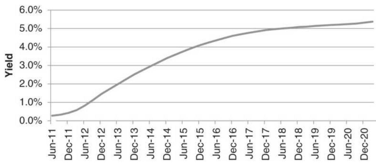
Eurodollar Futures Delivery Months
FIGURE 13.17 Eurodollar term structure of futures prices.
\[
\begin{aligned}
T V_{F 2} & =\left(1+0.0021 \frac{35}{360}\right)\left(1+0.0033 \frac{91}{360}\right)\left(1+0.0043 \frac{91}{360}\right) \\
& =1.002139, \text { or } 0.2139 \%
\end{aligned}
\]
The futures price would then be
\(100-0.2139=99.78608\). The actual futures price is 99.57 , giving a differential of about 21 basis points. For an arbitrage to be successful, traders look for a minimum of 25 to 30 points. Note that 91 days were used for each futures market, although the actual days may vary slightly and should be used.
Eurodollar strips, as well as the Eurodollar futures price, for the 5-year forward delivery should also be equal to the yield on the 5-year note or any note that is due to mature in the same time, with variation due to risk. Some threshold profit level is needed to cover the cost of
holding the Eurodollar contracts, the note or bond contracts, or to execute the cash market transactions. To make this easier, the Chicago Mercantile Exchange (CME) has a contract called a Eurodollar bundle, which trades from 1 to 10 years, essentially creating strips of those maturities from Eurodollar futures. This removes the need to execute all delivery months when creating a strip.
\section*{Trading the Yield Curve}
Many traders see shifts in the yield curve, steepening or flattening, as a trending process. As the central bank lowers rates in the near-term, the short end declines more than the long end and the curve steepens. Trend traders try to exploit this by creating spreads between the various interest rate maturities, Eurodollars, 2-year notes, 5 -year notes, 10-year notes, and 30-year bonds. This can be done by creating a new series of, for example, 10-year notes minus 5 -year notes, then trading that series by:
Buying 10-year notes and selling 5-year notes when the yield curve is steepening.
Selling 10-year notes and buying 5 -year notes when the yield curve is flattening.
The shorter maturities will tend to be less volatile than the longer end. It is necessary to size your position to equalize the volatility; otherwise, your profits and losses will always reflect the performance of the longer maturity. To do this we use the same method as discussed in pairs trading, take an equal investment
amount for each market and divide by the dollar-value of the volatility using the average true range of the past 20 days. The more volatile market will have fewer contracts.
It is difficult to include the Eurodollars in this type of trade because prices are not quoted in the same terms as the other interest rate markets. You would want to convert all prices to yields.
\section*{The TED Spread}
The difference between 3-month U.S. Treasury bills and 3-month Eurodollars is traded as the TED spread. Eurodollars are U.S. dollars on deposit in banks not in the United States held by both non-U.S. banks and branches of U.S. financial institutions. While originally only European banks were included, Eurodollars can now be in any major bank in the world that is not in the United States.
The TED spread is considered an indicator of credit risk and represents the shifting public confidence between the U.S. government and the highest quality non-U.S. domiciled banks. During times of crisis money flows back to the U.S. as a safe haven. The TED spread is traded in futures of the same delivery month. Typically, Eurodollar rates are higher; therefore, if March T-bills are at 97.50 and March Eurodollars are quoted at 97.00 (discounted rates of \(2.5 \%\) and \(3.0 \%\), respectively) the TED spread is o.50, quoted simply as the whole number 50. The TED spread rises when there is greater economic uncertainty. Banks outside the United States offer higher rates to prevent money from flowing back to the U.S.
Treasury. The U.S. T-bills will always trade at a higher price, offering lower rates but more security.
\section*{Implied Interest Rates}
After the financial crisis in 2008, many investors were concerned about the counterparty risk of even large banks. After all, if Lehman Brothers could fail, why not any bank or investment house? When you buy a
Certificate of Deposit (CD) issued by a bank, you are lending them money based entirely on the creditworthiness of that bank. Sometimes that loan is insured by a third party, but not often, and the insurance reduces the return of the CD. In a worst-case scenario, the insurance was written by AIG, a company that was itself on the verge of collapse. Instead, many investors looked to the futures markets, which are guaranteed by the clearing house. While there has never been a default in futures, it is always possible that the level of insurance provided by the clearing house will not be enough in a crisis. However, it is considered the better of the alternatives.
When a futures market trades in contango, where the price in each deferred delivery month is higher than the previous month, we can assume that most of that increase is due to carrying charges. This does not apply to agricultural markets, but the main focus is on extracting the dividend yield from stocks or the implied yield from precious metals. While this may be less than the current CD rate, the investment is smaller (margin rather than full cash) and seen as more secure.
\section*{Pure Carry}
A pure carry market is one in which the forward price is entirely comprised of the costs of holding the physical product until a predetermined delivery date. As previously mentioned, these costs are storage, insurance, and the loan rate. As an example, consider gold, which is a classic pure carry market.

On April 5, 2011, the price of the December 2011 contract was 1484.9. If we want to know how much interest is gained by buying the December contract and simultaneously selling the December 2012 contract at 1496.9, we can apply the normal calculation for annualized rate of return (see Chapter 2), using the actual elapsed days (in this case 362), and get 80.37 basis points. These returns can be derived from the numbers in Table 13.2. Eurodollar futures shows that the returns for the same period would be 43 basis points. In addition, to extract the 80 basis points you need only invest the required margin plus some amount of reserves rather than the entire face value of a CD. Figure 13.18 shows the gold futures prices and the implied yield based on the first May 2011 contract and the differences to each of the forward deliveries. TSMimpliedinterest is available on the Companion Website.
\section*{TABLE 13.2 Gold prices and delivery months, implied yield, and total days.}
\begin{tabular}{|l|c|c|c|}
\hline Month & Price & Implied yield & Days \\
\hline May-11 & 1480.9 & & \\
\hline
\end{tabular}
\begin{tabular}{|l|l|l|l|}
\hline Jun-11 & 1481.4 & 0.004059 & 30 \\
\hline Aug-11 & 1482.6 & 0.004549 & 91 \\
\hline Oct-11 & 1483.8 & 0.004675 & 151 \\
\hline Dec-11 & 1484.9 & 0.005350 & 182 \\
\hline Feb-12 & 1486.1 & 0.005228 & 242 \\
\hline Apr-12 & 1487.6 & 0.005396 & 302 \\
\hline Jun-12 & 1489.1 & 0.005506 & 362 \\
\hline Dec-12 & 1496.9 & 0.007137 & 544 \\
\hline Jun-13 & 1509.8 & 0.009630 & 726 \\
\hline Dec-13 & 1529.1 & 0.012780 & 908 \\
\hline Jun-14 & 1551.6 & 0.015522 & 1090 \\
\hline Dec-14 & 1577.9 & 0.018118 & 1272 \\
\hline
\end{tabular}
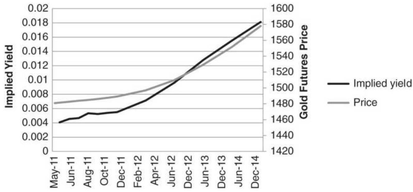
FIGURE 13.18 Implied yield from gold futures, April 5, 2011.
A strategy that gets blamed for many of the large moves in currencies is the carry trade. The idea behind this multicurrency approach is simply that money flows to the countries that have the highest interest rate net of inflation - that is, real returns. For example, if the interest rate in the United States is \(4 \%\) and the rate in Japan is \(1 \%\), as it was for many years, then we would borrow Japanese yen, convert to U.S. dollars, and buy U.S. Treasuries for a gain of \(3 \%\) per year. When we are done, we would return the amount of yen originally borrowed. The risk in the trade is that the U.S. dollar will weaken against the yen (USDJPY), causing an offsetting loss in the currency transaction that could easily be larger than the expected gain in interest income.
Although this process is thought to be extracting the carry, which is the cost of holding an asset for some time period, it is a misnomer. Traders do not own cash yen and exchange that for cash dollars to buy U.S. bonds in order to extract the carry. Instead they understand that the interest rate differential between the United States and Japanese 3-month returns will translate into interest rate parity (discussed earlier in this chapter) and the forward price of the dollar versus the yen will be higher if the dollar interest rate is higher than the yen interest rate. Therefore, they focus entirely on the futures or forward currency markets, where they can invest with exceptionally high leverage. Then, if the interest on a dollar investment is greater than the interest on a yen investment, they buy the dollar-yen cross, USDJPY. But the forward price, by definition, discounts the forward interest rate differential, so how
can you capture the carry if it's already discounted in the futures price?
The answer is called forward bias. Because the trade is executed in the forward market, it cannot extract the carry. Instead, it relies on the time-tested phenomenon that money flows to the country with the highest real rate of return. There is high confidence that the U.S. dollar, yielding \(4 \%\), will strengthen over the yen yielding \(1 \%\), or that Brazil at \(8 \%\) will strengthen over the dollar at \(4 \%\), providing Brazilian inflation is less than \(4 \%\) and that the economy is otherwise stable.
How significant is the risk that the currency will move against you? That the yen will strengthen against the dollar even when U.S. rates are much higher than Japanese rates? Sometimes the risk is substantial; therefore, a diversified portfolio is needed to offset the times when some of the trades go the wrong way.
\section*{Implementing the Carry Trade}
Most traders would like to implement the carry trade using the major industrialized countries, G7. Those are Canada, France, Germany, Italy, Japan, the United Kingdom, and the United States. Of those, there are now only 5 currencies. To be even more practical, it would be easiest to implement the trade using the actively traded currency futures markets, the euro (EURUSD), British pound (USDGBP), yen (USDJPY), Swiss franc
(USDCHF), Australian dollar (AUDUSD), Canadian dollar (CADUSD), and perhaps the Mexican peso (USDMXN). Using only exchange-traded markets
reduces the chance of counterparty risk. There are many other currencies listed on the CME that are illiquid, and they allow traders to EFP (exchange for physicals), that is, they can execute the currency trade in the cash market and exchange it for a futures position. At the beginning of each day the bank FX desk will post the number of basis points charged or credited in order to move the cash position to a futures position. It is simply the interest rate parity calculation, plus a transaction charge.
Now consider the difference in the spot FX rate and the nearby futures price for these crossrates. In Table 13.3, the spot and futures prices plus the corresponding cash 3-month interest rates are shown for February 27 and March 31, 2009. Cash rates can be found on Bloomberg and Reuters, while spot and futures prices for crossrates can be found on CSI, and other data services. Because the CME quotes some of these rates differently from the FX market, and the FX market is itself inconsistent in the way it quotes some of the rates, it is necessary to show all rates as "per USD" (how many USD are needed to get 1 of the other currency units), the values have been converted into a standard notation, shown in columns 5 and 6 . The interest rate differentials are the difference between the 3-month rates of other countries compared to the U.S. rate. The last column shows the percentage change in the futures price from February to March.
Positions are taken in the carry trade to reflect the direction of the interest rate differentials, most often at the end of each month. Based on February 27 shown in Table 13.3, those would be:
Long the euro against the U.S. dollar
Short the Swiss franc against the U.S. dollar
Long the Canadian dollar against the U.S. dollar
Long the Australian dollar against the U.S. dollar
Long the British pound against the U.S. dollar
Long the Mexican peso against the U.S. dollar Short the Japanese yen against the U.S. dollar
TABLE 13.3 Key values of crossrates and yields, March 31, 2009.
\begin{tabular}{|l|l|c|c|c|c|}
\hline & & \multicolumn{2}{|c|}{ 27-Feb-o9 } & \multicolumn{2}{c|}{ 31-Mar-ot } \\
\hline Country & Crossrate & Rate & Futures & Rate & Futu \\
\hline USA & USA & 1.2644 & & 1.1919 & \\
\hline EC & EURUSD & 1.8250 & 1.2656 & 1.5100 & 1.32 \\
\hline Switzerland & USDCHF & 0.4950 & 0.8661 & 0.4033 & 1.12 \\
\hline Canada & USDCAD & 1.3500 & 0.7826 & 1.0000 & 1.26 \\
\hline Australia & AUDUSD & 3.1633 & 0.5698 & 3.1383 & 0.62 \\
\hline UK & GBPUSD & 2.0494 & 1.4270 & 1.6488 & 1.42 \\
\hline Mexico & USDMXN & 7.5000 & 0.0588 & 6.5000 & 0.06 \\
\hline Japan & USDJPY & 0.6375 & 1.0319 & 0.6031 & 0.98 \\
\hline
\end{tabular}
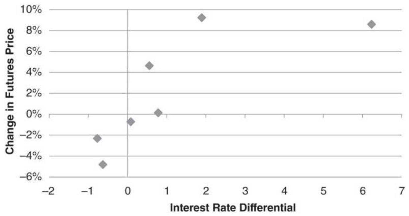
FIGURE 13.19 Interest rate differential versus change in futures prices during March 2009 for seven crossrates.
Each month new interest rates are recorded, differentials recalculated, and positions changed and rebalanced according to their volatility.
Although this month was not intentionally selected, 6 of the 7 crossrates satisfy the expectations of the carry trade, as shown in Figure 13.19. As the difference between the interest rate of one country gets larger compared to the U.S. rate (e.g., Mexico, the largest), the expected change in the currency also gets larger (although with considerable variability). The value of the Mexican peso increased from about 17 per 1 USD to 15 per 1 USD. Only the Canadian dollar, which had a slightly higher interest rate, lost value to the U.S. dollar, but then the rates were nearly the same.
February 2009 was still part of the window affected by
the subprime crisis, and both rates and futures prices were very volatile. Although it did not happen during this example, futures prices can move fast and farther than most of the differentials (which are less than 1\%), offsetting the perceived gain from the carry. To control the risk, most traders will volatility-adjust the position size of each currency position, improving the effect of diversification.
\section*{Opportunity and Concentration}
The biggest problem in the carry trade that uses the developed countries, which are the most liquid and traded on the CME, is that they have the smallest interest rate differentials and the most correlated currency price movements. When the United States releases a poor trade balance number, all currencies strengthen against the dollar. Adding the Mexican peso to the mix greatly improved returns because the differential was far larger than any of the other countries. However, as emerging markets are added, the risk of a large unfavorable currency move increases (such as a devaluation), as does the volatility of returns.
Another problem to be resolved is the concentration of positions in the funding currency. In Table 13.3 the U.S. rate was 1.26 , the third lowest, with Japan and Switzerland typically offering the lowest rates. The funding currency is the one that is shorted (or borrowed). Given the choice of contracts on the CME, the carry trade would have shorted the U.S. dollar in five of the seven cases. That makes success highly dependent on the direction of the U.S. dollar, specifically that it
continues to decline relative to the other currencies. If we were trading in the cash market, we could have sold the yen or Swiss against all the other currencies, but then there would be high concentration in those markets. And, while it's possible to create a mix of the major crossrates, there is still likely to be concentration in the funding currencies and more difficulty executing less active combinations.
\section*{Trading the "Wings"}
If trading the majors is not a very profitable strategy, then where is the money made? The answer is in the "wings," the second-tier currencies, not emerging markets but not fully developed. Those include Turkey, Israel, South Africa, Taiwan, South Korea, India, Brazil, Chile, Thailand, and a few others. Although Thailand is noted for having political coups regularly, the new government is much the same as the old one and the exchange rates do not reflect change for more than a few days. Argentina is omitted because it frequently devalues its currency. During the period from 2002 through 2018, the peso has gone from 1.73 to the dollar to 30 to the dollar, with one devaluation of nearly \(40 \%\) in 2015 .
The profits occur in the currencies with higher interest rates, some political uncertainty, and more volatility. The major currencies offer liquidity and add stability to the portfolio.
\section*{Creating a Portfolio}
The underlying strategy for a carry program is long-term trend following. Applied to each crossrate, a long
position says that you should buy the first country and sell the second. If we have an uptrend in the USDJPY, we would buy the U.S. dollar and sell the yen. But it would only qualify if the interest rate differential was above our threshold.
Profits depend on trading a broad range of currencies. In the universe of 27 currencies, there are 351 unique crossrates. Although calculations are made on each crossrate, they can be netted together so that there are buys and sells for the 27 underlying currencies. That makes trading manageable.
The most difficult issue is diversification, that is, balancing the risk. When one country raises rates, its currency increases in value and a larger number of crossrates will favor buying that country. It will be difficult to avoid concentrating positions in that country and putting the program at risk. Volatility adjusting each position will help. Even more difficult is the funding currencies. For years it was the Japanese yen and the Swiss franc. During the past few years, the U.S. dollar was added to that. Then the 27 crossrates would all want to be short one of those three currencies. Each would have \(33 \%\) of the equity.
Given 27 countries, an equally weighted portfolio would have \(3.7 \%\) in each country. However, that is unrealistic. A limit of \(10 \%\) is more realistic. In a worst-case scenario, a country devalues its currency by \(20 \%\), causing a net loss of \(2 \%\) in the portfolio, hopefully offset by gains in other countries. If \(10 \%\) is the maximum exposure allowed for any one country, what happens to the rest of
the \(33 \%\) for the funding currencies? It needs to be reallocated to the next best funding currency, or not allocated at all if there are no candidates. It is better to be underexposed than risk ruin.
\section*{Hedging the Risk of Devaluation}
The carry trade has a history of long periods of success followed by a large loss due to a surprise devaluation in one of the emerging markets. Can that risk be minimized? Because the emerging markets will offer higher rates than the funding currency, the program may also be long before a devaluation. If the higher rates are due to hyperinflation or political unrest, the trend will be down and the currency will be shorted. But that's not always the case.
There may be other indications that a devaluation is imminent, such as money moving out of that country, or increased volatility in the local equity market with declining prices. While you can't simply exit from positions using that currency because of the complexity of the hedge, you could place an additional hedge by selling options against that currency.
The problem is timing. If you assume that the Thai baht will be devalued at the next coup, maintaining a short options position will eventually cost more than the protection it offers. The key will be to recognize a smaller window in which a devaluation is more likely. The search for that solution is ongoing. Until then, a stop-loss is the best alternative.
\section*{IMPLIED VERSUS HISTORIC VOLATILITY}
Whether you favor using implied volatility (IV), the volatility associated with S\&P option pricing, or historic volatility (HV), the volatility of past price movement, the two must somehow converge. IV reflects what traders are willing to pay for an S\&P option based on expectations of future price movement. One would think that, if a large number of people are willing to pay for that belief, then it must be correct. If not correct, the anticipated volatility must become actual volatility tomorrow, or the day or week after. To find arbitrage opportunities between IV and HV, we'll use the ETF SPY and the volatility ETF UVXY.
\section*{Comparing volatility}
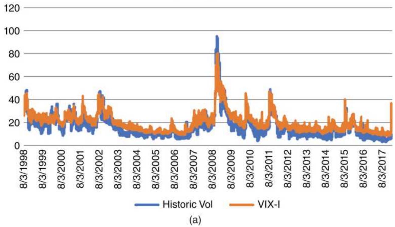
Ratio IV/HV
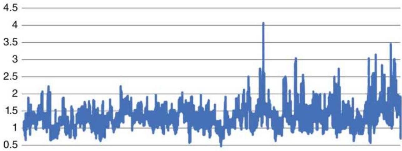

(b)
FIGURE 13.20 (a) Historic volatility and implied volatility, 1998-February 2018. (b) Ratio of implied volatility to historic volatility.
When we compare the 20-day annualized historic volatility of SPY with the implied volatility cash index VIX (Figure 13.20a), it is clear that they move together, making them candidates for arbitrage. If we look at the ratio of implied volatility to historic volatility (Figure 13.20b), it is more encouraging. In the long-term, the ratio varies around the average of 1.35 , where the expectations of IV are generally higher than the reality of HV.
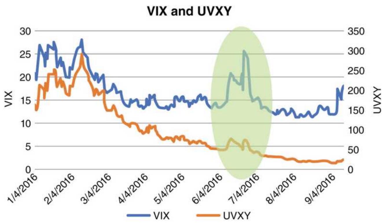
FIGURE 13.21 The VIX index (not tradeable) and UVXY (tradeable, leveraged).
\section*{Tradeable and Not Tradeable}
Most traders sell volatility. Figure 13.21 shows the downward bias, which is even more pronounced if you look back at older prices. To execute a sale, we can use one of the tradeable ETFs, iPath's VXX or the ProShares leveraged UVXY. Volatility is often sold when it jumps
up in anticipation of an upcoming, uncertain, and important event, such as the British vote to remain in the European Union. Figure 13.21 also shows the difference between the VIX index (not tradeable) and UVXY. The highlighted area at the end of June is the British vote. Note that UVXY, the lower line, does not peak nearly as much as VIX, the upper line. Traders, anxious to sell volatility based on a spike in VIX, nearly prevent the spike from forming in UVXY.
\section*{Implied Volatility and Historic Volatility}
There are a number of important differences between implied vol and historic vol. The biggest one is that historic vol has a built-in lag, which is both the worst and the best feature. The HV calculation, based on a 20-day average, has a lag of 10 days, which can be seen by the bulge and the horizontal move that follows in Figure 13.22. Because of the spike in volatility, historic vol jumps up and remains there for 20-days, until the day of the volatility spike falls out of the calculation period.
Implied volatility has a very different pattern, reflecting the day-to-day reactions of the traders - first in favor of staying in the EU, next getting out, then staying in again. Overall, implied volatility is much noisier than historic volatility, which means that there will be a lot of false signals, and traders will need to wait longer to confirm that a change of direction is going to be sustained.
\section*{The Arbitrage Opportunity}
There is a relative value arbitrage opportunity between
HV and IV. "Relative value" means that the prices do not have to cross, only move up and down relative to one another. Trades are made when one price series is overbought or oversold relative to the other. Therefore, when IV jumps up while HV lags, we would sell IV and buy HV. When they return to normal, relatively speaking, the trade is exited.
\section*{Implied and historic volatility}
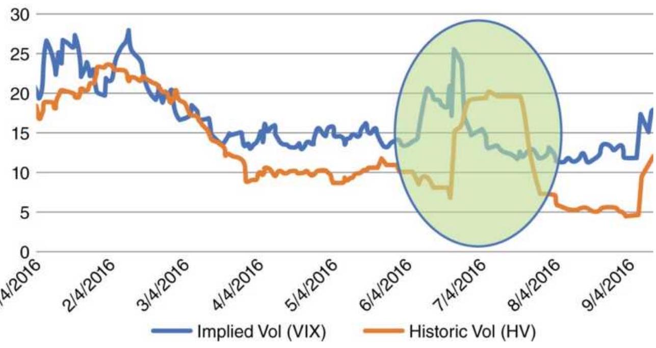
FIGURE 13.22 Implied vol (VIX index) and historic vol (calculated).
\section*{Timing the Entries and Exits}
A trading system requires a timing mechanism to know when the two markets are in position to be bought or sold. That can be done by calculating the stochastic indicators for IV and HV separately. The stochastic values can range from o to 100 . The UVXY stochastic uses the high, low, and close for implied volatility but only the close for historic volatility of SPY because the
highs and lows can't be calculated. If we subtract the HV stochastic from the UVXY stochastic, we get the pattern shown in Figure 13.23. This value can range from -100 to +100 . It shows that there is more time spent near 100 than near -100 . That would favor buying UVXY and selling historic volatility when the net stochastic is low.
\section*{A Crimp in the Plan}
But there is a problem. There is no ETF for historic volatility. It can be calculated but not traded. The alternative is to see what happens to SPY when the net stochastic is overbought or oversold. Because the values are highly skewed, the rules are:
- Sell SPY when the net stochastic is above 20 (in order to capture more trades) and exit at zero.
Buy SPY when the net stochastic is below -80 . Exit at zero.
The best policy is always to exit when the two markets are normalized, which is at zero. You could exit a bit sooner, for example, exiting shorts at +5 or +10 and long positions at -5 or -10 , but never assume that an overbought situation will then turn into an oversold one.
Once the two prices reach normal, there is no value in predicting which direction the two will go next.
\section*{UVXY - HV Stochastics}
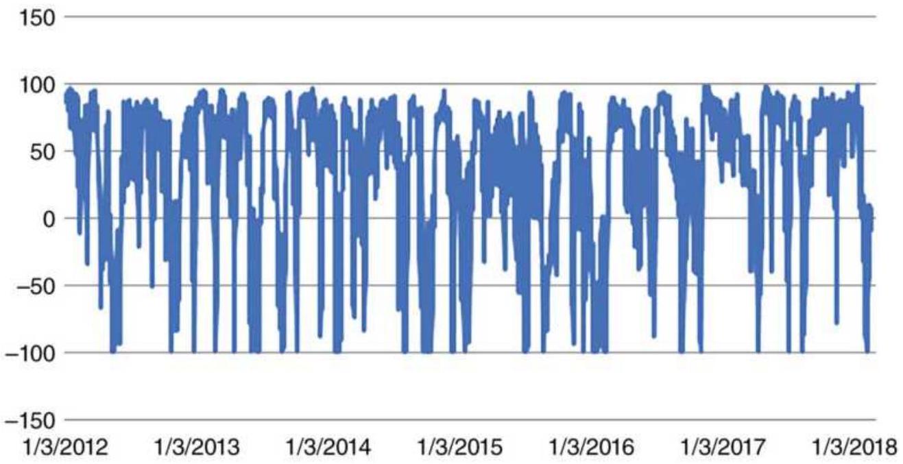
FIGURE 13.23 UVXY stochastic minus the HV stochastic.
\section*{The Results}
Trading one ETF long and short is going to be riskier than an arbitrage, although no trading is without risk. By trading \(\$ 10,000\) in exposure on each signal, the position size \(=\$ 10,000 /\) entry price, and following the simple rules given above, we get the results show in Figure 13.24, expressed as a Net Asset Value (NAV). While both longs and shorts are profitable, the shorts (selling SPY when UVXY is overbought) are more reliable. That trade closely resembles selling volatility, so not only does volatility decline after peaking, but the actual price of SPY declines with volatility.
Buying volatility is always less certain than selling, but the past five years tested show a net gain, and the combination of buying and selling adds about \(20 \%\) to the
total returns. Although this is not a true arbitrage (rather it is a timing method), it shows that price moves in SPY reflect the relationship between implied volatility and historic volatility.
\section*{SPY Total profits}
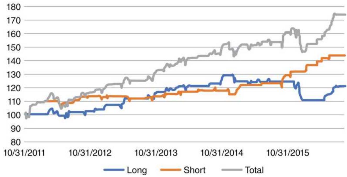
FIGURE 13.24 Net asset values of long trades, short trades, and combined long and short trades.
Another strategy is proposed by Chan. \({ }^{13}\) Using a contract ratio of 0.39:1, buy VX (volatility futures) and buy ES (S\&P futures) when VX is in backwardation with a roll return of \(-10 \%\) or less, or in contango with a roll return of \(10 \%\) or more. Chan explains how he arrived at this strategy and offers other insights into trading volatility.
\section*{CHANGING SPREAD RELATIONSHIPS}
Spread relationships can change over time due to structural changes in both the supply and demand, as
well as changes in consumer habits. Consider the following:
1. Seasonality for crops, orange juice, and many other products has changed as countries in both hemispheres increase production and join world export markets. Grain and orange juice from South America and edible oils from the Far East have permanently altered the seasonality of supply. This competition puts pressure on carrying charges.
2. Large agricultural conglomerates are able to use futures markets to hedge their production or purchases, shifting the need to buy or sell at times other than harvest. An increase in the storage facilities also decreases the need to sell at harvest.
3. Traditional ratios between gold, silver, and platinum have changed due to demand in the industrial use of those metals in the electronics and automotive industries. The rise of the middle class in China and India has added substantially to demand, as well as the metals' perceived usefulness as a hedge against inflation.
4. Consumer tastes change, causing a shift away from red meat for some period, then back to red meat during another; eggs are bad for cholesterol but then good for overall health. Lean hogs have replaced the traditional hog futures contract. Health concerns about the use of nitrates in bacon will change processing or pricing; consequently, the ratio between hogs and pork bellies changes.
5. Products such as high-fructose corn sweeteners have reduced demand for sugar. The use of corn for ethanol has further increased demand.
Very little remains the same over time. Even though there may be anticipation of change, unexpected events relating to health or interruption of supply can produce a price shock, which will affect many spreads.
In the equities market, the relationship between stocks in the same industrial group is affected by the trading of index futures. If one stock belongs to the small caps and another to the large caps, their prices may be forced apart by buying in the Russell 2000 and selling in the S\&P 500, and the subsequent arbitrage, moves that do not consider the individual stock relationships.
\section*{Gold/Silver and Platinum/Gold Ratios}
A relationship that has always been followed with keen interest is the gold/silver ratio, once considered normal at 33:1. Both markets have been used as a safe haven in times of economic instability. It serves as a good example of the variability of many perceived spreads.
When gold was fixed at \(\$ 35\) per ounce and silver was about \(\$ 1\) per ounce, the relationship was never very stable. Because silver prices were never fixed, the ratio could be volatile, ranging from 20:1 to 45:1. Even during the "Hunt crisis" in 1980, the ratio remained at about 33:1. But following that crisis, silver has remained weaker than gold, due to both increased use of gold as an electronic conductor and a growing middle class in India and China. Gold has proved to be the metal of choice. It
is now sitting at about 75:1 (see Figure 13.25).
The platinum/gold ratio (Figure 13.26) is also closely followed and much more stable. Gold and platinum have both found their way into commercial use, platinum for automobile catalytic converters. There is no fundamental reason for these prices to remain in the same ratio going forward. The use of platinum for automobiles may change as quickly as it began. While they remain as they are, traders will buy platinum and sell gold when the ratio falls, and the opposite when the ratio rises. Over the years 2014-2018, platinum has been losing ground to gold.
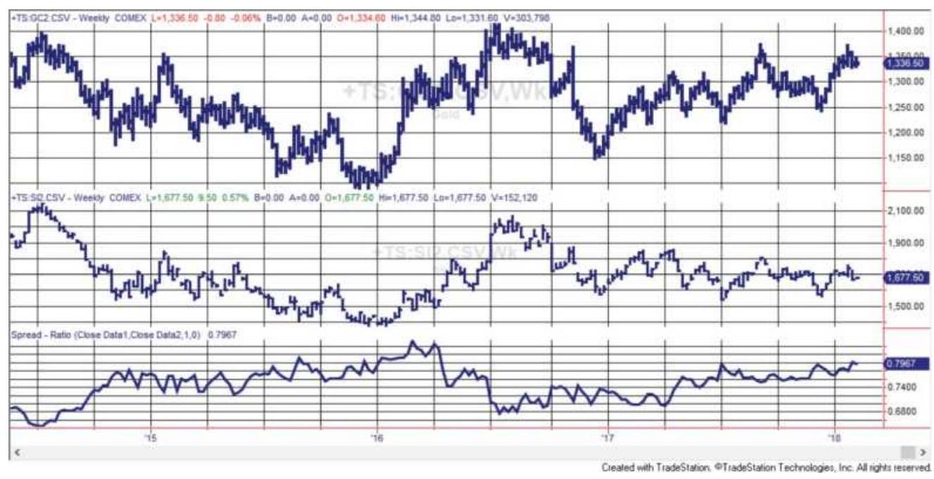
FIGURE 13.25 The weekly gold/silver ratio, from 2014 through 2017 based on nearest futures, was once normal at 33:1, but has gotten as high as 100:1. It has been closer to 75:1 for more than 10 years.
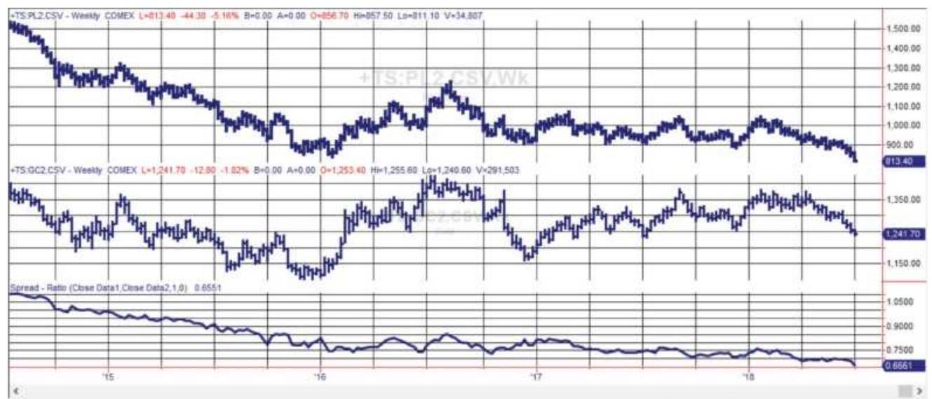
FIGURE 13.26 The platinum-gold ratio, shown here from 2014 through mid-2018 using nearest futures. Platinum has been losing ground to gold.
\section*{INTERMARKET SPREADS}
There are many dependent relationships between different futures markets that are not classified as arbitrage. Because the bases for these intermarket relationships are fundamentally sound, spreads are an excellent way to profit from short-term divergence. The most comprehensive study of these relationships can be found John Murphy's Intermarket Analysis, 14 in which he studies the leads and lags between markets and examines the interaction in their relationships. Markos Katsanos, \({ }^{15}\) in Intermarket Trading Strategies, also offers a detailed study of these relationships.
Many readers will be aware of the increased correlation between markets, a combination of globalization, arbitrage, and the movement of money seeking better returns or running from risk. Investments in large
commodity funds (such as the Goldman Sachs Commodity Index) contribute to sympathetic movements in grains, energy markets, and metals simply because of the flow of money.
The most elusive of the intermarket spreads is the relationship between bonds and the stock market, namely the S\&P 500. The Federal Reserve manages economic growth and controls inflation using interest rates; therefore, it is natural to expect the stock market to react to these orchestrated changes. As interest rates decline, the S\&P should rise. In economics, the reactive phenomenon is described as a \(J\)-curve because there is a delay between the lowering of interest rates and the response by the stock market. The lower part of the \(J\) pattern indicates that prices continue lower at first but at a slower rate before eventually responding to the stimulus. In most cases, such as the recovery that began in 2002 and then again in 2008, the Fed needs to lower rates a number of times before a sustained positive reaction can be seen in the stock market.
The \(J\) pattern can be seen in Figure 13.27, the financial crisis in 2008. As the S\&P begins to fall at the beginning of 2008 (top panel), 10-year note futures rise (center panel). Notes keep rising until the end of 2009, when the S\&P finally begins its recovery. In contrast, the euro (bottom panel) rises against the dollar as the S\&P falls and U.S. rates drop, making European rates more attractive. The pattern of the euro throughout the crisis varies as the monetary authorities search for a recovery policy and investors seek safety. However, this is an extreme.
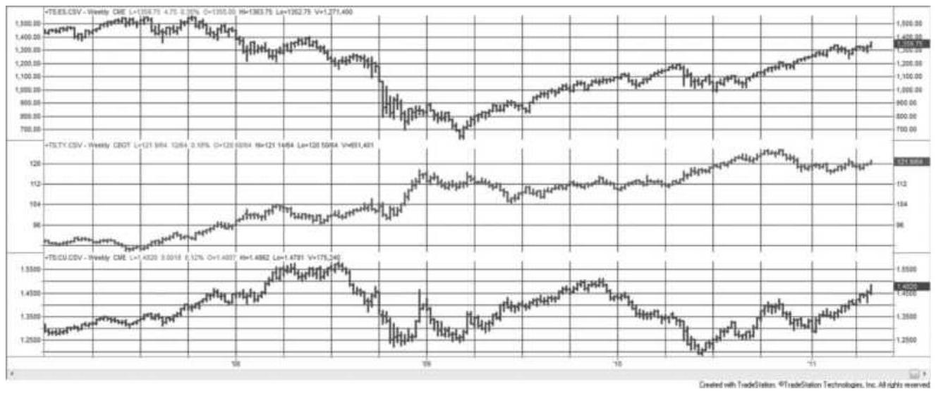
FIGURE 13.27 The decline in S\&P futures (top panel) is met by higher 10-year note prices (center), but does not react of a year. Lower U.S. rates result in the euro (bottom panel) strengthening until the 2008 financial crisis disrupts the pattern.
The next section, "An S\&P-Bond (Timing) Arbitrage," shows that there is a relationship that can be traded profitably.
Other intermarket spreads that should be watched are:
- All of the U.S. index markets, the DJIA, S\&P, Russell, and NASDAQ
- The most active European index markets, the EuroStoxx, DAX, and CAC
- The London Metals Exchange (LME) nonferrous metals, copper, tin, lead, aluminum, zinc, and nickel. All are used in housing.
- Gold and crude oil, one a major component of inflation and the other a hedge against inflation
- Commodities denominated in gold or other
currencies, giving us a view of what others pay for a product and creating a new market at the same time
\section*{An S\&P-Bond (Timing) Arbitrage}
The delay in the S\&P reaction to interest rate changes makes it impossible to trade \(\mathrm{S} \& \mathrm{P}\) and bonds as a classic arbitrage; however, Landazabal \({ }^{16}\) has used high-yield bonds (the ETFs HYG and JNK) to time when to buy SPY based on the intermarket relationship. The following is a complete set of trading rules, adapted from the article and expanded into a system:
Correlation of SPY with average JNK-HYG
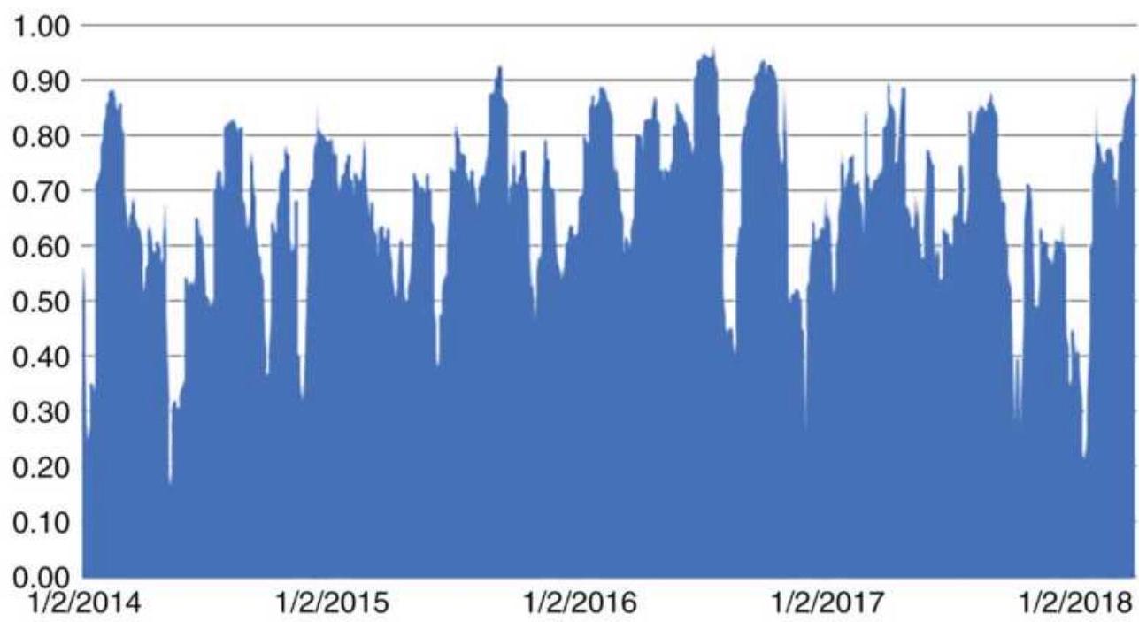
FIGURE 13.28 Rolling 20-day correlations.
1. Find the 20-day rolling correlations of SPY-HYG and SPY-JNK. Save the average of the two as AVG20R.
2. Find the 252-day rolling correlations of the same
combinations. Save the average of the two as AVG252R.
3. Buy SPY when AVG20R \(<0.65\) and SPY returns are at least \(0.5 \%\) below the combined returns of HYG and JNK over the last 5 days.
4. Exit the trade when AVG20R \(>\) AVG252R, that is, the correlations return to normal.
5. Exit the trade when the 5 -day return of SPY \(>=5\) -day average return of HYG and JNK.

Essentially, high-yield bonds perform similarly to the S\&P. When the S\&P lags the returns of the bonds and the correlations drop, we can buy SPY. The trade exits when either the correlation or the returns go back to normal. Figure 13.28 shows the average of the two correlations SPY-HYG and SPY-JNK, and Figure 13.29 shows the returns generated by the spreadsheet, TSM Crossmarket SPY-HighYield, on the Companion Website. Traders can increase returns using leveraged S\&P ETFs or futures.
\section*{Spreads Can Be High Risk}
Spread trading appears to limit risk because the net price move of correlated markets is smaller than each leg. However, cross-margining recognizes that buying one market and selling another related product has intrinsically lower risk than simply buying or selling short in a single market. The brokerage firm that you use will know that a long in S\&P futures and a short in Dow
futures is a reduced-risk position; therefore, they may give you favorable margin rates. Margin on these two trades will usually be reduced to the larger margin requirement of the two trades had they been taken as separate positions. Margin represents a measure of risk. When entering an intradelivery spread, for example, long March and short June 10-year Treasury notes, the margin can be remarkably small because the risk is perceived to be small. Lower margin equates to higher leverage and increases the risk for most traders who measure the returns on the trade as a percentage of the margin requirement. In some cases, the spread risk will be greater than the risk of an outright long or short position. When prices diverge, the leverage can work against you.
SPY returns based on high-yield bonds
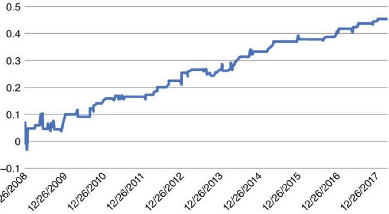
FIGURE 13.29 Returns based on timing SPY with HYG and JNK.
Spreading two markets denominated in different currencies, such as the S\&P and EuroStoxx, will add the uncertainty of changing FX rates. Whenever you add a third uncertainty the risk increases.
\section*{Using Spreads to Create New Markets}
At one time Russia bought all of its oil with gold. Oil is typically quoted in U.S. dollars. When a country imports any product, it converts (sells) its own currency and buys the currency of the country selling the product. The timing of when to buy depends on how the price is seen denominated in the currency of the buyer. If we divide the price of oil by gold instead of the euro or yen, we see a different picture of price movement. It effectively becomes another market to which we can apply trend following or other trading methods and get returns that add diversification to a portfolio.
As an example, Figure 13.30 shows crude oil backadjusted futures at the top, gold futures in the middle, and the ratio of oil to gold at the bottom. A 40-day moving average appears in each panel. The important point is that the moving average based on the ratio (at the bottom) turns at different points than either of the individual markets and still captures a significant profit in the ratio. Remember that the oldest data in backadjusted futures can be negative; therefore, the starting point for a strategy should be after the prices become significantly positive.
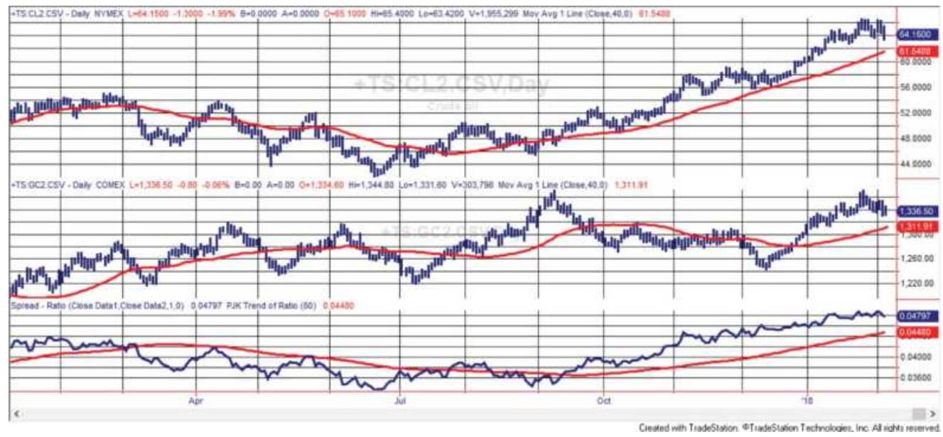
FIGURE 13.30 Crude oil (top) denominated in gold (center, daily futures) gives the ratio at the bottom. A 40week moving average is shown in each panel.

A simple trading strategy will buy crude and sell gold when the ratio is rising, and sell crude and buy gold when the ratio is falling. Each time the strategy enters a trade the position sizes of both legs are volatility adjusted in the same way discussed in the "Pairs Trading" section of this chapter and later in Chapter 23, under "Individual Trade Risk." Using a faster 20-day average of the ratio, because the trend is very smooth, returns of this method from 1983 are shown in Figure 13.31. The calculations can be found in the spreadsheet TSM Trend of Ratio on the Companion Website. Readers will find it interesting to see how crude and gold each contribute to the total profits.
\section*{Total profits crude/gold trend}
FIGURE 13.31 Total profits using a 20-day trend of the crude/gold ratio.
There are many markets dependent on the price of crude oil. Energy, plastics, rubber, and transportation
companies such as Werner Enterprises (WERN), lead the list, although oil is part of synthetic material and many other products. When using a stock as one leg of a spread, you may want to select only those trades that are long stocks.
In the world of hedge funds, liquidity is important, and creating a spread based on a fundamental knowledge of how international payments are made can help to solve that problem. Coincidentally, China announced in late September 2017 that it is preparing to launch a crude oil futures contract denominated in Chinese yuan and convertible into gold, allowing oil exporters to bypass U.S.-dollar denominated benchmarks by trading in yuan.
\section*{Trending or Mean Reverting?}
The previous sections have looked at spreads in many ways, using pairs, ratios, old and new crop, and trends. There have been examples of intermarket and crossmarket spreads. How do you know whether the spread strategy should be trending or mean reverting?
At different places throughout this book we've discussed the existence and effects of market noise. Noise is most noticeable in the short term while trends overwhelm the noise in the long term; therefore, when we choose to use a mean reverting system, we are trying to take advantage of market noise and do best if trades have a short
holding period. On the other hand, if there is a sustained divergence in two stocks, then a longer-term trend will capture that effect best.
By its nature, pairs trading seeks profits from short-term price distortions; therefore, it succeeds in the short-term using mean reversion. When investors shift from highrisk stocks, such as small caps, to more secure dividend paying stocks, it is a gradual shift of sentiment that can be followed using a trend. Similarly, when interest rates fall investors tend to buy shorter-term maturities so that they are able to move their money when interest rates start back up.
\section*{Trend Following Using Bull and Bear Spreads}
An intramarket spread can be a lower risk substitute for an outright long or short trend position. In grains and foods (commodities in general), a bull market will result in prices of the nearby delivery months rising faster than
deferred months. A bull spread can be placed by entering a long position in the nearby and a short position in a deferred month. Both risk and reward are reduced; however, the greater the time between months, the more volatile the spread (Figure 13.32). As in an outright position, once the upward price peaks, the spread must be reversed because the nearby delivery will decline faster than the deferred. A bear spread sells the nearby and buys the deferred contract.
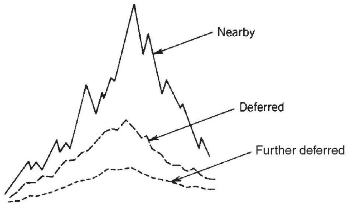
(a)

FIGURE 13.32 Interdelivery spread volatility. Actual prices. (b) Relationship of interdelivery spreads.
The basic strategy for entering a bull or bear spread is to follow the trend of the nearby contract. Many traders believe that the spread itself must also confirm the trend before taking a position; therefore, a medium-speed moving average may be used for the spread series. This would provide a signal based on the relative change in
spread direction. A 1- or 3-day change might be enough for the fast trader. A bullish trend signal in the nearby delivery and a bearish signal in the spread is a sign of a short-term supply disruption and not a good time to enter a trending spread.
\section*{Changing Volatility in Spreads}
The use of relative-value spreads means that you are looking for situations where one stock is relatively high and the other is relatively low, similar to a pairs trading scenario. This generates a trading signal to sell the highest and buy the lowest. Because it's a matter of relative value, we know that the timing is good, but if the volatility of the spread is very low, there may not be enough profit potential in the trade.
Volatility of the two legs, taken individually or together, defines the risk and opportunity for a mean-reverting strategy. Occasionally, jumps in volatility can create large losses, especially if it occurs in only one leg. Figure 13.33 shows the emini S\&P (top) and NASDAQ futures (second) prices from 2006 into 2011. The ratio is shown in panel 3 and the annualized volatility of the ratio of these two markets at the bottom. If you were using a mean reversion approach to trading based on the ratios, then buying at 0.05 and selling at 0.15 would have been good during the first half then. However, during the crisis that started in September 2008, selling at 0.15 would have meant suffering catastrophic risk. The period that followed starting in July 2009 is just as much of a concern. Volatility falls, and the ratio no longer touches 0.15
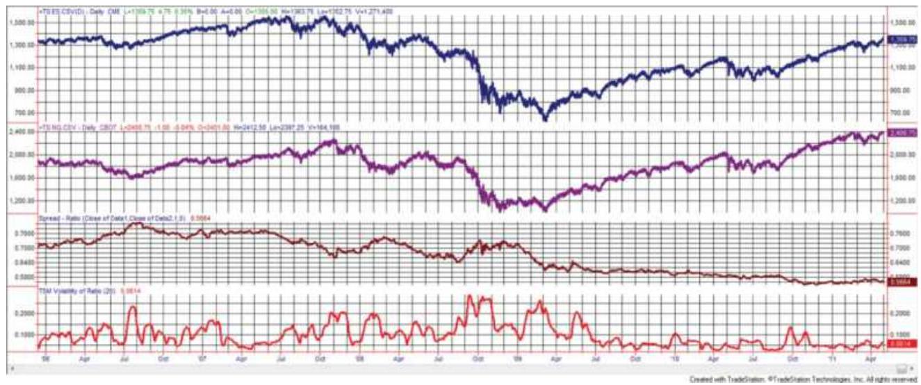
FIGURE 13.33 Annualized volatility of SP/NASDAQ price ratio, using futures, shows three different levels of volatility over five years.
This all argues for relative-value indicators to time entries and exits. Still, the jump from the earlier levels of volatility to the extremes of 2008 will produce a loss using any method. And while the relative value approach will produce trading signals during the low-volatility periods after mid-2009, it will not tell you whether volatility is too low to generate a trading profit because returns are less than trading costs. To overcome that problem, a low-volatility filter is needed that will reduce the number of trades by selecting trades with more profit potential.
\section*{Historical Perspective}
Studying longer historic periods will result in a better understanding of the consistency and risk involved in trading a spread. It will reveal seasonal and cyclic moves as well as periods of lower and higher volatility. Some of the factors that affect changing volatility patterns are:
1. Underlying price-volatility relationship. We associate higher prices with higher volatility and wider spread differences; lower prices force most spreads to narrow in absolute terms. The spread between heating oil and gasoline must be greater when those products are trading at \(\$ 4.00\) per gallon than when they are at \(\$ 1.00\). In addition, volatility increases with sudden price changes, but when the public adjusts to those levels, even if they are much higher, volatility declines. It is the concept that volatility increases during uncertainty then declines at equilibrium.
2. Normal seasonal patterns. Seasonality causes spreads to narrow and widen in predictable ways. During harvest, the basis spread (the difference between the spot and cash markets) widens, reflecting the available supply. After harvest, the basis will continue to narrow if demand fails to materialize.
3. Investor risk preference. Investors shift to safer holdings during times of uncertainty, and then return to markets with higher risk as the economy improves One familiar pattern is between the stock market and interest rates, where the phrase flight to quality indicates the move to government interest rates when a destabilizing event occurs, either a large drop in the stock prices or geopolitical crisis. There is also a shift between different segments of the stock market. During good economic periods investors are willing to risk the uncertainty of small caps; otherwise, they find safety in the larger
companies. Figure 13.32 compares five years of the S\&P 500 and NASDAQ, where NASDAQ is considered the riskier investment. Prior to 2008, ratios were much higher, indicating a larger portion of investors were putting money into NASDAQ. After 2009 that ratio dropped more than \(25 \%\), showing significantly less interest in riskier assets.
4. Specific events can alter spreads. A freeze in coffee or orange juice will alter the supply for more than one year, as will extreme export demand that reduces inventories. Investors will be more sensitive to any news of problems in production, resulting in higher volatility and upward price jumps.
\section*{Timing the Relative-Value Trade}

In the section on pairs trading, the fast stochastic was used to identify the timing for entries and exits. That is still a viable alternative, along with other oscillators such as the RSI and MACD. Ehlers' Fisher Transform is particularly interesting (the formula can be found in Chapter 11). Although it starts out to be similar to the stochastic indicators, it is structured to avoid getting stuck at the highs and lows for extended time periods. The full range of the Fisher Transform is +1 to -1 (or +100 to -100 ) but overbought and oversold thresholds of about +80 and -80 are recommended. When the ratio of platinum/gold peaks above 80 (see Figure 13.34) then platinum (top of chart) would be sold and gold (second panel) bought. The trade would be closed out when the ratio (third panel) is near zero, indicating a return to
normal. Ehlers' Fisher Transform does a good job of moving quickly between overbought and oversold levels.
\section*{Rating Services}
The Internet is a source of many financial services that rate the likely success or failure of stocks during the next few weeks or months. Some of these companies have performance records to show that their rankings have been reasonably accurate. The most notable of these is Starmine, which ranks stocks using a combination of valuation, momentum, earnings, and what Reuters calls "economic intuition." Analyst forecasts that have been more accurate in the past are given more weight; however, the actual process is proprietary. These services can also charge a substantial fee.
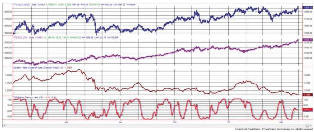
FIGURE 13.34 The platinum-gold ratio for 1 year beginning March 2010, using futures (third panel) with the Fisher Transform at the bottom.
Alternatively, there are websites that provide a stock screener that allows you to rank stocks by various
criteria, such as the price/earnings ratio ( \(\mathrm{P} / \mathrm{E}\) ), These include TheStreet.com, Cramer's Mad Money, Reuters, The Motley Fool, Yahoo Finance, and CNBC. Enter "stock screener" into your search engine to get a full list. Some websites will give a summary of analyst recommendations. These take the form of strong buy, moderate buy, down to strong sell, each with numeric values associated with the level of rating. Whether you create your own ranking or use an online choice, it is necessary to record the results weekly in a spreadsheet and monitor their success.
Having established whether a service or your own method is good, there are ways to trade the results as spreads.
1. You will need at least 5 stocks from the top and 5 from the bottom of the ranking; 10 would be better. That basket of stocks should be no more than \(20 \%\) of the total stocks being ranked. If the ranking is successful, then you will be treating it as a trending method, buying the best and selling the worse. If the ranking is bad, then it will be mean reverting and you will sell the top and buy the bottom.
2. If you are trading \(N\) number of stocks in each basket, and stock \(N\) (the worst of the best or the best of the worse) moves out of its basket by at least 2 positions, then close out that position and replace it with the one that has moved into that basket. This way you avoid frequent switching.
3. Verify that the stocks selected from the bottom have similar volatility to the stocks at the top. In some
cases, stocks are ranked very low because they are not moving. Those stocks will not offer any risk protection. The top basket should not have this problem. Find stocks at the bottom ranking that have sufficient price movement.
4. Volatility-adjust the top and bottom selections, preferably using the dollar value of the average true range and equal investments for each stock, in the manner shown in the "Pairs Trading" section, earlier in this chapter. Similarly, the top and bottom stocks may vary in volatility and would need to be adjusted, but that should only be done if they vary by more than \(20 \%\). Otherwise, each new position will be adjusted for current volatility and the portfolio will self-adjust.
Self-ranking can be done many ways, from using fundamental data about the individual companies, to simply tracking the returns or the information ratio (returns divided by risk), or even by the performance of a long-term trend system. For fundamental analysis, the ratings available on the Internet seem best, but for technical rating you will have more control over the process if you do it yourself.
\section*{Dogging the Dow}
The Dow components are an interesting group because they have extraordinary liquidity. At the same time, they are "mature" companies. Wisdom says that mature companies are unlikely to grow as fast as newer companies, which have unique products and more
available market share to capture. However, it is often worth verifying "market truths." In capitalization, the Dow stocks represent about \(20-25 \%\) of the S\&P. It turns out that returns on a passive portfolio of Dow stocks have been virtually identical to those of the S\&P since 2004.
\section*{The Dogs of the Dow}
The theory is that the companies that have the lowest returns in the Dow will raise dividends to attract buyers. That will allow them to outperform other stocks in the Dow. Without verifying the dividends, but assuming the theory is correct, we bought the ten Dow stocks with the worst returns on each December 31, holding them for a year. Figure 13.35 a shows the results.
Given the poor results, we tried the opposite approach, buying the ten stocks with the best returns. That gave us results very similar to the S\&P. Instead of rebalancing yearly, we then rebalanced monthly, greatly improving the returns as shown in Figure 13.35b. This shows that success is persistent and that poor performance is also persistent.
\section*{Hedging the Risk}
Although the monthly rebalance of the best stocks outperformed the benchmarks, it still shows extreme risk in 2008. Because risk is associated with volatility, we hedge the long positions when the 20-day annualized volatility of the Dow Index is greater than \(90 \%\). The hedge is done as follows:
Sell 50\% of each stock in the current portfolio, freeing half the investment and reducing risk.
\section*{Buy the weakest (yearly)}
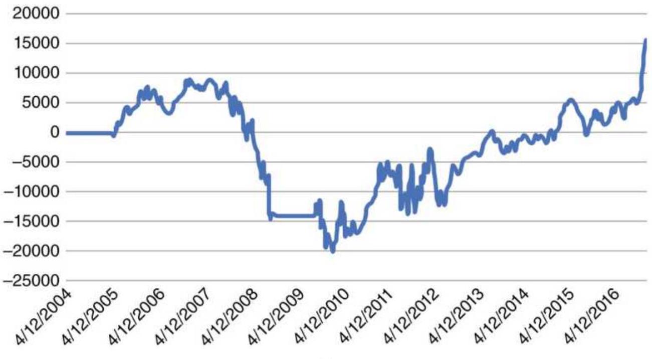
(a)
\section*{Buy strongest (monthly) NAV}
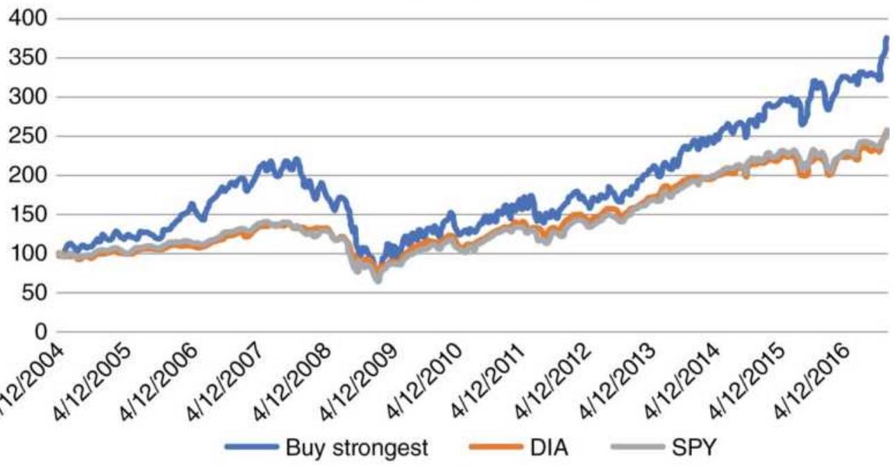
(b)
FIGURE 13.35 (a) Results of buying the 10 Dow stocks
with the worst returns, rebalancing yearly. (b) Results of buying the 10 Dow stocks with the best returns, rebalancing monthly.
Using those funds, sell short the ten stocks in the Dow with the worst performance. Each stock will have the same investment, \(1 / 10\) of the available funds.
Alternatively, you can sell short the Dow ETF DIA; however, the protection will not be as good as shorting the ten worst stocks. Figure 13.36 shows the results of the full strategy.
\section*{Other Spread Issues}
Experience shows that some trading techniques are better than others, and some are dangerous.
\section*{Using Conditional and Spread Orders}
The opportunities for entering a spread at a good differential can be short-lived and requires a spread order to assure that the minimum objectives are met. Instead of entering two orders to buy stock \(A\) at a specific price and sell stock B (or an index) at another price, it is far better to place a spread order to buy A and sell B at a difference of X . It is a common order for futures markets, but more difficult for stocks because one leg is a short sale.
\section*{DOW Strategy compared to SPY and DIA}
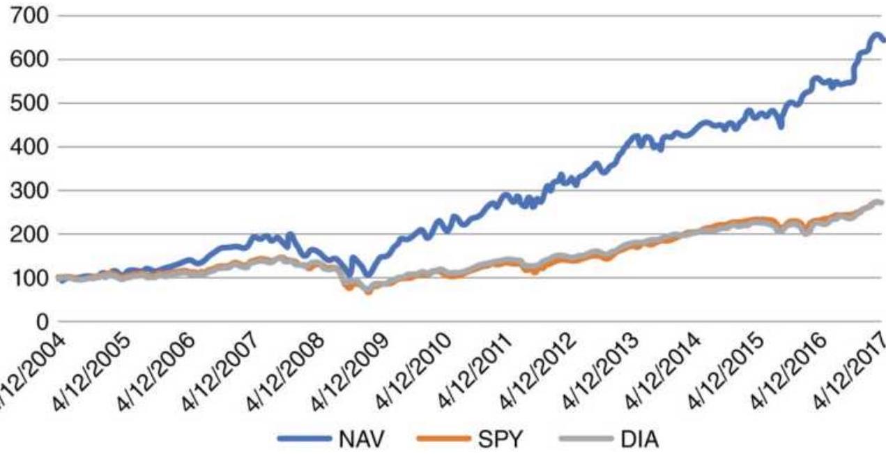
FIGURE 13.36 Results of Dow hedge strategy.
Alternatively, the short sale should be done first; then the buy follows as soon as the short sale is confirmed. Some trading platforms show when there is stock available for short sales, so placing the two orders simultaneously by pushing the enter key would be the simplest method. In futures, spread orders have the advantage of being cheaper, about three-quarters of the cost of two outright orders.
\section*{Legging In and Legging Out of a Spread}
When both legs of a spread are not entered or closed out at the same moment, you have an outright long or short position. Your risk is increased and in a short time you can lose the gains from a less volatile spread trade. If the purpose of the spread is to reduce risk, legging in or legging out is not going to accomplish that goal. When the market appears to trend upward, it could be
tempting to cover the short leg, and hold the outright long. A more conservative trader might enter a bull spread in two delivery months that represent lower volatility, thereby reducing risk and profits even further - and conserving prior gains.
\section*{Creating a Spread to Protect an Outright Position}
Protecting an existing trend position by spreading with the next deferred delivery, or by using options on either stocks or futures, will reduce risk - but at a cost. If the market has been going up and indicates a temporary downturn, some traders will want to hedge by selling the next deferred futures contract, an ETF, or a call option.
Hedging may have a tax advantages if it allows you to hold a stock position to capture capital gains. There is an added cost for hedging, either the commissions or option premium, plus the added complexity of the new position, that must be considered. Not only is it necessary to track the original trade, but you will need to know when to remove the hedge. If capital gains are not a concern, and given the competitive commission costs these days, closing out a trade or reducing your exposure may be a simpler and more effective way to deal with uncertainty.
\section*{Exceptions to the Rules}
During a trending period, most markets exhibit a clear relationship between delivery months. However, this is not the case for nonstorable commodities, such as cattle, hogs, broilers, and eggs. Because these contracts can't be redelivered, they show little relationship in the response of deferred contracts to the same bullish or bearish news.
During periods of exceptional demand, or if feed prices are very high, livestock may be sent to market early. This causes a drop in current prices and will force the price of hogs lower as well. The price of cattle and hogs in the next deferred month may rise to reflect the shortage of supply; however, even in the most extreme cases, this pattern cannot be carried very far into the future.
\section*{Extreme Spread Ratios}
The two legs of a spread rarely have the same volatility. When badly mismatched, a spread will act the same as if you had taken an outright position in the more volatile leg of the spread. The risk of the spread trade will even be higher than an outright long or short position if both legs go the wrong way. For example, Figure 13.37 a shows the price movements of a spread, and Figure 13.37b shows the components. Leg A is the more volatile. In the case of an intradelivery futures market spread, the deferred months are progressively less volatile. This is often the case because news that affects the current price has less of an impact on deferred prices. A volatility mismatch, as shown in Figure 13.37b, will be a poor choice for a spread, even if the position sizes are volatility adjusted.
Using a stock example, if one stock is trading at \(\$ 100\) and the other in the same sector is \(\$ 2\), the ratio is \(50: 1\). It is likely we will have a liquidity problem in the cheaper stock. Given an investment of \(\$ 100,000\) in each, you would trade 1,000 shares of the expensive stock and 50,000 shares of the cheap stock. Extreme ratios distort the importance of a move in the cheaper stock and
present the possibility ofevent risk. Low-priced stocks have relatively high volatility and a surprise might cause a large, unpleasant loss and difficulty exiting.
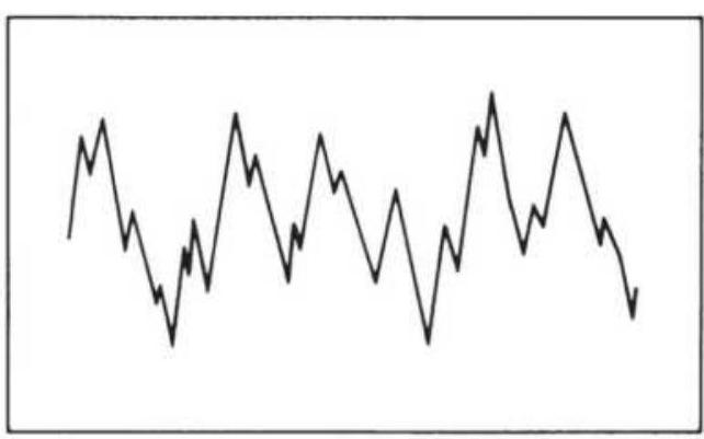
(a)
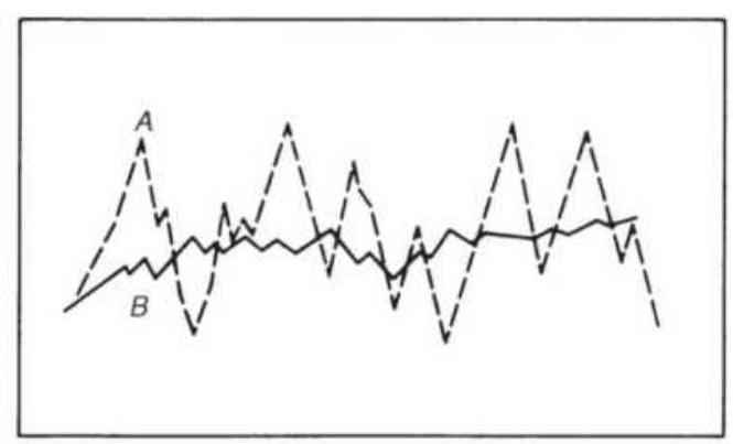
(b)
FIGURE 13.37 Poor spread selection. (a) Spread price. (b) Spread components.
In futures, there are other factors affecting the legs of a spread:
- For interest rates, a deferred contract takes on the pattern of a longer maturity; therefore, it will be more volatile.
- Specific events, such as an economic report or Fed announcement, can affect legs differently. Fed interest rate policy usually targets different ends of the yield curve, affecting the volatility in different ways along the curve.
- Highly volatile spreads in nearby months may not adjust to normal before the expiration of the contract. At expiration, extreme demand in the cash market may cause a short squeeze, the inability to deliver the cash product at futures expiration. Price movement is unpredictable.
A highly volatile spread may have greater risk than a single outright position in one leg. This can be the result of the two legs moving in different directions or the added leverage gained due to lower margin. This is not the purpose of a spread trade.
\section*{NOTES}
1 Perry J. Kaufman, "Technical Analysis," in Nancy H. Rothstein (ed.), The Handbook of Financial Futures (New York: McGraw-Hill, 1984).
\(\underline{2}\) An excellent source is Heylette Geman, Commodities and Commodity Derivatives (Hoboken, NJ: John Wiley \& Sons, 2005). See also Aswath Damodaran, Investment Valuation (New York: John Wiley \& Sons, 1996), pp. 448-458, which provided the basis for some of these formulas, and Marsha Stigum, Money Market Calculations (Chicago: Dow Jones-Irwin, 1981).
3 James E. Higgens and Allen M. Loosigian, "Foreign Exchange Futures," in Perry J. Kaufman (ed.), Handbook of Futures Markets (New York: John Wiley \& Sons, 1984).
4 Randy Frederick, "Trading with Fair Value," Futures (April 2006).
5 For more information see www.BarclayHedge.com.
6 Kenneth Kapner and Robert McDonough, "Doing Your Homework on Individual Equity Futures,"
Futures (March 2002).
Z http://www.usablestats.com/calcs/2samplet\&summar
\(\underline{8}\) Most common techniques are the Engle-Granger 2step procedure, the Johansen procedure, and the most popular, the Phillips-Ouliaris Cointegration Test. Specialized statistical software is needed. An excellent discussion of cointegration can be found in Carol Alexander's books, in particular Market Models (Hoboken, NJ: John Wiley \& Sons, 2001). My thanks to Elliott Hamilton for his patient help with this section.
9 The website www.quantinsti.com offers a Python solution to the cointegration test and further examples of applications to trading.
10 See
www.math.nyu.edu/faculty/avellane/QuantCongressU AlgoTradingLAST.pdf, by Marco Avellaneda (New York University \& Finance Concepts, LLC).
11 Murray Ruggiero, "The Future of Trading System Design," Futures (October 2014).
12 Galen Burghardt, The Eurodollar Futures and Options Handbook (New York: McGraw-Hill, 2003).
13 Ernest Chan, Machine Trading (Hoboken, NJ: John Wiley \& Sons, 2017), p. 121.
14 John J. Murphy, Intermarket Analysis (Hoboken, NJ: John Wiley \& Sons, 2004).
15 Markos Katsanos, Intermarket Trading Strategies (Hoboken, NJ: John Wiley \& Sons, 2008).
16 Hector Landazabal, "Hanging Out with the Junkies," Technical Analysis of Stocks \& Commodities (December 2017).
\section*{CHAPTER 14}
\section*{Behavioral Techniques}
I can calculate the motion of heavenly bodies, but not the madness of people.
-Sir Isaac Newton after his loss in the South Sea Bubble
Some approaches to trading are dependent on investor behavior and cannot be represented by pure mathematical techniques. Short-term systems are more likely to target patterns and fast breakouts rather than economic factors because, over a few hours of one day, the influence of ongoing macroeconomic policy and long-term trends is very small. The concepts presented in this chapter deal specifically with the interpretation of human reactions, although the interpretations are all systematic. The effects of a news announcement, an unusual or periodic event (such as earnings), and the opinion of traders are all important factors in price movement. It may help answer the question, "What is everyone else doing?" - or at least "What are they thinking of doing?"
The principal works of Elliott and Gann are included in this chapter with a complete discussion of the Fibonacci series and its ratios. Fibonacci forms a singular part of their techniques and has been applied to many other forms of charting. The way in which traders respond to market moves and the remarkable similarity that can be found in Nature give serious underlying substance to
these methods. Because not all of the assumptions upon which these systems are based can be quantified, they can only be substantiated by the performance of the systems themselves. These behavioral methods are fascinating and open areas of creativity essential to broadening system development. They are grouped together with discussions of natural phenomena and the rapidly growing area of financial astrology, all of which should stimulate your grey matter.
\section*{MEASURING THE NEWS}
If you can keep your head when all about you are losing theirs, maybe you haven't heard the news.
- Rudyard Kipling, adapted by H.L. Menken \({ }^{1}\)
Published news and social media are the greatest influences affecting the pricing of free markets. It broadcasts both official statistics and interpretation, earnings, opinion, and rumors. It can express information directly and by innuendo. It is indispensable to traders. News can materially alter any opinion by including unverified claims or omitting relevant information. Occasionally, one news service releases an economic report too soon, throwing the market into a turmoil. On the whole, financial reporting is good, but cannot be without bias. The very act of interviewing the CEO of some company may give viewers the impression that the company has credibility, which is not always the case. At the very least, it draws the investor's attention.
The impact of news is so great that a speculator holding a market position according to a purely technical system
would do best not reading, listening to, watching, or in any sense being exposed to news, whether pro or con. Even then, it is nearly impossible to shelter yourself from news. In a 1974 study by the Wall Street Journal, it was shown that \(99 \%\) of the financial analysts polled read the paper regularly, and \(92 \%\) considered it the most

shifted. You no longer see many commuters reading a printed newspaper. The circulation of U.S. newspapers has been declining at an increasing rate. In 1985 it was 63 million, then 56 million in 2000, 44 million in 2010, and only 31 million in 2017. Competition comes from CNBC, Fox Financial, and Bloomberg, which is said to reach 310 million homes worldwide.
As an element of a trading program or as an indicator of its own, the news has exceptional value, but its interpretation can be very complex. We believe that by measuring the impact of unexpected news such as earnings releases, economic reports, the USDA crop reports, and the CFTC Commitment of Traders report, \({ }^{3}\) we would be able to anticipate the direction of prices, or at least react profitably. But first we must be aware of the complications of analyzing the news.
The problem is in objectively selecting and ranking news items. On what scale do you determine cumulative importance? Some news items clearly have a greater impact on the market - weather disasters, terrorist activity, economic reports, a change of interest rates, major trade agreements, changes in government policy, key crop reports - but these must be ranked as bullish
\((+)\) or bearish (-) in a way that produces a numerical system of analysis. On a single day, an address by the president about foreign trade may be ranked -4 , a meeting of the Federal Reserve +5 , unemployment -3 , a terrorist attack in Europe -3, a continued lack of rain in the West +2 , larger-than-expected retail inventories -5 , and a key article in the Wall Street Journal on the OPEC's ability to control crude oil production +5 , giving a net score of -3 to the overall economic picture. This would be interpreted as moderately bearish.
Klein and Prestbo attempted such a study by assigning values of 3, 2, and 1 to articles in the Wall Street Journal of decreasing importance. Their interest was the stock market, their work was straightforward, and some of the conclusions general in nature. They succeeded in showing a direct correlation between the positive and negative news articles and the direction of the stock market. Because it was scored over 6 -week intervals before and after major turning points in the Dow Jones Industrial Averages, the news would stay about 70\% favoring the current market direction. Having eliminated the possibility of the market influencing the news, they could conclude that, in retrospect, the market reflected the nature of the news - a victory for common sense.
With the continued globalization of world futures markets, there is a noticeable reaction in all financial markets to significant economic reports released by any major economy. The correlations are especially high during a crisis when markets are under stress. Rising consumer confidence in Germany is interpreted as bullish in the United States because it is positive for
American exporters. Surprisingly lower earnings or disappointing growth of a major microchip manufacturer in China reflects badly on the entire tech sector everywhere in the world. News of the need to restructure Greek or Italian debt will cause a movement away from the euro while the resolution will strengthen the euro.
There are exceptions when news is of limited scope and relevant to a specific commodity, such as a lack of rain in the Corn Belt during prime growing season, or a winter freeze in Florida's orange orchards or Brazil's coffee region. The news is watched carefully during the last phase of a bull or bear move. Commodity traders will wait for a crop report to show the final numbers on yield, in the same way the financial market traders will react to monthly employment numbers or scheduled announcements by the Fed or European Central Bank with regard to interest rate changes, or signals of a change of policy. Grain traders are notorious for watching weather forecasts that affect U.S. crops. It is the anticipation of weather, rather than the actual weather, that drives most price moves, as it is the anticipation of interest rate changes, or employment numbers, that moves the equity markets. The news items that affect prices the most are:
Release of economic statistics such as PPI and CPI for inflation, retail sales, balance of trade, employment and initial claims, and consumer confidence
Action by the Federal Reserve or other central banks to change rates or change their bias (their leaning
with regard to future decisions)
- Changes in the money supply that indicate easing or tightening
Government reports on commodities production and inventories
- Unexpected news or price shocks, such as an assassination, terrorist attack, or supply disruption
- Trade negotiations, agreements, tariffs, legislation, and occasionally rulings by the U.S. Supreme Court that affect business
Weather and natural disasters, such as the Japanese earthquake, or a hurricane that affects the sugar crop or causes large payouts by insurance companies
- Front-page news articles and major television coverage of high prices, strikes, etc., and their potential effects on business
- Acquisitions, IPOs, scandals, SEC investigations, and quarterly earnings announcements
Market letters, research reports, and comments from accepted authorities, major brokerage houses (upgrades and downgrades), and influential organizations
\section*{Ranking and Measuring}
The problem of ranking and assigning numeric values to news items is that it requires knowledge of how others see the news. In the Klein and Prestbo study, they
concluded that about 90\% of the Wall Street Journal readers perceived news about the stock market in the same way, when classified as bullish, bearish, or neutral. One reason for this consistent interpretation of the news and statistics, then and now, is the concurrent interpretation by "experts." Within minutes of the release of an economic report or Central Bank action, the financial news services broadcast their interpretation, many of them remarkably similar. These have an overwhelming influence shaping public opinion. Even an announcement of an upgrade of Ford from hold to buy by Bank of America will bias investors toward being long Ford.
News can also be measured empirically by studying the immediate impact on prices of an expected or surprise news item. For statistical reports, such as Initial Claims, Consumer Confidence, or the Producer Price Index, traders must be careful to use the correct data. Market reaction is more a response to the difference between the expectations compared with actual figures, plus any corrections to the previously released data, than it is to the raw data. In some cases it is difficult to know whether a jump in prices was due to an upward revision of the previous data or current values that are higher than expectations. Investors may react to a good earnings report followed by a jump in profits by selling their shares because they think it cannot get any better.
You can find this week's list of economic reports on the Internet (try investing.com), along with the previous report data, expectations of the economists for the new data, and expectations of the market. Logical
Information Machines (LIM), a data service, provides all of the historic reports including revisions, and provides tools for analyzing the impacts. Combined with a record of trader expectations, there is enough information to evaluate trader reactions. One way of expressing the reaction is:
\section*{Price change \(=a \times(\) Current value - Expectations \()+b \times(\) Revision - Previous value \()\)}
where \(a\) and \(b\) are weighting factors, \(a>b\) implying that the current value is more important than the previous one. The values of \(a\) and \(b\) can be found using regression analysis. It makes the assumption that the effects of a news release are most important in the short term, and that its influence on the market is rapidly diluted following the release. A starting point for representing the way in which the news decreases in importance is to use the classic physics relationship:
\[
I=\frac{1}{T^{2}}
\]
where
\(I=\) the net impact
\(T=\) the elapsed time since the release of the news
This is interpreted as impact declines with the square of the distance (or time) since the event. It applies to sound, light, and even the pattern formed by a raindrop landing on water.
The impacts of economic reports are significant,
frequent, and worth studying. For futures markets, the CFTC releases its Commitments of Traders (COT) report each week. It tells the distribution of holdings among large and small speculators and hedgers as a percent of total open interest. This report is watched with the idea that the small speculators are usually holding the wrong positions while large hedgers are normally right. The COT report is covered in a later section of this chapter.
\section*{Trading on the News}
Even without a sophisticated method of measurement, there are many professionals who trade the news. When a bullish news item appears and the market fails to respond upward, the experienced trader looks for a place to sell. It shows that expectations exceeded reality and prices had already anticipated any bullish news.
Sometimes there are a large number of sell orders placed above the market in anticipation of one last rally after the report is released.
The premarket offers traders an opportunity to profit from overnight news. Although U.S. futures trade on Globex 24-hours and Europe has expanded trading sessions, most volume occurs during what we see as normal business hours, 8 a.m. to 5 p.m. local time. For both futures and equities, there is an aftermarket that starts when the official session closes (at about 4 p.m.) and ends at 6:30 p.m. The premarket for stocks is from 8 a.m. to 9:30 a.m. (New York) with some brokers facilitating trading as early as 4 a.m. This allows traders to respond to events in Asia and Europe or just get ahead of the market. U.S. investors caught in a bad trade can
sometimes exit their positions in London. Larger international companies such as Coca-Cola, JP Morgan, and GlaxoSmithKline begin trading at about 4 a.m. in New York.
It is more common to have foreign stocks listed in the United States as ADRs (American Depository Receipts). These are securities held by U.S. financial institutions outside the United States and denominated in U.S. dollars, similar to Eurodollar interest rate futures. The largest ADRs trading in the United States are Baidu, Petrobras, British Petroleum, Nokia, and Novartis.
One strategy is to sell a higher overnight move when there is little news to support the rise. Because of the low volume, price moves that are reactions to actual news tend to be more extreme. If prices have jumped up in the pre-market session in anticipation of a bullish economic report, selling early may be the only opportunity. Prices frequently fade quickly from early rallies or even gap lower after a bullish report that did not meet market expectations. Most U.S. economic reports are released at 8:30 a.m., New York time, one hour before the U.S. stock markets open. The response to the report can be seen on Globex, where most major index futures markets are traded, or in the premarket for some stocks.
Agricultural weather markets function purely on news. When there is a potential for a drought, traders with long positions wait for the 5 -day forecast hoping for no rain; they anticipate a loss of a specific number of bushels per acre for every dry day once rainfall is below a specific level. Weather markets are nervous, with prices often
gapping higher or lower at the open and are characterized by evening-up on weekends; they rely heavily on anticipation. It is said that a farmer loses his crop three times each year, once for drought, once for disease, and once for frost. Since 1976, the news has carried numerous articles on the desperate condition of the wheat crop in the western states, showing films of virtually barren fields, and yet the United States continues to harvest larger wheat crops. Weather markets have a history of volatile price movement but rarely materialize as the disaster that is anticipated, thanks to new drought-resistant strains.
The discounting of news is as important as the news itself. An old saying in the market, buy the rumor, sell the fact, implies that anticipation drives the price past the point where it would realistically account for the news. When the actual figures are released, there is invariably an adjustment back to their proper level. The pattern of anticipation for each economic report or news event should be watched closely. A later section in this chapter, "Trading the Reaction of Treasuries to Economic Reports," shows that price reversals are more common than continued movement following a report.
\section*{Market Selectivity}
The market seems to focus on one news item at a time and one remedy at a time. Although the same factors are always there to affect prices, they must reach a point of newsworthiness before they become the primary driving force. For heating oil, the combination of unexpected, sustained cold weather and low inventories will activate
a weather market. Although professionals may monitor thermals, published by the U.S. Weather Service, the market will react quickly to a weather report that anticipates a cold front over the next five days.
In the economic recovery that began in 2003, and the one that started at the end of 2008, U.S. traders focused their attention on weekly Initial Claims and the monthly employment report. The news broadcasts repeatedly stated that 400,000 claims was the balancing point between job growth and job loss. A sustained economic recovery needs job growth which would translate into consumer spending. Weekly Initial Claims data, released each Thursday at 8:30 a.m. in New York, can be followed by a sharp reaction in Treasuries and Index futures in U.S. and foreign markets. The monthly employment report, released on the first Friday, unless it is the first day of the month, can be even more volatile. In the United States, the employment report reflects the health of the economy. It takes precedence over nearly every other event.
\section*{Media Indicators}
In a delightful article, 4 Grant Noble argues that the news recognizes events when they are cresting, and most often provides a countertrend trading opportunity. He states that the American media should be viewed as providing trading signals in three major time frames:
1. Long term, as given by the large circulation news magazines (print and digital) such as Time, Newsweek, and the Economist. With the timeliness
of a brontosaurus, they profile moves that last many years.
2. Medium term, represented by Barron's, Forbes, and Business Week, covering a period of about 3 months.
3. Short term, held captive by The Wall Street Journal, The New York Times, and the cable news networks, which provide immediate interpretation to events, big and small.
By reading these headlines you find that The Wall Street Journal highlighted a "killing drought," "dust bowl," and The New York Times "Drought...imperils crucial wheat crop" just as the wheat price made new highs for the current move. In another case, a Barron's cover article asked, "Is the bull leaving you behind?" in August 1987 just ahead of the October crash. In all fairness, the media waits for events to become important before they cover them. They don't forecast, they report. Each year they reflect the concerns about the debt ceiling, automatic budget cuts (sequestration), yet-unknown policies of a new president causing inflation or recession. They express the investing public's euphoria over the Facebook IPO, then Alibaba. During the late 1990s, when everyone was buying dot.com companies, predictions were that the Dow would go to 36,000 . They are simply printing what readers want to hear. Now they can do it faster than ever before and reach more people.
The timing of media coverage seems to coincide with the level of popular concern. It may be perfectly valid to construct a consensus indicator based on the number of
square inches of news coverage given to an event in a combination of publications, each weighted by its circulation. This may be easier now because most news appears digitally. Investors must remember that the media is not trying to accurately predict the stock market; they are trying to sell their services by attracting readers using catchy headlines.
\section*{EVENT TRADING}
There are two situations that trigger event trading. The most common are scheduled economic reports, earnings announcements, and recommendations by financial institutions and independent analysts. The price moves tend to be modest and experienced traders usually take a position opposite to the market reaction, looking for a correction. This was an area discussed as part of arbitrage in the previous chapter. In this section we will look at larger reactions to reports and unexpected events and address specific situations.
\section*{Price Shocks}
The largest price moves with the greatest volatility, called price shocks, are the result of reactions to perceived important, unexpected news. These market events pose the greatest risks to all traders because they are unpredictable and of such great magnitude that they exceed the risk thresholds of many traders. It may be possible to trade for years without experiencing a large, adverse price shock; therefore, traders are not likely to plan properly for these situations. Yet surviving a price
shock is often the difference between the end of a trading career and a long, successful one. Further discussion of price shocks can be found in Chapters 21 and \(\underline{22}\). This section presents a strategy for trading immediately after a price shock.
Few price shocks are of such magnitude that they present an unmanageable problem. It may be that most price moves, big and small, are the reaction to news.
Larger price moves are the result of events that have a major impact on the economy rather than a single commodity, such as a terrorist attack, declaration of war, assassination, or natural disaster associated with weather or earthquakes. Smaller shocks come from the periodic release of economic reports by a government agency or monetary authority, radio or newspaper, earnings releases, upgrades and downgrades of companies, unexpected bankruptcy, takeovers, rulings by the Supreme Court, statements by the Department of Agriculture with respect to a new drug, and countless other sources. The U.S. government releases economic data on a pre-announced schedule, many of them at 8:30 a.m. New York time. These create regular disruptions.
The frequency and size of these price jumps, triggered by unexpected news, make these events a natural candidate for a trading system. \({ }^{5}\) While some options traders may buy volatility ahead of a report in anticipation of a strong market reaction, studying the systematic patterns that follow the initial price reaction to the news will be our approach. Because the news is unexpected, you cannot predict the direction or extent of the reaction; therefore, taking a long or short position in advance of a
government report would have a \(50 \%\) chance of success and often very high risk. Studies might show that there is a bias in the direction of interest rate price shock due to the way the monetary authority plans economic growth and controls inflation; however, the risks would remain high. This section only looks at positions entered on the close of the event day, the day on which a sharp market move occurred.
\section*{Market Reactions to Reports}
To determine whether there is ample opportunity to profit from the price move that follows an event, it is necessary to study the direction of the prices changes that occur over the following few days. These lagged reactions are the result of market inefficiencies. When a surprise occurs, no one can know what the correct price should be; therefore, it takes time for the market to reach equilibrium. The premise proposed by the Efficient Market Hypothesis, that the market will immediately find the correct price, is ridiculous. It may be the correct price at the moment, given the time to react and the size of the orders flowing into the market. With large price shocks there is often an over- or underreaction that is corrected during the next few hours and days. Sometimes prices jump one direction and immediately begin to go the other way until they have completely discounted the price shock by the end of the trading day. The initial reaction to a price shock may not be the profitable direction for a trader.
Figure 14.1 illustrates the types of price movements that can be expected to follow an upward price shock. When
there is an underreaction, or a structural change, prices move higher over the next few days; when there is an overreaction, or a short-lived event, prices reverse. Patterns are not as orderly as shown in Figure 14.1 because volatility is high and many traders react impulsively, taking profits or, more often, covering their losses.
When studying these events, we expect that a smaller price shock will be followed by a move of lower volatility. If the monthly jobs report shows employment dropped by \(0.2 \%\) in a month, the market expects a reaction by the government to stimulate job growth by lowering interest rates. If initial claims jumped by a full \(1 \%\), the number would be so unexpectedly large that it may be considered an error, in which case it is not clear to what extent the investors or the government would respond. The market may overreact to a large shock but underreact to a small one. The best way to discover this is to study the reaction to events.
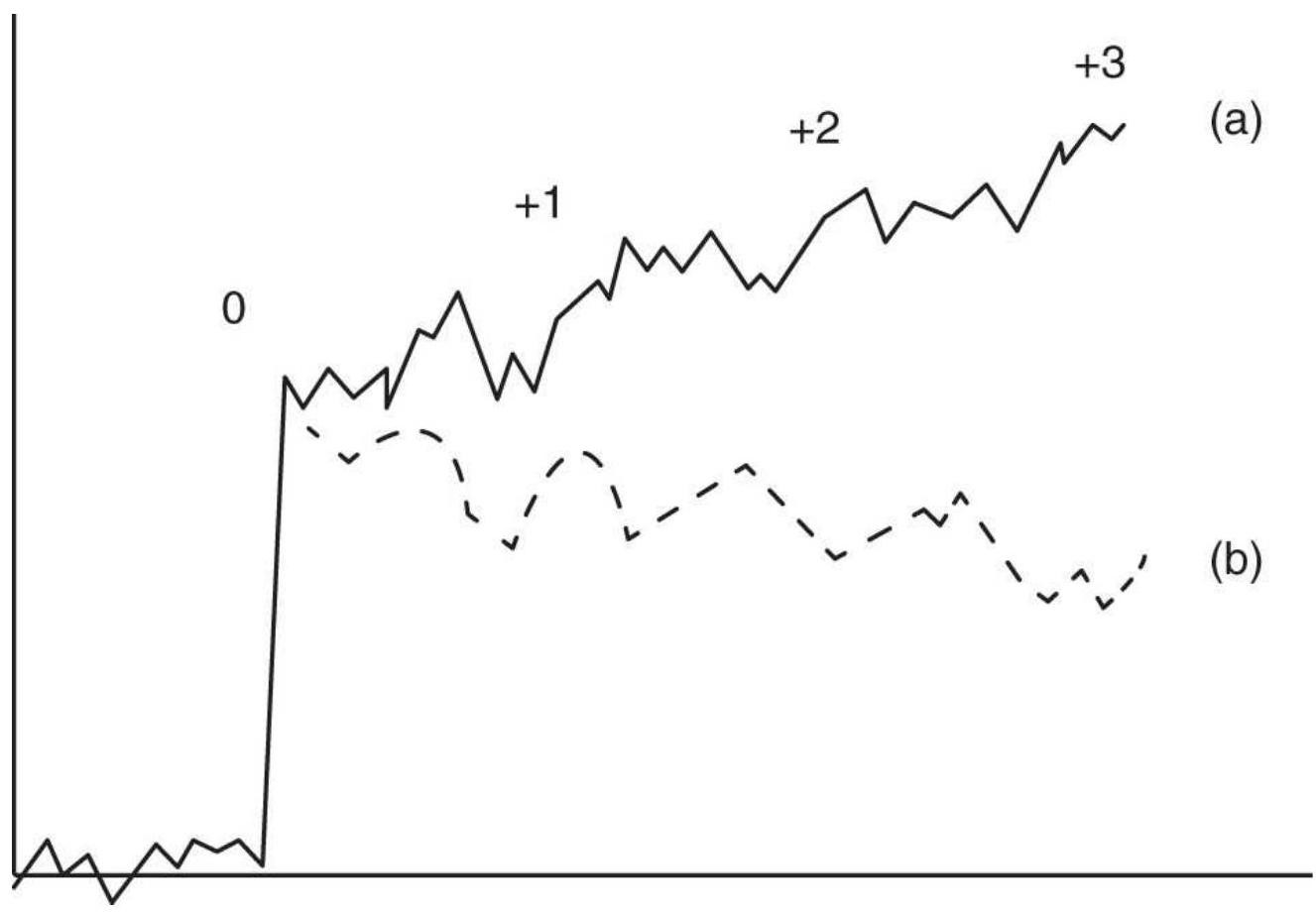
FIGURE 14.1 Price reaction to unexpected news, including delayed response. The upward price jump on the event day (o) may be followed by (a) a continuation move up or (b) a reverse move down over the next 3 days.
We could reason that price shocks can only occur if the direction is the opposite to the positions held by most traders. Given that most stock market investors are long, a surprisingly favorable price shock will not cause traders to change their positions.
Fundamental to understanding price shocks is that the size of the shock is based on the difference between the expectations and the actual reported data. The best assessment of expectations is the market price just ahead of an economic report. News services will also announce
expectations along with the previous month's data. The market always discounts what it believes is its best guess at what the report will say; therefore, if bond prices rise in advance of an important unemployment report, we can say that the market expects unemployment to increase. If the futures price of short-term rates has moved up by the equivalent of \(1 / 2 \%\) drop in yield in anticipation of a very bad report, and the report comes out neutral, then futures prices will drop sharply to offset the incorrect expectation. A study of how much prices have moved between releases of the same economic report can tell you whether the current price fully discounts the anticipated announcement.
\section*{Measuring an Event}
The most practical way of measuring the surprise effect of an event is to compare the volatility on the day of the shock to the average volatility. It is best to use the true range calculation and lag the past volatility to avoid days that are activity associated with the current event:
\section*{True range}
\section*{Volatility ratio \(_{t}=\)}
Average true range \({ }_{n \text { day, lagged } m d a}\) where the average true range is calculated over \(n\) days,
whe but the value used for comparison is lagged \(m\) days. Typically, \(n=60\) and \(m=30\). The use of 60 days for the average true range will reduce the effect of any other price shocks that occur within that period, and the lagging avoids missing two shocks that follow one
another, which might happen with geopolitical events, or a build-up to the current event. When the volatility ratio is greater than 3.0 we can say that a news event caused a significant price shock. The larger the ratio, the greater the surprise to the market. Note that the true range is used because the shock can occur overnight, causing an opening gap, in which case the best measurement of volatility includes the price move relative to the previous close. Because of 24-hour trading, price shocks no longer cause opening gaps in futures.
Note that a large true range may indicate a price shock but not a trading opportunity. For that there needs to be a close near the high or low of the day or a bar that follows that is both volatile and directional.
\section*{Trading the Response to the Event}
YouTube has numerous videos intended to teach how to trade an event-generated price move. Some of the advice given is:
Exit all positions ahead of the report.
Wait for a low-volatility bar following the first bar of the event before deciding how to act.
- Trade the opposite direction to the price move.
- Enter during the response to a report using stop orders placed above and below the price quote just before the report.
Exiting ahead of a report makes sense because we accept that we can't predict the reaction in advance. Entering using a stop order does not make sense because a
surprise report will cause prices to jump past your stop order and be executed at a price that you will later regret. To decide other trading rules requires additional work.
For example, Warwick found that a monthly change in the Consumer Price Index of between 0 and \(0.2 \%\) caused no particular reaction. A change between +0.2 and +0.4 or -0.1 and -0.4 should provide enough surprise for a noticeable market reaction, always based on the difference from expectations. Data greater than a change of \(\pm 0.4\) should cause a price shock regardless of the anticipation. In addition, we might find that changes over +0.4 tended to react in the opposite direction to the normal government action because of overanticipation or disbelief.
Based on his study, we get the following trading rules:
1. Buy on the close if the market closes in the upper \(20 \%\) of the trading range on an event day, and if prices have shown that they usually continue higher.
2. Hold for a predetermined number of days, based on the response pattern of the market. Most of the price move should occur in the first 5 days.
3. Use a stop-loss to limit risk.
In an older study applied to the corn market, Arnold Larson 6 found that \(81 \%\) of the price changes occurred on the event day. There was a typical price reversal of \(8 \%\) over the next 4 days, and a net change in price of \(27 \%\) in the original direction over 45 days. An update of this study, shown at the end of this section, confirms that human behavior is not easily changed.
\section*{Results of Event Studies}
In his book Event Trading, Warwick showed the test results of some of the major markets, allowing us to compare the effects of the systematic reaction of U.S. 30year bonds with that of the S\&P 500 and other financial markets. Unexpected good economic news that causes bond prices to rally sharply (causing yields to decline) would result in a rise in the stock market. Bad economic news may cause a rise in bond prices but a decline in stocks. Therefore, a drop in the consumption of durable goods should be followed by lower interest rates and a slightly lagged upward response in the stock market. This pattern is shown in Table 14.1, where the bond and S\&P results are side by side. Note the two entries for retail sales showing a bond rally on the first day followed by a decline over the next five days.
\section*{TABLE 14.1 Results of upward breakout of U.S. bonds futures (left) and S\&P 500 (right), 1989}1994.
\begin{tabular}{|l|c|c|c|c|c}
\hline & \multicolumn{3}{|c|}{ U.S. Bonds } & \multicolumn{2}{c}{ S\&] } \\
\hline & \begin{tabular}{c}
Holding \\
Period
\end{tabular} & \begin{tabular}{c}
Buy \\
or \\
Sell
\end{tabular} & \begin{tabular}{c}
Confidence \\
Level
\end{tabular} & \begin{tabular}{c}
Holding \\
Period
\end{tabular} & \begin{tabular}{c}
Bu \\
on \\
Se
\end{tabular} \\
\hline \begin{tabular}{l}
Durable \\
goods
\end{tabular} & \(0-1\) & B & 97 & \(0-4\) & B \\
\hline Retail sales & \(0-1\) & B & 90 & \(0-2\) & B \\
\hline Retail sales & \(1-5\) & S & 95 & \(2-4\) & S \\
\hline CPI & \multicolumn{3}{|c|}{ Low confidence } & \(0-3\) & B \\
\hline
\end{tabular}
\begin{tabular}{|l|c|c|c|c|c|}
\hline PPI & \(0-5\) & S & 95 & \(0-1\) & B \\
\hline NAPM & \(0-2\) & B & 91 & \(0-4\) & S \\
\hline \begin{tabular}{l}
Industrial \\
Production
\end{tabular} & O-1 & S & 94 & \multicolumn{2}{|c|}{ Low cc } \\
\hline GDP & \(0-3\) & B & 90 & \(0-4\) & B \\
\hline Employment & \(0-2\) & B & 91 & \(0-1\) & B
\end{tabular}
In general, we expect a price shock based on an economic data to impact interest rates first, then currencies, and finally equities markets. Typically, the interest rates react in a way to offset the economic effects and stabilize the equity market; this preempts the action that would be expected from the Central Bank. The foreign exchange (FX) markets will show a strengthening dollar when yields rise, and a weakening when yields decline, all tempered by the reason for the rate change. The exception is when the news is much more extreme than usual and targets the stock market first. Investors, because of a lack of confidence, will shift their funds from equities to interest rates in what is called a flight to safety. This will cause a decline in the stock market and a corresponding drop in yields, although Warwick normally expects the two futures markets to move in the same direction. Lower yields (higher bond prices) should lower debt and facilitate business, thereby raising stock prices. However, investors are cautioned that the lag in the reaction of Treasuries and equity index markets may vary considerably due to the state of the economy and current interpretation of economic policy.
Table 14.1 shows the way the markets move after both
the interest rates and stock market initially react with an upward price shock. When both markets continue in the same direction, such as following Retail Sales, GDP, and employment data, then the full impact of the data takes more days to be assessed by the market, or there is expectation of some additional response by the government. The PPI and National Association of Purchasing Managers (NAPM) reports do not show this consistency, indicating that the market takes this information differently. When the pattern of confidence is low, the market may do a good job of reaching the best price level in immediate response to the news; therefore, there is no consistency in the price move that follows.
Table 14.2 shows the side-by-side test results of reactions that cause a drop in bond prices and a corresponding drop in the S\&P 500. The lower-confidence results may represent the conflict between the normal upward bias of the stock market or the unusually bullish trend during the test period. The GDP results show that when there is the high confidence, the stock market moves up even when interest rates rise in reaction to positive GDP data. Balance of Trade data, which is not always the primary focus of the market, has a very consistent pattern, but is not clearly related to the interest rate move, as are most of the other statistics. It would have a reaction in the value of the U.S. dollar.
\footnotetext{
TABLE 14.2 Results of downward breakout of U.S. bonds (left) and S\&P 500 (right), 19891994 .
}
\begin{tabular}{|c|c|c|c|c|c|}
\hline & \begin{tabular}{c}
Holding \\
Period
\end{tabular} & \begin{tabular}{c}
Buy \\
or \\
Sell
\end{tabular} & \begin{tabular}{c}
Confidence \\
Level
\end{tabular} & \begin{tabular}{|c}
Holding \\
Period
\end{tabular} & \begin{tabular}{|c}
Bu \\
Ol \\
Se
\end{tabular} \\
\hline \begin{tabular}{l}
Durable \\
goods
\end{tabular} & \multicolumn{3}{|c|}{ Low confidence } & \(0-2\) & \\
\hline Retail sales & \multicolumn{3}{|c|}{ Low confidence } & \(0-4\) & \\
\hline Retail sales & \multicolumn{3}{|c|}{ Low confidence } & \multicolumn{2}{|c|}{ Low cc } \\
\hline CPI & 0-4 & S & 97 & \multicolumn{2}{|c|}{ Low cc } \\
\hline PPI & \multicolumn{3}{|c|}{ Low confidence } & \multicolumn{2}{|c|}{ Low cc } \\
\hline NAPM & \multicolumn{3}{|c|}{ Low confidence } & \multicolumn{2}{|c|}{ Low cc } \\
\hline Industrial & \(0-4\) & S & 93 & \multicolumn{2}{|c|}{ Low cc } \\
\hline GDP & \(0-3\) & S & 91 & \(0-3\) & B \\
\hline GDP & \(3-4\) & B & \(>99\) & \(0-3\) & B \\
\hline Employment & \(0-1\) & S & 93 & \multicolumn{2}{|c|}{ Low cc } \\
\hline \begin{tabular}{l}
Trade \\
balance
\end{tabular} & \(0-3\) & S & 93 & 0-3 & \\
\hline
\end{tabular}
Although this work concentrates on the short-term reaction to unexpected news, the long-term trend should not be overlooked. Economic data can exhibit trends over long time periods, and the response by the Fed is usually moderate but consistent. If the CPI or PPI show early signs of inflation, then the monetary authority will push rates up slightly; if this doesn't work, as seen in the next series of economic reports, they will move rates slightly higher again. This pattern creates an underlying trend that can be used to filter the direction of trades and add confidence to the results.
Readers are cautioned that the Treasury-stock index relationship can change for long periods due to the health of the economy. While the underlying economic principles will eventually surface, it is always important to study the market yourself and verify the patterns that you will use for trading. The process will build
understanding and confidence in the method.
\section*{Reaction to Jobs Reports}
Since the economic downturn of 2008, employment and interest rates have been the focus of the recovery, as it has been for many situations in the past. Using Logical Information Machines (LIM), it was found that, from 2008 through 2012, when the market underestimated its expectations of the monthly unemployment figure (issued on the first Friday of the month) by at least 0.2\%, there was an average return of \(4.5 \%\) in the S\&P 500 during the following 27 days from the close of the report day. Similarly, U.S. 30-year Treasury bonds showed an average return on a long position of \(3.2 \%\) during the period from 3 to 28 days following the report. \({ }^{7}\) The interpretation was that interest rates will continue lower, which will have a positive effect on the economy.
\section*{Raschke Trades the News}
In her popular book with Laurence Conners, Linda Raschke \({ }^{8}\) trades only the reaction to the morning economic reports. Using 30-year U.S. bonds as an example, if a report such as the Producer Price Index or Gross Domestic Product causes bond prices to jump
more than \(4 / 32\) above the high of the previous day, then:
Place a sell stop \(3 / 32\) below the high of the previous day to enter a short sale when prices reverse.
Once the new trade is entered, place a stop-loss \(1 / 32\) above the high of the current day.
Move that stop down as soon as possible to a breakeven point.
Raschke takes a businesslike approach to trading, keeping risk as low as possible and the chances of success as high as possible, even during the unusually high volatility that can follow the release of morning reports. The same method is suggested for currencies, but there is no reason why it could not be used for any market that is directly affected by the economic numbers, such as stock indices. European interest rate and index markets might be particularly interesting because they also react to U.S. reports but then must revert to their own economic situation.
\section*{Trading the Reaction to Scheduled Reports in Treasuries, Energy, and the S\&P}
Treasury prices are continually moved by scheduled economic reports. A good report implies that interest rates will rise and a poor report will cause them to fall; the reaction presumes that the government will use interest rates to achieve economic growth or to control excessive growth. As discussed in the previous sections, futures markets reflect the expectation of these reports.
In a study by Ruggiero \({ }^{9}\) that covered 175 report days, Treasuries were seen to overreact to the numbers released in the Producer Price Index (PPI), Jobs Report, and Retail Sales on the day of the report, plus the days of Treasury auctions.
To profit from the reaction of Treasuries, Ruggiero used a 1-day raw stochastic, (close-low)/(high-low). He then bought Treasuries when the move was below 0.50 and sold when it was above 0.50 on the next open following the report day. Positions were held for 3 days. Based on the results of bonds, the reaction to the PPI was best, retail sales next, and unemployment last, although still profitable. We can conclude that traders overreact to all three reports and higher volatility will yield better returns. The following studies confirm Ruggiero's approach.
\section*{Bonds}

The reaction of bond prices to economic reports can be identified by comparing the true range on the day of the report to the average true range (ATR) over the past 60 days, lagged to avoid the effect of recent volatility. Large reactions would be those days greater than \(3 \times\) ATR and moderate reactions would be greater than \(2 \times\) ATR. The spreadsheet TSM US-SP Identify Price Shocks, available on the Companion Website, identifies price shocks in bonds and shows the corresponding price move in the S\&P. An example can be seen in Figure 14.2.
Using a TradeStation program, TSM Price Shock Reactions, the upward and downward shocks are identified for extremes of \(2 \times\) ATR and \(3 \times\) ATR, and further separated into cases where the prices closed in the upper or lower \(25 \%\) of the trading range on the day of the shock. Figures 14.3 and 14.4 show the pattern of accumulated returns had a long position been entered on the close of the day of the price shock and held for 6 days. Part (a) of the figures are the upward price shocks, and part (b) shows the downward price shocks.
Continuous futures from 1991 through 2017 were used.
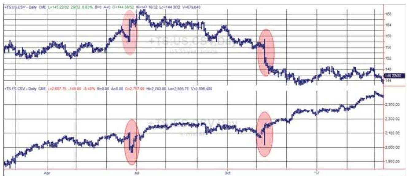
FIGURE 14.2 Price shocks in U.S. bond futures (top) and the corresponding move in S\&P futures (bottom) during 2016.
Although the test covered 28 years, there were only two cases of prices closing in the lower zone after an upward shock, and only two cases of prices closing in the upper zone after a downward price shock. A long position taken on the close of the day of an upward price shock lost money the next day and did not regain those losses over
the next five days. Going long after a downward shock was profitable the next day, but then lost money for most of the following week. The conclusion is that prices reverse the day after the shock and the best opportunity is a 1 -day trade.
US Bonds upward price shocks 2xATR
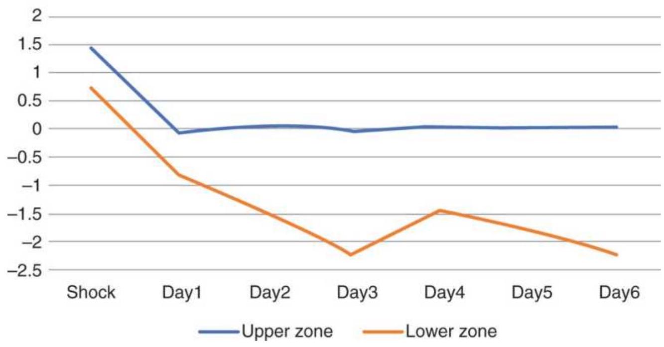
FIGURE 14.3(a) Bond futures returns from upward price shock using \(2 \times\) ATR threshold.
\section*{US Bonds downward price shocks 2xATR}
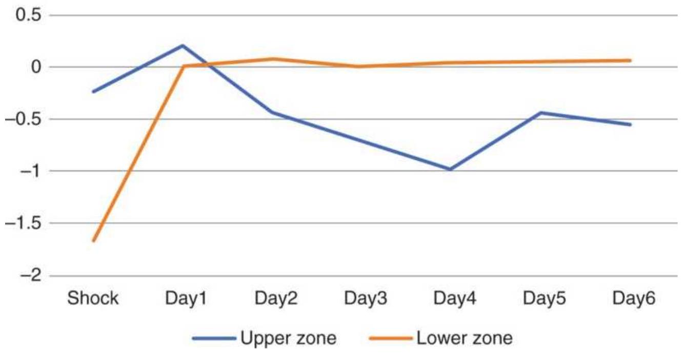
FIGURE 14.3(b) Bond returns using a \(3 \times\) ATR threshold.
US Bonds upward price shocks 3xATR
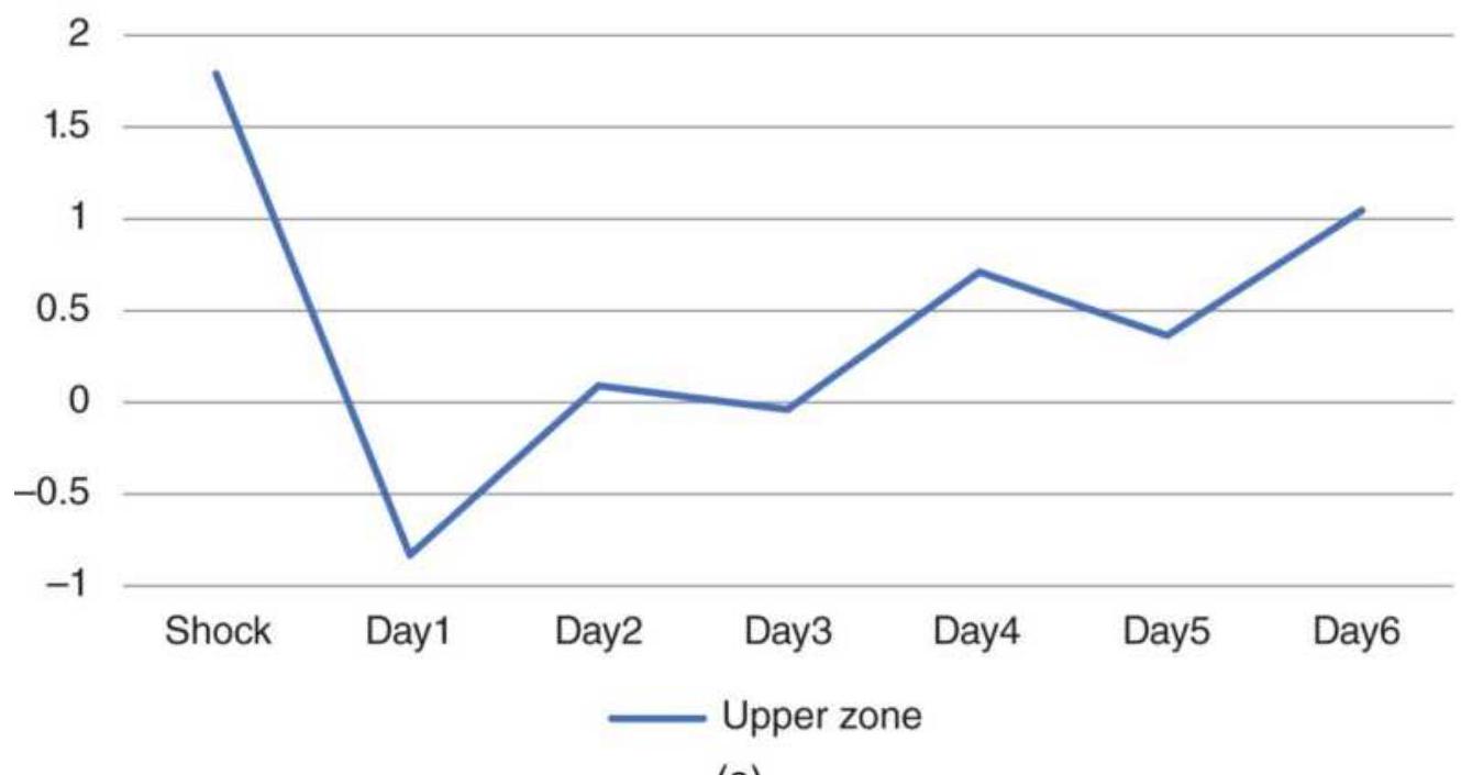
(a)
US Bonds downward price shocks 3xATR
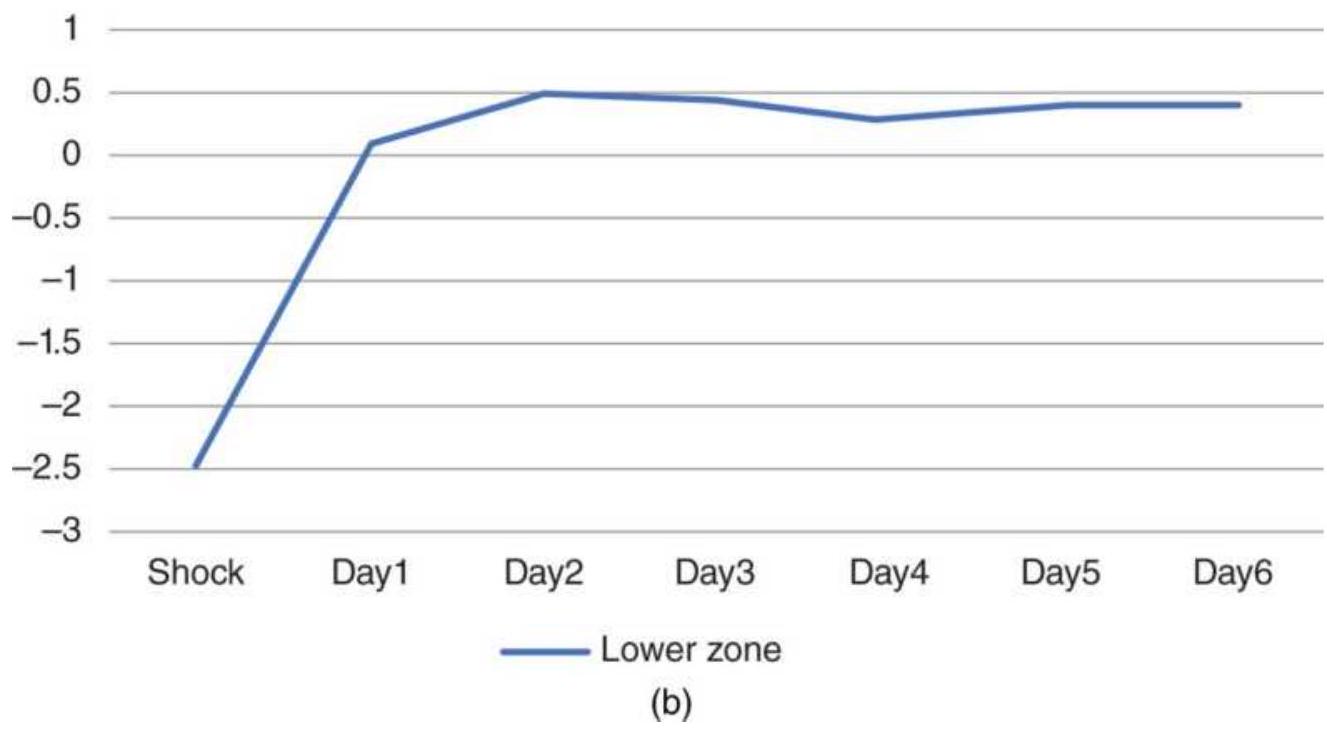
FIGURE 14.4 U.S. bond futures, returns from long positions following upward price shocks (a) and downward shocks (b) greater than 3 ATRs.
If we look at the largest moves, those exceeding 3 ATRs, there is a similar reversal pattern, with the exception that there were no upward shocks that closed in the lower part of the range, and no downward shocks that closed in the upper part of the range. Again, we see that taking a long position on the close of an upward price shock loses money on the next day but was profitable if the entry was delayed one day. Downward shocks recovered quickly and then stopped. Given that the test covered the period from 1991, most of which included declining interest rates, going long futures after a downward shock would be the best strategy.
\section*{Crude Oil}
The American Petroleum Institute (API) releases energy inventories every Tuesday (it used to be Wednesday) at 10:30 a.m. New York. The same study as bonds was applied to continuous futures from 1991 through 2017 and shown in Figure 14.5.
\section*{Upwards crude shocks \(2 x A T R\)}
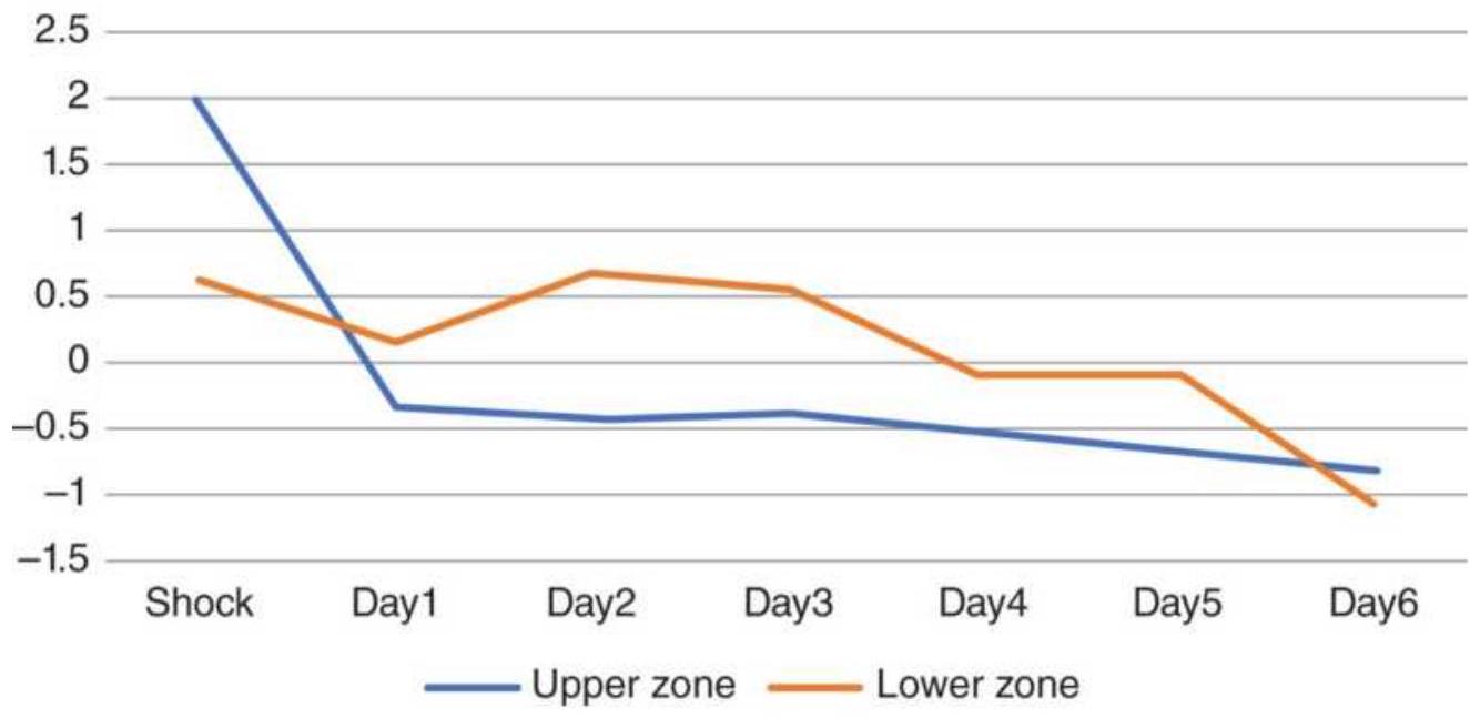
(a)
Downward crude shocks 2xATR
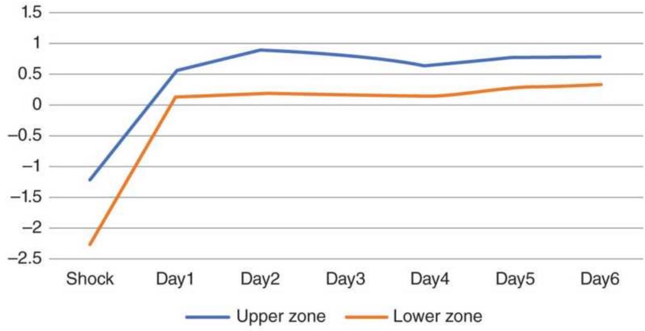
(b)
FIGURE 14.5 Returns from crude oil price shocks using the threshold \(2 \times\) ATR, continuous futures, 1991-2017. (a) Upward shocks. (b) Downward shocks.
Using the threshold of \(2 \times\) ATR, taking a long position on the close of the day of an upward price shock, the following week would have shown steady losses.
However, if a long position was taken on a downward shock, the next day would have seen a nice 1-day gain. In both cases, an upward or downward price shock, reversals were the winning strategy.
For the larger price shocks, indicated by the threshold \(3 \times\) ATR (Figure 14.6), a long position taken after an upward shock that closed in the lower zone would be profitable the next day, but one that closed in the upper zone would generate a loss. For downward shocks, a long position on the close would be profitable only on the next day whether prices closed strong or weak on the entry day. While crude has had extreme ups and downs, this pattern shows a bias toward higher prices.
\section*{Upwards crude shocks \(3 \times\) ATR}
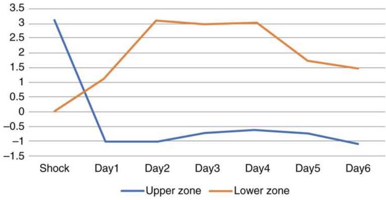
(a)
\section*{Downward crude shocks 3×ATR}
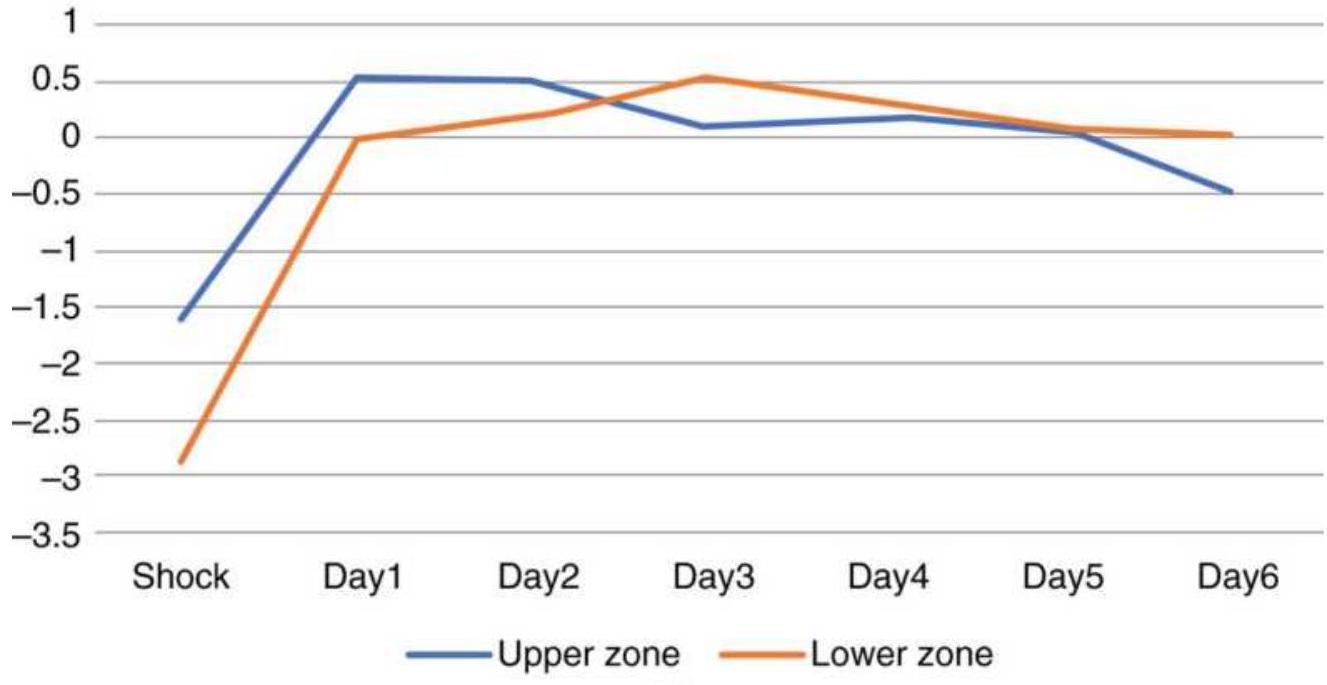
(b)
FIGURE 14.6 Returns from crude oil price shocks using the larger \(3 \times\) ATR threshold. Both results are based on taking a long position on the close of the day of the shock regardless of the direction of the shock.
For both bonds and crude oil, tested over 28 years, the clear tendency is for prices to reverse on the day following a price shock, whether that shock is modest in size or large.
\section*{S\&P}
The S\&P can react to any number of reports as well as daily news, so it is difficult to predict the days in which a modest shock might occur. During the period from 1991 through 2017, there were 126 upside shocks greater than 2 ATRs and 166 downside shocks, a reaction confirming that more investors are long looking to exit.
Figure 14.7 shows that taking a long position after an upward shock that closes near the highs results in a loss the next day. There was only one case where an upside shock closed in the lower zone, so the pattern is unreliable. For downward shocks, the most common case, going long if prices closed near the lows, was a winning strategy. If the downside shock closed near their highs, prices declined for the rest of the week.
\section*{Upwards SP shocks \(2 \times\) ATR}
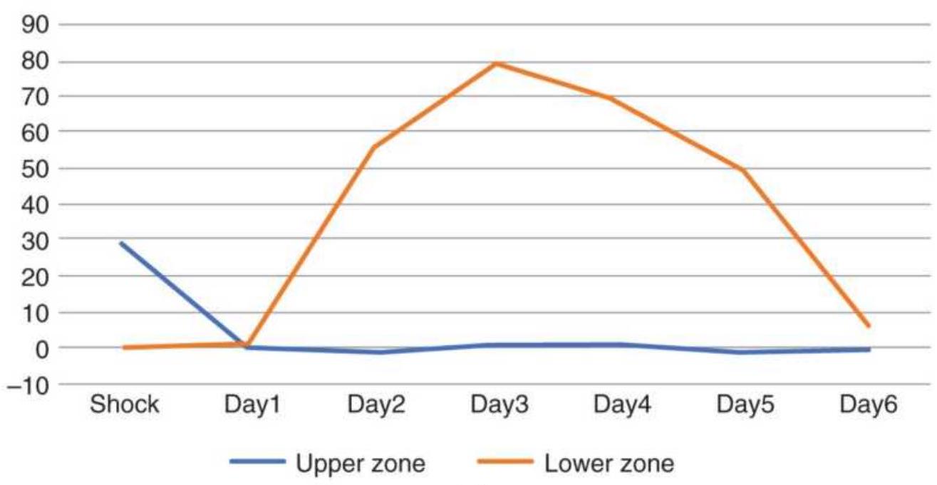
(a)
\section*{Downward SP shocks \(2 \times\) ATR}
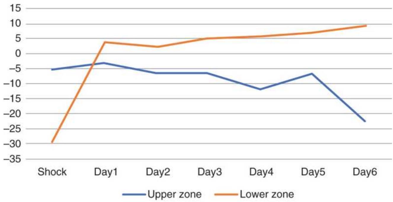
(b)
FIGURE 14.7 S\&P futures price shocks > 2 ATRs. (a) Upside shocks. (a) Downside shocks.
\section*{Upwards SP shocks 3×ATR}
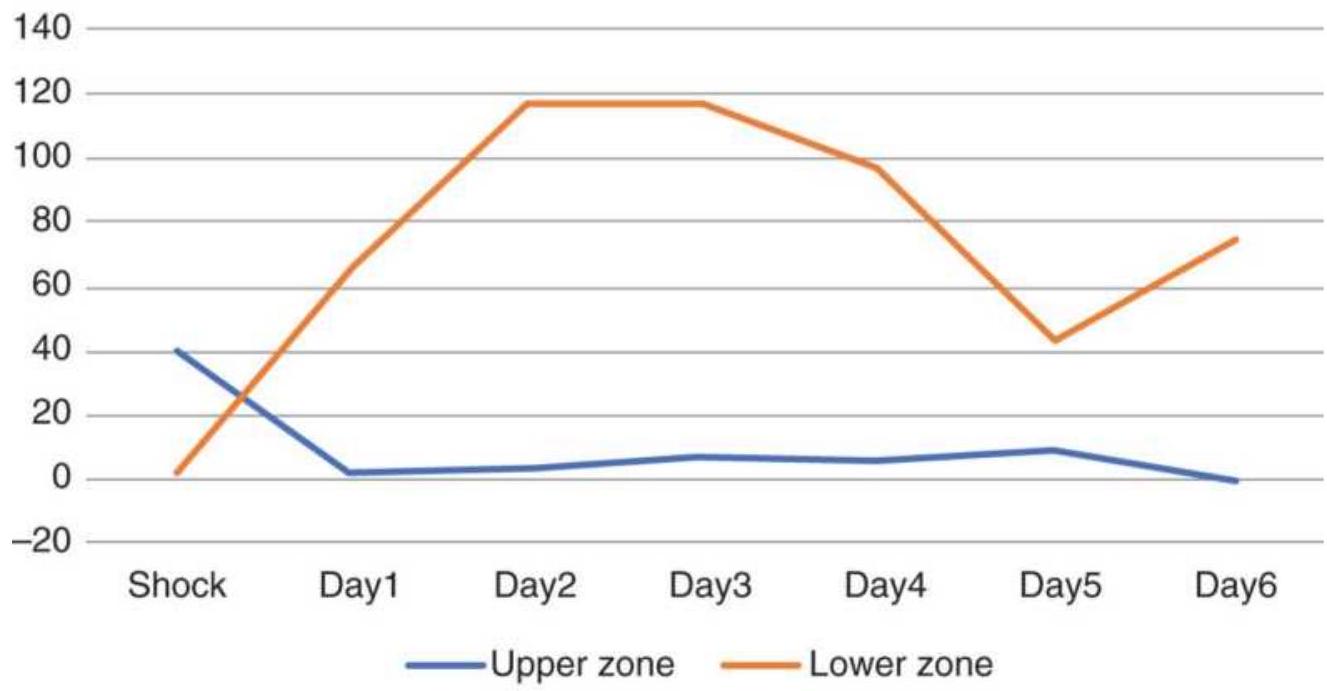
(a)
\section*{Downward SP shocks \(3 \times\) ATR}
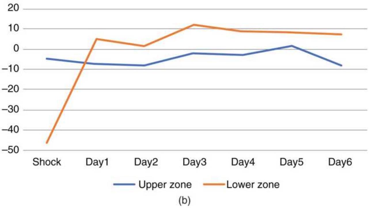
FIGURE 14.8 S\&P futures price shocks using 3 ATRs, 1991-2017. (a) Upward shocks. (b) Downward shocks.
Figure 14.8 shows the results of larger, \(3 \times\) ATR,
shocks. There were 23 upward and 34 downward shocks. Nearly all cases were higher closes for upward breakouts and lower closes for downward breakouts. Going long on a larger upward shock that closed high lost money the next day, then was quiet. Entering a long on a downward shock was profitable if prices also closed low but was flat when prices closed nearer the highs.
The S\&P always has a bias to the upside as well as high noise, so buying a large move down that also closes weak will often be a profitable strategy even if it has a high intrinsic risk.
\section*{COMMITMENT OF TRADERS REPORT}
Drawing from more than 20 years of experience in analyzing the CFTC's Commitment of Traders Report (COT), William L. Jiler described an approach to identifying a major trend in his 1985 CRB Commodity Yearbook. 10 With his usual thoroughness and clarity, Jiler presents material that had previously been unsuccessfully interpreted.
Originally released on the 11th day of each month, the publication of the COT report changed to twice each month in 1990, biweekly in 1992, and has been released every Friday since January 2000. The content of the report has remained essentially the same. The short form COT Report summarizes the open interest (open positions) of reporting and nonreporting traders as of the close of trading on the Tuesday of the reporting week. Reported positions are those exceeding a
minimum level determined for each futures market (e.g.,
750,000 bushels for corn, 500,000 for soybeans, 500 contracts for 30-year Treasury bonds, and 300 contracts for the S\&P 500). These levels are based on the total activity of the market and may change over time. Traders with reportable positions must aggregate all smaller positions held in the same market into one number. More recently, SWAPs have been included. Additional information is available that subdivides the open interest into positions held by hedgers, who are commercial users of the commodity, and speculators. By subtracting the reported positions from the total open interest, the positions of small hedgers and speculators can be found. It is the balance of positions between commercials and speculators that is often used to determine trade direction.
The short form, shown in Figure 14.9, gives a brief breakdown of speculative and commercial positions. In the long form, Figure 14.10, grain positions are further divided into old crop and other positions, including new crop and intercrop spreads. At the bottom are the concentration of positions held by the largest four and eight traders.
\begin{tabular}{|c|c|c|c|c|c|c|c|c|}
\hline \multicolumn{9}{|c|}{\begin{tabular}{l}
WHEAT - CHICAGO BOARD OF TRADE \\
FUTURES-ONLY POSITIONS AS OF \(12 / 12 / 06\)
\end{tabular}} \\
\hline \multirow{2}{*}{\multicolumn{3}{|c|}{ NONCOMMERCIAL }} & \multirow{2}{*}{\multicolumn{2}{|c|}{ COMMERCIAL }} & \multirow{2}{*}{\multicolumn{2}{|c|}{ TOTAL }} & \multirow{2}{*}{\multicolumn{2}{|c|}{\begin{tabular}{c}
NONREPORTABLE \\
POSITIONS
\end{tabular}}} \\
\hline & & & & & & & & \\
\hline LONG & SHORT & SPREADS & LONG & SHORT & LONG & SHORT & LONG & SHORT \\
\hline \multirow{2}{*}{\multicolumn{9}{|c|}{\begin{tabular}{l}
(CONTRACTS OF 5,000 BUSHELS) OPEN INTEREST: 417,081 \\
COMMITMENTS
\end{tabular}}} \\
\hline & & & & & & & & \\
\hline 73,598 & 56,045 & 69,448 & 237,539 & 232,901 & 380,585 & 358,394 & 36,496 & 58,687 \\
\hline \multicolumn{9}{|c|}{ CHANGES FROM 05/25/2004 CHANGE IN OPEN INTEREST: - 7,043} \\
\hline\(-10,463\) & \(-1,186\) & 126 & 3,462 & \(-6,610\) & \(-6,875\) & \(-7,670\) & -168 & 627 \\
\hline \multicolumn{9}{|c|}{ PERCENT OF OPEN INTEREST FOR EACH CATEGORY OF TRADERS } \\
\hline 17.6 & 13.4 & 16.7 & 57.0 & 55.8 & 91.2 & 85.9 & 8.8 & 14.1 \\
\hline \multicolumn{9}{|c|}{ NUMBER OF TRADERS IN EACH CATEGORY (TOTAL TRADERS: 317) } \\
\hline 102 & 89 & 92 & 67 & 96 & 233 & 226 & & \\
\hline
\end{tabular}
\section*{FIGURE 14.9 Commitment of Traders Report (short form) from the CFTC.gov website.}
\section*{WHEAT - CHICAGO BOARD OF TRADE}
Code-001602
Commitments of Traders - Futures Only, May 10, 2011

\(-----------------------\)
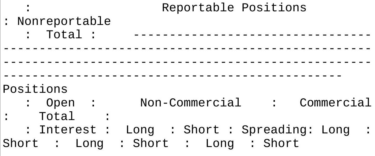
(CONTRACTS OF 5,000 BUSHELS)
All : 455,903: 100,101 89,939 65,413 253,366 243,455 418,880 398,807 : 37,023 57,096
Old : \(415,581: 100,159 \quad 95,463 \quad 46,454 \quad 237,460\) 227,124 384,073 369,041 : 31,508 46,540 Other: 40,322: 11,869 6,403 7,032 15,906 16,331 34,807 29,766: 5,515 10,556
Changes in Commitments from: May 3,
2011

\(-8,434-4,830 \quad-7,714\) : 286 3,170
Percent of Open Interest Represented by
Each Category of Trader
\begin{tabular}{lcccccc}
All : & \(100.0:\) & 22.0 & 19.7 & 14.3 & 55.6 & 53.4 \\
91.9 & \(87.5:\) & 8.1 & 12.5 & & & \\
Old : & \(100.0:\) & 24.1 & 23.0 & 11.2 & 57.1 & 54.7 \\
92.4 & \(88.8:\) & 7.6 & 11.2 & & & \\
Other: & \(100.0:\) & 29.4 & 15.9 & 17.4 & 39.4 & \\
40.5 & 86.3 & \(73.8:\) & 13.7 & 26.2 & &
\end{tabular}
:\# Traders : Number of Traders in Each
Category
\begin{tabular}{|c|c|c|c|c|c|c|}
\hline All : & 421: & 123 & 132 & 153 & 84 & 132 \\
\hline 311 Old : & 337 418: & 121 & 141 & 138 & 79 & 127 \\
\hline 294 & 326 : 171 . & & & & & \\
\hline Other: & 129 \ \({ }^{\text {171: }}\) & 37 & 31 & 19 & 33 & 86 \\
\hline
\end{tabular}
Percent of Open Interest Held by the Indicated Number of the Largest Traders
By Gross Position By
Net Position
4 or Less Traders 8 or Less Traders 4 or Less Traders 8 or Less Traders
: Long: Short Long Short: Long Short Long Short
\begin{tabular}{lcccccc}
All : & & 22.3 & 18.6 & 37.4 & 25.5 & 20.0 \\
13.5 & 34.1 & 19.0 & & & & \\
Old: & & 23.5 & 20.2 & 39.5 & 27.7 & 22.1 \\
15.8 & 36.7 & 22.3 & & & & \\
Other: & & 32.5 & 23.5 & 48.5 & 31.8 & 25.1 \\
14.8 & 38.5 & 20.5 & & & &
\end{tabular}
\section*{FIGURE 14.10 Commitment of Traders Report (long form), May 10, 2011.}
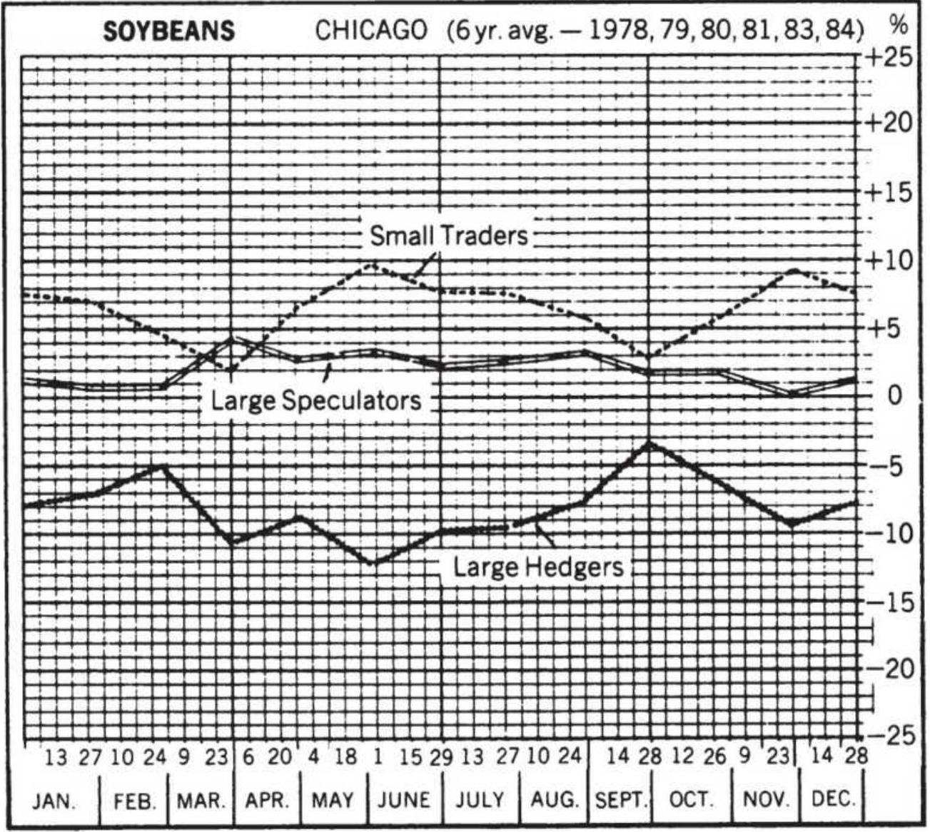
\section*{FIGURE 14.11 Jiler's normal trader positions.}
In order to analyze the shifts in position, Jiler compiled tables of normal patterns, similar to a seasonal study (see Figure 14.11). When the open interest of one group is significantly greater than their normal holdings, they express a definite opinion on the direction of the market. By tracking these changes for many years and observing the corresponding price changes, Jiler concludes that the large traders have the best forecasting record, and within that group, the large hedger is better than the large speculator. The small traders were notably worse. His
guidelines, based on agricultural products, were:
The most bullish configuration would show large hedgers heavily net long more than normal, large speculators clearly net long, small traders heavily net short more than seasonal. The shades of bullishness are varied all the way to the most bearish configuration which would have these groups in opposite positions - large hedgers heavily net short, etc. There are two caution flags when analyzing deviations from normal. Be wary of positions that are more than \(40 \%\) from their long-term average and disregard deviations of less than \(5 \%\).
This result was confirmed by Curtis Arnold, \({ }^{11}\) who compared positions of large and small speculators with commercials for the 1-year periods spanning 1983-1984. Arnold showed that the positions of commercials and small speculators tend to be opposite, with the commercials positioned to profit from the subsequent price move.
Over a wider group of 36 markets from 1983 to 1989, a study conducted by Bullish Review \({ }^{12}\) showed that a large weighting of long or short positions held by commercial hedgers correctly forecast significant market moves \(67 \%\) of the time. In retrospect, it seems likely that a large commercial trader, bank, investment house, or other institution would take a longer-term view of the market, setting positions to take advantage (or avoid the risk) of a potential price move. Because of their size, institutions are not likely to change their positions on minor price
Analysts should be aware that a qualified hedger, one that is registered with the CFTC in order to set large positions due to their ongoing risk of holding physicals, may also take large speculative positions under the same umbrella. Given this ambiguity, the COT classifications have tried to make it clearer where the "smart money" is positioned. The old report combined commercials and swap dealers; however, swap dealers can side with the speculator or commercial given market conditions. By separating them, the report now shows "true commercials."
\section*{The Briese Index}
Steve Briese created a COT Index \({ }^{13}\) as an oscillator to explain the results of the COT report.
\[
\text { COT Index }=100 \times \frac{N L_{t}-\operatorname{Lowest}(N L, n)}{\operatorname{Highest}(N L, n)-\operatorname{Lowest}(N L, n)}
\]
where
\(N L=\) the net long positions of a given group of reporting traders
\(n=\) the lookback period, ranging from 1.5 years to 4 years
This should be recognized as the formula for a stochastic, giving the bullish percentage. This index is available through Commodity Systems, Inc. (CSI) and is an easier
way of viewing COT data. When downloaded:
\section*{High \(=\) Large speculators \\ Low \(=\) Commercial hedgers}
Close \(=\) Small traders
As an example, soybean nearest futures for July 2017 through mid-April 2018 is shown in Figure 14.12 (a) and the corresponding Briese Index values on the right. The pattern of large traders is very similar to soybean prices while the commercials and hedgers are opposite. Small traders show a mixed pattern, similar to prices during a sideways period but opposite during a price shift. This would argue that the large speculators are driving the price.
\section*{Soybean nearest futures}
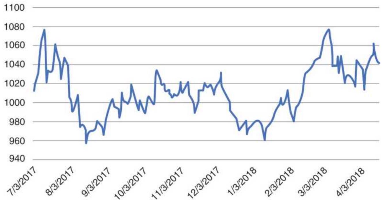
(a)
Soybeans Briese COT Index
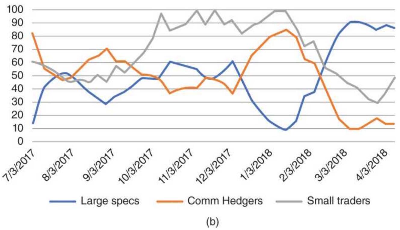
FIGURE 14.12 (a) Soybeans nearest futures, July 2017-April 2018. (b) The Briese Index for soybean COT
data.
While once only the agricultural products were tracked by the CFTC, now we can see all futures markets. The S\&P, always of great interest, is shown in Figure 14.13, continuous futures in part (a) and the Briese COT Index in part (b). During the long rally from July 2017 to January 2018, the large speculators held the biggest positions. Those started to decline well ahead of the price reversal in early February 2018 while the small traders were still building their long positions. Small traders continued to dominate the positions while the \(S \& P\) declined and tried to form a base. Small trader positions jumped up in mid-February when it looked as though the S\&P might rally, and they have remained dominant even when that rally failed. Hedgers have a more active pattern, reducing their positions (most likely shorts) as prices rallied, then entering and exiting as prices traded lower and higher - very much actions we would expect from speculators.
\section*{Emini S\&P nearest futures}
3000
2900
2800
2700
2600
2500
2400
2300

(a)
\section*{S\&P Briese Index}
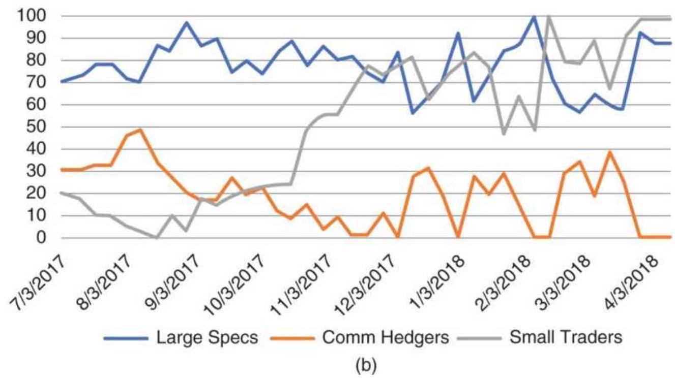
FIGURE 14.13 (a) S\&P continuous futures and (b) the Briese COT Index for each category.
\section*{Trading Signals}
These charts make it clear that the small traders are consistently out of phase with the direction of prices and the large speculators are driving the market. Ruggiero \({ }^{14}\) suggests:
- Sell short when the positions of the [large speculators] are strongest, well above 80, and the two other groups are weakest, under 20.
- Enter a long when the large speculators are below 20 and the two other groups are above 80.
- The holding time for this trade tends to be long, as much as 3 to 6 months, depending on the market, because large traders take time to change their positions.
Additional rules, based on the idea that the large speculators are usually correct:
- Enter a long when the stochastic for the large speculators crosses above 80 and the S\&P closes lower than it did 4 weeks ago.
- Exit the trade when the stochastic touches 40, which is just before the neutral level of 50 . It is not safe to assume that stochastic values will move from oversold to overbought; it is much safer to only expect them to return to neutral.
Ruggiero also used the COT Index for both commercials and small traders to create a basic timing model:
- If COT Index Commercials[lag] > Ctrigger and COT Index Small < Strigger, then buy.
If COT Index Commercials[lag] < Ctrigger and COT
Index Small \(>\) Strigger, then sell. \({ }^{15}\)
The results are bullish when the COT Index for commercials is high and the COT Index for small traders is low. The results are bearish when the COT Index for commercials is low and the COT Index for small traders is high. The COT Index for commercials is lagged by one or more weeks because the actions of commercials are interpreted as leading the market. Ctrigger and Strigger are levels that are determined to be significant turning points. In Ruggiero's tests, this method was highly successful for Treasury bonds using Ctrigger \(=30\), Strigger \(=50\), and lag \(=1\) (one week).
\section*{Capturing the Cycle in COT}
Taking a different approach, Ruggiero created a method that anticipated price direction based on extreme bullishness and bearishness in the COT report; however, he chose to take only long positions. \({ }^{16}\) The pattern being exploited is called the markup phase, which occurs after the commercials have stopped buying and start selling the rallies. At the same time, small traders enter the market as it accelerates. The public enters when prices are very bullish and commercials are turning bearish.
The purpose of this strategy is to take advantage of the short period of upward accelerated price movement, then exit after \(n\) days or when the acceleration has stopped. To implement this, Ruggiero finds the correlation of price and volume and converts that to an
oscillator rescaled to the range +1 to -1 . He also applies the Herrick Payoff Indicator (HPI) using a conversion factor of 100 and a smoothing constant of 0.10 (see Chapter 12), which combines price, volume, and open interest. A markup occurs when the correlation oscillator \(>0.3\) and HPI \(>0\) but not the highest value of the recent period and the payoff has not retraced by some threshold percentage.

Once the markup has been determined, another oscillator is formed from the net commercial position, longs minus shorts, ranging from 100 to 0 . If the oscillator \(>85\) and a markup occurred within the past 3 days, a long position is entered. Trades are held for at least \(n\) days and until there is no markup. An upgraded version of Ruggiero's program for this strategy is TSM COT Markup, on the Companion Website.
The numbers in the COT report can be turned into a Sentiment Index, as shown in the next section of this chapter.
\section*{OPINION AND CONTRARY OPINION}
Market sentiment, the collective opinion of investors, is a driving force in the market, yet it is very difficult to measure and even harder to deliver those results in a timely fashion. For that reason, analysts often substitute a combination of volume, open interest, and price for true sentiment, hoping that the recorded actions of traders closely relate to what they are thinking. Opinion, however, weighs on the marketplace and governs future
actions in the same way that high volume may not move prices today, but provides a platform for a potentially large price move. The Consumer Confidence Index, released monthly by the Conference Board and conducted by Nielson, is the prime example of opinion that moves the market.
Public opinion is fast to change. A prolonged bull market in stocks may show a gradual increase in bullish sentiment; however, the collapse of a bank, an increase in rates by the Central Bank, a sharp downturn in the economy of another region, or a single sharp drop in a stock index could quickly change the public's opinion. In reality, sentiment indicators are most popular for trading in the direction opposite to the collective public opinion.
\section*{Contrary Opinion}
The contrarian lies somewhere between the fundamentalist and the technician, basing actions on the behavior of crowds, in this case the market
participants. \({ }^{17}\) The contrarian sees the end of a bull market occurring when everyone is bullish. Once all long positions have been set, there is diminishing influence by the bulls; moreover, the contrarian believes that
opportunities always lie in the reverse direction from crowd thinking. 18
Contrary opinion alone is not meant to signal a new entry into a position; it only identifies situations that qualify. It lacks the timing. It is more of a filter than a trading system, a means of avoiding risk and finding an opportunity. Consider the patterns that appear in every
prolonged bull or bear move. First, there is a place where the direction is generally accepted as the major trend. After that, traders wait for a pullback to enter in the direction of the trend at a more favorable price. These price corrections within a trend become smaller or even disappear when everyone wants to buy a lower open or in the case of a bear market, sell a higher open, until finally there is a blow-off and a major reversal. The dramatic end to a prolonged move is generally credited to the entrance of the public; when the masses are unanimously convinced that prices are going higher, who else is left to buy?
The other important ingredient for a contrarian is that all the facts cannot be known. The widely accepted belief that prices will go higher must be based on presumptions; if the final figures were out and the reality known, the market would adjust to the proper level. This idea is older than The Art of Contrary Thinking. In 1930, Schabacker \({ }^{19}\) advised:
It is best to follow the crowd when fundamental considerations for the industry, for the stock and for the group are improving and indicate that there is really something to the move. But it is best to reverse the action of the crowd and desert them, or play the opposite side of the market, when their action is based more on rumors, on prospects, on paper talk, on public gossip, on results of pool publicity, etc., than upon a genuine raison d'être. Another clue is that when the resulting movement is sharper than usual and enthusiasm is higher than seems logical, it is also best not to follow the crowd.
The practical application of the theory of contrary opinion is the Bullish Consensus \({ }^{20}\) and the Market Sentiment Index, created from a poll of market letters prepared by the research departments of brokerage firms and professional advisors. In the Bullish Consensus (see Figure 14.14), these opinions are weighted according to the estimated circulation of these letters.
\section*{Sum of (Each source X Relative circulation X Bullish opinion)

The value of the bullish consensus ranges from o to \(100 \%\), indicating an increasingly bullish attitude. Because of the bullish tendency of the novice trader, and the long-term upward bias of the stock market, the neutral consensus level is \(55 \%\). The normal range is considered from \(30 \%\) to \(80 \%\), although each market must be individually evaluated.
Bullish
Consensus
Percentage
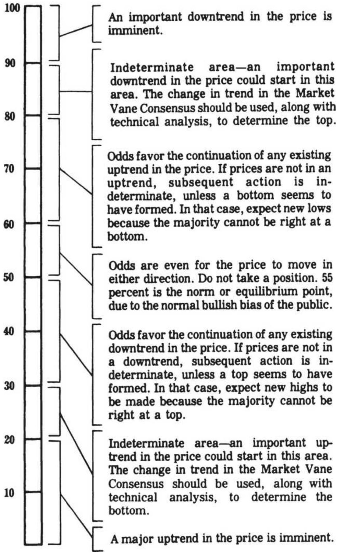
FIGURE 14.14 Interpretation of the Bullish Consensus.
Source: R. Earl Hadady, Contrary Opinion (Pasadena, CA: Hadady, 1983).
Hadady also devised a simple mathematical way of displaying the bullishness of the market. \({ }^{21}\) Using the formula below, he shows that when \(80 \%\) of traders are bullish, then the average buyer will hold only \(1 / 4\) the number of contracts as the average seller. This leads to a precipitous drop in prices once a decline begins,
\[
N_{t}=\frac{20 \% T \times N_{s}}{80 \% T}=\frac{1}{4} \times N_{s}
\]
where
\(T=\) the number of traders in the market
\(N_{t}=\) average number of contracts held by a single bullish trader
\(N_{S}=\) average number of contracts held by a single bearish trader
The principles of contrary opinion do not require that trades be entered only in the direction opposite to the current price movement. Within the normal range, the contrarian will take a position in the direction of the trend. Frequently, the Bullish Consensus will begin to increase prior to the price turning higher, indicating that the attitude of the trader is becoming bullish. It is considered significant when the index changes 10\% in a 2-week period. Once the Bullish Consensus reaches 90\%
during an upward move, or 20\% during a bear move, the market is considered overbought or oversold, and the contrarian looks for a convenient point to exit from the current trade. Positions are not reversed until prices show that they are changing direction. This could be identified using a moving average. Remembering Schabacker's advice, the occasion of a general news release that moves the market further than would seem reasonable in the direction of the general opinion is an opportune moment to enter a contrary trade; specific news that fails to move prices would be a good indication of an exhausted trend when the consensus is overbought or oversold. A typical contrarian situation identified by Hadady is given in Figure 14.15.
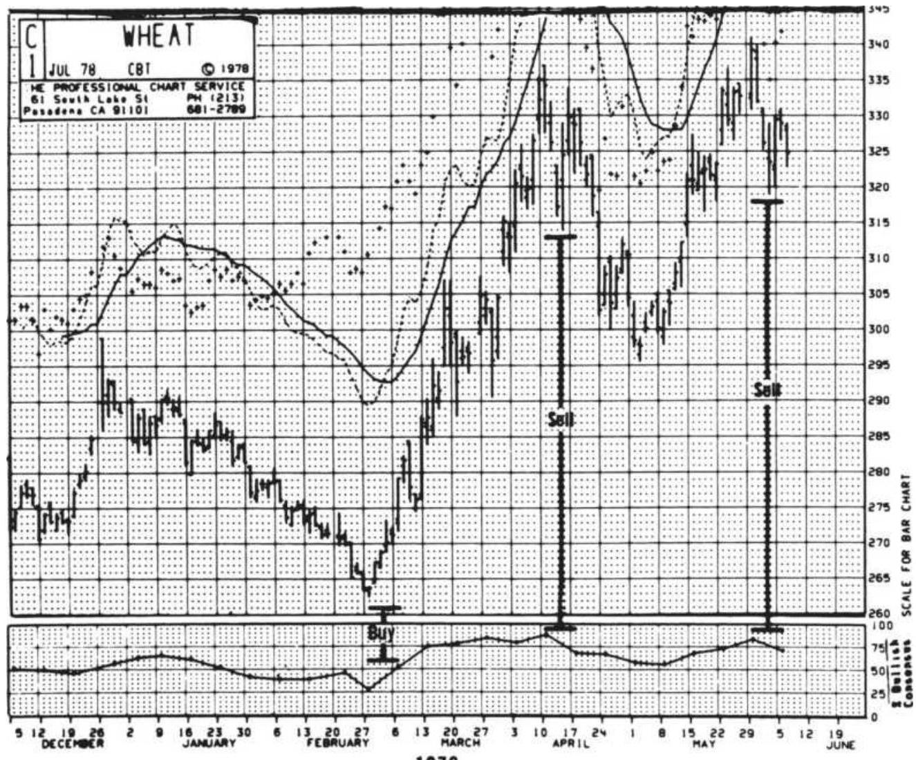
1978
FIGURE 14.15 Typical contrarian situation: wheat, 1978.
R. Earl Hadady said, "The principle of contrary opinion, by definition, works \(100 \%\) of the time. The problem is getting an accurate consensus." \(\underline{ }\) difficulty with this index; if 60 to 70 market letters are reviewed, read, and weighted to form an index, the results may be outdated before they can be used. Given the lag inherent to the index, contrary opinion is best used in combination with a longer-term position, often as a filter to avoid entered when the opinion is too bullish. The only viable exit signal would be when the
reverse consensus occurs. Because a consensus does not have to switch uniformly from bullish to bearish, it is not always prudent to wait for an opposite confirmation before exiting a trade.
Other sentiment indicators, given in a section that follows, are based on data readily available and avoid the issue of timeliness.
\section*{Commitment of Traders Sentiment Index}
The reported positions of traders, published in the

considered a recording of market opinion by category. By combining the stochastic calculation with a method originally developed by Curtis Arnold, you can create a Sentiment Index:
\section*{COT Sentiment Index \(=\) \\ Current net - Minimum net \\ Maximum net - Minimum net}
where
Net \(=\) Commercial net position (number of contracts) minus the total combined net position of large speculators and small traders
Maximum = Greatest net difference that occurred during the comparison period
Minimum = Smallest net difference that occurred during the comparison period
The intent of the Sentiment Index is to rank the current
spread between the commercial and speculative positions within the context of the historic range, as a bullish measure. With this approach, the commercials are the group that determines the correct direction of prices.
\section*{Put-Call Ratios}
The ratio of put option volume to call option volume, called the put-call ratio, is the major sentiment index for listed options. It too is used for its contrary value. Unlike the sentiment indices derived from analyst opinions, this ratio is available instantly. In theory, when the ratio is above 1.0 it is considered bearish and anything below 1.0 is bullish; however, it may be best to look at the ratio's deviation from its average, shown as trendlines in Figure 14.16.
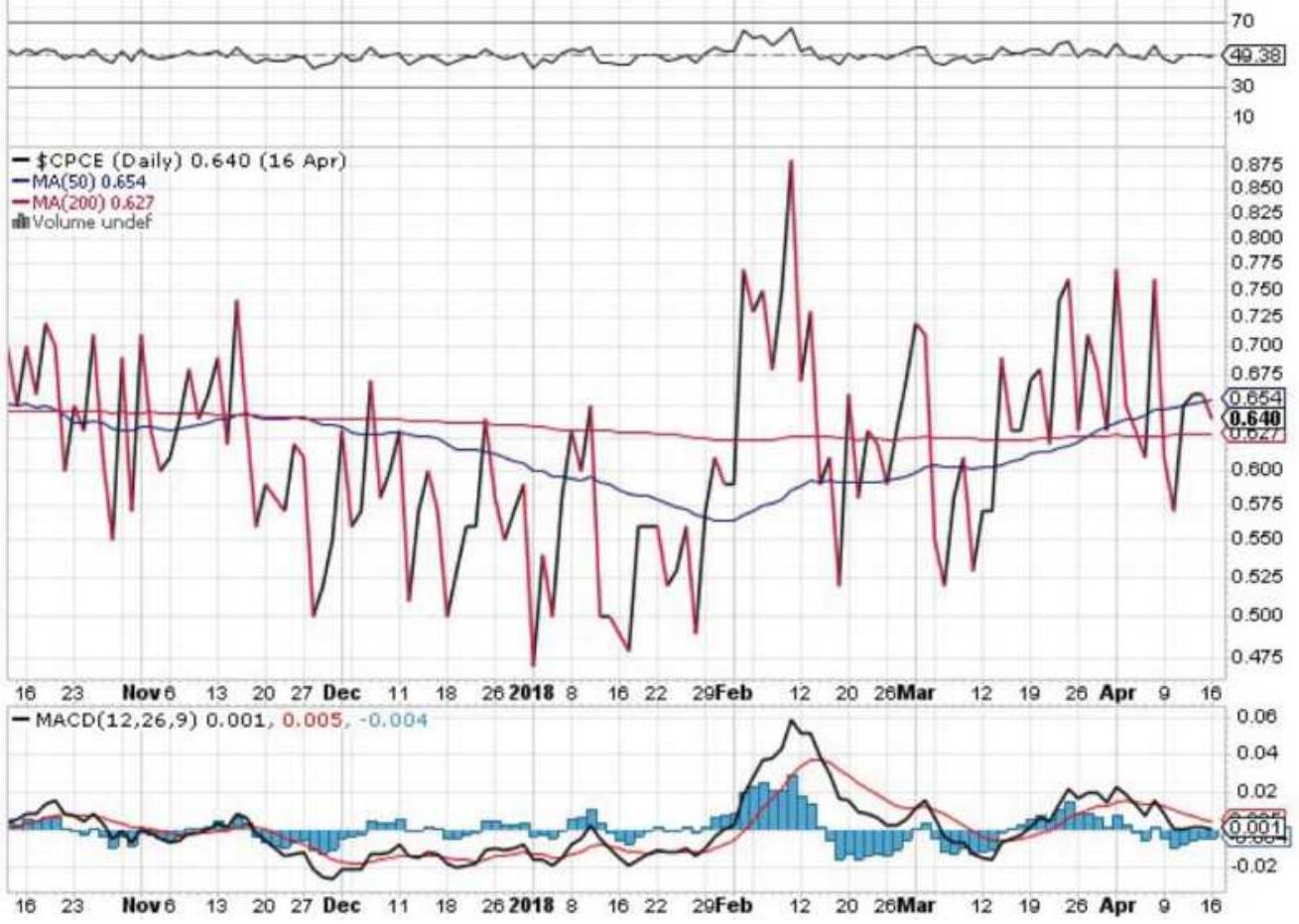
FIGURE 14.16 The put/call ratio (\$CPCE), October 2017-mid-April 2018.
Chart courtesy of StockCharts.com.
\section*{Other Market Sentiment Indicators}
While the Consumer Confidence Index is the most wellknown, the following are also interesting: 34
- The American Association of Individual Investors ("AAII") survey provides a reading of sentiment over the next six months, poled from its membership. Data is available from 1987.
- The National Association of Active Investment
Managers (NAAIM) Exposure Index represents the average exposure to U.S. equities reported by its members. In general, higher levels of equity participation indicate a bullish sentiment of the market. Declining values indicate that investment managers are starting to reduce portfolio risk.
- TD Ameritrade's Investor Movement Index is a behavior-based index reflecting the sentiment of their client base. As with other sentiment indicators, increases in the IMX indicate that investors are becoming more bullish; however, no specific thresholds levels are given.
The CNNMoney Fear \& Greed Index looks at stock price momentum, stock price strength, stock price breadth, put-call ratios, junk bond demand, market volatility, and safe-haven demand, to calculate the level of fear or greed in the market. The idea is that too much fear can sink stocks below reasonable levels while too much greed can send them far higher than their proper valuation.
\section*{Dogs of the Dow and the Small Dogs}
Another recognizable contrarian method is the Dogs of the Dow, popularized by Michael O'Higgins in Beating the Dow (1991). \({ }^{25}\) The method shows that, if, on January 1 of each year, you bought the 10 members of the Dow with the highest stock dividend yields, you would have returned 10.8\% per annum from 1992 through 2011, beating the S\&P return of \(9.6 \%\). Earlier returns were shown to be even better. It assumes that good companies
pull themselves up after a bad period by offering better yields, or by keeping dividends at the same dollar level after prices have declined.
For the small investor, O'Higgins proposed the Small Dogs of the Dow, also fondly called the puppies. Out of the 10 stocks selected as the Dogs of the Dow, buy the ones with the lowest stock value. In Robert Sheard's book, The Unemotional Investor, he presents the Foolish Four, a way of selecting 4 of the 10 Dogs. \({ }^{26}\) As described on winninginvestments.com, Sheard sorts the 5 stocks of the Small Dogs, lowest price at the top, and places them alongside the 10 Dogs, lowest yields at the top. If the same stock appears at the top, it is eliminated because it is trading at a low price for a good reason. If there is no match, he takes the top 4 stocks from the Small Dogs.
Those investors interested in a Dow strategy should also read "Dogging the Dow" in Chapter 13.
\section*{Watching the Big Block Transactions}
Big block transactions are those that are equal to or greater than 100,000 shares or have a transaction value of \(\$ 1\) million or more. Corporate insiders are the corporation's officers, directors, and beneficial owners of more than \(10 \%\) as specifically named in the 1934 Securities Exchange Act, Section 16. Corporate insiders must register their holdings with the SEC and must disclose any share transactions by filing a report within 30 days after the purchase or sale. Due to slowness in these filings, the Sarbanes-Oxley Act became effective in August 2003 to accelerate reporting (among other
things), which now must be done within 2 days of the transaction. Insiders can also file a plan with the SEC, in advance, to buy or sell shares on specific dates or at specific prices. Not all of the shares traded by insiders are "timed."
Insider trading is not the same as trading on inside information, which is illegally making a trade based on nonpublic or privileged information. Insider selling is a common occurrence, as executives who have accumulated stock options, and venture capitalists who see the appreciation in share value, convert their holdings into cash. Some of these transactions are done at regular intervals and have no relationship to market direction while others are at opportune moments and may offer insight into the future direction of prices.
The combination of big block trades by corporate insiders is a special case that was studied by Bjorgen and Leuthold, \(\frac{27}{}\) who concluded in 1998:
Since 1983, when net selling, measured in dollars, reached historically high levels, the stock market performed poorly over the next 12 months. At the time this article was written, 1998, corporate insiders were selling at levels approaching historic highs.
When net selling reaches historic lows, the market then performs significantly above average over the next 12 months.
The authors also noted that the number of net buy or sell transactions, regardless of total dollars, may also follow
the same relationship. The combination of these two items, large transaction size and privileged information, seems analogous to the positions of commercial traders in the Commitment of Traders report published weekly by the CFTC. Earlier in this chapter it was shown that large traders tend to be on the right side of the market while the small speculators are not.
\section*{FIBONACCI AND HUMAN BEHAVIOR}
Even though we may not understand the cause underlying a particular phenomenon, we can, by observation, predict the phenomenon's recurrence.
- R. N. Elliott \({ }^{28}\)
History is a record of great achievement in the face of disbelief, as exhibited by the explorations of Columbus, Magellan, and Marco Polo; the science of Leonardo da Vinci, Galileo, and Copernicus; and the philosophy of Socrates, Aristotle, and Plato. Hopefully, we are more observant today and less apt to condemn those who delve into areas still unknown. Of these, astrology is the most popular, with a very large following, particularly in Asia. Its acceptance may be partly because of its strong basis in physical phenomena. It attempts to classify personality traits based on positions of planets and stars at the time of birth, and predict the actions of groups based on the relationships of planets, moons, and comets to one another. The science of physics confirms that the positions of our moon and planets, the energy given off, and the gravitational phenomenon are directly
responsible for physical occurrences of tides and weather
- it seems reasonable that they might have a measurable effect on behavior. This will be considered in the following sections.
Let us look first at the fascinating subject of symmetry in nature. Science is familiar with the symmetric shapes of crystalline substances, snowflakes, the spherical planets, and the human body. The periodicity of the universe sun spots, eclipses, and other cyclic phenomena - is also understood, but its bearing on human behavior is not known. Work in biorhythms may tell us valuable information about the body but the relationship of behavior to nonbiological functions, such as planetary positions, is too abstract.
In 1904, Arthur H. Church wrote about phyllotaxis, the leaf arrangement of plants, \({ }^{29}\) showing its relationship to a mathematical series based on the works of Leonardo
Pisano, commonly called Fibonacci. 30 This
mathematical series of numbers has been attributed the quality of representing human behavior. Examples have been given that appear to be interesting coincidences to some, and significant to others. However, the resulting Fibonacci ratios have become an important part of price analysis.
It is not certain how Fibonacci conceived his summation series. His greatest work, Liber Abaci, written in the early part of the thirteenth century, was not published until 1857. \(\frac{31}{}\) It contained a description involving the reproduction of rabbits in which the following two conditions hold: Every month each pair produces a new pair, which, from the second month on become
productive; deaths do not occur. This becomes the famous Fibonacci summation series:
\[
1,1,2,3,5,8,13,21,34,55,89,144, \ldots
\]
where the first two is represent the original pair of rabbits. After that, each element of the series is the sum of the two previous entries.
Those who have studied the life of Fibonacci often attribute the series to his observations of the Great Pyramid of Giza. This pyramid, dating from a preliterary, prehieroglyphic era, contains many features said to have been observed by Fibonacci. In the geometry of a pyramid there are 5 surfaces and 8 edges, for a total of 13 surfaces and edges; there are 3 edges visible from any one side. More specifically, the Great Pyramid of Giza is 5,813 inches high ( \(5-8-13\) ), and the inch is the standard Egyptian unit of measure; and the ratio of the elevation to the base is \(0.618 .{ }^{32}\) The coincidence of this ratio is that it is the same as the ratio that is approached by any two consecutive Fibonacci numbers; for example:
\[
\frac{2}{3}=0.667, \frac{3}{5}=0.600, \frac{5}{8}=0.625, \ldots, \frac{89}{144}=0.618
\]
It is also true that the ratio of one side to a diagonal of a regular pentagon is o.618.
Another phenomenon of the Great Pyramid of Giza is that the total of the 4 edges of the base, measured in inches, is \(36,524.22\), which is exactly 100 times the length of the solar year. This permits interpretations of
the Fibonacci summation series to be applied to time.
The Greeks showed a great fascination for the ratios of the Fibonacci series, noting that while
\[
F_{n} / F_{n+1}=0.618, \text { the reverse } F_{n+1} / F_{n}=1.618
\]
was even more remarkable. They called these
relationships golden sections and appear to have used them in the proportions of such works as the Parthenon, the sculpture of Phidias, and classic vases. Leonardo da Vinci consciously applied the ratio to his art. It has always been a curiosity that the great mathematician Pythagoras left behind a symbol of a triangle of Fibonacci proportions with the words "The Secret of the Universe" inscribed below.
Church, in his work on phyllotaxis, studied the sunflower, noting that one of normal size ( 5 to 6 inches) has a total of 89 curves, 55 in one direction and 34 in another, consecutive Fibonacci numbers. In observing sunflowers of other sizes, he found that the total curves are Fibonacci numbers (up to 144) with the two previous numbers in the series describing the distribution of curves. The chambered nautilus is considered a natural representation of a golden spiral, based on the proportions of the Fibonacci ratio (see Figure 14.17). Nature also shows that the genealogical pattern of a beehive, and the stem (growth) structure of the Sneezewort (Achillea ptarmica) are perfect duplicates of the Fibonacci series.
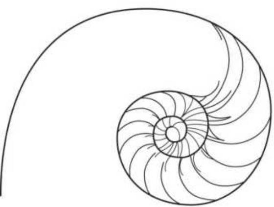
Chambered nautilus
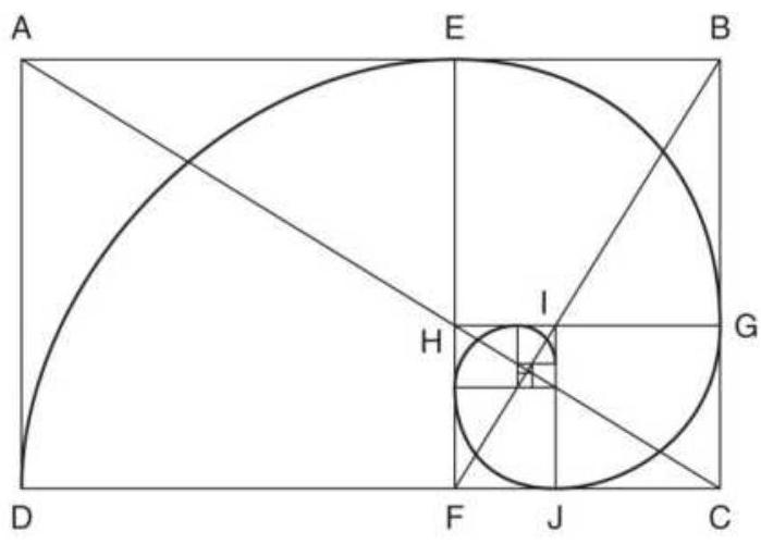
Logarithmic, or "golden" spiral
FIGURE 14.17 The golden spiral, also the logarithmic spiral, is a perfect representation of the chambered nautilus.
Source: Robert Fischer, Fibonacci Applications and Strategies for Traders (New York: John Wiley \& Sons, 1993), p. 9. Original source: H.E. Huntley, The Divine Proportion (New York: Dover, 1970), pp. iv, 101. Reprinted with permission.
Up to now, aspects of the Fibonacci series have been intriguing, but here it goes a step beyond. The numbers in the series have frequent or coincidental occurrences:
- The human body has 5 major projections; both arms and legs have 3 sections; there are 5 fingers and toes, each with 3 sections (except the thumb and great toe). There are also 5 senses.
- In music an octave means 8 , represented on the piano by 8 white keys and 5 black, totaling 13.
- There are 3 primary colors.
- The United States had 13 original states and 13 is an unlucky number.
- In the United States, the legal age is 21 and the highest salute in the army is a 21-gun salute.
- The human emotional cycle has been determined at \(33-36\) days by Dr. R. B. Hersey. 33
- The wholesale price index of all commodities is shown to have peaks of 50 to 55 years according to the Kondratieff wave: in 1815 after the war of 1812, 1865 after the Civil War, 1920 after the World War I, and the next about 1975.34
These examples are not meant to prove anything in the strict sense, but to open an area that may not have previously been considered. Human behavior is not a pure science and probes of this sort may lead the way to further understanding. The following sections deal with ideas such as these - sometimes reasonable and other times seeming to stretch the imagination.
\section*{Application of Fibonacci Ratios}
Fibonacci ratios have become an integral part of charting, used to measure advances and retracements. The most popular ratio is 0.618 ; therefore a price advance that measures \(\$ 5\) from start to peak will be expected to retrace by \(\$ 3.09\), before starting higher again. Alternately, traders have used 0.382, the complement of 0.618 , as a key retracement level; however, this is not a Fibonacci ratio. Advances of 0.618 or 1.618 , based on the length of the previous upward move, are measured from the end of a retracement to predict the extent of the next leg up. Therefore, a move that retraced 0.618 can be expected to test the previous
highs, or move higher by an additional 0.618 of the first leg up. Examples of these ratios can be found throughout charting analysis and they are an essential part of Elliott's wave analysis, covered in the next section. Specific examples can also be found in Chapter 4, where retracements are discussed.
Fibonacci ratios have also been applied to the duration of price moves by projecting the distance between peaks and valleys. This is covered in the section "Time-Goal Days.'
\section*{ELLIOTT'S WAVE PRINCIPLE}
R. N. Elliott is responsible for a highly regarded but complex forms of technical analysis. The Elliott Wave Theory is a sophisticated method of price-motion analysis and has received careful study by A. H. Bolton (1960), and later by Charles Collins. His works are fully covered in two books by Robert Prechter, publisher of the Elliott Wave Theorist; brief summaries of the method appear in some of the comprehensive books on market analysis. \({ }^{35}\) There is no shortage of books explaining the Elliott Wave Theory; simply search Amazon.com to find them. This presentation of Elliott's technique will include both the original principles and extensions, with examples.
The Wave Theory is an analysis of behavioral patterns based on a combination of chart patterns and mathematical ratios, and originally applied to the stock index. It has been credited with remarkably predictive ability with respect to the Dow Jones Industrial
Averages. It is understood that Elliott never intended to apply his principle to individual stocks (or futures markets), because price movement based on relatively low activity might not be consistent with those patterns that are attributed to mass behavior and macroeconomic patterns. This is the same justification used by Dow when he created the original Industrial Average. The successes of the Elliott Wave Theory reinforce the use of the technique; most summaries of Elliott's work recount them and the reader is encouraged to read these.
\section*{Waves}
The waves referred to in the theory are price peaks and valleys, not the rigid oscillations of sound waves or harmonics described in the science of physics. The waves of price motion are overreactions to both supply and demand factors within major bull moves that Elliott saw as developing in 5 waves and correcting in 3 . His broad concept was related to tidal wave bull markets that have such large upward thrusts that each wave could be divided into 5 subwaves, satisfying the same principle. After each primary wave of the major bull trend there was a major corrective move of 3 waves, which could be further divided into 3 subwaves (see Figure 14.18).
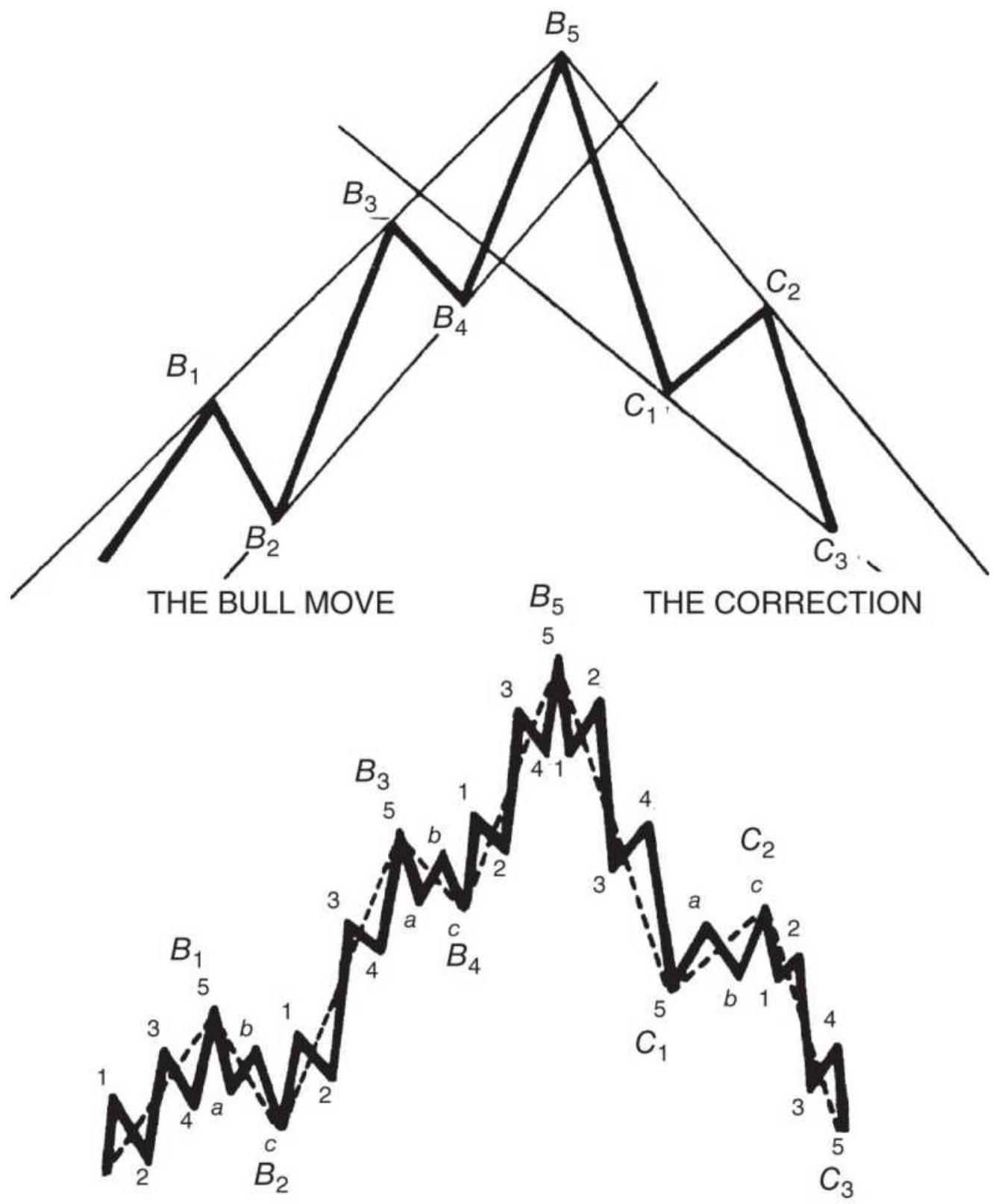
Subwaves show 5 waves in the main move and 3 -wave correction FIGURE 14.18 Basic Elliott wave.
The types of waves could be classified into the broad
categories of triangles and ABCs, representing a main trend and a correction, respectively. The term triangle was taken from the consolidating or broadening shape that the waves form within trendlines, although in later works Elliott eliminated the expanding form of the triangle (see Figure 14.19).
An interesting aspect of the theory is its compoundcomplex nature, by which each sequence of triangles can occur in subwaves within waves (Figure 14.20). More recent work suggests that in futures markets, a 3-wave development is more common than 5 waves. Prechter has shown many examples of major equity index moves that conform to the ratio of 1.618 . The equity index, because of its high volume, is most likely to represent the idealized patterns of human behavior. \({ }^{36}\)
\section*{Elliott's Sideways Markets}
Occasionally, the market pauses during a major move; or, it may move sideways in a volatile pattern after completing the 5 th leg of a wave. This has been described as "stock prices seen to be waiting for economic fundamentals to catch up with the market
expectations." 37 These periods can be represented by a single three, a simple zigzag or flat formation, or by the more extended double or triple three (Figure 14.21).
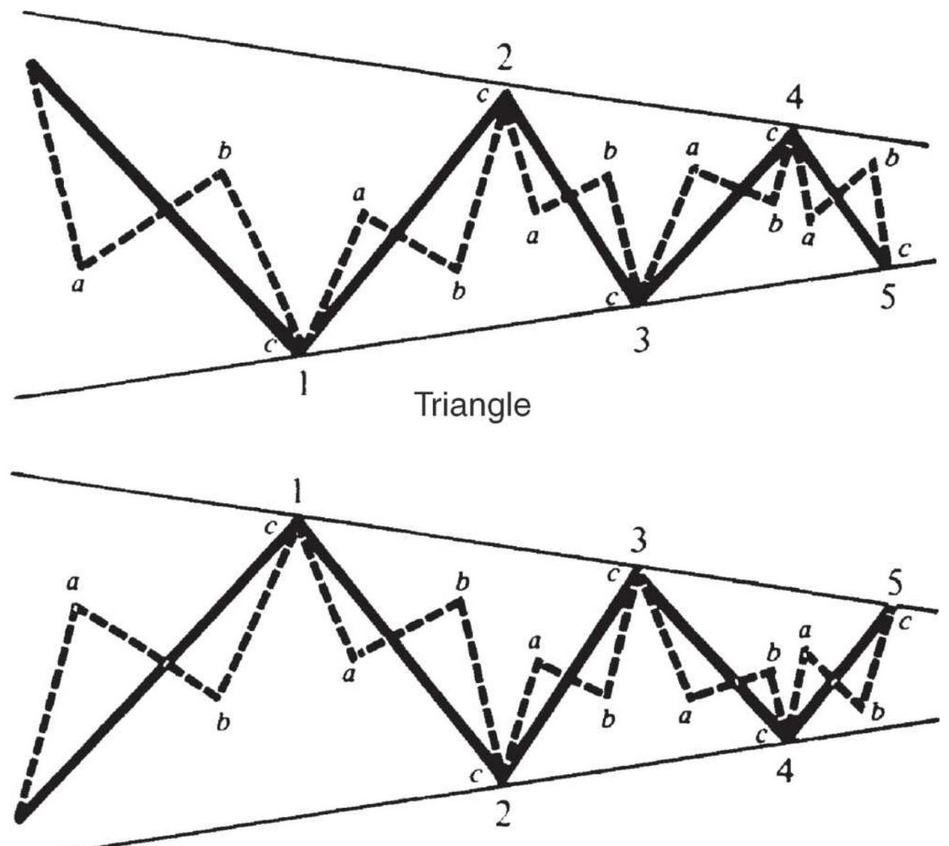
Inverted Triangle
FIGURE 14.19 Triangles and ABCs.
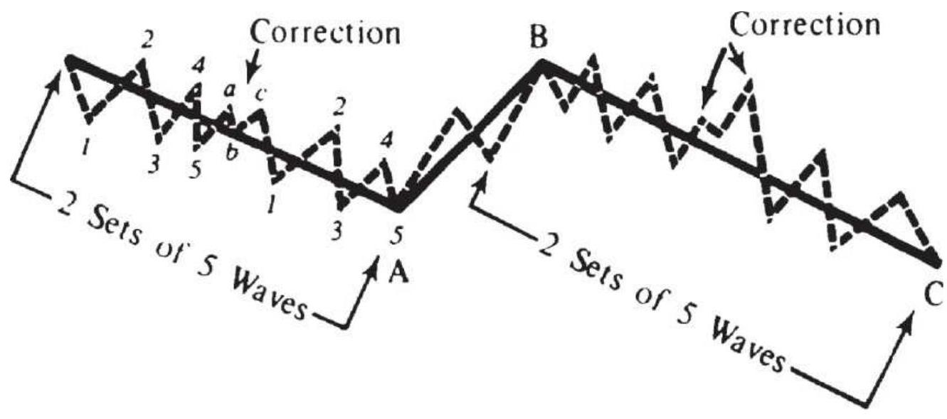
FIGURE 14.20 Compound correction waves.
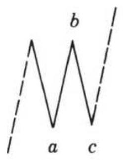
Single
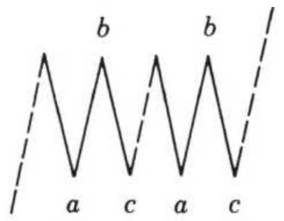
Double
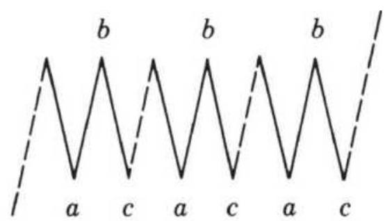
Triple
\section*{FIGURE 14.21 Elliott's threes.}
A small variation of the single three has been noted to occur following the 3rd wave, when the zigzag forms a minor swing reversal with \(B\) lower than its preceding top, and \(C\) lower than \(A\). Elliott also recognized this as a descending zigzag in an upward trend. 38 Chartists may see this as a descending flag.
\section*{Fitting the Market to the Patterns}
One point to remember when applying an intricate set of rules is that an exact fit will not occur often. The best trading opportunities will be when the developing price
patterns fit the theory; each successful step will serve as positive reinforcement for continuing. The critical period in the identification process is the 5 th wave. The failure of the 5 th wave to form indicates that the last correction of three waves will be retraced. In a bull market, an extension of the 5 th wave is often followed by a corrective 3 -wave pattern. In addition, the recognition of a 5 -wave sequence should be followed by further analysis to determine whether that cycle was part of a more complex series. One of the difficulties in this method is the orientation of the current position to the wave formation; the multitude of primary and secondary waves makes some of the situations subjective until further price movement clarifies the pattern. Anyone interested in the further interpretation of wave formation should begin with Bolton's work.
\section*{Elliott's Use of the Fibonacci Series}
The application of the Elliott wave theory was unique in its use of the Fibonacci series. Besides the natural phenomena mentioned earlier, the summation series has these mathematical properties:
- The ratio of any number to its successor \(\left(F_{i} / F_{i+1}\right)\) approaches 0.618
- The ratio of any number to its previous element \(\left(F_{i+1} / F_{i}\right)\) approaches 1.618
- The ratio of \(F_{i+2} / F\), is 2.618 .
- The two ratios
\section*{\(\left(F_{i} / F_{i+1}\right) \times\left(F_{i+1} / F_{i}\right)=.618 \times 1.618=1.0\)}
Elliott was also able to link certain measurements of the Great Pyramid to the Fibonacci series and connect the number of days in the year as well as the geometric figure of a circle to his theory. Both time and the circle will play a role in Elliott's wave analysis.
While Elliott used the lower end of the Fibonacci series to describe the patterns in the stock index, it should be noted that there are increasingly larger gaps between successive entries as the series increases. To be consistent with the original principle, each gap could be subdivided into another Fibonacci series in the same manner that the waves take on a complex formation. Harahus offers an alternate approach to filling these spaces by use of Lucas numbers, formed in the same way as the Fibonacci summation beginning with \((1,3)\) and resulting in the series \((1,3,4,7,11,18,29,47,76,123\), 199,...). The two sets are combined, eliminating common numbers, to form (1, 2, 3, 4, 5, 7, 8, 13, 18, 21, 29, 34, \(47,55,76, \mathbf{8 9}, 123,144,199,233, \ldots)\). The Fibonacci numbers have been set in bold type and will receive the most emphasis while the Lucas numbers will serve as intermediate levels of less significance. The numbers themselves are applied to predict the length in days of a price move. A bull move that lasts for more than 34 days should meet major resistance or reverse on the 55th day or on the 89th day (considering Fibonacci numbers only). It is suggested that a penetration of the 89th day should permit the series to start again with the beginning of the series added to 89 (e.g.,..., 94, 96, 97, 102, 107,
110, 118, 123, 136,...), including the more important Lucas and Fibonacci numbers from the original series. This effect is similar to the complex wave-within-a-wave motion.
The same numbers are used to express key levels in a trend reversal. For example, a bull move that carries prices up for 47 days before a reversal should meet resistance at the price level on the 34th day. If that price does not stop the reversal, either the behavioral implications of the number series do not hold for this situation or prices are in a different part of the cycle.
With the introduction of Lucas numbers \((L)\) there are some additional key ratios. In the combined FibonacciLucas series ( \(F L\) ), denote an element with \(j\) if it is the first element of the other series following entry \(i ; L_{j}\) is the first Lucas number entry following \(F_{i}\) that is a Fibonacci number. This results in the ratios
\(F_{i} / L_{j}=0.72, L_{i} / F_{j}=0.854\), and
\(F_{i} / F_{i+2}=L_{i} / L_{i+2}=0.382\).
The important ratio of a Fibonacci number to its following entry can be represented by the ratio of successive numbers \((1 / 2,2 / 3,3 / 5,5 / 8,8 / 13,13 / 21,21 / 144\), ...). When expressed in decimal, these ratios approach the number 0.618 in a convergent oscillating series (1.000, 0.500, 0.667,0.625, 0.615, o.619,...). These ratios, the key Fibonacci-Lucas ratios and the alternateentry ratios, represent the potential resistance levels, expressed as a percentage, for price adjustments within a
well-defined move. For example, a price advance of 1,000 points in the Dow to 25,000 might correct 100\%, \(50 \%\), or \(62 \%\), to \(24,400,24,500\), or 24,385 , respectively, according to the most important ratios.
Analysts should always remember that adding more key levels, such as Lucas number, increases the likelihood that prices will react at those levels, if only by chance.
\section*{Trading Elliott}
Elliott also knew that there was great variability in the waves and ratios created by price movement. The appearance of the waves is not regular in either length or duration and should not be expected to continually increase as they develop, although the 5 th wave is generally the longest. The waves must be identified by peaks only. Elliott introduced a channel into his theory in order to determine the direction of the wave being analyzed as well as to establish intermediate price objectives. Looking back at the diagram of the basic wave (Figure 14.18), note the channel that is drawn touching the peaks and bottoms of the bull move. For every two peaks, a channel can be drawn that will serve as a trendline for price objectives (see Chapter 3, "Creating a Channel with Trendlines" and "Price Objectives for Bar Charting"). A break of the lower trendline in the bull move will signal when a correction has begun.
The Elliott Wave Theory is very intricate, and a full understanding requires careful study, but the following rules outline the essentials of the method:
1. Identify a main trend and locate the major peaks
and bottoms that will form the 5 key waves.
2. Look for 3-wave corrections and 5-wave subtrends or extensions.
3. Draw trendlines to determine the direction of the trend and reactions.
4. Measure the length of the waves in days to determine if they adhere to the Fibonacci sequence; measure the size of reactions as compared to Fibonacci ratios.
5. Watch for reactions at points predicted by the Fibonacci sequence and corresponding to the patterns described by the 5 -wave main trend and 3 wave correction.
6. Use the ratios, day counts, and trendlines to identify price objectives.
7. Use the trendlines to determine changes of direction.
As complex as Elliott waves are, computer programs have been written that do a remarkably good job identifying them and showing them on a chart. To find these programs, you only need to type "Elliott wave" into an Internet search engine. These software packages have sophisticated graphics and technical analysis tools (see "Automating Elliott's Wave Analysis" that follows).
\section*{The Supercycle}
In all interpretive analysis, the big picture of long-term economic movement forms the foundation, and shorter-
term cycles and patterns are found within that larger structure. Elliott's wave theory is no exception. Shorter time periods include relatively more noise that make frequent, erratic patterns difficult to separate from the significant market movement. In 1996, Prechter used a Supercycle to describe the 5th wave of the prolonged bull move that was still intact at that time (see Figure 14.22). In 2019 that cycle was still intact, as shown in Figure 14.23. \({ }^{39}\) As the market continues higher we see that what we thought was a primary wave turned out to be a subwave.
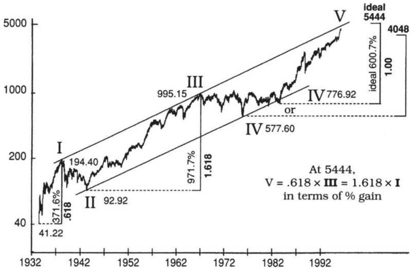
This chart includes the 1982 "orthodox" end-of-pattern low.
FIGURE 14.22 Price relationships in Supercycle (V).
Source: Robert Prechter, Jr., Futures (March 1996).
Copyright Robert Prechter, Jr. Reprinted with permission of Futures.
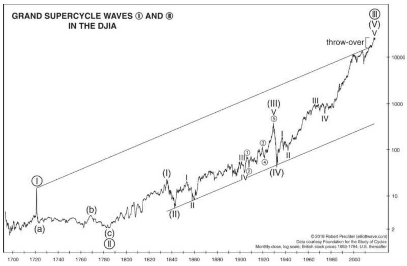
FIGURE 14.23 The Supercycle as of 2019.
Source: Robert Prechter (elliotwave.com).
When using a charting technique, it is best to look for markets that conform to the type of patterns you are seeking. This is also true with Elliott, which requires that prices advance in proportion to the Fibonacci ratios. In the DJIA Supercycle, shown in Figure 14.22,
Wave 1 begins at the 1932 low of 41.22 , peaking in 1937 at the high of 194.40 , a gain of \(371.61 \%\), close to the Fibonacci ratio of \(38.2 \%\).
- A Wave 2 retracement follows, which is equal to \(66 \%\) of Wave 1.
Wave 3 starts in 1942 at the low of 92.29 and ends in 1966 at the high of 995.15 , a gain of \(970.975 \%\). Note that when you divide the first gain by the second
gain, 371.616/970.975, you get the classic Fibonacci ratio 0.3827 . If Wave 1 is taken as equal to 0.618, then Wave 3 is 1.618.
- The Wave 4 retracement is another small move that may be interpreted as ending in 1976 at 577.60 or, preferably in 1883 at 776.92 .
The ideal 5 th Wave should then follow the same pattern, and gain \(600.692 \%\). This target is found by finding the value of Wave 5 such that:
\section*{Wave \(1 /\) Wave \(5=\) Wave \(5 /\) Wave \(3=0\)}
This gain of \(600 \%\) is based on the low of 776.92 , and gives a target price of 5444 . Traders are cautioned that the high volatility and unusual extension of the current move is likely to cause very specific targets, such as this, to be violated by as much as \(10 \%\).
History shows that the wave 5 target was reached, but then exceeded. To explain this, Figure 14.23 takes an even longer view of the Supercycle, beginning in 1720. Without the resources to look back that far, most analysts will need to be satisfied with smaller patterns consistent with Fibonacci ratios.
\section*{Automating Elliott's Wave Analysis}
Besides convenience, software that automatically identifies Elliott waves may show its historic
performance, allowing you to decide which markets work best. Programs such as Advanced GET, MTPredictor, MotiveWave, ELWAVE, and Track 'n Trade have unique
algorithms for identifying and displaying Elliott Waves. An example of MTPredictor is shown in Figure 14.24. MTPredictor uses a unique Isolation Approach to identifying an Elliott wave, a technique they have developed over the past thirty years. This chart shows the wave count and a trailing stop.
There are also simple formations that can be tested automatically with a minimum of programming effort. 40 Murray Ruggiero has defined the four trading opportunities for a basic Elliott wave pattern to be:
1. Enter Wave 3 in the direction of the trend.
2. Stay out of the market during Wave 4 (a retracement).
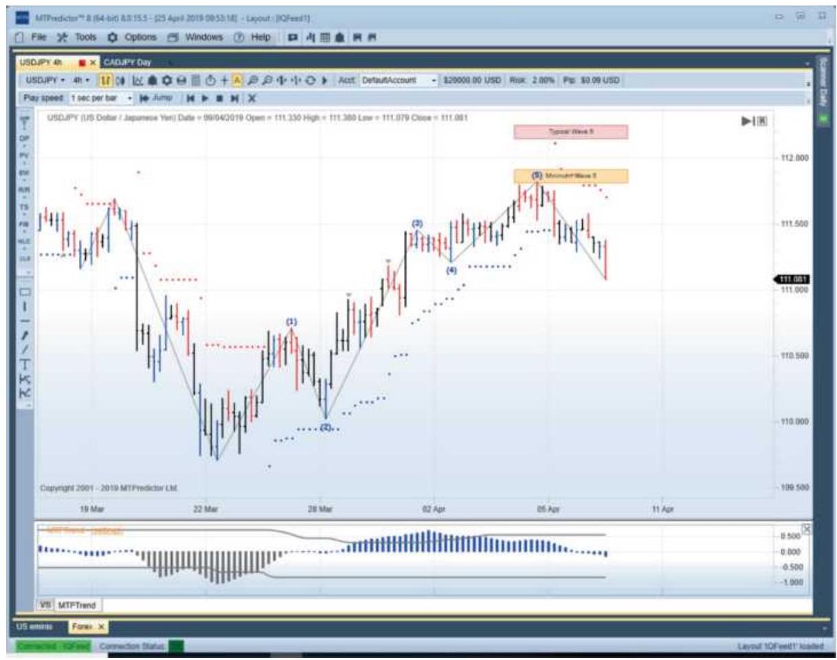
FIGURE 14.24 MTpredictor of Elliott Wave applied to yen futures.
3. Enter Wave 5 in the direction of the trend.
4. Take the countertrend trade at the top of Wave 5.
When a wave appears in two time frames, such as daily and weekly charts, the likelihood of the success of this formation increases.

One way of automating Elliott's technique is to use the Elliott wave oscillator (EWO). A series of extensions and pullbacks can be found using the EWO then combined with a method of counting waves that locates the current price within the standard Elliott wave pattern. The following five steps only apply to the bull move, although the bear market is treated as just the reverse set of rules. The full program, TSM Elliott Wave, can be found on the Companion Website.
1. Calculate the Elliott wave oscillator (EWO) as the difference between a 5 -period and a 35 -period simple moving average, applied to the average of the high and low prices:
\[
\begin{gathered}
\text { mean }=(\text { high }+ \text { low }) / 2 \\
\text { EWO }=\text { average }(\text { mean,5 }- \text { average }(\text { mean, 35 })
\end{gathered}
\]
2. A new upward trend begins when the EWO makes a new high for period \(n\), where \(n\) is determined by the user. This allows, for example, Wave 3 to be identified when it goes above the high of Wave 1.
3. A new upward trend also begins when the current
value of EWO is below zero (the 5-day average is below the 35-day average), and the trend is down (step 2), but the EWO has rallied by a predetermined percentage (called the trigger) of the lowest oscillator value of the past \(n\) periods (lowest. \((\mathrm{EWO}, n)\) ). Then the trend is up if \(\mathrm{EWO}<0\), the previous trend value is down, and:
EWO > trigger*lowest(EWO,n)
This rule allows the next wave to be found based on the retracement that comes between each wave.
4. To relate this to Elliott, we must know where prices are located in the 5 -wave sequence. For an uptrend, this is done in the following order:
a. When the trend turns from down to up we assume it is the beginning of Wave 3 ; we save the current values of EWO and the price.
b. Continue to save the new high EWO value and the new high price for Wave 3.
c. Wave 4 begins when EWO falls to zero.
d. If Wave 4 is currently active and the price is the 5-period high and EWO \(>\) o, then Wave 5 begins. Save the highest EWO value and highest price of Wave 5 whenever they occur.
e. If EWO in Wave 5 becomes higher than the highest EWO value in Wave 3, then we are still in Wave 3 up. Relabel the current Wave 5 values to be Wave 3 and continue as in Wave 3 with step \(4 b\).
f. If the trend turns from up to down in Wave 5 , then this is a Wave 3 down. Reset all values and look for a new Wave \(3 u p\) when step 4 a is satisfied.
5. The trading rules are based on the period \(n\) and the trigger (the percentage retracement).
a. Buy on the open when Wave 3 is first identified, whether a new \(n\)-period high or a retracement of the previous downturn (step 4a).
b. Buy on the open when Wave 5 is first identified (step 4d).
c. Buy on the open when Wave 5 turns into Wave 3 (step 4e).
d. Close out any long position when EWO falls below zero.

Using these rules, a long position is entered during the strongest parts of Wave 3 and Wave 5 . As a guideline for selecting both the period and the trigger values, a test of the EURUSD futures from 2000 through May 2011 showed excellent results using a trend period of 40 days, oscillator periods of 5 and 35 days, and a retracement trigger value of 0.35 . These parameters were found to be the best for the S\&P over that same period. Figure 14.25 shows a trade entering in September 2010, exiting in November, and reentering in January 2011. The programs for the functions, indicators, and strategies (beginning with TSM Elliott Wave) are on the Companion Website. Additional programs for the Elliott
Wave count, including trading rules, can be found in Ruggiero. 41
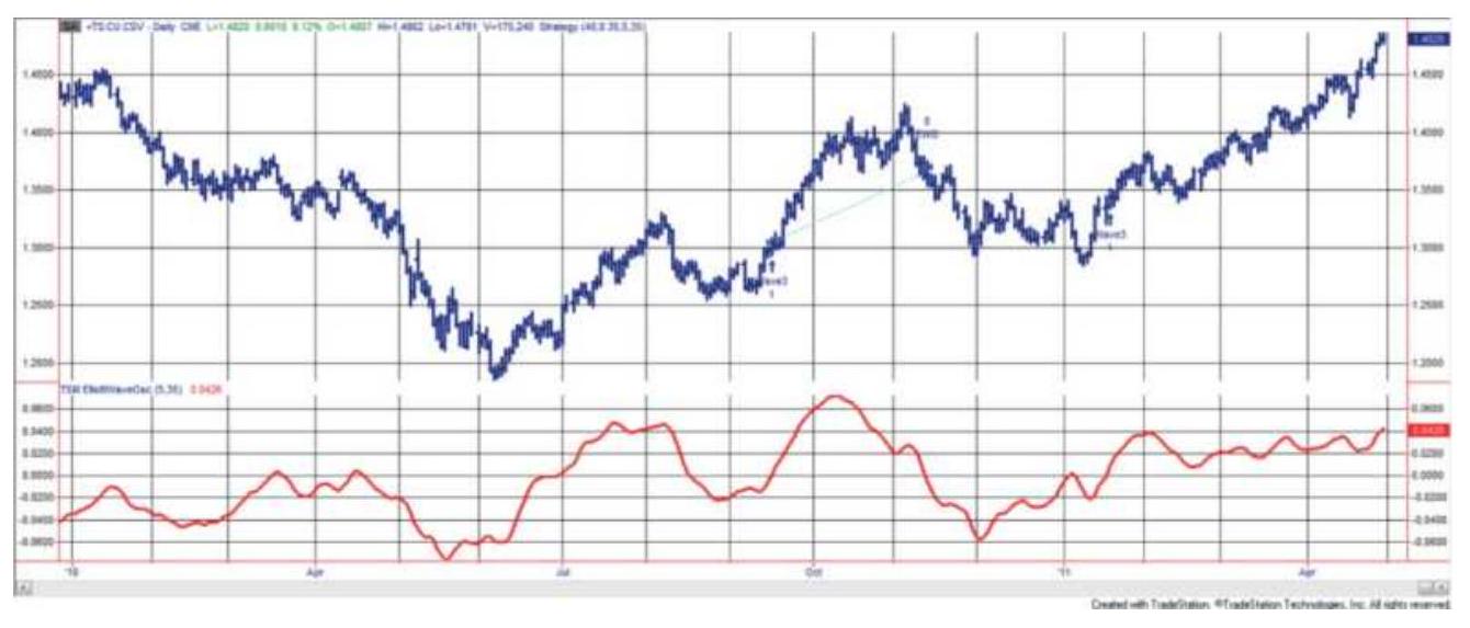
FIGURE 14.25 Trading signals for the Elliott Wave strategy, and the Elliott Wave Oscillator, applied to EURUSD futures.
\section*{A Comment on Elliott Wave Theory}
The Elliott Wave Theory is highly regarded, although it is an intricate combination of mathematics and chart interpretation based on assumptions about human behavior. Because it is primarily based on chart patterns it has been criticized as being too interpretive. The development of the \(5^{\text {th }}\) wave, the grand finale, receives the most attention - sometimes it never develops, and at other times it must be extended into another subset of waves, as we saw in the example of the Superwave. An analysis by Merrill shows that the median stock market bull move has 7 legs and the bear move has 5 legs, which may account for the frequent use of the compound form of the Elliott wave. Those analysts who find this study of interest should also read the works of W. D. Gann and
Edson Gould, both of whom concentrated on mathematical approaches to charting.
\section*{PRICE TARGET CONSTRUCTIONS USING THE FIBONACCI RATIO}
Using Fibonacci ratios, Harahus constructed the golden rectangle, golden triangle, and golden spiral. Although they appear to be significant, their application to markets can be complicated. In using a method as sophisticated as the Elliott Wave Theory, it is necessary to select situations that are most representative of the phenomenon described by the Fibonacci series.
Experience will help you decide which waves and which formations are most important and should be applied to this geometric analysis.

Harahus introduced the regular pentagon, which has sides of equal length, as a tool for measuring corrections to the primary waves. This pentagon has the property that any diagonal is 1.618 times the length of a side, exactly a Fibonacci ratio. By constructing a regular pentagon so that the major price trend falls along one diagonal, or along one side, the other lines connecting the corners of the pentagon will serve as support or resistance for future price moves. In addition, the circumscribed and inscribed circle will also serve as a measurement of support or resistance (Figure 14.26). The use of a circle is similar to Gann's concept of time and space, which will be covered a little later in this section. Detailed instructions for the construction of a
pentagon can be found on the Companion Website.
Harahus extends the charting techniques of the Elliott Wave Theory using circles and arcs, a method that has been applied to measuring retracements. A circle drawn from the top or bottom of a wave, representing the \(38 \%\), \(50 \%\), or \(62 \%\) levels, serves as a convenient measurement of elapsed time combined with a price correction. Prices are expected to meet resistance at any attempt to penetrate the key circles formed using the center points \(A\) or \(B\) in Figure 14.27.
\section*{Alternate Arc Measurement}
In Chapter 4, there were alternate ways of measuring retracement levels. In Tom DeMark's \({ }^{42}\) approach, if the market is currently at a low, rather than projecting the distance of this bottom point from the most recent swing high, he chose to look for the highest point that had occurred since the last time the market traded at this low level. He then applied his choice of ratios to find the key retracement levels. DeMark also uses his measurement from high to low to draw ares identical to those shown in Figure 14.27 but limited to the Fibonacci ratio 0.618 and its complement 0.382 .
\section*{FISCHER'S GOLDEN SECTION COMPASS SYSTEM}
Fischer's Golden Section Compass (GSC) System \({ }^{43}\) is founded on the premise that the human decision-making process unconsciously selects places to act that appear to
be the right time or the right price level but turn out to coincide with the same points determined by Fibonacci ratios. The behavior-based rules are combined with practical entry and stop-loss rules to eliminate those situations that do not properly develop.
(a)
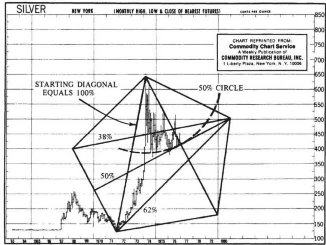
(b)
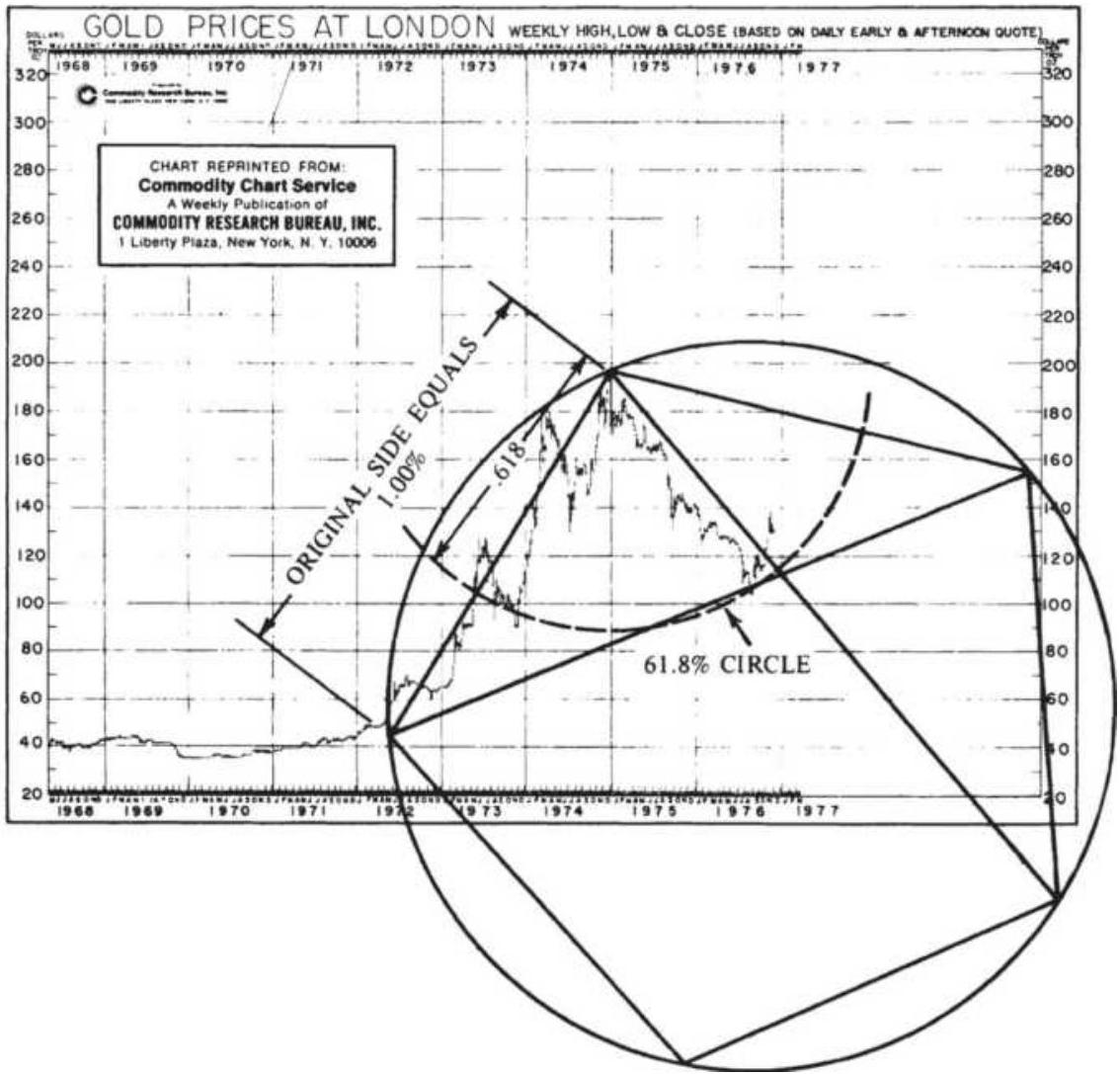
FIGURE 14.26 (a) Pentagon constructed from one diagonal. (b) Pentagon constructed from one side.
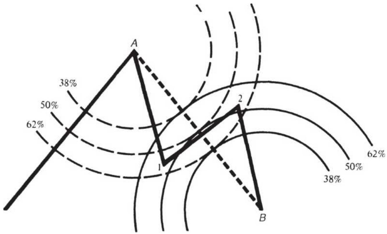
FIGURE 14.27 Using circles to find support and resistance.
Fischer is not alone in his observation of these patterns. Elliott, discussed in the previous sections, defined market cycles in 5 -wave patterns with 3 -wave corrections (Figure 14.28). In Nature's Law, Elliott shows the complete market cycle 44 as:
\begin{tabular}{|l|l|l|l|}
\hline Number of & \begin{tabular}{l}
Bull \\
Market
\end{tabular} & \begin{tabular}{l}
Bear \\
Market
\end{tabular} & \multicolumn{1}{c|}{ Total } \\
\hline Major waves & 5 & 3 & \begin{tabular}{l}
8 complete \\
cycles
\end{tabular} \\
\hline \begin{tabular}{l}
Intermediate \\
waves
\end{tabular} & 21 & 13 & \begin{tabular}{l}
34 complete \\
cycles
\end{tabular} \\
\hline
\end{tabular}
\begin{tabular}{|l|l|l|l}
Minor waves & 89 & 55 & \begin{tabular}{l}
144 complete \\
cycles
\end{tabular} \\
\hline
\end{tabular}
\section*{Time-Goal Days}
The GSC System states that a new price direction will begin on, or shortly after, the day calculated as:
\[
T_{k}=1.618 \times\left(L_{i}-L_{i-1}\right)+L_{i}
\]
or
\[
T_{k+1}=1.618 \times\left(H_{i}-H_{i-1}\right)+H_{i}
\]
where \(L_{i}\) and \(H_{i}\) are the days on which swing lows and highs occurred, and \(L_{i}\) occurs before \(H_{i}\).
For simplicity, an extreme may be used only twice for a calculation - once as the first point and once as the second. Figure 14.29 shows the order in which the calculations occur. Time-goal day \(T_{5}\) was calculated from lows \(L_{3}\) and \(L_{4}\) before time-goal day \(L_{7}\) occurred. When more than one time-goal day occurs at the same point, or when the highs or lows that formed the timegoal days are more significant, the likelihood of a major reversal increases.
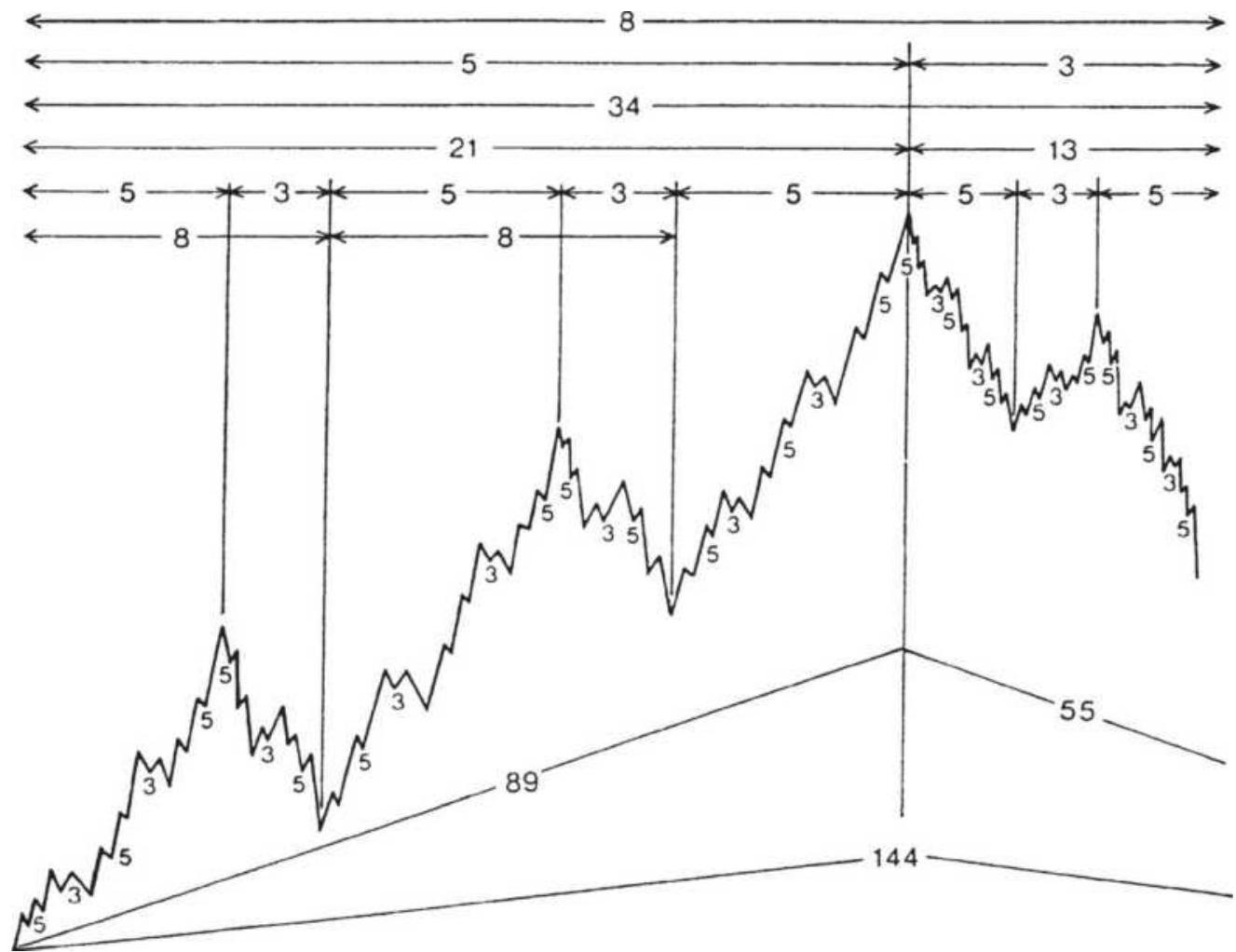
FIGURE 14.28 Elliott's complete wave cycle.
Source: Fischer, Golden Section Compass Seminar (1984), p. 28.
Specific entry signals occur on a 5 -day price reversal. A long signal is given following a time-goal day when the closing price is higher than the high of the past 5 days. This is sufficient to identify a trend change and allows the stop-loss to be the recent low or a fixed amount below the entry price.
\section*{Price Goals}
Price objectives are determined using the same highs and lows that were applied to time goals. Elliott's Wave
Theory is well-defined by Fischer, as shown in Figure 14.30. Once the low has been found, followed by Wave 1 , the price objectives for Waves 3 and 5 can be calculated as a function of Wave 1 :
Wave 3 objective \(=0.618 \times(\) High of Wave \(1-\) Low of Wave 1\()\) + High of Wave 1
Wave 5 objective \(=1.618 \times(\) High of Wave \(1-\) Low of Wave 1\()\) + High of Wave 1
The retracements to points 2 and 4 in Figure 14.30 are not determined in this calculation, and the probability of the 5 -wave target being successful is not confirmed unless the Wave 3 objective is satisfied. Price goals are used for profit-taking rather than new entry points. The GSC System, however, does not require that markets move in 5 -wave patterns. Price objectives can be calculated from long-term lows and the high of the first move up by multiplying that move by the ratio 1.618 . When price and time goals occur at the same point, there is greater confidence in the signal. 45
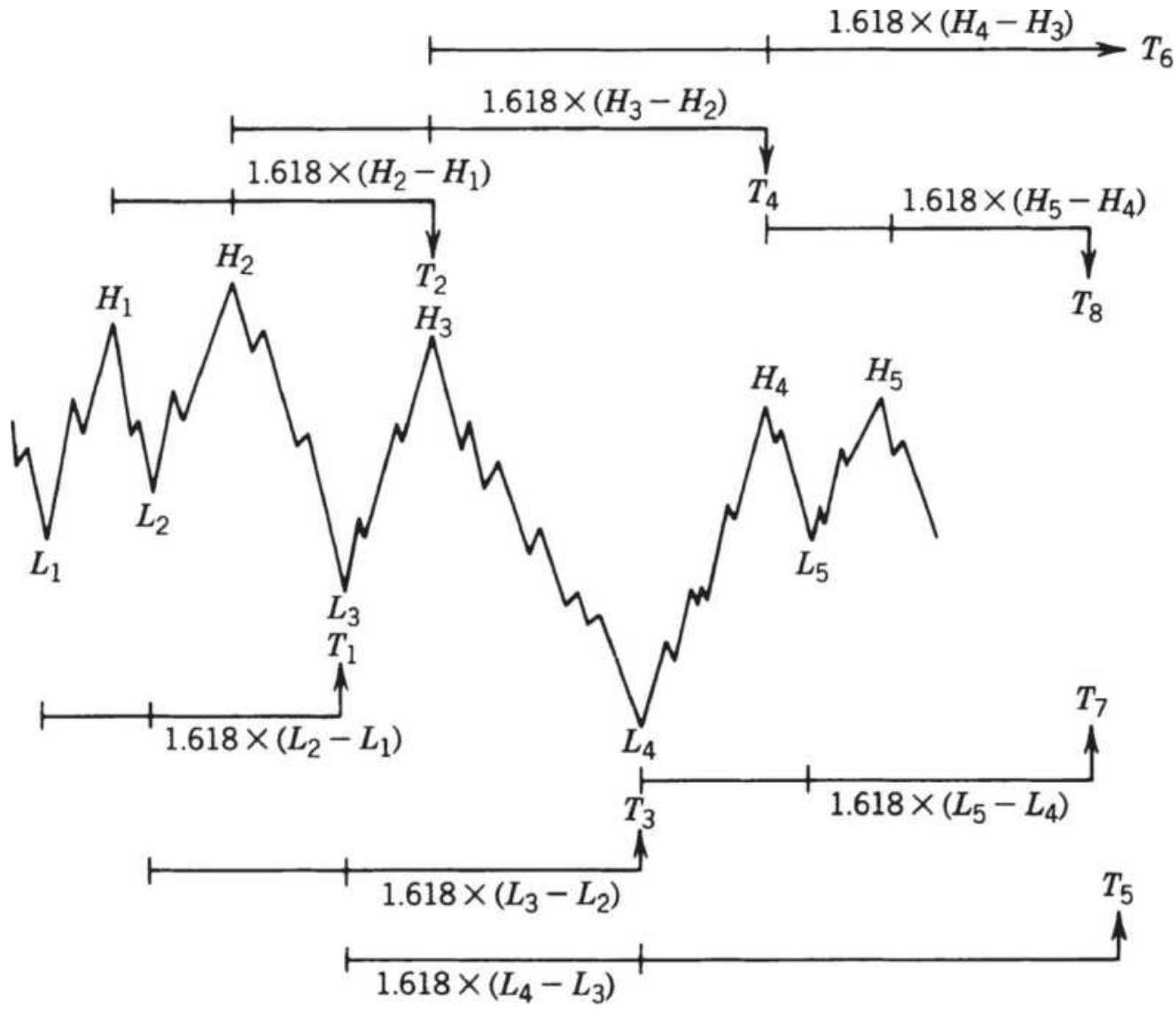
FIGURE 14.29 Calculation of time-goal days.
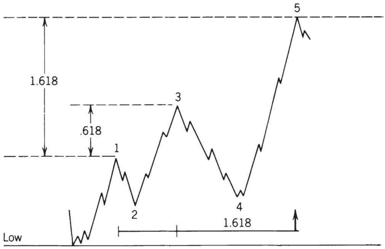
FIGURE 14.30 Price goals for standard 5-wave moves. In general, retracements from sustained moves can be expected to approximate or exceed \(38.2 \%\) of the initial move ( \(1-0.618\), the complement of \(61.8 \%\) ). Once a high-level objective has been reached and a reversal occurs, profits may be taken using this goal. If prices fail to make new highs following the first retracement, objectives for the next lower levels down can be set according to the inverted Elliott wave patterns, or \(1.618 \times\) initial downward move.
\section*{Filtering Highs and Lows}
The GSC System can be made to identify more significant highs and lows by increasing the selection filter. For example, a sensitive system would select highs and lows in gold that are separated by a minimum swing
of \(\$ 10\) or \(\$ 20\) per ounce. More significant points may be identified by swings of \(\$ 50\) per ounce. It can be demonstrated that a small filter will generate highs and lows that are produced by noise rather than significant behavioral actions. The system cannot be forced to produce more signals than the natural patterns allow. Readers will find this the same as the concept of a swing filter.
\section*{W. D. GANN: TIME AND SPACE}
The works of W. D. Gann cannot be explained with any thoroughness in a few words, but some of his main ideas have been selected and presented in this section. \({ }^{46}\) Gann was a pure technician, using charts for all his analyses. His methods varied substantially from conventional charting techniques, but his philosophy was one of a professional trader: Conserve capital and wait for the right time. Gann traded primarily grains for many years, and in his writings he attempted to summarize his most important observations; some of them are reminiscent of other well-known market lore.
Price moves are never exact. Gann was a believer in support and resistance lines, but expected some violation of the objectives because of lost motion, his way of accounting for the momentum that carries prices higher or lower than their fair value. Nearly a cross between Elliott's waves and Angas' cycles, Gann classifies bull and bear moves into four stages, each one compared to a trending move and a subsequent reversal culminating in a major top or bottom. He observed that bull markets
last longer than bear markets. He concluded that reversal patterns must decline in magnitude as the move develops and persists. A similar argument is expressed in the theory of contrary thinking. Much of Gann's work is based on the value of the 1940 dollar and requires an economic inflator to adjust prices to today's levels.
Gann's techniques combine mathematics and geometry with time and space; he finds duration as important as the size of the price change. One of his principles reflects the idea that a longer consolidation period results in a longer price move after a breakout. One popular approach to price objectives in bar charting is the extended rectangular formation, exactly this idea.
\section*{Time and Price}
Gann proposed certain natural divisions for price swings, expressed as percentages. Zero and \(100 \%\) are the most important of these. Using his understanding of human behavior, he considered a likely resistance level to be \(100 \%\) of the original point of the move (twice the entry price), or the highest or lowest price previously recorded for that market (based on cash prices, not futures). In a reversal, \(100 \%\) was a full retracement of the original move back to its starting point. Part of the rationale for this theory is that most traders like whole numbers; for this reason orders in grains are most often placed at 5 and 10-cent levels rather than at odd values. Even now, traders will find more activity as prices attempt to cross whole-number barriers, such as increments of 100 for the S\&P, or each 1,000 for the DOW. Most investors rarely think of entering an order at an odd price.
After the \(100 \%\) level, decreased importance goes to increments of \(50 \%, 25 \%, 12^{1 / 2} \%\), and so on. For the grain markets, which were the most active at the time of Gann's trading, this would mean that major resistance or support could be expected at the even dollar levels with the next level at \(50 \$\) intervals, then every 25\&, and so on, either higher or lower. The use of successive halving of intervals was also extended to time. Considering a year to be a full cycle of \(360^{\circ}\), a half year is equal to 26 weeks, a quarter year 13 weeks, an eighth year 45 days, and a sixteenth year \(22^{1 / 2}\) days. In cases of conflict, time always took precedence over price. For grains, a 1-year cycle was significant because seasonality is implicit in their supply, demand, and price. The combination of a key price level, expressed as a percentage move, occurring at a periodic time interval is the basis for much of Gann's work.
\section*{Geometric Angles}
The most popular of Gann's methods is his use of geometric angles for relating price and time. By using square graph paper, it was not necessary to know the exact angle because the construction was based on the number of boxes up versus the number of boxes to the right. A \(1 \times 1\) angle ( \(45^{\circ}\) ) was drawn diagonally from the bottom of the lowest point of a price move through the intersection 1 box up and 1 box to the right. This is the primary bullish support line. The primary bearish resistance line is drawn down from left to right from the highest price using the same \(1 \times 1\) angle. The next most important angles in order of significance are
\(2 \times 1,4 \times 1\), and \(8 \times 1\), equivalent to about \(63^{\circ}\), \(76^{\circ}\), and \(83^{\circ}\); for lower support areas there is also \(1 \times 2\) , \(1 \times 4\), and \(1 \times 8\), or \(26^{\circ}, 14^{\circ}\), and \(7^{\circ}\). Places where the support and resistance lines cross are of special significance, indicating a major congestion area.
Figure 14.31 is taken from Gann's private papers and shows the use of geometric angles in an actual trading situation. Lines were first drawn where Gann expected a bottom, then redrawn as prices developed. The initial upward move followed the primary \(45^{\circ}\) line; the second important support line, \(1 \times 2\), met the primary downward line at the point of wide congestion at the center of the chart. The highest point in this congestion phase became the pivot point for the next \(45^{\circ}\) downward angle defining the next breakout. Traders have found the primary \(1 \times 1\), or \(45^{\circ}\) line, is an important tool for staying with the major trend. It is used to filter out small reversals in both standard charting techniques and the point-and-figure method.
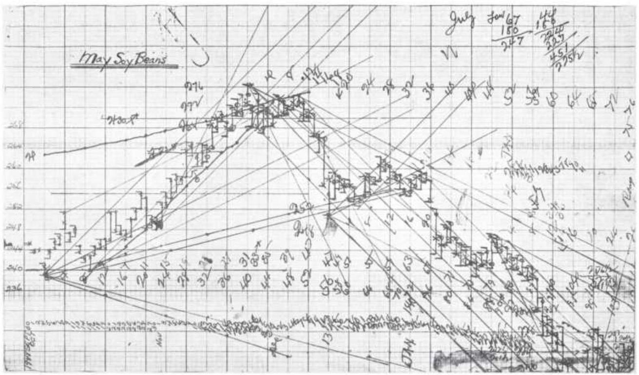
FIGURE 14.31 Gann's soybean worksheet.
\section*{Squaring Price and Time}
Gann combined this approach with the squaring of price and time shown in Figure 14.32. The center box is the lowest. recorded cash price of soybeans, \(44 \$\) per bushel. The prices then move one square to the right, circling counterclockwise and moving outward after each cycle. The basic geometric lines (horizontal, vertical, and diagonal) indicate the major support and resistance price levels, the most important one being 44 at the center, the junction of all lines.
Relating the square to Figure 14.31, the price chart showing geometric lines, the first support level is seen to be at exactly 240, upper left diagonal of the square and the starting point on the bar chart. The major resistance at 276 is the right horizontal of the square and the top of
the rally on the bar chart. The other key levels are the minor support at 268 (lower right diagonal), the congestion area support at 254 and 262 ( 1 box off), and back down to support at 240 . Notice that the distance between the lines on the square becomes wider as prices increase, conforming to the notion of greater volatility at higher prices. It is also expected that soybeans at \(\$ 10\) will have some lost motion near these key support and resistance levels. Figure 14.33 is an example of Gann angles from ganntrader.com.
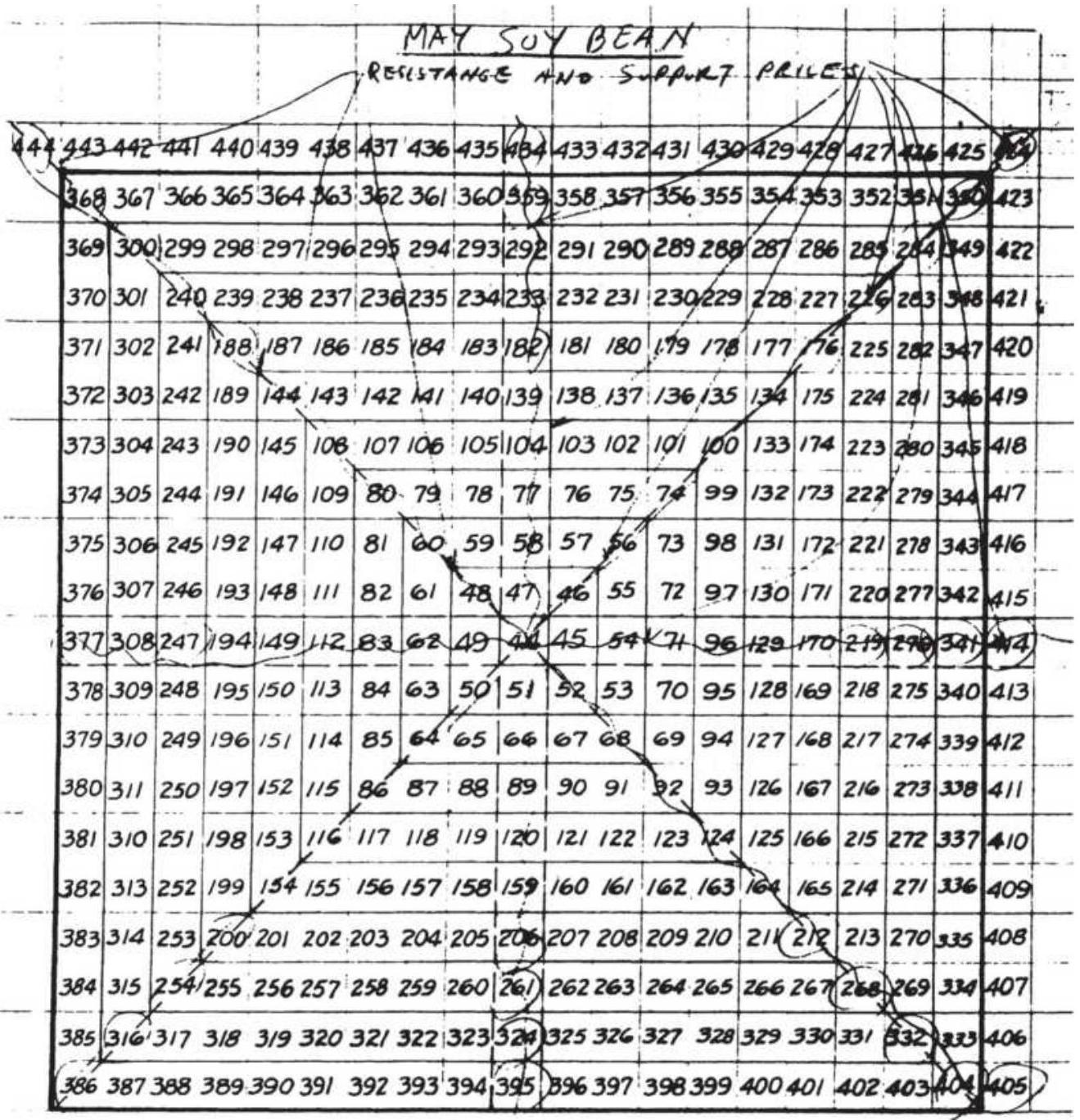
FIGURE 14.32 May soybean square.
\section*{The Hexagon Chart}
Gann extended his squaring method to include both geometric angles and the main cyclic divisions of \(360^{\circ}\). By combining these different behavioral concepts, the strongest levels of support and resistance are found where all three coincide. The generalized construction
for this purpose is the Master Calculator, based on aligning the chart at a point representing a multiple of the lowest historic price for that market; crisscrossing angles will then designate support and resistance for the specific market. Other time charts of importance are the Square of Twelve (one corner of the Master Calculator), the Hexagon Chart, and the Master Chart of \(360^{\circ}\). The Hexagon Chart can be used as an example of the combined effect.
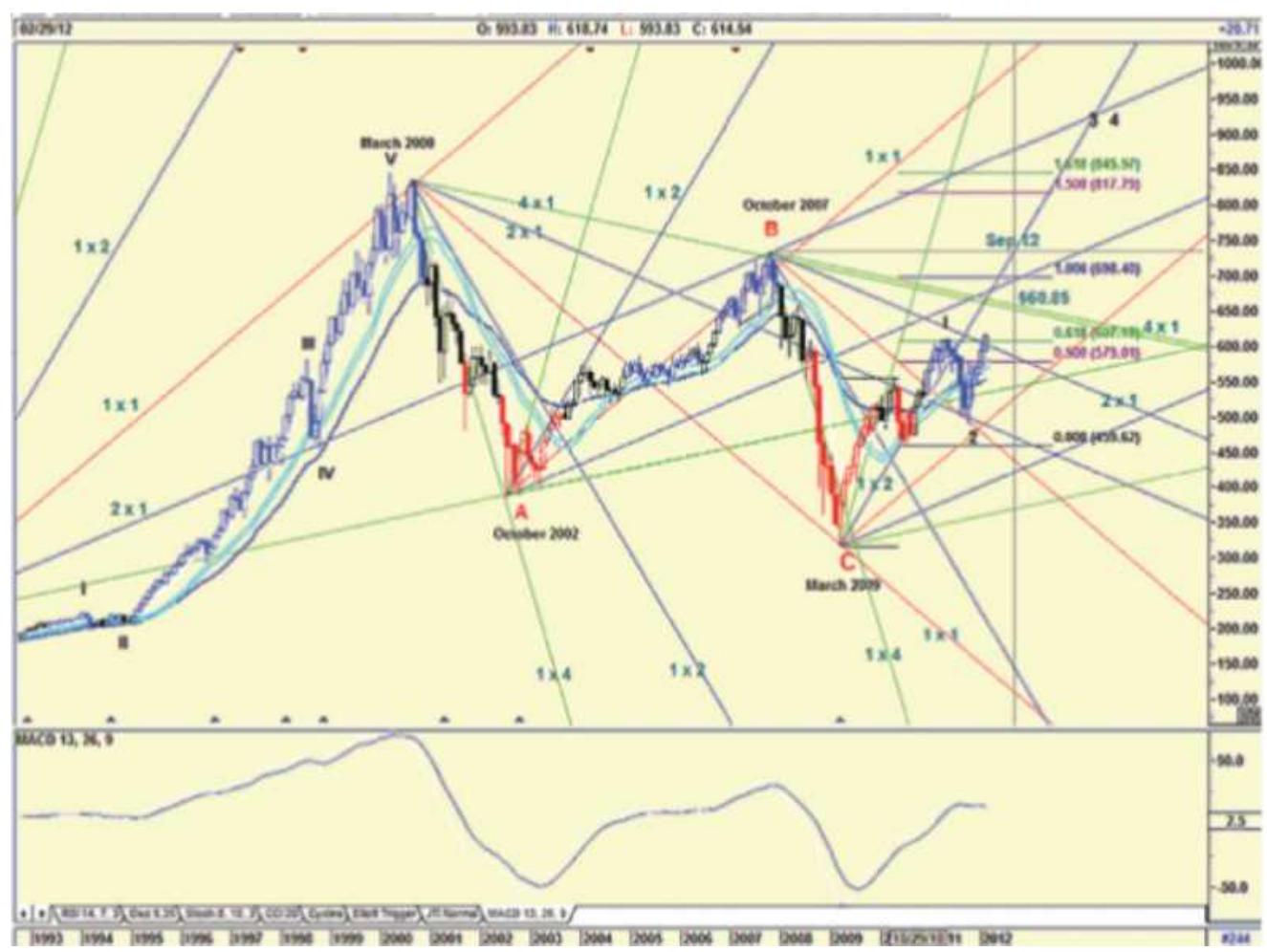
FIGURE 14.33 An example of Gann angles from ganntrader.com.
As shown in Figure 14.34, the inner ring begins with six divisions, giving Gann the basis for the chart name. Each "circle" becomes larger as it proceeds outward. In using
the hexagon, the degrees represent time and the numbers in the circle are price; a major support or resistance point exists when both time and price occur simultaneously.
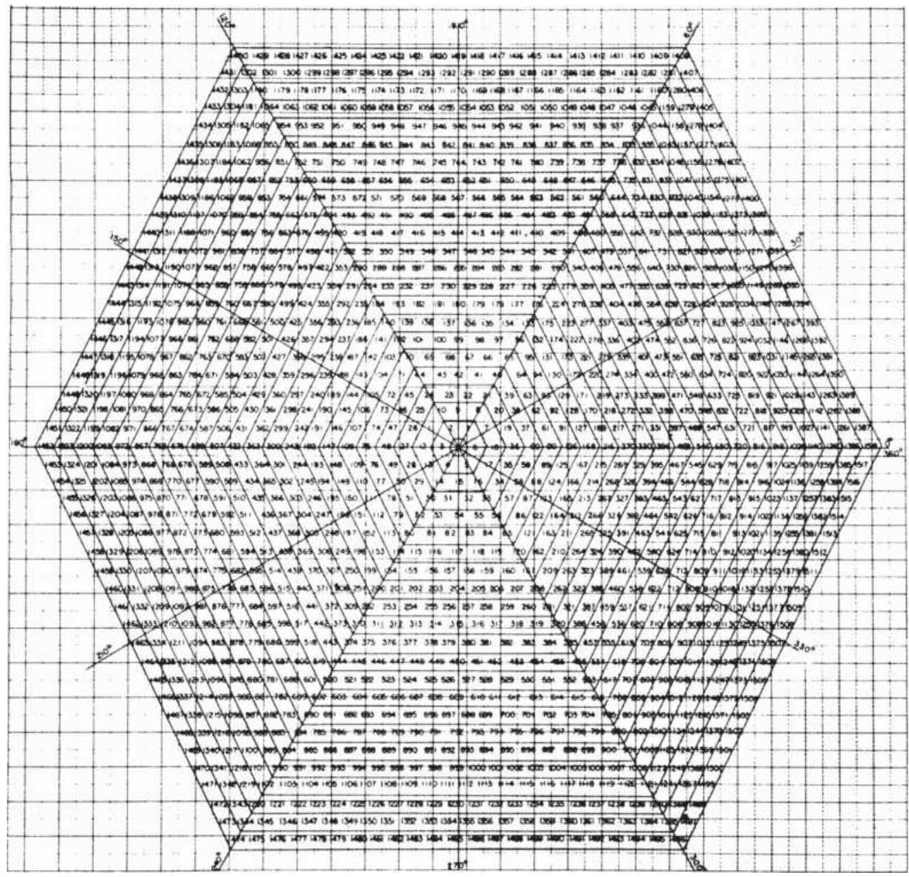
\section*{FIGURE 14.34 The Hexagon Chart.}
For example, consider the \(360^{\circ}\) of the hexagon relating to the calendar year, or perhaps the crop year for grains. In his own work on grains, Gann equated \(0^{\circ}\) to March 20, near to the first day of spring, the summer solstice,
when the sun crosses the equator going north. Then, the \(45^{\circ}\) line is on May \(6,90^{\circ}\) on June 21 (the first day of summer), \(180^{\circ}\) on September 23 (the winter solstice), and \(270^{\circ}\) on December 21 (the first day of winter). These primary divisions also represent the most significant places for price support and resistance. The other lines represent secondary levels.
When looking at price and time together on the Hexagon Chart, the distance between the major degree lines becomes greater as prices increase, again showing the importance of volatility. Using the price of November 77 soybeans, the chart shows that between \(90^{\circ}\) and \(180^{\circ}\), or June 21 to September 23, 1977, the price of soybeans should have support at 567 . Then it should move its major support level to 507 and its major resistance to 588 , with the next higher and lower support and resistance at 432 and 675 , respectively. As it turned out, this was a very accurate prediction.
Mathematically, when you divide the value in an outer ring with the value in the next ring toward the center of either the square or hexagon chart, we get a similar percentage move. If we take the top values of the square in the center, declining toward the middle of the chart, we get \(434,359,292\), and 233 . The percentage changes are 20.9, 22.9, and 25.3 - not the same, but close. We know that the percentage volatility increases as prices reach low levels, so Gann's values are consistent with that relationship.
On many of Gann's charts there is notation showing planetary movement, not related to the cycles of
seasonality, but what is believed to be the Jupiter-Saturn cycle, discussed in the next section. These techniques make Gann's work more difficult to reproduce than most methods; his tools are less conventional than others. If Gann were asked for a word of advice, there is no doubt that he would caution to patience, stating: When price meets time, a change is imminent. 47
\section*{Gann Software}
As with Elliott Wave, sophisticated software is available to chart Gann patterns. Some of the software includes both Elliott and Gann, in addition to elements of financial astrology discussed in the next section. Current software includes GannTrader, Market Analyst, Gannalyst, WaveTrader, Wave59 Market Astrophysics, Zenith Analytic, and Invest2success; however, scanning the Internet for "Gann trading software" will give you an up-to-date list.
\section*{FINANCIAL ASTROLOGY}
Astrology seeks a common bond in human behavior, similar to the work in biological rhythms and cycles. The impact of astrology on civilization has been great; observations of the periodicity of the moon are traced back 32,000 years. Star charts were known to have been in Egypt about 4200 BCE, and the earliest written ephemerides were in the seventh century BCE. 48 The pyramids at Giza are said to have sloping corridors leading from the faces to the interior that were used as sighting tubes for Egyptian astrologers for making
accurate forecasts. The acceptance of astrology
throughout history is widespread, including virtually all civilizations.
Even sophisticated analysts have been found to confuse astrology with the daily horoscope found in a local newspaper. Astrology, the interpretation of the effects of planets and stars on human affairs, is an art followed by a large portion of the world population and should not simply be discarded as mystical or occult. Interpretation of these effects can be complex and involves special skills. Most forecasts begin with a birth chart, which describes the position of the stars at the time of the inception of an event (as an IPO, not just a person's birth), then look at the current positions to identify the transitions. Over time, planets have taken on an association with specific commodities, and constellations are associated with certain types of business; these relationships can now be verified using computer programs which check the intricate position of the planets with the financial statistics of companies to find correlations. However, that task will be left for the more ambitious.
We will operate on the premise that the positions of the planets and sun - those bodies with the largest
gravitational pull on the Earth and one another - have clear physical effects that we can see around us. In the study of physics, this relationship is given as:
\section*{Gravitational constant \(\times\) Mass}
\section*{Force of attraction \(=\)}
where the gravitational constant is \(6.67 \times 10^{-8}\); the mass and the distance between the centers are found in Table 14.3 .
Of the most obvious physical effects, the seasons and the tides are undeniable; and there are many more subtle phenomena when you study astronomy, the science of the motion of the stars and planets, and their composition. In this section we will concentrate our attention on the physical phenomenon of planetary motion that can be identified and tested with the same confidence. We can go further and devise trading systems. Among these phenomena, eclipses and the lunar cycles are the most dominant, but there is one other combination that is important, the Jupiter-Saturn cycle.
\section*{TABLE 14.3 Size and position of the planets and Earth's moon.}
\begin{tabular}{|l|r|r|r|c|}
\hline & \begin{tabular}{c}
Equatorial \\
Diameter \\
(km)
\end{tabular} & \begin{tabular}{c}
Mass: \\
(kg)
\end{tabular} & \begin{tabular}{c}
Distance \\
from Sun \\
(mil km)
\end{tabular} & \begin{tabular}{c}
Duration \\
of Orbit \\
(Earth \\
years)
\end{tabular} \\
\hline Sun & \(1,392,000\) & \(1.99 \times 10^{30}\) & 0 & 0 \\
\hline Mercury & 4,880 & \(3.34 \times 10^{33}\) & 57.9 & .0 .24 \\
\hline Venus & 12,102 & \(4.87 \times 10^{24}\) & 108.0 & .0 .62 \\
\hline Earth & 12,756 & \(5.98 \times 10^{24}\) & 149.6 & .1 .00 \\
\hline Mars & 6,794 & \(7.35 \times 10^{22}\) & 227.9 & .1 .86 \\
\hline & & & & \\
\hline
\end{tabular}
\begin{tabular}{|l|r|l|c|c|}
\hline Jupiter & 142,800 & \(8.39 \times 10^{27}\) & 778.3 & 11.86 \\
\hline Saturn & 120,000 & \(5.00 \times 10^{27}\) & 1,427 & .29 .5 \\
\hline Uranus & 52,000 & \(3.77 \times 10^{26}\) & 2,870 & .84 \\
\hline Neptune & 47,500 & \(3.29 \times 10^{26}\) & 4,497 & .165 \\
\hline Pluto & 2,500 & \(5.98 \times 10^{22}\) & 5,893 & .248 \\
\hline \begin{tabular}{l}
Earth's \\
moon
\end{tabular} & 3,476 & \(7.34 \times 10^{22}\) & \begin{tabular}{c}
384,400 \\
km
\end{tabular} & .0 .075 \\
\hline
\end{tabular}
\({ }_{-}^{*}\) Note that mass \(=\) volume \(\times\) density and, except for the Earth and the Earth's moon, the density of the planets can only be estimated.
\section*{The Jupiter-Saturn Cycle}
Jupiter and Saturn combine to represent the overwhelmingly largest mass in our solar system other than the Sun (see Table 14.3). The two planets amount to about \(95 \%\) of the total mass of all the planets, and are about \(0.7 \%\) of the mass of the Sun. Because they are in adjacent orbits, they have a very large gravitational pull on other planets when they are near one another and a very different effect when they move apart. They are so large that they cause the Sun to shift periodically based on their positions around the true center of mass of the solar system, called the barycenter. When Jupiter and Saturn are on opposite sides of the Sun, the center of mass is near the center of the Sun, but when the two large planets are together, the Sun is pulled away from this center. This positioning also has significant effects on the Earth's climate, which in turn affects agricultural
production, supply and demand, and ultimately the economy. 49 The Greeks called the Jupiter-Saturn cycle The Great Maker of Time, and it is said that every significant cycle in stocks, commodities, and interest rates is either a multiple or a harmonic of the JupiterSaturn cycle. The most well-known, the 59-year Kondratieff cycle, is 3 times the Jupiter-Saturn cycle \((3 \times 19.859=59.577)\). Gann, who used a combination of time and price, based time expectations on seasonality and cycles. His work referred to a Master Time Factor that was never defined, but experts believe that the Jupiter-Saturn cycle fits his technique.
\section*{Charting the Saturn Line}
Having decided that the movement of the largest planets affects the way markets move, you can create a planetary envelope based on Saturn's path with respect to the Dow Jones Industrial Average. This requires converting the position of the planets into price. \({ }^{50}\) When completed, this envelope is treated as support and resistance lines in a manner similar to the standard charting interpretation, where penetration of a resistance line will become support; however, in appearance the Saturn lines are curved to represent its cycle (see Figure 14.35).
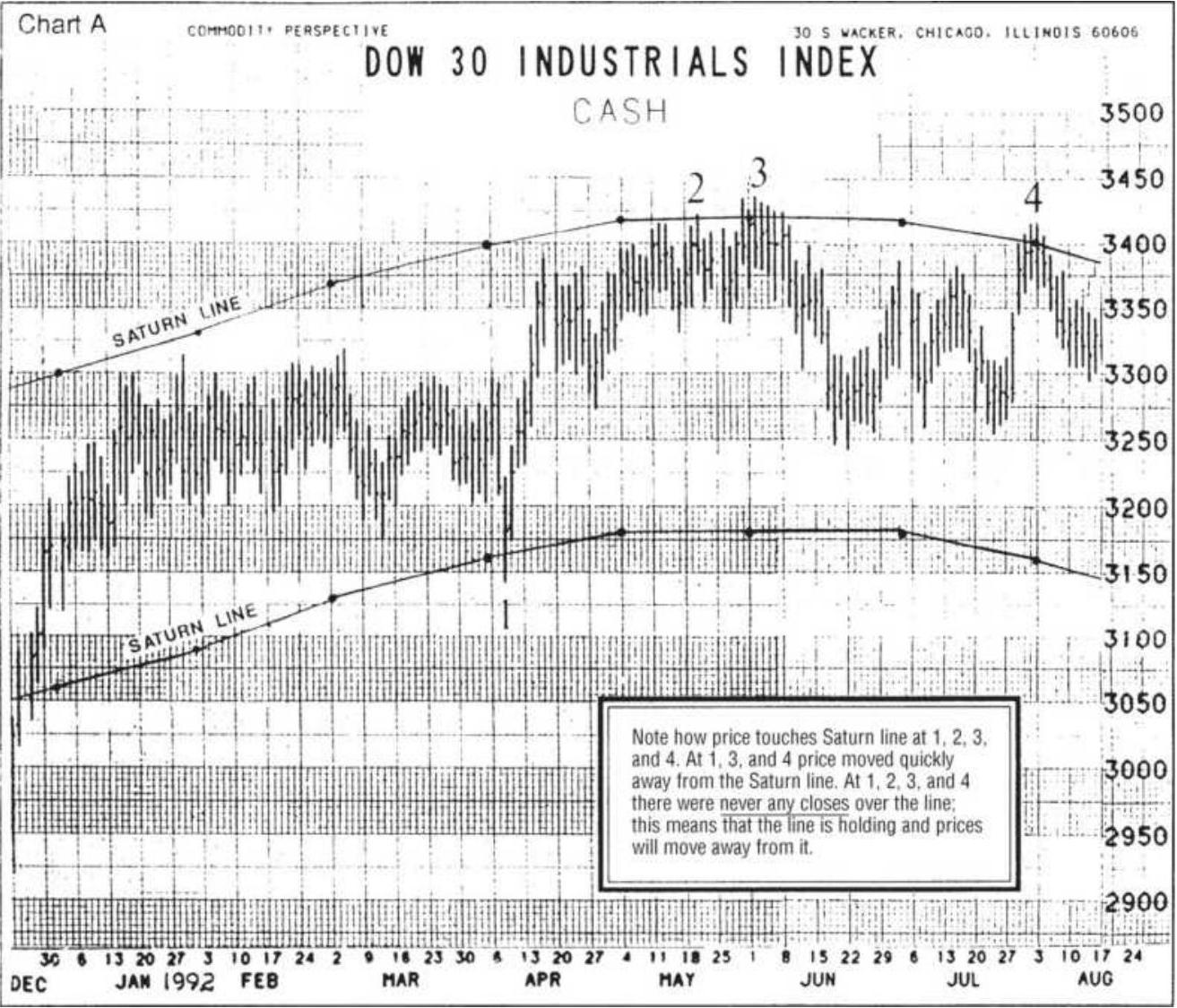
\section*{FIGURE \(\mathbf{1 4 . 3 5}\) Saturn lines drawn on the Dow Industrial Average.}
Source: Jeanne Long, A Traders Astrological Almanac (1994). Reprinted with permission from PAS, Inc., e-mail: pas24@aug.com, website: www.galacticinvestor.com.
\section*{Converting Planetary Position to Price}
Long transforms planetary position to price using two separate wheels, combined to form a Universal Clock, in a manner similar to W. D. Gann. Each wheel is unique to a specific market. To create the Universal Clock for the DJIA, you begin above the right horizontal (at 3 o'clock)
with the number 1 and move counterclockwise, placing 6 numbers per quarter, 24 for an entire cycle. You then move to the next outer circle and continue with the number 25 just outside the original number 1 ; therefore, each concentric circle contains the next 24 values, ending at \(360^{\circ}\) (a full cycle). The DJIA Clock is shown in Figure 14.36.
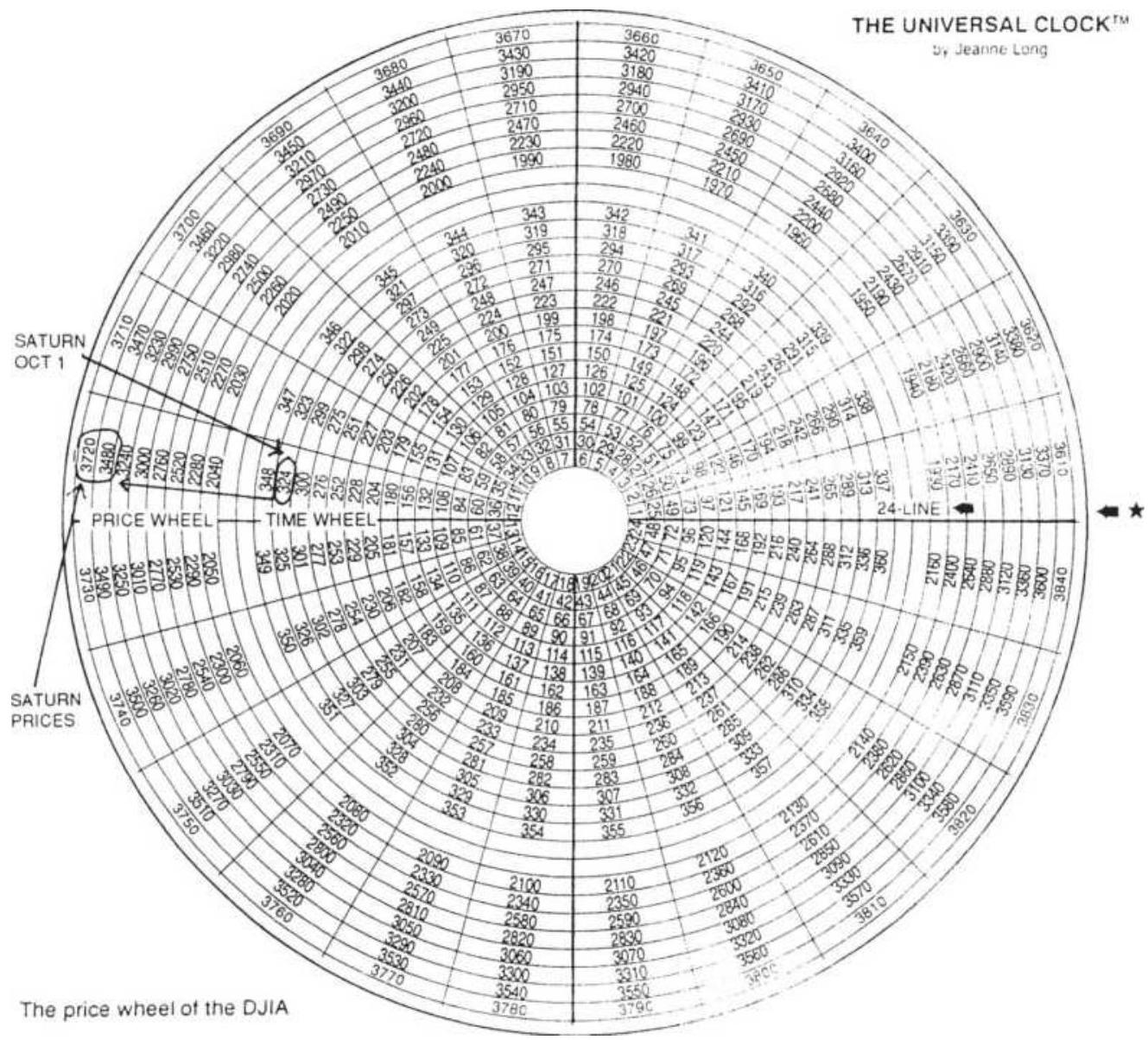
\section*{FIGURE 14.36 The DJIA Clock.}
Source: Jeanne Long, A Traders Astrological Almanac (1994). Reprinted with permission from PAS, Inc., e-mail: pas24@aug.com, website: www.galacticinvestor.com.
In the outer wheel of the clock, the DJIA is shown in increments of 10 points beginning in 1930 and continuing in circles of 24 values. Long does not explain the choice of the beginning price, but Gann uses a significant low and astrologers tend to use the price at a key starting time, such as the beginning of a new Dow calculation, birth of an exchange, or a transforming event, such as the 1929 crash.
To locate the planet on the time wheel, begin with the planet's position on a specific date. For example, on October 1, 1993, Saturn was at \(24^{\circ} 14^{\prime}\) (with respect to Aquarius). Aquarius falls between \(300^{\circ}\) and \(330^{\circ}\); therefore, the position of Saturn is \(300^{\circ}+24^{\circ}+14^{\prime}\) , or approximately \(324^{\circ}\). By locating 324 on the inner part of the wheel, you can refer to the prices on the outer part of the wheel and find the two prices (each in adjacent circles) that span the current DJIA price. These values are the current support and resistance lines. New values are found monthly.
\section*{Major Physical Events}
Of the major physical phenomena used in financial astrology, the most important are:
Solar eclipse, when the moon passes between the Earth and the Sun
Lunar eclipse, when the Earth passes between the moon and the Sun
- Conjunction, when any two planets are on the same side of the Sun and form a straight line with the Sun
- Opposition, when two planets are on opposite sides of the Sun and form a straight line with the Sun
A record of solar and lunar eclipses is given in Tables 14.4 and 14.5 .
\section*{TABLE 14.4 Solar eclipses, 2010-2020.}
Source: Wikipedia.
\begin{tabular}{|c|c|c|c|}
\hline \multicolumn{4}{|c|}{ Solar Eclipses } \\
\hline Date & Greatest Visibility & Date & \begin{tabular}{|l}
Greatest \\
Visibility
\end{tabular} \\
\hline \begin{tabular}{l}
\(11-\) \\
Jul- \\
10
\end{tabular} & \begin{tabular}{l}
Total: Southern Chile \\
and Argentina,
\end{tabular} & \begin{tabular}{|l|}
\(13^{-}\) \\
Sep- \\
15
\end{tabular} & \begin{tabular}{l}
Partial: Southern \\
Africa
\end{tabular} \\
\hline \begin{tabular}{l}
\(4-\) \\
Jan- \\
11
\end{tabular} & \begin{tabular}{l}
Partial: Europe, \\
Northern Africa
\end{tabular} & \begin{tabular}{l}
\(9-\) \\
Mar- \\
16
\end{tabular} & Total: Indonesia \\
\hline \begin{tabular}{l}
\(1-\) \\
Jun- \\
11
\end{tabular} & \begin{tabular}{l}
Partial: Iceland, \\
northern Canada
\end{tabular} & \begin{tabular}{l}
\(26-\) \\
Feb- \\
17
\end{tabular} & \begin{tabular}{l}
Total: Oregon, \\
Idaho
\end{tabular} \\
\hline \begin{tabular}{l}
1- \\
Jul- \\
11
\end{tabular} & \begin{tabular}{l}
Partial: Southern \\
Indian Ocean near \\
Antarctica
\end{tabular} & \begin{tabular}{|l|}
21- \\
Aug- \\
17
\end{tabular} & \begin{tabular}{l}
Partial: North \\
America
\end{tabular} \\
\hline \begin{tabular}{l}
\(25-\) \\
Nov- \\
11
\end{tabular} & \begin{tabular}{l}
Partial: Southwestern \\
South Africa
\end{tabular} & \begin{tabular}{l}
\(15-\) \\
Feb- \\
18
\end{tabular} & \begin{tabular}{l}
Partial: \\
Antarctica
\end{tabular} \\
\hline \begin{tabular}{l}
\(20-\) \\
May- \\
12
\end{tabular} & \begin{tabular}{l}
Partial: Pacific, \\
eastern Asia
\end{tabular} & \begin{tabular}{l}
\(13-\) \\
Jul- \\
18
\end{tabular} & \begin{tabular}{l}
Partial: South \\
Australia
\end{tabular} \\
\hline
\end{tabular}
\begin{tabular}{|c|c|c|c|}
\hline \begin{tabular}{|l|}
\(13-\) \\
Nov- \\
12
\end{tabular} & \begin{tabular}{l}
Total: Arnhem \\
Landand central Cape
\end{tabular} & \begin{tabular}{|l|}
\(11-\) \\
Aug- \\
18
\end{tabular} & \begin{tabular}{l}
Partial: \\
Northeastern \\
Canada
\end{tabular} \\
\hline \begin{tabular}{l}
\(29-\) \\
Apr- \\
14
\end{tabular} & \begin{tabular}{l}
Partial: South Indian \\
Ocean
\end{tabular} & \begin{tabular}{|l|}
6- \\
Jan- \\
19
\end{tabular} & \begin{tabular}{l}
Partial: \\
Northeastern Asia
\end{tabular} \\
\hline \begin{tabular}{|l|}
\(23-\) \\
Oct- \\
14 \\
\hline
\end{tabular} & \begin{tabular}{l}
Partial: Northern \\
Pacific, North America
\end{tabular} & \begin{tabular}{|l|}
\(2-\) \\
Jul- \\
19 \\
\hline
\end{tabular} & \begin{tabular}{l}
Total: Pitcairn \\
Islands, central \\
Argentina
\end{tabular} \\
\hline \multirow[t]{2}{*}{\begin{tabular}{|l|}
\(20-\) \\
Mar- \\
15 \\
\hline
\end{tabular}} & \begin{tabular}{l}
Total: Faroe Islands, \\
North Atlantic
\end{tabular} & \begin{tabular}{|l}
\(21-\) \\
Jun- \\
20
\end{tabular} & \begin{tabular}{l}
Partial: Asia, \\
Southeastern \\
Europe
\end{tabular} \\
\hline & & \begin{tabular}{l}
\(14-\) \\
Dec- \\
20
\end{tabular} & \begin{tabular}{l}
Total: Southern \\
Chile and \\
Argentina
\end{tabular} \\
\hline
\end{tabular}
\section*{TABLE 14.5 Lunar eclipses, 2011-2020.}
Source: Wikipedia.
\begin{tabular}{|l|l|l|l|}
\hline \multicolumn{4}{|c|}{ Lunar Eclipses } \\
\hline Date & \begin{tabular}{l}
Greatest \\
Visibility
\end{tabular} & Date & \begin{tabular}{l}
Greatest \\
Visibility
\end{tabular} \\
\hline \begin{tabular}{l}
2011 Jun \\
15
\end{tabular} & S.America & \begin{tabular}{l}
2016 \\
Mar
\end{tabular} & Asia \\
\hline \begin{tabular}{l}
2011 Dec \\
10
\end{tabular} & Europe & \begin{tabular}{l}
2016 \\
Sep
\end{tabular} & Europe \\
\hline \begin{tabular}{l}
2012 Jun \\
04
\end{tabular} & Asia & 2017 & Americas \\
\hline 2012 Nov & Europe & 2017 & Europe \\
\hline
\end{tabular}
\begin{tabular}{|c|c|c|c|}
\hline 28 & & Aug & \\
\hline \begin{tabular}{l}
2013 Apr \\
25
\end{tabular} & Europe & 2018 & Asia \\
\hline \begin{tabular}{l}
2013 May \\
25
\end{tabular} & Americas & 2018 & S.America \\
\hline \begin{tabular}{l}
2013 Oct \\
18
\end{tabular} & Americas & 2019 & c Pacific \\
\hline \begin{tabular}{l}
2014 Apr \\
15
\end{tabular} & Aus & 2019 & S.America \\
\hline \begin{tabular}{l}
2014 Oct \\
08
\end{tabular} & Asia & 2020 & Europe \\
\hline \begin{tabular}{l}
2015 Apr \\
04
\end{tabular} & Asia & 2020 & Europe \\
\hline \multirow[t]{2}{*}{\begin{tabular}{l}
2015 Sep \\
28
\end{tabular}} & e Pacific & 2020 & Americas \\
\hline & & \begin{tabular}{l}
2020 \\
Nov
\end{tabular} & Asia \\
\hline
\end{tabular}
The physical significance of an eclipse is said to be that it disrupts the flow of energy between two bodies by the interference of a third mass. In actuality, the gravitational forces of the two bodies are maximized when they are both on one side of the Earth, as in a solar eclipse, and minimized when they are on opposite sides, as in a lunar eclipse.
In astrology, the angles between planets are viewed from the position of the Earth; this is called a geocentric system. When a planet lies on the line between the Earth and Sun it is in a geocentric conjunction; when it is
aligned behind the earth it is in geocentric opposition. When a planet is at \(90^{\circ}\) to the earth-sun line, it is said to be square. \({ }^{51}\) The angles that the planets form with the Earth-Sun line are called aspects. For the purposes of trading, squares are considered bearish while conjunctions and oppositions are bullish; however, there are other interpretations. Conjunction and opposition may not always conform to the strict definition of forming a straight line with the Sun, but may refer instead to close proximity. Both solar and lunar eclipses are conjunctions.
\section*{More About Jupiter and Saturn}
Jupiter and Saturn are the largest planets in our solar system; therefore, in combination, they would have the greatest gravitational pull. Astrologers pay the most attention to their positioning. They are in retrograde when the both appear to be moving away from the earth (backward), and they are direct when they appear to be moving closer to the earth.
One reason for the focus on the Jupiter-Saturn relations was a study by a New York firm seeking to explain the investment success of the Rothschilds. Using stock market data from 1871 to 1946 (the time of Nathan, Lord Rothschild, and his brother Anthony Gustav de Rothschild) they found a 0.60 correlation in the conjunction of Jupiter and Saturn, \(30^{\circ}\) up and \(30^{\circ}\) down. It also appears that astrologers have attributed more (or less) risk-taking when Jupiter and Saturn are in retrograde. To help draw your own conclusions, Table 14.6 lists the dates of these transitions. It is also
interesting that J.P. Morgan used Angeline Adams, the famous astrologer, to advise some of their most important clients.
\section*{Trading on Aspects}
Although the clearest physical phenomena combine the sun, moon, and largest planets when they are in conjunction and opposition, there are many other combinations of planetary positions that are considered important. It may also be necessary to follow a planet from its \(90^{\circ}\) to \(270^{\circ}\) position so that you track its effect on prices through the most extreme \(180^{\circ}\) path. The calculations for lunar and solar eclipses appear at the end of this chapter, but automatically calculating the aspect of combinations of planets would be beyond the ability of even the most computer-literate traders; commercial software is available for this level of detail and can calculate the number of occurrences that an aspect corresponds to a price move or price peak greater than a minimum size.
\section*{TABLE 14.6 Dates on which Jupiter and Saturn go retrograde ( \(R\) ) and direct (D).}
Source:
https://www.moontracks.com/jupiter saturn chiron ingrE
\section*{Planet Date \& Time (GMT) Sign \& Event}
Jupiter Feb 05, 2017 06:52
Saturn Apr 05, 2017 05:06
Jupiter Jun 09, 2017 14:02
Saturn Aug 24, 2017 12:08
Libra \(-S / R\)
Sagittarius \(-S / R\)
Libra \(-S / D\)
Sagittarius \(-S / D\)
Jupiter Oct 10, 2017 13:20
Saturn Dec 20, 2017 04:48
Jupiter Mar 08, 2018 04:45
Saturn Apr 17, 2018 o1:47
Jupiter Jul 10, 2018 17:02
Saturn Sep 05, 2018 11:08
Jupiter Nov 08, 2018 12:38
Jupiter Apr 10, 2019 17:01
Saturn Apr 29, 2019 oo:54
Jupiter Aug 11, 2019 13:37
Saturn Sep 17, 2019 o8:46
Jupiter Dec 02, 2019 18:20
Saturn Mar 22, 2020 03:58
Saturn May 10, 2020 04:09
Jupiter May 14, 2020 14:32
Saturn Jul 01, 2020 23:37
Jupiter Sep 12, 2020 oo:40
Saturn Sep 28, 2020 05:11
Saturn Dec 17, 2020 05:03
Jupiter Dec 19, 2020 13:07
Scorpio - /
Capricorn - /
Scorpio - \(S / R\)
Capricorn \(-S / R\)
Scorpio - \(S / D\)
Capricorn \(-S / D\)
Sagittarius - /
Sagittarius \(-S / R\)
Capricorn \(-S / R\)
Sagittarius \(-S / D\)
Capricorn \(-S / D\)
Capricorn - /
Aquarius - /
Aquarius \(-S / R\)
Capricorn \(-S / R\)
Capricorn \(-R\)
Capricorn \(-S / D\)
Capricorn \(-S / D\)
Aquarius - /
Aquarius
The simplest method is to select days that correspond to swing highs or swing lows and record the major aspects at that time. The larger the swing, the more significant the results. By creating a table of key reversal levels it may be possible to find those aspects that exert the
greatest influence on the market. Once isolated, they may be used as a bias within a technical program.
\section*{The Moon: Buy Full, Sell New}
It is known that the moon's effect on our planet is great it is vitally connected with the movement of all fluids. The mass of the moon is about \(25 \%\) that of the Earth, and larger than the planet Pluto. It is remarkably large for a moon, with a diameter of 3,476 kilometers, \(27 \%\) that of the Earth. Because of its large presence and close proximity to the Earth (about 230,000 miles), the moon is also believed to affect human behavior in strange ways, especially during a new or full moon. New and full moon occurrences can be found in Table 14.7.
\section*{TABLE 14.7 New moon and full moon} occurrences, 2018-2021.
\begin{tabular}{|c|c|c|c|c|c|c|c|}
\hline \multicolumn{2}{|c|}{2018} & \multicolumn{2}{|c|}{2019} & \multicolumn{2}{|c|}{2020} & \multicolumn{2}{|c|}{2021} \\
\hline \begin{tabular}{l}
New \\
Moon
\end{tabular} & \begin{tabular}{l}
Full \\
Moon
\end{tabular} & \begin{tabular}{|l|}
New \\
Moon
\end{tabular} & \begin{tabular}{l}
Full \\
Moon
\end{tabular} & \begin{tabular}{|l|}
New \\
Moon
\end{tabular} & \begin{tabular}{l}
Full \\
Moon
\end{tabular} & \begin{tabular}{|l|}
New \\
Moon
\end{tabular} & \begin{tabular}{l}
Ful \\
Mo
\end{tabular} \\
\hline & \begin{tabular}{l}
Jan. 1, \\
Mo
\end{tabular} & \begin{tabular}{l}
Jan. 5, \\
Sa
\end{tabular} & \begin{tabular}{l}
Jan. \\
21, Mo
\end{tabular} & & \begin{tabular}{l}
Jan. \\
10, Fr
\end{tabular} & & \\
\hline \begin{tabular}{l}
Jan. \\
16, Tu
\end{tabular} & \begin{tabular}{l}
Jan. \\
31, We
\end{tabular} & \begin{tabular}{l}
Feb. 4, \\
Mo
\end{tabular} & \begin{tabular}{l}
Feb. \\
19, T
\end{tabular} & Jan. & \begin{tabular}{l}
Feb. 9, \\
Su
\end{tabular} & \begin{tabular}{l}
Jan. \\
13. We
\end{tabular} & \begin{tabular}{l}
Jan \\
28,
\end{tabular} \\
\hline \begin{tabular}{l}
Feb. \\
15, Th
\end{tabular} & Mar. & \begin{tabular}{l}
Mar. \\
6, We
\end{tabular} & \begin{tabular}{l}
Mar. \\
20, \\
We
\end{tabular} & \begin{tabular}{l}
Feb. \\
23, Su
\end{tabular} & \begin{tabular}{l}
Mar. \\
9, Mo
\end{tabular} & Feb. & \begin{tabular}{l}
Feb \\
27,
\end{tabular} \\
\hline \begin{tabular}{l}
Mar. \\
17, Sa
\end{tabular} & \begin{tabular}{l}
Mar. \\
31, Sa
\end{tabular} & \begin{tabular}{l}
Apr. 5, \\
Fr
\end{tabular} & \begin{tabular}{l}
Apr. \\
19, Fr
\end{tabular} & \begin{tabular}{l}
Mar. \\
24, Tu
\end{tabular} & \begin{tabular}{l}
Apr. 7, \\
Tu
\end{tabular} & Mar. & \begin{tabular}{l}
Ma \\
28,
\end{tabular} \\
\hline
\end{tabular}
\begin{tabular}{|c|c|c|c|c|c|c|c|}
\hline , Su & \begin{tabular}{|l|}
Apr. \\
29, Su
\end{tabular} & \begin{tabular}{|l}
May 4, \\
Sa
\end{tabular} & \begin{tabular}{|l}
May \\
18, Sa
\end{tabular} & \begin{tabular}{|l|}
Apr. \\
22, \\
We
\end{tabular} & May 7, & \(\left\lvert\,\)\begin{tabular}{|l|}
Apr. \\
11, Su
\end{tabular}\right. & Apr \\
\hline ay & \begin{tabular}{l}
May \\
29, Tu
\end{tabular} & \begin{tabular}{l}
June \\
3, Mo
\end{tabular} & \begin{tabular}{l}
Ju \\
17
\end{tabular} & \begin{tabular}{l}
May \\
22, Fr
\end{tabular} & e & Tu & \\
\hline ne & \begin{tabular}{|l}
June \\
28, Th
\end{tabular} & Ju & & \begin{tabular}{l}
June \\
21, Su
\end{tabular} & & & \\
\hline , Th & \begin{tabular}{l}
July \\
27, Fr
\end{tabular} & \begin{tabular}{l}
July \\
31, We
\end{tabular} & Aug. & \begin{tabular}{l}
July \\
20, \\
Mo
\end{tabular} & & \begin{tabular}{l}
July 9, \\
Fr
\end{tabular} & \\
\hline , & \begin{tabular}{l}
Aug. \\
26, Su
\end{tabular} & \begin{tabular}{l}
Aug. \\
30, Fr
\end{tabular} & & \begin{tabular}{l}
Aug. \\
18, Tu
\end{tabular} & & Su. & \\
\hline Su & \begin{tabular}{|l|l|}
Sept. \\
\hline 24, \\
Mo \\
\hline
\end{tabular} & \begin{tabular}{l}
Sept. \\
28, Sa
\end{tabular} & \begin{tabular}{|l|}
Oct. \\
13, Su
\end{tabular} & Sept. & \begin{tabular}{l}
Oct. 1, \\
Th
\end{tabular} & & \\
\hline ct. 8, & \begin{tabular}{l}
Oct. \\
24, \\
We
\end{tabular} & & & \begin{tabular}{l}
Oct. \\
16, Fr
\end{tabular} & & \begin{tabular}{l}
Oct. 6, \\
We
\end{tabular} & \\
\hline We & \begin{tabular}{l}
Nov. \\
23, Fr
\end{tabular} & & & Nov. & \begin{tabular}{l}
Nov. \\
30, \\
Mo
\end{tabular} & & \\
\hline & \begin{tabular}{l}
De \\
22,
\end{tabular} & & & & \begin{tabular}{l}
Dec. \\
29, Tu
\end{tabular} & 4, & \\
\hline
\end{tabular}
In an experiment conducted on an arbitrary set of
futures markets for the year 1972,52 it was shown that short-term movements of prices react with some uniformity with respect to the phases of the moon. In
fact, the markets chosen for observation - silver, wheat, cattle, cocoa, and sugar - showed an uncanny ability for prices to rise following a full moon and decline after a new moon.

To find the phases of the moon, you can refer to a number of books or many calendars that note the moon phases; however, to perform any lengthy study of the moon's effect on prices, the moon's phases will need to be computerized. TSM Moon Phases, which calculates the dates of the new and full moon, is available on the Companion Website. The calculations require that dates be converted to Julian notation, the number of days since the calendar began. At the end of the program the Julian date must be converted back to our familiar notation. The computer program includes a function to perform the conversion. An explanation of these calculations is given in the next section.
\section*{Calculation of a New Moon, Full Moon, Solar and Lunar Eclipse}
Although a highly accurate calculation of planetary positions and eclipses requires consideration of many minor items, a good approximation can be found with far less difficulty. 53 To calculate the exact time of the eclipses it is first necessary to find the time of the new and full moon. The resulting times are expressed in Julian Ephemeris Days (JDE), also called dynamic time \((D T)\).
\section*{Lunar Phases}
The new and full moons are simply two of the four lunar phases, measuring when the excess of the apparent longitude of the moon over the apparent longitude of the Sun is \(0^{\circ}, 90^{\circ}, 180^{\circ}\) and \(270^{\circ}\). The time of these phases are given by the Julian date:
\[
\begin{aligned}
J D E= & 2451550.09765+29.530588853 k+0.0001337 T^{2} \\
& -0.000000150 T^{3}+0.00000000073 T^{4}
\end{aligned}
\]
where an integer value of \(k\) gives the new moon (i.e., \(1,2,3, \ldots\) ) and an integer value increased by 0.25 , 0.50 , or 0.75 (e.g., \(1.25,1.50,1.75\) ) gives the three quarterly positions of the moon, respectively. The value \(k=0\) corresponds to the new moon of January 6, 2000. Negative values indicate times prior to the year 2000. \(T\) is the time in Julian centuries since 2000, found by \(T=k / 1236.85\).

In order to check your results, \(k\) is approximately equal to
\((\) year -2000\() \times 12.3685\) and year is
expressed in decimal notation (e.g., the end of March 1997 is 1997.25). Using this formula, we can get a list of dates for the full moon from about 1995 through the year 2000 (approximately 62) by creating an array called \(J D E\) and finding the 62 dates of the new and full moons ending at the year 2000 using the program TSM Moon Phases on the Companion Website.
For each value of \(k\) in the program, corrections
must be made to find the exact time of maximum solar or lunar eclipse using the following values:
2. Eccentricity of the Earth's orbit around the Sun:
\[
E=1-0.002516 T-0.0000074 T^{2}
\]
3. The Sun's mean anomaly at time JDE:
\[
M=2.5534+29.10535669 k-0.0000218 T^{2}-0.00000011 T^{3}
\]
4. The moon's mean anomaly:
\[
\begin{aligned}
M^{\prime}= & 201.5643+385.81693528 k+0.0107438 T^{2} \\
& +0.00001239 T^{3}-0.000000058 T^{4}
\end{aligned}
\]
5. The moon's argument of latitude:
\[
\begin{aligned}
F= & 160.7108+390.67050274 k-0.0016341 T^{2} \\
& -0.00000227 T^{3}+0.000000011 T^{4}
\end{aligned}
\]
6. The ascending node of the lunar orbit:
\[
\Omega(0 \mathrm{mega})=124.7746-1.56375580 \mathrm{k}+0.0020691 \mathrm{~T}^{2}+0.00000215 \mathrm{~T}^{3}
\]
7. The eccentricity of the Earth's orbit around the Sun:
\[
E=1-0.002516 T-0.0000074 T^{2}
\]
8. The following calculation, based on \(F\) and \(Q\), gives the basis for the solar or lunar eclipse. If \(F\) differs from \(0^{\circ}, 180^{\circ}\) or \(360^{\circ}\) by less than \(13.9^{\circ}\), then an
eclipse is certain. If \(F\) is more than \(21^{\circ}\) from these phases, there is no eclipse. If \(F\) falls between these values, then there is no eclipse if \(|\sin F|>0.36\). The next components needed for corrections are:
\[
\begin{aligned}
& F_{1}=F-0^{\circ} .02665 \sin \Omega \\
& A_{1}=299^{\circ} .77+0^{\circ} .107408 k-0.009173 T^{2}
\end{aligned}
\]
9. Then to find the exact time of the full solar (or lunar) eclipse, the following corrections (in days) should be added to the time of the mean conjunction given by \(J D E\) in the first formula above (smaller quantities have been omitted):
Time of maximum eclipse \(=\mathrm{JDE}+(\) lunar or solar component below \()+\) \(0.0161 \sin 2 M^{\prime}-0.0097 \sin 2 F_{1}+0.0073 \times E \times \sin \left(M^{\prime}-M\right)-0.0050 \times\) \(E \times \sin \left(M^{\prime}+M\right)-0.0023 \sin \left(M^{\prime}-2 F_{1}\right)+0.0021 \times E \times \sin 2 M+0.0012\) \(\sin \left(M^{\prime}+2 F_{1}\right)+0.0006 \times E \times \sin \left(2 M^{\prime}+M\right)-0.0004 \sin 3 M^{\prime}-0.0003\) \(X E X \sin \left(M+2 F_{1}\right)+0.0003 \sin A_{1}-0.0002 \times E \times \sin \left(M-2 F_{1}\right)-\) \(0.0002 \times E \times \sin \left(2 M^{\prime}-M\right)-0.0002 \Omega\)
solar component \(=-0.4075 \sin M^{\prime}+0.1721 \times E \times \sin M\) lunar component \(=-0.4065 \sin M^{\prime}+0.1727 \times E \times \sin M\)
\[
P=0.2070 \times E \times \sin M+0.0024 \times E \times \sin 2 M-0.0392 \sin M^{\prime}
\]
10.
\[
+0.0116 \sin 2 M^{\prime}-0.0073 \times E \times \sin \left(M^{\prime}+M\right)-0.0067 \times E
\]
\[
X \sin \left(M^{\prime}-M\right)+0.0118 \sin 2 F_{1}
\]
\[
Q=5.2207-0.0048 \times E \times \cos M+0.0020 \times E \times \cos 2 M
\]
11.
\[
-0.3399 \cos M^{\prime}-0.0060 \times E \times \cos \left(M^{\prime}+M\right)+0.0041
\]
\[
X E \times \cos \left(M^{\prime}-M\right)
\]
12.
\[
W=\left|\cos F_{1}\right|
\]
13. \(\gamma(\) gamma \()=\left(P \cos F_{1}+Q \sin F_{1}\right) \times(1-0.0048 W)\)
\[
u=0.0059+0.0046 \cos M-0.0182 \cos M^{\prime}+0.0004 \cos 2 M^{\prime}
\]
14 .
\[
-0.0005 \cos \left(M+M^{\prime}\right)
\]
\section*{Solar Eclipses}
For a solar eclipse, \(\gamma\) (gamma) represents the shortest distance from the axis of the moon's shadow to the center of the Earth in units of the equatorial radius of the Earth (the distance from the center to the surface of the Earth at the equator). Its value is positive if the axis of the shadow is passing north of the Earth's center, and negative if it is passing south. When \(\gamma\) is less than +0.9972 and greater than -0.9972 the solar eclipse is central, that is, there is a line of central eclipse on the
surface of the Earth (see Figure 14.37).
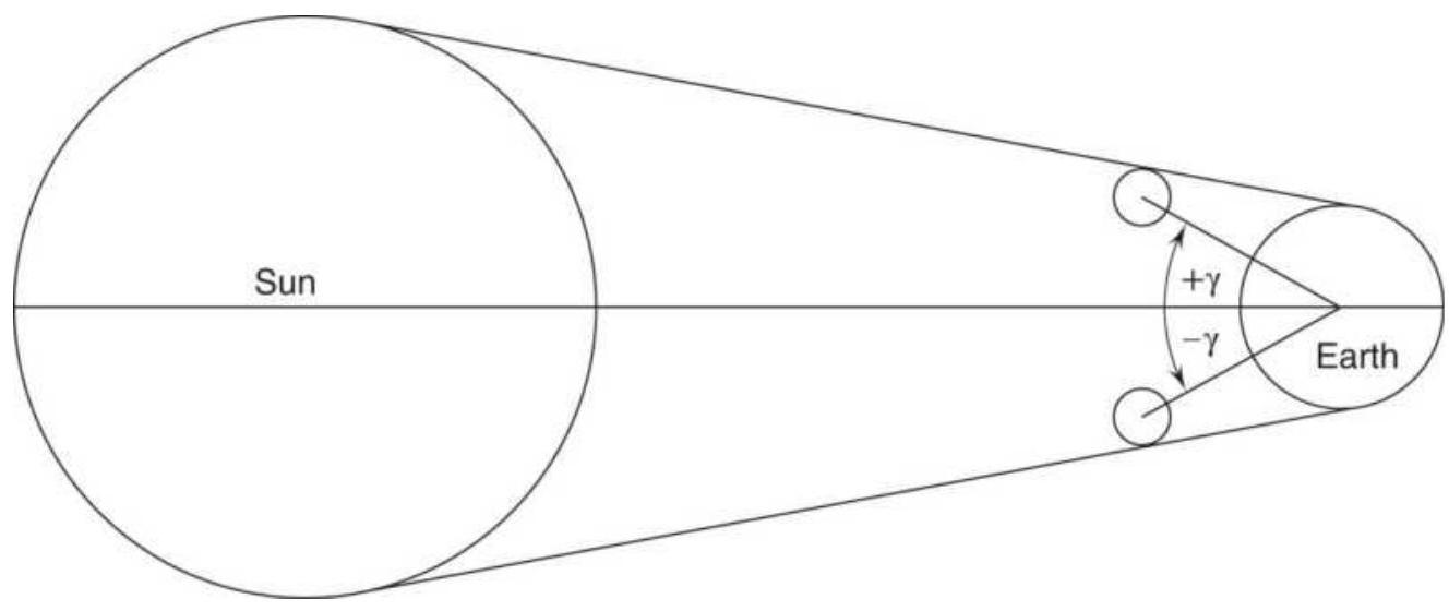
FIGURE 14.37 Geometry of a solar eclipse.
The value \(u\) gives the radius of the moon's umbral cone on the fundamental plane, which passes through the center of the Earth perpendicular to the axis of the moon's shadow (in units of Earth's equatorial radius). The radius of the penumbral cone in the fundamental plane is \(u+0.5460\). Based on these values, the following situations exist:
\(|\gamma|\) is between 0.9972 The eclipse is not central. and \(1.5432+u\)
\(|\gamma|\) is between 0.9972 Part of the eclipse may touch the and 1.0260 polar regions.
\(0.9972<|\gamma|<0.9972+|u|\) The combination of a noncentral total or annular eclipse.
\(|\gamma|>1.5432+u \quad\) No eclipse if visible from the Earth's surface.
For a central eclipse, The eclipse is total.

\section*{\(u>0.0047\) \\ The eclipse is annular. \\ \(0<u<0.0047\) \\ The eclipse is either annular or annular-total.}
To remove the ambiguity of this last situation, calculate:
\section*{\(\omega=0.00464 \cos W\), where \(\sin W=\gamma\)}
If \(u<\omega\), then the eclipse is annular-total; otherwise it is annular.
The greatest magnitude for a partial solar eclipse is reached at the point on the Earth's surface that comes closest to the axis of the shadow at:
Greatest magnitude of a solar eclipse \(=\frac{1.5433+u-|\gamma|}{0.5461+2 u}\)

\section*{FIGURE 14.38 Geometry of a lunar eclipse.}
\section*{Lunar Eclipses}
For a lunar eclipse, \(\gamma\) is the shortest distance for the center of the moon to the Earth's shadow (see Figure 14.38). The value \(\gamma\) is positive if the moon's center is passing north of the axis of the shadow, and negative if it
is passing south. At the distance of the moon, the penumbra radius is \(\rho=1.2847+u\) and the umbra radius \(\sigma=0.7404-u\). The magnitude of the lunar eclipse is:
penumbral eclipses: \((1.5572+u-|\gamma|) / 0.5450\)
\[
\text { umbral eclipses: }(1.0129-u-|\gamma|) / 0.5450
\]
If the magnitude is less than zero, there is no eclipse. The semidurations of the partial and total phases in the umbra are calculated as:
\[
\begin{aligned}
P & =1.0129-u \\
T & =0.4679-u \\
n & =0.5458+0.0400 \cos M^{\prime}
\end{aligned}
\]
and the semidurations in minutes are:
\[
\begin{aligned}
\text { Partial phase } & =\frac{60}{n} \sqrt{P^{2}-\gamma^{2}} \\
\text { Total phase } & =\frac{60}{n} \sqrt{T^{2}-\gamma^{2}}
\end{aligned}
\]

\section*{Example: Solar Eclipse of May 21, 1993}
The following values can be used to verify your calculations.
May 21 is the 141st day of the year, therefore:
\[
\begin{aligned}
& k=1993+141 / 365=1993.38 \\
& T=1993.38 / 1236.85=1.6116 . \\
& J D E=2449128.5894 \\
& M=135^{\circ} .9142 \\
& P=0.1842 \\
& M^{\prime}=244^{\circ} .5757 \\
& Q=5.3589 \\
& F=165^{\circ} .7296 \\
& \gamma=1.1348 \\
& \Omega=253^{\circ} .002 \\
& u=0.0097 \\
& F_{1}=165^{\circ} .7551
\end{aligned}
\]
Because \(180^{\circ}-F\) is between \(13^{\circ} .9\) and \(12^{\circ} .0\) the eclipse is uncertain, and because \(|\gamma|\) is between 0.9972 and \(1.5433+u=1.553\), the eclipse is partial. By calculating the greatest magnitude of a solar eclipse, we get 0.740 . Because \(F\) is near \(180^{\circ}\), the eclipse occurs near the moon's descending node, and because \(\gamma\) is positive, the eclipse is visible in the northern hemisphere of the Earth. By adding the corrections to \(J D E\), the final time of maximum eclipse is 2449129.0979 , which corresponds to May 21, 1993, at 14h21mos TD. This differs from the exact value of 14 h20m14s TD by less than 1 minute.
\section*{Software}
As you would expect, new software continually enters the public domain. By searching the Internet for "Financial Astrology Software" you can find services that calculate various astronomical and astrological events and interpret them. However, in order to use this method for trading it is best that some history of performance be tested. To do that, you will need to produce the numbers in a way that can be incorporated into an automated trading strategy. Without doing that, we have a tendency to remember the particularly good trades and forget the more frequent small losing ones.
The U.S. government provides the most definitive calculator for eclipses and other events at http://eclipse.gsfc.nasa.gov/JSEX/JSEX-index.html. Rather than program the formulas on a strategy development platform, you can calculate a number of events forward and backward and input those dates for testing.
\section*{NOTES}
1 Adam Smith, The Money Game (New York: Random House, 1967), based on the poem If by Rudyard Kipling.
2 Frederick C. Klein and John A. Prestbo, News and the Market (Chicago: Henry Regnery, 1974), p. 3.
3 A thorough analysis of the CFTC Commitment of Traders report can be found in Chapter 16. It should be noted that other government reports released on the same day may complicate the interpretation.
4 Grant Noble, "The Best Trading Indicator: The Media," Technical Analysis of Stocks \& Commodities (October 1989).
5 Ben Warwick, Event Trading (Chicago: Irwin, 1996). Also see Andrew Busch, World Event Trading (Hoboken, NJ: John Wiley \& Sons, 2007), and Peter McKenna, The Event-Trading Phenomena (2005, available online).
6 Arnold Larson, "Measurement of a Random Process in Futures Pricing," Food Research Institute Studies 1, no. 3 (November 1960), referenced in Warwick, Event Trading.
Z Gibbons Burke, "Event-Based Analysis," Futures (April 1995).
8 Laurence A. Conners and Linda Bradford Raschke, Street Smarts (Malibu, CA: M. Gordon Publishing, 1995).
9 Murray A. Ruggiero, Jr., "Exploiting Report Day Tendencies in Treasuries," Futures (February 2001).
10 William L. Jiler, "Analysis of the CFTC Commitments of Traders Reports Can Help You Forecast Futures Prices," 1985 CRB Commodity Year Book (Jersey City, NJ: Commodity Research Bureau, 1985).
11 Curtis Arnold, "Tracking ‘Big Money’ May Tip Off Trend Changes," Futures (February 1985).
12 Steve Briese, "Tracking the Big Foot," Futures (March
1994).
13 Murray A. Ruggiero, Jr., Cybernetic Trading Strategies (New York: John Wiley \& Sons, 1997).
14 Murray A. Ruggiero, Jr., "Seeking a Commitment," Futures (April 2002).
15 In Ruggiero, Cybernetic Trading Strategies, this was written as a buy signal; however, it seems that it should have been a sell signal.
16 Murray Ruggiero, "Trading off the Big Boys," Futures, January 1998
17 For the most definitive works, see Humphrey Neill, The Art of Contrary Thinking (Caxton Printers, Caldwell, \(\mathrm{OH}, 1960\) ), who is credited with having first formulated the concept, and R. Earl Hadady,
Contrary Opinion (Pasadena CA: Hadady, 1983, and Hoboken, NJ: John Wiley \& Sons, 2000).
18 The classic book on mass behavior is Charles Mackay, Extraordinary Popular Delusions and the Madness of Crowds (Eastford, CT: Martino Fine Books, 2017; first published 1841).
19 R.W. Schabacker, Stock Market Theory and Practice (New York: B C Forbes, 1930), p. 517. This book was the definitive study of the market. In it he quotes Theodore Price as saying that speculation is "hazard plus intelligence," while gambling is "hazard without intelligence."
20 The Bullish Consensus is a product of SibbettHadady, Pasadena, CA; a Market Sentiment Index is published in Consensus, Kansas City, MO.
21 R. Earl Hadady, "Contrary Opinion," Technical Analysis of Stocks \& Commodities (August 1988).
22 George Angell, "Thinking Contrarily," Commodities (November 1976).
23 Stephen E. Briese, "Commitment of Traders as a Sentiment Index," Technical Analysis of Stocks \& Commodities (May 1990).
24 The information in this section came from https://traderhq.com/trading-indicators/tradersguide-sentiment-indicators/.
25 See the website winninginvesting.com.
26 See the website for the Motley Fool at www.fool.com.
27 Eric Bjorgen and Steve Leuthold, "Corporate Insiders' Big Block Trades," Journal of Technical Analysis (Winter-Spring 2002). This study was written in May 1998 and won the 1999 Charles Dow Award.
28 R. N. Elliott, Nature's Law: The Secret of the Universe (New York: Elliott, 1946), p. 4.
29 A. H. Church, On the Relation of Phyllotaxis to Mechanical Laws (London: Williams and Newgate, 1904).
30 In the appendices to Jay Hambridge, Dynamic
Symmetry: The Greek Vase (New Haven, CT: Yale University Press, 1931), pp. 141-161, there is a full discussion of the evolution of this number series within science and mathematics, together with further references.
31 Leonardo Pisano, Il Liber Abaci di Leonardo Pisano (Rome, Italy: Baldassare Boncompagni, 1857).
32 Hambridge, Dynamic Symmetry, pp. 27-38.
33 R. N. Elliott, Nature's Law (p. 55). Elliott quotes other human emotional relationships.
34 Cycles (January 1976, p. 21); see also James B. Shuman and David Rosenau, The Kondratieff Wave: The Future of America Until 1984 and Beyond (Dell, New York, 1974), which is based on the theory developed by the Russian economist early in the twentieth century.
35 Robert R. Prechter, Jr., The Major Works of R. N. Elliott (Chappaqua, NY: New Classics Library, c. 1980), and A. J. Frost and Robert R. Prechter, Jr., Elliott Wave Principle (Chappaqua, NY: New Classics Library, 1978).
36 Robert R. Prechter, Jr., David Weiss, and David Allman, "Forecasting Prices with the Elliott Wave Principle," in Todd Lofton (Ed.), Trading Tactics: A Livestock Futures Anthology (Chicago: Chicago Mercantile Exchange, 1986).
37 See Prechter, et al., Forecasting Prices.
38 Robert R. Prechter, Jr., "Computerizing Elliott," Technical Analysis of Stocks \& Commodities (July 1983), gives some general observations on how he would go about adapting Elliott's interpretations to a computer program.
39 Robert R. Prechter, Jr., "Major Sea Change II," Futures (March 1996).
40 The content of this section is based on Murray A. Ruggiero, Jr., "Building the Wave," Futures (April 1996). He credits Tom Joseph for the development of the computer software, which is the basis for the product Advanced GET.
41 Murray A. Ruggiero, Jr., Cybernetic Trading Strategies (New York: John Wiley \& Sons, 1997).
42 Thomas DeMark, "Retracing Your Steps," Futures (November 1995). Also see Chapter 2 of DeMark, The New Science of Technical Analysis (New York: John Wiley \& Sons, 1994).
43 Robert Fischer, The Golden Section Compass Seminar (Hamilton, Bermuda: Fibonacci Trading, Ltd.). Also see Robert Fischer, Fibonacci Applications and Strategies for Traders (New York: John Wiley \& Sons, 1993).
\section*{44 Robert Fischer, ibid.}
45 Examples of time and price objectives can be found in Tucker J. Emmett, "Fibonacci Cycles," Technical Analysis of Stocks \& Commodities (May 1983 and
\section*{March—April 1984)}
46 William Gann's original works, Wall Street Stock Selector and Truth of the Stock Tape, both published in 1930, can be found in reprints.
47 Computer software is available for calculating and plotting much of Gann's works. See "Ganntrader I," Technical Analysis of Stocks \& Commodities (January-February 1984), or contact Gannsoft Publishing Co., 311 Benton St., Leavenworth, WA 98826, or Lambert-Gann, P.O. Box O, Pomeroy, WA 99347 .
48 Derek Parker and Julia Paricor, The Compleat Astrologer (New York: McGraw-Hill, 1971), p. 12.
49 For a complete discussion of this topic, see Henry Weingarten, Investing by the Stars (McGraw-Hill, 1996). A section written by Richard Mogey, "Long Cycles and the Master Time Factor," is the basis for the next section.
50 Jeanne Long, "Planetary Support and Resistance on the DJIA," A Traders Astrological Almanac 1994 (PAS Astro-Soft, Inc., 450-106 State Road 13 North, \#206, Jacksonville, FL 32259-3863, email: pas24@aug.com).
51 Hans Hannula, "Trading Planetary Eclipses," Technical Analysis of Stocks \& Commodities (April 1992).
52 Todd Lofton, "Moonlight Sonata," Commodities (July
1974).
53 Jean Meeus, Astronomical Algorithms (WillmannBell, Inc., P.O. Box 35025, Richmond, VA 23235, Chapter 52). A shorter version appears in another volume, Astronomical Formulae for Calculators. For complete accuracy, the author refers readers to the Astronomical Almanac, or the Canon by Mucke and Meeus. The material in this section combines both versions of Meeus' work.
\section*{CHAPTER 15 Short-Term Patterns}
Pattern recognition forms the basis for most trading systems. Patterns are most obvious in traditional charting, which is primarily the identification of common formations. Even moving averages attempt to isolate, using mathematical methods, what has been visually determined to be a trend. Traders have always looked for patterns in price movement. Because the earliest technicians were not equipped with computers, their conclusions are considered market lore rather than fact, and are handed down from generation to generation as proverbs, such as "Up on Monday, down on Tuesday," "Locals even-up on Fridays," or "Watch for key reversals." Because these three sayings have endured, they are candidates for analysis later in this chapter. Readers should also note the early work of Arthur Merrill, whose well-known pattern studies are still valid; these studies are referenced throughout this chapter. \({ }^{1}\) The earliest technical systems based on patterns were of the form: "If after a sharp rise the market fails to advance for 3 days, then sell." As computers became more powerful, more complex approaches could be taken. For example, by observing the closing prices, all patterns of higher and lower closes can be recorded to find their tendency to repeat. A computer is wellequipped to perform this task. From the price moves that
follow these patterns, we can conclude whether they have any predictive ability. This approach as well as the combination of events used to forecast profitable situations are discussed later in this chapter.
Pattern recognition is a source of many valuable ideas as well as false paths. Figure 15.1, a graph of the New York Stock Exchange (1854-1959), shows a very simple way to visualize the price pattern throughout the year. Each box represents the net movement of consecutive 2-month intervals and is either up or down. When viewing all the patterns for 104 years in one glance, it is difficult not to count the recurrences of the more obvious patterns and then look for the formations that precede them in order to see whether they could be predictive. For example, in 1922, 1924, and 1927, there were sharp advances in the market; the years preceding those showed identical \(V\) patterns. Can you find other repeated patterns?
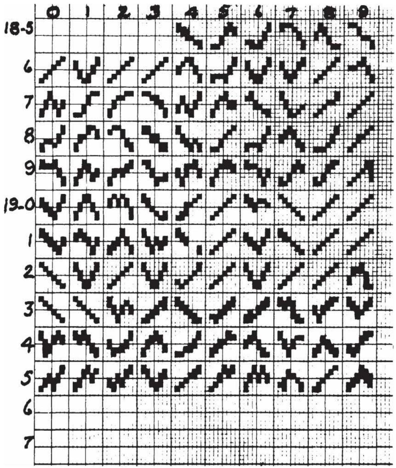
FIGURE 15.1 Graph of the New York Stock Market.
Patterns frequently provide the foundation for a trading method or the motivation to begin developing a method. They have been applied in many ways to price analysis; the combination of price and volume can tell you the
time of day to place an order. Daily trading opportunities may be a function of patterns based on the strength or weakness of the opening price, or even the preopening price moves. Weekly and weekend price patterns are studied later in this chapter, as well as types of reversals and their effects. These techniques can be used in combination by following a weekday pattern with a weekend pattern, or they can confirm the results of each other when used together. The end of this chapter discusses more general issues in pattern recognition. Because patterns are implicit in many trading systems throughout this book, readers are encouraged to use the index if they are looking for a discussion of a specific pattern. For example, intraday volume patterns will be found in the next chapter.
\section*{PROJECTING DAILY HIGHS AND LOWS}
Statisticians claim that the best forecast of tomorrow's price is today's price; for longer-term projections the
best forecast is the mean. While we may not be able to precisely forecast tomorrow's high and low price, being close can still be profitable.
\section*{Pivot Points}
The simplest approach to projecting tomorrow's highs and lows is to base those figures on the average price of today plus or minus a value that relates to the current trading range, or volatility. One technique, based on a pivot point,,\(\underline{2}\) projects two levels of support and resistance:
\section*{Pivot point \(P=(H+L+C) / 3\) \\ Resistance \(1 \quad R 1=2 \times P-L\) \\ Support \(1 \quad S 1=2 \times P-H\) \\ Resistance \(2 \quad R 2=(P-S 1)+R 1\) \\ Support \(2 \quad S 2=P-(R 1-S 1)\)}
As an example, take the high, low, and close of the day to be \(12.50,11.50\), and 11.75 . Then:
\[
\begin{aligned}
P & =(12.50+11.50+11.75) / 3=11.916 \\
R 1 & =2 \times 11.916-11.50=12.332 \\
S 1 & =2 \times 11.916-12.50=11.332 \\
R 2 & =(11.916-11.332)+12.332=12.914 \\
S 2 & =11.916-(12.332-11.332)=10.918
\end{aligned}
\]
The projected support and resistance levels show a downward bias consistent with the close that was in the lower part of the trading range.
Another method takes the average range (high-low) over the past 14 days, then adds and subtracts \(1 / 2\) of that range to yesterday's close, so that the projection is symmetric around the prior close and equal to the average range.
\section*{DeMark's Projected Ranges}

Another author and trader, Tom DeMark, \({ }^{3}\) has based his projections on the positioning of today's opening price relative to yesterday's closing price, which gives him added information about direction. If today's open is higher than the previous close, the projections are biased upward; if lower than the close, they are biased downward.
If today's close is below today's open, then:
Tomorrow's projected high \(=(H+C+2 \times L) / 2-L\) Tomorrow's projected low \(=(H+C+2 \times L) / 2-H\)
If today's close is above today's open, then:
Tomorrow's projected high \(=(2 \times H+L+C) / 2-L\) Tomorrow's projected low \(=(2 \times H+L+C) / 2-H\)
If today's close is the same as today's open, then:
Tomorrow's projected high \(=(H+L+2 \times C) / 2-L\)
Tomorrow's projected low \(=(H+L+2 \times C) / 2-H\)
Once the basic formula is determined, which biases tomorrow's projection in the direction of today's close relative to today's open, the projected high is found by removing two units of the low price, and the projected low is found by removing two units of the high price from the formula. This shifts the projection in the
direction of the new high by one-half the difference of today's close and today's low, \((C-L) / 2\), and the new low by one-half the difference of today's close and today's high, \((H-C) / 2\).
\section*{Comparing the Two Ranges}
Because the two methods of calculating the projected ranges use the same basic prices, combining them with slightly different arithmetic, it is not clear whether they give values that are the same or different. For example, if the Swiss franc had a high, low, and close of 6600, 6450, and 6500 , respectively, the first pivot method would give a projected first resistance level (high) of
\[
2 \times(6600+6450+6500) / 3-6450=6583
\]
DeMark's projected high is different, based on the way today's opening price relates to the previous close. If the open is lower than the previous close, we get
\((6600+6500+2 \times 6450) / 2-6450=6550\) ; if the open is higher, we have
\((2 \times 6600+6450+6500) / 2-6450=6625\) ; and, if the open is about the same as the previous close, then the projected high is
\((6600+6450+2 \times 6500) / 2-6450=6575\)
. Then the previous pivot point method returns a value similar to DeMark's neutral case when the market opens unchanged from the previous close.
\section*{TIME OF DAY}
Market participants have changed. While floor traders were once the cause of intraday patterns, day traders, systematic, and high-frequency traders now shape the price moves. Angas called these the "tides of the daily prices." Even as the players have changed, the intraday time patterns have remained the same. The classic pattern for prices shows more volatility and reversals early in the day while traders set new positions based on economic reports, perceived market direction, rebalancing of portfolios, and countless other reasons. Once that flurry of activity is over, prices show greater trending later in the day. In both stocks and futures, the greatest volume is near the open, the next highest volume near the close, and the lowest volume at midday.
\section*{The Participants Change but the Patterns Remain}
There are a number of reasons for these sustained patterns. Many investors evaluate their positions and study market reports in the evenings and then place their orders in the morning. In Europe, where business begins six hours earlier, economic reports are released before the main trading sessions in the United States and can affect the early market direction. However, U.S. business reacts to U.S. economic reports and premarket earnings releases, so U.S. markets readily change direction once the U.S. business day begins and reacts to the local news.
Although futures in all the major index markets are trading throughout the night, price movements during these "off hours" occur with low volume. It is the same in Europe's extended hours. European markets are open
until the U.S. stock markets close; however, that's 10 p.m. in Frankfurt and most traders have gone home. Only a few brokerage houses have desks that will accept orders late in the evening and execution of any size is a problem. With all the globalization, the patterns that occur during the day sessions have not changed.
The close of the day is the second most active time for trading because many investors believe that the closing price best represents the correct value.
In both futures and stocks, a large part of the daily volume is the result of day trades by professionals, a term we'll use to replace the floor traders, or locals. In the stock market, there are still market-makers, but they have lost the advantage of being on the floor and they enter their orders electronically along with everyone else. Professionals also include arbitrageurs, spread traders, and algorithmic traders, specifically high-frequency trading. For most of these traders, positions entered in the morning will be closed out by the end of the day to avoid the margin required of positions held overnight. Accounts are settled using the closing price.
Once the opening orders have been executed and the day's news is absorbed, volume declines. Many of these traders are inclined to take a morning coffee break, followed by a lunch break, and pay less attention to the market for the next few hours. All traders develop the habit of trading at particular times. Some prefer the opening, others 10 minutes after the open. Large funds and managed accounts have a specific procedure for entering the market, such as using close-only orders.
Institutions with large orders must trade during times when the volume is heavy in order to keep slippage under control, or they may take advantage of VWAP orders (volume-weighted average price) where partial orders are automatically fed into the market based on an algorithm that balances time intervals and volume. 4 Short-term traders are split between mean reversion and directional moves. A gap opening is normally an opportunity to take the opposite position while a steady move up on increasing volume will favor joining the move. Gaps can still occur at the open of the stock market and after an economic or earnings release.
In this chapter we'll look at a wide range of patterns. Some will be best faded - that is, traded as mean reverting - and others as trending, or directional. A few could be either and you, the reader, will need to decide.
\section*{Tubbs' Intraday Patterns}
In Chapter 13 of Tubbs' Stock Market Correspondence Lessons \({ }^{5}\) ("Tape Reading") he explains the six dominant patterns in the stock market (based on a 10:00 a.m. to 3:0o p.m. session, New York).
1. If a rally after the open has returned to the opening price by 1:00 p.m., the day is expected to close weaker.
2. If the market is strong from 11:00 a.m. to 12:00 p.m., it will continue from 12:00 p.m. to 1:00 p.m.
3. If a reversal from 1:00 p.m. to 1:30 p.m. finds support at 1:30 p.m., it will close strong.
4. If the market has been bullish until 2:00 p.m., it will probably continue until the close and into the next day.
5. A rally that continues for 2 or 3 days (as in Pattern 4) will most likely end on an 11:00 a.m. reversal.
6. In general, a late afternoon downward reaction after a strong day shows a pending reversal.
Putting these together, the following two patterns (among others) can be expected:
1. A strong open with a reversal at 11:00 a.m. not reaching the opening price, then strength from 11:00 a.m. to 1:00 p.m., a short reversal until 1:30 p.m., and then a strong close; according to Pattern 5 , there will be a strong open the following day.
2. A strong open that reverses by 11:00 a.m., continuing lower until 1:00 p.m., reverses again until 1:30 p.m., will close weak.
\section*{Merrill's Intraday Patterns}
Merrill's work shows the average hourly pattern of the stock market in Table 15.1, where a plus or minus sign indicates rising or falling prices during the interval ending at the designated time. During the four years shown, the opening corresponds to the positive or negative returns for the year while prices were consistently higher from 10 a.m. to 11 a.m. During 1963, the year of President Kennedy's assassination, the bullishness lasted all day, trailing off at the close.
Table 15.1 reinforces what we would expect is a normal
intraday pattern. Prices begin strong and continue through the first two hours. Having exhausted the early orders, volume drops and prices reverse due to lack of buyers. By 2 p.m. the short sellers who faded the opening move cover their positions, causing a move back in the direction of the opening hour. The only inconsistency in the pattern is the weak close, which contradicts the strong open. Had there been both a strong open and a strong close we could declare these as bull years without seeing the actual DJIA returns.
\section*{TABLE 15.1 Merrill's hourly stock market patterns.}
\begin{tabular}{|r|c|c|c|c|c|c|c|}
\hline & \multicolumn{6}{|c|}{ Trading Session Hour Ending } & \\
\hline & 10:00 & 11:00 & 12:00 & 1:00 & 2:00 & 3:00 & \begin{tabular}{c}
Yearly \\
Change
\end{tabular} \\
\hline 1962 & - & + & - & - & + & - & \(-10.75 \%\) \\
\hline 1963 & + & + & + & + & + & - & \(18.44 \%\) \\
\hline 1964 & + & + & - & - & + & - & \(14.10 \%\) \\
\hline 1965 & + & + & - & - & - & - & \(10.88 \%\) \\
\hline
\end{tabular}
\section*{Updating Intraday Time Patterns, 2017}

U.S. interest rate futures have had the longest sustained bull market in its history, from 1980 through 2017. Knowing that there is a bias in the direction of prices, we would expect to see a pattern in the way prices move during the day. Using the program TSM Intraday Time Patterns on the Companion Website, we get Table
15.2. Column 1 shows the end-of-bar time; column 2 is the percentage of times that bar moved in the same direction as the opening bar (compared to the previous day's close); column 3 shows the percentage that a bar closed higher than the previous bar; and column 4 shows the net average price change for that bar. What is immediately surprising is that, given a strong bull market, the percentage of times the price was higher (column 3) was always less than \(50 \%\), yet the net move for the day was positive, indicating lower yields. Figure 15.2 shows the pattern declining as the day evolves.
TABLE 15.2 Time pattern for 30-year bond futures, \(1998-2017\)
\begin{tabular}{|l|c|c|r|}
\hline \begin{tabular}{c}
End \\
Time
\end{tabular} & \begin{tabular}{c}
\%Same as \\
Open
\end{tabular} & \begin{tabular}{c}
\%Price \\
Higher
\end{tabular} & \multicolumn{1}{|c|}{\begin{tabular}{c}
Net \\
Points
\end{tabular}} \\
\hline .920 & & 48.89 & 0.0116 \\
\hline .950 & 41.97 & 45.70 & 0.0003 \\
\hline 1020 & 43.85 & 44.18 & -0.0012 \\
\hline 1050 & 42.08 & 47.05 & 0.0054 \\
\hline 1120 & 45.57 & 48.41 & 0.0002 \\
\hline 1150 & 43.89 & 46.18 & 0.0042 \\
\hline 1220 & 42.82 & 43.48 & -0.0015 \\
\hline 1250 & 42.65 & 44.76 & 0.0032 \\
\hline 1320 & 43.22 & 42.34 & -0.0022 \\
\hline 1350 & 43.83 & 45.35 & -0.0032 \\
\hline 1420 & 40.82 & 42.60 & 0.0003 \\
\hline 1450 & 41.86 & 44.26 & 0.0021 \\
\hline
\end{tabular}
\begin{tabular}{|c|c|c|c|}
\hline 1500 & 41.54 & 43.89 & 0.0034 \\
\hline \multicolumn{2}{|c|}{ Total Up. } & & 0.030 \\
\hline Total & & & -0.008 \\
\hline
\end{tabular}
\section*{US Bonds percentage moves}
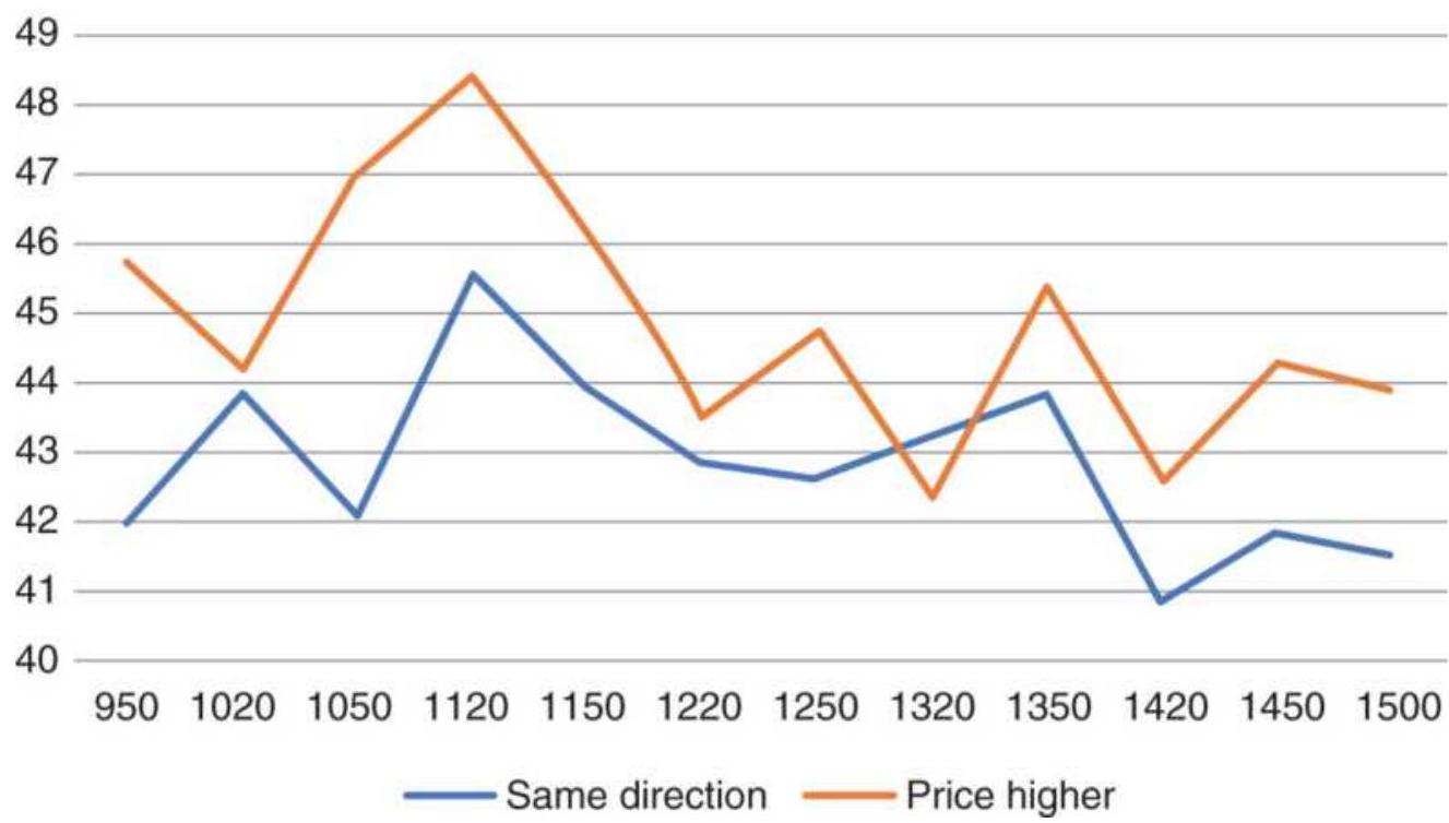
FIGURE 15.2 30-year bond futures percentage moves for bars in the same direction as the open and percentage bars with higher prices.
This means that a series of up-bars, as shown by Merrill in 1963, could still occur in a bear market. The last bar of the day may have had a larger price move than all the bars before it. Merrill did not have the tools to allow an analysis of the size of the move. The only way to view the pattern is by looking at column 4 , the net price change during the bar, and the way to tell if we were in a bull or bear market is to total the up-bars and down-bars, as shown at the bottom of Table 15.2 and in Figure 15.3. Prices tend to be higher from the 9:50 bar (the second
bar, NY time) through 12:50, decline for 2 hours, then rally into the close. Over the 20 years, the total daily upbars averaged a gain of 0.0306 points compared to a loss of -0.0081 points, for a net gain of 0.0225 points, where 0.0325 is \(1 / 32\).
30-Year bond futures 1998-2017
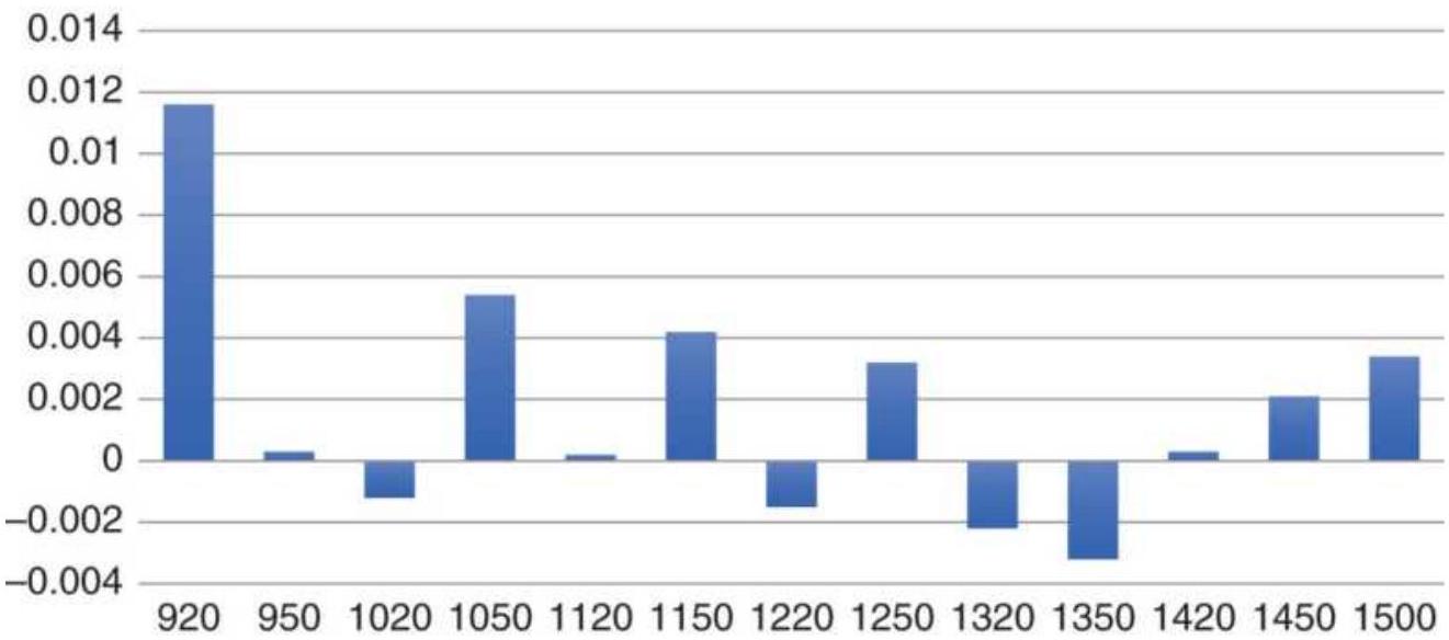
FIGURE 15.3 U.S. bond futures, average net point change by bar.
\section*{SP back-adjusted futures}
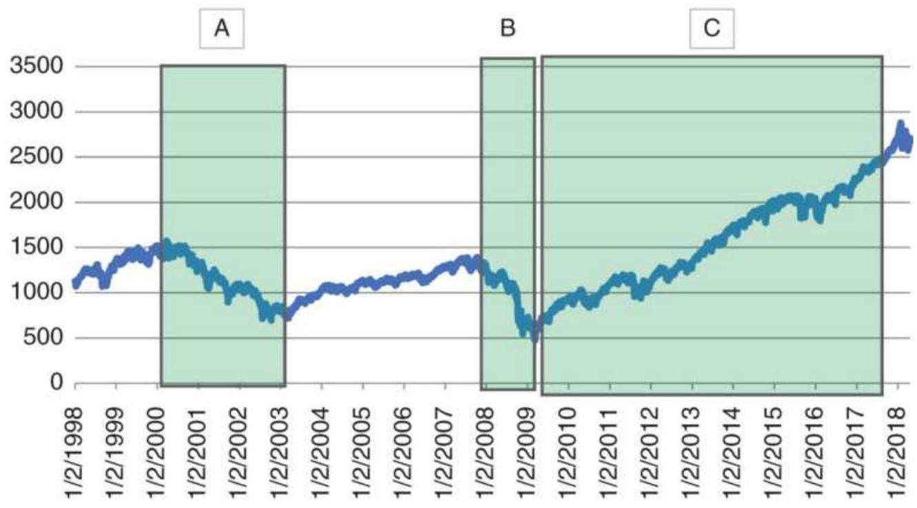
FIGURE 15.4 S\&P back-adjusted futures with intervals of study marked.
\section*{S\&P Time Patterns}
In contrast to bonds, the equity index markets have been bullish, but it has not been a smooth pattern, as shown in Figure 15.4. To have the best chance of understanding the daily time patterns, three short intervals with clear direction have been marked, (A) 1998-1999, a strong bull market, (B) 2000-2002, a bear market, and (C) 2008, the worst of the financial crisis. Table 15.3 shows the detail for the three intervals.
TABLE 15.3 S\&P time intervals for the three periods shown in Figure 15.4.
Dates 1/8/1998 To 12/31/1999
\begin{tabular}{|l|r|r|r|r|r|r|}
\hline \begin{tabular}{l}
End \\
Time
\end{tabular} & \begin{tabular}{c}
\%Same \\
As \\
Open
\end{tabular} & Higher & \multicolumn{1}{|c|}{\begin{tabular}{c}
Points
\end{tabular}} & \begin{tabular}{c}
\%Same \\
As \\
Open
\end{tabular} & \begin{tabular}{c}
Higher \\
Higher
\end{tabular} & \(\mathbf{l}\) \\
\hline 1030 & N/A & 53.11. & .0 .6475 & N/A & 45.38 & \\
\hline 1100 & 48.3 & 46.29 & -0.3198 & 49.53 & 47.79 & - \\
\hline 1130 & 48.9. & 54.11 & .0 .3347 & 48.46 & 47.93 & \\
\hline 1200 & 52.71 & 51.30 & .0 .0511 & 49.13 & 44.98 & - \\
\hline 1230 & 49.1 & 47.90 & -0.1423 & 50.47 & 48.73 & - \\
\hline 1300 & 49.9 & 48.10 & -0.0974 & 51.27 & 47.66 & - \\
\hline 1330 & 49.3 & 50.90 & .0 .0076 & 46.59 & 48.86 & \\
\hline 1400 & 45.89 & 48.10 & -0.0084 & 48.59 & 52.61 & \\
\hline 1430 & 45.29 & 48.30 & .0 .1451 & 43.64 & 46.72 & \\
\hline 1500 & 47.29 & 45.09 & -0.3541 & 51.81 & 45.92 & - \\
\hline 1530 & 52.71 & 49.50 & -0.1449 & 49.00 & 45.78 & - \\
\hline 1600 & 47.49 & 54.31 & .0 .2208 & 51.41 & 46.45 & - \\
\hline 1615 & 51.9 & 55.51 & .0 .2232 & 49.26 & 48.33 & - \\
\hline Total & & & -1.6301 & & & \\
\hline Up & & & & & & c \\
\hline Total & & & \(-\mathbf{1 . 0 6 6 9}\) & & & - \\
\hline Down & & & & & & \\
\hline
\end{tabular}
\section*{S\&P Futures time patterns}

1030110011301200123013001330140014301500153016001615
■ 1998-1999 Bull =2000-2002 Bear 2008 Crisis
FIGURE 15.5 S\&P time patterns showing three different market periods corresponding to Table 15.3.
The first S\&P period, 1998-1999, was the end of the dot.com bull market. The S\&P opened with a higher bar than any other bar during the day and the average gain exceeded the losses as shown at the bottom of that block. The second section shows the bear market from 2000 to 2002. Prices opened lower and the net losses for the day were greater than the gains. In the third block, showing only 2008, the heart of the financial crisis, prices open sharply lower and the losses each day were nearly twice the gains. Figure 15.5 shows the pattern of all three periods together. The open and late day stand out as the most important times. Regardless of whether it was a bull or bear market, the patterns from 2:30 p.m. were consistent, first lower, then higher, before a quiet close.
\section*{Crude Oil Time Patterns}
The last example is crude oil, which is a market with
extremes. Figure 15.6 shows a steady rise in prices in the early 2000s, a dramatic peak in 2008, a long period of sideways movement, and a decline back to the lows. The actual prices were not those shown on the chart due to back-adjusting. The peak in 2008 was near \(\$ 150 /\) barrel in the cash market but is shown much higher in this futures series.
\section*{Crude oil back-adjusted nearest futures}
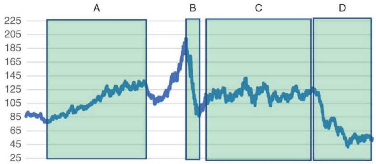
FIGURE 15.6 Back-adjusted futures for crude oil showing four intervals with different price patterns.
\section*{TABLE 15.4 Detail for crude oil time patterns.}
\begin{tabular}{|c|c|c|c|c|c|c|}
\hline \multirow{2}{*}{\begin{tabular}{|l|}
\hline Dates \\
End \\
Time \\
\hline
\end{tabular}} & \multicolumn{3}{|c|}{\begin{tabular}{c}
1/8/2002 To \\
12/29/2006
\end{tabular}} & \multirow{2}{*}{\begin{tabular}{|l|}
\hline From \\
\hline End \\
Time
\end{tabular}} & \multicolumn{2}{|c|}{ 7/7/2008 T } \\
\hline & \begin{tabular}{c}
\%Same \\
Aps \\
Open
\end{tabular} & \begin{tabular}{l}
\%Price \\
Higher
\end{tabular} & & & \begin{tabular}{c}
\%Same \\
Ap \\
Open
\end{tabular} & \\
\hline 94 & N/A & 9.60 & - & .9 & N/A & \\
\hline
\end{tabular}
\begin{tabular}{|l|r|r|r|r|r|r|}
\hline 1000 & 44.77 & 46.70 & -0.0092 & 1000 & 44.87 & 5 \\
\hline 1020 & 48.63 & 50.08 & -0.0003 & 1020 & 42.95 & 3 \\
\hline 1040 & 47.75 & 46.78 & -0.0042 & 1040 & 44.23 & 5 \\
\hline 1100 & 45.02 & 46.95 & -0.0019 & 1100 & 51.28 & 4 \\
\hline 1120 & 45.5 & 51.53 & 0.0118 & 1120 & 50.64 & 3 \\
\hline 1140 & 46.3 & 48.07 & -0.0001 & 1140 & 50.00 & 3 \\
\hline 1200 & 46.38 & 46.38 & -0.0068 & 1200 & 58.33 & 5 \\
\hline 1220 & 48.23 & 50.64 & 0.0160 & 1220 & 40.38 & 5 \\
\hline 1240 & 47.03 & 49.84 & 0.0113 & 1240 & 47.44 & 5 \\
\hline 1300 & 45.02 & 46.62 & 0.0062 & 1300 & 55.13 & 4 \\
\hline 1320 & 45.26 & 48.63 & 0.0085 & 1320 & 57.69 & 5 \\
\hline 1340 & 42.68 & 46.86 & 0.0013 & 1340 & 51.28 & 4 \\
\hline. & & & & 1400 & 51.28 & 5 \\
\hline & & & & 1420 & 41.67 & 5 \\
\hline & & & & 1430 & 50.64 & 4 \\
\hline Total & & & \(\mathbf{0 . 0 5 5 2}\) & & & \\
\hline Up & & & & & & \\
\hline Total & & & \(-\mathbf{0 . 0 3 7 7}\) & & & \\
\hline Down & & & & & & \\
\hline
\end{tabular}
The detail for the time patterns is shown in Table 15.4. Note that the trading hours during the oldest years were about an hour shorter than recently. The first block, A, from \(1 / 8 / 2002\) through \(12 / 29 / 2006\), shows steadily rising prices, and the net points for rising bars exceeds the net for lower bars. It is interesting to note that the first five bars of the day are all net negative in their price
move, even though it was a bull market. All of the gain was made after midday.
The second block, B, captures the sharp decline following the historic rally in oil. The opening bar shows a large loss and 10 of 16 bars were losses. The totals at the bottom show a strong bias toward lower prices throughout the day.
The third block, C , shows the pattern during a sustained sideways period. Although there is a net loss in price movement, only 7 of 16 bars during the day show losses. The opening bar is a loss, and is the largest move of the day, but the last bars are positive.
The last block, D, is another bear market and the net down-bars show a larger loss than the net up-bars. The first bar is negative and larger than any other bar during the day, which seems to be the pattern for crude. Figure 15.7 shows the pattern for the second block, the price drop from the highs of about \(\$ 150\) to near \(\$ 40\). Because the sizes of the moves were much bigger than the other three periods, they are shown separately. Note that everything happens in the morning, a sharply lower opening bar, a pause, then a sell-off up to midday. Afterward, very little happens. The traders were probably exhausted.
The other three intervals are shown together in Figure 15.8. The opening bar is negative in all cases, even though the first case was a bull market. The size of the opening decline aligns with the type of market, smallest if a bull market, medium if a sideways market, and largest in a bear market. Prices rally at midday in all
three cases and show more volatility than any other time other than the open.
\section*{Crude oil time pattern 7/1/2008-2/19/2009 severe price drop}
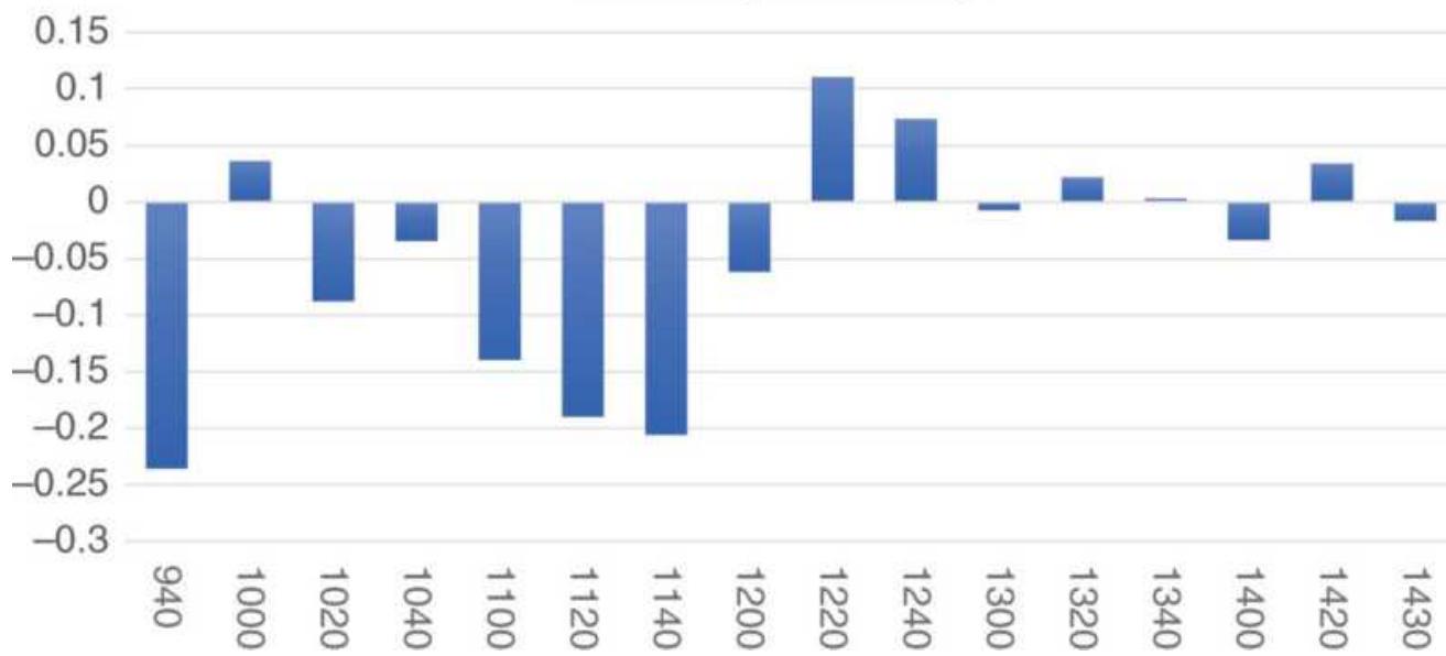
FIGURE 15.7 Crude oil time pattern for the sharp price decline from the highs in 2008.
Crude oil time patterns
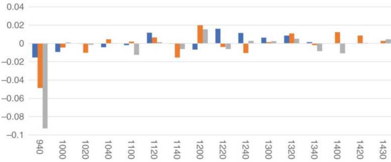
■2002-2006 Bull \(\quad\) Aug 2009-Aug 2014 Sideways - Aug 2016-Apr 2017 Bear
FIGURE 15.8 Crude oil time patterns for three cases of bull market, sideways, and bear market.
\section*{Finding the Common Pattern}
Bonds, the S\&P, and crude oil intraday time patterns reflect the current action of the market. The opening bar is the most volatile and decisive in determining the profits or losses for the day. There seem to be two approaches to profiting from these moves:
Determine the trend using a moving average of prices.
- Let the size of the opening bar tell you which scenario is correct.
It may be best to use both criteria. Trends lag, so if you are at the end of an upward trend and a series of opening bars posts larger losses than the combined move the rest of the day, the upward trend is either reversing or prices are entering a sideways period.
\section*{Intraday Highs and Lows}

When selecting a place to enter the market for a single day trade, it would be a great advantage to know the time of day at which the highest or lowest price is likely to occur. The same markets, the S\&P and the EURUSD will be used in case there is an opportunity to combine the previous time patterns with the likelihood of a high or low occurring. The tables and chart in this section were produced using the program TSM Intraday High-Low Distribution on the Companion Website.
\section*{30-Year U.S. Bond Futures}
Starting with bonds, because they have been in a sustained bull market, we capture the distribution of highs and lows throughout the day, shown in Figure 15.9. The first bar has the highest percentage of highs and lows, \(25 \%\) and \(27 \%\), and the last bar has the next highest frequency, \(16 \%\) and \(13 \%\). Looking back at the distribution of gains and losses for the same period, Table 15.2, the largest gain was on the first bar, more than \(1 / 3\) of the net gain for the day.
The two studies, taken together, offer the following scenarios:
- A gap opening upward can be the high or low for the day. Figure 15.9 shows that there is a somewhat equal chance of being either.
- If an upward gap is the low for the day, then the high is more likely to be made in the afternoon, especially at the close.
If an upward gap is the high for the day, then the low is likely to be made in the first part of the day, then a recovery in the afternoon does not make a new high.
There is an almost equal chance that the open will be lower. The following scenarios are possible:
Prices continue lower in the morning, then rally in the afternoon and may make a new high on the close.
\section*{U.S. 30-year bond futures, 1999-2017}
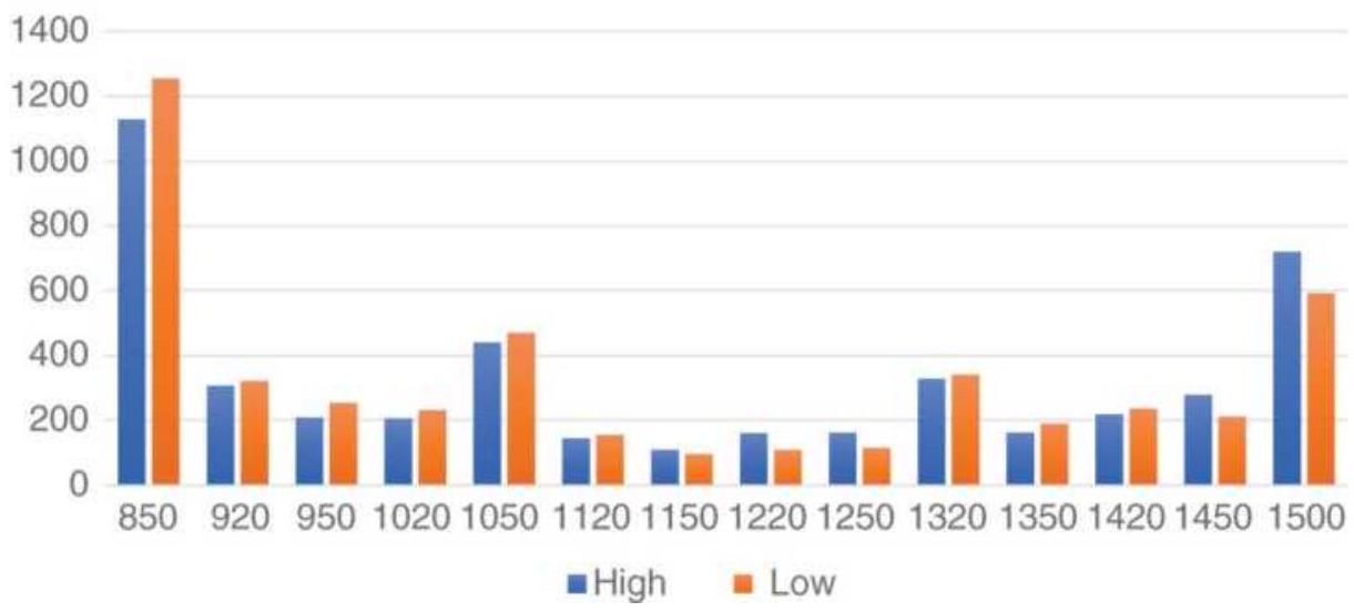
FIGURE 15.9 U.S. 30-year bond futures, highs and lows by time.
Prices move sideways throughout the day, making a new high or low at any time during the day, with the chance of a new high or low more likely on the close.
The price moves by time show that the changes are small after the open, so that any high or low not occurring on the first bar should be minor.
\section*{S\&P 500 Highs and Lows}
Using the period from 2009 through 2017, a clear bull market, the S\&P futures show that the lows are more likely to occur near the open through midday, and by 2 p.m. that switches to a greater chance of highs for the rest of the day (see Figure 15.10).
A trader can take advantage of this by deciding by midday whether prices have made a high or low for the day. The cumulative probability of a high or low (Figure 15.11) shows that, at 12:30 p.m. (NY time), there is a \(50 \%\)
chance of having seen the highs and a \(61 \%\) chance of having seen the lows. A new high after 12:30 would seem a good indication of a higher price to come and a reason to be long.
SP back-adjusted futures, 2009-2017
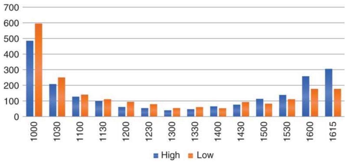
FIGURE 15.10 Distribution of highs and lows for S\&P futures, during the bull market, 2009-2017.
\section*{SP back-adjusted futures, 2009-2017 cumulative highs-lows}
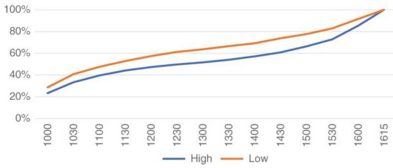
FIGURE 15.11 S\&P futures, cumulative percentage of
highs and lows, 2009-2017.
If we take the 2008 financial crisis as an example of a severe bear market, the pattern is very different. Figure 15.12 shows the highs more likely on the open, even while the losses in the first bar were very large (see Table 15.3). The conclusion is that, even with a sharply lower open, the first bar could still have been the high of the day. The rest of the day shows a mixed distribution of highs and lows indicating that early trading sets the tone for the day.
\section*{S\&P 2008 Financial crisis}
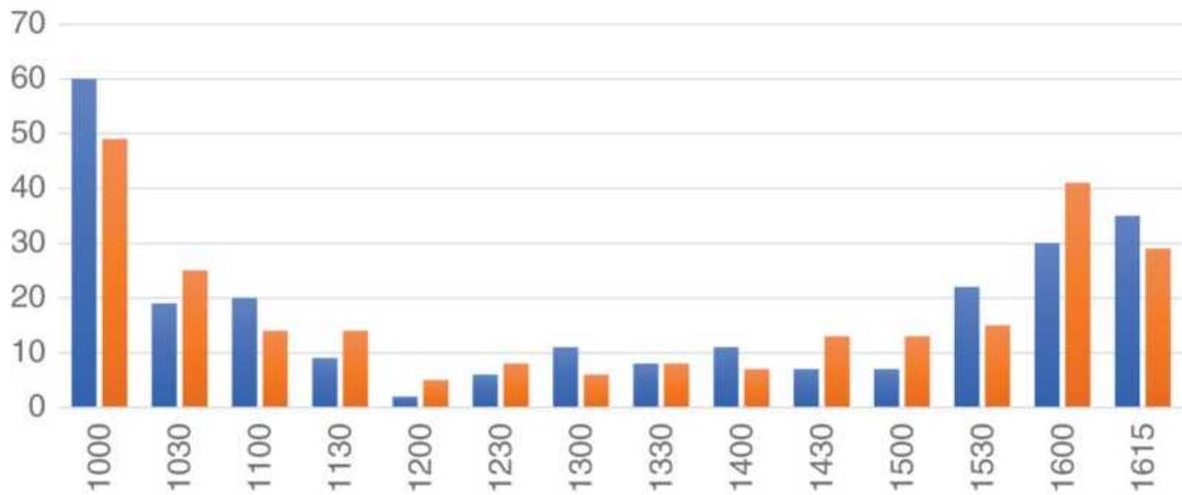
-High \(=\) Low
FIGURE 15.12 S\&P futures, frequency of highs and lows during the financial crisis of 2008.
\section*{EURUSD Highs and Lows}
Because currencies are actively traded around the world, the pattern for EURUSD is different from markets dominated by U.S. traders. Activity in the euro can be separated into three parts: from the open of Europe to
the open of the U.S. ( 2 a.m. to 8 a.m. in NY), from the open of the U.S. to the close of Europe ( 8 a.m. to 11 a.m.), and from the close of Europe to the close of the U.S. (11 a.m. to 4 p.m.). The euro has shown large swings against the dollar since its inception in the late 1990s. In Figure 15.13, the futures prices have ranged from a very strong dollar ( 0.90 ) to a much weaker dollar (1.64) and back up to about 1.23. The high-low distribution needs to be viewed in the same three regimes. Figure 15.14 highlights the period near midday when both markets are opens. Of course, traders can use Globex to trade 24 hours, but the greatest volume always comes during business hours and both Europe and the United States are open and active between 8 a.m. and 11 a.m.
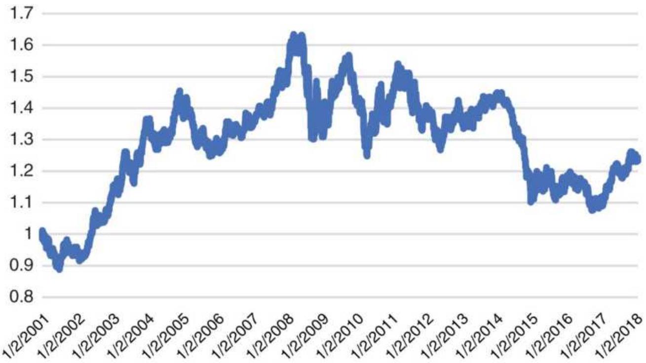
FIGURE 15.13 EURUSD futures from 2001 show wide price swings.
Euro currency futures, 2001-2017
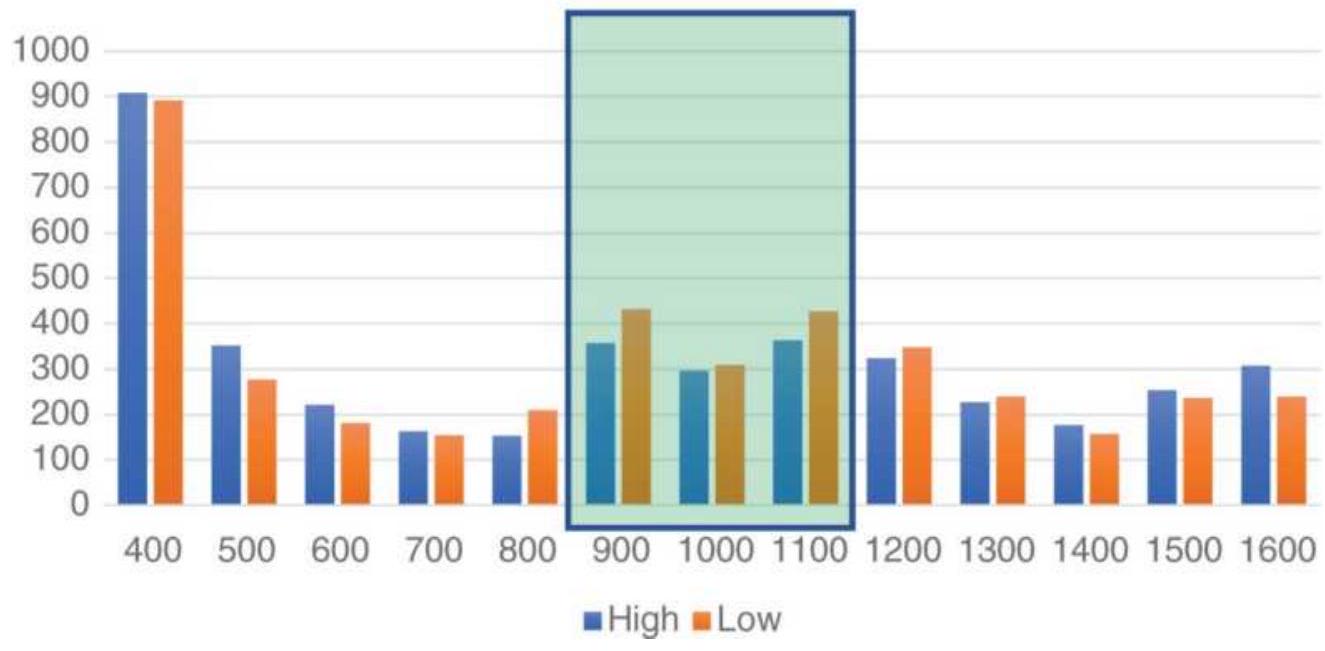
FIGURE 15.14 EURUSD high-lows marked with the times when the U.S. and Europe are both open.
Because the price chart in Figure 15.13 shows that 2018 prices are mid-range, it should not be surprising that there are no stand-out bars, that is, bars with either the high or lows much larger than the other. What is interesting is that the new lows are more likely as the European market closes, when new highs seem to favor the U.S close.
\section*{Using the Intraday High and Low Patterns for Trading}
There are few simple rules that come out of the intraday high-low patterns that are worth reviewing. Because there is a high frequency of the high or low occurring during the first bar of the day, you become more confident as the day progresses that an early extreme is a high or low. For example, the S\&P gaps up 12.00 points
after a bullish employment report. It then runs up to a high of up 15.00 points at the end of the first 30 minutes, then falls back 4 points to up 11.00 by the end of the second bar. Have we seen a high or a low? It may still be too early to tell, but our experience tells us that a trending market, such as bonds or the euro, will continue higher after making a new high while the S\&P is more likely to reverse. It should not take many bars to figure out the new direction. Some readers will be familiar with the classic Opening Range Breakout system, which buys a new high or sells a new low after some elapsed time following the open. These high-low charts show a similar picture, but they allow you to assign probabilities
because of the frequency distribution.
As each bar passes, we are more confident that we have seen the high or low. We can then trade in the highprobability direction, expecting that a new high or low will occur on or near the close. The sooner we make this decision, the more profit potential we can capture. A breakout of a high or low later in the day increases the chance of a close in that direction. Always place a stoploss at the point where a new low would occur if you are long, or a new high if you have sold short.
Midday offers another trading opportunity because of the small chance of seeing a new high or low. If you have decided that the low occurred near the open, then buying on a test of the lows during the quiet midday session could provide good entry timing. Chapter 16 will test a strategy based on the distribution of highs and lows.
\section*{An exception to every rule. During the 1990s the}
stock market experienced one of the greatest bull markets in history. From 1995 through 1996 nearly everyone was talking about the \(20 \%\) annual returns that were easily achieved in NASDAQ stocks and carried over into the broader market. This affected the intraday patterns. Investors would most often buy on the open, but they would also buy on any pullback during the day. The result was that the \(U\)-shaped pattern that we clearly see in the high-low distributions was replaced by a jump at the open and a straight line throughout the rest of the day.
\section*{OPENING GAPS}

Every trader sees the open as an opportunity for a profit. A large gap opening implies greater volatility, both up and down. Based on the way the market closes, it may also forecast the direction of the next opening price. This section looks at opening gaps in two different ways. The first is Table 15.5 showing the results for emini S\&P back-adjusted futures. You might realize that Globex trades 24 hours and there is no "gap opening," but the data used for these tests was built from intraday data to simulate what was once the "pit session," 8:30 a.m. to 3:15 p.m., Chicago time. To trade these gaps, measure the change in price from the previous close until the artificial open at 8:30 a.m. The table was created with the program TSM Gap Study on the Companion Website. The nine columns of the table are read as follows:
1. The opening gap expressed in big points for futures.
2. The number of cases for that opening gap.
3. Three columns explaining the closing price of the day
a. Cont Dir. The close continued (extended the move) in the direction of the gap.
b. Traded Below Open. The close was between the gap opening and the prior close.
TABLE 15.5 Results of the gap test using emini S\&P prices from 8:30 a.m. to 3:15 p.m., 2009-April 2018; gap increments of 2.00 points.
\begin{tabular}{|c|c|c|c|c|c|c|}
\hline \multirow[b]{2}{*}{\begin{tabular}{l}
Gap \\
in Big \\
Points
\end{tabular}} & \multirow[b]{2}{*}{ Cases } & \multicolumn{3}{|c|}{\begin{tabular}{c}
Position of the \\
Close
\end{tabular}} & \multicolumn{2}{|c|}{ Trading } \\
\hline & & Cont & \begin{tabular}{|c|}
Traded \\
Below \\
Open
\end{tabular} & \begin{tabular}{|l}
Rev \\
Dir
\end{tabular} & \begin{tabular}{|l}
Cross \\
Prev \\
Close
\end{tabular} & \begin{tabular}{|c|c}
( & Re \\
fro \\
Opi
\end{tabular} \\
\hline 20 & . 2 & . 1 & . 0 & . 1 & . 1 & 1 \\
\hline 18 & . 3 & . 0 & . 0 & .3 & & 3 \\
\hline . 16 & 2 & . 1 & . 0 & .1 & & 1 \\
\hline . 14 & . 6 & .2 & 3 & .1 & 3 & 3 \\
\hline 12 & .22 & .7 & 4 & 4 & . 14 & \\
\hline 10 & .25 & 12 & . 2 & .11 & . 12 & \\
\hline 8 & .58 & 16 & 13 & .29 & 35 & \\
\hline 6 & 153 & 63 & 25 & 65 & 85 & \\
\hline 4 & 260 & 109 & 26 & 124 & 158 & \\
\hline
\end{tabular}
\begin{tabular}{|r|r|r|r|r|r|r|}
\hline 2 & 357 & 200 & 7 & 141 & 178 & \\
\hline .0 & 41 & 0 & 0 & 0 & 0 & \\
\hline.-2 & 310 & 119 & 3 & 180 & 310 & \\
\hline.-4 & 275 & 91 & 26 & 150 & 274 & \\
\hline.-6 & 182 & 63 & 23 & 93 & 182 & \\
\hline.-8 & 68 & 17 & 15 & .35 & .68 \\
\hline-10 & 29 & .2 & .9 & .18 & .29 \\
\hline .12 & .8 & .2 & .2 & .4 & .8 \\
\hline .14 & .7 & .2 & .1 & .4 & .7 \\
\hline .16 & .0 & .0 & .0 & .0 & .0 \\
\hline .18 & .0 & .0 & .0 & .0 & .0 \\
\hline .20 & .6 & .1 & .0 & .5 & .6 \\
\hline
\end{tabular}
c. Rev Dir. The close reversed the direction of the opening gap, that is, if the open was higher, the close was lower.
4. The next three columns show the trading range pattern.
a. Cross Prev Close. Prices crossed the prior closing price at least once during the trading session.
b. Rev from Open. Prices reversed from the open but did not cross the prior close.
c. Cont Next Day. Prices continued in the direction of the open and never reversed.
5. The last column shows the number of times that
prices continue on the next open in the direction of today's gap.
\section*{Gaps in Futures Markets}
Starting with the S\&P in Table 15.5, we can summarize the information by adding all the values from gaps of 8 points and higher, and gaps of -8 points and lower, given in Table 15.6. This will simplify the analysis and give us enough trades to draw conclusions. By adding a line showing the percentage of times (out of the 118 cases) an event happened, we can find which combinations have the most promise.
The test shows that the S\&P was most likely to reverse direction by the close, that is, if prices gapped higher, the close would be lower than the open, and if it gapped lower, the close would be higher. The upward bias in equities is seen in the downward gaps closing higher \(56 \%\) of the time while the upward gaps closed lower only \(48 \%\) of the time.
The statistics for the downward gaps are especially interesting for the three columns of the Trading Range. Of the 118 cases, all of them, since 2009, crossed above the previous close after gapping down. None of them closed lower and none of them closed between the open and the previous close. There was a strong tendency to recover. Even in a sustained bull market, this seems unusual.
\section*{Bonds}
The analysis of 30-year bond futures spanned February
1999 through April 2017, and used increments of a quarter of a point, o.25. The results were summarized for gaps of 0.75 and higher, and -0.75 and lower, shown in Table 15.7.
TABLE 15.6 Summary of S\&P gap test results.
\begin{tabular}{|c|c|c|c|c|c|c|c|c|}
\hline \multirow[b]{2}{*}{ Gap } & \multirow[b]{2}{*}{ Cases } & \multicolumn{3}{|c|}{\begin{tabular}{c}
Position of the \\
Close
\end{tabular}} & \multicolumn{4}{|c|}{ Trading Range } \\
\hline & & \(\underset{\text { Dir }}{\text { Cont }}\) & \begin{tabular}{l}
Below \\
Open
\end{tabular} & \begin{tabular}{l}
Rev \\
Dir
\end{tabular} & \begin{tabular}{l}
Cross \\
Prev \\
Close
\end{tabular} & \begin{tabular}{l}
Adj \\
from \\
Open
\end{tabular} & \begin{tabular}{l}
Cont \\
Only
\end{tabular} & 到 \\
\hline \multirow[t]{2}{*}{\(>=\)} & 118 & 39 & 2 & 57 & .69 & 19 & 30 & \\
\hline & Percent & \(33 \%\) & \(19 \%\) & 48\% & .58\% & 16\% & 25\% & \\
\hline \multirow[t]{2}{*}{\begin{tabular}{l}
\(<=\) \\
-8
\end{tabular}} & 118 & 24 & 27 & 66 & 118 & . 0 & . 0 & \\
\hline & \(\square\) & \(\square\) & \(\square\) & \(56 \%\) & 100\% & .0\% & o\% & \\
\hline
\end{tabular}
TABLE 15.7 U.S. 30-year bond futures, 19992017
\begin{tabular}{|c|c|c|c|c|c|c|c|}
\hline \multirow[b]{2}{*}{ Gap } & \multirow[b]{2}{*}{ Cases } & \multicolumn{3}{|c|}{\begin{tabular}{c}
Position of the \\
Close
\end{tabular}} & \multicolumn{3}{|c|}{ Trading Range } \\
\hline & & Cont & \begin{tabular}{l}
Below \\
Open
\end{tabular} & \begin{tabular}{l}
Rev \\
Dir
\end{tabular} & \begin{tabular}{l}
Cross \\
Prev \\
Close
\end{tabular} & \begin{tabular}{c}
Adj \\
from \\
Open
\end{tabular} & \begin{tabular}{|l|}
Cont \\
Only
\end{tabular} \\
\hline \multirow[t]{2}{*}{\begin{tabular}{l}
\(>=\) \\
0.75
\end{tabular}} & 148 & 32 & 40 & 74 & .84 & 38 & 24 \\
\hline & Percent & \(22 \%\) & \(27 \%\) & 50\% & \(.57 \%\) & \(26 \%\) & \(16 \%\) \\
\hline
\end{tabular}
\begin{tabular}{|l|c|c|c|c|c|c|c|c|}
\hline\(=\) & 118 & 24 & 27 & 66 & 118 & .0 & .0 \\
\hline-0.75 & & & & & & & \\
\hline & Percent & \(20 \%\) & \(23 \%\) & \(56 \%\) & \(100 \%\) & \(.0 \%\) & \(.0 \%\) & \(\vdots\)
\end{tabular}
Remembering that bonds have been in a consistent bull market for most of years since 1980, the table shows more upward gaps than downward. The bullishness of prices can be seen in the column Cross Prev Close, where \(100 \%\) of the downward gaps reversed sometime during the day to cross above the previous close. Only \(57 \%\) of the upward gaps traded below the previous close. Neither higher nor lower gaps indicated a continuation the next day.
\section*{Crude Oil}
Crude oil futures were tested for the shortest period, September 2014 through April 2017, in increments of o.10, ten cents. During this time, crude was either in a downward or sideways price pattern. Table 15.8 summarizes the results for upward gaps of at least 30 cents and downward of -30 cents. The most outstanding value is that downward gaps crossed above the previous close \(98 \%\) of the time. The numbers also show that crude reversed direction most of the time, which is understandable in both a sideways and downward market. Many commodities resist lower prices.
\section*{The Euro}
As seen earlier, the euro has moved from par against the U.S. dollar to 1.50 , back down to 1.10 , and in 2018 it sits in the middle, at about 1.23. This test covered the period
from April 2001 through April 2017, using increments of 0.0025. Results are summarized from +0.0075 and higher, and -0.0075 and lower in Table 15.9.
TABLE 15.8 Crude oil futures, September 2014April 2017.
\begin{tabular}{|c|c|c|c|c|c|c|c|}
\hline \multirow[b]{2}{*}{ Gap } & \multirow[b]{2}{*}{ Cases } & \multicolumn{3}{|c|}{\begin{tabular}{l}
Position of the \\
Close
\end{tabular}} & \multicolumn{3}{|c|}{ Trading Range } \\
\hline & & Cont & \begin{tabular}{l}
Below \\
Open
\end{tabular} & \begin{tabular}{l}
Rev \\
Dir
\end{tabular} & \begin{tabular}{l}
Cross \\
Prev \\
Close
\end{tabular} & \begin{tabular}{|c}
Adj \\
from \\
Open
\end{tabular} & \begin{tabular}{l}
Cont \\
Only 1
\end{tabular} \\
\hline \multirow{2}{*}{\begin{tabular}{l}
\(>=\) \\
0.30
\end{tabular}} & 63 & 24 & 7 & 30 & 35 & . 8 & 20 \\
\hline & Percent & \(38 \%\) & \(11 \%\) & \(48 \%\) & 56\% & \(13 \%\) & \(32 \%\) \\
\hline \multirow[t]{2}{*}{\begin{tabular}{l}
\(<=\) \\
-0.30
\end{tabular}} & 62 & 29 & .9 & 24 & 62 & . 0 & . 0 \\
\hline & Percent & \(46 \%\) & \(14 \%\) & \(38 \%\) & 98\% & .0\% & .0\% \\
\hline
\end{tabular}
TABLE 15.9 Euro currency futures, April 2001April 2017.
\begin{tabular}{|c|c|c|c|c|c|c|c|}
\hline \multirow[b]{2}{*}{ Gap } & \multirow[b]{2}{*}{ Cases } & \multicolumn{3}{|c|}{\begin{tabular}{c}
Position of the \\
Close
\end{tabular}} & \multicolumn{3}{|c|}{ Trading Range } \\
\hline & & Cont & \begin{tabular}{|l|}
Below \\
Open
\end{tabular} & \begin{tabular}{l}
Rev \\
Dir
\end{tabular} & \begin{tabular}{|l}
Cross \\
Prev \\
Close
\end{tabular} & \begin{tabular}{c}
Adj \\
from \\
Open
\end{tabular} & \begin{tabular}{|l|l}
Cont \\
Only
\end{tabular} \\
\hline \multirow[t]{2}{*}{\begin{tabular}{l}
\(>=\) \\
0.0075
\end{tabular}} & 58 & 9 & 21 & 27 & 35 & 16 & .7 \\
\hline & & \(16 \%\) & \(36 \%\) & \(47 \%\) & .60\% & \(28 \%\) & \(12 \%\) \\
\hline
\end{tabular}
\begin{tabular}{|c|c|c|c|c|c|c|c|}
\hline\(<=\) & 58 & 14 & 15 & 29 & .58 & .0 & .0 \\
\hline & & 24\% & 26\% & 50\% & 100\% & . \(0 \%\) & .0\% \\
\hline
\end{tabular}
As with the other markets, the tendency for downward gaps to cross back above the previous close is strong. Upward gaps crossed below the previous close \(60 \%\) of the time, which is also high. Neither higher or lower gaps had a tendency to close at a more extreme price, as seen in the column Cont Dir. Because the data spans a longer period, and prices have moved within a wide range, the noise seems to be the dominant characteristic.
\section*{Gaps in Stocks}
The same test was run on a number of popular stocks representing different types of price moves. All tests were from 2000.through April 2018 and the normal trading session, 9:30 a.m. to 4:00 p.m., was used. Starting with Amazon (AMZN), increments of \(\$ 5\) were necessary to capture the right frequency, knowing that it would eliminate most of the events prior to 2010 when prices were much lower.
Table 15.10 is the profile of a bull market. For opening gaps of \(\$ 10\) and higher, or \(-\$ 10\) and lower, there were 180 upward gaps and 106 downward gaps. In addition, \(63 \%\) of the time an upward gap was followed by a higher open the next day, but only \(25 \%\) of the events showed downward gaps followed by a lower open. The column
Cont Dir shows that \(52 \%\) of the time, prices closed higher than the opening upward gap while in only \(27 \%\) of the cases did prices close lower than the opening
downward gap. All these numbers say that you want to buy Amazon, not sell it. No surprise.
\section*{General Electric}
As bullish and volatile as Amazon is, General Electric was selected to be the opposite. Most investors own it for its dividend rather than price appreciation. Since 1998 it has rallied to \(\$ 45\) at the beginning of 2000, dropped to \(\$ 10\) by the end of the 2002 bear market, rallied to \(\$ 35\) only to collapse again to near zero during the financial crisis of 2008. Another rally to \(\$ 30\) was in 2016 and it was on its way down at \(\$ 13\) in early 2018. Is there an opportunity when prices gap open?
There are no percentages that stand out in Table 15.11. The most interesting is the Rev Dir, which says whether a lower gap will close higher (20\%) and a higher gap will close lower (16\%). Combined with the column Adj from Open, we have the case where a lower open rallies but doesn't reach the previous close, then declines again. The same pattern seems to occur for upward gaps.
Opportunities are smaller, but they exist.
TABLE 15.10 Amazon (AMZN) gap analysis, \(2000-\) April 2018.
\begin{tabular}{|l|c|c|c|c|c|c|c|c|c|}
\hline & & \multicolumn{3}{|c|}{ Position of the } & \multicolumn{3}{|c|}{ Trading Range } \\
\hline Gap & Cases & \begin{tabular}{c}
Cont \\
Close
\end{tabular} & \begin{tabular}{c}
Below \\
Dir
\end{tabular} & \begin{tabular}{c}
Rev \\
Open
\end{tabular} & \begin{tabular}{c}
Cross \\
Dir
\end{tabular} & \begin{tabular}{c}
Adj \\
Prev \\
from
\end{tabular} & \begin{tabular}{c}
Cont \\
Only
\end{tabular} & \begin{tabular}{c}
Co \\
Ne
\end{tabular} \\
\hline\(>=\) & 180 & 93 & 50 & 37 & 64 & 114 & 2 & 11. \\
\hline\(>a\)
\end{tabular}
\begin{tabular}{|l|c|c|c|c|c|c|c|c|}
\hline 10 & & & & & & & & \\
\hline \begin{tabular}{l}
\(<=\) \\
-10
\end{tabular} & 106 & 48 & 33 & 25 & 41 & 65 & 0 & .4 \\
\hline & & \(27 \%\) & \(18 \%\) & \(14 \%\) & \(23 \%\) & \(36 \%\) & \(0 \%\) & .25 \\
\hline
\end{tabular}
TABLE 15.11 General Electric (GE) gap analysis, 2000 -April 2018.
\begin{tabular}{|c|c|c|c|c|c|c|c|c|}
\hline \multirow[b]{2}{*}{ Gap } & \multirow[b]{2}{*}{ Cases } & \multicolumn{3}{|c|}{\begin{tabular}{c}
Position of the \\
Close
\end{tabular}} & \multicolumn{3}{|c|}{ Trading Range } & \\
\hline & & Dont & \begin{tabular}{l}
Below \\
Open
\end{tabular} & \begin{tabular}{l}
Rev \\
Dir
\end{tabular} & \begin{tabular}{|c|}
Cross \\
Prev \\
Close
\end{tabular} & \begin{tabular}{|c}
Adj \\
from \\
Open
\end{tabular} & & \\
\hline \multirow[t]{2}{*}{\begin{tabular}{l}
\(>=\) \\
1.00
\end{tabular}} & & 6 & & 26 & & 80 & 1 & \\
\hline & & \(49 \%\) & 28\% & 20\% & \(34 \%\) & 62\% & \(1 \%\) & \\
\hline \multirow[t]{2}{*}{\begin{tabular}{l}
\(<=\) \\
-1.00
\end{tabular}} & & 56 & 43 & 20 & 36 & 76 & 1 & \\
\hline & & \(43 \%\) & \(33 \%\) & \(16 \%\) & \(28 \%\) & \(59 \%\) & \(1 \%\) & \\
\hline
\end{tabular}
\section*{Micron, Boeing, and Tesla}

There are three other gap analysis tables, Micron (MU), Boeing (BA), and Tesla (TSLA), in Tables 15.12, 15.13, and 15.14 . You can create these for any stock using the program on the Companion Website. These three stocks represent very different fundamentals and are highly liquid. For MU and BA, Adj from Open are most
interesting; neither stocks reverse direction from the opening gap very often. Both have some follow-through the next day.
TABLE 15.12 Micron (MU) gap analysis, 2000April 2018.
\begin{tabular}{|c|c|c|c|c|c|c|c|c|}
\hline \multirow[b]{2}{*}{ Gap } & \multirow[b]{2}{*}{ Cases } & \multicolumn{3}{|c|}{\begin{tabular}{c}
Position of the \\
Close
\end{tabular}} & \multicolumn{3}{|c|}{ Trading Range } & \\
\hline & & Cont & \begin{tabular}{l}
Below \\
Open
\end{tabular} & \begin{tabular}{l}
Rev \\
Dir
\end{tabular} & \begin{tabular}{|l}
Cross \\
Prev \\
Close
\end{tabular} & \begin{tabular}{|c|}
Adj \\
from \\
Open
\end{tabular} & & \\
\hline \multirow[t]{2}{*}{\begin{tabular}{l}
\(>=\) \\
1.50
\end{tabular}} & 55 & 27 & & 7 & 14 & & 1 & \\
\hline & & \(49 \%\) & \(36 \%\) & \(13 \%\) & \(25 \%\) & 7 & 2\% & \\
\hline \multirow[t]{2}{*}{\begin{tabular}{l}
\(<=\) \\
-1.50
\end{tabular}} & 57 & 33 & 17 & 6 & 15 & 36 & 5 & 27 \\
\hline & & \(60 \%\) & \(31 \%\) & \(11 \%\) & \(27 \%\) & \(65 \%\) & \(9 \%\) & \\
\hline
\end{tabular}
TABLE 15.13 Boeing (BA) gap analysis, 2000April 2018.
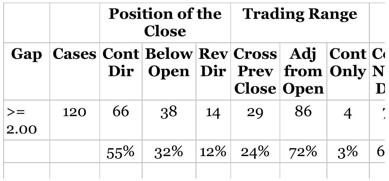
\begin{tabular}{|c|c|c|c|c|c|c|c|}
\hline \begin{tabular}{l}
\(<=\) \\
-2.00
\end{tabular} & 101 & 50 & 38 & 12 & 25 & 74 & 2 \\
\hline & & 42\% & 32\% & 10\% & 21\% & 62\% & 2\% \\
\hline
\end{tabular}
TABLE 15.14 Tesla (TSLA) gap analysis, 2000April 2018.
\begin{tabular}{|l|c|c|c|c|c|c|c|c|c|}
\hline & & \multicolumn{3}{|c|}{ Position of the } & \multicolumn{3}{|c|}{ Trading Range } \\
\hline Gap & Cases & \begin{tabular}{c}
Cont \\
Dir
\end{tabular} & \begin{tabular}{c}
Below \\
Open
\end{tabular} & \begin{tabular}{c}
Rev \\
Dir
\end{tabular} & \begin{tabular}{c}
Cross \\
Prev \\
Close
\end{tabular} & \begin{tabular}{c}
Adj \\
from \\
Open
\end{tabular} & \begin{tabular}{c}
Cont \\
Only
\end{tabular} & \begin{tabular}{c}
C \\
\(\mathbf{C}\)
\end{tabular} \\
\hline\(>=\) & 348 & 142 & 109 & .97 & 193 & 154 & 0 & 1 \\
\hline 2.00 & & & & & & & & \\
\hline & & \(.41 \%\) & \(.31 \%\) & \(28 \%\) & \(.55 \%\) & \(.44 \%\) & \(0 \%\) & .5 \\
\hline\(<=\) & 256 & 113 & 65 & .78 & 147 & 109 & 0 & 1 \\
\hline-2.00 & & & & & & & & \\
\hline & & \(.32 \%\) & \(.19 \%\) & \(22 \%\) & \(.42 \%\) & \(.31 \%\) & \(0 \%\) & .3 \\
\hline
\end{tabular}
Tesla has been a remarkable story that doesn't seem to show in the gap statistics. The number of upward gaps exceeds the downward gaps, indicating a bull market, but most of the other percentages are not high enough or low enough to create confidence in trading. Not all markets present opportunities.
\section*{Generalizing the Gap Openings for Stocks}
Is there a "big picture" of how stocks move after a gap opening? Rather than study each stock, combining a large number of stocks should give a more robust pattern
of how prices move. With that in mind, a test of 275 stocks, from 2000 through 2017, separated the gaps into increments of \(2 \%\), that is \(1 \%\) to \(3 \%, 3 \%\) to \(5 \%, \ldots .9 \%\) to \(11 \%\), and greater than \(11 \%\).
For each gap increment, we collected:
- The number of cases
- The size of the pullback (open to low for an upward gap)
- The closing price relative to the open
\section*{Upward Gaps}
If we average all 275 stocks, we get the results in Table 15.15. It shows what we already expect. Most of the upward gaps, occurring on \(31 \%\) of the days, are between \(1 \%\) and \(3 \%\). Prices pull back a good portion of the gap, generally more if the gap is larger, after which prices close very near the opening price. The pullback reflects a normal volatility relationship. It's safe to say that, in general, the pullback is about \(40 \%\) of the gap.
TABLE 15.15 Average upward gaps, pullbacks, and close for 275 liquid stocks.
\begin{tabular}{|c|c|c|c|c|c|}
\hline \begin{tabular}{c}
Higher \\
Open
\end{tabular} & \(\mathbf{1 - 3 \%}\) & \(\mathbf{3 - 5 \%}\) & \(\mathbf{5 - 7 \%}\) & \(\mathbf{7 - 9 \% \%}\) & \(\mathbf{9 - 1 1 \%}\) \\
\hline \%Events & \(31.26 \%\) & \(.3 .06 \%\) & \(.0 .99 \%\) & \(.0 .63 \%\) & \(.0 .59 \%\), \\
\hline \%Pullback & \(-1.45 \%\) & \(-2.50 \%\) & \(-2.73 \%\). & \(-2.99 \%\). & \(-3.51 \%\), \\
\hline \%Close & \(.0 .01 \%\). & \(-0.50 \%\). & \(-0.24 \%\). & \(-0.14 \%\). & \(-0.08 \%\). \\
\hline
\end{tabular}
This gives us a good idea of how to trade an upward gap
opening. If you began with a long position, take profits, wait for pullback, then reset your position. You should expect to gain anywhere from a \(1 \%\) to a \(4 \%\) but individual stocks and erratic price movements may make that much better or worse. If you had no position and just wanted to be long, you could capture about \(40 \%\) of the opening gap outright.
Note that any stock trading under \(\$ 5\) was ignored. Experience has shown that those prices can be unusually volatile and can distort the results.
\section*{Downward Gaps}
The fewer \%Events of downward gaps, shown in Table 15.16, confirm that stocks are biased to the upside. Pullbacks (an upward move after a downward gap) are a little larger, and the average of all stocks shows that prices consistently close higher than they open, another vote in favor of upward bias.
If you're a day trader, long-only, you can buy shortly after the open (volume dropping usually indicates that the sell-off is ending), then sell on a rally of about half the gap down. If you're holding a long position when prices gap down, you can exit on a rally of about one-half the gap, then reset on the close, trimming some of the loss.
\section*{Specific Stocks}
How much variation is there in the pattern of individual stocks? Averages can hide problems. Table 15.17 shows seven stocks, upward gaps on the top line, downward
gaps on the second line. Using Apple (AAPL) as an example, there are 111 days where prices gapped up between \(1 \%\) and \(3 \%\), but no days where it gapped \(u p\) more than \(11 \%\). However, there was one day when it gapped down more than \(11 \%\). Pullbacks were between \(1 \%\) and \(3 \%\) for upward gaps, with the exception that the one downward gap of \(9 \%-11 \%\) rallied \(15.32 \%\) and closed \(9.07 \%\) above the open. That must have been a volatile day!
TABLE 15.16 Average downward gaps, pullbacks, and close for 275 liquid stocks.
\begin{tabular}{|c|c|c|c|c|c|c|}
\hline \begin{tabular}{c}
Lower \\
Open
\end{tabular} & 1-3\% & 3-5\% & 5-7\% & \begin{tabular}{c}
\(7-\) \\
\(9 \% \%\)
\end{tabular} & 9- & \(>119\) \\
\hline \%Events & & 2.78\% & 0.94\%. & 0.59\%. & 47\%. & 0.64 \\
\hline k & & 2.48\%. & 3.33\%. & 4.07\%. & 5.72\%. & 5.90\% \\
\hline Cl & 0.11\%. & .34\% & 0.44 & 0.70\%. & 2.27\%. & . \(1.27^{\circ}\) \\
\hline
\end{tabular}
TABLE 15.17 Selected stocks, data from 20122017.
\begin{tabular}{|l|l|r|r|r|r|c|c|c|}
\hline & & \multicolumn{6}{|c|}{ Events } & \\
\hline & & \(\mathbf{1 -}\) & \(\mathbf{3 -}\) & \(\mathbf{5 -}\) & \(\mathbf{7 -}\) & \(\mathbf{9 -}\) & \(>\mathbf{1 1 \%}\) & \(\mathbf{1 -}\) \\
& & \(\mathbf{3 \%}\) & \(\mathbf{5 \%}\) & \(\mathbf{7 \%}\) & \(\mathbf{9 \%}\) & \(\mathbf{1 1 \%}\) & & \(\mathbf{3 \%}\) \\
\hline AAPL & Upward & 111 & 5 & 2 & 3 & 1 & 0 & -1.29 \\
\hline & Downward & 68 & 9 & 2 & 2 & 1 & 1 & 1.49 \\
\hline AMZN & Upward & 96 & 4 & 1 & 2 & 2 & 3 & -1.29 \\
\hline
\end{tabular}
\begin{tabular}{|l|l|r|r|r|r|r|r|r|}
& Downward & 48 & 8 & 2 & 1 & 2 & 1 & 1.58 \\
\hline FB & Upward & 124 & 12 & 4 & 0 & 1 & 4 & -1.57 \\
\hline & Downward & 79 & 9 & 4 & 0 & 1 & 1 & 1.68 \\
\hline GOOGL & Upward & 52 & 9 & 2 & 0 & 2 & 1 & -1.09 \\
\hline & Downward & 45 & 2 & 1 & 0 & 0 & 0 & 1.28 \\
\hline JCP & Upward & 150 & 20 & 5 & 4 & 1 & 4 & -2.19 \\
\hline & Downward & 105 & 14 & 8 & 5 & 1 & 2 & 2.7 \\
\hline NFLX & Upward & 139 & 15 & 3 & 3 & 1 & 8 & -2.02 \\
\hline & Downward & 99 & 9 & 3 & 1 & 0 & 5 & 2.01 \\
\hline TSLA & Upward & 205 & 34 & 9 & 2 & 0 & 5 & -2.12 \\
\hline & Downward & 137 & 25 & 3 & 1 & 4 & 2 & 2.44 \\
\hline
\end{tabular}
JC Penney (JCP) shows a more classic pattern in its pullbacks, larger as the gap gets larger, and 4 days with gaps over \(11 \%\). Penney has been trading at lower price levels, so there is a tendency to have larger moves. Note that both the upward and downward gaps close mixed relative to the open.
You can get a better understanding of the opportunities by looking at the close relative to the open, shown in the right panel. It may be a characteristic of the extended bull market, but stocks that open higher or lower tend to close near the open. There are a few exceptions, but they seem to reflect single events, such as a Netflix upward gap of \(9 \%\) to \(11 \%\) that closed \(16.68 \%\) lower than the open.
\section*{Trading a Gap Opening}
During the past six years, gap openings consistently have
pullbacks, probably in the first two hours of trading, and eventually close near the open. That gives you a working set of rules for day trading. If you have a long-only stock portfolio, exiting after the profitable gap open and resetting on a pullback is a better trade. Gaps also tend to be in the direction of the trend, so combining gap daytrading in a portfolio of trend-following positions can be a good complement.
\section*{WEEKDAY, WEEKEND, AND REVERSAL PATTERNS}
There are many patterns that are important to traders because they seem intuitively correct. In Chapter 10, "Seasonality and Calendar Patterns," we discussed month-end patterns which are attributed to the flow of funds in and out of large pensions and investment firms as well as evening up and resetting of positions before an accounting period. The next three sections are also concerned with day-to-day patterns. The first, weekday patterns, looks only at the closing prices during the \(5^{-}\) days from Monday through Friday in order to find recurring patterns. A week is often considered to have integrity as a trading unit of time, and participants are accused of acting in the same way each week. During a bull market, we are made to believe that new investors will enter on Monday; by Tuesday or Wednesday the inflows have waned, and prices fall back. This study attempts to isolate repeated patterns. For example, if prices have moved in the same direction from Monday through Thursday, should we expect a correction due to
profit-taking on Friday? Because patterns represent human behavior, the results will be insightful.
Weekend patterns are considered separately. The opening direction on Monday could restore the trend of the prior week, if those traders who liquidate on Friday intend to reset their positions. The weekend is also an extended period for unexpected news or a build-up of public interest. In a weather market, the fickleness of nature can cause traders to take defensive action ahead of the weekend. This study will also attempt to relate the direction of the Monday opening price to some pattern or trend during the preceding week.
Reversal patterns are not based on a day of the week but have often been discussed as a leading indicator. They may also be used for filtering or entry timing.
\section*{Weekday Patterns}
During their constant exposure to the market, professional traders observe patterns in weekly price movement; their acceptance of these patterns is as old as the market itself. In Reminiscences of a Stock Operator, the fictional character Larry Livingston (whom we believe to be Jesse Livermore) begins his career recording prices on a chalk board above the floor of the New York Stock Exchange, eventually becoming aware of patterns in these sequences of numbers. The most accepted pattern is the Tuesday reversal, which is taken as commonplace by close observers of the market. When questioned why a strong soybean market on the first of the week is reversed the next day, an aged member of the
Board of Trade would shrug his shoulders and quote: "Up on Monday, down on Tuesday." If this is true, there is a trading opportunity.
If a commonly accepted idea is not enough to be convincing, consider the additional idiosyncrasies of human behavior: The weekend allows a build-up of sentiment, which should result in greater activity on Monday. Coupled with adding back positions that were liquidated prior to the weekend, this may cause extra volume and a disproportionate move early in the session on Monday. This pattern may be further exaggerated when a clear trend exists. With a larger move on Monday, it is likely that Tuesday would show a correction. However, trying to justify how the market works is not as significant as looking at the numbers.
The first step is how to define the weekday pattern. Monday always receives the value \(\times\), regardless of whether its direction from Friday was up or down. For each day that closed in the same direction as the Fridayto-Monday move, another \(\times\) is used; when the close reversed direction, an O is recorded. Therefore, \(\times \mathrm{O} \times \times \mathrm{O}\) means that Tuesday and Friday closed in the opposite direction from the prior Friday-to-Monday move while Wednesday and Thursday were in the same direction. This could have meant either of the situations:
\begin{tabular}{|l|l|l|l|}
\hline & & (1) & \multicolumn{1}{c|}{ (2) } \\
\hline Monday & \(\times\) & Up & Down \\
\hline Tuesday & O & Down & Up \\
\hline Wednesday & \(\times\) & Up & Down \\
\hline
\end{tabular}
\begin{tabular}{|l|l|l|l|}
\hline Thursday & \(\times\) & Up & Down \\
\hline Friday & O & Down & Up \\
\hline
\end{tabular}

There may be a distinction between the weeks that begin with an upward move on Monday rather than a decline, but both cases were combined. It would also be reasonable to have assumed that the upward bias of interest rate markets during the past 30 years would justify a separation of patterns according to their initial direction. Additional tests might filter the results by overall market volatility or by a long-term or short-term trend. The program that produced these results is TSM Weekday Patterns, on the Companion Website. It does not use any filters, only records the weekday patterns in the simplest way. You can modify the program with conditions that seem important.
Results are shown as a binary tree with columns for each day of the week. Because all tests cover the period from January 2000 through April 2018, there are about 823 weeks. On Monday, all 823 are used and on Tuesday the two possible directions, up and down, will split that number according to the frequency of occurrence. By Friday there are 16 possible outcomes and, if they are all of equal probability, then each will have 51 entries. Because the number of entries drops quickly, more extreme probabilities earlier in the week would give greater confidence.
\section*{U.S. 30 -Year Bonds}
Starting with bonds because of its strong trend, Figure
15.15 shows a full set of possible weekday combinations, tested for 823 weeks, from January 2000 through April 2018. Tuesday shows a bias toward continuing in the same direction as Monday ( \(52 \%\) to \(48 \%\) ), but there is less of a bias on Wednesday. The combination with the largest probability is \(\times \mathrm{OO} \times \mathrm{O}\), indicating three of the four weekdays reversed Monday's move \(57 \%\) of the time. If you were hoping for a case that had a \(70 \%\) or \(80 \%\) reliability, you're going to be disappointed. What this does not show is that the Friday to Monday move may have been up \(70 \%\) of the time. The size of the reversals might have been much smaller than the size of the moves on the two days that continued Friday's direction.
The pattern that is best at the end of the week is \(\times \mathrm{OO} \times \mathrm{O}\) with \(57 \%\). That's consistent with the low probability of \(\times O O \times \times\) with \(43 \%\). That situation will happen 57 out of 823 weeks, or \(7 \%\) of the time.
As for "up on Monday, down on Tuesday," bonds show a reversal on Tuesday only \(48 \%\) of the time, but that may be the result of a persistent bull market.

FIGURE 15.15 U.S. 30-year bond weekday patterns, 2000-April 2018.
\section*{Heating Oil}
A more interesting market is heating oil, which has strong seasonality and occasional volatility during the winter months. There are two tests shown, one from 2000 through 2017 ( 829 weeks), and the other for just the two years, April 2016 to April 2018 (Figure 15.16). Results may be different if the data was limited to the heating oil season, from about August through March, but these tests include the entire year.
As with bonds, there are no exceptionally high
percentages by the time we get to Friday. However, if we take all the patterns with probabilities greater than \(50 \%\), we find that 5 out of 8 , or \(62 \%\), favor the same direction as Monday. That's a more interesting number for trading. If we look back at bonds, we find that \(66 \%\), or 4 of 6 cases greater than 50\%, favored a reversal on Friday.
If we limit the test to only one year, April 2017 to April 2018, we get more interesting results at the cost of fewer cases and less confidence. Figure 15.17 highlights the combinations with higher probabilities. If we take only those Friday combinations that show at least \(75 \%\), there are 3 of 4 reversals from Monday based on a total of 25 cases out of 49 , or \(51 \%\). That's quite high.
\section*{S\&P Futures}
With huge volume in the S\&P, is there a weekday pattern that can be exploited? Figure 15.18 shows the results of using data from 2000 through April 2018. We see a small bias toward reversing on Tuesday, but no large probabilities. If we look at all Friday probabilities greater than \(50 \%\), there is a \(62.5 \%\) chance of a reversal from Monday's direction. That fits with the idea that equity index markets are noisy, although it's a small edge for trading.
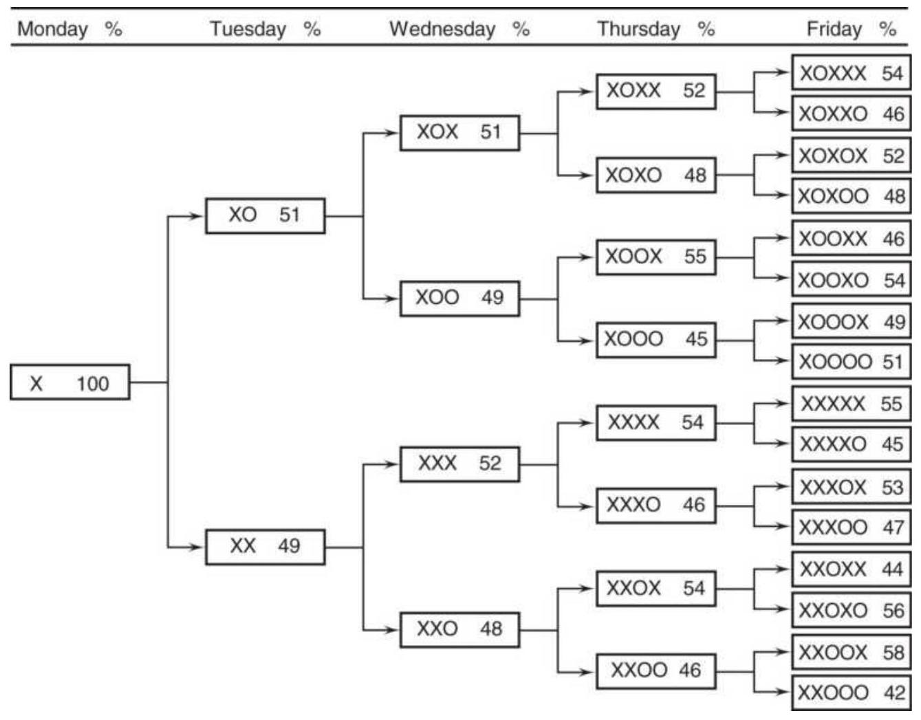
FIGURE 15.16 Weekday patterns for heating oil futures, 2000-April 2018.
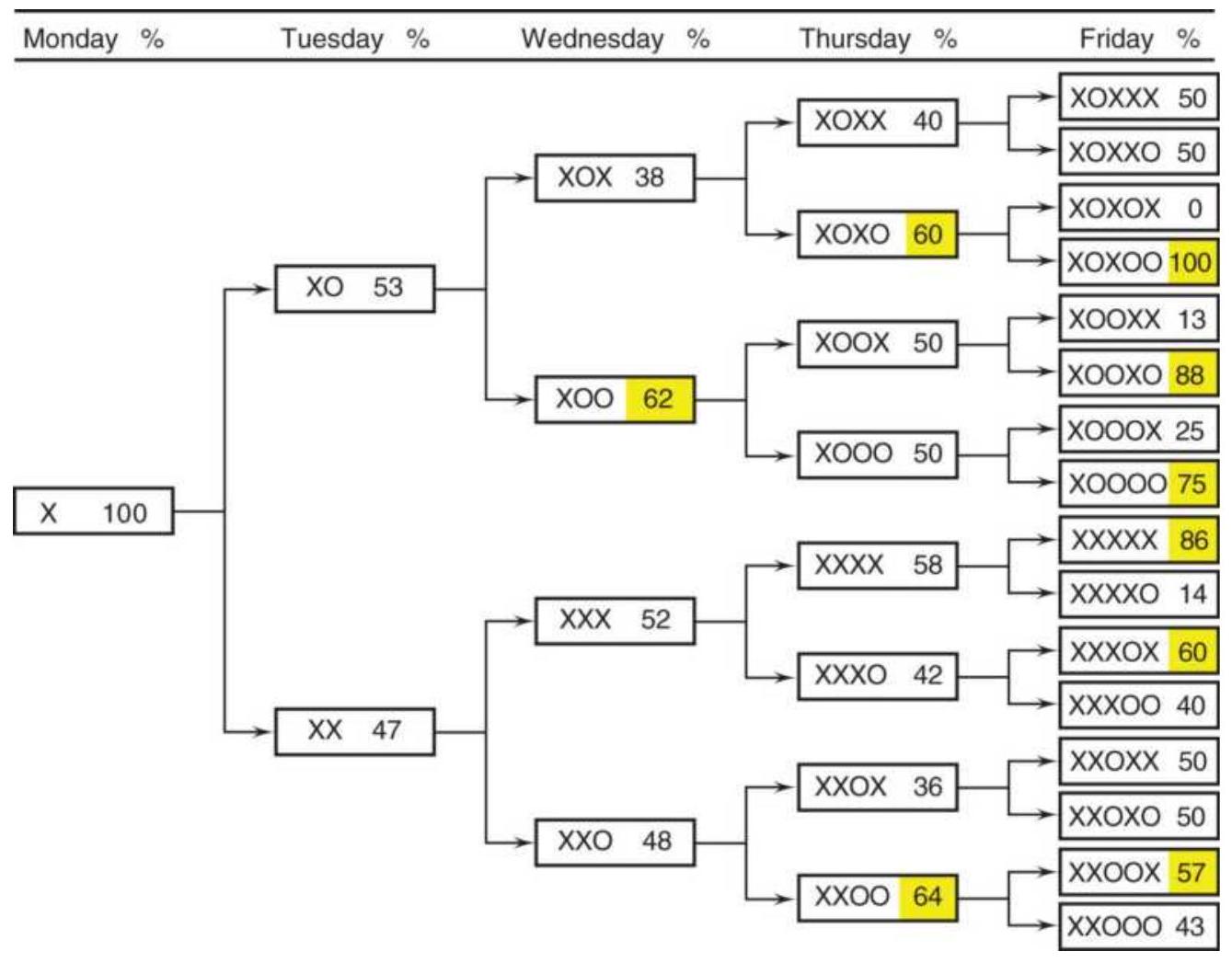
FIGURE 15.17 Heating oil weekday patterns, April 2017-April 2018.

FIGURE 15.18 Weekday patterns for S\&P futures, 2000-April 2018.
To see if we can find a stronger pattern, a test was run using only data from 2009 through 2017, the obvious bull market. Figure 15.19 highlights the higher percentages. While there was no "Tuesday reversal," there was a tendency for a Wednesday reversal when Monday and Tuesday closed in the same direction. Looking at all the combinations that were better than \(50 \%\), reversals were favored, even in a strong bull market.
\section*{Amazon.com}
We should be able to learn more by selecting a period of time that has some dominant characteristic, and a market that has had extreme moves. Amazon (AMZN) fits that criterion. During the period from 2009 through April 2018 it rose from \(\$ 51\) to \(\$ 1460\), a factor of more than 27. That should translate into a lot of consistent moves throughout the week, even though 2018 has been volatile. However, Figure 15.20 shows that the pattern is not what we expect. Prices favor reversals on Tuesday and Wednesday, and the Friday high-percentage patterns favor reversals by \(62.5 \%\). The only explanation for this apparent inconsistency is that the days with higher prices (and the same direction as Friday) were much bigger gains than the days with lower prices.
\section*{Weekday Patterns with a Trend Filter}
Are the weekday patterns clearer when they are in context with the price trend? In a trending market we would expect Monday to open in the direction of the trend, and most days during the week to move in the same direction; otherwise, the trend would not exist. In addition, many other short-term trading methods are improved by trading only on the side of the trend. For most markets, a longer trend is better than a shorter one.
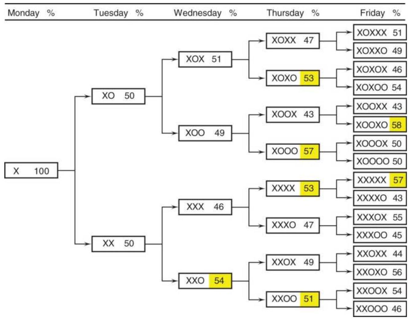
FIGURE 15.19 S\&P futures weekday patterns, 20092017.
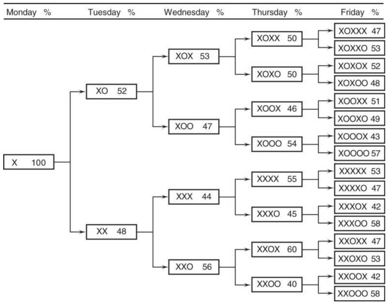
FIGURE 15.20 Amazon (AMZN) weekday patterns during the bull market, 2009-April 2018.
With that in mind, the weekday patterns were retested and filtered with a moving average. Because we don't know which calculation period is best, 30-, 60-, and 120day trends were used. The expectation is that the higher probabilities will go to the patterns that showed more days in the same direction as Monday, an \(\times\).
Starting with bonds, the market with the most trend, only the 120-day moving average filter was used, and a longer period from 1990 to April 2018 was tested to be sure that the trend was evident. The results are shown in Figure 15.21. The far-right column are the results of the
test with no trend.

FIGURE 15.21 U.S. bonds weekday patterns filtered with a 120-day moving average, 1991-April 2018.
Using a trend means that there will be fewer cases, because weeks that begin in conflict with the trend will be ignored. We expected that there would be a larger percentage of weeks where at least 3 of the 4 days from Tuesday to Friday would be in the trend direction. That didn't happen. Of the higher percentage patterns, the Friday move was opposite to Monday \(75 \%\) of the time. A simple trend doesn't seem to have added direction to the patterns.
\section*{S\&P Futures with a Trend Filter}
The most actively traded contract is the emini \(S \& P\), so a test of the three trends was made for the period 2000 through April 2018, Figure 15.22. After each designated pattern are three columns showing the percentage of cases for the 30-, 60-, and 120-day trend filters. If we average the patterns that end with an \(x\) and an \(O\) separately, we find that:
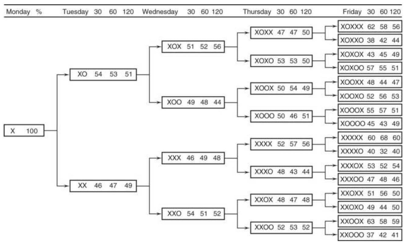
FIGURE 15.22 S\&P futures weekday patterns filtered by three trends, 30,60 , and 120 days.
- Tuesday tends to reverse.
- Wednesday has no special bias.
- Thursday has no bias.
- Friday is very favorable to the Monday (trend) direction.
The average percentages for a Friday pattern that moves in the same direction as Monday are \(57.3 \%, 58.2 \%\), and \(55.0 \%\) for the \(30^{-}, 60^{-}\), and 120-day filters, respectively.

To test this yourself, use TSM Weekday with Trend on the Companion Website.
\section*{Weekend Patterns}
The weekend pattern relates how Monday opens and closes relative to the price moves of the previous week. In recording these patterns, three factors are considered:
1. Friday liquidation. Many short-term traders do not want to hold a position over the weekend, especially a 3-day weekend, due to the accumulation of unexpected news.
2. Resetting positions on Monday. Positions closed out on Friday may be reset Monday, especially during a trending market, a weather market, or when there is ongoing geopolitical news.
3. New positions entering Monday. Longer-term investors use the weekend to digest the previous week's news and select those stocks or commodities to buy.
In the first two cases, there may be a large number of traders not willing to take weekend risk, even if they know that the Monday open is likely to add to their profits. They are trying to remove the less frequent, but large losses that might occur over the weekend. This uncertainty is common during agricultural weather
markets, where a shortfall of rain has driven prices higher, but unexpected rain over the weekend would cause a sharp reversal. Geopolitical risk in the Middle East, South America, or Asia can also result in shifts of power over the weekend, a nasty and unpredictable situation for traders.
If there are enough investors and traders on the same side of the market, the 2-day weekend delay should result in large Monday price jumps and good profits for those willing to hold the trade over the weekend. Expecting that the best results will be found by combining the weekend patterns with a trend, or a preceding high-frequency weekday pattern, a number of different conditions were tested. These were limited to closing prices.
\section*{Trend preconditions:}
Prior Thursday-to-Friday price direction
Friday-to-Friday (1-week) price direction
Most frequent price direction last week (using daily changes)
Based on each of these three trend conditions, the prices on the following Monday were tabulated to determine the frequency and consistency of the opening price, closing price, and whether the high or low prices on Monday would have allowed a profit from a position based on the preconditions. Table 15.18 summarizes the results for six futures markets, e-mini S\&P, U.S. 30-year bonds, the EURUSD futures, crude oil, wheat, and corn. The period was January 2000 through April 2018,
covering a wide range of price patterns.
An overview of Table 15.18 shows that all but the euro tended to open in the opposite direction from Friday's price move. Similarly, they all closed on Monday in the same direction as the open except the euro. The S\&P showed the highest tendency to reverse but many of those days would have recovered by the close. Corn is the best example of a reversal open but a neutral close. The averages on the bottom show that, in general, an opening reversal was normal and prices were still in reversal mode on Monday's close.
The last column of Table 15.18 shows the opportunity for profit if you hold Friday's position over the weekend. Even though Monday favors a reversal, more than 85\% of the time prices will allow for a profit on Monday, especially in the euro. Because the Monday close does not tend to favor the Friday position, traders would be advised to take whatever profit they can get.
Traders should consider that the three trend criteria only used the previous week of data. Trends in many markets last weeks and months; therefore, the same study could be done with a longer trend, which is more reflective of the positions held by investors.

The program to create these tables, TSM Weekend Patterns, is on the Companion Website.
\author{
TABLE 15.18 Weekend results conditioned on \\ the previous week's patterns.
}
\begin{tabular}{|c|c|c|c|c|}
\hline & Condition & & Open & Close \\
\hline \multirow[t]{3}{*}{\begin{tabular}{l}
eMini \\
S\&P
\end{tabular}} & \begin{tabular}{l}
Thursday \\
to Friday
\end{tabular} & 818 & 42. & 47. \\
\hline & \begin{tabular}{l}
Friday to \\
Friday
\end{tabular} & & 40 . & 48. \\
\hline & \begin{tabular}{l}
Most \\
frequent \\
direction
\end{tabular} & & 42. & 48. \\
\hline \multirow{3}{*}{\begin{tabular}{l}
U.S. \\
3oYr \\
bonds
\end{tabular}} & \begin{tabular}{l}
Thursday \\
to Friday
\end{tabular} & 798 & 43. & 41. \\
\hline & Friday to & & 42. & 45. \\
\hline & \begin{tabular}{l}
Most \\
frequent \\
direction
\end{tabular} & & 43. & 47. \\
\hline \multirow[t]{3}{*}{\begin{tabular}{l}
Euro \\
currency
\end{tabular}} & \begin{tabular}{l}
Thursday \\
to Friday
\end{tabular} & 798 & 54. & 44. \\
\hline & \begin{tabular}{l}
Friday to \\
Friday
\end{tabular} & & 53. & 44. \\
\hline & \begin{tabular}{l}
Most \\
frequent \\
direction
\end{tabular} & & 51. & 45. \\
\hline \multirow[t]{2}{*}{ Crude oil } & \begin{tabular}{l}
Thursday \\
to Friday
\end{tabular} & 806 & 51. & 50. \\
\hline & \begin{tabular}{l}
Friday to \\
Friday
\end{tabular} & & 49. & 52. \\
\hline
\end{tabular}
\begin{tabular}{|c|c|c|c|c|}
\hline & \begin{tabular}{|l}
Most \\
frequent \\
direction
\end{tabular} & & 49. & 50 \\
\hline \multirow[t]{3}{*}{ Wheat } & Thursday & 817 & 49. & 47. \\
\hline & \begin{tabular}{l}
Friday to \\
Friday
\end{tabular} & & 46. & 51. \\
\hline & \begin{tabular}{l}
Most \\
frequent \\
direction
\end{tabular} & & 46 & 50 \\
\hline \multirow[t]{3}{*}{ Corn } & \begin{tabular}{l}
Thursday \\
to Friday
\end{tabular} & 817 & 44 & 49. \\
\hline & Friday to & & 43. & 50. \\
\hline & \begin{tabular}{l}
Most \\
frequent \\
direction
\end{tabular} & & 44. & 51. \\
\hline \multirow[t]{3}{*}{ Average } & \begin{tabular}{l}
Thursday \\
to Friday
\end{tabular} & & 47.2 & 46.3 \\
\hline & \begin{tabular}{l}
Friday to \\
Friday
\end{tabular} & & \(45 \cdot 5\) & 48.3 \\
\hline & \begin{tabular}{|l}
Most \\
frequent \\
direction
\end{tabular} & & 45.8 & 48.5 \\
\hline
\end{tabular}
\section*{A Comment on Testing and Holidays}

Tests for weekday and weekend patterns did not
uncover situations that anyone would consider "high probability." Using long intervals will tend to neutralize the effects of interest rate policy, geopolitical events, and weather markets. If you can identify an unusual situation, the programs on the Companion Website can be used to find a dominant pattern that can be traded. For example, testing corn for June through August would capture weather markets, and isolating bonds for 2005 through mid-2006 would show the patterns for increasing interest rates. You can uncover opportunities using the tools at hand.
The weekday and weekend tests did not include any weeks in which there was a holiday, or long holiday weekends. It would have been perfectly reasonable to view the opening of the first day of the following week as a "Monday" even though it occurred on a Tuesday after a Monday holiday. Similarly, a holiday on Friday could have compared to the previous Thursday direction to the following Monday. These tests only used weeks with 5 trading days.
A well-known work that studies price movement prior to holidays is by Merrill and can be found in Chapter 10 under the section "The Holiday Effect for Stocks." Following that are other holiday patterns.
\section*{Day of the Month}
Not all buyers and sellers try to time the market. The U.S. stock market has been used as a long-term investment for retirement portfolios for decades, and the amount of money being moved in and out of the market
is a significant portion of the volume. Institutions such as Vanguard and Fidelity that manage IRAs, 401 Ks , and other retirement plans, have an obligation to put new money into the market, or redeem it, using well-defined rules, usually applied monthly. These investments cannot be liquidated on one day's notice. In addition, some firms realize their gains or losses at the end of the month (by exiting their positions) for accounting purposes. Non-U.S. firms, investing in the U.S. markets, may close out part of their profitable positions at the end of the month to repatriate their gains.
Does this show up as a pattern in price movement at the beginning or end of each month? To find out, we tabulated the returns (the daily price changes for futures and the returns for stocks) from the 1st to the 1oth trading day of the month, and from the last to the 1oth from the last trading day of the month. For all markets, the period from 2010 through April 2018 was used to be more reflective of current market patterns.
Starting with bond futures, the average daily changes are shown in Figure 15.23. Buying a bond futures contract can either lock in an interest rate or profit from declining yields (rising prices). The chart is very clear that selling occurs at the beginning of the month and buying at the end of the month. The middle of the month is quiet. For a trader, selling would be profitable as interest rates increased, which began in August 2016.
Combined with volume, buying bond futures at the end of the month is the major event, shown in Figure 15.24. The bond ratio is the current day's volume divided by the
40-day average volume. Ratios over 1.0 indicate that volume was higher than average, and the monthly pattern shows that most buying was during the last five days of the month, peaking on the third from the last day of the month at about \(50 \%\) more than the average.
\section*{Euro Futures}
As a group, FX traders also have a pattern. When foreign investors put their money in U.S. equities, they need to buy the U.S. dollar. When they exit their positions, they sell the dollar. Currencies also move on the balance of trade; that is, if the United States is buying more from Europe (as it normally does), the dollar weakens. On the other hand, when there is a geopolitical crisis, or when the U.S. economy is booming, money flows into the United States, either as a safe haven or as an investment. Figure 15.25 shows that the first days of the month, during 2010 to 2017, traders sold the euro against the dollar. Even with higher volume on days 8 and 9 (see Figure 15.26), it appears as though the balance of trading was net short. All the activity was in the first ten days, and the volume shows much lower participation in the second half of the month.
\section*{U.S. 30-Year bond futures price differences}
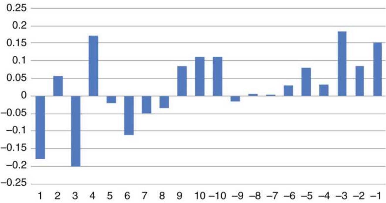
FIGURE 15.23 U.S. 30-year bond futures, 2010-April 2018, average price change.
\section*{U.S. 30-Year bond futures volume ratios}
1.6
1.5
1.4
1.3
1.2
1.1
1
0.9
0.8
0.7
0.6

FIGURE 15.24 U.S.30-year bond futures, volume ratio.
\section*{S\&P Futures}
Does the S\&P have a pattern during the month? Is it driven by institutional investing and not short-term traders? Will it change when the bull market ends, or has it already changed? Figure 15.27 shows mostly higher price changes, consistently higher in the first seven days of the month. The volume in Figure 15.28 shows more activity associated with those rising prices, followed by a drop in volume as prices become more erratic in the second half of the month. Normally, we would consider higher volume as supporting direction, and lower volume reflecting less price direction.
\section*{Euro futures differences by day}
0.0015
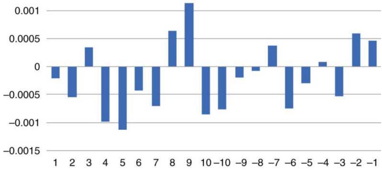
FIGURE 15.25 Euro futures price differences by day of month, 2010-2017.
\section*{Euro futures volume ratio}
1.25
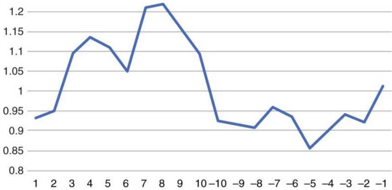
FIGURE 15.26 Euro futures volume ratio by day of month, 2010-2017.
S\&P futures price differences
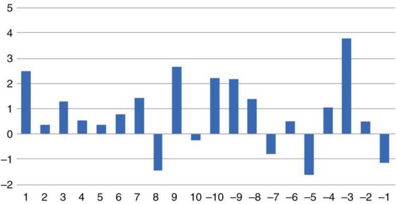
FIGURE 15.27 S\&P futures price differences, 20102017
\section*{Amazon.com}
It's not possible to look at all of the interesting stocks, but Amazon (AMZN) is high on the list. Using daily returns instead of price differences, Figure 15.29 shows buying all the time, but more during the second half of the month. That is confirmed by the volume ratio, Figure 15.30, which shows a steady increase in volume during the second part of the month, peaking at about \(25 \%\) higher volume near the end of the month, where the largest returns also occur. This may not be surprising because higher volume will be mostly buyers.
\section*{S\&P futures volume ratio}
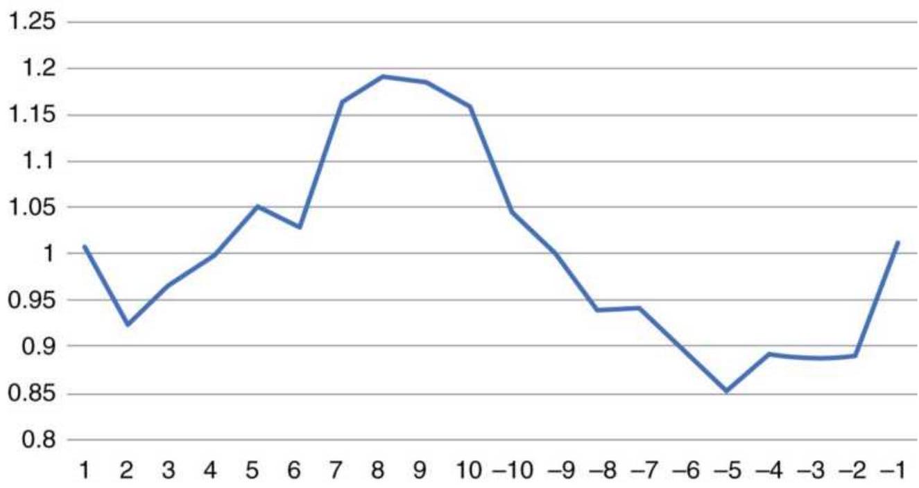
FIGURE 15.28 S\&P futures volume ratio, 2010-2017.
\section*{Amazon returns by day, 2010-2017}
0.6
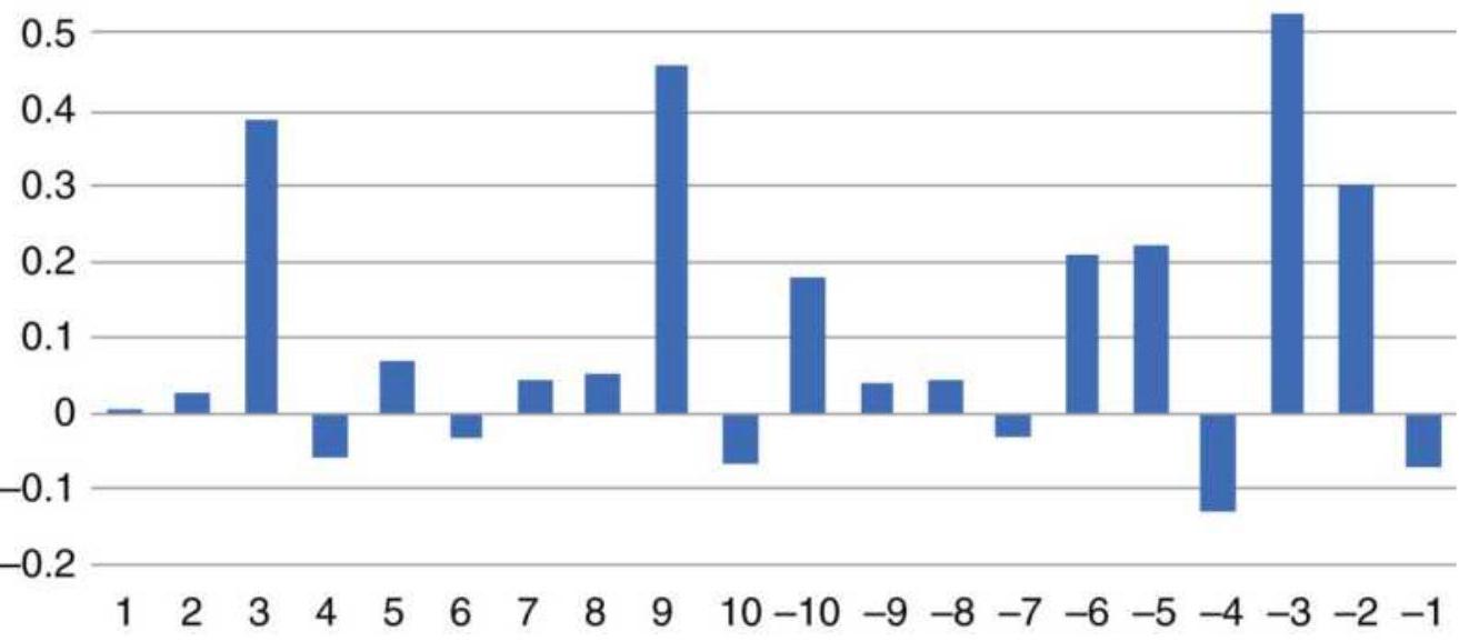
FIGURE 15.29 Amazon returns by day, 2010-2017.
\section*{Amazon volume ratio}
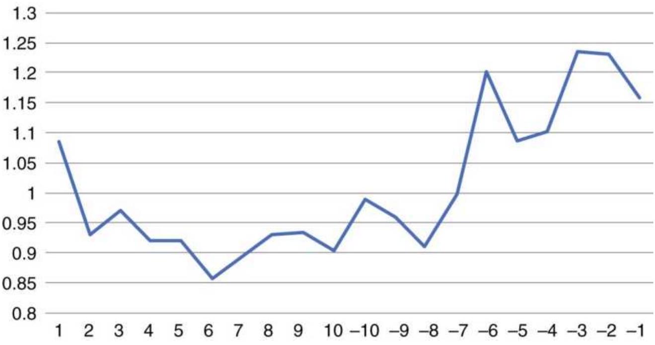
FIGURE 15.30 Amazon volume ratio by day, 20102017
Are the Day-of-the-Month Patterns Reliable?
Reliable patterns are normally associated with large volume, broad participation. They will also change with the price trend. The previous tests all used data from 2010 to 2017, one of the most persistent bull markets in history. When Amazon shows profits on nearly every day of the month, it should not be a complete surprise. But can a trader have confidence in these patterns?
We can't expect patterns to last forever. They take shape and continue when there is a clear bull market or bear market. When you can identify the regime, the day-today patterns during the month will help you isolate the best times to trade.
The most reliable patterns will be bonds. Institutions buy and sell bonds for their customer portfolios every month, but they are not trading, and they have a well-defined plan for redeeming positions and adding new ones. They may average in or out over a few days, but the activity has been concentrated at the beginning and end of the month.
A long-term position trader can find these patterns useful for entering. Find a period during the month that has a series of higher days and buy at the beginning of that sequence. That way you take advantage of what is called "free exposure," that extra boost from others buying after you. For short-term traders, buying or selling ahead of a sequence, then exiting a few days later, may be the best approach.
There are tradable indexes with huge volume, such as the Goldman Sachs Commodity Index (GSCI), which publishes its entry and exit rules, a requirement of the
SEC. A test of the day-of-the-month would likely show a strong pattern. When using this approach, choose carefully and change as the market changes.
\section*{Reversal Patterns}
Reversal patterns are similar to gap openings.in that they tell the frequency of price moves following specific patterns. The intention was to find a pattern in the open, high, low, and closing price of today that would help predict the next day's price move. You will also find outside days and inside days discussed in Chapter 4, "Charting Systems." Three combinations tested were:
1. Intraday trend continued. An upward trend is set up when yesterday's high is greater than the previous high and yesterday's close is greater than the previous close. We then found the percentage of days that opened higher or closed higher than yesterday. A continued downward trend is the opposite pattern.
2. Reversal day. A very popular chart pattern called a downward reversal day posts a higher high than the previous day but a lower close. Most traders believe that there is follow-through into the next trading day. An upward reversal day has a lower open and higher close.
3. Outside reversal. This is a more extreme case of (2), where yesterday's high was greater than the prior high, but yesterday's close was below the prior low. This downward outside reversal is continued if the next day opens lower or closes lower.
Results for these trend and reversal combinations are shown in Table 15.19 for the 8 markets representing a small sample of futures and stocks, using data from 2009 through April 2018. For added information, the table from the previous edition, covering the period from 2000 through 2011, is shown alongside. Reversal days do not occur as often as trend days, and outside reversals are far less common, as seen in the two columns on the right.
In the older test, the trend is the least distinctive pattern, with the exceptions of the S\&P and wheat. When the trend is up, the next day does not show much of a bias, but a small tendency to open lower and close higher than it opened. For downward-trending days, all markets are more consistent about opening lower and closing lower. The S\&P, however, had a strong tendency to open lower after an upward trending day, then close neutral (equally up or down). Wheat is the opposite, having a strong tendency to open higher (because there is a \(32 \%\) chance of it opening lower) after a downward trending day, and an equal chance closing either higher or lower. These markets would have presented significant opportunities. Did those patterns continue?
\title{
TABLE 15.19 Reversal patterns showing the results of 2000-2011 on the left and 2009-April 2018 on the right.
}
\section*{Test from 2000-2011}
\author{
Higher \\ Lower Low \\ App \\ High or \\ or Reversal \\ 28 C \\ Reversal \\ Down \\ Cas
}
\section*{Up}
\begin{tabular}{|c|c|c|c|c|c|c|}
\hline & Pattern & Open & Close & Open & Close & Up \\
\hline \multirow[t]{3}{*}{ EURUSD } & \begin{tabular}{l}
Trend \\
continued
\end{tabular} & 53 & 49 & 49 & 47 & 1028 \\
\hline & \begin{tabular}{l}
Reversal \\
day
\end{tabular} & 48 & 45 & 55 & 51 & 403 \\
\hline & Outside & 54 & 43 & 53 & 50 & 97 \\
\hline \multirow[t]{3}{*}{\begin{tabular}{l}
\(10-\mathrm{Yr}\) \\
Notes
\end{tabular}} & \begin{tabular}{l}
Trend \\
continued
\end{tabular} & 50 & 52 & 50 & 45 & 1053 \\
\hline & \begin{tabular}{l}
Reversal \\
day
\end{tabular} & 47 & 46 & 58 & 57 & 335 \\
\hline & Outside & 45 & 44 & 58 & 53 & 77 \\
\hline \multirow[t]{3}{*}{ Gold } & \begin{tabular}{l}
Trend \\
continued
\end{tabular} & 48 & 50 & 49 & 45 & 1061 \\
\hline & \begin{tabular}{l}
Reversal \\
day
\end{tabular} & 53 & 44 & 44 & 45 & 301 \\
\hline & Outside & 56 & 41 & 37 & 43 & 66 \\
\hline \multirow[t]{3}{*}{ Crude } & \begin{tabular}{l}
Trend \\
continued
\end{tabular} & 48 & 50 & 48 & 46 & 1044 \\
\hline & \begin{tabular}{l}
Reversal \\
day
\end{tabular} & 51 & 45 & 57 & 49 & 380 \\
\hline & Outside & 49 & 47 & 49 & 44 & 90 \\
\hline Wheat & Trend & 46 & 46 & 32 & 48 & 868 \\
\hline
\end{tabular}
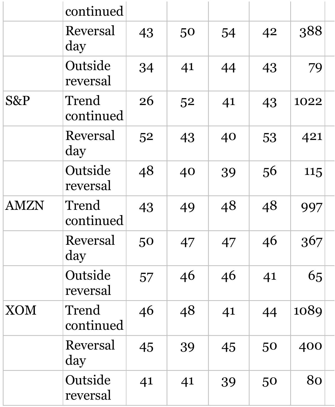
The prolonged bull market following the financial crisis of 2008 shows in the S\&P trend continuing higher \(55 \%\), up from \(52 \%\) based on the close and up \(37 \%\) versus \(25 \%\) on the open. Even though the S\&P continued to be noisy,
the upward trend of the market improved both numbers. All the other S\&P numbers were neutral or better.
We know that Amazon has been strong, and nearly all the values point to higher prices, improving over the older test. In particular, the Reversal Day shows 50\% compared to \(45 \%\) and the Outside Reversal shows \(63 \%\) versus \(41 \%\). Exxon also shows better numbers for the more recent test, more an indicator of the overall market trend.
The euro shows the most negative changes in values, mostly for the trend, but then it has had a wide price range, and is now settled somewhat in the center. Both the Reversal and Outside Reversal favored higher prices.
T-notes showed a strong tendency to follow through on downward reversals in the older test, with numbers well into the 50s. Given the strong upward bias in interest rate prices, that is an unexpected outcome. But then the new test shows the same pattern, just not quite as strong. It shows that, even in a bull market, not every day is up and there is an opportunity for profit by taking a contrary position.
\section*{The Taylor Trading Technique}
In 1950, George Douglass Taylor published his book method of day trading, which he had been using for many years in both the stock and grain markets. \(\frac{6}{6}\) While this preceded the availability of a computer, the method was fully systematic. The system is intrinsically cyclic, anticipating 3 -day patterns in the grains. These 3 days can vary when they are within an uptrend or downtrend.
Taylor's explanation of his method is thorough and includes many valuable thoughts gained from experience. The summary and analysis presented here cannot replace a reading of the original material. It should also be interesting that a 3 -day cycle continues to be a successful pattern and a simple version of it is at the end of this section.
Taylor developed his approach to trading through a belief that there is a basic rhythm in the market. The dominant pattern is seen to be a 3 -day repetition with occasional, although regular, intervals of 4 - to 5 -day patterns. Taylor's cycles are based on continuous trading days without regard to weekends and holidays. The 3day cycle varies slightly if prices are in an uptrend or downtrend. The uptrend is defined as having higher tops and bottoms over some selected time period such as a week, month, or season. A downtrend is the reverse. During an uptrend the following sequence can be expected: \(\square\)
1. A buying day objective, where prices stop declining and a purchase can be made before a rally begins
2. A selling day objective, at which the long position is closed out
3. A short sale day objective, where prices meet resistance and can be sold prior to a reversal
Following the third day, after a short position is entered, the cycle begins again with a buying day objective. When there is an uptrend, Taylor gives extra latitude to the long position with part of the day between the
liquidation of the long (2) and entering a new short (3) reserved to allow the upward momentum to exhaust itself. Downtrends are the opposite, expecting some added time for the downward move to finish before the rally begins.
The actual objectives are extremely short-term support and resistance levels, usually only the prior day's high and low prices or occasionally the high and low of the 3day cycle. On a buying day, the objective is a test or penetration of the prior day's low price, but only if it occurs first, before a test of the prior highs. Taylor's method is then a short-term mean-reverting technique, which looks for prices to reverse direction continuously. His belief was that speculation caused these erratic, sometimes large, cyclic variations above and below the long-term trend.
Taylor placed great emphasis on the order of occurrence of the high and low on each day. In order to buy, the low must occur first. If this is a buying day in an uptrend, a long position is entered after any lower opening whether or not the previous day's low is reached. Taylor reasoned that because an uptrend is generally stronger toward the close, the first opportunity must be taken on a buying day. However, if a high occurs first and prices then decline, nearing the lows toward the end of the trading day, no long position is entered. This pattern indicates a lower open the following day that will provide a better opportunity to buy. During a downtrend, the violations of the lows, or penetrations toward the close, are more common. By waiting until the next day to purchase, the 3 -day cycle is shifted to favor the short sale.
The same problem occurs when closing out a long and entering a new short during an uptrend. If prices rallied sharply on the same day that the long was entered, touching or penetrating prior highs, a higher opening would be expected the next day at which time the long position would be closed out. Because of the uptrend, a small setback and another test of the highs might be expected. It would then require another day to ensure that the strength was exhausted. If the high of the selling day was tested on the open of the short sale day, a new short would be entered immediately. If the short sale day opened lower and finished higher, no position would be entered.
Faster reactions to price moves are needed when a long position is entered on a buy day, or on the next open, during a downtrend. If prices rally sharply on the entry day, the position is closed out at a profit. This is important to remember because trading against the trend does not offer the latitude of waiting for the best moment; time is working against you.
\section*{Reading Taylor's Book}
Taylor called this technique his book method because he recorded all the information necessary for trading in a small 3" \(\times 5\) " spiral notebook that he carried. A sample from this book is shown in Table 15.20, an example that uses the November 75 soybean contract. In Taylor's book, there would be only one month per page due to the limitations of the page size. The first 5 columns contain the date and day, followed by the open, high, low, and closing prices. The first 10 days are used to determine
where the cycle begins. Scanning the daily lows, circle the lowest of the first 10 days, in this case March 19. Then work backward and forward, circling every third low price. These are buying days. The two in-between days are circled in the High column and indicate the selling day and the short sale day, respectively. This example is especially simple because it assumes a consistent uptrend and shows no variation from the 3 day cycle.
\section*{TABLE 15.20 Taylor's book, November 1975 Soybeans}
\begin{tabular}{|c|c|c|c|c|c|c|c|c|c|c|}
\hline \multicolumn{2}{|c|}{1975} & \multirow{2}{*}{ Open } & \multirow[t]{2}{*}{ High } & \multirow[t]{2}{*}{ Low } & \multirow{2}{*}{ March } & \multirow[t]{2}{*}{ D } & \multirow[t]{2}{*}{ R } & \multirow[t]{2}{*}{ BH } & \multirow[t]{2}{*}{ BU } & \multirow[t]{2}{*}{ Net } \\
\hline & & & & & & & & & & \\
\hline M & 10 & 540 & \(\times 542\) & 535 & 540 1/2 & & & & & \\
\hline T & 11 & 435 & 560 1/4 & \(\times 535\) & 560 1/4 & 7 & & \(183 / 4\) & 0 & \\
\hline W & 12 & 560 & \(\times 572\) & 552 & 571 1/2 & & 37 & & & \\
\hline H & 13 & 568 & \(\times 577\) & 559 & 560 1/2 & & & & & \\
\hline F & 14 & 553 & 559 & \(\checkmark 549\) & 549 1/2 & 28 & & 0 & 10 & +232 \\
\hline M & 17 & 548 & \(\checkmark\) & 548 & 548 & & 11 & & & \\
\hline T & 18 & 555 & \(\times 558\) & 538 & 538 1/2 & & & & & \\
\hline W & 19 & 530 & 546 & \(\times 529\) & \(5451 / 4\) & 29 & & 0 & 9 & \\
\hline H & 20 & 543 & \(\sqrt{555}\) & 540 & \(5471 / 2\) & & 26 & & & \\
\hline F & 21 & \(5471 / 2\) & \(\checkmark 5671 / 2\) & \(5471 / 2\) & \(5671 / 2\) & & & & \(-11 / 2\) & \\
\hline M & 24 & 573 & 581 & \(\checkmark 561\) & 573 & \(61 / 2\) & & \(13 \frac{1}{2}\) & 0 & \\
\hline T & 25 & 573 & \(\times 575\) & 564 & 574 & & 14 & & & \\
\hline W & 26 & 577 & \(\checkmark 594\) & 574 & 594 & & & & & \\
\hline H & 27 & 587 & 590 & \(\checkmark 579\) & 585 & 15 & & 0 & 0 & \(+31 \frac{1}{2}\) \\
\hline M & 31 & 592 & \(\checkmark 6\) & 589 & \(5951 / 2\) & \(241 / 2\) & & & & \\
\hline & & & & & April & & & & & \\
\hline T & 1 & 599 & \(\times 599\) & 584 & 591 1/2 & & & & & \\
\hline W & 2 & 589 & 591 1/2 & \(\checkmark 575\) & \(5753 / 4\) & 24 & & 0 & 9 & \\
\hline H & 3 & 570 & \((573\) & 565 & \(5663 / 4\) & & 0 & & & \\
\hline F & 4 & 570 & \(\checkmark\) & 567 & \(5763 / 4\) & & & & -12 & \\
\hline M & 7 & 577 & 577 & \(\checkmark\) & \(5653 / 4\) & 16 & & 0 & 5 & \\
\hline T & 8 & 566 & \(55791 / 2\) & 563 & \(5681 / 4\) & & \(171 / 2\) & & & \\
\hline W & 9 & 565 & \(\checkmark 574\) & 561 1/2 & \(5731 / 2\) & & & & & \\
\hline H & 10 & 571 & 575 & \(\sqrt{556}\) & \(5613 / 4\) & 18 & & 1 & \(51 / 2\) & \\
\hline F & 11 & 560 & \(x 564\) 1/2 & 558 & \(5631 / 2\) & & \(81 / 2\) & & & -9 \\
\hline M & 14 & 561 & \(\times 568\) & \(5551 / 2\) & 561 1/2 & & & & & \\
\hline T & 15 & 565 & \(5691 / 2\) & ( 560 1/2 & \(5631 / 2\) & \(71 / 2\) & & \(11 / 2\) & 0 & \\
\hline W & 16 & 562 & \(\times 566\) & 553 & \(5591 / 4\) & & \(51 / 2\) & & & \\
\hline H & 17 & 560 & \(\sqrt{565}\) & 558 & \(5631 / 2\) & & & & & \\
\hline F & 18 & 563 & 563 & \(\checkmark 557\) & 559 & 8 & & 0 & 1 & -1 \\
\hline
\end{tabular}
To judge the opportunities for buying and selling, the
next columns, marked \(D\) and \(R\), indicate the number of points in the decline from the short sale to the buying day and the number of points in the rally from the buying day to the selling day. In both columns, the differences use only the highs and lows. These values represent the maximum number of points that could have been made in those trades, provided the highs and lows occurred in the proper order. An \(\times\) or a \(\checkmark\) in the circle next to the high or low means that the opportunity to buy or sell occurred first; if a \(\checkmark\) appears, the opportunity occurred last. In the first case, the trade would have been entered that day, and if last, Taylor would have waited.
The next two columns, \(B H\) and \(B U\), show the risk and opportunity of that day's prices relative to the buying objective. BH means a buying day high and Taylor recorded the number of points that the day traded above the prior day's high (the short sale day), and \(B U\) shows the opportunity to buy under, by recording the number of points by which the day sold under the low of the prior day - the area to buy if the low occurred first. If neither situation occurred, zeros were entered.
A wide column on the right was used to indicate the net weekly change in direction by taking the difference between the prior Friday's closing price and the current Friday's price. This was used to compare the opportunity with the actual trading performance.
By observing columns \(D\) and \(R\) in Table 15.20 , we can see that there was ample opportunity for profits on both the long positions and short sales, with only one case of a
zero entry on April 3. The trades that would have been entered or liquidated can be approximated using the \(B H\) and \(B U\) columns and the \(\times\) and \(\checkmark\) notations. For consistency, we can assume that the \(\checkmark\) indicates that a position was taken on the next open. In either case, the results would have been good.
Taylor's daily method requires care in monitoring the market and is best done by a full-time trader. The order of the highs and lows must be watched as well as whether the new low is going to penetrate or fail to penetrate the prior lows. It would be helpful to combine this method with a good trend-following method and, for grains, be aware of the seasonality.
\section*{Taylor's 3-Day Trading Method}
For those who cannot watch the market constantly, Taylor offers a rigid 3-Day Trading Method, a scaleddown version of his more comprehensive book method. The cycles remain the same, but the buying and selling objectives are entered into the market in advance. What is primarily lost by this approach is the order of occurrence of the highs and lows; otherwise, the concept of the system remains intact.
One point to note is that this technique profits from penetration of support and resistance levels by assuming there will be no follow-through when the right patterns occur. Most other methods take the approach that trading in the direction of the breakout is the safer alternative. But trends work best with longer calculation periods, and fast trading works because of the noise -
and noise prefers a mean reversion approach.
\section*{A Computer Program For the 3-Day Trading Method}
If we reduce Taylor's concept to its most basic rules, we can create a program to take advantage of the 3-day pattern:
- Buy on the third lower close. Exit on the close after 2 days.
- Sell on the third higher close. Exit on the close after 2 days.
- Only take trades in the direction of the 100-day moving average.
This may seem unreasonably simple, but Figure 15.31 shows the results of this method applied to SPY from 2000 to April 2018, a period covering a wide range of activity. Without the trend, the returns were higher but with much more risk. Using the trend filter reduced number of trades but greatly reduced the risk.

Because this is a mean-reverting approach, it is most likely to work well on equity index markets and highly liquid futures, such as U.S. bonds. Applying this to individual stocks is likely to have disappointing results. The program, TSM 3-Day Trade, on the Companion Website, allows you to change the entry and exit periods to take advantage of the upward bias in stocks. Adding profit-taking would also come closer to Taylor's rule for exiting a long if there was a favorable move above resistance, or a short on a break of support.
You might even filter the entry by the day of the week. It may turn out that entering on a Friday has higher risk than entering on other days.
\section*{3-Day trade}
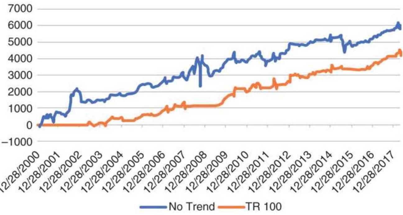
FIGURE 15.31 The 3-day trade system applied to SPY, showing net \(\mathrm{P} / \mathrm{L}\) with and without a 100-day moving average filter.
\section*{A Related Pattern by the Fed}
Edson Gould has identified a pattern called "three steps and a stumble." \({ }^{\prime 7}\) It refers to the reaction of the stock market following a third increase in interest rates by the Federal Reserve, where the first two increases did not cause a setback in stock prices. The accumulated burden of higher rates on corporate borrowing, disposable income, and mortgages becomes a reality after the third rate hike.
\section*{COMPUTER-BASED PATTERN RECOGNITION}
The methods previously discussed were based on patterns familiar to traders. The weekly and weekend studies as well as the intraday time patterns are intuitive to most traders. Now, of course, we can test many patterns across many markets looking for both unusual situations and similar occurrences. For a complex pattern, look at "DeMark's Sequential" in Chapter 4. Computers have allowed us to find more intricate but logical patterns as well as patterns that might not seem so reasonable.
Rather than the conventional price patterns where recurring sequences of higher and lower days are found within certain qualified intervals, computer-based pattern recognition refers to sets of descriptors and classes of interest. For example, \(-\frac{8}{\text { Aronson describes the }}\) sets and values that must be satisfied by a professional jockey as follows:
\begin{tabular}{|l|l|}
\hline Descriptor & Value Range \\
\hline Height & Under \(5^{\prime} 5^{\prime \prime}\) \\
\hline Weight & Under 120.lbs. \\
\hline Age & 16 to 35 \\
\hline Years riding horses & Over 10 \\
\hline
\end{tabular}
The set of people who satisfy all four conditions are said to contain all professional jockeys. The converse, that all people satisfying these conditions are professional
jockeys, is not true. It will be necessary to qualify this set further to create a set that contains only professional jockeys; however, these four conditions go a long way toward reducing the field.
How can this tool be applied toward the development of a trading strategy? It can be done by defining a trade profile. Consider the following criteria for a trade:
1. The price moves higher or lower by at least \(3 \%\) from the starting price.
2. The price move occurs within 20 days.
3. There is no loss exceeding \(0.5 \%\).
For any market, a computer or an analyst can locate all price moves that satisfy these conditions. The few days preceding an upward move that satisfies these conditions can be marked as buy days, and the few days preceding a downward movement can be designated sell days (see Figure 15.32).
By adding to a table as these combinations are located, the computer now contains the set of all buy and sell days, those days on which it would be good to get a buy or sell signal based on historic data. Next, some likely indicators must be specified to identify when these trades are about to begin. The following might be used:
The direction of a moving average
An overbought/oversold indicator such as the Relative Strength Indicator (RSI) or contrary opinion
- The direction of changes in trading volume
A 10-day momentum indicator

FIGURE 15.32 Specific buying and selling days.
By entering a broad selection of indicators and trying to avoid duplication, the computer can find a unique combination of indicators that net to produce trading signals for the days selected for buying and selling. Ideally, at least one indicator will exceed a threshold whenever a buy signals occurs, or at least two indicators will confirm a buy signal. For example, all buy signals occur when the average value of the RSI and the market sentiment (contrary opinion) are below the \(30 \%\) level;
however, having all buy signals occur here is not enough. Poor signals may appear at this level, which cause large losses. The perfect system will have no losing signals occurring in this zone. Unfortunately, in the real world there are no perfect solutions.
A computer program designed to identify what conditions are common to a selection of price moves is available using LIM (Logical Information Machines), a service that provides an exceptional amount of economic data as well as a querying language in which you can specify problems such as this type of pattern recognition. When you hear the financial news broadcasters saying, "Today's drop of \(3 \%\) in NASDAQ has a \(90 \%\) chance of reversing tomorrow," that information could be extracted through LIM, which searches and compiles the history of what follows from declines of \(3 \%\).
Analysts interested in these techniques will find neural networks and genetic algorithms of particular importance. They are powerful search tools that find patterns in a large amount of data with remarkable efficiency. Detailed discussion of these methods can be found in Chapters 20 and 24.
\section*{Repeated Patterns and Sample Size}
A mindless task for a computer is to recognize repeated price patterns. Over many years, the chance of a higher close following a higher close in the stock market is about \(55 \%\), due to investor bias and the uptick rule. In most other financial and commodities markets there seems to be very close to a \(50 \%\) chance of any day being
higher or lower. If there were a \(65 \%\) chance that a higher day followed a lower day, traders would jump on that opportunity and extract all possible profits until that pattern was extinct. What turns out to be important is the size of the move when prices move in one direction rather than the other, as discussed earlier in "Intraday Time Patterns."
What about two higher days in a row, or two lower days? We saw something similar in the Weekday Study, where various combinations that occurred during the week were posted along with the frequency of a similar or reversal day following. There were some combinations that showed high or low frequencies and attracted our attention, but not too many. In the Weekday Study we limited the analysis to repeated days of the week; however, these patterns could start at any time.
When seeking repeated patterns, it is important to remember that the number of cases drops quickly as the length of the pattern is extended. For example, if you are testing 1,000 days of data looking for a 1 -day pattern, you have 1,000 candidates. About one half will be higher days and the other lower days. If you now look for 2-day patterns, for example, up-up, then only \(25 \%\) of the days are likely to qualify, because the other three
combinations, up-down, down-up, and down-down, will normally share equal amounts. With 3-day patterns there are 9 combinations, each with about \(1 / 9\) th of the data, and so on. By the time you are looking for a sequence of 10 , there are 100 different combinations and the number of occurrences for each pattern will be very small.
But what if a specific sequence of 10 ups and downs can be found 10 times in a series of 1,000 prices? And what if an up day followed that sequence \(70 \%\) of the time? Would you have a potential trading system? It sounds promising, but there are just not enough cases to have confidence in the result.
One way to improve the sample is to look at the total count of up and down days within a long sequence, rather than the exact pattern of ups and downs. Therefore, if you found a sequence of 20 days with 15 ups and 5 downs, you would have a very bullish scenario for nearly all combinations, the least bullish being 5 down days at the end. You have now greatly expanded the number of patterns that satisfy this condition, and you can give this sequence a quality - bullishness, which may improve the chances for predictive success.
Readers interested in this method should read the sections on martingales and on "The Theory of Runs" in Chapter 22.
\section*{ARTIFICIAL INTELLIGENCE METHODS}
If you are expecting a trading system using Artificial Intelligence (AI) in this section, you will be disappointed. Even though AI has been defined as "intelligence demonstrated by machines," the characteristic that sets it apart from other computerized approaches is that an AI process should improve by self-learning. That is, it should not make the same mistake twice. Is that going to be possible with a trading system? Given the number of price patterns, the goal of a perfect system does not seem
possible.
The state-of-the-art is that financial firms are using AI to track client activity and understand how clients make investment decision. Investors are putting their money into firms that use AI in their products. Some of the techniques are image recognition, customer support, identifying data outliers, editing writing, security, and fraud.
Closer to our interests, Nomura Securities is credited with using AI for their high-frequency trading. Nevertheless, the main use of AI is for rebalancing portfolios and gives investment advice to financial advisors, including risk tolerance relative to age and income. Even though some of the techniques are called predictive analytics and cognitive technologies, most of the applications are to improve operations and reduce costs for financial institutions. And while we do not dispute the importance of AI in the future, we find that the terminology can often precede by years the ability to perform.
Market sentiment seems to be one bright spot. By "crawling the Internet" a program can identify both a topic or a specific market, and key words indicating positive or negative comments associated with it. Nomura is said to take the approach of outsourcing their objective to a large group of scientists and rewarding the solutions with cryptocurrency.
\section*{Replicating the Brain}
Another way of defining artificial intelligence is that it
aspires to perform an operation replicating or approaching human thinking. This is intended to distinguish it from simple pattern recognition, with which it is often confused. Artificial intelligence is the separation of two ideas. The collection of information that is stored in the brain has been termed the knowledge base. This is distinguished from reason, rules, and logic, called the inference engine. These ideas are not very different from the database and trading strategies that are discussed here, but with more impressive names.
The closest practical approach to artificial intelligence is heuristic programming. This refers to computer learning in very much the same way as a laboratory animal finds its way out of a maze. The computer starts with rules relative to the problem, then records the successful and unsuccessful experiences. Eventually, it has a complete table of what to do for each situation or at least a table of probable solutions. This is a realistic, intelligent approach when the same events can be expected to recur in the same way. It does not help in new situations without the added complication of extrapolation, basic relationships (e.g., price level to volatility), and other forms of expectation. This separates the problem of trading the market successfully from winning a chess game, in which there are a limited (although large) number of combinations.
But AI specialists have a solution that has been used successfully for gaming. One of these is called \(K\) nearest neighbor. This is discussed in Chapter 20, "Advanced Techniques." Even clever solutions cannot protect you
from a price shock that the computer program has not seen before. It may learn from that, but it may be too late.
\section*{NOTES}
1 Arthur A. Merrill, Behavior of Prices on Wall Street (Chappaqua, NY: Analysis Press, 1966).
2 Mark Etzkorn, "All in a Day's Work," Futures (January 1995). This technique is attributed to William Greenspan.
3 Tom DeMark, The New Science of Technical Analysis (New York: John Wiley \& Sons, 1994).
4 Source code for automatically generating VWAP orders can be found on codeproject.com/KB/recipes/VWAP.aspx.
5 Book by C. Ralph Dystant, republished in 1970; paperback 2013; available online. It may be that the original course had only 10 chapters and the others were added by Dystant.
6 George Douglass Taylor, The Taylor Trading Technique (1950), reprinted in 1994 by Traders Press, P.O. Box 6206, Greenville, SC, 29606.
7 Credited to Charles Kirkpatrick and Julie Dahlquist, Technical Analysis: The Complete Resource for Financial Market Technicians (2007). Also referenced on cmtassociation.org.
8 David R. Aronson, Artificial Intelligence Methods (privately published). Also see David R. Aronson, "Artificial Intelligence/Pattern Recognition Applied to Forecasting Financial Market Trends," Market Technicians Association Journal (May 1985), pp. 91131 .
\section*{CHAPTER 16}
\section*{Day Trading}
A day trade is a position entered and liquidated during the same trading day. Day trading reached a peak in popularity along with the top in the stock market at the beginning of 2000 but has again gained popularity in the bull market following the 2008 financial crisis. Trading on the long side of a rising market with good volatility makes day trading look easy.
The opening range breakout, buying a new high after the open and exiting on the close, was the strategy of choice in the '90s. While trading for a living is always difficult, day trading puts more restrictions on the rules, requiring you to extract a profit during a very short time period. Intraday prices respond more to noise than to fundamental factors. They can have unpredictable reactions to economic reports, and volatility can occur at any time due to large orders from funds, earnings statements, upgrades and downgrades, takeovers, geopolitical news, and the constant barrage of commentary on the financial news networks. The fact that the economy is strong or weak, that creeping inflation requires raising interest rates, or that the budget deficit is steadily growing has little impact on a trade that targets a 1-hour period during the day. Day trading is highly focused on price patterns, noise, and volatility.
Gaps, time of day volume, the distribution of intraday highs and lows, and other daily patterns that were discussed in Chapter 15 can be applied to day trading. Day traders often look for extreme price moves and a predictable pattern that follows. Day trading requires exceptional discipline, excellent planning, anticipation, and concentration. The need for a fast response to changing situations tends to exaggerate any bad trading habits; as in other fields, the shorter the response time, the greater the chance for error. In this chapter we will extend the idea of day trading to systems and methods that may hold a position overnight but expect to limit the trade to about 24 hours.
Day trading has become more sophisticated as tools have become more available, and data access (latency) is faster. Because of electronic order entry, commission costs have dropped dramatically, which makes faster trading possible. In addition to faster executions, the data streams have fewer errors and there is little question of a fair execution price. These changes have greatly increased competition among individual and commercial traders. Market makers have been squeezed out by penny price changes (compared to \(1 / 8\) cent) and high-frequency trading; they are forced to compete with every other investor because their order goes into the queue in the same way.
Arbitrageurs will compete with you during the trading day. Sophisticated systems at banks and large financial institutions consolidate data feeds that bring current transactions on every type of interest rate vehicle in every maturity and major currency. Analytic programs
can find outliers and show which combinations (such as strips) can produce a "riskless" profit. They buy and sell rapidly throughout the day. For the individual trader, few of these opportunities are available, although trading by these commercials adds liquidity to the market.
\section*{IMPACT OF TRANSACTION COSTS}
Transaction costs are the greatest deterrent to daytrading profits. The two components of costs are the fees paid to the broker and the slippage, the difference between your execution price (the real filled order) and your intended price. The combination can remove a large part of potential profitability and even turn expected profits into unexpected losses.
The fixed costs of trading have plummeted over the past 20 years. As far back as the early 1970s you would have paid as much as \(1 \%\) of the share value to trade stocks, and \(\$ 50\) per contract for futures. Stocks are now priced from \(\$ 1\) to \(\$ 7\) per order, although there may be a limit to the size of the order, for example, 500 shares, but not the value of the order. Institutional traders will negotiate the fees, which will be a small fraction of 1 cent per share. The larger the trade, the cheaper the per share cost. Futures are more expensive per contract, ranging from \(\$ 3\) to \(\$ 10\), but contracts are far bigger than a typical stock transaction. One contract of gold is 100 ounces, at a price of \(\$ 1,500\) is \(\$ 150,000\). Then for \(\$ 5\) you can buy or sell \(\$ 150,000\) worth of gold. For the position trader, one who holds the trade for weeks, the cost is incidental. For the day-trader, it needs to be watched, as do all
costs.
No matter how small, costs should not be ignored. Even low costs are like a slow leak, one drop at a time dripping into a bucket. At some point the bucket is full.
\section*{Costs and Volatility}

Once a day trader has committed to a strategy, that strategy can still be improved by selecting the right markets, paying lower commissions, and executing better. Part of the process is choosing markets with higher volatility. Higher volatility usually translates into larger profits (and higher risk), which then make costs a smaller percentage. Table 16.1 shows the S\&P futures average price, average daily price range, percentage range, and the value of that range. These values can be produced for any market using the program TSM Avg Price and HL Range on the Companion Website. Larger ranges are better for intraday trading.
\section*{TABLE 16.1 Price ranges for S\&P futures.}
\begin{tabular}{|l|c|c|c|c|}
\hline ES & Avg Price & Avg HL Range & \% Range & \$Range \\
\hline 2013 & 1532.87 & 16.84 & \(1.10 \%\) & .842 \\
\hline 2014 & 1846.88 & 19.95 & \(1.08 \%\) & .997 \\
\hline 2015 & 2006.81 & 27.69 & \(1.38 \%\) & 1385 \\
\hline 2016 & 2075.06 & 24.95 & \(1.20 \%\) & 1248 \\
\hline 2017 & 2452.19 & 15.87 & \(0.65 \%\) & .794 \\
\hline
\end{tabular}
Table 16.2 shows a sample of ETFs and stocks of
different volatility. The values shown are the average daily high-low range for each of five years. Of these, Amazon (AMZN) and Alphabet (GOOGL) have the greatest range, followed by Tesla (TSLA). SPY has had a range of 1.65 cents. Assuming you could capture one-half of that trading 100 shares, your profit would be \(\$ 82.50\); therefore, trading 100 shares at a \(\$ 10\) total cost would be \(12 \%\) of the maximum range - too large unless you have no losing trades. Trading 1,000 shares will be more reasonable but still \(1.2 \%\) and probably larger slippage. Some brokers limit the size of the trade to 500 shares, so the cost will not be lower than \(2.4 \%\). Even though we have found that low-priced stocks, such as J C Penney (JCP), are relatively more volatile, the absolute range is far too small to consider a day trade.
Futures are a different story, which is why they are a much better candidate for day trading. The counterpart of SPY is the emini S\&P contract, worth \(\$ 50\) per point. If your cost is \(\$ 10\) a round-turn, the average range has been \(\$ 1,052\) over the five years, making the cost under \(1 \%\) of the range. In addition, you can go long and short with no penalty. As the table shows, the S\&P has the smallest range other than wheat. Gold has an average range of \(\$ 1,839\), crude \(\$ 1,710\), and the DAX \(\$ 3,992\) (in euros).
\section*{TABLE 16.2 Average high-low range of selected stocks, by year.}
\begin{tabular}{|l|c|c|c|c|c|c|c}
\hline Year & SPY & QQQ & GE & AMZN & TSLA & GOOGL & JPM \\
\hline 2013 & 1.338 & 0.708 & 0.313 & .6 .262 & 5.073 & .6 .213 & \(0.86!\) \\
\hline
\end{tabular}
\begin{tabular}{|l|l|l|l|l|l|l|l|}
\hline 2014 & 1.649 & 1.023 & 0.326 & .7 .777 & 8.236 & .9 .481 & 0.84 \\
\hline 2015 & 2.142 & 1.391 & 0.440 & 10.373 & 7.111 & 11.806 & \(1.05^{<}\) \\
\hline 2016 & 1.868 & 1.255 & 0.406 & 13.153 & 7.148 & 12.445 & \(1.07 \varepsilon\) \\
\hline 2017 & 1.286 & 1.097 & 0.377 & 13.739 & 8.764 & 12.002 & 1.241 \\
\hline
\end{tabular}
TABLE 16.3 Average dollar range of selected futures markets, by year.
\begin{tabular}{|c|c|c|c|c|c|c|c|c|}
\hline Year & ES & NQ & DAX & US & Euro & Crude & Wheat & Gol \\
\hline 2013 & .842 & .708 & 2591 & 1166 & 1239 & 1814 & 685 & 261 \\
\hline 2014 & .997 & .979 & 3496 & 1013 & .959 & 1794 & 766 & 173 \\
\hline 2015 & 1385 & 1371 & 5495 & 1788 & 1590 & 2040 & 695 & 164 \\
\hline 2016 & 1248 & 1329 & 4364 & 1668 & 1168 & 1689 & 536 & 189 \\
\hline 2017 & .794 & 1104 & 3011 & 1131 & .987 & 1215 & 479 & 130 \\
\hline
\end{tabular}
\section*{Not So Fast . . .}
While there is no doubt that trading Amazon or the DAX makes the costs a much smaller part of trading, how much of the range can you really capture? What if you could pick the right direction and buy the open and sell the close? It turns out that, for both stocks and futures, the open-close range is very close to \(50 \%\) of the highlow range, the same percentage we just used.

To improve on that, many intraday trading systems are mean-reverting. They wait until after the open. If the market trades higher and conditions are right, they sell; if the market moves lower after the open, they buy. That extends the trading range in which they
can profit. The open-close range and the percentage open-close compared to the high-low is also given in the Companion Website program.
\section*{SLIPPAGE AND LIQUIDITY}
We know that higher volatility can mean greater profits for day traders, but it also risks greater slippage, and slippage cuts into returns. Then volatility is a positive for profits and a negative for slippage, less so if you're a mean-reversion trader rather than taking a position in the direction of the price move.
Trading a high-volume market is going to help. As of the 1 st quarter of 2018 , the futures volume, in contracts, of a small selection of markets was:
\begin{tabular}{ll}
10-Yr Notes & 3.6 mil \\
emini S\&P & 2.8 mil \\
Crude oil & 2.6 mil \\
Gold & 328 K \\
Euro & 194 K \\
Corn & 49 K
\end{tabular}
In general, the benchmark interest rate had the highest volume, followed by equity index, interest rates, energy, and the euro. After that, volume drops off quickly.
Combining high volatility (Table 6.3) with high volume would make the best choices for day trading.
Low-volume markets translate into larger bid-asked spreads, prices that may jump over your entry or stop
order, and quotes on the screen that are no longer the real price. While you may be able to wait for a good entry price, the urgency of exiting a trade does not offer that latitude and can be costly.
\section*{Slippage Differs with the Strategy and the Orders}
The cost of trading is different if you buy or sell in the direction of the price move (trading with the trend) or if you are trading against the direction of the move (mean reverting). Day traders can be either one. Trend traders are likely to have higher costs, entering new long positions as prices move higher and selling short on new lows. For example, in trading the emini S\&P, worth \$50 per point, it is safe to expect slippage to be \(1 / 4\) to \(1 / 2\) point, or \(\$ 12.50\) to \(\$ 25\), for each entry and exit. If the market is volatile, slippage can be much more.
If the S\&P daily range is \(\$ 931\), the fixed cost per side is \(\$ 6\), and the slippage is \(\$ 50\), then there is \(\$ 875\) remaining. If you could capture half of the trading range (the same as the open-to-close range), or even onequarter of the range, there would still be sufficient net profits. Typically, trend trading has only a \(1 / 3\) chance of a profitable trade and the profitable trades are twice as large as the losers; then your net result is a loss of the total transaction costs (one profit at \(\$ 90\) for each for each two losses each at \(\$ 45\) is a break even). You will need to do better than the average trend system to survive.
One of the price characteristics that is exploited in day
trading is market noise. As discussed in Chapter 2, equity markets have the greatest amount of noise, and this noise can be used for timing. Rather than chasing an entry price, waiting for prices to reverse will reduce risk and increase the chance of a profit. Given the large number of trades as a day trader, you can afford to be more selective.
\section*{Mean-Reverting Strategies}
Some strategies have less slippage than others. While trend-following and momentum techniques will buy and sell in the direction of the price move, mean-reverting strategies do just the opposite. They assume that relatively large price moves will not continue; therefore, a sharply higher move is sold and a sharply lower move is bought. Trading against the direction of the market with a small order should allow an entry at the intended price, reducing the slippage to near zero.
Exiting a mean-reverting method is easy if prices have moved your way. You are again selling as prices rise and buying as they fall. However, if you sell and prices continue higher, at some point you will want to cut your losses by buying back your shorts. This means buying when prices are moving higher and is subject to the same slippage as a directional strategy.
\section*{Estimating Slippage Costs}
If you know the cost of slippage, you can do much better selecting the markets to trade and have a realistic appraisal of your trading expectations. The factors that
make up slippage are volatility, overall market volume, the size of the order being placed, and specific market activity at the time of the order. Of these items, the specific market activity is the most difficult to record, because it can have any combination of noise and directional movement. For most traders with small volume, it should be enough to simply assume larger slippage when entering in the direction of the price move, or no slippage when trading in the opposite direction.
If you have recorded the order price, execution price, volatility (daily difference in the high and low), daily volume, time of day, and tick volume, you can find the importance of each factor and estimate the slippage for any trade by applying the formula:
Actual slippage at time \(T=a_{0}+a_{1} \times\) Volatility \(+a_{2} \times\) Daily volume
\section*{\(+a_{3} \times\) Current activity at time \(T+a_{4} \times\) Size of order}
By creating a spreadsheet of values for all trades, you can solve for \(a_{0}, a_{1}, a_{2}, a_{3}\), and \(a_{4}\), and then estimate future slippage at any time \(T\) during the day, given the current volume and order size. This approach was taken by Greer and Brorsen \({ }^{1}\) for large Stop orders using a ratio of order size to current market activity. For exiting at the end of the day, day traders may find that a market on close order can be filled anywhere during the last 30 seconds of trading, something to be avoided. For testing, the settlement price will not be as good as the last price traded; both are available. The Chicago Mercantile
Exchange uses the volume-weighted average of the trading activity in the 30 seconds between 3:14:30 p.m. and 3:15:00 p.m. Chicago time. To determine the settlement price, when using bond data, the symbol ZB gives the last price and US gives the settlement.
For agricultural commodities, the CME offers a Trade on Settle (TAS) order that assures you get the settlement price, the same price used to mark-to-market your open positions each day.
\section*{Volatility-Adjusted Slippage}
If exact numbers are not available, and you are trading during the day rather than on the close, it is reasonable to assume that slippage will be larger if volatility is greater. Whatever slippage you have decided to use, based on average price movement, you could increase that amount in proportion to increased daily volatility. However, decreasing slippage based on lower volatility should be capped, so that there is always some minimum amount of slippage. It is best to be conservative.
\section*{Missed Orders}
With a systematic day trading program, your success depends on executing all of the signals reasonably close to your system price. It is not enough to have accounted for slippage and commissions in the net results. If you are buying and selling in the direction of the price move, there are days when the market jumps after a news release and you cannot get filled anywhere close to your intended price. With most of the potential profit gone before you enter the order, it would seem reasonable to
simply skip that trade. These missed orders, called unables, can add up to a large part of your profits; at the same time they never reduce your losses.
Some markets are prone to more unables. The interest rate futures are often quiet ahead of the regularly scheduled government economic releases. If these releases contain a surprise, the stock market, which opens an hour later, will gap open. On Tuesday, the American Petroleum Institute (API) releases energy stocks at 10:30 a.m., Eastern Time. On Thursday, natural gas stocks (AGA) are reported at 10:30 a.m. Other reports, such as the Chicago Purchasing Managers and Michigan Sentiment Index, are typically released at 9:45 and 10:00 a.m., Eastern Time, after the stock market has opened. The Fed announces the results of the Fed Open Market Committee (FOMC) meeting at 2:15 p.m., Eastern Time. Add unexpected political and weather news to these regular announcements and you can easily form the opinion that prices are driven by a series of price shocks. The larger jumps make it difficult to execute a day trade in the direction of the price move, except at the worst price of the move.
\section*{Markets with Trading Limits}
Day traders may find that those markets with traditional daily trading limits present a problem during highvolatility periods. These are mostly U.S. agricultural markets, not cocoa, coffee, and sugar, although some financial markets have a pause in trading at trigger levels. In April 2011, the CME raised the daily price limits in corn to \(\$ 0.50 /\) bushel. Previously they had a
process of expanding the limits on each day following a limit move.
Day trading does best in markets that have wide swings not deterred by limits; a single locked-limit move can generate a loss that offsets many profitable day trades. High volatility and locked-limit moves present a contradiction for day trading. Expanding limits and trigger levels have greatly helped reduce the frequency of locked-limit days.
\section*{KEY ELEMENTS OF DAY TRADING}
Systematic day trading has evolved along with the markets. During the 1990s the opening range breakout produced great success by entering on a new high or low 15,30 , or 60 minutes after the open. Or, you could fade a large move in U.S. bonds after an economic report, and count on the price reversing. In the early 2000s, pairs trading in stocks generated steady profits, as did a larger market neutral portfolio of pairs. Program trading was also popular, arbitraging the S\&P futures and cash. Then, it was high-frequency trading, similar to pairs trading and market making, but done in milliseconds. The evolution has been from outright directional positions to complex mean reversion and spreads.
New tools have made it easier for any trader to participate. TradeStation, the most popular programmable platform, provides a way to enter your rules, then automatically sends orders to be executed as the system generates buys and sells. Of course, not everyone is comfortable with letting a program run
throughout the night, sending off orders on its own.
\section*{Migration of Trading Techniques}
Most traditional methods of technical analysis, in particular trend-following, are not used for strategies with a holding period less than 3 days, and probably do not apply for periods under 20 days. Trends are often used as a directional filter for short-term trading. An economic analysis of supply and demand, or the effects of the government's interest rate policy, would also not be important to a day trader except as a filter. However, trading the price reaction to economic reports (see "Event Trading" in Chapter 14) can become a daytrading strategy, that is, trading the market after the initial price jump. While it's not possible to anticipate a price shock, the day trader will react to large moves (this is covered in more detail in "Identifying Price Shocks" in Chapter 22). Techniques used for day trading can be applied to slightly longer periods of a few days.
Short-term price movement is mostly noise. The part that is not noise is not particularly important, although it may cause grief from time to time. Recognizing the extent of the noise affects a strategy in two ways:
- For directional trading, waiting for a pullback will improve entries.
Mean reversion becomes the preferred strategy, because price direction is rarely sustained, whether up or down.
If you accept the premise that short-term movement
cannot be distinguished from noise, then classic charting patterns, such as triangles and flags, are simply random patterns with no significance. However, penetration of previous key levels as well as changes in volatility and volume are significant to day traders.
From the day trader's viewpoint, only the most obvious recent key levels are important. Today's price movements are compared to today's opening price; today's high and low, yesterday's closing price; yesterday's high and low, and less important, last week's high and low; very memorable older support and resistance points; and finally, the life of contract high and low. When the same price satisfies more than one condition, there is greater confidence in the importance of that point.
\section*{Basic System Decisions}
The intrinsic lag in a moving average, and most trend calculations, makes that technique less adaptable to day trading. But there are other important questions to ask:
Do trends exist in this short time interval?
Do you use 24-hour data or define a period such as a "business day"?
- If you are using a business day, does the gap opening disrupt the continuity of the trend?
What bar size is best?
Throughout this book, the conflict between noise and trends is discussed. Short time bars (for example, 15 minutes) have relatively more noise than larger bars
(daily). More noise requires more time to identify a trend and a larger price move to profit from it; therefore, it may not be possible to enter a trend trade and still have enough profit potential before the end of the trading session.
To be fair, there are analysts who believe a moving average is a fine tool for day trading. Using a 20-bar average of 5 -minute data will lag 50 minutes. Given \(24-\) hour trading, that may work. But then, there are the other questions to be answered, some addressed in the next sections.
\section*{Using the Trend}
As an example of using a trend for intraday data, Figure 16.1 shows a \(20-\mathrm{min}\) bar chart for crude oil over a business day of 9 a.m. to 2:30 p.m., a total of 18 bars. Moving averages of \(10-, 20-\), and 40 -bars are plotted. The fastest trend abruptly changes direction when a gap opening occurs (see the highlighted areas). By the time the trend changes back, a trend trade would have been a loss. As the trends get slower, they do better at recognizing the direction of the price move. As a day trader, if you enter on the open in the direction of the trend, most of the trades in Figure 16.1 would have been losses.
Trends will most often be used to filter the direction of a day trade. For that purpose, a trend based on daily data would be best. The darker trendline on top in Figure 16.1 is a 10 -day moving average, showing a clear downtrend turning up. In this case it lags the bottom of the move by
only two days but favors shorts before that.
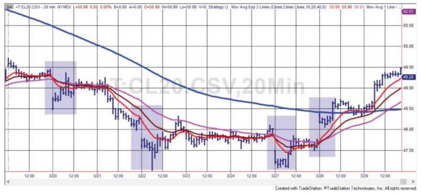
FIGURE 16.1 Moving averages applied to a 20 -minute bar crude oil business day.
\section*{USDGBP 5-min bars, 20-bar average}
0.52
0.519
0.518
0.517
0.516
0.515
0.514
0.513

FIGURE 16.2 USDGBP 5-min, 24-hr data with a 20-bar moving average.
\section*{Choosing the Intraday Bar Size}
It is always easier to use features normally provided by your quote equipment. Most traders think of intraday bars in \(5^{-}, 10^{-}\), or \(15-\) minute intervals, starting at the top of the hour. Developing a successful trading strategy is difficult enough but using an odd bar size may be adding unnecessary complications. Even within the realm of "normal" there are interesting choices.
\section*{Selecting the Bar Interval}
While there is no correct bar length, traders often choose \(5-, 10-, 15-, 20-, 30-\) minute, and 1 -hour periods to chart. Some system development platforms require that the interval be evenly divided into 1 hour intervals; therefore, a 7 -minute bar is not allowed. When using longer bars, such as 1 hour, it is important to consider the length of the last bar of the day. In trading platforms or charting software that require that all bars begin at the start of the hour, a 1-hour bar will post its first price at the end of the first actual hour, rather than one hour after the open; the last bar will be the interval from the last whole hour to the close. In the case of the energy markets, which close at 2:30 p.m. in New York, this will make the last hourly bar 30 minutes; for the S\&P pit session, closing at 4:15 p.m., and grains closing at 1:15 p.m. in Chicago, it would be 15 minutes. For a 30-minute bar, some software captures data from 14:00 to 14:29:59, so a market closing at 14:30 may have only 1 minute in the last bar, or just the last trade. When bars are uneven in this way, the volatility and volume for each bar can no longer be compared.
\section*{Using Tick Bars}
With any fixed-length bar, there are significant
variations in volume and volatility. During mid-morning or mid-afternoon, volume can be low. While normal trading in heating oil occurs every few seconds, at 12:30 p.m. there might be gaps of 10 seconds or more when there are no trades. For older data, these gaps could have lasted minutes. This creates a very large variation in volume and volatility. To avoid that, some traders will choose bars representing an equal number of ticks (or price changes), normally 10,50 , or 100 price prints. Conceptually, this is similar to Richard Arms' method, Equivolume, where bars that are charted vary in width according to daily volume. To do this, you will need tick data, or 1-minute or 5-minute data with either volume or tick count. Many development platforms will build these bars automatically for you from their own price history or data feed.
Uneven price bars have their own difficulties. As with equal time bars, the last bar of the day will not have the same number of ticks and will vary from day to day, as will the number of bars in the day. They will also show different patterns. Without extensive testing, there is no way to know which are more reliable. Using an arbitrary day of 5-minute, 24-hour USDGBP futures data, we applied a 20-bar moving average to the 5 -minute bars and to a 100-tick bar. The construction of the 100-tick bar was that it combined 5-minute bars until the accumulated volume exceeded 100 ticks, then started a new bar. A tick bar doesn't need to worry about the low volume overnight; it will just have fewer bars.
Figure 16.2 shows the 5 -min bars and the 20 -bar average. During the first half of the day, the downtrend has two false turns up. In the second part of the day, the uptrend has a number of false trend changes. Figure 16.3, using our construction of 100 -tick bars, shows a much smoother trend, one downtrend in the first half and one uptrend in the second half. For this one example, the equal-tick bar is far better at recognizing the trend.
\section*{Trading in the Wrong Time Zone}
The advent of 24-hours trading allows U.S. traders to respond to events happening in Japan or Europe, but only if they are willing to watch the market throughout the night. Trading the Nikkei 225 or the TOPIX index during U.S. business hours is not a good idea. Tokyo is 14 hours ahead of Chicago; when it's 9 a.m. in Chicago, it is \(11 \mathrm{p} . \mathrm{m}\). in Tokyo (and a day ahead). Japanese economic releases most often occur at 9:30 a.m. and 3 p.m. in Tokyo, or 7:30 p.m. and 1 a.m. in Chicago. The effect of Japanese economic news on the U.S. market tends to be small, so trading the Nikkei during Japanese business hours will be the way to benefit from their economic releases. The futures contract traded on SIMEX (the Singapore International Monetary Exchange) will be the most active.
\section*{USDGBP 100-tick bars, 20-bar MA}
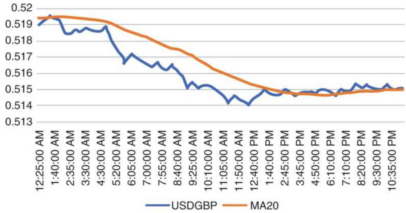
FIGURE 16.3 USDGBP 5-min data grouped by 100-tick bars, with a 20-bar moving average.
Trading European markets starts at 2 a.m. in New York and their economic releases come shortly after.
Announcements by the European Central Bank will move the U.S. interest rate market from the time of the announcement until the U.S. economic releases at 8:30 a.m., at which time the U.S. data tend to overwhelm the effects of the European data. Because prices can abruptly change direction following the U.S. reports, it's best to define the trading day starting when the U.S. becomes active, shortly before 8:30 a.m.
\section*{Time-of-Day Patterns}
Time-of-day volume and the intraday high-low distribution were discussed in Chapter 15. These patterns help traders time their entries and exits.
Understanding these patterns gave rise to the very popular opening range breakout strategy, which will be discussed in a later section.
\section*{Intraday Volatility}

One more pattern is important - intraday volatility. Although not surprising, an opening bar with higher volatility generally means greater volatility throughout the day. As with intraday volume, highs, and lows, volatility normally takes the shape of a "U," highest at the beginning and end of the day. In an example of 20min crude oil (Figure 16.4), the API and AGA reports, on separate days, come out at 10:30, causing a more volatile reaction; afterward, volatility reverts to a normal pattern. The last bar of the day is lower because it reflects only 10 minutes of trading rather than 20 minutes. This distribution can be shown for any intraday price series using the program TSM Intraday Volatility Distribution on the Companion Website.
\section*{Crude oil intraday volatility}
0.50
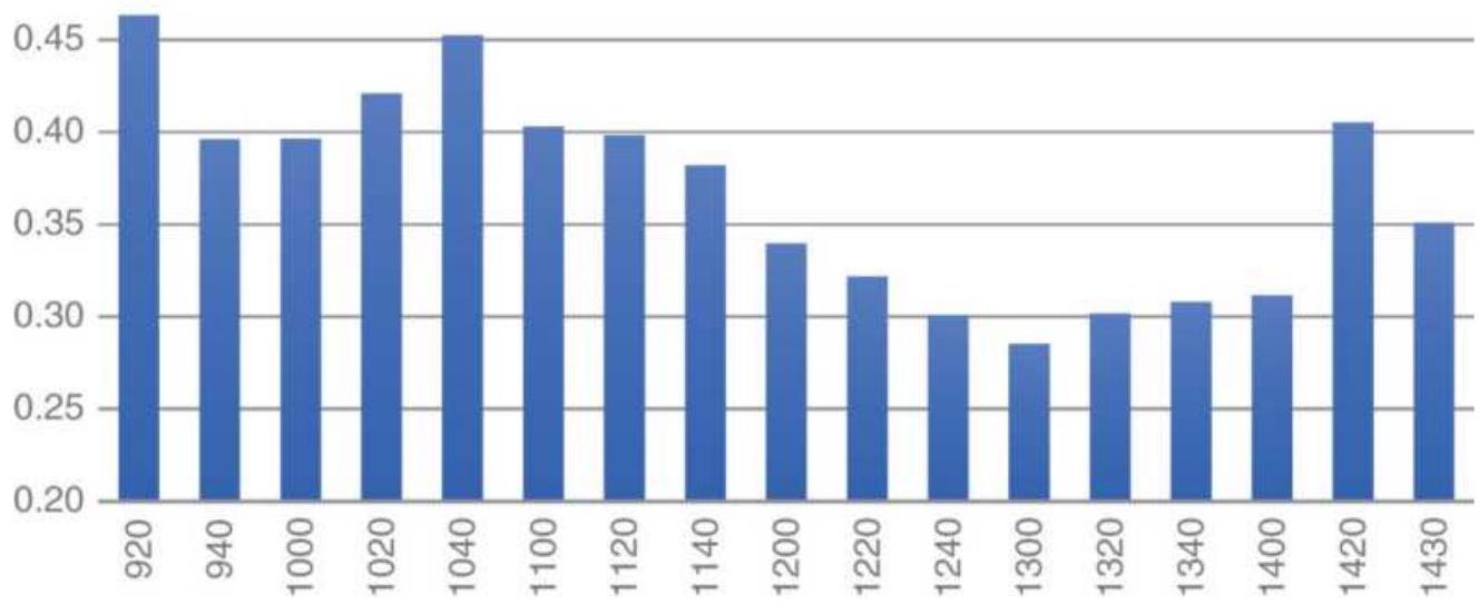
FIGURE 16.4 Intraday volatility pattern for 20-min crude oil, showing a jump at 10:30 when the API and AGA reports are released.
\section*{Recognizing a More Volatile Day}

If volatility is important for most day traders, then recognizing a more volatility day as early as possible will be an advantage. An indicator on the Companion Website, TSM Intraday Volatility Bars, creates a histogram of the cumulative average volatility by bar and plots today's volatility as dots, so that you can compare today with the recent past pattern, as shown in Figure 16.5 .
In Figure 16.5, the indicator is applied to 20-min crude oil bars, over what we consider the business day, 10 a.m. to 2:30 p.m. The dots show the cumulative volatility of the current day while the histogram shows the 5-day average cumulative volatility. Days where today's
volatility is close to the average seem to have quieter activity. Days that start with higher volatility seem to continue to increase relative to the past few days.
\section*{Trading Key Levels}
Traders are clear about specific price levels that they believe trigger changes of direction or continued moves. They also want those moves to happen when there is sufficient activity. These key levels are the ones most easy to remember - yesterday's high, low, and close, today's open, high, and low, and the most recent significant high and low. Traders remember these levels because it is their job to do that. Professional traders limit their focus to a few markets, so remembering those levels is easier.
There are general patterns that are expected throughout the day, even when they do not show in the time-of-day analysis in Chapter 15. Following the business-day opening, both volume and volatility drop toward midday. Around midday the high or low of today's trading range is often tested. It is common for most day traders to buy the bottom of the range and sell the top. A break of either support or resistance after midday is considered a major directional change; traders quickly shift to the direction of the breakout with the expectation of holding that position for the balance of the day. This concept forms the basis for the famous opening range breakout system discussed later in this chapter. A classic analysis of how key levels are traded is shown in Figure 16.6. This chart, created by Walt Bressert in the 1970s, uses the important recent highs and lows and is very specific about
relationships between the developing range, the previous day's range, and the time of day. You will find that many day-trading systems use patterns in Bressert's chart.
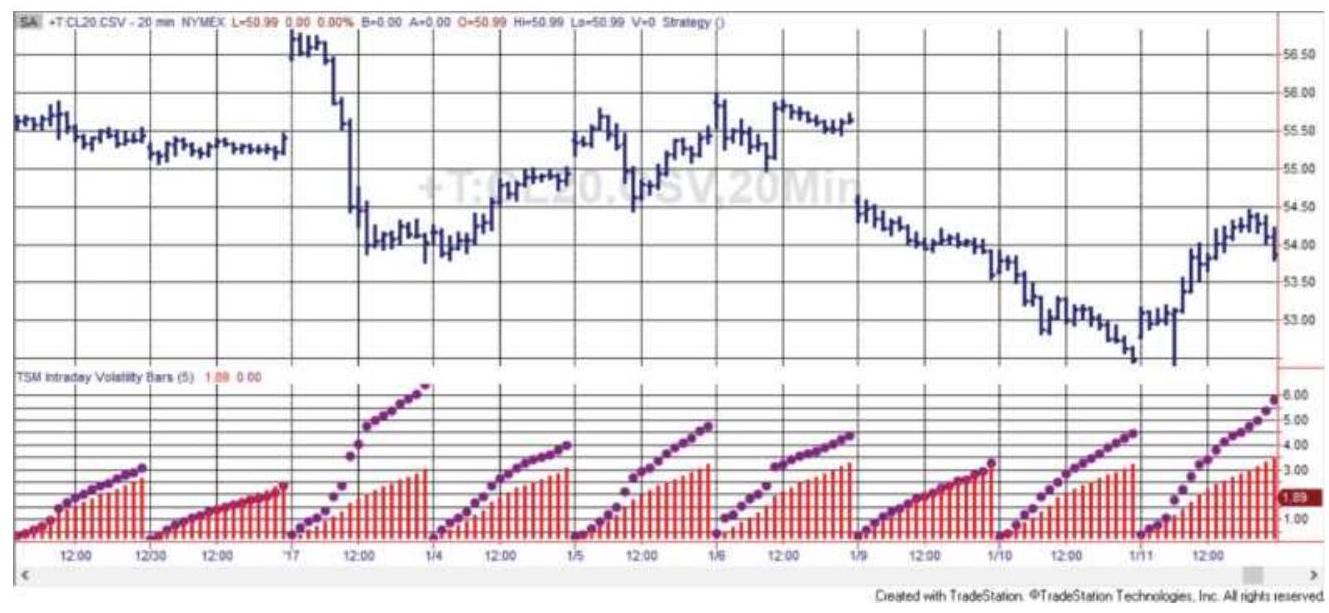
FIGURE 16.5 Intraday volatility indicator using past 5 days applied to \(20-\mathrm{min}\) crude oil futures.
To clarify the way Figure 16.6 is to be read, we use line 1 as an example. Note that columns \(A-D\) are days where the open was higher than the previous close, and columns \(E-H\) are days where the open was lower than yesterday's close. The notation in the box alongside number 1 shows the preconditions of that row, explained at the upper right of the chart; therefore, \(H_{E}<H_{Y}\) says that the high of the entry is lower than yesterday's high. This row shows the beginning of an inside day. Columns \(A-D\) give the trading signal as the day progresses. In the first box, \(1 A\), the absence of broken lines marked \(B\) and \(S\) for buy and sell indicate no trade occurs with this pattern for the first 30 minutes of the day.
To avoid confusion with the notation, you should replace the \(E\) with a \(T\). Rather than saying "the high of the entry" it is clearer to say, "the high of today." The use of "entry" means the "entry day," which is today.
The second box in row \(1,1 B\), shows that a buy and sell order can be placed 30 minutes after the open. The new long is entered on an upward break of the previous day's highs, and a new short sale is entered on a drop through the previous day's low. By midday, box \(1 C\), the buy and sell signals become closer by raising the short sale to a break of the current day's low, rather than the previous day's low. In box \(1 D, 35\) minutes before the close, if prices are between the current open and the current high, the buy signal is lowered to the current high and the short sale to the opening price of the day. Bressert's chart is an extremely good example of the way a professional trader reacts to changing patterns in combination with the constantly moving clock.
\section*{TRADING USING PRICE PATTERNS}
A trade that lasts from 1 to 3 days can be improved if short-term patterns or cycles can be found, such as those in Figure 16.6. For example, in a trending market there are outstanding weekly and weekend patterns. It is common to find that Monday's move is a continuation of the previous week's trend. By Tuesday (or sometimes Wednesday), the strength of new buyers or sellers has faded, and the market reverses due to lack of activity and some profit taking. It often stays in this state through Wednesday or early Thursday when it again resumes the
trend. Friday afternoon may see a minor reversal of the trend as some traders take profits and reduce risk ahead of the weekend. In a sideways market, the Friday and Monday directions differ from the direction during the prior week and often differ from each other. A study of these patterns can be found in Chapter 15.

\(H_{E}<H_{Y}\) - high of entry is lower than yesterday's high
\(\mathrm{H}_{E}>\mathrm{H}_{Y}\) - high of entry is higher than yesterday's high
R \(>\) - range of entry day extends above yesterday's close R < \(\quad\) - range of entry day extends below yesterday's close \(\mathrm{L}_{\mathrm{E}}<\mathrm{L}_{y}\) - low of entry day is lower than yesterday's low \(\mathrm{L}_{\mathrm{E}}>\mathrm{L}_{Y}\) - low of entry day is higher than yesterday's low
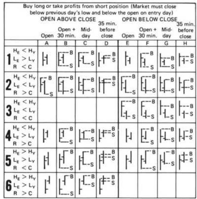
\begin{tabular}{|c|c|c|c|c|c|c|c|c|}
\hline \multicolumn{9}{|c|}{\begin{tabular}{l}
Sell short or take profits from long position (Market must close \\
below previous day's low and below the open on entry day)
\end{tabular}} \\
\hline & Open & \begin{tabular}{l}
Open + \\
30 min .
\end{tabular} & Mid- & \begin{tabular}{c}
35 min before \\
close
\end{tabular} & Open & \begin{tabular}{l}
Open + \\
30 min .
\end{tabular} & \begin{tabular}{l}
Mid- \\
day
\end{tabular} & \begin{tabular}{l}
35 min . \\
before \\
close
\end{tabular} \\
\hline & A & B & C & D & E & F & G & H \\
\hline 7 \begin{tabular}{l}
\(\mathrm{H}_{\mathrm{E}}<\mathrm{H}_{Y}\) \\
\(\mathrm{~L}_{\mathrm{E}}>\mathrm{L}_{Y}\) \\
\(\mathrm{R}<\mathrm{C}\)
\end{tabular} & 1 & -1 & & & 1 & & & \\
\hline & & -1 & & & & & & \\
\hline 9 \begin{tabular}{l}
\(H_{E}<H_{Y}\) \\
\(L_{E}<L_{Y}\) \\
\(R<C\)
\end{tabular} & & & & & & & & \\
\hline & 1 & & & & - & & & S \\
\hline & \(H_{--S}^{-B}\) & \(7_{-3}^{-8}\) & & & \(\mathrm{~F}_{-5}^{\mathrm{B}}\) & \(t_{--5}^{-8}\) & \(\square^{-8}\) & +is \\
\hline 2 \begin{tabular}{l}
\(\mathrm{H}_{\mathrm{E}}>\mathrm{H}_{Y}\) \\
\(\mathrm{~L}_{\mathrm{E}}>\mathrm{L}_{Y}\) \\
\(R>C\)
\end{tabular} & \(t_{-s}^{-B}\) & \(\mid t_{-3}^{-8}\) & & \(\left\lvert\,\)\begin{tabular}{|c}
\(f-8\) \\
\(f-s\)
\end{tabular}\right. & & & & \\
\hline
\end{tabular}
FIGURE 16.6 Intraday timing of market movement.
Source: Walt Bressert.
Some trading systems can be difficult to classify as daily or intraday. Steidlmayer's Market Profile is one of these. It is often followed by day traders but can be applied to daily data. It is found in Chapter 18, "Price Distribution Systems."
\section*{Variations on Support and Resistance}
Support and resistance levels are most important to the short-term trader. If prices start to move up, slow down, and finally reverse, it is natural to consider the highest price as a resistance point. Prices are thought to have been stretched to their extreme at that level. Any subsequent attempt to approach the previous high price will be met with professional selling in anticipation of prices stopping again at the same point or slightly lower. In addition, it is common for the traders to place orders above the previous high prices and enter new long positions or close out shorts in the event of an upward breakout through resistance.
This method tends to create and then reinforce the support and resistance price levels until they define a clear trading range. Within a 1- to 3-day period, these ranges can be narrow and yet effectively contain price movement. During the life of the trading range, it will continue to narrow as the levels become clear to more traders and the anticipation of a reversal at those levels becomes imminent. This is similar to an ascending or descending triangle based on daily data, where the price pattern continues to narrow.

There are many combinations of the day's open, high, and low, along with yesterday's high, low, and close that can be used to create a trading strategy. A good sample of those was shown in Figure 16.6. We can also create a strategy that uses the idea of support or resistance that exists near the middle of the trading day, where volume and volatility often drop to low points for the day and prices have a good chance of reversing
direction. If they continue to make new lows or new highs after midday, then we expect prices to continue in that direction for the rest of the day. The rules for this strategy, which we will call TSM Midday Support and Resistance (on the Companion Website), using 15- or 30minute bars, are:
1. Define "afternoon" beginning at 12:00 p.m. exchange local time.
2. Record the high and low from the open until 12:00 p.m.
3. Record the highest close and lowest close from the open until 12:00 p.m.
4. After 1:00 p.m.:
a. If there is no position or we are short, and the closing price of the bar is in the lower \(25 \%\) of the morning high-low range, then cover shorts and go long.
b. If there is no position or we are long, and the closing price of the bar is in the highest \(25 \%\) of the morning high-low range, then exit longs and go short.
c. If we are long and prices break below the low of the morning range, then exit longs and go short.
d. If we are short and prices make a new high above the morning range, then exit shorts and go long.
This strategy takes advantage of both support and resistance as well as an intraday breakout, limited to the
afternoons. Trades can be exited on the close, on the next open, or at midday of the next day. Results show that holding the trade longer, in other words, until the next midday, creates larger gains. The website program allows you to test combinations of breakouts and mean reversion. Figure 16.7 shows trading signals for the S\&P futures during March 2017, using the exit on next open option. Trades marked as MDlong and MDshort are breakouts during the afternoon, and trades marked MDsup and MDres are reversals based on failing to break support and resistance levels.
In its basic form, using 1:00 p.m. as midday this strategy returned \(\$ 80\) per trade for longs only, on 580 trades from January 2010 through April 2017. Short trades netted a loss. Crude oil showed very different results for the same period using 11:00 a.m. as the midday value, 30 minutes after the key oil reports are released. Exiting on the close showed profits in long positions while exiting the next day showed profits in shorts. Ambitious developers can exploit that by breaking it into two trades.
The choice of options depends on whether the market has trending or mean-reverting tendencies, large sustained moves, or persistent noise. That can be discovered just by trying the parameter choices and seeing which produces the most profit. Trending markets will also benefit from a trend filter to be sure trading is in the direction of the trend rather than fighting with it.
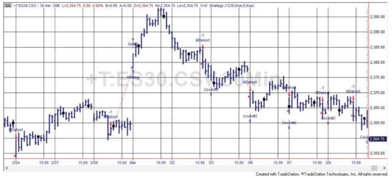
FIGURE 16.7 Midday support and resistance breakout applied to \(30-\mathrm{min}\) S\&P futures.
\section*{INTRADAY BREAKOUT SYSTEMS}
The 1990s were the crowning years for intraday breakout systems. With the advances in computer speed, userfriendly software, and the availability of electronic data feeds at a reasonable cost, the very popular \(N\)-day breakout method became the equally popular \(N\)-bar breakout method. Entry and exit signals could occur during the trading session based on new highs and lows of the previous 10 bars, rather than a new daily high or low. Traders also discovered that the risk could be shockingly large if there were reversals during the day caused by wide price swings - new highs, followed by new lows, followed by new highs again. Trades were held overnight, and the \(N\)-bar calculations continued across days.
Intraday breakout systems can have different rules to define the breakout. When we refer to the open, it could
be the open of the business day, defined by each user, or the actual market open which, for futures, is shortly after the close.
- A breakout of the high-low range formed after \(n\) minutes of trading or \(n\) bars after the open
A breakout based on daily volatility measured from the open
- A breakout based on daily volatility measured from the previous close
The first depends entirely on the volatility at the beginning of the new day. The second uses a percentage of the \(n\)-day volatility. The third uses the same \(n\)-day volatility but measures the breakout from the previous close. All intraday breakout systems can be filtered using a trend, minimum volatility, maximum volatility,
compression, and other qualifying patterns. Trades can be held overnight or exited on the close.
\section*{Opening Range Breakout Using Time}
Using time creates a trading signal independent of any previous data. Wait 30 minutes or 1 hour after the open to allow prices to establish their trading range and volatility. One of the most popular versions is called the 1st Hour Breakout, based on the obvious rules:
Wait 1 hour after the open, then fix the breakout levels as the high and low of that time period.
- Buy if prices move above the 1-hour high.
- Sell if prices move below the 1-hour low.
Reverse if prices cross the opposite threshold.
Exit at the end of the day.
If price penetrates the high, then penetrates the low, you first enter a long, then reverse by going net short. Some traders prefer to take only the first trade. Additional rules can be:
Set a profit target of 1 ATR based on the past 14 daily bars.
Cancel the trade if no signal occurs within 2 hours from the open.
\section*{Using Bars}

A simple and popular variation of the 1st Hour Breakout is the N-Bar Breakout, where the high-low range is fixed after the first \(N\) bars of trading. Based on the size of the bar, a 1-hour breakout could be 4 bars of 15 minutes or 12 bars of 5 minutes. It's easy to make the two methods the same, and the examples that follow will use \(N\) bars. In Figure 16.8, S\&P futures are \(30-\mathrm{min}\) bars with 2 bars for a breakout and the exit on close. A strategy to test this is TSM Intraday N-Bar Breakout, available on the Companion Website.
On day 1 the high-low range was set on the first bar, and an upward breakout occurred on the 3rd bar. An entry would have used a stop order to buy slightly above the high of the 2 -bar range. Prices closed higher for a profit.
On day 2 the bar established by the first two bars isn't penetrated until bar 4. That day also closed higher. The
breakout on day 3 also happened on bar 3 and prices closed slightly higher, and the same for day 4 . Day 5 had a buy signal on the third bar, which then closed lower. Near the end of the day, a wide-ranging bar penetrated the low band, causing an exit and a loss, but not necessarily a reversal to the short side. When breakouts occur near the close, there is little opportunity for profit and new trades may not be entered within 1 hour of the close. Additional rules might be:
- Trade only in the direction of the daily trend.
- Enter a trade only after an inside bar.
- Enter a long after a reversal pattern to the upside using a smaller bar size.
S\&P futures, 30-min bar, 1 hour breakout
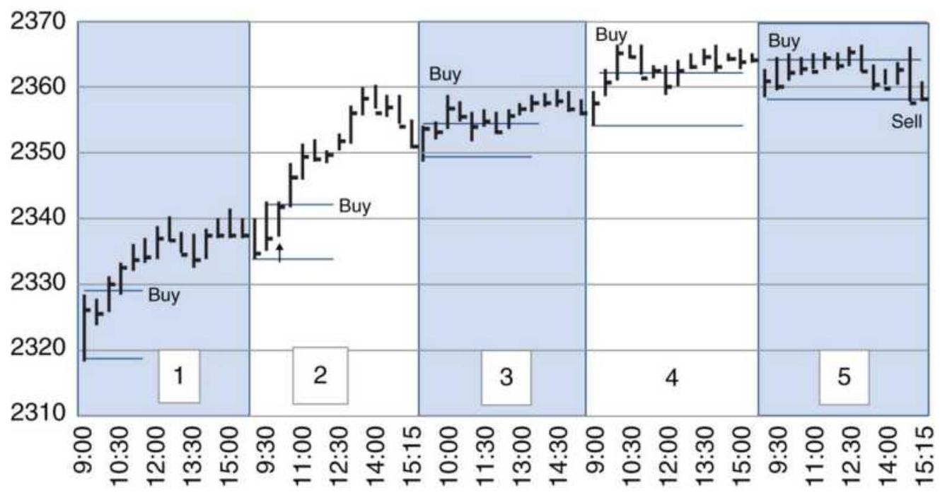
FIGURE 16.8 S\&P 30-min bars with a 2-bar breakout.
\section*{Raschke and Conners' Version of the 1st Hour Breakout}
In order to improve the selection of a buy day and a sell short day, Raschke and Conners created their own indicator called Momentum Pinball. \(\stackrel{2}{-}\) The underlying indicator, called the LBR/ \(\mathrm{RSI}^{\mathrm{TM}}\), is a 3 -day RSI of a 1 -day rate of change; therefore, the rate of change (which makes prices changes more sensitive) reduces the lag in the indicator. For a buy signal:
On the previous day, the indicator must have a value less than 30 .
- On the current day, place a buy stop above the high of the first hour's trading range.
- Once filled, place a sell stop at the low of the first hour's trading range.
- If the trade gets stopped out, reenter if prices reverse and penetrate the original buying threshold.
- If the trade is profitable at the end of the day, carry it overnight.
If the next open moves in the profitable direction, exit on the open.
Sell signals are the opposite of buy signals, with the indicator posting a value greater than 70 to set up the trade. While this is clearly an opening range breakout, the use of a 3-day momentum ties back to Taylor. Figure 16.9 shows an example of this method applied to the emini S\&P during December 2010. The top panel shows the 30-min S\&P bars, the bottom panel has daily bars, and the middle is the indicator based on the daily bars.
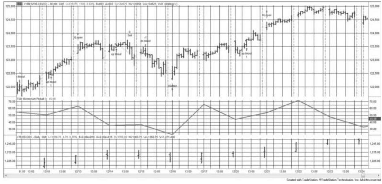
FIGURE 16.9 Using the LBR/RSI \({ }^{\mathrm{TM}}\) indicator to trade a 1st-hour breakout.

Testing this method on the emini S\&P for 2000 through May 2011, the results showed a gain of \(\$ 703\) per contract on 1,734 trades (no costs were used).
Considering the method was published in 1995, that is quite good. We should expect markets that are more trending than the S\&P to perform better. A program, TSM Momentum Pinball, on the Companion Website can be used for testing.
\section*{Opening Range Breakout Using Volatility}
In any form, the Opening Range Breakout \({ }^{3}\) gives the underlying entry and exit signals based on how far prices move from the opening price of the day. Using the range formed during the first hour of trading reflects the volatility of early trading. Sometimes that volatility can be smaller than the average. A very small breakout range
is not a reliable indication of the start of a price move.
To correct that problem, traders have used a minimum point move or a minimum percentage of the average daily volatility to create the high-low bands used for signals. Toby Crabel was the first to popularize that method, using different fixed values for each futures market, as shown in Table 16.4. The trader is then buying when prices move up from the open by, for example, \(8 / 32\) in bonds, or 25 basis points in cattle. If prices then declined to 8 ticks below the open, the long position would be reversed to a short. These are the basic open range breakout rules. All trades are exited on the close of the day.
Toby Crabel, in his extensive study of intraday patterns, found that combinations of inside days, low volatility, bull and bear hooks, and other patterns that precede the current day all contribute to a selection process that improves trading. Table 16.4 shows Crabel's comparison of an opening range breakout with and without using a preceding inside day. 4 The improvement is significant. Even though this was done in 1990, compression seems to remain a good filter.
If you consider that intraday trading may give at least one new signal each day, any method that helps select the better trades is welcome. The intraday trading profile of many small profits and losses allows you to be more selective without fear of missing the one big trade of the year, which is a problem typical of a long-term trendfollowing system.
\section*{Raschke Trades Crabel}
Linda Raschke, one of the stars of intraday trading, working with Laurence Conners, takes her own approach to Crabel's range contraction. 5 Raschke uses the inside day concept, focusing on a 4-day interval, NR4, where the 4 th day has a smaller high-low range than the preceding 3 days, but does not have to fall within the high-low of the past 3 days. The trading rules are then:
TABLE 16.4 Opening range breakout, \% profitable trades.
Source: Toby Crabel.
\begin{tabular}{|l|l|c|c|}
\hline Market & Breakout & \begin{tabular}{c}
Any Day \\
(\%)
\end{tabular} & \begin{tabular}{c}
Inside Day \\
(\%)
\end{tabular} \\
\hline Bonds & Open +16 ticks & 60 & 76 \\
\hline & Open +8 ticks & 55 & 74 \\
\hline & Open -8 ticks & 56 & 62 \\
\hline S\&P 500 & Open +160 points & 68 & 66 \\
\hline & Open +16 ticks & 56 & 61 \\
\hline & Open +80 points & 55 & 57 \\
\hline & Open -80 points & 49 & 48 \\
\hline Soybeans & Open +10 cents & 60 & 75 \\
\hline & Open -160 points & 49 & 70 \\
\hline & Open +5 cents & 56 & 67 \\
\hline
\end{tabular}
\begin{tabular}{|l|c|c|c|}
\hline & Open -5 cents & 58 & 69 \\
\hline & Open -10 cents & 63 & 76 \\
\hline Cattle & Open +50 points & 65 & 55 \\
\hline & Open +25 points & 58 & 55 \\
\hline & Open -25 points & 58 & 60 \\
\hline & Open -50 points & 63 & 73 \\
\hline
\end{tabular}
1. On the day following the NR4 day, place a buy stop 1 tick above the high of the NR4 day and a sell stop 1 tick below the low of the NR4 day.
2. If a new signal occurs - for example, a buy - and prices reverse on the same day, moving through the level of the sell stop, close out the long and sell short.
3. Use a trailing stop to avoid giving back profits.
4. If not profitable in 2 days, then exit the trade on the close of the second day.

This method can be tested using TSM Raschke Opening Range Breakout, on the Companion Website. The only missing feature is the trailing stop, which was not defined.
\section*{The Volatility Breakout Based on the Open}
An opening range breakout, where the breakout
thresholds are based on volatility rather than a fixed value, is the next step in the evolution of this method. Volatility is measured as the \(n\)-day average true range (ATR), then a percentage of that range is used to determine the breakout. The number of days in the ATR can range from 5 to 20 depending on how responsive the ATR is to current market volatility.
Figure 16.10 is an example of the bands formed using \(0.5 \times\) ATR added to and subtracted from the opening price. Because the ATR is based on daily values, the factor used to create the bands will be usually be less than 1.o. In the example, the upper band comes very close to the high prices of the day and may have triggered a buy signal. The low prices do not reach the lower band.
\section*{Breakout using \(0.5 \times 5\)-day ATR from today's open}
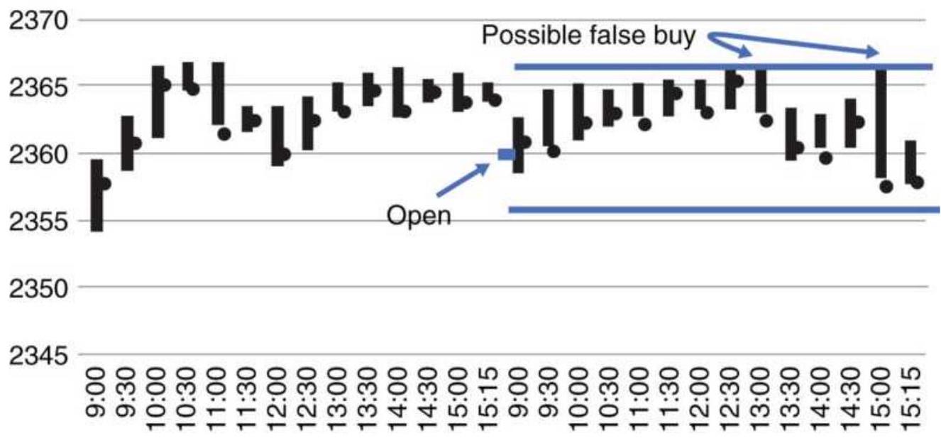
FIGURE 16.10 Example of using \(0.5 \times\) ATR thresholds from the open.
\section*{Volatility Breakouts Based on the Previous}
\section*{Close}
The alternative to using the open plus ATR bands is to center the bands around the previous close. Using the previous close adds some amount of trend to the system. It can also generate a trading signal on the first bar of the day. If prices tend to open higher in a bull market, you are much more likely to get a buy signal.
Figure 16.11 uses the same data as Figure 16.10 but centers the thresholds around the previous close.
Because the close was higher, the bands are higher and prices miss penetrating the upper threshold. Instead, there is a sell signal late in the day that generates a small profit.
There is no way to say which is better, intraday breakouts based on the open or the previous close, without testing. Trending markets will favor the previous close and using the previous close should produce more trading signals.
\section*{Breakout using \(0.5 \times 5\)-day ATR from previous close} 2370

2350

FIGURE 16.11 Example of using \(0.5 \times\) ATR thresholds from the previous close.
\section*{A Program to Test Intraday Volatility Breakout}

There are a lot of choices to be made when deciding what Intraday Breakout System you would trade. These choices need to be tested. A TradeStation program, TSM Flexible Intraday Breakout on the Companion Website can be used. That program produced the results shown in the previous sections. It has the following features and options:
- Use the open as the basis for determining breakout thresholds.
- Use the previous close for determining breakout thresholds.
- Trade the breakout, that is, buy a break of the high and sell a break of the low threshold values.
- Assign a percentage of the \(n\)-day true range as a breakout factor \(f\), and allow \(n\) to be assigned.
- Trade an additional breakout as a mean-reversion signal, using the same \(n\)-day true range but a meanreversion factor, \(m f\).
- Set the start time and end time for the day.
- Set the time of the last trade entry.
Allow profit-taking based on a factor of the \(m\)-day ATR, where you set \(m\).
Allow a trend filter, assign the calculation period.
- Filter using c-day compression, where you set \(c\).
Filter by a preceding inside day.
Allow "long-only" trades.
Allow the trade to be held overnight, exiting on the next open.
Indicate if you are testing stocks or futures. Stocks use an investment of \(\$ 10,000\) per trade and futures \(\$ 25,000\).
These features make the program long and complex. It will print a "detail" report that allows you to follow the bar-by-bar calculations in order to verify them. It will also print a separate report of daily cumulative returns for long trades, short sales, and the total of both. When using this program, it is best to start with one simple rule, blocking out the others, then add or change one option at a time. Caveat emptor: Be careful to verify the trading signals. The number of combinations makes it impossible to be sure there are no errors.
\section*{Deciding What Parameters to Use for an Intraday Breakout}
Although testing a strategy is covered in Chapter 21, an Intraday Breakout System requires some unique decisions that are best discussed here. There are a lot of rules possible, as shown in the previous section. Given a choice of testing multiple parameters at one time, or testing one at a time, there are advantages to one at a
time. You will know how each parameter contributes to the success. With an integrated solution, the interaction of parameters can be difficult to understand, and if the performance starts to fail, it will be equally difficult to figure out where the problem lies.
Taking the approach of testing one parameter at a time, we start with the most important, the ones that will have the biggest impact on the results. We'll use the approach that bases the thresholds on the opening price plus the daily ATR, and first test the 30-min S\&P futures, from 2010 through April 2017, using the open and then the previous close.
Figure 16.12 is the optimization results using breakout intervals of o.1, net of an \(\$ 8\) per contract per side cost. That cost may be high, but it will include slippage. Results show that the profitable breakout factors cluster from 0.5 to 1.0 with a peak at 0.6 at a total profit of about \(\$ 450,000\). The clear pattern is encouraging. Smaller breakouts react to noise and larger breakouts do not leave enough time in the day for a profit.
Next, we compare these results with the breakout based on the previous close, which takes advantage of the underlying trend. Figure 16.13 also shows a uniform pattern of profitable results, peaking closer to \(\$ 800,000\), overall a better performance. It appears that this model will be better.
\section*{Adding a Trend Filter}
The next parameter to be tested will be the trend filter.
Because basing the breakout on the previous close
includes some trend, the expectation is that a trend filter would improve the use of the open more than the previous close. At the risk of being accused of overfitting, we'll use the best breakout parameters, 0.6 for the open and 0.9 for the close, and only test the calculation period for the trend.
Figure 16.14 shows peak profits only slightly higher than tests without the trend, and those profits are limited to the faster trends, 20 through 40 days. However, to see that there is an improvement, we need to look at the statistics. Using the trend, the percentage of profitable trades was \(56 \%\) on 440 trades, with an average net return per trade of about \(\$ 1,100\). Without the trend there were \(55 \%\) profitable trades out of 471 , each averaging \(\$ 979\). That's not a startling improvement, but it is better. The disadvantage for asset managers is that the results will be more correlated with trend-following systems.
\section*{ES total profits using ATR breakout from open}
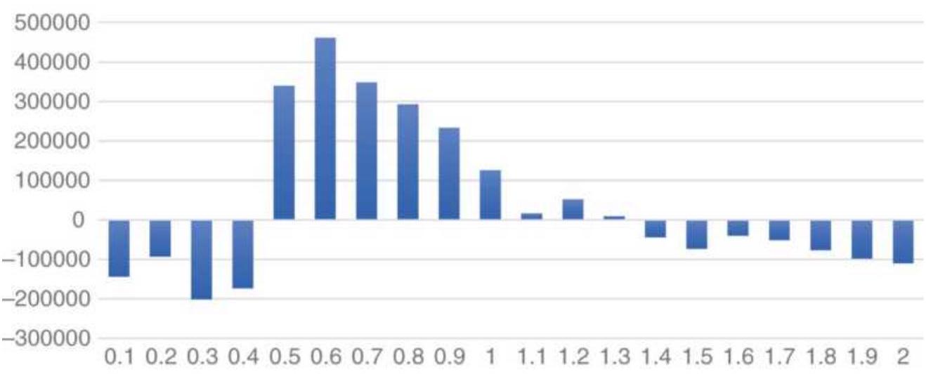
FIGURE 16.12 Optimization of 30-min S\&P breakout using an ATR factor measured from the open.
\section*{ES total profits using ATR breakout from close}
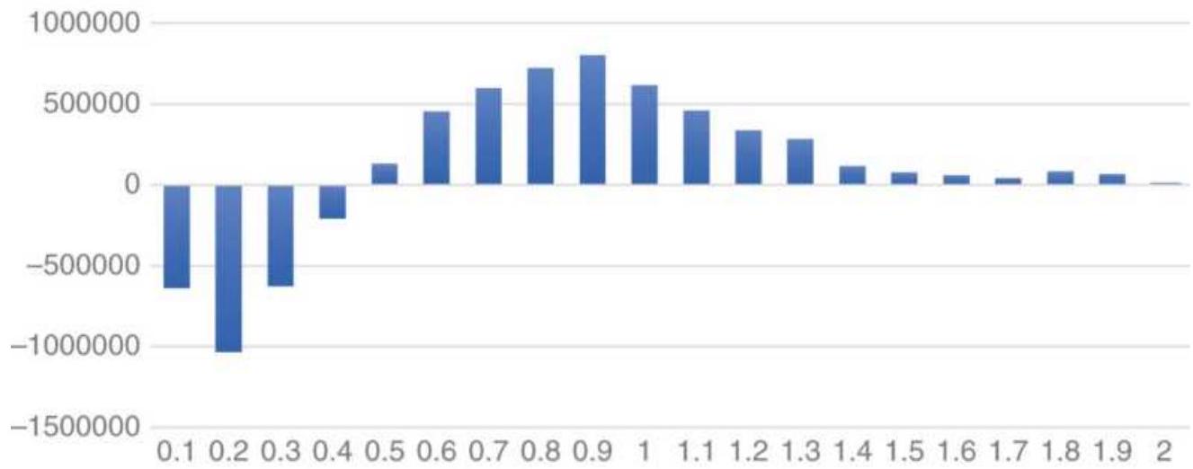
FIGURE 16.13 Optimization of 30-min S\&P breakout using an ATR factor measured from the previous close.
Trend filter for ES ATR breakout \(0.9 \times\) ATR from close
550000
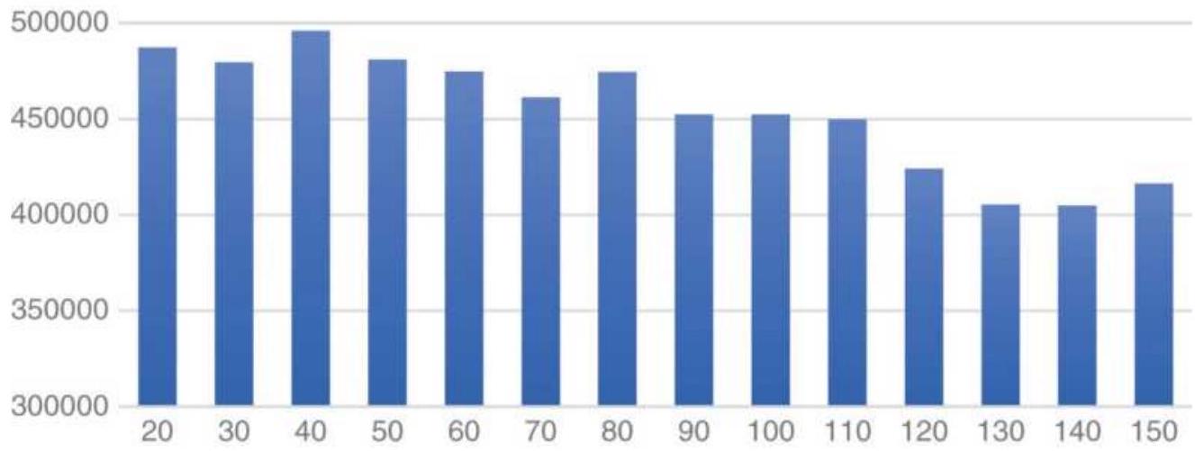
FIGURE 16.14 S\&P trend filter optimization based on breakout from the open.
Results of the trend test using the previous close are shown in Figure 16.15. Results without the trend showed a net gain of \(\$ 801,912\), on 347 trades, of which \(61 \%\) were profitable. With a trend filter, the periods 50 to 70 days
showed net profits at about \(\$ 816,000\) with 319 trades and a reliability of \(62 \%\). That is better than using the open and each trade was more profitable.
\section*{Comparing Results}
Neither the open or close breakout method benefited in a way that makes it clear that a trend filter should be used. The next step is to remove the trend filter and test another option. After each test, record the results and save them for when you have completed testing all the options of interest. Then try applying them, not testing, in sets of two based on the parameters previously selected.
It is often easier to make a decision by looking at the net results on a chart rather than tables of numbers. Figures 16.16 and 16.17 show the total net profits of the two breakout methods using the best trend filter results. While the numbers showed that the close was a better choice, the picture makes it much clearer that it has a smoother performance and a higher return. Returns on shorts can be seen in the difference between the longonly results and the total results. They are too small to be seen on their own.
Trend filter for ES ATR breakout \(0.9 \times\) ATR from close
830000
820000
810000
800000
790000
780000
770000
760000
750000
740000
730000
20
30
FIGURE 16.15 S\&P trend filter optimization based on a factor of the ATR measure from the previous close.
\section*{Choosing Mean Reversion}
Not all traders want to buy a rising market or sell one that's falling. Many professional traders prefer doing the opposite of the crowd. When prices move to the upside after the opening range is set, they wait for an extension, then sell. They do the opposite when prices drop. In the mean-reversion model, positions can be reversed from short to long if the lower threshold is reached after the short has been set. The opposite can also happen. In this system, mean reversion is similar to profit-taking, but once short, there is no protection if prices keep rising.
\section*{S\&P net profits using breakout from open and trend filter}
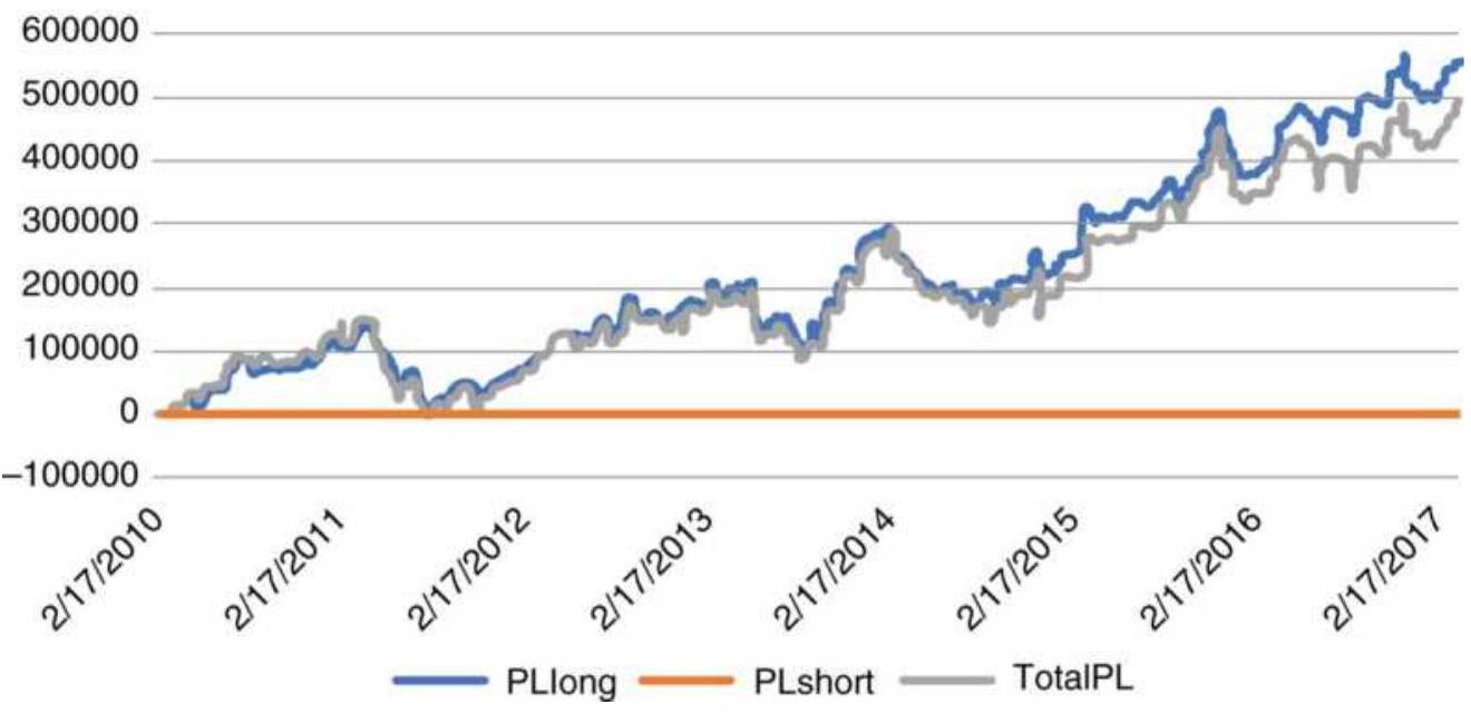
FIGURE 16.16 Net profits from S\&P breakout using the open and a trend filter.
S\&P net profits using breakout from close and trend filter
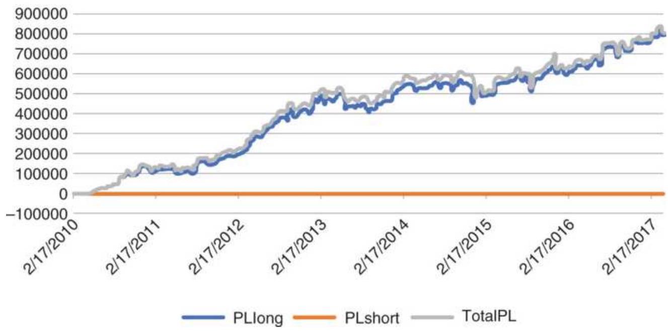
FIGURE 16.17 Net profits from S\&P breakout using the previous close and a trend filter.
Testing a mean reversion strategy can be done using the
same program, TSM Flexible Intraday Breakout. Limiting the test to breakouts based only on the day of trading, measured from the open, an optimization of the breakout factor is shown in Figure 16.18. Profits are clustered from the beginning of the test, at 0.5 to 1.0, then fall off sharply. That decline is mostly due to the reduction in trades as the thresholds become too large.
S\&P Mean reversion from open
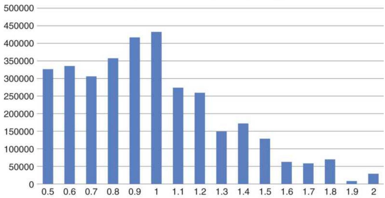
FIGURE 16.18 Mean reversion optimization based on the open using only the current day.
Net profits S\&P mean reversion from open
500000 450000 400000 350000 300000 250000 200000 150000 100000 50000
\(-50000\)

PLshort
TotalPL
FIGURE 16.19 Net profits from the S\&P mean reversion strategy based on extensions from the open.
Profits from the mean reversion strategy are smaller than the breakout using the open, but only by \(14 \%\). In exchange, the average profit was \(\$ 1,973\), twice that of the directional breakout. It had only 219 trades, of which \(64 \%\) were profitable. The equity curve is shown in Figure 16.19 and is much smoother than either of the directional results. Again, the short sales did not contribute much during the bull market.
\section*{Mark Fisher's Opening Range Breakout}
In The Logical Trader, \(-\frac{\text { Mark Fisher, an independent }}{}\) trader and founder of the largest clearing firm at the New York Mercantile Exchange, presents the most indepth description of an intraday trading method yet published. The method itself, primarily an opening range
breakout, is much more complex, with many additions developed over years of practical experience. And, while the techniques may be useful to many day traders, some of the trades will target very small profits, only possible for a professional trader with very low costs and little slippage. This summary only addresses the introductory concepts.
Fisher begins by defining the time interval to be used as the opening range. For stocks that interval is usually 20 minutes, and for futures somewhere between 5 and 30 minutes, depending on the market. At this point, the method is essentially an opening range breakout based on time. Because these are expected to be day trades, the time needed to recognize the opening range is kept short to allow the trade to capture as much of the daily price move as possible. It would be best to use no more than \(5^{-}\) minute bars for this approach. Because of the short opening range time interval, an additional requirement is that signals are confirmed by having prices remain outside the breakout thresholds by \(1 / 2\) the time of the opening range. Therefore, for a 20 -minute opening range, the price must stay above the high of that range for 10 minutes before you can buy.
We will call the high and low of the opening range \(O R H\) and \(O R L\), and the time needed to establish the opening range as \(O R\). Another range based on a percent of the opening range \(O R H-O R L\) (for example, 100\%) is used to draw a line above \(O R H\) and below \(O R L\), called \(+A\) and \(-A\). Another set of lines based on a different percentage of \(\mathrm{ORH}-\mathrm{ORL}\) (or example, 150\%) are
called \(+C\) and \(-C\); therefore \(+C\) and \(-C\) are above and below \(+A\) and \(-A\). Using these calculations, there are five initial trading scenarios for buying (they are opposite for selling):
1. Buy when prices move above \(+A\) and remain above \(+A\) for a time equal to \(1 / 2 \times O R\).
2. Close out the long trade if prices fall one tick below ORL.
3. Sell short if prices fall below \(-C\) and remain below that value for \(1 / 2 \times O R\).
4. Once reversed to short, a stop-loss is placed one tick above \(O R H\).
5. If prices do not prove profitable within a time interval equal to \(1 \times O R\), then exit the trade.
Figure 16.20 shows the sequence possible beginning with a buy signal. If \(+A\) is penetrated first, your trading bias is bullish; if prices reverse and fall through \(-C\), then your bias becomes bearish. Although the time needed to confirm an anticipated trade is given as \(1 / 2 \times O R\), and the time to confirm an existing trade is \(1 \times O R\), these times can be chosen by each trader. In the case of confirming a trade, the time might be 1.5 or \(2.0 \times O R\).
Chosen carefully, prices will consistently find support and resistance at \(O R H\) and \(O R L\) once \(+\mathrm{A},-\mathrm{A},+C\), or \(-C\) have been penetrated. The selection of \(O R\), the time interval, is most important because the size of the opening range is the basis for the \(A \mathrm{~s}, C \mathrm{~s}\), and the
confirmation of a trade.
\section*{Profit-taking and resets}
As with all day trading, profit-taking plays an important role. The erratic movement of intraday prices encourages profit-taking whenever there is an extended move. Although not specifically discussed, profit targets can also be set using a multiple of \(O R H-O R L\). After a long position has been closed out by reaching a profit target, and prices fall back below \(+A\) for some time interval, a long can be reset when \(+A\) is broken again with a stop placed 1 tick below ORL.
\section*{Pivot ranges}
To establish a bullish or bearish bias for the day, an additional pivot range is calculated based on the previous day's movement.
\[
\begin{aligned}
\text { Daily pivot price }\left(D P P_{t}\right) & =\left(\text { High }_{\mathrm{t}-1}+\text { Low }_{\mathrm{t}-1}+\text { Close }_{\mathrm{t}-1}\right) / 3 \\
\text { Average high }-\operatorname{low}\left(A H L_{t}\right) & =\left(\text { High }_{\mathrm{t}-1}+\text { Low }_{\mathrm{t}-1}\right) / 2
\end{aligned}
\]
Daily price differential \(\left(D P D_{t}\right)=D P P_{t}-A H L_{t}\)
\[
\begin{aligned}
\text { Daily pivot high } & =D P P_{t}+D P D_{t} \\
\text { Daily pivot low } & =D P P_{t}-D P D_{t}
\end{aligned}
\]
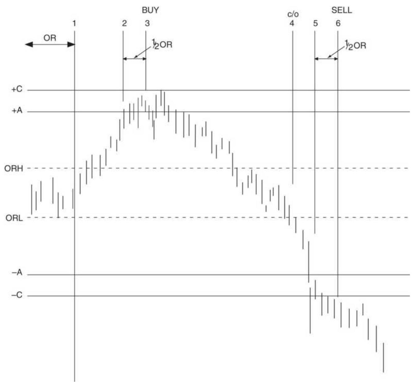
FIGURE 16.20 Fisher's buy-and-reverse scenario.
The daily pivot range can be used as a bullish or bearish bias. If the previous close was above today's pivot range high, then prices are considered bullish; if below the pivot low, then it is bearish. To confirm a bullish bias, today's price movement must find support at the daily pivot low and not trade below that level. If prices break through the pivot low, they are expected to make a significant move lower; therefore, the pivot range acts as strong support and resistance. Price movement that
breaks the pivot range as well as other support and resistance levels are considered more significant.
\section*{Importance of key ranges}
Once you have found the best time to establish the opening range, then calculated the \(A\) and \(C\) levels, and finally the pivot range, you have a number of key levels that provide strong indication of support and resistance for the day. Penetration of those levels, and confirmation based on penetrating and remaining through those levels, are the primary buy and sell signals; however, these key levels are often a point of indecision. Prices can hesitate at the moment of penetration; it is also common to move through those key levels and then retreat.
Fisher's time confirmation recognizes this problem.
Another entire set of rules has been written to fade these support and resistance levels. That is, a downward penetration of a support level ( \(-A,-C\), or pivot low) that fails is likely to be followed by a minor rally, perhaps back to the bottom of the opening range, ORL. These trades can provide frequent opportunities to enhance trading returns; however, profits can be small on days with low volatility. Traders will need to assess for themselves whether their cost structure and execution ability allows them to take advantage of these opportunities.
\section*{Filtering the Opening Range Breakout}
Larry Williams, in his day trading seminar, \({ }^{7}\) offers improvements to the classic opening range breakout,
applied to the S\&P 500 futures, using his own filters to select a better set of trades. He begins with a 10-day raw stochastic (readers should note that, although this formula was in the Holter article, the \%R defined by Williams has the numerator as Highest(High,10) - current close):
\section*{Close \(_{t}-\operatorname{Lowest}(\) Low, 10) \\ \%R Index \(=\) \\ \[
\text { Highest }(\text { High, 10) - Lowest }(\text { Low, } 10)
\]}
To set up a buy signal in the S\&P:
- \%R Index must be below \(20 \%\) and today's close must be lower than the close 7 days ago.
- Today's close must be higher than the previous close or the previous two closes to avoid buying into falling prices.
- Today must not be an inside day.
When adapted to bonds, and perhaps other interest rate markets, Williams wants more trend; therefore today's close must be higher than the close 4 days ago.
A second S\&P method exploits a different set of patterns, capitalizing on the tendency to rally on Mondays and Tuesdays:
- The previous day must not be an inside day with a close greater than the low of the day before ( 2 days ago) or the day before that (3 days ago).
- Today's close must be less than the close 6 days ago.
For bonds, today's close must be greater than the close 15 days ago.
The actual buy signal comes when prices penetrate a band formed by adding \(20 \%\) of the previous day's trading range to today's opening price. Williams also believes in the benefit of filtering trades using traditional seasonality. While they admittedly do not work all the time, they make the trader aware of the potential risk and can provide a helpful edge.
\section*{Afternoon Breakouts and Midday Reversals}
Early breakouts are most popular, but breakouts after midday also indicate a new price direction that should continue for the rest of the day. Because this cuts the potential profit by halving the time for the market to move, holding the trade overnight is essential.

The drop in volume and volatility at midday in most markets allows for the possibility of a reversal (if midday is also near the low or high of the day) or, if a breakout, a continued directional move. The program TSM Midday Support and Resistance on the Companion Website can be used for testing. This program can also select only the afternoon breakout signals and not the support and resistance trades. Both the midday time and the support and resistance zones can be changed. This method was discussed in an earlier section, "Variations on Support and Resistance."
\section*{Special Set-Up Patterns for Stocks}
Both intraday patterns formed near the beginning of the day and daily price patterns that precede today's opening can be used to find the best intraday trading opportunities. 8 Rudd selects the highest-probability buy signals, always using 5 -minute data. The patterns he describes are:
1. Dip and rally. Prices dip shortly after opening, lasting less than 1 hour, then rally back to reach the highs of the first few bars. They move sideways for some time, testing the highs without making new highs. Place an order to buy the breakout. The longer prices remain just under the high of the day, the more reliable the signal.
2. Consolidation. Prices move sideways for about 1 hour after establishing an opening range during the first few bars. Highs during the consolidation period tend to hug the highs of the day. Buy a breakout of the range. A narrow range is expected to give a more reliable signal.
3. Delayed consolidation. Prices open lower, then move higher during the first hour, settling at a resistance level. Prices test the highs but do not penetrate. Place an order to buy a breakout after resistance has held for at least \(1 / 2\) hour. Longer consolidations are better.
4. Early breakout. After a 15-minute narrow opening trading range, buy a breakout on the next bar. Prices may show a series of shorter consolidations and smaller breakouts.
5. Reversing after a false breakout. If, after buying a breakout of a narrow consolidation pattern (2), prices fall back into the original trading range, close out the long and sell, expecting a breakdown of support.
\section*{Day Trades Following a Wide-Ranging Bar}
Days in which the ending pattern is a wide-ranging bar (a high-volatility outside bar) that closes near the high of the day offer two special buying opportunities for day trading (selling is the reverse pattern) on the following day.
1. Breakout of a higher open. If, during the first 15 minutes of the next day, prices open above the high of the previous wide-ranging bar, trade lower to test the high of the wide-ranging bar, then begin to rally, buy the breakout of the current day high. Greater reliability should be expected if there is a welldefined upward trend in daily prices.
2. Selling a gap open. A substantial gap open should be sold if prices begin to fade during the first 5 minutes of trading.
\section*{Reversal Bar Set-Up}
Rudd also looks for a reversal set-up in two preceding days in order to take advantage of the completion of the actual reversal on the third day. The set-up must include the following three events:
1. The first daily bar must close near its lows.
2. The high of the second daily bar must not be much higher than the low of the first daily bar and must close near its high.
3. The high of the first daily bar should be at least 1 point above the high of the second daily bar because the difference represents the profit potential for the next day trade.
Following a successful set-up, the day trade is entered on day 3. The entry signals should be one of the original setup patterns, such as a dip and rally or consolidation. A large range in day 1 provides better opportunity.
\section*{Short-Term Gap Patterns}
A traditional gap opening is when prices open higher or lower than the previous close. A stronger form of a gap opening was defined by both Tom DeMark and Larry Williams where the market opens above yesterday's high and does not trade back down to that high. \({ }^{9}\)
In Williams' method, based on what he calls a true upward gap, you enter a new short position on a stop when the market pulls back to the previous high, or buy when a lower gap open rallies to the previous day's low. The trade is exited at the close of the day.

A more extensive program, TSM Intraday Gaps, can be found on the Companion Website. Entry choices for an upward gap are:
1. Buy on the close of the gap opening bar.
2. Sell short if prices pull back to the high of the previous day.
3. Sell short if prices pull back to the close of the previous day.
Exits choices are:
1. Exit on the close of the day.
2. Exit on the next open.
Using intraday data of 15 to 30 minutes, it seems that entry option (3) and exit option (2) are best. Then a penetration of the close is more important and exiting on the next open adds risk but tends to be rewarded.
\section*{HIGH-FREQUENCY TRADING}
High-frequency trading (HFT) is the result of faster computers and even faster delivery of data. While it is unlikely that most analysts and traders will ever attempt such a program, it is important to understand what it does, and the positive and negative effects it may have on other traders and investors. There are numerous websites that will provide far more detail on every aspect of HFT.
High-frequency trading (HFT) is an entirely algorithmic process, usually mathematical rather than pattern based. It trades an enormous number of times, each trade lasting milliseconds. It is said that the combination of algorithmic trading and HFT accounts for \(70 \%\) of all volume. The benefits to the ordinary trader are smaller bid-asked spreads. On the other side of the scale is that
HFT extracts profits from the market. We don't know how much. Some claim it adds volatility. There is an ongoing debate as to whether this is fair to the traders.
On the other hand, while HFT was initially very profitable, competition has made it more difficult and some highly visible firms have stopped participating.
\section*{HFT Basics}
High-Frequency programs \({ }^{10}\) have the advantage of:
Speed, executing trades in less than one millisecond. A retail trader who gets a fill in 1. second considers it fast. A program trader has a typical holding time of 11 seconds.
- Unlimited capital, a combination of the backing of huge institutions and that no margin, only a line of credit, is needed for trades liquidated by the end of the day.
Access to markets not available to retail traders, such as dark pools, and the ability to place orders in four decimal places (26.3274) while a retail trader can only specify 2 places (26.32). That may make profits very small for the HFT, but the hundreds of thousands of orders add up.
Fully automated, the HFT program continues, relentlessly, to search for opportunities, sends orders automatically, cancels when the situation changes, and exits with a profit (usually). There is no human intervention.
However, these advantages do not come cheaply. To
access quotes faster, the computer must be physically as close as possible to the source of the data feed, the exchange computer. Users may pay a fee of about \(\$ 300,000\) for this privilege.
\section*{Spoofing}
The ability to generate orders at lightning speed will always tempt some users to abuse the system. In 2012, a program was implemented that placed large orders with no intent to execute them. The speed of their access allowed the program to cancel the order just before it would have been executed. The purpose was to artificially move prices to appear that there is greater demand. At the time it took up 10\% of the bandwidth, slowing down orders for everyone else, giving the HFT program more time to capitalize on price differences.
\section*{Latency}
Latency \({ }^{11}\) refers to the amount of time it takes for data to reach its endpoints, including market quote data from the exchanges as well as trade fills. Low latency indicates faster speeds. Firms invest top dollar for the most powerful hardware and infrastructure to gain a slight edge on competition in terms of speed. During the speed wars of HFT in 2012, firms were trying to gain an edge on the speed of data by running a straight cable connecting Chicago to New Jersey that would reduce roundtrip latency to 12.8 milliseconds from 13.1 milliseconds compared to the average roundtrip time of 14.5 milliseconds. Since then, other HFT firms have adopted air-based transmission using microwaves,
cutting the roundtrip latency times to as low as 8.5 milliseconds. Speed arbitrage is considered a sophomoric strategy for HFT trading in terms of sophistication as competitors aggressively seek other forms of an edge.
\section*{Effect on Volatility and Liquidity}
It's been noted before that the morning is a period of erratic, often mean-reverting price movement. It is the result of higher volume responding to overnight news and early economic reports. It is also when HFT is most active. While that adds liquidity, it can also cause liquidity gaps and higher volatility as many HFT systems compete against each other.
One technique used by HFT is to weight the size of the bid and asked orders, decide which will push prices, then get in front of them. They can take a small profit or exit when the bid-asked balance shifts.
Not all of the higher volume in stocks should be attributed to HFT. Most algorithmic trading is for execution of investors' orders, known as smart execution. The program will break up a single, larger order into "daughters," often to match the existing bid or offer size, and execute them separately. These execution algorithms can play the same game as spoofing, canceling and replacing the "daughters" to get the other side to chase them, the result being a better fill.
\section*{Inside HFT}
The primary strategies used by HFT are a modified
version of statistical arbitrage and market-making. 12 In its most complicated form, stat-arb could look like a giant market neutral program, and in its simplest form it would be one side of a pairs trade.
\section*{Market Making}
Market makers take the opposite side of a retail trader. They are obligated to "make a market" by offering to buy no less than 100 shares when a customer wants to sell; they will take the opposite side when a customer wants to buy. However, the market maker doesn't need to provide a price one tick away, he (or she) can back away from the market when it starts to move in the wrong direction.
High-frequency trading looks for periods when prices are going sideways, then sells 1 tick higher and buys 1 tick lower, accumulating small but steady profits, as shown in Figure 16.21. Although we may not see that the bid-asked spread has changed, and think that nothing is happening, a substantial amount of volume could have occurred.
The HFT program will take a loss when prices move out of the sideways pattern, but it will exit quickly. Whether it buys or sells the breakout depends on how it assesses the information ratio (return/risk). It will take the trade if it sees a high return for a low risk, a function of volatility.
\section*{Pairs Trading Without the Pair}
The second and more complex application is a variation
of pairs trading. First the program finds two stocks that have similar price movement, such as Amazon and Walmart. Usually these stocks will be in the same sector. HFT can use linear correlation or cointegration to identify the stocks, the same methods used for pairs trading. Some programs use logistic regression, a method similar to standard regression for two variables, but producing a binary output, that is zero or one for "no" and "yes." Logistics regression can also produce an odds ratio, which is the probability that the answer will be correct, much the same as a confidence measure.
\section*{Market-market sequence}
32.24
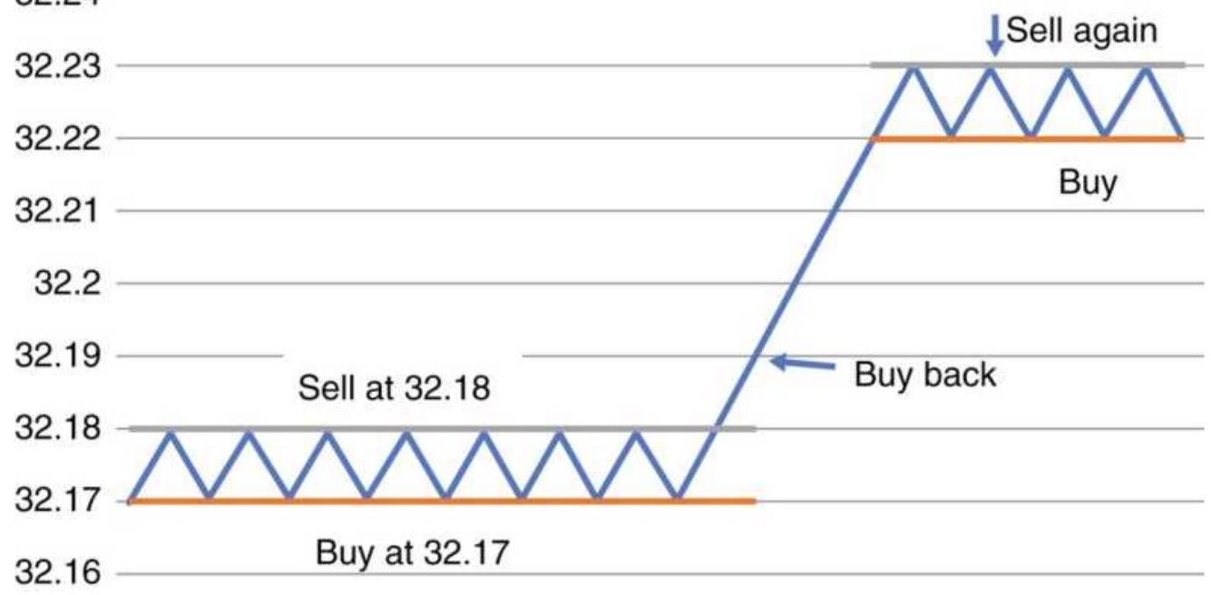
\section*{FIGURE 16.21 HFT market-maker sequence.}
Next, it identifies the "lead" stock, that is, the one that moves first with others in the sector following. Often it is the stock with the highest volume, but it can be easily identified by the lag relationship of the secondary market. An example is shown in Figure 16.22.
Again, sideways price periods are most desirable. When the lead stock moves up one tick, the HFT program buys the lagging stock, which then moves up in some proportion. The HFT program exits. The lead stock moves down one tick and the HFT program sells the secondary stock, exiting when it moves down. The HFT program is actually pairs trading but without the arbitrage, which would cost more and offset some of the profits.
The biggest gains come when prices break out of the sideways pattern. The lead stock falls below the low of the trading range, and the HFT program assesses the reward/risk ratio, then decides to sell the secondary stock. It stays short as long as the lead stock ticks down and exits the secondary stock as soon as the run is over. All this in milliseconds.
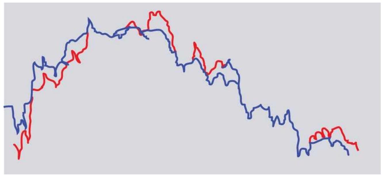
FIGURE 16.22 HFT with two similar markets, trading the one that lags.
High volume can be interpreted as potential volatility and low volume can be lack of interest. Traders are active when volume is higher than normal, and we expect that something is happening in the market. Increasing volume during the day could be a sign to set a new position, but relative volume can be misleading. As we saw in Chapter 12, there is a \(U\)-shaped pattern of volume during the day. Traders are less active at midday; therefore, volume systematically declines toward midday then increases toward the close. If one rule of an intraday strategy requires increased volume (or even increased volatility), then it will always be buying in the afternoon and rarely before midday. Also, with low volume at midday, those signals would be unreliable.

Figure 16.23 shows the intraday tick volume patterns in the bottom panel for 5 -minute crude oil data. The solid line is the average of volume for that bar each day. The histogram is the actual tick volume for that day. While this illustration only shows seven days of trading, the idea is that higher-than-average volume at the beginning of the day sets the pattern for the day, generally one with more volatility. With lower volume we could expect a reversal, or simply a day with no fundamentally based movement, often resulting in a slow drop in price. Another way to use tick volume is to look for a reversal when volume spikes. This is similar to the way we would trade daily volume, but it happens more often. If we look at volume spikes that are at least 1.5 times the highest average volume bar, we can apply a mean-reversion strategy that uses a profit target or exits
at the close of the day. The indicator that created this chart is TSM Intraday Volume on the Companion Website. Be sure to set the style for the average as a histogram and the style for the current volume as a line.
\section*{INTRADAY PRICE SHOCKS}
A price shock is a high-risk, unpredictable event. The shock can be in either direction, up or down, but always seems to move in a way that loses money for you. Although no one can reasonably expect to profit from anticipating the shock, there are strategies that try to take advantage of the reaction to the shock. Shocks in daily price movements and daily strategies were discussed in Chapter 14 under "Event Trading." Here, intraday shocks will be the focus.
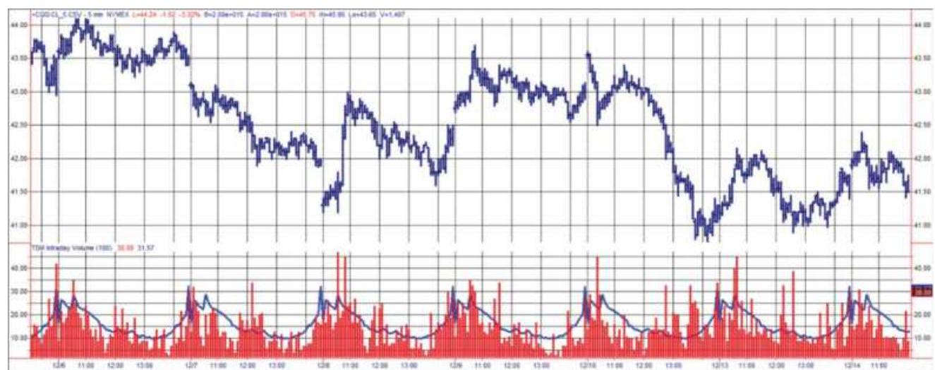
FIGURE 16.23 Intraday volume patterns for crude oil, December 2004. The bottom panel shows the 5-minute tick volume compared to the average for that bar.
Price shocks can occur in any market, but some are more interesting than others. Interest rates have frequent
small jumps when economic reports are released, and a few large jumps when the Fed has surprised the market by raising or lowering rates in an unscheduled meeting. Crude oil, however, has been at the center of geopolitical events in the Middle East, and has the occasional large jump that offers unique trading opportunities.
A price shock will be defined as an intraday bar with volatility that is at least twice the size of the average of previous bars. From the earlier study of volume, we should recognize that measuring the average is a problem with intraday data. Is it the average of the last \(n\) bars, the average of the past (exactly) 3 days of bars, or the average of this bar over the past \(n\) days? When the volume is very low near midday, should the criteria be more than twice the size? Would volume work as well as volatility? If we look at Figure 16.20, it appears that volume that is 1.5 to 2.0 times the average of the highest time bar isolates an intraday shock.

Because we are looking at price shocks, volatility will tell us that a shock has happened while volume will tell us that it could have happened. Using a similar program to the one that showed average volume by bar, we created the indicator TSM Intraday Shocks to plot the actual volatility of the current bar, the 20-day average volatility of each bar, and the 20 -day average volatility of all bars. An addition feature was that the \(20-\) day average could exclude the first bar, which often has the highest volatility. The bottom of Figure 16.24 shows the result of 20-minute gold bars during October 2016.
Notice that the first bar of each day is a spike. In the strategy that follows, that spike can be ignored because, for many markets, the reaction that follows is not as predictable as a spike that occurs during the day. By choosing the program optionexcludebar1, that bar is not used in the 20-day average of all bars, shown as a horizontal line near the top of the individual bar histogram.
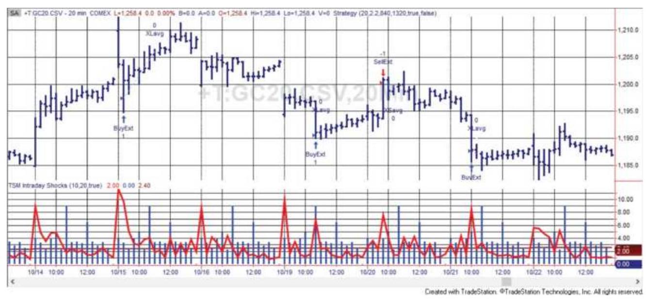
FIGURE 16.24 20-minute gold bars with today's bar volatility, the average bar volatility, and the 20-day average volatility of all bars along the bottom.

The rules for theTSM Intraday Shocks 2 strategy are:
1. Place a short sale limit order at the closing price of the current bar + factor \(\times\) 20-day average bar volatility. For gold the factor \(=2.2\).
2. Place a buy limit order at the closing price of the current bar -factor \(\times\) 20-day average bar
volatility. We used the same factor \(=2.2\)
3. Exit the trade when the current bar volatility falls below the 20-day average or on the second to last bar of the day.
Given these rules, gold was nicely profitable from 2010 to April 2017 with more than 50\% of the trades profitable.
Some added rules might make this strategy more robust. For example, only those moves with higher volume (or lower volume) could be selected. Even more interesting, we could adapt the method used by floor traders of watching the volume. While they once listened to the level of screaming on the floor, the intraday volume can be a good substitute. Floor traders would buy on prices moving higher as long as the floor noise was high or increasing. Once that noise started to fade they exited the position, under the belief that whatever caused the excitement was over and prices would pull back.
Using the volume chart in Figure 16.24 as a substitute for screaming, the strategy could exit when volume falls back to the average volume for that bar, or perhaps \(1 / 2\) the volume occurring on the high-volatility bar. It could extend the trade to increase the profit by requiring that both the volume and volatility fall below the average. That way the system is reading the market for its signals.
\section*{NOTES}
1 Thomas V. Greer, B. Wade Brorsen, and Shi-Miin Liu, "Slippage Costs of a Large Technical Trader,"
Technical Analysis of Stocks \& Commodities (January 1992).
\(\underline{2}\) Laurence A. Conners and Linda Bradford Raschke, Street Smarts: High Probability Short-Term Trading Strategies (Malibu, CA: M. Gordon Publishing Group, 1995).
3 See Toby Crabel, Day Trading with Short Term Price Patterns and Opening Range Breakout (Greenville, SC: Traders Press, 1990).
4 Toby Crabel, "Opening Range Breakout, Part 4," Technical Analysis of Stocks \& Commodities (February 1989).
5 Laurence A. Conners and Linda Bradford Raschke, Street Smarts: High Probability Short-Term Trading Strategies (Malibu, CA: M. Gordon Publishing Group, 1995).
6 Mark B. Fisher, The Logical Trader (Hoboken, NJ: John Wiley \& Sons, 2002).
Z James T. Holter, "Delivering the Day-Trading Experience," Futures (August 2001).
8 Barry Rudd, Stock Patterns for Day Trading and Swing Trading (Greenville, SC: Traders Press, 1998).
9 Murray A. Ruggiero, "The Science of Pattern-Based Trading," Futures (2004).
10 For additional detail, see
https://speedtrader.com/how-algorithms-and-high-
\section*{frequency-trading-programs-affect-your-trading/.}
11
https://www.math.nyu.edu/faculty/avellane/QuantCc AlgoTradingLAST.pdf.
12 Gaurav Chakravorty, www.quora.com/What-aresome-algorithms-behind-high-frequency-trading?
\section*{CHAPTER 17 Adaptive Techniques}
An adaptive technique is one that changes with market conditions. It could be as simple as using a percentage stop-loss or volatility based on an average true range. A true adaptive technique will change conditions or thresholds without manual intervention. One of the techniques in this chapter will be automatically changing the calculation period that determines the sensitivity and success of a trend or an indicator. Under some conditions, such as sideways markets, it may be best to use a slow trend or momentum indicator, and during explosive volatility those same methods may work better if they respond quickly. This shift from slow to fast (and back) due to changing market conditions is solved by using adaptive techniques.
\section*{ADAPTIVE TREND CALCULATIONS}
We begin by looking at techniques that vary the length of the trend. These techniques are based on a common premise that it is better to use a longer-term trend, one that is slower to react to price change when the market is either in a sideways pattern, exhibits low volatility or, in the case of Kaufman, has high relative noise. This may seem a reasonable assumption, but identifying a sideways market is very difficult. A price may be unchanged from a week ago, yet during those 5 days it
rose quickly for 3 days, then reversed sharply and, coincidently, was at the same level on the fifth day as it continued to plunge. Adaptive techniques can improve the basic performance of standard trend calculations, but they cannot solve all of the problems.
\section*{Kaufman's Adaptive Moving Average}
Kaufman's Adaptive Moving Average (KAMA), \({ }^{1}\) which began taking form in 1972, is based on the concept that a noisy market requires a slower trend than one with less noise. Noise is the erratic price movement that can be seen on any chart as up-and-down price changes within a trend or during a sideways period.
The concept behind the method is to capture the efficiency of the price move. A very noisy move can be compared to a drunken sailor's walk, staggering from side to side (never backward) yet still moving forward. Noise is not the same as volatility. If the Dow had a range of 100 points during the week, it matters whether it went up 20 points each day, or if it rose 100 points on Monday, dropped 100 on Tuesday, rose 100 on Wednesday, and so on. Clearly, going back and forth has more noise than a steady rise. Therefore, it is not as important that the price moved from a low point to a high point, but the pattern of how it was done.
As we will show, noise is not just volatility; in fact, it has little to do with volatility. Noise was introduced in Chapter 1 to show the change in globalization. It is covered in more detail in Chapter 20 under "Trends and Price Noise." The assumption in KAMA is that during a
relatively noisy price move, the trendline must lag further behind to avoid being penetrated by the normal but erratic behavior of prices, which would cause an unwanted trend change. When prices move consistently in one direction with low noise, any trend speed may be used because there are no false changes of direction. Figure 17.1 shows a price move with low noise and the same move with higher noise. With low noise, the trendline can be positioned closer to the underlying price direction; with higher noise, the trend must lag farther behind in order to minimize the frequent change of direction caused by the price crossing the trendline.
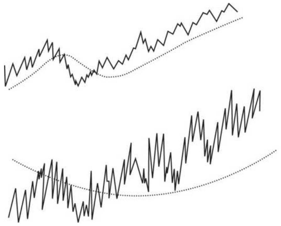
Low noise with a faster moving average trend
High noise with a slower moving average trend
FIGURE 17.1 Similar price moves with low and high noise.
KAMA was designed to select the best trend speed based on the smallest calculation period for the existing market conditions. It varies the speed of the trend by using an exponential smoothing formula (therefore, it is not a
"moving average" as the name says), changing the smoothing constant each time it is calculated. The use of a smoothing constant was selected because it allows for a full range of trends, represented as percentages, compared to the simple moving average, which uses integer values and is limited in its selection of the fastend speeds (see the discussion of exponential smoothing in Chapter 7). KAMA is calculated as:
\[
K A M A_{t}=K A M A_{t-1}+s c_{t} \times\left(p_{t}-K A M A_{t-1}\right)
\]
where
\(K A M A_{t}=\) the new adaptive moving average value \(K A M A_{t}=\) the previous adaptive moving average value
\(-1\)
\(P_{t}=\) the current closing price
\(s c_{t}=\) the smoothing constant, calculated each period as follows:
\[
s c_{t}=\left[E R_{t} \times(\text { fastest }- \text { slowest })+\text { slowest }\right]^{2}
\]
and
\section*{fastest \(=2 /(\) fastest moving average period +1\()\) slowest \(=2 /(\) slowest moving average period +1\()\)}
\[
\frac{\left|p_{t}-p_{t-n}\right|}{t p_{t-n+1}\left|p_{i}-p_{i-1}\right|}
\]
The fastest and slowest values represent the range of calculation periods over which KAMA can vary, each converted to its exponential smoothing constant equivalent. Nominally, these values are set to 2 and 30 or 3 and 30 . By squaring the smoothing constant components, the slow end becomes \(30 \times 30\), equal to an extremely unresponsive 900-period trend. The effect of this is to stop the movement of the trendline when the market becomes very noisy. On the other end, when the market goes up steadily without a reversal for \(n\) days, the speed of the trend can reach a very fast 4-period equivalent.
The efficiency ratio, \(E R\), has become known as fractal efficiency. It has the value of 1 when prices move in the same direction for the full \(n\) periods, and a value of \(o\) when prices are unchanged over the \(n\) periods. When prices move in wide swings within the interval, the sum of the denominator becomes very large compared to the numerator and \(E R\) approaches zero. Smaller values of \(E R\) result in a smaller smoothing constant and a slower trend. Both KAMA and the changing smoothing constant are shown in Figure 17.2. The 8-period KAMA is plotted in the upper part of the chart along with 20 -minute gold futures during December 2016 and compared to an 8-
period moving average. The KAMA line moves steadily higher from \(12 / 23\) while the moving average turns down after a gap opening. On the far right, the moving average turns down sooner. The overall appearance of the KAMA is smoother, with fewer changes of direction, as seen on 12/22. The KAMA appears to move in steps caused by the acceleration of the trendline, followed by its slowing down. The trendline never retreats. Trading signals will be taken based on the direction of the trendline, with some conditions.
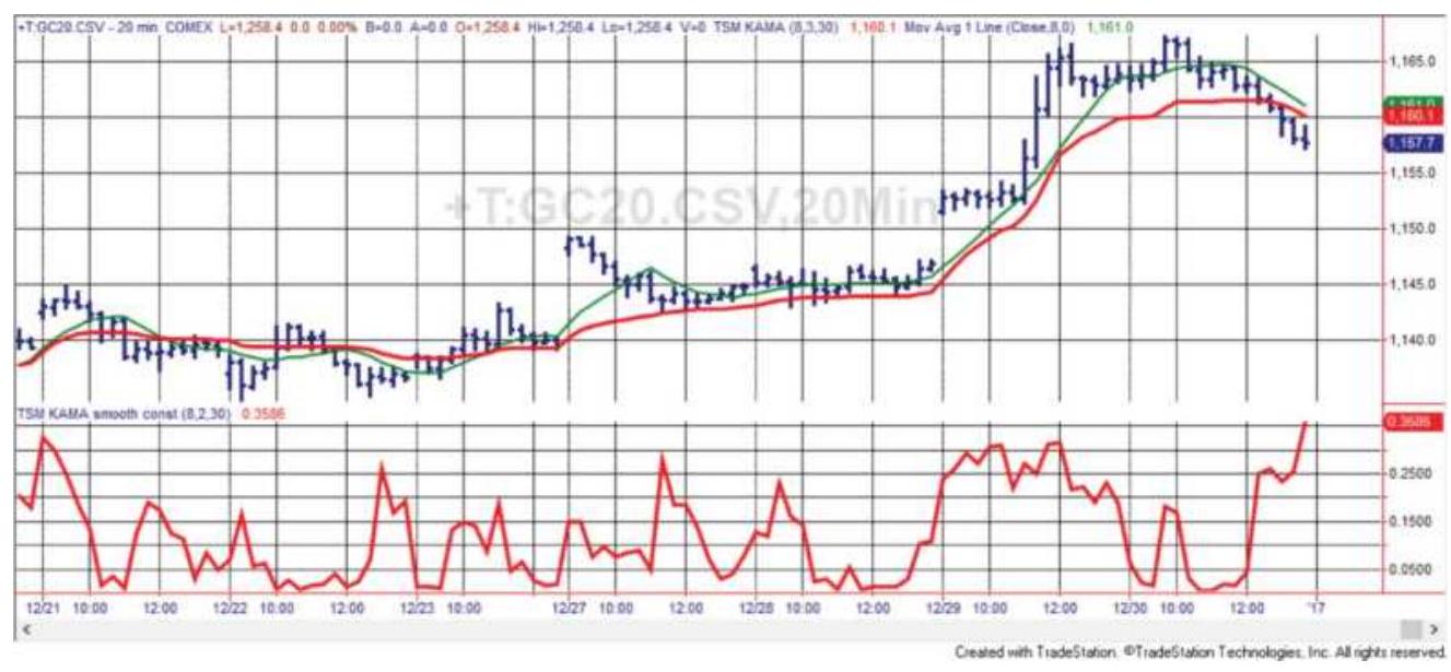
FIGURE 17.2 20-minute gold futures with an 8-period Kaufman's Adaptive Moving Average (the heavier line) and an 8 -period simple moving average. The KAMA smoothing constant is shown in the lower panel, December 2016.
The lower part of Figure 17.2 shows the changing value of the smoothing constant, \(s c\). In this example it reaches a high of just over 0.30, equivalent to a 5.6-day moving average, and a low near zero, which would cause the formula to assign the maximum 900-day calculation
period. When the smoothing constant is near zero, the KAMA line will appear to go sideways.
If you were to calculate KAMA, where \(E R\) is based on 10 periods, the smoothing constant ranges from \(2^{2}\) to \(30^{2}\), and \(C\) is the closing price, it can be expressed in TradeStation code as:
KAMA \(=\) KAMA[1] + ((absvalue(C-C[10])/ summation(absvalue(C-C[1]),10)*0.6022) + \(0.0645) * 2 *(C-K A M A[1])\)
where the bracketed numbers (e.g., [10]) represent days back.
\section*{Alternate Time Periods for ER}
In Kaufman's Adaptive Moving Average, the time period only affects the calculation of the efficiency ratio. The original purpose was to keep that calculation period, \(n\), as small as possible so that only a few days are needed to change the speed of the trend from fast to slow and back again. Users may begin testing in the range of 8-10 days.
When you use a longer calculation period for the KAMA or most other adaptive trends that will be discussed, the range over which the adaptive trend can vary will be centered closer to that period. It will still speed up and slow down, but without extremes. Figure 17.3 compares a 60-day KAMA with a 60-day moving average using S\&P futures data through April 2018. KAMA is closer to prices during the bull market. When prices tumble at the beginning of February, the KAMA turns down faster than the moving average and remains in a downtrend. The smoothing constant, shown at the bottom, changes
quickly from a fast trend to a slow one, then stays slow.
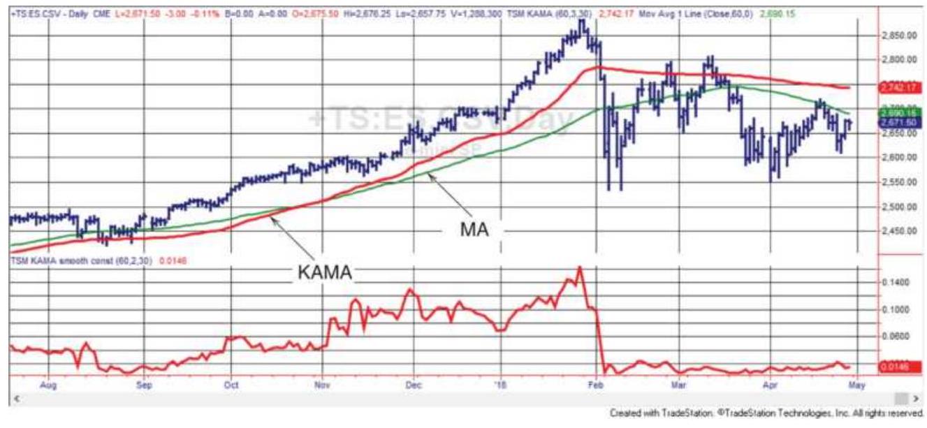
FIGURE 17.3 S\&P futures with a 6o-day KAMA (the darker line) and MA in the top panel, and the 6o-day smoothing constant at the bottom.
\section*{Extra Rules Needed for Trading}
What appears good on a screen does not always work as well for trading. The problem is caused by the use of exponential smoothing. While this technique is very convenient because changing the smoothing constant is all that is needed to change the speed of the trend going forward, the negative feature is that the trendline always changes direction when it is crossed by the price. This is counterproductive when trying to force the trendline to move sideways based on a very small smoothing constant.
In Figure 17.2 there is a period at the far left where the KAMA trendline appears to go sideways while prices move back and forth across it. If you could see the KAMA values, it would show that the KAMA trendline actually
changes direction at the same time prices penetrate the line, although these changes are extremely small. In the formula for KAMA, the expression \(p_{t}-K A M A_{t-1}\) is where the new trend is positive when \(p_{t}>K A M A_{t-1}\) and negative when \(p_{t}<K A M A_{t-1}\). To solve this, a small filter is used to avoid trend changes based on minor price penetrations. The filter is added or subtracted from the KAMA trendline to form a band that needs to be penetrated to get a signal that the trend has changed. There are two choices for constructing this filter:
1. Use a factor, \(f\), times the 20-day standard deviation of the changes in the KAMA values. The factor should be small, e.g., \(f=0.01\).
2. Remember the most recent low of the KAMA when the trend turns up, and the high when the trend turns down. A buy signal will occur when the KAMA moves away from the low by a fixed amount equal to \(F\).
Testing shows that the second option, where the KAMA trendline must change by a fixed amount, is a good choice. The results that follow will use that option.
\section*{Trading KAMA}
Kaufman's Adaptive Moving Average should be traded using the trendline to determine direction, buying when the trend turns up and penetrates the small threshold, and selling when it turns down through the lower threshold. Two other rules will be:
- For faster trading, keep the calculation period at about 8 to 10 days. For longer-term trends, use periods between 35 and 60 days. Even with a longer period, the calculation periods for the trend will have a wide range but centered closer to the selected period.
Leave the upper bound of 30 days fixed. To make the trendline less sensitive, make the lower bound greater than 2 , perhaps 3 or 4 .
Use the fixed threshold filter for entering to avoid unnecessary whipsaws.

The Companion Website has the strategy TSM KAMA and a spreadsheet TSM KAMA that can be used for testing. Results of an S\&P futures test using an 8period KAMA and a fixed filter of 0.017 are shown in Figure 17.4.
\section*{Chande's Variable Index Dynamic Average (VIDYA)}
Tushar Chande's Variable Index Dynamic Average (VIDYA) \({ }^{2}\) first appeared in Technical Analysis of Stocks \& Commodities in March 1992. VIDYA also uses an exponential smoothing as a base for varying the speed of the trend each day. VIDYA starts with a fixed smoothing constant of 0.20 and varies that according to the relative volatility. Using two time periods, 9 and 30 days, find the ratio of the standard deviation of the closing prices. When the volatility increases, the ratio is higher, resulting in an increase in the smoothing constant and
subsequently a slower trend. Then higher volatility slows down the trend and lower volatility speeds it up.
\section*{S\&P futures using 8 days and a fixed filter}
2000000 \(\qquad\)
1500000 \(\qquad\)
1000000 Comat
500000 \(\longrightarrow\)
0

ه
\(-500000\)
6/9/2011 6/9/2012 6/9/2013 6/9/2014 6/9/2015 6/9/2016 6/9/2017
FIGURE 17.4 Total profits using an 8-period KAMA with a fixed filter applied to S\&P futures, June 2010April 2018.
\[
V I D Y A_{t}=k \times s \times C_{t}+(1-k \times s) \times V I D Y A_{t-1}
\]
where
\(s=\) a fixed smoothing constant, suggested as a 9-day equivalent (i.e., \(s=2 /(9+1)=0.20\) )
\(C=\) the closing price
\(t=\) the current period
\(t=\) the previous period
\(k=\) the relative volatility, calculated as
\[
k=\operatorname{stdev}(C, n) / \operatorname{stdev}(C, m)
\]
where
stdev \(=\) the standard deviation function
\(n=\) the recent past \(n\) days and
\(m=\) a longer historic interval in days, \(m>n\)

Chande uses a relative volatility measure based on the standard deviation of prices over the past \(n\) days, compared to the standard deviation over a longer historic pattern of \(m\) days. When \(k>1\) the current volatility is greater than the historic volatility; when \(k<1\) the current volatility is less. Typically, the standard deviation is taken using price changes, or returns, rather than actual prices. Using prices will introduce some trend to the calculation. The VIDYA indicator is available as TSM VIDYA on the Companion Website along with a strategy program and a spreadsheet. Both allow you to apply the standard deviation to the price or price change. An illustration can be seen in Figure 17.5.
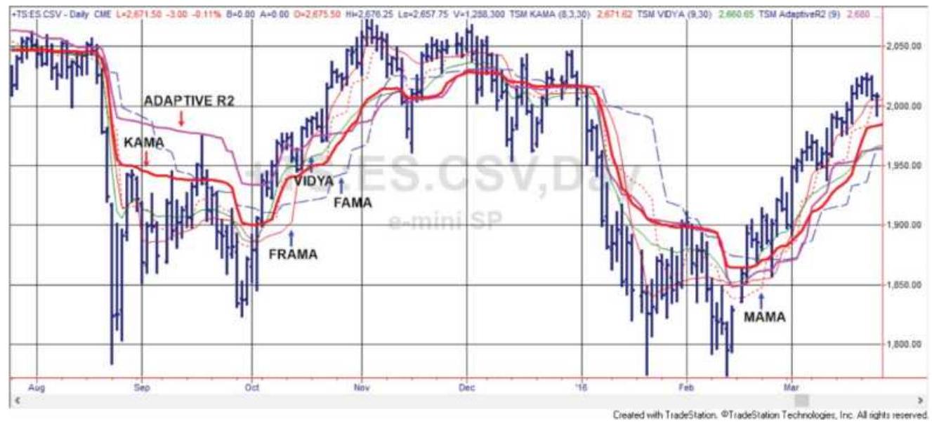
FIGURE 17.5 The adaptive indicators KAMA, VIDYA, Adaptive R2, MAMA, FAMA, and FRAMA, applied to S\&P futures, August 2015-March 2016.
\section*{Correlation Coefficient, \(\mathrm{r}^{2}\)}
Another intuitive choice suggested by Chande uses the correlation coefficient, \(r^{2}\), as the smoothing constant. This value is the result of measuring the residuals from a linear regression calculation. When the regression fit is very strong, the value of \(r^{2}\) is close to 1 ; when there is no apparent market direction, \(r^{2}\) is near \(o\). This fits neatly into the pattern of smoothing constants for KAMA and VIDYA.

A linear regression requires two series. For this method one series will be the closing prices and the other a sequence of numbers ( \(1,2,3, \ldots\) ). The formula for correlation was given in Chapter 6 but every software package has a function that can be used. In Excel it is
correl and in TradeStation, it is correlation. The smaller the residuals, the higher the correlation. The indicator, strategy, and spreadsheet are all named TSM Adaptive R2 on the Companion Website. As with VIDYA, you can apply the correlation to either prices or price changes. Figure 17.5 shows a plot of this technique along with others.
\section*{Ehlers' Adaptive Moving Averages}

As a specialist in cycles, John Ehlers uses the phase rate of change as the basis for much of his work. The following three indicators are his version of adaptive trends. The calculations for these indicators won't be repeated here, but can be found on MesaSoftware.com, in his book, Rocket Science for Traders, and on the Companion Website as the indicators TSM MAMA and TSM FAMA.
\section*{MESA Adaptive Moving Averages (MAMA and FAMA}
Ehlers uses the phase rate of change to create the MESA Adaptive Moving Average (MAMA), also fondly called the Mother of Adaptive Moving Averages. \({ }^{3}\) The phase rate of change is \(360^{\circ}\) per cycle; therefore, if the price cycle is 36 bars in length, then the phase rate of change is \(10^{\circ}\) per bar. If there are only 10 bars in the cycle, then the phase rate of change is \(36^{\circ}\) per bar. The phase rate of change is the number of degrees in the cycle that is captured by the time it takes to produce a single bar. To find the phase rate of change, a solution similar to the
Hilbert Transform is used (an explanation and example of the Hilbert Transform can be found in Chapter 11).
MAMA starts with the classic form of exponential smoothing:
\section*{EMA \(=\alpha^{*}\) close \(+(1-\alpha)^{*}\) EMA[1], where \(0<=\alpha<=1\)}
The phase rate of change is then used to specify \(\alpha\). For MAMA, Ehlers restricts the value of \(\alpha\) to between 0.05 and 0.50 , equal to a moving average between 2 days and 19 days.

Another indicator, the Following Adaptive Moving Average (FAMA), is created by applying the MAMA technique to the MAMA line itself, similar to double smoothing, using a smoothing constant for FAMA ( \(\alpha\) ) that is \(1 / 2\) the value of the smoothing constant used for MAMA. The result is that FAMA is a smoother, less volatile version of MAMA. This serves as a signal line in the same way as the MACD or stochastic indicators. The crossover of MAMA and FAMA increases the reliability of the trend signal. Programs to test MAMA and FAMA are on the Companion Website. Both MAMA and FAMA are shown with other indicators in Figure 17.5.
\section*{Fractal Adaptive Moving Average (FRAMA)}
Another of Ehlers' variations is an interesting use of fractals. 4 Fractals are similar shapes (self-similarity) that can be pieced together to represent any contour or
figure. Ehlers says that prices are fractal because they have the same "roughness" in every time frame. It is the reason why, if the time scale is removed, most traders cannot tell a 5-minute price chart from a weekly one. It follows that these shapes can be applied at any level of detail with similar results.
The classic example is using a ruler to measure the shoreline of an island (using a map). If we have a very large map and place a long ruler so that each end touches the coastline, we will get a smoothed value of the periphery of the island. The ruler will span some of the jagged parts of the coast. If we make the ruler smaller, the measurement of the coastline will increase because the ruler will include many of the irregularities skipped using a longer ruler. By following this logic, the coastline will be infinitely long if we use an infinitely small ruler. This is the basis for Ehlers' FRAMA approach.
Fractal dimension is a measure that describes the characteristic shape (or sparseness) of the figure (in our case a price series) at all levels of detail. The method of calculation is to cover the pattern with \(N\) number of the same patterns (objects) of various sizes, \(s\). Then one solution might have 100 square boxes \((N=100)\) of 5 different sizes \((s=5)\).
According to Ehlers, the relationship of the number of objects in two sets of sizes is:
\[
\begin{aligned}
\frac{N 2}{N 1} & =\left(\frac{s 1}{s 2}\right)^{D} \\
D & =\frac{\log \frac{N 2}{N 1}}{\log \frac{s 2}{s 1}}
\end{aligned}
\]
As a simple example, we would like to find the fractal dimension of a line that is 10 feet long. We will place
boxes of two sizes on the line, \(s 1=1\) foot and \(s 2=0.1\) foot. If we use 1 -foot boxes, we can fit 10 boxes
\((N 1=10)\); if we use o.1-foot boxes, we can fit 100 boxes \((N 2=100)\). Then the fractal dimension is:
\[
D=\frac{\log \left(\frac{100}{10}\right)}{\log \left(\frac{1}{0.1}\right)}=1.0
\]

Ehlers has used this to create an adaptive trend with features that include upper and lower bands, a trailing stop, and profit-taking. His original strategy has been modified and appears as the program and indicator TSM FRAMA on the Companion Website.
\section*{Comparison of Adaptive Methods}
Figure 17.5 shows the three MESA adaptive trends (MAMA and FAMA are the dotted lines, and FRAMA is a thin line) along with KAMA, the adaptive correlation, ADAPTIVE R2, and VIDYA, all applied to daily S\&P futures from August 2015 through March 2016. During this period there two swings that show how these trends react to changes of price direction.
Of the six indicators, FAMA appears to be the slowest but with the fewest false signals, while MAMA, with twice the speed, seems to be the fastest. All of them have similarities; KAMA and the Adaptive R2 have similar shape and often cluster near one another.
To better understand each method, Table 17.1 shows the performance of four systems: KAMA, VIDYA, AdaptiveR2, and MAMA. These were applied to a selection of futures markets from January 2000 through April 2018, a period with a wide range of price swings including extreme bull and bear markets. Each system used its recommended parameters, shown at the top of the table. MAMA generated a signal when it crossed FAMA; otherwise, each method went long when the trendline turned up and short when it turned down. Only longs were taken for the equity index markets, and there were no costs posted.
\section*{TABLE 17.1 Comparative returns of four adaptive systems applied to futures markets, January 2000-April 2018.}
\begin{tabular}{|c|c|c|}
\hline & KAMA (10 day, 3 to & VIDYA (9 and \\
day) \\
\hline
\end{tabular}
\begin{tabular}{|c|c|c|c|c|c|}
\hline & \begin{tabular}{|l|}
Profit \\
Factor
\end{tabular} & S & \%rites & \begin{tabular}{l}
Profit \\
Factor
\end{tabular} & Tra \\
\hline Eurodollars & 3.13 & 31 & 41.9 & 1.26 & 581 \\
\hline \begin{tabular}{l}
30-year \\
bonds
\end{tabular} & 1.20 & 157 & 36.9 & 0.97 & 675 \\
\hline Eurobund & 1.44 & 129 & 37.2 & 1.16 & 626 \\
\hline \begin{tabular}{l}
S\&P 500 \\
(Long)
\end{tabular} & 1.63 & 73 & 39.7 & 1.11 & 340 \\
\hline \begin{tabular}{l}
NASDAQ \\
100
\end{tabular} & 1.69 & 84 & 41.6 & 1.13 & 358 \\
\hline DAX & 1.09 & 84 & 38.1 & 1.12 & 342 \\
\hline Euro FX & 1.19 & 149 & 34.9 & 1.02 & 693 \\
\hline AUD FX & 1.20 & 161 & 35.4 & 1.21 & 341 \\
\hline Crude oil & 1.37 & 156 & 40.3 & 0.97 & 702 \\
\hline Heating oil & 1.28 & 168 & \(33 \cdot 3\) & 1.00 & 722 \\
\hline \begin{tabular}{l}
Unleaded \\
gas
\end{tabular} & 1.26 & 220 & 34.5 & 1.00 & 722 \\
\hline Natural gas & 1.02 & 162 & 35.1 & 0.88 & 728 \\
\hline Gold & 0.90 & 90 & 35.5 & 1.03 & 673 \\
\hline Copper & 1.41 & 174 & 35.6 & 1.00 & 726 \\
\hline Platinum & 1.29 & 175 & 36.0 & 1.36 & 677 \\
\hline Averages & 1.41 & 134 & 37.1 & 1.08 & 594 \\
\hline
\end{tabular}
The table shows that KAMA and MAMA are most similar, that is, they trade far less often than VIDYA and the Adaptive R2. That becomes more important when you reduce the returns by commissions and slippage.
The reliability, that is, the percentage of profitable trades, is highest when the system has fewer trades and lowest when it has the most trades.
While it's clear that VIDYA and the Adaptive R2 did not perform well, changing the parameters to slow down the trend might improve the returns of all four systems. There was an earlier example of using a longer period for KAMA applied to bonds. Because slower trends recognize underlying economic moves, most trend systems perform better with longer calculation periods.
\section*{ADAPTIVE VARIATIONS}
The first part of this chapter dealt with adaptive trends using exponential smoothing as the means for changing the speed of the trend. The following sections show other approaches to self-adjusting trading techniques.
\section*{Making Momentum Calculations Adaptive}
There are many momentum calculations, such as RSI, that vary from 0 to 1 , 0 to 100 , or from -1 to +1 . In order to use any of these as a smoothing constant in an adaptive indicator, it is necessary to change the values to range between 0 and 1 , where \(o\) is less trend and 1 is more trend, which is the normal interpretation for the RSI and most other indicators. If \(M\) represents the value of the indicator, then those values can be changed to fit the \(o\) to 1 pattern of the smoothing constant by using the transformations:
\section*{Momentum values}
\section*{Use the}
\begin{tabular}{|c|c|c|}
\hline & & transformation \\
\hline (1) & \(M\) varies from 0 to 1 & \(s c=M\) \\
\hline (2) & \(M\) varies from -1 to +1 & \(s c=\operatorname{absvalue}(M)\) \\
\hline (3) & \(M\) varies from 0 to 100 & \(s c=M / 100\) \\
\hline (4) & \begin{tabular}{l}
\(M\) varies from -100 to \\
+100
\end{tabular} & \(s c=\operatorname{absvalue}(M / 100)\) \\
\hline
\end{tabular}
where
\(s c=\) the smoothing constant to be used for the current period
\(M=\) the current momentum value
Transformations (2) and (4) recognize that when the momentum is at +1 and -1 or -100 and +100 there is a stronger positive and stronger negative trend. By taking the absolute values, the negatives are reflected so that the negative values take on the same pattern as the positive values.

The RSI, changed to an adaptive indicator, is compared with the KAMA and a 10-day moving average, all applied to Eurodollar futures from February through July 2011, in Figure 17.6. The moving average tends to be the middle trendline. During the sideways periods, the adaptive RSI is more sensitive, the moving average next, and KAMA the least sensitive. This could be corrected in the adaptive RSI by squaring the smoothing constant. Then a value of 0.75 would become 0.56 . Any lower value means a slower trend. A program to plot this is TSM Adaptive RSI, on the Companion Website.
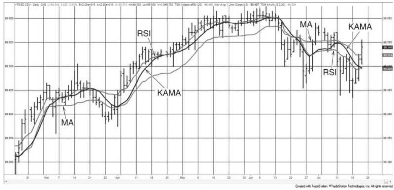
FIGURE 17.6 Comparison of the adaptive RSI, KAMA, and a 10-day moving average, applied to Eurodollar futures, February 2011-July 2011. The RSI is closest to the price, the KAMA is farthest away, and the moving average is often in the center.

An adaptive stochastic can be created using the basic stochastic formula by changing the look-back number of days in a way similar to KAMA, based on market noise. In the code below, period is the 10 days over which the efficiency ratio is calculated, the slowend and fastend are the same as KAMA, and stochper gives a changing number of days over which to find the highest high and lowest low, the basis of the stochastic
calculation. The raw stochastic ( \(K\)-fast) is then smoothed over 3 days to get \(K\)-slow. This indicator can be found on the Companion Website as TSM Adaptive Stochastic.
efratio = effratiofreq(period)/100;
stochper = intportion(slowend - efratio*(slowend fastend));
raw = (close - lowest(low, stochper))*100 /
(highest(high,stochper) - lowest(low,stochper)); astoch = average(raw,3);
\section*{McGinley Dynamics}
Among the work produced by John McGinley is a list of popular adaptive methods. His own New McGinley Dynamics \({ }^{5}\) is calculated as:
\(M D_{t}=M D_{t-1}+\left(p_{t}-M D_{t-1}\right) /\left(k \times n \times\left(\frac{p_{t}}{M D_{t-1}}\right)^{4}\right)\) where
\(M D_{t}=\) the current McGinley Dynamic
\(M D_{t}=\) the previous McGinley Dynamic
\(-1\)
\(k=\) a constant \(=0.60,60 \%\) of a selected moving average period \(n\)
\(n=\) the moving average period
\(p=\) the closing price
\section*{The Parabolic Time/Price System}
The first well-known adaptive technique was the
Parabolic Time/Price System, \(\underline{6}\) which attempts to reduce the lag intrinsic to a trend system as the trend develops. To do this, Wilder increased the speed of the trend by shortening the number of days in the
calculation whenever prices reached new high profit levels. The philosophy of the Parabolic System is that time is an enemy. Once a position is entered, it must continue to be profitable or it will be liquidated.
The Parabolic Time/Price System is always in the market; whenever a position is closed out, it is also reversed. The point at which this occurs is called the Stop and Reverse (SAR). When plotted, the Stop and Reverse point seems similar to a trendline although it has a decreasing lag. This is accomplished by making the SAR point, the distance between the current price and the trendline, closer to the current price of each bar, as shown in Figure 17.7. During periods of short, consistent trending, the Parabolic SAR converges on the price movement, extracting excellent profits.
To calculate the SAR value, first assume a long or short position. If the market has recently moved lower and is now above the lows of that move, begin with a long. Call the lowest point of the previous trade the SAR initial point (SIP) because it will be the starting point for the SAR calculation \(\left(S A R_{1}=S I P\right)\). Calculate each following SAR as:
\[
S A R_{t}=S A R_{t-1}+A F_{t} \times\left(H i g h_{t}-S A R_{t-1}\right)
\]
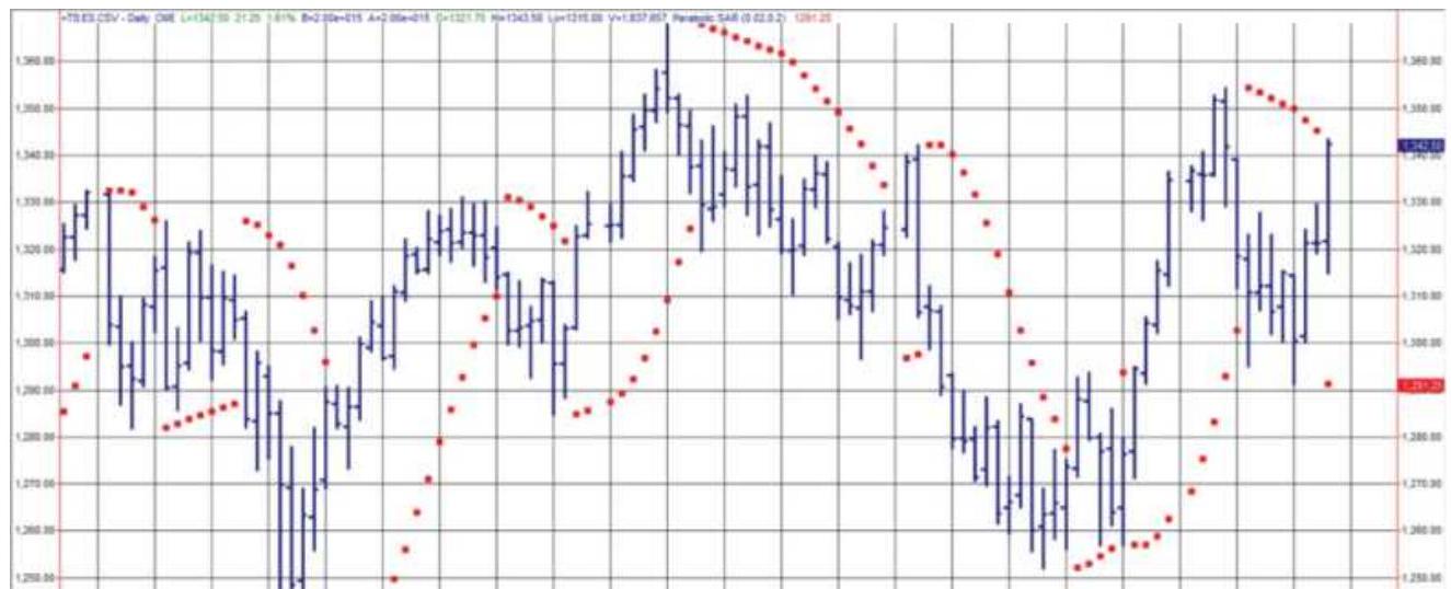
FIGURE 17.7 Parabolic Time/Price System applied to emini S\&P futures, February-July 2011.
This is an exponential smoothing formula using the high price for a long position and the low price when a short is held. For this method the smoothing constant is called the acceleration factor (AF), and it is initially set to 0.02 at the beginning of each trade. After a day in which a new extreme occurs (a new high when long, or a new low when short) the AF is increased by o.02. In terms of moving average days, the AF begins at 99 days and increases speed to a maximum of a 9-day moving average, but not linearly. The acceleration factor, AF, cannot be increased above the value 0.20 , the equivalent of a 9 -day moving average.
Using the highest high of the current move when long and lowest low when short keeps the SAR at its highest possible level during an upward move and lowest during a downward move. An additional rule compensates for this strength and prevents premature reversal by not allowing the SAR to get any closer than the price range of
the most recent 2 days, an area that would be high in noise:
If long, the SAR may never be greater than the low of today or the prior day. If it is greater than this low, set the SAR to that low value. A reversal will occur on a new intraday low, which penetrates the SAR.
For short positions, the SAR is initialized as the high of the recent move, \(A F=0.02\), and the daily calculation uses the lowest low of the current price move. To allow some price fluctuation, the SAR may never be below the high of today or the prior day.
Wilder's Parabolic Time/Price System was unique in varying the smoothing constant to satisfy the notion that time worked against the trade. The idea of increasing the speed of the trend as the trade becomes more profitable is still a concept that has validity and has not yet appeared in other adaptive methods. One weak point may be that AF always begins at 0.02. Although this allows the trade latitude to develop without being stopped out, a market that is moving quickly may be better traded starting with a faster trend. This method also requires fairly consistent price swings to produce profits.
A strong point is that the initial stop and reversal is the market extreme high or low rather than a statistically generated point. Also, the SAR does not get closer than the recent 2-day high or low, which prevents a reversal due to noise when the market is moving strongly in a
profitable direction. For those readers interested in the further development of this method, the Parabolic Time/Price System is combined with Directional Movement (described in Chapter 23) to form the Directional Parabolic System discussed in Chapter 9.

The TradeStation function TSMParabolic on the Companion Website allows the user to specify the starting value of the smoothing constant \(A F_{\text {min }}\), the increment \(A F_{\text {inc }}\), and the maximum value \(A F_{\text {max }}\). This provides for more flexible testing. Optimization of these values has been reported to produce good results.
\section*{Alternative Calculation of the Acceleration Factor}
Volker Knapp suggests that the acceleration factor can be successfully replaced by a variation using Kaufman's efficiency ratio (ER). \({ }^{7}\) Using a 10-day ATR and a 10-day ER, the rules are:
1. Set the initial stop at \(6 \times A T R\) from the entry price. That will avoid the uncertainty that surrounds a new trade.
2. If \(E R<0.30\), then leave the stop unchanged.
3. If \(0.30<E R<0.60\), then reduce the distance of the long stop by \(0.1 \times\) ATR or the short stop by \(0.5 \times A T R\).
4. If \(E R>0.60\), then reduce the distance of the long stop by \(0.2 \times A T R\) or the short stop by
\(0.1 \times\) ATR
5. The trailing stop is only advanced when the new stop is higher for longs or lower for shorts.
6. The stop applies to trading on the next day.
Note that the rules are not symmetric for longs and shorts.
\section*{The Master Trading Formula}
Another landmark method of creating a variable speed approach is Mart's Master Trading Formula. \({ }^{8}\) It is also based on an exponential smoothing formula where the smoothing constant and band formed around the trendline are calculated daily, based on market volatility. Mart's technique is to combine the average true range for the past 15 days with the net change over the same time period. Each of these volatility elements is ranked from 1 to 21 by defining a maximum value for each and dividing that maximum into 20 equal zones (the 21st being anything higher). The two rankings are then averaged to get a correlated volatility factor (CVF). Another ranking of 21 zones is created by dividing the highest CVF into 20 equal parts. The CVF is applied linearly to a range of smoothing constants from 0.084 to 0.330 , representing the approximate exponential equivalents of the moving average days from 5 to 23 . The trendline value is then created daily using the formula:
\[
\text { Trend }_{t}=\text { Trend }_{t-1}+\text { CVF }_{t} \times\left(H L C_{t}-\text { Trend }_{t-1}\right)
\]
where
\(H L C_{t}=\) the average of today's high, low, and closing
As with the other adaptive methods, the speed of the trend increases as volatility increases. A band is also placed around the trendline, based on an inverse relationship to the correlated volatility factor, CVF. The band is widest when there is low volatility and the smoothing constant produces a slow trend; it is narrowest in fast, highly volatile markets. Rules for trading Mart's Master Formula follow the basic band trading rules. The system is always in the market, taking long positions when the upper band is penetrated and short positions when the lower band is crossed.
A number of observations can be made about the Master Trading Formula as compared to the previous adaptive methods. First, the trend speed is the fastest, from 5 to 23 days compared to KAMA, which ranges from 25 to \(900\left(5^{2}\right.\) to \(\left.30^{2}\right)\). The second is that the band gets narrower as volatility increases and the trend slows, which is an attempt to enter sooner on a penetration even while the trendline backs away. This approach might be best for short-term or intraday trading. The last observation is that dividing the range into zones does not take into account that there is less sensitivity in the calculation periods as the time increases. It might be best to have a nonlinear distribution, where the size of the zone increased as the trend slowed.
\section*{OTHER ADAPTIVE MOMENTUM CALCULATIONS}
Varying the calculation period does not have to be limited to a trend formula. Any calculation period can be adaptive. The following techniques apply the same concept to traditional indicators that are used to measure overbought and oversold price movement.
\section*{Trend-Adjusted Oscillator}
One problem that confronts many traders who use stochastics or other oscillators is that the values tend to cluster in the lower half of the chart when the trend is down, and in the upper half when the trend is up. For a countertrend trader, this causes many oversold conditions during a downtrend that can give false buy signals. A Trend-Adjusted Oscillator \({ }^{9}\) (TAO) can correct this bias by modifying the value of the oscillator by the amount that the trend of the oscillator varies from its midpoint ( 50 for oscillators that range from 0 to 100, and \(o\) for those ranging from -100 to +100 ). Therefore, if a 10-day oscillator has been steadily declining and its 5 -day moving average has a value of 40 , then the current oscillator value is raised by 10 points (the midpoint of 50 minus the oscillator moving average of 40 ). The calculations for this are:

\begin{abstract}
\(n\)-Day moving average of oscillator \(\left(M A O_{t}\right)=\underline{i=t-n+1}\)
\(n\)
Trend-Adjusted Oscillator \(\left(T A O_{t}\right)=\) Midpoint \(-\left(M A O_{t}-O_{t}\right)\)
Correcting the sustained overbought and oversold situations in an oscillator is an ambitious goal. The trend-adjusted oscillator succeeds in many ways but at the cost of losing many of the smaller overbought/oversold cases. Figure 17.8, which applies the TAO to S\&P futures, compares the smoothed stochastic (thinner line) with the volatility-adjusted stochastic (thicker line). In the first half of the chart, the steady uptrend causes the standard stochastic to stay in the upper part of the range, frequently peaking above 80. When you multiply the TAO by 3 to broaden the range, it hovers around the center value of 50 and does not touch any extreme. Increasing the scaling factor to 4 or 5 could fix that.
\end{abstract}
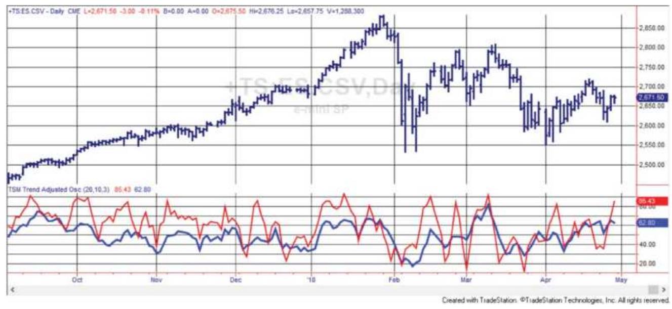
FIGURE 17.8 The Trend-Adjusted Oscillator applied to S\&P futures, September 2017-April 2018. The adjusted stochastic is the thicker line in the lower panel.

In the right half of the chart, the adjusted stochastic is oversold at the lowest point of the February sell-off, then overbought at the top of the following rally. It may miss some of the interim peaks and valleys but is good at finding the most important. This indicator is TSM Trend-Adjusted Oscillator on the Companion Website.
\section*{Dynamic Momentum Index}
This approach to creating a dynamic, variable-length relative strength index, which changes the number of calculation days based on market volatility, can be used
to change the period of any technique. \({ }^{10}\) In the Dynamic Momentum Index (DMI, not to be confused with Wilder's Directional Movement Indicator), the length of the calculation period increases as the volatility declines.
You may also select a pivotal period, around which the calculation period will vary; for the RSI this will be 14 days. When the volatility increases the period will be less than 14 days and when volatility declines it will be greater. The calculations are:
\[
\begin{aligned}
D M I_{t} & =I N T\left(\frac{P}{V_{t}}\right) \\
V_{t} & =\frac{\sigma_{t}(C, n)}{\left(\sum_{i=t-m+1}^{t} \sigma_{t}(C, n)\right) / m}
\end{aligned}
\]
where
\(V_{t}=\) volatility today, the standard deviation over \(n\) days divided by the average standard deviation over \(m\) days, where \(m=2 \times n\)
\(P=\) pivotal period, nominally 14
\(\sigma_{t}=\) today's standard deviation, using the closing
\((C, n) \quad\) prices over \(n\) days
INT = integer function, returns only the integer portion
\(n=\) days over which the numerator is calculated, nominally 5
\(m=\) days over which the denominator is calculated, nominally 10
When the the volatility is normal, DMI is 14 , the suggested pivotal value. That occurs when the current \(n\) -
day standard deviation (the shorter) is the same as the \(m\)-day (the longer) average. When the current volatility increases, the ratio is greater than 1 and the value of the DMI becomes larger than 14 .
A few alternatives in the DMI approach may improve results when generalizing this technique. First, the standard deviation should always be applied to the changes in price rather than the prices themselves. This removes the trend component. Additionally, the volatility ratio may be more robust if the sum of the absolute value of the price changes is simply compared against the average of that sum, and that \(m\) is much larger than \(n\) rather than limited to a factor of 2 :
\[
\operatorname{Sum}_{t}=\sum_{i=t-n+1}^{t}\left|C_{i}-C_{i-1}\right|
\]
\[
V_{t}=\frac{\operatorname{Sum}_{t}}{\left(\sum_{i=t-m+1}^{i} \operatorname{Sum}_{i}\right) / m}
\]

This indicator is available on the Companion Website as TSM Dynamic Momentum Indicator.
\section*{Combining an Adaptive Trend and an Oscillator}
You will find that most work by John Ehlers includes a cycle, or in this case a momentum indicator with its basis in a cycle, the Hilbert Transform. \({ }^{11}\) The result is an adaptive trend that is both fast and performs well. \({ }^{12}\) The
calculations are short:
\[
\begin{aligned}
A T_{t}= & \left(\alpha-\frac{\alpha^{2}}{4}\right) \times P_{t}+0.5 \times \alpha^{2} \times P_{t-1}-\left(\alpha-0.75 \times \alpha^{2}\right) \times P_{t-2} \\
& +2 \times(1-\alpha) \times A T_{t-1}-(1-\alpha)^{2} \times A T_{t-2}
\end{aligned}
\]
The price, \(P=(\) high + low \() / 2\). The trigger is calculated:
\[
\text { Trigger }_{t}=2 \times A T_{t}-A T_{t-2}
\]
Limit orders are entered using today's values as follows:
- If Trigger crosses above AT, then buy tomorrow at
\[
\text { Close }-0.35 \times(\text { High }- \text { Low }) \text { Limit }
\]
- If Trigger crosses below AT, then sell short at Close \(+0.35 \times(\) High - Low \()\) Limit

Ehlers' results for the euro futures were a few years old, but the test of that market from 2000 through April 2018 gave excellent results. Figure 17.9 shows the adaptive trend as the dark line and the trigger as the thinner line, applied to euro futures, from December 2016 through August 2017. As you can see, the strategy is mean reverting. Both strategy and indicators are TSM Instantaneous Trend on the Companion Website.
\section*{ADAPTIVE INTRADAY BREAKOUT}
\section*{SYSTEM}
An adaptive method developed for intraday stock trading, or stock index trading, has a number of unique features. The method is based on the idea that the expected value of the \(n\)-bar range is proportional to the square root of \(n\), a concept derived from the classic pricevolatility relationship. Taking this approach, Meyers \({ }^{13}\) first defines the high and low ranges as:
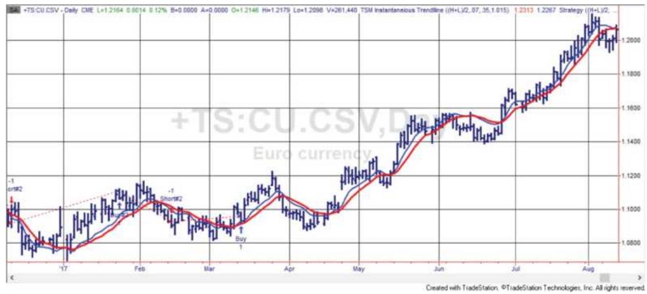
FIGURE 17.9 Ehlers' Instantaneous Trend applied to euro futures. The thicker line is the trend and the thinner is the trigger.
\(H R_{t}=H_{t}-L_{t-n}\) (today's high minus the low of \(n\) bars ago) \(L R_{t}=L_{t}-H_{t-n}\) (today's low minus the high of \(n\) bars ago)
Note that the high and low ranges do not use the highest high or lowest low of the past \(n\) bars, but the actual high and low of a single bar located \(n\) bars ago. Next, a range
ratio is created from \(H R_{t}\) and \(L R_{t}\) by normalizing in two ways, (1) dividing by \(\operatorname{ATR}(n)\), the average true range over period \(n\), and (2) dividing by a power function, \(n^{a}\), to correct for the characteristic that the range ratio gets larger as \(n\) gets larger. These calculations allow the different lookback periods to be compared. The normalized ranges are then:
\[
\begin{aligned}
N H R_{t} & =H R_{t} / n^{a} / A T R(n) \\
N L R_{t} & =L R_{t} / n^{a} / \operatorname{ATR}(n)
\end{aligned}
\]
Finally, the maximum range for \(N H R\) and \(N L R\) can be found over the most recent \(n\) periods:
\[
\begin{aligned}
H R_{\max } & =\operatorname{highest}(N H R, n) \\
L R_{\max } & =\operatorname{highest}(N L R, n)
\end{aligned}
\]
These final elements are high and low threshold values, which will be used to generate trading signals.
Buy when \(H R_{\max }>\) threshold high and \(L R_{\max }<\) threshold low
Sell when \(L R_{\text {max }}>\) threshold low and \(L R_{\max }<\) threshold high
Close out all trades 5 minutes before the close of trading
Four key variables \(-n\), the lookback period, \(a\), the power function, and the two threshold values - are all found by
optimization. It is suggested that the maximum lookback period, \(n\), should be no greater than 25 . Tests performed on QQQ, the NASDAQ 100 ETF, yielded the values \(n=6, a=0.75\), threshold high \(=0.50\), and threshold low \(=1.05\). If this method can be shown to be consistent over a reasonably long test period, producing about one trade per day, it is worth pursuing.
\section*{AN ADAPTIVE PROCESS}
An adaptive method can be a process as well as a formula. Rather than using a ratio or a sliding scale to change the smoothing constant, which in turn alters the trend speed, you can retest your system regularly using more recent data. The period being retested can always be a fixed number of days, as in walk-forward testing, or it can be selected visually, beginning when the market has changed its pattern, become more volatile, undergone a price shock, or moved to new highs or lows. The problem is having enough data to be satisfied that the results are dependable; the faster you react, the less data there is to make a decision. This approach, along with other testing methods, is covered in Chapter 21.
Selecting one trend calculation period from a test of a long period of data can be a robust solution, that is, it has been shown to net a profit after all price patterns, bull markets, bear markets, sideways, and those with price shocks. But it will also have large drawdowns. Changing the speed of the trend is an attempt to reduce those drawdowns and improve the percentage of profitable trades.
We can argue that traders no longer use fixed stops, such as \(\$ 500\) or 50 points, because the market volatility changes. The stop can become too close or too far away. Similarly, price trends can last a long time, such as a 30year decline in interest rates, or a much shorter time, as we see in crude oil price swings, or the weeks when interest rates change from declining to rising. Shouldn't the speed of the trend change at the same time?
The methods described earlier in this book show bands around moving average. Those bands can be based on volatility as with Bollinger bands, or a simple percentage of price. Both are self-adjusting. This chapter focused on changing the calculation period, using the simplest method, the correlation coefficient, or the much more complex cyclic approach of John Ehlers.
Adaptive methods are a clear extension of the system development process. Care must be taken when adapting to situations that do not occur often. While there is plenty of test data of medium- and low-volatility situations, very high volatility occurs less often and lasts for a shorter amount of time. In some cases, an adaptive system might do best slowing down the trend and simply holding whatever position it has until volatility drops. The KAMA does this. The other approach would be to speed up the trend to capture the shorter, faster, price swings. That may be a better solution, if it can be done. Analysts are encouraged to look further into these methods as an excellent way to improve system robustness.
\section*{NOTES}
1 Perry J. Kaufman, Smarter Trading (New York: McGraw-Hill, 1995), pp. 129-153.
2 Tushar S. Chande and Stanley Kroll, The New Technical Trader (New York: John Wiley \& Sons, 1994).
3 See previous footnote.
4 John F. Ehlers, "Fractal Adaptive Moving Average," Technical Analysis of Stocks \& Commodities (October 2005). See also John F. Ehlers, Rocket Science for Traders (New York: John Wiley \& Sons, 2001). The code for this and other indicators described here can be found online at mesasoftware.com/papers/MAMA.pdf.
5 John McGinley writes Technical Trends (P.O. Box 792, Wilton, CT 06897), and has compiled a selection of adaptive techniques as well as developed the ones discussed here.
6 J. Welles Wilder, Jr., New Concepts in Technical Trading Systems (Greensboro, NC: Trend Research, 1978).
Z Volker Knapp, "Parabolic Alternatives," Active Trader Magazine (September 2010).
8 Donald Mart, The Master Trading Formula (Brightwaters, NY: Winsor Books, 1981).
9 E. Marshall Wall, "Rolling with the Punches," Futures (July 1996).
10 Tushar Chande and Stanley Kroll, The New Market Technician (New York: John Wiley \& Sons, 1994).
11 John F. Ehlers, "Adaptive Trends and Oscillators," Traders.com (May 2000).
12 https://www.mesasoftware.com/seminars/AfTAMay2
13 Dennis Meyers, "Range Roving," Active Trader (March 2003).
\section*{CHAPTER 18}
\section*{Price Distribution Systems}
Price movement is usually seen as a chart in which each new interval is a new bar or point recorded to the right of the previous prices - the traditional time series. There are many applications that need to look at prices differently. Point-and-figure charting only moves to the right when a reversal occurs. A standard deviation looks at the way price changes are spread out. Market Profile, discussed later, studies the clustering of prices.
In pricing options, the implied volatility is used to decide the chances of prices remaining in a specific range for a specific amount of time. When a risk manager evaluates the volatility of returns, the same annualized standard deviation calculation is used. The standard deviation gives the most basic and accepted measure of price distribution. For our applications, we will favor historic volatility, which is easy to calculate and works well.
Because the standard deviation is the most commonly used measurement of price distribution, it is important to remember that a band formed by the average of the data \(\pm 1\) standard deviation contains \(68 \%\) of the data
(both up and down if price changes), \(\pm 2\) standard deviations contain \(95 \%\), and \(\pm 3\) standard deviations contain \(99.7 \%\) of all data. Theoretically, all data should be contained within the range of \(\pm 3.5\) standard
deviations, whether it's the height of men in Kansas or the size of daily price moves.
\section*{ACCURACY IS IN THE DATA}
The data used to determine the standard deviation is very important. Because we are seeking a statistical measure, it is most accurate when a large amount of data is used that includes a wide range of price movement and patterns. If we only used data beginning in 2010, the extreme volatility of the 2008 financial crisis would be missed and the volatility measurement would show far fewer extremes. That could cause a trader to underestimate the potential volatility and be exposed to greater risk than shown in the data.
For example, the price and annualized volatility (using daily returns) of the ETF SPY from 1998 through April 2018 are shown in Figure 18.1. In order to find the likelihood of high volatility, we take the average of all data, then add and subtract 1 standard deviation of that data to get the thresholds that contain \(68 \%\) of the data. Table 18.1 shows the lower and upper values of the distribution using the normal approach. The range of data included in 1 standard deviation is the average, 0.166 , plus and minus 1 standard deviation, 0.105 , giving the range from 0.105 to 0.062 . But once we expand that range to 2 standard deviations, the lower threshold is negative. We know that volatility cannot be negative, so using this approach doesn't work.
Instead, the frequency distribution will be a better solution (also see Chapter 2). Figure 18.2 shows all the
20-day annualized volatility values sorted highest to lowest (one for each day). There are 4,959 values. By looking at the sorted values, we can say that there is a \(10 \%\) chance that the volatility will be greater than \(28.3 \%\), which is in the 496th position, \(10 \%\) down from the largest value. In the same way, there is a \(5 \%\) chance that volatility will be greater than \(33.3 \%\), a \(1 \%\) chance that it will be greater than \(56.8 \%\), and a \(0.02 \%\) chance it will be greater than \(95.9 \%\) (Table 18.2). Had we used only the last year of data, these values would be very different because the maximum volatility would have been only \(27 \%\).
\section*{SPY prices and annualized volatility}
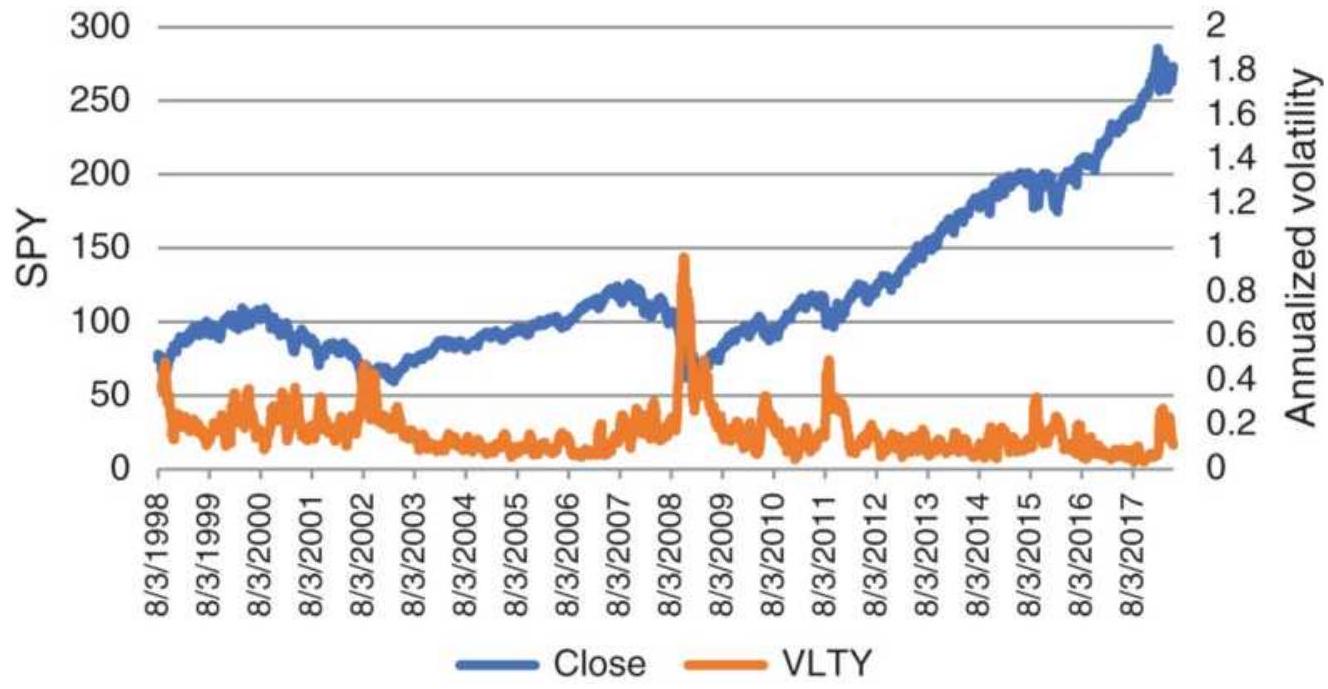
FIGURE 18.1 SPY prices and annualized volatility from 1998 through April 2018.
\section*{TABLE 18.1 Volatility distribution for SPY.}
\section*{Average of all data \(=\mathbf{0 . 1 6 6 9 7}\)}
\begin{tabular}{|c|c|c|c|}
\hline StDev & Value & \multicolumn{1}{|c|}{ From } & To \\
\hline 1 & 0.105 & 0.062 & 0.271 \\
\hline 2 & 0.209 & -0.042 & 0.376 \\
\hline 3 & 0.314 & -0.147 & 0.481 \\
\hline
\end{tabular}
Distribution of annualized volatility
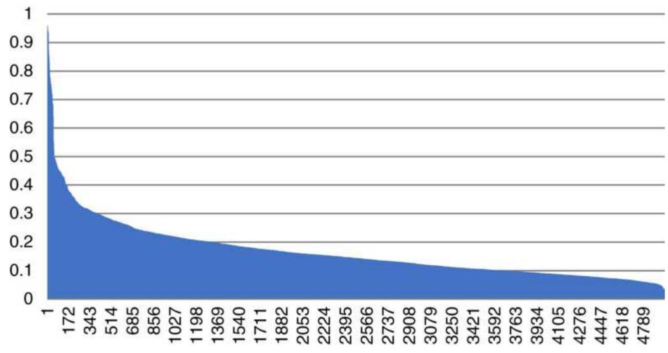
FIGURE 18.2 Daily values of 20-day annualized volatility of SPY sorted highest to lowest.
\section*{TABLE 18.2 Probability of annualized volatility} using a frequency distribution.
\begin{tabular}{|c|c|c|}
\hline Rank & Probability & Volatility \\
\hline .1 & \(.0 .020 \%\) & \(95.9 \%\) \\
\hline .49 & \(1 \%\) & \(56.8 \%\) \\
\hline 247 & \(5 \%\) & \(33.9 \%\) \\
\hline 496 & \(10 \%\) & \(28.3 \%\) \\
\hline
\end{tabular}
\section*{Standard Deviation Bands}
The use of Bollinger bands, discussed in Chapter 8, is a very popular application of basic price distribution. To create the Bollinger bands, calculate the standard deviation of prices (not returns) over 20 days and form bands of 2 standard deviations above and below the 20day moving average of the closing prices. For those wanting bands that envelop more or fewer data points, the standard deviation factor can be larger or smaller.
Once calculated, Bollinger bands can be displayed on any price chart, as seen in Figure 18.3. Because a 2-standarddeviation band would normally enclose \(95 \%\) of the data, a penetration of either the upper or lower band represents strength or weakness, or a data outlier. Some traders will use a penetration to confirm a directional trade and others to set up a mean reversion trade.
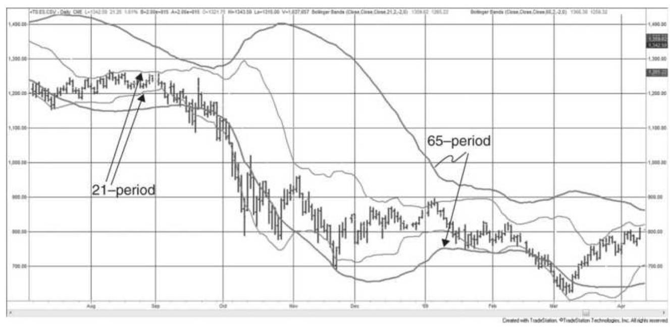
FIGURE 18.3 Comparison of 21-period and 65-period Bollinger bands, applied to the emini S\&P, July 2008August 2009.
Bollinger bands are most important for describing market volatility. A relatively narrow band translates into low volatility. By comparing a 21-period Bollinger band with a 65 -period band, you can see the relative difference between 1-month and 3 -month volatility in Figure 18.3. The thicker lines, based on the 65 -period calculation, cross the short-term band at points that show relative overbought and oversold situations, the decline in September 2008, and a smaller decline in February 2009. Comparing monthly and quarterly historic volatility may provide useful values for options traders.
\section*{Avoiding the Bulge}
Applying any technique to a rolling time interval of the most recent \(n\) bars is a common method of keeping in tune with current market conditions. In the case of a simple moving average, we already know that the lag causes the trendline to fall behind during a trending market.
There is a similar problem when using the most recent \(n\) bars to calculate a standard deviation, even when using the returns and not prices. If we are measuring the volatility of the market, and prices rally quickly, the volatility rises. This is most obvious in Figure 18.3, where the 65 -day standard deviation bulges out in October just as prices drop. It is symmetric around the 65 -day average, which is in the center of the bands, and also lags.
When volatility declines the bands are slow to narrow.
The days with high volatility need to work their way out of the calculation period. From November into
December, in Figure 18.3, volatility is quickly declining, yet the 65 -day bands remain wide. At that point the bands are not useful for reflecting the correct volatility.
A technique that is helpful for identifying unusual volume or volatility is to lag the data used in the standard deviation so that the standard deviation bands reflect price movement before the recent increased volatility began. Then a 20 -day standard deviation might use data from \(t-40\) to \(t-61\) days, where \(t\) is today. That way, the most recent volatile days are not part of the band and a current high-volatility day will penetrate the band. If lagged enough, declining volatility will return to inside the band. This method would recognize two volatile periods that occur one after the other while using a measure that is not lagged will miss the second evernt. At some point the band will expand to reflect higher volatility, but there is less chance that this will happen coincidental with a new period of high volatility.
If the purpose is to identify unusual volatility, then it is better to compare the current volatility with a longerterm measurement, a lagged measurement, or both. The longer-term period gives a better measure of normal volatility and makes any new volatile period a small part of the total, so that it has less impact.
\section*{Kase's DevStop}
Cynthia Kase, a well-known energy consultant, uses what she calls a DeuStop, an important part of a trading
system that she used for years. \({ }^{1}\) The stop has three levels. For a long position it is the average of a 2 -day ATR minus 1.0, 2.2, and 3.6 standard deviations of that ATR, taken over 20 days, subtracted from the closing price, rather than the trendline. The 2-day ATR introduces some smoothing, which may be necessary because using the current closing price will cause the stop to jump around. The first stop would then be:
\section*{DerStop \(1=\) close-average 2 -day ATR -1.0 standard deviations of the 2 -day ATR}
Other than the positioning of the stops, Kase's rules are not disclosed, but we can create standard buy and sell signals as follows:
Buy when the fast 5 -day trend crosses above the slower 21-day trend.
- Sell when the fast 5-day trend crosses below the slower 21-day trend.

Because there are three stop-loss levels, new positions will be entered in multiples of 3 contracts. Each time a stop level is crossed, one unit will be removed. The full position is reset when the trend changes direction. A program to test this strategy is TSM DevStop, along with an indicator of the same name that produced the stop levels in Figure 18.4. Results using crude oil futures were still good.
\section*{USE OF PRICE DISTRIBUTIONS AND}
\section*{PATTERNS TO ANTICIPATE MOVES}
Prices often form patterns that can be evaluated using probability, or simply viewed in much the same way as a frequency distribution, or histogram. Because many concepts are sound, but the statistical analysis is often difficult due to limited amounts of data or changing conditions, analysts have taken a much more empirical approach. The following section looks at some innovative ways to view price distributions and how they are interpreted into trading opportunities.
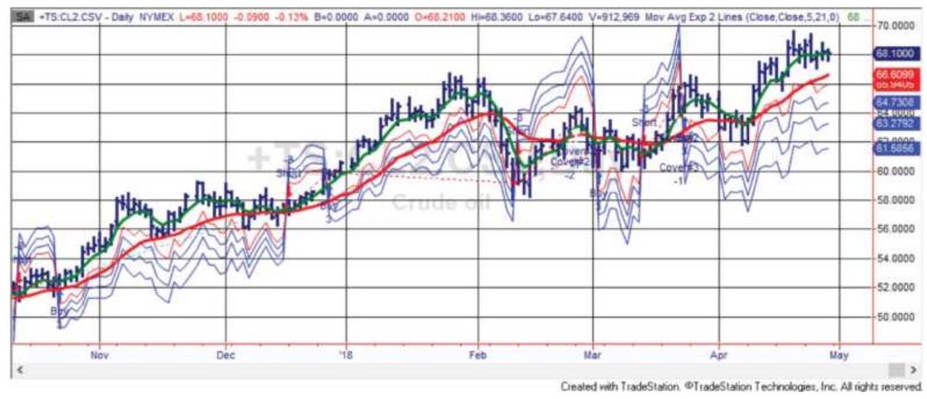
FIGURE 18.4 Kase's 3 DevStops with a "warning" line closer to the prices. The 5- and 21-day moving averages are shown as thicker lines. Applied to crude oil futures, October 2017-April 2018.
\section*{Analysis of Zones}
Rather than using standard deviations to identify the chance of a price move above or below yesterday's closing level, Bruce Gould divided historic prices into five zones, each \(20 \%\) of the price range over the previous
3 years. This long-term approach makes it clear that selling in Zone 1 (the lowest price levels) or buying in Zone 5 would present little opportunity for profit. Given the likelihood of a sideways trading period occurring, selling in a higher zone or buying in a lower zone increases the opportunity while reducing the risk. Because of the 3-year window, this type of analysis is best for investors with a long-term outlook.
For faster trading, J. T. Jackson 2 defined 5 short-term zones, based on 10-minute bars in order to forecast the strength or weakness of the next bar. These intraday zones, which were popular with floor traders, are calculated as:
\begin{tabular}{|l|c|l|}
\hline Calculation & Zone & \begin{tabular}{l}
If price is \\
above, then
\end{tabular} \\
\hline High2 = Average + High1 - Low1 & 6 & Strong up \\
\hline High1 = 2 * Average + Low & 5 & Moderate up \\
\hline Average = (High + Low + Close)/3 & 4 & Mildly up \\
\hline Low1 = 2 * Average - High & 3 & Mildly down \\
\hline Low2 = Average + Low1-High1 & \(\mathbf{2}\) & \begin{tabular}{l}
Moderately \\
down
\end{tabular} \\
\hline Any price lower & \(\mathbf{1}\) & Strongly down \\
\hline
\end{tabular}
where the High, Low, and Close are yesterday's daily prices. A test of how often the daily SPY, from January 1998 through April 2018, falls into these relative rankings gives:
\begin{tabular}{|l|c|c|c|c|c|c|}
\hline Zone & \(\mathbf{6}\) & \(\mathbf{5}\) & \(\mathbf{4}\) & \(\mathbf{3}\) & \(\mathbf{2}\) & \(\mathbf{1}\) \\
\hline \begin{tabular}{l}
S\&P \\
Frequency
\end{tabular} & \(12.8 \%\) & \(15.4 \%\) & \(29.5 \%\) & \(22.7 \%\) & \(11.9 \%\) & \(11.9 \%\) \\
\hline
\end{tabular}

which shows the upward bias expected of the overall equities market. The spreadsheet that calculated these values is TSM Jackson Zones SPY on the
Companion Website. These distributions will vary depending on the years used in their calculation. A longer interval that includes bull, bear, and sideways markets would be safest; otherwise, there is the chance that the calculations will create a bullish market profile, which would not serve well during a bear market reaction. Although you can avoid short-term bias by using more data, the zones tend to get very large.
The strategies for trading price zones focus on shortterm trends and short holding periods. For example, you can sell short when prices move into Zone 4 (mildly up) with a stop if prices enter Zone 5. If you consider Zones 3,4 , and 5 as containing mostly market noise, then selling at the top of Zone 4 and closing out that trade at about the average (the middle of Zone 4) or buying near the bottom of Zone 3 and closing out at about the average could capture the majority of price moves that have no direction.

A program for testing this method is TSM Zones, on the Companion Website. It requires both 10-minute and daily data.
\section*{Non-Random Patterns}
In evaluating the zone approach, the markets that offer the greatest potential for this strategy are those that show an abnormal distribution of prices within the six zones. For example, if the six zones were all equal in size, and the frequency of prices declined by one-half as they moved from the center to the extremes, there would be a perfectly random distribution with no profit potential:
\begin{tabular}{|l|c|c|c|c|c|c|}
\hline Zone of Equal Size & \(\mathbf{6}\) & \(\mathbf{5}\) & \(\mathbf{4}\) & \(\mathbf{3}\) & \(\mathbf{2}\) & \(\mathbf{1}\) \\
\hline Normal Distribution & \(7 \%\) & \(14 \%\) & \(28 \%\) & \(28 \%\) & \(\mathbf{1 4 \%}\) & \(7 \%\) \\
\hline
\end{tabular}
If the distribution is symmetric, but Zones 3 and 4 are much wider than the outer zones (a higher kurtosis), then the risk of selling at the top of Zone 4 with a stop at the top of Zone 5 and a profit target at the average of Zones 3 and 4 would result in an equal number of profits and losses, but the profits would be larger. If the zones are of equal size, the opportunities come when the distribution is clustered in the center:
\[
\begin{array}{|l|c|c|c|c|c|c|}
\hline \text { Zone of Equal Size } & \mathbf{6} & \mathbf{5} & \mathbf{4} & \mathbf{3} & \mathbf{2} & \mathbf{1} \\
\hline \text { Normal Distribution } & 2 \% & 8 \% & 40 \% & 40 \% & 8 \% & 2 \% \\
\hline
\end{array}
\]
In this case, selling at the top of Zone 4 would result in many more profits than losses, although profits and losses would be of equal size and there would be fewer opportunities.
\section*{Applying a Moving Average Distribution}
A trend filter often improves the reliability of a strategy, even if it reduces the number of trades. For this strategy,
separate moving averages values of the high, low, and closing prices can replace the actual high, low, and closing prices used in the zone calculations. In using this approach, a strong upward trend would cause all the zones to lag below today's prices, making current values strongly overbought. Zones created from the history of these averages will reflect the relative overbought and oversold price levels within trends. In a strong upward market, prices can remain in Zone 6 while they are steadily moving higher, in much the same way that an oscillator can remain over \(80 \%\) for a sustained period.
Using moving average values will change the way in which you trade these zones. For example, you might want to enter long positions only in Zone 5 and look to exit on strength in Zone 6. You might find that, if prices end the day in Zone 6 (very strong), they are likely to open the next day in Zone 4 (slightly higher). If you are strictly trend following, you might enter in Zone 6 and exit in Zone 4.
\section*{Zones for Forecasting Range and Controlling Risk}
Statistics have proved that, barring a superior forecasting method, the best estimate for tomorrow's price is today's price. That is, under most conditions, we cannot predict with any certainty that prices will go up or down tomorrow; therefore, the best estimate is to say that the price will be unchanged. However, if a trend system, such as a moving average, has been profitable, then its forecast for tomorrow is better than today's price. Market volatility, based on price changes, can be
used with a directional forecast of tomorrow's price to create a set of zones used to control risk or project the probable trading range. \({ }^{3}\)
First calculate the 10-day moving average of the absolute value of the daily price changes:
\[
A_{t}=\frac{\sum_{i=t-n+1}^{t}\left|C_{i}-C_{i-1}\right|}{n}
\]
\(n\)
where
\(n=10\)
Taken as positive numbers, zones are created that center around the current price and expand according to the average price change (volatility) using the following calculations:
\[
\begin{aligned}
H 2 & =C_{t-1}+2 A_{t} \\
H 1 & =C_{t-1}+A_{t} \\
L 1 & =C_{t-1}-A_{t} \\
L 2 & =C_{t-1}-2 A_{t}
\end{aligned}
\]
Five zones are then created by using the areas above H 2 and below L2, and the three ranges between H2, H1, L1, and \(L 2\), all of which change in proportion to the \(n\)-day volatility. These volatility levels, or zones, represent a very similar scenario to channel breakouts. The market often trades in a range defined by an average level of
volatility. When a new piece of information affects the price, it jumps to a new level, then trades with similar volatility (slightly higher at first) at the new level, slowly declining back to normal. Most often, the first breakout of an existing trading range puts prices in a zone just above the old range, making the pattern appear to be divided into equal zones. This same philosophy is the reason that standard profit targets for a price breakout are equal to the previous trading range. Charting systems that use trend channels will often set targets equal to the width of the channel prior to the breakout.

Figure 18.5 shows the forecasted zones applied to the emini S\&P, daily data, from January through April 2011. This was produced by the program TSM
Forecasted Zones, as well as the spreadsheet of the same name, available on the Companion Website. Readers can find additional trading range projections in Chapter 15.
\section*{Zones Based on Daily Price Levels}
Defining the zones in a way that allows profitable trading rules seems to be a challenge undertaken by many analysts. In this approach, the average true range is used to define six zones: 4
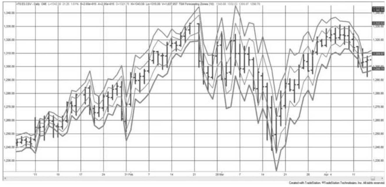
FIGURE 18.5 Forecasted trading zones using the Chande and Kroll method applied to the emini S\&P, January-April 2011.
Zone 5: Above today's high + 10-day average true range
Zone 4: Above today's high and below zone 5
Zone 3: Above (high + low)/2 and below zone 4
Zone 2: Above the low and below zone 3
Zone 1: Above the low-10-day average true range and below zone 2
Zone o: Below zone 1
Then we can look for two patterns:
Pattern 1: Tomorrow's opening zone compared to tomorrow's closing zone
Pattern 2: Today's closing zone compared to tomorrow's opening zone
It may be best to use data reflecting business hours, a notion discussed before. Rather than using the electronic S\&P, which trades \(23^{1 / 2}\) hours, limit the data to 9 a.m. to 4 p.m. New York or use SPY.

Trading rules for these zones are the same as Jackson. They can be mean reverting if using intraday data or if there is no clear trend, or trend following if using daily data or if there is a well-defined trend. You can produce a distribution of data within these zones using the program TSM Zones Using ATR on the Companion Website.
\section*{THE IMPORTANCE OF THE SHAPE OF THE DISTRIBUTION}
In the search to understand how prices move and what to expect, an analysis of price distributions can explain whether the market is trending, moving sideways, or simply unstable. Some of these patterns are clear, and others are not; in addition, the combination of patterns within patterns can become complex. The goal is to find a statistical edge. The following is a basic approach to interpreting price distributions, although each group of markets will have special characteristics. Successful trading systems and risk controls will exploit the way prices distribute.
\section*{Changing Distributions}
A quick observation of price data for most commodities,
such as soybeans or gold, shows that we should expect a skewed long-term price distribution, clustering at lower prices and a long tail toward higher prices. But even this basic pattern has gotten more complex. Globalization has introduced competition and changing currency values while inflation changes the underlying basis. Some commodities have had structural changes. Gold is no longer likely to trade at \(\$ 250\) /ounce, crude oil at \(\$ 20 /\) barrel, or electricity at 2.5 cents/kilowatt hour.
If we use as much data as possible, as statisticians suggest, we will get an odd distribution with either irregular or multiple peaks caused by structural shifts to higher prices. There is also likely to be lumps in the tail to the right because each price shift higher will cause more activity at prices further from the center.
Adjusted wheat prices
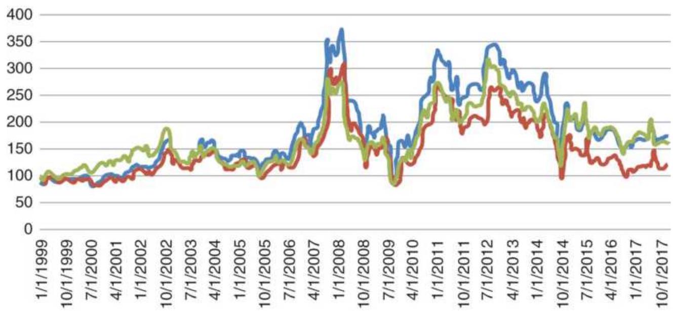
-Wheat Wheat/CPI Wheat/Euro
FIGURE 18.6 Wheat cash prices, and wheat adjusted for inflation and currency changes.
First, we need to understand the different ways we can view wheat prices. Figure 18.6 compares wheat cash prices, wheat prices divided by the CPI (deflating the price), and wheat divided by the euro (the value seen in Europe). The deflated price (divided by the CPI) shows that producers are receiving the same price in 2017 as they did in 1999. Viewed from outside the United States, prices did not spike as much in 2008, 2011, and 2013. The price distribution in Figure 18.7 tells us more. The darker bars (left) represent the distribution of actual wheat prices over the past 20 years. It includes the effects of inflation and exchange rates. The lighter bars show the distribution with inflation and currency removed dividing the cash price by the CPI (unadjusted less food and energy) and the spot euro. The cash wheat price distribution shows a wide top and a bump in the right tail at 275 before tapering off. The shape of the right tail indicates prices traded longer than expected at 275. Looking again at Figure 18.6, we see more activity at 275 .
\section*{Indexed wheat comparison}
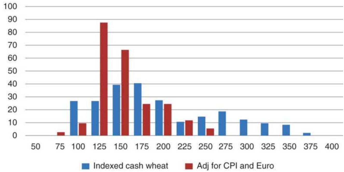
FIGURE 18.7 Distribution of wheat cash prices compared to the wheat price deflated by the euro and the CPI, 1999-2017.
When the CPI and euro are removed, we get a very different distribution - wheat prices without the effects of globalization and in terms of 1999 dollars. There is a clear peak at 125, a smooth decline to the right, and a fast decline to the left. The sharp drop-off of activity on the left is due to farmers resisting sales below the cost of production, combined with government support programs, which guarantees a minimum crop price. The right tail is smoother.
When working with long-term distributions, it may be necessary to adjust the data by factors that have materially affected prices over the years. There is usually a simple way to decompose prices so that they show their true patterns. It is often the case that the effects of multiple factors will cause a frequency distribution to be
irregular, but analyzing the components separately is much easier. We saw that the distribution of wheat was normal when inflation and currency were removed.
Now look at the euro by itself. Currencies have no intrinsic value. Unlike wheat, there is no cost of production, and no price so low that a farmer won't sell. A currency's value is based on the gross domestic product, the balance of trade, and inflation for that country. All else being equal, if it is a net exporter, its currency will rise. If it has a trade deficit, the currency will fall. It clusters at a value, relative to another currency, that is considered equilibrium. In Figure 18.8 that equilibrium has been between par (100, currencies are of equal value) to 124, the euro being stronger than the dollar. Values under 100 occurred earlier, and values between 110 and 124 are more recent and more frequent.
This distribution will also be studied in the section "Market Profile," later in this chapter. Knowing the distribution can allow you to create a mean reversion strategy when prices test the extremes, or a trending strategy when prices move within the main cluster. But how do you combine the adjusted wheat distribution with the euro distribution to create rules for trading? One way is to look at the combinations that can occur:
\section*{Euro price distribution}
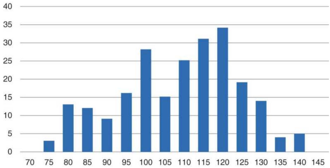
FIGURE 18.8 Price distribution of indexed cash euro, 1999-2017.
\begin{tabular}{|l|l|l|}
\hline \begin{tabular}{c}
Position of the \\
Price
\end{tabular} & \\
\hline \multicolumn{1}{|c|}{ Wheat } & \multicolumn{1}{|c|}{ Euro } & \multicolumn{1}{c|}{ Wheat action } \\
\hline \begin{tabular}{l}
Upper \\
right
\end{tabular} & \begin{tabular}{l}
Upper \\
right
\end{tabular} & \begin{tabular}{l}
Extreme Sell: Both wheat and euro \\
are overbought
\end{tabular} \\
\hline \begin{tabular}{l}
Upper \\
right
\end{tabular} & Midrange & \begin{tabular}{l}
Normal Sell: Wheat is overbought, \\
euro is neutral
\end{tabular} \\
\hline \begin{tabular}{l}
Upper \\
right
\end{tabular} & \begin{tabular}{l}
Lower \\
left
\end{tabular} & \begin{tabular}{l}
No Action: Rising euro would \\
offset falling wheat prices
\end{tabular} \\
\hline \begin{tabular}{l}
Lower \\
left
\end{tabular} & \begin{tabular}{l}
Lower \\
left
\end{tabular} & \begin{tabular}{l}
Extreme Buy: Both wheat and euro \\
are oversold
\end{tabular} \\
\hline \begin{tabular}{l}
Lower \\
left
\end{tabular} & Midrange & \begin{tabular}{l}
Normal Buy: Wheat is oversold, \\
euro is neutral
\end{tabular} \\
\hline Lower & Upper & No Action: Falling euro would \\
\hline
\end{tabular}
\begin{tabular}{|l|l|l|}
\hline left & right & offset rising wheat prices \\
\hline Midrange & \begin{tabular}{l}
Any \\
position
\end{tabular} & \begin{tabular}{l}
No Action: Trades should be taken \\
in the euro
\end{tabular} \\
\hline
\end{tabular}
A trade is closed out when prices return to midrange.
Irregular distributions mean that there are multiple factors affecting the product, or that there have been structural changes causing a price shift. In the first case, you can adjust the underlying price by inflation, currency, or interest rates. In the second, you can start at a more recent point in time that represents the new regime.
\section*{Equilibrium and Structural Change}
Price levels change over time, but how can we tell where the new low is, or what traders now accept as "normal"? One way is to look for periods of low volatility and low volume. When traders and investors see no opportunity, it can be at prices too high, too low, or at the level considered "fair value," also called equilibrium.
For grains, farmers will resist selling below their cost of production, but not always, because they may need the cash to operate. At a low price we can expect both volatility and volume to decline significantly. There is a similar phenomenon in most commodities. The chart of weekly copper futures, Figure 18.9, shows prices, volatility, and volume all at lows during 2002 and 2003 (the highlighted area) before beginning its rally. For the purpose of defining a base price for copper, this chart shows it at \(\$ 1.00 / \mathrm{lb}\). As time moves on, the base price
will rise.
The information derived from equilibrium is not limited to commodities with an absolute concept of a low price. Currencies are an example of markets with an intrinsic value that is difficult to identify. There may be multiple areas where volume and volatility drop, indicating that all the news has been absorbed and there is no anticipation of anything new at the moment. Or, as in Figure 18.10, it can identify a level in the euro/U.S. dollar (euro futures) below which no one is willing to trade. The highlighted area at par, 1.0000 , shows volatility dropping to its lowest point at the same time volume remains low.
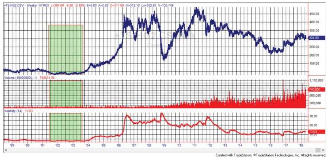
FIGURE 18.9 Low volume (center panel) and low volatility (bottom panel), the highlighted area, define the new base price for copper futures (top panel).
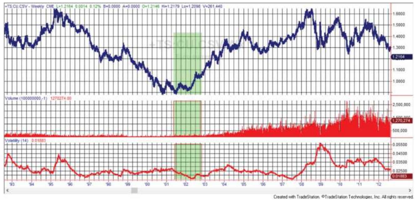
FIGURE 18.10 Euro futures show that volume and volatility fall to their lowest levels at a base price of 1.0000 .
As prices move away from equilibrium, both volume and volatility rise. The same pattern exists in the stock market. Some traders wait for a stock that has shown little movement and low volume to suddenly have increased volume. This is often followed, or accompanied, by increased upward price movement. Traders will jump into this stock and both volume and volatility will skyrocket, with traders pushing prices higher, an event called chasing volatility. It can be over just as quickly. Volatility drops, volume drops, and the stock reverts to its earlier pattern.
\section*{Price Manipulation}
Some "structural" price changes are due to manipulation rather than supply and demand. Traders need to be aware that all prices do not move freely, at least not all the time. The main culprit is OPEC, but it is not the only
one.
\section*{OPEC}
OPEC is a consortium of oil-producing countries with the common goal of keeping oil prices high. To do that, they agree to production quotas for each country as a way to limit supply. The main player in this cartel is Saudi Arabia, which has implicit control over production because it has excess capacity and can increase production at any time to drive down prices. By keeping this threat active, other producing countries keep close to their quotas.
Even with Saudi monitoring, it is generally accepted that the OPEC output is greater than the quotas because of cheating. By having monitors watching the loading of oil tankers, reports show that one country may sell their oil at the designated price but load \(10 \%\) more onto the tanker, effectively giving a 10\% discount. It is so common that it may even be built into the quotas, just as most speed limits are posted lower than necessary so that somewhat higher speeds are not punished. Everyone feels as though they've gotten away with something.
Oil prices can jump following an OPEC meeting and an announcement of a new lower quota. Prices can rally in advance of a meeting knowing that the purpose is to raise prices or keep prices high. It's very much the same as the anticipation of the Federal Reserve meetings. Traders sell bonds ahead of expectations of a rate hike, and prices jump either way at the time of the announcement.
\section*{LIBOR}
In 2012 a number of international banks were sued for manipulation of LIBOR (London Interbank Offered Rate). Each bank is supposed to report their actual lending rate at the end of the day, but many of these banks falsely inflated or deflated their rate to benefit their proprietary positions.
\section*{Copper}
Copper has been at the center of a number of scandals. In 1995 "The Great Copper Caper" centered around Sumitomo's attempt to corner the copper market. In 2017, Barclays was sued for price rigging. It was said to be taking the opposite positions of known clients and driving the price in their own direction just ahead of the close. As an ongoing problem, the LME is supposed to control copper depositories, which allows it to know and publish stocks on hand. There has been considerable talk about China hoarding copper stocks without reporting them, so the current supply is unknown, a situation that could be used to manipulate prices.
\section*{Intervention}
We may consider it a legitimate action by a Central Bank, but intervention in the value of a currency is still manipulation on a massive scale. The Bank of Japan has been the most active in preventing extreme strengthening of its currency, and the most aggressive of the G7 countries. China has systematically kept the value of the yuan low to benefit trade. The Swiss National Bank intervened in 2015 to the surprise of everyone, causing
massive losses for traders. Other emerging economies, such as Argentina, regularly devalue their currencies, but traders are watchful and often prepared.
\section*{Know Your Market}
Manipulation and scandals are not common. There are regulatory agencies that enforce strict adherence to rules. Exchanges each have a clearing corporation that guarantees the trades, so the profit that you expect is one that you get. Still, some markets are subject to more uncertainty than others, and anyone entering a market should be aware of its history and how it might affect your risk.
\section*{Medians and Means}
Although the inflation or dollar-adjusted long-term distributions show that commodity prices spend much more time at lower levels, there is a tendency to consider the average price as the midpoint between the highest and lowest prices. But the average gets distorted when there is a run of extreme prices. The median is always a better measurement of the normal price. This was discussed in Chapter 2. For the case of wheat, the average of all monthly prices was \(\$ 362.75\) while the median was \(\$ 341.50\), showing that the recent run-up affects the average much more than the center price. For the wheat series adjusted by the dollar index, the average was 0.00406 and the median 0.00243 , also skewed but by not nearly as much. While the median always comes at sorted position 151 for the 302 months, the average corresponded to position 186 for cash wheat and
position 157 for the series adjusted by the dollar index (DX). The difference between the locations of the average and median values is a good measurement of the distribution skew. In Chapter 2 the relationship was given as:
\section*{\(3 \times(\) Mean - Median \()\)}
\section*{Standard deviation}
For price distributions, the median is a much more useful value than the average, although not always as convenient to calculate. The median naturally adjusts for the skewness in the price patterns.
\section*{Short-Term Distributions}
Unlike the normally predictable patterns of the longterm price distributions, the distribution patterns of short time intervals can vary widely, and have a different interpretation. Short-term distributions are not anchored to a base level because the entire period of analysis may be at price levels that are significantly above intrinsic value or production costs. Keeping in mind the normal shape of price distribution for each market group, a different configuration can be a strong indication of expected price change.
Three distribution patterns for a commodity are shown in Figure 18.11 (b-d) along with the larger, long-term distribution (a). The normal distribution (a) shows the typical clustering at low prices with a long tail toward higher prices. The first short-term distribution (b)
mimics the long-term pattern but with lower frequency due to less data and the extended tail much shorter. This is most likely to occur at low price levels, where most activity is near the bottom with occasional short excursions up. Figure 18.11c is a bell-shaped, symmetric curve that could indicate a congestion area or short-term equilibrium at a price level not near the lows but also not at exceptionally high prices. When prices trade equally across a range, they do not exhibit any likelihood of favoring an immediate breakout either up or down; however, in the big picture, declining prices are always more likely.
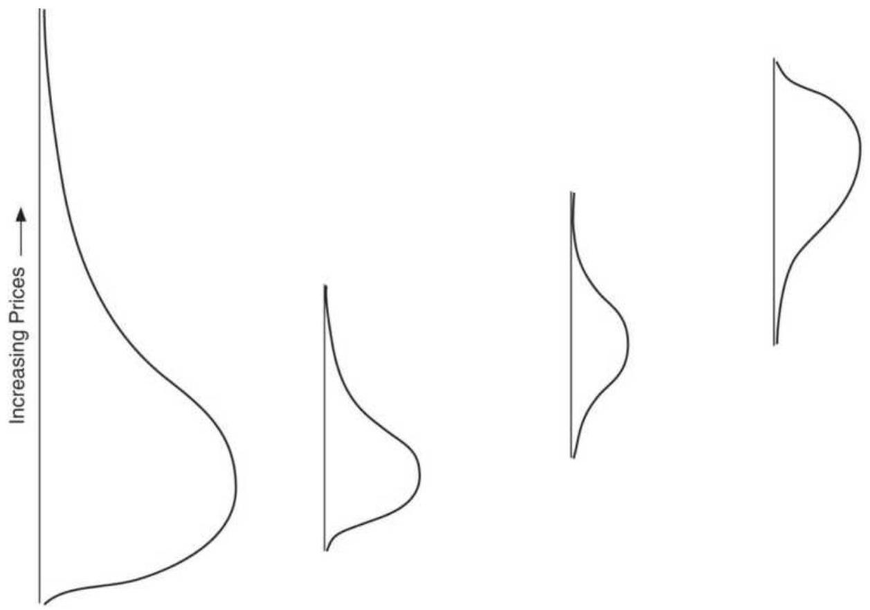
(a) Normal long-term distribution.
(b) Short-term normal pattern indicates moderate stability.
(c) Bell-shaped pattern indicates temporary equilibrium.
(d) Skewed opposite pattern implies unstable prices.
FIGURE 18.11 Three short-term distribution patterns. (a) A normal, long-term distribution. (b) A short-term
normal distribution near the low prices. (c) A bellshaped curve representing congestion but not indicating future direction; the market is in temporary equilibrium. (d) The tail points to lower prices with most activity at higher prices; the market is unstable and has substantial downside potential.
The fourth distribution (Figure 18.11d) is most interesting because it is skewed in the direction opposite to (a) and (b). This pattern is developed by a relatively fast move to a higher price level, then a congestion area formed at the higher level. If you had seen this distribution without knowing the actual prices, you could be certain that prices are higher than normal. The pattern is top-heavy and should be interpreted as unstable; prices are more likely to go down than up. This last conclusion does not require statistics, because prices at historically high levels may not decline immediately but must eventually correct to normal levels. Buying into a market with this distribution assures high risk.
\section*{Identifying Potential Price Moves}
From the patterns just described, a distribution that combines a long tail toward higher prices, with a median price that is relatively low, offers little promise of a potential upward price move. When prices are closer to the long-term median or mode, the most common occurrence, they are in an area of equilibrium and less likely to move. Potential volatility increases as prices get farther from the mode. Three distributions that have greater chances for price moves are:
1. A broad, often erratic formation indicates volatile current movement. Prices have not remained at one level and have not yet established a well-defined pattern or trading range.
2. A skewed distribution (with the tail toward higher prices), the mode near the base level, with the current price at the high end of the tail, indicates that prices are in the process of making an unusual, highly volatile move to the upside.
3. A skewed distribution (with the tail toward lower prices), the mode in the upper half of the distribution, and where the current price is in the tail (lower prices) indicates that prices have peaked after a significant move up and are starting down.
Any time prices form a distribution that is not the same as a long-term distribution and prices are not at low levels, there is potential for movement and volatility.
\section*{Using Skewness to Identify a Trend}
It can be argued that the skewness of closing prices, rather than intraday prices, is a robust measurement because the closing price is the final accounting for the day. 5 Skewness can be used as a leading indicator of a trend change if it is calculated as a moving skewness and acted on when it shows early signs of change.
This calculation of moving skewness involves four steps:
1. Double smoothing of the closing prices, to get the moving mean (M), with \(a=0.10\) :
\[
\begin{aligned}
S_{t} & =a \times \text { Close }_{t}+(1-a) \times S_{t-1} \\
D_{t} & =a \times S_{t}+(1 \times a) \times D_{t-1} \\
M_{t} & =\left((2-a) \times S_{t}-D_{t}\right) /(1-a)
\end{aligned}
\]
2. Moving deviation of the difference between the closing prices and the smoothed mean:
\[
D E V_{t}=\text { Close }_{t}-M_{t}
\]
3. Moving standard deviation of the moving deviation, with \(b=0.05\) :
\[
\begin{aligned}
S M D_{t} & =b \times\left|D E V_{t}\right|+(1-b) \times S M D_{t-1} \\
D M D_{t} & =b \times S M D_{t}+(1-b) \times D M D_{t-1} \\
M D_{t} & =\left((2-b) \times S M D_{t}-D M D_{t}\right) /(1-b) \\
S T D_{t} & =1.25 \times M D_{t}
\end{aligned}
\]
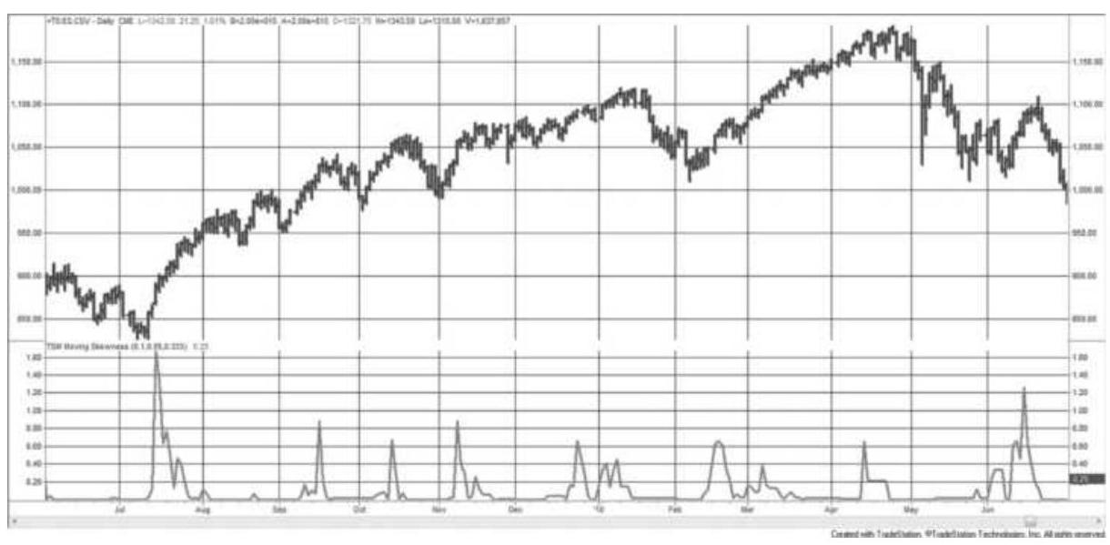
FIGURE 18.12 Moving skewness, emini S\&P
futures, June 2009-June 2010.
4. Moving skewness, with \({ }_{c}=0.333\) :
\[
G_{t}=\left(c \times D E V_{t}^{3}+(1-c) \times G_{t-1}\right) / S T D_{t}^{3}
\]

The resulting value of \(G\) is shown in the lower part of Figure 18.12 applied to the emini S\&P. The largest spike in the moving skewness, in July 2009, comes right at the beginning of a new uptrend. The second largest spike, in June 2010, also points to a change of trend, although a bit late. The more frequent smaller spikes are to be interpreted as turning points, although not as important. They seem to occur at short-term peaks. The program that calculates the moving skewness is TSM Moving Skewness, on the Companion Website.
\section*{Trading Using Kurtosis and Skew}
Skew is the 3 rd moment and kurtosis is the 4 th moment, both discussed in Chapter 2. Skew indicates a left or right leaning of the distribution and kurtosis gives the peakedness of the distribution. Because kurtosis is the 4 th moment, using the power of 4 , values are all positive while the skew can be negative. It is common to show excess kurtosis, which is 3 -kurtosis, where 3 is considered normal. Figure 18.13 shows both skew and kurtosis applied to Amazon (AMZN) during most of 2010.
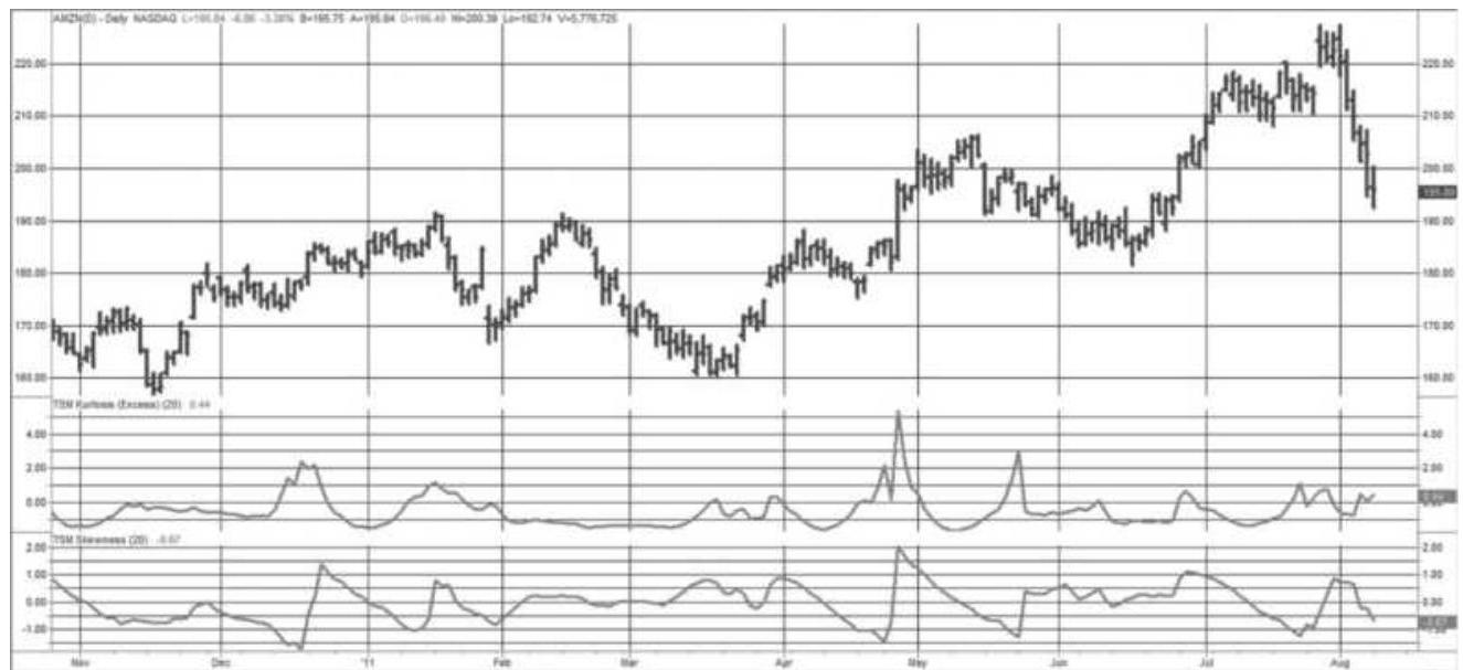
FIGURE 18.13 Excess kurtosis (center panel) and skew (bottom panel), applied to Amazon.com during most of 2010.

Note that both the excess kurtosis and skew peak in March 2010, but then show opposite extremes in May and again at the beginning of August. When they are in the same upward direction, kurtosis indicates that prices are clustering near the mode, also interpreted as persistence, and the skew shows that the tail is to the right (higher prices). When they peak in the opposite direction, the skew is to the left, toward lower prices. Then significant peaks in both skew and kurtosis at the same time will show a likely turning point or a critical point. Programs to plot these moments are TSM Kurtosis and TSM Skewness, both on the Companion Website.
If we use kurtosis in a trading strategy, we would want to buy or sell in the direction of the trend when the kurtosis is decreasing, indicating an orderly price move, and we would want to fade the trend (enter in the opposite
direction) when the kurtosis is increasing. \({ }^{6}\) Skew can also indicate a developing price pattern. If the skew is toward higher prices, and we are trend following, we would buy; if it leans toward lower prices, we sell. Volatility, measured as the average true range, can also help. Lower volatility is associated with lack of movement while high volatility is often accompanied by large, fast price moves. The rules for a trend-following system that combines kurtosis, skew, and volatility are:
- Buy when excess kurtosis crosses below o, skew > o, and volatility > minimum level.
- Sell when excess kurtosis crosses below o, skew < o, and volatility > minimum level.
A mean-reverting strategy can be created by trading when the excess kurtosis crosses above zero, indicating a strong move, then trading the opposite as indicated by the skew. Volatility will also be important. The rules for mean reverting are:
Buy when the excess kurtosis crosses above o, skew \(<\mathrm{O}\), and volatility \(>\) minimum level.
Sell when excess kurtosis crosses below o, skew \(>0\), and volatility > minimum level.
Figure 18.14 shows the Kurtosis-Skew strategy applied to the emini S\&P during March and April 2011. It is best if the calculation periods for kurtosis and skew are the same; however, this figure shows the 30-minute S\&P in the top panel, the daily S\&P in the second panel, and the 40-bar kurtosis, 15 -bar skew, and the 10-day ATR in the bottom 3 panels. While the volatility is used to decide the
trading signal, stop losses are:
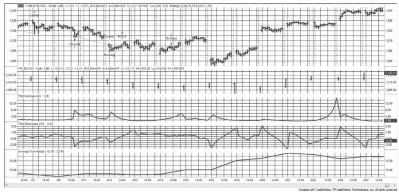
FIGURE 18.14 The Kurtosis-Skew strategy applied to emini S\&P, 30-min data (top panel) and daily data (2nd panel), March 17-April 6, 2011. The kurtosis, skew, and average true range are in the bottom 3 panels.
- (For longs) 5 points below the lowest low of the past 10 bars
■ (For shorts) 5 points above the highest high of the past 10 bars
The rules for the Kurtosis-Skew strategy used only three variables: the period for kurtosis, the period for skew, and the minimum volatility. There are two other features that should be considered:
A maximum volatility. Because mean-reverting trades performed better with higher volatility, trend trades may net better profits if they do not enter when volatility is high.
- Exiting when kurtosis moves the wrong way. The
existing strategy will enter when kurtosis is moving the right way but not exit when it moves the wrong way. Results may be improved by exiting when the excess kurtosis crosses zero, or it may be even better to track the trend of kurtosis, rather than only its relationship to zero.
Exiting when kurtosis or skew revert to normal. The original rules omitted a standard exit. The pattern of kurtosis and skew would suggest that the trade is over when either revert to their average value.
\section*{A PURCHASER'S INVENTORY MODEL}
A trader is most often a risk seeker while a commercial user of the markets is likely to be avoiding risk. A manufacturer must continue to purchase product needed for processing. This can be done safely by buying at regular intervals at the market price, or it can be done with added risk and reward by accumulating some amount of inventory at what appears to be a favorable price. The plan presented here draws on the basic concept of inventory management to accumulate and use inventory at a better than average price. \({ }^{7}\) Its success is
based on using price distribution to advantage. The process includes the following steps:
1. Establish the probable "high" and "low" price for the commodity based on a combination of price regression and inflation, as in Figure 18.15. Call them \(F H\) and \(F L\).
2. Define a gradient, \(G\), a triangle representing the maximum inventory that can be held at any price level relative to \(F H\) and \(F L\) (also shown in Figure 18.15). These levels will be expressed in terms of a percentage of inventory held, from \(10 \%\) to \(100 \%\) (at FH and FL respectively), with the minimum inventory, \(I_{\min }\), of \(10 \%\) or enough to operate for some number of days or weeks. These values can all be individualized.
3. Define the proxy rate of consumption, \(C\), in percent per day or week.
4. Define the standard purchase amount, \(P\), as a percentage of maximum inventory, used at each purchasing event when capacity is available.
5. Define the maximum inventory amount that can be sold, \(O S\), if the opportunity avails itself, the percentage size of each sale, and the minimum inventory on hand in order to make the sale.
Corn forecast lines and max purchasing triangle
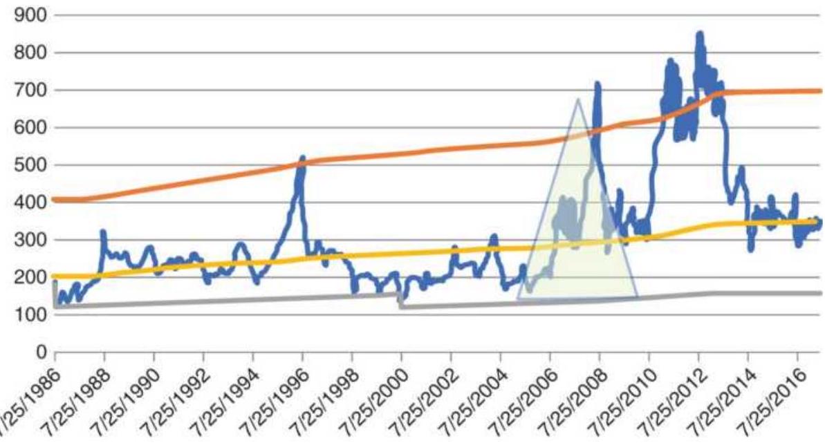
FIGURE 18.15 Forecast of highest and lowest corn prices expected.
6. Define the minimum time between inventory purchases and sales, in days ( \(D\), delay), so that we cannot buy or sell too frequently.
To accomplish this, certain tactical rules and parameters must also be defined.
1. A stochastic momentum indicator, \(M S\), for timing purposes, with high and low thresholds representing overbought and oversold conditions.
2. A second momentum indictor, \(M R\), based on a roofing filter (a cyclic transformation), with the same calculation period and overbought and oversold thresholds as MS. Momentum indicators are shown in Figure 18.16.
3. A trend indicator that will be used to filter and delay purchases when the trend is down.
4. A basis threshold (futures minus cash) below which normal purchases can be made.
5. A second favorable basis threshold below which a larger purchase can be made.
\section*{Stochastic comparison}
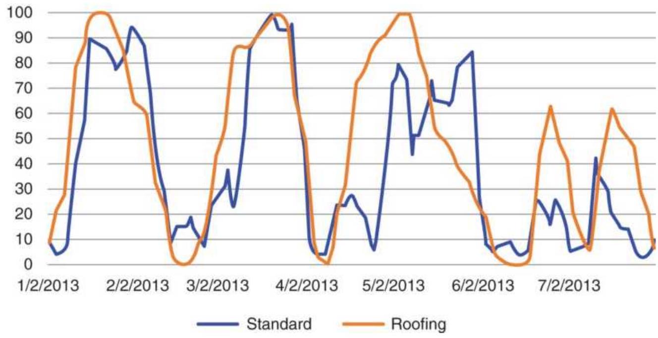
FIGURE 18.16 Stochastic indicator with and without Ehlers' roofing filter.
\section*{Setting the Range}
Determining the highest and lowest expected price for a commodity will be crucial to its success. As an example, using the cash corn prices from 1960 to 1983 (chosen as the beginning of the period of modern inflation), find the slope of the monthly and daily prices using a linear regression, and perform a similar regression for the Consumer Price Index (CPI).
The corn price regression, valued at the end of 1983, is then brought forward using the regression slope value plus the incremental slope value of the CPI, shown in Figure 18.15. The bottom line, the minimum forecast price, is initially set at one-half the value of the regression line. If penetrated by a lower price, it is reset at the lower price minus \(5 \%\) of the old high-low range.
The upper line is set at two times the regression line but may be adjusted so that it crosses at a point \(10 \%\) below the high prices. No buying will be done above the upper line.
\section*{Corn cash and futures converge}
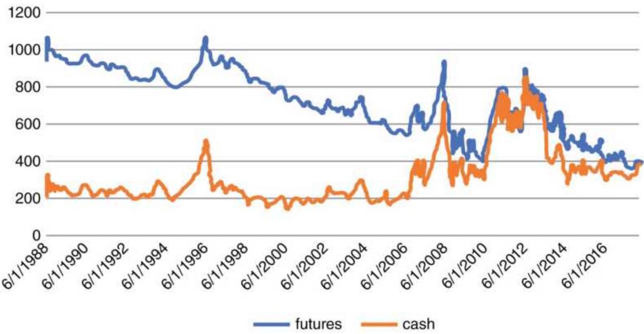
FIGURE 18.17 Cash and futures corn prices show futures in a long-term downtrend.
\section*{Maximum and Minimum Inventory Levels}
The position of today's price within the high-low range shown in Figure 18.15 defines the maximum inventory that can be held. The top of the triangle represents zero inventory above that which is needed to operate, and the bottom of the triangle indicates maximum inventory. Although a triangle was used in the illustration, the inventory levels are linear from bottom to top, so the regression line would indicate a maximum of about \(67 \%\).
The concept is that inventory can be accumulated at low
prices but not high prices. At the midpoint of the range, no more than \(67 \%\) of the maximum inventory should be held. The manager may replenish inventory used in production, or draw down inventory, but not make purchases that exceed the midpoint level. We'll call the minimum inventory needed for processing as \(10 \%\), although it would normally be defined in processing days. As prices rise, the size of new purchases gets smaller. This will avoid accumulating inventory at a high average price.
\section*{Timing the Purchases}

When purchasing inventory, timing is important. If you purchase an equal amount at equal intervals, the result is an average price. To do better, it's necessary to use a technical tool, in this case a variation of the stochastic momentum indicator. John Ehlers has created a smoothing process called a roofing filter, transforming the data that is then applied to the stochastic indicator, with the effect of removing much of the noise. Figure 18.16 shows the standard stochastic applied to cash corn, along with the stochastic using a roofing filter. The calculation period is not chosen by its ability to profit but by the frequency of oversold events, which must be coordinated with the frequency of buying. The roofing filter can be found on the Companion Website as an indicator, TSM Ehlers Stochastic Roofing, and a function, TSM Elhers Roofing Filter.
Given these tools, the manager can purchase excess inventory if:
- The inventory level is below the maximum indicated by the triangle.
- There have been no purchases for \(D\) days and prices are not in a downtrend. The counter for \(D\) is not advanced in a downtrend.
■ The stochastic is below the nominal threshold of 10 .
The purchase is made in the cash, forward, or futures market, whichever is being tracked. The purchasing quantity at these opportunities should be reasonably large. A series of small purchases will come close to an average price, regardless of good timing. Inventory levels are reduced regularly based on usage. At no time should inventory fall below the minimum level needed to maintain a safe operating margin.
\section*{A PRODUCER'S SELLING MODEL}
Producers have a similar challenge beating the average, but they can succeed only by selling at a price higher than what will turn out to be the seasonal average. \(-\frac{8}{\text { This }}\) selling model takes advantage of the concept that high prices do not remain high for long, especially with agricultural products that keep replenishing themselves each year. If you can sell at a relatively high price and buy back that commitment over a longer time period, then the buy-back will be the average price and your improvement will be the difference between selling high and buying back at the average. The success of the plan is in the details. You must:
Sell a large amount and buy back small amounts.
Otherwise you always get the average.
- Use the cash market for the trading signals, otherwise, for corn futures, the price is always declining and finding a sale price will be difficult (see Figure 18.17).
- Execute in the futures market and roll forward as needed.
- Continue to sell in the forward market as needed to get an average price in the event there are few system sales than are needed to hedge the entire crop.
\section*{Identifying Selling Opportunities}
There are two methods for identifying places to sell:
Use a 252-day moving average, which removes the seasonality, then create an upper band using a factor (say 2.0), or a 60 -day average true range times a factor (e.g., 8-10) added to the moving average.
\section*{Cash corn annualized volatility}
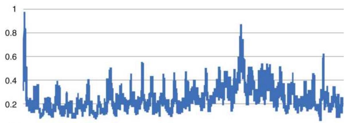
FIGURE 18.18 Annualized volatility of cash corn prices.
- Use a long-term regression similar to the purchasing model, with the upper band positioned so that it crosses higher prices 2 to 3 times each year.
One way to see the frequency of possible sell points is to look at the annualized volatility of cash corn prices, shown in Figure 18.18. The volatility is very seasonal and very consistent. Volatility will often come during growing season, and low prices are in the fall. Short sales entered during June and July are best exited by November.
As with all trading models, there are risks. In the Producers' Model, the risk is that you sell and prices continue to rise. One way to avoid that is to add a volatility threshold. While the volatility history between \(30 \%\) and \(45 \%\) is normal, higher volatility is risky. Another alternative is to wait for the price trend to turn down after the rally. The worst-case scenario is that you
wait for the next crop year, which most often corrects prices that were due to a supply shortage in the previous year. It doesn't happen often, but it is part of any system's risk and reward.
\section*{STEIDLMAYER'S MARKET PROFILE}
Market Profile, the effort of J. Peter Steidlmayer, appears to be a frequency distribution of intraday price movement but uses time, rather than volume, as its key element. Steidlmayer formalized this technique in 1985 while he was a director of the Chicago Board of Trade. The Board considered this such a unique insight that they copyrighted his work as Market Profile and Liquidity Data Bank. It was intended to provide detailed information to traders about how trading was facilitated. Market Profile offers much more than a count of how many times a price traded at one level.
With proper study, traders are able to separate participants by time frame and even identify their trading patterns. Figure 18.19 shows this technique as it originally appeared, with letters denoting sequential 30minute time periods, and an analysis of who participated in the trade at each price. \({ }^{9}\) Called a customer trade indicator (CTI), these categories are CTI 1 , the local floor traders (professional short-term traders and marketmakers); CTI 2, the commercial clearing members; CTI 3 , clearing members who fill orders for other members and nonclearing commercial traders; and CTI 4, clearing members who fill orders for the public or other customers not included in the previous groups (called
outside paper). The information on whose behalf the trade was executed is only available after the close of trading.
In order to understand what is originally described in Market Profile and the Liquidity Data Bank, you must know that the locals and commercial clearing members, CTI 1 and CTI 2, account for the largest part of volume (over \(65 \%\) ), and both have trading styles that are very different from the off-floor speculators who form groups 3 and 4. The locals take smaller positions, often counter to the current price moves and hold that trade for a period spanning seconds to a few hours. Most locals even up at the end of the day, which avoids the need to finance their positions. A commercial might be a bank that is hedging an existing currency exposure or arbitraging a gap between two or more short-term rates in the cash market. These positions may move the market but can be insensitive to current price direction and flow into the market at arbitrary times.
Outside paper, a term that refers to customer accounts, ranges from individual speculators to major fund managers. Their style of trading favors holding positions for more than one day, and a large majority will be trend followers. The style of CTI 3 is similar to CTI 4 ; that is, both tend to be directional, and the two can be combined for the purposes of evaluation. Although they account for a smaller portion of the volume, they are more influential in the short-term direction. Figure 18.19 combines CTI 1 with CTI 2 and CTI 3 with CTI 4 to simplify the patterns attributed to each group. During the period shown in the figure, the combined categories
3 and 4 caused the market to move when their participation was greater than 30\%. Observation shows that these trading points occur as prices move out of a previous area of sustained trading.
For those concerned with how high-frequency trading affects this process - it doesn't. HFT is done in milliseconds and would rarely move prices. It increases volume, which is not reflected in Market Profile, only price. There are variations of Market Profile, called by different names, appearing on many charting and trading platforms. They do not reflect the nature of the buying and selling, only the prices.
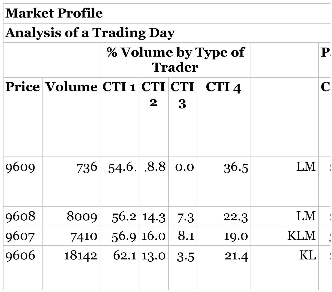
\begin{tabular}{|c|c|c|c|c|c|c|}
\hline 9605 & 31686 & 62.5 & 11.7 & 4.0 & 21.9 & KL \\
\hline 9604 & 13018 & 58.5 & 17.4 & 2.0 & 21.8 & KL \\
\hline 9603 & 14290 & 60.7 & 11.7 & 4.5 & 23.1 & KL \\
\hline 9602 & 5302 & 52.8 & 11.8 & 1.6 & 33.8 & K \\
\hline 9601 & 3616 & 69.9 & 8.7 & 6.2 & \(15 \cdot 3\) & JK \\
\hline 9600 & 4884 & 50.5 & . 8.4 & 1.9 & 39.1 & JK \\
\hline 9531 & 11828 & 60.4 & 12.5 & 1.2 & 25.8 & J \\
\hline 9530 & 13464 & 57.1 & 16.7 & 2.5 & 23.8 & J \\
\hline 9529 & 15878 & 59.7 & 12.7 & 3.5 & 24.1 & J \\
\hline 9528 & 4802 & 57.9 & 18.1 & 2.6 & 21.5 & J \\
\hline 9527 & 4292 & 50.4 & 12.1 & 1.6 & 35.9 & GIJ \\
\hline 9526 & 23594 & 63.1 & 11.0 & 4.8 & 21.1 & FGHIJ \\
\hline 9525 & 27090 & 58.5 & 15.6 & 2.7 & 23.2 & FGHIJ \\
\hline 9524 & 20004 & 59.7 & 15.3 & 2.5 & 22.4 & CEFGHIJ \\
\hline 9523 & 13956 & 60.1 & 18.2 & 3.0 & 18.7 & BCDEFGH \\
\hline
\end{tabular}
\begin{tabular}{|c|c|c|c|c|c|c|}
\hline 9522 & 11662 & 59.4 & 16.2 & 5.0 & 19.3 & ABCDEF \\
\hline 9521 & 23390 & 58.5 & 14.8 & 4.5 & 22.2 & \$ABCDEF \\
\hline 9520 & 46184 & 63.5 & 14.4 & 5.1 & 16.9 & \$ABCD \\
\hline 9519 & 16018 & 72.0 & 9.6 & 3.7 & 14.7 & \$ ABC \\
\hline 9518 & 8750 & 59.4 & 12.8 & 2.3 & 25.5 & \$ A \\
\hline 9517 & 5912 & 64.6 & 12.3 & 3.9 & 19.2 & Z\$A \\
\hline 9516 & 13896 & 62.9 & 15.7 & 4.9 & 16.5 & Z\$ \\
\hline 9515 & 5234 & 62.0 & 10.1 & 1.8 & 26.1 & Z\$ \\
\hline 9514 & 1745 & 52.9 & 12.7 & 0.2 & \(34 \cdot 3\) & \$ \\
\hline Total & 374792 & Total v & volum & & 199742 & \\
\hline \(15 \%\) & & 56219 & 15\% & & 29961.3. & \\
\hline & & & \multicolumn{4}{|c|}{\begin{tabular}{c}
Value area (70\%) from 9525 \\
to 9520 (Inclusive)
\end{tabular}} \\
\hline \begin{tabular}{l}
R34- \\
29
\end{tabular} & 51555 & & & & & \\
\hline R7-10 & 34297 & & & & & \\
\hline R7-11 & 65983 & & & & & \\
\hline
\end{tabular}
FIGURE 18.19 Original Market Profile for 30-year Treasury bonds.
\section*{Classifying the Patterns}
Steidlmayer was said to have first developed this information for his own trading. He taught a course on how to apply his evaluation technique, and there were a number of books written on the subject by himself and others. \(\underline{10}\) He spent considerable time studying and classifying formations, and separating days into three primary categories: normal, trending, and nontrending. On a normal day the price distribution forms a standard bell-shaped curve with the widest point positioned near the center; this point is called the value area. On a trending day the value area is not as welldefined, that is, it is spread out, and appears closer to one end of the distribution. A non-trending day has neither of the two recognizable patterns.
There is an important philosophic basis for Steidlmayer's work. It is a very credible attempt to explain how the market functions. He says that "the market probes high prices to attract sellers and low prices to attract buyers." This creates a value area. By observing the patterns of intraday price distribution, you can know whether there are countertrend opportunities, when prices reach the extremes of perceived value on a normal day, or when trend opportunities exist in the direction of current price movement.
\section*{Construction of Market Profile}
The Market Profile is created in a manner very similar to a point-and-figure chart. You can list every price on the left scale or create boxes that represent a price range. This latter technique will make the distribution look more uniform by clustering the price activity in the same way as a frequency distribution.
The most common way of plotting intraday data for Market Profile is to begin by placing the letter "A" in the boxes alongside the price at which the market traded. If we use half-hour intervals, called time/price opportunities (TPOs), then all prices that were traded during the first half-hour are marked with the letter "A." The letter "B" is used for the second half-hour period, the letter " C " for the third period, and so on. At the end of the day we have a chart that looks similar to Figure 18.19.11
Market Profile is intended to be used over many days, identifying long-term patterns as congestion areas or trending markets. To the extent that it accomplishes this distinction it can be very valuable. Determining whether a market is directional or not is the trader's greatest challenge. In Figure 18.20 the Market Profile is constructed by using numbers instead of letters to represent the range of prices traded over each day. The entire chart covers a period of 9 days. Other than the substitution of days for half- hour periods, the chart is created in the same way.
\section*{Value Area Using Daily Data}
\begin{tabular}{|c|c|c|}
\hline Price & Day Traded & \\
\hline 10228 & 1 & \\
\hline 10224 & 12 & \\
\hline 10220 & 120 & \\
\hline 10216 & 120 & \\
\hline 10212 & 120 & \\
\hline 10208 & 245790 & \\
\hline 10204 & 2456790 & 36 day counts \\
\hline 10200 & 245679 & \\
\hline 10228 & 2345679 & \\
\hline 10224 & 2345679 & \\
\hline 10220 & 23589 & \\
\hline 10216 & 589 & \\
\hline 10212 & 58 & \\
\hline
\end{tabular}
FIGURE 18.20 Daily Market Profile.
Source: "Locating Value with Auction Market Data" by Donald L. Jones. Technical Analysis of Stocks \& Commodities, Vol.7, No. 7 (July 1989). (C) 1989 Technical Analysis, Inc. Used with permission.
\section*{Time/Price Opportunities}
Time/Price Opportunities (TPOs) are the 30-minute blocks that are assigned letters on the Market Profile diagram. It is worth noting that the largest occurrence of
TPOs at a single price does not necessarily correspond to the price at which the highest volume occurred, as seen by referring again to Figure 18.20. This distinction is at the root of Market Profile because it emphasizes the amount of time that traders accepted a price, rather than the volume traded at that price (which could have occurred during a single period). In the bond example given in Figure 18.20, the greatest volume was transacted at 95-20, although the center of the value area - where there is the largest record of TPOs - is at 95-23, 3 points higher. Clearly, the Market Profile analysis is seeking out a different way of observing the actions of traders. In the formation of a value area, if the market moves between two prices, such as 95-20 and 95-23, because those values bracket the current trading range, each traverse will cause the prices in between to be marked with the same TPO letter, regardless of whether any volume occurred at those prices.
TPOs allow us to judge the potential direction for a move out of the current value area. This can tell a trader to buy strength or sell weakness. The market is said to favor the direction indicated by the upper or lower part of the value area that has the highest TPO count. When
performing the TPO count, you must have a well-defined value area and limit the count to within that range. Using Figure 18.20 with the mode at \(95-23\), count the TPOs prior to the interval that begins \(J\). There were 16 TPOs above \(95-23\) and 21 below (not including \(8 \$\) and \(3 Z\) ). During time interval \(J\), the balance shifted to the upside when it touched 95-29, at which point there was a large increase in volume. This could be attributed to CTI 1 and
CTI 2 exiting shorts and to a lesser degree, going long. The locals were finally joined by groups 3 and 4 taking a long position at 96-oo. An imbalance in the TPO count expresses a willingness for the market to favor the direction given by the largest count, but this applies to a normally distributed value area only.
\section*{Typical Patterns}
It is generally accepted that the market spends the greatest time in a sideways range, or congestion area, and a relatively small amount of time trending. The sideways period is defined as an extended time/price relationship and the trending period as a brief time/price relationship. The extended period creates a value area where traders are willing to buy and sell, and this activity is reflected in higher volume. According to Market Profile: \({ }^{12}\)
\section*{Value \(=\) Price \(\times\) Time \(=\) Volume}
In this analysis, called auction theory, the value area is the place that the market is willing to trade, and is seen in the time value. The value area represents about \(70 \%\) of the market volume. The center of this time value area is the price at which there are the most TPOs. Because market activity spends at least \(80 \%\) of the time in this value area, prices tend to rotate about the center. Rotation is the term given to price action that moves back and forth above and below this central value, building the pattern of normal distribution similar to a bell-shaped curve.
\section*{What Are the Buyers and Sellers Doing?}
The interpretation of the Market Profile is based on the concept that, under normal market conditions, prices rise to attract sellers and fall to attract buyers. There is a very active area of trading at a point called equilibrium where commercial buyers and sellers exchange freely because they consider the price at value (Figure 18.21a). If there are more buyers than sellers, the price rises to attract additional sellers who feel as though they are getting a price that is above value. However, as prices continue to rise there are fewer buyers because they perceive the market as overpriced. In Figure 18.21a, a buyer's curve and a seller's curve are drawn on the frequency distribution of a normal trading day. 13
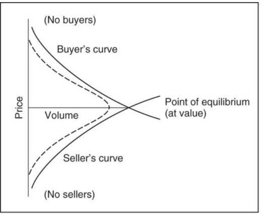
(a) Theoretical buyer's and seller's curve
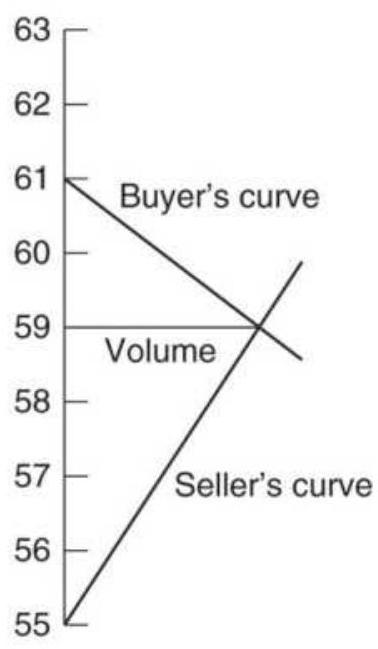
(b) Day 1
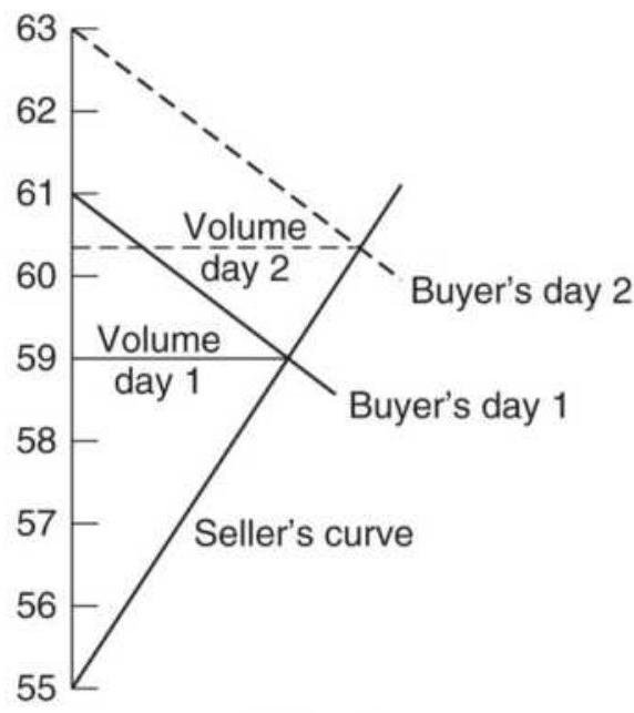
(c) Day 2
Volume shifts,
sellers remain firm, buyers retreat
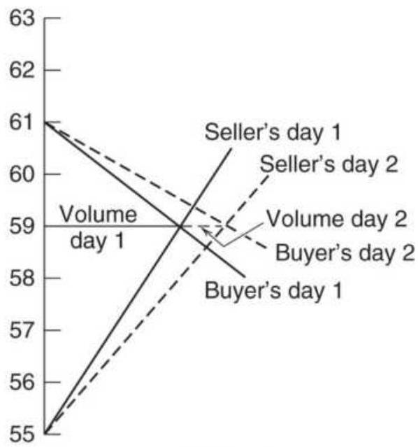
(d) Day 2
Both buyers and sellers hold firm, volume increases at same point
FIGURE 18.21 Buyer's and seller's curves for a sequence of days.
In this way the market is said to facilitate trade. When there are not enough buyers, the price falls; when the
sellers are scarce, prices rise. Constructing the buyer's and seller's curves for a sequence of days can help understand the dynamics of trading in terms of both price expectations and volume. For convenience, the curves are shown as straight lines, similar to supply and demand lines, in the following examples.
In Figure 18.21b, Day 1 begins with the buyer's curve disappearing faster than the seller's; therefore, the buyer's curve is more horizontal and the seller's more vertical. On Day 2 (c), the sellers have held their position, and the buyers are willing to move higher, retreating from their previous objective. This results in higher volume. Had the buyers moved lower and the sellers remained steady, the volume would be expected to decline. If on Day 2 (d) the volume increased while prices traded in the same range and at about the same peak price level (value level), the buyer's and seller's curves would have become more horizontal, indicating that both sides of the trade were holding firmly at the current level.
\section*{Quantifying the Value Area}
The idea of a value area that is shaped as a bell curve, or an extended formation that represents a trending day, seems clear; unfortunately, actual price patterns are rarely as clear as these examples. To help this process, Jones has applied overlays to these patterns, measuring them using a standard deviation. In Chapter 2, we explained that, for a normal distribution, the value of one standard deviation represents a clustering of \(68 \%\) of all values around the mean; therefore \(34 \%\) are on each
side of the mean. Similarly, two standard deviations contain \(95 \%\) of all activity, \(47.5 \%\) on either side of the average. In his analysis, Jones has defined a value area as one contained within two standard deviations of the center, using the TPO count to isolate the range. For example, if the entire chart contains 100 filled boxes, the price range is from 6615 to 6655 , the center is at 6635 , and that row contains 10 filled boxes, then two standard deviations contain \(90 \times 0.475=42\) boxes on each side of the center. This defines the value area.
\section*{Trending Markets}
Trends spread volume over a wider price range and are relatively easy to see. In the previous discussions, there is an early warning of a trend when prices move out of the value area or when there are a larger number of TPOs on one side of the center of the value area. Trends develop when the market attempts to probe a new price level, causing the current price to diverge from the value area. The participants may reject this divergence, and price returns to the previous area, causing a broadening formation; alternatively, they may accept the new price as fair value and generate a new value area by attracting volume (see Figure 18.22). The initial move that fails to find a new value area is called price trend; it usually begins and ends within a single time period (one TPO, which could be a half-hour or a day). A move that attracts volume occurs over a longer time period and is called a value trend. Daily charts, or a sequence of intraday 30-minute charts, are easier to use than a single 30 -minute chart when looking for a trend.
When comparing the Market Profile of successive days, it is helpful to watch the activity of the recent day compared to the value area of the previous day. When trading within the previous value area, both buyers and sellers are considered equal. A move above the value area is said to be motivated by the buyer and reactive by the seller, and trading below the prior value is initiated by the seller and reactive by the buyer.
Beginning of a Trend
Price Day Traded
\begin{tabular}{lll}
\hline 10228 & 1 & \\
10224 & 12 & \\
10220 & \(120 A\) & \\
10216 & 120 A & \\
10212 & 120 AB & \\
10208 & 245790 AB & \\
10204 & 2456790 ABC & \\
10200 & 245679 ABC & \\
10228 & \(2345679 A B C\) & \\
10224 & \(2345679 C\) & \\
10220 & \(23589 C\) & Breakout at 10208 \\
10216 & \(589 C\) & \\
10212 & 58 C & \\
10208 & CD & Consolidation or new \\
10204 & CD & around center of 10124 \\
10200 & DEH & \\
10128 & DEGH & \\
10124 & DEGHJ & \\
10120 & DEGIJ & \\
10116 & DEFIJ & \\
10112 & FI & \\
10108 & F & \\
\hline
\end{tabular}
FIGURE 18.22 Market Profile for a trending market.
Trends do not move in a fast, straight line to their correct new level; instead they move in steps, pausing to test whether a new value area can be formed that
facilitates price. The trend continues in this way until prices retrace to the previous consolidation area, where the TPO volume is expanded and the area is broadened, resulting in a value area. A longer view of this formation may look similar to the top-heavy distribution shown in Figure 18.11d.
\section*{Some Points to Remember about Market Profile}
One great advantage of using the TPO count, rather than traditional volume, is that the Market Profile can be created at any time in any market. All the necessary information is available. The method is very different from traditional trending approaches and offers insight into the current status of price action, whether it is in a consolidation phase or trending. Although the evaluation of Market Profile has been very interpretive, there have been important steps toward defining value areas and trends in a more objective way. Using the overlay method proposed by Jones, a very simple trend filter could be constructed so that new trend trades, based on traditional moving averages, are not set until prices move out of the value area.
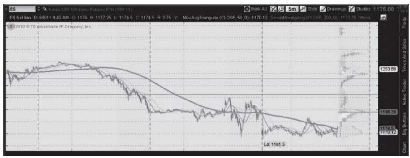
FIGURE 18.23 Monkey bars shown on the Thinkorswim trading platform on the top right.
\section*{Other Trading Platforms}
A scan of the Internet for "chart services with Market Profile" will uncover many companies providing this method in various forms. Although not strictly Market Profile, other platforms are able to create intraday price distributions that are similar. In Figure 18.23, Thinkorswim plots a distribution they call monkey bars. There are three days of 5 -minute bars shown for the \(e m i n i S \& P\) and the bars on the right relate to the individual price distributions for those days.
\section*{A FAST VERSION OF MARKET PROFILE}
Market Profile is a histogram of price frequency. Excel can be used as a substitute given a few simple decisions. For example, Figure 18.24 is a chart of SPY from January 1, 2018, through April 22, 2018, a period where the market sold off after a very long bull move. Would Market Profile say it's in a trading range? Is it likely to break out in either direction?
\section*{SPY from 1/1/2018-5/22/2018}
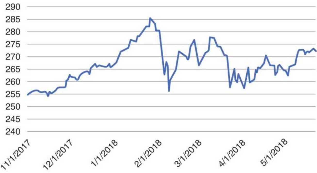
FIGURE 18.24 SPY prices, January 1-April 22, 2018.
Histogram of SPY prices from 1/1/2018-5/20/2018
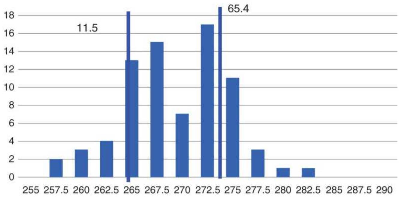
FIGURE 18.25 Histogram of SPY prices, \(1 / 1 / 2018-\) \(5 / 20 / 2018\)
If we visually choose the period of analysis from the top
of the market, February 1, until April 20, 2018, we can use the Excel histogram feature, available as an add-on in the Data drop-down menu, and create the chart shown in Figure 18.25. This could be done in more detail because SPY trades in \(1 / 100\) ths. This chart has bars of width 0.50 .
Instead of using a standard deviation, which doesn't work with skewed data, we'll count \(15 \%\) from either end and draw vertical lines at those frequencies. Based on 77 prices in the entire chart, \(15 \%\) from the low would be a count of 11.5 and \(85 \%\) from the low would be at position 65.4. Those are shown as longer vertical lines in Figure 18.25 . Note that the grouping is skewed to the left. According to the Market Profile rule, the higher bar at 272.5 indicates that prices are trying to move higher, out of the trading zone. Using a smaller bar size for the histogram would give more accuracy but could also lose the clear pattern that appears here.
This frequency distribution, even though skewed, shows support at 265 and resistance at 277 (to top of the 275 bar). Prices that trade through these levels are likely to form a new trend. From just this one chart of SPY, we can see that a price distribution can be a useful trading tool.
\section*{NOTES}
\section*{1 https://www.prorealcode.com/prorealtimeindicators/kase-dev-stop/.}
2 J. T. Jackson, Detecting High-Profit Day Trades in
the Futures Markets (Brightwaters, NY: Windsor Books, 1994).
3 Based on Tushar Chande and Stanley Kroll, The New Technical Trader (New York: John Wiley \& Sons, 1994), p. 172.
4 Adapted from Massimiliano Scorpio, "Targeting Your Pattern," Technical Analysis of Stocks \& Commodities (July 2005).
5 Dennis McNicholl, "Old Statistical Methods for New Tricks in Analysis," Futures (April 2002).
6 The original program for trading based on kurtosis and skew was provided as part of the TradeStation System Trading and Development Club. The program in this section is a modified version of that strategy.
7 Perry J. Kaufman, and Michael Riess, "We Can Beat the Average," Futures World, a publication of the LME (September 15, 1983).
\(\underline{8}\) See footnote 7 .
9 F. M. "Doc" Haynie, "Stretching the 'Profile' to Cover 24-Hour Markets," Futures (February 1992).
10 Three books on Market Profile appeared in 1989: J. Peter Steidlmayer: Steidlmayer on Markets (New York: John Wiley \& Sons, 1989); Kevin Koy, Markets 101 (Chicago: MLS Publishing, 401.S. LaSalle St., Chicago, IL 60605, 1989); and Donald Jones, Applications of the Market Profile (Chicago: CISCO,
32.S. LaSalle St., Chicago, IL 60604, 1989); however, the most complete material comes from the original course taught by Steidlmayer, called the Market Logic School. Readers may also want to study the original publication, CBOT Market Profile (1984), available from the Chicago Board of Trade; also J. Peter Steidlmayer and Shera Buyer, Taking the Data Forward (Chicago: Market Logic Inc., 1986); and J. Peter Steidlmayer and Kevin Koy, Markets \& Market Logic (Chicago: Porcupine Press, 1986).
11 Vlarii Salov, "Market Profile and the Distribution of Prices," Futures (June 2011), explores the use of tick data and the properties of the distributions.
12 Donald L. Jones, "Locating Value with Auction Market Data," Technical Analysis of Stocks \& Commodities (July 1989).
13 The following discussion is based on Robert Pisani, "How Market Structure Helps You Analyze Price Behavior," Futures (October 1987).
\section*{CHAPTER 19}
\section*{Multiple Time Frames}
In Chapters 8 and 9, combinations of two trends and two momentum periods were used to create well-known systems and indicators such as Donchian's 5- and 20-day Moving Average, the 2-trend crossover systems, double smoothing, the MACD, and the Turtle method, among many others. Each of those methods used daily data for all calculations. This chapter looks at systems where the components use a combination of intraday, daily, and/or weekly data in order to improve both timing and results.
The first Triple Screen trading is attributed to Barbara Diamond in 1981, a member and floor trader on the CME, who developed it after CQG made multiple time frames possible in their charting system. She presented her own trading approach to CQG clients and later to the MTA. Although the use of multiple time periods by professional traders has now been popular for decades, it is only since there are better trading platforms and faster data access that the use of multiple time fames has exploded for the at-home trader. The combination of multiple time periods allows the trader to time entries into the market using very short-term data, such as 10minute bars, while watching the longer-term picture for the daily or weekly trend.
The way three time frames are used seems to have solidified into:
Very short bars for timing
Medium bars for the primary trading signals
Longer bars for the overall trend or the big picture A sampling of various systems available online gives the combinations as:
\begin{tabular}{|l|c|c|c|c|c|r|}
\hline \multicolumn{3}{|c|}{ Sample 1 } & \multicolumn{3}{c|}{ Sample 2 } & S: \\
\hline Short & Medium & Long & Short & Medium & Long & Medi \\
\hline .1 min & .5 min & 15 min & .5 min & 20 min & \begin{tabular}{c}
\(1-2\) \\
hrs
\end{tabular} & Dai \\
\hline .5 min & 15 min & 30 min & \begin{tabular}{c}
15 \\
min
\end{tabular} & 60 min & 4 hrs & 60 n \\
\hline \begin{tabular}{l}
15 \\
min
\end{tabular} & 30 min & 60 min & & & & .5 m \\
\hline \begin{tabular}{l}
60 \\
min
\end{tabular} & Daily & Weekly & & & & \\
\hline
\end{tabular}
You can find websites with educational material on multiple time frames by entering "Multiple Time Frame Trading" into your search engine. Three that are very good for beginning traders are tradingsim.com, babypips.com, and Forex TradingStrategies4U.com.
Most trends are best identified over a longer time period, but choosing the specific entry point requires a much faster response. The result, using a combination of two or even three data frequencies becomes very sensible when each targets a specific purpose. If the trend can be identified profitably, then the trader can filter or select short-term trades that have a better-than-average chance
of becoming winners.
For most traders, the use of any one time frame presents special problems. The very short term contains a high percentage of noise that obscures the market direction. The numerous individual patterns that can be found in a 5 -minute bar chart can divert your efforts away from the big picture. The use of only weekly charts, although they clearly show the direction of prices, presents higher risk and little opportunity for a good entry point. The obvious solution is to combine both time frames into a program that uses each to its best advantage.
\section*{TUNING TWO TIME FRAMES TO WORK TOGETHER}
Throughout this book the individual systems and methods are discussed on their own merits, that is, their good features and their risks. However, an indicator is not a system and very few indicators are profitable on their own. They can be made faster and slower, just as a trend, some can take on the look of a system, but their primary benefit is timing. They are combined with other indicators and their trading signals are filtered using a longer-term trend or various chart-based patterns.
Once you have decided to combine two techniques, such as a moving average to identify the longer-term trend and an RSI or stochastic to provide improved entry timing, the two techniques must be tuned to work together. You are no longer looking for the best momentum indicator as a system, but a faster indicator
that will allow you to enter a trend signal at a better price. If a trend system gives you a new buy signal, then you only care about the first time the momentum becomes oversold for your entry timing. In addition, oversold in an uptrend may only be a momentum value of 50 on a scale of 0 to 100 . Readers might remember that Linda Raschke used this technique in First Cross.
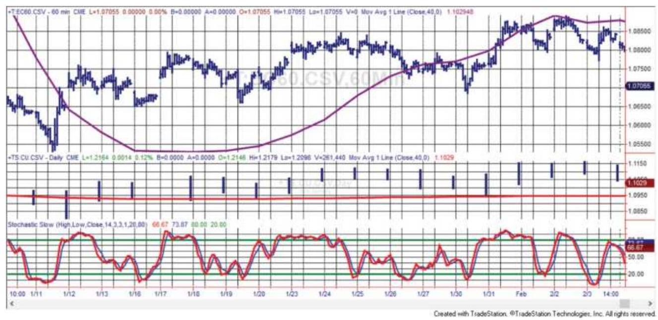
FIGURE 19.1 Euro futures \(60-\mathrm{min}\) data on top with 40day trend; daily bars in center panel; 14-bar stochastic using 1-hour data at the bottom.
Let's say your trend system has a typical holding period of two months (about 45 business days); you will want your timing oscillator to have a good chance of giving you a better entry point within the first 3 days. If your trade averages only one week, you'll want to use a 30minute or 1-hour chart for your momentum timing. That's where multiple time periods become important. The shorter bar intervals have much more noise than longer intervals and offer the opportunity to buy lower or
sell higher.
As an example, Figure 19.1 shows 60-minute euro futures at the top, daily prices in the middle, and a standard 14-bar stochastic, using the hourly data, at the bottom. Let's say the trend turns up on \(1 / 19\). A few bars later, the stochastic drops below the 20 threshold, at which point we enter the long trend position. We were able to take advantage of the sharp drop following the turn higher. On the far right of the chart, the trend turns down on \(2 / 2\) while the stochastic is still above the overbought threshold, so an entry occurs immediately. None of the momentum overbought or oversold signals are of any interest except those. We also benefit from buying as prices decline, and selling while they rise, reducing or eliminating the cost of slippage while improving the entry price at the same time.
\section*{DISPLAYING TWO OR THREE TIME FRAMES}
It will be easier to see trading signals if the multiple trends and indicators, each based on different bar sizes or data frequencies, can be shown on the same chart. Some charting systems, such as Sierra Chart (sierrachart.com), allow any combination of price series and indicators of different bar sizes to be displayed on single or multiple screens. Some very good services are available for free when you trade with a specific broker. Other charting packages are paid for separately. You'll need to ask each vendor how they handle varying time bars and multiple price series. The best today may not be
the best tomorrow.
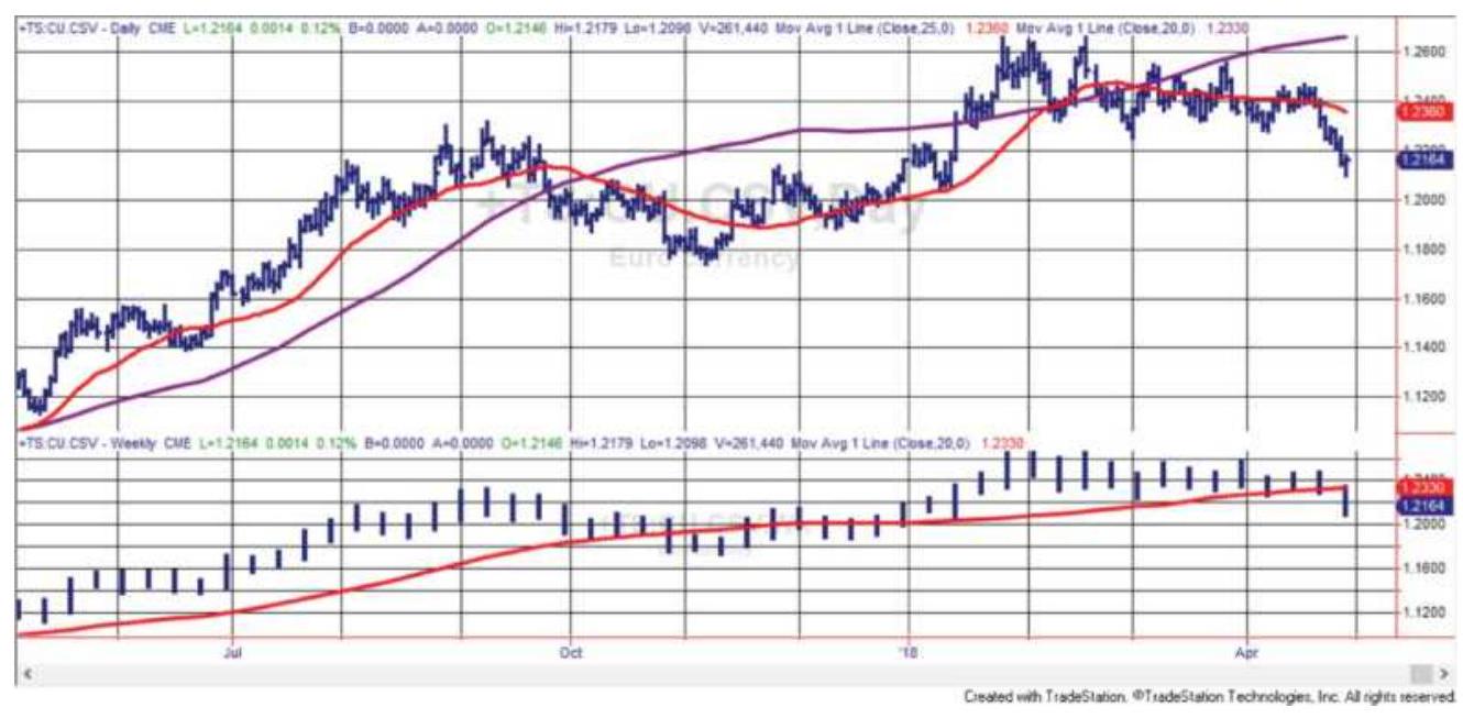
FIGURE 19.2 Daily and weekly data and trends for euro futures are displayed on TradeStation. The bottom panel has weekly data with a 20-week average. The top shows daily data with a 25 -day average and the weekly average copied from the bottom panel.
Using TradeStation as an example, while it is not the most sophisticated, it shows how we can accomplish what we want working within the system limitations. In Figure 19.2 the daily euro futures are shown at the top and the weekly euro futures at the bottom. It is easy to show the 25-day moving average on the daily chart (the faster trendline) and the 20 -week trend on the bottom chart. To get the 20 -week trend displayed on the upper chart, we simply drag that line from the bottom panel to the top panel. It can also be done by editing the \(20-\) week trend to assign it to the top panel.
\section*{SYSTEM}
The Triple Screen Trading System \({ }^{1}\) was introduced by Dr. Elder in 1985. He popularized this method for traders who had access to more sophisticated quote and graphics equipment, now available to everyone. It combines trend-following and oscillators using three time frames, each serving a specific purpose. The oscillators are normally associated with timing while the trend determines the direction of the trade, similar to the process discussed in the previous sections. Dr. Elder has observed that each time frame relates to the next by a factor of 5 . That is, if you are using daily data as the middle time period, then the shorter interval will be divided into five parts, bars of 1 to 2 hours in length, and the longer period will be five days, or one week.
To be practical, it is not necessary to divide a 6-hour trading day into five intervals of 1 hour and 12 minutes. Rounding to 1 hour is close enough. If, for example, you want to focus on trading a 10-minute chart, then the middle interval is 10 minutes, the short-term is 2 minutes, and the long-term is 1 hour (not 50 minutes).
While the original Triple Screen uses three display screens, or three windows, the same breakdown can be shown in separate panels of the same chart. When using one chart, the highest frequency data is on the top. In the following description, Screen 1 (or panel 3) holds the longest time frame while Screen 3 (panel 1) shows the shortest one. Figure 19.3 is an example of the Triple Screen, with 60 -minute gold futures in the top panel, daily prices in the second panel, and weekly prices in the
third (middle) panel. The bottom two panels show indicators for the intermediate (daily) move, discussed below.
\section*{Screen 1: The Major Move (Lowest Frequency Data)}
The long-term view is used to see the market tide, a clear perspective of the major market trend, or sometimes the lack of trend. Weekly data is used for this example (the third panel from the top in Figure 19.3), which is consistent with the experience that lower-frequency data (i.e., weekly or monthly) smoothes the price movement by eliminating interim noise. Although there are many other choices for a long-term trend, the Triple Screen approach uses the slope of the weekly MACD, where the histogram that represents the MACD value is very smooth, equivalent to, for example, a 13 -week exponential smoothing ( 1 rolling calendar quarter). The trend is up when the MACD bar, or 13-week exponential value, is higher than that of the previous week; the trend is down when this week's value is lower.
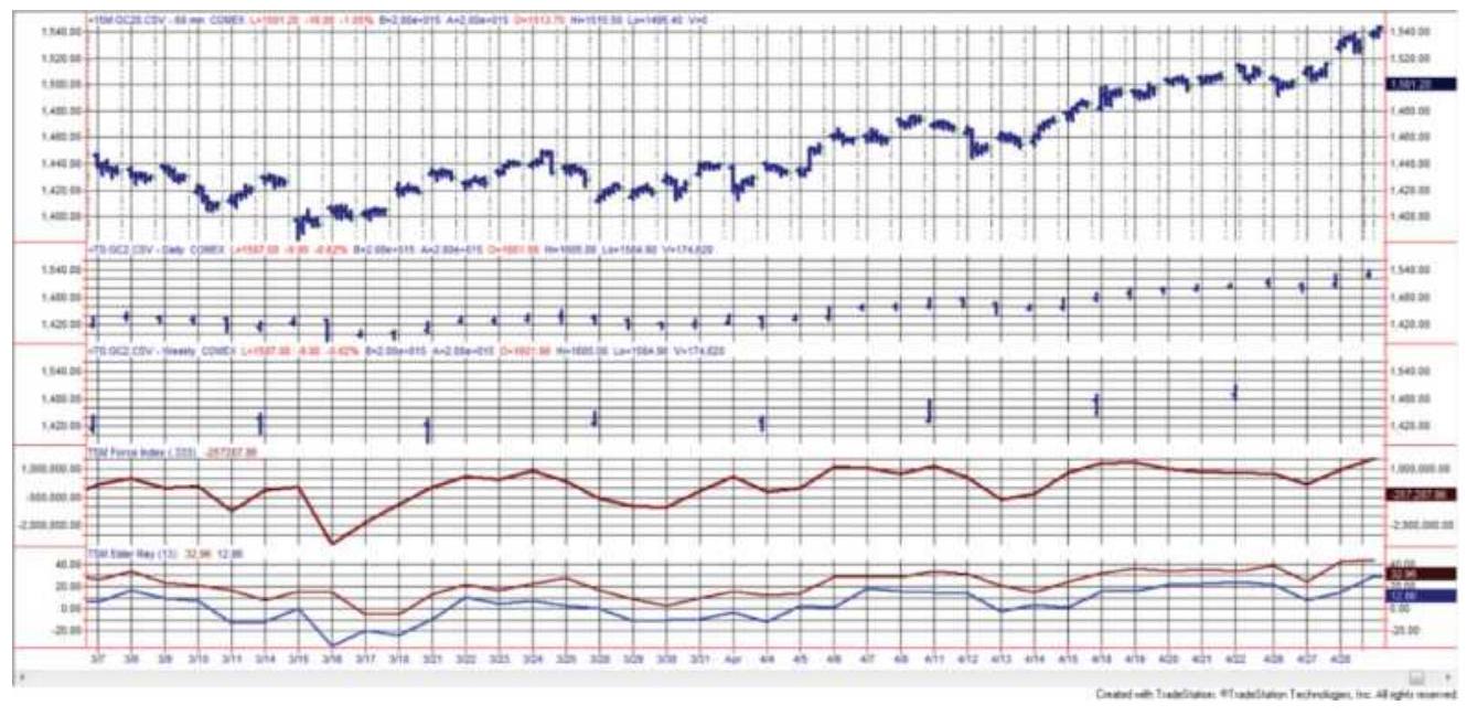
FIGURE 19.3 The Triple Screen for gold futures, March and April 2011. From the top, the panels are 60 -minute bars, daily, weekly, the Force Index, and the Elder-Ray.
\section*{Screen 2: The Intermediate Move (Middle Frequency Data)}
Screen 2 (the second panel) is the time period in which we would trade. The specific oscillator is not as important as the time frame and the ability to identify market waves in the major moves of Screen 1. Elder suggests two oscillators, the Force Index and Elder-Ray, both described below and shown in Figure 19.3. A stochastic can also be used.
1. Force Index
\[
\text { Force Index }=\text { Volume }_{t} \times\left(\text { Close }_{t}-\text { Close }_{t-1}\right)
\]
The Force Index is then smoothed using a 2-day exponential, equal to a 0.333 smoothing constant, and the resulting value is used to determine
overbought and oversold levels. The Force Index is shown in panel 3 .
Enter a long position using the Force Index as follows:
1. Identify the trend in Screen 1, which shows that the major move is up.
2. Confirm the long position if the 2-day exponential of the Force Index falls below its center line and does not fall below the multiweek low. When using a stochastic instead of the Force Index, buy when the stochastic falls below 30.
2. Elder-Ray
Elder-Ray is a technique for separating bullish and bearish movement.
\[
\begin{aligned}
& \text { Bull Power }_{t}=\text { High }_{t}-13 \text {-day exponential smoothing } \\
& \text { Bear Power }_{t}=\text { Low }_{t}-13 \text {-day exponential smoothing }
\end{aligned}
\]
To determine when to buy using the Elder-Ray (panel 4) and Screen 1 (panel 1), the following two steps are necessary:
1. The trend in panel 1 , the major move, must be up.
2. Bear power is negative but rising; bear power must not be positive.
Two additional steps may be used to filter trades
and improve performance, but are not required:
3. The last peak in bull power is higher than the previous peak (the most recent bull power should not be significantly lower than the previous peak).
4. Bear power is rising from a bullish divergence.
The opposite rules apply for sell signals.

Both the Force Index and the Elder-Ray can be found on the Companion Website as TSM Force Index and TSM Elder Ray.
\section*{Screen 3: Timing (High-Frequency Data)}
The final screen is for fastest response, primarily for identifying intraday breakouts (see Chapter 16 for a full description of intraday breakouts). It is shown as 6ominute bars in the top panel of Figure 19.3. To improve the point of entry, intraday bars can be used to set long positions when the intraday price moves above the previous day's high. There is no calculation involved, simply a Buy Stop order using the shortest time bar. In this example, a new buy signal occurs when the high of the hourly bar moves above the highest high of the hourly bars of the previous day.
\section*{Stop-Loss}
Every system needs risk control, and that most often comes as a stop-loss order. The Triple Screen approach positions the stop in a three-step process. For a long position:
1. First place the stop below the low of the day of entry, or the previous day's low, whichever is lower.
2. Move the stop to the break-even level as soon as possible. Naturally, there must be some room between the stop-loss level and the current price; otherwise the stop will always be hit.
3. Continue to change the stop to protect \(50 \%\) of the highest profits. In addition, you may consider taking profits when the stochastic or Force Index moves above the \(70 \%\) level.
\section*{ROBERT KRAUSZ'S MULTIPLE TIME}
\section*{FRAMES}
The most robust and fully automated approach to multiple time frames was created by Robert Krausz, a well-known trader who provided an extensive course on his method. To understand the importance of first arriving at a sound theory before implementing and testing a trading program, we need to briefly review the characteristics of performance that indicate a robust method.
When testing a trend-following system, we should expect that a trend of 100 days, compared to a trend of 50 days, will produce larger profits per trade, greater reliability, larger interim risk, and proportionally fewer trades. As you increase the calculation period this pattern continues; when you reduce the calculation period this pattern reverses. You are prevented from using very short calculation periods because relative market noise
increases, and slippage and commissions become proportionally larger; on the other hand, the longest periods are undesirable because of large equity swings. Test results should appear as a flowing picture, with a clear, profitable pattern and continuity when viewing returns per trade over the range of increasing calculation periods.
The sophistication in Krausz's work lies in his
understanding of this pattern, and its incorporation into
the structure of his program, The Fibonacci Trader. 2 Krausz also worked in three time frames. Each time frame has a logical purpose, and is said to be modeled after Gann's concept that the markets are essentially geometric. The shortest time frame is the one in which you will trade; in addition, there are two longer time frames that add to the clarity of the trading decision. The patterns common to time frames are compared to fractals; within each time frame is another time frame with very similar patterns, reacting in much the same way. You cannot have an hourly chart without a \(15^{-}\) minute chart, because the longer time period is composed of shorter periods; if the geometry holds, then characteristics that work in one time frame, such as support and resistance, should work in shorter and longer time frames. Within each time frame there are unique levels of support and resistance; when they converge across time frames then the chance of success is increased. In Krausz's work, the relationships between price levels and profit targets are woven with Fibonacci ratios and the principles of Gann.
One primary advantage of using multiple time frames is
that you can see a pattern develop sooner. A trend that appears on a weekly chart could have been seen first on the daily chart. The same logic follows for other chart formations. Similarly, the application of patterns such as support and resistance is the same within each time frame. When a support line appears at about the same price level in hourly, daily, and weekly charts, it gains importance.
\section*{Laws of Multiple Time Frames \({ }^{3}\)}
As a well-known, successful trader,4 Krausz brought more than just three time frames and some unique strategies to one display screen. He endowed the program with six rules:
1. Every time frame has its own structure.
2. The higher time frames overrule the lower time frames.
3. Prices in the lower time frame structure tend to respect the energy points of the higher time frame structure.
4. The energy points of support/resistance created by the higher time frame's vibration (prices) can be validated by the action of the lower time periods.
5. The trend created by the next time period enables us to define the tradable trend.
6. What appears to be chaos in one time period can be order in another time period.
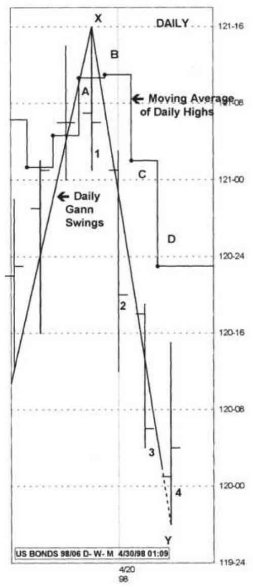
(a)
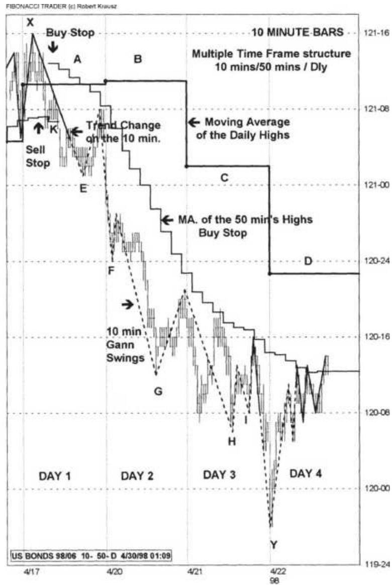
(b)
FIGURE 19.4 Krausz's Multiple Time Frames, June 1998, U.S. Bonds. (a) Daily chart with Gann swings and a stepped moving average. (b) Multiple time frame structure for the corresponding four days.
Source: Chart created using The Fibonacci Trader. Used with permission from Fibonacci Trader Corporation, 450106 State Road 13 North, \#206, Jacksonville, FL 322593863, www.fibonaccitrader.com.
\section*{Using three time frames of about the same ratio to one another (10-minute, 50-minute, and daily) with daily}
being the longest, Figure 19.4 shows the June 98 contract of U.S. bonds with a number of techniques applied over multiple time frames. Figure 19.4a uses only daily bars while Figure 19.4b uses 10-minute bars; both charts are drawn on the same price scale to make the comparison easier.
To understand the application of these techniques, it is necessary to identify the following features: \({ }^{5}\)
- The Daily HiLo Activator (in this case it is the moving average of the daily highs) is shown as a stepped line. The 4 days of interest are marked by the letters \(A, B, C\), and \(D\) and appear in both (a) and (b) of Figure 19.4.
The 5o-minute HiLo Activator (seen in Figure 19.4 b ), is the moving average of the 50 -minute highs, used as a Buy Stop, or the moving average of the 50 -minute lows used as a Sell Stop.
The 10-minute Gann swings are based on 10minute bars (in Figure 19.4b). The solid line shows when the Gann swing is in an upward trend, and the broken line when it is in a downtrend.
The interpretation of these techniques combines the faster response provided by the 10 -minute bars and the direction given by the longer time frames.
Based on the 10-minute Gann swings, the trend turned from up to down at about 121-o0 while the daily Gann swings placed the trend change much later, near 120-o0.
- The slope of the daily Gann swing, measured from point \(X\) to point \(Y\) on both charts, was down, defining the dominant trend. Short trades can be entered using the downward trend of the 10-minute time frame. The process of coordinating the trend of the higher time period with that of the lower time period, and acting in only that direction, seems to be the most advantageous approach. The low of each 10-minute swing, marked \(E, F, G, H\), and \(I\) on the 10-minute bar chart, provides opportunities to add to the original position.
At the top left of the 10-minute chart, the 10-minute close falls below the Sell Stop of the 50-minute HiLo Activator at point \(K\) (about 120-06). The Buy Stop then applies and follows declining prices for 3 days. These changes occur in the same area where the Gann swing indicates a trend change from up to down.
- The 50-minute moving average of the highs, shown in a step formation on the 10-minute chart, tracks the highs of the market rallies on Days 1, 3, and 4. The daily moving average of the highs (the Daily HiLo Activator) remained level on Day 2 and turned down on Day 3. The trend can only change to up when the Daily HiLo Activator turns up again.
\section*{More on Selecting the Three Time Frames}
When using multiple time frames it is important to understand that you cannot substitute a 10-period moving average of 1 -hour bars with a 40-period moving
average of 15 -minute bars even though they both cover the same time frame. Similarly, you cannot replace a 10week average with a 50-day average. It seems natural to think that any two trends covering the same time span will give the same result, but that is not the case. Although we can average many data points, we cannot get rid of all the noise; fewer data points over the same time span will always yield a smoother result. Therefore, the use of hourly, daily, and weekly time periodsmultiple time frames-gives a much different picture of the market than simply using three different moving averages of the equivalent calculation periods. It is much easier to see the major trend using weekly data, find the short-term direction based on daily data, and time your entry using hourly bars.
\section*{MARTIN PRING'S KST SYSTEM}
Martin Pring approaches multiple time frames using rate-of-change (ROC) indicators in his KST System. 6 Note that rate-of-change is the same as returns multiplied by 100 (i.e., whole percent). Because each ROC applied to a specific calculation period has a unique cycle, the combination of three calculation periods will provide a valuable confirmation of a trading signal. Although Pring prefers to begin with a long-term view of the market, using 6-, 12-, and 24-month ROC calculation periods, Figure 19.5 shows the 6 -, 12-, and 24 -week ROC applied to the S\&P 500 futures. Vertical lines show where the cycles of the three time frames align at major and intermediate tops and bottoms These points will
form the basis of the trading rules.
To avoid confusion, the rate of change used by technical analysts is:
\[
R O C=100 \times\left(\frac{p_{t}}{p_{t-n}}-1\right)
\]
which is the net price change (or return) from \(t-n\) to \(t\), expressed in whole percent. For those fact-checkers, the actual formula for rate of change is the change per unit of time:
\[
\frac{p_{t}-p_{t-n}}{y_{t}-y_{t-n}}=\frac{p_{t}-p_{t-n}}{n}
\]
On the left is the standard calculation for the slope. On the right is the simpler version where time (the denominator) is a unit value, moving 1 unit for each time step. The formula marked ROC will be used for the KST.
The cycles formed by the ROC are used in conjunction with a trend. The cycles not only confirm the trend change, but the size and frequency of the cycles will help to set objectives. The best trend moves occur when all three ROC indicators are moving in the same direction following a coordinated turning point.
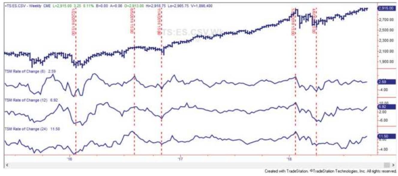
FIGURE 19.5 S\&P continuous futures with a 6-, 12-, and 24-week ROC (top to bottom), mid-2015-September 2018.
The second stage in the process is to smooth the ROC indicators, making them more reliable. Using the 6-, 12-, and 24 -month ROC preferred by Pring, the 6 - and 12month indicators are smoothed by a 6 -period moving average, and the 24-month smoothed by a 9-period moving average. Because the ROC calculation actually speeds up the price movement, instead of introducing a lag, this small amount of smoothing shows very little lag in the smoothed values. Using the three smoothed ROC indicators, Pring selects trades using the following guidelines:
1. A trendline based on about \(1 / 2\) of the longest ROC period determines the direction of the trade.
2. The longer 24-period ROC identifies the major move.
3. The strongest price moves occur when all three ROC values are moving in the same direction.
4. If the 24-period ROC peaks while the other two indicators are rising, the sell-off is minor. Similarly, when the 12 - and 6 -period indicators peak but the 24-period is rising, the sell-off is also mild.
We can conclude that all three indicators need to peak at the same time, as they did at the beginning of 2018, followed by all three values declining, to see a significant sell-off.
\section*{Creating a Composite Indicator}
Pring observed that trading signals generated by combining the ROC indicators with a trend reversal were out of phase with the major moves in the S\&P. To correct that problem, he created the KST indicator, a composite of four smoothed ROC calculation periods, each stepweighted in proportion to its period.
1. A 24-period ROC weighted 4.
2. An 18 -period ROC weighted 3.
3. A 12-period ROC weighted 2.
4. A 9-period ROC weighted 1.
KST \(=(4 \times\) Average \((\) ROC \((\) Close, 24\(), 9)+(3 \times\) Average \((\) ROC(Close, 18\(), 9)\)
\(+(2 \times\) Average \((\) ROC \((\) Close, 12 \(), 6)+(1 \times\) Average \((\) ROC \((\) Close, 6\(), 6)\)
where \(R O C(\) Close,24) is a function that returns the 24 period ROC and Average (ROC,9) is a function that returns the 9-period average of the ROC. In his description of KST, Pring does not give the weighting of
18 -period ROC ; the value 9 is used here.
To generate trading signals, Pring plots the 9-month ROC along with the KST indicator, plus the 12-period moving average trendline. In Figure 19.6 the bottom panel has an 18-period ROC smoothed using a 9-period average, one of the KST components. Using weekly data, the 18-period ROC seemed to track better. Trading signals are taken in the direction of the moving average trendline in the upper panel, but timed when the KST indicator crosses the ROC line after the first turn in the trendline. With the proper choice of ROC periods, the trade could be exited when the KST crosses the ROC in the other direction. If the ROC is too fast, then it will be difficult to take bigger profits from the trend moves; therefore, it seems preferable to use one of the slower ROC calculations.
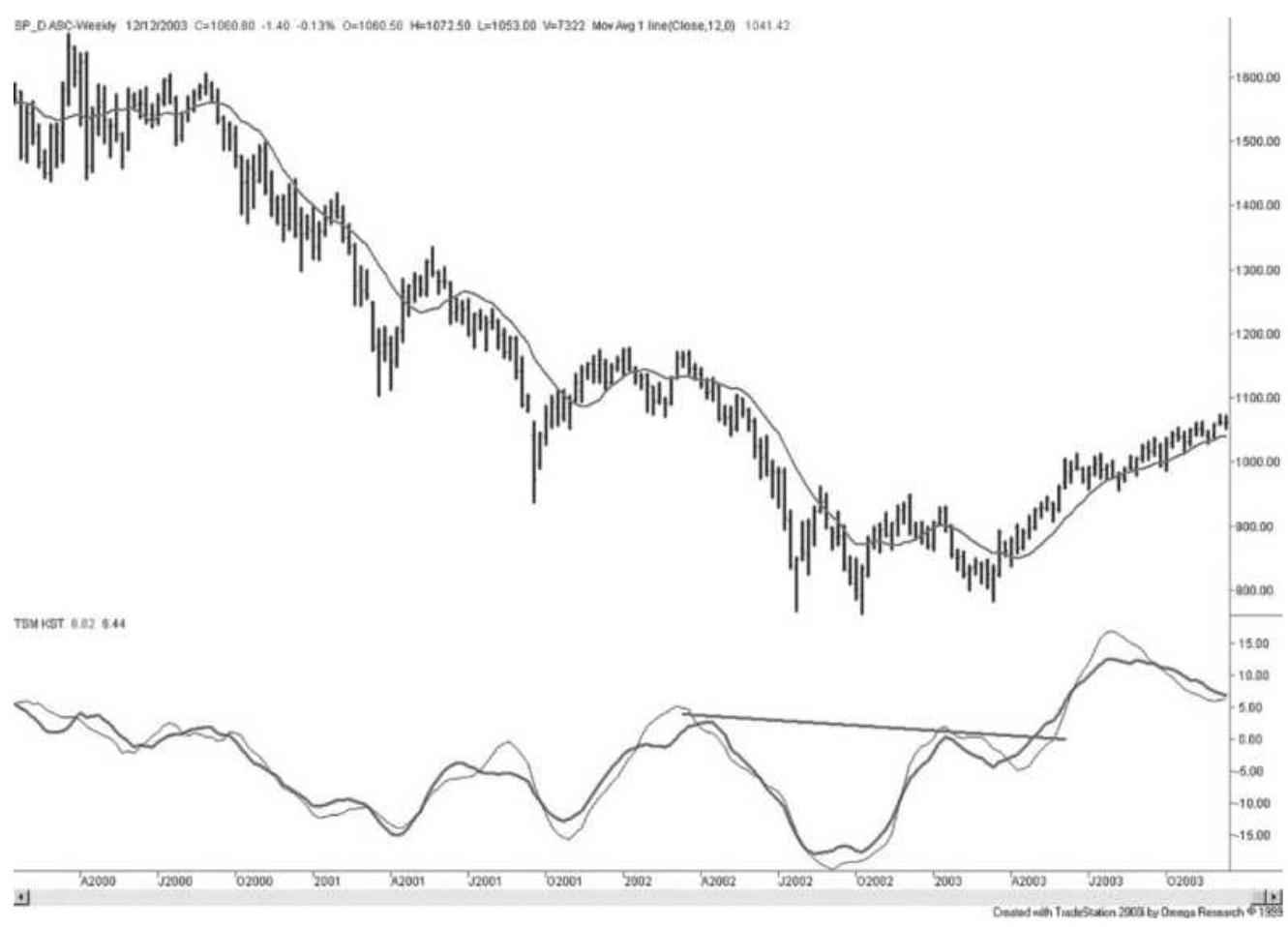
FIGURE 19.6 KST combined with an 18-period ROC and a 12-period trendline can improve time and selection of major price moves. Prices are S\&P 500 continuous futures, weekly, January 2000-December 2003.
The major trends are clearer, and the signals more reliable, when applied to monthly data, although the method is generalized to work using any data frequency. A faster version of KST can be constructed from daily data and used to filter trades or improve their timing. It is a requirement, however, that the KST signals be used in combination with a trendline.
The KST is an exceptionally smooth indicator with very little lag, making its signals more timely than most other indicators. It can also be used in the same way as an RSI or stochastic, applying divergence and trendlines to
generate additional, reliable trading signals. In Figure 19.6, a trendline has been drawn across the tops of the KST indicator beginning in April 2002, showing the breakout of a descending pattern in April 2003, a very timely entry into the S\&P index.

The KST indicator is available on the Companion Website as TSM KST.
\section*{NOTES}
1 Dr. Alexander Elder, Trading for a Living (New York: John Wiley \& Sons, 1993; updated 2014).
\(\underline{2}\) Robert Krausz, W. D. Gann Treasure Discovered (Geometric Traders Institute, Fibonacci Trader Corp., 450-106 State Road 13 North, \#206, Jacksonville, FL 32259-3863, FibonacciTrader.com). Also see references in the section "Fibonacci and Human Behavior" in Chapter 14.
3 Copyright Robert Krausz.
4 See Jack Schwager, The New Market Wizards (New York: John Wiley \& Sons, 1992).
5 The following chart analysis was provided by Robert Krausz. Further analysis of bond moves relevant to this discussion can be found in two articles, "A Strategy for Trading Multiple Time Frames," Futures (November 2001), and "Intraday Strategies for Multiple Time Frames," Futures (January 2002).
6 Martin J. Pring, Martin Pring on Market Momentum (Gloucester, VA: International Institute for Economic Research, 1993). Also see www.pring.com.
\section*{CHAPTER 20}
\section*{Advanced Techniques}
After price, volatility has the greatest impact on trading, so it is worth spending time understanding how to measure it and how to use it when trading. Those methods cover a wide range. Volatility has already been discussed as part of many indicators. It is used to improve the performance of stop-losses and profittaking and may confirm a breakout or indicate a regime change. A volatility-adjusted indicator allows many systems to automatically adapt to changing market conditions.
Volatility can be used as a trading filter, avoiding risk when volatility is high, or standing aside when the volatility is low and opportunity is small. It is the key measure of risk and will be the dominant ingredient in structuring a portfolio, covered in Chapters 23 and 24. It is used to size positions and maximize diversification. As systematic programs mature, there seems to be a greater, justifiable concentration on how to include and manage volatility. Here, we will look at it in more detail.
\section*{MEASURING VOLATILITY}
There are five practical measures of volatility that can be easily used to satisfy the need to show expanding and contracting volatility but are not tied to an underlying price level. The first four measure volatility over the most
recent \(n\) days, or \(n\) bars using price differences or ranges. The last uses returns, a percentage change, which applies to equities and cash markets, but not back-adjusted futures or some split-adjusted stocks. Referring to Figures 20.1 and 20.2 in conjunction with the formulas below, the five volatility measures for today, \(V_{t}\), calculated using the past \(n\) days, are:
1. The change in price over \(n\) days (Figure 20.1a):
\[
V_{t}=\text { Close }_{t}-\text { Close }_{t-n}
\]
2. Themaximum price fluctuation during the \(n\) days (Figure 20.1b):
\(V_{t}=\operatorname{Max}\left(\operatorname{High}_{t}, \ldots, \operatorname{High}_{t-n}\right)-\operatorname{Min}\left(\operatorname{Low}_{t}, \ldots, \operatorname{Low}_{t-n}\right)\) where Max and Min are the same as the TradeStation functions Highest and Lowest.
3. The average true range (ATR) over the past \(n\) days (Figure 20.1c and the center panel of Figure 20.2):
\[
V_{t}=\text { Average }(\text { Truerange }, n)
\]
where Truerange ( \(T R\) ) is a function that returns the maximum range from the combination of today's high, low, and previous close.
True Range, \(T R_{t}=\max \left(H_{t}-L_{t}, H_{t}-C_{t-1}, C_{t-1}-L_{t}\right)\) The ATR is a good measure of the daily volatility.
4. The sum of the absolute price changes over \(n\) days
(Figure 20.1d):
\[
V_{t}=\sum_{i=1-n+1}^{\dot{1}} \mid \text { Close }_{i}-\text { Close }_{i-1} \mid
\]
For stocks, the sum of the returns should be used.
5. Classic annualized volatility using daily returns (the bottom panel of Figure 20.2):
\(A V_{t}=\operatorname{Stdev}\left(r_{i}\right) \times \sqrt{252}\), where \(i=t-n+1, t\)
Annualized volatility has been shown in other applications.
In the change in price (1), the volatility is entirely dependent on the value of the two points, Close \({ }_{t}\) and Close \(_{t-n}\), regardless of the price activity that occurred during the days between them. If prices are very volatile but closed where they began \(n\) days ago, this method would show zero volatility. Over many calculations, this method returns a reasonable measure of volatility, but will always be lower than those using the highs and lows.
The maximum range (2) corrects for the dependence on only two points and will produce a more meaningful measure of volatility, which may also be used as an estimate of risk. This method may be effective as the basis for a stop-loss or profit target if you know the average holding period of the trade, because it estimates the maximum move for that period. It ignores the
frequency of directional changes within the time interval.
The average true range (3) is the most popular measurement of daily volatility. Many strategies use a factor times the average true range to place a stop-loss, take profits, or decide the current level of risk. It is generally used for short-term forecasting. To smooth out the values, or to create a larger value, define the true range to span two consecutive days. For a 2 -day ATR, replace \(C_{t-1}\) with \(C_{t-2}\) and use the highest high and lowest low of the past two days. This concept can be extended to 3 or more days.
The sum of the absolute price changes (4) is excellent for comparing volatility but more difficult to use, given the value will be large. It includes both frequency and magnitude. It was used in the efficiency ratio (ER) to measure the relative noise of a price series.
The last method (5), annualized volatility, is the most popular and accepted among financial analysts. It is the standard deviation \((\sigma)\) of the returns, \(r\), over the past \(n\) periods, times the square root of the number of periods, \(P\), in a year. The generalized formula is:
\(A V_{t}=\sigma\left(r_{i}\right) \times \sqrt{P}\), where \(i\) goes from \(t-n+1\) to \(t\).
For daily data based on a 60-day rolling calculation,
\(i=t-59\) to \(t\) and \(P=252\). For monthly data,
\(P=12\). Returns can be either \(r_{t}=p_{t} / p_{t-1}-1\) or
\(\ln \left(p_{t} / p_{t-1}\right)\). The formula cannot be applied to back-
adjusted futures or some split-adjusted stocks because the percentages are no longer true and some older data may become negative.
Of the five measurements, the two most often used are the average true range and annualized volatility.
\section*{Comparing Annualized Volatility and Average True Range}
Results from annualized volatility and average true range can be very different and can significantly affect trading decisions, position size, and risk assessment. Figure 20.2 shows a daily chart of Apple (AAPL) from August 2017 through May 2018. The average true range (ATR) is shown in the center panel and the annualized volatility (AV) in the lower panel, both calculated over 20 days. The two have very similar patterns but the values they return are very different.
(a)
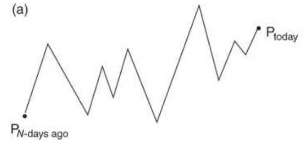
\(P_{N-\text { days ago }}\)
Change in price \(=P_{\text {today }}-P_{N-\text { days ago }}\)
(c)
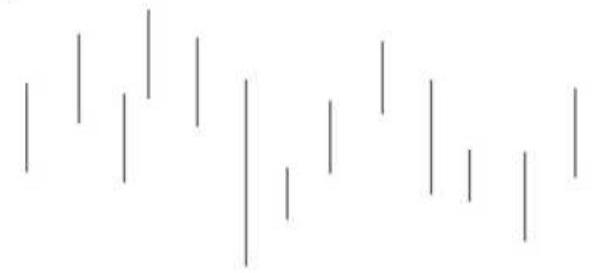
Volatility = average true range over past \(N\) days approx equal to average daily range (b)
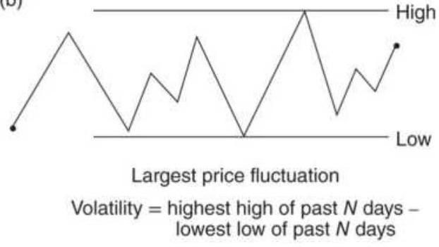
(d)
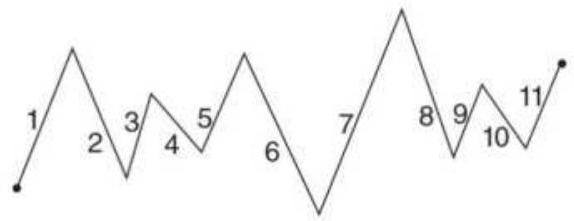
Volatility = sum of individual price changes, taken as positive numbers
FIGURE 20.1 Four volatility measures.
Source: Perry J. Kaufman, A Short Course in Technical Trading (Hoboken, NJ: John Wiley \& Sons, 2003). Reprinted with permission.
Because the ATR returns points, it will be more useful in setting short-term trading thresholds. For example, the average value of the ATR for AAPL is about \$3.50/share over the past three months. Then a stop-loss on a trade could be \(2.5 \times \$ 3.50=\$ 8.75\) while a profit target would be a larger value, \(3.5 \times \$ 3.50=\$ 12.25\). The annualized volatility returns a percentage, in this case about \(25 \%\) over the past three months. It says that, based on current price movement, we can expect a \(25 \%\) price range over the year. At the price of \(\$ 188\), that would be \(\$ 47\). Figure 20.2 shows the range of 150 to 190 , or a \(\$ 40\) range. That will be good for measuring risk but
difficult to use for a short-term threshold.
Because the ATR uses the highs and low, and the AV uses only the closing prices, our first choice is to use the ATR.
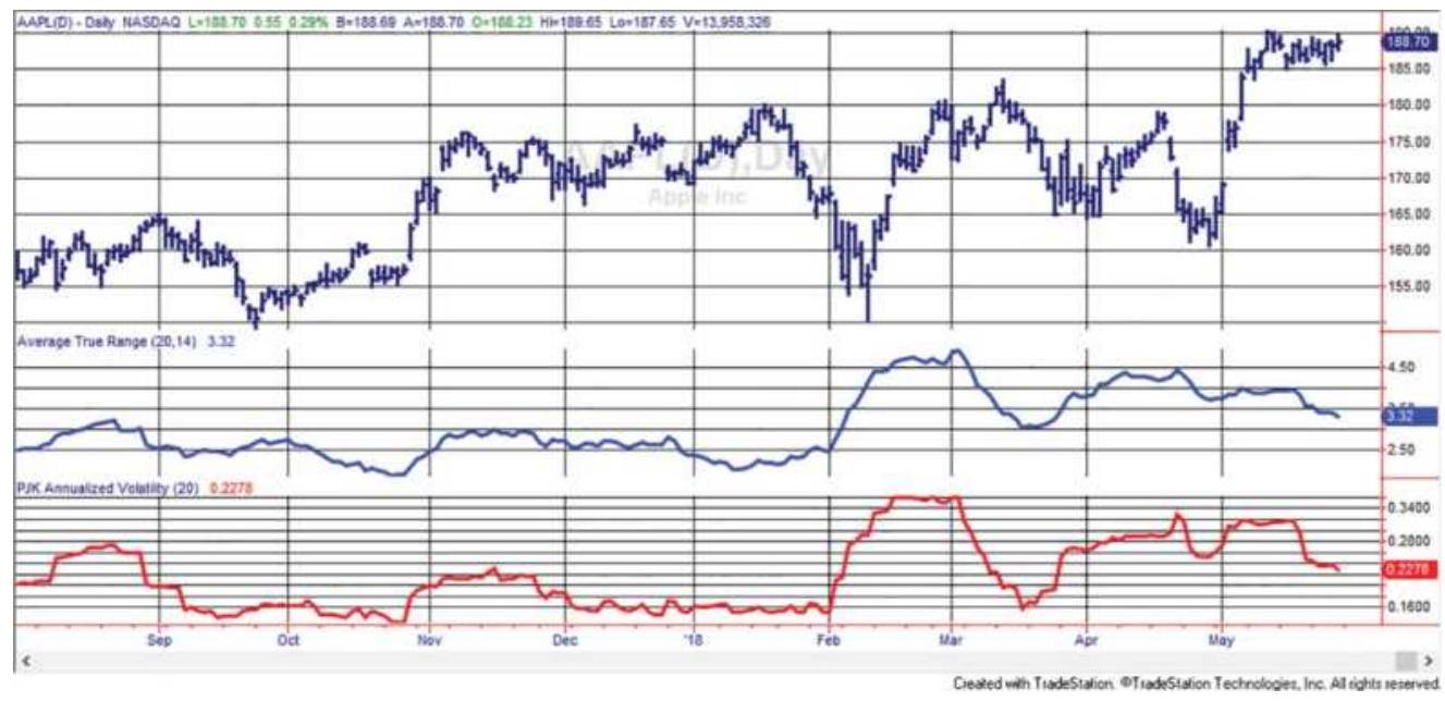
FIGURE 20.2 Apple (AAPL) with a 20-day average true range (center panel) and a 20-day annualized volatility (bottom panel).
\section*{Ratio Measurements}
Bookstaber \({ }^{1}\) presents a volatility measurement \(V\), in the traditional notation of a return series, that is, the ratio of successive closing prices. He adds alternative measures using the high and low, or a combination of the three as follows:
where \(C_{t}=\) the closing price on day \(t\)
\[
\begin{aligned}
H_{t} & =\text { the high price on a day } t \\
L_{t} & =\text { the low on day } t \\
V_{t} & =\text { the volatility on day } t
\end{aligned}
\]
a. Close-to-close volatility (for stock prices or cash data):
and
\[
R_{t}=\frac{C_{t}}{C_{t-1}}
\]
\[
A=\frac{1}{n} \sum_{t=1}^{n} \ln R_{t-i}
\]
then
\[
V_{t}^{2}=\frac{1}{n-1} \sum_{t=1}^{n}\left(\ln R_{t-1}-A\right)^{2}
\]
and
\[
V_{t}=\sqrt{V_{t}^{2}}
\]
b. High-low volatility:
\[
V_{t}=\frac{0.601}{n} \sum_{t=1}^{n} \ln \left(\frac{C_{t}}{C_{t-1}}\right)^{2}
\]
c. High-low-close volatility:
\[
\begin{aligned}
& S_{t}^{2}=0.50 \ln \left(\frac{H_{t}}{L_{t}}\right)^{2}-0.39 \ln \left(\frac{C_{t}}{C_{t-1}}\right)^{2} \\
& V_{t}^{2}=\frac{1}{n} \sum_{t=1}^{n} S_{t-i}^{2} \\
& V_{t}=\sqrt{V_{t}^{2}}
\end{aligned}
\]
Note that \(t\) may be a time interval rather than a single day. Then \(C_{t}\) is the last price of the period, and \(H_{t}\) and \(L_{t}\) are the highest and lowest prices of the interval.
In the close-to-close estimation, the volatility \(V_{t}\) is the standard deviation of the closing price ratios. Bookstaber states that this measurement will follow a distribution and that the actual volatility during the current period \(t\) can be set within the error bounds defined by the distribution.
\section*{Relative Volatility}
It is often convenient to filter trades by either high or low volatility. Sometimes, the absolute lows and highs are important, but relative highs and lows may work in many cases. Relative volatility \((R V)\) can be defined as the volatility over a short period divided by the volatility over a longer period, where the longer period is typical of the normal volatility:
\section*{\(R V_{t}=\frac{V_{V}(n)}{V_{t}(m)}\)}
where \(V_{t}\) is any of the volatility measures, and \(n\) and \(m\) are calculation periods, where, for example,
\(5<=n<=20\) and \(40<=m<=120\).
\section*{Lagging the Longer Period}
One problem with the relative volatility, and many other comparative measures, is that the shorter calculation period is contained in the longer one. A better measure would be to lag the longer calculation so that it ends before the shorter one starts:
\[
R V_{t}=\frac{V_{i}(n), i=t-n+1, t}{V_{j}(m), j=t-m-n+1, t-n}
\]
Then the shorter calculation, \(n\), goes from \(t-n+1\) to \(t\), and the longer one, \(m\), goes from \(t-m-n+1\) to \(t-n\), nonoverlapping periods. This method will also help on the back side of a volatile period, when the typical calculation that includes the recent volatility causes a prolonged hump. With a lagged longer period, the declining volatility will return to normal sooner and a second volatile event will be seen.
\section*{Implied Volatility, VIX}
Even easier than calculating the volatility yourself is to have a good measurement accessible at all times. The
CBOE's volatility index, VIX, reflecting the implied volatility of the S\&P options, is available on a real-time basis, as are a wide range of ETFs and ETNs, shown in Table 20.1. The VIX index was introduced in 1993 and only recently started trading as futures, valued at 1,000 times the price. VIX was originally the volatility of an options index, OEX, a weighted value of the implied volatilities of 8 puts and calls in the S\&P 100, expressed as a percentage of the index price. However, the futures contract is constructed from the forward 3-day volatilities of the S\&P 500 .
\section*{TABLE 20.1 VIX ETFs and ETNs, daily volume} greater than 5,000 , as of May 2018.
\begin{tabular}{|c|c|c|c|c|}
\hline Symbol & \begin{tabular}{l}
Long/ \\
Inverse
\end{tabular} & Leverage & & Issuer \\
\hline TVIX & Long & 2 & 40,000,000 & Velocity \\
\hline VXX & Long & 1 & 25,000,000 & iPath \\
\hline UVXY & Long & 1.5 & 20,000,000 & ProShares \\
\hline SVXY & Short & 1 & 7,000,000 & ProShares \\
\hline
\end{tabular}
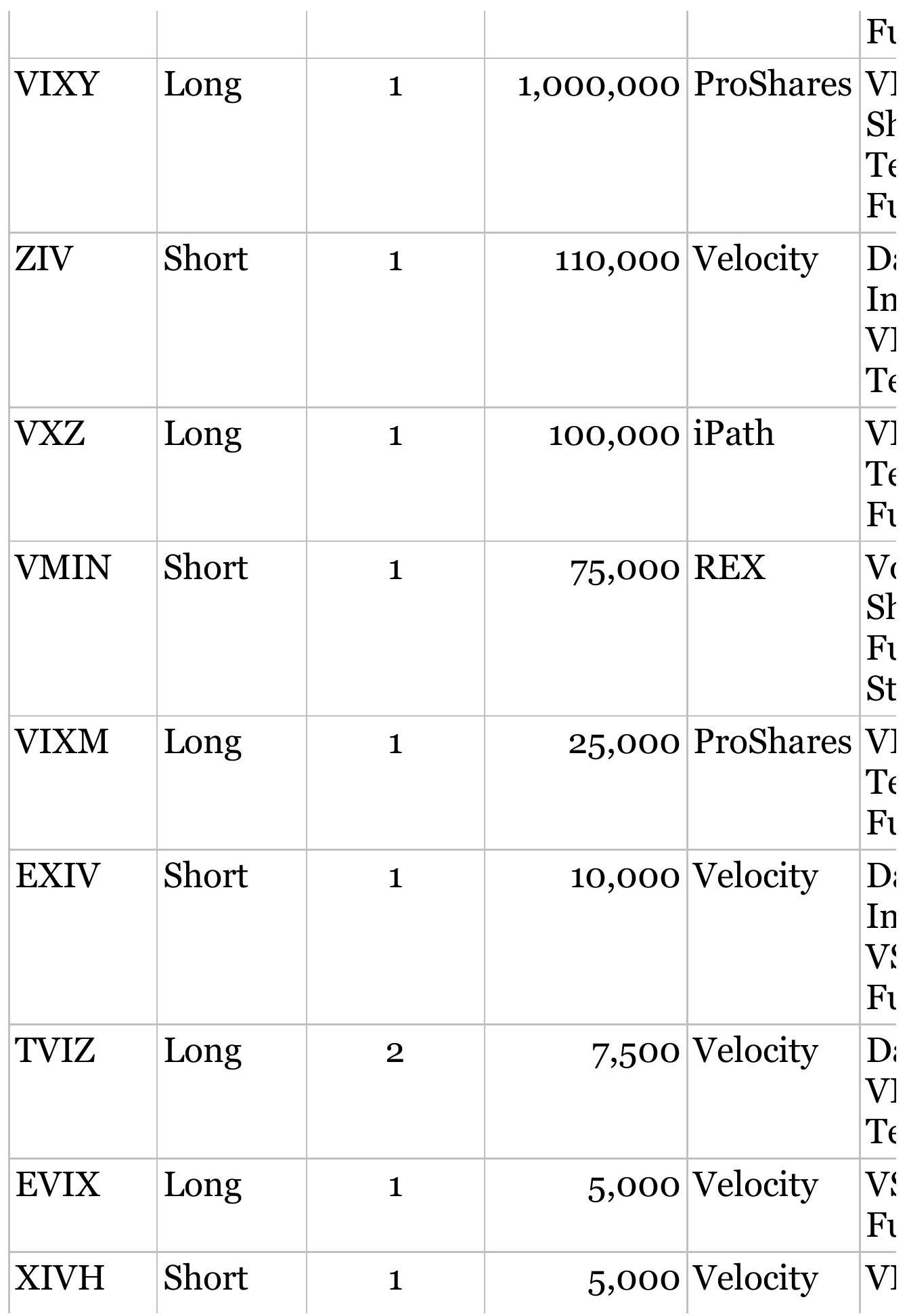
\begin{tabular}{|c|c|c|c|c|}
\hline \multicolumn{5}{|c|}{ FUTURES } \\
\hline VX & L/S & 1000 & 175000 & CBOE \\
\hline VXN & L/S & & Inactive & CBOE \\
\hline
\end{tabular}
VIX can be very volatile, so much so that on February 28, 2018, the double leveraged ETF UVXY was reduced to 1.5 leverage to avoid declines greater than \(50 \%\). This was in reaction to a jump of \(66 \%\) on February 5 , followed by a decline of \(33 \%\) the next day. Volatility can be volatile.
\section*{VIX Calculations in Brief}
VIX is calculated from the implied annualized volatility of S\&P options. \(\underline{2}\) Implied volatility is the volatility needed to satisfy the various conditions in the BlackScholes formula for option pricing. Because we know the option price and all other factors at any time, we can solve for the implied volatility.
- Select a range of call and put strikes in two consecutive expirations with more than 23 days and less than 37 days to delivery. They can be weekly and monthly. Say there are \(N\) options.
- Calculate the variance of each option and divide by \(N\) to assign the proper weight.
Add the total variances for the first and the second expiration.
- By interpolating the time of the two expirations, find the 3o-day variance.
- The square root of the variance is the standard deviation, equal to the volatility.
VIX is the volatility \(\times 100\).
If we know that VIX is \(16 \%\), and the S\&P futures is 2000, then VIX is forecasting \(16 \%\) volatility (a range of 320 points) for at-the-money options, relative to the price of the S\&P for 30-day rolling expiration period. \({ }^{3}\) Because the 30-day calendar period is equivalent to about 21 trading days, and there are 252 trading days in the year, 1 standard deviation of the volatility (equal to a \(16 \%\) move in the S\&P at 2000) becomes:
Implied range \(=2000 \times 16 \% \times \sqrt{\frac{21}{252}}=92.37\)
Then, an implied volatility of \(16 \%\) when the S\&P is at 2000 is equal to a \(68 \%\) ( 1 standard deviation) chance of a price change of \(\pm 92.37\) within the next 30 calendar days ( 21 trading days).
\section*{Implied Compared to Historic Volatility}
While VIX represents how traders see volatility at any moment, historic volatility is a measure of what actually happened. Neither is right or wrong. Traders will react
quickly to news but may not always interpret it correctly, especially the size of the price move that will follow from that news.
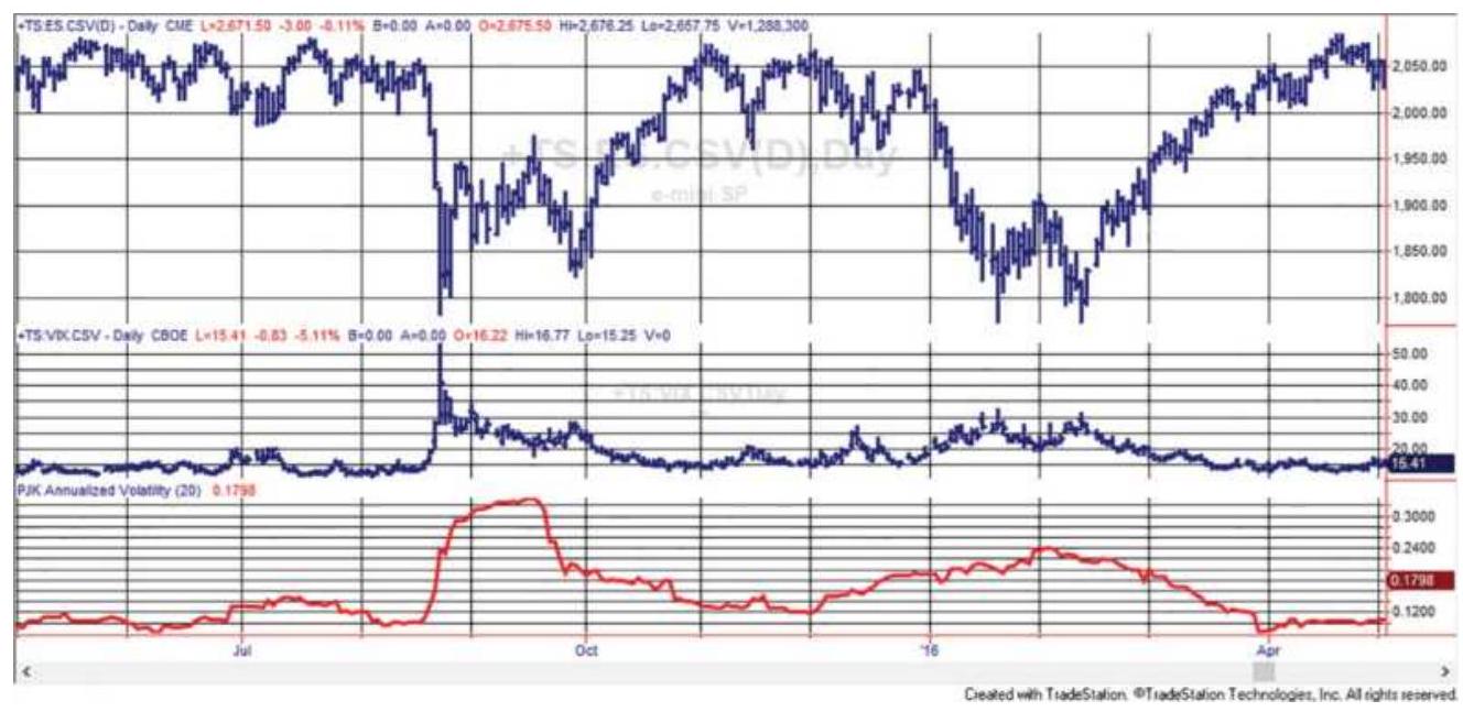
FIGURE 20.3 S\&P futures, June 2016-May 2017 (top), implied volatility (VIX) center, and historic volatility (bottom).
Figure 20.3 shows a period of S\&P futures with VIX index in the second panel and historic volatility at the bottom. Historic volatility is:
\[
H V_{t}=\operatorname{stdev}\left(r_{i}\right) \times \sqrt{252}
\]
where
\[
r_{i}=\text { past } 20 \text {-day returns }
\]
The patterns of VIX and HV are similar except when there is a price spike. Implied volatility spikes at the same time as the price and then starts to decline
immediately. Historic volatility is slower to rise because the day of the spike is only \(1 / 20\) of the calculation. It is then slow to decline because it takes 20 days for the volatility price data to roll off the calculation.
Is one better than the other? We will find that VIX will be helpful for identifying spikes much the same as volume, but historic volatility will be more practical as a filter for trading and for sizing a position. Because both are readily available in a timely manner, it is easy to test them both before making a decision.
\section*{THE PRICE-VOLATILITY RELATIONSHIP}
Everyone accepts the premise that a stock or futures market trading at a higher price will have higher volatility. It's also the reason why some financial analysts prefer using the log of prices rather than the simple returns (see Chapter 2, "Standardizing Risk and Returns"). It's true that volatility increases with higher prices, but only if you are looking at the actual price changes, not the percentage changes. For example, in 2008, Bank of America (BAC) lost 90\% of its value. Figure 20.4 shows that it was more volatile at the bottom of that move than at that top. That may not be surprising, and it may be easy to understand because sharp price drops are often volatile when they hit bottom. But from mid-2011 to mid-2012 BAC settled at a low price and showed "normal" volatility. Was the volatility at \$10-\$15 lower than when prices were at \(\$ 50\) ?
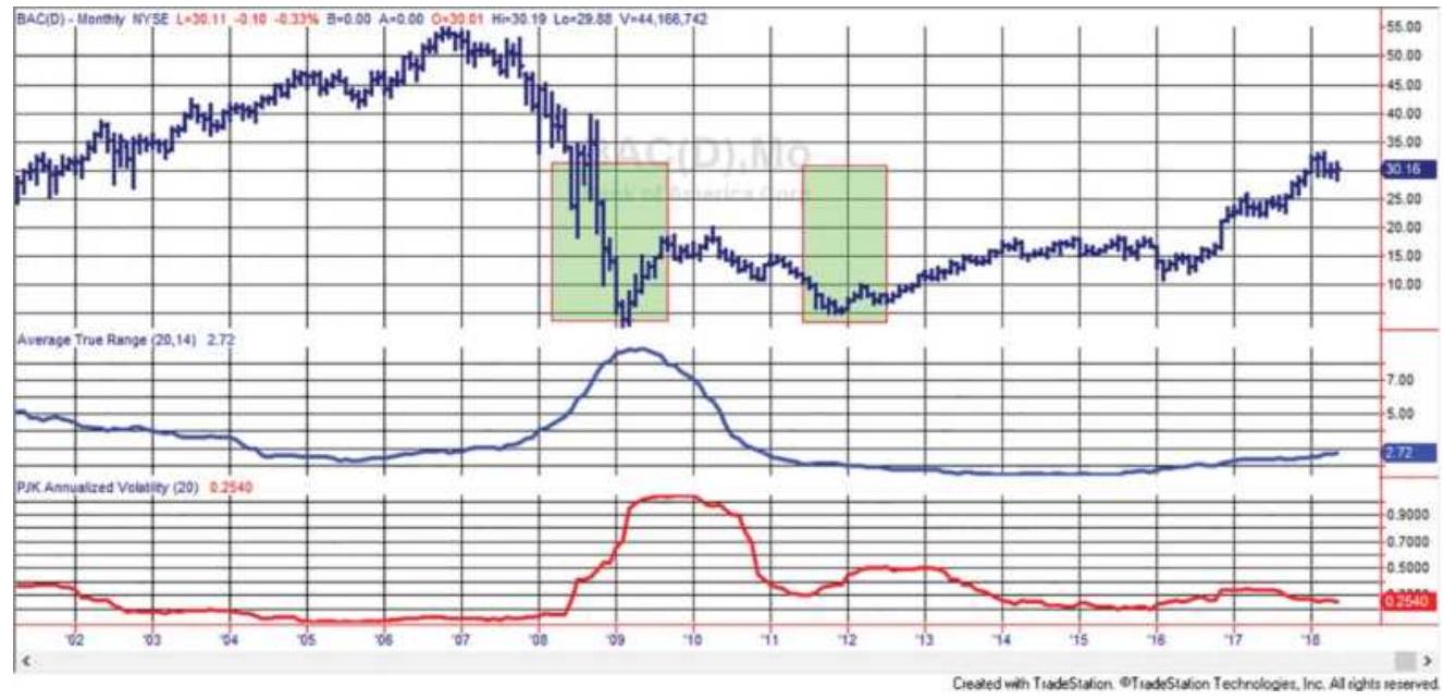
FIGURE 20.4 Bank of America with average true range (center) and annualized volatility (bottom).
Figures 20.5 and 20.6 compare the returns and the price differences against the BAC price levels. In Figure 20.5 the size of the daily returns (in percent) is far larger when prices are low. In Figure 20.6 we see that the actual price changes is nearly the same at all price levels. That is contrary to the way the industry uses price volatility, especially those that prefer the log of returns.
Because volatility is relatively higher at low price levels, an investor trying to equalize risk in a portfolio would be best not trading stocks that are priced under \$5, perhaps even \(\$ 10\). In addition to much higher volatility, they can have more erratic moves than higher priced stocks. Mean-reversion traders may find this the most desirable area to exploit. The situations where this becomes important are:
When sizing positions to equalize risk
When balancing position sizes for pairs trading or
\section*{market neutral baskets}
For assessing risk in portfolios
Even with an inverse risk relationship, most traders and portfolio managers can avoid the problem by using relative volatility, such as a rolling ATR or annualized volatility, to calculate a position size or filter a trade that is either too risky or too quiet. Using volatility to balance risk is covered in Chapter 23.
\section*{Using Volatility to Forecast the Lowest Price}
Commodity pricing is very different from equities. Equity prices are more complex in that they depend on the company product, the quality of management, competition, cost of financing, earnings, and many other tangible and nontangible assets. Commodities are nearly \(100 \%\) supply and demand. A stock price can go to zero, a commodity price cannot. It's very possible that the notion of lognormal price volatility started with commodities, as many other market techniques have migrated from commodities to equities. Most of these methods work, some do not. Forecasters with a more econometric leaning may find it useful to identify the price below which a commodity is not likely to trade, what we will call the base price.
\section*{Bank of America daily returns vs price}
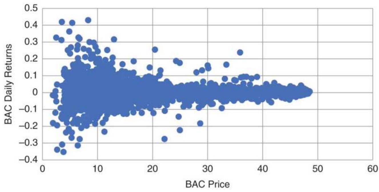
FIGURE 20.5 Bank of America price versus daily returns, 1998-May 2018.
Bank of America (BAC) daily price change vs price
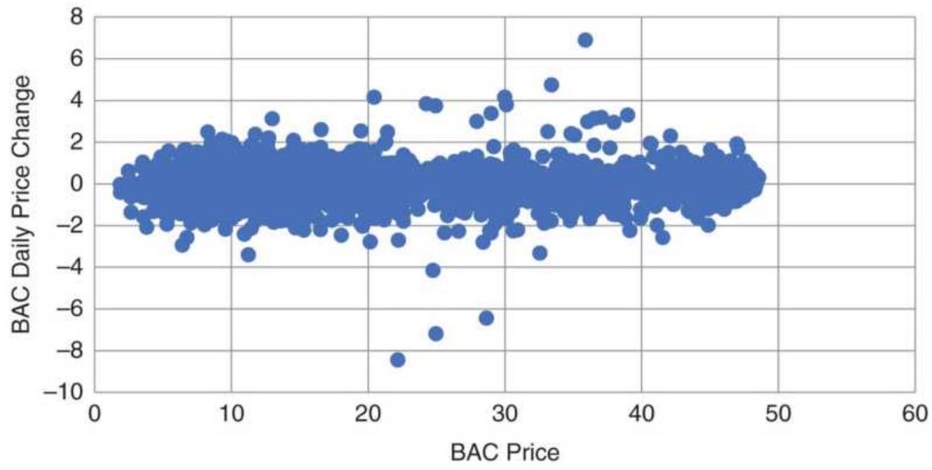
FIGURE 20.6 BAC price versus daily price differences, 1998-May 2018.
Using cash corn as an example, prices from 1978 to May
2018 are shown in Figure 20.7. Due to technology and improvements in yield in other countries, prices have remained low, first touching near \$1.00/bushel in 1986 and, unlike stocks, falling back under \$2.00 in 2000.
Annualized volatility for corn shows an understandable pattern, with annual spikes representing concern over crop yield during planting season. Volatility increased during and after the financial crisis of 2008 and is now returning to its normal pattern, as shown in Figure 20.8.
\section*{Cash corn}
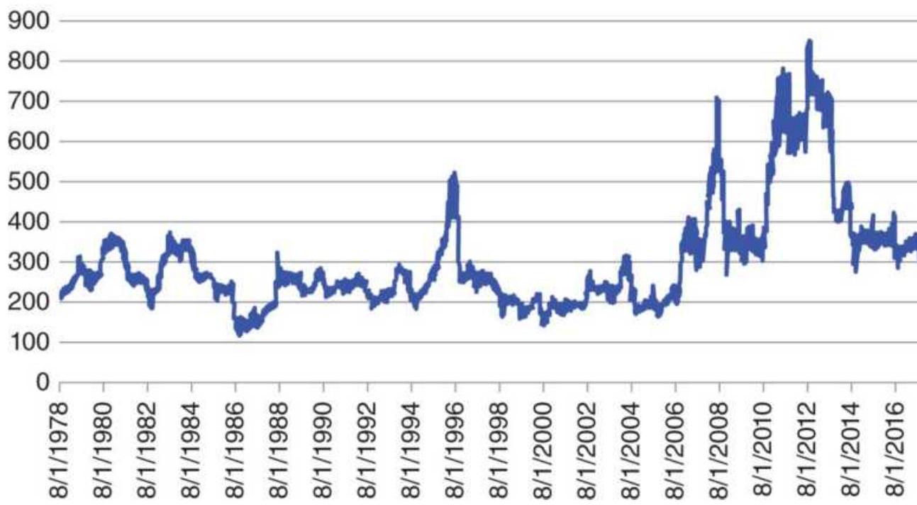
FIGURE 20.7 Cash corn prices, 1978-May 2018.
\section*{Cash corn annualized volatility}
400
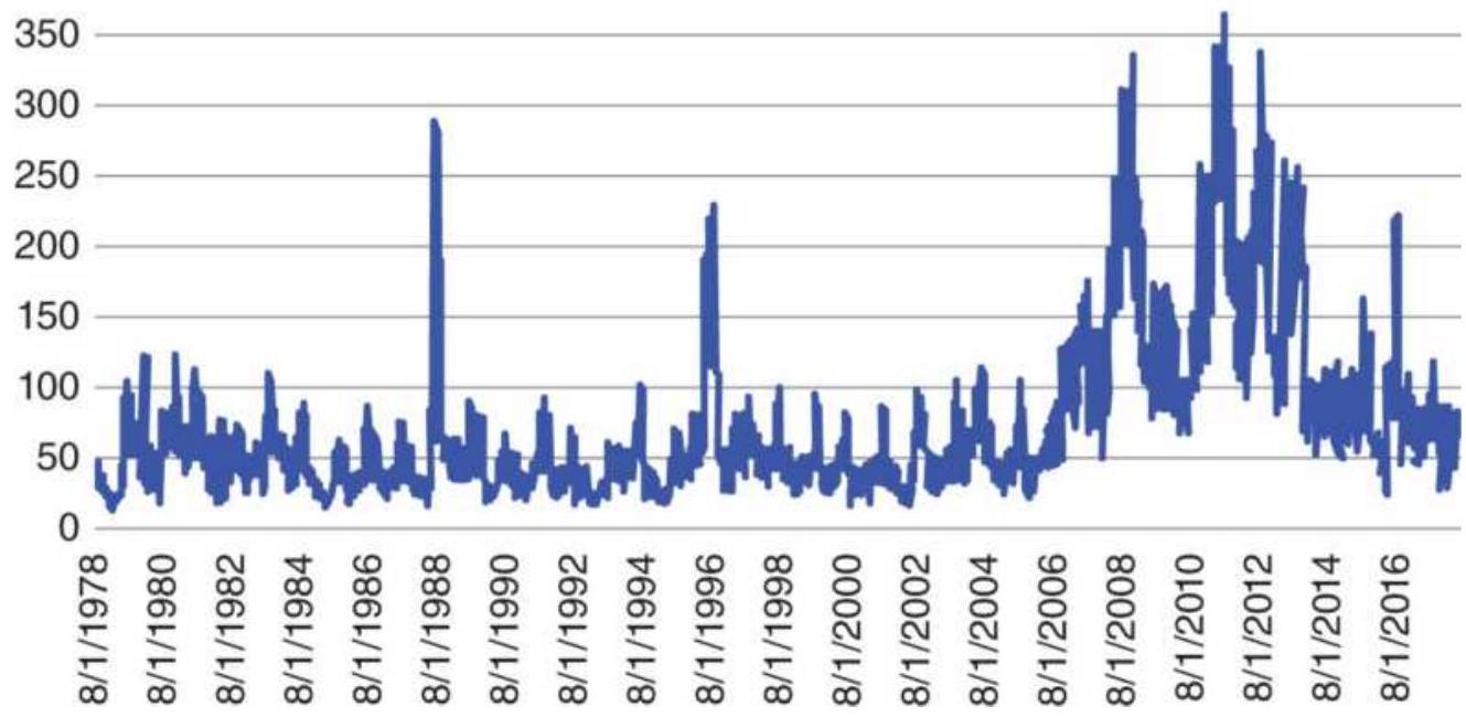
FIGURE 20.8 Annualized volatility of cash corn.
We can now see the difference in the price-volatility relationship of corn compared to Bank of America (Figures 20.5 and 20.6). In Figure 20.9 corn volatility narrows as prices drop to low levels. At about \(\$ 1.50 /\) bushel volatility will go to its lowest level between \(\$ 0.25\) and \(\$ 0.50\). A log curve has been drawn through the annualized volatility to show to pattern.
For commodities, the price-volatility relationship can show the lowest price likely to be traded, as well as the volatility associated with different price levels. As prices go higher due to supply or demand stress, larger variation would be normal. While a stock price can go to zero, commodities always have an intrinsic value. A farmer is always reluctant to sell below the cost of production. During times of surplus, or when an individual farmer is in need of cash, any crop could be
sold below cost, but not at zero, and not usually far below cost. At those levels, there is little commercial selling and few speculators interested in buying with no immediate expectation of gain. For econometric solutions, we can assign the base price to a commodity where volatility reaches its lowest level.
Cash corn price vs annualized volatility
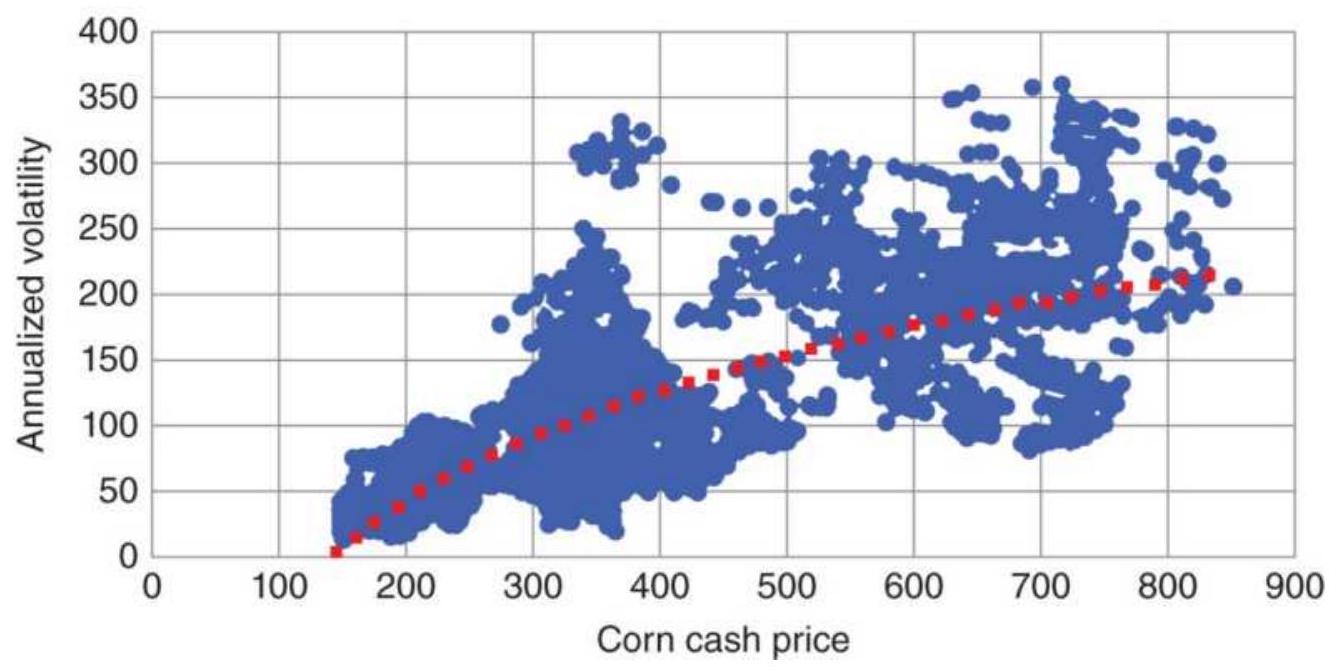
FIGURE 20.9 A scatter diagram of corn volatility versus price, with a log curve showing the pattern.
\section*{Other Price-Volatility Relationships}
There are three noteworthy exceptions to the pricevolatility relationship, and these exceptions will lead to a more general way of measuring volatility.
1. Interest rates trade as prices on the futures markets, which is inverse to the yield. When evaluating longterm volatility for rates, and in cases when calculating percentages, yield should be used.
2. Foreign exchange has no base price, only equilibrium, the price which all traders, and the governments, accept as fair value for the moment. This situation is always short-lived. Prices get more volatile when they move away from equilibrium in either direction.
3. Energy is strongly influenced by OPEC, an oil cartel, whose purpose is to keep oil prices high. They attempt to set the supply, which in turn should determine the price range. This was very effective when prices were \(\$ 18\) to \(\$ 32 / \mathrm{bbl}\) but does not seem to have as much effect at higher levels. Their production announcements can still cause a shortterm disruption in prices in either direction.
\section*{USING VOLATILITY FOR TRADING}
For many traders, using volatility is essential to success. It has been embedded in many of the systems and methods discussed throughout this book, but this section will look at specific applications that use volatility.
\section*{Intraday Volatility and Volume}
In Chapter 12, there is an intraday pattern showing that volume is highest near the opening of the day, and again near the close of trading. Intraday volume forms a smooth \(U\)-shaped pattern for domestic markets, and a \(W\)-shaped pattern for markets that open in Europe but span U.S. trading hours.
Intraday volatility has a pattern that is identical to
volume, highest at the open, then declining to its lowest point at mid-session, and rising again as the trading day ends. The closing volatility and volume are typically lower than at the open. \({ }^{4}\) One approach to calculating volatility (VT) is:
\[
V T_{t}=\sqrt{\frac{1}{n-1} \sum_{i=t-n+1}^{t}\left(\ln \left(\frac{p_{i}}{p_{i-1}}\right)-\bar{P}\right)^{2}}
\]
where
\[
\begin{aligned}
n & =\text { calculation period } \\
\ln & =\text { natural log } \\
P_{i} & =\text { price at time } i \\
\bar{P} & =\text { arithmetic mean of the natural log of price } \\
& \text { changes: }
\end{aligned}
\]
\[
\bar{P}=\frac{1}{n} \sum_{i=t-n+1}^{t} \ln \left(\frac{p_{i}}{p_{i-1}}\right)
\]
To find the correlation between the intraday pattern of volatility and that of volume, a simple linear regression can be solved:
\[
\text { Volatility }_{t}=a_{t}+b_{t} \times \text { Volume }_{t}+e_{t}
\]
for time \(t\). The resulting correlation, \(R=0.595\), is statistically significant for NASDAQ volatility and
volume. The correlation between volatility and volume is highest at the beginning and end of the day. Meissner and Cercioglu suggest that this volatility pattern, with the corresponding volume that provides liquidity, can be traded by being long options at the beginning and end of the day, profiting from the gamma (the rate of change of delta, which is the rate of change of the futures price with respect to the rate of change of the underlying asset). During the quiet mid-session period, a short options position may be used to profit from theta, the time decay.
\section*{Predicting Volatility with Trading Ranges}
William Brower, in his publication The Inside Edge, 5 performed a thorough study of trading ranges, with the purpose of being able to forecast when tomorrow will have a higher volatility. This would be an advantage for day traders, systems with short holding periods, and breakout systems in general. A summary of his results is shown in Table 20.2 for the S\&P from 12/23/87 through 12/15/95. \(O, H, L\), and \(C\) are the opening, high, low, and closing prices, and the notations [1] and [2] represent the prices 1 and 2 bars back.
\section*{TABLE 20.2 Predicting the trading range of the S\&P 500.}
Source: William Brower, The Inside Edge.
\begin{tabular}{|l|l|l|}
\hline Rule & Conditions Tested & Conclusion \\
\hline \(\mathbf{1}\) & \(0<\mathrm{L}[1]-\mathrm{x}\) & \(\left.\begin{array}{l}\text { Very good predictor, but } \\
\text { few cases (161 at } x=-0.10\end{array}\right)\) \\
\hline
\end{tabular}
\begin{tabular}{|c|c|c|}
\hline & \(0>H[1]+x\) & \begin{tabular}{l}
Modest predictor, but few \\
cases (101 at \(x=0.60\) )
\end{tabular} \\
\hline 3 & \(C[1]+x>0>C[1]\) & \begin{tabular}{l}
Range got smaller when \(x\) \\
\(=0.35\)
\end{tabular} \\
\hline 4 & C[1] - \(\mathrm{x}<0<\mathrm{C}[1]\) & \begin{tabular}{l}
Range got smaller when \(x\) \\
\(=0.30\)
\end{tabular} \\
\hline 5 & \(0<C[1]-x\) & \begin{tabular}{l}
Range tended to increase \\
as \(x\) increased
\end{tabular} \\
\hline 6 & \begin{tabular}{l}
\(H[2]>=H[1]\) and \\
\(L[2]>=L[1]\)
\end{tabular} & No significance \\
\hline 7 & \begin{tabular}{l}
\(H[2]>H[1]\) and L[2] \\
\(<\mathrm{L}[1]\)
\end{tabular} & \begin{tabular}{l}
Modest predictor of lower \\
volatility
\end{tabular} \\
\hline 8 & Day of week & \begin{tabular}{l}
Mon had lowest volatility, \\
Tues and Fri the highest
\end{tabular} \\
\hline 9 & \begin{tabular}{l}
Average(TrueRange,3) \\
[1] > x
\end{tabular} & \begin{tabular}{l}
Higher average true range \\
for 3 days was a very good \\
predictor of higher \\
volatility
\end{tabular} \\
\hline 10 & RSI(close,3)[1] < x & \begin{tabular}{l}
When RSI < 40 good \\
predictor of higher \\
volatility
\end{tabular} \\
\hline
\end{tabular}
\section*{Thomas Bierovic: On-Balance True Range}
To visualize the change in volatility, Thomas Bierovic has created an On-Balance True Range by following the same rules as On-Balance Volume ( \(O B V\), see Chapter 12) but substituting the true range calculation for volume. He then calculates a 9-day exponential smoothing of the On-Balance True Range and uses the crossovers of the
oscillator and smoothed oscillator to confirm signals. Although the highs and lows may come at nearly the same time as other oscillators, the relative peaks and valleys may offer the trader new insights. This simple interpretation can help separate high- and low-volatility conditions.
\section*{VIX Trading Systems}
The VIX, the index of implied volatility (see details earlier in this chapter), can also be interpreted as the level of risk in the market. VIX is considered a mean reverting indicator as the following strategies show.
\section*{Conners}
Larry Conners has based a number of trading systems on the VIX. This strategy, called Conners VIX Reversal 9, CVR 9, is based on VIX range expansion, looking for higher prices in the S\&P Index following a VIX
expansion and lower prices following a VIX contraction. \(\underline{6}\) This capitalizes on the concept that nonprofessional traders liquidate when volatility increases and buy when volatility decreases, commonly termed "risk on" and "risk off"; therefore, Conners treats volatility as meanreverting. Entries are based on a minor reversal in the VIX. The rules for buying (selling is the reverse) are:
1. Today's VIX high must be higher than the VIX high of the past 10 days.
2. Today's VIX must close below its open.
3. Yesterday's VIX must have closed above its open.
4. Today's VIX range must be greater than the ranges of the past 3 days.
5. If conditions 1-4 are met, then buy S\&P futures on the close and exit in 3 days.

Conners is looking for turning points in the VIX. The specific pattern that precedes a buy signal in the S \& P ends with a range expansion. This expansion is likely to mark the end of a short-term upward move in the VIX. A decline in the VIX that follows eases the way for a short-term rally in the S\&P. Traders are more comfortable buying when volatility is dropping. As with many other systems, this requires additional protective stops and position size management. A program for testing this, TSM VIX Conners CVR9, is on the Companion Website.
Another Conners mean-reverting VIX strategy \({ }^{Z}\) uses the RSI for timing. If:
1. The \(S \& P>200\)-day moving average
2. The 2 -day RSI of the VIX \(>90\)
3. Today's VIX open > yesterday's VIX close then buy the S\&P on the close and exit when the 2-day RSI closes \(>65\).
\section*{MarketSci Blog}

Michael Stokes posted one of the more interesting websites, MarketSci Blog, which offered numerous
creative strategies for equities trading. While no longer active, he has also posted on Seeking Alpha. This strategy, published on March 1, 2011, takes a 10-day exponential smoothing (EMA) and a 10 -day simple moving average (SMA), both applied to the VIX index, and buys the VIX when the EMA falls below the SMA, then sells short when the EMA moves above the SMA. It does this based on the concurrent closing prices. The rationale is that the EMA is faster than the SMA, given the same calculation period; therefore, it acts as a timing trigger. A fast execution is essential for mean-reverting trades. Figure 20.10 shows the VIX prices and the two trends for April-October 2010 along with trading signals, created by the program TSM VIX Mean Reverting on the Companion Website.
Figure 20.11 breaks down the profits from the strategy into long only, short only, and combined long and short. Unlike most other strategies, this is remarkably symmetric, with longs and shorts performing equally. It is important to note that this study was done using the VIX cash index, which is not tradeable. It could now be implemented with the ETF UVXY or the futures contract VX. It is also important to execute on the close of the day concurrent with the trading signal.
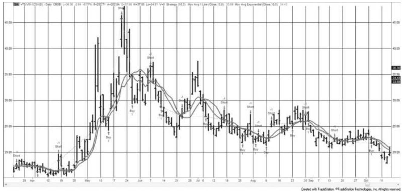
FIGURE 20.10 VIX mean-reverting strategy from MarketSci Blog, triggered by the EMA crossing the SMA.
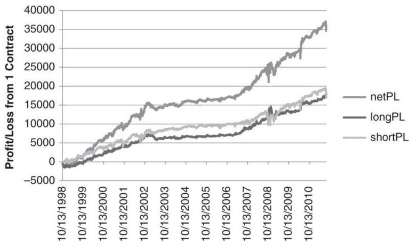
FIGURE 20.11 Profits from VIX Mean-Reverting Strategy, 1998-2011.
Gerald Appel on VIX
Gerald Appel \({ }^{8}\) gives his own thoughts on trading the S\&P using VIX:
- Buy when there are high levels of VIX, implying broad pessimism.
■ There are no reliable sell signals using VIX.
- Volatility tends to increase during weaker market climates.
- The stock market is likely to advance for as long as volatility remains stable or decreases.
\section*{Volatility System}
Bookstaber \({ }^{9}\) uses the average true range (ATR) over the past \(n\) days as the basis for a simple volatility strategy:
- Buy if the next close, \(C_{t+1}\), rises by more than \(k \times A T R_{t}(n)\) from the current close \(C_{t}\).
- Sell if the next close, \(C_{t+1}\), falls by more than \(k \times \operatorname{ATR}_{t}(n)\) from the current close \(C_{t}\).

The volatility factor \(k\) is given as approximately 3 but can be varied higher or lower to make the trading signals less or more frequent, respectively. This method falls into the category of volatility breakout and can be found on the Companion Website as TSM Volatility Breakout.
\section*{Using Volatility for Profit Targets and Stop-Loss}
\section*{Orders}
One of the most common uses of volatility is to make both profit-targets and stop-loss orders adapt to current market conditions. For that purpose, a method identical to Bookstaber, in the previous section, can be used to define both; however, they are often applied differently.
Profit targets are best used for short-term trading and determined at the time of entry:
\[
P T=p_{E} \pm k \times A T R_{t-1}
\]
where \(P T\) is the profit target based on the last trade entry, \(P_{E}\), and \(k\) is a constant, usually about 3 . If the last entry was long, the target is higher, and when it is short the target is lower than the entry price. The profit target is triggered by the intraday high or low price, rather than the close.
The reason that profit targets are used most often in short-term trading, rather than in long-term trend following, is that shorter time intervals have a higher degree of market noise. Once profits are taken, you want prices to reverse and allow you to reenter at a better price, or reverse direction entirely. For long-term trend following it is necessary to capture the fat tail; therefore, taking profits works counter to that notion. Once you exit a long-term trend by taking profits, and the trade continues to be profitable, it is necessary to reenter the trade to avoid losing that rare chance at an exceptionally large profit. For short-term trading, once a profit is taken, it is common to wait for a new trade.
For stop-losses, the same \(k \times A T R_{t-1}\) is used, but it is subtracted from the long entry and added to the short entry. In this case, when applying stops in a noisy market it is best to use the high and low to trigger the stop, but exit the position on the close. That way you take advantage of the intraday market noise to improve the exit price. A stop-loss must be far enough away from the current price to avoid being triggered by noise.
Stop-losses have the same problem as profit-targets when applied to long-term trend systems. If you are stopped out, but the trend is still intact, it is necessary to reenter the trade in order to avoid missing the rare but large profit. A more complete discussion of stops can be found in Chapter 23.
\section*{Low Volatility, High Returns}
We normally expect high volatility to yield high returns, and low volatility to be associated with lack of price movement. For a mean-reverting system that can be true, but not for a macro-trend trader. An article by Charlie Bilello \({ }^{10}\) shows that the 100 lowest volatility stocks found in the ETF SPLV (PowerShares Low Volatility S\&P stocks) often outperform the full S\&P with much lower risk. It's not that returns are much better, but risk is much lower.
High volatility does not have a good payout. When we trade individual markets, either stocks or futures, and the annualized volatility exceeds \(45 \%\), the returns decline and the risk increases. You may profit, but at a high risk. If you do not profit, you have just added risk to
your performance profile. Instead, you can exit your trade and reenter when volatility falls to \(35 \%\). There are always more trades, but a large loss can't be erased from your performance history.
Using the NASDAQ ETF QQQ as an example, Figure 20.12 shows the prices and annualized volatility from 1998 through May 2018. The high volatility in 2000 and 2001 represents the end of the Internet bubble. In 2008 there was the financial crisis. Applying a 100-day moving average, a period that works well for the S\&P, we can calculate the profits from trading both long and short. We then apply a volatility filter that exits a trade when the volatility exceeds 0.30 and reenters when the volatility drops below 0.15 . Figure 20.13 shows the results of both nonfiltered and filtered strategies.
QQQ Prices and annualized volatility
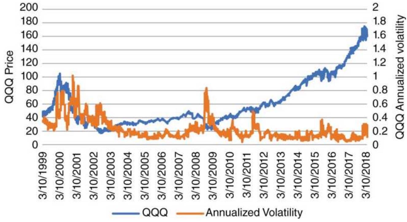
FIGURE 20.12 QQQ prices and annualized volatility, 1999-May 2018.
\section*{Profits from QQQ trend volatility filter}
10000
8000
6000
4000
2000
\(-2000\)

Unfiltered —FFiltered
FIGURE 20.13 Profits from trading QQQ with a 60-day moving average and a volatility filter.

Although the filtered performance was only slightly better than the unfiltered returns, the overall risk was much lower. There was no trading until after effects the Internet bubble ended, and no trading during the 2008 financial crisis. If we take the standard deviation of the daily returns of the nonfiltered and filtered methods, we find that the nonfiltered was 102 and the filtered was 56 , almost half. Then filtering this model reduced the risk by \(45 \%\) while returning more profit. A spreadsheet that does these calculations is TSM QQQ High and Low Vol Filter on the Companion Website.
Another rule could exit above the high filter threshold given the condition that (1) prices are moving higher or (2) prices are moving lower. Each market will have a
different underlying volatility; therefore, it will be necessary to test each separately to find the right threshold. While \(40 \%\) volatility seems to be an average that would be considered a good threshold, interest rate volatility is very different from crude oil and will require different threshold values.
On a larger scale, we can look at portfolio risk when volatility is above or below a target risk of \(12 \%\), meaning that 1 standard deviation of the annualized daily returns of a portfolio is \(12 \%\). We use \(12 \%\) as the norm because it is the typical target for futures fund managers. When the daily returns of a portfolio rise above \(12 \%\) we deleverage by reducing the position size; when it falls below \(12 \%\) we increase leverage. Deleveraging when volatility is high is almost the same as taking profits.
But portfolios spend more time at levels below the target than above, and trend following performs better during periods of low volatility. If our average portfolio volatility is \(8 \%\) and we are targeting \(12 \%\), then we are missing out on \(50 \%\) of the potential return unless we leverage our position size by \(50 \%\). This is discussed in more detail in Chapter 24.
\section*{Trade Selection}
In addition to the threshold values used to decide when to exit and reenter trades, there are other choices when using a volatility filter. The previous section used annualized volatility but the average true range would also work.
\section*{Eliminate or Delay?}
Whenever a high- or low-volatility situation occurs at the time of an entry signal, there are two choices. The trade can be completely eliminated by filtering, or it can be delayed until the high volatility drops or the low volatility increases to an acceptable level. When a trade is filtered, it is necessary to track the trade that was not entered, to know when it was completed. Each new trade is subject to the volatility threshold at the time of its entry. A trade that is delayed pending a change in volatility can be entered any time volatility moves back into the acceptable range, a much easier choice to manage.
The following sections look at these cases in more detail. Before starting, we can theorize that short-term trading would most likely eliminate trades that fall outside the acceptable volatility range because there are many trades, and each are held for a short time. Missing a few should not change the overall performance. At the other end of the spectrum are the long-term trend trades, held for weeks, that would suffer if an exceptionally large profit was missed. Then delaying the entry would be the best solution.
\section*{Ranking Based on Volatility}
Gerald Appel \({ }^{11}\) offers an additional approach to trade selection by creating a ranking method for mutual funds.
Select only funds with average to below average volatility.
Add the 3-month and 12-month performance together to get a single value.
Rank the funds.
Only invest in the top \(10 \%\).
You will find a similar approach to portfolio construction in Chapter 24.
\section*{Low-Volatility ETFs}
There are now low-volatility ETFs that are available to investors. The three largest started in 2011 and 2012, well into the bull market. They are iShares USMV ("Minimum Vol"), Invesco's SPLV ("Low Vol" S\&P), and Invesco's SPHD ("High Dividend, Low Vol" S\&P). During the time that the SPY gained 232\%, USMV gained 220\%, SPLV 195\%, and SPHD 167\%. It is not clear that the volatility of returns is proportionately lower, making them a truly low-volatility alternative. It may be that we need to see a more volatile period before deciding if they live up to their expectations.
\section*{Trade Selection Summary}
Once you have a basic system, the next step is to decide whether you can eliminate some of the losing trades without eliminating the profitable ones. In the extreme, we want to eliminate all of the losing trades, even if we reduce some of the profits; of course, that is impossible. Every system has a risk, even so-called "riskless" trades. Arbitrage, when done properly, has virtually no risk; however, it may be so competitive that the opportunities are rare and the margin of profit small. In the final
analysis you can't remove the risk, only delay it or move it around. If your system shows that it has essentially no risk, then it's important to rethink your development process to find the flaw.
Nothing is free. Good trading is not a matter of hitting it rich on a single short position; it is grinding out a profit day by day and week by week. Occasionally, if you watch a newly traded market, you might find an opportunity that others have not yet seen. If you act fast, you can capitalize on this for a short time, until others see the same situation. Then bigger players come in and push you out. In turn, they are followed by other investors who combine to remove all the profit opportunity, even for themselves. At the same time, other opportunities surface.
When selecting trades to eliminate, the easiest place to begin is by associating performance with volatility or price level. While some systems perform better in an environment of higher volatility, your strategy may show the best return relative to risk when there is less volatility. When you filter trades, you will always get rid of good ones while, hopefully, removing more of the bad ones.
\section*{Programs to Test Volatility Filters}

Besides the spreadsheet used earlier, TSM QQQ High and Low Vol Filter, there are programs on the Companion Website that will help you test the volatility filters.
TSM Moving Average should be used as the underlying strategy for the purpose of comparison. It allows you the vary the calculation period, whether you buy or sell on the current close, the next open, or the next close, and whether you want to trade only long positions.

TSM MA Vol Filtered for Equities allows you to specify the moving average calculation period, the volatility calculation period, and the high and low filters. Filters use the annualized standard deviation. This program is best with equities and cash markets, not for back-adjusted futures.

TSM MA Vol Filtered for Futures uses the ATR for volatility. This program is best for futures and uses volatility parity for position size. Positions will be very large if used for equities or cash markets.
\section*{LIQUIDITY}
Many systems, whether intraday or daily, that have excellent historic backtests will fail when they are actually traded. One reason for this disappointing performance is the lack of understanding of market liquidity at the time of execution. Consider two systems:
- A trend-following method, which will trigger buy or sell order as prices rise or fall during the day
A countertrend system, which sells and buys at relative intraday highs or lows
Although each system intends to profit with their opposing philosophies, both act when prices make relatively unusual moves. Figure 20.14 shows the normal distribution of intraday volume and the profitability associated with this distribution. \(\underline{12}\)
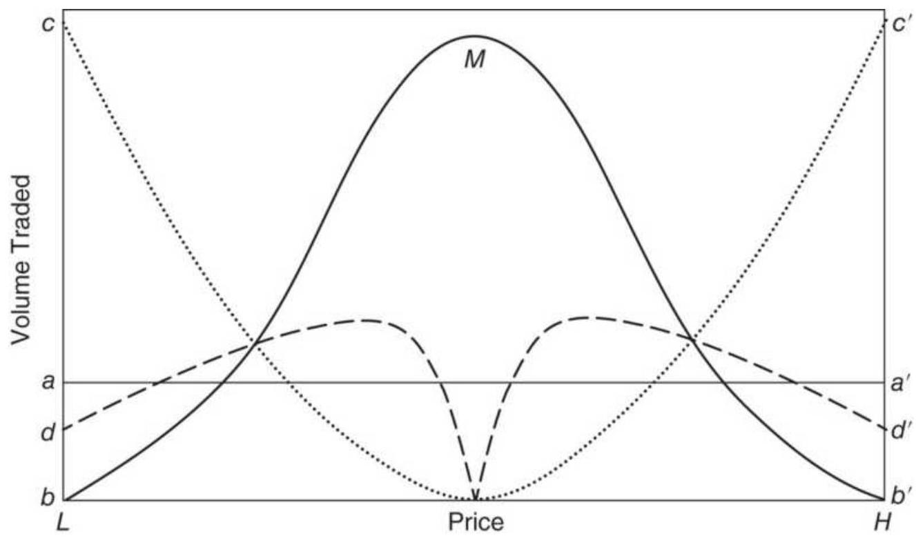
FIGURE 20.14 Daily price/volume distribution shows liquidity.
The solid line \(b b^{\prime}\) is the actual volume on an ideally normal day. Volume is greatest at the median price \(M\) and declines sharply to the high and low endpoints \(H\) and \(L\), where only one trade may have occurred. As we know from previous sections, the time of highest volume will be near the open and close of trading; therefore, \(M\) will occur at the beginning or end of the day, while the end points of \(b b^{\prime}\) will occur near midday.
The dotted line \(c c^{\prime}\) represents the apparent profit for a countertrend system that makes the assumption of a straight-line volume distribution. The endpoints are shown to contribute the largest part of the profits when, in reality, no executions may have been possible near those levels. Assuming the ability to execute at all points on the actual distribution \(b b^{\prime}\), the approximate profit contribution is shown as \(d d^{\prime}\).
For trend-following systems, no profits should be expected when buy or sell orders are placed at the extremes of the day. The actual price distribution \(b b^{\prime}\) is the maximum that could be expected from such a
system; in reality, the entry day is usually a loss.
\section*{TRENDS AND PRICE NOISE}
Throughout this book there are techniques that try to find the underlying trend when the price direction is not clear. The trader who enters a new trend sooner will usually be more profitable, but a market with erratic behavior will be less reliable. What makes a trend so difficult to identify is the price noise. A market with high noise is less predictable. In engineering, the type of behavior that shows no patterns is called white noise, yet the noise that we see in price movement has very definite statistical attributes. In Chapter 1 we discussed the way to measure noise using the efficiency ratio, or fractal efficiency. We found that different markets had different levels of noise, but that the equity index markets had the most noise and short-term rates the least. Also, emerging markets had low noise while markets in the major
industrialized countries had more noise. As the financial systems mature, more investors participate and noise increases. In this section we will look at another aspect of noise: how it directly affects trading. It is still treated as a big-picture item, more important conceptually.
Noise is the product of a large number of market participants buying and selling at different times for different purposes. Each has unique objectives and time frame. Noise includes price shocks - the reaction to unexpected events, in particular news or economic reports; and the effects are usually short-lived. Noise has most of the qualities of a sequence of random numbers. Nearly half of all price moves change direction on the next day; about \(25 \%\) of all price moves continue in the same direction for two days, \(12.5 \%\) for three days, and so on. These patterns should already be familiar to analysts. The size of a price move, or price shock, also appears to be random; that is, \(50 \%\) are quite small, \(25 \%\) are twice as large, \(12.5 \%\) are four times as large, and a few are extremely large.
\section*{When Is It a Trend Change and Not Noise?}
How can you tell if an upward price move is an indication of a new direction or simply more noise? The answer is that you cannot know for sure until prices continue in the same direction. If you are a fundamental analyst, a surprise increase in interest rates by the Fed would be both a price shock and a structural change. Unlike an assassination or unexpected election results, prices will not "correct" to their previous level. Smaller "shocks" occur during a period when the Fed is
systematically raising or lowering rates. Most of them are anticipated, and the market reacts to the difference between the Fed action and what was anticipated.
Figures 20.15 a - \(\underline{\mathrm{c}}\) show how noise varies for different markets and how it affects trend trading. The first could be Eurodollar interest rates, typical of a very low-noise market. Because of less noise, a simple breakout strategy would be able to identify a change of direction in time to capture a large percentage of the price move. The second part (b) represents a market with more noise, but still identifiable trends, such as euro futures. A higher level of noise means that the trend is identified later and exited later, resulting in smaller profits for about the same size move as Eurodollars. The third figure (c) represents what could be the equity index markets, which are exceptionally noisy. By the time the new trend can be identified, entered, and finally exited, there is no profit.
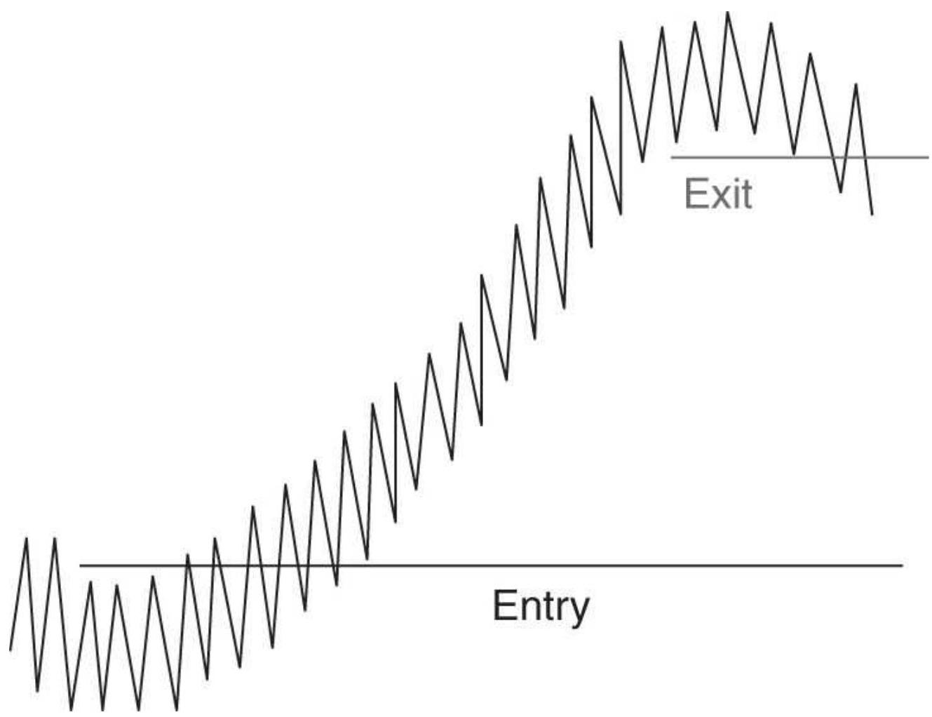
FIGURE 20.15a A low noise market allows sooner entries and exits resulting in larger per-trade profits.
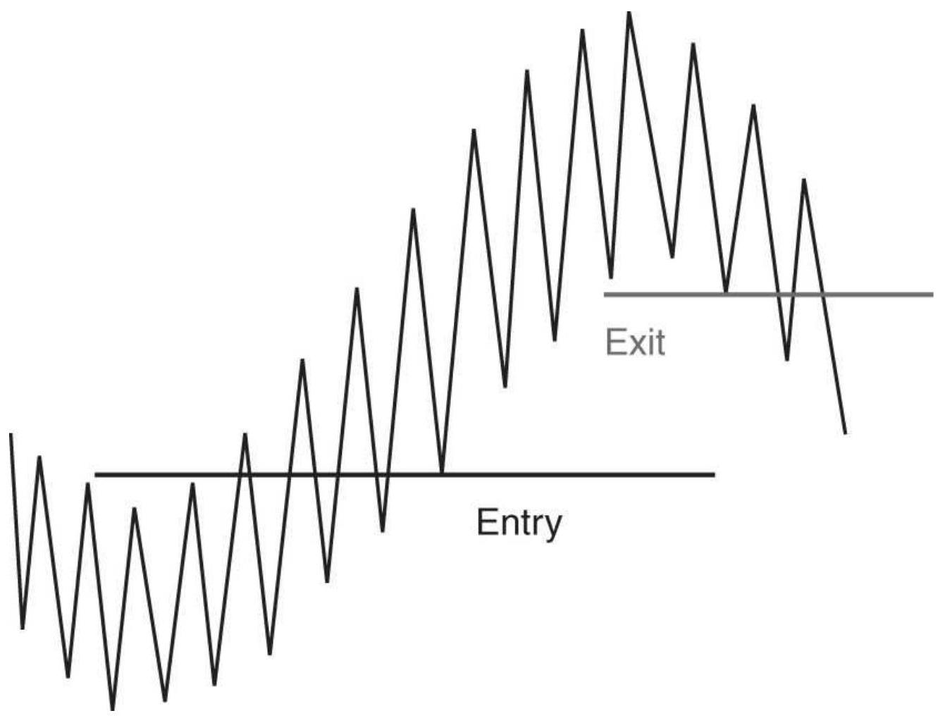
FIGURE 20.15b Increased noise causes entries and exits to be delayed, resulting in less profit for the samesize move.
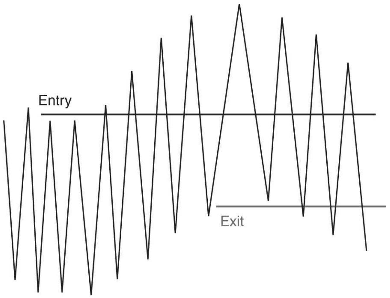
FIGURE 20.15c High-noise markets, typical of an equity index in a major industrialized country, cause entries and exits that are too late to net a profit.
We can improve our chances of entering a new trend, and not being fooled by noise, by waiting until the price changes direction by a larger amount. A small reversal of direction could easily be noise, but as that reversal gets larger, the chance of being a true trend increases quickly. This is the reason why a long-term trend is more reliable than a short-term one.
Figure 20.16 tries to visualize the way noise and the trend calculation period work together. Along the bottom are the absolute returns, showing frequent "normal"
returns and occasional price shocks, some smaller, some larger, some in the trend direction, others in the opposite direction. When a fast trend period is used (on the left), it experiences a large number of price shocks that might cause the trend to change. As the trend period gets longer (towards the right), the trend lags behind and fewer shocks will trigger a trend change. This results in the longer trends being more reliable, although they will suffer from markets swings while holding onto the same trade. There is always the exceptional price shock that affects any trend, as shown toward the right part of the illustration.
As markets evolve, noise increases. If you trade emerging markets, you will find cleaner trends at first, but that will deteriorate over time. To capture the same returns, it may be necessary to use a longer calculation period for trends. If you have already done that, and the noise still prevents you from capturing a trend profit, then switch to mean reversion, emphasizing the shorter holding periods. Noise is dominant in the short term and trends in the long term.
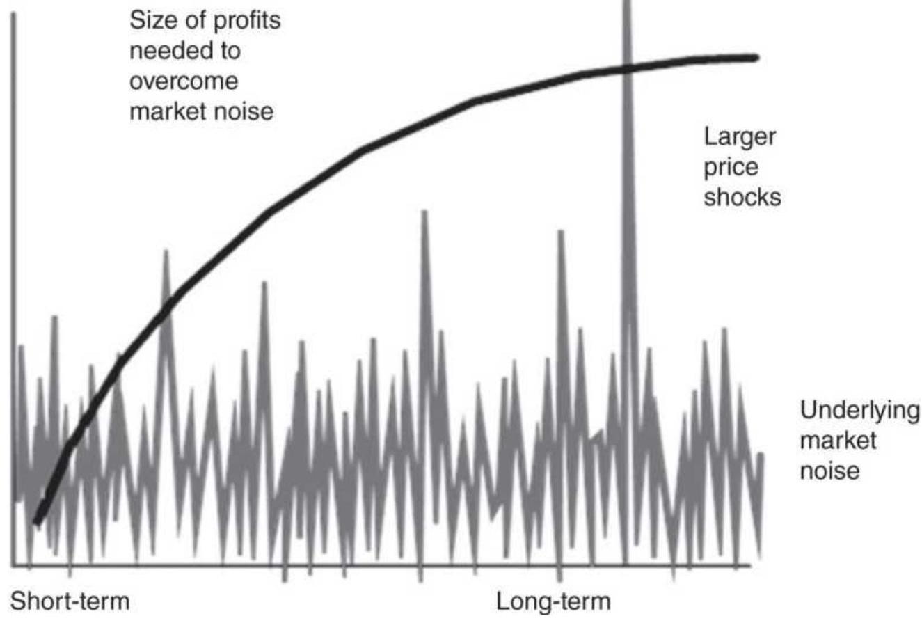
FIGURE 20.16 How the trend calculation period (the curved line) relates to market noise.
\section*{TRENDS AND INTEREST RATE CARRY}
In the environment of exceptionally low interest rates during 2010-2016, an interesting situation developed expressed by the question "Can you profit from using a trend system for interest rates when yields are near zero?" Certainly, there seems to be a good reason for believing that there is little upside profit buying Eurodollars futures above 98 or 10-year notes under a \(2 \%\) yield, and much greater downside risk if yields suddenly increase. Yet, there is still opportunity.
Trading interest rate futures involves rolling into the
new contract every three months ahead of expiration. Each time the data rolls into the next delivery month, it shifts from about 15 days to expiration to at least 105 days to expiration. The net interest on 105 days is much greater than 15 days, so the price of the futures contract will be lower because it is either discounted (as in the case of short-term rates) or simply reflecting a higher yield-to-maturity. If this situation persists for many months, or even years, then staying long the interest rates and rolling every three months continues to extract the carry. While that may not be a large profit in any one contract, the accumulated returns can be rewarding.
On the other side of the ledger is the risk. With low yields there is low volatility. In order to balance short-term rates with other markets, you would need to take large positions in interest rate futures. That exposes you to event risk. A small move, but one that is larger than expected can produce a very large loss.
\section*{FUZZY LOGIC}
The sections that follow, "Expert Systems" and "Game Theory," both use fuzzy logic as part of their process; therefore, we start here. Because trends and indicator calculations are estimations of market movement, very little is strictly true or false; therefore, probabilities are a more realistic way to view the results. For practical purposes, fuzzy will be our level of uncertainty.
The probability of being right can be represented by the percentage of profitable trades. When right, the average payout is the average profits per trade and when wrong
the loss is the average loss per trade. Whenever you can assign a probability to results, the variable can be called fuzzy. When you resolve the fuzziness into a "yes" or "no," zero or one, the answer is called crisp. \({ }^{3}\)
The idea of fuzziness is intended to describe the lack of precision in normal human conversation and thought. In its pure form, the use of fuzziness allows human uncertainty to be introduced into methods of artificial intelligence. For example, we often say:
"There were a lot of people in line at the show." "I had to wait a long time."
"It was really cold while I was waiting."
"The stock market was strong yesterday."
"Unemployment dropped sharply."
In all these cases we understand what is being said, although there are no specific values associated with "a lot of people," "a long time," "cold," "strong," and "sharply." In fuzzy logic, all is not true or false, o or 1, there or not there. True fuzzy logic will answer the question "If a half-eaten apple is still an apple, how much do you have to eat before it stops being an apple?"
The concept of fuzziness includes fuzzy numbers, such as "small," "about 8," "close to 5 ," and "much larger than 10," as well as fuzzy quantifiers, such as "almost," "several," and "a lot of." Phrases such as "unexpected results of government reports cause big moves" is a common fuzzy expression.
\section*{Fuzzy Reasoning}
Fuzzy events and fuzzy statistics are combined into fuzzy reasoning. It is a remarkable phenomenon that the answers to the following examples are clear to the human brain, but not to a machine (the answers can be found in the footnote): 14
Example X is a small price move.
\(1:\)
Y is much smaller than X .
How small is Y?
Example Most price moves are small.
2:
Most small price moves are up.
How many price moves are up?
Example It is not quite true that the quarterly earnings 3: were very bad.
It is not true that the quarterly earnings were good.
How bad were the quarterly earnings?
\section*{Common Approach to Fuzzy Solutions}
In the terminology of fuzzy logic, there are three aspects of problem solving: membership, to show how the data are related to each other; fuzzy rules, to draw conclusions; and defuzzifiers, to turn the fuzzy answers back into usable (crisp) results. \({ }^{15}\)
For example, we would like to predict whether a price move will be big enough to capture the profit needed by our trading system. To have a robust system, we always use a 20 -day trend but would like to predict which price moves will be larger than our minimum goal before we enter the trade. In general, we have found that, given commissions and slippage, we need to net \(\$ 500\) per trade. Because we are using a trend-following system that gives up profits before exiting, we would like to see an \(\$ 800\) peak profit in order to capture \(\$ 500\). Based on our needs, we can define our limits as:
Average peak move between \(\$ 300\) and \(\$ 800\) is acceptable.
Average peak move over \(\$ 800\) is desirable.
Average peak move under \(\$ 300\) is unacceptable.
To decide whether current price movement is likely to give us enough profit to enter a trade, we measure the average price move over every 20-day period for the past 1 year (long term) and for the past 1 month (short term). Based on this approach, we create the following rules:
1. If both the long-term and short-term profit potentials are unacceptable, then the current profit potential is unacceptable.
2. If both the long-term and short-term profit potentials are desirable, then the current profit potential is desirable.
3. If both the long-term and short-term profit potentials are acceptable, then the current profit potential is acceptable.
These three cases are very clear, but what if the longterm and short-term expectations are different because prices are now volatile? For example, if the long-term average peak profits are \(\$ 250\) and those for the shortterm are now \(\$ 600\), what can be expected from the current move? In the current application of fuzzy logic, this converts to a problem in probability for which we need more information about the history of these price moves. Through testing, we find that the 1-year average price move has a standard deviation of \(\$ 75\) and the past 1 month has a standard deviation of \(\$ 200\). We could then construct a diagram that shows the expected results from combining the two measurements (see Figure 20.17). The average returns are shown with descending lines based on their standard deviations. These cross at about \(\$ 350\) per trade, giving a reasonable answer to how to combine the two values.
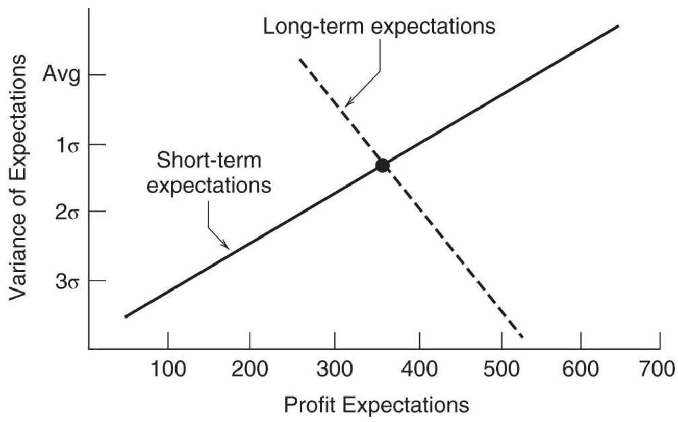
FIGURE 20.17 Expectations of a price move using two time periods.
The potential error in our calculations must also be considered. The longer-term measure used 250 trading days while the short-term used only about 20 days. The standard errors for those calculations are \(6.3 \%\) and \(22.3 \%\), respectively. In the final interpretation of results, we can say that the longer-term data is more important than the short-term values by about 3.5:1. Then we could write additional rules:
4. If the long-term potential is unacceptable and the short-term is acceptable, then the current potential is unacceptable.
5. If the long-term potential is unacceptable and the short-term is desirable, then the current potential is acceptable.
Using these rules, we can claim that we are applying fuzzy logic to our trading; however, the state-of-the-art indicates that fuzzy logic is still hanging onto the coattails of simple probability. When it lets go, it is likely to be the most significant breakthrough in market analysis.
\section*{Turning "Fuzzy" into Trading Decisions}
When it comes to applying the idea of "fuzzy" to trading, it takes on the appearance of a probability threshold, ranking, or scaling in out of a trade. For example, compression ( C ) is defined as each new day having a smaller trading range than the range \(n\) days ago. Then
C (1) will mean a 1-day compression, and \(\mathrm{C}(6)\) will be a 6day compression.
What if the 6-day compression was spoiled on the 4 th day when prices had a slightly larger range? We can say that, instead of \(100 \%\) satisfaction, we had \(5 / 6=83 \%\) satisfaction, provided that the outlier was not much bigger than the range on the start date. We can define a threshold so that a rating of at least \(83 \%\) satisfies the rule. However, we may want to take a smaller position due to less confidence.
How does fuzzy apply to a trend system? Instead of using one trend calculation period, we use three: 30,60 , and 120 days. There are four unique combinations, \((+++,+\) ,,+-+----- ), netting \(100 \%, 33 \%,-33 \%\), and \(-100 \%\). If we use more calculation periods, the number of combinations increases rapidly. The effect of this approach is that we scale in and scale out of a trade as one or more of the trends change direction. If the position size is directly related to the net percentage, the idea of fuzzy becomes crisp, a clear decision.
Noise is an example of relative intensity. The more noise, the harder it is to identify the trend. In Chapter 1 we defined noise as the net price change over \(n\) days divided by the sum of the absolute price changes over the same \(n\) days. The efficiency ratio was o when there was all noise, and 1 when there was no noise, only trend. The intensity of the noise was determined on the scale between \(O\) and 1.
In each case we need a threshold to define the level at which an action, buy or sell, will take place. That changes
fuzzy to crisp. \({ }^{16}\)
\section*{A Candlestick Example}
Ruggiero \({ }^{17}\) has created an example of fuzzy logic to identify the bullish engulfing, evening star, and dark cloud formations of candlestick charting. Pictures of these patterns can be found in Chapter 3, and are defined as:
Bullish engulfing pattern. A bullish outside day follows a down day, seen as a long white body larger than the entire previous day's dark formation.
Bearish evening star. Similar to an island reversal, it is a long white body followed by a gap higher white body, followed by a gap lower dark body.
Bearish dark cloud. A long dark body followed by a lower long white body, where the second day opens above the previous day's high but closes below the midpoint of the open-to-close range.
There are five functions not included but easy to program:
Candlecolor returns a 1 if white, -1 if dark.
Fuzzylong and fuzzysmall functions are true if those formations are satisfied. The current body is long when the current body \(>\) average body \(\times\) trigger1. The body is small when the current body < average body \(\times\) triggero, where trigger \(1>\) triggero. Refbar identifies which bar is the one that is being engulfed over the lookback period.
Windowup and windowdown functions return a number greater than zero when there is a gap in the proper direction.

The four key programs that identify these patterns are available on the Companion Website beginning with \(T S M\) to distinguish them from intrinsic functions. The logic in the programs is as follows:
FuzzyLong (function) returns the value 1 if the candlestick is Long White and o if the candlestick is Long Black. Zerocof is the factor, between 0 and 1 , that defines the length of a Long Black as a percentage of the average open-close range. Onecof is the factor for the Long White.
1. Calculate the range of the candle as \(R_{t}=O_{t}-C_{t}\).
2. Find the level that represents a zero (Long Black), \(z\) trig \(=\operatorname{average}(R, n) \times\) zerocof, where \(n\) is the calculation period, and \(n\) and zerocof are inputs. For example, \(n=20\) and zerocof \(=0.65\).
3. Find the level that represents a one (Long White), onetrig \(=\operatorname{average}(R, n) \times\) onecof, where \(n\) is the calculation period, and \(n\) and onecof are inputs.
4. Find the scale of the bar limits, scale \(=\) onetrig ztrig. If scale \(=0\), then set scale to a large number, 99.99.
5. Define a tall candle as tall \(_{t}=\max \left(0, \min \left(R_{t}-\right.\right.\) onetrig \(_{t}\) )/ scale \({ }_{t}\).
6. If tall \(_{t-1}=1\) and \(R_{t-1}-\) ztrig \(_{t}<>0\), then tall \(_{t}=\) \(\max \left(1,\left(R_{t}-R_{t-1}\right) /\left(R_{t-1,-}\right.\right.\), ztrig \(\left.\left._{t}\right)\right)\)
7. FuzzyLong \(=\) tall \(_{t}\).
FuzzyBullishEngulf(function) returns o (false) if it is not a Bullish Engulfing Pattern and size if it is true. The code for FuzzySmall is not provided; however, it will be very similar to FuzzyLong with smaller factors. The code for Engulfing is not provided but should be simple to create. A bullish engulfing pattern has the open and close of the today (the body) engulfing the high-low range of the previous day. If today closes lower, it is bearish, if higher, it is bullish. It is an outside day.
1. \(\operatorname{Sbody}_{t}=\)
FuzzySmall \(\left(O_{t}, C_{t}, n\right.\),onecof**.3,zerocof*1.0)
2. \(\operatorname{Lbody}_{t}=\)
FuzzyLong \(\left(O_{t}, C_{t}, n\right.\), onecof*2.0,zerocof*1.0)
3. If Engulfing \(\left(O_{t}, C_{t}, 1\right)=1\) and color \(_{t}=1\) and color \({ }_{t-1}\), then
FuzzyBullishEngulf \(=\min \left(\operatorname{Sbody}_{t-1}, \operatorname{Lbody}_{t}\right)\)
FuzzyEveningStar (function) returns o (false) if it is not an Evening Star and the size if it is true.
1. Color \(_{t}=\) candlecolor \(\left(O_{t}, C_{t}\right)\)
2. \(\operatorname{Sbody}_{t}=\)
FuzzySmall \(\left(O_{t}, C_{t}, n\right.\),onecof*0.3,zerocof*1.0)
3. FuzzyRange \({ }_{t}=C_{t}-\left(C_{t-2}+O_{t-2}\right) / 2\)
4. If color \(_{t}=-1\) and color \({ }_{t-2}\) and
\(\operatorname{Window} \operatorname{Up}\left(O_{t}, H_{t}, L_{t}, C_{t}, 1\right)>0\) and \(O_{t}>O_{t-1}\) and FuzzyRange \(_{t}<0\), then:
FuzzyEveningStar \(=\min \left(\right.\) Sbody \(_{t-1}, 1-\) Sbody \(\left._{t-2}\right)\)
FuzzyDarkCloud (function) returns o (false) if not a Dark Cloud and size if it is true. In this function the inputs onecof and zerocof are reversed to test for "not small."
1. Color \(_{t}=\) candlecolor \(\left(O_{t}, C_{t}\right)\)
2. \(\operatorname{Sbody}_{t}=\)
FuzzySmall( \(O_{t}, C_{t}, n\),zerocof*0.3,onecof*1.0)
3. FuzzyRange \(_{t}=C_{t}-\left(C_{t-1}+O_{t-1}\right) / 2\)
4. If color \({ }_{t}=-1\) and color \({ }_{t-1}\) and \(O_{t}>H_{t-1}\) and FuzzyRange \(_{t}<0\), then
FuzzyDarkCloud \(=1-\) Sbody \(_{t-1}\)
This is a clever and useful piece of programming that satisfies our own definition of these candlestick formations. Although it is called fuzzy, the logic still relies on threshold values, trigger1 and triggero, to determine that a body is long or short. Unless you turn fuzzy into crisp, you will not get any trading signals.
\section*{EXPERT SYSTEMS}
An expert system is one in which you draw conclusions based on an accumulated knowledge base that has been
stored as data, facts, and relationships in the form of \(i f\) then-else rules. The person who collects this information is called a knowledge engineer. This process is often
shown as a decision tree, where each "yes" or "no" answer leads down the binary path to the final conclusion; however, the actual process is more sophisticated and more interesting. \({ }^{18}\)
For a trading strategy, data used in the knowledge base should include price and economic data as well as known relationships, such as highly correlated markets move together, and high volatility means high risk. When the first expert systems were developed, the core information was gathered by interviewing experts, which is how the name expert system was derived. The success of this method depends upon the quality and completeness of the knowledge base.
The knowledge base is used by an inference engine, which is able to draw conclusions from the facts stored in the knowledge base. Therefore, if we have the following information:
FACT 1: U.S. bonds are more volatile than Eurodollar rates.
FACT 2: The S\&P 500 is more volatile than U.S. bonds.
FACT 3: Volatility is directly proportional to risk. then the inference engine can create the new fact:
FACT 4: The S\&P is riskier than Eurodollars.
The inference engine provides a straightforward, logical
process; however, there may be many relationships to resolve, not all of which may apply to the problem you would like to solve. For example, if we also have the following facts:
FACT 5: The S\&P has a high degree of noise.
FACT 6: Eurodollars have a low degree of noise.
FACT 7: The S\&P is currently trading below its 200day moving average.
FACT 8: The S\&P is currently trading above its 20day moving average.
FACT 9: The S\&P has been above its 200-day moving average for \(80 \%\) of the past 20 years.
FACT 10: Eurodollar rates are driven by monetary bank policy.
FACT 11: Current monetary policy is dominated by concerns of inflation.
FACT 12: Inflation results in higher interest rates.
FACT 13: Net trading returns for the S\&P have been 40\% per annum.
FACT 14: Net trading returns for the Eurodollar have been \(20 \%\) per annum.
then human logic might conclude that Eurodollar yields are likely to rise because of concerns over inflation. In addition, the S\&P has greater risk, more erratic behavior, and is currently not as strong as it has been on average over the past 20 years, although it is now rising.
Compared to Eurodollars, there is greater risk trading
the S\&P, but its returns have been higher.
How can this expert conclusion be duplicated by a computer? By adding a set of rules that parallels the thinking of experts, a computer can theoretically arrive at the same conclusions. For example:
RULE 1a: IF the Producer Price Index rises by more than the annualized rate of \(4 \%\) THEN we have inflation.
RULE 2a: IF there is high noise THEN there is less chance of a trend.
RULE 3a: IF there is high noise THEN there is greater risk.
RULE 4a: IF the faster trend is above the slower trend THEN prices are trending up.
For each positive rule 1 through 4 , there should also be a negative rule:
RULE 1b: IF the Producer Price Index does not rise by more than \(4 \%\) annualized THEN we do not have inflation.
Rule 2b: IF there is low noise THEN there is a greater chance of a trend.
Rule 3b: IF there is low noise THEN there is lower risk.
Rule 4 b : IF the faster trend is below the slower trend THEN prices are trending down.
Even with the negative rules there are some ambiguous cases. For example, in Rule 4 two trends are in conflict.
In other situations, the positive rule might be true but the negative may not be as strong. In Rule 1b, we see that the effect is that "we do not have inflation" rather than "we have deflation."
\section*{Forward Chaining}
The process of combining the rules and facts in order to yield an expert opinion is called forward chaining. For example, beginning with FACT 6, "Eurodollars have a low degree of noise," we find the relevant rule, RULE 3 b: "IF there is low noise THEN there is lower risk" and create a new fact that "Eurodollars have (relatively) low risk." Note that in each case the terms low, high, and faster, are all relative.
Once we have this new fact, that Eurodollars have relatively low risk, and we similarly conclude that the S\&P has "relatively high risk," we can also conclude that the Eurodollars have lower risk than the S\&P. The process of following the path of each fact as it is handled by various rules is called forward chaining. It will lead to other rules and other facts; it may be that the expert opinion will be found along this route, or that the combination of new facts, such as the relative risk between the Eurodollars and the S\&P, will provide the expert opinion.
This example shows only a few facts that can be easily summarized; however, there are thousands of pieces of information about performance characteristics, relationships to other markets, and fundamental factors that might alter expectations. If accumulated by asking
experts, it is also likely that there will be conflicting information. While the human brain has a remarkable ability to sort through these items and select the information it considers most relevant, some important items can be overlooked or combined incorrectly when there is too much to consider. An expert system is expected to use all of the data and reduce it to a single decision. In doing this it must also select the most significant facts and resolve conflicts associated with the proper order of events and the time horizon of the investor.
\section*{A Technical Expert System}
An expert system can treat indicator values as expert opinions and create systems without the fundamental relationships shown in the previous section. An example by Fishman, Barr, and Loick \({ }^{19}\) applied to the DJIA defines the rules as the relationships between the various indicators and calculations, and the facts as the values of those items. The purpose of this expert system is to inspect trending and nontrending characteristics of price movement to give the probability of a continued trend. The following example is adapted from their article:
Rule 1: IF ADX > 18 AND ADX > = ADX[2]
AND nontrending is false or undefined
THEN there is a \(95 \%\) chance the market is trending
\section*{Rule 2: IF ADX < 30 AND ADX < = ADX[2]}
AND trending is false or undefined
THEN there is a \(90 \%\) chance the market is nontrending
Rule 3: IF the market is trending
. THEN MACD = probability of 0.80 AND SD = probability of 0.85
Rule 4: IF the market is nontrending
. THEN MACD = probability of 0.55 AND SD = probability of 0.75
Rule 5: IF stochastic AND SK[1] < 30 AND SD[1] < 30 AND SK[1] < SD[1]
AND SK < SD THEN sell with 80\% confidence
Rule 6: IF stochastic AND SK[1] > 70 AND SD[1] > 70 AND SK[1] > SD[1]
AND SK \(>\) SD THEN buy with 8o\% confidence Rule 7: IF MACD AND MACD value > signal line value
. THEN buy with \(75 \%\) confidence
Rule 8: IF MACD AND MACD value < signal line value
. THEN sell with \(75 \%\) confidence
where
\(\mathrm{ADX}=\) the current 18-period ADX calculation (See Chapter 23.)
\(\mathrm{ADX}[2]=\) the ADX value 2 periods ago
MACD = the Moving Average
Convergence/Divergence with smoothing constants 0.15 and 0.075
\(\mathrm{SK}=\) a 9-period, \(\% \mathrm{~K}\) fast stochastic
SD = a 9-period, \%D slow stochastic
Undefined means that there is no information about the values. The expression "IF stochastic" is a test to see if this option is being used. The facts are the actual values to be used in the sample evaluation:
FACT 1: \(\mathrm{ADX}=19\)
FACT 2: \(\mathrm{ADX}[2]=19\)
FACT 3: \(\mathrm{SK}=90\)
FACT 4: \(\mathrm{SD}=80\)
FACT 5: SK[1]-SK \(=68\)
FACT 6: \(\operatorname{SD}[1]-\mathrm{SD}=92\)
FACT 7: signal line value \(=-70\)
FACT 8: MACD value \(=-68\)
FACT 9: the market is trending
The results, expressed as probabilities, offer greater insight into the likelihood of success using this method. Arriving at these probabilities, however, requires additional decisions. Without any further information, we can assume that there is only a \(50 \%\) chance that the stochastic is a correct trend indicator. If we were to test the number of times the stochastic indicated an upward
move and recorded the number of days that the subsequent price moved higher, we could get a much better indication of the chance of success.
\section*{A Fuzzy Expert System}
In an article by Paulo Merloti, fuzzy indicators are combined with expert rules for trading stocks. \(\underline{20}\) This requires an indicator, MAD (called moving average divergence), that "predicts" the direction and strength of tomorrow's price move. The size of the expected stock price move will be rated as low, medium, and high. The \(M A D\) indicator will return \(D\) (down), \(Z\) (zero), and \(U\) (up). The combinations of these price and indicator will be resolved into \(B M\) (buy more), \(N T\) (no trade), and \(B F\) (buy few), and their counterparts \(S M, N T\), and \(S F\).
The article emphasizes that changes in stock prices have a large random component; therefore, the following values are set after the open of the current trading day \(t\), and predict only today's price and today's indicator, not future values.
The expected price at the close of \(t\) :
\[
p(t)=10+3 \sin (2 \pi t / 17)+0.6 \cos (2 \pi t / 3)+r(t)
\]
the indicator at open of \(t\) :
\[
M A D(t)=0.3307 \cos (0.33 t)-0.0542 \sin (0.33 t)
\]
The last term in the price series is a random component:
\section*{\(r(t)=\operatorname{RAND}(t) \times(t \% 4)\)}
where RAND returns a random number between -1 and +1 , and \(t \% 4\) means \(t\) modulo 4.
Other conditions are an investment of \(\$ 10,000\), and for short sales, the ability to borrow \(70 \%\) of your equity on a margin of \(0.3 \%\) per day. The stock price can vary from \(\$ 0\) to \(\$ 20\) and the MAD indicator from -3 to +3 .
The daily trading decisions are resolved using the three tables shown in Figure 20.18, each representing a different test.
Test 1. If a stock has low volatility today and MAD indicates that it will be up tomorrow (U), then buy more (BM). If the stock price has high volatility today and MAD indicates that it will be down tomorrow (D), then sell more (SM).
Test 2. The basic concept that if there is a large random component, then buy low and sell high (a meanreversion strategy). The MAD indicator is not used.
Test 3. Similar to test 1 but includes the idea that if today's price is lower, then tomorrow may also be lower; therefore, we wait until tomorrow's open to make a decision. The same applies to prices that are higher today.
Test 1
\begin{tabular}{|c|c|c|c|c|c|c|c|c|c|c|c|}
\hline u & BM & BF & SF & u & BM & NT & SM & u & BM & BF & NT \\
\hline z & BF & NT & SF & z & DM & NT & SM & z & BF & NT & SF \\
\hline D & BF & SF & SM & D & BM & NT & SM & D & NT & SF & SM \\
\hline & Low & edium & High & & Low & edium & High & & Low & Medium & High \\
\hline
\end{tabular}
FIGURE 20.18 Three matrices associated with trading signals for three different tests.
\section*{Results}
Remembering that this test was performed on artificial data, test 2 far outperformed the other two tests. Test 2 is similar to a market-maker approach, buying when prices dip and selling when they rally. It is possible that real data will produce the same results unless there is a strong trend. Test 1 significantly outperformed test 3 . To have the best chance of success with this expert system, choose index markets, which have the most noise.
It would be ideal for system developers if there was a way of creating synthetic data so that there is an unlimited amount of data for testing. No matter how cleverly it's constructed, the computer finds and exploits the components of synthetic data, in this case the random price movement, in other cases, the trend or cycle. You cannot yet rely on the test results from synthetic data to show you if you have a successful strategy.
\section*{GAME THEORY}
Long before the movie A Beautiful Mind made people aware of John Nash and Game Theory, John Von Neumann standardized the idea in 1928, and later in his 1944 book, Theory of Games and Economic Behavior, coauthored with Oskar Morgenstern. Now, game theory has found applications in business negotiation, asset pricing, portfolio allocation, and, only recently, in trading.
The "game" part of game theory is to find a solution in a conflict situation where both players are satisfied. It could be called an optimal solution, although you will see that it is not always the best solution for either party. Instead, it is equilibrium, the solution defined by Nash as the one most acceptable.
\section*{Terminology}
Every venue has its own terminology, which can also be helpful in understanding the process:
\section*{Cooperative or Noncooperative. In a}
cooperative solution, each player agrees to abide by certain rules. That doesn't work for trading, because we don't understand why another trader will buy or sell, or what rules they will follow, so we will use the noncooperative solution, where you need to defend yourself from a wider range of responses by the other party.
Simultaneous or Sequential. In chess, each player moves in turn - that is, sequentially. In trading, each player can move whenever he or she wants, and as often as they want. We will use the simultaneous solution. That approach will be represented using a payoff matrix.
Perfect or Imperfect Information. Perfect information has a limited set of choices, such as a chess game or tic-tac-toe. Trading is much more complex, and we may not even be able to reasonably account for all the moves and combinations, making it imperfect.
Discrete or Continuous. In a discrete game we will be able to define the number of outcomes, events, and other factors. For trading that could be simply up or down, or it could be some ranking of up or down, such as strong up. Depending on the nature of your solution, it could be either discrete or continuous.
\section*{Matrix Representation}
We will use what is called the normal form, which shows the players, the strategies, and the payoffs in a matrix. Example 1 shows a 2-player, 2-strategy matrix with the payoff in each box; the left number in each box is the payoff for Player 1 and the right for Player 2.
Example E1 2-Player, 2-strategy game in normal form.
\begin{tabular}{|c|c|c|}
\hline & \begin{tabular}{c}
Player 2 \\
chooses \\
Left
\end{tabular} & \begin{tabular}{c}
Player 2 \\
chooses \\
Right
\end{tabular} \\
\hline \begin{tabular}{c}
Player 1 \\
chooses \\
Up
\end{tabular} & \(5,3,4,4\) \\
\begin{tabular}{c}
Player 1 \\
chooses \\
Down
\end{tabular} &
\end{tabular}
In this game, Player 1 can choose the row and Player 2 can choose the column. If they can only see their choices,
then Player 1 sees \(\left[\begin{array}{cc}5 & -1 \\ 2 & 1\end{array}\right]\) and chooses Up, which it turns out could pay out either 5 or -1 . Player 2 sees
\(\left[\begin{array}{cc}3 & -1 \\ 2 & 4\end{array}\right]\)
and chooses right, hoping to capture the 4.
We then have the solution at Up-Right and the payout to
each player is -1 .
If the players can see both entries, and they take turns and Player 1 goes first, then chooses Up, Player 2 now can choose Right and they both get -1 or Left and be satisfied with 3 . If Player 2 goes first and chooses right knowing that Player 1 will choose Up, both players end with a positive payout.
If both players choose simultaneously - that is, they don't know which choice the other will make - the situation is very different. Player 1 would like to choose Up and Player 2 would like to choose Right, but they know they will end up with a loss. If Player 1 chooses Down, he will either get 2 or 1 , better than -1 . If Player 2 chooses Right because he believes that Player 1 won't be greedy, then he can get 4. If they are both greedy, they get -1 . It becomes a game of psychology, not very different from the Prisoner's Dilemma \({ }^{21}\) and real-life negotiations.
\section*{A Frustrating Solution}
A real example can be found in the scrap metals
business. \(\underline{22}\) In this scenario a collection of scrap gold (jewelry, etc.) is melted and then representatively sampled. A portion of the sample is given to the refiner and the customer (the two players) for assay. A third portion is put aside for an impartial referee analysis should it become necessary. All three parties - refiner, customer, and referee - are assumed to have equal expertise in the analysis method.
Following the sample analysis, the customer and refiner
simultaneously exchange their sample analysis results. If the difference between the assay results is less than a previously agreed upon maximum difference in value, the average of the two results becomes the final settlement value and the settlement process is complete. If the difference between the reported results is greater than the previously agreed-upon maximum acceptable difference, the third sample portion is sent to the impartial referee for analysis. The final settlement becomes the middle value of the now three analysis results. The player, customer or refiner, reporting the assay that is farthest in absolute value from the middle (settlement) value is obligated to pay the referee analysis fees. Because the refiner and customer do not trust one another, both tend to exaggerate their measured assays in their favor before reporting to the opposite party. Excessive skewing of the measured assay will lead to referee involvement and the payment of fees. Reporting the measured assay without any skew or a skew too small leaves that player open to losses from skewed assays reported by the opposite party.
They could resolve the difference by simply reporting measured assays, then accepting the average of their own and the opposing player's reported results, but neither trusts the other. They follow these steps:
1. Each assays the gold bearing sample as accurately as possible.
2. Each player estimates the opposing player's measured assay to be very close to their own since they have very similar assaying capabilities and are
both using parts of the same sample.
3. The customer attempts to find an optimal assay skew. A financially optimal skew will be one where the refiner cannot gain from the exchange by using greater skew but at the same time not increasing the skew so much that the simultaneous exchange will end in referee involvement that will require the customer to pay analysis fees.
4. The refiner uses the same logic as the customer in adjusting his measured assay.
5. Importantly, both the customer and the refiner know the other is using the same optimization reasoning.
6. Using expected financial outcomes from various exchange scenarios, the customer and refiner determine a Nash equilibrium analysis result to report to the other at the time of the simultaneous assay exchange.
The assay results are shown in Figure 20.19. The customer chooses the column and the refiner choose the row. The payouts are in the intersecting boxes, on the top right for the customer and bottom left for the refiner. For the customer, the assay values are at the top and for the refiner they are on the side. The customer will need to raise his measured assayed value to offset the effect of a refiner assay skew and the refiner will need to lower his reported assay value as an offset to any customer assay skew.
\begin{tabular}{|c|c|c|c|c|c|c|c|c|c|c|c|}
\hline & & & & & (Col & Custom & & & & & \\
\hline & & 0.00 & 0.08 & 0.10 & 0.12 & 0.14 & 0.16 & 0.18 & 0.20 & 0.22 & 0.24 \\
\hline & & -2 & 103 & 122 & -97 & 174 & 198 & 224 & 250 & 272 & 293 \\
\hline & & -2 & -97 & -127 & -149 & -175 & -201 & -225 & -247 & -272 & -298 \\
\hline & -0.08 & 101 & 0 & 24 & 48 & 72 & -100 & 119 & 138 & 147 & 148 \\
\hline & -0.10 & \begin{tabular}{l}
-126 \\
123
\end{tabular} & 24 & 1 & \({ }_{-24}^{25}\) & -52 & -73 & \begin{tabular}{|c}
89 \\
-97
\end{tabular} & & \begin{tabular}{r}
107 \\
-134
\end{tabular} & \begin{tabular}{|c}
108 \\
-144
\end{tabular} \\
\hline & -0.12 & \begin{tabular}{l}
-152 \\
147
\end{tabular} & \(49{ }^{-50}\) & \(23{ }^{-25}\) & \({ }^{-1}\) & \({ }^{25}\) & \({ }^{-50} 43\) & \({ }^{57}\)\begin{tabular}{c}
57
\end{tabular} & -93 6 & ( 7 & ( \begin{tabular}{r}
61 \\
-113
\end{tabular} \\
\hline \begin{tabular}{l}
Refiner \\
(Row \\
Player)
\end{tabular} & -0.14 & \begin{tabular}{|c|}
\hline 176 \\
173 \\
\hline
\end{tabular} & \(74{ }^{-74}\) & \(48-49\) & 23 & -3 & \({ }^{27}\) & \({ }_{-52}^{28}\) & \({ }_{-74} 38\) & & 13 \\
\hline & -0.16 & \begin{tabular}{l}
-199 \\
200
\end{tabular} & \(98-98\) & \(68^{-73}\) & \(41^{-52}\) & \(1_{16}^{-29}\) & \({ }_{-12}^{-14}\) & \({ }_{-35}^{-4}\) & -60 & \({ }_{-69}^{-4}\) & (72 \begin{tabular}{c}
-30 \\
-72
\end{tabular} \\
\hline & -0.18 & \begin{tabular}{l}
-224 \\
224
\end{tabular} & \({ }^{-123}\) & \(90^{-97}\) & \(61^{-71}\) & -49 & \({ }_{-1}^{-36}\) & \({ }^{-26}-2\) & \({ }^{-32}-47\) & \({ }^{-64}-{ }^{-33}\) & (256 -5 \\
\hline & -0.20 & \begin{tabular}{l}
-249 \\
249
\end{tabular} & \begin{tabular}{c}
-144 \\
136
\end{tabular} & \begin{tabular}{c}
-117 \\
103
\end{tabular} & -93 & \(3^{-75}\) & -57 & & \({ }^{-50}-5\) & \({ }^{-61}-63\) & -65 \\
\hline & -0.22 & \begin{tabular}{l}
-272 \\
272
\end{tabular} & 143 & \begin{tabular}{l}
-136 \\
108
\end{tabular} & \(6{ }^{-107}\) & -86 & -75 & -62 & -64 & -71 & -88 \\
\hline & -0.24 & \begin{tabular}{l}
-296 \\
292
\end{tabular} & \({ }^{-173}\) & \begin{tabular}{l}
-144 \\
108
\end{tabular} & \(5^{-113}\) & -97 & & & \(\left\lvert\,\)\begin{tabular}{c}
-67 \\
-77
\end{tabular}\right. & \(\left\lvert\,\)\begin{tabular}{r}
-73 \\
-82
\end{tabular}\right. & -88 \\
\hline
\end{tabular}
FIGURE 20.19 Payout matrix for customer and refiner. Refiner chooses the row and customer chooses the column. The box \(-0.18 \times 0.18\) is the Nash equilibrium.
The Nash equilibrium is the location (assay exchange skew) where the customer cannot improve his position by moving left or right, and the refiner cannot improve his position by moving up or down. That location is ( \(-0.18,0.18\) ). Both players see essentially the same matrix and will reach the same conclusion. The frustrating part is that, if both refiner and customer trusted each other, they would have chosen to raise and
lower their values by 0.10 and had a payout of 1 each rather than a loss of 26 and 28 . The losses result from exchanges where either the customer or the refiner must occasionally pay referee analysis fees, which could have been avoided if the players trusted each other. In the end, the result is similar to the previous example, where greed resulted in a loss by both players.
\section*{A Trading Example}
Game theory is only now touching the financial markets, but there are no practical examples for trading. In this section, we create our own in the hope that traders will advance this idea or find even better applications.
Player 1 is a trend trader and Player 2 is a meanreversion player; therefore, when one is buying, the other is selling. We will look at markets that are trending up and trending down, by whatever indicator you use. The market will be the S\&P, which has an upward bias. Example 2 is the matrix that shows the payouts given different situations. Player 1 (the left value in each box) has only one payout. Player 2 has two payouts, depending on market conditions. The left entry in each box is the payout given a favorable price move, making the entry better; the right is a normal entry condition.
Example E2 Player 1 is a trend follower and Player 2 is a mean reversion player. Player 1 has only 1 payout for each combination while Player 2 has a payout based on other conditions.
\begin{tabular}{|c|c|c|}
\cline { 2 - 3 } & Trend is UP & Trend is DOWN \\
\hline BUY & \(100,[60,0]\) & \(0,[65,40]\) \\
\hline SELL & \(0,[20,-10]\) & \(75,[50,0]\) \\
\hline
\end{tabular}
The upper-left box shows that trend traders will get an average profit of \(\$ 100\) if the system buys when the trend is up. In the bottom right, trend traders will earn \(\$ 75\) if they sell when the trend is down. Buying is more profitable than selling. Trend traders are not allowed to buy when the trend is down, or sell when the trend is up, so the return in each of those cases is zero.
The mean-reversion traders have a more complicated situation. In the top-left box (the right entry) the meanreversion traders will buy when the trend is up, but wait for a pullback, earning \(\$ 60\) because the S\&P is biased to the upside. On the other hand, if the traders do not wait for a pullback, the payout is zero, hence the notation \([60,0]\). The top right shows the mean-reversion traders buying when the trend is down. If they wait for a sharp drop, they can make \(\$ 65\) because of the upward bias; otherwise, they make \(\$ 40\).
In the lower left, the mean-reversion traders sell when the trend is up. If they wait for a jump up and then sell,
they gain \(\$ 20\), otherwise they lose \(\$ 10\). In the lower right, the traders sell when the trend is down, but only on a rally, when they earn \(\$ 50\); otherwise, there is no trade.
This example points out that the trend trader has a better payout when buying in an upward trend. Selling in a downward trend is profitable, but not as much. The mean-reversion trader does best by waiting for an extreme price move and should only avoid selling in an uptrend. If you need to choose between trending and mean reversion, the results net out to be almost the same.
\section*{FRACTALS, CHAOS, AND ENTROPY}
Chaos theory is a way to describe the complex behavior of nonlinear systems, those that cannot be described by a straight line. It is also called nonlinear dynamics. Chaotic systems are very sensitive to initial conditions, that is, they will form different patterns and have different behavior depending on their initial "push." Chaotic systems appear, at first, to be random but turn out to have complex, underlying patterns. A popular analogy is the pattern created by raindrops falling on a pond. Each drop hits randomly, forming small waves that fade or are overlapped by the effects of other drops. Some drops can be small and others large. In the financial markets, the continuous flow of news acts as raindrops on prices. The most recent may be most significant, but that fades at the same time other news arrives. There is no way to predict the frequency or
significance of each news event, but once it is known, the effects can be measured.
The combination of randomness and feedback adds to the complexity. Traders have positive feedback when they buy and prices then rise. They will buy more. They have negative feedback when they buy and prices fall. They will then sell. Each trader has his own risk limits and time horizon, making their actions similar to raindrops landing on the market.
\section*{Fractals}
One method of measuring chaotic systems is with various geometric shapes. This effort has resulted in an area of mathematics now called fractal geometry; its approach strikes a true note about how the real world of numbers actually works. \({ }^{23}\) All of us have been taught Euclidean geometry in school; it is the world of straight lines and clean edges in which we can measure the length of a line or the area of a rectangle very easily. In the real world, however, there are no straight lines; if you look closely enough - using a microscope if necessary all "straight lines" have ragged edges and all may be described as chaotic.
\section*{Fractal Dimension}
In fractal geometry we find that there is a way of representing the irregularity of numbers and the formations seen in nature. We first must accept the notion that there are no whole numbers in nature, that real-world objects are more likely to be described as
fractional or having a fractal dimension. The classic example of this is the algebra of coastline dimension. We will see that the questions "How long is the coastline?" and "How far did prices move?" are very similar.
The answer to both of these questions is "That depends on how it is measured." Expanding on an example earlier in this book, consider the problem of measuring the coastline of Australia using a large wall map. If we take a 12 -inch ruler and place each end on a part of the coastline, then move the ruler to the next part of the coastline, we might find that the coastline is about 10 feet (perhaps 10,000 miles according to the scale). Using a 12-inch ruler requires that we cross over parts of the coast that jut out into the water; in other cases we might span a large harbor in order to get both ends of the ruler to touch the coastline. Had we taken a slightly smaller ruler we would have been more accurate and perhaps have found the coastline to be 15,000 miles; even a smaller ruler would have followed the contours better and found 20,000 miles of coast. As the ruler gets smaller, our coastline measure gets longer. If we had an infinitely smaller ruler, the coast would be infinitely long. There is really no correct answer to the question "How long is the coastline?" It all depends on your ruler.
Fractal dimension is the degree of roughness or irregularity of a structure or system. In many chaotic systems there is a constant fractal dimension; that is, the interval used for measuring will have a predictable impact on the resulting values in a manner similar to a normal distribution. Therefore, if we used a 12 -inch ruler to get 10,000 miles of coastline, we might expect a
predictable relationship of coastline to ruler:
24-inch ruler 5,000-mile coastline
12-inch ruler 10,000-mile coastline
6-inch ruler 20,000-mile coastline
Note that the large 24 -inch ruler returns a value that is actually smaller than what we believe is a reasonable answer. Some rulers just don't make sense for our measurements.
\section*{Fractal Efficiency}
In Chapters 1 and 17, there is a discussion of Kaufman's Efficiency Ratio. This ratio is formed by dividing the absolute value of the net change in price movement over \(n\) periods by the sum of all component moves, taken as positive numbers, over the same \(n\) periods. If the ratio approaches the value 1.0 , then the movement is perfectly smooth (not chaotic); if the ratio approaches o, then there is maximum inefficiency, chaos, or noise. This same measurement has been renamed fractal efficiency. In Chapter 17, Kaufman related this to trending and nontrending price moves, when the ratio approached 1.0 and o, respectively. While each market has its unique underlying level of noise, the measurement of fractal efficiency should be consistent for any one market over all time spans: weekly, daily, and intraday. Markets may vary in volatility, although their chaotic behavior is technically the same; therefore, theoretically, the characteristics of one market may be compared to others by matching both the fractal efficiency and volatility. In reality, there are small differences in fractal efficiency
due to the participation and liquidity of markets; however, once these differences have been considered, the treatment of price behavior can be the same.
The interpretation of fractal efficiency as noise allows trading rules to be developed. For example, a market with less noise should be entered quickly using a trending system while it would be best to wait for a better price or use mean reversion if the market has been rated as high noise. A noisy market is one that continues to change direction while an efficient market is smooth or persistent in the direction price movement. When viewed in the long term, the level of market noise should determine the type of strategy that should be applied to each market. These characteristics are important in choosing trading rules and in turning a theoretical model into a profitable trading system.
\section*{Chaotic Patterns and Market Behavior}
Chaotic patterns in prices are easy to visualize but very difficult to measure. There would be no problem in predicting price direction if every participant reacted in the same way to the same event, much the way a single planet would smoothly orbit a single sun. In the real world nothing is quite as simple. Consider the pattern of prices represented as nearby moons, \(a\) and \(b\), that are each circling nearby planets of equal mass, \(P 1\) and \(P 2\). Because the planets are larger than the moons, they are called attractors. We will get a wobbly pattern whenever the moon passes across the midpoint where one attractor is stronger than the other, shown as a straight line in Figure 20.20a. A moon at point \(a\) is most affected by the
nearest attractor, \(P_{1}\), but as it circles it becomes closer to P2 and tries to form an orbit around that planet. It might form a figure \(\infty\) pattern as it switches between \(P_{1}\) and \(P_{2}\), ending up in location \(b\) on the far side of \(P 2\). The possible patterns are too complex and they vary based on the distance between \(P_{1}\) and \(P_{2}\) and the size of \(P_{2}\) compared to \(P 1\). If attractor \(P 2\) is much larger than \(P 1\), as in Figure 20.20b, there will simply be a distortion in the orbit around \(P 2\) at the location of the straight line, rather than a switching of orbits from one planet to another.
As complex as these patterns might get, they are simple when compared to reality. Each day brings events of varying importance into the market, acting as attractors. Each attractor has an initial importance that loses value over time. To make matters worse, we cannot always predict when a new attractor, or news event, will appear. When we can predict the time, such as an economic report, we cannot predict the impact.
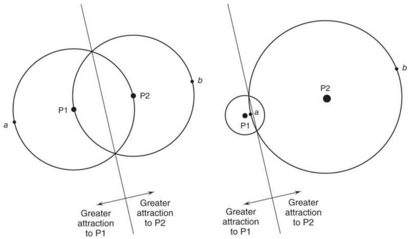
Size of orbit shows reflective effect of events.
(b)
(a)
FIGURE 20.20 (a) Equal attractors cause a symmetric pattern, often a figure \(\infty\), that switches between P1 and
P2. (b) Very unequal attractors show only a small disturbance in a regular orbit.
\section*{Using Fractal Patterns}
The most popular interpretation of chaos, and its trading application, is done using fractal patterns. Specifically, a 5-bar candle pattern that shows the inability for prices to rise, or the opposite pattern for declining, seems to be the common indicator. If we think about market noise, a 2- or 3-bar pattern is much more likely to happen by chance, so using 5 bars increases the likelihood that the pattern is significant. \(\underline{24}\)
An up fractal is very similar to a 5-bar pivot point, two
bars to the left with lower highs and two bars to the right with lower highs. A down fractal is the opposite, two bars to the left with higher lows and two bars to the right with higher lows. An up fractal indicates that the market is struggling to go higher, and a down fractal that it resists going lower. If the center bar is an outside bar, it is possible for the 5 -bar pattern to be both an up fractal and a down fractal. In each case, a trade cannot be made until the fifth candle is complete. \({ }^{25}\)
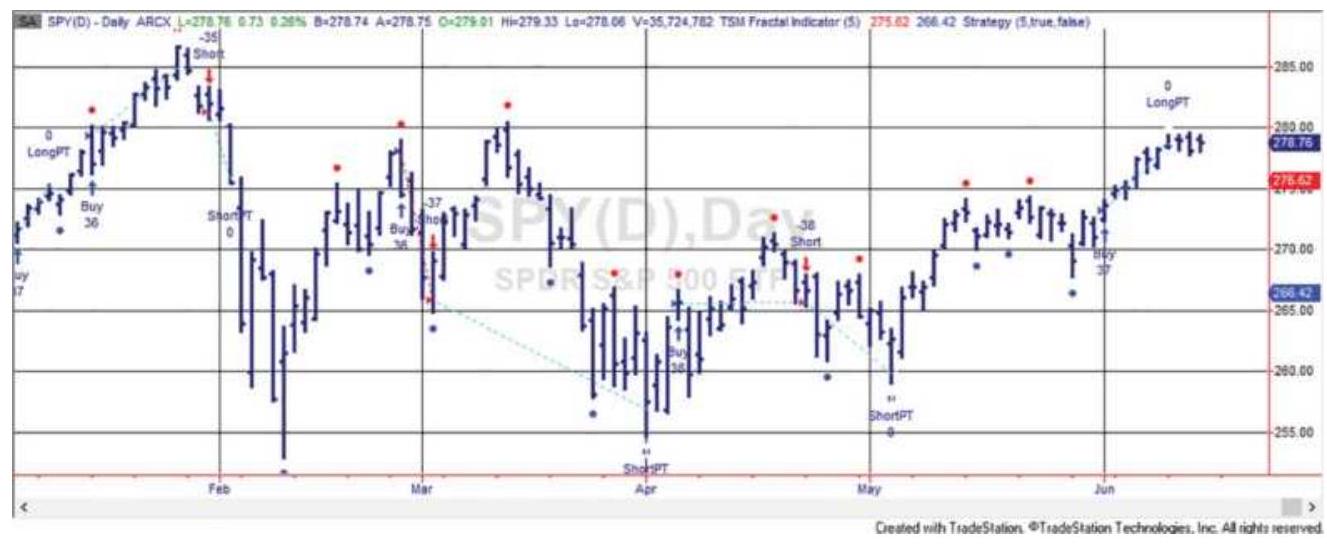
FIGURE 20.21 Points indicating fractal patterns as well as trading signals and profit-taking. A buy fractal is shown as a dot above the price and a sell fractal is below. Applied to SPY, January-May 2018.

Figure 20.21 shows a combination of up and down fractals, indicated by the dot above and below (a dot above indicating an up fractal). A dot above and below the same bar indicates that both patterns are satisfied. These points were generated by TSM Fractal Indicator on the Companion Website.
When a high or low goes above or below the previous fractal, it is called a broken fractal. That idea is used in the trading rules for the following strategy:
- Buy following a down fractal when the price goes above the highest high of the down fractal pattern.
- Sell after an up fractal when prices break below the low of the up fractal.
- Place a sell stop at the low of the fractal pattern or a buy stop at the high of the fractal pattern.
An additional rule has been added:
Take profits equal to the high-low range of the fractal pattern, measured from the trade entry point.

Testing of SPY from 2000 to 2018 was profitable for long positions with \(58 \%\) reliability. Using profittaking but not stops was the best combination, a result that is common for most short-term trading. You can test this yourself using TSM Fractal Strategy on the Companion Website.
\section*{Entropy: Predicting by Similar Situations}
Forecasting by finding a similar combination of factors, similar conditions, that occurred in the past has always been a technique used by fundamental analysts. It is necessary to match the state of major economic indicators with the less quantifiable government policy, then look at how the prices reacted to these similar setups in the past. \({ }^{26}\) The entire concept in charting, and
in most technical analysis is based on a predictable outcome following a specific chart or indicator pattern. These patterns can be simple or complex, exist in a single time frame or be the composite of multiple time frames.
There is one mathematical method that comes closest to being able to identify similarities in price patterns. While entropy is defined as a state of disorder, conditional entropy can measure the probability that two patterns are similar. When the value of conditional entropy is high, two patterns are closely matched. Advocates of entropy believe that similar patterns are likely to result in similar outcomes. \({ }^{27}\) This has an analogy in autocorrelation and even fuzzy logic, and conceptually, in any forecasting model.
\section*{Entropy}
Entropy is a measurement of expectations. If the output of a system is known, and there is no uncertainty, the value of the entropy formula is zero. When entropy is low, the state of the system is easy to predict. As the output becomes less certain, the value approaches 1 and there is more disorder. Entropy, \(H\), is defined as a function of price, \(x\) :
\[
H(x)=-\sum_{i=1}^{n} p_{i}(x) \log _{2} p_{i}(x)
\]
where \(x\) can have \(n\) different values, and \(p_{i}(x)\) is the probability that the outcome will be the \(i\) th value of \(x\).
When the system has only one possible outcome, \(n=1\) , then \(H(x)=0\). If all \(n\) possible outcomes have an equal probability, then uncertainty is maximized and \(H(x)=\log (n)\). Therefore, if there are 16 possible outcomes, the maximum entropy is 4 . It is convenient to normalize the value of the entry by dividing by the maximum value \(\log (n)\).
As an example, consider the price moves that follow a particular chart pattern, where prices close in the upper \(10 \%\) of the daily trading range and the stock is above its 200-day moving average. The hypothetical frequency of the next day's move is shown in Table 20.3. The calculations in the columns follow the formula \(H(x)\) and show the result \(H(\) pattern \()=2.20\). The maximum entropy for a 6 -scale variable is \(\log _{2}(6)=2.58\); therefore, there is considerable uncertainty in the ability of this pattern to forecast 1 day ahead.
TABLE 20.3 Frequency of price moves following a known pattern, including entropy calculations.
\begin{tabular}{|c|c|c|c|c|}
\hline \begin{tabular}{c}
Price \\
Move
\end{tabular} & Frequency & Probability & \(\log _{\mathbf{2}}\) (prob) & \begin{tabular}{c}
prob \(\times\) \\
\(\mathbf{1 o g}_{\mathbf{2}}\) (pro
\end{tabular} \\
\hline+3 & .33 & 0.13 & -2.98 & -0.38 \\
\hline+2 & .87 & 0.33 & -1.58 & -0.53 \\
\hline+1 & .84 & 0.32 & -1.64 & -0.53 \\
\hline-1 & .35 & 0.13 & --2.90 & -0.39 \\
\hline-2 & .14 & 0.05 & -4.22 & -0.23 \\
\hline
\end{tabular}
\begin{tabular}{|c|c|c|c|c|}
\hline-3 & .8 & 0.03 & -5.03 & -0.15 \\
\hline Sum & 261 & 1.00 & -18.35 & -2.20 \\
\hline
\end{tabular}
\section*{Conditional Entropy}
Conditional entropy will give us the probability of the outcome based on the current price pattern being similar to a previous price pattern. But first we need to create a frequency distribution to use as a basis for the calculations. Table 20.4. gives the number of times that an upward price change occurred given the completeness of a chart pattern while the current price was above the 200-day moving average. The value 1 on the left scale indicates that the pattern was complete; the value 6 is a minimum recognition of the pattern. The top scale shows the percentage change in price on the next day. The frequencies show that price changes of \(1 \%\) and \(2 \%\) were most common when the chart pattern was near completion but not yet fully completed.
Conditional probabilities can be calculated from the frequency distribution in Table 20.4. These are shown in Table 20.5. To compute the conditional probability of state \(j\) of variable \(Y\) (the dependent variable) given state \(i\) of variable \(X\) (the independent variable, the past pattern), we write \(p(Y=j \mid X=i)\). Then the conditional probability is computed by dividing the frequency of occurrence of the two states, \(n_{i j}\), by the total frequency of state \(i\), given as \(n_{i}\). Then the probability of \(Y\) conditioned on \(X\) is:
\section*{\(P_{\left.j\right|_{i}}=\frac{n_{i j}}{n_{i}}\)}
In this hypothetical example, the probability is highest, and the price moves the most, when the chart pattern is complete. In a test with real data we might expect the two values in row 2 , columns +2 and +1 to show the greatest probabilities. The values in the lower-right corner are high but are based on a sample of only 1 value; therefore, they are not reliable.
TABLE 20.4 Frequency of price moves following the completeness of the chart pattern when prices are above the 200-day moving average.
\begin{tabular}{|c|r|r|r|r|r|r|}
\hline & \multicolumn{5}{|l|}{\begin{tabular}{|c|}
\hline \\
Price Change Next \\
Day in \%
\end{tabular}} \\
\hline \begin{tabular}{c}
Completeness of Chart \\
Pattern
\end{tabular} & \(\mathbf{+ 3}\) & \(\mathbf{+ 2}\) & \(\mathbf{+ 1}\) & \(\mathbf{- 1}\) & \(\mathbf{- 2}\) & \(\mathbf{- 3}\) \\
\hline 1 & 19 & 4 & & & & \\
\hline 2 & 11 & 63 & 64 & 3 & 1 & \\
\hline 3 & 2 & 16 & 18 & 20 & 2 & 2 \\
\hline 4 & 1 & 4 & 1 & 9 & 6 & 2 \\
\hline 5 & & & 1 & 2 & 4 & 3 \\
\hline 6 & & & & 1 & 1 & 1 \\
\hline
\end{tabular}
The value 1 represents the completed pattern and 6 is minimum recognition.
\section*{TABLE 20.5 Conditional probabilities of a price change given the completeness of a pattern.}
\section*{Values correspond to Table 20.4.}
\begin{tabular}{|c|c|c|c|c|c|c|}
\hline & \multicolumn{3}{|c|}{ Price Change Next Day in \% } \\
\hline \begin{tabular}{c}
Completeness of \\
Chart Pattern
\end{tabular} & \(\mathbf{+ 3}\) & \(\mathbf{+ 2}\) & \(\mathbf{+ 1}\) & \(\mathbf{- 1}\) & \(\mathbf{- 2}\) & \(\mathbf{- 3}\) \\
\hline 1 & 0.83 & 0.17 & & & & \\
\hline 2 & 0.08 & 0.44 & 0.45 & 0.02 & 0.01 & \\
\hline 3 & 0.03 & 0.27 & 0.30 & 0.33 & 0.03 & 0.03 \\
\hline 4 & 0.04 & 0.17 & 0.04 & 0.39 & 0.26 & 0.09 \\
\hline 5 & & & 0.10 & 0.20 & 0.40 & 0.30 \\
\hline 6 & & & & 0.33 & 0.33 & 0.33 \\
\hline
\end{tabular}
The conditional probabilities can then be entered into the final formula for conditional entropy. The conditional entropy is the average sum of the entropies based on the conditional probability, \(H\), of \(Y\) (the second event or price change) conditioned on \(X\) (the first event or completeness of pattern):
\[
H(y \mid x)=-\sum_{x=i}^{t_{1}} p_{i}(x) \sum_{y=j}^{t_{2}} p_{i j}(y \mid x) \log _{2} p_{i j}(y \mid x)
\]
The higher the value of \(H\), the greater the predictive value.
\section*{GENETIC ALGORITHMS}
The concept of a genetic algorithm is based on Darwin's theory of survival of the fittest. In the real world, a
mutation with traits that improve any creature's ability to survive will continue to procreate. Although a genetic algorithm \({ }^{28}\) is actually a sophisticated search method that replaces the standard optimization, it uses a technique that parallels the survival of the fittest. It is particularly valuable when the number of tests or
combinations is so large that a test of all combinations is impractical. Instead of the typical sequential search, it is a process of random seeding, selection, and combination to find the best set of trading rules, parameter values, or weighting factors (as shown in Chapter 24) that reduces a standard search to a fraction of the time.
\section*{Representation of a Genetic Algorithm}
Using the words common to this methodology, the most basic component of a genetic algorithm is a gene; a number of genes will comprise an individual, and a combination of individuals is a chromosome. Each chromosome represents a potential solution, a set of trading rules, discrete values, or weighting factors. If weighting factors, the chromosomes may represent different portfolio allocations. If rules, it will form a trading strategy. For example, Chromosome 1 might be a rule to buy on strength:
If a 10-day moving average is below yesterday's close and a 5 -day stochastic is greater than 50 , then buy.
Chromosome 2 could be a rule that sells on strength in a downtrend:
If a 20-day exponential is above yesterday's low and
a 10 -day RSI is above 70 , then sell.
If we rewrite these two chromosomes in a notational form, the genes and individuals in its structure become more apparent:
Chromosome 1: MA, 10, <, C, [1], \&, Stoch, 5, >, 50, 1
Chromosome 2: Exp, 20, >, L, [1], \&, RSI, 10, >, 70, \(-1\)
Each of these chromosomes has 11 genes, any one of which can be changed. In addition, each chromosome has two individuals, separated by an "\&" operator. In Table 20.6 the description of the genes indicates other values that can replace the current ones. For example, the 10- and 20-day averages in gene 2 of chromosomes 1 and 2 could be changed to 5 and 15 days; or, the indicators Stoch and RSI could be changed to MACD and Momentum. A combination of trading rules, or chromosomes, will create a trading strategy. The following steps will be needed to find the best results:
1. A clear way of representing the chromosomes and their component individuals and genes, such as Table 20.6
2. A fitness criterion to decide that one chromosome is better than another
TABLE 20.6 Functional description of the genes in chromosomes 1 and 2.
\begin{tabular}{|c|l|l|l|}
\hline Gene & Chr & Chr & Function \\
1 & 2 & \\
\hline
\end{tabular}
\begin{tabular}{|c|c|c|c|}
\hline . 1 & MA & \(\operatorname{Exp}\) & \begin{tabular}{l}
Trend type (moving average, \\
exponential smoothing, \\
breakout)
\end{tabular} \\
\hline .2 & 10 & 20 & Calculation period for gene 1 \\
\hline .3 & \(<\) & \(>\) & \begin{tabular}{l}
Relational operator \((=,<>,<\), \\
\(<=,>)\)
\end{tabular} \\
\hline .4 & C & L & \begin{tabular}{l}
Price used in gene 1 calculation \\
\(((\) H.+.L.+.C)/3, indexed value)
\end{tabular} \\
\hline .5 & 0 & 1 & \begin{tabular}{l}
Reference to past data ([o] = \\
current day, \([1]=\) previous day)
\end{tabular} \\
\hline .6 & \& & \& & \begin{tabular}{l}
Method of combining \\
individuals (and, or)
\end{tabular} \\
\hline 7 & Stoch & RSI & \begin{tabular}{l}
Indicator type (RSI, stochastic, \\
MACD)
\end{tabular} \\
\hline 8 & 5 & 10 & Calculation period for gene 7 \\
\hline 9 & \(>\) & \(<\) & Relational operator \((<,<=,>)\) \\
\hline 10 & 50 & 70 & \begin{tabular}{l}
Comparison value for relational \\
operator
\end{tabular} \\
\hline 11 & 1 & -1 & \begin{tabular}{l}
Market action (1.=.Buy, \(-1 .=\). \\
Sell)
\end{tabular} \\
\hline
\end{tabular}
3. A propagation procedure that determines which chromosomes will survive and which will not
4. A process for mutation (introducing new characteristics) and mating (combining genes) to give chromosomes with greater potential a better chance for survival
\section*{Initial Chromosome Pool}
To begin, an initial pool of chromosomes must be created. These will look just like those in Table 20.6; however, each gene will be chosen at random from a list of candidates that have been previously defined. Eleven lists are needed, one for each unique gene.
1. Trend type, 1 of 5 choices: a moving average, exponential smoothing, linear regression, breakout, or step-weighted average
2. Trend calculation period, a whole number between 1 and 200
3. Trend relational operator, 1 of 3 choices: <, <=,>
4. Price used in the trend calculation, 1 of 4 choices: C , \((\mathrm{H}+\mathrm{L}+\mathrm{C}) / 3,(\mathrm{H}+\mathrm{L}) / 2\), indexed value
5. Reference data or lag: a number between 1 and 10
6. Method of combining individuals, 1 of 2 choices: and or or
7. Indicator type, 1 of 5 choices: RSI, stochastic, MACD, momentum, Fisher transform (all indicators must be transformed to return values between -100 and +100 )
8. Indicator calculation period, a number between 1 and 50
9. Relational operator, 1 of 2 choices: \(>\) or \(<\)
10. Comparison value for indicator and relational operator, a number between -100 and +100
11. Market action, 1 of 2 choices: buy or sell
These 11 lists offer the possibility of \(4.8 \times 10^{10}\)
combinations, or \(48,000,000,000\) possibilities.
Regardless of the computer speed, trying each
combination would be a daunting task. However, the genetic algorithm is likely to find the best solution, or a solution very nearly the best, in less than 1,000 passes through its process, taking no more than a few minutes.
To assure a fast solution, it is necessary to start with a large chromosome pool (for example, 5,000). Each chromosome in the pool is created by filling each gene with a random selection for its assigned list. Some chromosomes may be the same. This pool represents the genetic population.
\section*{Fitness}
Having created a pool of chromosomes that look similar to those in Table 20.6, it is necessary to decide which are best. This is done by defining a fitness criterion, orobjective function, which can be used to rank the chromosomes. Because fitness will lead to survival, it is very important to decide which chromosomes should be discarded and which should survive, or even flourish. A fitness criterion must combine the most important features associated with a successful trading strategy:
Net profits, or profits per trade
- The number of trades, or a sample error criterion
- The smoothness of the results or a reward-to-risk ratio
Ideally, preference is given to systems that have large profits, lots of trades, and very consistent performance. To measure that result, the following might be used:

where
PPT = profits per trade
\(N T=\) number of trades
\(G P=\) gross profits
\(G L=\) gross losses
Alternatively, the term GP/GL can be replaced by the information ratio, AROR/ASD, the annualized rate of return divided by the annualized standard deviation of the returns.
The fitness criterion, rank, favors large profits per trade, a large number of trades, and a high ratio of gross profits to gross losses, a measure of smoothness of returns. For example, a trading method that returned \(\$ 500\) per trade for 10 trades with a profit/loss ratio of 0.5 would have a rank of 170.75. Another system that returned only \(\$ 250\) per trade over 100 trades with a profit/loss ratio of 1.4 would rank 315.00. Therefore, the system with the smaller returns has a much more agreeable trading profile according to the fitness criteria which favors the gross profit-to-gross loss ratio. Each analyst must
create a criterion that allows those strategies that are most desirable to survive. It might simply be profits.
\section*{Propagation}
The process of natural section allows only the best individuals to survive. A strong propagation criterion is used to encourage the survival of chromosomes with the highest ranking, as determined by the fitness test. A weak criterion allows lower rankings to survive. The implementation of this selection process is also drawn from evolution. When an individual has a high fitness score, it is allowed to create more offspring; therefore, it becomes a larger part of the population. When it has a low score, it creates fewer offspring, or no offspring, and eventually disappears from the population.
The propagation step in a genetic algorithm determines how many offspring will be created from each existing chromosome based on its fitness score. For example, if there are only 10 chromosomes in the initial pool, with fitness scores from 1 to 5 ( 5 being the best), they are sorted in descending order of fitness as follows:

The propagation criterion states that the fitness score of each chromosome is multiplied by 3 and divided by 5 to get the number of new offspring when the chromosome is propagated. Then the numbers of offspring, in the same order, are:
\section*{\begin{tabular}{lll|l|l|l|l|l|l|l|lll}
New offspring \(\quad 3\) & 3 & 2.4 & 1.8 & 1.8 & 1.2 & 1.2 & 1.2 & .6 & .6 & .6
\end{tabular}}
The fractional number of offspring can be rounded or truncated to get whole numbers. If rounded, there will be 3 offspring for the highest-ranking chromosome, 2 for the next, 2 for the next 2 , and 1 for the next 6 , for a total population of 15 . But it is necessary to keep the population fixed at 10 because the pool size is fixed at the beginning; \(\underline{29}\) therefore, the bottom 5 chromosomes do not survive. The new population, using the original chromosome ranking, is \(1,1,1,2,2,3,3,4,4\), and 5 . There are more offspring from the fittest Chromosome 1; therefore, it has a better chance of surviving. The next few in line have a reasonably good chance of survival, and the ones at the bottom have disappeared.
One popular way to calculate the number of offspring is to divide the fitness of one chromosome, \(f\), by the average fitness of all chromosomes, \(F\). Therefore:
\section*{Number of offspring \(=\) Current fitness/Average fitness \(=f / F\)}
This method works best when there are a large number of choices rather than only 10 possibilities. However, if the fitness of the linear regression chromosome was 4, and the average of all chromosomes was 2 , the linear regression would propagate 2 or 3 offspring. The more offspring, the better the chance of survival.
\section*{Mating}
The new pool of offspring now moves to the next Darwinian test, mating. Remembering that a genetic
algorithm is a sophisticated search method, it needs a way to combine the genes of individuals that have passed the fitness criteria in different ways so that we might create a better chromosome. This is very similar to crosspollination, where you continue to pollinate two species with certain desirable but different features, hoping to get a new species that has the best of both. This is done through mating (also called crossover).
When mating, we must be careful to combine, or switch, the entire individual, and not just one gene (remember that individuals are separated by an " \(\&\) " symbol). All of the genes that form an individual make sense only as a set. Using chromosomes 1 and 2 , we can switch the first individuals to get:
Offspring 1: Exp, 20, >, L, [1], \&, Stoch, 5, >, 50, 1
Offspring 2: MA, 10, <, C, [1], \&, RSI, 10, >, 70, -1
In the genetic algorithm process, only a small percentage of offspring are mated, perhaps \(10 \%\) to \(15 \%\). If all the offspring were mated, then we would lose the combination that had the highest fitness without the guarantee that any of the offspring will be better. The offspring that are chosen to be mated are randomly selected. Because there are more offspring for the fittest chromosomes, there is a greater chance that these will be used in the mating process.
\section*{Mutation}
Mutation is the process of introducing new genes into the gene pool. Up to this point, the genetic algorithm has
propagated the fittest chromosomes, then created new chromosomes by combining entire individuals of an existing chromosome through mating. The last step is to randomly introduce new genes on the chance that an even better chromosome, or a better individual, will be formed.
A new gene can replace any one of the genes in the chromosome; however, it must be chosen from the corresponding list for that gene, as shown in the initial creation of the gene pool. For example, the first gene of the chromosome, which represents a trend-following calculation, can only be selected from the five calculations available. In mutating the gene, one of four other techniques is chosen randomly. Similarly, the calculation period and the way in which rules are combined are selected randomly from their corresponding lists. Typically, only one gene in one of the individuals in a chromosome is mutated; however, there is no rule that prevents you from changing more than one.
To be clear about the process, there are 10 genes in Chromosome 1 that can be altered. We get a random number from 1 to 10 to decide which gene to alter. Then we find another random number to designate which new value to use. As with mating, we only mutate \(10 \%\) to \(15 \%\) of the chromosomes. If we do too many, we might lose the best results; if we mutate too few, the solution may converge before we have found the best solution.
The two steps of mating and mutation provide the only tools needed to introduce new features into the process
and to combine features in all ways.
\section*{Converging on a Solution}
Each pass through the genetic algorithm process creates a new generation of chromosomes. Normally, the population (the pool size) remains the same but the average fitness (the measurement of success) of the pool keeps increasing through propagation, mating, and mutation. The solution is found when either:
1. The average fitness of the entire pool does not increase after a few new generations are created, or
2. There is no improvement over the chromosome with the best fitness.
With a large pool, it is possible to continue to improve the result, but in very small steps. It is best to have a convergence criterion that is not strictly "no change" but stops the process when the improvements become small.
\section*{Putting It into Practice: Simulated Performance}
As with the other techniques, it is best to test the process using \(70-80 \%\) of the data, then verify the result using the out-of-sample \(20-30 \%\). The performance of the outof-sample data will normally deteriorate but must still meet minimum success criteria. These expectations are discussed in the next chapter. Step-forward testing can also be applied. A complete discussion and analysis of testing procedures can also be found in Chapter 21.
\section*{Multiple Seeding}
Both the genetic algorithm and neural network (in the next section) are capable of finding a solution quickly; however, it may not be the best solution, just a very good one. Because there are so many combinations, you will never know whether the solution is the best; that would require testing every combination. It is most likely that the solution is a local peak rather than a global one. The analogy can easily be seen on a contour map. If you are dropped at a random point on a map, and you proceed to walk uphill looking for a peak, you will find the local high point, but you may have missed a much higher mountain across the valley.
Because the propagation, mating, and mutation processes all seek higher fitness values, they essentially move uphill from the best combinations in the initial pool. It is also possible that mating might move you from one hill to another or that the best combination of trends and indicators was never introduced during the random initialization of the pool, nor did it appear in the subsequent mutation process.
The most efficient solution is to run the genetic algorithm or neural network a number of times to see if it arrives at the same solution, starting with different random values in the pool. While it is not a guarantee that you will find the best combination, especially when there are a massive number of variations, it is the simplest way of avoiding serious oversights. The search tools are so fast that running them 10 times is still a minute amount of time compared to a sequential search. If you think about the contour map, starting at 10 different points has a much higher chance of finding the
highest peak than beginning at one point.
\section*{Success Stories}
A program that performs a genetic algorithm can be long and complicated, written in standard programming languages such as C++, Python, Java, or Matlab. Some of those programs can be accessed by searching for "open source genetic algorithm software." Even then, you will need the language software on your computer and programming experience to get them operational.

There are a number of articles explaining how these programs were used to arrive at successful trading systems. Some of these systems have been published and offer new trading strategies that you can study and modify. Eight of them have been saved as TradeStation strategies available on the Companion Website.
D'Errico and Trombetta, TSM Genetic Algorithm Solution, 30 apply what they call a Gandalf pattern, which compares three average daily prices:
AP, the average price \(=(O+H+L+C) / 4\) MP , the middle price \(=(H+L) / 2\)
\(B P\), the body price \(=(O+C) / 2\)
The entry condition is satisfied if:
\[
(\mathrm{AP}[4]<\mathrm{MP}[4] \text { and } \mathrm{MP}[2]<=\mathrm{AP}[3] \text { and } \mathrm{BP}[2]<=\mathrm{AP}[4])
\]
\section*{\((\mathrm{AP}[5]<\mathrm{MP}[3]\) and \(\mathrm{BP}[1]<\mathrm{MP}[3]\) and \(\mathrm{MP}[2]<\mathrm{MP}[3])\)} and the exit condition if:

or}
\((\mathrm{AP}[3]<\mathrm{BP}[2]\) and \(\mathrm{MP}[1]<=\mathrm{AP}[3]\) and \(\mathrm{BP}[1]<=\mathrm{AP}[1])\) or
\section*{\((\mathrm{AP}[4]<\mathrm{BP}[0]\) and \(\mathrm{MP}[4]<=\mathrm{AP}[1]\) and \(\mathrm{BP}[1]<=\mathrm{AP}[1])\)}
With 11 choices each of AP and MP, and 12 choices of BP, there are a large number of combinations possible. From the one term in the exit conditions, \(\mathrm{BP}[1]<=\mathrm{BP}[1]\), it is easy to conclude that this is the output of an optimization (we would not knowingly use this condition), in this case using a genetic algorithm. Nevertheless, the results applied to SPY, QQQ, and IWM are very good, with the past year out-of-sample. Figure 20.22 shows the total profits for IWM from 2000 through May 2018.

Six solutions were published by AdaptTrade.com, applied to U.S. bond futures stopping in 2007, ahead of the financial crisis. Five of the six strategies were longonly and one was short-only. Four of the six showed profits from 2008 through May 2018, not a bad result
given the financial crisis and out-of-sample data nearly as long as the in-sample data. Those strategies are available on the Companion Website as TSM Genetic Algorithm 1A, 1B, 1C, 1D, 1E, and TSM Genetic Algorithm Strategy 2.
\section*{Genetic algorithm solution for IWM}
40000
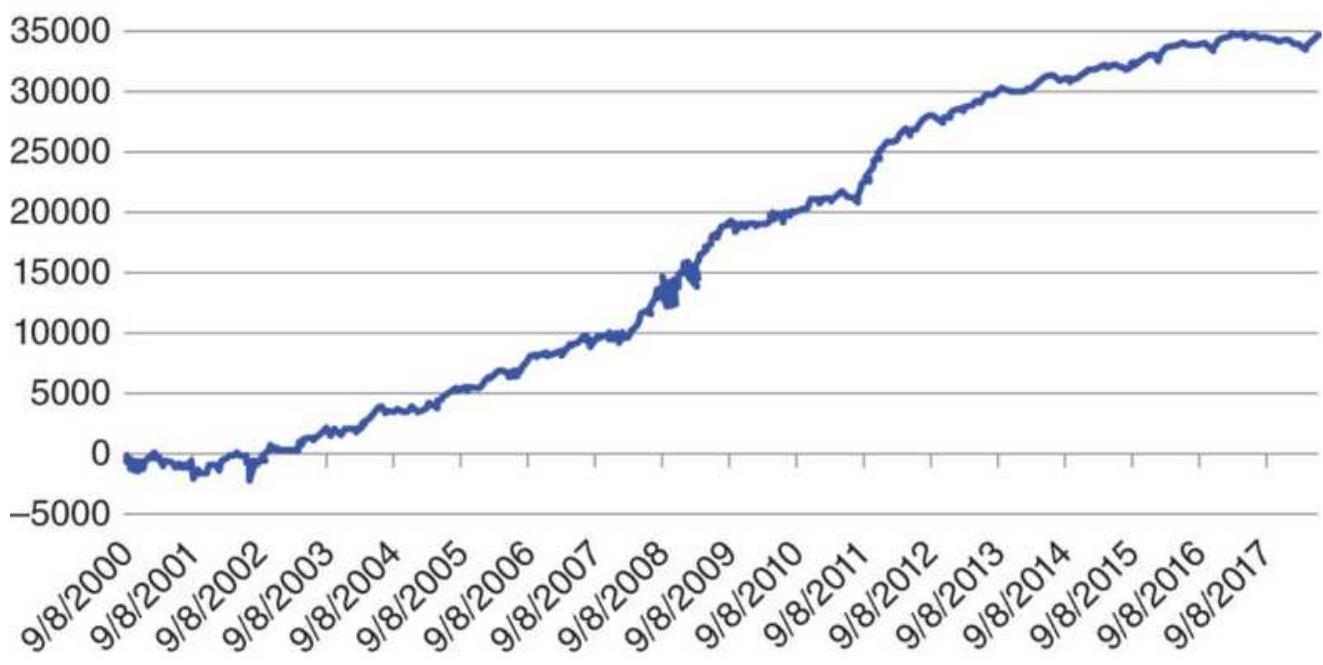
FIGURE 20.22 D'Errico and Trombetta's genetic algorithm solution applied to IWM.
\section*{Genetic Algorithm Software}
For those who would like to run a genetic algorithm themselves, there are a large number of choices. The following are just a few:
MatLab has both trial software and examples on the Mathworks website.
■ TradeSmart Research, Ltd. has a Genetic Optimizer for TradeStation.
- Excel has a genetic algorithm developed by Frontline Systems and available in their Premium Solver platform.
Wardsystem.com has a genetic algorithm, GeneHunter, add-in for Excel.
- There is a free open source genetic algorithm, PIKAIA, for Excel available at www.ecy.wa.gov.
- The University of Exeter has GANetXL, also an addin to Excel.
For a current list, search the Internet for "Genetic Algorithm Software."
\section*{NEURAL NETWORKS}
Neural networks are recognized as a powerful tool for uncovering market relationships. \({ }^{31}\) The technique offers exceptional ability for discovering nonlinear relationships between any combination of fundamental information, technical indicators, and price data. Its disadvantage is that it is so powerful that, without proper control, it will find relationships that exist only by chance. 32
Although the idea and words for the computerized neural network are based on the biological functions of the human brain, an artificial neural network (ANN) is not a model of a brain, nor does it learn in the human sense. It is simply very good at finding patterns, whether they are continuous or discrete, appearing at different times.
The operation of an artificial neural network can be thought of as a feedback process, similar to the Pavlov approach to training a dog:
1. A bell rings.
2. The dog runs to 1 of 3 bowls.
3. If right, the dog gets a treat; if wrong, the dog gets a shock.
4. If trained, stop; if not trained, go back to step 1.
\section*{Terminology of Neural Networks}
The terminology used in the computerized neural network is drawn from the human biological counterpart, shown in Figure 20.23. The principal elements are:
Neurons, the cells that compose the brain; they process and store information.
- Networks are groups of neurons.
- Dendrites are receivers of information, passing it directly to the neurons.
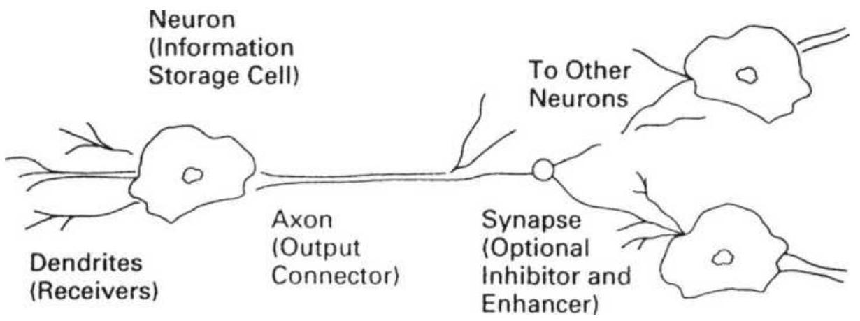
FIGURE 20.23 A biological neural network.
Information is received through dendrites and passed to a neuron for storage. Data are shared by other cells by moving through the output connector, called an axon. A synapse may be located on the path between some individual neurons or neural networks; they select the relevant data by inhibiting or enhancing the flow.
Source: Perry Kaufman, Smarter Trading (McGrawHill, 1995), p. 165.
Axons are pathways that come out of the neuron and allow information to pass from one neuron to another.
Synapses exist on the path between neurons and may inhibit or enhance the flow of information between neurons. They can be considered selectors.
\section*{Artificial Neural Networks}
Using essentially the same structure as a biological neural network, the computerized or artificial neural network (ANN) can generate a decision on the direction of the stock market. It relies heavily on the synapses, which are the weighting factors in this process. To achieve its result, it will also combine inputs that interact with one another into a single, more complex piece of data using layers of neurons, as shown in Figure 20.24, a classic 3-layer neural network. The ANN will modify these weighting factors to minimize the output error when compared to known results (the learning phase). The final solution can include linear, nonlinear, and pattern recognition relationships.
To be most efficient and avoid overfitting, the inputs to the ANN should be those factors considered most relevant to the direction of stock prices. The five items chosen here were the Gross Domestic Product (GDP), unemployment, manufacturing or inventories, interest rates, and the value of the U.S. dollar - all readily available data. Each of these items is input and stored in separate Layer-1 neurons. Changing the values in these neurons may have a positive or negative effect on the final output, which is the expected direction of stock prices. An improved GDP, lower unemployment, lower inventories, and a weaker U.S. dollar are all good signs for economic growth but also result in the possibility of higher interest rates. Higher rates are a defensive action by the Federal Reserve to prevent inflation with the eventual consequence of a decline in stock prices. Lower interest rates themselves have a direct effect on stock prices, reducing debt and improving corporate profits.
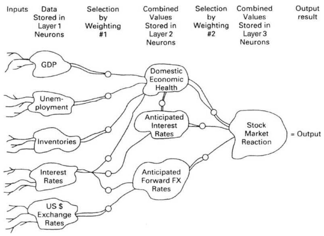
FIGURE 20.24 A 3-layer artificial neural network to determine the direction of stock prices.
Source: Perry Kaufman, Smarter Trading (New York: McGraw-Hill, 1995), 166). Reproduced with permission of McGraw-Hill.
\section*{How the Layers Work}
Each neuron in Layer 1, which receives the data from the dendrites, is connected to a second layer of neurons through a synapse. Each synapse can be used to restrict or enhance information by assigning a weighting factor. For example, if changes in unemployment have a greater impact on stock prices than changes in the GDP, then it may receive a weight of 1.5 compared to 0.9 for the GDP. If very small changes in any of the data are deemed
unimportant to the result, then the synapse can act as a threshold and only allow data to pass if it exceeds a minimum value. If the data is irrelevant, it gets a weighting factor of zero; if it reacts inversely to its value, the weighting factor will be negative.
The second layer of neurons is used to combine initial data into significant subgroups by trial and error. To allow this to happen, every neuron in Layer 1 must be connected to every neuron in Layer 2 by its own axon containing a synapse. Figure 20.24 shows the significant groupings that might result, ignoring the other connecting axons which would clutter the illustration. GDP, unemployment, and inventories are combined into a single item called Domestic Economic Health (DEH). The synapses allow each element to be assigned a specific level of importance relative to DEH using weighting factors. Also note that the neuron DEH is altered by anticipated interest rates, which is the result of data flowing to another neuron in Layer 2. Finally, the three neurons in Layer 2 are combined according to importance, giving the net stock market reaction to the input data.
Layer 2 may be called a hidden layer, because you normally only see the input and output layers. Layer 2 has the complex interconnections that allow feedback to occur. It is possible to have more complex connections by adding another hidden layer. In general, the more hidden layers, the longer the solution time and the more finely tuned the answer.
\section*{Helping It Along}
The human brain works in a way very similar to the artificial neural network. It groups and weighs the data, combines them into subgroups and finally produces a decision. The human process of weighing the data is complex and not necessarily transparent; that is, we may never know the precise flow of data, how many layers exist, and how weights are assigned and reassigned before the final decision.
Because a computerized neural network cannot know whether its answer is correct, you must tell it. This is done by giving the computer the historic data and the corresponding answers. By giving the artificial neural network a long history of information, it can determine, using feedback, the weighting factors that would have given the correct results most often. The more history that is given to the computer, the more likely it will find a robust answer. Figure 20.25 shows the results of using five different inputs to predict the direction of the stock market. Two of the inputs, the Academy Award Winners and the Number of NASA Launches, are not likely to fool the system in the long term but may appear to provide valuable information about economic activity for the near term. By using enough comparisons, the weighting factors are found to show that unemployment has a strong negative effect on prices, the GDP a strong positive effect, and inventories have a weak positive effect. The other items had no consistent predictive ability and received a weight of zero. This feedback process is called training.
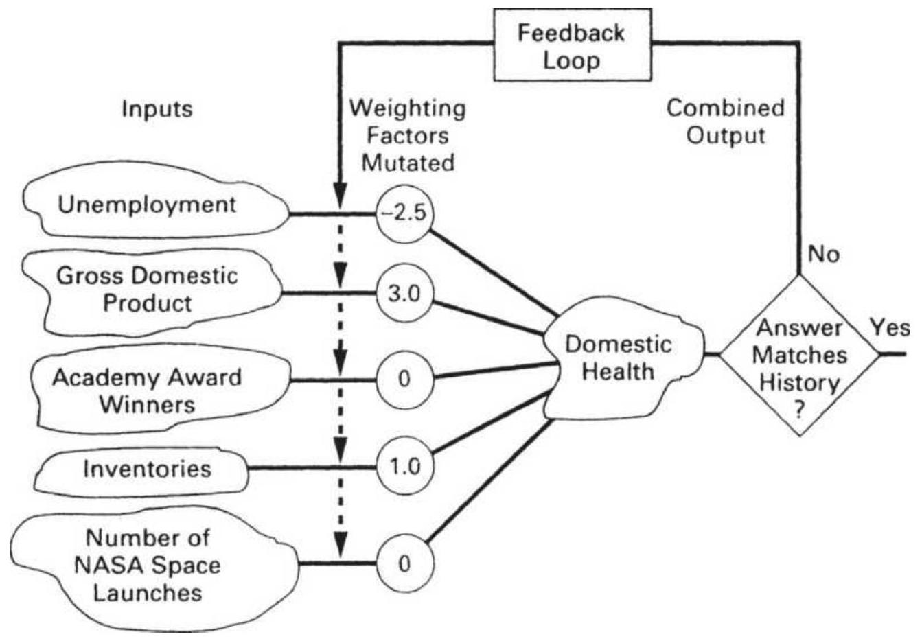
\section*{FIGURE 20.25 Learning by feedback.}
Source: Perry Kaufman, Smarter Trading (New York: McGraw-Hill, 1995), p. 166. Reproduced with permission of McGraw-Hill.
\section*{Selecting and Preprocessing the Inputs}
There is considerable debate over the inputs needed to find a successful solution using a neural network; however, everyone agrees that the selection of inputs is critical. These inputs must be presented in consistent, usable form because the neural network will not be able to change them. This step is called preprocessing. We must decide what are the most likely factors affecting the direction of stocks and the ability to anticipate that direction, then prepare data that contains information
with these qualities. For example, we may want to include the short-term and long-term trends, the direction of interest rates, the Dow Jones Utility Index, the ratio of interest rates to gold, economic data such as the GDP and the Balance of Trade, technical indicators such as the RSI, and ADX, and a 20-day moving correlation between the U.S. stock market and other major equity indices.
There are countless factors that might influence the direction of stocks; the more you choose, the slower the solution and the greater the chance of model that is overfit. If you choose too few, they may not contain enough information; therefore, the preprocessing problem requires practice. You may also construct a number of simple trading systems that show profits and include their basic components as inputs to the neural network. You might create a performance series for a specific system that has only values \(-1,0\), and 1 , representing short, neutral, and long market positions. In that way the neural net may be used to enhance an existing trading strategy.
\section*{Selecting the Success Criteria}
In a manner similar to evaluating any back-testing result, the training process requires that you select the success criteria (a full discussion of this can be found in Chapter 21). One possibility for the success criteria is a combination of frequency of trading, the size of the profits per trade, a reward/risk ratio, and the percentage of profitable trades.
According to Ruggiero, \({ }^{33}\) neural networks can be used to predict price direction, such as the percentage change five days into the future; however, they are much better at predicting forward-shifted technical indicators because these tend to have smoother results. Most technical indicators, such as trend and momentum calculations, smooth the input data, which is most often the price. The longer the time period used in the calculation, the greater the smoothing. Ruggiero suggests an output function such as:
Average((close[-5] -
Lowest(Close[-5],5))/(Highest(close[-5],5)
- Lowest(close[-5],5)),5)
which is the 5-day average of a 5-period stochastic shifted forward by 5 periods. In this notation, the bracketed value [-5] represents 5 periods into the future.
\section*{The Training Process}
At the heart of the neural network approach is the feedback process used for training shown in Figure 20.25. This is called the learning process. To observe sound statistical practice, only about \(60 \%\) of the data should be used for training. As the neural net refines the weighting factors for each of the inputs and
combinations of inputs (in the layers between the input and output), it will need more data to test these results. Of the remaining \(40 \%\) of the data, \(20 \%\) should be designated for testing. Finding a successful solution uses up to \(80 \%\) of the test data. At least \(20 \%\) of the data should be saved for out-of-sample validation.
Weighting factors are found using a method called a genetic algorithm, discussed in the previous section and extensively covered in Chapter 24. For now, we need to know that the training process begins with an arbitrary or random value assigned to the weighting factors of each input. As the training proceeds, these weighting factors are randomly mutated, or changed, until the best combination is found. The genetic algorithm changes and combines weighting factors in a manner referred to as survival of the fittest, giving preference to the best and discarding the worst.
Testing is completed when the results, as measured by the success criteria, cannot be improved. That is, after a number of feedback loops on the historic data (the oldest \(60 \%\) of the data), the test data (the next 20\%) is used with the new weighting factors. If the results are improving (also called converging), the process continues. If the results are improving at a very slow rate or have stopped because better weighting factors cannot be found, the neural network process is completed. Sometimes the results get worse rather than better. This can be fixed by beginning again using new random weighting factors. If this fails to solve the problem, then it is most likely that there are too many inputs that are irrelevant. Starting with a smaller number of basic inputs should get the process back on track.
Because the genetic algorithm is a trial-and-error process the best results could be found by chance, rather than by cause and effect. With enough data it is always possible that two series of events will appear related even when they are not. It is necessary to review the results to
avoid obvious mistakes.
\section*{A Training Example}
We would like to train an ANN to tell us whether we should buy or sell stocks. As inputs, we select the same five relevant fundamental factors: GNP, unemployment, inventories, the U.S. dollar index, and short-term interest rates. This test does not use any preprocessed data, such as trends or indicators. To simplify the process, the following approach is taken:
1. Each input is normalized so that it has values between +100 and -100 , indicating strength to weakness, with o as neutral.
2. When the combined values of the five indicators exceeds +125 we will enter a long position; when the combined value is below -125 we will enter a short.
3. Values between +125 and -125 are considered neutral to the trading strategy.
To show how the training process works, two combinations of starting values are shown in Tables 20.7 and 20.8 as Case 1 and Case 2. Table 20.7 is the initial state of the neural network, where we begin by arbitrarily setting all of the weighting factors to 1.0. In actual training, the network might require that the sum of all weights total 1.0. The values of the normalized inputs are shown in the columns marked Relative Value, and the correct historic answers are at the bottom, marked as Strong and Weak stock market reactions to these values. For the neural network to return the correct
answers it must produce a result greater than +125 for
Case 1 and below -125 for Case 2. By assigning initial weights of 1.0 to all inputs, the value of Case 1 is +75 and the value of Case 2 is +40 ; both fail to produce the known historic answer and testing continues searching for better weighting factors.
\section*{TABLE 20.7 Two training cases (initial state).}
Source: Perry Kaufman, Smarter Trading (New York: McGraw-Hill, 1995). Reproduced with permission of McGraw-Hill.
\begin{tabular}{|l|l|r|r|r|l}
\hline & \multicolumn{4}{|c|}{ Case 1 } & \\
\hline Input & Relative & Value & Weight & Net & Relativ \\
\hline GNP & Strong & 50 & 1.0 & 50 & Weak \\
\hline Unemployment & Low & -25 & 1.0 & -25 & High \\
\hline Inventories & Low & -50 & 1.0 & -50 & Neutral \\
\hline U.S. dollar & \begin{tabular}{l}
Very \\
Strong
\end{tabular} & 75 & 1.0 & 75 & Neutral \\
\hline Interest rates & Falling & -25 & 1.0 & -25 & Rising \\
\hline Total value & & 75 & & & \\
\hline Threshold & & \(\pm 125\) & & & \\
\hline \begin{tabular}{l}
Current \\
response
\end{tabular} & & None & & & \\
\hline \begin{tabular}{l}
Actual market \\
reaction
\end{tabular} & & Strong & & & \\
\hline
\end{tabular}
\footnotetext{
TABLE 20.8 Two training cases (after mutated weighting factors).
}
Source: Perry Kaufman, Smarter Trading (New York: McGraw-Hill, 1995). Reproduced with permission of McGraw-Hill.
\begin{tabular}{|l|l|r|r|r|r}
\hline & \multicolumn{3}{|c|}{ Case 1 } & \\
\hline Input & Relative & Value & Weight & Net & Relativ \\
\hline GNP & Strong & 50 & 1.0 & 50 & Weak \\
\hline Unemployment & Low & -25 & -1.0 & 25 & High \\
\hline Inventories & Low & -50 & 1.0 & -50 & Neutral \\
\hline U.S. dollar & \begin{tabular}{l}
Very \\
Strong
\end{tabular} & 75 & 1.0 & 75 & Neutral \\
\hline Interest rates & Falling & -25 & -1.0 & 25 & Rising \\
\hline Total value & & 125 & & & \\
\hline Threshold & & \(\pm 125\) & & & \\
\hline \begin{tabular}{l}
Current \\
response
\end{tabular} & & None & & & \\
\hline \begin{tabular}{l}
Actual market \\
reaction
\end{tabular} & & Strong & & & \\
\hline
\end{tabular}
In Table 20.7 the weighting factors have undergone mutation using a genetic algorithm, which substitutes a random weighting factor from a list of weighting factors that are constantly updated, saving the better weighting factors. This example attempts to use only weighting factors of \(+1.0,0\), and -1.0 . By randomly reversing the effect of unemployment and interest rates on the direction of the stock market, the results now match the historic pattern of stock movement. Using fractional values for weighting factors, and many more training cases, the ANN method should find the current
underlying relationship between these inputs and stock market movement.
\section*{Success Criteria}
Determining success during the learning process is a matter of measuring the ANN output against the training data, looking for convergence, a point where there is no longer an improvement. The common measurements are the average correlation between the stock market and the solution, the \(t\)-statistic, the \(t^{2}\)-statistic, and the \(F\) statistic. The \(t^{2}\)-statistic is unique to neural networks and measures the nonlinear relationships between two variables: 34
\[
t^{2}=\sqrt{A S} \times \frac{\sigma_{I}}{\sigma} \times \sqrt{n-k}
\]
\(\sigma_{O}\)
where
\(\sigma_{l}\) is the standard deviation of the input data
\(\sigma_{O}\) is the standard deviation of the output data \(n\) is the number of observations
\(k\) is the number of model inputs
\(A S\) is the average squared slope of the cross-section
As with most comparisons, it is also necessary to include a measurement of accuracy based on the size of the sample. The root mean square \((E)\) and the mean absolute percentage error (MAPE) can be used:
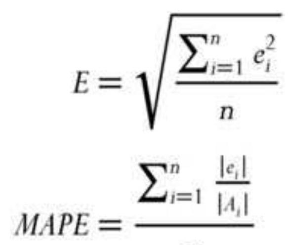
\(n\)
where
\(n\) is the number of observations
\(e_{i}\) is residual error of observation \(i\)
\(A_{i}\) is the actual value of observation \(i\)
\section*{Reducing the Number of Layers and Neurons}
The robustness of a neural network solution is directly related to the number of decision layers, the number of neurons in each layer, and the total number of inputs. Fewer elements produce more generalized and therefore more robust solutions. When there are many decision layers and many neurons, the inputs can be combined and recombined in many different ways, allowing very specific patterns to be found. That can quickly lead to overfitting.
Failure to converge to a solution can also occur if there are too many inputs and the genetic algorithm allows too much mutating (recombining of choices, discussed in the next section). The trade-offs using a neural network are the same as most other optimization methods. Too many
inputs and combinations increase the time of testing and increase the chance of a solution that is overfit. Too few values can produce a result that is too general, has large risk, and is not practical. It is best to begin with the most general and proceed in clear steps toward a more specific solution. In this way you will understand the process better, ultimately save time, and be able to stop when you have reached the practical limitations of this method.
\section*{Modeling Human Behavior}
An approach that models the way investors behave is to make each of the Layer-1 neurons contain the results of the major economic indicators. The synapse between Layer 1 and Layer 2 would discard any indicator when its value was not significantly different from zero. It reflects the way an investor will ignore a value unless it is significant. During the economic recovery following 2008, the market focused on employment. As the bull market matured, the focus changed to the expected actions of the Federal Reserve. A neural network can be constructed to reflect this change of importance. It can also limit itself to using only the two or three most significant economic indicators at the moment by altering the weighting factors.
\section*{A Final Comment about Neural Networks}
When using neural networks and other powerful searching tools, every analyst must keep in mind that neural nets will nearly always find the correct solution in a closed system, one where the output is fully defined by
all the inputs. An ANN is often used when it is too difficult to find a solution by other means. For example, in a chemical or manufacturing process, the formula may have too many variables. A neural network will not only solve the problem but solve it quickly. The stock market, however, is different. No one is sure that there is a solution to the problem as we are specifying it. Because of this uncertainty, there is no guarantee that the answer will work. You will need to test the results on out-ofsample data to verify the success.
\section*{Software}
There are dozens of programs now available for using neural networks. They range from simple to very complex. A list of these products can easily be found by searching for "neural network software" in the Internet. Note that there are websites that rank the top products. The more popular ones seem to be Ward
SystemsNeuroShell Trader, Alyuda Research Neurosignal XL, Attrasoft Predictor, Atuomatic Forecasting Systems CPC-X, and KnowledgeMiner.
For most traders, the more basic programs will be the best, so deep learning should be avoided. There is free neural network software in Excel using XLSTAT-R. You can also find free open source software, such as OpenNN. If you want a trading system that is based on neural nets, there are also a large number of companies offering them.
\section*{MACHINE LEARNING AND ARTIFICIAL}
\section*{INTELLIGENCE}
Machine learning is an extension of pattern recognition and is often thought of as self-learning. The goal is to make accurate predictions from data without being specifically programmed for a situation. Most methods will use some form of optimization and data mining to find similar patterns. The analyst can control the complexity of the process in the same way they can control the number of layers in a neural network solution. The process is also similar: select inputs, choose data for training, apply an algorithm, and choose the best parameters. Then test the selection on new data to verify the solution.
Machine learning is not magic. In most of the advanced techniques discussed in this chapter, there was a degree of data fitting. The analyst needs to decide the minimum fitting needed to solve the problem. The more fitting, the less likely it will work in the future, but less fitting usually results in a sloppy solution and more risk. In the summary of techniques that follow, you may find that the best prediction methods do not involve sophisticated techniques.
\section*{Preconditions}
When selecting the data, it must contain a broad sample of market conditions. If you choose 2009 to 2016, an extended bull market, then anything will work, and you will have no idea of the trading risk. The shortest, most reasonable data period will be from the later 1990 os through today, whatever that is.
Next is the choice of predictors or algorithms. Each should have a different purpose, such as a trend and an oscillator. Two different oscillators, such as an RSI and MACD, is an unnecessary duplication. Each indicator should return values in the same range, such as o to 1 , or -100 to +100 , in order to make the final assessment easier.
Because price forecasting is difficult, some methods will prequalify the data; that is, if the predictor is a trend, the data should have more trend than noise, that is, interest rate futures rather than equity index markets. It is not necessary for a randomly chosen price series to work successfully, as long as the desired series can be selected using a consistent rule.
\section*{Basic AI Techniques}
In most AI problems, there are known data points that have values, attributes, or characterizations. But there are many more data points that have not been classified. The purpose of many of the AI techniques is to classify those new data points using the known data points. That can be considered the "learning" part.
There is a similarity in these methods to Monte Carlo sampling (discussed in Chapter 21). Briefly, Monte Carlo sampling allows you to test random data points and collect their statistical attributes. Most likely, we are looking for the shape of a distribution, such as a bell curve. As we test data points, the results fill out the distribution until you can see the shape of the curve with a certain confidence, even though you may only have
tested \(5 \%\) of the possible data points. The following is a brief description of other techniques used in machine learning. 35
\section*{Identify a Chart Pattern}
There are programs that will identify standard chart formations, and some that will create a pattern of chart formations as new data appears. For example, a simple run of up-down-down-up can be captured and the direction and size of the move on the following day can be logged. If it is consistently higher (or lower) and profitable, the program can generate trading signals until it decides that that pattern is no longer profitable.
\section*{Find the Trend}
There are many ways to identify a trend, including moving averages, linear regression, and breakouts, but the key to success is the calculation period. A learning technique can scan a range of calculation periods looking for the best, then apply the trend method with that new calculation period to tomorrow's trading. In some ways, it is similar to ARIMA and even KAMA.
\section*{Deep Learning}
Deep learning is a neural network method with many layers and thousands of neurons. In order to reduce this to a practical problem, some of the layers are pretrained. This implies that some data will always produce the same decisions given a set of conditions; therefore, the complexity of the network can be reduced.
\section*{K-Nearest Neighbor}
This method \((k-N N)\) is considered one of the basic machine learning algorithms. It is used to determine the category or value of a new data point using the known values of existing data points. It can be categorized as either a classification or a regression method. As a classification, it is determined by a majority vote of its neighbors or in its simplest form, assigned the same class as its nearest neighbor. If a new data point is on a plane described as \(\left(x_{1}, x_{2}\right)\), then the nearest neighbor is the smallest distance found as:
\[
D^{2}=\left(x_{1}-y_{1}\right)^{2}+\left(x_{2}-y_{2}\right)^{2}
\]
In three dimensions the term \(\left(x_{3}-y_{3}\right)^{2}\) would be added. When more than one neighbor is used, they are assigned weights relative to their distance from the target, for example \(1 / d\), where \(d\) is the distance. The solution is the smallest value that is the sum of the weighted neighbors.
\section*{K-Means}
This technique is an extension of \(k\)-nearest neighbor. Given a random location \((x, y)\), assign the value of the data that is closest to that point using whatever weighting method you choose. Move the new point to the mean of the data just used to decide the value of the new point. Repeat the process of valuing the point based on the surrounding data. Continue until the new value and the mean are the same.
\section*{Al Perspective}
Many of these AI techniques are elegant, often in their simplicity. It is the same with genetic algorithms, neural networks, and Monte Carlo sampling. They are brilliant advances in search methodology and get to the optimal answer faster than we thought possible. The process of assigning a value to an unknown data point based on its surrounding neighbors is sensible and tends to smooth out the contours of the solution diagram.
These techniques can work for games, where it's fun to interact with the response of the computer to your actions. We don't need to think about whether that response is realistic, but do they work for trading? We don't have any trading examples yet, but we do know what can go wrong. If you try to get an answer that is too finely tuned, you will overfit the data and the results will be useless. You can expect an outcome of \(85 \%\) accuracy, but it will never happen. Whichever method you use, limit the number of inputs and rules and accept a general solution, along with the negatives that accompany it. Simple solutions have a less desirable outcome, but they are more predictable and more realistic.
\section*{REPLICATION OF HEDGE FUNDS}
Technology allows us to approach problems as never before. With the proliferation of hedge funds, some analysts have decided that they can replicate the performance of those funds using mathematical methods, and any inaccuracy would be offset by the lower cost of replication compared to hedge fund fees.
Replication can also be applied to a set of hedge funds, such as a fund of funds, or a hedge fund index. The systematic process of replication is marketed as a conservative and algorithmic approach to investing.
As an example, say that a hedge fund allocates resources only to stocks in the mining sector, and within that sector there are 10 stocks. The program is always long. If we have the historic returns of the hedge fund, we can use Excel's Solver and find what percentage of the investment would need to be allocated to each of the 10 stocks in order to duplicate the returns. This assumes that allocations did not change over the period of analysis. It may be that positions are rebalanced once each month, so that this regression may need to be done more often with some constraints on the size of the change allowed in each stock.
Alternatively, we try to replicate the returns each day by asking "What allocations would have given us yesterday's returns?" We then buy or sell shares to align with that solution. On the next day we ask the same question. If the hedge fund does not change positions often, we will adjust our positions until we align correctly with the hedge fund positions, similar to the way a Monte Carlo approach to sampling finds the right distribution. During the time it takes to find the same positions, there will be some tracking error, but this may be better or worse than the actual hedge fund.
\}
The mathematics of replication has become a specialized area of application. Rebalancing of the replication model
was initially done monthly; however, that would allow for large tracking errors. A better method would be to rebalance whenever the tracking error exceeded a threshold level. There is a trade-off between the tracking error and the cost of rebalancing. The Hedge Fund Replication Index (see hedgefundreplication.com) is said to be able to replicate \(85 \%\) of hedge fund returns, leaving a tracking error of \(15 \%\), less than the fees associated with a fund of hedge funds.
\section*{NOTES}
1 Richard Bookstaber, The Complete Investment Book (Glenview, IL: Scott, Foresman, 1985), p. 349.
\(\underline{2}\) For more detail see http://www.macroption.com/vixcalculation/.
3 Andrew Fisher, "Teaching the Old VIX New Tricks," Futures (August 2001). Fisher explains the VIX calculations in addition to proposed improvements in iVIX.
4 Gunter Meissner and Sarp Cercioglu, "Trading Trends and Correlations," Futures (January 2003).
5 William Brower, Inside Edge (Inside Edge Systems, March-April 1996), www.insideedge.net.
6 Larry Conners, "Timing Your S\&P Trades with the VIX," Futures (June 2002).
7 Larry Conners, Short-Term Trading Strategies That Work (Jersey City, NJ: Connors, 2008).
\(\underline{8}\) Gerald Appel, Power Tools for Active Traders (Upper Saddle River, NJ: Financial Times, Prentice-Hall, 1999), p. 155.
9 Richard Bookstaber, The Complete Investment Book (Glenview, IL: Scott, Foresman, 1985), pp. 224-236.
10 Charlie Bilello, "The Volatility Cycle," Proactive Advisor Magazine (May 18, 2016), proactiveadvisormagazine.com/.
11 Gerald Appel, Power Tools for Active Traders (New Jersey: Financial Times, Prentice-Hall, 1999).
12 Gary Ginter and Joseph J. Ritchie, "Data Errors and Profit Distortions," in Perry J. Kaufman (Ed.), Technical Analysis in Commodities (New York: John Wiley \& Sons, 1980).
13 Parts of this section are drawn from Perry Kaufman, Smarter Trading (New York: McGraw-Hill, 1995).
14 The answers to the examples are: (1) very small, (2) most, and (3) bad.
15 Murray A. Ruggiero, Jr., "Artificial Trader Jumps Candlesticks," Futures (February 1995), and "Lighting Candlesticks with Fuzzy Logic," Futures (March 1996).
16 An interesting paper that combines fuzzy logic with genetic algorithms is Garrison W. Greenwood and Richard Tymerski, "A Game-Theoretical Approach for Designing Market Trading Strategies," IEEE
Symposium (2008).
17 Murray A. Ruggiero, Jr., Cybernetic Trading Systems (New York: John Wiley \& Sons, 1997).
18 There are many companies offering Expert Systems in the Internet. They can be found by searching for "Expert Systems for trading." Some use Level 2 data (bid-asked prices and size) and most require a good understanding of math. This section will avoid the more complicated issues.
19 Mark B. Fishman, Dean S. Barr, and Walter J. Loick, "Artificial Intelligence and Market Analysis," Technical Analysis of Stocks \& Commodities (Bonus Issue, 1993).
20 For another example of an expert system that uses fuzzy logic, see Paulo E. Merloti, "A Fuzzy Expert System as a Stock Trading Advisor," http://merlotti.s465.sureserver.com/EngHome/Comp
21 See Erich Prisner, Game Theory Through Examples (Mathematical Association of America, 2014).
22 From "IPMI Assay Exchange Optimization," presented at the International Precious Metals Institute by Arthur Taylor and Michael Riess, Materials Management Corp, Greenwich, CT (June 10, 2016).
23 An excellent discussion of this topic can be found in Edgar Peters, Chaos and Order in the Capital Markets (New York: John Wiley \& Sons, 1991). The
coastline example is originally credited to Benoit Mandelbrot. Other books can be found by searching the Internet for "Chaos Theory in Financial Markets."
24 See Bill Williams, Trading Chaos (New York: John Wiley \& Sons, 1995). A new edition by Justine Gregory-Williams and Bill M. Williams was published in 2004.
25 More examples can be found https://go.tradimo.com/.
26 A data service, LIM (Logical Information Machines), provides both extensive fundamental and price data along with tools for comparing past events and their outcomes.
27 The mathematics for conditional entropy, with excellent examples, is located on the website http://tecfa.unige.ch and was written by Phillippe Lemay. This section is adapted from his work.
28 This technique is attributed to John H. Holland, Adaptations in Natural Language and Artificial Systems (Ann Arbor: University of Michigan Press, 1975).
29 The need to create a pool of maximum size, and maintain that size, is discussed in Chapter 24.
30 Domenico D'Errico and Giovanni Trombetta, "Artificial Intelligence for System Development," Technical Analysis of Stocks \& Commodities (August 2017).
31 Parts of this section are based on Perry Kaufman, Smarter Trading (New York: McGraw-Hill, 1995), pp. \(164-171\).
32 A wide range of books on neural networks, from simple and complex, can be found on Amazon; however, applications to trading seem to be on the Internet if you search for "trading systems using neural networks." There are some suggestions at the end of this section.
33 Murray A. Ruggiero, Jr., "Build a Real Neural Net," Futures (June 1996), the first of a series of excellent articles on this subject.
34 Stephan Kudyba, "Are neural networks a better forecaster?" Futures (October 1998).
35 For a more complete review of these and other techniques, see www.financial-hacker.com/buildbetter-strategies-part-4-machine-learning/.
\section*{CHAPTER 21}
\section*{System Testing}
Numbers are like people; torture them enough and they will tell you anything.
- Anonymous (quoted by John Ehlers in Rocket Science for Traders)
System testing remains a fight between computer power and common sense. Before computers, testing a trading system was a simple concept. Traders and analysts applied their ideas to charts, marking the buy and sell signals manually and keeping a hand-written record of the trades. The process took a long time, so it wasn't started unless the idea was thought to be good. Those ideas came from an understanding of the fundamentals, awareness of market patterns, and valuable experience. A profitable result verified the concept.
By the early 1990s, you were at the high end of technology if you had a computer with daily data updates, and a program such as TradeStation or MetaStock to give you charts and indicators that could be combined into a trading system. These programs could show the historic profitability of the trading strategies and, even better, the best strategy. Moving averages and the RSI were still sophisticated tools, but the ability to test for the best calculation period and combine indicators began a step down a path that has now become very complex and has taken the industry
farther from the simple solutions.
That process has continued to advance, but not always for the better. Those who have applied diligence, selectivity, and most of all common sense to automating systems are likely to have gotten more valuable results than ever before. Those who have carelessly used the power of computers and the convenience of trading strategy development software are not likely to be as successful. Bigger and faster computers and high-tech software do not mean better results.
The tools alone do not assure a profitable trading program. It is the thought process, creativity, and knowledge that is needed to be competitive. Computers allow us to solve problems of magnitude and complexity that we could never have considered before. We can manipulate massive amounts of data to find out not only whether our ideas are sound, but the associated risks.
But computers are still only highly sophisticated calculators, even when you call your technique "artificial intelligence." Giving it a catchy name does not make it true. Computers do not think, they compute.
The most misused technique that has evolved from computerization is optimization. It is the iterative process of testing data to find the single best moving average speed, profit-taking targets, stop-loss size, and any combination of parameters that produce the highest trading profits, the lowest risk, or some other objective. Using a genetic algorithm can even give you the best rules. That is not to say that optimization could not be effective. Experience shows that the best test results
never live up to expectations and they risk becoming a financial tragedy when traded. Overreliance on optimization results is fine tuning or overfitting. Everyone using a computer for testing a strategy is guilty of overfitting the result at some time.
Computers present a serious, often futile dilemma for the analyst. If the objective is to use a trend-following strategy - a moving average, exponential smoothing, or linear regression- how do you decide the right calculation period? In the early years of technical analysis, the \(5-, 10\)-, and 20 -day moving averages were most popular because they represented a 1-week, \(2-\) week, and 1-month time interval. Unfortunately, competition is now keener, markets more complex, and that simple approach is no longer viable. We turn to more intricate solutions and torture the data until it gives up the answer we want.
We can rationalize that testing all combinations of calculation periods and rules gives us a better understanding of how successful a trading system can be. Why guess at each parameter when you can try them all? We should know by now that this approach fails, but not everyone knows how to do it correctly. Test results are still important. The following sections discuss testing and optimization, how to take advantage of it, and how to control it.
\section*{EXPECTATIONS}
Some planning needs to be done in advance. Testing should be the process of validating your ideas. It first
requires that you define those ideas in a clear plan, deciding whether it should work for hourly, daily, or weekly intervals. You should have an idea of the relative risk of the method, and the percentage of profitable trades. For example, a trend strategy may only have 30\% profitable trades while an arbitrage system can have \(80 \%\). If the test results confirm your ideas, then you can have confidence in the strategy. If they differ, you must rethink your concept or review your implementation. Without expectations, there can be no validation or confirmation. Testing should be used for deciding between various trade-offs of risk and reward, but not for discovery.
\section*{Setting Your Objective and Measuring Success}
What are the minimum returns you will accept and what risk are you willing to take to reach that goal? The answer to those questions will tell you what type of system you want. In the previous chapters we've discussed the characteristics of different trading approaches. The main categories are trend following, mean reversion, arbitrage, and pattern recognition. Now is the time to decide which profile you want and write down or program the basic rules for that strategy.
Define the test objective. What measurement or statistic will show success? Is it the highest possible profit, the smallest risk, the frequency of profitable trades, or the average profit-to-average loss ratio? Testing software gives you a choice, but some do not allow a combination of these items; most likely, it will be a combination that you want. For example, if maximum profits are used as
the performance criteria, the resulting system may have one or two large profits and an overwhelming number of small losses. These extremes can be seen in energy strategies that captured the move to \(\$ 150 / \mathrm{bbl}\) in June 2008, or in gold where the losses of 20 years from 1985 to 2005 were all forgotten when prices neared \(\$ 2,000 / \mathrm{oz}\). When seen only as a single value of total profits for the equity index markets, you won't see the 90\% drawdown in NASDAQ, which would have resulted in fatal losses.
While there is no right way to define success, the industry has favored the Sharpe ratio, or the simple information ratio (without the risk-free returns)
\section*{Annualized returns - riskfree returns}
\section*{Sharpe ratio \(=\)}
\section*{Annualized risk}
This and other general performance measurements can be found in Chapter 23. Later in this chapter, the section "Performance Criteria" explains many of the components that can be used to decide the relative success of a trading method. All traders want to know the total profits and maximum drawdown, and day traders will want to know the average profit per share or profit per contract to understand the impact of costs and slippage on the results.
\section*{SELECTING THE TEST DATA}
More is better. Using more data is always better than less data, even when you may think that the market has
changed. "More" gives you additional price patterns, price shocks, bull and bear markets, and situations that only occur rarely, but can be vital to your survival. A trading system that is successful with more data is robust, although not as profitable as when using less data, and with results that are likely to be more realistic.
Both price data and economic data are readily available from numerous vendors. Price data includes daily high, low, and closing prices, plus volume and open interest (futures) for nearly all exchange-traded markets in the world. Individual stock data is also available and may be found on Yahoo.com at no cost (although some inconvenience). Intraday (tick) data on futures can be purchased from a limited number of vendors, the most well-known being CQG Data Factory and Tick Data, Inc. Stock data can usually be exported from whatever quote service you use. A complete database is an important asset. It can be kept current by automatic updating at the end of each day.
Equity data is typically straightforward, but there are exceptions:
Splits and reverse splits will change the historic prices. Depending on how it's implemented, the oldest data can actually be negative. Either way, the prices will not be the actual prices at the time.
Some series do not include dividends, and some give you both choices, with and without dividends. For the most part, take the series that includes dividends because it is part of the net gain of holding that stock.
Futures data can be more complicated.
- Because futures contracts are of short maturity (1 to 3 years), with contracts rolling every 1 to 3 months, back-adjusted data is the usual choice. It is common for the oldest data to go negative; therefore, most calculations use price differences rather than returns.
Using individual futures contracts will be necessary for some strategies where the true price is essential, but for trend following and other long-term strategies, unadjusted data requires keeping track of frequent rolling from one contract to another and adjustments to the trend series and indicators, which causes more work than using the backadjusted series.
Roll-adjusted futures will have a field showing which delivery month is being used so that you can post the added cost of the roll or know when the current contract appeared.
- There should be a cash price associated with most futures contracts. Sometimes it is best to track the cash and execute in the futures market.
Using individual futures contracts runs the risk of duplicating results for the same data period. For example, if the June 2019 futures contract is traded from July 2018 through June 2019 and the September 2019 contract from October 2018 through September 2019, they overlap from October 2018 through June 2019. If you are not careful about which dates should be
processed, a windfall profit or loss can be duplicated, resulting in incorrect results.
\section*{Using Adjusted Data Series}
Data vendors are aware that analysts want to use the data for testing and have created special adjusted and continuous test series. Prices of individual stocks will be corrected for stock splits by dividing the data prior to the split by the split ratio; therefore, a \(3: 1\) split will be adjusted by dividing the data before the split by 3 . If there was a previous split of 2:1 the data prior to that is divided by 6 . Downloaded stock data may have two closing prices, one reflecting splits and dividends and the other the raw prices.
Futures data, which expires every \(1-3\) months, is rolled by adjusting the gap between contracts on the date of the roll. Vendors allow you to specify exactly how and when the rolls should occur - that is, a specific roll date or a specified number of days before expiration. You can also select a default method, such as using the contract with the highest volume and open interest. Figure 21.1 gives an example of heating oil futures, which rolls every 30 days. The large vertical price changes represent the gap between the old and new contracts for unadjusted data.
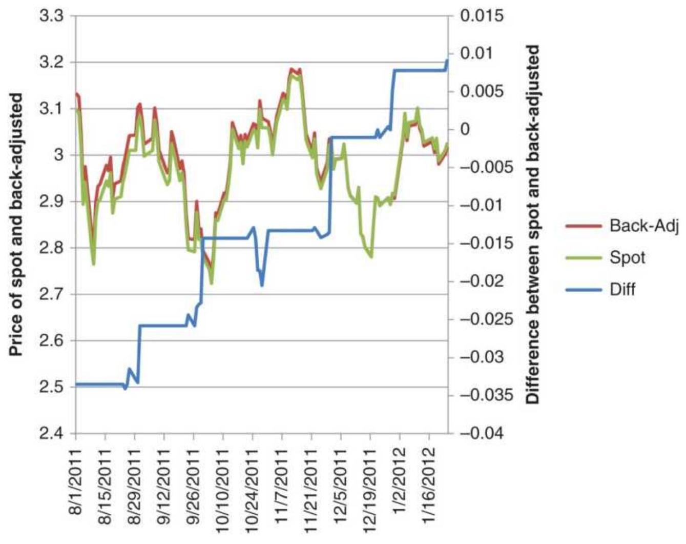
FIGURE 21.1 Comparing heating oil back-adjusted data with the nearest contract.
The most common choices for adjusted data are:
Backward-adjusted data. Working backward from the current contract, individual contract data segments are combined on a specific roll date by adjusting all the prices in the older contract by the difference between the prices of the new and old contract on the roll date. For example, if on the roll date the current contract was trading at 80.00 and the previous contract at 75.00 , then all the data in the previous contract would be increased by 5.00. Moving backward to the adjusted previous contract,
if that showed a price of 78.00 on its roll date, and the third-oldest contract showed 74.00, the prices in the third-oldest contract would be increased by 9.00 , the sum of the two roll values. Had the thirdoldest contract been higher than the second on the roll date, 81.00 versus 78.00 , then its prices would be increased by only 2.00 , the sum of 5.00 minus 3.oo. The adjustment in every older contract is the cumulative adjustment of all previous roll values. With back-adjusted data, the most recent data is the current contract, so that any new trading signal shows a current, correct price.
Forward-adjusted data. Beginning with the oldest data, this method adjusts newer data as it moves forward in time. At the end, the old data matches the actual prices, but the newest data is different. Forward adjusting is used in conjunction with indexing.
Unless a specific application calls for forward-adjusted data, back-adjusted data is the normal choice. One problem overlooked by many developers is the cost of rolling. Continuous data should provide a field that shows the current contract being used, which then allows you to post accurate trading costs.
\section*{Different Calculations Needed}
The main problem with any adjusted data is that old prices are not the real price at the time.
When comparing current high or low prices with past prices, the past prices will have changed. A
trading decision based on a new high may not be valid.
When calculating percentage changes, such as daily returns, adjusted futures prices will give the wrong values except in the current delivery month. When older prices become negative, percentages make no sense. When back-adjusted prices are near zero, percentages can be exceptionally large values.
Annualized volatility is based on daily returns, which may be incorrect. Therefore, the standard measures of risk and return can't be used.
If calculations based on percentages and comparisons to older prices do not work, what should be used?
The average true range will be a good substitute for volatility and will work for equities and futures. The current volatility compared to average volatility will give a ratio that can be used effectively. Volatility techniques are discussed at the beginning of Chapter 20.
A cash price series can be tracked along with the back-adjusted series. The cash prices of futures will allow old and new prices to be compared, as well as provide valid daily returns that can be used for volatility calculations. But cash prices can differ from futures prices, so care must be taken to assure the results are reasonable.
\section*{Cash Data and Foreign Exchange}
Cash data is available for most futures markets but currencies (FX) present unique problems.
The CME futures are active in the major currencies, all in terms of U.S. dollars except the euroyen, but there are also interesting crossrates that are not listed. By dividing one currency futures by another you can eliminate the U.S. dollar and create your own crossrate. Be sure to use the same delivery months.
Volume on the futures markets can vary considerably; therefore, CME data may not be as good as cash data. However, testing cash data and trading futures data can be a problem. Futures prices reflect the difference in interest rates between the two countries as well as speculative anticipation. Approximate futures data can be created from cash data by adding the interest rate parity, the forward difference in the interest rates of the two component countries in the crossrate. See "Forward Interest Rate Parity" in Chapter 13 for the calculation.
Many professionals trade crossrates by trading the spot month, or cash, which is most liquid, then executing an EFP (Exchange for Physicals) to a deferred futures contract. The broker adds a premium or discount, which they announce at the beginning of each trading day.
\section*{Synthetic Data}
The ultimate answer to getting more test data is to create it yourself. The more data, the better. It would be ideal if
synthetic data could be created that had the same characteristics as the data that will be traded, yet is different.
Rearranging Data. A Monte Carlo process first scans actual data looking for a way to divide the data into equal-length segments by finding the period that resulted in the lowest autocorrelation (the dependence of one data segment on the previous). The real data could then be rearranged randomly into a new series. However, mixing segments would separate a prolonged bull market from the inevitable decline that occurs at the peak. A system can survive a large loss if it follows a large gain, but may not survive if that loss occurs randomly. Perhaps separating data at periods of low volatility would be better.
\section*{Unique Data. A synthetic series created} mathematically begins with random numbers. One example can be found in Chapter 20, "A Fuzzy Expert System." It has been shown that a simple series of random numbers will look very similar to most price movements, especially during a sideways period. But price movement is not normally distributed and has much longer runs, both up and down, than would be found in a random series. Real data may have seasonality, a long, underlying directional bias due to government policy, changing volatility, and a certain level of underlying noise. But mathematics is powerful, and an artificial series can be created that has \(15 \%\) trend and \(85 \%\) noise, reflects a seasonal bias, and has a distribution
typical of stocks or futures.
A sophisticated attempt at creating synthetic data can be found in Wolberg's Expert Trading Systems. \({ }^{1}\) The technique uses a skewed price distribution, and a noise component that is a function of the price trend, yet variable around the trend. The trend component is itself nonlinear. One process used for verifying that the synthetic data has the same characteristics as real data is the Fraction Same Sign, which is the percentage of synthetic records in which the predicted and actual data have the same sign (move in the same direction). Other statistics of variance, noise, and distribution should match.
Synthetic data is an ideal solution to a difficult problem. It also brings to mind two computers playing chess with one another. One computer creates a data series to fool the other computer into thinking that it is real. The second computer is creating a strategy that can take advantage of the fact that it knows the data series is not real and is constructed from components that are built systematically. If the series was real, then it would have a level of complexity that resists exploitation. If it is not random, then another computer should be able to identify the process used to create the series, then capitalize on it. The second computer should always win.
\section*{Data That Is No Longer Useful}
There are clear cases when a stock or futures market has undergone a structural change and the current data is different from historic data. The evolution of General
Electric from a manufacturer of light bulbs to a massive financial institution represents a structural change. Its transformation back to a manufacturing company, announced in 2010, may be another structural change. A company that began in the United States, such as McDonald's, but expanded to have large international exposure, also shows a structural evolution in its price patterns. In foreign exchange, we have seen the individual European currencies first tied together by agreement, then finally merged into a single unit, the euro.
Is it important to include historic data in your testing when that data represents a different company profile or a different geopolitical situation? Ideally, your strategy is robust if it can adapt to these changing profiles and show consistently profitable returns over a long test period. The statisticians have that point in their favor - longer really is better. These companies and markets will continue to evolve and your program will need to continue to adapt.
\section*{Economic Data}
Most economic data are not as timely, precise, nor as reliable as the price and volume of stocks, futures, ETFs, and other exchange-traded products. Economic data, such as the Producer Price Index or Housing Starts, are released as monthly averages, and can be seasonally adjusted. Employment data are generally a few days late and reflect the average of the previous week or month. This statistical data is often revised in the following month; sometimes those revisions can be quite large.
When working with any economic data, you will need to know the history of the exact numbers released as well as the revisions, if you are going to design a trading method that reacts to those reports. You may find that the only easily accessible data are the revised numbers, but what you also need are the original announcements.
The U.S. and European data are very precise and prompt, but other countries can be months or years late in releasing data. If you plan to use world economic data, you'll find that most of it is not timely and not accurate. Timely is more important.
\section*{TESTING INTEGRITY}
Analysts use as much data as possible to determine whether their proposed strategy is sound. The use of long test periods assures a good sample of markets, including long periods of sideways movement, bull and bear markets, and a good number of price shocks of various sizes. As more data is used, it is most likely that the results will show larger price runs, larger drawdowns, and more complex patterns. The net result is more realistic, with lower profits and more risk.
As a very fast trader, you may think about limiting your testing to much shorter periods. If you trade twice a day, then in 5 years you would generate 2,500 trades. Sample error would not be a problem. However, a bull market can last for 5 years, so you may not know how your system will perform in a bear market. A large number of trades is not enough.
Experience has shown that the testing process often involves some level of cheating. While developing a system can be difficult, there is a right way and a wrong way to test in order to arrive at credible results. This section will outline the most acceptable methods.
\section*{In-Sample and Out-of-Sample Data}
The scientific method begins with in-sample data for testing an idea. In-sample data is a portion of the data that has been set aside for testing. Normally, it is about \(60 \%\) of the available data. Another 20\% of the data can be used for validation after settling on the rules and parameters. That gives you a chance to fix anything that might have been overlooked. The remaining \(20 \%\) of the data will be used for out-of-sample testing, the final step.
Most analysts will take the past 20 years of data and test the oldest 10 or 12 years. But then more recent data can be more volatile and reflect changes in the economy. If you choose the most recent 10 years for testing, then validate on older data, are you overfitting the current data? Does it matter of the older data doesn't perform as well? We should already know that testing any data that hasn't been seen before will produce results worse than the tested profile. New data will have different patterns, variations in volatility, and trends of different lengths. Testing always tunes a system to the data, so it is unlikely data not previously used will perform as well. Underperformance is expected and perfectly acceptable, as long as it is still profitable with reasonable risk.
\section*{Alternating Test Periods}
Alternating equal periods gives a better sample across changing markets. When using alternating periods, the system calculates performance on all data but only displays the in-sample periods. Results should always be shown as daily changes, not total profits. If you choose total profits, then the difference between the end of one in-sample period and the start of the next will show whether the trading method netted a profit or loss during the hidden interval. That would be cheating. Instead, the in-sample daily returns can be combined into one continuous stream and analyzed.
Alternating random periods is the most robust testing method, but those periods must be fixed at the beginning of the development process and not changed. If you were working on two different systems, then each would have its unique set of test data. In that way you are not always testing the same data for every strategy. To create random test periods requires a small program, but that could be implemented on a spreadsheet using the following rules.
Decide how many in-sample periods and multiply by 2 . Let's say there are only 2 in-sample and 2 outof-sample periods.
Does the in-sample come first? Let's assume yes.
Then, for 20 years of data, each segment will have about 5 years. Let's say that the shortest will be 2 years and the longest 8 years.
Start the first in-sample period on day 1.
Find a uniform random number (between o and 1)
and multiply that value by 6 , the range of years in the in-sample period. If the random number is 0.72 , then the adjusted value 4.32 is added to the 2-year minimum, giving the length of the first period as 6.32 years.
The same calculation is repeated for the next two segments. The last segment is whatever is left over.

Once calculated, all in-sample testing will use those data intervals. This in-sample data can be tested as much as needed. Rules and parameters can be changed based on a review of the performance. The data can be tortured without mercy. Evaluating these results will be discussed in the next section. The spreadsheet TSM_Random_Test_Periods will produce alternating test periods.
\section*{Out-of-Sample Testing}
When testing is completed, it is time to validate the results using either of two data periods set aside. The first out-of-sample period gives you a second chance. The last period is critical. You must have done all you can to create a good system before using the last out-ofsample data because there is no second chance. Once used, it will no longer be out-of-sample.
The results from either of the out-of-sample peiods will rarely have the same successful profile as the in-sample test, so don't be discouraged. More often, it will post about the same in-sample returns but with much higher risk. Because there are price moves never seen in the
original tests, the system is not as accurate dealing with them. A drop in the information ratio from 2.0 to 1.0 for the out-of-sample data is not bad, but a negative ratio (an outright loss) is a failure.
What happens when the first out-of-sample results are disappointingly low? You have a chance to correct it because you still have \(20 \%\) of the data for final testing. You may find that you overlooked a case where the volatility was extreme, and adding a simple volatility filter would fix it, increasing the ratio to 1.0. This is where integrity enters. You are now dealing with feedback. If the fix is logical, such as a volatility filter that applies to many situations, that's good. If you are changing a stop-loss to avoid a devasting loss in 2008, that's bad.
Finally, you're happy with the results and can use that last 20\% of the data for validation. Expect more deterioration in the results because of new patterns. Strict rules say that you cannot fix anything once you have used the final out-of-sample data. The result is always overfitting and the prospect of having developed a successful system plummets. You can spend endless time using the in-sample and validation data, but once the last out-of-sample data is used, you're done.
But that's unrealistic. No one wants to discard their system so quickly. You can still make changes to the rules provided the average of all tests is improved. See a later section in this chapter, "Refining the Strategy Rules."
\section*{IDENTIFYING THE PARAMETERS}
Once the test strategy is known, the parameters to be tested must be identified. A parameter is a value within the strategy that can be changed in order to vary the speed, timing, or threshold decision level of the system. For example, parameters include:
Moving average or trend calculation period (number of days or bars)
- Band width around a moving average (percentage or number of standard deviations)
RSI calculation period (number of days or bars) and the threshold to trigger action
Stop-loss value (fixed number of points, a percentage, or a volatility factor)
Maximum holding period for a trade (days or bars)
\section*{Ordering the Test Parameters}
Most systems have more than one important parameter. When a strategy includes a trend, a momentum indicator and a stop-loss, any one of them can materially change the performance. You will need to recognize which of these variables is most important.
Testing one parameter at a time can give you a better understanding of how each system feature impacts the outcome. It becomes a transparent solution. The most important feature must be tested first - the concept that drives the strategy. In the example of a system with a moving average, RSI, and stop-loss, the moving average
is the primary component. The success of the strategy will depend on selecting a profitable trend period. While other indicators and risk controls should improve the results, it is unrealistic to think that a strategy should be driven by the size of the stop-loss. In the same way, the second test should be the RSI to improve entry and/or exit timing. Risk control, using the stop-loss, should improve the final picture.
\section*{Range of Parameter Settings}
Without much effort an optimization can become very large and unmanageable. For example, a test of 246 moving average values ( 5 to 250), 30 RSI calculation periods ( 5 to 34 ), and 30 stop-loss values ( 0 to 3.0 in steps of o.1) gives \(246 \times 30 \times 30=221,400\) tests. Even if the time to run the test is not a problem, it can be a case of "not seeing the forest for the trees." Too many numbers will make it difficult to see the pattern in the results. It may also be tempting to focus on an area of success that may look large but is only \(20 \%\) of the total cases.
A smaller, well-distributed test will be easier to evaluate. If all combinations are profitable, a successful outcome is assured. If most of the tests are profitable, you have reason to be pleased. There are good reasons, discussed later, to keep tests more general. They are likely to work over a broader set of markets and come closest to future results.
\section*{Distribution of Values to Be Tested}
It is not necessary to test all the calculation periods for a moving average or any trend method; however, the values should not be spaced evenly apart. For a moving average, it is best to use all of the smaller values for the number of days and then fewer values as the numbers become larger. For example, the sequence:
\[
1,2,3,4,5,6,8,10,12,15,20,25,30,40,50
\]
would be a better choice than using all values between 1 and 50 . Consider that the difference between a 49- and 50 -day period is only \(2 \%\) while the difference between the 2- and 3-period test is \(50 \%\). The tests at the two ends of the test series represent very different sensitivity. The difference in performance between a 1- and 2-day moving average will be significant, but the difference between a 49- and 50-day trend will be negligible.
Using equal increments will weight this set of tests heavily toward the longer calculation periods. Using test values that increase in percentage increments would be a better choice. If the starting test value is multiplied by 1.5 to get the second value, and that is multiplied by 1.5 to get the third value, the final test series is improved. Beginning at 1 , the series becomes:
\[
1,1.5,2.2,3.3,5.0,7.6,11.4,17.1,25.6,38.4,57.7
\]
Each of these values are rounded to integers. By
specifying the tests using percentage increments, you not only reduce the test time, but you improve the value of the test results.
\section*{Types of Test Variables}
Test variables can be of three forms: continuous, discrete, or coded (alphabetic).
Continuous parameters refer to values, such as percentages, which can take on any fractional number within a well-defined range. If a stop-loss level is defined as a percentage, it may be tested beginning with the fractional value \(0.02 \%\) and increasing in steps of \(0.005 \%\) up to \(5.0 \%\).
Discrete parameters are whole numbers, or integer values, such as the number of days in a moving average.
Coded parameters represent a category of operations, also called a regime. For example, when the parameter value is \(A\), a single moving average is used; when the value is \(B\), a dual moving average crossover system is tested; and when the value is \(C\), a linear regression is used.
The first two parameter types, continuous and discrete, should be distinguished from the last one, coded. With progressive, numeric test values, the analyst can expect a continuous pattern in the results. For example, a moving average of 5 days may post the largest losses and show progressively smaller losses until 30 days is reached, where it becomes profitable; performance then peaks at 80 days and then starts to decay. The coded parameter, however, shifts rules for each value. There is no reason why a change of rules would result in any continuous performance pattern. The first rule may be profitable, the second losing, and the third profitable. The display of
results, discussed later, is only valid for continuous and discrete parameters tested in an incrementally ascending or descending manner.
\section*{SEARCHING FOR THE BEST RESULT}
The best result, or optimal result, of testing a strategy is the most robust solution. That is different from the parameter that yields the maximum value of the test objective, whether it is highest profits, most consistency, or highest information ratio. It is unlikely that the maximum return produced by any one parameter will be the selection that represents the most robust strategy; however, we will start by discussing techniques used to find the maximum result.
Search methods have evolved with technology. At the high end there are genetic algorithms and Monte Carlo sampling that are used when the number of test combinations is too large to scan all possibilities. They will be discussed in the next section. The most basic approach, sequential testing, calculates the results of every combination of parameters in a preset order. For example, a single moving average system with a stop-loss might have the following parameter test ranges:
1. Moving average calculation periods from 5 to 100 in steps of 5 .
2. Stop-loss values from o to \(\$ 5\) per share, or the equivalent, in steps of \(\$ 0.10\).
The total number of tests would then be \(20 \times 50=1,000\). When three parameters are tested, the number of tests
increases rapidly. Using a percentage parameter distribution, as discussed earlier, is a simple way to reduce the test time and improve the usefulness of the results. When there are too many tests, a wider spacing of values can be used to see the general pattern of performance. If encouraging, a more detailed testing can be done.
Before you run the test, remember that you will want to view the results in a spreadsheet. The computer may have no trouble running 10,000 iterations, but exporting and analyzing them afterward can be daunting.
\section*{Mathematical Optimization}
If you have created a system on a grand scale and the number of test combinations is far too long, then mathematical optimization offers a testing solution. However, this method only applies to continuous values, such as a moving average calculation period. In the simplest example, the procedure is:
1. Test one parameter, such as a trend calculation period. Initialize the other parameters to a reasonable value.
2. Find the best result and fix that value for the remaining tests.
3. Select the next parameter to test.
4. Continue at step 2.
This technique is called sequential optimization. It has the advantage of reducing a 3-parameter test case from
\(n_{1} \times n_{2} \times n_{3}\) total tests to \(n_{1}+n_{2}+n_{3}\). It has the disadvantage, however, of not always finding the best combination of parameter values when the test is very large. Figure 21.2 shows a 2-dimensional map of test results, a good way of visualizing the relationships between parameter sets. If we could see all the results, then the best choice is the 20-day moving average with a 0.30\% stop-loss (shown as 30 basis points), netting a score of 400 . Using sequential testing, beginning with the moving average days, and setting the stop-loss to its lowest value, the best result (in row 1, at the top) is 200, the 15-day calculation period. Fixing the first parameter value at 15 and testing the stop-loss values in that column, the best result is a score of 300 when the stoploss value was \(0.30 \%\). While this result is good, it is not the peak result 400 , or even the next best 350 . For this set of tests, the best results cannot be found if the test begins with the first row or the first column.
\section*{Moving average days}
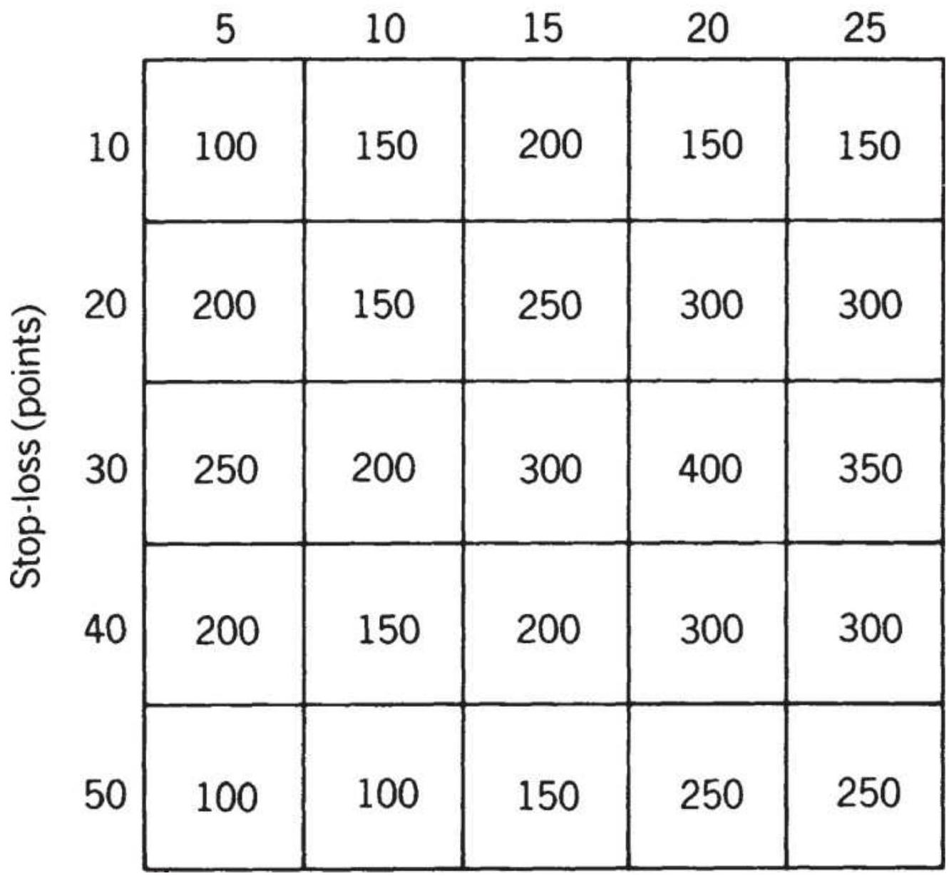
FIGURE 21.2 Visualizing the results of a 2-dimensional optimization.
The best way to avoid this problem is to choose a random starting point for the primary parameter. Say that's column 2. Find the highest value in column 2 (at row 3), then scan across row 3 for the best result. You can randomly select a starting row a number of times (not the same one) and still keep the total number of tests ( \(T\) )
to \(T \times\left(n_{1}+n_{2}\right)\), much smaller than \(n_{1} \times n_{2}\). This process is called seeding. When you have performed a number of searches beginning with a random cell and found the same results, you can conclude with some certainty that you have located the peak. For larger tests, more seed values would be needed, yet the total number of searches will be relatively small.
\section*{Step-Forward Testing}
The repeated process of choosing parameter values from short tests of in-sample data, then applying the results to out-of-sample data that immediately follows, is called

and blind simulation). In many ways this method parallels what happens in reality. We choose the parameters using older data, then apply them going forward for a preset amount of time. We then move the process forward in time and repeat. It goes as follows:
1. Select the total test period - for example, 30 years of daily data from 1988 through 2017.
2. Select the size of the individual "in-sample" test intervals - for example, 4 years.
3. Begin testing with the first 4-year period, 1988 through 1991.
4. Select the best parameter values from those results.
5. Use the selected parameter values from step 4 to find the performance for the next year, 1992. Accumulate this out-of-sample performance
throughout the test process.
6. If there is more data to test, move the test period forward by 1 year (the second test will be from 1989 through 1992), then test the new parameters on data for 1993. Add to the cumulative results. If done, go to step 8 , otherwise repeat this step.
7. The result of the step-forward test is the accumulated result of the individual out-of-sample tests in steps 5 and 6.
This process clearly simulates the traditional approach to test design, using in-sample and out-of-sample data in its proper order. It seems intuitively satisfying.
\section*{A Program for Step-Forward Testing}

There are add-ins available for step-forward testing provided by many development platforms. The Companion Website has a basic version, TSM WalkForward Persistence, that can be adapted to different trend calculations. It requires a starting and ending calculation period, plus an increment, for example 5 to 80 days in steps of 5 days. Define the in-sample number of days (e.g., 120) and the alternating out-of-sample period (e.g., 20 days). The program will find the moving average calculation period with the best profits for the in-sample period and apply that to the next 20 days. Then it steps forward 20 days and continues. It adds the out-of-sample results and shows the total plus the profits and losses associated with each of the calculation periods chosen, shown in Figure 21.3.
The accumulated results of all the calculation periods was a positive \(\$ 2,973\), but the figure shows that profits were better using longer calculation periods. Had the test gone out to 150 days, we would expect to see a cluster of profits.
\section*{Short-Term Bias}
Step-forward testing can introduce a bias that favors faster trading models. Because the in-sample test used only 4 years of data in our example, a long-term trend model may only post a few trades during this period. If there was a bull market during the entire 4 years, then most long-term trends would have captured the same results. Without enough data, testing cannot find which calculation period is best. Consequently, it would be difficult to evaluate the risk of these positions.
\section*{Walk-forward test of SP futures}
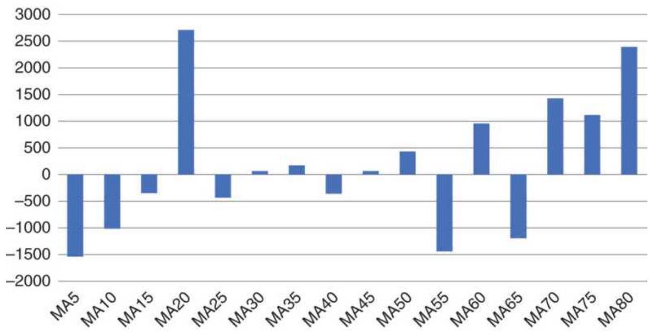
FIGURE 21.3 Walk-forward test results for SPY, October 1998-December 2018.
The problem of short-term bias can be seen when the optimum parameters values switch from short-term to long-term in successive test periods. For example, if you test moving averages from 5 to 100 days, you will find that one period shows 10 days as the best, followed by a period in which 100 days is best, followed again by a period in which 25 days is best. This erratic behavior is a sign that the data intervals are too short. It can be corrected by increasing the test intervals from 2 years to 5 years. Longer test intervals can eliminate most of the short-term bias. It also requires extra data at the beginning that cannot be used in the final results.
\section*{Intraday Testing}
The short-term bias is not a problem for intraday systems. John Ehlers says that intraday data is not stationary, that is, it can move in less predictable, shortterm patterns. \({ }^{3}\) He suggests that the test window should be two months and the walk-forward one week. He also recognizes that the noise inherent to intraday trading favors mean-reversion strategies.
\section*{Feedback}
The most serious concern about step-forward testing is feedback. Each application of step-forward process uses all of the data, a combination of in-sample and out-ofsample, even though the final performance is determined from the out-of-sample part. If the test is performed more than once, there is no out-of-sample data, which violates our concept of scientific testing. A way to avoid this problem is to set aside data that will not be used for
walk-forward testing, but for a final out-of-sample test at the end of the process.
\section*{TOO LARGE TO TEST EVERYTHING}
There are cases where you need to test a large number of parameters and rules - an optimization of hundreds of thousands (or even millions) of tests. Testing every combination isn't possible, Yet, there are search methods that can arrive at a likely solution quickly. These and other techniques were covered in Chapter 20. Here, we'll summarize the possible applications.
\section*{Genetic Algorithms}
A genetic algorithm is a very practical and very powerful searching tool. \({ }^{4}\) The process was explained in Chapter 20 and more examples can be found in Chapter 24. Given trend-following rules that would enter and exit on a trend change, modify the rules in one of the following ways:
1. (Four rules) Buy only on Monday, Tuesday, Wednesday, or Thursday.
2. (Three rules) Buy only when prices are lower for 1 , 2, or 3 days.
3. (Two rules) Enter a short sale only if prices are higher for 3 or 4 days.
4. (Two rules) Buy only when today's price is down or sell when today's price is up.
5. (Three rules) Exit a trade after 1 day, 3 days, or 5
days.
6. (Three rules) Exit a trade if the price moves 1, 2, or 3 ATRs from the entry price.
There are a total of 17 rules and 432 combinations. Which four rules are the best? A genetic algorithm will switch and combine rules, saving the best and introducing alternatives until it has found the best combination. It can do this quickly whether there are 432 combinations or 400,000. In this way, it can create the trading system for you. It is also possible to see a ranking, by performance, of the best system combinations. Remember that including rule changes, such as switching from a moving average to a linear regression, makes the results discontinuous and difficult to interpret.
\section*{Monte Carlo Sampling}
Monte Carlo sampling (or simulation) is used to create a statistically valid subset of tests when the total number of tests is too large. The results of this smaller set of tests can be analyzed as though it were the complete set.
Monte Carlo sampling (MCS) was created by the famous mathematicians Johann von Neumann and Stanislaw M. Ulam; they devised the method shortly after World War II to help them simulate the behavior of an atomic weapon. There is an interesting example of how the Monte Carlo process has been used to find the area of a lake with an extremely irregular shoreline. A picture of the lake is taken from above and the scale is determined (e.g., 1 inch = 100 feet). Think about the picture as
\(10^{\prime \prime} \times 10^{\prime \prime}\), displayed in color on a computer screen, with the lake clearly blue and the surroundings green. The picture is then superimposed with a fine grid, so that there are 100 (or even 1,000 if more accuracy is needed) pixels per inch, for a dimension of \(1,000 \times 1,000\) representing the entire screen, an unknown part of which is the lake. Now pick two uniform random numbers between 1 and 1,000 to represent the \(x\) and \(y\) coordinates and say the first values are 135 and 441. Remember that a uniform random number has an equal chance of being any of the values between 1 and 1,000 . The position \((135,441)\) is marked on the display and the computer determines whether it falls in the lake (blue) or on the shore (green). This process is repeated for 1,000 pairs of random numbers. When completed, the computer has counted 520 pairs that were in the lake; therefore, \(52 \%\) of the display area is lake, or 520,000 square feet. If more accuracy was needed, the grid would be divided into more pixels, and more random pairs would be generated. The test is completed when additional points do not change the size of the lake. The process works because the probability of a pair of random numbers falling in the lake is equal to the ratio of the lake's area to the entire picture. 5
Random numbers can be used to generate parameter values in a test of a trading strategy. If we had 8 parameters, each with 10 possible values, one value is picked at random for each parameter. Every time a value is picked a counter is incremented for that parameter. Every parameter has a counter for every possible value
used in the test (a total of \(8 \times 10\) ). Each time a string is created (one value for each of the 8 parameters, called a chromosome in Chapter 20) it is saved in a table along with its performance statistics. We continue with random selection until each of the 80 parameters have been used a "reasonable" number of times, perhaps 20 or even 100 . We would have a minimum of \(80 \times 100\), or 8,000 tests instead of the total tests, 100 million.
The test ends when each parameter has been used a minimum number of times and there is no longer any improvement in the results. These strings can now be analyzed as though they were the entire test set, although academics will argue that the statistical quality of the sample data (e.g., variance) may vary significantly from the whole set.
Both the genetic algorithm and Monte Carlo sampling can be performed a number of times. If the best results are similar, then you can be confident that the smaller sample is a good representation of the entire set. The use of random values has the additional advantage of avoiding unfair targeting of values that may be known in advance to perform well.
\section*{VISUALIZING AND INTERPRETING TEST RESULTS}
Visualization is vital for avoiding gross errors in development. Looking at a price chart of what is being tested avoids data errors. Presenting test results in some continuous form will show patterns, outliers, and erratic
results. Some will argue that this can all be done by scanning the numbers and using various measurements, yet there is no real substitute for what the eye can see.
Test platforms, such as TradeStation, MetaStock, and Ninja Trader, 6 are excellent alternatives for analysts who do not want to develop their own test platforms. TradeStation and MetaStock perform an optimization by sequentially processing every combination of parameters from a range specified by the user. The TradeStation results are shown as a table, which can be exported to Excel. Each line contains one combination of parameters, as shown in Table 21.1. In this example, the table shows a moving average test of QQQ, with calculation periods from 10 days to 150 days in steps of 10 (column B), covering the period from 1999 through May 2018. The user can choose to display dozens of statistics rather than the few shown here.
\section*{TABLE 21.1 Optimization report for a simple moving average test of QQQ, 1999-May 2018.}
\begin{tabular}{|c|c|c|c|c|c|c|c|c|c|c|c|c|c|c|c|c|}
\hline 4. & A & 6 & C & D & E & F & \(G\) & H & 1 & J & K & t & M & N & 0 & p \\
\hline 1 & Test & Period & \begin{tabular}{c}
All: Net \\
Profit
\end{tabular} & \begin{tabular}{c}
All: Total \\
Trades
\end{tabular} & \begin{tabular}{c}
All: \% \\
Profit- \\
able
\end{tabular} & \begin{tabular}{c}
All: \\
Win/loss \\
Ratio
\end{tabular} & \begin{tabular}{c}
All: Avg \\
Trade
\end{tabular} & \begin{tabular}{c}
All: Profit \\
Factor
\end{tabular} & \begin{tabular}{c}
Long: Net \\
Profit
\end{tabular} & \begin{tabular}{l}
Long: \\
Total \\
Trades
\end{tabular} & \begin{tabular}{c}
Long: \% \\
Profit- \\
able
\end{tabular} & \begin{tabular}{l}
Short: \\
Net \\
Profit
\end{tabular} & \begin{tabular}{l}
Short: \\
Total \\
Trades
\end{tabular} & \begin{tabular}{c}
Short:\% \\
Profit- \\
able
\end{tabular} & \begin{tabular}{c}
All: Max \\
Contracts \\
Held
\end{tabular} & \begin{tabular}{c}
All: \\
Return \\
on \\
Account
\end{tabular} \\
\hline 2 & 1 & 10 & -18433.31 & 653 & 32.16 & 1.66 & -28.23 & 0.790 & -4335.14 & 327 & 38.23 & -14098.20 & 326 & 26.07 & 483 & -95.93 \\
\hline 3 & 2 & 20 & 4665.23 & 435 & 36.32 & 1.89 & 10.72 & 1.084 & 6820.40 & 218 & 43.58 & -2155.15 & 217 & 29.03 & 452 & 49.22 \\
\hline 4 & 3 & 30 & -1404.54 & 337 & 33.83 & 1.90 & -4.17 & 0.973 & 3893.17 & 169 & 42.60 & -5297.70 & 168 & 25.00 & 459 & -18.67 \\
\hline 5 & 4 & 40 & 7380.83 & 309 & 34.30 & 2.25 & 23.89 & 1.175 & 8528.23 & 155 & 38.06 & -1147.38 & 154 & 30.52 & 491 & 108.43 \\
\hline 6 & 5 & 50 & 8391.37 & 231 & 28.14 & 3.16 & 36.33 & 1.237 & 9812.89 & 116 & 37.93 & -1421.52 & 115 & 18.26 & 458 & 192.96 \\
\hline 7 & 6 & 60 & 2912.30 & 225 & 30.22 & 2.47 & 12.94 & 1.078 & 6907.42 & 113 & 39.82 & - 3995.12 & 112 & 20.54 & 452 & 54.51 \\
\hline 8 & 7 & 70 & 4738.34 & 217 & 32.72 & 2.31 & 21.84 & 1.123 & 8318.98 & 109 & 45.87 & -3580.65 & 108 & 19.44 & 427 & 57.93 \\
\hline 9 & 8 & 80 & 7588.26 & 197 & 33.50 & 2.41 & 38.52 & 1.213 & 9900.91 & 99 & 44.44 & -2312.65 & 98 & 22.45 & 424 & 90.26 \\
\hline 10 & 9 & 90 & 6127.02 & 157 & 27.39 & 3.14 & 39.03 & 1.185 & 9232.16 & 79 & 37.97 & -3105.14 & 78 & 16.67 & 419 & 85.17 \\
\hline 11 & 10 & 100 & - 254.69 & 169 & 27.81 & 2.56 & -1.51 & 0.994 & 6198.23 & 85 & 29.41 & -6452.91 & 84 & 26.19 & 402 & -2.62 \\
\hline 12 & 11 & 110 & 11653.40 & 157 & 37.58 & 2.27 & 74.23 & 1.382 & 11963.67 & 79 & 43.04 & -310.26 & 78 & 32.05 & 420 & 171.56 \\
\hline 13 & 12 & 120 & 24356.67 & 141 & 46.10 & 2.46 & 172.74 & 2.164 & 18492.23 & 71 & 52.11 & 5864.44 & 70 & 40.00 & 422 & 404.79 \\
\hline 14 & 13 & 130 & 20690.36 & 137 & 38.69 & 3.00 & 151.02 & 1.964 & 16715.99 & 69 & 46.38 & 3974.37 & 68 & 30.88 & 420 & 470.41 \\
\hline 15 & 14 & 140 & 14753.77 & 141 & 32.62 & 3.41 & 104.64 & 1.653 & 13123.35 & 71 & 38.03 & 1630.42 & 70 & 27.14 & 427 & 296.92 \\
\hline 16 & 15 & 150 & 20191.24 & 119 & 42.02 & 2.84 & 169.67 & 2.060 & 16339.22 & 60 & 51.67 & 3852.02 & 59 & 32.20 & 422 & 445.60 \\
\hline
\end{tabular}
Results are easily plotted and can show profits for
combinations of long and short trades on a single bar chart (see Figure 21.4) or the same results on a line chart (Figure 21.5). On the bar chart it is easier to see that the profits from short sales are losses through 110 days while profits from long positions are more consistent. From 120 days, profits increase considerably.
QQQ Optimization (1)
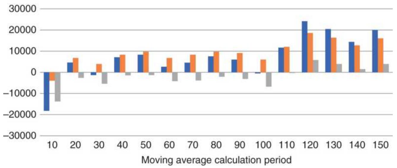
- All: Net Profit - Long: Net Profit — Short: Net Profit
FIGURE 21.4 Net profits from longs, shorts, and combined displayed as a bar chart
\section*{QQQ Optimization (2)}
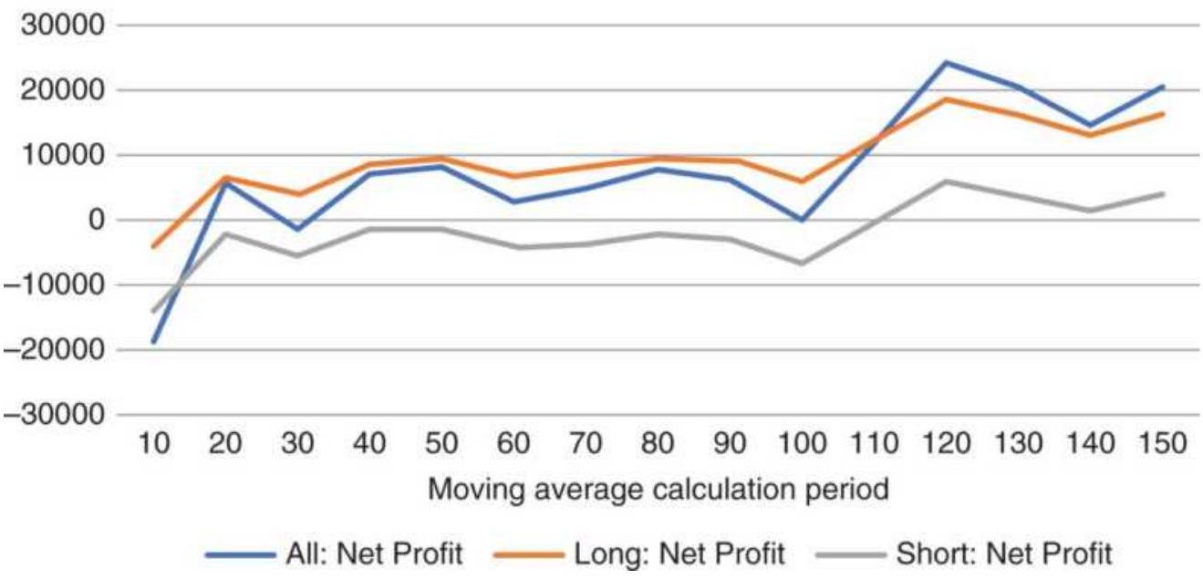
FIGURE 21.5 Optimization of QQQ shown as a line chart.
\section*{Showing Returns Through Time}
It can be more informative to display the optimization results for different years. For example, Figure 21.6a shows the moving average returns for euro currency futures (CU) over three time intervals, 1997-2017, 2007-2017, and 2012-2017. This gives us a chance to see not only the pattern of profits but the way those profits have changed over time. The last five years appear to show smaller gains, the result of much lower interest rates; nevertheless, recent profits are in the same pattern as the past.
The euro results show the best returns are for a 100-day average, but for faster trading, the 30-day average performs well. The big picture shows that the euro currency is a trending market and all but the fastest calculation period is profitable.
\section*{Total profits inclusive periods}
5000000

\(-1000000\)
\[
\begin{aligned}
& \begin{array}{lllllllllllllll}
10 & 20 & 30 & 40 & 50 & 60 & 70 & 80 & 90 & 100 & 110 & 120 & 130 & 140 & 150
\end{array} \\
& \text { Moving average calculation period }
\end{aligned}
\]

FIGURE 21.6a Euro futures optimization of a moving average system shown for 3 time intervals, each longer one inclusive of the shorter ones.
Total profits exclusive periods
2000000

\begin{tabular}{lllllllllllllllll}
-500000 & 10 & 20 & 30 & 40 & 50 & 60 & 70 & 80 & 90 & 100 & 110 & 120 & 130 & 140 & 150 \\
& & \multicolumn{7}{c}{\begin{tabular}{ll}
Moving average calculation period
\end{tabular}} & & & & & &
\end{tabular}
■ 1997-2006 | 2007-2011 - 2012-2018
FIGURE 21.6b Results of euro currency futures optimization showing performance over nonoverlapping time intervals.
It is more instructive to view the results as
nonoverlapping (exclusive) periods. In Figure 21.6b, the data is separated into three intervals, 1997-2006, 20072011, and 2012-2018. This allows us to see the consistency of performance over various intervals, and any changes that have occurred due to bull and bear markets. Had the middle period, 2007-2011, posted mostly losses due to the financial crisis, it would have been hidden in the profits of the previous or following years. Figure 21.6b shows that the most consistent performance was for calculation periods 30 and 100 days, where all three bars showed good returns.
\section*{Different Patterns}
Interest rates and currencies have strong trends, but the equity index markets do not. Eurodollars are closely tied to central bank interest policy which develops slowly and persists for as long as the Fed needs to accomplish its objectives. The test results in Figure 21.7 a show that the most recent period from 2012 through 2017 accounted for the smaller than 1997 through 2006 because interest rates were lower. The period spanning the 2008 financial crisis is more erratic.
Almost the opposite, the equity index markets have a great deal of noise, making it difficult to net a profit from faster trends, as seen in Figure 21.7b. Profits do not accumulate until the calculation period reaches 100 days. Large losses using fast trends shows why the S\&P is popular for mean-reversion trading. Gains in the S\&P are proportionately larger in the most recent period, which captures the extended bull market.
Wheat also shows only long-term profits, but not nearly as consistent as the S\&P (see Figure 21.7c). We might explain the 30 - and 35 -day gains as sympathetic to seasonality, but losses in the surrounding tests make that a risky choice. The longer-term profits are the result of changes in the U.S. dollar, which will cause wheat prices to rise and fall slowly within a narrow range.
Eurodollar optimizations
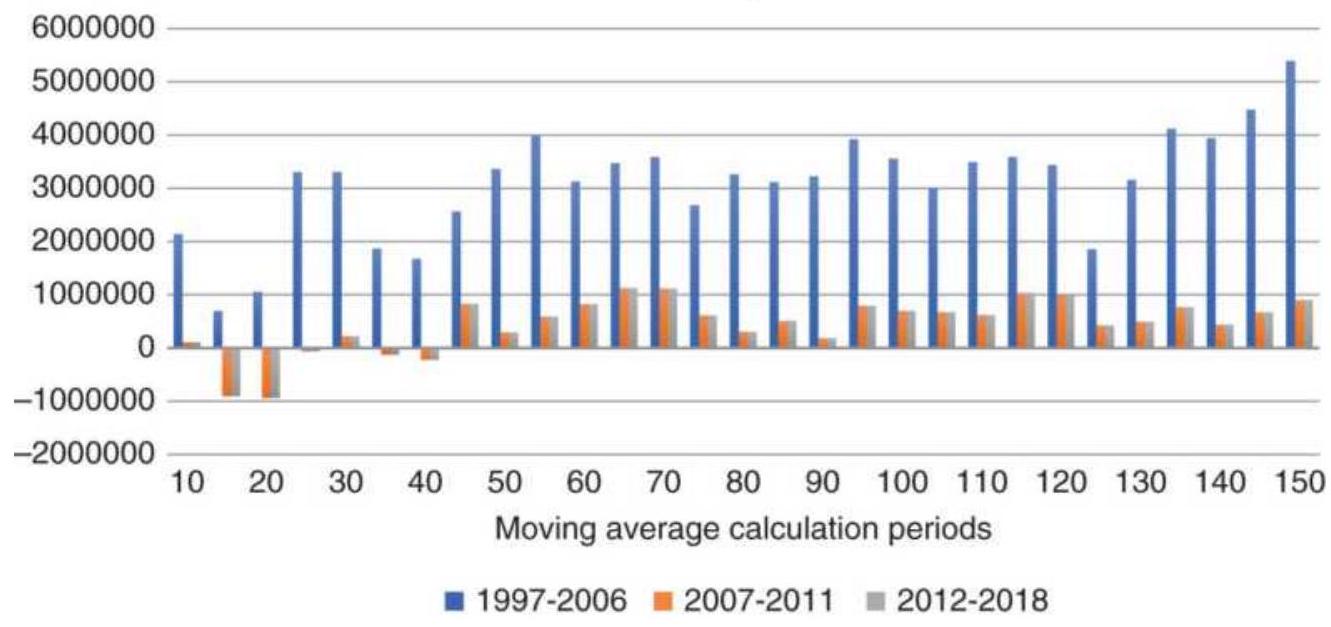
FIGURE 21.7a Eurodollar futures moving average optimization results through 2017.
\section*{eMini S\&P optimizations}
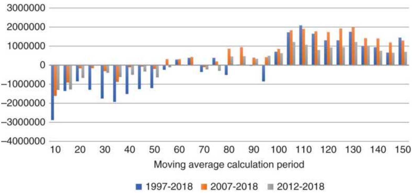
FIGURE 21.7b Results of an emini S\&P optimization. Wheat optimizations
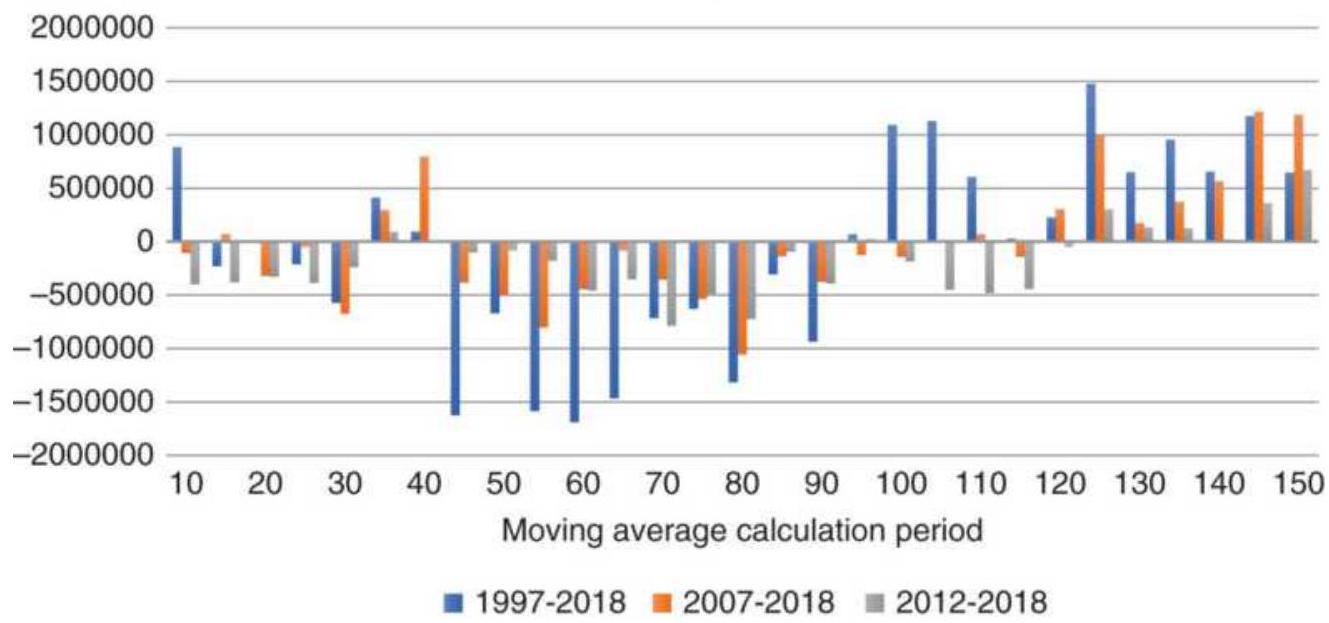
FIGURE 21.7c Wheat futures optimization shows erratic gains in the longer calculation periods.
Hogs optimizations
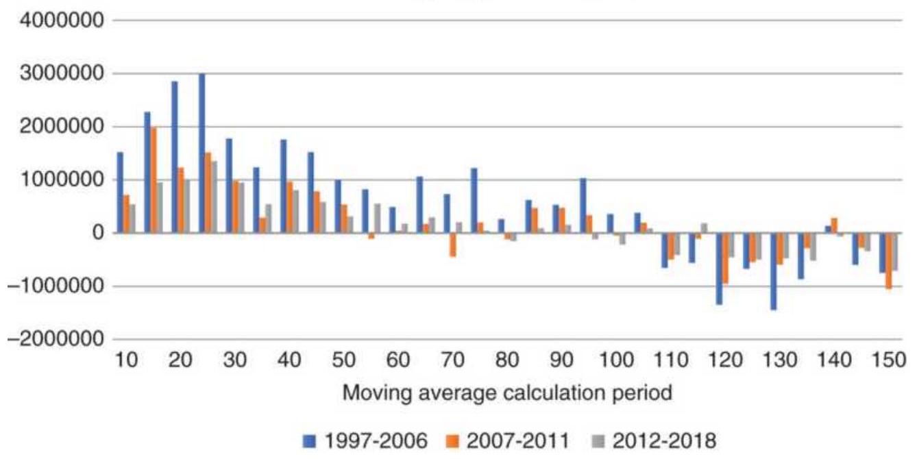
FIGURE 21.7d Hog futures optimization shows gains in the short-term.
Hogs are a non-storable, seasonal commodity, subject to supply and demand as well as grain prices. They also have a short life cycle. When feed costs are high, producers may sell off their stock early. This causes a sharp decline in nearby prices and a rise in deferred prices when the inventory will be low. Figure 21.7 d shows that short-term trends are the only ones that are successful because longer time horizons are too uncertain. The most recent six years, 2012-2018, are consistently profitable for faster trading, but gains are lower than in the past.
The last example is cotton, which has had significant supply disruptions due to flooding in Pakistan and India. Figure 21.7 e shows a performance spike at the moving average period of 80 days, but also profits on both sides of that trend value. While the 80-day average picked up
most of the profit, the trends that were slightly slower and slightly faster also benefited from that price move. The test shows that the next test period, 2007-2011, has a much smaller gain, and the most recent period has posted all losses. Spikes in an optimization do not indicate a predictable profit.
Cotton optimizations
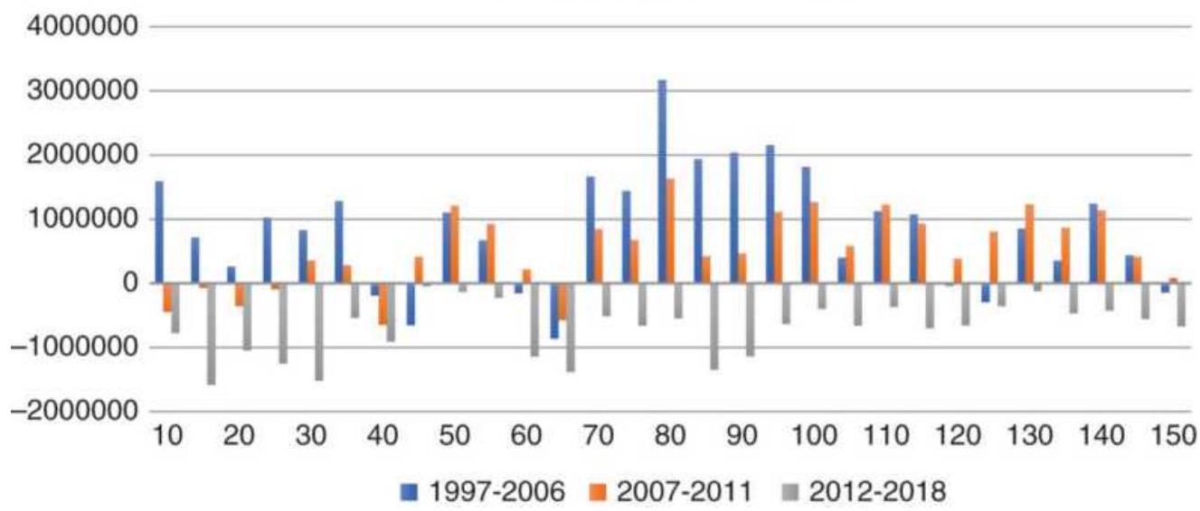
FIGURE 21.7e Cotton shows a performance spike using an 8o-day moving average.
Futures markets have unique personalities; some have long-term trends driven by economic policy, especially interest rates. A healthy economy will increase overall demand, which will be reflected in copper and other housing materials. During those times, most prices move higher. Other times, we need to pay attention to the price characteristics of each market. As seen in these moving average optimizations, the patterns can be very different. Displaying an optimization as a bar chart or line chart is a useful way of seeing the consistency of returns and whether those profits are still there.
Note that many patterns with long-term trends will show a flattening or slightly declining profit for the longest calculation periods. As you move to the right, the results become less sensitive to parameter values. If the trend test is from 5 to 150 days in steps of 5 days, then the first tests, 5 and 10 day, change by 100 . At the far right, the parameters change from 145 to 150 , a change of only \(3 \%\). It's not likely that the results of a 145- and 150-day moving average will be very different, hence the flattening of profits to the right.
\section*{Seeing Continuity in 2-Parameter Tests}
Visualizing the test results for single variables is straightforward, but there are more choices for 2parameter tests. In this example, a 2-moving average crossover system (long-short) is tested on the ETF QQQ from 1998 through most of 2017. The slow trend will vary from 50 to 120 , and the fast from 5 to 50 days.
\section*{Heat Maps}
If you arrange the test results in a matrix, with one parameter on the left (slower trend) and the other on the top (faster trend), Excel can color the cells to show areas of success and failure (see Figure 21.8). We can't use color here, but a gray scale has the higher profits darker and larger losses lighter. The slowest combinations (longest calculation periods) are in the top left, and the fastest in the bottom right. The slowest of both trends, the area in the circle, turns out to be best when we consider the average of an area, rather than a single result. The high percentage of profitable combinations,
\section*{\(90.7 \%\), indicates that QQQ is a trending market.}
\begin{tabular}{|c|c|c|c|c|c|c|c|c|c|c|}
\hline & & 45 & & 35 & 30 & 25 & 20 & 15 & 10 & 5 \\
\hline 120 & 10852 & 7005 & 10731 & 11547 & 6239 & 5942 & 8426 & 5758 & 1063 & 2527 \\
\hline \(1 / 5\) & 12806 & 13731 & 15113 & 9703 & 3642 & 6098 & 8306 & 7623 & -120 & -3468 \\
\hline 10 & 13147 & 11405 & 15216 & 6375 & 8127 & 7441 & 8943 & 5069 & 2149 & -5722 \\
\hline 05 & 13646 & 12211 & 11014 & 6313 & 7396 & 9735 & 5711 & 6118 & 5162 & -5111 \\
\hline 100 & 9697 & 11715 & 6570 & 8507 & 8293 & 10664 & 5362 & 7949 & 3133 & -133 \\
\hline 95 & 14601 & 16729 & 9601 & \(1 / 844\) & 7621 & 10057 & 5440 & 5580 & -68 & 859 \\
\hline 90 & 12331 & 13737 & 9281 & 8803 & 5642 & 6256 & 4280 & 1962 & 42 & 1837 \\
\hline 85 & 12181 & 8419 & 5202 & 7781 & 7928 & 9163 & 3128 & 6422 & -1105 & 620 \\
\hline 80 & 8995 & 6694 & 3055 & 2684 & 8236 & 4768 & -1529 & 5881 & 2795 & 1913 \\
\hline 75 & 10540 & 3442 & 2797 & 4196 & 5403 & 1611 & -1665 & 5134 & 6944 & 2092 \\
\hline 70 & 6029 & -2814 & 3219 & 3494 & 2699 & 2248 & -1630 & 2143 & 5149 & 1726 \\
\hline 65 & 56 & 1893 & 4441 & 6371 & 4671 & 502 & -2966 & -960 & 6782 & 5937 \\
\hline 60 & 7096 & 6663 & 4530 & 7989 & 9100 & 3210 & 663 & -695 & 4329 & 2723 \\
\hline 55 & 3559 & 2573 & 9445 & 10740 & 4525 & 4245 & 929 & 2321 & 7610 & -307 \\
\hline
\end{tabular}
FIGURE 21.8 Heat map of the 2 moving average crossover system.
QQQ Moving average crossover
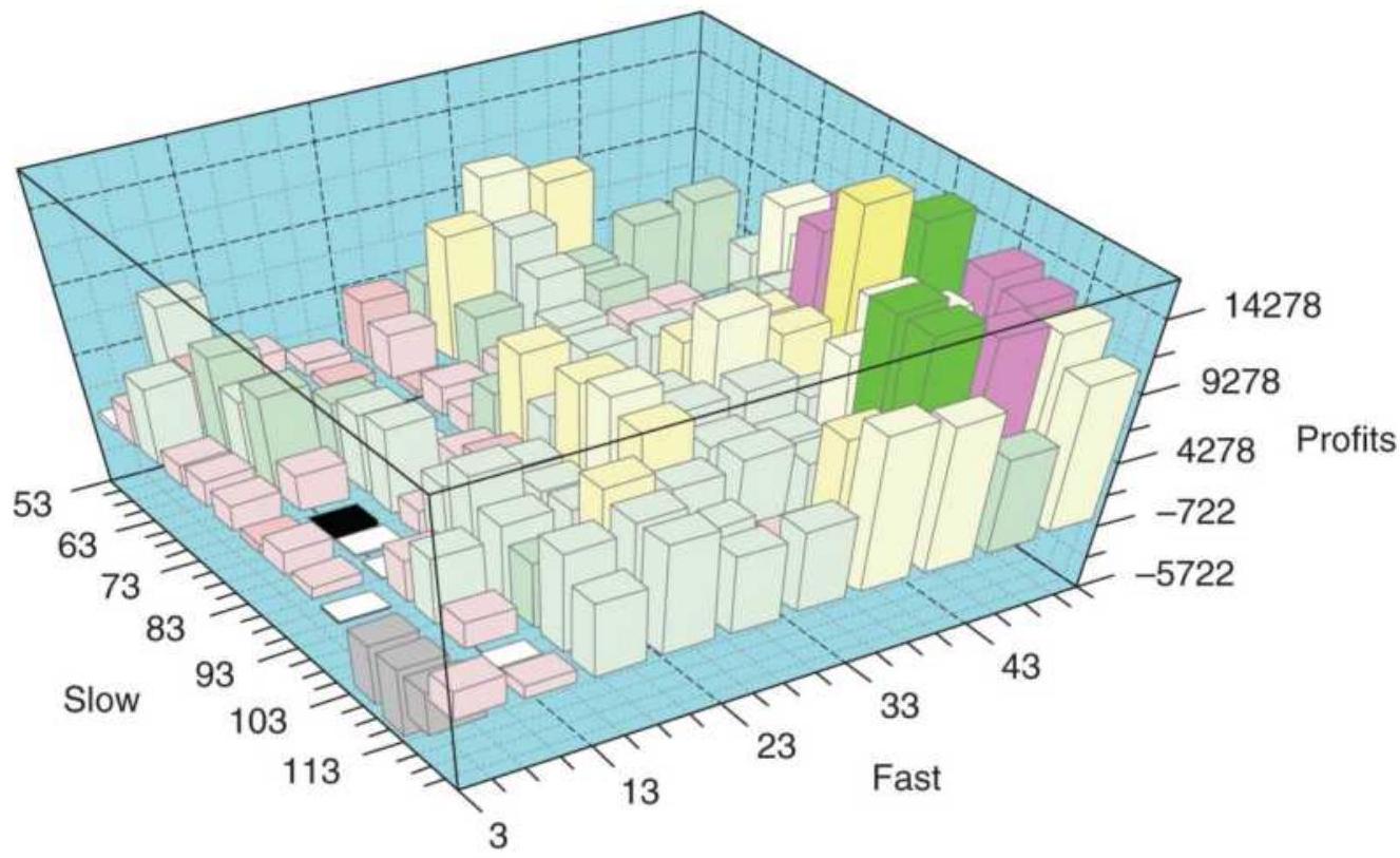
FIGURE 21.9 A 3-dimensional bar chart of QQQ
returns using a moving average crossover system.
Source: PSI Plot.
\section*{3-Dimensional Plots}
A 3-dimensional plot can give us another view of the same results. These are available in Excel or in a wide range of statistical software. In Figure 21.9 we see the slowest combination in the lower right corner and the fastest in the upper left. The height of the bar represents the net profit. The corner at the bottom, closest to us, shows the worst returns, a combination of the slowest long-term trend and the fastest short-term trend. It's important that there is a clear pattern. Erratic results will be seen as high and low bars alternating in no obvious way, or performance spikes randomly appearing across the chart. That would indicate that the system is unstable or badly defined and should not be traded.
Results can also be displayed as a surface chart (see Figure 21.10). Because this test only had a few values for each moving average, the results are jagged but the same as Figure 21.9. Smaller increments for each of the moving average calculation periods would make this smoother.
Whichever method you choose, displaying the results is a fast way of seeing whether the test was successful, and for spotting errors. If a 3-dimensional bar or surface chart had a spike in the middle, chances are there was a data error or a single, extreme price event. The best results have smooth contours.
\section*{QQQ Moving average crossover}
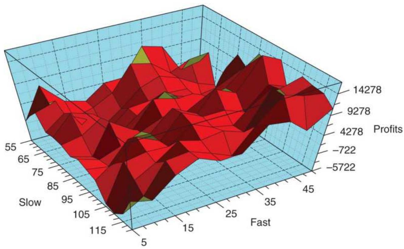
FIGURE 21.10 QQQ optimization results shown as a surface chart. The best results are in the lower right corner, consistent with the previous 3-dimensional bar chart.
\section*{More Than Three Dimensions}
A 3-dimensional plot has three axes, with the vertical one (the z-axis) showing the net profits, and the x and y axes showing two parameters, for example, there could be two trend calculation periods or a trend and a profittaking factor. If the system has three or more parameters, a moving average, RSI, and slop-loss, you will need more than one chart to visualize the results. For this example, we'll use a VIX mean-reversion strategy shown in Chapter 20, but we'll add a profittaking factor (PF) and a stop-loss factor (SF). In
addition, UVXY will be used instead of the VIX index, which cannot be traded. The rules will be:
1. Use the same calculation period for an exponential smoothing and a simple moving average.
2. Buy the VIX when the EMA falls below the SMA.
3. Set a profit target at PF \(\times 20\)-day ATR added to the entry price.
4. Set a stop-loss at SF \(\times\) entry price, where
\[
\mathrm{SF}<1.00 \text {, e.g., } 0.985
\]
An optimization is run on UVXY with the following setting:
- The trend calculation period from 3 to 15 in steps of 1
- The profit factor from o (no factor) to 3 in steps of 0.2
- The stop-loss percentage from o (no stop) to 1.0 in steps of 0.1
The total number of tests is 2,288 . The test results are exported to Excel. Three scatter diagrams can be plotted, the trend vs profits and stops, profits vs trend and stop, and stop vs trend and profits. Figure 21.11a shows the net profits for all 2,288 tests in which the calculation period was \(3,4, \ldots, 15\). We don't know whether the profit taking or stop-loss contributed to the results and it doesn't matter. The best bar is 12 , which has a similar high as period 15, but a higher low.
\section*{VIX calculation period}
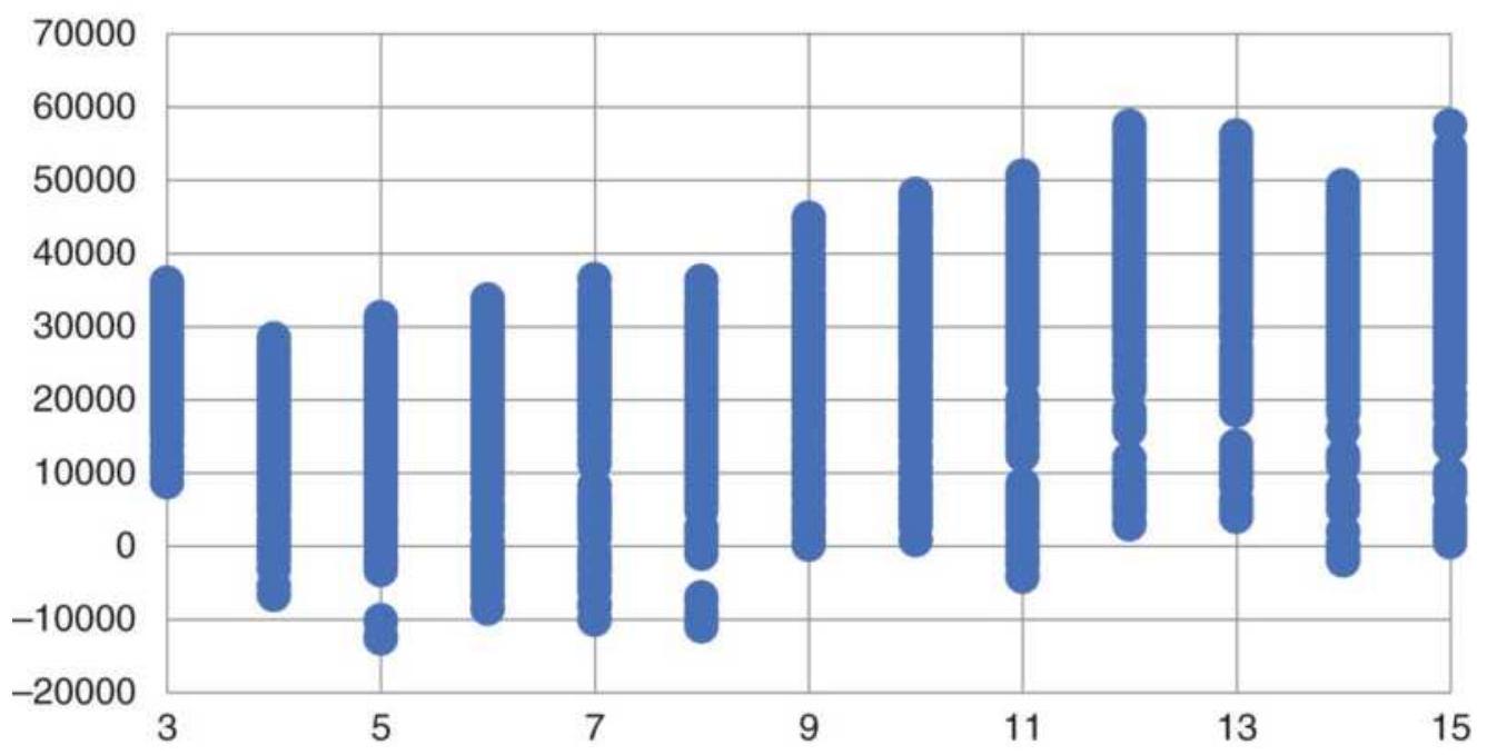
FIGURE 21.11a A scatter diagram of all test profits given the trend calculation period along the bottom.
The same process can be used to show all the net profits for different profit factors and stop-loss factors (Figures 21.11b and 21.11c). The first bar of the profit factor represents "no profit taking." The only bar that may be better is at 1.8 , which has a higher low. Given the choice of no profit-taking and taking profits for a meanreversion system, we would always choose taking profits. These systems are very short term and tend to operate within the range of high price noise. Capturing profits that might disappear tends to be a sound rule.
\section*{VIX Profit factor}
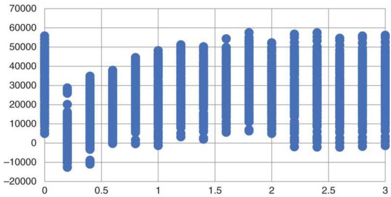
FIGURE 21.11b All net profits given the profit factor along the bottom.
VIX Stop-loss factor
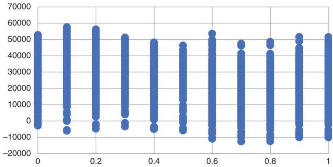
FIGURE 21.11c All net profits given the stop-loss percentage along the bottom.
A stop-loss is a different problem. A mean-reversion
system relies on having a lot of small profits to offset an occasional large loss. A stop-loss works against that profile by lowering the percentage of profitable trades. Generally, only a large stop-loss is used to protect a catastrophic loss. In this test of the stop-loss showing all returns, the best choice was o.1, which would translate into \(1 \%\) below the long entry price. However, the picture shows that stops affected all periods about the same.
Using the three scatter diagrams in Figure 21.11, the optimal choices are a trend of 12 days, a profit factor of 1.8 , and a stop-loss percentage of \(0.1 \%\). The results of using these choices are shown in Figure 21.12. As we've discussed before, and will again, the results of using the optimal parameters will always be good but will not necessarily work as well in the future because they are overfit. In the next sections we'll look at ways to choose parameters that avoid this problem.
\section*{VIX Strategy with optimized parameters}
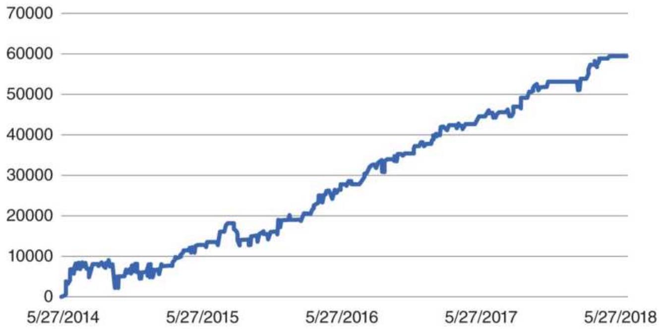
FIGURE 21.12 VIX mean-reversion strategy using
optimal parameters.
\section*{Averaging the Results}
Optimizations can have the look of a continuous pattern, as shown in Figure 21.5, but can also have an odd profit spike or drawdown. In Figure 21.13 is a simple test of a moving average systems applied to copper futures from 2007-2017. There are three tall profit bars at 60, 65, and 70 days, with the 65 -day return lower than the ones on either side. At the same time, the drawdown for the 65day test is slightly smaller than its neighbors.
Each trend period will result in entries and exits slightly different from its neighbors. In some cases it will produce a better return or smaller loss, and in other cases something worse. Can we count on that in the future? In other words, would we expect the 60-day trend to be the best for the next year, and would the drawdown be less than the drawdown of the 40-day trend? It all depends on how prices develop. From this chart we can only say that we should expect profits using trends of 10 to 70 days. How much profit? Our best guess would be the average of the 50-55-60-65-70 tests. This is similar to the AI technique in Chapter 20, " \(k\)-nearest neighbor."
Drawdowns are a little different. Rather than the average of its neighbors, it is safer to choose the maximum drawdown of its neighbors. The reasoning is that a small change in the trend signal could have avoided a larger drawdown, but there is no assurance that will happen in the future. It is especially true when there is an unusually
small drawdown surrounded by larger drawdowns, similar to the 25-day trend in Figure 21.13. It is best to assume that it was just luck that the system avoided the larger loss. If each of the profits and drawdowns are averages of 5 bars, two on each side, the results are shown in Figure 21.14.
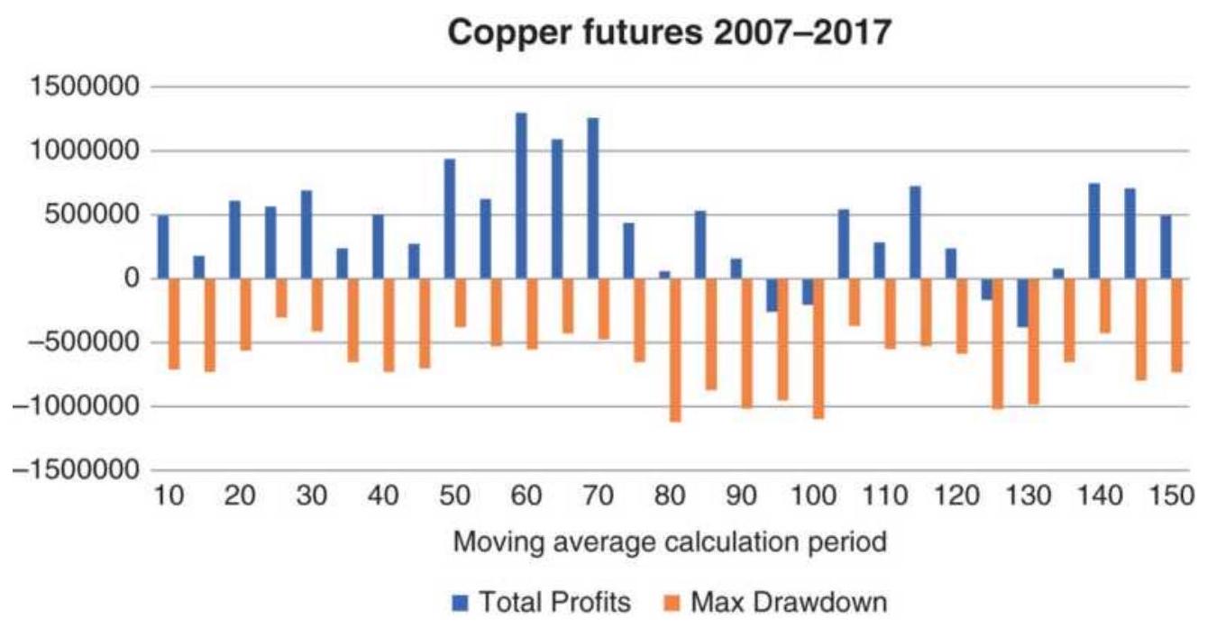
FIGURE 21.13 Moving average optimization of copper futures, 2007-2017, showing total profits and maximum drawdown.
Copper average profits and drawdowns
1500000

\(\begin{array}{llllllllllllllll}-1500000 & 10 & 20 & 30 & 40 & 50 & 60 & 70 & 80 & 90 & 100 & 110 & 120 & 130 & 140 & 150\end{array}\)
Moving average calculation period
- Average Profit Average Drawdown
FIGURE 21.14 5 -Bar averages of profits and maximum drawdowns for a copper optimization.
\section*{2-Parameter Averaging}
The results of a 2-parameter test may also be averaged to create a smoother set of values. Using a 2 -dimensional grid shown in Figure 21.15, the original net profit or loss of each test will be denoted as \(P L_{i j}\), associated with row \(i\) and column \(j\) of the display. The object is to replace each \(P L_{i j}\) with \(\overline{P L}_{i j}\), the average value of its neighbors. This is done, as seen in Figure 21.15a, by taking an average of the 9 test results centered around the \(i j\) th value. There are special cases when the \(i j\) th result is not fully surrounded but on the perimeter of the test grid. Figures 21.15b, c, and d show the averaging technique used when the \(i j\) th box is a top, side, or corner value. If this was a larger test with smaller increments, an average of a larger area would be better. A generalization of this
method can be found later in this chapter under N Dimensional Sensitivity Testing.
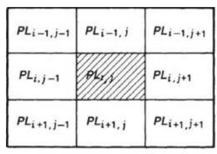
(a)

(b)
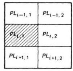
(c)
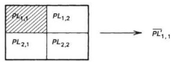
(d)
FIGURE 21.15 Averaging of map output results. (a) Center average ( 9 box). (b) Top edge average (6 box). (c) Left edge average (6 box). (d) Upper left corner average (4 box).
\section*{Trading More Than One Parameter Set}
We should expect that choosing the parameters that had the best net profit, or highest return ratio, or smallest drawdown, is not a good way of predicting future returns. The highest net profits are most likely to have been on the right side of a price shock, or avoided a price shock, while a parameter value nearby took a loss. The best result should be a classic case of overfitting.
If a large number of parameter combinations are profitable, or there is a large area of continuous profits in the test matrix, then choosing three or more parameter combinations at random, representative of the entire
test, should result in an average return over time. An average return is your best expectation of future performance. If you choose three parameter sets, then trade each as a separate system with \(1 / 3\) of the funds, netting out the positions. This will be discussed again in Chapter 24.
\section*{THE IMPACT OF COSTS}
Faster trading has the advantages of smaller actual losses but the disadvantage smaller profits and more transactions. A system that performs well with more trades will instill more confidence of futures performance.
On the negative side, short-term trading is a fight against slippage and overall transaction costs. There may be times when prices are moving so fast that you miss the trade completely, or accept large slippage just to be in the position. Figure 21.16 shows the impact of varying costs (per contract, per side, plus slippage) on the moving average system applied to futures. As we would expect, the shortest calculation periods have the most trades and the most cost. Based on a total cost of \(\$ 25\) per side, the 10 -day trend drops about \(\$ 50 \mathrm{~K}\), the 20 -day about \(\$ 34 \mathrm{~K}\), and the 40 -day about \(\$ 23 \mathrm{~K}\). We can see in the chart that the impact gets smaller as the calculation period gets longer and there are fewer trades.
\section*{Impact of costs}
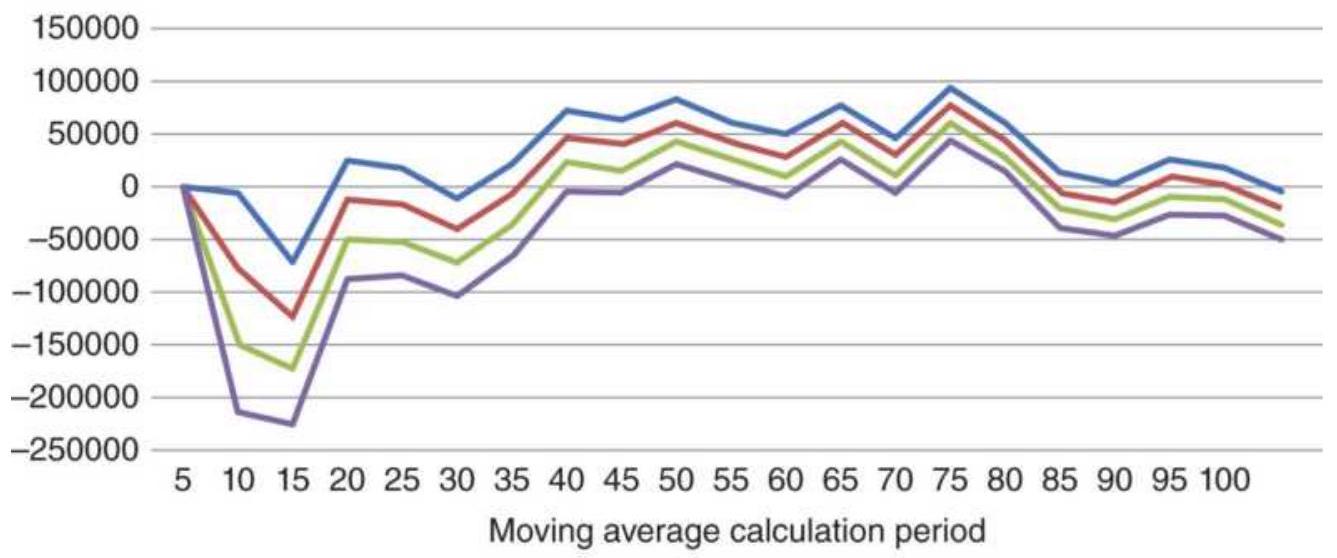
— No cost — \$ 25 - \$50 - \(\$ 75\)
FIGURE 21.16 Impact of costs on the moving average system.
Had you chosen to be very conservative and used costs of \$50 per contract, "just to be safe," you would have turned those profitable results into losses. Then all calculation periods from 10 through 40 were net losses. Using unrealistically large costs can cause you to eliminate a successful, fast-trading system.
\section*{REFINING THE STRATEGY RULES}
As testing progresses, it is inevitable that we will want to modify a rule or add a new feature to the trading strategy. This usually follows from inspecting the results of tests and seeing that a specific pattern was not treated properly (or profitably). After some work, the analyst introduces a carefully constructed rule which turns a previous loss into a profit. Figure 21.17 shows two possible changes in the performance pattern for a 1-
parameter test based on this change.
If the rule change improves a specific situation at the cost of other parameter values, the complete test pattern will appear as shown in Figure 21.17a. Higher peak profits occur where the new rule works best, but other parameter values perform worse than before. The average returns may remain the same, but the results are more extreme. Because the new rule caused the fitting of a specific pattern at the cost of added losses in other patterns, it is not an improvement. Statistically, this performance change can be measured by kurtosis. A high value of kurtosis, say above 6 , is a sign of overfitting.
In Figure 21.17b, the new rule improves performance in all cases. This pattern is an ideal solution and can happen when a volatility or trend filter is added. It is possible, of course, that an improvement is defined in such a way that it corrects only one specific problem without affecting any other trades. Rule fitting, which affects only one or two cases, is unlikely to work in the future. If it falsely raises expectations of success, it puts the investor at risk.
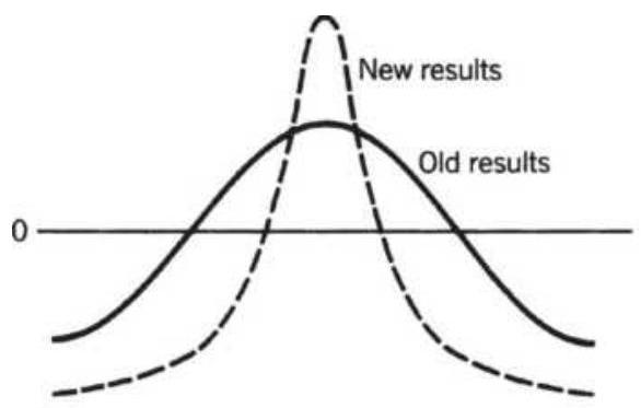
(a)
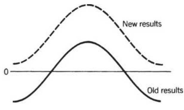
(b)
FIGURE 21.17 Patterns resulting from changing rules. (a) A rule change that improves one situation at the cost
of others. (b) A rule change resulting in general improvement.
\section*{ARRIVING AT VALID TEST RESULTS}
It is not unusual for the optimal test result, especially one with many parameters, to appear perfect. Most trades could be profitable, the equity drops might be small, and the strategy might perform in changing markets, and yet, the final system will consistently lose money when traded. Creating a system with predictive qualities (rather than one that is historically fitted) requires an acceptance of what is realistic, that all systems have risk.
When reviewing test results, we have a tendency to accept good test results but look closely for errors when there are bad results. It is important that all results be verified carefully.
\section*{Common Sense versus Statistics}
You can always find a particular moving average or indicator that gave a signal to sell the S\&P just before the 1987 crash, or ahead of the 2008 financial crisis. It is not difficult when a computer can combine millions of trend speeds, filters, momentum indicators, divergence rules, and so on, using powerful search engines. It is also easy when you are willing to sacrifice performance at other times to capture the biggest profits in recent history. However, what works in a specific case, and often an unusual one, is not likely to work in general. As Jack Schwager has stated, "The mistake is extrapolating
probable future performance on the basis of an isolated and well-chosen example from the past." \({ }^{\prime}\) Manipulating the rules is a wasted effort. Showing that a combination of technical indicators would have profited from the last market crash has no bearing on how it will respond to the next crisis.
The best systems are the ones that are not sensitive to modest changes in parameter values. They will make or lose more as you vary the calculation periods, but they will still be profitable. Profits and losses will accumulate gradually, not jump around. Results should pass the "smell test."
Performance is greatly dependent on the data you choose to test. If it was from 2009 through 2017, a prolonged bull market, the profile of performance would show steady profits with low risk. If you assume the same low risk in the future, you will be unpleasantly surprised. To get a realistic profile you must include a wide range of price patterns. The more extreme, the better it will serve you in the future. Results won't look as good, but they will be more realistic.
\section*{Omissions and Scenarios}
The more difficult problems to overcome are the ones you cannot see, the price moves that are not part of your test data, and the omissions. Every few years the market experiences a price shock: the Brexit vote in 2016, the subprime collapse of 2008, and before that, the terrorist attack of September 11, 2001. Price history is full of small price shocks caused by economic reports, but the very
large ones are years apart. If your test does not include data with a significant price shock, then you cannot know if you will survive the next one. You must be constantly looking for potential problems. You must question the ability of your strategy to perform under different scenarios. The guidelines in the next section are based on experience. They are intended to avoid the most basic and costly errors that occur in testing. You may be able to add your own experiences to this list.
\section*{Searching for Robustness}
A robust system is one that performs consistently in a wide variety of situations, including patterns that are still unforeseen. From a practical view, this translates into a method that has the fewest parameters and is tested over the most data. In tests by Futures Truth, \(\underline{\theta}\) the bestperforming systems commonly have four or fewer variables. \({ }^{9}\) The characteristics of a system with the best forecasting ability are:
1. It must be based on a sound premise. Each rule and formula must capitalize on a real fundamental or price phenomenon. Discovering a price pattern or cycle through optimization may seem to be a revelation, but it is more likely to be an illusion. By testing enough patterns, it is statistically probable that one of them will seem to fit. Without a fundamental reason for the existence of that pattern, it is not safe to use it. For example, the use of a very long-term trend to trade interest rates is intended to mimic the direction of Fed policy. A
shorter 1-month trend may be best for capturing the seasonal moves in agricultural futures. A short-term trader may hypothesize that a strong close on increasing intraday volatility will have followthrough on the next open. Observations based on experience and confirmed by testing are usually sound.
2. It must adapt to changing market conditions. Selfadjusting features do not use absolute price levels or fixed dollar amounts. They might include an inflator or deflator, stop-loss or profit targets that adjust to volatility, rule shifts based on whether the current year shows a seasonal or nonseasonal pattern, and a position size based on changing risk.
3. It uses the fewest rules possible. We sometimes add a rule that increases complexity but not profits. Fewer rules lead to a more robust solution. If a rule only adds a small amount of profit to the outcome, it is best to remove it.
4. It must be tested properly. The principles of statistics say that the best tests use the most data. More data includes bull, bear, and sideways markets, large and small price shocks, and periods of instability and doldrums. There is no substitute for more data, even when some analysts say that old data is no longer valid. Proper test procedures include using in-sample and out-of-sample data periods, discussed earlier. Alternatively, you can paper trade until there are enough trades to compare the out-of-sample profile with the
expectations defined by your tests.
From time to time each of the four points above will seem to be the most important. In the long run, they must all be satisfied to create a robust program.
\section*{Sensitivity Testing}
Another way to measure robustness is a sensitivity test. Sensitivity testing is simply a way of finding out how much performance changes when the individual and combinations of parameter values are shifted up and down by small amounts. A robust solution should be modestly sensitive to small changes in parameter values even though, as larger changes in values are used, the decay increases. Analysts start with the optimal solution and test to see how fast the performance decays when parameter values are changed.
\section*{Sensitivity in \(\boldsymbol{n}\)-Space}
When using multiple parameters, sensitivity needs to be viewed as an \(n\)-dimensional problem, commonly called \(n\)-space. Using four parameters in our example, assign \(w_{\mathrm{O}}, x_{\mathrm{O}}, y_{\mathrm{O}}\), and \(z_{\mathrm{O}}\) as the chosen, or core, parameter values with the starting performance based on those parameters. Consider that location as the center of a sphere. As the parameter values change, the new results will be away from the core in any of 4 directions. With \(n\) parameters, they would move in \(n\) directions. We can measure where they are by finding the distance of each point, \(i\), to the center of an n-dimensional sphere,
\(r_{i}^{2}=\left(w_{i}-w_{0}\right)^{2}+\left(x_{i}-x_{0}\right)^{2}+\left(y_{i}-y_{0}\right)^{2}+\left(z_{i}-z_{0}\right)^{2}\)
The sensitivity of these tests will be determined by how far they are from the core. All \(i\) sets of parameters can be sorted, smallest to largest. If they are partitioned into, for example, 10 equal sets, they represent concentric layers of the same sphere going outward. By averaging the performance statistics of each of the tests within the same layer, we can see how much the average layer decays as it moves away from the center in any direction. We then have an \(n\)-dimensional sensitivity test.
\section*{Performance Criteria}
Test results can be profitable, but are they good enough? It can be a rude awakening to be pleased with your system's \(12 \%\) returns only to realize that the average fund return was \(15 \%\). The industry has become highly competitive.
\section*{Benchmarks}
It is necessary to have a benchmark as a way of measuring success, a well-documented index, such as the S\&P 500, the Lehman Brothers Treasury Index, a class of funds, such as Fidelity, or a Commodity Trading Advisor (CTA) Index as published by Barclays. Benchmarks add a note of reality to expectations. In addition to your own personal gain, the reason for developing a trading strategy is to distinguish yourself from an investment program already offered by, say, the Royal Bank of
Canada. You will want to show better performance or a profile that offers diversification for investors.
The spectacular profits or losses of one manager that get spotlighted in the news is not a good measure of success, but simply a rare event. The focus should be on consistency. The largest gains can only come with high risk. It is all too common to see a fund with the largest monthly gains, up \(20 \%\) in June, is still down \(5 \%\) for the year.
\section*{Inaccuracies in the Benchmarks}
Two problems with published benchmarks are survivorship bias and asymmetric measurement of returns. Consider the last, a hedge fund that lost \(50 \%\) in 2008, then gained \(50 \%\) in 2009. Did they recover their investors' losses? Of course not. A gain of \(50 \%\) after a loss of \(50 \%\) still leaves the investor with a loss of \(25 \%\).
Survivorship bias is a different type of problem. Hedge funds report their performance each month, but if they have a fatal loss and close down their fund, they most often do not report the returns of the last month. They have no motivation to do that. Therefore, the performance benchmarks often omit the largest of the negative monthly returns. Websites posting returns do not audit those returns; therefore, inaccuracies, whether accidental or intentional, work their way into the benchmark. We will need to treat the benchmarks as "optimistic."
\section*{Measuring Test Results}
A well-known adage is "there are lies, half lies, and statistics." Statistics can prove a point or prove just the opposite, depending on how the numbers are presented.
Results of a shorter test interval can show an uptrend while a longer one is in a downtrend. What appears to be a large dollar gain can be a small percentage gain.
An optimization should represent a wide but reasonable range of parameter values, established in advance and based on the nature of the strategy. For example, if a short-term moving average is being tested from 10 to 30 days, with an RSI used for entry timing, the RSI would need frequent swings, most likely to happen if the test range is 3 to 10 days. You would not test the RSI from 3 to 50 days because the longer periods do not make sense in the context of the original plan. With a 45 -day RSI you may get no entry signals.
The performance criteria most often used to evaluate any trading strategy are:
1. Net profits. Profits are the reason for trading. While no one would select a system that produces a net loss, it is the other statistics that will tell you the risk and establish confidence.
2. Number of trades. Results with only a few trades are statistically unreliable. A system that has more trades with the same returns has a better chance of performing up to expectations.
3. Percentage of profitable trades. Also called reliability, a value above \(60 \%\) can be interpreted as a method that captures profits regularly. A trend system is working correctly if its reliability is between \(30 \%\) and \(40 \%\). A mean reversion or arbitrage system has a reliability in the range of \(75 \%\)
to \(80 \%\).
4. Average return per trade. This will tell you how sensitive the system is to commissions and slippage. An average return of \(\$ 50\) per trade for the euro currency is only 4 bps , and will be overwhelmed by costs during a volatility period. Many very fast trading systems look good until you apply realistic costs. Slippage per side on the S\&P should be 1 tick, or \(1 / 2\) a point, fixed income \(1 / 32\) to \(2 / 32\) (about \$45), and energy products up to \(20-30\) basis points (about \$100). A good estimate of the slippage would be the bid-asked spread. Slippage executing stocks vary with the liquidity and market volatility.
Slippage should be as accurate as possible, determined from actual trading. While it is good to be conservative by using a larger slippage, it eliminates faster trading systems that may be highly profitable.
5. Maximum drawdown. The largest equity swing from peak to valley is the maximum drawdown. This measurement can be very erratic and is not likely to be the largest risk seen in the future; however, it gives a rough idea of the minimum capital needed to trade. A small maximum drawdown may be a sign of overfitting or a very short test period. It is safer to take the average maximum drawdown from a range of tests than the one from the best result. An investor will typically capitalize a futures trading account with 3 times the maximum drawdown.
6. Annualized rate of return. The rate of return
requires that the size of the initial investment be known. Annualized returns are better than net profits because it allows you to compare one test against others or against a benchmark.
7. Smoothness of returns. A smoother equity curve is always more desirable than one with high volatility; an equity curve that is "too smooth" is suspicious. The TradeStation profit factor, the gross profit-togross loss ratio, is a simple way to compare the smoothness of the equity curve across a set of tests. Any value over 2.0 is very good. The information ratio, which uses the standard deviation of returns to measure risk, is preferable, or the standard deviation of the residuals based on a linear regression of the returns. These and other risk measurements are covered in Chapter 23.
8. Time-to-recovery. The time between two successive equity highs is the time-to-recovery. Most investors would choose a larger drawdown with a much faster recovery rather than a profile that languished for months without new high profits.
9. Time in the market. All else being equal profitability and risk - a trading system that is in the market less than another system is preferable. If two systems have approximately the same performance profiles, the one that is in the market less time is exposed to fewer price shocks. It may be preferable to sacrifice some potential profit in order to be out of the market more often. As discussed in
Chapter 22, being out of the market is the only
defense against price shocks.
10. Slope of periodic returns. If the quarterly or annualized returns are saved and a linear regression line drawn through those returns, the slope of that line would indicate whether the performance of the strategy is constant over time. A declining slope should be interpreted as better performance in the past, perhaps a trend system that did exceptionally well in the equity market of the 1990s but is not doing well now. A rising slope means that the strategy does better under current price patterns. A horizontal slope is good, indicating consistent performance across all time periods.
\section*{Creating Your Own Objective Function}
Given the choice of 10 criteria in the previous section, which is best, or is there a combination that is best? To make it more complicated, there are many measurements of risk and reward discussed in Chapter 23. Consider some of the more popular choices, from the simplest to the more complex.
Net Profits. If the purpose of trading is to accumulate profits, then this is the best measure. However, not knowing the risk associated with profits could lead to ruin.
Ratio of reward to risk. Measuring reward divided by risk, called an information ratio or Sharpe ratio, puts performance into perspective. This is a common measure used to compare returns but ignores the absolute level of profits.
Returns adjusted for sample error. Any measure of return is better when it is the result of a larger number of trades. For long-term trend following, there may only be a few trades unless the data sample is large. Adjusting the returns by the sample error can make for a better comparison.
Returns adjusted for time. Comparing a short track record with a longer one gives the short one an advantage. It must also be adjusted for its potential error.
An objective function would increase in value with higher profits, lower risk, more trades, shorter time to recovery, and a minimum profit per trade. But if a system satisfied all of those conditions, would it continue into the future? Can a performance measure be overfit in the same way as a system with too many parameters? The criterion that allows you to predict future performance is going to be the key to success.
\section*{Average Results}
While it is impossible not to look for the best performance in series of tests, the most robust performance is when the average of all tests of one strategy is better than the average of all tests of another strategy. If we accept that we cannot predict which parameter set will produce the best returns for the next month or year, then the average of all tests is likely to be what we actually achieve. It is the same as when economists predict that the best estimate for tomorrow is the mean value of today. Multiple parameters, used
with equal investments, chosen across the entire test space, will give you a better chance of achieving the average return. Those parameters can be picked randomly or manually, but should represent a fair sample of the entire set of parameters, fast and slow.
It is safe to say that, if \(70 \%\) of all tests are profitable, the system is robust and the average return and risk is a good estimate of expectations. To have an idea of the chance of achieving the average, we can calculate:
\section*{Adjusted returns \(=\) Average of all tests \(\boldsymbol{- 1}\) Standard deviation of all test returns}
A system in which the adjusted returns are greater than zero would have an \(84 \%\) chance of achieving the adjusted returns.
\section*{Look for Price Shocks}
One reason for not achieving the returns that you saw in testing is the unfair advantage of profits from price shocks. We know that a price shock cannot be predicted; therefore, we have, at best, a \(50 \%\) chance of being on the profitable side of the price move. If the system is a longterm trend-following strategy, chances of a profit from a price shock are less because most traders are on the same side of the trend and the shocks are most often adverse.
When reviewing trades, look for days with unusually large gains. They will be price shocks. If more than \(50 \%\) of the price shocks netted profits, then the returns are unrealistic. By posting a windfall profit, the risk of the system is erroneously reduced. If there are a number of
large profits and no large losses, you can be sure that you have overfit the data. Price shocks will be discussed in the next chapter.
\section*{Reading between the Lines}
It is easy to show specific examples of rules, indicators, and systems that produce large profits while the overall performance is bad. Many books and systems for sale
base the "proof" of a trading method on specific examples. These examples look reasonable in isolation. There is an inclination to accept them if the concept is sound - that is, when there is fundamental or economic substantiation, such as expecting a seasonal low in the U.S. crops at harvest. Nevertheless, proving a system is likely to be successful can only be done with a test over many years and disclosure of the statistical performance profile, not with a few well-chosen examples.
\section*{The Significance of Significant}
It is often the case that statistically significant results are not actually significant. This goes back to the problem of testing, retesting, and knowing how many combinations have been included in the sample. Using a less-than-statistical method, we previously suggested that a trading method was robust if \(70 \%\) of all tests were profitable. Naturally, that would be the initial tests using a reasonable range of parameter values. If we subsequently narrowed that range to eliminate calculation periods that always lost money, that rule would no longer apply.
If 1,000 different parameter values, spread over a wide range, were tested on a 10-year period of historic data, 50 of those tests could be profitable simply by chance. In addition, if you continue to try new trading rules indiscriminately and one is finally successful, that is not significant. The cumulative number of tests across all strategies is important. Finding 1 profitable strategy in 100 should not be comforting. Cranking out combinations of indicators and trends is sure to find an occasional, but unreliable success.
\section*{Systems That Work in Only One Market}
If a system is developed for the emini S\&P futures, should it work on the NASDAQ 100, the Dow, and the German DAX? Seen on a quote machine, and statistically, the price moves of the U.S. equity index markets are very similar. For long periods of time, European index markets track closely with the United States. When the monthly employment report is surprisingly poor, they all drop together, even Europe. When Retail Sales are higher than expected, they all rise together, perhaps not as much in Europe. Each of the four markets represents a different set of stocks, and each has a different volatility profile, and while a disappointing earnings report by Intel will impact NASDAQ more than the S\&P or Dow, there are implications in the Intel earnings that inevitably affect stocks in all markets.
Then the answer should be yes, a strategy that is profitable for one index market should be profitable for similar index markets. While profitability may vary, if it
generates good profits for the S\&P and losses for NASDAQ, then there is a problem lurking somewhere. The two other index markets serve nicely as out-ofsample data.
\section*{COMPARING THE RESULTS OF TWO TREND SYSTEMS}
The easiest way to understand the use of testing is by example. Using daily NASDAQ 100 futures (NQ) from 2000 through most of 2017, we compare the results of two trend systems, a moving average and the slope of a linear regression. These calculations can be found in Chapter 7. In both cases, the system generates a buy or sell signal when the trendline or slope turns up or down, respectively. There are no other trading rules. Position size is based on equal risk. Each trade is charged \(\$ 8\) per contract per side. The moving average system used a 110day calculation period and the linear regression used 140 days. These periods were selected so that the results were similar, as seen in Figure 21.18.
\section*{Which System Is Better?}
The good news is that both strategies are successful, and that they end with about the same net profits. The profit pattern differs from 2000 to 2004 when NQ declined sharply following the Internet bubble of the late 1990s. Being able to short futures turned the historic drop in prices into large gains. Afterward, performance was similar, and both have posted equally impressive gains following the 2008 financial crisis.
\section*{Net profits, NASDAQ futures}
2000000
1500000
1000000
500000
\(-500000\)


MA 110
LRS 140
FIGURE 21.18 Net profits from a 110-period moving average and a 140-period linear regression slope system, applied to NASDAQ futures from 2000 through 2017.
If we could only choose one to trade, which would it be? Table 21.2 gives some detail that will help. Notice that the returns are similar, but the profit factors are not. The regression model is showing a much higher reward-torisk ratio. But that can be deceiving. These numbers are based on closed out trades, rather than day-to-day profits and losses. Because the regression model has only 27 trades compared to 167 for the moving average, and its reliability is \(40 \%\) compared to \(35 \%\), it will show more closed-out profits. That will produce a higher profit factor. Figure 21.18 shows that the regression system had a much bigger equity swing in the first six years that doesn't seem to show up as risk in the statistics.
\section*{TABLE 21.2 Statistics for the moving average and}
\section*{linear regression strategies.}
\begin{tabular}{|c|c|c|c|c|}
\hline & \multicolumn{3}{|c|}{ 110-Day Moving Average } & \multirow{2}{*}{\begin{tabular}{|r|}
140- \\
All \\
Trad
\end{tabular}} \\
\hline & \begin{tabular}{c}
All \\
Trades
\end{tabular} & Long & \begin{tabular}{c}
Short \\
Trades
\end{tabular} & \\
\hline \begin{tabular}{l}
Total Net \\
Profit
\end{tabular} & \$1,663,777 & \$1,990,954 & \((\$ 327,177)\) & \$1,892, \\
\hline \begin{tabular}{l}
Profit \\
Factor
\end{tabular} & 1.56 & 2.4 & 0.79 & \\
\hline \begin{tabular}{l}
Total \\
Number of \\
Trades
\end{tabular} & 167 & 84 & 83 & \\
\hline \begin{tabular}{|l|}
Percent \\
Profitable
\end{tabular} & \(35 \cdot 3 \%\) & \(40.5 \%\) & \(30.1 \%\) & 40 \\
\hline \begin{tabular}{l}
Avg. Trade \\
Net Profit
\end{tabular} & \(\$ 9,963\) & \(\$ 23,702\) & \((\$ 3,942)\) & \(\$ 70\) \\
\hline \begin{tabular}{l}
Avg. \\
Winning \\
Trade \\
\hline
\end{tabular} & \(\$ 78,990\) & \$100,479 & \(\$ 49,764\) & \(\$ 302\) \\
\hline \begin{tabular}{|l|}
Avg. Losing \\
Trade
\end{tabular} & \((\$ 27,746)\) & \((\$ 28,507)\) & \((\$ 27,091)\) & (\$89, \\
\hline \begin{tabular}{|l|}
Max. \\
Consecutive \\
Winning \\
Trades \\
\hline
\end{tabular} & 5 & 4 & 3 & \\
\hline \begin{tabular}{|l|}
Max. \\
Consecutive \\
Losing \\
\hline
\end{tabular} & 13 & 7 & 19 & \\
\hline
\end{tabular}
\begin{tabular}{|l|r|r|r|r}
Trades & & & & \\
\hline \begin{tabular}{l}
Total \\
Commission
\end{tabular} & \(\$ 76,928\) & \(\$ 38,656\) & \(\$ 38,272\) & \(\$ 13:\) \\
\hline \begin{tabular}{l}
Intraday \\
drawdown
\end{tabular} & \((\$ 740,354)\) & \((\$ 607,288)\) & \((\$ 869,511)\) & \((\$ 881\), \\
\hline
\end{tabular}
Systems that hold trades longer must have a higher per trade risk than systems with shorter holding periods. Prices can move around more within the same trade. The moving average system, which cuts losses short, can still have a large cumulative loss from a series of bad trades; therefore, you can't tell which system will have the greatest risk simply by looking at the percentage of profitable trades. These two systems go about generating profits very differently.
The decision is going to be one of trading style. Do you prefer fewer trades with larger profits and losses or do you prefer to keep your losses small and have more losing trades?
Let's look at it another way. We know that the U.S. equity markets are biased to the upside. If we consider only the long positions, the regression model has about one trade per year while the moving average system has about 4.6 trades. Figure 21.19 shows the net profits from long-only trading. The results are nearly identical, so it's the risk profile that determines which you would trade.
There are other statistics that influence your decision. The number of trades determines the cost of trading. In this case, the regression model has only \(17 \%\) of the commission costs of the moving average, not including
potential slippage. On the other side of the ledger, the regression system has trade losses more than three times the size of the moving average system.
If these systems were fundamentally different, we would look for a performance decay over time. Because they are both trend following, and we have shown that all trend systems have similar performance based on whether prices trend, we can expect both of these methods to have similar profits over the span of the test. Your decision is entirely based on which risk profile is preferable.
Net profits, NASDAQ futures, long only
\section*{2500000}
2000000
1500000
1000000
500000
\(-500000\)
\(-1000000\)

\section*{—MA Long LR_LRS Long}
FIGURE 21.19 Net profits from the two strategies, taking only long positions.
\section*{RETESTING TO STAY CURRENT}
The original system tests, if successful, have proved the
concept. We know that the method works. The tests used 20 years of data to capture as many patterns as possible. A year has gone by. The system performed well, although there was one large loss. Should we retest using 21 years of data, retest using the most recent 20 years, or not retest at all?
First, a larger than expected loss is not surprising. New data will have different patterns, and risk is most often understated in testing. The decision is between testing 20 or 21 years. Statisticians favor more data, but that reduces the importance of the new data. In either case, the new data is only \(5 \%\) of the total. It could be unusually significant, as it was in 2001 and 2008; otherwise, the shift in 2-parameter optimization would look like that in Figure 21.20.
If a large shift occurs, then:
1. The data was unusually volatile and introduced patterns not previously seen in the data. In this case the shift in parameters represents a more robust selection.
2. The data period for the original tests was too short and did not include enough patterns to make the parameter choice robust. With a small amount of test data there is a greater likelihood that a faster trading model will be selected. If the new period is also short, the data pattern could change dramatically. That could cause the best choice to be very different.
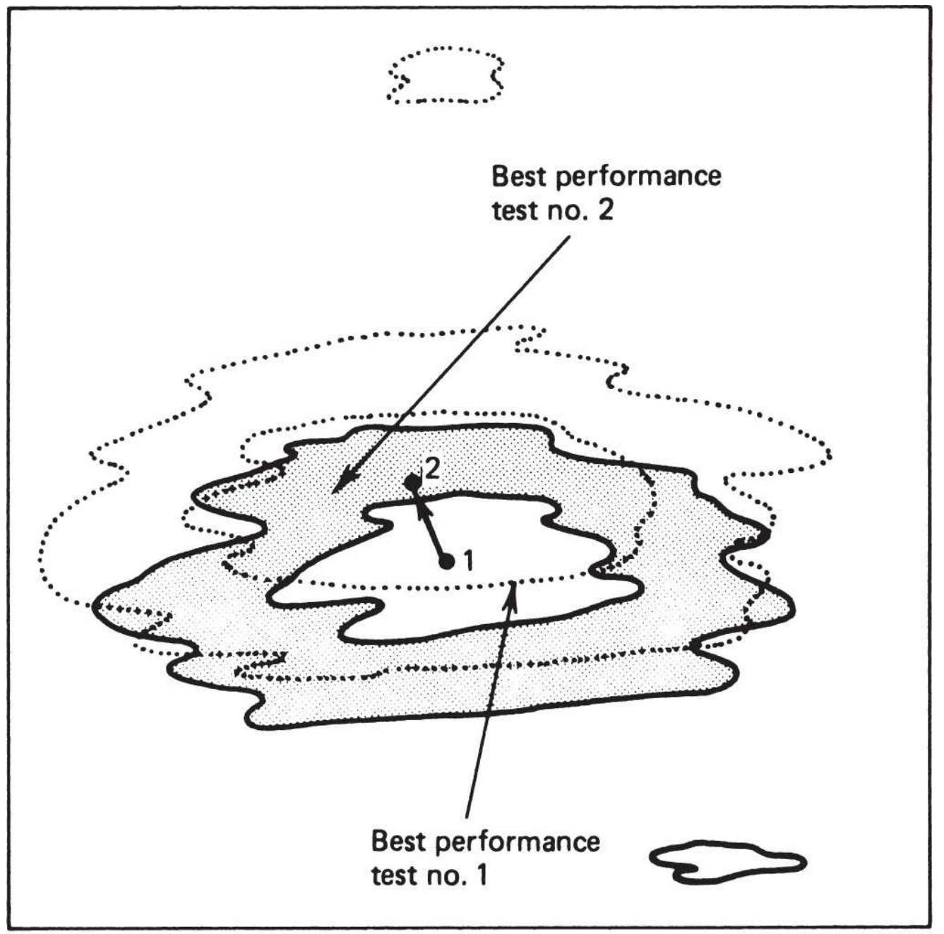
\section*{29R Represents shift in best performance areas}
\section*{FIGURE 21.20 Consecutive tests.}
Testing on the longer data series will get a more robust solution, which will often be a slower, less sensitive set of parameters. But the new selection should be close to the old one, as shown in Figure 21.20. If you plan to retest periodically, consider walk-forward testing. Try to avoid
short intervals of in-sample data.
\section*{PROFITING FROM THE WORST}
RESULTS
We've all looked at terrible test results and said, "I would make a lot of money if I did the opposite." Is that true? Knowing that equity index futures are full of noise, we tested the same moving average strategy on NASDAQ futures from 1 to 10 days and found that the 9 -day period generated the largest loss, net of an \(\$ 8\) per contract per side commission. That loss was \((\$ 2,636,042)\) on 649 trades. We can calculate the average trade size, remove the total costs, reverse the loss, and subtract the cost from the new results. Table 21.3 shows that, even with costs of \(12.6 \%\), the net result from trading the opposite signals can be very profitable.
\section*{Taking It Further}
We see that costs are not an obstacle in turning a losing system into a profitable one, but simply going short when the trend says "buy" introduces risk that may be too high. Fighting the trend has rarely been a successful strategy. If we use a moving average crossover, we can still reverse the fast trend but trade only in the direction of the long-term trend - a safer option. The rules will be:
- Buy when the slow average is up and the fast average turns down.
- Sell short when the slow average is down and the fast average turns up.
\section*{TABLE 21.3 Reversing a losing strategy.}
\begin{tabular}{|l|r|c|}
\hline & \multicolumn{1}{|c|}{ Cost } & Profits \\
\hline 9-Day net profits & & \((2,636,042)\) \\
\hline Total trades & 649 & \\
\hline Average size & 32.2 & \\
\hline Cost per side & 16 & \\
\hline Total cost & \((334,365)\) & \\
\hline Loss without cost & & \((2,301,677)\) \\
\hline Reversing the trade & & \(2,301,677\) \\
\hline Net of costs & & \(1,967,312\) \\
\hline
\end{tabular}
Exit the long position when the slow average turns down.
- Cover the short position when the slow average turns up.
We'll use the emini S\&P (ES) for comparison, from 2000 through 2017, testing the short trend from 1 to 10 days, and the long trend from 10 to 120 days in steps of 10. Figure 21.21 is a heat map with the results of the crossover test, and Figure 21.22 shows the results of the "fade" test. Results are very interesting for both approaches.
The standard crossover shows the best profits in the lower right section, the fastest choices for both the shortterm and long-term trends. But the upper left corner shows large losses. The system that fades the short-term trend shows profits everywhere, favoring the left, even though those profits are much smaller. It qualifies as
robust. The major statistics are:
\begin{tabular}{|l|r|r|}
\hline Statistic & Cross & Fade \\
\hline Net Profit & \(3,133,433\) & 120,711 \\
\hline Profit Factor & 1.37 & 1.99 \\
\hline Long Factor & 2.07 & 2.33 \\
\hline Short Factor & 0.94 & 1.75 \\
\hline No. Trades & 372 & 532 \\
\hline \% Prof Trades & \(67 \%\) & \(69 \%\) \\
\hline
\end{tabular}
Cross MA-Slow
\begin{tabular}{|r|r|r|r|r|r|r|r|r|r|r|r|r|r|}
\hline CROSS & SLOW 120 & 110 & 100 & 90 & 80 & 70 & 60 & 50 & 40 & 30 & 20 & Average \\
\hline FAST 10 & -978448 & -723843 & -786552 & -826219 & -680071 & -696131 & -269689 & 460560 & 184693 & 543056 & 877836 & -263164 \\
\hline 9 & -554477 & -724495 & -1103037 & -718620 & -487580 & -734838 & -253550 & -608 & 643404 & 980773 & 947118 & -182355 \\
\hline 8 & -834279 & -285414 & -608076 & -748309 & -732079 & -764643 & -20049 & 265339 & 918606 & 1858466 & 1283393 & 30269 \\
\hline 7 & -248567 & -107433 & -307960 & -986888 & -671675 & -613588 & -830853 & 137364 & 776645 & 1602149 & 1354556 & 9432 \\
\hline 6 & -69814 & -67600 & -434941 & -876985 & -543492 & -229183 & -45611 & 792503 & 1569377 & 1258461 & 1658715 & 273767 \\
\hline 5 & -202325 & -254032 & -387419 & -605072 & 184266 & 887613 & 582462 & 948254 & 2245669 & 2137756 & 2498891 & 730551 \\
\hline 4 & -561864 & -141465 & 2563 & -126099 & 794418 & 1077336 & 1337165 & 1519677 & 2509378 & 2112973 & 1999558 & 956694 \\
\hline 3 & -441963 & -72971 & 130392 & 154409 & 1196925 & 1314470 & 1781628 & 2395976 & 3053130 & 2665166 & 3133433 & 1391872 \\
\hline 2 & -456436 & 279275 & 490484 & 913988 & 597580 & 1708040 & 1587126 & 1950744 & 2353576 & 3058313 & 2641995 & 1374971 \\
\hline 1 & -157441 & 323525 & 293564 & 423736 & 358325 & 599058 & 729352 & 1412965 & 1485641 & 2011773 & 2627154 & 918877 \\
\hline Average & -450561 & -177445 & -271098 & -339606 & 1662 & 254813 & 459798 & 988277 & 1574012 & 1822888 & 1902265 & 524091 \\
\hline
\end{tabular}
\section*{FIGURE 21.21 Heat map of ES optimization of the standard crossover system.}
Fade
\begin{tabular}{|r|r|r|r|r|r|r|r|r|r|r|r|r|r|r|}
\hline FADE & SLOW 120 & 110 & 100 & 90 & 80 & 70 & 60 & 50 & 40 & 30 & 20 & Average \\
\hline FAST 10 & 71154 & 78752 & 55068 & 32362 & 38016 & 32068 & 48314 & 31538 & 19310 & 25044 & 21306 & 41175 \\
\hline 9 & 112723 & 120711 & 97111 & 74056 & 79423 & 73667 & 90932 & 73888 & 61566 & 66624 & 62627 & 83030 \\
\hline 8 & 81944 & 89500 & 65804 & 43174 & 49342 & 43040 & 59324 & 41857 & 30515 & 37556 & 31386 & 52131 \\
\hline 7 & 82649 & 90288 & 66141 & 43939 & 48913 & 43013 & 59329 & 42430 & 30456 & 35705 & 31775 & 52240 \\
\hline 6 & 77979 & 85804 & 62060 & 39367 & 45190 & 39135 & 55197 & 38699 & 26918 & 31149 & 28348 & 48168 \\
\hline 5 & 63699 & 72391 & 48396 & 26183 & 31138 & 25052 & 41336 & 24128 & 11662 & 17303 & 13034 & 34029 \\
\hline 4 & 95639 & 103386 & 79836 & 57190 & 62971 & 58806 & 74199 & 55688 & 44676 & 48977 & 44886 & 66023 \\
\hline 3 & 63356 & 71023 & 47664 & 25492 & 30649 & 23076 & 41476 & 23244 & 12914 & 17112 & 13111 & 33556 \\
\hline 2 & 97502 & 106430 & 81449 & 59005 & 64908 & 61119 & 75267 & 57904 & 47216 & 51659 & 47952 & 68219 \\
\hline 1 & 77380 & 85562 & 62516 & 38614 & 44438 & 40901 & 55673 & 37769 & 26179 & 33574 & 28288 & 48263 \\
\hline Average & 82402 & 90384 & 66604 & 43938 & 49498 & 43988 & 60104 & 42714 & 31141 & 36470 & 32271 & 52683 \\
\hline
\end{tabular}
FIGURE 21.22 Heat map of ES optimization, "fading" the short-term trend in the direction of the long-term trend.
The numbers that differentiate them are the size of the profits and the short profit factor. Fading results in a faster trading system that has good profits in both short and long trades; however, they are small. The standard crossover method holds trades longer and profits only on the long side. Traders should keep in mind that fading a short-term trend in a noisy market can prove to be a good timing technique.
\section*{TESTING ACROSS A WIDE RANGE OF}
\section*{MARKETS}
A comprehensive test that applies the same trading strategy to a broad selection of markets is basic to the concept of robustness. When a system performs well in many markets over the same test period and calculation ranges, it is fair to assume that the method is sound. If a technique works for the Swiss franc but not the euro, or 10-year Treasury notes but not 5 -year notes, then the method is most likely not robust but fine-tuned to each market. Markets have individual characteristics that might justify differences in performance; however, robust solutions are more likely to perform up to expectations. At the same time, we should expect the results to be suboptimal; that is, performance will vary considerably across markets because fewer parameters and rules will be used. As Ken Tropin, founder of
Graham Capital, says, "Loose pants fit everyone." In addition to the studies that follow, Chapter 8 includes a section, "Comparison of Single Trend Systems," that will be helpful in viewing the results of different trend-
following techniques side by side.
Robert Colby, in The Encyclopedia of Technical Market Indicators, \({ }^{10}\) gives an excellent comparison of market indicators by presenting each of their test results in a common format. Thomas Bulkowski has done the same in his Encyclopedia of Chart Patterns. 11 Viewing the results of a set of indicators gives a much better idea of the success of that approach than testing any one of them.
\section*{Classic Tests by Maxwell, Davis and Thiel, and Hochheimer}
There are three previous (if somewhat dated), wellknown comprehensive studies of moving average systems by Maxwell, \({ }^{12}\) Davis and Thiel, \({ }^{13}\) and Hochheimer. 14 In addition, Lukac, Brorsen, and Irwin studied 12 different trading methods across 12 futures markets. \({ }^{15}\) These studies are interesting because of the techniques and the conclusions. Strategy development software now allows us to test, in seconds, what once took hours or days, so the results of these older studies will be omitted in favor of our own tests.
\section*{Comparing the Results of Futures Markets}

We have seen in Chapter 8 that most trend systems generate similar results over a long test period; therefore, only the moving average results are shown here. Fifteen futures markets were tested from 1990
through 2017, with position sizing based on volatility parity. Costs were \(\$ 8\) per contract per side. Table 21.4 gives a summary of the results. Results were produced using TSM Trend on the Companion Website. The columns that are not obvious are:
Best Period is the calculation period with the highest Net Profit of all tests.
Best Range is the range of the top five calculation periods.
Profit Factor is the gross profits divided by the gross losses. It is based on closed-out trade results; therefore, any large losses held during the trade are ignored if that trade closed out at a better level.
\(\%\) Prof Tests refers to the percentage of profitable tests out of the total of 29 calculation periods. This gives us a notion of the robustness. If 22 of the 29 tests were profitable, regardless of the amount of profit, the result is \(75.8 \%\).
\section*{TABLE 21.4 Results of moving average optimizations on futures, 1990 -2017.}
\begin{tabular}{|l|r|c|c|c|c|}
\hline \begin{tabular}{l}
Futures \\
Market
\end{tabular} & \begin{tabular}{c}
Best \\
Period
\end{tabular} & \begin{tabular}{c}
Best \\
Range
\end{tabular} & Net PL & \begin{tabular}{c}
Profit \\
Factor
\end{tabular} & Trades \\
\hline \begin{tabular}{l}
Canadian \\
dollar
\end{tabular} & 105 & \(85-115\) & \(2,406,538\) & 1.58 & 228 \\
\hline Corn & 70 & \begin{tabular}{c}
\(70-\) \\
100
\end{tabular} & \(4,102,339\) & 1.73 & 294 \\
\hline Cotton & 80 & \(70-95\) & \(4,196,203\) & 1.70 & 309 \\
\hline
\end{tabular}
\begin{tabular}{|l|r|r|r|r|c|}
\hline Crude & 65 & \(65-115\) & \(5,224,796\) & 2.09 & 306 \\
\hline \begin{tabular}{l}
Euro \\
currency
\end{tabular} & 100 & \(25-110\) & \(4,477,641\) & 2.21 & 219 \\
\hline DAX & 150 & \begin{tabular}{c}
\(135-\) \\
150
\end{tabular} & \(5,123,376\) & 2.58 & 163 \\
\hline Eurodollar & 150 & \begin{tabular}{c}
\(95^{-}\) \\
150
\end{tabular} & \(6,943,208\) & 4.13 & 112 \\
\hline emini S\&P & 110 & \begin{tabular}{c}
\(105-\) \\
150
\end{tabular} & \(3,482,318\) & 1.78 & 255 \\
\hline Gold & 130 & \begin{tabular}{c}
\(50-\) \\
150
\end{tabular} & \(3,141,406\) & 1.73 & 242 \\
\hline Copper & 45 & \(45-80\) & \(4,223,077\) & 1.63 & 372 \\
\hline \begin{tabular}{l}
Heating \\
oil
\end{tabular} & 70 & \begin{tabular}{c}
\(60-85\)
\end{tabular} & \(4,212,676\) & 1.73 & 336 \\
\hline \begin{tabular}{l}
Japanese \\
yen
\end{tabular} & 55 & \(40-65\) & \(4,969,034\) & 1.85 & 352 \\
\hline \begin{tabular}{l}
Natural \\
gas
\end{tabular} & 30 & \(25-50\) & \(7,562,036\) & 2.01 & 432 \\
\hline NASDAQ & 120 & \begin{tabular}{c}
\(115-\) \\
150
\end{tabular} & \(2,946,445\) & 2.41 & 147 \\
\hline Soybeans & 85 & \begin{tabular}{l}
\(85-\) \\
140
\end{tabular} & \(3,353,548\) & 1.71 & 267 \\
\hline US bonds & 90 & \begin{tabular}{c}
\(20-\) \\
100
\end{tabular} & \(3,287,862\) & 1.82 & 245 \\
\hline \multicolumn{1}{|l|}{} & & & & \\
\hline
\end{tabular}
\section*{Observations}
The test range selected was 10 to 150 days, in increments
of 5 days. Because the increments were equal, the test will give more weight to the larger calculation periods.
The conclusions that can be drawn are:
1. All markets were profitable. We would need to look in more detail to see if those profits came in the 1990s or more recently.
2. All markets showed a high degree of robustness (the percentage of profitable tests). The S\&P had the lowest percentage.
3. Larger calculation periods are associated with very trending markets, such as interest rates and FX, or just the opposite, markets with no short-term trends, such as the DAX and gold.
4. Those markets with shorter calculation periods are normally commodities that have a strong seasonal component.
5. The best range of results often includes the maximum test period, 150 days.
6. Those markets that showed unusual results can, for the most part, be explained.
Figure 21.23 shows the markets sorted by best period, smallest to largest. The results confirm that a moving average is a viable strategy. Faster trends are associated with commodities and slower trends with financial markets.
\section*{Crossover Strategy}
In Hochheimer's crossover of two simple moving
averages, the short-term average (the faster trend) ranged from 3 to 25 days and the longer one from 5 to 50 days. The objective was to eliminate the whipsaws that occurred in a single moving average system. The rules for this system were:
Sorted by best calculation period
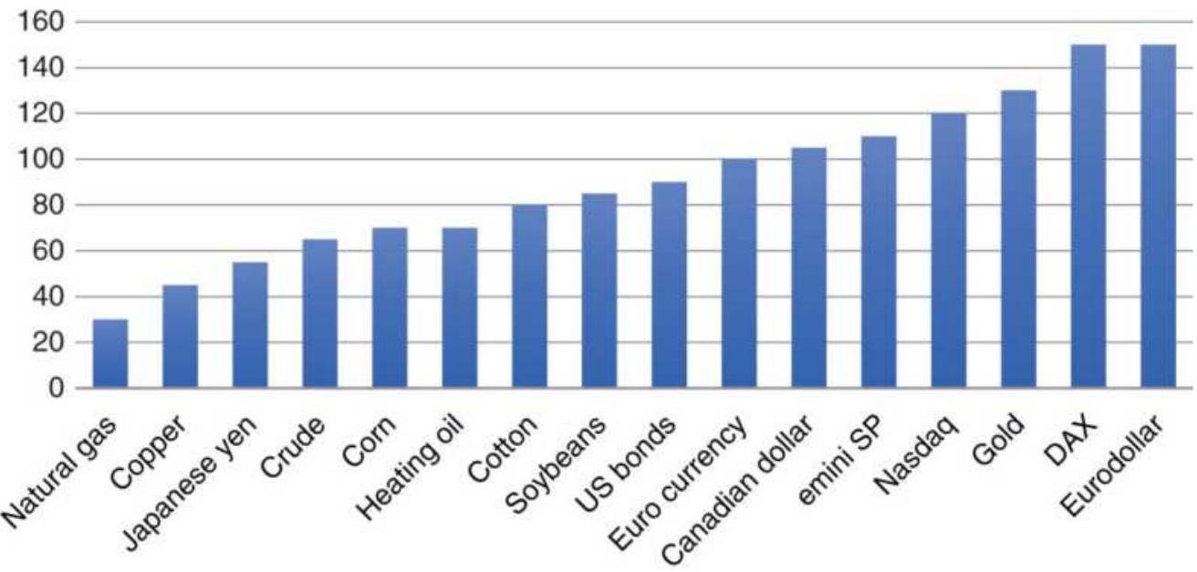
FIGURE 21.23 Best calculation period, sorted smallest to largest.
- Use a long-term and a short-term moving average.
- Buy when the short-term average crosses above the long-term average.
- Sell short when the short-term average crosses below the long term.
- The system is always in the market.
We briefly discussed crossover results in a previous section, "Profiting from the Worst Results." That was limited to the NASDAQ and emini S\&P futures. Profits were clustered in the lower right of the matrix, favoring
the shorter calculation periods for both parameters. Because markets have become noisier since Hochheimer's studies, we will set the short-term parameters from 5 to 50 , in increments of 5 , and the long-term parameters tested to the range 30 to 150 in increments of 10 . We'll let the system worry about combinations that overlap.
The results using nearest futures from 1990 through 2017 are shown in Table 21.5. At first glance, the Net Profits are good, but then two columns are a concern. The first is the \(\%\) Prof Tests. Of the 127 tests, most markets showed only 6 or 7 profitable tests. That's a small area of success. In most tests, the best parameters ranged from 30 to 50 days, even though we tested up to 150 days. Results might be better if we used less than 27 years of data. It's easy to find parameters when there is less data, but everything we have learned about trendfollowing supports the premise that more data is better.
\section*{TABLE 21.5 Crossover tests, nearest futures, 1990-2017.}
\begin{tabular}{|l|r|c|c|c|r|r|}
\hline \begin{tabular}{l}
Futures \\
Market
\end{tabular} & \begin{tabular}{c}
Best \\
Fast
\end{tabular} & \begin{tabular}{c}
Best \\
Slow
\end{tabular} & \begin{tabular}{c}
Net \\
Profit
\end{tabular} & \begin{tabular}{c}
Profit \\
Factor
\end{tabular} & Trades & \begin{tabular}{r}
\% \\
Pro \\
Tes
\end{tabular} \\
\hline \begin{tabular}{l}
Canadian \\
dollar
\end{tabular} & 30 & 50 & \(2,414,566\) & 1.53 & 139 & 8 \\
\hline Corn & 40 & 50 & \(4,518,106\) & 1.99 & 152 & 6 \\
\hline Cotton & 30 & 35 & \(2,782,052\) & 1.34 & 313 & 6 \\
\hline Crude & 40 & 50 & \(1,972,160\) & 1.32 & 190 & 5 \\
\hline
\end{tabular}
\begin{tabular}{|l|r|r|r|r|r|r|}
\hline \begin{tabular}{l}
Euro \\
currency
\end{tabular} & 30 & 35 & \(4,497,964\) & 1.77 & 260 & 5 \\
\hline DAX & 30 & 45 & \(2,625,532\) & 1.44 & 155 & 5 \\
\hline Eurodollar & 30 & 35 & \(6,207,499\) & 2.1 & 236 & 5 \\
\hline emini S\&P & 5 & 40 & \(2,463,189\) & 1.41 & 296 & 20 \\
\hline Gold & 30 & 50 & \(2,578,880\) & 1.53 & 135 & 24 \\
\hline Copper & 40 & 45 & \(4,211,050\) & 1.67 & 246 & 5 \\
\hline \begin{tabular}{l}
Heating \\
oil
\end{tabular} & 30 & 50 & \(1,767,693\) & 1.33 & 139 & 5 \\
\hline \begin{tabular}{l}
Japanese \\
yen
\end{tabular} & 40 & 45 & \(3,120,252\) & 1.45 & 271 & 6 \\
\hline \begin{tabular}{l}
Natural \\
gas
\end{tabular} & 40 & 45 & \(4,406,536\) & 1.72 & 204 & 6 \\
\hline NASDAQ & 20 & 60 & 913,326 & 1.31 & 79 & 24 \\
\hline Soybeans & 45 & 70 & \(1,851,017\) & 1.41 & 120 & 39 \\
\hline US bonds & 30 & 45 & \(2,271,159\) & 1.49 & 158 & 5 \\
\hline
\end{tabular}
TABLE 21.6 Testing on 2007-2011 and projecting on 2012-2017.
\begin{tabular}{|l|r|c|c|c|c|c}
\hline \multicolumn{7}{|c|}{ 2007-2012 Optimal } \\
\hline \begin{tabular}{l}
Futures \\
Market
\end{tabular} & \begin{tabular}{c}
Best \\
Fast
\end{tabular} & \begin{tabular}{c}
Best \\
Slow
\end{tabular} & \begin{tabular}{c}
Net \\
Profit
\end{tabular} & \begin{tabular}{c}
Profit \\
Factor
\end{tabular} & Trades & \begin{tabular}{c}
\% \\
Prof \\
Tests
\end{tabular} \\
\hline Crude & 20 & 40 & 681,628 & 1.98 & 27 & \(35 \%\) \\
\hline \begin{tabular}{l}
Euro \\
currency
\end{tabular} & 40 & 45 & 319,165 & 1.36 & 35 & \(8 \%\) \\
\hline emini & 25 & 30 & 701,172 & 1.76 & 40 & \(8 \%\) \\
\hline
\end{tabular}
\begin{tabular}{|l|r|r|r|r|r|r}
\hline S\&P & & & & & & \\
\hline \begin{tabular}{l}
US \\
bonds
\end{tabular} & 40 & 50 & 848,926 & 2.65 & 30 & \(36 \%\) \\
\hline \multicolumn{7}{|c}{ 2012-2017 Optimal } \\
\hline Crude & 50 & 40 & \(1,547,440\) & 4.38 & 30 & \(35 \%\) \\
\hline \begin{tabular}{l}
Euro \\
currency
\end{tabular} & 40 & 45 & \(1,434,772\) & 3.15 & 40 & \(9 \%\) \\
\hline \begin{tabular}{l}
emini \\
S\&P
\end{tabular} & 5 & 30 & 918,840 & 1.82 & 60 & \(24 \%\) \\
\hline \begin{tabular}{l}
US \\
bonds
\end{tabular} & 35 & 30 & 284,125 & 1.27 & 41 & \(31 \%\) \\
\hline
\end{tabular}
2012-2017 Using parameters from 2007-2012
\begin{tabular}{|l|r|r|r|r|r|r}
\hline Crude & 20 & 40 & \((342,328)\) & 0.78 & 33 & \(22 \%\) \\
\hline \begin{tabular}{l}
Euro \\
currency
\end{tabular} & 40 & 45 & \(1,434,772\) & 3.15 & 40 & \(100 \%\) \\
\hline \begin{tabular}{l}
emini \\
S\&P
\end{tabular} & 25 & 30 & 350,161 & 1.3 & 54 & \(38 \%\) \\
\hline \begin{tabular}{l}
US \\
bonds
\end{tabular} & 40 & 50 & 71,834 & 1.07 & 26 & \(25 \%\) \\
\hline
\end{tabular}
We'll take four representative markets, the crude oil, the euro, the S\&P, and bonds, test them for 2007 through 2011, then use the best parameters for the years 2012 through 2017. This is a rough walk-forward test. Table 21.6 has three parts: the top section is the best selection from the 2007-2011 test, the second is the best selection from a 2012-2017 test, and the bottom part shows the results if you use the 2007-2012 parameters for the next five years, \(2012-2017\)
If you add the Net Profit column in the bottom section of the table, it's profitable by about \(\$ 1.5\) million, a good outcome for anyone. The parameters are still in the same range as the longer test. It does not, however, come anywhere close to the profits that could have been achieved in the following five years (the center section). Had we done a proper walk-forward test, using shorter steps, the results might have been more stable. This does give you something to think about. Would it have been as good if we had tested the years 1995 to 2000, a strong bull market, and then traded from 2000 to 2005, a persistent bear market? Not likely, because there was no data in the test period that was similar to the actual trading period. The results of the crossover tests were created using TSM Moving Average Crossover on the Companion Website.
\section*{Final Comments}
The key to robustness is to test more data, more markets, more of everything, and then to study the results looking for common areas of success and broad patterns of consistency. There is no better way to tell if a market has trends than to test it for a variety of trending methods. A market that performs well using a daily breakout but fails with a regression slope is not a good candidate for trend system. If you are using walk-forward testing, be aware if the parameters jump around, rather than transition smoothly from one period to the next. If the results do not seem consistent, then longer test intervals are needed.
\section*{PRICE SHOCKS}
Ignoring or underestimating the significance of a price shock will result in catastrophic losses - if not now, then sometime in the future. Price shocks are large changes in price caused by unpredictable, significant events. The impact of price shocks on historic tests can change the results from profits to losses; it varies the risk from small to extremely large. A discussion of price shocks could easily fill an entire book, as demonstrated by Taleb's The Black Swan, but the concepts that are most important can be explained briefly. When it comes to actual trading, the difference between the expected results and actual performance (not attributed to slippage) is greatly dependent on the number and size of price shocks.
Price shocks come in different categories. An assassination, abduction, or political coup will surprise traders while a crop freeze can be anticipated as weather turns unusually cold. During times when good economic news is important to support a continued bull market in equities, any disappointing economic number will cause a temporary setback. Every word used by the Fed when stating its current policy on interest rates, following an FOMC meeting, is dissected by the traders, and can result in large, sudden price changes, or no reaction at all. The market always tries to anticipate the results of a scheduled economic report. When it is right, prices remain calm; when it is wrong, prices react in proportion to how poorly it was anticipated.
\section*{Misinterpreting the Past}
In this chapter, our interest in price shocks is how it affects test results and, consequently, the selection of parameters used for trading. At the time of a price shock, such as \(9 / 11\), we would never attribute a windfall profit to trading skill. The problem comes when testing a strategy with historic data, which always contains price shocks. The net profits do not distinguish between steady returns from a consistent move in the right direction or an unexpected profit from a price shock; results only show the set of parameters that had the best performance.
For example, if there were 10 major price shocks in 20 years of data, and your historic tests profited from 8 of those shocks, then you have overestimated your returns by profiting from at least 3 shocks that in all probability should have been losses. Even worse, you have underestimated your risk by posting profitable results that should have been losses. It is the erroneously low risk that is fatal to trading because it allows overleveraging and overconfidence.
\section*{Impact of Price Shocks on Performance}

To better understand the effects of price shocks on performance, a test was run that separated the price shocks from the results of a 100-day moving average applied to QQQ from 1998 through June 2018. Figure 21.24a shows that good profits are made on the long side and losses on the short side. Figure 21.24b is the accumulated profits and losses on days that the true
range was greater than \(2.5 \times 100\)-day ATR lagged 20 days. Downward shocks that occurred during long positions accounted for losses of \(\$ 2\) million, meaning that fully one-half of the QQQ profits were lost to price shocks. On the other hand, a small profit was gained for short sales due to upward price shocks. These results were created using TSM Price Shock Analysis on the Companion Website.
NQ Futures profits using a 100-day moving average
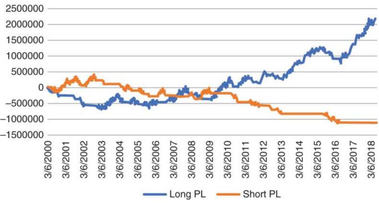
FIGURE 21.24a Total profits from long and short positions using a 100-day moving average applied to QQQ, 1998-June 2018
\section*{Effect of price shocks}
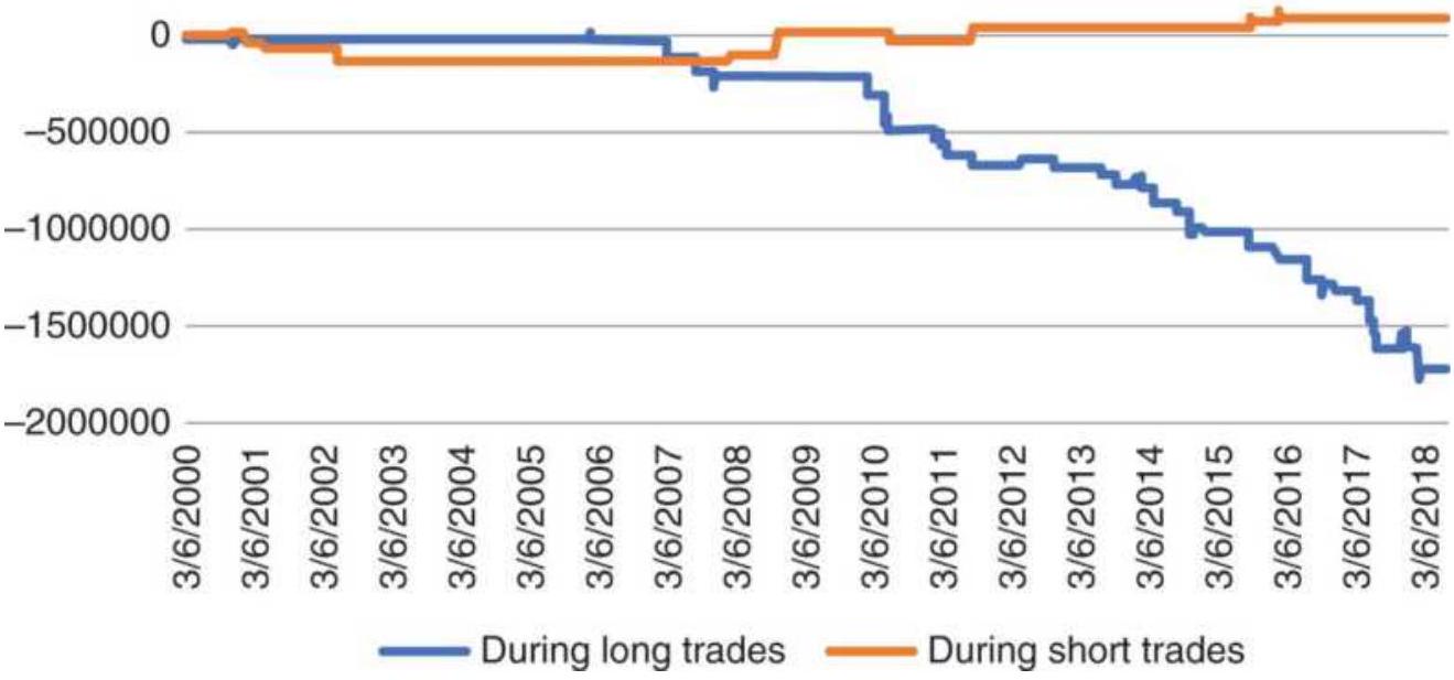
FIGURE 21.24b Net gain and loss from price shocks for the QQQ trend system.
\section*{Correcting Favorable Price Shocks}
If you're a long-term trend follower, there is little you can do about price shocks embedded in your test results. The reactions to the weekly economic reports are part of the trend, but it is the very big shocks that need to be considered. Let's say there is one shock that is more than 5 ATRs every two years. For a 20-year test that's 10 shocks. If more than \(50 \%\) are in your favor, then reverse that gain so that you don't profit from more than \(30 \%\) of the shocks and count them as losses. It will not affect the returns as much as it will the risk. Being more realistic about the risk makes for safer trading.
\section*{Exiting Before an Economic Report}
If you're a short-term trader and you expect a volatile
reaction to the next economic report, or if you're an oil trader and the weekly API (American Petroleum
Institute) release always causes price to jump, you might exit your position ahead of the report and then reset it after the excitement dies down.
Having traded oil for an oil company for many years, I can say that this doesn't work. When there is a trend in oil prices, weekly reports as well as news releases favor the trend. Price volatility will increase following the report, but it will be short lived. Exiting and reentering will add cost, require skilled execution, and ultimately produce worse results.
It is not just oil. Price moves are made of frequent, small price shocks, the reaction to the constant flow of news, and large orders by funds. Most of these confirm the trend direction.
\section*{ANATOMY OF AN OPTIMIZATION}
The Iraqi invasion of Kuwait on August 6, 1990, and the U.S. retaliation on January 17, 1991, created a price pattern that caused a series of bad optimization tests; this pattern can teach an important lesson that could be applied to the financial crisis of 2008 and most likely the next price shock. \({ }^{16}\) The strategy is a simple moving average applied to crude oil futures. The test period began January 2, 1990, but 100 days were needed to initialize the calculations; therefore, the first trade was entered May 24, 1990 (see Tables 21.7 through 21.9).
\section*{TABLE 21.7 Test 1: Optimizing crude oil, January}
2, 1990-August 3, 1990.*
\begin{tabular}{|c|c|c|c|c|}
\hline Period & \begin{tabular}{c}
Net \\
Profit
\end{tabular} & ROA & \begin{tabular}{c}
Max \\
Drawdown
\end{tabular} & Trades \\
\hline 5 & 2615 & 82.9 & -3155 & 11 \\
\hline 10 & 6765 & 959.6 & -705 & 5 \\
\hline 15 & 6975 & 989.4 & -705 & 3 \\
\hline 20 & 4975 & 705.7 & -705 & 3 \\
\hline 25 & 6975 & 989.4 & -705 & 3 \\
\hline 30 & 4635 & 657.5 & -705 & 3 \\
\hline 35 & 3635 & 313.4 & -1160 & 3 \\
\hline 40 & 3215 & 276 & -1165 & 3 \\
\hline 45 & 3255 & 187.6 & -1735 & 3 \\
\hline 50 & 255 & 10.6 & -2415 & 3 \\
\hline 55 & -715 & -21.1 & -3385 & 5 \\
\hline 60 & 2625 & 156.7 & -1675 & 5 \\
\hline 65 & 2785 & 239.1 & -1165 & 5 \\
\hline 70 & -385 & -12.6 & -3055 & 7 \\
\hline 75 & 1955 & 112.7 & -1735 & 3 \\
\hline 80 & -5040 & -100 & -5040 & 2 \\
\hline 85 & -5040 & -100 & -5040 & 2 \\
\hline 90 & -5040 & -100 & -5040 & 2 \\
\hline 95 & -5040 & -100 & -5040 & 2 \\
\hline 100 & -5040 & -100 & -5040 & 2 \\
\hline
\end{tabular}
\section*{Trade detail using a 15-day moving average}
\begin{tabular}{|l|c|r|r|r|}
\hline \begin{tabular}{l}
Trade \\
Date
\end{tabular} & B/S & Price & \begin{tabular}{c}
Profit or \\
Loss
\end{tabular} & \multicolumn{1}{|c|}{\begin{tabular}{c}
Cum \\
P/L
\end{tabular}} \\
\hline \begin{tabular}{l}
May 24, \\
1990
\end{tabular} & Buy & 23.58 & & \\
\hline \begin{tabular}{l}
May 25, \\
1990
\end{tabular} & Sell & 23.55 & -55 & -55 \\
\hline Jul 11, 1990 & Buy & 22.49 & 1035 & 980 \\
\hline Aug 3, 1990 & Sell & 28.51 & 5995 & 6975 \\
\hline
\end{tabular}
*Testing stopped the day before the invasion of Kuwait.
Test selects 15-day moving average.
Holding short on August 6, 1990, when Iraq invades Kuwait.
In both Test 1 and Test 2 the moving average calculation periods selected were those that produced the highest profits. By accepting these choices, the trader would have held a short position before the invasion of Kuwait, and a long position before the U.S. retaliation. In reality, there would have been large losses - the best past parameter values could not predict the price action on the next day. When a price shock is an important part of the data being tested, the best optimized result is the one that took the most profits out of that move, even at the cost of losing on most other trades. The system is not robust; it is finely tuned to one price move.
\section*{TABLE 21.8 Test 2: Optimizing crude oil, January 2, 1990-January 16, 1991.*}
\begin{tabular}{|l|l|l|l|l|}
\hline Period & \begin{tabular}{c}
Net \\
Prft
\end{tabular} & ROA & MaxDD & Trds \\
\hline & & & & \\
\hline
\end{tabular}
\begin{tabular}{|l|c|c|r|r|}
\hline 5 & -6010 & -32.3 & -18610 & 32 \\
\hline 10 & 3660 & 22.3 & -16430 & 20 \\
\hline 15 & 12350 & 103.8 & -11895 & 14 \\
\hline 20 & 19810 & \(345 \cdot 4\) & -5735 & 10 \\
\hline 25 & 8410 & 105.5 & -7970 & 10 \\
\hline 30 & 8420 & 86.8 & -9705 & .8 \\
\hline 35 & 18075 & 1348.9 & -1340 & .5 \\
\hline 40 & 11150 & 308.9 & -3610 & .6 \\
\hline 45 & 9335 & 304.1 & -3070 & .5 \\
\hline 50 & 8265 & 246.7 & -3350 & .3 \\
\hline 55 & 2485 & 55.0 & -4515 & .7 \\
\hline 60 & 9075 & 184.8 & -4910 & .5 \\
\hline 65 & 7155 & 100.4 & -7130 & .7 \\
\hline 70 & 3815 & 53.3 & -7160 & .7 \\
\hline 75 & 7195 & 83.9 & -8580 & .9 \\
\hline 80 & -8540 & -82.6 & -10340 & 12 \\
\hline 85 & -3860 & -54.2 & -7125 & .8 \\
\hline 90 & 1960 & 35.7 & -5485 & .4 \\
\hline 95 & 440 & 9.5 & -4615 & .4 \\
\hline 100 & -3950 & -85.6 & -4615 & .2 \\
\hline & & & & \\
\hline
\end{tabular}
\section*{Trade detail from testing}
\begin{tabular}{|l|r|r|r|r|}
\hline Trade Date & B/S & Price & Profit/Loss & Cum P/L \\
\hline \begin{tabular}{l}
May 24, \\
1990
\end{tabular} & Buy & 23.58 & & \\
\hline May 25, 1990 & Sell & 23.55 & -55 & -55 \\
\hline
\end{tabular}
\begin{tabular}{|l|l|r|r|r|}
& & & & \\
\hline Jul 12, 1990 & Buy & 23.49 & 35 & -20 \\
\hline Oct 19, 1990 & Sell & 40.10 & 16585 & 16565 \\
\hline Oct 30, 1990 & Buy & 41.23 & -1155 & 15410 \\
\hline Oct 31, 1990 & Sell & 41.92 & 665 & 16075 \\
\hline Nov 19, 1990 & Buy & 38.39 & 3505 & 19580 \\
\hline Nov 21, 1990 & Sell & 37.30 & -1115 & 18465 \\
\hline Nov 26, 1990 & Buy & 40.62 & -3345 & 15120 \\
\hline Nov 27, 1990 & Sell & 40.53 & -115 & 15005 \\
\hline Jan 7, 1991 & Buy & 35.70 & 4805 & 19810 \\
\hline
\end{tabular}
*Testing stopped the day before the U.S. retaliation.
Test selects 20-day moving average.
Total profits are \(\$ 3,225\) without price shock.
Holding long when U.S. attacks Iraq.
TABLE 21.9 Test 3: Optimizing crude oil, January 2, 1990-March 28, 1991.
\begin{tabular}{|l|c|c|r|r|}
\hline Period & Net Prft & ROA & MaxDD & Trds \\
\hline 5 & -17255 & 64.0 & -26975 & 45 \\
\hline 10 & -13195 & -45.0 & -29295 & 31 \\
\hline 15 & 4480 & 26.6 & -16840 & 20 \\
\hline 20 & 8430 & 67.6 & -12475 & 16 \\
\hline 25 & -4690 & -22.6 & -20725 & 20 \\
\hline 30 & -1395 & -6.4 & -21775 & 17 \\
\hline 35 & 28335 & 2114.6 & -1340 & .9 \\
\hline
\end{tabular}
\begin{tabular}{|c|c|c|c|c|}
\hline 40 & -360 & -2.5 & -14420 & 12 \\
\hline 45 & 18245 & 594.3 & -3070 & .7 \\
\hline 50 & 8265 & 246.7 & -3350 & 3 \\
\hline 55 & 2485 & 55.0 & -4515 & .7 \\
\hline 60 & 9075 & 184.8 & -4910 & .5 \\
\hline 65 & 7155 & 100.4 & -7130 & .7 \\
\hline 70 & 3815 & \(53 \cdot 3\) & -7160 & .7 \\
\hline 75 & 7195 & 83.9 & -8580 & .9 \\
\hline 80 & -18225 & -81.3 & -22410 & 13 \\
\hline 85 & -12945 & -70.4 & -18390 & .9 \\
\hline 90 & -4065 & -40.3 & -10080 & .5 \\
\hline 95 & -8645 & -56.0 & -15430 & .5 \\
\hline 100 & -3485 & -75.5 & -4615 & .5 \\
\hline \multicolumn{5}{|c|}{ Trade detail from testing } \\
\hline Trade Date & B/S & Price & Profit/Loss & Cum P/L \\
\hline May 24, 1990 & Buy & 23.58 & & \\
\hline May 25, 1990 & Sell & 23.55 & -55 & -55 \\
\hline Jul 16, 1990 & Buy & 24.16 & -635 & -690 \\
\hline Nov 9, 1990 & Sell & 40.58 & 16395 & 15705 \\
\hline Jan 14, 1991 & Buy & 38.76 & 1795 & 17500 \\
\hline Jan 16, 1991 & Sell & 39.36 & 575 & 18075 \\
\hline Mar 8, 1991 & Buy & 29.89 & 9445 & 27520 \\
\hline Mar 13, 1991 & Sell & 30.89 & 975 & 28495 \\
\hline Mar 19, 1991 & Buy & 30.75 & 115 & 28610 \\
\hline
\end{tabular}

Test selects 35-day moving average.
Total profits are \(\$ 2,495\) without price shocks.
Optimization profits include both Iraqi invasion of Kuwait and the U.S. attack on Iraq.
In Test 2, although there were large profits from the first price shock, the trader would have still held the wrong position when the second shock occurred. This method of testing hides the real trading risk, focuses on profits that cannot be predicted, and does it all at the expense of everyday trading profits.
Test 3 looks back at the best results when the data includes both price shocks, August 6, 1990, and January 17,1991 . Instead of calculation periods of 15 and 20 days, selected in the first two tests, this optimization shows best returns had a 35-day calculation period. The sequence of results in the optimization places the peak returns in an uncertain position between two losses, indicating fortunate timing. The trading detail shows that the system would have shorted oil on the day before the invasion of Iraq. The more reasonable selection would be in the area of the 60-day period, although profits are far lower, and there is still no assurance that this choice would be profitable the next time.
\section*{SUMMARIZING ROBUSTNESS}
Earlier we listed the criteria that were important in
"Searching for Robustness," the first being a sound premise. In showing test results, we concluded that a large percentage of profitable tests was a good measurement of robustness. But first, it was necessary to set performance expectations and make realistic assumptions about the parameter values that were likely to work, as well as to use realistic costs. Testing was done on in-sample data and validated with out-of-sample data.
If we pass the hurdle of in-sample success, followed by good out-of-sample results, we have proved the concept. We can retest with all the data and then trade, using a small commitment to begin.
Practically speaking, a robust trading strategy is one that produces consistently good results across a broad set of parameter values applied to many different markets tested for many years. Robustness is a term used to describe a system or method that works under many market conditions, one in which we have confidence. In the best scenario, a robust system is not sensitive to moderate changes in parameter values. It does not mean that the strategy has no risk.
A strategy can also be robust if the underlying premise has a single set of rules with no parameter values and is successful across a specific set of markets during a specific time period, provided there is a large sample of trades. The best example is the 1 -hour intraday breakout, even though some might consider the " 1 hour" a parameter.
The highest profit or the best risk ratio is not important
when looking for robustness, and focusing on these values can be distracting. A more complicated performance criterion will result in fewer successful tests and be a poor predictor of future results. Instead, it is the average value of all tests that is important, that is, the average net profit, average number of trades, and the average profit per trade, but not the maximum drawdown. Assuming the larger maximum drawdown in a test range is safer. The following is a checklist and brief explanation that outlines the steps for testing, evaluating the test results, selecting parameter values, and monitoring actual trading, consistent with the purpose of finding a robust trading strategy: testing should be used for validation of an existing idea, not for discovery.
\section*{Qualify the Problem}
1. Is the underlying premise sound? It should be based on factors that drive the market, such as interest rate policy, or on market interaction, such as arbitrage, or even a short-term pattern that keeps recurring.
2. Can you program all the rules? Programming a system guarantees that all of the contingencies have been thought out. Rules can even account for exceptional situations, such as crisis intervention following a dramatic price shock, where a different set of rules are applied.
3. Does the strategy make sense only under certain conditions? A strategy can apply to a smaller set of specific situations, such as the monthly labor report,
provided there are enough cases to justify confidence.
4. Take a guess as to the expected results. A rough estimate of the number of trades, percentage of profitable trades, and even the net profits should be written down before testing begins. Testing then becomes a way of confirming these estimates.
5. Be critical of good results. Getting good test results that are better than expectations can show an error in the rules or the implementation. It is the same for poor results. While we always try to understand and fix bad results, you must also verify good results.
\section*{Before You Test}
1. Choose the testing tools and methods. Select a test platform, such as TradeStation, MetaStock, or Ninja Trading, that can speed up the test process and keep it objective. Using a popular platform prevents the strategy from looking ahead at the data before making a decision about today, an error that can easily happen using Excel. Many perfect strategies have been created by accidentally looking at tomorrow's prices. A development platform will also give you the correct profits and losses.
2. Use as much data as possible. More data is best, and it should include bull and bear markets, price shocks, and sustained sideways periods. You can expand your database by using other similar markets.
3. Separate the data into in-sample and out-of-sample
sets. The only way to assure that no overfitting has occurred is by reserving part of the data for validation. Performance on the out-of-sample data will rarely be as good as in-sample but will give you a more realistic idea of expectations.
4. Choose the range of parameter values that applies to the strategy. The nature of the trading strategy, for example, a long-term or short-term breakout, will determine the parameter values that should be tested. Test only the range that makes sense for the strategy. This serves to validate the concept.
5. Decide the order in which to test the parameters. Not all parameters should be tested at the same time. The most important parameters should be tested first to see if the basic structure is profitable. These parameters, such as the calculation period for the trend or the arbitrage threshold, will have the greatest effect on results. These results may show that faster trading cannot be profitable after transaction costs. Other parameters, such as a stoploss, are used to refine the risk profile, and should not turn a losing method into a profitable one. They can be tested later.
6. Be sure the parameter test values are distributed properly. Testing equal increments of trend periods can be misleading. The difference between a 3 - and 4 -day moving average is \(33 \%\) while the difference between a 99 - and 100-day average is only \(1 \%\). When testing periods from 1 to 100 days, in steps of 1, the average results are heavily weighted toward
the long end, which has similar performance. Commercial testing platforms may not allow unequal test increments; therefore, it is necessary to consider the results in a way that compensates for the distribution.
7. Define the success criteria. Highest net profits may not be the best measurement of success for individual tests. Risk-adjusted returns, high reliability, frequency of trading, and time in the market can be combined to give a good objective criterion. Overly complex criteria are not good.
8. Try to visualize the results. An individual column in the table of test results can be viewed as a bar chart while two columns can be seen as a scatter diagram or a heat map. It becomes clear which parameters are stable and which are not.
\section*{Evaluate the Results}
Careful review of the test results can help you avoid many hours of unnecessary work later on. Look at the individual trades for a number of parameter combinations. It's not possible to understand a system by looking only at the statistics. An exceptionally large trading loss, too many trades that exited with a stop-loss, and not enough with profit-taking will indicate a problem that cannot be seen without studying the details.
1. Verify a reasonable sample of calculations. Just because calculations were done by a computer doesn't mean they are correct. Someone had to tell
the computer what to do, and people make mistakes. This is the time to remember the carpenter's rule: measure twice, cut once.
2. Were there enough trades to have reliable results? Results that show excellent performance with only a few trades are a problem. When there is not enough data, there is no way to be sure that the results are robust.
3. Does the trading system produce profits for most combinations of parameters? The best assurance of robustness is when most parameters produce profitable results, even though the returns may be small and the risks vary.
4. Did rule changes improve overall test performance? When a special rule is added to improve performance or to correct a specific problem, the average statistics of all tests must improve while the standard deviation remains unchanged. Or, the standard deviation of all tests must decline while the average returns remain unchanged. Both profiles indicate a change that is a global improvement; otherwise, the changes have targeted a single problem, which is a sign of overfitting.
\section*{Choose the Parameters}
There is no sure way of knowing how the final selection of values will perform in the future. The testing process tries to separate robust performance from chance, but there are no guarantees.
1. The final parameter selection can be based on all data. Good test procedures call for using in-sample and out-of-sample data, but once that has been completed successfully, a final test can be run on all data. Staying as current as possible improves the chances for success.
2. Choose parameters from a broad area of success, or choose multiple parameters, spaced apart. Peak performance of any sort is not likely to be repeated. Select the final parameter values that represent average returns in an area of consistency that is not sensitive to moderate changes in parameter values. Choosing multiple parameters across the entire test range, or from a broad area of success, will prevent committing yourself to a single value. Trade them as multiple systems, netting the positions.
3. Profits should be distributed evenly throughout the test period. The best performance shows consistency over time. It is best that profitable results are not based on a few good trades and that returns do not deteriorate over time.
4. Verify whether a disproportionate amount of profits came from price shocks. It is not possible to avoid large price shocks in real trading, and most of them will cause trading losses. Be sure your parameter selection was not based on unreasonable profits from price shocks.
5. Scale the risk to a personally acceptable level. Every return is associated with a proportional level of risk. We express this as one standard deviation of the
daily returns, annualized. Be sure that you can withstand a large loss. You need to be able to sleep at night. You'll find much more in Chapter 23.
6. When there is a choice between two sets of parameter values, choose the one that spends less time in the market. Being out of the market is the only defense against price shocks. Separating exits and entries improves slippage and liquidity.
\section*{Trading and Tracking Performance}
The development of a system is never complete. There is a continuous evolution in the markets, seen in the changing participation, volatility, interrelationships between markets, and the introduction of new markets. The only way to see how these changes affect a trading program is to carefully monitor the system signals compared to actual trades. From this evaluation, funds can be reallocated, the method of placing orders can be changed, costs can be estimated, and better rules can be introduced. Without monitoring the trading, and comparing the results to the test expectations, there is no basis for saying that a system is performing correctly.
1. Trade using exactly the same rules that were tested. It is often convenient to program a simple version of an idea but trade a more complex set of rules. Or, a new rule may be added at the end without testing, because the test process takes too long. What appears to be an inconsequential change can cause substantially different results. The tested method and traded method should be identical.
2. Trade the same data that was used in testing. Most stock and futures data will be the same for testing and trading, but forex data may vary, and testing cash FX is not the same as trading futures. Backadjusted data works for trend systems but not for percentage calculations. The best trading results come when the test data and trading data are from the same source.
3. Monitoring the difference between the system and the actual entries and exits. Slippage, the difference between the system price and the actual market execution, can change performance from theoretically profitable to a real trading loss. Monitoring this difference will tell you the realistic execution costs, the maximum volume that can be traded, and the best time of day to trade.
\section*{A Final Comment on Testing}
Testing is the only way you can know if a strategy can be successful, but it provides no guarantee of profits. Testing can be done on many levels. It can be as simple as validating a single set of rules with no parameters using a spreadsheet. It can be as complex as a multidimensional analysis of results based on parameters that are so interdependent that they must all be tested simultaneously using specialized software.
Testing that follows a sound procedure, and a test evaluation that looks for robust solutions, will improve the chances for success. Bad testing can be tragic - a waste of time and resources that leads to a system that
has little chance of success.
The extent of testing is a matter of judgment. Simple tests can outline the performance profile and provide an understanding of the risks and rewards. Complex tests may introduce subtle errors in the process, just as complex strategies may be flawed due to their intricacy. Begin simply, increase the complexity slowly, and stop as soon as possible.
Remember that, as hard as we try, real-time results will not be as good as historic results. Historic price patterns never repeat themselves in the same way. The best system rules and the best parameter values are the ones that are the simplest and the most general. They may show lower returns and greater risk than the optimized results, but they are much more likely to represent the future returns. For a set of tests, the best measure of expectation is the average of all tests.
Other areas of interest to readers actively testing and evaluating test performance are genetic algorithms, discussed primarily in Chapters 20 and 24 , and most of Chapter 23, especially the section "Measuring Return and Risk."
\section*{NOTES}
1 John R. Wolberg, Expert Trading Systems: Modeling Financial Markets Using Kernel Regression (Hoboken, NJ: John Wiley \& Sons, 2000).
\(\underline{2}\) A thorough presentation of both step-forward testing and optimum search techniques can be found in
Robert Pardo, The Evaluation and Optimization of Trading Strategies (Hoboken, NJ: John Wiley \& Sons, 2008).
3 Interview \#152, Better System Trader podcasts.
4 Readers are encouraged to read Murray A. Ruggiero, Jr., Cybernetic Trading Strategies (New York: John Wiley \& Sons, 1997), Chapter 20 , "Using Genetic Algorithms for Trading Applications".
5 Adapted from an example in Wolf von Ronik, "System Testing via Monte Carlo," Futures (April 2001).
6 There are an increasing number of test platforms available for a wide range of costs. Many of these will advertise in or have been reviewed by Modern Trader, Technical Analysis of Stocks \& Commodities, and The Technical Analyst.
Z Jack D. Schwager, Schwager on Futures: Technical Analysis (New York: John Wiley \& Sons, 1996), p. 673 .
\(\underline{8}\) John Hill and George Pruitt, Futures Truth, Hendersonville, N.C., is an organization that validates and monitors trading systems. It publishes Futures Truth Magazine, www.futurestruth.com.
9 John Hill, "Simple vs. Complex," Futures (March 1996), p. 57.
10 Robert W. Colby, The Encyclopedia of Technical Market Indicators (New York: McGraw-Hill, 2003).
11 Thomas Bulkowski, Encyclopedia of Chart Patterns (New York: John Wiley \& Sons, 2000).
12 Joseph R. Maxwell, Commodity Futures Trading with Moving Averages (Speer, 1974).
13 R. E. Davis and C. C. Thiel, Jr., A Computer Analysis of the Moving Average Applied to Commodity Futures Trading (West Lafayette, IN: Quiatenon Management, 1970).
14 Frank Hochheimer, "Moving Averages," and "Channels and Crossovers" in Perry J. Kaufman (Ed.), Technical Analysis in Commodities (New York: John Wiley \& Sons, 1980).
15 Their study in 1988 is referenced in Matthew C. Roberts, "Technical Analysis in Commodity Markets: Risk, Returns, and Value," 2003.
16 Perry Kaufman, "Price Shocks: Reevaluating Risk/Return Expectations," Futures Industry (JuneJuly 1995).
\section*{CHAPTER 22 Adding Reality}
This chapter discusses topics that do not seem to fit into a clean category but are essential for trading, especially systematic trading. The first part concerns the use - and the misuse - of the computer. Technical analysis and computers have become inseparable. It would be rare to trade a new system without first running it through a computer to simulate its past performance.
"Extreme Events" discusses the most underestimated deterrent for finding the best system, for generating realistic expectations, and the most common reason for catastrophic loss. Price shocks have been discussed in Chapter 21 ("Anatomy of an Optimization"), yet their importance cannot be underestimated. Unpredictable events, once they become part of price history, are often treated as though they could have been anticipated. This can inflate performance returns and minimize risk during strategy testing with serious consequences to actual trading. This section tries to explain how to close the gap between testing and reality.
"Gambling Techniques: The Theory of Runs" looks at how Martingales would help control risk. What would seem more reasonable than assuming that the odds are against you in the stock or futures markets and treating it as a gambling scenario?
There is a short section that looks at the characteristics
and trade-offs of trend following and mean reversion strategies. It is important that your choice of trading fits your ability to take risk.
The last section reviews the similarity of systems and the impact of technical systems on the markets.
\section*{SOME COMPUTER BASICS}
Make sure your present report system is reasonably clean and effective before you automate. Otherwise your new computer will just speed up the mess.
- Robert Townsend \({ }^{1}\)
Computers are not a substitute for thinking. They excel in performing the same tedious task, over and over again, quickly and accurately - provided, of course, that correct information was entered. The computer has become an essential part of trading, from viewing charts to order entry to system development. This section will highlight both good and bad ways to approach a computer problem.
Speed and capacity are no longer a concern when choosing a computer. Even the basic models have sufficient power to run charting systems and development platforms. Storing tick data on all stocks from their inception may still present a problem, but there are servers that can easily handle that. Even laptops have storage measured in terabytes and perform multitasking, even quad processing. Still, buying the high-end hardware ensures some added longevity to your purchase.
\section*{Off-the-Shelf}
Decide which development platform you will use. Almost all brokerage houses, such as TD Ameritrade, Fidelity, and Infinity, provide smart charts that have some programming ability - that is, a simple language that allows you to enter your own indicators and will display buy and sell signals. Many of the strategies in this book are best done on a more comprehensive development platform, of which there is a large choice. Among the most popular are TradeStation, MetaStock, Ninja Trader, Wealth-Lab, AmiBroker, TC200o, and Neuroshell. The magazine Technical Analysis of Stocks \& Commodities (www.traders.com) publishes a reader's survey each year, ranking the most popular software, brokerage firms, data vendors, and other services by price categories. When the charting package is associated with a brokerage firm, it usually comes with historic data. Firms that deal with futures will also provide continuous data for testing. Development software falls into two groups:
1. Daily market analysis, with data updates and orders placed at the end of the day.
2. Intraday trading platform, providing users with real-time data feeds and executions. Intraday platforms will also allow you to use daily data.
Both types of software provide the ability to enter your trading strategies and test them on historic data.
Software that operates on daily data, also called end-ofday data, is considered "off-line" and is used by traders who prefer to evaluate the market after it closes and
prepare orders that can be executed the next day without having to constantly watch the market. The intraday trading platform, however, is much more complex and more expensive. It requires active data feeds, which the user pays for separately. It is possible to download the intraday data from those services, and build your own database, but that process is tedious.
\section*{Acquiring Data}
Most brokerage and charting services will provide access to data for whatever you trade. For equities you'll be able to test stocks and ETFs going back at least 20 or 30 years. For futures the S\&P starts in 1983, but gold goes back to the early 1970s and grains even further. The most extensive access to data of all types - prices, economic reports, fundamentals of every sort from every country - will be on Bloomberg and Reuters. Data can be downloaded easily and used for testing. Most of these services have an "export" option in a drop-down menu for downloading the data on your screen. Bloomberg will let you put multiple markets into a single spreadsheet, aligned by date.
If you want daily data, which is very popular, you can see a list at www.DataVendors.com; however, it is missing some important vendors. Commodity Systems, Inc. (CSI), and Dial Data are good benchmarks. CSI includes cash data for all commodities. For intraday data, CQG and Tick Data, Inc., would be the place to start. If you are going to use the data for trading each day, you'll want a service that updates the data automatically.
For RYDEX funds and individual stocks that you might want to analyze, you can go to Finance. Yahoo.com and download nearly any U.S. market into an Excel spreadsheet for free.
For monthly data and many fundamental statistics going back to the beginning of the 1900s, try the CRB Yearbook, \(\underline{\underline{2}}\) an annual publication that allows all data to be downloaded.
\section*{Be Careful to Choose the Right Data}
There are choices for stock, ETF, or futures market data. A stock can be split-adjusted, and stocks and ETFs may or may not have dividends included. Most often you don't want the unadjusted series because it has large gaps when stocks split, and you do want the dividends included. An adjusted series may show negative prices at the start, which makes it impossible to use percentages or returns on older data.
For futures you'll want the back-adjusted series for testing. You may also want the cash price in order to calculate the basis, the difference between cash and futures, or to calculate the annualized volatility. All futures trading is electronic but vendors offer two choices for the closing price: (1) the settlement price and (2) the last traded price. If you are analyzing the market in the evening after the close and placing orders for the next open, then using the settlement is best. If you're placing a contingent order on the close, for example, buy if the close is below 65.25, then you want the last price traded.
\section*{Data Accuracy}
It may seem surprising, but even daily data - open, high, low, and close - from electronic trading can vary from one provider to another. Most often the settlement prices are the same, but the highs and lows can be off by small amounts, as can the last price. If you subscribe to an automatic download service, these differences are usually corrected the next day. But some are not, and you need to review your trading signals for the rare one that makes no sense.
For most developers small data differences are not important, but for "official" posting of the settlement value of an ETF or listed fund, the differences need to be resolved each day by using multiple data sources. The government requires two sources that are accurate to 10 decimal places - a far cry from when we got the men on the moon with 2 decimal places!
Even though historic intraday data has been available for many years, you may find short periods where the decimal point shifts within a data series. A simple visual check, displaying the historic data as a chart, will show any problems that need fixing. Smaller errors may never be found.
Combining data from different vendors may also introduce problems. One source may record a price as 135.50 and the other as 13550 or 1355.
\section*{Clean Data . . . or Not}
Tick data is notorious for including some bad prices, simply because of the magnitude of the numbers. Errors
were pervasive when futures markets were open outcry and prices were recorded by a clerk with a data entry keyboard, standing above the pit. Now that nearly everything is electronic, the prices are far more accurate, but not always perfect. When using high-frequency data (for example, every tick), it may turn out that not all ticks are flowing through to your computer due to the speed of access. In other cases, when there is a fast market extremely high volume - you will either receive the data late or miss pieces of data.
There is still good reason to check the integrity of the data, especially if you're downloading historic data, preelectronic age. Simple checks of daily data should include:
1. Outliers: those data points that are more than \(4 \%\) away from the previous data (or some preset percentage).
2. Missing dates: more than 4 days in sequence without data should be flagged as a potential problem.
3. Open and closing prices outside the high-low range are not possible, and the data should be corrected or removed.
For intraday data, some additional checks are:
4. Frequency of data: a comparison of the average ticks per 5 -minute interval with the current frequency, looking for those times when there was no data.
5. Unusually large intraday price jumps that reverse
within a few seconds indicate a data error or a large order filled away from the market price.
A vendor that advertises clean data has been checked for all discrepancies and "corrected." Done by someone else, it's not clear how those corrections were made. But you may not want clean data. If you developed a system based on clean data, then applied that strategy to intraday live data, you would find that there were a large number of additional trades due to bad prices. Your theoretical, profitable results would instead be filled with bad trades, netting a loss instead of the expected profit. The solution is to use the original, dirty data in the development to force the system to be less sensitive to price movement. This is less of a problem now than it was in the past.
\section*{Start with Standard Techniques}
Strategy development programs provide a wide assortment of standard techniques in the form of indicators and preprogrammed systems. Choose a stochastic oscillator or an RSI, a moving average or an N -day breakout, and combine them in various ways with different calculation periods, such as a 10-day and 40 day smoothing, or even vary the frequency of data using 15-minute, 1 -hour, and daily bars. These existing techniques can satisfy most needs. It has already been shown that trend profits are the result of prices trending rather than the formula used to create a trendline. The trend speed is more important than the method. Adding an oscillator or momentum indicator for entry timing is also a concept that can be satisfied by a number of
indicators. Somewhere in the combination of these techniques should be a trading strategy that matches the time frame and risk profile that you want. Before taking the path of specialized programming, there is a lot to be learned by using these standard tools.
\section*{Programming a New Idea}
Computer programming talent is no longer rare, but in high demand and sometimes expensive. However, many of us have become proficient at spreadsheets and some simple programming tasks, so we have a better idea of what is good and bad. Fortunately, the data
management, the complex bookkeeping, and order entry are already built into development software. Functions such as buy on the close or sell at 125 stop allow orders to be entered as they would in actual trading. It is only necessary to code the strategy. The list of trades and a performance summary will be produced automatically.
Large-scale testing is also a well-used feature. Most important, the software prevents you from looking ahead at tomorrow's price in order to decide whether to buy or sell today. Throughout this book, there are many examples of strategies in both Excel and TradeStation. Anyone able to program can take the simple TradeStation instructions and change them to Basic, C, or any other language.
The prevailing philosophy about software development is to try to use as much third-party software as possible. For example, after an optimization has been run (resulting in hundreds of lines of test results, one line for
each combination of parameter values), save the results to a spreadsheet. This test detail can then be sorted, organized, analyzed, and charted with all the facilities in the spreadsheet program. If a series of tests are saved, they can be compared to other tests. Results can be averaged and ranked in order to find the most robust strategy. For the more popular platforms, there are users' groups, support groups, and newsletters that can be of great help.
Each month, Technical Analysis of Stocks \& Commodities will have the code for a selected strategy in a variety of languages, printed toward the end of the magazine and available online for downloading. It is an easy way to start learning to program by example. Some companies have add-ins that provide a more comprehensive statistical profile for your tests while others have an add-in portfolio program. It is a good idea to check to see if these services satisfy your needs before attacking the programming yourself.
\section*{THE ABUSE OF POWER}
"Power corrupts" does not apply only to politics. It is tempting to let the computer solve the problem of finding the ideal trading system, but it can't do that. In Chapter 21, we discussed the process of finding a successful trading system beginning with a sound premise. Instead, you can throw all indicators, trend calculations, fundamental data, and rules into a big pot and let the computer find the best combination using brute force optimization, neural networks, or genetic
algorithms. However, you should know by now that an overfit solution does not work. More computer power makes processing faster but does not make the solution
better. There is a good argument for saying that less power means that more thought will go into the idea in advance. But then, it should always be that way.
\section*{Vertical or Integrated Solutions}
There are two philosophies for system development: vertical, using individual building blocks, one upon the other; and fully integrated, similar to a puzzle box where all pieces fit together in just one special way. The fully integrated method takes advantage of the interrelationship between features, such as the calculation speed of a trend and a filter that blocks entering a new trade and forces the liquidation of the current trade when volatility is too high. It is possible that, as the filter blocks more trades, the trend speed will change to be profitable in markets with less volatility. Therefore, the two parameters, trend speed and filter threshold, are interdependent and must be tested together.
Using the vertical method, the primary rule is tested first and must be profitable without any other features. In this case, the trend is tested and found to be successful when the calculation period is above 40 days. Next, the volatility threshold is tested with a range of trend periods to see if it improves the average returns of all tests. The volatility filter is therefore determined to be a robust addition to the rules. It is also clear if the volatility feature does not work.
What happens when the vertical solution tested separately shows that volatility does not help, but there is a successful integrated solution? This can happen when the trend period is not profitable on its own but is profitable when selected trades are avoided based on the volatility filter. To some analysts, this is a more sophisticated solution; to others, it is overfit. The answer can be found by tabulating the percentage of profitable test combinations, a measure used in Chapter 21 that was called robustness. If the percentage of profitable tests of the combined parameters is greater than the percentage of successful tests using only the trend, then the volatility feature is an improvement.
There is also a philosophic issue. Do you want to trade a system that has two components, where each is not profitable on its own, but is profitable when combined?
\section*{Transparent or Complex Solutions}
A transparent solution is one that is easy to understand. If it was based on a chart pattern, it could be explained by showing that pattern, or combination of patterns. If a trading signal was generated, another trader who knew the rules could look at the prices on a screen and confirm that a signal should have occurred at that point.
A complex system is not transparent. A chart pattern that is filtered by price volatility and volume, then confirmed by the pattern of other stocks in the same sector as well as the S\&P 500 index, would be difficult to calculate manually. If the underlying premise is a trend based on a portion of a trigonometric curve, it is not
clear that anyone could intuitively know that a trade should have occurred on any specific price bar.
Complex solutions may be wrong without anyone knowing. They are more difficult to create, especially difficult to debug, and cannot be visually confirmed by studying the signals on a chart. Acceptance is based on historic testing. A complex solution can be successful, but it is a very difficult road to follow, and difficult to fix when it goes wrong.
\section*{FINAL STEPS BEFORE LAUNCH}
\section*{Paper Trading}
With all good intentions, when a new strategy is developed, the plan is to hold the most recent data aside for out-of-sample testing. However, before testing is completed, that data has been used at least once, most often many times. No matter how much you try, it's unlikely you will have data for an out-of-sample test. Even if you did confirm the results with unseen data, you still want to paper trade.
Paper trading, also called virtual trading, is running the trading strategy as though you were trading, but without money. Some test platforms have a "simulation mode" for that purpose. You can operate an intraday trading strategy and see results close to what you might get if you were trading with electronic order entry. The best ranked companies to offer virtual trading are TradeStation, Kapitall, and TD Ameritrade.
Paper trading may still give you an optimistic result, depending on the accuracy of the executions, but it will show any serious problems that you have in your strategy. It will not show the maximum risk, the best returns, or even the percentage of good trades when it's used only for a few weeks, but that should be long enough to verify that the program was implemented correctly. It's best to be able to compare the few trades with the profile of the system gleaned from the backtest.
It is always a relief when the system posts its first profit, but it is the overall profile that is most important. Don't start trading a new system without monitoring its performance first. After that, start with a small amount.
\section*{It Should Work, but It Doesn't}
You start paper trading and the first five trades are losses. Your expected reliability is \(50 \%\), so it's a concern. Your next five trades have only one profit. Now it looks like a problem. You were conscientious about following all the right procedures. What could be wrong?
If you are convinced that the method should work but the results were not good enough, each step in the process will need to be reviewed. Trading strategies should be built slowly; each piece must be proved to be sound before going on to the next step. Shortcuts are not good. One odd trade could lead you on a path that shows a serious omission. If the performance deteriorated as new rules and features were added, the problems should have been resolved or the feature discarded before moving forward.
\section*{Isolating the Problems}
A few of the more common problems that cause disappointing test results are:
1. The rules were interpreted incorrectly. When the rules were programmed, choices were made in order to satisfy a rule that was not clear. For example, buy only if confirmed by volume. When that rule was programmed, it was interpreted as buy only if today's volume is greater than yesterday's volume. Because volume is erratic, the statement should have been buy only if today's volume is greater than the average volume of the past 10 days.
\section*{2. The techniques did not work for the} parameter value range that was tested. The original concept was to find a medium-length trend to avoid very long holding periods that have high risk, or very short-term trading that is too intense. However, none of the parameter values in the range from 15 to 70 days worked and the stop-loss of \(1 \%\) to \(3 \%\) did not seem to be effective.
Systems do not always work as expected. It turns out that medium-speed trends have highly variable holding periods; that is, sometimes the price move is sustained for 1 to 2 weeks, other times 2 months. The same trend period cannot capture both.
Negative results are important feedback. They help create a better strategy before it is too late. After all, if the answers were known in advance, this would all be unnecessary.
Instead of finding a single, medium-speed trend, combine a longer trend with the medium one. The longer one will find the fundamental direction, dictated by economic policy; the medium calculation period will capture shorter moves within that trend, at the same time avoiding the losing scenario of trading against the fundamental direction. Take the time to understand why two trends worked when one did not. This is an opportunity to increase your understanding of how the market works and find a successful strategy at the same time.
3. It worked in some markets but not in others. Some markets have clearer trends while others have more noise. Not all markets will work with the same strategy; however, similar markets should work. Don't expect Raytheon and IBM to trade the same way, or Intel and General Electric, but two wireless telephone companies or two auto manufacturers should produce similar results. In futures, the fixedincome markets show the longest trends while the equity index markets have the most noise. You should be concerned when similar markets perform differently, but expect different markets to have unique characteristics.
\section*{Just Because It Doesn't Work in Practice Doesn't Mean It Won't Work in Theory}
If the more general issues are not the problem, then you need to look deeper.
Were you too selective?. When the initial idea was verified, was it done with selected data, representing markets that were most likely to be successful? It may work during a particular type of market but fail during other times. Try to isolate the same type of price patterns in other markets by filtering periods of high or low volatility or isolating intervals of high correlation.
Ignoring a few large losses. Long-Term Capital made the mistake of rationalizing a few large losses, convincing themselves that the combination of events that caused the largest equity drawdowns during historic testing would not occur again. If those losses were removed, then the expected risk was much lower, trading could be leveraged, and profits would be increased proportionally. They were right and wrong. The same events did not happen again, but different circumstances resulted in losses just as large. Because of their high leverage and massive positions, they shook the entire financial system when they collapsed. If anything, history does not show enough risk. The increased correlation between markets and greater participation will result in faster, larger, and more volatile price swings with less protection from diversification.
Misjudging market volatility. If the year was 1996 or 2009 and the equity markets were moving steadily higher, a newly developed system trading the S\&P or NASDAQ 100 could be very profitable with low risk. As time advances toward 2000 or
2018, the system continues to perform in the same bull market, but volatility increases significantly. If the system trades the same number of NASDAQ contracts in 2000 as it did in 1996, then it is exposed to 6 times the volatility as prices moved from 600 to 4,000 . Individual trade risk and overall market exposure must account for changing volatility.
\section*{Failing to recognize an evolving} marketplace. Not only can volatility change dramatically, but price patterns will change with growing market participation. Increased volume from a broad set of participants introduces more noise into short-term price movement. Economic policy still creates the major trends; however, theoretical market efficiency does not stop the increase in erratic price movement caused by large and small traders acting with similar or opposite objectives. The net effect is that a trend system will take longer to recognize a trend change. It will enter later and exit later, resulting in a reduction in net profits. Over a long test interval, this will show a noticeable decay in performance.
\section*{EXTREME EVENTS}
Price shocks are the most likely reason for catastrophic loss. Although very large price shocks are infrequent events, experiencing only one is enough. Price shocks cause the largest gap between expectations (formed by historic testing) and real trading results. The
implications of price shocks in testing were discussed in Chapter 21.
A price shock is usually unexpected, but always an unpredictable event. Price shocks are a normal part of price movement and happen often. Most are small and the result of economic reports that differ from expectations, such as the Fed raising rates by \(1 / 2 \%\) when only \(1 / 4 \%\) was anticipated, unemployment rising by more than was expected, or a drug company's latest miracle cure being denied by the FDA. A surprising election outcome, such as the British vote to leave the EU ("Brexit") or the election of Donald Trump in the United States, can cause sudden, large moves. But the most severe price shocks are unexpected events with global impact, such as the terrorist attack of 9/11/2001. A significant political event, such as the abduction of Gorbachev in 1991, caused havoc in the foreign exchange markets for 3 days. The collapse of Lehman Brothers may have been a shock, but the subprime crises evolved over days and weeks. The key word to remember is unexpected.
\section*{Money Moves the Markets}
As technology has made communication instantaneous, everyone seems to know of a price shock at the same time. The world watched while the second airplane flew into the World Trade Center. Markets plummeted until trading was halted in the United States. Drops in the \(\mathrm{S} \& \mathrm{P} 500\) were mirrored in the equity markets of every country.
During a price shock, diversification doesn't work. Markets all move together, or all reverse together. While the equity markets dropped, fixed income prices skyrocketed in a flight to safety. Both of those price moves are easily explained. However, other markets, such as soybeans and cocoa, uniformly reverse direction because of large-scale liquidation. The fundamentals are no longer important; investors are simply cashing out of all positions, some of them needed to cover margin calls.
It is the money that moves the market during a price shock. It was exactly the same scenario in the subprime crisis of 2008. Correlations went to 1 , not because those markets had anything fundamentally similar, but because investors were moving money out as quickly as possible. Markets that are entirely unrelated to the events will become volatile in what appears to be a sympathetic move. This usually compounds the trading risk while it presents great opportunities for profit.
\section*{Fooling Yourself with Hindsight}
If an event was expected, then it would not cause a price change, let alone a price shock. No one can profit from a price shock by clever planning, only by luck. We can never assume that an open trade would be on the right side of a price shock in more than \(50 \%\) of those events, and it may be far fewer. Unfortunately, back-testing a trading system using historic data does not attempt to identify price shocks, but treats them as normal, everyday events. The final selection is often the parameter values that produced the best returns or return ratio, profiting from the price shocks. Regardless
of the way the best performance was judged - higher profits, lower risk, or a combination of statistical values - you can be sure that selection has been the greatest beneficiary of these unpredictable price shocks. It goes a long way toward explaining why out-of-sample and real trading are never as profitable as the simulated test results.
While there are no other alternatives for validating a proposed trading strategy, back-testing is weakest because of its handling of price shocks. In an attempt to understand the enemy, the six most important prices shocks since 1990 were:
1. The abduction of Gorbachev. A particularly difficult price shock on August 16, 1991, was followed by an opposite shock two days later. Russian Premier Gorbachev was abducted and then surprisingly released (see Figure 22.1). European currencies dropped sharply against the dollar because of anticipated disruption of Russian trade. Many currency traders profited from this shock because they were holding short positions over the weekend when Gorbachev was abducted on a Sunday. They continued to hold shorts, looking for a further decline, but gave back their profits when prices abruptly reversed on Wednesday.
2. Labour's loss in the British election, January 1992. Politics holds many surprises, but the victory of John Major's Conservative party in 1992 was unexpected (see Figure 22.2). After a 2-month uptrend, prices gapped lower and posted a daily
range of nearly \(£ 10\), close to \(6 \%\). The low was made on the fifth day after the election results and was followed by a 3 -week recovery that retraced \(90 \%\) of the fall. This price shock had limited effect on other markets.
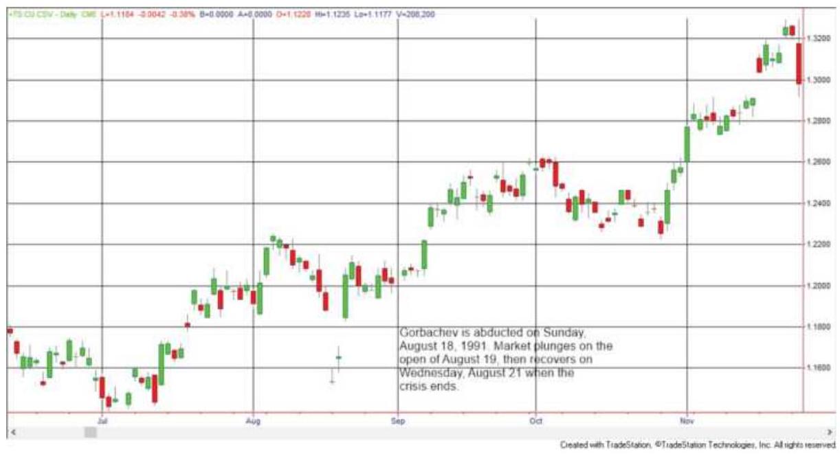
FIGURE 22.1 The Gorbachev abduction caused a double price shock, with most impact on the European currencies, such as the US\$/German mark.
Source: Chart created with TradeStation® \({ }^{\circledR}\).
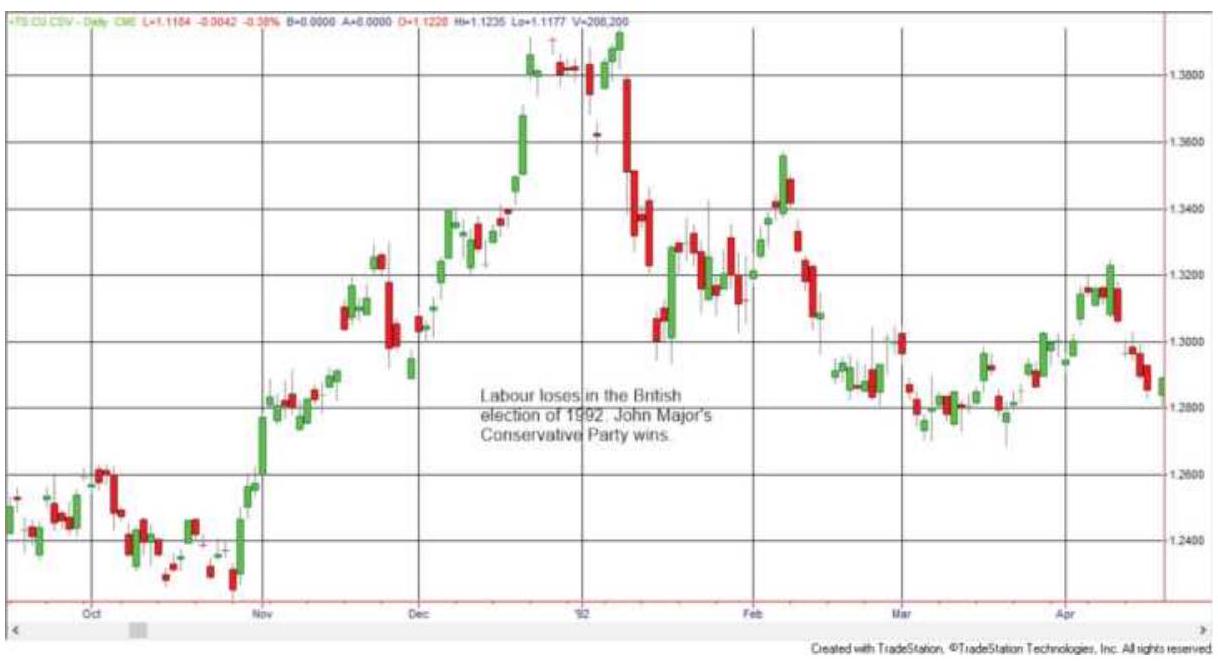
\section*{FIGURE 22.2 Labour's victory in the British election of 1992 represents a more common shock.}
Source: Chart created with TradeStation® by Omega Research, Inc.
3. The Gulf War, August 2, 1990, through February 28, 1991. Oil prices are notoriously volatile, but the Gulf War marked a period of unprecedented price shocks driven by news (Figure 22.3). Because Iraq had been moving troops near the Kuwait border, Iraqi intentions were not a surprise. Figure 22.3 shows that prices were rising from the second week of July as news of Iraq's plans circulated in the marketplace. The threat of an oil supply disruption and a failing diplomatic solution resulted in a rise of \(\$ 4\), or \(28 \%\). Therefore, many short-term traders would have been long on August 7, 1990, when Iraq invaded Kuwait. The most dramatic price shock was on the day of the U.S. invasion of Kuwait, January 17, 1991. Futures prices opened near their high of
\(\$ 30.80 / \mathrm{bbl}\) and by the close of trading had fallen to \(\$ 20.50\). The first cash trade in oil, after the invasion was known, exchanged hands at about \(\$ 4 \mathrm{o} / \mathrm{bbl}\). There was a 1-month uptrend ahead of the U.S. invasion but most macrotrend systems were short ahead of the \(\$ 10\) drop in futures prices.
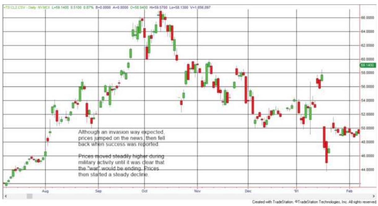
\section*{FIGURE 22.3 Crude oil prices from Iraq's} invasion of Kuwait through the beginning of the Gulf War, August 1990-February 1991.
Source: Chart created with TradeStation® by Omega Research, Inc.
4. The terrorist attack on September 11, 2001. This generation will remember where they were on \(9 / 11\), just as the last generation remembers where they were when John F. Kennedy was assassinated. In an unprecedented move by the exchanges, all trades executed in the morning before the attack were cancelled. After the S\&P close on September 10 at 1101.4, prices of futures opened 6 days later on
September 17 at 1041.4, 5.4\% lower, posting the low for the move of 939.0 on September 21, after another 5 days of steady declines. (See Figure 22.4.)
5. The British vote to stay in the European Union. Polls indicated that those for staying in the EU were ahead of those favoring an exit. The British pound rallied ahead of the vote only to drop \(7.6 \%\) by the close, and \(12.7 \%\) at its lows less than two weeks later (Figure 22.5).
6. The U.S. presidential election of 2016. No one was more surprised than Donald Trump. Anticipation favored Hillary Clinton and Democratic policies that would have continued restrictions on business and expanded welfare. That was considered negative for the economy. When Trump won, markets rallied from sharply lower prices overnight and continued higher for more than a year, optimistic about tax relief and deregulation. (See Figure 22.6.)
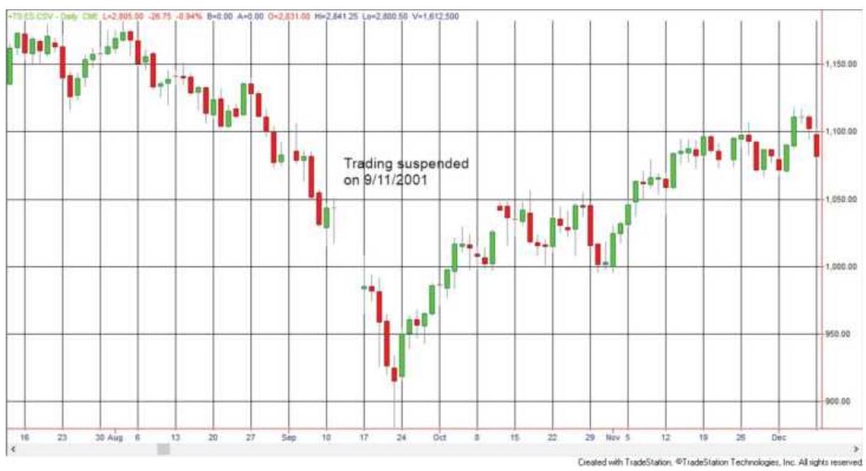
FIGURE 22.4 The price shock of 9/11/2001.
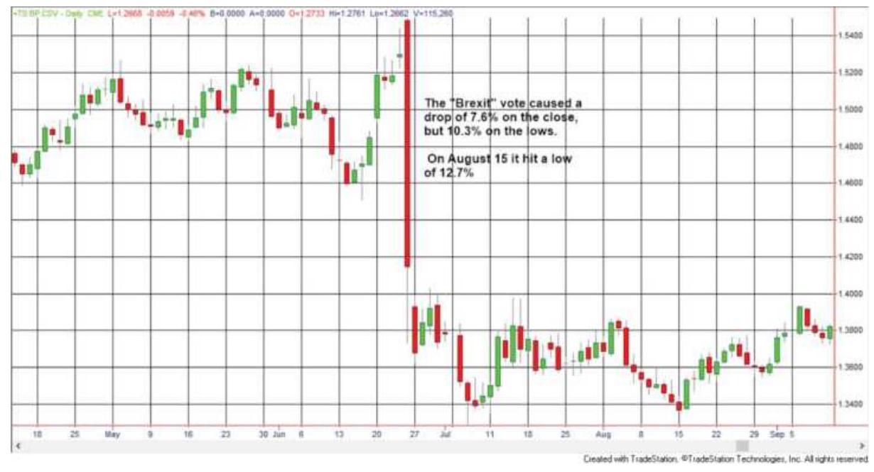
FIGURE 22.5 The surprising results of the British vote on staying in the European Union.
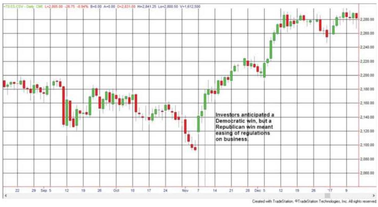
FIGURE 22.6 The U.S. election of 2016 was a surprise to both the stock market and the new president.
\section*{TABLE 22.1 Summary of price shocks.}
\begin{tabular}{l|l|l|l|l|l}
Event & \(18-\) & 80 & Price \(\$\) Value \(\$\) Value II
\end{tabular}
\begin{tabular}{|l|c|c|c|c|c|}
\hline & \begin{tabular}{c}
Day \\
Trend
\end{tabular} & \begin{tabular}{c}
Day \\
Trend
\end{tabular} & Shock & \begin{tabular}{c}
of \\
Shock \\
(C to \\
O)
\end{tabular} & \begin{tabular}{c}
Shock \\
(C to C)
\end{tabular} \\
\hline Gorbachev & Up & Down & Down & \((\$ 4,337)\) & \((\$ 4,337)\) \\
\hline \begin{tabular}{l}
Labour \\
victory
\end{tabular} & Up & Up & Down & \((\$ 1,125)\) & \((\$ 3,700)\) \\
\hline \begin{tabular}{l}
Iraq \\
invasion \\
of Kuwait
\end{tabular} & Up & Down & Up & \((\$ 1,750)\) & \((\$ 1,170)\) \\
\hline \begin{tabular}{l}
U.S. \\
invasion \\
of Iraq
\end{tabular} & Up & Down & Down & \((\$ 7,500)\) & \((\$ 10,560)\) \\
\hline 9/11/2001 & Down & Down & Down & \(\$ 3,000\) & \(\$ 2,912\) \\
\hline \begin{tabular}{l}
Down
\end{tabular} & & & & \\
\hline Brexit vote & Up & Up & Down & \((\$ 1,137)\) & \((\$ 7,206)\) \\
\hline \begin{tabular}{l}
U.S. \\
election \\
2016
\end{tabular} & Down & Down & Up & \((\$ 1,300)\) & \((\$ 2,425)\) \\
\hline
\end{tabular}
\section*{Analyzing the Price Shocks}
Everyone starts with a disadvantage when there is a price shock. The seven shocks shown in this section caused large moves, mostly losses for both short-term (18 day) and long-term (8o day) trend traders. Can we find something hopeful in the information collected in Table 22.1?
For the most part, prices closed with larger losses (" C to C") than on the open ("C to O") after the price shock occurred. Those that did not continue in the shock direction closed mostly at the same price as the open. When there was a profit, it wasn't improved by the close. The conclusion is to exit as soon as possible.
The other approach is to hold the position or "double down." In 4 of the 7 cases, prices recovered all or nearly all of the price shock in 2 to 8 days. In one case prices continued sideways. Then holding the position had a \(71 \%\) chance of recovery - if you weren't wiped out by the price shock.
The main problem with price shocks is the size of the loses. Futures trading is highly leveraged and most trades take advantage of that by leaving little in reserve for drawdowns. Most would not have survived a loss of \(\$ 7,500\) in crude oil or \(\$ 4,337\) in the euro. An important point to remember is to have sufficient reserves to withstand most price shocks.
\section*{Identifying Price Shocks}
If we cannot predict price shocks, and they seriously impact our historic tests, then we must understand their effects. In Chapter 21, it was shown that price shocks
always added profits to historic performance of trend systems, but in actual trading this is not likely to be true. This was done by identifying a price shock as a 1-day trading range five times the size of the previous trading ranges, as measured using the average true range. By accumulating the net change due to price shocks relative to the trend position, you can see the impact on performance. Trading a price shock is also called event trading and is discussed in Chapter 14.
\section*{Crisis Management}
One aspect of crisis management is having sufficient financial reserves to survive an extreme, correlated price reversal, if not a worst-case scenario. For most trading programs, holding enough reserves aside to weather a worst-case scenario will lower the annualized rate of return to an unacceptable level. Nevertheless, the potential for a large loss is real. That means some tactical method must be used.
In the previous examples of well-known price shocks, prices reversed direction within a few days and continued in that direction for some time. If the original position was held after its initial loss, then part of that loss would have been recovered. The strategy that evolves is:
1. If there is a windfall profit from the price shock, exit the position.
2. If there is a large loss from the position, hold the position expecting a reversal. This may take a few days and may increase the risk.
3. If there are adequate reserves, the position can be increased on a volume spike, but preferably when volatility declines after the spike.
\section*{System Disconnect during a Crisis}
A large price shock can create a disconnect between a trend system and the market. During 1987, the stock market began an accelerated decline in mid-October, leading to a 2-day drop of large proportion on very high volatility and confirmed by a volume spike. Figure 22.7 shows how a 50-, 100-, and 200-day moving average reacted to that move. All three moving averages turned down on the day of the largest drop. A sell signal triggered on the day of the shock and executed on the next day would have gotten the lowest price of the move. Switching to crisis management rules, where shorts are liquidated and longs are held, would have been a far better strategy.
Equally important is the direction of the price movement compared to the direction of the three trendlines after posting the low price of the shock. The fastest, 50-day, was still in a downtrend until mid-December, the 100day trend until mid-February 1988, and the 200-day until early June 1988. When the trends turned up, prices had already recovered \(22 \%, 24 \%\), and \(30 \%\), which would be the size of the loss from a short position entered on the day of the shock.
It seems clear that these moving averages are out of phase with the price movement after the shock. The moving averages are not reflecting the market trend;
they are catching up to an event long past. Dogmatically holding a short position from mid-October onward because the trendline is down puts the trader out of phase with reality.
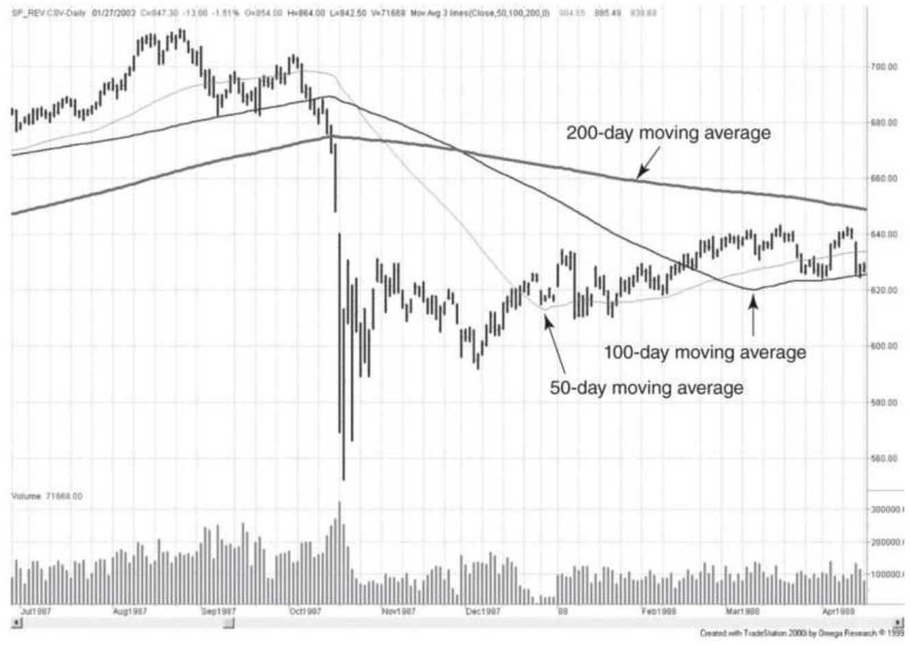
FIGURE 22.7 S\&P 500 futures. Moving average trendlines become out of phase after the 1987 crash.
The collapse of the world stock markets in the fall of 2008 was not a price shock, but an evolving event. The news of financial problems appeared slowly, steadily, and clearly in favor of an economic disaster. Figure 22.8 shows that any long-term trend follower would have been short ahead of the decline, which, on this portion of the price movement, was a drop of \(55 \%\) in the S\&P futures. There was no disconnect and trend followers
trading futures posted their best year in the history of that industry.
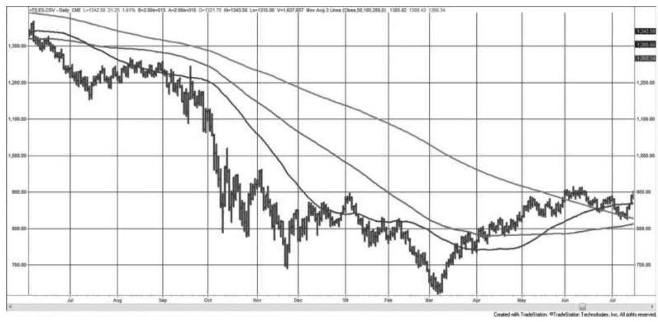
FIGURE 22.8 The S\&P decline due to the subprime crisis generated large profits for trend followers who were already short. Continued depressed prices allowed the trends to catch up to lower prices.
Crisis management requires special rules for unusual circumstances. The response to price shocks can be treated as a temporary regime change but can still be systematic. All traders must have a plan to account for the worst cases. This switch can be triggered on volume and volatility, then ended using the same criteria.
\section*{GAMBLING TECHNIQUES: THE THEORY OF RUNS}
The application of gambling theory to highly leveraged or short-term trading satisfies two important conditions. First, it presumes no statistical advantage in the
occurrence of profits and losses but concerns itself instead with the probable patterns. Viewed simply as an up or down price move, or a trading profit or loss, each daily change could be treated as an occurrence of red or black in roulette. Second, gambling theory stresses money management under adverse conditions. A successful professional gambler and an active trader must be highly disciplined and follow a strict method of capital allocation. This section will look at a gambler's approach to money management and risk, using the Theory of Runs.
If the assumption is made that the profit or loss of each trade is unrelated to the previous trade, or that each successive price has an equal chance of going up or down, the situation closely resembles roulette. In Monte Carlo, the roulette wheel has 37 compartments: 18 black, 18 red, and 1 white, assuring a loss of \(2.7 \%\) in the same way that transaction costs are a handicap to trading.
Continuously betting on only red or black will break even, less \(2.7 \%\), over long betting periods. The only way to change the odds is by money management - varying the size of the bets. Although the variables in trading are more complex, we will look at this first.
\section*{The Theory of Runs}
The most well-known method for winning in a gambling situation is based on the probability of sequences occurring, the Theory of Runs. On each spin of the wheel, the likelihood of the same color (red or black) reoccurring is \(50 \%\), or \(1: 2\) ( 1 out of 2 , ignoring the white slot). To define a run of 3 reds, it is necessary to show a
black on each side, that is:
Black - Red - Red-Red - Black
otherwise the run may not be complete. If each color has a \(50 \%\) chance of occurring, the probability of a run of 3 reds is:
\[
\frac{1}{2} \times \frac{1}{2} \times \frac{1}{2} \times \frac{1}{2} \times \frac{1}{2}=\left(\frac{1}{2}\right)^{5}=0.03125
\]
or about \(3 \%\). One run of 3 can be expected for every 32 spins of the wheel (called coups). Extending that to runs of \(n\) consecutive reds gives \((1 / 2)^{n+2}\). For 256 coups, which is both a power of two and the approximate number of trading days in a year, there are the following possibilities for runs of red:
\begin{tabular}{|c|c|c|r|}
\hline \begin{tabular}{c}
Run of \\
Length
\end{tabular} & \begin{tabular}{c}
Probability \\
of \\
Occurrence
\end{tabular} & \begin{tabular}{c}
Expected \\
Number of \\
Occurrences
\end{tabular} & \begin{tabular}{c}
Total \\
Appearances \\
of Red
\end{tabular} \\
\hline 1 & \(1 / 8\) & 32 & 32 \\
\hline 2 & \(1 / 16\) & 16 & 32 \\
\hline 3 & \(1 / 32\) & 8 & 24 \\
\hline 4 & \(1 / 64\) & 4 & 16 \\
\hline 5 & \(1 / 128\) & 2 & 10 \\
\hline 6 & \(1 / 256\) & \(\mathbf{1}\) & 6 \\
\hline & & Total appearances: \(\mathbf{1 2 0}\) \\
\hline
\end{tabular}
There is less than a \(1 \%\) chance that a run greater than 6 will occur, and that only 4 will occur out of 10,000 spins. Notice, however, that the total appearances of red is only 120 , short by 8 . These 8 appearances could increase any of the runs from 1 through 6 , or become a run of 7 or 8 . The likelihood of a run greater than 6 is calculated using a geometric progression to get the sum of all probabilities greater than 6 , or \((1 / 2)^{n+2}\), where
\section*{\(256 \geq n \geq 7\) :}
\[
\begin{aligned}
P & =(1 / 2)^{9}+(1 / 2)^{10}+\cdots+(1 / 2)^{256} \\
& =\frac{(1 / 2)^{9}}{1-(1 / 2)}=\frac{1}{256}
\end{aligned}
\]
There is only one chance that there will be a run greater than 6 in 256 tries. The average length of a run greater than 6 turns out to be 8 , based on the decreasing probability of occurrences of longer runs. The average length of all runs greater than \(n\) will be \(n+2\). That makes the table of runs complete, with the number of occurrences of red equal to 128 .
Each time you double the number of spins, you increase the length of the longest possible run by 1 , so that for 512 spins there should be a run of 7 , and for 1024 spins, a run of 8 .
\section*{Martingales and Anti-Martingales}
The classic gambling application of the Theory of Runs is
called Martingales. In the simple version of this approach, an initial bet is doubled each time a loss occurs; whenever there is a win, the gambler nets one unit of gain and the betting begins again at the initial size. To demonstrate how this works, it is necessary to use a table of uniform random numbers (in Excel use the function RAND). These numbers vary from o to 1.0. Let all the random numbers from 0 to less than 0.5 be assigned to red, and larger values to black. Figure 22.9, read left to right, where open squares are red and solid squares are black, shows the first 257 assignments according to our own test. Assuming that we bet on black, losses will depend on the longest run of red. We must decide the size of the initial bet in advance, which should be as large as possible and still withstand the longest run of red that is likely to occur. By using the results from the analysis of the length of runs, we find that for every 256 coups it is likely that only 1 run greater than 6 will occur, and that run would most probably be 8 in length. The probability of a run of 9 is \((1 / 2)^{11}\), or one in 1024. In 256 coups, the odds are about 3 to 1 against a run of 9 occurring.
COUPS GENERATED FROM RANDOM NUMBERS
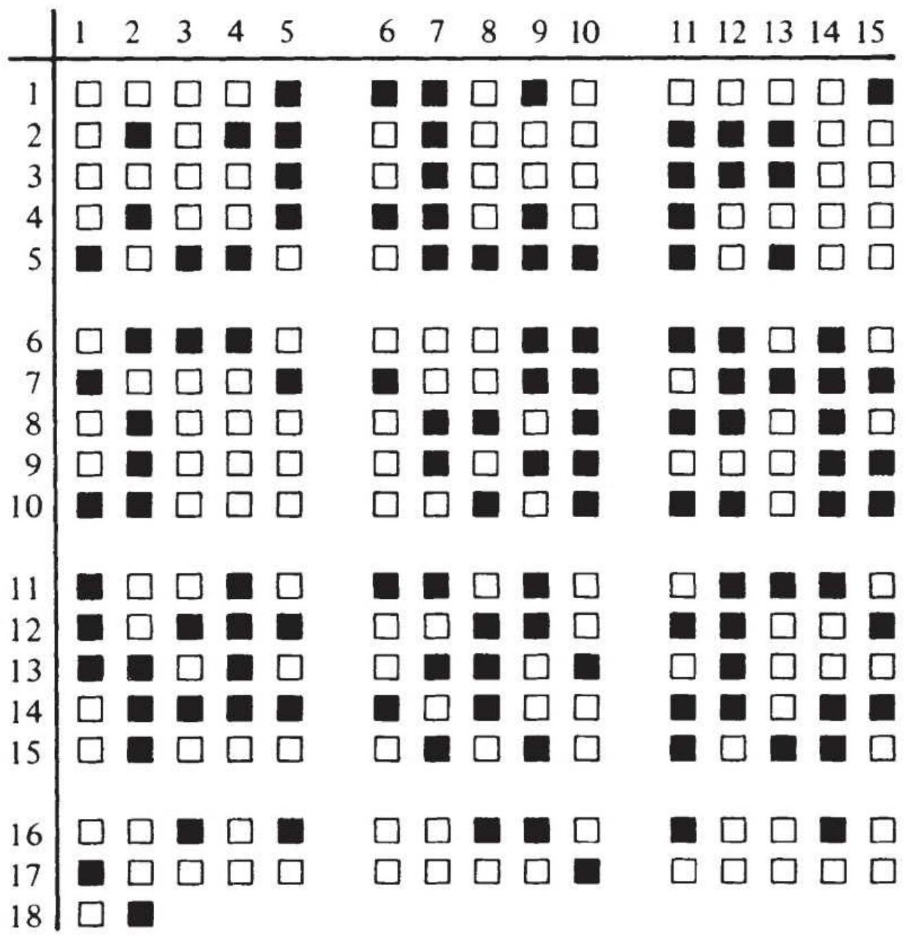
FIGURE 22.9 Sequence of random numbers representing occurrences of red and black.
Having decided that capitalization must withstand a run of 8 , we calculate that a bet of \(\$ 1\) doubled 8 times is \(\$ 128\). Divide the maximum amount of money to be risked by 128 and the result is the size of the initial bet. If
the available stake is \(\$ 1,000\), then when divided by 128 gives \(\$ 7.8125\), which must be rounded down to \(\$ 7\); therefore, on the eighth consecutive occurrence of red, the bet will be \(\$ 897\). Counting the occurrences of runs on the simulated roulette table (Table 22.2), we see that a run of 8 (but not 7 ) appears.
The results are within expectations, and no run greater than 8 occurred in either red or black. For the purposes of this example, the betting would then proceed as shown in Figure 22.10, using an initial bet of \$7. Every occurrence of black is a winner. Although as much as \(\$ 897\) may be won on a single black coup after a run of 8 , each sequence of runs nets only the initial bet of \(\$ 1\) because of the accumulated losses during that sequence. For the 256 coups shown in Figure 22.8, there were a total of 65 distinct runs, resulting in a profit of \(\$ 455\), a return of \(45.5 \%\) on capital. Instead of using Martingales, if we had used the basic strategy of betting equal amounts on black to win on every coup, we would have lost \(\$ 140\) on a \(\$ 7\) bet. The Martingales method therefore has a good chance of winning a moderate amount. In a casino, the drawback is the occasional run of 9 . The house sets the maximum bet for the table, which always prevents doubling down after a run of 8 .
\section*{TABLE 22.2 Simulated runs.}
\begin{tabular}{|l|l|}
\hline Red & Black \\
\hline 35 runs of 1 & 35 runs of 1 \\
\hline 12 runs of 2 & 14 runs of 2 \\
\hline .7 runs of 3 & 11 runs of 3 \\
\hline
\end{tabular}
.7 runs of 4
.2 runs of 5
.3 runs of 4
.2 runs of 5
.2 runs of 6
.1 run of 8
138 total occurrences 118 total occurrences
\begin{tabular}{|c|c|c|c|}
\hline & \begin{tabular}{lllll}
1 & 2 & 3 & 4 & 5
\end{tabular} & \begin{tabular}{llll}
6 & 7 & 8 & 9
\end{tabular} & 112 \\
\hline 1 & \begin{tabular}{llllll}
1 & 2 & 4 & 8 & 16
\end{tabular} & (1) 1 ( 1 1 2 2 1 & \begin{tabular}{llllll}
2 & 4 & 8 & 16 & 32
\end{tabular} \\
\hline 2 & \begin{tabular}{ll}
1 & 2
\end{tabular} & \begin{tabular}{llllll}
1 & 2 & 1 & 2 & 4
\end{tabular} & 8目1 1 \\
\hline 3 & \begin{tabular}{lllll}
4 & 8 & 16 & 32 & 64
\end{tabular} & & (8) 1 过 1 \\
\hline 4 & 4 4 & (1) 1 1 1 ( 1 & [2] 1 \\
\hline 5 & [16 1 1 201 & 24 4 1 1 & [1 1 ( 2 ( 1 \\
\hline
\end{tabular}
FIGURE 22.10 Betting pattern.
\section*{Anti-Martingales}
The anti-Martingales approach offers a smaller chance of winning a large amount; it is the opposite of applying Martingales. Instead of doubling each losing bet, the winners are doubled until a goal is reached. Because there is an excellent chance of 1 run of 6 in 256 coups and a similar chance of a longer run, this method wins if the long run occurs in the first half of the number of coups to be played ( 128 out of 256 in this case). Once a run of 6 occurs you must immediately stop playing.
We already know that a run of 6 returns \(\$ 32\) on a bet of \(\$ 1\), and a run of 8 nets \(\$ 128\). This method would have lost if it had been applied to black in the test sequence; because there were 138 red coups with no black runs
greater than 5 , there would have been a loss of \(\$ 138\). If the bet had been on red, looking for a run of 6 , there would have been three wins, each for \$94, and a loss of \(\$ 118\) for that many appearances of black. Waiting for a run of 8 would have won \(\$ 128\) and lost \(\$ 117\) on black by stopping right after the win. The success of anti-
Martingales depends on how soon the long run appears. In 4,096 coups, a run of 11 will occur once, returning \(\$ 1,024\) on a bet of \(\$ 1\). In the same 4,096 turns, there will be 2,048 losses, showing that if the long run happens in the middle of play, the method breaks even; if it occurs sooner, you win.
\section*{The Theory of Runs Applied to Trading}
Before applying either Martingales or anti-Martingales to the markets, it must be determined whether the movement of prices up or down is as uniform as in roulette. Table 22.3 shows the number of up and down runs for a selection of index and futures markets from 1998 through June 2018, 5,012 days for SPY. The number next to the market symbol is the number of days in the test. For 5,000 coups the chance of a run of 10 is only 1 in 5,000 , and the chance of a run of 18 is less than 0.005 in 5,000 .

If the ups and downs were random, a run of anything over 11 would happen rarely, but Table 22.3 shows that every market (except gold) had a run of 13 or more. Price moves are not random. Figure 22.11 plots the up and down runs for SPY along with random runs. The distribution of down runs is nearly random, but the up
runs show far fewer runs of 1 and far more unusually long runs. There is clearly an upward bias in these markets. The program TSM Theory of Runs on the Companion Website will create these runs for whatever data you choose.
One way of incorporating these results into a trading program is to treat the higher frequency of short-term reversals as a way to improve entry prices for long positions:
After a new trend buy signal, wait for the market to reverse before entering the new trade.
\section*{TABLE 22.3 Frequency of up and down runs for} selected markets, 3/17/1998-6/22/2016.
\begin{tabular}{|c|c|c|c|c|c|c|c|c|c|c|}
\hline & \multicolumn{2}{|c|}{ SPY } & \multicolumn{2}{c|}{ QQQ } & \multicolumn{2}{c|}{ IWM } & \multicolumn{2}{c|}{ DAX } & \multicolumn{2}{|c|}{\begin{tabular}{c}
Hai \\
San
\end{tabular}} \\
\hline & \#Up & \#Dn & \#Up & \#Dn & \#Up & \#Dn & \#Up & \#D & \#Up \\
\hline. \(\mathbf{1}\) & 345 & 700 & 298 & 648 & 266 & 604 & 342 & 699 & 322 \\
\hline .2 & 299 & 326 & 309 & 300 & 315 & 284 & 332 & 325 & 344 \\
\hline .3 & 276 & 163 & 228 & 136 & 220 & 148 & 249 & 152 & 233 \\
\hline .4 & 167 & .69 & 132 & .62 & 143 & .56 & 142 & .70 & 167 \\
\hline. \(\mathbf{5}\) & 87 & .32 & .98 & .30 & .75 & .23 & 105 & .33 & .89 \\
\hline .6 & .61 & .7 & .58 & .11 & .53 & .14 & .58 & .12 & .57 \\
\hline .7 & .33 & .5 & .29 & .2 & .29 & .4 & .39 & .8 & .26 \\
\hline .8 & .19 & .1 & .21 & .3 & .18 & .1 & .14 & .0 & .12 \\
\hline .9 & .12 & .0 & .11 & .2 & .10 & .0 & .9 & .2 & .13 \\
\hline \(\mathbf{1 0}\) & .2 & .0 & .4 & .0 & .3 & .1 & .4 & .0 & .4 \\
\hline
\end{tabular}
\begin{tabular}{|l|l|l|l|l|l|l|l|l|l|}
\hline \(\mathbf{1 1}\) & .1 & .0 & .4 & .1 & .1 & .0 & .4 & .1 & .0 \\
\hline \(\mathbf{1 2}\) & .0 & .0 & .0 & .0 & .0 & .0 & .2 & .0 & .3 \\
\hline \(\mathbf{1 3}\) & .0 & .0 & .0 & .0 & .2 & .0 & .3 & .0 & .1 \\
\hline \(\mathbf{1 4}\) & .1 & .0 & .1 & .0 & .0 & .0 & .0 & .0 & .1 \\
\hline \(\mathbf{1 5}\) & .0 & .0 & .0 & .0 & .0 & .0 & .0 & .0 & .0 \\
\hline \(\mathbf{1 6}\) & .0 & .0 & .0 & .0 & .0 & .0 & .0 & .0 & .0 \\
\hline \(\mathbf{1 7}\) & .0 & .0 & .1 & .0 & .0 & .0 & .0 & .0 & .0 \\
\hline \(\mathbf{1 8}\) & .0 & .0 & .1 & .0 & .0 & .0 & .0 & .0 & .1 \\
\hline
\end{tabular}
\section*{SPY Runs}
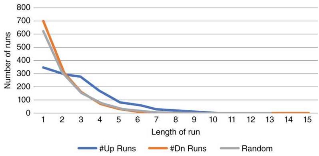
FIGURE 22.11 Runs of SPY compared to random runs.
The most interesting applications are in the betting strategies of the Martingales and anti-Martingales methods, applied to futures markets. The following sections show two possibilities.
\section*{Martingales with a Trend Filter}
By combining the Theory of Runs with the direction of
the trend, and the upward bias that we see in the table of runs, the chance of being on the correct side of the longest runs is increased, and the size of the price move in the direction of the trend may also tend to be larger. Long-term trends will offer the best chance of identifying the direction of prices. We can create rules to take advantage of this:
1. If the trend has just turned up, based on a moving average, enter a long position with 1 unit (the initial investment divided by the price).
2. If the trend is still up and the price closes lower, double the size of the long position.
3. If the trend is up and the price closes higher, remove all positions in excess of the original 1 unit.
4. If the trend turns down, exit all longs and sell short 1 unit.
5. If the trend is down and prices close higher, double the size of the short position.
6. If the trend is down and prices close lower, cover all short positions in excess of the original 1 unit.
Because it is possible for prices to go the wrong way longer than you have money, we need to cap the number of times we can double down. For this test, we will start with 1 unit \(=\$ 1,000\) and allow doubling up to 5 times for a total of \(\$ 32,000\). At that point we will hold the current position until prices move in our favor, then reduce the size back to 1 unit, the initial amount.
\section*{Martingales with trend}
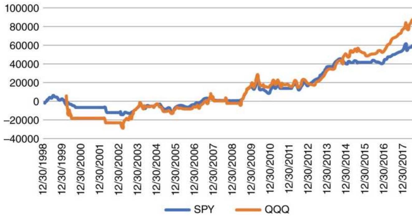
FIGURE 22.12 Comparison of total profits for SPY and QQQ using a 120-day moving average filter, a \$1,000 initial investment, and doubling 5 times.
Using this strategy, we tested the ETFs SPY and QQQ from 1998 through June 2018, using a 120-day moving average with the results shown in Figure 22.12. The period from 2000 through 2002 saw a \(90 \%\) drop in the price of \(Q Q Q\), but the trend filter kept the strategy out of the market most of the time. It was less of a problem in 2008. Because QQQ has longer runs than SPY, its results were better.

You can try this yourself using TSM Martingales with Trend, on the Companion Website. Four other programs - TSM Martingales, TSM Martingales
Crossover, TSM Martingales Crossover V2 (fractional positions), and TSM Martingales Crossover V3 (whole
sizing) - are also available.
\section*{Anti-Martingales}
Applying anti-Martingales calls for adding to the position size when we are profitable and resetting to the starting size when we have a losing day. This test used QQQ from 1999 with the same 120-moving average filter and allowed doubling the position size up to 4 times (the "cap"). The position size was the initial investment divided by the closing price on the day of the new position. Then the maximum exposure is \(\$ 16,000\) less the open profits when using doubling, and \(\$ 5,000\) when adding equal units.

For comparison, we also added equal investment amounts rather than doubling. A comparison of the total profits is shown in Figure 22.13. Doubling returned about \(\$ 10,000\) on an investment of \(\$ 16,000\), or \(62.5 \%\), while adding equal amounts returned about \(\$ 5,000\) on a maximum investment of \(\$ 5,000\), or \(100 \%\). Not all the funds are used all the time, but because they must be available, the largest exposure is used as the investment. These results were produced using TSM AntiMartingales on the Companion Website.
\section*{Anti-Martingale with QQQ sizing}
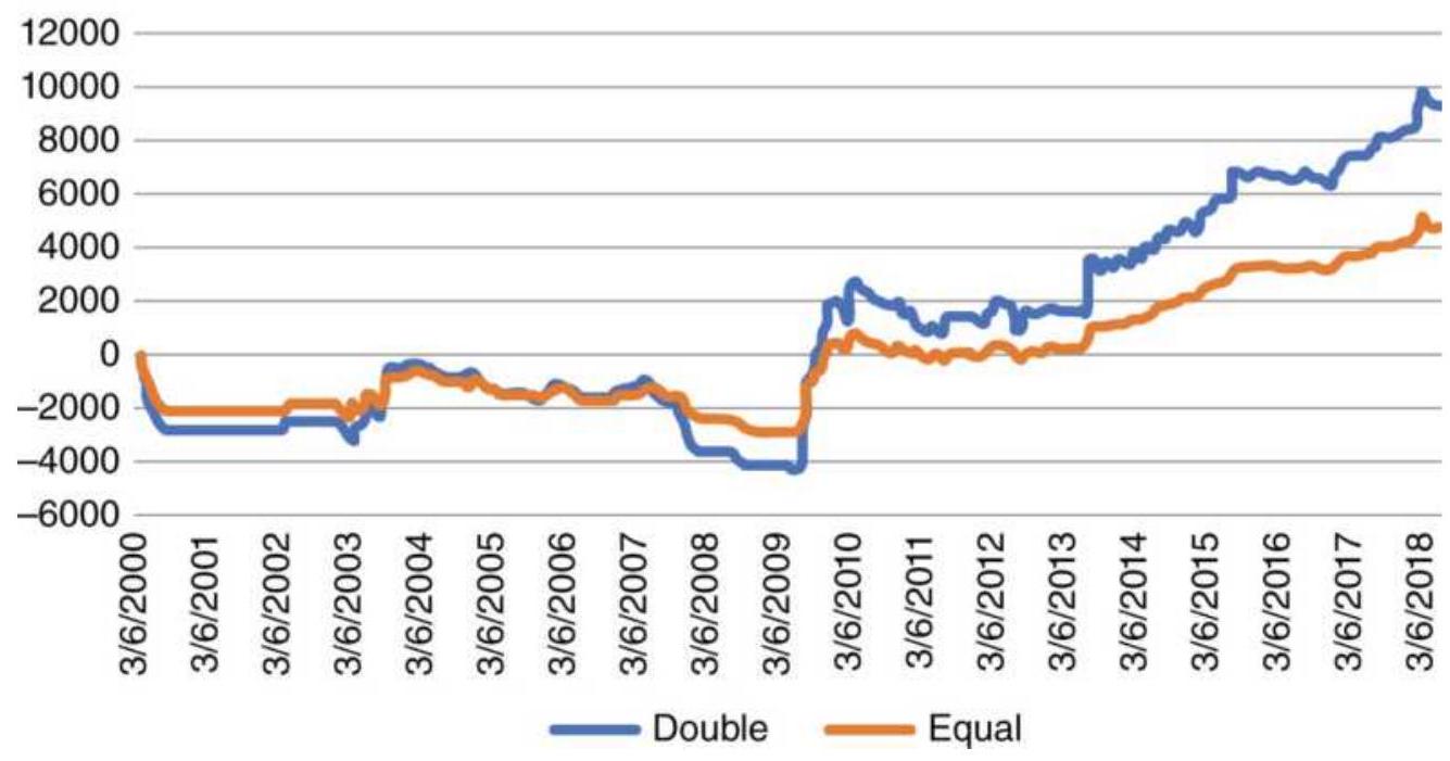
FIGURE 22.13 Anti-Martingales applied to QQQ, doubling the position when there was a profit compared to adding equal units.
\section*{Fractional Martingales}
The simple Martingales and anti-Martingales just discussed offer one possibility for applying gambling theory to position management. But always doubling the size of the position requires deep pockets. If a large account is being traded, it may be better to use the actual profits to decide the number of futures contracts or shares for anti-Martingales. Another approach would be to scale down the risk by trading 1.5 times the previous position size rather than doubling. This last approach was taken by Furguson, \({ }^{3}\) and should give the same relative improvement over the basic trend method with less absolute risk.
\section*{Delayed Countertrend Entry into a Run}
For Martingales, rather than doubling the size on the first down day in an uptrend, waiting until prices posted two or three lower closes should increase the chances of a move back in the trend direction. Although there are fewer opportunities, the chances of a continued adverse move quickly become smaller.
Gustafson \({ }^{4}\) studied the S\&P from 1988 to 1995 and created a trading strategy that entered a long position after prices closed lower 4 days in a row, exited after an upward run of 5 days, and always exited after 8 days. Admittedly, this method is only long and takes advantage of the upward bias in the stock market, which was particularly strong in the mid- and late-1990s. The results for the in-sample period had \(78 \%\) of the trades profitable, a \(\$ 35,030\) net profit, and a \(\$ 5,847\) maximum drawdown. Applying this to data from 1982 through mid-2001, the results had \(76 \%\) reliability, profits of \(\$ 348,460\), and a drawdown of \(\$ 56,370\), showing that this pattern was successful out-of-sample, but still in the same bull market. The rules are:
1. If \(C_{t}>C_{t-1}\), then up \(=u p+1\), else up \(=0\)
2. If \(C_{t}<C_{t-1}\), then down \(=\) down +1 , else down \(=0\)
3. If down \(=4\), then buy on next open
4. If up \(=5\), then exit longs on next open
5. When days-from-entry \(=8\), then exit longs on
\section*{SELECTIVE TRADING}
It may be unrealistic to think that you can always follow a fully automatic system without manual intervention. You may override system signals to impose sound risk management during a crisis if the system is not programmed to deal with the current volatility, or that a smaller position is best before a Fed announcement, or that the market has temporarily disconnected from the strategy.
The beginning system trader often has concerns that the impersonal buy and sell orders will not react properly to the underlying forces that are driving prices. This can cause the trader to override the system signals. For example, if the program is geared to take profits after a move of \(2 \%\), the trader might judge that the current price move is going to continue and opt for holding the trade rather than taking profits. The approach to selective filtering generally favors holding a position that has a loss until it shows a profit (if ever), rather than applying consistently good risk management. Personal judgment tends to interpret all news in favor of holding the position in anticipation of a profit someday. An experienced trader has learned to control these urges to override the system, not to take a loss personally, to keep losses small, to establish and stay with a trading plan, and to filter out unsupported opinions. Trading is a business, and business principles must take precedence over emotions.
\section*{SYSTEM TRADE-OFFS}
Although traders are continually searching for a system that has no losses, they are realistic enough to know that there are trade-offs between the size of the profits and the percentage of profitable trades, the size of the stoploss and the number of times it is hit, or the length of a trend and the size of the drawdowns. Just as in gambling theory, a system can be structured to have frequent small losses and occasional large profits - or frequent small profits with some large losses. It is simply not possible to create a system with no losses. Even "risk-free" arbitrage is not risk free.
Risk is immutable. You can move risk from one place to another but it will still be there. You can change the profile and have more small losses or a few larger ones, but they will add up to the same loss. Where and when it happens is also unknown. Accepting the risks that are part of trading, and trading systems, helps you plan ahead and protect yourself from the inevitable drawdowns. Experienced traders have learned to embrace the risk and over time they become less sensitive to risk.
The basic principles of systematic trading require that the trader choose between the frequency of profits to losses, the relative size of those profits and losses, and the number of opportunities that will be available to trade. These relationships will be different for various types of systems.
\section*{Trend-Following Systems}
The relative risks and rewards of trend-following systems change based on the length of the calculation period. Using a simple moving average system applied to closing prices, the example in Figure 22.14 shows that a faster moving average will stay closer to the current price than a slower moving average. The maximum risk is measured from the current price to the corresponding moving average value.
The other changing pattern is that longer trends capture more of the fat tail. In fact, a fast trend cannot capture the fat tail at all, although the average profit should still be larger than the average loss. Basic trend following will always have many more small losses compared to fewer larger profits. At the same time, the risk, due to the lag, increases with the trend period.
The risk of a single trade having a small or large loss is not a good measure of trading risk. Because there are more losses than profits in normal trend-following systems, it is important to consider the sequence of losses as part of the ultimate risk of trading. It is the aggregation of these losses that provides a reasonable comparison in determining whether a slow or fast moving average system has the best profit-to-loss ratio.
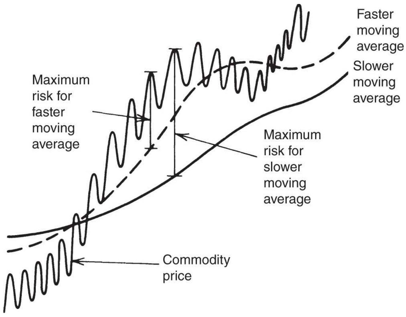
FIGURE 22.14 Relative risk of a moving average system.
The attraction of a trend system is that it cuts losses short. This is called conservation of capital. Because of that feature, a typical trend system has only \(30-35 \%\) profitable trades.
\section*{Mean-Reverting Systems}
Mean-reverting systems are those that take positions contrary to the direction of the current price move, or in the case of arbitrage, take positions opposite to the divergence of two related markets. If we subtract the stronger price from the weaker in an arbitrage, we can
treat the difference as the price in a mean-reversion strategy.
A mean-reversion strategy has an entry threshold. A system can take the opposite position on a small move up or down and have many profitable trades with small returns, or it can be more selective and wait for a larger move. It would then have fewer traders with larger profits. When entering sooner, risks are higher and the trades are held longer. Figure 22.15 indicates L (low), M (medium), and H (high) entries that take advantage of relative volatility. Figure 22.16 shows how profits and risk relate as trades are entered sooner or later.
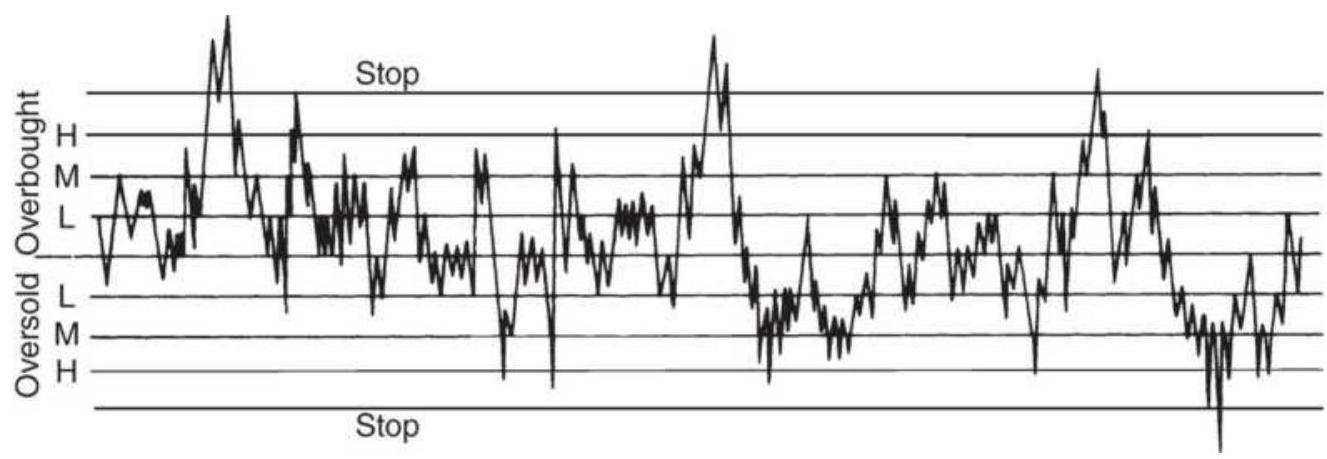
FIGURE 22.15 Entry point alternatives for a meanreverting strategy.
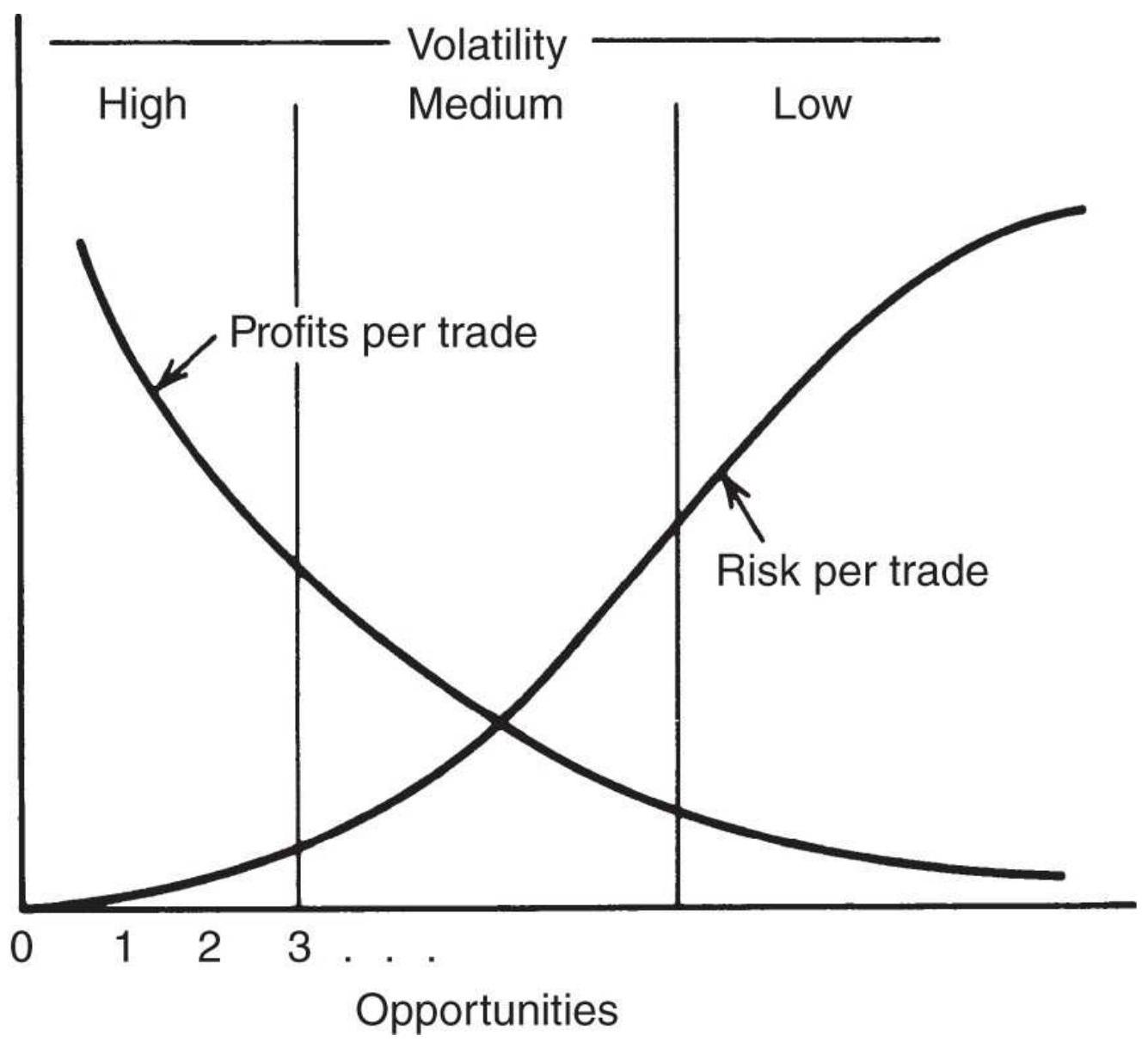
FIGURE 22.16 Relationship of profits to risk per trade based on opportunities.
\section*{Comparing Trend and Mean-Reversion Systems}
Trend-following and mean-reversion strategies are nearly opposite in how they profit. The table below summarizes their features:
Trend following
Many small losses and a few large profits
\section*{Mean Reversion}
Many small profits and a few large losses
About 30\% profitable trades
Risk increases with trend length
Macrotrend systems are correlated
Works best with longer periods
Costs are not important
Stop-loss may prevent you from capturing the fat tail
Profit-taking will prevent you from capturing the fat tail
High volatility should be avoided
Low volatility is an advantage
About 8o\% profitable trades
Risk increases as the entry threshold gets smaller
Mean-reversion systems are not correlated
Works best with shorter periods
Costs can be important
Only very large stop-loss can be used
Profit-taking is essential
High volatility is an advantage
Low volatility should be avoided
Both trend following and mean reversion are important, popular trading strategies. They complement each other because they are uncorrelated, unless you filter the mean reversion strategy with a trend.
All systems have trade-offs. In the development of a system or trading philosophy, each person must settle on the combination of risk, reward, and opportunity that best suits him or her. There is no best combination.
\section*{Combining Features}
The Commodex system was first presented in 1959 and is still actively run by second-generation Philip Gotthelf. \({ }^{5}\) Commodex combines the components most acceptable to the experienced trader in a unique weighting method. It includes moving averages, price momentum, and open interest to calculate a trend index. It then ranks its results to produce a relative strength value.
Using 10- and 20-day moving averages, the system scores the current market performance to establish the value of the trending component. Bullish and bearish values are calculated by looking at three situations independently: the moving average signals from the long- and short-term trends, and the double moving average signal generated by combining the two trends. The two techniques of single and double moving averages are treated exactly as covered in Chapter 8 . The most important of the three factors is the long-term trend, second is the short-term trend, and last the relative position of the fast to the slow moving average. The highest-ranking upward-moving trend occurs when current prices are above both the faster and slower moving averages, and the faster average is below the slower. The opposite positions would result in the strongest downward-trending component. Trends are considered neutral if the most important element, the long-term moving average, conflicts with the other two factors.
The rate of change in open interest (for futures) reinforces the trend. Using a concept different from the usual charting techniques, Commodex considers it a
bullish sign if there is increasing growth momentum in
open interest combined with rising prices. The growth momentum is the difference between the rate of increase of the open interest and the 20-day moving average of the open interest. Confirming a bull move with rising prices and rising open interest is a classic concept of charting. The bear move is confirmed with rising open interest and falling prices. Commodex also considers a drop in open interest along with falling prices to be a bullish factor. The movement of volume is treated in the same manner as open interest and can confirm a bull or bear trend. An increasing volume momentum with rising prices is support of an upward move; other combinations indicate bear trends.
Added together, the signals are ranked from a strong buy to a strong sell. The system must be given credit for quantifying and balancing of these elements, which are generally treated as highly interpretive charting techniques. The rules for applying the daily signals to trading combine both the individual strength of the signal with the movement of the Commodex trend index. The trend index itself acts as an overbought/oversold indicator, specifying profit-taking at specified levels and allowing a position reversal in more extreme situations; stops are placed using the 20 -day moving average with predetermined band penetrations. Additional objectives are based on the profits accrued from a trade. A 50\% return gets a protective stop on part of the positions, and a \(100 \%\) profit requires the liquidation of half the position. These money-management concepts are an important aspect of any system and tend to round out Commodex.
\section*{Combining Trends and Trading Ranges}
Price movement is classified as being in either a trend or a trading range, and most traders decide that one or the other of those regimes will be their sole focus. Trading ranges and trends take turns dominating price movement, with the trading range most common. Whenever the S\&P breaks above a recent high or below a previous low, analysts are quick to point to the next level of resistance or support as the price target. If those levels are clear, prices will hesitate or reverse direction. Because this is a well-known concept, we can put rules on combining the trend direction with support and resistance levels. These are shown in Figure 22.17.
The rules for combining the two techniques depend on the size of the trading range, the speed of the trend, and whether the support and resistance levels have been established over time. A recent trading range formation offers less of an obstacle than those that have survived for some time. If the range is narrow, a moving average buy or sell signal invariably occurs at the resistance or support level and is met with an initial reversal. For a larger range, a medium-speed moving average signal may occur closer to the center of the range and allow some opportunity for trend profit before resistance is encountered. For very wide ranges, there may be ample latitude for a moving average to signal entry and close out without the interference of support and resistance levels. One method of combining the two techniques is to use whichever signal comes first. The following are the combinations that could happen for a short sale based on medium to wide ranges:
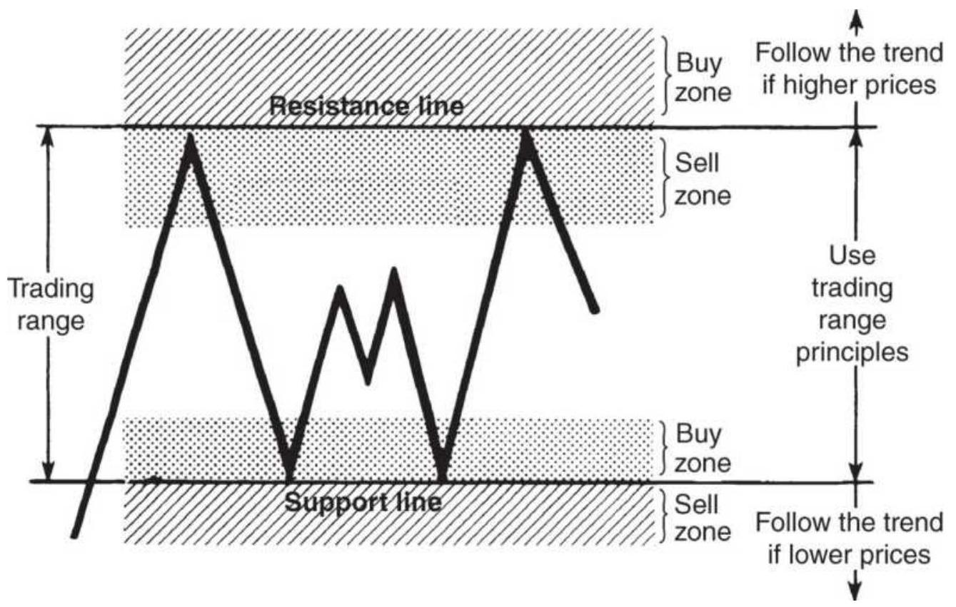
FIGURE 22.17 Combining trends and trading ranges.
1. Enter a new short position when the moving average turns down.
2. Enter a new short position when prices enter the sell zone below the resistance level.
3. Close out the short position when the moving average turns up.
4. Close out a short position when prices enter the buy zone above the support level.
5. Close out a short position when prices break through a resistance level moving up.
The same rules apply in reverse for long positions. The advantage of this filtering method is that new short trades are not entered at just above support levels. A
downward trend and a support level cancel each other out.
\section*{SILVER AND AMAZON: TOO GOOD TO BE TRUE}
This story of silver trading could have applied to the NASDAQ or S\&P index during the late 1990s, or perhaps gold in 2011, and certainly Apple and Amazon in 2015. There is no doubt that the same circumstances will reappear from time to time.
In 1974, public awareness of inflation caused an overwhelming interest in all forms of hedging, with large numbers of naive investors purchasing silver and gold as currency protection. Many investors turned to the futures markets, which also offered leverage.
One investment system that was sold at that time was intended to be a leveraged substitute for the purchase of bullion rather than a trading strategy. When it was published, it had always worked in the past - the sponsor of the system stood behind it with his reputation. The rules of the system were:
1. Trade silver futures because of their intrinsic value, historic performance, potential, and fundamental demand with short supply.
2. Use the futures contract between three and seven months from delivery to combine the advantages of liquidity and duration.
3. Always buy, never sell, because it is always
\section*{successful.}
4. Buy whenever you like. Although any sophisticated method can be used, it won't matter in the long run; any guess will do just as well. Follow the same method for adding to positions or reentering after closing out a trade.
5. Close out the position when there is a profit, not before.
6. Meet all margin calls - don't let the market beat you.
7. Invest \$5,000 per contract (5,000 troy ounces). This will allow a \(\$ 1\) per ounce adverse move (silver was at \(\$ 4.50\) per ounce).
8. Whenever you need reinforcement, reread the reasoning behind this system.
9. Do not let anyone or anything interfere with following this system.
How did the investors do? It depended on when they started. It's easier to see the results by looking at the cash silver prices in Figure 22.18. Investors would have started with huge profits, buying silver below \(\$ 5 /\) ounce and watching it run up to \(\$ 50\) during the rampant inflation, compounded by the Hunts buying that ended in January 1980. Prices then fell to below the original entry where they lingered for 25 years. Another rally in 2011 looked good but didn't last.
The problem with using trading profits to increase your position is that you have the largest exposure when
prices turn. If you buy on margin, you don't have the ability to withstand a large setback. Unless the stock or futures market only goes up, you will eventually be wiped out.
\section*{SIMILARITY OF SYSTEMATIC TRADING SIGNALS}
A primary concern of both the government regulatory agencies (SEC and CFTC) and individual traders is the similarity of trading signals generated by computerbased systems that are used to manage large positions. Throughout this book, we have noted that the market is the driver of trends, and that the specific trend-following method is less important. These systems may appear different in their rules and parameters, but for each to be profitable, they need to extract their profits from the same price moves, even though they may enter and exit at somewhat different points.
\section*{Silver cash prices}
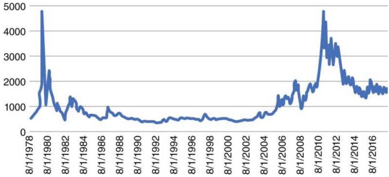
FIGURE 22.18 Cash silver prices, 1978-June 2018.
If trend-following systems with different calculation periods are not highly correlated, then it is possible to reduce portfolio risk by trading a variety of different techniques and calculation periods; however, the reality may be different from the theory. Lukac, Brorsen, and Irvin \(\underline{6}\) performed a study that compared 12 popular trading techniques (mostly trend-following) over 12 varied futures markets for the years 1978-1984. Each system was optimized, using 3 years of data, and the best parameter values were used to trade the next year. The systems selected were:
■ Channel systems
-Closing price channel (CHL)
-MII price channel (MII)
-L-S-O price channel (LSO)
Momentum/oscillators
-Directional Indicator (DRI)
-Directional Movement (DRM)
-Range quotient (RNQ)
-Reference deviation (REF)
Moving averages
-Moving average with percent band (MAB)
-Dual moving average (DMC)
Systems with trailing stops
-Parabolic Time/Price System (PAR)
-Alexander's Filter Rule (ALX)
-Combined Directional Movement and
Parabolic Time/Price System (DRP)
The study used three measures to test system similarity:
1. The percentage of the time that systems are on the same side of the market (long or short).
2. The percentage of buy or sell signals that occurred on the same day or within a few days of one another.
3. The correlation of aggregate monthly portfolio returns.
The results showed a significant positive correlation in the system profitability. However, there is no pattern that showed that one particular type of system is notably more correlated than others. The Parabolic and Directional Parabolic systems are most similar because
one is based on the other. The percentage of trades that occur on the same day was very low. A more informative comparison is seen in Table 22.4, which tallies the percentage of days that each system held the same position.
The study concluded that computer-based systems trade on the same day significantly more often than would randomly be expected, but the actual percentage of trades that occur on the same day is small. These systems have the potential to move market prices. One must be concerned, as the assets under management of macrotrend trading programs continue to grow, that they will hurt each other fighting to get into a position at the same time.
\section*{That Was Then...}
To see if anything has changed, and to understand the amount of diversification you can get from varying the calculation period or the trend-following technique, new tests were run using the ETF SPY from 1998 through June 2018:
Moving average periods: \(10,20,40,80\), and 160 days
- Trend-following systems: moving average (MA), exponential smoothing (EXP), linear regression slope (LRS), and breakout (BO)
The rules for these systems can be found in Chapter 8. The simplest approach was used. Positions were entered and reversed based on the trend direction. The system
was always in the market, both long and short. To get a visual impression of the results, Figure 22.19, shows the total profits of each of the moving average calculation periods. The fastest trend, 20 days, performed the worst, the slowest, 160 days did the best, and the three in between were very similar. Notice that each calculation period was twice the length of the previous one to maintain a constant percentage increase in the number of days used.
\section*{TABLE 22.4 Percent of trading days systems holding the same positions.}
Source: Reprinted with permission of Futures (250.S. Wacker Drive, \#1150, Chicago, IL 60606, November 1987).
\begin{tabular}{|l|c|c|c|c|c|c|c|c|c}
\hline & \multicolumn{9}{|c}{} \\
\hline & \multicolumn{9}{|c}{ Trading System } \\
\hline System & CHL & PAR & DRM & RNQ & DRP & MII & LSO & REF \\
\hline PAR & 70 & & & & & & & \\
\hline DRM & 82 & 76 & & & & & & \\
\hline RNQ & 75 & 61 & 73 & & & & & \\
\hline DRP & 68 & 83 & 75 & 59 & & & & \\
\hline MII & 82 & 69 & 80 & 75 & 65 & & & \\
\hline LSO & 73 & 58 & 71 & 73 & 57 & 73 & & \\
\hline REF & 72 & 57 & 69 & 69 & 55 & 72 & 69 & \\
\hline DMC & 81 & 62 & 77 & 79 & 61 & 79 & 76 & 78 \\
\hline DRI & 70 & 56 & 68 & 72 & 54 & 71 & 69 & 67 \\
\hline MAB & 65 & 54 & 66 & 62 & 53 & 63 & 61 & 57 \\
\hline ALX & 72 & 64 & 71 & 68 & 59 & 73 & 65 & 67 \\
\hline
\end{tabular}
Percent of the trading days each pair of systems is on the same side of the market (long or short) at the same time. All coefficients are significant, assuming a binomial distribution with \(99 \%\) confidence limits.
\section*{SPY Total PL}
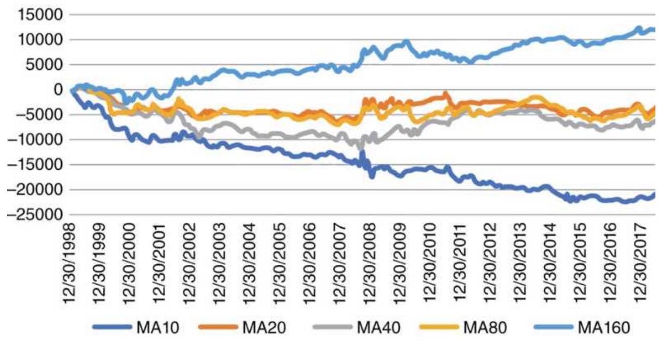
FIGURE 22.19 Moving average results for SPY using different calculation periods.
For a statistical comparison, Table 22.5 shows the correlations of daily returns for the five calculation periods. The correlations decline as the difference between the calculation periods increases. The correlation between the 10-day average and the 160-day average is very small.
TABLE 22.5 SPY Moving average correlations, 1998-June 2018.
\begin{tabular}{|l|c|c|c|c|c|}
\hline & MA 10 & MA 20 & MA 40 & MA 8o & MA 160 \\
\hline MA 10 & 1 & 0.535 & 0.316 & 0.217 & 0.152 \\
\hline & & & & & \\
\hline
\end{tabular}
\begin{tabular}{|l|c|c|c|c|c|}
\hline MA 2O & 0.535 & 1 & 0.536 & 0.413 & 0.275 \\
\hline MA 4O & 0.316 & 0.536 & 1 & 0.577 & 0.417 \\
\hline MA 8o & 0.217 & 0.413 & 0.577 & 1 & 0.605 \\
\hline MA 160 & 0.152 & 0.275 & 0.416 & 0.605 & 1 \\
\hline
\end{tabular}
\section*{Holding the Same Position}
Considering only the moving average system applied to SPY from 1998 through June 2018, we totaled the number of days that each system held that same position as each of the other systems. The results are shown in Table 22.6. Unlike the correlations, the percentages are very similar to the older ones that covered 1978 through 1984. We need to be reminded that these are trendfollowing systems, and to be profitable, they will need to be on the same side of a winning trend.
Are other trend-following methods just as similar? Looking at the most popular trending methods, the moving average (MA), exponential smoothing (EXP), linear regression slope (LRS), and breakout (BO), we found the correlations of the daily returns for SPY using a 20-day calculation period for each method, as well as an 80-day period, typical of a macrotrend system.
Table 22.7 shows the correlations of the shorter, 20-day calculation period. The averages along the bottom show that exponential smoothing had the least similarity, although 0.70 is still a high correlation. Without seeing these results, we would have expected the moving average and exponential to be most similar, and the breakout to be different from the others. The 20-day
calculation period is also sensitive to price changes, so correlations might have been lower. This points out that it is the price move that drives the systems, not the systems that cleverly uncover the price trends.
Running the same test using an 8o-day calculation period, typical of a macrotrend program, gave the results in Table 22.8. Correlations were slightly higher as all systems held their trend positions longer. However, results are very similar to the 20-day test.
TABLE 22.6 SPY Similarity of positions using different moving average calculation periods.
\begin{tabular}{|c|c|c|c|c|c|}
\hline & \multicolumn{5}{|c|}{ Similarity of positions } \\
\hline & 10 & \begin{tabular}{r}
10 vs \\
20
\end{tabular} & \begin{tabular}{r}
10 vs \\
40
\end{tabular} & \begin{tabular}{r}
10 vs \\
80
\end{tabular} & \begin{tabular}{r}
10 vs \\
160
\end{tabular} \\
\hline 10 vs 10 & - & \(77.3 \%\) & \(68.5 \%\) & \(63.7 \%\) & \(61.9 \%\). \\
\hline 10 vs 20 & \(77.3 \%\) & - & \(77.8 \%\) & \(70.2 \%\) & \(66.3 \%\) \\
\hline 10 vs 40 & \(68.5 \%\). & \(77.8 \%\) & - & \(70.2 \%\) & \(66.3 \%\) \\
\hline \begin{tabular}{l}
10 vs \\
\hline 80
\end{tabular} & \(63.7 \%\). & \(70.2 \%\) & 77.0\%. & - & \(66.3 \%\) \\
\hline \begin{tabular}{l}
10 vs \\
160
\end{tabular} & \(61.9 \%\). & \(66.3 \%\) & \(72.3 \%\) & \(81.5 \%\) & - \\
\hline
\end{tabular}
\section*{TABLE 22.7 Correlations for four trend methods using a 20-day calculation period.}
\begin{tabular}{|l|c|c|c|c|}
\hline & MA & EXP & LRS & BO \\
\hline MA & 1 & 0.658 & 0.742 & 0.771 \\
\hline EXP & 0.658 & 1 & 0.577 & 0.575 \\
\hline
\end{tabular}
\begin{tabular}{|l|c|c|c|c|}
\hline LRS & 0.742 & 0.577 & 1 & 0.746 \\
\hline BO & 0.771 & 0.575 & 0.746 & 1 \\
\hline Average & \(\mathbf{0 . 7 9 2}\) & \(\mathbf{0 . 7 0 2}\) & \(\mathbf{0 . 7 6 6}\) & \(\mathbf{0 . 7 7 3}\) \\
\hline
\end{tabular}
\section*{TABLE 22.8 Correlations for four trend methods using an 8o-day calculation period.}
\begin{tabular}{|l|c|c|c|c|}
\hline & MA & EXP & LRS & BO \\
\hline MA & 1 & 0.681 & 0.767 & 0.763 \\
\hline EXP & 0.681 & 1 & 0.577 & 0.621 \\
\hline LRS & 0.767 & 0.577 & 1 & 0.788 \\
\hline BO & 0.763 & 0.621 & 0.788 & 1 \\
\hline Average & \(\mathbf{0 . 8 0 3}\) & \(\mathbf{0 . 7 2 0}\) & \(\mathbf{0 . 7 8 3}\) & \(\mathbf{0 . 7 9 3}\) \\
\hline
\end{tabular}
\section*{High Correlation at the Best and Worst Times}
The similarity of trend-following systems presents a problem for diversification. Given the high percentage of days when different methods using different calculation periods are all holding the same long or short position, investors are exposed to more risk than they might expect. If there is an abundance of trend-following systems used to manage billions of dollars in funds, then we can expect violent sell-offs when they all try to exit their positions at the same time, or at nearly the same time.
The solution will be to diversify into different strategies, such as mean reversion, arbitrage, and pattern recognition. Managing the portfolio leverage will also be critical to avoid being highly exposed when markets
move against you. The process of controlling correlated risk, and overall risk, is discussed in the next two chapters.
\section*{NOTES}
1 Robert Townsend, Up the Organization (New York: Knopf, 1970), 36.
2 Published by John Wiley \& Sons.
3 James William Furguson, "Martingales," Technical Analysis of Stocks \& Commodities (February 1990), and "Reverse Martingales," Technical Analysis of Stocks \& Commodities (March 1990).
4 Gordon Gustafson, "Price Persistency," Technical Analysis of Stocks \& Commodities (January 2002).
5 More on Commodex can be found at their website, Commodex.com.
6 Louis P. Lukac, B. Wade Brorsen, and Scott H. Irwin, Similarity of Computer Guided Technical Trading Systems (CSFM-124, Working Paper Series, Columbia Futures Center, Columbia University Business School, New York, March 1986). Also by the same authors, "Do Similar Signals from Trading Systems Move Prices?" Futures (November 1987).
\section*{CHAPTER 23 Risk Control}
Anyone who has never made a mistake has never tried anything new.
- Albert Einstein
Every trading style has losing streaks that will ruin an investor who begins trading at the wrong time or is undercapitalized. The size of the position, the markets to trade, and when to increase or decrease leverage become important for financial survival. Systematic risks are those that can be controlled or reduced, while market risk, which can take the form of a price shock, can never be eliminated. As Andrew Lo said, "Risk is measurable but uncertainty is not," and "Opportunity lies in uncertainty because everyone that understands risk can squeeze out every bit of marginal return." 1
This chapter covers a broad range of topics related to risk, including individual trade risk, collective risk, leverage, and more on the effects of price shocks and catastrophic risk. Portfolio risk is discussed in Chapter 24. It is not possible to say that one is more important than another. In a specific situation, any one of these areas may hold the answer to preventing a substantial loss. The first part of this chapter discusses capitalization and shows why many traders are successful for months and then lose everything in only a few days. It explains the choices in dynamic leveraging and offers alternatives
of less risk. Profit-taking and stops, the two most common ways to control risk, are shown to apply to specific types of trading, but not as a generalized solution. The last section tries to identify, as soon as possible, when a system has failed to live up to its expectations.
\section*{MISTAKING LUCK FOR SKILL}
Embracing risk is as important as measuring risk. Understanding and accepting each day's losses and series of losses is essential for survival. Risk cannot be eliminated, as much as traders try to make each trade a profit or engineer systems to minimize losses. You can move the losses around, make them bigger or smaller, but you cannot eliminate them, and they will always add up to (almost) the same amount. Measuring risk as a \(10 \%\) chance of losing \(20 \%\) of your equity is not as sobering as actually losing \(20 \%\). It is even worse when you thought you could only lose \(5 \%\).
Daily price volatility gives a good approximation of short-term risk. Volatility of the daily profits and losses of a trading method provides a way to estimate how much risk must be absorbed to achieve the expected profits. Price shocks are the fly in the ointment. They add an unpredictable aspect to risk, coming at unexpected times and causing losses that can be small or very large.
A price shock represents the greatest risk for traders. \(\underline{2}\) In most cases a price shock causes a loss, but when it is a windfall profit it can be disarming. A price shock, such as \(9 / 11\), cannot be anticipated, and any profit that might
have been gained is the result of luck, not skill. Traders must realize that the profit from a price shock could have been a loss; they should assess how their account would have survived if it had been a loss. Mistaking luck for skill ignores the risk and exposes a trader to future risk for which he or she is now unprepared. Long-Term Capital Management, a home for some of the smartest financial minds, believed they could engineer the risk out of each trade by explaining away and removing all of the previous large price shocks. They failed to survive the next price shock. If you do not recognize and include these larger, infrequent losses in the performance profile, trading accounts will be undercapitalized.
The only way to reduce the possibility of loss from a price shock is to be out of the market as much as possible. This translates into two practical trading rules:
1. Choose a strategy that is not always in the market. That might involve using profit-taking or multiple trends. A trading method that is in the market only \(40 \%\) of the time has a \(60 \%\) chance of avoiding a price shock. A strategy that is always in the market will be exposed to all price shocks.
2. Try to earn as much as possible while investing as little as possible. The less you have invested, the less you have at risk. Look for strategies that have a high return when they are in the market, even if they are active only \(30 \%\) of the time. Futures and options can increase your returns with leverage as high as 20:1; however, that works against you when a price shock causes a large loss. A reduction in returns for a
larger reduction in exposure is a good trade-off.
\section*{RISK AVERSION}
Traders react differently to risk, and most are riskaverse. A primary reason for the popularity of trend systems is that they provide some degree of conservation of capital. They take small losses when prices move the wrong way and hold a trade for much longer when it shows a profit. By taking small losses, the investor can wait until a sustained trend comes along. But each trader has her personal tolerance level for risk and not all of them find conservation of capital appealing. Some are risk seeking.
Daniel Bernoulli, a famous mathematician, proposed a theory of utility in 1738 that distinguished between price and value, where price is the same for everyone but value (utility) depends on the personal circumstances of the individual. \({ }^{3}\) Bernoulli's approach defined a concept of diminishing marginal utility, shown in Figure 23.1, which indicates that as wealth becomes greater, the preference for more wealth diminishes (unlike the concept of power). In the lower left part of the chart, where the investor has a small net worth, the likelihood of accepting risk is much higher, although the magnitude of the risk is still small. When risk becomes greater all investors become cautious. Bernoulli's graph shows the curve beginning at zero and moving up and to the right in a perfect quarter-circle, ending horizontally where risk is no longer attractive. This implies that at some point, all people are risk-averse. Most people are not interested
in an even chance of gaining or losing an equal amount. As state lotteries have shown, they are interested in a very small chance of winning a very large amount. Young people with a small amount of money are willing to take greater risks, rationalizing that a small amount of savings is not significant for their future.
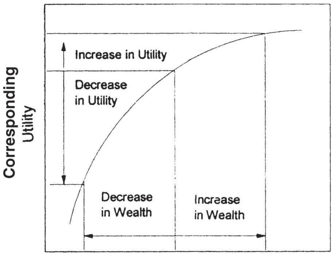
\section*{Initial \\ Wealth}
FIGURE 23.1 Changes in utility versus changes in wealth.
Source: Peter Bernstein, The Portable MBA in Investment (New York: John Wiley \& Sons, 1995), p. 38. (c) 1995 Peter Bernstein. Reprinted by permission of John Wiley \& Sons,
Inc.
Other theories that have been proposed are that the market maximizes the amount of money lost and the market maximizes the number of losing participants. All of these concepts appear to be true and are helpful in understanding how the market functions.
\section*{Risk Preference}
The Bernoulli theory of utility recognizes that each investor has his or her unique objectives and attitudes toward risk. Some investors would like to keep risks low and returns steady; more speculative investors would risk a sizable amount of their capital for a chance at a larger return. This trait is called the investor's risk preference. The risk preference, \(P\), or utility of an investor for a specific venture (in this case a trade) can be found by adding the expected value of the investor's utilities or preferences, \(P_{i}\), for the various outcomes of that event:
\[
P=w_{1} p_{1}+w_{2} p_{2}+\cdots+w_{n} p_{n}
\]
where
\[
\begin{aligned}
\sum_{W_{i}} & =1 \\
n & =\text { possible outcomes }
\end{aligned}
\]
The weighting factors may be the results of personal bias or may be the calculated probabilities of each outcome. For example, consider a gold trade that has a likely profit of \(\$ 4,000\) and a risk of \(\$ 1,500\). For convenience, adjust
the reward values by dividing by 1,000 . If the probability of success is \(60 \%\), the total utility of the trade is:
\[
P(\text { trade })=0.60 \times 4+0.40 \times(-1.5)=1.8
\]
If the probability of success were increased, the utility \(P\) would increase linearly. But investors do not feel the same about different rewards. Given a scale of o to 100 (negative to positive reaction), an investor may rank a \(60 \%\) chance of a \(\$ 4,000\) profit and a \(40 \%\) chance of a \(\$ 1,500\) loss, both as a 65 . If the reward is increased to \(\$ 8,000\) while the risk remains at \(\$ 1,500\), the investor might only raise the preference of the trade to 80 , although the utility would be 4.2 , more than twice as large.
The various curves drawn through the computed utilities represent the risk preference of the individual. Figure 23.2 shows these curves progressing from extreme risk aversion to extreme risk seeking. As the risk increases in (1), the trader is risk-averse and less likely to participate in the trade; in (3), there is equal chance of taking the trade at all risk levels; and in (5), the trader is risk seeking and is more likely to enter a trade that has higher risk.
\section*{The Efficient Frontier}
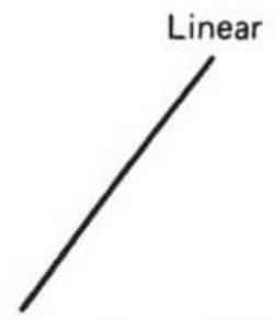
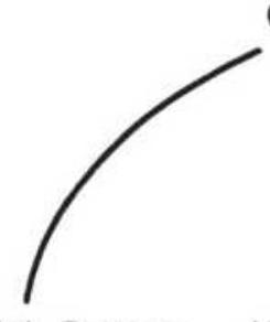
(1) Extreme risk averter
(2) \(\begin{aligned} & \text { Moderate } \\ & \text { risk averter }\end{aligned}\)
(3) Neutral to risk
(4) risk seeker
(5) Extreme risk seeker
\section*{FIGURE 23. 2 Investor utility curves.}
Source: R. J. Teweles, C. V. Harlow, and H. L. Stone, The Commodity Futures Game: Who Wins, Who Loses, Why? (New York: McGraw-Hill, 1974), p. 133. (C) 1974. Reprinted with permission of The McGraw-Hill Companies.
A large number of performance profiles result from combining trading strategies, a diverse selection of stocks, futures, ETF, and funds, and the amount of leverage used. Each of these investments can be described in terms of its annualized rate of return (AROR) and its annualized risk (ASTD). Risk is most often the standard deviation of the annualized returns; however, other measurements will be discussed in the next sections. They are repeated here for convenience, using daily returns \((r)\), the net asset value (NAV), and the number of days in the calculation \((n)\) :
\[
\begin{aligned}
\operatorname{AROR} & =\left[(\operatorname{NAV}(t-n) / \operatorname{NAV}(n)]^{\wedge}(252 / n)-1\right. \\
\operatorname{ASTD} & =\operatorname{STDEV}(r, i) * \operatorname{SQRT}(252), i=t-n+1 \text { to } n
\end{aligned}
\]
The efficient frontier is a way of visualizing which choices would be made by any rational investor. Suppose there were 8 different investment programs, and each
reported their annualized rate of return and the annualized risk. These could then be plotted in Figure 23.3. Let us also assume that these investments represented a good sample of all risk-and-return combinations.
A rational investor is one who wants the highest return for the lowest risk. Therefore, given a choice between investment \(D\) and investment \(C\), we would choose \(C\) because it had the same risk but a substantially higher return. Similarly, if we were given a choice between investment \(D\) and investment \(A\), we would choose investment \(A\) because it has the same return with a much lower risk. Given a choice of any two investments, displayed on a chart of risk and return, a rational investor will always choose the one that is higher and to the left.
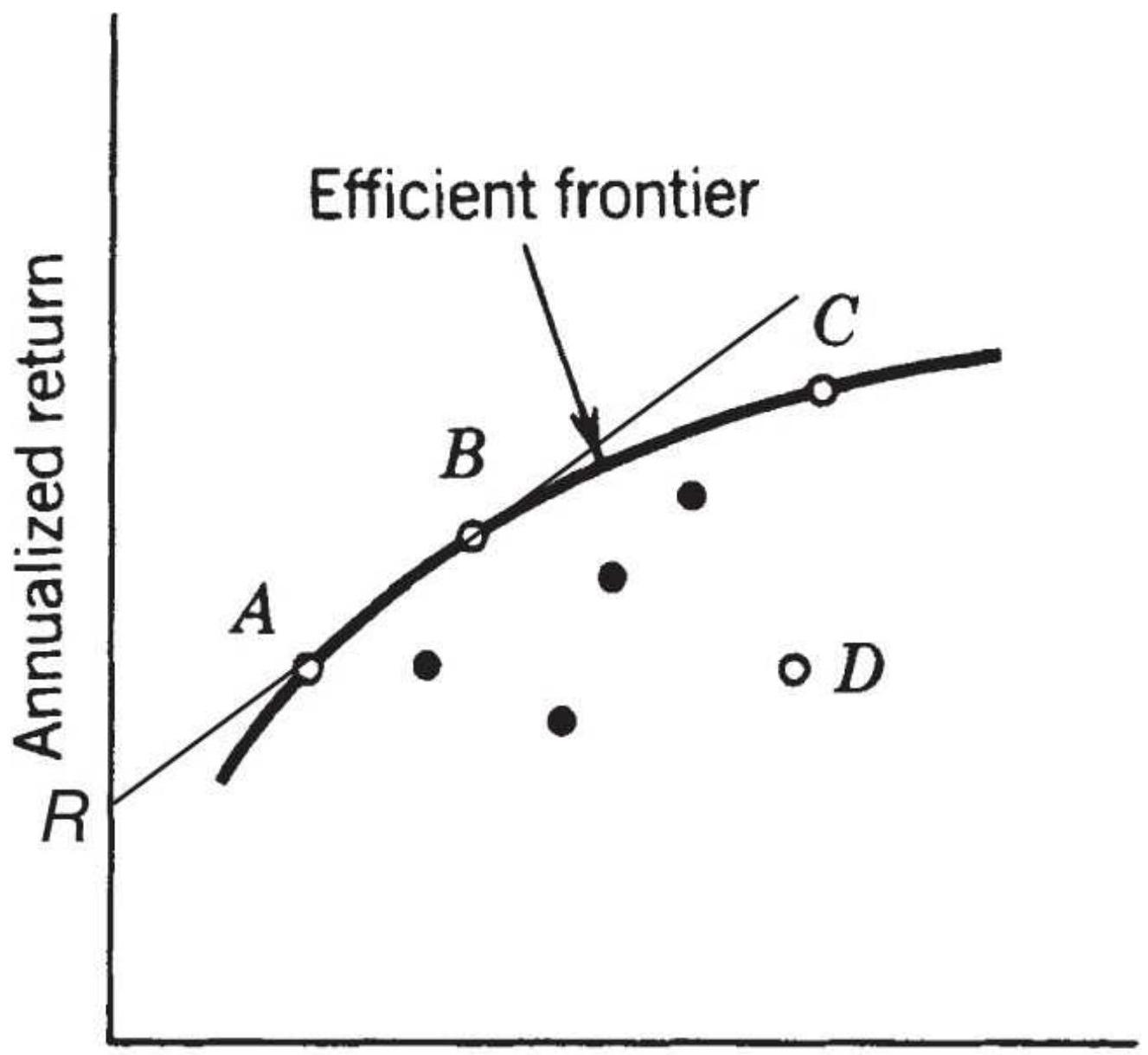
\section*{Risk measurement}
FIGURE 23.3 The efficient frontier. The line drawn from \(R\), the risk-free return, touches the efficient frontier at the point of best return-to-risk ratio, \(B\).
The efficient frontier is a curve plotted through those investment alternatives that have the highest returns for a given risk, or the lowest risk for a given return. An investor seeking greater returns with a higher tolerance for risk will choose an investment further to the right on
the curve; one with a lower risk tolerance must select a program farther to the left and lower, with less return. The optimal point on the efficient frontier is where the return-to-risk ratio (AROR/ASTD) is a maximum. This is also the point where a line, drawn from the risk-free return \((R)\) on the left scale upward to the right, is tangent to the curve. Nevertheless, not all investors choose this point because the absolute level of risk may be too high, or the absolute returns too low. Investors' risk preferences are personal and unique. Finding the optimal portfolio selection is discussed in detail in Chapter 24.
\section*{Common sense Management of Risk}
Risk control is as much an issue of common sense as it is complex rules and mathematics. While most of this chapter shows how various rules, measurements, and leveraging techniques can reduce risk, successful traders have applied common sense, without complex formulas, for a long time. Some of these principles are:
1. Only risk a small amount of total capital on any one trade. The total amount risked should allow you to comfortably survive a number of losses in a row. No trade should ever risk more than \(5 \%\) of the invested capital.
2. Know your exit conditions in advance. There should be a clear exit criterion for every trade, even if the exact loss cannot be known in advance.
3. Large profits mean large risk. If the average profit
or average loss is too large relative to the investment, then smaller positions should be taken.
4. Exit a trade quickly. Exit a trade as soon as you recognize that something is wrong. Don't try to manage the loss. Many floor traders believe that the smartest trader is the first one out.
5. Don't meet margin calls. Experienced traders believe that a margin call is an objective statement of a trade that's gone wrong, or a system that is not meeting expectations. It is a time to review trading performance rather than invest more.
6. Liquidate your worst position first when lightening \(u p\). The profitable trades have proved that they are performing properly; the losing ones have proved they are not. Stay with the good positions and liquidate the worst.
7. Be consistent with your trading philosophy. If you are a trend follower, then keep losses small and let profits run. You cannot be a trend follower by taking the first profit that you see.
8. Plan for contingencies. Nothing ever goes as planned, and you must be prepared for infrequent but important exceptions, such as a price shock. Do not be undercapitalized.
\section*{LIQUIDITY}
The ability to implement any trading program depends on the liquidity of the market. Lack of liquidity results in
poor executions. A liquid market does not necessarily mean good fills, but an illiquid market assures bad ones. Two types of illiquidity most often encountered in the markets are:
1. Fast markets, in which there are mostly buyers or sellers, and few traders willing to take the other side of the position.
2. Inactive markets, usually a small-cap stock, deferred futures contracts, and many ETFs, where there is less commercial or institutional interest.
The fast market is the reaction to news or an economic report where everyone has the same interpretation of the direction that prices should move. In futures this may be combined with a supply/demand imbalance or a perceived imbalance. Once a large number of buy orders flood the market, specialists, market makers, and locals all stand aside (or widen the bid-asked spread and offer very small quantity) rather than be run over. The few arbitrageurs, hedgers, and risk-seeking traders willing to take the opposite position do little to offset the vast number of orders that continue to push prices in one direction. In an illiquid market, a large premium must be paid to attract another trader to take the opposite side. This only succeeds when the bid or offered price clearly appears to give the other trader a significant advantage.
Ginter and Richie \({ }^{4}\) have described the cost of execution in terms of order size, volume, and the speed of the market, in a single formula that applies to the futures markets, but could be adapted to individual equities:
\section*{\(c=K \times \frac{Q \times V}{L_{c} \times L_{o}}\)}
where
C = cost of execution due to liquidity
\(\ell=\) size of the order entered
I = volatility of the market
\(L_{\text {}}=\) volume of the market (all contract months for futures or possibly the combined volume of highly correlated equities)
\(l_{1}=\) volume of the specific delivery month or individual equity
\(K=\) constant factor
The volatility \(V\) might be the daily price range, annualized volatility, or implied volatility. This provides a way to measure how much volume would move the market a specified number of points. The total volume (liquidity) \(L_{c}\) is important because it implies liquidity due to interdelivery spreading in futures. If applied to stocks, added liquidity may come from activity in a closely correlated industrial group. Volume also serves as a measurement of the general interest in the product or in the related stock group. Increased trading in other futures delivery months, or in similar stocks, is a sign of growing interest.
The constant factor \(K\) varies according to the type of the execution order being placed and the current direction of
the price. If prices are moving higher and a buy order is placed, \(K\) will be large; if prices are moving higher and a sell order is placed, \(K\) will be smaller. The investor can see that transaction costs, including commissions and execution slippage, will have considerably greater impact on systems that trade more often, have smaller average profits, and trade in the direction of the trend. Given a choice between systems of equal gross profits, the investor should favor the method of fewest trades in the most liquid markets.
\section*{MEASURING RETURN AND RISK}
Risk and return are the two most important criteria for measuring performance and for determining that one trading method is better than another. Looking at only returns is not enough. However, the ways in which these and other measures can be combined to express the quality of performance varies considerably. For example, returns are often the annualized rate of return (AROR), but they can also be expressed as the slope of a straight line drawn through the daily or monthly returns. Risk has many more variations from the annualized standard deviation of returns (ASTD) to measurements of drawdown and time to recovery. The following section gives an overview of these alternatives.
\section*{Risk Characteristics of a Trading Model}
Measuring risk or returns can be applied to any strategy that has produced historic results, whether real or theoretical. The use of actual trading results is always
better because it will show larger equity swings than hypothetical performance. Hypothetical results are always optimistic. In some cases, techniques such as analyzing trends of daily returns do not improve theoretical results but can be a great benefit in real trading.
When you compare performance using any return/risk ratio, you are looking for some point on the efficient frontier. That is, any program with a higher return but the same risk will be preferable, and any program with the same return but a lower risk will be preferable.
\section*{Daily, Monthly, or Annually}
Government reporting requires that returns be shown using monthly data, and most professional managers present their results in that way. Monthly returns always look better than results based on daily returns because they are inherently smoothed. It is unlikely that the endof-month net asset value (NAV) will be either the lowest or highest of the month. Similarly, annual results are smoother than monthly.
\section*{The Sharpe Ratio and Variations}
The classic measurement of performance is the Sharpe ratio (SR), devised by William F. Sharpe, expressed as:
\[
S R=\frac{A R O R-R F}{\sigma}
\]
where
\(A R O R=\) the annualized rate of return
\(R F=\) the risk-free interest rate (usually the 3-month rate)
\(\sigma=\) the standard deviation, or fluctuation, of the periodic returns (the annualized volatility)

Applying the calculations for AROR and ASTD shown earlier to the data in Table 23.1, we get the results shown at the bottom of the table. The same spreadsheet can be found on the Companion Website as TSM Calculation of the Sharpe Ratio.
\section*{Interest Income}
TABLE 23.1 A spreadsheet to calculate the Sharpe ratio.
\begin{tabular}{||c|c|c|c|}
\hline & A & B & \multicolumn{1}{c|}{ C } \\
\hline 1 & Date & Close & \multicolumn{1}{c|}{ Return } \\
\hline 2 & \(1 / 2 / 2018\) & 266.50 & \\
\hline 3 & \(1 / 3 / 2018\) & 268.19 & 0.00634 \\
\hline 4 & \(1 / 4 / 2018\) & 269.32 & 0.00421 \\
\hline 5 & \(1 / 5 / 2018\) & 271.11 & 0.00665 \\
\hline 6 & \(1 / 8 / 2018\) & 271.61 & 0.00184 \\
\hline 7 & \(1 / 9 / 2018\) & 272.22 & 0.00225 \\
\hline 8 & \(1 / 10 / 2018\) & 271.81 & -0.00151 \\
\hline 9 & \(1 / 11 / 2018\) & 273.79 & 0.00728 \\
\hline 10 & \(1 / 12 / 2018\) & 275.57 & 0.00650 \\
\hline 11 & \(1 / 16 / 2018\) & 274.63 & -0.00341 \\
\hline 12 & \(1 / 17 / 2018\) & 277.25 & 0.00954 \\
\hline 13 & \(1 / 18 / 2018\) & 276.78 & -0.00170 \\
\hline 14 & \(1 / 19 / 2018\) & 278.04 & 0.00455 \\
\hline 15 & \(1 / 22 / 2018\) & 280.30 & 0.00813 \\
\hline 16 & \(1 / 23 / 2018\) & 280.90 & 0.00214 \\
\hline 17 & \(1 / 24 / 2018\) & 280.79 & -0.00039 \\
\hline 18 & \(1 / 25 / 2018\) & 280.91 & 0.00043 \\
\hline 19 & \(1 / 26 / 2018\) & 284.16 & 0.01157 \\
\hline 20 & \(1 / 29 / 2018\) & 282.28 & -0.00662 \\
\hline 21 & \(1 / 30 / 2018\) & 279.38 & -0.01027 \\
\hline 22 & \(1 / 31 / 2018\) & 279.52 & 0.00050 \\
\hline 23 & & \(82.4 \%\) & \(8.72 \%\) \\
\hline 24 & & AROR & AVol \\
\hline
\end{tabular}
\section*{Calculating the information ratio}
Put the date and closing price in columns A and B .
Calculate the daily returns in column C. For example, B5/B4-1 = 271.11/269.32-1=0.00665.
At the bottom of column B calculate the annualized rate of return, AROR as:
\[
(\mathrm{B} 22 / \mathrm{B} 2)^{\wedge}(252 / 20)-1=82.4 \%
\]
At the bottom of column C calculate the annualized volatility as:
\[
\begin{aligned}
& \operatorname{STDEV}(\mathrm{C} 3: \mathrm{C} 22) * \operatorname{SQRT}(252) \\
& =8.72 \%
\end{aligned}
\]
The information ratio is AROR/AVOL \(=\) \(0.8240 / 0.0872=9.45\).
This ratio is very high because January 2018 was an exceptionally good month for stocks and the AROR assumes the returns will continue at that rate.
For practical purposes, the risk-free return \((R F)\) is often omitted, with the simplified form called the information ratio, discussed in the next section. You do not want to eliminate \(R F\) if you have included interest on unused capital in your returns. Many trading programs that are
out of the market more than \(20 \%\) should be earning interest on the idle funds.
For futures trading, interest can be earned daily on a large part of the market-to-market value of the account. For a comparison of different investments, it is necessary to specifically identify which returns include interest income. For system testing, all performance would subtract the same risk-free return; therefore, omitting it would not change the ranking of successful systems.
\section*{Information Ratio}
The information ratio (IR) is calculated as:
\[
I R=\underline{A R O R}
\]
\section*{\(\sigma\)}
The Sharpe and information ratios satisfy the criterion that, all else being equal (primarily risk), higher profits are better. It does not satisfy either of the other criteria illustrated in Figure 23.4 because it cannot distinguish between:
1. Consecutive small losses (System B) and alternating small losses (System A), shown in Figure 23.4a.
2. Large surges of profits and large losses, shown in Figure 23.4b.
Clearly, System \(A\) is best in both cases.
\section*{Geometric Ratio}
Because ratios are similar to percentages, it may be more
accurate to take the geometric ratio of the daily returns rather than the annualized rate of return. \({ }^{5}\) The calculation for the ratio \((G R)\) would be:
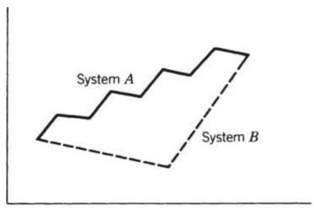
(a)
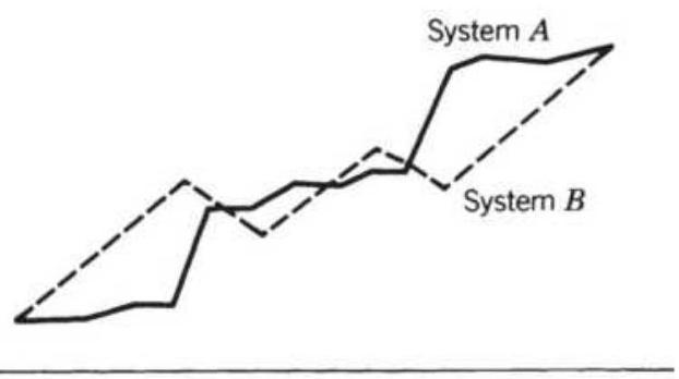
(b)
FIGURE 23.4 Two cases in which the Sharpe ratio falls short. (a) The order in which profits and losses occur. (b) Surges in profits versus evenly distributed losses.
\[
G R_{t}=\left(r_{t-n+1} \times r_{t-n+2} \times \cdots \times r_{t}\right)^{1 / n}
\]
\section*{Treynor Ratio}
In the Treynor ratio (TR), the annualized return less the risk-free return, \((R F)\), is divided by beta, the relative volatility of the current portfolio compared to a benchmark, usually the S\&P.
\[
T R_{t}=\frac{A R O R_{t}-R F}{\beta_{t}}
\]
The Treynor ratio isolates excess return. The portfolio beta is the sum of the weighted individual stock betas within the portfolio. If the fund has a beta of 1.2 , then it
is \(20 \%\) more volatile than the overall market, in this case the S\&P.
\section*{Palagi Ratio}
Alessandro Palagi divides the Sharpe ratio by the product of the maximum percentage drawdown and the deviation from a straight line. The intention is to favor returns that have smaller drawdowns and smaller variation from the annualized rate of return, an overall smoother performance profile. The Palagi ratio \((P R)\) is:
\section*{Sharpe ratio}
\section*{\(P R_{t}=\frac{\text { MaxDD } \times S_{t D e v}(\text { Residuals) }}{\%}\)}
where both the maximum drawdown and the linear regression residuals are calculated over the same data interval as the Sharpe ratio.
\section*{Average Maximum Retracement}
Schwager \({ }^{6}\) has presented a comprehensive study of riskand-return evaluation techniques but seems to favor the Average Maximum Retracement (AMR). This method finds the average equity drawdown, the difference between the current value in the account and the highest past value, ignoring all days when equity was on new highs.
\[
A M R_{t}=\frac{1}{n_{n}} \sum_{l=-n+1}^{i} \operatorname{POS}\left(M C E_{i}-T E_{l}\right)
\]
where
\[
\operatorname{POS}(X)= \begin{cases}x & \text { if } x>0 \\ 0 & \text { if } x<0\end{cases}
\]
and
\(M C E=\) maximum closed-out equity (realized profits) on any trade entry date prior to \(i\)
\(T E_{i}=\) total equity on day \(i\)
\(n=\) total number of days of equity data or the calculation period
When \(T E_{i}>M C E_{i}\), the equity is on a new high and all traders will have a profit on day \(i\), regardless of when they began. Schwager suggests that a much simpler computation would use only the low equity day of each month; it would give a rough but good approximation.
Measuring only the drawdowns is a concept similar to semi-variance and is valuable because the distribution of profitable returns compared to losing returns is not symmetric; therefore, the standard deviation does not express it correctly and may bias the results in favor of profitable days. If the profitable days are less volatile, it gives you an understated picture of risk.
\section*{Largest Loss and the Calmar Ratio}
Measurements such as Schwager's \(A M R\), and even the basic standard deviation, are good for comparing the long-term performance of one system against another; however, they lack the reality of simply looking at the largest loss seen over the test period. John Sweeney calls this the maximum adverse excursion, \({ }^{7}\) advocating that traders should minimize the size of their largest loss.
Consider the standard deviation of equity changes, showing that in any month there is a \(68 \%\) chance that your returns will be between \(15 \%\) and \(-5 \%\) (a mean of \(5 \%\) and a standard deviation of \(10 \%\) ). There is only a \(2.5 \%\) chance that you will lose more than \(15 \%\) in one month (2 standard deviations, one sided); therefore, there is a \(50 \%\) chance you will lose that \(15 \%\) in one of the first 20 months ( \(20 \div 2.5\) ). For most traders, these probabilities do not translate into the actual amount of loss.
The largest historic loss, called the maximum drawdown, is a practical alternative. It simply states that the trading program did lose \(15 \%\) during one month of a 3 -year test. While it is likely that the program will have a larger loss in the future, you must be prepared for a \(15 \%\) loss in a single month. The relationship of the drawdown to the returns is expressed as the Calmar ratio:
\section*{Calmar ratio \(_{t}=\frac{\text { AROR }_{t}}{\text { Max Drawdown }_{t}}\)}
where max drawdown as of day \(t\) is the largest historic drawdown, peak to valley, from the beginning of the data to today.
Using the historic drawdown is practical but not without problems. In the previous chapter on testing, there were many cases where the final system profile benefitted from unintentional overfitting. Even when parameters were chosen from a robust section of the test surface, they might all have looked good because the timing avoided a particularly bad price shock. Then the theoretical maximum drawdown might be understated. Even if not overfitted, the future always brings larger profits and especially larger drawdowns.
\section*{Sortino Ratio}
A variation on both the Sharpe ratio and semivariance, the Sortino ratio includes only the downside risk in the denominator and replaces the risk-free threshold with a minimum acceptable return (MAR) in the numerator. The Sortino ratio is calculated as:
\[
S R_{t}=\frac{A R O R_{t}-M A R}{\sigma\left(P E_{t}-E_{t}\right)}
\]
\(M A R\) may be the risk-free rate of return or any other threshold set by the investor. The denominator is the standard deviation of all the negative equity excursions, the difference between the peak equity \((P E)\) and the current equity ( \(E\) ), not equal to zero, on each day during the calculation period.
\section*{Ulcer Index}
Investors have increased anxiety as current returns drop farther below the highest returns previously achieved. This can be measured by the Ulcer Index \((U I)^{8}\) a form of semi-variance, similar to Schwager's Average Maximum Retracement, that produces a statistical measure of relative declines on all days that were not new high returns.
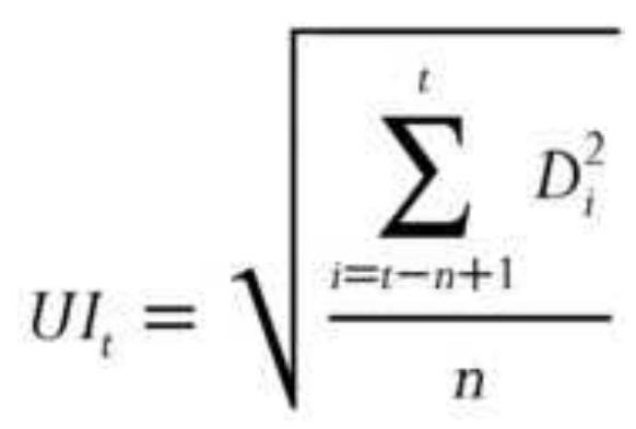
where
\(D=\) the difference between the peak equity as of day \(i\) and the actual equity on day \(i\). Days where \(\mathrm{D}=0\) are not used.
\(n=\) the number of days used when \(D\) is not 0 .
If the equity on day \(i\) is a new high equity, then \(D_{i}=0\). As \(U I\) increases, investors are more anxious about performance.
\section*{Time to Recovery}
A trading program that recovers quickly from losses is more desirable than a program that lingers at its lowest level of loss. The fact that a program recovers quickly
does not change its maximum drawdown, but it will change the annualized volatility, measured using a standard deviation, or any statistic that averages the daily negative excursions. Given two systems with the same maximum drawdown, the one that recovers sooner is best.
\section*{Decaying Performance}
The most common calculation of returns is the average of the individual annualized returns; therefore, if a trading program returned \(24 \%, 18 \%, 20 \%, 15 \%\), and \(19 \%\) in 5 consecutive years, most investors would see this as an average return of \(19.2 \%\). Another equally valid method is to find the slope of a straight line through the cumulative returns, \(24 \%, 42 \%, 62 \%, 77 \%\), and \(96 \%\). This gives the annualized returns as \(17.9 \%\) because it reflects the slight tendency for returns to decline.
A systematic way of determining if your system worked better in the past but has been struggling in more recent markets is to find the slope through the annualized returns (monthly or quarterly returns if there is much less data). If the slope is rising or sideways, then the system is performing well. If the slope is noticeably declining, then performance is decaying; it is not adjusting to current or changing markets.
\section*{Can the Risk Be Greater Than the Numbers Show?}
Many of the risk measurements described in this section express the probability of a future loss. Within reason,
many of them succeed, with VaR being the most likely (described later in this section). An investor must distinguish between the calculated probability and the effects of a real loss. If there was only a \(1 \%\) chance of a \(50 \%\) loss in a single month, then by the 50th month there would have been a \(50 \%\) chance of a \(50 \%\) loss. There is also a large error factor in most of these calculations because the amount of data used to find the statistics was too small. If 100 cases were used, the results are accurate to \(\pm 10 \%\). Confidence in the measurement also depends on the period in the market that was used to create these values. The risk in crude oil was exceptionally high during the Gulf War and then again in 2007. If those periods are not included, the results will not reflect the future risk of trading crude oil.
\section*{Potential Risk}
Risk is never a single value; it is a probability, and the standard deviation is the tool most often used for finding that relationship. Even when a drawdown occurs that is larger than the previous maximum drawdown, there is still a small chance that another, even larger drawdown will occur. It is unreasonable to think that all future losses will be smaller than the maximum already experienced. This potential for loss can be expressed in two different calculations over \(n\) days:
1. Probability of a drawdown (DP). This is essentially the methods used by Schwager and the Ulcer Index.
Calculate the standard deviation of all daily drawdowns, \(D_{i}\), measured from the most recent
equity high to today's equity value. When the today's equity is also a new high equity, the value used is zero,
\section*{\(D P=\operatorname{stdev}\left(D_{i}\right)\)}
where \(i=1, n\), and \(n\) is only those days where a drawdown existed, that is, \(D_{i} \neq 0\).
2. Semivariance (SV). Calculate the linear regression of the equity stream or NAV, then find the standard deviation of all negative residuals, \(D_{i}\), below the corresponding value of the straight line fit, \(p_{i}^{\prime}\).
Semivariance will produce a smaller value than \(D P\) because the values on the straight line will be lower than the peak equity.
With either measure, \(D P\) and \(S V\) represent the value of 1 standard deviation; therefore, there is a \(16 \%\) chance that there will be a drawdown greater than \(D P\) or \(S V\) over the next \(n\) days. There is only a \(2.5 \%\) chance of a drawdown of twice that amount over the next \(n\) days.
Either of these measurements can be used to form a ratio of return to risk, called a drawdown ratio \((D R)\) :
\[
D R_{t}=A R O R_{t} / D P_{t} \text { or } D R_{t}=A R O R_{t} / S V_{t}
\]
where
\section*{\(A R O R_{t}=\) the annualized return on investment as of day \(t\)}
These ratios satisfy all three of the original criteria:
higher profits are favored because the rate of return is in the numerator, the order of profits and losses will result in larger and smaller net equity drops, and large gains are not penalized because only the drawdowns are used to measure risk.
Conservative investors may want to avoid some potential problems in these ratios. Systems will have greater risk than the measure shows if:
1. They are tested with smaller samples.
2. They have few historic equity drops (also likely to be a poor sample).
3. They concentrate on fewer product groups (not well diversified).
4. They compound positions.
\section*{Value at Risk}
Value at Risk (VaR) is used in most companies to assess whether the current market positions are likely to produce a loss that is unacceptably large over the next few days. It attempts to anticipate risk, even though it is accomplished using historic data. VaR is the probability of loss of the current portfolio positions based on past price movement. For example, Bank Two holds large short positions in fixed income futures to protect loan commitments at current levels. They also hold a wide variety of foreign currencies, of which \(50 \%\) are hedged with forward contracts. If interest rates drop or the U.S. dollar strengthens, they could show large losses in their futures positions. According to bank policy, the loss
allowed in a single day must be kept under \(0.5 \%\) of cash value of these commitments. If there is a potential risk exceeding that amount, the futures position must be immediately reduced.
\(V a R\) is a combination of cross-correlations between markets for which there is exposure, the position sizes, the volatility of those markets, the projected time period over which the risk will be forecast, and a confidence interval to determine the risk tolerance. Using the return series for the interest rate and FX exposure held by Bank Two, the variance-covariance solution for VaR can be calculated as: 9
\section*{\(V a R=\sqrt{\sigma_{I R}^{2}+\sigma_{F X}^{2}+\left(2 \times \rho_{I R, F X} \times \sigma_{I R} \times \sigma_{F X}\right)}\)}
where
\(\sigma=\) the standard deviation of the return series for the individual markets
\(\rho=\) the cross-correlation between the two return series
In this example, the return series reflects the position size and volatility of the exposure. This formula implies a VaR projected period of 1 day.
For example, Bank Two holds 1 million in EURUSD, which have a daily standard deviation of \(0.565 \%\). If the current EURUSD rate is 1.25 , then the market value of the position is USD 1.25 million. It also holds a EUR 1 million position in 10-year Eurobunds, which show a standard deviation of \(0.605 \%\) and a market value of USD
1.25 million. Using 1.65 standard deviations to represent the \(95 \%\) confidence level, we make the assumption that \(r_{i} / \sigma_{I}\) is normally distributed, and the EURUSD exchange rate should not drop more than
\(0.565 \times 1.65=0.932 \%\) (less than \(1 \%\) ) on a single day, \(95 \%\) of the time. The Eurobunds should drop less than \(0.605 \times 1.65=0.998 \%\) on a single day. We could then expect the approximate risk of the FX position to be
\section*{USD1.25 mil \(\times 0.932 \%=\) USD 11,650 and the} risk of the Eurobund position to be
\(\$ 1.25 \mathrm{mil} \times 0.998 \%=\) USD 12,475 over the next 24 hours.
The total risk of the FX and Eurobund positions is not the sum of the two risks, because correlations between the two markets may show that price movement of one market is partially offset by opposite movement in the other market. In this example, the correlation of the returns of two markets is -0.27 , showing that there is a noticeable offsetting effect. Applying these values to the previous formula gives:
\[
V a R_{t}=\sqrt{12475^{2}+11650^{2}+(2 \times-0.27 \times 12475 \times 11650)}
\]
\[
V_{a} R_{t}=\text { USD } 17,068
\]
The Value at Risk for the next 24 hours is far less than the sum of the two individual market risks because their price movements tend to offset each other.
A more general calculation of VaR uses separate values for the underlying prices, the position size, the time period, and the confidence interval. For three assets, this is:
\(V a R_{i}=C I \times \sqrt{P}\)
\[
\times \sqrt{\begin{array}{c}
w_{1}^{2} x_{1}^{2} \sigma_{1}^{2}+w_{2}^{2} x_{2}^{2} \sigma_{2}^{2}+w_{3}^{2} x_{3}^{2} \sigma_{3}^{2}+2 w_{1} w_{2} x_{1} x_{2} \sigma_{1} \sigma_{2} r_{12} \\
+2 w_{1} w_{3} x_{1} x_{3} \sigma_{1} \sigma_{3} r_{13}+2 w_{2} w_{3} x_{2} x_{3} \sigma_{2} \sigma_{3} r_{23}
\end{array}}
\]
where
\(\mathrm{Cl}=\) the confidence interval (expressed as 1.65 standard deviations for a \(5 \%\) probability)
\(P=\) the VaR calculation period (5 is a projected period of 5 days)
\(w_{i}=\) the weighting factor, or relative position size
\(x_{t}=\) the current value or price of the asset on the current day \(t\)
\(\sigma_{i}=\) the annualize volatility, shown below
\(r_{i j}=\) the cross-correlation between market \(i\) and market \(j\)
Cross-correlations can be found using the spreadsheet function correl, or can be calculated directly from the formula in Chapter 6. The volatility, \(\sigma_{i}\), is calculated using the prices, \(x_{i}\), over \(n\) days, as the standard deviation of the price changes, annualized:
\[
\begin{gathered}
\sigma_{i}=\sqrt{252} x_{\text {stter }\left(d_{l}\right)} \\
d_{i}=\frac{x_{t}-x_{x_{t-1}}}{x_{i-1}} \text { orer the past ndays }
\end{gathered}
\]
The square root of 252 is used to annualize the daily values.
In the practical implementation of risk control, VaR would be calculated before the close of trading and, if its value exceeds the threshold amount, action can be taken to reduce the exposure on the same day.
\section*{Generalized VaR Calculation}
The probability of loss at the end of a forecast period, \(P_{E}\) , is calculated as the difference between the cumulative percentage loss over that period and the cumulative expected return. Dividing this value by the cumulative standard deviation and applying the standard deviation of a normal distribution gives a probability estimate. \(\underline{10}\)
\[
P_{E}=N\left[\frac{\ln (1+L)-\mu T}{\sigma \sqrt{T}}\right]
\]
where
\(N[]=\) the cumulative normal distribution function, NORMDIST in Excel
\(L=\) the cumulative percentage loss in periodic units
\(\mu=\) the annualized expected return in continuous units
\(T=\) the number of years in the horizon, where 1 day is \(1 / 252\)
\(\sigma=\) the standard deviation of continuous units
In this process, the compounding of periodic returns results in a lognormal distribution while the continuous returns and standard deviation are normally distributed. When using VaR, this calculation is changed to specify the probability, \(Z\), and solve for the size of the threshold loss.
\[
V a R=-\left(e^{\mu T-Z \sigma \sqrt{T}}-1\right) W
\]
where:
\(e=\) the base of the natural logarithm (2.7128)
\(Z=\) the chosen probability deviate (for example, \(5 \%\) is 1.65)
\(W=\) the initial value of the asset
The result of this calculation gives the probability of loss at the end of the period, \(T\), and does not reflect any losses that might have occurred within the period (if \(T\) is greater than 1 day). Losses during the period will always be at least as large as the loss at the end of the period.
\section*{A Simpler Way to Calculate Value at Risk}
There are three ways to calculate Value at Risk: variance-
covariance, historical, and Monte Carlo. The section above discussed the classic variance-covariance approach, but most analysts will find the historical method easier to implement, intuitively simpler, and it can be done on a spreadsheet. It is important to remember that the result is only accurate when the past data represents what is likely to happen in the future. Referring to Table 23.2, first set up the data:
1. Row 4: The 7 futures markets in the portfolio
2. Row 5: The current position size (negative means a short position).
3. Row 6: The conversion factors (big point values) for each market in row 6
\section*{TABLE 23.2 VaR calculations on a spreadsheet.}
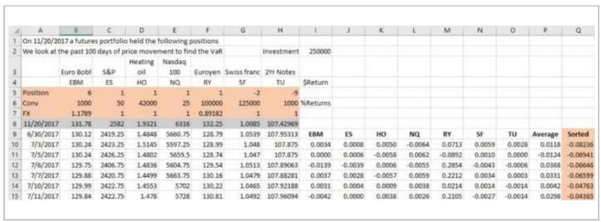
4. Row 7: The current FX value for each market in row 4
5. Row 8: The current price for each market in row 4
6. Rows \(9-107\) : The past 99 days of prices aligned under each market (more if you want more accuracy)
In each row:
■ Calculate the daily return for each market using today's position size (row 5) and the prices in row 10 , then 11 , etc.
Put the market returns in columns I through O and the average return for all markets in column \(P\).
When done with 100 days, copy and paste the values from column P into the next column, Q, and sort Q , smallest to largest, so that the biggest loss is at the top.

Because there were 100 days used, the loss representing a \(5 \%\) probability will be the 5 th entry down, -0.0473. Then there is a \(5 \%\) chance of losing \(4.73 \%\) today. This spreadsheet example can be found on the Companion Website as VaR Example Using Futures.
Mathematically, the process is: 11
1. Given \(n\) markets or assets, each with positions (contracts or shares) \(w_{1}, w_{2}, \ldots, w_{n}\).
2. Calculate the returns for the past \(k\) days
\((k=100)\) as \(r_{i}=p_{i} / p_{i-1}-1\),
\(i=t-k+1, t\).
3. Calculate the total returns for day \(i\) as
\(R_{i}=w_{1} r_{1 i}+w_{2} r_{2 i}+\ldots+w_{n} r_{2 i}\). Include the forex and conversion factors (for futures) if applicable so that the total returns are all in USD, euros, or any single currency.
4. Find the average, \(\bar{R}\), and standard deviation, \(s\), of \(R\) over the \(k\) days.
5. Given a confidence level specified in standard deviations (e.g., \(99 \%=2.33\) ), the \(\operatorname{VaR}\) for the current day, \(t\), is \(\bar{R}-2.33 \mathrm{~s}\). VaR is always expressed as a negative number.
\section*{Hindenburg Omen}
The Hindenburg Omen \({ }^{12}\) is a price pattern that attempts to forecast a stock market downturn. It is named after the famous Hindenburg disaster of May 6, 1937, during which the German Zeppelin Hindenburg exploded and burned. The basis for the calculation is Norman Fosback's High Low Logic Index (HLLI), which is the lesser of the NYSE new highs or new lows divided by the number of NYSE issues traded, then smoothed using an exponential moving average. The premise is that, under normal conditions, a large number of stocks either makes new highs or new lows, but not both at the same time. That situation indicates instability. The original rules are:
The number of NYSE new 52 -week highs and the number of new 52 -week lows must be greater than or equal to \(2.8 \%\) of the total issues that advance or decline that day.
- The NYSE index is greater than it was 50 trading days ago.
- The McClellan Oscillator is negative.
- The new 52-week highs cannot be more than twice the 52 -week lows, although the new lows may exceed the new highs by any amount.
The combination of events must occur on 3 consecutive days.
Once the signal has occurred, a major decline is expected within 30 trading days, but only when the McClellan Oscillator is negative. When implementing this strategy, we changed the rules slightly. The ETF SPY was used because the new highs-new lows data is readily available.
- Calculate the ratio of the minimum of the 52-week highs and 52 -week lows divided by the total issues.
- The 10-day exponential smoothing of the ratio must be greater than 0.48 .
The McClellan Oscillator must be less that 100 (not extremely high).
These events can occur on just one day rather than 3 consecutive days.

A program that writes a spreadsheet showing the Omen days is TSM Hindenburg Omen on the Companion Website. You can change the threshold, smoothing days, and McClellan threshold. Figure 23.5 shows the days forecast as Omens as vertical lines on an SPY chart from 1998 through June 2018. Nearly all of them come just before a sideways or declining period.
\section*{The Hindenburg Omen}
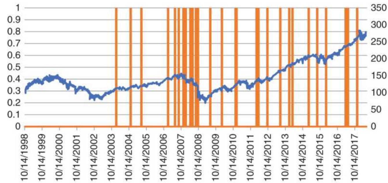
FIGURE 23.5 The Hindenburg Omen shown as vertical bars on a chart of SPY prices.
\section*{It's Not the Markets, It's the Money}
At the risk of repeating this too many times, market trends and price shocks are caused by institutions and investors moving money. When all markets move together, it is more likely to be panic than a sensible reaction to news. Under stress, investors withdraw money from every type of investment, causing them all to reverse direction at the same time.
Money seeks a safer place during times of extreme uncertainty, and this is seen as a sharp sell-off in stocks or a bond price rise on widespread buying. In 2011 and 2012, short-term rates went negative in the United States and in Europe - investors were willing to pay the government to hold their money just to gain safety. No amount of correlation analysis or diversification will
protect an investment from a price shock and no amount of insightful analysis would have expected interest rates to go negative.
\section*{POSITION SIZING}
Position sizing is important whether you trade one market or a diversified portfolio. Let's say you have a portfolio of five futures markets, shown in Table 23.3. If you know which one is going to outperform the others, then you put most of your money into that one. However, you are most likely to be wrong, and you will lose more because it was your biggest investment.
\section*{Sizing Futures}
We'll start with futures because it is a pure case of using volatility parity. Futures need to be traded with substantial reserves in order to reduce the leverage you get when only margin is required. Typically, about 25\% of the investment is used for purchasing. Without reserves, leverage can range from \(4: 1\) to \(20: 1\) depending on the volatility of the futures market. By using only \(25 \%\) of your investment, you reduce the leverage by a factor of 4 and have reserves that allow you to cover losses while holding your system positions.
\section*{TABLE 23.3 Position sizing in futures.}
\begin{tabular}{|c|c|c|c|c|}
\hline \$100,000 & \begin{tabular}{r}
Crude \\
oil
\end{tabular} & EuroBobl & Copper & NASDAQ \\
\hline \$20,000 & 65.95 & 131.05 & 327.5 & 7176 \\
\hline
\end{tabular}
\begin{tabular}{|l|r|r|r|r|r|}
\hline 20d ATR & 1.504 & 0.4615 & 5.75 & 84.125 & c \\
\hline Conversion & 1000 & 1000 & 250 & 20 & \\
\hline Currency & 1.00 & 1.20 & 1.00 & 1.00 & \\
\hline \$ Volatility & 1504.00 & 553.80 & 1437.50 & 1682.50 & 2 : \\
\hline
\end{tabular}
Position size = Allocation \(/ \$\) Volatility
\begin{tabular}{|l|r|r|r|r|}
\hline Contracts & 13.3 & 36.1 & 13.9 & 11.9 \\
\hline
\end{tabular}
Table 23.3 show the steps used to equalize risk in futures based on a \$400,000 investment but using only \(\$ 100,000\) for trading.
- Divide the trading amount equally among the five markets, giving a \$20,000 allocation to each market (shown on line 2 to the left of the current price).
■ Calculate the 20-day ATR (line 3).
Multiply the ATR by the conversion factor (big point value, line 4) and by the currency (line 5) to get the U.S. dollar value of the volatility (line 6).
Divide the allocation (step 1) by the dollar volatility (line 6) to get the position size (bottom line) in contracts.
Using this method, all positions will have equal volatility risk, which tends to maximize diversification. The sizing looks reasonable, with crude oil and NASDAQ getting the smallest allocations because they are the most volatile. Risk parity is another, more complicated ways of sizing. It looks at the incremental change in price; it is not clear that the result is better. 13
\section*{Sizing Stocks}
Volatility parity for stocks requires some extra steps to scale the initial results back to the actual investment size. In Table 23.4, we use five popular stocks during mid2018 and see that the volatility (" 20 d ATR") covers a wide range. Bank of America (BAC) and Visa (V) move just over \$ \(\$ .50\) per day, while Amazon moves \(\$ 20\) per day.
Dividing \(\$ 20,000\) by the 20 -day ATR gives the allocations shown on the line "Allocation/ATR." If we look at the value of those shares on the line below, we get \(\$ 5,589,404\), far larger than our \(\$ 100,000\) investment. By multiplying the value by \(20,000 / 5,589,404\) we can scale the allocations back to a total value of \(\$ 100,000\), then divide the allocation by market by the share price. We get the final position sizes on the bottom line.
\section*{TABLE 23.4 Position sizing for stocks using ATR.}
\begin{tabular}{|l|r|r|r|r|r}
\hline \multicolumn{7}{|c}{ Stock positions using ATR } \\
\hline \$10o,o0o & \multicolumn{1}{|c|}{ BAC } & NFLX & XOM & \multicolumn{1}{|c}{ V } & AM: \\
\hline \$20,000 & 30.09 & 361.4 & 82.88 & 16.81 & 168 \\
\hline 20d ATR & 0.5445 & 7.31 & 1.367 & 0.5655 & 20. \\
\hline Allocation/ATR & 36731 & 2736 & 14631 & 35367 & \\
\hline Value & 1105234 & 988782 & 1212582 & 594518 & 1688 \\
\hline Scaled to \$20K & 3955 & 3538 & 4339 & 2127 & 6 \\
\hline Adj Share Size & 131 & 10 & 52 & 127 & \\
\hline
\end{tabular}
If we use annualized volatility instead of the ATR, we get a different allocation, shown in Table 23.5. Annualized
volatility uses only the closing prices, so it may underestimate the volatility. Prices are mid-October 2018. On the Weights line each value is found by:
Finding the sum of 1 divided by the annualized volatility of all stocks
- Inverting the previous value (1 divided by sum of those inverses)
We can then normalize those weights so they total to 1.0 and multiply the weights by the total investment to get the Actual Allocation. The share size is the allocation divided by the price. But the average 20-day volatility is just over \(20 \%\). If our portfolio target volatility is \(10 \%\), then we scale all position sizes down to the amount on the last line, Shares at \(10 \%\) vol.
\section*{The Easy Way}
For those investors not interested in all of these calculations, the alternative is simply to divide the equal allocation by the share price. We accept the fact that higher prices have more volatility in terms of absolute price changes, but less volatility in terms of percent. We can minimize that error by not trading stocks priced below \(\$ 5\) or \(\$ 10\) per share, although there will still be some distortion. The question becomes, "Is the benefit of using the ATR or annualized volatility worth the effort to do the calculations?" In Table 23.6, the allocations divided by the price are the same shape as the annualized volatility solution before scaled down to a \(10 \%\) target. As far as we know, this is the most popular way of calculating position size.
TABLE 23.5 Stock allocation using annualized volatility.
\begin{tabular}{|l|r|r|r|r|r|}
\hline \multicolumn{3}{|c|}{ Stock positions with leverage and target of 10\% } \\
\hline \$100,000 & BAC & NFLX & XOM & \multicolumn{1}{|c|}{ V } & AMZN \\
\hline \$20,000 & 30.09 & 361.4 & 82.88 & 16.81 & 1689.3 \\
\hline 20-Day AnnVol & 17.3 & 37.4 & 12.1 & 12.6 & 23.8 \\
\hline Weights & 0.058 & 0.027 & 0.083 & 0.079 & 0.042 \\
\hline Normalize & 0.200 & 0.093 & 0.286 & 0.275 & 0.146 \\
\hline Actual Allocation & 20031 & 9266 & 28640 & 27503 & 14560 \\
\hline Adj Share Size & 666 & 26 & 346 & 1636 & 9 \\
\hline Shares at 10\% Vol & 323 & 12 & 167 & 793 & 4 \\
\hline
\end{tabular}
\section*{TABLE 23.6 Position sizing using price.}
\begin{tabular}{|l|r|r|r|r|r|}
\hline \multicolumn{6}{|c|}{ Position size using price } \\
\hline \$100,000 & BAC & NFLX & XOM & V & AMZN \\
\hline\(\$ 20,000\) & 30.09 & 361.4 & 82.88 & 16.81 & 1689.3 \\
\hline Position Size & 665 & 55 & 241 & 1190 & 12 \\
\hline
\end{tabular}
\section*{Volatility of Low-Priced Stocks}
To understand why you would want to avoid stocks trading at low prices, Figure 23.6 shows the price and corresponding position sizes for Bank of America from 1998 through June 2018. In February 2009, prices dropped to \(\$ 1.13 /\) share, resulting in a spike in the position size. At the same time, volatility increased sharply. At low prices, daily returns are erratic and would result in large changes in position size each day
and expose portfolios to event risk.
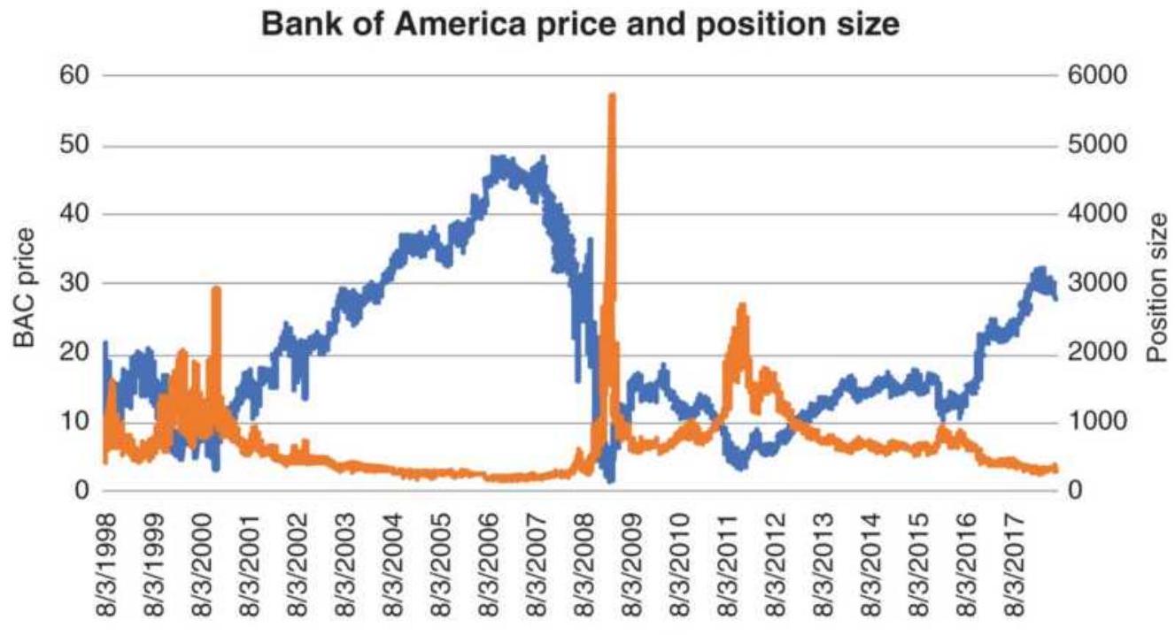
——BC—Position size
FIGURE 23.6 Bank of America prices with position sizes based on a \(\$ 10,000\) investment divided by the closing price.
\section*{Using VIX Instead of Historic Volatility}
Both the ATR and annualized volatility are measures of historic volatility. VIX is the implied volatility of S\&P options. Because VIX represents how traders see future volatility, it may be that VIX is better for sizing positions, at least for the S\&P. Figure 23.7 shows both VIX and the SPY 20-day annualized volatility, the same calculation period used for VIX. VIX tends to be slightly higher than the actual volatility on most days.
If we take a closer look at the two values during the financial crisis of 2008, we see that VIX jumps around more and that it did not reflect the high volatility at the
peak (Figure 23.8). The smoothness of the annualized historic volatility is greatly due to the averaging of 20 days while VIX reflects the trader's opinion of volatility at the moment.
\section*{Comparing volatility}
120
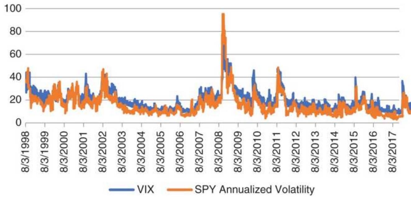
FIGURE 23.7 VIX and annualized volatility of SPY.
Comparing volatility during the 2008 financial crisis
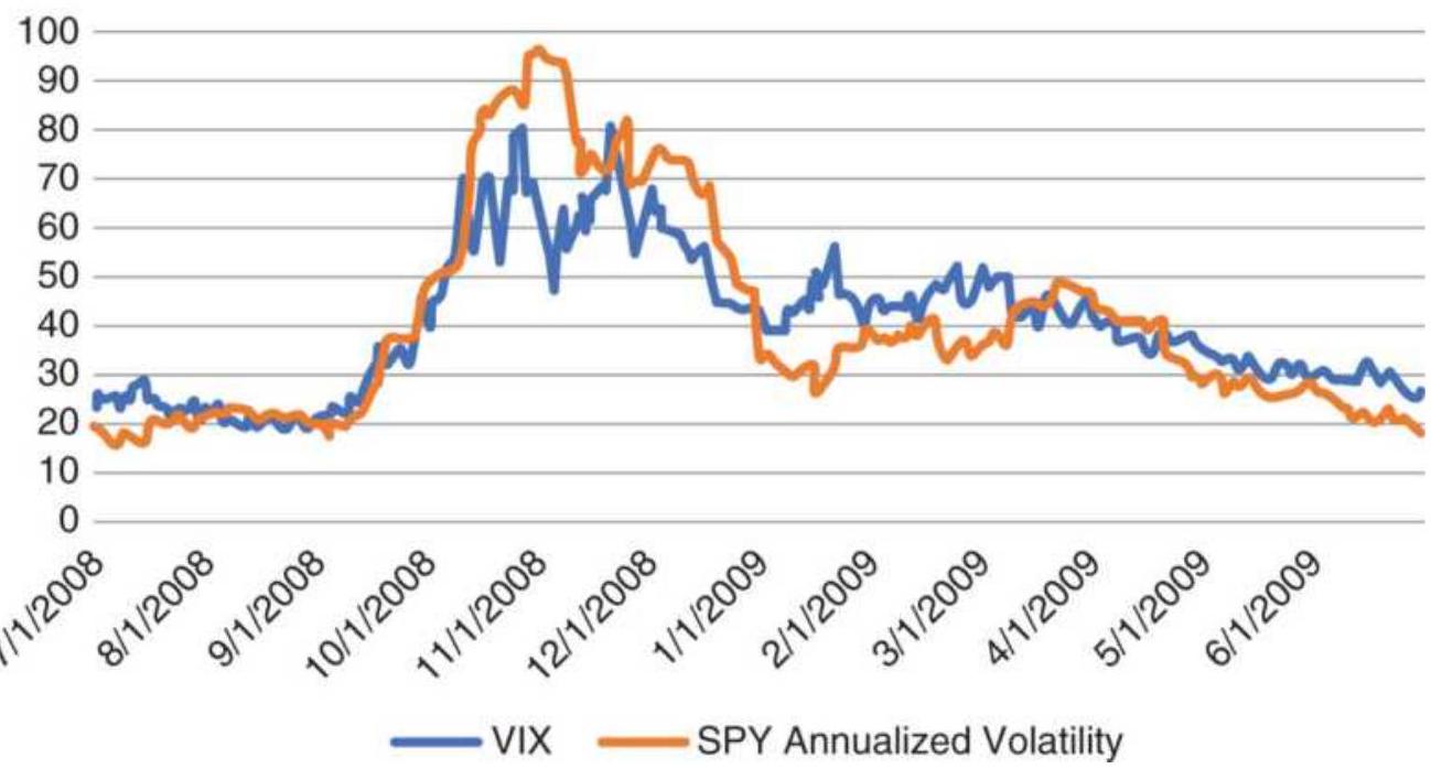
FIGURE 23.8 A closer look at VIX and SPY annualized volatility during the financial crisis of 2008.
A test was run on SPY using multiple moving averages with position sizing based on (1) the investment divided by the closing price and (2) a formula using the inverse of the VIX (smaller positions with higher volatility). Results came out nearly the same. We then chose method 1 because it was simpler and could be applied to all equity markets while implied volatility can only be used with those stocks that have options. The abrupt changes in VIX also means that position sizes could vary by \(25 \%\) from one day to the next, introducing more chance into the process.
\section*{INDIVIDUAL TRADE RISK}
Risk control begins at the moment a position is entered. There are two distinct risk issues at that time: volatility of that position, and the total exposure of that trade relative to the investment amount. We will look at the second one first.
\section*{Initial Position Risk}
The entry point of a trade is the time of greatest uncertainty for any trading method. Systematic strategies identify the critical point where the trend changes, but because of the lag in the calculation, a buy signal may occur on a day when prices drop, or a sell when prices rise. It could also be a false signal, with the trend changing direction the next day. Most trend systems have a low rate of success, so the chances of a
loss are high. The exception is the breakout strategy because it starts each trade with high risk, the difference between the high and low of the calculation period.
For mean reversion traders, the greatest profits are in anticipating the change in direction of prices. They must buy when prices are falling and sell when they are rising. They count on the likelihood that certain moves cannot be sustained for more than a few days or that large moves are overextended. Even though they have a high success rate, mean reversion traders take larger risks.
\section*{Stop-Losses}
A stop-loss order provides the ability to control risk on individual trades. A sell stop is placed below the current price and becomes a Market Order to sell once that price is touched. Stops do not guarantee that you are filled at the stop price because opening gaps, fast markets (after news events), and low volume can result in large slippage. If the market gaps lower on the open, below your sell stop, the order gets filled at the market price.
Tight stops, those placed close to the current price, are hit often. The farther away it is placed, the less likely it is to be hit. The pattern is very similar to random price moves. Using random numbers, the number of times a stop is reached multiplied by the distance of the stop will always be constant. Then using a stop must be better than a random event to be a good trading rule.
The beginning trader may decide that no trade should lose more than \(\$ 500\) and place a stop at that point. Some more experienced traders believe that you should never
lose more than \(3 \%\) of your total investment on a single trade. It makes sense to scale your losses to the investment size, but stops are more sensible if they relate to the nature of the system, the timing of the trade, the market volatility, or a chart pattern. The magnitude of the risk should be handled by decreasing or increasing leverage. Some possibilities that change with market conditions are: 14
1. Place the initial stop at a previous support or resistance level.
2. Use a multiple of the current volatility, for example, 3 times the 10 -day ATR.
3. Advance the stop by a percentage of the price change, as in Wilder's parabolic system.
4. Use the recent swing high or low point, based on a percentage minimum swing.
5. Use the highest high or lowest low of the recent \(n\) periods.
\section*{Trailing Stops}
A trailing stop is one that captures an increasing part of the profits as prices move in a favorable direction. Some trailing stops advance, but never retreat, as in Wilder's Parabolic; others, based on volatility and price changes, may retreat. Trailing stops are usually constructed in one of the following ways:
1. Fixed percentage. A long position was entered in IBM at \(\$ 75\) based on a moving average signal. A trailing stop of \(3 \%\) is positioned below the highest
closing price during the trade. The position is exited if either the trend changes or prices fall by \(3 \%\) from the high point of the trade, whichever comes first. This stop does not retreat.
2. Volatility. A stop based on volatility will be closer when there is less volatility and farther away with more volatility. It will also be positioned downward from the best high or close of a long position. A typical stop for a long position may be the highest price \(-5 \times 10\)-day average true range. Figure 23.9 shows the trailing stop as dots. Some traders will not use a stop until some minimum level of profit has been reached.
3. Locking-in profits. Rather than use a stop all the time, some traders will reposition the stop to the entry price once the trade has reached some level of profit. It goes with the philosophy "Don't let a profit turn into a loss." If it's done too soon, you can be stopped out on market noise.
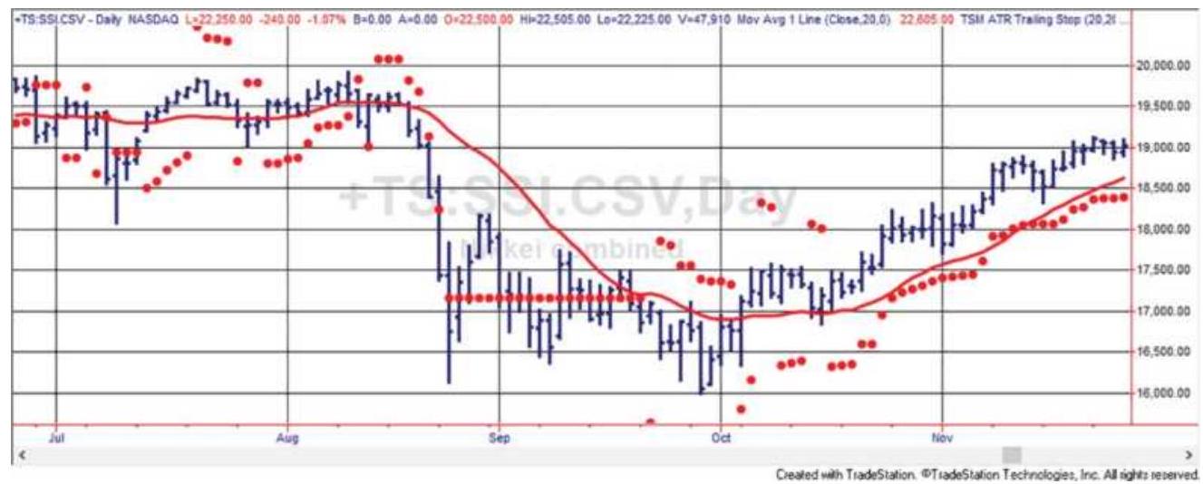
FIGURE 23.9 Trailing stop based on volatility, applied to Hang Seng futures.
\section*{Standard Deviation Stop}
The standard deviation, the most basic measurement of risk, can be used to determine stop-loss levels. \({ }^{15}\) In her Dev-stop, Cynthia Kase uses the following steps to create stop-loss levels for both long and short positions:
1. Calculate the true range (TR) of the past two trading days, the highest high and lowest low of the 2-day period or 2-bar period.
2. Calculate the rolling average true range (ATR) of TR (in step 1), using 30 bars for intraday charts and 20 days for daily charts. Note that each period combines 2 days.
3. Calculate the standard deviations (STDEV) of the true ranges in step 1 using the same 20-day and 30bar periods as in step 2.
4. The stop-loss values are
\(\mathrm{DDEV}=\mathrm{ATR}+(f \times \mathrm{STDEV})\), where \(f=1,2.06\) to 2.25 , and 3.20 to 3.50 , where the larger values of the pairs correct for skew and the allow for greater risk.
5. The dev-stop for long positions is trade high DDEV; the dev-stop for short positions is trade low + DDEV. Trade high and trade low are the prices corresponding to the greatest profit in the long and short trades.

This method is similar to a trailing stop but uses the standard deviation instead of the ATR. In Figure
23.10, an 8o-day moving average, the smooth, heavier line, is shown with 30 -year bonds. The two other lines above and below prices are the standard deviation stops based on the 8o-day price differences and a multiplication factor of 8 . The chart shows that the trend changed from long to short, which occurred about December 1, 2010, would have been stopped out at least 15 days earlier. In the following short position, the daily high penetrates the stop, but the stop is only activated if prices close above that level. In the most recent long position, the stop is closer to prices than the moving average but manages to stay clear of being hit because it adapts to the price volatility. A program that uses these stops and an indicator that displays them are TSM Moving Average Stop-Loss and TSM Stdev Stop-Loss, both on the Companion Website.
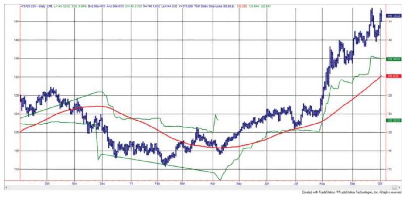
FIGURE 23.10 30-Year bonds with an 80-day moving average (the smooth line) and an 8o-period standard deviation stop with a factor of 8 measured from the high or low of the trade.
\section*{Profit-Taking}
Profit targets are points at which the system captures a profit expected to be larger than the return at the end of the trade, or it captures a windfall move, such as a favorable reaction to an economic report. For meanreversion trading, profits are taken when the relative value returns to normal or corrects by a predicted amount. For both strategies, profit-taking works best in noisy markets, where prices are not likely to continue in one direction. It also works best when it is based on price volatility \((V)\), and is most often calculated as:
1. For longs, a multiple, \(f\), of the average true range added to the system entry point (not the actual fill), \(E+f \times \operatorname{ATR}\)
2. A favorable move of \(f \times\) ATR on any single day, or combination of successive days, where \(f\) is a multiplication factor
In method 1, the profit target is fixed at the time of entry. In method 2, it can be hit on any day with sufficient volatility. Method 2 assumes that any large move will reverse, even if it is a profitable move while the net trade is a loss. The typical value for \(f\) in method 1 is between 3 and 4 using a 20-day ATR, but most analysts data mine to find the best factor.
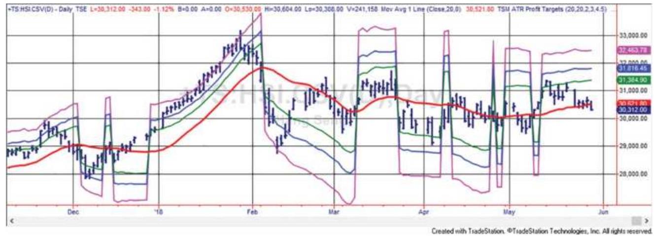
FIGURE 23.11 Three profit targets based on volatility and measured from the trendline, applied to Hang Seng futures.
\section*{Scaling Out of a Trade}
To offset the effects of data mining, use three or more profit targets. \({ }^{16}\) To construct them, start with the "best" factor, say 3.0. Set two other factors at 2.0 and 4.0, or 1.5 and 4.5 , so that the average of the profit-targets is the best pick. If one of the targets is hit, your exposure is reduced. If two are reached, it is unlikely you will turn a profit into a loss. This approach avoids the problem of a price that almost reaches the profit target then reverses. It is commonly used by professional short-term traders. Figure 23.11 shows the Hang Seng index with a moving average and profit targets measured from the trendline.

A program to test variable-size profit targets, TSM Moving Avg Profit Targets, can be found on the Companion Website.
\section*{KAUFMAN ON STOPS AND PROFIT-}
\section*{TAKING}
Profit targets are essential in short-term trading, where the price noise makes it likely that any favorable move will reverse soon. For mean reversion trading, profits are taken when prices return to normal. Profit targets are more difficult to incorporate into a longer-term trendfollowing system because they risk missing the bigger profit (the fat tail) in exchange for smaller but more frequent profits. As a trend-follower, the same trend is still intact after you take profits, so you need to find a way to reenter that trade to avoid missing the rare, but very large price move.
Both profit-taking and stop-losses are a duel with price noise. If a news event causes a sharp drop followed by a fast recovery, then hitting a stop captures the worst exit. On the other hand, if volatility gives you a windfall profit, then exiting that position and reentering at a better price will be a good move. Because there is so much market noise, stop-loss orders are usually based on the closing price. For intraday systems, which operate in an environment of high noise, a stop triggered by an intraday price move is best executed on the close to take advantage of a pullback. The opposite would be true of profit-taking. You would want to exit at the time of the intraday spike rather than wait for the end of day.
\section*{Stops}
It is not clear whether a stop-loss improves results or simply seems to be a good idea, but does not actually result in better performance. Every trader can tell a story
of how a stop order was executed at the worst price of the day, or how it saved him from a devastating loss. In fast markets you are lucky if your stop is executed near your price. Often it gets filled at the extreme of the move, where all the buyers and sellers cluster. But that does not mean that stops do not work. Some work and some don't. The ones that are most likely to work must adapt to volatility, such as the standard deviation stop, rather than a fixed dollar amount or a percentage of price. Support and resistance levels are also good. And trailing stops are the most practical.
Using a trending system in a trending market, such as U.S. 30-year bonds from 2000 through 2011, a stop can act as an advance signal for a trend change. The heat map in Table 23.7 shows that the average of all tests using a trailing stop was better than not using a stop. The best results were for longer trends and stop factors from 4 to 6 , the upper right corner of the table.
\section*{Proximity Risk}
When many stop orders cluster around the same point, there is proximity risk. One way this can be seen is as a gap as prices break through a key support or resistance level. Given the large number of trend-following systems, it would not be surprising to find that many of them are generating the same orders on the close, especially after a very volatile price move.
TABLE 23.7 Stop-loss test of 30-year bonds, 2000-2011, applied to a moving average strategy and displayed as a heat map. Lighter shading
\section*{indicates more positive results.}
\begin{tabular}{|c|c|c|c|c|c|c|c|}
\hline \multicolumn{8}{|c|}{ Stop-Loss Factor } \\
\hline \begin{tabular}{l}
MA \\
Period
\end{tabular} & 10 & 8 & 6 & 4 & 2 & Average & \begin{tabular}{c}
No \\
Stop
\end{tabular} \\
\hline 100 & -11594 & -6969 & 8625 & 11594 & -6313 & -931 & -27875 \\
\hline 90 & 10063 & 12250 & 35781 & 47594 & 35438 & 28225 & 688 \\
\hline 80 & 11625 & 13063 & 33594 & 44688 & 21688 & 24931 & 4813 \\
\hline 70 & 26063 & 32219 & 42406 & 41406 & 34063 & 35231 & 8531 \\
\hline 60 & 1688 & 7844 & 13813 & 14250 & 16906 & 10900 & 6281 \\
\hline 50 & -10281 & -1156 & 12750 & 22313 & -344 & 4656 & -8000 \\
\hline 40 & 5906 & 13375 & 21375 & 30906 & 20156 & 18344 & -3781 \\
\hline 30 & -19000 & -13531 & -3344 & 6781 & 7125 & -4394 & 6938 \\
\hline 20 & 33938 & 36156 & 34125 & 52500 & 44688 & 40281 & 36375 \\
\hline 10 & -1594 & -813 & 1094 & -188 & 17438 & 3188 & -813 \\
\hline Average & 4681 & 9244 & 20022 & 27184 & 19084 & 16043 & 2316 \\
\hline
\end{tabular}
Macrotrend systems with substantial assets under management may take up to 3 days to enter a trade. The likelihood of proximity risk is greatly increased, and the cost of execution could be significant. For more, see "Similarity of Systematic Trading Signals" in Chapter 22.
\section*{Profit-Taking}
Profit-taking in a trending market is more of a problem. You exit a long position with a profit, but then prices keep going up. If you don't reenter, you might have taken a small profit and missed a big one. On the other hand, if you only expect to hold a trade for five days, as you would with mean-reversion, then taking a profit is important.
Using a stop or taking profits have similar problems when applied to different strategies.
A stop-loss works for a trending system in a trending market; it is bad for a nontrending market or a mean-reversion system.
Profit-taking works for a mean-reversion or shortterm strategy, but not in a trending market or with a long-term trending strategy.
\section*{Managing Risk without Stops}
A stop-loss is not the only way to reduce risk. An alternative is to reduce the size of your positions as volatility increases. For a trend follower, it would allow you to reduce risk and remain in the trend. At the beginning of this chapter we showed how to calculate the position size based on price volatility. The greater the volatility, the smaller the position. You can also rebalance those position sizes as the volatility changes, although you must consider the added costs. Portfolio volatility stabilization will be discussed in the next chapter. That process will scale the leverage of the entire portfolio to maintain a constant level of risk.
\section*{Risk Control Overlay}
Some traders include stop-loss orders based on factors other than the price or volatility of the specific market traded. They generally take one of the following three approaches:
1. A percentage of initial margin, for example, \(50 \%\) to \(70 \%\) of initial margin. This is loosely related to long-

of long-term volatility may be a more satisfactory alternative.
2. A percentage of the portfolio value or total account value, for example, \(1.0 \%\) to \(2.5 \%\). This concept of equalized risk (and perhaps reward) across all markets is very popular; however, it is not sensitive to individual markets, and as with many stops, it imposes artificial overrides. If the volatility of one market increases or decreases faster than others, then this risk level would need to be adjusted to individual markets; otherwise, the stop would be too close in some markets and too far away in others.
3. The maximum adverse excursion determined by historic evaluation. 18 A stop is placed just beyond the maximum adverse excursion for each trade, or \(2.5 \%\) of the price, whichever is smaller.
\section*{ENTERING A POSITION}
In the equities market, most people with retirement programs choose to add to their stock portfolio as money is available, and to reinvest profits. Over the long run, if the stock market continues to rise, that method is good. On the other hand, if you do not plan to hold the position for the rest of your life, then you have the following choices when you get a buy signal:
Buy the entire amount at the time of the signal.
- Average into the position.
Wait for a better price.
We will compare these three choices, although the third - waiting for a better price - requires that you decide how much better and what if a better price doesn't happen?
\section*{Averaging into a Position}
The idea of averaging into a position does not apply to any specific trading strategy, but we can look at trend following as a popular example. We will use the emini S\&P, U.S. 30-year bonds, crude oil, and gold, to represent a sample of market patterns. We apply an 8oday moving average from 2009 through mid-2018.
The test will look at always entering 5 contracts (or in equities, 5 shares), spaced from o to 5 days apart, where o means all contracts are filled at the time of the new trading signal. The value 1 means that 1 contract was entered each successive day, 2 means one day was skipped in between fills, and so on. The maximum range of 21 days would be too long for a fast trend system, so it is likely that the number of days used to average into a trade will depend on the average holding period of the trend system. This study simply looks at one trend period, 80 days.
When averaging into a trade, if the trend changes direction before the full position is set, then the loss on the trade will be less than if you had entered all contracts on the signal day. On the other hand, if prices were to move steadily higher after a new long signal, then the average entry price will be worse.
TABLE 23.8 Results of averaging into a new position based on an 8o-day moving average system. "Days Between" indicates the number of days between each entry. There of 5 entries for each market.
\begin{tabular}{|c|c|c|c|c|}
\hline Days Between & S\&P & Bonds & Euro & Gold \\
\hline 0 & \(.74,047\) & 221,397 & \(.9,377\) & 223,180 \\
\hline 1 & \(.94,357\) & 190,437 & 67,846 & 149,916 \\
\hline 2 & \(.80,061\) & 182,816 & 99,072 & 142,288 \\
\hline 3 & 108,479 & 177,573 & 88,107 & 127,802 \\
\hline 4 & 121,787 & 155,830 & 84,979 & 115,256 \\
\hline 5 & 142,558 & 145,053 & 77,339 & 127,240 \\
\hline
\end{tabular}
Table 23.8 shows the results. The first row ("o") is the benchmark 8o-day moving average where the entire position of 5 contracts is set at the time of initial entry. The next column gives the results of setting 1 contract on each of the first 5 days beginning on the day of the initial entry. Column 2 sets 1 contract on the initial day, the next four on day \(3,5,7\), and 9 (spaced every 2 days). The remaining columns space the entries every 3,4 , and 5 days, respectively. Then the final column takes 21 days to enter a trade, day \(1,6,11,16\), and 21.

The S\&P is a noisy market and the results show that delaying by the maximum amount produced a much higher profit. Bonds are a very trending market; therefore, entering on the first day was best. The position of the best result tells you the level of noise in that
market. The euro favors a 2-day wait and gold no wait. We can expect the U.S. equity index markets to all improve with a long wait, and interest rates to prefer no wait, but other markets have their own personality and would need to be tested separately. A program, TSM Averaging In, on the Companion Website, was used to produce the results.
\section*{Waiting for a Better Price}
A simple way to improve an entry is to wait for a price that is better than the system signal. The obvious problem is that when there is a new long signal and prices keep going higher, you can't enter. And, because prices kept rising, the trade is a profit. You end up improving some entries and missing some profits.

To understand the trade-offs, the program TSM Wait for a Better Entry, on the Companion Website, tests a combination of how many days to wait and the size pullback to anticipate. The answer relates to the smoothness of the prices. Noisier markets will favor larger pullbacks over more days while trendier markets will favor small or no pullback and no waiting. By now, this should be a familiar scenario.
Tests used data from January 2009 through June 2018, one contract for futures and one share for equities. The trade could be entered anytime up to 4 days if the pullback threshold was reached. The size of the pullback depended on the individual market and its volatility but was specified in points. Table 23.9 and Figure 23.7
summarizes the results and gives a scatter chart to help visualization.
Figure 23.12 shows the benchmark results as the leftmost dot, where trades are entered at the time of the signal with no restrictions. To the right are all the results for different pullbacks for each day. For example, the S\&P chart shows that by waiting 3 days to enter, the range of pullbacks from 0 to 10 points would have averaged a better return than pullbacks on other days.
Most of the markets show improvements by waiting 4 days. That says the markets do not keep moving higher after the 8o-day trend buy signal, or lower after the sell signal. They give you an opportunity to enter at a better price. It also means that averaging in may have also given a better price. From previous discussions, we know that short-term interest rates have a strong trend; we should expect that entering sooner is better. Results always depend on the test period. Bond futures peaked in 2016, and the trend is no longer up. The S\&P is no longer a bull market. Testing shorter time periods may help adjust to changing market conditions.
\section*{TABLE 23.9 Size of pullback and best delay for} each market when waiting for a pullback to enter.
\begin{tabular}{|l|l|l|}
\hline US 30 & Pullback & o to \\
Year & Range & O.50 \\
Bonds & Best & 4 Days \\
& delay & \\
& & \\
& &
\end{tabular}
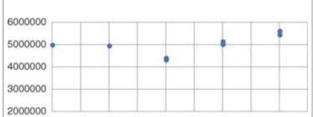
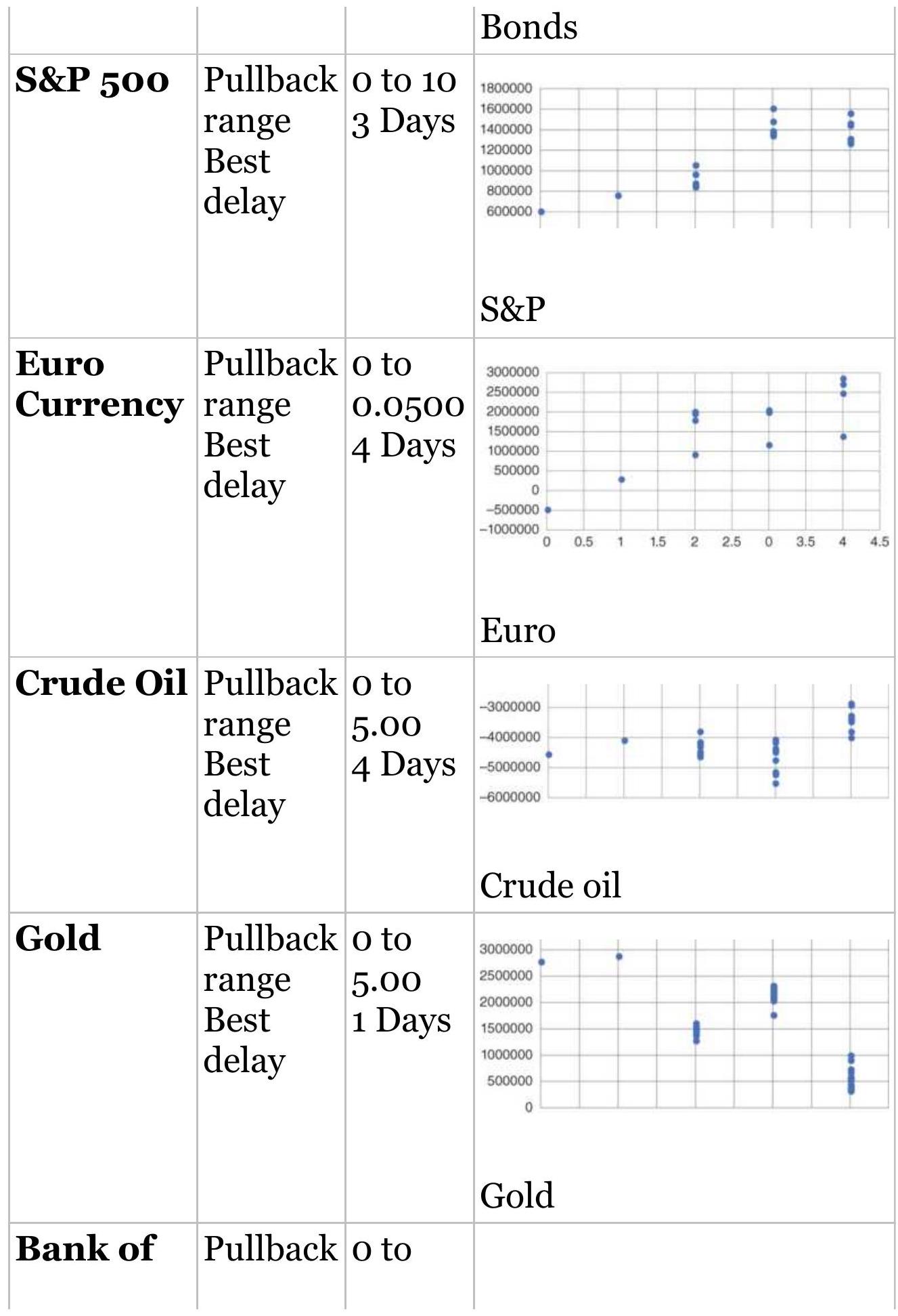
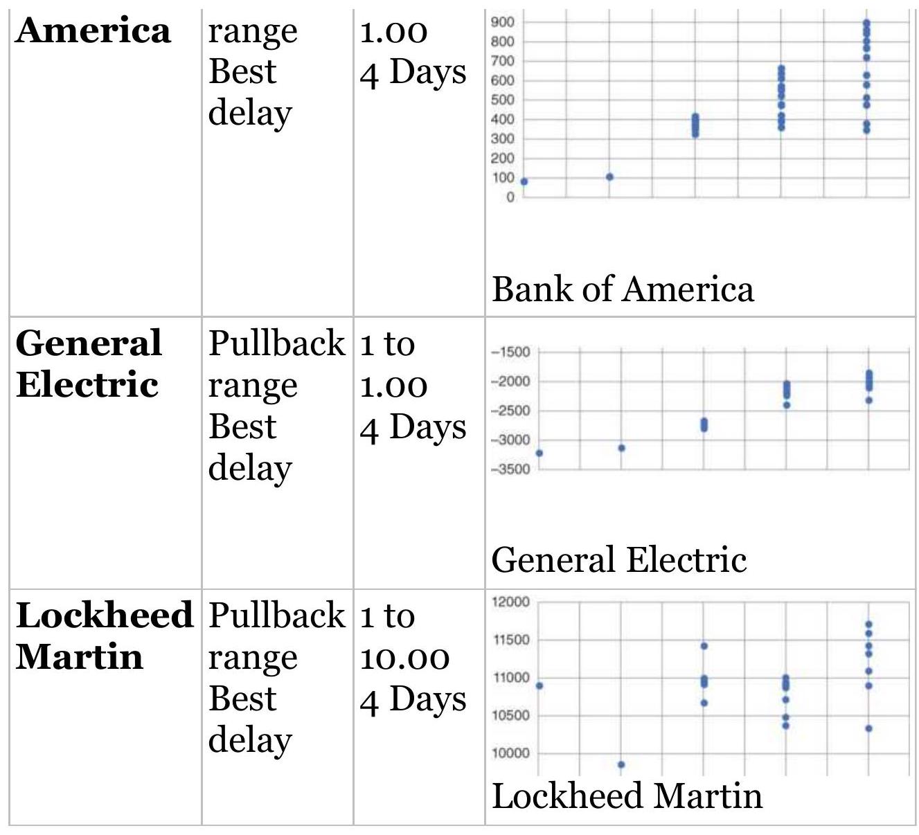
FIGURE 23.12 Wait for a pullback. Most markets show that waiting can improve your results.
\section*{Using Momentum for a Better Entry Price}
A flexible solution to getting a better entry is to use a momentum indicator. Linda Raschke's First Cross system used this concept as a primary rule for shortterm trading. In this case we will use a 120-day moving average as a benchmark, knowing that it works well for the S\&P. The RSI will be the timing indicator. Long positions will be entered after the initial signal or at the
time of the initial signal if the RSI is below a threshold level for the specific market. This level varies between 25 and 40 , reflecting the volatility of the market. The calculation period for the RSI also varies between 4 and 8 days in order to get a trading signal within the 5 -day requirement. If the trend changes direction before a momentum signal occurs, there was no trade. If the trend remains the same at the end of 5 days, and we have not gotten a momentum signal, we enter the trade on the next open.

Table 23.10 shows a small sample of results using prices from 1998 through July 2018. The program, TSM Timing the Entry, on the Companion Website, was used to produce these results. On the top, the S\&P futures used a 4-day momentum with a buy threshold of 25 (the sell is 100 - buy threshold, or 75). Because of the price noise, half the trades were missed, which reduced the total profits by about \(5 \%\) but increased the profit factor, the percentage of profitable trades, and the average profit per trade. That seems to be a better choice.
The other futures markets, U.S. bonds and the euro currency, improve in every measure with fewer trades. Bonds have a slower RSI and a lower threshold while the euro is much faster with a higher threshold.
TABLE 23.10 Results of timing the entry using an 8 -day RSI, an 8o-day moving average, and threshold entry levels of 30 and 70 for buy and sell signals over 20 years.
\begin{tabular}{|c|c|c|c|c|c|}
\hline ket & \begin{tabular}{r}
Total \\
Profit
\end{tabular} & \begin{tabular}{l}
Profit \\
Factor
\end{tabular} & \begin{tabular}{|l|}
Total \\
Trades
\end{tabular} & \%PProf & \begin{tabular}{c}
Average \\
Tradt
\end{tabular} \\
\hline \&P & 3,227,408 & 2.45 & 130 & 34.6\% & 63, \\
\hline \(4 \times 25\) & \$7,882,621 & 3.29 & 62 & . \(9 \%\) & \$127 \\
\hline Bonds & \$2,824,987 & 1.29 & 159 & \(30.8 \%\) & \$17,76 \\
\hline \(8 \times 25\) & \$3,449,288 & 1.65 & 66 & 40.9\% & \$52,26 \\
\hline Euro & \$5,822,061 & 1.78 & 104 & 35.6\% & \$55,98 \\
\hline \(4 \times 40\) & \$6,616,023 & 2.18 & 65 & 44.6\% & \$101,78 \\
\hline AAPL & 15,741 & 7.31 & 59 & \(30.5 \%\) & \(\$ 26\) \\
\hline \(5 \times\) & \$13,748 & 4 & 25 & 44.0\% & \$55 \\
\hline AMZN & 5 & 3.46 & 65 & 32.3\% & 65 \\
\hline \(7 \times\) & \$38,385 & 7 & 31 & 35.5\% & \$1,23 \\
\hline LMT & 7 & 2.37 & 93 & 30.1\% & \$18 \\
\hline \(8 \times 35\) & \$17,351 & 3.02 & 41 & 46.3\% & \$4 \\
\hline
\end{tabular}
Apple and Amazon were chosen along with Lockheed Martin as the stock sample. The perception of Apple and Amazon is that they had long periods where prices went straight up and waiting for a pullback would be a poor strategy. Apple does show slightly lower profits and a lower profit factor, although both 7.31 and 5.54 are exceptionally high. The percentage of profitable trades increased slightly, but the size of the profits doubled. Amazon had a similar profile. If these are the two worst examples, the using momentum to time entries should be good. Lockheed market showed improvements in all statistics. It has been in a steady growth pattern.
One statistic missing from these tests is time-in-the-
market. If these gains were accomplished while reducing exposure by \(20 \%\) to \(30 \%\), the results are better than they appear. Risk declines noticeably when a system is not in the market all the time.
\section*{LEVERAGE}
Leverage is controlling an asset using less money than the value of that asset. If you bought a gold futures contract on \(10 \%\) margin, then you are depositing only \(\$ 13,000\) to control the value of an asset worth \(\$ 130,000\), 100 ounces of gold at \(\$ 1,300 /\) ounce. Then every price change in gold, up or down, is magnified 10 times. If gold drops \(\$ 10 /\) ounce, then you make or lose
\(\$ 10 \times 100\) ounces \(=\$ 1,000\). In the current volatile environment, gold can move as much as \(\$ 25\) in a day, or \(\$ 2,500\), about \(19 \%\) of your deposit. That is great when it's a profit, and horrible when it's a loss.
The consequences of leverage can be seen by measuring the volatility of returns; however, leverage also plays a crucial role in both the trading strategy and the portfolio structure. With higher leverage, there is more volatility and more risk in every trade. Futures and options markets offer exceptionally high leverage, and some traders and analysts take advantage of the maximum allowable. Without leverage, many futures prices show less risk than stocks. In stocks, leverage is only achieved by borrowing up to \(50 \%\) of the face value of the stock, and that works best when interest rates are low. For the most part, the discussion in this chapter applies to futures. Leverage also allows you the flexibility to
balance the risk of a portfolio, a subject that is discussed in more detail in the next chapter.
\section*{Trading on Margin}
Each futures exchange sets the minimum margin based on price volatility, but the investment house, or broker, often sets that minimum higher for their smaller customers. In addition, they may require a minimum deposit. They need to protect themselves in the event that a price shock wipes out more than the entire value of their customer's account and they are left making up the loss.
Commercials, those businesses dealing in commodities, can often put up margin of only \(5 \%\) rather than \(10 \%\). In some cases they substitute a letter of credit rather than any cash. In addition, they sweep the account each evening, removing any excess profits and replenishing any losses. There is no audit of how the positions taken by commercials offset business risk, so it is very common for these businesses to speculate under the guise of hedging. When the CFTC publishes its Commitment of Traders report, separating the open interest into speculators and commercials, those who believe that the hedge positions are offsetting physical exposure might be surprised.
\section*{Margin Rules and Volatility}
The rules of brokerage houses require that an investor replenish the amount in his or her account back to the full amount if the loss on any futures position exceeds
\(25 \%\) of the initial margin. If you were required to put up \(\$ 16,00 o\) for one gold contract, and gold fell \(\$ 40\), you would get a margin call that required another \(\$ 4,000\) deposited by the next day. If you capitalized the account at more than the initial margin, which is the usual process, then that \(\$ 4,000\) can be taken from the excess in the account. Because \(\$ 40\) is a move of only \(2.5 \%\), it is impractical to have only \(\$ 25,000\) in an account that trades 1 contract of gold. If you started with \$50,000, then your leverage is not really 10:1, based on margin, but only about \(3: 1\), based on the entire investment. The minimum account size required by your broker is negotiable, based on your financial solvency and the size of the positions you trade, but can never be less than the minimum exchange margin.
Volatility will vary across markets, and margin usually lags the actual risk, going both up and down. Exchanges do not change the margin requirements often, and volatility must increase or decrease substantially, and remain at that level, before the exchange governors meet for their review.
\section*{Reserves and Targeted Risk Levels}
How much do you really need in your trading account to be "safe" and still leverage your returns? Since 2008, the hedge fund managers and CTAs have gotten much more conscientious about identifying risk and deciding the safe amount of leverage to use. Using the daily profits and losses from a simulated trading history, the process goes as follows:
1. Record the daily profits and losses.
2. Calculate the standard deviation of those profits and losses.
3. Decide how much risk you are willing to take. Risk should be measured as the annualized volatility taken on the daily returns of your performance, not the returns of the prices.
4. A target risk of \(12 \%\) means that 1 standard deviation of your returns should be \(12 \%\). At that value, there is a \(16 \%\) chance of losing \(12 \%\) over the data period used in the calculation, and a \(2.5 \%\) chance of losing \(24 \%\) over that period.
5. If the risk calculation shows that you have more than \(12 \%\) volatility, then reduce your position by o.12/actual risk.
This method will be described in detail in Chapter 24, where it is applied to portfolio risk and called volatility stabilization. Portfolio risk tends to persist, so increasing and decreasing the leverage to target your risk objective works well.
Futures accounts need significant reserves to absorb the losses due to leverage. That allows you to continue to trade at the targeted level of volatility. Reserves will vary as the position sizes are adjusted in order to keep volatility stable. In the real world, the lowest practical volatility target is \(6 \%\), more often \(8 \%\). A target of \(16 \%\) or higher can put an investor at risk.
\section*{Leverage Based on Exposure}
The traditional way to measure leverage uses exposure, the actual value of goods purchased. For example, the margin for 1 gold futures contract was raised to \(\$ 9,450\) on August 24, 2011, when gold was trading at about \(\$ 1,800\). That is \(5.25 \%\) of the contract value, or leverage of 19:1. As mentioned before, a brokerage firm would never allow a customer to open a futures account with \(\$ 10,000\) to trade 1 gold contract. A move of \(\$ 25\), only \(1.4 \%\), which happened often at that price level, would create a gain or loss of \(\$ 2,500\). If a loss, then the account value would fall to \(\$ 7,500\), generating a margin call. Each brokerage firm decides on the minimum account value based on volatility, as well as an assessment of the experience and credit history of the trader. For 1 contract of gold, it is likely that the broker will require \$50,000, reducing the leverage to 3.6:1.
In Europe, some registered funds have leverage limits set by the government. Typically, this can be 2.5 times the current account value. Compared to U.S. regulation, this is very severe. For the gold contract valued at \(\$ 180,000\), the account must set aside \(\$ 72,000\). The biggest problem is with interest rate futures, which are also assessed at face value, although the risk is actually a function of the yield, which goes in the opposite direction. When Eurodollar rates are trading at 99.50 , yielding only \(1 / 2 \%\) interest, the regulatory authorities require
\(0.9950 \times \$ 1,000,000\) (face value), or \(\$ 995,000\) to
trade one contract. That essentially eliminates trading any short maturity interest rate futures in a small investment account. The markets most affected are Eurodollars, T-Bills, Short sterling, and probably
everything with a maturity of 5 years or less. The position size would be too small and the capital allocation too large.
\section*{COMPOUNDING A POSITION}
At some point, many traders find themselves adding to, or compounding, their position (or seriously considering it). Some view this as a means of concentrating their resources in those markets that have more potential. There are two lines of thinking. When a trade becomes more profitable, it is confirming its move and is thought to deserve more of a commitment than a trade that has not become profitable. The alternative, when prices move against you, is scaled-down buying, oraveraging down, popular in the securities industry. In pension programs, where new money is added at regular intervals, the entry timing is not considered.
(a)

(b)
\begin{tabular}{|c|}
\hline 10 \\
\hline 10 \\
\hline 10 \\
\hline 10 \\
\hline
\end{tabular}
Additions
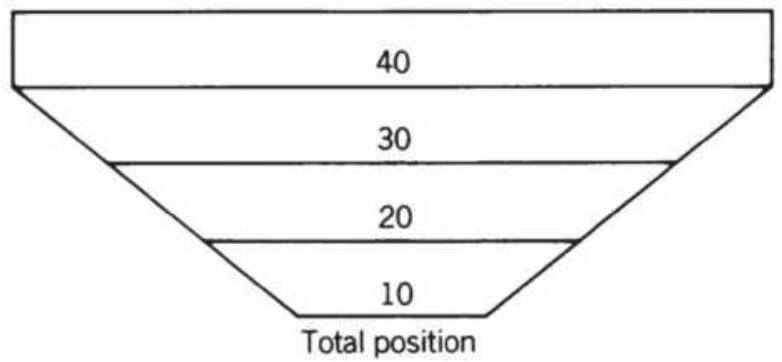
(c)
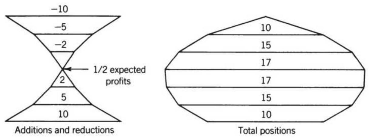
FIGURE 23.13 Compounding structures. (a) Scaleddown size (upright pyramid) offers a small amount of compounding. (b) Adding equal amounts (inverted pyramid) gives maximum leverage. (c) Reflecting pyramid combines leverage and profit-taking.
\section*{The types of compounding are illustrated in Figure} 23.13. Part a starts with 10 units and adds smaller
amounts, 5 then 2 then 1 . On the right is the total size of the trade. Part b shows equal positions added, and part c shows adding then removing positions. Systematic traders may use a number of timing conditions to decide when to add:
- A sustained basing formation, adding even a few days or weeks
- Expectation of substantial additional profits, prices are moving in your direction
A clear risk level, prices have come near your support, resistance, or stop-loss and have stabilized
Compounding results in holding a much larger position at the end of the compounding than when you started. That makes the position "top heavy" and very sensitive to a price reversal. Risk can become unmanageable.
Now consider building a position similar to averaging in. If you plan to buy 1,000 shares of Apple or 10 contracts of S\&P futures, then you can start with 200 shares or 2 contracts and add the same amount at regular intervals, but only if you have new high profits. If prices go the wrong way, then you wait. If the trend reverses before you have finished compounding, the loss will be smaller. The process is similar to averaging-in but requires profits as a confirmation.
\section*{Adding on Profits}
Adding on profits is not the same as waiting for enough profit and using those profits to add size. That could take a long time, especially in futures. Adding on profits
means that the market is performing well according to your strategy. The choices are:
Adding equal amounts on new high profits with a minimum number of days separating the entries.
Adding smaller positions as prices move in your direction.
We have already discussed scaling in when prices move against you. You get a better average price but will miss many of the trades where prices moved in your favor.
To test a timing strategy of adding on profits, we use a simple moving average with the typical macrotrend calculation period of 68 days. We will test a sample of futures markets from 2009 through July 2018, the emini S\&P, 30-year bonds, the euro, crude oil, and gold. The rules will be:
1. Enter 1 unit on the new trend signal (10 contracts).
2. Enter another unit after each \(n\) days only if the trade is on new high profits.
3. Stop entering when you have a total of 5 units.
Looking only at the total profits for each waiting period (a 3-day wait means that no new position can be added within 3 days of another), the results in Table 23.11 show that bonds, the market with the most trend, does best when the entire position is entered at the time of the signal. Then entry "o" in Day Wait means that all contracts were entered without any waiting period. The euro, also a trending market, favors waiting 1 day before entering each of the 5 legs. The S\&P, notably a noisy
market, spreads the entries over at least 25 days. Each market has a different bias, which can be related back to the strength of the trend during the test period. The best results are outlined.

Table 23.11 shows the results from both long and short positions, but many of the markets are biased to the long side. Table 23.12 shows the same test but only the results of long trades. The program, TSM Adding on Profits, used to create both tables, can be found on the Companion Website.
There are many combinations that could have been tested, a wide range of trend speeds, a mean reversion system, and adding to the trade using different percentages. Only a small sample could be covered here.
\section*{TABLE 23.11 Building a position on new high profits.}
\begin{tabular}{|c|c|c|c|c|c|c|}
\hline \begin{tabular}{l}
Day \\
Wait
\end{tabular} & \begin{tabular}{l}
Total \\
Days
\end{tabular} & S\&P & \begin{tabular}{c}
US \\
Bonds
\end{tabular} & Euro & Crude & Gold \\
\hline 0 & 0 & -1735446 & 3881832 & 6092002 & 3879368 & 2068672 \\
\hline 1 & 5 & 1855091 & 2213627 & 7312570 & 6350592 & 1804100 \\
\hline 2 & 10 & 2365565 & 2286054 & 6911214 & 6385780 & 1519460 \\
\hline 3 & 15 & 2454170 & 2112376 & 7031505 & 6655496 & 1442544 \\
\hline 4 & 20 & 2193740 & 2078841 & 6527886 & 5719820 & 1881936 \\
\hline 5 & 25 & 2507002 & 1799081 & 6467046 & 5390540 & 2017240 \\
\hline 6 & 30 & 2376585 & 1282943 & 6203331 & 6170100 & 1525520 \\
\hline 7 & 35 & 2462059 & 883913 & 5905494 & 4789228 & 2257852 \\
\hline 8 & 40 & 2411751 & 917855 & 5704808 & 5136820 & 2069396 \\
\hline 9 & 45 & 2592722 & 962374 & 5059170 & 4962232 & 2659472 \\
\hline 10 & 50 & 2504696 & 1029313 & 5081564 & 5495760 & 2713832 \\
\hline
\end{tabular}
\section*{TABLE 23.12 Adding on new highs, long-only.}
\begin{tabular}{|lcc|c|c|c|c|}
\hline \begin{tabular}{l}
Day \\
Wait
\end{tabular} & \begin{tabular}{c}
Total \\
Days
\end{tabular} & ES & \begin{tabular}{c}
US \\
Bonds
\end{tabular} & Euro & Crude & Gold \\
\hline 0 & 0 & 1176394 & 4605291 & 2825118 & 1734784 & 3265128 \\
\hline 1 & 5 & 2125248 & 3683661 & 3079548 & 1742556 & 2695420 \\
\cline { 1 - 3 } & 10 & 2433014 & 3700400 & 2786612 & 2010648 & 2709016 \\
\hline 3 & 15 & 2261488 & 3340263 & 2835961 & 2324940 & 2477540 \\
4 & 20 & 2133273 & 3204317 & 2625698 & 1974984 & 2833728 \\
\hline 5 & 25 & 2303920 & 2965335 & 2649887 & 2026224 & 2927240 \\
6 & 30 & 2254189 & 2329509 & 2542092 & 2526804 & 2456488 \\
\hline 7 & 35 & 2186926 & 2293323 & 2348361 & 2023468 & 2695248 \\
8 & 40 & 2121272 & 2271528 & 2122784 & 2242864 & 2673312 \\
\hline 9 & 45 & 2272461 & 2051280 & 1632425 & 1902112 & 2527476 \\
\hline 10 & 50 & 2188416 & 2217313 & 1607505 & 2329876 & 2743988 \\
\hline
\end{tabular}
\section*{Averaging Down}
Because the practice of averaging down is pervasive in the equities markets, it would be remiss if we did not run the same test as Adding on Profits but reverse the logic so that we are adding on losses. Equal positions were added after at least \(n\) days provided that the open position was a loss greater than the previous loss. There was an additional weaker test that allowed new positions to be entered as long as the trade showed any loss after \(n\) days, but those results were actually worse than this study.
Table 23.13 and 23.14 used the same 80-day moving average and the same futures markets as the previous entry tests. Both long and short sales are included. In this case there are two tests, data from 1998 through 2008, which includes the bear market following the Internet bubble of the 1990s as well as the financial crisis of 2008. If there was a time to add on declines rather than enter the entire position on the initial signal, it would be during these two bear markets. The other test uses data from 2009 through July 2018, a bull market for equities, and a generally good economic period.
\section*{TABLE 23.13 Averaging down, 1998-2008.}
\section*{\(1998-2008\)}
\begin{tabular}{|l|c|c|c|c|c|}
\hline Delay & ES & US & CU & CL & GC \\
\hline. \(\boldsymbol{0}\) & -303756 & -8940 & 301206 & 214988 & -11444 \\
\hline. \(\mathbf{1}\) & -84466 & .38358 & 128217 & -4232 & -27144 \\
\hline
\end{tabular}
\begin{tabular}{|l|l|l|l|l|l|}
\hline \(\mathbf{2}\) & -75252 & 32712 & 122812 & -11326 & 19760 \\
\hline. \(\mathbf{3}\) & -72439 & 37435 & 109197 & 4748 & 7856 \\
\hline. \(\mathbf{4}\) & -82334 & 24579 & 63986 & 4776 & 13270 \\
\hline. \(\mathbf{5}\) & -78866 & 19206 & 57797 & 16010 & -4736 \\
\hline. \(\mathbf{6}\) & -76693 & 9051 & 59229 & 20604 & -11826 \\
\hline .7 & -71985 & 15066 & 63800 & 22538 & -7550 \\
\hline. \(\mathbf{8}\) & -78796 & 16692 & 50619 & 19504 & -4192 \\
\hline. \(\mathbf{9}\) & -78814 & 12616 & 50619 & 20814 & -1656 \\
\hline \(\mathbf{1 0}\) & -78678 & 7992 & 51094 & 27648 & -170 \\
\hline
\end{tabular}
\section*{TABLE 23.14 Averaging down, 2009-2018.}
\begin{tabular}{|l|c|c|c|c|c|}
\hline \multicolumn{7}{|c|}{ 2009-2018 } \\
\hline Delay & ES & US & CU & CL & GC \\
\hline. \(\boldsymbol{0}\) & .16547 & 255463 & -9154 & -206244 & .179858 \\
\hline \(\mathbf{1}\) & -24940 & 87455 & .86791 & -123732 & 112558 \\
\hline \(\mathbf{2}\) & -23104 & 54823 & 52883 & -110654 & 114558 \\
\hline \(\mathbf{3}\) & -19408 & 65639 & 53711 & -119334 & 98914 \\
\hline \(\mathbf{4}\) & -18532 & 58829 & 49734 & -109686 & 92268 \\
\hline \(\mathbf{- 5}\) & -9068 & 57346 & 49576 & -106852 & 100008 \\
\hline. \(\mathbf{6}\) & -5813 & 55503 & 51205 & -99740 & 105168 \\
\hline. \(\mathbf{7}\) & -5684 & 57566 & 29190 & -95768 & 100628 \\
\hline \(\mathbf{8}\) & -4627 & 46209 & 30090 & -88604 & 103164 \\
\hline \(\mathbf{9}\) & -4002 & 45881 & 30469 & -91882 & 102092 \\
\hline \(\mathbf{1 0}\) & -3802 & 46147 & 30469 & -90118 & 63094 \\
\hline
\end{tabular}
The S\&P futures (ES) shows predictable results. During the first period, which included sustained bear markets, the systems preferred to delay the entry. During the more recent bull market, it prefers to enter immediately.

In general, the pattern shows that, as the delay increases, both losses and profits get smaller. The reason is that the entire position is not entered when the delay is lengthy. If the trend changed direction before the entire position was set, the results would be better. But that is offset by cases where the trend went long, there was a small reversal, then prices moved steadily higher. A large part of the profit was missed by holding a partial position. This could be solved by adding a rule that required that the full position be entered after some number of days. Readers interested in testing this will find the program TSM Averaging Down on the Companion Website.
\section*{SELECTING THE BEST MARKETS}
Knowing which market to trade at the right time would clearly improve performance. Using a trend system, you would want to measure the trendiness of a market. For a mean reversion system you want markets with the most noise. If you use a correlation coefficient, \(r^{2}\), or the linear regression residuals to rank the trend over 20 days, then your trading system should also use the same 20-day period. A low correlation or large residuals would imply that mean reversion would be best.
To prove that ranking methods result in better
performance, we would need to record their values in a table over various time periods. 19 For example, the five measurements below can be calculated for periods of 5 , 10,20 , and 40 days.
1. Correlation coefficient, but only for values greater than 0.25
2. Sum of the net moves, in dollars, over \(n, 2 \times n\), and \(4 \times n\) days
3. Slope of an \(n\)-day regression expressed as dollar values
4. Wilder's Average Directional Movement (ADX), but only for values greater than 0.20
5. Average of the absolute value of price changes Each measurement will need to have threshold values that determine when they represent significant trends. The correlation coefficient would be greater than 0.25 and Wilder's ADX would need to be above 0.20 . If the results are erratic, it may be necessary to smooth the last 3 days of each value. In the case of item 5 , higher volatility is often associated with greater profits and greater risk for a trend-following system; therefore, it is necessary to take a careful look at how this ranking affects the smoothness of performance. Ranking and selection are discussed in Chapter 24.
\section*{Commodity Selection Index}
Among Wilder's trading tools is the Commodity
Selection Index (CSI), \({ }^{20}\) a calculation for determining
which products are most likely to make the greatest move for each dollar invested. In this case, the movement measured is directional; therefore, it should apply directly to trending models. The CSI combines directional movement, volatility, margin requirements, and commission costs into an index that allows for market comparison.
\section*{Directional Movement}
The trending quality of the market, as defined by Wilder, begins with directional movement, the greater of either:
1. Plus DM (PDM), today's high minus yesterday's high, \(H_{t}-H_{t-1}\)
2. Minus DM (MDM), today's low minus yesterday's low, \(L_{t}-L_{t-1}\)
Note that plus \(D M\) and minus \(D M\) are often written as \(+D M\) and \(-D M\); however, to avoid confusion in the following calculations, they will be shown as PDM and \(M D M\).
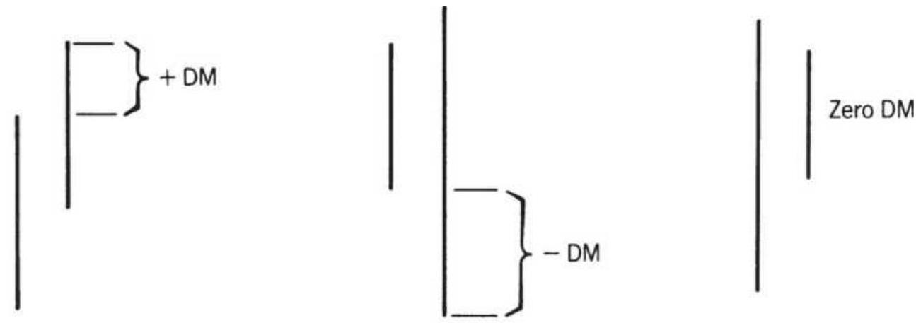
\section*{FIGURE 23.14 Defining the DM.}
The directional movement is either up or down, whichever is larger of PDM and MDM. It is the largest part of today's range that is outside yesterday's range. The value that is not used is set to zero. When an inside day occurs, both PDM and MDM are zero, and the directional movement is zero (Figure 23.14).
In the calculation of PDM and MDM, DM is expressed relative to today's true range (TR1),
\(\max \left(H_{t}-L_{t}, \quad H_{t}-C_{t-1}, \quad C_{t}-L_{t-1}\right)\). The true range is always positive.
The relationship of the price direction to the true range is called the Directional Movement (DM). Today's directional movement is calculated using either the PDM or the MDM, whichever is greater. The notation " 14 " refers to Wilder's choice for the period over which the values are smoothed.
\[
P D M 14=+\frac{D M 14}{T R 14} \quad \text { or } \quad M D M 14=-\frac{D M 14}{T R 14}
\]
Once the first DM 14 is calculated, using 14 days of price movement, an average-off technique is used to find each successive DM14 as follows:
\[
\begin{gathered}
P D M 14_{t}=P D M 14_{t-1}-\frac{P D M 14_{t-1}}{14}+P_{D M} 14_{t} \\
M D M 14_{t}=M D M 14_{t-1}-\frac{M D M 14_{t-1}}{14}+M D M 14_{t}
\end{gathered}
\]
The same procedure is followed for the true range:
\[
T R 14_{t}=T R 14_{t-1}-\frac{T R 14_{t-1}}{14}+T R 14_{t}
\]
These results can also be produced using a smoothing constant of 0.133 , which is an approximation of the 14day smoothing, where \(t\) is today's value:
\[
\begin{aligned}
P D M 14_{t} & =0.133 \times P D M 14_{t-1}+P D M 14_{t} \\
M D M 14_{t} & =0.133 \times M D M 14_{t-1}+M D M 14_{t} \\
T R 14_{t} & =0.133 \times T R 14_{t-1}+T R 14_{t}
\end{aligned}
\]
At this point, the directional movement components can be used as trading indicators; however, Wilder's interest was to use this in a more complete concept, shown in the following sections.
\section*{Directional Indicator and True Directional Movement Once the PDM14, MDM14, and the TR14 are calculated, the directional indicators, PDI14 and MDI14, are:}
\[
\begin{aligned}
& \text { PDI14 }=\frac{P D M 14_{t}}{T R 14_{t}} \\
& M D I 4_{t}=\frac{M D M 14_{t}}{T R 14_{t}}
\end{aligned}
\]
and the True Directional Movement (DX) is the difference between PDI14 and MDI14. When an upward trend is sustained, the MDI current value is zero; therefore, PDI14 becomes larger, MDI14 becomes smaller, and DX becomes larger. The result is then normalized in order to express the final value between 0 and 100,
\[
D X_{t}=100 \times \frac{\left|P D D 14_{t}-M D 14_{t}\right|}{P D I 4_{t}+\text { MDI }}
\]
where multiplying by 100 converts the percentage to a whole number, and the absolute value prevents DX from becoming negative. At the same time, the absolute value causes DX to lose the direction that prices are moving.
\section*{Average Directional Movement Index (ADX)}
The DX is then smoothed using the equivalent of a 14day average (a 0.133 smoothing constant) and is called the Average Directional Movement Index (ADX).
\[
A D X_{t}=A D X_{t-1}+0.133 \times\left(D X_{t}-A D X_{t-1}\right)
\]
The ADX, the PDM, and the MDM are shown for NASDAQ 100 continuous futures in Figure 23.15. The heavier ADX line moves higher as the price trend becomes clear. The individual components, the PDM (shown as the thinnest line) and the MDM (the mediumweight line), indicate the relative strength of the upward and downward moves within the trend. As NASDAQ prices decline, the MDM remains above the PDM, which is shown along the bottom of the lower panel.
One last adjustment is made to the extreme variance of the ADX by taking the average of the current value and the value of the ADX 14-days ago. This final value is called the Average Directional Movement Index Rating (ADXR):
\[
A D X R_{t}=\frac{A D X_{t}+A D X_{t-14}}{2}
\]
The ADX and ADXR are shown plotted together in Figure 23.16. The ADX is seen to oscillate about the ADXR. Measuring the distance of the ADX from the zero line, a higher amplitude means higher directional movement and a stronger trend, whether up or down. The peaks are always the extremes. The distance between the ADX and ADXR is used to measure the overbought and oversold condition of the trend. The larger the value, the greater the reactions to the trend.
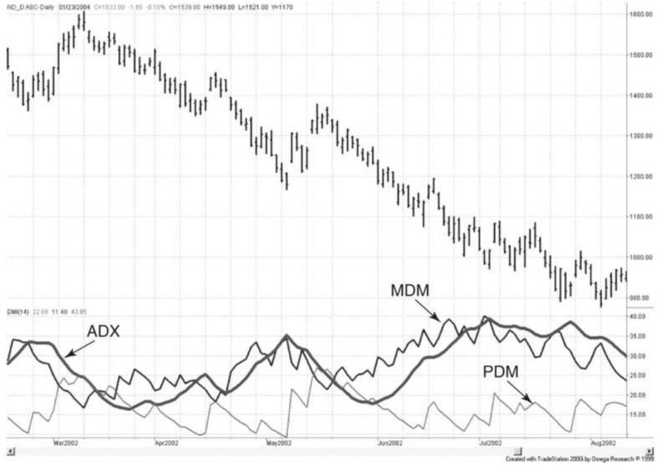
FIGURE 23.15 The 14-day ADX, PDM, and MDM, applied to NASDAQ 100 continuous futures prices, February-August 2002.
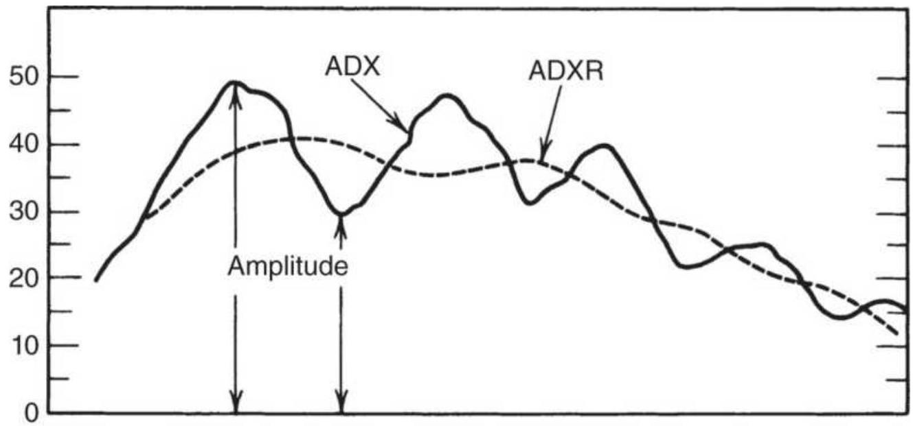
FIGURE 23.16 The ADX and ADXR.
\section*{Using the ADX as a Trending Indicator. The ADX} has become a popular tool. Ruggiero \({ }^{17}\) uses it to determine the trend with the following rules:
1. If ADX crosses above 25 , the market is trending.
2. If ADX crosses below 20 , the market is consolidating.
3. If ADX crosses below 45 after being higher, the market is consolidating.
4. If ADX rises above 10 on 3 of 4 days after being lower, the market will start to trend.
5. A trend based on rule 4 remains in effect until the \(5^{-}\) day difference in the ADX is less than 0.
Additional analysis says that above 40 is a strong trend, above 50 extremely strong, and above 70 a "power" trend.
\section*{Commodity Selection Index}
The creation of the Directional Movement Indicator, the different components, and finally the ADX leads to the Commodity Selection Index (CSI), which is calculated as:
\[
C S I_{t}=A D X R_{t} \times A T R 14_{t} \times\left[100 \times \frac{V}{M} \times \frac{1}{150+C}\right]
\]
where
ADXR = average directional movement index rating ATR14 = 14-day average true range
\(V=\) conversion factor (the big point value); value of a 1.00 move for a futures market (in dollars).
\(M=\) margin (in dollars)
C \(=\) commission cost (in dollars)
The CSI can be applied to equities by setting \(V=1\) and \(M\) to the total investment in that market. Note that for any specific market, the value inside the bracket does not change. By calculating it once and calling that value \(K\), the CSI can be expressed as:
\section*{\(C S I_{t}=A D X R_{t} \times A T R 14_{t} \times K\)}
A portfolio allocation can be chosen by calculating the CSI daily or weekly for each market. Simply select those products to trade that have the highest CSI or allocate position size in proportion to their CSI value.
\section*{Trading Rules Combining PDM, MDM, and ADX}
Most often, the three indicators - PDM, MDM, and ADX - are used to complement a trending strategy by improving the entry or exit timing. Used by itself, an increasing ADX confirms the direction of the price move, whether up or down. Colby 21 found that using a 2 -day calculation period with the following rules, the Dow Jones Industrial Averages were profitable for 72 years from 1928 to 2000:
Enter a new long position when the 2-day PDI > the 2-day MDI or the 2-day ADX > the 2-day smoothing of the ADX.
Close out a long position when the 2-day PDI < the 2-day MDI or the 2-day ADX < the 2-day smoothing of the ADX.
Entering a new short sale and exiting a short sale (buying to cover) are the opposite rules. All orders are executed on the close. The results show that a \(\$ 100\) investment would have returned \(\$ 9,988\) after profits were reinvested, which was much better than a buy-and-hold strategy. Programs to test these indicators are available on most test platforms.
\section*{Ranking Trends Using Prices}
Chande also created his own trend ranking based on a rolling period of 50 or 100 days. \(\underline{22}\) His trend strength is calculated as:
\[
S_{t}=\frac{\ln \frac{P_{t}}{P_{t-n}}}{\sigma\left(\ln \frac{p_{t}}{P_{t-1}}, n\right) \times \sqrt{n}}
\]
where \(\sigma\) is the standard deviation applied to the 1-period returns over \(n\) total periods. There is a similarity to the formula for noise given in Chapter 17. The numerator is the net return over \(n\) days, divided by a volatility function. In this case, \(S_{t}\) can be either positive or negative to show the trend direction. When applying this to stocks, the ln function implies that volatility increases as price increases, which is not correct, as shown in
Chapter 22.
\section*{Kaufman's Strategy Selection Indicator}
A market's characteristic is reflected in its price patterns. Some markets, such as the S\&P 500 index, can be very volatile with gradual upward moves and fast, sharp drops. In contrast, Eurodollar interest rates are very steady, often trading high volume at the same price.
Qualifying markets by their underlying level of noise allows you to decide which trading strategy is most likely to be successful. Less noise favors trending systems and high noise makes mean-reverting techniques a better choice.
The concept of noise has been discussed in Chapters 1 and 17 and it is again of great value when choosing which system to apply to a market and identifying when a market is best treated as trending. In essence, noise is market movement that has no direction or price movement in which the amount of direction is overwhelmed by erratic up and down movement. As a simple reminder, noise is defined using the efficiency ratio, \(E R\), the absolute value of the net price change divided by the sum of the individual price changes taken as positive values, over the same time interval. Closing prices are used.
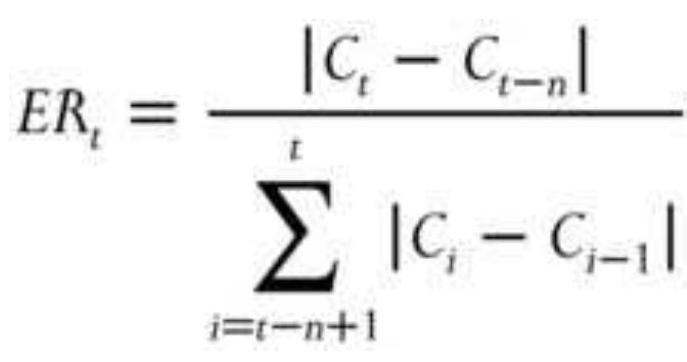
\(E R\) is not the same as volatility and indicates that noise increases as \(E R\) gets closer to zero because of a large amount of erratic price movement (the denominator) or a small numerator due to little net price change. In Chapter 1, the level of noise was shown for world equity index markets (see Figure 1.6) and for Asian markets specifically. It was also shown that ranking the noise of various equity markets would show the maturity of that market (see "Maturing Markets and Globalization"). Emerging markets have less noise and more trend because there are fewer participants and those that are active seem to have the same view of the direction of the market, or the lack of liquidity drives prices further in one direction than would be seen in a highly liquid market. But equity index markets could be a special case. A program that calculates the average efficiency ratio is TSM Efficiency Ratio Average, available on the Companion Website.
\section*{Results of Efficiency Ratio Selection}
Can the efficiency ratio be used to select which markets to trade? The easiest way to test this is to show the results of a trending system compared to the value of the efficiency ratio. Using the total profits for performance, based on an 8o-day moving average, and the 10-day efficiency ratio (a small number of days to exaggerate the values), we used data from 30 world futures markets from 1998 through July 2018. Those markets included 6 interest rates, 13 equity index, 3 currencies, 6 metals, 4 energy, and 4 agricultural. The results are shown in the
scatter diagram, Figure 23.17
The extreme points on the scatter conform to our expectations. The far right point is Eurodollars and to the left of it is the Short sterling. These are the two rates with the shortest maturity and most likely to track monetary policy. At the far left bottom, the two points clustered together are the FTSE and EuroStoxx, two European equity index markets. The point furthest to the left is the Russell 2000. The other equity index markets are the next points to the right.
Total profits versus noise
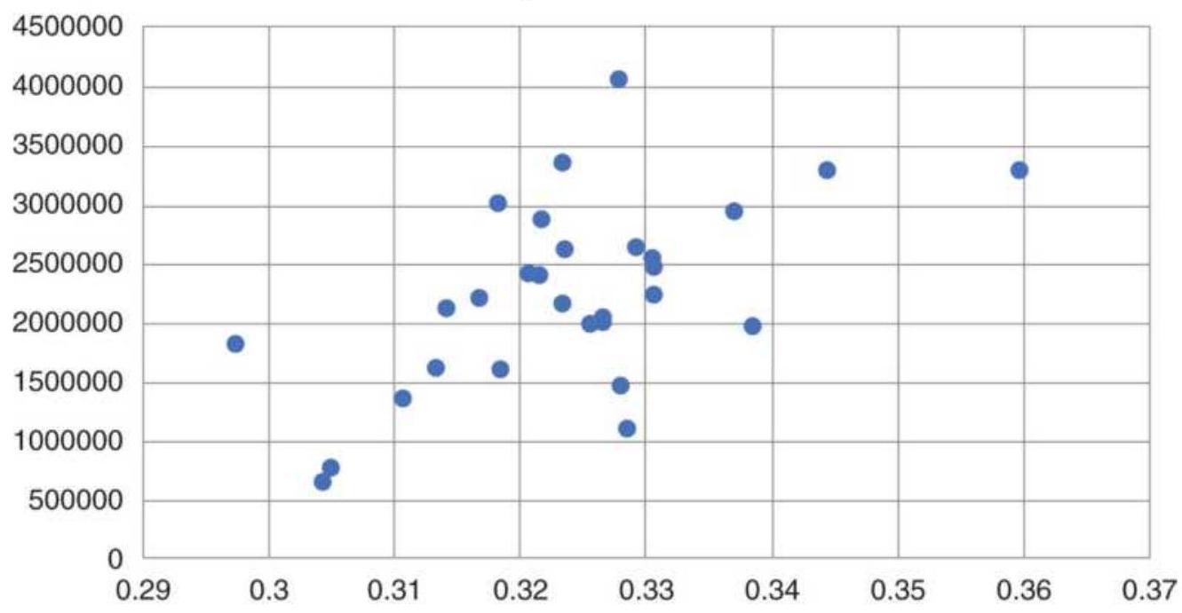
FIGURE 23.17 Scatter diagram of the profit factor versus the efficiency ratio for a wide range of futures and equities, 1990 -mid-2011.
Using a different trend speed and different number of days to calculate noise could make these points move around; however, the overall picture will remain the same. The shorter maturity interest rates have the
strongest trend and will be at the top right. The actively traded equity index markets will be at the bottom left. Other markets will have varying degrees of profits and will move around near the center. It shows that the efficiency ratio can be a valuable tool for selecting the right market for a specific strategy.
\section*{PROBABILITY OF SUCCESS AND RUIN}
The relative size of trading profits and losses, the frequency of the losses, and the sequence in which they occur combine to form an equity profile. This can apply equally to the returns of individual discretionary traders or fully automated trading systems. The profile can be used to determine the capitalization necessary to maintain trading during the losing periods, which will allow the system to continue uninterrupted trading. In investment terminology and probability theory, the level at which there is no longer enough money to continue trading is called the point of ruin, and the likelihood of getting there is the risk of ruin. The probability of the risk of ruin is expressed as:
\[
R=\left[\frac{1-A}{1+A}\right]^{c}
\]
where \(0 \leq R \leq 1\), and where o indicates no risk, and 1 is certain ruin:
\(A=P-(1-P), P\) is the proportion of winning trades, also called the trader's advantage
\(c=\) the initial investment expressed as 1 unit (other investments can be expressed in fractional increments)
A trading system that has 60\% profitable trades and trading capital of \(\$ 10,000\) (1 unit) will have a risk of ruin calculated as follows:
\[
\begin{aligned}
& A=0.60-(1-0.60)=0.20 \\
& R=\left(\frac{1-0.20}{1+0.20}\right)^{c}=\left(\frac{0.80}{1.20}\right)^{c}=\left(\frac{2}{3}\right)^{c}
\end{aligned}
\]
When \({ }_{c}=1\) unit, and the initial investment is \(\$ 10,000\), the risk of ruin \(R=0.66\), or \(66 \%\). When \({ }_{c}=2\) units and the initial investment is \(\$ 20,000, R=0.43\), or \(43 \%\). Therefore, the greater the trader's advantage or the greater the capital, the smaller the risk of ruin (Figure 23.18).
When using profit goals, the point at which trading would stop if the goal was achieved, the chance of ruin should decrease as the goal becomes closer. The relationship would be expressed as:
\[
R=\frac{[(1+A) /(1-A)]^{G}-1}{[(1+A) /(1-A)]^{+G}-1}, 0 \leq R \leq 1
\]
where all terms are the same as before, and \(G\) is the goal in units of trading capital.
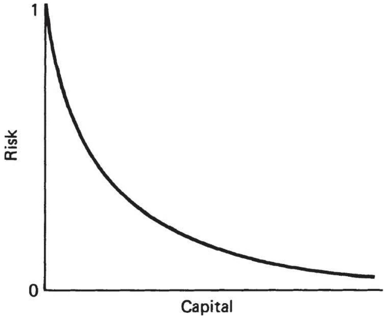
\section*{FIGURE 23.18 Risk of ruin based on invested capital.}
\section*{Wins Not Equal to Losses}
The basic equations in the previous section are generally applied to gambling situations, where the size of profits and losses are the same. This requires that the percentage of winning events exceed the losing events in order to avoid ruin. Trading, however, often results in more losing trades than profitable ones and must therefore return much larger average profits than losses. This pattern is common to all conservation-of-capital systems, such as trend following. The risk of ruin of
unequal profits and losses, including an unequal chance of a profit or loss, can be found as: 23
\(C_{T}=\) the total capital available for trading (in units)
\(C_{R}=\) the cutoff point, where level of ruin is reached ( \(C_{R}<\) \(C_{T}\) )
\(C_{A}=C_{T}-C_{R}\), capital available to be risked
\(E=\) the expected mean return per trade, the probabilityweighted sum of values that a trade might take
\[
E=\sum_{i=1}^{N}\left(P L_{i} \times P_{j}\right)
\]
where
\(P L_{i}=\) the possible profit or loss value
\(P_{i}=\) the probability of \(P L_{i}\) occurring ( \(0<p_{i}<1\) )
\(N=\) the number of trades
\(E_{2}\) is the expected squared mean return per trade, the probability-weighted sum of all the squared values of a trade:
\[
E_{2}=\sum_{i=1}^{N}\left(P L^{2} x_{\left.P_{1}\right)}\right)
\]
where \(P L_{i}\) and \(P_{i}\) are defined above. Then:
\[
\begin{aligned}
& D=C_{A} / \sqrt{E_{2}} \\
& P=0.5+E /\left(2 \sqrt{E_{2}}\right)
\end{aligned}
\]
and the risk of ruin is:
\[
R=\left(\frac{1-P}{P}\right)^{D}
\]
Introducing an objective and a desired level of capital \(L\), the risk of ruin \(R\) becomes:
\[
R=1-\frac{[(1-P) / P]^{D}-1}{[(1-P) / P]^{G}-1}
\]
where
\[
G=L / \sqrt{E_{2}}
\]
As in the first situation, using equal profits and losses, the risk increases as the objective \(L\) increases.
Ralph Vince \({ }^{24}\) derived similar results from Griffin's work, \({ }^{5}\) which claims to provide a "fair approximation" of risk. Vince's approach has been modified here for convenience and given in a way that allows a spreadsheet solution:
\[
\text { Risk of Ruin }=((1-P) / P) *(\operatorname{MaxRisk} / A)
\]
where the following terms are defined in the order needed for calculation:
AvgWin is the average winning trade (e.g., \$400) AvgLoss is the average losing trade (e.g., \$200) Investment is the amount invested (e.g., \$10,00o)
ProbWin is the probability (percentage) of a winning trade (e.g., 0.40)
ProbLoss is the probability (percentage) of a losing trade (e.g., o.6o)
MaxRisk is the maximum part of the investment that can be lost, in percent (e.g., o.25)
AvgWin\% is ABS(AvgWin/Investment)
AvgLoss\% is ABS(AvgLoss/Investment)
\(Z\) is the difference of the possible events, (ProbWin \(\times\) AvgWin\%) \(-(\) ProbLoss \(\times\) AvgLoss\%)
\(A\) is the square root of the sum of the squares of possible events,
\(\left[(\text { ProbWin } \times \text { AvgWin\% })^{2}+(\text { ProbLoss } \times \text { AvgLoss } \%)^{2}\right]^{(1 / 2)}\) \(P\) is \(0.5 \times(1+(Z / A))\)
\section*{TABLE 23.15 Examples of risk of ruin with unequal wins and losses.}
\begin{tabular}{|l|r|r|r|r|r|}
\hline & Case 1 & Case 2 & Case 3 & Case 4 & Case 5 \\
\hline AvgWin & 400 & 400 & 400 & 350 & 325 \\
\hline
\end{tabular}
\begin{tabular}{|l|r|r|r|r|r|}
\hline AvgLoss & 200 & 200 & 200 & 200 & 200 \\
\hline Investment & 10000 & 5000 & 2500 & 10000 & 10000 \\
\hline ProbWin & 0.4 & 0.4 & 0.4 & 0.4 & 0.4 \\
\hline ProbLoss & 0.6 & 0.6 & 0.6 & 0.6 & 0.6 \\
\hline MaxRisk & 0.25 & 0.25 & 0.25 & 0.25 & 0.25 \\
\hline AvgWin\% & 0.04 & 0.08 & 0.16 & 0.035 & 0.0325 \\
\hline AvgLoss\% & 0.02 & 0.04 & 0.08 & 0.02 & 0.02 \\
\hline Z & 0.004 & 0.008 & 0.016 & 0.002 & 0.001 \\
\hline A & 0.0297 & 0.0593 & 0.1187 & 0.0270 & 0.0257 \\
\hline Z/A & 0.13484 & 0.13484 & 0.13484 & 0.0740 & 0.0389 \\
\hline P & 0.56742 & 0.56742 & 0.56742 & 0.5370 & 0.5194 \\
\hline Risk of & \(10.16 \%\) & \(31.88 \%\) & \(56.46 \%\) & \(25.35 \%\) & \(47.00 \%\) \\
\hline Ruin & & & & & \\
\hline
\end{tabular}

A spreadsheet, TSM Risk of Ruin, and a function of the same name, can be found on the Companion Website. Using a spreadsheet, Table 23.15 gives the risk of ruin for a few cases. Case 1 is a benchmark trendfollowing configuration using a \$10,000 investment, a \(\$ 400\) average win, and a \(\$ 200\) average loss. The probability of a win or loss is \(40 \%\) and \(60 \%\) respectively, and the maximum loss in the account is set at \(25 \%\). That gave a risk of ruin \(10 \%\), shown at the bottom of the column. In Cases 2 and 3, the size of the investment is halved twice and the risk of ruin increased to \(31 \%\) and \(56 \%\). In Cases 4 and 5 the Avg Win is reduced from \(\$ 400\) to \(\$ 350\) and \(\$ 325\) and the risk of ruin also increases
rapidly. In Case 6, the Avg Win is held at \(\$ 325\) but the MaxRisk is reduced from \(25 \%\) to \(15 \%\), causing the risk of ruin to jump to \(63 \%\). \(\underline{26}\)
\title{
MANAGING EQUITY RISK
}
Every system has profit and loss patterns that can be seen clearly by plotting its equity. Long-term trend systems give back part of their gains when prices turn after a long run of profits. They show steady, small losses in sideways markets. Mean reversion systems are less predictable except when volatility is low and profits are very small.
In previous sections we discussed adding on profits and adding on losses. For most cases, they did not improve the basic rule of entering the entire position at the time of the initial trading signal. In markets that were generating profits or had strong trends, getting in quickly was best; in markets that were losing money or had high noise, waiting as long as possible to enter was best. Unfortunately, we don't know whether we will have profits or losses until afterward.
A common problem is to think that making 50\% after losing 50\% recovers your losses. It only returns half your losses. Consider a system that has a 100\% gain for each profitable period, followed by an interval where there is a \(50 \%\) loss. If this cycle is repeated twice each year, then each year will have the following equity pattern:
\author{
Change in \\ Equity
\section*{Total} \\ Equity
}
\begin{tabular}{|l|c|c|l|}
\hline \begin{tabular}{l}
Original \\
Investment
\end{tabular} & & \(\$ 10,000\) & \\
\hline Gain of \(100 \%\) & \(+10,000\) & \(.20,000\) & \begin{tabular}{l}
First 6 \\
months
\end{tabular} \\
\hline Loss of \(50 \%\) & \(-10,000\) & \(.10,000\) & \\
\hline Gain of \(100 \%\) & \(+10,000\) & \(.20,000\) & \begin{tabular}{l}
Second 6 \\
months
\end{tabular} \\
\hline Loss of \(50 \%\) & \(-10,000\) & \(.10,000\) & \\
\hline
\end{tabular}
Trading would be a lot of work for no return.
Some investors choose not to compound their returns, but let profits accumulated as reserves, also called account excess. Given the same profit/loss cycle as above but holding the investment constant results in a very different equity pattern. The management of the reserves can be the key to success. Starting with margin and reserves equal, reserves increase during profitable periods and decrease during losing ones. Proportionately more of the total equity is traded during losing phases. The results are:
\begin{tabular}{|l|l|l|l|l|l}
\hline & \begin{tabular}{c}
Change \\
in \\
Equity
\end{tabular} & Margin & Reserves & \begin{tabular}{c}
Total \\
Equity
\end{tabular} & Rese \\
\hline \begin{tabular}{l}
Original \\
investment
\end{tabular} & & 10,000 & 10,000 & 20,000 & \\
\hline \begin{tabular}{l}
Gain of \\
\(100 \%\)
\end{tabular} & \(+10,000\) & 10,000 & 20,000 & 30,000 & \\
\hline \begin{tabular}{l}
Loss of \\
\(50 \%\)
\end{tabular} & \(--5,000\) & 10,000 & 15,000 & 25,000 & \\
\hline
\end{tabular}
\begin{tabular}{|l|l|l|l|l|l}
\hline \begin{tabular}{l}
Gain of \\
\(100 \%\)
\end{tabular} & \(+10,000\) & 10,000 & 25,000 & 35,000 & \\
\hline \begin{tabular}{l}
Loss of \\
\(50 \%\)
\end{tabular} & \(-5,000\) & 10,000 & 20,000 & 30,000 & \\
\hline
\end{tabular}
This approach holds the size of positions the same and allows the reserve to increase during profitable periods and decrease during the next losing period. While this will capture the profits, it requires twice the investment so that the return is half what the system gives you.
In the next example, the total account value of \(\$ 25,000\) is distributed \(40 \%\) to margin and \(60 \%\) to reserve at the end of the first cycle. It is redistributed so that the next profit phase will be entered with a larger base than the previous losing cycle. The result is a gradual increase in profits:
\begin{tabular}{|l|l|l|l|l|l}
\hline & \begin{tabular}{c}
Change \\
in \\
Equity
\end{tabular} & Margin & Reserves & \begin{tabular}{c}
Total \\
Equity
\end{tabular} & Resi \\
\hline \begin{tabular}{l}
Original \\
investment
\end{tabular} & & 10,000 & 10,000 & 20,000 & \\
\hline \begin{tabular}{l}
Gain of \\
\(100 \%\)
\end{tabular} & \(+10,000\) & 10,000 & 20,000 & 30,000 & \\
\hline Loss of 50\% & \(-5,000\) & 10,000 & 15,000 & 25,000 & \\
\hline Redistribute & & 12,500 & 12,500 & 25,000 & \\
\hline \begin{tabular}{l}
Gain of \\
\(100 \%\)
\end{tabular} & \(+10,000\) & 12,500 & 25,000 & 37,500 & \\
\hline Loss of 50\% & \(-5,000\) & 12,500 & 18,750 & 31,250 & \\
\hline Redistribute & & 15,625 & 15,625 & 31,250 & \\
\hline
\end{tabular}
\section*{Trading on Equity Trends}
It seems reasonable to think that the equity stream generated from a trend-following system, especially a long-term macrotrend system, would also trend. We would expect prices to move in a favorable direction most of the time, producing a chart with reasonably smooth swings. By applying a simple moving average to the accumulated profits and losses, we could exit positions when the trend of equity turns down.
A word of caution. Results of a theoretical system, that is, one that was recently developed and tested, will tend to have longer, more profitable trading intervals and smaller downturns than the results of actual trading. It will be difficult to find a trend that improved the equity. Actual performance is not as smooth, but the drawdowns can be erratic, sometimes steep losses followed by slow, steady recoveries. It is also a pattern that would be difficult to improve by using equity trends.
As an example, we took the results of a macro-trend equity trading program from 2002 through July 2018. The last five years were actual results, the earlier years were the results of system development. We calculated the 60-day trend of the NAVs and set the daily returns to zero if the trend direction was down on the previous day. The filtered NAVs were calculated based on those returns. Results are shown in Figure 23.19.

The result of this test was that the risk dropped from \(23 \%\) to \(20 \%\), but the AROR dropped from \(20 \%\) to
\(15 \%\). The net result was not a good trade-off. Other calculation periods were tested and the 60-day equity trend was the best. You can try this yourself with your own NAVs using the spreadsheet TSM Equity Trends on the Companion Website. System equity patterns are all different, and this method may reduce a large drawdown. It may help if you first find out if the returns are positively autocorrelated, meaning that there is persistence in either positive or negative returns.
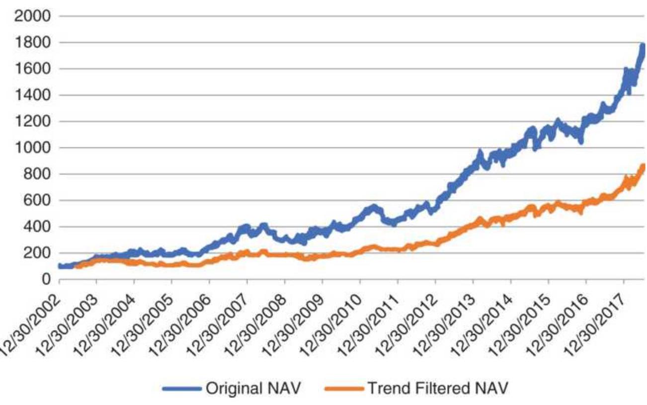
FIGURE 23.19 Original NAVs and filtered NAVs for a macrotrend system using stocks.
\section*{IDEAL LEVERAGE USING OPTIMAL \(f\)}
Optimal \(f\) is the optimal portion of an account that should be invested at any one time, or the size of the bet to place on any one trade. The amount to be risked is
measured as a percentage of the total investment. The objective is to maximize the amount of exposure yet avoid the possibility of a loss greater than some target amount. Trading a very small part of assets can be a poor use of capital while trading too much guarantees bankruptcy or ruin. Optimal \(f\) is the ideal portion of an investment that should be placed at risk at any one time. \(\underline{27}\)
\section*{John Ehlers' Method}
Investing generally has a 2-level optimal \(f\) : (1) the part of the total investment put at risk compared to that part held in cash equivalents (i.e., no risk), and (2) the individual size of the commitment to each stock or futures contract within the portfolio. This is particularly important for futures, where the high leverage of individual markets makes it very easy to risk too much.
Before getting into the calculations, it will be helpful to define some of the terms \({ }^{28}\)
Upward bias (B)
\(\# \mathrm{~W} /(\# \mathrm{~W}+\# \mathrm{~L})=\# \mathrm{~W} / \mathrm{N}\)
Downward bias (1-B)
\(\# \mathrm{~L} /(\# \mathrm{~W}+\# \mathrm{~L})=\# \mathrm{~L} / \mathrm{N}\)
Expectancy (E)
\(\# \mathrm{~W}^{*}\) Odds \(-\# \mathrm{~L}=\mathrm{B}^{*}(1+\mathrm{R})-1\)
Odds (R) \(\$ \mathrm{~W} / \$ \mathrm{~L}\)
Bet (Bet)
\(\$ \mathrm{~L}\) or \(\%\) Bet \(=\$ \mathrm{~L}\)
OptF (Optimal \(f\) )
\(\mathrm{E} /\) Odds \(=\mathrm{E} / \mathrm{R}\)
Equity (F\$) Linear
\(\mathrm{N}^{*} \mathrm{E}^{*} \$\) Bet
Equity (FF)
\(\left(1+\mathrm{R}^{*} \text { Bet }\right)^{\wedge} \mathrm{B}^{*} \mathrm{~N}^{*}(1-\text { Bet })^{\wedge}((1-\)
Exponential
B) \({ }^{*} \mathrm{~N}\) )
where \(N=\) number of trades, \#W = number of wins, \#L \(=\) number of losses, \(\$ \mathrm{~W}=\) total dollar wins, \(\$ \mathrm{~L}=\) total dollar losses, \(\mathrm{F} \$=\) size of dollar bet, \(\mathrm{FF}=\) fixed fractional bet.
\section*{Ralph Vince Method}
Ralph Vince, in his popular book Portfolio Management Formulas, \(\underline{29}\) focuses on optimal \(f\), risk of ruin, and other practical items. The first step is to be reminded of what percentage gain is required to recover a percentage loss.
\[
\text { Required gain }=\frac{1}{1-\text { Percent loss }}-1
\]
That is, a \(50 \%\) loss requires a \(100 \%\) gain to restore the original value. Because the amount risked on each trade depends on our expectations of loss, the results obtained from the optimal \(f\) calculation will be the size of the bet, the invested amount, or the number of futures contracts to be traded, as a percentage of the maximum loss. The value used as a maximum loss will be an estimate, because losses can always be greater than those already experienced in the market, or those found by historic testing. In addition, the optimal \(f\) will be different for each system, depending upon its performance profile.
The mathematics behind Vince's optimal \(f\) is based on the Kelly Betting System. 30 Kelly states that the optimum bet is the one that maximizes the growth function \(G(f)\) :
\section*{\(G(f)=P \times \ln (1+B \times f)+(1-P) \times \ln (1-f)\)} where
\(f=\) the optimum fixed fraction
\(P=\) the probability of a winning bet or trade
\(B=\) the ratio of the average winning return to the average losing return
\(\ln =\) the natural log function
The solution for finding the optimal fixed fraction to invest uses the geometric product and geometric mean, which represent the way in which profits and losses accrue.
Optimal \(f=\max \left(\prod_{i=1}^{n}\left(1+\frac{f \times\left(-R_{i}\right)}{\text { Largest loss }}\right)\right)^{1 / n}\), for \(f=0.01\) to 1.0 where
\(\max =\) the function that returns the maximum value
\(\Pi=\) the product function
\(R_{i}=\) the series of individual trade returns
\(n=\) the number of trades
By testing values of \(f\) between 0.01 and 1.0, based on the geometric mean of all trades (each percentage profit or loss applied to the account value before the current trade), we can find the value of \(f\) that gives the best return. That \(f\)-value is the optimal \(f\), the percentage of
the total account that should be invested for each trade.
Another way of expressing optimal \(f\), is: \({ }^{31}\)
\[
f=[p \times(P L R+1)-1] / P L R
\]
where
\(P L R=\) the ratio of average profit to average loss
\(p=\) the probability of a winning trade
Therefore, if \(p=0.50\), there is an equal chance of a profit or a loss. If the average profit is \(\$ 400\) and the average loss is \(\$ 200\) (giving \(P L R=2.0\) ), then
\(f=(0.50 \times(2+1)-1) / 2=0.5 / 2=0.25\) or \(25 \%\) of the available capital.
Given an equal chance of a profit or a loss, it is not likely that there would be 4 losses in a row, each of \(25 \%\); however, eventually, there will be a run of 4 or 5 losses in a row. Optimal \(f\), however, invests a fraction of the current equity; therefore, after a loss of \(25 \%\), the next investment is \(25 \%\) of the balance, or \(18.75 \%\) of the initial equity. If there are further losses, that amount drops to 14.06\%. After three losses in a row, instead of having lost \(75 \%\) of the initial equity, the investment has only dropped by \(57.81 \%\). Over time, with profits twice as large as losses, and winning trades alternating normally with losing trades, the losses will be recovered.
\section*{Observations of Optimal \(\boldsymbol{f}\)}
According to Alex Elder, \({ }^{32}\) the ideal amount to invest on
the next trade will keep changing because each new trade affects the calculation. If you trade a position larger than determined by optimal \(f\), and get average results, you can expect to go broke eventually because you are overinvesting. On the other hand, if you invest less than the optimal amount, then your risk decreases arithmetically, but your profits decrease geometrically, which is another bad scenario. Because this is too complicated for most investors, the simple solution is to keep trading the same allocations, with a reserve sufficiently large to absorb most extreme, adverse price moves. For futures, John Ehlers finds that the total exposure should be \(25 \%\) of the investment.
On the positive side, Dr. Elder concludes that the most useful results of optimal \(f\) are that it tells the trader to:
Never average down
Never meet margin calls
- Liquidate the worst position first
The application of optimal \(f\) uses the end value of individual trades while ignoring the day-to-day volatility. The drawdown during a trade could be much larger than the final outcome of that trade. Then there is more risk than can be seen using only the final result of the trade.
Markowitz also looked at this problem in 1959, with the following approximation:
Expected \(\log\) return \(=\) expected return \(-1 / 2\) variance of returns
Using an amount of leverage \(M\), the log returns becomes:
\section*{Expected leveraged log returns \(=M \times\) expected return \(-1 / 2 M^{2}\) variance of returns} then
\section*{Optimal leverage \(=\) returns \(/\) variance \(=\mu / \sigma^{2}\)}
As with other methods, this depends on the future being the same as the past. Because of the uncertainty it may be best to consider using these methods only to reduce leverage, not increase it. Traders should measure success in terms of a return-to-risk ratio; therefore, this method of leveraging should be compared to other volatility stabilization approaches given in the next chapter.
\section*{COMPARING EXPECTED AND ACTUAL RESULTS}
In the development of an economic model or trading system, the final selection, as well as the choices made along the way, are based on comparing the results of one method to another. Often the results are given in terms of information ratios, profit/loss ratios, annualized percentage profits, expected reliability, and drawdowns. Although these statistics are common, their predictive qualities and sometimes their accuracy are not known.
On occasion, these results are generated by a sample that is too small, and they are not the results of actual performance but an historic test. This does not mean that the model will be unsuccessful, but that the pattern of success might vary far from expectations. In actual trading, everyone experiences a series of losses
exceeding the maximum level that was expected; at that point, it is best to know whether this situation could occur within the realm of the system's profile or whether the system has failed. For example, a moving-average system is expected to have about \(33 \%\) profitable trades with an average profit to average loss ratio of 4:1. But if the first 10 trades of the system are losers, should trading be stopped?
\section*{Accuracy}
We know that the accuracy of the results depends on the number of trades in our sample data. Fewer trades will result in less confidence. Table 23.16 shows the probability of a net loss given the number of trades and the long-term information ratio (annualized return divided by annualized risk) of the trading strategy. 33 A ratio above 1.0 gives a reasonably smooth performance curve; a ratio above 3.0 is very smooth.
The left column of the table gives the number of trades completed, and along the top is the long-term information ratio. The top left corner of the table, showing \(48 \%\), is the probability of showing a net loss in total performance after 10 trades with an information ratio of o.50. Note that, even with a very high ratio of 3.0 , on the right, there is still a \(34 \%\) chance of that any profits will turn into a loss. The reason is that 10 trades is a very small sample size. As the number of trades gets bigger, the chance of turning a profit into a loss for a system with a successful history is zero.
Note that the data used in Table 23.16 was created
automatically and will not have the characteristics of real trading results, which can have unusually long runs of profits or losses, and the occasional price shock. Its intention is to show that systems with only a few trades have a great deal of uncertainty.
TABLE 23.16 Probability of a loss after N trades, relative to a system information ratio.
\begin{tabular}{|c|c|c|c|c|c|}
\hline Trades/Ratio 0.50 & \(\mathbf{0 . 7 0}\) & \(\mathbf{1 . 0 0}\) & \(\mathbf{2 . 0 0}\) & \(\mathbf{3 . 0 0}\) \\
\hline. \(\mathbf{1 0}\) & \(48 \%\) & \(47 \%\) & \(45 \%\) & \(41 \%\) & \(34 \%\) \\
\hline. \(\mathbf{2 0}\) & \(47 \%\) & \(44 \%\) & \(42 \%\) & \(37 \%\) & \(32 \%\) \\
\hline. \(\mathbf{5 0}\) & \(44 \%\) & \(40 \%\) & \(35 \%\) & \(28 \%\) & \(18 \%\) \\
\hline. \(\mathbf{1 0 0}\) & \(38 \%\) & \(38 \%\) & \(32 \%\) & \(22 \%\) & \(13 \%\) \\
\hline \(\mathbf{. 3 0 0}\) & \(36 \%\) & \(31 \%\) & \(23 \%\) & \(.8 \%\) & \(.3 \%\) \\
\hline \(\mathbf{. 5 0 0}\) & \(30 \%\) & \(25 \%\) & \(18 \%\) & \(.4 \%\) & \(.0 \%\) \\
\hline \(\mathbf{1 0 0 0}\) & \(24 \%\) & \(18 \%\) & \(11 \%\) & \(.1 \%\) & \(.0 \%\) \\
\hline
\end{tabular}
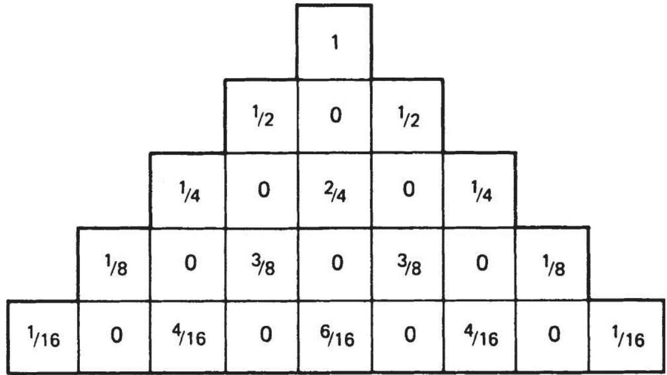
\section*{FIGURE 23.20 Pascal's triangle.}
\section*{Binomial Probability and the Likelihood of a}
\section*{LOSS}
What are the chances of having an unusually large run of losses? Using a random-number sequence to represent a trading model, we can find the probability of \(l\) losses in \(n\) trades when the probability of a loss is \(p\). Most of the work in this area of probability is credited to Bernoulli, whose study of a random walk is called a Bernoulli process. A clear representation of a forward random walk is shown by the Pascal triangle (Figure 23.20), where each box represents the probability of being in a particular position at a specific time. The result of this process is called a binomial distribution.
The forward random walk is similar to price movement, with the far edges of Pascal's triangle showing the probability of a continuous sequence of wins or losses using random numbers, and mixed sequences of profits and losses shown as we move toward the center of the triangle. The sequence \(1 / 2,1 / 4,1 / 8, \ldots,(1 / 2)^{n}\) is exactly the same as in the discussion of the Theory of Runs. The probability of successive losses can be calculated as the likelihood of a run of the same length, \((1 / 2)^{n+2}\).
A binomial distribution is useful in considering the total number of losses that can occur in any order within a sequence of trades; it is the probability of getting to a specific point at the base of Pascal's triangle when there
is a high probability of moving to the left (losses) rather than the right (profits). The formula for the binomial probability is:
\[
B(l: p, n)=\frac{n!}{l!(n-1)!} p^{\prime}(1-p)^{n-l}
\]
where
\(l=\) the number of losses
\(n=\) the total number of tries
\(p=\) the probability of a loss
and the symbol "!" is the factorial (e.g.,
\(5!=5 \times 4 \times 3 \times 2 \times 1)\)
Consider the first 5 trades of a system with a probability of success of \(1 / 3\). How many losses should be expected? To answer the question, it must be phrased differently. In this case, what is the probability of having 4 losses out of the first 5 trades? Let \(l=4\) and find the binomial probability \(B\) for all possibilities based on a normal distribution function. Then:
\[
\begin{gathered}
B(4: 0.667,5) \frac{5!}{4!1!} \times(0.667)^{4} \times(0.333)^{1} \\
=\frac{120}{24} \times(0.19792) \times(0.333) \\
\quad=5 \times 0.659=0.32954
\end{gathered}
\]
The binomial probability of having 4 losses out of the first 5 trades is about \(33 \%\). Table 23.17 shows the probability of loss for the first 5,10 , and 15 trades of a system with a \(1 / 3\) predicted reliability. Results show the highest probability of loss is at the \(2 / 3\) point (mean) for each sequence, but the standard deviation gives the range of variance about the mean, so that from 2.3 to 4.4 losses are expected in every 5 trades, 5.2 to 8.2 in 10 trades, and 8.2 to 11.8 losses in 15 trades.
Note that in the 5 -trade example, the chance of no loss is only \(1 \%\) and there is a \(13 \%\) chance of all losses. For the purpose of evaluation, it is easier to look at the maximum rather than the minimum number of losses. For 15 trades, there is an \(8 \%\) chance of 13 or more losses; if the system has produced more than 12 losses in that period, there may be something wrong with the trading method.
\section*{TABLE 23.17 The probability of a specific number of losses.}
\begin{tabular}{|c|l|c|c|c}
\hline \multicolumn{2}{|c|}{ 5 Trades } & \multicolumn{2}{c|}{ 10 Trades } & 1: \\
\hline \begin{tabular}{c}
Number \\
of \\
losses
\end{tabular} & \begin{tabular}{c}
Probability \\
(\%)
\end{tabular} & \begin{tabular}{c}
Number \\
of \\
losses
\end{tabular} & \begin{tabular}{c}
Probability \\
(\%)
\end{tabular} & \begin{tabular}{c}
Numbe \\
of \\
losses
\end{tabular} \\
\hline 0 & 1 & 0 & 0 & 0 \\
\hline 1 & 4 & 1 & 0 & 1 \\
\hline 2 & 16 & 2 & 0 & 2 \\
\hline 3 & 33 & 3 & 2 & 3 \\
\hline 4 & 33 & 4 & 5 & 4 \\
\hline
\end{tabular}
\begin{tabular}{|c|c|c|c|c|}
\hline 5 & 13 & 5 & 14 & 5 \\
\hline & & 6 & 23 & 6 \\
\hline & & 7 & 26 & 7 \\
\hline & & 8 & 19 & 8 \\
\hline & & 9 & 9 & 9 \\
\hline & & 10 & 2 & 10 \\
\hline & & & & 11 \\
\hline & & & & 12 \\
\hline & & & & 13 \\
\hline & & & & 14 \\
\hline & & & & 15 \\
\hline \multicolumn{2}{|c|}{ Avg \(=3.5\)} & \multicolumn{2}{|c|}{ Avg \(=6.67\)} & A \\
\hline \multicolumn{2}{|c|}{ Std \(=1.05\)} & \multicolumn{2}{|c|}{ Std \(=1.5\)} & St \\
\hline
\end{tabular}
Instead of the Pascal distribution, which is symmetric, the Poisson and various skewed distribution functions will be more appropriate for trading performance. It is well known that price changes and their returns have a skewed distribution with a fat tail.
\section*{\(\chi^{2}:\) Chi-Square Test}
Once a system has been traded and there is enough data to produce a performance profile, a simple correlation between these actual results and the expected results can be found using the chi-square test. The sample error,
\(1 / \sqrt{N}\), will tell you if there is enough data.
Assume that the real trading results show a reliability of \(20 \%\) ( 1 out of 5 profitable trades) as compared to the expected reliability of \(35 \%\). What are the chances of getting the expected results? The chi-square test is:
\[
\chi^{2}=\frac{(O-E)^{2}}{E}
\]
where
\(O=\) the observed, or actual result
\(E=\) the expected or theoretical result
Then:
\[
\begin{aligned}
\chi^{2} & =\frac{(20-35)^{2}}{35}+\frac{(80-65)^{2}}{65} \\
& =\frac{(-15)^{2}}{35}+\frac{(-15)^{2}}{65} \\
& =\frac{225}{35}+\frac{225}{65}=6.428+3.46 \\
& =9.89
\end{aligned}
\]
The percentage of actual winning trades is compared with the anticipated winning trades and the losing trades with the expected losing trades. The answer must be found in the first row of Table 23.18, which gives the distribution of \(\chi^{2}\).
The probability is distributed unequally in the table
because the results are only significant if the probability is small, showing less likelihood of the results occurring by chance. For this simple 2 -element test, the result is classified as:
Highly significant if.
\section*{\(\chi^{2} \geq 10.83(0.1 \%\) or \(1 / 1000)\)}
Significant if. \(\quad \chi^{2} \geq 6.64(1 \%\) or \(1 / 100)\)
Probably significant if.
\[
\chi^{2} \geq 3.84(5 \% \text { or } 1 / 20)
\]
The answer \(\chi^{2}=9.89\) is between \(0.1 \%\) and \(1.0 \%\), which shows significance. That is, given the expectations, there was only a \(1 \%\) chance that the reliability would have been \(20 \%\) when \(35 \%\) was expected. It shows there is a problem with the system, most likely overfitting.
\section*{TABLE 23.18 Distribution of \(\chi^{2}\).}
\section*{Cases}
\section*{Probability of Occurring by Chance}
Less
\begin{tabular}{|l|l|l|l|l|l|l|l|l|}
\hline .1 & \(\mathbf{0 . 7 0}\) & \(\mathbf{0 . 5 0}\) &. &. &. &. & & .0 .01 \\
\hline .1 & 0.15 & 0.46 & .1 .07 & .1 .64 & .2 .71 & .3 .84 & .5 .41 & .6 .64 \\
\hline .2 & 0.71 & 1.39 & .2 .41 & .3 .22 & .4 .61 & .5 .99 & .7 .82 & .9 .21 \\
\hline .3 & 1.42 & 2.37 & .3 .67 & .4 .64 & .6 .25 & .7 .82 & .9 .84 & 11.34 \\
\hline .4 & 2.20 & 3.36 & .4 .88 & .5 .99 & .7 .78 & .9 .49 & 11.67 & 13.28 \\
\hline .5 & 3.00 & 4.35 & .6 .06 & .7 .29 & .9 .24 & 11.07 & 13.39 & 15.09 \\
\hline
\end{tabular}
\begin{tabular}{|l|l|l|l|l|l|l|l|l|}
\hline 6 & 3.83 & 5.35 & .7 .23 & .8 .56 & 10.65 & 12.59 & 15.03 & 16.81 \\
\hline .7 & 4.67 & 6.35 & .8 .38 & .9 .80 & 12.02 & 14.07 & 16.62 & 18.48 \\
\hline .8 & 5.53 & 7.34 & .9 .52 & 11.03 & 13.36 & 15.51 & 18.17 & 20.09 \\
\hline .9 & 6.39 & 8.34 & 10.66 & 12.24 & 14.68 & 16.92 & 19.68 & 21.67 \\
\hline 10 & 7.27 & 9.34 & 11.78 & 13.44 & 15.99 & 18.31 & 21.16 & 23.21 \\
\hline
\end{tabular}
\section*{TABLE 23.19 Results from Analysis of Runs}
\begin{tabular}{|l|l|l|}
\hline \begin{tabular}{l}
Expected Length of \\
Run
\end{tabular} & \begin{tabular}{c}
Actual Results \\
(E)
\end{tabular} & \begin{tabular}{c}
Results \\
(O)
\end{tabular} \\
\hline 1 & 1225 & 1214 \\
\hline 2 & 612 & 620 \\
\hline 3 & 306 & 311 \\
\hline 4 & 153 & 167 \\
\hline 5 & 77 & 67 \\
\hline 6 & 38 & 41 \\
\hline 7 & 19 & 16 \\
\hline 8 & 10 & 5 \\
\hline 9 & 5 & 3 \\
\hline\(\geq 10\) & 4 & 5 \\
\hline\(\geq 8_{-}^{*}\) & 19 & 13 \\
\hline
\end{tabular}
\({ }_{-}^{*}\) The last groups were combined in order not to distort the results based on a small sample.
The chi-square test can be used to compare actual price movement with random patterns to see whether there is appreciable variation. Based on the expected number of runs (discussed earlier in the section "Gambling
Techniques: The Theory of Runs," in Chapter 22), Table 23.19 shows the difference between the expected runs of a random series compared to the actual runs of a price series.
Applying the actual data for runs of 1 through 8 against a random distribution, based on Table 23.19:
\(\chi^{2}=\sum_{i=1}^{8} \frac{\left(0_{i}-E_{i}\right)^{2}}{E_{i}}\)
\(=\frac{(1214-1225)^{2}}{1225}+\frac{(620-612)^{2}}{612}+\frac{(311-306)^{2}}{306}+\frac{(167-153)^{2}}{152}\)
\(+\frac{(67-77)^{2}}{77}+\frac{(41-38)^{2}}{38}+\frac{(16-19)^{2}}{19}+\frac{(13-19)^{2}}{19}\)
(4)
(5)
\(=0.09877+0.10457+0.08169+1.2810+1.2987\)
(6)
(7)
(8)
\(+0.23684+0.47368+1.8947\)
\(=5.470\)
From Table 23.18, the probability can be found in row 7 to be about \(55 \%\) for 8 cases. These results are not significant; the Theory of Runs shows that all cases taken together give the same patterns as chance movement. Individual runs or sets of 2 or 3 adjacent runs can be inspected for distortion. In both cases, the results are
further from normal but not mathematically significant. The two runs that differed the most were 4 to 5 days, which showed an \(11 \%\) probability of occurring by chance.
Highly significant price runs can be found when there is a fat tail, an extended run of, for example, 20 days, which is found occasionally in trending markets. By looking at the asymmetry of price movement, where a reverse run of 1 day is of negligible value, the significance of these runs will dramatically increase. Price movement is not a simple matter of random runs and equal payout.
\section*{Yates Correction}
Frank Yates, an English statistician, determined that the chi-square test often overestimates the significance for small amounts of data (under 5 data points). This can be corrected by subtracting 0.5 from the difference between each observed value and the expected value:

It should be noted that using a small number of data points is unreliable at best.
\section*{Is the Model Broken?}
Some trading systems will have a limited life, especially when based on an economic scenario. A strategy that exploited a pattern may find that the pattern occurs less often or has received too much publicity. An arbitrage
may degrade if the components become too highly correlated.
One way to judge if a model is performing as expected is by measuring the size and duration of drawdowns and comparing that to the tested profile, understanding that, as the amount of data increases, so will the likelihood of larger profits and larger losses. This was discussed at the beginning of this section, under "Accuracy." We could also use a chi-square test. If a new system begins trading and posts steady losses until it reaches the previous maximum drawdown, chances are that something is wrong. Systems should not systematically decay from the first day of trading.
The probability of a drawdown greater than \(P\) can be calculated as: \({ }^{34}\)
\section*{Probability of a drawdown \(\geq P=\left(1-\frac{P}{100}\right)^{2 \mu / \sigma^{2}}\)}
This formula assumes a normal distribution of returns (although trading returns should have a longer tail to the right). The value \(\mu\) is the average fractional change in equity (percentage returns), and \(\sigma\) is the standard deviation of the returns.
\section*{NOTES}
1 Andrew Lo, Adaptive Markets (Princeton, NJ:
Princeton University Press, 2017).
\(\underline{2}\) A book entirely devoted to price shocks and the "black swan" is Nassim Nicholas Taleb, Fooled by
Randomness (Texere, 2001). Taleb has popularized the phrase "mistaking luck for skill."
3 Peter L. Bernstein (Ed.), The Portable MBA in Investment (New York: John Wiley \& Sons, 1995), p. 37 .
4 G. Ginter and J. Richie, "Data Errors and Price Distortions," in Perry J. Kaufman (Ed.), Technical Analysis in Commodities (New York: John Wiley \& Sons, 1980).
5 Giorgos E. Siligardos, "Averaging Reward-to-Risk Ratios," Technical Analysis of Stocks \& Commodities (August 2016).
6 Jack D. Schwager, A Complete Guide to the Futures Markets (New York: John Wiley \& Sons, 1984).
Z John Sweeney, "Maximum Adverse Excursions for Stops," Technical Analysis of Stocks \& Commodities (April 1987).
8 Created by Peter Martin in 1987, it appeared in a book by Peter Martin and Byron McCann, The Investor's Guide to Fidelity Funds (New York: John Wiley \& Sons, 1989).
9 Jacques Longerstaey, RiskMetrics \({ }^{\text {TM }}\) Technical
Document, Fourth Edition (Morgan Guaranty Trust Company, riskmetrics@jpmorgan.com).
10 Mark Kritzman and Don Rich, "The Mismeasurement of Risk," Financial Analysts Journal (May-June 2002). This entire section uses material from the Kritzman and Rich article.
11 Thanks to Robert Ehbar for his help in this section.
12 According to Wikipedia, the Hindenburg Omen originated with Jim Miekka, and the name was suggested by the late Kennedy Gammage.
13 Wikipedia has the calculations for "risk parity."
14 Tushar Chande and Stanley Kroll, The New Technical Trader (New York: John Wiley \& Sons, 1994).
15 Cynthia Kase, "Redefining Volatility and Position Risk," Technical Analysis of Stocks \& Commodities (October 1993).
16 Courtesy of Barbara Diamond, the first woman trader on the floor of the Chicago Mercantile Exchange.
17 Tushar Chande and Stanley Kroll, The New Technical Trader (New York: John Wiley \& Sons, 1994).
18 John Sweeney, Campaign Trading (New York: John Wiley \& Sons, 1997).
19 Based on an idea suggested in Chande and Kroll, The New Technical Trader (New York: John Wiley \& Sons, 1994).
20 J. Welles Wilder, "Selection and Direction" in Perry J. Kaufman (Ed.), Technical Analysis in Commodities
(New York: John Wiley \& Sons, 1980).
21 Robert W. Colby, The Encyclopedia of Technical Market Indicators, 2nd ed. (New York: McGraw-Hill, 2003).
22 Tushar Chande, "Which Trends (and Markets) Are Best?" Futures (May 1997).
23 Fred Gehm, Quantitative Trading \& Money Management, rev. ed. (New York: McGrawHill/Irwin, 1995).
24 Ralph Vince, Portfolio Management Formulas (New York: John Wiley \& Sons, 1990).
25 Peter A. Griffin, The Theory of Blackjack: The Compleat Card Counter's Guide to the Casino Game of 21, 6th ed. (Las Vegas: Gamblers Press, 1999).
26 A full discussion of risk of ruin can be found in Ralph Vince, The Handbook of Portfolio Mathematics (Hoboken, NJ: John Wiley \& Sons, 2007), Chapter 12
\section*{27 John Ehlers has provided his solution for optimalf. It can be found on the Companion Website.}
28 Norman J. Brown, "The Subtle Aspects of Expectancy," Technical Analysis of Stocks \& Commodities (August 2016).
29 Ralph Vince, Portfolio Management Formulas (New York: John Wiley \& Sons, 1990), pp. 79-86. Also see
Ralph Vince, The Handbook of Portfolio Mathematics (Hoboken, NJ: John Wiley \& Sons, 2007), Chapters 4 and 5 .
30 John L. Kelly, Jr., "Kelly Betting System," Bell System Technical Journal (July 1956). Kelly's own method began with the optimal bet size based on unequal payouts as \(p-(1-p) / r\), where \(p\) is the probability of winning and \(r\) is the win/loss payout ratio.
31 Robert P. Rotella, The Elements of Successful Trading (New York Institute of Finance, 1992), pp. 549-550).
32 Dr. Alexander Elder, Trading for a Living (New York: John Wiley \& Sons, 1995).
33 This table is based on a Monte Carlo analysis, graciously provided by Moritz Seibert.
34 John R. Wolberg, Expert Trading Systems (New York: John Wiley \& Sons, 2000), pp. 181-183.
\section*{CHAPTER 24}
\section*{Diversification and Portfolio Allocation}
It's not that I'm so smart, it's just that I stay with problems longer.
- Albert Einstein
The risk of trading in specific stocks, ETFs, futures markets, or most other assets can be substantially reduced by diversification and proper use of leverage. The object of diversification is to have the offsetting price movement reduce overall risk more than it reduces returns. Trading in more than one asset (with similar volatility) will always reduce total risk. For most investors, the best portfolio will yield the highest returnto-risk ratio in real trading.
This chapter discusses the methods that can be used to build a portfolio and maximize diversification. It begins with a simple, logical selection of markets, then shows how Excel's Solver can provide a classic portfolio allocation solution with little effort. An important discussion will be deciding how much to allocate to each asset. The last part of this chapter shows how a genetic algorithm approach will create a portfolio that has a better return-to-risk ratio than the traditional solutions, and is flexible in the way it handles the idiosyncrasies of active trading.
Some of the terms in this chapter will be those used by analysts specializing in portfolio allocation and risk management. It is important to be able to speak the same language.
Alpha, a measure of improvement above risk-free returns or the results of a benchmark. A positive alpha is a measure of being smarter.
Assets, which can be different markets, commodities, or investment vehicles.
Beta, the relative performance of a portfolio compared to the overall market or to any benchmark. A beta of 1.2 indicates that returns and volatility are \(20 \%\) greater than, for example, the S\&P.
Investment class, a category of investment, a similar group of markets, such as utilities, technology, equities in general, interest rates, real estate, art, or foreign exchange.
Returns, or return series, are the daily returns of an investment and can be net of costs calculated using methods shown in Chapter 2. We will use \(E_{t} / E_{t-1}-1\), where \(E_{t}\) is the total equity in the account on day \(t\). Returns are effectively percent changes.
Equity is the current value of an account, including the initial investment plus or minus the cumulative net returns from trading. Where there are assets denominated in different currencies, all of them are converted to a single currency at the daily spot FX
rates. We will assume U.S. dollars.
Information ratio, or return ratio, is the measurement used for expressing the relationship of returns to risk. It is the annualized return divided by the annualized risk. Other measurements of risk were given in Chapter 21. Net Asset Value (NAV) is an index, usually beginning at 100, that gives the value of an investment as compounded returns.
Objective function is the way of measuring success of a strategy. If the objective function is the return, then the method that yields the highest net profit is the best answer. If the objective function is the return ratio, then the highest return divided by risk is the best answer.
Passive investment is a buy-and-hold strategy and is used as a performance benchmark.
String, a single entry in a table, such as one possible allocation of assets. One string might assign \(5 \%\) to each of 20 assets while another string allocates \(3 \%\) to each of 10 assets and \(7 \%\) to each of the remaining 10 assets.
\section*{DIVERSIFICATION}
Diversification means spreading risk, the wellestablished way of lowering risk by trading multiple markets. For the purposes of risk reduction, it is necessary to distinguish between systematic risk, which can be reduced by diversification, and market risk, which cannot be eliminated. The benefits of
diversification are greatest when the markets traded have different price movement and the methods of making trading decisions are unrelated.
Typical investment portfolios contain a variety of fixed income, equities, real estate, and art, as well as different investment philosophies. These all combine to provide different rates of return with different patterns so they do not suffer losses all at the same time. Unfortunately, this is not always the case. Market risk, including price shocks and catastrophic risk, is not predictable, and can surprise even the most sophisticated investors. The subprime crisis of 2008 proved that diversification can disappear under stress. Even with a random scenario of up or down, prices of two independent markets will move the same direction \(50 \%\) of the time. Minimizing and avoiding market risk is the subject of this and other sections in this chapter.
Practical diversification can begin with a broad selection of markets and a single tactical approach, a selection of different trading strategies for one product, or a combination of multiple systems and many markets. There are three main steps to achieving diversification:
\section*{1. Selecting Individual Assets from Unrelated}
Groups
Risk is reduced when trading is spread among those markets with as little relationship to one another as possible. This can be measured as a low covariance or low correlation, as discussed in Chapter 6. Limiting the assets to exchange-traded stocks, futures, and funds,
market groups can be roughly classified, in order of liquidity, as fixed income, currencies, equities and equity index, energy, industrial and precious metals, grains, livestock, foods, and miscellaneous. The last group includes fiber, wood, and other products. Equities are classified into many industrial groups, such as technology, health care, and utilities; however, the extent of diversification among those groups is limited because most tend to react to the same broad economic conditions.
There is a larger category called financials that encompasses fixed income, currencies, and index markets. While these sectors can move independently over the short term, they are recognized as having strong fundamental interrelationships. When an economic report is released, there is a predictable pattern to the relative direction of all markets within the financials. For example, a better-than-expected announcement of U.S. GDP will first cause Treasury prices to drop (yields rise because a strong economy eventually causes inflation), then the U.S. dollar to strengthen (people buying dollars to invest into the U.S.), and the stock market to rise (unless it is sensitive to higher interest rates, in which case it will fall). When the attack of \(9 / 11\) occurred, investors moved away from the stock market into fixed income in a flight to safety, and away from the U.S. dollar, if possible. A portfolio allocation will need a way to exploit these relationships if it is going to provide the best solution. Aside from the financial markets themselves, other commodities react to changes in interest rates and the U.S. dollar. As the dollar gets
weaker, the prices of oil, gold, and grain increase. As actively traded world markets, these products hold an international value. Although we tend to remember news coverage that causes high volatility and correlated movement between groups, there are long intervals when prices of commodities are not driven by news or financial markets. During those periods, agricultural markets have little to do with metals and each class of assets moves according to its own fundamentals.
Similarly, when the S\&P index is moving sideways, the individual stocks within the S\&P will also have greater independence. Barring a price shock and its aftermath, there is considerable independent movement in most commodity prices each day, and in many stocks. Money moves the market, not fundamentals, and money seeks safety when there is a price shock. There is no diversification during a crisis.
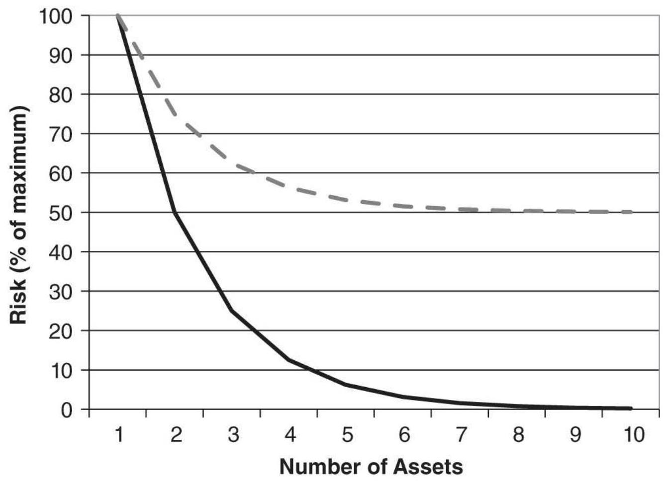
—— Ideal diversification - - Maximum of 50\%
\section*{FIGURE 24.1 Effect of diversification on risk.}
When properly selected, diversification will reduce risk, although not necessarily on any one day, as shown in Figure 24.1. As diversification increases from 1 to 4 assets, risk falls quickly; however, as the number of assets increases above 4, the reduction in risk becomes less dramatic. With perfect diversification, where each investment is independent of one another,
diversification into 2 assets would reduce risk to \(50 \%\) of the initial risk, 3 would reduce risk to \(33.3 \%, 4\) to \(25 \%\), and so on. In the real world, a fully diversified portfolio might reduce the initial risk by \(50 \%\). More assets always offer better diversification than fewer assets.
\section*{2. Multiple Strategies}
Given the higher degree of correlation between markets under stress, using varied strategies should give better diversification during uncertainty. Although some techniques may appear different, they may actually be highly correlated. A moving average system, ARIMA model, and point-and-figure are very different methods, but all are trend-following. If all trend-following systems are profitable, then they must extract those profits from the same price moves and hold the same position at some time. For system diversification, it is best to select strategies with different functional attributes. The following methods are likely to be less correlated with each other:
a. Trend-following (moving averages, point-andfigure, breakout)
b. Countertrend or mean-reverting (stochastic, contrary opinion, Hilbert)
c. Spreading (pairs trading, sector neutral, interdelivery, intercommodity, arbitrage, product)
d. Fundamental (value, supply and demand, P/E ratio)
e. Carry programs, convenience yield, and implied yield
f. Patterns (divergence, charting formations)
All six techniques are conceptually different. Trendfollowing tries to take positions in the direction of the major price move while mean-reverting strategies target short holding periods and the opposite position. Spreads
are normally neutral on direction and only benefit from the relative move between two markets, and fundamentals use value and various other statistics to take a long-term position without the benefit of timing. Carry programs and yield extraction target components of price, and patterns can be any formation. These different strategies can be holding conflicting positions in the same market at any one time, reducing overall risk. \({ }^{1}\)
\section*{3. Balanced Risk}
Equalizing risk is necessary if the selection of different assets and systems is to offer the best possible diversification. In securities, risk is often balanced by investing equal dollar amounts in each stock, but two stocks trading at the same price can have very different volatilities. Bank of America, which once traded at \(\$ 30\) or \(\$ 50\) per share, dropped to \(\$ 5\) following the financial crisis and showed much more volatility at that level. Companies in the news tend to be more volatile than those that are under the radar.
The three most popular ways to allocate equal risk are:
a. Investing equal dollar amounts in each asset
b. Investing equal risk as measured by the annualized standard deviation
c. Investing equal risk as measured by the average true range

These choices were discussed in Chapter 23, the
section "Position Sizing." If the high, low, and closing prices are available, then the average true range gives the best measure of volatility for futures, but simply dividing an equal dollar investment in stocks by the closing price was easiest solution. The spreadsheet with the formulas for calculating position size is TSM Adjust Shares for Risk on the Companion Website.
Diversification has its negative side as well. If assets are equally weighted, diversification gives you the average returns. A classic example of diversification is to use one strategy that has a zero net return (System \(B\) in Figure 24.2) but a negatively correlated performance to another asset \((\operatorname{System} A)\) which has a high return. While the average returns of the two assets is half the return of System \(B\), the combined risk could drop by more than \(50 \%\). If the objective function is a return-to-risk ratio, then the combined portfolio of two assets is better than either one of the assets, yet it may not be satisfying to the investor.
\section*{Changing Correlations}
Finding the correlation between two assets is a standard way of assessing the amount of diversification that can be achieved. Typically, the correlation is evaluated over a single long period of time or taken as the average of a rolling period. But averages do not explain what can happen during shorter time periods. During the fall of 2008, when the S\&P plunged, all markets reversed, effectively making all correlations 1 . Figure 24.3 shows the 20-day rolling correlation of the S\&P to the 30-year bonds, the euro, and gold futures. Bonds normally move
opposite to the S\&P; that is, when the S\&P rallies, interest rates would increase to dampen expectations of inflation (bond futures decline).
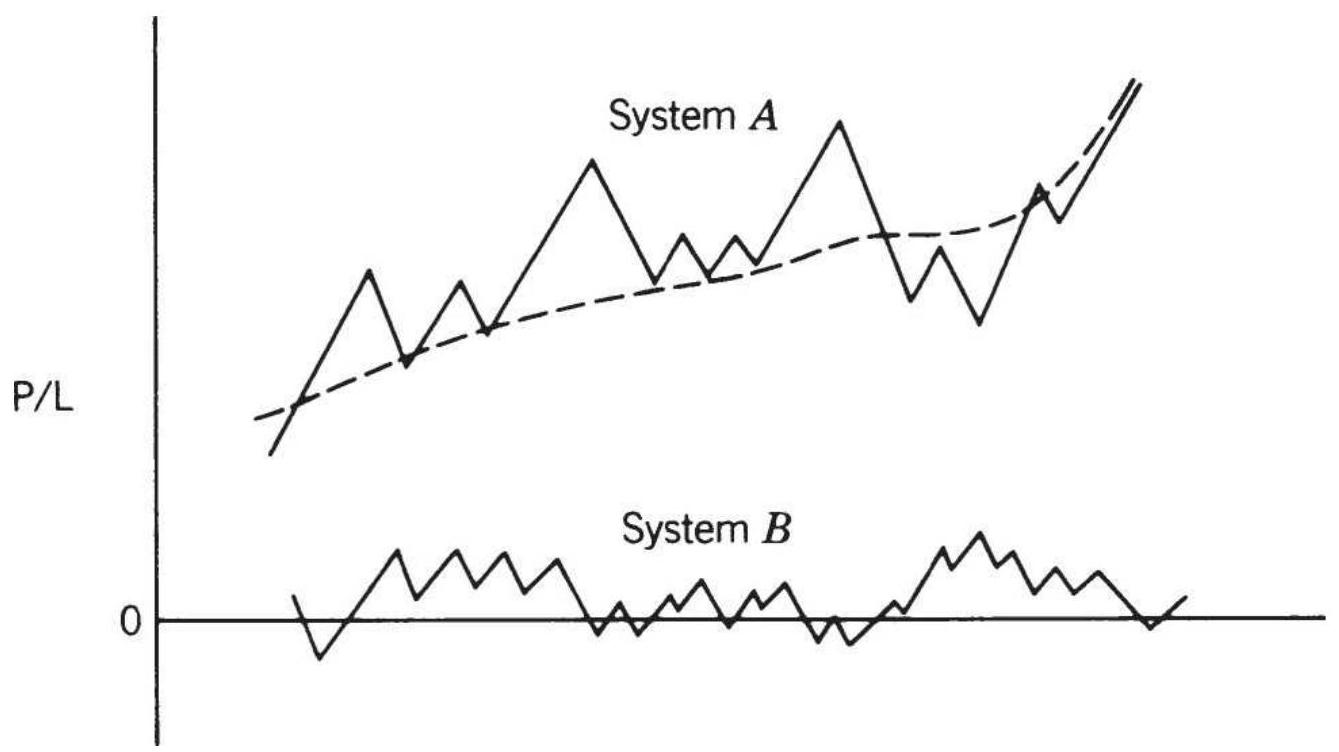
FIGURE 24.2 Improving the return ratio using negatively correlated systems.
\section*{Correlations during a crisis}
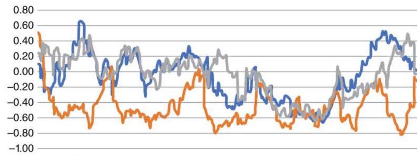

FIGURE 24.3 Rolling correlation of S\&P futures against 30-year bonds, the euro, and gold futures.
In the late summer of 2008, we can see that the subprime crisis caused both gold and the euro to post a negative -0.6 correlation to the \(S \& P\). That is interpreted as the S\&P dropping while gold and the euro rally at the same time. If we had used a shorter calculation period, the correlations would have been more extreme. Bonds also show a correlation of -0.60 , so while the \(S \& P\) dropped, investors looked for safety in fixed income.
Many of the statistics that we use to make decisions are good under normal market conditions. When a price shock occurs, they go to extremes, for which we are always unprepared. In other parts of the book we have discussed the only ways to avoid this unexpected risk:
Be out of the market as much as possible.
- Cap the portfolio leverage.
Use uncorrelated strategies.
Orderly changes in volatility can be managed using various volatility adjustment methods, discussed later in the section "Volatility Stabilization."
\section*{TYPES OF PORTFOLIO MODELS}
In his book Inside the Black Box, \(\underline{2}\) Rishi Narang gives five basic ways in which portfolios are constructed, along with their advantages and disadvantages.
\section*{Equal-Dollar Weighting}
Each asset in the portfolio gets an equal share of the investment. In the case of stocks, each of 20 assets will receive \(5 \%\) of the current account value. This expresses the belief that trying to forecast which asset will perform better than another is extremely unreliable. Unequal weighting concentrates risk, which is a problem if the trade does not meet expectations. To account for differences in volatility, we need to adjust the number of shares or contracts.
\section*{Equal-Risk Weighting}
As discussed in the previous chapter, equal-risk weighting attempts to equalize the risks of each trade using a volatility measurement or estimate of expected drawdown. For example, if a portfolio has two assets, \(A\) and \(B\), with volatility of \(4 \%\) and \(1 \%\) respectively, then \(A\) will get \(20 \%\) of the allocation and \(B\) will get \(80 \%\). As with equal-dollar weighting, it attempts to give every trade an equal chance to affect performance. This method, called volatility parity, is commonly used for futures portfolios.
\section*{Alpha-Driven Weighting}
In this method, those assets with higher alphas (better returns) will get larger allocations; however, these are not simply scaled to the estimated alpha. Instead, the assets are ranked by expected alpha and those at the top are given larger allocations. This avoids creating severe distortions in allocations but favors those assets that have performed best in the past.
\section*{Decision-Tree Models}
A more complex approach, the decision-tree, allows you to match each asset with certain characteristics to get a net allocation. For example, if there are three strategies within a portfolio, and three levels of risk under each of those strategies, then we need to associate each asset with a strategy and a risk level in order to arrive at the allocation for that asset. Either of these decisions can be dynamic.
\section*{Optimization}
A fifth and popular model is where allocations are determined by a classic mean-variance optimization. In this approach, the volatility and correlation of the assets are evaluated and an optimal allocation is determined that maximizes return and minimizes risk. The sections that follow will discuss the various ways in which an optimal portfolio can be found.
\section*{Too Much Diversification}
As we see in Figure 24.1, as more assets are added, the improvement due to diversification declines. Adding a second asset gives a huge reduction in risk, but adding a tenth asset, or a twentieth, can have little impact. Adding assets can continually improve the reward-to-risk ratio; however, the average returns can drop to an undesirable level. Managers must weigh the benefit of more diversification against lower returns.
Some investment funds are so large that it is difficult to find enough assets to absorb the entire investment. Some funds believe that all of the investment must be actively
used all the time. To achieve that goal, they find assets that have lower returns or even slightly higher risk. Either of those choices reduces performance.
\section*{Improving ETF Sector Returns with Equal Weighting}
Sector ETFs offer investors a chance to participate in a correlated group of stocks, capitalized-weighted the same as the S\&P index. Sector ETFs can have a large number of stocks, but the largest ones dominate the performance. In 2006, Guggenheim introduced ETFs that matched the sector SPDRs but were equally weighted. If there are 55 health-care stocks in the sector SPDRs Health Care ETF (XLV), then there are 55 stocks in Guggenheim equally-weighted Health Care ETF
(RYH). When we compare the returns of the SPDRs and the Guggenheim sectors, we see that the equally weighted sectors performed slightly better, as shown in Figure 24.4. The information ratio, the annualized returns divided by the annualized risk, shows a similar pattern.
Using the health-care ETF XLV as an example, Figure 24.5 shows the weighting of each component stock in 2015. Johnson \& Johnson (JNJ) on the far left has the largest impact, followed by Gilead (GILD), Pfizer (PFE), and Merck (MRK). In 2018, Gilead moved lower on the list and was replaced by United Health Care (UNH). Shifting of positions is an indication of performance. UNH has performed better than GILD.
Returns for cap-weighted and equally-weighted sectors \(30 \%\)
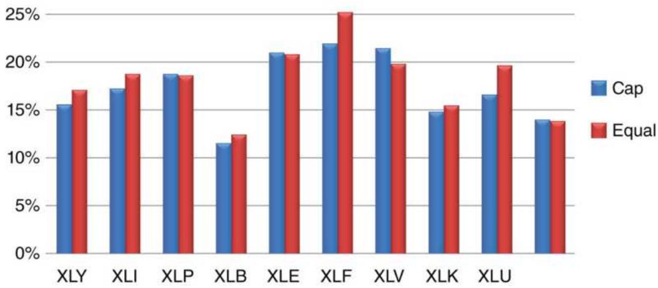
FIGURE 24.4 Returns of cap-weighted and equally weighted sector ETFs.
XLV Index weight in descending order
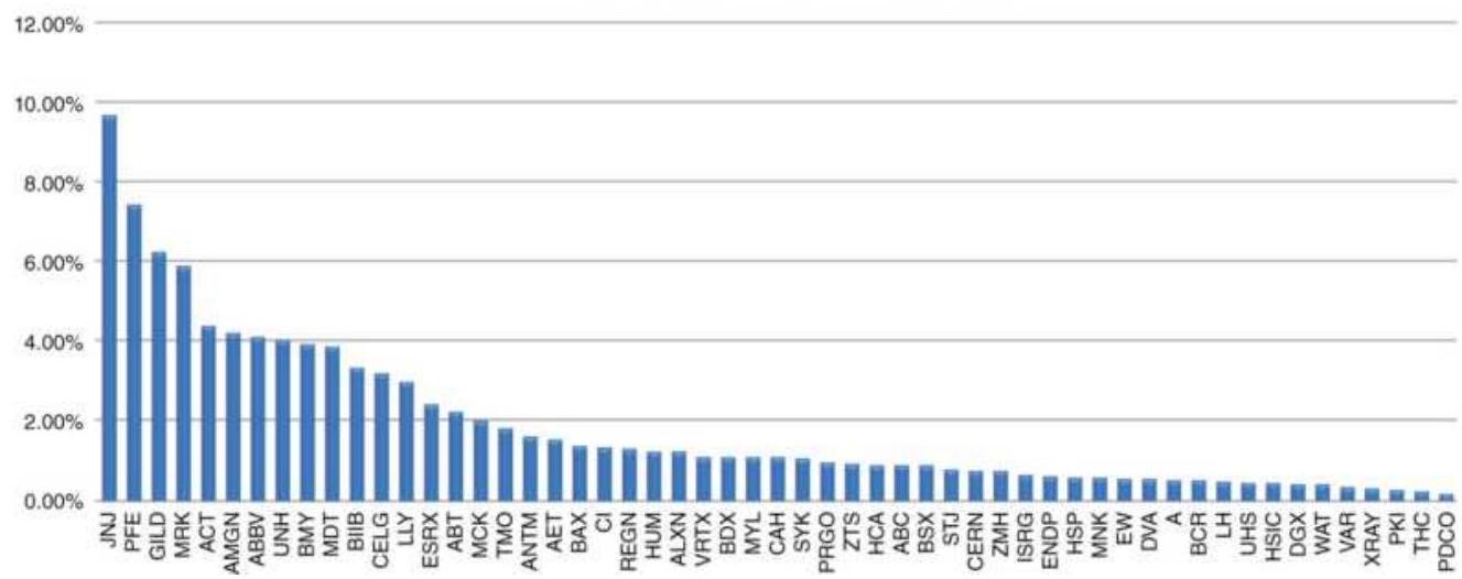
FIGURE 24.5 Weights of XLV components.
Assuming that investors would rather have better returns if possible, switching of these weighted positions indicates that the largest allocations did not perform the best. Instead, if we take the nine largest companies and weight them equally, we get the results shown in Figure
24.6. The capitalization-weighted nine stocks returned \(15.2 \%\), the XLV index \(19.4 \%\), and the equally-weighted 9 stocks \(28.5 \%\).
\section*{CLASSIC PORTFOLIO ALLOCATION CALCULATIONS}
Deciding which systems and markets should be traded at the same time, in an effort to reduce risk through diversification, is an entire field of expertise called portfolio management or asset allocation. While the price patterns have always evolved with structural changes in the economy, technology, and investment participation, globalization has made portfolio management much more difficult, causing higher correlations and often greater volatility. Nevertheless, the classic approach, based on Modern Portfolio Theory (MPT), continues to be popular.
\section*{Changing the weighting of XLV}
400
350
300
250
200
150
100
50

FIGURE 24.6 Returns of XLV, capitalization-weighted 9 stocks, and equally-weighted 9 stocks.
The principle of classic portfolio allocation is to minimize risk through diversification while maximizing returns. Once the assets are selected that will be used in the portfolio, the expected return, \(E(R)\), for the portfolio is the weighted average of the expected returns of the individual assets in the portfolio: \({ }^{3}\)
\section*{\(E(R)=w_{1} E\left(R_{1}\right)+w_{2} E\left(R_{2}\right)+\cdots+w_{n} E\left(R_{n}\right)\)}
\[
=\sum_{i=1}^{n} w_{i} E\left(R_{i}\right), \text { where } \sum_{i=1}^{n} w_{i}=1.0
\]
The worth of a portfolio is not only its return, but its risk; therefore, the covariance of the portfolio assets becomes an important criterion in deciding which combination of those assets creates the best results:
\[
\sigma_{R}^{2}=\sum_{i=1}^{n} w_{i}^{2} \sigma_{i}^{2}+\sum_{i=1}^{n} \sum_{j=1}^{n} w_{i} w_{j} \operatorname{cov}_{i j}
\]
where \(\sigma_{i}^{2}\) is the variance of the returns of asset \(i\), and \(\operatorname{cov}_{i j}\) is the covariance between the returns of asset \(i\) and the returns of asset \(j\). The covariance between two assets is the product of their standard deviations times the correlation coefficient (the covar and corr functions in Excel) of the same two assets:
\[
\operatorname{cov}_{i j}=\operatorname{corr}_{i j} \sigma_{i} \sigma_{j}
\]
Given two portfolios with the same returns, the one with the smaller variance is more desirable; when the variances are the same, the portfolio with the highest return is best. This is the same conclusion drawn in the discussion of the efficient frontier. For a portfolio of only two assets, the calculations needed for expected return and variance are:
\[
\begin{aligned}
E(R) & =w_{1} E\left(R_{1}\right)+w_{2} E\left(R_{2}\right) \\
\sigma_{R}^{2} & =w_{1}^{2} \sigma_{1}^{2}+w_{2}^{2} \sigma_{2}^{2}+2 w_{1} w_{2} \operatorname{cov}_{12}
\end{aligned}
\]
It is important to compare portfolios using this basic measurement of return and risk; however, it is not the entire picture. When evaluating the relationship over a long time interval, there may only be one case where a very high correlation would have caused a fatal loss of equity. That one case can be lost in the statistics because the large number of normal cases overwhelms one extreme event. For safety, it is necessary to look at the maximum portfolio loss. In addition, it is best to assume that the largest historic loss will be exceeded sometime in the future, if only by chance or the fact that the probability of a run increases as the amount of data increases. In today's more complex market environment, the worst-case scenario becomes more likely.
Globalization has increased the correlations, and the past patterns of returns cannot represent all of the patterns that will be seen in the near future. It is also wise to run a value-at-risk analysis on the final portfolio to see how many times risk exceeded a conservative threshold, even if it did not result in a large loss. An excessive number of risk spikes is a sign of too much leverage. Value-at-risk was discussed in Chapter 23.
\section*{Spreadsheet Approach}

A practical way of evaluating a portfolio does not require special mathematical knowledge or expensive
software. It can be done using a spreadsheet. Table 24.1 shows the monthly returns of SPY and the Vanguard bond ETF BND combined into a portfolio of 60\% stocks and \(40 \%\) bonds. Columns \(D\) and \(E\) show the monthly adjusted percentage returns of these two series and columns \(G\) and \(H\) have the corresponding NAVs. Using data from April 2007 through July 2018, the return of SPY was \(5.8 \%\) and BND \(3.6 \%\). When combined they were \(5.2 \%\). However, the risk of SPY was \(14.6 \%\) and the combined portfolio had a risk of \(8.9 \%\). Considering that 2008 showed a loss of nearly 50\% in equities, an AROR of \(5.2 \%\) seems good. Figure 24.7 shows the NAVs of SPY, BND and the combined portfolio. The full spreadsheet is on the Companion Website as TSM Stock and Bond Portfolio.
Note that the interest rate ETF BND has flattened out as rates dropped to near zero. Management of the bond portfolio by Vanguard has prevented it from having losses even as interest rates have been rising. In 2008, the combined portfolio saved a large part of the drawdown in SPY.

\[
\begin{aligned}
& -\mathrm{SPY}-\mathrm{BND}-60 \% \mathrm{SPY}+40 \% \mathrm{BND}
\end{aligned}
\]
FIGURE 24.7 SPY and BND NAVs compared to a portfolio of \(60 \%\) SPY \(+40 \%\) BND.
TABLE 24.1 Portfolio evaluation of stocks and bonds using a spreadsheet.
\begin{tabular}{|l|c|c|c|c|c}
\hline & \multicolumn{2}{|c|}{ Prices } & \multicolumn{2}{c}{\begin{tabular}{c}
Percentage \\
Change
\end{tabular}} & Combined \\
\hline Month & SPY & BND & SPY & BND & \begin{tabular}{l}
Stock + \\
Bond
\end{tabular} \\
\hline \multicolumn{1}{|c|}{ A } & B & C & D & E & F \\
\hline Allocation & & & 0.60 & o.40 & \\
\hline \(4 / 1 / 2007\) & 148.29 & 53.210 & & & \\
\hline \(5 / 1 / 2007\) & 153.32 & 52.702 & .0 .034 & -0.010 & .0 .0165 \\
\hline \(6 / 1 / 2007\) & 150.43 & 52.445 & -0.019 & -0.005 & -0.0133 \\
\hline \(7 / 1 / 2007\) & 145.72 & 52.946 & -0.031 & .0 .010 & -0.0150 \\
\hline
\end{tabular}
\begin{tabular}{|l|l|l|l|l|l}
\hline \(8 / 1 / 2007\) & 147.59 & 53.681 & .0 .013 & .0 .014 & .0 .0133 \\
\hline \(9 / 1 / 2007\) & 152.58 & 54.014 & .0 .034 & .0 .006 & .0 .0228 \\
\hline \(10 / 1 / 2007\) & 154.65 & 54.519 & .0 .014 & .0 .009 & .0 .0119 \\
\hline \(11 / 1 / 2007\) & 148.66 & 55.587 & -0.039 & .0 .020 & -0.0154 \\
\hline \(12 / 1 / 2007\) & 146.21 & 55.853 & -0.016 & .0 .005 & -0.0080 \\
\hline
\end{tabular}
\section*{FINDING OPTIMAL PORTFOLIO ALLOCATION USING EXCEL'S SOLVER}
Excel'sSolver is a remarkably simple tool for solving complex problems. 4 If it cannot be found under Tools, then it will be necessary to select add-ins and follow the instructions for installing this software. It is part of the Excel package, but it is not set up during the initial installation.
Solver allows the user to solve equations, subject to various conditions. For this example, we would like to know how we should have allocated an investment of S\&P 500 futures, gold futures, Apple, and Microsoft for the period November 2010 through October 2011. The steps are:
1. Align the data in columns \(B-E\), Table 24.2, starting in row 4. When using mixed assets, such as NYSE stocks and gold futures, there may be days when the NYSE was open, but gold closed. On those days the previous price of gold is carried forward.
2. Calculate the returns of columns \(B-E\) in columns \(F-\) \(I\) using \(p_{t} / p_{t-1}-1\). Returns start in row 5 . Figure
24.8 shows the original prices reset to 100 on the start date and indexed to make comparisons easier. Enter the initial, equally-weighted allocations in row 3 , columns \(F-I\), above the returns (the area in gray). For 4 assets each would be set to 0.25 . The values shown are the final results.
3. Enter the formula for the sum of those allocations (always 1.0 ) in row 4 , column I.
4. Calculate the weighted returns of the 4 assets in column \(J\). Use the function SUMPRODUCT(List1, List2), where List1 is fixed at the 4 allocations (step 2), and List2 are the returns in each row, columns \(F-I\).
5. Calculate the NAVs in column \(K\).
6. At the top of column \(J\) calculate the annualized standard deviation of the returns in column \(J\).
7. At the top of column \(K\) calculate the annualized rate of return from column \(K\).
8. In cell \(L_{3}\) calculate the information ratio cell \(J_{3} / K_{3}\). This is the value that will be used to determine the success of the solution.
The Solver page can now be set up.
\section*{Solver Settings}
By clicking on Data/Solver or Tools/Solver (earlier versions), the Solver window will open. This has the following sections that must be filled in:
1. Set Objective (or Target cell), a single value that will
be used to decide the solution. In this example, the target cell is \(L 3\), the information ratio.
2. To (or Equal to) allows you to say that the maximum value ( \(\max\) ) of the information ratio is needed.
3. By changing cells, tells Solver that the solution can be found by varying the values of the weighting factors in \(\$ \mathrm{~F} \$ 3\) :\$I 3 .

FIGURE 24.8 Prices of the 4 assets used in the Solver solution, converted to NAVs and set to 100 on \(11 / 1 / 2010\).
\section*{TABLE 24. 2 Solver Setup.}
\begin{tabular}{|c|c|c|c|c|c|c|c|c|c|c|c|c|}
\hline & A & B & C & D & E & F & G & H & I & J & K & 1 \\
\hline 1 & & \multicolumn{4}{|c|}{ Prices } & \multicolumn{4}{|c|}{ Returns } & \multicolumn{2}{|c|}{ Portfolio } & \\
\hline 2 & & S\&.P & Gold & AAPL & MSFT & S\&.P & Gold & AAPL & MSFT & Returns & NAVs & Ratio \\
\hline 3 & Date & & & \multicolumn{2}{|c|}{ Weights > } & 0.091 & 0.550 & 0.359 & 0.000 & \(15.2 \%\) & \(30.0 \%\) & 1.9723 \\
\hline 4 & 10/29/2010 & 1158.75 & 1366.3 & 300.87 & 25.84 & & & & 1.000 & & 100 & \\
\hline 5 & 11/1/2010 & 1162 & 1359.3 & 302.2 & 26.06 & 0.0028 & -0.0051 & 0.0044 & 0.0085 & -0.0010 & 99.90 & \\
\hline 6 & 11/2/2010 & 1171.75 & 1365.6 & 307 & 26.38 & 0.0084 & 0.0046 & 0.0159 & 0.0123 & 0.0090 & 100.80 & \\
\hline 7 & 11/3/2010 & 1176.25 & 1346.3 & 308.53 & 26.32 & 0.0038 & -0.0141 & 0.0050 & -0.0023 & -0.0056 & 100.24 & \\
\hline 8 & 11/4/2010 & 1197.5 & 1391.8 & 315.03 & 26.37 & 0.0181 & 0.0338 & 0.0211 & 0.0019 & 0.0278 & 103.02 & \\
\hline 9 & 11/5/2010 & 1201 & 1406.4 & 316.75 & 25.89 & 0.0029 & 0.0105 & 0.0055 & -0.0182 & 0.0080 & 103.84 & \\
\hline 10 & 11/8/2010 & 1199 & 1411.9 & 316.76 & 25.94 & -0.0017 & 0.0039 & 0.0000 & 0.0019 & 0.0020 & 104.05 & \\
\hline 11 & 11/9/2010 & 1190 & 1418.8 & 314.5 & 26.07 & -0.0075 & 0.0049 & -0.0071 & 0.0050 & -0.0006 & 103.99 & \\
\hline 12 & 11/10/2010 & 1193 & 1408 & 313.55 & 26.17 & 0.0025 & -0.0076 & -0.0030 & 0.0038 & -0.0050 & 103.47 & \\
\hline 13 & 11/11/2010 & 1190 & 1412 & 314.25 & 25.64 & -0.0025 & 0.0028 & 0.0022 & -0.0203 & 0.0021 & 103.69 & \\
\hline 14 & 11/12/2010 & 1174.5 & 1374.2 & 303.63 & 25.46 & -0.0130 & -0.0268 & -0.0338 & -0.0070 & -0.0280 & 100.78 & \\
\hline
\end{tabular}
4. Subject to the constraints, allows us to enter the requirement that the sum of the weighting factors must equal 1.0. This is done using a secondary window where the cells, mathematical operator \((=\), \(<,>\), and a constant can be entered. This portfolio requires the cell \(\$ \mathrm{I} \$ 4\), the operator " \(=\) ", and the constant 1. It also requires that each of the cells, F3, G3, H3, and I3, be set so that each cell is " \(>=0\) ". This will prevent negative weighting factors, which represent selling the asset rather than buying. If the short sale solution was desired, then each of the 3 cells would be constrained as, for example, \(\mathrm{F} 3>=-1\) and \(\mathrm{F} 3<=1\). This would keep the weighting factors between -1 and +1 ; otherwise they can take on any values.
There are various options for the number of iterations to be performed, the technique used, the maximum time allowed, and a record of various calculated values. The defaults work well; therefore, none of these are necessary.
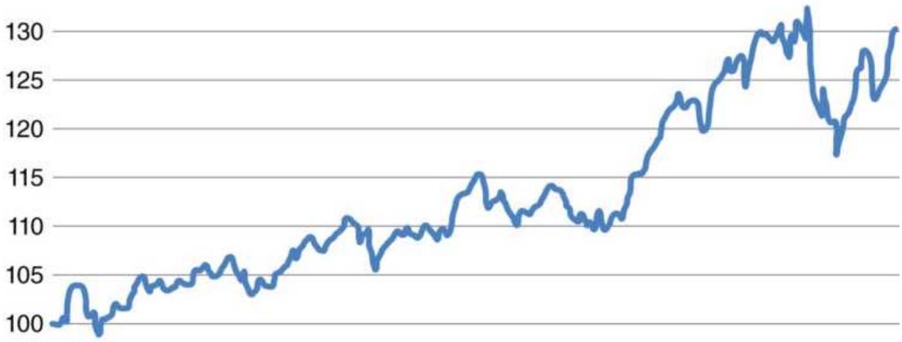
95
90
FIGURE 24.9 Solver results.
\section*{Solver Results}
By clicking on the solve button, the program returns an answer instantly. The cells containing the allocations are changed, as are the portfolio returns, AROR, and information ratio, shown at the top of Table 24.2. More data and more markets will give a more reliable result. Figure 24.9 shows the portfolio NAVs using solver's allocations. This gave \(9.1 \%\) to S\&P futures, \(55 \%\) to gold futures, \(35.9 \%\) to Apple, and nothing to Microsoft. The information ratio of 1.97 is high and result shows a steady increase with one drawdown near the end of the test.
\section*{KAUFMAN'S GENETIC ALGORITHM}
\section*{SOLUTION TO PORTFOLIO ALLOCATION (GASP)}
Portfolio allocation is a basic requirement for trading more than one market. Excel's Solver can be used to get an estimate of the proper allocations; however, it does not include the cross-correlations in price movement, market liquidity, or a number of subtle measurements that are needed by the professional manager handling large investments.
Portfolio optimization (specifically, mean-variance optimization) is the accepted method used by many financial analysts to find the best allocations. It is also taught in university graduate school financial courses as the recommended solution. Many Wall Street firms apply this method and rebalance the portfolio quarterly, using as little as one year of historic prices. This gives the allocation that maximizes the return ratio and places their expected returns at the optimal point on the efficient frontier.
Whether the need is to find a portfolio of stocks that work well together, balance a diverse mix of futures markets, or any combination of assets, it will require a special computer program. Classic portfolio optimization deals with choosing the set of stocks that fit best together, with positions that are only long. It is called a passive portfolio because there is no strategy involved, simply an allocation. Once a position is entered, it is held until the next optimization is run and the portfolio is rebalanced. All of the investment is fully used.
This section discusses the portfolio solution where the assets are trading returns of any combination of stock and futures markets. When using trading results there are periods when a strategy has no position; therefore, there are no returns. That is different from a passive portfolio of stocks, where there are continuous returns. As we will see, this type of input presents a problem for the traditional mean-variance method, such as used by Markowitz, which assumes that there will always be prices, hence returns, each day. However, it is easily solved using the Genetic Algorithm Solution to Portfolios (GASP) developed by Kaufman.
\section*{Modern Portfolio Theory}
Chapter 20 gave a basic explanation of how to use a genetic algorithm to find the parameter values of a trading system. Here, the genetic algorithm is used to find the best allocation for each asset - stock, stock index, or futures market - in order to achieve the best objective function. It uses trading returns, expected to be generated by algorithmic trading, instead of price returns. \({ }^{5}\) As with Markowitz, the solution will target the highest return for the lowest risk.
\section*{A Special Case for Active Trading}
For those who trade a systematic method, an optimum portfolio based on the prices of the markets traded makes no sense. The portfolio program may treat two stocks that are rising at the same time as highly correlated while the trading system shows one of those stocks long and the other short. Instead of a strong
positive correlation for that time period, there should be a strong negative correlation. Therefore, it is the daily returns of the trading in each market that should be input, not the price.
In traditional portfolio analysis, called a mean-variance solution, the standard deviation of the daily returns is used to measure risk and the covariance to measure the correlation and relative volatility of one with respect to the other. When one series has no trade, there is no data and neither the standard deviation nor the covariance can be used. Then the standard method can't be used.
For example, when trading the S\&P and bonds, a systematic method that uses two moving averages has the following rules that create longs, short sales, and situations with no position:
1. Hold longs when the fast average and the slow average are both moving higher.
2. Hold shorts when the fast average and the slow average are both moving lower.
3. Exit all positions and do not enter new ones when the fast and slow averages are moving in different directions.
\section*{Problems with the Standard Deviation and Covariance Calculations}
The previous trading rules define a system that may only be in the market \(50 \%\) of the time. During the periods when there are no positions, the daily returns are zero. How does this affect the standard deviation and the
covariance calculations? Let us assume that a bond price series (as well as a passive holding in bonds) has a daily standard deviation of \(0.5 \%\). If the trading system just described is in the market for \(50 \%\) of the time, then the standard deviation will be only \(0.25 \%\) because one-half the days have a zero return.
Because the standard deviation is used to represent risk, a trading method that is in the market less often will always appear to have less risk and less return. But it may have the advantage of larger returns on days that it is active in the market. That can be an attractive feature for a trader, but the profile will appear less desirable because both returns and risk are smaller. The same problem exists in the covariance calculation. To be fair, some analysts would argue with this conclusion and say that the zero returns count and any two series with the same standard deviation have the same risk. Perhaps they should use their allocations to trade their own portfolio.
\section*{The Objective Function and Target Risk Level}
Before the problem can be solved, it is necessary to decide how to measure success. The accepted approach is the return ratio, or information ratio, the annualized returns divided by the annualized risk; however, there are many ways to measure risk.
\section*{Risk measured by annualized volatility.} Securities analysts have always measured risk as the annualized volatility, the standard deviation of daily, monthly, or annual returns (if there is enough data),
multiplied by the square root of the number of periods in a year, 252 for daily, 12 for monthly.
Risk measured by the residuals of a linear regression. Another popular measure of risk uses the residuals of a linear regression. First, find the annualized rate of return of the portfolio based on the slope of the straight-line approximation. If there are 5 years of return history, then the residuals would give the standard deviation of the return differences above and below the straight-line fit for the 5 years. This results in a probability of loss relative to the 5 -year history, a convenient and useful value, which does not need to be annualized as did the standard deviation.
The negative aspect of using residuals as a risk measurement is that the optimization process will find the best allocation that keeps returns as close to the straight line as possible. This may seem good when it prevents drawdowns, but it also penalizes any prolonged gains that move returns far above the straight line determined by the regression.
\section*{Semivariance of daily drawdowns. One} measure that stands out as not having the restrictive qualities of either the standard deviation or the residuals is the semivariance of drawdowns. This measure uses the difference between the previous high cumulative return and the current return, always as a positive number. Therefore, there is a non-zero value on every day that is not a new highequity value. There are no entries when equity is on
new highs. Because this represents the probability of a drawdown of a specific size over the full interval of returns, it is not necessary to annualize the results. The portfolio optimization process will try to limit the size of the drawdowns, but has no agenda with respect to the profit patterns.
The objective function (OF) used in GASP, the genetic algorithm solution, will then be:
\[
O F=A R O R / \sigma_{D}
\]
where \(\sigma_{D}=\) the standard deviation of the daily drawdowns, or semi-variance:
\[
\sigma_{D}=\sigma\left(E_{H}-E_{i}\right), E_{H} \neq E_{i} i=1, n d
\]
where
\[
\begin{aligned}
E_{H} & =\text { the high equity as of day } i \\
E_{i} & =\text { the current equity } \\
E_{H} & \neq E_{i} \\
n d & =\text { the total days when there was a drawdown }
\end{aligned}
\]
The target risk level is the probability of a specific loss, given as a standard deviation or a percentage of investment, over a specific period of time. You may specify that the portfolio must have a small chance, for example, \(0.1 \%\) (one-tenth of 1\%) of losing \(10 \%\) during a 10-year period. The \(10 \%\) loss is based on the measurement of risk, either the standard deviation of the returns, the standard deviation of drawdowns
(semivariance), or the Ulcer Index. (See Chapter 23 for different risk measures.) Both a maximum and minimum target risk level will need to be specified. The minimum is necessary because the program can always use only a very small part of the investment in order to keep risk low. That will normally cause the rate of return to be unacceptably low. When searching for the optimal portfolio, a large number of unacceptable solutions can be avoided by creating a range of risk tolerance.
\section*{The Optimal Portfolio}
Theoptimal portfolio is the same whether using the classic mean-variance solution or a genetic algorithm approach. It is always the allocation with the best objective function, in our case, the highest return for the lowest possible risk. Without considering investor risk preference, where some investors will accept higher risk in exchange for a smaller increase in returns, any rational investor will take:
- Higher returns for the same risk
- Lower risk for the same returns
The efficient frontier was introduced in Chapter 22, showing the curve that represented the best choices of portfolios that satisfied the objectives of the rational investor. Our solution will be to maximize the objective function, which gives only one best result, as does the mean-variance solution. Our solution will also show a number of good but suboptimal solutions, which may be of interest to investors who want more return or less risk.
\section*{Portfolio Constraints}
Portfolio constraints are practical considerations and limitations that are imposed on the portfolio program. The most obvious of these constraints is liquidity. Some stocks or futures markets are more active than others. The portfolio optimizer cannot be allowed to allocate too much to a thinly traded stock. That would result in slippage and a poor execution far in excess of those transaction costs considered in the testing of the strategy. A safe rule is not to exceed \(3 \%\) of the average volume traded in one day. Trading less is always better.
It is practical to specify liquidity constraints as absolute numbers, such as 500,000 shares of Microsoft or 5,000 contracts of S\&P minis. Restricting allocation to a percentage of the investment may not always translate into the right number of shares or contracts.
It may also be necessary to restrict negative allocations, or weights, which imply that you would take the opposite positions in those assets. For example, a portfolio that has both euros and gold may find that euros have a better return ratio than gold and profits appreciate faster. The ideal allocation may be to place \(5 \%\) of the investment into euros and \(-3 \%\) into gold, effectively arbitraging euros and gold to get a better ratio. Some investors may be fine with this solution; however, most investors would prefer only positive allocations.
\section*{Constraining Diversification}
Ideally, the portfolio allocation program should be allowed to mix and match any markets in any percentage
to create the best portfolio. However, in a real world there are choices to be made. There is a practical reason for choosing between:
1. Optimizing a portfolio of all stocks at one time
2. Optimizing the returns of stocks within a sector or industrial group, then optimizing the returns of the groups using the allocations from the first step
Although a genetic algorithm solution is fast, time is always a factor. Separating the assets into common groups, optimizing these smaller sets and creating a subportfolio return series, then optimizing the results of those smaller portfolios turns out to be a much faster process than a single, large optimization. Because the time to calculate expands exponentially, 10 separate optimizations each with 10 assets is much faster than one optimization with 100 assets. In addition, we have the opportunity to impose some degree of common sense on a purely mechanical process.
We may know more about the potential for correlated price movement than the portfolio program can measure using the return streams, having lived through a few years of turmoil. All assets have the ability to be highly correlated in times of extreme stress. If the price history does not have enough occurrences of the type of events that cause common price movement, then the portfolio process will assign allocations to similar assets that may be too large. There should always be enough data and it should be selected to include high-risk events.
\section*{The Genetic Algorithm Solution}
The GASP program uses a genetic algorithm solution because it is fast, provides a nonlinear approach, and can handle disjoint returns, common to trading performance. There are six steps in the genetic algorithm solution:
\section*{1. Initialization}
2. Calculation of the portfolio objective function
3. Test for completion
4. Propagation
5. Mating
6. Mutating
After step 6, the program tests for its completion criteria. If not yet complete, the process returns to step 2 and ends when step 3 is satisfied. A brief review can be found in Chapter 20.
\section*{Preparation}
To begin, we first need the return series of each asset. In a traditional stock portfolio, these can be the daily returns derived from the price series using either
\(p_{t} / p_{t-1}-1\), or \(\ln \left(p_{t} / p_{t-1}\right)\). For traders, in
particular futures traders, the return series are the daily profits or losses of each strategy applied to each market, converted to a percentage change based on a designated investment. Data may also be input as NAV series, which are then easily converted to daily returns. Table 24.3 shows 5 assets representing the NAVs of one strategy for example, AAPL, GE, the euro futures, 10-year
Treasury note futures, and crude oil futures. This data history begins arbitrarily on \(8 / 23 / 2000\).
\section*{TABLE 24.3 Returns expressed as NAVs.}
\section*{Step 1. Convert Input Returns to NAVs}
\begin{tabular}{|l|c|c|c|c|c|}
\hline Date & A & B & C & D & E \\
\hline \(8 / 23 / 2000\) & 100.00 & 100.00 & 100.00 & 100.00 & 100.00 \\
\hline \(8 / 24 / 2000\) & 100.00 & 99.24 & 99.09 & 98.83 & 99.15 \\
\hline \(8 / 25 / 2000\) & .99 .93 & 100.02 & 100.02 & 100.03 & 100.02 \\
\hline \(8 / 28 / 2000\) & 101.66 & 101.66 & 101.98 & 102.55 & 101.86 \\
\hline \(8 / 29 / 2000\) & 101.39 & 101.40 & 101.33 & 102.16 & 101.58 \\
\hline \(8 / 30 / 2000\) & 100.35 & 102.54 & 101.25 & 103.90 & 102.85 \\
\hline \(8 / 31 / 2000\) & .99 .94 & 102.15 & 101.06 & 103.30 & 103.33 \\
\hline \(9 / 1 / 2000\) & 100.47 & 101.58 & 101.06 & 102.43 & 103.33 \\
\hline \(9 / 5 / 2000\) & 101.40 & 102.00 & 101.56 & 102.20 & 103.80 \\
\hline \(9 / 6 / 2000\) & 102.45 & 104.09 & 103.82 & 105.41 & 105.26 \\
\hline \(9 / 7 / 2000\) & 102.45 & 104.67 & 103.82 & 106.86 & 105.26 \\
\hline \(9 / 8 / 2000\) & 102.45 & 104.67 & 103.82 & 101.40 & 105.26 \\
\hline \(9 / 11 / 2000\) & 101.22 & 104.05 & 103.88 & 100.52 & 104.72 \\
\hline \(9 / 12 / 2000\) & .99 .45 & 102.38 & 103.88 & .97 .94 & 102.84 \\
\hline \(9 / 13 / 2000\) & .98 .50 & 101.48 & 103.88 & .96 .56 & 101.83 \\
\hline \(9 / 14 / 2000\) & .99 .01 & 100.66 & 103.88 & .95 .60 & 100.91 \\
\hline \(9 / 15 / 2000\) & 102.83 & 101.45 & 105.03 & .96 .30 & 100.91 \\
\hline \(9 / 18 / 2000\) & 104.48 & 103.07 & 106.63 & .99 .30 & 100.91 \\
\hline
\end{tabular}
Common trading units. The portfolio solution will assign
a percentage of the investment to each asset based on the return series. That percentage should be applied to the assets in the same way that the original returns were created. This is straightforward for a portfolio of only stocks, but when mixing stocks and futures, you will need to know the initial investment allocated to futures to assign the new allocation correctly.
If the returns of the assets were generated with different investments, the allocations will try to equalize the risk. For example, if the return series for asset \(A\) was based on a \(\$ 2\) million investment, and the other four assets, \(B\) through \(E\), were each based on \(\$ 1\) million, then a final portfolio allocation may assign \(11.1 \%\) to \(A\) and \(22.2 \%\) to each of the other assets in order to create equal investment risk. It recognizes that the volatility of the returns of the \(\$ 2\) million asset is twice that of the other assets. Asset \(A\) will then be traded with half the amount as the other assets, which will make the net amounts equal for all assets.
To avoid confusion, it is better to assign equal investment amounts when creating the returns for each system or market.
\section*{Initializing the Pool}
The search for the best portfolio allocation begins by creating a pool of random portfolios, commonly called strings in genetic algorithm terminology. The pool can also be thought of as a gene pool, because future portfolios will be created from it. The pool should be as large as possible in order to increase the speed of the
search. For portfolios with fewer than 25 assets, a pool of 5,000 strings should be large enough. To understand the number of combinations in a complete, sequential search of all portfolios, consider the 5 -asset example, which has \(100^{5}\), or 10 billion combinations - and that is if the percentage allocations are in whole percent, not fractions of a percent.
\section*{Creating a Portfolio Using Random Numbers}
Using the 5 -asset example, one portfolio, or string, is created by:
1. Finding a uniform random number between 0 and 1 for each of the 5 assets. In Table 24.4, the Excel function RAND( ) is used for each of the assets \(A-E\), and for each of the portfolios, \(1-10\) in the pool.
2. Adding the 5 random numbers for each portfolio to get the total, \(T\), shown in the right column.
3. Dividing each random number for assets \(A-E\) by \(T\) to create a normalized percentage, where the total of all random numbers equals 1 . These numbers represent the weighting factors, or initial allocations for each asset, shown in Table 24.5 .
\section*{TABLE 24.4 Generating random numbers to create weighting factors.}
Step 2. Generate Random Numbers between 0 and 1
\begin{tabular}{|l|l|l|l|l|l|l|}
\hline Portfolio & A & B & C & D & E & \begin{tabular}{c}
Total \\
A-E
\end{tabular} \\
\hline
\end{tabular}
\begin{tabular}{|l|l|l|l|l|l|l|}
\hline .1 & 0.954 & 0.356 & 0.402 & 0.924 & 0.388 & 3.025 \\
\hline .2 & 0.642 & 0.091 & 0.501 & 0.010 & 0.010 & 1.255 \\
\hline .3 & 0.295 & 0.995 & 0.509 & 0.558 & 0.687 & 3.044 \\
\hline .4 & 0.581 & 0.204 & 0.943 & 0.408 & 0.175 & 2.312 \\
\hline .5 & 0.615 & 0.796 & 0.277 & 0.115 & 0.072 & 1.874 \\
\hline .6 & 0.726 & 0.073 & 0.069 & 0.376 & 0.184 & 1.428 \\
\hline .7 & 0.953 & 0.523 & 0.246 & 0.893 & 0.080 & 2.695 \\
\hline .8 & 0.329 & 0.667 & 0.169 & 0.211 & 0.626 & 2.001 \\
\hline .9 & 0.660 & 0.747 & 0.372 & 0.226 & 0.769 & 2.774 \\
\hline 10 & 0.833 & 0.893 & 0.536 & 0.010 & 0.850 & 3.123 \\
\hline 11 & 0.776 & 0.252 & 0.663 & 0.964 & 0.667 & 3.321 \\
\hline 12 & 0.578 & 0.873 & 0.299 & 0.100 & 0.447 & 2.296 \\
\hline 13 & 0.883 & 0.567 & 0.621 & 0.712 & 0.732 & 3.515 \\
\hline 14 & 0.606 & 0.025 & 0.798 & 0.227 & 0.219 & 1.875 \\
\hline 15 & 0.629 & 0.396 & 0.234 & 0.041 & 0.146 & 1.446 \\
\hline 16 & 0.713 & 0.531 & 0.515 & 0.852 & 0.942 & 3.553 \\
\hline 17 & 0.829 & 0.584 & 0.411 & 0.289 & 0.011 & 2.125 \\
\hline 18 & 0.812 & 0.215 & 0.444 & 0.159 & 0.724 & 2.354 \\
\hline
\end{tabular}
TABLE 24.5 Normalized weighting factors for each portfolio in the pool.
\begin{tabular}{|c|c|c|c|c|c|c|}
\hline \multicolumn{7}{|c|}{ Step 3. Normalize Random Values } \\
\hline Portfolio & A & B & C & D & E & \begin{tabular}{c}
Total \\
A-E
\end{tabular} \\
\hline & 0.131 & 0.290 & 0.062 & 0.310 & 0.208 & 1.0 \\
\hline
\end{tabular}
\begin{tabular}{|l|l|l|l|l|l|l|}
\hline 2 & 0.150 & 0.125 & 0.291 & 0.290 & 0.145 & 1.0 \\
\hline 3 & 0.393 & 0.103 & 0.295 & 0.135 & 0.074 & 1.0 \\
\hline 4 & 0.304 & 0.130 & 0.132 & 0.385 & 0.049 & 1.0 \\
\hline 5 & 0.248 & 0.287 & 0.058 & 0.160 & 0.247 & 1.0 \\
\hline 6 & 0.330 & 0.171 & 0.280 & 0.057 & 0.163 & 1.0 \\
\hline 7 & 0.066 & 0.313 & 0.201 & 0.203 & 0.217 & 1.0 \\
\hline 8 & 0.380 & 0.043 & 0.143 & 0.423 & 0.012 & 1.0 \\
\hline 9 & 0.216 & 0.365 & 0.133 & 0.016 & 0.270 & 1.0 \\
\hline 10 & 0.277 & 0.049 & 0.129 & 0.261 & 0.284 & 1.0 \\
\hline 11 & 0.178 & 0.283 & 0.301 & 0.107 & 0.130 & 1.0 \\
\hline 12 & 0.172 & 0.086 & 0.204 & 0.288 & 0.250 & 1.0 \\
\hline 13 & 0.439 & 0.322 & 0.053 & 0.172 & 0.014 & 1.0 \\
\hline 14 & 0.305 & 0.063 & 0.063 & 0.217 & 0.352 & 1.0 \\
\hline 15 & 0.313 & 0.189 & 0.245 & 0.251 & 0.002 & 1.0 \\
\hline 16 & 0.098 & 0.247 & 0.359 & 0.255 & 0.041 & 1.0 \\
\hline 17 & 0.111 & 0.322 & 0.079 & 0.251 & 0.237 & 1.0 \\
\hline 18 & 0.214 & 0.165 & 0.225 & 0.139 & 0.257 & 1.0 \\
\hline
\end{tabular}
Apply constraints. Not all portfolios will qualify. If the investment is large - \$100 million, for example - and asset \(A\) is a stock that must be limited to purchases less than \(\$ 10\) million, then asset \(A\) cannot have a weighting factor greater than \(10 \%\). This can be resolved by rejecting any portfolio that shows a weighting factor greater than 0.10 under \(\operatorname{asset} A\). In Table 24.5 that would reject all but two portfolios, 7 and 16 . Fortunately, the process of
generating initial portfolios is very fast, and rejecting \(90 \%\) of them will not slow the process significantly. It would seem more efficient to generate a random number for asset \(A\) using the Excel function Randbetween \((0,0.10)\) to produce a value between o and 0.10 ; however, the rescaling after the other random numbers have been generated might result in a value for \(A\) greater than \(10 \%\).
Group liquidity constraints must also be corrected. After each asset has been assigned an allocation, another random number is selected between zero and 1.0 , which will scale the allocations of the entire group. Consider a group with liquidity set at 1,000 futures contracts. This group contains 3 assets that have been assigned maximum liquidity of 550,100 , and 300 contracts based on their individual system liquidity constraints; however, the total allocation for the group that contains this system may be less than the group maximum. A random number is then selected for the group liquidity. If, for example, the number 0.40 is selected and the maximum group liquidity is 1,000 , then all allocations in that group will be rescaled to total 400 .
Maximum and minimum absolute risk are other constraints. Although the objective function will be returns divided by risk, the amount of absolute risk will be important in the results. Some investors will not accept a portfolio in which the risk exceeds some predetermined value. In other cases, it is not
possible to achieve returns greater than, for example, \(20 \%\) per annum, without having annualized risk in the range \(8 \%\) to \(20 \%\). Any random portfolio that produces a risk less than \(8 \%\) or greater than \(20 \%\) will be rejected. The calculations for finding these values are in the next section.
\section*{Evaluation of Each String in the Pool}
The evaluation process calculates the portfolio returns and risk of each string to find the objective function. This is done immediately after the initial pool is created, and it is done at the beginning of each cycle throughout the genetic algorithm process. The objective function chosen for this test is the information ratio; therefore, it will only be necessary to find the annualized returns and annualized standard deviation of each portfolio in the pool.
The portfolio return \(R\) on any day, \(i\), is:
\[
R_{i}=w_{1} r_{1 i}+w_{2} r_{2 i}+w_{3} r_{3 i}+w_{4} r_{4 i}+w_{5} r_{5 i}
\]
where
\[
w_{1}+w_{2}+w_{3}+w_{4}+w_{5}=\Sigma_{W}=1, \text { and }
\]
\(0 \leq w_{i} \leq 1\)
\section*{\(r_{n i}=\) the daily return of assest \(n\) on day \(i\)}
This process is easily done on a spreadsheet, shown in Table 24.6, using either returns or in this case, the NAVs. For the first row, on \(8 / 23 / 2000\), each of the daily
returns (calculated from the NAVs) is multiplied by the weighting factor at the top of the column (using sumproduct) and is posted to that row to the right. The final column shows the returns of that day. This is done for each day to get a portfolio NAV series. Once the daily returns are created for the first portfolio (or any of the 5,000 strings in the pool), the annualized returns and annualized standard deviation are calculated, shown as \(1.85 \%\) and \(1.23 \%\). At the bottom of the column Portfolio \(N A V s\) is the AROR of \(29.33 \%\) for these 18 days. At the bottom of the Returns column is the annualized volatility of \(19.15 \%\), giving an information ratio (the objective function \(O F_{1}\) ) of 1.53 for Portfolio 1.
To complete the evaluation step, the objective functions, \(O F_{p}\), must be calculated for all \(p\) randomly generated portfolios in the pool.
\section*{Rescaling to a Target Volatility}
When using unit allocations, such as the number of futures contracts rather than a percentage weighting factor, it is necessary to rescale each portfolio allocation to a target volatility, or risk level. Trading too few contracts will yield a low risk and a low return. If the target volatility is \(15 \%\), and the risk evaluated after the random allocation shows risk of only \(5 \%\), then all allocations should be multiplied by 3. Portfolio specifications will allow individual portfolio risk to vary from the targeted risk by \(\pm 5 \%\) (specified by the user). After rescaling, it will be necessary to see if any of the assets exceed its liquidity limits. If yes, the portfolio is
discarded. Note that the rescaling is not needed to find the best portfolio, only to satisfy constraints, because rescaling does not change the information ratio.
\section*{TABLE 24.6 Evaluating portfolio return and risk.}
\begin{tabular}{|c|c|c|c|c|c|c|}
\hline & \multicolumn{6}{|c|}{ Step 4. Evaluate the Returns of Por } \\
\hline & \multicolumn{6}{|c|}{ Weighting Factors } \\
\hline & 131 & 0.290 & 0.061 & 0.310 & 0.208 & \\
\hline & & B & & D & E & P \\
\hline\(\square\) & \(\square \square^{00}\) & 100.00 & 0.00 & . 00 & & \\
\hline /24/2000 & 100.00 & \(\square\) & 99.09 & .98 .83 & 9.15 & .99 \\
\hline 0 & & & \(\square\) & \(\square\) & & \\
\hline /28/200 \(\\
) & 101.66 & 101.66 & 101.98 & 102.55 & .86 & \\
\hline 8/29/2 & 10 & 0 & 3 & 102.16 & 10 & 1 \\
\hline (30/ & 100.35 & 102.54 & 101.25 & 103 & 102 & \\
\hline /31/2000 & . 9 & 5 & 101.06 & 30 & 103.33 & \\
\hline /1/2000 & 10 & 8 & 6 & 3 & & \\
\hline /5/2 & & & & & & \\
\hline /6/20 & & & 103.82 & & 10 & \\
\hline 7/200 & & 7 & 82 & 106 & 26 & \\
\hline /8/2 & 45 & 104.67 & 103.82 & 101.40 & 105.26 & \\
\hline 9/11/2000 & 101.22 & 104.05 & 103.88 & 100.52 & 104.72 & 10 \\
\hline /12/2000 & & 38 & 103.88 & 4 & 102.84 & \\
\hline & & & . 88 & . & 101.83 & \\
\hline \(14 / 20\) & . & 100.66 & 103.88 & . 95.60 & 00 & \\
\hline
\end{tabular}
\begin{tabular}{|c|c|c|c|c|c|c|}
\hline \(9 / 15 / 2000\) & 102.83 & 101.45 & 105.03 & .96 .30 & 100.91 & 10( \\
\hline \(9 / 18 / 2000\) & 104.48 & 103.07 & 106.63 & .99 .30 & 100.91 & 101 \\
\hline & & & & &. &.\(c^{\prime}\) \\
\hline & & & & & 1.5315 & \\
\hline & & & & & Ratio & R \\
\hline
\end{tabular}
\section*{Test for Completion}
The objective function has now been calculated for each portfolio in the pool. The best objective function in the pool is now compared to the best objective function in the previous cycle to decide if the process has been completed. This step is skipped on the first iteration, following the initialization of the pool. Completion may be tested in two ways:
1. Convergence. The best objective function in the current pool is identical, or nearly identical, to the best objective function in the previous \(n\) iterations. It is best to allow at least 2 or 3 cycles of the process without any appreciable improvement before accepting the results as final.
2. Number of iterations. The process has completed a fixed number of iterations.
Although convergence is the normal completion criterion in search methods, a fixed number of iterations may serve you best in this method. The genetic algorithm technique rapidly approaches an optimal solution, but it may show very slow improvement afterward. Because this level of accuracy is not necessary, it is more important to repeat the entire process 3 to 5 times
beginning with a new pool of random strings. Similar results from these tests, either from actually weighting factors or the objective function, will confirm that the method has found a global maximum rather than a local maximum.
\section*{Propagation}
Darwin observed that propagation of the species was improved by the survival of the fittest. This step in the genetic algorithm process replicates the survival of the fittest. Strings with higher objective functions will survive the selection process while those with the lowest objective functions are discarded.
\section*{Ranking the Portfolios}
Using the objective functions, the portfolios in the pool are sorted so that the ones with the highest objective functions are at the top. For implementation, it is faster to do an index sort. First, number the portfolios sequentially by creating a column of the portfolio numbers alongside their respective objective functions, then sort only those two columns. This avoids shuffling large lists of assets, which can be time-consuming, even for fast computers.
Another random process is used to propagate the best portfolios. If there are only 8 strings in the pool with the following sorted objective functions:
\[
3.65,2.50,2.00,1.65,1.40,1.20,1.05,1.00
\]
then the differences between these values will be used to
encourage the reproduction of the portfolios with the best objective functions. The differences are:
\[
1.15,0.50,0.35,0.25,0.20,0.15,0.05
\]
representing a total span of \(3.65-1.00=2.65\). These differences, converted to percentages of the span, are:
\[
43.4,18.9,13.2,7.5,5.6,1.9
\]
From this it can be seen that there are much larger gaps between the higher objective functions than between the smaller ones. This is the feature used to facilitate propagation. For different objective functions, with different ranges of results, unique propagation rules will be needed.
\section*{Propagation of the Best Results}
Propagation enables the best portfolios to not only survive but have added influence on the outcome. \({ }^{6}\) Propagation, just as most of the other steps in the genetic algorithm solution, uses random numbers. In this case, a uniform random number between 3.65 and 1.00, the highest and lowest objective values, is needed. It is important to generate a uniform random number, one that is equally distributed within the range of values. To do this, the Excel function
randbetween(lowest,highest) will be used, where lowest \(=100\) and highest \(=365\) (the function only uses integers, therefore the values are multiplied by
100).
If there are 8 portfolios in the sample pool, we first find the midpoint between each of the 8 objective functions:
\begin{tabular}{|l|c|c|c|}
\hline Portfolio & 1 & \multicolumn{1}{|c|}{2} & \multicolumn{1}{c|}{3} \\
\hline \begin{tabular}{l}
Objective \\
functions
\end{tabular} & 3.65 & 2.50 & \multicolumn{1}{c|}{2.00} \\
\hline Midpoints & 3.075 & 2.25 & \multicolumn{1}{|c|}{1.825} \\
\hline
\end{tabular}
Next, generate 8 random numbers, one for each portfolio. Those portfolios chosen to be propagated are placed into a new pool of the same size as the original. Although the random numbers are between 100 and 365 , they are divided by 100 to fit the scale of the objective functions. When the random number falls to the left of the midpoint of two objective functions, 1 copy of the portfolio to the left is placed in the new pool, as shown below:
\begin{tabular}{|l|l|l|}
\hline Random Number & \multicolumn{1}{|c|}{ Reason } & No. of Copies \\
\hline 3.63 & Closer to 1 than 2 & 1 copy of 1 \\
\hline 3.49 & Closer to 1 than 2 & 1 copy of 1 \\
\hline 1.71 & Closer to 4 than 3 & 1 copy of 4 \\
\hline 1.51 & Closer to 5 than 4 & 1 copy of 5 \\
\hline 1.93 & Closer to 3 than 4 & 1 copy of 3 \\
\hline 1.44 & Closer to 5 than 6 & 1 copy of 5 \\
\hline 2.64 & Closer to 2 than 1 & 1 copy of 2 \\
\hline 3.48 & Closer to 1 than 2 & 1 copy of 1 \\
\hline
\end{tabular}
When completed, the method has created a new pool
containing the following 8 portfolios (shown in order of highest objective function):
\begin{tabular}{|l|c|c|c|c|c|c|c|c|}
\hline New portfolio & 1 & 2 & 3 & 4 & 5 & 6 & 7 & 8 \\
\hline \begin{tabular}{l}
Original \\
portfolio
\end{tabular} & 1 & 1 & 1 & 2 & 3 & 4 & 5 & 5 \\
\hline \begin{tabular}{l}
Objective \\
functions
\end{tabular} & 3.65 & 3.65 & 3.65 & 2.50 & 2.00 & 1.65 & 1.40 & 1.40 \\
\hline
\end{tabular}
Because the original portfolio 1 was the fittest, with an objective function of 3.65 , it has the greatest chance of surviving. Portfolios 6,7 , and 8 did not survive, and while portfolio 5 has more copies than the better results 2 through 4 , it will eventually be eliminated unless it mutates into a better portfolio. When performing this process with a large pool of 5,000 or 100,000 strings, many of the old portfolios will survive. The objective is to remove about \(10 \%\) of the worst performers on each cycle while propagating the best.
The following steps define the propagation process for a large pool of \(P\) portfolios. As individual portfolios ( \(p\) ) are propagated, they are moved from the original pool 1 to a new pool 2:
1. Calculate the objective function for all \(P\) portfolios in the pool.
2. Sort the portfolios, putting the highest objective function in position 1.
3. Note the range of the objective functions from the highest \(O F_{H}\) in position 1 to the lowest \(O F_{L}\) in position \(p\).
4. Get a uniform random number, \(R\), between \(O F_{L}\) and \(O F_{H}\).
5. Determine which portfolio, \(p\), has the objective function closest to the random number \(R\).
6. Make 1 copy of portfolio \(p\) and place it into the new pool 2.
7. If \(P\) portfolios have been propagated, then go to step 8 ; otherwise, go to step 4.
8. Erase the contents of pool 1 and copy the contents of pool 2 into pool 1.
Pool 1 now contains the propagated portfolios. Pool 2 is only used as temporary storage during the propagation process.
If the propagation process is too slow, it can be accelerated by multiplying the number of copies by a factor, such as 2 , or by using the integer value of the objective function as the number of copies. The danger is that the program will make too many copies of the same strings, reducing the diversity in the gene pool and increasing the chance that the final choice will come from the original pool. This is the equivalent of finding a local maximum rather than a global one.
\section*{Mating Parents to Create Offspring}
Mating is the process of combining two parent (original) strings in a way that creates two unique offspring. As in life, if two strings with excellent genes are combined, the offspring may have genes that are superior to either of
the parents. This step will also be implemented using random numbers.
The mating process will select two portfolios at random from the pool of \(P\) portfolios and combine part of one string with part of the other. The strings will first be divided at a random point, then the two left parts will be switched. The result is two unique portfolios. Mating follows the steps:
1. Select portfolio \(P_{i}\) using a random whole number between 1 and \(P\), where \(P\) is the total number of portfolios. Mark portfolio \(i\) as processed so that it will not be selected again.
2. Select portfolio \(P_{j}\) using another random number between 1 and \(P\). If the portfolio selected is marked as processed, then increase the random number by 1 until the next unused portfolio is found. If the value reaches \(P\), then begin again at 1 .
3. Get a random number, \(a\), from 1 to the number of assets in the portfolio. If our portfolio had 5 assets, the random number must be an integer from 1 to 5 .
4. Mate the two portfolios by switching the weighting factors in \(P_{i}\), assets 1 through \(a\), with the weighting factors in \(P_{j}\), assets 1 through \(a\). For example, if \(a=2\), then the two leftmost assets of portfolios \(i\) and \(j\) are switched:
Before mating (parents):
\section*{Portfolio i: \\ \(W_{i 1} \quad w_{i 2}\) \\ \(W_{i 3}\) \\ \(W_{i}\) \\ \(W_{i 5}\) \\ Portfolio \(j\) : \\ \(w_{j 1} \quad w_{j 2}\) \\ \(w_{j 3}\) \\ \(W_{j 4}\) \\ \(W_{j 5}\)}
After mating (offspring):
Portfolio i:
\(w_{j 1}\)
\(w_{j 2}\)
\(w_{i 3}\)
\(W_{i 4}\)
\(w_{i 5}\)
Portfolio \(j\) :
\(W_{i 1} \quad w_{i 2}\)
\(w_{j 3}\)
\(W_{j 4}\)
\(W_{j 5}\)
5. Normalize the two offspring. Because the sum of the weighting factors will no longer total 1 in each of the offspring portfolios, they must be normalized by dividing each weighting factor by the sum of all the weighting factors in the new portfolio.
6. Correct for liquidity constraints. Mating does not affect individual market liquidity constraints because the positions in the portfolio of those items being switched remain the same. Group liquidity, that is, a maximum volume that can be traded in a set of markets, can be affected if the split occurs within one of these groups. If the petroleum sector, crude oil, heating oil, and unleaded gasoline, is considered a futures market group, then each market may be limited to 2,000 contracts, but the total group may also be limited to 4,000 contracts because of diversification. During the initial allocation of the pool, the allocations for the three energy markets are reduced to 4,000 if they exceed that amount. For example, if crude, heat, and gas have initial allocations of 2,100, 1,500, and 1,500,
they could be scaled to \(1,400,1,000\), and 1,000 to keep the total below the group maximum of 4,000. However, another portfolio allocation might have \(800,1,500\), and 1,500 . If these two portfolios are mated and the split comes after the first market, one of the offspring will have allocations of \(1,400,1,500\), and 1,500 , which exceeds the limit by 400 . Therefore, groups need to be rescaled to satisfy liquidity constraints after mating.
7. Continue mating until \(10 \%\) to \(20 \%\) the portfolios have been combined into offspring. As with the other steps, mating too few will not allow for enough new combinations and cause early convergence while mating too many might lose the best results.
The mating process creates new combinations of portfolio allocations. Because of the previous propagation step, there are more copies of portfolios that generated higher objective functions. By combining these portfolios randomly, the chance of finding a better combination is very high.
\section*{Mutating: Introducing New Genes into the Pool}
The final step in Darwin's process is mutation, a random change that can improve the species or create an inferior member. The act of mutating prevents the gene pool from stagnating. In this application, introducing new genes prevents the selection process from converging too soon. Consistent with the other steps, mutation replaces one randomly selected gene (one weighting factor) in a randomly selected portfolio, with a new, random value,
in about \(10 \%\) of the current portfolios.
1. Get a random number between 1 and \(P\) to indicate the portfolio to be mutated. Mark that portfolio as processed so that it does not receive another mutation.
2. Get a random number between 1 and \(a\), the number of assets. This will be the asset to be changed.
3. Get a random number between o and 1.0 to represent the new weighting factor.
4. Adjust the new weight to satisfy any individual market liquidity constraints and group constraints (as discussed in the previous section, "Mating Parents to Create Offspring," item 6).
5. Normalize the weighting factors of the mutated portfolio by dividing each weighting factor by the sum of the weighting factors, being sure that the constraints are still satisfied.
6. Continue mutating portfolios until the targeted percentage, between \(5 \%\) and \(15 \%\), is reached.
As in the other steps, too much mutation will result in losing the best results; too little mutation will cause the genetic algorithm to converge too quickly to one of the portfolios already in the pool.
\section*{Continue with the Evaluation Step}
The genetic algorithm process is complete. The pool has been created, propagated, mated, and mutated. The results can now be reevaluated by calculating the
objective function of each of the portfolios to see if there has been an improvement. This is done in a previous section, "Evaluation of Each String in the Pool." The process continues until the completion criterion is satisfied.
\section*{Optimal Subsets}
When solving the portfolio problem for a large number of assets - for example, 50 to 100 - it may be practical to find the best subset of only 15 assets. While the genetic algorithm process will reject systems that do not contribute to the solution, the best allocations may concentrate \(90 \%\) of the allocations in \(10 \%\) of the assets. The remaining assets provide only marginal improvement.
The portfolio solution will normally allocate some amount of the investment to each asset, unless those assets are nearly identical to another asset in the portfolio; therefore, any subset will be suboptimal. Using subsets is contrary to the Markowitz solution because it limits the diversification. The mean-variance solution will always seek the lowest variance, which comes with greater diversification. Nevertheless, removing assets with very small allocations is more practical for an investor.
To maintain the distribution in the portfolio, simply discard the assets with small allocations and redistribute the investment in proportion to the remaining allocations. However, this manual intervention may be time-consuming and yield allocations that exceed
liquidity constraints when the allocations are redistributed to the remaining assets.
Using the genetic algorithm, subsets can be established during the initialization of the pool and maintained throughout the rest of the process. For a subset of \(s\) assets out of a total of \(S\) assets:
1. When initializing the pool, choose only \(s\) assets at random. The remaining assets are given the weight of zero. Follow the same steps for choosing weighting factors, then normalize.
2. Propagation remains the same. Only the objective function is calculated; the number of assets is not relevant.
3. Mating requires an additional step. Select the first parent portfolio and decide where it is to be split. Count the number of assets on each side of the splitting point. Select another parent portfolio. Count the number of assets on each side of the same splitting point. If they are the same, those two portfolios can be mated by switching assets at the splitting point. If not, move to the next sequential portfolio and test if the number of assets match. Continue until a match is found. Two parents cannot be mated if they have a different number of assets on each side of the split because the resulting offspring will have either more or less assets than the required subset amount \(s\). Except for a few portfolios, the normal distribution of assigned assets due to random selection will allow most portfolios to be matched with others that have the same asset
distribution relative to the split. The few portfolios that do not match can be discarded.
4. Mutating has a problem similar to mating, but it is easier to solve. After selecting a portfolio at random, choose an active asset at random and remove it. Then choose another asset (previously zero but not the one just removed) and generate the new weight using a random number, normalizing afterward. This keeps the total number of assets at \(s\).
The subset solution is much faster than a full solution. It involves some compromise because it is a suboptimal solution. Without controlling the mating and mutating process, the program will try to introduce more assets in order to improve the results. Although the pool starts with portfolios that all have only \(s\) assets, the mating and mutating process will continue to combine, add, and propagate portfolios with more assets. You will be fighting nature, although the best solution using a large number of assets will be only slightly better than the optimal subset.
\section*{Is It the Best Portfolio?}
For allocating a few assets, the result of GASP is the optimal portfolio. As the number of assets gets larger, the number of possible solutions quickly becomes too large to have included all combinations in the pool, but for 20 or even 50 assets the solution is very likely the optimal one. For a much larger number of assets, the combinations created by the genetic algorithm in a limited amount of computing time may be a small
percentage of the total possible. Yet the answer may be close to optimal. At least it will be very good.
When allocating many assets, one way of estimating the answer is to limit the percentage increments assigned to each allocation. Using 100 assets as an example, a random generation of weighting factors could return values with 4 decimal places, such as 0.0523 , representing a \(5.23 \%\) allocation. Then each of the 100 assets would have 10,000 possible choices and the total combinations would be
\[
10,000!(1 \times 2 \times 3 \times \ldots \times 10,000), \text { an }
\]
extraordinarily large number. However, if the problem was limited to whole percent, the number of combinations would only be 100 ! - still very large but much more manageable. When arriving at the optimal solution, the shape of the allocations based on \(1 \%\) increments must be similar to that based on 0.001\% increments. Except for a very large investment, an allocation of \(0.001 \%\) of the investment is not significant.
Although there are many answers with near-optimal solutions, most of them differ in the second and third decimal place, which makes it unimportant to the trader. The GASP program should consistently return a nearoptimal solution.
\section*{Verifying the Global Maximum}
One way of verifying that the solution is a global maximum and not a local one is to run the solution more than once. Each new pass creates a completely new pool of random allocations and begins the genetic algorithm
process again. If five passes were made on a portfolio problem with 50 assets, the allocations should be very similar. The one with the highest objective function is the best and may represent the global maximum. There may also be many local maxima with peaks that are nearly the same. This can be seen if the objective functions are the same but the allocations are significantly different.
It is more efficient to run the portfolio solution 5 times, each with 50 to 100 cycles of the genetic algorithm, than to run it once with 500 cycles. The solution begins to converge after 50 cycles and is unlikely to change significantly afterward. This is due to the percentage of mating and mutation specified in the program at \(10 \%\) to \(15 \%\). If a larger percentage is used, then convergence would not be as fast and the results could become unstable.
\section*{An Example of a GASP Solution}
The best way to understand the full process of the genetic algorithm solution is to see the step-by-step results. This example uses 19 unique strategies for trading the NASDAQ-10o futures contract, each with three components that could be based on a trend ( \(T\) ), mean-reversion ( \(M\) ), or a combination of both \(T\) and \(M\) (B). These strategies are applied to only long positions \((L)\) or only short sales (S). Therefore, a long-only strategy that combines trend, mean-reversion, and mean-reversion components will be labeled LTMM, and appears as the eighth strategy in the output, shown in Figure 24.10. Other features of this test are:
1. A total of 19 assets (in this case an asset is the return stream of one NASDAQ strategy).
2. The historic returns of each strategy cover the interval from May 4, 1995, through June 30, 2002, a span of 7.16 years.
3. A target optimal subset of 12 of 19 assets.
4. An investment of \(\$ 10\) million.
5. An initial pool size of 5,000.
6. A mutation rate of \(10 \%\).
7. A risk calculation based on semivariance of drawdowns ( \(D\) ).
8. A target risk of \(16.7 \%\) representing the confidence level of 99.74 .
9. Each pass of the program will have 100 cycles.
10. There will be 3 passes.
Allocations that appear in Figure 24.10 are the numbers of futures contracts. The program knows the margin needed to trade one contract and the margin-to-equity ratio required by the investor. The total number of contracts allocated by the GASP program is a function of the total investment and the margin-to-equity ratio.
\section*{Overview of the Process}
The evolution of results in Figure 24.10 can be seen in the number of cases (Case) and the objective function (ObjF) in the first two columns, and in the 19 columns of contract allocations under the strategy names,
representing the largest part of the printout. In Pass 1, Case 1, at the top of part \(a\), the objective function is 12.955. The allocations represent the best objective function found in the initial pool of 5,000 that qualified as having a risk within \(5 \%\) of the targeted risk level of 2.85 using the semivariance. Note that all values in the column \(S t d D\) are within 5\% of 2.85 . Allocations are always rescaled, if possible, to achieve a standard risk level in order to avoid low-risk solutions that also have low returns. The columns that follow ObjF are alternate risk measures:
\section*{GENETIC ALGORITHM foliondx}
from 19950504 to 20020630, 7.16 years, 19 assets, invest passes 3, cases 100, subset 12, pool size 5000, cull 2.00, 1 basis D, minliq 1 , liq on, ratio on, riskeq off, maxsys \(\mathrm{O}, \mathrm{V} f\)
\begin{tabular}{|l|c|c|c|c|c|c|c}
\hline PASS 1 \\
\hline Case & ObjF & Std & StdR & StdD & Mdd\% & LTBB & LBB \(]\) \\
\hline .1 & 12.955 & 1.18 & 19.17 & 2.79 & 16.85 & O & O \\
\hline .4 & 13.089 & 1.11 & 15.17 & 2.75 & 19.42 & 0 & 0 \\
\hline .5 & 13.905 & 1.26 & 15.00 & 2.78 & 16.85 & 5 & 0 \\
\hline .9 & 14.161 & 1.41 & 14.21 & 2.85 & 14.75 & 7 & 0 \\
\hline 10 & 14.529 & 1.43 & 15.86 & 2.87 & 16.84 & 0 & 20 \\
\hline 12 & 14.944 & 1.36 & 13.94 & 2.72 & 16.02 & 13 & 0 \\
\hline 13 & 15.111 & 1.39 & 17.16 & 2.79 & 16.25 & 13 & 0 \\
\hline 14 & 15.439 & 1.48 & 17.98 & 2.89 & 16.37 & 0 & 0 \\
\hline
\end{tabular}
\begin{tabular}{|l|l|l|l|l|l|l|l|}
\hline 15 & 15.925 & 1.50 & 19.22 & 2.92 & 17.72 & 0 & 3 \\
\hline 18 & 16.293 & 1.47 & 18.61 & 2.78 & 15.65 & 5 & o \\
\hline 19 & 16.313 & 1.48 & 18.89 & 2.79 & 12.90 & o & 3 \\
\hline 22 & 16.477 & 1.48 & 17.18 & 2.79 & 14.01 & 5 & o \\
\hline 25 & 16.732 & 1.46 & 19.12 & 2.71 & 15.14 & o & o \\
\hline 29 & 16.810 & 1.47 & 18.23 & 2.71 & 13.58 & 3 & o \\
\hline 30 & 16.833 & 1.47 & 20.29 & 2.73 & 14.33 & o & o \\
\hline 31 & 16.842 & 1.48 & 18.58 & 2.78 & 14.70 & o & o \\
\hline 32 & 16.972 & 1.50 & 18.17 & 2.72 & 13.37 & 3 & o \\
\hline 34 & 17.044 & 1.45 & 17.45 & 2.71 & 14.68 & 4 & o \\
\hline 36 & 17.078 & 1.46 & 17.61 & 2.72 & 14.71 & 4 & o \\
\hline 37 & 17.100 & 1.49 & 17.77 & 2.75 & 14.91 & 5 & o \\
\hline 39 & 17.122 & 1.48 & 18.00 & 2.73 & 14.85 & 3 & o \\
\hline 41 & 17.129 & 1.48 & 17.09 & 2.72 & 14.38 & 4 & o \\
\hline 42 & 17.152 & 1.50 & 18.42 & 2.76 & 14.86 & 4 & o \\
\hline 43 & 17.190 & 1.48 & 18.13 & 2.73 & 14.70 & 4 & o \\
\hline 44 & 17.225 & 1.48 & 18.96 & 2.73 & 14.46 & 3 & o \\
\hline 45 & 17.235 & 1.48 & 18.01 & 2.71 & 14.70 & 4 & o \\
\hline 47 & 17.257 & 1.48 & 18.53 & 2.73 & 14.68 & 3 & o \\
\hline 49 & 17.261 & 1.48 & 18.10 & 2.71 & 14.68 & 3 & o \\
\hline 52 & 17.285 & 1.50 & 18.43 & 2.74 & 14.41 & 3 & o \\
\hline 54 & 17.306 & 1.48 & 18.17 & 2.72 & 14.39 & 3 & o \\
\hline 59 & 17.315 & 1.48 & 17.98 & 2.71 & 14.39 & 3 & o \\
\hline
\end{tabular}
\begin{tabular}{|c|c|c|c|c|c|c|c|}
\hline & & & & & & ND & ND \\
\hline Case & ObjF & Std & StdR & StdD & Mdd\% & LTBB & LBB] \\
\hline objf & 17.315 & 1.48 & 17.98 & 2.71 & 14.39 & 3 & 0 \\
\hline Rtio & 17.315 & 1.48 & 17.98 & 2.71 & 4.39 & 3 & 0 \\
\hline & BEST R & ATIO & & & & ND & ND \\
\hline Norm & AROR & AStd & StdR & StdD & Mdd\% & LTBB & LBB] \\
\hline stdev & 33.29 & 16.60 & 12.75 & 1.92 & 10.20 & 2 & 0 \\
\hline sdres & 17.42 & 0.55 & 6.67 & 1.01 & 5.34 & 1 & 0 \\
\hline maxdd & 65.26 & 2.05 & 24.98 & 3.77 & 20.00 & 4 & 0 \\
\hline \multicolumn{8}{|c|}{ EXPONENTIAL DI } \\
\hline & & & & & & ND & ND \\
\hline Conf & AROR & Std & StdR & StdD & Mdd\% & LTBB & LBB] \\
\hline 95.40 & 95.38 & 3.00 & . 54 & 5.51 & 29.28 & 6 & 0 \\
\hline 99.74 & 49.46 & 1.55 & 18.97 & 2.87 & 9 & 3 & 0 \\
\hline 99.90 & 42.59 & 1.34 & 16.26 & 2.47 & 13.05 & 3 & 0 \\
\hline \multicolumn{8}{|c|}{ Best case has 11 of 19 assets. } \\
\hline \begin{tabular}{|l|}
\hline PASS \\
\hline 2 \\
\hline Case \\
\hline
\end{tabular} & & & & & & ND & ND \\
\hline Case & ObjF & Std & StdR & StdD & Mdd\% & LTBB & LBB] \\
\hline .1 & 13.651 & 1.18 & 13.66 & 2.75 & 16.61 & 14 & 0 \\
\hline .2 & 14.190 & 1.19 & 12.82 & 2.73 & 16.58 & 12 & 0 \\
\hline 5 & 14.449 & 1.44 & 21.58 & 2.82 & 18.82 & 10 & 0 \\
\hline
\end{tabular}
\begin{tabular}{|l|l|l|l|l|l|l|l|}
\hline 9 & 14.576 & 1.37 & 16.40 & 2.82 & 15.56 & 0 & 0 \\
\hline 10 & 14.595 & 1.39 & 17.56 & 2.91 & 18.90 & 0 & 0 \\
\hline 11 & 15.225 & 1.34 & 19.08 & 2.73 & 15.85 & 0 & 0 \\
\hline 13 & 15.246 & 1.42 & 19.73 & 2.93 & 17.95 & 0 & 0 \\
\hline 14 & 16.199 & 1.45 & 22.19 & 2.84 & 14.48 & 0 & 0 \\
\hline 17 & 16.387 & 1.41 & 20.51 & 2.75 & 17.48 & 6 & 0 \\
\hline 18 & 16.561 & 1.45 & 21.51 & 2.81 & 15.30 & 0 & 0 \\
\hline 21 & 16.669 & 1.44 & 20.76 & 2.80 & 15.63 & 0 & 0 \\
\hline 22 & 16.798 & 1.45 & 19.27 & 2.78 & 15.66 & 0 & 0 \\
\hline 23 & 16.980 & 1.48 & 19.02 & 2.83 & 16.68 & 0 & 0 \\
\hline 25 & 17.013 & 1.52 & 21.67 & 2.90 & 16.56 & 0 & 0 \\
\hline 26 & 17.077 & 1.51 & 21.10 & 2.87 & 16.27 & 0 & 0 \\
\hline 27 & 17.198 & 1.44 & 18.91 & 2.73 & 16.01 & 0 & 0 \\
\hline 29 & 17.299 & 1.45 & 18.97 & 2.73 & 15.93 & 0 & 0 \\
\hline 31 & 17.427 & 1.46 & 19.25 & 2.73 & 15.97 & 0 & 0 \\
\hline 35 & 17.479 & 1.46 & 19.51 & 2.72 & 15.65 & 0 & 0 \\
\hline 38 & 17.651 & 1.51 & 19.24 & 2.74 & 15.77 & 0 & 0 \\
\hline 42 & 17.661 & 1.50 & 19.55 & 2.75 & 15.73 & 0 & 0 \\
\hline 45 & 17.677 & 1.50 & 19.42 & 2.74 & 15.79 & 0 & 0 \\
\hline 47 & 17.694 & 1.50 & 19.01 & 2.72 & 15.64 & 0 & 0 \\
\hline 48 & 17.710 & 1.49 & 18.87 & 2.71 & 15.70 & 0 & 0 \\
\hline 51 & 17.730 & 1.51 & 18.89 & 2.73 & 15.97 & 0 & 0 \\
\hline 53 & 17.767 & 1.51 & 19.35 & 2.72 & 15.88 & 0 & 0 \\
\hline 56 & 17.800 & 1.51 & 19.49 & 2.75 & 15.73 & 0 & 0 \\
\hline & & & & & & & \\
\hline
\end{tabular}
\begin{tabular}{|l|l|l|l|l|l|l|l}
72 & 17.801 & 1.52 & 18.68 & 2.72 & 15.81 & 0 & 0
\end{tabular}
\section*{ND \\ ND}
Case ObjF \(\quad\) Std StdR StdD Mdd\% LTBB LBB]
\begin{tabular}{|l|l|l|l|l|l|l|l|}
\hline objf & 17.801 & 1.52 & 18.68 & 2.72 & 15.81 & 0 & 0 \\
\hline Rtio & 17.801 & 1.52 & 18.68 & 2.72 & 15.81 & 0 & 0 \\
\hline
\end{tabular}
BEST RATIO
SOLUTION
ND ND
\begin{tabular}{|l|c|c|c|c|c|c|c}
\hline Norm & AROR & AStd & StdR & StdD & Mdd\% & LTBB & LBB] \\
\hline stdev & 33.28 & 16.60 & 12.81 & 1.87 & 10.85 & 0 & 0 \\
\hline sdres & 17.32 & 0.54 & 6.67 & 0.97 & 5.65 & 0 & 0 \\
\hline maxdd & 61.35 & 1.93 & 23.62 & 3.45 & 20.00 & 0 & 0 \\
\hline
\end{tabular}
EXPONENTIAL DI
ND ND
\begin{tabular}{|l|c|c|c|c|c|c|c|}
\hline Conf & AROR & Std & StdR & StdD & Mdd\% & LTBB & LBB] \\
\hline 95.40 & 98.10 & 3.08 & 37.74 & 5.51 & 31.96 & 0 & 0 \\
\hline 99.74 & 50.60 & 1.59 & 19.60 & 2.94 & 16.49 & 0 & 0 \\
\hline 99.90 & 43.65 & 1.37 & 16.72 & 2.46 & 14.28 & 0 & 0 \\
\hline
\end{tabular}
Best case has 11 of 19 assets.
\begin{tabular}{|l|c|c|c|c|c|c|c}
\hline PASS & 3 & & & & & ND & ND \\
\hline Case & ObjF & Std & StdR & StdD & Mdd\% & LTBB & LBB] \\
\hline .1 & 13.662 & 1.20 & 17.41 & 2.73 & 13.02 & 0 & 0 \\
\hline .3 & 13.691 & 1.24 & 17.36 & 2.82 & 13.64 & 0 & 6 \\
\hline .4 & 13.802 & 1.24 & 19.10 & 2.80 & 14.51 & 0 & 0 \\
\hline
\end{tabular}
\begin{tabular}{|c|c|c|c|c|c|c|c|}
\hline 5 & 13.936 & 1.22 & 18.54 & 2.83 & 17.35 & 0 & 0 \\
\hline 7 & 14.292 & 1.18 & 17.14 & 2.72 & 16.43 & 0 & 0 \\
\hline 9 & 14.731 & 1.45 & 16.53 & 2.89 & 15.25 & 0 & 0 \\
\hline 10 & 15.308 & 1.38 & 17.13 & 2.74 & 12.94 & 0 & 18 \\
\hline 12 & 15.484 & 1.40 & 18.65 & 2.76 & 13.53 & 0 & 18 \\
\hline 13 & 15.776 & 1.36 & 18.85 & 2.72 & 16.68 & 0 & 0 \\
\hline 15 & 16.432 & 1.40 & 20.95 & 2.72 & 15.11 & 0 & 0 \\
\hline 18 & 16.621 & 1.47 & 18.55 & 2.79 & 15.45 & 0 & 0 \\
\hline 20 & 16.941 & 1.48 & 18.99 & 2.76 & 14.30 & 0 & 0 \\
\hline 22 & 17.063 & 1.49 & 21.29 & 2.80 & 16.56 & 0 & 0 \\
\hline 24 & 17.147 & 1.47 & 19.75 & 2.72 & 13.52 & 0 & 0 \\
\hline 25 & 17.225 & 1.50 & 18.93 & 2.81 & 16.44 & 0 & 0 \\
\hline 26 & 17.370 & 1.49 & 18.42 & 2.71 & 14.19 & 0 & 0 \\
\hline 27 & 17.459 & 1.54 & 19.59 & 2.80 & 15.34 & 0 & 0 \\
\hline 30 & 17.554 & 1.52 & 19.40 & 2.77 & 14.68 & 0 & 0 \\
\hline 33 & 17.587 & 1.52 & 19.98 & 2.78 & 15.34 & 0 & 0 \\
\hline 34 & 17.600 & 1.55 & 20.44 & 2.81 & 14.93 & 0 & 0 \\
\hline 35 & 17.736 & 1.52 & 20.17 & 2.73 & 14.33 & 0 & 0 \\
\hline 40 & 17.737 & 1.53 & 19.53 & 2.74 & 14.85 & 0 & 0 \\
\hline 41 & 17.758 & 1.54 & 19.80 & 2.77 & 14.94 & 0 & 0 \\
\hline 42 & 17.760 & 1.51 & 19.90 & 2.72 & 14.33 & 0 & 0 \\
\hline 43 & 17.848 & 1.52 & 19.85 & 2.72 & 14.81 & 0 & 0 \\
\hline 51 & 17.848 & 1.53 & 20.03 & 2.72 & 14.93 & 0 & 0 \\
\hline 52 & 17.859 & 1.53 & 19.90 & 2.73 & 14.86 & 0 & 0 \\
\hline
\end{tabular}
\begin{tabular}{|l|l|l|l|l|l|l|l|}
\hline 55 & 17.861 & 1.53 & 20.01 & 2.74 & 14.89 & 0 & 0 \\
\hline 57 & 17.864 & 1.53 & 19.90 & 2.73 & 14.97 & 0 & 0 \\
\hline 59 & 17.870 & 1.52 & 19.83 & 2.71 & 14.66 & 0 & 0 \\
\hline 62 & 17.894 & 1.52 & 19.88 & 2.71 & 14.82 & 0 & 0 \\
\hline
\end{tabular}
\begin{tabular}{|c|c|c|c|c|c|c|c|}
\hline & & & & & & ND & ND \\
\hline Case & bjF & Std & tdR & StdD & Mdd\% & LTBB & BB] \\
\hline bjf & 17.894 & 1.52 & 88 & & & 8 & 8 \\
\hline & & 1.52 & & & & 8 & 8 \\
\hline \multicolumn{4}{|c|}{\begin{tabular}{c}
BEST RATIO \\
SOLUTION
\end{tabular}} & & & ND & ND \\
\hline orm & AROR & AStd & R & StdD & Mdd\% & LTBB & LBB \\
\hline & 33.29 & 16.68 & 3.64 & & 18.17 & 8 & 8 \\
\hline dres & 28 & 8.51 & 6.67 & 8.81 & 4.97 & 8 & 8 \\
\hline maxdd & 5.49 & 2.86 & 26.83 & 3.66 & 28.88 & 8 & 8 \\
\hline
\end{tabular}
EXPONENTIAL DI
ND ND
\begin{tabular}{|l|c|c|c|c|c|c|c|}
\hline Conf & AROR & Std & StdR & StdD & Mdd\% & LTBB & LBB] \\
\hline 95.48 & 98.81 & 3.11 & 48.38 & 5.53 & 38.13 & 8 & 8 \\
\hline 99.74 & 58.96 & 1.68 & 28.93 & 2.93 & 15.58 & 8 & 8 \\
\hline 99.98 & 44.18 & 1.38 & 18.26 & 2.47 & 13.47 & 8 & 8 \\
\hline
\end{tabular}
Best case has 11 of 19 assets.
Total run time 85 mins 6 sees.
FIGURE 24.10 GASP solution for 16 NASDAQ 100
futures strategies.
Std is the standard deviation of the daily returns.
\(S t d R\) is the standard deviation of the residuals, based on a linear regression of the return series.
\(S t d D\) is the semi-variance, the standard deviation of the daily drawdowns.
\(M d d \%\) is the maximum drawdown as a percentage of the investment.
Column 1 shows that the best solution was found in 59 cycles through the program. The missing numbers occur when no improvement was found for a cycle or sequence of cycles. Allocations shift considerably in the first 15 cases, then stabilize and improve gradually. The objective function gained \(80 \%\) of its improvement in the first 15 cases, and the remaining 20\% in the next 45 cases, and nothing afterward.
The final solution, which appears in case 59 , is rescaled at the bottom of part (a) to the targeted confidence level of 99.75 (less than a \(0.25 \%\) chance of losing the targeted amount of \(16.97 \%\) of the investment during the test interval of 7.16 years). The annualized rate of return is \(49.46 \%\) for this solution.
The results of the three passes show that the best objective function increases in each pass from 17.315 to 17.801 , and finally to 17.894 . The rate of return (seen as \(A R O R\) in column 2 in the last 3 lines of each pass), however, only improves from \(49.46 \%\) to \(50.95 \%\), showing that returns are very similar. Comparing Pass 1
and Pass 3 , the allocations might seem very different; however, the same strategies receive the allocations and the distributions of the allocations are similar. In Pass 1, the strategy LMMB receives 107 contracts (confidence level 99.74), and in Pass 3 it is given 121 contracts. At the same time, strategy SBBB drops from 69 to 57 contracts. There are clearly a range of allocations that will return similar results. In each of the three passes, the number of assets allocated differed from 10 to 12, although all were no higher than the requested level of 12 .
The total elapsed time for the test of 3 passes, each with 100 cases (or cycles), was 85 minutes on a \(1.7 . \mathrm{mHz}\) Pentium 4 processor, the best available in 2004, but slow compared to today's standards. Considering the number of possible combinations, the time is not a deterrent.
\section*{Test Interval for Portfolio Allocation}
Short test intervals are responsive to current market conditions but do not reflect the full balance of bull and bear markets. More importantly, they may not show periods of extreme risk. Statisticians always prefer more data to less data. Rolling a 6 -month portfolio every month limits the view of each performance or market to a very narrow window. No one has yet shown that an allocation based on short intervals is better than one based on a longer period. Be sure that the test period includes bull and bear markets plus the occasional price shock. Be sure that the portfolio will survive the financial crisis of 2008.
\section*{VOLATILITY STABILIZATION}
When a portfolio is engineered it has a specific risk profile. Normally, this can be stated as \(12 \%\) volatility, equal to 1 standard deviation of the annualized returns, indicating that there is a \(16 \%\) chance that the drawdown will be greater than \(12 \%\), and a \(2.5 \%\) chance that it will be greater than \(24 \%\). However, these statistics are calculated over many years of data and the averages do not show the variation in risk that can happen over that period. It is possible with " \(12 \%\) volatility" that there will be years of \(8 \%\) volatility and some uncomfortable spikes of \(18 \%\) or even \(25 \%\). Investors would like more stability.
Volatility stabilization has become an important part of the managed account process. There are many ways that it can be accomplished, and all of them will control the fluctuation of risk to some degree. None of the methods eliminate the need for an additional risk control, such value-at-risk. All measures of risk look only at historic volatility; using multiple measures is always better.
Capping leverage is a forward-looking risk control. If you prevent high leverage, then you prevent high risk. Some traders and analysts believe that you limit returns too much when leverage is capped, so it is often not used. Risk managers should not discard the idea without thoroughly testing it.
As an example of volatility stabilization, consider a rolling measure of annualized volatility. Table 24.7 is a segment of a systematic trading performance showing the NAVs and the daily returns in columns B and C. This
is the output from a portfolio of mixed assets with no regard to the volatility. It turns out that the system had an annualized volatility of \(8.5 \%\) but varied from \(1.5 \%\) to \(25.5 \%\). Both extremes are not appealing. Low volatility misses returns and high volatility adds risk.
TABLE 24.7 Example of volatility stabilization.
\begin{tabular}{|c|c|c|c|c|c|c|c|c|c|c|}
\hline \multicolumn{2}{|c|}{ A } & B & C & D & E & F & G & H & I \\
\hline & Original & & & Vol & Adj Vol & Adj & Vol-Adj & Ann Adj \\
\hline & Date & NAVs & Returns & Ann Vol & Factor & Factor & Returns & NAVs & Vol \\
\hline \(19 / 12 / 2011\) & 635.14 & -0.0005 & 0.0878 & 1.366 & 1.408 & -0.001 & 4231.22 & 0.124 \\
\hline 2 & \(9 / 13 / 2011\) & 634.07 & -0.0017 & 0.0874 & 1.372 & 1.408 & -0.002 & 4221.18 & 0.123 \\
\hline 3 & \(9 / 14 / 2011\) & 631.98 & -0.0033 & 0.0863 & 1.391 & 1.408 & -0.005 & 4201.53 & 0.122 \\
\hline \(49 / 15 / 2011\) & 626.93 & -0.0080 & 0.0969 & 1.239 & 1.408 & -0.011 & 4154.31 & 0.136 \\
\hline \(59 / 16 / 2011\) & 628.39 & 0.0023 & 0.0837 & 1.434 & 1.408 & 0.003 & 4167.94 & 0.118 \\
\hline 6 & \(9 / 19 / 2011\) & 633.87 & 0.0087 & 0.0888 & 1.351 & 1.408 & 0.012 & 4219.09 & 0.125 \\
\hline \(79 / 20 / 2011\) & 634.25 & 0.0006 & 0.0828 & 1.449 & 1.408 & 0.001 & 4222.63 & 0.117 \\
\hline 8 & \(9 / 21 / 2011\) & 636.37 & 0.0033 & 0.0765 & 1.569 & 1.408 & 0.005 & 4242.50 & 0.108 \\
\hline 9 & \(9 / 22 / 2011\) & 643.52 & 0.0112 & 0.0918 & 1.307 & 1.408 & 0.016 & 4309.65 & 0.129 \\
\hline & & & & & & & & & \\
\hline
\end{tabular}
To stabilize the volatility, first calculate the volatility factor \((V F)\) :
\section*{Target Volatility}

If your target volatility is \(12 \%\), then \(V F\) will be greater than 1 if the actual volatility is less than \(12 \%\). It will be less than 1 if the volatility is greater than \(12 \%\). In row 1 of Table 24.7, the volatility (column D) is 0.0878 ; therefore, \(V F=0.12 / 0.0878=1.366\). The returns (column C) are multiplied by column E to get the adjusted returns (column G). Those returns are then
used to create new NAVs (column H) with the volatility near the target of \(12 \%\) (column I).
To avoid too many changes in the position size due to changing \(V F\) every day, the daily volatility factor (column E) that we use will only change when it varies by at least \(20 \%\) from the current adjusted volatility factor (column F). In Table 24.7 that doesn't happen, so the adjusted volatility factor remains at 1.408 .
When the volatility factor changes, all positions in the portfolio must change by the ratio of the new factor to the old factor. Then a new factor of 1.40 instead of an old one of 1.20 would require that all positions be increased by \(16 \%\).
Using the results of an actual trading system, a macrotrend portfolio of world futures markets, we adjusted the average volatility to \(12 \%\) but did not vary the leverage. The strategy had an AROR of \(8.7 \%\) over 29 years from 1989 through June 2018 (Figure 24.11). By applying volatility stabilization with a target of \(12 \%\) and adjusting whenever the volatility differed by \(20 \%\), the new NAV (Figure 24.12) had an AROR of \(14.3 \%\) with the same volatility, and improvement of \(64 \%\).
NAV average vol \(=12 \%\) no stabilization
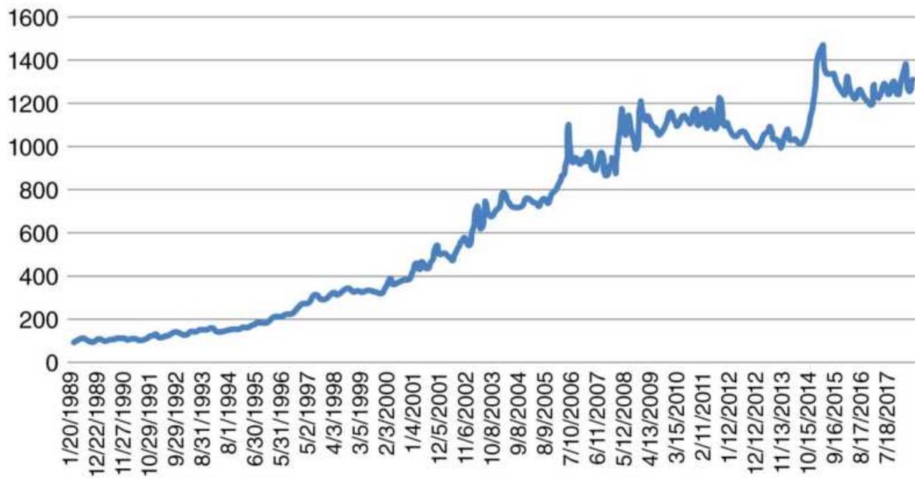
FIGURE 24.11 NAV of macrotrend system with no volatility stabilization.
NAV after volatility stabilization with \(12 \%\) target
7000
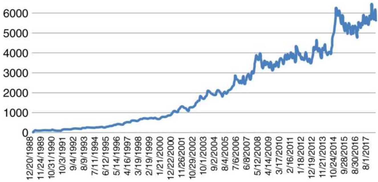
FIGURE 24.12 NAV of the same macrotrend system with volatility stabilization.
In a market with increasing volatility, the stabilization process always lags behind. If you target \(12 \%\), the average will be closer to \(13 \%\). In a market with declining volatility, it will be between \(10 \%\) and \(11 \%\).
\section*{Switching Costs}
Each time the volatility factor changes, each position size being traded must be adjusted. This can incur significant costs. The way to deal with this is:
Use a longer calculation period for the volatility calculation.
- Use a volatility change threshold, so that no positions are altered unless the volatility changes by, for example, \(20 \%\).
Deciding on the right combination is a matter of testing a specific strategy.
\section*{Capping Exposure}
Registered funds, in particular the European UCITS requirements, control leverage by imposing restrictions on exposure. This mainly affects managed futures. The requirements are:
- Total exposure cannot exceed \(2.5 \times\) current account equity.
- Exposure to commodities cannot exceed 20\% of current account equity.
The severe restrictions for commodity trading can be explained by fear of delivery, even though some financial
instruments have cash settlement.
Capping must be applied after all volatility stabilization and other adjustment factors have been accounted for. It is the last step. To understand the effect of capping, we must first explain exposure. Exposure is the face value of the assets being held. For equities it is simply the number of shares times the share price. For commodities it is the number of contracts times the big point value. This is the same as the face value except for interest rates with maturities less than one year. For example, with 3month maturities the rule is that the face value of \(\$ 1,000,000\) is divided by 4 .
Capping must be concurrent with taking positions. In a manner similar to controlling VaR, you must evaluate the exposure relative to the cap before setting positions that would exceed the cap. If the exposure \(E_{t}\) is greater than the cap, \(C\), then the normal process is to reduce all positions by the ratio \(C / E_{t}\), including the new positions that caused the exposure to exceed the cap. By reducing all positions in the portfolio you maintain the portfolio balance and its integrity.
Capping should reduce the total returns of the portfolio but it may have only minimal effect on the information ratio. High leverage is usually associated with low volatility, and low volatility is often associated with lack of price direction, so there is only a small expectation of reduced performance. Given regulations, most portfolio managers have no choice.
\section*{Business Risk}
Most professional managers receive funds from allocators, many of whom are investment firms and banks. Along with the funds are certain conditions. Among those may be:
Do not risk more than \(4 \%\) on any one day (determined by VaR).
Do not lose more than \(15 \%\) of the investment.
If your target volatility is \(12 \%\), you have a \(16 \%\) chance of losing \(12 \%\) at some time, and you have a somewhat smaller chance of losing \(15 \%\), a number to be avoided, but a definite possibility.
Let's say your system has a drawdown of \(10 \%\). Do you keep trading the same amount or reduce your exposure? If you reduce your exposure by \(25 \%\), you reduce your risk of ruin but you also slow down your recovery. That is a difficult business decision.
If you've decided to keep trading with the same exposure, there is nothing more to say. You will recover the losses or go out of business. But let's say that risk of ruin is not a good idea and you want to reduce leverage to avoid hitting the \(15 \%\) limit. You can reduce your positions by \(20 \%\) every time you lose \(1 \%\) more, so you cannot reach a \(15 \%\) loss. Having done that twice, the program stabilizes with a \(12 \%\) loss. What now?
There needs to be a process for adding back leverage, but if it's done too soon, another series of losses will result in reaching the \(15 \%\) threshold. There doesn't seem to be an automated solution to this problem, but there is a systematic one.
1. Track the performance as though you were still using your target volatility of \(12 \%\).
2. Wait until you recover \(3 \%\) of your \(12 \%\) loss ( \(25 \%\) ).
3. Wait for a reversal of profits, that is, a loss of \(1 \%\). Your shadow system is now up \(2 \%\).
4. Add \(25 \%\) of your position back.
5. Go to step 2.
If you lose all of the \(3 \%\) profit, reduce your position again by \(25 \%\) and start all over.
The Turtles had a similar method. For every 10\% drawdown in the portfolio, measured from the peak equity, the position size was cut by \(20 \%\). (At the time, most futures managers considered \(50 \%\) the maximum loss rather than \(15 \%\).) For every \(62 / 3 \%\) recovery, \(10 \%\) was added back. Costs were included when calculating these values.
These may not be the best plans for all investors, but business risk is real, and a clear plan is needed before it is necessary.
\section*{NOTES}
1 A good example of this can be found in Murray Ruggiero, Jr., "The Benefits of Trading Multiple Systems on Multiple Markets," Modern Trader (July 2016).
\(\underline{2}\) Rishi K. Narang, Inside the Black Box (Hoboken, NJ: John Wiley \& Sons, 2009), Chapter 6.
3 Peter L. Bernstein (Ed.) The Portable MBA in
Investment (New York: John Wiley \& Sons, 1995), p. 252.
4 The author would like to thank Evans Curtice, of Graham Capital Management, for his help in this section.
5 Harry M. Markowitz, "Portfolio Selection,"Journal of Finance (March 1952); also Harry M. Markowitz, Portfolio Selection (New Haven, CT: Yale University Press, 1979). The Markowitz model allows for short sales represented by negative weighting factors, where the sum of all weighting factors is 1 . In this genetic algorithm there will be only positive allocations, although negative and positive can be implemented by allowing a random number between -1 and +1 to represent the weights rather than a value between \(o\) and 1.
6 Thanks to Lutz Borgiel of ARIAD Asset Management in Hamburg, Germany, for his help with this propagation method.
\section*{ABOUT THE COMPANION WEBSITE}
This book is accompanied by a website, which you can find at www.wiley.com/go/tradingsystems6e (password: pjk6e).
The website includes:
- Appendix 1: Statistical Tables
Appendix 2: Matrix Solution to Linear Equations and Markov Chains
- Appendix 3: Trigonometric Regression for Finding Cycles
- Appendix 4: Construction of a Pentagon
■ Bibliography
- Computer programs and spreadsheets
\section*{INDEX}
\section*{A}
Acceleration, 325, 369-375
Also see Momentum
Accumulation and distribution, 106-118, 512
also see Chart Patterns
Accumulative average, 256
reset, \(\underline{256}\)
Adaptive techniques, \(777-797\)
Chande's VIDYA, \(782-783\)
comparisons, \(786-787\)
correlation coefficient, 784
Dynamic Momentum Index, 794-795
efficiency ratio, \(780-781\)
Ehlers methods, 784-787
FAMA, \(783-784\)
Fractal Adaptive Moving Average, 785-787
fractal dimension, \(785-786\)
fractal efficiency, \(780-781\)
intraday breakout system, 795-797
KAMA, \(778-782\)
Kaufman's Adaptive Moving Average, 778-882
MAMA, 784
Master Trading Formula, 791-792
McGinley Dynamics, 789
MESA Adaptive Moving Average, 784
momentum, 787
Parabolic Time/Price System, 789-791
trend-adjusted oscillator, 792-794
variations, \(787-795\)
VIDYA, \(782-783\)
A/D oscillator, \(356-360\)
Adding on profits, 1062
Advance-Decline System, 531
Advanced techniques, \(\underline{849}-918\)
ADX, 375-377, 1067-1069
Agricultural patterns,
Also see Intraday patterns, Seasonality
Allocation.
See Optimal \(f\), Portfolio allocation
Alpha defined, 1089
Amazon, \(\underline{1011}\)
day-of-the-month pattern, 721
seasonality, 402-403, 409-411
volume pattern, 499
weekday patterns, 713
Angas, L.L.B., 21, 146
Annualized volatility, 850
Annualizing, 40-43, 801-802
Anti-martingales, 1001-1008
Apple, Gerald, 868
VIX system, 864
Arbitrage, 541-605
Also see Spreads
butterfly spreads, 574
carrying charge, 550
Carry trade (FX), 580-584
cointegration, 563
convenience yield, 550
convertible, 556
crossrates, 552-554
crack spread, 571-572
Eurodollar strip, 576-577
forward rate parity, 551-556
gold -Barrick Gold relationship, 210-218
implied interest rates, \(578-580\)
intercrop spreads, \(572-574\)
interest rate parity, 551,580
intermarket spreads, 591-605
merger arb, \(556-558\)
market neutral, 546, 557
pairs trading, 561-574
stock and futures, 569
program trading, 554-556
rating services, \(559-560\)
relative value trade, 561, 569, 586, 597
reverse crack, 572
S\&P-bond, 592
single stock futures, 558
soybean crush, 570-571
Stress Indicator, 566 -568
TED spread, 578
volatility, \(584-589\)
yield curve, 544, 576-578, 605
ARIMA, 233 -238
Also see Regression
ARIMA strategies, \(\underline{237-238}\)
Arms, Richard
Arms Index (TRIN), 522
Equivolume, 504
Artificial intelligence, 732-733, 915-917
Aspects, planetary,
See Astrology, financial
Aspray's Demand Oscillator, 513
Asset allocation.
See Portfolio allocation
Astrology, financial, 668-681
aspects, \(674-675\)
calculations, \(\underline{676}-681\)
eclipses, \(\underline{673}\)
Force of attraction, \(\underline{669}\)
Jupiter-Saturn cycle, 670-672
solar eclipse, 678
lunar eclipse, \(\underline{680}\)
Universal Clock (Jeanie Long), \(\underline{672}\)
lunar phases, \(677-678\)
software, 68
Attractors, 892
Autocorrelation, 40, 222
Autoregressive Integrated Moving Average.
\section*{See ARIMA}
Average-off, 250, \(\underline{256}\)
Averages, 24-28, 31
Also see Moving averages, seasonality
geometric mean, 25-26
harmonic mean, 27
quadratic mean, \(\underline{26}\)
relationship between, \(\underline{28}\)
Average Directional Movement See ADX
Average Maximum Retracement, 1032
Average true range, \(\underline{850}-852, \underline{857}, \underline{862}, \underline{865}\)
Average volume, 506
Averaging down, 1063-1064
Averaging in, 1053
Awesome Oscillator, 362
\section*{B}
Bands and channels, 280-292
Also see Confidence bands
Adaptive, \(\underline{281}\)
Bollinger bands, 284-289
Keltner channels, \(\underline{281}\)
percentage bands, \(\underline{281}\)
rules, \(\underline{286}\) - 290
standard deviation, \(\underline{801}\)
using highs and lows, \(\underline{280}\)
volatility bands, \(\underline{282}-283\)
Bar chart
See Charting
Barrick Gold-gold relationship, 210-218
Bayes' theorem, 55
Bear market seasonal patterns, 429-431
Bear spread, 596
Bear trap, 133
Behavioral techniques, \(\underline{607}\)-681
Also see Price Shocks
Astrology, financial, 668-681
Commitment of Traders Report. 627-635
contrary opinion, 635-638
Dogs of the Dow, \(\underline{641}\)
Elliott's wave principle, 646-656
event trading. 614-627
Fibonacci and human behavior, 642-646
Gann, W.D., \(\underline{662-668}\)
Golden Section Compass System, 657-662
Lucas numbers, 649-650
Jobs report, 620
news, trading on, \(\underline{608}-614\)
put-call ratios, 639
reaction to reports, \(\underline{620}\)
Sentiment Index, \(\underline{638}\)
using Neural Networks, 905-915
Benchmarks
See Testing
Beta defined, 44, 1089
Bierovic's On-Balance True Range, \(\underline{862}\)
Big Block transactions, 641
Binomial probability, 1081-1088
Blau, William, 261-265
double-smoothed momentum, 261-265
True Strength Index, 294, 365-367
Block transactions, 641-642
Bollinger bands, 284-289
Squeeze, \(\underline{288}\)
Bolton-Tremblay indicator, 520
Bonds, 443
day-of-the-month pattern, 718
intraday price patterns, \(\underline{689}-690, \underline{695}\)
intraday volume pattern, 535
price gaps, 701
price shocks, \(\underline{621}-624\)
reaction to reports, \(\underline{619}\)
S\&P arbitrage, 592
weekday patterns, 709-710, 714
Bookstaber Volatility System, 865
Bottoms and tops, \(\underline{106}\)-118
See Chart patterns
See Spikes
Breadth, 518-526
Also see Volume, Open interest
Arms Index (TRIN), 522
Bolton-Tremblay, 520
comparison of indicators, 524
countertrend indicator, 525,532
High-low baskets, 524
High-Low Index, 523
interpreting, 518
McClellan Oscillator, 519
Schultz A/T, 521
Sibbett's Demand Index, 519
Thrust Oscillator (TO), 522
TRIN, Arms Index. 522
Upside/Downside Ratio (UDR), 521
Breakaway gap, 90
Breakout systems
Also see Day Trading, Event trading, Point-andFigure,
Swing trading, Turtles
Also see Comparison of trend system, 295-307
Donchian's
4-Week Rule, 196-197
40/20 Channel Breakout, 201
Intraday, 752-761, 794-795
N -day breakout, 195-205, 295-307
S\&P midday breakout, 751
Stridsman, Dynamic Breakout, 200-201
weekly, 198 - 200
Bressart, Walt, intraday patterns, 747-748
Briese Index, \(\underline{631-633}\)
Bulkowski, Thomas, \(\underline{80}\)
gaps, 92-93
ranking of candle patterns, \(\underline{162-166}\)
Bullish Consensus, 635-640
Bull and bear chart formations, see Chart patterns
Bull market, seasonal, 429-431
Bull spread, 596
Bull trap, 133
Business cycle, 458-460
Business risk, 1132-1133
Butterfly spreads, \(574-576\)
\section*{C}
Calculation periods,
See Testing
Calendar patterns
See Seasonality
Calmar ratio, 1032
Cambridge Hook, 377
Candlestick charts, 126-130
best of, \(130,162-166\)
pivot points and candle charts, 130
quantifying candle formations, 129
strategies, \(\underline{126}-130\)
Capping exposure, \(\underline{1129} \mathbf{- 1 1 3 2}\)
Caps, 96
Carry, interest rate, 874
Carrying charges, \(543-545\)
Carrying charge spread, 550
Carry trade (FX), 580-584
Cattle cycle, \(453-455\)
Chaiken, Mark
Accumulation distribution, 512
Volume Count Indicator, 511
Chande, Tushar, 782-783
Channel breakout, 153-154
Channels, 280-291
Also see Chart patterns
moving, \(155-156\)
Chaotic patterns, 892
Charting and chart patterns, 67-136 accumulation and distribution, 106-118
bull and bear traps, 133
caps, 96
channels, \(\underline{80}, \underline{85}, \underline{121}\)
compression, 144
computer recognition, \(\underline{160}-162\)
consolidation patterns, 121,125
continuation patterns, 101-105
cups, 96
distribution-bottoms and tops, \(\underline{87,}\) 106-118
Dow Theory, \(72-80\)
episodic patterns, 118-119
Also see Price shocks
failures, 132
flags, \(\underline{116}, \underline{125}\)
gaps, \(\underline{89}-94\)
Also see Gaps
head-and-shoulders. 115-118, 124
inside days, 101, 144
island reversals, 95
key reversal days, 97-99, 143
one-day patterns, 89-101
outside days, 100, 143
pennants, \(\underline{101}\)
price objectives, \(\underline{120}-126\)
pivot points, 96-97, 145
profit targets, 120-126
ranking of patterns, \(\underline{162}-166\)
rectangle bottom, extended 113-114
reversal days, 97
reversal patterns, 99
rounded tops and bottoms. 114-115
run days, 105
spikes, 94-95
systems and techniques.
See Charting systems and techniques
tops and bottoms, 106-118
trendlines, \(\underline{81}-89\)
redrawing, 122
triangles, 101-103
\(V\)-bottoms, 106 -109
\(V\)-tops, \(106-108\)
wedges, \(\underline{101}, \underline{104}, \underline{115}\)
wide-ranging days, 99-100
Charting systems and techniques, 137-166
candlestick charts, implied strategies, \(\underline{126}\)-130 channel breakout, 153-154
Commodity Channel Index, 156
complex patterns, \(158-160\)
confirming signals, 132
DeMark's Sequential, 158 -160
Dunnigan's Thrust Method, 138-141
Fibonacci ratios, 146-147
inside days, 144
moving channels, \(155-156\)
Nofri's Congestion-Phase System, 141-143
One-Way Formula, 140
pivot points, 145
Point-and-Figure, 176-194
outside days, 143
retracements, \(\underline{146}-152\)
Rule of Seven, 125-126
Schabacker rules, 146
Square Root Theory, 141
Thrust Method, 138-141
Trident Commodity Trading System, 148-150
Tubbs' Law of Proportion, 147
Wyckoff, Richard, 157
Chi-square test ( \(\chi^{2}\) ), 1085-1088
Coffee seasonality, 425,429
Cointegration, 563
Commitment of Traders Report, 627-635
Briese Index, 631-633
COT Index, 631 -633
COT Sentiment Index, 636, 638-639
Jiler interpretation, \(\underline{628}\)
Ruggiero strategy, 633-634
Commodex method, 1011-1012
Commodity Channel Index, 156
Commodity Selection Index (CSI). 1065, 1069
Compounding a position, \(1060-1064\)
Compression, 144
Computer basics, \(983-992\)
Confirmation, principle of, 77
Confidence bands, 220-221, 238-241
Congestion Phase System, Nofri's, 141-143
Conners, Larry
Advance-Decline System, 531
breadth indicator, 525
VIX system, \(\underline{862}-863\)
Contingent probability, 51
Continuation patterns, 101-105
Conservation of capital, \(\underline{1022}-1023, \underline{1073}\)
Consolidation patterns, 121, 125
Contrary opinion, \(635-638\)
Convenience yield, 550
Convertible arbitrage, 556
Cooling degree days, 422
Cootner, 5
Copper optimization, 948
Corn
cycle analysis, \(470-472,480\)
price-volatility relationship, \(\underline{858}-860\)
Purchaser model, \(\underline{820}-821\)
seasonality, 394, 425, 427, 429, 432-434
Seller model, 821-824
Corn-soybean relationship, 215-215
Correlation coefficient, \(r^{2 \mid \mathrm{i}} \underline{218}\)-222
Also see Portfolio optimizing, Arbitrage in adaptive trends 784
Correlation of trading signals, 1019
Correlations, changing, 1091
Costs, rebalancing (switching), 1131
transaction, 19, 736-741, 950
COT Index, 631-633
Cotton
Optimization, 942
seasonality, 395-396, 398-399
Countertrend,
See Mean Reversion, \(\underline{\text { Arbitrage }}\)
breadth, 525, 532
RSI, \(345-350\)
Crabel's intraday method, 755-756
Crack spread, 571-572
Crisis management,
See Price shocks
Crossovers,
See moving average
tested, 967
Crossrate arbitrage, 552-554
Crude oil
crossover tests, 968
gold spread, 594-596
intraday patterns, 692-694, 702, 741
intraday volume, 535
moving average tests, 966
optimization, 969, 972-976
price shocks, 624-625
Cups, 96
Curvilinear
See Regression analysis
Cycle analysis, 451-493
business cycle, 457
cattle cycle, \(453-455\)
detrending, 465
election cycle, 460-465
Ehlers' methods, 481-489
Fisher Transform, 485-486
Inverse, 486
Fourier analysis, \(473-481\)
Excel, 478 -480
Southwest Airlines 473, 479-480
Hilbert Transform, 483-485
Hurst method, 491-493
Hurst principles, 452
Kondratieff wave, \(458-460\)
maximum entropy (MESA), 481-488
Parzen window, 477
phase angle, 481 -482
phasing, 491-493
Presidential election cycle, 460-465
removing the trend, 451, 457, 465-467
Short Cycle Indicator, 489-490
spectral analysis, 474
spectral density, 475
Swiss Franc cycle, 455-456
terminology, 467
triangular weighting, 466-467
trigonometric analysis, 468-481
trigonometric regression, 2-frequency, 472
Tukey window, 477
Universal Oscillator, 488
War cycle, 457
D
Data, 18, \(\underline{12}, 921-926\)
acquiring and cleaning, 984-987
back-adjusted, 921 -926
synthetic, 925
testing, 22, 921-926
that is no longer useful, 926
Day-of-the-month patterns, 717-722
Day trading, 735-775
Also see Intraday, Patterns
afternoon breakouts, 767
bar size, 744-746
costs, 736 -741
Crabel, Toby, 755
First-hour breakout, 752-755
gap patterns, 768
high-frequency, 769-772
intraday breakout systems, \(752-761\)
intraday mean reversion, 761
key levels, \(747-748\)
liquidity, 770
Mark Fisher Opening Range Breakout, 763-766 mean-reverting strategies, 761-763
midday reversals, 767
missed orders, 740
opening range breakout, \(752-761\)
pivot ranges, \(764-766\)
price patterns, \(748-751\)
price shocks, \(771-775\)
profit-taking, 758, 764
Raschke and Conners \(1^{\text {st }}\) Hour Breakout, 754
support and resistance, \(763-765,767\)
Taylor Trading Technique, 724-729
time-of-day patterns, \(\underline{686}-699,746\)
time zones, 745
trend following, 741
volatility, \(746-747\)
volatility breakout systems, 755-761
volume patterns, 773
wide-ranging bars, 753,768
DAX, intraday volume pattern, 535
Death Cross, 311
Debugging, 990-992
Deflating prices, \(\underline{809}\)
Degrees of freedom, 38
Delaying the order, 279-280
\section*{Demand.}
See Supply and demand
Demand Index, Sibbett, 519
Demand Oscillator, Aspray's, 513
DeMark's
projected ranges, 685
Sequential, \(158-160\)
Density, price, \(\underline{11}\)
Detrending,
cycles, 465
seasonality, 408-411
Diamond, Barbara, 835
Differentiation, rules for, 372
Directional Indicator, \(\underline{1067}\)
Directional Movement (DM), 1065-1067
Directional Parabolic System, 375-377
Distribution-bottoms and tops,
See Chart Patterns
Distributions.
Also see Price distributions,
Frequency distributions, Statistics
changing shape, \(\underline{808}-819\)
equilibrium, \(\underline{811}\)
Excel functions, 37-38
frequency distributions, \(\underline{28}-38\)
kurtosis, 35-37, \(\underline{817}-819\)
medians and means, 30,814
mode, 30
patterns, \(\underline{803-811}\)
S\&P volatility, 800
short-term, \(814-816\)
similarity of, \(38-41\)
skewness, \(\underline{816}-819\)
structural changes, \(\underline{811-814}\)
Divergence, momentum, 378-385
MACD, 380
slope divergence, 384-385
trading rules, 381
multiple divergence, 385
Divergence Index, 342-343
Diversification, 18, 1089-1133
balanced risk, 1093 -1095
of markets, \(1091-1092\)
of strategies, \(\underline{1092}\)
over-diversification, 1096
Dividends vs Treasuries spread, 546
Dogs of the Dow, \(\underline{601}, \underline{641}\)
Donchian's
4-Week Rule, 196-197
\(5^{-}\)and 20-day moving average, 309-311
20- and 40-day breakout, 311
40/20 Channel Breakout, 201
Double smoothing, 261-265, 365-369
Dow, Charles, 4, 72-80
Dow, Puppies of the \(\underline{601}\)
Dow Theory, 72-80
Drawdown ratio, 1035
Drop-off effect, moving average, 256
Dunnigan, William, 138-141, 146
One-Way Formula, 139
Square Root Theory, 140
Thrust Method, 138-141
DX (true directional movement), 1067
Dynamic Breakout System, 200
Dynamic Momentum Index, 794-795
\section*{E}
eBay, 402
Eclipses, see Astrology
Economic data, 22, 61-64
Economic reports, quantifying, 64-66, 926
Also see Event trading
Efficiency ratio, 779
Also see Noise
Efficient frontier, 1024-1026
Ehlers, John,
adaptive trends, \(784-787\)
cycle methods and indicators, 481-489
optimal \(f, \underline{1078}\)
Swami charts, 343-344
Elasticity of supply and demand, 57-59
Elastic Volume-Weighted Moving Average, 516
Elder, Dr. Alexander,
Elder-ray, 840
Force Index, 840
Triple-screen trading system, \(\underline{838}-841\)
Election cycle, 460-465
Elliott, R. N., 146, 646-656```
Elliott Wave Oscillator, 653-656
Elliott's wave principle, 646-656
programming, 653
Super Cycle, 651-652
Entropy, 481-489, 894-897
See Cycle analysis
conditional, 896-897
Entry methods, 1053-1058
Episodic patterns.
See Charting, Price shocks.
Equilibrium, See Market Profile
Equilibrium of supply and demand, }\underline{60
Equity trends, 1077-1078
Equivolume, Richard Arms, }50
Error measurement
sample, 23
standard, 23
ETFs, low volatility, }86
Euro currency,
day-of-the-month pattern, 718
intraday highs and lows, 697-698
intraday patterns, 702
```
optimization, 939-940
Eurodollar strip, 576-577
Even numbers, trading on, 146, 152
Event-driven trends, 167-205
Also see Trend, event-driven
Event trading, 614-627
Also see Price shocks, Trends, event-driven
Excel distribution functions, \(37-38\)
Exhaustion gap, 91-95
Expected and actual results, 1085-1088
Expert systems, \(\underline{880}-885\)
Exponential smoothing, 257-264
Also see trend calculations and trend systems
comparison of methods, \(\underline{262}-263\)
double smoothing, 261-265
Kaufman's Adaptive Moving Average, 778-882
Parabolic Time/Price system, 789-791
residual impact, 259
smoothing constant in days, 258
triple smoothing, 293-294, 365-367, 385
Exposure, risk, 1129-1132
Extreme events,
See Price shocks
Extremes, identifying and fading, 328, 332-333
Also see Mean-Reversion, Profit targets
F
FAMA, 784
Fat tail, \(\underline{270}-272\)
Federal Reserve, 4
Also see Central Bank
Feedback, 19
in testing, 929, 935
Fibonacci ratio, \(147, \underline{642-646}\)
Also see Elliott's wave principle, behavior techniques golden rectangle, 656
golden spiral, 644
profit targets, 656-657
Fibonacci Trader, 843
Filters,
Also see Volatility
low-volume periods, 531, 537-538
seasonal, 422-439
Financial astrology, 668-681
First Cross, Raschke's, 363-364
Fisher, Mark, opening range breakout, \(\underline{\underline{61}}-767\)
Fischer, Robert
Golden Section Compass System, 657-662
First hour breakout, 752-755
Fisher, Mark, opening range breakout, \(761-767\)
Fisher Transform, 485
Inverse, 486
Flags, 116, 125
Fol1owing Adaptive Moving Average, 784
Force Index, 507, 840
Ford, \(402-404\)
Forecast Oscillator, 241
Forecasting trends.
See Trend calculations
Forward rate parity, 551-556
Fosback, Norman, Hindenburg Omen, 1040
Fourier analysis, \(473-481\)
Also see Cycle analysis
Four-Week Rule, 196-197
Fractal Adaptive Moving Average, 784
Fractals, \(\underline{890}, \underline{893}\)
Also see Efficiency ratio
fractal dimension, 785-786
fractal efficiency, \(779,891-892\)
Frequency distributions, 28-38, 799-802
showing fat tail, 272
Fundamental analysis, \(\underline{2}\)
compared to technical analysis, 3
Fund flows, 442
Fuzzy Logic, \(874-880\)
\section*{\(\mathbf{G}\)}
Gambling techniques. \(\underline{1000}-1008\)
Game theory, 885-890
Gann, W. D., \(\underline{146}, \underline{662-668}\)
geometric angles, 663-665
hexagon chart, 667
soybean charts, \(665-668\)
Gaps, 84-95, 699-707
breakaway, 90
Bulkowski on, 92-93
exhaustion, 91-95
filling the, 91
intraday patterns, \(768-769\)
Kaufman on, 93
Genetic algorithms, \(\underline{897}\)
in testing, 935
Kaufman's genetic algorithm portfolio solution, 11031129
software, 905
Geometric angles, Gann, 663-665
Geometric
mean, 25-27
moving average, 255
ratio, \(\underline{1031}\)
Globalization, \(\underline{12}-13, \underline{134}-136,546\)
changing patterns, \(134-136\)
Gold, 501
ARIMA correlogram, \(\underline{233-238}\)
crude oil spread, 594-596
implied interest rate, 578 -580
Gold-Barrick Gold relationship, 210-218
Gold/silver ratio, 590
Golden Cross, 311
Golden rectangle, \(\underline{656}\)
Golden Section Compass System, 657-662
Golden spiral, 644
Also see Fibonacci
Government reports, 76
Also see Event trading
\section*{H}
Hadady, Earl R.,
See Contrary Opinion
Harmonic mean, \(\underline{27-28}\)
Head-and-shoulders formation, 115-118
profit targets, \(\underline{124}\)
trading rules, 117
Heating degree days, 422
Heating oil
seasonality, 396-399, 406, 424
weekday patterns, \(710-711\)
Heat map of QQQ, 943
Herrick Payoff Index, 340-342, 505
Hedge fund replication, 917
Hexagon chart, \(\underline{667}\)
High frequency trading, 769-772
High-Low Index, 525
High-momentum trading, 336
Highs and lows, intraday, 695-699
Highs and lows, projecting, 685-686
Hilbert Transform, 483-485
Hindenburg Omen, 1040
Hirsch seasonal strategy, 446
Historic volatility, \(\underline{855-856}\)
for positions sizing, 1045
Hogs, optimization, 942
Holiday effect for stocks, 441-442
Holidays,
See Seasonality
Horizontal count, point-and-figure, 191-193
Hull Moving Average, \(\underline{266}\)
Hurst, phasing, 491-493
Ichimoku Clouds, 316-318
Inflation yield oscillator, 65
Implied interest rate, \(578-580\)
Implied volatility \(\underline{854-856}\)
Also see Volatility
Index, \(45-50\)
calculation, 45
construction of major market, 49-50
cross-market and weighted index, 48
leveraged long or short index funds, \(47-48\)
U.S. dollar, \(49,63-64\)
Inflation, adjusting for,
See Deflating prices
Information ratio, 1029-1030, 1090
In-sample data,
See Testing, Neural Networks, Step-Forward
Inside days, 101, 144
Interest rate carry, 874
Interest rate parity, 551-556, 580
Intermarket spreads, 559-561, 591-593
Intraday
See Chart patterns, Day trading
breakout systems, 794-795
volatility, \(\underline{861}\)
volume patterns, 534-537, 771
Intraday Intensity Indicator, 512
Intramarket spreads, 541-543, 596
Inventory Purchaser Model, \(\underline{820} \mathbf{8 2 3}\)
Inverse Fisher Transform, 486
Island reversals, 95
J
January effect (Merrill), 447-448
Jiler, William L., \(\underline{67}, \underline{627}\)
Jobs report, reaction, \(\underline{620}\)
Joint probability 51
Jupiter-Saturn cycle, 670-672
\section*{K}
Kalman filters, 238
KAMA, \(778-882\)
Kase, Cynthia DevStop, 803
Kaufman
on gaps, 93
on profit targets, \(\underline{1050}\)
on stops, \(\underline{1050}\)
Kaufman's
Adaptive Moving Average, 778 -882 efficiency ratio, \(779, \underline{1070}\)
genetic algorithm
See Portfolio allocation
Strategy Selection Index, 1070-1072
Kelly Betting System, 1079
Also see Optimal \(f\)
Keltner
10-day moving average rule, 291
Minor Trend Rule, 173
Key dates, seasonal, 435-438
Key levels, intraday
\section*{See Day trading}
Key reversal days, \(97-99\)
Kondratieff wave, \(458-460\)
Krausz's multiple time frames, \(\underline{841}\)-844
KST System, 845-847
Kurtosis, \(35-37\)
trading system, \(\underline{817}-819\)
\(\mathbf{L}\)
Lags and leads, \(\underline{667}\)
Lag, correcting distribution, \(\underline{801}-803\)
Law of averages, \(\underline{24}\)
Law of Proportion, Tubbs', 147
Leads and lags, 267
Least squares method, \(\underline{211-218, \underline{245}}\)
Also see Regression
sinusoidal, 232
Legging in and out of a spread, \(\underline{603}\)
Leverage, 1058-1060
Leveraged funds calculation, \(47-48\)
Linear correlation, 218-222
Also see Regression
Linear regression, \(\underline{210}-218\)
Also see Regression
Linear regression slope, \(\underline{210}-218, \underline{221}\)
Also see Comparison of trend system, 295-307
tests, 959-962
Link relatives, \(413-415\)
Liquidity Data Bank.
See Market Profile
Liquidity, 869-870, 1027-1028
Also see Volume
intraday, 770
portfolio constraints, \(\underline{1107}\)
Livermore, Jesse, system, 171-172
Location spreads, 547
Long, Jeanne, 672
Longevity, system, \(15, \underline{17}-18\)
Lucas numbers, 649-650
Lunar eclipses and phases,
See Astrology, financial
\section*{\(\mathbf{M}\)}
MACD (Moving Average Convergence/Divergence), \(335-337\)
Also see Momentum
Machine learning, 915-917
MAMA, 784
Manipulation, \(\underline{812-814}\)
Margin, trading on, 1026, 1052, 1058-1060
Marginal probability, 51
Market Facilitation Index, 538
Market neutral trading, 546
Also see Pairs trading
Market Profile, Steidlmayer's, 824-834
Market Sentiment Index, 638-641
Mark Fisher Opening Range Breakout, 761-766
Markov chains, 52-55
Markowitz, Harry, 1104
Martingales, 1001-1008
Master chart of \(360^{\circ}\)
See Gann
Master Trading Formula, 791-792
Maximum entropy, 481-488
McClellan Oscillator, 519
McGinley Dynamics, 789
Mean deviation, 32
Mean-reverting strategies
Also see Martingales
compared to trend following, 1011-1013
exiting countertrend trades, 336
fading extremes, 331-333
intraday, \(761-763\)
Median, 30, 814
moving, 255
Merger arb, 555-558
Merrill, Arthur A.,
holiday effect, 441-442
intraday patterns, \(\underline{689}\)
MESA, \(481-488\)
Also see Cycle analysis
Mispricing arbitrage, 548, 556
Missed orders, 740
Mode, 30
Modern Portfolio Theory, 1097-1103
Moments of the distribution, 31-37
Also see Variance, Standard Deviation,
Skew, Kurtosis
Momentum, 325-386
Also see Oscillators, Stochastics, Mean reversion adaptive, 787
as a trend indicator, 330-331
changing volatility, 334
comparison of trend system, 295-307
Directional Parabolic System, 375-377
divergence, \(378-385\)
Divergence Index, 342-343
double-smoothed, 365-369
fading extremes, 328, 332-334
Herrick Payoff Index, 340-342
high-momentum trading, 336
\section*{MACD (Moving Average Convergence/Divergence), \(337-339\)}
mean reversion, \(332-334,336\)
Money Flow, 340
risk protection, 335
sideways and trending, 364-365
Swami charts, \(343-344\)
System, 291
timing an entry, 331
trend indicator, 329-336
TRIX, 293-294, 385
True Strength Index, 294, 365-367
Momentum-Volume Indicator, 339-342
Volume, 339
Momentum-Volume Indicator, 339-342
Money Flow, 340, 511
Monitoring, performance, 19
Monte Carlo sampling, 936-937
Month-end effect, 442
Moon, phases,
See Astrology, financial
Mother of Adaptive Moving Averages index (MAMA), 784
Moving averages, 248-254
Also see Trend systems, Adaptive techniques
Also see Comparison of trend system, 295-307
10-day moving average rule, \(\underline{291}\)
ARIMA (Autoregressive Integrated Moving Average).
See ARIMA
accumulative, 256
average-off, 250
average modified, 250
comparison of methods, \(\underline{275}, \underline{277}, \underline{295-307}\)
crossovers, QQQ, 944-945, 967-969
Donchian's 5- and 20-day moving average system,
309-311
double smoothing, 261-265, 365-369
drop-off effect, 256
exponential, \(257-264\)
See Exponential smoothing
forecast error, 245
geometric, 255
Hull Moving Average, 266
leads and lags, 267
MACD (Moving Average Convergence/Divergence), \(335-337\)
optimizations, 966
pivot point, \(253-254\)
reset accumulative, 256
seasonal detrending, 408
signal progression, 319-322
signal similarity, 1014-1019
Also see Entropy
simple moving average, 250
standard deviation, 254
triangular, 252-253
weighted, \(\underline{251-252}\)
Moving channels, \(155-156\)
MPTDI (Major Price Trend Directional Indicator), 291292
Multiple time frames, \(835-847\)
Elder's Triple-Screen trading system, 838-841
Krausz's multiple time frames, 841 - 844
Pring's KST System, 845-847
two time frames, \(836-838\)
Multiple trends, 307-314, 314-316
Multivariate approximations, 214-215, 228-231
Also see Regression
\section*{N}
NASDAQ Intraday volume pattern, 535
NAV, see Net Asset Value
\(N\)-day breakout (rolling breakout).
See Breakout systems, \(N\)-day
Negative Volume Index, 512
Neill, Humphrey, 615
Net Asset Value, 46, 1097-1100
Net Momentum Oscillator, 347
Neural networks, 905-915
News, trading on,
\section*{See Behavioral Techniques}
Nofri's Congestion-Phase System, 141-143
Noise, price, \(779-781\)
Also see Efficiency ratio
and globalization, \(\underline{12}-14\)
measuring, \(9-13\)
impact on chart formations, 106
impact on trading, \(\underline{11}, \underline{871-873}\)
Nonlinear approximations for two variables, 222-225
Nonlinear, transforming to linear, 225-227
Nonseasonal patterns, 431-434
Normalized Volume, 506
\section*{O}
Objective function, 957, 1090, 1108, 1112-1113
Occam (also Ockham), William, 20
On-Balance True Range, Bierovic's, \(\underline{862}\)
On-Balance Volume, 509-511
One-day patterns, \(\underline{89}-101\)
One-Way Formula, Dunnigan's, 140
Opening gaps, \(\underline{699}-707\)
Opening range breakout, \(752-761\)
Also see Day trading
Open interest, 496
interpretation, 502-503
probability model, 533
substituting for volume, 516
Opinion.
See Contrary opinion
Optimal \(f, \underline{1078}-1081\)
Optimal portfolio
See Portfolio allocations, Testing
optimization, 969, 972-976
portfolio, 1096-1129
Optimization, 969, 972-976
Oscillators, \(344-386\)
Also see Momentum
A/D Oscillator, \(356-360\)
ADX filter, 375-377, 1067-1069
Awesome Oscillator, 362
Cambridge Hook, 377
Elliott Wave Oscillator, 653-656
Directional Parabolic System, 375-377
Forecast Oscillator, 241
Net Momentum Oscillator, 347
Relative Strength Index (RSI), 345-350
2-day, 348-350
MACD, 350
\%R Method, 360
Raschke's First Cross, 363-364
Relative Vigor Index, 361
stochastics, 351-356
stochastic RSI, 356
Strength Oscillator, 364
trend-adjusted, 792-794
Williams' oscillators, 356-360
Ultimate Oscillator, 360
Outside days, \(\underline{100}, \underline{143}, \underline{145}\)
Out-of-sample data
See Testing, Neural Networks Step-Forward
Overfitting,
See System Testing
\section*{\(\mathbf{P}\)}
Pairs trading, 546, 561-568
position sizing, 568
Palagi ratio, 1031
Parabolic Time/Price System, 789-791
Parameters
See Testing
Parity, forward rate, 551-556
Parzen window, 477
Patterns and pattern recognition, 681 -733
also see Charting, Chart patterns, Day trading
artificial intelligence methods, 732-733
computer-based, 729-731
day-of-the month, 717-722
DeMark's projected ranges, 685
evolution of, \(134-136\)
gaps, price, \(\underline{89}-94, \underline{699}-707\)
highs and lows, projecting daily, 685-686
intraday updated, \(\underline{689}-699\)
Merrill's intraday patterns, 689
one-day, \(\underline{89}-101\)
pivot points, 685
stocks, intraday, 703-707
Taylor Trading Technique, 724-729
time-of-day patterns, \(\underline{686}\)-699
Tubb's intraday patterns, 688
reversal patterns, 722-724
weekday patterns, \(708-715\)
weekend patterns, \(715-717\)
PDI (directional indicator), \(\underline{1067}\)
Pennants, 101
Percentage smoothing.
See Exponential smoothing
Performance
Also see \(\underline{\text { Information ratio }}, \underline{\text { Sharpe ratio }}\), Testing benchmarks, 954-955
decay, 1034
expectations, 990
measurements, 40-45
monitoring and feedback, 19
Peters, Edgar, \(\underline{890}\)
Phase angle, 481-482
Phasing, 491-493
Pivot points, \(96, \underline{145}, \underline{253}, \underline{685}\)
for candle charts, 130
reversals, 96
swings, 173
Pivot ranges, \(764-766\)
Planetary Clock, \(\underline{672}\)
Platinum/gold ratio, 590
Platinum seasonality, 402-404
Point-and-figure charts, 157, 176-194
box size, \(181-185\)
formations, 179-181
price objectives, 191-194
horizontal count, 191-193
vertical count, 193-194
reversals, 190
recent applications, 194
trading techniques, 185-191
trendlines, 181
Portfolio allocation, 1089-1133
alpha-driven weighting, 1095
calculations, \(1097-1100\)
constraints, \(\underline{1107}\)
decision-tree models, 1096
equal-dollar weighting, 1095
equal-risk weighting, 1095
equally weighted sector ETFs, 1096-1097
Kaufman's genetic algorithm solution, 1103-1129
Markowitz, Harry, \(\underline{1104}\)
Modern Portfolio Theory, 1097-1103
Objective function, \(\underline{1108}, \underline{1112-1113}\)
optimal, \(1097-1103\)
optimizing, 1096 - 1129
spreadsheet solution, \(\underline{1100}-1103\)
volatility stabilization, 1129-1132
Position sizing, 568, 1041-1046
Positive Volume Index. 512
Potential risk, 1035
\section*{Also see Volume}
Practical considerations, 983-1019
Prechter, Robert R.,
See Elliott wave
Presidential election cycle, 460-465
Price and Volume Trend, 512
Price distributions, \(28-38,799-802\)
Also see Distributions
Price distribution systems, 799-834
Annualized price moves, \(\underline{804}-808\)
correcting the lag, \(\underline{802}-803\)
deflating prices, \(\underline{809}\)
Kase's DevStop, 803-804
kurtosis and skew, trading system, \(\underline{817}-819\)
patterns, \(\underline{808}-819\)
Producer Selling Model, 823-824
Purchaser Inventory Model, 820-823
Market Profile, Steidlmayer's, 824-834
zone analysis, \(\underline{804}-808\)
Price objectives.
See Profit targets, Charting
Price shocks, 614-627, 992-1000
bonds, \(\underline{621}-624\)
crude oil, \(\underline{624}\)-625
effect on testing, 958-959
episodic patterns, 118-119
crisis management, 998
intraday, 773
S\&P, 626-627
testing, 970-976
Price targets.
See Profit targets
Price trends
See Trends
Pring, Martin, KST System, \(\underline{845-847}\)
Probability, 50-56
Bayes' theorem, 56
binomial, 1081-1088
contingent probability, 51
joint probability, 51
laws of, 51
marginal probability, 51
Markov chains, 52-55
Probability density function,
See Fourier transform
Probability of achieving a return, 43
Probability model, with volume, 533-534
Producer Selling Model, 823-824
Product substitution, 547
Profit targets, 1049-1050, 1052
day trading, 758, 764
charting, \(120-126\)
Fibonacci, 656-657
Kaufman on profit-taking, 1050
Mark Fisher, 764
point-and-figure, 191-194
Fibonacci ratios, \(\underline{656}\)-657
volatility, 865
Program trading, 554-556
Programming your own system, 983-992
Progression, moving average signals, 319-322
Projected crossovers, 323
Projecting daily highs and lows, 685-686
Proximity risk, 1051
Puppies of the Dow, 601
Purchaser Inventory Model, 820-823
Put-call ratios, 639
Pyramiding.
\section*{See Compounding a position}
\section*{Q \\ QQQ}
crossover test, 944-945
optimization, 938
Quadratic mean, 27
Quotient transformation, 323
\section*{\(\mathbf{R}\)}
\%R Method, 360
Random walk argument, \(\underline{6}-7\)
Ranking candle patterns. \(162-166\)
Ranking markets. 868, \(\underline{1070}\)-1072
Also see Risk Control
Ranking trends, 1070
Raschke, Linda,
First Cross, 363-364
Raschke trades Crabel, 755
Raschke and Conners \(\underline{1}^{\text {st }}\) Hour Breakout, 754
trades the news, \(\underline{620}\)
Rate of change (ROC), 325, \(\underline{845}-847\)
\section*{See Momentum}
Rating services, arbitrage, 559-560, 599-601
Reaction to economic reports,
See Event trading
Reading, recommended, 14
Rectangular formations, 113-114
Regression analysis, 207-242
ARIMA, \(\underline{233} \mathbf{- 2 3 8}\)
calculation period selection, 209-210
confidence bands, \(\underline{220}-221, \underline{239}\)
curvilinear, 222-223
Excel regression, \(\underline{213}\)
Forecast Oscillator, 241
linear correlation, 218-221
least squares, \(\underline{211-218}\)
least-squares sinusoidal, 232
linear regression, 210-218, 239
logarithmic fit, 226
market strength, 241-242
multivariate approximations, 228-231
seasonality, 408-409, 417, 424
second-order least squares, 222-225
trading strategy, 218-241, 238-241
transforming nonlinear to linear, 225-227
Regularization, 265
Relative Strength Index (RSI), 345-350
Also see Oscillators
Relative value spreads, \(561,569,586,597,599\)
Relative Vigor Index, 361
Renko bricks, 194-195
Replication of hedge funds, 314, 917
Retracements, 146-152
Returns,
annualizing, 41
compounding, 43
standardizing, \(41-43\)
Reserves, 1060, 1075-1078
Reset accumulative average, 256
Resistance lines, \(83-84, \underline{89}\)
Retracements, 146-152
Returns, calculation of, 1025
Also see Risk measurements
\section*{Reversal}
days, 97-99
failed, \(\underline{172}-173\)
midday, 767
patterns, 99, 722-724
Point-and-figure, \(\underline{177}, \underline{190}\)
Reverse crack, 571-572
Richard Arms' Equivolume, 504
Risk, 41, 43
aversion, 1022-1027
downside, 45
point-and-figure, 188-194
preference, 1024
spread, 593
Risk calculations.
See Risk measurements, \(\underline{\text { Statistics }}\)
Risk characteristics of systems, 1028
Risk control, 19, 1021-1088
Also see Price shocks
averaging into a position, 1053-1054
binomial probability, 1081-1088
business risk, 1132-1133
chi-square test \(\left(\chi^{2}\right), \underline{1085-1088}\)
compounding a position, \(\underline{1060}-1064\)
conservation of capital, \(\underline{1022}\)-1023
efficient frontier, 1024-1026
entry methods, \(1053-1058\)
equity risk, \(1075-1077\)
equity trends, \(1077-1078\)
exposure, 1060, \(\underline{1129}-1132\)
leverage, \(1058-1060\)
liquidity, \(1027-1028\)
Kaufman's Strategy Selection Indicator, 1070-1072 margin, 1026, \(\underline{1052}, \underline{1058}-1060\)
measuring.
See Risk measurements
optimal \(f, \underline{1078}-1081\)
position sizing, 1041-1046
price shocks, 1021, 1022, 1041
profit targets, \(1049-1050\)
Kaufman on profit-taking, 1050
pyramiding.
See Compounding a position
ranking markets for selection, \(\underline{1070}-1072\)
using ADX, \(\underline{1067}-1069\)
Commodity Selection Index (CSI). 1065, 1069
Directional Movement (DM), 1065-1069
Directional Indicator (PDI), \(\underline{1067}\)
Kaufman's Strategy Selection Index, 1070-1072
True Directional Movement (DX), 1067
using prices, \(\underline{1070}\)
ranking trends, \(\underline{1070}\)
reserves, \(1060,1075-1078\)
selecting markets, \(1064-1071\)
stops, \(\underline{1046}\)-1051
See stop-loss
trade risk, \(\underline{1046}\)
utility, 1023
Vince, Ralph, Optimal \(f, \underline{1079}-1081\)
volatility stabilization, 1129-1132
waiting for a better price, 1053-1058
Yates correction to chi-square test, 1087
Risk of ruin, 1072-1075
Risk management
See Risk control
Risk measurements, 1028-1041
annualized returns (AROR), 1025
annualized volatility, 850, 1025
average maximum retracement, 1032
information ratio, \(\underline{1029}-1030, \underline{1090}\)
Calmar ratio, 1032
Chi-square test, 1085-1088
drawdown ratio, 1035
expected vs actual, \(\underline{1081}\)
geometric ratio, 1031
Hindenburg Omen, 1040
Palagi ratio, \(\underline{1031}\)
performance decay, 1034
potential risk, 1035-1041
probability of a loss, \(\underline{1081}-1084\)
regression residuals, 1031, 1035, 1064
risk-adjusted returns, 1029-1030, 1090
risk of ruin, \(\underline{1072-1075}\)
semivariance, 1035
standardizing, 40-45
Sharpe ratio, 1029-1030
Sortino ratio, 1033
time to recovery, 1034
Treynor ratio, \(\underline{1031}\)
Ulcer Index, 1034
Value-at-risk (VaR), 1036-1040
Risk preference, \(\underline{1024}\)
Risk protection in momentum, 335
Robustness.
See Testing
ROC (Rate of change) Method, 312, 845-847
Also see Momentum
Rolling breakout.
See \(\underline{N}\)-Day breakout,
Rounded tops and bottoms, \(\underline{114} \mathbf{- 1 1 5}\)
RSI (Relative Strength Index), 345-350
adaptive, \(787-788\)
Ruggiero, Murray, \(\underline{6}, \underline{621}, \underline{631}, \underline{633-635,} \underline{653-656,}, \underline{768}\), \(\underline{875,} \underline{878}, \underline{910}, \underline{1068}\)
Rule of Seven, 125 - 126
Runaway gap, 91-92, 115
Run days, 105
Runs, distribution of, 270-273
Runs, theory of, \(\underline{1000}-1008\)
Also see Gambling techniques
\section*{\(\mathbf{S}\)}
\section*{S\&P}
intraday price patterns, \(\underline{691}-692, \underline{696}-697\)
midday breakout system, 751
optimization, 941, 964
price gaps, \(\underline{699}-701\)
price shocks, \(\underline{626}-627\)
reaction to reports, \(\underline{619}\)
seasonality, 443-446, 449
weekday patterns, 710-712, 715
Sample error, \(\underline{21-22}\)
Saturn lines, 670-672
Schabacker, R. W., charting rules, 146
Schultz A/T, 521
Schwager, J. D., 72, 1032
Seasonality, 387-450
Agricultural markets, 389
Amazon, 402-403, 409-411
Average prices, 390
bear market patterns, 429-431
bonds, 443
books, 438
bull market patterns, 429-431
calculating, 390-408
changing patterns, 394
coffee, 425,429
cooling degree days, 422
corn, 394, 425, 427, 429, 432-434
cotton, 395-396, 398-399
currency effects, 434-435
eBay, 402
equity index, \(440-443\)
ETFs, 426
Ford, 402-404
fund flows, 442
heating degree days, 422
heating oil, 396-399, 406, 424
Hirsch strategy, 446
holiday effect for stocks, 441-442
January effect (Merrill), 447-448
link relatives, \(413-415\)
key dates, \(435-438\)
Metals, 389
month-end effect, 442
\section*{Also see Day-of-month patterns}
moving average method, 415-416
nonseasonal years, 431-434
October, risk of, 449
platinum, 402-404
positive years, 394, 401, 403
S\&P, \(443-446,449\)
sensitivity, 420-422
Southwest Airlines, 401, 406
stocks seasonal patterns, 400-406, 439
sugar, 428
trading rules, 422-426, 432-434, 444
unleaded gasoline, 396-398
volatile years, effects of, 398
volatility, 404-408
weather sensitivity, 420-422
wheat, 391-394, 412-416, 427
Winter's method, 419
\(\mathrm{X}-11\) and X12 methods, 416-419
yearly averages, \(411-413\)
Second-order regression,
See Regression analysis
Sector returns, equal weighting, 1096-1097
Selling Model, Producer, 823-824
Semivariance, 45, 1035
Sensitivity testing, 954
Sentiment Index, 638-641
Sequences, trading signal, 319-322
Sharpe ratio, 921, 957, 1029-1030
Shocks.
See Price shocks.
Short Cycle Indicator, 489-490
Shultz A/T, 521
Sibbett's Demand Index, 519
Sideways markets
\section*{Also see \(\underline{\text { ADX }}\)}
identifying with velocity and acceleration, 369-375
Strength Oscillator, 364
Similar situations, 894-897
Silver, 1013 -1014
Similarity of trading signals, 1014-1019
Similar years analysis, see Seasonals
Single stock futures arbitrage, 558
Skewness, 33-35, \(\underline{816}-819\)
Slippage costs, \(736-741,950\)
Slope, 210-218, 221, 295-298, 302, 307, 370
Also see Regression
divergence, 384
Smoothing.
See Exponential smoothing
Software, vendor statistical, 22
Solar eclipses,
\section*{See Astrology, financial}
Sortino ratio, 1033
Southwest Airlines
cycle analysis, \(473,479-480\)
seasonality, 401, 406
Soybean-corn relationship, 214-215
Soybean
crush, 570
multivariate solution, \(\underline{214}\)-215
Gann charts, 665-668
Spearman's correlation, 221
Spectral analysis, 474
Spectral density, 475
Spikes, 94-95
Volume, 500, 526-529
Spreads, 541-605
Also see Arbitrage
bull and bear spreads, 596
butterfly, 574-576
carrying charges, 543-545, 547
changing spread relationships, 589-591
crack and reverse crack, 571-572
creating new markets, 594 -596
cross-market, 546
crude oil and gold, 594-596
dividends vs Treasuries, 546
Dogs of the Dow, \(\underline{601}\)
gold/silver ratio, 590
implied interest rate, \(578-580\)
intermarket, 559-561, 591-593
intramarket spreads, 541-543, 596
legging in and out, \(\underline{603}\)
location spreads, 547
market neutral trading, 546
mispricing, 548, 556
old crod-new crop, 572
pairs trading, 546, 561-568
product relationships, 547
platinum/gold ratio, 590
rating service, 599-601
relative value, 599
risk, 593
soybean crush, 570
stocks, 546
substitution of products, 547
TED spread, 578
volatility, 597-599
yield curve, 576 - 578
Square Root Theory, Dunnigan's, 141
Standard deviation, 30, 32-33
Bollinger bands, 284-289
and frequency distribution, \(\underline{28}-38\)
moving average, 254
Standard Deviation Stop, 1048
Standard error, 23
Statistical arbitrage,
See Arbitrage
Statistics, \(\underline{21}-66\)
\section*{See Price distributions, Probability}
frequency distributions, \(\underline{28}-38\)
Steidlmayer's Market Profile, \(\underline{824}\)-834
Step-forward testing, 933-935
Stochastics, 351-356
Also see Oscillators
Stock dividends and splits
See Data
Stop-loss, 1046-1051
Standard Deviation Stop, 1048
trailing, 1047
volatility, 865
Strength, measuring market, 241-242
Also see Ranking
Strength Oscillator, 364
Stress Indicator, 566-568
Stridsman, Dynamic Breakout System, 200
Student \(t\)-test, 38-39
Substitution of products, 547
Sugar seasonality, 428
Supercycle, 651-652
Supply and demand, 56-66
building a model, \(\underline{60}-66\) demand, \(56-58\)
elasticity of demand, 57
elasticity of supply, 59
equilibrium, \(\underline{60}\)
supply, 58-59
Support and resistance lines, \(83-84\)
\section*{See Charting}
Swami charts, 343-344
Swing filter, \(\underline{168}-169\)
Swing trading, \(170-172\)
also see Event trading
constructing a swing chart, \(\underline{168}-170, \underline{172}\)
failed reversal, \(\underline{172}\)
Keltner Minor Trend Rule, 173
Livermore approach, 171-172
pivot points, 173
rules, \(\underline{170}-171\)
Wilder's Swing Index, 174-176
System development guidelines, 15-16
System testing.
See Testing
\section*{Systems}
See Charting systems, Trend systems
Targets.
\section*{See Profit targets}
Taylor Trading Technique, 724-729
Technical analysis defined, \(\underline{1}\)
TED spread, 578
Ten-day Moving Average Rule, 291
Term structure, carrying charges, 544
Tesla, 500
Testing, 19, 919-981
3-dimensional plots, 944-947
benchmarks, 954-955
changing rules, 951
comparing results of futures, 966-949
comparing trend systems, 959-962
costs, 950
data, 921-926
adjusted data series, 922-927
synthetic data, 925
expectations, 920
feedback, 929, 935
genetic algorithm method, 935
heat map, 943
in-sample data, 927-929
interpreting results, 952, 977-979
measuring test results, 955-958
Monte Carlo sampling, 936-937
multiple parameters, 943-950, 979
multiple systems, 959-962
optimizations, 937-950, 966
out-of-sample data, 927-929
parameters, 929-931, 951, 954
performance tracking, 980
price shocks, 958-959, 970-976
profiting from the worst results, 963-965
retesting, 962-963
robustness, 953-955, 965-970, 976
sensitivity, 954
Sharpe ratio, 921, 957
step-forward testing, 933-935
visualizing and interpreting results, 937-950
Theory of runs,
See runs
Thrust Method, Dunnigan's, 138-141
Thrust Oscillator, 522
Tick volume, futures, 497
Tick Volume Indicator, 514
Time frames,
See Multiple Time Frames
Time series
Also see Cycles, Regression, Trends, time-driven
components, \(\underline{207}\)-208
Time to recovery, 1034
Time zone, trading in the wrong, 745
Timing the order, \(\underline{279}-280,331\)
Time-of-day patterns, 686-699
Tops.
See Chart Patterns
Trade-offs, trend vs mean reversion, \(\underline{1011-1013}\)
Trade selection, 18, 1008
Trading ranges, \(\underline{1012} \mathbf{- 1 0 1 3}\)
Trading styles
convergence, \(\underline{2}\)
in stocks and futures, \(7-9\)
Trading system profile, \(17-19\)
Trailing stop, 1046-1051
Transaction costs,
See costs
Transforming nonlinear to linear, 225-227
Traps, bull and bear, 133
Trend-adjusted oscillator, 792-794
Trend analysis in spreads,
See Spreads
Trend change, anticipating, 276-277
Trend-following, \(\underline{1009}\)
reliability, 131
Trend-following systems
See Trend systems
Trendlines.
See Chart patterns
point-and-figure, \(179-181\)
Trend calculations, 243-267
Also see Regression, exponential smoothing, moving averages
drop-off effect, 256
error analysis, \(\underline{245-246}\)
exponential regularization, 265
exponential residual impact, \(259-298\)
geometric moving average, 255
Hull Moving Average, 266
linear regression slope, \(\underline{210}-218\)
relating exponential and standard moving averages,
260-261
Trend, removing the, 451, 457, 465-467
Trend systems, event-driven, 182-233
Donchian's 4-Week Rule, 196-197
Donchian's 40/20 Channel Breakout, 311
expectations, \(\underline{247}\)
Keltner Minor Trend Rule, 173
moving averages, \(\underline{248}-252\)
\(N\)-day breakout, 195-205, 295-307
pivot points, 96-97, 145
point-and-figure, \(176-194\)
swing trading,
See Chart systems, Swing trading
Turtles, 201-205
weekly breakouts, 198-200
Wilder's Swing Index, 174-176
Trend systems, time-based, 269-324
4-9-18 Crossover Model, 316
10-day Moving Average Rule, \(\underline{291}\)
anticipating the trend signal, \(\underline{276}\)-277
bands and channels, \(\underline{280}\)-290
Also see Bands and channels.
buy and sell signals, 272-279
calculation period, \(\underline{290}\)
Also see Testing
combining mean-reversion, \(\underline{1011-1013}\)
comparison of trend systems, 295-307
crossover models, 316.307-316
Death Cross, 311
delaying the order, 279-280
distribution of profits and losses, 271-272
Donchian's
5 - and 20-day moving average, 309-311
20- and 40-day breakout, 311
early exits, 322,323
fat tail, \(\underline{270}-272\)
Golden Cross, 311
\section*{Ichimoku Clouds, 316-318}
linear regression slope, 210-218, 221, 295-298, 302, 307, 370
Modified 3-Crossover Model, 316 momentum system, \(\underline{291}\)
moving average. \(\underline{248}-252\)
Also see Moving average
moving average sequences, \(319-322\)
MPTDI, 291-292
multiple trends, 307-314, 314-316
Projected crossovers, 323
Raschke's First Cross, 363-364
Replication, 314
ROC Method, 312
selecting the trend speed, 318
similarity of signals, 1014-1019
single trends, 277 - 279
step-weighted moving average (MPTDI), 291-292
two trends, 307-314
three trends, \(314-316\)
timing the order, \(\underline{279}-\mathbf{2 8 0}\)
TRIX, triple exponential smoothing, 293-294
Volatility System, 292
Trendlines, \(\underline{81}-89\)
Trends,
Also see Bar charts Dow Theory, Event driven,
Trend calculations, Trend systems
and interest rate carry, 874
causes of, \(70-71\)
equity, \(1077-1078\)
impact of noise, \(871-873\)
in retrospect, 131
vs sideways, 364
Treynor ratio, \(\underline{1031}\)
Triangles, \(\underline{101}-103\)
Also see Chart patterns
Triangular weighting, 252-253, 466-467
Trident Commodity Trading System, 148-149
Trigonometric regression,
See Regression, Cycle analysis
TRIN, Arms Index. 522
Triple-screen trading system, \(\underline{835-836}\)
Triple tops and bottoms.
See Chart patterns
TRIX, triple exponential smoothing, 293-294, 385
True Directional Movement (DX), 294, 1067
True range, \(850-852\)
Also see Average true range
On-Balance, 862
True Strength Index, 294, 365-367
\(t\)-Statistic, \(38-40\)
\(t\)-Test, student, \(38-39\)
Tubb's, Frank, 146
intradav patterns, \(\underline{688}\)
Law of Proportion, 147
Tukey window, 477
Turtles trading rules, \(\underline{201}-205\)
TWAP, 517
\section*{\(\mathbf{U}\)}
Ulcer Index, 1034
Ultimate Oscillator, 360
Unemployment
See Economic reports
Unleaded gasoline, 396 - 398
Universal Clock (Jeanie Long), 672
Universal Oscillator, 488
Upside/Downside Ratio, 521
U.S. dollar index, \(49,63-64\)
Utility, 1023
V
Value area.
See Market Profile
Value at Risk (VaR), 1036-1040
Variably-weighted moving average, 516
Variance, 32
\(V\)-bottoms, 106 -109
Vertical count, point-and-figure, 193-194
Velocity, \(369-375\)
VIDYA, 782-783
Villiers, Victor De, 177
Vince, Ralph Optimal \(f\), 1078-1081
VIX
for position sizing, \(\underline{1045}\)
system test, 945 -948
trading system, \(\underline{862}-866\)
Volatility, 43-45, \(\underline{849}-867\)
annualized, \(\underline{850}\)
average true range, \(\underline{850}-852, \underline{857}, \underline{862}, \underline{865}\)
breakout systems, intraday, 755-761
Chande's VIDYA, \(782-783\)
effects of volatile years, 398
filters, 869
historic, \(584-589,855-856\)
implied, 584-589, 854-856
intraday volatility and volume, \(746-747, \underline{861}\)
lognormal transformation, 858-860
low volatility ETFs, \(\underline{868}\)
low volatility stocks, 1044
MarketSci Blog, \(\underline{863}\)
measuring, \(\underline{849}-860\)
momentum, 334
predicting, \(861-862\)
price relationship, \(\underline{856}-860\)
profit-targets, 865
ranking, 868
relative, \(\underline{853}, \underline{858}\)
seasonal, 404-408
spread, 597-599
stabilization, \(1129-1132\)
stop-losses, 865
trading, \(\underline{860}-869\)
volume is a predictor of, 505
VlX trading system, \(862-866\)
Volatility System, 292, \(\underline{865}\)
Volume Accumulator, 511
Volume, 495-539, 526-523
Advance-Decline System, 531
Equivolume, Richard Arms', 504
filtering low-volume periods, 537-538
futures volume, 496
Herrick Payoff Index, 505
probability model, 533-537
interpretation, 502
intraday patterns, 534-537, 771
liquidity, 497
Market Facilitation Index, 538
momentum, 339-340
probability model, 533
spikes, 500, 526-529
strategy, 529-530
tick volume, futures, 497
variance, \(498-499\)
volatility, volume is a predictor of, 505
\(W\) pattern, 498
Volume Count Indicator, 511
Volume indicators, 506-516
Accumulation distribution, 512
Average Volume, 506
Aspray's Demand Oscillator, 513
Elastic Volume-Weighted Moving Average, 516
Force Index, 507
Intraday Intensity, 512
Money Flow Index, 511
Negative Volume Index, 512
Normalized Volume, 506
On-Balance Volume, 509-511
Positive Volume Index. 512
Price and Volume Trend, 512
Substituting open interest, 516-517
Tick Volume Indicator, 514
Variably-weighted moving average, 516
Volume Accumulator, 511
\section*{Volume Count Indicator, 511}
Volume momentum, 507
Volume oscillator, 508
Volume-weighted MACD, 515
VWAP, 516
Volume momentum, 507
Volume oscillator, 508
Volume-weighted MACD, 515
\(V\)-tops and bottoms, 106-108
VWAP, 516
\section*{\(\mathbf{W}\)}
\(W\) volume pattern, 498
Step-forward testing, 933-935
Also see Testing
Weather sensitivity, 420-422
Weekday patterns, 708-715
Weekend patterns, 715-717
Weekly breakouts, 198-200
Also see Breakout systems
Wedges, 101, 104, 105
Weighted average, 251-252
Weingarten, Henry, \(\underline{670}\)
Wheat,
deflated, \(\underline{809}-811\)
optimization, 941
seasonality, 391-394, 412-416, 427
Wide-ranging days, 89, 99-100
Wilder, J. Welles, Jr.
Average Directional Movement index (ADX), 375-377, 1067-1069
Commodity Selection Index (CSI). 1065-1070
Directional Indicator (PDI), \(\underline{1067}\)
Directional Movement (DM), 1065
Directional Parabolic System, 375-377, 789-791
Relative Strength Index (RSI), 345-350
Swing Index, \(174-176\)
True Directional Movement (DX), 1067
Williams, Larry,
A/D oscillator, 356-360
\%R method, 360
Ultimate Oscillator, 360-361
Winter's method for seasonality, 419
Wyckoff, Richard D., 157
\(X\)
X-11 and X12 seasonal methods, 416-419
XLV equally-weighted subset, 1096-1098
\(\mathbf{Y}\)
Yates correction to chi-square test, 1087
Yield curve arbitrage, 544, 576-578, 605
\(\mathbf{Z}\)
Zone analysis, 804-808
\section*{WILEY END USER LICENSE AGREEMENT}
Go to www.wiley.com/go/eula to access Wiley's ebook EULA.