


4 ways generative AI will transform the way you manage testing
4种方式生成AI将改变您管理测试的方式
In this guide, we’ll share four ways generative AI can boost your...
在本指南中,我们将分享四种生成式AI可以提高您的...
Software testing metrics are a way to measure and monitor your test activities. More importantly, they give insights into your team’s test progress, productivity, and the quality of the system under test. When we ask ourselves “What have we tested?,” metrics will give us better answers than just “we have tested it.” Different teams measure various aspects depending on what they want to track and control or improve. 重试 错误原因
A metric usually conveys a result or a prediction based off the combination of data. 重试 错误原因
Result metrics: metrics that are mostly an absolute measure of an activity/process completed.
成果指标:主要是对已完成活动/流程的绝对度量的指标。
Example: Time taken to run a set of test cases in a suite
示例:在套件中运行一组测试用例所花费的时间
Predictive metrics: metrics that are derivatives and act as early warning signs of an unfavorable result.
预测性指标:是衍生工具的指标,可作为不利结果的早期预警信号。
Example: Defects created vs. Resolved chart shows the rate of defect fixing. This grabs the team’s attention if this rate is slower than the rate desired.
示例:创建的缺陷与已解决的缺陷图表显示了缺陷修复率。如果这个速率比期望的速率慢,这会引起团队的注意。
The aim of collecting test metrics is to use the data for improving the test process, rather than to just show fancy reports. This includes finding tangible answers to the questions:
收集测试度量的目的是使用数据来改进测试过程,而不仅仅是显示花哨的报告。这包括为以下问题找到切实的答案:
Good answers to these questions need measurement. This post includes 64 of the absolute, derivative, result, and predictive metrics that testers and QA managers use most often.
这些问题的好答案需要测量。这篇文章包括测试人员和QA经理最常用的64个绝对、衍生、结果和预测指标。
As a tester, your road to metric creation has to start somewhere. Fundamental QA metrics are a combination of absolute numbers that can then be used to produce derivative metrics.
作为一名测试人员,您的度量创建之路必须从某个地方开始。基本QA指标是绝对数字的组合,然后可以用于产生衍生指标。
Absolute numbers are a great starting point, but typically they are not enough alone.
绝对数字是一个很好的起点,但通常它们还不够。
For example, if you report on the follow grid, this may not be enough to understand if we are on schedule for completion, or what results we should be looking into each day.
例如,如果你在跟踪网格上报告,这可能不足以理解我们是否按计划完成,或者我们每天应该查看什么结果。
| Day 1 第1天 | Day 2 第2天 | Day 3 第3天 | |
| Results Completed 填写的结果 | 35 | 40 | 45 |
In this case, the absolute numbers produce more questions than answers. With the help of derivative metrics, we can dive deeper into answering where to solve issues in our testing processes.
在这种情况下,绝对数字产生的问题多于答案。在衍生指标的帮助下,我们可以更深入地回答在测试过程中解决问题的地方。
The following are the derived metrics that aid Test Tracking and Efficiency:
以下是有助于测试跟踪和效率的派生指标:
| 13. |
|
| 14. |  |
| 15. |  |
| 16. |  |
| 17. |  |
| 18. |  |
| 19. |  |
| 20. |  |
| 21. |  |
Test effort metrics will answer the questions: “how long, how many, and how much?” These metrics are great to establish baselines for future test planning. However, you need to keep in mind that these metrics are averages. Half of the values fall over the average and half of them under.
测试工作度量将回答这些问题:“多长时间,多少,以及多少?”这些度量标准对于为未来的测试计划建立基线非常有用。但是,您需要记住,这些指标是平均值。一半的值超过平均值,另一半低于平均值。
Some of the specific measures are:
一些具体措施包括:
| 22. |  |
| 23. |  |
| 24. |  |
| 25. |  |
| 26. |  |
| 27. |  |
Test effectiveness answers, “How good were the tests?” or “Are are we running high values test cases?” It is a measure of the bug-finding ability and quality of a test set. Test effectiveness metrics usually show a percentage value of the difference between the number of defects found by the test team, and the overall defects found for the software.
测试有效性回答:“测试有多好?”或者“我们正在运行高值测试用例吗?”它是测试集的缺陷发现能力和质量的度量。测试有效性度量通常显示测试团队发现的缺陷数量与为软件发现的总体缺陷之间的差异的百分比值。
28. Metrics Based: Test effectiveness using defect containment efficiency
28.基于缺陷的:使用缺陷遏制效率测试有效性

The higher the test effectiveness percentage, the better the test set is and the lesser the test case maintenance effort will be in the long-term.
测试有效性百分比越高,测试集就越好,并且长期的测试用例维护工作就越少。
Example: If for a release the test effectiveness is 80%, it means that 20% of the defects got away from the test team.
例如:如果一个发布的测试有效性是80%,这意味着20%的缺陷从测试团队中消失了。
29. Context Based: Test effectiveness using team assessment
29.基于上下文:使用团队评估测试有效性
Using defect containment efficiency metrics might not work when:
在以下情况下,使用缺陷遏制效率度量可能不起作用:
At times like this, we will need another way to measure test set effectiveness that is opinion or context based.
在这样的时候,我们需要另一种方法来衡量测试集的有效性,即基于观点或上下文的有效性。
You can ask your team to rate the test set for how good it is. Before you do so, it is important to tell your team to be unbiased and define what a good test set means. For example, your team may decide that a good test set should cover high risk requirements adequately. Be realistic and focused on the most critical areas of your application.
您可以要求您的团队对测试集进行评级。在您这样做之前,重要的是告诉您的团队要保持公正,并定义好的测试集意味着什么。例如,您的团队可能决定一个好的测试集应该充分覆盖高风险需求。现实一点,专注于应用程序中最关键的领域。
Your team could also use a subjective scaling method. Out of a 100% rating (1 to 10 scale), ask your team to give a score to the test set as to how complete, up to date, and effective the test set stands today. Get an average on the score to get the team’s perceived average test effectiveness. Talking about what tests are good and bad from the perspective of the subject matter expert, proves to be a meaningful exercise in narrowing your test focus.
您的团队也可以使用主观缩放方法。在100%的评分(1到10分)中,要求您的团队就测试集的完整性、最新性和有效性给测试集打给予。获得分数的平均值,以获得团队感知的平均测试有效性。从主题专家的角度谈论什么测试是好的和坏的,证明是缩小你的测试重点的一个有意义的练习。
It is important to tell your team to be unbiased and to define what a good test set means.
重要的是告诉你的团队要不偏不倚,并定义好的测试集意味着什么。
Software quality metrics gauge the health of the application that are under test. Inevitably, the next core set of metrics that you want to analysis revolves around coverage. Test coverage metrics measure the test effort and help answer, “How much of the application was tested?”
软件质量度量标准测量被测试的应用程序的健康状况。不可避免的是,您要分析的下一个核心指标集将围绕覆盖率展开。测试覆盖度量测试工作,并帮助回答“测试了应用程序的多少?”
For example, “Of these tests that are passing or failing, what are are the artifacts or area of my application that they are designed to ensure my products are produced in a high quality.” Below are some key test coverage metrics.
例如,“在这些通过或失败的测试中,哪些是我的应用程序的工件或区域,它们被设计用于确保我的产品以高质量生产。下面是一些关键的测试覆盖度量。
| 30. |  |
| 31. |  |
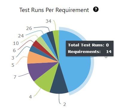
32. Test cases by requirement
32.按需求划分的测试用例
| REQ | TC Name TC名称 | Test Result 测试结果 |
| REQ 1 | TC Name1 TC名称1 | Pass |
| REQ 2 | TC Name2 TC名称2 | Failed |
| REQ 3 | TC Name3 TC名称3 | Incomplete |
33. Defects per requirement (Requirement Defect Density)
33.每项要求的缺陷(要求缺陷密度)
| Req name 要求名称 | Total # of Defects 缺陷总数 |
| Req A | 25 |
| Req B 要求B | 2 |
34. Requirements without test coverage
34.无测试覆盖的需求
| REQ ID 要求ID | REQ NAME 产品名称 | REQ STATUS 请求状态 |
| REQ001 | REQ A | To Do 做 |
| REQ002 | REQ B B | Done |
Even though a higher test coverage % and charts can instill confidence in your test effort, it is a relative value. Just like we can’t find all bugs, we cannot create enough tests to achieve 100% test coverage. This is not a limitation of the tester, rather it’s due to the reality that all systems are unbound. There are countless tests when we consider field, function, and end-to-end levels of testing. Therefore, it’s good to define exactly would would qualify as 100% test coverage to a limited test inventory.
尽管较高的测试覆盖率和图表可以为您的测试工作注入信心,但这只是一个相对值。就像我们不能找到所有的bug一样,我们也不能创建足够的测试来达到100%的测试覆盖率。这不是测试人员的限制,而是因为所有系统都是不受约束的。当我们考虑字段、功能和端到端级别的测试时,有无数的测试。因此,最好准确地定义将有资格作为100%的测试覆盖到有限的测试清单。
People (time), infrastructure, and tools contribute towards the cost of testing. Testing projects do not have infinite monetary resources to spend. Therefore, it is important to know how much you intend to spend and how much you actually end up spending. Below are some of the Test Economics Metrics that can help your current and future budget planning.
人员(时间)、基础设施和工具构成了测试成本。测试项目没有无限的货币资源可供花费。因此,重要的是要知道你打算花多少钱,你实际上最终花了多少钱。下面是一些测试经济学的建议,可以帮助您当前和未来的预算规划。
35. Total allocated costs for testing
35.分配的测试费用总额
36. Actual cost of testing
36.实际测试费用
For example, if your budget is 1000 dollars and that includes testing 100 requirements, the cost of testing a requirement is 1000/100= 10 dollars. Cost per test hour, 1000 dollars for 100 hours means 10 dollars for every hour. This of course assumes that all requirements are equal in complexity and testability.
例如,如果您的预算是1000美元,其中包括测试100个需求,那么测试一个需求的成本就是1000/100 = 10美元。每小时的成本,100小时1000美元意味着每小时10美元。当然,这是假设所有需求在复杂性和可测试性方面都是相同的。
These numbers are important as baselines and help with estimating for future budgets for projects.
这些数字作为基线非常重要,有助于估算项目的未来预算。
37. Budget variance 37.预算差异
38. Schedule variance 38.进度偏差
39. Cost per bug fix
39.每次bug修复的成本
40. Cost of not testing
40.不测试的成本
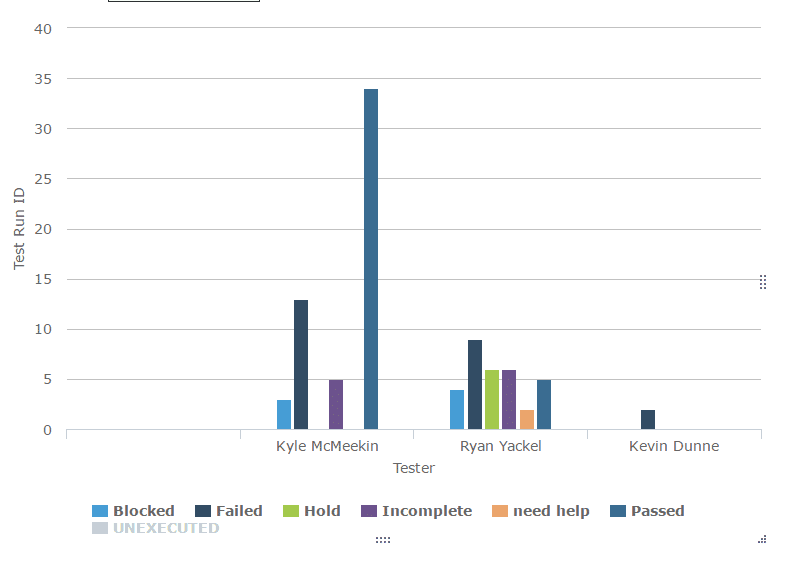
These metrics can be used to understand if work allocation is uniform for each test team member and to see if any team member needs more process/project knowledge clarifications. These metrics should never be used to attribute blame, but used as a learning tool.
这些度量可以用来了解每个测试团队成员的工作分配是否一致,并查看是否有团队成员需要更多的过程/项目知识澄清。这些指标永远不应该用来归咎于责任,而应该作为一种学习工具。
41. Distribution of defects returned, per team member – Insights 2.0
41.每个团队成员返回的缺陷分布- Insights 2.0
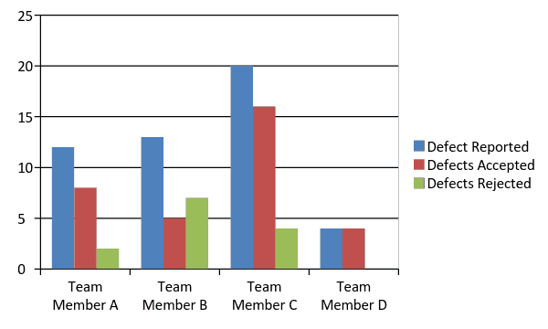
42. Distribution of open defects for retest per test team member – Insights 2.0
42.每个测试团队成员重新测试的未决缺陷分布—Insights 2.0
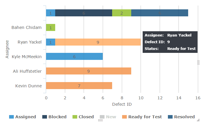
43. Test cases allocated, per test team member – Insights 2.0
43.每个测试团队成员分配的测试用例- Insights 2.0
44. Test cases executed by test team member – Insights 2.0
44.测试团队成员执行的测试用例- Insights 2.0
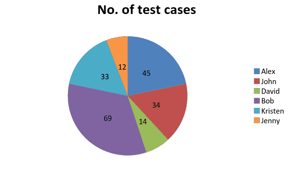
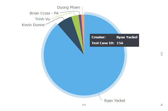
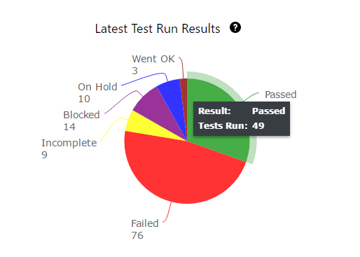
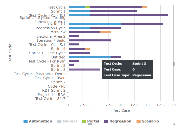
Typically, pie charts or histograms are used to get a quick snapshot of work assignment. The chart below immediately brings to our attention that Bob is overbooked and David is underutilized. This gives the test lead/manager an opportunity to look into why that is the case and take corrective measures if needed.
通常,饼图或直方图用于获得工作分配的快速快照。下面的图表立即引起我们的注意,鲍勃是超额预订和大卫是利用不足。这为测试主管/经理提供了一个机会来调查为什么会出现这种情况,并在需要时采取纠正措施。
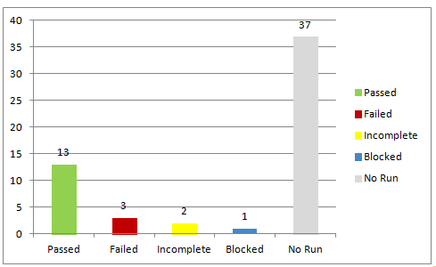
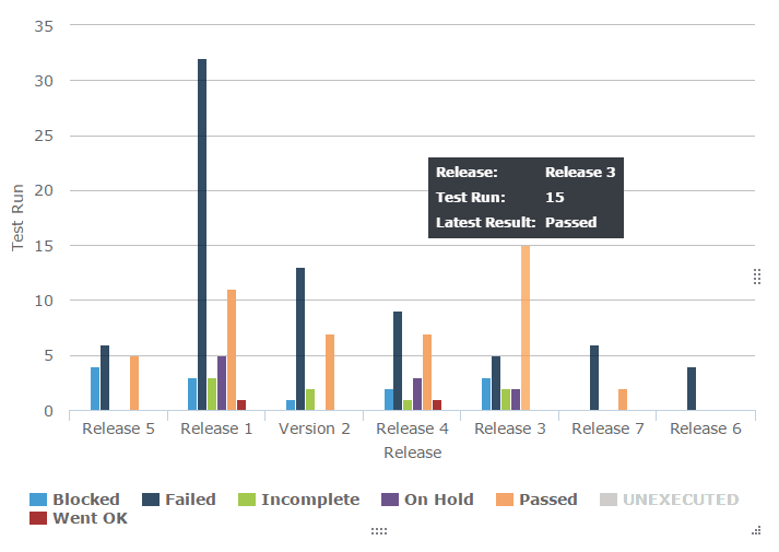
Test Execution snapshot chart shows the total executions organized as passed, failed, blocked, incomplete, and unexecuted for easy absorption of the test run status. These charts are great visual aids for the daily status meeting because raw numbers have a higher chance of slipping through people’s minds. The growing and shrinking bars capture attention and communicate progress and speed much more effectively.
测试执行快照图表显示了组织为已通过、失败、阻塞、未完成和未执行的总执行情况,以便于了解测试运行状态。这些图表是日常状态会议的重要视觉辅助工具,因为原始数据更容易被人们遗忘。增长和收缩的酒吧捕捉注意力和沟通的进展和速度更有效。
45. Test execution status chart
45.测试执行状态图
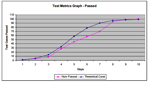
These charts help in understanding how the rate of testing and the rate of defect finding compare with desired values.
这些图表有助于理解测试率和缺陷发现率与期望值的比较。
Taking the cumulative defect counts and test execution rates, the theoretical curve is plotted. This in comparison with the actual values will trigger an early red flag that test processes need to change if the targets are to be reached.
采用累积缺陷计数和测试执行率,绘制理论曲线。与实际值相比,这将触发一个早期的红色标志,即如果要达到目标,测试过程需要改变。
46. Test Execution Tracking and Defect Find Rate Tracking
46.测试执行跟踪和缺陷发现率跟踪
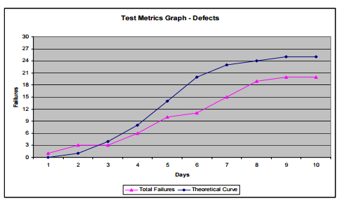
More information and image source
更多信息和图片来源
Software undergoes changes – frequent, few, and far between. Changes incorporated have to be monitored to understand their impact on the stability of the existing system. Changes usually induce new defects, reduce application stability, cause timelines to slip, jeopardize quality, etc.
软件经历着变化——频繁的、很少的、间隔很远的变化。必须监测所包含的变化,以了解它们对现有系统稳定性的影响。变更通常会导致新的缺陷,降低应用程序的稳定性,导致时间表延误,危及质量等。
47. Effect of testing changes
47.测试变更的影响
Total number of defects that can be attributed to changes. This could mean making sure defects have proper affected and fix visions attached when they are reported to development. It is a little bit of an effort to categorize these defects as change related and not, but it is worth it.
可归因于更改的缺陷总数。这可能意味着确保缺陷在报告给开发人员时有适当的影响和修复愿景。将这些缺陷分类为与更改相关或无关是一项小小的努力,但这是值得的。
48. Defect injection rate
48.缺陷注入率
Number of tested changes /problems attributable to the changes
测试的变更/变更引起的问题数量
For example: If ten changes were made on the system and 30 defects were attributable to the changes, then each change ended up injecting three defects and the defect injection rate is 3 per change.
例如:如果对系统进行了10次更改,并且30个缺陷可归因于这些更改,则每个更改最终注入3个缺陷,缺陷注入率为每个更改3个缺陷。
Knowing this number will help predict the amount of defects that could be expected per new change. This allows test teams to strategically use retrospective meetings to understand their capacity to help identify and fix defects coming from new changes.
知道这个数字将有助于预测每个新更改可能预期的缺陷数量。这允许测试团队战略性地使用回顾会议来了解他们的能力,以帮助识别和修复来自新更改的缺陷。
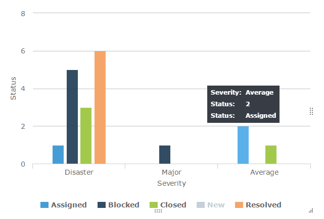
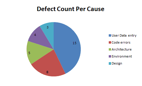
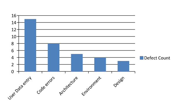
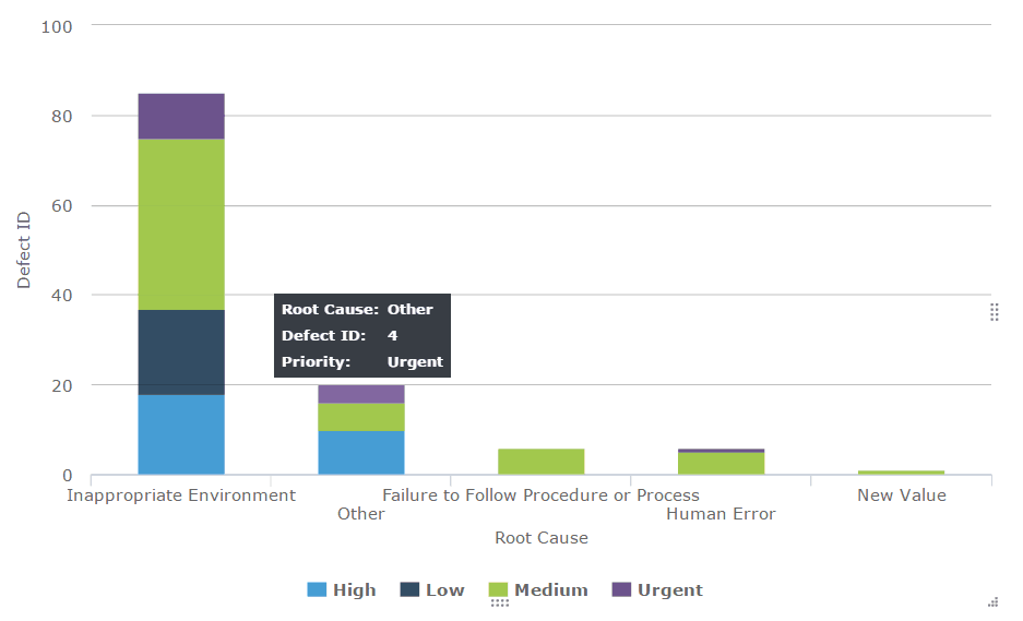
Defects can be categorized based on type, root cause, severity, priority, module/component/functional area, platform/environment, tester responsible, test type, etc. Odds are that your team right how has set up a whole list of refined classifications for defect reporting.
缺陷可以根据类型、根本原因、严重性、优先级、模块/组件/功能区域、平台/环境、测试人员责任、测试类型等进行分类。
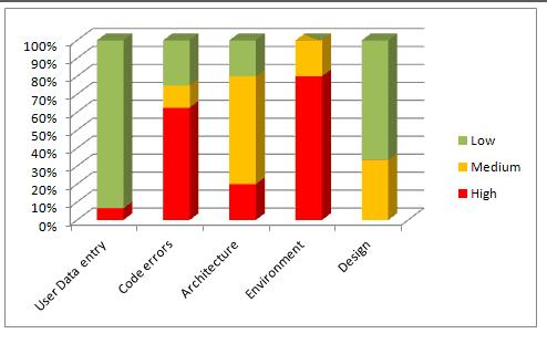
Defect distribution charts are helpful in understanding the distribution and to identify areas to target for maximum defect removal. By using a histogram, pie or Pareto charts that show where your development and testing efforts should go.
缺陷分布图有助于理解缺陷分布,并确定最大限度消除缺陷的目标区域。通过使用直方图、饼图或帕累托图来显示您的开发和测试工作应该去哪里。
49. Defect distribution by cause
49.按原因划分的缺陷分布
50. Defect distribution by module/Functional area
50.按模块/功能区域划分的缺陷分布
51. Defect distribution by Severity
51.按严重度划分的缺陷分布
52. Defect distribution by Priority
52.按优先级划分的缺陷分布
53. Defect distribution by type
53.缺陷类型分布
54. Defect distribution by tester (or tester type) – Dev, QA, UAT or End user
54.按测试人员(或测试人员类型)划分的缺陷分布-开发人员、QA、UAT或最终用户
55. Defect distribution by test type-Review, walkthrough, test execution, exploration, etc.
55.按测试类型划分的缺陷分布-评审、走查、测试执行、探索等。
56. Defect distribution by Platform/Environment
56.按平台/环境划分的缺陷分布
A histogram or a pie chart shows an instant visual identification to highly affected areas. But, when there are too many parameters, without patterns that are difficult to discern, you might have to use a Pareto chart.
直方图或饼图显示了对高度受影响区域的即时视觉识别。但是,当有太多的参数,没有难以辨别的模式时,您可能必须使用帕累托图。
Defect Distribution pie chart: This serves one purpose ONLY. It helps you to quickly find the areas that are most dense (the reason for most defects.)
缺陷分布饼图:这只用于一个目的。它可以帮助您快速找到最密集的区域(大多数缺陷的原因)。
Defect distribution histogram:
缺陷分布直方图:
When creating a histogram, be sure to organize your data values from High to low or low to high for most impact.
创建直方图时,请确保将数据值从高到低或从低到高进行组织,以获得最大影响。
You can stop here, but to get more out of your metrics, continue with the next step.
您可以在这里停止,但要从您的指标中获得更多信息,请继续下一步。
Combine the histogram with the distribution of Severity of defects in each cause. This will give you the areas that you should focus on more accurately.
联合收割机将直方图与每个原因中缺陷严重度的分布相结合。这将给予你应该更准确地关注的领域。
For example: We know that the area that caused most defects was User Data Entry, but just because the count is high we need not necessarily focus on that first because most of the “User Data Entry” are low(in green). The next category that has the highest number of defects and with a high portion of severe issues is “Code Errors”. So this chart will refine our data and give us a much deeper understanding of where to channel further development and fixing effort.
例如:我们知道导致大多数缺陷的区域是用户数据输入,但是仅仅因为计数很高,我们不需要首先关注它,因为大多数“用户数据输入”都很低(绿色)。下一个缺陷数量最多且严重问题比例最高的类别是“代码错误”。因此,该图表将完善我们的数据,并使我们给予更深入的理解,了解如何引导进一步的开发和修复工作。
Defect distribution Pareto chart:
缺陷分布帕累托图:
You could also create a Pareto chart to find which causes will fix most defects. In many cases, a Pareto chart may not be necessary. However, if there too many causes and the histogram or pie chart is insufficient to show the trends clearly, a Pareto chart can come in handy.
您还可以创建一个帕累托图来查找哪些原因可以修复大多数缺陷。在许多情况下,帕累托图可能是不必要的。然而,如果有太多的原因,直方图或饼图不足以清楚地显示趋势,帕累托图可以派上用场。
To know which causes to focus on in order to fix maximum defects with minimum work (or what 20% of the causes can fix 80% of the defects), draw a line at the 80% mark on the Secondary axis and drop it on to the X axis, as shown below:
要知道为了用最少的工作修复最多的缺陷,应该关注哪些原因(或者哪20%的原因可以修复80%的缺陷),请在辅助轴上的80%标记处画一条线,并将其放在X轴上,如下所示:
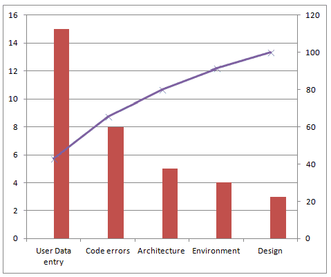
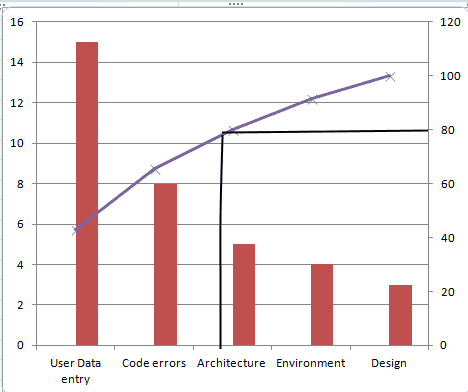
The causes User Data Entry and Code Errors should get more focus than others.
用户数据输入和代码错误的原因应该得到更多的关注。
Defect distribution at the end of test cycles or at a certain point in test cycles is a snapshot of defect data at that point in time. It cannot be used to derive conclusions if things are getting better or worse. For example: At a point of time, you will know that are X number of severe bugs. We don’t know if X is more than the last cycle or less or is the same.
测试周期结束时或测试周期中某个点的缺陷分布是该时间点缺陷数据的快照。它不能用来得出结论,如果事情变得更好或更糟。例如:在某个时间点,你会知道有X个严重的bug。我们不知道X是大于还是小于上一个周期,或者是相同的。
With the distribution over time, you will know what’s been going with the defects in each category. We can see if defects have been increasing, decreasing or are stable over time or over releases.
随着时间的推移,您将知道每个类别中的缺陷发生了什么。我们可以看到缺陷是否随着时间或版本的推移而增加、减少或稳定。
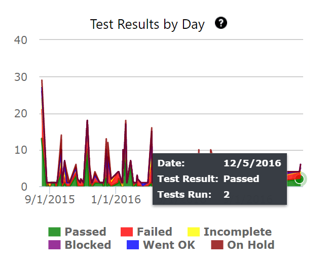
Defect distribution over time is a multi line graph showing the defects per cause/module/severity trends over a period of time.
缺陷随时间的分布是一个多线图,显示了一段时间内每个原因/模块/严重性趋势的缺陷。
57. Defect Distribution over time by Cause
57.按原因划分的随时间变化的缺陷分布
58. Defect Distribution over time by Module
58.各模块随时间的缺陷分布
59. Defect Distribution over time by Severity
59.按严重度列出的随时间推移的缺陷分布
60. Defect Distribution over time by Platform
60.不同平台随时间的缺陷分布
For the following data:
对于以下数据:
| Test Cycle 测试周期 | Code Error 码错误 | Security Problem(access permissions) 安全问题(访问权限) |
User error(data entry) 用户错误(数据输入) |
| Cycle 1 周期1 | 8 | 4 | 15 |
| Cycle 2 周期2 | 7 | 3 | 13 |
| Cycle 3 周期3 | 1 | 5 | 9 |
| Cycle 4 周期4 | 1 | 5 | 4 |
| Cycle 5 周期5 | 0 | 4 | 1 |
Plot a multiline chart for the 3 causes over 5 cycles, as below:
绘制5个周期内3个原因的多线图,如下所示:
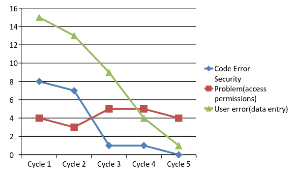
Here is what the chart can help us understand:
以下是图表可以帮助我们理解的内容:
Limitations: 局限性:
61. Defects created vs. defects resolved chart
61.创建的缺陷与解决的缺陷图表
Bug found vs. fixed chart is a defect analysis line chart that lets us see defect removal process patterns and understand defect management effectiveness
Bug found vs. fixed chart是一个缺陷分析折线图,它可以让我们看到缺陷移除过程模式,并了解缺陷管理的有效性
To start creating Fixed vs. Found chart, you will have to first collect the no. of defects found and no. of defects resolved everyday during a test cycle. This is one of the charts that need cumulative numbers to make sense. Consider the following defect data over a 10 day long test cycle:
要开始创建Fixed vs. Found图表,您必须首先收集在测试周期中每天发现的缺陷数量和解决的缺陷数量。这是一个需要累积数字才有意义的图表。考虑10天测试周期内的以下缺陷数据:
| Test Cycle 1- Date 测试周期1-日期 | Bugs created 创建的bug | Bugs resolved 已解决的错误 | Cumulative bugs created(Total no. of bugs created so far) 已创建的累计错误(迄今为止已创建的错误总数) |
Cumulative bugs resolved(Total number of bugs resolved so far) 已解决的累计错误数(迄今为止已解决的错误总数) |
| 10/10/2016 | 6 | 4 | 6 | 4 |
| 10/11/2016 | 3 | 0 | 9 | 4 |
| 10/12/2016 | 4 | 4 | 13 | 8 |
| 10/13/2016 | 2 | 4 | 15 | 12 |
| 10/14/2016 | 2 | 3 | 17 | 15 |
| 10/15/2016 | 0 | 0 | 17 | 15 |
| 10/16/2016 | 1 | 0 | 18 | 15 |
| 10/17/2016 | 0 | 2 | 18 | 17 |
| 10/18/2016 | 0 | 2 | 18 | 19 |
| 10/19/2016 | 0 | 0 | 18 | 19 |
A defect created vs. resolved chart for the above data looks like this:
针对上述数据创建的缺陷与已解决的缺陷的图表如下所示:
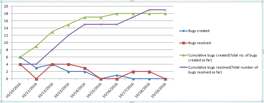
This chart is great but there are too many lines that distract us. The raw numbers of bugs created and resolved is meaningless, you can remove them from the chart for a cleaner created vs. resolved chart, as shown below:
这张图表很棒,但有太多的线条让我们分心。创建和解决的bug的原始数字是没有意义的,您可以将它们从图表中删除,以获得更清晰的创建与解决图表,如下所示:
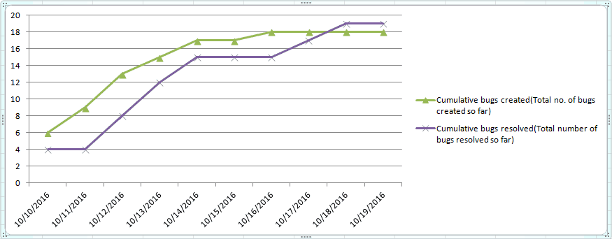
This chart answers the following questions:
该图表回答了以下问题:
Here’s how: 具体操作如下:
Limitations: While this chart answers a lot of important questions, it does have its limitations.
局限性:虽然这个图表回答了很多重要的问题,但它确实有其局限性。
References: 参考文献:
https://confluence.atlassian.com/jira064/created-vs-resolved-issues-report-720416052.html
Managing the Testing Process, Rex Black, Chapter 4: “How Defect Removal Proceeds”
管理测试过程,雷克斯布莱克,第4章:“缺陷消除如何进行”
http://www.wiley.com/WileyCDA/WileyTitle/productCd-0470404159.html
62. Defect removal efficiency /defect gap analysis
62.缺陷去除效率/缺陷间隙分析
Defect removal efficiency is the extent to which the development team is able to handle and remove the valid defects reported by the test team.
缺陷移除效率是开发团队能够处理和移除测试团队报告的有效缺陷的程度。
To calculate the defect gap, get a count of total defects submitted to the Development team and the total number of defects that were fixed by the end of the cycle. Calculate a quick percentage using the formula,
为了计算缺陷差距,获取提交给开发团队的缺陷总数和在周期结束时修复的缺陷总数。使用公式计算快速百分比,

Example: In a test cycle if the QA team reported 100 defects out of which 20 were invalid (not bugs, duplicates, etc.) and if the development team has resolved 65 of them, the defect gap % is: (65/100-20)X100= 81%(approximately)
例如:在一个测试周期中,如果QA团队报告了100个缺陷,其中20个是无效的(不是bug、重复等)。如果开发团队已经解决了其中的65个,则缺陷差距%为:(65/100-20)X100= 81%(大约)
When the data is collected over a period of time, the defect gap analysis can also be plotted as a graph as below:
当在一段时间内收集数据时,也可以将缺陷间隙分析绘制为以下图表:
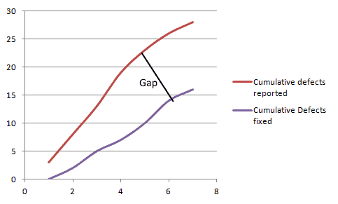
A large gap shows that the development process needs changing.
巨大的差距表明发展进程需要改变。
More Information: https://www.equinox.co.nz/blog/software-testing-metrics-defect-removal-efficiency
更多信息:https://www.equinox.co.nz/blog/software-testing-metrics-defect-removal-efficiency
63. Defect density 63.缺陷密度
Defect density is defined as the number of defects per size of the software or application area of the software.
缺陷密度定义为软件或软件应用领域的每个尺寸的缺陷数量。

If the total number of defects at the end of a test cycle is 30 and they all originated from 6 modules, the defect density is 5.
如果测试周期结束时的缺陷总数为30,并且它们都来自6个模块,则缺陷密度为5。
More info: http://www.softwaretestinghelp.com/defect-density/
更多信息:http://www.softwaretestinghelp.com/defect-density/
64. Defect age 64.缺陷年龄
Defect age is a measure that helps us track the average time it takes for the development team to start fixing the defect and resolve it. Defect age is usually measured in the unit days, but for teams of rapid deployment models that release weekly or daily, projects, it this should be measured in hours.
缺陷年龄是一个度量,它可以帮助我们跟踪开发团队开始修复缺陷并解决它所花费的平均时间。缺陷年龄通常以单位天来度量,但是对于每周或每天发布项目的快速部署模型的团队,它应该以小时来度量。
For teams with efficient development and testing processes, a low defect age signals a faster turnaround for bug fixes.
对于具有高效开发和测试过程的团队来说,低缺陷年龄意味着更快的bug修复周转。
Defect Age= Difference in Time created and Time resolved
缺陷存在时间=创建时间和解决时间的差异
This post was written by Swati Seela and Ryan Yackel.
这篇文章由Swati Seela和Ryan Yackel撰写。
In this guide, we’ll share four ways generative AI can boost your...
在本指南中,我们将分享四种生成式AI可以提高您的...
Hear our experts share how SAP Change Impact Analysis (Tricentis...
听听我们的专家如何分享SAP Change Impact Analysis(Tricentis)如何帮助您解决问题。
Automate to mitigate risk, accelerate migration. Oracle Fusion...
自动化以降低风险,加速迁移。Oracle Fusion.
Elevate your online retail game with cutting-edge web performance...
借助尖端的Web性能提升您的在线零售游戏.
Read this report to learn how automated testing can help agencies...
阅读本报告,了解自动化测试如何帮助机构...


