11 Customizing Graphs 11 定制图表Customizing-Graphs
Introduction 导言
This chapter introduces you to various aspects of graph customization. All Origin graphs start from a graph template. If the graph you are making is fairly standard for its type, the options that were stored in the graph template may be entirely adequate to produce a polished-looking graph. The business of basic graph creation was covered in the last chapter, Graphing.
本章将向您介绍图形自定义的各个方面。所有 Origin 图形都是从图形模板开始的。如果你要创建的图形在类型上比较标准,那么图形模板中存储的选项可能完全足以生成一个外观精美的图形。上一章 "图形绘制 "介绍了基本图形创建业务。 Sooner or later, however, you are going to want to add annotations, modify axis scales, or change plot colors. Hence, the purpose of this chapter is to introduce you to some key Origin graph customization tools and techniques, as well as to point you toward resources that will help you manage more complex graph customization tasks.
不过,您迟早会想要添加注释、修改坐标轴比例或更改绘图颜色。因此,本章的目的是向您介绍一些关键的 Origin 图表定制工具和技术,并为您提供资源,帮助您处理更复杂的图表定制任务。 We begin with a discussion of the graph customization-related toolbars, as these toolbars have tools that are commonly used for quick modifications of graph elements.
我们首先讨论与图形定制相关的工具栏,因为这些工具栏上的工具通常用于快速修改图形元素。
Dockable Toolbars 可停靠工具栏
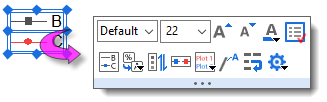
Toolbar buttons useful for graph customization tasks, include the following:
对图形自定义任务有用的工具栏按钮包括以下内容:
| Description
|
Toolbar 工具栏
(default configuration)
(默认配置) |
Format toolbar buttons: 格式工具栏按钮
- Creating and customizing text objects.
创建和自定义文本对象
|

|
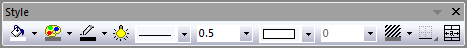
Style toolbar buttons: 工具栏按钮样式
- Editing colors, line thickness, fill patterns.
编辑颜色、线条粗细和填充图案。
|
|
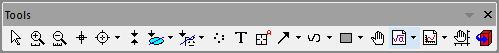
Tools toolbar buttons: 工具栏按钮
- Add text objects, lines, curves, arrows, rectangles/circles/polygons.
添加文本对象、线条、曲线、箭头、矩形/圆/多边形。
|
|
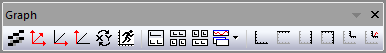
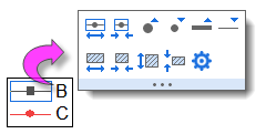
Graph toolbar buttons: 图形工具栏按钮
- Add graph layers incl. inset graphs, merging or extracting graphs; exchanging axes; anti-aliasing and Speed Mode.
添加图形层,包括插入图形、合并或提取图形、交换坐标轴、抗锯齿和速度模式。
|
|
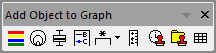
Add Object to Graph toolbar buttons:
将对象添加到图形工具栏按钮:
- Add legends/color scales/bubble scales; date & time and project path stamps; XY scale; table objects.
添加图例/颜色比例/气泡比例;日期和时间以及项目路径标记;XY 比例;表格对象。
|
|
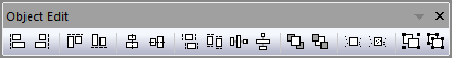
Object Edit toolbar buttons:
对象编辑工具栏按钮:
- Arranging and aligning objects and layers on the page.
在页面上排列和对齐对象和图层。
|
|
Menus, Dialogs and Buttons Used in Graph Customization
图表定制中使用的菜单、对话框和按钮
Many quick graph customizations can be done using Origin's graphing Mini Toolbars. More complex customization options can be accessed from commands on the Format or Graph menus. The following table lists key menu commands and dialog boxes plus a few toolbar buttons, used in customizing graphs.
使用 Origin 的图形迷你工具栏可以快速定制许多图形。更复杂的自定义选项可以通过 "格式 "或 "图形 "菜单上的命令访问。下表列出了用于自定义图形的主要菜单命令和对话框,以及一些工具栏按钮。
| Task
|
Dialog Name
对话框名称 |
Method
|
Customize the graph Page, Layer, or Data Plot
自定义图形页面、图层或数据绘图 |
Plot Details dialog 情节细节对话框Plot Details Dialog BoxGraphs, Plot Details
|
- Double-click on Page, Layer or Data Plot
双击页面、图层或数据图表
- Format: Page... menu 格式:页面...菜单
- Format: Layer... menu 格式:层...菜单
- Format: Plot... menu 格式:情节...... 菜单
See, Customizing Page, Layer and Data Plots
请参阅,自定义页面、图层和数据图表
|
| Customize Axes
自定义坐标轴 |
Axis Dialog 轴对话框Axis Dialog Box Graphs, Customizing Axes
|
- Double-click on axes or tick labels
双击坐标轴或勾选标签
- Format: Axes... menu 格式:轴...菜单
- Format: Axis Tick Labels... menu
格式:轴标记标签......菜单
- Format: Axis Titles... menu
格式:轴标题......菜单
See, Customizing Graph Axes
请参阅,自定义图表坐标轴
|
|
Add a Default Legend
添加默认图例
(most 2D graphs)
(大多数二维图形)
|
N/A
不适用
|
- Click the Reconstruct Legend (CTRL+L)
 button on the Add Object to Graph toolbar button on the Add Object to Graph toolbar
单击 "向图表添加对象 "工具栏上的重建图例 (CTRL+L) 按钮
- Right-click on the legend object and choose Legend: Reconstruct Legend
右键单击图例对象,选择图例:重建图例
- Choose Graph: Legend: Reconstruct Legend from the main menu
选择图表:图例:从主菜单中选择图表:图例:重建图例
See, Graph Legends 见,图表传说
|
| Customize the Legend 自定义图例Legend, Customizing Graphs, Legend CustomizationUpdate Legend
|
(Text Object -) Legend dialog
(文本对象 -)图例对话框
|
- Ctrl + double-click on the legend object text
按住 Ctrl + 双击图例对象文本
See, The (Text Object Properties) Text tab
请参阅"(文本对象属性)文本 "选项卡。
|
|
Update Legend dialog
更新图例对话框
|
- Right-click legend and choose Legend: Update Legend or choose Graph: Legend: Update Legend...
右键单击图例并选择图例:更新图例或选择图形:图例:更新图例...
See, The legendupdate Dialog Box
请参阅,图例更新对话框
|
|
Legends/Titles tab at Page level of Plot Details dialog
绘图详细信息 "对话框页面级的 "图例/标题 "选项卡
|
- Double-click in the white area just inside graph window frame (but outside of the data plot), then click on the Legends/Titles tab
双击图表窗口框内的白色区域(但在数据图之外),然后单击 "图例/标题 "选项卡
- Choose Format: Page and click on the Legends/Titles tab
选择格式:选择格式:页面,然后点击图例/标题选项卡
See, The (Plot Details) Legends/Titles tab
见,《(情节细节)传说/标题》选项卡
|
Add a Color Scale (color-mapped plots)
添加色标(彩色绘图) |
N/A
不适用
|
- Click the Add Color Scale
 button on the Add Object to Graph toolbar button on the Add Object to Graph toolbar
单击 "向图表添加对象 "工具栏上的 "添加颜色标度 "按钮
See, Color Scales 见,色阶
|
Add a Bubble Scale (symbol-size mapped plots)
添加气泡标度(符号大小映射绘图) |
N/A
不适用
|
- Click the Add Bubble Scale
 button on the Add Object to Graph toolbar button on the Add Object to Graph toolbar
单击 "向图表添加对象 "工具栏上的 "添加气泡标度 "按钮
See Bubble Scale 参见气泡标尺
|
Merge multiple graph windows into one graph window
将多个图形窗口合并为一个图形窗口Graphs, Merge
|
Merge Graphs dialog
合并图表对话框
|
- Graph: Merge Graph Windows... menu
图表合并图表窗口...菜单
See, Merge and Arrange Graphs (tutorial) and The Merge Graph Dialog Box.
请参阅合并和排列图形(教程)和合并图形对话框。
|
Adjust multi-layer graphs:
调整多层图表
resize, move, swap, align, or add layers
调整图层大小、移动、交换、对齐或添加图层 |
Layer Management dialog 图层管理对话框Graphs, Layer Customizations
|
- Graph: Layer Management... menu
图形图层管理...菜单
- Right-click on the layer icon.
右键单击图层图标。
See, Layer Management-Quick Start
参见,图层管理-快速入门
|
Simple adjustment of multi-layer graphs:
多层图形的简单调整:
arrange and/or resize layers
排列和/或调整图层大小 |
Arrange Layers dialog 排列图层对话框Graphs, Layer Customizations
|
- Graph: Arrange Layers... menu
图形排列图层...菜单
- Right-click on the layer icon.
右键单击图层图标。
|
Save settings as graph template
将设置保存为图表模板 |
Save Template As dialog
将模板另存为对话框
|
- File: Save Template As... menu
文件:将模板另存为...菜单
- Right-click graph window title and choose Save Template As...
右键单击图形窗口标题并选择 "模板另存为"...Graphs, Saving Custom Templates
See, Graph Template Basics
参见,图表模板基础知识
|
Manage graph templates, 管理图表模板
plot to a template
绘制模板 |
Template Library 模板库 Graphs, Template Library
|
- Plot > Template Library menu (worksheet or matrixsheet is active)
绘图 > 模板库菜单(工作表或矩阵表处于活动状态)
See, The Graph Template Library
参见,图表模板库
|
Save settings as graph Theme
将设置保存为图形 主题 |
Save Format as Theme dialog
将格式保存为主题对话框Graphs, Save Format as Theme
|
- Right-click and choose Save Format as Theme... context menu (graph is active)
右键单击并选择 "格式另存为主题...... "上下文菜单(图形处于活动状态)
See, Saving Formats to a Theme
请参阅,将格式保存到主题中
|
Manage Graph Themes: edit, combine, apply Theme, set as System Theme
管理图形主题:编辑、合并、应用主题、设置为系统主题Graphs, Save Format as Theme
|
Theme Organizer dialog 主题组织器对话框Theme Organizer
|
- Preferences: Theme Organizer.. > Graph tab.
首选项:主题管理器.> 图表选项卡。
- F7 hotkey. F7 热键。
See, Theme Organizer 主题组织者
|
Quick Editing: Mini Toolbars and Object Manager
快速编辑:迷你工具栏和对象管理器
While the dialog boxes listed in the previous section will provide full access to plot properties, settings are sometimes buried and hard to find. Often, the most convenient way to carry out common graph editing tasks is to use Mini Toolbar buttons or Object Manager short-cut menu commands -- or a combination of the two.
虽然上一节中列出的对话框将提供对绘图属性的全面访问,但设置有时会被隐藏起来,很难找到。通常情况下,执行常见图形编辑任务的最便捷方法是使用迷你工具栏按钮或对象管理器快捷菜单命令,或者将两者结合使用。
Mini Toolbars for Graph Editing
用于图表编辑的迷你工具栏
Most Origin graphs support a set of "quick editing" tools for interactively modifying common graph object properties. Tools are context-sensitive so that -- (1) depending on where you click inside the graph window, (2) what the selected object is and (3) whether you have selected an individual plot or a plot group -- you will have a different set of tools available to edit your selection.
大多数Origin图形都支持一套 "快速编辑 "工具,用于交互式修改常用图形对象的属性。这些工具与上下文相关,因此:(1) 取决于您在图形窗口内点击的位置;(2) 所选对象是什么;(3) 您选择的是单个绘图还是绘图组;您将有不同的工具集可用来编辑您的选择。
- Workspace display of Mini Toolbars is controlled via View: Mini Toolbars.
迷你工具栏的工作区显示可通过视图进行控制:迷你工具栏
- There are five levels -- i.e. five groupings of graph properties -- that can be edited with Mini Toolbars: page, layer, plot, text or drawn objects and graph axes.
迷你工具栏有五个级别,即五个图形属性组:页面、图层、绘图、文本或绘制对象以及图形坐标轴。
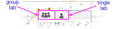
- When editing grouped plots, a single click will select a single plot. The Mini Toolbar displays two tabs -- one for the customizing the group, the other for customizing the single plot.
编辑分组绘图时,单击一下即可选择单个绘图。迷你工具栏显示两个选项卡,一个用于自定义组,另一个用于自定义单个绘图。
- Most Mini Toolbars have a "properties"
 button that opens a related Origin dialog box where you will find the full range of available controls. button that opens a related Origin dialog box where you will find the full range of available controls.
大多数迷你工具栏都有一个 "属性 " 按钮,可打开相关的 "起源 "对话框,在该对话框中可以找到所有可用的控件。
 | Unless you have changed your selection, you can do a one-time restore of a Mini Toolbar after it has faded by pressing the SHIFT key.
除非您更改了选择,否则可以在迷你工具栏褪色后按 SHIFT 键一次性还原它。 |
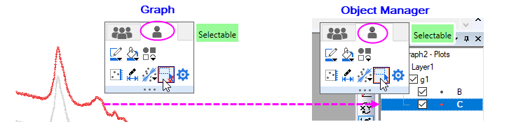
| If you disable selection of individual graph layers, plots and graphic objects with the Selectable Mini Toolbar button, these elements remain selectable in the Object Manager (OM).
如果使用 "可选迷你工具栏 "按钮禁用了单个图形层、绘图和图形对象的选择功能,这些 元素仍可在对象管理器 (OM) 中选择。 To restore graph window selectability,
要恢复图形窗口的可选择性、
- Highlight the element in OM, and click the Mini Toolbar Selectable button again (Hint: If OM doesn't list plots in the active graph window, right-click on OM and Show Plots. Likewise, if OM only shows plots, right-click on OM and Show Graph Objects).
高亮显示 OM 中的元素,然后再次单击迷你工具栏可选按钮(提示:如果 OM 没有在活动图形窗口中列出绘图,请右键单击 OM 并显示绘图。同样,如果 OM 只显示绘图,请右键单击 OM 并显示图形对象)。
|
Controlling Buttons that Increment
控制递增按钮
Some Mini Toolbar buttons will increase or decrease some property by some increment, each time you click the button (e.g. font size, rotation angle, layer grid spacing). In such cases, you can modify that increment by manipulating the value of a LabTalk system variable.
有些迷你工具栏按钮在每次点击时都会以一定的增量增加或减少某些属性(例如字体大小、旋转角度、图层网格间距)。在这种情况下,可以通过操作 LabTalk 系统变量的值来修改增量。

For information on these LabTalk system variables, see this Appendix in Origin Help.
有关这些 LabTalk 系统变量的信息,请参阅 Origin 帮助中的附录。
Manipulating Graphs with the Object Manager
使用对象管理器操纵图形
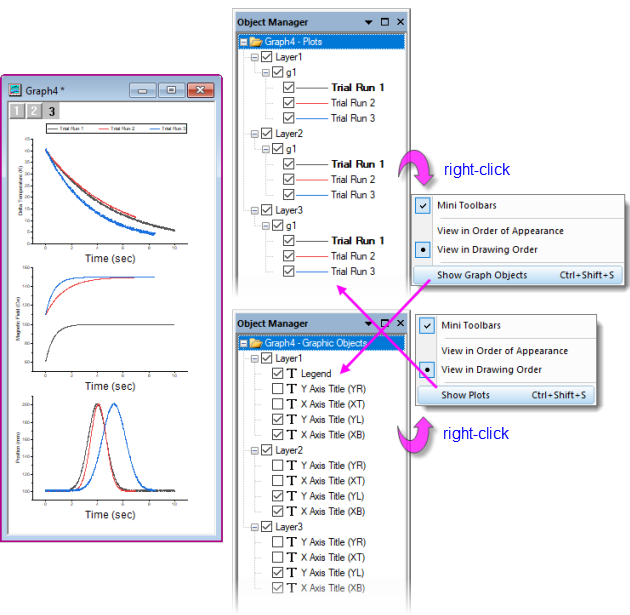
The Object Manager is general tool for managing Origin windows but it is especially useful for manipulating graph windows. When a graph window is active, the Object Manager offers alternate views -- toggled by right-clicking in an empty portion of the Object Manager and choosing Show Plots or Show Graph Objects(Ctrl+Shift+S):
对象管理器(Object Manager)是管理 Origin 窗口的通用工具,但对图形窗口的操作尤其有用。当图形窗口处于活动状态时,对象管理器会提供其他视图--通过右键单击对象管理器的空白部分并选择 "显示绘图 "或 "显示图形对象"(Ctrl+Shift+S)来切换:
- Show Plots: a collapsible, hierarchical list of plots by layer, plot group, etc.
显示图块:按图层、图块组等分类的可折叠分层图块列表。
- Show Graph Objects: a collapsible, hierarchical list of window objects (legends, text objects, images, etc.) by layer.
显示图表对象:按层显示窗口对象(图例、文本对象、图像等)的可折叠分层列表。
Object Manager Tips: 对象管理器提示:
- Whether in Show Plots or Show Graph Objects view, right-clicking on an element will open a shortcut menu of relevant actions (ungrouping a set of plots or designating a plot as the first plot in a plot group, for instance).
无论是在 "显示图块 "还是在 "显示图表对象 "视图中,右键单击某个元素都会打开相关操作的快捷菜单(例如,取消图块组或指定某个图块为图块组中的第一个图块)。
- Common to both views is a check box beside each element; when checked, the element displays in the graph window, when cleared, the element is hidden.
两个视图的共同点是每个元素旁边都有一个复选框;选中时,元素显示在图表窗口中,清除时,元素隐藏。
- Besides openning Plot Details to rename the layer, you can right-click on the layer icon (e.g. Layer1) in Object Manager and choose Rename.
除了打开 "绘图细节 "重新命名图层外,您还可以右键单击 "对象管理器 "中的图层图标(如图层 1),然后选择 "重命名"。
- Additional shortcuts give quick access to source data, to Plot Details, allow you to rearrange plot or object order and to other relevant tasks such as opening an inserted image in an Image window for further editing.
其他快捷方式可快速访问源数据、绘图详细信息,允许您重新排列绘图或对象顺序,以及其他相关任务,例如在图像窗口中打开插入的图像以进行进一步编辑。
Editing Graphs Using Object Manager and Mini Toolbars
使用对象管理器和迷你工具栏编辑图表
When a graph is active and you select graph elements in the Object Manager, a Mini Toolbar will show (make sure the Mini Toolbars option is checked in the Show Plots/Show Graph Objects shortcut menu as shown in the image above).
当图形处于活动状态,并在对象管理器中选择图形元素时,将显示迷你工具栏(请确保在显示绘图/显示图形对象快捷菜单中勾选了迷你工具栏选项,如上图所示)。 With the available buttons, you can make quick customizations to common plot properties such as line color, line thickness, display of labels, etc.
利用可用按钮,您可以快速自定义常用的绘图属性,如线条颜色、线条粗细、标签显示等。
| In Object Manager Show Graph Objects view, there is a Select All with Same Name shortcut menu entry. Use in combination with Mini Toolbar buttons (e.g. Font Size) to make quick graph changes.
在 "对象管理器 "的 "显示图表对象 "视图中,有一个 "选择具有相同名称的所有对象 "快捷菜单项。与迷你工具栏按钮(如字体大小)结合使用,可快速更改图形。 |
Example: 1 Layer, 2 Y Axes
示例:1 层,2 个 Y 轴
There is now general support for "Double-Y" graphs in a single layer. Previously, two independent Y axes meant "two layers." Beginning with Origin 2023 the user can create Double-Y graph in single layer using only the basic plot type templates using new GUI controls,.
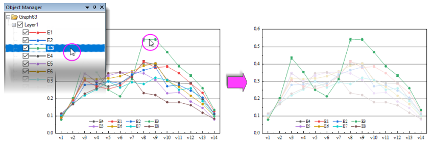
现在已普遍支持单层中的 "双 Y "图形。以前,两个独立的 Y 轴意味着 "两个图层"。从 Origin 2023 开始,用户只需使用新的图形用户界面控件的基本绘图类型模板,就可以在单层中创建双 Y 图形。 In the following simple example, the user has plotted four Y datasets against a single X dataset. Because values in two of the Y datasets are of an order of magnitude larger than values in the other two, two plots appear "flat" and seem to show little variation with changes in X. However, using a combination of Object Manager and Mini Toolbars, we can select the "flat" plots and Plot on Right Y. With a more appropriate scale, the plots no longer appear flat.
在下面的简单示例中,用户绘制了四个 Y 数据集与一个 X 数据集的对比图。由于其中两个 Y 数据集的值比另外两个数据集的值大一个数量级,因此有两个图显得 "平淡无奇",似乎几乎没有随 X 的变化而变化。不过,我们可以结合使用对象管理器和迷你工具栏,选择 "平淡无奇 "的图,然后在右 Y 上绘图。 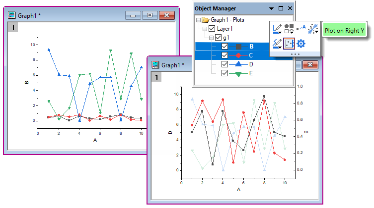
| In addition to the above simple example, you can find an example of a single-layer Double-Y Violin Plot in your Learning Center samples by pressing F11 and searching on "2023". Also, Origin includes some templates for simple cases, see Multi-Panel/Axis section for more information.
除上述简单示例外,您还可以按 F11 键并搜索 "2023",在学习中心样本中找到单层双 Y 小提琴图示例。此外,Origin 还包含一些简单案例的模板,更多信息请参见多面板/轴部分。 |
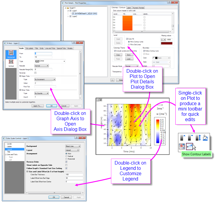
Customizing Page, Layer and Data Plots
自定义页面、图层和数据图表
Plot Details Dialog BoxGraphs, Plot Details
A graph window is a collection of objects, organized in a hierarchical structure. As we shall see, there are editable properties at the Page, Layer, Data Plot and Data Point levels.
图形窗口是按层次结构组织的对象集合。正如我们将要看到的,在页面、图层、数据图和数据点级别都有可编辑的属性。 Quick formatting of many plot properties can be done using Mini Toolbar or dockable toolbar buttons, as mentioned above. However, more comprehensive access to plot properties is available from each graph's Plot Details dialog box.
如上所述,可使用迷你工具栏或可停靠的工具栏按钮对许多绘图属性进行快速格式化。不过,可以通过每个图形的 "绘图详细信息 "对话框更全面地访问绘图属性。
To open Plot Details: 打开 "地块详情":
- Double-click on your plot.
双击您的地块。
- Click the Format menu, then choose Page..., Layer... or Plot..., to open Plot Details at the corresponding level.
单击 "格式 "菜单,然后选择 "页面..."、"图层... "或 "绘图...",打开相应级别的绘图详细信息。
The figure below shows an example of the Plot Details dialog box:
下图显示了 "绘图细节 "对话框的示例:
- The left panel depicts the Page > Layer > Plot hierarchy as an expandable/collapsible tree.
左侧面板将页面 > 图层 > 绘图层次结构描绘成一个可展开/可折叠的树形结构。
- The right panel contains controls, organized by tabs, that pertain to the object that is currently selected in the left panel.
右侧面板包含与左侧面板当前所选对象相关的控件,这些控件按选项卡排列。
- To customize an object, select it in left panel and modify the corresponding properties that appear on the various tabs in the right panel.
要自定义某个对象,请在左侧面板中选择该对象,然后修改右侧面板各选项卡上显示的相应属性。 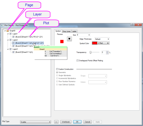
Selected Left Panel Object
选定的左侧面板对象 |
Right Panel, Controls for...
右面板,用于控制... |
| Page
|
Settings that pertain to the whole page -- Print/Dimensions, layer drawing orders, page display color, legends/titles, etc.
与整个页面有关的设置--打印/尺寸、图层绘制顺序、页面显示颜色、图例/标题等。 |
| Layer
|
Settings that are specific to the graph layer -- Layer background colors, layer size and speed mode settings, layer display settings, stack settings for applicable plot types. Some plot types will include extra tabs/controls specific to the plot type.
图形图层的特定设置--图层背景颜色、图层大小和速度模式设置、图层显示设置、适用绘图类型的堆栈设置。某些绘图类型会包含该绘图类型特有的额外选项卡/控件。 |
| Plot
|
Plot-specific properties. The tabs and controls vary by plot type (e.g. Scatter plots have a Symbol tab with controls pertaining to scatter symbols, Line plots a Line tab with controls pertaining to line plots). Anything to do with a particular data plot -- color, fill patterns, colormapping, labeling -- will be found at this level in Plot Details.
特定绘图属性。选项卡和控件因绘图类型而异(例如,散点图的 "符号 "选项卡包含与散点符号相关的控件,线形图的 "线 "选项卡包含与线形图相关的控件)。与特定数据图有关的任何信息,如颜色、填充模式、颜色映射、标签等,都可以在 "绘图细节 "中的这一层找到。 |
| Data Point
数据点 |
Properties that apply to user-specified "special points". Available for any plot for which plots discrete points (scatter, line + symbol, column/bar, etc.). The tabs and controls are generally similar to those available at the Plot level but any property that you set at the level of a special point, will apply only to that point.
适用于用户指定的 "特殊点 "的属性。适用于任何绘制离散点(散点图、折线图 + 符号图、柱状图/条状图等)的绘图。这些选项卡和控件通常与 "绘图 "级别上可用的选项卡和控件类似,但在特殊点级别上设置的任何属性将仅适用于该点。 |
:
| Prevent text and label objects from scaling when resizing layer, by going to the Size tab of Plot Details (Layer level) and setting Fixed Factor to 1.
进入 "绘图细节"(图层级)的 "尺寸 "选项卡并将 "固定系数 "设置为 1,可防止文本和标签对象在调整图层大小时缩放。 |
Customizing Grouped Plots
自定义分组绘图
Graphs, Customizing Grouped Plots
 | Beginning with Origin 2020, there was a change in selection behavior that affects grouped plots. Now, a single-click on a plot selects the plot. A second click (or CTRL+click) selects a single point. SHIFT+click selects the entire group. Note that when using the new mini toolbars, a single click on a plot group displays tools for editing the plot group or the single, selected plot. To revert to the old plot selection behavior, set @GSM=0.
从 Origin 2020 开始,选择行为发生了变化,这会影响分组绘图。现在,单击图块即可选择图块。第二次单击(或 CTRL+单击)选择单个点。SHIFT+单击则选择整个组。请注意,在使用新的迷你工具栏时,单击一个绘图组会显示用于编辑绘图组或单个选定绘图的工具。要恢复到旧的绘图选择行为,请设置 @GSM=0。
|
When you select and plot multiple data ranges to a single graph layer, the plots are grouped in the layer. Generally speaking, plots within a group are automatically differentiated by assigning styles built from one or more customizable "increment lists", one for each plot property (symbol shape, symbol color, line style, etc.).
当您选择多个数据范围并将其绘制到一个图表图层中时,这些绘图会在图层中分组。一般来说,组内的绘图会自动区分开来,方法是从一个或多个可定制的 "增量列表 "中分配样式,每个绘图属性(符号形状、符号颜色、线条样式等)都有一个增量列表。 By default, some properties are configured to increment "by one" (e.g. line color is assigned according to the "Candy" color list and each successive plot is assigned the next color in the list) and some will be configured not to increment (e.g. line style is solid for every plot), though this is ultimately controlled by the user. In any case, the increment lists for each property are saved with the graph template (.oggu) or Theme file (.oth) so that you can easily use them later to create graphs with the same look.
默认情况下,某些属性被配置为 "逐一 "递增(例如,线条颜色根据 "Candy "颜色列表分配,每一个连续的绘图都分配列表中的下一种颜色),而某些属性将被配置为不递增(例如,每个绘图的线条样式都是实心的),不过这最终由用户控制。无论如何,每个属性的增量列表都会与图形模板(.oggu)或主题文件(.oth)一起保存,这样您以后就可以轻松使用它们来创建具有相同外观的图形。
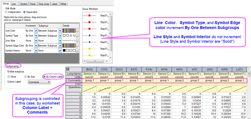
The above image shows the Plot Details Group tab settings for a line + symbol plot in the upper-left. On this Group tab, the first column lists Line Color, Symbol Type, Line Style Symbol Edge Color and Symbol Interior. Properties of Line Color, Symbol Type and Symbol Edge Color are set to increment By One and Between Subgroups (subgrouping occurs using the column Comments), while Line Style and Symbol Interior are set to increment by None (they do not vary).
上图左上角显示了线段+符号图的 "绘图细节 "组选项卡设置。在该组选项卡上,第一列列出了线条颜色、符号类型、线条样式符号边缘颜色和符号内部。线条颜色、符号类型和符号边缘颜色的属性设置为 "按一递增 "和 "子组之间"(使用 "注释 "列进行子分组),而线条样式和符号内部设置为 "无 "递增(它们不会变化)。 As previously mentioned, this arrangement is completely customizable and you can save customizations with the graph template:
如前所述,这种安排是完全可定制的,您可以通过图表模板保存定制内容:
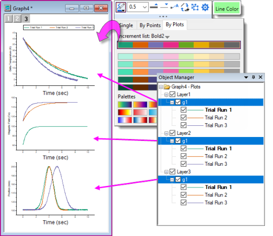
Using Object Manager with Grouped Plots
使用对象管理器与分组绘图
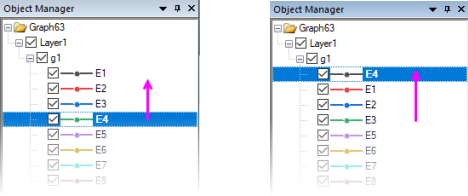
- To highlight a single plot and dim others (grouped or ungrouped) in the layer, click once on the plot in Object Manager. Conversely, clicking once on a plot in the Object Manager, highlights the plot in the graph window, while dimming others.
要突出显示图层中的单个图块并调暗其他图块(分组或未分组),请在对象管理器中单击图块 一次。反之,在 "对象管理器 "中单击绘图一次,则会在图形窗口中突出显示该绘图,同时调暗其他绘图。
- To reorder plots in the layer, drag a plot icon within the group; or right-click on the plot (in Object Manager) and choose Move Up or Move Down.
要对图层中的图块重新排序,可拖动组内的图块图标;或右键单击图块(在对象管理器中),选择上移或下移。
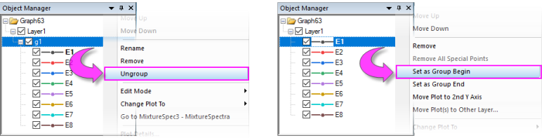
- To group or ungroup data plots in the layer, right-click on the group icon ("gN") and choose Ungroup. To group plots in the layer, right-click on a plot and choose Set as Group Begin.
要对图层中的数据图进行分组或取消分组,请右键单击分组图标("gN")并选择取消分组。要对图层中的图块进行分组,请右键单击图块并选择 "设为组开始"。
- To move a plot from one group to another, drag the plot to the other group.
要将绘图从一个组移到另一个组,可将绘图拖到另一个组。
- To move a series of plots out of the group, right-click the last plot that you want to keep in the group and choose Set as Group End.
要将一系列绘图移出组,请右键单击要保留在组中的最后一个绘图,然后选择设置为组结束。
- To remove a plot from the layer (and the graph), right-click on the plot and choose Remove.
要从图层(和图表)中移除某个绘图,请右键单击该绘图并选择移除。
- To move a plot to a second Y axis, or move the plot to another layer, right-click on the plot in Object Manager and choose Move Plot to Second Y Axis or Move Plot(s) to Other Layer ....
要将绘图移动到第二个 Y 轴,或将绘图移动到其他图层,请右键单击对象管理器中的绘图,然后选择将绘图移动到第二个 Y 轴或将绘图移动到其他图层 ....。
Customizing Multi-layer Graphs
自定义多层图表
The graph layer is a fundamental concept in Origin and it is a primary building-block of most complex Origin graphs (e.g. a graph with both left and right Y axes may be constructed by overlaying one layer on another, and sharing a common X axis between the two layers). While the graph layer is, fundamentally, a self-contained unit it is, at times, desirable to create dependencies between layers:
图形层是Origin中的一个基本概念,也是大多数复杂Origin图形的主要构成部分(例如,通过将一个图层叠加到另一个图层上,并在两个图层之间共享一个共同的X轴,就可以构建一个具有左右Y轴的图形)。虽然从根本上说,图形层是一个独立的单元,但有时也需要在各层之间建立依赖关系:
- One type of dependency is what we call "linking" of layers, which involves establishing spatial relationships or relationships between axis scale values. You can read more about linking graph layers, below.
其中一种依赖关系就是我们所说的图层 "链接",它涉及建立空间关系或坐标轴刻度值之间的关系。您可以在下文中了解更多有关链接图层的信息。
- Another type of dependency is based on what we call "common display" and this is most useful in a situation where we have multiple similar panels in a graph and we want to do something like change the background color of each graph, or perhaps the change plot colors used in each layer.
另一种类型的依赖关系基于我们所说的 "通用显示",这种依赖关系在以下情况下最为有用:在一个图形中有多个类似的面板,我们想改变每个图形的背景颜色,或者改变每个图层中使用的绘图颜色。
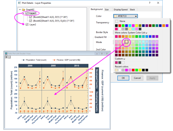
At the graph page level in Plot Details, you will find a Layers tab that has controls that affect all layers within a given graph page. The Common Display controls can be used to enable simultaneous editing of layer, plot and axis properties of multi-layer graphs. For instance, in the following example, we have a two-layer trellis plot -- the two layers being necessitated by there being a left-Y axis and a right-Y axis with two completely different scales -- and as a simple illustration, we have used the Common Display controls to simultaneously add a background color to both layers. We could have accomplished the same thing without using the Common Display controls but this would have required twice the work -- set the background color of layer 1, then set the background color of layer 2.
在 "绘图细节 "的图形页面级别,您可以找到 "图层 "选项卡,该选项卡中的控件可影响给定图 形页面中的所有图层。通用显示控件可用于同时编辑多层图形的图层、绘图和坐标轴属性。例如,在下面的示例中,我们有一个双层棚架图--由于左 Y 轴和右 Y 轴的刻度完全不同,因此必须有两个层--作为一个简单的说明,我们使用通用显示控件同时为两个层添加了背景颜色。如果不使用通用显示控件,我们也可以完成同样的工作,但这需要两倍的工作量--先设置图层 1 的背景色,然后再设置图层 2 的背景色。
This was a simple illustration but we can use the Common Display controls for application of more complex mix of layer, plot and axis properties. Some of Origin's built-in multi-layer graph templates have Common Display elements turned on by default. When working with multi-panel graphs, you may want to choose Format: Page, click the Layers tab in Plot Details, and check the Common Display settings. See Common Display for more information.
这是一个简单的示例,但我们可以使用 "通用显示 "控件来应用更复杂的图层、绘图和坐标轴属性组合。Origin 的一些内置多图层图形模板默认打开了 "通用显示 "元素。在处理多面板图形时,您可能需要选择 "格式":页),单击 "绘图详细信息 "中的 "图层 "选项卡,然后选中 "通用显示 "设置。有关更多信息,请参阅通用显示。
| The Common Display Apply to control supports including or excluding certain layers from common display customizations. For instance, you might have a 4 panel graph, each with an inset layer and using this control, you could apply a common background color to the inset layers without applying the same background color to the 4 primary layers (panels). See Common Display for more information.
通用显示应用于控件支持从通用显示自定义中包含或排除某些图层。例如,您可能有一个 4 个面板的图形,每个面板都有一个插入层,使用该控件,您可以将通用背景色应用于插入层,而无需将相同的背景色应用于 4 个主层(面板)。更多信息,请参阅 "通用显示"。 |
Special Points: Customizing a Single Data Point
特殊点自定义单个数据点
Graphs, Customizing Data Points
For some plot types such as scatter, column or pie, you can modify the display properties of a single data point.
对于某些绘图类型,如散点图、柱状图或饼图,您可以修改单个数据点的显示属性。 To edit a single point:
编辑单个点:
- Click twice (slowly) or press CTRL + click on a data point to select it. Use the Mini Toolbars to edit properties of the data point; or click available buttons on the Style or Format toolbars.
在数据点上单击两次(缓慢)或按 CTRL + 单击以选择该数据点。使用迷你工具栏编辑数据点属性;或单击样式或格式工具栏上的可用按钮。
- For access to a wider range of customization options, (a) double-click on the selected point or (b) CTRL + double-click on an unselected data point. This opens the Plot Details dialog box with the focus set to edit the data point (identified in the left-panel of Plot Details by its row index number). Then use controls on the tabs in the right panel to modify the appearance of the data point, add drop lines, data label, etc. Changes you make to the special point will not affect the appearance of other points in the same plot.
要访问范围更广的自定义选项,请 (a) 双击选中的点,或 (b) CTRL + 双击未选中的数据点。这将打开 "绘图细节 "对话框,并将焦点设置为编辑数据点(在 "绘图细节 "左侧面板中通过行索引号标识)。然后使用右侧面板选项卡上的控件修改数据点的外观、添加下拉线和数据标签等。对特殊点所做的更改不会影响同一绘图中其他点的外观。
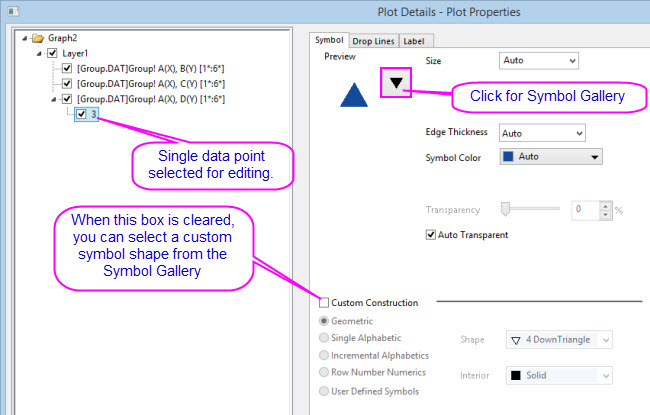
| Origin supports adding your own plot symbols. For more information, see User Defined Symbols Grid.
Origin 支持添加自己的绘图符号。更多信息,请参阅用户自定义符号网格。 |
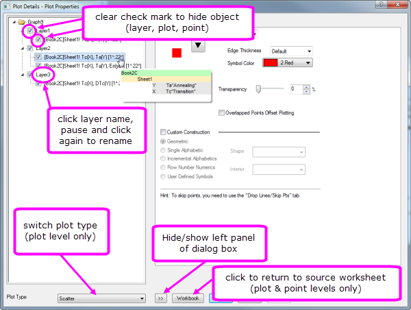
To remove customizations made to a single data point:
删除对单个数据点的自定义设置:
- Right-click the single point in the left panel of the Plot Details dialog and choose Delete.
右键单击 "绘图详细信息 "对话框左侧面板中的单点,然后选择 "删除"。
- In the graph window, click on the single point to select it, then press DELETE on the keyboard.
在图形窗口中,单击单点将其选中,然后按键盘上的 DELETE 键。
The point itself is not deleted; only the custom style is removed, with the point reverting to the style of the containing data plot.
点本身不会被删除,只会删除自定义样式,点会恢复为包含数据图的样式。
| Adding a special point at the beginning or end of a plot is not always easy, but there is a simple, foolproof technique:
在情节的开头或结尾添加一个特殊点并非易事,但有一个简单、万无一失的技巧:
- Select a special point anywhere on the plot, then double-click on the point to open Plot Details.
在绘图的任意位置选择一个特殊点,然后双击该点打开绘图细节。
- In the left-hand panel of Plot Details, click once on on the point index number and wait until the index number becomes editable.
在 "绘图细节 "的左侧面板中,单击点索引号,直到索引号可编辑为止。 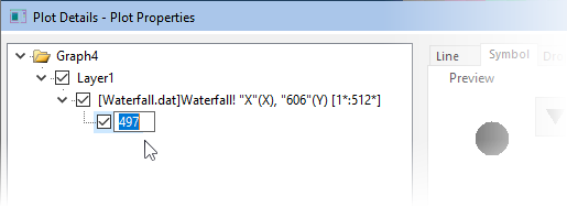
- To add the special point to the first point in the plot, type Begin; to add to the last point type End. If you know the index number of the first or last point, you can type that instead.
要将特殊点添加到绘图中的第一个点,请输入 Begin;要添加到最后一个点,请输入 End。如果您知道第一个点或最后一个点的索引号,可以键入该索引号。
- Click outside the edit box. Make other special point customizations as needed, the click Apply or click OK to close Plot Details. The special point will be added to the beginning or end of your plot.
单击编辑框外。根据需要自定义其他特殊点,然后单击 "应用 "或单击 "确定 "关闭 "绘图细节"。特殊点将被添加到绘图的起点或终点。
|
Customizing Graph Axes 自定义图表坐标轴
Axis Dialog Box Graphs, Customizing Axes
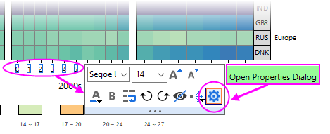
Many common edits to axis properties can be done quickly from Mini Toolbar buttons. Click on an element to edit.
通过迷你工具栏按钮可以快速完成轴属性的许多常用编辑。点击要编辑的元素。
For more complex edits of axis properties, open the Axis Dialog:
要对轴属性进行更复杂的编辑,请打开轴对话框:
- from the Axis Mini Toolbar > Open Properties Dialog.
从轴迷你工具栏 > 打开属性对话框。
- from the Origin menu > Format: Axes.
从起源菜单 > 格式:坐标轴。
Customizing Axes with Mini Toolbars
使用迷你工具栏自定义坐标轴
For quick adjustments to axis properties, you can use Origin's axis Mini Toolbars. As with all Mini Toolbars, available tools will vary by plot type and selected object. For instance, note that clicking on a graph axis line brings up a different set of buttons than clicking on the axis tick labels.
要快速调整坐标轴属性,可以使用 Origin 的坐标轴迷你工具栏。与所有迷你工具栏一样,可用工具会因绘图类型和所选对象而异。例如,单击图形轴线与单击轴线刻度标签会出现不同的按钮。
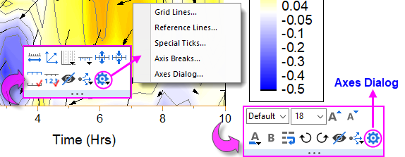
Note that clicking the "gear" button on the axis line Mini Toolbar produces a popup menu with simplified "Mini Dialogs" for axis line elements. For access to all axis settings, click Axes Dialog on either toolbar.
请注意,单击轴线迷你工具栏上的 "齿轮 "按钮会弹出一个菜单,其中包含简化的轴线元素 "迷你对话框"。要访问所有轴设置,请单击任一工具栏上的轴对话框。
Customizing Axes with the Axes Dialog Box
使用轴线对话框自定义轴线
All graph axis customizations can be made in the Axes Dialog box. Click on the Mini Toolbar "gear" button and choose Axes Dialog; or double-click on the graph axis or tick labels. This will open the Axis Dialog - Layer N dialog box.
所有图形坐标轴都可以在坐标轴对话框中进行自定义。点击迷你工具栏上的 "齿轮 "按钮,选择 "坐标轴对话框";或者双击图形坐标轴或勾选标签。这将打开 "坐标轴对话框 - 图层 N "对话框。
This image shows the tab-based axis dialog used by most 2D and 3D graphs.
此图显示了大多数二维和三维图形使用的基于选项卡的坐标轴对话框。
- In the left panel, you can select one or more icons (hold the CTRL key to select multiple icons) to specify the axis or axes to be customized, then select the desired tab and choose your options.
在左侧面板中,您可以选择一个或多个图标(按住 CTRL 键可选择多个图标)来指定要自定义的轴,然后选择所需的选项卡并选择选项。
- Click the Apply To... button to apply the axis format settings of the currently selected axis to another axis.
单击 "应用到... "按钮,将当前选定轴的轴格式设置应用到另一个轴。
| Tab
|
Controls for
控制 |
| Scale
|
Scale range of values, scale type, rescale mode and margin, reverse scale, major and minor ticks.
刻度值范围、刻度类型、重刻度模式和余量、反刻度、大刻度和小刻度。 |
| Tick Labels 标签
|
Display and Format options for major and minor tick labels, including custom labeling using LabTalk substitution or mathematical expression. For information on custom formatting of numeric data including display of percentages, fractions, pi, and geographic (Lat/Lon) formats, see Origin Custom Formats.
主刻度线和小刻度线标签的显示和格式选项,包括使用 LabTalk 替代或数学表达式的自定义标签。有关数字数据自定义格式的信息,包括显示百分比、分数、圆周率和地理(纬度/经度)格式,请参阅起源自定义格式。
| Font size of major and minor tick labels can be scaled separately (Axis Dialog > Tick Labels > Minor Tick Labels > Font Scaler(%)).
主要刻度线和次要刻度线标签的字体大小可分别缩放(轴对话框 > 刻度线标签 > 次要刻度线标签 > 字体缩放比例(%))。
|
|
| Title
|
Axis title (often set using variable notation) and font options. Note that you can directly edit by double-clicking the text object in the graph.
轴标题(通常使用变量符号设置)和字体选项。请注意,您可以直接双击图形中的文本对象进行编辑。 |
| Grids
|
Control display and properties of grid lines at major and minor ticks.
控制主要和次要刻度处网格线的显示和属性。 |
| Line and Ticks 线条和刻度线
|
Global axis line and tick display options for all axes.
所有轴的全局轴线和刻度线显示选项。 |
| Special Ticks 特殊标记
|
Placement of special tick labels.
放置特殊勾选标签。 |
| Reference Lines 参考线
|
Reference lines are optional lines that you add to your graph, either for emphasis or to mark some key statistic. Additionally, they can be paired to add fill color to some portion of your graph (e.g. "recession bars" in plots of financial data).
参考线是您添加到图表中的可选线条,用于强调或标记某些关键统计数据。此外,它们还可以配对使用,为图表的某些部分添加填充颜色(例如金融数据图表中的 "衰退条")。
| - You can use named ranges to place Reference Lines on a graph.
您可以使用已命名的范围在图形上放置参考线。
- You can set a default line style for Reference Lines -- either in the Reference Lines dialog or in a customized graph -- by right-clicking on the Reference Line and choosing Set as Default Line Style.
您可以在参考线对话框或自定义图形中为参考线设置默认线条样式,方法是右键单击参考线并选择设置为默认线条样式。
|
|
| Breaks
|
Enable line breaks and configure each break.
启用换行符并配置每个换行符。 |
Note: For more information on axis customization and for axis controls for specialized graph types (e.g. polar, ternary, radar chart.etc), refer to:
注:有关坐标轴自定义和特殊图形类型(如极坐标图、三元图、雷达图等)坐标轴控制的更多信息,请参阅: Help: Origin: Origin Help > Graphing > Graph Axes
帮助:Origin:Origin 帮助 > 制图 > 图形轴
|
Customizing Data Plot Colors
自定义数据图表颜色
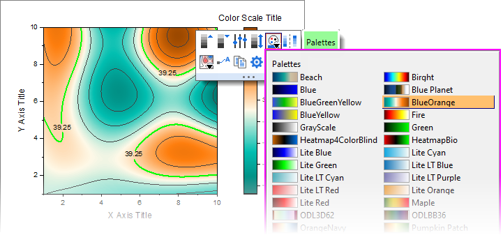
Origin ships with a number of installed color lists or palettes. If you prefer to create your own color lists or you have a standard set of palettes and want to port them over to Origin, there are a number of tools available in the software for doing that. See the next section, Color Manager, for more information.
Origin随附了一些已安装的颜色列表或调色板。如果你喜欢创建自己的颜色列表,或者你有一套标准的调色板,并希望将它们移植到Origin中,软件中有很多工具可以实现这一功能。更多信息,请参阅下一节 "色彩管理器"。
Color Manager 色彩管理器
Use the Color Manager for importing, creating and organizing the color lists and palettes that you use in Origin:
使用色彩管理器导入、创建和整理在 Origin 中使用的色彩列表和调色板:
To open the Color Manager:
打开颜色管理器:
- Choose Preference: Color Manager.
选择首选项:颜色管理器
The following list numbers correspond to controls shown in the image above:
以下列表编号与上图中的控件相对应:
- Click these radio buttons to display installed Color Lists or Palettes.
单击这些单选按钮可显示已安装的颜色列表或调色板。
- Click Import from Web to open a dialog where you can specify a URL to install palettes. Support for Scribus (.xml), Office Color Table (.soc), Adobe Color (.aco), Adobe Color Table (.act), Adobe Swatch Exchange (.ase) and JASC PaintShopPro (.pal).
单击 "从网络导入 "打开一个对话框,您可以在其中指定安装调色板的 URL。支持 Scribus (.xml), Office Color Table (.soc), Adobe Color (.aco), Adobe Color Table (.act), Adobe Swatch Exchange (.ase) 和 JASC PaintShopPro (.pal).
- Click to install locally-stored palettes. Support for Scribus (.xml), Office Color Table (.soc), Adobe Color (.aco), Adobe Color Table (.act), Adobe Swatch Exchange (.ase) and JASC PaintShopPro (.pal).
点击安装本地存储的调色板。支持 Scribus (.xml), Office Color Table (.soc), Adobe Color (.aco), Adobe Color Table (.act), Adobe Swatch Exchange (.ase) 和 JASC PaintShopPro (.pal).
- Click to open the Build Colors dialog where you can build a color using a number of tools: using standard color controls, direct entry of HTML codes or use an eye-dropper tool to pick onscreen colors. You can read more about the Build Colors dialog in the Origin Help file.
单击可打开 "构建颜色 "对话框,在该对话框中,您可以使用多种工具构建颜色:使用标准颜色控件、直接输入 HTML 代码或使用滴眼器工具在屏幕上选取颜色。有关 "构建颜色 "对话框的更多信息,请参阅 Origin 帮助文件。
- Right-click on the Available list(s) to:
右键单击可用列表: - Delete or Rename lists (you can also rename by clicking directly on the name). Lists that are dimmed have already been Selected for GUI. Those that are Selected for GUI appear from drop-down lists throughout the user-interface -- in Plot Details, from the Fill Color button
 on the Style toolbar and from the Mini Toolbar Fill Color button on the Style toolbar and from the Mini Toolbar Fill Color button  when a plot or special point is selected. when a plot or special point is selected.
删除或重命名列表(也可直接点击名称进行重命名)。变暗的列表已被选中用于图形用户界面。为图形用户界面选择的列表会出现在整个用户界面的下拉列表中--在 "绘图细节"、样式工具栏上的 "填充颜色 "按钮 ,以及选择绘图或特殊点时的迷你工具栏 "填充颜色 "按钮 。
- Merge Color two or more Color Lists/Palettes selected in the Color Manager. Note that the total number of colors in selected lists/palettes cannot exceed 256 (i.e. Merge Color will not be available).
合并颜色管理器中选择的两个或多个颜色列表/调色板中的颜色。请注意,所选列表/调色板中的颜色总数不能超过 256 种(即合并颜色不可用)。
- Use the list control to set Category = Undefined, Sequential, Diverging or Qualitative.
使用列表控制设置类别 = 未定义、顺序、发散或定性。
- Use these controls to add or remove color lists and palettes from the user-interface (GUI).
使用这些控件可从用户界面(GUI)中添加或删除颜色列表和调色板。
- Use these controls to move a selected list or palette up or down in the various GUI color lists.
使用这些控件可在各种图形用户界面颜色列表中上下移动所选列表或调色板。
- Click Set Default Plot Colors to open the Theme Organizer's System Increment Lists tab, where you can set default colors for use in your plots.
单击 "设置默认绘图颜色 "打开主题管理器的 "系统增量列表 "选项卡,您可以在此设置绘图中使用的默认颜色。
- Drag list-number icons to rearrange GUI color list order.
拖动列表编号图标,重新排列 GUI 颜色列表顺序。
Applying Color to Your Graphs
在图表中应用颜色
There are many options for applying color to your graphs. We will try and cover the basics here, pointing you to other resources for more in-depth discussion.
在图表中应用颜色有很多选择。我们将尝试在此介绍基础知识,并为您提供其他资源,以进行更深入的讨论。
List of key topics on the subject of plot color:
关于情节色彩主题的重要议题清单:
Applying Colors Singly 单独涂抹颜色
| 
Picking and applying a single custom color has been made easier with the addition of the "eyedropper" tool to the Single tab of the Color Chooser. Previously, the eyedropper tool was buried in the Build Colors dialog.
由于在 "颜色选择器 "的 "单一 "选项卡中增加了 "滴管 "工具,挑选和应用单一自定义颜色变得更加容易。以前,"滴管 "工具被隐藏在 "构建颜色 "对话框中。 |
Applying colors singly simply means applying a single color to a plot as opposed to applying color from a color list to a series of plots. It is the most basic way to apply color to a single plot or special point. Simply select a color well from anywhere on the Single tab -- from the LabTalk colors at the top, from a selected color list, or from a custom or recently used color.
单一应用颜色是指将单一颜色应用于一个绘图,而不是将颜色列表中的颜色应用于一系列绘图。这是将颜色应用到单个绘图或特殊点的最基本方法。只需从 "单一 "选项卡上的任意位置选择一种颜色即可:从顶部的 LabTalk 颜色、所选颜色列表、自定义颜色或最近使用的颜色。
-
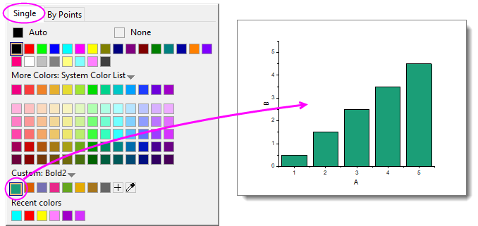
- Select a plot (e.g. scatter plot) and click the Fill Color button on the Mini Toolbar that appears.
选择一个绘图(如散点图),然后单击出现的迷你工具栏上的 "填充颜色 "按钮。
- Select a plot and click the Fill Color button on the Style toolbar.
选择一个绘图,然后单击样式工具栏上的填充颜色按钮。
- Double-click on a plot to open the Plot Details dialog box where you can click on a tab to the right side (e.g. Symbol tab for a scatter plot) and set color for the element.
双击绘图可打开 "绘图详细信息 "对话框,您可以单击右侧的选项卡(如散点图的符号选项卡)并为元素设置颜色。
- To create a special point -- i.e. to assign special characteristics to one data point in your plot -- press Ctrl+click to select the point, then use the Mini Toolbar, Style toolbar or Plot Details controls to customize color for that point.
要创建特殊点(即为绘图中的一个数据点分配特殊特性),请按住 Ctrl+ 单击选择该点,然后使用迷你工具栏、样式工具栏或绘图细节控件自定义该点的颜色。 -
Applying Colors By Points
按点应用颜色
Applying colors By Points generally means applying a color to each point in a plot by one of several schemes. The simplest involves picking an Increment From color from a predefined color list and assigning colors, in sequence, to each point in the plot.
按点应用颜色通常是指通过几种方案之一为绘图中的每个点应用一种颜色。最简单的方法是从预定义的颜色列表中选择一种 "从点开始递增 "的颜色,然后依次为绘图中的每个点分配颜色。
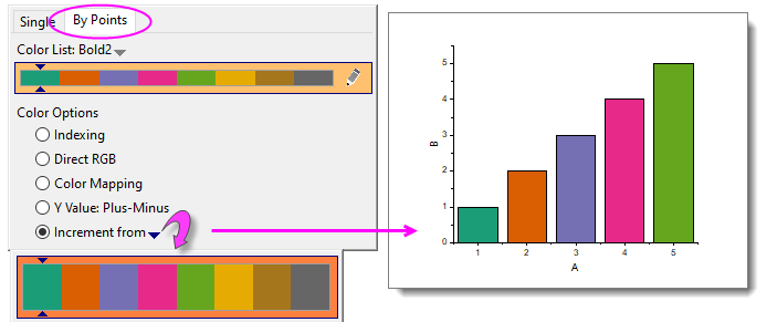
As in the case of applying a single color, you can apply these settings using controls in Plot Details; or by selecting the plot and using the Fill Color buttons on the floating Mini Toolbar or Style toolbar docked to the top of your workspace.
与应用单一颜色的情况一样,您可以使用 "绘图细节 "中的控件来应用这些设置;或者选择绘图,然后使用浮动的迷你工具栏或停靠在工作区顶部的样式工具栏上的 "填充颜色 "按钮来应用这些设置。 Other schemes typically make use of a column of values to assign color to points:
其他方案通常使用一列数值来为点分配颜色:
- Indexing assigns point color by associating an integer or text string (categorical value) to different colors in a list.
索引通过将整数或文本字符串(分类值)与列表中的不同颜色相关联来分配点颜色。
- Direct RGB assigns color using a value derived from columns of RGB values.
直接 RGB 使用从 RGB 值列导出的值分配颜色。
- Color Mapping -- used for 2D, Contour and 3D plots -- assigns colors in a list or palette, to values across the range of the plot's Y or Z values.
颜色映射--用于二维、等高线和三维绘图--将列表或调色板中的颜色分配给绘图的 Y 或 Z 值范围内的值。
There are several other schemes which are specific to a certain plot type (or family of plots), but the list above covers most of what you will use. For more information see Using a Dataset to Control Plot Color.
还有其他一些针对特定绘图类型(或绘图系列)的方案,但上述列表涵盖了您将使用的大部分方案。更多信息,请参阅使用数据集控制绘图颜色。
Applying Colors By Plots 按地块应用颜色
You apply color By Plots when you want to assign differentiating colors to a series of plots. Typically, this series of plots comprises a "plot group." In a plot group, plot attributes including color, are assigned to each plot by incrementing through a style list -- color, line-style, symbol shape, etc.
当您想为一系列曲线图分配不同的颜色时,就可以应用 "按曲线图着色"。通常情况下,这一系列绘图组成一个 "绘图组"。在图块组中,包括颜色在内的图块属性是通过样式列表(颜色、线条样式、符号形状等)递增分配给每个图块的。
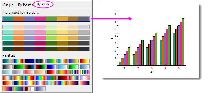
| From Origin 2023, a new way to apply a color palette to 3D bar charts is available. The method works best for 3D bars as it allows you to apply a color palette by Z value (this is neither "apply colors by plots" in the above sample graph, nor "applying a colormap" as described below, but something unique to 3D column/bar plots).
从 Origin 2023 开始,可以使用一种新方法为三维条形图应用调色板。该方法最适用于三维条形图,因为它允许您按 Z 值应用调色板(这既不是上述示例图中的 "按图块应用颜色",也不是下文所述的 "应用色谱",而是三维柱形图/条形图的特有功能)。
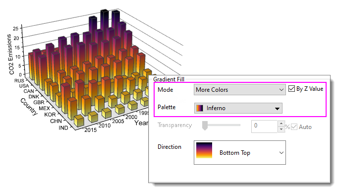
To find out more about this graph customization, press F11 and on the Learning Center Graph Samples tab, set the drop-down list to 3D Bar Charts and search on "gradient."
要进一步了解这种图表定制,请按 F11,在学习中心图表示例选项卡上,将下拉列表设为 3D 柱状图,然后搜索 "渐变"。 |
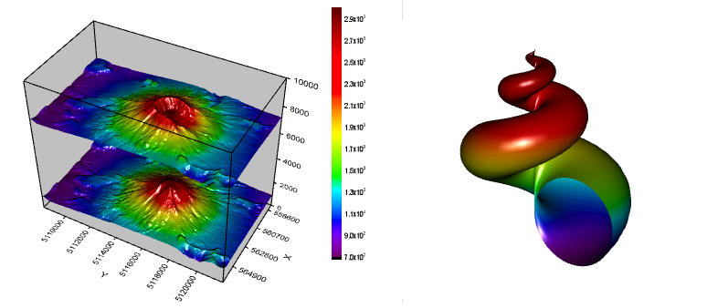
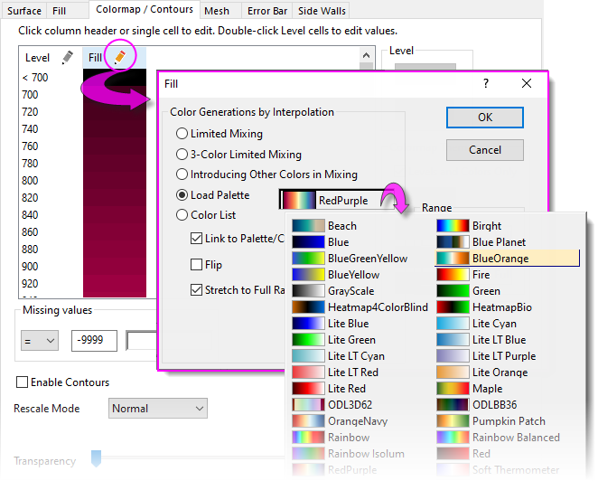
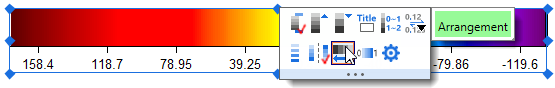
Applying Colormaps to 2D, 3D and Contour Plots
将色彩图应用于二维、三维和等高线图
While you can use a color list with a contour or 3D plot, it is probably more common that you will use a color palette. This allows a wider range of color variation and can add realism to 3D surfaces and 3D function plots.
虽然您可以在轮廓图或三维图中使用颜色列表,但使用调色板可能更为常见。调色板允许更广泛的颜色变化,可以增加三维曲面和三维函数图的真实感。
| You can add new color palettes to Origin by drag-and-drop. Support for Scribus (.xml), Office Color Table (.soc), Adobe Color (.aco), Adobe Color Table (.act), Adobe Swatch Exchange (.ase) and JASC PaintShopPro (.pal).
您可以通过拖放方式向 Origin 添加新的调色板。支持 Scribus (.xml), Office Color Table (.soc), Adobe Color (.aco), Adobe Color Table (.act), Adobe Swatch Exchange (.ase) 和 JASC PaintShopPro (.pal). |
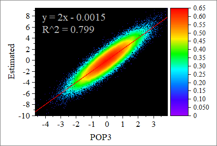
Colormapping can also be applied to 2D plots. This allows you apply a greater range of color variation to data points than would be possible with incrementing or indexing. A good example of applying a color map to a scatter plot would be Origin's Density Dots plot in which, typically, thousands of scatter points are plotted and an algorithm is used to calculate point density and assign color to ranges of point densities.
色彩映射也可应用于二维绘图。与递增法或索引法相比,这种方法可以为数据点应用更大范围的颜色变化。将颜色映射应用到散点图的一个很好的例子是 Origin 的密度点图,在该图中,通常会绘制成千上万个散点,并使用算法计算点密度并为点密度范围分配颜色。
Applying a colormap to a 3D or contour plot is much the same as applying color singly, by points or by plots. You select a plot -- then using the Palette button on the floating Mini Toolbar or the Style toolbar. You pick a palette.
在三维图或等高线图上应用色彩图谱与单独应用色彩、按点或按图应用色彩的方法大致相同。选择一个绘图,然后使用浮动迷你工具栏或样式工具栏上的调色板按钮。选择一个调色板。
You can also use the controls on the Colormap/Contours tab of Plot Details. This tab gives many more options beyond simply picking and applying a colormap.
您还可以使用 "绘图细节 "的 "色标/色彩 "选项卡上的控件。该选项卡提供了更多选项,而不仅仅是选择和应用色谱。
For more information on applying color to colormapped plots, including contour and 3D surfaces, see these topics:
有关在彩色绘图(包括等高线和三维曲面)中应用颜色的更多信息,请参阅这些主题:
Graph Legends 图表图例
How the Default Legend is Created
如何创建默认图例
Graphs, Customizing Axes Legend, Customizing Graphs, Legend Customization
A graph legend is automatically created when you plot data. For most 2D and some 3D graph templates, the default legend combines (A) plot style information stored with the graph template, with (B) dataset information stored in the worksheet column label rows, and places the resulting legend object on the graph page.
绘制数据时会自动创建图形图例。对于大多数二维和某些三维图形模板,默认图例会将 (A) 图形模板中存储的绘图样式信息与 (B) 工作表列标签行中存储的数据集信息相结合,并将生成的图例对象放置在图形页面上。
Note that the default legend object is not created with literal text and plot symbols but instead is created from LabTalk script.
请注意,默认图例对象不是通过文字和绘图符号创建的,而是通过 LabTalk 脚本创建的。
- This allows the legend object to be dynamically linked to plotted data and worksheet metadata, so that the legend can be updated when data or plot metadata change.
这样,图例对象就可以动态链接到绘图数据和工作表元数据,从而在数据或绘图元数据发生变化时更新图例。
- Because construction of the legend object relies on scripting rather than literal information, you can save customizations to a graph template and recreate the graph with its accompanying legend object using new data, as often as is needed.
由于图例对象的构建依赖于脚本而非文字信息,因此您可以将自定义保存到图形模板中,然后根据需要使用新数据重新创建图形及其附带的图例对象。
The legend script relies on "substitution notation" to convert variable values to readable symbols and text. You can see this notation when you double-click inside of the legend object (as if to edit it).
图例脚本依靠 "替换符号 "将变量值转换为可读符号和文本。在图例对象内部双击(就像编辑一样),就可以看到这种符号。
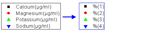
- You control which dataset metadata are used in constructing the default legend text by setting the the Translation mode of %(1), %(2) list in the Legends/Titles tab of the Plot Details dialog box (Format: Page...).
您可以通过在 "绘图细节 "对话框的 "图例/标题 "选项卡(格式:页面...)中设置 %(1)、%(2) 列表的翻译模式来控制在构建默认图例文本时使用哪些数据集元数据。
- Custom strings can be constructed using LabTalk substitution. Customizations can be saved to the graph template for repeat use.
可使用 LabTalk 替换构建自定义字符串。自定义字符串可保存到图形模板中,以便重复使用。
| Origin has a Fit Layers to Page tool that is useful for arranging a graph and a large, text-wrapped legend on the page.
Origin 有一个 "根据页面调整图层 "工具,可用于在页面上安排图表和大型文本封装图例。 |
Adding and Updating the Default Legend
添加和更新默认图例
The table below lists tasks associated with adding or updating the graph legend, and where to find editing controls for each legend type. Legend, Update vs. ReconstructBefore proceeding, we should point out that there are two legend refresh modes:
下表列出了与添加或更新图形图例相关的任务,以及查找每种图例类型编辑控件的位置。在继续之前,我们应该指出有两种图例刷新模式:
- Updating a legend will preserve any customizations that you might have made to the existing legend, including size and position adjustments and legend symbol and text customizations.
更新图例将保留您对现有图例的任何自定义设置,包括尺寸和位置调整以及图例符号和文本自定义设置。
- Reconstructing a legend will overwrite any customizations. When you add or reconstruct the legend, you are creating a copy of the legend that is stored in the graph template.
重建图例将覆盖任何自定义设置。添加或重建图例时,您将创建一个存储在图形模板中的图例副本。
| The legend object occasionally goes missing. If you cannot add or reconstruct your legend, there is a good chance it already exists but is outside of the page and can't be seen. Try clicking Graph: Legend: Reset Legend Position which should restore the legend to its default location.
图例对象偶尔会丢失。如果无法添加或重建图例,很有可能图例已经存在,但在页面之外,无法看到。请尝试点击图形:图例:重置图例位置,这样就能将图例恢复到默认位置。 |
In addition, the graph template stores a Legend Update Mode setting that determines how the legend is refreshed when adding or removing data plots from the graph. See Controlling Legend Update, below.
此外,图表模板还存储了一个图例更新模式设置,用于确定从图表中添加或删除数据图时刷新图例的方式。请参阅下面的控制图例更新。
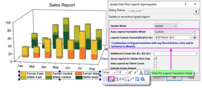
| The legendupdate dialog box and the Legend/Titles tab at page level of Plot Details both have an Auto Legend Translation Mode drop-down that determines which worksheet metadata (e.g. column Long Name, Comments, etc.) is used to generate the legend text. For a list of Custom options, see Legend Substitution Notation.
图例更新对话框和 "绘图详细信息 "页面级的 "图例/标题 "选项卡都有一个 "自动图例翻译 模式 "下拉选项,用于确定使用哪个工作表元数据(如列长名称、注释等)生成图例文本。有关自定义选项的列表,请参阅图例替换符号。 |
Note: For more information on creating and customizing graph legends, see:
注:有关创建和自定义图表图例的更多信息,请参阅: Help: Origin: Origin Help > Graphing > Graph Legends and Color Scales
帮助:Origin:Origin 帮助 > 制图 > 图表图例和颜色标度
|
Controlling Legend Update
控制图例更新
When a data plot is added or removed from a graph layer, the default behavior is to update the legend. The Legend/Titles tab at the graph page level in the Plot Details provides a Legend Update Mode drop-down to control this behavior.
从图表图层中添加或删除数据图表时,默认行为是更新图例。在 "绘图详细信息 "的图形页面层级上,"图例/标题 "选项卡提供了一个 "图例更新模式 "下拉菜单来控制这种行为。 The default setting Update when Adding only affects the legend display of data plots that are added or removed. Previous legend customizations to existing plots, such as literal text entered manually, will be maintained.
默认设置 "添加时更新 "只会影响添加或删除的数据图的图例显示。之前对现有绘图的自定义图例(如手动输入的文字)将会保留。

|
Tutorial: Customize legend and add data plots
教程:自定义图例并添加数据图
- Start with a new project in Origin.
在 Origin 中开始一个新项目。
- Open Windows Explorer and navigate to the subfolder <Origin EXE folder>\Samples\Import and Export\
打开 Windows 资源管理器并导航到子文件夹<Origin EXE folder> (Samples\Import and Export)。
- Shift-select the files S15-125-03.dat, S21-235-07.dat, S32-014-04.dat and then drag-and-drop the files onto an empty Origin workbook. The three files will be imported into three separate workbooks.
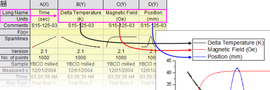
用 Shift 键选择文件 S15-125-03.dat、S21-235-07.dat 和 S32-014-04.dat,然后将文件拖放到一个空的 Origin 工作簿上。这三个文件将分别导入到三个工作簿中。
- Click on one of the workbooks, select the column B, and create a line plot.
点击其中一个工作簿,选择 B 列,然后绘制折线图。
- Right-click on the legend and select Legend: Update Legend... to open the legendupdate dialog.
右键单击图例并选择图例:更新图例...打开图例更新对话框。
- Change the Auto Legend Translation Mode drop-down to Custom, and in the edit box that appears below, enter the string:
将自动图例翻译模式下拉菜单更改为自定义,然后在下面出现的编辑框中输入字符串:
@WS, @LD3
and then press OK to close the dialog box. The legend updates, displaying the sheet name and the third user parameter.
然后按确定关闭对话框。图例更新,显示工作表名称和第三个用户参数。
- Click on the second workbook, select column B, move the mouse over the right-edge of the column until it changes to
 , and then drag-and-drop this data onto the graph to create a 2nd data plot. , and then drag-and-drop this data onto the graph to create a 2nd data plot.
单击第二个工作簿,选择 B 列,将鼠标移至该列的右边缘,直至其变为 ,然后将该数据拖放到图表上,创建第二个数据图。
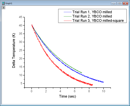
- Repeat the procedure with column B from the third workbook. The graph will now display three data plots, and the legend will automatically update to display the identifier for all three plots.
对第三个工作簿中的 B 列重复上述步骤。现在图表将显示三个数据图,图例将自动更新以显示所有三个图的标识符。
- Click on each individual curve and use the Style toolbar to set a different line color for each. The legend will automatically update and display the new line color.
单击每条曲线,使用样式工具栏为每条曲线设置不同的线条颜色。图例将自动更新并显示新的线条颜色。
|
Special Legend Types 特殊图例类型
As mentioned, Origin supports these specialized legends for use with specific graph types. These legends can be customized and updated similarly to the Data Plot legend used by most 2D graph types.
如前所述,Origin 支持与特定图形类型一起使用的这些专用图例。这些图例可以自定义和更新,与大多数二维图形类型使用的数据图例类似。
| Legend Type
图例类型 |
Menu to Create
创建菜单 |
Used in situations where ...
用于... |
Legend for Categorical Values
分类值图例
|
Graph:Legend:Categorical Values
图表:图例:分类值
|
At least one plot attribute (e.g. color, symbol shape.etc) is controlled by data indexing.
至少有一个绘图属性(如颜色、符号形状等)由数据索引控制。
See the Legend for Categorical Values help page.
请参阅分类值图例帮助页面。 |
Point by Point Legend
逐点图例
|
Graph:Legend:Point by Point
图表:图例:逐点
|
The plot symbol style is controlled by data indexing, an increment list, or color mapping.
绘图符号样式由数据索引、增量列表或颜色映射控制。
See the Point by Point Legend help page.
请参见逐点图例帮助页面。 |
Legend for Box Chart Components
方框图组件图例
|
Graph:Legend:Box Chart Components
图表:图例:方框图组件
|
The graph is a box chart, or a grouped box chart.
该图表是方框图或分组方框图。
See the Legend for Box Chart Components help page.
请参阅框图组件图例帮助页面。 |
Tips for Quick Legend Edits
快速编辑图例的技巧
Many edits to the graph legend can be made from the legend's Mini Toolbars. The default legend for 2D graphs has two Mini Toolbars:
可以通过图例的迷你工具栏对图形图例进行多项编辑。二维图形的默认图例有两个迷你工具栏:
- The Legend toolbar -- available when you select the legend object -- has general controls for font, legend reconstruction, reversing order, etc. Click on the legend object to produce the blue selection handles.
图例工具栏(选择图例对象时可用)具有字体、图例重构、反转顺序等一般控制功能。单击图例对象可生成蓝色选择柄。
- You also gain quick access to more complex controls such as Data Plot Legend Translation Mode -- identifying the column label row metadata that you wish to use to create your graph legend.
您还可以快速访问更复杂的控件,如数据图表图例转换模式--识别您希望用于创建图表图例的列标签行元数据。
- The Legend Symbol toolbar becomes available when you click on a legend symbol. Use it to change symbol or pattern block height and width, line thickness, etc.
点击图例符号后,图例符号工具栏就会出现。使用它可以更改符号或图案块的高度和宽度、线条粗细等。
In addition to the Mini Toolbar for the default legend, there are toolbars specifically for Color Scales and Bubble Scales.
除了用于默认图例的迷你工具栏外,还有专门用于颜色刻度和气泡刻度的工具栏。
To format your legend or scale using a Mini Toolbar:
使用迷你工具栏格式化图例或比例尺:
- Select a legend or legend component (e.g. legend symbol). A Mini Toolbar with context-specific buttons will show.
选择图例或图例组件(如图例符号)。将显示一个迷你工具栏,其中包含特定于上下文的按钮。
- If the toolbar fades too quickly, restore it by pressing the Shift key.
如果工具栏消失得太快,按下 Shift 键即可恢复。
| To format multiple legend objects on a page using a Mini Toolbar, press Ctrl and select the objects. Release Ctrl to display a Mini Toolbar for editing. Alternately, when the graph window is active, go to Object Manager and right-click on a legend object and choose Select All with Same Name and use the Mini Toolbar that appears in the Object Manager space
要使用迷你工具栏格式化页面上的多个图例对象,请按下 Ctrl 键并选择对象。松开 Ctrl 键,即可显示迷你工具栏进行编辑。或者,当图形窗口处于活动状态时,转到对象管理器,右键单击图例对象并选择 "选择所有同名图例",然后使用对象管理器空间中显示的迷你工具栏。 |
.
Other Legend Editing Tips
其他图例编辑技巧
- Apart from the Mini Toolbar buttons, you can also right-click on the legend object, choose Legend and open a shortcut menu with some useful commands such as Text Color Follows Plot, Reverse Order, and Show Legend for Visible Plots Only. The same menu commands are available from Graph: Legend.
除了迷你工具栏按钮外,您还可以右键单击图例对象,选择图例并打开一个快捷菜单,其中包含一些有用的命令,如文本颜色跟随绘图、反转顺序和仅为可见绘图显示图例。同样的菜单命令也可从 Graph:图例。 - Both the Mini Toolbar and the shortcut menu have an Arrange in Vertical/Horizontal button/command for changing the legend aspect; or you can modify it interactively by selecting the legend object, then pressing CTRL while dragging a selection handle (e.g. drag horizontally to create a legend that is all on one line).
迷你工具栏和快捷菜单上都有一个 "垂直/水平排列 "按钮/命令,用于更改图例的排列方向;也可以通过交互方式修改图例,方法是选择图例对象,然后按下 CTRL 键,同时拖动选择柄(例如,水平拖动以创建全在一条线上的图例)。 
- You can modify the white space around legend entries in the default 2D legend, by clicking precisely on the legend frame and dragging the selection handles.
在默认的二维图例中,您可以通过精确点击图例框架并拖动选择手柄来修改图例条目周围的空白区域。 
- While plot metadata stored in column label rows is an ideal source for legend text, you can simply overwrite the existing legend text with literal text. Either double-click on the legend text to enter in-place edit mode or if that proves to cumbersome, right-click on the legend and choose Properties (taking care not to overwrite the "\l( )" notation that creates the plot symbol). CTRL + double-clicking on the legend will also open the this dialog.
虽然存储在列标签行中的绘图元数据是图例文本的理想来源,但您也可以简单地用文字文本覆盖现有图例文本。您可以双击图例文本进入就地编辑模式,如果觉得麻烦,可以右键单击图例并选择属性(注意不要覆盖创建绘图符号的"\l( ) "符号)。CTRL + 双击图例也会打开此对话框。 - As discussed above, the default legend is automatically-generated by combining worksheet metadata with customizable plot styles. However, there are times when your auto-generated legend needs some "tweaking":
如上所述,默认图例是结合工作表元数据和可定制的绘图样式自动生成的。不过,自动生成的图例有时也需要一些 "调整": 
- One common legend customization is to manually add legend symbols and text that are independent of any data plot (you can read about that here). Besides frequently used symbol, you can also add an independent Color Block (1):
一种常见的图例自定义方法是手动添加独立于任何数据图的图例符号和文本(可在此阅读)。除了常用符号外,您还可以添加独立的色块 (1): - Right-click on the legend object and choose Properties to open the Text Object - Legend dialog.
右键单击图例对象,选择属性,打开文本对象-图例对话框。
- Click the Add Legend Symbol button
 . .
单击添加图例符号按钮 。
- Enable Color Block, customize the block and click Add.
启用色块,自定义色块,然后单击添加。
- Manually add text at the end of the string that is used to generate the block before closing Properties.
在关闭 "属性 "之前,在用于生成块的字符串末尾手动添加文本。
- Another desirable adjustment is to add some white space between legend entries. This is done using the Separator button
 on the Text Object - Legend toolbar (2). on the Text Object - Legend toolbar (2).
另一种理想的调整方法是在图例条目之间添加一些空白。这可以通过文本对象-图例工具栏上的分隔符按钮 来实现 (2)。 - In the upper panel of the Text Object - Legend dialog, place the cursor at the end of the line preceding where you want to place the separator, then click the Separator button (hint: separator thickness can be controlled by editing the numeric portion of the inserted syntax \sep:50).
在 "文本对象-图例 "对话框的上面板中,将光标放在要放置分隔符的行尾,然后单击分隔符按钮 (提示:分隔符的粗细可以通过编辑插入语法 \sep:50 的数字部分来控制)。
- If you are adding special characters to the legend manually, there is a simplified Symbol Map dialog for doing that. Most-used symbols are arranged on tabs for easy access. To access the full Symbol Map dialog, click the Advanced button.
如果要在图例中手动添加特殊字符,有一个简化的 "符号图 "对话框可供选择。最常用的符号排列在选项卡上,便于访问。要访问完整的符号图对话框,请单击高级按钮。
- Double-click a legend symbol to open the Plot Details dialog box.
双击图例符号可打开 "绘图详细信息 "对话框。 - Any changes that you make to the legend can be saved with the graph template (File: Save Template As) If you do not want a legend object added to your graph each time you create the graph, delete the legend object and re-save the graph template.
如果您不希望每次创建图形时都在图形中添加图例对象,请删除图例对象并重新保存图形模板。
Annotating Your Graph 为图表添加注释
Graphs, Adding Text & Drawing Objects
When we speak of "annotating" a graph, we are talking about adding text or drawing objects to the graph. Generally, these "annotations" help to enhance the graph in some way -- add a page title, add an arrow to draw attention to some graph feature, label data points, add a date-time stamp to note the time of graph creation, etc.
当我们谈到 "注释 "图表时,我们指的是在图表中添加文本或绘制对象。一般来说,这些 "注释 "有助于以某种方式增强图表的效果--添加页面标题、添加箭头以引起对某些图表特征的注意、标注数据点、添加日期时间戳以记录图表创建时间等。 Annotating a graph can be as simple as adding a static text object and formatting it with Mini Toolbar buttons. Or you might add a more complex object that is dynamically linked to a variable value or to some LabTalk script that is executed whenever some user-specified event occurs.
图形注释可以很简单,只需添加一个静态文本对象并使用迷你工具栏按钮对其进行格式化即可。或者,您也可以添加一个更复杂的对象,该对象与变量值或 LabTalk 脚本动态链接,每当用户指定的事件发生时,该脚本就会被执行。 The following table lists some common graph annotation tasks and available tools for accomplishing those tasks:
下表列出了一些常见的图形注释任务和完成这些任务的可用工具:
| Task
|
Method
|
Label Data Points and Plots
标注数据点和绘图 |
- Choose Format: Plot ..., then click the Label tab and select Enable (not available for all plot types).
选择格式:绘图...,然后单击标签选项卡并选择启用(不适用于所有绘图类型)。
- Select a plot and use the Mini Toolbar Show Data Labels button
 to turn on labels. Some label buttons may support formatting options for the data labels (hint will be a downward pointing arrow as on the button shown here). to turn on labels. Some label buttons may support formatting options for the data labels (hint will be a downward pointing arrow as on the button shown here).
选择一个绘图,然后使用迷你工具栏上的显示数据标签按钮 打开标签。某些标签按钮可能支持数据标签的格式选项(提示将是一个向下的箭头,如图所示)。
- To label a single data point, click twice on the point (hint: not a double-click but a click, pause, click). When the single-point is selected, click the Show Data Labels button on the Mini Toolbar.
要标注单个数据点,请在该点上单击两次(提示:不是双击,而是单击、暂停、单击)。选中单点后,单击迷你工具栏上的 "显示数据标签 "按钮。
- For format options not supported by Mini Toolbars, you will generally use controls on the Label tab of Plot Details. Note that labeling options will depend on the plot type.
对于迷你工具栏不支持的格式选项,通常使用 "绘图细节 "的 "标签 "选项卡上的控件。请注意,标签选项取决于绘图类型。
|
| Add Text Objects
添加文本对象 |
- Click the Text Tool
 button, then click on the graph to place the object. button, then click on the graph to place the object.
单击文本工具 按钮,然后单击图形来放置对象。
- Right-click on the graph and choose Add Text from the shortcut menu.
右键单击图形,从快捷菜单中选择添加文本。
- Double-click on text to do rich text editing; or click on the object and use the text object Mini Toolbar to change font color, bold, align, wrap text, etc.
双击文本可进行富文本编辑;或单击对象,使用文本对象迷你工具栏更改字体颜色、加粗、对齐、换行等。
|
| Add Page Title
添加页面标题 |
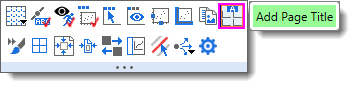
- To add a page title to the graph window, hover near the top of the page (just below the title bar) and click the Add Page Title Mini Toolbar button.
要在图表窗口中添加页面标题,请将鼠标悬停在页面顶部附近(就在标题栏下方),然后单击添加页面标题迷你工具栏按钮。
|
| Add Layer Title
添加图层标题 |
- To add/modify layer title in the active layer, click on the graph layer, then click the Add Layer Title Mini Toolbar button; or right-click on the graph and choose Add/Modify Layer Title from the shortcut menu.
要在活动图层中添加/修改图层标题,请单击图形图层,然后单击添加图层标题迷你工具栏按钮;或右键单击图形,从快捷菜单中选择添加/修改图层标题。
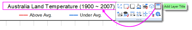
- This is a new type of text object which is (a) center-aligned horizontally on the layer and in which (b) wrap-text is enabled. Once a title is added, it can be toggled ON/OFF with the Mini Toolbar button.
这是一种新型文本对象,它 (a) 水平居中对齐于图层,(b) 启用了换行文字功能。添加标题后,可以使用迷你工具栏按钮来切换标题的开/关。
|
Add Vertical/Horizontal Line
添加垂直线/水平线 |
- With a 2D graph active, use the Insert: Straight Line... menu item. Note that this tool allows use of a simple LabTalk expression in the At Value field (e.g. "mean(plotdata(1,Y))" which translates to "mean of 1st plot's Y dataset") for positioning the line object. For information, see At Axis Value.
在激活 2D 图形的情况下,使用插入:直线...菜单项。请注意,该工具允许在 "在轴值 "字段中使用简单的 LabTalk 表达式(例如 "mean(plotdata(1,Y))",即 "第 1 个图的 Y 数据集的平均值")来定位直线对象。有关信息,请参阅 At Axis Value。
|
Annotate a Data Point
注释数据点Graphs, Labeling a Data Point
|
- This is another another option for labeling individual data points. Click the Annotation
 tool on the Tools toolbar. See The Annotation Tool. tool on the Tools toolbar. See The Annotation Tool.
这也是标注单个数据点的另一种选择。单击工具工具栏上的注释 工具。请参阅注释工具。
|
| Add Drawing Objects
添加绘图对象 |
Use the corresponding toolbar buttons on Tools toolbar. Origin supports:
使用 "工具 "工具栏上的相应工具栏按钮。原点支持 - Arrow, Curved Arrow. 箭、弯箭
- Line, Polyline, Curve, Freehand Draw.
直线、折线、曲线、自由手绘。
- Rectangle, Circle, Polygon, Region.
矩形、圆形、多边形、区域。
|
Insert Equation, Word Object, Excel Object, Other OLE Object
插入公式、Word 对象、Excel 对象、其他 OLE 对象 ExcelGraphs, Insert Equation
|
- Insert Equation button group on the Tools toolbar. For equations, note that you can download a free App from the OriginLab File Exchange, for adding LaTeX objects to worksheets and graphs.
工具栏上的 "插入方程 "按钮组。关于方程,请注意您可以从 OriginLab File Exchange 下载一个免费的应用程序,用于将 LaTeX 对象添加到工作表和图表中。
|
Insert Worksheet, Insert Graph
插入工作表,插入图表 |
- Click the Insert Worksheet
 or Insert Graph or Insert Graph  buttons on the Tools toolbar (the two share a split button). This opens a browser dialog from which you can choose a worksheet or graph. Both insert an image object (name = WBook or GPage) into the graph. buttons on the Tools toolbar (the two share a split button). This opens a browser dialog from which you can choose a worksheet or graph. Both insert an image object (name = WBook or GPage) into the graph.
单击工具工具栏上的插入工作表 或插入图表 按钮(两者共用一个分割按钮)。这将打开一个浏览器对话框,从中选择工作表或图表。这两种方法都可以在图表中插入图像对象(名称 = WBook 或 GPage)。
- To style inserted tables(worksheets), including coloring alternating rows and a new Mini Toolbar for modifying the appearance of grids, frames, cell colors, fonts, etc. For more information, see Inserting Worksheets in Graphs (and Layouts).
为插入的表格(工作表)设计样式,包括为交替行着色,以及用于修改网格、框架、单元格颜色、字体等外观的新迷你工具栏。更多信息,请参阅在图表(和布局)中插入工作表。
|
| Insert Image
插入图片 |
- Right-click on the graph and choose Insert Images From Files. You will be asked whether you want to insert your image as a background for the active graph layer. Answering yes will cause the image to be imported and placed behind plots, graph legends, text objects, etc.
右键单击图形并选择从文件插入图像。系统会询问您是否要插入图像作为活动图层的背景。如果回答 "是",则图像将被导入并放置在绘图、图形图例、文本对象等后面。
|
| Add Table
添加表格 |
- Click the New Link Table
 button on the Add Object to Graph toolbar and then click on the graph. button on the Add Object to Graph toolbar and then click on the graph.
单击 "向图表添加对象 "工具栏上的新建链接表 按钮,然后单击图表。
- From the main menu, choose Insert: Table.
从主菜单中选择插入:表格。
- To edit table content, double-click the table object.
要编辑表格内容,请双击表格对象。
- To format the table, select it and use the available Mini Toolbar.
要格式化表格,请选择表格并使用可用的迷你工具栏。
|
Insert Date & Time Stamp
插入日期和时间戳 |
- Date & Time
 button on the Add Object to Graph toolbar. button on the Add Object to Graph toolbar.
日期和时间 按钮。
|
| Insert Project Path
插入项目路径 |
- Project Path
 button on the Add Object to Graph toolbar. button on the Add Object to Graph toolbar.
项目路径 按钮。
|
Add Bracket with Asterisk
用星号添加括号 |
- To indicate statistical groupings, click the Add Asterisk Bracket
 button on the Add Object to Graph toolbar. button on the Add Object to Graph toolbar.
要表示统计分组,请单击 "向图表添加对象 "工具栏上的添加星号括号 按钮。
- To change bracket shapes, click on the barcket and select from drop-down list of Bracket Type Mini Toolbar button.
要更改托架形状,请单击托架,然后从托架类型迷你工具栏按钮的下拉列表中进行选择。
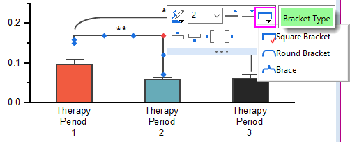
- Manually adjust the size and placement of brackets by dragging handles on the object.
通过拖动对象上的手柄,手动调整括号的大小和位置。
- To format the bracket, click the bracket and use the Mini Toolbar buttons.
要格式化括号,请单击括号并使用迷你工具栏按钮。
|
| Add XY Scale
添加 XY 比例 |
This is useful when using a nonlinear xy scale.
这在使用非线性 xy 比例时非常有用。 - New XY Scale button
 and click on a graph layer. and click on a graph layer.
新建 XY 比例按钮 并单击图形图层。
- Select Insert: XY Scaler.
选择插入:XY 标尺
|
Tips for Editing Your Graph Annotations
编辑图表注释的技巧
| Beginning with Origin 2021, use Alt+Enter when creating multi-line text objects. To revert to using Ctrl+Enter to insert a line break, set @FCA=1.
从 Origin 2021 开始,创建多行文本对象时使用 Alt+Enter。要恢复使用 Ctrl+Enter 插入换行符,请设置 @FCA=1。
|
- Pressing CTRL when drawing with the Rectangle
 or Circle or Circle  tools, will draw a square or circle (as opposed to a rectangle or ellipse). tools, will draw a square or circle (as opposed to a rectangle or ellipse).
使用矩形 或圆形 工具绘图时按下 CTRL 键,将绘制正方形或圆形(而不是矩形或椭圆)。
- Use Mini Toolbar buttons for quick edits to selected objects. For more complex edits, right-click an object and choose Properties to edit object properties and set defaults.
使用迷你工具栏按钮对选定对象进行快速编辑。要进行更复杂的编辑,可右键单击对象并选择 "属性 "来编辑对象属性和设置默认值。
- For text objects, including the axis titles and graph legends, you can edit text objects directly in "In-place Edit" mode. Double-click on a text object to edit. Use the Format toolbar buttons to add superscript, subscript, and Greek characters.
对于文本对象(包括坐标轴标题和图形图例),可以在 "就地编辑 "模式下直接编辑文本对象。双击要编辑的文本对象。使用格式工具栏按钮添加上标、下标和希腊字符。
- You can enable text wrapping for text objects, including legend objects. Open the object's Properties dialog, click the Frame tab and enable Wrap Text, Adjust Height; or select the object and click the Wrap Text Mini Toolbar button.
您可以为文本对象(包括图例对象)启用文本换行。打开对象的 "属性 "对话框,单击 "框架 "选项卡并启用 "换行文本"、"调整高度";或者选择对象并单击 "换行文本迷你工具栏 "按钮。
- NEW: By default, there is an 80 character limit (with spaces) to in-place editing of wrapped text. Below this threshold, double-clicking on the object will put you into in-place edit mode; above the threshold, double-clicking will open the Properties dialog. You can adjust this threshold using system variable @TLIP.
新功能:默认情况下,就地编辑封装文本的字符数限制为 80 个字符(含空格)。低于该阈值时,双击对象将进入就地编辑模式;高于该阈值时,双击对象将打开 "属性 "对话框。您可以使用系统变量 @TLIP 调整该阈值。
- NEW: When long text objects are not wrapped, you can use system variable @TLIPN (default = 60) to determine the character threshold for entering in-place edit mode or to open the Properties dialog, upon double-clicking.
新功能:当长文本对象未封装时,可以使用系统变量 @TLIPN(默认 = 60)来确定进入就地编辑模式或双击后打开属性对话框的字符阈值。
- Note that while manual editing of axis titles and legends may be the best "quick solution", in most cases, you are better off using worksheet column metadata to automatically create axis title and legend text.
请注意,虽然手动编辑坐标轴标题和图例可能是最好的 "快速解决方案",但在大多数情况下,您最好使用工作表列元数据来自动创建坐标轴标题和图例文本。
- Do NOT set font size while in "In-place Edit Mode" unless you need to mix font sizes within a single text object. The correct way to change font size is to click the text object once so that the green selection handles appear, then select font size from the Format toolbar. If you set while in In-place Edit mode, Origin will not indicate the proper font size when you hover on the text object.
不要在 "就地编辑模式 "下设置字体大小,除非需要在单个文本对象中混合使用字体大小。更改字体大小的正确方法是单击文本对象一次,使绿色选择柄出现,然后从 "格式 "工具栏中选择字体大小。如果您在 "就地编辑 "模式下进行设置,当您将鼠标悬停在文本对象上时,Origin 不会显示正确的字体大小。
- When you are in In-place Edit mode, you can right-click and choose Symbol Map to insert special characters into your text object.
在 "就地编辑 "模式下,您可以右键单击并选择 "符号映射",在文本对象中插入特殊字符。
- You can insert data from of a worksheet cell into a text object by copying and pasting the cell contents. While in In-place Edit mode in the text object, right-click and choose Paste or Paste Link. Data added by Paste is static; Paste Link is dynamic and thus, the text object will update if the data in the linked cell changes.
通过复制和粘贴单元格内容,可以将工作表单元格中的数据插入文本对象中。在文本对象的 "就地编辑 "模式下,右键单击并选择 "粘贴 "或 "粘贴链接"。粘贴 "添加的数据是静态的;"粘贴链接 "添加的数据是动态的,因此,如果链接单元格中的数据发生变化,文本对象也会随之更新。
- Also, when in In-place Edit mode, you can right-click and choose Insert Info. Variable... to insert project variables into the text object. Since the pasted information is linked to a LabTalk variable value, the inserted data updates if the variable value changes.
此外,在就地编辑模式下,可以右键单击并选择插入信息。变量...将项目变量插入文本对象中。由于粘贴的信息与 LabTalk 变量值相关联,因此如果变量值发生变化,插入的数据也会更新。
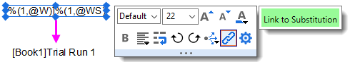
- You can insert variable values into a text object using the LabTalk %, and $ substitution notation by setting the Link to (%,$), Substitution Level to 1 in the text object's Properties dialog box, Programming tab. Right-click on the text object and choose Properties from the shortcut menu. Alternately, you can use the Link to Substitution Mini Toolbar button, saving you from having to open the Properties dialog.
在文本对象的 "属性 "对话框的 "编程 "选项卡中,将链接设置为 (%,$),替换级别设置为 1,就可以使用 LabTalk % 和 $ 替换符号在文本对象中插入变量值。右键单击文本对象,从快捷菜单中选择 "属性"。或者,您也可以使用 "链接到替换迷你工具栏 "按钮,这样就不必打开 "属性 "对话框了。
- You can use controls on the Programming tab of Properties to associate your LabTalk script with a text or drawing object (for instance, see Linking Text Labels to Data and Variables). Enter your script in the text box and specify a Script, Run After condition for running the script. Use the Apply to drop-down to set the scope for the script.
您可以使用 "属性 "的 "编程 "选项卡上的控件将 LabTalk 脚本与文本或绘图对象关联起来(例如,请参阅将文本标签与数据和变量链接)。在文本框中输入脚本,并为运行脚本指定 "脚本"、"运行后 "条件。使用 "应用于 "下拉菜单设置脚本的作用域。
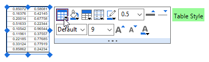
- You can copy a range (of cells) from a workbook and paste it into a graph as a table object. Table content is (a) edited by double-clicking on the object and (b) can be formatted using Mini Toolbar buttons.
您可以从工作簿中复制一个单元格区域,然后将其作为表格对象粘贴到图表中。表格内容 (a) 可通过双击对象进行编辑,(b) 可使用迷你工具栏按钮进行格式化。
| You can add text formatting (e.g. super-/subscripting) to non-consecutive characters via the text object's Properties dialog:
您可以通过文本对象的 "属性 "对话框为非连续字符添加文本格式(如上标/下标):
- Right-click on the text object and choose Properties.
右键单击文本对象,选择属性。
- On the Text tab, press CTRL and in the text box, highlight multiple characters by dragging with your mouse.
在文本选项卡上按下 CTRL 键,然后在文本框中用鼠标拖动选中多个字符。
- Click the desired text formatting button above the text box and click OK to close.
单击文本框上方所需的文本格式按钮,然后单击 "确定 "关闭。
|
Simple Symbol Map 简单符号地图
The Simple Symbol Map is a "settings" menu to assist in managing symbols.
简单符号地图是一个 "设置 "菜单,用于帮助管理符号。
- To insert a symbol, highlight the symbol and click Insert.
要插入符号,请选中该符号并单击 "插入"。
- For help with Advanced or other dialog settings, see the Origin Help file.
有关高级或其他对话框设置的帮助,请参阅 Origin 帮助文件。
From the "gear" icon... 从 "齿轮 "图标...
- Add: Enter space-separated Unicode 4-character sequence. Symbols will be appended to the current tab.
添加:输入以空格分隔的 Unicode 4 字符序列。符号将被添加到当前制表符中。
- Delete: Enter space-separated Unicode 4-character sequence. Symbols will be removed from the current tab; or click Select to pick symbols to remove.
删除:输入空格分隔的 Unicode 4 字符序列。符号将从当前选项卡中删除;或单击 "选择 "挑选要删除的符号。
- Reorder: Drag to reorder, click Done to apply changes.
重新排序:拖动重新排序,单击 "完成 "应用更改。
- Reset to Factory Default: Resets to default symbol set for current tab.
重置为出厂默认设置:重置为当前选项卡的默认符号集。
- Append from Factory Default: Restores previously-deleted default symbols to current tab (does not affect user symbols).
从出厂默认值添加:将先前删除的默认符号恢复到当前选项卡(不影响用户符号)。
For more information, see the Origin Help file page Adding Unicode and ANSI Characters in Text Labels.
更多信息,请参阅 Origin 帮助文件页面 在文本标签中添加 Unicode 和 ANSI 字符。
Grouping, Aligning and Arranging with the Object Edit Toolbar
使用对象编辑工具栏进行分组、对齐和排列
You can group text labels and drawn objects so that they move or resize as a unit:
您可以将文本标签和绘制对象分组,使它们作为一个整体移动或调整大小:
- To select objects, press SHIFT + click; or drag out a box around objects using the Pointer
 tool. tool.
要选择对象,请按 SHIFT + 单击;或使用指针 工具在对象周围拖出一个框。
- To group the selected objects, click the Group button
 on the Object Edit toolbar. on the Object Edit toolbar.
要对所选对象进行分组,请单击对象编辑工具栏上的分组按钮 。
- To ungroup objects, click the Ungroup button
 on the Object Edit toolbar. on the Object Edit toolbar.
要取消对象分组,请单击对象编辑工具栏上的取消分组按钮 。
You can align multiple text labels and/or drawn objects with one another using the tools on the same Object Edit toolbar:
您可以使用同一 "对象编辑 "工具栏上的工具对齐多个文本标签和/或绘制对象:
- Select objects to be aligned by holding the SHIFT key while selecting (or drag out a selection box using the Pointer tool), then click one of the align objects buttons on the toolbar. Note that objects will be aligned with respect to the first-selected object.
按住 SHIFT 键同时选择要对齐的对象(或使用指针 工具拖出选择框),然后单击工具栏上的对齐对象按钮之一。请注意,对象将相对于第一个选定的对象对齐。
You can bring overlapping objects to the front or send them to the back:
您可以将重叠的对象移到前面,也可以将它们移到后面:
- Select the objects that you want to move to the front or the back.
选择要移动到前面或后面的对象。
- Click the Front button
 or the Back button or the Back button  on the Object Edit toolbar. on the Object Edit toolbar.
单击 "对象编辑 "工具栏上的 "前 "按钮 或 "后 "按钮 。
Note: For more information on graph annotations, see your Origin User Guide:
注:有关图形注释的更多信息,请参阅《Origin 用户指南》: Help: Origin: Origin Help > Graphing > Adding Text and Drawing Objects
帮助:Origin:Origin 帮助 > 制图 > 添加文本和绘图对象
|
| You can also use the Object Edit Toolbar to manipulate graph layers. Use buttons to align and set a uniform size for multiple graph layers or to swap layer order.
您还可以使用对象编辑工具栏来操作图形图层。使用按钮可对齐多个图形图层并为其设置统一尺寸,或交换图层顺序。 |
Using Page or Layer Grids to Place Objects
使用页面或图层网格放置对象
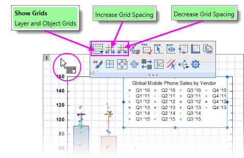
For manually placing objects -- graph layers, text objects, legends, etc. -- you can turn on a non-printing, non-exporting page or layer grid:
对于手动放置对象(图形图层、文本对象、图例等),可以打开不打印、不导出的页面或图层网格。-- 你可以打开一个不打印、不输出的页面或图层网格:
- With the graph active, choose View: Show: Page Grid/Layer Grid (displays only one at a time).
图形激活后,选择 "查看":显示:页面网格/图层网格(一次只显示一个)。
- Alternately, you can turn on grids by clicking near the page margin and clicking the Mini Toolbar Show Grids button. In addition, you'll find buttons for increasing or decreasing grid size by increments.
或者,你也可以点击页面边缘附近,然后点击迷你工具栏上的显示网格按钮来打开网格。此外,你还可以找到按增量增大或减小网格大小的按钮。
Control of the Grid 控制电网
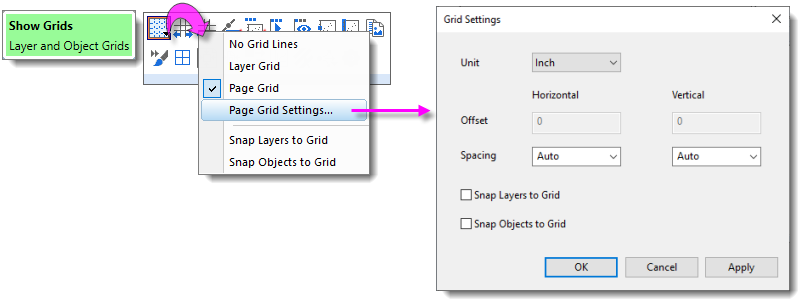
Grid display and related grid settings are found by clicking on the Show Grids button.
单击 "显示网格 "按钮可找到网格显示和相关网格设置。
- Click Show Grids, then click Page Grid Settings.
单击显示网格,然后单击页面网格设置。
Object Attachment and Scaling in Graphs
图形中的对象附着和缩放
Graphs, Scaling Objects
There are two settings that you should know something about, particularly if you subsequently modify axis scales or resize the graph layer after adding annotations: One is the object's Attach to method, the other is the layer's Scale Elements behavior.
有两个设置您应该有所了解,尤其是在添加注释后修改坐标轴比例或调整图形图层大小时:一个是对象的 "附加到 "方法,另一个是图层的 "缩放元素 "行为。
Object Attachment 物体附件
When you add a text or drawing object to an Origin graph window, the object becomes part of the active graph layer. Thus, if you resize or delete that graph layer, you will resize or delete the added object.
在 Origin 图形窗口中添加文本或绘图对象时,该对象将成为活动图形层的一部分。因此,如果调整该图形层的大小或删除该图形层,就会调整所添加对象的大小或删除该对象。 In addition to being part of the graph layer that was active at the time of object creation, note also that objects are attached to the graph in one of three ways, depending upon the type of object and where it is created on the page.
除了作为创建对象时处于活动状态的图形层的一部分外,还要注意的是,对象是以三种方式之一附加到图形上的,这取决于对象的类型和在页面上创建的位置。
To view the "Attach to" setting for any object:
查看任何对象的 "附加到 "设置:
- Right-click on a text or drawing object and choose Properties....
右键单击文本或绘图对象,选择属性....。
- Click on the Programming tab and note the object's Attach to setting.
单击 "编程 "选项卡,注意对象的 "附加到 "设置。 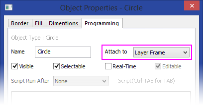
Though objects remain a part of the layer that was active at the time of their creation, you can manage some object behaviors by changing the object attachment method. An object is attached in one of three ways:
虽然对象仍然是创建时处于活动状态的图层的一部分,但您可以通过更改对象附加方法来管理某些对象行为。对象有三种附着方式:
- Page. When attached to the page, objects are not affected by moving or resizing the graph layer, nor are they affected by a change in axis scales. These objects are still associated with a particular graph layer and they will be hidden or deleted if the layer is hidden or deleted.
页面。附加到页面后,对象不会受移动或调整图形层大小的影响,也不会受坐标轴比例变化的影响。这些对象仍与特定图形层相关联,如果隐藏或删除图形层,这些对象也会被隐藏或删除。
- Layer Frame. Objects that are attached to the layer frame, are resized and moved with respect to the layer frame. However, they are not tied to axis scales and are not affected by changes in the layer's axis scale values. Objects are hidden or deleted if the associated layer is hidden or deleted.
图层框架。附着在图层框架上的对象可以根据图层框架调整大小和移动。不过,它们与轴比例无关,也不受图层轴比例值变化的影响。如果相关图层被隐藏或删除,对象也会被隐藏或删除。
- Layer and Scales. Objects are linked to a particular range of axis scale values. If you resize the layer, the object is resized accordingly. If you rescale the axes, the object moves in relation to the visible scale and will disappear from view if the linked axis scale range is not displayed. These objects are hidden or deleted if the associated layer is hidden or deleted.
图层和刻度。对象与特定范围的轴刻度值相关联。如果调整图层大小,对象的大小也会相应调整。如果调整坐标轴的比例,对象将相对于可见比例移动,如果未显示链接的坐标轴比例范围,对象将从视图中消失。如果相关图层被隐藏或删除,这些对象也会被隐藏或删除。
To briefly illustrate why object attachment is important, let's look at the following graph. After the graph was created, arrows and text objects that point to their respective data plots, were added to the graph. Both arrows and text objects are attached to the graph Layer Frame.
为了简要说明对象附件的重要性,让我们看一下下面的图表。图形创建后,箭头和文本对象分别指向各自的数据图块。箭头和文本对象都附加在图表图层框架上。
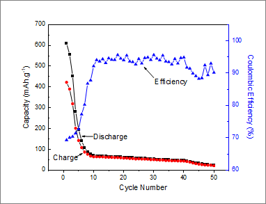
Now, consider what happens to these objects when we modify the graph's X axis scale (recall that objects attached to the Layer Frame "are unaffected by changes in the layer's axis scale values"). Note that by changing the axis scale display range, we have shifted the data plots but the text objects and arrows did not move with them.
现在,请考虑一下当我们修改图形的 X 轴刻度时,这些对象会发生什么变化(请记住,图层框架上的对象 "不受图层轴刻度值变化的影响")。请注意,通过更改坐标轴刻度显示范围,我们移动了数据图块,但文本对象和箭头并没有随之移动。
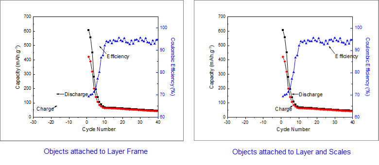
The remedy for this is to change the text and drawing objects' Attach to method to be Layer and Scales because "if you rescale the axes, the object moves in relation to the visible scale." Sometimes we may want an object to move with scale changes; at other times we may not. You can force either behavior if you keep in mind the Attach to setting.
解决这个问题的方法是将文本和绘图对象的 Attach to 方法改为图层和缩放,因为 "如果调整坐标轴的比例,对象就会根据可见比例移动"。有时,我们可能希望对象随比例变化而移动;有时,我们可能不希望。如果牢记 "附加到 "设置,就可以强制任何一种行为。
Object Scaling 对象缩放
Object scaling often comes up when manually resizing the graph layer or when merging separate graphs into a single multi-panel graph (Graph: Merge Graph Windows). By default, added objects are set to Scale with Layer Frame -- that is, when the graph layer is resized, associated objects such as text objects, axis lines and ticks, and axis titles -- will be scaled proportionally. In the case where you merge four single layer graphs into a single, four layer multi-panel graph, these objects will be scaled down with the reduction in size of the layer frame.
在手动调整图形层大小或将独立图形合并为单个多面板图形(图形:合并图形窗口)时,经常会出现对象缩放问题。默认情况下,添加的对象被设置为随图层框架缩放,也就是说,当调整图形图层大小时,相关对象(如文本对象、坐标轴线和刻度线以及坐标轴标题)将按比例缩放。如果将四个单图层图形合并为一个四图层多面板图形,这些对象将随图层框架大小的缩小而缩放。
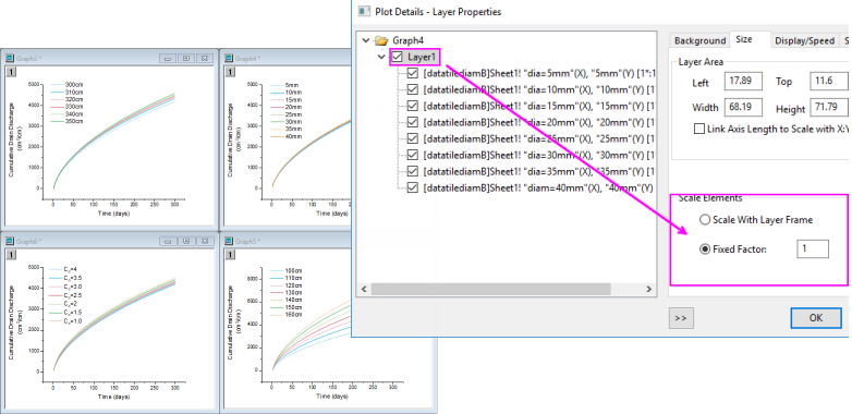
However, this is another default behavior that you may want to change (e.g. you have set your font size to 10 pt. and you want to preserve that size), and you can do this using the Scale Elements control on the Size tab (Layer level) of Plot Details. If our goal is to keep objects at their current size when merging graphs, for instance, we can open the Plot Details dialog box and at the layer level (Format: Layer...), click on the Size tab, choose the Fixed Factor radio button and set the scaling factor to 1.
不过,这也是您可能希望更改的另一种默认行为(例如,您已将字体大小设置为 10 pt,并希望保留该大小),您可以使用 "绘图细节 "的 "大小 "选项卡(图层级别)上的 "缩放元素 "控件来更改。例如,如果我们的目标是在合并图形时保持对象的当前大小,我们可以打开 "绘图细节" 对话框,在图层级(格式:图层...)上单击 "大小 "选项卡,选择 "固定系数 "单选按钮并将缩放系数设为 1。
| If you have resized the graph layer, either by merging multiple graphs into a single graph or by manually resizing the layer, you will find that the font sizes do not display at their "correct" size (i.e. if you select a text object, the Font Size list on the Format toolbar shows the original font size). Further, if select a text object, the Status bar will report two font size numbers -- "size" and "actual". You can reset font size so that they are shown as actual size, not scaled size, by choosing Graph: Fix Scale Factors. For more information, see FAQ-441 How do I export graphs with exact size and resolution as specified by publishers?
如果您通过将多个图形合并为一个图形或手动调整图层大小来调整图形图层的大小,您会发现 字体大小不会以 "正确 "的大小显示(例如,如果您选择文本对象,格式工具栏上的字体大小列表 会显示原始字体大小)。此外,如果选择一个文本对象,状态栏会显示两个字体大小数字--"大小 "和 "实际"。您可以通过选择图形来重新设置字体大小,使其显示为实际大小,而不是缩放大小:修复比例因子。有关更多信息,请参阅常见问题-441 如何按照出版商指定的精确尺寸和分辨率导出图表?
|
Inserting Images to Graphs
在图表中插入图像
There are two general approaches to adding images to graph windows:
在图形窗口中添加图像一般有两种方法:
Floating or Background Images
浮动或背景图像
- Images can be inserted to graphs from file or from Image Windows.
可从文件或图像窗口向图表插入图像。
- Images can be inserted as floating images or as a layer background.
图片可以作为浮动图片或图层背景插入。
- Double-click on a graph image to open the image in an Image Window.
双击图形图像可在图像窗口中打开图像。
- Once opened in the Image Window, define a region-of-interest (ROI) and Clip the image (graph image clipped to ROI) or Crop the image (image is cropped in Image Window and graph).
在 "图像窗口 "中打开后,定义感兴趣区域(ROI)并剪切图像(图形图像剪切到 ROI)或裁剪图像(图像在 "图像窗口 "和图形中被裁剪)。
- Use the Image Window to Set (image) Scale or Set (image) Coordinates of the inserted image.
使用图像窗口设置插入图像的(图像)比例或(图像)坐标。
- Images may be saved with the project or linked to an external file (Link File) to control project size.
图像可与项目一起保存或链接到外部文件(链接文件),以控制项目大小。
| Prior to Origin 2022b, images linked to an external file had to be manually reimported on project open. Now, linked images are automatically reimported, including modified source images. Disable or modify auto import with system variables @LFAU and @LFC.
在 Origin 2022b 之前,链接到外部文件的图像必须在项目打开时手动重新导入。现在,链接的图像会自动重新导入,包括修改过的源图像。使用系统变量 @LFAU 和 @LFC 可禁用或修改自动导入功能。 |
Inserting Image from File
从文件插入图像
You can insert an insert an image into graph page, with the option of inserting it as a background image that is linked to layer and scales.
您可以在图表页面中插入图像,还可以选择将其插入为与图层和缩放比例相关联的背景图片。
- With the graph layer active, choose Insert: Image from File. The image is inserted as a floating image.
激活图形图层后,选择插入:从文件插入图像。图像将作为浮动图像插入。
- To convert the image to a background image, double-click to open it in an Image Window.
要将图像转换为背景图像,请双击该图像在图像窗口中打开。
- Right-click on the Image Window image and choose Set as Layer Background.
右键单击 "图像窗口 "图像,选择 "设置为图层背景"。
- Click the Close button
 on the Image Window. on the Image Window.
单击图像窗口上的关闭按钮 。
Inserting Image from Image Window
从图像窗口插入图像
You can also insert images to graphs from an Image Window:
您还可以在图像窗口中为图形插入图像:
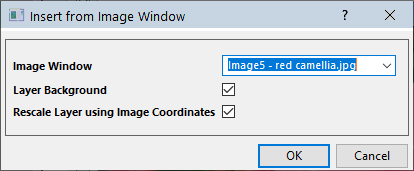
- With the graph window active, choose Insert: Image from Image Window. The Insert from Image Window dialog opens.
在图形窗口处于活动状态时,选择插入:从图像窗口插入图像。此时将打开 "从图像窗口插入 "对话框。
- Set the Image Window drop-down to the desired image.
将图像窗口下拉菜单设置为所需图像。
- Optionally, choose to insert the image as Layer Background and to Rescale Layer using Image Coordinates (Layer Background only).
可选择插入图像作为图层背景和使用图像坐标重新缩放图层(仅限图层背景)。
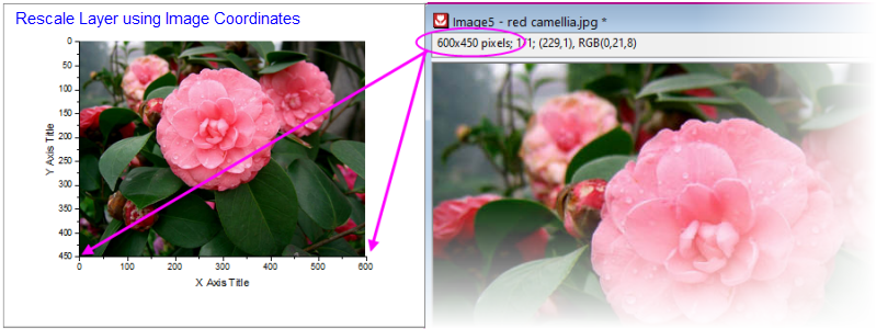
Manipulating Images with the Image Window
使用图像窗口处理图像
Mini Toolbar 迷你工具栏
Clicking on an Image Window image produces a Mini Toolbar with buttons for simple image manipulations (flip, rotate, convert to gray scale, etc.).
单击图像窗口中的图像,会弹出一个迷你工具栏,其中包含用于简单图像处理(翻转、旋转、灰度转换等)的按钮。
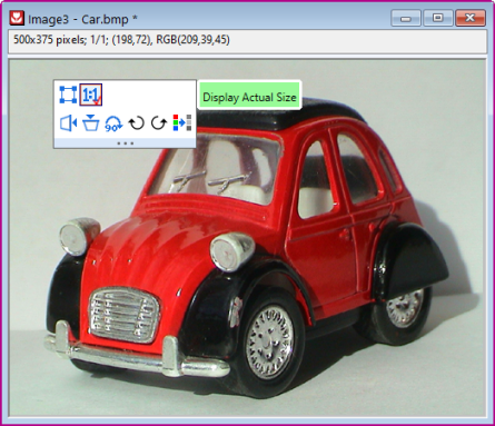
Region-of-Interest (ROI) 感兴趣区域(ROI)
Placing an ROI object on the Image Window image allows you to perform certain image editing operations.
在图像窗口图像上放置 ROI 对象可以执行某些图像编辑操作。
Add an ROI to the image by one of the following:
通过以下方法之一为图像添加 ROI:
- Click the Add ROI button
 on the Mini Toolbar. on the Mini Toolbar.
单击迷你工具栏上的添加 ROI 按钮 。
- Right-click on the image and choose Add ROI.
右键单击图像,选择添加 ROI。
- Click the Rectangle Tool
 on the Tools toolbar. on the Tools toolbar.
单击工具工具栏上的矩形工具 。
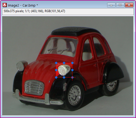
Once added, the ROI can be resized (by dragging handles) or moved. Additionally, various operations can be performed on the ROI, including:
添加后,ROI 可以调整大小(通过拖动手柄)或移动。此外,还可以对 ROI 执行各种操作,包括
- Clip graph image to ROI, Crop image to ROI or Copy ROI as image to graph.
将图形图像剪切为 ROI、将图像裁剪为 ROI 或将 ROI 作为图像复制到图形。
- Copy Positions/Paste Positions for copying ROI dimensions to a second ROI on another Image Window.
复制位置/粘贴位置用于将 ROI 尺寸复制到另一个图像窗口上的第二个 ROI。
- Export ROI or Import ROI to save or apply previously-saved ROI dimensions.
导出 ROI 或导入 ROI 以保存或应用之前保存的 ROI 尺寸。
For more information on the Image Window, see the Origin Help File.
有关图像窗口的更多信息,请参阅 Origin 帮助文件。
Inserting Images into a Text Object
在文本对象中插入图像
Images can also be inserted as part (or the entirety) of a text object. Source images can be from:
图片也可以作为文本对象的一部分(或全部)插入。源图像可以来自
- Local image file or Web image URL
本地图像文件或网络图像 URL
- Worksheet cell 工作表单元格
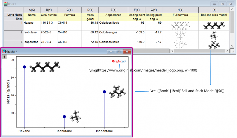
Local Image or Web URL
本地图像或网络 URL
When you insert an Image from File or Image from Web using the following methods, the image is linked and not stored in the Origin project file. This helps control project file size.
使用以下方法从文件插入图像或从 Web 插入图像时,图像将被链接,而不会存储在 Origin 项目文件中。这有助于控制项目文件大小。
- On the Tools toolbar, click the Text tool and click once on the graph to enter "in-place" edit mode.
在 "工具 "工具栏上,单击 "文本 "工具 ,然后在图形上单击一次,进入 "就地 "编辑模式。
- Enter text if needed and when ready to insert image, right-click and choose Insert: Image from File or Image from Web:
根据需要输入文字,准备插入图片时,右键单击并选择插入:来自文件的图片或来自网络的图片: - When inserting an image from file, browse to your local image file and click Open.
从文件插入图像时,请浏览本地图像文件并单击 "打开"。
- When inserting an image from Web, you'll need a URL (hint: locate your Web image, then right-click and copy the address (Copy Image Address, Copy Image Link, etc, depending upon browser).
从网页插入图片时,需要 URL(提示:找到网页图片,然后右击并复制地址(复制图片地址、复制图片链接等,视浏览器而定)。
To examine (or modify) the syntax used for inserting an image, you can select the inserted object and choose Properties. In the Text Object dialog, you should see something like these examples:
要检查(或修改)用于插入图像的语法,可以选择插入对象并选择属性。在 "文本对象 "对话框中,您将看到类似以下示例的内容: Examples: 例如
\img(file://"C:/Program Files/OriginLab/Origin2023/Samples/Image Processing and Analysis/white camellia.jpg",w=200)
\img(https://www.originlab.com/images/header_logo.png, w=200)
... where option "w=" is the default width in pixels, of the inserted image. Width is user-modifiable by editing the "w=" value in Properties or -- if no width is specified -- by simply dragging the object's selection handles.
...其中选项 "w="是插入图像的默认宽度(以像素为单位)。用户可以通过编辑 "属性 "中的 "w="值来修改宽度,如果没有指定宽度,则只需拖动对象的选择柄即可。
Worksheet Cell 工作表单元格
You can also insert an image from a worksheet cell into a text object, but you'll need to make use of a special syntax. The syntax is not complicated and combines a \cell( ) escape sequence with a cell reference -- either a range reference (e.g. [Book1]Sheet1!col(C)[1] ) or a named range reference.
您也可以将工作表单元格中的图像插入文本对象,但需要使用一种特殊的语法。该语法并不复杂,它将 \cell( ) 转义序列与单元格引用(区域引用,例如 [Book1]Sheet1!col(C)[1] )或已命名的区域引用结合在一起。
- On the Tools toolbar, click the Text tool and click once on the graph to enter "in-place" edit mode; or right-click and choose Add Text from the shortcut menu.
在 "工具 "工具栏上,单击 "文本 "工具 ,然后在图形上单击一次,即可进入 "就地 "编辑模式;或者右击并从快捷菜单中选择 "添加文本"。
- Enter your string into the text object using the examples below as a guide:
以下面的示例为指导,在文本对象中输入字符串: - If you are copying and pasting a string (e.g.
\cell([Book1]Sheet1!B[1])), click outside the text object to leave edit mode. Your cell image should display in the text object.
如果您要复制并粘贴一个字符串(例如 \cell([Book1]Sheet1!B[1]) ),请单击文本对象外以离开编辑模式。单元格图像应显示在文本对象中。
- If you are typing directly into the text object in "in-place" mode, enter your syntax (e.g.
\cell([Book1]Sheet1!B[1])) and when finished, right-click on the object, choose Properties and on the Text tab, remove one of the leading "\" characters from your cell reference (Origin automatically "protects" "\" characters entered into text objects which is why you'll need to remove one "\". See Escape Sequences).
如果您在 "就地 "模式下直接键入文本对象,请输入语法(例如 \cell([Book1]Sheet1!B[1]) ),完成后右键单击对象,选择 "属性",然后在 "文本 "选项卡上从单元格引用中删除一个前导"\"字符(Origin 会自动 "保护 "输入文本对象的"\"字符,因此您需要删除一个"\"字符)。请参阅 "转义序列")。
- If you are typing directly into the Text Object (Properties) dialog, enter your syntax (e.g.
\cell([Book1]Sheet1!B[1])) directly to display the cell image.
如果直接键入文本对象(属性)对话框,请直接输入语法(如 \cell([Book1]Sheet1!B[1]) )以显示单元格图像。
Examples: 例如
\cell([Book1]1!col(C)[2]) // Book1, Sheet1, col C, row2, size = current font height
\cell(alpha,200) // named range "alpha", width=200 logical pixels
\cell(alpha,h=300) // named range "alpha", height=300 logical pixels
Working with Map Data 使用地图数据
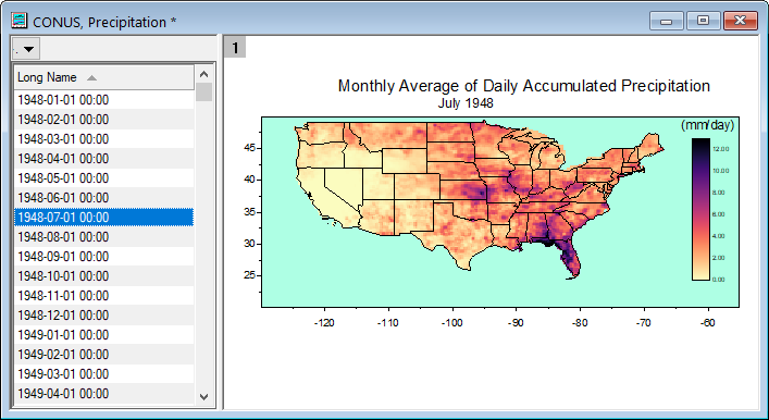
You can overlay geopolitical boundaries on graphs or Image Plots of NetCDF data from the Insert menu.
您可以通过插入菜单在 NetCDF 数据的图表或图像图上叠加地缘政治边界。
- Insert: World Map will apply boundaries within the graphs current Lat and Lon ranges.
插入:世界地图将在图表当前的纬度和纬度范围内应用边界。
- Depending upon the graph's Lat and Lon ranges, other options may be available (e.g. Continental USA Map, Map of China, etc.).
根据图表的纬度和经度范围,可能会有其他选项(如美国大陆地图、中国地图等)。
Importing Shapefiles 导入形状文件
You can also import locally-stored shapefiles using Origin's Shapefile Connector:
您还可以使用 Origin 的形状文件连接器导入本地存储的形状文件:
- With a workbook active, choose Data: Connect to File: Shapefile.
激活工作簿后,选择数据:连接到文件:Shapefile。
Map-related Apps 地图相关应用程序
There are at least two add-on Apps for inserting geographic data:
至少有两个附加应用程序可以插入地理数据:
- OriginLab's free Google Map Import App lets you place a Google Map as background on the graph page using specified coordinates.
OriginLab 的免费 Google 地图导入应用程序可让您使用指定坐标将 Google 地图作为背景放在图表页面上。
- Maps Online is another free OriginLab App that lets you connect to one of several map databases.
Maps Online 是另一款免费的 OriginLab 应用程序,可让您连接到多个地图数据库之一。
You can find and install these Apps by pressing F10 and searching on maps. For information on App installation, see Where Do I Find Apps?
按 F10 键并在地图上搜索,即可找到并安装这些应用程序。有关应用程序安装的信息,请参阅在哪里可以找到应用程序?
Arranging Graphs and Layers
排列图表和图层
Graphs, MergeGraphs, Extract to Layers Graphs, Extract to Graphs
| Task
|
Method
|
Merge multiple graph windows into a single graph window.
将多个图形窗口合并为一个图形窗口。 |
- Graph: Merge Graph Windows... menu command
图形合并图形窗口...菜单命令
or 或
- Merge Graph Windows button
 on the Graph toolbar. on the Graph toolbar.
合并图表工具栏上的图表窗口按钮 。
| Origin has two dialog boxes -- Fitting Layers to Page and Fit Page to Layers -- that are useful for arranging multiple graph panels on the page and for adjusting graph margins.
Origin 有两个对话框--"根据页面调整图层 "和 "根据图层调整页面",可用于在页面上排列多个图形面板和调整图形边距。 |
|
Extract data plots in one layer to multiple layers.
将一个图层中的数据图提取到多个图层中。 |
- Extract to Layers button
 on the Graph toolbar. on the Graph toolbar.
提取到图层按钮 。
Hint: to preserve your original graph, click the Duplicate button  before extracting to layers. before extracting to layers.
提示:要保留原始图形,请在提取到图层之前单击复制按钮 。
|
Extract multiple layers in a single graph to multiple graph windows
将单个图形中的多个图层提取到多个图形窗口中 |
- Graph: Extract to Graphs
图表提取到图表
or 或
- Click the Extract to Graphs button
 on the Graph toolbar. on the Graph toolbar.
单击图表工具栏上的提取到图表按钮 。
All layers are extracted to individual graph windows, even if a layer is linked to another layer.
所有图层都被提取到单独的图形窗口中,即使一个图层与另一个图层相连。
By default, the layextract dialog box has Extracted Layers set to 1:0, which specifies that all layers be extracted. To extract only certain layers, clear Auto and use the layextract X-Function's comma/colon notation to control which layers are extracted. The notation 1:0 means starting with layer 1, extract all layers to graphs (0 denotes all). Specifying 1,3:4, for example, tells Origin to extract only the first, third and the fourth layer. Note that you can enable Keep Source Graph to preserve the original graph.
默认情况下,"图层提取 "对话框的 "提取图层 "设置为 1:0,即指定提取所有图层。要只提取某些图层,请清除 "自动",然后使用 layextract X-Function 的逗号/冒号符号来控制提取哪些图层。1:0 表示从图层 1 开始,提取所有图层到图形(0 表示全部)。例如,指定 1,3:4 表示 Origin 只提取第一、第三和第四层。请注意,您可以启用 "保留源图形 "来保留原始图形。
|
Add, arrange, resize, position, swap, align, or link layers
添加、排列、调整大小、定位、交换、对齐或链接图层 |
- Graph: Layer Management... menu.
图形:图层管理...菜单。
- Position selected layers using Object Edit toolbar buttons. Hold SHIFT + click to select multiple layers and Align Left, Right, Top, Bottom, etc.
使用对象编辑工具栏按钮定位所选图层。按住 SHIFT + 单击可选择多个图层并向左对齐、向右对齐、向顶对齐、向底对齐等。
| You can use the Layer Management tool's Swap control (Graph: Layer Management,Size/Position tab) to physically swap layer positions without reassigning layer numbers. Before doing so, set each linked layer's Units to % of Page (Size/Speed tab of Plot Details).
您可以使用 "图层管理 "工具的 "交换 "控件("图形:图层管理","尺寸/位置 "选项卡)来实际交换图层位置,而无需重新分配图层编号。在此之前,请将每个链接图层的单位设置为页面百分比("绘图细节 "的 "尺寸/速度 "选项卡)。 |
|
Simple arrangement of layers
层的简单排列 |
- Graph: Arrange Layers... menu.
图形:排列图层...菜单。
- Row by column layer arrangement with control of page size and spacing between layers.
逐行逐列的图层排列,可控制页面大小和图层之间的间距。
|
Link graph layers
链接图层 Graphs, Linking Axis Scales
|
- Linked Axes Scales tab, layer level of Plot Details dialog box.
绘图细节 "对话框图层级别的 "链接轴刻度 "选项卡。
- Link tab of the Layer Management dialog box.
图层管理 "对话框的 "链接 "选项卡。
When linking layers, the child layer must have a higher layer number than the parent layer.
连接图层时,子图层的图层编号必须高于父图层。
Linked layers can be moved and resized together.
链接的图层可以一起移动和调整大小。
You can link layers' axis scale values to be Straight (1:1) or you can specify a Custom mathematical relationship.
您可以将图层的轴比例值连接成直线(1:1),也可以指定自定义数学关系。
- For Column/Bar/Box chart, each set of linked layers can share the Spacing tab Gap Between Bars (%) setting of the Link to layer (requires that page-level Layers tab Column/Bar/Box Gap Across Layers be enabled).
对于柱形图/条形图/方框图,每组链接图层可以共享链接到图层的 "间距 "选项卡 "柱形图/条形图/方框图间距(%)"设置(要求启用页面级 "图层 "选项卡 "柱形图/条形图/方框图间距")。
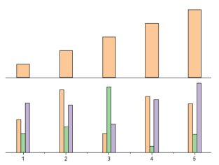
|
| Reorder layers 重新排列图层 Graphs, Reorder Layers
|
There are several ways to reorder graph layers (reassign Layer number for each Layer). Learn more about reassigning layer numbers in the mini tutorial below this table.
有几种方法可以对图形图层重新排序(为每个图层重新分配图层编号)。有关重新分配图层编号的更多信息,请参阅本表下方的迷你教程。
- Method 1: Open the Layer Management dialog and click the row header (shown in image below) and drag it up or down to change the Layer order.
方法 1:打开 "图层管理 "对话框,单击行标题(如下图所示)并向上或向下拖动,以更改图层顺序。
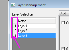
For more information, see the Layer Management tool.
更多信息,请参阅图层管理工具。
- Method 2: Enter the following LabTalk script in the Command Window (Window:Command Window), then press Enter to execute.
方法 2: 在命令窗口(Window:Command Window)中输入以下 LabTalk 脚本,然后按 Enter 执行。
page.reorder(n,m)
The command changes the nth Layer to the mth Layer.
该命令将第 n 层改为第 m 层。
- Method 3: Use the Front and Back buttons on the Object Edit toolbar (these buttons work on the active layer as indicated by the graph layer icon
 ). Alternately, right-click on the graph layer icon and change layer order using shortcut menu commands (e.g. Bring to Front). ). Alternately, right-click on the graph layer icon and change layer order using shortcut menu commands (e.g. Bring to Front).
方法 3:使用 "对象编辑 "工具栏上的 "前 "和 "后 "按钮(这些按钮对活动图层起作用,如图 层图标 所示)。或者,右键单击图形图层图标,使用快捷菜单命令更改图层顺序(如显示到前方)。
| When two layers are linked by a common X axis (e.g. Double-Y graph), you can swap layer drawing order by right-clicking on the "front" layer in Object Manager and choosing Push to Back. This will not break layer linking.
当两个图层通过一个共同的 X 轴连接时(如双 Y 图形),您可以在对象管理器中右键单击 "前 "图层并选择 "推至后 "来交换图层绘制顺序。这不会破坏图层链接。 |
Note: Reordering layers may break layer linking relationships.
注意:重新排列图层可能会破坏图层链接关系。
| A Note on Inset Graphs: In certain situations (see Tutorial, below), the order in which the layers are drawn on the screen becomes an issue. In this image, we have added an inset graph using the Add Inset Graph with Data button (Graph toolbar). The problem is that the data plot of the parent layer (red symbols) shows through the inset layer (small, black symbols). To fix this, we do two things:
关于嵌入图形的注意事项:在某些情况下(见下文教程),图层在屏幕上的绘制顺序会成为一个问题。在本图中,我们使用 "添加带数据的嵌入图形 "按钮(图形工具栏)添加了一个嵌入图形。问题是,父图层(红色符号)的数据图通过嵌入图层(黑色小符号)显示出来。要解决这个问题,我们需要做两件事:
- Set the inset layer background Color = White -- by default, it is None (Format: Layer, then Background tab).
设置插入图层的背景颜色 = 白色 - 默认为无(格式:图层,然后是背景选项卡)。
- Set the layer Drawing order to Draw layer by layer (Format: Page then Layers tab).
将图层绘制顺序设为逐层绘制(格式:页面,然后是图层选项卡)。
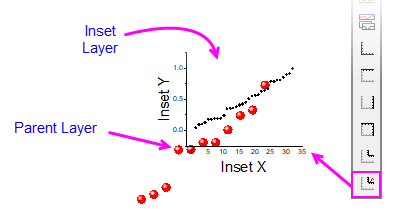
By default, an inset layer is added "on top of" the parent layer but if needed, you can click on the inset layer to select it, right-click and choose Bring to Front.
默认情况下,插入图层会添加到父图层的 "顶部",但如果需要,可以单击插入图层将其选中,然后单击右键并选择 "显示到前面"。 |
|
| Exchange X-Y Axes
交换 X-Y 轴 |
- Graph: Exchange X-Y Axes menu command
图形交换 X-Y 轴菜单命令
- Exchange Axes
 button on the Graph toolbar. button on the Graph toolbar.
交换坐标轴 按钮。
|
Move a plot(s) to another layer
将绘图移动到另一层 |
- Method 1: Open Plot Setup dialog(by selecting Graph:Plot Setup), expand the bottom panel, select a plot and drag it from a layer to another layer.
方法 1:打开 "绘图设置 "对话框(通过选择图形:绘图设置),展开底部面板,选择一个绘图并将其从一个图层拖到另一个图层。
- Method 2: Run
laymplot -d; (e.g. open the Script Window, type the command and press <Enter>) to open the Move Plot dialog to specify plot(s) to move and a target layer.
方法 2:运行 laymplot -d; (例如,打开脚本窗口,输入命令并按 ),打开 "移动绘图 "对话框,指定要移动的绘图和目标图层。
- Method 3: Copy (CTRL+C or Copy Range context menu) a plot and pasting (CTRL+V or Paste context menu), between different layers or different graphs.
方法 3:在不同图层或不同图形之间复制(CTRL+C 或复制范围右键菜单)一个图形并粘贴(CTRL+V 或粘贴右键菜单)。
Note: the pasted plot won't be associated with the source data of the copied plot, but exists as a loose dataset.
注意:粘贴的绘图不会与复制绘图的源数据相关联,而是作为一个松散的数据集存在。
|
|
|
In a multi-layer graph, layer order determines drawing order. The 1st layer is plotted and then 2nd layer is plotted on top of it, and so on. The layer with higher number is drawn on top of the layer with lower number. This is important when plots in one layer overlay plots in another layer. When necessary, you can change layer order to change plot drawing order.
在多层图表中,图层顺序决定绘制顺序。先绘制第一层,然后在其上绘制第二层,以此类推。编号较高的图层绘制在编号较低的图层之上。当一个图层的绘图覆盖另一个图层的绘图时,这一点非常重要。必要时,可以通过更改图层顺序来改变绘图顺序。 This mini tutorial shows you how layer reassignment works. Use the preview window to see how layer number reassignment affects your graph.
本迷你教程将向您展示图层重新分配的工作原理。使用预览窗口查看图层编号重新分配对图形的影响。
- Click Help: Origin Central or press F11.
点击帮助:Origin Central 或按 F11。
- Click on the Graph Sample tab, set the Samples in drop-down list to Area Plots and double-click on this graph:
单击 "图形样本 "选项卡,将 "下拉列表中的样本 "设置为 "区域图",然后双击该图形: -
- Activate the graph Area Plot With Horizontal Color Gradient, then click the Extract to Layers button on the Graph toolbar. Set both number of rows and columns to 1, click OK, then, click OK again for the page spacing. The green layer is on the top of the yellow layer in the figure. The purpose of this last step was simply to create a two layer graph in which the data in one layer partially hides the data in the other layer. What we will do now is to reorder the layers and set the yellow layer on the top, giving you a better view of the two plots.
激活图形 "带水平颜色梯度的区域绘图",然后单击图形工具栏上的 "提取到图层" 按钮 。将行数和列数都设置为 1,单击确定,然后再次单击确定来设置页面间距。图中绿色图层位于黄色图层的顶部。最后一步的目的只是创建一个双层图,其中一层的数据部分隐藏了另一层的数据。现在我们要做的是重新排列图层的顺序,将黄色图层放在最上面,这样就可以更好地查看这两个图。 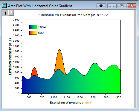
- Choose Graph: Layer Management... menu, then drag the row header "1" of the Layer1 in the Layer Selection downward under the Layer2 (indicated by a blue line), and click OK.
选择图形:图层管理...菜单,然后将 "图层选择 "中图层 1 的行标题 "1 "向下拖动到图层 2 下方(用蓝线表示),然后单击 "确定"。
- You can see the yellow layer is on the top now.
你可以看到黄色图层现在在最上面。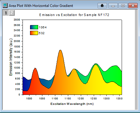
Alternate Method:
You can use the Front or Back toolbar buttons (located in the Object Edit toolbar, or at the top of Layer Selection box in the Layer Management dialog) to bring a layer forward or push it backwards. As happens when you rearrange layer order with the Layer Management dialog, this method swaps layer numbers.
其他方法:您可以使用 Front 或 Back 工具栏按钮(位于 "对象编辑 "工具栏中,或 "图层管理 "对话框中 "图层选择 "框顶部),将图层向前或向后推进。与使用 "图层管理 "对话框重新排列图层顺序时发生的情况一样,这种方法也会调换图层编号。
|
Inset GraphGraphs, Inset
| You can copy a layer from one graph window to another graph window. Click to select the layer first (a frame shows around the layer). Then press Ctrl+C or right-click and choose Copy. Click on the target graph window, then right-click to Paste.
您可以将一个图层从一个图形窗口复制到另一个图形窗口。首先单击选中图层(图层周围会显示一个框)。然后按 Ctrl+C 或右键单击并选择 "复制"。单击目标图形窗口,然后右键单击粘贴。 |
Note: For more information on merging graphs, see your Origin User Guide:
注:有关合并图表的更多信息,请参阅《Origin 用户指南》: Help: Origin: Tutorials > Graphing > Layers > Merging and Arranging Graph Layers
帮助:起源:教程 > 制图 > 图层 > 合并和排列图表图层
Help: Origin : Origin Help > Graphing > Reference > The Merge Graph Dialog Box
帮助:Origin :Origin 帮助 > 制图 > 参考 > 合并图形对话框
|
Templates and Themes 模板和主题
Origin's flexible Page > Layer > Plot hierarchy, plus an extensive list of editable object properties makes it easy to customize and save your graph settings for repeat use. You can preserve your custom settings in a couple of ways -- either with templates or with Themes. These concepts are introduced below.
Origin 灵活的 "页面 > 图层 > 绘图 "层次结构,以及大量可编辑的对象属性列表,让您可以轻松自定义和保存图表设置,以便重复使用。您可以通过模板或主题等几种方式保存自定义设置。下面将介绍这些概念。
Note: For detailed information please refer to Origin Help file, see:
注:有关详细信息,请参阅 Origin 帮助文件: Help: Origin: Origin Help > Graphing > Creating Graphs from Graph Templates
帮助:Origin:Origin 帮助 > 制图 > 从图表模板创建图表
Help: Origin: Origin Help > Customizing Your Graph > Graph Formats and Themes
帮助:Origin:Origin 帮助 > 自定义图表 > 图表格式和主题
|
Templates 模板
Graphs, Templates
A new Origin installation lists close to 240 plot types, each one backed by an Origin graph template file (*.otp or *.otpu). For most users, a Plot menu graph is the starting point for customizing and saving your own custom graph templates. The basic process goes like this:
新安装的Origin列出了近240种绘图类型,每种类型都有一个Origin图形模板文件(*.otp或*.otpu)作为支持。对于大多数用户来说,"绘图 "菜单图形是自定义和保存自定义图形模板的起点。基本过程如下
- Plot your worksheet or matrixsheet data using the Plot menu (or equivalent graphing toolbar button).
使用绘图菜单(或相应的图形工具栏按钮)绘制工作表或矩阵表数据。
- Customize the graph's default settings.
自定义图表的默认设置。
- Save the graph as a graph template file (*otp or *.otpu) by choosing File: Save Template As and filling in the requisite information. By default, custom templates are saved to your User Files Folder (hint: easily find this folder by clicking Help: Open Folder: User Files Folder).
选择文件:模板另存为并填写必要信息,将图形保存为图形模板文件(*otp 或 *.otpu)。默认情况下,自定义模板保存在用户文件文件夹中(提示:单击帮助轻松找到该文件夹:打开文件夹:用户文件文件夹)。
A few things to note:
有几点需要注意:
- The Plot menu is the definitive list of built-in plot types. At one time, a graphing toolbar button was created for each new plot type but in recent versions, few toolbar buttons have been added as toolbar space has become limited.
绘图菜单是内置绘图类型的权威列表。曾几何时,每一种新的绘图类型都会创建一个绘图工具栏按钮,但在最近的版本中,由于工具栏空间有限,已很少添加工具栏按钮。
- In a fresh Origin installation, each one of Origin's 240 built-in graph types uses a specific "system" template when creating a particular graph type. When you click on a Plot menu graph or graphing toolbar button (e.g. Area
 ), one of these system templates is used to plot the selected data. ), one of these system templates is used to plot the selected data.
在新安装的Origin中,Origin的240种内置图形类型中的每一种在创建特定图形类型时都使用一个特定的 "系统 "模板。单击 "绘图 "菜单图形或图形工具栏按钮(如 Area )时,这些系统模板之一将用于绘制所选数据。
- System templates are installed to the Origin Program Folder. They are completely customizable but as the Program folder is write-protected, you cannot overwrite the original system template file (see next).
系统模板安装在 Origin 程序文件夹中。它们可以完全自定义,但由于程序文件夹有写保护,因此不能覆盖原始系统模板文件(见下一步)。
- Instead, when you customize and save a system template, it is saved by default to your User Files Folder (UFF). If you save the customized template to the same system template name, the customized template replaces the system template as the template associated with the Plot menu command or corresponding toolbar button used to create that plot type. Additionally, the customized template is added to the user's Template Library.
相反,当您自定义并保存系统模板时,默认情况下会将其保存到用户文件文件夹 (UFF)。如果将自定义模板保存为相同的系统模板名称,则自定义模板将取代系统模板,成为与用于创建该绘图类型的绘图菜单命令或相应工具栏按钮相关联的模板。此外,自定义模板还会添加到用户的模板库中。
- To view your custom graph templates, click Plot (workbook or matrix should be active) and click Category = MyTemplates.
要查看自定义图表模板,请单击绘图(工作簿或矩阵应处于活动状态),然后单击类别 = 我的模板。
- You can save a graph template anywhere (and with any name) that you like -- it does not need to be saved to your UFF. However, by saving customized templates to your UFF, they will be collected in one, easily-remembered place and they will be readily available when you upgrade your Origin software (since Origin 2018, all Origin versions have shared a common User Files Folder).
您可以将图表模板保存到任何您喜欢的地方(并使用任何名称),而无需保存到您的 UFF 中。不过,将自定义模板保存到您的UFF中,它们就会被收集到一个易于记忆的地方,当您升级Origin软件时,它们也会随时可用(自Origin 2018起,所有Origin版本都共享一个通用的用户文件文件夹)。
The Template Library 模板库
Summary of Features: 功能概述:
- Toggle between list and thumbnail view modes. Thumbnails images are automatically generated when you save a template.
在列表和缩略图视图模式之间切换。保存模板时会自动生成缩略图。
- In either mode, you can hover on the template to preview, read template location, comments, etc.
在这两种模式下,你都可以悬停在模板上预览、阅读模板位置和评论等。
- In list mode you can sort; or opt to list a User or Extended template under Plot: My Templates.
在列表模式下,您可以进行排序;或选择在 Plot: My Templates(图标:我的模板)下列出用户模板或扩展模板。
- Templates are listed as System, Extended or User. System templates are Origin's default templates for creating Plot menu graphs. They can be plotted to and customized but cannot be overwritten. Extended templates are add-on templates that are installed with Origin. User templates are those that you specifically customize then save using File: Save Template As; or which you add using the Library's Add or Scan functions. Note that User templates can include customized System templates that you have saved to \User Files.
模板分为系统模板、扩展模板和用户模板。系统模板是 Origin 创建绘图菜单图形的默认模板。它们可以绘制和自定义,但不能被覆盖。扩展模板是Origin安装的附加模板。用户模板是您专门定制后使用 "文件:模板另存为 "保存的模板,或者使用库的 "添加 "或 "扫描 "功能添加的模板。请注意,用户模板可以包括您保存到 \User Files(用户文件)中的自定义系统模板。
- To scan your User Files folder (UFF) for custom templates, click the Scan User Template icon. To browse and add a template file to the Library, click the Add Template icon.
要扫描用户文件文件夹 (UFF) 以查找自定义模板,请单击扫描用户模板图标。要浏览并向库中添加模板文件,请单击添加模板图标。
- Click the List Cloneable Templates icon to show only cloneable templates.
单击 "列出可克隆模板 "图标,只显示可克隆模板。
- Click the Manage Mode icon to delete, show or hide a given template. Hiding a template removes it from My Templates but does not remove it from the Template Library (note that you can also remove a template from My Templates simply by clearing Show in Menu). Deleting a template removes it from the Library and moves the template to User Files\DeletedTemplates.
单击管理模式图标可删除、显示或隐藏指定模板。隐藏模板会将其从 "我的模板 "中移除,但不会从模板库中移除(注意,你也可以通过清除菜单中的 "显示 "将模板从 "我的模板 "中移除)。删除模板会将其从模板库中移除,并将模板移动到 User Files\DeletedTemplates 中。
- Click the Template Center icon to open a dialog and search the OriginLab site for additional graph templates.
点击模板中心(Template Center)图标打开对话框,搜索 OriginLab 网站上的其他图形模板。
| You can search for Template Center templates and install them directly from the Start menu.
您可以搜索模板中心模板,并直接从 "开始 "菜单安装。
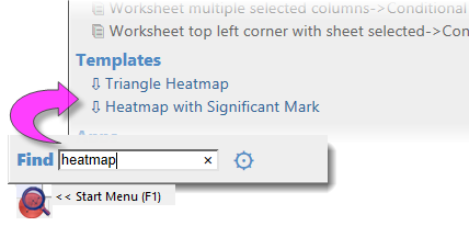
|
Themes and Copy/Paste Format
主题和复制/粘贴格式
Graphs, Themes Graphs, Copy/Paste Format
An Origin Theme is a file containing a set of object properties. There are four kinds of Theme files in Origin: graph Themes, worksheet Themes, dialog Themes and function plot Themes.
Origin 主题是包含一组对象属性的文件。Origin 中有四种主题文件:图形主题、工作表主题、对话框主题和函数图主题。 Graph Themes are a collection of properties of different elements in a graph window. A graph Theme can be very simple (e.g. graph axis major and minor tick direction settings) or it could be something more complex (e.g. a combination of page dimensions, layer background, axis scales, and color palettes). Whether simple or complex, the purpose of graph Themes is to allow you to quickly change one or more object properties in an existing graph, or to apply a consistent set of properties to a selection of graph windows, without having to recreate a suite of settings, or to apply those settings one-by-one to individual graph windows.
图形主题是图形窗口中不同元素属性的集合。图形主题可以非常简单(如图形坐标轴主刻度和次刻度方向设置),也可以更加复杂(如页面尺寸、图层背景、坐标轴比例和调色板的组合)。无论是简单还是复杂,图形主题的目的都是让您能够快速更改现有图形中的一个或多个对象属性,或将一组一致的属性应用于选定的图形窗口,而无需重新创建一套设置,或将这些设置逐一应用于单个图形窗口。 All graph objects have a customizable set of properties that are specific to the object type. Therefore, it follows that the properties that can be saved as a Theme differ depending upon the selected object. You can (1) copy a Theme from one object and "paste" it to another object of the same type or (2) you can save a Theme from one object as a named Theme and apply that named Theme to other like objects at a later time.
所有图形对象都有一组可定制的属性,这些属性是对象类型所特有的。因此,根据所选对象的不同,可以保存为主题的属性也不同。您可以:(1) 从一个对象复制一个主题,然后将其 "粘贴 "到另一个相同类型的对象上;或 (2) 将一个对象的主题保存为命名主题,然后在以后将该命名主题应用到其他类似对象上。
- Right-click on an object in a graph window (e.g. a plot) and choose Copy Format. Depending on what you click on, there may be sub-menu items under the Copy Format shortcut menu, which give you the option as to what exact format to copy.
右键单击图形窗口中的对象(如绘图),然后选择 "复制格式"。根据点击的对象,复制格式快捷菜单下可能会有子菜单项,让您选择要复制的具体格式。 - To apply the copied formats to a single object, right-click on your target graph and choose Paste Format To. Again, this shortcut menu might has some sub-items that limit what to paste. In this way, the formatting option(s) from your source object should be applied to your target object.
要将复制的格式应用于单个对象,请右键单击目标图形并选择 "粘贴格式至"。同样,该快捷菜单可能会有一些限制粘贴内容的子项目。这样,源对象中的格式选项就会应用到目标对象中。
- To apply the copied formats to multiple windows in the project, keep the source graph window active and select Edit:Paste Format(Advanced)... from the Origin menu. This opens the Apply Formats dialog box. Here you have the option of editing or selectively applying formats to one or more graph windows in the Origin Project.
要将复制的格式应用到项目中的多个窗口,请保持源图形窗口处于活动状态,然后从 "原 始 "菜单中选择 "编辑:粘贴格式(高级)..."。这将打开 "应用格式 "对话框。在这里,您可以选择编辑或选择性地将格式应用到 Origin 项目中的一个或多个图形窗口。
- If you would prefer to save formats to a named Theme file that you can re-apply at a later time, choose the Save Format As a Theme... shortcut menu item, then use Preferences: Theme Organizer to apply the Theme when needed.
如果您希望将格式保存到一个命名为 "主题 "的文件中,以便日后重新应用,请选择 "将格式另存为主题... "快捷菜单项,然后使用 "首选项":主题管理器在需要时应用主题。
Theme Organizer 主题组织者
Theme Organizer Graphs, Theme Organizer
Use the Theme Organizer (Preferences: Theme Organizer) to organize and apply Themes to graphs. With this dialog box you can apply a graph Theme simultaneously to multiple graphs in the Origin project file.
使用 "主题组织器"(Preferences: Theme Organizer)来组织和应用图形主题。通过该对话框,您可以将图形主题同时应用于 Origin 项目文件中的多个图形。
To combine multiple Themes in the Theme Organizer dialog box:
在 "主题管理器 "对话框中组合多个主题:
- Press the CTRL key while selecting multiple Themes, then right-click and choose Combine from the shortcut menu. The shortcut menu in the tool provides an option for editing a Theme, allowing the user to add/delete properties from an existing Theme.
选择多个主题时按下 CTRL 键,然后右击并从快捷菜单中选择合并。工具中的快捷菜单提供了编辑主题的选项,允许用户添加/删除现有主题的属性。
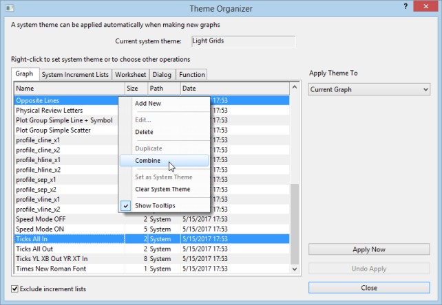
- The Theme Organizer has separate tabs for managing graph, increment list, worksheet, dialog boxes and plotted mathematical function Themes.
主题管理器有单独的选项卡,用于管理图形、增量列表、工作表、对话框和绘制的数学函数主题。
- If you right-click on a graph Theme and save it as your System Theme, then each time you plot a new graph, this System Theme will be applied regardless of the settings that were saved with the graph template†.
如果右键单击图形主题并将其保存为系统主题,那么每次绘制新图形时,都将应用该系统 主题,而与图形模板† 中保存的设置无关。
- Use the System Increment Lists tab to manage increment lists and selectively apply them to project graphs.
使用 "系统增量列表 "选项卡管理增量列表,并有选择地将其应用于项目图表。
- You can load a graph Theme in the Export Graph dialog and the Theme will be applied to the exported image file.
您可以在导出图形对话框中加载图形主题,该主题将应用于导出的图像文件。
| † If you don't want a System Theme to be applied automatically to the graph, save the graph as a template (File: Save Template As) and clear the Apply System Theme to Override check box.
† 如果不想自动将系统主题应用到图形,请将图形保存为模板(文件:模板另存为),然后清除应用系统主题覆盖复选框。 |
Topics for Further Reading
延伸阅读主题
|